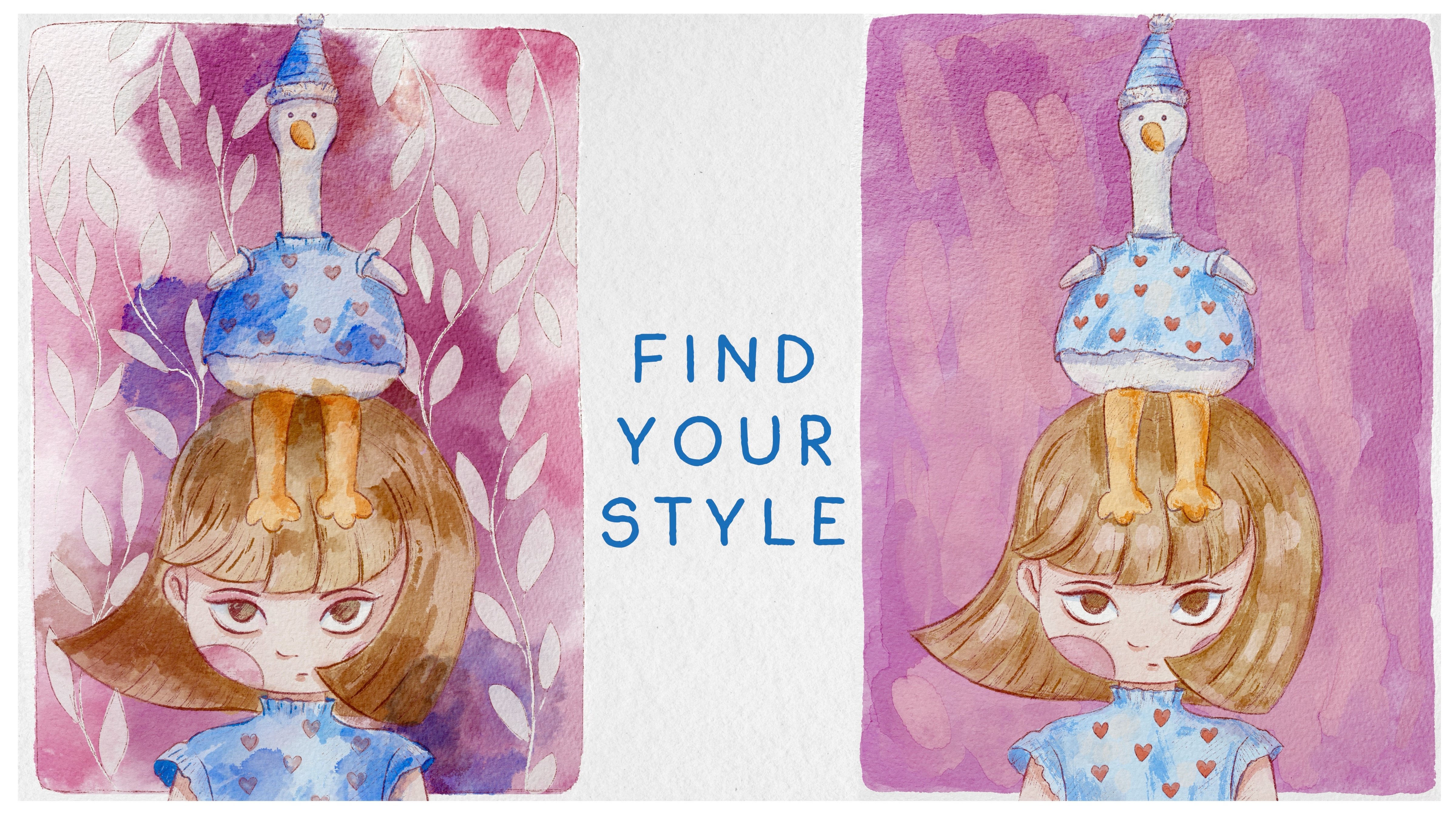
Transcripts
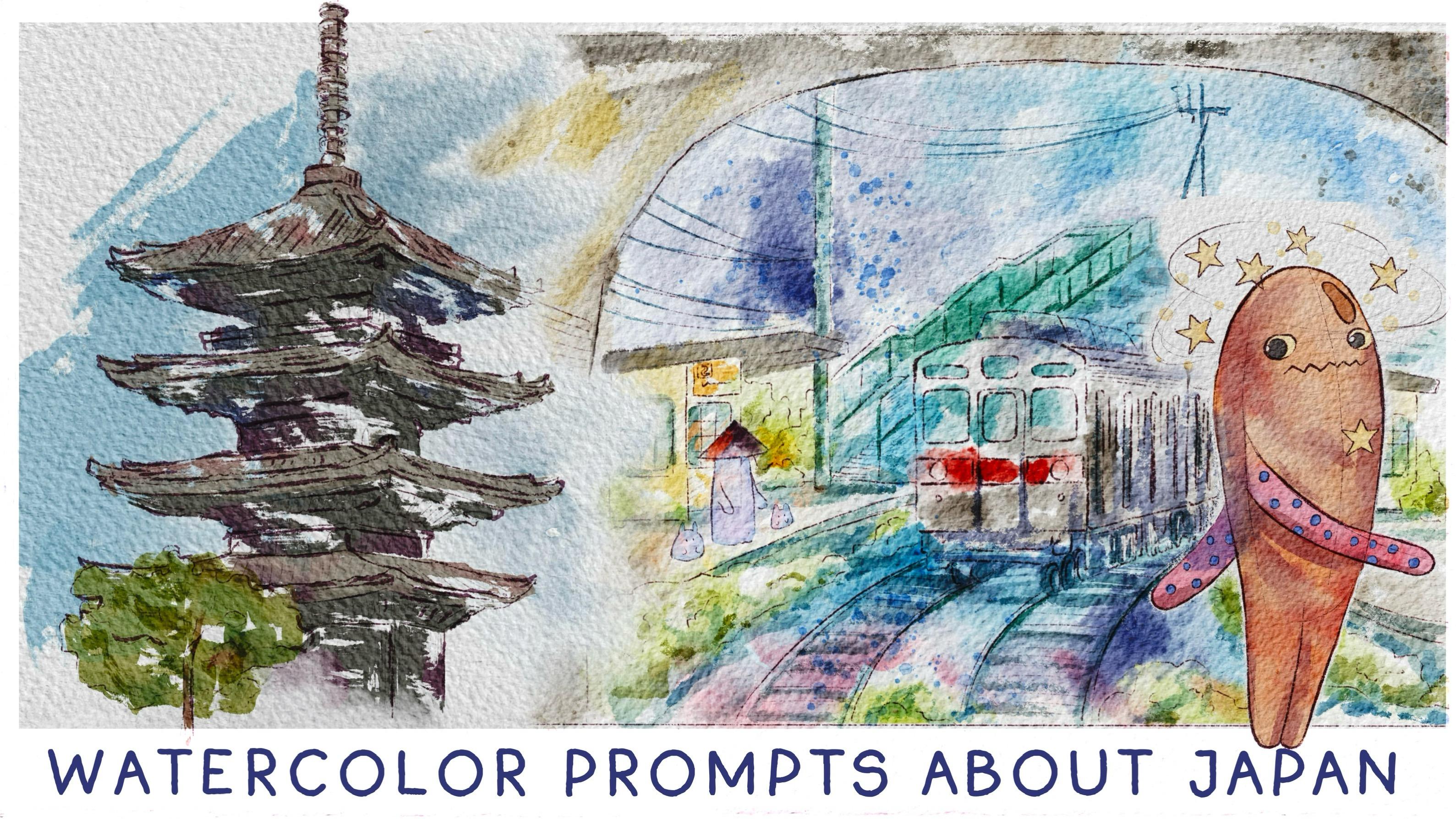
1. Introduction: Hello, my lovely artist. Welcome to my class and let's have imaginary trip to Japan. Then seven proms that
will help to bring your digital watercolor
skill to totally new level. Get ready to learn new watercolor techniques
for Procreate. My name is Zinga. I'm an artist, and I'm here to show you that digital watercolor is magical, and you can create this
magical world with all those cute characters and whimsical nature
with your own hands. So for that, we
will need procreate and a little bit of inspiration. This class, I start by
telling you where to find all the freebies and how to get ready for the
painting process, like creating watercolor
paper and procreate and exploring all the brushes
that we will have today. Because Oday's class is special, the whole trip to Japan, so we will not have any problems with inspiration or references because I prepared for you many pictures and a
small video from Japan. This part takes an
important role in today's class and that's where our creative
journey starts. We will prepare sketches
for every prompt. Seven beautiful and cut
topics are waiting for us and different ways of
painting digitally, too. I will show you how
to add colors, stems, shades and highlights to our art from the sketch to
detailed composition, we will make our painting
process a little bit advanced, and all the topics, of course, will be
connected to Japan to our imaginary trip to this
country of rising sun. By the end of my class, you will be able to create watercolor illustration in
different style in procreate, using watercolor techniques
in fun and simple way. What's important seven
prompts will help you improve your digital painting
skills and become more familiar with useful
procreate features. During the course, I'll slowly move you throughout my workflow, explaining every
step and describing procreate features and water
color painting techniques. What you will learn
during the class? First, more about procreate, then more about
sketching techniques, how to create watercolor
paper texture, how to use different
watercolor painting techniques and how to apply
them to Procreate app. Next, how to use
layers, blending modes, clipping mask and Alpha log, and then how to add volume and color
variations to your art. And the most important, how to improve your
watercolor technique using digital brushes. What you will need
for out desk class, I will use procreate with
iPad and Apple pencil. You also can use procreate
or Mazzi drawing pads, or just regular watercolor
paper and paints. About course resources, I prepared for you
everything that you need. It will be texture
paper, custom brushes, color palette references, my
own pictures that I created. And who is this class for? The class is great for
intermediate level. Also can be useful for beginners if you have
basic understanding of apcriate features for those
who is interested in digital, watercolor art, cute
characters, and Japan. One more thing that
I want to mention your opinion and feedback
is super important to me. So feel free to tell me
what you think about my class in discussion
or review section, I will be glad to reply to you. My dear fellows, I cannot
wait to start this class, and definitely I
cannot see what you upload to project
section. Let's do it.
2. About Class Project: Now let's talk about
class projects. Just follow your
steps and create seven illustrations related
to Japan in watercolor style. Of course, don't forget about
the tips I gave you today. Explore the new
painting techniques and chose a style that suits you most and then
create beautiful artworks. I'll use Procreate
for this class with iPad and Apple Pencil. You also can use them, or it can be some
drawing pads or just regular body coolor paper and paints, whatever you want. In today's class, I will paint seven illustrations
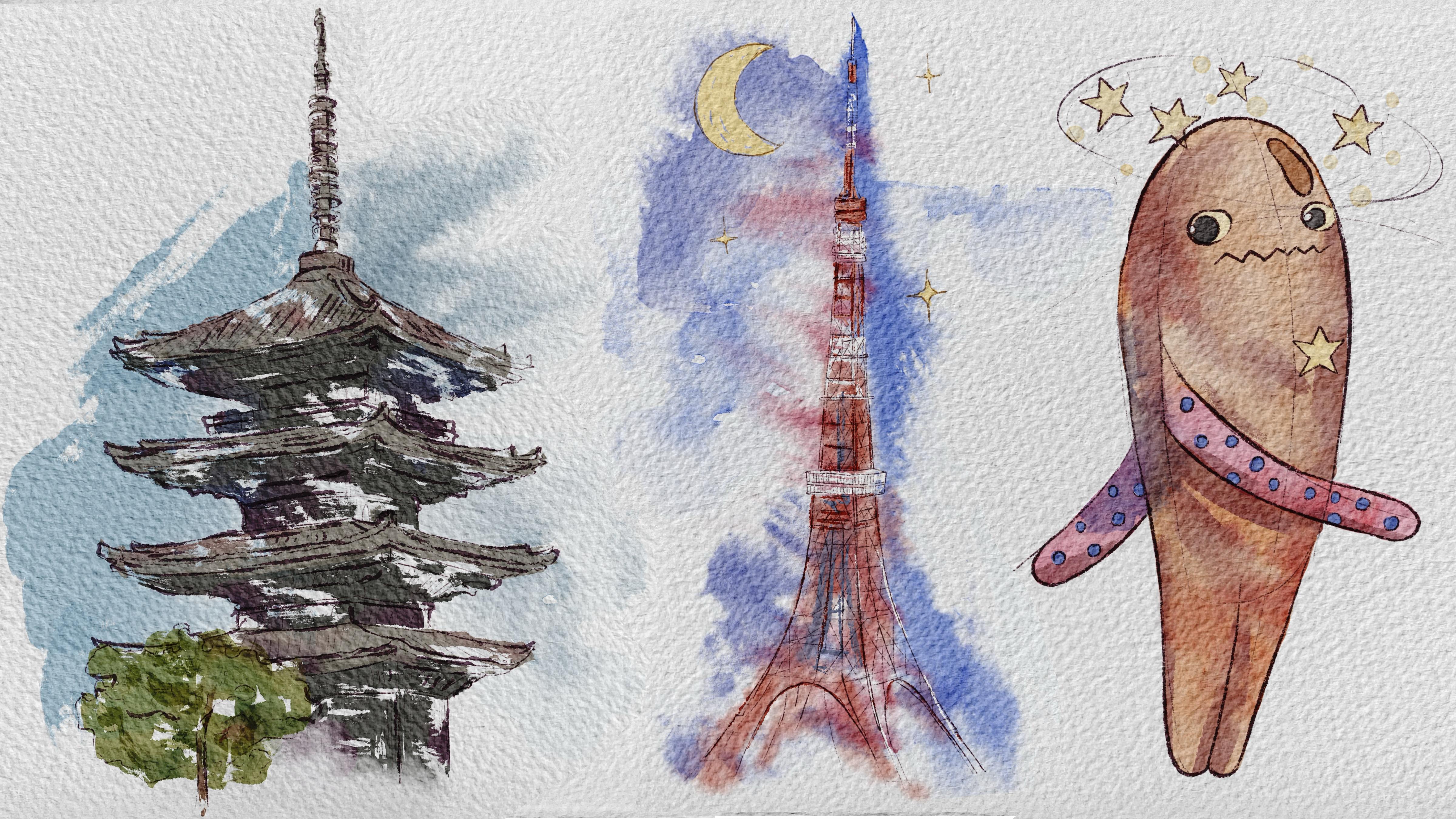
related to seven prompts. We will paint
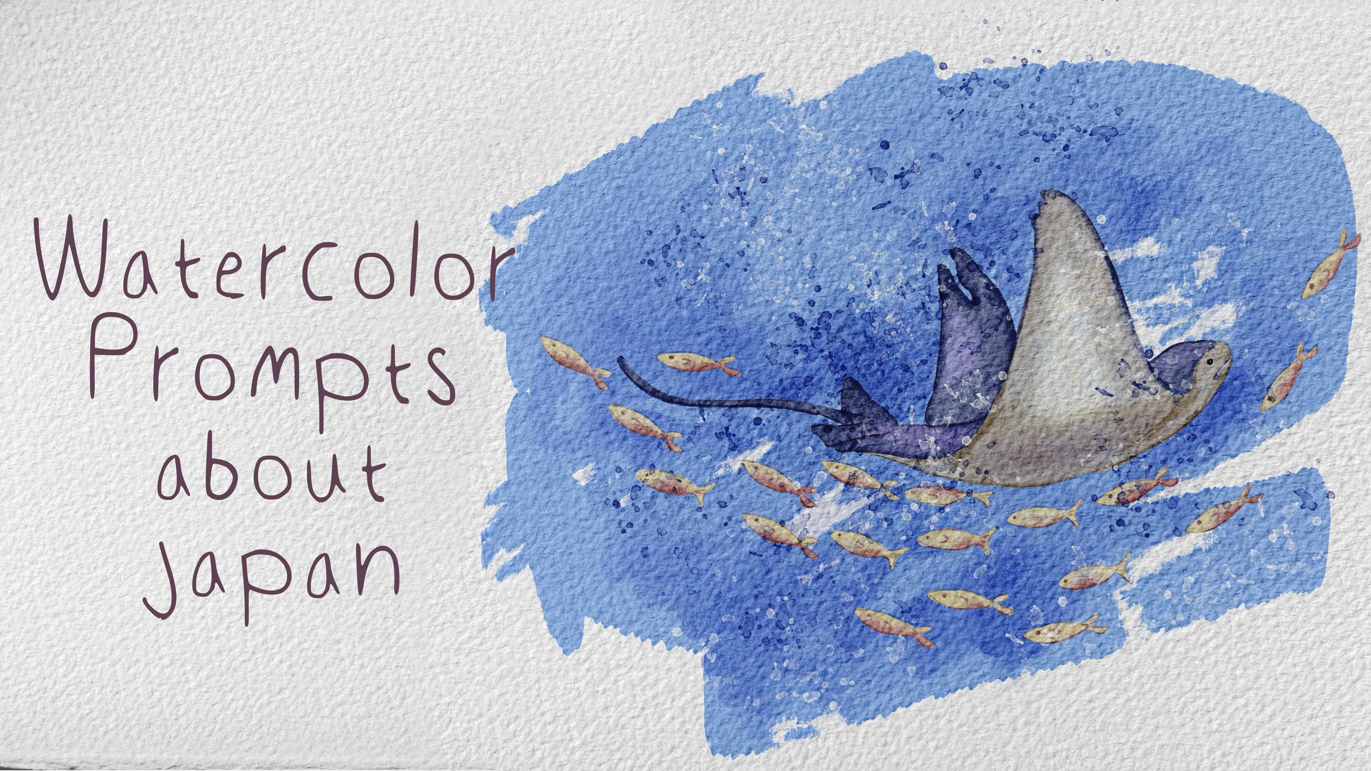
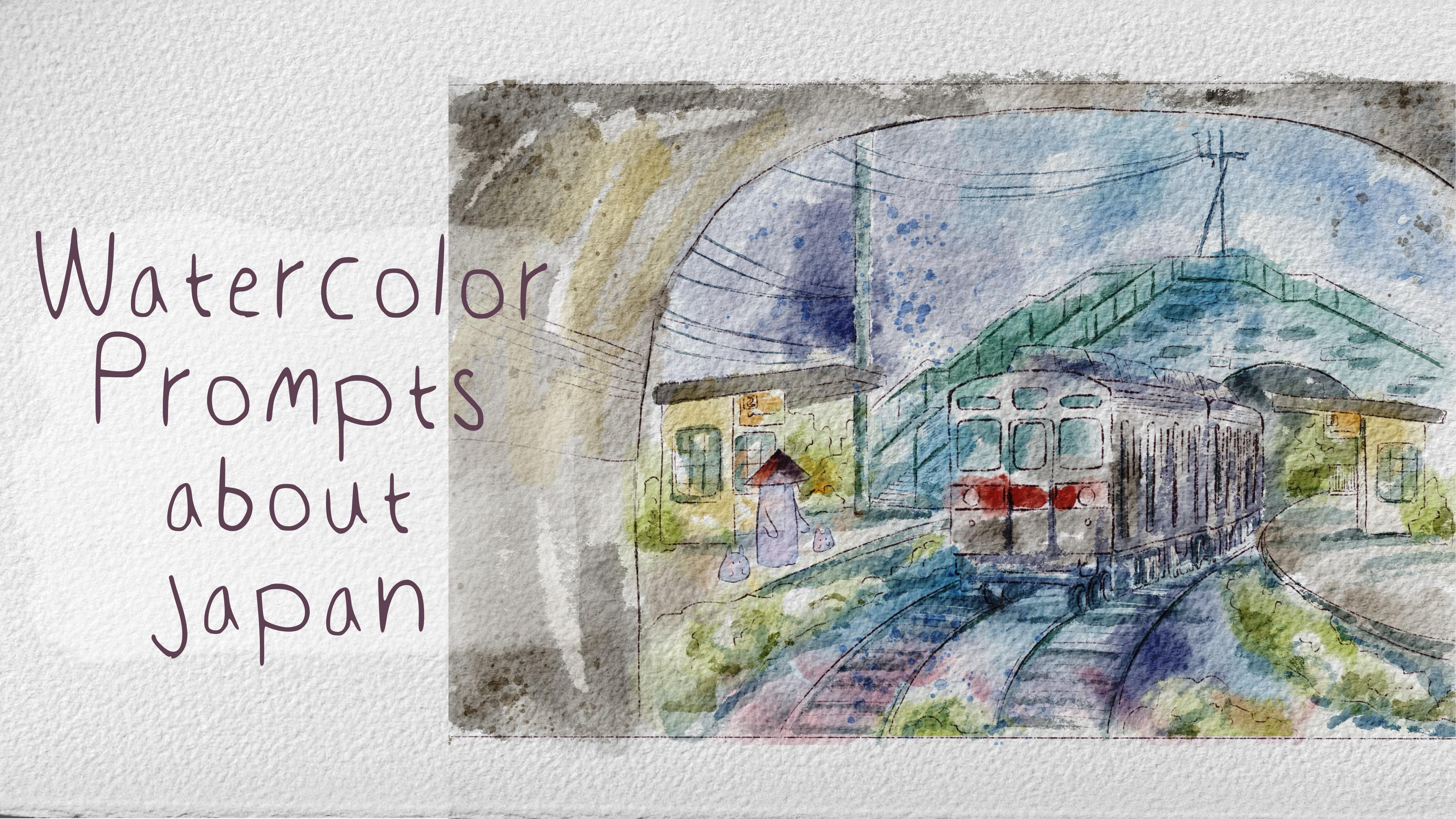
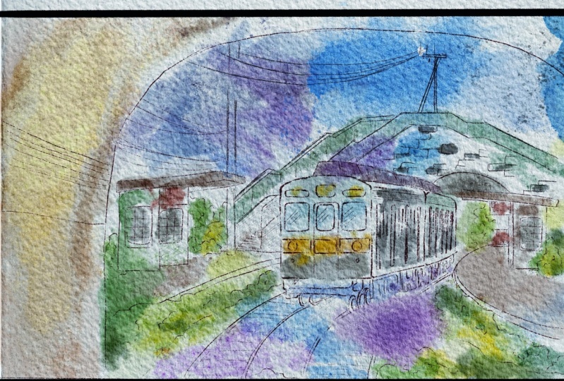
Mokeka, snowmankey, whimsical train, Tory gate, pagoda, Tokyo Tower,
and stream gray fish. Also, we will experiment with
different painting styles. Once again, you can choose completely different
topics and draw something you try experiment
and enjoy painting process.
3. Tools and Resources: In this class, we will
talk about resources and where to find them.
It's pretty simple. Follow the steps, go to
projects and resources section, download previews,
go to Files app and then Import all the previews
into the Procreate. Also, it's hard to create watercolor illustration without
watercolor texture paper. So we'll fix this issue
in next next class. So let's talk about
that right now. My lovely Skillshare community. I think we are ready
to get started. And in this class, I will show you where to find all the freebies and how to get ready for the
painting process. So let's start doing that. So once you open my class, please do it in browser. It can be Rome or Safari. Why browser Because if you
do it at Skillshare app, my freebies might
not be visible. So you go to SafarioHome, then you go to Projects
and Resources section, and in the right corner under
the headline resources, you will find all the freebies. After that, when you
download everything, you go to Files App
to Downloads folder, and our next step will be,
let's split the screen. From the left side,
we're going to have Files App and from right
side, we have Procreate. Then we need to inpert PSD
format file into the Procrit. How to do that, just drag and drop file into the Skillshare. Then you see it over there. Next, we just open it. Make sure that when
you say the file, it's not in your
picture gallery, it's in Fils app and it
has PSD format file. When you open layers, you see that we have two
paper layers on the top, and we have paint here layer. About paper layers,
let's just lock them. So in this case, you will not paint mistakenly on this layer. Then we can duplicate pain
here layers a couple of times. After that and the freebies, you also will see we
have a lot of sketches. So what you should do with them? We need to track
and drop them from Files app into the
Procreate. So let's do that. Then go to the new layer, turn off the first one, and about the second one, let's go to Mokeke sketch. You can rename MokekeOPmpt one, prompt two. Here's nom. Then we need to select all
the layers by swiping right, you select all the layers
and you press group. Next, let's just rename sketch. So it's just easier for us
to understand what is what. After that, let's duplicate
pain here layer three times and do same with
brush set and swatches. About the swatches, they're
called seven proms. I already set them as a
default. How to do that. You see among the palettes,
we have three dots. You need to press it and
press set as default. So we have seven prompts. Press three dots, press
set as a default, and then go to disk. And here we have all
our seven prompts. Now let me explain what is what. Close files app. Because
we have seven proms, so I tried to separate all our color palettes,
one from each other. For one prom, which is
called Tokyo Tower, we didn't have any pictures because it's red and
white literally, so we're going to take
colors from another prompt. So first prom, this one will be related to
mo keke painting. Second one is snow monkey,
pretty muted color. Next one is fantasy train. I tried to pick some
limited amount of colors, and of course, we
would have some of the colors from
another color palette. So next one, this is
Story gate in Hakane. Next illustration is pagoda. And the last colors are
for the stem grayfsh. Dan so now you
know what is what. And now we will be a little bit more prepared for
our painting process. Once you set all our layers for the painting process,
we have color palette. Now let's talk
about the brushes. The brush set is called
Japan seven proms, this one, and I have so
many brushes for you. Let's be on pin here layer now. And let me briefly show
you all of the brushes. Six B pencil is
native procret brush. It's great brush if you
want to create sketches. You also can use my own
Blue HB pencil brush. It's a little bit sharp
and has rougher sure. So you can combine those two
pencils together. Indeed. Next, Bo Chinese ink crush. Great for those sharp lines. I'm going to use it for
our first illustration. Bu Asian agate also
would be amazing for adding some shades
and sharp lines. Bu artistic, a little
bit lighter brush, but also these very
distinctive brush strokes. Next, Blue dark
watercolor edges. This is main brush if
you're going to use for filling colors for our
watercolor objects. Bu natural stains
brush and blender. It's very good with
mixing colors together. You see it gives you
very natural feeling. Bo soft diffuser, use
it as a blending brush. Burning etches, good for adding soft watercolor touches
as a shade or too. By transparent watercolor. Brush can help us very
soft shading strokes, B water drops. My suggestion to use it with
a bigger amount of size, and it's also good
blending brush was that you use as a brush, so it blends on a paint layer. Bo Watercolor silloets. That's very sharp
lines, like edge lines. Good for some bushes,
nature, B salt. Blap is lovely. If you want to add some
singular splatters and we have so
many stem brushes. Let me show you. So I think we've done
this preparation process. And if we talk about
the reference pictures, what I want to add, we're going to use this, this, this, this, and this. Those reference pictures, you
might use different ones. It's totally fine. And you
can alter the illustrations. You don't need to follow
exactly my steps. But that's what I'm going
to use for our art. And I hope those illustrations, the video that we just
watched will be a good, inspiration for you to create
your own illustrations. So we have our layers. We have the sketches, and I think we are ready to jump to the next part
of the class where we'll start our first
prompt and we will talk a little bit about the
sketching techniques. So let's do it.
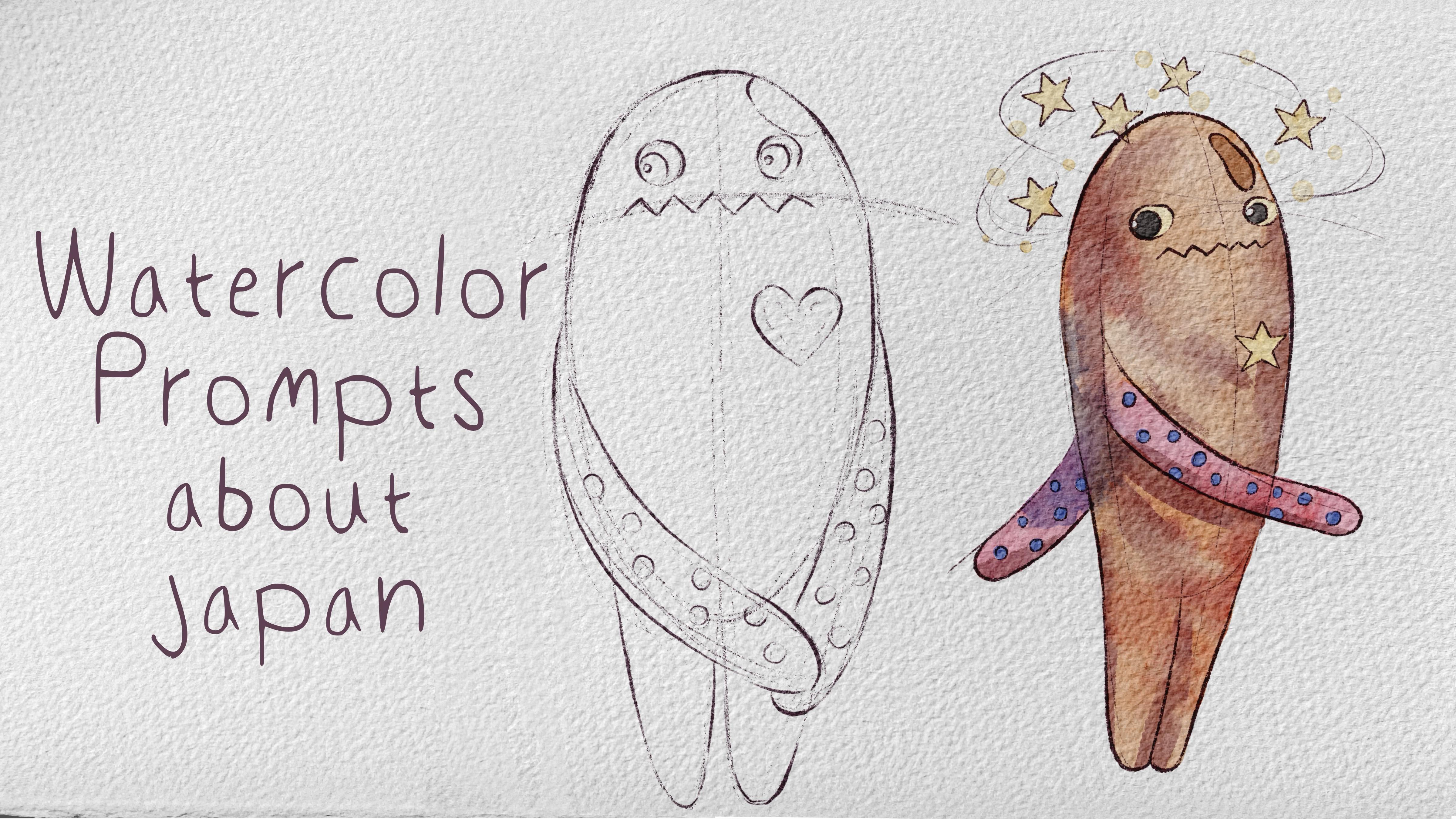
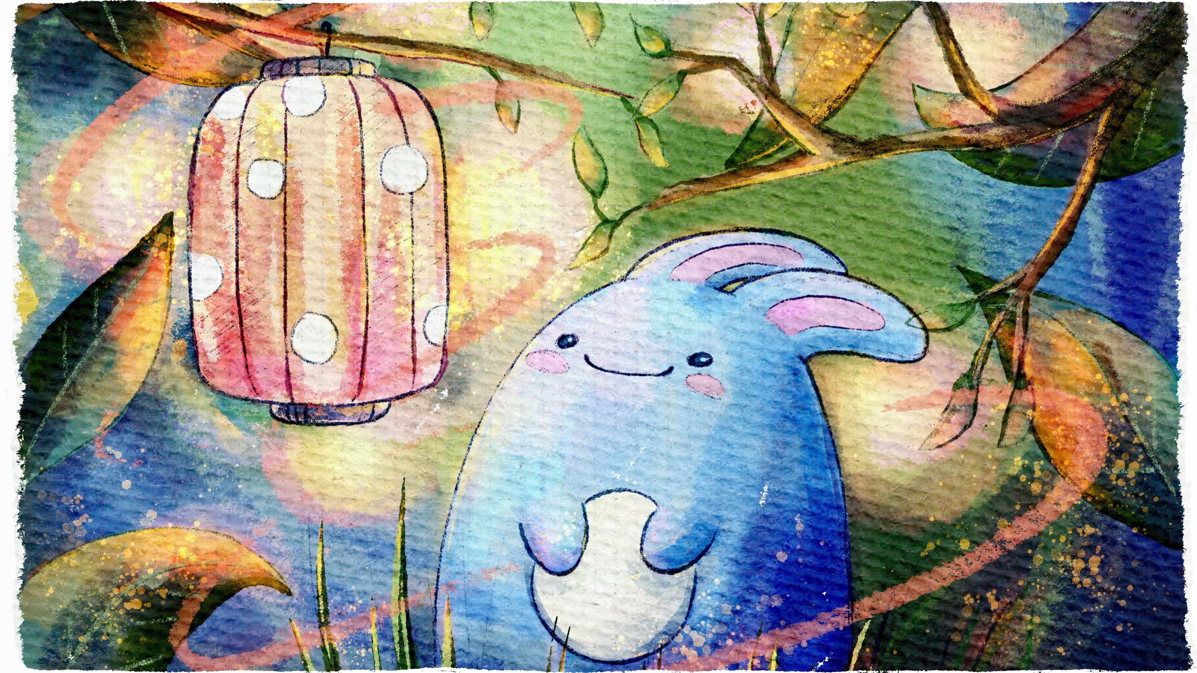
4. Prompt 1: Mokeke: Now it's time for our prompts. We will start each
prompt with sketch. Pencil part is super important because in
some restrations, we will have a lot
of pencil parts, and in some, we will
not use it at all. Feel free to follow my steps
or use your own sketches. Be creative. About
my first prompt, it will be more
are kept painting. My first city was Hakana and it's where I saw
such cute creatures. I thought the spirits protecting the temples
and shrinees because almost everyone around me had them on their backs
or simply as a toy. Later I discovered that
they are actually aliens, very cute, very popular. And in my eyes, they still
look like spirit protectors. So that's why I
decided to choose Mokeke as our first prompt. So So so like I mentioned at the
beginning of this class, sketching part is
super important. And we're going to use
different sketching techniques and depending on the
style because today we're going to create seven
different illustrations in different watercolor styles and using different watercolor
painting technique. So we experiment, we grow, and we are trying to become more efficient in watercolor
process, painting process. So what I want to tell you is that for our first illustration, which is Mokeki art this one, let me just turn rotate
our love illustration. That's what I paint. For the sketch, don't worry, we're going to go through
all of the steps, and I'll show you how
I created the sketch. And what we're going
to do for this one, I'm going to keep the pencil part because I think
it looks very pretty. And our first
watercolor style will be more or less tidy,
if we might say so. So we will play with
some stems in this, and we will also add some dry brush strokes
for this style. So what we're gonna do first is find some reference pictures. This art. So we don't touch sketch. We can just maybe switch to
multiply blending layer mode. I think it would
be a great idea. Then we go to paint here
layer and write color. Then on the top, we
can write stemps and also we can add shades. About shades and stems, we will switch to multiply
blending layer mode. We will do that in advance. And a color layer, that's
where we're going to paint. So go to action button,
Canvas, reference image. So this is our
Makk illustration. Makk, once again, let me briefly tell you
again what is it? It's a lovely lien that is
super popular in Japan. He looks like spirit
to my perception. And this lien likes hugs. So you see it has, like, some tiny button over there, and it's supposed like to
hug whenever they see. So you can just, like, leave hand this way, or you can actually tie them together thanks
to the button. So it creates a
feeling like this. He's hug and everything. So here are the pictures
from different size, different angles, and
that's what I paint. You might paint exactly
the same illustration or you can just
rotate it slightly, add some face expression and and put the hands
where you like it. So let's just create one
more layer and write sketch, and let's create
sketch together. I will go with HB
pencil for, like, emphasizing main features
and about the sketch, I'll just want to move it
slightly to the side for now. Okay. So this is our
more cake illustration. Let's just create
it by ourselves. I decided to make
this part a little bit bigger, like, fattier. If we can say so. So let's just about the
color, purple shade. You can create, like,
a ball over there. And you see I tend to keep all of those sketching
lines together. You can use a sixpe pencil, this brush, he's thin
or brush strokes. And then you need to see
where you have mouth, eyes. I will paint this illustration
and this position. Then we need to add, uh legs T. Jake, I'm using Bo HB
pencil and about arms. That's just lovers'
eyes a little bit. We can create a
feeling like he's hugging himself because he
feels a little bit shy. D hmm. Like that. Paint tiny hole here. And you see, I paint some stars. You can add more details
that I'm going to add more stars around
his head because, like, he's an alien, so he might be a little
bit star related. And I still think
that he looks great, or maybe you can paint just like a heart or just like a flower or don't need
to paint anything at all. And then we're gonna
have some dots around. It looks very cute.
Then we go to six B pencil and you can
exaggerate some of the lines. My suggestion if
you want to create some dynamic in illustration, you can have thinner or
thicker lines in your art. Like that. So not all of the lines should have
the same thickness. Obviously, you can
alter them the way you. Very cute. So think which sketch
you would prefer more. You can create your
own sketch like this. Okay, you can use
mine. Actually, both of them are so beautiful. But I'm still, I'm gonna stick with this one, and
I forgot about that. Next, make it smaller. And when we've done
with sketching part, let's just start
painting process. Well, for this lovely Mokeki, what we're gonna do
is first of all, go to color layer, then go to pod watercolor edges and grab our orange color. I made it a little bit
more saturated like this. And just fill the area
Kaki with this colour. Just try not to go
beyond the light. As a blender, I will use
Bosov diffuser here. Mm hmm. And about arms, I will grab this pink color, and I'll add pink
shade to this part. As a eraser, use runny inker and slightly
blend color one in another, so it would look
more natural. Okay. So let's just change the
color of a star without actually changing the color in our color palette.
How do you do that? Let's go to go with
Selection tool and select this part of the star
accordingly to the outline. Here, use free hand. Great. Then our star
shape selected. Let's go to adjustments and press hue saturation
and brightness. Let's make it brighter,
more saturated, and let's go with
the color we like. Maybe a little bit
yellowish, Lexis. I think it's nice. And ran. So we changed the color without actually changing the
brush and color palette. Let's do the same with ice. Selected eye again and press. Then go to adjustments, hue saturation and brightness, increase the brightness,
more saturated, and let's go with
yellowish color. Like that. And the middle part we will paint with black color. Selection tool, free hand. Add Add, stran
brightness, darker. And the middle part where we have white color,
let's just erase. That's it. About brown color, if you want, let's just
go with this brown color. We can have the same brush, and let's just paint on
top of our like sand. And then we have
some white dots, but I decided to turn
them to blue colour. So my suggestion here go
with eraser and resi dots. Or we can use the same
technique that we used for this star outline if you like. But I just want to
paint with a brush. And I want to do
it on a new layer. Because for the shading, I will use clipping
mask technique, and I don't want to
affect our dots. Create one more layer,
right color dots. Blue color, same brush. Control the size. So cute. Uh, yeah, great. We filled area with the colors. It looks cute. So let's
keep it that way. Then we'll add some
stems and sheads. Let's start with stems. About stems. I want to place
layer about our color layer, and then I will go and
press clipping mask. I will go with this brown color. And then let's go
to the stem brushes and find the brushes
that we like. That might look very natural. What about Watercolor stamp seven I think this
position is good. Then if you want, you can play
with blending layer modes. Again multiply, color
burn, linear burn. So which one you
would like more? I will go with Color Burn, have a little bit, pinky shade. And then let's create
one more layer. It's in between,
multiply Stemsc. Then let's go with blue color. Stamp nine. Then
when you add stamp, you can rotate its position. You see, I place it
somewhere here because I think it looks natural when
color bleeds one in another. Another trick that I
can show you is how to exaggerate the
color of the shade. Let's go to adjustments
and press curves. A tiny bit of shades here in
this area. Yeah. Looks cute. And I think that's it
for the stamp shading. Let's look at the
blending layers. So same, you can
do with shading, a highlights because
some of the layers, some of the blending
modes actually can create very beautiful
highlights strokes. Okay, I'm going to
keep the stems cool. Now about shades, because I don't want to
go beyond the lines, so I also want to
use clipping mask. So in this case, I'll just move the shades layer to our color
layer and place it above. And you see automatically it
will be clipping mask mode. It's multiply
blending layer mode. And obviously, I will
change the brush now to Chinese ink brush. Now let's go with brown color, maybe even a little bit reddish because this
brush is very saturated, so be careful with
intensity of color. Let me show you see
it's super saturated. What else I want to tell you? Because I was using blue
dark watercolor edges brush, which is semi transparent. That's why when we
use clipping mask, so the layers are
not as intense as they could be because our original color
is semi transparent. Let me show you.
When we turn off background color
and paper color, you see, we have the grid
coming through the color. If you want to remove
the transparency and make the layers that are in clipping mask
blend in layer mode, mobile brand, we can
remove the transparency. How to do that, Layer, and then we will go to adjustments and press hue
saturation and brightness. Then we need to move brightness
all the way up to 100%. Cool. So now let's take
our white color and merge together with our
original color layer. Make sure that the white
layer stays underneath. Merge together. You see? And when we merge
together the layers, immediately, it
became so bright. Let's go to shades layer. So now when we use
Chinese ink brush, it's more saturated. You can just take
purely a brown color. And now let's just add
some brush strokes. Here and there. Don't worry. If you think that's
too dark, it's okay. Later, we can lower
the opacity of the what was this layer. Just some sharp lines
here and there. And you are happy
with everything. Here we can play with
blending layer modes, like I said, and lower
the opacity of the layer. So it will not be that bright. I like dark in color and
then with intensity. Oh, another way, like I said, go to curves and
make it brighter, lighter, less visible,
more visible. I like this shading way and
then go to natural stains, brush and blender and use it as a blender and blend some of
the sharpness a little bit. Also try to avoid
coloring star. Max it? Another trick, you can use
the shades layer and go to hue saturation and
brightness and change the color of
the shade itself. You see, there can be so
many color variations. I like to make it a
little bit warmer. Same you can do with intensity, brightness, saturated,
less saturated. I'll make it a little
bit less saturated. So this is and for
the shading part, now let's add tiny details. Okay, for the details,
but like I said, I want to add some stars around our lovely, beautiful Makake. So I want to go to
our sketch layer, go grab Selection
tool free hand, and I want to select the star
and press copy and paste. So now our star is selected
separately on separate layer, and I just want to place
those stars around Make. Duplicate star layer. Laity. Here, think change the
size of the stars. Everyone can be here. Likes it. And if you are happy
with everything, merge together and merge
together with Moka itself. And then let's come back with SixbPencil and I just want
to show purple color. I just want to show, like, the direction of
stars like this. And let's add colors
to the stars, too. Yellow colour, dark
watercolor edges. And let's briefly that's okay. Because sometimes
it can be so tricky to paint stars and, you know, like, they might be disproportional or maybe a
little bit ugly in some way. So if you manage to paint one star beautifully,
just copy paste it. And you will save more time. Oh, on the contrary,
you can paint every new star and just
practice and paint and stars. Depending on free
time that you have, you can keep adding
more and more shades and maybe some dots around, tiny details, but I just
want to keep it this way. Like that. So we don't need our
reference picture. This is our lovely Moka ke. You can keep experimenting. If you like everything, you
can even add more shades. You can play with
intensity of colors. But for me, I think
this piece is finished.
5. Prompt 2: Snow Monkey: Now we are ready to move
to the second prompt. Snow monkeys on the mountains in Nagana and they like
hot sprint so much, and they like to pose
for the pictures, too. So I had no other
choice but to pick snow monkey as our next
prompt. Use the brushes. I provided I want the freebies on native procrtalsOo brushes. Don't forget to
paint on layers that are under the paper layer group, and we will have very special
painting techniques today. So let's not wait, and let's go to our
second illustration. I am So what we're going to
do before we jump into next prompt is group
all our illustrations. What I did, I just selected our main color then
by swipe right. I kept selecting
the other layers and then I'll just press
group and write Mek. We need Mokeke too. Put it to the
sketching part. Cool. Now, let's turn off
Mokeke the painting part, turn off our sketches, and let's turn on
our lovely monkey. RtateRdateT. This is a monkey that
I painted already. Let's go to the reference. Yeah, and this is our
reference illustration. I made it a little
bit in cartoony way. And as you see here, pencil part takes biggest part. So we're gonna have more pencil and less actual watercolor. So the watercolor will be more or less, like,
semi transparent. This is the picture that I
took when I was in Nagoya, and I went to the hot
springs where monkeys were bathing and
they look so cute. They were posing. They were so energetic and very peaceful. That's why I managed to
take such close shots. So what I did here, I mixed many brushes, like six pencil, HB pencil, and also some of the
native sketching brushes. But I think two pencils will
be more or less enough. So let's just do the same. Let me show you how I
created those sketches. I lower the amount of intensity. I'll create one molayer.
I'll write one key. I'll go with brownish color. And let's go with
HB pencil first. So when we need to paint
some animal illustration, we need to break as all of the objects into
shapes, our monkey. So head is like an oval, so I paint a circle, and the rest of the body is
also an oval. Like that. So it's like
combination of two s, and the face itself without fur is l two. So I
did it this way. Then I need to show
the direction of eyes where the eyes looking at. So one line, another line for eyes for nose. And
that's pretty much it. After that, little by little, I started to show the
details like the forehead, all those bones, and yes, I decided to paint
in cartoony way, like two circles because I think this way monkey looks cute. In and show the
direction of ice. So monkey is looking
somewhere to the left. And then little by
little, I can paint fur. And about fur, I just tilted
the pencil a little bit. You can adjust the
size of the brush, press it harder, lighter, and just show some fur, show the arms just basic
shape of our monkey. So little by little, keep
adding more details. And later we're gonna
go to an aza brush. Maybe some dark
shades over there. The most difficult part was
to show this area in, like, more or less natural way because if you don't
make it darker, it would look a
little bit strange. So you can make it a
little bit sharpi. You see show the
direction of fur. Lex. Then go to six bit pencil. And you can make
some shades with those soft brush strokes and
add more details to ice. Like monkeys happily
looking somewhere. Now it looks extremely cute. Here, Mike is a little
bit surprised, I think. Yep, so keep adding and
painting more shades. So this is a sketching
techniques that I was using for
this illustration. Me pencil, and we can make
watercolor more transparent, more saturated or
less saturated. Me muted. Turn it
this different way, add more shades, add shading to this part too,
and tinting tinting. Keep creating illustration,
keep painting. And like I said, by altering the thickness and thinness
of the brush strokes, we can create really
very harmonious art. So let's jump to
painting process. Before we add any colors, what you need to remember, let's change blending
layer mode to multiply. So that means that the
color of pencil will be naturally planted
with our color layer. And here I'll write
rename color, then stems. Change blending layer mode
to multiply, then shades. I think that's it.
Color. About the color. First of all, now I'm going
to use another brush. Blue water drops. Second row is color for
our illustration for now. And now let's go with
this gray shade. It's very special brush, and you see you create a color. Just don't lift your pencil. This color a little bit to
the fur, go to adjustments, press lik with fi size 54 or so, and just push it to the edges. 67. Like that. So we created some illustration. And then boon natural
stains brush and blender, increase the size and blend the color a little
bit to the sides. In this case, it would
look very, very natural. Okay, so we created the shades, the ones
that we needed to. So next step. Let's go to a little
bit brownish color, same color, same brush. Add some brown shades
here and here. You see, very natural blending. Let's do this way. And next, let's go to this pinkish color and
add some color to manged. Here. This part is bright, so I just erase this part and go with the blending tool
and blend the sharpness. So I just want to show
highlight here a little bit. And same I will erase. This part of ice. So now let's make
ice tiny bit darker. For that, we're gonna
change the brush. It's gonna go with
Burni inker brush. It's a reference picture? One, two, and this
color is almost black. And then let's go to
slightly bluish shade. It shows shading from
this part. Mm hmm. Slightly brighter.
Bend some parts. Tiny bit. Let's keep
it this way. Okay. Like I said. And if you want to play with
intensity of color, same go to curs and see what you would like to
do with this color, make it more intense,
less intense, more saturated or
less saturated. I like it. Okay, we made it
a little bit more intense. Then let's go with stems. And about stems, I
will go to I will put one stem layer
underneath of our monkey. I want to add some
background stems. I will go with this because money is surrounded by the snow, so I will grab this blue shade, and I will grab watercolor stamp nine erase overlappins in some parts or
just simply blends. You can have such kind of stamp you can think
where to put it on. Perfly vertical, and we can make some kind of rectangular shape. Let and blendes I like it. I'm going to keep this
background Stamp Lexis. That's what we'll
have. And then we can keep adding
shades and stamps. Let's go with stamp that
is about our color layer. I want to grant
watercolor stamp eight. It looks very natural, and I want to add
shade to this area. If you want to
intensify the shade, you can duplicate the
layer. You see like that. By duplicating, you made
the color more vibrant. I lower the opacity till 50% on one layer and merge it together
with another stamp layer. Good. Now, let's keep
adding more shades. Let's keep it in shades. So about the stems. Very last stamp. Let's add it too. And what about? Let me think. Let's go this pin color. And I want to put
this stamp here. Merge together stems. Now let's go to shades. And here you have two options. Let's go with a blue color. You can keep using stems or you can go with what about
Blue Running edges brush? Just two Lexis.
Some blue shades. Now change the color. Likes that. And you can play
with blending layer modes. Luminosity is nice. Curse. And I want to make it a
little bit more vibrant. So what we had now a
little bit brighter. And tiny suggestion. Let's go to the sheets, and then I want to go with bull color and use Bullapislazul
brush here and there. And then to blue salt color, switch to a brown color
and add some dots here. And then blending tool if
you don't like some parts. I'm happy with what we have. Next step, I will go with
Blue watercolor step three. This is my final step. And what about Let me think
blue color, let it be. And here we will have
some variations. Let me show you what I will do. First of all, I will need to
separate those two lines, so I will go with
selection tool free hand. I emphasized one. I saw that one line and then three fingers down
and press cut and paste. So now I have those two layers separately one from
another. Multiply. They'll just place
it here and there. I think those lines
might look very natural. Free form, and I need to change the size of
those two lines. What I'm going to
do is tablicate and place it in the NazaPlce. Steel free form. Maybe I want to place it here. Hinge, flip vertical because I want to look a little
bit different. Like that. Now what I will do
is I will select line these parts come
here, merged together. Now I want to change the color. So I selected part of the line. Then I will go to hue
saturation and brightness. And here I want to
change the color. I'm thinking to which color
I would like to change. Maybe this brown is good one. Then Duplicate. Again, not this one. Duplicate. Free form. One more. Yeah, I think this size is good. Then I'll just merge those two layers together
and again go to another car. Like this one. Duplicate. Duplicate those shades
and play them here. Okay, cool. Now the tiny, tiny parts. Let's just add tiny details
to the face of monkey. Dunk Shakes? Yes. Here we have splatters. You can merge those two
together, and then details. Asian aced brush. We control the size. Hair and the nose. And don't worry. Is
first it might look a little bit scary,
but it's a kay. Tiny bit. Just want to add a
little bit more volume. Okay. Wonderful. Come
back to our color. And now we can play with color and opacity
with blend and more. We multiply. Let's go. Let's move the opacity all
the way down till 50%. So now it looks fam better, and then you can go to curs
same what we did earlier. And here we can adjust the
intensity of color, too. You can control the way how thick or thin water color is and how transparent it is. I think tiny details
that I want to add is, let's go with Brani inker brush. So we're going to go with a little bit darker shade
via a new details layer, and let's just add
those details with runny inker brush
because I think they might look even better. And then I also want to change the intensity of color
a little bit with curves. Tiny. Okay. I think
that's pretty much it. So intensity. Now let's go to curves. Make it less on more vibrant. And we've done with our
paint style this time. So let's go and keep
creating new illustrations.
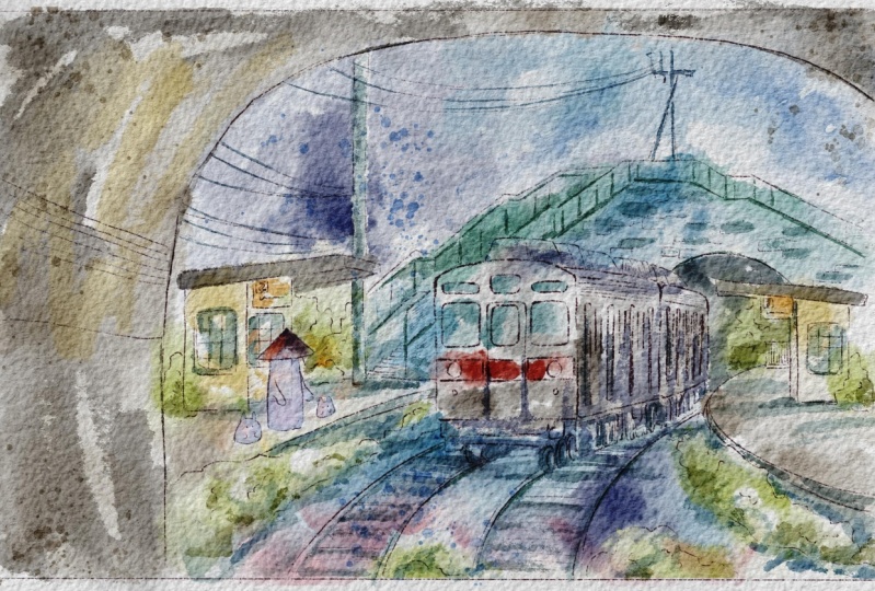
6. Prompt 3: Whimsical Train: It's time to move to our third painting and explore
next painting technique. In this part, we'll spend more time and paint
way more details. Let's not hesitate. There are so many different types
of trains in Japan, and trains have special
place in my heart, too, especially after the anime
5 centimeters/second. So it will be our next prompt, not easy one, but
I hope you will enjoy the process
as much as I do. Or side shows Wow. Well, it's time for
our fantasy train, where we will try to create
this whimsical feeling, maybe not maybe definitely
inspired by Spirited Away. You see, my decorations
is about Spirited Away. So I think this is our
main illustration, not today's among all
of the tasks because it will require a little bit
more time painting time. So I combine two illustrations. This one. And train
from this art. So about this train, what I did, I was tracing it first, and this restration
I just paint all by myself just by
looking and painting. So let's just do
the same very fast. So what I will do, I'll
create one more layer above, go with this properly shade, and then grab six B pencil. And after that, I will
turn on this layer. I will lower the opacity. Then what I need to do because her orientation is to the left
side and on this picture, train goes to the right side, I just need to flip it and
probably zoom tiny bit. And here, because trains a
pretty complex structure. So I was thinking maybe tracing would be the fastest way for
me to replicate the train. Ah. So once you I will not
spend too much time on redrawing that in details, 'cause I'm gonna use
pencils that I that I'm gonna use the sketch
that I already prepared. Just want to show you what
I was doing step by step. Like it, ding ding ding, d ding. Something like it. And here, here, here,
here, here, here. Like that. Let it in. Then what I did, I deleted the sketch here. So this is how train.
And after that, I will turn it off,
turn on our painting. If you want, of course,
you can trace it too, but my suggestion
is to practice and just paint by
looking at the art. So let's use it as a reference. Cool. That's our
reference illustration. Then I need to show the tunnel. Here, Lx it. After that, show the lines here, and show the tunnel again. And from that tunnel, then we will turn on our previous sketch and place it the way where
we want it to be. If you don't like something, distort or wrap and just try to adjust it accordingly
to the proportions. Like that. Then when you did it, merge everything together.
No, don't merge. Then you will go
to our layer with the background and
erase overlap. Dining and digging.
And after that, let's come back and start
painting the background. So in this type of art, pencil part is very important. We won't erase it for sure. On the contrary, we're going
to use less paintings, use colors to emphasize some of the parts of the
background, for example. So pencil part will really
help us to define what is what in our illustration. So keep painting, keep
creating for example, the bridge, and once again, depending on the
time that you have, you can paint more or less
details for your illustration. And so this is a way how
I was creating my art, so you can combine
different pencil techniques together in one illustration
and it's totally okay. So delete those ones,
my fantasy train. Let me just briefly.
First of all, multiply blending layer mode. Second, I just want to show
you that I made some changes. I added more bushes. I added more greenery here over there and like inside of the
tunnel because like I said, I want to have this
fantasy feeling. So that means that
probably we will need to add some u
realistic things. And that's what we did. We can keep it this
way later if you want. You can add more
character example, you can add some ghost that will glow and just
wait for the train. And I think this is a good
suggestion that you can do. Let's just paint
one more spirit. That's great. Player here, maybe, like, spirit was waiting. Let's have the spirit, the same that I was painting for my previous class where we had class about
Japanese streets. Just erase overlapping. So head will not be
transparent, like the spirit. So now let's go to the eraser and switch to Buss off diffuser. And then I'm on
fantasy train layer, and I just want to make the background slightly
less visible, okay? Like that. So the ghost is waiting for the
train, probably. Just one ghost, okay. And maybe I can add my
lovely ball spirits. Uh huh. Oh. Likes it. So now we made our illustration. Prettier. That's how I fancy the train with
those lovely spirits, like the waiting for the train, and I think we are
ready to get started. So let's go to the background. This is a color for
our illustration. We're going to take some
other colors, of course. About the rush, I'm going to
use Blue water drops. Here. Mm hmm. Then some purple
shades. Like said. Next. Here. Then yellowish color. Cream. And then some bluish. And up to set. Let's just go. Duck likes it. Now let's add
some colour to the floor. And then that's
it for this part. Later, I need to
add more details. So for now, I'm going
to keep it this way. Now, what about train? Let's add some colors
to train, too. And for that, I will
go to color layer. We have some red
color over there. Let's change a picture. Mm hmm. Make the size
tiny bit smaller. I have to set a gray shade here. Tako ki. And you see, I like to still keep
some of the white spots. I think it looks great. Say I'm gonna do with a background. So for this type
of illustration, I am attented to keep it,
like, semi transparent. Like I said, what calory. But obviously, we'll need to add some tiny details to exaggerate
some of the objects. But I do like that our train
is so like mysterious. So what are we gonna do? Let's just finish adding
some colors to the train. L. And maybe we can add some color to the
head of the spirit. I want to make it pretty bright. Another thing that you can do, you can go to the background
color and do same, go to curs, and you can
exaggerate the colors, the shades, make it
more or less vibrant. Same with the train. Okay, color you name
it's train here. And now let's start adding
some shades and tiny details. So I think for now, let's I will duplicate stem
layers a couple of times, and I will go to the details, so I want to add details first. And for this occasion, I'm
going to use p artistic brush. Oh, if you want, you can go with Blue Asian aged,
whatever you want. All brushes are pretty suitable. I like that this
brush can leave you some gaps, pretty natural gaps. Alexis. In itself is already
pretty good shader. So as a shading color, I'm going to use blue. Let's see what else
we need to do. Dunk, here, here. And inside, this part is darker. So I'm going to go with this
dark, almost black color. As a blending brush, I'm using Bull watercolor drops. Now I would like to add
some dark shades to the inner part I really
believe that this, like, gentle touch
can try to not imitate but help to reach
this a Zaki's painting style. Mm hmm. Likes it. And then the yellow color. After that, we have tiny shades. It's the same blue
color over there. Control the size,
and we need to pay shades from the bus
train stove, not bastop. And some sunbeams. I think this colorful feeling is what makes this
art very special. Colorful shades. Can add some shades
to the bushes too. I wanted to use so many brushes like for different occasions, but then this is my habit. Like I just, like, take
one brush and then paint everything just
within one brush. If you can, try to use many
brushes, not just one. Okay, cool. Now, I just want a tiny bit of yellow color here. And then what about drain? We can also add iation Alex the lines are so sharp
when we use Csp. Mm hmm. Oh, here. It's a shades over there. So I can add shades
little by little. Then I want to add
shades over there. And the facet I'm going to use steel blue shade. Same brush. Me slightly darker lines. Same brush. That
some shadings here. A little bit fromsyside. And then yellowish. Even orange. And then, let's just
set some shades in this area. Darker color. I don't want to that
too much later, it's really will be hard to
be focused on actual feeling. So what I'm gonna do is, I think I'm going create one more details layer for
really very small details. And I will go with
this olive color. I just want to show some
shade. At this part. Just here and there. Next, I think I want to add
some colors here. And now, go to Bur
any inker brush. And you see here, we
have some sharp lines. Probably let's merge
together as a details layer, and then create one layer
and also write details. Don't worry, it will
not be that sharp. We're gonna control
the intensity. Okay. I'm pretty happy
with the results. Now I want to show some grayish color. Damn. Now, we don't need our
reference picture, turn it off. What I'm going to do
is play with opacity. Maybe 65% would be enough. And the last last part
about the background, still with normal,
I'm going to add some glow into our
lovely spirits. Put archaterclor edges, and spirits will be I don't
even probably blue. And then press caution blur. I will glow a little. And I will go with screen. Duplicate. Rename. And I will go see that there
is a color underneath. Sure. I think this color is good. And if you want,
you can keep adding more details, for
example, screen, and then I will go with
orange color and Blue Asian We lies god. And the last thing,
as I said, stems. So pick the stems that
you would like more. For example, let's go with
what if we go with pink color? And add apilazl brush. Mix it. And then go
to another stems. Let's go this greenish shade.Tomm Bo
Watercolor stamp six. Here at the Sam fits got
in this area, you see? Just here. And I would like
to use one more stamp, use pink color and add stem brush here. I
think somewhere here. And I think we need
to add some stem for the sky blue colour. Let's see which
one would be good. Stem six. I think this
one is pretty gentle. And can show some
watercolor feeling. And tiny tiny tiny suggestions. What else you can do?
Submerge together the stems, and then rectangle. Cut. Same Rock tangle,
cut. Then background. Cut ran you enjoyed this
painting technique, too. I think this art takes a lot of inspiration and
efforts and creativity. And I hope you like this
painting style, too. This is probably why
the most favorable. So I will be happy to see your other paintings
in this style, and let's jump into next
painting technique.
7. Prompt 4: Torii Gates in Hakone: Next, fourth prompt Tory gate. I chose to paint from Hakona Shrine because it's
very picturesque and I didn't imagine that
Tory gate can be such impressive and
endlessly beautiful. So let's paint it all together. M. Well, now we are ready to paint
these lovely try gates, and I took this picture
in Hakane I decided to paint this illustration
because it's very picturesque. So the way how I create a
sketch, let me show to you, let's just turn off this sketch, create a new one and
write Tory gate. And then, first of all, you can look at the illustration
and then redraw it, like, do the same, or you can just trace it. So in order to create sketch, what the first step
that we need to do is I insert that photo, I will turn off the
paper layer for a while. And next thing that we'll do, I'll just move it here. And about this sketch, I use two different
sketching techniques here. First, I just traced
part of the Tory gate, and another thing is I just finished painting
of missing parts. And then I just used
my imagination, and I didn't use all I didn't paint all those trees
accurately and true to life. I just turned them into
cartoony way of and also I prepared for your
second illustration, reference picture of Tory gates. So you can use those ones
or you can use another one. You can use Bug B
pencil 06, B pencil. Li. Mm hmm. And then you can also add tiny details of that
you want to add. I don't need to look at
another reference picture because I was
creating this sketch, so I remember how the second
Tory gate looked like. Mm hmm. So I try to
change a tiny bit. And then let's just make our illustration even
less visible, like that. What we should do is let's
just add some trees. And like I said, I
don't want to add too many details because
our aim for this type of illustration is actually try to reach this cartoony way of painting that we can see in, for example, Japanese cartoons. So I'm going to paint a tree. Somewhere here, paint
some tree branches here. And then you can
schematically show the road like it's curving
to the right side, and then you can just show some trees inside of
the gates already. Some of the trees
can be like tall, so they will go beyond the try gates and also
you can add some bushes. And then we don't need
our reference picture. Let's just turn it off. We just took the basic shapes, maybe some proportions,
but then you can be creative and add whatever
you want all by yourself. So I like this composition. We have some freedom. We can add whatever we want to our art. And that's it. That's the tory gate
that we're going to use. Again, you can use my sketch
that I prepared earlier. I added a little
bit more details to this art. So
whatever you like. I will stick with our sketch
that I already prepared, and also feel free
to use another gate. Like I said, I prepared for
you a few reference pictures. So finally, let's jump
into painting process. Duck, multiply. Make sure that your blending
layer mode is multiply. We have color layer and
Shades layer is multiply, color layer is normal. I will go with dark
watercolor edges, and I will grab this red color. May bit tiny bit. I'll do Lexis. Later, I show you I will
show you some variations. How's a tricky way how to add some colour
variations to the art. Let's just wait a little bit. Dunk next it. Mm hmm. Now go with dark
color almost black. Bland overlappings. You can leave tiny white
gaps between the lines. Think it might look good.
And a little bit lighter, it's just Okay. Cool. Okay, and I'm going to
use Blue Asian agate and go with this bluish shade. Think I'll do it on a new
layer because I want to change the color a
little bit later. So you see, I have
some overlappings. I'll put it underneath. I think it looks good like that. Blend. And I will increase the brightness
lower the saturation. And here, I'll pray with
the color of the road. I want to see which
one I would prefer more because I think
bluish is too bright. Mm hmm. I'm considering this
color. Looks pretty good. Okay, I'll keep it this way, and I'm going to add some
color to the sky, too. And about this sky, I'll just
go a little bit brighter. Have the same layer,
even brighter. Why we need to fill the color with the sky
with specific color? Because later we're going to
use a stem brush with cloud. A little bit messy.
I like that feeling. Mm hmm. If you want, you can grab Asian agate as a razor tool and
erase some parts. If you think there are too
much of them. Color trees. Okay, so why I create a
new layer and place it underneath of our original
color like Tory gates? Because when I add some
color to the trees, they might overlap
with our gates, and I don't want
those overlappings. So that's why I place it
under our Tory gate layer. And then let's go with this beautifully
amazing olive color. And I would go with but
dark watercolor edges. And then let's go with
this greenish color, and I want to add this
color over there. So why I leave
those white gifts? Because every tree because
of the amount of leaves, you will have some
transparent part that you can look through them. And we still want to reach those relaxing feeling in
our illustration. Mmm. Now, we need to grab
brown color, that one. And for this art, I'll go with Burani
incur some branches. So maybe just partly bend some parts. Mm hmm. Like that. So first part is ready. Now let's go to shading parts. Okay, so because the prior set we're using is semi transparent, which means that layer is
semi transparent, too. And if you want to use
clipping mask or Alpha log, so because of that,
the intensity of color might not
be that visible. So what we should do is to
remove the transparency. And what we're gonna
do is let's just go to our background color.
Let's just write. And then duplicate it. After that, go to lower layer. Go to adjustments, press hue
saturation and brightness and go all the way up with
brightness till 100%. So now a layer is white. Merge together with color
tree, original frost layer. Let's go to gates, Duplicated to go to lower layer, press adjustments, hue
saturation, and brightness. And merge it together. Now let me show you magic trick how to use some
color variations. For that, I will go with a selection tool and then use free hand and select some
parts of Tory gates. This one, then maybe here, press at some color
variations in this area. Press, here at, and
then feather 15%. After that, let's go to hue
saturation and brightness. And here we can
play with colors. You see, in areas that we can add more or
less color variations, and I think it looks wonderful. You can make it
lighter or darker. I would make it slightly darker. And I want to move a little
bit to purple shade. So you see, we can have those color variations that
look pretty much nature. You can make it less saturated or on the contrary,
more saturated. Okay. So now AtoriGates a
little bit more vibrant. So this is a magic trick and techniques that we use for
this type of illustration. You can do the same
with tree with trees, with the road,
whatever you like. About the road, we
can do the same. Let me show you. And we can
show shades in this way. Select area around the gates. Press d. In some part here. And now, here you don't need
to use feather in this way. So when we use our
adjustment tool and when we add the shades, because we didn't use feather, the lines will be sharp. And you see, and this
border line is not softened as it could be
if we would use feather. And I actually like when we just lower the brightness a
little bit all the way down, so I won't change anything else. And this is the way how we created shades for
our illustration. And it looks very realistic. Okay, so we added some
color variations. I show you the ways how to add shades thanks to this technique. And the next step, let me show you how to use clipping mask. So let's use a shades layer and place it above
our color tree. And then it's in multiply
blending layer mode, and then we need to
press clipping mask. So now, when we paint
on shades layer, when we draw, we cannot leave the borders of our lower
layer. Let me show you. Let's go with dark
watercolor edges. Color. We have our green color. And then when we draw, you see, we cannot leave the edges of our original tree
layers. But what's good? If we don't like it, we
can just turn it off. So this is how I'm going to
add shades to our lovely art. Let's do it. Little by little. We can start at some
shades here and there. This brush is
precious sensitive, and it's really amazing
for it in some shades. You can add the same color
to this lovely bushes. I like it, too. Or you can
use our olive color at first, and then blend some of
the lines that you don't. Try to make it like randomly
and more natural way. You can have olive shades on the bushes or there and add
this dark color to tree here. And I think here is also nice. But just splend it
a little bit more. And then bushes. Let's have the same olive color. Yeah, like that. You still can add these green
shades in some areas. Somewhere, not everywhere. Just exaggerate the
shade a little bit more. Like that. And now it would
look even more realistic. So those are the shading
techniques that we were using for this painting style. And then I think I want to add some green
shades over there. Just tiny bit. Mm hmm. In this way. I think now it might look
even more realistic. So what if we add some
shades here, too? Remember what we did,
go to free hand, selected the area
adjustments and lower the shades
tiny bit. Like that. So now let me show you
the way how you can add shades to our gates. So let's go to our color layer, and then we need to
press Alpha lock. The principle working
is the same as what we were using for our
clipping Ms layer mode. But here the only one difference is that you don't have
additional layer. So when you paint on this layer, you cannot undo all the actions. Red color may be a
little bit darker, and here I want to go with
Blue Asian act brush. Just want to show some shade. So remember, you cannot
undo all our actions. Din or I think, yeah, it. And then we can go dark color. That some sheets over there. Tiny bit. And that's it. And if you are happy
with everything, just turn off Alpha lock. You don't need our reference
picture anymore. Ding ding. And what I promise you to do
is let's just add clouds. It's a tiny details part. Let's go to details, double tap on white color, and then let's go all the way
down and grab Cloud brush. Here, make it smaller and
place it here in this eight. And then if you want to make
it a little bit brighter, you can do it by
duplicating, A detail layer. Or if you don't want
exactly this one, we have another cloud. You can place it here, too. By duplicating, you can
make it more saturated. I prefer first clouds
brighter and more cartoony, so I'm going to
keep this one here. And if you want,
you can duplicate this detail layer and
add one more cloud over there and then erase overlappins
by using selection two. And then three fingers
down and press cut Then that's our details layer, and that's a cartoony way of painting this lovely to gait. So I hope you like this
painting technique, too, and you learn a few tricks how to paint
in watercolor style.
8. Prompt 5: Pagoda in Kyoto: What about Fibs prompt? A ready. Pagoda in KyotaPbably
the most famous one. I woke up at 6:00
in order to take pictures where it's
not too crowded. So now all of us can
paint it right now. So for our next couple
of illustration, I'll show you the sketching
techniques that I used, and it was tracing because we
have so many tiny details, it was just easier to trace our illustration because
I wanted to add pi. So what I did, let me show you. Boom. I turn off the light,
I turn of the paper, er the opacity of the
original illustration, created one molar above, use this purple color, and then six B pencil. Also, I tried to combine
a few pencils together like mine and native
procreate brush. And I just traced all
those tiny details. It took us some time to complete the illustration and paint
it like little by little. Also, you can increase the size. You can press harder, and then the brush strokes
will be sharper. And then little by little, you are painting tiny details. If you want to make it
look like street life, you don't need to use trays
in sketching technique. You just need to look
at the art by using this picture as our reference
and just try to redraw it. And that's it and your pencil strokes might
not be that accurate. It's totally okay.
The most important is to have to show the
feeling on freedom. To maybe a little bit wavy
line not 100% accurate. It doesn't matter as long
as you like the art, and it represents what you want to show through
your illustration. So this is my way of
sketching in art. And let's just complete it and then jump into
painting technique. Or other thing is you
can use my sketch or create your own illustration that you would prefer more. The most important is
to learn how to use this combination of
loose aticoor style and dry brush strokes. So let's start with
background color. Background. I play this color. The first one, then
we're going to go colors, shades and stems, and shades and stems, I will use multiply
blend layer mode. So for the background color, I will go with bluish shade, maybe on this bluish. And then you can experiment. You can use some stem brushes. Let me show you. Here you have, total freedom for your art. Oh, we can go with such
beautiful brush strokes. And from another hand, from another side, you can use both Asian egg and brush,
but it's too bright. So let's just try to
control the intensity. We are combining loose
watercolor style altogether with
these dry elements, which I think might look very
and blend sharpness. Yeah. So I think this part, I
want to make a little bit lighter so it will
feed our gentle, L O gentle stem brushes. So that our background
colors that we're going to use for
this illustration, then we'll go to colors, and I will stay Blue
Asian aged brush. I have all those layers
for our illustration. Let's start with brighter
gentle one, color layer. And because this is
loose watercolor style, we might and in the same time, it's dry brush stroke, we might go beyond
the lines this time. This brush is very special. It has special shape, so you will need to tilt it
under some specific angle. Mm I I really like this brush. So special. Mm hmm. If you see some gaps
or like too much of the color because I use the same Asian agate
brush as an eraser, so it lets me erase
everything perfectly. Mm hmm Okay. So we can go with a little bit darker shade, but be careful. It might be like, almost black. So about the curs, I'll just make this part slightly lighter. And now I will go
with darker shade. You see, it's almost black
because of the brush. So I think I would use a
new layer, just in case, color two in case
if I would like to change the intensity
and opacity of the color. So that's why I will
use a new layer. Yeah, this brush is perfect
for dry brush strokes, especially if you want to
give yourself some freedom. And then I would like to use natural brush and
stains as a blend. And the next thing
is same brush, 'cause I'm going to keep the
same style olive colour. And final touch, brown color was a tree drop
blending technique. Set. So now, obviously, I would like to make some
color changes in this art. Oh, and now I want to show
you some painting tricks, thanks to Alpha log. So we are on color two layer, then we're going to go
and press Alpha log. After that, we will go with let me think
Blue water drops. And I will go with
this dark blue color. And thanks to water drops, it can actually help you to
reach very realistic feeling. Then switch to purple color. And now thanks to this
lovely painting technique, we can make our illustration
a little bit nemic. More purple way of painting Lexis and blend the color,
spread it naturally. Next thing, what
I'm going to do, I will go to the
background color, and I will erase some of the
overlapping CC with our sky. I want to keep those
white spots white. Mm hmm. Same here. Done here in this area. You likes it. Turn on Alpha Lock
at color one layer. And here, I would like to go with a little
bit pinkish shade. Let me change brush to
softer one, Bani edges. This brush gives you very
natural and soft transitions. And I will do the same with
tree darker olive color, maybe even Hmm. Purple shade. Here.
L on to affect tree Turn off alpha lock. Okay, now, let's jump into
adding tiny details part. So we are at shades layer. We actually already use stem
brushes for the background, so we don't need to use stems. So shades layer we can use for tiny details to exaggerate
some of the parts. And here I will use Bani inker. I have this purple
color, this one. And now use smaller color. I want to show
some of the lines. You shouldn't paint
every tiny details. No. Just like main
lines would be enough. You just need to
show what is what. Ls. Uh huh, come back. Wow, I like it so
much, so we don't need our reference picture
anymore, and that's it. That's I love your illustration. Tiny suggestion, again, you can play with blending layer modes. So see which one
you would prefer more can make it more
or less saturated. You can go to curse
and also play with color intensity and see which
one you would prefer more. I would probably make it
a little bit brighter, but that's basically it. That's the art that we created. It's in loose bodicur style and dry brush strokes
and combination. And I hope you enjoyed this
painting technique, too.
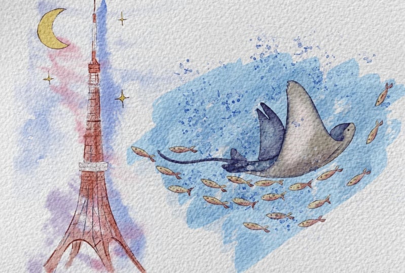
9. Prompt 6: Tokyo Tower: It's time for the six
Prompt. Tokyo Tower. For me, Millennial,
who was raised on sailor Bo cartoons,
it's a special place. It has a special vibe when you just look at this
powerful tower. So let's keep exploring watercolor techniques and
create one more artwork. I had A. Well, now it's time to paint
in loose watercolor style, and we're going to keep
our pencil sketch, too. So let me show you
what we're gonna do. First of all, the way how
I created this sketch, again, it was tracing. I'll just do it this way.
Let's just turn it off. We have our reference picture. Turn off the paper layer, lover as a pasitin of
our reference picture. And here we have the sketch. I have six pencil. We can try with HB pencil two and then Oh yo
that's too harsh. And then you just trace it. Trace as many
details as you want. And by the way, today's style
is loose watercolor cell, and we're going to apply stem brushes for
this painting style. Tin in and you add those tiny
details little by little. And then those cross
hatchings here and there, and you keep painting. Another thing is you can just turn off the
reference picture, clear this sketch, and try
to draw it all by yourself. Go grab maybe 60 pencil
if you want to change the intensity of
the brush stroke and just paint it
all by yourself. Again, in this way, not everything might be perfect, perfectly painted, and
it's totally okay. That's what we're
gonna have here. Then erase parts that
are not correct. And this way, so the most important is to understand which way of painting
you prefer more, and it's totally okay if
you don't want to trace it. Yeah. It's very good practice if you just paint
all by yourself. Without tracing, it
can help you to make your brush strokes
more confident. Listing I it, you see? I redraw it many times. Then here Then one more circle there. And then we're gonna have
one more layer above, and here we're gonna start
having cross hatchings too. And in this way,
little by little, you are painting your Tokyo
tower and the way you like. Probably I would like to
add one more layer here. I think it can be
thicker a little bit. And here's cross hatchins. And then you paint dug this way. Dang. So, something like that. And then it's a little bit
like eiffel towel. Tiny bit. You see, like the carvin
is different this way, but I made it look more
like eiffel towel. So it's like cis here. Again, if you want to
change some of the angles, you don't need to redraw it. You can just press liquefied
tool around 60%, maybe less, more, and just adjust the angle. This is another tip
that is good if you sketch and you want
to make some changes. So and then you might made it
a little bit more playful. Like what I did, I just
painted moon because for me, Tokyo Tower is
always Siler moon. And I can paint a couple
of stars here and there. And this is tracing. Feel free to use
any style you like. Okay, turn off our
pencil sketch. Let's come back to previous one. Go to multiply blending
layer mode here. And maybe I would like to move
our sketch a little bit to the center because
I'm going to use layers and I don't want
it to affect our picture. Like, you'll see
it better clearly. And then let's just
arrange layers. So here we will
have a background. And I'll just
duplicate it a couple of times because I will use
different stem brushes. Next, I will have a color. So this is color for
our moon stars and for our beautiful Tokyo Tower and maybe tiny
details in the end. I multiply blend the layer mode. Lexis. So let's go to background layers
and start painting. And like I said,
you're going to use stem brushes a lot for
this type of illustration. And we don't have any colors
for Tokyo Tower, like, specific raw for the
Tokyo Tower illustration because I'm going to
use this red colour, white color, and
different shades of blue colour from
and other sets. So let's go with this beautiful, bright blue colour, and
then go with stem brushes. What about Blue stem six? And don't forget to turn
on the paper this one. And you see it looks
very, very realistic. Like, let's do it this way. Super cool. I'm gonna
keep it like that. So background color again. What if you add a
stamp for all the way next to the
tower. Like that. Mm, but I cut some part. So just clear. Do it again. Okay, L. Free form and change the angles
the way you like. Then rotate it to this side. And then I will go to
liquefy and I will move this part a little bit to
the tower cause later, I'm going to add
some color here. And I think it will look
very cold, like I said. And then duplicate
background color. We're going to use many
stem brushes here. If you want, you can change
the colors a little bit. So let's go with
this purple color. And I would like
to use Step two, too dark, a little
bit brighter here. I don't see how it
will look like. Maybe here if you're
going to use red color. So what I'm gonna
do is I will go to adjustments, saturation
and brightness. I want to use red
color here, axis. Brightener and more saturated. You see, it looks
good. So this is like color from
the tower itself. Next, background, duplicate. And then what about stamp one? And I just want to see
where it might suit good. Reform. And then just blend this part. Okay. If you are happy
with everything, merge together all the
background colors, let's go to one more
background layer. What if we have the
same purple color? And let's see which
blender brush would look would work very
well. This one is good. And we'll just place it
on Denise. Like that. I think it might look. It might be a very good, tattoo. Like, what colour tattoo? Please. Almost a bright
yellow color for the moon. Let's go with Ban inker
brush. I'm gonna use it. To make this part very
bright. Like that. And the next thing is, let's go with red
color, but too bright. Like this, and let's add the
color to this part, too. And don't worry if you think
it's too bright, it's okay. We're going to adjust
the intensity of color. My suggestion at first. Oh, what if you could
use running edges? Because, like I said, this
is loose watercolor style. So color will just naturally
bleed one in another. And about those shades, I just want to make
them less saturated, so selected, and
then go to curves. Then let's go to white color, and here we'll go with
runny inker brush. Maybe a little bit
less transparent. And then this part is white. And that's basically it. Inside, we're gonna have a
little bit darker shade. So let's go to some color
inside and blend it. Tiny bit, like said. And after that, if you want to make the color more saturated, just duplicate it by
a couple of times. We like it. Maybe I'll just erase
some color from the moon. And then I want to make
our background color a little bit more vibrant. So I'm at background color, go to curse Make it
slightly brighter. And I like how the color
bleeds one in another. And now let's go to the
details part, reddish color, running ink brush,
and I just want to aaturate some of the lines. Make them more vibrant. Because it's loose
with the colour style, and we use mostly stem brushes. I don't want to add
too many details, 'cause I want it to
be super gentle. Great. And I want to show you one more magic trick that we can use for
this illustration. I think the color for the stars, the outline is a
little bit too dark. So in order to change
it a little bit, but at the same time,
don't change the color of the actual tower, what we do is let's go
to the sketch layer, then Tokyo Tower and press Alpha g. So you're going
to do the same what we did in our
previous paintings, and then let's go to a
little bit brownish shade. And just add those colors. Here. And now, you see, the
outline is not that sharp, and I think it looks
just wonderful. So we gonna need our reference
picture, turn it off. And this is our lovely
illustration of Tokyo ta. You lose watercolor style.
10. Prompt 7: Cute Stingray Fish: I didn't expect that
time flies that fast, and it's time for
the last prompt. Stein gray fish. I went to aquarium and
was just blown away by the amount and beauty
of the ocean creatures. They are so elegant, so I picked one of them Stein gray fish to
be our last prompt. Let's not hesitate and
make this last step. I think it's Well, for our next illustration
sting gray fish, we're gonna use another
painting technique where we're going to
use less pencil sketch. So what I will do, I will
lovers opacity and I will switch blending
layer mode to multiply. And then let's do
same write color, then create new layer
shades Blending layer mode, multiply, and then background. Next. Let's go to
background color first. And here we have a few options. First, you can use our stem
brushes to add some color. Let me think. Oh,
wait. I forgot. Okay. Later, we're going to
use some reference picture, and I will use this blue color
for the background color. So you can use our stem
brushes if you would like to. But I think I would already use too much of those stem brushes. I will use B Asian aged
as our background brush. Increase the size. And I just want to have such
kind of background layer. And then I will go to
curse and I want to make it slightly lighter lexis. Our next step will be go to
color layer and reference. That's our illustration, and as you saw from the
second illustration, we have detailed explanation how our lovely stingray
fish looks like. Let me show it to
you right here. So here we have step
by step explanation. And what I want to tell you
how I created this sketch, obviously. That's
our second layer. So what I will do, of
course, you can trace it, but my suggestion in this
type of art don't trace. Just try to paint
us all by yourself. So for our sting grayfish
illustration, what we will do. In a side, we placed the fish from
different angles so you will be able to
understand what is what. Then we will write a sketch. Go with this purple color. Doesn't really matter because we will lower the pacity
of the sketch. So we won't really
use it that much. And then we just need
to show some movement. So I want to show the
curve this way, like set. And this way, I'm going to
paint our skate not skate, our sting gray fish, too. Free form. I'm going
to use it this way. Then liquefy push. The edge is a little
bit like that. So we see the face
of this lovely fish. We can make it
like he's smiling. Then show the edges of the
tail and then tail itself. Yes. And I forgot about
the second win is a twin. Does tray fish have
wings, everybody. Okay, so now we painted. It looks a little
bit like shark. We don't need our
reference picture here. And I will add also, I will show the
movement of fish, too. And I'll just paint
it here and there. What else you can do, you can
just take one of the fish, for example, free hand,
selected the fish, and then press copy paste. And now we can just place it everywhere by
copy pasting it. And add as many
fish as possible. They can just, like,
follow the direction of the steam grayfish but like
going in opposite way. So just try to show the flow, like I painted here. You see the curve. I want to show the curve, the dynamic of the art. I like this. So this
is how we create a sketch for the Stingray
fresh illustration. And now let's jump
into painted process. Well, I'll lover the
opacity for the sketch. Now turn on the background color and don't forget
about the paper layer because it helps us to keep this natural watercolor
feeling, color layer. Then let's go to
this purple shade, and I will go with
dark watercolor edges. Here. And then you see the edges. Have some outline,
and then beige color. I don't worry
because like I said, we use transparent brush,
semi transparent brush. So we still see the
background color coming through the
brush strokes. It's totally fine. Later, we will we will just remove
the transparency. Now, use blending tool to blend the overlapping shouldn't
do it too much. Here. And now we have this
part where we will blend blue colour altogether
with beige color. Because in our illustration, we have this purple outline. That's why we're
going to keep it. Wonderful. So now let's remove the overlappings,
how to do that. Same by duplicating the layer, then go to lower
layer adjustments, aturation and brightness
and move it all the way up. And then when we have this
layer, merge together. Amazing. Actually, we're
supposed to do the same with our lovely fish. So what I'm going to
do with the fish, I'll create one
more layer, right? Color fish, fishes, and
I'll place it underneath. Cause later, I also need to
remove the transparency, and because I already did
it with our stingray fish, I need to do the same steps
with small tinier fishes. So let's go with let me think what color of
the fish we go have. I've thinking about this one, but probably we're
gona make them Gold. Golden color seems good. And later, I will add some
color variations to that. So let's speed up
the video and fill all the fishes with a color. We can lower the sketching
layer even more like 30%. So this type of creation is
more like childish style. And it's not like
childish style, but it's good for children's
book illustration, and it's pretty simple and it doesn't really have
this pencil outline. So here we will need to
work a little bit more on our watercolor brush strokes. N. So let's do the same with fish. Duplicate, lower layer, citrion brightness
all the way up, Duplicate it again,
and merge together. And I forgot about
I dug, let's see. What about Burani inker brush? Oh, no, no, no, let's go with our stingray fish
layer. Like that. So C. Now, what I want to show you is some tricks how to
a chides and highlights. So let's jump to the next step. All those painting
techniques that I showed you previously were mostly related
to shading techniques. So now it's time to talk about painting techniques
related to highlights. So I'm staying on
my color layer. Then I will go and
grab free hand tool, select the circle
inside and press Ed. Same with this tail this part. Tiny tail. Tiny bit here, triangle
Ed in this part, Ed. Then use feather,
but just a little bit maybe for 9% would be fine. And then go to hue
saturation and brightness and increase your brightness
all the way up tiny bit. You can increase the saturation. And if you want, you can
add some color variations. I would add more purple color to this part and maybe a little
bit more highlights here. Was that. N. So this is a highlight that
we now know how to apply, and maybe some lines would
be a little bit sharp, so you can blend them tiny bit. Now, what I want
to tell you about some color variations,
same technique, but we'll use some color
variations because you see the belly of the fish is
a little bit different. So I'm going to go here
and then use feather, 13% hue saturation
and brightness. And I just want to
highlight this part two. Make it more saturated. Maybe some shades over
there, tiny bit. 42%. The next thing is, let's add shades to fish. So fish layer, same free hand, partly add some
parts to bellies. Add. Did I add to everyone. Want to add some
blue shades. Yep. Then steel selection
tool feather maybe 6% sit in brightness. And here, I can increase
over the brightness, and I can choose what
color I would like to use. On a picture, the color. Additional color
is actually blue. But I'm still thinking, would it look nice if we
had some blue shades. I think it's cool. But this
color also looks nice, too. I would stay with radio shade. Keep it that way. Mm hm hm. Next step is we need to add some line to the edges of the brush strokes
because like I said, we don't use pencil, we
can even lower there, sketch more, 25% or some. I keep it 30% the
way what we had. And then what I'm going
to do is use alpha lock. Let's go with fish alpha lock, and I will go with
probably reddish color. And let's go and grab
Ronnie ink your brush. It's too dark, lighter, and some edges can
be slightly sharp, especially in an area
where we have red colour. So here we will spend
some time because we're going to add tiny details, and then we'll add ice
and show some texture. Then blending tool, blend, sharpness inside a
sharp edge line. So we blend a inner
part, not outer part. And then when we do sew, the color blends very naturally. Like that. Now, same brush, thinner size, and we
need to show eye. And lovers asides
and show some parts, body parts. Like tear. On. So fish is ready. Now, let's come back
to our stingray fish. Turn off Alpalo do the same with Alpalo with the
fish, our main fish. And I would go with
slightly bush bluish shade. So I just want to show the body. Tiny bit. Probably a little bit
purple shade. In this part. So in an area where two objects
are close to each other, we're going to have the
darkest part like the shade. Here. And then I will blend this part. You see same on our
reference picture. This part is the darkest. Now, tail. Then blend. Blend it from the inner side. Then when we do it, once again, we use Batural stains
brush blender. So when we do it, our
fish looks so real. Like that. Same here. The ding. Mm hmm. Looks very, very cool. And now from this part, from belly tiny
bit darker shade. And under this win is a win? Mm hmm. Likes it. Now, once you're happy
with everything, let's just add tiny
details to art. So about the shades, we're going to use
transparent watercolor and grab this proper shade. Now we will create shades layer, multiply blending layer mode, place it underneath
of our fishes, but about background layer, and then I want to show some color variations
here and there, so show some realistic feeling. Because water is not just
one colour, obviously. And then increase the size
and blend some sharpness. If you want, go to
curves and steal, play with different
color variations. I like this vibrant color. Dunk. Next step is bubbles. Let's go to the details layer with multiply
blending layer mode. Pay attention to
that. So multiply. And then we will have Bu salt layer and look so cool when we add
those splatters everywhere. And this time, I place
it above all our layers. You see here, then I will go and have normal
also details layer, but normal blending layer mode. Then I will go with white color. Same brush, lower the
size little like this. We don't need our
reference picture, Canvas. And that's one more
illustration that we created that is perfect for
cartoon style illustrations, like for picture books. And I hope you enjoyed this
painting technique, too. So, guys, I hope all our
journey today was so useful. You discovered so
many new ways how to paint illustrations in
different watercolor styles. You can how to reach
density of color, how to make our illustration
very transparent, how to add more or less
pencil to our illustration, how to combine pencil
and watercolor together, how to not use pencil at
all in our illustrations. And I hope with such intense prompts task your painting skills
became better. You learned some new
painting techniques. You discovered some
probably unique ideas, how to paint different things in watercolor style digitally, and this painting
will look exactly the same as traditional
watercolor art. And let's see each
other in next class. I wish you a lot of inspiration, and I will wait for your own illustrations in
projects and resources section. I'm so excited to see what you created in this
seven prompts task. Yes.
11. Final Thoughts & Bonus: Congratulations. This is
the end of the class, and now you definitely
should be proud of yourself. You learned a lot
of useful things and created beautiful paintings. And in the future,
you can create more. I bet your painting style
became more advanced too. So now you know
more about Procrit, different watercolor
painting techniques, and how to apply those
techniques in Procrit, how to use layers, clip
and mask alpha log, different blending layer modes, and also how to volume and
color variations to your art. And the most important, you improve your
watercolor painting style using digital
watercolor brushes. So why this class was useful? Now you can experiment
with your style. You gain some inspiration
and creative ideas. Discovered a little bit more about Japan. What's
more important? We can create
digital art that is so similar to traditional
watercolor media and we had seven prompts
that help you to become skilled in digital
watercolor journey. I will be happy to see
your artworks in projects and resources section and
give my own feedback. I would really appreciate your own opinion
about this class. You always can leave
review in review section. In my future class, I will keep discovering magical watercolor world and create endlessly
adorable character. Let's see each other
in next class. May.
 Inga Yoon, Digital illustrator and teacher