Transcripts
1. Class Introduction + Overview: Imagine painting beautiful atmospheric
watercolor landscapes in under 15 minutes.
Hello, friends. I'm SaninaNabil, a top teacher on Skillshare and an
author to the book, Bold and Beautiful
Watercolor Skies. In this class, you
will learn how to let the water and
pigment flow freely, allowing the paint
to move naturally and work its own quiet magic. Welcome to the 70 challenge where we will take a
more expressive path, focusing on capturing
the feeling of a place without
overthinking the details. It's all about letting go, trusting the flow of watercolor, and allowing your intuition
to guide each breaststroke. With each painting,
you will explore new color combinions and
create stunning compositions. I will walk you through the
materials and techniques, making it easy to follow
along and enjoy the process. Each painting takes
less than 15 minutes. Just enough time to pause, breathe, and create
something beautiful. So if you have God
a moment to spare, come paint with me and let's bring dreamy
landscapes to life.
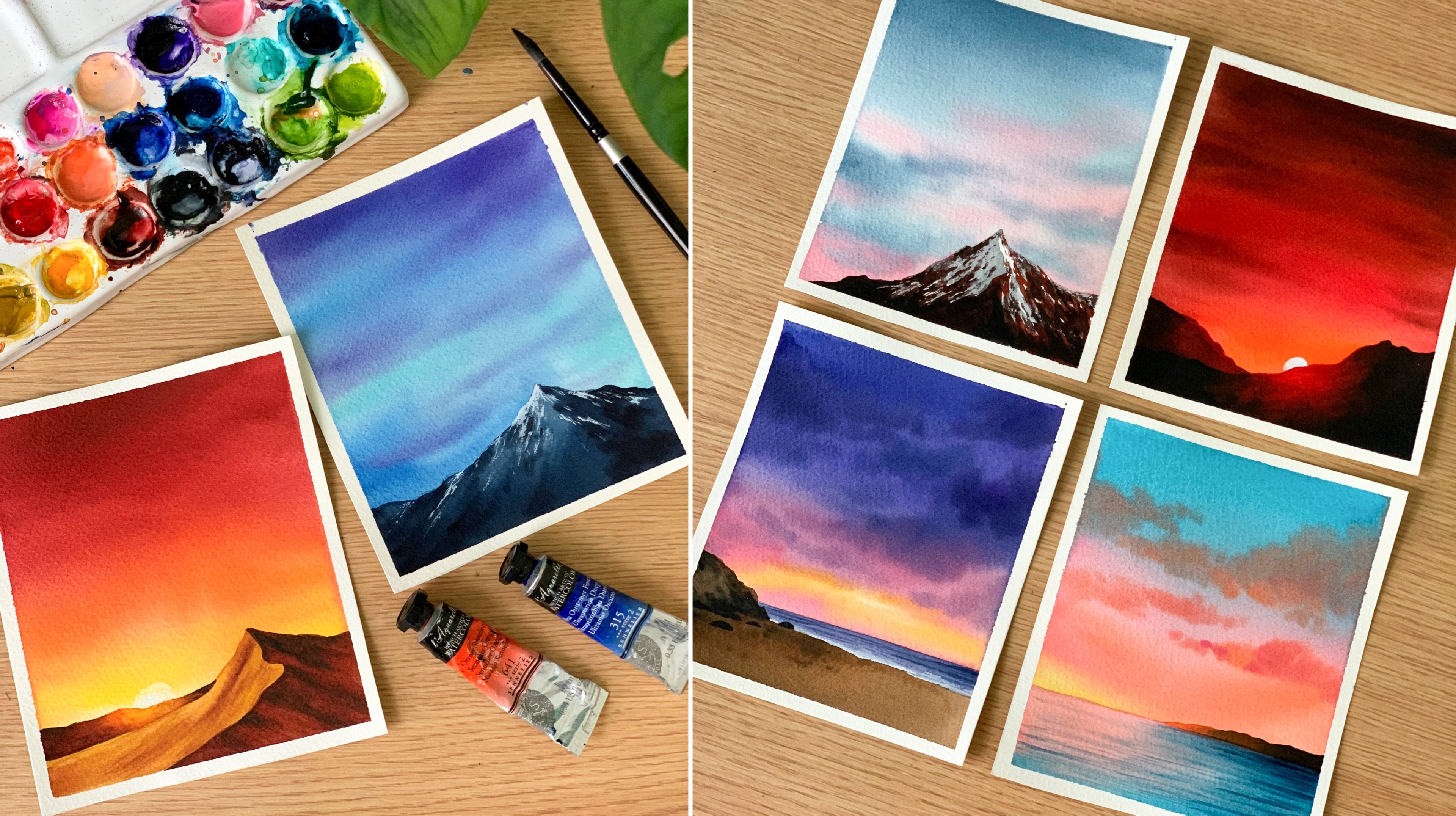
2. Art Supplies You'll Need: All right, so let's start
by having a look at the materials you will
need for this class. I will start with the paper. According to me, the paper is the most important aspect
of any watercolor painting. So the paper I'm going
to use is from arches. It's 100% cotton
watercolor paper. This one is a cool
pressed paper, and here's the size
I'm going with. It's 12 by 15 centimeter. You can compos your
painting however you like, but please be sure to go with an artist create
watercolor paper. That is what matters
and have cut the edges. With my hand, you can
absolutely keep the border. If you prefer that way, you don't need to tear
off the sides. Okay, so that's all
about the paper. Now coming to the colors. I'll be using watercolor tubes
for this entire session. They'll be from
different brands, and I will explain the colors at the beginning
of every painting. We'll be working
with the maximum of four colors for every painting. Now to mix your colors, you will need a mixing palette. This one is a ceramic
mixing palette. You can go with any palette
that you normally use. Now let's talk
about the brushes. All the brushes I'm
going to use for this class is from the
brand silver brush, but the brand doesn't matter. You can go with any brush
that you normally use. Please try to go
with similar sizes. Okay. So the first brush
here is a 1 " wash brush. We'll be using this one to apply a coat of water onto
the entire paper. Then I have another flat brush, which is a half inch brush. Then I have three round brushes, size number eight, size number
six, and size number two. These are the five
brushes I'll be using don't have the exact same size,
that's totally fine. Try to go with any size
that is nearly similar. The next thing you will
need is two jars of water. One has to stay clean, and the other one is to rinse off the paint
from your brush. Then you will need a
pencil and an eraser. There is only basic
sketching like horizon line and
some minor things. Okay, so for that, you will
need a pencil and an eraser. Then the next thing you will
need is a masking tape. You can fix your paper onto a drawing board or
onto your table. And then finally, you will
need a paper towel to dab off the excess amount of water or paint from your brush. Alright, so those are the materials you will
need for this class. Keep them ready, and
let's get started. Oh
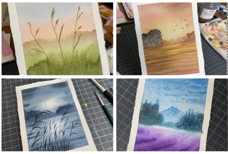
3. Before We Start : Okay, so before we start, there are a few things
to keep in mind to have a beautiful
painting experience. First, I will show you
the paintings that we're going to do in
this entire challenge. Here is the first one. All the paintings that
we're going to do in this challenge
can be finished in 15 minutes or even less. Now the next one is
a beautiful sunset. This one is one of my favorite. Then we have a very
beautiful and minimalist, foggy forest, the favorite. Then we have a simple
lavender field, more like an abstract one. Then we have a foggy meadow with some beautiful
white flowers. I really like this
colour combination. It turned out really beautiful. And then we have a
monochrome painting. I have only used paint screy for this entire painting
and a bit of white. Then finally, we have
a simple misty lake. Okay, so those are the
seven paintings we will do together in this
watercolor challenge. Now, the very first
thing I want to talk about is the border
for this painting. You might have noticed this
irregular hand ton border. Honestly, it wasn't really
for aesthetic purpose. My paper was in a
very bad condition. I think it was an
old batch of paper, and the paint started
seeping into the borders, making it really dirty. So initially, I thought of fixing it with some guash paint, but then it was quite difficult to do that for all
of these paintings. So I decided to tear
off the edges to give it a rustic look and
to solve my problem. So, yeah, tearing
of the border is absolutely not necessary.
You can keep your border. Now, the next thing I
want to talk about is the importance of using a good
quality waterclour paper. If you look at this
painting here, we are going to do the entire
thing in one single layer. So in these kind of paintings
where we are creating that foggy atmospheric
landscapes, it is very important to make your background
state wet for a longer time with a cellulose paper or a
student grade paper. This might be a bit tricky. So it is very important to use 100% cotton watercolor paper. Over is artist grade. Otherwise, it will be a frustrating experience and
you won't enjoy the process. Okay, so be sure to go with a good quality watercolor paper. You can see the process here. There was no break in between. The entire painting is
done in one single go, starting with a background, adding the details
and everything. Okay. Now, that brings
me to the second point. Maybe it is a better
idea to watch the process before you
start your painting, and then you can join me along. This way, you're
well informed about the steps and what
to expect next. Now, this painting
is a bit different. We will start with
the background, and then we will add
the full crown details, which are these trees. Now there is another one
here, the misty Lake. For this painting, we are
going to do everything in one single go
without any break. We'll paint the sky
and the lake together. Then we will add these trees
and all these elements. So every painting is different and the color palette
is different. I think it's a good
idea to run through the video before you start
your actual painting process. Now, in these paintings,
you can see we are playing with
different tonal values. You can see lighter tones, medium tones, and darker tones, which means it is really important to work
with clean brushes. Keep a separate brush for adding water onto your background. This way, it will stay clean, and there won't be any
paint stains on it. In the same way,
it is also equally important to check whether
your brushes are clean. I mean, the actual
painting brushes. So before you start applying
paint onto your paper, rinse your brushes in
clean water and dab it on a paper towel to make sure there is no leftover
paint on your brush. It might seem very silly, but it is very important. And also the next
important thing is to keep your paint ready
before you start painting. I'll be explaining the
colors at the beginning, so squeeze out some
paint onto your palette, and also make sure you have some clean working space
on your palette. My palette is quite
dirty. Ignore that. We'll be working with a
maximum of four colors, so that's all the
space you need. So yeah, that is it.
We are good to go. Now without wasting
any more time, let's start with Of painting.
4. Day 01 - Quiet Fields: Hello, hello, hello.
Welcome to day one of painting beautiful atmospheric
verticular landscapes. And here is our first painting. This one is one of my
personal favorite. It's a simple yet a
beautiful painting. I think you can finish this
in less than 15 minutes. Anyway, for the sky, I'm going to go with a
combination of gray and orange. The color you see on the top, it's a really, really
light tone of pains gray. You can also use indigo
if you prefer that, but go with a lighter tone. So that's the first color you will need for this painting. We'll use a darker tone of pains gray for the landscape as well. The next one is orange. This one is cellular orange. Go with any orange you have got, even vermilion will work. So these are the two colors
I will use for the sky. Then from there, we
will start the meadow. And for that, I'm
going to go with a mix of yellow
ochre and sap cream. This one is to
turn my grain into a more earthy grain,
if that makes sense. But if you have olive green,
you can use it acetus. You don't need a mix yellow
ochre and grain together. But if you don't
have olive green, just pick some yellow ochre or orange and mix
that with sap grain. Okay. The beauty of this
painting is those earthy greens. So I would recommend not
using sap green acts. Now, depending on the amount of yellow ochre or orange you're
adding into sap green, the color can look different,
and that's totally fine. So right here, I'm adding some orange and yellow
ochre with sap cream. So this one is more
like a brownish green. See that? It's a
darker olive green. You can see that color
in the background. So yeah, those are the colors and the color mixing process. Now keep all the colors ready on your palette, let's
give it a try. All right, so I'm starting
by applying a coat of water onto my anterior paper
and make sure you have the colors ready
before you start applying water because we're going to finish the entire
layer in one co, the entire background layer. Then we have to add some
details on top of it. Okay. So my paper is evenly wet. Now to apply the paint, I'm going to go
with the flattrsh. First, make sure it is clean. And then the first color
I'm going to pick is gray. I want a really
light tone of gray. That's a color I'm going
to use for the sky. Add some water into your
paints gray and turn that into a lighter tone
and apply that on the top. If you don't want to use gray,
you can also use indigo. That's another color choice. You can see the color
is pretty light. Then I'm going to wash my brush. I'm going to pick a
little of orange. This one is cellllar orange, and I'm going to
apply it over here. Then I'm going to spread
it and blend it with gray. Now towards the bottom, I will make the color more brighter along the horizon line. Okay. So that's a blend of gray and orange and only
along the horizon line, herd is a bit brighter. But I feel like the
colors are really dull. I'll apply some more over here. To bring in a bit of
contrast in our sky, I think even the
gray could have been a bit more brighter,
but never mind. I'm not going to go over it. For now, I will apply some more orange because when I introduce the landscape,
this will get covered up. Okay. Now with the same brush, I'm going to pick some green. This one is sap green, and I'm mixing a bit of
yellow ochre with it. This is to turn that into an olive green, sort of a color. Now I'm applying that
towards the bottom. Okay. If you use
sap green acid is, it will be really bright. Maybe we can add a
little of orange Jasper. So I want a color
which is more earthy, and that's why I'm adding green with orange and yellow ochre. If you have olive green,
you can use it directly. That is too brownish, so I'm adding some more
green into the mix, and I'm adding that
onto the background. Just apply your
paint. It doesn't need to be a clean
blend or anything. Maybe we can add some
brownish color as well to bring in some
texture and tonal values. See that? So it doesn't
need to be a clean blend. Now I'm adding some
more taco toune, picking some paint screen, mixing that with cream. Now, adding that at the
bottom in a very messy way. So my idea is to bring in some texture and tonal
values into the background. It doesn't need to be
a clean blend at all. Okay? Now, I'm going to
keep this brush aside, and I'm going to go with a round brush to
smudge the colors. So if your background is messy, it will look like there
is some textures. If it's clean and perfect,
it will look flat. So messy is what we
need right here. I'm picking a bit
of orangish grain, and I'm going to add in some lines and some textures
onto the background. So it's more like
the grassy line, but not perfect ones. This way, I'm just spreading
the colors into each other and I'm introducing some texture onto
the background. First, we can add some texture far away along the horizon line. The background is still wet. So I'm starting off
with this point. Then we can come along
towards the bottom. Okay, so go with a medium tone and add in some sheps along
the horizon line, let that spread into
the background. I made the color a
bit more darker, and I'm just adding
some shapes over here. Just some random shapes to
show the plants far away. Now, along with that,
I'm also going to add some grassy lines in
a very messy way. You can see them
clearly. They are not perfect, and that's fine. Our intention is to create some texture
in the background. And even if we add
them in a perfect way, it won't stay perfect as
the background is wet. Now I'm making the color darker, and I'm adding some more lines, especially at the bottom part. It's a mix of pain screen
and sap cream. See that? Don't overdo it. Add a
few only at the bottom. The rest can stay as it is, because only at the bottom,
you want to introduce a much more taco tone
compared to the top. I'll add some more, and
then we can let this dry. Alright, so that's how
it has turned out. I'm very happy with the result, other than the bleed I
have on either side. But now I can't help it.
There's nothing can be done. So I'm gonna leave
it for trying. Okay, so that is
right perfectly. Next, we're going to add some details onto
the background. And for that, I'm picking
some yellow ochre, and I'm adding a little
of sap green into it. Okay. Now using this color, I'm going to add some
plants onto the background. I can see a patch over here. To cover that up,
I'm going to add my first plant on top of it. So these plants that I'm going
to add are quite simple. You have to start
by adding a line, a slightly irregular line
to make it more natural. See that? It's not
a straight line. It's a bit irregular. Now onto this, I will add some more lines,
just some branches. Maybe we can make it a bit more taller than just add
a few more branches. Again, irregular lines. Similarly, we will
add more branches, then some leaves and some
flowers onto the top. Okay, I will add another
one right next to that. So the color I'm using here
is a mix of yellow ochre and sap cream and it's kind of an opaque color because there is
yellow ochre in it. You will see that when I'm adding the lines at the bottom, where I have the daco tone. First, I will add some
more leaves over here. Okay, so it's a combination
of branches and leaves. See that? Now, I will add a few lines over here,
then you will see the color. So right here we are
actually layering a lighter tone on top of darker tone, and it
is still visible. The reason is we have added
yellow ochre into sap crane. Okay, so go in a similar way so that we can make use
of the layering method, just like gouache. This
is the color I used. It's yellow ochre from Shinhan. I guess all the yellow ochre
works in the same way. So try it out. If
it's not happening, maybe you can use naples yellow,
instead of yellow ochre. Now I'm going to
add another line. Towards the bottom, it is
showing up very beautifully. I will add few lines as well. I don't think I need to add a
lot of lines at the bottom. We already have enough
texture in the background. Initially, I was quite upset that I didn't go
with a darker gray. But now looking at
the entire painting, I'm happy with the colors. They're looking very soft and everything is going
so well together. Now onto these tips, I'm going to add some
teeny tiny leaves. My first plan was to
add some flowers. Then I thought of
keeping it simple. So I'm just adding a few
tiny leaves on the tip. But if you want to add some
flowers, it's totally fine. You can go the same detail
and add some teeny, tiny flowers on the top. Okay. Now I'm going to
continue with this detail. Maybe I will add a
few more plants onto the background to
fill in all the gaps. Now I'm doing the
same for this one, adding few lines first. Then I will add that top
detail, and that is it. So if you want to
add more plants onto your background,
you could do that. This one is our full
ground element. So if you want to
make it more dense and more thicker,
that's totally fine. You can go ahead and add in
as many plants as you like. I think I will add one more I'm just deciding where
to add the next one. Maybe I will add that
in between these two. So, yeah, that's our painting. Now, the only thing I'm
going to do is I will add some leaves at the bottom and maybe some grassy
lines as well. And with that, we'll be done with our
painting for day one. It was a really quick painting. I think we took less
than 10 minutes so far, and it's really beautiful. The best part about
this painting is that brighter orange we
used in the background. If that was a lighter tone, it won't look this beautiful. Alright, so with that,
we have come to an end. Our first painting of this
challenge is officially over. Now it's time to peel
up the masking tape. I was expecting a clean border, but it's a mess. I think there's something
wrong with the paper. Otherwise, it won't
bleed like this. Anyway, it's a first painting, so I cannot leave it like this. So I'm going to grab
some white quash, and I'm going to
cover up all these. I'm just keeping it real. Maybe you always have wondered, how do I get clean
water all the time? No, I don't is a clear example. So after all those
work was done, I decided to cut off the edge, and here is the final painting. You can keep your border. You
don't need to cut it off. Anyway, if you
haven't tried it yet, do give it a try and let
me know if you liked it.
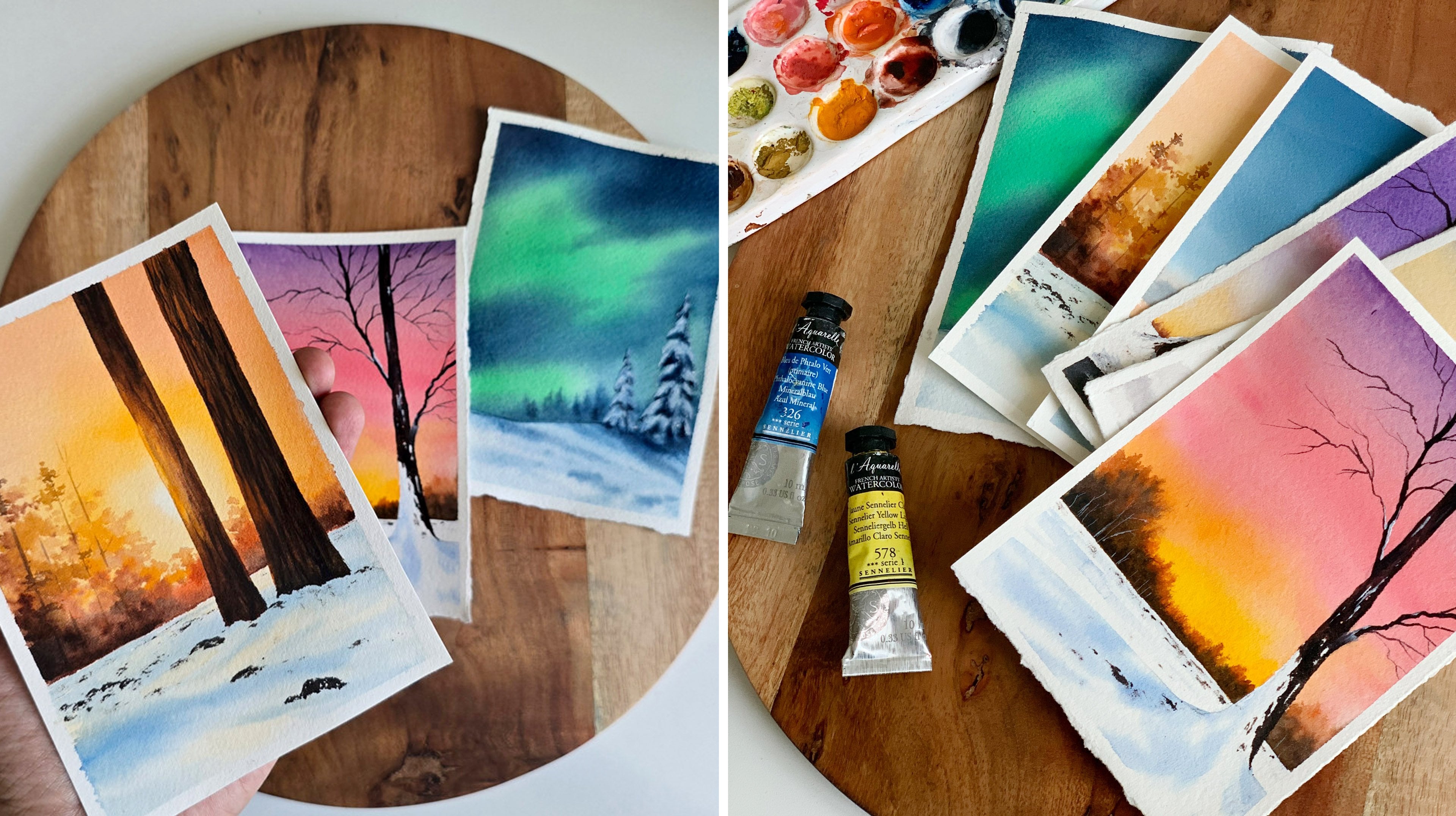
5. Day 02 - Glowing Sunset: Hello, dear friends.
Welcome to day two of painting beautiful
atmospheric landscapes, and here is our
painting for the day. I really enjoyed
creating this piece, and I can't bear to show
you how to do the same. I will start by introducing
you to the colors. So the very first colour
we will need is a yellow. The one I'm using here
is carmum yellow light. Go with any similar
yellow you have caught. The next one is a
yellowish orange. This one is carmum
yellow orange. And then we need a
brighter orange. This one is cellular orange. You can use vermin or any similar brighter
orange you have got. So that is yellow and
two kind of orange. Now, if you don't have yellowish orange,
it's totally fine. You can just mix that
yellow and vermilin together to create a
lighter yellowish orange. Now, the next two
colors you will need is brown or Brzena. This one is permanent brown, and then finally, you
will need pains grey. If you don't have pains grey,
you can go with plaque. So these are the
colors you will need for this gorgeous painting. Yellow, yellowish orange, then vermilion or
any similar orange, brown and painkscrey. Okay. Now, let's give it a try. Alright, so I have
my paper ready here. For this painting, you don't
need to add any sketch. We can start right away. Maybe you can just add a horizon line just for you to understand where you
should be putting the colors. So I'm going to add a line right at the center,
and there is it. So the top part is
going to be the sky, and the bottom part is the lek. Now, make sure you have all the colors ready
on your palette. We need a yellowish
orange, a brighter orange, brown and pinkcrey. Now, when these colors are
ready on your palette, you can start by
applying a quart of water onto the anterior paper, using any of your
clean white brush. Okay. So the brush
I'm using here is a 1.5 inch brush,
and it's clean. Okay, so my background
is evenly wet. Now let's go with the
medium sized round brush. This one is size number eight. But first, make sure
your brush is clean. Now I'm going to start with
this yellowish orange. Now, we're going to leave
some space at the center, and let's apply the yellowish
orange on either side. We have to add some
yellow at the center. But I just realized I haven't taken out
yellow on my palette. So let me do that first. You can go with any of your warm yellow. The one I'm using here
is cadmium yellow. You can also use gamboge yellow or any other
similar yellow. Now take a little of that and
apply that at the center. Okay, so we're not going to
really show the sun acetus, we're just going to show
that glow at the center. That's it. So we have some
yellow at the center. Now I'm going to go
back with orange, picking a bit more
brighter tone. And I'm adding that
on either side. So you can see the
way how I'm moving my brush from either side with the center while
retaining that yellow. Now, gradually, I'm going to
make the colors more bolder, so I'm picking a bit of brown, mixing that with this
brighter orange, adding that on the top. This is just the
beginning. We are going to make the
color more darker. But maybe before that, I will just apply
some more orange. I'm mixing these two
oranges together, and I'm going to add a few
lines here on either side. While retaining the
yellow at the center, I'm not going to
touch that part. See that? So from either side, apply some lines
towards the center. Your background is wet, so they will nicely blend
into each other. Now I'm going to pick a
bit more darker brown, and I'm adding that
towards the top. Just adding some random
lines and shapes. But I'm not touching the yellow. I think there's a lot of water. So I have dabbed it
on a paper towel. Now a bit more orange. So we have to create
that contrast, and it has to be a play
of light and dark. So at the center, we
have a lighter tone. Then on either side, we have introduced some medium tones, and towards the top, we
have made it more darker. I think you can already
see the glow here. So only if you play
with light and dark, you can bring in that contrast. I think I will add some
more yellow at the center. It is not really prominent. Okay, so that's how
it has turned out. I'm pretty happy with the colors and the glow we have created. Now in a similar way, I'm going to apply paint
towards the bottom, starting with orange, adding that on either side while leaving some space
at the center. The same way how I
painted the sky, and that's where I'm going
to introduce some yellow. Now towards the bottom,
I will add some brown. Then I will go with yellow. Okay, so I'm going
to clean my brush, picking some yellow,
adding that at the center. Okay, so that is yellow. Now I'm going to go
back with orange, adding lines from either side. Okay. So the base
layer is almost ready. Now, we have to introduce
more darker tones. We have to add some
clouds on the sky and also some lines on the lake
to bring in that contrast. So I'm picking some more brown, adding a few more
lines onto the sky. See that? So just like
how we did earlier, add some lines from either side without touching the yellow. Okay. Similarly, we
have to add lines at the bottom as
well, onto the lake. I will start from the bottom, making this part darker. Then gradually I will add
some lines onto the top. Our background is
still really wet, so we have to make
use of the time and add these lines to show
the movement in the water. Okay. The only tricky part
here is to work faster. We need to add in
all the colors and all the lines before the
background dries up. Now I'm dabbing that
on a paper towel, picking a bit of orange. So I want a paint which
is not too watery. And with that paint,
I'm just going to smudge the lines to
give it a softer look. Right now, those lines
are spreading a lot and it doesn't look
very smooth and soft. So go with a lighter orange
and then just spread it out. See that? You can see
the difference it made. Now I'm going back with brown to add the trees and
the landscape far away. Adding some shape here while the background is
still wet. See that? It will nicely spread into the background like a soft blur, making it appear it is foggy. Similarly, on the
other side as well. I'm adding some brown shapes. But towards the center, we
have to add in some orange. You should not use brown acetas. So clean your brush, then pick a little orange and use that color towards the center where we have created that clue. Now, clean your brush again, and right at the center, use really lighter
tone. See that? Now you can smudge the bottom
to give it a better look. Alright, now it's time to
introduce more darker tones. Right now, the colors
are quite medium tones, so I'm picking some brown and adding a little of
paints gray into the mix. So this is the time
we're introducing paints gray into the painting. All this while we were just
using orange and brown. First, I will add some
shapes over here, only onto the left end. I won't be adding similar
shapes on the right. So only over here onto
this extreme side, I'm adding some
shapes. See that? Make sure not to bring them
too close to the center. We have to retain those orange
and yellow at the center. So add them only onto
the extreme side. Now, you can just much it. Okay. So just like the
sky and the lake, whatever elements you're
adding into the painting, if it's closer to the sun,
it has to be lighter. So I'm picking a bit of orange, and I'm adding that towards this part, which is
closer to the sun. Now cleaning that and making
it lighter again over here. See that? You can really
see the glue now. Now to the extreme end, I'm making it a bit more
darker, only over here. The rest can stay as it is. Just like I said
earlier, you have to play with that colors. You have to introduce
dark and light to create that sense of
contrast in your painting. Otherwise, everything will
look quite plain and flat. Okay, so the landscape is in. Now with the same
color, I'm going to add some lines onto the water. My background is
still really wet. So just onto that
wet background. I'm adding some lines. So
when you add these lines, try to leave some
gap in between. Don't add them too
close to each other. Okay, you can see a bit of
orange and yellow in between. And that's how you should
be adding those lines. On the other side,
I'm not adding much. Okay, I think it
can stay as it is. Let's focus on the left side. There we have that bigger
landscape element. Now, I will add a few
more shapes over here. And with that same color,
that darker brown, I will add some more lines
onto the background. Okay, so it's a darker brown. It's a mix of paints gray
and permanent brown. Now only onto the left side, I'm adding a few lines, leaving some gap in between. So we have to see
all those colors in the background, yellow, orange, medium tone of
brown, darker tone, all of those colors. Okay. So that's how it has turned out. We still have to
introduce some more taco tones to give it a better look, but I will first
finish up this part. Adding some more
patterns over here, but it looks like
this part has dried. The rush is quite wet still. I'm not really sure what
happened only on this part. Anyway, that's it. That's the landscape
in the background. Honestly, this painting is quite complete at this
point, but to me, I'm a perfectionist, and to me, those lines are not
looking really soft. So there is one
trick that I always do to make those
lines more softer. So clean your brush, then
go back over some orange. It has to be a medium tone, and your breast should
not be too wet. If it's too wet, dab
it on a paper towel before you add these
lines. Minus a bit of wet. So dab it on a paper towel. Now extend these lines.
Go very light handed. Don't put a lot of pressure.
Like a feather touch. Gently smudge those lines. This will give it a softer look. Along with that,
you can also add some lines towards
the right side. Okay. So honestly,
at this point, if you're happy
with your painting, you can stop it. It
is in a good shape. But to me, I wanted to add some more darker tones while
my background is still wet. So if your painting
is starting to dry, you can stop it at this point. Otherwise, go with
the darker tone of brown and introduce
a few more lines only on the left side. So this step is
completely optional. If you're happy
with your result, you don't need to
add any extra lines. You can call it done. In case if you're
adding them, try to leave some gap in between. Don't add the lines too
close to each other. I'm focusing only
on the left side, and onto the same areas, I'm adding an extra line. I'm going with one more round, making the color more darker and introducing another line, again, onto the same area. So this time, it is only
on the extreme end. I'm not spreading that too
much towards the center. Okay, so you can see
the difference it made. The colors are more darker, and there is a
beautiful contrast. Earlier, it was
all medium tones. But then it's
completely optional. The earlier version
was also really beautiful because
with this painting, the trick is making a background stay wet
for a longer time. So if it is starting to
dry, don't attempt this. Leave it as it is.
Otherwise, you will ruin your decent
looking painting. Okay. I will just add a few more shapes over
here, using a Taco tone. Just some teeny tiny
shapes only on the top. The rest is looking good. Alright, so that
is it. Now, there is one more thing
that I want to do, which is fixing those lines, especially the ones
at the bottom. You can see they are
looking a bit rough, so I'm picking a
little of orange, and I'm smudging these lines
to give it a softer look. Right now, that spread
is not really beautiful. So pick some orange on your brush and
spread out those lines. This will make those lines
very soft and blurry. See that? It instantly
made a difference. Now, I have a bit of naples yellow left on my palette from the
previous painting. So there's one more thing
which I would love to do, which is, again,
completely optional. If you want to do this step, you can take out a bit
of naples yellow, which is a pastel yellow. I'm switching to
a smaller brush, picking a bit of niples yellow, and I'm going to add a few
lines underneath the sun. Let me pick some paint and show you how I'm
going to do that. Okay, so right over here
underneath that glowy part, I'm going to add a few lines
onto the leg. See that? So naples yellow is a
mix of yellow and white. It's a pastel yellow. So when you add lines using this color, it will really show
on your paper. If you're using the normal
yellow like cadmium yellow, Cambos yellow or
any other yellow, there are chances it might
not show on your paper. So if you don't
have naples yellow, there's nothing to worry. Add a bit of white watercolor into any of the
yellow you were using earlier and add in a few lines.
Alright, so there we are. We are done with our
painting for the day. But to give you a finished look, I'm thinking of adding
some birds onto the sky. So with my smaller brush, I'm taking a bit of paints gray. Maybe a darker brown is
better than paints gray. These are super tiny birds, and they are far away. So go with any of
your smaller brush and add in a group of birds,
three or four of them. I will add one more here, maybe
another one onto the top. Now I'm thinking
to add another one closer to the sun using brown. So let me clean off my brush. Then I will pick some brown. It can go with brown or it can go with a mix of
brown and orange. Now I'm adding a bird over
here with that brownish color. Okay. If you want to add more
birds, you could do that. I'm going to stop it here. I will make this a
bit more brownish. And I will add the same
brown onto this one. Alright. So that's it. That's how my painting
has turned out. It's a gorgeous painting, and I really like the glow
we have created here. Give it a try if
you get to try it, and let me know if you liked it. Thank you so much for
joining me today. I'll be back here soon
with our next painting.
6. Day 03 - Foggy Forest: Hello, dear friends.
Welcome to another day of painting beautiful
atmospheric landscapes, and here is our
painting for the day. Now, for this painting, you
will only need three colors. The first one is indico, then sap cream and
some pink screy. Okay, so keep the colors ready,
and let's give it a try. Alright, so let's start. First, I'm adding
a horizon line. Which is a bit below
the end of the paper. So start by just adding
a line, that's a sketch. Now you have to make sure
you have some in deco, sap cream and pink
screen on your palette. These are the three
colors you will need for this anterior painting.
So keep them ready. And when you have
them ready, you can apply a coat of water onto the anterior paper
and make it evenly wet. And using my washbush. This one is 1 " wash
brush and applying a nice even coat of clean
water onto the anterior paper. Okay. Run your brush multiple
times back and forth, just to be sure the water
has reached everywhere. And there won't be any pools
of water if you do so. Okay, so my paper is evenly wet. Now we can start applying the
paint onto this wet layer. So I'm going to keep
this brush aside. And I'm going to go with a
medium sized round brush. This one is size number eight. Go with any brush
of your choice, any medium size brush. Now, the first color
I'm going to pick is indigo and making sure
the brush is clean. Now we'll go with a
medium tone of indigo, and we'll apply that
on the top first. Then gradually
towards the bottom, we will add more green
and a darker tone. Okay, so go with any of
your medium sized trash, add some water into in tigo and turn that
into medium tone. Now apply this on the top part. As you're coming down,
make it a bit lighter. I'll apply some more on the top. Okay, so towards the center, I'm not adding much paint. Only on the top, we
have a medium tone. I'm making it lighter
as I'm coming down. Okay. Now, right over here, I will apply some medium tone. So in between, we
have a lighter tone. Then on the top and the bottom, we have a medium tone of indico. I'm spreading that into
the background. Okay. Now I'm going to go with
green with the same brush. I'm picking some sap cream. First, we can go with a
medium tone of green, then gradually we can make it
darker towards the bottom. I'm adding more water, and
I'm making it lighter. So that's a tonal
value I'm going with. I'm applying that over here, and I'm gently blending
that with the blue. Now towards the bottom, I will make it more darker. So I'm picking indigo, and I'm mixing that with
sap green to make it more darko and I will add
that at the bottom. See that? So towards the top, we want to retain that
lighter tone or medium tone. And at the bottom, we want to introduce some textures
and taco tones. So just add that in
a very random way. You can leave it acets and it will nicely blend
into the background. And you can see those
textures we are creating. Okay, so make your green darker by adding some indigo
or paint green to it. I'm adding more darko tones. Okay. The top part, you
can leave it as it is. Right now, I have added some
paint green with green, and that's the color
you see right now. Okay, so that's how the
background has turned out. If you want to add
some more taco tone, you could do that. Now I'm going to go
the smaller brush. This one is size number six, and I'm going back with intigo we will need a medium tone. Now using this color,
I'm going to introduce some leaves and some
foliage onto the top. This one is somewhere between a darker tone and a medium tone, simply add some patterns
like this onto the top. Don't make it too dark, go
the similar tonal value, and we have to do this before the background dries
out completely. Be quick and introduce some patterns and some
textures onto the top. I will do the same
on the other side. We only need some on the
top, don't overdo it. In between, we need a
lighter tone as well. So on the top, we
have this foliage. Then in between, we
have a lighter tone. Then again, towards the bottom. We have a medium tone I can. That's how it is. So follow that pattern. So only on the top, you can see that medium tone towards the bottom, I have
made it lighter. Maybe we can make it
slightly more darker. I'm picking more indigo. I'm adding some more patterns
onto the topmost area. I'm just adding that onto that wet background
in a very random way. I'm not following any particular shape or size or anything. Simply add that paint onto
the wet background and smudge it in a very
light handed way. Don't put a lot of
pressure, and that is it. So that's how it has turned out. If your background is still wet, you can add more patterns, more taco tones, or
more lighter tones. Whatever you prefer? I think it's in a good place. I don't want to add
any more patterns. So I'm going to call it done. But before I leave
it for trying, I'm thinking of adding
some more taco tones at the bottom using paints gray. These are the places where
I'm going to add the trees. So just in between, I'm introducing some darker
tones on either side, because I'm planning
to add one tree on the right and another
one on the left. And that's where I'm
adding these taco tones. But it looks like the
background has almost dried. So the best thing
to do right now is to stop and wait
for this to dry. And that's what I'm gonna do. Alright, so let's
leave this for drying. All right, so that's
how it has turned out. It has become a little faded, but it is still very pretty. Now the next step is to add the trees onto
the background. And for that, I'm going
to go with indigo. I will start with
the medium tone. I'm adding some water. Then I'm dabbing my brush
on a paper towel. Now, I will start with the first tree using
this tonal value. I'm adding that over here. So you just need to
add the tree trunk. We're not going to add
new branches or anything. Now towards the bottom, I will tap it off
using a paper towel. So just take a soft
tissue and dab it off. Now, in a similar way,
we can add more trees. You can use a lighter tone or a similar tonal value for
the rest of the trees. I'm dabbing that off
towards the bottom. Okay, so this will create a
foggy effect quite easily. You don't need to put
any extra effort. Now, I'm going to
add my next tree. Maybe we can add a branch here. Otherwise, they will
all look the same. I'm extending this
one towards the top. Then I'm adding a branch. Okay, so that's my second tree. Now, in a similar
way, we can add more. You can add them
wherever you like. You don't need to
follow the same spot and the same cut of tree. It can be a straight tree or an irregular shape
or an inclined one. However you want to
add them, you can add. So the first set of
trees I'm adding right now is using
a lighter tone. Then I will do the same using
a slightly darker tone. And then we will go the
final round of trees. I will add one more over here
using the same tonal value. Then after that, I will
go with a medium tone. So add the shape of your tree,
then towards the bottom, dab it off using a paper towel
to create a foggy effect. Now, I'm going to
add the next tree using a slightly darker tone. So that's the kind of color
I'm going with. See that? Extending that
towards the bottom. Here, I will pick some water
and I will make it lighter. Okay. Now the rest, you can dab it off using
a paper towel. See that? How easily we created
a fog effect here. So that's a trick.
Now in a similar way, if you want to add more
trees, you could do that. I think I will add one more
using the same tonal value. Okay, so those are
the background trees. Next, I'm going to go
the foreground trees. And for that, we have to use a slightly darker tone
of intiko for the base. Then onto that,
we will introduce some textures using pinks gray. So start with the darker tone of intiko Maybe one tone darker than the colour
you used earlier, then outline the tree. Go with an irregular shape, more like an organic shape. Okay. The color I'm using here, it's a darker tone of intico. Add in your tree
the basic shape. Then we can introduce
the textures. Now onto this, I
will add a branch. Maybe we can make it
a bit more thicker. Towards the bottom, I think
I'll just dab it off. Now onto this, I will add
a branch, maybe here. Now in a similar way, I
will add one more tree. But before that, I need to
introduce the textures. We have to do that while the
background is still wet. So first, add in
the basic shape. I'm almost done. Okay,
so that's my tree. Now onto this, I'm going to add some textures using paints gray. I think I will use
a smaller brush. I have taken some paints
gray on my brush, and I'm dropping that in a very random way
onto the wet layer. You can add them
wherever you like. I'm just adding some shapes and some lines onto that wet layer. As the base layer is still wet, when you add these darker tone, it will spread in a way
leaving a beautiful texture. There is nothing to worry here, simply add them
wherever you like. I'm going to add a few
towards the bottom as well. See that? So just drop in that darker tone without worrying too much, and that's our tree. I will add some
more here and also towards the top.
Okay, so that is it. Now in a similar way, we
can add one more tree. I'm thinking of adding
that towards the right. You can add them
wherever you like. You don't need to follow
the same pattern, or if you want only one tree, even that is totally fine. I'm going to add that over here. So first, you have to go with a medium tone or a
dako tone of intigo. Then add the basic shape of your tree and finally
add the textures. If you have noticed I'm placing the tree where I have those
taco tones on the ground. This way, we don't need to
put a lot of effort showing the roots and all those
details. See that? So I have placed it right
where I have introduced those taco tones, go
in a similar way. And wherever you have those taco tones on the grassy land, introduce your tree
right over there. Okay. Now, let me quickly
finish this tree. Mm. Alright, so the tree is ready. Now I'm going to add
some branches onto these two trees
using pains gray. You can add as many
branches as you want, but go with a smaller brush or a brush with a pointed tip. And add branches, in a way,
they look more natural. Go with a nice curvy
irregular shapes. Okay. I will add one
more here or maybe here. Okay, I'm not going to overdo. I think this one is in
good shape right now. So I'm gonna call it done. If you want to add
more or if you want to add one more tree, that's
totally up to you. You can add that. You can add more branches
and more trees. Maybe one more tree on the
left will be really nice. Anyway, that's it for the day. It was a quick and
lovely artwork. I hope you all enjoyed it. Thank you so much for joining. If you haven't tried
this painting yet, give it a try and let
me know if you like it.
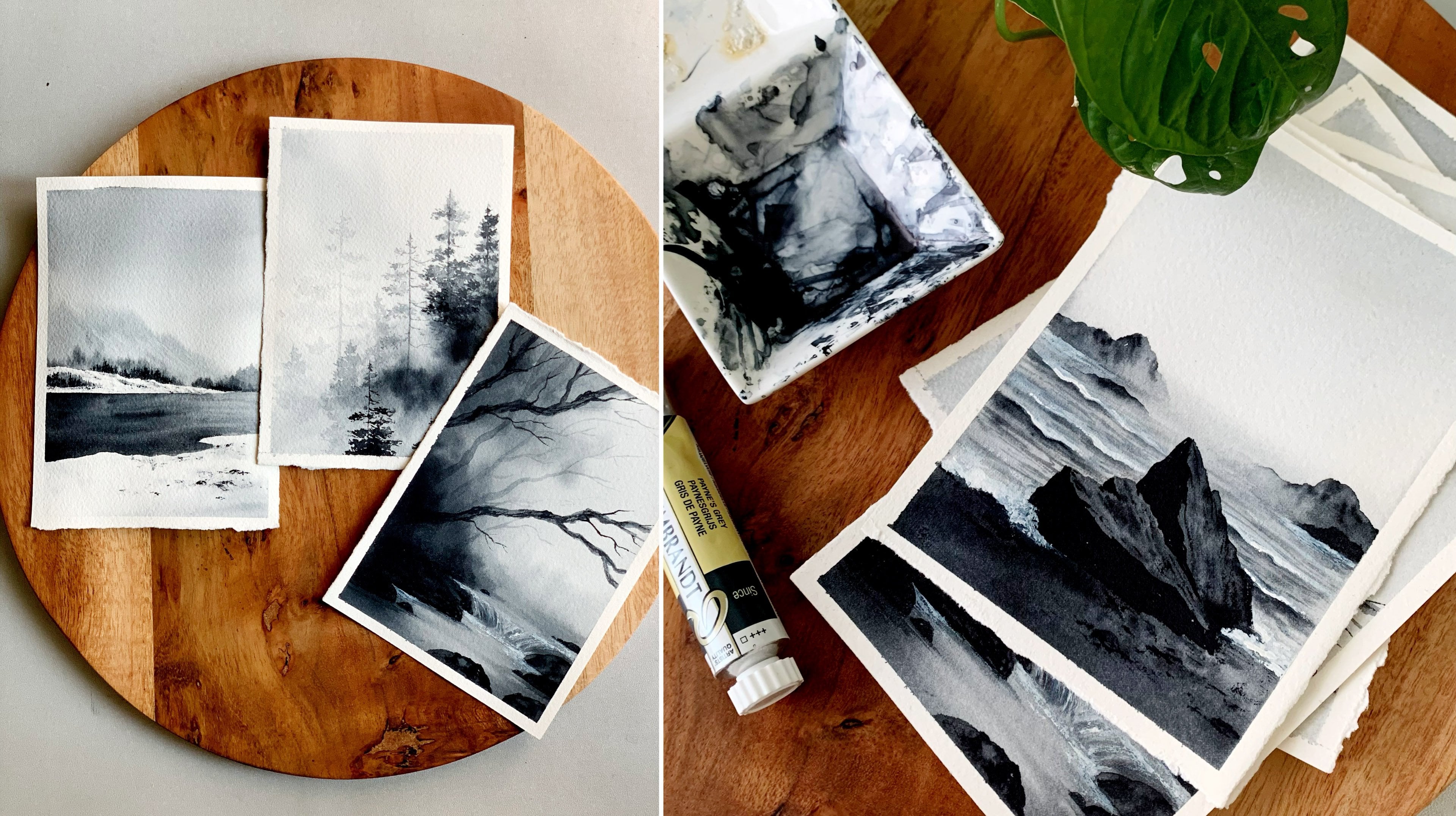
7. Day 04 - Moonlit Night: Hello, dear friends. Welcome to another day of painting
at Masrik Landscapes. And here is our
painting for the day. It's a monochrome painting, and the only color you
will need is Paints gray. We'll be playing with
different tonal values of gray to achieve this result. So for the background,
we will play with a lighter tone of gray as
well as a medium tone. We're going to
achieve the result by varying the amount of water
we are adding into the gray. So the color you see
here is a medium tone. Then for the final details, we'll also be using a taco tone. Okay, so that's how we're
going to achieve the result. And here's the gray that I'm going to use. It's
from Rembrandt. In case if you don't
want to use Pains Gray, you can also use indigo for
this particular painting. Now, along with Pains gray, you will also need
some white gouache or watercolor to add the
moon and the reflection. Okay, so that's all about the color. Now
let's give it a try. I already have my paper ready
here and even the colors. Now, the first thing I'm
going to do is adding a line, which is the horizon line. To divide the sky and the lake. So the top part is the sky
and the bottom is the lake. Now, I hope you all have some pain screen ready
on your palette. So somewhere over
here, I will have my moon and then the
reflection right underneath. All right. So the sketch and the paper and the
colors are ready. Now we can start by applying a quatter water onto
the entire background. Apply a nice gentle coater water onto the entire background. Don't make it too watery. Run your brush back and forth to make sure the coater
water is even. Okay, now I'm going to
switch to my round brush. You can use a round
brush or a flat brush. The one I'm going to use
is size number eight. First, make sure it is clean. Mine wasn't had some
leftover violet on my brush. Okay, so I'm starting with
a medium tone of gray, and I'm applying
that at the center first where I have the moon. So in a circular way,
I'm applying that paint. So over here, I need
a lighter tone. Then around that, I
want medium tone, and towards the outer side, I want the color to
be a bit more darker. So that's a plan. My
background is too watery. The colors are spreading a lot. Anyway, I'm using a medium tone right now or maybe more
like a lighter tone. It has yet to be
medium, I think. Okay, now with the same brush, I'm picking a medium tone. And I'm applying that
onto the top first. Then leaving that lighter
spot at the center, I'm adding paint from
either side towards the center so that I can
retain that lighter tone. Okay, the color can
be more darker. Otherwise, it will be too dull. So from either side, I'm adding
paint towards the center. Try to retain a bit of lighter tone at the
center. That's all. Okay. Over here, you can see
a little of lighter tone. That's all I could achieve,
but that's enough. Now I'm making it more darker, going with some
more medium tone, adding that onto the top first. Then from either side, I'm adding that towards the center. That lighter tone
is still there. Okay. Maybe just maybe we can make it a little more darker because it's
a night scene, and I want the colours
to be a bit more darker. And, you know, with watercolor, it tends to fade a little
when the paper has dried. So let's not take a chance. I think maybe we can go with one more round of darker tone. If you're happy
with your result, you can leave it as it is. You don't need to
add any more paint. But to me, I think
this top part can be a little more darker
and also on either side. Otherwise, that contrast
won't be there. Now, I will just spread
it into each other, and then I will
go with the lake. Otherwise, by the time I start the lake, the
paper would dry up. So I'm just gently spreading
them into each other. All right. So that's the sky. I'm kind of happy with the
way it has turned out. I have achieved a lighter
tone at the center, then some medium tone around it, and also on the top. I don't want to
overdo and ruin it, so I'm leaving that
aside and I'm going with a lake foror which I'm
going to use Pains gray. I will start with a medium tone. I will apply that onto
the entire background. Then just like I
did for the sky, I will start making the color more darker from either side. Okay. So go the medium tone
or a lighter tone first, apply that onto the
entire background. Then go the darker tone. You can add some at
the bottom first. Then from either side, add
paint towards the center. So here you have an
imaginary horizon line. Keep that in mind. Considering that, you
can add paint from either side towards the
center in a linear way. So at the center, we are
leaving some lighter tone, which is going to
be the reflection. You can keep on
building that color. We don't need a lot of
lighter tone at the center. So once you start
adding that taco tone, you will automatically lose that lighter tone at the center. So don't worry a lot. You can keep on adding that taco tone, some at the bottom, then a
few lines from either side. Okay, even if you totally lose that lighter tone at
the center, it's fine. We can add them
with white paint. Okay, so there is
nothing to worry here. The only thing you have to be careful is the wetness
of your paper. Before your background dries, you need to add these lines. So from either side, keep on adding some
lines. See that? There is still some lighter
value at the center. Add more lines. We don't
need this much lighter tone. Okay. So that's how we're going to build
upon the background, start with the lighter
to, then make it darker and darker by adding
these lines from either side. Now you can really
see that glow here. Now, I have cleaned my brush and I'm dabbing it
on a paper towel. Okay, with that clean brush, just go to quickly run it
back and forth. See that? Just to smudge and make
those colors a bit smooth. Okay, so that's it for now. Now I'm going to go
with a darker tone to add the horizon details. So with the same
brush, I'm going to pick a darker
tone of paints gray. And while the background
is still wet, I'm going to introduce
those elements over here. Is the same way how we did
for the other paintings. So you can make it
higher at some places, then lower at some places, just to add that
realistic character. Okay. And if your
paint is too watery, dab it on a paper towel before
you add these elements. Otherwise, they
will spread a lot, and it will be very difficult to control the way
they are spreading. Once we're done with
this, we need to add the moon and the reflection. But before that,
I think I can add some more elements here,
maybe make it darker. And then I need to
add some more lines onto the lake. Okay. So the background
elements are done. I'm not going to touch it again. But with the same tonal value, I want to add some more
lines onto the lake. But before that, let's
clean up a brush and lift off some paint to
define the horizon line. So gently take off some paint and introduce a
very subtle horizon line. It doesn't need to
be super white. It can be a little faded. And next, we're going to go
p with paints gray again, a darker tone, and I'm adding
some lines onto the leg. Once we added earlier,
it's not visible. So we can define this
a little more better. So just like how we did earlier, leave that gap at the center. Then from either
side, add some lines. Alright. I think that's
looking really nice right now. The colors are so good. But I know it will be one
tone lighter when it dries. That is what I'm scared about. Anyway, that is it. Let's leave it for trying. Look at this look
at those colors. So that's what I was
telling about earlier. The colors will tend
to fig a little, which is very normal
with watercolor. So in the initial layer itself, we have to go with
a darker tone. Anyway, what's done is done. Now for the next step,
I'm going to squeeze out some white quash
onto my palette. Now go with any of
your smaller brush, pick some paint on your brush, and we're going to add a
teeny tiny moon over here. And then we need to
add the reflection. It won't be very much visible as the colors we have used in the background has faded a little. But still, I think
it is visible. Okay, now with the same brush, I'm going to add the reflection, which is just a few lines on the lake underneath the moon. So underneath the
moon, add few lines. Okay. I think we should have gone with a
much more darker tone. Anyway, what's done is done, I will make it a
bit more brighter, going with one more round, adding those lines again. Alright, so that's a
reflection and the moon. Now the next task is to
add the grassy pattern. Ovs is going to make a lot
of difference over painting. Right now, it is very dull
and it is very boring. But with the next step, it is going to change into
the next level. So clean your brush, the
same smaller size brush and go with a much more
darker tone of paints gray, which is more like black. Okay. If you want to
use a rigor brush or a liner brush or any other
kind of detailing brush, you could go with that
because we're going to add plenty of free
hand lines. See that? So go with some nice
curvy freehand lines, and then onto that,
add some leaves. So these are the plants and the reeds growing
along the river. Okay. So add some
nice free hand lines, then some leaves onto that. I'm focusing on the left side, I will add a few more
bigger ones like this. Then at the bottom, I will add some grassy lines to
cover that part. Okay. Our interior background
is quite tall. So only if you add a
foreground element, which is very dark, our
painting will look complete. Otherwise, it will
be just boring. So yeah, this is a final step. You can add these grassy pattern and plants and reads
wherever you feel like. Some of the lines can be
really long and curvy. I'm going to add a
nice long one here. Then onto the tip, I'm adding
some teeny tiny lines. Okay, so go these kind of lines, add them in different
orientation. Some of them can
be straight, some of them can be long and curvy. It will add a lot of realistic character
to your painting. Don't add them all
in the same way. Let them be wild. Okay,
so let's add these lines, and after that, at the bottom, I will introduce some
more thicker lines. All right, so the
major plants are in. Next, what I'm going to do
is with the same brush, I'm going to add some lines
close to each other at the bottomost area to
make this area darker. I don't want any
gaps in between. Otherwise you won't
feel that contrast. So I'm just going
to cover this part. I'm adding some lines
close to each other, just some free hand lines. And then I'm going
to cover this part. So without much gap, add
them close to each other. It doesn't need to be perfect. We're just trying to
cover that bottom area. So just keep on adding
them as many as you can and cover the bottom. They don't need to be as
long as the previous ones. They can be in a medium
or a short of size. Our intention is just
to fill this area, so you can just add
them however you like. So I'm just adding a lot of
them without lifting my hand, and that's how I'm filling it. Similarly, I will add them
on the other end as well. So wherever I'm seeing some cap, I'm filling them by adding
more and more lines. You can see the difference now. Earlier, there were a
lot of gaps in between, and for some reason, the
painting wasn't looking complete because there
wasn't any contrast. Now, when I fill the bottom, when that darker
color was introduced, it looks very much different. It looks complete, and it
looks beautiful as well. Okay, so that's how
it has turned out. You can see how gorgeous
it has turned out. The only thing I regret is not making the background
a little more darker, but here is the final result. It is still beautiful, I think. If you haven't tried it yet, do give it a try and let
me know if you liked it.
8. Day 05 - Misty Lake: Hello, hello. Welcome
to another day of painting beautiful atmospheric
particular landscapes. And here is our
painting for the day. So as usual, we will start with the colors we will need for
this beautiful painting. You actually only
need two colors. It can be indigo or any
other blue of your choice. And along with that, you will
also need some sap cream. The color you see
right now is indigo. But when I started
off with indigo, I wasn't really happy. So I decided to mix
some cellar blue with intigo to make the color a bit more brighter,
if that makes sense. Otherwise, you can just
go with prussian blue or any other blue of your
choice for the background. So I just mix these
two colors together, intigo and celliarblue. Because when I started
off with indigo, I felt it is really dull. So this is the kind of blue I will be using for
the background. It is not necessary
to mix these two. You can just go with indigo. Okay. Now, along with this, you will also need
some sap cream, and that's our next
color and a final color. You can also try the
same painting with a different color
combination of your choice. It could be indigo and violet or maybe crimson and violet
or some brownish colors, maybe brown and orange. Aw, these are the colors
I will be using indigo, Palo blue and sap cream. Okay. Now let's give it a try. Let's start with our next
atmospheric landscape. I have my paper and
the colors ready here. So for this one, we
don't need any sketch. You just need to
imagine a horizon line. O is going to be somewhere
at the center of our paper. We don't need the
sketch really, so I'm just going to
erase that off. But just imagine that's where our horizon
line is going to be. Okay. Now we can start by applying coated water
onto the entire paper. Before you do that,
make sure you have all the colors ready
on your palette. We need indigo or any other
blue that you prefer. Then along with that,
we will also need some sap cream so apply a gentle coat of water
onto the entire paper. Run your brush
multiple times just to be sure the coater
water is even. Now to apply the paint, I'm going to go with a flat brush. You can use a flat
brush or a round brush. I'm going to start with indigo. I will apply a medium tone onto the top and
towards the bottom. Then towards the center, we have to make
the color lighter. So go with any of
your flat brush, then apply a medium tone. Then gently, make it lighter. Then go with that
medium tone again, apply that at the bottom. See that? So the center,
we have a lighter tone, and on the top and the bottom,
we have a medium tone. I'm not really
loving the vibe of indigo here. It
looks a bit dull. So I'm thinking of mixing
some blue with indigo, maybe a hilo blue or Persian
blue or any other blue. Let me see which I
can crab quickly. All right, I got one.
This one is cellar blue. It's more like a To blue. You can use indigo acets.
There is no problem with that. For me, I feel like
it's a bit dull. You will see the
difference now. See that? The blue is a bit more
brighter and vibrant. Okay, so go with prescient blue or any other blue
of your choice. It doesn't need to be ItigoO you can just make
some prussian blue or any other blue of
your choice with intigo and make it
a bit brighter. Okay, so that's how the
base layer has turned out. I have a medium
tone on the top and the bottom and towards the center, I have
made it lighter. Now, I'm going to keep
this brush aside, and I'm going to go
with the arm trush. This one is size number six. I'm mixing the
same colors again, indigo and cellar blue. Then on the top and the bottom, I'm going to add some
more deeper tone. More like some clouds and
some textures on the sky. Add some lines in
a very random way. We'll have to maintain
that lighter tone at the center then on the
sky and towards the lake, we can add more taco
tones and textures. With the same color,
I'm going to add some lines at the bottom,
which is our lake. I think we can make
it more darker. Otherwise, when it dries, it will look very dull. I'm going to pick the same color again and I'm repeating
the same exercise, some more clouds and textures on the sky and some
lines at the lake. See that? Make it more
brighter towards the bottom, and then some more clouds. It is actually a
very easy painting and a beautiful one as well. But the tricky part here is making your background
stay wet for a longer time as we're going to paint the entire thing
in one single layer. So that's how it has turned out. Now to even out everything, I'm going to dab my
brush on a paper towel. So this will remove
that excess amount of water and paint from my brush. Now with that kind of dry brush, I'm smudging the paint back and forth. Just to make it even. There are some hard lines. So this will smooth
out everything. Okay. Now we're going to
add some horizon details. The trees and everything
in the background. For that, with the same brush, I'm picking a Darko
tone of intigo. Now over here, I'm
going to add a detail. See that? So just start with a rough shape and make sure
your paint is not too watery. If it's too watery, dab it on a paper towel before
you add this shape. Otherwise, it will spread a lot. I'm going to add some lines on the top to make it look like there are some
pine trees over there. I'm adding that shape
only on the right side. The left side, I'm leaving it astous just to create
a foggy atmosphere. Now I have cleaned my brush, and I'm smudging this part, and I'm making it lighter. Okay. You have to do all these things very quickly before the background dries out. That's the main reason why I went in with a small piece of paper because it's easier to handle the wetness
of the paper. If it's big, it will
be very tricky. Anyway, now I'm adding some
lines on the top over here. Okay. So that's how
it has turned out. We have the background
details ready there. Next, I'm going to go
with the landscape. And for that with
the same brush, I'm picking some sap cream. You don't need to
clean the brush. You can go with sap
cream directly. Okay. So this one is a
size number six arm brush, and with that, I'm
picking some sap cream. Maybe we can add a bit of indigo because we don't want
that bright pleasant cream. The green can be a bit dark, add a pinch of indigo
into sap cream and then add in some
lines over here. You can leave a gap in between
and then add your grain. The background is still wet. So there are chances they will spread a little, which
is completely okay. Don't worry about
that. But don't go with the watery paint
with spreading a lot, dab your brush on a paper
towel and then add this line. I want to add some darker
tones and texture aspll, but before that, I
will clean my brush. Then I will dab it
on a paper towel. Now over here and gently smudging the paint to
give it a smoother look. Okay, I'm really loving the
way this one is progressing. The colors are really beautiful. Now I'm going to pick
the darker tone. I will add some textures, and then we have to add
the reflection as well. The color I'm using right now is a mix of indigo and sap cream, and I'm adding some dako
tones at the bottom. Then also adding some tots and some textures
towards the top as well. Okay, I won't be touching the pine trees that
stay as it is. Only over here
towards the right. I'm adding some taco tones.
The left has to stay. Don't add any taco
tones over there. Next, we can add reflection. Now I'm picking some indigo. And I will start
with the pine trees. Similar to the shape
we have added earlier, I'm adding a shape over here. It can be a bit different,
that's totally fine, but try to go with similar
heights and similar shapes. Okay. So I started off with
the tacotun on the right. Now I have cleaned my brush and I'm smudging it
and making it lighter. Now we're adding some lines
to show the pine trees. It's the same thing
we did earlier, but in a mirror image. On the right, we have
some toler trees, add them over here
in the reflection. Now, I will add
some green asphalt, being that mix of
indigo and sap cream. I'm going to introduce
that over here. When you're doing this,
leave a gap in between. That is really important to
create that foggy atmosphere. Okay. Now maybe I will add
few more lines on the leak. This is just to show
that water movement. Add some lines with
the same paint. Okay. Now I will just push these trees a bit more down to make it
similar to the top. Okay, so that's how
it has turned out. Now we're going to introduce some textures and
some more pine trees. But before that, I
will clean my brush, and then I'm going to lift
off some paint from here. Just wiping my brush
in a straight line. And then smudging those paint
to give it a better look. It's a really beautiful
color combination, and I'm super happy with
the way it has turned out. But I think to make
it look complete, we can add some more taco
textures and a few pine trees. So I'm going back with a
mix of intigo and green, and I'm adding some taco
tones onto the right, mostly towards the bottom, just to make it look like
there are some plants or grass or some kind of
things over there. Otherwise, it will
look quite plain. Just to introduce
some taco tones, if you feel like
there is enough, you don't need to add
anymore, and that is it. Maybe we'll add a few
at the bottom as well. Not a lot, maybe a few lines. It is starting to dry,
so I don't want to take a chance going
with a pine trees. This one is completely optional. If your painting is
starting to dry, you can leave it at this
point. If it's not. Maybe we can add one
or two pine trees. My paper is still a little
wet, not completely wet. You can see the paint
is not spreading a lot, which means it is
almost drying out. I'm adding one tree
there, maybe one more over here. It's
a very rough tree. Add a line, then add some
shapes onto either side. I'll add the reflection as well. So these trees are very basic. They're not well detailed. We're adding them on
a went background. So even if you go in a
very much detailed manner, it won't stay in
the perfect shape. So just add a line, then add some shapes messy shapes onto either side to introduce the foliage and do the same
thing for the reflection. All right. So that is it. That's how our painting
has turned out. If you want to add more
trees, you could do that, or some tacotuns or some textures or anything
that you want to add. But only if your
background is still wet. Otherwise, it's a good
idea to stop it here. Okay, so that's how
it has turned out, and I'm really, really
happy with the result. It was a really quick painting. I think we took less
than 10 minutes or maximum 12 minutes. I hope you all enjoyed it. Here is the final result. Give it a try either with
the same color combination or a different color
combination of your choice, and let me know if
you liked it. Oh
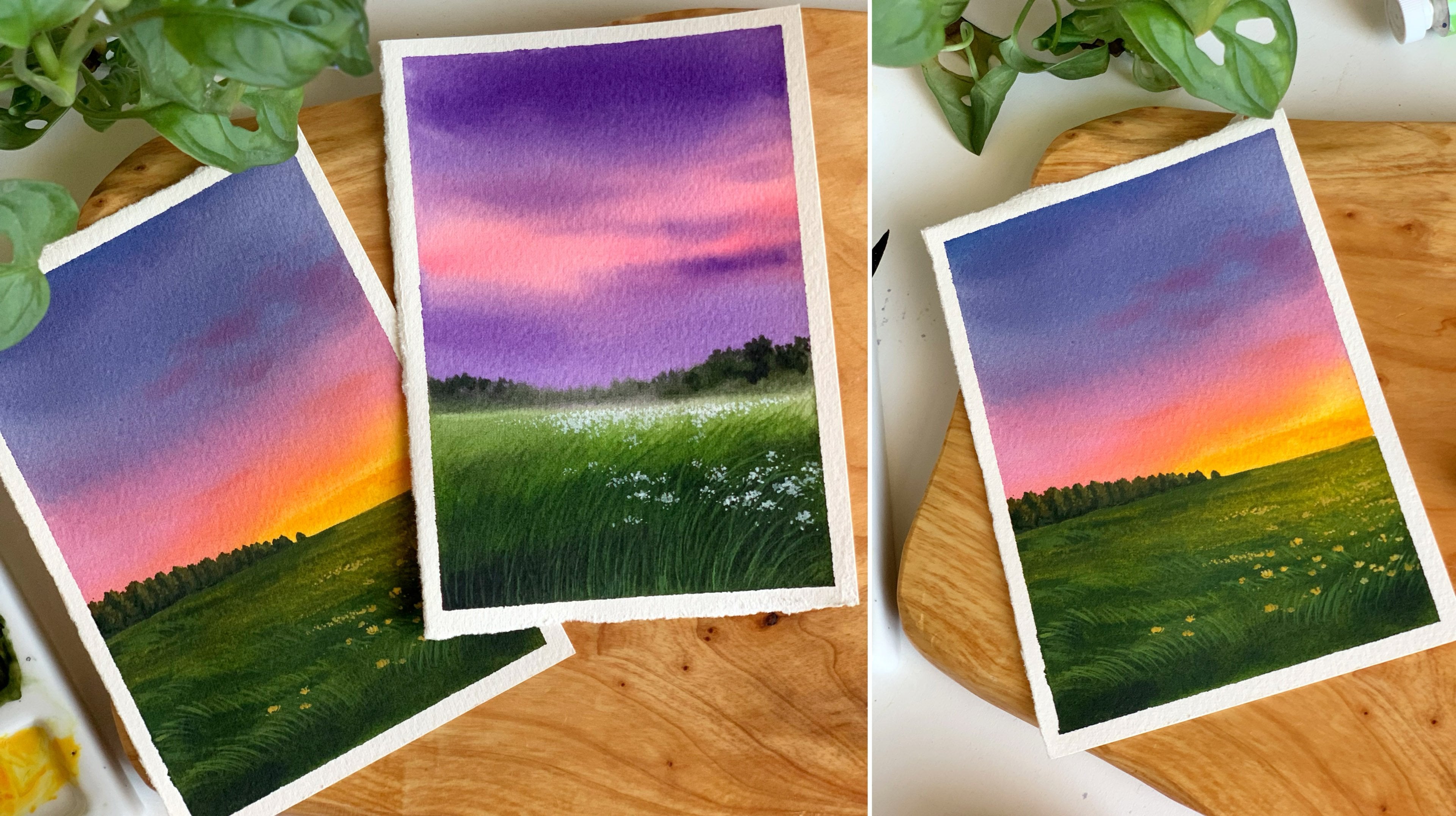
9. Day 06 - Purple Evening: Hello, dear friends.
Welcome to another day of painting beautiful
atmospheric landscapes. And here's our
painting for the day. Now I will start with the
colors you will need. So the very first
color you will need is a mix of violet and indigo. That's a color we'll be
using for the background. I mean, for the sky, as well as for those
landscape elements. So this one you see
here is indigo. Then along with that, you
will also need violet. Now, in case if you want
to use indigo for the sky, you can use it as ittus without
mixing that with violet. To me, I'm going to
go with the mix of these two colors
just to make it a little different from
the usual colors we use. Now, there's one more color
you will need or sap cream. Now, sap cream as well, I'm not going to
use it as it is. I'm going to go with a mix
of indigo and sap cream. Okay, so these are the
three colors you will need for this
beautiful landscape. In case, if you
want to use ident green instead of sap green,
that's totally fine. Okay, so these are the
three colors you will need. Along with this,
you will also need some white gouache
or white watercolor. Alright, so I have my paper
and the colors ready here. Now, I'm starting by
adding the horizon line a little below the
center of the paper. So that's where I'm
placing my horizon line. Okay, so the top
part of the sky, then bottom, we have a meadow. That's how we need.
Now, before you start, make sure you have all the
colors ready on your palette. You will need indigo,
violet, and green. Once you have the colors ready, you can start applying
a clean coat of water onto the entire paper. And make it evenly wet. Okay. So my paper is evenly wet. Now, I'm going to keep
this brush aside, and I'm going to go
with a round brush. Go with any of your
medium sized round brush. I'm going to go with
eight. Now, the color I'm starting with is a mix
of indigo and violet. I want a color which is more like a bluish indigo,
if that makes sense. I'm mixing some indigo
and violet together. I will apply this color on the sky and I will show you
how it is looking like. It can be more violetish
or it can be more bluish. You can apply any color
you feel like or you can just go with indigo
acetys or violet acetas. Anyway, this is the
color I'm going to use. I'll make it a bit
more brighter. Okay, this looks fine.
Now, as I'm coming down, I'm making the color
slightly lighter. So I'm not going to
pick any more paint as I'm approaching
towards the bottom. So on the top, it's more
like a medium tone, towards the horizon line,
it is slightly lighter. Now, I'm going to straightaway
go with the grassy land. With the same brush, you
don't need to clean it. Now, the color I'm going with is a mix of green and intigo, sap green and intigo. We want the colors
to be a bit darker. So just mix some sap cream
and indigo together. If you feel like you can
also go with ident green. Even that will be a
nice color combination. Okay, so that's the kind
of color I'm going with. I'm applying that towards the bottom in a very random way, leaving some caps in between. So it's a mix of
indigo and sap green. Now, along the horizon line, I'm introducing the same color. Okay, so there's a
slight gap between the sky and the grassy land. Now I will make the bottom more darker, picking more intco, adding that at the
bottom most areas and some lines and some shapes in between to bring in
some kind of texture. Okay. So while your
background is still wet, add in some taco
tones here and there. So that's our sky
and the grassy land. Now, I'm going to apply
a bit more taco tones. Then I will start with
the horizon details. We want to introduce
some landscape elements along the horizon line, which are going to be blurry. So while the background
is still wet, we need to introduce them,
and that's our next task. Okay, so I'm going to
keep this pressure aside, and I will go with
a smaller brush. This one is size number six. Now for the landscape elements, the color I'm going to go
with is the same color I use for the sky
in a darker tone. So I'm mixing some violet
and indigo together. So this time, the
color is slightly darker than the
color of the sky, and using that color, I'm going to add in some random shapes along the horizon line. We have to apply this while
the background is still wet. So don't wait for a longer time. Add them right away. I have
left a slide gap in between. If you can do that please. Otherwise, we can introduce that by lifting off some paint. So onto the end, I'm
making them higher. And in between, it is shorter. If you go the waring height, it will add a realistic
character to our painting. So add them in a waring
height like this. And at some places, the color
can be a bit more darker. You can see the way
how I'm dropping it. Okay, so just add
those shapes onto the background and let that
spread into the background, however it feels like. Okay. And if your
paint is too wet, you can dab it on a paper towel. Don't go with that
super watery paint. Alright. I will add in some more taco tones
toward the bottom. So I'm mixing some
indigo and violet again. And over here, I'm adding some dots and some
shapes of the dako tone, and you can see it spreading
into the background, leaving a nice texture. I'm doing the same on
the other side as well. You can still see
a gap in between. See that? But on the left side, I couldn't leave any gap. The color spread a bit more. Anyway, that's how
it has turned out. We can introduce that
gap again. All right. So those are the
landscape elements. I'm really loving the
way this is turning out. That moody atmosphere
is really nice. And it's a beautiful color
combination as well. I will add a little more
Okay, so that is it. Now, I'm gonna clean my brush. And then I'm gonna dap
it on a paper towel. Now with that dry brush, I'm going to lift off some paint from here in a straight line. Okay. So once you've done that, dab your brush on a paper towel. And if you want to repeat
it, do that one more time. No more than that. Okay, so we have introduced
that line again. So this would make it look
like a foggy landscape, and that's what I'm
trying to do here. Okay, so that's a first step. Now we have one
more thing to do. Oh, it is adding the flowers. And for that, I'm going
to go with white quash. I will squeeze out a little
of paint onto my palette. Now, at this point, my painting is almost starting to dry, so I have to act very quick. Have taken some white
paint on my brush. Now using that, I'm adding
some dots onto the background. It doesn't need to be like
a properly shaped dot or circle or anything. You can just keep on adding some dots close to each other. They don't need to have
a particular shape. And since our background
is still a little wet, they won't appear too prominent. They will look a little
faded and blurry, and that is totally fine. So just make use of the time and keep on adding some dots
wherever you feel like. You can add them as different different
groups here and there. So I have added some
along the horizon line, then have added some
towards the bottom. In between, there is
some green color. So that's how you
should be adding them. Don't cover up the
entire background. Okay. Now in a si lo way, I will add some more flowers
onto the other side. Alright, so I've
added enough of them. They are a bit blurry. They are not an opaque
white, and that's fine. We'll be adding some
more flowers at the end when everything
has dried completely. For now, I'm cleaning my brush, and I'm going back with a
mix of violet and indigo, the same colour I used earlier, and using that color, I'm going to add a few
trees, few pine trees. This one is not necessary. Only if you want to add
them, you could do that. Otherwise, just skip this step. So at some places, the
background is still wet. Over here, it is still wet. So the tree is a bit blurry. But the other one, it
has kind of dried, so the tree isn't that blurry. So when you add these trees, you will get a combination of both, some prominent trees and some blurry trees. This
one is also blurry. We don't need a lot of trees, just three or four of them, or maybe two on one side,
two on the other side. And also, this one
is not necessary as p. So just decide on whether
you want to add them or not. These are very basic trees. I'm not looking into
the detail. See that? It's a very rough shape. I'll add one more here
and maybe one more. And that's it. I think with
that, I will call it done. Because the background
is starting to dry and I don't
want to mess it up. Okay, so that's how
it has turned out. Maybe I feel like
adding one more here. Now, at this point, if you want to call it done,
you could do that. We have added all the details. We have the sky, the meadow, and the pine trees, and also the landscape elements,
even some flowers. But I'm going to do
two more extra task, which is not really necessary. And for that, I'm going to
go with a smaller brush. So I'm keeping this one aside, and I'm picking my size number two unreh which has got
a much more better tip. Okay. Now, I'm going to go back with a mix of
indigo and sap cream. And I'm going to introduce
some grassy pattern. This one is completely
unnecessary. Only if you want to add
in some more texture and details, you could do that. So wherever I have
these green gaps, over there, I'm adding
some grassy lines. Not a lot, just a
few here and there. I won't be adding
them everywhere. I'm focusing only
at the bottom area where we have these
darker tones. So I'm just adding some
lines, some shorter lines. And you can see they're
not very prominent, which means it's totally okay if you don't want to add them. I will add a few more
because when I started it, I will add some more
onto the other side. Only at the bottom, that's
where I'm focusing. I won't be adding
any onto the top, so I'll just add a
few here. All right. Now, after this, there
is one more task left, which is adding some more
flowers onto the background. Using a much more
brighter white. The ones we added earlier,
they are looking quite blurry. They are not at all visible. So I thought of going with a much more opaque
and clear white, and then we can add some
more flowers in between. So I'll quickly add some more grassy lines onto
the background. And then I will
straightaway go with white. Okay. So this one
is nearly done. Now I'm going to
switch to white, have taken some white
paint on my brush. So this time, there are a few differences
compared to earlier. The first difference is the background has
dried completely, and I'm using a smaller brush and the white is more opaque. Okay. Now, you can add as
many flowers as you want, but try not to cover
that background color. You want a combination
of that blurry flowers and the prominent ones. This would make it
look more beautiful. I'm focusing on the
bottom part first. Then I will add some
onto the background. I'm really loving the
way this is turning out, especially with
those white flowers. I think it was a good decision to go with one more
round of flowers. The ones we added earlier, they are not very visible. Okay, so just go with any of your smaller brush and
go with opaque white. It could be either
guache or watercolor. If you're using watercolur,
try not to add a lot of water because watercolor is more transparent
compared to Guache. If you have guache,
go with that. Okay. I will add some
more onto the background. I'm picking more paint, adding some teeny tiny dots
far away along the horizon. I don't want to add a lot over here because it's far away, and we have that blurry
white over here, and that's enough, I
think. And that's it. That's our painting for the day. It turned out really beautiful. I hope you all
enjoy the process. Give it a dry fa to try it, and let me know if you liked it.
10. Day 07 - Lavender Fields: Hello, dear friends.
Welcome to another day of painting beautiful atmospheric landscapes with watercolor, and here's our
painting for the day. It's a simple lavender field, more like an abstract one. Anyway, let's start
with the colors you will need for this
gorgeous painting. The very first color is indigo. That's a color I'll
be using for the sky, for the mountain, as well
as for the landscape. But for the landscape, I will also be going
with another color, which is a mix of sap
cream and indigo. I'm not really sure if we can
see that on the painting. I have used that color towards the bottom
of the landscape, but it's not really visible. Now, the next color you
will need is violet. This one is permanent
violet from Shinhan. Now you will need one
more color or its rose. It's a beautiful color. This one is permanent rose
again from Shinhan. So these are the four colors you need for this painting, indigo, then a mix of indigo
and sap cream, permanent violet
and permanent rose. Okay, so I have my
paper ready here. Now I'm starting by
adding a horizon line. Now we have to add
some inclined line to show that lavender field. So imagine a vanishing
point and add some angled lines like this
towards that vanishing point. I have added four of them here. Okay, so that's our sketch.
This is all you need. Now we can start painting. Before you start,
please be sure you have all the colors
ready on your palette. When you have them
ready, start by applying coat of water onto
the end paper, using any of your
clean white brush. Run your brush multiple times, just to be sure the
water has reached everywhere and there's
no pols of water. We need a shiny even coat. Now I'm going to go with a
medium sized round brush. First, I'm making
sure it is clean. Obviously, it wasn't. So I'm starting off with
a light tone of indigo. I'm adding that
onto the wet paper. Now towards the horizon line, I'm making it a bit lighter. Maybe we can drop
in some more paint. Otherwise, when it dries up, it will be much more lighter. Okay, so start with
the medium tone, then make it lighter
towards the horizon line. You can use a flat
drish or a round rush. Both will work. Alright,
so that's a sky. Next, I'm going to go
with the lavender field. I'm using the same brush. And to start off,
the color I'm going with is a mix of
rose and violet. So in this mix, I will have
more rose and less violet. I have both the colors
ready on my palette. So with the same brush, I'm picking some rose first
and adding a bit of violet. Okay. Now, I'm starting
off on the bottom. So that's the color
I'm going with. So towards the
bottom, I have used a very vibrant and pr tone. Then towards the horizon
line, I'm making it lighter. Okay, so that's a base layer. Looks like there's a
lot of water on my sky, so I'm going to clean my brush, and I will fix it before
I go the next step. Because all the
water was floating down and it's going to
spoil my lavender field. Okay, so the sky is fixed. Now I'm going to go back
to the lavender field. I had taken some color earlier. It was a mix of violet and rose. So this time there is more
violet in the mix than rose, and using that color, I'm
adding those angled lines. See that? So just add them in, and towards the bottom, you can introduce those taco tones. Okay. It's kind of very
rough and messy right now, but that's okay. We can fix it. So for the next step, I'm going to go with
the smaller brush, and I'm picking the same color because with a smaller brush, I will have better control, and there won't be a lot
of paint on my brush, and this way, I can control
the way it is spreading. So I'm adding some more
paint in the same way. Okay. Now, what I'm going to do is I'm going
to wash my brush, and I'm going to go with
a clean damp brush, not completely dry and
not completely wet. It is just damp. Now
with that damp brush, I'm just smudging the paint. If there's a lot of water,
please be sure to dab it on a paper towel and then
gently smudge the colors. Don't put a lot of pressure. Be very light handed when
you're doing this tip. Now if you look at
the picture, you can see that gaps in between, which is really important. Between every section, you
need to have that tiny cap, and that is how it will
look like a lavender field. Don't cover up the entire area. Now I'm going to go
back with indigo, and I'm going to add
the horizon details. So I'm thinking of mixing a
bit of green with intigo. This one is not
really necessary. If you want to go with Intigo
acets, you could do that. Now, right over here,
I'm adding some shapes. See that? It's a mix of indigo
and a bit of sap cream. Now, add some shapes
on either side. Towards the center,
I'm not adding much. Over there, I want to
introduce a snowy mountain. So I'm adding this
on either side. Maybe towards the center,
we can make it shorter. I'm adding some taco
tones using intco. So I'm just dropping
in that paint. You can add some
torts or some shapes. Anyway, it will spread into the background and leave
some beautiful texture. Okay, so on either side, I have added some shapes. Now I'm adding some
taco tones as well. Don't bring this too
much towards the bottom, because it will spread
into the lavender field, and you won't have that
blurry horizon line. So that is very important here. Now I'm cleaning my brush and I'm dapping it
on a paper towel. Then I'm smudging that a little. If you want to add more taco
tones, you could do that. Okay, so those are our
horizon trees and plants. Now I'm going to lift off
some paint from here. It is starting to spread
into the lavender field. I'll do that one more time. Okay, it looks better now. Now I'm thinking of adding
some more darker tones. The background is still wet, so I can drop in
some more paint. If you're also starting to dry, you can leave it as it is. You don't need to
add any extra paint. Okay, so that's how
it has turned out. Now, I'm thinking of adding some pine tree kind of
shapes onto the top. You can either
leave it like this or with the same paint, I mean, indigo, you can add some
shapes onto the top, only if your background
is still wet. Otherwise, this won't
be a good idea. So in case if your
background is still wet, add some lines towards the top. Just to make it look like there are some pine trees over there. It doesn't need to
be perfectly shaped. You can just extend
that paint towards the top. Okay, so that is it. Now, there is one more
quick thing we have to do, which is adding some textures
on the lavender field. And for that, I'm going
to go with a mix of valet and a bit of indigo. So we need some kind of dakotne. And with that, I'm adding
some grassy lines. See that? Again, it doesn't
need to be perfect. Our background is wet. The idea is adding them while the
background is still wet. So be quick and add some
taco tones at the bottom. You can see the way how I'm
adding those taco tones. So we have different
sections here. I'm adding them along
the bottom side. So it's just a matter of
adding some grassy lines, some messy grassy lines, and that's it. Okay. Now, before I leave
this for drying, I'm thinking of adding
some more pine trees. So I'm going to go
back with indigo. Then I will simply introduce
some more lines towards the top just to show
those pine trees. Right now, they
look very blurry. Okay, so towards the top, I'm adding a few
lines like this. So it is just 8 minutes
into the painting, and we already have a
beautiful result here. Now, once we're
done with this, we need to add the snowy mountain. So painting atmosphic
landscapes are quite easy, but then you have to
plan them accordingly. You need to plan
everything in advance. You need to know
which color to use when and how to add them in. You won't have much time
to think in between. Okay, so we have to do everything before the
background dries. That's a tricky part. Anyway, this is how
it has turned out. I will add a few
more lines here, then I will leave it for drying. All right, so that is
right. Now the next step is to add the snowy mountain. And for that, we need a
medium tone of indigo. Okay, so clean your
brush properly, then add some water into indigo and turn that
into a medium tone. If it's too light, when we add the snow, it
won't be visible. So try to go with a medium tone. So I'm using a color
which is more like the color I have used
on the top of the sky. That is the kind of tonal
value I'm going with. Okay. So I've taken the paint. Now I'm going to
add the mountain. If you want, maybe you can add a light pencil sketch and
then add in your paint, or it can go right away. Okay. I'm going to start
adding the shape first. I'm adding that over here. So let's start by
adding the shape. You can go with any
shape and any size. For me, I'm just adding them
in between these trays. Now I'm picking some water and I'm making it lighter
towards the bottom. Okay. And I'm just
spreading that into the background without
disturbing the trees and plants. So make sure there's no
much water on your brush. Just make it damp
and spread it out. Okay. So that's our mountain. I think I will add
some more paint, and also I will fix
the shape a little. Okay, so that is the mountain. Now, we'll have to
wait for this to dry before we add the snow. If you want to fix the shape of your mountain,
you could do that. You have to do them all
right now before it dries. I think I will alter
the shape a little. And also, if you don't
want to add the mountain, even that is totally fine. Maybe you can add a few
birds and call it done. Anyway, that's a mountain. Now I'm gonna leave
it for drying. All right, so here we
are. Now, the only task left is to add the snow. And for that, I'm going
with some white gouache. If you have gouache,
please go with that, or you can just use
white watercolor, but don't add much water. We need a dry opaque paint. So I'm picking the
paint directly from the tube with my smaller brush. Now I'm going to add some snow onto the tip of the mountain. The rest is going
to stay as it is. So only on the tip, I'm adding some lines using
this white paint. So start from the tip
of your mountain. Then from there, add some
lines towards the bottom. These are just
some simple lines. They don't need to be
of any particular shape or thickness or size. Okay. So simply add some
lines towards the bottom. If you can try to
go the dry paint, don't add any water. This will make them
look very nice. It will have a realisti texture. Okay, I'm picking
some more paint. I'm adding a few more lines. So from there, I'm
adding that dry paint towards the bottom to
introduce those snowy texture. You can see how beautiful
it is turning out. I'm loving these textures. It's very easy to paint
a snowy mountain. I used to use this
technique quite a lot. Alright, so we're nearly
done with our mountain, and I'm really loving the way this painting
has turned out. If you want to add some more
snow, you could do that. But don't add a lot
towards the bottom. Focus on the top,
along the tip of the mountain. And that's it. Here is our final painting
from this collection. I hope you all
loved it. Thank you so much for joining
and happy painting.
 Zaneena Nabeel, Top Teacher | Artist | Author