Transcripts
1. Intro, trailer: Watercolor painting
is such a wonderful, creative activity to
have in your life. Engaging in this process is
almost like a meditation. You can disappear
into the world of merging pigments
and flowing water. However, getting
your watercolor to look fresh and vivid can
be harder than it looks. But this process doesn't
have to be so overwhelming. There are proven
ways to approach watercolor in a way that
satisfies and motivates. AG Beta, I'm an
artist working with watercolor and a top
teacher here on Skillshare. My watercolor journey
started 14 years ago, and I love painting, complex portrait
works and florals, but I also like to create simple approachable
watercolor demos for everybody who wants to
build a watercolor skill. I have a studio in my
hometown in Slovakia, where I teach
watercolor workshops. This class is a seven day
watercolor challenge. It is designed to
walk you through many watercolor techniques and approaches in a very
digestible format. I noticed this on myself
and my students that we just 60 minutes per day
during a seven day period. You can push your skill from uncomfortable to very
comfortable even to easy. But with this class,
you're not just going to be trying for better results. I will show you my best tips and tricks on how to
approach this medium. This class consists
of 15 lessons. In the first lesson, I'll walk
you through the materials. I love to do all the exercises and demos in my sketchbook. Next 14 lessons, contain
exercises and demos. Each day, you will work on a simple exercise and
then a wood colored demo. Exercises are a
great opportunity to practice technique,
get comfortable with it. Try tips and tricks before you actually paint
the finished piece. Every demo dedicated
to a particular day follows the exercise to apply
all the learned principles. This challenge contains a
variety of subjects from simple botanicals to
more complex florals. Some still life
and bird studies. From day three, I will walk you through sketching
basics and I will explain it in a way that's very easy and applicable
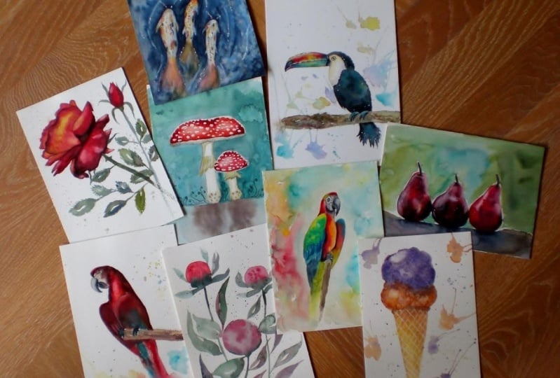
immediately into your work. As your class project,
you will have seven watercolor
paintings to show off. On Skillshare, you can share your project to gather
feedback from me and others. So if pushing your painting and sketching skill is something
that you want to do, I invite you to join this challenge and
looking forward to spend the following seven days guiding you through
this process. And I'll see you in class. Okay.
2. Class orientation: Welcome to the class. I'm
so glad that you've chosen to enroll in this project, we're going to
have a lot of fun. But before we start,
I want to give you a quick overview of
the entire class, how to take it Basically, just how to take full advantage of the tools that you
have at hand here. So first lesson is
about materials. Check it out before you
start your challenge. It helps you to pick
the right kind of materials and set up
everything before day one. When you're all set up, you
can start the challenge, and I do recommend
that you take it over the period of seven days
as it was designed. Each day, you'll
have two lessons to watch and paint along. First lesson of the day
will always be an exercise. I will always do this on the left side of
the sketch book. Second lesson of
the day is a demo. I will paint this here on the right side of my sketchbook. All the lessons
are slow pace and you will be able to paint
along in real time. I'm estimating that both the
exercise and the demo of each day will take you
somewhere 30-90 minutes. I started to challenge with very simple exercises and demos that are quite
quick to finish. And probably the seventh day
is the most challenging one, but even that one
shouldn't take you more than 90 minutes to finish. I do recommend that
you use a hair dryer to speed up the drying
process as I always do, because this saves
me a lot of time. It is really as simple
as that just follow the exercise and follow
the demo for the day for the next seven days
and you'll be able to enjoy your newly acquired
watercolor skill very soon. This class is also
project based. I invite you to take full advantage of skill
share community and aplo your class project done below after you have completed
the challenge, There is a tab done
below the class. It's called projects
and resources. This is where you upload
photos of your painting demos. You can also include
the exercises. It's up to you, but you can also just
include seven demos. It is fine. Please upload all seven photos
into one project. You can also write something
about your experience, going through this challenge. You can write about
your ups and downs. This gives me a
great opportunity to give you
personalized feedback, not just to see your paintings, but also I get the
idea of how you did and what was particularly bothering you during
this challenge. I always write feedback to every single project that
is uploaded to my classes. And it's not just for
me, but other students, they tend to browse the
project section a little bit. They tend to like the projects and leave their own feedback. And your project has therefore, a great ability to support
other people to join the challenge as well and level up their watercolor skills. So please upload your project. It all makes learning more fun. One last thing in the projects and resources tabbed down below. There are also class resources
that you can download. I included step by step
sheets of every demo, my sketches of the
demo that you can use. There's also a full
list of materials, and I also included high
resolution scans of every page, the exercise and the demo, so that you can take a closer
look at my final results. And so now that you
know how to proceed, I will see you in
the next lesson about watercolor materials.
3. Materials: In this lesson, let me
introduce materials. This is my setup that I will
be using for this class. This is just my
recommendation purely based on what I currently
have in my studio. I want to show you each
material one by one. Feel free to substitute for whatever else you use
in your own work. There is a PDF down below in projects and
resources section. You can download that PDF. You have a list of
all the materials and colors that I'm using
for this class there. We're going to need
some drawing supplies. This is my favorite
brand of pencil. This is Marcumgrap by Stadler. It's in two B. You just grab any pencil that you
have at hand. I like to B. If you like something like HB, which is a bit harder. I also use mechanical
pencil from time to time. This is also with two B
lead in it. It's 0.5. This is graph 600. I don't think they
make this anymore, but it's like an old
mechanical pencil. I don't have to
sharpen it. This is one thing why I
prefer it sometimes. I do rougher sketches with the regular pencil and sometimes I add the mechanical
pencil lines. But it's not you only
need one pencil. So now my erasers, they are very
important. I use three. This one, I use rarely, but if you want to get
rid of line completely, then hard pencil eraser
will be just fine. This is fabricstle
dust free eraser. You have it in my PDF. This is a needed eraser, I think, widely used this one. This is for lightening
your sketch, getting rid of the marks
from the under sketch. So that is my probably most
frequently used eraser in Warraclor And then I have this eraser in a
pencil. It's Chino. I don't know if you will be
able to find this locally, but we here in Slovakia, we have this in the
local art stores. It's really available.
It's cheap. It costs about one euro, and it erases for details, very well, the eraser
is nice and soft. I also have a
sharpener to sharpen both my pencil eraser
and to be pencil. I'll be doing this class
as an sketchbook exercise. What I like about
sketch books is that they are not
so intimidating. You don't really have to be worried about
messing up too much. What type of sketch book
you pick is up to you. There's so many types of watercolor sketch
books on the market. Please search for a type that is filled with
watercolor paper, which means at least
300 GSM paper. Different brands, they make
paper very differently, and the paper behaves
very differently. For practice, you
don't have to worry about having 100% cotton paper. These are Strathmore 400 series
watercolor sketch books. They have student grade, like paper made from pulp. They are quite good quality. You can paint on both
sides of the paper, and it's just fine for practice. They're a bit less expensive. I'd recommend that
you start with something like this or similar, but look for 300 GSM paper. Some sketchbooks
have 200 GSM paper. Those might be suitable
for painting outside, but for our techniques, search for 300 GSM. The size of your sketchbook, ideally, this is A four. You want to pick
something like this. This is A five sketchbook. This is very small for what we're going to do in this class. So A four, or something
similar or close to A four. I will be using a cotton
paper in my sketchbook. I have this other brand of
sketchbook made by hand, brand this coal
sketchbooks and they fill their sketchbooks with
artist brand paper. This one is fabriano
paper, 100% cotton. So it is higher budget
than the Strathmore, but always cotton paper
behaves a little bit better. I would work in Strathmore, but I don't have many
pages left in there. This is the one that
I've already worked in, but just a few pages
were covered so far. I think this will be the sketchbook that I will
use for this class now. I use this clips to kind of
hold the pages while I paint. I don't use tape
in my sketchbook. If you don't have a
watercolor sketchbook, feel free to use regular kind of watercolor
paper. Tape it down. With masking tape
to some kind of board so that it straightens
that it holds position. You can also use the
regular watercolor pads that are gummed on
all four sides. In that case, you won't
need the masking tape. In this class, we'll also use these three special materials. This is masking fluid
or drawing gum. You will need some
old synthetic, very cheap, thin brush. I use it only as a
masking fluid applicator. We will use drawing on day six. I will then explain in more
detail how to use this one. You'll also need kitchen salt. This is regular table salt. We'll use it for some
special watercolor effects. In one of them, I will also use the designer's guage
permanent white color. It is opaque color to add some details on top of
your watercolor painting. And now we have more important
tools, brushes and colors. I'm going to use
only four brushes, but I will give you some
alternatives, very basic Color brush that I use. Usually, I paint like 90% of my painting with
this one brush. This is what's called
color round brush. So it has soft bristles,
always has a tip. You can make a lot of
marks with this brush. It can have a wider mark, but if you only
paint with a tip, it can be quite sharp. The result can be
a sharper line. So I really like this brush, one kind of brush that you will use for most
of your painting, and it is one of the
most important brushes that you will ever purchase. So if you find a brush that
has natural bristles or, like, very, very high quality soft synthetic bristles,
you can use that. Let me show you
some alternatives. This one of mine is Winsor
Newton series seven, which is, like,
finest sable brush, so it's a bit pricey. Alternatively, this brush
costs less than ten euros, and it can also hold
quite a lot of water. It can create a good mark It has a cheap search for a round brush that is
similar to this one. This is a synthetic brush. This is Princeton
velvet touch round. Just keep in mind that
this will be brush that will hold less
wature than these tools. Probably the cheapest option, and also a very good
option, I think, is one of these brushes,
there's no brand, but these are Asian
brushes for calligraphy. You can get in any art supply
store very, very cheap. It's just a couple of euros. And they also have
soft bristles. They're best working
when they're new, and in time, I find that
the bristles tend to split, but still it's a
very good value for the amount of money
that you spend, and it has even softer tip, so you can draw very
fine lines with it. I have another brush that
I will use in this class. It is the same round brush, but it's number three. Alternatively, pick
any cheap brush that you can get your hands on. This should not
be an investment. They should be just
a couple of euros. So you'll be good to go
with two round brushes, one larger, one smaller, preferably something that has a tip and can hold more water. For painting, I will only
have third brush here. This will be my Part. This is three eighth of an inch. This brush is flat, also has sable bristles. I really like this one. Having stable bristles
because it is very thirsty. Usually, I use it
for backgrounds or if I want more
expressive brush stroke. Good option is
Princeton Neptune. This is a small 11 half
of an inch square wash. A vinci has an option
that is very inexpensive. This one is called
cosmotop mix B, and it's a mix of natural
and synthetic bristles. Compared to the priority
is the best alternative. One last brush that
I'll be using. This is also a flat brush and it has synthetic bristles.
This is not for painting. It wouldn't really
work because it would lift more pigment than it
would put down on the paper. But we will use it for
lifting technique, which means that if you have a clean brush with
stiffer bristles, then you can easily lift
some of the pigment. Away from the page. And you can correct mistakes
this way, red highlights. I'll explain the technique. When we come to it
during our challenge, we'll use it many times, but this brush is not for painting, just for the lifting technique. Final material are my
watercolor paints. You don't have to
have exact brands, exact type of paints. Just look for shades
that are a bit similar. You can also replace the shades with
something that you have. I like to purchase from a
local art supply stores. Some brands are more common in my country than
I do countries. In Europe, most commonly
available paints are Wins Newton and
also SminkyHradms. We also have Sinar paints
and use Sinar on occasion. Daniel Smith are also
available in Europe, but a bit more pricey. Here, I still like
that brand very much. In US, Daniel Smith, I hear is very common and easy
to find not as expensive. So that's a very good brand
of order color paints. You can have student
rate paints. Every large brand has two lines. Wins Newtons is called Cotman. And the professional line that's the highest
artistic quality. Those are called Winster
won professional. The student line will
be always cheaper, a bit more available. The student line is
something that you can use, and it will be just fine
for your sketchbook. I tend to use the artistic line. It is just what I usually
have on my palette, and I don't want to
have two palettes. So I paint with
the same palette, whether I do sketchbook work or large scape work that
goes to an exhibition. And now I want to
introduce you to the individual ten
colors that have picked. So I tend to do a lot of nodes
in my sketchbook because my sketchbook work is usually a preparation for
painting larger. Feel free to also get into
this habit of creating nodes, and I think that it
will encourage you to treat your sketchbook
as a practice field. We'll be using yellow. This is lemon yellow. And here, I'm going to water
the paint down so that you see how the paint looks when it's when it's a bit thicker. That means more
pigment and less water and how it looks when you
dilute it with water. We're going to do this
with every color. Next one is green gold. I also use transparent
yellow from W Newton, that one I like more, but currently I run out of that
paint, so this is similar. This is green gold. I would say it's a yellow, but I don't have many
greens on my palette, so this color is a nice shortcut to quickly
mix in your green. Then we're going to
use cadmium red. This is I think a staple kind of red that you should
have on your palette. The red maybe are
one of those colors that can look a bit more vivid when you have
the artist kind. For example, on the purpose, you don't really see that much of a difference, but on red, I can see that a cadum is very high quality
red that shines. The next one, I use it a lot for different works
and portraits. It's another staple of mine, and this is Alizarin crimson. Usually, I use
permanent version. It's called permanent
Alizarin crimson, either by Daniel Smith or ShmkyHdm also has
permanent version. Next is magenta. Magenta is like a rouge
or similar to carmine. But this color is also one of those that you
should have on your palette because it is used to create very intense
mixes of purple, all kinds of purple very easily. Next one is a purple. You don't really have to have this color because you
can easily mix it. From the rest of the colors from taking magenta and the
blue that will follow. You can mix them together. But I still use this
particular shade. This is permanent move
by Windsor Newton, and I use it because
it has granulation. It tends to look
a bit more rough. This is a convenience color. You don't really have to have it on your palette
because you can easily mix it from the magenta and the blue that will follow, but sometimes for convenience, some secondary colors are
fine to have at hand. I'm going to use
cobbled turquoise. This is cobalt turquoise. And guys, if you don't
have this pigment, then you will be
not able to get it. This is like a primary color. You might have a problem
finding this shade in student gray lines because this pigment I think only is available at
the artist lines. If you only have
budget to invest in one color that is artist
grade, this should be one. Primary blue that we'll
use will be cobbled blue. We don't need to go darker. This will be cobbled blue. A beautiful color as
a standalone color, but also creates a white range of mixes that are very useful. Next color is paints gray. I actually have one
particular brand that I like because every
brand makes paints gray. But some of them they look very different
from every brand. This is weird, but
most of the brands, when you look at
the paints gray, it looks like a blue color, similar to indigo,
maybe very bluish. But I buy a particular
paints gray from the brand seniliar it
is a bit more neutral. It doesn't go that blue. It's not a problem if you
have any kind of paints gray, just something that
I have on my palette because I like this
brand for this color. Usually, this is the
base for my palette. I don't have greens, I
mix greens very easily. But for this class, I have one green that
I added to my palette. It's added actually
on the side here, and it is prucian green. So if I have to have one green, I usually opt out for this one. I like that it's dark. Gives me like strong
pigmented mixes of color. The brand is Daniel Smith, but you can use any other brand. So these are all the ten shades. For every painting
that we'll do, we'll pick two up until six colors the most out
of this range of paints. Please go now find
something similar. And once you are ready with
your watercolor setup, please join me in
the next lesson. This will be the first day
of our watercolor challenge. And in our first exercise, but we'll learn how to create different marks with watercolor, how watercolor behaves on a dry and wet surface.
I will see you there.
4. Day 1, Exercise (Watercolor fundamentals): Okay. Welcome to your first day of a seven day
watercolor challenge. In this lesson, we will do a short exercise before painting your first
watercolor piece. In this exercise,
we'll take a look at some general
watercolor principles. I also want to show
you how to draw with your brush and how
to blend colors. Today we are only
using two colors, magenta, and prucianGreen.
Let's get started. We are going to
get familiar with watercolor technique first by learning how to dilute watercolor and how
to apply to paper. First, we'll grab a
bit of watercolor. You can use any type of
brush that you have at hand. I prefer to do this with
my flat sable brush. First, I'm going
to grab a bit of watercolor with my damp brush from the pen and apply it to the mixing space
on your palette. If your palate doesn't
have a mixing space, you can use a plate like a
regular porcelain white plate, that's what I also like to use, or you can get a very cheap mixing plastic palette
have it on the side for these mixtures and apply just a bit of water
to that pigment. Watercolor essentially
is a pigment diluted with water like this. Resulting watercolor
should be a puddle. The more water you add the
more light will be the paint. So let's try to do
this gradually. So I first only grab a
bit of pigment here, a bit of pigment
with damp brush. And I apply it here to my
paper. It is quite dark. Then you can apply
a bit more water to that puddle here
and you can switch. And a bit more water
and switch again. This is how we gradually add
more water and switch again. This is how we gradually
dilute that water color. By the way, having a tissue on your table and doing this
dabbing your wet brush into it will help a lot
because brush it cannot draw very well and tie the brush stroke if it
has too much water on it. You can also have excess
water on your marks. I tend to grab it
with my damp brush and like this and get
rid of that excess here. This way, I have better
control over what happens to my wash. And
I can dilute even more. We're still not
finished with this. I can dilute even more, you have to get rid of all the extra pigment that
you have on your brush. It's almost clean water. Here. The last stroke should be only with clean water like that. This is basically what
is called a graded wash. You don't have to
remember the names, but just so you know that this is how water color behaves. The more pigment you
have and less water, the more dark it is. But we rarely draw
with water color, like with temporary with
guash or with acrylics to do this draw brush that's dry very rarely only when we
want to obtain some texture. Usually, you create
a pool of water mixed with your pigment
and you try to mix here and look for that particular
ratio of pigment and water that you are looking
for either darker or lighter and then
apply to your papers. This is like a basic first thing that you need to know
about water color. You can do that also
with the green. One of the basic things to know about water
color is that you can apply it to either a dry
paper like I just did. In that case, watercolor will have a dis hard edge around it, and this always happens if
you apply it to papers, that's dry and let
it dry like that. If you apply watercolor
to a surface that's wet. We can now wet a little bit of that surface here a
little bit of that paper. Here, this is now
damp, completely damp. We can now make here
a mix of paint. I'm going to make
it a bit darker so that you can see properly. I will dry my brush
just a little bit so that I don't have too
much water, too much excess. I will paint the circle here
in this pre dampened area. And this circle after it dries. It will not have such
sharp edge like this one. It will have soft
edge, a blurred edge. We sometimes apply watercolor in layers because of this rule. Sometimes you apply first layer into wet paper and let
everything blend nicely. Then after that dries, you can apply watercolor again
on top of this blurred out first shapes and create some nice hard edges,
create some detail. You can also combine
these techniques. Let me show you what I mean. I'm going to first
paint a circle here. The circle was painted
on a dry paper, and so the edge of
the circle will not be blurred out like this
one, will remain sharp. But now I'm going to reach
for the prucianGreen, just a little bit of color. Okay. And I'm going to
put a bit of that green here and from the
other side as well. I will do this with the green. Whenever the green
was applied to dry paper, it will stay sharp. But inside when it touched the pre wet insides
of that circle, it starts to blend here. Here, naturally,
these two colors will blend together in a wet surface. We can now grab a
bit of magenta, not a lot of water here, just a thicker pigment, with the tip of your brush, you can do some
scribbles here inside. Okay. Okay. Just do
the tip of your brush. And everything that jewel
scribble here will soften, will blur out a little bit. This is one example
of how to use both wet on dry and wet in
wet at the same time. Now, I want to show you that even though we only have two colors
in this exercise, they can produce a wide range of other secondary colors
in between them. So I will grab magenta again. This is clean magenta paint
with just a bit of water, very very little
water because I want this color to be nice and dark But still, you have to still add
some water in it. Let's start doing
something similar like we did here. This is magenta. Now, let's add just a little bit of Prussian green in
that magenta and mix. You can start just a little bit. You should still have something that looks more like magenta, but it shifted the color
a little bit towards something darker because
Prussian green is dark color. We can apply a bit more of
the Prussian green now. We're starting to get
something like purple, something that looks
a bit more purple, and a bit more Prussian green. I will be relentless in mixing
these two colors together. Even a bit more. Let's add even more
Prussian green into this mixture. Look at this. This is almost black. With student grade paints, it will not be so black, it will be a bit grayish purple. We can continue adding green
into the mixture. Like this. Until slowly in a moment, we will only be painting with Prussian green on
the other side. Here. Now you can see one color
blends into another color, and it produces a
very wide range of secondary colors that
can be of great use to us. We just two colors you can produce interesting painting
that has some depth. You have some dark tones, you have greens,
that's cool tones. You have some warmer tones. I would highly encourage you to work with less colors at first, and then we'll start
adding more so that you get familiar with
how these colors work. Now, let's learn
another one technique, and then we'll go to
paint today's demo. And that will be how to use
your brush to draw shapes. I'm going to use mainly
the round brush now. I'm going to just grab something that I have on my paltw
colors not important. Just put the brush
down and then lift it. If I put the brush down and pull a little
bit and then lift, I get a shape like this. This is the typical shape
that round brush produces. Try doing this shape again. Put down and lift. Sometimes I have to go
over that mark again. We are always starting from the tip as I was drawing
a line with the brush. Draw the line, but
slowly increase the pressure as you drag
the brush and then pull. What you get looks like a leaf, so you can use this
technique to create a wide variety of botanical
elements such as leaves. I want you to try to work with this brush and utilize this
technique, just to exercise. I'm going to do one row that contains these leaves
that are a bit shorter. You can also mix the magenta in that
color doesn't matter. Something like this.
These are shorter leaves. One more and one more
just to practice. Now I want you to try to
do a bit longer shape. First, just draw
a line like this. You can do it slowly.
You don't have to rush. Then you can do the same,
increase the pressure, and that will produce
line that is a bit thicker, like this one. Let's do this again with
even more pressure. Now you're getting line that is really thick like this one. Quite consistent if you can
keep the same pressure. Now, let's combine all
this tree in one line. Let's start with a small line, then increase the pressure and increase the pressure again, and then start lowering the pressure and lifting
the brush as you drag, and then finally left the brush. Something like this, it's a longer shape that
reminds you of a leaf. The more you practice
this, the better you will get at
it, one more time. Start as a thin line,
increase the pressure, increase the pressure some
more and then lift and lift. You can go back here,
there's a space. You can go back with some color. You can add pops of
color while the paint is still wet and you can
let it dry like this. It will have an interesting
texture in the end. We still have some room left, so we can try to
use this technique, but let's curve the leaf
in different directions. I can go like this. I can start here, increase the pressure,
slowly drag and then lift. I can go the other direction. I can I can create a
curve here like that. Can add some water. I can even go and cross the previously painted
shapes with another one. And I can go like this. Here, I like to do this
leaves with my larger brush, but you can do the same with smaller brush if you want
to practice some more. You will have similar shapes
just in smaller versions. Doing this exercise, it
greatly helps you to control water color but
also control your brush. For painting,
utilizing our brush, learning to force it
to produce the kind of interesting mark that we want is one of the more
important things. Keep on practicing. And once you are done, I will meet you here and we'll do our first demo together. This page. I hope you're not
exhausted from the exercise. We are nicely warmed up now
and in the next lesson, we'll use all of these
techniques to create a lovely watercolor piece.
I will see you there.
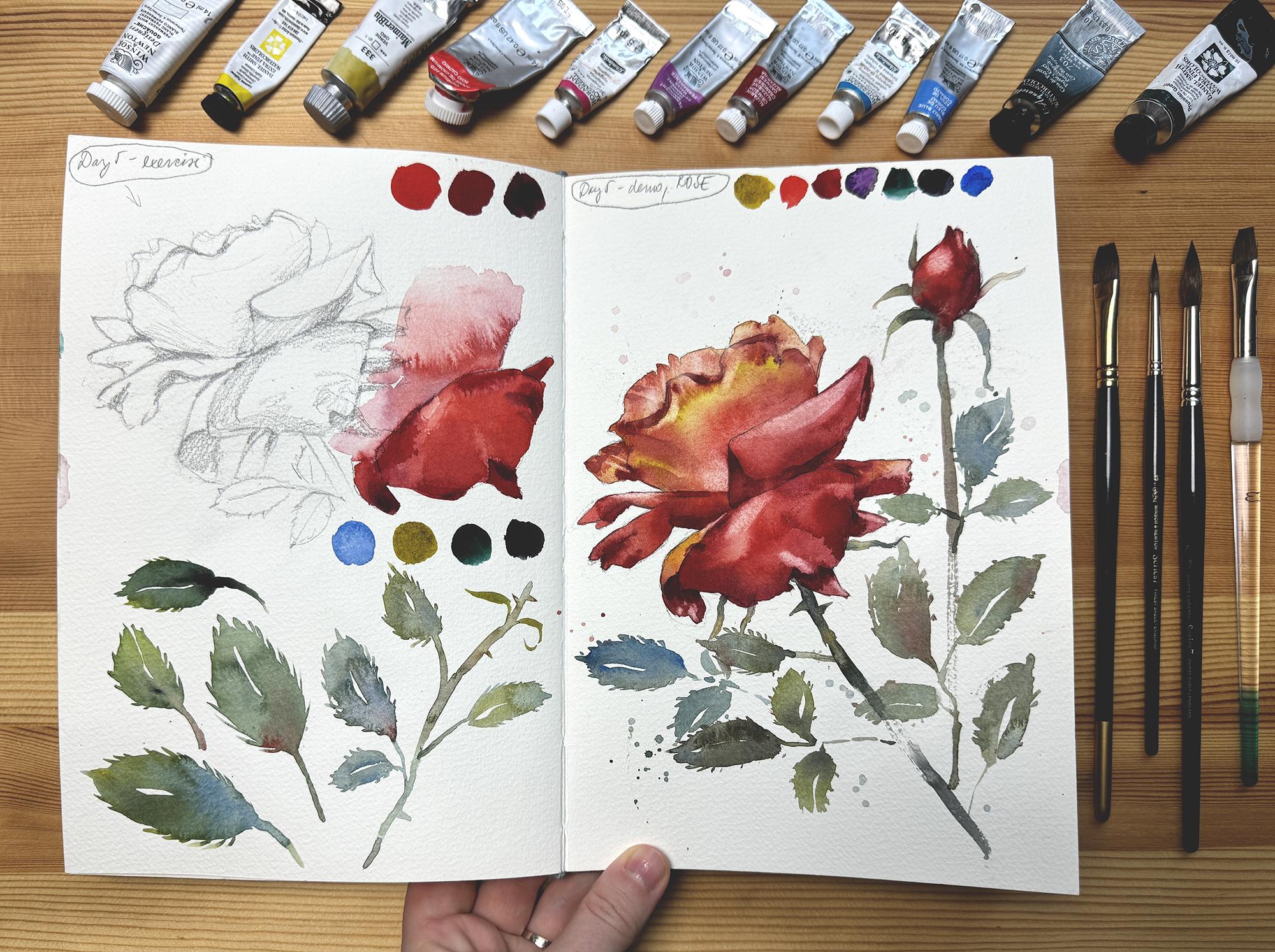
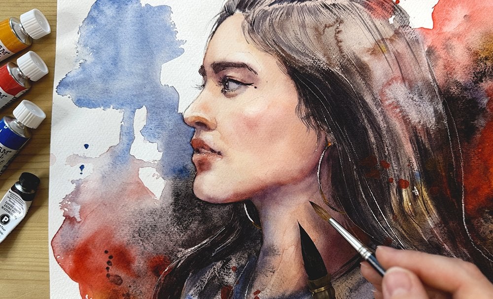
5. Day 1, Demo (Peonies): Okay. In today's demo, we will utilize all of
the techniques that we learned during
a one exercise. We will create our
first painting with these approaches.
Let's get started. We'll first start by preparing
this pool of magenta, add more water, less pigment to have it nice and
transparent like this. We can start creating a circle. We'll do the PN bad here. With my brush, I will grab more intense pigment
straight from the pan here. We'll dry my brush a
bit so that I really have thicker pigment on
the tip of my brush. We're going to paint
into wet area, so we don't really need
excess water here. If you are painting
on dry surface, then it's better to have more
excess water on your brush. But if you go wet and wet, the wet is already there, so here you can have
thicker pigment. Gently draw in here at
the top of the bud, just add some texture. I'm I'm just going to apply some random strokes
bit that magenta paint, and you can you can
let it sit there, you can let it
spread a little bit. Now into this magenta, we need to apply a bit of Prussian green and create that the dark
purple that we had. You can put it in the middle, just a bit here. Now, I'm going to only grab Prussian green dry the
brush a little bit. Okay. Yeah, dry the brush a
little bit before applying. And I'm going to add a stroke
here and a stroke here. And we will here draw something that looks
like a stem flower stem. I want to create a mixture
of the two pigments here that is very dark like
almost black and put it here. Because that flower usually
has the shadow there. Now you can deal the green
and let's add a few of these lovely looking leaf
shapes around that bud. I like to paint leaves
a bit more transparent, so not a thick paint, just more transparent paint. I will go like this and
I drag and push a bit, and then I pull
and lift my brush, same as we did before. This is something that
happens wet in wet. The colors, they
mingle together. It's okay. Don't worry about it. It looks nice. In the end, you don't have to control
these transitions very much. Now, let's add a bit more here. This is going to be
a thinner leaf here, another leaf, very carefully, slowly, you don't have to rush. And for this, if you want, you can use smaller brush. Sometimes this larger brush doesn't have such a sharp tip. The smaller brush will do a better job here like that. Into that wet paint, you can always add a pop of color here and there to
make it more interesting. Let's paint another bud and test the technique
again. Okay. So another maybe a
bit smaller puddle of light magenta paint. I'm going to get rid of
all the excess water actually so that I have this wet but not overflowing
with water. If you have excess
water here like this, always lift it with your brush. I usually just put a tip of the damp brush in it and it will suck all the excess water. I'm going to grab the magenta, and I am going to do the
scribble here, just a bit. Just to scribble
some texture in it, mix magenta and green add
some texture as well. And with green, I want to
maybe lighter green this time, I want to hear paint a stem a bit darker pigment here and leafy shapes to attach Okay. And you can practice different
directions of that stroke. They can curve in
multiple directions. To create this dark purple. I like to have dark pops
of color here and there. Sometimes when
working wet in wet, you will find that the
color that you applied and it looks strong enough that
it suddenly is not there. Feel free while it's
still wet, though, feel free to return and then
add some more pigment if you think is not going
to pop that color. Now it's going to
pop a bit more. I want pops of green as well. Let's not over this will be I want fresh
spontaneous water color, so that's what we'll do. One last bad I think
three will be enough for us for today's demo. I'm going to have one here. I might be a bit but a bit a bit more of that. Agenda color. I'm going to grab some pigment
and do the scribble, again, dark on top. Maybe some extra water on top here to make
it a bit lighter. Just push the paint
back and forth, keep it wet while you
can, but not excessively. When you see that there
is a pool of water, then you can just grab it like this with your
brush, get rid of it. And add some extra
pigment on top. And with the green, we can add some dark green
here at the bottom. Like that. And we can drag this stem
a bit further. But I'm trying to add more water as I drag so that's a bit lighter at the bottom and a
bit so a bit darker here. And we also need to add leaves, but let's make them a bit
larger this time so that we practice a whole range of
shapes like we did here. Let's create these leaves
a bit larger like that. And here can be another one. Okay. Another one. Sometimes I just add clean water and just drag that pigment that I already have on the page. I very much like when these
wet shapes they touch and one color bleeds into another area
spontaneously like this. Try not to resist the
spontaneous watercolor effects. The real this is the point of actually trying
to work with watercolor. I'm going to make
another one here. Maybe a smaller stroke. Okay. And we can now we can finish
these stems here and here. I'm going to leave
this one like this. This one, it will
go like this and here and maybe it's not
so great with the cross, but it's okay for practice. Let's add a bit more leaves. These leaves in the meantime, we can go create
another shape. Okay. And we can also add a bit
more magenta into the leaves. Why not? We'll look fine. It's a two color study. Like that. As I told you, sometimes I like to
add pops of color. So here, for example. In some areas, it's nice
to have these pops. So just play around with
the color a little bit more like here, hope. Okay. Are we good?
Maybe a few more. Okay. Sometimes when the shape
doesn't look so great. Sometimes I can't do
it with larger brush. I just grab a smaller one
and I correct the shape. You can also grab a brush. You can load it with pigment. Okay. And create a few splatters that will serve as
some decoration at some detail to the painting, and we're done with them one. Going to let it dry and we'll see if the textures
look all right. This is too much
of a water pool. I'm going to suck it
out with my brush. Like that. If you want
to hair dry this, you will have to get rid
of all the excess water. Otherwise, the hair dryer might create a mess from
the standing water. And that's it for the day one. So that was a successful day one of our seven day
watercolor challenge. Don't forget to return tomorrow and watch the next lesson. We'll be exploring different
watercolor effects, mastering splatters. And there's another quick
and fun demo waiting for you to try out.
I'll see you there.
6. Day 2, Exercise (Watercolor effects): Okay. Welcome to second day of
watercolor Challenge. Let's start with
a short exercise. I will show you how to create a few fun watercolor effects. Today we'll use three colors
and it will be yellow. Rd, we'll only use
just a hint of it, and it will also be purple. The yellow and the purple
will be our main colors. I just wanted to produce a
different type of yellow. That's why the red
because when you mix the yellow with just
a bit of that red, you will get a different type
of yellow, the warmer type. Something like this, and that is what we want for this exercise. We'll also today need the salt, the kitchen salt or table salt that we discussed
in the materials lesson. You might just start with the yellow color
that we have here. Maybe let's mix some more. Let's paint a wash with it here. White the water we want. For the washes, I
really like to use the flat brush because it's quicker and it can give you a nice rectangle like this one. When you have it painted, grab a bit of that salt and sprinkle it on
top of that wash. We want to do this
while the wash is wet, there should be no hesitation between when you paint that wash and when
you apply the salt, it should be seamless.
Do it quickly. Let's do the same with purple. Because one color is light, the other one is dark and the texture will
look a bit different. Yeah, we can add more water
to wash to this texture, more water so that
it flows nicely. Well, let's make it
a bit more wide. Give us more space and
now apply the salt. And we have to wait now
for at least 10 minutes. You should slowly start to
see how that salt soaks in water and pulls pigment away from each of these
tiny little particles, and it creates effect
that looks like crystal. While that salt
is doing its job, let me show you a
different effect that we'll also today use
to decorate our painting. We'll do it like
this. You're going to need a lot of water. That's why we're using the
big one, the big brush. I have a pool of water here, so just grab soak it
all in into your brush. And then, that's
a happy accident. Now you can knock on
your brush like this, and it will create
some splitters. But then also one of them
should be big like this one, a lot of water, lots of
water here and here. Let's do the same with
a purple color load your brush with tons of
tons of water and pigment. You don't see my palette
today. It's here. I'm going to load my brush
with color and water. I'm going to knock on my
brush with one finger. You can also just
dip your brush into water has some spare
pigment on it, but the splager will be much more transparent
than this one. When I do spers I like to do it with very little pigment
because they look better. If they're too dark, then they don't tend to look very nice. Let's also do the big
splatters. The big ones. Lots of color drip
in from your brush. The splatter is one
standalone effect, but it is also nice to do
what I call a blow effect. When you get this large pedal
of water or pool of water, just blow on go closer and the colors merge
in a way that is very unpredictable
but nice in the end. Maybe we can try practicing the splatters with
smaller brush now. The size of the splatter will always depend on the
size of your brush. So I tend to use
small splatters, large splatters, both
brushes for these effects. I can grab the large brush. I will dip it here to
get rid of excess water, and now I can soak in all the excess water
that I have here. I'll be a bit more work, but then I will be able to use hair dryer to
dry everything. Otherwise, I will have to wait at least 30 minutes
before the settles. Here, especially. Now, the purple that
I use is permanent malp here when it
combines with the yellow, you can see how
nicely granulated. It gives you that
grainy texture. It's not a smooth watercolor. That's nice. If you don't have
granulating permanent map or any other kind of granulating watercolor,
do not worry. This is just to show
you a difference and to let you know that if by any chance you have
in your collection, a granulating pigment, that
this is not a faulty color, that this is something
that you can actually utilize
in your paintings. In that very short amount of
time while we did pleasures. Here is what our
salt has been doing, but I would still give it five more minutes to see
if it can go any further. But when the wetness goes away, the salt cannot do anything
because the salt effect is always dependent on
how much water you have in that wash. Once
the wash is dried, the salt will no longer
create any effect. This is what final effects look like after I
dried the page. We are now ready to
proceed with today's demo, so please join me
in the next lesson, we'll paint an ice cream using mostly these textures.
I'll see you there.
7. Day 2, Demo (Ice cream): In this lesson, we will paint a fun little watercolor
demo, ice cream. We'll seize the
opportunity to try out all the wonderful
effects that we just discovered in a single
painting, so let's get started. I'm going to first apply to my palette some of
the yellow color and add a bit of purple in yellow and purpolar colors
that create high contrast. So when you mix them together, they cancel each other and they create
something like gray. Let me show you this
is the combination. Let's add a hint of red in it, and we should have nice and we should have nice caramel
color, something like this. And that's what we want for now. I'm going to hear draw
a triangle shape. This will be a cone
of our ice cream. You can add more water. Also, it's not so complicated. Something like
this. I'm going to add more water as I
approach the bottom. I'm going to I'm going
to make it disappear. We can also add pops of color, like a bit of yellow, a bit of red, just pops of
color to make it more fun. Let's paint two
scoops of ice cream. You just add more red into the mixture will
be orangey color. And this will be our
first ice cream. Like that. On top of it, let's paint
with purple color here. Shape that is round, but you know how
it is ice cream. It doesn't have to
be super clean. The shape is very random. I will apply a bit
more pigment at some areas and a bit more
water to some other areas. And while everything is
still wet, you apply salt. What I also do to
enhance texture a little bit is to
grab a small brush, grab a bit of a thicker purple
pigment and just do this. Just add some pops of the
pigment here and there, as if those are some chunks
inside that ice cream. We can try to do
something similar here, but this is light
colored it might not work as well with the purple. Like that. We already know that the salt and some excess water will take its time to
create the effect. In the meantime,
let's do splatters. First, I'm going to do
the large splatters and we'll blow on
them a little bit. I'm going to take
the purple color and we'll do a large
pedal or pull here, and I will blow on it like that. Maybe with some lighter
pigment here, Okay. And now we can take a smaller
brush loaded with pigment, more water than pigment. And I will tap it and create
a few decordouspladers. I'm tempted to use pure yellow
also and to let it blend. We can also use
experimental little bitten, use clean water and Lai create another effect splattery
effect inside this texture. A few purple splatters. Okay. That's enough.
That's no splitters. You can do as many
splitters, as you wish. You can do more,
you can do less. It's really up to you.
Whatever you find balance. Just remember, take out the
excess water afterwards. I really recommend to
let it dry naturally. Let it sit for B just take
a break, have coffee, and return to it and only then finalize the drying
process with hair dryer. That will be probably the best
way to gather effects that That are well done
because watercolor needs time to create the textures that we've tried here
and talked about. Go to let it rest,
and I will see you in about 30 minutes and we'll see how the effects
will look afterwards. The textures and
everything is all dry. I'm going to get
rid of the salt. Just going to scrub it off. And these are the very
nice looking textures that developed as we let that salt sit on top of
our watercolor wash. I now I would like to show you just a few more
tips and techniques to push this little demo
into another stage, give it some more
detail, not a lot. Well, finally, for
the first time, we'll use this brush has synthetic bristles is a
little bit more sturdy. I'm going to dampen
it with water. You have to get
rid of the excess and I'm going to get
a paper towel here. Gently scrub off
some of the pigment in this area, like that. I just want to create
some highlight in order for the ice cream
to look a bit more round. In this area, light
here, in this area. Now the ice cream looks
a bit more round. This brush can go aside for now. I now want to dit
a bit more shadow. I'm going to get my
smaller round brush. And for the shadow,
we need to use this orange color plus
some purple color. This will be our color
for the shadows. Looks like brown a bit darker brown than what
we used previously. I'm going to apply some of that shadow here as
if it was underneath the the purple ice cream
with just damp brush, I'm going to softly get
rid of this edge here. Just rub it off with damp
brush to soften the edge. The same I want to do
here in this area. I want to like this. Separate the scone from
the ice cream here. We add in a bit of shadow, and then we just damp
brush, no pigment on it. I'm going to gently
rub this edge off. In this way, you can merge the previous layer with the
layer that is that is on top. Add the pig more pigment here. This was pretty easy. Now we have three
separate layers. I'm going to dry this
with the hair dryer, and I want to show you
one more one last detail that I want to add to the
scone, and that's some texture. I'm going to again do it with
this brush and I'm going to demonstrate lifting because I forgot to do it
during the exercise. When you dampen your brush, get rid of excess water, you can literally draw with that brush on top of already
dried water color like this. But what that brush does, it lifts the pigment
off the page. And shows some of the whiteness
of the paper underneath. But the effect is more profound
if you then use a tissue or something to get rid of that pigment that
has been lifted. And you can draw You
can draw textures, you can draw basically
anything with this technique. You can lighten some areas,
you can make it softer, you can make it sharp, you can draw with the brush as well. We're going to use
this kind of drawing hatching for the texture of
the cone, the ice cream cone. And I'm going to draw a few and you really have to wrap that
pigment off the page. By the way, I have to
tell you on some papers, this goes pretty easily, and other papers, it just
doesn't work as well. It depends on the ability of paper to sack the pigment
in into the bristles. Some papers, they hold the
pigment, won't let go. But it also depends on the particular water
color that you're using. Don't be disappointed if this
doesn't work for you with the particular materials that
you have because it really doesn't work 100% of the time
and just a few more lines. We're drawing the
opposite direction now. And there you have
it. A ice cream study without that much detail, but you can see texture on the cone as well as on
the ice cream itself. I hope you enjoyed today's demo and don't forget to
tune back in tomorrow. There's another fun exercise and a painting demo
waiting for you. We'll talk about sketching
basics and paint a watercolor toucan I'll
see you there. Perfect
8. Day 3, Exercise (Sketching basics): Welcome to day three of our watercolor
painting challenge. I wanted to dedicate to
exercise to sketching because as we transition towards
more realistic subjects, creating a sketch
for each painting will become more important. Sketching different
subjects doesn't have to be complicated and everyone can do it with just a
little bit of practice. Let me now show you a few basic principles on
how to approach this. I have my drawing tools here. This is the T B pencil. These are the three erasers that I showed you
in materials lasts. I'm going to put
them aside for now. So I'm going to do the exercise
on these pages as always. First, let's sketch
basic geometric shapes that I think everyone will know how to sketch just
in order to get the hand moving and
just get started. You can grab your pencil like when you're writing like this. This particular grib however, allows you to make
a precise line, but also a very short line
because this grib does not allow for much movement
within the hand itself. So When I'm in the first
phase of sketching, I try to be really,
very, very loose. I hold my pencil like one, like in Harry Porter movies, give you your hand
a bit more motion in the wrist like this. Let's first try
drawing some circles. This is a circle. If you
have a grip like this, it will be more
difficult for you. Even though you
have more control, you have less movement, so to produce a circle that is more or less solid will
be easier with this grip. You can use as many
lines as you want, as long as the resulting
shape is resembling circle. Sometimes I go outside the line and that's
fine. That's okay. Let's try now to do an
oval like an egg shape. This is also fun. A bit
more difficult for me. This one is probably the most difficult shape
that you can draw. Now let's try to draw
some lines square. You will probably find that for you will be always
more simple to draw a line that
is straight than any kind of curve
or circle or oval. Whenever we can, we will try to use straight
lines in our drawings. Last one will be a rectangle, so two sides will
be a bit shorter, two will be a bit longer. It doesn't have to be precise. The point is just to get
your hand moving a bit. You can use many
lines like I did. You can now notice that
we produced some shapes, but we also produced
a lot of lines. Now I would come
back to the shape. And I would try to maybe you can switch your grip from the
loose grip to this one. And you can try to find that average line.
Something like this. You can now go back with needed
eraser and needed eraser usually doesn't get rid of the lines that
are a bit thicker. The easily get rid of all these extra
lines that are soft. Now we can go back and
we can clean the shape, the same with the oval. Find one line that
will be the final one and get rid of all the excess lines. Usually, you need to clean
a bit more afterwards, and we have an egg shape. Now, we can push lines around the square
and the rectangle. You can make emphasis. Then also, get rid
of the excess lines. Okay. And we produced four
basic geometric shapes. I can also use
this needed eraser to get rid of what I
smudged on the page. Let's just take a look at what these shapes mean and how you
can use them for sketching. Interest them, we use this
reference photo of a two, but we first need to
learn how to sketch it. When I look at the subject, this one is really
a bit more simple, but you can do this approach
with most complex subjects. You just have to
kind imagine parts of the object that
you're drawing as very, very simple geometric shapes. So what do we see? I see
two big parts of the bird. This one is like the belly, then there is head. And then there is a beak. There's also a tail, and there's a lot of
small things in between, but let's just focus on
the large shapes first. Let's start from
the largest shape. I'm going to draw an oval. It will be slightly
tilted like this. I'm just going to
sketch it very loosely. Then I'm going to take another shape,
another large shape. Head is a bit
smaller, large shape is big, something like this. Also, there is a circle that head reminds me of
a circle and the tail. I would say it could
be a triangle or something like this or a
shape similar to this. It's like a triangle
that's cut here. There you have shapes and
if you put them together, you are going to get cc. Let's now try to put
the shapes together. Let's take this one.
Let's draw it here. Next to that one,
there is a circle. At this point, you're going
to have to experiment, check it's called proportion. Roughly, you have to pay
attention to how large is the circle when you put
it close to this shape. How large is one next to
another. Which one is larger? Is it twice as large,
three times as large. Sometimes you make a mistake
and then you can correct it. This ability to assign a proper size to certain parts of the object
that you're drawing. This requires to train your eye. There's no special explanation
about proportions, no other way to learn how to do it other than draw a lot and force your brain to engage in this activity of
comparing two objects. Let's put another shape here. And the last shape here. This is how I see
it. Obviously, there is another shape and there is and that is this branch
that it's sitting on, and there's some small shapes that we would have to address. Let's do read one more time here because I want to show you the two stages of how to put
this entire sketch together. At first, you only have
these basic shapes. This is one, this is two, three, four, the oval goes here, this is the beak, this is the
head and this is the tail. When you put them together, you only did half the work. What we have to do now
is to connect them in a way that appears like a
subject that you're drawing. Let's notice this be
a little bit further. It is not as wide. When I
notice it a bit more closely, I don't see that it is as wide. There is a middle line here, and this end there will be
slide curve to it here, slide curve that is a bit more exaggerated
than what we do. Then we can continue by adding this shape with smaller
shape on top of it. More interesting difference will be how you connect the head to it because it has a neck, but the circle and the oval, they're connected here in
a bit more softer way. It is not a jump like this, but we need to connect them
as if you were putting skin over these geometric shapes. Also here, I would say that
this part is a bit more cut, not to stand too much
in this direction. Now I'm noticing another
shape and that is this hard shapes hard put on the side that
white shape here. You can draw it in,
something like that. Finally, we will connect here. From this, what was very
simple triangle here, we'll just have to do cuts into that triangular shape in order to get something
that's similar to this one. We can also add
different smaller shapes such as I, that's
another circle. If you look closer, there's another circle inside that circle and here are
two more dark shapes. Like that. What about the feet? What shape do they
remind you of? The way I see it, it's
also just a half circle. Something similar to this. It's just a bit less thick.
You can draw it like this. And cut that in half to create two fingers and a nail
on the other side. More or less, it's the same. This kind of shape like
a moon, cut it in half. There's lots of different ways, lots of other ways
how one can see these shapes can start drawing
with a circle and oval. You can start drawing
with the heart and then connect an oval and oval. You can see it in
many different ways. Sometimes it also helps
when you're drawing to turn your sketchbook
in a different position, then check the shapes,
how they appear to you. If you even put your
sketchbook upside down, then you can see the
shapes a bit more clearly. Because this way, your head disconnects from seeing a bird. Now you don't see bird, now
you just see these shapes, so you can compare them a
little bit better than before. Now, for example, I see that this line doesn't
really match this line, but I did not see it
from the other side, so I can now here
correct a bit more. And here also. When you
turn your sketchbook, different mistakes
about the drawing, different proportional
views show up to you that did not show
quite as well before. In this small sketch that
already looks like a bird, you can still perceive the
original sketch lines, but we can now gently
wrap them off with needed eraser and
we can emphasize certain lines that are now More important here I even suggest that the line is
not solid, that it's a bit. It has feathers, so it has
these bumps along the way. Here we can use some
hatching in order to get more emphasis there
because it's very dark. Yeah. And here,
there's the branch. This is basically how
you can draw anything. It takes a bit of practice, but not as much as you would
think and anybody can do it. Using this simple
shape approach, you can draw things that are simpler but
also more complex. Every time, even with a
very, very complex subject, you have to look for
these large shapes that the subject contains. You just have to pay
attention to what keeps it together rather than the
details that separated. As a final test of your newly
acquired sketching skill, let's do a sketch of this two to the other side
of the sketchbook. This sketch will serve us to paint today's demo
in the next lesson. Since you've already
drawn this two con, it will not be hard for
you to do it again. Just this time do
it a bit larger. Now we want to feed the
bird to an entire page. Leave some room above his head. I used roughly two
thirds of this page for my two gun drawing and the
upper third remained unused. There's a reference photo
attached in the projects and resources step down below that
will help you sketch this, but there's also my
sketch attached. So if you prefer to trace it to a watercolor paper
and proceed with the painting process,
you can do that too. Just remember to sketch the
first stage, very lightly, use the lighter pencil
grip to make better shapes and then start connecting all shapes and
refining your lines. Take your time and
don't rush yourself. But keep in mind that
your process will get much easier and much
faster with practice. Your erasers are a
great tool that will help you clean your sketch
and achieve a refined look. When you have built a solid
silhuette of the bird, you can start
adding few details. There are a few black shapes on the beak that you
can draw in the eye, which is basically two
circles and then fingers. Sketch created for a
watercolor painting doesn't need any
kind of hedging, shading, strong lines,
or too many details. It's point is to create a guide for where to put color
during painting process. Adding too much detail
or strong shading with pencil would obstruct
transparent watercolor pigments. Usually, it is also a wasted
work as details can be added on top of basic
watercolor washes with color and thin brush. So just create a silhouette of basic features of the bird and you are done with
today's exercise. In the next lesson, we'll
use watercolor to paint this beautiful colorful
bird. I'll see you there.
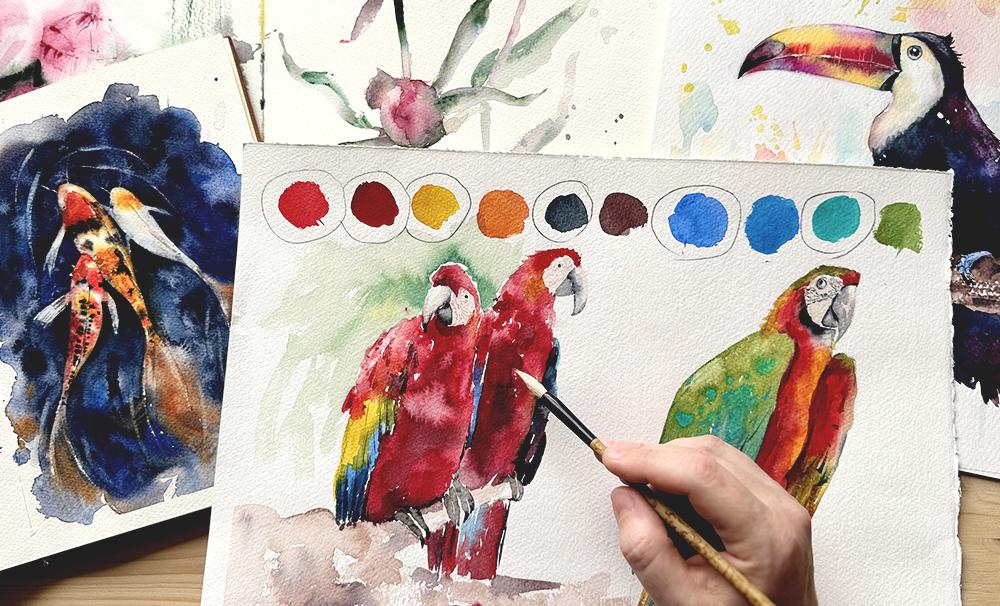
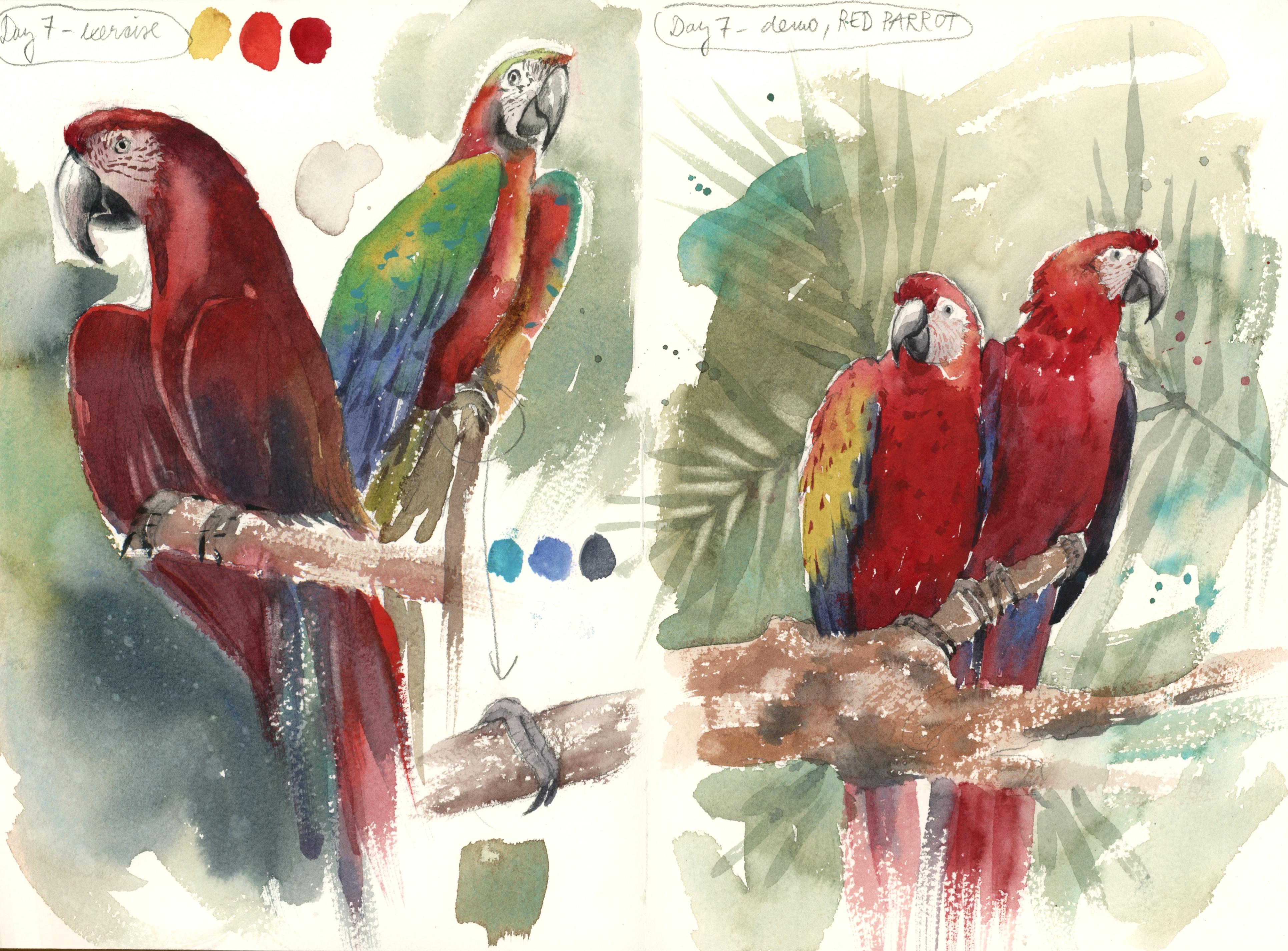
9. Day 3, Demo (Toucan): In this lesson, we'll
paint a watercolor toucan. We will use a playful approach taking advantage of
watercolor effects and some of the basic
techniques that we already know from previous two
days of our challenge. Let's get started. Now that we are finished with the sketch, let's paint today's demo
together step by step. Let's select the few colors. In this case, it's going to be more colors because
we can make this two can look a bit more colorful
than is our reference photo. I'll start with yellow. Then we can also
use the green gold. I would love to use
alizarin crimson also to have just pops of red. That may be purple. Here. Okay. And turquoise, I don't think that we
can go without this one. This is a tropical bird, so it would be very
nice to have pops off this color and then paints gray for or to replace the black
to make it very dark. I want to start with the beak. And I will start
with the first color that's the lightest and
that is our yellow. I mix a bit Asian crimson into the yellow and
make it a bit warmer, very little pigment, like that. Now it gets a bit
warmer and a bit more rich and a bit more
of that green gold. And we'll just place
it on the beak, and we can start
adding other colors, z and crimson in between
the yellows here. So we will connect the colors, but we'll only stay within
the silhouette of the beak. We can now add the turquoise box of turquois here and there. And the purple. I think I overdid
that with purple, so I'm going to
remove some of it. But maybe smaller
brush will be a bedder more handy right now. I will try to lighten some areas by trying to lift the pigment
a bit with wet brush. Just a bit. Maybe I'll go back with yellow
and adjust the color bit. We lost. I'll try to
adjust that as well. So I'll try to just play around
with color a little bit, but try not to try not to push the color
too much back and forth. Try to make them stand
next to one another. For this part, we
can mix a little bit of more orange color with our
Asian crimson and yellow. And we can start kind going here around the
eye a little bit. But this time with very transparent
color because this is a zone that is
more or less white. I want to give it pops of color, make it look a bit more around, but not a strong color
like on the big, very, very soft color. Like this, pops of color, very diluted, thinner brush. I'm going to grab just
a bit of purple here. Added here a smart a little bit. But most of this area, I want to keep white. We are almost done
for the first layer, but I would also like to
color these parts, the legs. They are blue in color. I'm going to use the turquoise. I'm going to give
it a bit color. And you can mix a bit
of paints gray into turquoise to make it be also. What we'll do now is
add a bit splatters to reach the painting even before we put
on all the black. I want to do pops
of color splatters. I want to use some that will
be a bit more like purple. They can cover the
body at this point. Just don't make them too dark, and we're going to blow
on some turquoise. Whatever you add here, it will be very dark
color sitting on top, so it doesn't really matter if the splatter goes because
you can cover it up later. A few red splatters as well. I kind of missed that. I like this kind of
painting to be very joyful. Have a lot of color,
play around with it. Use your own eye to figure
out what the balance is. When it comes to the platters, their color and their amount. Now when I think I have all of these platters already placed. As usual, I try to get rid
of all the excess water. Try to soak it into my brush and then dry Usually I let it sit for 10
minutes on my table, and then I get a hair dryer
and I finish drying that. So I'll meet you here
in a few minutes after this is dry and
we will continue. The entire page is now dry. And now I would like to paint all the dark areas on our bird. Mostly, we'll be
using paints gray. There's a couple of those dark areas that
we need to paint. This one over here, the largest area is here, the almost entire
body of the bird, and then the tail. Here you can dilute
it a little bit. It doesn't have to be too thick, and we can start from
here, from this side. And first paint this shape. Then I'm going to go with
these two smaller ones. If you have too much
water on your brush, you can use the tissue like
we did before, get rid of it. With a damp brush here, I'm going to remove some of the pigment to make it a
bit larger on the top. If you do it like this,
here is also a reflection, you will get it some volume. Now we're going to paint
this large area here. While here, the edge is a bit
more smooth on the inside. The outside the line
will be a little bit broken to show that
these are feathers. So here, I'm going to paint and draw some
irregularities in that line. Okay. Here, carefully, we can mix
in some other colors too. Don't have to be purely dark. Especially this part of
the back is a bit lighter, so you can include
other colors feel free. Okay. And here, we have
to be careful in order to avoid this
shape of the legs. So Sinar brush will be
better choice here. Okay. Can you know the tail? That one will be darker. Okay. One thing that I forgot, and while I still have
blue on my palette, I will do it now, and it's
the inside of the eye. So you can do this. You can just paint
the entire eye blue. And later when this dries, we will deal with the inside. I think I kind I have to do it one more time because I went over the edge
of the sketch. Whenever I'm painting eyes, I tend to remove a bit of the
pigment from the lower part here in order to give you the illusion of
being a bit more round. So more pigment in
the upper part, less pigment in the lower part. Now we'll let it dry. First, I'd like to do the
branch, and for that, we will need our
soft flat brush. We can mix our yellow
with pines gray, maybe with a bit of red, and that should create brown. Brown is not a color to mix. Every time you mix every color that you have
on your palette, you basically get a brown. I'm just balancing
this to make it like this one with more yellow is
a bit more greenish here. It is not the shade that I want, I'm going to add more red, and this is the shade that
is better for the branch. Something like this
is what we created. With more yellow, you will
have a brown like that. With more red, you will
get a brown like this. So what we're going to do is to load this brush with pigment. When you paint with your brush, you have it like this
against the paper. But now you want to put
it almost like flat down on the page
and then do this. Then you get something
like this. It's texture. We call it dry brush texture. Here, try to stay
within the sketch. I just want to see some
of the texture here. I first do the texture, and then I go back with more
water, and I will connect. I will connect the paint. We'll fill out the rest, but from time to time, you need to leave out
this dry texture spaces. So that it will have some
highlights on the photo also, there are some highlights
on that branch. Okay. Yeah. I'm going to put more
paints gray in it and then do these darker spots. So while it's still wet, here and there, you
just do these marks. This is going to be branch
with very little work. I'm going to dry this and maybe just a bit more work a little bit underneath
the legs, more shadows. Now, I want to
show you how to do the final details and make the two C and look
much more alive. First, I'd like to work
on a big for some more. I want to make it look
a bit more round, so we will need to remove
some of the pigment to create this highlighted
area over here. For that, we'll use the flat brush that
has sturdy bristles. I'm going to dampen it and
get rid of excess water. Now we can use it
like an eraser. You can just rub the paint that's always this works only with already
dried water color. You have to rub it
like this and then use a tissue to lift the paint. I'm going to do it some more. Sometimes it requires patience, but usually that works nicely. I want to also create a
sharper highlight around the middle line here. Because that's what I see
also on the reference photo. I would like to use this
technique also to read some of this texture
on the beak. The texture on the
reference photo is a bit more in color, but I want to make it light. Rub the pigment like this
and create the folds. This will be a texture
on the be like that. I think it looks really nice. We're not done with the beg yet. I also want to emphasize
the highlight here. That a bit more on this side. This is a really powerful watercolor technique
that you can use. I'm going to also create
a highlight here now. Now I like it very much already. I'm going to grab a small brush going to take some color, maybe, maybe a bit more red,
and we'll emphasize the middle middle
line here a bit more. Okay. Now, a bit paints gray. I'm going to draw the
inside here of an eye. With dark paint,
this paints gray, I'm going to pat nails. This is just casual parts and then some Some of these details on top
of these fingers here. We're almost done. These details I think help the subject
a lot to stand out, but I want to do one last thing that is not
completely necessary, and that's to use white guash. It is similar to watercolor. It can be dissolved with
water, even when it dries, but it is a thick opaque paint, which is a difference from
guash and watercolor. I use it to add highlights. Use your small brush, dip
it into the guash paint, and we'll just paint a small highlight into
the eye here and here. If you want to, you can also decorate with a few
more highlighted areas. The bird or the textures here, just add some visual interest. Like this. You can also fix mistakes with us if there's
something that didn't go quite as plant if you have a smudge that's
really irritating. I'm going to maybe add
a few here to the beak. And now we are. How did it go? Did you enjoy today's
painting process? I hope you had fun. Just so you know tomorrow, we're going to do even more expressive and
interesting studies. In the four exercise, we'll
talk about how shading works. In the following demo,
we'll paint beautiful, colorful pairs.
I'll see you there.
10. Day 4, Exercise (Shading basics): Welcome to the four of our seven day
watercolor challenge. Its exercise, we will practice
shading techniques for simple objects using both pencil and watercolor.
Let's get started. I have this subject
here as a final level. But first, we will do
exercises in pencil. We're going to shade a sphere. Then we're going to
apply that to a pair. Let's try to draw a circle. First, there's circle and then there's sphere
if we shade it. We already know how
to draw circle. We learned that previous lesson. We can actually make
it a bit larger. This is small. And let's make it 21, we will try to work with pencil
and one with watercolor. Use the technique
from the previous day to emphasize which lines are final to get the final
edges of the circle, one and the other one as well. Let's make this
circle into a sphere, and what makes something
that is two dimensional, what makes it three dimensional is actually light and shadow. Imagine that we have a source
of light like the sun, for example, and it's hitting
an object from the side. What makes that object look three dimensional
and perceived as something that has a form is actually the difference between
the light and the shadow. Always going to be parts
of this object that are closer to the
source of light. Therefore, more
exposed to the light, and some parts that
will be in shadow. Every time that you paint an
object or draw an object, you have to figure out
which parts are close to the source of light and which are further away from
the source of light. Let's say that the sun
is hidden from the side. There will be one
spot on that sphere here that will be almost
completely white. That's the one tiny spot that is closest to
the source of light. We call that a highlight. There's an area around the
highlight that is going to be a bit more further away from the light source
than the high light. So it's going to
be a little bit, still very light, but
a little bit darker, so we can hatch this part
of the body of the sphere. Then there's another area that's a bit further
than this one. It's going to be a bit more dark because it is It is going
away from the light. I hope that now you're
getting the idea, but it's going to get very
interesting very soon. Since the bowl is round, the sphere is round, it's not
going to be all that equal. This part this side is going to be a little
larger than here, so we're going to
have to do gradients. With every part that
we're going to hatch, we're going to do a
bit of the gradient. Next part. I would say that
this area of the sphere is the area that's
about halfway from the light source to where
it should be darkest. We call that a mid tone. So we have to hatch. However, on this side, here is going to be
slightly darker than here because this part is a bit closer to the
light than this part. So there's more and this
area is going really, really away from the light. There's not a lot
of light hitting this part of the
body of the sphere, so it's going to be even darker. And this my friends, this is what we
call a core shadow. So this is darkest
area of the sphere. It is not on the edge here. Here's going to be mid
tone because some of the light is being reflected from the other
side of the sphere, and as the sphere is round, you'll find its way
back here to this area. Sphere is a bit
more trickier than a cube or any object that
is flat on the sides. Go what you would think is the darkest part of the
sphere here is actually not. Darkest part is a little bit further away
from the edge here. And when you draw or
paint it like this, the sphere will look round. We have to even out
these areas a bit more to ensure that the
transition is better. So it should be lightest, light, mid tone, really dark. If the light source hits
the sphere from the side, there will be a cast shadow, so we can draw a shadow here. You can hatch it. That would be. Since it's shadow, it's
going to be something dark. Also, that shadow will have a little bit more
reflected light in this area and it's
going to be very, very dark in this area. That is the spot that will get the least amount of light
in the entire situation. Ven less than here. Now you know how to
shade the sphere. This is pretty easy
to do with pencil. But now when we know where the
shadows need to be placed. Let's try to place
them on the page with watercolor because that gets a little bit more challenging. We already know that
watercolor tends to run while the washes are wet. So how do you make the
shading so precise? With pencil, you can control
which part is midtone, which is highlight,
which is very dark. With watercolor, it's
going to be a little bit more of the pushing
paint here and there, but Let's do it together. I hope that we can handle it. You can go ahead and draw the highlight
in that will help you. Usually, I draw
it with my brush, but you can do it with
pencil for an exercise. And we can also draw the
silhouette of the shadow so that it's a bit
more easy for start. Let's make that sphere. Let's make it a red color. So I'll have the red color here. And I'm going to
dilute it for now. We start painting
from light to dark, so we will add the
dark tones in the end. With a light color, we have to avoid that highlight. The rest of the sphere, it
needs to go wet in wet. Well, gradually going to increase the amount of
pigment we have on the brush, and we will add it just like
we did with the pencil. Add more pigment as the body of the sphere goes away
from the light source. In this part of the shadow, the red color isn't enough, so I'm going to use a bit of the pins gray to
make it slightly. And a bit more diluted
wash for this part. I'm also trying to keep
the amount of pigment on my brush in by tapping
the brush here, getting rid of the access. And damp brush,
no pigment on it. We can just slightly
lift some of the pigment here in this area to make
that reflected light. We also need very
dark pigment now to start painting the shadow
and the occlusion, it needs to be the part. So here, And here is something very
specific to watercolor. Do not worry if the
color bleeds here. It might not be 100% accurate. But it is something that
we rather tend to keep in watercolor because it
is a spontaneous effect. It doesn't really destroy overall look of the
painted object. And here I'm going
to add more of the diluted watercolor as I paint the shadow towards the area that gets a bit
more reflected light. And this is how you paint a very simple three D looking
sphere in watercolor. And even go back and add some of the pigment here if we lost. If we lost it, but
only while it's wet. After it dries or if the wash
is semi dry, just leave it. If you want to correct some
mistakes or add more shadows, you can wait for this
to dry and then add another layer to emphasize
or deepen some shadows. Can be very simple
and you can do a lot of shading
in only one layer. Keep in mind that you can't have tons of
water on your brush. You have to use the
paper towel to get rid of the access always
before doing a strokl. If you paint brush strokes with a brush that is too
loaded with water, it will start flowing
back and forth. You won't be able to keep
that pigment in one area. I'm going to now dry this, and when it's dry, I will sketch the
pair in pencil and we'll try to paint it in
watercolor as an exercise. I'd like to sketch pair
by trying to sketch a small circle representing this and a large
circle that's here. And then you just
connect them. Like this. You can also draw this ten. Not complicated, not
too complicated. Another one, this will
be the water color part A. Pretty simple. So we can now emphasize
a little bit these edges Let's try to shade
it a bit in pencil. We have to notice the
highlighted area. The highlight is here. The highlight is very soft
here and also on this side. I'm going to start
to admit tone with pencil here just a
little bit here. Sometimes it helps you to squint your eyes
a little bit when looking at the reference and
the tonal value is just pop. So first, I'm just
hatching everywhere where I see midtone and then we're going
to add dark ones. Like that. I see highlights
here highlights. Here is a mid tone and now more of the dark areas need
a bit more ching. Okay. Okay. So something like this. I need to clean the this
sketch a little bit and leave and we will try to reproduce something similar
but in water color. Oh, it also has a slight
shadow like this here. The darkest part is
definitely here. Now it is up to us to
handle the water color. We can use similar color or we can use Asban crimson
that's more close to this. First, I'm going to water
it down and only work with light value and applied here. I'll try to avoid the areas that I marked
here as a highlight. Sometimes with clean water, you can go into these
areas and make these edges a little bit
softer like this. But with clean water. Okay. Here, also
with clean water. And only clean water
in this area here. But now we can start applying more intense color
to the areas that have more tone. Like here. We also will need some paints gray to
make it even darker. Definitely will be here. Here. Not so dark here though. Here I got too much water
so I'm just going to lift it more pigment over here. Here we have to lift. This is the reflective part. Shadow. I try to hold the shape. And sometimes there's
too much water, so we have to lift it again. Okay. And here also. So here we got way
too much pigment. I'll try to use my
tissue to correct this. And we have the stem also
need more dark pigment. A bit more shadow here. One last correction
here, too much pigment. If you want to make it
look a bit more fancy, you can always use your dam
brush lifting technique to clean up some of these
highlights here. And here add some extra
highlight. Here also. To make this shape
even more believable. Yeah. And if you want to be super super precise, you can even leave these tiny dots to add
some texture of that pair. Like that. Okay. So sometimes I get totally consumed and trapped by
the process of trying to make it the most balanced and it's not really necessary because
this is an exercise. But you get my point.
You can go pretty close to achieving this three
dimensional effect with just a few techniques
in just a few minutes. We are now ready to proceed to the four demo and paint
these beautiful pairs. I'll see you in the next lesson.
11. Day 4, Demo (Pears): Okay. Welcome to the four of our seven day
watercolor challenge. Let's paint today's demo, which will be colorful and
expressive study of pairs. We now know how to
approach shading three D objects with watercolor. So this will be a blast.
Let's get started. First, I'm going to
sharpen a pencil. I can draw a line here. Let's place three pairs next to one another. Like this. Really quick and easy sketch. Sometimes I like to
leave the sketch marks. It makes very interesting
combination with the paint. Now that we have
the sketch ready, we can find colors. We can use a little bit
of that green gold. We're going to use
both types of red. I see some cadmium red when that skin of
the pair is more on the light and Asian crimson more in the shadowy
shadowy parts. So I think both reds will
be good for this study, and then paints gray
for some darkening. I think we can also use the purple color a bit for
the shadows on the ground. Definitely we'll use turquoise, and I think we're
going to use a lot of colors and cobbled blue
as well to paint the sky. I'm going to start with
very light green gold. Here. And I'm going to just pay
attention to the values first. So very light color, very light red color also, and let's avoid all
the light areas. Here. Here I see a bit
more of the red pigment. And Azar and crimson. On this side is more present. Now we can use brush with clean water and merge them
together these tonal values. But just clean water
so that we don't have a lot of pigment in
the highlighted areas. But we need to
connect these colors. Here and I'm going to even
use a bit of that purple. This is purple here
and here, just a bit. Maybe with very thin brush. We're going to do
this tiny space that is a little bit more dark and also with
just clean water, smudge the edge of bit. I'm reaching for a bit of blue now in order to deepen
the shadows here. Just a tiny bit.
And here as well. Okay. Mm. I'm going to dampen this part. So I want a little
bit of bleed here, but we have to connect
all the pairs together. I'm going to start
working on the next one with greenish yellow
or green gold, just like a hint of it, like an underpainting then
I'm going to continue with the mix of reds that I've watered down to do the similar thing and block in around the highlighted area. I go everywhere where
I don't see light. With my brush. Here,
I see pop of red. As and crimson, that is what
I see, this kind of red, and here maybe more cut red, and here also, I want
to connect them. I'm mixing more dark as I go here because
that's the darker part. A little bit of purple there. And here as they connect. And lighter red. And clean water to connect here. Okay. So here. Removing the highlights
in this area. Just try to find similar value disposition
on the food reference. We can correct some areas later if we want to
in the second layer. Let's go to do the third. Again, I'll go around
the highlights. I see a lot of color here. But also purple
when they connect. On this side, there's purple. I also see intense color here
more intense color here. And then clean water. Okay. When you connect
with clean water, some of the pigment will
get inside that area, but not a lot and it will
it should still stay light. It's just softens a little bit. Here to softens. Here I need more red. I like that and very
intense red here. Okay. I think we're good for now. Let's paint the bottom. This is going to be
major color is going to be the purple. You can do this. We already did the texture with the and some paints
gray because it needs to be really dark in areas where the pair the bottom here
to paint the shadow. And the rest we can
maybe the rest, we can work out with
some like for example, just quickly mix some
brown like this. Okay. I can do a bit more splatters. But we now also have the
background to paint. I'm going to use the
turquoise color. Here is the turquoise, a bit of that blue, a bit of the green gold, and we can try to go
around the pairs here. You can leave out white
spaces sometimes. You can leave out
tiny white spaces in the background here and
there. It will look nice. And here we just clean water
you can smash the paint. I'm doing everything
with this flat brush, I really love to do this stuff
with the flat brush here, getting the silhouette,
but I do not come close to the red
paint is still wet. Okay. Maybe we can make it a bit here with
mixing paints gray into it. And here is just a few
more spaces to fill. And it is done. We have to it's not
done completely, but the first layer is done. I'm going to now
dry before we dry, you know that you have to
get rid of all these excess. And I'll meet you here
in a few minutes after this is completely dried out. So my demo is now dry. We have to finish
some of the details, but let me just tell you that what we did in this first layer, we did 90% of the painting, and it's really great and
this kind of approach has me painting for longest periods of time with most interest
because it's so free. It is not precise. You don't really color
between the lines, but there's a whole new level of thrill when you follow
this kind of approach, and the painting
looks a bit raw, but it also has this energy that colored very precisely done paintings they just don't have. This is what I personally
enjoy with art, and it is also what
I really love to explore today in this
particular sketch. But there is a downside
to this wet in wet all free go all in approach. And that is that sometimes the textures of water
color when they dry very flat because they
flow into one another and they even out in this example. Here it didn't happen. Here the pigments, they stay separated. We can see the
highlights, the mid part, and the parts that color
really pops there. You can see the
total differences. Here we can lost it. We have to go back and fix some of it with
the second layer. Sometimes a few of these
mistakes like I keep. Sometimes I make a
decision to just keep it raw as it happened. Other times, this is the
center of the entire picture. I might go back and try to fix. First thing that we
do, we are going to soften some of
these highlights. Even that will help you make that object
look a bit more three D. Here and here. Soften some of the edges, make the total differences
look a bit more realistic. So that already
helped a little bit, but we also have to add
shadow here and here, find some sort of red
here with damp brush, I want to soften the
edges a little bit. Soften this edge here. In a similar way,
we have to do this on this side a little bit more we always have to at least a bit just
soften the edges. Okay. And here there
are a bit more. Okay, now that shape is standing out much
more than it was before. Also, here I want to remove
some of the pigment, make a bit more reflected light. This pair still a little
bit messy in this part, so maybe we'll
just fix that one. So better. I think it could also use removing
a bit of that pigment. Dry. Grab a tiny brush with some dark brown and
we'll paint the stems. Here on top, I only
work with water, and here I remove some of the painted pigment because
even that stem from the side, from the right side,
it has lightness. There. In the bottom, we can add a bit
more red color here. Okay. The second one And paints gray on top. And the last one. A
bit more red here. A bit more dark at the
bottom. And that's done. One last thing, should
we try to remove some of the decorative textures or whatever you see on that I
see lines and dots like this. And with a little brush can also paint some
of these darker ones. But for an exercise,
this is basically it. Tomorrow, we'll paint
a beautiful red rose. Learn a lot about more
complex shedding and we will level up our
brush marking technique. So please don't forget
to tune back in tomorrow and meet me in the next
lesson. I'll see you there. Okay.
12. Day 5, Exercise (Complex shading): Welcome to the five of our seven day watercolor challenge. I hope you feel energized and curious as to what we're
going to do today. I'll not let you
wait any longer. Today, we're going to paint a beautiful red
rose in watercolor. But before the painting demo, we'll do a drawing and
a shading exercise that will be very
useful for us and help us prepare for these a bit more
difficult subjects. So let's get started. Today's topic will be to
paint a watercolor row, so we'll go back a little bit to botanical theme is just a
great subject to learn from. So first, I'd like to start
our exercise by sketching it. When I try to sketch
something like this, every petal has very
different shape. So I try to look at
the flower as a whole, and I try to find the closest possible shape
to what I see here, maybe a diamond shape,
something like this. At first glance, it
just looks like this. But I also see when
I look up close that there's basically two
directions of the petals. One is all the petals
going from this side up. It's this group of petals, and the other part is the petals facing down.
This is the group. I would like to maybe
draw a distinction, and then maybe draw this
bottom part of the rows here, including all of these
petals and the upper part. That could be something
like this and here. Now we can go back to this shape and try to add more petals
to it or on top of it. Usually, I would start
with the largest petals, then find the smaller ones. Quite a large one
is this one and it looks like a
triangular shape here. Something like that. There's a bunch of smaller
pedals all look like a smaller triangles
or rectangles here. Not that difficult
to sketch once you have this larger pedal placed. What about these? Here is one that is also looks
like a rectangular shape, something similar to that. There's a fold to that pedal, like this part is
folded a little bit. On the other side,
there's another pedal, there's a fold here. It all returns back to
this central point. From this point,
whatever you draw, the curves doesn't have
to match the reference, but it needs to go
back to this center, like here and here. There are some petals
on top of this and some shapes that will be
more visible from this side. Look at this, we've got the rows in very small amount of time. We now have to clean the
sketch with needed eerasor. I'll now try to
emphasize some of these lines add maybe a bunch of folds here,
another fold here. But remember, when you
sketch always go from the large shapes and then add
small shapes on top of it. Then, another one. A bit more clean up
around the petals and we're almost done
with the sketch. I really like doing these quick sketches on the other side of my sketch book because when I approach the main subject, my hand is a bit more
skilled because I've already drawn it a couple
of times. Draw a stem. There's a bunch of leaves here. And maybe a leaf Leaf over
rose will be of this shape. It will have these little
thorns on the side and very more prominent visible
center, something like that. They will be usually,
will be in groups. Like that. Maybe a third one
on the other side. Now while we still have
the pencil in our hand, we will need to place a bit
more shadow. Here is a fold. Underneath the fold, there
will be more shadow. In this area will be
a bit more in shadow, so you can hatch that area. Even if you don't
have reference for, you can sometimes apply logic to where the light will be and the shadow will be just imagine that the light is
coming from this side. And then try to
imagine the form, which parts of it would be
more hidden from the sun. Usually, it is all of these
little spaces that petals get on top of each
other and they will prevent the light
coming in between them. Usually those spaces
will be pretty tight and therefore a
bit more dark like here. All of these upper
parts will be more exposed to the sun and
will therefore be lighter. Here, some folds,
a couple of folds, folds can also be a bit darker. And these parts might be
a bit more like mid tone. Here these will be a
bit more in shadow. These ones that are at the
bottom will be darker. Here will be darker. Here will be darker because the light just doesn't go there. This will definitely be darker. This is just a very
quick map of where the light and dark goes
when it comes to rows. Now that we are a
bit more familiar. Let's try to pick one area one or two pedals and then try to shape this in watercolor. We can pick this
triangular pedal. I'm going to sketch it here. It goes maybe
something like that. Here is the upper part.
Here is this little one. There's another petal
here, another here, and we can try to shake
this in water color so that we familiarize ourselves with the techniques of
applying color. I'm going to use cadmium red. For the exercise, but
also a laser and crimson. I think there should be enough. Maybe a hint of purple for
the darkest spaces here. I see that the entire
petal is basically red so we can paint
the first wash, that's going to
be completely red That's going to
include the pedals that we sketched are
very close to this one. You don't really
have to distinguish between them in
your first layer. You can do a more or less
flat wash. Like this. But then we have to go back in. First, we'll lift the
color here and in areas that appear to be a bit lighter while the wash
is still wet, here. Maybe a bit here. Then with Asian crimson, we can go back and in
some areas that we see, there's a bit of a
tonal difference, we can adjust that, we can
add pigment to it here. Definitely here. Do this while the wash is wet. I'm going to get the purple and only get the darkest parts. This will be very small
parts, just a few. Here. Maybe a few folds. And here is that
that area over here. So we'll just smatch
the color in this area. Any other differences that
we found, I feel like here, we need more red.
No, that's all. This is a very quick way to show you how to shade a pedal. It's best than in
wet in wet setting, but we also can use layering approach to add more
definition if we want to. Usually what I do is I do a flat wash the entire
flower with one color, do some variations of the color here is
more orange color. Here is more of color that
looks like more than orange. And then when it dries
in second layer, I ashadow, but we're not
finished with the exercise yet. Just like in day one, we did leaves just by
stamping our brush. That's how we're going to do the leaf of the rose as well. It's just going to be a bit
more complex shape because it also has the tiny
little thorns on the side. So let's practice this
before we go to this page. I'm going to use the green gold as well as the prucian
green that I have. Maybe we'll use also paints gray because when you mix
paints gray with green gold, you will get really
lovely like earthy green. This is the green gold, here is the prucian green, and here is the paints gray. I really like the combination of paints gray and green gold. We can start painting now. First, you'd just do what
we've already done is to make this kind of shape with your brush and then
another against it. But do not quite touch
the two strokes. Now while the silhouette
is still wet, with small brush, you
can do this thorns. I like to use different
colors for it. Like that. Now I did thorns
with just green gold. Now I want to hear a just the
stem with some pines gray, so I got at least
three shades there. I really like to vary
my colors like this. Let's try another
one, more green gold. But the shape we need
to practice the shape. One, then two. You can vary the color. Let's do the thorns. Like that. Why not
add some red as well. We can try with different
bruh, with a larger brush. Maybe the thorns will need to
be done with the small one. So a bit definitely larger. I'm going to take this one
for for the little thorns. Can you even do it
with clean water. Since this is wet, so the water will get the pigment
from inside that shape. Let's try another
one. Maybe I will add some glue into the
mixture as well. One, two, And now, let's try to paint multiple leaves on one branch. Let's paint a branch like this
can vary the color a bit. I really like to use red in combination with
green because it makes it look more brownish,
if you mix the two. With green gold, you can do this tiny little leaves that take different turns. Here I do a thorn. Another one. And let's try to connect
this while it's still wet. And one shape, second
shape and little thorns. And here one shape. Second shape, a bit more
blue and a little thorns. Like that. And
maybe a larger one as well to connect here. When you practice like this, you will get faster
with that shape. You will remember it.
You will actually be able to paint it from
memory after a while. Maybe one more thorn
here, and that is done. In combination with
these techniques, we can develop our rows study. Thank you so much for doing
this exercise with me. You are doing so
great, meet me in the next lesson in which we'll
paint our rows together. After all this preparation, it will be so easy for
us. I will see you there.
13. Day 5, Demo (Rose): Welcome to the five painting
demo in this lesson, we'll paint the
Watercolor roses, which would not be an easy task. But we have been
exercising, experimenting, and thinking about
our subject so thoroughly that this
will surely go well. Let's now use all of
the techniques that we learned in the previous
exercise and create some magic. You start painting, try to
sketch the rows one more time. Use the same approach as we
did during the exercise. Start with very basic
geometric shape, divide it into two sections, each for petals facing
different sides. Then start adding medium shapes, look for larger petals and think about the kind of
shape they represent, and then add the smallest
ones in the end. When all the shapes are placed, you can use needed eraser to clean your sketch,
refine your lines. I always try to make the curves look a bit more elegant,
but at the same time, keep in mind that all
the shapes have to fit together as part
of just this one rows. So try to also view
them as an entity. Interesting thing about
flowers is that they're both easy and hard to draw
and paint, easy, in a sense that if you draw them disproportionately as
opposed to human portraits, nobody will notice this. It will probably still
read as a flower. And hard because between
all of these petals, everything you paint
is basically abstract. The amount of petals,
shadows between them running in
different directions, up close to a painter
rarely make any sense. And so it's easy to get lost
in details of a flower. I added this rose bud here. I don't have a reference for it, but we'll just
improvise this one. Now that I have my
sketch finished, we can start to paint. I'm going to use my larger round brush for the first layer. I will start selecting
colors first. I want to use a bit
of that green gold. I'm going to use both the reds. I will use purple. Even though it doesn't
really show that much, but it's for darkest areas. Pruian green. Even though we might not need Brucian green for
this demo as much. When we mix this one with paints gray that
I'm about to add, we should get
sufficient dark green. Here, I also used a bit of blue. I forgot to add it here. I like the pops of blue
when I'm painting leaves. Let's start with
the green yellow first as like this wash that
goes underneath the red. Now we can paint with red. Here be careful about
the silhouette. Try to stick with
the silhouette We might need smaller
brush for these edges. And we go in with
lighter paint first. Like that. As we descend, we are going to add more of the
Alizarin crimson. And more crimson. In these bottom parts it's
going to be even more of that. Crimson mixed with purple. Hey. H Now, with larger
brush, only damp brush. We can lift some
of the pigment in these areas that show
a bit more light here, just like we did
with this exercise. And here and a little bit here. I'm going to push
some clean water into these areas in order to reveal some of that and
create some texture. Here we can Add some more of
the redness here. Here and there, while
it's still wet, it will slightly dissolve. We won't have that much work
in the second layer anymore. It's just like pops of red. You can see some difference
in u and mainly in tone. This bottom part is still. I'm going to now paint with laser and crimson
mixed with purple. I'm going to add here the
dark areas here also. And pure alizarin
in these areas. There should not
be a lot of work. But while the wash is still it can be really
nice if you add some distinction and
value variety now, S. The tiny splitters. I don't mind, actually,
I wanted to add some, but make sure that
they are rather more transparent than
this one so that it doesn't look like
you cut your finger, and then there's
blood on the page. Yeah. Just a few could try to paint this bod. It could be cut red. For starters. And then add some of the darker reds here and on this side, even purple here, and those greens that we have here left over from
the previous exercise. We can connect to this stem. And with green gold, and just just a bit of this. I want to add this little
shiny little leaves here. And a bit of blue. Like that. Here we
can also connect. I like to do the dry brush here. Just drag a brush that we previously got rid
of some extra water, and it has this effect
showing a bit of texture. You can also paint
the leaves here. Green, gold, and blue and just mix everything that you
have on your palette and try to do every brush dro with a different variety
of different version of green and it will
look really nice. We can continue adding
these th with small brush. And a bit of thorns, we already practiced this
so should be easy now. And we can try to
add of these leaves. Here. Here, just a bit of that extra detail and
some more darkness and can add one here as well. And a large one here. And some thorns. We can also do greens to
decorate the painting a bit. Maybe one more here to
balance out these shapes. And now we have to
let everything dry. I don't think there's
that much to do now. The first layer is dry. We can continue with
shading the rows. We've done a lot in the first
layer, which is awesome, but we really need to emphasize some value differences
in the second layer. First, we remove the pigment as to create more highlights. That's what I always do first. Let's start with the bud. I would go here and make
it look a bit more round. Here are some parts that
ought to be a bit lighter. That's I think all of the
important highlights, and now just a few shadows. Most of the shadows, I will
do with combination of algien con and the purple. It can be more
diluted than this. Let's start here at the top. There are some fools
that are a bit darker. I'll just apply paint there. Sometimes you have to apply and then smudge the paint
a little bit with wet brush to push and
create gradients. Here just a couple
of these folds. You can just apply
paint like this and smudge a little bit like that. Then you have a fold in a pedal. But this top part is, I think sufficiently
shaded more or less. Here, I smudge there's not that much light in these parts where the
pedals occlude themselves. Here we will be more shadow. Here will be here more shadow, and we need clean brush to
just smug this and connect these shadows here as
to create a gradient. Here also will be shadow
here will be shadow. Always with wet brush, try to smudge a little bit and connect with everything that
you've previously painted. Kind of harsher
shadows are here here and here. And
connect with water. Yeah, I didn't even believe
that it's this easy, but it's really done we've shaded most of it
in the first layer. Maybe here I would
add more definition, one more shadow here
with a red that is a little bit closer to
mid tone than to a shadow, and then with clean
brushes connected. That now it looks a bit more
round also maybe here a bit at the tone and then
smudge the paint like that. And I think yeah. I think I'm going to
gar this and then carefully observe if it needs anything else,
but I think we're done. Thank you so much
for joining me in another day of our
watercolor challenge, and I really hope to
see you back tomorrow. We're going to learn how
to apply maskin fluid and what handy tricks we can use to make it work
in our advantage. We'll paint red mushrooms, and it will be a great day
again. I'll see you there.
14. Day 6, Exercise (Masking fluid): Welcome today six of our seven
day watercolor challenge. Are you still on board? I hope you are.
Today, we'll explore special type of material
that's called masking fluid. This technique
will give you lots of different possibilities to try out within your usual
watercolor practice. Let's get started with the
exercise very easy today. Today we'll be drawing new
subject red mushrooms. We will explore
contrast. A little bit. We will also learn a new
watercolor technique, which is using masking fluid. I think it's a lot of fun first. I would like to sketch
the mushroom from at least two different angles
than explore coloring. Before we start working
on our final demo, I want to show you how to use masking fluid so that
there are no surprises. I would like to sketch this one. Shape is similar
to half and oval. So if you have an oval, you can cut it in half. There you have mushroom cap. Then it has the leg. This particular mushroom,
it has some squirt in here, this shape, like that. If you look from down, you can open that cap
a little bit here. You can make it look
a bit more open. If you look from up, then the mushroom can
look something like this. You will not see this
inside part anymore, but you'll still see the
skirt here and the leg. Maybe the mushroom
will be a little bit more flat in this area. I will clean the sketch now, and I'll try to now make
my lines a bit more clean. At the bottom, it also has
some foldings like here. It's not completely smooth. We'll clean this a
little bit more. You may notice that
the mushrooms, they have these white spots. If I want to paint
these differences between the red and the white, I would have to draw every white piece and then very carefully with
a small brush, go around the white
areas with red paint. That's probably
what comes to mind about how you would do this. It is not the best solution. There's a better
technique to be used with watercolor and
that's maskin fluid. This is masking fluid
or drawing gum. I'm usually using
this one by Pebble. It's the most common
type that I can get in local art supplies and
it's also very cheap. I have done another brands that are white in color.
This one is blue. Now I want to explain
to you what it does, painted, where you want
to have white areas. It masks the white of the paper. Once it is dry, it will seal the paper underneath so you
can paint over it. That's very convenient. One thing you have
to know is that once you paint the spots with maskin fluid,
you have to wait. It needs to be completely dry, and the drying t
largely depends on the amount of maskin fluid
that you put to the paper. If it's too thick, then
you have to wait longer, maybe an hour, maybe even more. If it's not too thick, then you can start painting
within 20 minutes. When I was first
starting to learn, I used masking fluid a lot. Later I avoided because of the drying time slows
down my process nowadays. But for starters, it
is very, very useful. One last before we
start to apply it. You really have to apply
it with the brush that you dedicate to masking fluid
because it ruins your brushes. Never touch the masking fluid with your regular watercolor
brush because it ruins it, it will be gone, it
will be destroyed. I have this one cheap synthetic
brush that I only have for masking fluid purposes
after I'm done with painting. I will keep the masking
fluid on it to dry, then I will just rub
it off and I use it again as masking
fluid applicator. Be very, very careful
with your brushes. I do recommend you not have them anywhere near where you're
working with masking fluid, only when it's dry then pick
your watercolor brushes. We can now draw
these white spots. L you see them on
the reference photo. I really am trying not to create too thick washes of
these muscum fluid, sometimes is very
hard sometimes. Sometimes you make a
larger drop of it. Next one, a bit smaller here. If you mess up and if the mask in fluid gets anywhere
else that you do not want, try not to scrub it, wait until that spot is, and then you can scrub it
very easily when it's. Sometimes I prefer the
colorful masking fluid because when you apply to
the paper, you can see it. Many masking fluid brands, they make masking
fluid that is white. Sometimes when you're
applying it to white paper, there's not much contrast between white paper and
white masking fluid, so you can't really
see it very well. But once you start painting, you can see what
you're going to get. Even though the rest
of the mushroom like the leg and the
skirt is also white. We do not need to use masking
fluid for those areas. Those are large areas. You don't have to
mask large areas. You can easily bypass
them with your brush, just paint around them. The small areas are the problem. Reflections in the eyes and these tiny little details you can use masking fluid for.
That's what it's made for. Just going to put my
brush here to dry. While we wait, let's explore
the color combinations. I'd like to do red mushroom cap. We're going to use cadmium
red, lesbian crimson. We're going to paint
the cap with these. I'd like to use green gold in combination with the reds in
order to shade these legs. I can show you what I mean. When you take these
and bits of the red, you get something like this. Very watered down. It creates a very
subtle color that you can use for shading like here. I'm going to apply
it at these parts like the sides with
only clean water, I'm going to join the two sides and then we have
just a very subtle shadow. One side could be
more than the other. We also will need a background. I think here I'm going to
do more of the green gold. E for the background, we'll use turquoise and I
think even a little bit of Let's use prucian green since we have it,
that can't be bad. We can use prucian green. Now that we have the
cobalt turquoise. We can also invite to this party and help us
shade these legs like that. I think with the addition of
the cobalt is a bit better. To decorate, we can
learn how to paint these tiny little parts
of the forest that could be that could be like that that will grow from
underneath the mushroom. With just a tiny brush. We'll use this to decorate
the picture a little bit. We can even do a snail. Very illustrative,
not very realistic, just to decorate our
picture. Like that. Now we have the color
combination ready, but we still have to wait for
the masking fluid to dry. So I'm going to now
wait when it's, I'll come back and I'll
show you how to the cap. A few minutes past and
my masking fluid is dry. I always test it with my
finger like I tap on it. If no masking fluid is left behind on my
finger, then it's dry. When your masking fluid is wet, it's a bit milky. But when it's dry, it is clear, usually
transparent. However, it will always be glossy and a little bit sticky, so don't worry about that. That's how it's
supposed to look. Now we can start
shading the cap and we'll start working with our larger brush and
cadmium red paint. This is the cad red. You
can basically do this. You can go and paint
the entire cap. With one red. Here also. Now we take Azer and crimson, which is a bit more dark. We'll apply here,
more to the top. H that's how I see
it on reference. On this one, also at the bottom, because there's a curve a
slight curve, maybe here. We can also try to lift some of the pigments we think
the highlight would be where we think the paint would be a
little bit lighter. We can try to dry this. You can probably now understand what I
talked about when I mentioned color this balance when using blue masking fluid. This is not the big deal,
not the end of the world, but if you use a
white masking fluid. After you paint over it, you will no longer be confused, you will see white spots, but now we see blue spots, that can be a bit confusing. I'm now going to wrap
off the masking fluid. You can wrap it off
with your finger. I do prefer my
harder eraser for it because I don't want
my paper to be sticky. And this is what we get. Use of skin food is
as easy as this. But you do have to
care for your brushes. I erased a bit of
my underdrawing. When we do our final demo, we will push this a bit further, but I will show you those
tips on the demo itself. Now I just want to test how the colors will balance
if I add the background. I want to add a mix of
teals and the Prus green. Here I have some greens left
from the previous demo, and the prucan green I
really like the combination. Here we can just paint around. I'm leaving a bit of a gap like we did
previously with the pairs. Just a little bit. I think it will work the colors, they compliment
each other nicely. I'm going to try a
bit darker here on this side to see
how that will work, but I think even darker
is quite nice looking. Both will work just fine. I think that now we sufficiently plant the upcoming picture. Clean up just a little bit. I'm going to dry and we can
start working on our demo. I'll see you in the next lesson. We will use masking
fluid one more time in an interesting and colorful
demo painting. Let's do this. H.
15. Day 6, Demo (Red Mushrooms): Welcome today six of our seven
day watercolor challenge, which is completed an exercise dedicated to the use
of masking fluid, which is a material
typical for watercolor. In this lesson,
we will use it in our final demo painting of red mushrooms.
Let's get started. I'd like to sketch
the mushrooms. There's a reference
photo that we can use. I do, probably two mushrooms, but I like the idea of
having one that is larger. The large mushroom, it
has a cap that is white, and then it will
have a leg that goes like this and that skirt here. That's like main Main idea here. Now let's do a smaller one. We can make them
overlap a bit here. The skirt will be attached here and the leg will be shown a bit. I kind of like this composition. Maybe we could do one more, but two will be enough. So I'll keep just two for today. I'm going to make the lines
a bit more bold, bit bolder. That was not a difficult sketch. That's a very easy sketch. Maybe I will make some
adjustments here to make this a bit more
visually interesting. That. Now that we
have sketch ready, we can start painting these white spots
with masking fluid. Careful again,
reminder put aside your watercolor
brushes until you're done with this process. So Some of these white spots will kind of stand away
from the cap like here, towards the background,
there will be some volume to these spots. Now that we're done, we're
going to let this dry. I waited a few minutes, and this is already dry. Let me do my test,
and it's just fine. We can start painting.
First layer will be done like we did
during exercise. I'm going to grab
my round brush, a bit of and we can get started. It's straightforward. But just keep the silhouette of the cap clean if possible. Paint within the lines
that you previously sketched. One and two. I love this brush because it
keeps so much paint in it. You don't have to
go back and forth. You can just paint. It runs out only after you're done painting
a really wide wash. Adding some ser
and crimson here, and here also just a little
bit on the top like that. We can also try to get
rid of some of it, make the highlights a
bit more stand out. Even I'm going to in some
extra water to create ture Well, this is dray. I can still work a little bit, but I'm going to do this. I'm going to wet this
for ground here. I'm going to mix a bit
of this brown color. Into my reds, I'm
applying yellow gold. Also a bit of paints
gray to darken this now I have this color, and so we can run like that. You have to tilt your sketchbook
just a little bit to let this flow towards the
bottom of the page. Now I think we're okay to dry. Now that this is dry, we can
get started on a background. I want to do background before
these parts because here we still have the masking fluid
on and these white parts, they stick into the background. I want to preserve
that white space. Let's paint the background with the green Prusi
green and cobalt teal, like we did before
during our exercise. We don't have to paint the
whole page. You can just Just go around that mushroom. Can leave out some areas here. I will need smaller
ash here in this area. Now I'm inspired to do a
bits to decorate this part. Sometimes I like to do splatters with clean water
into wash that's not quite dry yet and it will have a very interesting
effect sometimes. You can splatter both on dry
surface and on wet surface. It will have some interesting
watercolor effects as. We will have to probably. Maybe I go a bit further. Here. I don't like
that line there. But I'm going to
make this bottom part a little bit lighter. Drying time. Everything
has dried but here, I do not like these hard edges. I will with clean water just with clean
water on my brush, I will try to smudge
and get rid of that. Here, maybe also
just some softer transitions at times
because hard edges, they tend to capture way too
much attention visually. I'd like that attention
somewhere else. Do this always with very
soft brush, if possible. We can get rid of Musk in fluid. We don't need that anymore. The contrast is a
bit higher because the blue masking fluid is no longer
obstructing the colors. Now we get to the
parts to create some details and shade these areas that
normally would be white. White is actually never white. It also has highlights
and shadowy parts. The shadow color
can be something like we mixed in our exercise. Green gold together with red, but also you can
include a bit of cobalt turquoise
like this color, and you'll get
something like this. This color just
make sure that you dilute that mixture with water, so that is a bit lighter. Here will be a
shadow that the cap will throw a little bit. I can add a bit more of the green gold Then we have to work very delicately because we want to
add some color, but we don't want
to lose the white. I'm going to just wet this entire skirt with clean
water, more or less clean. My water is no
longer 100% clean. Then into this wet wash, we can insert some tones such as the browns
and the green gold. But everything will be diluted, we will be watered down. But just hints of
color, not too much. The same we can do here. Water this first, and then
insert some of the color Lightness is important. I also want to do
something similar here. Apply the paint on the
sides of the leg and then just clean water
and you can merge this. Like that. We can go
up here a little bit, with the color on the sides. Clean water. Just
merge this color. Keep the middle
part white parts on the sides need to
be slightly darker, but the pigment is very, very light, very diluted. Last part is this part. I'm going to leave a gap between this area and the, the red cap, just a tiny line that will separate it
to give it some space, make it a bit more airy, and I guess more shadow
will be on the sides. Here will be a bit more here, maybe more here, more. You can also insert some clean water in it that
will lighten that wash bit. Here with light brown color, I'm going to do this to just suggest some of
this some texture. And there's still a lot to do, but we have to now dry
everything in order to continue. Oh, no, we can still
do one more thing. That is to shade
these white areas. Because these white spots, those are actually three
D objects on the cap. They will have a
very tiny shadow underneath each of them, that's going to be easy
enough to paint it, but you have to go inside
every single one of them. You just mix similar
color like this. Put it on your
brush, and then like bottom part of every
single white spot. You have to paint
the shadow here. Half of it will be now painted. You can just do a
quick mark like this. But it needs to have
some tone down below. And here as well. Like that. That will give it some volume. One of the last details
that we need to add to suggest some
texture of these skirts. Similar color that
we used for shading. This time, you can add
a bit more pigment on your tiny brush because we're just going to draw
lines like this. Also here you can show a
little bit of the lines. And I think we're
done with this. My background usually is a bit larger than
what I made today. I might have to mix a
darker brown color. So I'm going to use a bit
more of the paints gray. They're not very
visible, but it's okay. And that is our demo day
six. I hope you enjoyed. We have one more day ahead. I hope that you
still have energy to finish our
watercolor challenge. I'm looking for tomorrow. That's going to be
the day when we use of what we've learned. We're going to do exercises, nice blending of the colors, and I can't wait to meet you, so I'll see you in the
next lesson tomorrow.
16. Day 7, Exercise (Color blending, complex sketching) - Part 1: Hello, my friends.
Welcome to day seven of a seven day
watercolor challenge. You heard me right.
It's the last day. But before we celebrate it, we made it and acknowledge how much we grew
during this challenge. We have one last exercise
and demo to complete. I picked the most
interesting demo and also the hardest
for the end. Here we have a
wonderful opportunity to use nearly everything
that we've learned. We blend colors, shade a
bit more complex objects, and use expressive
brush strokes to insert some life
into our paintings. And so without further
ado, let's get to work. One last note, this exercise is a bit longer
than previous ones, and therefore, it's
split into two parts. For today, I've chosen
a red parrot is the subject that I painted a couple of times that it
was always so much fun. We're going to do
studies of this bird. I want to take full advantage of this beautiful
palette of colors. My main goal is to show you that even complex subjects can be simplified and
painted with ease. First, I'd like to focus on the main shape of the bird
and explore it in pencil. Maybe we can start
with this one. Let's first try to draw it. If you can remember day three when we
painted our two can. Then did an exercise
that was all about drawing using
very simple shape. That's what we're
going to do now. Try to find very simple
geometric shapes that could be applied to
this particular subject. We can start with a
whole silhouette. You can see a shape like
this, for example, right? We can find a shape like that. We can take the whole
body of a parrot. But we can also find
smaller shapes within. Maybe the head, you
can perceive it as a square or rectangle, it can also be perceived
as a circle here. We can try to do that. Peak can be like a half circle at
start, something like that. Here the belly as an oval. We can just connect
these shapes. We can also apply the oval
shape for both of these wings. I'm going to use one
here and one here, and you have to just
connect everything now. Like that. Then there is this shape and
then there are legs. That's going to be similar
than what we drew when we were drawing the two
and look at this. We can use a small
circle for the eye, and then we can try
to adjust the shape. I'm going to make the
big a bit smaller. But in general, it
is no than this. I'm going to now
clean the sketch. Maybe use my
mechanical pencil this time and try to make
it a bit more precise. Here, I'm just suggesting that the line is broken
and it's not solid. Here, maybe just a little bit too because
there are feathers. This is very quick
sketch of parrot. No that we are a bit more
familiar with that shape. Let's try to sketch another
one, maybe another position. I'd actually like to
explore this one. This shows more color on
the wings from this angle. But it's a bit more
difficult to sketch, so let's tackle that now. Probably we'll have
to sketch it a bit smaller so that
it fits in here. I'm going to try to imagine that the head is a circle here. Try to do something that looks
like a snowman basically. Here is the wing like one wing. Going to try to very, very loosely get the idea
of how that shape works. Maybe here is the
belly like this. If you can barely touch the
paper with your pencil, you can just literally
just feel that form. Without making too
much commitment, you don't have to push
that pencil too hard. Here is another oval
for another wing. Here two more ovals for these leg parts.
One and the other. Here is something
that it stands on and we don't see this part of
the wing, but that's okay. What's going on with this head? Here is another oval. It's going to be a big
from the side side view. Something like this.
This white area, it really reminds me of a
triangle that's a bit more curved and there's the eye. I think that's enough. We
can now clean the sketch. Again, try to build on top
of what we sketched loosely with I like to use mechanical pencil
for this because it allows me for
more precise lines. Now I'm trying to make
the shape a bit and There's a pattern on the face, so we can draw that as well. Where is very, very colorful, but it still has
certain areas that are a bit more in the dark, hard to shade this thing
because there's so many colors, but there's some areas that will always be a little bit darker. Let's find them and try to dg that with pencil just so
that we realize them, then we'll be easier
to apply the color. I would say that there
are some areas that have more contrast
around the Big. These areas here, they
tend to be a bit more dark and also here on the bag. Around the eye, the upper
part, will be darker. Here underneath will be
a bit of a darker patch here. There's the belly. The belly will be a bit
lighter in this part and just a little bit
darker in this part, and here because the
wing cast shadow. This part will be Here
also. Definitely darker. Very similar situation
here in this part. The belly will cast shadow. Here. This is interesting.
There's texture here and a lot of color. But this part usually
catches a lot of light. However, underneath
these feathers, there's a bit more darkness. We'll have to apply color
here, a bit more tone. That is not so hard, but I like to do this before painting to go around that form, trying to realize where
the shadow would be. Or where things get a little bit more dark
so that I don't have to try to figure out when my paint is wet. This
really helps me out. Maybe this part just
a little bit of tone. It gets you thinking
about the form before you paint so that
ultimately when I paint, I'm not as confused
with the form because I already got myself
familiar with it. When you think about
it, the sketches, there are 15 minutes
both of these pairs, that's not a lot of time, and I'm much more efficient when I'm doing the final painting. We can try to do the same
with the previous bird. But that one has a lot of
the darker areas because here we don't see the color of the bird as much as we
see a lot of shadows. He is very much affected
by light and shadow. He is under a very strong light coming from the other side. The entire big will have
a high light here on top, but this other part is
almost always in shadow, almost all of it is very, very dark and in shadow. Even this white part is
basically in shadow. This part will be in shadow. S, this entire part on the back is more in shadow. You
can just has this. There is cast shadow here. This is probably the
shadow being cast by the beak here that needs to be sharper and
this will be very dark. I bit of it here as well. This subject, I've been
such strong light, it makes for a very
interesting painting process. This is also
interesting. The wing will have here rim light, and on both sides,
there's shadows. This will all be in shadow. And here will be
quite strong shadow. It will be really strong shadow. I'd like to do a lot of
these in pencil because that's just everything
would be in pencil. It's enough if you just suggest that there's
light and there's shadow. Similar situation
on the other wing, probably the darkest
area will be here. All of this very in shadow, and here very dark shadow. We can now try to go and
explore in water color. Plan the colors and explore how to place
them on the page. For this exercise, which
colors do we need? Definitely red,
Alizarin crimson. Usually when I
paint red subjects, somehow I find them
necessary use both of them. We're going to need
our green gold. For the wings, we're going to need turquoise, coupled blue. We're going to mix
them together. I think we're going to need
paints gray because of all of these darker areas on the face and details
and darkening of some. Yes, so three warm, three cool colors, and
we should be fine. Despite of having
such strong light, I think that this
one will be more fun and easier actually. Let's start with just
applying basic color. What I mean by basic
color is that if there was no strong light, what color would the parrot be? Top of his head, it
would be cadmium red. And sarin crimson
because here this part, I'm going to need to
paint with smaller brush, suggest some of the feathers and then continue using mostly
lyserin crimson here. But be careful, you have
to leave out this area. Now we can use a bit
more cadmium red. Here are these parts that
they are more transparent. And you can smog that paint. You can continue here for this. Basically, this is a red bird. This is a sketch and a study, you don't have to be
timid about this. You can just place all the
colors there quite quickly. There's green gold here, and I see a bit of
turquoise also. There maybe a bit
of blue, like that. Just hints of it.
Definitely see blue here. And the red down here. You can be expressive like that. Please don't spend 2
hours on the exercise. Before that dries, I want to also just give
a bit of color. I'm just going to
use some paints grade that's left over on my palette for the legs here. Just a suggestion is fine. Some texture for that wood that it's sitting on like that. Some texture. Now, we will
need to paint this part. It cannot be white, so you can mix something that you have left over on
your palette with a lot of water to create this
muddy very light color. Something like that.
That's going to be how white spaces
appear in shadow. If you have a water that you
use for cleaning your brush, and you used it
for a bit usually gets this color. So
you can just use that. You can dry this. We
can apply the shadow. I'm going to use Az Crimson, you can mix with
some paints gray, and you're going to get
this shadowy color. We can try it out. I
think that will work. And we have to apply that
everywhere you see that shadow. Every place that
we hatched before. If there's some spaces like here that's going to
be sharp, shadow. With clean brush. I'm
going to clean it. I want to hear blend a
little bit. Here not. Only here. But this
has sharp edge, so you have to
leave it like that. Maybe the shadow on the
face is not sufficient. Maybe I have to go a little bit. And the bottom is
also in shadow. But I'm being very
extremely loose with this. Now we can see light and shadow. It should be similar to what we have on
the reference photo. This one is a difficult subject, but it's fun to
explore it like this. Dry in time. I don't want to pay attention to the details too much
because this is a study, but we have to do some. This pattern that
I see on the face, try to get the general
direction of the strokes. You get the idea of it working. You can finish the beak.
We can apply the detail. Tip of the nose, focus on the
areas that are very dark. With clean water, on your brush, you can blend towards
the areas that are a bit lighter so that
you're working with the pigment that you
already have on your page. This is probably the
quickest way to do a baclor study is to first
apply the pigment to the areas that are very
dark and then just smudge with clean brush towards
the areas with mid tone, that's very easy and quick. Might not work for
more detailed pieces that need more attention, but for study is fine. Maybe the nails, just
like we did with the Tc, I'm just going to add
some of these details. I think for the study,
this should suffice. I'll still try with my sturdier watercolor flat
brush, lighten some areas. And here also lost
some of the lightness. Here maybe here these areas. We can try to push the pigment away from the paper here to
and uncover some of these. On top of his head as well, we lost some light there. We've got the point
and that's all that. I wanted for an exercise. Let's try to do this one. Probably with just small
brush very quickly, and then we move to final demo.
17. Day 7, Exercise (Color blending, complex sketching) - Part 2: In part two of our exercise, we will continue with watercolor study of the second bird. This one is a little bit different because we
have to blend colors. There's more colors, there's
cool colors, here is red, but we still will
do one layer and we try to put the colors
next to one another. I'm working with
green gold here. I'm starting from
the top of his head. Here is a bit of the
green gold color. Then here it connects to. Red. I'm going to add red. I'll just add colors like I see them on the
reference for them. Here I see more
orange, cadmium red, and then connecting to that, I see more of the
lyser and crimson. Here. Try your watercolor
be a bit more watery. Your brush should not be dry. Here Here there's dark area. To that area, there
connects more red here. More orange red, you can mix with the yellow to
get more orangey tone here and more of the strong red all
the way to the legs. On the legs, I will
mix the red with a bit of paints gray that is on
my palette to darken it up. I'm going to start using
turquoise a little bit here connecting to the red
and a bit of green gold. Just basically apply the
colors next to one another. On his wing, we
have to start with the green gold and start
applying turquoise, the cobalt turquoise
to these wings. Then as we descend, start
applying the cobald blue. Here and there,
you can leave out some highlights that
looks always nice. As we move down, I think you can start
adding paints gray to that blue so that it looks
a bit more like this. It changes hue a little bit. Feathers at the bottom
are green gold. Legs similarly to
what we did here. Then there's that branch. I'm just going to
do a branch here. That was quick, but you see that we block
all of the colors. We can do more, but
we have to now dry. We don't have to apply too
much tone to this area. Here, it was a lot in shadow
when you compare the two, this one is more
white than here. Doesn't mean that it
cannot have any tone, could have slight tone, but it's not supposed
to be as dark as here. Now we can add a
few more details, a little bit of shading. I'll start this time with
details on the face. I have the paints gray here, going to be very similar
to what we did here. But the pattern is not red. It appears more of the
same color like the beak, so I'm just going to do that. Then there's the beak. There are more
intense areas that I'm going to feel
with color first. Then I'm going to
water down the pines gray and kind of feel
the rest of the areas. When I have paints gray here, we can mix it a little bit
into the alizarin crimson and try to shade the area
here around the belly. Here, it needs just a bit
more tone and here as well, and you can blend that with
brush that is a bit dump. I can just do this blending. I'm going to do similar thing
with blue and paints gray, and here is the shadows
that we have to add. Add pattern and
add these shadows. But this is just a suggestion, please do not be too literal. We're just studying wood
color to apply were. Maybe a few more dark tones around the legs and we're done. We could grab turquoise
and do more here, suggest that there's something
going on with the texture. Here as well. Not too many details. For a quick color study,
I really like it. Now you know how to approach even a complicated subject
that contains a lot of colors. My role is to keep it fresh, paint a bit more quickly, put more emotion, less thinking, but that comes of
course with practice. But this is our seven days, so Hopefully your hand is
used to the technique. I'm excited to do
the final demo. A final demo, I would
like to do pair of birds, like to do it even more complex because this
is our seventh day. We have to outdone
ourselves today. But there's one detail that everybody is always
so confused about. So let's sketch that as last part of our exercise
and as the legs. Draw these legs or this one. I'm going to imagine
the leg or the finger as like one large
oval like this. Another finger next to it as another oval that here
will connect to the leg, the body of the leg. Like that. Here's one finger, another finger,
and it wraps here, will wrap around this branch, and here it will have a nail, usually very dark nail. And it has this like a texture on top that
contains these lines. So it looks like this. This is the branch, and it
wraps around it. This is it. I can paint it with some grayish color and maybe the branch as well
with some textures, trying to do the dry
brush a little bit. And that will be a bit
darker at the bottom. That leg will also be a little bit darker here
like here in between, the fingers, maybe here,
a little bit darker. And that nail will
be really dark. Like that. This is the detail. This is an exercise, but
a very important one, you can always
break down details of every painting that you're
going to do like this. Last thing that I
just want to check is if the color of the
background will fit. We have some space here. I'd like to apply maybe
green gold and teal colors. Mix them with a bit of red. If you get green and teal, they're very strong,
very saturated. If you mix a bit of red into it, it will get more subtle, like a minty type
of earthy green. I like that a little bit more. Let's check if that works. And I think that
will work nicely. Either this or that. Here, like this subtle more green
as a background. We can apply that to
our final painting. I'd like to maybe
explore the possibility of using a stronger color
for the background. I'm mixing the blue
with paints gray, and I try to apply it here. No, I think it would be
too dark in the end. Yeah, but this is a sketch page. After we dress, you can
see from distance and use whatever you like
in your final approach. Now that we're finished
with our final exercise, meet me in the next lesson, and we will paint our last
demo together red parrots. So I hope that we can finish this strong and I
will see you there.
18. Day 7, Demo (Red parrot): Welcome to your
last painting demo, final demo of our seven
day watercolor challenge. We already studied red parrots
in the previous exercise. We learned how to draw them, paint them using
two layer approach, and now we use all of
these techniques to create one intriguing
watercolor piece. I'm excited for this
lesson, so let's do this. First, let's sketch. We could start by
placing the branch. It's going to be like this. There's the main branch. One parrot will be sitting here, and the other one next to him. One will have a head here
and the other one here. That's a very simple
way to approach this. One wing. I can perceive
it as very in oval here. Something like this. That will be its belly. The other wing is
hidden here, like that. Here we have head of
the other bird belly, and then wing hidden
here and tails. I always try to place
large shapes first, so the bellies and
then attach the rest. Because in this situation, if you decide that you need
them larger or move them, it's not really that
big of a problem because you only have a
couple of ovals on the page. Later on, if you decide that
they need to be bigger, it will be a problem because
you'll have details and the big sketched and you won't
be willing to move it all. I will add secondary features
that are a bit smaller. These white areas, like
white faces, I would say. Here is one. The other
one here like that. Here is going to be the eye. The beaks I perceive
as an oval here that will have a bit of this
thing coming out of it, a bit of a thorn
coming out of it. Here is the oval and
here will be the thorn. The other one will be
a little bit easier. Its like half oval and
here is the thorn. I think we have most
of it sketched, but the legs are missing. Remember what we
discussed here when we were sketching this finger, you have to simplify them
into these kind of shapes. A or leg that's going to belong to this bird
and the last one, it really wraps
around this branch. Here's going to be a little
bit inner neck and this wing. I think we've
sketched quite a lot. I'm going to take needed eraser and we'll clean my sketch now. So I'll just try to lighten it. And then go and make
these lines a bite. But I'm building on what I've already sketched very loosely. I adjusted the wing to
be closer to the body. And I hear the nails. So I always see two fingers
wrapping around the branch. So that's what I keep in
mind when I'm drawing. Preliminary sched
looked very simple. And easy to do. The one
that I came up now, when I cleaned it up,
it looks really neat. Always sketch like this and you'll be satisfied
with whatever your sketching just forget
the complexity at first step, always draw large shapes, draw a snowman basically. Then in the second
stage, refine, pay a little bit attention
to whether that line is smooth and nice or a bit
curvy or a bit dobbly. That's all. When you do that, you'll end up with a
very solid sketch. That is all, guys,
we have a sketch, and now we are going to paint. Going to apply the
same principle that we learned during our exercise. I think I'm going to
start with sarin crimson as that's the color
that I perceive here. We can start applying
the red color here, and then we'll continue
with cadmium red, which is the lighter red as that is what I see on
this side, a little bit. Lighter. Here is a pop of color. Here is almost orange. Maybe you can mix in a little
bit of that yellow in it. Here. Then I'm going to continue with
Alizarin crimson around the beak and
under the neck here. This is the strong pigment, but now I only with clean water, I'm going to smudge it
towards these areas because these are a little
bit more in the light. It's the same pigment from here. I'm just going to push it with bruh clean water and it
will create a gradient. Here and there's just
like pops of pigment. This wing is going to contain yellow and blue
connect these colors. Green gold that I'm connecting to the
previously placed color. Here I'm using cobbled blue. As I have it on my brush, I'm going to apply it here
because that's going to be also present in this area. Now, the red again, here is going to be red and more red to apply here,
more pigment actually. You can leave out some
of these whit spaces. Don't worry about
that, that will give your painting a
little bit more air. So to say, not a lot, but just will look nice. Working with a bit more
of the Alisan crimson, maybe mix in some
of the blue that's left on my palette
because here is a bit. It will be darker around
the wings as well. And a bit more red here. We can move to the other bird. Almost orange color
will be here. There. I'm actually
going to use yellow, a little bit of yellow with wet brush just will
move towards that head. But now we start
applying here and here of intense Az
crimson, dark red color. More hydrid in this area. We can smudge it a little
bit with be brush and then more lyser and crimson also in these areas that
contain pops of color. Here more dark. More blue. I'm going to add paints
gray to my blue here. Is going to be der. Like that. Here, maybe pops off that similar color
while this is still wet. Ultimately, you want to
join all the colors into one wet wash. For the feathers
here, first we need blue. Feathers are blue, one, two, three, and then red And here, we're just
going to do very loosely these suggestions of these
feathers, tails here. This works for me with bigger
brush a little better. While we're on it, we can add
some texture to the branch. I'm going to add yellow into everything that
I have on my palette. That's brown. That's
basically Brown is one of the colors
that are easiest to mix. I'm just going to
do the dry brush. I'm just going to do some
of the texture here. Then with a bit darker paint, I'm going to do some pops. Now like to blend
the texture a little bit with clean water. But still leave out
some white spaces. Because we don't need
all of these highlights. We just need a few. You either wait or you grab a hair dryer, dry these so that
we can continue. I'd like to do
actually background so that I can see
all the colors. I really favored some sort of
color that looks like this. I think we made it by using green gold and mixed
into our blue. This color is still very bright, so you can use your red or brown to tone it down a little bit to make
it more subtle. Then we can apply
this to the birds. It doesn't have to
be even, it can be larger and darker at times, and you can keep some
distance from the birds. I like applying my
backgrounds like that. We're just having a
little bit of distance from the subject here. I can contain pops of
turquoise that's fine as well. We can even do these
decorative drops and drips. Now, we're going to suck
the water out and then dry. We can now do details
and some shading. Let's start with the
details so that we can see their heads
a bit more clearly. I'd like to mix that which can be done from basically all of the paints on your palette. But watered down very
much is this gray. We want to leave out
the highlight of the beak and paint everything
else with this color. This is the highlight.
I'm not touching that. I'll just paint everything else. Here also just a little
bit of white area, white space, and
everything else is gray. Let's mix the gray, but more intense pigment, and we can paint the
fingers with this color. You can also make them
blue if you want. Now, we have to use
clean paints gray. This dark color make sure that the brush is
not overly soaked with it and paint all of
the dark details, just like we did during
the practice here. I'm starting with the
areas that are very d here that pops off dark. The eye another eye blend
the color with wet brush. This part is very dark,
and here is dark. The rest is white
or almost white. Around the eye, you
can do small shadow. They also have pattern
on their face like here, but on this reference photo, it is barely visible, but I can see that it is in
lighter red color like here. Maybe we'll make it a
little bit more profound. Here it is crucial that
your brush does not contain too much water
because it will not draw a thin line if it does. Some more definition to
the beaks like here. Now, we have to paint shadows. Let's start with these wings, mixed with paints gray. That's my instinct. Paint
these shadowy parts like each one will
be one stroke. Sometimes I use the
dry brush approach like paint these shadows
with less water on my brush. Sometimes I blend
them like this. Then there is shadows
in the red part, they will need to be red. Maybe alizarin crimson, which
is the darker type of red, and you really need to
go in there and kind of suggest the divisions
between feathers like that. That's quite a nice detail. Some of them might
be a bit lighter. I need to lighten. Lighten them. As they approach this part, they will be a bit lighter. As they go away from the light, they might be a bit darker. We have to do some lines, suggesting shadows of the
fur here on the belly. Just here and there, you can see these darker pops of color,
and that's your detail. In this area, it will need some definitions of some darker
areas need to be covered. Here, since I have it on my brush already, we
have to do the same. This bird needs some of these. Maybe use a little
bit of blending. I tend to work a bit quickly. Try to not lose the freshness. I do not try to
shade very strictly, try to copy the reference 100%, like the expression more
than the facts of this. Just suggest that there is some darker areas that
will give the bird volume, but will not destroy the underlying texture
that water color created. Here we might go a
little bit wider, blend in more deep shadow. Maybe a pop of color
more, and some blending. Maybe add some more
decorative splatters, maybe even red ones. I would finish here. But if you are tempted
to step a bit further, we can risk it together and do some of these palms
in the background. We'll only need some of the green age that we
already have on our palette, and we could use the
technique from lesson one to just add some of
these palm leaves. Then I can add a
stronger color here. Here is going to be from the other side. One more. And I'm using very light color just like I don't want
to destroy the subject. I just want to slightly
switch things up. And I don't even
keep it like this. Sometimes I notice that the
values aren't so great. Here, I like the values because the leaves can stand
out on this background, but here is all just one tone. I'm going to try to do this. With our lifting brush. I will try to lighten the background that's
between these leaves, O only enough to make
that leaf read a bit, like a little bit better. I'll just basically lighten
the spaces be these leaves. Like it a little bit more. This is the final
artwork that we've done together during our seven
day watercolor challenge. I sincerely hope that you
enjoyed this challenge. This is very hard to paint a nice watercolor painting
without preparation. My goal during this
watercolor challenge was also to give you the preparation
and show you its importance. There are days that I am in a rush and I
think for myself, L et's just keep
the preparation. I don't have time
for that today. Let's just do the final demo. And then I end up regretting
this because often enough, I mess up the final painting. Try not to think of the
exercises and studies as an extra amount of time that you might
not need to spend. This really sets you
up for a success. And I'm so grateful that you've
lasted those seven days. I'm very proud of you,
and I hope to be able to create more challenges like
this one in the future.
19. Final Thoughts: I want to genuinely
thank you for joining me for the seven day watercolor
intense training. You've outdone yourself,
and I'm sure that you feel much more comfortable
with the medium now. I'm excited to see your project. So once that you
painted seven demos, take a photo of them
and upload them to the projects and resources
section down below. So that I can give you feedback and other students get to see and like your project as
well. And what is next? My watercolor journey hopefully never ends as this
is my big passion, and I really hope that yours
doesn't end here either. I would love to get
your feedback as to which subjects resonated
with you the most, which ones were most fun to do during this challenge.
This allows me to prepare my next class with your
suggestions in mind. And to make sure that you
don't miss my next class, follow me here on Skillshare. I also announce these
classes on my Instagram and YouTube so you can check
those channels out also. And so I'll see you
next time. Bye.
20. BONUS LESSON (Day 8), Exercise: Hi, friends. I'm excited to welcome you to this
special bonus lesson designed to further
expand the skill that you've already mastered
during our challenge. Today we will dive into drawing and painting beautiful koi fish, starting with a simple
sketching exercise to handle those tricky
curves and ovals, followed by a relaxed
watercolor demo where we will bring
the subject to life. You will also learn how to
balance colors and create expressive watery effects that give your painting
depth and movement. Let's get started. Hello there. Welcome to a bonus lesson
that I created for those of you that already completed
the whole challenge. But even for those of you that just started out
the challenge and want to keep going
because now you might feel that the
motivation is high, or maybe you just got the
hang of your technique. So for this theme,
I would like to do beautiful watercolory
background and some koi fish. My sketchbook that I used for this challenge
is almost full, but I do have one
more page left. This is already the back cover, but this is one last page, so let's get started. So I do have here some photos that I'm going to link down
below to the resources. These are photos of
different type of koi fish. You can take that
as inspiration. During this exercise,
I want to take one or two and just show you what techniques I'll be using to paint and execute this.
We'll do some detail. You love these techniques. You can use them for
all kinds of surfaces, different kinds of subjects. Fish is not so hard to draw. What I like most about this kind of composition
is the movement. There's a flow to this
kind of composition. The flow is what I tend to
sketch as the first thing, for example, this could be one fish and this
could be another fish. This action line is the first
thing that I will sketch. The thickness of the
body of the fish, it appears largest and
thickest in this area, somewhere here, you
can draw a circle. Then the rest of the
body could be this long. We can just connect
the circle like that with the rest of
the body and we will have to prolong it here
to get the fish shape. Here is going to be the tail but we won't really
draw the tail. We will just draw this open space at the end
of the body like that, and here we will work a
little bit with watercolor. This is basically very, very simple shape of the
body of the fish. Let's try to repeat this again. Here, shortly after
the beginning, there's going to be the circle. The body could be this long so you can then
connect the circle, the sides of the
circle with this end. Do not close it completely here. The need to stay a
little bit thick here in this area and then just open
the lines for the tail. Here in the front, we need
to close the shape again, maybe just like this
a little bit less. Besides that, here on the sides, they do have eyes. So you could do these
tiny little bumps here on the sides of the head. And in this side that we
drew was the thickest. Here, you could do this
kind of guideline, and that is where on both sides, they have fins so you can draw shape that's like
this looks like this. Here and here as well. They do have another
set very small here, a little bit more far, but those are not as
important as the first ones. Once you have and arrive into
this kind of fish shape, you could maybe emphasize
the silhouette a little bit by pressing your
pencil a little bit more. Like that. I also like to use the kneaded eraser and get
rid of the guidelines. I'm going to keep
these guidelines here just because that's an exercise so that I can
take a photo for you later. That's our fish. But the rest
will be on the watercolor. Let's go over color palette and the rest of the techniques. I would like the background
to be nice and blue. Whichever blue colors you
have, they will work for you. I prefer darker blues, but you could go lighter
and use turquoise. Main color of the
fish will be orange, if you go to light, then there's less contrast against the orange,
which is light colors. I like to use darker background. This is ultramarine but we can also use a little
bit of cobbled blue, which is a bit lighter. I also on my palette,
I have paints gray. And this will make a
complete set of blues. I think this will
be enough blues to use for the
background to make it a little bit more
interesting and colorful. For the fish, there will be orange and there
will be red mostly. We will need the pains
gray because some parts of the fish will also contain these darker stains at the back, so I want to do that
with pains gray. This was the drawing exercise, but let's here, let's
draw one more fish. This will be guideline, a little bit larger so that you can properly test the
watercolor technique. You connect one line, connect the other line, you do the tail and like
the front of the head. Fin, one, two, three, four, a little bit of e on the side. Good. We're good. Now we'll use the Ned eraser
to erase the guidelines. We'll go over the
sketch one more time. The sketch and the construction
that I just erase, it greatly helps me to build the foundation for
the shape of the fish, but then I no longer need
it and I don't want it here because it ightobstract
my watercolor wash, which will be light
because the fish, most of them are very light. So if you do something
like this, you'll do well. I made one of the
common mistakes and that's the
length of the body, check your body if it
doesn't have bumps in it and if it's not too
long or overly short. First we will do wet in wet, some of the pattern
on the fish's back. So for that, I will
grab my round brush and I will wet the entire
background underneath the fish. You can take a smaller brush with little bit of
orange pigment. Make sure that this
time this pigment is a bit more thick, so you don't go with too much water on your
brush into a watery wash. The paint that you put down, it will spread inside
this wet wash. The key to wetting
wet is to wait just a minute or two depending on the
temperature in the room. After you pre wet the paper, you can observe the paper. If it's glossy, then it's
probably not ready yet. But if it starts to
met a little bit, then you can insert just a little bit of pigment
and watch it how it behaves. If it spreads too much like
this one, it's too wet, but if it spreads
just a little bit, like that, that's what we want. I can draw a pattern now. It doesn't really matter if it spreads beyond the
outline of the fish because we will cover the rest of the bleeding paint with the background so
don't worry about that. I might add a little
bit of red also. Because I like the patterns when they're red together
with orange. Make sure this is thick pigment. This is not I get that pigment
here from the fresh paint, and it barely has any
water because the water here is basically on
your paper already. One last color that I want
to add is the paints gray. It will be dark. If
it spreads too much, it can basically
ruin your results. I just want to draw a
pattern not too much with this darker color because the background will be
darker and if you overdo it, then there will be no
contrast later on. Okay. I think this is fine. Now you can grab your
dryer and dry this. Now we've got orange and we've
got the red as well here, we've got the paint is gray. Now we want to use the blue ones and create some background. We want to mix on our palette. We want to mix a little
bit of blue colors. They will mingle on
the page anyway, so you don't have
to be super precise about them being clean.
It doesn't really matter. But I do want to apply a blue that's a bit darker right
next to the body of the fish. So, when I'm trying to go and paint around the
silhouette of the fish, I need to grab a
smaller brush like that. And here as well. The rest I should
be able to handle. If you mess up the silhouette a little bit, it
does not matter. I will show you
in the third step how we're going to fix that. But now we have the darkest
pigment here around the fish, so we can afford to put a little bit more
cleaner watercolor into that area that's a bit more
far away from the fish. Here I'm using cobbled blue just to make that blue a
little bit different. Here in this tail, you can use a little bit of
that orange or red like that and make it run from the
body into the background. We could merge the oranges
into the background, just a little bit,
ever so slightly. I will now take the excess watcher that's
been accumulating here. I'm going to take it away with my brush so that it
does not create blooms. Although sometimes
the blooms can be nice in this background, if you want, you can grab darker paint and do
some more accents. The background can
be very abstract. With that part, you
can experiment. But if you want, we can also grab a little
bit of water with our fingers and we can put it inside the wet color
and let this dry. We do have a third
step to this exercise. This all is dry
and I want to show you to push that fish a
little bit into three D, shade it slightly bit and how
to correct the silhouette. I have a flat brush
for watercolor. It's a little bit softer. That's very important
because if you have brush that's too
sturdy and stiff, that's mostly used for acrylics
or something like that, then it might lift
way too much pigment. But try to find one
that's very soft. Now we can Nama brush is
being dipped into water. Remove the excess
water with my tissue, and then I gently try to rub this inner part
of the fish here. Against the background, but
you have to make sure that you go with the silhouette and
do not wet the background, just rub this with the
silhouette of the fish. What it does is that it gently, it pushes some of the excess
pigment from the background. I pushes it into the
silhouette of the fish. Here, even the fins to we need to do that
even for the fins. If you do this, suddenly
from both sides though, then suddenly the fish will
start to look a bit more three D. It will give it a little bit of that
darker color on the side. Since my brush is soft, I do not destroy the
pattern on the fish's back. But look, now we have a fish
that has a bit more form. Just to finish this, we will
add a few more details, the details for the eyes. I could even draw here
the central line that could represent fin on the back and then
with clean water, gently smudge that
line a little bit. To incorporate it into
that shape like that. Sometimes I do a
second layer with the orange color or red color and I just tweak the
pattern a little bit. For some white details, we'll be using the scalpel. You could do this front
like they have this. I don't know how that's called. That we could do some white details here
around these eyes, here on the back as well. You can even do and just scratch off some of
these highlights that would represent the texture
of the pattern. This is just enough
detail for the exercise. We'll do better on this side. So I'm going to
put a masking tape here and we can start
painting the final dm. Always it's great to try that out before you do
the final one here, but still it's sketchbook, so just have fun with it. I love the background. I really enjoy these type of backgrounds. I don't think we did I don't think we did
so many backgrounds. In this challenge, we did some beautiful one with
the birds and here also. But there's something about this blue one that will hopefully make
you want to try this. In the next lesson,
we will paint a simple yet striking mini
painting of coy fish. We will build on the techniques
you just practiced this time bringing them together into a more polished
final piece. I hope you're excited to finish this bonus
lesson with me.
21. BONUS LESSON (Day 8), Demo (Koi fish) - part one: Lesson, we will create our
final y fish painting. The process is
straightforward and all the techniques we
will use are ones. You've already practiced
in the previous exercise. Let's get started. I
would like to start with the drawing and then do a composition and
then paint some ifsh. Let's get started.
I would like to use this space to create a
very simple composition. Let's say that we would
take these three fish. And we just gently
first sketch the line, the dynamic action line, and here would be another one. Maybe here could be small
one just fading away. I would like to use what we
experimented with before, doing a circle and then connect like that. This fish with this
reference photo is not exactly viewed from the top, but the eye will be here
and the top will be here. And here there's going to be the fin and another
one. Here is another fish. They will be very close. I'll do the circle and then connect and do this. We'll just hide
the end, the tail. Here's a fin. Here,
they're almost connected, so not everything is visible
and there will be the eye. This one, I would
like to put her a bit closer. Maybe even like that. I will do the circle here
so they are more connected. And draw it like this. Finn and maybe this other set of them here this tail actually
will be getting lost. Should we leave it like this or do you want one more here? I think we are good
with just three because then we have more space to experiment with
the background. This is very simple, I think, but you have to
practice a little bit. Hopefully, the exercise helped. So now I want to clear
the sketch a little bit. I will go gently over
it with Ned eraser, and then we can
emphasize the lines. This is my final sketch. It's not very elaborate, but it's enough to
fill it with paint. Now that we have the sketch, we can start doing
the first layer. I would like to do the pattern
just like we did here, so I will wedge the entire page. Wet the page so it is filled with water
but not soaking wet. Now we have to paint some of the patterns and if it spreads too much, then it
can make a mess. I will first start
with the orange. Maybe you remember
from the exercise, the one rule that we have. If we paint on a surface
that's been pre wet, it is using thicker pigment. I'm going to take
a little bit of pigment straight from
this pen on my brush. But before I go here, I will dry a little bit, and then I check. I want to see if it
spreads too much. I will paint one or
two these splatters and it still spreads
a little bit. So maybe we paint
slowly like that. It's very interesting effect. But here I want the
pattern to be more orange, even here a little bit. On this one, we will only paint one and it
spreads way too much. If it spreads like
this, you can wait for a minute. And maybe here also. With red, I will wait 2 minutes because orange
is more forgiving. It's lighter, so it's
easier to correct. But the red, if it
spreads way too much, then can create some problems
for us because I would like to leave out
some of these spaces. I'm ready to start trying. So here I am painting red. This is just very
abstract shapes. This is the beauty
of painting fish. If you do the pageant differently than on
the reference photos, it still looks great
because each one of them, they have their own style, even though the colors
tend to repeat. Here is a little bit. This one has more of
the red. Here, here, And even here. It just has more intense red. I'm going to grab a little
bit of the paints gray, and that's the last color that I paint because
that's the darkest, so it is quite risky. But I want to do a
few patterns here. Don't forget thicker
paint wet paper. Almost no water on your brush. Here. You will immediately
notice if there are spots that are almost dry and where the paint
no longer spreads, I would still
prefer if it spread rather than not because
that makes a nicer effect. And here, this one has
more spots, but not large, just I need thicker, thicker paint for this. Even on the fins,
there's some pattern. All right. After this, after you paint all of these, sometimes I feel like I've
lost some of the white. So while it is still
not set in stone, I can use my brush and just get rid of some
of the pigments, just lift it with the brush. But we can do that even if
the paint already is dry, maybe that even
works a bit better. Here I feel like I
want to revive the red and orange because
once it dried, it faded a little bit. Okay. Now I will dry it, and then we will
do the background. So now everything is dry. The background is going to
be my blues, my blue colors. And I will try to add paints
gray into those blues, especially here where
they touch the fish. I might need a larger
brush for large areas, but smaller brush to basically be able
to fit these areas, the smaller areas
a little better. Never use small brush for the
areas that are larger here, but here you can
definitely use something smaller just to bring
the paint closer. We know already from
the exercise that if the silhouette is not
perfect, that's okay. Here I want to use
spledgers and tend to these edges immediately
because they will dry and once they do that, they might stay sharp. We do not want that
we want everything to be seamless, look like water. You can even keep these
pools of water and paint here while we like before
we cover everything, paint the entire background, that's going to help us
to keep this wash alive so that we can create some
effects once it is all done. You can really do
pools of water in this stage here as well. So like here that Lots and lots of water. Here, there's smaller space. And more blue colour. Here outside the
silhouette of the fish, you can be really free and more expressive if you want
to and do it like this. What I want to do is to
grab some orange and red and let it bleed here outside the tail
towards the background. You can do it like
that. Just add it into the wet
background. Sort of. Now we have everything
covered with paint. You can grab the pools of water. You can remove the excess now, but still everything
should still be wet, more or less, of course. Now it's time to
do some effects. So I want to do the one with
a little bit of splatter, just put some water
in these washes and here a little bit of dark paint and let it
spread in the background. So that's another effect that
you can try if you want to. You can even try to do some more splider
in orange and red. Colors they very nicely
mingled together. You can put some darker paint, some darker paint
here and you can do this into the background. Usually, when I do
this background, I'll let it sit for
a couple of minutes and let it dry naturally. I will see in a few minutes
after all of this is dry and we will try to do final
details and some shading.
22. BONUS LESSON (Day 8), Demo (Koi fish) - part two: Now that it is
dry, we want to do some shading and then
finally some details. First, I want to grab my soft flat brush and I want
to dampen it with water, but you have to get rid
of the excess water. Otherwise it will
just make a mess. Now that it's nice
soft, little bit wet, we can start rubbing here the silhouette or
just the insides of the fish here on the edge, and it will help us activate the pigment here at the
edge of the silhouette, and it will create a very subtle shading
like something like this. Here, we have to add some of the pigment because these areas they connect to each other, but here is no background. I basically need the background
paint to shade for me. I'll just grab a
bit of the paint from my palette here and add it. So now, finally, you can see
these two fish separate. Our shadow is just this tiny, very transparent film
at the edge here. And on this side as well, here we need to do some more shading And this
fish is almost white. So here we have to be
extra mindful and just rub with clean water here that will correct
the silhouette, but also we let this
transparent film of color inside the
fish body like that. Sometimes I like to
emphasize so I can add a bit more pigment here and
from the other side as well. Don't forget there
cannot be double edge. You have to soften everything
with a damp brush. And the fin as well, one fin
and the other one here, two and I want to rub this
edge a little bit also. Basically, we just clean all
the silhouettes of all of these three fish so that we gain this very subtle shading
from the background. As I touch the silhouette, the edge with this end
of the flat brush, it will grab some color
from the background and we let it onto
the fish body, and that will
create the shading. But here, I have to be
very mindful of softening this new shadow and
basically blending it into the entire body so
that it does not look cut. You can just push the color
back and forth until you've got this effect. I
think it's quite okay. Before I tweak some more,
I will want to dry. Here we want to check
if all of the edges are not too smudgy
because what we just did, it sometimes leads to smudgy line between the
fish and the background. In certain areas,
you can emphasize that contrast there so you can paint one more
layer like this, just add a little bit of the dark paint and with
almost clean water, I will just merge it with
the background like that. So not entire
background repaint, emphasize this line between fish and the
background like that. Sometimes it's nice to also just the color
when it has two layers, sometimes it's darker,
a bit more vibrant. So don't be afraid to add
second layer if that's needed. Here as well, I
might be able to do some more tweaks and here
around the tail as well. But this I will do just very
loosely like you see me now. Edit, smudge it a little bit, and then this is
all that we need. And I want to repair some
of the pattern on the back. So I want to grab maybe
first the orange or the red and just paint over some of the patterns if you feel like it gets a
little bit smudgy. If it got too smudgy, then you can repaint here. And here I might paint
just a little bit more of the details that's just a little bit of the pattern might end up having
some sharp edges. Like that. Even with the paints gray, I will add some
just for intensity. You can play around with this, try not to overwork, but it's okay if you decide
to correct some and tweak some areas because it always looks nice when you pay a
little bit more attention, even though the demo will be a bit longer because of that. So I will want to fix this one. Here, the red is also
a bit more gone. Maybe just add a bit of color and then just
smudge the color a little bit just to make it sit on the first
layer, a bit better. And here is we these patterns are really lovely
because they're like painting abstract piece. I do like to have
some balance of these chaotic areas of
watercolor where we splatter, use big wash and some of the tiny little details that you really need to paint
with tiny brush, but do not overwork. One last thing and we're
done is to use the scalpel. I like to sometimes scrub
off with damp brush, these waves like this. You can use wet brush, and you can basically
draw a wave here with it. This is just water. And then you can try to
rub it off with a tissue. Hop, and there you have it. It gives the image some dynamic. Like that. Now that all that's done, we want to take our scalpel and try to do some of the
tiny little details. I do like to scratch off some patterns on
the back like here. And also the fin that's
on the back of the fish. And here are two. And also, you can do that alongside
the wave that you just did. That will look a bit more, even bit more believable. And lastly, these
details in the front. The fish is, I
don't know, beard. And we have it. We
can remove the tape. So I hope that was
a fun little demo that we just did
as a bonus lesson. I'm pretty excited
to have this motive, which is my favorite on the
last page of my sketchbook. And there you have it.
Congratulations on completing your koi
fish, mini painting. I hope you enjoyed
these simple yet effective watercolor
techniques as much as I do. They're quick to apply, do not require too
many layers and can still lead to
beautiful results. If you have already shared a
project for the challenge, feel free to update it with
your Koi fish painting, or you can start a new one. I would love to see
how yours turned out. I will be featuring
some of your works in my upcoming discussion posts so others can be inspired, too. And who knows there may be
more bonus lessons to come. Let me know if that's something that you'd be excited about. And with that, I
will see you soon.
 Jane-Beata Watercolor, Watercolor artist & teacher