Transcripts
1. Welcome to the class:): Unlike food photography,
food illustration is all about capturing more than just a representation
of the food. Good food illustration
speak to the senses. It captures the
colors, textures, and even the emotion that food
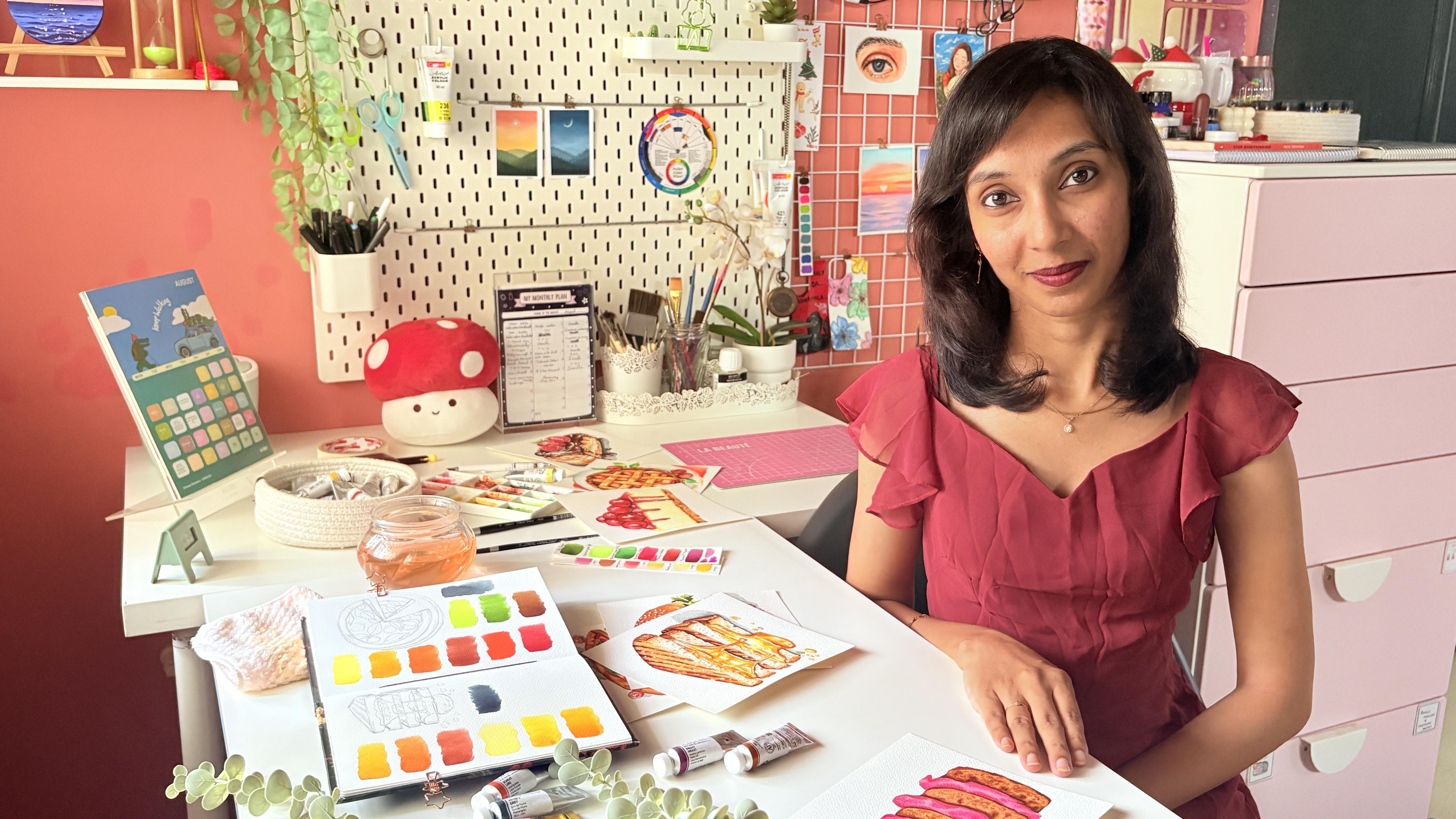
provokes. Hello, everyone. I'm Mani, a mother, a fashion designer, an artist, and an art instructor,
and I'm from India. Before we start, I'm
going to give you a quick idea about what
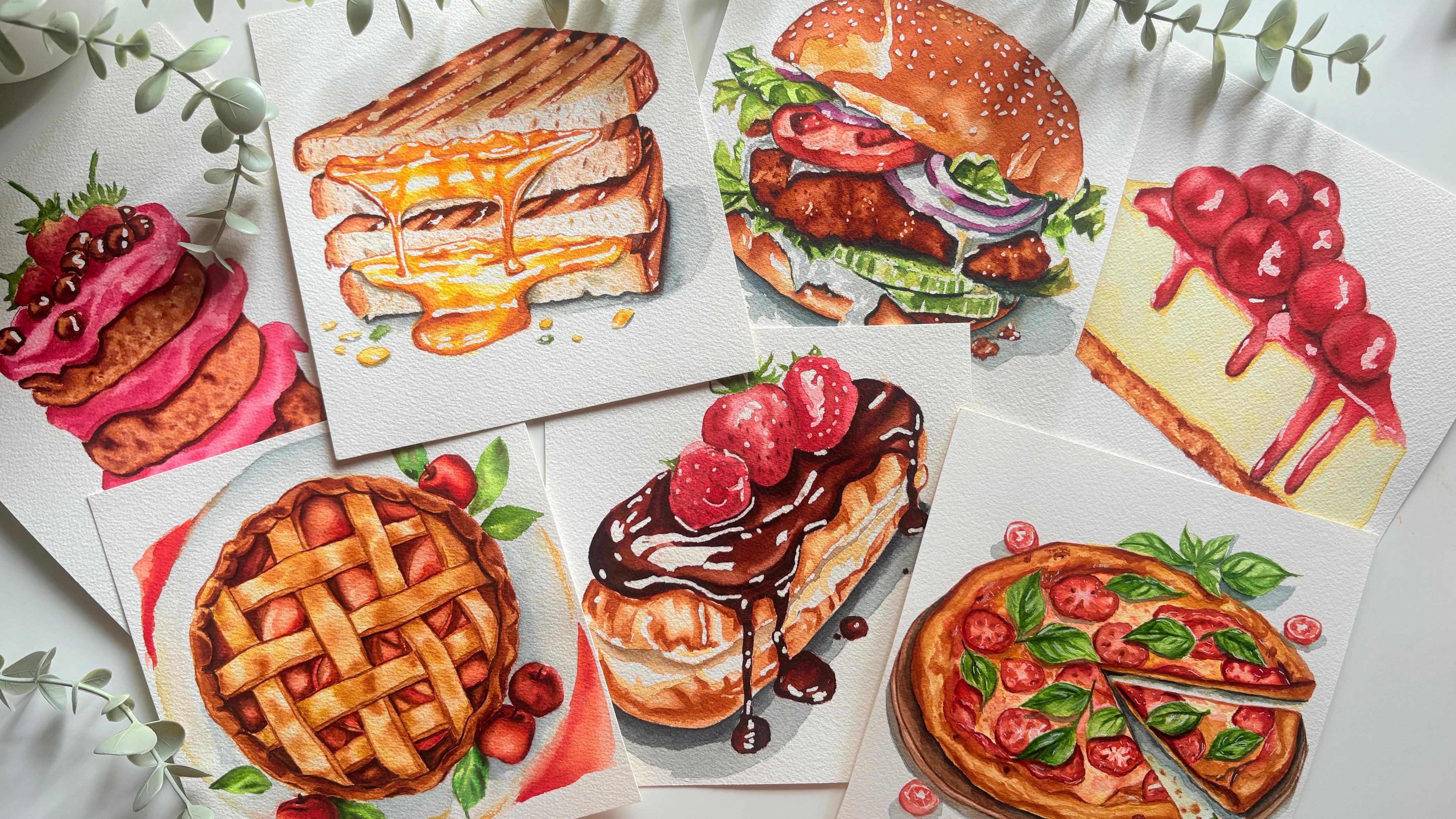
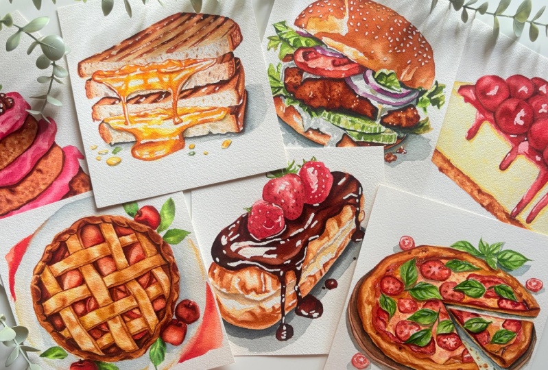
this class is all about. As the class title says, we will paint the seven realistic food
illustrations, sir. Throughout this class,
I will teach you how to practice outlining in the
simplest way possible. Additionally, learn about
the color palette and how to create a realistic food
illustration step by step. With each painting, I'm going to explain how and where
the color has been used and so many new techniques to paint food illustration
so realistic. You can see all the paintings look so yummy and so beautiful. All these paintings are just so attractive with
vibrant colors. This journey is going
to be more interesting. So these are the paintings that we are going to
do in this class. As seven realistic
food illustrations, we have a simple cherry
cheesecake that looks so creamy with a soft crust and
cherries with creamy sauce, an apple pie with a
beautiful bread crust and crispy lattice with
vibrant cooked apple inside. Yummy chocolate el with rich and thick chocolate
glazing on top. A grill toast which
has mouth watering, hot, melting cheese
between the slices. This looks so realistic. It's everyone's favorite pizza
with a crusty dough base, vibrant red tomatoes and
green basils as a topping. Strawberry chocolate cake with beautiful soft pastel strawberry frosting in between and
fresh strawberries on top. Last one is a delicious
burger with fresh onion, tomatoes, lettuce, and
chicken as a filling. It came out more realistic, which has me craving
to take a bite. Every painting is unique and easy for everyone
to learn and paint. For each project, there
is a technique session to give you a solid understanding
of the color palette, and we will learn
to draw outlines, and we will learn everything in detail in the main
project step by step. You will be more confident. Once after learning the outline, I will be teaching the step by step coloring process from how and where to
use these colors. We will have similar technique
for all the projects. If you're an absolute
beginner or intermediate, you will slowly understand and this project is going
to be more helpful. You'll get a basic
idea about how to paint your realistic food
illustration using watercolor. So yeah, here is a delicious set of food illustrations
for you all, and I think it's a
wonderful opportunity for you all to come out of your comfort zone and
try some new way to draw outlines and to use
a new color palette. If you are ready
to give it a try, join me in the next session
for the materials that we are going to use for
our upcoming project.
2. Materials you will need: Before we start the painting, let's have a look
at the materials you will need for our
seven day project. I'll start with the paper
because according to me, it is the most important aspect for the watercolor painting. So this well, here is a brand
called Kansan Heritage. It is an artist grade
watercolor paper, also arches. It is specifically
made for watercolor, and it is 100% cotton. So artist grade papers
are mostly 100% cotton, and student grade papers are a combination of
llulos and cotton. So try to go with the
paper that is 100% cotton. And the next thing is that this paper is cold
press watercolor paper, which means it has a
slight amount of texture. It is not flat and
not overly textured. You can find hard
pressed watercolor paper that doesn't have any texture. Then there is a
rough grain paper. Over there, it is a bit more textured than a
cold pressed paper. If you love working
with textured paper, you can go for rough
grain. One more thing. This paper is 300 GSM, which is one for DLPs, which means the quality is quite thick enough to hold multiple
layers of watercolor paint. Now, coming to the size, this one is 26 into 36
centimeter sized paper pad. For this painting, I have
chosen a square size. You can cut them or you can go with any size
that you prefer. So that's all about
the watercolor paper. Next material I'm going to
talk about is Watercolors. I'm going to use watercolor
tubes from various brands. This one here is PWC, which is from Shinhan.This
is a Korean brand. Next one is TUV an
Indian watercolor brand. This one is art philosophy. Then Vangug watercolor. And finally, white
Knights half pan set. You can use any watercolor
brand you have got. It doesn't need to be
the same watercolor that I have shown here. Now to mix your colors, you need a mixing palette. This one's a ceramic
mixing palette. You can directly squeeze
out the paint into the palettes and
it's easy to clean. You can go with
plastic or ceramic, but I personally
recommend using ceramics because it is easy to clean and they don't
stain the palette. Let's go to the
next art material, which is watercolor brushes. These are my absolute favorite
brushes for watercolor. They are all from brands
like silver brush, Princeton and then blo fur. Now, let's discuss the sizes
required for the projects. Round brushes from silver brush
sizes eight and six, sir. Wash brush from Princeton. Round brushes from Princeton
sizes three and three bar O. Round brushes from Rublov
sizes three and five, they have pointed tape. Next thing I'm going to talk
about is a jar of water. As you can see here, here, there is a two jar of water. One is to rinse of the
paint from your brush, and the other one
has to stay clean. We can use this water
in case you need to dilute some paint or apply
some water on the background. Having two chows of
water is always good. Next material is masking paper. This one is very basic. I'll be fixing my paper to the acrylic board which you
can lift and keep aside. You can even use it to
stick it on the table. The next two material are a pencil and a kneadable eraser, where a lot of
sketching is involved, you definitely need this to practice the outline on
before starting the lesson. Or I will help you with the basic outline technique
before starting the project. So these two are mustard. Next thing is you will need a tissue paper or
a cotton towel to clean or tab of the excess amount of
colors on the brushes. Final material is masking fluid, which is also
called drawing gum. It can be applied to the places where it
has to be highlighted, or you can use it to prevent
watercolor spreading. So that's all the material we will be needing
for the classes. Just get ready with this and
join me in the next session. It's time to learn our first
yummy food illustration.
3. Day 1 Cherry Cheesecake Techniques: Hello, dear friends. Welcome to the first day of the seven
day Food Illustration series. This is the painting that
we will be creating. It is a gorgeously colored. It's cheesecake. First, we can take a
look at the sketching. Then we can gradually try out
the colors and techniques. If you wish, you can try it with me or you can just observe. Let's practice the outline before jumping into
the main project. We'll start from the base draw a parallel slanting line and
join them on both sides. Following that, draw a
line 30 degrees from the left and 40 degrees from
the right and connect them. It appears to be a triangle now. Next, create a line to give
it a appearance of a crust. Lastly, draw circles to
place the cherries on top. Although it may seem simpler, try to master the outline so that you can
draw it precisely. Practice as much as you can
to get a proper proposition. Now, let's discuss the colors. So for the cheese part, I'm going to use maples
yellow and Titanium white. Both are from Shinhan. I'm just going to
mix them to get this milder color that
produces the ideal cheese hue. Let me show you the swatches for both colors and we'll show the exact color for the cheese. This one is naples yellow. As you can see, this
one is bit darker. This one is naples yellow
that is mixed with white. Now, you can see the difference. This one gives the
exact cheese hue. Now for the soft crust part, I'm going to use yellow
ochre and Bnciena. Both are from Shinhan. Let's see the swatches. I'm going to use the loc tone of yellow ochre as a base layer. This one is bunsena for the
second layer of the crust. For the cherries, I'm
going to use scarlet lake, Pyrrole red, and
permanent brown. You can go with any brand. It doesn't have to be the same. For the base layer,
the first one is a paler shade
of scarlet lake. And the second one
is pyrrole red. I used to give cherries
a deeper tone. TowsPermanent brown
is the final color. This gives the cherry
cheesecake its final appearance by adding depth and shadows
between the cheris. It's the final look of
the cherry cheesecake. The final product was more
realistic and attractive. I think we discussed
everything we need to know before you get started
on the main project, and I really hope that you guys were able to
follow the techniques. Join me on the next session so that we can paint a
realistic cherry cheesecake.
4. Cherry Cheesecake Painting: Welcome back. I'm so excited
for our very first class. We are going to print
a Chi cheesecake. I've got the outline
ready as we have discussed and
practice the outline in the technic session. Now, let's fix the paper directly onto the table
using masking paper. We will mark the highlights
using masking fluid. You can just directly take
it out from the bottle or else just pour it into a small bowl and
take it from that. As I'm going to mark the
highlights in a fewer places, I'm going to take it out
directly from the bottle. Now, we are going to mark
the highlights on top of each cherries because the shadow falls from the left side. So we are going to mark the
highlights according to that. Always use pointed tip brush
to apply the masking fluid. After applying the
masking fluid, let it dry completely so we
can proceed to the next part. Now, for the cheesecake part, I'm going to use maples yellow
mixed with titanium white. If you don't have naples
allow, just don't worry. You can mix any
yellow with white, and you will get
a similar color. It doesn't need to be the same. Now, for the crust part, I'm going to use yellow
Oka and Danciena. For the cherries, I have used
pyrrol red and scarlet leg. And finally, I have used pain
spray for depth and shadow. Now, evenly apply water
to the cheese part. Make sure it doesn't
go outside the line. Once after applying
water evenly, mix naples yellow and
white and apply evenly. Once you have applied the
color everywhere, take off the excessive colors only on the top part
using a dry brrush. Now, the base part looks darker. Now for the crust, let's apply a lighter tone
of yellow ochre. Then use a darker tone of
yellow ochre as a second layer. Now, take a darker
tone of yellow ochre, drop here and there
and let it bloom. Now, take the burn sienna and apply it in the same way
we did for yellow ochre. Then apply burn sienna below on top of the
crust layer by layer, as I have shown in the video. Then apply water to
the cherries and take a lighter tone of pyrrol red,
apply evenly everywhere. Make sure to use the
pointed tip press so that the color doesn't
go outside the line. Now, take a lighter
shade of scallot leg and apply it on the edges
below the cherries. And also on the dripping path. Clean the brush and
blend it evenly. For the cherries, take the
medium tone of pyrrol red and apply it to the center and
invers circle of the cherries. The same way applies
to all the cherries, blend them evenly
and make sure you paint all the cherries
before the water dries. Paint a darker tone to the cherry where it
is placed behind. Always clean the brush before
blending. Make sure of it. Now, take a darker
tone of scarlet lake and paint the edges and
the dripping pattern. Now, for the cherries, using the darker tone
of scarlet lake, paint the center and
corners of the cherries. Also paint the center of the cherries using
permanent brown. Now, you can see
the shinier part on both sides of the cherries. In the same way, we are going to paint cherries one
by one by painting the medium tone of scallot
leg and permanent brown as a darker tone inside and in
the corner of the cherries. You can see that I'm painting
the alternative cherries because if you paint the cherries next to
the painted cherry, the color will spread
to the next cherry. So just paint alternate
cherries so that the previous one will
dry in the meantime. If the background water
dries, don't worry, apply water to the particular
cherry and make sure it doesn't spread to the next
one and paint on top of that. Always use a darker tone to show the depth and shadows
between the objects. Once after completing
the cherries, let's take the darker
tone of naples ello, paint on the edges of the cheesecakes underneath
the cherry part. And above the crest part. And also on the right
side of the dripping pad. Now, we will remove
the masking fluid once it is completely
dry using an eraser. If you wish, you
can use your hands. Make sure your eraser is clean, so it will not
catch any color or else the color might
spread to other areas. Once I have removed all the
masking fluids carefully, I don't want to leave
the highlights as it is. If you wish, you can leave them. But I'm going to give a lighter wash so that it will give a
more realistic look. Using a lighter
tone of pyro red, give a light wash where all
the highlights were marked. Mm Once the painting is dry, remove the masking
tape carefully. Now, a realistic cherry
cheesecake is ready. I hope you enjoy this
process as much as I did. If you haven't tried
it along with me, go try it after this. Thank you so much for
joining me in this session. I look forward to meeting
you in the upcoming project.
5. Day 2 Cheese Toast Techniques: Uh Hello, dear friends. Welcome to the second day of the seven day fruit
illustrm Sirius. Here's the painting that
we are going to do. It's a cheese toast with a realistic cheese
dripping effect. First, we can take a
look at the sketching, then we can gradually try out
the colors and techniques. If you wish, you can write with me or you can just observe. Let's practice the outline before jumping into
the main project. Draw a parallel vertical line and join them horizontally
on both sides. Then draw line 30 degrees from the left to the right side. Now, draw a line 45
degrees right to left. Draw rectangular
boxes in between. Draw an equal line to make
four rectangular boxes and make a curved line on the right side as
I have been drawing. Here is the extra lines and
the lines between the boxes. Now, draw a slanting line
on top of the toast to make it look like toasted
or cooked appearances. Then finally, we draw the cheese stripping effect and mark the highlights
wherever necessary. Marking highlights is the most important
part in watercolor, as we can't correct
once it is painted. For the cheese stripping effect, just follow the video
for the perfect outcome. As an additional
tip, if you want, you can add a bit
of spilled cheese at the bottom for a
more realistic touch. Practice the outlines as much as possible before moving
into the main project. So for the toast part, we are going to use
only three colors which are yellow Ochre, burn sienna, and
permanent brown. These are from Shinhan and Tuwi. Let me show you the swatches. I'm going to use
the lighter tone of yellow ocher as a base layer. This is bunsena for
the second layer for the toast and
base layer of crust. This one is permanent
brown for a darker hue. You can go with any brand. It doesn't have to be the same. Now, this is the color I'm going to use for the
toast and crust. Now, for the cheese, I'm going to use naples yellow, Indian yellow, and
cadmium yellow orange. These are all from Shinhan. First one is a lighter shade of naples yellow
for the base layer. The second one is Indian yellow, which I used to get a
medium tone on cheese. The final color is cadmium yellow orange or
you can just use Burnsiena. I have used this for the depth and cooked
color for the cheese, but you can see that both cadmium yellow orange
and burn sienna look similar. You can use any color,
it's up to you. Finally, I have
used paints gray. I have used this color to show a shadow and a darker
tone between the toast. And for this, I have used
cadmium green light, which you can omit if
you don't need it to be. It's a cadmium green
light from Shinhan, you can use any green you have. It's the final look
of the cheese toast. It came out mouthwatering
and more realistic. I think we discussed
everything we need to know before you get started
on the main project. I really hope that you guys were able to
follow the techniques. Join me on the next session so that we can paint a
realistic cheese toast.
6. Cheese Toast Painting: Hello again. Welcome back to our second day of our
food lustration series. Today, we are going to paint a delicious cheese
dripping grilled toaster. I have the sketch ready now. I'm going to lighten the sketch using a knee double eraser. Now, using a masking fluid, let us mark highlights
wherever necessary on the toast butt and also on
the dripping cheese pattern. Be sure to use the
point tape brush for the perfect finisher. Marking highlights
is important as we can't correct once it is
painted using watercolor. Always try to learn your sketch
because you have to know where the light falls and where you need to
mark the highlights. Once the masking fluid
is completely dry, now let's start painting
from the top crest, then slowly move to
the layer below it. Then finally, we'll
paint a cheese patter. For this painting,
I'm going to use silver brushes six and eight. For the top layer, I'm
going to use yellow ocher, bunsena and permanent brown. Paints gray if needed. At the top layer evenly now. Then apply a light tone of
yellow ochre everywhere. Then slowly increase the tone of yellow ochre and apply it around the corners
of the toast. Now, take a lighter shade of burn sienna and apply
the corners as I showed. Then blend it evenly. Using a darker shade
of burn sienna, apply around the corners. Now, using the same tone, applied on the slanting
line in between that's inside the toast
and blend it softly. Now, using a lighter
tone of permanent brown, make a line around the toast
that looks like a crust. With the same tone, apply to the slanting line to give
a proper grilled effect. Make sure to follow the video
for the proper outcome. Keep increasing the colored
tone as I have shown. Same way, paint all the
toast and crust pad using those three colors
yellow Ochre as a base, bunsena as a medium
tone for the sides, and permanent brown for a darker tone for the
sides of the crust. Make sure to paint from a lighter tone to a darker
tone for a perfect finish. Never use black to
show a dark effect. You can either go
for a darker tone of the same cue or just
go for pains gray. Here, I have used Pains gray for death between the toast and
on the corns of the crust. Now, you can see how realistic
this toast already looks. If you don't have pains gray, do have it in your collection. Now, coming to the cut
part of the toast, using the lightest
tone of Bern sienna, just randomly apply dots or
marks like there is a hole. You can even use a
lighter shade of paints gray below the
cheese for shadow. Now, we have completed
the toast part. We'll paint a shadow using
a light duster shade of paints gray under
the cheese stripping and below the toast. And blend it evenly. Now, take a slightly
darker tone and apply only bill on the
right side of the toast. Now, coming to the cheese put, we'll start painting
with the base layer. Apply paint using
a lighter shade of naples yellow in all
the places evenly. You can go for the wet on
wet or wet on dry technique. Here I have painted wet on dry. Repeat the process using a
darker shade of naples yellow. Now, using a lighter shade of Indian yellow paint only on top and below the
highlighted part. Repeat the same process using a darker tone of Indian yellow
as we did for Naples lo. Make sure to follow the
video in this portion. Finally, using
cadmium yellow orange or any lighter shade of orange, you can even use Bersiena as it looks similar
to this color. Paint around the corner
of the highlights. I'm painting this part slowly so you can watch and
paint along with me, or you can watch and
try it out later. Now, repeat the process using a darker tone
of the same hue. Wend them evenly after every stroke for the
soft perfect finish. Finally, painter spill
the cheese and spices. Once the painting
is completely dry, using an eraser, remove all
the masking fluids carefully. Once it is done, give a light pause using a
lighter tone of burn sienna, where the highlights are
marked on the toast pat. Now, using a medium
tone of the same hue, paint around the places where
the cheese was painted. Make sure not to paint
using a darker tone, or it will look like a
cartoon illustration. Use a pointed hip brush
for the perfect outcome. Remove the masking tape carefully once the painting
is completely dry. Here is a delicious
cheese toast stady. Hope you enjoyed the
process as much as I did. Can't wait to see your creation. See you all at the next project.
7. Day 3 Chocolate Eclair Techniques: Hello, dear friends. Welcome to the third day of the seven day food
illustration series. Here's the painting that
we are going to do. It's a chocolate tecler. First, we can take a
look at the sketching, then we can gradually try out
the colors and techniques. If you wish, you
can dry it with me, or I can just observe. Draw three horizontally
slanting lines and join them on the right
side as a curved shape. And on the left, draw a curved line with an
incomplete as I have shown. Then paint a or chocolate
effect as well as a chocolate dripping
effect like an oval shape, then leave it incomplete on top. Now, draw three strawberries on the incomplete
place as I have shown. Draw a leaf on top
of the strawberries. Then finally, mark the
highlights wherever necessary. Mm Also, mark the places for the cream filling in
between the burn parts. So for the base part
of chocolate ecla, I have used Ica and Bnciena. Let me show you the swatches. We will be using the
lightest shade of loca. This is Bersiena. You can go with any brand. It doesn't have to be the same. Now, for the chocolate part, I'm going to use
permanent brown, transparent marsh
brown, and paints gray. You can use black if needed. This one is permanent
brown for medium shade. This one is transparent marsh
brown for a darker brown. If you don't have this color, just mix a little black with permanent brown
to achieve this color. This one is paints gray. Now for the strawberry, I'm going to use pile
red and brown madder. Both are from Shinhan. This one is pyro red. The second one is grown madder. The last color is paints gray. I have used this for
the shadow and depth. It's the final look of the chocolate tegler who
doesn't love chocolate? It looks sweet and amure, and I really hope that you guys were able to
follow the techniques. Join me on the next
session so that we can paint a realistic
chocolate tecler.
8. Chocolate Eclair Painting: I have the sketch ready, just like we practiced. Let's fix the paper
directly onto the table using masking tape. We'll lighten the sketch
using a kneadable eraser. Next, with the help
of masking fluid, let's mark the highlights. As I have so many
places to cover, I have taken a fluid
into the powder. Use a pointed tip brush
for a perfect finish. Now, let's start applying. Starting from the top layer, make sure to apply all
the highlights without fail so that you can
paint with confidence. Once the maskin fluid
is completely dry, I will start painting. For this painting, start
from the base part. For this, I have used
yellow ochre and burned na. These both are from Shinhan. We'll use silver brush eight. Now, we'll start applying
water as we are going to paint everything layer by
layer from bottom to top. Now, we'll apply water
to the bottom part. Make sure it doesn't go into the cream filling area because we are going to
leave the place white. Using the lightest
shade of yellow ocher, apply the color evenly. If you feel that excessive
color has been applied, just wipe it out using
a clean brushre. Following that, apply
a lighter shade of bunsena as I have
shown in the process. Slowly, increase the tone and
continue the same process. Now, apply water to the top part and paint the base layer
using yellow ochre. Using the next color
as burn Sienna, apply the second layer as I have shown to as quickly as possible before
the water get dries. If you feel the area is larger and you're not confident
enough to paint all at once, just divide it into two parts
and paint it separately. Once the painted part
is completely dry, we'll paint the middle layer using a lighter shade
of yellow ochre. Now apply burn sienna only on the top line
to show the depth. After finishing this part, we'll start painting the
chocolate glazing effect using permanent brown, transparent Mrs brown,
and pains gray. If you don't have
transparent marse brown, just mix permanent
brown with pains gray to get a similar color
that we are going to use. Now, apply water to
the top layer evenly. Oh start applying
a lighter shade of permanent brown
everywhere evenly. If you have applied
masking fluid, you can paint this
part confidently. This is the part that
you need to paint continuously so that the
background doesn't get dry. And also the top layer
gets spread evenly. So you can blend them properly. Now, apply the medium tone
of permanent brown below the strawberries
around the corners and between the highlights. Oh leave the dripping part. We can paint that finally. Then using the darker tone of permanent brown
paint to the areas, as I have shown in the videos. You can see how rich
the colour looks. Painting the green glazing is the favorite part for me while painting
food illustrations. Now, blend them evenly
using a clean brush. Now, using the
transparent mass brown, repeat the process as we
did with the last tone. Make sure to leave
the middle place with a lighter tone to
get a shining look. Finally, using paint gray paint the cornice to get
a darker depth. Make sure not to paint too much or don't go outside
the planted area, or the lighter shade
will get spoiled. Now, you can see the
rich chocolate effect that this painting
already gives. Now, coming to the
dripping pattern, paint using permanent
brown as a base layer. Apply the darker tone only as I have shown
in the process. Once this part is
completely dry, I will start
painting the berries for all the three
berries I have used, paler tone of pyral
red as a base tone. Apply a medium tone
of pyral red as a big circle dot to get a
perfect raspberry shape. Following that, we'll
paint the last beerry with the same medium tone
on the inner circle. Paint more darkly
on the inner corner to show the hip that the
strawberry is placed behind. As we learned from the
previous painting, always paint alternatively to avoid colour spreading
to the next one. Now, using the medium
tone of brown madder, apply it to the center part of the dots to make it look darker. Also, apply to the corner
of the strawberry. Once both the berries are dry, we'll paint the center one, starting from the base
layer with a paler tone, followed by a medium tone of the same hue or on
the inner circle. Follow the same techniques using the medium shade of
the brown madder. Now, using the permanent brown, mark dots inside
the strawberries. Once the berries
are completely dry, we'll paint the leaves. In the meantime, we'll
paint the shadows. Using the lighter
shade of pain spray, paint the base layer. Following that, use
the medium shade to paint the second
layer as I have shown. Finally, using the darker
shade of the same tone, paint a line closer
to the base part. I hope the strawberries
are dry by the time. We'll paint the base layer using the cadmium green light or any lightest shade of
green you have got. Following that, using
the lighter shade of sap green paint the
sides of the leaf. Lastly, paint the
spilled chocolate. Now, let it completely dry, then we can remove the
muskin fluid using eraser. So we have the cream
filling part left to paint. Now, using the lighter shade of yellow ocher paint the places where I have shown
in the process. Also, use the lightest shade of Pyl red to give a light wash
on the highlighted parts. Now, our delicious
dessert is ready. It's come out more
beautiful than I expected. Hope you enjoyed
painting this with me. Don't forget to
post your creation, meet you on the
next EME project.
9. Day 4 Apple Pie Techniques: Hey, all, welcome to the fourth day of the seven
day Food Illustration series. Here's the painting that
we are going to do. It's yummy apple pie
using vibrant colors. First, we can take a
look at the sketching. Then we can gradually try out
the colors and techniques. If you wish, you can try it with me or you can just observe. Let's practice the outline before jumping into
the main project. Draw a big circle and
make it a curved line. Draw an inner circle with a
small gap for a raider look. Then next, we are going to make a thick lattice vertically
and horizontally like a loop. Now, draw uneven curved lines in between the lattice to make
it look like apple fillings. Then finally, you
can draw outlines of the apples and leaves
outside the apple pie. You can omit this part if
you don't need it to be. My advice would be to
practice the outline as much as possible to make the painting look
more realistic. So for the crust, I'll
be using three colors, which are yellow ochre, burn sienna, and
permanent brown. Let me show you the swatches. You can go with any brand, or even the colors don't
need to be the same. Now, there is a trick here. I won't be using the
yellow ochre as it is. I'll be adding some
water to lighten the color to make the
color more transparent. So this is yellow ochre. This one is from Shinhan. You can see here that
the darker tone with less water and the lighter
tone has a little extra water. The second color is
bunsena from Shinhan, which I used to make the
crust look a little darker. The third color is
permanent brown, which is from Tuve to make the crust with a burnt
effect more realistic. Now, coming to the filling
part of the apple pie, I have used vermilion
he pyrol red. Along with this, I have used yellow ochre
for the pasiler. This one is from Shinhan. So that is vermilion hue, or you can use any bright orange seeds that you have to layer
the apple filling. The second one is Pyle red. You can use any red that you
have to paint the edges of the filling to look more cooked and to give
the depth of the filling. As you can see here, outside of the apple pie, I have apples, apple leaves, and a ceramic plate. For that, again, you'll be needing vermilion
hue pyrool red, and for the leaves, I'll
be using sap green, permanent green and
cadmium green light. It is not necessary to paint
these apples and leaves. It's up to you. And
for the ceramic plate, I have used pins gray. So this one is sap green. The second one is
permanent green. The final one is
cadmium green light. And finally, here you can
see this one is paints gray, which I'm going to use a darker
tone to show the depth of the crust and make it more transparent to paint
the ceramic plate. It's the final look
of the apple pie. I think it looks more
realistic and ama. I think we discussed
everything we need to know before you get started
on the main project, and I really hope that you guys were able to
follow the techniques. Join me at the next session so that we can paint a
realistic apple pie
10. Apple Pie Painting: Welcome to the fourth day of our seven day food
illustration series. Make ready the sketch, as mentioned in the
technique video. Using a kable eraser, make the sketch lighter. With the help of masking tape, stick the paper onto the table. The colors I'm going to
use yellow Ochre, buniena, permanent brown from
TUV, paints gray, sap green, cadmium green
light, permanent green. Pyl red, vermilion hue, and finally, white, if needed. I'm going to use size
eight from silver brush. We are going to paint
the Braided crust pat. Apply water evenly only
on the brided crust. Make sure it does not
go out of the line. Take a lighter tone of yellow ochre and gently
apply to the crust. Now, take size six
from the silver brush. Take a little darker
tone of yellow ochre and paint randomly towards
the inner line of the braided crust. Take Bziena and apply it on either side of
the brided crust. Then blend it evenly
using a clean brush. Now, repeat the process
using permanent brown. Now, blend it using a little water to
make it look softer. Now, coming to the lattice part, we will paint the
horizontal line. So while it dries, we will paint the
vertical lines. Apply water to the area
where we are going to paint. Take a lighter tone
of yellow ochre, gently apply it to the lattice. Where the lattice is
being overlapped, just apply a darker tone of
yellow ochre above that. Also on the sides of the
vertical line to show the depth. If the water dries, blend the corners
to give soft edges. Now, using burn Sienna, apply randomly onto the places where yellow ochre is painted. Just paint this area using
the pointed tip of the brush. If you accidentally apply a darker tone of any
color, just don't panic. Use water to blend it evenly. Now using permanent brown, paint inner curved lines to show the depth and also blend
it inside the lattice. Now, paint the lower part of the lattice to make it
look thick realistic. Same way, we are going to paint the vertical lines
of the lattice. If you're not confident
enough to paint all at once, just paint them individually. If your base color is wet, just apply the color and let it bloom to give soft
realistic edges. Just watch the process
carefully for more details. Now, coming to the filling part, we are going to use vermilion
hue and pyrrol red. For the base layer, we are
going to use yellow ochre. Gently apply a lighter shade of yellow ochre on the fillings. If you want, you can
paint one by one. It's not compulsory
to paint all at once. Now, take a lighter shade of vermilion hue and make sure it is not overly watered and start painting
the filling portion. Then blend it. Make sure the lattice and brided
crust is completely dry, or else those colors will spread into the
filling pattern. Now, take a lighter shade of payal red and paint
around the corners. Just keep a drop and
let it bloom inside. Apply a darker tone of the same hue on the same
color as a next layer. Make sure to paint
the fillings from the inner circle of the pie
for a more cooked effect. Now, apply the permanent brown around the corners
for a cooked effect. You can use any lighter shade
of paints gray if needed. Same way, paint
all the fillings. Watch the process
slowly to learn more. Finally, we'll paint
all three at once, using the lightest shade of permanent brown and darkest
shade around the corners. Once the pie is
completed and dry, we'll paint these apples these leaves and
the ceramic plate. For that, we are going
to use these colours. You can either use paints
gray or brown matter. It's up to you. First, we'll apply the lightest
shade of vermilion hue. Following that, paint
Pyrrole red on the sides. Then take out the colors in the middle part
to give highlights. Lastly, apply brown madder on both sides from
medium to darker tone. Use paints gray to paint a stem. Using the same process, paint the rest of the apples. After painting the apples, we'll paint these leaves using these three colors
permanent green, cadmium green light,
and sap green. Start painting the base layer using the cadmium green light. Followed by applying the
sap green on one side. Paint the base of the leaf using the permanent green
and blend it evenly. Same way, paint all the leaves. Now, for the ceramic
plate, using paints gray, apply the clust shade as
a base, then blend it. If you want, you
can also use yellow ocher to get a dirty
look on the plate. So using vermilion hue, paint the towel below the
ceramic plate, as I have shown. Paint these extra
details if needed. Once the painting is dry, remove the masking
tape carefully. Now, our realistic
apple pie is ready. It came out more
realistic than I thought. I hope you enjoyed
the processor. Join me on the next project to paint another realistic
food illustration.
11. Day 5 Pizza Techniques: Hello, friends. Welcome to the fifth day of the seven
day food illustration series. Here's the painting that
we are going to do. It's a pizza with tomatoes
and basil as toppings. First, we can take a
look at the sketching. Then we can gradually try out
the colors and techniques. Let's practice the outline before jumping into
the main project. Draw a big circle, then draw an inner circle, leaving in 1 " gap. Um, Now, draw a line that divides the
circle into three fourth. And in between the gap, draw a line that looks
like a triangle. Here is the excessive
line between the circles. So now for the toppings, draw circle on top of
the pizza for tomatoes. It doesn't have to be
same or look similar. Just paint as per
your creativity. Then finally, draw basil. Lastly, draw a semicircle below the circle
for a wooden base. Even though it looks simpler, try to learn the outlines patiently to draw
them perfectly. So for the crust part, I'm going to use naples yellow, yellow ochre, Bersiana
and permanent brown. Let me show you the swatches. I'm going to use
a paler shade of naples yellow for
the base layer. This one is yellow ochre
for the second base layer. This is Burnsiena for
the sides of the crust. The final one is permanent brown for the inner and outer circle. You can go with any brand. It doesn't have to be the same. Now, this is the color I'm going to use for the crust part. Now, for the tomatoes, I'm going to use vermilion hue, brown madder and scarlet lake. Or you can use any red
and oranges you have got. This one is vermilion
hue from Shinhan. The second one is a brown
madder from Shinhan. Now, for the basil, I'm going to use cadmium green light and sap green. First one is a lighter shade
of cadmium green light. The second one is sap green, which I used to get a
darker tone on basil. For the wooden base
under the pizza, I have used burnt umber, and for the shadows, I have used paints gray. So that's all the color that we are going to use
for this painting. Master the outline before
starting the main project. It's the final
look of the pizza. It came out exactly
as I wanted it to be. I think we discussed
everything we need to know before you get started
on the main project. And I really hope that you guys were able to
follow the techniques. Join me at the next session so that we can paint
a realistic pizza.
12. Pizza Painting: Hello again. I have the
sketch ready for the pizza. Now, let's tick the paper directly onto the table with
the help of masking tape. Let's lighten the sketch
using double eraser. For the dough part, I'm going to use naples yellow, yellow ocher, burn sienna,
and permanent brown. For this painting, I'm going to use size eight
from silver brush. Let's wet the area evenly. Make sure to apply only
on the crust part. Take the paler shade of naples yellow and apply evenly
around the crust. For the second layer, take the lightest shade of yellow ochre and apply it to the outer corner
of the crust. Repeat the process
using a darker shade of yellow ochre and blend it
evenly using a dry brush. Now, using the same shade, apply to the inner
circle of the crust, as I have shown in
the process and blend it in the center part
to make the soft edges. Now, using the medium
shade of burn sienna, paint the outer
circle of the crust. Make sure to follow the process step by step
for a better outcome. Now, apply the
darker shade of burn Siena randomly here and
there around the circle. Blend them after every stroke. Finally, using permanent
brown paint outermost crust to show the cooked effect. Using the same method, paint the crust of
the sliced pizza. By this time, you would have
noticed that yellow ka, Bernsena and permanent brown are the major colours for all the crushed dough
and cake paintings. So if you love painting
food illustration, just have these colors
in your collection. Once the crust part
is completed and dry, we will start painting the inner paste part using a lighter shade
of naples yellow, applied to all the places
where there are no toppings. Make sure to apply the color without disturbing the toppings. If you're not confident
enough to paint all at once, paint it in a smaller portion. Following that, take a
lighter shade of yellow ochre and just drop the color here
and there and let it bloom. If your background is dry, apply water undo the
previously mentioned process. Using the medium tone
of yellow ochre, paint underneath the leaves
to show the depth and shadow. Now, using the Taylor
shade of pyral red, drop the paint here and
there around the toppings to give a saucy look and blend
them to get a better result. Once the base part is dry, we will paint the tomatoes. Take the lighter shade of
scarlet leg and apply it to the particular tomato
and take out the colors at the center using a dry
brush to give highlights and take a medium tone
of the same hue and give the proper
cut tomato shape, as I have shown. Now, using brown madder,
apply to the corners, repeat the process
using permanent brown and mark at the
center of the tomato. Repeat the same process for all the tomatoes
individually. Make sure to apply the darker
tone on the corners when the object is placed behind
or below to show the tip. If you don't have
the same color, just go for any red and
orange you have got. Try to practice the
tomatoes separately to get confidence while
painting on the main project. After painting the tomatoes, we will paint the basil
using these three colors. Make sure that the tomatoes
are completely dry or else the green colour
from the leaves will spread. And finally, we will paint the tomatoes and basils
outside the pisa. For the lighter shade of basil, I have used cadmium green
light and maples yellow. Now, apply naples yellow
to the lower part of the leaf and apply permanent green to the top part of the leaf and blend them. Now, using sap green, apply to one side of
the leaf blend it. Repeat the same process
for all the leaves. You can paint all
the leaves using different techniques as
per your creativity. Using sap crean, give a stroke inside the leaf like
I have shown blended. L. Using a darker
tone of sap grain, paint a line inside the
leaves as a center line. Once after painting the basil, paint the side crust using a lighter shade of yellow
ochre as a base layer. Use Gersiena for the second
layer in the same place. Now, using burnt amber, we will paint the wooden base. Using a lighter shade
of burnt umber, paint the wooden base
where we have marked. Now, take the medium tone of
the same color and apply it to the top layer of the wooden base and keep
increasing the tone. Just follow the process
as I have shown. Now, using Plains gray, apply the shadow between
the slices and blend them. Now, using the darker
tone of Pains gray, apply a line closer to the
slice using the same shade. Apply below the wooden base. Using the lighter shade
of Naples yellow, apply it in between
the slices like cheese melting and drop the yellow occur here and
there for the spilled effect. Now, we will paint the basil and tomatoes
outside the pizza. It's up to you whether you can paint or omit this process. I have painted this to give
a more realistic look. Finally, using a darker shade of gray paint below the
pizza for a deep shadow. You can use black if you want. Paint the shadows
for the basil and tomatoes using a lighter
shade of paints gray. Once the painting is dry, remove the masking
tape carefully. A realistic pizza is ready. Hope you enjoy this process. Let's meet on the next project. Oh.
13. Day 6 Strawberry Chocolate Cake Techniques: Hey, all, welcome to the sixth day of our seven
day Food illustration series. Here's the painting that
we are going to do. It's a simple chocolate cake. First, we can take a
look at the sketching, then we can gradually try out
the colors and techniques. If you wish, you
can try it with me, or we can just observe. Let's practice the outline before jumping into
the main project. If you are a beginner, it is going to be more
easy for you to try. Draw a parallel vertical line and join them only
in the part below. Well, start drawing the cake and frosting from bottom
to top layer by layer. Now, draw the
frosting one by one. Now, draw a chocolate
pause randomly. Finally, grow the strawberries like
it has placed behind. Now the outline is completed. We'll look into the
color palette for strawberries for frosting
and cake parts separately. For the cake part, I'm going to use yellow oka, burn sienna and permanent brown. Let me show you the swatches. This is yellow ocher
for the base layer. The second one is burn
sienna for texture. The last one is permanent
brown for depth and shadow. Oh so all the three
layers of roasting, I have used permanent
rose and brilliant pink. These both are from Shinhan. This one is brilliant
pink for a base layer. The second one is a permanent
rose for the darker shade. Lastly, brown madder
for depth if needed. Also, I have used the same brown madder for the darker shade
in the strawberry, and for the strawberries, I have used two colors. These are pyrole red
and brown madder and also cadmium yellow. This one, pyrole red for the
base layer of strawberry. Now, for the chocolate
balls on top of the cake, I'm going to use burn
sienna and permanent brown. For the strawberry leaves, I'm going to use Cadmium
green light and sap green. This one is cadmium green light, and the second one is sap green. So that's all the color that we are going to
use for this painting. You can even change
the colors of the frosting as per
your creativity. It's the final look of
the chocolate cake. It came out so beautifully, and the frosting
looks so em and soft. I think we discussed
everything we need to know before you get started
on the main project, and I really hope that you guys were able to
follow the techniques. Join me on the next session.
14. Strawberry Chocolate Cake Painting: Oh Hey, everyone. Welcome to the sixth day of our seven day food
illustration series. I have the sketch ready. Lighten the sketch
using the Kuble eraser. Fix the paper onto the
table using masking tape. So for the cake part, I'm going to use
yellow cha Burnsiena and permanent brown. I'm going to use the
silver brush shi six. We'll paint from top to bottom, apply water to the area evenly. And apply yellow ocher. Take out the excess color
if you feel it is darker. Following that, take
a lighter shade of bunsena and apply it to
the top part of the cake. Now, do the same for
the bellow part. Now, using a darker
shade of burn sienna, repeat the previous
process and drop the colours in between here
and there and blend them. Keep increasing the tone to paint the corners
of the cake. Using permanent brown, paint
the top edges and drop the colors in the middle part and also paint the part below. Repeat the process for
the middle layer of the cake and also the
base layer of the cake. Follow the process
for more details. Paint the bottommost
layer darker. Once the cake part dries, we will paint the
strawberry frosting. Now, for the frosting, I'm going to use brilliant
pink and permanent rosa. If you don't have brilliant
pink, don't worry. Even the color pigment in the
brilliant pink says it is a mixture of permanent
rose and titanium white. So just mix permanent rose with white to get a similar
color that we have here. So let's paint from
the top layer. Apply water evenly and make sure it doesn't go into
the chocolate bowls. Then apply brilliant
pink evenly. Now, using permanent rows, apply it to the place
where I have painted. L If the color spreads, just take it out using a dry brush and blend
it to give soft edges. Now, using a darker tone, apply around the corners in the sides and below
the chocolate balls. If you want, you can use brown madder to show
the dark effect. But I have not used the darker tone because
I like this soft color. Repeat the same process
for the next two layers. As you can see that I have applied the base
layer more watery, so the darker tone
is getting spread. Don't worry in this stage. Control the water
using a dry brush or apply a small amount of darker
color and let it bloom. H Once the frosting is completed, I will mark the highlights
on the chocolate bars using masking fluid
and let it dry. Oh So let's leave this part to dry completely. By the meantime, once the
frosting is completely dry, I will paint the shadows
underneath the frosting using the darker tone of permanent brown and also on
the top of the frosting. As you can see the
difference after this. Now, coming to the
chocolate bars, pin the base layer using busiena and paint using
permanent brown on the corners. Same way, paint all
the chocolate bars. We'll paint strawberries once this path is completely dry, using pyrole red
and brown madder and also using cadmium yellow. Apply cadmium yellow on
top of the strawberries. Make sure to paint the
strawberries alternatively. And using a lighter
shade of pyrole red, apply to the rest of the places. Using a darker tone
of pyrrol red, apply it on the edges. Repeat the process
using brown murder. Follow the same steps to
paint the middle strawberry. Once the strawberry is dry, using cadmium green
light and sap green, I will paint the leaves. Take the lighter shade
of cadmium green light and apply it to all three
leaves on the strawberries. Then using sap green, apply only on the
edges of the leaves. Now, after removing masking fluid from the chocolate bars, our strawberry chocolate
cake is ready. Hope you enjoyed
painting the processor. We'll meet you on the last
food illustration project.
15. Day 7 Burger Techniques: Uh Hello, dear friends. Welcome to the seventh day of the seven day food
illustration series. Here's the last painting
that we are going to do. It's a tasty chicken burger. First, we can take a
look at the sketching, then we can gradually try out
the colors and techniques. If you wish, you
can try it with me, or you can just observe. Let's practice the outline before jumping into
the main project. We'll outline from the
bottom to the top. Watch me outline closely
for more information. We'll outline from the
bottom to the top. Rather, baseline curved. Following that, outline
the lettuce and continue drawing the line for
the patty and the cucumber. Always outline later. Once this part is done, again, strand from the left. Following this from
the left now draw outline of the chicken
and tomatoes above that. Coming to the right side, draw the extra chicken and
draw an onion about that. Watch carefully and draw an
outline for Manas in between. Finally, draw lettuce
on both sides of it. Then draw the base
layer of the bun. Lastly, just mark
the sesame seed on top of the bun and
mark the highlights. As you can see, I have
started out learning a little about that there is not enough space
for the top part. It may look simpler, but for beginners,
it's very difficult. So practice the outline a
lot for a better result. So this is the outline
that we are going to do. So for the bun and the
fried chicken part, I'm going to use these colors. Yellow aka, burn sienna, permanent brown, and
paints gray if needed. Let me show you the swatches. This is yellow Ochre
for the base layer. This is bun sienna. The third one is
permanent brown. You can go with any brand. It doesn't have to be the same. Now for the lettuce
and cucumber, I have used cadmium green
light and sap green. These both are from Shinhan. This one is cadmium green light. Second one is sap green. You can see here
that I have used yellowish green because I have mixed cadmium green light with yellow ochre to get
a similar color. To make it more darker, just makes yellow occur to
get this particular shade. This I have used for lettuce. Now, for the tomato, I have used vermilion
hue and brown madder. These both are from Shinhan. The first color I'm going to use is a paler shade
of vermilion hue. The second one is brown madder. Now, for the onion I have used bright violet from Shinhan and permanent
magentha from Shinhan. This one is bright
twlet for base layer. The second one is permanent magentha for the second layer. Lastly, for shadow and
depth between the fillings, I have used pain screy. So that's all the color
that we are going to use. It's the final look of
the chicken burger. It came out really lovely. I think we discussed
everything we need to know before you get started
on the main project. And I really hope that you guys were able to
follow the techniques. Join me at the next session so that we can paint
our final project.
16. Burger Painting: Hi, everyone. Welcome to the final day of the food
Illustration series. I have the sketch ready. I hope you practice the outline from the
previous technic session. Make the sketch lighter
for better results. Using the masking tape, stick the paper directly
onto the table. With the help of masking fluid, let's mark the highlights. If you're not sure where
to mark the highlights, just watch the video
before starting. Mark the spots for sesame seeds. Once the masking fluid
is completely dry, we will paint the
top part of the bun. Let's wet the area completely. Take a lighter shade of yellow ochre and apply
it everywhere around it. For this, I have used burn sienna and yellow
ocher from Shinhan. Now take burn sienna and apply it before the
background water dries. Take a darker shade of burn
sienna and apply it to the top part of the burn and to the places where I
have shown in the video. What's the process before
starting the painting? Leave the particular places lighter than the rest
of the places darker. And apply the darkest shade of Bziena on the top pot to
get a more realistic look. Finally, using
permanent brown paint the top corners and
blend them evenly. When this part is
drying, meantime, we will paint the fried
chicken using the same colour. Just apply the water precisely and apply yellow Ochre
as a base layer. Take off the excessive
color if you feel like you have
applied more dark. Following that,
using burnt sienna, apply it around the corners. Just put the colored drops and let it bloom. Don't blend them. Now, take a darker tone of the same color and
repeat the processor. Using permanent Brown, apply to the places I
have shown in the video. Make sure to follow the
process step by step. Finally, using permanent brown, mark dots inside
the chicken put. Repeat the same process for
the chicken put on this side. Also, we have a
small portion here. Once the chicken
part is painted, let's paint yet uses one by one. Using a lighter shade
of cadmium green light, apply the base layer. Watch the video more
closely for more details. Unlike other paintings, this
painting have more details. Blend to make the color
even more lighter. Same way, applied to
all the lettuces. Now, take a lighter shade of sap green and give the
shape for lettuce. This shows where
the leaf is folded. Apply the same to
all the leaves. Now, take a darker tone of sap green and
repeat the process. If you want the sap
creen to be darker, just mix paints gray
to get a darker color. Now, mix yellow ocher with cadmium green light to paint
this part of the lettuce, as we learned from
the technician, to give a ripe leaf look. Now, give a shape to
lettuce using sam grain. L Now, using paints gray, paint the shadows above and
underneath the lettuce. After painting the lettuce, let's paint the cucumber. Apply a lighter shade of cadmium green light and using a lighter shade
of yellow ochre, mark a line above the cucumber. Then using sap cream, apply the line above the
cucumber like we did with loca. Do the same process for
the second cucumber. Once it dries, let's paint the tomato using
these three colors. They are all from Shinhan. Apply a lighter shade of
vermilion hue everywhere evenly. Take a medium shade
of the same tone, applied to the skin
part of the tomato. Now, using brown madder, applied to the either
side of the skin. Now, using the same tone, make a shape inside the tomato. Now, repeat the process using a darker tone
of brown matter. Now, take permanent brown and mark the edges
to show more depth. A Once the tomato is completely dry, we will paint the onions using Bright violet
and permanent magenta. These both are from Shinhan. Take a lighter shade of bright violet and apply
to the skin of the onion. Now, take a medium tone
of the same shade, applying to the center and
either part of the onion. Now, take a medium shade
of permanent magena paint, center, and either side of the onion to make
it more realistic. Repeat the process
on the next onion. You can even use lighter shade of paints gray for more depth. Now, once after
painting the onion, we will paint the bun
that is placed below, apply water evenly, then apply yellow
ocher as a base layer. Following that, apply burn
Sienna as shown in the video. Keep increasing the tone
and apply it to the edges. Then using a lighter
shade of permanent brown, repeat the process and blend
them to give a soft edge. Once after painting
the bun part, take a lighter shade
of pains gray and give an uneven shape inside where we left space
for mayonnaise. Once after painting
the mayonnaise, using a darker shade
of pains gray, apply a deep line
below every object. If you're not sure how to do, just watch the process and
follow the instructions. Now, using a medium
shade of burnt sienna, apply it below every sesame
seed to paint a shadow. Now, using a lighter shade
of paints gray paint a shadow below the burger to
the place where we marked. Following that,
use a medium tone and paint the second layer. Finally, using a darker
tone of paints gray, apply a D plant closer
to the base part. Once the painting
is completely dry, we will remove the masking
fluid using an eraser. After removing
everything clearly, use a medium shade of yellow ocher and paint in the
places where I have shown. Then blend them softly. Now, remove the masking
tape carefully. A delicious chicken
burger is ready to eat. Hope you enjoyed this process. Can't wait to see your creation.
17. Thank You for Joining: Congratulations if you completed watching all the projects. Thank you so much for joining. I hope you all enjoyed painting the food
illustrations with me. There are a lot more food
illustrations are there to try. I can't wait to see
the realistic food illustrations that
you have painted. Again, thank you so
much for joining. For me, painting and heating
have been a therapy. So I love painting
food illustrations, and also I love to explore
so many different mediums. And this is not the end. Consider this as a beginning. If you enjoy this class, I would really love it if
you leave a review for me, and I would love to see
your class projects. So do upload your class projects
to the project session. Happy painting. I really
hope to see you next time with another gorgeous project collection of paintings.
 Manohari Muralidharan, Artist