Transcripts
1. Welcome to The Class: As the air turns crisp and the color of
nature begins to glow, it's time to slow down, breathe, and paint
the beauty of fall. Welcome to six easy fall
watercolor paintings, Autumn theme for
beginners. Hi, everyone. I am Manohari, an
artist, an art educator, and I'm so happy to welcome you to my cozy
watercolor class. I have been painting
for several years, and I truly believe that art has a beautiful way of calming mind and connecting
us with simple moment. Through my class, I love helping others with the
same peaceful shot, creating art that feels warm, personal, and full of art. In this class, we
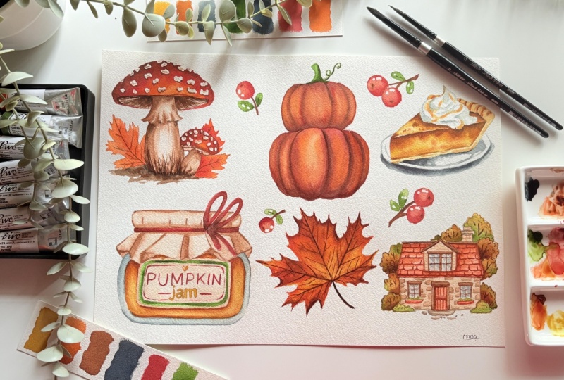
will be celebrating the season of fall with six
easy watercolor projects, perfect for beginners or anyone who wants to
unwind and paint along. In this class, together, we will paint a tiny forage
mushroom, a glowing pumpkin, a delicious pumpkin pie, a cozy pumpkin jam jar, a radiant maple leaf, finally, a charming autumn houser
under by golden trees. Each painting is designed
to help you relax, explore colour and enjoy the soft flowing beauty
of it on wet watercolor. You learn how to
create smooth blends, layer glowing autumn tones, and add simple details that bring warmth and
life to your art. Each lesson is slow paced, relaxing and filmed
in real time, so you can paint comfortably
with me step by step. By the end of this class, you will have six beautiful fall paintings ready to frame, gift or decorative space,
and most importantly, you will gain the
confidence to continue exploring watercolor
with joy and ease. So light a candle, make yourself a cup of tea, and let's paint together as we welcome the golden
season of creativity.
2. Materials & Colour Palette: Before we begin painting, let's go through all
the materials you will need for this cozy
autumn watercolor class. I'll be painting on Arch's
cold pressed watercolor paper, 100% cotton and 300 GSM. This paper holds water beautifully and allows the
colors to flow gently, giving the soft glowing texture we love when
wet-on-wet watercolor. I'll be using ten
by 14 in sheet and painting all six projects
together on the same paper. It's a lovely way to create a little autumn
collection on one page. For paints, I am using a Korean branded Shinhan PWC,
professional watercolors. They are rich in pigment, transparent and blend smoothly, which makes them perfect for capturing the gentle
tones of fall. My color palette
includes yellow hooker, burnt sienna, burnt
umber, Brown der, brilliant orange, vermilion hue, Indian yellow, paints gray, and sap green for those
earthy muted accent. For brushes, I'll be using the silver brush black
velvet 3,000 is serious. A size eight round brush
for washes and large areas, a size four or six for
layering and midsized details. These breasts holds a lot of water and have a
beautiful spring, making them easy to control for soft washes and fine lines. But don't worry if you don't
have the same supplies, please feel free to use
whatever watercolor paints, papers, or brushes
you already have. It's your creativity and
joy that matters most. The techniques I'll
be sharing you will work with any good
watercolor materials. You will need a mixing palette. Two jars of clean water. One for rinsing your breast, and one for clean washes, and a tissue or paper towel to blot or lift
off excess paint. Keep a pencil and eraser
ready for light sketching. Use masking fluid
for any highlights. Use masking tape to secure your paper edges
neatly on the board. I've also attached a
downloadable outline file for all six projects. You can print them or trace them lightly onto your watercolor
paper before we start. That's all you need.
Simple materials, warm colors, and your
creative sprint. Ready to bring the magic of
autumn to life on paper. So gather your supplies, prepare your outlines, and let's begin our first fall
painting together.
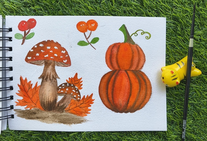
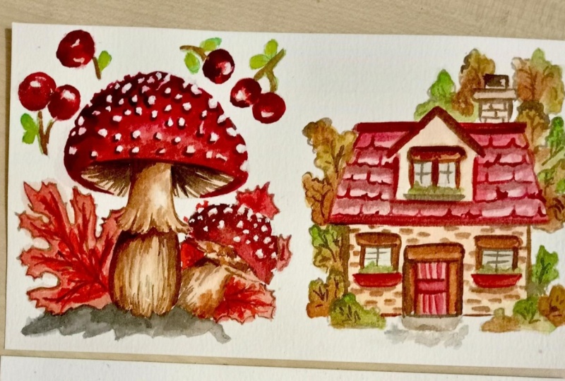
3. Mushroom: Hey, everyone today, we'll paint a dreamy mushroom using
the wet-on-wet technique. Get your mushroom outline ready from the
downloadable file. We are going to use brown mida, scarlet lake, brilliant orange. Paints gray and burnt umber. Before we start, let's
test our colors. These five will form the foundation of
our entire painting. See how each look on paper. Vibrant, warm, brilliant
orange for a light warm basin. Warm scarlet red tone creates dark maroon for cap shadows, deep muted reddish
brown madder for rich rest for the top
section of the mushroom. Deep warm brown umber for a warm rich mid tone
on mushroom stem. Deep blue gray for cool shadows. If you want crisp white spots, apply masking fluid to those shapes now and
let it dry fully. If you prefer to paint
the spots later, skip masking and plan to add them with white
gouach at the end. Always keep the
pencil lines soft. Don't press hard. Refer to the downloadable picture for the outline in the project
and resources section. Once it's completely dried, for the first to wash, wet the mushroom cap
area with clean water evenly to paint using the
wet-on-wet technique. Make sure the water doesn't
go outside the line. Wet-on-wet technique
helps you move from light to dark smoothly, and you can watch how
colors interact naturally, something you can't get
with opaque mediums. Not dripping wet,
it should be shiny. Load your brush with
brilliant orange. Apply the color evenly
across the cap. While still wet, you can
drop in a slightly thicker, brilliant orange near the edges. Make sure the middle is lighter. If not, take out
the excess color using a clean dry brush. The warm orange glow
will shine through later layers and make the mushroom look
natural, not flat. Using scarlet lake, start adding colors from the top
and edges of the cap. Let it softly blend
into the orange base. Don't cover the
orange completely. This is the mid tone layer. It adds body and volume. Leave the lower curve of the cap slightly lighter so
it look rounded. For the last layer, use brown madder to create
realistic shadows and depth. Apply the colors to the
underside of the cap, which is the shadow area. Also around the edges where the cap curves
away from the light. This final layer
sculpts the mushroom. It shows where the
light heats and hides. Keep layering until
it gets darker. Finally, add brown umber to give the deepest
shadow and soften the edges slightly with a clean damp brush so the
shadow blends smoothly. Mix of brown madder
plus burnt umber gives a rich chocolate tone for the
top of the mushroom capper. Lightly with the stem
area with clean water, just enough for a shiny surface. Mix a very diluted burnt umber, which is a light tea washer. Drop it gently into the wet paper and apply
it around the stem. Leave the center
apart for light fall. Let it partially dry so
that the shine fades, but the paper is
still slightly damp. Mix a medium burnt umber
with less water this time. Drop it along one side of
the stem and lightly drag the tip of a brush vertically with burnt umber to
mimic stem lines. Use a mid tone of
the same hue to paint underneath the
first half of the stem. Following that,
mimic the stem lines using the same mid tone
from bottom to top. Add a touch of paints
gray to give extra depth. Add a darker hue. If the top of the cap feels
lighter after it dries, it's up to your painting. Same way, paint the stem, which is below the cap, drop the color gently
into the wet area, remove excess color
from the right below, and let the pigment
flow down naturally. It will create a soft
vertical gradient. Use medium burnt umber, drop it along one
side of the stem, shape the folded area. With a thicker bunt umbertuch the darkest areas near the
base and under the cap. To paint a small mushroom
using a wet-on-wet technique, float diluted brilliant orange, drop it onto the
cap area gently, let it spread naturally. Second layer with scarlet leg while the surface is still wet. Following that add
brown madder and burnt umber to the deep
tone are on the cap. Also, to give the
deepest shadow. For the stem, use a light
burnt umber wash and drop in more pigment to all the sides to give a dark and perfect
cylindrical look. While the cap is still wet, add a touch of burnt umber
near the underside of the cap. It will spread
slightly and create a soft shadow, if needed, add a tiny touch of
pain screen to form a darker base and darken
the underside shadow. Use a light burnt umber wash on both sides where the
gills have to be placed. While the base dries with the entire leaf
with clean water, load diluted brilliant orange. Drop it into the
edges of the leaf. Make sure to give the edges proper shape and let it
spread towards the center. While the surface is
still shiny and wet, touch brown madder along
the center of the leaf. Watch it softly merge
with the orange. It will create glowing
red rush tones. Lift a bit of
brilliant orange with a damp brush where
you want highlights. While it dries, we'll paint another leaf with
the same technique. Mark the edges
with an orange hue and fill the rest with
deep brown madder. Drop a bit of brown madder in the lower part of the
lobes for shadow. Use a rigor or small round brush and a
diluted mix of burnt umber and paint gray to
paint the gills as thin radiating strokes
from the stem outwards. Very line thickness and
lever few paler gaps, so they look natural. For the deepest
shadow under the cap, use a stronger mix, which is more pain scrape plus burnt umber applied
on wet on dry. Make a line under the cap to give depth and a deep shadow. Using the same hue with a rigor or pointed round brush,
paint the inlines. By the time of drying, remove the masking
fluid if you used it. Using a light burnt umber paint, paint the surface
underneath the stem. While the base is still wet, load a mix of paints
gray and touch it into the areas where
you want cool shadows. Darken slightly near the base of each mushroom to anchor them. Use the tip of a small round
or rigor brush and drop in a few upward flicks of paints gray into the still damp area. Grass blends gently without
a half separate strokes. Hope you had fun exploring colors and
techniques in watercolor. See you in the next class. Happy painting.
4. Pumpkin: Hello, everyone in
today's schon will paint a beautiful cozy autumn pumpkin using only the wet
on wet technique. Make ready the outline using the downloadable resources
from the project section. Here are the four colors
we'll be using today. Brilliant orange, brown
madder, pains green, and sap green, our
main pumpkin color, right, and cheerful,
brilliant orange. Brown madder, a
warm reddish brown that deepens the orange. Pains gray a cool neutral
for soft shadows. And finally, sap
green for the stem. Now we'll begin painting
the bottom pumpkin, but only alternate
segments first. This helps keep each section's
edges soft but distinct. Wet the alternate three
segments with clean water. Make sure it's evenly shining. While the paper
is still shining, load your brush with
brilliant orange, a light, watery mix. Drop the color into the middle
of each pumpkin segment. Let it spread on its own. Don't brush too much. You'll see the color
blooming beautifully. That's the magic of wet on wet. Take a slightly deeper tone of brilliant orange and
apply it to the sides of each segment and take off the excess color from the middle using a dry brush to
give a more shiny look. While still wet, add a bit of brown madder along
the edges for shadow. Also the side of each segment
and near the bottom edge, let it gently spread
into the lighter center. Let's mix brown madder with a touch of paints gray
for a darker tone. Use the tip of dress to
drop this color along the grooves between segments and the shadow
under the pumpkin. Repeat the process for
every other segment, leaving gaps in between to dry. Drop the color, brilliant
orange right into the center. Remove the excess color at the center for a
shiny look if needed. Following that, add
brown madder to mix of paints gray and add to the bottom and
sides of the segments. Keep increasing the tone
for a darker shadow. Using a pointed tip, take a deep tone and
make a line in between the segments and at the
bottom to create depth. Paint the remaining
segment in the same way. Whit first, then drop
brilliant orange, blend it with brown madder, remove the excess color for a shiny look and deepen
with paints gray mix. Finally, add a line in between the segments and
blend them evenly. Drop a deep mix of paints gray and brown madder to create a soft shadow and let it fade inward smoothly or just blend them evenly as
per the pumpkin shape. Let the pumpkin dry fully before painting
the one above it. This time, we'll paint the entire pumpkin wet
on wet together to get a softer transition wet the whole top pumpkin shape
evenly with clean water, drop brilliant orange
across the middle areas. This first layer creates
our warm glowing base. The wet paper will help it spread and soften automatically. Leave the very top pot slightly lighter for
a gentle highlight. The paper and water are
doing most of the blending. Next, we'll deepen the color on the sides and near
the lower edge, add brown meter to the lower edge and
let it bleed inwards. Touch this hue gently into the outer curve of each segment. Add a mix of brown madder with paints gray to make a
rich, warm orange brown. That's this mix gently into the outer curves
of each segment, and also the bottom edge where the stop pumpkin rests
on the lower one. If you want the pumpkin
to look more rounded, add a touch of this darker
mix on one side only, either left or right. Drop a deep mix of paints gray
and brown matter to create a soft shadow and let it
fade inward smoothly. Repeat the process on
the top of the pumpkin, blend them evenly as per the pumpkin ship to
give a soft edge. Using a pointed tip, take a deep tone and
make a line in between the segments and at the
bottom to create depth. If you want a stronger contrast, add another drop of brown madder near the bottom while
it's still glossy. Now, for the final touch, we'll use the sap green. Drop sap green in
the base and middle. Add little paint gray
to the shadow side. Let it blend softly to
create natural gradient. Use a pointed tip brush to add
a tiny swirl for the vein. So that's a final product. Thank you for
watching. See you at our next Casi autumn
painting session.
5. Pumpkin Pie: Welcome, everyone.
Today, we'll paint a warm and cozy
pumpkin pie slicer. Before we begin painting, make sure your sketch is ready. Find the reference in
the project session. This project is
perfect for learning. Soft blens warm tone with
just three beautiful colors, which is yellow ochre, bun sienna, and pinscrey. I'm going to use a black
velvet silver brush around six with a pointed taper. Yellow Ochre for the base color for the pie filling and crust, gives the golden baked warm. B sienna for the rich
caramel tone and brown crust areiasm
Pink gray for the soft shadow at the crust around the plate
and the whipped cream. We'll begin with
the filling area. Using a clean brush, apply an even chain of water
to the pie filling area. The surface should appear
glossy, but without pizza. Drop a dilute wash
of yellow ocher into the damp which
let the wash shuttle. Take a little
darker yellow ochre with less water this
time and apply it to the corners of the
filling and give the shape where caramelization
has to be placed. While still wet, load the brush with more concentrated
burn sienna and drop it near the
lower and upper edges where the filling
is caramelized. Let it bloom into the ochre
to create a soft gradation. Repeat the process with
darker burn sienna this time. Mix a dark shadow, which is burn sienna
plus a tiny bit of paints gray and drop it into the deepest folds
and the underside of the filling and where the
filling meets the crust. Now, apply clean water to the top filling and leave a small line in between
for highlights. Apply masking fluid if you
are not confident enough. Apply yellow ocher lightly
into the wet area, starting from the top edge
and spread it evenly. Let the paint move freely. Don't brush back
and forth too much. Take a little darker yellow
ochre with less water this time and apply it to
the corners of the filling. While the surface is still wet, load a more concentrated
mix of burn sienna, drop this gently towards
the lower edge of the filling and near the whipped cream and the
corners of the filling. Now to deepen the shadow, mix a tiny bit of pains great to create a soft
warm shadow tone. Just a hint of pains
great to add depth. Don't overuse it. We want the slice to
stay warm and glowing. Prepare a very
diluted paints gray for the plate and basin. With your pointed tip brush, apply the diluted
pains gray directly on the dry paper to outline
the plate's curved edge. Work confidently wet on
dry gives you crisp edges, but blend it where
you want softness. Add a little darker tone of pains gray just below the slice. To cast a shadow, apply a darker tone of paint screen right
beneath the plate. The shadow should be darkest, right under the plate
and fade gently away. Now, to paint the crust drop yellow occur gentry for the pas. Use a pointed tip brush to paint the crushed ridges using the lightest to darkest
shade of Bnciena. Drop a bun sienna where
the crust is browned. Now, for the whipped cream, apply a very light shade of
burn sienna on the lower and the middle part of
the cream swells or where the cream touches
a warm pie filling, keep the upper peaks of
the cream untouched. This warm tone helps the cream
sit naturally on the pie, catching that soft reflected
light from the filling. Once the burnsiena
layer is fully dry, prepare a light pins grave
wash for soft shadow. Apply it only to
the underside of each cream fools or where
one swells overlaps another. Notice how the cool gray against a warm base makes the cream looks real
and three dimensional. If needed, add a tiny touch of paints gray mix right under the base of the cream for the natural shadow
where it meets the pie. Our funk in pie become more
natural and more realistic. Thank you for watching and meet me again in our next
creative session.
6. Pumpkin jam Jar: Hi, everyone. In this lesson, we will be painting a
yummy pumpkin jam jar using the wet on wet technique. We will focus on creating
those soft color lenses, gentle fabric folds, and a warm autumn fell
of homemade jam. We will be using yellow
cur, burnt sienna, burnt umber, paints cream, brown matter, and sap cream. We will use masking
fluid to preserve the highlights like the shiny
reflection on the glass, the light spots on the tag, or any bright label details. This helps us get
crisp white highlights without needing
white paint later. Now let's take a quick look at our colour palette
before we begin. This is yellow ochre. It gives a soft golden globe that works beautifully
for our jam basin. Burn sienna adds that cooked caramel tone that makes the
jam look real and thick. Here's burnt umber, which gives a lovely natural
shadow tone and helps define the fabric texture.
This is paints gray. It is perfect for painting the glass part of the char.
This is brown matter. We will be using it for the
tack and for the lettering on the label to add a soft contrast against the cloth background. And finally, sap green. We'll add this to the label
design for the small design. First, let's wet the
jam area evenly, make sure it looks
shiny but not puddled. This prepares the surface
for our soft color blensa. Load your brush with a
diluted yellow ocher and gently touch it
into the wet area, letting it spread naturally. This will be our
glowing gay stone. Let the color move freely in the wet paper or just
apply everywhere evenly. Now, wipe out the excess color using the dry brush only
in the middle part. While the surface
or still glossy, makes burn sienna a bit
more concentrated and drop it along the bottom
and sides of the jam areas. It will blend softly into the yellow and create a
natural warm gradient. To add dip, add more dark burn
sienna this time and place it in the top corners and the bottom corner for a
deeper jam like look. This give jam the
rich thick feel. Oh for the label background, lightly wet inside
the label shape, take a light mix of burnt umber and apply it gently
across the label area. This will form the warm paper
tone underneath the text. Keep the color soft so that our lettering stands
out clearly later. Coming to the cloth folding, begin by evenly wetting the
cloth area with clean water. The surface should look
shiny but not dripping. Now load your brush with a
very diluted burnt umber, mostly water with just
a touch of pigment. Gently drop it across
the wet surface. This first wash forms the lightest tone and keeps the fabric feeling
airy and soft. Let the pigment
travel on its own. Avoid brushing too much. While the paper is
still listening, pick up a thicker
mix of burnt umber, a medium strength,
touch this color along the bottom of each folds or
near the rim of the jar. Watch how it spreads upwards
into the lighter base, creating a smooth transition. Before the paper
loses its shine, use a more concentrated
burnt umber. Very little water this time. Drop this darker mix right
into the deepest part of the folds or where the
cloth tucks under itself. Let the pigment settle
and bloom naturally. This gives you that
rich dimensional look without any harsh lines. With a clean damp brush, slightly touch the edges of the darker areas to soften them. This keeps folds
smooth and rounded. If any spot feels too heavy, gently lift a little color with your brush tip or tissue that instantly
bring back the light. Now, leave the surface
to dry naturally. Don't use a dryer at this stage. The slow drying keeps those beautiful soft transition
and watercolor blooms. Now, for painting the bottle, gently rub off
masking fluid with clean drive fingers
or a soft eraser. Now, with the entire glass
area with clean water, the surface should
look evenly glossy, not too wet or puddle. Next load your brush with a
very diluted paint screen, gently touch the brush
into the wet paper, starting from the outer
side of the bottle. Let the pigment flow inwards. When the surface is
still glistening, prepare a medium
strength paints gray, slightly thicker
with less water. Drop this color along
the darker side of the bottle under the
rim and near the base. Notice how it softly spread
into the first layer. This gives the bottle its
round shape and gentle depth. Before the paper starts drying, makes a rich thick paints gray. This will be our darkest tone. Using the tip of your brush, trace a soft outline around the rim and edges of the bottle. The outline will blur
slightly and merge into the lighter wash. Now to
add depth inside the jam, prepare a thicker mix of burnt sienna using the
tip of your round breast. Start adding soft curved
lines inside the jam area. Follow the round
shape of the jar that helps creates a sense of
thickness in the jam. Let the darker
burned sienna flow gently into the base
color underneath. This gives a natural look of blending fruit
inside the glass. Coming to the tag path, start by evenly wetting the entire tag area
with clean water. Now, load your brush with a
very diluted brown madder, mostly water with just a
soft touch of pigment. Gently spread it across
the wet surface. This first layer will give
the tag a warm light tone. It is a base color. Prepare a medium
strength brown madder. Drop this mix along
the edges of the tag and near the string
area to create depth. Keep everything blending softly. The wet on wet flow will do
most of the work for you. Now, take a darker mix of brown madder with just
a touch of pain screen. This deeper tone adds shadow
and definition applied gently along the lower edge of the tag under the knots
and near the cornice, where you want more contrast. Start with a medium
mix of brown madder, just smooth enough to
flow from the brush tip. Using a fine round brush, draw soft outline lines
inside the label area. Keep your hands light so the lines stay natural
and slightly varied. Now, using the
same brown madder, write the word pumpkin across
the center of the label. Use confident strokes,
not too heavy and let the brush show slight
variation in tone. Next, clean your brush and take a warm mix of yellow ochre. Using a round brush, write the word jam
just below the title. Keep it lighter and smaller
than the main word pumpkin. This adds a nice color contrast
using the same colour, paint a tiny heart. Finally, mix sap green
to a medium consistency. Use the tip of
your brush to draw a thin borderline around
the edges of the label. And that completes
our label detailing. These warm natural tones tie the whole painting
together beautifully. Thank you for watching
and see you in the next autumn watercolor
session. Happy painting.
7. Maple Leaf: Hi all today, we'll paint
a single maple leaf. Begin with a soft pencil
outline of the leaf. Refer to the downloadable file in the project and
resources section. We are going to paint with just four colors Indian yellow, brilliant orange, brown medal, and finally, paints gray. Here's a Indian yellow, bright, warm, and
great for center glow. Brilliant orange
is our mid tone, which gives that
autumn intensity. Round madder will be used to enrich edges and warm shadows. Paint gray is for cool, subtle shadowing, used
sparingly to avoid muddiness. With the whole leaf evenly, you want a glossy
surface that will accept blooms but not
puddles that run. If a puddle forms, blood gently with a paper towel. With a round brush, pick up Indian yellow and drop it into the leaf center and around
where you want the warm glow, let the pigment bloom outwards. Watch how it floats and spreads. This is the heart
of the leafs glow. Do not brush hard. Gently touch pigment to
the paper and lift off. Now that the paper is evenly wet and we have dropped Indian
yellow in the center, we'll move to our main
color, brilliant orange. Make sure your brace
is medium sized and fully loaded with creamy
consistency of paint, not watery, but
not thick either. Touch the orange gently to
the edges of the yellow area. Watch how the pigment spreads and softly
blends into the yellow, creating a seamless transition. Don't drag your breast too much. Drop and gate the paint. The water will carry the color beautifully across
the damp surface. Move outwards towards
the edges of the leaf. The color will naturally fade lighter as the
water disperses it. If you notice any harsh line
between yellow and orange, rinse your breast,
blot the excess water, and gently touch the boundary. This clean damp
brush will act like a blender and soften
the lines instantly. As you reach the outer
edge and tip of the leaf, increase the pigment
strength slightly. This gives a glowing
gradient from warm yellow inside to rich
orange on the outside. Work on one section at a time so the paper
stays evenly wet. Let the paint travel and flow. Resist the urge to overctrol
the spontaneous blending, which is what makes wet on
wet painting so magical. Now we'll add depth and contrast
using only brown madder. This pigment has a warm, earthy red tone that
naturally deepens the oranges without
losing their glow. Now, while the paper
is still evenly wet, gently touch the brown madder to the outer edges and
the tip of the leaf. Notice how it softly spread
into the brilliant orange creating that natural burnt
effect of an autumn leaf. Work section by section, drop small touches of
color instead of brushing. Each area will form a slightly different
pattern of blending, giving the leaf a very organic, realistic look, avoid
overworking the areas. The charm of brown madder lies
in its gentle transition. It gives warm depth and richness without needing
multiple layers. Now, using a mix of brown
madder and paint gray, using a small round brush, gently touch this mix to the outermost edges
and tips of the leaf. Watch how it softly seeps
into the wet surface, creating beautiful gradient of red brown fading into
the orange beneath. You will instantly notice
more definition and contrast as the leaf starts
to pop up from the paper. Let it dry completely, and you will see
those soft gradients settle beautifully
into the paper fibers. We'll continue using
the same color using a fine round brush, begin at the center
vein and lightly draw it outwards
towards each tip. Let your brush glide gently. Don't press too hard. Next, paint the
smaller side veins branching from the center line. Make them lighter and thinner
as they move outward. Remember, nature isn't perfect. Some leaves can curve
slightly or fade halfway. That irregularity makes
your leaf more organic. With the same color mix, apply a slightly stronger
tone to paint the stem. You can deepen the very base
of the stem with a touch of more paints gray for the
gentle shadow transition. Thank you for
watching. I hope you love creating this warm
autumn maple leaf. See you again at our
next watercolor session. Happy painting.
8. Autumn House: Hey, everyone. In
our last session, we will be painting this
cozy little autumn house from our six Easy fall painting. So get your sketch ready, and let's begin with
the color Swetch before we start painting. The Outline model
is available in your project and
resources section. So we are going to use
yellow c burn sienna, burnt umber, vermilion hue, sap green, and paints gray. Yellow ochre, which will be our base shade for the trees
and light autumn tones. Now, burn sienna, a warm, earthy tone that
adds richness to the autumn leaves
and tree areas. We'll use vermilion
hue, a bright, warm red and a mix of
little burn sienna into it for depth and
a cousi brick tone. Next, sap green. This
will mix beautifully with yellow ochre to create soft natural green
areas in foliage. Next, burnt umber. We'll use this for
the house walls and the wooden window frames. It gives a soft natural
contrast to the roof. Finally, paints gray. This will be for
the window glass to create a calm, bluish
gray reflection. Now our colors are ready and balanced for
this autumn palette. Start by taking a medium
round brush evenly with the entire area where your
bushes and trees are sketched. Make sure the surface
has a nice even shine, not too much water, just enough for the pigment
to move freely. We have multiple bushes
near each other. Divide them into two
separate sections. We will paint them
alternatively. First one, then skip
on. Then the next. This way, the colors don't
merge into each other too much and each
bush keep its shape. For the base layer, pick up a yellow ochre and gently
drop it into the wet paper. You will see the color
spreading softly. This will form the warm golden
undertone of the foliage. Cover most of the light
areas with this shade, but leave some small gaps for the next color to
blend in naturally. Next, take sap green while
the paper is still wet. Drop it randomly, mostly on the upper and middle part
of the bush and tree areas. Allow it to flow into
the yellow ocher. Don't try to control
it too much. Now we will bring
in burn sienna, load your brush with a
medium consistency mix, and start dropping it
into the lower part of the bushes and on one
side of each tree. This warm reddish
brown shade gives the painting the
rich autumn depth. Notice how it blends with the sap green to create a
soft, earthy transition. Let's move on to the
second alternate section of the bushes and trees. This time, we'll
repeat the same step, but we'll be a bit
more mindful of how the color blends between
these two divisions. Let's begin with the
Byston of yellow occur. Drop the color softly
across this section, leaving little gaps
here and there to keep it lively and airy. This will again form the glowing foundation
of the autumn foiliage. Next, move on to sap green. Apply it while the yellow
ochre is still wet, focus more of this green on the upper part of the bushes and some middle spots where light and shadow mates Let
the two color mates gently. The natural blending will create those subtle olive
and mossy tones typical of fall greenery. Now, pick up bunsiena. We will use it to bring
back that autumn richness, drop the pigment into the lower and shaded
side of each bushes. Letting it flow
upwards slightly. Don't be tempted to mow
your brush around too much. Let the paint work on its own. Finally, we'll deepen
the tones at the base. Load your brush with
more concentrated burnsiena slightly
thicker in mix, gently tap this color along the bottom edges of the bushes and the darker side
of the tree trunk. Now, for painting the roof, begin by wetting the
entire roof area evenly with clean water. Take your time and make sure
every corner is covered, especially along the edges
where the roof meets the wall. Now, let's prepare a first
color vermilion hue. It's a beautiful warm
red orange shade that gives a perfect autumn
warmth to the roof. Start by gently dropping
the vermilion hue from the top ridges of the roof and let it spread
naturally downwards. Avoid brushing too much. Just let the pigment
flow on the damp paper. While the surface is still wet, we'll add some depth and shadow. Take a darker tone
of vermilion hue. This gives us a deeper
terracotta tone. Drop this darker color near the shadowed
side of the roof, especially under the edges and
around the bottom corners. Don't add any fine line details. We'll paint the terracotta
roof tile texture later once this layer
is completely dry. Now, while the roof is drying, we can move on to the wall area. This time, keep the paper
slightly less wet than before. We want a gentle flow
not to running for the wall color will use burnt
umber as the main shade. Load your brush with
a diluted mix of burnt umber and drop
it across the wall, leaving a few lighter
areas to such as sunlight. The soft tone of
burnt umber will give a cozy earthy warmth to the house and balance
beautiful with the red roof. Let the paint spread
and settle naturally, forming those soft
watercolor textures that makes the surface
look organic and real. If you'd like a
little variation, add a touch more pigment towards the base or corners
while it's still damp. This will create subtle shading
without any hard edges. We'll let both of these layers dry completely before we add the terracotta details
on the roof and the wooden texture on the
wall in our next step. Once this dries,
we'll move on to the detailing stage and
bring the textures to life. Load your brush
with vermilion hue. Apply the color directly
onto the paper, beginning at the top of the door and moving downwards with
gentle even strokes. Cover the entire door evenly, keeping the brush strokes
in the same direction. Now, move to the window porch, the small shade below the door. Now we'll add shadow and
dark tones to the roof. For this, take burnt umber
slightly thicken the mix. Apply this color along all
four sides of the roof. The top ridge,
both sloping sides and the bottom edge where
the roof meets the wall. Using a fine tipped round brush, begin outlining the outer
frame of the window. Work slowly and follow
the edges carefully. The dry surface will
help you get a clean, precise line without
any spreading. Apply an even coat
of burnt umber all around the frame to
define its boundary. Make sure your strokes
follow the structure, horizontal on the
top and bottom, vertical on the sides to mimic the natural grains
directions of foot. Once all the frames and
divisions are done, take a moment to
check for balance. The burnt umber should
look rich and warm, matching the tones
of the door and roof while still standing out
against the wall color. If any edges looks too strong, you can slightly soften it with a clean damp brush to blend it slightly into the
surrounding area. While this layer is drying, we'll paint the
Terracotta roof details. Take a small amount of
vermilion hue as your base, and then slowly add burn
sienna to deepen the shade. Since we are working on details, make sure your brush
has a fine point. Size two or four round
brush works perfectly. The paper should be completely dry because we'll
be using the wet on dry technique again here to get crisp
tile like strokes. Now, begin painting small
curved strokes across the roof area to represent
the terracotta tile pattern. Stand from the top
of the roof and move downwards following
the natural slope. Each stroke should be slightly curved and parallel
to the roof line, which helps create the
illusion of rounded tiles. Leave tiny gaps of
lighter vermilion between each rope to show where light hits the top
edge of the tiles. The dry surface ensures every stroke stay
distinct and visible, enhancing the tiles
structure beautifully. Continue this pattern
across the entire roof, adjusting your tone
slightly between vermilion rich and burn SNR rich
mixtures to create variation. This helps the roof
feel lively and organic instead of
flat and uniform. Once the entire terracotta
detail is complete, take a step back and
look at the transition, the soft vermilion
base underneath with these deeper curved tile
details on the top. Add a lot of charm and
a warmth to the house. It's one of those small
touches that makes the painting feels
complete and full of life. Makes a diluted wash
of paints gray, keep it transparent
and cool in tone. After painting a light
wash as a background, start by applying the wash diagonally across
each window pane, one soft stroke in
the top left corner, fading gently towards
the opposite corner. A few small highlights unpainted to represent light
reflection on the glass. This subtle variation gives
the illusion of transparency. Now we'll refine the door frame and windows for extra realism. Using a darker shade
of the base color, darken the areas where
the two frame meets, especially at the corners
underside of the frames. These spots naturally
catch less light, so darkening them gives
an instant three D feel. Keep the strokes fine and
deliberate less is more here. You can also leave a
few highlights along the top edge of the frame to show where light hits directly. These subtle details make your atom house feel
inviting and realistic, even with just a few
controlled layers. Now, we'll move on to one of the most charming parts
of this painting, adding brick details
to the wall. Make sure the wall area
is completely dry. Using a burnt umber with
a fine tipped brush, start by painting a
small rectangular shape in neat rows across wall area. Each brick doesn't
have to be perfect. In fact, a bit of irregularity makes them look more natural. If you prefer, you can
first lightly mark the brick positions with your pencil sketch before
painting over them. This simple offset pattern
adds realism and structure. Keep the brush
pressure light and reload your color frequently
to maintain an even tone. When you are covered, the
desired wall area start adding variation using a
darker mix of burnt umber. Drop this darker tone into the lower edge or one corner of a few random bricks or all of them while the paint
is still lightly damp. This subtle shading
creates depth and makes the brick
look uneven edged, full of texture and character. Now, paint the path
stone and bushes on the porch using the same method
that we learned earlier. To add a tree branch, take a darker mix
of burnt umber, start painting using a
nice pointed tip brush. Use confidence strokes to keep the branches looking
organic and natural. Let them extend
outward and upward, following the direction
of tree shape we have already painted. Also give minute outlines
for the branches. The soft touch ties everything
together beautifully. And with that, our final
autumn house painting and the last project in this
fall series is complete. Thank you so much for joining me through each cozy,
colourful painting. I hope these projects
inspired you to keep creating and exploring
watercolor with joy. See you soon in my next class and as always, happy painting.
9. Final Touch!: Now let's move on
to our final touch, painting these four
lovely berries that will complete our
autumn collection. A with the wet-on-wet technique to keep the color
soft and glowing. We'll be using brown
madder for the berries, sap green for the leaves, and burnt umber for the stems. Let's start with the first berry lightly with the circle
area with clean water, then drop in brown madder and just watch how beautifully
the pigment flows. Add a little more colour
to one edge to create the rounded juicy look
and remember to leave a tiny highlight spot
for a natural shine. Use the tip of your brush with burnt tamber to paint a thin, delicate stem and
drop in sap green, letting it flow from
the center outward. While it's still damp, add a slightly darker tone near the veins to create
a soft texture. Now, using the same
wet-on-wet method, let's paint the rest
of the berries. Each project in this class
holds its own little story, a blend of warm, calm, and the gentle magic we
feel when autumn arrives. Through every breaststrokes, we have explored the
richness of color, the softness of the
wet-on-wet technique, and the quiet joy that
watercolor brings. It's been such a
lovely journey from painting glowing pumpkins
and soft mushrooms to the falling leaves
and these tiny berries that complete our
composition so beautifully. We explored wet-on-wet and
wet on dry techniques, learn to balance
warm and cool tones, and discovered how
simple details like a tiny highlights or a thin stem can bring so much depth and
realism to our artwork. And more than anything, we have learned patients how to enjoy the slow calming rhythm
of watercolor painting. As you finish your piece, take a moment to look
at your collection, each artwork carrying its
own little story of autumn. Whether it's a
bright maple leaf, the rustic pumpkin pie or
these delicate berries, they all remind us how beauty often lives in the
smallest, quietest details. I hope as you painted along, you found moments of peace
and inspiration and maybe discovered new ways to express
your love for this season. Don't forget to share your finished project
in this class gallery. I truly enjoyed seeing how each artist as their own touch to
this art and themes. As the colours settle, you will notice how beautifully
they blend together, warm red, gentle greens and earthy brown capturing the
cozy feel of autumn perfectly. Now, step back and enjoy how these four berries bring the perfect finishing glow
to your watercolor piece. Keep painting. Stay curious
with your colors and remember every season brings a new story to tell
through your art.
10. Thank You for Joining: And with that, we have reached the end of our cozy
watercolor journey. I hope you truly enjoyed
painting along with me, taking a little time
to slow down, breathe, and capture the warmth of fall
through your breaststroke. Each piece tells a small
story of the season, and I hope they bring as much as joy they did to
me while painting them. If you have completed your
artwork, I'd love to see them. Please upload your
crass projects right here in the
project section. It's always so inspiring
to see how each of you interprets the same theme
in your own unique way. Your paintings might even
inspire other students too. If you enjoy this class, it would mean so much if
you could leave a review. It really helps others
discover my classes, and it encourages me to keep creating more peaceful
painting session for you. Don't forget to follow
me here on Skillshare, so you'll be the first to know when my next
class is released. I have many more cozy
watercolor projects and seasonal themes planned, and I'd love for you
to join me again. Thank you so much for
painting with me today. I hope this class brought you calm confidence and a
touch of autumn warmth. Until next time, keep painting, keep creating and always let
your heart guide your heart. See you soon in my next class.
 Manohari Muralidharan, Artist