Transcripts
1. 4 Shading Effects in Illustrator - Introduction: Hello, I'm Helen Bradley. Welcome to this graphic design for lunch class, four shading techniques to use in Adobe Illustrator. Graphic design for lunch is a series of classes that teach a range of tips and techniques for creating designs and for working in applications such as Illustrator, Photoshop, and Procreate. In this course, I'll show you how to create four easy to use shading techniques for adding dimension and the interest to your Illustrator drawings. These four techniques vary from simple to more difficult and each of them can be used for both simple and more complex designs. In addition to the techniques themselves, you're going to learn a heap of new things including tips for choosing shading colors that update automatically when the object color changes, and how to create your own custom stipple shading brush. The skills you'll learn here can be applied to a range of design projects in future. Enough for me if you're ready, let's get started creating these four shading effects in Illustrator.
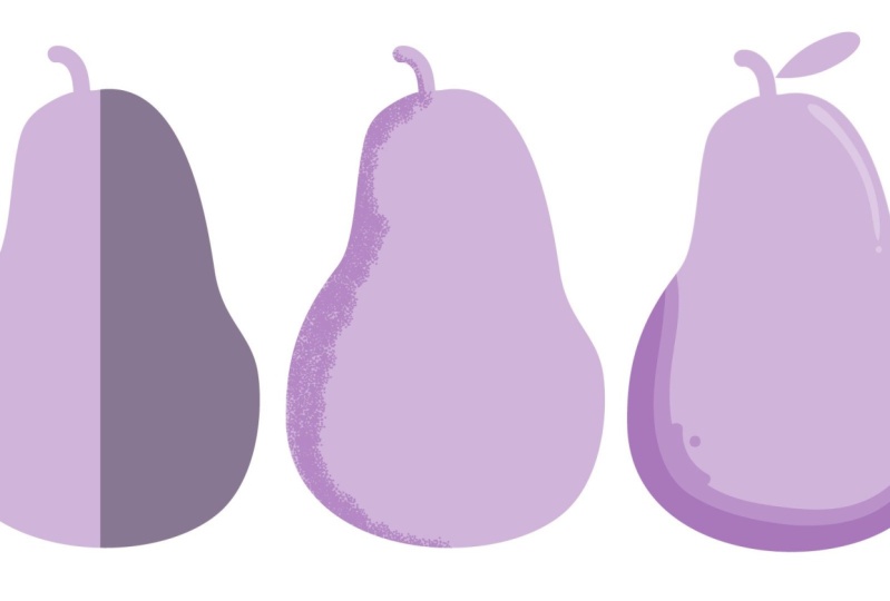
2. Pt 1 Make a Shape to Use: To get started on our shading effects, we're going to need something to work with. We're going to create everything in this class I'll choose File, and then New, and just create a document. I'm using one the size of my screen which has 1920 by 1080, but you can choose whatever size that you like. Now we're going to use the blob brush for this because it's just a really nice tool to get familiar with using and it works particularly well for this process. I'm going to select the blob brush tool and I'm going to select a color to work in. For this, I'm going to select a sort of green color. Now for the blob brush to paint in green, it needs to be the stroke color and we don't need a fill color at all. With the color selected, let's double-click on the blob brush and just set up its settings. I wanted to paint fairly smoothly, so I've got smooth drag all the way to the right and size, I don't know exactly how big 19 points is going to be because I can't see it right now. So let's just click OK because we can actually resize it on the go. You can use the keystroke that you would use in Photoshop, which is the open and close square bracket key. The closed square bracket key makes it bigger, the open square bracket key makes it smaller. With my brush nicely sized, I'm just going to drag out something that looks roughly pear-shaped. Remembering that I had the blob brush set to smooth, it's going to sort of smooth out as it finishes. Now when I finish drawing this shape, I could have course color over it and fill the shape in. Whether it would fill in correctly would depend on my blob brush settings. What I need to do is to have cape selected enabled so that the shape is still selected, and then when I drag over it with the blob brush, the shape is updating. But let's have a look and say also a tip for closing shapes like this that actually have sort of a middle in them. Because what the blob brush gives us as not a stroke, even though we were painting with that green color as a stroke color, what we end up with when we use the blob brush is a filled shape. It doesn't have a stroke, it's just a filled shape. Well, this is a compound shape because it's got a hole in the middle. You can always fill in the holes and a compound shape by selecting the shape and choose object and then compound path release. That releases the middle of the shape so that you get what looks like a filled shape, although it's in two pieces still. If you want a sandwich those together into one shape, you can go to the Pathfinder here and just click on Unite. We have something that is a sort of rough pear shape then add a little tip to it. Let's go back to the blob brush and go to shrink it down this time. This time I'm holding the open square bracket key just to make it go a whole lot smaller. Let's just go and add a little stem onto the top of our pear. If you want to smooth out this shape, you can go to object and then path and go to simplify. This is the new simplified dialogues. I'm just going to click those little dots to open it up. You can reduce the curve and reduce the corner point angle threshold. I like to leave preview on so I can see what the result is. This will just simplify the path and give you less points. You can see that we started off with 46 points for this particular shape. It's down to ten, so you can just finesse your path using that tool. Now we've got our shape. Let's have a look at our very first process for shading this shape. In this case, what we're going to do is just drop a line down the center of it and shade one side of it, a darker color.
3. Pt 2 Select and Shade Half an Object: For the first shading technique, we're going to shade just half of this pear shape. I'm going to the pen tool now. If you're afraid of the pen tool, it's fine. This is really easy to draw. All you're going to do is locate a position about here so that we can drag down to create our dividing line. For this we want it to be straight. All you're going to do is simply click at the bottom where you want this line to be and then just click all away around. Now, it's really hard to see what's happening here because we're using two exact same shades of green. Double-click on the fill and just choose an alternate color to use. Now it's a bit clearer what's going on here. Now what we want to do is to cut out this side of the pear from this shape here. But it will be handy for us to leave that shape as a separate shapes and we still have the pair, but we'll have a half pair shape. In addition to do this, we'll go to the last palette. I'm going to make a duplicate of the pear because we don't want to lose our pear shape when we go to cut a piece out of the pink shape. I'll drag this onto the new icon here, so I've got two copies of my pear. I'll just turn the bottom one off so that we can't see it. Now I'll go and select the pink shape and add duplicate pear shape. What we want to have left at the end of this is this piece in here. There are a few ways that you can do that, but perhaps the easiest is to use the shape builder tool. Here is the shape builder tool. It's on the toolbar. What we'll do is hold our mouse pointer over this bit that we don't want and hold the Alt or Option key as we just drag to indicate, to illustrate that this is the path that we want to remove. Now, if you happen to be using an older version of Illustrator and you don't have the shape builder tool. This is what you would do. Let's just wind that back out here. In this case, we still want these two shapes, but we're going to reverse the order. We're going to put the pear on top of the pink shape and we're going to use the pear as a cropping guide. I will select the pear and select the pink shape and we'll go to the Pathfinder. In this instance we'll use the crop tool and what that does is it just leaves you with that pace that we wanted. We'll go back and turn on the pear. We've got the pear itself and we've got our element that we want to use for shading. Now in this instance, we've been left with a piece here that we don't want. It's a rule with a really good idea to keep your paths really neat and tidy. What we're going to do is we're going to take this path that you can see when I turn it off, it has no effect on the documents and we're just going to grab it and trash it. This now is a path inside a group, but that's the only path in the group where we're just going to take that out again to simplify this. In the next video, we'll have a look at shading color options.
4. Pt 3 Choosing a Shading Color: The simplest option that we have for shading this half of the pear is just to select it and select the color to use. I'm going for a darker version of the grain. So I'm going to the eyedropper tool. I'm just going to sample the green color, which not only samples it, but also applies it to the second half of the pear. Well I'll double-click here and then go and select a darker color to use. That's a perfectly acceptable way of re-coloring our pear. We've got this shading effect on our pear. The problem with this is that if we want to change the color of the pear, we're going to have to change the color of the shading too. Let's go and get the pear, the base shape, and let's make it a pink color. Of course now the shading doesn't work so well with it. To make it match, we would need to go and select this color and then go and find a darker version of it. It's a two-step process. It would be much easier for anyone using this shape, including us if the shading actually updated when the pair itself changed color. Well, this is one of the ways of doing that. Let's go to the shading element and let's make it a gray. I have a gray here, I'm going to just sample that gray or mid gray will be fine. Then I'll go to the appearance panel, and under opacity here, when I click on that, I get access to some blend modes and we're going to use the Multiply blend mode. We're getting pretty much the same effect as we got last time by sampling this color and just choosing a darker one. The difference is this time that the shadings going to update automatically. Let's go back to our layers, let's target the base pear shape, and let's go and change its color, we'll make it a blue this time. You can see that the color of the shading is updating because we're using a gray in Multiply blend mode. So that's one of your options for choosing a shading color is to choose a shade of gray and then blended into the shape underneath. That means that when you change the color of the shape, the shading will appear to change color as well.
5. Pt 4 Another Method for Choosing Shading Colors: In the previous video, we looked at one of our options for adjusting their shading color so that it would update automatically and that of course was using a gray color. Let's look at a different option this time. What I'm going to do is go back and sample my blue, I've got two sides, the exact same color. I'll double-click on this and I'm going to choose my darker blue color. I'm also going to make sure that I don't have our blend mode applied to this, so you can see here when I go to opacity, I'm back to normal and the reason for that, is that I sampled not only the blue color, but also the appearance here. That meant that this side of the shape is now no longer in a special blend mode, it's just the regular normal blend mode. I just wanted to be clear about that. We've got a blue here and a lighter blue over here. Well, let's select this blue side here, and let's make this a global color. What we'll do it with its selected is we'll go over here to the swatches panel and we can just click here on this icon, which is new color group. You're going to select Selected Artwork and select these two other options and just click. "Okay". What that means is that if we change the color here in the swatches panel, even if we don't have this shape selected, it will still update, that's what global colors do. With our global colors selected though, let's go to "Window" and let's go to "Color Guide". Now, on my Color Guide, I have selected "Show Tints and Shades," and I've got quite a few Tints and Shades here. You can get to those by selecting the "Color Guide Options", and you'll see that I've got four steps with more variations, so that's just the setting I've got for this dialogue. This is the color here that we're using, what I want to do is to select the it and a color to use for the rest of the fruit. So I'll click on this and I'll hold down the "Control K" and click on this color as well. So these are true global colors, but this one is a teamed of this one and that's why this is really important. I'll go to the "Flyout" menu and I'll choose "Save colors" as swatches. I can close this dialogue now. What we have now is the color that we're using here, but also a global color tint of this color. Let me just get rid of these so that they're not in the way here. Will make sure that this shape uses this color and it does because you can say when I click on it, this color has got the outline around it that tells me that this shape is fueled with this particular color. Let's go and select the base fruit layer, this is the entire fruit. I'm going to color it with this color. Now, perhaps on reflection that would have been better to have chosen the next darkest color, but that's not really relevant right now. What is relevant is how we change colors. If I go here and double-click on this color tone preview on, you'll see that this color is actually this one here. Even though I've got this one selected, it's this base color, then it's going to be edited and on the way, if we change this color, this one's going to adapt as well. Let's just go and find a different color and see how both these colors are changing. So by designing this way, we're also building in this flexibility. We can change the color of our fruit by selecting either of these colors and just changing them and when we do that, it doesn't matter which of these colors we change, both of them are going to change in the underlying fruit. Let's just prove it. Lets go and choose the darker color, which is what I've got selected here. Of course, when I adjust the color of that darker color, the lighter color is changing as well, it is possible also to harness the power of global colors to make your shading update automatically change either the shading or the fruit, and the other one changes as well.
6. Pt 5 Create and Use a Stipple Brush: It's now time to have a look at a second shading effect and for this we're going to use a stippled brush and we're going to make our own. We no longer need this shading elements. I'm just going to select it and delete it. All we need at this stage is our basic pear shape. To make our stippled brush, we're going to create a brand new documents, so "Choose File," and then "New." My base document was 1920 by 1080. For this, I want a very small document for my stipple brush. I'm creating one that is just a 100 pixels by a 100 pixels in size. I'll click, "Create." Now, I'm going to just select my stroke and I don't want any filler at all. I've just got a black stroke. Black is important to use at this stage because it allows you to create a multi-color brush or a brush that can be easily painting in different colors later on. We'll go to the blob brush. Let's go and find the blob brush tool. In this case, I'll double-click on the blob brush because we just want a very small size, about a 2 point brushstroke is just fine and we just want one of them. We're just going to put down a single brushstroke in the middle of the document. We're going to use this to create our stipple brush, but we're going to do that without having to paint all the dots ourselves. I will go to the pen tool. We're going to make this a "No fill, no stroke" selection here. Make sure you don't have any fill and you don't have any stroke. That is critical. Then we're going to click once in this document about this distance from the dot. Then I'll press, "Escape," because I don't want anything more than just a single dot. I've got a dot here that has no fill and no stroke, and I've got a black circle effectively made using the blob brush here. I'm going to select both of these and I'm going to group them again, this is critical if you don't group them, the next step is not going to work because what we want to do is to use a "Transform Effect," but we need the extra space between the dot and the middle of the "Transform Effect" otherwise, we'll just end up with dots on top of each other. This extra little selection, that little click of, "No fill, no stroke," just allows us to create a bigger shape that we can then rotate. With the shape selected, I'll choose, "Effect, distort and transform." Then transform will turn preview on so we can see what we're doing. We'll start moving this and I think probably two or three is sufficient but let's just say how we go with this. We'll add some copies probably about ten would be a really good idea and then will start increasing the angle and you just want this to start curving around in an interesting way. What I've got here is I've got three on the horizontal movement, two on the vertical, 13 degrees on the angle of rotation, and ten copies. Something like that will be just fine, yours is going to be different and that's just fine as long as it's looks basically like this, you're good to go. Click, "OK." Now, with this whole objects still selected, we are going to do this again. "Effect, distort and transform and then transform." We get a warning that we're about to apply a brand-new effect and that's exactly what we want to do. We'll click, "Thank you, yes." Turn preview on so you can see what you're doing. Let's wind the copies up to again, about ten, and let's start increasing the angle. As we do, we're getting this effect that's looking a little bit like a scatter brush. Now, we can change the look of this by selecting a different one of these nine little boxes here and that's just the rotation point. Let's just see what we can get here. All I'm looking for is something that is going to work for my scatter brush. Now, that would work just fine. It's closing up in the middle but also this middle selector would work pretty well too. Now, you can move the vertical and the horizontal or one or the other. I think actually the vertical is working reasonably well for me here, just breaking that shape up a little bit and let's just try for a different angle. I'm really liking what I've got here right now, but I don't have enough of these arms coming out, so if I increase the copies, I'll end up getting more arms. It's basically a symmetrical shape, but something that's got a lot of objects in the middle and others around the outside. I'll just click, "OK." Again, yours is going to look different to this, but basically as long as you get some dots around the outside and a more intense set of dots in the middle, you're going to be good to go. Let's select, "Over all of this." Let's choose, "Object, Expand Appearance," because that turns it from just a single anchor point and a dot that have a transform or two transform affects applied to them. It will turn that into a series of dots. "Object, Expand Appearance." Now, we've got individual dots, but our individual dots are jammed inside a lot of groups. Let's just see what we've got here. We've got groups and groups and groups. We'll choose, "Object, Ungroup." Then keep doing that until "Ungroup" is no longer an option. It is now no longer an option because what we've done is broken out all of these dots into individual paths. With these dots selected, let's break this up a little bit further before we go any further, we'll choose, "Object, and then Transform and Transform Each." Let me just zero out this dialogue for you so you can see what it should look like. When you select the, "Objects and choose Object Transform, Transform Each," you should see no difference at all in the shape.Make sure that you've got "Preview," turned on so you can see what's happening. We'll select, "Random," because we want the rotation and move effects to be random and then we'll add a little bit of distance to the vertical and horizontal movement. We're looking at sort of breaking up the regularity of this shape. Let's add a little bit of an angle of movement as well. You can just tap on the angle if you tap with the "Up" or "Down" arrow key, you move one degree at a time and then just experiment until you get your shape broken up a little bit. It's a whole lot less regular than it was. But you do want some intensity in the middle and you want it to be lighter around the outside. When you're happy with what you've got, just click, "OK" This is going to be your stipple brush. Now, you could go ahead and move things around a little bit, you could delete things. You'll find that some of the stipple brushes that you make are much more open in the middle and some like this one in particular are very closed up. But you can experiment with different settings as you make your rotations to create different arrangements of dots to make your stipple brush. I'm just going to go with this one. Let's select over all of these shapes and let's copy them or go to, "Our pear document." I'll choose, "Edit copy," go to, "Our pear document." Choose, "Edit paste." This is my set of dots that is going to make my stipple brush. Right now, before I lose all my selection I'm going to put them in a group because they really need to travel as a group rather than individual dots. Now, we're going to make this into a stipple brush so with them selected we go to the brushes panel. Click here on the, "New icon." We're going to make a new scatter brush. I'll click, "OK." Now in this dialogue, at this stage, the only thing that you probably really want to do is to set this to tints and just click, "OK." Now, let's go and see what our brush paints like. For the color we're going to use, I'm going back to the colors that we pre-selected. These are the global colors that we created in the previous videos. I'm going to the brush tool. Let's go and get out paintbrush. Let's go and get our stipple brush, make sure that we have it selected and let's just paint and see how it paints. No, it's not particularly good right now, but I didn't expect it to be any different to this. What we have to do is change its setting so it paints more like what we want it to paint like. I'll double-click on the scatter brush to make changes to it. Right now, I think the size is pretty good, it might be better, maybe just a little bit bigger. You can just wind up the size if you want to. I'm just going to take mine up to about 110 - 111, just make it a slightly bigger brush, but again your brush may look different and so you can make a decision as to whether you want yours to be smaller or larger or the same size as it was originally. With spacing, this needs to be closed up. I'm going to reduce the spacing. If I wanted to paint a bit more like this so it's more joined up than individual bunches of dots, if you like. Now, for scatter, the scatter and the rotation settings are going to give us a brush that has a bit more interests to it. What we'll do is set these to random. I'm going to do that for rotation and for scatter. Now, with rotation, we're going to drag all the way in one direction and all the way in the other direction on this slide so that these shapes are now rotating quite significantly and so it looks a lot less regular of a shape. Now with scatter, we can do something similar. I'm going to increase the scatter in one direction and then take it also in the other direction. That again breaks it up. If I go too hard in both directions, let me just show you what's happening. These are sort of an x and y scatter, you're pulling the shapes off the base line and they're going in all directions or we don't want anything nearly as big as that, but we do want something that's going to break this up. Here's minus 12 percent and minus 12 percent, a lot more uneven of a stroke. Once, you've got things at this stage, you can have a look and say, "Well, maybe you want your shape to be a bit bigger, maybe you want the spacing to be a bit smaller. You can adjust those settings to suit. When you're done, just click, "OK." Now, you're warned that the brushes in use and do you want to apply that change to the stroke? We can do that. It doesn't really matter cause we're not actually going to use that stroke. At this point, I can get rid of that stroke and let's have a look at using this brush to paint some shading onto our pear. Now, if we're going to just paint over the edge of the pear, let's have a look and see what happens when we use our shading brush. When I just draw around the edge of the pear shape, you can see that the dots go outside the pear as well as in. There's a solution to this and that involves not doing things that way. Let's just trash that line. Instead, let's go and select, "Our pear." Down here are three little icons and 99.99 percent of the time you're working in Illustrator you're in draw normally. You probably didn't even know that these icons were even there and that's just fine, except today we're going to use this one, it's called draw Inside. We'll click on that and you get these little boxes around the edge of your shape that tells you you're in draw inside mode. Now, let's go and get our brush, and let's go and get our paint color because we lost that. The paint color needs to be on the stroke of the brush. We're in this drawer inside mode. Now we're going to just go and apply our brush to the edge of this shape. You can see that this time the shape itself is acting as a clipping mask. In fact, that's what we're going to have in the last panel shortly, is a clipping mask that is the shape of the pear. That's just operating to remove the bits off the brush that are outside the edge of the pear shaped. That means that we don't have to be careful as we paint. All this clipping is being done automatically for us. As soon as you're ready to finish, you can go back to draw normal and when you click, "Draw normal," things look normal in Illustrator, you don't have those little boxes around everything. Over here in the layers palette, we have a clipping group and the clipping path is this pear. If I turn it off and on, you can say that the pear object is acting as a clipping path and it's clipping the edges of that brush giving us a very neat effect. These are all a brush strokes that we have inside our pear because this thing here is the brush, we don't need that any longer. In fact, we could trash that. I encourage you to play around with creating your own scatter brushes. They can be really useful in Illustrator. You'll probably want to create a couple of those, some with dots a little bit further apart and some with dots a lot closer like this one is. Now, when you create stipple brushes like this, you've gone to a lot of effort to create them. Let's have a look in the next video how you can save them, so they'll always be there to use.
7. Pt 6 Save and Load Your Custom Brushes: Before we go any further, let's go and save the stipple brush that we created. What I'm going to do before I do that, is get rid of all the other brushes here. I'm going to select this basic brush hold the Shift key and Click on this last brush in the palette and go to the trash can and delete the brushes. Now basic, you can't delete, it's always going to be there, but you can see that Illustrator protects you from that. I'll click on the calligraphic brush It can't be deleted. Let's try these other brushes. Now some of them might be in use and that's fine. You won't be able to delete them you just going to delete what you can to tidy up the brushes pallet so this is what we're left with. This is the scatter brush we want to save. Let's go ahead now and click the Fly out menu and choose Save Brush Library. Illustrator opens up the library setting where your brushes are saved. Now, I've already got a scatter shading brush so I'm going to call a scatter shading two and I'll click save. That brush is now saved so that we can use it in other documents in future. Let's just go and make a quick new document and see how we would get access to those saved brushes. Let's go and create a reasonable size document. The brushes panel zero is back in a new document to the default brushes panel. To get your brushes that you saved go to the Brush Libraries menu and choose User Defined. You'll see your shading brushes were you saved them are accessible here. So here's scatter shading two. I'm going to click on it and as soon as I click on it in this dialogue, it gets automatically added to the brushes panel for this new document. I can just close that panel. Now, I've got a second one so let's go and say the other scatter shading brush that I created, it's a bit more of a separate brush. Let's have a look and see what it looks like. We'll grab the brush tool. This is the one I created earlier. It hasn't been set up nicely, so it's not painting correctly. This is the one that we created and of course it's shading much better. So that's a way of saving your scatter brushes so that you can get access to them in future in other documents.
8. Pt 7 Shadows and Highlights: For this next shading effect, we're going to do it both shading and highlighting. So I'm going to shade this side of the pear and highlight this side. So I need a lighter color for one side and a darker color for the other. I've got my global colors selected. So I've got the dark shading color and the base shading color for the pear but I don't yet have anything as I highlight. So with the pear color selected here, I'm going to, "Window" and then, "Color Guide", because what I want to access to one of these lighter tints, and you always want to make sure that the color that you select has this little triangle in the corner because that means it's a global color. So this one's going to be just fine. So I'll click on it to select it or go to the fly-out menu and choose, "Save Color" as swatches and it's added to the swatches palette. Not exactly where I want it to be, but I can just drag it into position and get rid of this empty group. So now I have a color for the highlighting, the base color for the pear, and the shading. I've also got just one instance of the pear, so I've got rid of everything else except that base pear shape. Well, to make the highlighting which is going down this side of the pear, we need two copies of the pear. So let's go and get those two copies. Now, I'm going to use the darker one, the one that is my base pear color. I'm going to have that on top and the one in the middle here I'm going to make the lighter color, the color of what it is that I'm doing, which is this highlighting. Then we'll go to the, path, and select it for this base pear shape that's on top. I'm just going to move it out of the way and as I move it out of the way, we can then see the highlighting underneath and we just need to decide how much highlighting we want. Well, I think that's a pretty good amount there. Now I'm going to lock my base pear out of the way because what I'm about to do is kind of get rid of everything else except this little strip. So I'll make sure I have everything else selected. If I locked down the base pear and then just select over these shapes so there are only two shapes that I can select other two that aren't locked down. At this point, you can go to the "Shape Builder" tool. I'll hold the "Alt" option key as I drag over the pieces that I don't want, which are the base pear shape in the middle here and the edge piece over there. All I want left behind is this one little element over the side, which is my highlighting. So when I turn off the base pear shape, this is my highlighting. By doing things in the order that I'm showing you, everything is always going to be in the exact right position. So let's turn off the highlighting for now and let's step through the same process, this time to create the shading. Well, the first thing we're going to do is make two copies of this base path, and then we'll lock down the base one because we don't want to it to move. Now the one that's going to be our highlighting or our shading is always going to be the middle one, this one in the middle of the sandwich. So select it and apply a different color; the darker color or the lighter color to it. You won't be able to see it because it's hidden under this shape here. Then go to this shape that's on top and move it. You're going to move it away so that you can see the shading underneath and you're going to decide just how much shading you want. Well, I don't want very much. That looks pretty good to me. So once you've got your shading in place, you're going to select over both of these shapes and if you've got access to the "Shape Builder" tool your click on the "Shape Builder" tool, hold the "Alt" option key and just drag over the pieces you don't want and the pieces that you don't want is the one in the middle and the one that's hanging over the edge. So what you should see in your layers palette is just this little strip of color. That's what it is. It's the shading element. When you turn back on your shading and your highlighting, you've got your pear shape with the shading and highlighting intact. Now let's just step back a step because if you've got a version of illustrator that does not have the "Shape Builder" tool, let's look and see what you're going to do. So I've got all these elements placed. I was just ready to go and get the "Shape Builder" tool, but say you don't have it. Well, you're going to select over these pieces here. So you've got your two shapes selected. You'll go to the "Pathfinder" and what you need to do is to subtract this shape from this shape. So you're subtracting the top shape. This is the option for minus front or subtract top if you like, just click on it and you'll be left with the piece that you want. You can always just check it to make sure that you've got the right piece. If you haven't, just undo it and try again. Maybe make a different selection if you made the wrong selection here in the Pathfinder dialogue. So here is our effect with nice little strips of color down either side of the pear. These strips of color have been made from the base pear shape, and they've be made in such a way that you don't have to move them around because they're already in the correct place. As I said, "Shape Builder" is a gimme tool for this. If you've got the "Shape Builder" tool, use it, it's way easier but if you don't have access to it, then you can still get that same effect using the Pathfinder tool. Now because we're using global colors, of course we can edit the color of this pear shape. Now I don't have anything selected right now at all. I can select on any of these colors, turn preview on and make a change to that color. When I do every single color that is in use in this image is changing appropriately. The darker one is getting a darker version of this color, the mid one is getting a middle version of this color and the highlight is a lighter version of this color. Of course, you could also use gray colors. So let's see how we would do that. I'm going to select this shade piece and I'm going to make it a darkish gray and I'm going to blend it using the "Multiply Blend" mode. Now I can get to that also by this opacity setting here. So let's just make it "Multiply Blend" mode. It's blending into the layer underneath now I think I've got two darker grays, so let's go back to a lighter gray for that. Now this is the highlight, so what we would do is put a light gray in here and we will go to change the blend mode. In this case, we need something that's going to lighten things. So we would use the "Screen Blend" mode. So you'll use screen for lightening and multiply for darkening. I think it's a bit too light, so I'm going to darken that just a little bit. I think it's still a bit light. Now because the shapes that are the highlighting and the shadows are not global colors, if we wanted to change this pear will need to go to the base pear shape. I've lost my layers panel, so let's just go out and get that back. Here's the base pear shape, I'm just going to unlock that and I'm going to change its color. As I change the color of the base pear shape, then the color of the highlighting and the shadow is going to change automatically because these are gray's that are blended into the layer underneath using the appropriate blend mode. Multiply for darkening for the shadow area, and screen for highlighting for the lighter area.
9. Pt 8 Create a Set of Linked Global Swatches: Before we start into a shading technique that needs a range of tenths of a color, let's see how we can pre-prepare our colors. I have a pear here and I've got it colored a dark color. You'll want to start with the darkest of the colors that you want to use. The darkest of your shading colors, because it's only possible to extract global colors for those colors that are actually lighter and they'll be linked together. Just be aware, start with your darkest color. I'll select over my pear; this as my darkest color here, I'll go to the Swatches panel. I'll click here on New Swatch and I need to make sure to set this as Global. I've clicked Global, I'll click OK. It's added here to the Swatches panel. Now with it being the current swatch, the current selected swatch will go to Window and then Color Guide. Here in the Color Guide provided you've got it set up somewhat similar to mine and let's just have a look at my Color Guide options. I've got four steps and a 100 percent variation set here. What we'll have is the current color, the color that we're using here as the leftmost, or darkest, of the available global colors. All these are global colors. What we can do is click on it and Shift-click on this lightest one. Then goes the fly-out menu and just click Save Colors as Swatches. That creates a brand new swatch group, all of global colors, all of which are linked to each other. What we would do at that point is if we wanted to use some other colors as shadows, we've gone select our pair and color it with the middle one of these colors that would leave us two colors to use for shading and a couple of other colors to use as highlights. As I said, it's a really good idea to pre-prepare those swatches. If you think about it, start with the darkest color. Build your small set of global swatches that are all linked to each other and will change whenever you change one of those swatches.
10. Pt 9 Multi Level Shading Technique: For this next shading technique, we're going to create something that looks a little bit like this. Now I already have my pair in a document. It is just that basic pear shape. I'm going to add a leaf to it. For this I'm going to the Ellipse tool. I'll just drag out a narrow ellipse. Go to the direct selection tool and select just this anchor point at the very end. Up here on the Tool Options bar, click this "Convert option" that makes it into a pointy end. Still with the direct selection tool, click on this anchor point and shift click on this one. You've got just these two opposing anchor points selected. These are hollow and not selected. Go over here to the scale tool. When you have the scale tool selected, you can drag in or out on these handles and they're both going to move at the same time, the same amount. I just want to make this a sort of narrow leaf shape. Now that it's created a hover outside one of the corners of the shape when it's selected with the selection too, l and just rotate it so that we can add it behind the pair itself. Now we're ready to create those nice curvy lines in our pair, so let's open up the last pallet and get ready. I have my basic pear shape. I'm going to make a duplicate of that. I'm going to lock the original down and hide it so it's no longer visible. Now we're going to draw some lines through as shape with the pen tools. I'll go to the pen tool. I'm going to flip this here so it's going to draw with a stroke but no fill, and I'm going to set my stroke to a color that's going to be really easy to see over the top of my pair. I'm also increasing the stroke weight so I can see things really clearly. What we have to do is draw a curve sort of around here. Now you could also try this with the pencil tool. That's another tool that you could use. You want to start your line outside the pair that's going to be crucial because this next steps not going to work if you don't do that. Then you can just draw using your pen tool, a nice curved line that swings around sort of on the inside of the pair. When you're ready, you can just swipe back out. Press the "Escape key" when you're done and go back to the direct selection tool. At this point you can sort of modify your shape. It's a little difficult for me to say where my handles are because everything's blow. I'll double-click on the layer and the last pallet and just change this to a different color, say something like green. Now will be able to say the handles are a little bit more clearly. I'm doing at this point is just adjusting these handle so I get a nice sort of smooth line through my pair. The longer the handles are, the more curved the line will obey it. There will be a smoother curve rather than a really sharp curve. When you're happy with the curve that you've created, makes sure that both ends of the line outside the pair. You will select the line with the selection tool, but make sure that nothing else is selected. Then choose object path, and then choose divide objects below. What that does is anything that is below that line that was unlocked and visible is then cut into pieces, and the line has been sacrificed in the process. What we've got here is this dark shaded area here, and then we've got this beat in the middle here, which we can then color with the next color in color set. Let's just make that the fill and the stroke. We've got the first of our lines. Now I haven't cut this particularly well, but you will cut it better because you'll spend a little bit more time on it. Now if you prefer to use the pencil tool, let's see how we do that. I'm going through the pencil tool. I'm going to make sure that I'm painting with just a stroke and no fill. I'm going to select a color for this again, pink or something that's going to be really obvious, increase the weight of the line. Then I'm again going to draw my sort of loopy bit. Now you want to make sure that your pencil tool is set to smooth, so it's smooth everything out. If I double-click on it, you'll say that mindset to smooth and you'll need to do that before you start drawing the line, you can't do that afterwards. We say if you make a mistake with your line, just undo it and start over again. Again, making sure that the ends of airline are well outside the edge of the pair, we can select this with pace. We're going to cut into this time is this pace, so let's lock down this paste down here just in case it was going to be cut because we don't want it to be cut. We'll go out and select just the line object path, divide objects below. Now this pace has been cut in two. Obviously this pace is the right color. This path is not the correct color, so let select on that and let's color it with the next color in series. You could do it again if you wanted to. I think two layers of color, in addition to the base color of probably sufficient. You could do the same with the leaf. In this case, we're going to lock down everything else because we don't want to cut through the stem, we just want to cut through the leaf. Again, I'm going to use the pencil tool. Again, flip it, sorry, line painting with a stroke and make sure I can see my strokes are nice color like pinks, good one. Increase the value, you'd make sure that your pencil tool is drawing with smooth, turned on if this were the first time you used it. Just going to have a look at this maybe adjusted a little bit. This line is going to cut the leaf underneath into two paces. If you want to keep a duplicate of your life, do that before you start cutting things up and just turn off the duplicate and lock it down. Only things that are visible and unlocked will be cut in half or in part by this line, I want to lock those places as well just in case the only thing that it should be unlocked at this stage is actually the duplicate leaf. With the line selected again, object path, divide objects below, it's really nice little feature bat. I'm going to re-color these portions of the leaf, just making sure that you do the fill and the stroke. I'm going to grab this one and I'm going to make this the next lightest color. Next up we want to add a little bit of shading through here, and we're going to do that with a line. To make our line, we're going to borrow the underlying shape of the pair, which is why we keep a spare pair there just in case we need it. We are going to make a duplicate of it, go back and lock down and hide the original SWOT still sitting there. Grab this copy, it's really hard to move because it's underneath everything solves choose shift and right arrow to just sort of move it out of the way. I'm going to flip it so it only has a stroke, and for the stroke again, I'm going to use a bright color so we can say what we're doing. I'm going to thicken it up because that makes things easier as well. Now what I wanted to do is to borrow this part of the curve to place in here because I know it's going to be a really good fit because it is that curve itself. With the line selected, with the selection tool, there are three possible options, only one of which is going to work. Over here you've got the arrays at all. You might think that would work, but this is what they arise at all does, if you do it on a closed line, it's just making the lines sort of bindings so that's obviously not the tool to use. There's also a knife tool that again, that's not going to work because we try and cut the line, we just end up with extra bits, it's actually the scissors tool. Now with the scissors tool, you have to make sure that you hit the line. You're going to make sure that you are actually clicking on the path for it to work. I am going to cut the path here and I'm going to cut it again down about here. When you do that, you're going to end up with two separate lines, there's this bit and there's the rest. Well, we don't want the rest. I'll just delete that and let's take this bit and move it into position, it's going to be a perfect fit because that's where it came from. Right now it's at the bottom of the last pallet, let's just drag it above everything else so we can actually say it. I'll select it, if we zoom in, you'll see that it's got hard in, so it's got these sort of little buttons on it. Well, with it selected, if you go to stroke, you can select this round cap option. Now sometimes this stroke options disappear from the Tool Options spot if they do that on you at any stage, go to Window and then stroke and you'll get a stroke panel. In the Stroke panel, when you do Show Options, you get this round cap options. You can always get to it, even if it's not visible on the Tool Options bar, that's a nasty habit of disappearing. Next up, what we want to do is change it obviously from this pink color to one of our theme colors. I'll just make sure that the line is targeted and let's give it that lighter color. Let's zoom out and have a look and say how things look. If you think it's too long, just select it and go back with the scissors tool and just cut it. I think mine is of bit long, I'm just going to cut the end off at here, this is the bit I no longer want. Because we set the line with the curved ends, it's just defaulting to curved ends even if we'd just cut the end off. Now what I'm doing is checking on this line to say what it's limelight is its. The limelight is 11 points, I'm going to the blob brush tool. I'll double-click on it. I'm going to set it to the same 11 points. Click "Okay". Let's just zoom in here and I'm going to add a simple little blob brush dot at the end of this line. That's finished off this sort of effect, now the only other thing you may want to add is a little bit of detail in here. What we'll do is we'll go and sample one of the colors that we're using light sample this color here. I'm going to add a little detail in here. I'll go to the blob brush, probably wind up the white on the blob brush a little bit, and just draw in the element that I want to add to the underlying shading. Let's zoom in here so we can see it more clearly. If I think it needs a bit of adjustment, I can select it. It's just a regular shape and I can move it for example. I'm going to join this with this underlining shading so I need to pick up which pace of shading in actually is, I think it's this one which it is. Let's unlock it, let's select it, let's go up here and select this Paste shift, Click on it to select it. With both of those selected, I can go to the Path finder and click on "Unite", and that just joined it into a single shape. If it jumps up in the last pallet, goes to the wrong place, she can't see things, just drag it down into position. Now I'm going to add another little dot again with the blob brush. I'm just going to add a little dot here, just to add a little bit of extra dimension that will mirror the dot I've got over here. This is a slightly more complex level of shading, but very easy to do using either the Pen tool or the Pencil tool. Now of course, because I've used theme color theory, I can just double click on the color set, preview on it doesn't matter which of the colors I select, but we can easily change the entire color of the pair by just dragging on the color selectors. Now I'm working in RGBA. If you want to, you can work in HSPA, which is huge saturation and brightness, makes it a little bit easier to select an actual cue, adjusts the saturation, and then adjust the brightness as required.
11. Pt 10 Working with Multi Color Images: So far in this course we've been working with just a single shape and a single color. It's now time to have a look and see how we could adapt some of those shading principles, to more complex shapes that have multiple colors. We're going to look at this mushroom first of all, and we're going to color it or shade it two different ways. We're going to use the gray, where we apply a gray shape in Multiply Blend mode, and we're also going to have a look and see how we would color it using tints and shades of the base colors. Let's start first with the gray version. What we need to do is to create a shape that goes over the top of this mushroom, that is half of the mushroom shape, that we're going to fill with a gray and then apply it in a multiply blend mode. A mushroom is comprised of a number of different objects. There's the top of the mushroom here, there's the little stem of the mushroom here, and then there are three dots. These are the dots on the mushroom. What we need to do is to create a single shape that is the cap and the base of the mushroom, that we can then cut in half and use for our shading. We don't want to lose the mushroom itself. We need some extra bits if you like. Coming over here to the last panel, I don't have to select these and selecting them is not the way to actually duplicate them. It's actually just clicking on the layer in the layers palette here. I'll click on the bottom of the mushroom here and then Shift click on the top of the mushroom. These are the two shapes that make up the overall mushroom shape. I'll just drag them down here onto the new icon and that's the way that you make sure that you duplicate absolutely everything. Now we're going to select the base and the cap duplicates of these shapes. We're going to put them together to make a single shape so that we can carve it in half. We'll do that using the pathfinder. Although you could use the shape builder tool. I'll go over here to the Pathfinder and just click Unite. That creates one shape. Now I've got a little bit missing here, and I can clean that up very easily by just going to the shape builder. It looks like I didn't make the world's best cut between the two shapes. Here is a mushroom shape and what we need is just half of it. Let's go and get the rectangle tool, and we'll just drag over a rectangle. What I'm looking for here is a snap of the edge of the rectangle to the middle of the mushroom and there it is, there, snapping into position. I placed the rectangle over the side of the mushroom that I don't want, I want to get read of this piece here, I want to keep this piece here. We'll go to the layers palette and make sure that we have selected the two bits that we're going to be working with. But right now I'm just going to color the rectangle a different color. Here's our rectangle, and down here is our mushroom shape. I've got those both selected. Now you can use the shape builder tool or you can use the pathfinder. If you're using the pathfinder, you'll just click on it and choose minus font. That just gets rid of the rectangle on the side leaving this shape here, which is the one we want to use. Let me undo that. If you're using a shape builder tool, you'll go and select the shape builder tool and you'll hold the Alt or Option key as you drag through these two pieces that you don't want leaving this piece behind. Now that we've got this piece, we're just going to fill it with a shade of gray. Let's go and get our grays and I just want a fairly light shade of gray for that. Then we'll go up here to the tool options bar and choose a Multiply Blend mode. You can get to that also through the Appearance panel. When I click away, you'll see that we've got this half and half look with our mushroom and it's being created using a gray shape placed over the top of the mushroom and blended in with the Multiply Blend mode. That means that if we change the color of the remainder of the mushroom, then the shading is going to change automatically as well. What if we go and make this a red mushroom with little white dots? Let's just go and make these dots white. Let's make the cap of the mushroom red. I'm going to select it down here and let's just go and get a red color for it. Because we've used the multiply blend mode on a gray shape that is equivalent to half of our mushroom, we're getting that shading effect. It's very, very stable and it's going to work regardless of what color their mushroom is.
12. Pt 11 Another Coloring Method: Now let's have a look at our second option. For this we've got a few things that we need to consider. Because when I created this mushroom, I did not use global colors. We know from experience that if we do create this as a global color, when we go to the color guide, we are only going to be able to select lighter versions of this color as global colors that will change automatically. Darker ones aren't available to us. We're in a bit of a fix before we even begin. This is the approach that I suggest that you take. If you haven't already created global colors and tints and use the darkest available global color, this is what I suggest you do, and that is to change these colors before you even begin. If you want the shaded area of this mushroom cap to be darker than this is, then you're going to make a change to it. I'll go to the mushroom cap and I'll double-click on this color. I'm just going to use a slightly darker version. For that, I'm just going to decrease this B value, this brightness value. I'm going to take it down to 50 percent instead of 60. I'm dropping it by about 10 percent. That's created a nice dark color. I'm going to do the same for the mushroom base here. Double-click on it. Just go to my B, my brightness value, and just decrease it, in this case by about 10 percent. Let's just tap away. It looks pretty good to me. I'll click "Okay". Now, there's also need to be recolored, but we'll worry about those in just a minute because right now it's these two colors that we're most interested in. I'll select these two shapes, so that's the mushroom base and the mushroom cap. I'm going to save those colors as global colors. I can do that by just opening up the swatches panel. Of course, you can get to that by selecting Window and then Swatches. Click here on this option which is "New color group". Select selected artwork and these two options and click "Okay". What happens is twofold. Firstly, the colors in this mushroom have been added as global colors, so we've got access to them. But when I click on the mushroom cap, you'll see that it's actually colored with this global color. We've converted the colors in the image to global colors. That's a benefit of doing things that way. Now we need teams, we need are lighter versions of these two colors that we can use to color this side of the mushroom, so we get dark on this side, light on this side. I'm going to select the first of my colors. I'll go to Window and then Color Guide. Here is the color that we're working with it you can see, we can't get darker colors as global colors, but we can get lighter version. I'm going click on this and I'll choose "Save colors as swatches". Now I've got, this is my base color that I was working with, and this is an 80 percent tint of that color. I'm just going to move it up into there so that leads to a like a pigeon pair. Let's drag this one down to here, and we're going to find a pigeon pair for it, a lighter version of it. We'll select it, Window, Color Guide. This is the color, it's the one in the middle. We're going to select this one and go and save it as a swatch. Got back to our swatches panel and very unhelpfully, it's gone in the wrong spot, but we're going to put it alongside the color belongs with. Let's go and grab the loose color group and get rid of it. Now we've got the colors that we need. We've got a mushroom and it's colored with global colors. The next step is to divide it in half and color the pieces. We need to make a decision here. Do we want to divide this into four pieces so we get two pieces for the base and two pieces for the mushroom cap and half is one color and half as the other, or do we want to keep a solid mushroom, a whole mushroom underneath, but just create the extra half pieces on top? I'm going to do that. I'm going to keep my intact mushrooms. I'm going to keep these two shapes here. Click on one, Shift, click on the other. I'm going to drag onto the new icon, so I've got duplicates, and I'm going to lock this down. Now you need to lock these down because when you run that line through the shape and use it to divide the objects underneath, it will divide everything that is not locked down. We don't want these to be broken in half. We want them to stay exactly as they are. These duplicates, that's fine. We can cut those in half. These dots are not going to be affected because they not almost dividing line if you like. We are going to the line segment tool and I'll just drag out my lines so my mushroom shape is in the middle of my document. I'm just dragging a line using the smart guide as a guide. Here is our line, and of course it has to be well beyond the edges of the shape or also won't work to divide the shapes below. We'll go and select the line, make sure nothing else is selected because that's the way that this tool works, and will choose Object, Path, Divide Objects Below. Here in the last panel you can see that it has divided this mushroom into four pieces and we need to decide the bits that we want. Well, this is the darker side and it's already the same color as the paste below, so we can just delete it. We don't need that side of the mushroom and we don't need this piece either because there are darker colors. This piece and this piece need to be created or colored using those teams that we made. Let's just target the fill color. I've got the darkest paste selected up here, the pigeon pair or the color that goes with it is this one here. So I'll just click on it. Now we'll go to this piece and the color that it needs to be the tint of that color is that one there. Then for consistency, we're going to grab these little dots on the top of the mushroom. Because if they were colored the same as the base of the mushroom originally, then they should really be this tint. Now, in the color panel here and the color swatches panel, you can always tell which colors belong with each other because when you hover over this, It's red green and blue values are exactly the same as the one that is its tint. These two sets of RGB values are exactly the same. It's just that this is an 80 percent tint of this color and so it's got 80 percent on the end. That's going to be the same here. RGB colors exactly the same for these two colors. Just as the second one is an 80 percent tint. If you're unsure as to which belongs to which, you can read it very easily from the swatches panel. Now we have our shaded object. Of course, we can make changes to the colors. I can click on either of these two colors to change the mushroom cap color. I've selected one, I'll turn preview on and I can drag these sliders around to find a different color and I can use a different color method as well. I could, for example, use HSP, and that would allow me to drag on the hue slider to change the color of the top of the mushroom. Then I can go and change the base of the mushroom by double-clicking on it and then just adjust the base of the mushroom here. We'll turn preview on so we can see what we're doing. Now, you'll notice that even though these objects here are locked down because we're using a global color, then the rules about global colors that these objects are going to be changed accordingly to the change that we've made to the global color. Now, what's interesting too, I'm just going to unlock those and select everything with Ctrl or Command A. If I go here to recolor artwork, then we've got these two colors. You can say that they're sitting side-by-side here, the tint to end the original color and the tint to the original color in the image. We can go to Edit, and here we could just drag around on the color slider and we're taking the pair of colors with us every time that we adjust a color. We're taking both the original color and the tint and moving them into different area and here, the original color and the tint and moving them together elsewhere in the color wheel. There's a second method for working with this particular multicolored image.
13. Pt 12 Troubleshooting Problem Designs: Let's have a look now at a more complex shape and discuss how we will go about adding some shading to it. Well, we could do it the same way as we did the mushroom in terms of dividing it in half and making half of each of these shapes, the darker version and the other half, the lighter version. We'd have to grab the colors into swatches panel because I don't have them set up as global colors. I'd need to create the tints for those global colors, I'd need to divide everything in half and that would be pretty doable. The other option, of course, is to create a semi-circle, a half a circle and fill it with gray and just put it over the top of everything and blend it with multiply blend mode. I'm going to show you how to do that one because there's a little bit of a got you with this particular shape and I want to show you what that is. So first of all, I'm going to turn off the middle bits because we don't need those, we just need to focus on the outside, the big bit that we need to use to create our half circle. Now this is a shape that has a stroke around the edge and a filled center. It's the stroke around the edge that is going to be a little bit confusing because what we need to do is to make sure that when we create our half circle, that it is the full size of this shape and it's not missing bits. Let's just go and duplicate this circle because I'm going to need one version of it for the cucumber, I'm going to need the second version of it to cut it in half. Now, let's go to the rectangle tool. I'm just going to reset my options here. I'm going to fill this with a pink color so we can set and not wanting any stroke on this rectangle at all. Let's just go and grab and create a rectangle that's going over half of our pace of cucumber. We'll go and select both of these shapes and we're going to use the Shape Builder tools. So I'm just going to press "Alt" or "Option" on a Mac and just drag over this to create our half circle. Now the problem with this half circle is that it's not big enough for the job that we need it to do. So let me just show you what the problem is. I'm going to turn off the stroke, and you may have already seen what just happened was that the shape actually became a little bit smaller. Let me fill it with the gray color, let me make everything else visible again, and let me move this gray shape above everything else. This is the problem. Because of the way that this cucumber was designed and I designed it to show you this, so I've designed it probably in inverted commas badly for what it is that we're trying to do here, because this might happen to you. What's happened is that this stroke around this ellipse, when I select it and go to the Stroke panel here, it's set to be in the center. So the full width of the stroke is straddling the edge of the underlying shape. When we go and create half of a circle and remove the stroke from that half circle, then we're losing this extra bit around the edge of the shape. Now if you think that you might be able to just build it back by adding some extra stroke around it, that's going to be a problem as well. Let me show you what the problem is going to be. I'm adding some gray stroke and I'm just going to increase the stroke weight here. You might be seeing the problem already and that is, that this is the middle of the underlying shape, and by adding the stroke around the edge of the shape, we've solved the problem around this edge, but we've created one here where we've actually made the half circle wider. So we're cutting in to the shape underneath. When we go and set this blend mode to multiply, we're going to have a shading that's not halfway down the middle of the shape. We've got a really flawed solution here, one that you need to just be aware of. Let's go back, let's trash that, let's have a look at the solution. Let's go and get this ellipse. I'm going to make a duplicate of it again, I'm going to turn off and lock down the one I need to keep. This is the one that's causing problems because of the location of the stroke. So here's a quick and easy way of solving it without redrawing anything. That's what we don't want to do is we don't want to go and fix this ellipse because that might potentially throw a larger design out. So it's not a solution to fix this ellipse, the solution is to work with the one that we've got and solve the problem so that we can actually get half a circle. What we're going to do is we're going to expand this. Its selected, I'll choose object and expand. So now I've got two pieces. Now I've got a group and I've got the path, the stroke around it as one shape, and I've got the piece in the middle of the flesh of the cucumber as another. Well, what I'm going to do is, with these two select, I'm just going to put them together and just unite them. Now the shape that I've got is exactly the same shape as this one here and exactly the same size. Let me just test it by making it red. We don't want it to have any stroke at all. This is what we're going to make our half gray circle out of. When I turn back on the visibility of the cucumber, you can say that we're not seeing any red outside, so it's at least smaller than this place. Well, if I drag it above, it's hiding it so we know it's exactly the right size. Now if I make half of this shape, I'm going to have a proper half of this shape. Let's go and get a different fill color, but first let's deselect that shape. Go to my rectangle, place the rectangle over the middle of the circle so it's going to cut it really nicely, go and select the red circle and the blue rectangles, so that they're the only two things selected. We can do it using the Pathfinder palette by choosing minus front, or we could use the Shape Builder Tool by holding Alt or option, just dragging over the two pieces we don't want. You can see this time the shape is exactly the right shape. It's exactly a perfect size. We will go and fill it with that gray color, we'll set it's blend mode to multiply, and we'll move it above everything. We want it to be at the very top so that when we turn back on everything else, we've got that shading effect that we're looking for, we have got a gray filled shape over the top of everything and it's nicely placed in the middle of the shape. It's not off by any amount. Just a heads up, if you've got any shapes that have got strokes on them, and if the stroke is either outside the shape or centered over the shape, then you have potential issues when you go to make your base shape, and you'll need just to be aware of it. If necessary, just expand it and join it altogether to give you the exact shape that you're looking for.
14. Project and wrapup: We've now finished the video content of the course, and so it's over to you to practice these techniques. Choose one or more of the shading techniques that you want to work with, apply it to an image and post an image of your shaded object as your class project. Now, if it would help you to use the cucumber or the mushroom, you'll find those in the class project area, and you can download those and use those files. Otherwise, you're free to use any other image that you download from the web or that you create yourself. I hope that you've enjoyed this class and that you've learned heaps from it. As you were watching these videos, you would have seen a prompt asking if you would recommend this class to others. Please, if you did enjoy the class and learned from it, would you do two things for me? Firstly, answer yes, that you do recommend the class, and secondly, write, even in just a few words, why you enjoy the class. Recommendations like this help other students to see that this is a class that they too might enjoy and learn from. If you see the follow link on the screen, click it to keep up to date with my new classes as they're released. If you'd like to leave me a comment or a question, please do so. I read and respond to all of your comments and questions, and I look at and respond to all of your class projects. My name's Helen Bradley. Thank you so much for joining me for this episode of Graphic Design for Lunch, and I look forward to seeing you in an upcoming episode soon.
 Helen Bradley, Graphic Design for Lunch™