Transcripts
1. Analyze Phase of DMAIC- Data Analytics introduction: Hello friends. Let's get started on
this training program, corners data analytics
using MiniTab. What are you going to
learn in this course? So the skills that
you will learn in this course are some
basics of statistics. We will be covering
descriptive statistics, graphical summary, distributions, histogram, box-plot, bar charts,
and pie charts. I'm going to set up a new
series on test of hypothesis, which I will be sharing in the link as a link
in the last video. But let's first understand all the different types
of graphical analysis. Who should attend this class? Anyone who has, who is a
student of Lean Six Sigma, who wants to get
certified as Green Belt, Black Belt, or who
wants to apply statistics and graphical
analysis in their place of work. Even though you might
be an entrepreneur or you might be a
student and you want to understand
statistics using MiniTab. I'm going to cover all of it. We're going to learn what mistakes commonly happen
when we are analyzing. Because when we do analysis using simple theory
based data points, everything appears to be normal. So I'm going to show
you some traps in which our analysis will fail and how you should
avoid those traps. We will try to, at the end of this program, you, what will you take away
from this program? You will understand how to
do some basic analysis. You'll understand what
are the tools that are required during
your measure phase, like capability
calculations and so on. We will use during the
analyze phase so if possible, to cover test of hypothesis. Otherwise, if it get, the video gets bigger, I will put it as
a separate sees. Ivan also cover which graph to use when some common mistakes we have and we perform graphical analysis
and creating graphs. And how do I derive insights and conclusion
from those graphs? This will really help you in understanding this
program really well. Let's see what is a Minitab? Minitab is a statistical
software that's available and it has
multiple regions. So I go find a new project. My Minitab screen looks
something like this. I have a navigator
on the left side. I have my output
screen on the top, I have my data sheet, which is very much
like an Excel sheet, which I can work with. I can keep adding these
sheets and have lots of data. I can do a lot of analysis
using my options. We're going to cover basic
statistics, regression. We will be covering a lot of basic statistics and we'll be covering lots of graphs using different types of data, right? So if you were interested
in knowing these things, you should definitely
enroll and watch my video. Thank you so much.
2. Recap of Introduction to Lean Six Sigma: Understanding the transfer
function in six sigma. Let's now explore the function and its relevance in six sigma. This begins by understanding the mathematical relationship. Y is a function of X. In this equation, Y
represents the output and the results or the
outcome we want to improve. X represents the input
variable or the pattern. F represents the function or the transformation that can
be applied on those inputs. In essence, fix Sigma is about identifying and
optimizing the X factor, the inputs that
drive the output. By improving the Xs, we must improve the Y or we
focus on improving the Y. The transfer function
example in Dmth. Let's consider an example, calling a technical support
to resolve a computer ratio. In the defined phase, we define a problem, how long it takes for a customer
to receive a resolution. Y, which is equal to
the time to resolution, O is the total time it takes to resolve
the customer's issue. In the measure phase,
we identify and measure the various factors
involved in the call. Like the time in the queue, the time with support, the time spent transferring
the calls between agents, the resolution time. Analyze phase, we
determine which Xs are critical and what are the typical variations
across the factors. During the improve phase, we implement changes to reduce the time
spent in each step. Perhaps automating
certain responses or optimizing routine logic
is what is covered there. During the control phase, we monitor the system to ensure that the Y
that is a time to resolution has indeed improved and stayed in cop over time. This process can be repeated continuously to drive
further improvements. When followed
rigorously, DMAC is a powerful repeatable
methodology for achieving measurable return. Additional improvement,
methodologies in six Sigma that we have pen. Sixema nan by other
proven tools and techniques and practices which includes statistical
process control. It utilizes Controls chart to monitor the
variation over time. It uses the upper and
lower control limit to identify when the process is statistically out of control. SPC tools can trigger the DMX cycle when variation and defect exceed the
acceptable threshold. Variation and defect
reduction tools include commonly in total
quality management. They help identify
the root cause, opportunities for optimization. These tools play
a key role during the analyse and the
improve phase of DMC. Teamwork and quality circles. Originated in Teta emphasis were based on team based approach
to the process improvement. Employees at all levels
collaborate regularly to solve a problem using the tools and methodologies provided
in six Sigma. The quality circles often
integrate statistical tools, DMAT, and DPAtRduction
techniques. Next, Six Sigma projects
and the Yellow Belt road. In the next section,
we will discuss the Six Sigma projects and highlight what a yellow
belt needs to know, including the project roles, responsibilities, and the value the Yellow Belt brings
to the improvement team. Typically, the duration of a six Sigma project can
vary significantly. A short term project may last
just a few hours or day, especially when it is driven by small quality team aiming
for incremental icuments. A long term project
can span over a year, particularly when the scope is complex and cross functional. This is where the black
belt comes into play. However, the most typical
Six Sigma projects, which are a green belt run
about four to eight weeks, allowing enough time
to gather the data, move through all the
phases of the DMC cycle. Teen roles in six
Sigma projects. Each team member plays a
distinct and critical role. Let's understand them. A master black belt and a Blag. These people are leading
and managing projects. They ensure alignment with strategy and mentor
the team members. Green belts. They handled
a detail analytics, data gathering, and help
implement process improvement. Yellow belts are the people
who provide key inputs, assist with data collection, and support the
implementation activity. Though not as project leaders, yellow Bells have a very
essential team member role which are driving the day to day execution of the
Six Sigma project. What are the common goals
Six Sigma projects have? Project varies in
scope and often focus on reducing variation
in customer experience. In today's world,
experience matters a lot. Accelerating time to market, eliminating errors and defects, lowering operational costs, some critical consideration
for implementing Six Sigma and executive
sponsorship and management bid. Project without strong
leadership support and funding and visibility
are very unlike ecofaxe. Appropriateness of
the methodology. Pi Sigma is so powerful, but it is not right
for every problem. Avoid a one size fits all
methodology or a mentality. Start small and then scale. Build confidence
and skills that are smaller manageable
projects before taking up a broader
transformation effort. Do you know when to
use other approaches? In some cases,
alternative methodologies can be more appropriate. Lean initiative, Business
process reengineering, we call it as BPR, Business Process
Management or BPM. Or the other methodology
which can be used. Scope control is very important. If the project scope is too broad and it lacks
a clear outcome, it becomes unmanageable. Cost versus benefit. Consider the ROI before
investing time and resources. Example, spending
100 hours to save only 10 hours annually is
not an effective trade off. Conducting a
readiness assessment before taking up a project
is very important. This helps your
organization's preparedness before we dive into
picking up a project. Define the desired outcome. What are we trying
to achieve and why? Establish a success criteria. What does success look like for both the organization and
the individuals involved? Evaluate the data availability. Do we have reliable, relevant and timely data
to support analysis? Assemble the right team. Do we have people
with the skills, influence, and commitment to
make the product successful? Build a business case. What is the value
of improvement? Who tends to benefit
and who might resist? What's the expected ROI? Assisting the organizational
readiness is very important when you plan
for a six Sigma project. Are these key questions because
they are very important. Is, how does the future state look like compared to
current situation? Are we solving a real life
problem in our business? Is now the right time
to implement Six Sigma? Carefully assessment
ensures that the six Sigma project
is not only relevant, but it's also achievable and impactful for our organization. Are we evaluating
the performance? Do we have a strong
rationale about applying six sigma in
our business case? And finally, is there
something else going on in your project that
needs your attention? In Six Sigma, is there
actually right approach? These questions can
be certain that our organization is ready for six SEMA for
a given problem. There are three key steps to assess the organizational
readiness. Step one, assess the outlook
and the future path. Ask the question,
I chain critical? Business need it right now. Evaluate the current
performance. Ask the question. Is there a strong
strategic rationale for applying six Sigma
into our business? Review the systems and
the capacity for change. Ask the question, can
the existing improvement deliver the level of change
needed to keep us successful, competitive without
using six Sigma? To get started, consider
the importance of customer experience,
customer satisfaction. We're focusing on voice of
customer to drive change. Improvements are essential
and customer needs them. This is where six Sigma data
analysis tools come handy. It helps us in understanding how the customer
truly cares about. Six Sigma provides
powerful tool, future strategic planning by improving marketing
effectiveness, getting things right the first
time and identifying what really matters to the customer regarding our projects
and services. One such valuable tool in six Sigma Toolkit
is the CO model, which helps us understand and prioritize customer
needs more effectively. The CO model is a method
for gathering data from customers and understanding what truly matters to them. What differentiates our
offerings from the rest? It helps us in identifying important things like what
are the features that can increase customer
satisfaction when delivered well
attributed to the customer. What are the potential
dissatisfactor that could harm the customer
experience if not address? By analysing these feedbacks, we can prioritize
improvements that can create greater value
for our customer. Now, let's consider
strategic planning. Six Sigma analytics can play a critical role by identifying key factors
driving customers. Customer satisfaction, integrating them into
strategic planning. Performance improvements
are most needed. I an organizational
culture part of a standard approach of TIC Sigma through effective
project chartering, metric development,
control systems, and quality circle
teams can significantly enhance performance alignment
across the organization. Profitability remains
a top priority. Six Sigma is specifically effective in reducing
cost of quality. Many organizations
spend 20 to 75% of cost simply ensures quality
in products and services. By lowering these costs, we stay closely aligned with
customers expectation and consistently deliver better and faster than our competitors. Okay. Concept of len. Lean manufacturing,
particularly in a service sector
environment means recognizing continuous
improvement initiative. At its core, N focuses on
streamlining and enhancing processes to create more
value with your resources. TahiOo often regarded as father
of modern lien thinking, emphasized that the essence of lien lies with one
simple principle, calculated time from receiving customer order to receiving the payment for fulfilling it, and then work
continuously to make that time as short as possible. Len is fundamentally about eliminating waste across
the entire value sting, reducing unnecessary time,
effort, and resources. The result is to maximize value, improve efficiency,
better quality, and higher customer
satisfaction. In a manufacturing setup, an success stories are many. Currently, we have a lot, even in the service sector.
3. Project Work: Let us understand what is the project work
that we're going to do in this data analytics
program using MiniTab. As I told you, we are going
to work with MiniTab. And this is the Minitab
that I will be using. I will also be sharing
with you a datasheet, your project data sheet, where I have multiple examples, where we are doing
calculations on capability. We will try to see
distributions and you can see that there
are various tabs. Example one example
two example three, we'll try to do some
trend analysis. We will try to see
Pareto charts. We have lots of data that
has been shared with you, which will give you a
hands-on experience on working with data, right? So let's get started.
4. Basics of Statistics: Welcome to our next
important topic, Basics of statistics. In this video, you will
learn what statistics is, what descriptive statistics is and what inferential
statistics is. Let's start with
the first question. What is statistics? Statistics deals
with the collection, analysis, and
presentation of data. For example, if we
want to investigate whether gender has an influence on the preferred newspaper, then gender and newspaper are our so called variables
that we want to analyze. To analyze whether gender has an influence on the
preferred newspaper. We first need to collect data. To do this, we create
a questionnaire that asks about gender and
preferred newspaper. We will then send out the
survey and wait two weeks. Afterwards, we can display the received answers in
a table in this table. We have one column
for each variable, one for gender and
one for newspaper. On the other hand, each row represents the response
of one person. For example, the
first respondent is male and stated
the times of India. The second is female, and stated the Hindu, and so on. Of course, the data does not
have to come from a survey. The data can also come from
an experiment in which. For example, want to study the effect of two drugs
on blood pressure. Let's consider another
real life example. Imagine you are a
store manager and want to know if a new product
display increases sales. You could collect
data on sales before. And after the new
display is set up, this data will help you analyze the effectiveness
of the display, or suppose your
school administrator, and want to understand if extra tutoring sessions are helping students improve
their math scores. You could collect
as scores before? After the tutoring sessions
to analyze the impact. Now the first step is done. We have collected data and we can start analyzing the data. But what do we actually
want to analyze? We did not survey the entire population
but took a sample. Now, the big question is, do we just want to
describe the sample data, or do we want to
make a statement about the whole population? If our aim is limited
to the sample itself. That is, we only want to
describe the collected data. We will use descriptive
statistics. Descriptive statistics
will provide a detailed summary
of the sample. For example, if we surveyed 100 people about their
preferred newspaper, descriptive statistics would
tell us how many people prefer times of
India or the Hindu. However, if we want to draw conclusions about the
population as a whole. We use inferential statistics. This approach allows
us to make inferences about the population
based on our sample data. For instance, using
inferential statistics, we might estimate
the proportion of all adults in a city who prefer a specific newspaper based on a sample of 500 respondents. Inferential statistics can also help us determine if a
certain demographic, like gender, significantly influences newspaper
preferences. By analyzing our sample data, we can make inferences about the entire population's
newspaper preferences. By using both descriptive
and inferential statistics, we can gain a deeper
understanding of our findings and make informed decisions about
marketing strategies or content creation for
different newspapers. In the next lesson, we
will dive deeper into practical applications of
statistics. Stay tuned.
5. Importance of Levels of Measurement or Data Typs: Importance of levels
of measurement. Understanding the level of measurement is crucial
for several reasons. Appropriate analysis. Different levels of measurement require different
statistical techniques. Using the wrong method can
lead to incorrect conclusions. Data interpretation. Knowing the level helps
incorrectly interpreting results. For example, mean values are
meaningful for interval, and ratio data, but not for
nominal or ordinal data. Visualization, effective data
visualization techniques vary based on the
level of measurement. Bar charts are suitable
for nominal data, while histograms are better
for interval and ratio data. Let's delve deeper into
each level of measurement. Nominal level of measurement. Nominal variables
categorize data without establishing
any meaningful order. For example, asking respondents about their mode of
transportation to school, bus, car, bicycle,
or walk is nominal. Each category is distinct, but there's no inherent
ranking or order among them. Analyzing nominal data
involves counting frequencies or using bar charts to visualize
distributions. Ordinal level of measurement, ordinal variables introduce
a meaningful order or ranking among categories, but the differences between ranks are not
consistently measurable. For instance, asking
students to rate their satisfaction
with their mode of transportation as
very satisfied, satisfied, neutral, satisfied, or very satisfied demonstrates
ordinal measurement. While we can rank
these responses from least to most satisfied, the numerical difference between satisfied and very satisfied
isn't quantifiable. Analysis typically involves
median calculations and non parametric tests. Interval and ratio levels of measurement,
metric variables. Interval and ratio variables are considered metric variables. They share the
characteristic that the intervals between
values are equally spaced, but ratio variables also
have a true zero point, making all arithmetic
operations valid. Examples include measuring
age, weight, or income. For instance, asking
respondents about the number of minutes it takes to get to school measures interval data, where the intervals
between responses, EG, 10 minutes, 20 minutes are
consistent and meaningful. This allows for statistical
measures such as calculating averages and using advanced statistical techniques
like regression analysis. Summary. Understanding
these levels of measurement is crucial for designing surveys and choosing appropriate
statistical analyses. Nominal data informs us about categories
without any order. Ordinal data allows for ranking but not precise
measurement of differences, and metric data interval
and ratio enables precise measurement and supports a wide range of
statistical analyses. Whether creating
frequency tables, bar charts, or histograms, selecting the right level of measurement ensures
accurate interpretation of data and meaningful insights across various fields
of study and research. Let's take a closer look at
each level of measurement. Nominal level of measurement. Nominal data is the most
basic level of measurement. Nominal variables
categorize data, but do not allow for meaningful ranking of the categories. Examples include
gender, male, female, types of animals, dog, cat, bird, preferred newspapers. In all these cases, you can distinguish
between values, but cannot rank the
categories meaningfully. For instance, investigating
whether gender influences the
preferred newspaper involves nominal variables. In a questionnaire, you would list possible answers
for both variables. Since there's no inherent order, the arrangement of categories in the questionnaire
does not matter. Data collected can
be displayed in a table and frequency tables or bar charts can be used to
visualize the distributions. Ordinal level of measurement. Ordinal data can be categorized and ranked
in a meaningful order, but the differences between ranks are not
mathematically equal. Examples include
rankings, first, second, third, satisfaction
ratings, very unsatisfied, unsatisfied, neutral,
satisfied, very satisfied, levels of education,
high school, bachelors, masters,
in this case, while the order is meaningful. The intervals between ranks
are not necessarily equal. For example, if a
questionnaire asks, how satisfied are you with
your current job with options ranging from very
unsatisfied to very satisfied? The response categories
are ordered, but the exact difference between each level of satisfaction
is not quantifiable. Analysis of ordinal
data often involves calculating medians and
using non parametric tests. Interval level of measurement. Interval data has equal
intervals between values, but lacks a true zero point. Examples include temperature
in Celsius or Fahrenheit. Interval data allows for the measurement of
differences between values. But because there
is no true zero, Ratios are not meaningful. Statistical operations such
as calculating averages, and using techniques like regression analysis
are possible. Ratio level of measurement. Ratio data has equal
intervals between values and includes
a true zero point. Examples include age,
weight or income, because ratio data
includes a true zero. All arithmetic
operations are valid. This level allows for the
calculation of ratios and averages and enables the use of advanced statistical methods. Oh. What we've learned so far using an example. Imagine you're
conducting a survey in a school to understand
how pupils get to school. Here are questions
you might ask. Each corresponding to a
different level of measurement. The first question could be, what mode of transportation
do you use to get to school? Options might include bus, car, bicycle, or walk. This is a nominal variable. The answers can be categorized, but there is no
meaningful order. This means that bus is
not higher than bicycle. Walk is not higher
than car and so on. If you want to analyze the
results of this question, you can count how many
students use each mode of transportation and present
it in a bar chart. Next, You might ask, how satisfied are you with your current mode
of transportation? Choices might include
very unsatisfied, unsatisfied, neutral,
satisfied, or very satisfied. This is an ordinal variable. You can rank the responses
to see which mode of transportation ranks
higher in satisfaction. But the exact difference between satisfied and very satisfied. For example, is
not quantifiable. For the final question, how many minutes does it
take you to get to school? Here, minutes to get to
school is a metric variable. You can calculate the average
time it takes to get to school and use all standard
statistical measures. We can visualize this data with a histogram showing the
distribution of times it takes to get to school and compare the different
transportation modes. So Using nominal data, we can categorize
and count responses, but cannot infer any order. Ordinal data allows
us to rank responses, but not measure precise
differences between ranks. Metric data enables
us to measure exact differences
between data points. As already mentioned, metric
levels of measurement can be further subdivided into interval scale and ratio scale. But what is the difference between interval
and ratio levels? Let's explore the
difference between interval and ratio levels of
measurement using an example. Interval versus ratio
level of measurement. In a marathon, the
time taken by runners to complete the race serves
as a practical example. Consider a scenario
where the fastest runner finishes in 2 hours and the
slowest finishes in 6 hours. Here's how we classify the measurement level based
on the information provided. Ratio level of measurement. A ratio level of measurement
is characterized by having a true zero point where zero represents the absence of
the quantity being measured. In the Marathon example, all runners start at the same 0.0 time when they
begin the race. With a true zero point, we can make meaningful
comparisons such as stating that the fastest runner took three times less time
than the slowest runner, 2 hours vis 6 hours. This level allows for meaningful multiplication
and division operations. For instance, if
one runner finishes in 4 hours and
another in 12 hours, we can accurately say that the first runner was three
times faster than the second. Interval level of measurement. An interval level of measurement
lacks a true zero point. In the marathon context, if the stopwatch starts
late and we only measure the time differences from the fastest runner
who started on time, we lose the true zero reference. While intervals between
values are still equally spaced and
arithmetic operations like addition and
subtraction are valid, multiplication and division
may not be meaningful. For example, saying a runner finished 4 hours ahead of
another is meaningful. But we cannot state that
one runner was four times faster than another without knowing the total time for both. In summary, interval level
measurement allows for equal intervals
between values and supports operations like
addition and subtraction, but does not possess a true zero point necessary
for meaningful ratios. Now, a little exercise to check whether everything
is clear to you. First, we have state of the US, which is a nominal
level of measurement. This means the data is used for labeling or naming categories without any quantitative value. In this case, the states are names with no inherent
order or ranking. Next, we have product
ratings on a scale 1-5. This is an example
of ordinal data. Here, the numbers do
have an order or rank. Five is better than one, but the intervals between the ratings are not
necessarily equal. Moving on to names of departments
like the procurement, sales, operations, finance,
this is also nominal. The categories here, such
as different departments are for categorization and
do not imply any order. Next, we have CO two
emissions in a year, which is measured on
a metric ratio scale. This level allows for
the full range of mathematical operations,
including meaningful ratios. Zero emissions mean
no emissions at all. Then we have telephone numbers. Although telephone
numbers are numeric, they are categorized as nominal. They are just identifiers with no numerical value for analysis. Level of comfort is
another ordinal example. This might include levels
such as low, medium, and high care, which
indicate an order, but not the exact difference
between these levels. Living space in square meters is measured on a ratio scale. Like CO two emissions, square meters mean there
is no living space and comparisons like double
or half are meaningful. Lastly, we have job
satisfaction on a scale 1-4. This is ordinal data. It ranks satisfaction levels, but the difference between
each level isn't quantified. In the next lesson, we
will dive deeper into practical applications of design of experiments. Stay tuned.
6. Measures of Center and Measures of Dispersion: Let's examine both methods, starting with
descriptive statistics. Why is descriptive
statistics important? For instance, if a company wants to understand how its
employees commute to work. It can create a survey to
gather this information. Once enough data is collected, it can be analyzed using
descriptive statistics. So what exactly is
descriptive statistics, its purpose is to describe and summarize a dataset
in a meaningful way. However, it's crucial to note that descriptive
statistics only reflect the collected data and do not make conclusions about
a larger population. In other words, knowing
how some employees at one company commute doesn't allow us to fer how
all workers do. Now, to describe
data descriptively, we focus on four key components, measures of central tendency, measures of dispersion,
frequency tables, and charts. Let's start with measures
of central tendency, which include the mean,
median, and more. First, the mean, the arithmetic
mean is calculated by adding all observations together and dividing by the
number of observations. For example, if we have the
test scores of five students, we sum the scores, and divide by five to find that the mean test
score is 86.6. Next is the median. When the values in a data set are arranged in ascending order, the median is the middle value. If there's an odd
number of data points, it's simply the middle value. If there's an even number, the median is the average
of the two middle values. An important aspect of
the median is that it is resistant to extreme
values or outliers. For example, regardless
of how tall, the last person is
in a high data set. The median will remain the same. While the mean can change significantly based
on that value, the median remains unchanged regardless of the
last person's height. Meaning it is not
affected by outliers. In contrast, the men can change significantly based on
that last person's height, making it sensitive to outliers. Now, let's discuss the mode. The mode is the value or values that occur most
frequently in a dataset. For example, if 14 people
commute by car, six by bike, five walk, and five
take public transport, then car is the mode since
it appears most often. Next, we move on to
measures of dispersion, which describe how spread out the values in
a data set are. Key measures of dispersion
include variants. Standard deviation range
and intequatle range, starting with
standard deviation. It indicates the
average distance between each data
point and the mean. This tells us how
much individual data points deviate
from the average. For instance, if the
average deviation from the mean is
11.5 centimeters, we can calculate the standard deviation using the formula. Sigma equals the square root of the sum of each value
minus the mean. Squared, divided by n, where Sigma is the
standard deviation. N is the number of individuals. X sub i is each
individual's value, and x bar is the mean. It's important to
note that there are two formulas for
standard deviation. On divides by n, while the other divides
by n minus one. The latter is used
when our sample does not cover the
entire population, such as in clinical studies. The latter is used
when our sample does not cover the
entire population, such as in clinical studies. Now, how does standard
deviation differ from variance? The standard deviation measures the average distance
from the mean. While variance is simply the squared value of
the standard deviation. Next, let's discuss range
and intequatle range. The range is the
difference between the maximum and minimum
values in a data set. On the other hand,
the inequartile range represents the middle
50% of the data, calculated as the difference
between the first quartile, Q one and the third
quartile, qu. This means that 25%
of the values lie below and 25% above the
inte quartile range. Before we proceed to
the final points, let's briefly compare
these concepts, measures of central tendency
and measures of dispersion. Let's consider measuring the
blood pressure of patients. Measures of central
tendency provide a single value that represents
the entire dataset. Helping to identify
a central point around which data
points tend to cluster. On the other hand,
measures of dispersion, such as standard deviation, range and inteQatile range indicate how spread out
the data points are. Whether they are closely grouped around the center or
widely scattered. In summary, while measures of central tendency highlight the central point
of the data set, measures of dispersion
describe how the data is distributed
around that center. Now, let's move on to tables, focusing on the most
important types, frequency tables, and
contingency tables. A frequency table
shows how often each distinct value
appears in a data set. For example, a company surveyed its employees about
their commute options, car, bicycle, walk,
and public transport. Here are the results from 30 employees showing
their responses. We can create a frequency
table to summarize this data by listing the four options in
the first column, and counting their
occurrences from the table. It's clear that the
most common mode of transport among
employees is by car. With 14 employees
choosing this option. The frequency table provides a concise summary of the data. But what if we have two categorical variables
instead of one? This is where a
contingency table, also known as a cross
tabulation comes into play. Imagine the company
has two factories, one in Detroit, and
another in Cleveland? If we also ask employees
about their work location, we can display both variables
using a contingency table. This table allows us to analyze and compare
the relationship between the two
categorical variables. The rows represent the
categories of one variable. While the columns represent
the categories of the other, each cell in the table
shows the number of observations that fit into the corresponding
category combination. For example, the first cell indicates how many
employees commute by car and work in Detroit
was reported six times. Thank you. I will see you in the next lesson of statistics.
7. Minitab: In this class, we're going to learn about hypothesis testing. I'm going to teach you hypothesis
testing using MiniTab. I'm also going to teach you hypothesis testing
using Microsoft Office. That is using Excel and Microsoft Office for those who are interested in
going for MiniTab. Let me show you from where
you can download Minitab. Minitab.com under Downloads. Here we come to the
download section. You have MiniTab
statistical software, and it is available
for 30 days for free. I have also downloaded the
trial version on my system and Dando analysis and
showed you showed it to you. Remember, it is available
for 30 days only. You please ensure
that you complete the entire training program
within the first 30 days. When you feel the value in this, you should definitely
go ahead and go by the licensed
version of MiniTab, which is available over here. I just have to click on Download
and download Woodstock. It starts with a
free 30-day trial. And it's good
enough time for you to practice all the
exercises which are driven. It will ask you
for some personal information so that they can be in touch with you and they can help you
with some discounts. If there are any. You have a section called as Dr. MiniTab or you have
a phone number. If you're calling from UK, it will be easy for you
to call over there. But if you're talking
from other places, talk to MiniTab is a
much easier option. This is a very good
statistical tool and they keep upgrading the
features regularly. So personally, I feel that this investment
will be worth it. But for those who cannot
afford to go for the license, they can use Microsoft Office, at least some of the features, not all, but some of the
features are available. So initially I will show you the entire exercise of different types of
hypothesis using MiniTab. And then we will move
into Microsoft Excel, stay connected and
keep learning.
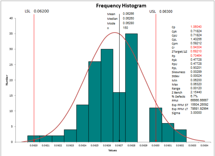
8. what is Descriptive Statistics: In today's session, we are going to learn about
descriptive statistics. Descriptive statistics
means I want to understand measures of center. Like measures of center,
mean, median mode. I want to understand
measures of spread. That is nothing but range, standard deviation,
and variance. Let's take a simple
data that I have. I have cycle time in minutes for almost a 100 data points. I'm going to take
the cycle time in minutes from my day
project data sheet. I'll go to MiniTab and I
will paste my data where here I want to do some
descriptive statistics. Stats. Click on Basic Statistics and say Display
Descriptive statistics. When I do this, it gives me an option in the pop-up window, which is called as, which shows me the available
data fields that I have. I have cycle time in minutes. So it is telling
me that I want to analyze the variable
cycle time in minutes. I'll just click on, Okay, and immediately you will find
that in my output window. I can just pull this down. In my output window. It is showing me
that it has done some statistical analysis for the variable cycle
time in minutes. I have 100 data
points over here. Number of missing values are 0. The mean is 10.064. Standard error of mean is 0.103, standard deviation is 1
to minimum value is 7.5. One is nothing but your
quartile one is 9.1. Median, that is,
your Q2 is 10.35, Q3 is 10.868, and the
maximum value is 12.490. If I need more
statistical analysis, I can go ahead and
repeat this analysis. This time, I'm going to
click on Statistics. And I can look at the other
data points that I need. Suppose if I need the range, I don't need standard error, I need I need
inter-quartile range. I want to identify
what is the mood. I want to identify what is
the skewness and my data. What is the kurtosis in my data? I can select all of it and say, okay, I will click on, Okay. When I do this, all the other
statistical parameters that I have selected will come
up in my output window. This is my output window. So it's again tells me that additional data point
that I selected. So radius is nothing but your
standard deviation squared. It is 0.0541. It is telling me the range
that is maximum minus minimum. It is 4.95. Inter-quartile range is 1.707. There is no mode in my data. And number of data points at
0 because there is no more, the data is not skewed. The values very close to 0, it is 0.05, but
there is kurtosis. It means my data is not
appearing as a non-work go. So good, we like to see
how my distribution looks. Let's do that. I click on stats, I click on Basic Statistics, and I will click on
graphical summary. I'm selecting cycle
time in minutes. And I'm saying I want to see
95% confidence interval. I click on, Okay,
let's see the output. The summary of the
cycle diamond minutes. It is showing me the mean,
standard deviation, variance. All the statistics things are being displayed on
the right-hand side. Mean, standard deviation,
variance, skewness, kurtosis, number of data points
minimum first quartile median, third quartile maximum. These data points which you
see as minimum Q1, median, Q3 and maximum will be
covered in the boxplot. The boxplot is framed
using these data points. And when you look at the Velcro, it says that the bell
is not steep curve, it is a little fatter curve, and hence the kurtosis
value is a negative value. We will continue our learning more in detail in
the next video. Thank you.
9. Descriptive vs Inferential Statistics: Let's examine both methods, starting with
descriptive statistics. Why is descriptive
statistics important? For instance, if a company wants to understand how its
employees commute to work. It can create a survey to
gather this information. Once enough data is collected, it can be analyzed using
descriptive statistics. So what exactly is
descriptive statistics, its purpose is to describe and summarize a dataset
in a meaningful way. However, it's crucial to note that descriptive
statistics only reflect the collected data and do not make conclusions about
a larger population. In other words, knowing
how some employees at one company commute doesn't allow us to fer how
all workers do. Now, to describe
data descriptively, we focus on four key components, measures of central tendency, measures of dispersion,
frequency tables, and charts. Let's start with measures
of central tendency, which include the mean,
median, and more. First, the mean, the arithmetic
mean is calculated by adding all observations together and dividing by the
number of observations. For example, if we have the
test scores of five students, we sum the scores, and divide by five to find that the mean test
score is 86.6. Next is the median. When the values in a data set are arranged in ascending order, the median is the middle value. If there's an odd
number of data points, it's simply the middle value. If there's an even number, the median is the average
of the two middle values. An important aspect of
the median is that it is resistant to extreme
values or outliers. For example, regardless
of how tall, the last person is
in a high data set. The median will remain the same. While the mean can change significantly based
on that value, the median remains unchanged regardless of the
last person's height. Meaning it is not
affected by outliers. In contrast, the men can change significantly based on
that last person's height, making it sensitive to outliers. Now, let's discuss the mode. The mode is the value or values that occur most
frequently in a dataset. For example, if 14 people
commute by car, six by bike, five walk, and five
take public transport, then car is the mode since
it appears most often. Next, we move on to
measures of dispersion, which describe how spread out the values in
a data set are. Key measures of dispersion
include variants. Standard deviation range
and intequatle range, starting with
standard deviation. It indicates the
average distance between each data
point and the mean. This tells us how
much individual data points deviate
from the average. For instance, if the
average deviation from the mean is
11.5 centimeters, we can calculate the standard deviation using the formula. Sigma equals the square root of the sum of each value
minus the mean. Squared, divided by n, where Sigma is the
standard deviation. N is the number of individuals. X sub i is each
individual's value, and x bar is the mean. It's important to
note that there are two formulas for
standard deviation. On divides by n, while the other divides
by n minus one. The latter is used
when our sample does not cover the
entire population, such as in clinical studies. The latter is used
when our sample does not cover the
entire population, such as in clinical studies. Now, how does standard
deviation differ from variance? The standard deviation measures the average distance
from the mean. While variance is simply the squared value of
the standard deviation. Next, let's discuss range
and intequatle range. The range is the
difference between the maximum and minimum
values in a data set. On the other hand,
the inequartile range represents the middle
50% of the data, calculated as the difference
between the first quartile, Q one and the third
quartile, qu. This means that 25%
of the values lie below and 25% above the
inte quartile range. Before we proceed to
the final points, let's briefly compare
these concepts, measures of central tendency
and measures of dispersion. Let's consider measuring the
blood pressure of patients. Measures of central
tendency provide a single value that represents
the entire dataset. Helping to identify
a central point around which data
points tend to cluster. On the other hand,
measures of dispersion, such as standard deviation, range and inteQatile range indicate how spread out
the data points are. Whether they are closely grouped around the center or
widely scattered. In summary, while measures of central tendency highlight the central point
of the data set, measures of dispersion
describe how the data is distributed
around that center. Now, let's move on to tables, focusing on the most
important types, frequency tables, and
contingency tables. A frequency table
shows how often each distinct value
appears in a data set. For example, a company surveyed its employees about
their commute options, car, bicycle, walk,
and public transport. Here are the results from 30 employees showing
their responses. We can create a frequency
table to summarize this data by listing the four options in
the first column, and counting their
occurrences from the table. It's clear that the
most common mode of transport among
employees is by car. With 14 employees
choosing this option. The frequency table provides a concise summary of the data. But what if we have two categorical variables
instead of one? This is where a
contingency table, also known as a cross
tabulation comes into play. Imagine the company
has two factories, one in Detroit, and
another in Cleveland? If we also ask employees
about their work location, we can display both variables
using a contingency table. This table allows us to analyze and compare
the relationship between the two
categorical variables. The rows represent the
categories of one variable. While the columns represent
the categories of the other, each cell in the table
shows the number of observations that fit into the corresponding
category combination. For example, the first cell indicates how many
employees commute by car and work in Detroit
was reported six times. Thank you. I will see you in the next lesson of statistics.
10. Concepts of Inferential Statistics Part 2: Let's dive into
inferential statistics. We'll start with a brief
overview of what it is. Followed by an explanation
of the six key components. So what is inferential
statistics? It enables us to draw
conclusions about a population based on
data from a sample. To clarify, the population is the entire group
we're interested in. For instance, if
we want to study the average height of all
adults in the United States, our population includes
all adults in the country. The sample on the other hand, is a smaller subset taken
from that population. For example, if we select
150 adults from the US, we can use this sample to make inferences about the
broader population. Now, here are the six steps
involved in this process. Hypothesis. We start
with a hypothesis. Which is a statement
we aim to test? For example, we might want
to investigate whether a drug positively impacts blood pressure in individuals
with hypotension. Oh, In this case, our population consist of all individuals with high
blood pressure in the US, since it's impractical to gather data from the entire population. We rely on a sample to make inferences about the
population using our sample. We employ hypothesis testing. This is a method used to
evaluate a claim about a population parameter
based on sample data. There are various
hypothesis tests available, and by the end of this video. I'll guide you on how to
choose the right one. How does hypothesis
testing work? We begin with a
research hypothesis. Also known as the
alternative hypothesis, which is what we are seeking
evidence for in our study. Also called an
alternative hypothesis. This is what we are trying
to find evidence for. In our case, the hypothesis is that the drug
affects blood pressure. However, we cannot directly test this with a classical
hypothesis test. So we test the
opposite hypothesis, that the drug has no
effect on blood pressure. Here's the process. One,
assume the no hypothesis. We assume the drug
has no effect, meaning that people
who take the drug and those who don't have the
same average blood pressure. T, collect and
analyze sample data. We take a random sample. If the drug shows a large
effect in the sample, we then determine the
likelihood of drawing such a sample or one
that deviates even more, if the drug actually
has no effect, or one that deviates even more, if the drug actually
has no effect, T, evaluate the
probability p value. If the probability of observing such a result under the null
hypothesis is very low. We consider the possibility that the drug does
have an effect. If we have enough evidence, we can reject the
null hypothesis. The p value is the
probability that measures the strength of the evidence
against the null hypothesis. In summary, the null
hypothesis states there is no difference
in the population, and the hypothesis test
calculates how likely it is to observe the sample results if the null hypothesis is true. We want to find evidence for
our research hypothesis. The drug affects blood pressure. However, we can't
directly test this, so we test the opposite
hypothesis, the null hypothesis. The drug has no effect
on blood pressure. Here's how it works. Assume the no hypothesis. Assume the drug has no effect. Meaning people who
take the drug, and those who don't have the
same average blood pressure, collect and analyze data. Take a random sample. If the drug shows a large
effect in the sample. We determine how likely it
is to get such a result, or a more extreme one. If the drug truly has no effect, calculate the p value. The p value is the
probability of observing a sample
as extreme as ours. Assuming the null
hypothesis is true. Statistical significance. If the p value is less than a set threshold, usually 0.05. The result is
statistically significant, meaning it's unlikely to have
occurred by chance alone. We then have enough evidence to reject the null hypothesis. A small p value suggests the observed data is inconsistent with
the null hypothesis. Leading us to reject it in favor of the
alternative hypothesis. A large p value suggests the data is consistent
with the null hypothesis. We do not reject it. Important points. A small p value does not prove the alternative
hypothesis is true. It just indicates
that such a result is unlikely if the null
hypothesis is true. Similarly, a large p value does not prove the null
hypothesis is true. It suggests the observed data is likely under the
null hypothesis. Thank you. I will see you in the next lesson of statistics.
11. Concepts of Hypothesis testing in detail: Welcome back. Let's understand
hypothesis in more detail. Hypothesis of We have an entire population that
we would love to study. But there would be
always constraint of time and resources to study
the entire population. Hence, we take a sample
from the population using different sampling techniques
and pull out a sample. We study the sample and draw some inferences
about the population, and that is as
inferential statistics. What exactly is hypothesis? A hypothesis is an assumption that can neither be
prone nor disapprove. In a research process, the hypothesis is made
at the very beginning, and the goal is to either reject or not reject the hypothesis. In order to reject or fail
to reject the hypothesis, data example from the
experiment a survey is needed, which are then evaluated
using hypothesis test. Using hypothesis,
usually hypotheses are performed starting
at a literal review. Based on the literal review, you can either justify why you formulated the
hypothesis in this way. An example of
hypothesis could be men earn more than women for
the same job in Austria. The hypothesis is an assumption of an expected association. Your target is either to reject or fail to reject
the null hypothesis. You can test your hypothesis
based on the data. The analysis of the data is done using the
hypothesis testing. Man earn more than women for
the same job in Austria. You made a survey of of almost 1,000 employees
working in Australia, a T test of independent sample. In this test, the
hypothesis you need from the survey suitable
hypothesis tests such as the T test or the
correlation analysis test. We can use online tools like Data tab or Excel
tools to solve this. How do I formulate a hypothesis? In order to formulate
a hypothesis, a research question
must first be defined. A precise formulate
hypothesis about the population can then be derived from the
research question. Man earn more than women for
the same job in Australia. To the subject, what is the question we want to ask
and what is the hypothesis? You will then
provide the data to the hypothesis test and
draw the conclusion. This is a very beautiful
visual representation of how a hypothesis
test is performed. Hypothesis are not
simple statements. They are formulated in such a
way that they can be tested with They can be tested with collected data in the course of
research process. To test hypothesis, it
is necessary to define exactly which variables are involved and how these
variables are related. Hypothesis then are assumptions
about the cause and effect relationship of the association
between the variables. What is a variable in this case? Variable is nothing but
a property of an object or an even that can
take different values. For example, an eye
color is a variable. If the property of the object, I can take different values. If you are researching
a social science, your variables can
be gender, income, attitudes, environmental
protection, et cetera. If you're researching
about the medical field, then your variables
could be body weight, smoking status, heart
rate, et cetera. So what exactly is the null
and alternate hypothesis? There are always two
hypotheses that are exactly opposite to each other and that claim to be opposite. These opposite
hypotheses are called as null and alternate hypothesis and are represented by H
naught and H A or H one, H zero and H one. The null hypothesis of H naught assumes that
there is no difference between two or more groups with respect to the characteristics that we are trying to study. The null hypothesis are hen. The null hypothesis assumes that there is no
difference between two or more groups with respect
to the characteristics. Example, the salary of the men and women are not
different in Austria. The alternate hypothesis
is the hypothesis that we want to prove or we are
collecting data to prove it. So alternate hypothesis,
on the other hand, assumes that there is a difference between
the two or more groups. Example, the salary of the men and women
differs in Austria. The hypothesis that you
want to test or what you want to dive from the theory usually
states the effect. The gender has an
effect on salary. This hypothesis is called as
the alternate hypothesis. It's a very beautiful
statement, right? There is another
way of writing it, and that is a gender has
an effect on salary, and hypothesis test is called
as alternate hypothesis. The null hypothesis usually states that there is no effect. Gender has no effect on salary. In the hypothesis test, only null hypothesis
can be tested. The goal is to find out whether null hypothesis is
rejected or not. There are different
types of hypothesis. What types of hypothesis
are available? The most common distinction
is between is differences, correlation
hypothesis, it can be directional and non
directional hypothesis. Differential and
correlation hypothesis. Differential hypotheses
are used when different groups are to be distinguished and the group of men and the group of women. Correlation hypotheses are used when they want to establish a relationship or a correlation between the variable
is to be tested. The relationship
between age and height. Difference hypothesis. Difference hypothesis
is test where we whether there is a difference between
two or more groups. The example of
difference hypothesis are the group of men
earn more than women. Smokers have higher risk of heart attacks than non smokers. There is a difference
between Germany, Austria, and France in terms of
hours work per a week. Thus, one variable is always a categorical
variable like gender, smoking status or the country. On the other hand,
the other variable is an ordinal variable or
a variable of salary, percentage risk of heart attack, and hours work per week. Now, let's understand
correlation hypothesis a little more in detail. A correlation hypothesis test, relationships between
two variables. For example, the height
and the body weight. As the height of the
person increases, the body weight gets impacted. The correlation
hypothesis, for example, is taller a person is, the heavier he is, the more
horse power a car has, the higher its fuel consumption. The better the math grade, the higher the future salary. As you can see
from the examples, correlation hypothesis
often take the form of the more the
higher, the lower. Thus, at least two ordinal scale variables are
being examined. Directional and non
directional hypothesis, hypothesis are divided into directional and non directional. That is either they are one sided or two sided hypothesis. If the hypothesis contains
words like better than, worse then, the hypothesis
is usually directional. It could be a positive
or a negative. In the case of non
directional hypothesis, one often finds out
the building blocks, such as there is a difference
between the formulation, but it's not stated in which direction the
difference lies. For the non directional
hypothesis, the only thing of interest is whether there is a difference in the value between the
variables under consideration. In a directional hypothesis, what is the interest whether one group is higher or
lower than the other? You have two sided hypothesis, or you can have one
sided hypothesis like left sided or right sided. Non directional hypothesis, a non directional
hypothesis test whether there is a difference
or a relationship. It does not matter
in which direction the relationship exists
or the different cos. In the case of a
difference hypothesis, it means that there is a
difference between two groups, but it does not say whether
one group has a higher value. There is a difference between the salary of men and women, but it does not say
who earns more. There is a difference
in the risk of heart attacks between
smokers and non smokers, but it does not say who
is at a higher risk. In regards to the
correlation hypothesis, it means that a relationship or a correlation
between two variables. But it But it is not said whether
the relationship is positive or negative. There is a correlation between height and weight and there is a correlation
between horse power and fuel consumption in the car. In both cases, it is not said we the correlation is
positive or negative. When you talk about a
directional hypothesis, we are additionally indicating the direction of the
relationship or the difference. In case of the
different hypothesis, statement is made, which group
is higher or lower value? Men earn more than women. Smokers have a higher risk of heart attacks
than non smokers. In case of a
correlation hypothesis, the relationship is made as to whether a correlation is
positive or negative. The taller a person
is, the heavier he is. The more horse power a car has, the higher its fuel economy. One sided Directional
alternate hypothesis includes only the
values that differ in one direction from the values
of the null hypothesis. Now, how do we interpret the p value in a
directional hypothesis? Usually, statistical
softwares are always help you in
calculating the p value. Excel has also become very smart in calculating
the p value, and it helps in calculating the non directional test and also helps in giving
the p value for this. To obtain the p value for
directional hypothesis, it must check whether the
effect is on right direction, then the p value
is divided by two, and whether the significance
level is not sped by two, but only one side. More than this, we have
a tutorial on P value. So please go and watch that in the analyzed phase of my course. If you select a directed
alternate hypothesis in a software lil data type, for the calculation
of hypothesis, the conversion is
done automatically and you can only reads. Now, step by step instruction
for testing the hypothesis. You should do a
literature research, formulate the hypothesis,
define the scale level, determine the
significance level, determine the hypothesis test, which hypothesis
test is suitable for scale levels and
hypothesis style? The next tutorial is
about hypothesis testing. You will learn about
hypothesis testing and find out which one is better
and how to read it.
12. Introduction 7Qc Tools: T. Welcome to the new class
on seven quality tools. This is one of the most
important concepts if you are thinking about doing small continuous improvement in your process or operations
or manufacturing setup. Even if you are in
the service industry, these tools will help you
to keep track of quality. With that, let's get started. So the seven QC tools, what am I going to cover as part of this
training program? It is the seven
quality control tools. Number one, things catapult, flow chart histogram
Pareto analysis, Fishburn diagram also called as Ishikawa diagram Run
charts check sheets. We are not only going to cover these tools at a high level. We are going to
do some examples, how to draw these things using Microsoft Excel
wherever possible. We're also going to give you some sample exercises with data that can help you do
these activities very easily. We're going to talk
about what is the tool, how to use the tool, when to use the tool, some common mistakes
that we should avoid, and a step by step guide to create the output
that is required.
13. Checksheet: Let's go to the
next quality tool out of the seven QC tools, that is the check sheet. Let's learn more
about check sheet. Check sheets are used for systematically recording
and compiling the data. From the historical sources or observations as they occur. It can be used to collect
data at locations where data is actually
generated over time. It can be used to capture both quantitative and
qualitative data. So I've shown you a simple
check sheet where you have defect types and how many times this particular
defect is happening. This can be used
to systematically record and compile data from historical sources or
observations as they occur. It can be used to
collect data at locations where data is
generated at real time. This type of data can be quantitative as well
as qualitative. Check sheet is one of
the basic seven QC. What does the check sheet do? It is used to create
easy to comprehend data and that comes with
simple efficient process. With every entry, create
a clear picture of facts as proposed to opinion
of each team member. That is why it's one
of the data driven. It standardize the agreement on definitions of each
and every condition. How is a check shape used? We agree upon the definition of events or conditions
that are being observed. Example. If we seek the root cause of
severity one defects, then agreement is to
make it as severity one. Decide on who collects the data, decide the person who will be
involved in this activity. Note down the sources from
where the data is collected. Data should be in the form of sample or the entire population. It can be both qualitative
as well as quantitative. Decide on the knowledge
level required for the person who is involved
in the data collection plan. Decide on the frequency
of data collection, whether the data should be
needed to be collected, weekly, hourly, daily,
or a monthly basis. Decide on the duration of the
data collection, that is, how long should the data be collected to make it
a meaningful outcome. Construct a checksheet
that is simple to use concise, complete, and have consistency
in accumulating data throughout the
collecting period. Please note that check sheets
were created as one of the quality tools when we
were in the industrial age. Currently, we are in
the information age. We have so many ERP softwares, Machine ese capturing
data because of IT, and there are various other computer generated reports
which are applicable. Seek to use a checksheet
only and only when you are in a completely
manual data capture process. It is one of the tools, but the least use tools
in the last few months. Let me rephrase, least use
tools in the last few years. Unless and until your
company is completely not having any systematic
approach of capturing the data. It's a very good tool if you
are using people who are blue colored employees
and you do not have high tech systems
to capture the data. So I have attached the template for the check sheet in the
project and resource section. You can refer to it.
Just give me a second. I will show you the check
sheet on the screen. So I can use a check sheet that I have given you as part of
my parado template. You can write down the
categories over here, telling me that it is
defect one defect two. Hight is an issue there of whatever is the
name of your defect, please list all the
defects here, right? And then you can market that how frequently
is this happening? Wherever it is happening, please start writing one. How frequently are you seeing this and when are you seeing it? This in conjunction to I can use later on this data
for my Pareto analysis, for which I have created a separate video,
you can use that. You don't need a separate
check sheet in today's world. You can use the one which
I have given over here. Thank you. I will see
you in the next class.
14. Boxplot: Today, we are going
to learn about boxplot and understand
it in detail. We all would have seen boxplot
in multiple instances. But let's see what
does it interpret. So what exactly is a boxplot? With a boxplot,
you can typically graphically display a lot of
information about your data. The box indicates the range of the middle 50% of the place
where your value lies. Let's understand the box
plot, how it is divided. If the beginning of the
box is called as Q one, it is the lower end of the box, and it's also called
as the first quartile. Q is the upper end of the
box or the third quartile. The distance between Q three and Q is called as an
inter quartile range, which is the middle
50% of your data. The 25% of the data is
below Q one, In the box, you have 50% of the data, and therefore, 25% of the
data is above the box. You have a main and the
median line inside the box, which again splits the
data into 25 and 25%. So let us say when we display
the age of the participant, the box plot, one is 31 years. It means that 25% of the participants are
younger than 31 years. Q three is 63 years. It means that 25% of the
participants are older than 63. 50% of the participants
are 31-63-years-old. The mean and the median. The median is at 42, which means half of
the participants are aged older than 42 years, and the other half are
younger than 42 years. The dash line is also called as the average line
or the main value, which represents the average. As the mean is away
from the median, it clearly says
that the data is. The solid line represents the median and the dotted
line represents the average. The point which are further
away are called as outliers. The height of the whisker is roughly 1.5 times the
interquartal range. The whisker cannot
keep ping endlessly. The outlier and the
ti shaped whisker. If there is no outlier, the maximum value is here. If there is an outlier, the T shaped whisker is
the last point in which 1.5 times the interquaral range and others are
called as outliers. How do I create a boxplot? You have Excel sheet to
create your boxplot, and you can also do it
using online tools. Yeah, so I can just
go for charts. With that, I can say I'm
taking the metric variable, then you have an
option of histogram, and you also have an
option of boxplot, which clearly says
that the Q one is 29, is 66, median is 42, Man is 46. Maximum is 99, the
upper fence is 99. There are no outliers. Let's go and change the data. Let me make this as 126. As soon as I change the value of a person to 126,
when you come back, you will find that there is
a outlier in the histogram, and it's very evident over
here that 126 is an outlier. And here, the upper fence is 92. The Q three is still the same, the Q one is still the same. So the box size does not
change and so on. Right? What if the person is one ero? In that case, you will see that it is not
part of an outlier, but it is still part of the isc. I can make the graphic small, I can show the zero line. I can show the
standard deviation. I can show the points. I can make it as
horizontal and vertical. So all these options
are possible using an online
statistical tool. I can obviously download the
Zip file and work with it. Okay. How can I do boxplot
using Excel sheet? So I have copied the
same data over here. I have different groups, so I have gone ahead and
selected my age as data. And now I go to insert, recommended chart,
go to all charts, and I have box and
whisker chart. And I'm able to see my
box and whisker chart. I can remove my grid lines and
I can add the data labels, and it clearly shows my pat. Maybe I can just increase
it to make it more visible. I can change the color of
my graph to be different. Oh and I can pick the My average
is over here. My median is 421, three and. Now, the same graph, I can also group
it based on roots. I'm taking the
group and the age. I click on in, I can click
on recommended chart, go to all charts and
do box and whisker. This time, I have four boxes
for each of the group. I can change the color
of my graph. All right. I can include the data labels. When I include it over here
and click on the comma sign, you will find that
the tei points have been So it's very easy to draw graph using Excel as well as using
some online tools. So for the groups, I've
taken the group plus the A, and for this, I have taken. So for A, let's say
for the group C, if I go ahead and change
the value as 100, you will find that there
is an outlier over there. The minimum value is ten, let's change the values 25. You will realize that this is how the
values are changing. Great. So I will see you in
the next class. Thank you. Oh.
15. Understand Box Plot Part 1: In this lesson, we are going
to learn more about boxplot. A boxplot is one of the graphical technique which helps us to identify
outliers, right? Let us understand how
a boxplot gets formed. Let's understand
the concept first before we get into
the practicals. A boxplot is called as a
boxplot because it looks like a box and it has
viscous like the cat. The cat has on its face. Now, just like the way the cat cannot have and less viscous, the size of the whisker of the box plot will be decided
on certain parameters. You will see some
important terminologies when you're forming a boxplot. Number one, what's
the minimum value? What's the quartile one? What is the median? What is the core tight? Three, what is the size
of the maximum whisker? And what is the maximum
value on the data point? Here? The minimum dogs over the minimum point and where
the whisker can be extended. Q1 stands for first quarter, which means 25% of the data. Let's assume for ease, we have 100 data points. 25 per cent of the data will
be below this one mark. Between Q1 and Q2. Twenty-five percent
of your data will be formed, will be present. Q2 is also called as the median or the
center of your data. So if I arrange my data in
ascending or descending order, the middle data
point is called as a median and it is called as Q2. Q3, or otherwise also
called as upper quartile, talks about the
twenty-five percent of the data after the medium. So technically, by
now you have covered seventy-five percent
of your data will be below your
third quartiles, 25 per cent below Q1, 50% of the data below Q2, Seventy-five percent of
the data is below Q3. So technically, out
of 100% of the data, 75% of the data is below Q3. It means twenty-five percent of my data points will be above Q3. Now the distance between
Q1 and Q3 is called, is called as the box size. And this box size is also
called as inter-quartile range. Q3 minus Q1 is called as
inter-quartile range. As I told you at the
beginning of the class, that the size of
the whisker depends upon the interquartile
range or IQR. Q3. I can this line form 1.5
times the size of the box. So 1.5 times into IQR plus q3 will be the upper
limit for my whisker. On the right side.
On the upper side. If I want to draw the
whisker on the left side, it is nothing but the same 1.5 times into
inter-quartile range. But I subtract this value from Q1 and extended till that value. So it sets up the lower limit. You might have data
points which are coming below the minimum point. You might have data
points which are coming beyond the
maximum size of the risk of these data points
are called as outliers. The beauty of boxplot
is it will help you to identify if there are any
outliers in your dataset. Let's see how can I
construct a boxplot? Because physically I
don't have to worry about finding out 2525% percent. And really by person, we will go to MiniTab and then do the work. So let's see this datasheet. So in our previous class, we did some descriptive
statistics on this. And we found the data points. We found minimum Q1, Q2, Q3, and maximum data point. Let's try to construct a boxplot for the
cycle time in minutes. So I will click on graph. I will go to box plot and see a simple boxplot
and click on, Okay, I'm going to select
cycle time in minutes. And I'm going to say, Okay, let's see the data view. If you look at this boxplot, the below line is called
as the one. It is 9.16. The median is the middle line, and it need not be
exactly in the center. The top of the box is Q3, which is 10.86 in
this data range, and the interquartile
range is 1.7. My box can extend
for 1.5 times on the elbow and it can go 1.5 times into 1.7
on the balloon. And you are seeing
that there are no asterisk marks
in this boxplot, very clearly indicating
that there are no outliers in my
current dataset. Let's pick up some
more data set. In our next video to
understand how do box plot.
16. Understand Box Plot Part 2: Let us continue our journey on understanding boxplots
more in detail. If you go to the sheet
in your project file, which is called as a boxplot. I have collected data of cycle time for five
different scenarios. As you can see that some places I have more
number of data points, like I have almost 401745 data. In some places, I have
only 14 data points. So let's try to analyze this in more detail to understand
how boxplot works. I have copied this
data onto MiniTab, case one, case two, T3 and T4. So first thing I would
want to do is do some basic descriptive
statistics for all the foreign keys. I'm selecting all of it. And then I'm seeing,
when I see my output, I can see that in
three of the cases, I have 45 data points. In the fourth case, I have 18 data points. In the fifth case, I
have 14 data points. So the number of data
points are very, if you look at my minimum value, it is ranging from 1, one, twenty one, twenty two. And the maximum value is
somewhere between 4090 them. In one scenario I have
developed values from 21 to 40. In one scenario I have
values from two to 90, which very clearly shows that the number of data
points or do this. But my range of value is white. So if you look at the rate, it's ranging from
18.8 to 99 points. So in case two, I have 1200 as a
range, so 99 years. And the same can also be
observed as standard deviation. You can see that the
skewness of data is different and kurtosis
is different. Let's first understand
the box plot in detail. And in the next video, when I'm talking
about the histogram, we will understand the
distribution pattern using the same data set. Let's get started.
I click on graph. I can click on boxplot
and I click on simple. What I can do is I can take up 11 case at a time
to analyze my data. So case one, it shows
me a box plot and this boxplot very clearly shows that there are no
outlier in my data. And the range is between. When I keep my cursor over here, I have 45 data points. My whisker is ranging
from 21.6 to 4.4, and my inter-quartile
range is 5.95. My median is 30.3. My first quartile is 26.9. My third quartile is 32.85. Let's redo this
thing for case two. When I do my keys too, if you now look, the box is looking very small because here my data
points are same. Fortified by Vickery
is again ranging from 21.6 to 40 for seem like
my previous scenario. But I have outliers over here, which are far beyond. If you remember, the
descriptive statistics for kids to my minimum value is one
and my maximum value is 100. My median was seemed like
my previous scenario. My Q1 is also similar, not same, but similar. And Q3 is also similar. But when you look
at the box plot, the box is very small, very clearly indicating that do my inter-quartile
range is 6.95. My viscous can only go 1.5 times and any data
point beyond that, Misko will be called
as an outlier. I can select these
outliers, right? And it is very clearly see, k is two, the value is 100
and it is in row number one. Row number 37, I have
a value called as 90. In row number 30, I have
a value called is 88. And in row number 21 I have
a value called as one, which is a minimum size. So I have outliers
on both the sides. Let's understand case three. When I look at the chemistry, I put my cursor on the boxplot. I have the same 45 data points. My viscose or from 21.6 to 40 for seem like my
case one, case two. But in this scenario, I have lot of outliers. On the lower end. That is, on the bottom of
my core, tight, right? It is easy for us to click on each one of them and
see how my boxes are. Now the beauty over here is
I have only 18 data points, but still I have an outlier. Let's do it for k is five. And understand that as well. I have a smaller box. I have only 14 data points and I have an outlier
on the up button, and I have an outlier
on the lower end. Here the value is 23. But seeing these
plots differently makes it difficult for
me to do a comparative. Can I get everything
on one screen? So I go to graph,
I go to boxplot. I will do simple
environment selected. I'm selecting all the cases together and seeing
multiple graphs. I'm seeing skin and I'm seeing
the axis should be seen. Grid lines should be seen. And I click on, Okay. I'm getting all the
five data points, five cases scenario
in one graph. This will make it easy for me to do the analysis, that case one. So do individually when
I saw the case one, if we're showing us a big swath. But when I'm doing a comparison of one next to each other, I can know that in case two I have outliers on the
top and the bottom. In case three, I have
outliers on the bottom side. In case four, I have
outliers on the top side. In case five, I have
outlets on both the sides. The number of data
points are different. The bulks will get drawn. The size of the box cannot be determined by the
number of data points. I have 45 data points, but my box is very narrow. And I have 14 data points
and my box is white. So the size of the box. So if I have 14 data points, it is going to divide my
data into four parts. So three data points below Q1, three data points
between Q1 and Q2, three data points
between Q2 and Q3, and three data points beyond Q3. Whereas when I had
45 data points, it is getting
distributed as 11111111. My median would be
the middle number. So what is the learning from this exercise is that by
looking at the size of the box, you cannot determine the
number of data points. But what you can definitely determined is that in
mind that dataset, do I have data points which
are extremely high or low? So the purpose of drawing
a box plot is to see the distribution and
identify outliers, if any. I hope the concept is clear. If you have any queries, you are free to put it up
in the discussion group. And I'll be happy
to answer them. Thank you.
17. Pareto analysis: Hello friends. Let's continue our learning on seven QC tools. The tool that we are
going to learn today is Pareto charts are also
called as parto analysis. This is based on the famous statistician
not statistician. Let me correct myself, economist who went around the world to study the proportion of wealth with respect
to the population. When he did this, Mr. Pareto found out the 80 20 principle. Let's dive deep into it. So the Pareto analysis, the principle that
helps you focus on the most important matter to
obtain the maximum benefit. It describes the phenomena that a small amount
of high value contributes more to the total than a high number
of low values. The focus is, what are those high value
attributes that I need to focus on instead of so
many small value items. This in short, is called as identify the vital few
instead of the trivial many. What are those red blocks
which are only three or four? But the contribution is major. Instead of looking at hundreds
of small things where the contribution total
contribution is minor. Even if I look at my
personal expenditure, O of my total
income that I make, majority of my money
goes off in paying EMI, paying the rents, and bills. So those are my vital few, instead of trivial many, where I'm trying to look
at the bus tickets, the food I'm eating, or the small purchases
that I'm making. So if I want to
make good savings, I need to focus on seeing how
I can repay my EMI quicker, how I can have a rent, which is within my budget. The Pareto analysis is based
on the famous 80 20 rule. It states that roughly 80% of the results come from
20% of the effort. Very nicely said, the 80%
effort comes from 20% effort. Similarly, 80% of
the problems or effects from 20% of causes. We use this for our
cause analysis. The exact percentage may vary from situation
to situation, whereas we believe
it to be 80 20, even if it is a 75 25, we should go ahead and pursue
of fixing those vital few. Sometimes we might
get it as a 70 30, sometimes we might
even get it as 88 12. These are just some
of the examples. The point is, which are
those major causes, which I can fix with minimum effort to
get maximum results. In many cases, few effort are usually responsible
for most of the results. A few causes are usually responsible for
most of the effort. If I related back to my exam, there are certain
chapters in my book which carry more weightage
in my final exam. If I'm thorough on
those chapters, my probability of getting
60 70% becomes very easy. Instead of trying to read all the 20 chapters
in my workbook, I might focus on few
chapters to get the results. Sparto analysis is used by decision makers to identify
the effort that are most significant in order to decide which to select
first, the decision making. It is used for process
improvement projects to focus on the causes that contribute most to a particular problem. This will help prioritize
the potential causes, factors, and key process inputs of the problem
being investigated. It's a continuous
improvement toolkit. Pareto analysis is used when prioritizing
projects to focus on significant
projects that will bring value to the customer
and to the business. Rather than doing
all the projects that are there in
my project list, I would focus on
those few projects, two or three major projects, which can give me
maximum benefit. You can be careful during the scoping of the
project if you're using the parto Aysis or for
prioritizing your resources, who is the main person that
is required for your project. We can also use parto
analysis for visualizing your data to quickly know
where the focus should be put. For example, I have a lot of defect data like ten
tear off dense catch. I'm doing the analysis
and I've got this data. If I put it in the descending
order of the defects, I find that tear off
is the maximum effort. And followed by pinhole, then then, and so on. The one which are in gray, I'm not going to focus much because they are not
contributing majorly. If I fix the tear off, I'm going to get
maximum results. If I'm going to fix
the first three, I'm going to get major reduction in the defects that are
happening in my process. For example, if you collect
the data about defect types, operator analysis can reveal which type of defect
is most frequent. You can focus on your
efforts in solving the cause that has
the most effect. The benefit of parto analysis is to help you focus on
what really matters. It separates the major causes of the problem from
the minor one. It allows to measure the impact of improvement by covering
before and after. It allows to reach consensus about what needs
to be addressed first. The Pareto principle has been found to be true in many fees, 20% effort to give 80% results. Instead of work or
we can also call it as 20% causes giving
me 80% effect. So if I'm thinking about
cause and effect analysis, it is again 20%
causes, 80% effort. O effect, if I'm looking at
effort results analysis also, we say put less effort
to get maximum results. 20% of the company's client are responsible for
80% of its revenue or 80% of the sale comes
from 20% of the clients. So that is the concept of 20% effort versus
results of 80%. The Pardo Analysis
act office can be thought about as 20% of the
workers do 80% of the work. 20% of the time spent on a task leads to 80%
of the results. 20% of the population owns
80% of the nation's wealth. Isn't it true, even
in our country, our state, our community? We find that there are very few people who are owning the maximum
amount of wealth. You may use the 20% of the household tools,
80% of the time. You may wear 20% of your
clothes, 80% of the time. So it's time for you to just
apply parto analysis in your personal life to clean up your wardrobe if you believe in the concept of minimalism. 20% of the car drivers
causes 80% of the accidents. 80% of the customer complaint comes from 20% of the customers. Just a few cause accounts for most of the effect
on the fish pole. If I'm converting my parto
analysis to a fish pole, you will find that
there are few causes which contributes
to the major one. By listening to all
these examples, you would have understood
that Pareto is not restricted to apply only at
your office or place of work. You can even apply parto
analysis in your personal life. If I take it to Twitter or a social media
platform like that, most of the active 20%
of the Twitter users are responsible for 80%
of the tweets overall. The parto chart is
a special type of bar chart that plots the
frequency of historical data. So you need to understand
this data is as of yesterday or as of today
morning or as of last month. So it is a categorical data. The x axis very
clearly says that it's a categorical data and the y axis talks about the
frequency of occurrence. So Parto analysis cannot be used for continuous
data, please note. So if you see, you will have categorical data with frequency plotted
in descending order, the major causes which are less effort to
get maximum results. The categorical data, it
is the lowest level of data that results in classifying
people, things or event. I can make it more simple. Anything that's made with words is called as
categorical data. Geographical locations,
weather, color, device type, blood type, blood, bank account type, like
savings or current, FD or home personal loan type of error or
defect, type of the dat. Pareto analysis,
the vertical axis represents the frequency
of the categorical data. The x axis represents the
categories of the labels. The horizontal axis represents the categorical data that
causes a problem or the issues. The bar is arranged in a descending order
from left to right. The most frequent occurring
one is on the left side, the least frequent occurring
one is on the right side. You do not have to worry if
you have microsoft Excel, it will draw it for you. If you are using an
older version of Excel, I will share a template in the project and
resource section below. If you have too many categories, you may group those small
infrequent categories into the category
called as others. The last bar is usually a little higher than
the previous ones. You may optionally put a
cumulative frequency curve above the bar giving it a secondary y axis to represent the
cumulative percentage. This simply helps in
interpreting the results more easily and to identify
the 80 20 connection. The parto analysis
focus on efforts on those categories whose
vertical bar account is for 80% of the results. You should look for something
which are major causes, maximum effect and least
effort to get maximum results. If you look at the
two parto patterns, A and B, which one is the best illustration
of the parto pattern. I would suggest it is
the pattern A because pattern B is showing
that most of them are almost
contributing equally. This is uniform distribution, so I would not go with it. I would go with the one
that is category A. And this is wrong. If the resulted charts clearly illustrates
a parto pattern. This suggests that
only few causes accounts for about
80% of the problem. This means that there
is a parto effect, and you can focus your effort on tackling these few causes
to get maximum result. If you would have received
a pattern like B graph, then the parto analysis
will not work, and we will have to
use some other QC too. However, if no parado
pattern is found, we cannot say that some causes are more important than others. As I just said. Make sure that your parado chart contains enough data points to
make it meaningful. In today's world, there is a lot of data that's available, so please ensure that you're capturing as much
data as possible. The Pareto analysis on how
to construct a parto chart. If with your team, define the problem that
you're trying to solve, identify the possible causes using brainstorming or
similar techniques. Decide the measurement method
to be used for comparison, the frequency, cost,
and time, et cetera. How to construct a parto chart, collect the data and require the categorical data
to be analyzed. Calculate the frequency
of the categorical data. Draw a horizontal line and place the vertical bar to indicate
the frequency of category. Draw a vertical line on the
left to place the frequency on the left of the line in case you are drawing
it on a graph paper. Microsoft Excel can do
parado chart automatically. But if you're doing it manually, then sort the categories in the order of frequency
of occurrence from the est to the smallest largest coming
on the left side. You should calculate your
cumulative frequency curve and a cubultive percentage line. If you observe the
parade to effect, focus your improvement effort on those few categories
whose vertical bar accounts for the most. These causes are likely to have greatest impact on
your process output. I've taken a sample pareto
to analyze the reason why patient is using a call well in a
hospital when admitted. So they need toilet assistant, need food or water, repositioning of their
bed, intravenous problems, pain medication, urgent
call back to bed, obtaining all the ones
which are in gray are are not frequently happening things and
are not important. So if we focus on the first
three, or the first four. So if I would say
that four factors, which contributes to
40% of the effort, and you are going to
get 70% of the effect. So I might decide to just
work on the first three, that is 30% effort, to still get 68% effort. Anything is fine. Concept being that I need to put less effort
to get maximum results. Customer complaints
in a factory. A factory team has conducted
a parado analysis to address the rising number of complaints from the
customer's perspective. In a way, management
can understand. It's a type of customer
complaint, product complaint, document related complaint, package related complaint or
delivery related complaint. We can see people customers
are maximum number of times complaining about the type of the product or the
defect with the product. Followed by the document
related issues. Customer complaint in a factory, the main categories
may be too generic and can be divided
into subcategories. So if I think about
product complaints, it's at a high
level, I might take it as sub components
of problem A. Is it scratch dent problem, pinhole, pair of HMA or others. You will be able to apply again the parto on the product
complaint as well, that if you're going
to fix scratch and dent related issues in
a product complaint, the majority of the product
complaints will come down. Type of document complaints, we can see that
missing information is the major contribution
followed by invoice error, wrong quantity and others. The parto chart can
be further analyzing by using the main
categories to be divided into subcategories or
subcomponents where the specific problem occurs most often are called
the subcategories. Customer complaints
in a factory. The results suggest
that there are three subcategories
that occur most often. Note that it is possible to
merge two charts into one. So I have type of product complaints
and type of document, and I can go ahead
and marge them. Pero Principles is named after the Italian economist
Wilfredo Peto. Joseph Juran has applied Peto principles to quality management for
business production. In your analysis, consider
using contextual data, meta data, and the columns
that contain textual data. Databases often contain a lot of categorical data
about the environment from which the data is taken. This data can be very
useful in later analysis when investigating the who
cause concepts and ideas. Pareto principles can help
you measure the impact of improvement by comparing
the before versus after. If you see the blue work
was a major aipulor, after the projects,
you find that there is a major improvement
in that category. The new parto chart
can show that there is a major reduction in
the primary cose. Statistically, parado
principles can be described by the power lot distribution and many natural phenomena to
exhibite the distribution. With that, I come to the end of the concept of
parto analysis. In the next video, I'm
going to show you how I do Pareto analysis
using Microsoft cel. See you in the next class.
18. Concept hypothesis testing and statistical significance: Let's break down the
concepts related to hypothesis testing and
statistical significance. One, hypothesis testing, when conducting a
hypothesis test, we start with a
research hypothesis, also called the
alternative hypothesis. In your case, the research hypothesis that the drug has
an effect on blood pressure. However, we cannot directly test this hypothesis using a
classical hypothesis test. Instead, we test the
opposite hypothesis that the drug has no
effect on blood pressure. We start by assuming
that on average, people who take the drug
and people who don't take the drug have the same blood
pressure in the population. If we observe a large
effect of the drug in a sample, we then ask, how likely is it to draw
such a sample or one even more extreme if the
drug actually has no effect. The probability of
getting such a sample, assuming the null hypothesis, no effect is called the P value. The P value indicates the probability of obtaining
a sample that deviates as much as our observed
sample or even more extreme if the null
hypothesis were true. If the p value is very low, typically less than 0.05, we have evidence to reject the null hypothesis in favor of the
alternative hypothesis. A small p value suggests that the observed data or sample is inconsistent with
the null hypothesis. So Three, statistical
significance. When the p value is less than a predetermined
threshold, often 0.05. The result is considered
statistically significant. This means that the
observed result is unlikely to have occurred
by chance alone, and we have enough evidence to reject the null hypothesis. The p value threshold
is set at 5%, or 0.05, a small p value suggests that the observed data or sample is inconsistent
with the null hypothesis. Conversely, a large p
value suggests that the observed data is consistent
with the null hypothesis, and we do not reject it. Four, errors in
hypothesis testing. Remember that a small
p value doesn't prove the alternative
hypothesis is true. It only suggests that the observed result is unlikely under the
null hypothesis. Similarly, a large P value doesn't prove the null
hypothesis is true. It only suggests that the observed result is likely
under the null hypothesis. Let us now understand
the two types of errors. The type one error and
the type two error. Type one error occurs when we mistakenly reject a
true null hypothesis. In your example, this would mean concluding that the drug works
when it actually doesn't. Type one error is
when you reject the null hypothesis,
when in reality, the null hypothesis is true, but your decision about the
null hypothesis is rejected. Type two error occurs when we fail to reject a false
null hypothesis. Type two error is
when you fail to reject the null hypothesis,
when in reality, the null hypothesis is false, but your decision about the
null hypothesis is accepted. In your example, this would mean missing the
fact that the drug works. Sample taken did not
show much difference. Mistakenly thought that
the drug is not working. In the next lesson, we will dive deeper into
practical applications of design of experiments.
Stay tuned.
19. Understand Test of Hypothesis: Hello friends. Let us continue our journey
on MiniTab data analysis. Today we are going to learn
about hypothesis testing. You might have heard that we do hypothesis testing
during the analyze and improve phase
of our project. So to understand how
hypothesis test works, let us understand a
simple case scenario. I will come back to this graph again and explain
you that it is. As you know, when we go
to the court of law, the justice system can be used to explain the concept
of hypothesis testing. The judge always starts with
a statement which says, the person is assumed to be
innocent until proven guilty. This is nothing but your null
hypothesis, the status quo. When they are caught
case which goes on. The lawyers tried to
produce data and evidences. And unless and until we do not have strong data
and strong evidences, the person is In the
status of being innocent. So the defendant or the
opposition lawyer is always trying to say that
this person is guilty and I have data and
evidence to prove it. He is trying to work on
alternate hypothesis. And the judge says, I'm going with the status quo of null hypothesis by default. Let me explain you
in a more easy way. You and I, we're not taken to the court of law
because by default, we all are in OSA, that is the status quo. Who are pulled to
the court of law. People who are who have
a chance of have come, have committed some crime. It could be anything.
So same way. What do we try to do
hypothesis testing on when I'm doing my analyze
phase of the project. So I have multiple causes which might be contributing
to my project. Why? We do a root cause analysis and we get to know that, okay? Maybe the shipment got delayed. Maybe the machine is a problem, maybe the measurement
system is a problem. Maybe the raw material
is of not good-quality. We have multiple reasons
which are there. Now I want to prove
it using data, and that is the place where I tried to use hypothesis testing. All the processes
have variation. We know all the processes
follow the bell curve. We are never add the center. There is some bit of
variation in every process. Now the data or the
sample which you updated, is it a random sample
coming from the same Banco? Or is it a sample that's coming from an entirely
different bell curve? So hypothesis testing will help you in analyzing the same. Whenever we set up
a hypothesis test, we have two types of hypothesis, as I told you, the status quo
or the default hypothesis, which is your null hypothesis. By default, we assume that
the null hypothesis is true. So to reject the
null hypothesis, we need to produce evidences. Alternate hypothesis
is the place where there is a difference. And this is the reason why the hypothesis test has
actually been initiated, right? We will understand
with lots of examples. So stay connected. So when I'm framing up null
and alternate hypothesis, Let's say, I am saying my mu
are nothing but my average, my population average
is equal to some value. Always remember, your alternate hypothesis
is mutually exclusive. If mu is equal to some value, the alternate hypothesis would say mu is not equal
to that value. By say, mu is less than equal to some value
as a null-hypothesis. For example, if I'm
selling Domino's Pizza, I see my average delivery time is less than equal
to 30 minutes. The customer comes
and tells me, know, the average delivery time
is more than 30 minutes, that becomes my alternate. Sometimes, if we have the null hypothesis is mu is greater than
equal to some value. For example, my average quality is greater than equal to 90%. Then the customer comes
back and tells me that know your average quality is
less than that percentage. So always remember the
null hypothesis and alternate hypotheses
are mutually exclusive and complimentary
to each other. We will take up many more
examples as we go further.
20. Null and alternate Hypothesis concept: Let's dive into
inferential statistics. We'll start with a brief
overview of what it is. Followed by an explanation
of the six key components. So what is inferential
statistics? It enables us to draw
conclusions about a population based on
data from a sample. To clarify, the population is the entire group
we're interested in. For instance, if
we want to study the average height of all
adults in the United States, our population includes
all adults in the country. The sample on the other hand, is a smaller subset taken
from that population. For example, if we select
150 adults from the US, we can use this sample to make inferences about the
broader population. Now, here are the six steps
involved in this process. Hypothesis. We start
with a hypothesis. Which is a statement
we aim to test? For example, we might want
to investigate whether a drug positively impacts blood pressure in individuals
with hypotension. Oh, In this case, our population consist of all individuals with high
blood pressure in the US, since it's impractical to gather data from the entire population. We rely on a sample to make inferences about the
population using our sample. We employ hypothesis testing. This is a method used to
evaluate a claim about a population parameter
based on sample data. There are various
hypothesis tests available, and by the end of this video. I'll guide you on how to
choose the right one. How does hypothesis
testing work? We begin with a
research hypothesis. Also known as the
alternative hypothesis, which is what we are seeking
evidence for in our study. Also called an
alternative hypothesis. This is what we are trying
to find evidence for. In our case, the hypothesis is that the drug
affects blood pressure. However, we cannot directly test this with a classical
hypothesis test. So we test the
opposite hypothesis, that the drug has no
effect on blood pressure. Here's the process. One,
assume the no hypothesis. We assume the drug
has no effect, meaning that people
who take the drug and those who don't have the
same average blood pressure. T, collect and
analyze sample data. We take a random sample. If the drug shows a large
effect in the sample, we then determine the
likelihood of drawing such a sample or one
that deviates even more, if the drug actually
has no effect, or one that deviates even more, if the drug actually
has no effect, T, evaluate the
probability p value. If the probability of observing such a result under the null
hypothesis is very low. We consider the possibility that the drug does
have an effect. If we have enough evidence, we can reject the
null hypothesis. The p value is the
probability that measures the strength of the evidence
against the null hypothesis. In summary, the null
hypothesis states there is no difference
in the population, and the hypothesis test
calculates how likely it is to observe the sample results if the null hypothesis is true. We want to find evidence for
our research hypothesis. The drug affects blood pressure. However, we can't
directly test this, so we test the opposite
hypothesis, the null hypothesis. The drug has no effect
on blood pressure. Here's how it works. Assume the no hypothesis. Assume the drug has no effect. Meaning people who
take the drug, and those who don't have the
same average blood pressure, collect and analyze data. Take a random sample. If the drug shows a large
effect in the sample. We determine how likely it
is to get such a result, or a more extreme one. If the drug truly has no effect, calculate the p value. The p value is the
probability of observing a sample
as extreme as ours. Assuming the null
hypothesis is true. Statistical significance. If the p value is less than a set threshold, usually 0.05. The result is
statistically significant, meaning it's unlikely to have
occurred by chance alone. We then have enough evidence to reject the null hypothesis. A small p value suggests the observed data is inconsistent with
the null hypothesis. Leading us to reject it in favor of the
alternative hypothesis. A large p value suggests the data is consistent
with the null hypothesis. We do not reject it. Important points. A small p value does not prove the alternative
hypothesis is true. It just indicates
that such a result is unlikely if the null
hypothesis is true. Similarly, a large p value does not prove the null
hypothesis is true. It suggests the observed data is likely under the
null hypothesis. Thank you. I will see you in the next lesson of statistics.
21. Statistics Understanding P value: What is the p value and
how is it interpreted? That's what we will
discuss in this video. Let's start with an example. We would like to investigate whether there is a
difference in height between the average
American man and the average American
basketball player. The average man is
1.77 meters tall. So we want to know if the average basketball player
is also 1.77 meters tall. Thus, we state the
null hypothesis. The average height of an
American basketball player is 1.77 meters. We assume that in the population of American basketball players, the average height
is 1.77 meters. However, since we cannot
survey the entire population, we draw a sample. Of co, this sample will not yield an exact mean
of 1.77 meters. That would be very unlikely. Oh. It may be that the sample drawn purely
by chance deviates by 3 centimeters by
8 centimeters by 15 centimeters or
by any other value. Since we are testing an
undirected hypothesis, that is, we only want to know
if there is a difference. We do not care in which
direction the difference goes. Now we come to the p value. As mentioned, we assume
that in the population, there is a mean value
of 1.77 meters. If we draw a sample, it will differ from the
population by a certain value. The p value tells us how likely it is to
draw a sample that deviates from the population by an equal or greater amount
than the observed value. Let's take a closer look again. We have a sample that is
different from the population. We are now interested in how likely it is to draw a sample that deviates as much as our sample or more
from the population. Thus, the p value indicates how likely it is to draw a sample whose mean
is in this range. For example, if by chance sample deviates by 3
centimeters from 1.77 meters. The p value tells us how
likely it is to draw a sample that deviates 3 centimeters or more
from the population. If by chance sample deviates by 9 centimeters from 1.65 meters, the p value tells us how
likely it is to draw a sample that deviates 9 centimeters
or more from the population. Let's take an example where
we get a difference of 9 centimeters and our
favorite statistic software. Like Mini tab, calculates
the p value of 0.03. That is 3%. This tells us that it is only 3% likely to draw a
sample that is equal to or more than 9 centimeters
different from the population mean
of 1.77 meters. For normally distributed data. This means the probability that the mean lies
in this range is 1.5% in one direction and
1.5% in the other direction. Totaling 3%. If this
probability is very low. One can of course ask whether
the sample comes from a population with a mean
of 1.65 meters at all. If this probability is very low. One can of course ask whether
the sample comes from a population with a mean
of 1.77 meters at all. It is just a hypothesis
that the mean value of basketball players
is 1.77 meters. And it is precisely this
hypothesis that we want to test. Therefore, if we calculate
a very small p value, this gives us evidence
that the mean of the population is not
1.77 meters at all. Thus, we would reject
the null hypothesis, which assumes that the
mean is 1.77 meters. Thus, we would reject
the null hypothesis, which assumes that the
mean is 1.77 meters. But at what point is the p value small enough to reject
the null hypothesis? This is determined with the
so called significance level, also called Alpha level. There are two important
things to notice here. One, the significance level is always determined
prior to the study and cannot be changed
afterwards in order to finally obtain
the desired results. Two, to ensure a certain
degree of comparability, the significance level is
usually set at 5% or 1%. AP value of less than 1% is considered
highly significant. Less than 5% is called significant and greater than
5% is called significant. In summary, the p value gives us an indication of whether or not we reject the
null hypothesis. As a reminder, the
null hypothesis assumes that there
is no difference. While the alternative hypothesis assumes that there
is a difference. In general, the
null hypothesis is rejected if the p value
is smaller than 0.05. It is always only a probability, and we can be wrong
with our statement. If the null hypothesis is
true in the population, I, the mean is 1.77 meters. But we draw a sample that
happens to be quite far away. It might be that the p
value is smaller than 0.05. We wrongly reject
the null hypothesis. This is called type one error. If in the population, the null hypothesis is false. IE, the mean is not 1.77 meters, but we draw a sample
that happens to be very close to 1.77 meters. The p value may be
larger than 0.05, and we may not reject
the null hypothesis. This is called type two error. Thank you for learning with me. I will see you in the next
lesson of statistics. Y.
22. Understand Types of Errors: Let us understand
some more examples of null and alternate
hypothesis. So suppose if my project
is about to shed you, my null hypothesis
is a fixed value. So I would say my
current mean of my current average
time to build to share Julie's 70% are. Current. Average of P to S is 70%. The alternate hypothesis would
mean that it is not 70%. Suppose I'm thinking about the moisture content
of a project. I'm into a manufacturing
setup and I want to measure if the moisture content
should be equal to 5%. Or 5% is what is
acceptable by my customer, then I can say my
moisture content is less than equal
to five per cent. Then the alternate
hypothesis would claim that the moisture content is
greater than five per cent. The case where the
mean is greater than, then the null hypothesis. We do not have the
interest in that problem. Let's understand it further. The question was,
did a recent TED those small business loan
approval process reduce the average cycle time
for processing the loan? The answer could be no. Means cycle time did not change. Or the manager may see that yes, the mean cycle time
is lower than 7.5%. So the status quo is
equal to 7.514 minutes. And the alternate says, no, it is less than 7.414
minutes or days, whatever is the main unit of measurement we are
measuring, right? So by default, your status
quo is go null hypothesis. And the example or
the status that you want to prove easier
alternate hypothesis. Now, there could be some sort of arrows when we make decisions. So let's go back
to our code case. The defendant is in
reality not guilty, right? Let me take up my laser beam. By default, the defendant or the reality is the
defendant is not guilty. Verdict also comes
that the defendant, the person is not guilty. It's a good decision, right? So yes, we have made a very good decision that
the person is innocent. In reality, the
defendant is guilty. And the verdict also
comes that he's guilty. The decision is a good decision. What happens is, in reality, the person is not guaranteed, but the verdict comes that he's guilty and innocent
person gets convicted. It's an error. It's a very big error. In Northern person, given a
sentence and put in jail, given a penalty,
that's an error. The error can even happen
on the other side, where in reality the
person is guilty, but the verdict comes
that he's not guilty. Guilty person is declared as innocent and he's set for it. This is also an arrow, but which is a bigger error. The bigger error you can write down in the comment
box, what do you think? Which error is the bigger arrow? Is the error a bigger error or is the error be
the bigger arrow? It no sane person getting
convicted is a bigger error or is a guilty person moving on the roads free,
either bigger arrow? I hope you have already
written the comments. So the reality is this
becomes my bigger error. And this is called
as type one error. Because if an innocent
is convicted, we cannot give back the
time that he has lost. We cannot get he would go to
a lot of emotional trauma. If a guilty is
declared as innocent, we can take him to
the higher court and Supreme Court and to get
him to prove that yes, he's not he's guilty, right. So I can get this decision over here that the person is convict. He should be convicted
and he should be declared as guilty and
should be punished. So this error is called
as type two error. If somebody asked you which
error is a bigger error, type one error, it is also
called as an alpha error. And this is called
as a beta error. Right? Let's continue
more in our next class.
23. Understand Types of Errors-part2: Let us understand the types
of arrows once again. So as we know that if the person is not guilty or the
person is innocent, and the verdict is also saying that the
person is not guilty. It's a good decision. If the person is guilty, verdict is he's guilty. The decision is again,
a good decision. The convict is not, has to be sentenced or
should be punished. The problem will happen when an innocent person is proved
as guilty and he suffers. The second type of problem which happens when guilty person, a person with a criminal
is declared as innocent. And he said, This is called
as a type one error. That is, an innocent
person getting convicted or punished
is a type one error. It is also called
as alpha arrow. A guilty person, criminal set free is called as a type
two error or a beta error, which is also an error
which we want to avoid. The level of significance
is set by the Alpha value. So how confident do you want in making the
right decision? So type one error happens when the null is true,
but we rejected. Type two error happens when
in reality the null is false, but we fail to reject it. Now how does this
help us process? So let us just understand this
every day for lunch sheet. Right? Let's understand
this in more detail. This is the actual scenario. Let's write the
actual on the top. And this myths
like the judgment. Okay, now, let's think
about the process. The process has not changed. Has not changed. No alternate will be process has changed. Now the judgment is noted. And the judgment is the
process has improved. Okay. Now I'm going to ask you a
very important question. If a process has not changed and the judgment is that
there is no change, this is the correct decision. Process has changed and the judgment is also that
the process has improved. That's also a correct decision. Now, imagine the process
has not changed, but we declared that now I
have an improved process and an improved product and I inform the customer, Is it correct? An error. And this is called as a type
one error because seem old, but our debt is sold to the
customer as new product. Can you understand
what will happen to the reputation of the company? The team or product is sold to the customer as new products. New one core product. So what will happen to the
reputation of the company? It will go for a toss
and hence we say, this is not a good decision. Now understand here also
the process has changed. The process has improved, but the judgment comes
as not improved. This is also an error. I don't deny it. This is called a
type two error or audit is also called
as a beta error. Right here. What happens is that we are not communicating
to the customer that the improvement
has happened, right? So we do not we are keeping the improved items in brood product
in the warehouse. Now this is also not correct, but the bigger error is here where actually we have
not done an improvement, but I'm informing the customer that you're bad people join.
24. Remember-the-Jingle: When we do test of hypothesis, there are always two hypothesis. One is the default hypothesis, which is the null hypothesis, and second is the
alternate hypothesis which you want to prove. And that's the reason you
are doing the hypothesis. So when you do the hypothesis, the reason we do is we are never having the access
to the whole population. So when we collect the sample, we want to understand, is the sample coming
from the bell curve or the distribution
from where we are understanding whatever
variation you see, is it because of the natural
property of the dataset. Sometimes you sample could be at the end corner of the Velcro. And that is a place where we get the confusion that
does this data belongs to the original Velcro or does it belong to the
second alternate? Welcome. That is there. We will be doing exercises
which will be giving you an understanding of this
in more easy to do. Hypothesis, you get
information like the p-value apart from the
test statistics results. You also get the p-value. We always compare the p-value with the null value
that we have set. Suppose you want to
be 95% confident. Then you set the p-value as 5%. And if you set the
confidence level is 90%, then your Alpha value
is ten per cent, or your p-value is 0.10. The reason we do a p-value is that if you can
see this bell curve, the most likely observation is part of the
center of the bell. Very unlikely observation
are coming from the tail. This p-value, the green reason, helps you tell
whether it belongs to the original Velcro or does it belong to the
alternate bulk of that is, you are trying to prove through
the alternate hypothesis. Hence, the p-value comes as a help for you to
easily remember this. Remember the jingle. Below, null. It means if the p-value is
less than the alpha value, I'm going to reject
the null hypothesis. P high level flight. If the p-value is more
than the alpha value, we fail to reject
the null hypothesis, Concluding that we do not have enough statistical evidence that the alternate hypothesis exist. We will be doing a lot of
exercise and I will be singing this jingle multiple times so that it's easy for
you to remember. Below null, go behind nullcline. Some of the participants with, when I do the workshop
get confused, they will say none
go means what? The other thing which
I tell them to easily remember is f for
flight and F for field. So if P is high null, we'll fly. It means you're failing to
reject the null hypothesis. Null hypothesis will exist. The alternate hypothesis
will get rejected. Remember one more thing which is mostly asked
during the interview. The p-value was at 1.230.123. Would you reject
the null hypothesis or would you accept
the null hypothesis? Or would you accept the
alternate hypothesis? Or will you accept
the null hypothesis? As a statistician's? We never accept any hypothesis. Either we reject
the null hypothesis or we fail to reject
the null hypothesis. We always say it from
the point of view of null because the default status quo easier
null hypothesis. If the P is high, we do not accept the null
and alternate hypothesis. Are we do not accept
the null hypothesis. We say we fail to reject
the null hypothesis. If the p is low, we do not accept alternate, but we say, I reject
the null hypothesis, concluding that there is enough statistical evidence that the data is coming from
the alternate Bellcore. We will continue with
lot of exercises. And this will give
you confidence about how to practice and interpret and use
inferential statistics in your analysis when
you're doing it.
25. Test Selection: One of the most common question which my participants
are asked when I'm entering the project is that which hypothesis
should I use rent? So this is a simple analysis which will help you
understand that. Which tests should I be using? Just like the way when a
patient goes to a doctor, the doctor does not
prescribe him all the test. He just put his grabs him the appropriate test based on the problem that the
patient is fishing. If the patient sees I
met with an accident, the doctor would say that I think you should get
your X-ray done. He would not be
asking him to go for his COVID test or RT-PCR test. If the person is coughing
and is suffering from fever, then RT-PCR is suggested. And at that point of time we are not able to satisfy the x-ray. It looks similar way when we do simple hypothesis testing, we're trying to understand or another compare it
with the population. We want to understand what
test should we be performing? When, if I'm testing for means, that is your average, then you compare the mean of a sample with the
expected value. So I'm comparing the
sample with my population. Then I go for my
one-sample t-test. I have only one sample
that I'm comparing. I want to compare if the
average performance of the, if the average sales
is equal to x amount, which is the expected value. So we were expecting
the sales to be, let's say 5 million. My average is coming to say 4.8. I have I met that are not. So then I can go and do
a one-sample t-test. Compare the mean of samples with two different proportions. So if I have two
independent T's, so let's say I'm conducting
a training online. I'm conducting a
training offline. It is the Shrina and I have a set of students who are
attending my online program. I have a different
set of students who are attending
my program of mine. I want to compare the
effectiveness of training. So I have two samples, and these are two
independent samples because the participants
are different. Then I go for two-sample t-test. If I want to compare
the two samples so people come for my training. I do an assessment before my training program about their understanding of
what Lean Six Sigma. And I can take the
training program and the same set of participants attend the test after
the training program. So the participants
or the scene. But the change
which has happened is the training which
was impacted on them. I have the test results before the training and I have the test results after the training, I want to compare the
training is effective. Then I go for two-sample
paired t-test. Progressing further. Suppose if I am
testing for frequency, I have discrete data
and I want to test the frequency because in discrete data I do
not have averages. I take frequencies. So when I'm comparing
the count of some variable in a sample to
the expected distribution, just like the way I
had one sample t-test. The equivalent of it for a discrete data would be my
chi-square goodness of fit. I, by default expected to be a normal value or a particular
value or unexpected value. And I'm comparing that. How far is my data? I go for a chi-square
goodness of fit. This test is available
on MiniTab in Excel. It is not available. So I will be creating a
template and giving it to you, which will make it easy for you to do the chi-squared test. All three different types of chi-square test using
the Excel template. If I have to count some of the variables
between two samples. So it will be chi-squared
homogeneously t-test. I'm checking a
simple single sample to see if the discrete
variables are independent. I do Chi-Squared
independence test. If I have a proportion of data, like good or bad applications, I've accepted versus rejected. And I am saying that okay, 50% of the applications
get accepted, or twenty-five percent of
the people get placed. I have a proportion
which I want to test. If I have only one sample, I go for one proportion test. If I want to compare
proportion of commerce graduates
versus science graduate or proportion of finance, MBA, people with
marketing MBA people, I have two different samples, so I can go for two
proportion test. So to summarize the thing, when I'm testing, am I
testing for averages? Am I testing for
frequencies like discreet data or am I
testing for proportions? Depending upon that,
you are picking up the appropriate test
and working on it. We're going to
practice all of it using Men dab and using exit. The dataset is available in
the description section. In the project section, I invite you all to practice
it and put your projects, your analysis in the
project section. If you have any doubts, you can put that in the discussion section and I'll be happy to answer your doubts. Happy learning.
26. Concepts of T Test in detail: What does this video teach you? About the T test? This video covers everything you need
to know about the T test. The end of this video, you'll understand what AT
test is, when to use it, the different types of
t tests, hypotheses, and assumptions
involved, how AT test is calculated and how to
interpret the results. What is a t test? Let's start with the basics. A t test is a statistical
test procedure. That analyzes whether there is a significant difference between
the means of two groups. For instance, we might compare the blood pressure of patients
who receive drug A versus. Drug B, types of t tests. There are three main
types of t tests, the one sample t test, the independent samples t test, or two t test, and the paired samples t test. What is a t test for one sample? We use a one sample
t test when we want to compare the mean of a sample with a known
reference mean. For example, a chocolate
bar manufacturer claims their bars weigh an average of 50 grams. We take a sample. Find its mean weight. Assume the sample
weight is 48 grams, and use a one sample
t test to see if it significantly differs from
the claimed 50 grams. What is a t test for
independent samples? The independent samples
t test compares the means of two independent
groups or samples. For instance, we might
compare the effectiveness of two pain colors by randomly assigning 60
people to two groups. On receiving drug A
and the other drug B. And then using an
independent t test to evaluate any significant
differences in pain relief. What is a t test
for paired samples? The paired samples t test compares the means of
two dependent groups. For example, to assess the
effectiveness of a diet, we might weigh 30 people before. After the diet, using a
paired samples t test, we determine if there's a significant difference
in weight before. After the diet. Understanding
the difference between dependent and
independent samples is crucial in choosing
the right type of t test for your analysis. Dependent samples
or paired samples, refer to cases where
each observation in one sample is paired with
a specific observation. In the other sample, this pairing arises from the nature of the
data collection, such as before and
after measurements. On the same individuals, matched pairs in an experiment. The paired samples t test
is used to assess whether. The mean difference between these paired observations is
statistically significant. On the other hand, independent
samples are observations, drawn from two separate groups, or populations that are not related or paired in
any systematic way. Each observation
in one sample is entirely independent of
every other observation. In the other sample, the
independent samples, T test evaluates
whether the means of these two independent groups differ significantly
from each other. Choosing between these types of t tests depends on
how the data were collected and the relationship between the samples
being compared. Using the correct t
test ensures that your statistical analysis
accurately reflects the nature of your
research question and the structure of your data. Here's an interesting note. The paired samples t test is very similar to the
one sample t test. We can also think of the paired samples t test as having one sample that was measured at two different times. We then calculate the difference between the paired values, giving us a value
for one sample. The difference is
one minus five plus two minus one minus three, and so on and so forth. Now, we want to test
whether the mean value of the difference just calculated deviates from a reference value. In this case, zero, this is exactly what the
one sample t test does. What are the assumptions? For a t test, of course, we first need a suitable sample
in the one sample t test, we need a sample and the reference value in
the independent t test. We need two independent samples, and in the case of
a paired t test, a paired sample, the
variable for which we want to test whether there is a difference between the
means must be metric. Examples of metric
variables are age, body weight, and income. For example, a person's level of education is not
a metric variable. In addition, the metric variable must be normally distributed in all three test variants to learn how to test if your
data is normally distributed. In case of an
independent t test, the variances in the two groups must be approximately equal. You can check whether
the variances are equal using L evens test. What are the hypotheses
of the t test? Let's start with the
one sample t test in the one sample t test. The null hypothesis
is the sample mean is equal to the
given reference value. So there's no difference, and the alternative
hypothesis is the sample mean is not equal to the given
reference value. What about the independent
samples t test? In the independent t test, the null hypothesis is the mean values in both
groups are the same. So there is no difference
between the two groups, and the alternative
hypothesis is the mean values in both
groups are not equal. So there is a difference
between the two groups. And finally, the paired samples
t test in a pair t test, the null hypothesis
is the mean of the difference between
the pairs is zero, and the alternative
hypothesis is the mean of the difference
between the pairs is not zero. Now we know what
the hypotheses are. Before we look at how the
t test is calculated. Let us look at an example of why we actually
need a t test. Let's say there is a
difference in the length of study for a bachelor's
degree between men. And women in Germany. Our population is
therefore made up of all graduates of a bachelor
who have studied in Germany. However, as we cannot survey
all bachelor graduates, we draw a sample that is as
representative as possible. We now use the test to test the null hypothesis that there is no difference
in the population. If there is no difference
in the population, if there is no difference
in the population, we will certainly still see a difference in study
duration in the sample. It would be very
unlikely that we drew a sample where the difference
would be exactly zero. In simple terms, we now want to know at what difference
measured in a sample. We can say that the
duration of study of men and women is
significantly different. And this is exactly what
the t test answers. But how do we
calculate a t test? To do this? We first calculate the t value to
calculate the t value. We need two values. First, we need the difference
between the means, and then we need the standard
deviation from the mean. This is also known as
the standard error. In the one sample t test, we calculate the
difference between the sample mean and the
known reference mean. S is the standard deviation
of the collected data, and n is the number of cases. S divided by the square root of n is then the standard
deviation from the mean. Which is the standard error? In the dependent samples t test, we simply calculate
the difference between the two sample means. To calculate the standard error, we need the standard
deviation and the number of cases from the
first and second sample, depending on whether
we can assume equal or unequal
variance for our data. There are different formulas
for the standard error. In a paired sample t test, we only need to calculate
the difference between the paired values and
calculate the mean from that. The standard error is then the same as for a one sample t test. What have we learned so
far about the t value? No matter which t
test, we calculate. The t value will
be greater if we have a greater difference
between the means, and the t value will be smaller if the difference between
the means is smaller. Further, the t value becomes smaller when we have a larger
dispersion of the mean, so the more scattered the data, the less meaningful are
given mean differences. Now we want to use the t test to see if we can reject the
null hypothesis or not. To do this, we can now use
the t value in two ways. Either we read the critical
t value from a table, or we simply calculate the
p value from the t value. We'll go through
both in a moment. But what is the p value? A t test always tests the null hypothesis that
there is no difference. First, we assume that there is no difference
in the population. When we draw a sample, this sample deviates from the null hypothesis
by a certain amount. The p value tells us how likely it is that we
would draw a sample that deviates from the population by the same amount or more
than a sample we drew. Thus, the more the sample deviates from the
null hypothesis, the smaller the p value becomes, if this probability
is very very small, we can of course, ask whether the null hypothesis holds
for the population. Perhaps there is a difference, but at what point can we
reject the null hypothesis? This border is called
the significance level, which is usually set at 5%. If there is only a 5% chance
that we draw such a sample. Or one that is more different. Then we have enough evidence to assume that we reject
the null hypothesis. In simple terms, we assume
that there is a difference, that the alternative
hypothesis is true. Now that we know
what the p value is, we can finally look at how
the t value is used to determine whether or not the
null hypothesis is rejected. Let's start with the path
through the critical t value, which you can read from
a table. To do this. We first need a table
of critical t values, which we can find on Data tab under tutorials and
T distribution. Let's start with
the two tail case. We'll briefly look at the one tail case at
the end of this video. Here below, we see the table. First, we need to decide what level of significance
we want to use. Let's choose a significance
level of 0.05 of 5%. Then we look in this column
at 120.05, which is 0.95. Now we need the
degrees of freedom in the one sample t test and
the paired samples t test. The degrees of freedom are simply the number
of cases minus one. If we have a sample
of ten people, there are nine
degrees of freedom. In the independent
samples t test, we add the number of
people from both samples and calculate that minus two
because we have two samples. Note that the degrees of
freedom can be determined in a different way
depending on whether we assume equal or equal variance. So if we have a 5%
significance level, and nine degrees of freedom, we get a critical
t value of 2.262. Now, on the one hand, we've calculated a t value with the t test and we have
the critical t value. If our calculated t value is greater than the
critical t value. We reject the null hypothesis. For example, suppose we
calculate a t value of 2.5. This value is
greater than 2.262, and therefore, the
two means are so different that we can
reject the null hypothesis. On the other hand, we can also calculate the p value for the
t value we've calculated. If we enter 2.5 for the t value, and nine for the
degrees of freedom, we get a p value of 0.034. The p value is less than 0.05, and we therefore reject the
null hypothesis as a control, if we copy the t
value of 2.262 here, We get exactly a
p value of 0.05, which is exactly the limit. If you want to calculate
AT test with Data tab, you just need to copy your
own data into this table. Click on hypothesis test and then select the
variables of interest. For example, if you want to test whether gender has
an effect on income, you simply click on
the two variables and automatically get AT test, calculated for
independent samples. Here below. You can
read the p value. If you're still unsore about the interpretation
of the results, you can simply click on
interpretation inwards. A two tail t test for
independent samples, equal variances assumed showed that the difference between female and male with respect to the dependent variable salary was not statistically
significant. Thus, the null
hypothesis is retained. The final question now is, what is the difference between directed hypothesis and
undirected hypothesis? In the undirected case, the alternative hypothesis is
that there is a difference. For example, there
is a difference between the salary of men
and women in Germany. We don't care who earns more. We just want to know if there
is a difference or not. In a directed hypothesis. We are also interested in the direction
of the difference. For example, the
alternative hypothesis might be that men earn more than women or women earn
more than men. If we look at the t
distribution graphically, we can see that in
the two sided case, we have a range on the left
and a range on the right. We want to reject the
null hypothesis if we are either here or there with
a 5% significance level. Both ranges have a
probability of 2.5%. Together just 5%, if we
do a one tail T test, the null hypothesis is
rejected only if we are in this range
or depending on the direction which
we want to test in that range with a 5%
significance level, A 5% fall within this range. Thank you for learning with me. I will see you in the next
lesson of statistics.
27. Understand 1 sample t test: Let us understand which
hypothesis tests should I use? In Minitab, you have an assistant which can
help you do that decision. So if you go to assistant
hypothesis testing, it will help you identify based on the number of
samples that you have. To suppose if you
have one sample, you might be doing
one-sample t-test, one sample standard deviation, one sample percentage defective, chi-squared goodness of fit. If you have two samples, then you have two sample
t-test for different samples. T-test if the before and
after items are the same. Sample standard
deviation to sample percentage of defective
chi-square test of association. If you have more
than two samples, then we have one way ANOVA
standard deviation test, Chi-square percent
is defective and chi-squared test of association. We will be practicing all of
it with lots of examples. So let's come to
the first example. We have the ADHD of
calls in minutes. We have taken a sample
of 33 data points. Average is seven, minimum
value is four minutes, maximum value is ten minutes. The reason we have to do a hypothesis testing is the
manager of the processes that his team is able to close the resolution or on the
call in seven minutes. And the process average
is also seven minutes, minimum is four minute. But the customer sees
that the agents keep them on hold and it takes more than
seven minutes on the call. So now I want to statistically validate whether
it's correct or not. Whenever we are setting
up hypothesis testing, we have to follow the five
step six step approach. Step number one, define
the alternate hypothesis. Define the null hypothesis, which is nothing but
your status quo. What is the level of significance
or your Alpha value? If nothing is specified, be sent Alpha value
as five per cent. We first set the
alternate hypothesis. So in our case, what is the customer saying? The customer sees that the average handle time is
more than seven minutes. The status quo or
the SLA agreed is the ADHD should be less than
equal to seven minutes. As I told you, the null and the alternate hypothesis will be mutually exclusive and
complimentary to each other. Now, identify the
test to be performed. How many samples do I have? I have only one sample of the
HD of the contact center. So I am going to pick
up one sample t-test. Okay? Now I need to do
the test statistics and identify the p-value. If you remember the
previous example lesson, we said if p-value is less
than the alpha value, we reject the null hypothesis. If p-value is greater than
five per cent or Alpha value, we fail to reject
the null hypothesis. Let us do this understanding. So if you remember, we have our project data. In the project data, we have the test of hypothesis. Over here. I have given you the
AHG of coal in minutes. So I have copied this
data onto MiniTab. So let's do it in two ways. First time and show it
to you using assistant. Second, I will show it
to you using stats. So if I go to assistant
hypothesis testing, what is the objective
I want to achieve? It's a one-sample t-test.
I have one sampling. Is it about mean? Is it about standard deviation? Is it apart, defective
or discrete numbers? We're talking about
the average 100 times. So I'm going to take
one sample t-test. For data in columns. I have selected this. What is my target value? My target value is seven. The alternate hypothesis is the mean age of the call in minutes is
greater than seven. This is what the
customer is complaining. Alpha value is 0.05 by
default, I click on, Okay. Let's see the output. To see the output
you're going to click on View and output only. You will see that. If you see the p-value,
p-value is 0.278. You remember below non-goal
be high nullcline is this value of 0.278 greater
than the alpha value of 0.05? Yes, it is. Hence, I can conclude
that the mean is d of coal is not significantly
greater than the target. Whatever you are seeing
as greater than target, it is only by chance. So there is not enough evidence
to conclude that the mean is greater than seven with five per cent level
of significance. And it also shows me
how the pattern is. There is no unusual data points because the sample
size is at least 20. Normality is not an issue. The test is accurate. And it'd be good
to conclude that the average handle time is not significantly greater
than seven minutes. I can go ahead and reject the claim given by the customer. The few calls that we see as high-quality,
high-value goals. This could be only by chance. The same test. I can also do it by clicking on test stat, basic statistics. And I'll save one sample t-test, one or more samples,
each in one column. I will flick your select ADHD. I want to perform
hypothesis testing. Hypothesized mean is seven. I go to Option and I say, what is the alternate
hypothesis I want to define. I want to define that the actual mean is greater
than the hypothesized mean. Click on Okay. If I need graph, I can put up these graphs. Click on Okay, and
click on Okay. I get this output. So the descriptive statistics, this is the mean, this is the standard
deviation and so on. Null hypothesis is mu
is equal to seven. Alternate hypothesis is
mu is greater than seven. P-value is 0.278. Concluding that null flight, we fail to reject
the null hypothesis, concluding that the
average 100 time is around seven minutes.
Let's continue. We received our output. We saw all of this, and we have concluded that
the average handle time is not significantly
greater than seven minutes.
28. Understand 2 sample t test example 1: Let's do one more example
of two teams, two samples. So in this example, two teams whose performance
need to be measured. The manager of DMB claimed that his team is better
performing team than DNA. The manager of a team advocates that this
claim is invalid. Let's go to our dataset. So if you go to
the project file, you will have something
called as team a and team B. So let me just copy that data. Okay. Let me go here and place the
radar on the right side. Why can also do I can take a new sheet and paste the data. Right? So let's come to as hypothesis testing,
two-sample t-test. Let me delete this value. And TB, the team a is
different from the VM. I can also say based
on the hypothesis that is team be claimed that
his team is better than a. So I can say it is less than
TV. And I click on Okay. Again, in this example, I get an output which says that the team is not
significantly less than TB. Do you have the
values of 27.727.3? There is no
statistical difference between both the tips, right? So both the examples which
we got were like that. So let's go and see
one more example. I have taken cycle time of process one and cycle
time of process B. So let's just copy this data. This is another data set. And I go, What's my
alternate hypothesis? Both the beams are different. What is the null hypothesis? Both the teams are same. Because these two
teams are different. I will go ahead and do
my two-sample t-test. The data of each
team is separate. And I'm seeing is different
from TB alpha value is 5%, and then I click on, Okay. Now, if you see the
output this time, it says that yes, the cycle time of a is significantly different
from the cycle time of dB. Here, this 26.8,
twenty-seven point six. But if I look at
the distribution, the distribution that this red is not overlapping
with this red. So there is a difference in the cycle time of the two teams. If I have to do the
same thing using stats, basic statistics,
two-sample t-test. Like your time of
being e at the time of TB options, are there different? I can have my graphs. I don't want an
individual graph. I will only take the
boxplot and say, okay, mu1 is population mean of
cycle time of processes, cycle time of process B. Now if you'll see there is a standard deviation
that is a difference. The p-value is 0,
telling that, yes, there is a significant difference
between both the teams. Be low, none cool. So here we are rejecting
the null hypothesis, telling that there is a significant difference
between E and D. Right? I have seen the same thing
with the distribution goes on. So there is a
larger distribution or here and there's a
smaller distribution. I can do my graphical
analysis that I did learn on your right and then see how
the team is performing. So this is the summary of DNA. Mean is 26, standard
deviation is 1.5. And if I scroll down, I get for team B and it
is coming in this way. Now I want to overlap
these graphs so I can click on graph
and a histogram. And I'll say a bit
fit and silky. And I will select these two graphs on separate
panel of the same graph, same vitamin C max. Click on, Okay. Click on Okay. Can you see that the bell curve of both of them are different? Let's do an overlapping
graph histogram. And in multiple ground
overlay on this graph. Can you see that the blue and the red, there
is a difference? And hence, yes, the
kurtosis is different, the skew is different, and that's what
is the conclusion in my two-sample t-test, which says that the distribution there is a significant
difference. There is a statistically
significant difference between sacred time of being
EN fighter, dying off. The second thing, we will learn about bed t-test
in our next example.
29. Understand 2 sample t test example 2: Let's come to our example. Two. There are two centers whose performance
needs to be measured. The manager of
sensory claimed that his team is a better performing
team than the center B. The magnitude of the center be advocates that the
claim is invalid. Again, I will follow
my five-step process. What is the alternate
hypothesis? Is better than B. Let's make it more easy. It is not equal to T, is not equal to TB, or center is not
equal to center. What does the
non-hypothesis center a is equal to center V, level of significance,
five per cent. How many samples do I have? I have two samples, center editor and center B data. Because I have two samples, I need to go for
two-sample t-test. Let's go to our Excel sheet. I have the data for
Centauri and center B. I'm going to
copy it in Minitab. I'm placing my data here. Let's do the two-sample t-test. So I go to Stat, Basic Statistics and
say two-sample t-test. Both the samples
are in one column. Each sample has its own column, so I'm going to
select this sample. One is sensory sample. Do you center B? Option is hybrid. That is no different. So the difference
between a and B is 0. And I go ahead and do it. I can have my individual
box plot and say OK, and say Okay, let's
see the output. So the sensory data is
yours and TBI data is here. And if you see the p-value, the p-value is high. Again, I got an example which
says that be high null fly, meaning there is no difference between center and center B. If you see the individual value, but you see the same thing. Let's see the boxplot. The boxplot says
that the mean is not significantly
different because it would have taken a sample. That's the reason it is, and you are seeing a value of 0, which is an outlier. So we should be
considering that. The same thing. Let me do it using
hypothesis testing. Two-sample t-test, sample mean. Sample is different. The mean of center
is different from the mean of center B and C. Okay. So does the mean difference, the mean of Santa Fe is not significantly different
from the mean off center. Right? If you see this distribution, you can find that the red part is completely overlapping
with each other, telling that there is
no enough evidence to conclude that there
is a difference. There is a difference when
you see the mean, 6.86.5. But that could be
because of a chance. And there is a standard
deviation also. Hence, these show it
using the red bars, telling that there is not a significant difference between
sensory and center week. We will continue learning about other examples in
the coming video.
30. Understand Paired t test: Let us understand
one more example. This is an example
of paired t-test. If you look at this case study, the psychologists wanted
to determine whether a particular running program has an effect on their
resting heart rate. The heart rate of 15 randomly selected
people were measured. The people were then put on a running program and measured
again after one year. So are the participants
saying before versus after? Yes. And that is the reason it
is not two-sample t-test, but it is a paired t-test test, the before and after
measurement of each person or in
bands of observation. So if I go back to my dataset, I have something called
as before and after, there's a different stage, I'm not taking the
difference value. I've taken the data for the 15 people and
put up in mini tab. Right? Now, I want to do because it's the same person
before and after I, we want to understand the
different hypothesis testing. I'm going to take paired t-test. The first thing was, what's the alternate hypothesis? Before and after is different. If you remember, the program
of before and after, they want to determine if they
have an effect on the run. The measurement one is before, measurement tool is up. Mean of before is different
from the mean of after. So that's my
alternate hypothesis. So what's my null
hypothesis mean of before is there is no change. The alternate sees the before
is different from after. Alpha value is 0.05. Let's click on Okay. Let's see the output. So does the mean differ? What is a p-value of 0.007? The mean of before is significantly different
from the mean of after. If you look at the mean
value, it was 74.572.3. But there is a difference. So if you see the
difference is more than 0. And if I look at these
values of before versus after the blue dot is after
the black dot is before. Most of the participants, their heart rate had reduced
after the running program. Few of them were an exceptions, but that could be an exception. There is no unusual
paired differences because our sample
size is at least 20. Normality is not an issue. The sample is sufficient to detect the difference
in the mean. So I can see that, yes, there is a difference
between both of them. Wonderful. So again, quick revision. Hello, null goal as the p-value is less than
the significance level, we conclude that there is a significant difference
between both the readings. If I have to do the scene, I click on Stat,
Basic Statistics. Bad detest, each
sample in one rule. Before, after option
is they are different. Let me take only the
boxplot and histogram of I don't want to
pick the histogram. I'll only take the boxplot. Null hypothesis. The difference is 0. Alternate hypothesis is
difference is non-zero, p-values low, concluding that I reject
the null hypothesis. And there is a difference
by adopting the program. So if you see the null value, the red dot is much away from the mean of the confidence
interval of the box toward concluding that there
is a difference between by undergoing the program by this heart specialist, right? So in the next program, we will learn, take
up more examples.
31. Understand One Sample Z test: The quick recap of
the different types of tests that we
learned is that if I'm looking at how different is my group and between
the population, I go for a one-sample t-test. When I have two different
groups of samples, then I go for two-sample t-test. If these samples
are independent. If I will go for
a paired t-test. Paired t-test. If the group the
same set of people, but it is or different
point of time. Like we saw the example
of the heartbeat. So the people were measured
on their heartbeat. The report through
a running program and post the running program. How was that hot resting
heartbeat, right? So those are the
things that we sorted. Now let's continue
with more examples. So we add on use case number five, fat percentage analysis. The scientists for a company that manufactured process who want to S's the percentage of fat in the company's
water source. The advertisement posted date
is 15% and the scientists measure that the percentage
of fat is 20 random samples. The previous measurement of the population standard
deviation is 2.6. Now this is the population
standard deviation. The standard deviation
of the sample is 2.2. When I know the
population parameter, I can go ahead and
use one sample z-test because the number
of samples I have is one. And I want, I have the known standard deviation
of the population. Now, again, I'm going to apply the same thing defined the
alternate hypothesis, right? So what am I going to say? What's the alternate hypothesis? Fat percentage is
not equal to 603050. What are the null-hypothesis
fat percentage is equal to 15%. Level of significance
five per cent. Because I know it's
a one-sample test and I have the population
standard deviation. I'm going to use
one sample z-test. Let's do the analysis. I have opened the
project file and I have the sample IDs and cause a fat
percentage data over here. Let me copy this
data into Minitab. But copied the percentage of fat with the
scientists have done. Because we know that
population standard deviation, I can go ahead and use
one-sample z-test. My data is present in a column. It's the fact presented. The known standard
deviation was 2.6. I want to perform
hypothesis testing. Hypothesized mean, it's 15%. So my null hypothesis is the fat percentage
is equal to 15. My hypothesis is fat was a
big a is not equal to 15. I can pick a graph of boxplot
and histogram and say, Okay, I will show
you the output. So the null hypothesis is fat
percentage is equal to 15. Alternate hypothesis
is fat percentage is not equal to 15. Alpha value is 0.05. My p-value is 0.012, as my p-value is less
than the alpha value, P low, none cool. So I reject the null hypothesis, concluding that the fat
percentage is not equal to 50. If you see over here, the fat percentage
is more than 50. I can redo the same
test. This time. I can go ahead and check. Is my fat percentage greater
than the hypothesized mean. Let's do it. And still I get my
p-value more confidently, 0.006 very far from
my Alpha value. Concluding that yes, the Alpha, the null value is
hypothesized, mean is 15. But the sample says that there
is a high probability that your fat percentage in the
source is more than 50. What is the advice we
will give to the company? We will advise the company
that you cannot sell the naming that the container is 15% because our factor
is more than 15%. So to be safe, you can change the
label of the product to saying that the fat
percentage is 18, right? Because we have five per
cent is going through 20. So a consumer will be happy to receive a product which
is containing less fat. Then to receive a product
which is containing more fat because we are all
health-conscious, right? So let's continue
in the next class.
32. Understand One Sample proportion test-1p-test: We will continue on our
hypothesis testing. Sometimes we might have a proportion of
the action, right? We do not have averages or standard deviation
or variance to measure though,
that we are doing. Let's take this example six, the marketing analyst wants to determine whether the male, the advertisement for the
new product resulted in a response rate different
from the national average. Normally whenever you put an
advertisement in the paper, they say there are the advertising company usually see is that we will be able to impact 6% outcome
or 10% outcome or some number outcome right here. What is, it's the same
type of scenario. Here. They took a
random sample of 1000 households who have
received advertisement. And out of these 10
thousand households, sample 87 of them made purchases after receiving
this aggrandizement. So this company, which is
an advertising company, is claiming that I have made a better impact than the
other advertising's. The analyst has to perform the one proportion z-test to determine whether
the proportion of households that made a
purchase was different from the national average
of 6.5 because this is 8.7. In this case. What is your
alternate hypothesis? Alternate hypothesis is the
advertisement is different than the response to the advertisement is different
from the national average. Here we will say there
is no difference. They both are sin, alpha value is five per cent. And we're going to take
up one proportion, z-test, event proportion test. I'm supposed to take
you to the minute. So let's go to MiniTab. I can go ahead and these dads, basic statistics,
one proportion. I do not have data in my column, but I have summarized, right? So let me close this, cancel, let me close this. So I have taken one
sample proportion test. I have summarize data. How many events have
been are we absorbing? We are observing 87
events to happen. The sample is of thousand. I need to perform
hypothesis test and the hypothesized proportion, 6.5, 0.0656%.5, right? So it is 0.065. This proportion is not equal
to hypothesize proportion. I say, Okay, I see, Okay. Now the null hypothesis is the proportion is
equal to 6.5 per cent. Alternate hypothesis is
the proportionate impact is not equal to 5.56 per cent. P-value is 0.008. What does it mean? Yes, be low, none cool. So we reject the
null hypothesis, concluding that the effect
of the advertisement, He's not 6.6.5 per cent, but it is more
because if you see the ninety-five percent
confidence interval, it says 0.7% to 10%, right? You have got a
proportion of 88.7%. And the 95% confidence
interval of proportion is much ahead of 6.5,
it starts from 7. So we can conclude that there is a significant impact of the advertisement and we can go over this advertising company. Let's continue in
our next lesson.
33. Understand Two Sample proportion test-2p-test: Let's do this exercise one
more time using Assistant. So we have the numbered
80 beef products by supplier E that
we have checked. 725 are defective
or non-defective. So how many is that effective? So if I do a subtraction, it would be 777802 minus 725 is 77712 products of sampling the supplier B were
selected by 73. Perfect. So how much is
defective? One, 39. So let's try to do our
two proportion test using Minitab assistant as this
then hypothesis testing, sample pieces, stool, sample percentage defective supplier E, 0 to 7771 to 139. The person is defective of supplier E is less
than the percentage defective of supplier B. I will go ahead
and click on Okay. And I get that. Yes, that percentage
defective or supplier is significantly less
than the percentage defective of supplier B. And if I scroll down, Yes. So it says the difference, this supplier a is
reading readiness. That from the test you can conclude that the percentage
depictive of supplier a is less than Supplier B at
5% level of significance. When you are seeing
this percentage. Also, you can
clearly see that we will continue with the
next hypothesis testing in the next week. Do
34. Two Sample proportion test-2p-test-Example: Now let us understand
the next example. This is an example where
an operation managers samples a product
manufactured using raw material of two suppliers, determine whether one of
the supplies raw material is more likely to produce
a better quality product. So 802 products were
sampled from the supplier E 725 or perfect, that
is non-defective. 712 products were sampled from
Supplier B, 573 or buffet. That is, it's not defective. So we want to perform
because what is their personal data
non-defective percentage? Yes, I have got two proportions, supply array and Supplier B. Let's go to main. I can go to Stat, Basic Statistics two
proportion test. I have my summarize data, the evens by the first ease, 725 or both act out of 802. So let's take
725025723712572371. The option with them
seeing is there is a difference and
let's find it out. So the BVA, the null hypothesis, is there is no difference
between the proportion. Alternate hypothesis is there is a difference between
both the proportions. When I was looking
at the p-value, the p-value comes out to be Z, to be low null. It is concluding that I have to reject the
null hypothesis. There is a difference in the performance of
the two suppliers. Now, if I think about
because I'm talking about perfect or
non-defective, currently, sample one has 90% perfect and sample two has 80% perfect. So concluding that supplier E is a better supplier
than Supplier B. Right? So, thank you so much. We will continue in
the next lesson.
35. Using Excel = one Sample t-Test: Many times we understand
test of hypothesis, but there is a
challenge that we have. The challenge is that I
do not have MiniTab me. Can I not do test of
hypothesis with an easy way rather than going through a manual calculation using
statistical calculator. Do not worry that is possible. I'm going to show you
how I can get to do test of hypothesis using
Microsoft Excel. Go to File. Go to Options. When you go to Options,
go to Add-ins. When you click on Add-ins. Let me click here. You have an option
which is called as Excel add-in in
the Manage option. So select Excel add-in
and click on Go. Click on Analysis ToolPak and ensure that this
tick mark is on. Once you have that, you will find that
in your Data tab. You have data
analysis available. If let me click on it for you to understand
what's possible. In data analysis. I have an OR correlation, covariance, descriptive
statistics, histogram, t-Test, z-tests,
random number generation, sampling regression
and all those things. So it is becoming very easy for you to do hypothesis testing. At least the continuous
data hypothesis tested easily through
Microsoft Excel as well. I'm going to take you through step-by-step exercise for now. Let's go back to
the presentation. Let's take the first problem. That is, I have the descriptive statistics
for the HD of the call, the manager of the
processes that his team is working to close the resolution on the call in seven minutes. But the customer
sees that he's kept on hold for a long time, and hence he is spending
more than seven minutes. If I look at the
descriptive statistics, it is telling me ten minutes, median is seven, average is 7.1. Now I would want to do this analysis using
Microsoft exit. So let's get started. I have this use case in the project data
which I have uploaded, click on ASD, of course, it takes you to this place. Now, I will first
teach you how to do descriptive statistics
using Microsoft Excel. I'm going to click on data
analysis under the Data tab. I'm going to look for
descriptive statistics. Click on, okay. My input range is from
here to the bottom. I have selected. My data is grouped by columns. The label is present
in the first row. And I want my output to
go to a new workbook. I want summary
statistics and I want confidence level of
me. I click on OK. Excel is doing some calculation and getting it ready for it. Yes. Here is my output. I click on former over here
to see what's the output. So you can see you are mean, median mode, standard
deviation, kurtosis, skewness, range,
minimum, maximum, sum, count, confidence level. All these things are easily calculated by a
click of a button. I do not have to write
so many formulas. Now, let us go back
to our dataset. I want to do the
hypothesis testing. What is my null hypothesis? When the null hypothesis is that the ADHD is equal
to seven minutes. Alternate hypothesis. The ADHD is not seven minutes. There is a different alpha
value I'm setting up as 5%. And with that, I'm going to
conduct the tests that I'm going to connect is
a one-sample t-test. When you are doing
one-sample t-test using Microsoft Excel, you will have to
follow a small trick. The trick is, I'm going to
insert a column over here. And this, I'm going
to call it as dummy. Because Microsoft Excel comes with an option of
two-sample t-test. I have HD of the call in minutes and dummy where I have
written down to zeros, zeros. However, the average median, everything for 0 is always 0. Click on data analysis. I will go down and I will say two sample t-test
assuming equal variance. I'm going to select this. I'm going to click on, Okay. My input range,
one is this line. My input range
through this dummy. My hypothesized mean
difference is seven minutes. Label is present in both the Alpha value
set as five per cent. And I'm telling that
my output needs to be in a new workbook. I click on Okay, it is doing the calculation
and getting me the output. You can see that the numbers
have conveyed as a practice, I just click on the karma in the Format section so that
the numbers are visible. I'm changing the view because dummy does
not have any data. I am free to go ahead
and delete this column. Now let's understand what
do we always look for? We look for this
value, the p value. Do you remember the formula? Let me get my
formulas over here. Yes. What is the conclusion? The conclusion is P high. I fail to reject the
null hypothesis. Concluding the ADHD of
the call is seven months. I'm rejecting the
alternate hypothesis because my p-value
is beyond 0.05. I'll be taking up more examples
in the following lessons. So I'm looking forward for
you to continue this series. If you have any questions, I would request you to drop your questions in the
discussion section below, and I will be happy
to answer them. Thank you.
36. Correlation analysis: Welcome to the next lesson of our analyzed phase in the DMac life cycle of a
Lean Six Sigma project. Sometimes we get into
a situation where we would want to do a
correlation analysis. And hence, I thought today I should be diving
you deep into what is correlation What
is the difference between correlation
and casualty? How do I interpret correlation when I look
at the scatter plot? What significance
level can I set up when I'm doing my
hypothesis testing? Pearson's correlation,
Spearman correlation, point b serial correlation, and how to do these calculations online using some of
the available tools? So let's get started. So what exactly is
correlation analysis? Correlation analysis is a
statistical technique that gives you information about the relationship
between the variables. Correlation analysis can be calculated to investigate the
relationship of variables, how strong the correlation is determined by the
correlation coefficient, which is represented by
the number letter r, which varies from
minus one to plus one. Correlation analysis can
thus be used to make statements about the strength and the direction
of the correlation. Example, you want to find out whether there is a correlation
between the age at which a child speaks his first sentence and
later success at school. Then you can use
correlation analysis. Now, whenever we work with correlation, there
is a challenge. Sometimes we get confused with
things that are a problem. Like, if the
correlation analysis shows that two characteristics are related to one another, it can substantially
be checked whether one variable can be used to
predict the other variables. If the correlation mentioned the example is
confirmed, for example, it can be checked whether the school success
can be predicted by the age at which the child
speaks its first sentence, it means that there is a
linear regression equation. I have a separate video on explaining what is
a linear regation. But beware, correlation need not have a causal relationship. It means any correlation that can be discovered
should therefore be investigated by the subject matter
expert more closely, but never interpreted
immediately in terms of content, even if it is very obvious. Let's see some of the examples of correlation and causality. If the correlation between the sales figure and
the price is analyzed, there is a strong
correlation identified. It would be logical
to assume that the sales figure are influenced by the price
and not the wise person. The price does not happen
the other way around. This assumption can, however, by no means be proven on the basis of a
correlation analysis. Furthermore, it can happen
that the correlation between the variable x and y is
generated by the variable. Hence, we will be covering that in partial correlation
in more detail. However, depending upon
which variable can be used, you may be able to speak a causal relationship
right from the start. Let's look at an
example if there is a correlation between
the H and the salary. It is clear that age
influences salary, not the other way around. Salary does not
influence the age. So just because my
age is increasing, or just because I
have a higher salary does not mean that
I will be old. Otherwise, everyone
would want to earn as little
salary as possible. That's just love. Interpret the correlation. With the help of
correlation analysis, two statements can be made. One about the direction
of the correlation, and one about the strength. Of the linear relationship of the two metrics or the
ordinarily scale variables. The direction indicates whether the correlation is
positive or negative. Whether the strength
dictates whether the correlation between the
variable is strong or weak. So when I say there is a positive correlation exists between we are trying to say that the larger values of the
variable x are accompanied by the larger values of variable y and not
the other way round. Height and shoe size, for example, are
correlated positively. The correlation
cofient lies 0-1. That is, it's a positive value. Negative correlation
on the other hand exists if a larger
value of variable x is accompanied by the smaller value of variable
y and the other way round. The product price and the sales quantity usually
have a negative correlation. The more expensive a product is the smaller the
sales quantity. In this case, the
correlation coefficient will be between
minus one and zero, assuming it's a negative value. So it results in a negative one. How do I determine the
strength of the correlation? With regards to the strength of the correlation coefficient r, the following table
can act like a guide. If your value is
between 0.0 to 0.1, then we can clearly say
there is no correlation. If the value is
between 0.1 to 0.3, we say there's a little
or a minor correlation or a correlation. If the value is between 0.32
0.5, medium correlation, if the value is between 0.5 0.7, we say there is a
high correlation or a strong correlation, and if the value is
between 0.7 to one, we say it's a very
high correlation. At the end of this module, I'll show you how to calculate the correlation cation
directly on an online too. So let's go further. When you do it online, you will get one
of the tools that we use to analyze
the correlation is a scatter plot because
both the x and the y are variable data type or metric data type
as you call it. Just as important as considering the correlation coefficient
is a graph in graphical way, we can use a scatterplot. So as the age, the x axis will always
have the input variable, and the y axis will have the output variable because
y is equal to function of x. And I can see that as my age is increasing, my
salaries increase. The scatterplot gives
you a rough estimate whether the corre whether
there is a correlation, and whether there's a linear or a non linear correlation and whether there
are any outliers. When we do correlation, we might also want to do
our hypothesis testing, test the correlation
for significance. If there is a correlation
in the sample, it is still necessary to
test whether there is enough evidence that
the correlation also exists in the population. Thus, the question arises when the correlation copion is considered statistically
significant. The significance of
correlation esient can be tested using the t test. As a rule, it is tested whether the correlation coeent is significantly
different from zero. That is, a linear
dependence is tested. In this case, the null
hypothesis is that there is no correlation between the
variables under study. In contrast, the
alternate hypothesis assume that there
is a correlation. As with any other
hypothesis testing, the significance level
is first set at 5%. The Alpha value is set at 5%. It means I should have 95% confidence in the
analysis that I'm doing. If the calculated p
value is below 5%, the null hypothesis is rejected and the alternate
hypothesis applies. If the p value is below 5%, it assumes that there is a relationship between
the x and the. The t test formula that we
use for hypothesis testing is r into under root of n minus two divided by under root
of one minus r square. Where n is the sample size, r r is the determined
correlation of the sample, and the corresponding
p value can be easily calculated in the
correlation calculator. Directional and non
directional hypothesis. With correlation analysis
can be tested for directional or non directional
correlation hypothesis. What do we mean by non directional
correlation hypothesis? You are only interested
to know whether there is a relationship or a correlation
between two variables. For example, whether there is a correlation between
age and salary, but you are not interested in the direction
of the relations. When you are doing a directional
correlation hypothesis, you are also interested in the direction of
the correlation. Whether there is a positive or a negative correlation
between the variables. Your alternate hypothesis
is then example. Age is positively
influenced on salary. What you have to pay attention to is in the case of a
directional hypothesis, you will go with the
bottom of the example. So you will go telling that, is there a positive
influence or not? So normally, we say there is no correlation and
there is a correlation. But here we'll say there
is no correlation, and the alternate
hypothesis will say that there is a positive
influence on the salad. So now let's go
to the next part. That is Pearson's
correlation analysis. With the Pearson's
correlation analysis, you get a statement about the linear correlation between the metric scale variables. The respective covariance is
used for the calculation. The covariance gives
a positive value if there is a
positive correlation between the variables
and a negative value if there is a negative correlation
between the variables. The covariance is
calculated as COV or covariance of X is calculated using the formula
given on the screen. Do not worry. We don't have to
calculate it manually. Then we have systems and tools which can do
that analysis for us. However, the covariance is
not standardized and can assume values between
plus and minus infinity. This makes it
difficult to compare the strength of the relationship
between the variates. For this reason, the
correlation coefficient is also a product
movement correlation. And this is calculated
in a different way. The correlation coeent is obtained by normalizing
the covariance. For this normalization,
the variance of the two variable is
calculated as given by. The Pearson's correlation
coeent can now take values of minus one to plus one and can
be interpreted as follows. The value of minus one
means that there is an entirely positive
linear relationship, and the more the minus one indicate that there's an entirely negative
relationship exist. The more and the less. With the value of zero, there is no linear relationship. The variable does not
correlate with each. Correlation of plus one will
look something like this, which is only
possible in theory. Correlation of 0.7 plus will
look something like this, where it's going in
a positive side, and most of the
dots are closer to the axis to the
regression light. A correlation of plus
three will be scattered, but it's going in a
positive direction. When you do a correlation you
have a correlation of -0.7, they are all scattered
moving downward. So as the value of x increases, the value of y is reducing, and most of the dots are scattered around
the regression ide. We get the correlation value
of zero in multiple ways, either the dots are
completely scattered, or you might get some
perfect lines like this or like this, which again, would not be, which
means that you need to take some other analysis for interpreting the variables. Now, finally, the strength
of the relationship can be interpreted and this can be illustrated by the
following tale. The strength of the correlation. If it is 0-0 0.1, there is no correlation. If it is 0.1 to 0.3, there is a little correlation 0.3 to 0.5 medium correlation, 0.52 0.7, very high sorry, high correlation, and 0.7 to one is a very
high correlation. To check in advance whether a
linear relationship exists, scatter plots should
be considered. This way, the
respective relationship between the variables can
also be checked visually. The Pearson's correlation
is only useful and purposeful if demor
relationships are present. Pearson's correlation
has certain ems, which you should be
keeping in mind. For PSM, whenever
you're using this, the variables must be
normally distributed, and there must be a
linear relationship between the variables. The normal distribution
can be tested either analytically or graphically
using the QQ plot, which I will teach
you how to do. Whether the variables have
a linear correlation, it is best checked
with the scatter plot. If the conditions are not met, then Spearman's
correlation can be used. So I hope you are
clear till here, and let's continue our
learning. Let's continue. What do we do when
my data is not normal and I want to establish
a correlation analysis. In this case, we use
Spearman's rank correlation. Spearman's rank correlation
analysis is used to calculate the relationship
between two variables that have an ordinal
level of measure. When you have variable data, or I can say continuous data, we are using normal
correlation analysis like Pearson's
correction analysis. But if my data is ordinal
or non parametric, then I can go ahead with
Spearman's correlation analysis. This procedure is
therefore used when the prerequisite of the
correlation analysis, that is the parametic
procedures are not met or when there is no metric data or
continuous variable, and the data is not normal. In this context, we
offer refer it as Spearman's correlation
or Spearman's row. Spearman's rank
correlation is meant. The question can then
be treated as is Spearman's rank
correlation similar to those of Percy's
correlation coefficient? Examples. Is there a correlation between two variables
or features? For example, is
there a correlation between age and
the religiousness in the France population? The calculation of the
rank correlation is based on the ranking system
of the data series. This means that the
rank measure variables are not used in the calculation, but are transformed into ranks. The test is then performed
using the ranks. For the rank correlation
coefficient, p, the value between minus
one and one are positive. If there is a value
less than zero, p is less than zero, there is a negative
linear relationship. If the value is
greater than zero, then there's a positive
linear relationship. If the value is zero or close
to zero like 0.1 to -0.1, we can say that there is no relationship
between the variables. As with the spareans
correlation coefent, the strength of the correlation can be classified as follows. So if it is 0-0 0.1, there is no correlation. If it is 0.12 0.3, there is a little correlation. If there is 0.3 to 0.5, there is a medium rretation. There is 0.5 0.7 high correlation and 0.7 to one,
very high correlation. If there are negative values, we will say minor
negative correlation, high negative correlation,
and so on and so forth. There is another type
of correlation called this point bi
serial correlation. The point bi serial
correlation is used when one of the variable
is dichotomous. Example, did you
study or not study? The other is a metric
variable like salary. In this case, we use a point
by serial correlation. The correlation of a point
by serial correlation is the same as the calculated
Pearson's correlation. To calculate it, one of the two expressions of the dichotomous value
is coded as zero. The other is coded as one. Calculated correlation
analysis, we will show you using Excel or the other tools that are available for free. I will show you the
calculation after some time, but let's first study the case. A student wants to know if
there's a correlation between height and the weight of the participants in
the statistic course. For this purpose, the
student drew a sample, which is distributed below. So I have the heights of the people, I have the
weights of the people. To analyze the
linear relationship by means of
correlation analysis, you can calculate the
correlation using Excel or the other
available tools online. First copy the table into
the statistic calculator. Then click on correlation
and select it. And finally, you will be able to get the
following inserts. So let's do it online. So I have come to data tab.net. It is an online
statistical calculator. The data over here has 100% data security because the calculations are
made on your browser, and the data is inserted and stored on your browser cookies. The data is 100%, and that is the reason the
calculation works very fast. The data therefore does not need a large
server, and hence you. So I have the body weight, I have the weight,
and I have the age. So I want to understand. So if I go down,
I have cortation. I want to understand if
there is a relationship between body way height
and body weight. What type of correlation I want? Let's go with Pearsons first.
There is a correlation. There's a positive correlation. Level of significance is set. 5% We can test for assumptions, and it is immediately
doing the analysis. It is doing the QQ plot for me. It is drawing the histogram, and it is showing
the results, right? So we can say that yes, more or less the data is
normally distributed. I can copy this by
clicking on Download PNG, and the file will get copied. And you'll be able to
see it in that way. So now let me close this tumba, so it has tested for
the assumptions. The summary in verses, the result of the Pearson's correlation showed that there is a very high positive correlation between body weight,
height and weight. The results showed that the relationship between
body weight, height and weight
are statistically significant with a
positive r value. R is 0.86, and the
p value is 0.01. 001. So when you look at the
strength of the correlation, if the value is greater
than 0.7 and one, we say it's a very
high correlation and it's a positive decor. When I go for
hypothesis testing, there is no or a
negative correlation between body height and weight. There is a positive correlation between body height and weight. How many cases we
have ten cases. The r value is 0.86, and the p value is 0.001, which is less than 0.5. Hence, we reject the hypothesis telling that there
is no correlation, and the alternate hypothesis
applies that there is a positive correlation between the body
height and weight. The advantage of being on data draft is that you
have AI interpretation. This table summarize
the results of the analysis of body
height and weight, showing the correlation
coefficient r and the P va. The correlation
coefficient value indicates the strength and the direction of the
relationship between the variable of
height and weight, and the coefficient
value is 0.86, which is suggesting
that there is a very high positive
correlation. This means that generally, as the body height increases, the weight also tends to
increase and vice versa. The P value. The p
value here assumes that the available data provides sufficient evidence to
reject the null hypothesis. In this case, the one
sided hypothesis tested, and the null hypothesis
stats that there is no or negative correlation between the height and the
weight in the population. In most cases, the p
value is less than 0.05, we consider that there is a
statistical significance. In our case, the
p value is 0.001, which is obviously
less than 0.5. The null hypothesis is rejected, and the result of the
Pearson's correlation shows that there is a statistical significance of positive correlation between
the body height and weight. So the result of the Pearson's correlation shows that there is a very positive correlation
between height and weight, and this is stored by statistically significant
positive correlation of r value as 0.86 and
P value is 0.05. Now, there is a scatter plot which is automatically
getting done. I can click over here and
get my regression line. I can change my axle if I
want to not start from zero, Do I want a zero line? Then the zero is included, but I don't want it.
I can change it. How do I want my image, the extra large PDM and so? I can click on Download TNG
to download this image. Now, as I told you,
we can also do the co variance calculation. So when I'm looking at body
height and body weight, the co variance is 1.29, right? So it means that there
is a relationship. So that is how you are
doing the calculation. Now, for point by
serial calculator, we might have a different type of data where we
want to analyze, does the change in salary have something to
do with the gender. Then in this case, I would be selecting
the metric value as salary and the nominal
variable as gender, and then I will be
doing my calculation. It would set the male as
zero and female as one. Box plot, which tells that yes, the males tend to have a higher salary when
compared to female. So when a student
wants to know if there's a correlation
between heightened s, we have done that analysis. The hypothesis, if you can
go for a normal hypothesis, there is no correlation between the body height and weight. There is an association
between height and weight, but I had taken a directional
hypothesis in my test. The P value is this, and we saw how we can
generate the output. First, you will get the null
and alternate hypothesis. The null hypothesis states that there is no correlation
between height and weight, and then we have the
alternate hypothesis which stalls the opposite. If you click on submarine birds, you'll get the interpretation,
which we just saw. We can go ahead and
actually we tried out the directional or one sided
correlation hypothesis. And in Excel and there are other tools which
can help you calculate. So we just did the testing, telling that there is no
or negative correlation between body gen, and there is a
positive correlation between body heighten. And when we saw, we got that, yes, there is a positive, very strong positive
correlation, and hence the p value
was less than 0.01. In this case, you must first check whether the correlation is in all the directions of
the alternate hypothesis, that is the height and weight
are positively correlated, and in this case, the p
value is divided by two. Hence, only one sided
distribution is considered. However, this tool takes care of these two steps
and the summary in verse is given as we saw. We state that there is a
positive correlation between the height and weight of
the data set on sample. Hence, we can say that there is a significance
positively correlated, and we can see that there is a very positively
correlated between variables of height and pt. Thus, there is very high
positive correlation between the sample
height and pt. With that, we will close our correlation analysis and I will see you in
the next class.
37. Pearsons Correlation analysis concept: L et's continue our
correlation journey. I'm going to cover about
Pearson's correlation today. Pearson's correlation
analysis is an examination of the relationship
between two variables. For example, it is a correlation between a
person's age and salary. Both of them are
continuous variables, and hence the diagram
will be scattered. So as the age of the
person increases, does the salary increase? Now, you need to remember
y is a function of x, so your y axis will
have the outcome, and the x axis will have
the independent variable. More specifically, we can use
the Pearson's correlation coefficient to measure the linear relationship
between two variables. If the relationship
is not linear, then this correlation equation
will not be of any hell. I think you would have
observed that I have changed my AR for
this recording. If you liked it, just put a thumbs up in the
comment section. L et's continue, the strength and the direction
of correlation. With the correlation analysis, we can determine how strong the relationship is and in which direction
the correlation goes. We can read the strength and
the direction of correlation in the Pearson's correlation
coefficient letter r, whose value varies from
minus one to plus one. The strength of the correlation, the strength of the correlation, it can be read on the table. The r value lies between zero to minus one indicates that
there is no correlation. If the amount of the value of
r lies between 0.7 to one, it is a very highly correlated,
very strong correlation. Now, if the values are positive, it is positively correlated, and if the values are negative, it is negatively correlated. So let's say the r value
comes out as -0.66. Then we can say it is highly
negatively correlated. So this I have taken up from the book of statistics.
Let's contain it. What do you mean by the
direction of correlation? A positive correlation
is a correlation exist when large values
of one variable are associated with large values
of other variable or when a small change in
one variable is associated with a small
change in the other variable. So if it's a positive
correlation, if there is a bigger
value on x axis, it corresponds to a
bigger value on y axis. And a smaller value on x axis correlates to a smaller
value on y axis, as you can see in
these two images. A positive correlation results examples of height
and shoe size. This results in a
positive correlation. So as the person's
height increases, the shoe size is
also increasing. The result is a positively
correlation coefent, and r is greater than zero. Now, did you see there's
a mistake in this graph? The mistake is the shoe
size is the outcome, and height is the
independent variable, but we have wantonly mapped
it wrong to avoid it. So let me put my
comments over here. What is wrong in the pow graph? The question is, does the
show size increase effect or result in increase
of the height of the person or does the increase in
height of the person, serves increase
in the shoe size. Please write in the
ten section below. Yes. Remember, y is
a function of x. And here, y is height of the person and x is my mistake. X is the height of the
person and y is the so size. I hope now it's clear what
we are trying to say. So y is a function of x. Let me make the letter
a small y because that's the project y. X is
the height of the person. So here, the mistake is that we have shown
it in the wrong way. The negative correlation
is when a large value on one variable is
associated with a small value on the other
variable and vice versa. So if the y axis is big, the x axis value is small. And if the x axis value is big, the y axis value is small. This is what is called
a negative correlation. The dots are flowing. Unlike the previous one where the dots were
flowing upwards. Now, the negative correlation is found between product
size and sales value. This results in a negative
correlation cation. What happens when
the price increases, the sales volume decreases. And if the price is reduced, people tend to buy more volume. Resulting in more sales. Let me write it do increases. Very good. So the result
is a negative correlation, the coefion value of
r is less than zero. The stronger the correlation is, the value goes
closer to minus one. And here the graph is correct. As the price is increasing, the volumes are decreasing. Now, how do we calculate
Pearson's correlation cient? That's a very important
thing, right? The Pearson's
correlation ceient is calculated using the
following equation. Here, r is the Pearson's
correlation coient. X i is the individual
value of one variable. Example, it could be
the age of the person. X bar is the average age
of the sample data set. Y one is the individual value of the other variable or
the outcome variable, and Y bar is nothing but the average salary of
the sample dataset. So here, x bar and y bar are the mean value of two
variables respectively. This is whole divided
by under root of x one minus x bar square, y one minus y bar whole square. So when I'm squaring it
and doing an under root, it will be taken care of. So x one is the
individual values, and y one is the
individual values of the outcome variable. R is the Pearson's correlation
and the mean value. In this equation, we can see
that the respective mean values of the first subtract
from the other variable. In our example, we calculated that the main value
of age and salary. We then subtract
the main value of each age and salary
against the mean. We then multiply
both the values. We then sum up the individual results of
the multiplication. The expiration of
the denominator ensures that the correlation coefficient always ranges
between minus one and plus one. Remember, you don't have to
manually calculate any of it. Currently, we have these
features available on Excel and multiple
online website. If you want multiple
two positive values, we get a positive value. And if we multiply
two negative values, also we get a positive value
minus into minus e plus. So all values that
lie in that range are a positive influence on
the correlation coeion. As the age is increasing, the salary is increasing, as the age is decreasing,
the salaries decreasing. If we multiply positive
value with a negative value, we get a negative value that
is minus to plus is minus. All the time, there
is a range of negative influence on
the correlation coeion. So the things which are
highlighted in the purple box, if the data is
falling over there, then it will result in
a negative correlation. Therefore, if our
value is predominantly two green areas of the
previous two figures. We get a positive
correlation coeent, and therefore,
positive correlation. If our scores are predominantly in the red area of the figures, we get negative
correlation coeent and has thus negative
correlation. If the points are distributed
over all the four areas, positive terms and
negative terms, they cancel each other out, and we might end up with very small or no
correlation at all. So this is a very
important part, which you need to understand. Right? If the points are
distributed overall, then we result in no
correlation at all. Now, how testing correlation and coefficient are significant? In general, the
correlation coeficient is calculated using a
data from a sample. In most cases, however, we want to test the hypothesis
about the population. Because we cannot study the population, we
take a sampling, and we take a sample and
by studying the sample, we want to draw inference
about the population. In this case, the
correlation analysis, we then want to know if there is a correlation
in the population. For this, we test whether the
correlation coeficient in the sample is statistically significant and
different from zero. Now, how do we do
hypothesis testing? For Pearson's correlation? The null hypothesis and the alternate hypothesis for
Pearson correlations are th. The Null hypothesis says
there is no there is no correlation and hence the R value is not significantly
different from zero. There is no relationship. The alternate
hypothesis says that there is a significant
difference, or there is a linear
correlation from the data. Attention. We
always test whether the null hypothesis is
rejected or not rejected. This is very, very important. We never accept or we never
work on the like myself. The thing is, we always work to prove or to reject
the null hypothesis. We never try to
prove the alternate, though our research starts
because there is an alternate. In our example, when the salary and the
age of the person, we could thus say the question. Is there a correlation
between age and salary for the
German population? To find out, we draw a
sample and test whether the correlation coefficient is significantly different
from zero in this sample. The null hypothesis is then there is no correlation between salary and age in
the German population. The alternate
hypothesis is there is a correlation between the salary and age in the
German population. Significance and the test. When the Pearson's
correlation ceficient test is significantly different from the zero based
sample survey, we test it using
the t test formula. Here, r is the
correlation coefient, and n is the sample size. Again, I would say
it's good to know the formula but not
get lost at it. Right? A P value can be calculated
from the test statistics t, and the p value is smaller than the specified
significance level, which is usually 5%, then the null hypothesis
rejected, otherwise not. So we want to ensure that the p value is if
it is greater than 0.05, we fail to reject
the null hypothesis. If the p value is
greater than 0.05, then we fail to reject
the null hypothesis. Now, what are some assumptions that are there in
Pearson's correlation? What about the assumptions
of Pearson's correlation? Here we have to
distinguish whether we want to calculate the
Pearson's correlation coient, or we want to test a hypothesis. To calculate the Pearson's
correlation coeion, only two metric
variables are present. Metric variables, for example, can be person's weight, salary, electric
consumptions, et cetera. In short, continuous variable. The Pearson's correlation
coient then tells us how large the linear
relationship is, and is there a non
linear relationship? We cannot read from the
Pearson's correlation coiion. So this is a linear correlation, and if your data is carried
out or showing up like this, then we tend to go ahead. So then in this case, there is no correlation. However, if we want
to test whether the Pearson's correlation
coefficient is significantly different
from zero in the sample, we want to test the
hypothesis that the two variables are
normally distributed also. Because you cannot test the Pearson's correlation
for non normal data. In this if the calculated
test statistics t and the p value cannot
be interpreted reliably. If the assumption is not made, Pearson's rank
correlation will be used. It means that for
non normal data, I'm going to use Pearson's
rank correlation. How do I calculate
Pearson's correlation online using Excel
and other tools? I will be showing
it to you shortly.
38. Point Biserial correlation: Let us now learn about point
bi serial correlation. I'll be covering the theory and the example and how we can practically do this with an online calculator.
Stay connected. What exactly is point
bi serial correlation? Have you heard about it earlier or your face has turned
something like this? We mostly hear about linear regression,
logistic regression. When we learn about correlation, we think about
simple correlation, positive correlation,
negative correlation. And whenever we are
doing correlation, we are only thinking
about variables, continuous variables on
both x axis and y axis. So let's understand what is
point by serial correlation. It's a special case of a
Pearson's correlation, and it examines the
relationship between a dicotonmous variable
and a metric variable. Okay. The rule for
correlation is both your variables should be
continuous or metric. But using point by
serial correlation, I can even check for a
dichotymous variable variables, which can be yes or no. Let's understand the example
of dicotonous variable. A dicotymous variable is a
variable with two values, gender, like male and female, and smoking status like
smoker, non smoker. Metric variables,
on the other hand, are weight of the person, the salary of the person, the electricity
consumption, and so on. So if we have
dichotonmous variable and a metric variable, we want to know if there
is a relationship. We can use point by
serial correlation. So let's understand
the definition of it. Point by serial correlation is a special type
of correlation, and it examines the
relationship between dichotyous variable
and a metric variable. Dichotonomous variables are
variables with two values, and metric variables are continuous variables
with infinite values, like height weight, salary, power consumption, et cetera. How exactly is the point by serial correlation
calculated? It uses the concept of
Pearson's correlation, but in the Pearson's
correlation, we also have a variable
which is nominal in nature. So for example, let's say you are interested
in investigating the relationship between
the number of hours studied in one test
and the results, that is the person
passed or failed. So here I can see how
many hours did the person spend in studying and did it
result in a pass or a fail? We have collected data for
the sample of 20 students. 12 students have passed, eight students have failed. We have recorded the
number of hours for each of the students who
have studied in the test, and we assigned a score
of one to the student who passed the test and zero to the student who failed the test. Now, we can either calculate the Pearson's correlation
of the time and the test results or we can use the equation for the
point by CDN correlation. Now we can either calculate the Pearson's correlation of time and test results
with the equation. Now, here, x y is the mean value of the
people who failed, and X one is the mean value of the
people who have passed. N stands for the total
number of observations. N one stands for the number
of people who have passed, n two stands for the number
of people who have failed. Just like the Pearson's
correlation cofent, r, point by serial correlation is rp B also varies between
minus one and plus one. With the help of cefent, we can determine two things. That how strong the
relationship is. Is it a positive correlation? Is it a weak positive
correlation, and in which direction
the correlation goes. Is it a positive correlation or is it a negative correlation? The strength of the correlation
can be read in the table. If the value is between
0.0 and less than 0.1, there is no correlation. If the value is between
0.1 to less than 0.3, there is low correlation. The value is between
0.3 and 0.5, there is a medium
correlation 0.52 0.7 high correlation 0.7 to one,
very high correlation. If the value is between
zero and minus one, we call it as a
negative correlation. If the coefent is between
minus one and less than zero, it's a negative correlation, hence a negative relationship exists between the variable. If the value is between
zero to plus one, it's a positive correlation. Thus, a positive relationship exists between the variable, and if the result
is close to zero, we say there is no correlation. The correlation
coefient is usually calculated with the data
taken from the sample. However, we often want to test hypothesis about
the population. We want to test a
hypothesis about the population because we
cannot study the population, we are using a sampling tech. We calculate the correlation
cefent of the sample data. Now we can test if the correlation coefent is significantly
different from zero. The null hypothesis says that the correlation coefent does not differ significantly from zero. There is no relationship. Alternate hypothesis says that the correlation cohesion differs
significantly from zero. There is a relationship. So when we compute the point
by serial correlation, we get the same p
value as we compute the t test for independent
sample for the same data. So whether we test the correlation
hypothesis with point by serial correlation or a difference hypothesis
of the t test, we get the same p value. What about the assumptions
that we have to consider whenever we do a
point by serial correlation? Here, we must distinguish
whether it is just want to calculate
the correlation coeent, or do we also want to
test the hypothesis. To calculate the
correlation coeent, only one metric variable and
one dichotomous variable, it must be present. However, if you want
to test whether the correlation coefent is significantly
different from zero, one metric variable must also
be normally distributed. If this is not given, the calculated
test statistics or the p value cannot be
interpreted reliably. We can use online
calculators like Data tab, which can help you do the analysis and which
I will cover now. We are on data tap. I
have populated some data in terms of number of
our study test results, and I've converted zero and one as pass and fail
as zero and one. I can import my data using this button and I can clear
the table using this. You have settings to decide
what type of settings you want to use for visuals.
Now let's go down. I'm in correlation,
and I have options. Here, my nominal variable
is test results. My metric variable
is our strded. I want to calculate
Pearson's pans and convolu. For now, I'll just
keep it as Pearsons. My nominal variable
is test results, as soon as I selected nominal
variable as test results, It was able to identify this as a point pi
serial correlation. The hypothesis says there is no correlation between our
studied and test results. The alternate hypothesis
says there is an association
between the number of hours studied and
the test results. The point serial correlation fail is taking the
value of zero, Ps is taking the value of one. The point by serial
correlation value r is 0.31 degrees of freedom r 18 t
is 0.14 p value is 1.79. I have the boxplot over here telling that my boxplot for the past students
is like this. 50% of the participants
are studying between 8.5 to 19.25 hours who
have resulted in a pass. People who got failed are
studying 7-13 hours, right? I can even download this by clicking on the
download PNG button. And you will see that
I'm able to Now, how does the calculation works for the point b
serial correlation? If you calculate the point
by serial correlation, choose a metric variable and a nominal variable
with two values. Before I go there, let me
just do summary in words. The point b serial
correlation was run to determine the
relationship between our studies and test results. There is a positive correlation between our study
and test result, which was not significant, statistically significant
because p value is greater than 0.05. If I had more data like this, where I'm using
multiple values to determine male and
female zero and one, and then it has calculated. So it says, is there a correlation between the
salary and the gender? And we can very
clearly see that yes, male have a higher salary significantly when
compared to female. But if you see the p value, it's very close to 0.05, but it is 0.07. So we fail to reject
the null hypothesis, telling that maybe it is because of the sample ding error. O
39. Logistic Regression: Welcome to the next lesson
on logistic regression. Let's understand
the theory example and how we do the
interpretation. When do we use
logistic regulation? Let's take for an example. Wherever we have to
check whether is it an old person who will who
will suffer with cancer, or is it a male or a female who who's getting
more of a disease? Is it a smoker who is
causing the disease? When I want to check
for multiple variables, which can infect and tell me whether the disease is possible, what is the probability
of having a disease? So let's dive deeper. What exactly is regression? A regression analysis
is a method of modeling relationship
between variables. It makes it possible to
infer or predict a variable, whether the customer
is happy or sad, based on one or more
of other variables. So I'm trying to check
if this is possible, based on the person's
qualification, the time it takes or the age. What is the factor
that's affecting it? The variable the variable we want to infer or
predict is called as a dependent variable
or the criterion, and the variables
that we use for prediction are called as independent variables
or predictors. What is the difference between linear regression and
logistic regulation? In a linear regulation, the dependent variable
is a metric variable. Example, the salary, electricity,
consumption, et cetera. It means it's a
continuous variable. In a logistic regression, the dependent variable is
a dichotonmous variable. What is a dichotonymous
variable? It means that variable
has only two values. For example, whether
a person will buy or does not buy a
particular product, or whether a disease
is present or not. How can logistic
regulation be used? With the help of
logistic regulation, we can determine what has an influence on whether a certain disease
is present or not. We could study the
influence of age, gender, smoking status on
that particular disease? In this case, zero stands for no diseased and one
stands for diseased. The probability of
occurrence of a disease or a characteristics is one means the characteristics
is present is estimated. Our data site met look
something like this where my independent
variables could be a gender smoking status, and my dependent
variable could be a variable made up
of zeros and ones. We could now investigate what influence the
independent variable and have the disease have
the effect on the disease. If there is an influence, we can predict how likely a person is to have
a certain disease. Now, of course, the
question arise. Why do we need logistic
regulation in this case? Why does the linear
recreation not work? So let's do a quick recap of what happened in the
linear regression. Let's do a quick recap of
what is linear regulation. In the linear regression, this is our regression equation. Y is go to b1x1 plus
b2x2 plus b3x3, and so on and so forth. B and xn plus c. We have
the dependent variable y, and we have independent
variables like x one, x 2x3tx nine. And we have the
regression coeion, b one, b2bt Bn. Now, however, when you
look at this variable, the dependent variable is
made with zero or one. And hence, your output will
look something like this. You have a lot of dots on the zero line and a lot
of dots on the one line, but you don't have
any data in between. No matter how much
value you have, the independent variable can contribute to make
the variable as 0-1. The results are
always zero or one. In a regression equation, we have to simply put a
straight line through the points and we see that
there is a lot of error. We can now see that in case
of a linear regression, values between plus and
minus infinity can occur. And hence, this formula does not work.
What's the solution? However, the goal of
the logistic regression is to estimate the
probability of occurrence. The value range of prediction
should therefore be 0-1. And hence, we want a
line which fits on this line and not a
diagonal like this. So we need a function
that only takes values between that results in
a value zero and one. That is exactly where the
logistic function does. No matter where you
are on the x axis, you will be your y axis will either result
in zero or one. Between the minus and
the plus infinity, the only results are 0-1. And that's exactly what we want. The equation of the
logistic recoration will look something like this. The logistic function is now used in the
logistic recreation. So let's break down the linear recreation
formula one more time. One plus y isqu to b1x1 plus
b2x2 plus t b x, and so on. This equation will now be
inserted in the function. When you do that, it is e to the power of minus your largest linear
recreation equation, 1/1 plus e to the power
of minus equation. Thus, the probability of the dependent variable
is one given by this. What does this look
like in our example? What is the probability
of a certain disease? P is disa. What is the probability that the person is
diseased is equal to 1/1 plus e bar
minus B one into H, B two into gender, P three into smoker plus A? It's a function of a, gender and smoking status. For Z, the equation of the linear equation is
now simply inserted. And when you do that, we
find that the probability of a dependent variable is
one given that example. In our example, the probability of getting a certain disease based on the parameter of a
gender and smoking status. What does this look
like in our example? E to the power of minus B one, B two, B three, are all the coefficient of determination so that the model best fits on the given data. To solve this problem, we call it as a maximum
lighthod method. For this purpose, there are good numerical methods to
solve the problem efficiently. But how do you interpret the results of a
logistic regulation? Let's take a look at
the fixitios number. He gender smoking
status and disease. 22 female non smoker
and is diseased, 25 female smoker is diseased, 18 male smoker is no diseased, so on and so forth. When we put this on an online statistical calculator
and we go to regression, and then select what are my dependent variables and what are my
independent variables? What is a more of
prediction diseased or not diseased, and so on. And when we click on it, it will perform the
recreation equation for us. So we want to calculate
logistic recreation, so we will have to click
on the recreation tab. Then we copy our data there and the variables are
shown down here. Depending upon how your
dependent variables are used, online statistical
calculators like Data tab will calculate either the logistic
recreation or linear recreation under
the tab recreation. We choose diseased as dependent variable A
gender smoking status as independent variable. Now, the calculator will do the logistic regression
equation for us. Now, go through all the
table slowly and understand, and let's start from the top. If you do not know how to
interpret the results, there's a pattern call
a summary in verse. You can copy it in word, you can copy the
results in Excel, and you can copy the
classification table also. So let's start. The
first thing that is displayed in the result
table is the results, where we say that
the total number of cases are 36 people
have been examined. 26 have been correctly
estimated and that's 72.22 percentage
in percentage time. With the help of the
calculation, regression model, 26 out of 36% have
correctly been assigned. That is 72%. Now let's go to the
classification table below. You have an option to export
it to word and excel. Here you can see how
often the categories not diseased and disease are observed and how often
they are predicted. So the observed
values are 11, five, five, 15, and the predicted
categories are like this. So we can say that they have made a correct
prediction means. In reality, the person
is not diseased, and the model has also
predicted it has not diseased. In reality, the
person is deceased, and the model has
predict diseased. Both are positive. True positive and true negative. But we have a concept called a false negative and
a false positive. In reality, the person
is not diseased, but the model is
telling it is diseased. So this is a false
positive case, which is okay because
you can definitely go for the second opinion
and the person is careful. The concern is for
the false negative. In reality, the
person is diseased, but my model is not
able to predict it. Hence, these five
patients will miss on the treatment if they don't
go for the current diagnosis. In total not disease
observation are 16 11 plus 516. Out of these 16, the recreation model
correctly scored 11 as not diseased and incorrectly
stored five as disease. Out of 20 diseased individuals, 15 were correctly
scored as disease, Pi were incorrectly
scored as To be noted, for deciding whether a
person is diseased or not, a threshold of 50% is used. If the probability
is greater than 50%, we are marking it as diseased. As the probability
is less than 50%, we mark it as not desased. So if the regression model
estimates greater than 50%, the person is assigned desased,
otherwise, not desaed. Let's come to the
chi square test. We have a detailed
video on chi square. The chi square value is 8.79
degrees of freedom three, and the p value is 0.32. If P low null go. We will go into the
hypothesis testing. Here we can read
whether the model is on a whole is
significant or not. The answer is, yes.
Now let's see. There are two models
to be compared. In one model, all the
independent variables are used. In the other model, few of the independent
variables are used. With the help of
chi square test, we compare how good
the prediction is when the dependent variables
are used and how good it is when the dependent
variables are not used. And the chi squared t test tells us if there is a
significant difference between the two results. The null hypothesis is both
the models are the same. The p value is less than 0.05. This means that the null
hypothesis is rejected. So when the null
hypothesis is rejected, we assume that there is a significant difference
between the models. Thus, the model as a
whole is significant. Next comes the model summary. In this table, you will see one hand with minus two
log likelihood value, and on the other hand, you have different coefficient of determination r square value. The model summary
looks like this. You can easily export
it to word and cel. Minus two log
likelihood is 40.67, Cosell r square value is 0.22. And the other values
are also displayed. The R square is used to find out how well the recreation model explains the dependent variable. In the linear recreation, the R square indicates
the portion of the variation that can be explained by the
independent variables. The more variance
can be explained, the better the regulation model. R square is used to
find out how well the regulation model explains
the dependent variable. In a linear regulation, the R square indicates
the portion of variance that can be explained by the
independent variables. The more variance can be explained and the better
the regulation model. However, in the case of
logistic regulation, the the meaning is different. There are different ways
of calculating r square. Unfortunately, there
is no agreement yet on which is the
best way to do it. The R square according
to coin cell is 0.22 Nagker ki is
0.29 and so on. And now comes the
most important table, table with the model coeent. The most important parameter
of the coient is B, p value odds ratio. The coeent B values are here, the p values are here, and the odds ratio is here. We can see that gender p
value is greater than 0.05. It means that gender is not a contributing factor
for the disease. In the first column, we can read the coefficient values as 0.040 0.871 0.4 -2.73, and then we can insert those values instead
of B one, b2bk. When we insert the cypion, we get an equation like this, 1/1 plus erase 20.04 into H, 0.87 into gender plus 1.34 into smoker minus
the constant of 2.73, and then we go ahead
and calculate. With this, we can now calculate the probability that
a person is deceased. We want to know how likelihood that a person with the
age of 55-years-old, female and smoker
can be deceased. We replace the value
of age with 55, gender as zero because
it's not a male and one as a smoker and
then calculate the value. When we do this calculation, the probability value is 0.69. It means there is a
69% likelihood that a 55-years-old female
smoker is disease. Based on this prediction, it would now be
decided whether or not to extensively investigate. The example is purely imaginary. In reality, there
could be certain many other factors and different independent
variables like the weight of the person age of the person and many more other things to determine whether the
person is diseased or not. But now let's come
back to the table. In the column, we can read coefficient of significant
difference from zero. The null hypothesis is coefficient is zero
in the population. The following null
hypothesis is testing. The coefficient is zero
in the population. As the variable is
smaller than 0.05, the predicted coefficient
is significant influence. In our example, we see none
of the coefficient has a significant impact as all the p values are
greater than 0.05. Now let's go to understand
the odds ratio. The odds ratio is
1.042 0.39 83.81. For example, the
odds ratio is 1.04, means that for one unit
increase in the variable age, the increase of probability that a person can fall
sick is by 1.04. And we can see that for smoker, the odds ratio is very high. With that, we come to the
end of logistic recreation. We will see you in the
practical session. Stay on. Thank you.
40. Logistic Regression practice: We will use an online calculator to do regression analysis, especially the
logistic regression analysis in this video. I have uploaded a
separate video on how you can do this
analysis using Excel. So let's continue with online
statistical calculator. I can import my
data by clicking on the import button and
drop Excels files, SV file or Data tab file. I can click on Browse
and get my data inside. Right? So I have
already loaded my data, which you can see on the screen. I have whether a person
is deceased or not, age, gender smoking status. We can see that the data
type has been automatically been identified by the
statistical calculator. It says age is a
metric variable, gender is nominal, and smoking
status is also normal. Disease is nominal. Now, what I do is I click
on regression, scroll down. So I have a good
amount of cases. Let me just scroll down. When I click on regression, I can do simple
linear regression, multi linear regression,
and logistic regulation. What are my dependent variables? Age is my dependent variable. Gender is a dependent variable. Smoking status is a
dependent variable. What do I want to predict? I want to predict whether the
person is diseased or not. Am I selecting the right thing? No. I want to check, what is the dependent variable? What is my y? My y is whether the person
is deceased or not. And my independent variables are a gender and smoking status. So for reference of gender, I'm taking male as one. For reference of smoking status, I'm taking smokers as one, and the model is predicted whether the person
is diseased or not. Now I can click on
summary in words, and it does a proper
analysis and shows it to me. Right? It clearly shows that a logistic regreation
analysis has been performed for examining the
influence of age, gender, female and smoker status as
non smokers as variables, disease is predicted
for the value decease, a logistic analysis
model has shown that the chi square for the three
is 8.79 p value is 0.32, and the number of
observations is 36. The coefficient
of the variable p is 0.04, which is a positive. This means that when the
increase of age is associated with increase of
the probability of the dependent variable disease. However, the p value is 0.092, indicating that the influence is not statistically
significant. The odds ratio is 1.04, indicating that for
one unit increase of the variable eight, the increase of the odds that the dependent variable is
deceased increases by 1.04. The coefficient of
variable gender female, B value is 0.87 negative. Because this variable
is negative, it means that the value of
the variable gender female, the probability of the
dependent variable becoming disease decreases. However, the p value of 2.0 0.28 indicates
that the influence is not statistically
significant. The odds ratio is 0.42, meaning that the
variable gender female, the probability of the dependent variable disease increases by 0.42 times. The coeficent of the
variable smoker status, p value is -1.32,
which is negative, which means that if the
value of the variable of the smoking status
is non smoker, the probability that the dependent variable
is deceased decreases. However, the p value is 0.089, indicating that the influence is not statistically
significant. The odds ratio is 0.26 means that the variable
is a smoker status, non smoker probability that the dependent variable deceased
increases by 0.26 times. Now, let me pick up the
reference as non smoker and the category as
this and no disease. Now, let's come to the summary. We find that there is a slight
change in the analysis. All of them have now
become negative. Right? The odds
ratio has changed, telling that for one
unit increase in age, 0.96 indicates that
the person will be not deceased because now we are targeting not
deceased, right? So you should be careful of what you are taking
as a reference. What do you believe
in your hypothesis, are male people more
likely to be diseased. So when you take
the gender as male, the b value is -0.87. Now here my target
is not diseased. So it seems that the
probability that the male person being not
diseased decreases by 0.97. But if I'm looking at diseased, you will find that this
is now a positive value. Smoker is also a positive value. So we should know what is the target variable
we want to study. Now let's come down. Let's see the results, and I even have an AI
interpretation to help me. The table summarizes
the overall performance of the binary logistic
regression model. Here the interpretation is, total number of cases are 36, which is the total number of observations The
table summarizes the overall performance of
the binary logistic model. Here, the interpretation is the total number of cases of 36. This is a total number of observations or instance
the model has tested on. In this context, the
number of individuals are items in which the model attempted to predict
the outcome, whether the person
is deed or not deed. Correct assignment is
26 out of 36 cases, the model predicted the
outcome of 26 of them. This correct prediction included both true positives
correctly identifying the person is diseased and true negative correctly identifying
cases without diseased. In percentage 72.22%. This is the accuracy of the model indicating
that the number of assignments is 26 divided by the total number of cases 36. I multiply it with ten
to get the percentage. It tells us how the model
makes the right prediction. Now, let's understand the
classification table. Is where we are
trying to classify. I can take help of AI
interpretation to understand it. The table summarizes
the goodness of fit measure from the logistic
regression analysis. Here, the true positive
true negatives are 11 cases where we have correctly predicted that
they are not diseased. False positive are five cases where we have made
a type one error. False negatives are
five cases where we incorrectly predicted
they are not diseased as type two error. True psitives are correctly
predicted as diseased. Correctness of prediction. Correct prediction for
not diseased is 68.75%. The total not diseased cases
were correctly identified. Correct predictions of disease, sensitivity or we call, 75% of the actual disease cases
were correctly identified. Total accuracy is 72.22% all protection
whether disease or not diseased, we
correctly identified. Now, let's understand
the chi square test. The beauty with this
statistical calculator is that it gives you
an AI interpretation. I don't have to go
to changeP to it. The table shows the results
of the chi square test associated with the binary
logistic regression model. The test is often used to assess the overall
significance of the model. Here, the interpretation
of each component. I squared is the statistics where the answer is
8.79 in our case. This measures the
difference between the observed and expected
frequency of the outcome. The higher the chi
square value indicates greater discrepancy between the expected and the observed value, suggesting that the
models predictors have a significant relationship. Degrees of freedom, here, we have three degrees of
freedom representing the number of predictors in the simple
logistic regression. P value is the
probability of observing the chi squared
test statistics as extremely as one observed
under the null hypothesis. The null hypothesis is that there is no
relationship between observed and expected frequency of the outcome predicted
by the volume, P value is 0.032, suggesting that there is 3.22% probability that the observed chi square
statistics is extreme. And the null
hypothesis where true. The p value is 0.32 below indicating that it's
less than 0.05 threshold, indicating that there is a statistical
significance result. Now, let's do a model summary. So here it says the minus
two log likelihood is 40.67. It measures the models fitness. The lower value better
the model fits the data. In our case, the value is 40.67, that it is relatively
a saturated model, a model with a perfect fit. This number alone does
not tell us much. Hence, we need to compare it with
different other numbers. Cocin cell R square
value is 0.22. This is a pseudo
R square measure that indicates the amount of variation in the
predicted variable explained by the
model. It ranges 0-1. The value of 0.22 indicates that the 22% variance is
explained by the model. However, it's worth
noting that this measure never reaches one even
for a perfect model. Let's go to Nagar
K R square value. It is 0.29. Again, we try to adjust the r
square to reach to one. But remember, there is a 29% of the variation is
explained by this model. It means that you
need to include more variables to understand
the model better. When we are looking at this, we are getting the
model difference. The component is question
represents the various size, standard error, z value, p value, expected ratio
and 95% confidence. Let's do the interpretation. The model predicts
The basic outcome as -2.73 where the
predictor are zero, the odds ratio is 0.7. Suggesting lower
odds of outcome when the predictor is at
the reference value. With every unit
increase of the age, the probability
that the person is deceased increases by 0.04. That is 4% increase in the odds. If the gender is male, there is a 0.87%
increase, and so. Et's do the prediction. If the person's age
is 45 and the person is male and the probability
that the person is a smoker, what is the probability that the person will be
diseased? There is 0.81. Is it more than 0.45? 50%? Yes. There is a probability that the
person is diseased. But if the person is a female, then the probability decreases. Moreover, if the person
is a non smoker, then there is a very
less probability that the person is diseased. Now we have gone to
the next example where we are trying to check if the person will purchase
a product or not. And The variables are gender, age, and the time
they spent online. So I'm going to click
on recreation equation. What is the dependent
variable, gender, age, and the time spent online and purchasing behavior
is my dependent variable. There are three types of
predictions they are happening, not two like last time. We have buy now, buy later and don't
buy anything. Reference category
for female gender, I'm taking it as female, and let's go to the summary. So the logistic regression
analysis performed here that the influence
of the gender male, age, and time spent online on the variable purchasing behavior
for the value of by now. The logistic regression analysis shows that the model has, on the whole was significant. Number of observations are 24. The coefent that the
variable gender is male is 1.53, which is positive. This means that the value
of the variable gender ma, the probability that the
person will buy increases. The p value is 0.201, indicating that the influence is not statistically
significant. Odds ratio is 4.63, meaning that the gender is male, the probability that the
dependent variable by now increases by 4.63 times. The cofient of variable ag is p equal to -0.11,
which is negative. This means that an increase in age is associated
with decrease in the probability that the
dependent variable is by now. However, the p value is 0.07 indicating that the influence is not statistically
significant. Odds ratio is 0.9, indicating with every
unit increase in the age, the person by now only
increases by 0.9 times. The coeent of the variable
time spent on the online shop is b -0.02, which is negative. It means that the more a
time spent on the online, there is less probability
that they will buy now. P value is 0.56 indicating it's not
statistically significant, and the time spent
online increases the odds by 0.98 times. 24 cases 17 correctly
predicted in percentage 70. Let's do the analysis. So um total number of cases 24, correct assignment
17 percentages 70. Now, let's go to the
classification table. We can understand that what's the type one error
and type two error? True negatives 13 cases were correctly predicted
that they are not going to buy False positives
are three cases, which was incorrectly
predicted as they are pin now, but in reality,
they did not buy. And false cases are that four
of them actually bought, but our model said
that they did not buy. Four cases were correctly
predicted as Pi now. Correctness of by now is 82%, correctness of by now is
50% total accuracy is 70%. If you look at the
chi square equation, we are getting the
p value of 0.42. Here, the probability
of a chi square test is extremely important as one of the observed value of
the null hypothesis. The null hypothesis is that there is no
relationship between the observed and the
expected frequency and the output predicted
from the model. P value of 0.42 is become below this convention 0.5,
statistically significant. If I go with the model somebody, we can see that the r squared
values are very w. And I have the p value So now
let's do a prediction. If the person is a male and is 45-years-old and the
time spent is 2 seconds. What is the probability
that a person will buy? There is no much probability. But if the person
is 20-years-old, then the probability increases. So we can understand that the new generation people are willing to buy more
than the senior people. If we have an
80-year-old person, then the probability is
absolutely equal to 0.01. So I hope you learn how to do logistic regression in
this video. Thank you. Oh.
41. ROC Curve: D. Let's understand the ROC curve. We just completed learning
about logistic regression. One of the ways to validate the accuracy of the model
is using the ROC curve. Let's understand the
theory with examples. So ROC stands for receiver
operating characteristics. It's a graphical way of representing the performance of a binary classification model, also called as a logistic
regression model, and also for other
classification threshold. Let's understand
with an example. Let's assume that we are
performing a screening test on patients to identify whether the patient is
healthy or diseased. For this classification
to be done, the pharmacist is performing
some tests on the blood and then deciding
who of them will be diseased and who are healthy. When they got the
sample of ten data, they have decided that
they will put a threshold, and anybody below that
threshold will be called as healthy and anybody above the threshold will be
called as diseased. Now, how do we decide what
should be the threshold? Based on which you
can predict that the future is the
patient is deseased? So let's say we have
got a sample of ten people with
their blood levels. We see that most
of the people who are diseased have a
higher blood level. And most of the people who are healthy have lower blood levels. So we decide that let's
put a threshold at 45. So when we put a
threshold at 45, we are saying that
anybody who is below 45, we will classify
them as healthy. Anybody who is above 45, we will classify
them as disease. Now we can see that there are
certain issues over here, and let's understand
those issues in detail. So in this case, out of
six people who have been classified as
disease, two of them, four are correctly
classified as disease, but two of them are incorrectly
classified as disease, but in reality,
they are healthy. So we have classified four
out of six as disease, and this is called as
two positive rate. It is also called
as sensitivity. On the other hand, of the
four healthy individuals, we misclassified one
person as diseased. A disease person as healthy, and we have correctly classified three healthy people as healthy. Now, when we mis classified
one out of four as healthy, this is called as
false positive rate, and it is represented by FPR or it is one
minus specificity. The threshold of 45, we get true positive
rate as 4/5, that is 80% and false
positive rate as 2/5 as 40%. So what exactly is TPR
or two positive rate? True positive rate
is nothing but true positives divided by true positive plus
false negative. Two positives are
the persons who are correctly
classified as disease. We have correctly classified
four of them as disease. False negatives are
the persons who are incorrectly
classified as healthy. So we did a mistake
with one person. So Total is 4/1. So true positives is nothing but four of them have been correctly
classified as diseased. But the problem was that out of the four who were
correctly classified, one of the diseased
person we missed. The reason we need to know the TPR is that
what percentage of people will go without
being treated? The specificity is very important to understand
that there is 20% of the population which
might not be treated well, or we are correctly classifying 80% of the population
that we have tested. Let's understand FPR,
that is false positively. False positives are the people who are healthy individuals, misclassified as diseased, and two negatives are
healthy individuals. Individuals were correctly
classified as healthy. So two of them have been
incorrectly classified as DCs. So we start treatment for them, divided by total number that is five who were
actually healthy. So total number of
healthy people divided by how many people
were false positive. So 40% of the people have
been 0.4 is the rate of FPR. So how do we calculate TPR
and FPR for each threshold? Should I put the
threshold as 38? Should I put the threshold
at 65, and so on. So in this case, we calculate the TPR and FPR for
each of the thresholds. If I put this as zero, then my true positive
rate is increasing, but my false positive
rate is almost zero. So this is precisely
the two values that are getting plotted
on the ROC curve. The true positive rate
is plotted on the y axis and the false positive rate
is plotted on the x axis. We want to decide that
if you go at 0.240 0.2, our false positive rate is here, but the true positive
is increasing, and similarly at 0.4
0.6 0.8 and one. Now, let's draw the complete
ROC curve for our example. If we choose the threshold
value to be very small, that is push all the
way to the left, we correctly classify all the
five diseased individuals. But we misclassify all the five healthy
individuals as well. Hence, the true positive rate is five out of five that is one. In the same way, however, we misclassified five healthy
individuals as diseased. So the false positive rate is five out of five,
that is again one. For that reason, the first
data point is at one dot one. So as we push the threshold, we will still correctly
classify if I'm at 0.2. I'm still correctly classifying all the five individuals
as diseased, but I'm classifying four of the healthy individuals
also as diseased. So now I come to the
next data point. So if I take 0.8
as the threshold, my true positive rate
is five out of five, so I've correctly classified all the people who are
deceased as deceased. But out of five
healthy individuals, we have now misclassified
only four out of five. And hence, I am at 0.8 in terms of the
false positive rate. For the next roshold, where we have the
positive rate of 0.1, we are at 0.3, and
we see that we have correctly classified all the
five people as diseased, but my healthy
individuals are less. So that will be my
third data point. Five diseased people are
correctly classified. False positive rate is
three of them have been misclassified as disease
out of five, that is 0.6. At the next threshold, the diseased person is misclassified as healthy
for the first time. This is the threshold. This is the place where
the diseased person is getting misclassified
as healthy. And hence we see a dip in the true positive
rate from 12.8. The true positive rate is
four out of five that is 0.8, and the false positive rate is three out of
five that is 0.6. We can now do that for
all the other thresholds, and accordingly, we
draft our ROC curve. At this point, for example, 80% of the das individuals were correctly
classified as disease, 20% of the healthy individuals were incorrectly
classified as disease. Using the ROC curve, we can compare different
classification methods. Classification models are better is better the higher the curve. Therefore, the larger the
area under the curve, the better the
classification model is. Using the ROC curve, we can compare different
classification methods, and it is precisely
the area that is reflected by the AUC
area under curve value. The area under curve is used during linear regression
model valuation. The AUC value varies 0-1. The larger the value,
the better the model. What about the ROC curve and
the logistic regression? For example, we could build a new classification model
using the logistic regression. Here, we could use the additional values
like blood value, age, and gender of each of
the person and try to predict whether the person
is healthy or diseased. About the ROC curve and logistic regression,
let's continue. In a logistic regression, the estimated value is then how likely it is that a particular
person is deceased. Very often, 50% of
them simply take as the threshold to classify whether a person
is deceased or not But of course, this does not
be what we are thinking of. So you can't be taking the
threshold as 50% always. Therefore, even with the
logistic regulation, we construct the ROC curve for different threshold values
and see that at what level, we have the maximum area. So how can I get the
ROC curve online? Yes. So now let's understand
how I can do this ROC calculation
using the data. So I've populated
some data values for more than 40
almost 40 people, different blood levels and whether the person
is diseased or not. So I can either go for
my liberation model, and I say that I want to state
the variable as diseased. Variable state is yes or no, and I want the test
variable as blood value. So immediately we get the ROC, and the ROC is showing that at what levels specificity
and sensitivity. Sensitivity is nothing but
my true positive rate. How many of them diseased people have I
classified correctly? Specificity on the other hand, is how many of them
or how many of the healthy people have been
misclassified as diseased. And we want that there is. Diseased people are 19, not diseased are 22, and positive is greater
than equal to one, the sensitivity is one and
it shows me the entire data. We can loe some sample data. And do. I can also find this
under my correlation model. So I'll go to regulation, and I'm saying my
dependent variable is deceased and blood value is
my independent variable. The summary in words, if the logistic regulation
analysis has been performed to examine whether
the blood value of a variable deseas to
predict the value as yes. Logistic recreation
analysis shows the chi square value is 5.23, P value is 0.02. It means blood able to predict there is no influence of blood
level on disease. We reject the null hypothesis
because the p values lo. The coient of the blood value B is 0.03, which is positive. It means that the increase
in the blood value is associated with the increase in the probability of the
dependent variable as yes. The p value of 0.32 indicates that the influence is statistically significant. The odd ratio is 1.03, indicating that one
unit increase in the blood value will
increase the odds of the dependent variable
as yes by 0.13 times. So when we build the
logistic regression, we can see that we have just read the summary
that the p value is 0.03 telling that there's a significance of the blood
value to the diseased. The table summarizes that
out of 41 cases which have been investigated are observed
for building the model, in this context, the
number of individuals who were either predicted
as diseased or healthy. 28 of them out of 41 were
correctly classified, diseased individual
classified as diseased, and healthy individuals
classified as healthy. The percentage is 68.29. It indicates the total number of people who have been
correctly classified by 28, which is divided by 41, and then it is multiplied
by 100 to get a percentage. If I tell you how often the model makes
the right prediction, whether the prediction is
presence or absence of S. So we can see that out of this is called as a
classification table. People who are actually not diseased and correctly
predicted as not diseased, people who are diseased and
predicted as not diseased. This eight is my concern. Why? Because these
are the people who will not go for
their treatment. And five of them have been
classified as diseased, when in reality, they
were not suffering. So we will then be
building the ROC model, and the ROC currently the AOC, A under the curve is 0.699. Higher the curve,
better the model. Out of 41 cases, the correct assignment has
happened for 28 cases, and the incorrect assignment
has happened for 13 cases. So 68% of the people were
correctly classified. Now, let's do an
AI interpretation. The AI interpretation
very clearly says that the model fit of
two log likelihood. The lower the value,
the better the model. Here, the value is 51.39 indicating that the model
is relatively saturated, a model with a perfect fit. The number alone
does not tell much. We need to compare it
with other models. Now, let's do the
interpretation of the model. The table shows
that we have done a binary logistic
recursion analysis, which look at how predictors influence the likelihood
of a particular outcome. Components, Cefion B. This represents the
effect of each predictor. A positive coeent increases the likely odds or the
log odds of the outcome, and the negative
coeion decreases it. Standard error. This measures the standard deviation
of the estimated coeion, relatively how
precisely the model estimates the coesion value. The z value. This is the z score calculated as a coefent
divided by the standard error, it is used to test the null hypothesis that
the coefent is zero. P value indicates
the probability of observing the data or
something more extreme. If the null hypothesis is true, the lower P and word
value suggests, the p value indicates
the probability of observing the data or
something more extreme. If the null hypothesis is true, the lower p value suggests that the null hypothesis of no
effect is less likely. Interpretation.
The model predicts the log odds of the
baseline as -1.31, for all the predictors are zero. The odd ratio is 0.27, suggesting that the lower
odds of the outcome when all the predictors are
of the reference value. Blood value that
increases by three. Now, let's do the prediction. If my blood value is 85, then there is a 75% probability
that I am suffering. I will also get to
see the ROC curve. The ROC, the area under
the curve is 0.699. She Shh
42. Understand the Non Normal Data: Our normal or not. Let us try to
understand how do we work when my data is not normal? Or even before getting there, let me introduce you to this
gentleman. Any guesses? Who is the gentleman? You can type in the chat
window if you know. And even if you do not know,
that's perfectly fine. There are no penalty
points for wrong guesses. Yes. Some of you have
guessed it right? He's the famous person behind
our normal distribution. Mr. Carl cos. He's the great mathematician. And he was the person
who came up with the concept of the
Gaussian distribution or the normal distribution. So here is the brain
behind concept of normal distribution and all the parametric tests
that we are taking. If my data is not normal, then it can be skewed. It could be negatively skewed or it could be
positively skewed. If I say negatively skewed, it is technically having
a tail on the left side. Positively skewed means
tail on the right side. It means my data is not
behaving in a normal way. My data can be not
normal because it is following a uniform distribution or a flat distribution
like this. Then also it's not following
the normal distribution. My data can have multiple peaks, something like this,
which represents that there are multiple data
groups in my dataset. And it's not normal behavior. Because my data has
all these things. I need to treat this data differently when I'm doing
my hypothesis testing. And why is this data not normal? It could be because of the
presence of some outliers. It could be because of
the skewness of my data, or it could be because of the kurtosis that's
present in the data. So the reason for your data not behaving in a normal way
could be one of these. Let us summarize,
what did we learn? My data is not normal if the
distribution has a skewness, has unimodal, it's not unimodal, but in fact this bimodal or
multimodal distribution. It is a heavy tail distribution
containing outliers. Or it could be a
flat distribution like a uniform distribution. These are some basic reasons why my data is not behaving
in a normal way. Odd, it is not a
normal distribution, then there are multiple
distributions. There are other
distributions as well, which talks about the
exponential distribution, which models the time
between the event. The log-normal distribution. Which says that if I apply
the logarithm on the data, then my data will follow
a normal distribution. Poisson distribution, binomial distribution,
multinomial distribution. Let us understand some examples, real-life scenarios where the non-normal distributions
can be applied. If you look at this, whenever I am trying to predict something over a
fixed time interval. Then I use Poisson distribution for my analysis and hypothesis. Some examples of Poisson
distribution or the number of customer service called
received in the call center. The number of
patients that present a hospital emergency
room on a given day, the number of request for a particular item in an
online store in a given day. The number of packages delivered by the delivery company
in a given day, the number of defective items produced by a manufacturing
company in a given day. If you observe there is
a common behavior here. Whenever we are
trying to understand something on a
particular time period, it could be a given day, it could be a given
month, given B. Then we prefer to do our analysis using
Poisson distribution. Some examples of
log-normal distribution. The size of the file
downloads from the internet, the size of the particles
in a sediment sample, the height of the tree, the size of the
financial returns, the size of the insurance game. If you see these examples, like if I take the example of financial returns from
their investment, you might see that out of my
portfolio of investments, some investment gave me a
very good return of 100%, 100%, 150 per cent, 80 per cent. And you will also
see that I have made investments in some part in my portfolio because
it resulted in a zero return or a negative
return because I'm in loss. But overall my
portfolio is giving me a return of 12 to 15%
or 15 to 20 per cent. You are trying to say that your distribution is technically not a normal distribution. You have very low returns
and very high returns. But if you apply the
logarithm on your data, then it behaves like a normal distribution that
overall your portfolio will result in a return of
some X percentage. Similar applies even in
the insurance claim. Let us try to understand the application of
exponential distribution. The time between arrivals
of customers in queue, the time between failure in
a machine, your factory, the time between purchases
in the retail store, The time between phone calls
and the contact center, the time between page
views on the website. Now if you see between the Poisson distribution and the exponential distribution, there is one common element. What is the common element? We're trying to study
with reference to time. Whenever you're doing
a normal distribution, It's not with reference to time. Right? So these are some applications. But the difference
between a poison and an exponential is in a
Poisson distribution. It is on a particular day, on a given day, on a given week are given month. Here we are trying to understand the time between the two evens. What is a time gap
between the two events? Then the exponential
distribution can help you out. We can, let's understand the application of some
uniform distribution, like the heights of the
student in the class. Needs of packets in
a delivery truck. Some packages are very big, some packages are small. If you put it in a distribution, you will also find that
it's a flat distribution or a uniform distribution because for each category of packages, you'll have approximately
the same number of, similar number of packages. Goods that you're delivering. The distribution of test scores for a multiple choice exam. The distribution of waiting
time at a traffic light, the distribution of
the arrival time of a customer at a retail store. So if you see all these examples following uniform distribution, it's not a bell curve. Because you have
continuously people who are arriving at
the retail store. It's not that there
is a sudden peak. And the real-world scenarios of
heavy-tailed distribution, it means the distribution where
the outliers are present, the signs of the
financial loss and an insurance industry or other
signs of financial loss. In a few ask a trader, they would see that extremely high and an extremely
low number. The size of the
extreme rainfall. So we do not have extreme
rainfalls every year. So we wouldn't be able to say
that whatever has happened, it's because of an outlier. And heavy-tailed
distribution are usually impacted because of
the presence of outliers. So if your data is
having outliers, then you can also see
that the distribution for load is a heavy-tailed
distribution. And we will understand
in the next session, what type of non-parametric
tests should I be performing? Depending upon the type of the non-normal data
that we are starting. The size of the
power consumption, the size of the
economic fluctuation of the stock market crash. These are all examples of your
heavy-tailed distribution. Examples of bimodal data. Here you need to understand bimodal means there are two outcomes that
we're trying to study. The distribution
of exam scores of students who studied
and those who did not. Distribution of ages
of the individual in a population who from
two distinct age groups, height of two different species, salary distribution of employees from two different departments. Godspeed on a highway with two groups of slow
and fast drivers. So here you can see
that I am having two groups of data
which are different. And I'm trying to understand the behavior are I will go ahead and do my investigation
as part of my hypothesis or the resource
that I'm trying to do. If I have more than two
groups, two different, more than two different groups, like three different groups
for different groups, then it becomes a
multimodal distribution. Right? So I think by now you
would have gotten an idea of what are the different
distributions which are not normal distributions. So how do I determine if
my data is not normally? The first dot become, it comes to our mind
is a normality test. But even before doing
a normality test, you can use simple
graphical methods to find out if your
data is normal or not. You can use histogram. And here the histogram is
clearly showing multiple moves. So I can clearly see that this is not a normal
distribution. If I tried to put a fit line, then also I can see that
there is skewness in my data. I can also use box plot to determine if my
data is not normal. So here you can see that
I have a heavy tail on the left side telling
that my data is skewed. I can also have outliers which a boxplot can easily highlight. So I can hide, identify the heavy-tailed distribution
using the boxplot. Also. I can use simple
descriptive statistics where I can see the numbers
of mean median mode. And when I see that
these numbers are not overlapping or not
close to each other, that also simply indicates
that my data is not normal. I can look at the kurtosis and skewness of my data distribution and then come to a conclusion if my data is behaving
normal or not. So I have shown you other ways of identifying
whether your data is following and not non-normal distribution or if your data is following a
normal distribution. Now I would say one more thing. Do not kill yourself
if your mean was 23.78 and median is 24, and the mode would
be like 24.2 or 24. So if there is a
slight deflation, we still consider
it to be normal. Right? Skewness close to zero is an indication that
my data is normal. But if my skewness is beyond
minus two or plus two, it is definitely our
non-normality proof. Ketosis is also one more way of identifying if my data is
following normal distribution. Most of the time we prefer the kurtosis number
to be in 0-3. But if you're
ketosis is negative, it means that it's a flat curve. Audits follow a
uniform distribution. Audit could be a
heavy-tailed distribution of high kurtosis could also be an indication that your
data is too perfect. And maybe you need to
investigate if there are, they have not manipulated your data before
handing it over. Other favorite ADText or
Anderson-Darling test, where we try to understand
if my data is normal or not. So the basic null hypothesis
whenever I'm doing NAT test, is that my data follows
a normal distribution. So this is the only
test where I want my p-value to be greater
than 0.05 that I get, I fail to reject the
null hypothesis, concluding that my
data is normal, and I fall back on my
favorite parametric test, which makes it easy for
me to do the analysis. But what if during the ADA test, your data and your data analysis shows that the p-value
is significant, that it is less than
0.05, maybe it's 0.02. Then it concludes, my data
is not normal distribution. And I need to investigate what type of
non-normality it has. Accordingly, I will
have to put up the test and then
take it further. We will continue our session
in the next Venice day. I hope you liked it. If you have any questions, please feel free to
comment in the WhatsApp or in the Telegram channel or in the comments
section over here. Any topic which
you would like to learn as part of the y's
Wednesday's session. I would be happy
to look into that. If you can put those comments in the chat box or in the WhatsApp
group or the telegram. I really love teaching you and I thank you for being wonderful. Students. Take care.
43. Kruskal Wallis test 3 or more groups nonnormal data: This tutorial is about
the crus walus test. If you want to know
what the crus c, walus test is and how it can be calculated
and interpreted. You are at the right place
at the end of this video. I will show you
how you can easily calculate the walus test online. And we get started right now. The crus Walus test is a
hypothesis test that is used when you want to test
whether there is a difference between
several independent groups. Now, you may wonder a
little bit and say, Hey, if there are several
independent groups, I use an analysis of variance. That's right. But if your data are not
normally distributed, and the assumptions for the analysis of
variance are not met. The wus test is used. The Wace test is the non parametric
counterpart of the single factor
analysis of variance. I will now show you
what that means. There is an important difference
between the two tests. The analysis of variance tests, if there is a
difference in means. So when we have our groups, we calculate the
mean of the groups, and check if all the
means are equal. When we look at the
crus C wals test, on the other hand, we don't
check if the means are equal. We check if the rank sums of
all the groups are equal. What does that mean?
Now, what is a rank? And what is a rank sum in
the classical als test? We do not use the
actual measured values, but we sort all people by size, and then the person with the smallest value gets
the new value or rank one. The person with the second
smallest value gets rank two. The person with the third
smallest value gets rank three, and so on and so fourth until each person
has been assigned a rank. Now we have assigned a
rank to each person, and then we can simply add up the ranks from
the first group. Add up the ranks from the second group and add up the ranks from
the third group. In this case, we get a rank sum of 54 for
the first group. 70 for the second group, and 47 for the third group. The big advantage is
that if we do not look at the main difference
but at the rank sum, the data does not
have to be normally distributed when using
the cross was test. Our data does not have to satisfy any distributional form, and therefore, we also don't need it to be
normally distributed. Examples for the
rusk wallace test for the rusk walus test. Of course, the same
examples can be used as for the single factor
analysis of variance, but with the addition that the data need not be
normally distributed. Medical example. For a
pharmaceutical company, you want to test whether a drug XY has an
influence on body weight. For this purpose, the drug is administered to 20 test persons. T test persons
receive a placebo and 20 test persons receive
no drug or placebo. Objective, Determine
if drug XY has a statistically
significant effect on body weight compared to
placebo and control groups. Social science example. Do three age groups differ? In terms of daily
television consumption, research question
and hypothesis. The research question for
the ruskal was test maybe. Is there a difference in the central tendency of
several independent samples? This question results in the null and
alternative hypothesis. No hypothesis. The independent samples all have the same central tendency, and therefore come from
the same population. Alternative hypothesis,
at least one of the independent
samples does not have the same central tendency as the other samples and therefore originates from a
different population. Before we discuss
how the crus cull, walus test is calculated,
and don't worry. It's really not complicated. We first take a look
at assumptions. Assumptions. When do
we use the crus c? Walus test? We use
the crus Walus test if we have a nominal
or ordinal variable with more than two values. And a metric variable, a nominal or ordinal variable with more than two values is, for example, the variable, preferred newspaper,
with the values, Washington Post, New
York Times, USA today. It could also be
frequency of television viewing with daily
several times a week. Really never a
metric variable is, for example, salary, well, being, or weight of people. What are the assumptions now? Only several independent
random samples with at least ordinarily scaled characteristics
must be available. The variables do not have to satisfy a distribution curve. So the null hypothesis is
the independent samples, all have the same
central tendency. And therefore come from the same population
or in other words. There's no difference
in the rank sums, and the alternative hypothesis
could be at least one of the independent
samples does not have the same central tendency
as the other samples, and therefore comes from
a different population. Or to say it in
other words again. At least one group
differs in rank sums. So the next question is, how do we calculate a
rusk. Wallace test. It's not difficult.
Let's say you have measured the reaction
time of three groups. Group A group in group C, and now you want
to know if there's a difference between the groups in terms of reaction time. Let's say you've written down the measured reaction
time in a table. Let's just assume that the data is not
normally distributed, and therefore, you have to
use the crus k was test. Then our null hypothesis is that there is no difference
between the groups, and we're going to
test that right now. First, we assign a
rank to each person. This is the smallest value. So this person gets rank one. This is the second
smallest value. So this person gets rank two, and we do this now
for all people. If the groups have no
influence on reaction time, the ranks should actually be
distributed purely randomly. In the second step, we now calculate
the rank sum and the mean rank sum
for the first group, the rank sum is two plus
four plus seven plus nine, which is equal to 22, and we have four
people in the group. The mean rank sum is
22/4, which equals 5.5. Now we do the same
for the second group. Here we get a rank sum of 27 and the mean
rank sum of 6.75, and for the third group, we get a rank sum of 29, and the mean rank sum of 7.25. Now we can calculate the
expected value of the rank sums. The expected value, if
there is no difference in the groups would be that each group would have
a rank sum of 6.5. We've now almost got
everything we need. We interview 12 people. The number of cases is 12. The expected value
of the ranks is 6.5. We've also calculated
the mean rank sums of the individual groups. The degrees of pre
Domina case are two, and these are simply given by the number of
groups minus one, which makes three minus one. Lastly, we need the variance. The variance of ranks is
given by n squared -1/12. N is again a number
of people, so 12. We get a variance of 11.92. Now we've got everything
we need with these values. We can now calculate
our test value g. The test statistic
corresponds to the g square value and is
given by this formula n times the sum of r bar minus e r squared all divided
by Sigma squared. In our case, the
number of cases is 12. We always have four
people per group. So we can pull out the E 5.5
is the mean rank of group A, 6.75 is the mean
rank of group B, and 7.25 is the
mean rank of group C. This gives us a
rounded value of 0.5, as we just said. As we just said, this value corresponds to the square value. Now we can easily
read the critical, square value in the table
of critical, square values. You find this table
on the Internet also. We have two degrees of freedom. And if we assume that we have a significance level of 0.05, we get a critical, square value of 5.991. Of course, our value is smaller than the
critical g square value, and so based on
our example data, the null hypothesis is retained, and now I will show
you how you can easily calculate the Cresco Wallace
test online with Data tab. Online calculation. In order to do this, you simply visit data tab.net, and then you click on the statistics calculator and insert your own data
into this table. Further, you click on this tab, and under this tab, you will find many
hypothesis tests, and when you select the
variables you want to test, the tool will suggest
the appropriate test. After you've copied your
data into the table, you will see the reaction time and group right
here at the bottom. Now we simply click on
reaction time and group, and it automatically calculates an analysis of variance for us. But we don't want an
analysis of variance. We want the non parametric test. We just click here. Now, the calculator
automatically calculates the
ruskal Wallace test. We also get a e
square value of 0.5, the degrees of freedom are two, and the calculated p value is, and here below, you can
read the interpretation. Ruskal Walus has
shown that there is no significant difference
between the categories. Based on the p value, therefore, with the data used, we fail to reject
the null hypothesis. Just try it out yourself.
It's very easy. Stay connected, keep learning, keep growing, see you
in the next lesson.
44. Design of Experiments: Hi, and welcome. In this video. We'll delve into the
fascinating world of design of experiments. Commonly referred to as DOE, we discuss what design of
experiments or DOE is, the process steps
of DOE project. How DOE can help you reduce
the number of experiments. How to estimate the number
of experiments needed. And we go through the most
common types of designs. So what exactly is design
of experiments at its core, design of experiments, DOE is a structured
method used to plan, carry out, and
interpret experiments. The main purpose of DOE is to find out how different
input variables, called factors, affect
an output variable, called the response variable. Here's a more
straightforward explanation. Systematic approach. DOE is organized and methodical. It follows a step by step
process to ensure that experiments are conducted in
a logical and efficient way. Input variables, factors. These are the elements
that you change in an experiment to see how
they affect the outcome. For example, if you
are baking a cake, factors could include
the amount of sugar, the baking time, or
the oven temperature. Output variable,
response variable. This is what you measure
in the experiment to see the effect of the changes
you made to the factors. In the cake example, the response variable could be the taste or texture
of the cake. The goal of DOE is to understand the relationship
between these factors and the response variable. Helping you determine
which factors have the most significant impact and how they interact
with each other. Imagine you're riding a bicycle. The smooth rotation
of the wheels depends on the condition
of the bearings. If the bearings are
well lubricated, there's minimal
frictional torque, making pedaling effortless. However, if the lubrication is inadequate or the
temperature is too high, more effort is required to maintain speed due to
increased friction. In such cases, DOE allows us to systematically
investigate factors like types of lubrication, such as oil or grease, and varying temperatures low, medium, High to precisely quantify their impact
on frictional talk. But why is this important? Design of experiments
enables us to design efficient test plans that uncover these
insights effectively. By carefully manipulating
factors and their levels, DOE helps us pinpoint which variables significantly
influence the outcome. Be it in mechanical systems
like bearings or in more complex scenarios involving human responses to medications. The applications of DOE
are vast and diverse, whether optimizing
manufacturing processes, improving product designs, or refining medical treatments, DOE serves as a powerful
tool to identify critical factors and determine optimal conditions for
achieving desired outcomes. It empowers researchers
and engineers to make informed decisions based on empirical data rather than
relying on guesswork. In our upcoming segments, we'll explore the
essential steps of ADOE project from designing experiments to
analyzing results. As we proceed further
in the course, we uncover the intricacies of design of experiments
and discover how this methodological approach can revolutionize your approach to experimentation and research. Stay tuned for more insights
and practical tips.
45. The areas of application for a DOE: Now, let us understand what are the areas of
application for DOE. The applications of DOE are
wide ranging and varied, whether it's for optimizing
manufacturing processes, improving product designs, or refining medical treatments. DOE is a powerful
tool for identifying key factors and determining the best conditions to
achieve desired results. It helps researchers
and engineers make informed decisions based on real data instead of guesswork. Steps of DOE project, let's take a look at the
process of A DOE project, planning, screening,
optimization, and verification. In the first step, planning. The things are important. First, gain a clear
understanding of the problem and the system. Second, determine one or
more response variables. Third, identify factors that can significantly influence
the response variable. The task of determining
potential factors that influence the response variable can be very complex and time consuming. For example, a fishbone diagram
can be created in a team. Now comes the second step. Screening, if there are many factors that could
have an influence. Usually more than
four to six factors. Screening experiments should be carried out to reduce
the number of factors. Why is this important? The number of factors
to be investigated has a major influence on the number
of experiments required. Note, in the design
of experiments, the individual experiments
are also simply called runs in the
full factorial design, which we will discuss in
more detail in a moment. The number of
experiments or runs is n equal to two
to the power of k, where n is the number of runs and k is the number of factors. Here is a small overview
if we have three factors. For example, we have to make at least eight runs
with seven factors. It is already at least 128
runs, with ten factors. It is already at
least 1024 runs. Please note that this
table applies to AD OE, where each factor only has
two levels, otherwise. There will be even more runs, depending on how complex an
individual experiment is. It may therefore be
worthwhile to select so called screening designs
for four or more factors. Later, we will discuss the fractional factorial design and the placid Berman design. Which can be used for
screening experiments. Once the significant
factors have been identified using
screening designs, and hopefully, the number of
factors has been reduced. Further experiments
can now be conducted. The data obtained can then be used to create a
regression model, which helps to determine
the input variables in such a way that the response
variable is optimized. After optimization comes the
final step verification. This involves checking
once again whether the calculated optimal
input variables really have the
desired influence on the response variable. Depending on whether we are in the screening step or
the optimization step. There are different
types of designs. Thank you for your attention. In the next lesson, we will dive deeper into practical applications
of design of experiments and how to interpret the results
effectively. Stay tuned.
46. Types of Designs in a DOE: Types of designs in
DOE experiments. When we are in either
the screening step or the optimization step. We use different types
of design methods. The most well known ones
are full factorial design, fractional factorial design,
Placet Berman design, Box Benkin design,
central composite design. Let's start by looking at the full factorial design and the fractional factorial design. We also need to answer why
we put in all this effort. Why do we use design
of experiments, DOE, and why do we
need statistics? The reason is that experiments
take time and cost money. Therefore, we need to
keep the number of runs, individual experiments
as low as possible. However, if we do too few runs, we might miss
important differences and not get accurate results. For example, let's
say we want to find out which factors affect the frictional
talk of a bearing? We need to carefully
design our experiments to identify these
factors efficiently without doing unnecessary runs. How are the number of
experiments in DOE estimated? Let's take a look at an example. We want to investigate
which factors influence the frictional
tock of a bearing. Let's start with one
factor, lubrication. We want to know whether
lubrication affects the frictional torque if a
bearing is oiled or greased? To find out, we take a random
sample of ten bearings? We oil half of the bearings
and grease the other half. Now we can measure
the frictional tok of the five oiled bearings and
the five greased bearings. But why use ten bearings, in most cases, each run
costs a lot of money. Perhaps we can manage
with fewer runs. How many experiments
do we need to find out if the lubricant has an
effect on the frictional tok? Let's just start with
the ten bearings. We can now calculate
the mean value of the frictional torque of the
oiled and greased bearings. Then we can calculate the difference between
the two mean values. In this sample, we can see a difference between oiled
and greased bearings. However, we also notice that the frictional torque in the oiled and greased
bearings is highly variable. If we take another random
sample of ten bearings, the difference might be greater, or it might be in the
opposite direction. In other words, the
frictional talk of the bearings varies widely. The wider the spread, the more difficult it is to identify a specific
difference or effect. Fortunately, we can reduce the variability
of the mean value by increasing the sample size. The larger the sample size, the more precise the
estimation of the mean. Therefore, the
smaller the effect and the wider the spread
of the response variable, the larger the sample
size needs to be. But how much larger, how can you estimate the
number of runs needed? You can use this formula as an approximation to estimate
the number of runs needed, n equals Sigma divided by Delta. A squared here, n is
the number of runs. Sigma is the standard deviation. Delta is the effect
to be determined. For example, if we have
a standard deviation of three newton millimeters and a relevant difference of
five newton millimeters. We need 22 runs. If the standard deviation
is two newton millimeters. We only need ten runs if the standard deviation is
one newton millimeter. We need four runs. So we would use two runs with greased bearings and two
runs with oiled bearings. But how can DOE help you
reduce the number of runs? We will see it in detail
in the next lesson. Thank you for your attention. In the next lesson, we will dive deeper into practical applications
of design of experiments and how to interpret the results
effectively. Stay tuned.
47. How to reduce the number of runs: But how can DOE help you
reduce the number of runs? Let's assume that the
calculation of the number of runs results in
16 experiments. Eight runs with oiled bearings and eight runs with
greased bearings. But what if we have
a second factor? Let's say in addition
to lubrication, we have temperature with
low and high levels. Then we need another eight runs to take these factors
into account. So we need 16 runs to check if the
lubricant has an effect. And 16 runs to check if the
temperature has an effect. This gives us a
total of 24 runs. Now the question arises, is it possible to achieve
this with fewer runs, and that brings us to the
full factorial design. The question is, why should we limit ourselves to testing
one factor at a time? Instead, we could
devise a design that incorporates all
potential combinations, such as grease and
high temperature. Of course, we still need
16 runs per factor. We get this by making four runs with each of
the four combinations. Then we have eight runs with
oil and eight with grease, and on the other side, eight with low temperature and eight with high temperature. We now have a total of 16
runs before we had 24 runs. We now need fewer experiments and get even more information. Why more information? We now also know
whether there is an interaction between
temperature and lubrication. For example, oiled
bearings may show a variation in frictional torque at different temperatures, which is not observed
with greased bearings. This information would
have been lost previously. Now, when we have three
factors instead of two, the savings are even higher. If we test one of the
three factors at a time, we need 32 runs. If we now run two
experiments for each combination in a
full factorial design, we still only need 16 runs. However, for each factor, we still have eight
runs per factor level. For example, for the
lubrication factor, we have eight runs with oil
and eight runs with grease. Of course, we can also create full factorial designs
with more than two levels. For example, the
temperature factor could have three levels, low, medium, and high. However, as mentioned
at the beginning, even with a full
factorial design with two levels in each factor, the number of runs
required increases very quickly as the number
of factors increases. Let us, therefore, now take a look at the
fractional factorial design. The fractional factorial design is used for screening designs. That is, if you have more than approximately
four to six factors, Of course, reducing the number of runs means
reducing information. In fractional factorial designs, the resolution is reduced. What is the resolution? The resolution is a
measure of how well DOE can distinguish
between different effects. More precisely, the
resolution indicates how much the main effects and
interaction effects are confounded in a design. But what are mean effects
and interaction effects? What does confounded mean? In design of experiments, the term effect refers
to the impact that a certain factor or
a combination of factors has on the response
variable of an experiment. Essentially, they measure how much the response
variable changes when you change the factors. A main effect is
the influence of a single factor on the
response variable. For example, what influence does the lubrication of a bearing
have on the frictional tok? Interaction effects occur
when the effect of one factor on the response variable depends on the level
of another factor. For example, the effect of the lubricant on
the frictional talk could depend on the temperature. But what does that mean? Thank you for your attention. In the next lesson, we
will dive deeper into practical applications of design of experiments. Stay tuned.
48. Type of Effects: But what are main effects
and interaction effects, and what does confounded mean? In design of experiments. The term effect refers to the impact that a
certain factor or a combination of factors has on the response variable
of an experiment. Essentially, they measure how much the response
variable changes when you change the factors? A main effect is
the influence of a single factor on the
response variable. For example, what influence does the lubrication of a bearing have on the frictional torque? Interaction effects occur
when the effect of one factor on the response variable depends on the level
of another factor. For example, the effect of the lubricant on
the frictional tok could depend on the temperature. But what does that mean? Let's say we have an average
frictional torque value of 102 newton millimeters for the bearings with oil
and an average value of 108 newton millimeters for
the bearings with grease. Then we have a main effect of lubrication of six
newton millimeters. But now we can break this down into high and
low temperatures. At high temperature,
we could get 98 for oil and 102 for grease. The difference between oil and grease is only four
newton millimeters. At low temperature, we
could get 104 and 112. A difference of eight, so the lubrication factor is
influenced by the temperature, and we have an interaction between lubrication
and temperature. The interaction leads
to a difference of two new 10 millimeters
to the original result. We therefore have an
interaction effect of two newton millimeters. Full factorial designs take all interactions into account. In our bearing friction example, in addition to the lubricantent
temperature factors, we also looked at
the interaction between lubricant
and temperature. However, as the number
of factors increases, numerous interactions
rapidly emerge. For example, if we
have five factors, A, B, C D and E, we get the interaction
between two factors. Between three factors, between four factors and
between all five factors. Now, of course. The question is, do we really
need all the interactions, or can we reduce the resolution? This is exactly what the fractional factorial design does in a fractional
factorial design. Interactions can
be confounded with other interactions or with
main effects of factors. What does confounded mean? It means that the effects of different factors or the effect of the interaction of factors cannot be separated
from each other. The extent to which the
number of runs can be reduced at the expense of resolution is shown
in this table. The resolution is usually
indicated by Roman numerals. Example three, four,
five, and so on. Here on the diagonal. We see the full
factorial designs. We'll go through what
resolutions three, four, and five mean in a moment. For example, if we
have six factors, we need at least 64 runs for
a full factorial design. If we choose a fractional
factorial design with a resolution of six. We need 32 runs with
a resolution of four. We need 16 runs, and with a resolution of three. We need only eight runs. But what does that mean? How does it work? The
full factorial design is always used as
the starting point. Let's take a look at the
example with eight runs. In the next lesson, we
will dive deeper into practical applications of design of experiments. Stay tuned.
49. Fractional Factorial design: Let's break down the
key points about fractional factorial
designs in simple terms. What are fractional
factorial designs? Fractional factorial designs are an efficient way to test
multiple factors simultaneously. They significantly
reduce the number of experimental runs needed. Why use fractional
factorial designs? Using fractional
factorial designs saves both time and resources compared to full
factorial designs. Additionally, they allow for the testing of interactions
between factors, providing valuable insights
with fewer experiments. One, Resolution in fractional
factorial designs. Definition, resolution refers to how much information is captured in an
experimental design. In simpler terms, it tells
us how many factors like A, B, C, we can test together and how well we can separate their effects from each other. H igher resolution,
example, three or three. This means we can test
more factors together, but it also means
that the effects of these factors might get
mixed up with interactions. These factors interact
with each other. For example, with
resolution three, the effects of main
factors could be mixed up with interactions involving
two other factors. Lower resolution, example. I V or four, here, we can't test as many
factors together, but it's clearer to see
the main effects of each factor because they are less mixed up with interactions. For instance, at
resolution four, the effects of main factors are confounded with interactions
involving three factors. Two, confounding
effects, definition. When we say effects
are confounded, it means we can't tell exactly which factor is causing a
certain change in the results. This happens because
different combinations of factors might have similar
effects on the outcome. Example, imagine
testing factors, A, B, and C, if we add a fourth factor, D, the results might show changes that we can't
attribute solely to D. The effect of D might
be mixed up with how A, B, and C interact
with each other. Three, impact of resolution
on experiment design. Explanation. Choosing a
resolution affects how efficient our experiment is and how clear our results are. Higher resolution, lets us
test more factors together, but requires more tests to
be confident in our results. Lower resolution
requires fewer tests, but can make it harder to entangle the effects
of different factors. Four, practical
examples, Illustration, to understand better, think of testing different recipes
for baking a cake. If you change one ingredient, like sugar, the
taste might change. But if you change
both sugar and flour, it's harder to say which
change caused, which result. The design helps
us balance testing many factors and understanding
their separate impacts. By understanding these points, researchers can design
experiments that give clear answers about how
factors affect outcomes, even when testing
several factors at once. We'll go through what
resolutions three, four, and five mean in a moment. For example, if we
have six factors, we need at least 64 runs for
a full factorial design. If we choose a fractional
factorial design with a resolution of six, we need 32 runs. With a resolution of four, we need 16 runs, and with a resolution of three, we need only eight runs. But what does that mean
and how does it work? The full factorial design is always used as
the starting point. Let's take a look at an
example with eight runs. Suppose we have
the factors A, B, and C with a full
factorial design, we can test whether factor A, B or C has an effect. We can also test whether interactions between
two factors have an effect and whether interactions among all three
factors have an effect. If we now want to test not just three factors
with eight runs, but an additional fourth
factor, S factor D, we must sacrifice
some information from one of the interactions. For example, the
interaction of A, B, and if we want to test a fifth
factor with eight trials, let's say factor A, we would need to sacrifice
another interaction. For example, the interaction
between B and C, however, we are not actually
dropping the information. We are mixing the new factor
with the interaction. This means we've
confounded the factor with the interaction.
What does that mean? It means we can't determine
if an observed effect is due to factor D or the
interaction of A, B, and C. Similarly, we
can't tell if an effect is due to factor A or the
interaction of B and C of cose. It's much less problematic
to mix one factor with an interaction of three factors than with an interaction
of two factors. Similarly, we can't
distinguish if an effect results
from factor A or from the interaction of B and C. Now, we have a good transition
to the resolution. What do the resolutions three, four, and five mean? At resolution three,
main effects can be confounded with
interactions of two factors. For example, factor D could be confounded with the
interaction of factors A and B Experiments with resolution three so therefore be
considered critical. They can only be used
if the interaction of two factors is significantly smaller than the effects
of the main factors. Otherwise, the interaction
of two factors can significantly distort
the result of one factor. Experiments at resolution
four are much less critical. Here, only the main effects are confounded with the
interactions of three factors, and the more factors
involved in an interaction. The smaller the effect
is likely to be. Furthermore, in resolution four, interactions of two factors are confounded with interactions
of other two factors. O Experiments at resolution five are not
considered critical. Main effects are only confounded with interactions
of four factors. In the same way, two
factor interactions are only confounded with
interactions of three factors. But how do you confound a
factor and an interaction? Let's take a look
at this example. Here, we have the
full factorial design of the three factors, A, B, and C. These eight runs
are carried out in total. We still only consider
factors with two levels, minus one stands for one level and one
stands for the other. For our frictional talk example, the test plan would look like this for the factor temperature, minus one is the
low temperature, and one is the high temperature. If we now run the experiments, we obtain a value for the
response variable for each run. If factor A is one or minus one, this has a certain effect
on the target value. The same applies if factor
B is one or minus one. The interaction effect tells us whether there is
an additional effect. I factors A and B
are simultaneously, one or minus one, or if both go in exactly the
opposite direction. On one side, we have the
pairings with the same sign, and on the other side, the pairings with
an unequal sign. We can check whether there is a difference in the
response variable, between the values in the green group and the
values in the red group. If there is a difference, then there is an interaction
between A and B. However, if we know in advance, that there is only a very
small or no interaction, we can use these combinations. To test a fourth
factor, D to do this, we simply multiply. A and B. We always have a
one, if the factors, A and B have the same sign and minus one if they have
a different sign. Of course, a problem may arise. When analyzing the results. If there is a difference between the green and the red values. In the response variable, we cannot determine whether
this effect comes from the interaction between A and B or from factor D if we are a. Show that there can be no
interaction between A and B. This is not a problem. Then we can be sure that the difference is due
to factor D similarly. We can take the interaction
of A and C and also measure factor A and
the interaction of A, B and C to measure
factor F therefore. In this case, we measure six factors with
only eight runs, but we can no longer distinguish factor D from the interaction of A and B factor A
from the interaction of A and C or factor F
from the interaction of A, B, and C in the next lesson, we will take a detailed view at the other types of
designs available in DOE. In the next lesson, we
will dive deeper into practical applications of design of experiments. Stay tuned.
50. Plackett Burman Central Composite design: Welcome today. We are diving into
different types of design of experiments. Or DOE, let's start with
the Placet Berman Design. What is a Placet Berman design? Placet, Berman designs are typically used with two levels, and of resolution three. The main advantage of these designs is
that the interaction between two factors is distributed among
several other factors. For example, the interaction
between factors A and B is confounded with all other factors except
A and B themselves. This makes Plackett Burman designs ideal when dealing
with many factors, and when only the main
effects are of interest. However, these designs
should be used with caution, if you assume that two factor interactions
can be neglected. Though this requirement
is less strict than in classical fractional factorial designs of
resolution three. Moving on, what is a
box Benkin design? The box, Benkin design, along with the central
composite design is used to analyze and optimize a
few factors in detail. And to identify non
linear dependencies for detecting non
linear relationships. At least three levels
per factor are necessary with a full factorial design
using three levels. The number of trials
can increase rapidly. For instance, with two
factors at three levels each, you need nine runs and with three factors
at three levels each, it increases to 27 runs. Box, Benkan designs
address this by creating a full factorial
design with two levels. And including center points, such as three times
for two factors, or with three factors, which reduces the
number of runs 27-15. Although this reduces
the number of runs, it may identify fewer non
linear relationships. Next, let's discuss the
central composite design. This design typically involves three types of test points, two, level fol factorial points
which form the corners of a cube or hyper cube in
multi dimensional spaces. Central points located
in the center of the space defined by
the factorial points. Axial points which lie on the axes of the factor
space outside the queue. These last two types
of points help estimate non linear
effects in your model. In the next lesson, we will dive deeper into
practical applications of design of experiments.
Stay tuned.
51. Conclusion: I would like to thank you very much for
completing the program. It shows that you are highly committed on your
journey for learning. You want to upskill yourself and I trust you
have learned a lot. I hope all your concepts
are also clear. I want to ensure that I tell you what are the other programs
that I do want skillshare. So on Skillshare, I have many other programs
which are already there and many will come up in the future weeks
and future months. What the programs are like
storytelling with data, how I can use the analytics, data visualization, predictive analytics without
coding, and many more. Apart from this, I also work
as a corporate trainer. I ensure that all
my programs are highly interactive and keeps all the participants
very much engaged. I designed the books which are customized for my workshop, which also ensures
that all the concepts are clearly understood
by the participants. My games are designed
in such a way that the concepts get loans
in a while they play. There are a lot of games which are designed for my programs. And if you are interested, you are free to contact me. I have also done more
than 2 thousand hours of training in the past two
years during the pandemic. These are just a few
of the workshops. So if your organization
wants to take up any corporate training
program which is offline or online. Or if you feel that personally you want to upskill
your learning, you're free to contact
me on my e-mail ID. Stay connected with me on LinkedIn if you
liked my training, please ensure that you
write a review on LinkedIn. Also, I also run a
Telegram channel where I put lot of
questions where people can learn the
concepts and they will, they might just take few
seconds for them to do it. Apart from that,
please ensure that you write to leave a
review on Skillshare, that how was your
training experience? Please do not forget to
complete your project. I love people when they are committed and you have proved
that you are one of them. Please stay connected. Stay safe, and God bless you.
 Dimple Sanghvi, AI Consultant, Lean Six Sigma Master Black Belt