Transcripts
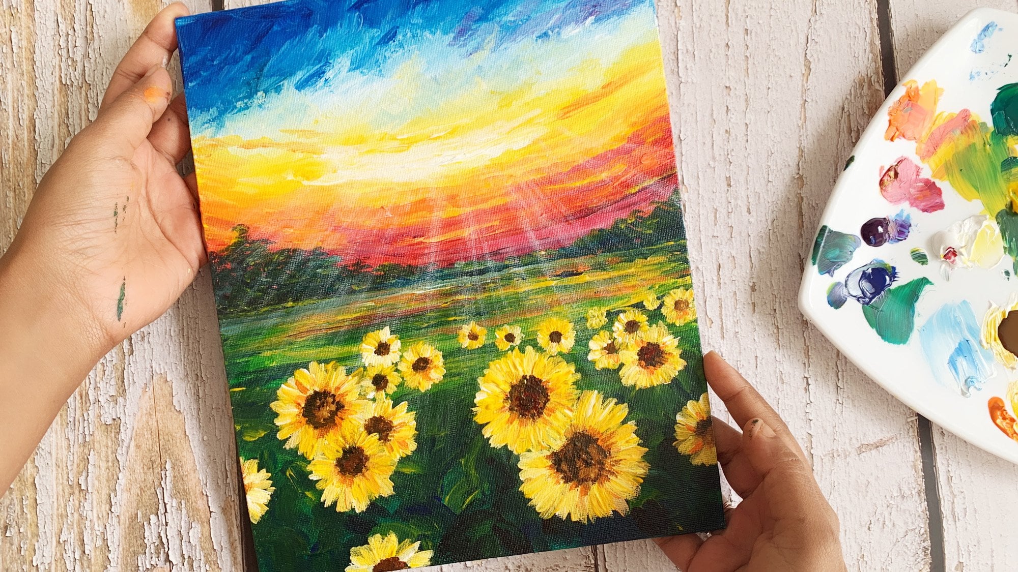
1. Welcome!: [MUSIC] Welcome to 15 days of summer sky landscapes. In the next 15 days, you are going to learn 15
different landscapes of white clouds floating
across the bright blue sky. Acrylic paints are so versatile. I fell in love with
this medium during the early 2014 when
I was working in IT. As a beginner, I bought so many art supplies and
started experimenting. There was no proper guidance or classes to teach techniques. I practiced and created
some 2000 plus paintings, till date, and learned a lot
through trial and error. But I don't want you to go
through all that pain and wanted to teach you acrylics
in absolutely easy way. Acrylic paint is
a perfect choice for beginners and experts alike. Because you can
apply it in layers, which means you can make changes easily if any
correction to be made. It dries fast so you don't
have to wait long between layers and you can clean it up easily with just water and soap. If you have been on the
fence to try acrylics, I invite you to join
me in this class. Learn the basics of
acrylics and learn to paint 15 beautiful landscapes. Hi, my name is Debasree, and I am an artist
based out in India. I have been teaching art
professionally since 2016, and I have taught more than
20,000 people globally. I have changed my profession
from corporate to a full-time artist to pursue my interest in art and to educate others about
acrylic paintings. If you want to know
more about me, please visit my website, debasreedey.com, or connect
with me on Instagram. [MUSIC] Have you ever heard the voice
inside your head? I could paint that and
fade like there is an obstacle keeping
you from even trying. Well, I am here to tell you
that it happens to all of us. That is why I created
this class for 15 days with different paintings each day so that you
can follow along, paint, learn and get in the
practice of painting daily. Practicing more paintings
is the key here. Don't just paint one or
two, paint hundreds. In this class you will
learn how to get there. At the end of the 15 days, you will be able to paint
from your imagination or just by looking at your own photographs
of any summer sky. In this class, I will tell you all the basic
acrylic art supplies that you need to create
amazing acrylic paintings. Then I will guide
you through some of the basics of acrylic blending, followed by teaching
you how to paint realistic clouds using
an easy six-step method. After that, I will give you an exhaustive understanding of acrylic color theory using
which you can create 100 different shades of
colors just by mixing a few. Then we embark on our
journey of painting 15 different landscapes
in the upcoming days. Nature your talent. I know you have it if
you're watching this video. Practicing art can be super fun when we do it
together as a community. I hope you are excited by
now to join me inside, I can't wait to start this
exciting journey together. I look forward to
seeing you inside.
2. Art Supplies: In this lesson, I'm
going to tell you all the supplies that
you'll need for this class. So if you're an absolute
beginner and you have never painted in acrylics and you want to buy some of the stuffs. I will tell you the very
minimal art supplies that you need for
painting in acrylics. First thing first, you
need a base to paint on. So I normally painting
acrylic papers. This is the one that I have
been using in this class. So this is an A5 acrylic paper, which is this one. This is an A4 artist
accurately fever, which I have cut down in half. This is the half that have stuck down to this white foam board. Okay? Now I am going to
link all the products down in the description
below so you can click on them and get the
products that you want. So this is the first thing
at artist actually paper. Now, if you're an absolute
beginner, I mean, actually favors are excellent
for painting and acrylics, but I would still recommend
to get a canvas bad. That is like the cheapest thing. This pad, rather than
getting a canvas board or a stretch canvas or Canvas that looks something like this. So what you can
do is you can use acrylic papers to do
some practice things. The practice things
I'm going to show you in this sketch book. So this is a sketch
book, A4 sketchbook. It is not meant for acrylics. So if you have a
regular sketchbook, do not try practicing in it. This is where I will be showing you all the techniques
that you're going to learn in the coming
up upcoming lessons. This is an A4 journal. This is where I have done all the demos and all the
techniques and everything. So you can do not do
it in a sketchbook, do it on a Baptist church, on an acrylic paper. For the final projects,
all the paintings, you can do them on an acrylic
paper if you want to. But if you're an
absolute beginner, I definitely recommend
using a canvas. That is the surface material. First thing that you need
for acrylic painting. Now for this class, I have
used only these three brushes, one flat brush and
to round brushes. One brush is medium-sized and the one is
absolutely pointed. Size 0, liner brush. Again, I have linked to all
the products down below. I'm not sure if you can get
just these three brushes. I would recommend if
you're buying brushes then by a set of flat
brushes or stage of round brushes
on the variety of sizes of the brushes and you can paint them on any
surface that you want to. Okay, so that's the
painting surface. Then. You're painting
brush, acrylic brush. You need a plate to mix on. This is the play
that I have used. I will link it below as well. If you want to get this. It's not a setting is played. I think it's a little
plastic you played, but it's very easy to wash off the beans and you reuse it. Next, the most important
or the acrylic colors. For the acrylic colors, you can buy a set of 12 acrylic paint where you
will all the 12 colors. But I really don't like
using the whole set of 12 colors is because there are few colors like purple or pink. These are the colors
I really don't use in my, in my paintings. But if you want to
have those colors, you can buy a set of 12. The most colors
that I like using, the blues and the greens. Now, I think instead of 12, you get generally two types of blues and two
types of grains, which is great, but there are some colors that I
need a lot more. So what happens when I used to buy a set of four or
12 o'clock colors, the ones I use the
most is to get over. That is when I decided to
buy each tube like this, or if you're buying
fluid acrylics. However, just a particular color that I like to use a lot. Now the colors that you
need for this class are, I have used these three, actually four blues
in this entire class. This is Prussian blue. Now, I do not have the Prussian blue intake body acrylics. That's why I have used the
fluid acrylics which I store in this nozzle bottles. And the colors I've
used a Prussian blue. This is Taylor blue, ultramarine
blue, and light blue. These are the colors
that I've used. But if you don't
have these colors, if you have some other blues, you can use them as well referred to the
color blue lesson. And you will get a very
good understanding of the, of how you can reuse blues that you already
have without buying any. Okay, So these are
the blues and greens. I have used these two greens. One dark green and light
green viridian hue and permanent green light. These are the two
greens that I've used. These are the two
yellows that I've used. One cool yellow,
one warm yellow. Again, you will get the
details of all these colors in detail in the color lessons. So go through them to understand the different tastes of colors. And then these two colors, burnt sienna and burnt umber, very important for any painting. According to me. And coming into black and white, I have used two types of
whites in this class. One is a fluid acrylic, which is basically this one
is physical acrylic colors. You get it in India. I have linked it
down. I'm not sure if you get it outside
India as well. So this is a huge
bottle that I buy in fiber level or one liter, and I generally stored them
in nozzle bottles like this. So this is a color
that you would see me use a lot of fluid acrylic. And I have used
tick body acrylic, which is the camel one. Again, I buy this in
500 emailed rather than a 100 ML because it's cost-effective because
I use a lot of white, so it makes sense to buy a
500 ML bottle like this. For black also have
used the fluid acrylic, but you can use the
tick body acrylics also if you have
thick body acrylics, the reason for this
class I decided to use the tape body
acrylics is because not everybody has access
to the the fluid acrylics. Whereas we take body acrylics, you can mix little bit
of water and make them a little fluidly and get the
consistency like this one. So that is what you
would see me doing in the class that I have mixed water and pinned
down little bit. And yeah, so that's all, these are all the colors
that you need in this class. And a masking tape, which is
this one I have been using. I will link this one also down. I really liked this masking
tape rather than this one. This is the one that
I used to use audio. There isn't. This gets off from
the paper very, very easily, which is amazing. All your eye. When I used
to use this other one, I used to have the pages is to tear up while
taking it off. So I really like this one and the gum is also very strong. And a glass of water
and some tissue papers. That's all you need for creating beautiful
acrylic paintings. Just to summarize all of them, first thing you need is a painting surface,
acrylic surface. Then acrylic brushes, acrylic
paints, glass of water. And I'm asking them,
That's all you need. And if you don't
have a foam board, if you have any regular
board like whatever I like, cardboard or whatever
you have at home or you can tape down your paper
to the table as well. I like it on this because
I can move it around. So I hope you got a good idea of all the art supplies that you
need to buy for this class. If you already have,
you can reuse them, use whatever you have
without wanting to buy. If you have any question, feel free to ask me in
the discussion below, and I'll be happy
to get back to you.
3. Basics of Acrylic Blending: In this lesson, I'm
going to teach you the very basics of acrylics, which is blending two colors and creating a beautiful
textured outcome. This blending is
going to come in very handy if you learn it
now in creating the sky. In this class we're going to create many different
types of skies. Now I want to show you what are the two different
types of blends, and then I'm going to
teach you how to do that. But first you need to understand
what do I mean by that. If you look at this
background, look at the sky, try to look through the
cloud to the background. You see, there are a few strokes that you can see
are very visible. It's not a very smooth blend. The textures and everything are visible. Same thing over here. You see the brush marks are all visible in
the background. Whereas in this one, you won't see too
much of brush marks, but it's like a smoothly
done background. When it is a smooth background, the color gradation changes
from dark to light, but there are not much
brushstroke scene that is called a smooth blend. When you see there
are some gradation. I call it a textured blend. I hope you understand
what it is. Now I have put couple
of masking tapes on my A4 sketchpad. But if you are practicing
for the first time, if you're a beginner
at acrylics, I would not recommend you
doing it on a sketchbook. This is a regular
sketchbook paper. It's not really
meant for acrylics, for the demo purpose I'm
showing it to you here, but I want you to practice
it on a acrylic paper. Or you can do it on a canvas, clothes, whatever
you have available, but definitely not on a
sketchbook paper because you will find it very difficult to merge it on a sketchbook paper. Acrylic paints does not go
well on sketch book paper. The reason I can do it
is because I know how to blend it because I've been
doing it for many years. I still remember
it was 2013 when I didn't know all these
things and I bought as a regular sketchbook
and acrylic paint, and I did try doing a painting, that was the year I
started painting. It came up horrible and I
thought I'm a bad painter, but later I understood
it was not really me, but it was the paper that was resisting me from creating the painting that
I wanted to do. Then when I switched to Canvas, then everything started
falling in place very easily. For the demo purpose,
I'm showing it here, but please try it
on a acrylic paper. In the first one I want to
make some Prussian blue. The three pallets I've taken
out are Prussian blue, permanent blue light, and
this one is ultramarine blue. In the first one, I'm
going to mix this two in the second one,
I'm going to do this two. The color doesn't really matter. I'm just trying to show
you here how you blend. First you start off
with a dark color on the top and you
keep coming down. Remember, what is a blending? We mix two colors and gradually
tone it down to white. That is how the upgradation
of the sky looks like. Now I can do it directly
with Prussian blue, tone it down with two white, so it will be lighter
version of Prussian blue. That is also doable, but
I want to show you how I mix two colors also. Now I will start moving onto
little bit of light blue. You see I picked up
the second color in the same brush without
washing the brush. What I'm doing is I'm
adding the color, and then I'm going up
into the Prussian blue. If the Prussian
blue is not there, I'm picking up a little
bit of Prussian blue, absolutely less amount. How you blend is you go
up and down a few times. This first one, I'm doing a textured one where you
see the brush marks. You see the brush marks
are very much visible, and one way of getting textured background is
having absolutely no water, so I don't have any water
and that's why my brush is very dry as you can see. That's because I'm using
thick body at least. If you need to add water, if you feel you are having trouble moving that
thick body acrylic, if you're taking water, this is how you take water. Just touch the
corner of the brush. I did not keep the whole
brush into the water, just the corner of the
brush in the water. Absolutely tiny
beaker of water and taking that will help you
blend it a little bit easily. You see over here, this and this are
very distinct colors, but we have to mix both of them. This is my light-blue
and as I am going up, picking up absolutely
less amount of Prussian blue and
trying to blend this. Again, I'm going up so the Prussian blue is
getting overridden. I'm taking little bit more Prussian blue and
mixing it with this. So good amount of colors are added and
they are blended nicely, and some of the
brushstrokes are visible. Now let's keep coming down. I have light blue and now I
will start moving onto light. You see when I'm
adding the white also am just not
leaving it here. I am going up also trying to blend it in with the previous
color that was above it. Now, what I'll do is I'll just wipe off the excess paint that I have on the tissue paper. Just to make the
bottom part say, for example, this
is where it ends. I'm adding a lot of white here, and now I'll take this up and blending with this lighter
version of the blue. This is the absolute
lowest plot, which is basically the
horizon of the painting. I'm going up and blending it in. You see I'm not really
doing it like a smooth one and you see so many brush
marks going here and there. I'm also creating some
brush marks like this. Absolutely I love doing this. My target here is to show the
gradation of the color from dark to light as I'm coming down and also create
some brush marks. You see how nicely
it has been blended. Practice this a
few times because when you start painting in
acrylics for the first time, blending can seem
really difficult, but it's not really once you
know how to do it right. All you have to do is go up and down a couple of
time. That's all. I'm adding a really dark Prussian blue on the
top to keep it dark, and as I'm coming down,
the color is changing. This is the first blend. Now in the next blend, I'm not washing off the brushes, getting rid of the color. What I'm going to do is
mix these two colors. I'm starting off with
ultramarine blue and mix it with light-blue. Also add some white here
and make it a light color. This is the darkest
color on the top. Now gradually I'll
keep coming down. Now in this second one, we are trying to
create a smooth blend where all the brushstrokes
are not visible. Very simple thing this time you take just a little
bit more water. Rather than dipping just
the corner of the brush l'm dipping the entire
tip of the brush. I'm coming here and blending. l will be dipping my brush into the water a few more times
to be able to get this. But make sure you have paint. If you don't have paint, it's not going to happen. It will be too much watery. Now you see how nice colors. I'm going to change
the colors also in-between as I am changing
and go coming down. But only just adding
little bit of water. You see this is where there was no paint so the water came
directly on the paper. Rather than that have
some paint first. You create this textury
background like this, then when you want to
make a smooth blend, that is when you ask
comment at the water, so don't add the
water directly on the paper or canvas
wherever you are doing. Now, we have come
quite a bit down. Now, it's time to
make it lighter. I'll start adding more of white. Now gradually start taking it up and blend it with a dark shade
that we have on the top. Some water, wherever it
takes you is that coming up, just adding little bit of water is going to
blend it smoothly. Now I'm going up one more time just to make sure
everything is looking nice and even and making it just a little
bit more dark on the top. You see how the two colors
blend into each other seamlessly just by going a
couple of times up and down. You see you created
such a beautiful sky gradation in this way. The trick in creating
a smooth blend, if you like smooth blend, I absolutely like this because I like seeing all the
textures of the brush. But if you'd like smooth blend, all you have to do is touch a little bit more water than what you've done
in your previous step. Every time I do a blending, I have to go up and down a couple of times
to get it right. You see at this part, the blending is very nice. But over here there
is a little gap so I'll just go here a couple of times to make sure
there is a smooth. Now it becomes smooth. I'm just going to remove the tape. You understood two different
types of blending. Now I'm going to show you one more different types of
blending that we're going to do in all the fields of the paintings that
you're going to learn. For that, I'm taking out
a few green and yellow. The most of the blending that
I'm going to do in the field of the landscapes
are going to be in this way. Rather than blending
them completely, this is where we blended
them very nicely. Dark shade to light shade. But in the field area it's going to be a stroke like this. Then I add the yellow
blended into the green. Then I might add a
little bit of yellow. You see the lines, the brush lines are
very much visible. This is how we're going to
create most of the fields. This is also a blending
because we are moving from dark to light or
whatever light to dark. But rather than going up
and down multiple times and blending them all in and making a smooth
blend like this one, this is more of an uneven blend. In most paintings, it's light always
at the distance. I create that with the white
add a little bit of yellow. Then as you keep coming down, I'm going to
introduce some green. You see the gradation
is happening. Blending of one color into
another one is happening. Then probably for
creating textures, I'm going to take a
couple of strokes into the lighter
shade, lighter area. Maybe a little bit of yellow
strokes in-between this. This is a different
blending where you're not really
blending everything together but yet there is a change of color happening from light to dark here as well. These are the two different
types of blending that is going to help you a lot. If you're new to acrylics, I would recommend
that you try this out different types of
blending and get your hands used to mixing two
different acrylics colors. This is going to
help you immensely in creating these landscapes.
4. Cloud Technique - Part 1: [MUSIC] In this lesson, I'm going to teach you
the basic techniques of painting clouds. In this class you're
going to be learning 15 different types of clouds
in each day's landscape. You're going to learn so many
different types of clouds, but if you understand this basic technique that I'm going to teach you
in this lesson, you don't want to
get the basic idea. I'm going to break down
the steps of painting the clouds into six
different small steps. So if you understand
those steps and the basic technique
of painting cloud, then once you go into each of these paintings and learn
to create different types of clouds it's going to help you understand them
even much better. I'm going to teach you
a couple of techniques here then you can practice them and see
which one suits you best, which one you like more
because I pretty much can create the same cloud
using multiple techniques. So all these techniques
that I'm going to teach you here are my self-discovery. By painting many, many clouds, I came up with this technique. I have broken them down
into the way that I felt uncomfortable and then I realized that it's really
easy to paint clouds. I know when you don't know how to paint
clouds it might seem, oh, my God, how am
I going to do it? It's so complicated
looking at it. But once you understand
the six different steps, it's going to be so easy. Now before painting the clouds, I am also going to teach
you another blending. In the previous lesson you
learned this blending. But the problem that
happened in teaching these blending was it's a
very small, narrow space. In this small space, you can move from left
to right very easily. You can just move your brush. This is the flat
brush that I use. You just can go very easy. But when we're
painting on A5 size, so this is the A5 size in which I will be teaching in
the class, or maybe, say for example, you are
painting on a A4 size, so this sketchbook is a A4 size, you have to move all the
way from here to here. Now with acrylic paint, since it has a very
high drying property, you won't be able
to go all the way. You might have to break it down just to move from left to right. That is why in this lesson, I'm going to teach
you that blending where you have to move
from here to here, and how you can do the blending. Technique is just the same, but I feel this was
very easy to move. Here you will now
understand how to move such a wide range. That makes sense? Anyways, I have to paint the sky to be able to
teach you the clouds. I thought it will
be a good lesson for me to teach you the
blending of the sky here. Now here I'm going to create
two different sections of sky and teach you two
different types of clouds. In the first one, what
I'm going to do is I will first understand
these two types of clouds that I'm
going to teach you. When you paint background, acrylic painting takes somewhere around 2-5 minutes
for the layer to dry. If you paint the sky background and immediately you start
painting the cloud, then the white mixes
with the background blue because you're not giving it even a minute or two
minutes time to dry. But if you're painting
on a huge surface, the background pretty much
dries by the time you are coming back on it with the
white to paint the clouds. In that case, you will
not have that problem. I am going to teach you
both the techniques. Whether you're painting on a small surface or a big surface, you can attack this
problem either ways. In the first one I'm
going to do is paint the background and then I'm going to be in the
second background, and then paint immediately
on it the cloud. By the time you finish this
and come back to this one, this would have
completely dried, so we will add the cloud when
the background has dried. So this one is while
the background is wet, this will be when the
background is dry. The technique of the cloud is going to be absolutely the same. What I will do here, I'll do the same cloud
here so you get to practice twice and
also you get to understand how to paint the clouds on different
types of backgrounds, as in dry background
or a wet background. Enough said. Let's get
to painting the sky now. I've taken out two
different types of blues. The brushes I am
going to be using the same three brushes that I told you in the
art supply video. One flat brush, one round brush, and one liner brush. The colors I have taken out
for this is Prussian blue, phthalo blue, black, and white. Why Prussian blue
and phthalo blue? I just wanted to experiment by mixing these two
colors and show you. You can play around
with whichever colors you like the most. I definitely loved
these two colors, so I'm just
experimenting with this. Now let's start the blending. This is the blending lesson. [NOISE] You see, I could not take a complete
stroke from here to here, it dried by this, so I'm
going multiple times. So many strokes are
happening here. I'm going to do a texture
blend and not to plain blend. A smooth blend because
I really like it. Here I am mixing Prussian
blue with phthalo blue. Like you understood in
the previous lesson, when you blend two colors it
doesn't blend immediately, so you have to go over the blending area
a couple of times. That is exactly what
I'm doing here. I'm going to come probably
all the way till here. From here, I am starting to add white and Prussian blue because white and Prussian blue gives that beautiful light
shade that I like. What I do here also, while I'm picking up white
I like to go towards the bottom of the sky because
it is the widest most. I add lots of white and then keep going up and blend it with a
darker layer of blue. You see the color
is almost over, so I have a very dry brush, which means I barely
have paint in my brush. I'm going up, trying to blend it with
the darker shade of blue. Before blending you
see where there's a clear distinction between
the dark and the light here, so this has to be blended. That blending I'll come
to a little later. First, I want to
add as much white I want towards the
bottom of the sky. I think this is a good one. Now I start blending. What do I do here?
There's a stark contrast. I start taking a
little bit of paint, accidentally less not a lot, and start to blend it in with the above dark
layer of blue. Now, there's a stark difference between phthalo blue and
above Prussian blue. I'll take a little bit
of Prussian blue here and blend it in with
the phthalo blue. Then I will take a
little bit more of white and keep coming down to blend it in with the
lighter blue at the bottom. Like I said, I keep going up
and down a little bit more. See in the previous video, while I was showing
the blending, I could not do this so much because it was a narrow space, so it dried off quickly and I didn't get so
much time to go up and down. The reason I go up and
down so many times until I'm satisfied with the
blending that is happening. If you've been satisfied in just one stroke,
you can stop there. Now over here also you can see a stark distinction.
Look at it closely. There is a distinction between this color and this
color and this has to be blended so that it
looks like it's smoothly going into each other. For that, I am taking some
more Prussian blue and phthalo blue and keep going
higher and higher. Again, there is a
line forming here, some coming hard and adding little. You'll
see what's happening. The reason I like this picture of blending is
because you can see all the brushstrokes and
it just looks so gorgeous. Now, I mean, I'm done here. I'm not going to come down here again because
they can again, this will get
distorted and again, I'll have to add lots of colors. Now I'm going up to
complete this blend and adding that dark layer of Prussian blue once
again to the top. To have a smooth blend. I mean, not really smooth blend, but the gradation
showing properly. Now I have lot of Prussian blue. Just wiping it off, excess one on the tissue paper. This time what I'm
doing is I'm using the feather-like touch
of the brush and very gently blending it into
each other.Very gently. I'm not putting too
much of pressure with my brush. That's it. Now you see, you can see
all the brushstrokes and yet you can
see how the color is gradually switching
from dark to light. This will be our first guy, so let it dry and then
I'll come on top of it and paint the cloud and by this time what I'm
going to do is I will paint the bottom sky. For that, just for
experiment sake, I am going to use
a different color. There is no point in
doing the same color. Just by using these two colors, I can create so many
different colors. What I'm going to do
is mix phthalo blue and Prussian blue
on my palate and some white and I'll start off with this
lighter tone on the top. It's not as dark as
Prussian blue over here, it's a little lighter. Now I will keep going down and
make it even more lighter. It's like here I'm
starting almost from this mid-tone blue and
I'm going down. If you feel like experimenting, you can just do with
just phthalo blue or one of the shades that
you've taken out, and see what happens when you
blend it down with white. One of the things I have felt or realized after painting a lot of cloud painting is that, when you have a very dark
background like this one, the white clouds on top
of it looks very bright. But that doesn't mean that the cloud will not
look good on this one. This also has a very subtle
effect of it while you paint. But yes, on a dark, Prussian blue it's
really something else. I'm going to go again add
the white at the bottom. You can see all the brush marks, they are looking fabulous. There is not too much
of a gradation here. I'm just adding little
bit more of white here and this color just a
little bit more on the top. The sky is done. Now, like I said in the
beginning of this lesson, that I'm going to be painting the cloud directly
on top of this. Right now it's not
dried, it's pretty wet. This time I'm going to paint
the cloud on top of it, teaching you all the
six steps that I mentioned to paint the clouds. This is how I paint on
top of a wet background. This is a wet background. What I do is, wash off my, not wash wipe off my brush to get rid
of the excess paint. Then with a flat brush, take lots of white come here and create the
shape of the cloud. I'm looking at this one, I'm going to tag it for you. As in upload it. This is
a photo I'm looking at. It doesn't matter,
you can just take any random cloud photograph that you can get your hands on. All I am doing here is, the very first step is painting the shape of the cloud
without doing anything else. Simple thing, paint the
shape of the cloud. Not ruining the entirely details of how the cloud is like, but just on a very rough scaled and I am just one big one in the center to teach you
how to paint clouds. This comes like this. This comes like this
and you see what's happening just because the
background is fit well, I painting with white, it's mixing with the blue. Honestly, I don't mind it, I actually didn't like it. There are few loose
one's going here, which I'm not going to do now, but just paint the cloud here. What happens here is, and I'm letting you know what exactly happens
when I paint like this. When I paint on an A5 size
of paper or a A4 size paper, this is pretty much what the
dimension of the paper is. When I'm painting a cloud. I paint it immediately
on top of blue. You can see through some of the blues that are showing
through the white. You will see when I paint
the white here, that paint, since it would have
dried completely, it will be bright white. This is not absolutely
bright white. This is little bluish white. If I go one more time
on top of it you'll see the blue is mixing
up with the white. What I do generally is give
it a little time to dry. But when I'm
painting a landscape and there are not
just one cloud, there are multiple clouds. What I do is start
painting the other clouds. By the time I finish
creating the shape of all the clouds and come
back to the first one, it would have dried by now. But since I am teaching you
just one cloud right now. It is not dry and as you
can see, it's pretty wet, so I'm going to give it
a couple of minutes, let it dry and then
I'm going teach you what to do in the Step 2. It's been a couple of
minutes and since it's summer it dried pretty fast. Next, what I'm going to do in the Step 2 is I'm
going to add some more of white to this to make it look
absolutely vibrant white. This is the step that happens when you paint on
a dry background. You don't have to do it twice, just by doing it once the cloud looks absolutely white because
it's not blending with the background white blue. This is just a
repetition of Step 1 than with a black brush. Now in Step 2, the most important thing
that I'm going to do in the Step 2 is smudge
the edges of the cloud. I've created it in the
shape that I saw in the picture but if you notice the edge of dark clouds are not so prominent all the time. They're smudgy and it's
soft or feathery edge. That is the state
that I'm going to do here, which is Step 2. Let's do that. How I do it is have absolutely less amount
of paint on my brush, which is what I have. Then you see I'm moving my brush in round and round
motion like this. Since I have very less paint, you see I'm creating this smudgy feathery
edge of the cloud. Picking just a little bit
more of paint to join it with the inside cloud that I
painted in the previous step. This is where I'm
giving the exact shape that I'm seeing in
the photograph also. One more thing I want to tell
you that while I'm doing this soft smudgy
edge of the cloud, I am not using the entire
flat base of the brush. This is like pretty white. All I'm using is
just the corner. I'm holding my brush like
this and using the corner, just one corner to
do the smudging. Now it can be a little difficult for you if you're doing
it for the first time. In that case, you can do
it with a small brush, this round brush or the
liner brush, either of them, because if you find this one difficult then you can try that. In this other one, I'm going to show
you how you can do it with a small brush. But in this one, since
I like this a lot, I'm teaching you this
because I find it much easier to do it with
this flat brush. Only thing that you
have to keep in mind that you don't have
too much of paint. I feel I have a bit
too much so I'm wiping it off and then coming and adding this smudgy
edge of the cloud. See, it's so pretty. Especially because it's smudgy. You're not adding
too much of paint, so it doesn't cover the blue background quite a lot and the blue shows through, which is what makes it look even more great so you
can add as much. What I do is when
I paint [LAUGHTER] clouds like this
from a photograph, I go overboard and do add this
smudgy in the way I like. Right know we are
in the second step. In the second step,
one more thing that I generally like to do is you would see that with
just a big amount of cloud, big chunk of cloud there's few more cloudlets also
which are next to it. If the photograph that you have chosen that has it.
This is what I do. This one has, so I am creating few more cloudlets in
this exact same technique using which I did
the smudging of the edge of the big cloud. Using that technique,
I am coming here and using the corner
of the brush, very less amount of paint and
using the tip of the brush. I'm moving the brush in
round and round direction and creating some cloudlets Maybe if you're
coming out from here, fill loose clouds
here and there. Is not here in the
photograph as you would see, but I'm just adding
few just to make you understand it's so fun to do
and you can add wherever. This is something like I said, I do it some of the times
even if it is not there. I like to add some extra. Whenever I am going
inside the cloud area, I can add as much paint I want, not too much but
just a little extra. The moment I am on the edge
and doing this merging. Wipe off the excess
paint and do this. Here I want to teach you
one more thing that, I have taken out this thick body actually over here, white. When you paint the center area
with this thick body also, you get very bright
white because it doesn't blend with the
background blue a lot. You can have really
nice white cloud. I just added a little
bit wherever I saw that there is a little bit of blue is showing
through, you can do this. Again. I'm sticking to
the center of the cloud. I'm not really
going to the edges because the edges
are nicely done. If I go out on the edge, then I'm going to spoil all
the stuff that I just did. If I have to do the edge
I would rather wipe off all the paint and with a less paint I'm just
going to go and do this. That is your Step 2. In the Step 2 what did we do? We add detail to the edge of the cloud
by smudging the edges and made the edges
little bit cleaner and softer as it is blending
into the background sky. Take any reference image, any reference cloud, maybe it can be a
photograph that you've taken and try to
paint that shape. Once you paint, look at few clouds and you've
painted the shapes, you will get a good
understanding. In the step 2 what we
also did is we added few small cloudlets here
and there, like this one. After adding the smudging edges, I am adding a little bit more of white inside to make them look a little
bit more brighter. Thick body acrylic is something that I'm showing it
to you so that you understand both
the whites so use both of them fluid acrylic and thick body and see
which one you would like more for creating the
clouds because everybody will get to have their
own way of doing it after learning the
exact same steps. Find out which one
works for you the most. This is step 2. Now in the step 3, the most important step we are going to add the
shadows of the clouds. Every cloud that
you would look at, if you look up at the sky
up outside your window, you will see that
there are always shadows. What are the shadows? The cloud is floating
like this on the sky. The sun is falling from the top. The top part of the cloud is highlighted
with the sun rays, but the bottom of
it, the sun rays are not reaching so they are shadowed against the light. Most of the time you'll find the shadows are towards
the bottom side. That is the step that
we're going to do next. For creating the shadow, what I am going to do is
create the shadow color. Looking at the photograph
that you're looking at, you would see that
the shadow can be little grayish or can be
little grayish bluish mix. Depending on the photo
that you're looking at. The photo that I am looking at, this is grayish and I feel there is a little
bit of blue also here. That is what I'm
going to do. But in step 4 also we're going to
add another layer of shadow. There are two steps
for adding shadows. In step 3, I'm going to add a lighter version of shadow, in step 4 I'm going to add
a darker version of shadow. Let me create the shadow color. Tiny bit of black. Anytime you're mixing black
and white to create shadow, just dip the corner
of the brush. [LAUGHTER] I added so less
that there is no black only. Then you mix it up with white. It's a very, very dark color, tiny bit of blue to it and I have a
beautiful dark shadow. This is the shadow
color that I'm going to do in the next step. In this step, what
I'm going to do is, on the side of it, create the light shadow. This is the light
shadow on my plate. However, since I
mixed all the colors, my brush has a lot of paint. Now, if I have a lot of paint, I cannot [NOISE] use it
directly on the paper. What I'm going to do is just
wipe off little excess, see so much paint
I had, so much. After getting rid of the
color you come here and see, look at your photograph, I see some shadows
here, some shadows. The shadows are coming here, going here, at the bottom here. Just see where is the
shadow going and that is where you go and just
add few of the shadows. There are a few here and there. Now the shadows have been added. Now, what we have
to do in step 3 is, after adding the shadows, we have to blend it with white. Now, you have already
understood blending. All I'm doing is
on the same brush, picking of white and
adding it next to it and blending it
into the white. That's a lot of whites,
so I'm going to wipe it off and make it more grayish and with the
grayish color or the shadow color I am trying
to add some smudgy edge, more white to blend this side. Even adding shadows to this small cloudlets here
and there also, little bit. Now moving on to step 4 and in the step 4 also it's
the repetition of step 3, where I'm adding
another darker layer of the shadow color
and blending it again. Here I am going to pick up this dark shadow
that I created here. I see in this one
that I'm looking at, the dark shadow is only over here and it's coming
all the way down here. This is where the darkest
of the shadow is, add it and now I am using little bit off the lightish
gray and blending it off. I'm taking just a
tiny touch of water. See how much water I'm picking, just a corner of water. Not too much because I'm having a little
difficulty blending it. Just by taking
little bit of water, I am done blending it
in into the white. Very nice blending
has been done. What is our step 5? I mixed the step 5
and the 4 together. Step 5 was adding the
shadows to the cloudlets. This I have already done. In step 5 also what
we can do is if you feel while adding the
shadows to the cloudlets, if you want to add a few
more of the cloudlets, this is the time you
can add some more. Let me just go
ahead and add a few more just to make
you understand. Few of the cloudlets
here and there. This was our step 5. What is step 6 which is the last step of the
cloud technique? You see when I added the shadow, most of the white was covered. Just blending it a
little bit over here. I feel like it was
not blended properly, so just blend it in properly. Now in this case, I can see that the white
is very much showing. But sometimes while
painting what happens is the highlight, which is the bright white
that we added in the step 1, it gets overshadowed
by the shadow. As in the whites are
not very visible. In my case, it is visible, but I'm teaching you what happens if you overshadow
the white as in, you've added too much of shadow. In the step 6 which is the last step of the
painting of clouds, what you do is you add
another layer of white. I'm going to take
out some more of the fluid acrylic white. All I'm going to do is wherever
there is bright white, as in the very bright sun falling that is
where I'm going to add the white once again. You see when I'm
adding this white, it is looking so much brighter than the one that I had before. In some places in between
the shadows also you go and you add some
of the highlights. There you go. The first cloud has been done and
you can see how nicely you can very clearly see the dimension of the
cloud as if it's a 3D. How is that possible? Only by adding proper amount of your highlight and shadow. Just by adding highlight
and shadow in a landscape, you can make it
look 3D realistic, whatever you want to call it. Now, I'm going to
repeat the same cloud and teach you one
more time here. But in this time I'm
going to show you all the different
methods that you can apply in creating the
exact same cloud. The reason I'm repeating
is so that you can see the difference of doing
it with other technique. While you're watching
it and you're doing it, so do it exactly
the way I'm doing. This one I did it
with a flat brush. This one I'm going to do
it with these two brushes. Try out both and see which one you like more or which one you're more
comfortable with. In painting some of the
times what I do is, I'm comfortable
with all of them. So this one also, I'll start off with
the flat brush and then move on to this brush. But depending on where I'm
painting, so say for example, in some landscape
you would've seen, let me show you one
of the paintings. Say for example this one, there are lots of small
clouds over here, so that I cannot do
with a flat brush. Even if I did the
whole thing with a flat brush at the
bottom where I'm doing all this small cloudlets
floating at a distance, that I will of course use
this liner brush to create the small ones and maybe this mid-size ones I would do with this medium brush. Depending on how much big area you are doing you can
change the brush.
5. Cloud Technique - Part 2: In this one I'm
going to teach you this big cloud, how you can do. I sometimes actually
to be honest, this cloudlets that I did here, I actually like them doing
much more with this brush because I think I get
amazing textures with this. So find out for yourself
which one works best for you. I think I had green in my brush, so I'm going to get rid off. In the last step, I think I did white a lot. I just wanted to get rid of
all the excess paint I had. Let me start off
with this white. The shape might not
be exactly same, but you see no blue
is being picked up because the background
is completely dried. It won't be exactly similar, but I'm trying to do
in a similar shape. The reason I do the
first step with the flat brush is because it's
a big area to be covered, so with a flat brush I
can cover it faster. That's the only reason I
do it with a flat brush. So this was my step
1 where I'm painting the cloud shape using
a reference image. Now, I am not using this brush,
I'm not watching it all, so I'm just keeping
it on the side. Now, our step 2 is what? Smerging the edges of the outline of the cloud by making it little
feathery light. For that step, see
what I'm doing. I'm taking just a little bit of paint on this liner brush, and I hold my brush like this, almost making it lie
down on the canvas. So I'm not holding it like this, I'm holding it like this. I go in that round
and round motion. I'm not even taking
any paint because there's a lot of
paint inside already. I can create some of
the shapes nicely also. See for example, here, the photograph that
I'm looking at, it has a really nice crisp edge. I can do that, and I can create the feathery
texture also over here. Look at that, how nicely
the pictures are forming. To be honest with you, I really don't know which
one I like more, because I think sometimes depending on my
mood to be honest, I like the pink brush one like the one I'm
doing right now, or maybe sometimes I like
doing it with a flat brush. Tell me which one
are you liking more, this technique or
the previous one? I feel this is very easy to do. That is what I feel, but that is only my opinion, so I want to know
how it is for you. Just to focus is on the edge
of the cloud, the outline. You see that in
center of the cloud is not properly filled
in, but that's okay. We're going to anyways, come and add highlights over there, so I'm not much
bothered with it. To do this technique, you need to make sure that
you don't have too much of paint in your brush. This is step 2
where we are adding the edge of the cloud, plus we are adding
some cloudlets also. Let's add a few cloudlets here. These loose feathery
clouds which I love doing. Let me go ahead a
little bit more and add a few more cloudlets over here. Like I was saying, on
a bright dark blue, it's so fun to create some of these loose clouds. You see. Inside I'm just adding
little bit more of white. So this is our step 2. Step 3 and 4 are adding
layer of shadows. One is lighter shadow,
one is darker shadow. Let me move on to the
shadow state now. I don't think I am going
to use this brush, but you can try definitely out this one once again while
doing the first step. In the first step just
fill it up with this one. Personally, I like filling
it up with a flat brush. For the third step, I am creating some shadow color. This is already dried, so I am mixing little bit more. This is the dark shadow, and I need some more light. I'm adding some more white to it to create this light shadow. Light shadow has been
added, as it mixed. Now I'm coming and adding it
very gently here and there. You see what I'm
doing is I'm using this entire length
of the bristle, to make it lie down and then
going ahead and adding it. Now I'm going to blend
it in with the white, so I'm taking quite a bit of
white and blending it in. While blending, wherever I feel I need to add a little
bit more shadow, I can do that also. Blending and adding more
shadow wherever necessary. When I paint alone, as in painting a landscape, the step 3 and 4 are
not very prominently different for me because I do it together while
I am doing it, and that is exactly
what happened now. So I'm still on step 3, blending the shadow
with the white. Now I am going to add the
darker version of the shadow, which is this color, and I'm coming here and
adding this darker shade, and blending it with
white once again. Those are step 3 and 4. Now in step 5, what is step 5? Adding the highlights
wherever you feel another layer of highlights.
That was the last step. Step 5 was adding the shadows to the cloudlets, which
I already did. So it's like step 5 is
merged with step 3 and 4. I am breaking down the steps
for you to understand. I never have these steps in
my head while I'm painting, so it's difficult for me to remember what exactly I'm doing. I just intuitively
keep painting. This is step 5 where I'm adding the shadows
to the cloudlets. The last step is adding
some more layer. It's just a little bit
more shadows, maybe here. In the final step adding some more white as in
the highlight of the cloud to finish it off. So adding some bright
white on the edge. Of course, blending it
down with the shadow. So if you need to blend it a bit more and you see
it's not blending, feel free to pick
up a little bit of shadow color and blend
it in with the white. But our focus is on making the whites prominent, this time. Adding some of the loose edges also while I'm adding the white, and also blending it
in with the shadow. Doing so many things
at the same time. Blending it in, and adding some white. When I paint it, so I go over all these steps multiple times. It's never just once. I'm adding the white here. If it doesn't blend
with the shadow, then I pick up the shadow
once again, and blend it in. Simple. Since you have
learned blending, you will see that how easy
it is to do all these steps. More of whites. Cool. I mean, it's not
there in this one. It is there. If you look
at the photograph here, there are a few small
clouds here which I want to do here and show
you how you can do that. These are the small clouds. First thing you do is
small cloud shapes. That is always step
number 1. Small ones. I generally like to
hold my brush like this and keep doing
this small one-by-one. Then I generally like to add the shadows immediately because what happens when
you add immediately, the white is wet and your shadow mixes up with
the white immediately. Then later maybe you can go
and add the blurry edges. Alternating the steps a
little bit here and there, depending on which place
I'm painting the cloud at, and whatever I feel is
easy, I can do that. Sometimes what I also do is these are all happening in
case of the small clouds. For the big ones, I mostly follow this pattern
that I showed you. For the small ones, what I also like
doing is take lots of these shadow colors so that when they're lots of small ones, and I add all the shadows first. Then I go on top of it and
add the highlighted clouds. Always, whenever you are adding the shadow or the
highlight first and then the other one you always
need to make sure that you're blending each of
them into each other. That is the most
important thing. You see, I'm not
doing them in detail. Whatever I'm doing
right now it's not even there in the
photograph but I'm just adding these small ones to show you what all
stuff you can do. Let me add a few more here. What I'm doing here is first adding quite a bit of shadow, and then on top of this, then adding the clouds. Finally, I'm going to take
the tape off so that we can see how nice it is looking
with a crisp edge. Wow, isn't that fabulous? What do you think? It's so easy. It's not difficult at all. Normally what I like
to do is always before ending my painting, I like to add
little touch-ups of whites here and there and
make it give a very final, beautiful shape or texture. Most of the time I do this with this liner brush with very little touch-ups
here and there. I hope you understood
how to paint clouds. Practice them may
be more than ones. I would suggest if you're
painting clouds for the very first time
with acrylics, it's really easy but
you just need to have a little bit of patience
and do it multiple times. Don't just do it once and think you will be able to
paint amazing clouds. Just do it twice. Just listen to me
and do it twice, and you will be
surprised at how amazing you change from the first
time to the second time. Because when you're
doing first-time you're understanding and you are
doing at the same time. In the second time when you
do the exact same thing, you will see how much
you have improved. I'm telling you this from the stories that
I keep hearing from my students that second
time they could not believe that they painted
something like this. Please do it a couple
of times before you move on to painting the
beautiful landscape. I hope you enjoyed it. Thank you so much
for joining me.
6. Color Study - Blue: In this lesson, I'm going to tell you all about the blues. You are going to have a
really good understanding of the different types
of blues and how you can use them in your painting whether it's
sky or anywhere else. The blues that I have taken
out here are Prussian blue. This is the only fluid
acrylic that I had; Prussian blue and remaining all five of them are
thick body acrylics. Prussian blue is
this one which is pretty light that I have
stored in a bottle, which is the fluid acrylic. I don't have this in thick body that's why I am using
this fluid acrylic. Next, I have taken out
this one, turquoise deep. After that, Pthalo
blue, this one. Then, this is the
ultramarine blue. After that, I've taken out
this color, bright aqua green. Then I have taken out last, this one, light blue permanent. I'm going to keep them
aside and take out my journal where I'm going to swatch them out and show you
how each of them looks like, and then how you
can mix and match two different blues and
come up with a new blue. Take out all the
blues that you have. Right now I don't
have a cobalt blue, so this is the one I had, but it is dried so I can't
use it in my painting. If you don't have all these six different types of
blues, that's okay. Whatever blues you have, if you had just two
shades of blue, just take them out, whatever blue you have, just
take them out. Then I'm going to
take out quite a bit of white because
I'm going to use white to mix up each of these
colors. This is a brush. I'm using the round
brush, size six. Let's start with the first one. This is Prussian blue. First thing first, I'm
going to apply just a dark Prussian blue so that now
you understand how it looks when it is
absolutely dark. I'm going to wipe off the brush, get rid off all the
excess Prussian blue, pick up some white and see whatever is remaining
Prussian blue I had. I'm just mixing this up with this dark Prussian
blue so that you can understand how
Prussian blue looks like and how it looks
when it mixes with white. I'm just trying to pick
some random shape for this. This is how Prussian
blue looks like. Look at the different shades
you can create just by varying the amount
of white to this. Look at the absolute
lightest shade. Absolute light shade
of Prussian blue. It's quite gorgeous. Now I'm going to wash
off my brush completely, get rid of all the Prussian blue from it and start off
with the next one, which is the turquoise deep. Again, I'm going to take
good amount of this paint and add it on the top so that
I can see how dark it is. It's like almost looking
like black, very dark. Now I'm going to bring
it down and pick up some white, blend it off. Look at this beautiful
color being created. Again, look at
this lighter shade by varying the
quantity of white. What's the color that
you are creating? That's the turquoise deep and washing off the brush. The next color is, this is Pthalo blue. It's trying to dry off
my brush completely without any water so that I
can see exactly how it is. This color is very
close to this one. Pthalo blue is very similar
to this turquoise blue. Now let's add the white, blend it in with
the Pthalo blue. Looking at these two,
it looks very similar, both of these colors. So having just one of
them should be good. Washing off completely. Moving on to the next one. This is ultramarine blue. Applying the solid
color on the top, picking up white
and adding it from the bottom and
blending to the color. Compared to these ones, this looks very purplish. If you know color theory, you know that every
primary color, blue is a primary color, every primary color has a warm shade and a
cooler shade to it. The blues that fall towards
the reddish category are the warm blue and the blue that falls towards the green
side are the cool blues. Just by knowing
this little theory, you understand that these are cool blues and
this is the warm blue. Check out the light shade again. The light shade is something
that you absolutely don't understand unless and until you do these color
mixing swatches. This is done. Moving on. I'm making sure that
I'm drying my brush absolutely clean before
moving on to the next blue. This is one bright aqua green. Even though the name is green, it looks pretty much like blue and I use
it quite a lot in the sky and then thinning
it down with white. Then the final one, what's the color name? It's light blue permanent. This is a very
beautiful sky color. I'm not sure, if this is the lighter version
of cobalt blue. If you have cobalt blue, and if you do this thinning
down with the white, let me know, if this is
the color that you reach. Look at this light shade. It's very pretty. All the shades have been done. They look pretty good. You understand what are
the different colors and each of the
colors individually. Next, what I'm going
to do is I'm going to mix two colors and see what color I come up with so that if I want to change
the colors in my landscape, like in the sky, I can mix and match a
couple of colors and know which color I like just
by doing this exercise. I highly recommend that
you do this exercise for yourself so that you have a
reference image like this, a reference page like this, where you can go to
anytime you need to find out what
color you want to do. If you look at a photograph, and you're not sure what
is the color of this blue, you can come to this
page and find out which color you want to do for that landscape. Makes sense. The color that I want
to do first is let's say Prussian blue
and light blue. Picking up Prussian blue, and I am picking up light blue, and mixing both of them. You see the color
that I'm getting. Again, I'm going to tone
it down with the white. You see it's a very
different color than both Prussian blue
and the light blue. It's a very different color, and this combination I use
quite a bit in my landscapes. Next combination I want to do is let's say this turquoise
and the light blue. Just by adding the light blue, do you feel there
is a difference in the color shade than what
was in the original one? I don't feel it's too
much of a difference, very slight difference
with this light blue, but when I added
white to this one, turquoise blue, I feel the
color is very much the same. Whether you use mix of these two or you use this one directly, I think it's pretty
much the same thing. Next, I want to use
Prussian plus ultramarine. Here is my Prussian, here is my ultramarine. These two colors are very
opposite because like I said, this is cool blue,
this is warm blue. Let's see what happens. You don't know what
is happening unless you clean it down with white. This is a very interesting color that we didn't have before. I'm cleaning it down a lot with white to see the actual
color what's happening here. Very pretty color, and it's very different from
both the colors that we had. Look at this light shade. It's absolutely different from all the colors that
we have created. When you mix and match, you understand the different
colors that you can get. Before I move on and
before we forget, let me just write down the names of all these
colors that I have done. Now, I'm going to keep doing the same thing as I mix a
couple of few more colors, and experiment and
find out how it looks. The next color
that I want to mix is Phthalo and light blue. Have I done ultramarine
and light blue? Basically, I want to mix a
warm blue and a cool blue. Maybe ultramarine
blue and light blue permanent would be a
good thing to see. This is ultramarine blue, and this is light blue. Yes, look at that
beautiful color. Let's clean it down. It's a very different color than all the previous
colors we have done. Very different Prussian. This one was ultramarine
plus light blue. Because ultramarine is
very much like purplish. That's why it's a
very different color. I'm just adding some white
in-between to see how it looks when I add some
clouds just for fun. Next, I want to mix again, just keep writing because I keep forgetting the
colors I'm adding. This is ultramarine
plus light blue. Next I'm going to mix
pthalo blue and light blue. This is pthalo blue and
this is light blue. Again, very different
color. Actually, no. If I look at the pthalo
blue light color, it's very much same. This is pthalo blue
towards the light, and this is pthalo
blue plus light blue. It's basically doing
the same thing as what happened here. The turquoise blue
with the light blue, it's looking same as
the turquoise blue. Same thing is happening
with pthalo blue. Pthalo blue plus light
blue is also looking like the pthalo blue lightened. What I understand is
that the light blue, since it is the cool blue, if I'm adding it
to the cool blues, it's not making a
lot of difference. Rather, if I'm adding the
light blue to the warm blue, then it is making a
lot of difference. Then let me mix ultramarine blue with all
the different colors. I've done ultramarine
with Prussian, I have done ultramarine
with light blue, let me do pthalo blue
and ultramarine. How about that? Here
is pthalo blue, and I'm going to
take ultramarine. I need to take out a
little bit of ultramarine. This is my pthalo blue, and now little bit of
ultramarine to it. Let's tune it down. Very differentiate
shade. But I feel like this shade is very much
similar to this one. Just a very slight difference. Ultramarine mixed with any of the cool blues is giving
almost the similar color. This is pthalo, this is ultra. I'm just adding it on the top so that both the dark colors
are little visible. Then we tone it down with white. Whatever colors you have, I'm coming up with
a formula so that I understand what
color I'm liking. It's a little different from the ultramarine
plus light blue, but not too different. It has a little purplish
shade towards the end. Great. This one is turquoise plus light blue. This is pthalo
plus ultra marine. What else can I
experiment? What else? Ultramarine plus this
bright aqua green maybe. Cleaning off the brush is very important to make sure that no previous
color is there. Ultramarine and
this pthalo green. It's a very dull
color, I believe. Let me tone it down. Oh, not chilly, it's a
very interesting color. See, when you tone
it down with white, it's when you
actually start seeing what color is coming out of it. It's a very different shade. It's a shade that I
have not seen before. What else can I do? Have I done turquoise
plus ultramarine? No, let's do that. Turquoise plus ultramarine. Let's see what color we
create by mixing these two. Wow, this is also very pretty shade and a
very different color. I feel anytime I add
ultramarine towards the bottom, which is after adding the white, the color is very much
the same for this, this, this, and even this one. But I shouldn't
plus ultramarine. Let me write down these two. I think this is a very different shape
that we have got here. This is ultramarine plus aqua green. This is ultramarine
plus turquoise. Yes. I think we came to
a very good conclusion that adding a warm blue and a cool blue creates a very
different shade like this. Adding light blue to any of the cool blues is creating
pretty much the same color. Like this, this, this, this, this are very similar. Just having one such color
is going to be fine. This is a very different shape, ultramarine blue tint down, well, with white. Ultramarine mixed with any of the cool blue like
Prussian plus ultramarine, turquoise plus ultramarine,
pthalo plus ultramarine, light blue plus ultramarine, they are all giving
very similar shades. So I, 2, 3, 4, these four shades are very
similar towards the bottom. I think that's enough
of practicing this. I hope you got a very
good understanding of how the blues work, how you can mix and match. I'm sure you don't have so
many blues if you have, by all means practice them. If you have just
two to three blues, just mix and match and find out which color
you like the most. Then accordingly, you can
choose the color for the sky.
7. Color Study - Green: In this lesson, we're
going to talk about all the greens that I
have used in this class. After understanding
all the blues, it's time to dig into greens. These are the four main
colors that I've used to create green in this class. I've taken out these four
colors, viridian hue, permanent green light, cadmium yellow medium, and lemon yellow. These are the four
colors I have taken out along with the
black and white. I'm going to show you
how many colors you can create by mixing
all these colors. In some of the paintings, I have also used blue to create green because as you know that green is not a primary color. Yellow is a primary color
and blue is a primary color, so by mixing these two colors, blue and yellow, you can also come up with
variety of greens. But still, I have used these
greens because rather than mixing when I want to use
it in a lot more quantity, it's good to use the greens like this
directly from the tube. But I'm going to show you
also how you can create greens from blue and yellow. For that, I'm also
going to take out ultramarine blue
and Prussian blue. I'm just taking one cool
blue and one warm blue. Prussian blue is the cool blue and ultramarine blue
is the warm blue. Also here, what I
want to tell you that every primary color has a warm side and a
cool side to it. Just like the blues, if you look at
these two yellows, this is more towards the red side and this is
more towards the green side, so this is a warm yellow
and this is a cool yellow. It's very good to
understand that in all the three
basic primary colors, you have a cool version
and a warm version. Understanding that will help you create different kinds
of colors very easily. Let's start. I'm going to
start with the dark one. Just like the blue,
I'm going to tone it down with white and show you the different color that you can create just from this one shade. This is the bright dark green and if I tone
it down with white, this is the color you get. It's a very pretty color. Sometimes this color, I use for painting sea
as well in seascapes. This is the color of the sea, also very aqua green color. I love this light
shade of this green. This is one of the colors. Then let's create the same
thing with the light green. Even the light green
mixed with white gives a very beautiful color, like a very pastel color. I'll get this pretty color. Oops, I'm so sorry,
I just saw that it's out of my frame, so sorry about that. Here it is. Then I'm going to do
the same thing with this four colors
that I've taken out. Well, this is the
cadmium yellow medium, and see what happens when
you pin it down with white. Sometimes what I like doing is instead of using
lemon yellow, I like to tone down the color of warm yellow with the white. It's not exactly, you don't
get really lemon yellow, but it's a lighter
version of this yellow. Then the lemon yellow, such a beautiful color. Now, we're going to create so many more different
types of greens by mixing all these four colors and I'm going to show
you how you can create green using black as well. Black is a very important
factor of creating greens. We will shortly come to that. I'll start off with
this dark green and we can mix it with
this light green. This is the color we
get and if I pin it down with white, this is the color we get. It's a little different
from both of these greens. When you mix them, this is the green
shade that you get, which is a very nice color. It's a little different. Now, let's mix the dark green, look at this, beautiful greens. Very pretty green. Look at the lighter version, that's even more prettier. After that lets make dark
green with lemon yellow. You see the shade is very different from what we got here. Two different colors. Many
different types of green we're creating by mixing
all these colors. I like this one. Is very bright. You know why? Because this is a cool yellow. We use lemon yellow,
which is a cool yellow, which means it's more
towards the side of green. When we mix green
and the cool yellow, which is the green
version of yellow, you get this bright green. Whereas when you mix
it with warm yellow, it's more towards
the muddy side. This is a very warm green
that we created here. Let's repeat the same
process with light green and warm yellow. I don't see too much of
difference between this and this. The dark green mixed with
warm yellow is giving me the same shade almost as the light green and
the warm yellow. Now let's do light green and lemon yellow. Again, it's a very bright
like springy green. Now I'm going to show you in that
how if you say, for example, you have a very
little touch of green in a painting and you don't really want to use
these two greens. How you can create
greens using blues. Say for example,
this is ultramarine. With ultramarine, if I
use the warm yellow, what is the color we get? You see, we're getting
olive greenish color, like muddy, but this is
also a very pretty color, like a version of green. Now let's do ultramarine with the lemon yellow. Whatever blue you have, try mixing it with the
yellows and see what you get. See this is a very
different shade of green that I'm getting. Because it was cool yellow, it's towards the green side, like a brighter green again. Twain it down with white
to see the actual color. It's like a very
different green. Now let's repeat the same process
with Prussian blue. Now, the ultramarine
was a warm blue. That is why it was more towards the orange side than
on the green side. Now, whereas Prussian
blue is a cool blue. Chances are that we
will have a better green with the Prussian
blue. Let's find that out. Isn't that a beautiful
green that we are creating? Is it similar to
any of the greens we have created in the past, out of the all the above ones? I'm trying to see if it
matches with anything, but no, not really. It's a very different green. Next, Prussian blue
with lemon yellow. I believe it's going to
create a very bright green because both of them are
cool primary colors. This is the green
that I like to use a lot in my paintings
because this is like, I feel the most
vibrant green ever. I like it even more
than the actual greens. Like I said, if you have a very less amount of
green in your painting, you don't want to take out the green just for doing a
little bit of green, this is the easiest thing to do. If you already have blue
and yellow on your plate, you don't have to take out the green and you can just create
little bit of green using this method. The last two colors that
I'm going to show you is by mixing yellow and black. That also creates so,
because black is very dark. First thing I'm
picking up is yellow, starting with the warm yellow, and tiny bit of black. Don't take a lot. Tiny bit of black. Let me come here and
add it to the yellow. Look at this beautiful
green we are creating. It's a very different yellow
ocher color. Same thing. Let's do it with
the lemon yellow. Tiny bit of black. Really different kinds of green. Just by using a few colors, look at the amount of differentiate of green
that we created. Now, I'm going to write all the names of whatever colors I have added before I forget. Here are all the
names I have added. I absolutely loved
the tissue, didn't I? I was just trying
to see if there was any similarity between into greens and I absolutely
don't see one. All of them are so
very different. Whatever greens and yellows
and blues that you have, you should totally
do this exercise and find out what you like. I am just going to do one last
thing and I'm going to add just a little bit more of black. Say for example, when
you want to create shadows to the greens, you can increase the amount
of black and have this shade. I just wanted to have
a little bit of black visible because it's not visible from this color
swatch I have done that there is any black in it. Almost all, teacup little bit. I think more than the black
mixed with cool yellow, I like that black mixed
with warm yellow. Again, it's a personal choice. You'd want to do this stuff, you will see which
color do you like more. I mean, not that
this is good or bad. It's just a personal choice. If I talk about greens, this is looking more
like a blue to me. That is why I said I use this for in the seascape
to paint the water. This is a very bright green, Viridian Hue and
light green mix. This is a green that I liked, a very vibrant spring, the summary green.
This one also. Both the warm yellow, so
wherever I have called warm yellow is basically
the cadmium yellow medium. This is the warm yellow, this is a cool yellow. With the warm yellow somehow I feel it has a very warm
touch to the green, and these two are also
very vibrant green. These two combinations, I absolutely love
green plus yellow. This is a very beautiful
green. I like this one. These two colors that I
created with ultramarine blue, probably not my absolute
choice of green. The two greens created with Prussian blue are
absolutely brilliant. I love these two. I love this two, I love this form. This is not my
absolute favorite. That's all about it. I think this is a very good
exercise for you to try, so you just need to do it once and for the rest of your
life you're sorted. So anytime you need
to create a green, just open this page and see what you have
created and see the green that you'd like
to use in a landscape , and you're sorted. Do this exercise, and I hope you enjoy creating this exercise because it's
a very fun thing to do. Absolutely enjoy doing it, and you will come up
with a beautiful result. To make you understand
how each of these greens works
out in a landscape, let me show you a
couple of paintings. Look at this one. This is clearly a mix of
lemon yellow and green, so pretty much this shade. I think it's a little mix up for light green and warm
yellow and cool yellows. So like mix up these two, which you can
clearly understand. Now, this is mix of
black and warm yellow. As you can clearly understand the color that has
happened here. This looks like light green, dark green mix and
thin down with white. So all the colors that has
happened here is this one. Check this out together
so that you understand. Next one is clearly
looks like warm yellow, so it is warm yellow
with light green. This is the shape
that I can see here, it's warm yellow and dark green. I think dark green and
warm yellow is this one, and light green and warm yellow. That mix of these two colors
has happened over here. Sometimes dark green mixed with black also gives
away dark green. So that is also to create
the shadows and stuff. This looks like
close to this color, so ultramarine blue
and warmer yellow. I can very well understand that there is ultramarine blue
in the sky here. I must have used the ultramarine
blue mixed with yellow, and that is why
this is the color that is there and little
bit mixed with black, a combination of these
two in this landscape. Looks like yellow mixed
with the burnt sienna. So that is also
another different kind of greens or land
color that you get. This I'm going to tell
you in the later section. Show also the greens that
you see on the side. It looks like a mix of more. Actually, this is a
little bit of green and yellow over this color, and little bit of this. Along with that, there's a
mix of bond sienna also. So bond sienna mixed
with green also gives a very different kind of green. But displays looks very similar to the light shade over here. What else? This is
where we started. You understand that
how the greens, when you paint in the landscape the different greens can create, so many different
kinds of landscapes.
8. Color Study - Browns: There are two very
important colors that I've used in this class rigorously and I'm going
to talk about them. One is burnt sienna and
one is burnt umber. These two colors I feel is
a very important colors that you can probably mix with primary colors
and create them. But I like using them
straight from my tube because I use it quite
a lot in my paintings. I'm going to do a little
bit of color swatch and show you how you can change these colors in so many variety of ways and
use them in your landscape. Let me start with burnt sienna. It has a little bit of
reddish property in it. When you pin it down with white, look at this beautiful earthy
color that you create. That is burnt sienna. Look at these pretty shades
that we have created here by adding lots of white. This is burnt umber, looks very dark,
almost close to black. But look at this color when you pin it down with the white, see how it looks like. These two colors
look very different when mixed with black as well. I'm going to do a
little bit of that. So this is burnt sienna, and I'm going to mix with
a little bit of black. It's a very nice wooden color. [NOISE] Look at this shade. Same thing with burnt umber. It's very dark, so
mixing with black, it's not going to make
a lot of difference, but yes, of course, it
will get even darker. That's it for these two colors. Now, I mix burnt sienna. When you are painting
summer landscape, green is pretty much
dried at most times. What I like to do is mix yellow. Let me take out the yellow, maybe a warm yellow. Because burnt sienna is on
the warm side, it's reddish. I'm taking out some yellow. What I like doing in my landscapes when
there is a dry land, that is when I like to mix burnt sienna with yellow and you'll get that
beautiful, say, for example, wheat field or
that land if you're creating, then these two colors
mixed comes in very handy. I have mixed these two colors
a lot in my landscapes. Then you pin them down with white and this is
the color you get. Now the one thing that
I've never done is mixing burnt umber with yellow. Let me try and do it right now and let's see
what color we come up with. It's a weird color, greenish, I would say. Not sure, it looks
like green to me, like this olive green, isn't it? I don't know if I'm going
to use it anywhere by mixing burnt umber and yellow. But yeah, it is green. Another way of creating green
is burnt umber and yellow. Wow, I didn't know that.
See when you experiment, you get to know so much stuff. I think that's all
for this class. That's the main properties. Now, let me show you a couple of paintings that I've done so that you understand
how it looks. For example, in this painting, this bottom part is completely done by a mix of burnt
sienna and the white. You see this is very much the similar color with a little touch of
yellow in some place, mix of this and this. Let's see if I talk
about this one. This is a mix of more of yellow and burnt sienna
with little bit of white. Look at this one. This
is a mix of burnt umber, burnt sienna, and white. Maybe I can just create
that one quickly. I don't think I have mixed
burnt sienna and burnt umber, so this is a mix of burnt
sienna and burnt umber. Let's pin it down and let's
see what color we get. That's a very pretty color, very different from
these two colors. This is exactly the
color of the road that I have done here. Just by mixing these two colors with little bit of yellow, there are so many variety of colors that you
can come up with. Isn't that so pretty? Before I finish off, let me just write down all the colors names. [MUSIC] There you go. These are all the color
combinations possible. Try them out and
you going to have so much fun in doing
this exercise. [MUSIC]
9. INSPIRATION: [MUSIC] Welcome to our first day of 15 days of summer sky. In the next 15 days, you are going to
be seeing a lot of blue sky and white
clouds floating across. So before we begin
this journey together, I urge you to invite some
calm into your mind, into your heart, into your eyes? [MUSIC] Do you have any view
of the sky from a window? If not, you could walk
to your balcony or simply step out of your home
and stare above at the sky. Look at the clouds floating, they float so slow that you
may not grasp it immediately. But if you keep
staring for some time, you will see them moving. Play your most favorite song. Listen to it while
you look at the sky. Feel the emotion of the song as if it's
floating in the cloud. Pause the video and do it now. [MUSIC] I hope you have listened to
me and done the exercise. I'm sure you're already
feeling the calm. Take some deep breaths. Take some moment to settle
down at your creative corner. Let's get to the painting. [MUSIC]
10. Day 1 - Cloud Harmony: Hi, let's start with
our Day 1 Painting. Let me tell you all
the art supplies that you need for this painting. The colors that I have taken
out are Prussian blue, light- sky blue, white, black and white, yellow. This is chrome yellow
from the brand that I use but you can find this yellow as cadmium yellow in any brand
and this is burnt sienna. For white, I have taken
out a little bit of fluid acrylic and a little bit of peak body white as well. Both of peak body
and fluid because I might be using a mixture
of both. That's why. For the blue, I
wanted to tell you that I have taken
out two blues but if you want you can use
just one blue and indeed down by mixing it with white
and make it a light blue. You don't necessarily
need to use two blues. I took out two blues
because I really wanted to experiment and see
how the mix of these two blues look and I absolutely love this
color just like it. If you don't have two
blues that's totally fine. Just make sure that you're
using one dark blue that you can paint it down with white. These are the few basic colors. Blue, yellow, brown,
black, and white. I have not taken out any green
in this because I am going to create the green by
mixing blue and yellow. These are all the colors. I have my acrylic
paper taped down to a white foam board and these are the three brushes that I've
taken out for this painting. This is a flat brush and the
size for this brand is six. I generally measure
the flat brush based on the size
that I'm using. I measure it like
this approximately 1, 2, 3, 4, 5, 6, 7, 8. It's a little lesser than eight but pretty much
approximately that is how I decide the brush
that I like to use for the canvas size and
one round brush and one thin brush to do any
detailing or whatever but this round brush is the one that I like to
use for my painting. For this painting, I don't
have to sketch out anything. I can pretty much start by painting it with a brush and color directly on
my canvas board. Let me start. I'll
start off directly with a very dark blue
starting from the top. I'm making sure that I'm going
all the way to the edge. Now, if you are painting
on our canvas cloth, then you will not have this
problem that I am having. When you paint on acrylic paper, it doesn't blend very
well like canvas cloth. I always suggest for beginners if you're
painting to paint on canvas rather than
painting on acrylic paper. It's not very difficult for me to blend it because I have been painting with acrylics for
a really long time but I remember when initially I
started painting on papers, I found it difficult. So you can choose accordingly. You can try it out on
paper sometime and see which one you find
comfortable but from my students what I have heard is they all love blending it on canvas cloth
because of course that is a very smooth
feeling of blending. I'm not going in any
particular direction. I am pretty much trying to. My focus is on covering
up the sky area. I'm just going to
bit by bit with my color and brush and
coming down gradually. I'll go like this
till half the canvas. So you notice how I am blending the sky is first I'm
adding the dark blue. Then I'm adding the
white to lighten it. Then I'm going up also
a little bit to blend it up with the above
color that I have. Now, as I'm starting to go down, I will start using more
of white and less of blue because we are blending
it from dark to light. Dark on the top and
light at the bottom. This has become too light so
I'm adding little bit more of Prussian blue in this section towards the top, eventually coming down. Here you see this
sharp distinction between the dark blue
and the light blue. I'm just going up just a little
bit just to blend it out evenly and making sure I'm
covering the entire canvas. There is no white spot left out. Absolutely dark on the top. Pretty much blend
up and coming down. Now I've pretty much come like half the canvas. Now I will switch
to the light blue but if you want to continue
with the same blue, you can just keep on
adding white to it and come all the way till here. Lovely drawing it out. At this place, I am
using this light blue and blending it up
on the top first. Look at that. Lovely. Now, I will keep adding white
and bring it down. Just mixing a little
bit of light blue and Prussian blue
to blend it well and just to make sure there is some smooth
blend between both the colors. Well, as you can see, there is very rough texture, I don't want to make it very
smooth as it's coming down, as one solid go and a
very smooth blending. I like this rough blending and that because that gives a lot
of texture to the painting. But if you like smooth
blending by all means, go ahead and do that but
this is what I like, so I want to stick to it. I'm pretty much done
with this sky now and I will move on to
the clouds now. There is a little bit
of canvas showing here. I just want to add little
bit of light blue. You see how I blend. Even if I add any color, I just go up and down a
little bit just to make sure it's blending well. Now I'm going to go ahead and
do the clouds and for that, I I'm not going
to wash my brush, all I'm doing is taking
a tissue paper and just wiping off
the excess paint. [NOISE] That's it. Here is my brush and I'm
taking up the white and I'm creating some clouds by going
in round and round motion. Now the color in the background
is not completely dried. I I'm aware of that, and I I'm taking
advantage of that and that's how I'm going. I'm holding my brush very loose. See, what I'm doing
is with a flat brush, I'm doing it now, just to cover huge area in
the sky to create the clouds. Look at the way I'm
pulling my brush. I'm almost making it lie
on the face of the canvas. I'm not holding it high
like this particular reach, but it's like lying over here and I'm doing it very soft and I'm going round and
round motion like this. It's done over here
and over here, I I'm going to go face loosely, very smoothly so that there
is not too much of color. I create this thread-like
texture of the cloud here, same thing I'm going to
do here a little bit. You see the benefit that
we're getting because the blue in the
background is wet. It's not a 100 percent dried, but it's dried quite
a bit is that this white is mixing up with
the blue and giving us a light bluish
white so the white is not absolutely white. It's mixing up with the
blue and becoming light and that's creating very
nice color of the cloud. At the moment, I'm playing
around only with white. Sometimes this tape I like
to do with my round brush, this one but because I have done it with both with the flat brush and the
round brush as well. Depending on my mood I use
whichever brush I don't want to use so you can try it, this thing out around brush as well if you feel
like experimenting. I want to tell you one
thing is see the width of the brush is pretty thick but because I I'm doing
very small area, I I'm using like the
corner of the brush like this and doing the clouds. I'm just going to add a little
bit more over here because it's looking almost like
bluish, not much white. Wherever you want to make
it more white you just go ahead with white
months more.Right Rite now I'm just switching a
little bit for sometime to my small brush and I
wanted to show you especially over here
the small clouds. Over here the blue
has completely dried. It's not really mixing a
lot with the background. I have a less paint and I I'm
holding it it very loose. This is why I have kept this thick body
acrylic over because what happens when you paint with thick body acrylics
is most thicker. The blue shows little less. For some places I'm going to use the thick body acrylics
like right now, over here I'm using the
thick body acrylics. The edges of the cloud, I like to go very
gentle, very soft. Even over here, I I'm
using a little bit of thick body acrylics to
make it look more whitish, like absolute solid white. Now, once we approach the edge, so this is the
edge of the cloud. Whenever you approach the edge, go very gentle and create these lose actually edge
to give thread like picture of the cloud and using thick body I'm creating the edges of
the cloud as well. Some loose clouds floating around here and there like this. This one, I want to make
it a little bit more. To control the amount of paint that is going on the
canvas what I like to do is I like to make the
brush light on the canvas. That way I can control each more so that it doesn't
have too much of paint out on the canvas. Very less pressure. Just going with a
thick body acrylics to make the cloud more
white than it was before. In the first round, the white was mixed up
with the background, blue and it was whitish
blue, which is nice. Some places I I'm leaving that light blue color
show through and it's simply says I want
absolutely solid white blue. In those areas I'm going
with thick body acrylic. Just keep coming down. Here also, see I'm creating little bit of the shape and little loose floating clouds. There are lots of loose
floating ones, sure. Look at the way I'm
holding my brush. It's like almost
making it to lie on the canvas and using the tip. If you want, depending
on your canvas size, you can use an even
thinner round brush. If you feel this is too big for the canvas size
that you are using, just with patients, just
keep going little by little. It's all developing together, coming together. Look good. That's the first round of
a cloud that we have done. Next thing I'm going to
add a few most loose here, but not right now. Right now, what I want to
do is I can maybe just a few more alert and before
moving onto the gray. Now, that most of the
white has been done, Now I'm going to
move on to the gray. The gray I'm mixing a little
bit of white with black. This is a lot of dark green. I'm using little bit
of blue also with it. This is the color that
I finally created, maybe just a little bit more of. Now, I'll just swipe
up little excess and come here and add dark one. There are two different shades of gray we're going to use, this is the most dark
one that I'm using now. Wherever there is a dark gray, I'm just going with it. Even fewer also,
it's quite great. Keep referring to the image. I'm going to make
it one tone down so I'm adding more
of white with it. It still the same grid, just a little bit lighter. With that, I'm going to go in the center and create some more, maybe just a little bit more
flat, it's more bluish. I'm trying to make
it more grayish. Again, I'm blending it with
the white, that is there, you're not just leaving it directly and I have too much
of pain because of which are not able to blend
well so wiped it off a little bit on
the tissue paper. I am softly been blending it. More white it's too dark, want to make it light. Again, the way I'm
holding my brush is making the clouds very easy. If you hold it like this, you will see that you are
having fun the process. The classic coming up
nice automatically. Whenever I'm adding the gray, I am making sure that
I'm taking little bit of white and blending it with
the rest of the white cloud. I might have to go
back again and add a little bit more
of a dark gray. But for the time
being, I'm focusing on this lighter gray
that I am adding, the gray is going
basically on the down part of all the clouds that we added. See I'm adding some
loose ones like this. Absolutely brushing
it over on the edges. My brush like this
is actually making the process much, much smoother. Most of the cloud has been done. Now what I'm going to do is
just go over it once again with white and wherever
there is bright white cloud, I'll just touch up the white ones again
because what happens is the process of adding the
gray shadow to the cloud, you end up losing few of the
bright white spots after. I'm doing it quickly, the
moment I finished this is because I will be able to blend it with the
gray part very easily now rather than
keeping it for later, maybe I went up just a bit more of great in some of the places. Basically going to went
through unless I am happy with the shapes that sticking the
shadows that it's taking. But the process
is just the same, just add some white and
then create at the bottom of it to create the
shadow of the cloud. I think that's it, I can keep on doing it
for some more time. Unless and until
you feel satisfied you can keep doing it. Because it's all about your personal perception
of the clouds, how you want to have it. Because I feel like it's
difficult for me to stop. I have to stop at someplace. Let's add a little bit more of this small clouds at the
bottom, we are done. That's it. Stay a few more
of the grease on the age, make sure that it is looking
nice with this 3D clouds, give a really nice look
and very nice ages. From this one you lose one over here, that's it. We're done. Now, I am going to wash this brush. I kept it outside
for quite long, so it's kind of
dry a little bit, what I'm going to do now is
rather than watching this, I'm wiping it off, getting rid of as
much blue I can. Taking white and just a
little bit of burnt sienna, I'll create this
land at the bottom. Recently I have
started liking to take small strokes and that creates a very nice
texture to your painting. I always like textuary
stuff on my paintings. I am adding just a
little bit of yellow to it to keep a
little yellow touch. What you can do here is pick one smooth stroke and create a beautiful land
without any texture. I mean, that's
totally up to you. What I'm doing is taking
small strokes like this so the brushstrokes
are very much visible. [NOISE] Trying to create
some textures into the land rather than
keeping it absolutely flat. I m creating some
textures to it. Because that's my
personal choice. You can choose not to do that. But I somehow feel that showing
the brushstrokes through creates such gorgeous
vibe to your painting. If you have not done this, you can try it out and
see if you like it. Because unless and
until you try something is difficult to see whether
you'll like it or not. I'm using a little bit
of thick body white here to create some texture
in the distant space. That's it. It's done. I love all the colors
that I just created at the bottom using just
a mix of three colors, burnt sienna, yellow, and white. At this step, I am washing
off my brush, so I could, I could have done this with
this round brush also, but rather than using that, I am using this small
pin liner brush because I feel I will have more control if I use this one. The colors I am using are white, burnt sienna, yellow, and a little bit of blue to create that
greenish texture, more of burnt sienna
and a touch of black. You see this beautiful green that I ended up
creating over here. It's a good amount of
paint that I created, so it will suffice
me to create this entire green over here. Now I am not to the entire mixture over
here, but on the side, I'm adding a little bit more of yellow to have both
dark and light yellow. The colors I mixed
are burnt sienna, partial blue, yellow, black. This side is the dark part, this side is the light board. I'm starting off
with that dark part, and I'm creating the
horizon line over here. I'm adding more of blue to it
to have more of green tone. It's looking more
like brown over here. Honestly, if you look
at the photograph, it's more brownish, but I want to have it greenish tone rather
than more of brownish tone, so I change it. [NOISE] Now after
creating the line, I am going in
perpendicular direction, and creating the
distinct ones like this. The reason I'm holding my
brush like this because I got used to holding it like
this while doing the clouds, and also you will be able to see it better because
if I hold it like this, you won't be able to
see what I'm creating. I'm holding it like this, but feel free to hold
it however you feel comfortable and keep
going like this. Pushing it up in perpendicular
direction and adding some light shades in between. Because anything that
you create in nature, it's never the same color because the sunlight
is falling on it. Some places it's dark, some places is light. By varying the shapes that
you're using in your painting, you create the depth
of a landscape. In some places, I'm adding this burnt sienna to create
that brownish effect. More or less the complete
background is done. Now, what I'm doing is using
the tip of the brush to create some of the pointy tree-like structures
in some places. Not everywhere. I'm not doing
it in a very detailed way, just in some places. Adding pointy tip like this. That's it. Not too much. Maybe I want to add
a little bit of yellow in some places just
to give more highlights. You see using this brush was a good decision
for this area because it's helping me create
all the details easily. With a big brush, it would have been
a little difficult. This part is done
and now I'm creating just one layer over here as
you see in the photograph. We are going to create, I'm adding just a little black
with it and some trees up. I twist my brush
like this to get rid of all the excess
paint from my brush, and I can use the tip to
create absolutely pin lines. I'm using little water because otherwise it's
not going to move. Like this painting lines, and now we're going to
go all out and create some good amount of
trees over here. There are lots of
chunks coming down here, small thin lines. Then you go up and I'm
adding little bit of yellow in between to
add the highlights, and a few lines very
lightly like this, almost there is no
paint on my brush. Some green line just to show some green
texture on the field. Absolutely light
strokes. With that, we almost come to the
end of the painting. That's it. You won't see this
exactly in the photograph, but I'm just adding
this highlighted tree to have this as stuff focal
point of the painting. This tree will be highlighted. When you look at the
photograph or the painting, this is the tree that will
grab your attention first thing, or maybe the clouds. It really depends on
how you look at it. I'm looking at it
very close right now because I I'm into the painting, and this tree is pretty much
like the odd color out. The rest of it is a lot of
the same color everywhere. I'm just doing a little bit
of touch ups here and there. Just with a yellow, I'm adding some highlights at the
bottom of this distant land. I think that's it.
It's looking good. Just a little bit of dark almost black over
here at the base. That's it. I'm not
going to overdo it. I tend to do that.
I paint alone. Washed off all my brushes. Very important to
wash your brushes after finishing a painting
because otherwise it dries up. I'm excited to see how it's looking after the tip peeling. [MUSIC] There you go. Our first painting is done. Have a look at it up close. If you want to do
any changes to it, you can always add
something if you want to. Go ahead a little bit more
time with the clouds, play around with it because I know that's the best
part of acrylics. If you don't like
something, when it dries, you can just go over on
top of it once again to add as many layers
as you want to. There are canvases that
I painted 5-6 times. That is the versatility of acrylics that I
absolutely enjoy. Go all out and do
whatever you like to do. I'm adding just a little
touch up of white with the paintbrush because I would
have more control with it. That's it. To be
honest with you, I'm never satisfied with my paintings because
I feel like I can just keep going
and do so much more. But sometimes what
also happens from my experience is
that when you keep going a lot, actually, if I would have stopped earlier, it would have been kind of nice, but it really depends
on artist to artist, how you look at your painting. It's totally, I
won't say a norm, I won't give you
any guidance here. So just listen to your
intuition and just go for it however you like and
create your painting. But I hope you enjoyed
creating the first painting along with me and you understood
how easy acrylics is. Just stick with it a little bit more wherever you don't like, just go and correct it on
top of it once [LAUGHTER] it has dried.. That's it. This small clouds
are really nice to keep going on and on. There you go. Tell me
how did you like it. You can talk about
your experience in the discussion section and write a review if you liked it. Because there's so many
awesome paintings coming up in this class and I'm so
excited to do this, and each of all these
different types of landscapes. If you have any question, please feel free to ask in the discussion and I would
love to answer it for you. With that, I I'm done. The final thing that
I'm going to do is sign my name to this. Signing is a very important
part of painting, I feel. Because I have heard it
from many of my students that they don't know
how to paint, for me, I also personally, even I didn't know for
a very long time how to sign or rather which
color to use for sign. I have pretty much, what I have done is used
absolutely different colors. Say for example, I would use blue to create a
signature over here, but later with a lot of practice and by
observing other artists, I have learned that
it's better to use similar color tone
that you were using. For that reason, I'm
using some burnt sienna. I'm adding a good
amount of water to it, and I'm twisting to leave
as much paint as possible. I'm going to sign. Again, I'm twisting
just to get rid of the excess paint so that
I have a pointed tip. [MUSIC] I have been painting for good
eight years now, I think 8-9 years. I have changed my
painting signature at least four times and this is the one that I
have very recently changed and I
absolutely love this. I feel like this is going to be my permanent signature
the rest of my life. There you go. [NOISE]
See you tomorrow.
11. Day 2 - Rising Above: [MUSIC] Hi, welcome to Day 2, and I am going to use the same three brushes that are used in yesterday's class. The flat brush, one
medium-sized round brush, and one liner brush. Here are the colors
that I have taken out for today's class. Phthalo blue, this is the
one that I have taken, phthalo blue, then I have
taken ultramarine blue. Then I have taken out, this is permanent
light-blue permanent, it's a light blue color. These are the three
blues I have taken out and then I have taken out
this cream viridian hue, which is like dark green, then this is a light green, permanent green light, and then I have taken
out cadmium lemon. These are the six main colors
that I have taken and of course black and white
and a little bit of burnt sienna. Let's begin. I want to experiment
with three sky. That's why I have taken out
these three blues and I want to teach you and
also experiment with these three colors
how well we can create a beautiful
color of the sky just using these
three colors and what a variety we can do with the sky in today's painting. For the white, I have also
taken out fluid acrylics and a little bit of
pink body acrylic. I'm going to start on
the top using phthalo blue and light blue. I'm picking up both of them
together and I am going on the top along with
little bit of white. I like this phthalo
blue color which is little greenish
and along with that, a little bit of light blue, which is nice shade. Instead of again going all around making one single stroke, I am going bit by bit and adding small strokes
one after another. For this side, I want
to create the sky with ultramarine and light blue, so adding with lots of white. You see I got a different
tone of blue on the side. Let me just increase
the color a little bit. Ultramarine blue and light blue and I'm mixing them
in the center using white. As we are coming down I
am trying to blend all of it together and I do more
of white and light blue. Just like in
yesterday's painting, how we blended all the colors, that's the same thing. The first round is always
blending of colors. But this time we added a little touch-up
of different blues and try to make it similar rather than keeping
it one solid blue. As we are coming down we
are adding more of white. The sky is done. Now I am
going to use this other brush and I'm going to add the
clouds on top of it. Again, I'm making the brush lie down on the canvas and it's mixing up with the
background, which is nice. Round and round motion for these clouds and if you noticed, I took up a little bit
of ultramarine blue, very little ultramarine
blue along with the white to give it a shadow. Instead of using black as the shadow like
we did yesterday, in today's clouds, I am using the ultramarine
blue to create the shadows. Because if you look
at the photograph, the shadow is more
purplish rather than. That became a bit
too bright white, so I'm just wiping off my
brush and making it absolutely light with a touch
on the canvas, almost no paint on my brush. That's why I am able
to create these nice, gorgeous textures of the cloud. Let's come down, and create
lots of clouds here. Whenever I want to
create more white, I like to take this thick body acrylic
because that creates more vibrant white and
even over here also, I want to create vibrant white. Again, mixing a little bit of ultramarine blue along with
white to create the shadows. If you notice the color
of the photograph or the color of the
cloud in the photograph, you see that it's a
little purplish and that's one of the reason I chose the ultramarine blue to add little bit in the sky so that
it doesn't look like just coming in this shadow and
it has a little bit of connection with the
rest of the painting , if that makes sense. [LAUGHTER]. I'm absolutely loving the
shade it's creating over here. Make sure you go all the way
to the edge to make sure that it's going all the
way to the deep edge. It's pretty much done. Now just because here it's
quite dark amount of shadow. What I'm doing is taking
just a tiny bit of black, mixing it up with
this ultramarine blue and adding some white. I'll wipe it off
and then I'll add a little dark
shadow on the spot. Maybe just a little
bit here and there. Again, I'm going with
the lightest shade and kind of blending on the
shadow to the Cloud. Even in this area I'm just adding very light amount
of shadow below the cloud. Again, I'm working with a
lighter shade on top of the shadow just because I feel it has become too
dark in some places, so I'll add some white. You can see it so much. I'm going to and fro,
to and fro to get the clouds right but once you understand the technique
that I'm following, you will be able to create
really easily all the clouds. I know painting clouds
can look a little bit intimidating if you don't
know the correct techniques, but it's really easy. I really want you
to understand that, that it's not difficult at all. Even if you're not painting,
you're just watching it. You will understand just by
watching that how easy it is. It's not very easy, it's not that complicated also. I just want you to
get that feel of it. Oops that's a lot. I feel it's starting
to come together, enough of to and fro, maybe just one final
touch of little white, just to make some
bright cloud spots. Keep referring to the image
and you'll understand why I'm going in certain
places and not everywhere, because not everywhere
is very bright white, just in some places. Alright. I really like how it turned out and I think
after the tape peeling, it's actually going
to look really good, which I am not able
to see right now. Now we will move on
to the green area. First thing what I'm doing
is just marking out with white where my stuff
is going to come. If this is where the land comes, you can do this with the
pencil as well as this one. When I'll get up and
get up until now. This is where the green comes, and this is where the
green mountain comes. This is where there are few distinct mountain and that's it. I mocked out where all
this stuff is coming. Now let me start painting. I'm starting with
the dark green. Like I said in
yesterday's class also, I am going stroke by stroke. Before that, let me just make out the marking properly, and, moving on to a little bit of light green and
little bit of yellow, the colors are drying very
fast because my AC is on and it's summer in
Pune, it's very hot. A little bit of white. While I'm marking out those
stuff for the outlining, I am also painting
in the process. I like to do two things at once. This part is almost done. At this time I'm going to
switch to this thin brush, mixing white and this dark green to make the distant area. Over here, I have to add
the distant mountain also for that I'm mixing with the same brush without
cleaning it off, I am adding maybe just a little bit of
phthalo blue with it. I mix a lot of color. I
don't know if you got that. I haven't washed my brush,
so ultramarine blue, little bit of phthalo blue, and here is my
distinct mountains. Now add little white to
it and make it a tone lighter for the
even distant ones because they are at a
distance, so they're light. There you go. It's done. Making sure it's going
all the way to the deep. I'm not washing my brush
instead I'm taking white and the viridian hue green
to do the land in front. That's done. I think I actually like the
small liner brush, so I'm going to use that
to fill this place up. You see how I did
not wash my brush, so it has pretty much all the colors that
we have been using. Here's a little distant one. Adding little yellow. I am using very thick paint
to do this and I'm not really smoothing it out making
my small, small strokes. That's done. Now let's
come to the front. This yellow is giving me a little trouble and
I like to trouble. [LAUGHTER] I'm adding
some yellow in the front. This is basically
where the light has fallen, the sunlight. That is why this part
is light, white to it. I'm going to put this too
[NOISE] in the water, because they are
drying up very fast. I don't want my brushes to dry
out and become not usable. I've actually wasted a lot of
my brush just like this by keeping it on the side and
not washing it in time. This is done. You'll see just by creating stroke by stroke. Starting to keep such nice, dense look and feel of
the whole painting. Now it's time to mark
out this line over here. I'm using little white along
with it just to mark it, a little bit of burnt sienna. You see how I don't wash my brush moving on from
one color to another? Mixing the burnt sienna it's
almost dried, but it's okay. I just need very
little to add it here. I like how all the
colors mix up and gives a really nice shade
that I could not have come up with had I
not mixed all the colors. That's it. I really loved
the color it formed. This has done and some
land fixture over here, that's it, and let's create
some other greens over here. I'll come to this little later. Let me just get done
with this side first. I'm adding little bit
of black over here. Even though over here also, we have to add a little black. I'm not going to
go into detail and create those trees very nicely. I'm just going to go
little random, and that's it. There are
lots of trees here. I am going to just make
sure that it looks like different trees so just adding some yellow
highlights to it. All my trees are done
on the right side. On the left side, I am going to use
this dark one and create some perpendicular trees. Taking a little
bit of dark green. Adding in perpendicular strokes, it's not perpendicular strokes, its like vertical stroke. That's what I am trying
to do here and adding some over here, adding some black
at the bottom in vertical strokes so that it goes with the entire upward
strokes that I did, blending it into it. It's a little confusing so don't get into
the detail of it, keep looking at the photograph. But all I'm trying to do is make sense of what is
where and accordingly. This is a land green here. Just trying to get some sense of it without trying to
get in too much of detail. It's starting to look so
nice that these two entries, all the tree standing in front and everything is
starting to look good. Cool. This is done. I just want to add a
little bit of eggshell this mountain, dark one. That's it. I don't want to
fuss about it too much. Now moving on to the
big round brush. Lots of white along
with this dark green. Look at this beautiful color it creates maybe a little
bit of light green also, but the main color is white her. We're going to go all the way
to the end. There you go. There is no gap here. Everything is completely done. Now let's keep moving,
keep coming down. You see all the brushstrokes are visible and I wanted
to keep it that way. When the brushstrokes are
visible in a painting, it gives a very nice rich look. [NOISE] I am just going to take the strokes ones
and not come back to it a lot. Just keep going down. Over here there is one line of the field
going up and down. See how easy acrylic
painting is. Just a couple of strokes. You
know how people complicated mostly is by doing too
much, overdoing it. If you just take one
stroke, it's done. Over here, I'm going to
take this light green. If you see that
there is a division in the field for that, I am taking the liner brush. Making that line to show that division of the field that you can see
in the photograph. [NOISE] We'll look at that big chunk
of yellow that I picked up. I like it sometimes having these little bumps in my painting to create
beautiful texture, so I'm going to leave it
like that. It's really nice. It looks like almost like
the 3D feel of the field. Switching to my big round brush and continuing this texture. Now from here, you
see the grasses are in this direction. Rather than going in
horizontal strokes, I'm going to go in vertical
strokes like this. I want to keep this brush also. Before that, I'll just go a little bit
horizontal over here. There's a little dark tone
over here, can you see that? That is what I am
going to add here, that little dark tone, the shadow of the
field basically. There's not too much of
yellow in the photograph, but I just feel like
adding a little bit of yellow to it just to give a little
brightness to the painting. I sometimes not follow the photograph exactly
as it is color-wise. I add my own colors. Right now all I'm
doing is going in horizontal direction
because first I'll cover up the whole canvas, and then I'll go in
vertical direction like I was doing some time back. Adding little bit
of dark green also. Now the whole canvas is covered. Now, I will go and add some
vertical strokes to it. I'll make sure
you're able to see. Using little bit of water, some black. I'm playing around with
these three colors, dark green, light green, and black and white. It's a little
difficult for me to move my hand in a way
so that you can see it. Let me just move it
around a little bit so that I can do it properly
while you can see it as well. I think I'm able to
do it now better. Everything is just practice. You just do it a couple of
times, you get a hang of it. Don't become too focused on
getting it exactly how it is. If that's what you want, by all means, but I am
not going to do that. I am going here and
there with some colors not exactly going by
what you see here. In some places, I'm adding
a little dark one to show the shadow of this grass. You see how much paint I have. I feel at this point I am going to switch to
the liner brush and create some
strokes like this. This is fun to do. Create
some small strokes like this. Create few. Over here, there's a shadow
area, over here. Done. Next, I'm moving on to
a little bit of yellow just below it to cover up the
base of what I just did. It's really starting to look
good with the thin brush. With this round brush, I feel I was not able to
do the strokes very well. I did not have too much
of control on my brush, but this liner brush, I feel it's more under
my control and I am able to take the
strokes the way I want. Like I said, with acrylics,
it's really easy. All my before strokes are going down and they're becoming
almost invisible. This final strokes
are going to be visible by the end
of the painting. Wow, I'm absolutely
loving what I am doing, it's so fun to go
stroke by stroke, small strokes, one at a time. Just make sure you
vary the color. That's the main thing that
you need to focus on. Just make sure you're not adding same color
next to each other. You see I'm placing the
whites and the blacks, a little far from each other. Let's add some whitish at the bottom. We are done. Now, let's look at the painting
after taking the mask of because that's when
we really get to see. I'm just making sure before
pealing the mask off that I have gone all
the way to the edge. Nothing is left out. Yes, mask pilling time now. [MUSIC] There you go. A beautiful landscape with a different color
combination in the sky. You'll learn to create a different landscape with
a different color shade. I have some color lifting my brush so I just
thought I just put a few touch-ups over
here just to neutralize these fine lanes with
a little blurry line. That's it. I'm not
going to do too much. Like I said, it's difficult to stop and now I'm
going to sign it. The color I am choosing has to be something that
goes with green. As you can see, this place
is very complicated, so signing it with the lighter color
would be better and I am adding some white also with it to make
it even more lighter. Water is very
important for signing. What I'm going to do is
before adding the sign, I'm going to just darken. Should I do that?
Just making the place a little bit more dark so that my signature is very
nicely visible. This is what I do
sometimes. Let's see. [MUSIC] I hope you enjoyed creating
this painting along with me and you had a nice time experience
of painting it, please post it
under the projects. I would love to see it, and if you have any question, feel free to ask me by
posting a discussion. Thank you so much
for joining me. See you tomorrow.
12. Day 3 - Strength in Numbers 1: [MUSIC] Hi, welcome to Day 3. I'm using the same three
brushes as yesterday. One flat brush, which is proportionate to
this canvas size, one round brush, medium-size, which is Size 6 even
this is size 6. This is a Size 0 liner brush. I somehow have a feeling that this liner brush is
not very pointed, so I might switch to even more liner brush later
in this painting if I need. These are the three brushes
and the colors that I have taken out, are light blue, this one viridian
hue, dark green, light green, which
is permanent green light and lemon yellow. These are the four main colors. Then I have taken
black and white, and then burnt umber, burnt sienna, and crimson red. These are three colors
that we will use for all the detailing lighthouse
and the house later. Let's dig into the painting. I'm starting off
with a flat brush. This time I'm using
just the light blue for the sky without
much complication. Simple, light blue for the sky. I am going to create
the horizon here. Not absolutely in the center, just a little bit
higher than the center. I'm creating the light
shade of the sky here. With just a few simple strokes, you can just fill up the
entire canvas, the sky area. I'm just going couple of times more just to make
sure that there are no white spots remaining
in the canvas. This is happening because
I'm using acrylic paper, if you use canvas cloth
it doesn't happen much, but just make sure that you're covering
the entire canvas, it's a good practice. The complete area
has been covered. Now, let's go on top of
it and create the clouds. I'll just wipe off the excess blue on the tissue paper and I will not to wash it. Rather I would use
the same brush and rather than using the whole
breadth of the brush, I'm going to use just a corner. By corner I mean like this, you get a small dot with
the corner of the brush. That's the area I'm going to use mostly to create the
clouds, you see. Today, I forgot to take
out a little bit of for thick body acrylic of white. But if you feel that is easier for you,
feel free to do that. I wish I had taken
out, but it's okay, I will manage with
the fluid acrylic. There's going to be a
lot of cloud shadow coming up in a while. First I am trying to create. Again, you see I'm
making my brush lie down on the canvas to get those thread-like edges of the cloud and even to
create the whites shapes. It's very easy technique
to create clouds. It's pretty much done. Just to add a little bit more, maybe on the top here. Now I am going to create some gray and maybe add a
little bit of blue. Create dark nice shadow
of this cloud here. Blending it with more of white. At this point I am going to
switch to the round brush because I'll have
a better control of the loose age with
the round brush. You see how nicely I could
create all the loose edge. Very gentle strokes bit by bit. That's it. Some more. You see I don't create
one shade of gray, I have dark to light to light. All the shades are
there which are going to need at whichever time, I'm just going to pick that up. I think by now, you are going to have a very good
hangover over clouds. Tell me if that is so. Most of it is going to
go in the background. However, we still do the clouds as nice
as possible because there's a lot of objects that
are going to come on top of this beautiful sky
that we're doing. However, I have a plan, I'm thinking if you
look at the photograph, I'm not going to do the objects as thick as it is
shown in the photo. I'm going to reduce
the size a little bit just so that my sky
is more visible. That's what I'm thinking right now. Let's see how it goes. I'm just finishing
the sky up with just a few loose strokes,
towards the edge and some bright white
in few of the areas. So that's beautiful
sky, I like it. Now only I am washing this one. This one I'm not washing. This had a little bit of gray. I am directly switching
gear and moving onto green and adding
the green field or hill. That's too dark, so I'm just using a little bit of yellow. You see the gray is
getting mixed up in the green and that's okay. Just making sure I
did a straight line. Done. I'm just going in
random direction and filling up the space [NOISE]. You can see how
random I'm going. It really doesn't matter because it's just the background
that I'm creating. It's done now let me go all over and fill up all the white spots left out in-between [NOISE]. Just a little water because
thick body acrylics is very heavy and
difficult to move around, so just taking
little water helps. All these white spots, I'm targeting on
filling this up nicely. I'm done and I'm just
adding a little bit of yellow on the absolute
extreme edge towards the horizon because this is where all the
yellow flowers are going to come in a while. That's done. The bottom part I'm not going to do
anymore with this brush. I'm just going to switch to
this round brush [NOISE]. Washing it off. Taking black and dark green and it's just like how we did in
yesterday's painting. I am creating some lines. And I get a feel that
rather than this one, I'm using some water also. The thinner brush would be
easier to create these lines, but if I do with
a thinner brush, it's going to take forever, so what I'm doing is
with a big brush, I am creating few
strokes and then I will switch to the thinner
brush and do some more. All of it is going to go in the background once
the flowers come, so have fun in the process. It doesn't imagine how
it's looking exactly, just making sure there's some vertical strokes
of the grass. Just to give a few
final touch-ups, I'm going to wash this
flat brush itself [NOISE]. Just a few final touch-ups with the thin brush, liner brush. You see some fine lines of
branches looks really nice. Some highlighting lines [NOISE]. It's so therapeutic. I feel like [LAUGHTER] doing this on and on, it's so good. I don't want to go
too up because I really like this horizontal
line that I've created. I don't want to change that, so I'm trying not
to go too high up. So that's it. I'm going to leave it
at that [NOISE] and I am going to create
the lighthouse now. I just want to give it
some time and make sure that the sky area is completely
dried before I do this. So instead, what I can do now is there's
some greens over here, so I can just try and do that. I'll just mark out
the lighthouse area, it's like this much. Then just behind it, I'll actually do it with
this brush itself. [NOISE] One good thing of doing
the background greens first is that if there
are any lines that gets into the lighthouse, once I paint been lighthouse, it will be taken care of. Just a few trunks. I did not really add a lot of detailing to this just to make sure that not
getting too much in detail because if we get
into the details of this, it's going to take a long time. But we are just touching it up lightly and create a
beautiful painting. Let's do the same thing on
this side of the lighthouse. I am thinking of
ignoring the house. I don't think I want
to do the house, but if you want to
do it by all means, please do it because it'll be too crowded,
I think to be honest. Also the cloud will be
visible over there, so I think that I want that. I had taken out the crimson red just for the
roof of the house, but now I'm discussing the
idea of doing the house. But feel free to do
it if you want to. I'm just going to
go all the way till the end with a little
bit of [NOISE]. I'm not getting into details
of all that is there. I'm going to leave it like that. So the cloud is still
not dried and that's why I am avoiding creating the lighthouse because I
want it to completely get dried and then I
can do it happily. Let me do this a little bit. This dot-dot-dot, not getting
into too much detailing, and create some trunks. That's it. I'm going to give it a little break and come back and do the lighthouse in a bit. I will wait for this to
dry up a little bit, and then I will add
the flowers as well. It hasn't completely dried, but I will start doing
[NOISE] the lighthouse. Let's do that. For that
I'm using burnt umber. Burnt umber is
almost like black. Since it's a thick
body acrylics, I am mixing some water with it. Let's create the shape
of the lighthouse. Feel free to use a
pencil if you're not confident of doing this with
the paintbrush directly. I am taking a little
bit of burnt sienna also and mixing this up. A little bit of burnt sienna. I'm going to create the
shadow a little later. First I'm focusing on
getting the shape right. Then I'll create this
horizontal shape over here. I'm using a little
bit of black with it. Finally, the top structure. I'm using the color
as for my wish, I'm not really
following the color I'm seeing in the photograph. [NOISE] Now, let's create some of
the shadow that is falling. Oops [NOISE] I made
a mistake over here. You can see that I
added a little, as in, I did not add it, but it
just got added by mistake. See how I'm going to correct it. I'm just going to increase
the shape a little bit. Even down, I am going to
increase this side a little bit. Now, let's create a shadow. [NOISE] Since I don't have
too much paint on my brush as I'm taking
the brush down, it's coming up as broken lines
you see, which is great. I [LAUGHTER] didn't have
to do much about it. Similarly, I'll
take some white and create some broken
lines as the shadow, and some flaky textured wall, give it a little bit of yellow [NOISE]. It sticks your
wall, that is done. A little black on the left side to show the shadow because the
light is on this side and our light over here. [NOISE] Again, I'm not getting into absolute detailing
of the lighthouse, but just trying to do as less as possible to
get the light and shadow. That's it. Now, we have to create the four
wings of the lighthouse. Before that, I'll just create
the doors and the windows. I feel this was competitively difficult one because
of the lighthouse. But it's always fun to
learn something new rather than just what we always do. It's good to have little
subjects in the painting. Pushes you beyond
your comfort zone. Finally, the door at the bottom. It's very detailed work,
so take your time. I know I'm doing it very fast. Just watch it and rewind it little bit if you
need to watch it again, and then do it nicely slowly. Don't have to do very fast. I have been painting
for a long time. I absolutely do these
things very fast, but I understand that this
is a very detailed work, and you may not be able to do as fast as me, so take your time. That's how it looks. Pretty 3D-ish just
because I have given it the nice light and shadow feel [NOISE]
is looking very nice. Once it dries, I'm going
to create the four wings, or whatever the thing is called, and I'm going to
paint the flowers.
13. Day 3 - Strength in Numbers 2: Some more of lemon yellow and I'm going to use this thin liner brush
to do these flowers. The distant ones are
smaller to maintain the perspective
and the front ones are going to be really big. It's a little tedious,
little boring job, but just stick to it
and after 10 minutes, you will be surprised. Also, what I'm trying
to do here is rather than moving the
brush and painting, I'm picking up this thick paint and just dropping
it on the canvas. So that it looks really good, almost like 3D-ish,
lots of texture. Only the distant ones
are very small so it's going to take a
little more time. Once we come forward it's
just going to get easier. One easy way of doing this is also if you
just want to take a horizontal line that also
you can do. I have done that. That will look very abstractive, but I feel if you just
stick with it and just do a few flowers it is going
to look really nice. It's worth doing it, I feel. I mean, sometimes when I didn't want to do
all these flowers, I have just taken a straight
line like how we did here. Just listen to some music, play some music on, and just keep doing while
listening to the music. Just because I'm recording
it right now I don't want to play any music because it's just going to not limit me create
a good video, so I'm not playing it, but otherwise, when
I paint alone, when there are something like this which is going to take
a little longer than usual, I like to listen to some beautiful music that I like to listen
to and play them. You enjoy the process
while listening to music. I'm going to shut up now and let you do this and
enjoy the process. Almost towards the end. Now, what I'm doing is that then having them evenly spread out, I am going to create a cluster. So going on top of each
other and creating a cluster in some of the areas. Because if it is
evenly spread out, it just looks a little funny. Creating some clusters. Finally, I am taking a little
bit of burnt sienna, mixing it up with the yellow. Not everywhere, but just
adding them at the bottom of the flowers in some places. I'm just going over
here one more time. The stand ones, there's no space because
it's a distant one so pretty dense at the distance. In some places, I'm
adding the bond center. I hope you are having
fun in the process and not really feeling stressed out. I understand it can
get a little boring but it's all good
in the process. Enjoy the process
while you're doing it. Look at that, that's
pretty awesome. Going through it
and final thing I'm going to do is create
these four blades I guess, blades of the lighthouse. For that, I'm creating this
color with burnt umber, burnt sienna and white, and a little bit of black. This is the color
that I created. I'm creating quite a bit at
a time because I'm going to use all of it while
creating these plates. It's going to be a
little funny to do this now because it's going to
be a little difficult. Keeping my hand on
top and trying to do. This is where it's
starting from. One. Use a scale and a
pencil to mark it out. Two. Three. Four. I think
I did it right. Just seems a little. Now I'm just making the lines
a little thick. They're not perfect but I'm
happy with how it turned out. Now for this next part, you can use a black gel pen or something if you're not very confident of doing this
with a paintbrush, just adding a little
shadow on one side. As thin as possible. Use a good liner brush for this. It's done. How nice is that? Check out the windmill. I absolutely love it. There's a little shadow
that has fallen on the body over here so I'm just going to do
that quickly little bit. Not in too much of detail but
just a few lines like this. That's it. This is the
shadow and we're done. Let me peel off the tape
and see how it's looking. There it is. I feel this was a little complicated little
Lindy painting, but I think it's good
to learn something new. That is the reason I did
not add the house over here but if you want to and if
you're feeling adventurous, please go ahead and add it. I'm going to finish it off
by doing my signature. For that, I don't
have any space over here so I'm going to do
the signature over here. It's going to be a
little difficult. I'm trying to not smash up the yellow in my
fingers and do it. Let me try. There you go. I hope you enjoyed
today's painting. I loved creating it. It was a little complicated, but if you stuck to
the end I'm sure you are able to create
this gorgeous one. Please post your painting under the projects and tell
me how you liked it. I would love to know how much you are enjoying
doing this with me. Before I wrap it up, I just want to add a
little final touch-ups. If you don't want to do this, absolutely feel free to stop it but I just want to
go ahead and add a few of the flowers that
I just feel like adding. Like I said, it's
totally up to you how much you want to do it and I absolutely love playing with my painting after filming
also a little bit more. For this one, I thought I might as well show
you a little bit. What I'm doing here is I am
taking black and burnt umber and I am creating a few lines under the
flower, not a lot. It's not going to make
too much of difference but just adding few details. I love doing it, that's why
I'm doing it and that's why I said windy is already
looking beautiful. If you don't want to do
this, it's totally fine. But I just thought I'll
show you a little bit of my process that I do. Done.
14. Day 4 - Eternally Floating: [MUSIC] Hello and welcome back. Today is Day 4 and I
have chosen to create a beautiful landscape again
with lots of clouds floating. The materials are
the acrylics paper, the same three brushes
that I have been using. The colors that have
taken for this class are Prussian blue
and Phthalo blue. Prussian blue I don't have intake body acrylics that's why I'm using the fluid acrylics. This is the one, the fluid acrylics that
I stored in a bottle. But if you have Prussian blue in thick body, you can use that. Prussian blue, Phthalo
blue this is the one. I want to experiment by mixing these two colors and
see how it looks, rather than simply
Prussian blue and yellow. For yellow have taken out this one, cadmium yellow medium. This is the one,
and I have taken out two different
types of whites; fluid acrylics and thick body, black and burnt sienna. It's a very limited palette. There is no green in this one, but I will be creating
a little bit of green using Phthalo blue and yellow. All right, let's start. I'll start off with this flat brush and
absolutely dark on the top. I will start with the
absolute dark Prussian blue without creating
any texture because when you use just
one solo color, you don't really create
a lot of texture. It's only when you
mix two colors, you will start seeing some textures forming
on your canvas. At the moment, I want to keep it absolutely
dark on the top because when your sky is so dark and you
create clouds on top of it, it gives amazing, fantastic look to the sky. That's pretty dark. Now I'll start adding a
little bit of Phthalo blue. I don't think I like it
a lot, but no worries. It's my painting. I can choose the color of the
sky that I like. Let's see, let's continue. I'm mixing both the
colors here so that the shapes are not too visible as in the proceedings
and pillows, dots. It should not be like that. Let me start taking some white. Now I'm starting
to like the shape. You'll see what
happens when you use the dark shades directly
and mix them up. It might not always
look excellent, but the moment you
start adding white, the actual sheet of the
color starts showing. I'm going to come all
the way till here. What I'll do is I'll just
add the white first at the bottom because I'm
picking up white right now. With that, I'm adding little
bit of Phthalo blue to give that greenish light
change of color. Now gradually as I go up, I'll start getting dark color. Maybe some more of white. I just want to make
it really light. That's nice. Just
creating some sheets. I don't want to
keep it absolutely flat out like I've
done on the top. Because we are using
two different colors, which is white and Phthalo blue, it's easy to create
the textures. If you see the photograph,
it's absolutely flat. But I don't like such
flat-out colors. That's the reason I am
creating all these textures. Now let's start going up and
blend in the two colors, as in the light and the dark. Making sure I'm doing on the way till the edge of the painting. Now we need a little
bit more dark. You see these three colors, Prussian Blue, Phthalo blue, and white is giving such a beautiful shade
that I am loving a lot. From the bottom up, the blending has been done. Let's go up a little bit and
blend a little bit tomorrow. [NOISE] Blending is really fun, so if you have never
done this before, you will find out that initially there can
be a bit of struggle. But you probably have to go a couple of times up and down like I'm doing right now. But ultimately it's
the most fun part of painting with acrylics. I'm going up now and making it finalizing the
top part of the sky. Cool. This is completely done. Over here you see there
is a stark difference, so for that I'm
just going to take absolutely tiny bit of white
and blend in both of them. It's done. I am going to wait for it just a
little bit, not too much. I feel at this time, I think it is going
to be better if I can wash the brush off
because generally, I tend to paint with the
brush with a blue on it. But since there's a lot of Prussian blue in my
brush as you can see, not soft so I'm going
to wash it off. Then the very next step is
to dry it off completely, so taking a tissue paper, there's a little bit
of blue within it and that's absolutely fine, but make sure it's absolutely
as dry as possible. [NOISE] Now let's start
creating the clouds. Starting off from the top, and you see that blue is wet, it's not completely dry so
it's going to mix up and become light blue
and that's okay. I have a lot of paint at this
point of time in my brush. But for creating clouds, you need to really
have less paint. What I'm doing is again, I'm making my brush
lying down and creating the strip like loose
ages of the cloud. This is why I went in
directly without drying the background because when you paint directly on the
little wet background, the white is mixing
up with the blue and creating light bluish
mixture for the end, which is something
that I really like. I'm using the corner
of the flat brush, this corner to create this lose feathery
picture of the cloud. Let me just switch to the medium-sized round brush and we'll be able
to do it better. At all times I like
to keep the brush on the line on the canvas to
get these feathery extras. All I'm focused on is doing
the edge right now because later I'm going to go
inside and fill it up with absolute bright white. But right now, I am switching between the
flat brush and the round brush because I feel with
a flat brush I can get better textures, the edge textures of the cloud. I see this loose
feathery structure. Also, I can cover more place at a time with the flat
brush which is also nice. Right now I'm creating the
main big shapes of the cloud. See all the background has completely dried so
it's not mixing up with the blue and it's
almost bright white. Small ones I'm not
going to do now, I'm going to do it later
with a small brush. I'm going one second
time and creating, and I leave it more
brighter white, and same thing I'm
going to do here also. Go one more time
over this and add some more bright white. I absolutely love doing these feathery edges
of the clouds. Whenever I'm doing this I absolutely feel so
good doing them, taking my time to do
them nicely, slowly. Here comes our thick body
acrylic of white to rescue and I'm going to use that
to create some more white. I'm almost creating texture
with a thick body acrylic, holding my brush in a way
that it's lying down on the canvas and you can see it's sketching
some amazing textures. I'm absolutely loving it the
way these textures form. I can't play around over
here a lot because it's picking up a lot of blue
from the background. Let this dry a little bit and meanwhile what
I'm going to do is, maybe just add a
little bit here. I'm just going to create
all the small ones here because this place
is completely dry. While that top part is drying, I will be able to come and finish this part and then go up and do the top portion nicely. Let me switch to the round brush a little bit
and see how it's coming. This place is
absolutely small clouds so instead of these two brushes, I'm not washing them because
I'm going to move to this again while creating
the shadows. But for the time being, I'm using this
liner brush and I'm using the fluid acrylics
over here to create all these clouds
here, small ones. Holding the brush like this, the way I'm holding
now makes it very easy to create the shape
that I want to, so try that out rather than
holding it on the top. I'm not really getting into all the detailing
of every cloud, just trying to create few
horizontal strokes like cloud. There are quite a few of
the bottom with the gray if you are referring to the
image, the reference image. At this point, I'm just
going up a little bit just to see if this
portion has dried. [inaudible] I want to
create the gray color. See, holding the brush like
this is able to give me some control on the brush so that I know how much to add, where to stop, and everything. This place is still not dried. If you lose ones you're
creating very slowly, very gently moving the
brush here and there. It's time to create
some gray now. I am taking just a
tiny bit of black. Just taking tiny bit of
black creates a lot of gray, so don't take a lot of black because then it
will become really dark, and also taking just a
tiny bit of blue to this. There's a lot of the color in my brush so I'm
just wiping it off and adding more white to
get the shadow color. Now let's add a
little over here, mixing the shadow color
with white to blend it into the white cloud
that's on my canvas. Again, starting
off with the dark, adding at the bottom, then adding some white and
blending it into the white. Very simple, that's
how we're able to create all the shadows. I feel using this thin
liner brush I am able to get a good control over how much quantity
I want to add. Let's go down and add
all these small clouds. If you feel I'm going too fast, this is what I suggest. Just watch it first once
and then you try doing it. Because if you don't
watch it or if you are doing while watching, you won't be able to
see all the steps. This part, especially
the small cloud part, just watch it once and you
will absolutely understand. All I'm doing is just going
at the bottom first with a dark shadow and then adding some of the whites, lending it into the shadow. I'm repeating the same
thing again and again so that the more you listen to it, more you understand
what's happening here. Now let's go on the top and
I'm switching to this brush. It's very much dried. I'm still using little bit of thick body acrylic and
the fluid acrylic. You can see it's getting
really bright white now. Since this is like
the bigger area, rather than using this
liner brush for the shadow, I'm going to use
this brush itself. But before that I
just want to make it little bit more white. Now, let me take
this shadow color and come here and blend it in. I think I absolutely
love how it's turning out some more brightening
white on the top. Whenever I'm coming down, I'm switching to
this liner brush to get more, better effect. Like I always say,
you can keep going on as long as you
feel like doing it, but I think I'm going
to stop here now. Otherwise, it's going
to go on forever, very difficult for me to stop. As long you are able
to see that it's like the shadow and the whitish of the whiteness of the cloud
is visible, you can stop. I hope you understood
the concept of creating such clouds because that will help you create any
cloud that you see in any photograph if you
get this concept right. Just adding a little touch up on this small ones at the bottom. I feel I haven't really spent
a lot of time on this ones. That's it. I'm going to wash
this one and the flat brush. I'm going to continue with
this brush itself doing the bottom section now. Now I already have
a white and blue. All I'm doing is picking up some yellow and going
over it very slowly. I'm taking little water because this thick body
acrylics are dried. See. I picked up a little
bit of Phthalo blue, which is why I created
this beautiful green. However, I don't want to
create a lot of green so I'm just adding all the
greenish structures wherever I'm seeing
in the photo. Next, wiping it off, and then moving on to yellow. Generally when I do
the lines like this, I try to just go with the flow and mix and match the colors. Create little bit of shadow and basically just
play around with this section and not really follow exactly what
is there in the photograph. But that's just
me. If you want to create exactly how it is, you can totally do that. Here is a land like this. For this side, I am going
to use the smaller brush, as in the small liner brush. I'm going to use
the burnt sienna, mix it up with
little bit of yellow and create this color over here. This little section is done. Over here also there is a little land that's
going like this. With white, I'm
going to get over here and create like
little bump on the land, going random. Actually the reason I'm
going once again is because I see that some of the
canvas is showing through. Some white spots are
left out and that's why I am going over
it once again. There is a little
bump over here. I like creating
such textures with the thick body acrylic and it's nice to have that paint pop up from the canvas
creating some 3D effects. Absolutely love textures. At this time, let me tell you, I am also thinking of
creating a very nice color in this corner where my
signature is going to come so I am putting little
extra attention here. [inaudible] gets looking really good. I don't want to overdo it. Few strokes here and
there just for fun. Now I think these
brushes work is done. I'm just going to mix
a little black and yellow and maybe just
whatever blue is left, the color is almost drying. I got this beautiful
olive shade of green. I feel like getting this
now here a little bit, gosh it's beautiful
color that I created, just makes it a little
bit of yellow with it I think that should be good. Let's do this. Adding more of black and adding some distant
trees with small dots. I'm just moving my
finger a little and creating distant
tree like this. [NOISE] I absolutely love the
textures that are formed. I think I need to add just
a little bit of yellow, I've just overdone it a bit. You see how beautiful
the textures are forming just because my brush is dry and I have less
paint on my brush. That's it. It's done. Just I'm not liking
this part quite a bit, so just making sure
that it looks nice. Done and it's time
to take off the mask because the edges are
not absolutely visible. [LAUGHTER] I don't
even know how it is, so let's peel it off and
see how it's working. [MUSIC] It's done. I absolutely
love how it turned out. I just feel like adding a little bit of
textures over here. I'm taking a little
bit of burnt sienna, it has a lot of water. I'm just creating some dabbing the color on top
of this to create some rough dry leaves
trees texture, along with a bit of yellow. Just a small little textures not too much because
I love texture. Rather than keeping it flat-out, I like doing some pictures. Adding tiny bit of black
here to create some shadow. I'm going to finish it off
by adding my signature. Can you see how nice the wave of the land is visible just by creating little bit
of light and shadow. Light on one side and
dark on one side. That's the way you
create a land. I feel here it is
a bit flat out, so I'm just adding some
highlights to the land. You know this liner brush of
mine is completely spoiled because it's not having
are tiny smooth tip. I am going to switch
to a different brush. [NOISE] This because
liner brushes after using for some
time they done bad. I am going to use burnt sienna
and a little bit of black, maybe for creating
the signature. [MUSIC] Thank you so much for joining. I hope you enjoyed this class and if you created
this along with me, please post it
under the projects and let me know your feedback. I would love to here if you're liking it or if there
is anything that you want me to teach you new I would love
to hear from you guys. Thank you so much for joining.
15. Day 5 - Stream Of Life: [MUSIC] Hello and welcome back. Today in Day 5 were
pretty to create a stream flowing through
the middle in mountains. It's a very beautiful landscape. I had already created it before
once and I loved creating it so I'm so happy to teach
you guys this painting. The colors that I would use for this painting
are Prussian blue. Mostly, I think I am going
to use Prussian blue, I had still taken out this
all the permanent green, permanent blue or light
blue permanent color. But I'm not too sure if
I'm going to use this. Prussian blue is the main color that I'm going to
use in this one. Then I've taken viridian hue
and cadmium yellow medium. This is like the
warm yellow then, black and white
and burnt Sienna, very limited palette using which we are going to create
this beautiful painting. Let's dig in. I'm going
to talk again on the top using Prussian blue.
I love this color. But if there is any other
blue that you like, feel free to use it. Like I said, I don't
think I would be using the light blue color because
with Prussian blue itself, by adding white to it, you can create a
very beautiful color , not really necessary. I'm just mocking out till where the sky is going to come
maybe a little bit above it, but I'll just come
a little bit below. Pretty random because it's all going to get filled
up with clouds in a bit, so I'm not really too focused
on how I am doing it. My entire target
is just to fill up the white canvas with blue. This corner top-right especially I want to make it
absolutely dark. [inaudible] to the
photograph and you'll understand how I'm gradually proceeding from
one step to another. It's been covered completely. I am going to wash
off my brush and dry it off completely
as much as I can. I'm just doing a
little bit more blend creating light blue
at the bottom. You see what happened.
The dark blue on the corner became
a little light, and that's why I had to go again and add some more
of the dark blue, blending it in to the light. What happens in
blending is for me sometimes I just go up and
down a couple of times, rather than just
doing it at once. Because unless an
anti lamb absolutely satisfied with the
color that I want, the shades that I want, I just keep going up and down. You also get too clumsy. Again, I'm taking the light
up a little bit more, wiping it off, adding more
blue to get the blend. It's not a very smooth blend, but there is a very
nice blend over here. Right now I'm going to
wash the brush once again, and dry it off completely. Before the blue
completely dries off, I am starting off with my cloud. Reason being I want the white to blend with the blue
in the background little bit to create those
light bluish textures. Right now what I'm
doing is marking out where all the clouds are, and I'm using the
corner of my brush to create all these
loose, feathery clouds. If you have done so far, you'll probably have become
a master in creating clouds. [LAUGHTER] If you lose once here and see the reason
I'm doing it so fast is because I want to do this before the blue dries off
because it's drying very fast these days in Borneo because it's very hot summer, and that's the reason I have chosen all the summer paintings, inspired by the way
that I am watching, lots of white to create
fluffy white bright clouds. [MUSIC] At this stage, what I'm going to do is take the liner brush and
use it to create some nice edges of the cloud as I am seeing at the [inaudible]
at the photograph. Rather than creating really lose aims like the feathery ones
that we have done so far. In this one, especially they are very nicely done edges which is what I've
tried to do here. Along with that I'm doing few loose ones also here and there. [MUSIC] Adding a blob of white here to create this
beautiful sunny, bright blue sky with
the white clouds. I think it's starting to look
really gorgeous already. Now it's time to add the
shadows of the clouds. Here's my white little black very light because there's not too many dark shadows here, so very lightly, I'm adding the shadows. [MUSIC] I think I absolutely love the sky and the cloud
however it has come out. Just adding a little more
bright white inside. [MUSIC] I'm coming down a little bit
more because just in case, there is some white
showing through. I don't want it to be
the light blue color, rather the cloud color. I'm just coming
down a little bit, just to be on the safe side. [NOISE] Now, I'm going to add the green
meadow with the same brush. I'm going to wash
this black brush off. [NOISE] Creating
this beautiful green by mixing these two colors. [MUSIC] We are just marking out at the moment. Then comes the light
one. That's it. I absolutely love
the combination of this green and the blue. [NOISE] Before moving forward, I'm just going to
add this tiny little [NOISE] mountain at the back. All I did was take some Prussian blue
with the same green that I already had, and adding some
more green to it, and adding a little distant one. [NOISE] The distant mountains are done and now I will do one
good round off the middle. Just to make sure that
it is in the front. [NOISE] Sure is another line. Just to note where I'm
supposed to do this. Right-side mountain on
this side is almost done. [NOISE] Just some highlights
of the sun rays falling. The one in the front, I'm
going to do it a little later. Let's focus on the
left side now. [NOISE] I'm going
to fill this up. [NOISE] Rather than
one solid color, I like adding some more of the other
colors just to create some [NOISE] pictures
and shadows. You see how I created
the shadows by adding some more of
dark green on the side. I'm not really
defining all of them, but I am adding them randomly and the colors
are being created. That is the thing I
want you to understand, that you don't have
to really sit and get in detail of all of it, rather you can just have fun in the process and let it
come alone on its own. That's more fun. Now let's create this dark one. I'm going to use this
medium-size brush because if I do it with this
small brush liner brush is going to take forever. I'm doing it with this
one just to do it faster. I'm going to add
some black to it. You see I don't mix the green
and the black on the plate. Rather, I like to come directly
on the Canvas and paint, and as we're nearing this edge, I'm going to add some yellow
and blend it with this. One more thing I'm
going to do here is take a little bit of black and create the edge of this mountain by shaking my hand little bit
and creating some textures on the edge because it's
like Green Mountain. It's not absolutely smooth edge. It's like there are greens
on the edge of the mountain. I'm creating this wavy end of this left side one and
it's pretty much done. Okay. Just next to it I'm
going to add absolutely bright yellow that
comes all the way here. Let me quickly draw it out so that I know where
what is going. This is where the stream is
flowing and this is where another land comes like this
and this is where it flows. There's a lot smaller
land over here. Keep referring to
the photograph. This is where the
stream comes flowing. Cool. The complete
marking of the stream is done and now I'm going to just fill it
up. It's so simple. I had black in this
one so I better wash it off and take
just yellow and create this part. For this part, I am mixing
this light green color. I'm going to fill
it up nicely with this medium-size round
brush because it's easy to fill up bigger space faster. I'm using a little bit of
water because it's very dry. Now as I'm filling it, I am starting to create
some textures on top of it. With just yellow, the brush stroke whichever
direction the brush is going, the texture is forming
automatically. Over this side. I know
I paint very fast, so if you feel I'm
going too fast, just rewind it a
little and watch it. Also, I would recommend
that you watch it first and then you do
the in-depth place. I have completely filled up
the left side of the meadow. Just adding some random color, not really focused on. But the only thing
that I do is I pick up the colors separately, rather than mixing them
on the plate and picking. In the process, I created
really nice textures. Now let's create on the
right side as well. I'm going to take
out some white, [NOISE] some yellow, moderate. The edge over here is not done, it's not done at all. I'm going to do that
a little later. Right at the moment, I'm just focused on creating the beautiful
greens on the right. The land is done. It's not 100 percent done, I'm going to come and
revisit it once more. But meanwhile, I'm
going to wash my brush, take the liner brush and do
the stream in the center. For doing the steam, I'm
going to use white and gray. The gray was already
created here a little bit. I'm just using that
paint and very softly, slowly I'm going here. I'm going a little bit on
the land also to create the direction that I
want to create and later when I finalize the land, that is when I will come and
create the actual land edge. If that makes sense. I'm
using completely gray here. [NOISE] There's a different color
going to come here and now after adding the gray, I'm going to add some white to show the flow of the water. See how I'm adding the white. Just watch this part. I'm going to do it very
quickly and I'm dropping the white flowy paint because these is fluid
acrylics that I have. I'm adding that in the center like this
from both the sides. Over here, the flow
is pretty high, so lots of white over here. This rock over here that I'm
going to do a little later but since connecting the
sides little bit with white. At this point, what
I'm going to do is, the water is pretty much
done as you can see. But since I have
this light blue, what I'm going to do is just make a little bit
of light blue here and this can be done
using the Prussian blue also but I'm going to mix a lot. I'm just adding
little touch-up of this light blue here and
there in some places. Not overdoing it and now since
the rock is coming here, what I want to do is
take the burnt sienna, mix it with little bit of black, and create the drops
right over here. Not very particular
about how it's coming, just trying to
make the rock here and also create the
edge of the land here. I just want to mix this green that I added
a little bit with yellow so that it
looks connected. I'm just adding that
and over here also. A little bit of the
edge of the land. Now I'm taking some gray and making it just
a little bit darker gray and adding this on
the edge of the water. It's a mix of all the colors, I'm not really segregating
what color I'm doing. But it's like the mix
of this burnt sienna, black and this blue that I have. Let's go all the way
down because this is the rock over which
the stream is flowing. So it's a mix of
all these colors. These are some of the rocks
protruding into the water, so I'm adding those rocks now. You see everything is mixed
into each other so I can't really define if I'm
doing the rock now, or the green now, or the water now, I'm switching between to-and-fro
between all the things, and the colors are also
getting mixed in the process. See now, very gently
I shifted towards the left and I'm creating some of the rocks with this burnt sienna and black
on the left side as well. So there are some rocks that are going to
come up here as well. But let me just finish up the right side very nicely
because it's almost done. There are some rocks
here as well so I'll just do that part also. The colors that I'm using for this entire part is
burnt sienna and black. More of burnt sienna because
of the rocks on the edge. [NOISE] Same thing on this side also. Pretty much done this side. Now I'm going to add some more of these pictures
on the left side. But before that, I'll
do one more thing. Few of the rocks I'm going
to create inside the stream. So few rocks here and there, so very small details. I'm not really adding them
in absolute detailed way, I'm just adding some
stuff here and there. One rock here, some rocks here. This is along with the green
so I'm adding the green edge also because now the water has been done so I can nicely define the edge with the green and
the browns and everything. You see how nicely
it's coming together. Now I'm switching to the medium-sized round brush and just sticking
this up a little bit. I'm not really getting into
details of all of this, just creating some big strokes, which is creating the
nice green metal. Some black here maybe
and along with that, some green, some yellow. So the direction of
my brushstroke is deciding the dimension
of the land. [NOISE] I had black and burnt sienna, so I'm taking some more
of yellow and green. I will create some more
of this shadow over here in the distant land, so it goes like this. Wow, I absolutely like
it, how it's coming. Simple done and I will add some highlight over here and some clean and white on the side. That's pretty much done. What else I wanted to do? Take some white
and burnt sienna, so created with weight and buoyancy and I created
this rock color, and now on the green
area or I will come and add some
of these rocks. There are lots of rocks
falling here and they're, not in detail, just a few. These small details actually
add a lot to the painting. I'm just adding small dots, basically, more white
and burnt sienna. Let's have rock
stand. Good. You just add a little shadow
to this rock. If you just add one flat color it doesn't look very great, so I'm just adding some
burnt sienna to them. Just a little touch
here and there. There is a huge shock over here, so just that as well. Again, if I try to get into the detailing of all
of these it's going to take forever so I want
to stop at some of these rock color directly like this without getting
into the details. Cool, I like it. What else do I want to add? Maybe some of the burnt sienna. The more burnt sienna I'm
adding more fresh color is coming to this
blue-green painting. Next what I'm going to do is this water is flowing
through on these rocks, so just going to add a few of the water lines
flowing through. Just some small detailing that adds a lot to the painting. That's done, just adding a few green strokes
here and there. Cool. I think that's good. Like I said, if I
keep on doing it, I can keep on doing
it forever and add lots of minute detailing, but I have to stop at some point when I'm face satisfied
with how it is looking, and the way I decide when to stop is also looking
through the camera, so I'm looking through
the camera right now and I'm absolutely liking the shadow and a light
reflection of the sun. I'm going to stop here and
take off the masking tape. [MUSIC] Here it is. I think I can go on and add
lot more detailing to it, so if you've done
[inaudible] I would ask you to actually sit with the reference photograph and see what else can you add because I gave you the basic direction of how to create this painting. But I want to ask
you to go ahead and do some more of stuff
that you want to do. There are so many small
things that you can do. I am just doing a few just to show you
what all you can do. So just keep looking at the photograph and see which is the part
that you are liking. Maybe all of fit you don't have to do whatever you are seeing, but just hearing there you
can add a few more strokes and make your
painting look unique, different than what I have done. I'm also going to do the same. I'm probably going
to sit and add a few more details to this part. This is a very good
place to stop, and in this class here, I hope you learned a
lot in this class. It was complicated
painting, I would say. But if you've followed along, I'm sure you got a very good
idea on how to approach a complicated photograph
like this when you feel whether you will
be able to paint it or not. The first step in starting any painting
is to get over that fear that holds us back from
even starting that painting. Keeping that in mind, so start any painting
and you'll see that just block up the big
areas that you're seeing, and you will be able to start doing the complicated
painting on your own after you have finished this and you
understood how to do that. I'm adding one drop
here inside the stream. This small details, they make the painting
look very nice, these small details
here and there. See what more you can add. One thing you might have
noticed that I don't wash my brush a lot
and in the process, what happens is I end up creating a color that
I myself don't know how I created because I don't
wash the brush and it just mixes all
the colors that I have on plate and creates something absolutely beautiful. I'm going to end this class
by doing my signature. I'm looking for a
place where I can put my signature and I think
this is a good place to do. [MUSIC] There it is, tell me how you like it, and if you have been
able to create this, please post it
under the projects and show me what you did
after following this class. I want to see how
much more details you add after my class. I'm also going to probably sit now and add few more
detailing to this. I don't know what
I'm going to do. It pretty much looks
complete to me, but maybe I will add some
more rocks in this area. I'm so excited to see
what you have done so please share your painting and tell me how you liked it and I'll see you
tomorrow. Thank you.
16. Day 5 Continued: Dr. Dr.
17. Day 6 - This Must Be The Place: [MUSIC] Hello and welcome back. In today's class in Day 6, I'm going to teach a
very easy landscape. It's a very easy one, but there are lot to
learn here as well. I've chosen that
easy one because yesterday's one was
pretty difficult. It's a little lengthy also, so I thought, let's do an easy one today. The colors that I
have taken out for this are Prussian blue, this is ultramarine blue. This is the light blue, this is cadmium yellow, black and white,
and burnt sienna. These are the colors. I've taken the ultramarine blue because this is a
little purplish-blue. This is a little purple, it has a little purple to it. I wanted to check how just in my experiment
with Prussian blue and ultramarine blue and
see what result I get. Let's start. I will
start with mixing these two colors with
little bit of white. You see there is a little
purple touch to this color. I'm also using little bit of light blue shade. Look at the reference photo. The reason I started from
here and not from the top, is because there's
a lot of blue here, and then the cloud
starts from here. That is the reason I
started from here. On the top, I'm going to
start with white directly, because this is where the
clouds are starting to form. Looking at the landscape, however the sky is, that is how I decide
where I start from. Also, I'm doing it very loosely, which means I'm not
trying to create a lot of exactly how it is. First thing I'm
doing is creating all the edges of the clouds. I'm keeping my brush lying down on the canvas and creating the edge of the clouds. Just adding more of white to it. This is not the final picture. I'm going to come
on top of this and add just a little bit of shadow. Then from the bottom, and this comes all
the way till here. I love this light soothing
blue that I have created here. Now gradually blend
the cloud over here. Very loosely again, I'm creating the edge of
the cloud in this way. This is a little weird shape for the sky, but that's okay. We need to practice
different types of landscapes to be able to paint different
types of skylights, so that's why I have
chosen this one. Now I will start creating
some of the shadow color, which is gray, and this is where
it's a lot dark, but I'll still wipe off
a little bit of it. I don't want to have too
much of paint in my brush. I'm adding the dark
shades over here. Now gradually let
us start to go up. It's mostly light gray shadow, not the dark gray
that we did here, so with light shade. I'm going to go bit by bit
and add the shadow color, wiping off the excess paint and adding little bit of white. This is starting to look good. Just moving here and there wherever I feel I want
to add something, not very particular doing
it roughly randomly, just adding little bit of blue which is showing
through the cloud here. I'm going to add some blue
here, along with white, which is like the
sea at the distance, almost blending into the
horizon with the sky, such a pretty landscape, and leaving it at that because I'm going to create some clouds on top
of it floating. Most of it is not
going to be visible, so I don't want to
go up too much. Like I said, it's going to
be a very loose landscape. Let me start off with this brush and then
gradually I'll move on to the small liner brush. Because if I do the
entire thing with the small liner brush is
going to take forever, so I think it's good idea to start off
the big clouds with this flat brush and then
move on to the liner brush. Roughly I've created the shapes. Now I will go and add some
of the shadows to them. Now I'm going to go slow. I have a problem of
painting really fast, and that happens when
you paint a lot. If you also start painting quite a bit after
creating probably 100, 200 paintings, probably also
you'll get also this speed. Creating little bit more of the shadow color so
that I don't have to keep creating
it all the time, and this is the lighter
shade that I want. Now bit by bit I'm going
to go and create all of these small clouds
at a distance. I absolutely enjoy doing this. There is really not
much of technique here, all you have to do is create
the cloud shape and then add the shadow and blend it of with the white so that
its not too permanent. It's really easy. It's just that you
have to just keep going for all of the
clouds one by one. I'll let you watch it
and do it slowly [MUSIC] Isn't it so much fun to just keep looking
at the photograph and be able to create the
clouds and the landscape. What I really want you to understand here in this class is that by doing a couple of these paintings
that I'm teaching you, you will get such a good
idea of how to paint sky and landscapes that you
should be able to look at any photograph and you
will be able to create it. I really want you to
get that confidence after doing it and
that's why I'm recommending that you
have the photograph open and have a look
at it while you're doing it so that you get a good understanding of how to look at a photo and then do it. In some places I am adding
little bit more of fresh white to give the white, let's highlight
area of the clouds. The down area where I'm
doing the clouds now, it's not that I am doing each of them individually
very nicely, but I'm just creating the lines which are giving
the cloud-like structure. That is how I'm going to do it. I don't want to get
into all the detailing of this, please. I'm pretty happy
with how it's turned out and I don't want to do much. I just want to add a few more of the loose clouds on
the edge over here. The fresh white clouds give a much better summary
look of the sky. That's it. Now, I am switching to
the flat brush. I haven't washed it yet. All I'm doing is
using the same brush, I'm not doing anything. I had a little bit of blue in it and using the same
brush I picked up yellow and adding over here. For the remaining part I'm
mixing little bit of black with cadmium yellow which creates a very beautiful green, and I am using that green
to cover up this place. Now, as you notice, I'm not going to create
exactly how it is again, I'm just going to give the
impression of the land. Just creating some
horizontal lines, alternating the green
and the yellow. This is pretty much done. Switching to the liner
brush and taking burnt sienna to create
the land over here. You'll see in the photograph
there is a small land, so that is the one
I'm creating here. I leave it at land. I think this is a mountain. Adding some shadows
to the mountain, and some of the
distant mountain. I like doing these
lines because it differentiates
between the horizon, it differentiates between
the sky and the land, which is almost blended
into the background. You saw that I did not do the mountain very neatly
just spew impressions. Now I'm going to
create just some of the green grasses that
you are seeing here. For that I'm mixing
ultramarine blue and yellow. I'm creating this grass-like
structure that you see here. This is so fun to
do and it's so easy or so I hope you are able to understand by now
how easy this is. Once you get a grip on how to look at a
photograph and paint it. I absolutely love this
green color that I'm doing, mixing yellow and black. Like I said, it's a
fairly easy landscape. I'm adding mode of black in some places to
create the shadows. In some of the places, I'm adding these blacks
alternately with a green to create the shadows
of these bushes. This is pretty much done. I don't want to overdo it
and we finished it quickly. If you want to
continue doing more, looking at the
photograph, you can. In some places actually it's a good idea to add a
little bit of green touch, but I don't know how to do that. I want to finish it at here. But if you want to
add little bit of bright green color to this and that will look nice as well. But this is the
color combination I really want to
have for this one. [MUSIC] Let me pull
up the tape [MUSIC] Can you see how
good it is looking, especially the below area
after the pealing of the mask. It's giving a really nice edge with little
highlights over here, all little dark over. The whole landscape
looks pretty balanced. I'm just going to end up this
painting with my signature. Participate, difficult
to place it here. But I think I'm
going to do it here. [MUSIC] There you go. A fairly soothing
very easy landscape where you get to play with the clouds a lot in a
very different way. This sky is very different than all these skies that
we have done so far, and a very easy landscape
that makes you feel like you are now looking
at this landscape and feel like just being here. I absolutely love it. I think I'm going to
touch up a little bit on the Cloud section and
in this painting. [MUSIC] Thank you. I hope you enjoyed creating this beautiful
landscape with me. Please post your painting. I would love to see
how what you did. I'm actually eagerly waiting
to look at what you guys do. I will see you tomorrow.
18. Day 7 - Keep Rolling | Part 1: Hello and welcome to Day 7. I hope you've been enjoying
the past six days and you learned to create
different types of clouds. The point in this class is
not just painting clouds, but learning to paint
different types of clouds. If you see in this painting
in today's class on Day 7, I'm going to teach
you these clouds, which are not very dense
like the past six days, but in today's landscape, the clouds are very sparingly floating in the sky in
a very small quantity. By now since you've already learned how
to paint the clouds, it's going to be so easy, but it is also going
to be a different type of cloud that you're going
to learn in this class. Also, I absolutely love this landscape for hay bales
rolling on the wheat fields. It's just a perfect
summer landscape and let's get started. I hope you enjoy this painting. Let's get started with
today's painting. Here is my acrylic paper and
the brushes are the same. One flat brush, one middle-size round brush
and one liner brush and the colors that
are taken out for this class is ultramarine blue, light blue, cadmium yellow, burnt sienna, viridian green. Wait, let me show you. Viridian hue green,
this is the shade. These are the five colors,
plus black and white. All right, so let's get started. In this class, I decided
to experiment by mixing ultramarine blue
and the light blue. I don't think this
is a combination that I have done before, so let me start mixing with the colors with
a little bit of white. I like mixing white with
any of the sky color, so to tone down the color
and make it look pretty. It's coming out a little
muddy and not really vibrant blue so let me instead switch to this
light blue color directly. This is pretty nice and vibrant, so let us continue
with this one. You see this is the
benefit of acrylics. You can cover up one
color with another one. Now, as we're going down, I will start adding more
of white to this blue. This blue is not the same as it's shown in the photograph. If you want to do the
exact same color, then you can start off with Prussian blue because
this is the same color. I had done quite a few dark
blue shade in the sky, so I wanted to experiment
with a new color. That's the reason I'm not
using the Prussian blue. Otherwise, Prussian
blue would have been perfect for this painting. Just creating the
horizontal line now, and I'll go up and mix it
up with the light blue. Just taking little
touch of water. So whenever you want
to do a smooth blend, as in you don't want the
texture lines to show too, just add more water, and if you want textury
background like I like mostly, you can ignore the
water, very simple. If you look at the sky, it
has a very smooth blend. Not necessarily whatever
I'm seeing I have to do. I can do it in my own way, so I'm keeping it
little textury, blending it little
bit here and there. I like tender very gentle
shade of this blue, which is nice because some
of the previous paintings, I did are dark blue, so I wanted a lighter tone just for a change in the color. You see, I went up and
down quite a few times to bring it to a
blend that I like. It's totally your personal call, how much you want to do. One of the things that
I've noticed is when you do a very dark background, with the Prussian blue, the clouds become
very prominent. That is the only benefit of
doing a dark background. But sometimes I like soft
color of the blue as well. This is where all the distinct mountains are going to come, so I'm adding just a
little bit more of white here so that is it. There are few textured lines
that are visible here, but I'm leaving it at that. You see some lines are
visible here, so that's okay. Now I'm going to paint
the clouds immediately. Rather than washing my brush, I am wiping it off. Now, I am taking just
a little bit of white, not too much because is
a very loose clouds. Just making sure it's dried. It will be absolutely dried, but since it's summer, it can dry up quickly.
Yes, it is dry. So you see my white is not blending up a lot
with the background. It's blending a
little bit which is good and with very
gentle pressure. I'm coming here, making the
brush lie down on my canvas, and creating the loose clouds like this, very
gentle touchings. I'm using the edge of the
brush to be able to do this. Adding one more layer
of white on this. Okay, now adding few
loose ones next to it. I'm taking a little bit of
pink body acrylic white here, to be able to do this nicely. The edges are important, like I always say. Now, doing a very thin one, so I'm making my brush lie down and with very gentle strokes, I'm adding few of the clouds
here and there, a few here. See if it was on top
of Prussian blue, it would have been
very prominent. Right now, it's not
very prominent, but it's creating a
very calm-looking sky with clouds floating in it, which is also very nice. Here is one big
one in the center. I'm not using the entire
breadth of the brush. I'm using the corner to be able to have a list face
covered by the brush. If you find it difficult to
do it with a flat brush, switch to a small brush
that will be easy. Over here the clouds
are very small, so definitely switch
to a smaller brush. But I like having fun with a flat brush so I'm
continuing with that. You see I'm just using the
corner of the brush here. We're going to revisit
this one because this is a big one, so I'm going to revisit
this after sometime. There's one more
here. Whenever you've taken more paint, you won't be able to
create the loose edges, for them you really need
to have less paint. I just wiped off excess paint on the tissue paper and then creating this loose
thread-like clouds. This is the reason I have
chosen this painting because it has a very
different cloud way, loose, very thin one rather
than a very thick one, and there is one more,
like a big chunk. If you use floating
ones in-between here. Using the corner of
the brush again. Now this part has
completely dried, so I'm just going over
it once again and adding vibrant white color. Pretty much all the loose
clouds have been added. Now, I will just add a little
bit of shadows to this. For creating the shadows, this time I am not
going to use black, rather I would use a little
bit of what is this one? Ultramarine blue. So I got a popply shade, and there's not too much
of shadow in this one, just very light shadow. I like the gentle look of the landscape that is
happening in this one. Very soothingly welcoming look. So yes. That's why not adding too much of
shadow in this one is like very much white clouds. Alright, so now that
it has been added, I'm not washing this brush. I'm just keeping it aside, and I am taking a little
bit of this liner brush and adding some of the prominent white
highlight of the cloud. Some here, some here. If you look at photographs of
different types of clouds, you'll see there are so
many variety of clouds, known too clouds are
pretty much the same. Which is so good to look and
observe and paint that you actually get to
observe nature so much more when you
paint landscapes, which is why I like it a lot. Otherwise, you don't
really get to stare. Even if I stare at the
sky and look the clouds, it's not like I'm
paying attention to all these nitty-gritty details of each of the clouds like
where the highlight is, or where the shadow is formed. But when I paint the same photo, it really opens
up my eyes to see so many different things and after you paint a few
of the landscapes, once you start looking
at nature or at the sky, you will see this
sky differently just because you
have painted it. Because painting really
opens up intuitive eye that we normally don't use. I said normally
because some people might use it without
painting as well. I'm absolutely loving this
feathery loose clouds, not too much, just in small clusters fluting
here and there. All different random shapes. All right, so pretty much done. It's looking really nice. I love the shadow
that has formed here. Just a little bit
of shadow here, also there is a little
bit of the shadow. Just adding more
highlight on the right because the shadow
is on the left. The shadow is very shuttle, it's not very bright, which is different from all the previous ones
that we have done. You see the blue was
little wet here, and that's why the blue
has still not dried. So I'm adding a thick
layer of white on top of it to cover that
up, but it's okay. I'm not going to get into too
much nitty-gritty detail. Now before adding the mountains, I'm just adding may be
more clouds floating here, at a distance, which is so good. Small lines and just adding little bit
of this ultramarine blue and the white one to
create few of the distant ones, which are not absolutely
brightly visible. That's where I'm adding
little ultramarine blue with it to make it toned down. That is the distant cloud, and now I will create
the distant mountain. For that, I am adding
more of ultramarine blue. This is not the
color. If you look at the photograph, this
is not the color. The color is pretty much, I feel like it's lighter
version of prussian blue. Actually prussian blue would be a perfect color
for this painting, for the sky as well as
the distinct mountain. I've toned down with
little bit of white, but I absolutely love the
color that I'm doing. Let me take a little
bit of black with it. That's a lot of black. I'm just going to mix it up. More ultramarine blue, maybe just a little
bit of light blue. Little lighter
shade at the back, and little darker
one in the front. I made a little bit
of distant mountain, a little bit of front mountain. Maybe just a little bit more of dark shade absolutely
in the front. There's going to be a lot happening here but
for the time being, let's just leave it as it is. We just created some of these distant mountains with light shade at the back
lighter shade at the back, then a little darker, and then absolutely dark. Three layers of a distant
mountain made did here and let me
leave it at that. The reason I did not
watch this one is because I'm going to
use the same brush and create the entire front part. I picked up a lot of yellow and just a little
bit of this green. As you can notice,
I'm just mixing everything on the paper. A little bit of burnt sienna. Basically the wheat field color, the entire background I'm
adding a lot of this, just a little bit of white. All I want to do is
fill it up completely and then come on top of
it and paint it nicely. I always like to apply a
layer of background to my entire painting before adding all the
details on top of it. That way what happens
is two things. One is my painting is undercoated with
one layer of paint. If anything is visible
is this color, not the blank canvas as
in the white canvas, plus it's helping me
covering up a lot of paint like the color
of the canvas as well. I'm mixing the colors
directly on the paper. It's mostly brown
because it's summer and it's like dried wheat field. It's like yellow and
burnt sienna mostly. In between, there is a
touch of green as well. Let me take out a
little more yellow. This distant part, I want
to keep it very light, so I'm adding more of
white to this part. As it is coming down more
of white and burnt sienna. You can see the
amount of texture that I am creating
in the process. I'm leaving it at that. As you see while
creating the background, just go multiple
times up and down. Look at what you're creating. see if you are liking it because this is like I
said, it is a background, so it's most of it
is going to go in the background and I'm going
to paint on top of it. so the texture really
doesn't matter. But I like to create really nice ones rather
than making them bad one. That is why I'm going up
and down a couple of times to make sure that it is nice. I kind of made it already. It's looking like
a distant field because it's like
light on the top, dark at the bottom, so that is giving the depth of the field. With that, I'm going
to take a break here. Make sure you can also
go and take a break. Have some water and freshen up while we let the painting
dry and in the next step, we're going to come
on top of this and add all the beautiful
details of this painting. I took a little break and let
the canvas dry completely, hydrated myself as well
and now we're going to start and paint the remaining
part of the painting. All right, so for that I
am using this liner brush, zero six liner brush
and this is going to be a very exciting part
of the painting so watch this part a little bit, and then probably you
can start painting. I'm going to use these
two colors alternately, burnt sienna and this
dark green color. I'm not going to paint it out completely as in
like sketch it out. I generally like sketching
with my paintbrush. But if you are a
beginner and you feel like a little difficulty
in doing this step, feel free to use a
pencil to sketch it out. What I'm doing is looking
at the photograph and marking out the place
of the green area. Then there is some
green coming here, that I picked with my
finger but that's okay. Then there is some coming
here. Then some here. You see how intuitively
I'm looking at the photograph and I'm
creating this place, not going into too
much of detail, and also I am observing the
direction of the field. I'm going in that direction. It's not just green, it has a little brown
in some places as well. I think this is the place
which is not dark green. Connecting in acrylic
is fairly easy. I am taking some of the
yellow and adding it here. This is the black space and
not the dark green space. Adding some white
also to this place, a little burnt sienna. This is how you correct
if you make any mistakes and then let me add all
the dark greens first, that will make it easy for me. Coming all the way here. Then a little patch over here. Not too much water here, so I'm painting with thick paint to create the
picture of this distant land. That is the very good way of
painting such landscapes. Where rather than your
brush doing the work, you let the paint do the work. So apply a thick layer of
paint and your textured green. Let's say for example,
let me show you. So this is a very thick
amount of paint that I added, and you just move it
around a little bit. This is almost like the thick layer of the
green is formed here. right a little bit of shadow to this by adding
a little bit of black. You see, look at
that texture that I created here by adding
a thick layer of paint. So same thing you
can do everywhere, and add this thick green. That is why I'm using
the green in this one. Otherwise, I would
have mixed blue and yellow to create the green. But since I need a
thick amount of green, that's why I am doing this. Same thing I'm going
to do here as well. I really like a thick
amount of green and a little shadow with black. The black's here. I think I have pretty much done the greens. Now, on top of this
without washing my brush, I'm coming and adding
some of the yellows. You see the reason I'm adding
immediately is because I want it to kind of mix
up with this a little. At the distance also there
are a few green lines. For this, because I want to create an absolutely thin line, I am taking a
little bit of water and adding some of
the distant lines. So adding some black
also along with it. There's a lot happening in the distance if you
look at the photograph, but we're not going to go in on that detail and see
how easily we do that. So creating some lines
with green like this, trying to create as
thin lines as possible. With that adding some
yellow also in the lines. Maybe some blue also, just to create some
variety in the colors. Now let's add a
little lighter color. So we added quite a
bit of dark colors, now a few of the lighter colors. You see we're not
really defining all of them at the distance. But still we came up
with a very nice, distant looking middle. To sum it all up, I'm adding a little amount
of black in the distance. The complete distant
land has been done. Now let's add all the colors
in this middle portion. Before that I'll just add
some more of the green here. Now I'm washing off the
liner brush and adding some yellow and a burnt
sienna and a little white, and I'm adding it in the
direction of the field. Same thing continuing
wherever I have a little white spot
[inaudible] adding over there. Over here as well. Alright, so that is the
entire distant land, which has been done now. All I did in the end
was adding a little bit of this yellow in-between, this green area just to
add a few highlights. It cannot be just
flat out dark green. I added just a little bit of
yellow as the highlights. On the shadow we had already
added earlier, right? So all I did now is
just add little bit of yellows because you understand the light and shadow of the
landscape is very important. So adding the highlights
were also very important. That is all for this step. In the next step I'm going
to add this beautiful field.
19. Day 7 - Keep Rolling | Part 2: Now for the next step, I'm using this middle size
number 6 round brush. I'm going to continue
the same thing except the color is going to
be different this time. Before moving on to that, I'm just going to
add a few more of highlights in this top section. This is white and yellow. The light yellow. I'm adding this
color because the more highlights you add, the more gorgeous the
shadows also become. Adding a little
bit of highlight. Is a light, shade. Over here as well. Some here. Now, I washed off that brush and this is the one I'm using. The reason I'm using this middle sized round brush is just so that I can cover more
space in less time. All I'm using is yellow, white, and burnt sienna. That's all I am using. Going in the direction
of the field that I'm seeing in the photograph. Actually, I'm going to use this liner brush and this
round brush alternately. I'm using little bit of
burnt sienna and yellow mixed with white and creating. You see this lands
that you see here, which is coming
from here to here. One Then there's one from here to here. That's it. We're going to
follow this direction. Mode of burnt sienna
and yellow mix. As I'm coming down,
it's becoming darker. Trying to create these lines that I'm seeing in the field. This place, it's like
in this direction. I'm just following the
direction of the field, as I'm seeing in the photograph and reach the bottom
of the canvas. Now I'm just going to make the lines a
bit more prominent. That's why I'm switching
to the liner brush. You see how nice thick
textury it's becoming. I'm not going to cover
the entire thing. Just so that the
background is visible, beautiful background
that we have created. Just adding a few strokes. Then the strokes
in this direction. Adding more white to it so that just so that the
directions are visible, there is one direction of
the field in this way. You'll see there are a lot
of directions in this way. Just creating the directions. Let the colors be a
little different. The colors doesn't have to be exactly what you are seeing. Just little bit here, and that is fine. As long we are able to
create the direction, show the direction of the
field by using the textures. This look beautiful. I'm absolutely loving
all the directions that I'm able to create here. You see just by mixing the
burnt sienna, cadmium, yellow and white, there are so many shades that I
was able to create here. Just because I'm not mixing
them a lot on the palette, in the canvas they are
forming really nice. Now I think the
undulating texture of the land is
very much visible. Now I'm going to let it dry. [MUSIC] At this moment. What I can also do is peel off the tape because after this I'm going to add the hay bales, the rolling wheels that
would be inside the canvas. It's not much on the edge. I can peel it off now. I'm so excited to
do that always. [MUSIC]. Here it goes. I'm not going to let
it dry completely. The reason I wanted to make it dry before doing the hay bales is because if there is any mistake that I
want to correct, I will be able to do it only if the background layer is completely dry
because I don't want the hay bale to mix with
the field there that I want you to pop up
on [inaudible]. Because of that, I'm
going to let it dry. Now we are at the absolute
last step of the painting. I'm going to create
these beautiful hay bales or the rolling wheels, whatever you might
want to call it. They are going to add so much of a definition
to this painting. I'm starting off with a small liner brush and
taking burnt sienna. I'm starting off
with this big one that we see in the front. Just creating the
round structure. This is the shape of it. We go like this. A geometrical shape that we learned in school
in the geometry class. A cylindrical shape. I'm focusing on the shape first and then I'll fill
it up with color. Did you see that I did
a little correction. I increase the size
a little bit to the top to connect it with this. The shape is done. Now
we're going to fill it up. I'm going to start by adding
the dark color first. This is the shadow side. Then adding a little
highlight on the top. Because on the top
the sun is falling. It is light on the top. It might take me to
take out some white. The shape is getting
a little distorted, not the way I did
at the beginning, but I'll bring it back
to shape very soon. This is the side and I'm going to add
some more of the shadow. Highlight to this. There's going to be
even more dark shadow at the bottom, but before that, let me now come here and add the front of the rolling wheel. All we're doing is we're
going in the direction and creating the picture. Just by using the picture, we are creating the shape
of whatever we are doing. There you go. The shape is
very clearly visible now. I am just going to
make it a little dark, so by adding a little bit
more of burnt sienna. Adding thick textury paint to make this look very textury. Now, I'm adding some of the
burnt sienna on this side. Now, I'm going to
add some black. Absolutely at the bottom and
mix it up with burnt sienna. Just a little bit on the side. Just a few lines here
and there, all dried. I feel I've added too much here, so I'm adding some more
of burnt sienna here. Now comes the shadow, that black and burnt
sienna mixed color, so that is what I'm using
to create the shadow. Very, very dry strokes, make sure you don't
have much paint. I don't have much
paint, that's why I'm going directly on the canvas. If you have just wipe it
off on the tissue paper. If I have very less paint, I can create some dry
strokes like this. Going all the way here and really gently adding the
shadow very, very gently. On the edge, I am making
it little bit blurry. Just like how we do
the edge of the cloud. Exactly in the same way, I'm just adding the edge
of this background in very dry strokes. It is done. I'm just going to
add some more of the light color because I feel like there's too much
of dark over here, and a bit of white and yellow. That's it. Now at the
bottom over here. See I'm just adding one
more layer of shadow, and washing off my brush. There's few of the grass
which is in front of it. For that, all I'm doing is adding little bit of the previous color that
we had on the field. That is the color I'm just
adding on the front of it. Blending it into the shadow, and leaving it at that. The biggest hay
wheel has been done. Now, let's move on
to the next one. I hope you understood
how I did the first one. By watching the second one, you will get even better
ideas such as on the top, there is a lot of highlight. I'm just adding one more layer
of highlight on the top. I am not sure if I'm really satisfied with the
shape that is forming, so I'm just going multiple
times on top of this. Yes. This is pretty good. Now, the same thing continues. I am taking a lot of burnt sienna to create
the shape over here. First thing is the shape. This is a little smaller, because this is a little behind. I'm creating the shape first. Here is the side
part. Filling it up. I can create the shadow
also at the same time, this is where the shadow falls. The entire structure
has been done. Now it's time to fill it up. Again, I'm starting off with
the side portion first. Adding little bit of
yellow to create texture. I'm going to add
the black later, so for the time being, I'm coming to the center, adding lots of yellow, a little bit of white. Right, this is done. Now, I can add some burnt
sienna, and let mix. Here comes the
shadow. That's it. See in the second time
it's done faster. Also because it is
a little smaller. I'm adding burnt sienna more, and adding some of
yellow to blend it off into the background. Adding some
highlights on the top and few of this highlight's
color in the center. As in, the shadow colors. Maybe a little bit more
burnt sienna in the center. Two are done and now there
are so many small ones. Let's do them one by one. They are not going
to take more time because they'll be tiny ones. All I'm doing is getting rid of all the paint from my brush because they are
really small and I need to be able to have
a very pointed tip to be able to do them. Rolling off my
brush to get rid of the paint and I'll
start from here. There you go. You see just in a
couple of strokes, this one is done
because it's small. This is the shadow, a little bit more of black. This is done. Next one. A couple of more. I don't think I'm going to
do all of them. Let's see. I'll do as many
as I feel like doing. This is done, creating
the shadow and then the light
touch on the side. That's it. I feel if I take out even
smaller brush, it's going to be better
for this day because I'm struggling with
a liner brush, so I switched to an
even thinner brush. I think I can do
more definition with this brush. That is right. They are looking really gorgeous and maybe just a couple of more. These are very,
very tiny because they are at a very
much distance, and doing these tiny ones with my small brush is
extremely difficult. I'm not going to do
all like I said. All I'm doing is adding
all the shadows, small amounts of shadows
with burnt sienna and black. The shadows, as in the
shadow on the field. Then take the yellow
and white mix. Pretty good and maybe
just a few on this side. These are just as sides. I think two is fine. I'm going to do too many. If you are painting this
on a bigger size Canvas, maybe A4 or something, it's going to be
easy to do this. You learned how to create the shadows of the hay bales
and they're really easy. If you look at the painting, there are quite a few more. I would definitely highly encourage you to do
more if you can, or you can stop here
where I am stopping. I love these beautiful shadows. Have a look at it close. It's looking gorgeous,
especially this distant land. You can see the highlight and the shadow of the
painting is creating a really good texture
from a distance. I'm going to end it
up with my signature. [MUSIC] That's all for today's class. I hope you enjoyed
this class and if you created along with me
in today's painting, please post it in
the projects pillar. I would love to see
what you've created and see each other's projects. Thank you so much for joining
and see you tomorrow.
20. Day 8 - Path To Greatness 1: Hello, and welcome to Day 8. In today's class, I have
chosen to teach you this beautiful landscape of cumulus clouds in
three big chunks. Also, I love this painting
because of this road, it's like going towards the infinity and it's a
very beautiful landscape. Once you learn this painting, you will see that
you are able to create this landscapes
that you come across online in a photograph or
maybe even a photograph that you've taken and you'll be
able to create them so easily. Dive in start the class and enjoy learning to create
this beautiful landscape. Let's get started with
today's painting. Same acrylic paper, same three brushes and the
colors that I've taken out for today's class is
Prussian blue light blue, permanent cadmium yellow,
burnt sienna, burnt umber. These are the five colors, along with black and
white. Let's get started. Today I was thinking
you have already done seven paintings and you've seen that I always start the
sky from top to bottom. Today I was thinking of experimenting and starting
it from the bottom up. How about that? It will be
something new to learn today. You could also try this
out along with me and then find out which
one you like more, which one is working
out better for you? I'm starting from the bottom
with the light blue color, along with white.
I love this color. This is such a vibrant,
happy blue color. I don't know why I bought this ever because I never
used to use it, but I had it in my test for a very long time and
I never used it. Then once I started using it, this has become one
of my favorite color. See, you can create
this color by mixing chocolate with
blue with white. By mixing a few other
colors as well. But I feel like why do so much of painting if the color is already
available directly, and this is a color I use a lot, so I think this tube
is already in ending. I have to buy a
new one probably. I have gone up. Now what I'm going to do is
add a little bit more of light-blue and gradually
start adding Prussian blue. Because you must have noticed by now in all the
previous paintings, I go up and down so many times to get a
blending of my desire. I was thinking, what if I start from the bottom and go up? Do I have to do so many
times of blending? That is exactly what
I want to find out. Experimental is always good, you always find something
new so try it out. Since I'm sharing with you all my thoughts that I'm
having while I am doing this, you are also understanding
how I think and how it is good to think in different lines rather than
always doing the same thing. As far as I can
remember forever, just to make it
easy for you guys. Whenever I have taught sky, I have always started from
the top and come down always like as long as I have
been teaching painting for like seven, eight years now. This is probably
the very first time I am doing from bottom up. Now I'm taking just a
little bit of water. Just to make a smooth blend, I don't want too
much of texture. I don't like adding too much
water in my painting anyway. See, I came down and all my
pretty light blue is gone. This is exactly what I
was trying to avoid, but I could not. It became diluted
with Prussian blue. I'm not going to
leave it at that. There is lot of pictures in the sky and I think I'm going to leave it like that rather than
trying to smooth blend it. Keeping the top absolutely dark. Like I was telling in
yesterday's painting, then you do the
background so dark, the clouds look gorgeous. This photograph has
really nice clouds. I really wanted to take advantage
of it and do it nicely. You see how I'm blending
with the dry brush strokes I am moving it around and round, and bringing it down till here. Almost the blend is done. Just I want to add a few
more strokes at the bottom. Honestly, if tell you my feedback after doing
this from bottom up, I think I preferred the
top-down approach much more because anyhow
I have to come down and up multiple times to
do the blend of my choice. It wasn't really too much of help going from
bottom up, so it's okay. Now you also got to do it. Now you can choose however you
want to do it and do that. I'm going to take out some
more of the light blue. That's enough and in this one, what I'm going to
do is I'm going to let this dry completely
because they know what happens
is every time I start doing clouds
on top of this, it picks up this dark
blue from the back. What I'm going to do is let
this dry for some time. Meanwhile, what I'm going to do is [inaudible] this brush because I don't
think I need this. I'm going to paint the road and do all the
other stuff the bottom part, so fill the background
of this interconverse. I'm using the absolutely
thin liner brush. The color I am making is
mixing burnt sienna and white to create this
beautiful pastel color. With that, I am going to
create the bottom part. Creating the horizon line here. I am drawing it out as
always with my paintbrush. Feel free to do this part with pencil if you find that helpful. Or I would say, start doing
it along with me with the paintbrush and you
will see how fun it is. I'm mixing a little bit
of burnt umber to this. I got this another
beautiful shade, which is what I'm going
to use in the road. Now what I'm doing is using this color and going in
the direction of the road. In-between coming with
just white and blending this off with the
color I just added. I'm going with white in-between and blending all these
colors together. It's such a pretty shade. You can use this shade
in other paintings also. It's such a good
shade that you can create with burnt
sienna and burnt umber. Now the distance, I'm
going to add some white to create a
light on the side. You see how alternately I'm adding the color with
a little bit of white. That's how the road is done. You can absolutely see the
depth of the road coming from the far away to the
highlighted in the front. Now on this side, you see there is a
little dark patch. I'm going to create
that with burnt umber. Very less paint and
almost no water. That's why I'm getting
these broken lines. That is a good thing
because it looks good. With a broken line, I'm adding some
shadow next to it. This part is done. We're going to add
some more lines, but I'll let this dry up first and then I'm going
to add all the stuff. This one I added
immediately because it's going to blend into this
very nicely somatic, just one more line next to it, which is almost getting blended into this one to show
the perspective. Isn't this good? This part is done. While I'm with this color, what I'm also going to do is add the horizontal line. The colors are drying very fast. I just took out the color, and it's almost drying because it's very hot in
[inaudible] these days. I'm absolutely loving the summer because I am painting
summer landscapes. What can be better than that? This is going to be the
mountains coming up here. I'm not going to the mountains
now because I will do them after adding the clouds. The reason I added this
is because I'm going to add the green over here. Watch that, how I'm
going to do it. I just washed out my brush and immediately before this dries, I'm adding the white, yellow over here,
a little bit of white so that it mixes into
the burnt umber I just added. Now what I'm going to
do is mix the yellow, and Prussian blue and create
this beautiful green. I'm going to come
here and add it here. Again, I'm following the
direction of the field to add the color so that it looks
like it is in that direction. Just by maintaining
the directions, you create such realistic
look of the painting. I maintain the direction
and I'm going to add some more that will blend almost with
the burnt umber on the side of the road, and adding some
white highlights. The field is pretty much done. If you notice there
is a little bit of brownish shade also to it. I'm just mixing the same green only with some of
the burnt sienna to give a touch-up of just a little bit of
brown shades over here. Not too much. Very
dry brush strokes of brown on the side. The green is completely added, and maybe some of the browns
in this distant place. Now the same thing, I will continue with the
same color on the left side. Very light color. With just these many colors, if you just mix it with
different amount of white, you can create so many
different shades. I absolutely love
this green shade that I'm creating
without using green. Isn't that so good?
In-between, I'm adding a little bit
of brown shades. Now let's add a good
amount of green. Very dry brush. I'm almost struggling to
apply the paint on the paper, but I think having
a little yellow. In the photograph, you
don't see too much yellow, but I'm adding a good
amount of yellow because it just makes
it very vibrant. Otherwise, it might
look a little dull. I'm just mixing all
these things up together and connected all the lines. I'm just following
the direction. You see here I followed
this direction, here I follow this direction, and add different shades
of colors in between. Just adding little bit of
browns here in the distance. That's it. Maybe just a bit more of brown over
here, drying my brush. Don't want to add too much. Dry strokes like how we did this burnt umber area like
that with burnt sienna. Very dry strokes. I'm just wiping it off and adding here the burnt
sienna strokes, broken burnt sienna
strokes on this side. While the sky was drying, we finished the
complete background. We'll take a break here. Just adding a little
bit of burnt umber. [NOISE] I'll let this dry. Take a break. In the next step, I'll start off with the clouds and then come down and
finish this whole thing off. At this step, we have covered
the entire background, and in the next step
we're going to add all the highlights on top of it.
21. Day 8 - Path To Greatness 2: It's been five minutes
and everything has dried completely and now let's start
adding the clouds. I'm starting off
with the white and I switched back
to my flat brush, with which I added
the sky background. Let's create the big
shape of the cloud with the edge that
you see over here. Just a very big outline. I'll fill this up completely. Be careful when we are close
to the edge of the cloud and with dry brush strokes and adding the edge in
a very, very loose way. Add the other one on this side. I don't know why I
picked up on it to blue because I thought
it might look good, but no, even white is good. Dry brush strokes
while at the edge. Some of these small loose ones. This one I can do with
a small brush also, but I'm actually more comfortable with the
corner of the flat brush. But you can do it with
this small brush. I will also do it
with a small brush maybe a little later I'm taking a little bit of a
thick body white paint. There is a huge
one in the center, so let's get to that. Creating the rough edges. Starting to look
pretty good to me and now use the small one
on the left side. I feel working with
a thick body acrylic for these textures
work really good. Just a few strokes. Now they're very quite a
few small ones below this, so let's get to them now. Many different weird
shapes of the clouds and it's so fun to do them
of every different shapes. I think time is coming up
gradually for me to give up the flag brush and move
on to a thinner brush, because this is small now, I'm using the corner of my flat brush to do
this small ones. I absolutely love working with my flat brush
for everything. Even though I'm using
such a big brush, I'm using only the corner
of it to create everything. There are lots of clouds here. You see I'm not
really getting to all of them individually, rather than just creating
a lot line over here. They're so many small
ones for them also. Some of them are of my
individual style of cloud. I'm not really trying to
do all the exact shape, but I'm referring to
the photograph for replacing the clouds
here and there. But all the small ones, I cannot go through
each of them so I'm putting them in my own way. Lots of clouds have been added, I'm keeping the flat
brush on the side and moving in with
a liner brush now, and let's see if I
can add a few more. There is a lot of
water in the brush, I got rid of the water because
it has to be a dry brush. Wherever I want to do some
nice edges with a small brush, it's much better
to do all of that. Give the exact shape of the edge and not
a very rough one, so that I'm doing with
this small brush. Correcting some of the edges wherever I feel like
correcting a little bit. Trying to make sure
that I' m going all the way to the edge of the masking
tape and adding it so that nothing is left
out on that corner. I'm just making sure that I'm adding white wherever
necessary and after this, I will start making the shadows. Over here we have a
little less white and the first thing I'm doing is
making them prominent white. This is done maybe if I just increase this just a little
bit more on the edge. Over here also you see there is a little bit of blue
showing through. I'm just going and
filling them up as much as I can and
adding some edges. Nice looking edges. I am pretty happy with how this turned out. Now it's time to
add the shadows. For the shadows, I am going to mix white and black
and create some gray. I'm taking out just a
little bit more of white. Tiny bit of black
creates a lot of gray. At this time I think I'm
done with the flat brush, so I'm just keeping
it in the water. This is the dark gray
and now I am toning it down and mixing it up
with white on the side. Let's add all the shadows
wherever there are shadows. This is in the middle
of the cloud section, there are few shadows
here and there. I'm using white to blend
it off into the white. At this point, what I'm also trying to do is
wherever there are few of the blues or
showing through the white, that is the place also I'm going to and adding some white. Blending it with white. The shadow has been
added onto this one. Now let's add here. That's a lot dark, so I'm just going to
add some more white to this. It's done. Now in this one, lots of dark shadows here
and a few over here. All the shadows have been added. Now I'm going to blend
it off with white. [NOISE]. Just a little bit of shadow, there is not too much
of shadow in this one. Very light amount of shadow, but very little shadow. As we're coming down, let's just add quickly
to all these small ones. Just at the bottom, just touching up the bottom part of all of these small
ones little bit. We're also adding some
bright white to top it up. Just playing around and just doing a little bit of
stuff here and there. I'm absolutely
enjoying this process, so just continuing
little bit more with it. This is done just making sure I'm going all
the way to the tip here so that after the mask
peeling it looks really good. All the clouds are done, big chunks of fluffy clouds. I absolutely love it. Like I said, it will end only
when you want it to end. If you feel like adding some
more highlights or shadows, feel free to do that. Just going to add a few
more of the stuff here. If you've noticed, there are beautiful lines
of clouds formed, I generally don't like
to paint that way with absolutely doing it to the tee. I like to keep it in a
little loose abstract way and give the feel of it while at the same time
not doing it in detail. The clouds are done. Now, I am going to paint the mountains
and finish it off. For doing the mountains, I am mixing burnt sienna, burnt umber, and creating
this beautiful colors. See, I already had a
white in my brush, so I didn't have to
take much of white. Now, I'm going to go from here and the colors have dried a lot, so I'm taking a few bit
more of the color and adding a little water and
mixing because it's dried. Again, I'm going to create
thick shady mountains with a thick layer of the paint and I absolutely love doing
it, you know by now. Now I'm going to create
some of the textures by using the dark color. This is actually
the shadow that has formed in front of the mountain. This is basically the shadow. Now one dark layer
at the back of it. One layer coming here. Taking a little of
white to create the textures and it is done. You see how I don't
create a solid color and use the colors alternately
and create some textures. Now I'm taking some
more of white to create the highlights of the mountain because it's a
sunny, bright sky. The sun is falling on the
mountain and creating a lots of shadows and highlights. Whenever the sun is falling, it's the light color which
I'm doing right now, and wherever it's not falling, it's a dark one. Just add a little touch
of black to this. Otherwise, it's going
to look too flat. Unless I add some black, the shadow won't
be very prominent. I'm playing around
randomly with this, so it's difficult to explain. Just watch this part and
then do it in your own way. The mountains are done. This little bit of shadow and highlight created
here and there. Just trying to darken
the shadow a little bit more with just a
tiny bit more black. I felt like this painting
didn't have much of black and any painting is never complete
without some black in it. I'm happy to add some more
shadows here with black. I feel it's very nice prominently highlight and shadow that we have done over here. Now, the last thing, just a last few touch ups
that I'm going to do. There are a few trees here, so I'm not going to go into
all the details of it, but just create some of them. But before that, let me create
the road first properly. There is a white line. There is one more over here, which is coming from here. One more line with
burnt umber and black, which is almost here. I can see a little yellow
line over here as well. I'm just adding a little
touch of yellow by this line. That is all and some
of burnt umber. A little bit on the side here. You see I'm just adding few
touch ups here and there. Now there are some
distinct field over yours, so for that again, I'm just doing a little touch up with burnt sienna
I'm just adding. This looks like a little
drops at the distance. There is a little
green on trees. I'm just adding a few of those small things with Prussian blue and
yellow combination. A little touch-up, small touch ups here and there. Some small little
grass here and there. You can see my colors
have very much dried, so I'm having trouble
picking them up. I don't want to take out more paint because
it's almost done. So if I take out more, it's going to be wasted. Anyways, every day I'm
wasting so much of paint. After the class is finished, all the paint I
generally wash off. It's done and there are
few lines that I see. That is the last
thing I'm going to do which I'm going to do
with the burnt umber, burnt sienna mix,
and a brownish. You see there are few lines and I feel these lines are so cute. I really wanted to do them. I'm having some
water on my brush otherwise doing this lines
are going be difficult. This looks good.
On this side also, the same stuff,
some more of lines. As I'm going far, it's becoming
lighter and smaller. That's all. I think
I finished it. Now let me take off the masking tape and
see how it looks. [MUSIC] Here it is, the final painting. I think I really want
to add some of the more of the edges to the
clouds, it's just me. You don't have to do this but I'm going to sign
the painting and add some more touches in
the cloud because the cloud is the hero
of this painting. That is what is taking most of the attraction of this painting. I'm just going to add
a few more clouds and that's it. We're done. [MUSIC] Here it is. So I kept on painting for some more time, adding
little touch-up. Feel free to add them
if you feel like. I just wanted to
show you how I do all the little touch-ups at
the end of the painting. If you like it, you
can also do it. I'm trying to teach
you the process here, rather than teaching
exactly what to paint, so that once you
understand you can do any painting the
way you want to. So we finished creating
this beautiful painting. I hope you enjoyed
and you created this gorgeous landscape
along with me. If you did, please post
it under the projects, and I would love to
see what you created, and see you tomorrow.
22. Day 9 - Simply Floating: [MUSIC] Hello and welcome to Day 9. In Day 9 I have chosen this
photograph, this landscape, which is fairly easy compared to the painting you
created yesterday. I chose a easy one but again, creating the clouds in this
one is not absolutely easy, you are going to learn
another different clouds in this landscape. But I chose a easy one so that you can finish it
in a little lesser time, and I hope you enjoy
creating this painting. Let's get started with
today's painting. The art materials are: the three same brushes
that I've been using, A5 acrylic paper, which is tipped down
to my home board. The colors that I've taken
out for today's class are only four shades:
ultramarine blue, this one, light blue permanent, cadmium yellow, burnt sienna, black, and white. I want to experimental with
ultramarine and light blue mixed for the sky color
today. Let's get started. It's a very simple landscape
so it's going to be very easy for you to follow
along and create this, so let's get started. All I'm doing is taking
these two colors, mixing them up a little bit
with white and adding it. As you see, this
color is different from the photo color
that you'll see. But I wanted to experiment
with this color, I don't want to do
the exact same color, but if you want to do
the exact same color you can use Prussian blue, so that's the color
that is there. As you can see, the
color is not very dark, as dark as Prussian blue, and that is the thing that
I want for this painting. Just a try, just an experiment. [NOISE] Pretty good. Now as
I'm coming down, I'm going to have
both the colors, I'm going to switch
to only one color. I want to have a mix of both of these colors and
see how they look. It's a very different shade than all the colors
we have done before. Again, if you are blending just keep going up
and down a couple of times so that it shifts from dark to light
towards the bottom. I'm just adding a little
bit more of the dark shade, as dark as is possible by
mixing these two colors. I'm not going to take water, I'm going to use only paint, maybe just a tiny touch
of water, not too much. Now as I'm approaching
the horizon, I'm going to switch to
much more of white. This is where the white comes. It's a very different shade, but I absolutely love
it, it's very subtle, very pasty shade is what I
feel with a little touch of ultramarine is making it look really a little purplish also. It's a very nice
shade, I'm liking the shade how it is coming up. Now as I'm going up, I'm going gentle so that I
can keep blending it with the top part gradually
creating the blend, very different shade than the
photograph but that's okay. Whole blending has been done. Now, before adding the cloud, I am going to fill up the green, or should I do the cloud first? I think let's do the cloud. All I'm doing is getting rid of the excess paint from my brush, don't want to wash it, I've a very dry
brush and I'm mixing a little bit of fluid white
and thick body white. Let me start from the top. Keeping my brush almost
aligned on the canvas, see if the top part
completely dried, and when you lie your brush
down like this you can create the texture of
the cloud really nicely, which you probably would
have learned by now. Here are loose ones
here and there. Now, let's do the
one from the side. Very loosely undoing, not
adding too much of paint. I have a lot of paint
over here as you can see, so I'm just dabbing
a little bit off in the tissue paper and
creating the edges. Again, I'm using the corner of the brush to create
these loose clouds. Now there is a big one
coming up from the right. Don't put too much pressure with your brush on the canvas
and that way you can actually control the shape and the texture of the
cloud. It's really easy. Don't put too much
pressure, very, very gentle pressure, and then there is one
here on the side. Isn't it so fun to paint cloud? Ain't you starting to love
painting cloud by now? I somehow have
fallen in love with painting clouds so much. Let me know how is it for you. Has anything changed
ever since you started painting the summer skies? I'm sure if you've come so far, you probably feel it's really easy to do it by now,
don't you feel so? Let me know whatever
you feel while you are submitting your project. I actually love really everything that you
guys have been writing. It just makes me feel so good to see that so
much you are learning. Now here comes the time
to do all the small ones. This is the time normally I like switching to the small brush. I'm just going to do a few more. There is a lot of gap here, so I'm going to add some of my own clouds here which is
not there in the photograph, but I'm just feeling
that it's very emptish. Just creating few loose
ones here and there. Once you start understanding
how the clouds float, it's going to be so easy to be able to do
something on your own. I just added a little bit
of cloud here in there, which is not there
in the photograph. Very loose here. Time to do all the small ones. [NOISE] At this point, I'm just going to create
some horizontal lines of the clouds and not
really getting into much of the details, because with a flat brush
I can't really do much, so I'm leaving it at that. Later when I'm going to come and use my small brush
that is when I'm going to add all the beautiful small clouds
with a small brush. This point I'm just going
over all the clouds once again and adding
some bright white. Very soon I'm going to start
adding all the shadows. Just adding some loose
ones here and there. All the clouds have been
added and now I'm going to add all the shadows. Not too much of
shadow in this one, just a little bit of
black and a lot of gray. I have a lot of
paint on my brush, so I'm just getting
rid of all of it. It's very important to
have dry brush while you paint clouds to
get good textures. That's a lot of dark, adding some more white to it. Again, wiping it off. Let me start from
here, very light gray. Since the white is pretty wet, the shadow color is
very easily blending in with the white because I just added
the white so it's wet. All these ones are
done, the main ones. Now I'm going to add a
few of the gray here. This is the time that
I'm going to switch to the smaller brush
because it's difficult to do all of it with
the flat brush. I'm going to wash this off and take my small liner brush, size 0, and I'm going to
add the small ones here. I am taking the thick body white because it's
going to be pretty, thick, popping out, and in a distance, it's going to look
nice and bright. [NOISE] All the clouds have been added. Now I'm just going to
add few touch ups of the edges with a clean
brush because with a clean brush I feel
I can do much more. Very less paint and some
loose clouds here and there. I'm just adding.
In some places I'm adding proper nice borders and in some places I'm
keeping them loose depending on how I'm seeing
it in the photograph, but feel free to try
your own way also. You don't have to do exactly, I'm just trying to teach you all different types of clouds. Here what I'm going to do is some loose edges, like this. [NOISE] Here I'm going to add just a
little bit more of shadows. I'm going to take a little
bit of blue with this. You see, just by adding a
little bit of shadow under all the small ones it's
just going to look so good. [NOISE] It became a
little dark here, so I'm just mixing it
up with little white. With a small brush you
can play around a lot and add much more detailing to the cloud
however you want; by playing in the small
areas a little bit more. You can add another
layer on top of it. More layers you add, better your painting looks. But sometimes I like to
leave it at this stage. It also gives a very nice
realistic impressionist look, so I sometimes like having
it that way as well. Most of the time I
like it that way, actually, in loose
impressionist way. But the reason I'm doing so
much in detail is so that you understand how you can
approach such a painting. You can leave it at one
step, as in one layer, or you can go and do a second layer and
a third layer also. I want you to understand how much you can
do and how it can transform. More you do, more realistic
your painting becomes. I'm pretty happy with how
the clouds are looking. They're looking very 3D-ish
popping out of the canvas, showing a very
nice 3D texture of the clouds with right
highlights and shadows. That's all. [NOISE] I'm
going to leave it at that. Now, I'm going to
create the bottom part. I am continuing, but
you can pause it here, take a break and
then take out your yellow and burnt sienna
and do this part. Now I'm going to
show you the color mixing and creation of a
beautiful green shade. I'm using this
medium-size round brush. Starting off with the yellow and adding some
yellow a lot first. Now I'm going to create the
green. What's the process? Here is the yellow
and I'm taking a little bit of
ultramarine blue. See. Look at this beautiful
color that I created. It's a very pretty green and I absolutely
love this color. You see I'm taking small, small strokes and trying to fill this up in
a very loose way. As I'm going down, taking more of ultramarine and creating the dark shade
of green in a very, very simple way, not
really creating a lot. Here, just trying to
fill up the space. My brushstrokes are all
very, very visible here. Taking a little bit of burnt sienna and mixing
with this color. As you can see, that some of the canvas is still showing. There's a little
white spot showing. For that it's very easy to
cover it up with water, but rather than water
I really want to have thick amount
of paint over here. That's why I'm going
on this place again and adding a dark
layer of color. You see this thick texture
color that is forming here. Now, because I added
a very thick texture, now with just a brush, I'm just throwing
them upward to create this grass-like because there's a lot of grass over here
and they're vertical. But rather than creating
them in a definite way, I'm just creating small, small strokes here to show
this grass-like texture. [NOISE] That is all about
the bottom part. There is a little dark land
over here and for that I am creating this over here. Just to make it more dark, I'm taking a little bit
of black also here. With this brush, I'm having a little trouble
because it's big. I'm just adding some
more of the darks here. As you can see, I'm
not doing it in the exact way how it
is in the picture, but I'm doing it in my
own impressionist style. Now, I'm using the liner
brush for doing this part which is pretty dark over here. I'm adding actually
a lot of black here. If you mix yellow and black, also you'll get the
exact same shade. I am mixing it up with a
little bit of black now and adding it over here. Little touch of burnt
sienna in-between. Mixing all the colors and a few leaves
popping up like this. Just creating them. How about that?
It's almost done. Just adding a few dots. More shadow I create, more gorgeous these
bushy area looks, so I'm adding some more of
black at the bottom to give a very dark shadow
to this place. It's done now. The last
thing what I'm going to do, is just go at the bottom of it and add a layer of
yellow like this. Look at that, how
pretty that is looking. Add maybe a little bit
of burnt sienna to this. That became too dark, I'm
just going to go over it. Add a little bit of
burnt sienna to this. That is all and I see there
are little lines over here, I'm going to create that also. It's very tough because
it's like small place. Mixing little bit of burnt
sienna and check out this. It's like [inaudible]
is what I feel it is. Mixing a little bit of
burnt sienna and black. These small things add so
much of life to a painting, makes our landscape look good. As I'm going towards the right, it's becoming small and small. Very much invisible,
but it's still there. Very less pressure of brush. I like adding these small
strokes here and there. This adds a lot of
elements to the painting, just adding some
small touch-ups here and there as McLeish. That's what I'm doing here
and there and going really impressionist in my attempts. You learn something new here, how to not exactly
copy what you see, rather, do it in your own style. I love doing that sometimes. It's so fun to do. Playing around, looking
at our landscape, and doing it in your own way. That's it. I'm
going to stop here. I'm very happy with how
this has turned out. Especially the land part. I think this was one of the
quickest painting we did. I'm going to peel off the tip. [MUSIC] Here you go. The final painting, I think it's looking absolutely amazing. Look at the beautiful
textures at the bottom. You can see a
little bit of paint popping out over here also, which is pretty good. We did an absolutely
different color of the sky here is very subtle. It's not as bright
as Prussian blue yet it's giving a very
beautiful soothing, calming feeling to the
landscape. Don't you think so? I'm going to finish it
off with my signature. [MUSIC] That's all for today's class. I hope you enjoyed
creating this painting, post your painting, whatever
you have created from today's class in
the projects below. I would love to
see what you did. Thank you so much for joining, and I'll see you tomorrow.
23. Day 10 - Standing Strong: [MUSIC] Hello, and welcome back. Today's Day 10, and we are going to learn
this gorgeous landscape. I absolutely love. This is a very simple one. Just some clouds and
sky and the field. But what I absolutely love about this painting is this
beautiful small hut. When you look at a photograph and you see a hut like this, it might feel like, Oh my God, it's so complicated and I
don't even know how to do it. In this painting
along with learning all the backdrops
of this landscape, you're going to learn such
easy ways that you can handle a house like this in whichever photograph
you can come across. I really want you to understand that painting a house like
this is not difficult at all, if you just follow the
step-by-step process I'm going to teach
you in this class. Have fun and enjoy
creating this painting. The art materials are the same. A5 acrylic paper, my same three old brushes and the colors I've taken
out is Prussian blue, cadmium yellow, viridian
hue, black and white. I'm going to take
out burnt sienna and a little bit of red for creating the
house a little later. I'm not taking it
out now because it's going to dry by the
time I come to it. I just took out just some of the colors that I'm going to
need right right. This one I'm going to use only Prussian blue
and no other blue. I'm going to mix the
Prussian blue with white and do it down with a
lighter shade of blue. It's a very beautiful
brushing color on the top of this landscape, as you can see in the photo. Prussian blue just mixed with white gives such
a beautiful color that you don't really need to mix any
other color with it. If you look at
this bright color. While blending, this is how
I like to blend normally. I added the white
and I'm bringing it down as much as possible. Now once the color
is almost gone, you come here and
you blend this too. [NOISE] Cool, the blending has
been done on the top. Now let's keep going down. Let's keep going down. I don't have to take
any more Prussian blue, I hope because I already
have a lot in my brush, so more white I add it's
going to thin it down. If you look at the amount
of blue I have already, so I think that's good enough. It's coming all the
way down till here, so I'm adding a good
amount of white here. You see the blue is a little different from what you've
see in the photograph, but this is also a
very pretty blue. If you want the exact same what you see in the photograph, then you can add the light blue, this one, to this and it will create the exact same
shape that you're seeing in the photograph. Anytime I'm taking
Prussian blue to do some of the blending, I'm taking absolutely less, just on the corner of my brush. You can see lots of
brushstrokes in the sky. It's not a very smooth blend
and that's totally fine. I absolutely love it. Now, before this background
completely dries, we're going to do some of the fairy clouds on the
back and see how I do that. Just wiping off my brush and taking absolutely
less amount of white, and come here and brush it
all the way from the back. Tilting my canvas a little
bit to be able to do this and it might have to take a little
bit of blue with it. Very less paint in my brush, otherwise this
wouldn't be possible. I know this can seem
a little scary, so watch it a couple
of times to see that how much this paint I have and how gently I'm brushing
it off on the canvas. These are all the
background clouds, not the fluffy big
ones in the front. You will see a lot of
loose clouds at the back, which are called
basically cirrus clouds. That's the one I'm doing here, but this corner I'm
using little bit of blue also along
with the white, because this Prussian blue
is very dark over here so for that place I'm
using light blue. Just going a couple of
more times on top of this to get the
exact shade I want. I don't want it so light, so just making it a
little bit more whiter. These are all the
background cirrus clouds. Really fun step
to do this cloud. You can keep on doing, but don't overdo it. Add a little bit more
white over here, and we're done with this. Look at those distant clouds. It's such a fun way of doing. This is a new type of cloud that you are introduced
to in this one. [NOISE] Now, I'm going to [NOISE] wipe
off the excess blue from my brush and start creating the big clouds that
we see in the front. Then one more. Ranging the strokes and then one over here. This one is behind the house, so doing it a little bit, not too much because it's
going to get covered up. So I did it pretty fast, and I'm going to let it dry a little bit and then
add the shadows to it. Before adding the shadows, I am going to add a little bit more of white
with my liner brush, just to make them
look gorgeous white. You see the shape
of the cloud is so different in this photograph. This has a very nice
edge, not the rough one, but defined edge, so I'm trying to do
that as much as I can. This is done. Now, this one. I'm adding a very light layer of white here because it's going
to go in the background, so not creating a
thick layer of white. Also, the edges
doesn't matter because the house is going to
come in front of this. That's all. Now, I'm going to add the shadow, so creating little bit of gray, wiping off the excess. I'm adding a little bit of
blue also with this shadow. Now, blending it
off with the white. This is done. See for this one, adding very little touch ups
of shadow here and there. All the clouds are done. They are looking
pretty 3Dish to me because of this highlights
quite liking it. Adding a little ouch up of this background ones right now. Not too much, just a little bit. That's it. Not doing too much. Done. Now I am shifting
to my flat brush, and I'm going to create this beautiful green
field over here. I'm mixing a little bit
of Viridian Hue to create this bright green texture. Adding this all the way, adding little bit
of white with it. Creating lots of texture. Adding really thick
amount of paint. [NOISE] Just adding a little
bit more of yellow. To make it look a
little brighter, I'm adding a touch of lemon
yellow to it as well. [NOISE] It's a very bright color. If you notice, I'm
not really going in vertical direction and
adding all the flowers, rather I am doing it in a very impressionist way and
creating horizontal strokes. But if you want to create it the way it
is in the picture, this is how you go about it. I'll just do a
little bit and show. It's just, make little drops
like this with the color. I'm just doing it in some
places, not everywhere. Create this vertical textures. Cool. I'm not going
to keep all of them, so I'm linking them off a little because I liked
the impressionist style. So I'm going to keep it like
that in most of the places. But I showed it to you, so you can do it if you want to. I like it like this and I
think it's looking lovely. It has a good
amount of textures, which is popping
out of the canvas. I'm going to leave it like that. Now, I'm going to let it dry before doing the
house because if I keep my hand here the
color is going to come up, so I'm going to let it dry. But since the housing
is in the center, I can pill off the mask right now because I'm not going to paint anymore on the edges.
Let's see how it's looking. [MUSIC] Already looking very beautiful even if you don't add the house. But yes, I'm going
to go ahead and add the house and you'll learn how to create a
beautiful house as well. Now, we're going to
create the house. For creating the house I
have taken out two colors, burnt sienna and crimson red. I'm using this liner brush
size 0 to create the house. Now, I'm going to do it
directly on the canvas, but I want you to
practice it once with the pencil or try it with the pencil on the
canvas and then you can do it with a color. I'm being really bold here and trying to do directly
with the brush. The reason I did here
is because I want this much of cloud to be
visible on the roof. That is why I started from there and coming all the way down, coming midway between this and this and I'm going like this. The first area is turned. Let me do the entire
structure and then I'll go and pull
it up. Now from here, it goes like this then
comes here, and this. You see how easy this is? Comes all the way
here, goes up here. Now over here there
is a small house just below this,
another roof shed. I'm creating that here. It can stand like this and this one comes
like this from here. I'm taking this out
a little bit more. This is how I correct
with the paint as well. This comes here,
this comes here. I'm going to use a little bit of yellow to fill off the color. I'm filling it up with the
light colors first and then I'll go and fill up
the dark colors. See how I'm mixing the colors with the shades in-between and not trying to create
a solid color over here. You see it's a blend
of kid cadmium yellow and burnt sienna
that I did here. This is the lighter section, this is also the
lighter section, so let me do it here as well. Now if you see, there's a little bit shadow
that's falling here, so I'll go and add
that shadow here. I'm not creating all
the details over here, so I'm leaving it like that then I'm creating the
shadow over here. Because I just added the yellow, if I add the shadow
it will blend into it and that's why I'm
adding the shadow here first. Now, there are not
many dark shades here. Now over here I am mixing
a little bit of yellow, a little bit of burnt sienna, a little bit of crimson red
and this is the color I got. You saw that I picked up all
the three colors and I came here and then I
am mixing them on the canvas so that there is beautiful shades forming on the
canvas in the house. It's not a very solid color. Now, let me do this spot, the roof of this small area. Mix of burnt sienna and red. Cool. This is done. I'm adding just a
little bit of cadmium here to show the light on this side and the
shadow on the right side. I'm going to go and
add a little bit of yellow and red over here to create this big roof. When you look at this
photograph and you see this house, it
looks complicated. I felt also complicated and I wasn't sure if I should do this, if I should ignore the house, but you see when you
go step-by-step and you build it up it
becomes so easy. I hope you are learning that
in the process so that you can do anything else also. From my experience, anytime I saw a complicated painting and I thought I won't
be able to do it, what I did was I just trusted my instincts and
started off with it and then by the end of it
it's just so easily done. But you need to take that leap of faith and
go ahead and do it. This part is done and a
little bit here as well. I'm going to add a little
bit of burnt sienna, red, and a touch of black
using a little water. Come here and add the shadows. It's pretty dark here, so I'm using black. There was no black until now in this painting,
did you notice that? I absolutely love touching a little bit of black
in my paintings always. Mixing it up with black
and brown sienna. Same color, I'm
going on this side, this is the last part I believe, and the entire house
has been covered. Just taking little
bit of yellow, white and trying to create these horizontal lines, but I don't think [NOISE]
it's going to look nice. I like it how it is right now, so I'm just going to blend
it off with more of yellow. [NOISE] Now I'm going to come into
this mixture of brown sienna, red and, black. I'll create this
chimney over here. I'm going to go in
all the details just a little bit like this and one over here. Little touch of yellow
on the right side. This part is done and I'm going to add
the door over here. This looks likes the
main entrance over here. Now again, I'm not going to
go into all the detail and add every door window I see. But just going very roughly and adding some of the stuff, here I'm adding some
of the shadows. [NOISE] This is pretty much done and
what more do I want to add? Don't have to do everything. [NOISE] I'm just going to
wash my brush clean and use the white to add
some windows over here. Difficult to add in
this small space, so just adding as much possible. Maybe just one over
here like this, and fill it up with black. I'm very small place
to play around, so make sure you have a
very fine liner brush. That's it. Nice. Want to create this one
because this is white. Adding just a little
bit of white, which is like the roof
opening is going to create a little nice white touch
to the house, and one here. Here it is. [NOISE] I'm not really happy with the windows
to be honest with you. I'm just thinking what
more can I do to this, so just trying to
just go once again. That's so mall. I think it's pretty fine. Now, just before ending it off, one more black line
touch-up just here. Done. Now before
finishing it off, I'm just going to
add one line of lemon yellow to make it look
really bright over here, just in front of the house so that it looks nice because
we did the house later so I'm adding a very
thick layer of lemon yellow at this place. There it is. The house
looks pretty good to me. I don't like this
line over here. Just added a little bit
of yellow to this spot. I'm just going to end it
off with my signature. [MUSIC] Here is today's painting done. I hope you enjoyed creating these beautiful painting and I can't wait to see
what you created. Please post it in
the project section, share any of your
experiences if you want to and I would love
to hear from you guys. Thank you so much
for joining today and I'll see you tomorrow.
24. Day 11 - Going The Distance: [MUSIC] Hello, and welcome
back to Day 11. I hope you've been enjoying
all the paintings so far, and you've learned really how
to paint beautiful clouds. Today's painting, I have
chosen a very simple one, yet you're going to learn
so much in this one. The art supplies that I have
are my A5 acrylic paper. The same three brushes:
one flat brush, one round brush, medium-sized, and one liner brush. The colors that I have taken out are light blue permanent, viridian hue,
permanent green light, and cadmium yellow medium. These are the four colors
along with black and white. Very simple requirement
for the art supplies, and let's get started. For the sky, I have taken only light blue permanent
because I'm not going to mix any other color
and keep it really simple, yet I'm going to show you
how you can make it a little different by using a little
bit of a different color. I'll show what I mean
by that a little later. Let me just start
filling up from the top. Thick body acrylics
dries pretty fast. I like to take some
water along with it, just a tiny touch of
water and not too much. If you are using fluid acrylics, you will not find this problem. Now, I am starting to
mix it with white. I think I'm going to come
all the way until here. My blending is almost done. It's rough blend, and I like it. Let's keep it a little rough. I'm not going to make
it very smooth blend. Now, towards the bottom where it is touching
the green field, see what I'm going to do. It's a very simple color
shift that I'm going to do, to little bit of
greenish-like turquoise blue, but I don't have turquoise
blue on my palette. I'm going to create just a
tiny bit of turquoise blue, and I want to show
you how I do that. All I'm doing is
mixing a little bit of viridian hue with the blue, and adding lots of white, little bit more of viridian hue. I see we created this beautiful
pastel turquoise color. I have too much of
paint on my brush, so I'll just wipe it
off a little bit. Try mixing viridian
hue very less. Otherwise, it will become
too much of green. This is the color
that I'm going to add just a tiny bit over here. You see, you're
basically creating the sky with a mix
of two colors. One is blue, and one is
little bit of turquoise, without taking out
the turquoise blue. But by just mixing a little
bit of green with it, you're creating a different
shade in the sky. This is done. Now, I let it dry a little bit
before adding the clouds. If you look at the photograph, there are two types of
clouds in this painting. One are the big chunks of
white clouds in the front, and there are few cirrus
clouds in the background. Right now, I'm creating those
cirrus clouds in the back. Just doing them before
moving onto my next step. Just a few feathery, loose, absolutely dry strokes. Try not to have too much of white in your brush
while you're doing this. That's all for the cloud. Now, I'm going to
use the same brush. I'm not washing
it. I let it dry. Then I'll come
back on top of it, and I'll create the big chunks
of clouds on top of it. Before that, I'll just
do one small thing. I am going to create the road. For that, I need burnt sienna. I forgot to take out
the burnt sienna in the beginning of the lesson. Burnt sienna, I'm taking
out a little bit right now. With that, I'm going to
create the road first. Then I'm going to create
the greens on the side. Creating the road
is really important because this is the
highlight of the painting, and that's why I'm doing it now. I'm not keeping it for the end. Very simple, that's it. Now, I am creating
the path of the road. All I'm going to do is extend this because anyways,
I'm going to fill it up. That's it, done. Then I'm going to create the other path. Later, we're going to come, and fill this up and do it nicely. But for the time being,
I'm just filling it up with color so that I know
how much is the road, and I don't confuse
it with the field. Because of that, I'm
just filling this up. There's a little gap
in-between the roads, and I want to paint that green. But for the time being,
this looks good. I'm going to come back to it
later after doing the field. The road is done, washing off this brush. This one I did not wash. Now, I'm going to add the
color just a little bit. I'm not going too close to
the road because I don't want to get inside the road. I'm just keeping
it on the outside. With the thin brush later, I'm going to do it properly. Just filling it up in a
very abstract, loose way. As you can see I'm
not really focused on what is coming
right what is not. My focus is on just
painting this big area with my flat brush. The reason I did it like this is because I'm going to
extend the road over here. That's why I did it. The
color has been done, now I am getting rid off this flat brush, washing it off. This is done. I'm
going to move on to this small brush and I'm
going to fill it up nicely. I'm going to take up some more
of the yellow, it's corn. Now with the liner brush, all I'm going to do
is go slowly and add some of the yellows like this. You see I'm giving it a
direction as well. As you see, going in this
direction like this. This is the form
that I am doing. Now what I'm doing is I'm
going closer to the road because I had not been
digit with the flat brush. I did not have the
space to go here. I'm just going to close
to the road and adding the colors, all the way. Here I'm going to
add some dark green. There is more to be
done here but I'm just doing little
bit and leaving it at that for the time being. This side is completed, and now on this side I'm
going to go a little more and add the colors using little water because
the paints are drying very fast, it's summer. I like this pretty
color I created here. It's not exactly necessarily
the same color as I see in the picture but it's fine
as long I like to color. Over here I'm going to add
a little bit of dark ones. I'm taking the direction
like this so that it looks like the
grass are standing. I think I want to add a
little bit more here, but for the time being, I'm going to leave it at
that and even here also. I'm just making the direction of the grass a little bit like
this, like standing up. I think I want to take out a
little bit of lemon yellow. The cool yellow. Let's add a little bit of this
and see how it looks. It's like a lighter yellow. Let's add a little goo
texture over here which is on the top where the
sun reflection is falling a lot and a
little bit over here, mixing it with the light green. This is done. Over here also
I'm going to create a few of the standing grass
textures like this. It's so fun to keep
doing all this. Tell me if you feel
fun while you do this. I'm adding a line of a yellow here and all of these
grass-like textures here. Basically we are
trying to create the dimensions of the field
which is like lowland, highland, but that is what
we're trying to drew by doing all this pictures. A little hue of the green, dark green just like this. We have to create the green
in-between here as well, which I'm going to
do a little later. Now I'm going to create
the sky as in the clouds. I am going to do
it with this one, this middle-size round
brush, so let's do that. First step, creating
the shape of the cloud. [MUSIC] The shape of the cloud is done. Now I'm going to
add the shadows. I'm blending it in
with the white. Pretty good. Now I cannot
use this brush anymore, so I'm washing it off. There is a lot more to be done, but I'm going to
use this thin brush now because I really
like creating the edges with the rough edges of the cloud with
this small one. I'm going to wipe off
my brush once again, keep it absolutely dry. Remember, I had some yellow and green in my brush
and that is showing up here, which is so beautiful. Do you see that there
is a little bit of yellow touch in the cloud. The reason there is a yellow
touch in this cloud is because clouds whenever there is a shadow of the
cloud that you'll see, there is always a
reflection from the ground. So whenever you look at a cloud, it always has a
reflection on whatever is in the ground of that cloud. So that is what
reflects that color. That is the color that reflects. I'm happy that there's
a little bit of yellow that came up here because if
we look at the photograph, it also has little bit of the
color green in the shadow. It's totally fine. I'm happy that I didn't
have to pick up the yellow and my brush
already had some. So it just happened naturally. You know what I feel? I feel like when nature
paints in the actual cloud, it also has little
bit of color from the cloud left in its brush. When it paints the cloud, it just happens like this
by coincidentally, I mean, I know it sounds a little funny, but that is what my logic is. I think it's a
pretty good logic. All I'm doing is
focusing on the edge of the clouds and creating
some rough edges. Creating another layer of white. The got you is white ones, but this side is also very yellowish if you see the photo, there is a lot of yellowish
color in the cloud here. I'm going to add that
as well little bit. I'm mixing the yellow and the gray shadow a
little bit over here. Same thing I'm
doing here as well. You see the colors
are drying so fast. I just created this
gray, but it's gone. So I'm creating it again. I feel the clouds are
pretty much done. Just going to end
it up a little bit with blending it a
little bit more with the white and adding a
little bit of the edges. I really liked this yellow
part of the cloud here. Now, let's finish
up the green field. I'm just adding because
you see the blue cloud is little bit like there's a
little bit of Canvas that showing through here so
I want to fill that up. So I'm adding using little
water because it's very dry with the lemon yellow. Making the field look
nice on this horizon. This is done. Now I'm going to add some of
the greens in-between. It's a little difficult because it's green narrow
line over here. I'll create it a
very textuary way. As you can see, it's just
going through the road because like I said earlier, I did it just to outline it. But now this is the time
I'm actually painting it. I'll make sure I will paint
it where exactly I wanted. This is like correcting
the painting from how I did it earlier. A little bit of dark green just to create
the shadow on this side. This is done. Now, I'm going to just
fine-tune the road a little bit more and finish it off. Let's see, let me
try doing that. It's going to be a little difficult because it's
very thin over here, you know that's the problem. All I'm doing is
twisting my brush to make the tip of the brush absolutely pointed and I'm trying to make sense of
the road here like that. Let me use more white. That's done. Now, let's create some
of the shadows of the road which we did not do at the first
time when I did it. So let's create some of the burnt sienna here and
then through the same turn, I'm going to add
a line of white, some more white
here on this side. So one side is light, one side is dark you know how
to create light and shadow. This side is the lighter one. Even for this one, I'm going to add
some more white, and on this side, I'm
going to add little dark. Now, let's create little
dark on this side. I want to make this spot
a little bit more dark. This is absolutely in the front. This is how it is
brushing it off, very lightly on the
white. That's it. You can clearly
see the light and shadow of the road
on both sides. Let me now take off and peel
off the tape and see if I want to add a little more of
cloud shapes or something. [MUSIC] I really like the
yellows over here. Like I said, it's
a little different than what we did before. I just want to add
a little more to this and a little bit of cloud, as in the cloud shadow. That's it and I'm going to
blend it off with the white. There you go. The complete
lane painting is done. As you can see, it's
really fun to create this. It's not very difficult. I can keep on adding some
more layers in the green. I just want to show
you my process. I don't feel the
painting is ever done. So if you feel like you can add some more
of the lines like this, I just like adding colors, highlights, and stuff like that to make the painting
look as I want it to be. Adding very dry strokes
of yellows on the green to show the direction of the field here and I want to finish it off
by adding this tree, which is standing here. It's a really fun
thing to create. Just a small little tree. I'm dabbing my brush like
this to create this. Okay, done and adding
just a tiny bit of black to this to create more
shadow in this painting. It's done and now I'm going to create the shadow of this tree. Small little lovely tree, you can add a bit
more towards the top. That's it. So we got the
tree and the shadow. Very simple, very easy. Try this out and you can
create a beautiful landscape. Make some real
landscape very bright. The reason I use lemon yellow is because,
with the lemon yellow, you can show the
sun's reflection on the field much more because it's brighter yellow than
the chrome yellow, because the chrome yellow
is more like orange-ish so I feel if you do this
with the lemon yellow, it's actually good rather
than platinum yellow medium. I hope you enjoyed this
painting and I'm going to sign off my painting
and finish it off. Do show me what you've created. I would always be great
to see what you guys are creating so share with me
and I'll see you tomorrow. [MUSIC]
25. Day 12 - Calm Reflections: Hello and welcome back. Today is day 12th and
we're going to learn a beautiful calming
reflection painting. We know where you're going to learn about the reflection of the cloud on the lake or
the water at the bottom. I think honestly it's such a pretty painting
and a pretty photograph. I loved it and I wanted
to teach you this. Art materials are very simple. It's an A5 actually paper, I have three paintbrushes,
actually brushes. This is are the three
brushes that I've been using throughout
this class. The color is a very limited
color palette as you can see. Just one blue, Prussian blue is what I'm
going to use for this class. But I have also taken
out a little bit of ultramarine blue just to spice it up a little
bit because there are just three colors that
you see in this painting, which are just blue, white, and black. These are the three colors. The main color is just
one, which is blue. Rather than using just
simple Prussian blue, I thought let us use ultramarine blue as well to spice
things up a bit. Let's get started. I'm starting with the dark
Prussian blue on the top. This corner, the top left
corner is absolutely dark, so I'm going to add lots of dark Prussian blue and it's done. I'm not going to add
any more Prussian blue unless I need to take
more for blending. But this much dark
is good enough. Now I want to start taking some white and start blending it up. You'll see this color
that I am getting if you've watched the
blue color study, you would see that just
by from one color, but tinting it with white, you get so many different
shades of blue. That is exactly what's
happening here right. Now as I'm coming down, instead of toning down the color a little
bit with white, at this point, I
am going to solve. What I'm doing here is just
blending, adding more white, and blending it up with the
blue because once this dries, I won't be able to
blend it a lot more. This corner is absolutely
dark and I'm happy with it. I don't want to go more inside it because they need
to become more lighter. Then I'll have to add more of Prussian blue to make it dark. I'm trying to avoid from going up more but
as you can see, I've already gone up till here. All I'm doing is coming and adding some more
of Prussian blue. This is the thing
I wanted to avoid, but sometimes while you blend, it just happens once in
a while and it's okay. Now as I'm coming down, I want to switch to little
bit of ultramarine to get this nice purplish touch to my Prussian blue and create a different shade of blue by mixing these two colors. Till here is my horizontal. Let me just create
that part first and then this color is basically a mixer of Prussian
blue and ultramarine blue. This is the shade you get. It's a little different from
just digit of Prussian blue. Mix a little bit of Ultramarine
and it looks really nice. I'm mixing these two colors
together and adding it too. Once again, I'm trying
to blend it off nicely but I'm
keeping a rough blend because the clouds are going to come on top of it and all the blendings are not
going to be very much visible. But only at the joining, I'm adding a little bit more
of Prussian blue to make sure that the joining
is not very obvious. Blending is done and
it's pretty nice. I can see the gradual deep of the color from top to bottom. Now I'm not going to
take any more color, but just take more of white and keep going
down from here. Just for my reference, so that I know from where
the horizon starts otherwise these two colors are
going to mix up together. I'm adding more of
ultramarine blue here at the bottom area from underneath the horizons to
know where the horizon is. Then I'm coming down here adding more of ultramarine here, the purplish shade,
and making it lighter. It's fun just mixing it up. Absolutely at the bottom
is lots of white, as you can see in
the reference image. I'm just adding a little
bit here and there. Adding some textures
and making it even lighter at the bottom. As you can see, it's like water. This is where the
reflection is falling, so I'm trying to mix and blend both Prussian
and ultramarine here. Also, I think I'm
going to add more of ultramarine towards the
bottom and as it goes higher, it's going to blend
in with the Prussian. This is what I think
is going to look good. I'm adding more white
here and at the bottom. This blending is very nicely
done and I'm happy with it. Now as I'm going higher, this is where I want to mix
ultramarine with Prussian. This is where ultramarine
ends and Prussian starts. Oops, that's a lot of dark. I'll just wipe off
the excess Prussian from the brush and very gently
don't have too much paint. Just blending it with the ultramarine here
Very dry brush, I have absolutely no
paint in my brush. Just dry brushing it and
blending it and trying to create horizontal lines which are like the watermark you can say. All at once, I'm now
going to come back again and do it very gently brushing some
of the white color off to show that
this is the water. A very gentle amount of white. Do you see what I'm doing? Maybe like a feather touch, almost barely
touching the canvas. I think that's enough. Absolutely at the water bottom, we're going to just touch
it up a little more. That's it. Now, I'm going to add all
the beautiful clouds. Just wiping off the brush
without washing it. Am going to take most of white. See what's happened by now that the sky part is
completely dried. So the white is not blending in with the blue and helping
me create beautiful clouds. Sure, I'm not trying to
do the entire cloud, which trying to make
the shape of the cloud, as I'm seeing in the photograph, and adding some
more of white here. This is the main big
chunk of white I see. Then on this side, so again, I am using just the corner of my brush because you can see my brush is very rough already, but I don't want to use it like the entire flat side of the brush because
that's pretty big. Rather than that, I'm using the corner of the
brush as much I can reduce the surface area of the
brush touching the canvas. You can achieve this by
using a small brush as well. But I like using flat brush, so I'm using the flat brush, but you can definitely do this. I think you can do it well
with the small brush, as in a small round brush that will not take too
much of surface area. Very soon I'm going to switch
to the thin liner brush. But I just want to add the
big chunk of white chips with this flat brush because
that's just how I like it. I'm sure if you have tried
the cloud techniques by now, you know which technique
you like more. Whichever technique you
like, you can do that. Don't have to follow
exactly what I'm doing. If this is the one you
like, you can totally do that or use the small brush. Now from here, I'm not going
to go down because doing this part with a flat
brush is difficult. There is one more shape here, but don't want to do
it with the flat brush because it's not
a very big area. Just going little bit in the center and adding
it and that's it. I'm going to leave the flat
brush over here, it's done. There are a lot of
reflection clouds also, but we're going to go
to that a little later. I'm going to wash
off the flat brush here and switch to
this thin liner brush. You can do it with
this one also. But I think I liked this one, so I'm going to do this. Now, the second step of
cloud painting is what? Trying to create that nice, feathery age of the clouds. Very lose, having
fun in the process. I generally rush my
paintings if you've noticed, I think to do it fast because
I know I can do for fast. But sometime I feel the fun of the painting is
in not getting it done, but by enjoying the process. So right now I'm going
absolutely slow as you can see, gently creating this feathery
hitches of the clouds. I'm having fun in the
process of doing this. Having fun is the
most important thing that you do while
you're painting. Do not take stress. Do not focus on what the outcome is even if the
outcome doesn't come out well, it's fine as long you enjoyed
the process of creation. So right now, I am
very focused on creating the feathery
age of the cloud, trying to do it as nicely as I can and adding some more
white in the center. In the next step, I will
come and add the shadows. Before that I wanted
to add more of white. This is the feathery edge, you see it's a lose
edges of the cloud here. It's starting to look nice. Now, same thing I'm going
to do on all the rest. So now, all the feathery touches of
all the clouds that are added in the previous
step has been done. Now, I will move on and add all the small clouds
that we see at the bottom. So here, what I'm
doing is I'm doing Bootstrap 1 and 2
of cloud painting, at the same time. I'm not really creating
the shape and then creating the feathery edges. I'm doing both of them together. As I'm adding, I'm trying to create the feathery edges also. I would suggest just
watch a couple of them you understand the process, and then you start looking
at the reference image and do it on your own rather
than watching what I'm doing because the
process is exactly the same. So just watch a
couple of minutes and then started we
need to on your own. I've added all the small clouds, but it's difficult to do it only with white so this is where I will start bringing in the next step which is
adding the shadows. Now I'm going to
create some gray here, and I'll start
adding the shadows. I'll start from the top and
then I'll come down here and I'll add all the other stuff. What do we do with
adding the shadows? We add the shadows and we
blend it in with the white. First thing what I'm doing
is adding all the shadows. All the shadows are added. Now, I'll just wipe
it off and take just white and I'm going to blend
it in with the white cloud. Now more white. This is the most fun step I feel when you're blending the
shadows into the cloud. It just creates such
a beautiful step. I'm adding lots of
clouds because on top of this I'm
going to come and do the final step which is adding the highlights once again
so at this step I'm just going all out
and adding a lot of shadows and adding a little bit of blue also with it. This one has a lot of shadow. Do you see that in
the reference image? There is so much of
shadow in this one. Let's go all out and
add the shadows. Making sure you're
adding all the way to the taped area of the paper. This is done. Now, I will start adding
all the shadows in these bottom ones,
the small ones, which I was not able
to do much with just white because without
adding the shadow, it's not going to
look that good. My focus is on adding all the shadows of
these small ones first. Then add some white on top of it and blend it
in with the shadow. Is such a fun step. It just looks complicated unless you have done
it and you feel like, "Oh my God, how is
going to happen?" But once you start doing it, you will see that it just
falls in place so easily. I'm telling you my
thought process, what used to happen
to me earlier by looking at the
photograph like this, I'm like, "Oh my God, how am I going to do it ever?" But then I realized once you
start doing it bit by bit, it just falls in place. I feel that is with
everything in life. When you look at
a bigger problem, it just seems like, "Oh my
God is such a big problem. I don't know how to handle it." But once you start taking the first step and the second
step and the third step, you see that everything is
falling in place so easily. It's not that difficult as
it looked when I started. But midway through that problem, it's like, "Okay, it's done. It's not that difficult." First, what I'm doing is
adding more of shadows underneath and now I am adding more of white
and blending it in. It's a very complicated
area because there are so many small clouds, do not get focused
on perfection here. This is one of my biggest life learning and I'm
sharing with you. I used to do that
earlier trying to create everything perfect exactly as I'm seeing in the photograph. I have to do that exactly
as it is otherwise, "Oh my God, what are people going to say about my painting?" These are the kind
of thoughts that used to go on inside my head. Then I realized, "No,
you don't have to do it absolutely perfect," we're just trying to give
the feeling here of there are lots of
low clouds floating, small clouds floating,
there are so many clouds, beautiful clouds floating
in the blue sky. Let's keep our focus on
that, not on perfectionism. Having fun in the process of creating these gorgeous clouds. Who do you think is sitting
and painting clouds? No, only you and me. Focus on that, you're doing it. Now, I feel a lot of the shadows have been
added and now I can go on top of it and add a
lot of whiteness. I like holding my brush like
this and not like this, like this, so that I can go like this rather than
holding it on the top. It just happens faster. I like this. This one
has a lot of whiteness. This is last step of
the cloud painting. I'm adding a lot of the white highlights
on top of the shadow. You see how much
white highlight is there here down these areas, that is what we're doing, adding a lot of highlights. Absolutely fresh white
just on the edges. I'm trying not to disrupt
the feathery edge that I did in the second step because I did it
with lots of love. I don't want to disrupt all of them so I'm not going
absolutely to the edge but just adding just before that and trying to blend
it with the shadow here. All the beautiful highlights in the shape of the cloud here. Going one by one and
creating the highlights. But just by creating
the highlight, it's not going to be enough
because you need to blend it in with the shadows
just a little bit, maybe not a lot,
but a little bit. I feel in this painting
you're going to learn painting clouds so much more than all the previous
paintings together. But yeah when you have done so many paintings like we're on this 12 today and if you've
painted all this while, I'm sure you're skill of painting clouds have
improved immensely. Let me know if that has
happened or if it has not. If you think something is
missing here that I may not be able to see and if you
can help me with that. Tell me what else can
I teach you that will help you do it better that you're not able
to do at this point. What I'm going to do
here is just create some background strokes of those feathery
clouds at the back. I'm not doing a lot
just a little bit. Enough of clouds I feel this is very good already
we've done so many. Now, I'm going to add the blue horizon and I'm
mixing Prussian blue and ultramarine blue
together and I'm creating just a line using
a little bit of water. We are just pushing blue
that is all I picked up just to make it
look a little dark. A couple of hills
in the distance, as I'm seeing so this is done. Now the reflection
part for that, I'm just going with
the same color. I'm using little
ultramarine blue in the shadow color just to make it look just
a little different. That's it, so this is done. Now, what I'm going to do is
take a little bit of black and just create a black
line here in-between. Isn't it so pretty? By using this black
we are creating the horizon line
and that's done. Now I'll wash off my brush and we'll start creating all
the clouds at the bottom. First thing I'm starting
off with a little bit of white and ultramarine. The easier way would be probably to turn the
canvas upside down. But I really want to
do it this way and try doing it this way and
see how it turns out. I remember last
time or whenever I did this reflection
painting before. I turn it upside down. But just for experiment sake
I'm just doing it like this. All the small clouds,
that's what I'm doing here. As reflection, I'm using more of ultramarine blue rather than the gray color
at this point. Maybe just a little bit of gray. Now let's come up this is where all the
big chunks are coming. You see, I'm not really focused on
doing exact how I'm seeing trying to do it
in random places. This is where I see a
huge chunk of cloud so completing it
with a small brush because I just don't feel like switching my brush
to a bigger one. It's going to come out
fine because I'm using the complete length of the
brush to fill this up. Already I'm getting like
the feathery edges of the clouds already by
doing it like this. This is done, I'm going to do a
couple of more. Now I am making some
gray for the shadow. I'm going to have them
at the bottom here. You can see how loosely I'm creating the clouds, not focusing on each of them. Doing it in a couple of
way rather I'm having fun in the process
and adding them fast. These are the bright highlights
that I'm adding. I always say that I don't
really follow the steps of the cloud technique that I have taught you in this class. But rather, once you get the hang of the cloud painting, you can just go to and fro in-between the steps and
do it in your own way. That is exactly what I'm doing. I'm not really
following all the steps sequentially, as I said, sometimes I'm adding
the highlights and then I'm adding the shadows. This is where I'm adding
all of our highlights which are showing through the shadows. Let's go. Just adding some loose feathery
clouds here and there, just to make it look like a lot. This is going in
with the brush and just adding a
little touch-ups of white here and there
wherever I see more of gaps. All the reflections
have been added, and I quite like it
how it's looking. Adding some, see my brush has very less white left, right? With that I'm just going
on the edges and adding some lose clouds floating here and there just a
little bit here that, not too much, most
of it is being done. Now before adding those little
human in this painting, I am going to pull
off the tape and then [inaudible] Washing off the
brush and let's take it off. Before peeling off the tape, I feel just want to add just a little bit in
this corner, mist it. A little bit of white
highlight showing through. Always, before
pulling of the tape, make sure that the edges are done exactly the
way you wanted to. Because the inside you
can always add later, but the edges it's a little difficult after
peeling off the tape. That's it. Look at this gorgeous
painting we created. I hope you're creating
along with me because it would be fun
to see what you do. I'm just adding little touch-ups
of cloud before adding the human because the human
come exactly on top of this. Wherever I wanted to touch
a little bit of cloud, I'm just doing it now. I'm adding just bright
highlight, highlighted white. I think I need to
take out some white. Just some bright highlighted
whites here and there and blending into the
white into the shadow. Because you just don't add shadow or the highlight
just as it is. You always blend it in, and I'm adding some more here, like a little bluish. That's it, done. Now it's time to create
the human, let's do that. The brush that I've
been using is very much like of not very pointed, but yeah, there is a point. But I definitely recommend you using a very nice pointed brush, otherwise it can be a
little difficult to paint. Here is the black. If you're not feeling
very confident, do it with the pencil first and then do it with the paint. I am risking it and doing it. Let's see what happens. There goes my little human, and now it's time to create
the shadow for this. Watch this first
and then you do it. I'm lightening it even
more by adding more white and adding the
shadow at the bottom. There it is. I think this horizontal shadow is something I need to
collect little bit, and I'm adding a touch of
Prussian blue also with it. That's it. Very good. I'm going to add
the signature now. Well, that's it. Here you go, a gorgeous painting done of cloud reflection, which I understand it
can to be a little complicated if you're trying this painting for
the first time, but if you just follow along
for this entire class, I'm sure you have created a beautiful painting
by following my steps. Once you learn one
such painting, I'm sure you will be able to get any photographs online
and repaint on your own. I would love to see
what you've done, so please take a picture
of what you just created and post it
on the projects, and I would love to see
and get back to you. Thank you so much for
joining me today, and I'll see you tomorrow
on Day 13. Thank you.
26. Day 13 - Keep Walking: [MUSIC] Hello. Welcome back. Today is Day 13 and
we're going to create another beautiful
summer landscape of white clouds floating
on the blue sky. I'm sure you must be enjoying by now all the beautiful paintings
that we have learned. Let's get started with
today's painting. The art supplies I have
are A5 acrylic paper, the three acrylic brushes, which are pretty ringed by now. I've been using
these three brushes for this entire class, one flat brush, number 6, which is perfect for
this size of Canvas, one middle sized round brush, and one liner brush. This is not the liner
brush I have been using. This is the one I have
been using because it has become a little rough. The point is a little rough, it's not very pointed. That's why I've
taken this one out for signing purpose
and all that stuff. But anyways, I'm
going to be using these three brushes for
this class as well. The colors that I have taken out for this class are
ultramarine blue, light blue permanent,
cadmium yellow, green, viridian hue, and burnt
sienna, and black and white. I was actually looking
at the blue color study. I was looking at which color I want to create for this one and I decided that I should do ultramarine
plus light blue. This is the color which is very soothing and this is the
one that I thought of using in this project. It's a little different from
the reference photograph if you'll see, but that's okay. I wanted to use this
color for my painting. I'm starting with ultramarine blue and I'm mixing it
directly with light blue. I'm using a little touch
of water because while painting with thick
body acrylics, it's a little difficult to
blend them or to use them on your canvas just a thick
paint without some water, so I'm using little bit
of color water into it. The top color is done, very different
from the color I'm seeing in the reference image, and as I'm coming down, I'm using more of
the light blue. As I'm adding the bottom layer, I'm also going up and
blending it off with the upper side, upper layers. Now I will start using more of white as we're coming down. The horizon is going to come
all the way somewhere here. I want to keep this
absolutely light. As I'm going higher, I'm going to use more
of the light blue here. If you've painted with
me so far and you're painting this as
painting number 13, I'm sure by now you probably must have understood
by now how much you've improved in your
acrylic blending for the sky and for
painting the clouds. Do let me know how
it is going for you because I would love to, because I definitely know I have improved so much from
the time I started, so I'm sure it's going
to be the same for you. That is all. I'm not
going to blend up anymore because the clouds are going
to come on it on top of it, and I absolutely love this
soothing sky background. It's very pretty, it's not very harsh color, very pretty like this
stylish shade of the blue. I absolutely love this color. I think we used
this background in one of the paintings before. One of the landscapes before, I can't remember
which day it was. Maybe Day 2, I'm thinking, probably Day 2 or 4. I can't remember. But yeah, one of the days I
remember doing this. Now, immediately before
doing the field, what I'm going to do is, my brush doesn't have
too much of paint, so whatever paint I have, washing it off on the paper because anyways I'm going to color
on top of it later. Now, I'm taking absolutely
less amount of white. Look at the amount
I'm picking up, absolutely less, and
I'm going to come here, make the brush lie down on
the canvas and create some of this loose feathery clouds on the background before doing the big chunks, just doing this. Most like feather
touch on your canvas. Gently, I'm adding the colors. Add just a little bit
more over here just to make it a little bit
dark and then light ones, very lightly brushing
and taking it forward. A new technique of
cloud painting for you. Try this out and see
it's so fun to do. All I'm doing is
making my flat brush lie down on the
canvas, that's all. The less amount of paint you
have on your paintbrush, the better you will be
able to get this effect. Isn't this beautiful? See how this loose clouds
are forming gradually. I'm making sure that I'm
going all the way to the edge of the tip, so that there's no
space left out here. Adding a good amount of white at this bottom area just to
make it more prominent. I'm loving absolutely
how it is coming. I'm creating these edges
also of the cloud. This is almost done,
the background cloud. Now after this I'm
going to create the big chunks of
clouds in the front. I'm going to do little later. But before that, what
I'm going to do is just create this field, so watch out how
I'm going to do it. Such a pretty color. Right now I'm not creating it absolutely like the
weight is supposed to be, but I'm marking
out the place for me so that I know how much
I'm supposed to paint, where I'm supposed to paint. I'm marking out the area. This is the top part, then there is a road here. This is the field on the side. Sure I'm going to bring a
little bit of burnt sienna and blend it in with the greens. Mixing all the colors together. Not really focused on exactly
how it's coming because my focus is on filling
up this place first. This side more of burnt sienna
and a little bit of white. Background is filled up. A little bit I has to be
filled up here as well, so let me do that also. Like I said, don't
be bothered about exactly how it's coming out, just keep your focus on
filling up the space. In this area also I'm going to, very rough way as you can see, I'm not really focused on
how exactly it's looking but just filling up the white canvas so that there is no
white canvas left. The complete whitespace
has been covered. Now what I'm going to do
is wash off this brush. I want to use this round brush, medium-sized brush,
and I'm going to create the clouds now. Let us dry meanwhile. This is the big chunk of the
cloud that I have painted. I'm just going one
more time on top of it to add more amount of white because it's very wide
bright cloud in the front. Not so much bothered about the exact shape and
everything because I'm going to add the shadow
and make it purple. Then I'm going to add the
small clouds at the bottom. This is where I'm having
a little bit of problem doing it with this
big round brush. Just going to add a little
bit more and I'm going to switch to the thinner brush. Now, I'm washing this one also and switching to
the liner brush. Now I'm going to go slowly and add all of this beautiful
clouds towards the bottom. The problem with this small
clouds I always feel is that not having the shadow. I'm going to add the
shadow also along with it. I did mix a little
bit of blue also with the shadow to make it look
a little bluish, grayish. Let's come here and I'm going
to add this shadow color. These are the colors that I'm adding in the background
because I'm going to add some beautiful whites
in front of it, creating the
background with this. Also, I'm going to create the dark shadow of
this big cloud here and blending it off into
the white with some white. Now I'll take it upward and create some
shadows beautifully. Watch this part little bit
and then you can attempt it. Just watch once
how I'm doing it. I'm doing it pretty fast. If you just watch it properly, you will get a hang of it. All the shadows are done. Now without washing the brush, I'm coming here and adding the
white clouds on top of it. Check this out how I'm doing. On the shadows have
been added and now I'm adding some of
the white clouds. This is done. Now finally, I'm going to add some
more of the highlights in the clouds by going on top of the shadow and add at
the highlights once again. This is pretty much the last step of the
cloud techniques. Very slowly I'm going and adding the final
highlighted area. The shadows went down and
the top of the clouds became full of highlights
at this point of time. Adding this small loose
cloud next on the sides, somewhere here and there. I think it's looking gorgeous and didn't want to
do too much on it. Just adding little
light highlights here and there to show the shapes and the
different clouds and stuff. All the clouds are
done and I think it's looking pretty fantastic. Absolutely love it. Just want to add
a little bit more of the shadows in some places. As you can see, I'm just
adding few of the lines in the middle and
probably later I'm going to add one more layer of highlight once everything has tried to make it look
absolutely bright white. It is already looking
pretty bright, but just if I feel I
can add a few more. If you see this cloud, it doesn't have too much of feathery outside outline line, so that's why I'm keeping it pretty much like a solid line on the edge and not really creating too much
of feathery stuff. That's it. The clouds are done and now I'm
going to start painting the bottom area which
is what we have just marked out and
now I'm going to paint it absolutely properly. Let me start with burnt
sienna and white. There are so many, nice lines out here that I'm
going to fill up one by one. In everything, my
focus would be to keep shadows at
distance properly. Sure. Wherever I've seen
burnt sienna to be done is what I'm
filling up first thing. This has little bit of
yellow in some places, so I'm just adding that
as the shape of the road. I don't like horizontal
strokes like this. Somehow in the center
because that is where the highlighted
portion is. Little bit of dark
burnt sienna stuff on the edges which are
like the shadows formed. Don't have too much of water in my brush is fairly dry stroke. Then one more on this side, which is pretty dark, trying to create the
horizontal strokes rather than doing them
in a vertical way. This part is done. Then there is a lot of
burnt sienna on this side, but that I'm going
to do a little later since I'm doing this road, you see how I progress in my paintings normally
is generally I like to mix these
two colors so I see that there are a lot
of green on the side. You saw that I did not
wash my brush, right? With the burnt
sienna immediately I can now shift it to the dark green because I want to blend these two
over here right now. See how I'm going to blend it. Over here you see the grasses are coming
on top of the road. The reason I'm doing it now
and not later is because then this is going
to blend up with the burnt sienna that
I added immediately. Don't want them to be too
separate from each other, but rather I want them to
blend into each other. That's why I'm adding
this right away. You see the burnt sienna
is mixing up with the yellow and the green. Some more of burnt
sienna on the top. The yellow and the burnt
sienna is pretty mixed up. Now the same color, same thing I'm going to
do on this left side as well. They mixed up. Now, I'm going to create some of the grasses coming onto
the road like this. I don't have too much
of water on my brush, so I'm struggling to do this because I want to have
some of this dry strokes. The drought side is
completely done. Now, I can start moving
on the other side. Now, before doing
the sides over here, first thing what I'm going to do is add the color over here. I want to keep it very
texturey so Check this out. I'm not going to do a
very smooth colors. I'm just going to go all over and add thick amount of paint. That's the fun of painting
with body acrylics. Good amount of texture [NOISE]. Look at the thick amount of texture that I have added here. Lots of thick body paints
on top of this, here we go. Even here I'm adding
a good amount of thick body
acrylics like this. Thick amount of paint. Now, that I've added this, I'm going to create all the
divisions that I see here by mixing dark green and
a little bit of black. This is the color. I'm
trusting my brush to get rid off all the paint from my brush so that I get a pointed tip, which is what I did get. Now I'm going slowly on top of this and you
see all these beautiful. This brush is very, what do you call, rough [NOISE], so I am washing it off once. Washing it off completely, and then I am taking this dark green color so
I can do it properly. I'm coming here and I have little amount of water in this because if you
don't have water, it's going to be
difficult to do this. Looking at the photograph and I am creating all the lines. These are like bushes
here and there. There is a lot over here. Just by adding this one
line of dark green, you see how much
dimensions we are adding onto this painting. I might add little
bit of yellow to this black to show little highlight. I don't want it to be
too flat of course, so I'm adding little
bit of highlight on this dark green thing
that we have added. Now from here I see
a straight line going all the way till here. Then a line from here like this. All these divisions
in the field, they look so awesome. I think this is a wheat
field or something. Because those the fields that have this
kind of divisions, I have seen in my
childhood in villages that this divisions are there
for which had done for basically
agricultural reason. They look **** neat when you look at them
from a distance. [NOISE] This is where some of these tree-like
shapes [NOISE] are coming. I'm going to add
them, some over here. This one line going
all the way from here, all the way to the end. You see all the beautiful
thick textures that we added previously are
starting to look so good. Because of which this
is getting so much of dimension and depth
and everything. That is all, it's done. Now over here, with the same brush
without washing it, I'm just adding one
layer of yellow so that it blends in with
this black over here. See that is what I'm saying. I don't want them to be too
separate from each other. That is how you create
a beautiful landscape. You mix all of them. Everything that I'm adding, I'm blending it to the
next thing that is there. Over here also blending it onto the road that
we had done earlier. Now, I'm not going
to wash my brush. I'm going to use the same brush, and add some of the
the burnt sienna. You see the colors
are mixing because my brush is not clean. It doesn't have a very pure
color, whatever I'm taking. Rather [inaudible] washing, I'm going to just
wipe off because I think I have a lot of black. I'm going to come here and add
some of this burnt sienna. Now since I'm using
this liner brush, it's going to get a little bit difficult to add the
colors, but that's okay. Mixing burnt sienna and yellow, some white also is going to
light on the right side. You see look at the textures I'm creating by creating this short, short strokes with
this small brush. I'm coming down all the way
close to the road here. Everything is
blended very nicely. Later on I'm going
to add some of the grass strokes
which are like upward. But this is done
on the right side. I don't want to add
too much to it maybe. Just a bit of this light color. Just maintaining the direction. That's all I'm trying
to do here. That's it. Done. Now for the
left side also I'm going to do the same thing. Start off with something
light on the distance. Some burnt sienna over
here and then I'm going to blend it on in with
green and yellow. Again, I'm adding good, thick, textury stuff. I'm taking small
strokes like this. I think this is the benefit of painting with a small brush. You can create so many strokes. This is if I would've
used a bigger brush, my middle-sized round brush, it would have done all the
things in just one stroke. But here I have
to go a couple of times on this area to do it, and that is creating
a beautiful texture. I think little bit
of burnt sienna in between all of this. All I'm doing now is I
have done the background. Now I'm going to go on top
of this and add some of this grass-like textures
a little bit like this. Not everywhere,
not going do it in a very particular way,
but just randomly. Just some of the strokes. Let me add some water
because it's dry. Water, more water, more
little bit of burnt sienna. I'm just adding some of this grass strokes
here and there. I'm loving doing this stuff. It's so therapeutic I feel. Just some burnt sienna
strokes here and there. I think that's all. I can keep going on and on, and do more of this stuff, but I'm going to stop here, and peel off the tape. [MUSIC] Look at this, is looking perfect, so nice. Now I'm going to end this
painting by creating other [NOISE] wooden posts, other sticks that are
there on the right side. Let's do that. Mixing lots of burnt
sienna and white. Let me first create
the first one. The color is mixing up
with the background. I'm going to take some
more burnt sienna. Make it bright. That's looking nice. On the right side, I'm
going to add more of white because one side is dark, one is light, remember. I'm adding little touch of white here and there to give it the look of the wooden picture. I think with a little
touch of black, it's starting to
look even better. That's the first one. Let's create the next one. Since this was the first one, I did it with a lot of
frequencies like the front one. For the next ones,
we don't have to get so much in details. That's all. Make sure the height of the [NOISE]
sticks reduce as you go inside. I'm switching to this
peanut liner brush to add the white highlight on
the side of this poles. It's difficult to do it with
this other liner brush. I'm using this. It's looking nice. I absolutely love it. Just a little bit more of white. With this bold brush, I'm actually enjoying doing
it because it's more pointed. It's very important to have
a pointed liner brush. This is done. [NOISE]
The final thing is just creating
few of these ropes. For that, I'm using
little bit of gray, black and white mix. Don't want to use
absolutely dark black. Check this out, very gently. The front ones are most visible. I have to do this
one very nicely. This is basically creating the boundaries so
that you cannot enter this field. That's it. Don't do really bright lines because it's not very
highly prominent traits. I mean, even if there are
little breaks in between, that's also fine but that's it. I'm going to finish it
off with my signature. It's almost done. Before ending, I'm just
going to create some of the grass here coming
in front of this land. Just some final grasses. [MUSIC] That's it. The painting is done. I totally love the
perspective of this painting. I think this is something
new that we did in this painting from
all the previous ones. I think even in the
hay bales that we did, there also we had little
bit of perspective where you see the field in the front and how the distinct area of the field is visible,
and even in this one. Just by doing this
smaller lines, it creates so much
of perspective and depth of this painting. Try this out and let me know how you liked it, what you created. I would love to see, supposed
in the projects below. We have just two more days
left to finish this challenge. I hope you're enjoying it. I hope you are creating all
these beautiful landscapes. Share it with me and
I'll see you tomorrow. Thank you for joining
me in this class.
27. Day 14 - Peaceful Morning: [MUSIC] Hello? Welcome back
and today is Day 14. The painting that I've
chosen is of a Havel, which is what we did I
think on Day 7 also, one of the Havel landscapes and I really loved it so nicely. The wheat rolls rolling
on the wheat field, and so I decided to do one
more of those landscape. The cloud shape in this
landscape is so beautiful, the shape of the cloud floating. So I really wanted to create
this cloud shape as well. Because of both reasons
I chose this painting. So the art supplies
are A5 acrylic paper. These three brushes and
the colors that I've taken out are turquoise
blue, this is the one. Turquoise deep and
light blue permanent, green, this one, permanent green
light, lemon yellow, cadmium yellow, burnt sienna. I wanted to do this color, this turquoise
plus light blue is a very bright blue color. So this is the one
I wanted to try out for this one so I chose
these two colors. It's different from the color you'll see in the photograph. That's why I'm showing you this because this is the
one I chose to do. But you can definitely choose to do something
else if you wanted to. So what I'm doing is I'm
mixing these two colors first on my plate and
then I am adding it here. Look at this beautiful color. [NOISE] As I'm coming down, I'm moving to more
of light blue, already loving this color. It's so bright, like perfect
for a summer sky, isn't it? I'm creating it in
a very rough way, it's very different
from the color you see in the photograph. [NOISE] We're coming somewhere till here I think [NOISE]. So taking a little bit more of this dark one to blend it in. The blending is done. [NOISE] Beautiful blending, I love it, making it just a little bit more lighter
towards the horizon. [NOISE] It's done. Now, I'm not going to do
the cloud immediately because I want the background to dry off a little
bit and then I'll do. Meanwhile, what I'm going
to do is create the greens. Look at these two lovely colors. I'm mixing a little bit of
the green and cadmium yellow. These two colors create
beautiful shade of green, making it little wavy in the horizon and
shooting the land. You see with a flat brush, I'm having a little
struggle to do this, but it's giving me a
beautiful texture. That's why I'm still
continuing with this. With just one stroke it's done. Not one stroke, maybe
just a couple of strokes. This field is done,
very thick textury. Love it, how it's coming. Now, just below this, I am going to create
maybe just a couple of more yellow lines here. Look at this pictures that we formed here. Isn't it pretty? Let me take out a tissue paper. [NOISE] Just wiping it off. It says green and
I'm switching to lemon yellow and
green just below it. [NOISE] Here I'm taking just a
tiny bit of burnt sienna. I'm mixing it up
with the yellows, both the yellows and I
got this beautiful color. I'm using that to paint
the complete field. Just a tiny bit of water
because it's very dry. It's done. It's not exactly the color you see over
there in the photograph, but I absolutely love this
color that we formed. Just going to add just a little
bit more of the yellows. The colors are drying very fast. This comment I actually
got from some of you on Instagram that the colors
are drying very fast. I know I am feeling the
same because it's summer. It's the color, they're
drying very fast. So only suggestion
that I can give you is do not take out a
lot of paint at once. Take out little by little. So once you're using, then the color
will not go waste. But to be honest with
you, in this class, I have wasted a lot of paint and I don't like
wasting paint a lot. But that happens once in
a while because this way the research that
it's happening. But I'm also thinking
that probably I'll teach you and me
at the same time, to a smart way of painting where you don't
waste a lot of paint. So I'm thinking of doing that just after finishing this class because in the summer is actually becoming very
urgent to do that. I love this brownish, yellowish free field color
rather than the green one. But you see, since we added
one layer of green before, there is little touch of
green in the field as well, which I think is beautiful. Also the brush is giving some
textures in the background, which is also very beautiful. The entire field is done. I'm not going to
revisit it anymore, so that's why I'm doing
it at once because generally I revisit all
the steps once again, but this one, it's a very
simple smooth field and I'm not going to revisit it other than painting the
Havels on top of it. [NOISE] Some beautiful horizontal
strokes, I'm taking here. Cool, that's it, I'm not going to do too much. I have a habit of
overdoing stuff, but I'm going to leave it here. So now I'll let it dry. While it is drying, I am going to paint the clouds, so I'm going to use
this flat brush, that's why I'm washing it off absolutely clean, dry it off. Always before doing clouds, make sure you have a dry brush. Okay, absolutely dried. Now I'm using the
corner of the brush and creating this
beautiful cloud shape. Absolutely love this shape. This one is very huge
coming from here almost. Just a random shape of the cloud and then it's flowing
like this and this. Look at that shape , isn't that pretty? There is a few small
ones here and there, but I'm not going to do
it with this flat brush because it's going to
pick up a lot of space. So what I'm going
to do is before moving on to the
small liner brush, just going to create the edges, the federal touches, which is basically step 2 of
our cloud technique. Just going to add the beautiful edge of
this big cloud here. The smaller ones, I'm going to do it
with a thin brush. You see with the flat brush, I absolutely get this texture so beautifully that
I don't feel like struggling with any other brush. Done almost. It's happening fast only
because I have a flat brush. All right, so this is done. Good big chunk of the big cloud which is filling up the centers
a little bit more. I'm not washing the
brush because I'm going to use this
brush to create the shadow and I have
to do it quickly or it's going to get dried. You can wash it
off, keep it aside, and then use it again but
I like painting fast, so I'm going to use it. With a small brush, I'm creating all these small clouds
around this big one. I love doing this, I
absolutely love this. It's such a therapeutic process. Now what I'm going to do
is go on top of it and add a little bit more brighter
white and let it dry. Otherwise, the blue is
showing through it. Just going to create
a few loose ones here and there floating around. All right, so before
this brush dries, I'm quickly switching over to this one and you'll see
it hasn't dried yet, creating the shadow color and I'm coming here
and adding the shadow. You see how easy this is when you have
done it a few times, you understand that it's not as difficult
as it looks like. For the small ones I'm
just adding a little bit, not too much because the flat brush is
not going to be sufficient for this small area, so I'm not going to do too much. Okay, so that's it. Now, I'm going to blend it in and make it look nice. I'm not going to
go all the way to the edges because the
edges are done nicely, so I'm going to stick
towards the center and add all the shadows. The main shadow is done, I
wanted to add it quickly, that's why I used
the flat brush. Now I can easily switch
to the thin brush, so what I'm going to do is rather than drying
it on the plate, I'm going to clean it off and I am switching
to the thin brush. I want to add a few
more here and there, wherever I feel I need to
add a little bit more, and also I'm going
to add the shadows to the small cloudlets. Anytime I'm adding the shadows, I'm directly adding the white and blending it
on with the white. Almost all the blendings
have been done and now I'm going to add some of the highlights on
top of the shadows. Shadows here. Now adding this small ones, I absolutely love them. Just as few small brush strokes and you can create
such gorgeous stuff. Now I'm going to
wash off the brush and do the last step of
the cloud technique, which is basically adding
bright white on top. This is done, over here also a little bit
of bright white. Where else? Maybe
a little bit here. Oh, wow, I love it. I love the way things happen. Just adding a few of the background clouds like
this, very dry strokes. Not too much, just a
little bit here and there and it's done. Now the final thing
we're going to add although here it is, I think ordinarily is
starting to look really good. Let's get to adding
all the hay bales now. Remember how we edit
the hay bale in day 7? If you haven't done that, try it out it's a really
fun one to do it. I'm starting to do it over here. This is how I think it is. The first big one. You see as I'm adding it, I am creating the texture of
this round shape as well. Very less paint I'm using, not using too much paint
like try stroking. That's it, done and in between these I'm going to add
some of the yellows. You see it's done. It's such an easy technique. Just watch it once
more if you didn't get it quite and just watching it once will give you a good idea of how to do it. On the top, I'm adding a
little bit more of yellow because that is the
highlight section. I need some more of yellow. Along with the yellow, I'm
adding some of white as well. Just a tiny bit of black here. This is basically
the shadow side and in just a bit of
this blackish area on the side as well. This is where the shadow
of the hay bale is. How easy is that? Tell me how easy is that? I'm not filling up
the entire area with the black of
this dark color. I am using absolutely less paint so that it looks like the
broken lines and that's it. Creating some of the
strokes of the field. I feel this shadow part, I just need to do a little bit more and a little highlight on the side here. The first big one is done, now I'm going to
repeat the same thing, do one more here a tiny bit of black. A little yellow on the side and here comes the shadow. I feel this also needs to
be a little bit more dark, so I'm just adding
a little more here. Same thing over here. You saw that outside the shadow, I added a little bit of the field areas just
to make it look nice and maybe just a little
bit more of the shadow here. These two are done, blending
it into the background. That's it. Now comes the
time for all the small ones. First thing I'm
going to do is make it a dot and add all
the shadows first. One. Here, one more. here a couple of them on this side. That's all for all
the dark sides. Now, I'm going to add
all the light sides. Or maybe before going
to the light side, I'll just add all the shadows because the shadows
are also dark, right? All the shadows are done. The final part of the
painting is adding all the highlights for the small hay bales
that we just added, and for that, I'm using a mix of yellow and burnt sienna. You see it's so easy once you
understand the technique, and you can pick up any hay bale painting
and you can do this on your own. That's it. Now what I'm going to do
is just make a little mix of burnt sienna and
yellow and go in the center of this
dark side just to give the feeling of these rolls. I feel I have added
too much of light, so I'll just go and
add some more of the highlight shadow,
the dark color. That's it, it's done. My God, I feel it's
looking seriously good. Let me peel off the tape
and see if I want to add up a few things. [MUSIC] All right, so this
is how it looks. I love the combination of this, the blue, green, and
yellow one after another. I think they are creating a very bright color combination. All I'm going to do at the end is just some more
of these lines. I think it's really fun to add some more detailing after
the painting is done. That's it. We're done for today. I'm going to just sign off my
painting and finish it off. It was really nice
painting with you today. I hope you had a good
time painting with me. Let me know what you created. Share your painting by posting
it under the projects, I would love to
see what you did. Let me know if this
class is helping you to develop a
practice of painting every day and are you able to create everything that I'm teaching you, do let me know. I would love to hear from you. Thank you so much
for joining me in today's class and I'll
see you tomorrow. [MUSIC]
28. Day 15 - Let The Light In: [MUSIC] Hello, welcome to this class. Today is day 15, which is the last day
of the challenge. If you have reached till here, pat yourself on the back because you've done
a great job of creating all the 15
projects so far. Even if you have not
done all of them, you can always go
back and do them at any point of
time if you want. Today I have chosen one of my most favorite
painting of all time. This is the one that I
have done once before. Here is the one. I did it on a small
journal exercise, and I want to teach
you this today. It's a little complicated than all the other 14 paintings
we did in this class, because there are quite a new things that you're
going to be learning. Here we're going to introduce
the sun for the first time. We have painted all these
beautiful paintings of bright, sunny morning, but we haven't
painted the sun till now. In this class, we're
going to learn how to do the sun and create perfect sun rays so that it
doesn't look very obtrusive, but it looks blended
into the painting. You're going to learn to
paint the sunflowers, which is another good
object to learn to paint. The favorite part of this painting for me is
creating this bottom area. There's a lot of
abstract strokes that I want to teach
you in this painting. Let's get started. The art supplies are:
A5 acrylic paper, the three acrylic brushes, one flat brush number 6, round number 6, and round liner brush number 0. The colors that I
have taken out for this class are Prussian blue, chrome yellow, lemon
yellow, burnt sienna. These are the four main colors, along with black and white. Let's get started. I'm going to start
with a flat brush and Prussian blue on the top. This is something that
we have done quite a few times by now using
Prussian blue for the sky, making it absolutely
dark on the top, and as we come down, we start painting
it down with white. This is not something new. This we have done quite
a few times I'm sure. If you've done all
the paintings so far, you are pretty proficient
by now of doing this thing. I am not going to take
this white too much into this dark area where
I have PR Prussian blue. I don't want to lighten it. I want to keep it
absolutely dark like this. I start coming all the way down and start blending it also with this
Prussian blue here. You can see I'm struggling
to do the blend, but I like it this way. I don't like to have paint
on my brush because I feel the blending happens much better if I do it this way. That is just my take, but if you feel you are
having difficulty blending, then you can add a
tiny touch of water. Don't take too much of water. Just a tiny, tiny touch. This is a perfect
color of blue at this level towards the horizon. Now I'll start going up and
blend these two colors; the lighter shade and the
medium shade of blue. Tiny touch of Prussian
blue, not too much. Totally having fun in
this process of blending. I like going in this
round direction because I feel the blending happens
better if I do this. [NOISE] Making sure the entire
canvas is covered and there is no white
space showing through. I feel it has already become
very light towards the top, so I'm just adding
a little bit more of Prussian blue to darken
it towards the top. But I'm going to
blend it as well. I'm going to add
little bit of white to this so that it blends nicely. Look at that. How
nice blend it is. It's not smooth blend because
I'm not using any water. Remember, if I use any
bit of water to this, this becomes a smooth blend, but I like the rough blend, that's why I don't
use any water. This is completely done. I'm going to give it a couple
of minutes and by then, what I'm going to do is add
the color on the bottom. I'm not washing my brush, I'm just keeping it aside
because I'm going to use this. I'll just wipe off
all the excess blue. Actually, you know what, I am going to wash it off. Completely, wash it off. Get rid of the blue [NOISE]
take some tissue paper and dry off my flat
brush and keep it aside. While it is drying, I want
to make it 100 percent dry. By then, I'm going to add all
the field color over here. This is a nice technique. All I'm going to
do is I'm taking the absolute thick body acrylic and adding the color here. You see, the brushstrokes are creating such beautiful
strokes over here. Mixing it with little
lemon yellow also, tiny touch of white. The distant color is done. Now let's start coming down. I'm going to add the chrome yellow all
the way to the bottom. It's just the first coat. I'm adding all the
color over here. Absolutely dry strokes. [NOISE] Just a tiny
touch of water. That helps blend in
much, much easier. That is why I say if
you are struggling, you can always use a
tiny touch of water. I like the struggle somehow. I like to do it with
that rough, struggling, structured way. This is done. See, look at this. Very less burnt
sienna on my brush and I'm going in this direction. I'm just drying it off
on the tissue paper because I don't want any water. Look at this, it shows
that I'm creating here. I absolutely love doing this. Same thing over here as well. You need to have absolutely
less amount of paint on your brush to be able to
do this dry stroke technique. [NOISE] Going all in vertical direction, and adding this a little
bit more on the side. Remember, this is where the
sampler is going to come. That's it. I'm not going to go up too much because this is exactly where the sampler
is going to come. I'm just going to darken this area just a
little bit more. Before that, let me
just add a little more of chrome yellow on this side. Just blending it in
with the burnt sienna. I'm going to make it just
a bit of tad bit dark in some places with burnt sienna
and tiny touch of black. You need to have
really dry brush over here to be able to get
these strokes properly. Actually, it's better
to do it in summer when your colors are drying,
your brush is drying. Actually, that is
a very good thing. Use it to your advantage and
do all these dry strokes. That's it. I'm not going to
do too much and crowd up this place because later we're going to add the
sunflower over here. Just finishing it off with adding a little bit of chrome
yellow here and there. Little bit of lemon yellow on top of it because
the distant it is, I'm going to make it lighter. Also using my brush, I'm giving the strokes
of this field. I love the blend of
this burnt sienna and chrome yellow color. I feel it's so
mesmerizing this color. Totally love it. That's it. I'm not going to
do too much, leave it here. I'm going to use the flat brush
now to create the clouds. Let's do it. The first
thing first all I'm going to do is create
the shape of the cloud. There it is. The shape
of my cloud is done. The first one is done. Then I'm going to
do the second one. That is done. Now the small ones
here and there. You see, by the time I've
reached the number 15 painting, I am doing it so
fast compared to how I did it in painting number one. It's very clearly visible to me. I don't know if it
is visible to you, but it's very clearly visible to me that I'm doing
it much faster. My hand has progressed a lot by painting
these 15 paintings. I'm sure it's going to
happen the same for you if you keep doing
all the 15 paintings. I'm absolutely loving it
because I am happy with my progress that I see
after teaching this class. Done. Now I'm going
to go in-between these and just fill it up just
a little bit more of white. What is the next step? I'm going to add these
feathery edges that I like doing with my flat
brush because I feel the brush is quite
rough and with this, I can get really nice edges rather than with a thin brush. Sometimes I like doing it
with a thin brush as well, but this is what I am liking at this
moment, so I'll do that. The main chunk of the
cloud is filled up. I'm just keeping
this brush aside and switching to
the liner brush, generally using which
I do these edges. I'll just add just
a little touch, all the small ones that is difficult for me to
give the exact shape. That is what I'm going to
do using this liner brush. The main chunks are done. Before doing the shadow I
am going to do the sun. So before doing the
the shadow, why? Because the sun is going
to go in the background. If I do this final one, then it'll be difficult
for me to do the sun. For that reason, I'm
doing the sun now. Don't have too much
of paint on my brush. Just a little bit of paint. I'm not doing it
very bright white, just barely touching the brush on the canvas and
creating the white. Now see. Now I'm going
to move the plate aside and I'm going to go in all direction very
light stroke of white. Keep moving it around and take big strokes that goes all the way
outside the canvas. Just a tiny touch of white. I want the lines to be broken. I don't want it
to be too bright. That's why I'm
taking less paint. If I take less paint, then it's going to
be broken lines. If I take too much paint, then it's going to be a solid
line, which I don't want. Trying to create the lines
as straight as possible. I just want to add just a
bit more of the sun rays. Finally, add a lot of white
to the sun center and just taking it out a little bit so that it
looks like together and not very separated from
the center circle. Some of the rays I'm going
to take on the way here. I think that's good amount. Done. Now we will start
creating the shadow. For that, again,
I'm switching to this flat brush that I had
kept aside and had not washed, creating some gray and I'm going to take little
bit of Prussian blue also while creating
this shadow color. That's a lot of dark, so I'm going to wipe it off a little bit on the tissue paper and add the color here little bit in
this small area. Now I'm going to use white
and blend it up immediately. I don't have to take
the light gray because the ones I pick up
white in this brush, it's already becoming lighter. This shadow is not
on the bottom, whereas towards the front, because the sun is in the back. The shadow is always
on the other side of where the sun is. That's why you see the
shadow is in the front here. We can see the light
through around the clouds, like on the side and the
shadow is in the center. For the small ones, I'm
not going to re-sketch with the flat brush, rather I'm going to switch
to the light brush. These big two chunks
of shadows are done. I think I am done
with this brush, so I'm going to wash it
off and switch to this one and just very gradually
do all the edges. I think the edges of the big
ones are pretty much done. Still, I'm just
going one more time. Just blending the
shadows with the white. This is done and now, especially the small ones which I could not do
with the flat brush because it's too big to
go on this small area. Just going to go wherever in some places little bit
here, little bit here. Now it's time to blend
it off with the white. Now that the shadows
are completely done, I'm going to add
a fresh layer of white on the edges because
that is where the sun is falling and bright
white clouds are visible of the edges of all
these big cloud chunks. At this time, I'm
drawing the edges also very nicely on the other side. This is done now on this side. In this one, I feel the edge is very bright white already, so I'm not going to do too much and the edges are also very nicely done with a flat brush so I'm not going to go
too much over it, rather I'm just
going to go here and there add some bit of highlight in between and at quite a
bit at the bottom here. Just a little shadows
here and there. I think I need to create
just a little bit more of shadow because the colors
are drying very fast. Got some good shadow here so I'm going to
blend it with the white because this
blending are not done in the small
clouds very well, so just going to go
over them once again. All the shadows are done nicely, they are blended also very well. What I do normally is after
I've added all the clouds, I just generally take
a step back and see how much is done and if I
need to add a few more. Now, I'm just looking at it through the camera and I
think it's looking gorgeous. The sun is looking
like from the back. The cloud is lit
up on the edge and there's a good
amount of shadow in the front of the cloud. I think it's done. I
know I did it very fast. Watch it once again if you
need to and then do it slowly. Just adding little bit of
highlights in between, as in the lighter color, a little bit of whitish color. It's bright, glowing
clouds on this side. I'm just adding one more
good layer of bright white, some shadow
here in the front. That's it. Before
adding the sunflower, I'm going to add a
little green that you see so for creating the green, I'm mixing chrome yellow
and Prussian blue. My beautiful green is done. Just one line of horizon. I need to add some water
because it's very dry. All the edges are done. What I'm going to do is
peel off the tape now, let it dry completely, especially the green
portion that I just did, and then finally we're
going to do the sunflower. The sunflower is in the center so the edges are not required. So I'm going to peel it off now. [MUSIC] The sun, the cloud, I think this is a very
different type of cloud than all we have
done in the past, everything is done dried
and everything is fine. Now I'm going to start
painting the sunflower. For painting the sunflower, I need some greens first. I will start off with green. This is my green, quite a good amount of
green I have created here. I'm going to go all the way to here with the green still. Just marking it out. I'm not really doing it
right now but I'm marking, where this green petals of the sunflower is going to
come so that I can paint the petals first and
then come on top of it and create the greens. This is where it is, and this other one, small one is right
next to it over here. Even for this one, this is where the
green stuff is coming. Since I have green on my brush, what I'm going to do
now is just paint the petals, the leaves, not the petals, sorry. Some of the leaves, I'm just going to do, not all. Adding just a tiny bit of
yellow to it to make it lighter green in some places. That's it. The greens are done. I'm going come back to it later. Washing off my brush completely and I'm going to paint
the sunflowers now. For the sunflowers, I'm going
to use just lemon yellow. The paints have
dried quite a bit. Here it is, I`m mixing the lemon yellow
with a little bit of water to make it a little fluid because it's
really dried by now. Check this out, how
I'm going to do just one stroke for one petal. Starting from here, that's the one petal
of the sunflower. That's second petal. That's the third petal, I hope you're getting the idea and I'm just bending
it a little bit. I think I need to
take out some more lemon yellow, it's very dry. But even this one, I am going to mix it up with a
little bit of water. Because when I have a
little bit of water, I can make just one petal
with just one stroke, otherwise I might have to
take multiple strokes. Always starting at the
base and going outside. You see I'm adding
a thick amount of paint and just dragging it out. It's so easy and
yet so effective. Now, I'm going to let it dry while I
do the other sunflower. For that also, I'm
mixing a little bit of water, making it fluidy. Let's do all the small petals. Because I'm doing it on
the dark background, you see the petals are so much more visible than the first one. While you're reaching the tip, pick the brush up to
have a pointed end, otherwise the petals are
not going to look good. Make it point the tip. All the petals are done. This one, just one more,
properly over here. Next what I'm going to do is one more layer of
yellow for that, I'm taking chrome yellow. With the chrome yellow, I want to go on top of it, it's basically like the shadow. It's just like the
shadow of the cloud. It is in the center because, the sun is in the front. Just adding one layer of chrome yellow on top of this one. On top of the lemon
yellow layer. This one, I'm not going
all the way till the end, I'm going only till half of it. Two layers of yellows are done. I'm going to give it
just a few minutes, make it dry completely, and then come on top of
it and add the green, because if I add the
green directly right now, it's going to mix
in with the yellow. I don't want it to
mix in this time. I want it to be pure green
and then we're going to do the green stem also
properly and finish it off. For that, I'm just
going to give it some time for the yellows
to dry off completely. Anyways, drying is not
going to be a problem now because everything
is drying very fast. That's all. The
sunflowers are done. It's been a couple
of minutes and the yellow is completely dried, because I used a lot
of water with it, it took a little bit more
time to dry, but never mind. Now, I'm going to
make some more of green and I'm using water because all the
colors are drying. Green has been done, taking little bit
more of yellow. I'm going to create
the petals on the back of the sunflower. Which means I'm going to go on the back like this
and continue exactly in the flower petal motion
and add all the greens. That's it. It's done. That is how simple it is. I'm going to add a
little bit of shadow and highlight to this just
to make it look good. Here also, I'm going
to add the stem first and then go over it and add the green
petal on the back. I'm going to make it a
little bit more dark. Add the shadow side and so for that I'm adding a little
bit more of Prussian blue and coming on top of it and adding just a bit
of the dark side. Same on this one. [BACKGROUND] Just adding one more layer of the light green on top of it. It's like a mix of
dark and light. Let me add just a little
bit more of light green only in some places
to show the highlight. There you go, the
painting is done. I am going to sign it off, now. [MUSIC] There you go. The complete painting
has been done. I hope you enjoyed
it and created this beautiful
bright summer sky, and you created all the
paintings in this class. I'm so excited to see what you created and I hope you've found my tutorials helpful and let me know how well
it went for you. I would love to
hear back from you. Thank you so much for
joining me in this class.
29. Your Class Project: Do you want to be
able to paint all by yourself and not by
watching my tutorials? Well, I hear you. I feel you. Why? Because
I have been there. Before I started
painting on my own, I had watched hundreds of
tutorials for good five years. I painted voraciously
watching others. One fine day I realized
that I can paint on my own. How did that happen? Well, it isn't magic. Simple perseverance
and practice. Your class project would be not just paint all the 15
landscapes along with me, but today, create a landscape from a photo that
you have clicked. No, not downloaded cloud images, but an image that you have
clicked in the past or today. Sounds unreal. I assure you if
you followed along with me and painted
all the 15 landscapes, you will be able to capture the sky from your
window, balcony, or outside, and be
able to paint it on your own just by
looking at the sky. Here are a couple of
videos I had taken. Left one is a time-lapse from my balcony and the right one taken from airplane while I was flying from Kolkata to Pune. For this project, I'm
also going to try and paint from my own click. Now be ready to
surprise yourself with your own talent and thank you so much for joining
me in this class.
30. My Project Process: Yeah. Yeah. Yeah. Dr. Dr. Dr. Dr.
 Debasree Dey, Acrylic Artist & Educator