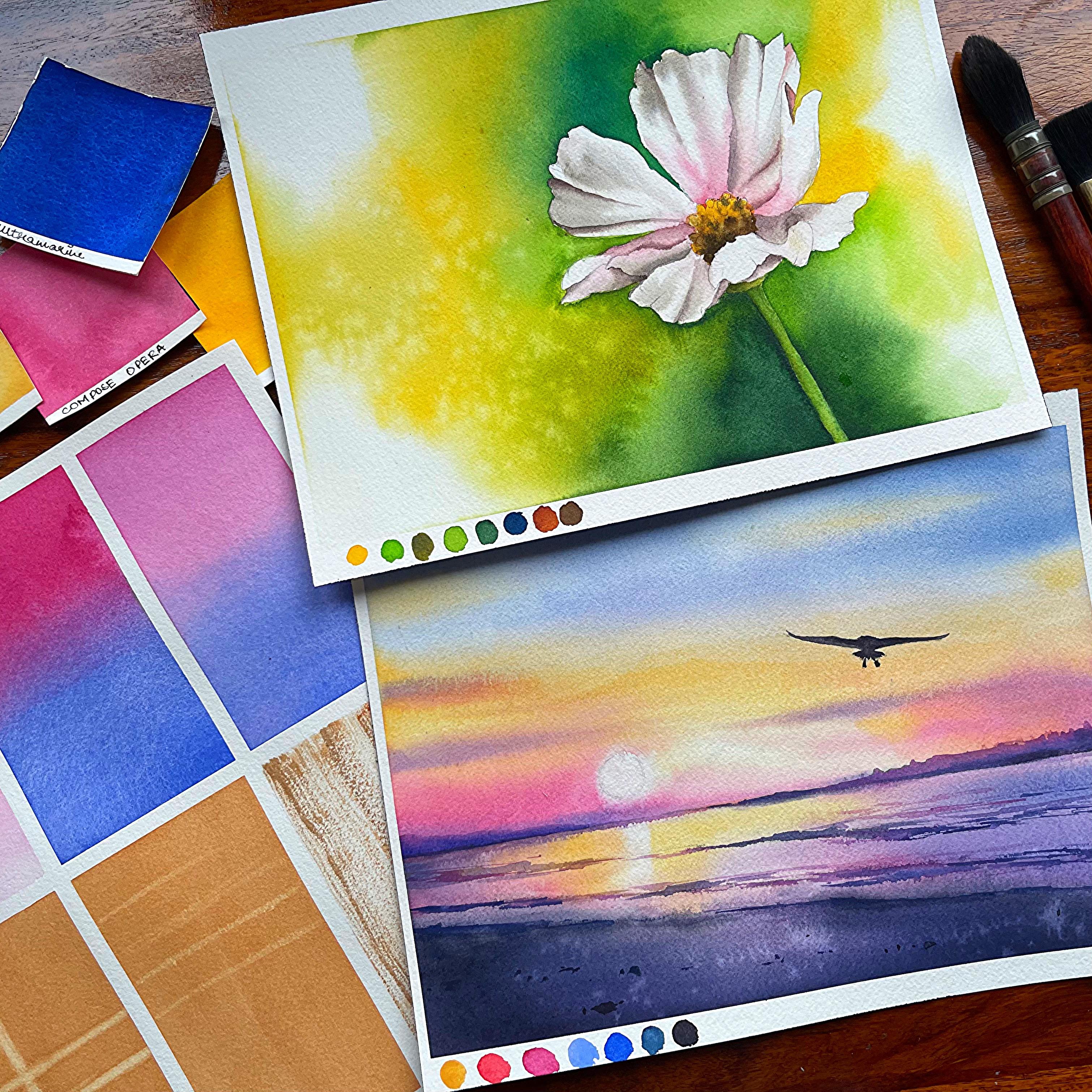
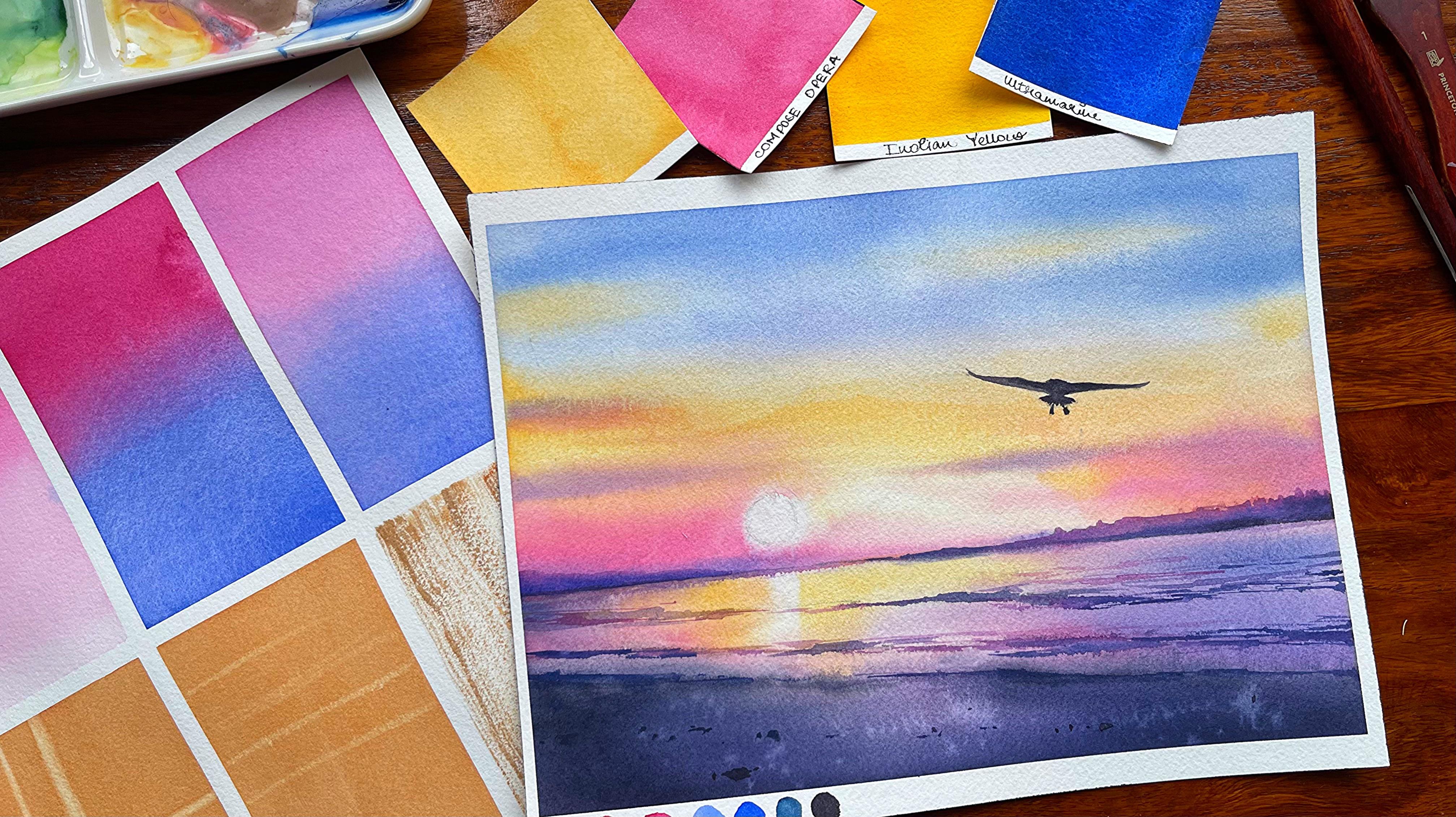
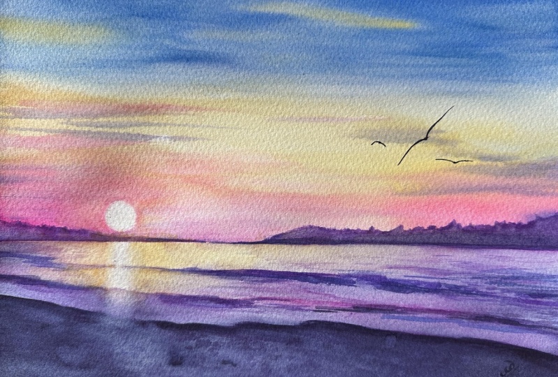
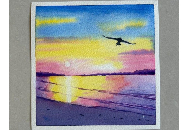
Transcripts
1. Introduction: Many of us do have a preconceived motion
about watercolors, that it is a very tough media, and it takes a lot of time to understand not only about
the colors, paints, paper, et cetera, but also each
and every technique that we should be using for any of our
watercolor paintings. Though today I have thought
to take a class where we are going to discuss 101
watercolor techniques. Each of the technique
is unique and every technique has its
own use in a future at. Ty Sangam Ty ornat an
artist instructor, mother, grand owner of Wiping persons where we manufacture handmade, sketchbook, artist great paints, as well as a Skillshare
talk teacher. Overall, we are going to
attempt ten final projects. Every project has about ten techniques
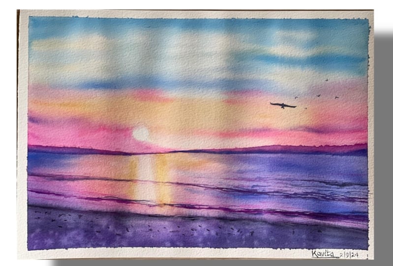
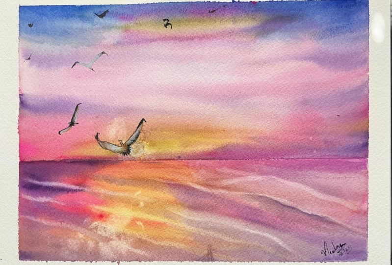
being discussed initially and then using all those
techniques in our final project. We are starting with some basic techniques
like wet on wet, wet on fry, understanding
gradient washes and much more. Finally, if you are someone who is starting out
with what colors and wants to actually have
a ride with this medium, then this classes for you. Go ahead and join me
in the next video.
2. Materials Required: Let us understand everything
about paper, paints, watercolors, et cetera,
which we are going to use throughout
the entire class. This is the first final project
which we are going to do, and the size of the paper
is 31 by 20 centimeter. This is the second project
that we're going to attempt once you are done
with the first 20 techniques. For the techniques part, I'm going to use a
really big size paper. The size of the paper is 26 by six centimeter or
ten inch by 14 inch. Of the paper, which I would
love to use throughout my entire watercolors
techniques part. You can use both the
sides of the paper. If you are someone who is new to watercolors and doesn't want
to waste much of paper, you can use both the
sides of the paper for painting all your techniques or understanding all your
techniques, how you go about it. You need a palette
for sure for keeping all your colors or the palette where you
want to mix your colors. Now, there are two
kind of mixing which we will also
learn in future. One would be on the palette and one would be on the paper. All those kind of
techniques also will need a palette for
sure at your disposal. I will go ahead with any kind
of 12 to 18 shade colors. This is artist grade colors
from various brands, Licina, whole been, Windsor
and Newton, et cetera. I will show you a
few basic brushes, which I'm going
to use throughout the technique section as
well as the final painting. We will need a flat
brush for sure. Now this is very,
very important. I will keep a larger
flat brush for applying my water and
a smaller flat brush. Now this is usually used
to lift up your colors. Then the next is your
Princeton six Neptune brush, this is more like a mop brush. Again, for applying your water or a larger space for colors. I'm going ahead with size six, silver black velvet and refile three by
zero, mop brushes. One very thin brush
that we need. This is silver, ruby satin, zero, zero size brush. Again, this is the
brush which I would be using for completing
all my paintings. Now we need an as
pencil scale rubber. There are two kinds of erasers, which you can see, one
is the needable eraser, and one is this
kind of an eraser, which is majorly
your non da store, any kind of other erases
that we usually use. Now needable eraser helps you to take out all the graphite
marks from your paper. Usually, you'll see that it also remains on
the top like this. This is a tissue, which
is very, very important. Even in our technique section, I will show you how
important is the tissue. You can use a tape. Now this is basically
a masking tape. Again, this is a
cheaper masking tape, which you can only
use if your paper is 100% cotton, 300 GSM orals, you might have to go ahead
with some of your washi tapes, which doesn't take off any of your paper and it doesn't peel off your paper at
any point in time. I will have two jars of water, one fresh supply of
water and another for just going ahead and aching off the colors
from your brushes. That's it from the
supply perspective. Let's go ahead and start out with our technique
section now.
3. 1/101 - Watercolor Techniques: H Let's start with our first wash and it is flat wash on a wet
on dry method. Now, what is wet on dry? My paper is dry, and I will go with wet
colors on top of it. I'm starting by just
making a pool of colors, which I would be using
for this flatwh. Flat wash is nothing
but an even layer of wash of pigments on
top of your paper. Now, this even layer of pigments that spreads
over your paper can only happen if you have this kind of a pool
ready for yourself. If you continuously add some
of the other pigment on top of the water or the
pigment that's already there, the pool, then you will not have the single color that you can
apply on top of your paper. We are going from top to bottom, and even we will go
from bottom to top. You can also do a smash from left to right or
from right to left. It all depends
upon the fact that how you want to
have an even wash. For me, doing a wet
on roy is a bit tough compared to if I'm going ahead
with a wet on wet method. That really allows the
pigments to automatically go ahead and move around on
top of the paper evenly. We will see that
in the next video. Flat wash is usually the basics
of watercolor techniques. If you can actually
master this flat wash. The other washes
like gradient wash, as well as arctd ph will become much more
easier in the process. You can go ahead with any
of the watercolor sheets available on your palette
for doing this flat wash. I have gone ahead with Opera.
4. 2/101 - Watercolor Techniques: L et's experiment with a
wet on wet flat wasah. What I've done is, I've already applied water on
top of my paper, and now I'm going with
my compose opera color, and you can see that I'm evenly trying to add the colors
from top to the bottom. And then I will again take the colors from
bottom to the top. If I only take from
the top to the bottom, what happens is the colors
might get way more lighter as the bh will keep
applying the colors and it will go lighter and lighter till I reach
the bottom part, and it would become more of a gradient wash rather than
it becoming a flat wash. Whenever you are
doing a flat wash, it is important to not only
go from top to bottom, but also from bottom to top. You can also go sideways, that is from left to right
and from right to left. Even distribution of
pigments is the key. And secondly, if you are
doing a wet on wet technique, it becomes way more easier as water does a lot of work for you rather than we trying to do an even wash on a
wet on dry method. The next thing is going
to be a gradient wash.
5. 3/101 - Watercolor Techniques: Variant postes is one of the very important postures
that any artist can think of, and today we are doing
a wet on dry method. We are starting out with compose opera going from the top. I one third of the paper, and then washing my brush and taking the watery mix again, washing the brush again, and then again taking
it towards the bottom. I will again go ahead
and wash my brush. This is a way to make
your pigments lighter and lighter as you reach towards the bottom
part of the paper. I will again go with the same way I have
done it right now. You can go over and layers, or you can also go ahead
with one single layer. I would leave that
decision up to you. You can go with a
round brush or else, you can also go
with a flat brush. Flat brush might give
you a better outcome compared to a round brush
as I have always seen that a flat brush can
easily go ahead and spread very well the colors
on a larger piece of paper. Let's try this with
two colors now.
6. 4/101 - Watercolor Techniques: Radian wash wet on
dry with two colors. I'm going ahead
with the same color that we have used till now. It is going to be
my composed opera. We are going from the top, and we will only approach
till the middle point. From where you will
see that I will go ahead with my
true blue color. Any blue is good, you can go with bal blue or any other kind of
blue like ultramarine, which I'm going to
use from the bottom, and I will move till the top. Now, this is a bit difficult. If you are even taking
a bigger paper, as well as you are going ahead with this kind of
wet on dry method, you might get patches, and that's what I
wanted to show you through this
particular exercise. If you are looking
for a bigger paper, you must and must go ahead
with a wet on wet method. If you're going with
any smaller spaces, this wet on dry method is
good to go ahead with. Rest, I would always always
ask you to go ahead with a wet on wet method rather
than a wet on dry method. Can see very well
that I'm also getting a bit of patch at
the middle portion, so I will go ahead
with the same color. That is my compose opera and start getting the
colors towards the top. It might also mean that I will get a darker value compared to what I
would have expected. So that way, I would say that you have to take
or you have to be much more careful in a wet on dry method rather than going ahead with a wet on wet method. Let's again start with our ultramarine and go from the bottom and reach
to the middle part. I have been very careful while I'm doing the swatch
so that I know that the colors are evenly
distributed as well as I get these two
shade gradient wash, which I have been
looking forward to. Next one would be a wet on wet.
7. 5/101 - Watercolor Techniques: Ohh This one is a wet on wet
two shade gradient wash, where we will apply one layer of water
on top of the paper, and then we will go ahead
with both the colors, gently apply it from the top, the first color,
and gently apply. The second one from the bottom, and you will get a color that would be absolutely
stunning in the middle. Along with it, the gradient wash from the top to bottom
will be absolutely even. One thing to keep in mind while you do this
kind of washes, that all of these washes
that you do wet on wet will become one to two shade lighter than
what it appears right now. Why, as this is watercolors. And when you apply watercolors
on top of a wet surface, it will become way
more lighter compared to if you are applying it
on top of a dry surface. So if you are wanting any particular color
which is way more darker, I would always suggest
you to go ahead with a wet on dry method rather
than a wet on wet method. If you are planning to cover larger sheets or larger spaces, it is a wet on wet method that you should
always go ahead with. So these kind of
things you should always keep in
mind while you are doing any of your
watercolor floorals, landscapes, et cetera. It clearly helps to build
up your fundamentals, and it can actually ese you through the future paintings
that you plan to do. We will be doing a painting
in the coming time, that is once we are done with
the first tech techniques, and you will see that some of these techniques have
been used over there and how easily we can
achieve the results if we have few of our
fundamentals in place. Every watercolor
technique that we approach or that we are using in our watercolor journey will have some amount of positives and
some amount of negatives. So always always keep in mind that few of the things that
you are trying to achieve, even in a wet on wet method might go ahead as
way more lighter, so you might have to go ahead
and apply one more shade or one more layer on top of the colors that you have
achieved right now. This particular shade as we move on to our next technique, you will see will become
way more lighter, as I did tell you earlier. It's time to move on to
our next lesson now.
8. 6/101 - Watercolor Techniques: This is kind of a special
case where we are going to go ahead and do a gradient wash
with three different colors. Now, I am choosing the colors which are closer on
the color wheel. That is one is yellow, then is either you can
take compose opera or some of the other orange or quinacrodon
cooral kind of color, then go ahead with
a blue or purple, whatever shade you want to do. I would leave the decision absolutely up to you the kind of colors that you want to use or the kind of bins
that you want to get. You can also go ahead with the same colors that
I am using right now, which is majorly my yellow, then some amount
of your red into it quinacodon coral and
going with the yellow in a darker value shade because it is a wet on wet technique
and the color that I want to get with the
gradient wash is a darker value compared to what you have seen me
applying over here. Now it's time to go ahead and apply some more of my
quin acrodone coral. I would leave this
decision up to you. You want to use red, orange, quin acrodon coral. Every color looks
absolutely amazing. You can mix some of your shades, like either you can
directly take purple, or else you can also
go ahead and mix your compose opera
and blue to get a shade that you see
towards the top. There can be multiple colors which can be used
for a gradient posh. Now, since this particular
place is really small, and hence I just thought to
go ahead with the colors that are closer on the
color we two, three, four. Any kind of shades that you want to go ahead
with you can use. You can also mix your
colors and then use. I would leave that
decision up to you. I'm making the colors
a bit more darker. Now, this multiple gradient wash can also be known as
a variegated wash. It's not exactly
a variegated wash because variegated wash can be done anywhere on the paper and you can apply any
amount of colors, shades, pigments, et cetera on top of the paper to
get a variegated wash. But it is somewhere similar to an intermediary between a
gradient wash and parcaor wash, which might intersect between these two kind of techniques. There are many techniques
and watercolors, which you will get where you might find these kind
of intersections. Let's go ahead and move on
to our next technique now.
9. 7/101 - Watercolor Techniques: Now we have come down
to varicated washes. What is exactly varicated wash? Now, arcate wash is
basically a wash, which we usually do in
a wet on wet technique. We start out with any shades of your choice and just keep
applying it on the paper. Now, if you really want to see the kind of shades that
do not give muddy mixes, we have to go ahead and check
out a bit into the color. A theory is a very,
very important concept, and we are going to
touch upon it in one of our technique section
for sure as there is a lotlon from there so that we do not end up any kind
of dark mixes that we need or even can get colors
like black or darker value in blue by only
mixing the colors like burn Ciena
and the ultramary, or multiple colors
of one single shape. I'm going ahead and applying
the yellow first and then I'm going ahead and apply either you can apply the orange, red, nacodon coral, and some
amount of purple on the top. I would leave that
decision up to you how you want to go ahead
and apply your cavas, but it's mostly to give you a look and feel of
how you can go ahead and apply colors in
any way to create beautiful skylines or for
creating beautiful silo days. All of these are usually used in skies to
a greater extent, as well as to a lesser
extent into the fields. It is very, very basic that we all need for all our
landscape paintings, as well as it comes very handy when we are doing any
kind of floral paintings. Let's go ahead and move
on to our next lesson, which is very important and it's all about
lifting your colors.
10. 8/101 - Watercolor Techniques: Let us understand a very
important technique, which is all about lifting. Now, this is a wet paper, and I will have a damp brush, which I would use to
actually pick up my colors. The next one where I'm going to tell you about how to pick up the colors from a dry paper with the help of
your damp brush. So let's first
approach this part of the painting where I'm going ahead and applying a
burns in our color. On the complete paper. It's an even flat wash, which I'm doing with the
help of my flat brush. As I did tell you earlier, that the flat brush
can really do a quick flat washes for
a larger piece of paper, and you can also exercise it even in your
future paintings. I am making two
blocks right now. One of the blocks is damp, and another one will not be damp or wet anymore
when I'm going ahead and applying
the damp brush on top of it to
pick up the colors. I'm using a flat brush and just going ahead and
picking up the colors. Again, rubbing it on my tissue. And then again, going ahead
and picking up the colors. This is a repetitive
and iterative process, which we are going to
do for picking up or lifting out our colors in
many of our future paintings. One of the most
important usage of this is when you are
drawing your sum, or when you are
drawing your moon, as well as you want
to show any kind of a light effect anywhere
in all these places, this has got a great use. Though I can say that it's easier to do it this
way rather than masking, Mask always gives
us a hard edge, which we don't want in
soft paintings like these. I will add two to
three lines over here. You can continue to see
how I use my damp brush because this is
something that you need to practice
before you go ahead, start with your final painting. I have a final painting
after the first ten of these techniques
that we are going to cover. The next one will come up after we are done with
first 20 techniques. This way, not only we are going to only explore the techniques, but also learn how to use them in our final paintings
very easily. Many of our
techniques, by nature, we use in any kind of watercolor
paintings that we do, but sometimes we are
also not aware of it. So this whole techniques part might help you to understand
that in more detail.
11. 9/101 - Watercolor Techniques: Let's go ahead and check
out the next technique, which is all about
removing or lifting out your colors with the
help of a damp brush. I'm going ahead and using a
damp brush on a dry paper, and all I'm going to do is just use my tissue to
lift out the colors. Now, this lifting out
technique is a bit difficult, and it might not help you to
take off the entire color from the paper as there
are some staining ness of the color that always stays
on the paper once it is dry. Hence, we need to
repeat the process in one particular
part of the paper. So going over in one
space, once, twice, the, particularly to pick up
the colors is something that I have realized we
need to do very often. You can also go ahead with
a bigger flat brush to make your colors lift out from that space a bit more easily than what I'm
doing right now. But I wanted to make
some thin lines at this stage, and hence, making that thin lines
is only possible once we are going ahead and using a
damp brush to do the same. Moving on to the
next technique now.
12. 10/101 - Watercolor Techniques: Let's go ahead and focus
on our last technique, which is dry brush technique. You can pick up any colors on your flat brush
and just take off all the extra colors or the fluid water which you have
on your brush on a tissue, and then start applying
it on the paper exactly the way
you see over here. So overall, it's going to be like this once you
start applying it. It is often used in
techniques like painting old doors or some wooden areas, or maybe even for trees,
branches, et cetera. If you are someone who has been looking forward to
work with textures, this is a great way
to create textures on old wooden suitcases or even on old wooden
doors, barns, et cetera. I will move on to one of our
full painting after this. It is broken into two parts. One is all about
starting with a sketch, and then we move on
to the painting, where you use all these
techniques to finish it off.
13. Practice Execrcise 1: Let's have a look at
all of our colors now. This practice exercise is majorly a wet on
right technique. Now, in a wet on
right technique, you have to understand how easily the colors can be
blended with each other. Wet on ry is a tough technique
compared to wet on wet, but let's try it
before we move on to the easier one in the
next practice exercise. Go ahead and marking
our horizon light, then we are going
to mark our sun. Once we have marked our sun, we will start with the lightest value moving
on to the darkest value. As we progress,
do make sure that you are blending your
colors quickly, or else, the paper may dry up fast, and you may get some
of the harder edges which we would really like to avoid throughout
the entire process. Going ahead with
the lightest value, and this is my Naples yellow. I am adding this color in and around the sun area or
just above the sun area. I and around the sun would be majorly somewhere
around my opera. And then I will add
some blue as well as some amount of ultramarine
towards the top au. Let's go ahead and keep
blending our colors. I'm using a mop brush because my mop brush can hold
a lot more water. This is a 12 in to
12 centimeter paper, so it becomes really easy. To just see how we can work
on this kind of a paper. Going ahead and adding some
of the quin atrodon coral on top of the yellow
color that we have added. I genuinely like
to use the naples yellow shade because
this doesn't react with blue to give us
any kind of grease. That way, I can avoid
many of the muddy mixes, which usually we may produce
during our paintings. Though we have a much more
detailed understanding of the color theory
as we progress, but over here, I
would like to avoid any kind of bad color mixes. Going ahead with my royal blue, in case you do not
have royal blue, you can also go ahead with
any of your cerliu blue. We will add some more
of our Naples yellow. As you see, the
colors will become way more lighter once
the paper dries up. I'm going ahead
again with some of my opera and addict in
and around the sun. As you see over here, I am trying to just go ahead
and mark out the area, which would be majorly my sun. I'm using the tip of
the brush just to mark that area so that we don't
push the colors into the sun. You can also just use a masking fluid to mask
out the area like this. Or else go ahead
with some amount of your any of the
other masking tape, et cetera, which
can be also used for just masking out
the area of the sun. I'm using a mix
of my ultramarine and some of my alo blue, but you may avoid using
to blue, teal blue. Sometimes doesn't mix very
well and give good colors. So it's important to mostly
go ahead with ultramarine. By mistake, I did again, pick up some amount
of teal blue. So I would just push the
colors towards the top and add some amount of my royal blue again to push the
color towards the top, using some of my ultramarine
now towards the top area. As I know, I have
covered quite a lot of area in the top part and hence, I'm just going ahead and pushing my blue
color towards the top, so that's somewhere
or the other. I don't see much of
the teal blue coming below and it's mostly the
ultramarine that we have added. I like to blend my colors well, you can see that there
is some more blending, which is left towards
the bottom area. Now the colors look
really organic and they have moved into
each other on their own. This is something that
I always say you guys should keep in mind when
you do water colors, the colors need to move into
each other on their own. If you are not genuinely allowing the colors to move into each other in watercolor, then it may become really tough in your
watercolor journey, because water is primary compared to your
colors in watercolors, and water has to do all its job. Though we are doing
a wet on dry method, but as you can see, we continue to add few of the colors even in
a wet on wet way. As we have already added
the colors and now we are just blending it in all
the areas where it is needed. Some more of my ultramarine
near the horizon line. I'm to go ahead with my green. Now this is majorly
my yellow green, which I'm going to use. I will also mix some of my forest green along with
this yellow green and then create two different shades for my bottom or the greener
parts of the bottom area. I will go ahead and start adding this color with a mix
of my forest green to. The blue which I
had on the palette, I am using it to my advantage. I really like to
keep it that way. My paper is still wet, that is the sky and the colors I'm moving
into each other. But since I've kept
a darker value, which is blue towards
the horizon line. It might not be very
difficult for me at this stage to let the colors move into each other
because blue mixed with green will only give
a darker shade of green. That way, I would say that I'm pretty much
safe in this case. Now, if you are not
having something which is similar to this one and would
like to secure the space, you can go ahead and just use a masking tape below
your horizon line. That way you can
secure the space and not allow the colors to
move into each other much. Once the paper is dried, then only you start using the
bottom part of the paper. I will go ahead and
add some amount of the yellow green now to mix it with the
forest green that we have added and make
the colors look a bit more darker
and not separated. They should look that they are two shades of the
same green grasslands that you see over here. I think a bit of yellow would be a great advantage at this stage. You can go ahead and
add it, and then again, blend it with some of your
darker shade of your green, which can be for
a screen or else, you can also go
ahead with any of your blue shade to add this kind of a darker
value over here. My horizon line has
blurred out a bit because of the colors
moving into each other. It's time to add
some darker values. It can be the forest
green that you have, or else even a mix
of your blue and any kind of green that's
there and just blend it. So that it makes
the line look more organic and we can see that
there is a portion of it, which is majorly the area that is in the far
away grasslands, and some of the grasses are
intards the bottom medium. Now going ahead
with some yellow, once your paper is dry enough and trying to blend the
corners before that. Now, this blending
you can do once your paper is not so dry, which is that there is still some amount of moisture
left on your paper, and you can do this
with a clean damp, I would say a flat brush. Any kind of flat brush or smaller flat brush is
always handy in this case. Now going ahead with some of my yellow and adding
it in the sun, just blending it,
making the left side more lighter with the yellow
color on the right side. I will keep it white.
But I think the white that I wanted to
keep is not as is. I might have to go ahead
and add a bit of my white at in to it before
I finish it off. So let's see how the
painting is turned out. But before that, let's try to actually pick up
some of the colors, which we have already added. Though this is a very soft, subtle sun, which
I want to show. But still I guess it has
become a bit more darker and somehow It becomes and if
you keep adding colors, which is a kind of mistake
that all of us do. It's absolutely fine if these
kind of mistakes do happen, we have a white
quash or any kind of white opaque water color like titanium white to fix
all these mistakes. Fixing my mistake now, and let's have a
final look at it, how the whole
painting will look. Once we are done
with the left side, we will move ahead and go to the next painting that
you see on the right. It is a bit more advanced than what we have
done right now. So it might take about
12 to 13 minutes. And then you can go ahead
with the next first project. That is a beautiful
evening by the beach or beautiful evening
that you can watch. And the sea waves move, so all of it put together
looks so so good. Let's move on to the
next exercise now.
14. Practice Exercise 2: Blending in a wet on wet method is more prevalent when you are covering bigger spaces like skies or bigger masses
of trees, et cetera. Let's go ahead and
mark out a area, which is going to define our small sun and
then a horizon line. I'm going to mark my
horizon line towards the bottom part as the majority of our
focus is on blending. Understanding how the colors
mix directly on paper. Allowing the colors to
move into each other naturally and getting
a few organic mixes, which might not look dirty, as well as they
just don't give you any muddy kind of
final outcomes, which you may not like
in your painting. L et's go ahead and just apply some water on top
part of the people, which is going to be my sky. I'm not going to occupy the smaller circle that is
going to define my sun. Hence, going in and around it
to define the other parts. This is a big mob
brush, which I have. You can also go ahead with a
flat brush of your choice. Once you have an even coat of wash of clear water laid
on top of your paper, we are going to go ahead with
our small simple mop brush. This is three by zero, or you can say it is
smaller than the size zero, which you usually
get in a mop brush. I'm going ahead with
my cenari orange color initially and then a bit of
my nekles yellow into it so that the colors
become more and lighter in value
compared to what we have applied towards
the bottom butt. Go ahead with the sun or you can say in
and around the sun. We are not going to
touch this area. We have not used any
kind of masking fluid. Nor we have used any kind of our masking tape to
mask out this area. I'm consciously going in and around the sun to make it look absolutely organic and it is bright and vibrant
because of which, I have to make the orange color in and around it very vibrat. Now going ahead with a
beautiful neutral tint from the brand
Winsor and Newton. I have been using
this neutral tent for quite a few years now. And if you are looking for
some darker value like this, then you can easily
go ahead with a neutral tint or else you can also use a lamp black color That is absolutely
fine because many of these shades do come in a particular box of
shade of 12 or 15 or 18, whatever you get in the market. So it's absolutely okay. If you don't have the neutrotan, you can try using
black instead of that. Mass plaque or lamp plaque or any of the other black
color that you have. Mixing a bit of my Naples
yellow into the orange. You will see some of the
mixing I do on the palette and some of the mixing I even
do on the paper directly. Just exactly the way we
are doing over here. Now, this mixing, which
happens on the paper, gives us a variety of colors, which usually we do not see when we do a
mixing on the palette. Hence, it's important
to not only work with one single technique
of mixing on the palette. You should work in and around. Like, either if you
are going ahead with some of the color
mixing on the paper, you will see that the colors gradually move into each
other and they even give rise to way more number
of shades compared to what we can usually observe
if we are mixing on the palt. Hence, it's important to continuously mix
the colors and get the shades of your liking or choice on the paper as
well as on the palette. Mixing some amount
of neutral tint into my orange and getting
a darker shade now. Sometimes I do like
to add a bit of the darker shade
while I am moving from the top towards the bottom. Now, this part is
majorly where I'm trying to add a few clouds
towards the top area. Go ahead with some of my
darker shades of neutral tint. Initially, when I go ahead with, I start with the lightest value. And slowly steadily,
I keep adding darker and lighter
values to my painting. Altering my values
not only helps me to keep my painting
more impressive, as well as the color
expression is much better. It also helps me to understand where exactly I want to
add the darker values, as well as the lighter values. How I can play with
the values to make the painting look more appealing to anyone
who is conserving it. The clouds are to the top. While they come towards the, they will become more
and more smaller. Hence, I am not trying to add a lot of clouds
to the bottom area. Defining the darker value
towards the bottom, and then we will go ahead with some of our grains to
mark out the area, which is majorly the horizon
line and below that. You can start out with
any green of your choice. For me, I'm going ahead with some amount of my forest green
mixed with neutral tint, but I really did not like it, and hence I had to go ahead with either olive green that
you have on your palette or some amount of any other darker shade of green or lighter
shade of green, that has a bit of
yellow tinge in it. That's what I like
to add over here. I'm mixing even some amount of my brownish shade that
I created by mixing my neutral the
orange color towards the bottom area so that the shade of green
looks more earthy. I am looking forward to more
earthy colors at this stage. We are going to mark out our horizon line by
using our damp brush. That is majorly by actually lifting out the colors with
the help of our flat brush. We have done this
technique earlier and I'm only going to use the same
technique for this painting. There are a lot of
techniques which we have explored and all
these techniques have major uses either
in our paintings now or in our future
paintings as we progress. These easier exercises are basically an add on
for each one of you who is struggling
with watercolors and wants to go ahead
and explore it. I am adding some of my
darker sheet of brown at this stage and marking my
horizon line in a better way. We are going to go and add
some of our neutral tent now. Once you have added
the darker values of neutral tent in and
around your horizon line, it's time to go ahead with the darkest value
of neutral tent now and apply it in some of the
spaces wherever it is needed. Playing with your values
has always been the key if you are working with a
limited palette excise, over here, mostly what we are
doing is limited palette. Now remove the
tape and angle and have a final look at
both the paintings, which you have done.
This is excise two. Let's go ahead and move
on to our final project.
15. Project 1/10 - Evening by the Beach - Colors: Let me tell you all the
colors for this painting. It is Naples yellow,
Quin acrodon Coral, the next would be compos
Opera, royal blue, ultramarine, indico,
and neutral tint.
16. Project 1/10 - Evening by the Beach - Part 1: This is the first
project for the class. Here, we are going to do easy watercolor
seascape painting. Though I know that we
haven't touched much upon the colors that you
should be using and how you should be
choosing all of them, which would be
touched upon as we progress with our
watercolor techniques. We are starting out with
our basic horizon line. You can just about 6.5 centimeter for this
kind of a paper size. But if you're going ahead
with AO size pickle size, then of course, your
dimensions would change. For me, the dimension
will change only to select less than half
of the p is what I see. My Clouds is going to take a major portion
of this painting. I'm going ahead and
drawing a few lines, which will really
show my shoreline, as well as it will show where exactly my
sand is, et cetera. Let's go ahead and add these
with our pencil sketch, and then we will go ahead and start applying
colors on top of it. All these techniques might
not have been covered now. There are mostly few of the techniques which
I'm going to use, which is more into a wet on wet technique rather
than it being wet on dry. Once we are done
with the first part, that is majorly the area
where we are drawing, we will move on to the second
part of it where we are going to start out with our first layer and then
moving to the second layer. Layers is something that I usually do in my
watercolor paintings, and none of my paintings
are done in one single lay. Usually there are at least
two layers which I use for my watercolor
landscape paintings, and there are more when I
work on with my florals. Though I am a
believer that you can actually finish off a painting within two, two, three layers. Go ahead and marking a small
sun on the left hand side, I would leave the sun
on the left rather than taking it on the right
or even in the middle. I'm a strong believer
that we should always focus on the rule of thirds and then mark out our
areas or our focus points. Go ahead and adding water
on the top part of the sky, you can use any brush to do so. For me, I'm using a
thick more brush kind of a brush for adding all of this water
over here on the sky. Let's have a closer look at it, how my water is flowing
and how my paper sheen is, how the top of the paper looks like once I've
applied the water. Since I have taken
completely 300 GSM, 100% cotton arches paper, it's way more easier for
me to control the water. Always always go ahead with papers that you are
more well versed with, where you have spent
a lot more time, so that it's easier
for you to go ahead, concentrate and paint
on top of them. Paper is a very, very important factor in your
watercolor paintings, and I would like you
guys to also focus on the paper part more when you are starting out
with your watercolor journey. Let's go ahead and work
with the lightest value. It is basically
our Naples yellow. Now, I'm starting out to apply
it in and around the sun, and then we will move
on to our next value, which is majorly composed opera. These are the two colors
which I really love using my mob brush to add both of these colors because it can
really hold a lot of colors. It is three by zero
aqua soft brush. It helps me to add the
pig pins quickly as well as evenly on top of
the surface of the paper. Now going in and around the sun. Now sun is a very,
very sensitive area, and whenever you are painting either a sunrise or a sunset, it's important to
go around the sun. Bit later compared to where
you are applying your yellow. You can always start out in
and around the sun also, but I would prefer to leave a bit of the
part in and around it in white and then move
on to our next color, which is more of composed opera. If any place I don't
like the color, I will pick it up
with the help of my mob brush or any
of your flat brushes. Picking up the colors
or lifting out the colors is a very,
very important technique, and it is one of the
most important areas that should be
touched upon or that is usually touched upon by me, at least in all my paintings. If you know how to lift
out your colors well, you would be in a position to actually create
a good painting. Because in watercolors, there is no way that we can get back to the original color or to the
original white of the paper. Hence, it is important for us
to exactly know how to lift out our colors if there is any mistake
that we have created, going ahead with my
compose opera and starting to apply it from the left and moving
on to the right. Now it's time to
add a bit more of my darker value of
composed opera. I am again using the same brush and adding it from the left, and again, a bit of
it on the right. All the directional painting or the sky painting
is directional, that is mostly horizontal. There is no other
direction which I going in this
particular painting. There are more of
directional clouds, et cetera, which you can make, and you can learn all of it in one of my classes that
I've given recently, as well as a few of my
other past classes too. Overall, through my watercolor
exploration experience, I do understand the
more you paint, the better is your understanding
of your colors, paper, brushes, everything, and
even better is your outcome. I'm going ahead and
adding some amount of my ultramarine and then adding it towards
the bottom area. Ultramarine, when you mix
it up with compose opera, you will get a color that
looks a bit more like purple. That's absolutely okay. If we are even getting the
colors more like purple. It is a evening
sunset by the beach, which we are trying
to show over here. And I'm going without any fears when I'm
applying all of my colors. This is something
that you should always keep in mind
as a useful tip. Do not fear watercolors. If you're fearing watercolors, you will not be in a position
to nail your painting. Just go with a free mind and
start applying your colors. Don't think about
the final outcome. Only keep enjoying the process
of applying the colors on the paper and how beautifully the final outcome comes out, whatever comes out, just start appreciating the final output. Watercolor is a medium that will only start
growing on you when you stop wearing it and start
to partnership with it. I would use the similar colors. That is your compose opera and some parts of the purple
that we have actually made. The whole of the painting
is done with very, very light and subtle colors, and this will also
appear one or two shade lighter as we are doing
wet on wet technique. Applying some amount of yellow, my paper is still wet. That's one of the
reasons I can touch upon few of the areas if
your paper is not wet. Please leave it as this and go ahead with the top part of
the sky where we are going to apply the mo Picking up your colors with the help
of your damp wet brush. That is a damp wet flat brush. You may be very
successful at this stage, or you might have to
repeat the process two or three times
even in future. So those kind of things will, of course, happen in
water color paintings. You have to just take it with a pinch of
salt is all I can say. Sometimes one single
process even of lifting up the colors might
be a bit more ley, and it is not so
easy as we think. Going ahead with the
top part of the sky, where I'm applying
my royal blue, and this is from the brands and. This is a very, very light blue. If you don't have this blue, please go ahead
with celium blue. It is good enough to start covering the
top part of the sky. Some of the white spaces I
have left on purpose empty. I'm going ahead with some of my yellow to fill
up those paces. This is majorly the yellow, which is Naples
yellow as it doesn't react with the blue to create a bad kind of a green or a muddy green or even
any shade of green. And that's one of
the best things. It's Naples yellow date from the Branson ear and I have
been using it for years now. You would have seen many of
my other classes earlier, where I've used the same shade. Adding some of your
darker values. It can be your ultramarine
or donrne blue into the shape that
we are now applying. It is a darker value compared to the royal blue that we
did apply initially, and covering up some of
the spaces of the sky. Again, I'm using only
one single brush as you can see for covering the
entire space of the sky. I don't believe on
the fact that we have to make a lot of dramatic
clouds at this moment. It's a very simple
and easy painting. We are working wet on wet. And that's what is
in my mind when I'm working through the entire
process of the sky area. Trying to lift out the colors
from the area near the sun, for sure, that is a very,
very important part. Applying some of your
ultramarine more and some of your royal
blue mixing it well, going with this deeper value with some of your
co to process it, though, I will not
say co is a lot. It's just a bit of it
to make it more darker. Since the color that I have got right now towards
the top part of the sky, will turn way more
lighter and applying a bit more darker color is
very important at this stage. You can see the top part of my paper is still very
wet because of which the colors are moving pretty evenly throughout the
entire part of the paper, and every shade that
I'm applying for the sky has turned out
really soft and simple. They look very organic when they are mixing
up with each other, and that's what I always wanted. Go with a bit of yellow
to blend out with the blue that we have added
for the top part of the sky. I can't continue working towards the bottom part as you
can see the bottom part is and if we keep working
in the bottom area. You will see that we will get dry patches and those patches, I really like to avoid in
all my watercolor paintings. Again, removing the colors with the help of my
flat damp brush. Just wash your brush
well and again start lifting out your colors
wherever it is necessary. It's time for us to start
focusing on the bottom area, which is basically a
shoreline or seashore. We are going ahead with a very light wash of
water on top of it, and then we will start
applying the colors. In and around the sun, it
would be lightest value. I am going ahead with my Naples yellow at this moment and
applying it in and around it. Once we have applied
the Naples yellow, we will go with
the darker values like your compose
opera and some amount of your blue and purple that we have already applied even
earlier for the sky. I would be majorly using
all the colors from the sky for showing
the water ripples, as well as some of the bottom area where
there's seashore. We are going to go ahead with one or two shade darker
with the help of blue. Just blending my colors into the yellow part that
we have already added, and then going with some of my compose opera to start applying the colors
even from the right. The left part has a
lot of compose opera, yellow and the
colors of the skies, hence, this looks pretty
organic as of now. Let's see how we can work it
out even on the right side. The left part was
way more lighter or way more smaller
as well compared to the darker side or the
right side where we are going to apply the
darker lighter values in a bigger space or
in a bigger area. Just blending with
my composed opera. You can see that I'm
picking up the colors from the right side and this is
majorly a huge palette, which I've kept for myself. It's easier for me to
actually choose my colors. Check the colors on top of the palette and then
start applying it. Now I'm applying
some blue as well as a bit of purple and opera. Blending it well to just show you how beautifully the
colors move into each other, or pigments move into each
other when your paper is having some amount
of moisture in it. Now, this can be also said as that this is a wet
on wet technique, which we are going ahead
and applying at this stage. So I would leave that
decision up to you, what you really want to call. If you want to go ahead and call it as a wet on wet technique or wet on moist technique,
that's absolutely okay. It's up to you to decide
what you really want to say. For me, a wet on wet technique
is always works great. They have a beautiful
final outcome. You can majorly have a look at how beautifully the
colors move into each other, the pigments flow, and how
soft is the final color. Adding some of my purple. Now you can either p a purple or if you have a purple
or be available, you can use that purple
from your palette. For me, I love to
prepare it and hence I'm mixing some amount
of my compose opera, then blue to create this purple. The shoreline, initially,
what I'm making is way more lighter than what you
will see as we progress. Let's start applying
our neutral tent now. Now neutral tent is a shade that I have always loved to use. I don't usually keep any
black on my palette. Though there are many
of you who might have a black like Mrs
black or lamp black. Whatever black if you have, you can use it also. But for me, I love to use this neutral tent and
mix it with my blue. Then get a shade which
looks a lot more darker and start applying
it on the paper. I have not used a lot
of this neutral tent, a bit of it for covering some of the areas of my shoreline. Now we will pick up a bit
more of our neutral tint into the pines that we have already applied and start applying it from the right
and on the left. That gives me a lot more
understanding of how I want to add this color on the
totality of my shine. If I like to keep it a bit more lighter as I go
towards the part, there will be some
reflection of the sun in the watery beach area also. Hence, you can also see
that you may like to apply only a lighter value of
it while you go towards the middle or a bit on the left side where
there is the sun. Applying some of my colors
even on the left part. I'm cleaning up
some of the spaces. Now, this cleanup is okay. If you can do it,
if you may not be in a position to do
it, that's also okay. Let's go ahead and splatter some of our water on top
of the shoreline. This is one of the
best exercises. Splattering is something that
is very, very important. We would be learning
about it as we progress. The next techniques that
you're going to learn is more about splattering itself
in much more in depth way. Adding some more of our
splatters on the shoreline. This kind of a splatter
effect will only come up when your paper
is moist or wet. If your paper is dry already, you will not be in a position to get this kind of an effect. Be very sure when
you are applying any of your colors or
any of the techniques, how you are going to
get the final outcome. As the paper is wet, I can still apply the darker value to show the
shoreline in a better way. You can see that my
brush is rolling from the right and moving
into the middle part. I can see a bit of
patch on the left. We will fix this. We can
use a dam brush to fix this part if we are
getting any kind of patches anywhere
in our painting. As I earlier, I will use my damp brush to
clean up some of the patches if it
appears as I don't like to have a final
patchy outcome, for sure. Let's move on to the next video where we are going to
finish this painting.
17. Project 1/10 - Evening by the Beach - Part 2: The second layer is all about
adding some more lines, and finishing off the
painting in a better way. We are not going to actually go ahead and add
lines everywhere, but at starting out
with the first part. This is a very, very light
color, which I've taken, and now I'm just trying to again merge it with
the background color. As you can observe
over here, but mostly, you will see that now
I will go ahead and start adding some
of my opera color. This is basically compos opera. You can also go
ahead with carmine or any of the other
colors of pink, which is available with you. What happens if you
overdo a painting somewhere is what you
can see over here. I have picked up the color from where exactly
I did not want, so leave it at it and start adding your colors only when your paper
is dry enough. Do not go ahead and start adding the colors if your
paper is still wet. I'm mixing some of my royal blue into the color of pink and then start adding the color
even on the other side, which is majorly the top part. Here you can see because of
the picking up of the colors, some of the area has got
a kind of flower effect, T though I would not say it
completely a qualifer effect, but something which
is similar to it. Now going ahead and just
adding some of my pints, or you can say this is a
red alt kind of a shade. And then applying some blue towards the
bottom area of it, just to make it look very organic with the colors that
we have already applied. I like to use the same
color shades, et cetera, which we have used
for this guy even on any of the other parts of
this particular painting. You will see how organically
all colors move into each other and they look
so nice and beautiful. I would be adding a bird in
the top part of the sky, which is something that I've realized will look
good in this painting. But a single bird is all
I want at this stage. I have moved on to a
smaller flat brush, and I'm just
blending the colors, which I've added for the horizon line on top
of the horizon line. There can be simple trees or maybe a small land mass area, which can be seen
and blend it up with the damp wet brush. This is a flat
brush, which we have pain using this kind of
technique very often, and I use it in many
of my paintings. Even it be floors or landscapes everywhere,
it looks very nice. I'm using the same red
Vallet kind of a shade, which I have got it. This is majorly a mix of your royal blue and some
of the other shade. That is the composed opera. Though I will mix some of my blue as I'm going
towards the right, even in the bottom wave area, which you can see over
here and the top part, I will, of course, go ahead and change my colors to a greater extent if I want some darker values in
few of the places. And then go with the lighter
values in the other areas. But mostly first,
always try to paint the lighter areas and
then go ahead with your darker colors to add the darker values on
your painting that way. Your watercolors will
be easier for you. And you can paint along very quickly in any of your
watercolor painting. There is no need to come back. There's no need to
lift your colors. And to a great extent, you can control your colors as per your needs and
as per your wants. I just erased out the pencil, apo graphite mark, which
we had for the sun, because now this sun
really looks nice, beautiful, and we don't need
to do much at this stage. It looks very organic, starting out with
the darkest values for some of the
areas of my waves. I want to just add this
as a wet on dry method. I'm not going wet on
wet, no softer details. Only more of hard edges that we are going to
get in this painting. D When you are at the defining stage on majorly adding the
last few strokes. I would say that this
is at a stage where we are mostly done with the
two thirds of the painting. It's only one third,
which is left. All the area is covered. It's just some of the areas
where we are required to add some of our lines to show the ripple
effect of the wave, as well as you can see the pattern of the waves like they move from
left to the right, and they move in a way that you can see all the lines will move to one single
point on the left hand side. Which is also called as
the invisible point. This has been one of the very, very important concepts which
I have taught even earlier. In many of my other classes, you can go ahead
and check that out. It's a very, very
important concept and cups very handy in many
of your paintings. We will touch upon it even
in the further techniques or any of the drawing sessions
that is there in future, which is coming
because we overall, we have ten paintings that
we would be touching upon. Going ahead and adding a very, very light value
near the sun area. I'm not going to cover
the entire area that would not show the reflection
or the waves in a good way. Not to overdo a painting at any point in
time is something that we all must learn in the process of
doing watercolors. Watercolors is a medium where we all should know
that less is more. Trying to use the colors
of the palette for your watercolor paintings
because always just picking up the colors from
the main area where you have all the colors stored is not a great idea because you may
pick up very darker values. From the palette,
we have lighter, darker colors already available, and it becomes way
more easier for us to pick up any
kind of shade color, et cetera at this moment. Mixing up with a bit
of your blue now, and then adding some of the ultramarine to create
a shade that looks, amazing or very, very
organic is all I can say. I'm extending a bit of the land mass even
on the left side and will make it way thinner as
we move towards the sun area. At this moment, I think I'm very happy with how it is turning up. I might have to go ahead
and look at the bird, which needs to be added. It will take a bit of time to
add that bird and to create this beautiful sun down at
this moment, I would say. It looks so amazing to me. I cannot tell you how much I am pleased the colors of the sea, the colors of the sky. It gives me so much of
calming sensation within. It makes me feel like as if I'm already there
on that beach, and it's making me feel so much full from the
creativity perspective, that really I am so so excited to teach this
particular lesson to you guys. It's one of my favorites. The colors, the
skies, the water, everything, has just
come together so well. I will go ahead and add a pint of my neutral tint
towards the base area of the right side land
mass that we can see in the painting and
then just blend it with very little clear water. Blending it is
always a great idea. I think blending is one of
the best exercises that we must have while we
started with watercolors. I think blending
gradient washes. This is something that is actually the base of any
watercolor painting. Okay. I guess the bird is
just around the corner. Let's go ahead and
start adding it. You can even start
with a pencil lying and then go go ahead by
painting the bird altogether. A very simple sketch
of a flying bird. It's easy to me. Go ahead and just extend the
wings, and in the middle, there's a bit of a body of the bird that we
are going to add. And the wings are going
to be a bit more longer. So yes, that's what I'm
adding on the right, as well as the M graphite
marks are always. As I use a very, very light graphite mark pencil, which is majorly my
two edge pencil. You can go ahead with
HB or maybe a one shade lighter whatever whatever
is available with you. That's something which
I cannot tell you. But yes, having said that, make sure that there are no graphite marks
when you are going ahead and painting your
watercolor paintings because that's very,
very important. Owise, these graphite
marks will show up, and you will not get a
great final outcome. I guess this is it. This looks very nice. Now it's time to go ahead
and start adding the colors. The color is, of course,
the neutro tent, which we have added for some of the parts in our painting. I'm using the same color, a bit of it for the legs, and then we will use the same color for
the other parts too. We're finally done almost with the entire part
of this painting, and we have to move on to the next ten
different techniques which we are going to learn, and they are equally amazing and equally important for
any watercolor painting. These all techniques we will
be using in a floral bloom, which we are going
to add on as we progress in this watercolor
technique section. Okay, so time for learning
next ten techniques, which will take us to 20 different techniques that we have added on in watercolors. It's essential for any bigner. Or any middle or advanced
level watercolor artist. Something or else is
always there for you. So go ahead and look out for all the techniques
you may already know it. But some of the techniques which we already know sometimes, we just use it very often, but we are not sure of. We are not ready to accept
it as the techniques, or this is the particular outcome that we are
getting in all. Okay, let's remove the
tape pattern angle and have a final look at it. I'm very happy with the clear nice crisp
edges which we have got.
18. 11/101 - Watercolor Techniques: M. Today, we are going to
discuss about splattering, and there are three
different exercises where you're going to
explore splattering. Let's go ahead for
the first one. I will go ahead and apply a layer of your burn sienna
on top of the paper. And once you have
applied the burn sienna, the paper is quite wet. At that moment, only, we will splatter
some clear water or any kind of water where you have even washed your brushes is
good to go ahead with it. Just apply it and see
how the water moves or how your paint moves from that particular space once
you did splatter some water. Movement of pigments is very
important at this stage. As you know, once the pigments start moving to different areas, this water that you
have splattered, those particular areas
become lighter in value because of
the water splatter and the pigments will move in and around it rather
than staying over there. At this moment, the moisture
on the paper is very high. Hence, what I can say is the splatter will not
give you a great outcome. If you are splattering
on a moist paper, I would say that gives a better outcome than what
you will observe for here. But knowing, what
is the exact amount of water that you need on top of the paper
is very important. You can see that within
the first 1 minute only, I'm doing all this exercises and the full video is real time.
19. 12/101 - Watercolor Techniques: O This is a second
kind of splattering, which we are trying
to do over here, and this is basically
splattering on moist. Now moist is a surface, which is not as wet as we
had in the first case. So I would allow this paper to remain wet for a
longer period of time, which means that
I'm not going to apply a lot of
colors on top of it. Once I've applied the layer, I will just move it around for a few more seconds
and just see that I don't have of glaze on top of the paper or puddles
of water floating around. That way, I can
really ensure that the paper or the area
is not overloaded with lot of water or it's not as wet as you have seen
in the last case. So you need to go ahead
and check the moisture or the amount of water on top of this paper before you go
ahead and splatter it. I will show you exactly how
we are going to do this. Believe me, the first
step is to apply your even layer of
pigments on top of your p, and then you can see how the glazes on top of the paper. It's not as glazy or it doesn't have a lot of moisture
on top of it, just the exact amount
which we need. Now I'm going ahead and splattering this clear
water on top of it. You can see the left side
was way more lighter. That is the displacement
of the colors from the part of this paper was way lighter compared to the
one that you observed now. That is splattering
one, moist paper.
20. 13/101 - Watercolor Techniques: The third method of splattering
is one of my favorites. It is moist to dry kind of p. I will show you how exactly
I do this process. But first and foremost, it's very important to apply an even coat of paints on top of a p. Once we have applied this
color on top of the paper, e, we might have to go ahead
and wait for a few seconds for even a minute before we
do any kind of splattering. First of all, it's
important to go and have an even coat of flat wash. You already know how I
have done my flat washes. Either you can do a crosswatch, or you can go ahead and do a flat wash from the
top till the bottom. I like to do a crosswatch
as you can see over here. I'm trying to have an even coat of pigments on top of this
portion of the paper. I have divided my paper of
course into ten equal halves and you can do it on any
size as you want to do it. This is an A three size paper and I'm doing it on
an A three size. You can even go ahead with a smaller size rather
than doing it on this. Now it's time to wait. Now, waiting is the most important process
at this moment. You might have to wait for
one or two or 3 minutes, depending on the kind of
paper that you are using, if you are using 300
GSM, 100% cotton paper. Then it might be that you have to wait for a
longer period of time, as well as it is also dependent on the climatic
conditions that you have. If it is too hot, then your paper will
dry up very fast. If it is cold or moist enough, then your paper might stay moist for a longer
period of time. So keeping all of this in mind, then only you can think when
to go ahead and splatter. I've just picked up my
paper to show you how exactly the moisture on my
paper is and what's the shine. It's moist to dry kinds. It's not exactly moist completely like we
did in the last one. Here you will see that the splatters will
become more bigger, and they would look more
like a olflower effect. Now, flower effect, I'm not sure if all of
you are aware of, but it's mostly happens
when you have moist to dry kind of a paper and there is a backgroun of the water
on top of the paper. Let's wait for a
few more seconds before we move on to
the salt technique.
21. 14/101 - Watercolor Techniques: H Let's start out with
the fourth method, which is splattering your
salt on top of the paper. Now, I have two
ways of doing it. One is your paper is moist and you are
splattering your salt, where exactly you will see that the salt will not displace your pigments to
a greater amount, or the salt will only create some of the marks or
displace the pigments very slightly compared to
the one where you have really moist surface or you have good amount of water
on top of your paper. You sprinkle some salt, and then you will see that
there is a lot of movement of pigments from that
particular space of the salt ad to in
and around the areas. Let's start off
with the first one. I have added an even coat of
wash on top of the paper, and I need to wait for
approximately a few seconds. That is half a minute to
1 minute before I check the paper and see the amount of moisture that's there
on top of the paper. This is a very, very
important step to exactly note the amount of moisture that's available
on top of your paper. No one can frankly tell you what exactly should
be the moisture. It's the kind of trial
and error method. Every time I try to see exactly the amount of minutes
or the amount of seconds, but that might change
a lot depending on your climatic conditions
as I did tell you earlier. So I am now taking
some amount of salt and applying it
on top of the paper. My paper is not really
wet at this moment. You can see that
my water on top of the paper was sitting along with the pigments for quite
some amount of time, and that's the reason
that you might not see a lot of movement
of pigments. Let's go ahead and let it
try to see the final result.
22. 15/101 - Watercolor Techniques: Let's talk about
the fifth method. This is a very, very
interesting method. We are going to go
ahead and apply a layer of colors
on top of a paper. I'm using my flat
brush for adding this even layer on top
of the smaller paper. Once it is done, I will
go ahead and start adding my salt on this
absolute wet paper. Let's use the same salt, which we did apply on the
left side of the paper. And now I'm adding just the exact amount of salt also on the
right hand side. I really did not want to think much while applying the salt, any place anywhere
you can go ahead. Only I wanted to keep
the amount of salt on most similar to what we did
apply on the left side. Hence I have gone ahead and used the same salt that I did
apply on the left side. There there would be no
change that you will observe in terms of the salt. Only the textures will be very different on
the right side, and the texture would be very different on
the left hand side. We need to go ahead and wait
for a while before we get a final outcome of
how this part looks, and you need to give it the
time for it to dry off, and then only you can
observe how the whole of the displacement
of the sort from this particular area looks like. Very excited about
the result and we can see a stark difference
between both of them.
23. 16/101 - Watercolor Techniques: Masking with masking
tape is a great method. If you are planning to go ahead and just mask
out a particular area with your masking tape and then just not allow
water to enter on it. If you are planning to
do layers of masking, then this is not a great idea. I will show you the kind of mistakes that you can
commit if you are planning to go ahead with
layers of masking and just apply
negative painting. So negative painting surely will not work with
the masking tape. If you're looking for
negative painting, masking fluid is the
best way to go about it. I'm applying my ultramarine blue over here throughout
the entire space, and then you will see that
once the paper is dry, this particular area
will remain as white. But as we continue to add
more and more layers, the colors will move
into each other or into the area where you
have masked out with the help of
your masking tape. Therefore, I always say
that masking tape is only good for one layer rather
than working with layers. If you are planning to go
ahead with negative painting, masking fluid is the
best way to go about it. Go ahead and applying one more layer as you
can observe over here. The water or the color
which has pigments in it might enter into
some of the spaces. What happens if you keep using the same masking tape over the area where you have painted? The paper where you have added the pigments and
water may not be at the same level or
there is a change or a shift in the straight
form of the paper, which you usually get initially. Now there is a bit of
buckle which happens, and that bit of buckle is being used by your water to enter
into few of the spaces, as you can see over here. This can continue to
actually hamper your work. If you are planning to
go over end layers, you can improve it a bit with
the help of your tissue, but still it will not give
you the 100% results. Let's go ahead and again apply one more layer of this masking tape and
then go ahead with the other p. It is just
for your knowledge and sheer importance of using your masking fluid rather
than using only masking tape. All of these exercises do come very handy when
you are working with watercolors because
there are a lot of mistakes that we tend
to make in watercolors, and this might be one
of them which you may have also committed
or can comment in future. Do understand the
masking tape is only a one time use
stuff whereas if you are going ahead and wanting to mask various areas for
negative painting, your masking fluid is the
best way to go about it. We will be even
experimenting with masking fluid after we are
done with the white ash.
24. 17/101 - Watercolor Techniques: Let's go ahead and work
around with white ah. Sometimes. What
happens is we do not have any masking tape
masking fluid or anything. At that time, any white
bake watercolor or your white ash can come as
a help for your highlights. You can apply it on the
areas where you want to just add some of the white
touches of watercolor. L et's go ahead and add a clear flat wash of
my from in blue color. We have done enough of
our burn Cena earlier. This particular part, I
just thought that it would be great if we can choose
some other shade and column. Going with a simple watercolor, which is opaque nature that
you need to keep in mind. No acrylic colors
can work if you are trying to work around with
only one single medium. I have got this question in a lot of my other tutorials too. Your watercolor is
water as a medium. Even wash can work because wash has also water
as a common medium. Whereas for dryl your
medium is not water. It's something else,
and therefore, even oil will not work. If you are applying to work
with oil in watercolors, it would be completely a
mixed media and we are not going to do that in
any of our paintings. Now going ahead and
making a few lines, as you can observe over here, these can work great as you highlights with a smaller brush.
25. 18/101 - Watercolor Techniques: H A very important part of masking is how to mask your particular
areas or paintings. I will first use my brush cleaner and
then dip my brush in it. Once I have dipped it well, I will pick up some of my
masking fluid on my brush and then start applying
it anywhere I would exactly the way
you observe over here. Once the masking fluid
is completely dry, go ahead and apply
a layer of color. Once the color is dry, just pick up the
masking fluid or erase it out with the help of
the masking fluid eraser. As we are done with
those particular areas. We have also picked
up the masking fluid. We are going ahead and again applying it in some
of the other areas. This particular method is great when you are doing
any negative painting, where we are trying to explore various or different layers
of negative painting. For me, it's important to use masking fluid because that
gives me a better coverage, and there are
hardly any leaks of water into the areas where
I want to preserve and we. It is a bit different
than your masking tape, but it works great for
any painting swear there is in depth layering that you
are particularly wanting. Go ahead and start applying
another layer of colors. Once you have applied
another layer of colors, you will see that you need
to let this layer also dry. Once this layer is dry off, you can easily pull up the paints with the
help of your iso. Then the particular
area where you are actually removing
the masking fluid from will remain
one shade lighter, than where you have
applied the colors. It's a very easy way
to go ahead and keep applying your paints layer
by layer by layer by layer, and it gives some beautiful
amazing outcomes. You can try it for shapes
like butterflies or leaves or simple shapes like
spheres, squares, et cetera. Go ahead with anything of your
choice and start doing it. I think you will be
in a position to nail this kind of
paintings completely. Let us move on to the
next technique now.
26. 19/101 - Watercolor Techniques: You can use your palette
knife for many purposes, even for drawing branches. Let's go ahead and explore this particular side
of palette life plan. I'm going ahead and using my brush to draw
two whole lines, and now I'm taking
a palette knife. Go in few of the spaces where I want to draw the
branches of the trees, dropping in some
color and trying to spread it with the
help of my palette knife. If you are ever
looking for creating very thin branches
for your trees, I think this is a
great way to do it. Sometimes we are not having that perfect brush or we are not getting that perfect kind of stroke with the
help of our brush. At that particular time, this palette knife can come to your rescue to a great way. Have used two x speed in
this particular video, except all the other videos
that we have loaded in now. You can see that I'm
sorely extending all the branches as you
observed in the bottom one. We can continue doing
this process even for the left side of the tree and have more
branches coming in.
27. 20/101 - Watercolor Techniques: You all have seen many ways to draw your branches,
trees, et cetera. For this particular painting, I'm going ahead and
applying some ultramarine. Once we have applied the ultramarine blue
on top of the paper, you will see that I will
not leave a lot of water. It's more about a flat
wash at this stage, and then we are going to use our palette knife for
lifting technique. This is a great method for lifting in any of your
paintings where you have this absolute amount of water or the correct amount of
water on top of your paper along with the pigments and start using this for
more of your paintings. Let's go ahead and create
that beautiful flat wash first where we don't have excess water on
top of our paper. We have just the
correct amount of pigments and water on
top of the people. Once we are done with this, then we are going
to start lifting the water on top of the paper. You will see that it is easy, but there should
not be any puddles. That's one of the reasons always using a flat brush
for these kind of paintings is good
to go ahead with and understanding the
technique is most important. With the water you need to play. I understand it's
water and watercolors, but solving the paper, how much water I have kept on top of the
paper is something that you must continue to explore
your watercolor skills with. I feel that there's a lot to do with water in water colors
compared to pigments. If you know more
about water control, you can easily nail
the paintings. As you can see, there was
no putle of water and it's easy for me right now to actually pick up the
colors from the paper. I'm using the tip of my palette knife to
go ahead and do this. You can use any
smaller palette knife too for doing this process. You really don't need this particular
bigger palette knife. You can have any kind of
smaller palette knife too. Continue adding more
branches if you need and then have
a final look at it. We will move on to
the exercises now.
28. Practice Exercise 3: Colors for completing
the small exercises is Opera Qin acrodon coral, Naples yellow, ultramarine,
neutral tent, and violet. This exercise is going
to be very interesting. It's the third exercise
from the series, and we are going to use a lot of techniques that
we have launched to date. The first one would
be your blending, the second would
be your masking, and the third would be
your splattering these are the three most explod
ones along with some amount of
lifting that we are going to use for the water area. Let's go ahead and
mark our horizon line. And once you have marked
the Horizon line, we will go ahead and start
adding a small mountain. Now, this is a snow
clad mountain. That's one of the
reasons that I would be masking it with the
help of my masking tape. What I usually do is I do place my masking tape and just cut it out with the help
of my scissors, once I draw on top of it. And then we are
going to go ahead with our top area,
that is the sky. Once you have added
this masking tape, as you also saw in one of
the techniques section, that it can very well
mask out the areas, which you want to save for whites of the mountains
or whites of the snow, whites of the grounds, anything
that you want to save. I am going ahead and using my opera to start out
with the sky area. This is it on Roy Method, another technique that
we have already learned. Go ahead and just
adding some amount of my coral along with it
towards the top area. And a bit of your Naples yellow. Now Naples yellow
has been one of my favorite colors to go
to in most of my painting. It gives that subtle soft effect rather than making the
painting look very bright. So that's one of the good
ways to go about it. I have siched my brush to a really large one as I want
to cover bigger spaces. I am going ahead and just adding some of my blue
ultramarine color on the top area and then
blending it with the help of my clear water
towards the bottom area. You can see that
blending is always the key in most of the paintings that you
are going to do. So if you know a blending method that is
good or working rate for you, I'm pretty sure
about it that you would be in a position
to nail your paintings. I will go ahead and just
again add some amount of my colors in the middle
area as you can see over here. The colors were really soft
and subtle at that moment, and I wanted to add a
bit more darker values. That's one of the reasons, I like to go ahead in layers, or you can say that I go
ahead with the colors. Once I feel, I am more
comfortable with it, adding lighter
values initially and then going ahead with
my darker values. Some amount of purple towards
the top area of the sky. This really makes the blue
stand out to a greater extent. Though you may not observe it
as a absolute purple color. But once your painting
is tried off, you can see how beautifully the color works out
for you I'm going with my neutral tent to add these shades of the
clouds for the sky area, and I work from the bottom area, then take it towards the top. I'm starting in and
around the mountain area. The back side of the mountain
area has a lot of clouds, and usually they are
smaller in size and shape, not a very huge kind of formation that
we are going to do. Some smaller clouds that
we are going to add. I'm mixing some amount
of my ultramarine into the neutrotan and the
purple which I already had. So this is basically a mix
of all these shades to get a color that looks
something similar to the one, which are seeing right now. All I can say is it has a
lot of neutral tint in it. It is majorly dominated by neutral tint compared
to the other colors. So you might not observe the other colors very
well at this moment. Once your paper is dried off, as it has ultramarine in it, there will be some kind of granulation even
for this sky area. And that granulation
really works great. When you have a final beautiful
outcome of the clouds. I'm using my size one or size two brush as this is a
very, very small paper. I am not using a big paper for completing this
painting altogether. It's around 12 centimeter. It's not absolutely
square a bit longer, so maybe 12 by 15 centimeter
or something like that. You can also use 12
by 12 centimeter. It can be a square paper. It's absolutely okay, whatever
you are comfortable with. The exercises are
on smaller paper as I want you guys to explore the Techniques on a smaller paper, and once you are
more comfortable, we will move on
to a picker paper where we are going to paint our beautiful and outcome that I always always adore
working with a flower. I am going ahead and adding some more of my darker values. I think it has become too dark. I might have to lift up some of the colors wherever
it is needed. These kind of things do happen
in many of our paintings. If you want to just
lift off your colors, take any damp brush. Damp clear brush, of
course, it needs to be, and then you can pick up the colors from the area
you want to pick it up. I would pick it up somewhere
around the right hand side. You will see as I pick it up. You can observe that I am adding very lighter value of clouds
towards the top area, not adding any darker values. I am adding all the darker
values towards the bottom. As I move towards the top. I will just merge the colors to the same
background areas, which I have. Okay, picking up the color with the help of my damp brush. This method, particularly,
you also know. I have already discussed it in the technique section and
you can go back to it if you are someone who
is new to watercolors or doesn't know how to
pick up the colors. It's a great way that can be used for any of
your paintings. You can also use a flat brush for lifting out your colors. We will be discussing it as we progress in
the water area. The whole of the
painting is rear time so that all of you exactly know how to work it
around for yourself. Because if you are not
doing it rear time, that you might be
confused at some moment, what to add, how to add, how I am progressing, hence, everything is being
kept rear time. I'm going ahead. I'm using some amount of my
onrene blue and ultramarine to add the colors towards the bottom water area. I will just go ahead
and cover the area. We can also apply some of
our darker values more like your indigo as you observed over here and create some
waves structure. It's okay. If you
want to create, if you don't want to
create, that's also fine. There is no hard and fast
rule that you have to go ahead and create
it as I am seeing. So yes, I'm also picking
up some of the colors, and there might be some
splattering technique which we will see how it works. Okay, adding some of
my darkest value. That is the same neutral
tint which you did observe that I have
used for the sky area. I like to use the colors
alternately for the water, as well as for the sky. I like to use the
similar kind of colors for most of
part of my painting. I don't like to go ahead and use a lot of shades or
create a lot of shades. We will use the similar one for approaching most of the areas
that you need to cover. Just pick up some of
the clear water on your brush and start splattering it towards
the bottom part. You can see that
the splatters are very light because
my paper is very, very wet, as you have
observed last time. So there were three
different scenarios. The first scenario
was where you were adding water on a
very I would say, watery kind of place, or there was more water, moisture on top of the paper. It was having a lot of water
content at that moment. And hence, the splatter
will become very feeble. If you are going ahead on a paper where it
is moist too dry, you will see that your colors or the colors will
move a lot more. As well as the splatters will be more like they will
be more distinctive, and you can see them well. Compared to what you can
observe in the first place. Okay, I guess, we are good. I'm just trying to add some
of my lines, and then again, I will go with my
splatters as I'm really not happy with
how it has turned out. So it's okay. You can
always go head on top of this platters again
and make a few lines. Again, adding this platters
as you know that I'm someone who loves to add these kind of splatters for all my paintings. Continue adding it
with your clear water. And once it is done, you might have to leave it to dry off before you start with the middle part or
the mountain aium. You can do another thing
that I've done over here. I have gone ahead parallel
and just taken off the particular masking tape
from all of the space. And then I will start
applying my colors. Make sure that if you do
this kind of technique, you do not touch any of the areas or else the
colors will move a lot, and you might not be
in a position to have a good outcome or exactly the outcome you
would like to have. As my paper has dried off, more, now you can observe that the platters can be seen
very, very distinctly. Going ahead and picking
up the similar colors, like the tint and adding it in few of the areas where I
think it is necessary. Just below the mountains, usually we see that the
area is a bit more darker. I'm going ahead and adding
some of my smaller lines, torts, et cetera for showing the rocky areas
of the mountains. It is a slow and
repetitive process. So you might have to go here and add some more dots here and
there with a smaller brush. You have to go ahead
and keep working on it. Make sure that there are some dots and lines
which you add. And it is not equal at every. Some of the places
will have value. Some of the places will have just a few dots here and there. Once this is done, we will go ahead and
just pick up some of the colors from the
water area to show that there is movement in the water as we are
not going ahead and showing any kind
of reflection into the water for the mountain area. Heads. There is
movement in the water, which needs to be
shown properly. So go ahead and add su more splatter if your
paper is still wet, which I did, but I
don't think that there's much of a
difference at this stage. Go ahead and just use
your flat damp brush, pick up the colors,
use your tissue, and start picking it up in all the areas wherever
it is necessary. Two to three lines. If you can create that's good, it can really show that there
is movement in the water. I'm happy with how
it is turned out. Then now, let's
go ahead and move on to our second exercise.
29. Pratice Exercise 4: Colors are Naples yellow, cellar orange, and neutral tint. We are going to go ahead and first make a sketch
of this mountain. And I'm going with a
very, very light pencil, which is my edge or two
edge you can go ahead with. Usually, we get HB
pencils in the market, whereas two edge is usually
known as a drafting pencil. I like to use it for all
my watercolor drawings. It's a very easy sketching
that we are going to do, and then we are going to learn
how to blend our colors, as well as keep some
whites in our skies. So this is something
that I always always say in all
my sky paintings. Try to keep some good amount
of white in your skies. It gives a beautiful outcome for anyone who is
having a look into it. We will go ahead and use a few basic techniques like
wet on wet and wet on try. We have learned how to
make wet on dry lines. We will use almost the
same kind of techniques to just make the rocky
terrain of the mountains. Okay, let's go ahead and apply some water on
top of the paper. And once we have applied water, we will go ahead with
our Naples yellow. Once we have applied
the Naples yellow, we are going ahead
with some amount of our neutritan along with a
mix of our Cenear orange. You can mix either Cenear orange or quinacridone coral
into the Naples yellow to get a color
that is similar to the one which you observe
on the paper right now. I will be wetting
the entire surface. I'm not going ahead and wetting only this sky p just
like the last exercise. This exercise is more wholesome, and it's about
wetting the whole of the area that you
observe over here. Start with a very
simple gradient wash, that is darkest value
towards the top, and as you come
towards the bottom, it is more of the lighter value. I'm going ahead with
my mop brush to apply my colors on
top of my paper. This is a very,
very small paper, which you see over here. 12 centimeter by 15 centimeter or 12 into 12 square papers, whatever you want to use, please go ahead and use
it for this painting. Once you have a subtle
colors already on people, go ahead and make some amount of your orange into
the neutral tint and you get a brownish gray kind of a sheet that you start
applying on the people. If you're not happy with that, you can also pick
up of the colors on your brush and start applying it as I'm
doing over here. A bit of the darker values, I will also apply as I go
towards the bottom area. This is more of a wet
on wet method that I'm using right now
on top of my p. I am continuously adding
some colors and just making it a bit more darker in few of the areas
where I think it is necessary. Now, this particular part is
kind of a trial and error. When I say that you need to
know all your techniques, one important aspect
of watercolors is also going with the lightest value initially and adding
the darker value, slowly introducing
it to your painting. So that you exactly know how
your painting is developing. This one particular I would say aspect of watercolors
is trial and error, and no one can actually
teach you this. It's just that you have to keep experimenting with it
and understanding it. You can only do these
exercises or do this wet on wet part till
your paper is wet. Once your paper is dry, we cannot do it anymore. Start applying some more of the darkest value towards
the bottom right hand side. We're slowly going to
develop even the mountains. You will see how I do it. But in between
adding some more of the values for our clouds is something that I
want to go ahead with. I've always fallen in love
with different kind of skies, and I've always experimented
a lot with the skies, as well as the water and all
of these kind of paintings. Skies remain one
of my favorites. And if you are
someone who wants to actually explore various
kind of techniques, I think this gives you
a lot more opportunity to understand the
techniques along with it to give a way to the different situations where you are experimenting
with the colors, as well as the kind of sheets
that you're selecting. For me, this is kind of, I mean, not a very I mean, one of a kind of
colors that I select. I select very
different shades in this complimentary
colors altogether. Sometimes you can also go ahead with split
complimentary colors. And those are the
kind of things that you need to explore
at every moment. When I see about colors, many of you might not know
exactly the kind of sheets, colors, or color theory
that I'm talking about. Split complimentary
colors is more about choosing colors from
the opposite side, as well as two colors that
are closer to each other, like the one here, which I select Naples
yellow and citar orange. Along with it, I'm using one of the other darker
sheets that is neutral tint. Not only that, I only
use a limited palette, which means three shades in
total to create a painting. There is a lot of different,
not only techniques, but the kind of
knowledge that we pour into each and
every painting, which somehow we
are not aware of, and we do not recognize
at that moment, but as we keep looking into
it and going into it further, you get to understand that it's not only about
just blending, splattering, et cetera, there is a lot more in terms
of color theory that we are going to learn
in our future paintings too, as well as the exercises
are going to come up, different kind of values that we're going to
select, et cetera. But having said that, each and every aspect in watercolor has a
lot of importance. Not only your brush
soks, et cetera. But it's also about some kind of a knowledge or some kind of an understanding of the colors that makes your painting
really, really attractive. Okay. I guess I
have spoken a lot. Let's go ahead and just add some of our darker
values into the mountains, like I have done it over here. As well as we are going to
just blend out a bit of the colors as I
think it has become way more darker than I
would have expected it. So yes, cleaning up a bit, as well as adding some of
my orange and your Naples yellow in the areas where
it was way more darker. And now it has become lighter
or just blending it with the darker values did not
create a very good outcome. You will have mistakes, and you will do mistakes and
know what a color painting. All you need to understand is every mistake doesn't need
to be taken to your heart. Once you have done a mistake, just get over with
it and go ahead and just improvise it further
or let it be as this. And then you can always try another painting. Okay, great. I think, just a bit more clouds, making it a bit more heavier as it goes towards the bottom part. Some more lines. You
can go ahead with your size one or size
two brush for this. Loud your brush with some of the lighter or darker
values of this, um beautiful neutro tint. Now, this neutro
tint is, of course, from the brand
Vincent and Newton. I initially tried scenario. What happened is it's a very, very good color, but
it does flow a lot. Now, there are a lot of characteristics that
a color also has. Like it can always move or
flow a lot because of which, it might become a difficulty for anyone who is looking into it and who is
working through it. If it moves a lot, you will get less
opportunity to control it. Like here, I can control the color to a greater
extent compared to the maybe some of the shades which I can't if they
just keep flowing, or keep moving into the whole of the space
to a greater extent. Okay, good. I have mixed the same sheets that
we have used earlier. And it's time for us to
let the paper dry off to some extent and start
applying our beautiful shade. That is our neutritent. Yes, I have been
using this shade for many years now,
and believe me, this is one of the most
sought after shades of mine every time I
want to paint my skies. Skies always like have the
majority of the beauty in it. You have so much to
learn from them. They continuously change,
and you really can't capture it through your
lenses at every moment. Either you can continue to have a video of
it, to capture it, or else just capture a bit of it and use it as an inspiration
for your paintings. Okay, adding the
darkest value now, and I have already mixed
some amount of orange. I'm adding this darkest
value in few of the other spaces to make the rocky terrain
of the mountain. The colors are the same as the sky as I did already
mentioned earlier. Now, why I have kept
the same colors? There is rocks, as well as there is snow on
top of the mountain. The colors usually
shine on the mountain. So once these kind
of things happen, you will automatically see that the same colors are
getting reflected, and it would look
certainly amazing when you are working with
watercolors like these. Okay, the reflection
of the light happens on many of
the mountain peaks, and you can see it very well if you ever get a chance
to see Kachinjanga. So I had did a recent visit, and I saw Kachinjanga
during the morning Sunrise. It was an amazing view, and believe me, there are
reflections, which do happen. So keep that in mind. Not always, maybe, but, yes, there are times of the day
where you get to see it. Okay, adding some of my darker values even
towards the bottom part. Right now, you will see me just working very quickly
at this moment, not paying much of
attention to the details, as I'm not into the
details as of now, slowly adding the darker
values and only the areas where it is needed to create
the crest and troughs, as well as the rocks
of the mountains. Adding the last few
details after this. I for my background part of the mountain or that is on the back side,
which you can see. I will go ahead and only
apply my dry brush technique. That is something
which I want to really show you comes very handy
for these kind of purposes. Make sure that you are now not applying the details
at e. It's on the a few dots or lines that you were
adding at this moment. We really don't want to had a lot of darker values because
we have already done that. It's a small dot lines, et cetera that is
going to define the whole of the
mountains from here on. You can always go ahead and pick up the colors with the help of your damp clean
brush that comes very, very handy for any kind of
painting which you want, either it p or damp flat brush, or else, either it
or damp round brush. We have already done this
in the past exercises, as well as in some
of our techniques. I am using the same technique
even here in our painting. Along with techniques
that we have learned, there is a bit of an
understanding about perspective, line, drawing, et cetera
that comes very handy. Though I will not say that everything you need
to do it on your own, or you need to learn
to a greater extent, but a bit of it can
help in your journey. I will add some bits and parts here and there
wherever I can for your learning in this
particular class as it has everything that you need for starting out
your watercolor journey. So let's go ahead and
next look forward to the first or like the second big painting and
the second big project. It's a floral. We will be
using a lot of splattering, as well as a lot of
wet on wet technique. Over there for
completing the painting, as well as it's a
bigger painting. You can do it on a
smaller paper too, but I did prefer
going ahead with a bigger paper as that
really helps me to build up my confidence to a greater extent to
become an artist or to help myself feel
like an artist and just continue to
work like an artist. It's the way I really
give my dreams a way to show the creativity or to just
show off my own creativity. It's a great way. So
I guess this is it. We are almost done any dots, any lines here and there. That's it. And then remove
the tape pattern angle. Always do not try to
tear off your tape. Removing the tape
pattern angle also helps you to save your
paper from tearing it off. I have, of course, done
it in a very quick way. But overall, you should not
try to tear off your paper. It should be safe after all
exercise that is stare. Make sure that your paper
is dry before you just take off the complete tape from
both of these painting. Okay, great. I'm very happy and let's move on to
our next big project.
30. Project 2/10 - Colors - Cosmos Flower: Colors are composed
opera, inacrodon, coral, indian yellow,
me green, burn Ciena, forest green, CPA, ultramarine, and do keep a sap green
or olfran by your side.
31. Project 2/10 - Cosmos Flower - Part 1: So guys, this
particular painting is not really about sketching, but we will explore sketching in detail as you know
that I am a person who loves to understand
and sketch a bit before we cohe
with our painting. You might feel that
this is a bit of a difficult painting
compared to the last two, which we have done in exercises. We are going to
explore a lot about splattering in this
particular painting. If you want to give it a pass and move on to the next
set of techniques, I would say that you should at least try it once
before you skip it because there is so much
to learn throughout this particular
painting that it is certainly going to help you in your watercolor
journey for future. Okay. Let's go ahead and
first draw a small circle. I have taken a small coin and started drawing that circle. Once I did draw the circle, I have made a few lines in all the directions.
You can see it. These directional lines
actually help me to understand how I want to place my petals for more
cosmos flower. Now, my cosmlower is something that I always always
love to paint, too. I haven't done that in
the few months, frankly, but the one that we tried in one of my
other classes where you are actually exploring
seven different florals and seven different
styles over seven days. It has a daisy in it, and every one of you might like to go ahead
and check that out. It's easier and
beautiful painting or similar to the one that
you are doing right now. I usually use a
drafting pencil and this drafting pencil is two
from the brand monograph. You can go ahead and use any other stretching pencil
like HB or maybe two HB, though I would always
always prefer HB over two HB as well as a H. That is also okay because
the graphite marks are way more lighter and when you are actually painting
with watercolors, you exactly know that this is a very, very
transparent medium. Because of its transparency, it's important to go ahead with only the particular
graphite marks which are way more lighter and don't you don't see it through
once you apply the colors. That's something I always
like to keep in mind or use a needable eraser
to make it way more lighter before you coheit
with your painting. Okay, it's time to add some
of my other petals too. If you are unable to see it on a smaller screen like a phone, you should go ahead
and just switch on to a bigger screen like
your iPad or a laptop or any other bigger screen
which can help you to actually understand this
painting in a better way. I will keep on adding
more and more petals. I really glow slow
at this moment as I am trying to
just gauge through the fact that where exactly
I need the petals and the petals which are towards the bottom are a bit wrap up, or you can say they are
looking towards us and hence they are not an ex circle which we are going to make. Keeping all of that in mind, you will have these petals
which are just in front of us way more smaller than the ones
which are on the top. If you keep this in mind, it can help you to understand
how each and every petal is practically done in
this particular painting. Okay. Great. Let's go ahead and keep adding more and more
petals even on the right. I'm going to finish
this off very quickly, and once we are done, we are going to go ahead and just start with the
background wash. The background wash is not
going to be very simple. It's going to take up
some of our time as there is a lot in terms of the
painting that we are doing. We are not going to go ahead and just add
only a background, the color, or we are not going to protect
this particular flower. This particular flower
is way more lighter in value compared to the background which you are going to add. And hence, there is always
a possibility to add one layer of your masking fluid protecting all of
these parts and areas. But in case you are
unable to do so, go ahead and let it be as is, we are going to go
with our thinner brush and cover the entire
background. It has to be really I'm working on a 300 GSM, 100% cotton arches
cold press paper. I always go ahead
with arches paper, either a B 185 GSM or 300 GSM. I prefer 300 GSM over 185
when it is a bigger painting, as well as there is a
lot of heavy washes. This particular painting has
good amount of heavy washes. I strictly never place my particular flower in the
middle of the painting. I am one person
who loves to place it either on the right
or on the left side. Not exactly anywhere
in the middle, that really doesn't work
as a composition for me. Though there is hardly
any composition in terms of other elements
that we are adding, it's just a simple background that is there in the I mean, as we follow, you will see, but rest everything is
really simple and easy. Okay. There are a few times. I'm using my eraser
just to erase it off. If you're someone who's not
well versed with sketching, go ahead and check out in
the resources section, you have a sketch of this. You can download it and just
trace it on your paper, and then go ahead
with your painting. In the middle, usually you have pollen stamens and everything
that's in the middle part, and we are going to add that even in this
particular flower. Though majority of the
area looks very sorted. Though I am not going to define it individually in this flower, it's only just with my various variations of colors as well as lighter
and darker values of colors, we are going to change it. That's it. I guess, you need to keep
in mind when you are even working with
your watercolors. As I did tell you earlier also, that masking fluid is always
an option if you want to go ahead and just mask out
the flour on the sides, exactly the way I'm showing
it right now with my fingers, or else even leave it
*** and just follow how I am going ahead and adding the colors
on this painting. This is something which
I have learned over the years that you always do
not need a masking fluid. And most of the time, I prefer
not to use masking fluid, what I've usually seen
with masking fluids that initially for two to three months or six months,
they are great. And post that, they
starts becoming more and more I would say sticky and they do not get
lifted up easily. There are lots of issues that we usually face
with masking fluid, and hence I like to avoid
it in most of my paintings. So there are situations
where we can not and hence in those
situations, I like to add it. I would say this painting
is very simple, easy, very touching, and I am in absolute love
with it completely. I have loaded my brush
with some of my yellow, and this is my
beautiful Indian yellow from the brands inlier. I have been using this
yellow for many years now. Most of you who have been following me over
here on Scelsare, or else even on my
YouTube channel or my Instagram channel, watercolor dot Illustration et. You exactly know that how
beautiful the shade is, as well as in various
classes of schare, we have also used
the same shade. I'm using may green. This is a beautiful shade
from the brand chimenke, and I have, again,
used this, uh, particular color in many of
my older paintings, too. If you do not have
this may green, you can use any of your light green for completing this
part of the painting. While I go just near the flower, you can observe very well that I go very slow at this moment, as well as I just go
ahead in a way that I do not spoil any parts
or I do not get into the shape and size of the
flower that we have added. The important way of adding
the particular water in and around this that you
just leave out the flower and some spaces in
and around it rest. You can continue
adding a heavy flow of water on the other parts
that would really help you to just spread
the colors as well as the whole painting will come together very
very easily that way. Okay, great. I guess I'm happy with how
it is turning out. Some of the spaces, we need even some of our darker
and lighter values. We are going to
add that You will see that the whole paper
I'm not going to use, I would leave some of
the parts even in white. I love to use the white of the paper in many of the areas. This color looks
more like radian. I don't know why it is, so
you can use some to along with some green to get a shade that looks more like radian. But I think I will
just give it a pass. I'm not very happy with
how it has turned out. Mixing some amount
of olive or any of your other sap green can be
a great help at this stage. Using the scene
colors that we have used even in the top for
the bottom area too. This is the forest
green along with it. I'm mixing some amount
of my dontne blue. The nonten blue is one
of my favorite blues, which you must
have seen me using in many of my earlier
paintings, too. L et's take a closer look at how I continue to
paint the edges. This is something
that I always say, use the tip of your brush to add the colors on these
parts of the flower. It's important to
exactly know where you want to add the colors or
how slowly you go about it. When you see a
particular painting, you always follow
it as real time. Some of the
paintings, of course, we can not do real time. I do understand, but
most of the videos that I add on Skillshare
are real type so that you exactly
know how much time it took me to complete a
painting and similarly, you can also just go ahead and complete
yours along with mine. I always always motivate you to complete any
painting along with me. It would be a great idea to just watch it first at two X speed, maybe understand how
I am progressing and then go about with
the family painting. Okay, I guess I'm
just mixing some of my colors again here and
there and making it move. Watercolors is all about water. If you have good amount
of water on your paper, it would do all
the work for you. You do not need to work
very, very hard then. You have to just
sit back, relax, and just enjoy the colors, how they move into each other. Some of the areas, of course, are drying up a bit more faster. I'm not sure exactly why
did this happen altogether. Is it because of a
particular pigment, which I'm using or some of the pigments have
reacted with each other. So not much idea into it, but still continue
to add the colors. It's not actually hampering any particular parts as per se, or it is not going
to even change my painting to greater extent. But it looks like a background, and I'm really not
happy with how these backgrounds usually
happen on a painting. Though, I guess I should
be in a position to fix it very quickly
as we progress. Let's continue to
work around with it. Never get lot into
these smaller thoughts of not being able to do as you want or it's not
exactly working out, like you must have thought, we can go over the colors again and maybe it would
get a bit darker. It really doesn't matter. It's just that we just will go ahead and
fix it very very quickly. So do not worry about anything that you are
doing in watercolors. Water is a great great source of predicting everything
that you have done til. Okay. I guess I'm happy with
how this has turned out. At this moment, I
am pretty relaxed and I'm happy with my
background to a greater extent. There is a lot to be done
on the right hand side, but yeah left hand side
looks very much sorted, and we might have
to go ahead with some splattering to make it look more beautiful
and a bit more organic. I'm going ahead and lifting
a bit of the yellow, which I think is in excess
on the middle part. So that's where I'm going ahead and just picking it
up. But that's okay. In some of the areas
I'm even also going and adding some
amount of my yellow. So those things will
always always happen. As you progress
with watercolors, what happens is to our eyes, we might like something, and we might just not
like a few things. And those are the things that
you might have to go ahead and continue to change
or add or do whatever. You see that line
has got over here. I will go ahead,
load my brush with some paints and go in and
around it to correct that line. These kind of smaller
things have got a lot of importance in
watercolor paintings, and I would ask you to
continue doing it or exercise these
smaller corrections everywhere that you want to do. O. I have really gone slow at this moment
and you can see that I'm even adding some
more darker values in the bottom area
till it is wet. You can continue to
work on a wet area, but if it becomes dry, then it becomes
very difficult to work on any of the areas. So keep that in mind when you're working
with watercolors, if your watercolors
are just drying up, you may not be in a position to work around with it any further. So just stop working on that particular
area and leave it ***, or else you can also go
ahead with a spray bottle. We will see how to
work with spray bottle very soon in some of
our technique section, as well as exercise it
in one of our exercises. Okay. I guess I continue to just add some of my splatters on the areas which
are already done. Now, this is semi wet
kind of a situation. It's not completely wet and
it's not completely dry. This is the correct moment in which you should always
add your splatters. It should not be too wet. It should not be too dry. If it is very dry, you will not be in a position to see your splatters anymore. And the textures will
not be formed, whereas, if it is too wet, again, everything will
become really blur. We have already gone
through three of our most important
techniques section where you see how
those platters work. So yes, that is it. I will continue to add some more of my yellow
on the right side. Excited to always always
paint my backgrounds. This is something that
I've learned over time. Backgrounds are usually done
in two, two, three ways. You can keep it warmer, or else. You can also do it with
colors like green, yellow, and then a darker
value of greens, which are more
easier and simpler. You just see those os
those colors in nature, and then you are
just exercising it. Whereas in case you want to
go absolutely contemporary, you can also use the colors
that are there within the flower for painting
your u uh, backgrounds too. Those kind of things
we will also do as we progress with our
watercolor paintings. I always always say that
watercolor has a lot of scope. It's all about how much we practice and how much
we research into it, how much we experiment with it. Experimenting is a
thing that all of us should continue to
work around with horrors. It might be a possibility
that we will not be in a position to naive
any of our paintings. You know, after a while, what happens is that
you are in a loop, and you continue to
work in that loop. If you really want to break the motroni of that
particular loop, It's important to go ahead and step outside your comfort zone. And that comfort
zone is what I say experimenting with water
colors with different colors. Your maybe sketching,
improvement, and any aspect of drawing, et cetera, will ultimately lead to a progress in your
whole creative journey. And that's what we are always
always looking forward to. Adding some amount of my may
green and just adding it, mixing it with the yellow that we have already
added on the right. You can see how easily the yellow mixes up with
this may green. My green is one of the
most favorite drinks that I used in my watercolor
floral paintings. For a while, I haven't
been using this color, but now once I've
got back to it, I think I would love to use it even in my future paintings. I will use the same
pattern of colors, which I've done on the left and then just leave
this painting ***. I'm not going to touch it
at each and every place. This is something which I
know about watercolors. If you continue to
touch your watercolors, you might end up not
having a great outcome. Whereas if you
just leave it ***, where I say less is
als watercolors, you continue to get a
better outcome at it. Okay, great. I guess this is
it and how it looks almost. If you want to splatter or just blend it a bit,
continue to blend. You can see lots and
lots of white spaces, which has been left
in the painting. Still this painting will
come together very, very quickly and nicely. So never ever think that keeping the wide
spaces is not a great idea. It's always a great idea, and the final outcome is even
more expressive that way. Let's move on to our next video.
32. Project 2/10 - Cosmos Flower - Part 2 : This is part two,
and all we are now focusing on is the cosmos. You need your paper
to be absolutely dry before you start out with
this part of the painting. Let your paper dry
completely before you go on to the whiter
parts of your flora. Go ahead and add some water, leave the middle part, which is basically going to be in yellow. I would add the water on all the other parts
of the florals, or you can even go
individually petal by petal. As I always say that you should not actually start working
on an acent petal. But over here, we
are going with very, very light washes of
some kind of a carmine, pink kind of a color, and you can mix your
brown with blue to get a dirty black kind of shade, which is not exactly brown, black, very light shade. To add to the darker
values of this flora. Before that, I'm adding
the water thoroughly on all the petals as you
can observe over here. This color is basically
your quin acrodon coral, but if you don't
have this color, please go ahead with
any pink, carmine, scarlet, or any kind of a pink
that's variable with you. It is good. We are
starting out from the middle part and
extending it outwards. That's how I will
go about adding the colors in all the
parts of the petal. Water is going to do
a lot of work for us, and hence, when you are
extending the colors, you will observe that water is going to
allow the pink color to move towards the outer parts rather than it being
in the inside. Mix the brown with some two
to create the shadow area for this cosmo s. White and pink kind of color is
all we want to create. Let's have a closer look at it. My paper is still because of which I
can go ahead and just extend the water very well and pull it towards
the middle part. Now, this is more about
pulling the colors, or you can see I am starting
from the outer part and moving inwards when I
was applying the pink part, I was moving from the middle
part and moving outwards. That's how I will go about
it for most of the petals till I start actually defining each and every
petal separately. So let's continue to work
on it for each one of them. You will often see me using
my hand just to correct in a few of the places where
I think it is necessary, but you can also go ahead with the tissue rather than
using your fingers. I just love to paint, and that's one of the reasons I don't think much when I'm using my fingers to correct it or when I'm using a tissue
to correct it. It's all about just
the creativity and the beautiful colors flowing into the water
or the white areas and how they just become
a bloom on paper. Okay, adding values of this quin acodon coral
onto the p. As I said, that you can also use any kind
of a pink color to do it. So I go with compose opera. Compose opera is another
pink bright or vibrant shade that I always love to use
and most of my paintings. M You can switch on to a smaller brush and
just blend your colors a bit wherever you are not happy or
the colors are really more. You know that right
now your paper is wet, and lifting your colors
will be way more easier than lifting it out when
your paper is absolutely. We have seen this
exercise just before, and it's always a great
idea to work with the lifting technique when your paper is in a
moist condition. O. Adding green onto the stem area, and I will go ahead with my
bit of darker value of green, as well as lift out the green wherever I think it is necessary the darkest value because
all you don't want is the background as well as
the stem to look similar. Therefore, try to have a lighter stem color
compared to the background. That's all you need to keep in mind when you are
approaching the stem. Rather than thinking about all the colors,
shades, et cetera. I always like to go with
the thought process that's important rather than thinking about the colors that
you really need or want. All you know about the
colors is the mean green, which is a beautiful
green that we have been using
throughout our painting. We can go ahead and also
use it for these parts. I will add some of
the lines here and there just to make individual
petals look even better, as well as you will
observe that once I start adding these
kind of lines, some of the areas I need to even blend it
with clear water. I usually keep a
blending brush by my side and use another brush. But there are times where I have only one single brush
adding the colors, and then just going ahead and taking off the
extra colors into the water, washing it well, and then again, just going ahead with
the clear brush to blend the colors over
here on the paper. Those kind of experimentation
and those kind of work, I continue to do
it in any painting that I see or I like
to approach in my way. L et's go ahead and again, do the same process. This is a pretty
iterative process, which you will observe
that I will continue to do throughout this process
of the floral part. Some more lines and
some more blending, which means that you have to go ahead with another brush and blend it and pick it up till it goes towards
the middle part. Some more of this darker values to actually show
individual petals well. So if you don't give this criteria of
showing off the petals, otherwise, what it
will show of is as like a complete one petal
flower, which we don't want. There are various petals, at least six to seven petals or eight petals in this flower, and we should be in
a position to show all of them. Oh. Painting each and every petal is a very iterative process, as I did tell you even earlier, and individually
actually showing of this petal is
even more iterative. Hence, I would just
add some music. You can continue to go on with this process and just
follow along paint it. I'm pretty sure about it. All of you have some
basic knowledge now of techniques, et cetera. And if you have followed
the techniques, you will be in a position to practically nail this
part of the painting. I have usually a big size paper because even if I have
to pink my floral, it has to be big enough so that it can easily accommodate
all the colors rather than using very
smaller brushes to complete the whole of
these parts of the floor. The Starting with the middle part now and it's simple yellow. Indian yellow is one
of my favorite colors. I'm going ahead and adding
the Indian yellow over here. Once I have added
the Indian yellow, you can use a bit
of the orange into it or add a bit of
pink into it to make it some orangish color so that
you can add that color and make some variation of the colors even when
the paper is still wet. So what happens is we want variation of colors even
in the middle part. I will introduce brown, as well as darker
shades of brown. Towards the bottom part, it would be darker and towards the top part, it
would be lighter. So that's how we will go
about it and continue to work through this each and
every even smaller, smaller details is important. Keeping it wet or keeping it lighter or not detailing
it is one part of it. But not going ahead and even working through smaller parts is something that
I like to avoid. I love to paint on every smaller part
that's there in a floral or in any
part of the painting. Though there are
areas where you will see that I like to
keep it as white, those areas, of
course, will remain. But rest of the areas, I like to paint
it in the colors, which is really appropriate. You can use a CPR over here for the darker value of the
browns or else go ahead and mix some amount of your blue
into your burn Cena and get a darker value for this
part and keep applying it. You can also pick up the
colors where you think it or it is up to the ma, those things will
and will prevail. Oh. Sometimes even the simplest of the paintings where it
has to remain really, really simple like over here, the middle part, we are not detailing
anything and still I did lift out the colors
to a extent and again, add it wherever it is necessary. So these kind of things do keep happening in
every painting, sometimes you are
just not satisfied with the final outcome, and you continue to
paint it till you are in a position where
you are satisfied with it. So these smaller picky
things I also do, and then let your paper
dry off to a good point. But before that, I will again go ahead with some more
of my colors in the middle part and apply as it really doesn't show off much
of variation in the shades, as well as the darker
values are hardly there. So those kind of lines
need to come up, and we will just touch
our brush and lift it, touch our brush and lift to add these tt kind of structures
as you observe over here. Once these are done, let your paper dry off and then remove the
tape pattern angle. I'm pretty sure about it, you will have a fantastic
outcome in your final painting. Removing my tape now.
33. 21/101 - Watercolor Techniques: This is one of the very
exciting techniques where you are going to learn
about blotting or again, lifting with the help
of a tissue paper. Let's go ahead and
have an even coat of wash throughout
this entire block, which you see over here, and I'm applying my ultramarine. You can go ahead with any of the other blue shades for
this part of the painting. I always prefer using
ultramarine as a blue shade, but you can also go
ahead with pal blue or any of the other blues that
you have in your pallet. Once you have covered the
entire part of the paper, and when your paper is having a good amount
of mature on top of it, you have to take any tissue, make it into a roll
like structure, and then start tapping
off the colors from the part of the paper where you want to
actually lift it out. It is usually used in many
of the cloud paintings. I'm not a person
who is in favor of this technique or uses this technique to
a greater extent, but I have seen many artists doing it in their
cloud paintings. You can always go ahead and use your tissue to pick up
the colors this way. And then apply a
darker value shade of supposedly brown and ultramarine to create
that dark kind of color, which looks more like black, but yet not black.
It's a dirty mix. And apply it over
here wherever you think it can give the shadows
of the cloud properly. This is a simple technique and it can be used
very in a much, much more versatile
way, I would say. It can be also used for
your ground or for any of the other structure
where you want to create some kind of textures. So overall, this has got a great use even in any
of your future projects.
34. 22/101 - Watercolor Techniques: We are going on to
our next technique, and this is all about back runs. Now, what do you exactly
mean by backgrouns? It is like you have a tape
that is attached on the sides, and then you have some water that you have applied
on top of the tape also. Once you are done
with the painting, almost it's a semi moist
dry kind of a state. The water that was
there on the sides of the tape just flows
into and it gives a cauliflower kind of an
effect on the edge or may create some of the textures in your painting, which
you may not like. So those kind of
things do happen in this background
kind of a state, and we are always, I mean, this is particularly a state which every one of us should
know or should be aware of. If you want to go ahead and use it as a texture
in your painting, great, please do it. If you are someone who
wants to avoid it, I will share a few techniques
by which you can avoid. First is when you have applied your water on top of the paper, make sure that there
is not a lot of water, which means that
there are no puddles on that particular
part of the paper. That way, what
you're ensuring is, there is an equal
spread of colors, as well as equal
spread of pigments. Your extra water is
oddly taken out. And once your extra
water is taken out, there are no chances
of backgroun. I am right now going ahead
and cleaning the sides of the This is what I have been
doing for many years now, in many of my paintings. It has helped me avoid this particular situation
in most of my paintings. I would say, though there
are times where I do have backgrounds or I do have
mistakes like these. I can't do much about it. And it usually happens
in paintings where I am not using any masking tape, and I'm even wetting the
back side of my paper. It has good amount of water
on the board drolic board, which I'm using and just
flows back into the painting. You can't do much
about those cases. And hence, I just let it be. But in this particular painting, if you have a semi
dry or moist kind of a situation and you start pouring a bit of
water from the sides, you will realize that there are small movements of paints or pigments from that
particular area from your corner basically into the interior parts of
the painting and which gives an outcome that your corners have
some kind of texture, et cetera coming in, or you have not let your corners
remain boring. This is one thing that
I always always follow. Keep your corners absolutely
boring. In a painting. Now that helps anyone to perceive your painting
as more expressive, as well as it gives a
feeling to the painter or to the people who
are watching it. Even artists can watch and painter can
watch your painting, whosoever is watching it, that this is a very, very expressive painting focused on that particular subject where you want to
focus rather than the entire paper and detailing
every bit of the paper. Let's move on to the
next technique, no.
35. 23/101 - Watercolor Techniques: Let me explain you one of another very famous problems that we usually face
and out painting, and it is a qualiflwer effect. What is exactly ifloer effect? It is basically a
semi dry condition, or you can say the
moisture is good enough on the paper where you are not
applying any more paints, but you accidentally
drop some water or just add few drops of
water here and there. And from there you get this kind of displacement of pigments
on top of the paper. The pigments move from
that particular area where you did add the water into the other parts
of the painting. So through this painting, what happens in these cases
is that you get an outcome, which might not be
of your choice. So all I can tell you is there is an easy way to
go through this. If you have a very
simple background, just go over your
background once more and get done with it, or if you want to
add another layer, that way also you can avoid
this kind of a mistake. I have done it in many
of my past paintings, and it has been really helpful. Though I have introduced
this mistake in my painting just to
show you how it works, and we have to let
this paper dry off, to understand the
last technique, which is the background, as well as this
particular technique, which is majorly a
qualifloer effect. So both of them, if
you have to learn, it has to be like you have
to give it some time. Once the paper dries off, we get to understand
it completely. Even on the sides in
the middle left part, you have seen that I
have introduced a bit of water just to show you the
background in a better way. These small issues we all face
in many of our paintings, and we are always
struggling as big nurse. I just wanted to make your life a bit more easier
by knowing or just acknowledging the fact that these problems do happen and all of us have
faced it in the past. You might also face it and may use it to your advantage
in future paintings.
36. 24/101 - Watercolor Techniques: L et's have a look at how the mistakes which
we have discovered, that is backgrounds and this
alfer effect looked like. On the other part, I have just started a clear
wash of water, and then I'm going ahead
with my pouring technique. Now, what do we mean
by pouring technique? Now, pouring
technique is usually a technique where I
take some good amount of water or some great amount of water on top of my paints, which is neutral tent, and then try to paint with it. I usually pour this paint
directly on the wet surface and then just move my paper to allow it to move to various
parts of the paper. This can be very much
used for painting, any mist or any kind of backgrounds where you
need some lighter values. So yes, that's a great way to use this kind of a
technique in your painting. I have used it in my
past for painting mist, and I absolutely love it. Let's go ahead. I have
already added the color. I will go with one more
darker shade of it. I will take the neutral tint
from the brand insin Newton. I have been using this brand
for quite a few years now, and I know that this paint
doesn't move to a huge extent, which I usually faces a
problem for scenarior. And hence I have shifted to
Winsor neewton neutral tint. L et's go ahead with some
more darker values and try to add it on top
of the painting. I usually add it
towards the top so that it doesn't move all along the
painting, that's something, which I really don't want in
this part of the painting, and hence I have applied
it on only the top part. Once this is done, we will go ahead and just apply a bottom dark line to
make the horizon line. That's how I just
say that sometimes keeping your paintings absolutely
simple is always great. Move your painting,
move your paper, or else you will not see
how these colors move and how you can use it to your
advantage. Okay, great. I guess I am very much happy
with how it has turned out. I will just take off
all the extra water that's there on
top of the people. I do like to avoid the
cauliflower effect, of course, in a
painting like this. And hence, we are very, very aware of the fact
that tissue comes to a great use when we have any mistakes or when we commit any mistakes or about to
commit mistakes, guys. So that's something you
should keep in your mind. Go ahead and making a
small horizon line, it just completes my
painting to a large extent. Okay, guys, I'm good. Let's move on to our next
important technique.
37. 25/101 - Watercolor Techniques: Our next technique
is very interesting. It is using your sponge. So This particular technique is basically inspired
from the pa fact that many of us do love
to add lots and lots of textures into
our foregrounds, or even into the wooden doors, windows, or the fields that
we paint in landscapes. All of these actually led to this particular part of
my technique section. Let's go ahead and
apply a clear wash of paints on top of the paper. This is a flat wash
that we are doing equal distribution of paints
throughout the paper, and then I would use a sponge. Now, how does a
sponge help you to create lots and
lots of textures? I will use a very small part of the sponge and
just go over it in any part of this paper to create the kind of
textures that I thought. Okay, so this is not
what you should look at. I'm just trying to have
one more darker layer of paint or else you will
not be in a position to see how my sponge is working at least in this
portion of our paper. You see my sponge over here, and I will go ahead and just
dabbing it off on my paper, and you will see that there is some amount of lifting that has already started happening. You can go over various paces again to create some
more of the lifting. Though, I will not
say that this is of great use if you are
planning to lift out. Altogether, this
is just to create some kind of texture
for your paintings. It helps when you are
making any wooden panels, or you want to paint wood, or you want to paint
old barns and also. That way, I guess this
is a great technique. You can also use it
on a reverse way. That is, you just tip this particular
sponge in any kind of as that you want and then go over a white paper
to create textures. So it works both ways. I will just show you a
quick example if you are good and happy to
go around with that. I think it's also a great
usage of sponge in this way. If you believe on spontaneity, this particular sponge can
help you in a lot of way, just add some textures
and try to build humans or just add some fields, et cetera, and go for a
very spontaneous painting. Spontaneity also leads
to a lot of creativity. Moving on to the next technique.
38. 26/101 - Watercolor Techniques: The next important painting
is all about laying. Now, what is this layering? I usually use the
layering technique for many of my paintings, and I like to do it in
two to three layers. If even I'm doing
an outdo painting, I'll like to create it
in two to three layers, but I know that when you are
doing a studio painting, you can go up to five or
six layers if you are doing any floral painting
or you want to add light and shadows
into your painting. In those kind of paintings, yes, where it is more detailed, et cetera, you can go over in
many layers to create that. I have applied one clear
layer of my paints, and then I'm going over
it with another layer. Once that layer of
paint has dried off. You can go with a third layer,
fourth layer, fifth layer. L layers really help to actually make or break a
painting to a great extent, and I think that this is a very, very important technique in many of your outdoor paintings.
39. 27/101 - Watercolor Techniques: Let's talk about a very
important technique which is really
required when you are trying to paint wings of any supposedly leaves
or wings of a flower. You want to displace
your paints. If you are trying
this out, I think this is a technique
that you must know. First, always apply color
on top of your paper. Once you have applied it, take a script liner brush. Script liner brush is the
best to do this technique. You have to just
keep cleaning up the script liner
brush on the paper, and then again, wash it. Again, just dab off
the extra water from the script liner brush and start applying
it on the paper. You will see how
easily the colors are getting displaced
and you can make tree like structures
for your background or even you can create wings
for any kind of flowers. All you need to know is the
paints that you are using. Paints is a very, very
important part of this. If your paints has a lot
of staininness in it. What happens is displacing
that color becomes very tough or displacing that pigment from that particular area, even with a script line of
brush becomes really tough. In those cases, I can only
tell you that you should use the colors that has really
less amount of staininness. Keep that in mind, and
I feel that you will be in a position to nail
this kind of painting. But just continue
to do this process. It's having a clear
tissue by your side. Then just using the
script liner brush, taking off the extra pains from the script liner brush into a bowl which has extra
clear set of water. Once that is done, just
tap it off on the tissue. All the extra water
from the brush, again, get back to the bathing and start doing the
repetitive process. Of course, it's a repetitive
and iterative process. But the kind of outcome
that you can get through this process is really,
really amazing, and I am truly amazed by the way we can create these beautiful veins
like structure. We will have more of it
coming soon in our paintings, but till then, you can try
this particular exercise. Next technique is even more
helpful with controlled, I would say, water and paints in your brush to create
soft background trees.
40. 28/101 - Watercolor Techniques: I have used for something of trees in the
winter season and much better. Let's start out by adding a clear layer of water
on top of your paper. Once you have added the water, we will go ahead with a very
simple and easy exercise. Just have some controlled water and p scrip line or brush. Then we will start with a very, very simple light lines. Once that is done, we will go ahead with more and more of these lines
to create that soft. Let's see how I am going
ahead with my script l b. Script liner brush never picks
up a lot of pains and it. That's one of the
reasons I always prefer a longer hand ch which I can control to a better extent
compared to my brushes. Han said that, whatever is available with you
this technique. I'm pretty sure about it, you may get a great
outcome or even if you are getting into
some broader trees or making a few mistakes. That's okay. You
get to learn that, this might not be the
best way to approach. You can go ahead with any
of the other brushes or maybe smaller size
and shape of brushes to create these
kind of structure. Okay, I am happy with
how this has turned out. We will move on to our
next technique and the next technique is even more interesting than the currents. So it's all about mixing your colors on palette
and paper book.
41. 29/101 - Watercolor Techniques: And it is all about mixing
your colors on the paper. I love this technique. I have literally grown so
much with this technique that I really can't emphasize the importance
offered to you guys. Go ahead with my neutral tint and applying it towards any of the parts and just leave a few of the places
which are white. Then go with some of your tine and the colors just move into
each other on the paper. You know, you will get various other colors if you try this, much, much bigger paper. The kind of sheets you
will create will be way higher than when
you mix corner palette. Let's move on to the
next where you mix in at
42. 30/101 - Watercolor Techniques: The next ps, if you mix
your colors in a palette. Supposedly, I had a color
called this neutral tint, I'm mixing some amount
of ultramarine in it. You will get a shade that looks really in between blue and the neutral tint somewhere like Indigo or maybe a
bit darker than indigo, but you will never get a lot of shades or you will never
create a lot of shades. Of course, you can keep
creating with value and maybe a particular
area will be in one value, particular area will
be another value. But the kind of
diversity which you can achieve with the
help of going ahead with any of the shades between these two and
applying it on the paper to create larger number
of shades and colors on top of the paper is not what can be achieved with a
flat wash like this. So that's all according to me, I would always always suggest to mix on the paper rather
than on the palette. But yes, there are necessities
where we even need to mix it on the palette rather
than on the vapor. So those kind of things
will always remain. But use it very in much more intelligent
ways, all I can say.
43. Practice Exercise 5: We are going to use
only one single color, and that is neutral then
from the brand Wins Newton. I have been using this
paint for quite a while, and this is one of my favorite. Go to paints. Let's go ahead and draw a very rough outline. This is basically the rocky
area for my fkgrounds. As well as for my fkgrounds, I will drop in a few dry trees. For my backgrounds, I would be using the technique number 29, which we have learned last, where we are going to paint
some blurry trees wet on wet. As well as. Now, this is
a really small paper. You can also do this
exercise on a bigger paper where you can really allow
your paints to flow, move, et cetera in the way we have done
our pouring method. So all of it put together, we are going to use a few of the methods that we have
learned, the techniques, et cetera in the
last 30th technique and work around this
whole painting. Let's go ahead and start
with our background. The background is going
to be very interesting. Almost a similar way we have
done our pouring method. I would just apply
some clear water. Though this water does
have a bit of blue in it, but it really doesn't
matter as we are going with a really dark shade
like neutral tint. If you are going
ahead with any of the other shades like blue, Prusian, blue, et cetera, make sure that you a clear
water on top of your paper. I'm going ahead with a
really big size brush and dropping in some of my paints towards the
top part of the sky. I will use my book now to
move around this color. You can see how easily the colors are moving in
a wet on wet technique. Now, a wet on wet
technique is one of the most interesting and
beautiful techniques that anyone can explore. For me, I love to always always explore a
wet on wet in a way that I can have a very
expressive final outcome. Ill my paper has good
amount of wetness, or you can say good amount
of water on top of it. You can keep adding
some darker values too and make your paper move a lot. If you make your
paper move a lot, the colors will move, and you will see
how they are making some clouds beautiful
skies for yourself, you are doing work compared to what the
colors are doing for you. This is a kind of mist that
I want to show over here. So that's why I'm not going
to add or keep continuing to add lots and lots of clouds
or lines, et cetera. We will keep it simple, keep adding, darker, lighter
values, wherever we want. Let the paper move, let the colors move. Water will do its job
and water colors, and we are going to enjoy
it to an overall extent. Watercolors is very
interesting at this stage, I would say, because there is so much of unknown at this point. We don't know how the whole painting is going to turn out. It's just a few areas where we have just
added some colors, and that to we are working
with one single color. Though I think we
have to touch upon a lot about the values and
how we create the values. But I guess at this moment, we can keep enjoying the
painting that we are doing. For everyone who is willing to do the left side
of the painting, it's coming very soon. I will be uploading it. As well as along with it, you will understand that I do go ahead and always wash my paper. Sometimes what happens is that the colors don't come up
as per your expectation, and you really have to just wash your paper or go ahead with one more
painting for me. Washing the paper is always a
good option and just trying to get to the final outcome
is something that I always, always for love for. So keeping my head straight and just thinking about
what can be the final one. No thinking much about
what I have done. What can be done better is
always my thought process, which is mostly like your journey rather than
being the final destination. Let's go ahead and start out with the darkest value
for the bottom area. I will not be adding it in
every part, the rocky area, I will leave it, and later on, I will go ahead with a
darker value in those areas. In some of the areas, we will just add one
or two darker drops. That to, you can see
and just follow along. The whole of the
painting is real time, so you should not face any problems regarding
the pace of the video. To add some clean water
in the middle part. You can see how I'm introducing
it with the help of my brush to make the colors move a bit towards
the bottom area, though, you might feel that this may give you some cauliflower
kind of effect, but it will not as my paper has good or the cos
amount of wetness, which is required to
not allow the I mean, the qualiflwer kind of
an effect to happen. It happens when your paper is dry and semi moist
kind of a situation. So in those situations,
I think backgrounds, as well as your qualifler
effect is most and most prevalent or Keep
touching your areas, whenever it is even not
required in those areas, of course, you will get problems
like qualiflower effect. Okay, great. I guess this
is going pretty well. As of now. We will just
introduce some more of our darker values as I did tell earlier and this time
with a smaller brush. I'm going ahead with my
silver black velvet. I mean, this is all black
velvet, silver brush, and this is one of the
smallest zero size brush, which I have with myself. Just keep introducing
some dots here and there, and then we will also
introduce some soft lines. You will see that those
soft lines really give such a beautiful
background tree effect. As we practice
during our session. I think it was in techniques 28 and 28 or 29, you will find it. You can go ahead, check it out. If you haven't done
how you can use with a controlled brush
kind of an approach. For this part, you have
to wait for a while. You should not have
puddles of water or a lot of water on
top of your paper. Or else the color will just move a lot
more than required. That's one of the reasons I
always go ahead and wait for a while before you go with
adding these kind of lines. This is 185 GSM, 100% cotton arches paper. If you are someone
who is using 300 GSM, make sure that you work on top of it with the kind of
wetness that you can judge. Now, this is
something the wetness and the water control
is up to you. You have to understand it. Keep experimenting with it. All I can say is there will be almost a no shine kind
of effect on your paper. At that moment, you just know that there is some
moisture on the paper, but not a lot of moisture, which will lead your
colors to move a lot. Of course, that we are not
even looking forward to. The colors will only move. Now my paper has
dried off completely, and you can have a look at it. It's time to start
adding your bottom part. That is the rocky area. This rocky area is
having a darker value, which is neutral tint to add on. I am going very slow
at this moment. It's just a final few
lines, final few areas. We are going to complete, and then we are done
with this painting. This is, of course, one of my favorite paintings from all the exercise series that
you're going to attempt. Believe me or not,
something that I have realized over
the years is that the better is your approach towards a painting or the light headed you are
towards a painting, the better would be the outcome, rather than just thinking
much about the painting, just enjoy some live
music and keep painting. All the paintings will
never be a masterpiece, and that's absolutely okay. We are not here to
create masterpieces. We are here to learn something, just help improve our
creativity and move on. If you have even
done some mistake, you exactly know that you
have learned something and you will not commit
this mistake in future. That's what is
always the takeaway from any painting that
you are attempting. Okay, introducing some more of my darker values in
few of the areas. I just think that the rocks
look a lot more darker in this bottom part and the left part compared
to the right side, so I might have to
just go ahead and introduce a bit more
color even on the right. So that the colors
look even right, or else the colors are not looking much even in this case. And to add some more
foreground trees, I will go ahead with
my thinnest brush as I can control it
in a bit of way, so you can also use a script liner brush if
you have it with yourself, or else any normal
thin brush can do. Trees are very easy to paint
because you just go ahead, make a line, and then
just again branch it out. We just go ahead in an
iterative process to paint it. There is one single tree, which would be larger
and in and around, I would be making uneven or
the trees that are larger, depending on the fact that
none of them, of course, are as large as the one that
I'm painting right now, but the others are smaller in some places or larger
in some places like that. It continues. There is a randomness and
they are all uneven. That's something
which I always follow for painting nature
in water colors. Now move on to smaller branches and smaller I would say plants, et cetera rather
than a been trees. They are all dried.
It's autumn season. So yes, we have to make some dry trees now compared
to what we did earlier. Let's also go a bit
with the season. I love the autumn and the winter season to a great
extent because in India, we don't get to feel in our
sight much of the season, but in Derry, I could enjoy
the seasons a bit more. Okay, let's continue to
add some more of our nicer and beautiful in outlines to make it more
and more interesting. I think there is nothing
less or more in this case. Whatever just seems
good to your eyes. Just make those four
or five plants. Of course, we need dry
dry one absolutely. And continue to add that. Once it is done,
let's move aside, and let's go ahead with our one of the most important
parts at this moment, which is finishing off. Now, how do you get to
know that this is it? We're not going to retouch
it more from here. I get to know it that I'm
not going to retouch it anymore when I see that in
and around the subject, I have almost finished out or I have not much more area left. I always keep some
areas very boring, and that should be there
in a painting or else the focus never remains
on your subject. So that's it, and let's move
on to the next painting, which is on the left side. I know you all are waiting for that beautiful clouds
skies and martins.
44. Practice Exercise 6: Let's start out with a
basic sketch of mountains. What happens is that sometimes when I do
sketch the mountains, I am not very happy with
how it has turned out. It is going to happen
even over here. So do not sketch right now, you will get an
opportunity to sketch. I will erase this part and
then come back and again, Roy. Yes, these kind of
drawings and these kind of things to keep happening
for each one of us, whosoever is working
with watercolors, because towing is the basic. And if you don't
get that correct, initially, sometimes
these two happen ya. It's not that always
we get the best of the outcome and always
we are like, Okay, this is how I would have
liked it to happen, and it sometimes comes
in the second time. And that's absolutely okay. Only one thing you
need to keep in mind, never use a very dark
graphite pencil. Watercolors are transparent and you will be in a
position to see it. Um, like, because of the transparency of
the people, hence, always always try
to go ahead with a very light pencil that doesn't put any
marks on the paper, and it can be easily removed. So a two edge pencil,
an HB pencil, or a edge pencil, all of these are
good to go ahead. L et's now make our mountain. It's going to be a
very simple process. Go a bit slow, there would be a foreground mountain and there would be a
background mountain, as well as there would be
water in the bottom part. I'm leaving majority
for the sky. Now, the sky is to tell you that I do commit a
lot of mistakes, and you will see
that how I will be adding all the colors to my sky and then again
removing everything, washing it with water, and then picking up all
the colors with my tissue. So do not do not try
to attempt it now. As I'm saying, I would be
going ahead and giving you the opportunity where
we will be pinking together in one speed. So this is maybe
around ten or 11 peed where you do not
need to follow it. Exactly the way
you see over here. It's just for your reference that everyone can do mistakes, and I always always
pe up my mistakes, and I love to show
it to you that yes, all of us do have or do put
up with a lot of mistakes. And yes, we sometimes
can edit it and actually make it into
a beautiful painting. There are times where I do
not get a good final outcome. So that's also okay. I'm going ahead and applying
some good amount of water, a generous amount of
water on top of my paper, and going with my tissue to just dab off all
the extra water. Though these colors have
some amount of stainingness, and because of the stainingness, you will see that the colors will stay on top of the paper. Though the color scheme
remains the same, hence, it is easier for me to go
over it and just paint. I have a beautiful
Winsor blue from the brand Winsor and tan
professional great colors. You can go ahead with any of the other colors that's available with you
like Cobalt blue. It is somewhere similar to
the color of Cobal blue, and I really really love
the Cobal blue color. So do not wait for the colors, go ahead and start applying. We are going with Cobal blue or winsor blue
on the top and the bottom would be more about our simple, pf opera shade. So many of you asked me that if you don't
have opera shade, you can go ahead with any
of your other pink shades. But Opera is a color, which you cannot
make on your own. And hence, we can all mix
colors and give rise to Opera. That's one of the reasons
you need to have Opera or a palette to get a sheet
that is similar to this one. But you can go with any of the lighter shades
like your car mine, et cetera, which can
actually work for you. I always go with a
lighter shade initially, and once I am happy
with the lighter shade, I will go ahead with a bit of a darker shade of the same blue. You will see me also
applying my yellows and my paints along with a
bit of my other purpose. So this is Naples yellow. Naples yellow works best
in these kind of paints. Why I say that because
it doesn't react with the blue to give a
green kind of a shade. But make sure that blue that you are using also doesn't react to give you
any dirty shades. Now, this pincer and
Newton blue is good, and it doesn't give
me any dirty shades. But there are shades
or da Naples yellow, which is available
in the market that gives bad or dirty shades. So be very sure of the
colors that you are using or the kind of colors that you'd like to
use in your palette. I am going with some
of my blue and a bit of purple that I've mixed in it to make it a bit more darkle. I'm going with my
size for brush at this stage and making
some darker clouds. You can see I dab off my extra paints on my
tissue and then again, go to make some of my smaller
clouds dots here and there. Let's go ahead with a bit
more darker sheet of blue, as you can see, I love to
add the blues to my sky. And the colors that I use
for the background painting, I usually use those same
color even for my clouds. Like if you are going ahead
and using supposedly, very light purple
for your background, I usually use some
amount of purple and blue maybe for
painting my clouds. That way, I'm complimenting the colors also with each other as well as they look super amazing once your
painting is complete. I will tell you
more about colors as we progress in this journey. There is a lot that is left if I have to
say about colors. There is so much that we have to explore, analogous colors, complimentary colors, how
you choose only warm shades, how you choose cool
shades, et cetera. Let's just wait for
all of that then you can load your brush with some
of your quinacrodon coral, or else you can also co
ahead with the mix of some amount of the
opera that you have taken along with it,
the Naples here. Now, these two colors will
give you a color that looks a bit more orangish than the
opera that you have used, and that particular shade is quite close to Quin
crodone coral. Though I have not used
Quin acrodon coral per se, you can mix these colors
and make colors like these. Every color, of course, will not be exactly similar to the one that you
observe on the paper. The idea is frankly
not to go ahead only with the colors and look at the colors and finalize
the palette, et cetera. It's more to understand how we use or control the
water of our paper, how you can just go ahead
and edit all your mistakes, and how you can create a
beautiful final outcome. That's something which is
always there in my mind. How do I make things
more interesting, as well as just show off the mistakes also that we
usually don't in any ping. It's time to add only
smaller clouds now. We are not going to add a lot of larger clouds at this moment and blending it with
our lighter values. That is Major opera
and some amount of Naples yellow is all we
are expecting over here. We are going to also introduce a bit of purple into our clouds. So just hold on and make yourself very calm when
you are painting clouds. This is something
that I always say. Watercolors is not about
being very, very fast. It's being patient
with your colors, with your brush and let them
all share with each other. Let them all just
partner with each other. Once we have applied all the larger clouds
towards the top area, it's time to concentrate a
bit more on the bottom part. We are going to in some of the smaller purple
area over there. And let's just go with the flow. You do not need to think much
when you do these things. I have learned over time that if I think more about a painting, I'm going to spoil it
for sure, but whereas, if I think less and
just go with the flow, I'm surely going to
nail that painting. And that's what happened
in my last painting. I was just thinking too
much about the water, the water control, and how I'm going to add the
colors, et cetera. And finally, I could not Actually make it. I had
to literally wash off the entire water on top of the paper and
then again start. So these things do happen. And if you go with a free mind, I'm pretty sure you
are going to mail it. Sometimes you might have
observed that I add the clouds, and then again, I take it back, then again, then I
again take it back. So this is how I
continue to work. Yes, we do even remove it with
the help of a damp brush. So I do this exercise pretty repetitive till I am happy
with how it has turned out. Now, you can see that
I've got a very, very dark color and
I'll try to merge it with the background
that I already have. These smaller aspects
of painting will continue and if you want a
red violet kind of a color, you can just make
some amount of pera into the violet color which
you have in your palette, and you will get a color that looks more like a red violet. I prepare my own
colors in the process, and I would always always ask you guys to also
prepare your own colors. Okay. Once you're happy with how your clouds
have turned out, it's time to concentrate a
lot on your bottom area. You should always always check the paper before you
start with the bottom, which is majorly the area
that has the mountains. I would be doing it in a
very, very interesting way. You would love it. Believe me. Go ahead and apply the Windsor and Newton
blue shade which you have. Then once that is done, you should go ahead and start
applying a bit of purple. You will see how the colors
just merge into each other. They move into each
other so well. And you will get
some more shades, which usually you don't expect or usually
you don't get if you just add the colors on the palette and then
add it on the paper. So mixing your colors
on the paper is always a great idea compared to mixing your colors
on the palette. I will not say that mixing your colors on the palette
is absolutely a bad idea. Of course, we need colors, which is important to
add to a painting, and hence we should have the final painting
where there is, of course, the color
that is mixed to. Hence, let's just see how much the beauty adds on as being mixed on
next set of colors. I've started adding the purple as you can see earlier also, and I'm adding it in darker and lighter values in
few of the places. Most of them you can see is in a way that the colors
are moving into the blue. I don't need to do much work. At this moment,
just make sure that your complete area of
blue is not covered. We will apply some
more of the blue. We will apply more
of the purple. So more water also
you can apply. There are that can be done
even in a smaller space. This is another thing that I've always learned
about watercolors, which is excitement
to do watercolors. I am so excited always to
work with watercolors. And that excitement really holds all of these
paintings together. Even if I am wrong, if I commit any mistake. I just go with a
very, very positive mind that this is
going to work out, and this is going to
work out in my favor. So all that really gives a
very, very good outcome. You have seen that I did add some amount of purple and
now I'm again going with blue and adding it in few of the places just in the
form of dots and all. Some of the places I'm
covering it completely. Some of the places I will not. Some of the places
you can also add a bit of water or
just clear it out. It's a simple, easy process experiment and understand
experiment and understand how you want to practically just
develop a pat. This particular exercise is
all about experimenting. It's not about going with
any set rule in your mind, getting a fantastic outcome, knowing this is the only outcome that you
are going to have. And finally, you
are going to get a beautiful output.
All of those thoughts. You can just giggle on the
backside, enjoy the journey, and just enjoy the
watercolors because watercolors is an
amazing, amazing medium. L et's remove the
tape pattern angle and start painting
the bottom area. Though my paper is not
dried up completely, I would ask you to just let your paper dry up
the mountain area. I did not have so your
patience at this moment. I just wanted to
complete the painting as it came out so
well and I was so excited to just finish it off and see how the whole
look and feel of it is. I'm going to do a very, very
simple color over here. The blue and the purple, which we have used for our sky, we would be a sky as well
as for the mountain both. We will be using the same
colors for this water area. Adding some more purple
towards the bottom area into the blue that we have already
added with my flat brush, and then let's see how the
whole painting has turned out, keeping my fingers crossed. I know already you
have nailed it. You guys are doing just great. Post this painting, we will
be going ahead and doing a fantastic exercise where
it would be a stepwise, easy process of painting a sky and more things into
a bigger paper, et cetera. Though there would be very
less work at this moment, I just want you guys
to get the hang of watercolors and get to
understand all the techniques. Mm techniques is the key. If you know the techniques, if you know the water control, but not holding on to
only those aspects and not enjoying the flow is something that I always
always refrain from. So I just expect you guys to also do the same.
Enjoy the process. Enjoy the flow.
Enjoy water colors, and you're going to get something seriously
seriously amazing. Yeah, there's so
much of happiness always in my voice when I
talk about watercolors. The watercolors make
me feel so happy, not only happy, it makes
my soul very happy. I always find a
purpose when I learn watercolors or I even
teach watercolors. So I guess this is now the time to also make my
foreground mountains. I've just used a simple
blue and purple kind of shade to add the mountains, but I can see that the water is flowing towards a
bit water area. I will use my flat
brush and just remove the extra colors from there
and make it a bit more white. That's it. Enjoy it and remove the t pattern angle once your paper is
completely dried off. Oh
45. Project 3/10 - Sunset in the Paddy Fields: This is going to be
a project three, and we are going to use our entire paper for
completing this painting. I am going to even share a very important and quick
trick with each one of you who is new to watercolors about how to keep your paper wet for a longer period of time. The first step right now is
to mark our horizon line. Once we have marked
our horizon line, we will go ahead and then
start with our painting. You can take about 8 centimeters and mark it is mostly
towards the lower part, or you can see it's a bit
above one third of the p. That's all we are going
to mark for our bottom area, which is the paddy fields or any kind of fields
that you want to add, I am pretty much okay
with any kind of fields that you want to
depict through this painting. I would ask you guys to go for a bigger size paper because
that leaves you with more opportunity to understand how you want to
paint your clouds, how you want to
paint your skype, then even your
fields, et cetera. Though there is more work involved on a bigger size paper, but chances of going wrong
goes way more lesser than going ahead if you are
working on a smaller paper. Let's just add some of our water on the back
side of the paper. I'm using a spray bottle right now to spray
the entire part. You can go ahead with
either a spray bottle or you can also add it with
the help of your brush. Like this, you can
add on the paper, even on the back side, just the way you are now
adding on the front side. Simple, easy, and yet this is going to be the
biggest trick that you can use for all
your paintings. This is the master of
keeping your paper wet for longer and longer and longer period of time. It
really helps you. Not only to pay for
a longer period, but also gives you with more
opportunity to experiment. For me, who stays in a
place which really keeps, I would say, warm during or hot during the hot summers and warm also during the
whole of the year. It's not a place which is very, very humid and cold where my paper stays wet for a longer period of
time than I would expect. And hence, I really need those extra time and
those extra hours. And who doesn't like to
have those extra hours? I guess every one
of us likes it. Let's start out with
our yellow color. This is going to be
an Indian yellow. I'm starting out
by marking my sun. Once I've marked my sun, I would go ahead with Naples
yellow and some amount of Cenear orange to mark
in and around it. As well as I would
add this cenar orange even towards the bottom
part of our paddy fields. The light of the sun is very, very vibrant and bright, because of which even
the paddy fields, which is at a distance is
supposed to not pure green. It usually takes up the
color of the sun or the color that is very closer to the
brightness of the sun, which is orange or
maybe the brown, which has more of red in it. Something like that, we
are going to depict with. Okay. I'm using a very
big brush in a way. I would say as this is a more brush from
the brand refile, and this is a very nice brush, which I have been using
for quite some time now. It's zero by three. It has got a very nice tip. If you really want to
work with the clouds, I think this is a great
brush to start out with. Once we have added this orange, even towards the bottom, let's go ahead with either
Sap green or olive green to mark the bottom area, and then we are going
to work around with the darkest value of green that is either the forest grain or make some amount of
donren blue into it to create the darkest and the
darkest values of green, whichever you need for completing the bottom
part of the paint. We would be using a
lot of techniques for depicting the vision of painting the fields
is very important, and how we put it on the paper is something that
I really want to depict. It will have soft lines. It will have dark lines. It will have all kinds of lines to create the motion of the
paddy fields on the right. Because the fields cannot
be in one single direction. Usually, there is some
kind of a wind and here the wind is mostly moving
it towards the right. So we are going to experiment
with that motion too. I'm going ahead with
royal blue or you can go ahead with blue if you do not have
this royal blue. It's a very light shade
towards the top area. I will mix it with a
bit of indigo to give a bit of a darker color and
rest everything stays set. Blending of colors is the key, and I have been
blending the colors with my round pig brush. Though you can also go
ahead with a flat brush, flat brush is great
for blending, and it comes in very
handy when you are doing any kind of blending
in mediums or oils. Though for this
kind of a painting, I think even round brush
is to go ahead with. My painting has got a background now and
a beautiful blend, which is absolutely seamless between the skies as
well as the bottom part. You should not be stuck
to the idea that we need a seamless blend
or something like that. All you should
always think about is whatever and whenever you are painting
with watercolors, make sure that your paper remains for a longer
period of time. Because you have to go ahead and paint even the
clouds on top of it, which is something
that you can only do when you are that This is the correct amount
of water that you have on your paper and you
can still add the clouds. I would always say the
major important aspect of a watercolor painting is to have the right amount of water or moisture
on the paper, which allows you to
even add the clouds. I'm going ahead with
yellow occur right now and just taking off all the
extra color on my tissue. Starting out with it
on top of the blue. You can see my colors
are not reacting with the blue to give
any kind of grains. This is a great sheet that I using from the
Brand Winsor and Newton. If you are someone who hasn't experimented with incent
and Newton colors, I think they have the
perfect blend and the perfect range of shades, which do not react and give any kind of muddy
or green mixes. I've tried this with the royal blue that
you have over here, and it really stays or
gives the beautiful look and the glow that
is needed when you are adding any kind of yellow
ocher to your painting. I have used some amount
of my brown now, and then I have added my clouds. As I was seeing that my
yellow has taken over even the bottom part because of which my clouds were
not seen very well. I would go ahead and
mix some amount of my, um neutritan orals, you can also go ahead
with paints gray. So I have used paints gray and then start adding
the darker clouds. Now, clouds have to be dark and light both of them together, which we usually see. And for this
particular painting, I'm going ahead with
the darker clouds too. So yes, having said that, adding the darker
clouds in some of the areas where I
think it is necessary and then just adding some more of it
towards the left side, few dots lines here and there. I would leave till
my paper is wet. I will continue to work on
it once your paper is dry. You cannot work on
it any further. You have to stop the
painting at that moment, let your paper dry absolutely, and then again, start
applying water. So that's the basic rule. I have di said this in one
of my earlier classes too. I think it's many of
my earlier classes, too, but this is the key. And if you can get this, I think you will
be in a position to nail all your paintings. Going with my cellular
orange now in some of the spaces and mixing it
with my yellow ocher. I'm using my size four brush, you will see that I
will use minimum number of brushes for my
entire painting. I always believe that
you can go ahead with maximum three
to four brushes for completing any
of your paintings. You really don't need
a lot of brushes. It's just the best set
of brushes maybe that you can own and just complete any kind of painting
that you want. Overall, there are smaller
lines and smaller details, which I might add while I go towards the bottom
part of the sky area, because you will see in and
around the horizon line, any kind of clouds that appear, they're way more thinner,
lighter compared to the one that you see above it, or they are way more bigger. And we will also use the same kind of techniques
for completing this painting. There will be some clouds that
I would be adding even to the top part and that
particular area, you will observe will
come up with clouds, et cetera that are not so not so dark in a way and
they're way more lighter, but they're way more
bigger in size. So that's the logic which I would be using for
completing this painting. I can see very beautiful
subtle shades appearing, but now it's time for
working on the top part as I can feel that my top part
is getting dried up very, very quickly, and
it's important to add the darker clouds
right away oral, so I will not have any
further time to do it. Adding some amount
of clear water, and then again, picking it
up on my brush, adding it. Towards the right and
towards the left. Not all the areas
I'm going to cover. This is something
that I always keep in mind not to cover
the entire space, just covering some of the areas where I feel
that it is important. You will always see
that my brushtrokes are from the right
towards the left so that I can make my clouds look fame because sometimes I even
do it in a circular motion. So all those things work best. Wherever I'm going
ahead and painting any kind of skies and
clouds, et cetera. Some smaller dots
here and there. And some of the dots I would
leave just like that to work around in a way that
my clouds look really impressive in this
particular painting. I'm pretty much done with
the top part of the sky. I'm not going to touch it more. I will now work on
the bottom part, as I can see even the
bottom part is getting dry, which I really don't
want at this stage. I want to add some more of my darker shades
into the painting, and then just add
the forest green, then some amount
of blue to make it even more darker while it
is towards the bottom area. I'm adding right now my brown. You can see that the brown and the green will give some kind of sap green that we really
want for this painting, and I'm going ahead and applying
the colors, blending it. Blending is the key,
as I always say. Any kind of gray gate washes, two or three different colors. You can even do variegated wash. There is no particular
rule in which you should go or follow a
particular rule in this case. Do whatever makes
your heart happy, do whatever helps you to enjoy painting this particular sunset. I would say sunset are
one of my favorites, and I express a lot where I'm painting
any kind of sunsets. You can use any kind of erasor, rubber, sharper, et cetera, just to elevate your paper
a bit from the top so that the water flow is
towards the bottom, and the colors don't move
a lot into the sun area. The whole of the paper is
wet, as you know, now, what happens is that your water or the color
that you have added, which is the brown
in the bottom area may sp and go a bit
towards the top, which we don't
want in this case, and we want more of greens, et cetera to continue adding in the bottom spot, no
movement, nothing, let the top part B *** and go ahead with
only the bottom part. I'm covering the top part
so that I can go ahead and just platter some of the
water into the bottom area. Though this might not give
us the best of the outcome, which is absolutely okay. Every time you will not
get the best outcome. For some of the things, you can just leave it ***. Go with the flow,
enjoy the moment. Enjoy the painting that
you are doing and finally, we will have an outcome that
is something to our liking, is all I can always
always expect. For my fields area,
it's important to add some smaller dots, lines, et cetera, which would look more
like paddy fields. You will see all
the motion that I do with my paper, paints, et cetera is absolutely
simple, easy, and you can replicate it
in your paintings too, even in any of your
other projects that you want to attempt. I'm going with my
thinnest brush, just moving the colors
here and there. I don't have any particular
color on my brush ases. This is only the color, which I've added
towards the bottom, and I'm taking it
towards the top. This is basically moving your colors or
pulling your paints. And I'm pulling my paints
towards the top to make it more look and
feel like the fields. Of course, it's
in any direction, but my wind is towards
the right direction, hence you can see most of the fields moving
toward the right bush. Once this part is done, you have to let your paper off before you start out
with a second part. If you are not happy, you can continue to do this process, just the way I'm doing right now and add some more lines and some more movement into this grassy field or the
grassland or the paddy fields. You will see that after the
painting has dried off, the lines will become
way more lighter, and you have to go with
one more line of addition, I would say, This is how it is. If you are working
on a wet surface, the lines will become
way more dull and a lot more lighter compared to what you would expect it to. Then you have to work on
dry to make it more darker. O. I will continue to
make this movement, and this is a pretty
iterative process. You can go ahead and
make some amount of one blue into yours, even some amount of your
pain into the green, and then add more of these lines as you
observe over here. Some of the lines, you have to even turn a bit
more on the right. I continue. To do this
kind of a movement, but always make sure that you don't have a lot of
paints on your brush, and you have to go ahead with a really small brush
like a zero size brush, which I'm having right now. This is, I guess, zero, zero, from the brand silver, I mean, silver is a brand, and this is one of the brushes from
that brand altogether. Yes, I can get the exact
lines and the way I expect, it gives me the lines
in the similar manner. Some of the lines, of course, will become a motical
because you have the brush, which is loaded
with some colors. Whatsoever way you try, all of them will not be
even and randomness is the basic nature of
painting nature too, so it goes really well that way. And that's one of
the reasons I really love painting with watercolors. Watercolors has got
its own randomness and nature has also
got a randomness. So both of them blend together to give an amazing
amazing outcome. I'm going ahead with
my paint screen and green which we had and then mixing it
with some amount of orange as we go towards the sun. I will use my flat brush for blending it
with the grassland. You will see how I do that. But before that, let's
just go ahead and complete this background bushes, or you can say some amount of foliage that we
have got over here, and then move ahead
with the other parts of the painting or finishing
of the painting altogether. This last four to 5 minutes, we are almost done
with the basics, and there is no way you can
go wrong at this moment. Everything will go
right from here. Believe me or not, the
difficult part was the sky, the blending and
the bottom portion, which you have nailed
it completely. It's just some bit of detailing that is necessary at this moment and to show
the glue of the sun, we have to make it
a bit more orange. Near the area of the sun, and the rest of the area will remain the same color
as we had earlier. O. I'm going to now work on
the bottom portion as this. You will see how we are going to just add some of
the paddy fields. I mean, I will show some
of the paddy over here, and I will not detail it much. Believe me or not, these
are absolute traspin, and you can have any kind of raspins that you want to show. But let's go ahead with
some of our darkest value, mix some amount of paints
gray and then start adding a bit of a
broader area first, and then just add
a bit of a line, which moves towards
the bottom area. This is all I am going to do, and I'm going to actually
add variety of them, some of them bigger,
some of them smaller. Some of them with line, some of them not
having a full line. So yes, that's how I'm going
to add it for this painting. Adding a few more,
as you can see, I am not happy and
satisfied till now. All I would say is most
important at this moment is to create two or three
in and around the sun, where you will add
a bit of orange and make it look
like the bright sun. The rays are beaming
through this body field, and that's what we are going
to also add over here. It's something that I'm so
excited about painting fields, painting skies,
painting sunsets, everything just makes it come together quickly in a way that
the colors are harmonious. The painting looks very
harmonious in itself. It's soothing to the eye. It has colors that are even, opposite on the color, that is the blue
and, the yellow. So all of this put together
is something that I would always always love to create in most of my maintings. It is basically the magic that you get when you're
working with water colors. Finally, I'm reading those
two particular lines, which is the most important, and I would say this really helps you to make
the painting come to life. I would go ahead with
some of my orange now. You will see how I work with my orange and add it
towards the top area. I will again go with one more. I'm not really not happy
with how it has turned out, so I will use my
brush to just pick up the colors and then goes
with some of my orange. Whenever I'm not happy with it, I usually use my flat brush to pick up any kind of colors. In around the sun, it would be this shade, and that's what I had to add. But somehow it was more darker shade than I would have liked
to add over here. Again, doing the same
process in the next one, you can see how I'm coming up with all of these
smaller details. Great, we are done. Let this paper dry off
before you go ahead and remove it from the
board that you have used. This is basically an acrylic
board that I usually use for my paintings and have a final
look at the painting now.
46. 31/101 - Watercolor Techniques: Water color is made
out of two components, one is water, and one is color. If I have to talk about color, it has to be color wheel. I know as bigness, many of us to get put out with the idea that why do
we have to learn color, color wheel, color theory, and so many other things. If you do not get into the
technicalities of it and just understand a
basic basics of it, I guess you are good
to go ahead with. I would be choosing
three colors. That is my red, blue and yellow. These are majorly
my primary colors. You can take primary red, primary yellow, primary blue. I have gone ahead with the
three different colors, one of which is my
cadmium yellow. The second is my red, and this is Winsor red. The third is basically ultramar. That's the color
which I have chosen. You can go ahead with any of the other blues
that you have. It can be even,
the primary blue, as I've told you earlier. Let's go ahead with the yellow. I'm going to do a very
simple color wheel. First, let's put out the colors that are in
our primary section, and then we will
discuss a bit about the other colors that we can
make from the primaries. Now there are only
three primary colors, as I've told you. There is nothing else that is needed for making
these kind of colors, or you can make all kinds of colors from
these three shades. Though there can be various different kind of blue shades which you can use on the more cooler part and
the warmer part even in the blue shades to create
various different color wheels. As well as I'm going to
tell you how to create color wheels using
white and using black. So yes, it's going
to be amazing. Let's first lay out our
three basic colors. As I did tell you, now
I'm laying out the red. After this, I will
lay out the blue. Let us first understand
the meaning of primaries. Now, these are the basic
colors where there cannot be any combinations or
you cannot create these colors from combining
any of the other colors. They are the first t kepping
stone in your color wheel. For example, you can have
your other greens, browns, and even the various
shades of purple, pinks, et cetera from these all shades that we are going to
create from this colorway. I'm adding some
tomarn right now, and then we will move to more cooler as well
as warmer colors. There are lots to
discuss in colors. I am planning to go step wise. First, let's understand how do we create a
simple color wheel. Because this is a
very, very important step for every beigner,
and over here, we are talking about
a color wheel that has any kind of three primaries, whichever you want to select. I will give you the option
to select your own shades. I really don't want you
to be a thinking about these are the only
colors that can be used or those are the only
shades that can be used. Let's prepare our orange. Now, there can be two to
three shades of orange, like yellow, orange,
orange and red orange. Why I say so many
oranges can be made? Because if you mix 50% of red and 50% of yellow,
you get an orange. If you mix more of your yellows. That is around septic 5%
or 70% res 30% is red. You will get more
of a yellow orange. And if you mix more of your reds and less
of your yellows, you will get a red orange. So these kind of
shades can be created. The orange shade will become
your secondary color. And the other red orange and your yellow orange are
basically a tertiary colors. Basically they are a derivative from all the color mixing
exercises that you're doing. Though there can
be various kind of color mixing exercises
that anyone can do. These are just a very, very basic outcome that
I'm discussing with you. I am a person who really loves to explore
a lot of colors. And initially, when I was exploring the world
of watercolors, I really added 48 shades of incident Newton
professional colors, then some 32 shades of PWC, some around 36 shades
of Mello Mission gold. Every brand new name
I was going after them to just add to
my color palette. But all I have
realized over time is that I really do not
need so many shades, and many of the shedes I have never used or opened up to date. All I have been using in my palette is about
12 to 18 shades, and those are the most huge
shades for all my landscape, florals, as well as
any of the cityscapes, et cetera, which I create. So you exactly need to only have a few shades that you are more comfortable with
when you use them. I am going ahead and creating another shade of my blue purple. Why I say it that
it is a blue purple because it is more
of a blue color over here and less of the red color that makes
it on the darker side. And the next would be more of a purple shade
that we can create. There are various derivatives which I would be creating over here and you can have a
look at it and try it. Believe me, this is a very, very important exercise for
vagueness intermediate, as well as an advanced
double artist. You can use any shades of blue, red or yellow to create
your own color wheel. You might have often come
across paintings that really are great to look at, and you might have
also come across paintings that are not
so good to look at. Why do we have this kind of, I would say, differentiator
between paintings. So it's all about
color choices that we make in each of
these paintings. Some of the people love to
work with harmonious palettes. Some of the people love to work with split
complimentary palettes. Some of the people love to work with complimentary palette. And there are other
artists who love to work with all the colors that
you see in a palette. Now, that is where I would beg to differ from
each and every one. If you are selecting colors, it has to be amongst
these kind of ranges. Either it has to be harmonious, either it has to be any kind
of complimentary colors, and either it has to be any kind of split
complimentary colors. The colors that make up
like all the colors, if it makes up a painting, then it's seriously
going to break up that painting rather than
making that painting because you will have a lot of colors that are going
to give muddy mixes, and we really don't want any muddy mixes in any
of our future paintings. This is all I have realized
through my experience. By the way, I have created
three shades over here, as you can see on the left, it is my blue. Then we have our blue violet. Then we have practically the
purple or the violet shade, and then we have the red Vallet. Overall, all I can say is that the more
you mix your colors, the more you learn
about the colors. If you are using
more of a yellow, as you can see right now on my palette and mixing
with a bit of blue, you will get a
yellow green shade. This is a perfect shade for
many of our foregrounds, or even many of our backgrounds, depending on where you want
to focus your lights on. I have realized the lights are the areas where we
want to add more of warmer shades and the dark or
the more further away areas where you want the
cooler shades. So warm and cool shades are something that we are
going to discuss next. So keep that in mind, and rest. Let's create the last two
grids, which are left. One is the blue green
that you can see. Now this has more of blue
in it and less green in it. So I do add it as my blue green. And then I will go ahead
with one more shade, which is majorly
going to be my green. Some of the colors do love to create more shades from itself, like if you were adding about
20% of the blue and 80%, it would be more on the
yellow greenish side. And then you can change
it to 30% of blue and 20% of your some red, and then maybe you are
adding the rest as yellow. It might be a combination
of all of it, and it might turn out a bit on the green
brownish side of it. So this might give you a color that looks a
bit olive in shade. Well, all I can say is that whenever you are
mixing your colors, you have to see what
you come up with. Is it a brown that you
are coming up with, or is it some another shades that you might not have seen earlier is all
you're coming up with. Absolutely, okay. Just keep
discovering your colors, keep the chart handy. Just know your colors very well, that whichever you
are purchasing, that's the most important
aspect of watercolors. Because if you can
select your colors well, I'm pretty sure
about it that you're going to actually nail
all your paintings. We are going to go through
two exercises once we are done with these
basics of color. Let's continue to add the blue
color into the primaries, and then I will move on to my next shade where
I'm going to tell you how to create more of your lighter values
into this color.
47. 32/101 - Watercolor Techniques: When you make color wheel, you can create various
versions of it. One very easy version
is just adding a bit of white into all the shades that you have created last time. That's a good way to also
understand how you can create all the past kind of shades that you might
have avoided earlier. The second one is to create more cooler shades with
the help of black color. So you can add a bit of black in the shades that you have already created and get another color. So that particular part, I would leave it up to you, how you want to
add a bit of black into it and then create
various shades of it. I am creating one of it
with the usage of white. Right now I have added a
bit of white into my red, and you can see that
I have a light, pinkish kind of shade over here. Once I have this shade, I will go ahead and
add the yellow. Again, the yellow
that you will see will be kind of a pastel shade, and this is an iterative
process from here on. You have one more step in addition to the colors that
you have created last time. That is adding
somewhere around 20, 25% of white into the
shade that was data. Always always keep in mind that we are not going to create very dark shades of white or maybe very
opaque shades of white. It would be more of
transparent shades of white that we are
creating over here, and those are more to do
with past kind of shades. Let's continue with
our yellow orange, and then we will
have our orange. After the orange,
you can have more of your red orange.
These are the shades. Continue to work on it. I will just add some
music at this stage. There's not much to explain. You can just continue working
through this color wheel. All I can say is not skip any stage because the color wheel whole
concept is very important. Making all the colors or how to create your own colors
is very important. Along with it, just
to understand where exactly the colors fall is very, very I would say, difficult aspect if you
are not aware of it, but it becomes really easy when you start
understanding it. And this particular kind of
thing is seriously amazing. You can actually create so many shades just by adding
a bit of white and black. So there are practically about e 11 shades that you have already
created with the white. And with the normal
shades, along with it, you can create again
11 more shades with adding the black. Of course, I am even adding
the primaries into it. Primaries are given to us. But all I'm saying is that you can create as many
shades as you want, even adding simplest of
the colors. Okay, great. I guess I had enough of
talking at this stage, and it's time to just
leave it to music and enjoy the whole process of creating these
beautiful shades. Oh Oh. Mm.
48. 33/101 - Watercolor Techniques: Color temperature is a very,
very important concept. Primary colors can both
be warm as well as cool. For example, your lazarn
crimson is a very cool red leaning towards the blue part of
the color wheel, while any of the other
reds that can be cadmium reds or even
the cadmium yellow, you can see that these
kind of colors are more leaning towards the
warmer part of the color. A pool red, such as
Colsar and crimson can be warmed with
a bit of yellow. It is important to understand
the color temperature, especially if you are planning
any kind of landscapes or any kind of your
clouds, et cetera. Why I say this? Because
in this particular class, we are mostly dealing with
landscapes and sky scapes. And hence, warmer
colors advances, well, which you think if you are
closer to your bottom part, or you are painting anything
in the foregrounds. They would be warmer in shades. There would be more of yellows, light yellow greens, et cetera. And when you are
going more towards the horizon or leaning
towards the backgrounds, there will be more of the green greenish blue shade into it. Hence, understanding a bit about your color
temperatures can always be a great add on when you are working
with landscapes.
49. 34/101 - Watercolor Techniques: L et's understand a bit
about our secondary colors. Now, what are secondary colors? If you can just create one
shade with the help of 50% of your red and
50% of your yellow? That is basically
orange which you get. Now, there can be various kind of secondary shades which can be created with various kind of cooler and warmer colors
of yellow and red. Hence, I will not
say that you can create only one single
shade in secondary. There can be multiple shades of secondary depending on the kind of shade that you plan to
use for your primaries. So always always understand that a lot of
secondary shades are dependent on the kind of primary shades that you plan
to use in your painting. For our current palette, let's understand what our
secondaries are all about. For me, over here, it would be my orange, then would be my purple and
the lat would be my green. These are my secondary
shades which I have created with the help of the primaries that
I have chosen. But the colors of
the primaries over here are more from
the warm family. You can see the reds, yellows, as well as the
blue is ultramarine. Hence, all the colors
that you would be getting will be more
on the warmer side.
50. 35/101 - Watercolor Techniques: What are your tertiary colors? Now, tertiary colors
are the colors that appear in between the
secondaries and the primaries. There can be various
range of tertiary colors which you can create in
between these sheets because you can always alter
the amount of blue as well as the reds or or the yellows, whatever you are creating. And you can get various kind of sheets like your yellow orange, or you can get more
of a yellow, yellow, kind of an orange, and then
you can have more of a red, red kind of orange
than a red orange, and then you can have
your normal orange. Hence, there can
be seriously many, many kinds of colors that can be created in
your tertiaries, and this is a real open
book at this stage. If you are not sure of the number of tertiaries
that can be created, please go ahead, choose two colors and start
making all the shades. You will see that Altering
own even a bit of the colors here and they can create multiple multiple shades. I'm super excited. At this stage.
Believe me or not, we have created around
six tertiary colors like in between your
yellow and the red, you can get a yellow orange, as well as a red orange. Similarly between the greens, you can get a yellow green
and you can get a blue green. So all of these shedes have been created as
a part of tertiary. I'm going to add all of it
over here in the bottom part, and then move on to the next
part of this color theory. Believe me, this is one of the very easy color theories
that I'm teaching over here. There are various kind of color mixing techniques
that can get into. But I think this is
great as a big no, as well as it can help you to even paint most of
your landscapes, your sea scapes,
your cloud scape, or even florals, as well as the colors for
the cityscapes. So mostly we are covering
it all over here and we are going to move on to two
beautiful exercises that I have selected for you. Oh.
51. 36/101 - Watercolor Techniques: S, let's go ahead and understand harmonious
or analogous colors. Now, harmonious
analogous colors, it's practically the same. They will lie just next to
each other on the color wheel. So it can be your red. It can be your orange. It can be your yellow. So you can create a very
small color wheel also, and you can create a more
elaborate color wheel and then just select
your colors from there. I can have a color
like my violet. And then I can
have a red violet, a, orange, maybe yellow. All of these are almost next to each other on my color wheel. I'm going from my do shades
to my warmer shades. That's how I move into the color wheel and that's how I read into the harmonious shades. You can also create greens using all these shades of greens that we have
created over here. M
52. 37/101 - Watercolor Techniques: L et's understand a
very important concept that is complimentary colors, and I have been using
complimentary colors for many years now for
many of my paintings. And hence, this
complimentary color over here that we
are going to discuss is basically your yellow and the purple that are opposite
to each other on the color. You're going to select colors that are opposite to each other, like you can select the
orange as well as the blue. You will see many of
my paintings have don tran blue and
the cengar orange. So these pots shade
really go great with each other and the final
outcomes are also amazing. You should try out this
color for your paintings, and I can tell you the skies
as well as the waters or even the backgrounds can look great when you are going ahead with your
complimentary colors.
53. 38/101 - Watercolor Techniques: No. Today, I'm going to tell you a bit about
one of my favorites, and that is split
complimentary color. What is split
complimentary color? You already know the
complimentary color. They lie opposite to each
other on the color wheel. And when you talk about
split complimentary color, it's all about this yellow
green that is in the star. Then the blue green
that is again in the star and the
opposite would be red. So if you use these three
colors for any kind of foreground painting
or making your greens, then this comes to a split
complimentary color. Again, another way
to look at it is, you are considering
blue, yellow, orange and maybe purple for your colors of the sky
or something like that. That is, again, a split
complimentary color, which you have considered. If you are taking any kind of orange and
yellow orange with the blue, that also becomes
split complimentary.
54. 39/101 - Watercolor Techniques: Neutral colors are created by adding a color to
its complimentary. For example, the complimentary
of blue is orange. By adding a little of
orange to the blue, you can create a very pleasant
kind of gray tone color, and that becomes your
neutral tint in this case. Now, since we have already studied the complimentary color, it was important for
me to even tell you how to create your
neutral tonal values. If you don't have any
kind of blacks or the darker values ts gray,
et cetera in your pal. This is just one of the example of the colors that can be made. You can also try the red as
well as the green to create a neutral tent that would be darker in value and
see what you get. Always use your
color wet to select your complimentary colors and
then get a neutral offit.
55. 40/101 - Watercolor Techniques: This particular technique
is not exactly a technique. It's more a task. I would like you
guys to add a bit of plaque into the main
color wheel that we have created and then create your
own tone down values of the colors and see
how you can get a cooler form of all the
shades with the plaques. So go ahead, do that
and let me know. Let's move on to
our exercises now.
56. Practice Exercise 7: Let us work through
our first exercise, and it is all about our
split complimentary colors. We are going to
use Naples yellow, Sennelier orange, and one of my favorite, which
is neutral tint. Why is it sp
complimentary colors? You guys already know that
spit complimentary color are basically the colors which lie almost opposite
to each other. I usually break up the
complimentary colors into two different colors
like yellow and orange. And opposite to it, I would be picking up something
like a neutral tint. Let's just draw a
horizon line now and once we do draw
this horizon line, it's important to draw
a few other lines that go somewhere close
to the vanishing point. Now, the vanishing point doesn't
lie on the horizon line. It lies above the horizon line. I would be adding
a few more lines. Again, just to depict the
kind of vanishing point, which is, of course, not on the horizon line, as I did tell you earlier. It's a very easy sketch
drawing if you are unable to get it correctly with the help of a free
hand line drawing. Go ahead and use a scare. Once we have added that, we will just add a
small line over here. As you can see, this
is practically to denote a holding that
stands on a road. We would be drawing a road that you can see in the bottom area. And to the top area, I would be adding this holding. Once I have added this holding, I will go ahead and add two of my background
mountains and some of the lines that
will depict some far away buildings and
some of the trucks, et cetera that I'm
moving on this road. Always know that water
color is not about making an exact sketch or making a very
realistic painting. I always love to keep it
very loose and energetic. That really helps me to give a great perspective
to the painting, as well as it helps
me to develop a beau outcome that is close to reality or
whatever you see, but painting it in my own style. That is the freedom
which watercolors have always given me, and I have thoroughly
enjoyed it Tildate. For so many years, I have been painting with this
beautiful medium. And this beautiful medium
has not only challenged me, but also taught me
a lot in terms of how and what should
I be expecting when I am trying to paint
something it has to be from within me and how I want to paint it rather than
just copying a picture, photograph or something
that I have observed. It's all about how I see it, how I want to paint it, and how I want to
maintain a sketchbook. So many of you have asked me about my sketchbooks earlier. I do have other classes
about maintaining your sketchbooks and how you can continue to paint
on your sketchbook. But all I can say is a daily
painting habit is very, very important when you
are working through your sketchbook exercises or if you are working through
your watercolor journey. It's important to
practice daily. Yes, there are many times. After a few years, I did not get much of time, and I was struggling
with a toddler, and I still have days, maybe six, seven days in a
row where I cannot paint, but then I make a genuine effort to get
back to my routine. That is something
which I have been enjoying for many years. And this intention of painting every day
comes from within, and I really want to
keep it as. Okay, great. I think I have already
added a small truck. You can add more
trucks, if you want, you can add more
cars if you want. I would leave that
decision up to you. This is my first road painting that practically I'm doing
with each one of you. I haven't painted roads earlier. The way we are
doing it right now. I would be coming up with more compositions
about road, et cetera. But believe me, this is one
of my favorite paintings. I have done it on an
A five sized paper. If you are someone who
is in love with roads and the mountains wants
to take road trips, et cetera, this is not
going to be a mess. So you have to go
ahead and make this. Drawing process should
always be slow. Now why a drawing
process should be slow? The outcome that you have is always based on the
drawing that you have done. If you have a good
drawing by your side, it's easier for you to actually have a good
outcome with watercolors. You always keep in mind when you are working through a
medium light watercolors. Will add a few more holdings
in the far away area, and then we will apply water on the complete
surface of the paper. Once we have applied water on the complete
surface of the paper, we will go ahead with
our lightest value, which is, of course,
the Naples yellow. You can go ahead with
any other yellow of your choice or even
cadmium yellow is good. But Naples yellow is one of the colors that I love
to add to my paints. It is usually bright
and brilliant, as well as it doesn't react with other colors to give any
kind of dirty mixes, even it doesn't react with blue. I'm adding some clear
water on the left side, and you can see how
the water is flowing. Watercolors is by
the name water, and then it comes as colors, and I have always always
told you water is a very important
component in watercolors. If you know how to
play with water, you are completely in
line with watercolors. You can partner
with this medium. You can never
control this medium. Water has its own
way of movement, and water has its own way of how it want to
react with the pains, as well as the movement of
it can't be controlled. Hence, partnering with it is one of the best
ways to go about. Never try to think that Okay, we can really do
something very amazing by just applying the paints on
the paper, and it is done. No. You have to wait and see how the colors move into each
other, the combinations. This is a estd combination. I would say, I have been using these colors even in the past, and I have got great
results in the past, too. So I can use these colors
even in my future paintings. The orange is brilliant
and very vibrant. It adds the kind
of beauty that is needed to enhance a dull
color like neutral tint. Though I will not say
it is dull color, it is more of a cooler
shade that you are adding, and the Naples yellow does a great job ahead bringing the
vibrancy in your painting. Okay, great. I guess this is it. I will just go here with some of my darkest value that
is neutral tint, and then allow the
colors to move. Over here, it's only
important to see how I add the colors and how the directionally the colors
are moving into each other. There is not much that can
be controlled at this stage. All you can do is just enjoy the flow of
water in water colors. Enjoy the movement
of your colors, enjoy how they really create
the magic on their own. We don't have much
role at this stage. We are the background
where less is to be done, more is to be done with
the help of water. I'm continuously
introducing some of the other shades
here and there. First, I am adding
Naples yellow, and then I am adding
one of our favorite, which is our cinilar
orange or else even a mix of your cenar orange and some
of the Naples yellow. I think this looks more
like cadmium and less like your Naples yellow, but the color has
turned out very pretty, and that's most
interesting at this stage. Go with some of our cenar orange again towards
the bottom area, and then we will add some
of our darkest value, which is the neutroden. You can use any of
the other sheets like beings gray if you
don't have this neutritent. As many of you don't have
this sheet in place, maybe. Os you can also try out the blacks if you are
not very confident or are not having the sheets
in place with you right now, or it's not there
in your palette. I think I will
introduce some orange towards the top area and then see how the
colors turn out. I'm really not happy
this neutritent and the yellow moving
towards the top area, so maybe I have to do
something over there. All the colors I
have introduced, and now it's time for the pi to dry up before he coed with H L two and L two is going to define all the areas
in the bottom part. This is basically the mountain, then the road area, the trucks, the basic all the drawings that you have done for
defining the area, which is majorly the road
area and in and around it. All I can say is
that the whole of the painting is mostly
dependent on the top part, which is the light, and the light really defines
a lot in this painting. I'm going with some of my
orange and neutral tint mix. We'll also introduce
orange in some of the areas whereever
it is necessary, as you can observe right now. Oh. Now I'm introducing
my neutral tent. Now, this neutral tent is basically very
important to include towards the middle
rounds as well as towards the
absolute bottom area. I will mix the colors with the orange that has already been applied and which turns
out to be absolutely. Let it. Once it dries up, we will go with a darker
for ground mountain. I will continue to
change the values. The values are in between the orange and the neutral tint. Some of the areas has more of orange and less of neutral tint. And some of the areas have of neutral tint and
less of orange. So, yes, it is a. You can easily go ahead with Tim to add some of our
buildings on the left side. I will go ahead with
my bigger brush. This is my three by zero brush. I have been using
this brush very often for most of my paintings. It helps me to cover
larger areas very quickly, as it has got a n t, which helps me to work through the entire space in
very amount of time. Though I know you
might be finding this painting a
bit longer because the backgrounds really takes good amount of time
as you can see here, that there was a
lot of water flow, there was a lot of plending, which happened with the yellows, the oranges, et cetera. So keeping all of that in mind, you have to give it the time. You can break up this
painting into two parts, one is for the backgrounds, and one is for the foregrounds. Even after the mountains, you can take a small break and then come back
to the painting because ten to 15 minutes are
still left in the painting, and lots of detailing is
to be done at this stage. Though the mood of
the painting has been set during
the initial part, it is all about adding the colors for the top
and the bottom area. I'm going with my thinnest
brush and introducing some of my darkest
value for my building, adding a few dots. Some lines. It is
absolutely abstract. I am not going ahead and
defining anything in specific, just a few lines, few dots, few trucks that we will be
adding, and that is it. You are going to nail
this painting that way. M The foreground mountain over here is still wet, and I'm introducing
some darker values. You can see how the
colors are moving, and they are becoming
a bit like a bloom, which is absolutely fine. Go with all the conferences. Just make the whole mountain
black. On neutral tint. That's the only request rest. You can always go ah
and do the kind or introduce these kind of
things into your painting. It's time for something
more beautiful and more, I would say, something
that I really, really love to do in my
paintings, which is roads. Though I have not
in, like, really, really made a lot of roads or not made a lot of
cars, et cetera. But recently, I've
started enjoying doing even these cityscape kind of
paintings to a great extent. I am making a few lines. You can see that I'm using the tip of my brush
to do the same. Do not want to work through
each and every detail of it, as I always say watercolors
is more intuitive. It's not about introducing
every detail into a painting. It's just going with the flow, painting any coolor
photographs that you also, but in your own style,
in your own way. And my style would be in
between being loose as well as finite detailed,
something in between that. So yes, I love to
keep it that way. Some of the areas
have to be loose, have to be blended well. Overall, I feel that this painting has my
heart completely. I've introduced a lot of darker values towards
the bottom side. And more of orange as it goes
towards the horizon line. Now, we are making it lighter to the darkest value
as we come to the bottom. That's how I look
at this painting. Every painting has got
a flow of its own. Either you start from
the sky and take it to the bottom or you think how
you want to go about it, like you make your
skies more darker, you make your four
grounds more lighter. And even if your sky is like a thunder storm
or maybe rainfall kind of Kind of sky which is like re laden with water and
I'll be really dark. For making the
painting come to life, you need to have a bottom area that is way more
lighter in value. Or else the whole
painting doesn't add up. It has to be a play of your
light and dark values. It has to be a
play of your cool, as well as vibrant sets. And that's where
the whole concept of color theory comes into play. If you know color theory well, I'm pretty sure
about it that you are going to nail most
of your paintings. But getting it to
use or even allowing yourself to use the color
theory in your own way is very, very important, and that's
the whole thing which I would say can make or break any of your paintings
to a great extent. L et's go ahead and use our thinnest brush to mark
again a few small dots, as well as far away holdings. I'm not going to
detail it here and there to make it
organic and show that, yes, there's a far away
land buildings, et cetera. And some kind of people with
along with this hoarding, then your roads, et
cetera, is given. So you have to just feel that. You have to just get that from the get that
notion from the paint. It's not about painting everything to the
poverty detailed. Just make sure that somehow you can going with my lighter value, a mix of my orange
and neutral tint. And then I would
go ahead and apply the darkest value of
the neutral tint. Either with this brush, that is my size for
silver velvet or else, you can also go ahead
with your size 00 brush. Again, from brand silver. Yes, I have been using
this ruby satin brush, and it is seriously amazing. I have used quite a number
of them from this brand, and I am beyond words to let you know that if you are ever thinking of purchasing
a thin brush, this can be one of your choices. H. Some more small
buildings and lines, as you can see in
our background, and then we are going
to this painting. For drying, as well as I think, there has to be one more truck, which I want to add. Not sure if I'm going
to add it right away or I'm going to allow this painting to, and then I'm going to add. I'm still deciding all
those factors. Every time. When I go ahead with a
painting, I'm just deciding, you know, on the go, I make a lot of improvements
in the painting. And sometimes I don't
have that in my mind. I just see that painting
looks balanced or not. Is there something
that looks missing? Do I want to add more trucks? Do I want to add more
roads, lines, et cetera? Does it look dark enough? Or do we have to make
it look more darker? Maybe the roads. If
you're not happy with it, so all of it, slowly, steadily, you just built up. Every time you're not sure of that it's going to
turn out perfectly. And every painting
is experimental. Believe me or not, watercolors, you can never get
a perfect painting in the first go,
most of the time, as well as if I also paint one painting
three to four times, every outcome is going to
be somewhere different. And hence, you have
to go with that idea that each and every painting is going to be a bit different
than the other one. Similar art or, similar
paintings, similar sketching, but still the outcomes can
differ from each other. So yes, it's okay if you're not getting
the exact outcome. It's absolutely fine. Just know that how you can use your split complimentary
colors to get the finest or the bestest of the outcome is all I want
you guys to understand. I would just leave
it at this stage. You already know my colors. You already know how
I am proceeding, so there's less to explain. Just adding a bit of music. You can enjoy the music and
continue with your painting. A Oh L et your paper
dry off completely and then remove the
tape pattern angle, have a final look
at this painting. I think that you would be very happy with how it
has turned out. Though I think that some of
the layers were not enough, and we might have just
added some more of the darker values here and Let us move on to the
next exercise now.
57. Practice Execrise 8: Let's start by knowing all the colors for this
particular painting. I will go with a
harmonious palette, starting out with my favorite, that is Nipples yellow. Indian yellow, cinear orange, then we will go ahead
with our compose opera. Once we are done with all the colors from
the warm family, we have to also select the
colors from the cool family. I will go ahead
with ultramarine. Then the next would
be my paints gray. And the last would
be my royal blue. You all know that these
are a lot of colors, and that's one of
the reasons I have kept this exercise as
exercise number two. Dealing with colors sometimes
create a lot of confusion, but here we will
go step by step. We will see how we introduce the lighter values and slowly steadily introducing
all the darker values. Let's go ahead and first
wet the entire paper. I usually go ahead
with a crosswatch, which means that I will
go from left to right, right to left, and from top
to bottom, and bottom to top. That's how I go about
it so that there is an even coat of water
on the entire paper. I have taped down my paper. This is a square paper, which I'm using for
the second exercise. You can go ahead with any size. 20 centimeter is a good size. That's what I am using
for this painting. You can even use
a smaller paper, but what happens
is sometimes you may not get the details that we really want in a smaller paper compared to if you are using
a bigger paper. Going ahead with
my Naples yellow. This is my favorite she date, and I have been using the Naples yellow for
many, many years now. Of course, Naples yellow also differs from brand to brand. If you are using
Sena Naples yellow, it might be different
than the one that you are using in Windsor and
Newton Naples Yellow. So keep this in mind that whatever color you are using might be a bit
brighter or lighter. So do not compare it exactly to the colors that
you see over here. As I can say that first of all, I always pick up a bit
more darker value compared to what others might
pick up initially. And then I do apply
a lot more layers. I continue to apply layers so that I can get
vibrant colors. So those are the tips for adding any kind
of vibrant color. I'm going ahead with
my really big brush. This is big, of course,
because it is mop, and my mop brush is
three by zero from the brant u This is Aquat and it is files
and bicenlia, I guess. I have been using it for
many of my paintings, and you guys already know that all these brushes really help you to age through your
paintings in a bigger way. In case you any day want to invest in a good brush,
this might be the one. I'm going ahead with
some of my yellow, and then some of my orange. The orange that I
have is a mix of the yellow orange kind of a color that you
can see over here. I'm continuously
adding blue as I need this blue
towards the top area. I will bend it a bit more
with my thickest brush, and if I even want to
pick up any colors, it can be easily picked up with the help of
my thickest brush. If you want a darker value of the royal blue that
you see over here, you can of course
go ahead with a bit of ultramarine in it and you will get the shade
that you observe. The darker values can
always be created by mixing a bit of any
of the other blues. Now I am just
picking up a bit of colors from wherever I
think it is necessary. The color that is mixed
up with the yellow will give a dirty mix as
you can see over here. So we might have to
introduce the yellow again a bit on the bottom side. And then just add some of
the Indian yellow to get the vibrancy which
you have been looking for entirely for this
particular painting for sure. Okay, great. I guess
this is it and now we are going to go
ahead with our ultramarine. Ultramarine and a
mix of dontran. If you don't have dontin, you can also go ahead
with prucian blue. Now, these are the
extra shades that you can always have in your palette. Prucian blue is
readily available in every palette that
you choose almost, so should not be a problem. I keep telling you about any alternate colors
which I have used. I'm using some of my car mine, but if you don't have carmine, please go ahead with compose
opera that's good enough. You don't need carmine
at every place. So right now, you can see most of the strokes are
horizontal strokes. All the strokes
will not remain as horizontal strokes
as we progress. So just hold on and you will see some good amount of fireworks
happening over here. The paper has become quite dry, and hence we need a spray bottle that you should be using for
spraying some extra water, or else the colors
will not move. This work of spray bottle, I haven't shown very
extensively to any of you, which we will be
using in future. So there are two
definite techniques that I'm going to
introduce next is. One is using your spray bottle, and another would be how to keep your paperwork
for a longer period of time. So those two things, we are really going to
explore in much more detail as we progress with this
101 watercolor techniques. Let's continue to just
add a few more shades. And colors. We can see that some of the spaces have
now become white. If you are struggling to keep your paper white at any point, I think this is a great
way to go about it. Your spray bottle can come very handy in many of your
paintings that you are doing. I will go ahead and just add a bit of my yellow into
the pinks that we have. Though I can see
that I don't know, my color is granulating
to a great extent. And somewhere or the other, I'm really not sure that I want that kind of a
granulation or not. Having said that, I'm enjoying
what I am doing right now. I'm using the tip of my brush to add some of the orange into it, and then we will go ahead with
compose Opera blending it. This is more brighter
than the carbine that you can use from your palette. Usually, carbine or any of
your darker value of pinks are available in any common palette
that you are purchasing. So kind of good, but continuing some more blending is the way I
would like to go about it. Though you know there are
many paintings for the skies, which I have done in less than 20 minutes in
less than 10 minutes. But this particularly really
gave me a lot of problems. Though I will tell you how it occurred to me that I want
to add a harmonious pallet. Clouds, you know, become
very easy to depict, or you can say the skies
and the clouds become very easy to actually tell you how
to divide your color set. Into these harmonious
analogous colors or even into split complimentary
colors, how to go about it. It becomes really easy that way. Going ahead with
some of my blue, my paper is wet to a great extent and my
colors are moving. I'm so happy to see this. I may not be using my
spray bottle anymore as my colors are moving
in a great way. I mean, they are
more than moving at this stage, or
is all I can say. Okay. Continuing with
some of my blue. You can use any blue
that's available with you. You do not need the ultramarine
only for this part. I'm using ultramarine
from the brand Rembrandt. I have been using ultramarine from this particular brand that the Spinser and
Newton Professional Rate, but then I wanted to try
something more than that. And Rembrandt is a great
alternative if you are looking for a
bit cheaper one compared to Winsor
and Newton because I really need this particular
ultramarine in a very, very good amount, and
that's one of the reasons. I cannot stick to the colors that I continue
to use from Winser Newton, as this is a bit more
expensive in India and hence I just wanted to try something a bit more cheaper than that. T hough I guess, it's
all about investing, and I feel that
somewhere or the other, it's good to invest
in good colors, good brushes, and good paper. These three things are most
important in watercolors. And if you have invested
in all of these, you will never struggle in
your watercolor journey. Going ahead with
some of my blue, you can see and how
I'm mixing to get a purple with the pink that
is your compose opera. I love the fact
that you can change the color of purple as
per your requirement. You can go ahead and introduce
the darker value purple, the bluish purple, or any kind of purple that you
have been looking out for. You have already done that
in your color theory, and the color theory is the stepping stone for anyone who wants
to do watercolors. If you are someone who
is new to watercolors, I think this particular thing can very well help you in any
of your future journeys to. Okay. I guess this is it. I will continue with some of my blues as you can
see over here and then add it in some of the areas over on
the bottom part two. Adding a bit of it, though I am really not
confident how much the blending will happen as my people has again
started drawing up. I mean, drying up. And it
is a continuous process. You cannot fight with the paper. You have to
continuously introduce some colors or water
or whatever it is, but you cannot fight
with the paper, how it is drying off, et cetera. It will continue to dry off, and you might have to go ahead
and still paint over it. In the areas, which is wet. You just see the areas
which are drying off, do not touch those areas,
which are still wet. You can continue to work on it. If you are facing a difficulty
like I am doing over here, all I can say you can do is to let your paper dry off
completely and then again, come back to your
painting and introduce the colors exactly
the way you want. Introducing some
more of my pinks, as you can see, and then just blending it
with a bit of blue. Again, that part I think is drying off one
of the reasons, I am not introducing
a lot of colors. This part has already dried off. So I have to blend it
with some clear water, though clear water
is not here at all, I always have to jar of water available for myself.
You can see that. One is for washing my brushes, and one is a clear one on
the right side, absolutely. This is very, very, very important step in
watercolor journey. I'm introducing some amount of my royal blue in the top area, as you can observe over here, and I am trying to displace
the darker values, replace it with a bit
of lighter values. So the best part
about royal blue is, it is a bit opaque nature. Because of its opacity, it works well when
you are even working on top of any of your
transparent water colors. But you cannot
continuously do that in your watercolor paper because if you
continuously do that, what happens is that the
colors will not react anymore. Once you have added
the royal blue, on top of it, you cannot add
any of the other shades. I did add a clear shade
of water over here and then now I am again progressing towards
the bottom area. This continuously
happens to me, you know, I have always felt that
watercolor papers, if you can take even thicker and thicker, it might help you. We have like 620
GSM or like that. That works best
for skies and all. But I have worked for skies
starting from 185 GSM. So yes, it is difficult. It is stuff, but sti willy. In this p view, all I can say is that
water control is a very, very important part, and you can learn only
with practice. Practice is the key
for water colors. I am right now introducing
some amount of orange and trying to
displace the colors. My paper is semi wet condition. It's not absolutely wet, so it is easier for me to
displace the color and create some kind of clouds which
you are seeing over here. This is the first time I'm introducing you to
these kind of clouds, T though I have painted
it earlier, but yes, I want to introduce it to
you guys and tell you that this particular thing
you can only do when your paper is in a
semi dry kind of condition, you cannot do it before your paper has is in a
condition, which is semi dry. So yes, don't try it. Just like that, let your paper dry off a bit before
you try these kind of Things on your paper. Now again, I'm introducing
some amount of my this bright pink
kind of a color. You can also go ahead
with in acadon Coral, if you don't have
these kind of carmins, et cetera with you, that
can also serve well. Introducing some pinks in
the lower bottom area, and once this pink is done, we are going to go
ahead and blend it with some clear water as
you can observe here. All of this is pretty
iterative as a process. You have done it, but the whole painting takes
some good amount of time. That's one of the reasons. I always always say that give your painting
the time it is needed. If you are not giving your
painting the time it needs, then you might not be landing up with a final painting
of your liking. Hence, just going with the flow is something
that is very, very important in every
painting which you. Lastly, guys, it was easier for me to give up on this painting. Believe me, I had to
rewet so many times. I was not getting
the exact colors, what I wanted to show you, I was not getting the
exact kind of sky. And I was at one point in time, very into the painting, into the painting, but
still I continued with it, and I wanted to see
the final result. The result could have been
different. I will not deny. Of course, all the results will not be the best and hence, this could have been way
than what I had over here. But the final painting is something that is of
my liking and I would love to continue to add these kind of paintings even
in my future classes too. I think it not only
helps anyone to learn, but it also gives you
a lot of variety of clouds that you can even introduce in your
future paintings. Some more blue that
I have introduced. It is mostly the royal blue
from the brand senior, and then we will go ahead
with the bottom area. If you don't have this blue, you can go ahead
with cerealum blue. Always, always
watch the painting first at a two X
speed, if need be, and then go ahead with
your final painting that really helps you to any of your paintings
that you are attempting. So all these paintings now with the exercises are not
absolutely a basic level. It is somewhere in between basic two intermediate or
maybe intermediate level two. So having said that, keep your mind calm. I can tell you you're going to every painting that you do. Just keeping your mind
calm really comes very handy in any of your
watercolor journey. I'm introducing some of my darkest value towards
the bottom area now, as you can see over here. And then we are going to add some dots with the
help of our paint screen, or any of the indicos, et cetera that you have as the darkest value
in your particular. I mean, in your whole palette. Let us introduce some
darker values now. The paper is quite semi
bet kind of condition. If you introduce some dark
value of paint screen on it, you will see that the
colors will move a bit and you can also get
a beautiful is on. I have added a darkest value, as you can see towards
the bottom for showing the horizon
line in a better way, and then I guess small dots, et cetera, is also needed. I will add that here and there once I feel a
bit more confident, or do I really need
to add that that I always love to judge before adding any
colors to my painting? Showing some trees
in the far away land or near the horizon line. I have always loved to do it. Now adding a few dots
to make it over here. And then even on the left side, I would be adding one or two of them here and
there. Okay, great. I guess this is done. We will just continue with it. Let your paper dry off and
have a final look at it. I sure you will fall in love
with the painting that you. Met you soon, again, in the next lesson where
we are going to paint a A painting. Be sure about it that
you're going to love what I would be teaching next. Oh. M.
58. Project 4/10 - Harmonious Sky: Let us understand all
the colors which we are going to use for
completing the painting. I would be going with
the darkest value that can be either indigo
or paints gray. Then next would be my
beautiful ultramarine. Third would be windsor blue. You can go ahead with any of the other blues that's
available in your palette. Then would be my royal blue. I would go ahead with
two sheets of yellow, one is Naples, yellow,
one is Indian yellow. And the last would be my opera. These are the sheets
which I have used, but you can choose
your own colors from whatever is available, opera can be replaced
with a bit of pink or Tarmine that is available
on your palette. You can go ahead with
serens blue if you don't have this royal blue
available on your palette. This is from the brand canalia. We have used it even earlier. First, go ahead, tape
down your paper. This is an A four size
paper which I have taken and I have taped it
down from all the ends. Though we have seen in the
last paddy fields painting that if you want to keep a paper wet for a
longer period of time, it should be wetted
on both the sides, but I will show you a real
struggle that all of us faced if we are working on
any kind of a sketchbook. Sketchbook exercises
are the key, as I've always told. But having said that, they are a source of great difficulty level if you are working on a
sketchbook and you are really not aware of
how to handle the people or sometimes it's just not the correct fit
of the sketchbook. I too had my set of difficulties when I
was working with it. So let's go through it. I'm going ahead with
my yellow first. I'm using my size six
or a size four brush, whatever is available with you. To apply the colors. Now, this is a broader
brush than that. You can also go ahead with a more brush and then
apply some amount of quinacrodon coral or else the same color you can produce
with the help of opera. You can mix your opera with a bit of yellow to
get a shade that looks similar to the one which I'm using right
now on the paper. One thing that I have learned through my
watercolor painting is that you have to be always sure that
your water is moving. Water movement is very important for any
watercolor painting, and if your water is not moving, then it would be difficult for you to complete this
kind of a painting. Another thing that I have
realized over time is that any of the spray bottles is one of your best friends
just like the tissue. If you're not happy or if you want more water at
any of the places, it comes very, very handy. Let's go ahead and just continue applying our beautiful
winsor blue. You can go ahead with
any of the other blues, as I did tell you earlier, that's available
on your palette. It can be even bar blue. You do not need to think
much about the blues. It's just the colors that we are applying for now and
covering up the space. I will go ahead with some of the color of the blue even
towards the bottom area. You can see that the paper is slowly drying up and I don't
like that fact altogether. This is 185 GSM, 100% cotton, arches paper, and I did
struggle a lot on this paper. Though I know every paper that you start and
continue to paint, it gives you a sense of how quickly you have
to work through it or how difficult it is to work through
it and how you can handle the pressure of working
on that kind of paper. If you are looking for a
cheaper quality good paper, I think B Hong is a great
option to go ahead. I do have many
sketchbooks of mine where I have used B hong paper, and this particular
sketchbook, again, is from vibrate parcels where
I have used arches 185 GSM, 100% cotton paper
as these are not available directly in
the market and most of the people who are doing hand binding for you can
help you out with it. Um, if you are someone who is looking for a
perfect sketchbook, you can always reach out to
WagnParsons going ahead and adding some amount of my darkest
value of indigo or else, paints gray, as I did tell you, but I will not be happy
with how it turned out, believe me, because
it's not giving me the exact results
that I was expecting. The blues are
beautiful, but quickly, the whole paper is
going to dry up, and I'm not sure how to continue to keep it wet for
a longer period of time. And hence, I guess
there is a lot of issue when it comes to your
final painting at this stage. You will have more of
clouds painting coming up in many of my other
classes in future. But if you are someone
who is looking for an absolute digno
friendly cloud scape, then there is one of my audio classes which I
have given where you can paint about 15 different
clouds and it is amazing. You can have clouds within
eight to 10 minutes, you can have clouds which are painted with
longer period of time. There I've even explained
the impact of climate, or you can say the impact of keeping your paper moist
for a longer period of time, how much time you can use
for an entire painting, how quickly you have to move
through it and a lot more. Okay, let's not get into that. Let's continue to work on
the top part of our sky, though, I think it
has turned out well. But now when I look back, I was really not happy
with how it did turn out. And hence, I had to work
through it once more. I'm picking up the colors from
wherever it is necessary, and then I will go
ahead with some of my beautiful royal blue. I have been using this
blue just to tone down my shades wherever
it is necessary. As you have seen that for past three to 4
minutes or 5 minutes, I have been working on
the top part of the car, which leaves me with very, very less amount of time to go ahead and work
on the bottom part. This is important note that
you all should understand. I am working on a 185
GSM, 100% cotton paper. It cannot hold a lot
of water nor it can hold or allow me to go
through multiple washes. This can only take
around two, two, three or maximum four washes of watercolors that
are heavy washers. You note that my style of painting is more to
do with heavy washes, and that's one of the reasons it becomes difficult for
me to really work through any of the heavy flow of watercolor when I'm
using a 185 GSM B. For these important days
or for these times, I usually keep a
spray bottle handy. If I'm not getting the kind of clouds that I'm
expecting or if I'm not getting the kind of final
painting that I'm expecting, I usually go ahead
with my spray bottle, spray some amount of water on
top of it, and then again, go over the areas where I think that applying
color is necessary. There are few important
techniques or I would say helps, which is very important when you are working
through watercolors, one of them is
your spray bottle. This second would be a very important part that
is mainly your tissue. So these two keeping in mind is a or important ingredient of water colors is all
I'm going to tell you. I'm applying darker values
towards the bottom areas as well as picking up some of the colors from wherever
it is necessary. You are seeing that the
whole painting has taken me around 29 to 30 minutes
and believe me, it will take that I'm really not happy with
how it has turned out. If you're happy with how
this has turned out, then it's absolutely fine. Leave it at this stage and
let the paper dry off. There is no particular rule that you may like something or you may not like
something for me. I was not liking how
the cloud turned out. For me, I wanted something a bit different than how it has
turned out in this painting. So I had to work through my
spray bottle and I had to work through the
other parts like tissues and just blending
the colors again with the background that you see over here using my blending brush, that is a damp brush to continuously just go ahead
and apply the colors. It's not the best idea
to go ahead with it. This is just a
satisfaction level. I feel of an artist, and where we go wrong is to continue working
on the paper. You are seeing that now my
paper is already drying off and I just dried off
in most of the places, and still I'm working
on that paper. If you continue to
work on the paper, which has dried off completely, what happens is that you
will end up with patches. And that's what you
are going to watch even in the top part of the sky. If you are getting the patches, believe me, that's not the
great way to go about it. We are going with soft,
beautiful clouds. And if you have to keep your
clouds soft and beautiful, it's important to just not allow your paper to dry off or stop working on it when
your paper has dried off. I'm now adding a mix of my windsor blue and some
amount of ultramarine. This is not the best way. You will see that I
will get some lines. You can stop, as I did
tell you earlier if you like the painting and
just leave it at that stage. Observe what I'm
going through as of now and how I am
working through it. Do not follow any further
next steps, till I tell you, this is just telling you
how I ruined the painting, and then I again got back into the painting spree and how this whole
painting turned out. So leave it at this stage, and we will see how
my spray bottle comes very handy
for helping us to actually get a moist
workable paper that I'm going to work on again. You can see that
almost the whole of the colors from the yellow
and the pink side is gone. I have to go ahead and again apply the colors to an extent, but all I can say is that the complete paper will
not become white for sure because there is a lot
of staininess from the blue color that you
have applied earlier. And because of that stainss, it would be difficult
for you to go over any white parts that you
need in this painting. Hence, whenever
you are painting, keep that in mind if you are
even picking up any colors with the help of your tissue or even with the help of
your spray bottle, it is not going to
make your paints or the whole of the painting
go white, absolutely. That's the beauty
of watercolors. Watercolors is less forgiving compared to any of
the other mediums. But the final outcome has got various different
variety of I would say, beautiful, beautiful,
soft blooms, et cetera. And that's one of the
reasons I'm always, always inclined towards
this particular medium compared to any of
the other mediums that I've used to take. Let me now go ahead and just add a bit more of the blues
that I did at Audio. I'm going to use the same blues. I'm not changing anything
in terms of colors. Let's keep the same
set of shades. The darkest value is basically your indigo or pains gray because my Pains grey
has a lot of blue in it, and that's why I do use Pains Grey as an
alternative of indigo. If you don't have paints gray, you can also go
ahead with handcom. The paper is really big, which gives me a lot of opportunity to play
with the colors, to create the magic with
the help of the brush. So bigger papers gives you more opportunity to
work around any, I would say, smallest of
the detail that you want to add in your painting
compared to smaller papers. Smaller papers leaves us with less opportunity though there is less paper wastage altogether, but experimentation also is restricted in a smaller
piece of paper. I am almost done with
the top out of the sky. I'm not adding a lot of
colors at this moment. If required, we will go
ahead and add it later on. I will be working with
my smallest brush now. This is my size 00 brush
from the brand, um Silver, and this is a ruby satin brush, and
I'm in love with it. I have been using this
brush for quite some time, and all I can say is this is a fantastic brush that you can use for tina lines, et cetera. My paper has a lot of water, which gives me an opportunity
to not only play with it, but also to pick up some of
the water or the colors, as you can see from the
places where I need to or else the paints
are moving a lot, which I don't want at this moment for the
top part of the sky. Sky that we have created now is quite different than what
we did create earlier. I would say the earlier
sky was also nice, but I just wanted to have a sky that looks similar to
the one that I created now, which is one of the
reasons I did apply my small spree bottle to remove all the excess color
and then again, go over it. Right now, I am going a bit slow and adding
some of the layers wherever it seems to be necessary and slowly going
with the bottom part. If I don't touch the
bottom part now, again, the colors will dry up, which I don't want
at this moment. Going slow is always an art. It's not that you can
go slow very easily. Believe me or not,
watercolors requires a set of fast and slow techniques
wherever it is necessary, like over here, when you have covered the entire
piece of the paper, you need to go slow. Along with that, you have to keep in mind that
the paper is wet enough to apply all the
paints, colours, et cetera. Having said this, I guess,
the more you practice, the better it is and you can really get a hang of
it very, very quickly. Every day practice is the best. If you can't, at least
try alternate day. There are days where I go
a lot without practice, but still I try to get back
to it as often as possible. Some days are like
just simple skies, just simple landscape, just drawing something so that I can finish it off in the
next painting session. Having said all of this, I try to keep up
with everything that I continue to paint in
this watercolor joint. When I talk about watercolors, it's always a journey. Do not try to fast
forward the process. Believe me, watercolor
takes a lot of time. Portraits take a lot of time. Everything that you learn
takes a lot of time, and it's absolutely fine to
give it the time it needs for anything to just come up
to the pace which you want. I have given a lot of time for my paintings which has
lots of buildings in it, urban sketching, et cetera. I still continue to do it, but in a more loose way, I am continuing with
the style of painting, and still, I feel there
is a lot more to learn. Every sketchbook where I start
and I continue to paint. I feel that there is
more and more that can be explored and more
and more that can be done. So all of Is coming together with time and time is the essence
you continue to learn, you continue to
paint, and finally, you have a fantastic
and beautiful outcome. I will let my paper
dry off and then paint two beautiful,
I would say, small mountain ranges
in the foreground area so that I can have overlapping
mountains over here, and this will give me
the sense of a horizon. Now this sense of horizon is equally important
when you are working through your watercolors and mainly when you are working
through your skies, a small horizon is the key. If skies is what you
are concentrating upon, then that's the key. By the way, has anyone till now been able to guess the kind
of colors which we have used? It's again, more of a harmonious
palette, you can say. All the colors are
just close to each other on the whole
of the color wheel. You can have lesser
number of colors even for a harmonious palette or you can have more number of colors. The last one exercise, which we did as the
eight exercise, as well as this
final painting uses similar set of shades
because I really did not want you guys to get confused in the process and
concentrate on the shades, more on concentrate
on the colors more. The more we need to work
upon is the water control. As I always always say, in any painting that you do, water control is always the key. Once your foreground
mountain is dry, you can go ahead
with a darker value. This can be absolutely
a pink gray and then add another range over here. Don't think much when you
are adding this range. It's absolutely free
hand kind of a drawing. If you have done a small sketch, it is always always helpful, but rest if you haven't done
that, that's also okay. Finally, this is
it. Let it dry off and then let's have
a fine look at it. Let's know our colors, remove the tape pattern angle. There might be some
seepage here and there, which is absolutely okay. Do not think much
about these seepages. Just look at the bigger picture, which is all about having a beautiful outcome of the scar with harmonious
color palettes. I will meet you
again tomorrow with more number of techniques
that we are going to learn, and it would be helping you to keep your paper wet
for a longer period of time or even to erase any of the mistakes which you
have done in watercolors.
59. 41/101 - Watercolor Techniques: One of the most
important techniques for keeping your paper wet for a longer period of time is applying water on the
back side of the paper. All our paper are usually
cotton papers because of which, if you apply water on
both side of the paper, it remains wet for
longer, longer period. And even if you
want to paint like clouds or any of the
other things like water, et cetera, which
needs a lot of time for all the experimentation
can be easily done on it. Hence, this is my
favorite technique.
60. 42/101 - Watercolor Techniques: I have already
shown you a lot of general techniques that we
usually use in watercolor. Now, let's go ahead and
become a bit more specific. We are going ahead with
four different kind of ways in which I usually
paint my mountains. And the first one is wet on wet, where I will go ahead and
apply water on one part of the paper and then load my brush with some
amount of pain screen. Once I have loaded my brush with some amount of pain screen, I will just draw a simple line. It can be crooked, et cetera. This is all about
painting mountains. So you can apply
line in any way or any parts of the place wherever you want to add
the mountain area. I'm going ahead and applying a lighter value initially and then adding some of
the darker value towards the bottom medium. I always love to
change my values, and that's one of the ways you can make any painting
more attractive. Now, this is an absolute wet on wet way in which we are
creating soft mountains. I will go ahead and add
a wet on dry method in the next go where we will add our mountains with a wet
brush but on dry paper. But before we go ahead, let's continue to add some
more colors onto these parts. I will also splatter
some amount of water because splattering is always good and create textures.
61. 43/101 - Watercolor Techniques: I will go ahead and start
out with just any line. Again, my line is not straight. This is basically for
my background mountain. I will go ahead and just
add any color of my choice. This should be usually
a lighter value. Here I have taken pains grey. You can also go ahead with any other darker sheet of brown, blue, et cetera, whatever you
want to go ahead and add. Love to splatter some of the water into
the mountain spaces, and that's what I'm doing even over here to
create the textures. Once the paper is dry, we will go ahead with Layer two. The layer two has to be darker
compared to the layer one, where we have added the
background mountain. Usually, you will see these
kind of mountains coming up when there is a
lot of mist or else, even during the sunrise
sunset in the mountains, these kind of scenarios
are very much seen. This is a very, very important kind of
mountainscape that you should always always
try it is easy, and those flattering creates the required texture that you need for any kind of
mountain painting. It's easy, simple, yet very interesting for a
Pigna intermediate, as well as an advanced
level artist. I will go ahead to
the next method now till then if you
want some more water, go ahead and play with water. Watercolor is all about
playing with water. Flattering the water helps to displace the pigments from
that particular area.
62. 44/101 - Watercolor Techniques: This is my third way
of creating mountains. I usually go ahead and work
on it in a wet on dry method, but I initially add
one single color like it can be a paint screen or blue or any color
of your choice, and then add some amount of lighter value like
orange or maybe pink or any of the other shades that are closer to each
other on the color wheel. I will go ahead and use orange. They are mostly
complimentary to each other. You can use complimentary
colors or even the colors that are next to each
other on the color wheel. That way, you are
not only creating various gradients and various colors within
this mountain. I also adds a lot of interesting and
contrasting colors that does come up when you are working on a
bigger size paper. Over here, we are working
on a smaller size paper, and hence so many
colors as well as the work of water may not be possible to explore on
the best possible extent, but you can see that I'm splattering some
water over here. I use my bigger brush only, which is my mop
brush to do this. And then, again,
I will come back to some of the paths
with splattering, adding the colors or removing
some amount of colors. Those are usually the way I create different
kind of values, textures, et cetera, within a mountain peak that I'm
adding in a painting. You will see how I
come back now once my paper is in a semi
dry condition and start adding or just
picking up some of the colors in few of the places where I feel
that it is important, thereby creating
lots and lots of textures and lots and
lots of you could say, darker and lighter values, mix of colors, et cetera. Many of these painting ways are used in more advanced
kind of techniques, but any bigner can
also use it in their own paintings and
create fantastic outcome. Water is a major play in
watercolors and hence, always always remember to
use water to your advantage. Let's move on to
the next one now.
63. 45/101 - Watercolor Techniques: Let's go ahead and paint
our last mountainscape. This is the toughest out of all, as I feel because there's a
good play of water and paints and colors of one single color itself within this painting, and hence we are going
to go ahead and first apply a very random
shape for our mountains. And then we will start adding some of the paints in
a few of the areas, as well as pick up the paints. And from some of the
areas along with it, make sure that you are also adding some of
the darker values. I have added some water
and made one part of this mountainscape
a bit lighter in value compared to some
of the other parts. Towards the bottom area, I have started introducing
some darker colors, and then that darker
color will move a bit right now it looks more like the upper or the middle mountainscape that
we have done in two shades, but slowly steadily,
you will see that I will start adding
one or two lines, and those lines
will start adding the rocky texture
to our mountain. I have used this kind of mountainscape in many
of my paintings, as well as this comes very handy for any kind of a
simple landscape, if you want to
attempt this kind of mountainscape actually involves a lot of
lifting technique. You will just wash
your brush, dry it up, and then lift out the colors
from a few of the areas. Then again, repeat this process
so that you start getting some of the lines for the rocky terrain which
you want to show well. I did not get it
as such as of now, and I might have to go ahead
and repeat the process. The whole of the painting
is in 1.5 x speed. Actually, all the four
paintings were in 1.5 x speed, as I was just showing you the way exactly I create
these textures, then the mountains, et cetera. So now you can observe there are a few
lines that has come up, as well as I have
picked up some of the colors from the areas
wherever it is necessary. Let the peer dry after this
and have a final look.
64. 46/101 - Watercolor Techniques: Four different ways in which we can paint our grasslands is something that I am always fascinated
about, so let's start. How to paint simply grasses
or grasslands or you can say that a basic
outcome of the grounds, I go ahead with my
lightest value, which is yellow, and then I mix some amount of my
yellow green in it. Along with it, I will also add some olive green
and the dark green that's available on my palette. You can also go ahead with
only yellow and dark green. When you start mixing
up from the top, you add the yellow,
and from the bottom, you can go ahead and add
the darkest value of green to get the colors
that you see over here. Now every palette does
differ to a greater extent. I'm using Indian yellow, and I'm using olive green plus forest cream from
the brand sennelia. This is the easiest way
in which you can paint your crown simple blending and then allowing it to
rest for a few minutes. Once it rests, there will
be less water on the paper, and then we are going to
go ahead and splatter some amount of our water or
clear water on top of it. Splattering is always
a great technique when you are looking
out for some textures. Let's go ahead and splatter
some clear water now. Moving on to the next one now.
65. 47/101 - Watercolor Techniques: This particular technique is practically an extension
of the last one. What I usually do, I will blend my colors in a similar way I did for my last one that is
going ahead with yellow, then some yellow green, olive
green, and forest green. You will see me using the
same colors throughout. I am not going to change
the course of the colors, et cetera, only I might use some amount of blue to
add the darkest value. It can be even bluish
pains gray or indigo. My indigo actually
moves around a lot as it is from the brand QR. That's one of the reasons I
will not be using indigo. I might use a bit of your pains gray to create
the darkest of the values. Okay, let's move
this acrylic board. You can see that the
colors are moving and once the colors have
moved to an extent, I will go ahead with
the darkest value, applying it on a few spaces. Now, this part is a bit different than the one
which we have done last here we are introducing some patches
of darker values of green, which you can usually see
in any kind of grasslands. Now, this particular part, I always love to work around
with in my paintings, and I'm even picking
up the colors from a few areas where I
think it is necessary. Once I have picked
out the colors, I will go ahead and just
apply some splatter. We are not going to complicate this painting much
as we are just trying to understand
the various ways in which a ground
can be painted. Great. I guess, I'm
good and we need to let this paper be like this for a few minutes before we go
ahead with these platters. I will tell you if you
allow your paper to rest for two to 3 minutes and then
go ahead with this platter, the water on top of your paper reduces
to a greater extent. Because of which, once
you splatter the water, the pigments will not
move to a great extent. Whereas if you
splatter very early, the pigments will move to a lot. Um, area. And I would say that sometimes
we do not even get to understand that whether splatter has happened also or not. I will repeat the
process of splattering once more and then move
on to the next technique, which is very interesting.
66. 48/101 - Watercolor Techniques: Guys, all four of these
techniques are at 1.5 x speed. If you are looking out for adjusting the speed and
painting along with me, please go ahead and adjust
the speed on your screen. I'm going ahead with
my indian yellow, and then similarly, I will go ahead with
my darkest value as we progress towards
the bottom ariam. The interesting part about
this painting is we are going to actually explore a technique called as pulling the paints. It's a simple method of moving your darker value pigments from the bottom towards
the top ariam. You need to have a
good tip of any brush, or you can also go ahead with liner brushes to do
these exercises. Ah, let's first go and blend the colors a bit more
wherever necessary. Nowadays, I've started keeping a towel that is basically
a cotton towel by my side, as I have used lots
of paper tissues, and it's not an environment
friendly thing because of which there is a bit of a change in the
towels that you see. Okay, I've started
pulling the paints. This is my brush from the brand, Escoda, and I have been using
this brand for a while now. You have seen this brush in many of my audio paintings, too. Wherever I just
feel that there is less of these grasses that
has come up from the bottom, I will go ahead and
just add a bit of colors into my brush and then again start
pulling the panes. I might have to switch
over to another brush like this one and then go
ahead with clear water, as you can see over here. Let's have a closer look at it. This process though
iterative and you have to go ahead and
clean your brush again with clear water or
else you will not get these white grasses like
I'm getting over here. The pigments are getting displaced from that
particular area. But again, for this process, you need to have water control, or you have to wait for a few minutes before you go
ahead with this process, or else the colors
will move a lot, the pigments will move a lot, and you will not get
these white lines as we are getting over here. Once we are satisfied
with the white lines, we might like to add a few more of these colored or
darker value lines, which I feel is equally
important in this painting. All I can say is the grasslands or the grasses are very
close to our eyes, and we can see the subject well. Though the work has been
done in a more abstract way, and I love to always interpret anything that
I see in my own way. So overall, I think
I'm happy with it. Let's move on to the next one.
67. 49/101 - Watercolor Technique: Et's move on to the
fourth kind of Ruslan that I usually paint in
many of my paintings. And here I will be
using a fan brush. Though in my other paintings, I haven't used a fan brush much, but I really want
to tell you how you can use your fan brush
to your advantage. So let's go ahead and
add some Indian yellow. The yellow is really
bright, which I have. This is from the brand en we are going to go ahead
and apply some greens. You can go ahead and take
any green of your choice. I have taken a really
dark value green. What I did was, I took a
brush which had a nice tip, and now I'm trying
to draw lines. Now, these lines are
basically the fields of any particular crop or grasses or any particular I would say, harvest that really
you want to do, but it is in the early stages. That's one of the
reasons you will see this green color
which is coming up. The fields are, of course, you can also paint and brown, but the brown and green doesn't
give a very good outcome. That's one of the reasons. I love to go with the yellow. Yellow is bright. And vibrant, as well as the outcome is
really pleasing to the eye. I'm going ahead and
blending the colors a bit. It is just too much of a yellow, and I have to blend some more of the colors as the green has
turned out to be really dark. I love to do this process very often for many paintings of
mine, you would have seen. Now, all these lines
actually merge to one single point called
as the vanishing point. You already know about
the vanishing point from my audio classes. If not, then I would
just give a small brief. When you are doing any kind of urban sketching
or any kind of sketching, there is usually a
point which like all the lines have to merge
to that vanishing point. There can be one
vanishing point. There can be two
vanishing point. There can be multiple
vanishing points for cityscapes, too. It can be on the horizon line. It can be outside
the horizon line. So it all depends where you want to place
it. For this one. We are somewhere
outside the paper, and now I'm going ahead
with my flat brush, pulling the paints to an extent, and for some of the areas, I'm even going ahead and
adding some new paints. Pulling the paints was
a great technique, and I love it for
all my paintings. But in few of the places, I have to go ahead and introduce some more of the colors or else it will not exactly have the
look and feel which we want. Okay, some more splatters, and then we are done. Let's have a final
look at it because I'm really excited to understand
how this has turned out. Once the paper is dry, we will go ahead and
just remove the tape at an angle and have a
fine look at the painting. But before that, do you see that there is no color
in the sky area? I will go ahead with some
royal blue and start adding the colors
wherever it is necessary. Basically, all the white spaces, I will just go with
a flat brush and cover it with a very
light blue shade.
68. Project 5 - Autumn in Old Town - Part 1: This is going to be an
E five size painting, and I am doing it
on a sketchbook. You can go ahead
and do it either on a sketchbook or on any size
of paper of your choice. You can also go ahead
with a bit bigger size. I would leave that
decision up to you. I have just marked
a horizon line. It is almost at the
middle of the paper, and now I have taken one point from where most of
the lines are originating. This is basically
the vanishing point. The vanishing point is almost
on top of the horizon line, and I'm drawing a few lines
as you can see from there. The vanishing point is not exactly in the middle
of the horizon line. It is placed a bit on the
left of the horizon line. I would go ahead and just draw a straight line after this, but before I do it, I will take some time to understand where exactly I
want to place that line. This is a very, very
important point at this moment to understand how you should go
about your sketching. Sketching is always a backbone for any painting
that you are doing, and better you can sketch, the better is your outcome. Though I haven't focused much on any of the sketching parts before this because we were mostly focusing on all the
techniques of watercolor. Watercolor comes up with
its own set of challenges in terms of techniques and in terms of water
control, et cetera. Having said that, if you have a good sketching
by your side, it becomes easier for
anyone to frankly go ahead and have a good
outcome as a final painting. I always make sure that
my line is balanced, which means that
on the left, also, I have the exact space
that I'm cutting out, as well as on the right, also, I'm cutting out the exact space. Hence, it looks more
like a balanced building rather than it not being like a balanced
building altogether. Yes, I guess I'm
pretty happy with how slowly we are approaching towards getting our
final sketch out. I feel that you should always make an effort
to do the final sketch. It is always easier to go
ahead and just trace out. I have already uploaded the painting on the
resources section, so you can go ahead and just get tracing done out of it
on your final painting, but that's not what I would highly recommend you
for all the paintings. It's easier to do that and
get a great final outcome. Having said that, as you progress in your
future paintings, I would ask you to go
ahead and always always sketch whatever you are trying to paint that
will help you out, even in your other
paintings that you plan to do ever after this. As we progress with watercolors, I will keep adding some of
the other tips also for sketching that will
really help you to ace through your sketching
parts very, very quickly. I have made the top part of the tower a bit more smaller
compared to the bottom part. And story, we would be adding
a tomb like structure. It is the, of course,
before winter, it is autumn season, and I wanted to reflect the colors of the autumn
season in this painting. We will be using lots of
yellows, browns, et cetera, so be ready to actually enjoy a very colorful
painting going ahead. There's less to
explain at this stage. You just need to go ahead and keep joining your lines
as I'm doing right now. As well as on the left, you have to also join the line. There's a straight line that
I did mark in the beginning, and that straight
line is basically a guideline for our whole
sketch at this moment that really helps
us to actually find the fine balance in any architecture that you
are going ahead and drawing. I always always go
a bit slow with any kind of architectural
drawing that I am doing. I am not a person who has
been an architect or who has a great knowledge about how to draw buildings
from the beginning. I have learned this over time, and I'm still learning
it, I would say. Mostly, whenever you are
approaching a painting, make sure how you
can go ahead and just simplify it into simple, um, into simple buildings or into simple small
lines, et cetera. Now, if you can actually
simplify your sketching, it becomes very easy
even to paint that. If you are always trying to make your paintings
more complex, then it would become
really tough for anyone. You me or any person to practically approach
that painting, and it usually ends
up in long hours, whereas these kind of
paintings can be done very quickly within
40, 45 minutes. That's the way I
approach my paintings. I really can't give a
whole day to painting. I have a child, I have house. I have a lot more
things to look at, like, business, et cetera. Having said that,
I always try to strike a balance between
my painting hours. Then I do edit a lot of videos. I even give it on
Sci share regularly, as well as on YouTube. So yes, finding that correct
balance is very important. Painting daily is a very,
very important part. If you can paint daily, I can tell you you
can have a great, great, I would say, practice sessions that you
are doing and a very easy or a very quick
improvement can be seen for each one of you who is
following this routine. Though there are days where I
too can't paint and I might have to really taken off the days where my
child is at home. So yes, those exceptions
are always there in everybody's household or you have your own priorities
with work, et cetera. Many of us are even
working, and hence, it becomes really tough to only go ahead
and keep painting. By the way, I have already
added some windows. You can also do the same
and then just extend a bit on the left with another line as you
observe over here. I would always ask you to watch my any kind of session
that I'm giving over here on a bigger screen because bigger
screen really helps you to go ahead and understand the whole
painting much better, even any smaller lines
that you tend to miss on a smaller screen
can be taken care of. And you have, I mean, there is usually no way
that you are going to miss anything on a bigger size
screen that you are watching. Even a TV is great if you are someone who wants
to watch it on a TV. Ty to draw some faraway houses. As you can observe over here, I'm going ahead and
making a few lines, and then I will just
draw a few street lines. That's it. And it would really
tell me how I am adding the houses pretty quickly and easily
in the background. So the whole focus, of course, will remain on the
tower that is on the front, but there has to be a
few background houses that also exist or
buildings that exist. And for that particular
reason only, I'm adding all of these. Let us now go ahead and make
some foreground houses. Foreground houses will
also have their roofs. I'm going to go ahead and make
some easy roofs over here, just some parallel lines and then using a slanting
line going to join them. I do alter the size and shape
of these houses always. That way, all I can say is even if architects
have designed something, these old towns will have different kind of
houses compared to what you will
get in any kind of a new society where
all the houses, et cetera, may look
almost similar. So when there is an old town, make sure that you add some number of houses
that do not look similar in totality and then have a final
look at your sketch. But make sure that
you are adding a few trees because it
is the autumn season. And for the autumn season, it's important to
draw a few trees. We are almost done. We are very close to being
done for them with our sketch. I would go ahead and just draw these lines where basically
it's pavement kind of place. And hence the trees are
growing there itself. Altogether, long, long trees. I'm trying to add a few
lines to show the shape, then size, breadth
of those pavements. We will also do the
same for the back side of this line that you
are observing right now, which I'm drawing, as well
as on the right side, also, we are going to
do the same thing. Do not think much while
you are drawing this tree. The process of sketching and
painting is very different. And as I have told you do also, that the sketching is not very, very simple for this one. Having said that, if you take or diget it and if
you try to try it, I'm pretty sure about it, you are going to nail it because
everything is real time, and real time gives you a lot
more opportunity to think, wait and then go ahead
with the painting. Painting is going
to be a bit longer, as I did tell you earlier also, it's going to be around
40 to 50 minutes that we are going to do in total,
along with the sketch. If you trace the sketch, it becomes way shorter that way. For the area that is on
the back side of the left, I mean, the one that is there in the front is
basically a pavement, and the other one is
basically a bounded area. And in that bounded area, you will find a lot of trees. I'm just adding simple trees, sketching it and even adding
a bit of shading into it, it becomes easier for me to go ahead and paint on top of it. That way, it is
way easier for me, and I do it in the most
easiest way possible, always. I'm someone who really loves to the life more and more easy. And that way I continue to
sketch more detailed stuff. But when I'm painting, it takes me less
time to understand where exactly I'm going to add the darker and
lighter values. There's a foreground
tree that we have also created
on the left side, as you can observe. And then there are
background trees. Of course, there has to
be more and more trees, a few more branches, and then you can see the
left side is almost done. Now we have to focus
on the right side, how we go ahead, add a bit more roofs as you
can observe over there. These are smaller details
that we are adding right now. And then even on
the pavement area, we have to add a few
trees that I will, of course, take care
as we progress. Okay, great. I guess I'm happy with how this is
turning up altogether. We have to add a few more
buildings at this stage, and adding some buildings means some more
of the sketching. These are straight or
slanting lines mostly. Believe me, whenever
we are drawing, the street and slanting lines
is a maximum that you need. For any kind of your
urban sketching. And that way, if you can add some straight lines
and slanting lines, any urban sketching, you are
going to nail completely, even in your future. So all your paintings that you do in future is all dependent on the easy way you are going to nail your sketching part. Initially on the
right side pavement, also, I was thinking
I might add a tree, but now I feel that only a few branches
is good to go or else the whole sketching
that we have put together might not get
all the attention. And I really want
the whole painting to be focused even on that, though it is an autumn painting, but we have added buildings, and the buildings
should get a lot of attention in our
painting, for sure. I am a true believer that you have to focus on
one or two things in your whole painting
that you are doing other things have to be kept very simple, not so detailed. And that way, the whole focus
of your painting is only on this particular item or this particular area
which you have detailed. Rest of the things
can go very simply, and people are just focused
on these areas to have outcome that looks
really nice and their whole attention is also
being holded well that way. Now we are done, we have to focus on the
painting altogether. So, yes, it was a
detailed sketch, and it took a good amount of
time for each one of you. But, believe me, it's going
to reap a lot of benefits for all of you who has
been following this class. All the steps, all
the techniques that we have discussed
till date is very, very detailed given in a way that any bigner can
also understand. Though I know this might not be a painting that all of you as bignurs can do because of which there are a
lot of exercises. Till now, there are
about eight exercises that we have attempted, and there are about four final
paintings that has some of the other things which we have applied over here
being applied there. So overall, if you
are planning to go ahead and even attempt
a painting like this, please go without fear. Even as a big nerve,
you can attempt it. Do not worry and never think
you are not good enough. You are always good enough. You have the power to create. You are thinking
about creativity, and creativity is
everything that you can do. You are trying and trying is
the most important thing. Yes, it takes a while to understand each and
every smaller thing. I'm still learning
each and every day. Believe me, there have been years that I have been painting, but still there are items
which I do miss out, or I still sometimes try
to figure out, Okay, how less complicated I
can make a painting, how simplified I can work
through all my paintings. In the meantime, I have
added a bit of blue color. Either you can go ahead
with Siraneum blue or you can mix some amount
of your royal blue with your ultramarine to
get a shade that looks similar to the one that I've applied right now on the paper. I'm not going ahead and
applying a lot of colors. Believe me, the idea is not
to add colors at this stage, the first layer so that we know we are going to add
the trees over here, and we are going to make the
skylight all the colors, if you want them to pop up, it's important to
make the sky lighter. Or else the colors do not get
a lot of time to pop up or they really can't get you an outcome that looks
nice and popped. This is cadmium yellow deep, which I'm using along with it. You can also go ahead with
some amount of brown. The paper is still wet, and I'm applying
the yellow colour on the wet paper itself. I have not thought
anything much as of now for this part
of the painting. Go ahead and adding some
colours for the background, as well as some colours for the sky is all there in my mind. We have seven to eight
more minutes where we are going to paint
a few more things. So just hold on, go slow at this stage. Do not think much. You have already spent a
lot of time in sketching. All I can say is take
a small break once your sketching is over and then come back to your painting. If you are sitting in
one single session for your painting also, sometimes it might become
difficult and you might get frustrated with the
fact that it is taking so long or you
might not be happy. With an outcome that
you have come up with as there was less
time for you to relax, it's important to do
anything in watercolors. Having that mindset that you
are in a relaxed position. Creativity will only flow
when you are relaxed. You don't have anything in mind. You want to meditate. Believe me, watercolors
is the best medium with which you can meditate in
your future, in your present. I cannot tell you how
beautiful this medium is, how much patience
it has taught me. I was a very, very impulsive
person at one point in time, and I used to really jump on to final decisions
very, very quickly. And those used to really impact
my life in greater ways. All I have learned over
time is that never ever judge a book by its cover. Yes, do not come up to
conclusions very quickly. Take your time, read through
the book, understand it. Life is just like that. You don't need to just go on to any kind of
conclusions very quickly. Have a look at it with
a full mind and don't just go ahead and be impulsive at achieving anything and everything that
you have thought of. It might take time.
Everything takes time. Believe me, each
and everything that we do in life has a purpose. It is happening for a reason, as well as it's going to take a lot of time.
Have the patience. It's going to give you lots
and lots of beautiful fruits, and along with it, they are
going to be very, very tasty. So go ahead and
just add a bit of brown along with the yellow
that I have added over here. Brown can be any
brown in your palate. Believe me, you do
not need to go ahead with a particular brown. Like here, I'm using, I guess, some amount of even red ochre, but I'm open to whatever
colors you have. The idea is to
enjoy watercolors, to actually go ahead and have a blast with this medium and
partner with this medium. This particular
medium is going to reward you only when you are
going to partner with it. Believe me, if you are
going to beat yourself up or if you're going
to beat this medium, you're going to beat the paper or you're not happy
with the paper, all of this really is going to add up to
a lot of frustration. Just go with the flow. Whatever paper you have, whatever brushes you have, whatever medium
you are following, whatever it is,
enjoy the process. Enjoy the way that
it is being done. Let's go ahead and just draw a bit of an extended pavement, as you can see over here
and paint it in yellow. I'm going with my flat brush to do it because
it's a larger area, and I can go ahead with any
of my flat brush to add the darker color
or lighter color anywhere where there is a larger space that can be filled. I'm going ahead even
with some amount of my brown and some blue
blue and brown color, I do use a lot in most of my paintings because
that really helps me to really get an outcome
that looks blended together. And usually the roots are, in gray shade, but I don't
practically use a greyhade. I usually create the
greyihae with the help of my brown and the blues
that I have in my palette. I usually do not even
own any black color, which you would have seen
me using in the past, or I haven't used any of
the black colors till date. I usually make
these colors on my own and then use it even
in my future paintings. My sketchbook is 185 GSM. That's one of the reasons the colors do get absorbed
a bit more quickly, but it is 100% cotton
arches paper, 185 GSM, that gives me some time
to least work on it, and it's perfect when you are doing any kind of
orbit sketching, where I really
don't need a lot of time for adding layers. There are only a few
layers which I would go ahead and add on top of it. Okay, blending some amount
of brown into the yellow that we have added for
the pavement area. I'm filling up the other
white spaces even in yellow. You can observe over here with
the help of my mop brush. This is the aquaton mop brush, and I have been using
it for quite some time. It is from the brand rufle. So if you are ever planning to buy any of the mob brushes, this can be one that
you can think of. Okay, adding some of my brown, a bit more darker
on the right side. I love to always add more colors into my building rather than going with a flat
color or shade. We are almost done
with the layer one. Now we have to move
on to the next part where we are working all the
rest of the white parts of the layer one and
going in it and adding the next few layers for
completing the painting.
69. Project 5 - Autumn in Old Town - Part 2: This is part two of my painting, and it's the most fun part. I would say, I will go ahead and start with some
clear water splattering. Along with it, I will also
pick up some colors and then add the colors onto
the splattering part. Now, this flattering really adds the required randomness
that we need on the road. If you use a road, there is a wear and tear
that we usually observe, and that wear and tear
needs to be shown. Time to start with a bit
of our house painting. I will go ahead with
the red ocher color that we have used for many
parts in this painting. You can also go
ahead with any of the other sheets that's
available with you. Even mixing a bit of pink into the brown or
red into the brown can give you a sheet
that's closer to the one which I'm
using right now. Adding small bits and parts of it very carefully
at this moment. I really don't want to create any mess,
believe me or not. This is what is
there. In my mind. The painting is going
to be complete very, very soon, and we are going
to get a beautiful outcome. I know that the faith
of even having the fact that you will get a
beautiful outcome is something that can help you
to sail through any painting, any difficult painting or any difficult
sketching very easily. Believe me, when you think that you will sail
through it and you will have a final outcome
that is up to your liking, you will have that patience to practically
complete the painting, even if you have to come
back to it or take a break, whatsoever be the way you
will nail it for sure. Okay, some more blue into the areas which are
basically the windows, and this is important for any monumental paintings or even any old town
building paintings. So just go with the floor, enjoy the smaller parts and details that we
are adding right now. The majority, which
was in white, we have already completed. So all we will be
doing after this will be adding lots and
lots of details. Details is, of course, a key. I mean, every part of
a painting is a key, but details helps you to
maintain the light and shadow of a painting or it
also helps you to show the perspective
in a better manner. And hence, it really has
a lot of importance. I will go ahead with
some of my aqua green from the brand
Winsor and Newton. You can go ahead with any green that's available with you. There is no need to go ahead with this particular shade only. You can mix some amount of yellow into it if you
are someone who thinks that this is a
lighter color or blue depending on if you think
that this is a very, I mean, light color, and hence
I need to make it darker. If you think that this
is a darker color, you need to make it lighter. Go ahead and make
some yellow into it. I would leave that decision
absolutely up to you how you want to focus
and add the colors. I'm creating the
light from the right. If you see and hence all my darker values
are placed on the left. I did tell you already
that if you really want to make your parts darker, add some amount of blue, and then you will see
that the green has become way more darker than
what you would really want. Go ahead and just add the house details that are
there in the background. As you observe me
doing over here, I'm going with the blue colour that I already have
on the palette. You will observe
me that I will use a very few number of shades or colors for who
of my painting, I usually just
select a few colors, and then I mix and match all those shades to create
the final painting. That's how I love to approach a painting like a lot of colors create a lot more confusion in a watercolor painting
when you are a pino. If you can really work
through very less number of shades like monochrome
or limited palette, it helps you to develop the skill in a much
better manner, which is to focus on watercolors rather than focusing on
only the color card. As I look back and
as we progress, I know that watercolor is
not a very easy medium. It takes a while for you to partner with it
or get a hang of it. Hence, I do not think that you cannot work on
a bigger size paper, or you cannot work on
a smaller size paper, smaller size paper gives less opportunity to
add the details. Bigger size paper, again, gives more opportunity
to add the details, but if you spoil the paper, you might be in a position to
just waste a lot of money. So just get out of all of
these thought processes. Paper is important. Paper is the foremost important
thing in watercolors, and that's one of the
reasons I always, always keep a
sketchbook by my side. Sketchbook is something
that really helps me to age through any painting
very well. You know? There are so many paintings
which I do in smaller parts first and then go back to a bigger painting of
that and finally, when I work on the
bigger painting, the bigger painting
is much better than the smaller painting
which I have done. Having said that, if
you do not practice or if you do not spoil a smaller painting
or bigger painting, you will not have
this set of learning. Believe me or not, the hands on experience which you get with watercolors is always yours and no one can take
it away from you. My paper is almost
dry on the top area, and now I'm going
ahead and adding a few lines over there
just for the detail part. This is with the help
of my zero brush. You can go ahead
with a zero brush or it's called optimal
kind of brush, which has got a very nice
tip to work through it. I have been using these
brushes for quite some time, and I know that there are
few of the brushes for which I might have
to go ahead and purchase new ones, but till now, I have been able to
manage and I guess I'm okay and good with Okay, adding a few more
details on the top part, and then I would go
ahead and just add the uppermost part where I
also need to add the line. Keep your hand steady. So one important aspect
of being a painter is that your hand needs to be
steady for architectural, at least kind of drawings, landscape is very easy. So do practice a bit
of your brush strokes before you go ahead and
attempt any kind of, I mean, at least any kind of an architectural
kind of drawing. I'm not saying that
absolutely architecture, but bits and parts also
of it, if it's there, you have to go ahead with straight lines, with
slanting lines. Those have to be corrected. Of course, that has to
really land correctly. As I have shadows
on the left side, even for white buildings, I will add a bit of maybe
a totally brown blue kind of color and then
add a few windows, I mean, small dots, which will show the windows but Okay, going ahead
and just filling up the last building
that I can see from here and even adding
the top part, which is majorly the roof
part of this building. Once this part is done, we have to even focus
on the major areas, that is the trees, et cetera which we have
on our foreground area. I'm to add another
layer for our tree, as well as some of the
dots here and there. I have already
added a base color. This is just to make
it more organic and it would make it look more darker in few of the
areas wherever we want. I'm going ahead with my
gamboo yellow altogether. Because this is a
very beautiful shade that I have discovered from
the brand Windsor and Newton. Of course, this is
Gamboo yellow deep. And then there is,
again, a gamboo yellow. So either you can go ahead with Camboog yellow or maybe
Gambo yellow deep. This is good. We will
just mix up some of the shades of red
ochre and that you can wet the place with a
simple clear water and then go over it like this so that you create leaf like structures, and it looks finally something that's very,
very impressive. We will also go on the left
using the same technique. For the bushes, I have also gone ahead and used
the same technique. I am adding a few colors
of brown and just yellow. The mix over here
for the pavements, et cetera, where I think the
colors are still very light. Those areas might go ahead
and add one more layer. See, layering is always
good rather than going ahead and applying the
darkest value initially. If you go ahead and apply
the darkest value initially, it becomes very difficult to
come back in watercolors. And, you know, many
of the watercolors are staining in nature. Hence, the color don't go
away so easily, though, most of these colors which are from the
professional brand, I have seen that they are not so much into the staining part. They usually get
off from the paper, and it's easier to take it out. But still, I mean, we
should be more watchful. When it is about
watercolors. Okay, great. Let's go ahead and continue with the tree part
on the left side, as I did tell you earlier. So splatter of this brown or you can say the red
ocher onto the root area, which would show that the leaves have also fallen on top of that. I would go ahead
and do that even on the pavement on the
left but.This is very, I would say abstract
way of showing the leaves that they are
fallen on the ground. I usually make some
amount of my brown into the blue to get the
darker values of brown. I usually don't keep a real darker value
of brown with me, though you can also keep
CPR if you are not very, very much into all
these mixing of colors. But as a practice, I would ask you to start experimenting with
mixing of colors. It really helps you to just think about getting
more and more shades or more and more colors. You can really work
with a few sheds that is available
with you rather than focusing on a lot of shades and colors that you need for
any kind of painting. Maybe today you are
painting florals, tomorrow, you are painting water, then you are painting something else. So you will keep on adding
more and more colors, which is not a necessity. You can just go ahead and check
out my color theory part. It's a very, very important
part, I would say. In watercolors for big nurse, as well as even for any
intermediate level artist, because it comes very handy when you are experimenting
with your paints, when you are experimenting with your the kind of sheets that
you want to go ahead with. What kind of shades you should choose in any painting
that you want to do? It's time to add
some branches and just make some of the pavements
part or the lines that we did add do only into darker values so that it
can provide some depth. That, of course, the pavement exists and the pavement also is, like, it is a bit
above the road. So this really helps
to showcase that. I'm even going ahead and
making some small dot like structures so that it can show the wear and tear of a
particular building. Wear and tear is very important for all the kinds of roads,
building, et cetera. And if you are someone who knows about at least a bit about
architectural painting, I use two important
techniques in it. One is mixing of colors, as I did tell you, and
second, is the wear and tear. Even showing the randomness
to show that wear and tear in a road or a building
is very, very important. So go ahead and do
that for anything that you can see in more detail compared to anything
that's far away from you, where you really don't need
to add so much detail. That's absolutely okay. Continue with the layer
for our background. This is basically the area which is covering the other
parts of the trees. Basically a boundary wall, which we usually
see in areas that are mostly in small
towns or maybe in towns, as well as even in
big cities also, just to showcase that this is the particular area of a particular building
or something like that. And I have seen in
many societies or in many places where we have buildings or people are
staying in that area. So those areas usually
do have these kind of walls being built. Okay, going ahead and
adding a few lines, you can go ahead with any brush that you are comfortable with. Now, I did practically
choose A five size paper as I did not want this painting to be longer than what it is. Believe me, I wanted it to
be way more, like, shorter, but then we ended
up being longer, which is, like, really, I could not do much in it. I am now adding a few branches, mix some amount of your
blue with the browns, and you will get a
darker value shade that you can go ahead
and simply add into your background trees which are going to go dry very soon. Someone lose branches and we are very close to being done. Now you need to just
step back, relax, and observe that do
you really want to add anything more or
does this look good? This is something that I
always say to everyone. It might look good to you rather than following me,
just stick there. Don't do anything more. If you think that your
painting is already complete, Um, don't touch it. I always say this to everyone
who is there, who is actually
taking any classes or workshops from
me in watercolors. Watercolors is something
that you exactly know that here is the
time we need to stop. Or if you continue to
work on a watercolor, it would be overworking
on that watercolor piece. Hence, very important. And must note thing is to just go ahead and stop
when it's necessary. If you don't stop, what will happen is
the whole painting will go for it to us final. I am still working on few
parts where I want to show some further loose leaves on the left side as we have
it on the right side. And even on the right side, I haven't shown any branches, which is a necessity to show. I will continue with that. There is less to
explain at this stage. You can just continue
to see how I'm working with these smaller details and a few branches on the
right that I have added. And even on the background, I am adding one or two lines, smaller lines,
creating some windows, adding a bit more darker line. And that's all I
guess I'm pretty much happy with how
this has turned out. Maybe I would go ahead
and just remove the tape. And sometimes what happens is, even after removing the tape, I want to add a few things, which I do in many paintings. I will not deny the
fact that I don't. But I like to avoid overworking in all the
places wherever I can. But there are paintings where I have overworked
in the past. Believe me, I have left
paintings where I've worked less rather than it could
have been a bit more, I would say, detail. So yes, tri king that balance takes a while, and
you can do it. Believe me, just have
that faith in yourself. When you are doing any painting when you're approaching
any painting, you can seriously do it.
That's why you are here. Creativity is a gift. You are trying to use that gift, and you are going to nail it. As I did tell you earlier, even after removing
the tape, yes, there are areas where I
think I should have added a bit more depth where I need
some more darker values. This usually stays.
As an artist, you want to be perfect, but there is no
perfect painting. I feel it very
strongly from within. Um, there is no perfect painting that I might have
done that date. It's just trying to showcase a particular photograph
or any place that you observe in
your own language. So art is a language that
you have the kind of watercolor paintings
that you are doing is your language
of showcasing that. Someone else who is also
an artist might have a different way of
showcasing this part. I know this particular
painting has been very long. That's one of the
reasons I did tell you, even olio that we do not have
any exercises attached to this particular area where we have been discussing about the next ten techniques 40-50. Maybe even in future, we will have lesser
number of exercises, and we will be focusing more
on the final paintings. We have already focused
a lot on exercises. Aldo, there are about
eight exercises that you guys can follow, and it's time to work
on the projects now. Okay, I will see you again very soon where
we will be adding the next set of various kind
of watercolor techniques. This particular
class is a blast. I'm telling you, I'm
so happy creating it, and I hope you guys are equally happy to go through it and to learn everything
about watercolors. W
70. 51/101 - Watercolor Techniques: 51st technique, and this is
going to be very interesting. We are going to paint our
skies four different ways. The first way is going
to be really simple. I'm going ahead and adding
some amount of my royal blue, then some ultramarine
and plow blue. I will be doing this cloud
in a wet on dry method. So I'm going ahead
with some wet colors, and then I am blending
it with my clean brush, as you can see in
various places. Rest of the areas, I would leave Azes. Now, wherever I
did wet my paper, I would again go over it
in some of the areas to make my other clouds which are
smaller in size and shape. As you come towards
the bottom area, which is the horizon line, your clouds become smaller
in size and shape. That's how the perspective of cloud or skies usually work. It's time to start
with our shadows. Now, shadows will be a mix of our pains gray and some
amount of orange or else you can also call them the
water laden cloud area where it is darker
in value compared to the other areas which are
more lighter in value. I'm going ahead and adding the color which is more darker. Now, even the darker color, I go ahead with a very
light shade initially, and as it progresses, I might go ahead
with a darker value. That's how we
continue to work with our water and watercolor. Water is the major, I would say, the player in our
watercolor, whole painting. So always always be
very happy to paint with water if you're getting the opportunity to do the same. Some amount of green
towards the bottom area, and then we are done. We are going to go ahead
on the second kind of cloud where we will be doing
a wet on wet technique. Some of the areas where we
did add the darkest value, it did not turn out really dark. We might have to go ahead with one more layer of darker value. The paper is still wet
and can be worked upon. That's the best part about adding the
clouds at this moment.
71. 52/101 - Watercolor Techniques: No We are on our
second kind of cloud, and this is one of the
most interesting ones that I usually like to work on. I do apply a clear
layer of water, and then I would go ahead with my lightest
value initially. I did prepare my light value
earlier, but I saw that. Of course, that
color is now gone, and we have to prepare that
color again to an extent. And once the color is made, we are going to start applying the color in a few
places, as you can see, towards the top area, the clouds would be bigger, and as we go towards
the horizon line, the clouds will become
smaller in size and shape. As you usually see in
all the paintings. Now it's time to go ahead
with a darker value. I will start out in a few of the areas which are
near to the blue color. These are basically the shadows
of the clouds or you can also say the water laden
clouds or cumulus clouds, which has a lot of water in it, and it can practically
rain at any point in time. Those kind of clouds are
usually shown over here by this addition of the darker
values to the painting. Once it is done,
we will go ahead with our green towards
the bottom aria. But sometimes I do even lift out my colors
wherever I think it is not necessary or when we come a bit towards
the bottom area, it needs to be way more or
lesser compared to what I got. I would go ahead, just pick up the values and maybe
go over a few of the areas as you observe me
doing over here right now. I am finally quite okay
with how it has turned out. Now you might have to
just leave it *** and concentrate on the bottom area where we are going
to add some greens. Of course, the green can be
any one color of your choice. It can be olive green. It can be your light green, dark green, any green that
you want to go ahead. You can also add yellow if you think that's the color
you want to add. I'm adding some faraway green, which is majorly some trees. Just near the horizon line lets, move on to the next
kind of cloud, which is very interesting as
it is a directional cloud.
72. 53/101 - Watercolor Techniques: The third kind of
cloud is, again, a wet on wet technique where I will first
apply clear water, though my water just has
a bit of blue in it, but it really doesn't matter, as we are doing it just for
the demonstration purposes. But if you are doing it
for a final painting, do take a clean brush
and clean water. For applying the first wet
layer, once it is done, we are going to go ahead with
any blue of your choice. Really, it doesn't matter what kind of blue you
want to go ahead with. Again, I did tell
you this is just for purpose of
demonstration over here. You can use it in
various different ways in many of your paintings. So this is just an easy way
in which I'm showing that you can add colors so that your clouds do
get a direction. And there are many ways in which we usually paint
directional clouds I will surely go ahead
and try to give an example or try to
make a final project, which can really help you to age through your directional cloud
paintings in a better way. I am extending the darker value towards the left side as
you can observe over here. And if somewhere I have even
added any darker value, I go ahead and just pick it up with the
help of a clean brush. You can keep paper towels or kitchen towels or any kind
of towels by your side for just taking off the extra color from your brush and
then wash your brush, pick up some clean water, and again, start painting. It's a very easy process. You do not need to
worry much when you are working on
this kind of painting. Our paper is wet, as well as the areas around
the horizon line is wet, you can go here and
apply the green. Green not only shows the trees that are
there in the distance, but also highlights the horizon.
73. 54/101 - Watercolor Techniques: The third one has always been, again, one of my favorites. I have done this very often. This is a wet on wet way in
which you can paint your sun. Again, painting the sun has
got many ways, believe me. If I go into the depth
of painting the sun, I think the whole
class can be on it. So I'm not getting into an
absolute detail into that. But let's just
understand a basic way. If you are going ahead
with a wet on wet method, around the sun, it would
be lighter values. And when you go
away from the sun, then it would be darker values. If you can just
keep that in mind, I'm pretty sure about it, you are going to nail at
least the basic paintings which you can think
of in watercolors. I'm going ahead and
applying some more colors, which is majorly my orange, pink, et cetera, whatever
you want to go ahead with. You already know a lot about analogous colors or
harmonious colors, whatever color you are choosing, go ahead with that.
Just keep applying it. They should be next to each
other on the color wheel, and I guess you will be happy to get a painting that
looks something Nice, easy, and just don't
complicate it much. I always say keeping
your painting simple. Really makes the painting glow, and you are going to completely
nail it. Okay, great. Guys, let's go ahead
and just apply some darker value even towards the bottom
part of this painting. And once it is
done, we are going to just blend it in
a few more areas. Wherever it is necessary. As you can see, the painting
has gone really dark, so we might have to go ahead
and just pick up some of the colors wherever it is necessary or just
include some orange. As you can see over here, I have included a lot of orange. Now, the paper is really small. Now, when your paper
is very, very small, what happens is
that the space is very less in terms
of experimenting, and therefore, you do
not get the real feel or how the final painting would look alike
on a bigger paper. And hence, there can be a lot of gaps between a smaller painting
and a bigger painting. But doing a smaller
painting always helps you to understand
how exactly you want to play with
your colors and where exactly you want
to place your colors. This gets me to the point that every thumbnail painting is very important when you are
working on a bigger painting. Let's move on to the
next technique now.
74. 55/101 - Watercolor Techniques: Water has always been a
very challenging subject, and today I'm here to help you out to paint water
six different ways. Let's go ahead with
the royal blue first and apply it on the total part, which is about a small size
polroid painting or like the kind of sizes
which I like for poloi paintings around 13
centimeter and 12 centimeter. That's the size
which I have taken, and I started applying some darker values towards
the bottom and then moving on with a lighter value as we reach the horizon line. I will go here with
some amount of my ultramarne that's one of my favorite colors when
I'm creating water. This is the easiest
way of creating water, which means there will be simple bending that
we are going to do. I will start adding the colors and swatching it from the
bottom towards the top. As we reach the horizon line, you will know that the colors will become lighter in value compared to what you have
added towards the bottom part. We will repeat this process two to three times
till we are satisfied, and then we will leave
this area to dry off. Once the paper is dry off, I will go in and around
the horizon line to create a small area of land that would really help to define the horizon
line in a better way. I have been doing these kind of smaller tricks and many of
my other paintings, too. It's time to just go ahead, wash your brush and go with the lighter value as you are approaching
the horizon line. Simple, easy and very
interesting is all I have been up to when it's about
Bigginers water scape. This is the easiest way and easiest approach that
I have taken anytime. I'm going ahead with
my burnt umber, and then I have to
add some amount of my burn siena as well as
a bit of the ultramarine. That's how I finish
off this part. You can really see that it's very easy to go
kind of a painting. You don't need to
think much when you are working around with a
painting like this one. The next painting
that we are going to do is going to be a bit more complex than what you
have attempted till now, as there are six
different ways of water, so there will be more complexity
that I'm going to add, as well as some more good tips and tricks that I want
to share with you all. Let's continue to just
work on this part. I think I would love
to change my brush a bit because this brush is
giving me a bit of an issue, so changing the brush would be a great idea at this moment. Somehow I feel that
this brush of mine, which is from the Vinci Casaneo
has lost a bit of its tip because of which I
have to switch to my other brush which
I use very often. And that's, again,
from the brand Rafael. So I have been using that brush. It has got a really nice tip. I would use that even in my other paintings
when I'm doing. Now, you know, what
happens in a mob brush, more brush can really help to hold gallons of water
in it, as we say. It becomes very easy for
us to dip at once and continue to work through
the entire piece. And that's one of the reasons
you would see me using a lot of more brushes
compared to other brushes. Let's move on to the next one.
75. 56/101 - Watercolor Techniques: The second one is a bit
interesting in terms of the first one compared to
what we have done earlier. All we are going to do
is do the same trick, apply the same color first, and then go ahead with other shades to work
upon the water area. I'm excited to show you this one because this is one of my
favorite ways to create water. I would say the fifth one is the most favorite
way that I have created water always
in my paintings, and I have been following that process for
quite some time, and you will be amazed
with the final results that you get with
each one of them. I am doing the same process of adding a darker value towards the bottom and then going to the top with a lighter value. Now, this is the
bluish green kind of shade that I have added, and I will add some more green
now into the water area. You can use any green
of your choice. I will be using
some olive green, as well as some amount of my
greenish yellow if required. And then we will be adding some forest green
along with some blue. I don't really
think about adding my greens much to the water
area because there is algae, and usually you
would have seen in many paintings that greens do give us a beautiful outcome when we are doing water
in coastal areas. In areas like
Maldives, et cetera, you would have seen
great greenish water or great bluish water. Whatever you see, just try to replicate the similar colors
even in your painting. If you can do that, I'm pretty sure about it,
you're going to nail it. I've already added the colors. Now I'm going with
the darkest value and adding some lines. I'm just adding straight lines. This is wet on wet method. I did not allow my paper to
dry off to a great extent. It's already winter season. That's one of the
reasons my paper stays wet for a longer
period of time. I don't need fan or even
easy to work around with. I can just work around
on the paper simply. That makes my life much
more easier to be frank. Yeah. So these are a
few positives which happens when you are
in the winter season, and that's one of my
favorite seasons to create as many
paintings as possible. Okay, I will continue
with my painting now and just add some more lines
as you observe over here. We are going to have a
final painting in and around this land area,
that water area. I will try to give you a bit of understanding about
the reflection too in the upcoming few techniques
part so that you are aware of how to create
the reflections to not only how to
create your water, but also the reflection. Okay, let's continue
with our top area, which is majorly our
area of the land. I will go ahead with, again, a simple hill kind of situation. I will keep the same colors
that is burnt armor, then burnt sienna, as well
as some amount of ultramari. That's the usual shade which I usually used for any
of my water paintings, at least for creating
the land area. I love to blend my colors, and if you are someone
who is looking to understand a bit more about
the blending and land area, I think you should not miss
out the techniques about the mountain part
because that gives you a real understanding of how I mix my colors even in
smaller areas like these. Let's continue to add a bit
more of our darker values towards the bottom area and then moving on to the next one. Next one will be a
lot more interesting again because we will be using some splattering to
create the water.
76. 57/101 - Watercolor Techniques: This is the third way
which I'm showing you the way you can
basically paint your water. See people or artists have painted water in many ways dead, and these are only few ways in which I have learned
painting water. You might have your own, but these can make
your difficulty level much lesser if
you are a big nurse, so going through it can seriously help you in
your watercolor journey. I will go ahead and
add some greens, as you can see over here. And once I have added the green, I will go towards
the bottom area with some darker value of green. This is basically a green
which looks more like a cobalt green or a
teal kind of a shade. You can just mix some
amount of your green into the blue that is already
existing and come up with a shape that looks
similar to this one, as well as this
might need a bit of white also in it to bring
a bit of oacetye it. That's okay if you don't
have even the white. You can go ahead with whatever color is available with you. The intent is not to go ahead with the colors
or stick to the colors. The intent is to learn
something new like watercolors and learning how to paint waters
very, very easily. I will go ahead and add
somewhat darker values. You can see that I
introduce greens in some of the places and darker values
in some of the places. I do not touch my brush
evenly in all the places. That's something you must
keep in your mind when you are painting
this particular one. I will go ahead and just allow my paper to dry up a bit more, which means that at least I
have to wait for two, two, 3 minutes so that
when I splatter, the pigments move from that particular place and go or shift to some other place. We have used splattering in the past in many
of our paintings, and I will go ahead
and now introduce some of my darker values
in few of the places. See, even if you splatter and leave it, that's
absolutely okay, but I like to introduce a bit of darker values just to
show the movement. I have switched my brush to size we brush and then I'm going
ahead with these lines. You can see how easily the
colors merge into each other. They are not very,
very dark or light. They are blending very well with the bottom area or with a base color that was
already existing. I will add a few more lines
and then I will leave this painting to dry off and you can also go with one more
step that is splattering some amount of the stalker
value on top of this part. Of course, it's not the
best way or the ideal way, but as I say, these are basic ways in
which I have painted water. Many artists may have very different way
of painting water. I see that these drops
have become really big, so I might have to go ahead
and blend it a bit in few of the places where I
feel it is necessary. Once it is done, you have to allow it to dry
before you go ahead with the top part that is
majorly your land area. Now while land
area is important, land area is an
important idea to just showcase that your landscape
is differentiable. What is a landscape made out of? Landscape is basically your sky, then your land, your water? All of this falls
under landscape. Your horizon line
basically differentiates your sky from the water area. Now, if you define your horizon
line in a better way by adding any of these
small land areas, it would be easier for
any of the artists or any person who sees your painting to perceive
it in a better way. I will go ahead and add a
bit of my darker value. That would be ultramarine. Ultramarine is one
of my favorites. I have introduced
ultramarine even in the past in many
of my paintings, and this is another one. Blending it, blending it well, and then let's have
a final look at it.
77. 58/101 - Watercolor Techniques: Now I will go ahead with my
fourth way of painting water. Again, the first process
remains the same, we will cohere with a
very light shade of royal blue and add it on the entire paper
because for my skies, I'm keeping in blue as of now. I haven't told you much about if you are keeping your skies blue, the color of the sky gets
reflected into the water. Right now not thinking
about the reflection, et cetera in the water area. That part will come later. Right now we're just trying to understand how we
can paint water. Though reflection is a very important part
of painting waters, but yes, let's puck it for now. It's more difficult,
I would say. Again, the process is same, what you have done for your
first way of painting water, we will go ahead
with ultramarine, some amount of our paints gray, and then we will just start with the darkest value from the
bottom and take it to the top. Before that, I did apply some ultramarine on
the whole surface. So yes, nothing different
that we are doing as of now. A difference that I would be doing over here would be
once my paper is dry. Right now, my paper is dry. I am mixing some amount
of my ultramarine and my paints gray,
creating the ripples. Now, this is just applying
some of your pressure in few of the areas to create
some broader lines and then, again, just making it bit more thinner as
you go away from. The process remains same, and I would be doing the
same process till the top. But as I go towards the top, the line will become
thinner and smaller or maybe much more
lower compared to what we are adding
towards the bottom area. This is creating ripples
on a wet on dry surface. Yes, I know that movements can be created
in various ways. As I tell you, even earlier, this is one of the
easiest ways that you can create ripples if you are working or if you are
someone who loves to work wet on dry
kind of a method. I have worked this out
many times in my painting, and it has turned out great
for all my paintings. Okay, continue with the process
till you reach the top, and once you reach the top, make it thinner and thinner once it becomes
thinner, a few lines, and that's it
because whatever is far away from our
eyes will be way more lighter or we
don't see it in so much depth compared to
whatever is closer to our eyes. And that's how the
perspective also works. If you are working
with perspective, this thing you need to
always always keep in mind. Once you are happy and satisfied with your ripples,
let it dry off, and then we are going
to go ahead with the Horizon line area where
I'm going to just drop in, again, a small land area. You can drop in land area. You can drop in some amount of greens along with the land area, but I did not want to complicate
the matter as of now. Let it be simple. Let's just keep it as mix some amount of burn
sienna and ultramarine. Once that part is done, we are done with this. The whole video again
is at 1.5 xpeed. In fact, all the videos
have been at 1.5 x speed. If you want to adjust your
speed at any point in time, please go ahead and feel free to adjust your
speed, to learn it. And I am going ahead
with the most, most interesting one,
which is my next one. Believe me, that's my favorite. I have been working through
it for many years now, and I have figured that is one of the best
ways to paint water. So let's go to more
exciting stuff.
78. 59/101 - Watercolor Technique: We are onto our fifth, which is a bit advanced in
terms of how to paint water. This is an advanced
technique compared to the second one
which you paint. We are going to almost
work on the same lines. We are starting out again
with some of our royal blue. Once we have added
the royal blue, we will go ahead
with ultramarine and add it from the bottom. And take it a bit
towards the top. I'm using my flat
brush right now as I want to just work
through it a bit quickly. You can also go ahead
with your round brush. I would leave that
decision up to you. Mixing some amount of
my endontrine blue. You can use any blue that's
available on your palette. Something that I have learned
over my time is that yes, blues do matter, but
they don't matter in a way that they make or
break in a painting. Hence, go ahead with
whatever is available, and then you can see the
results yourself. Okay, great. I will just continue
to mix some more of my greens into
the water area. And once it is done, I will just add a bit of touch off this royal
blue again towards the top. And in the bottom, it would be some more amount of my
dark value of blue, which would be my ultramarine, or you can go ahead
with endontne whatever is available with you. Let you switch our brush
now from what brush I had. I will move on to
my round brush. This is size six. It's called a optimal brush. You have seen me using
this brush very often. I will just join some
lines here and there. This is just adding a bit of
blue line here and there, as you can see over here, using the tip of this
brush to our advantage. Now mixing some amount of my ultramarine and some
amount of my paint screen. Along with a bit of Bforescreen, you can see a mix is ready. We are going ahead and
just adding some lines, not much of straight lines, but yes, lines,
all I can say they are almost in a way that we have done on
the left hand side. The top was more of straight
lines, which we did add, but here we are not thinking much about the straight lines. We are going ahead, dropping in lines, connecting
it in a few places. As we go towards the top, we are going to make
it way more thinner because they are not
closer to my eyes anymore. The one problematic point
sometimes happens in the brushes that I
really can't control the thin part very easily. Yeah, I mean, it's
all about practice. If you practice,
you can control it. It's just that I'm
using it after a while, and hence I was just facing
a bit of a difficulty. But that's absolutely fine. It had worked well for me. Now it's time to go ahead
with our flat brush. Just pick up the colors
in few of the areas. As you see over here, you will see that there
is a shine which you get and some of the areas
will become lighter in value. This is just under the darker value that
you have created. You need to add this line. My God, this is really and truly changing your
way of painting water. Believe me, I have done this in the past in one
of my paintings, and it did reward me
in such a great way. I know I should have, like, introduced it in the
first go itself, but then there is a set of developments
that we need to do. It just doesn't happen
all of a sudden, and I really don't want to introduce things all
of a sudden to you, which might look very difficult at the
first go altogether. So now again, trying to just lift out some of the
colors from the tops. The top area is anyways dark. When you have a darker
color on the top area, you seriously can't pick up
the colors to a great extent. And that's absolutely
okay if you can't because you
are not supposed to also get much of a shine or this white color
when you are picking it up. Once this part is done, we are going to again
retouch it with a bit of darker value in a
few of the areas where I think it is
necessary because I feel that some of
the areas have become really light after the addition of this white or
picking up of the color of the white with the
help of my flat brush. So I would go ahead and just add some of the value darker
value here and there, and then again, I'm done. The paper is still wet. That's one of the reasons
I can work upon it. If your paper is dry,
you cannot work upon it. I'm using 100% cotton
arches, 300 GSM paper, and it's winter
because of which I'm getting a lot of time
to work on this paper. You know that the whole time that I took for
this painting was around 9 minutes and my paper remained wet for
around eight to 9 minutes, which hardly happens if you don't apply water on the
backside of the paper. Climatic conditions do affect your paper to a great extent. That's one of the reasons I always say use
100% cotton paper, use 300 GSM paper, use a higher GSM paper. If you are in an
area where it is very dry or where it
is very, very hot. So yes, climatic condition
has a great role to play in the decision that
you make towards, like, selecting your
paper and Okay, great. I guess this is it. I will go ahead and just make the mountain a bit more better. As you can see over here, I will add some amount of
my French ultramarine, as well as burnt sienna. Those are the two
shades that I have been using along
with burnt umber, which is the base color that I have added in
all the paintings. After this, we are going
to let this paper dry off and move on to the sixth part, again, is a bit advanced version of what you have already done. In your third one. We are going to go
ahead and just add a few more techniques into it and see how the
painting works are. Sometimes you may like
this kind of a painting, sometimes you may
like even that.
79. 60/101 - Watercolor Techniques: Let's go ahead and add a small mountain space in and
around your horizon line, as you can see over here, and then we will go ahead
with our blue shade. This is the royal blue color, again, from the brand senalia. I have been using this color very often in many
of my paintings, whether it be sky, whether it
be water, land, et cetera. So this has been a
very nice colour, which has come very handy in
many of my paintings now. Going ahead and just adding the sheet till the bottom part. Once I have added the
sheet till the bottom, we will go ahead and apply
lots and lots of techniques. So be aware that if you like this particular
way of painting, then you must know that
we are first going ahead with some of
our ultramarine and then moving up till the top. As you have done
in the first go, I will go ahead and
introduce some more ultramarine and again add
it in the bottom area. We are also going to add
some amount of green. You can see how I will
just add some olive and some yellow green towards the bottom area and in some of the spaces in a very uneven way. I'm not going to add
it evenly everywhere, like all the other
paintings which we did earlier or all the other examples and techniques
that we did earlier. Then it's time to add some
more of our ultramarine, but this time, it has
to be way more darker. I go in a very uneven
way, not uneven way, particularly going ahead and adding a few lines
here and there. Once this part is done, we have to prepare
a very dark mix of the colors and then add
the darkest of the values. It has to have some amount
of paints gray or else I don't think the colors will become as dark as what we need. You can also make some
amount of forestry if you really want to that decision,
I would leave it up to you. I would just add some more lines as you
can see over here, going with my size
four brush uneven way. Again, there is no
straight lines that I'm following or no particular
lines that's there in my mind. Continue to add this
as you see over here, continue to add some more lines. We will also go ahead with
lots and lots of splattering, picking up of colors, all the techniques that
we have learned till now, we're going to use it here. But one thing that you
need to realize is if you use all the techniques in
one particular painting, I don't I have never
personally liked it a lot. Now, it's a personal opinion, but I want you guys
to also see it, understand it for yourself, and then only decide that you
want to go ahead with it. You don't want to
go ahead with it. Let's pick up some of the colors with the
help of a clean, flat brush, or you can
also take a round brush. That decision is also yours, you want to pick up
the sheats and colors. I'm still introducing some
lines here and there. My paper is wet,
and that's one of the reasons I can
really play with my colors to a greater extent compared to the ones
that I could earlier. Once this part is done, we will move on to splattering. Now, splattering is a great way to introduce any kind
of textures for woods, for mountains, for
even land area, et cetera, even for
water, it can be used. That's something which
I want to tell you. Sometimes smaller splatters are, of course, better than
larger splatters. So keep in mind that
you can always do smaller or larger
splatter depending on how you want to just
go ahead with it. Again, this part
looks pretty good, and now I need to
add the mountain, of course, the area
or the hill area. Again, I will go ahead
with burnt umber, introduce some amount
of burnt sienna, and then some amount
of my ultramarine, as you always see
me introducing it. I feel I have said everything
that you had to know. Now it's time to only
just follow how I do it and then repeat it if you
like it along with me. Believe me, this is also a
great way to paint water, but of course we all have
our personal choices. Mine is the fifth one, or you can say the fifth way
in which we did paint water. I am picking up some of the colors with the help
of my lounge brush. I will also use my flat
brush to pick up the colors. Now I'm keeping a towel
very handy because paper towels do
not last very long and it's not even very
environment friendly. That's one of the reasons I have switched on to using towels. Last part is where
I'm introducing some lines once my
paper is almost dry. So your paper is almost dry. You are introducing
some lines now. These will act as
ripples and create the kind of movement which we really need
in this painting. Once these ripples are created, you exactly know that your water has good amount of waves
in it, and it's moving. This is an optional
thing that you can do. Either you can stop
dio once you have added the platters and all
or move on and add this.
80. Project 6 - Easy Landscape: Project six is going
to be loose and soft. This is something that I must tell you as you progress
with watercolor, there are two ways
of going around it. One is to actually have
a great control over your paintings and make it with a wet on wet and wet
on by both method, or else you can go ahead with the way that I'm
doing right now. In this way, you will
have lesser control, but the final outcome is way
more softer and beautiful. That's what I
always like to tell you even about the
paintings that you do. You can always select
your approach. It's up to you how you
want to go ahead with it. But as an instructor, I would love to tell you
the various kinds of ways in which you can approach a painting or you can go
ahead with your paintings. Let's start with a
very simple sketch. You can see over here, there are two to three
lines which I have drawn, and there will be
a simple pathway. Now, the whole painting is not going to take you
more than 14 minutes. It's just that I went a
bit crazy with my skies. That's the reason it
took me some more time. Till, like, till a
particular point, I will let you know how
much to paint on the sky. And after that, let's not
paint anything over there and wait for about 40 seconds till I tell you you can
again start painting. I have applied some water
on the top part of the sky, and now I will start
with my naples yellow. You can see that naples yellow I have been using in various
paintings of mine, and this is a very pretty
color that doesn't react with the blue to give any kind of
the muddy colors of grey. I will go ahead and
pick up some of my darker values
of naples yellow and start applying
in few of the areas, as you can see over here. I can also pick up the colors with the help of
my flat brush in various areas where I think
that it is necessary, so those activities can always continue with this process
of applying the colors. Believe me, when I'm
painting the sky, I really don't know how the
sky is going to turn out. I myself have a lot in terms of understanding that
I need to do while painting the skies and
this particular painting is something where I always
experiment with my sky. So till now, it's
perfectly fine. You can mix some of your naples yellow with some senila orange. That's what is the color
which I have taken and started applying on
the top part of the sky. As we go towards an
absolute top part, you will see that the color
will become either royal blue or you can take erleium blue if you do not have
the royal blue. These two colors are
really soft and nice, which can be applied
alternatively for the sky area. Please stop here and wait for about 40
to 50 seconds till you see how I have
painted my skies earlier, and then I will change the
whole course and again, go ahead with the same
colors to be applied in various places and see
how it has turned out. So this cloud, of course, did not make much sense to me, and it really did not actually like it because it was covering the
whole of the skies. The colors were not blending
together and something that really did not match
up to my expectations. And that's one of the
reasons I did take off all the colors at
this moment and again started applying
my royal blue. This is something that I
have done even in the past, and I do it if I'm never satisfied with any
particular colum. I took off the entire color, added some more royal blue, as you can see over here, again, and then I will go ahead with my darker value
shades of colors. Usually, I mix my orange, that is similar orange into the donthrine blue to
get the darkest value of colors as you can absorb me over here when I apply
it on the paper. Due to this repetitive process, my paper was drying up and I had to really go over
it once more with my colours of even naples
yellow to make it more darker or you can
say at least to apply some water and
make the paper wet. It was very, very
important at this stage. You can see that the paper
is also buckling up a bit. It really doesn't matter
at the end of the day. What we are trying to
understand is how to make a easy and beautiful outcome of this watercolor exercise
that you are doing right now. This project might be one of the final projects,
but believe me, it is kept really simple so that anyone can come and
try to attempt. If you haven't done any of the exercises
and projects solo, I would request you
guys to do that before going ahead with
this particular project. It will take you a bit more understanding because this is
more of wet on wet. And as you advance
in watercolors, the wet on wet method
comes more handy to you. So knowing it would be a bit better compared to not knowing it at all in terms
of watercolor, how to apply your
colors, et cetera, and how to make it look like this would be a bit of difficulty if
there's no prior knowledge. I have already given
so many exercises and projects earlier. I think if you even
start doing that, it would be very easy for you to continue with this painting. Okay. I guess I'm happy with
how this has turned out. Now I'm going ahead with
my darker value of colors. I have also added bit
of neutral tint into the shade that I already
discussed with you, which is in Danthneblue,
celia orange, and neutral tint for my
darker value clouds. I have shifted my brush to
the one that is aqua tone, SS three by zero brush, and it is the smallest mob
brush which I have with me. It can really help you to have a lot of colors
in the brush as well. It does allow you to continue working on painting for
quite longer period of time without needing
to dip your brush anywhere until and unless
you want to change the color or the shade like I went ahead and added
some blue into the color. As we progress,
you can see that I did drop a big droplet
of water on my paper, but those things are okay. Some days you do a few mistakes, and that really doesn't matter. Let me continue with some
of my more color mixing and adding off some of
the orange in few of the spaces wherever I
feel it's necessary. I keep blending my colors. Right now, my paper is not
as wet as it was lier, and I can make a few strokes
that look like clouds. You have to always wait
for that perfect time where you can go ahead
and make your clouds. This is something that I have realized if your
paper is too wet, the clouds will not take the form and
shape that you want. If your paper is too dry, again, you cannot work upon it because your clouds will
not be soft enough. Mix is again, the same
three colors neutral tint, then your snalia orange and some amount of
endonthrine blue. But the color mixes, the pigment ratio
has increased more. I'm trying to blend my colors a bit as I
go towards the top. I do not want to keep the same level of pigment to water ratio
in all the places. This is something that
I have learned if you vary your color and values, the outcome that you get
is something super cool, and I have done it previously also in
many of my paintings, and I'm doing this again. By the way, this particular
sketchbook is 185 GSM, 100% cotton, and it is
made out of arches paper. So it really looks well for any painting where it takes a lot of time or
you need multiple washes, so it can really support it. And I'm so happy to actually show you this
particular painting. This book, of course, is from Vibrant castles. That's one of my own runs which
I use for my sketchbooks. Okay, let's continue
with our painting again. Now, all my paintings
that you see over here is something
that I love to do. I take some good amount of time to get to that
particular painting. It just doesn't come like that. Yes, there are mistakes
that I do also commit, and I mostly try to show you even my own mistakes
because I don't like to just show you the best of what I have done till
date that everyone knows. Yes, we as I would say watercolor artists have done our share or our bit, for sure. Without that, we haven't
been at this stage yet, and I do get the fact that it's important to
also understand the whole process of watercolors and how you
can control your water. Water control is
something that I would say is very,
very, very important. For any artist, it
takes a bit of time, and that's absolutely fine. Take your time to get it done. Let's add some thinner clouds, as you can see over here. I'm adding these
thin clouds from the bottom area and
taking it on the right, as well as on the left. All I can say is there has to be some picking up
of the colors from the middle part as it has
turned lot more naples yellow, which I don't like
at this stage, and I might want to go ahead and just pick up the
colors from that area. Blending is always great
if you blend well. Your final painting is going
to turn out very good. So that's something
that is given, right? You don't need to worry
on that fact for sure. Okay, guys, I guess a bit more, and then I would be
done with my clouds. I need to work on my mountains as well as the
bottom area after this. This is something that I
always always say that bottom area is very important
in paintings like these, where the main focus, of course, remains the top area, but the bottom area has
a lot to do in terms of the soft approach that you are going to take for your
watercolor painting. Soft and I would say
more loose paintings are difficult to do compared
to a wet on dry method, which I have seen very often been easily
picked up by everyone. Time to add my darker value for this part of the mountain. This is more of orange that
you can see right now. I would be mixing some amount of donthrine blue into it and create a bluish
orange kind of shade. So that's one of my favorite got shades, I can always say. I just fall in love with that shade every
time I work with it. Continue adding more
and more colors. So I did actually go ahead
and record it during the evening because of
which you can see a bit of shadows as the light is
coming from the right. I have already mixed my colors and even mixed a bit of
neutral tint into it so that the colors
may look a bit more darker than what it is usually. This kind of blending
you have already seen we have done in
our mountain part. If you have done this blending, it's important to
now have a look at how this wholly looks in total and then go ahead with the right side of the
mountain or the hill part. Let's have a look at my palette now because
this is something that I have a bit
from the beginning. But let's see how we continue
to work around with it. I have taken some
amount of my sap green. You can also go ahead
with any other green that you have with yourself and mix a bit of brown into it. To get the exact shade,
something like this. I'm going ahead with my green, as you can see over here. I did allow my hill on the left side to dry off before going
ahead with this one. Now, if it doesn't dry off, what happens is the colors
will move into each other, and it will not
give you the exact, I mean, the way you want it. It would not come
exactly the same way. Rest, everything is fine. I mean, still, you
will be in a position to have a good
outcome over here. You can see I am continuously
blending some of my blues, and these blues can
be in Dontrine blue, Prussian blue, or ultramarine, whatever is available
on your palette, mix it with olive green
or sap green again, whatever is available
on your palette, and then create colours of your heels in two to
three different shades. I really like changing my values a lot as
well as the sheds. That really gives a
lot of better outcome, and it's more like a
mature painting which comes out at this stage, then. And finally, somewhat darker values towards the bottom part. As you can observe over here, there is a dark blue mixture that I have made on my palette, and I'm just adding it towards the bottom with the help of a size three or a
size four brush, whatever is avaiable with you. Once this is done, let's just splatter some water, clear water or you
can also splatter some colors exactly the
way I'm doing over here. Splattering is always good. You get good textures and you get to understand
the look and feel and even simple things can beautifully change
painting altogether. That is something which I have learned over time
that even very, very simple things can change your painting to a greater
extent and make it look very pretty and beautiful if you
can add some simple stuff and I think it makes it
more exceptional. Okay, guys, I guess this is it. You want to just experiment a bit more with
splattering, et cetera. Please go ahead, continue
to experiment a bit more, even if it be adding a bit of orlein or any of the yellow
shades that you want. So I usually have Indian
yellow and Oleine. Lately, I have discovered that aolin is a good color if you are planning something to add to
your painting for textures, et cetera, or even
for your I would say, even for your
grasslands and all, so that can be a great
one to work around with. So this particular color
is very good to go ahead. Okay, I guess this is it. I have made this painting
really slow as I wanted you guys to see
that I also paint slow. It's not that I am app
at doing everything. It takes me a lot of time to understand and
to go through it. So yes, overall, it is difficult
and it is time taking. But all I can say is that it becomes all very fruitful and it becomes all very satisfying to yourself when you are
done with this painting, and you exactly
know that you have made a beautiful
creation out of it. Progress is important
as I always say. I see myself
progressing every day, and that's what is
important for me. I don't want to just go ahead and not make progress daily. Daily progress is
very important, even if it be a very
small painting, just try to go ahead with it. Okay, adding some colors
towards the bottom part. You can go ahead with Leo water, but of course, brush has some
yellow in it, so it's fine. I have also added
that bit of yellow. You can go ahead with Ole and added in some of the parts
or even Indian yellow, Indian yellow is more brighter. So going ahead
with Indian yellow at this moment would
be a good choice. And as you progress, you can always add more of
Alene going forward. Mixing up some sap green, as well as some amount of my yellow green towards
the bottom area, I will slowly introduce the
darkest value of green. For this, you can also add some amount of
ultramarine into your mixture and then see
what really works out. Now, the paper is audi wet. Now, if your paper is wet, the colors will move. That's a great way to
go ahead and paint. As I always say that
somewhere or the other, you will get a better outcome if your paper is wet as watercolor
is going to do your work, water is going to help you do exactly or get the exact
final outcome what you need. I'm going ahead and again adding some more of the darkest
value towards the top. I have used my fan brush to
make some of my glasses. I will be adding more and more darker values as we progress. So do not worry at this moment. Continue to paint. You will see that something
seriously beautiful and amazing has turned out. Towards the edges, try to
make it a bit more darker. I'm going slow at this moment. Maybe I have to go
ahead with some more of the darker values as well as some splatters of OR or some darker
value splatters. Those all things
are also going to. Adding some Brzena for the way or for the muddy
road, as you can see, and then I am now going
ahead with some blue to add the darkest value which you have
observed over here. I love to add my ultramarine
dnrine blue or you can also go ahead with Prussian blue for the darker
values of the blue. This is something
that I have realized that green works
great with blue. If you want to have
darkest value shades, I think blue works great, as well as the values
change to a good extent that helps to create pretty differentiated
and expressive outcome. Okay, on the right side, there is a small white patch. We are going to make it green. Don't worry. There is a
lot that's coming up. Let's continue to do the fan brush process.
You already know it. From my earlier techniques, I'm going to show you
a lot of techniques that you can apply
for painting trees. Something that I've
learned over time is that tree painting
is very different and many of us may not be in a position to do it
very well initially, but with a few
practice sessions, I think you should be
in a position to do it, whether it be far away trees or whether it be closer bushes, or something that
is very different. I would say, yeah,
in a totality, you will have a good knowledge of landscapes and skyscapes, even the grasslands,
water, et cetera, whatever you want to paint, you will have a good
understanding of it. I'm just dropping in a
few dots here and there, touching my brush and picking
it up at this moment. Time for some starters, and this is my best I would say, process thing that I love to do anytime I work
with watercolors. Okay, great. I
guess this is good. Let's add some more
drops of blue pen. Continue to paint with
me. At this moment. I have less to explain and
more to do with the starters, darker values, as you see over here and get some good
textures for our ground area. I'm mixing some blue
into my roadway area, as you can see over here, and then I'm going
to try to paint with some of my yellow again. Blend it, blend it, blend it, as you
observe over here. Sometimes my platter do also reach the sky and it's
important to pick it up with a damp tissue or else you can also go
ahead with any tissue, and then whatever be the dots, we will convert them into perch. So do not worry. We have solution for every
problem that we face. Yes, you know, watercolors
are not forgiving. I know to a great extent, but they are forgiving if you are using 100% cotton paper. Or you want to paint
something else like a bird, et cetera, that
can also be done. There's a simple landscape. Believe me, there is more
that we are going to paint and you're going to
enjoy it to a greater extent. As we progress with this class, next ten techniques are
going to be very important. If you are someone
who is in love with watercolors and want to paint landscapes,
skyscapes, et cetera. So do follow 60-70 techniques that is 61 till 70 techniques. It's going to be interesting, as well as a bit
challenging, too. So yes, With a challenge, do not worry. I'm here to help you
out at every moment. Right now, I have picked up
some ordine on my brush, and I guess that's how it's
being that's the spelling. But if not then too, it's a yellow color, basically, which has a bit
of opacity in it. It's from the brand senalia and I've been using
it for years. If you two want to ever
purchase this color, I think it's a great idea. Initially, I did not use, but from the time I've started
painting loose landscapes, this particular
color has come to a rescue in a great way. Okay, good, guys. I guess I'm happy with
how it is turning out. I will continue with
the painting till I am fully satisfied with it and
then have a final look at it. There are six, 7
minutes more to go. We will continue
with our birds too, because I can see one or
two drops here and there, which I really want to not
have on this painting or not really not going to add it on this
painting, for sure. I'm almost done
except the birds, so I guess I will just add a bit more of this
yellow splattering. And once the yellow
splattering is done, we will start out
with our birds. Birds, of course, can be small, big, I mean, whatever size and
shape you want them to be. That's absolutely okay
to go ahead with it. I have some small dots in
my sky, which did appear, and I'm just trying
to go ahead and extend that dot to make
it look like birds. I guess that's it. And I'm very happy with how
it has turned out. Let's have a final look at it. And then our painting is ready. We are done. I will meet you again tomorrow with
more techniques.
81. Project 7 - Floral Landscape: Here's a list of colors that you need for completing
Project seven. Finally, we are onto
our seventh project, and here I am going to divide the paper into
three equal halves. The first half is
basically going to be the sky and a small
mountain in the background, and the lower half is
going to be basically the area where I will be
making the floral fields. You will be doing it in a
very, very loose style. It would be more spontaneous and less control is the idea. We have done projects
where we had really great control
over our colors, and we were doing more
wet on dry methods. But as we progress
with watercolor, I do understand that there
is a need to go ahead and make paintings which are more spontaneous and you have
less control over it, that makes your painting
really interesting. This might take you
a bit more time to understand compared to, I would say, the other paintings where it is more of
wet on dry method. That's the only
difference which I have seen in these kind
of paintings, rest, all the rules are same, all the kinds of
paintings would be same, and everything that we
apply in terms of colors, et cetera, will be same. So there is not much
of a difference. We will be using
the techniques that we have already learned
like splattering, then going ahead with
the blending pot, making soft background martins. You have already done
that previously. We have done it in our
various techniques till date. So all of it is what we have learned is going to be applied
in this painting. Going ahead and
making a small house for the background area. I do like to keep something in the background because that really makes my painting
very interesting. My sky is very boring, even my background
hill is boring. Only the floral us in the front might be a
bit more interesting. And hence, I want to keep some more interest
in the painting, and that's one of the
reasons I just chose a small house that's
existing on the left side. I usually don't place any of my subject like
these in the middle. I usually like to keep it
the left or on the right. Not exactly in the
middle, for sure. We will go ahead and add a bit of a wall for
the background area, and then some of my bushes
on the middle part, as well as some of the
bushes on the right side, also, I'm going to add it. This is not something
that was existing. It's pretty imaginary, and the whole painting
is kind of imagination. So don't blame me for the fact that this doesn't exist
or anything like that. It's purely out of how I think this painting
really looks interesting. And there are of course, there is something
that I have seen in a particular photograph. And I'm not trying to
mimic that photograph, so it had lavender
fields, et cetera, and it has it had normal
green fields and all. So I did change a lot of that
photograph that was there, of course, in my mind, mostly. I do see a lot of photographs, but I don't exactly draw it
similar way what's existing. Hence, you will always
get to know that, yes, this is from that
particular painter. It also is an ownership that you have not copied anything. Though I will not say that copying from a
photograph is bad, all I'm saying is as you
progress with watercolors, you get to know what you should actually choose
for a photograph and what you should just
delete or what you should add. So photographs at one
point in time just becomes an inspiration
part for you, and you just develop on that inspiration
to make it yours. Going ahead and applying some water on the back
side of the paper, as well as on the front
side of the paper. Backside of the
paper really helps my painting to stay wet for
a longer period of time, as well as it gives me a
lot more time to paint. So that's a great way to go about in any painting
of your choice. I'm using erleium
blue at this moment, and I'm adding colors
towards the top part. Now since my paper is on a wet on wet basis,
I would be doing it. So the colors that you
observe right now will become way more lighter as we
progress with watercolors. So once this paper dries up,
it would become lighter. I might have to go
ahead with some more of my darker
values like purple, et cetera, that I would be
adding for the sky dium. Paper is A four size, which you are going to paint, and all I can guarantee you
is within 40 to 45 minutes, you would be done
with this painting, as I know that I have done
it in around 30 minutes, but it takes a bit more time as you would be
stopping, seeing it, and then again doing I can tell you as a
practice, go ahead, watch this video
at a two way speed just to understand how
I am progressing with watercolors and then come back and start painting
along with me. I would be more than happy
to solve any of your doubts. If you have any doubts, drop in your comments in
the discussion section. I would go ahead and just
write whatever is your doubt. I will try to solve it. I'm using my purple shade. This is, I think, from the brand
Winsor and Newton. Of course, there are various
purple shades that we have. My royal blue is
completely over. That's one of the
reasons you are seeing erleium blue now
for the sky area. But I guess, that's not
a bad option altogether. It's lighter in tonal values. Though I feel that royal
blue has a bit more opacity, and I think that color really glows in a
watercolor painting. But as an option, you can always go ahead
with irelium blue if you do not have royal blue
available with yourself. Something that I've
learned over time is that for anything that
you're trying to paint, you can always have
a light wash. Like, for this part of my hair, I would like to go ahead
with a darker value, whether it be green or
whether it be blue. So if I have to go ahead
with a darker value, I can always just add a very
light shade of ultramarine, which is one of my favorite
shades, as you guys know. And though then go ahead
with the green over it, because the green anyways will, of course, show up as this
color is not very dark. Now I'm slowly adding more
colors of blue and green, blending it slowly and steadily. You will see that
the whole painting is coming together so well. They blend it so well. I mean, everything is so soft and it just the colors
bleed into each other. They move into each
other in a way as if the blending is just
happening on its own. So, yes, it's going to be very, very, very interesting
process is all I can say. I am super excited. I hope you guys are
equally excited to really go ahead and
paint along with me. You will see some of the areas from the bottom of this hill, I will keep clearing out. Now why I clear out that area? Because I want to keep that
area in lighter tonal values. Though, like many people like to go ahead from the
top to the bottom, or they go ahead with the lightest value and then
move on to the darker value. I just have a simple rule. Whatever you are
comfortable with, like, I'm more comfortable with
going ahead with the hill, then going ahead
with my grounds, that is the whole of the area. So I would just go with that. If I need to clear out some area with my
brush, I would do that. Flat brush is great to do that, and I would like to move
from top to bottom. Though this whole house is in a different shade
and I would like to approach it later on,
we can keep that. We can park that for later on. And rest of the areas, I would like to just do it initially rather than
waiting forever to do it. You can see how two
different colors have blended into
each other so well, giving different tonal values, giving different values
of green and blue. And the whole I would say this
whole hill part looks so, so amazing at this moment. I am super happy with
how it has turned out, though there might be
some more additions in terms of the colors, et cetera, that I would go
on adding as we progress. Do not worry much, but this is this is what I was
trying to actually show you when we were working with the softer tonal values as I was saying that they will
blend into each other, but they will give you various
shades, colors, et cetera. The whole of the
painting is still wet. Your sky is also wet, and hence splattering is not an option at this
stage from mind. I would say, you have to wait
for any kind of splatters, et cetera, and I would like to avoid it for this
small hill area. Though I know that it gives great textures and it makes the painting
very interesting, but let's just avoid
it at this moment. I've added more water
on the bottom side, and I would go ahead
with some of my red. This is the permanent
red which I have. Though this red red
just moves a lot, and that's something
which I did not like. Though I'm not aware
at this moment, whether this red was from my brand art philosophy or it was from the brand Senalion. Hence I'm not sure
that whether I would be using this particular
red in future or not, all I can say is I'm happy with how the final
outcome came in. I was in a position to
practically control the colors. I have seen QR as a color. It does spread a lot. If you are someone who works with a lot of
wet on wet technique, I would ask you to go ahead with shades from the brand
Michel they have a unique property of
not spreading a lot that gives you a lot more opportunity to play with colors. By the way, right
now, I have mixed some amount of red
with my yellow green, and I have added the color
towards the top area. The colors will become lighter. Always keep that in mind, as well as you can always a clear water to make
it also lighter. Do not worry when you
are adding the colors. Go ahead and add the colors. If you're working on
even bigger paper than AFO size, it's even better. As I always say, the
bigger is better, you get a hang of it. You get to understand
how to work with it. Though this is a 300 GSM, 100% cotton arches paper. Still, at times, I
was struggling with the water control
part of the paper. You can see how I would continue splattering
more of my colors and few or more of my even water in some of the
areas making the paper wet. You can see that slowly, steadily the paper is not
wet much towards the bottom. We have to really work
very quickly in these kind of paintings as the paper
dries up faster and faster. And during the
daytime, of course, my temperatures have
not dropped so much because of which even my paper is drying up along with it. The season is really
dry at this moment. Mm, like, where I'm staying
is has become colder, but it has become
really dry also. And hence, it's difficult to keep the paper
wet for longer. I'm going ahead with the
same shade of the green. You can go ahead even
with the sub green if you have that green and then add
it towards the bottom area. These colors that
I'm adding right now may not stay the same, believe me, I will
blend it so well that you will really
not understand much. Splattering is great. I would go ahead and splatter some more in few of the areas. This is basically my
quinacrodon coral that I have taken for
the splattering part. As I see that my paper
is not wet much, I would go ahead with
some clear water and just platter it on the
whole of this area. This plattering really helps
me to keep my paper wet. It brings in the required
amount of texture that I need, as well as I would be placing a small tape towards
the top area part. You will see when I place it so that the colors don't
move towards the top. The colors start moving towards the bottom.
That's the idea. Gravity will do its job, and hence it becomes easier for any painter to work
through watercolors. Paper seems to be pretty wet, so we will go here and just add some more of
our darker values. I have chosen or thino brush, which has got a nice tip. This is size six from
the brand Escoda, and I am loading my brush with
some more of my forestry. You can also mix some blue into your green to make
it a darker value. Keep adding the colors
in various places as you observe over
here towards the top, bottom area, as well as some more of the
dots here and there. I am struggling again a bit
with the water control part, but we all do that. So don't think much when you
are also struggling with it. Just go ahead and paint. If you are feeling that
the water is really low, we did this exercise
of splattering. You can again go ahead and
use the splattering exercise, but I think that is really going to help you in
your painting, for sure. You can also keep
a spray bottle, and spray bottle really helps during the hot summer
kind of seasons. I keep it very often for
painting with watercolors. You can also keep if you are someone who is actually
feeling that the paper is going dry as we progress
with our colors or as we continue to paint because none of the paper
can keep your paper wet for, say, another 40 minutes. It's really tough. Even if you apply water on the
backside of the paper, it is tough to keep a paper wet for 14 minutes or 45 minutes
the time you are painting. Hence you can do these small
hacks to help yourself out. I have mixed some amount
of purple into my pink, and now I'm going ahead
with my compose opera. This is somewhere or
other closer to carmine, et cetera, kind of pinks. You can mix a bit
of purple into it to make it more visible. I would leave that
decision up to you. This is you can keep it red. You can keep it a bit purplish. That's absolutely up to you. Cleaning up some of
the areas on the top, because I just feel
that it's too much green compared to what I need. And I might just
blend the colors a bit more as you see over here. After the blending, I just feel that the whole painting is
coming together very well. We need some more dots
here and there and some more smaller dots because as something goes
far away from you, supposedly even feels whatever is going far away
from your eyes, they will not be like having lots and lots of grasses that
are visible to your eyes. It would be plain lance, kind of, whether it be green, whether it be any other shade, it would be more of plain lands. And hence, we have to
also do it that way. Good. Once my blending is done, I think I would love to
splatter a bit of water, as you can see it on
the top right corner. We can do this exercise
as many times as we want, but all that would happen is that the whole painting will
take more and more time. So if you are happy with how the grounds are right
now, just avoid it. Go ahead and blend your top part because the colors and even
the water is moving a bit up, which we really don't want, so I am blending my sheets over there
because of this reason. I've loaded my
brush with some of the darker values and even then just cleaning it up to
blend some of the areas, as well as I'm
blending the top part. This is more of an
iterative process, and we will be back
once we have to paint our main part of the building. Till then you can just see how I progress by cleaning some of the areas and blending
some of the parts. Most of the things we are
done with, as you can see, there is only around ten to
12 minutes which are left, and this is more about
the detailing part along with the building area. I think the top area of the hill has started looking good now. The blending is
also smooth enough. It's only some more
of the darker dots that I'm adding right now
towards the bottom part, which you observe over here. And then I'm adding the
lines from the bottom, again, which moves
to the top area. Of course, it should not be absolutely so
loud and dark that you just see it
separately compared to what you have till now
added into your painting. That's something you should
always always keep in mind. The paper is going dry. I'm getting hardges. I might have to go ahead with
some of the yellow just to blend the edges a bit and
then have a look at it. There's a small green path
just below our hell area. I would go ahead and
apply it with the help of my size three or
size four round brush. This is Casaneo, and it
is from the brand Vinci. I've already added some darker
value dots here and there, and once these dots are done, we will go to the bottom area
and just blend our colors, as you see over this
particular place. And once the blending is done, it's time to just go ahead
and paint our trees. Everything is still wet, the paper is amazing. And I would say that
I'm super happy with how this is this whole painting is turning up at this moment. Though we don't know, believe
me, at one point in time, I just thought
that this painting is not going to go anywhere. And I might have to
just leave it as is. But over time, I have
decided one thing with my experience that
never ever leave a painting. Just see where it goes, see how it turns out. If it turns out,
well, it's great. If it doesn't turn out well, you at least have a learning
from that painting, and that learning is the
most important part. I'm going ahead with my naples yellow and adding
the naples yellow on top of my building area
that you see over here. Once I've added
the naples yellow, I will go ahead with
burn sienna and some amount of ultramarine
to create the Daco values. You can also go ahead
with CPR if you are not very well versed with
the mixing of colors. Like I don't prefer CPR always. Yeah, in some cases, I do apply it, but mostly, I like to just mix my colors of blue and encena to
get the darker values. We will keep adding Burnsiena in various parts of this
particular building. The building that is
on the front part, I will not add much because that part is the lightest
area which I want to keep. But for the walls, yes, I will go ahead and just
add my burned Ciena. Along with it, you will also
see that I would be blending my ultramarne as well
as some amount of CPM. CPR, of course, as I tell
you earlier, it's optional. You can also mix your
colors and then do it. You can go ahead with our various techniques spot where I have explained you
about mixing your colors, how you can create
different colors, as well as what are
complimentary colors, analogous colors, et cetera. So there is a lot of learning
that you can do there, and it will become
very easy for you to even choose your
colors that way if you have gone through
that particular part or those particular
techniques in this class. Let's go ahead and add some of our darker values
into the tree area. The tree is still
wet, and that's one of the reasons you
can say it as trees, bushes, et cetera, whatever
you want to say it. I'm okay with it because
this is at a distance, and they're not as large
as the trees are usually. So just dropping in few
drops here and there, you can see that I use my brush very lightly when
I'm adding these drops. I don't want to overdo it. In some of the areas, I will add a bit
of darker values and let it be lighter
in the other parts. Something that I learned
over time is that if your values are
changing on its own and they do not just, like, move as if they are darker
or dry or you can say, it becomes very dry in some of the places and you are not
having any soft edges. The soft edges really helps to blend the colors and
they move into each other so easily as if it is a natural blending
compared to if you have, um hard edges when your paper has dried up and then you are going ahead with the next layer. Those things I really love to avoid in any watercolor
painting nowadays. With time, I am learning to
make it more and more softer, and I would say, this
learning process continues for every artist. All I can help you
with is learning the new ways or learning a particular way of
working with watercolors. You may like it, you
may not like it. If you like it,
you will continue to work with that process. If you don't like it, you
might just go ahead and work with another kind of way of
working with watercolors. It's all creativity. Every
creative is different and every way of working with
colos is also different. So don't think much when
you're working with was just enjoy the flow. I would say watercolors
is all about flow, and the better you
enjoy the flow, the better is your outcome. I just feel that this
painting is glowing. I don't know why, but yes, this painting seems to be glowing in some of
the other ways, maybe because of the way we have selected our colors or what. I'm really not sure
of, but all I can say is I'm very happy with
how it has turned out. I'm super excited to
just finish it off and have a look at
the final painting. But all of this has been
possible only because we did apply one layer of water at
the backside of this paper. You know that keeping the paper wet for a longer period of time, at least a 300 GSM
is very, very tough. If you are looking
to paint on for 40, 45 or 50 minutes or an hour, 620 GSM or 640 GSM is all I would ask
you to go ahead with, though, that kind of paper is pretty expensive
in the market, and it might be very difficult
for anyone to procure it. But if you can just
invest on the paper, paper is something that is going to reap you so many benefits
that I can't tell you. Okay, some more bushes
for the background. This is what my darkest value. I'm adding right now towards
the bottom area of the hill, and then we will just
blend the bottom area into the lightest
value of our grounds. I hope you like this project. Do upload your projects
in the project gallery. I'm waiting to see it all. This particular project
has my heart, so go ahead. Try do let me know any challenges that
you are facing in it. I'm just blending any extra
water that you see over here, and then let's have
a final look at it.
82. Project 8 - City Lights: Project At is going to
be very interesting. We are going to start
out with this sketch. Now this sketch is already uploaded in the
resource section. Please go ahead and check out this sketch,
download it from there. You can use a A four size paper like this and start out
with your painting. I did apply some water
on the back side of the paper and even on the
front side of the paper. Please two just
apologize my voice. It is a bit coarse because
of the col and cuff. I am going to do a weight on weight for the sky
and the water area. You will see that we
are going to start out with the lightest
of the value, and this is naples yellow. This is one of the most
favorite paintings from the entire series. Believe me or not,
this series took me some good amount of time
to put it together and come out to you with
paintings and taking it to more of an advanced level
from the big Nurs that we started out with so I would
leave the decision up to you to paint this along
with me or just watch it. But I would always, always encourage you to
just paint along with me because the whole
sketch is anyways given. You don't need to
do much, go ahead, trace it, and then you are good to start
out with your painting. I'm going ahead and starting
out with the orange shade. Now, this orange shade
I have prepared. I had canaliaOange,
and I mixed it with some amount of naples yellow
that was already existing. And with that, you see the pale kind of an orange
shade that has come up. I'm going to use it for the bottom part as I'm going just below
my horizon line two. Go ahead with my coral color, this Asquin acrodon
coral from the brand, which I usually use a lot of
times, Thurs Daniel Smith, Daniel Smith, SNlier,
then Wincora Newton, as well as Rembrandt. These are the four
basic brands that I have used still date and even Migo Machine
gold to add on. Along with it. I also
have paints from PWC. So yes, I would say there
are lots and lots of brands. As I did purchase it long back, and I'm still continuing
with many sheets of theirs. It's not that you
need a lot of paints, except the ultramarine
that I've been using in a lot of quantity. So yeah, that's one of
the paints that's there, and I've been using it for
quite good amount for a date, like, from the time when I
started out with my paintings. Going with some more orange and then quin acrodon
coal for the bottom area. Once I'm done with
the bottom area, we will go ahead and start
out with some of our pink. Now, this is basically a
compose opera that is somewhat closer to the carmine or any of the other things that you
have on your palette. We will go ahead and apply
it towards the bottom area. Now it's time to go a bit bold, and this is the red color
that I have on my palette. I see that my paper is
actually drying up a lot, so I might have to go ahead
either just spray some water or just apply one more layer
of paints on top of it. I don't know which I would
prefer as of now, but, yes, I can't let my
paper dry off for sure. That's something which is
always there on my mind. I don't like paper drying off. If required, go ahead
and spray some water, which makes the whole
painting go even more easier. I am applying some more of my darker tonal values of the compose opera on
top of the sky area. I will again load my
brush with some more of my naples yellow
and start blending it with the pink
that I have already applied in the top part of
the sky. Along with it. Now, since this is a wet on wet painting that we are doing, you will see that the
colors will appear one or two shades lighter compared
to what you see over here. So applying some more of
the darker values is good, but be very sure till what length you want to
go to make it darker. That is something which
always goes on in my mind, how much I want
to make it darker or how much I want
to keep it lighter because you really don't know where it is exactly
going to go wrong. Take a spray bottle
like this and spray some water on top of your paper, you can see that I did spray quite a good
amount of water. This is a great example of keeping your paper
wet for longer, and if you do not want to touch your areas with any
of your brushes, this is a great way
to go about it. I have done it even in the past, and this was a very, very important example
that I wanted to show you if you want to keep your paper wet for a
longer period of time. There's not much at this stage, which I need to explain. It's just simple
blending with some of the colors that I
feel it's important for you to just observe and go around
with me painting it. It's the basic background
washes that I'm doing, so I am very, very conservative when I
am doing these kind of washes and I would
take my time to apply the lighter values
and the darker values. That is basically a nature
of mine in watercolors. It's difficult to come back
to lighter tonal values. It's always great if
you start out with lighter values and then go
out with the darker values. Mixing of colours is a
very important concept. You can see that I'm making
a red violet over here, which is basically
mixing some amount of purple into the pinks
that's already existing. And then you get a shade that looks more
like a red violet. It's not exactly purple, it's not exactly pink, but it's somewhere
in between pink and the violet shade which you can usually absorb in a palette. Now this red volt
color is readily avaiable in the brand
Mijello Mission gold. Every time you do
not really need to actually go ahead and
purchase a color, you can also just
prepare it for yourself and use it in your painting
as you see over here, me doing it also
in a similar way. I'm using a flat stroke over here with the use
of a thinner brush. This is just to apply some of the lighter values
into the painting. I will go ahead with
some of the red violet again and just start applying it as you
see in this space. This is a space which
is more of whites, and I want to go ahead and
make it bit more darker. I'm conservativist my approach, as I always say it, I don't go ahead in the first go
with this painting. I will take my time and
then only apply the colors. Let's go ahead and just
apply some more of our darker values with a thinner brush as
you see over here. I continue to paint over these areas for a
longer period of time as I've applied water for
both sides of the paper, and that gives me a lot more
time to go ahead and paint. Let us go ahead and
even try to apply some more of the darker
values for the water area. As you see over here, there are some lines
like structure, which I am applying
in the bottom part, and this is with
the darker values. It is basically a purplish color which is also known
as red violet. Some more red and naples yellow, and I feel that I'm
quite done with the sky as well as the areas where I wanted the darker
values of the color. You will see the sky color as well as the
bottom area color. Both are almost similar. Now, why is that? Because water doesn't have any
color of its own? It basically reflects
the color of the sky. Hence, whenever you are
applying the colors of the sky, you should keep in mind that you apply the
similar colors into the water area except the times when there
are some algae, et cetera in the water and the water sometimes
appears more green. In shade, and that can always be justified because of
the kind of photo that you see in a particular
scenario or in an area that you usually
observe you usually observe either from any kind
of places that you have seen photographed or may have some of the sources who have
given some photos to you. So these do happen in nature, and that's what I
also love to always, always work around with
I've applied the colors, and then I did
allow the colors to settle down to
completely dry off. You can see these are two shades lighter than what
you might have seen earlier. I'm going ahead with
my Bonsiena color, and then I would go ahead
with some of my ultramarine, as well as grids, all the shades that
I've used in the sky, some more of the purples, et cetera, to make
the darker values. This is basically
my ultramarine, as you can see over here, and I'm applying it
to the bottom area. I might have to go ahead
and switch my brush in few of the areas wherever
it is necessary. I will not go ahead and apply a same flat color
throughout the painting. You will usually see
that even in a sunset. Most of the people
would usually use some of the black color and just
paint the subject in black, but that's not the idea. I always love to go ahead
with similar shades of the sky colors even into
the building area and then blending it with some of my ultramarine and Bron sienna to make it look much,
much more interesting. Interest is something
that I always, always look forward to if you can make a
painting interesting. I'm pretty sure about it that many of the
people are going to like what you have,
actually painted. All the bigger areas,
you can, of course, cover it with a bigger brush. But if you have smaller areas
that needs to be covered, you have to switch your brush
to size four or size one, size two, whatever
is available with. Let's continue to paint
some more of the areas. There's nothing much
that I need to explain. I'm using the similar colors which I did use
even for the sky, blending it with the browns
and blending it with some ultramarine to create
the darker value of brown towards
the bottom area. We are going to paint
even some lines. That's going to be
very, very exciting. There is a lot of
excitement which is left. We are not even halfway
through, and believe me, there is so much that we are going to create
within this painting. It's one of my favorites, and there's a reason. We are going to work
with the reflections, how the reflection come up on a water is surface
where it is moving. So you will not see that the entire area of the whole building
comes up on the water whereas you will see
majorly the lights that are coming up on the water radia or showing
up on the water ia. Towards the bottom area, I'm working with the
ultramarine, as you can see. And even on the right side, I'm ending it with
the ultramarine, it is giving me some darker
brown kind of shade, and some of the area, of course, stays in the blue. We are going to also go
ahead and add some of the background building area
on the back side of this. But first, let this paper
or this part dry off. We don't want to
touch all the areas, and then it would become
very tough for us to go back if anything
goes wrong from here. I'm to paint the water.
You can go wet on dry exactly the way I
started out initially, and then I was not happy with how the lines were showing up
and I wanted to wet on wet. Now, it's a choice that
you can make for yourself. I have shown you how
to make a wet on dry ripple into the water, as well as a wet on wet ripple. Both of these are explained well in the technique section. So if you are someone who wants to look back into
the technique section, Please go ahead and have a
look at your techniques. You will find all of these being covered
in the techniques, even how to mix up the colors, et cetera have also been
covered over there. Now I have applied
one more layer of water onto the bottom
part going ahead with my in a brush to make
ripple light structures. This could have
been done earlier, but my paper was really
wet at that time. And all the ripples that
I was trying to paint was getting blended into
the bottom parts. Sometimes your paper is so
wet that you cannot do much, and you might have
to go ahead with another layer to
create those ripples. Wherever the colors are getting smudged to
greater extent, go ahead and use your flat
brush to just take out the extra colors
from those areas and just pick up the darkest of the value
because blending is the key, but that doesn't mean that
you blend the colors so much that there is no further
ripples that you can see. Another thing that you
can always keep in mind is whenever your subject
is pretty far away, what happens is that you will not see the
exact reflection that is usually not seen if it is not an
absolute calm water. If it's an absolute calm
water, you can see it. Otherwise, it's very
difficult to absorb it. So that is another
thing I must tell you because that is as per
the rule of perspective, and it's important for each
one of you to know it. I am applying some more of my bluish purple
color that I take it from the palette and towards the bottom area of
this building part, just blending it with the other sheets that
are already there. We're almost into
the last few parts which we need to paint. I am first just completing
the building top area. I see that I did
leave it for you. And it's important
to go ahead and complete all the areas
where we did not paint. Even for the background area
we have to paint over there. We cannot leave the
spaces in white. That's something I mean, at least in the
background color, it's not white
anymore, but yeah, not even in the
background color. Blend it. If you have made any mistakes like
I did over here. Sometimes blending is great. Blending helps you to actually get rid of any mistakes
that you have done, and I do it very often
into my paintings. As you see over here, I have gradually applied
darker values in the bottom, as well as on the left and the right side to
keep it more boring. Was into the central area, I have mixed up more colors. As you also this is to increase the level of
interest into the painting, and I'm going ahead
and just adding some other darker values and few of the areas
wherever it is needed. Finally, some windows
with the tip of my brush so that
we can have small, small dots over there, and then we are
going to go ahead with some more of
our thinnest lines. Just take off all the extra
water into the, I mean, a paper or any kind of towel
that you have with yourself, and then only go ahead with the darkest value in the
places wherever it is needed. I need to work on the background right inside corner for my
background part of the colors. So that is also coming together. My paper is almost drying up, so it's time to now go ahead and work on the other
parts of the painting. For the lights that we want to introduce into the area
wherever it is necessary, I will go ahead and apply
some of my nipples yellow. When my paper is
wet and then just use a blending brush to blend
those areas a bit more. You will see how I use it. You can see that I'm
using the same brush. It's not a blending brush. It's the same brush just
to make it more blurry. So I would be doing this
process repeatedly in all the areas where we have applied the naples yellow color. Naples yellow color is a bit
opaque in nature because of which even when you apply on the darker spaces,
it will show up. I'm applying some
white on top of the naples yellow that
we have already applied. The paper is still wet and it is easier for me to show
the lights this way. Another quality of
naples yellow is that this doesn't
actually mix with any of the blue to give
you the greens or the dirty mixes that you expect with the yellows
that you might get. So it is easier for anyone to work with
naples yellow if you are not someone who is so good with the colors
or choosing the colors, and you will always get the
green with the yellow, blue, so all kinds of those kind of mistakes can also be avoided as a big now if you have started using naples
yellow in your painting. I find the lights to
be at equal distance. So I would also apply
some more lights in closer it distance
just to make it look more random
because every time you cannot have lights at equal
distance from each other, some of the places
will even be little up due to the street lights
or some of the windows. I mean, it can be
anything, right? So you need to keep that in mind when you are working
even with the lights, you should apply it
in a way that they don't look absolutely even. Background part will
be in the same colours like the one that you
have seen over here. It's the purple and the red that you can apply
red VletO else the pink, whatever is those
color of the sky, you can use those similar colors to even make this
background part. Some random lines again at
this moment here and there. I will not think much when
I'm applying these lines. I will use the tip of my brush. This is the Escoda
size six brush, and this has got a
very nice tip optimal. Now many of the other
brush companies like the Vinc et cetera also
has these kind of brushes. They are great to
work around with. I have been using
this for years. Now, many of you who have been there on my journey
of Skillshare for last five years know that I have been using it at least
in the past four years. Let's apply some
more of the whites to brighten up the
lights in few of the areas as they will not be
of equal intensity for all. Hence just also changing
the intensity does matter. At this moment, I
need to go ahead and just even show that these lights do have effect on the water and there's a reflection of
the lights on the water. I would be using
my thinnest brush, as well as my fingers
to do the same. You will see how we do it. Some of them are done in white, some of them in Naples
yellow that we are also applying over
here at this place. I will continue with
the reflection of the lights and just follow me. Some of the areas, of course, are in the naples yellow, as I did tell you earlier. Some of them will be
smaller in size and shape, and some of them will be
larger just to show that there is an uneven reflection which is falling
on the water area. Sometimes I also do
paint with my fingers, and you can see I'm using it to apply some of the reflections
on the water area also. It's time to paint some birds. It's the evening
time, and the birds are all going back
to their own nest. So it's great to just add
some birds in the sky. Add a few of them. Don't
try to just add a lot. That's something always
always keep in mind. It will take away the beauty that you
have already created. Have a final look at it, and I think you will
be happy with it. Okay, let's again, move
on to the next painting. Now, there are two
more projects to go before we end this
whole of the class.
83. Project 9 Winter Evening by the Castle: No. Hello, guys. Welcome back to
the ninth project. Let's have a look
at all our colors, and then we are
going to add a lot of water on the back
side of the paper, as well as on the front
side of the paper. The drawing has been uploaded
in the resources section. You can go ahead and use an EFO size paper
for this painting or a bit smaller size depending upon what is available with you. I have taken arches 300 GSM, and now I'm going ahead with a mix of my royal blue
and some amount of ultramarine to add
the lightest value towards the bottom
part of the painting. I always love to introduce
some of the colors as we progress rather than
adding it in the initial part, because if I add the colors
in the initial part, sometimes I'm really not sure of that whether I want to
give and add it or not. This is pure ultramarine. You can see that the
colors on the paper is granulating and
it's breaking up now. Many of you are aware about
granulation and many of you, if you're not aware
about granulation, I do have a class
where we are working with granulation of
various colors, et cetera. So please go ahead and check out my class, meditate
with watercolors. In 14 days, you can
really learn a lot. And it's a complete wet
on wet kind of class, which really is a great
way to learn watercolors. Okay, I have used
my thick brush now. Now, this brush helps
me to really fade away the colors at any place wherever
I think it is necessary. You can see that I'm
trying to add more of my darker values and see
wherever it is needed. If not needed, then
I am bledning it. This is a repetitive
and iterative process. I wait and then I always go
ahead with another color. Now, waiting is a very important
process in watercolors. If you are someone
who has patience, then it might be difficult for you to continue
with what colors. Watercolors demands a lot
of patients, acceptance, happy accidents, and lots of other things
which we cannot control. Whatever we are not
controlling at all, it will work as it wants. And hence, accepting a lot of things in the process
is very important. Going ahead with my t blue, as you can see
over here and then adding it towards the
top part of the sky, I'm using a flat brush
because I really want the colors to move at this moment and cover
a larger space. Now, larger space is
very important for me because the paper is drying up and I really don't
want my paper to dry up. You might have seen that I have applied water on both
sides of the paper, but the top part has dried up. We need to go ahead and
blend it very quickly. Using a broader brush at
this moment is very tougher. And for adding
some opera colour, I will go ahead
with my opera colo and start blending it from the area where I have stopped
adding my other sheet, which is Tioblue
and then blend it, you can see that the
blending, of course, is a bit of a task
because some of the area of this castle
we are not covering, and that's what makes the whole painting a bit
challenging at this moment. I will go ahead and even add a few more of the
techniques very soon. So just hang in
there and there are more things coming up as there are more
classes also coming up, which is going to help
you believe me in your watercolor journey
to a greater extent. Most of the classes now, which I am thinking will be more in a wet on
wet concept that can help you to control your water on paper
to a greater extent. Going with some more of the
opera and then adding it towards the bottom
part of the sky area, as you can see over here, blending is the key
as I always say, so I continue to
blend my colors. By mistake, I have added some To blue as you can
see over here, and now I realize that, Okay, the Telo blue doesn't
look good in this part, and I have to remove it. So go ahead and use sub
ultramarine or brown just to add the darker value and
make it look more organic. I have been using burn Sienna in various places
wherever I think it is necessary for our bushes in the background
or even the trees. That's absolutely okay. Go ahead and use it
as per your need. Guys, I feel that it's time to let the paper dry off before you start
with the castle, but there are some people like me who don't like to
wait at all and who would love to start
out with the castle as soon as they see
that the sky is done. Now, it has both sides, I can say, that one part of it is if you start
with the castle, the colors will move even into the sky area and you don't have much
choice to control it, but that also looks
great because it gives a glue kind of a situation which makes your
watercolor looks amazing. So overall, yes,
there are flip sides, as well as upsides, downsides, whatever you
can say in watercolors. If you're someone who enjoy the spontaneity of watercolors, I think you should
go ahead and always paint your castle
along with the sky. So that's how I look at it. But if you're
someone who loves to wait and then only go
ahead with your castle, you are also doing great. You can do that way. So, yes, it's all up
to you how you want to manage or paint
with your watercolors. So more businum for the bushes, as you can see over here, and then we will go ahead
with some of our blue. Again, just to blend it with
some ultramarne this time, I'm not going ahead with
my to blue anymore. I usually create my darker
value of brown so you can say the grays that you
see on my palette on my own, mixing the colors like ultramarine bunsena
and some other shades, too, whatever I
find on my palette. This is an exercise that I have been doing for
quite some time, and believe me, I'm very
happy to do this every time, as it gives me a lot of
insights into the color mixing, and it has helped me really to develop my skills as an artist. If you're someone who is new to watercolors and wants
to try these out, I think this is a great way to start out
with your water journey. I really know that the colors will be very light once
the paper dries off, and I really want some of my ultramarine to seep into
the top part of the sky. Though it has become really
light at this moment, and it will become more lighter because I have
used lots of water. The backside of the
paper also has water, and hence it's not
going to be dark. Believe me, if you are
working with watercolors, these are the kind
of experiments that you should look forward to. Sometimes it does work,
sometimes it doesn't work. There have been paintings
which have failed for me. So Go with that mindset
that we are only experimenting over here every day we are not going
to create master, I would say a
masterpiece altogether. Hence just going with the flow, enjoying watercolors, enjoying
the nature of watercolors, enjoying the flow of water and all is something that
you should always, always look forward to. I love the blend of
colors. At this moment. For my sky, you can
see various shades of colors moving in
and blending in. This is something that really, really gives me that kick to continue painting
with watercolors. Believe me, these are
the things that I always always look forward
to in my watercolor journey. Oh. Okay, guys, it's
time for the castle now. I will go ahead with
my lemon yellow. Now, I have never
tried the Otolio. I usually go ahead
with my indian yellow, but this time, I wanted
to try my lemon yellow. You can see I'm starting
out from my smallest part on the right and then
moving on to the left part. Left part is a bit bigger and, I would say broader. So experimenting becomes easier as I'm moving from the
right to the left. That's how I go about it. I take a bit of time to understand what
colours I want to mix, even in my, um, middle part. If you are someone who is
starting out with watercolors, keep a rough paper handy
with yourself where you can mix your colors and see how they are working
with each other. If you don't have, of course, lemon yellow, you can also go
ahead with alone. It's a great shade to work out. So yes, I would leave
that decision up to you. You want to work with urolin or lemon yellow,
that's up to you. In the bottom part
of this castle, we will go ahead with
either burn sienna or you can also
take a red sienna. And there are other
various shades which you get even in any kind
of watercolors. You can experiment
with those colours on a rough paper and see
if it works with this, go ahead and use it. But burn Siena is something
that organically mixes with the yellows if you
are working on a castle kind of painting, and I can suggest you that
colour for your painting. Going ahead with some more
of our burnt sienna and then completing the backside
of the casso part, as you can see on
the itching left. A I think I changed my mind and
it became yellow now. Yes, sir. But on the
left side, of course, I have to add some more
of my brown color. This is light and
shade or you can say that I would love the
contrasting effect even on the smallest of the parts
because of which you can see these kind of things
happening at this moment. I still have a lot of space to play in terms of watercolors, and I will continue
to add some of my darker values towards the
bottom part of the cassa. Now the top part will be a bit lighter and in
yellow because you can see that there
are lots of lights that are there in the castle
and because of that light, you will get this
kind of brightness, whereas not all the parts of the castle does have
so much of light. And hence, you will not get the similar kind
of brightness or the lightest values of yellow or the lighter colors
in all the parts. Now, that's how I see it always, and I'm blending the brown
with some of my Indian yellow, as you can see over here. I will continue to add some of the browns,
even on the right, as I observe here that there
are a lot of bon sienna, which is important to add
on the right side, too. So yes, going ahead and adding that burn
sienna over here. I'm introducing some
ultramarine again now, as you can see just below the top part of the castle or you can say
there's snow just below that. I've started introducing
in the darkest of the parts of this castle. L Now is the time to blend your colors,
mix your colors. The first, I think, 19 to 20 minutes was the
initial part where we are trying to just
add the colors in the correct way to our
Kasser and the next part is all about adding
some of the colors, blending it, waiting,
and then again, adding the colors just to see what works well
at this moment. You have to go slow
from here on there is nothing called as
being fast, go slow, embrace, whatever you get in
terms of the final outcome, and believe me, I love the fine lath
them of this painting. There is so much that I've
learned through this painting, and one of the most
important parts is patience. I had to paint this twice. The first one was
on a square paper, and the second one is over here, which you are watching on
bit smaller size than AFO. Of course, the
board is AFO size. And hence, I can tell you
that you can go ahead with either an AFO size or a bit
smaller paper for yourself. Watercolors was
never my favorite. And, believe me, in school, I used to hate this
medium altogether. The brushes, color, and
paper never used to talk to each other or they never
used to move as I wanted. But over the years, I have
learned that there is a lot that has changed in
watercolors in terms of paper. That's the most, most important. Don't go ahead with
those cartridge sheets or non cotton paper like 25%. Cotton or 50% cotton go
with 100% cotton paper. That's the most
important part in watercolors going with
100% cotton paper. And then just take the brushes
that's available with you. Colors Artist grade
is very good. One of the most important
go to brands for me right now has been Winsor and Newton
Professional Grad. Then it has been Michell
Omission gold, PWC, as well as some parts or some
few colors of Rembrandt, also, I've started adding
in my palette nowadays. Introducing some brown
towards the top part, and then now also
adding some browns towards the part of the castle, which is just filled
up with snow. I continue to blend my
colors to a greater extent. Of course, you can
see my palette, but you can see how I
am blending my colors. I usually use ultramarine
and Bnciena to get a grey kind of sheet that I'm using as you observe over here. You can see that my
colors are moving as my colors are moving
and hence they are also spreading because of which I might
have to go ahead and use a flat brush so that there can be
some control over it. But this is a part and
process of my learning. I have again introduced some more darker colors.
They will also move. Will create a glow in the sky. This kind of effect, I never thought that we can get, but as we progress, I understand that lots of things are possible
in watercolors. Either you take it as
it comes and accept these accidents and
enjoy what you have created or just sit and think how it could
have been controlled. So go with the first way, enjoy whatever is being
thrown at you or given to you by watercolors and
continue to work with it. Believe me, it helps
you to really, really add a lot more feathers to your hat very easily if you can accept the flow of
watercolors and just go with it. Let's start adding some windows, as you can see from here, that I want to add a few of the windows even
on the right side. So yes, that's the main tower or that's the main entrance of
the castle, as you can say. I want to detail it a bit. The paper is still
wet because I did apply a lot of water on the
back side of the paper. I did allow my paper to stay wet for a
longer period of time. Adding somewhat dper
values as we go towards the bottom area and then extending
it on the right. As well as we will be doing a similar kind of process
even on the left side. Though I am not going to
detail it to a greater extent, that's what I just
feel that I will leave it more dreamy
and more free flowing. Not adding lots of details
with lots of heartaches. That's what I don't like
in a watercolor painting. I love to keep it more
simple, enjoyable, as well as just making it look as if it is
just freely flowing. Your creativity is flowing. And yes, it really makes my heart
completely full and enjoyable. The whole painting really, really I love
creating and I hope you are also enjoying
right now along with me. For this painting
at various places, I have used some amount
of my white gauche, or you can go ahead
with any white, opaque color like titanium
white, et cetera, that can help you to add a
bit of lines here and there. I'm going ahead with an
absolute dry brush and just trying to make some
of my dry branches, and that is basically
the tree or you can say, some branches of a
particular tree, which is showing up from the I have used this
kind of a technique, even in my audio few
paintings, but they were, of course, not the ones which you will see over
here on Skillshare. It was majorly the ones
which we did audio, just like that on
Instagram and all. Right now, I'm sharing all
the secrets with you guys for painting these
branches over here. Once I'm happy and satisfied with the dry brush technique, then only I will go ahead with my final branch section or you can say final
branches painting part. But then let's go ahead
because it is still wet, so I will just go ahead with
my top part of the castle, as you can see over here, and I'm adding some of
my darkest value in a few of the places where
I think it is necessary. I have switched on my brush
to size three right now. You can see if I'm
not comfortable with my size three brush. I go ahead with my
Escoda optimal brush. It has got a nice tip on
the top side of the brush, and it becomes really easy
for me to go ahead and add the darker and the
lighter values pretty easily with this brush. Using my flat brush, satin like this is satin ruby brush or ruby satin brush from
the brand silver velvet. And I'm using it again just to pick up the colors from
wherever it is necessary. As I know that
these flat brushes are great when you're
working with watercolors, and it helps us to really
pick up the colors, well, adding some more lines. As you can see, it's going
very simple and easy way. Again, the paper
is still wet and my lines are also
becoming a bit blurred, which I really love in
terms of the effect. It gives you that my gale kind of an effect that I
always look forward to. Adding some more final details, and at this moment, I don't
have much to explain. If you are looking for the sketch of this
particular cast, please go ahead and have a
look at the resources section. You will get the sketch from there and use it on AFO size
paper or a bit smaller. I would leave that
decision up to you, but you have to
use it on more of a rectangular paper rather than using on a square paper
where you might not Actually get a similar kind of I would say the
castle, et cetera, and the size may differ
to a greater extent, and the paper may
become longer towards the bottom area and even
longer on the top area. So for all these
reasons, I always say, please stick to the dimensions
that I usually provide. Every painting is not similar, and many of the paintings have been done on different
sizes of paper. I absolutely get it. And for each of these, I do explain it in detail how
you can actually go ahead and change your sizes to get the desired
effect of the painting. Adding some tramarne
blue and blending it, as you can see
over here and even taking the darker values
towards the bottom area. This is, again, a very,
very important process. I always apply lighter values
when we are starting out, and as we progress
with watercolors, I tend to actually change my
values to a greater extent so that we don't actually overpower the
colors at any point in time, nor we are just lost and can't come back
with any sort of colors. It's always good to go with lighter values and the
darker values blended. Wherever it is necessary
and then use any kind of soft blending brush
as you see over here, I have also used some kind of a mob brush to do this painting. After the blues, I will also add some of my
darkest value colors, that is my dark brown towards the bottom left
area so that I can extend it as we go towards the top and blend it over here. I love the blending process, and I have been working through this process for
many, many years now. Believe me, I started out when when I started
out altogether, I did not know all
of these tricks, but, yes, over the years, now I feel that these are the go to tricks for
any watercolor artist. These are simple, simple tricks, but they had so much power
and so much strength. And the difference that it creates in any
watercolor painting is seriously amazing. My vapor is dry now and the
colors don't move a lot. I will go ahead with
my dark brown color, and I'm adding the windows. As you can see over here, I'm extending it a bit more
towards the bottom area. As well, I will go
ahead and just add some more parts of these
windows on the Um, I mean, even you can touch the bottom area
near the door part. That's absolutely okay. Some of the parts, of course, I leave it as is not
touching it much, not trying to add lots
and lots of I would say, this is something that I don't like to be added in my fainting. And that is your hardages
as it is wet on dry method, and wet on dry method. So basically, my brush is
wet and the paper is dry. The water will not allow it
to move much hence we have less chances of making it more dreamy and nice and
the way I like it. So yeah, I would say I will not touch all the
areas as you see over here. Finally, it's time
for my branches. I would go ahead with
a nice thin brush and the brush where I'm
more comfortable with. You will see that I'm just extending the lines
in few of the areas. I will just make a longer line, and then I will extend
it on the left, as well as on the right. Some of the branches
will be smaller, some of the branches
will be larger depending on the randomness
that I want to create. As I always say that
nature is random, and we don't have much
role to play in this. Just go ahead and add more and
more branches, as you see. I'm taking it slow and
around ten to 15 minutes I would be actually dedicating to this part of the whole painting. Hence you have less to
expect at this moment. Just follow my brush strokes
and continue to paint. You can only do this
process once your paper is at least dry enough to
add these drier branches. I'm ordering the thickness
of my branches size. Some of the branches I
will make more thicker, some of the branches I
will make more thinner. So that's how I love
to go about it, not making it equal, changing it at regular intervals or changing it wherever
I think it is necessary. That's at this moment, I have really less to explain. To be frank, there is only some of these brush strokes
that you need to follow, make these lines,
and that's all. Going ahead and
just adding some of the lines is all we need for
this watercolor painting. I hope you like the soothing
music that I have added at various intervals and just adding a few more
dots here and there. The dry trees that
usually occur in the areas where you
have a lot of snow, either there would be dry trees, try branches, or
try smaller plants. That's usually how it is. And once it is, again, the spring and summer, they will all be
blossoming and you will have nice green leaves,
trees, et cetera. I really don't want
to add a lot of darker values onto my castle, and that's what I
keep in my mind. I want to add or keep
this glow for sure. That's one of the
reasons I had to paint this particular
painting two times as I did not get the
desired effect initially. Now is last four to 5
minutes, or you can say, this is the time
where you must think before you add anything
to your painting. I'm going ahead and adding some snow on the
branches of these trees. That's what I would be doing, as well as just splattering it in few of the areas where
I think it is necessary. I don't know whether it
is even coming up or not. One or two of them here
and there, that's it. This is, by the way,
the evening time, you can also splatter it
for showing the stars, but stars is not the idea. Having a bit of a snowball or having one or two
of them here and there makes a lot of sense in any kind of watercolor
snowy painting. Again, I would say
that it's time to think not adding a lot of
snow everywhere on the tree. That's something which I have
seen many of us as bignurs doing that we add
lots and lots of snow everywhere wherever I feel
that it is even not necessary. I have done it in the
past. You may also do. So yes, um, going a bit minimal
on the snow is important. It's not everywhere that
you would be seeing though you can add lots and
lots of it, but then again, it has to be also on the top of the castle and there should be lots and lots of
snow that you see, which we are not observing at every point in time
in this painting, and hence it is important to not add lots and lots
of it, as I always say, just go with the fact that it has to be equal
in all the spaces wherever you are adding, not adding it like
uniformly adding, I would say, because
uniformity is something that's important in
watercolor painting. If it's snowing somewhere, it has to snow even
on the castle. The snow should appear even on the other parts
of the painting. And that's where the whole
important area lies. I will go ahead and
touch a few parts of these areas which you find
on the snow or you can say that this is
basically the areas which I want to also show has some amount of snow
as there is a bit of snowfall which keeps
happening in these areas, and I'm adding the
white opaque watercolor for the same low reason. Now you can have any kind
of opaque white watercolor, but don't try to use acrylic. That's something which I say is not similar to the
medium which we use. You can use gouache
because gouache again, uses water as the medium, and for watercolor, also we have this similar medium
that is water. So anything that is, I would say, exchangeable, is better to use
rather than using something that is
absolutely different. By the way, I'm trying to create some glowing lights
as you see over here. These are small
dots that appear, and I am just blending it a bit, as you observe and then
making a small dot again. Now, these glowing
lights we usually see during those cold days, and I really wrap
myself in a blanket, have my cup of coffee. As initial days I was
studying and working from Um, I would say, pretty
much the northern side of India where there is
lots and lots of cold. That cozy space or corner
is very important for all the watercolor
paintings which I create during the time
I was staying in Gurka. But right now, yes,
it's very different. I stay in Bangalore, which is not cold at all. If we, of course, do a
comparative analysis,
 Dhritikana Nath, Watercolor Artist and Instructor