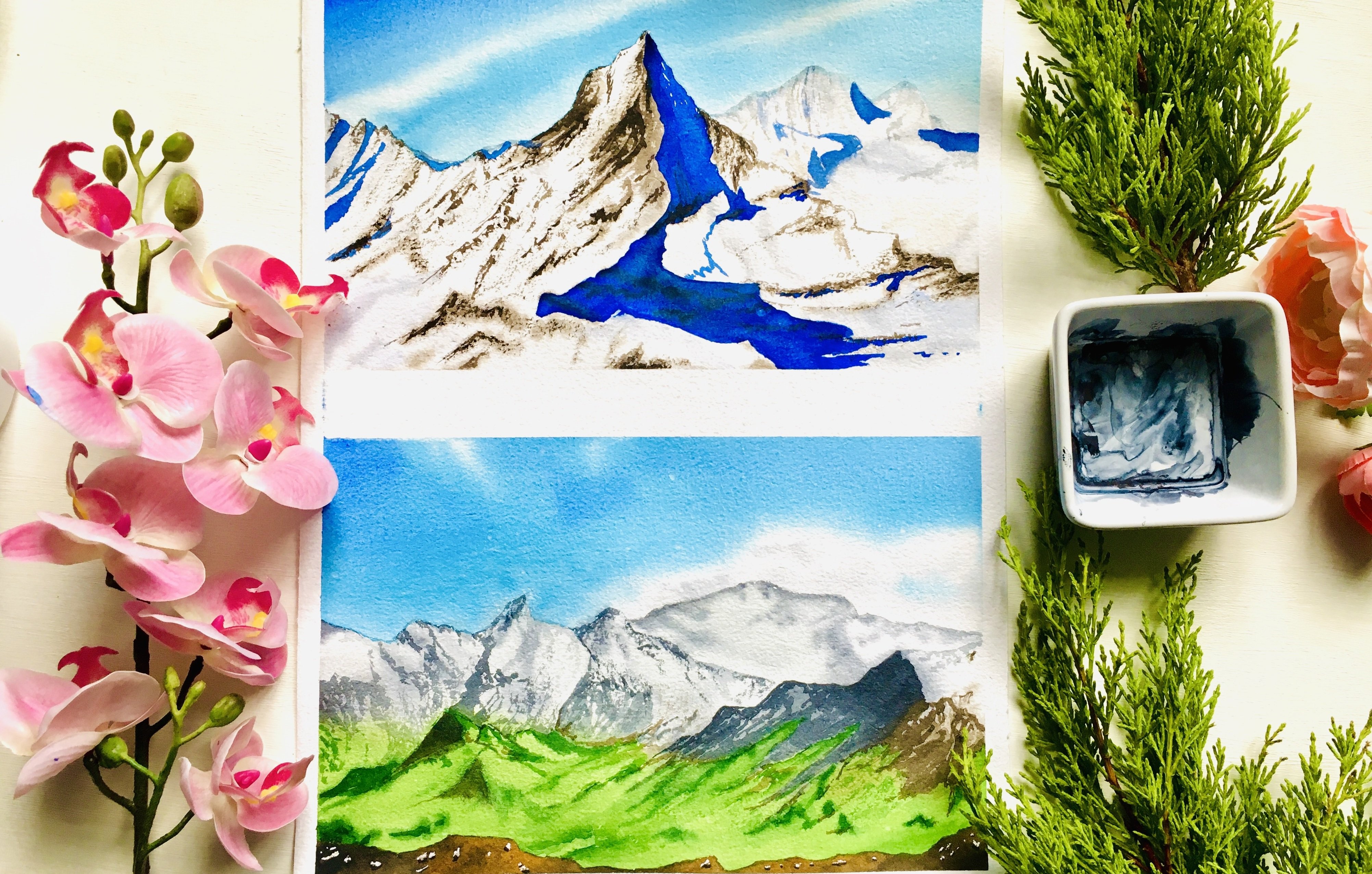
Transcripts
1. Welcome to the Class!: Have you ever been captivated by the way watercolors
dance on the paper, creating worlds of
color and light, the sheer joy of painting, the thrill of experimenting with pigments and the
meditative calm it brings. That's what I want to share
with you. Hi, everyone. I am G. I am an artist,
an aerospace engineer, Mom to al, and a passionate
watercolor, just like you. I also wear a few other hats? Media artist, a silver
brush educator. Ambassador to White
Knights Watercolors and CSR I'm Stationers India. But what I love the most is sharing my creative
journey with all of you. If you follow my Instagram
colorful mystique, you've probably seen
glimpses of my paintings, my processes, and my love
for all things watercolor. Now, I'm thrilled to invite you to join me on an
exciting new adventure, my third hundred days of
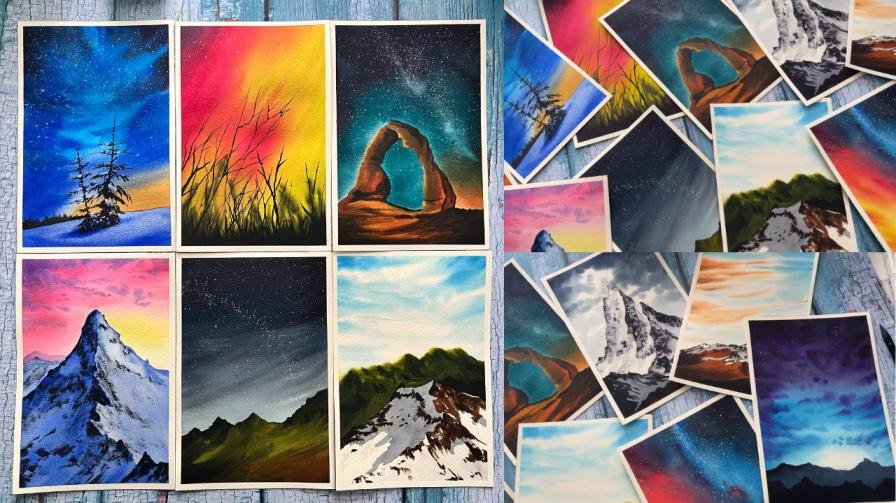
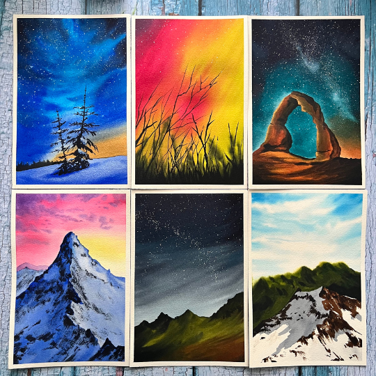
watercolor painting class, a brand new 100 day project. This class is designed to
spark your creativity, build a consistent
painting habit and ignite a lifelong
passion for watercolors. But they are a beginner
or have some experience. My goal is to de dive into
the world of watercolor. Where we master
various techniques together one day at a time. But it's also about so
much more than that. It's about finding joy
in the creative process, pushing your artistic
boundaries and discovering the magic
of consistency. I know firsthand how
busy life can get. Trust me, juggling work, family, and all the other hats I
wear isn't always easy. But I also know that finding just 1 hour a day to create
can be a game changer. That's why I've designed this
class to be approachable, fun, and most
importantly doable. Unhandle all the prep
work, finding inspiration, painting step by step tutorials, and editing everything ly. All you have to do
is show up with your brushes and
paint along with me. No matter your skill
level or experience, if you're ready to embark on
100 day watercolor journey, grab your brushes, gather
your paints, and join me. Let's explore the beautiful
world of watercolors together and discover the joy of
consistent creative practice.
2. Class Overview: Hey, thank you so
much for joining me. I'm excited to have you here
for this creative adventure. Here's a quick overview of what you can expect
in this class. This class features
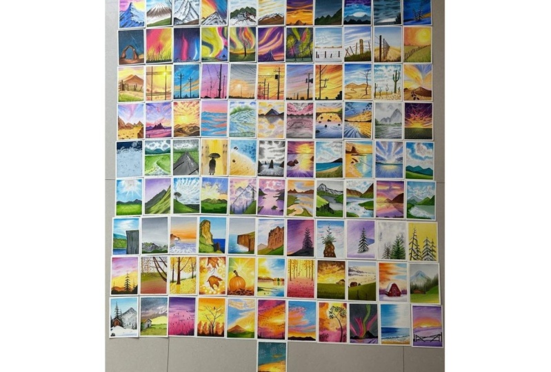
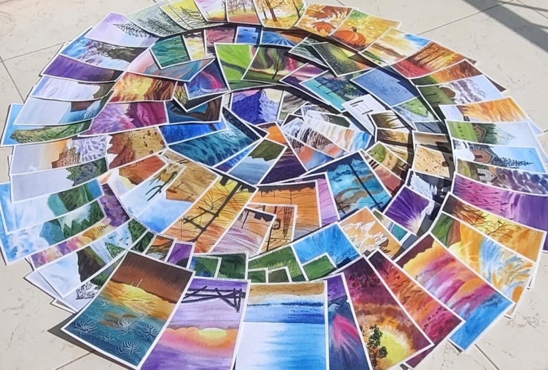
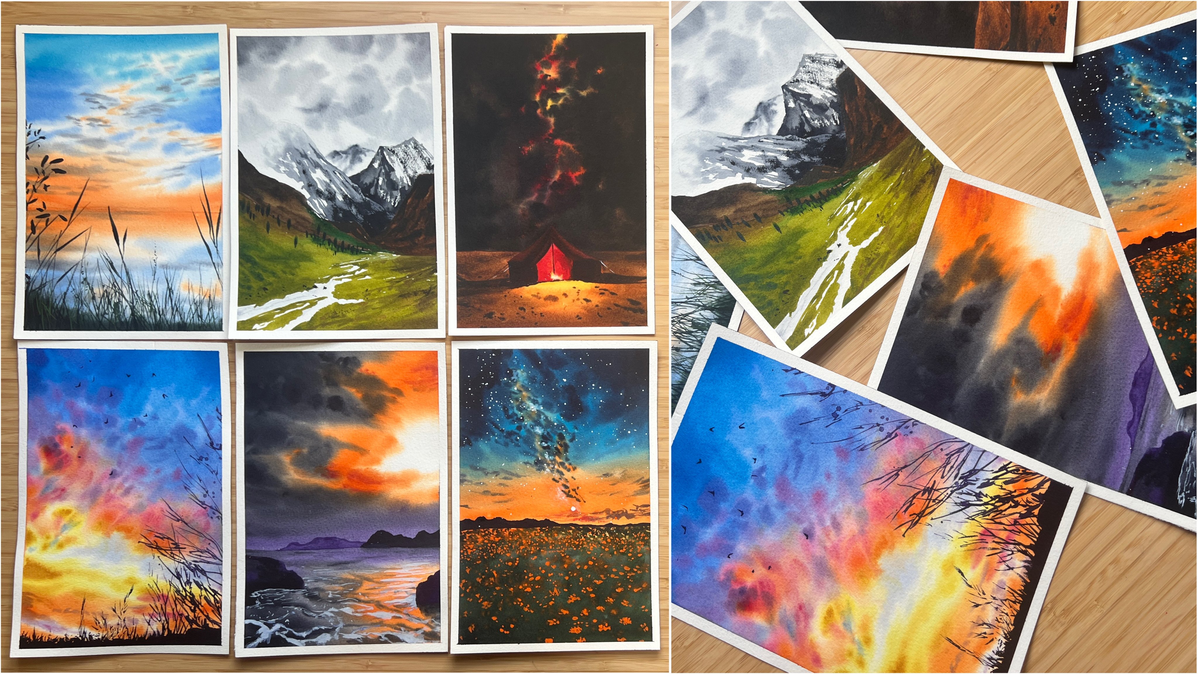
100 unique paintings, each covering different
techniques and subjects. We'll explore 16 exciting topics over 16 weeks with six
painting projects per week, just like the original
hundred day project if you were a part of it. Then to give you
some breathing room, we'll have a break
day every Thursday. Use it to catch up on any mist lessons or simply re hart your
creative batteries. And to celebrate our
accomplishments, we'll finish off with four fun bonus paintings at the end, making it to a total
of 100 paintings. Each day's lesson will be
uploaded the day before. The entire class will be gradually unfolded
over about 17 weeks. This allows you to fully absorb each lesson and practice
at your own pace. This means that you will find
all the hundred projects uploaded after 17 weeks from the launch
date of this class. Now, I want to tell you a
bit about my teaching style. I like to keep things
spontaneous and conversational. So you'll see me paint and talk through my
process in real time, including any mistakes
I make along the way. So I highly recommend watching each lesson once
before you start painting, so you can gather your
materials and get a feel for the project and not repeat any mistakes that I may
have done while painting. Although I have covered
some techniques in the beginning of this class, if you're a complete beginner, then I suggest checking
out my ultimate guide to watercolors and
water control classes. First, because
they will give you a great foundation in
watercolor techniques, which will be super
helpful in this class. Also, at the start
of each project, I list all the colors
used so you can prepare your palette or pre mix your paints if you
have a limited set. You'll also find a PDF of my entire palette in the resource section of
this class uploaded. I am so excited to embark on this colorful
journey with you. Let us explore the
wonderful world of watercolors together and
see what we can create
3. Art Supplies You'll Need: Hey, hey, here. Let
us have a look at all the art supplies that we
will need for this class. First of all,
beginning with paper, we would need a paper that can withstand large washes that
we will do with watercolors. The paper that I am going
to be using is this brand, Saunders water ford, and it's a coal pressed
or not surface. We definitely need a paper that has got a bit of a texture, either hole press paper
or a rough surface paper. This one is 300 GSM or 140 LV. Make sure you grab a paper that has got a minimum thickness of 300 or at least 270 GSM. You can see the paper
is really thick. It's really important
because otherwise, your paper is going to
buckle and tear off, especially when painting
with watercolors. So I have already cut the papers that I need into the size
that we will be painting on, which is the small A five size. This might be slightly
bigger than the A five size, considering that this
is not exactly A four. So this entire sheet of
paper is 12 " by 9 ". So I've just cut that into half. This is probably like a teeny, tiny bit larger than the
A five size. That's all. But by all means,
go ahead and use an A five size for
your paintings. Just one suggestion
would be that if you need to paint on a
larger surface area, then I would suggest to try
and invent more stuff into your paintings
because The paintings that I am doing is on a
smaller surface area. When you enlarge it into
a larger surface area, you will feel that it has
more space in between and lacks lots of
elements in it, which is why you'd have to add more based on your intuition
to get better off it. But if you're going
to be downsizing, it's absolutely not a problem. My recommendation would
be to obviously go with a paper that is at
least 100% cotton, cold pressed and around 300 GSM. Next, you will obviously
need water colors. So I will be using watercolors from various brands
that I have here, such as Schmike, White Knight, Daniel Smith, Windsor
and Newton, et ce. But I think most of them are
now Schmike in my palette. Having said that, obviously, the next thing that you need is a palette to mix your paints. So this is my go
to palette always, and this is the
palette that I use in almost all of my paintings. If there are any
additional colors used than there is
in this palette, then it will be mentioned at the beginning of
each class project, as is all the other colors
that is already used in that. So This palette with
all its colors is uploaded as a PDF into
the resources section in case you need
to check out what are the colors in my palette. And also, this palette is from Mijello Mission
Gold classic. So this came along with
the Migo Mission gold set, and I've been using it since. So you can see it's
pretty much used, and this is like my
most favorite thing because I like it because
it's goth third to six wells, and you know, I can store
enough paints in this one. So I've got lots of these paints squeezed out and ready to use, and I'll just squeeze
more as I need them. Next, obviously, you
will need brushes. I will be using brushes
from the brand silver, mostly the black velvet
series that you can see here, so some flat brushes and
some pointed down brushes, and I might also use a
liner brush at some point. So I would recommend
having a nice flat brush, maybe even a larger
one than this, if you can have it. This one is a three
by four inch. You can also go for
like a 1 " brush, and then a large point of down brush for your
larger strokes, such as this one a size 12 or a size eight,
or a size six. So I use all of these
sizes interchangeably, but that does not mean that
you need all of these sizes. I would highly recommend
having one flat brush, then a medium size brush, such as a Size eight, and then a detailer brush, such as a Size two along
with a liner brush. This one is a liner and
it's a Size one brush. These are the main
ones that I recommend, and I just interchangeably
use all of these, just depending
upon the mood that I am painting with, that's it. But these are the brushes
that we'll mainly need. Will also need some white quash. The white quash that I'm using is from
Windsor and Newton, and it's the permanent
white color. You can also use
the titanium white, which is absolutely amazing
opaque white as well. The next thing you
will need is a board to tape paper on to a surface. It's ideal if you can
find a surface to tape your paper on rather than
your table surface itself, because sometimes
you might need to tilt your board in
different directions. So I am using this
plywood board. It's just a random
plywood board and you can see it's being
painted a lot on. This is one that I normally use. Having said that, we definitely need a tape as well
to tape the paper on. This is a normal masking tape that I usually get
from Amazon UK. But if you want something that's a really good brand and
does not tear the paper, then I would recommend this one. This is empty washi tape. I'm using this one at the initial stages
in the hundred da project and we'll
see how it goes. If this finishes off, then I probably might
shift to this one. There you go. Empty ahi tape if you need a brand
for the masking tape. I would also recommend having two jars of water,
just like this one. I like to use two jars of water because every time you go
and wash your brushes, then your water gets dirty
and muddy like this one, and you don't want to be
picking up fresh water to add onto your paper or your fresh paint with
this muddy water. I like to have another jar, which I always keep clean, and whenever I'm washing my brushes, I go over
to the other one, wash it off, rinse off all the pigments on my
brush and then pick up fresh water for applying onto the paper or for taking fresh
paints from the other jar. We'll also obviously need
a pencil and eraser. This is a netted
eraser that I'm using. You could also use just
the normal eraser. At some point, we might also
use a ruler if there are some things that you just need to make some nice
beautiful sketches. Last but not least,
we will also need some paper towels to remove the excess water
from our brushes. I normally use this microfiber
clothes that I have. I have many of these and I
just keep reusing them by washing off the paint from
it because it's watercolors, it just washes off easily. You can either use a
nice paper towel or a microfabric cloth or a
cotton cloth for this purpose, and basically that's it. That is all of the
materials that you would need for this class. If you're ready,
let's get started.
4. Techniques: All right, in this radio,
I'm just going to quickly show you some of the
techniques with water coolers, is just like a recap for, if any of you are joining
us as a beginner, a complete beginner
to water Css. So here's my paper,
all taped and ready. I'm just going to show
you some of the things. So I am applying
water onto my paper. Whenever I say we are going to apply water
onto the paper, we need to make sure
that the water that to be applied is just
a sheen of water, that is just like a film of
water and not too much water. So I actually, you at your paper under light. So you can see it
through this camera. It's just a sheet of water. If at all, at any point, there's an excess, see, that is an excess amount of water. We always need to make sure that the water
that we apply onto the surface is just a
film of water like that. Let me get rit of
the excess water, and now you can see
it's just a fillm. You can always observe
it under light and you will be able to see how much water you
have on your paper. And I know that many
of you may be living in dry conditions or a
place where it's like, really dry so quickly, and your paper might dry
while you're working. So there is a trick to that. If you're going to be
applying water to the whole of your paper or like
part of your paper, go ahead and apply
water to the paper. Then wait kind of like 2 minutes or something
until the water settles in and goes through the paper and the
paper starts to dry. And you'll notice that like there's little to no water
on your paper at all. After that, go ahead
and reapply the water. The second time the paper is going to take
longer to dry off. That is, the underlying surface of the paper has
still the wetness. That is where the paper
absorbed the excess water. It went through the fibers of the paper and
it's still there. The second time
around, it's going to take longer for it to dry. That is why this method
is going to work. Now, why we apply the water
onto the paper is mainly because we want to be
painting with wet on wet. The wet on wet means. The first part of the wet is for the brush and the second part of the wet is for the paper. When your brush is wet, that
is wet paint onto wet paper, that's what wet on wet means. Why we war the wetness is because we want
a paint to spread. Let me just grab quickly color, and I'm going to show
you what happens. Second you see how the paint is like spreading and not
staying in one area. That is what wet on wet means. It also gives a softer edge. Like, for example, if
I apply some strokes, you will see that
once this dries, it has a softer edge. Let me show you the
difference between this and the one wear doesn't
have the softer edge. So if we're applying wet on dry, so here at the bottom
of this paper, the paper is dry,
and my paint is wet. When I apply, can
you see we've got a really harsh edge as
opposed to what this is. This is the difference between
wet on wet and wet on dry. So we will be using
both of these methods. You can see this one
is wet on dry. So Another thing that
I want to show is how you can continuously
do some strokes and, you know, have a regular
stroke of color. So what I mean by that is, let me probably grab
the same color, and I'm going to go ahead
and apply the stroke. So if I grab some more color, and you can see actually
under the light, that this area is still wet. So before that area dries off, if you go ahead and apply, you can see that we got an even stroke
without a harsh edge. But if it's after some
time and if it's dried, then when you do
it, you're going to get a harsh edge
in between like that. Even then, if you probably go around it a little bit more, you would be able to reactivate that pigment and get
rid of that harsh line. But once it's
completely dried off, I think this may
not be possible. It will be hard for
us to get back that. The next thing I want
to show while this is wet is to how you
can soften the edge. Remember the entire edge
of this was softened. But you could just use water and the brush to like you know, soften out the edge, and you can see now this
harsh edge is gone. Now this side, we have a really huge harsh
edge on that side. If I were to soften it, I can just go with my brush and a little
bit softened now, then I wash off the
pigment because I just absorbed extra
pigment from there. And then if I go over it again, you might need a little bit
of water on your paper and, you know, kind of soften
and extend it outwards. And there, now you
have a really nice, softened edge on both sides from our wet on dry stroke. So Now, you know both wet on wet, wet on dry, softening. Let's just look at dry
brush stroke or dry on dry. So dry brush stroke
or dry on dry. Basically just the name
as it says, dry on dry. Your paper needs to be dry and your stroke needs
to be dry as well. So how do you get dry stroke? Because your watercolors were not activate dry. So
it's very simple. You can see that
the paint that I've picked up right now has got
a little bit of wetnes. But the more you apply, it's going to lack the water, as the water in it is
going to be finished. Do not dip more water
into your brush, but rather just
pick up the paint and you will see at a point when it starts to become dry and see that texture
that we're getting. This happens because of
the grooves on the paper. So if you observe
a watercolor paper closely, it's got this texture. This is why I recommended
using a paper that's got at least a medium
texture or a rough texture. So there are two ways that you can get the dry
brush technique. You can start with a
wet on dry stroke, and then like transition on
to the wet stroke like that. And now you've got
a wet dry stroke. But if you'd like to completely just use the dry
brush technique. What I normally use
is I use the pigment, and then I kind of like, make sure I know, rub my brush off along the edge and get rid of all
the excess water. You can also squeeze out the excess water and absorb
it using your tissue, and then I make sure that my brushes have started
to come out dry, and then I go around
onto my paper. Okay. This just happened because this is
actually dry on wet. I'll come to that in a moment. So Here, my paper
was still wet there. So see, now I'm getting all
these dry brush strokes. So this is how you can do dry
brush stroke or dry on try. Now, there's one more
thing which is dry on wet, which means, again, your
paper is going to be wet. Let me just wet
this region again. Okay. I'm not bothered about all the color
that's already in there. I'll probably grab
a different color so that I can show you. So that area of the
paper is still wet, as you can see through
this camera here, and I'm going to grab let's say, I'll grab a little
bit of orange. So I want to make sure that it's dry and not a wet pigment. So you will be able to see from the consistency on my paper
actually on my palette. So this is still wet. If I just make sure, now you can see it started
to come out as dry, and now my brush is dry
and my paper is wet, and you can see you
get a stroke where it does not spread out too much because there is no
water for it to spread. It stays in that place, and that is dry on wet stroke. Okay? These are some of the techniques that
I wanted to cover. Then there is also
something called a splattering,
which is basically, if you pick up a nice
consistency of wet milky paint. Milky means the consistency
is flowy like this one. I should probably have cleaned my palette before I
showed you this one. Anyways, see this is
milky consistency. And when there is a mi
consistency of your paint. Usually, I hold my brush using these three
fingers like that, and this finger is free. What I do is, if you tap on it, you will see that it
releases that water. Plus the pigment onto the paper, giving them some nice platters. You can get dry splatters, which are the ones
that are here and you can get wet on wet splatters. There's wet on dry platters and wet on wet
splatters as well. So that was that. The more additional techniques. You can refer to my class on
ultimate guide to Water CLS. And also, I will be
explaining more techniques in detail as we go through the different projects in this class. So I
hope that helps you. And I hope this
techniques lesson was helpful to those
who are a beginner or if you wanted to rush up
on your watercolor skills. So I will see you
in the next lesson.
5. Taping the Paper: All right, let us
have a quick look at how we're going to
be taping the paper. It's very, very important
that we understand how we can tap our paper
because otherwise, your edges will bleed and you
will not have a clean edge. In order to get a clean edge, we obviously need
to tape the paper. So I have a bunch of tapes here which I normally
use for my paintings. This one, I don't
even know the brand. I mean, it does say su name, but this is something
that I always go and order from Amazon UK. It's been my go to tape because
I've seen that it works. And as I always say, if you see that your papers tearing off or something's wrong and you're having
a lot of bleeds, then chances are it's the
paper and not the tape itself. But if you're using a
paper that's really good. For example, you're
using the same brand of paper I am and you find
that it's tearing, then probably you need to
invest in a different tape. Obviously, it comes down
with trial and error, and you might have to
find the best tape that's available in your region. Although I will leave links to these ones in
the description. This here is another
washi tape that I love. This one has a brand and
it's from the brand MT. Empty washi tape, it's
really really nice, and it's got like a
glossy feel to it, which means that
it resists water and it's really amazing. The fact that it resists water is also helpful
because it does not allow water to settle
on top of this, which can then back run and cause blooms or the cauliflower
effect on your paintings. This is really nice. In
this 100 day lessons, I am going to be using this one. This is MD washi tape. Again, I will have the links
to these in the description. Let's go ahead and have a look at how we're going
to be taping the paper. I know that if you're already
an experienced artist, and you probably knew this,
but I'm just covering this up for all the beginners
who might be joining us. There, you want to extend your tape, and you
want to tape it. For this whole lesson, I am going to be
choosing somewhat like a 0.5 centimeters of a
gap, nothing more. If you want to have
more, you can go ahead and have more,
it's absolutely fine. There, I'm just going to use
my fingers to tear it off. The reason why I show this is because when we finish the whole thing,
I will show you. Let me just cover up
all the four sides. And as you can see, I don't use any ruuler or anything
as in the tape, of course, because
I've seen some people, they use a ruler to make sure that the tape that you're
putting is straight. But I think your eyes are
sufficient enough to, you know, look and see, for example, this is
not perfectly straight. I can see that there's a
little bit lesser on the side, and here is a little bit more, but that's all right, right? I mean, it's not a
mathematical project where you need it to be like
exactly the same, right? There and all four corners. Now, I'm just going to go
ahead and do this side. Now, as you can see, all
the four corners are done. But as I always say, if you've followed
my glasses before, I make sure that my
tapes are intact. You need to make
sure that you run your finger along just
along the edges so that if there's any tiny bit of air gaps that's wrapped in
between, you get rid of that. Big is those air gaps might
lead to the water being, going there, and
when it goes there, then it might expand
a little bit more, and that's how you get pleads. So we do not want that, which is why I run
my finger along, especially along the edges
because that's where usually it's more prone to like
the paint spreading out. So I just make sure that my
edges are nice and in depth. Sometimes when I'm using
this masking tape, I do usually use a ruler to press it
down a little bit more. But this MT washi tape is a little bit more
on the softer side, so it's actually very um, handy to just use the finger and not a roller. There you go. That's how I would tape the
paper. Here's a little tip. If you want to be prepared for the next day after a
one day's painting, you can go ahead and have
your paper taped down and ready so that when you come into your workplace
or your studio, the next day, it's all
ready for you and you do not have to waste time setting your
paper and everything. That's something that I like
to do because it eases up my process and I'm sure that
it might help you as well. Let us now move on to the day
one and have fun painting. So welcome to this
challenge once more, and I'm so happy that you have decided to take
this. Let's go ahead.
6. Day 01 - Rosy Peak: Hey, hey, hey. Welcome to day one of the
hundred day project. And this here is what we're
going to paint today. Trust me, it's
very, very simple. Because I am breaking
down the steps for you, you are going to be
able to paint this. Okay. So first of all, I want to thank
you all again for deciding to take that leap
and join this project. So I hope you're able to
complete 100 days of painting. Okay. So let's have a look at the colors that
we need for this mating. Basically, for the sky, I have used Indian yellow
or transparent yellow. If you want the
exact pig number, that's B Y 150, then Quinacn rose or PV 29, then a little bit of a violet, ultramarine blue,
and paints gray. Those are the only colors that I have used to paint this
gorgeous mountain. So let's now get
started with this one. All right. Let's get started. I am going to make the
pencil sketch first. Here I am going ahead and
using my mechanical pencils, and since we've already
covered taping the paper, I will have my paper taped and ready for all
of the lessons. Here's it ready, and
now let's get started. We're just going to
add in a mountain. Here, I'm just going to
add in, le mountain. You can just follow along as in right after I
finished the sketch, I will show it to you closely, and then you can pause it right there and have a look at that. Something like that.
Then I want the front of this mountain to be
going like that. There, I have got the
pencil sketch ready. Now, let me show it you closely. There you go. You
can pause right here and make your
sketch on the paper. It's as simple as that and don't stress on the
fact that you need to make all of these lines of the
mountains just the same. Just observe a few points. This line is around one
third of the paper. As if you divide your
paper into one by third, is almost like a one
by third position. The point on the right is
a little bit over the top, not on the same line. This one come all the
way down and here, do not make it go over to
the tip or the corner. So these are just good tips that you can implement
for composition, as in having your elements
somewhere in the one by third, do not have elements going into the corners
and things like that. Also, if you observe the
top tip of the mountain, it's not at the half
position of the paper, but it's more than half as in it's almost at the
one by third position. If you place your elements or the points of peaks and things like that in the one
by third position, then it makes it look
more attractive. That is a reason why
we're doing it this way. Okay. Now let us go ahead and start painting
the background. Background in this case, is the sky region here and we're going
to be painting that. Here, I have got my flat brush. I'm getting started. So a little side note from me. If you're thinking why
my pallet is dirty on the first day of the class and I didn't manage to clean it, it's not because I actually
painted another one, which I thought was
going to be day one. It ended up being a
little bit longer and probably tougher than
the day one or day two, and I made it into
day three instead. I am doing another one
now for the day one. It's just a side note from me, some things that going
on in the back end if you enjoy hearing these. Here, we are going
to be starting. So I'm just going to apply water to the background
sky over there. Just using my flat brush
because it covers a nice range. You can always go ahead and use a larger brush such
as like this one, which is a large round brush or even a size 12 round brush like this one that I have here. Either of these you can use
or you could use a flat rush. Here I am using a flatruh. As you can see, I'm going over
the edge of the mountains, and I'm moving my brush in
such a w that this tip of the brush is able to cover bends and creeks
that I have added. And because we're only
applying to the sky, I guess it's easy enough for
us to keep it wet longer. As in, I'm guessing it won't dry out before you can
finish with your sky. But also make sure
that your paper only has a shea of water
and not too much. This shea of water, you'll be
observing through an angle. If you look at your
paper through an angle, you'll be able to see that
it's got a shea of water. Also if you feel
that there's too much and you've applied
a lot of water, just tilt your board in the
direction american flow. If you tilt it downwards, then the water will flow
towards the mountain. At this time, so it up. So that any excess water can go out of the paper
and out of our way, and that will make sure
that there's no boots or excess water on
our paper and that it's just a low sheen giving us a perfect way technique. Okay. There you go. I've
applied the water. I think I'm going
to continue with the same rush that I have here. And what we're going
to be doing is we're going to start with
a nice yellow shade. Here, I've grabbed
a yellow shade, but we want it to be
really, really lighter. I've just taken it in
a very light amount, and we're going to be applying it right along that right edge. I think that's a bit too. I'm just washing my brush because I think I've
applied a lot of paint now, but then we can
use the same thing to spread it around
and make it lighter. I do not want it to be too
vibrant at this stage, which is why I'm
lightening it up. Also, as I come closer
towards the mountain, I want it to be even lighter. I can see it's lighter
there at the bottom, then it gets into
a medium range and then going into a
darker at the top. Okay, so that's how
I want it to be. It's a small gradient that
we've achieved there. Now let's move on to
the next color and the next color that
I am going to be taking is the quinacrodon rose. This quinacodon
rose, we're going to start applying from
the left side. Just go ahead and apply a nice
amount of quinacodon rose. This is a point where
you want to make sure that you go along the edge and do not go
over to the mountain. So you can see,
I'm being really, really careful and not touching the area of my
mountain. All right. And also observe the fact
that there's a mountain there that I actually
painted with the sky. That's because that mountain
is in the background. So we'll let that be. Okay? And we'll add that with
a subtle color later on. Here I've started, and
I'm just going to go ahead and apply over to
the right side as well, just using my flat
rush and a nice edge, and we can go slightly over to the yellow and blend it up. See it's a slight blend, so that The yellow has a
tint of like an orange, but it's blended there. Can you see? This whole
area with our pinks, we need it to be in a subtle. The sky needs to be subtle here. We don't want it to be
ibrant. There, I've added. Now I'm just going to
go with another set of pink color towards the
right side, right. Do not think that you need
to do gradients here. We definitely do
not want gradients. This is just different colors that we're applying
and do not worry. You can see there's a bit
of a darker toe there, then there's a
lighter toe there, there's a darker toon there. It's fine. We are not
looking for a gradient here. Although it does, I did say that the yellow was
a bit of a gradient, but that was just to
explain how it looked like. But it's absolutely fine if you don't have a
gradient over there. The colors need to be
really nice and subtle. That's why I am adding. So we've added some
nice pink shades. Now I'm going to shift
from my flat brush and I'm going to move on
to my size eight rush. So it's the round brush that
I'm moving to right now. And we're going to
grab some violet, some beautiful violet shade. So here I have, but we
need the violet to be in a nice and subtle
amount, not too much. So we'll start with
subtle amounts at first and observe the consistency
of the water as well. So the consistency
of the water here, as you can see, it's
very very less, do not use watery paint. Because if you use watery paint, that you will not be able
to do the sky, okay. So just going to add some nice violet
strokes over the top. This will happen only if
your pink is still wet. Make sure that it's still
wet and not too watery. Here I'm just dropping some nice violet
shades onto my sky. You can see that, what's happening and the same
over to the right side, and then try and use the entire length
of the brush and also observe where I'm
holding the brush. There. It's very, very important that
you note where I'm holding the brush because it
gave out a lot of information as to the
control that I'm using. If I'm holding right there, it means that I have
very less control, so you can see, the
strokes will be more on the random
side and it's okay. See, just adding
some nice strokes. I guess I want to go with a
little bit more purple here. L et's grab in a little
bit more violet and I'm slightly making it a bit
more darker on that side. Not very dark just again, it's got to be subtle. See? That's it. Practically, our sky is done. It's as simple as that. Can you see that? Now that
we're done with the sky, there's a little bit
of the mountain to do. Let's go ahead and paint
that ma ground mountain. I'm going to do that with violet itself and you are going to do it slightly with a bit of
a lighter violet paint, your paper might be
still or it might be a little bit on the website, which gives a little bit of
the hairs on the mountain. You see, we've got a little
bit of a softer edge. Do not make it too soft, I guess this amount
is more than enough. There, we're done with that
whole of the background. Now, all we need to do is to wait for this to
completely dry out. I know that many of
you may not have a hair dryer, but unfortunately, it's something
that we do have to do like wait for it to try. Let's go ahead and
quickly dry this up. There you go. It's all dried up. Now let's go ahead and
paint the mountain. For painting the mountain, I am going to grab myself a larger brush because it's such a larger area
that we want to cover. You can either start by
applying water to the whole of the mountain or you can just
directly do the wet on dry. I'm just going to quickly
add water to my mountain, but I would also not go towards the edge and try to
perfect the watering. Just going to keep it. At that and now I've covered
almost all of the areas. The edges are not done yet, but I can do that with my brush. Just going to tilt my
board and make sure that there's no excess water. There isn't, Let's go
ahead and keep adding. I am going to be using
ultramarine blue. Here I am grabbing
my tomarne blue. Altimarne blue is granting, it's going to granulate on
the paper, but that's okay. As you can see, as I'm
taking on the mountain, I make sure that I
follow along the edges. You can see because
of this edge, it touches in the water. It's spreading. I actually picked up the
wrong blue just right now, and that's Tal blue. So saved right
before. I ruined it. Here just going ahead
with my ultramarine blue, and we're going to add it to the whole of our
mountain right now. In this layer, we're going
to write ahead and go it add on to the top. See how that's turning out. Here along this right edge,
we actually need to be very, very careful because
you should not have any color go outside
because if it goes outside, then it's going to mix up with the yellow and create
a green shade. We do not want literally any
greens on this mountain. It's a snow mountain,
so we're supposed to be adding blues at this moment. Blue because it's a sunset time. At sunset, the colors of the
shadow on ice turns to blue. That's why Here, just literally grabbing my ultramarine blue and adding to my whole
of the mountain. Right now, we're not looking at the edge or the lines that we created and make sure
that the blue that you're adding is somewhat
on a lighter tone. It needs to be absolutely
lighter. We can see. What I'm just going to do is, I think that I applied a little bit of a darker
paint on this side. I'm just going to quickly
try and lift off. This is where one of
those points where I say, it's better to watch my lesson once before starting because I correct my mistakes and you don't want to be doing the
same mistakes that I do. If you're watching this
first, then just note, tow this right
side, go ahead and try and apply a lighter
tone, I would say. Just a little tip from me to adjust for the
mistake that I did. Now it's a slightly lighter done and here is a darker side. But I think, no but. Sorry. Wait done. Let's just wait for this
layer to not completely dry. It was just the
mountains first layer. We will add another
layer on the top, but now let's wait
for this to dry out. There you go. I've
dried up my mountain. Now we're going to grab the ultramarine blue again and we're going to
create the darker edge. Here I'm just going to go over the left side again because now we need
that to be darker, but now we're going to follow along this edge of the mountain. And the same. We're
going to follow along this edge of the mountain where
we did the pencil sketch. S, it's more on the darker side. Make sure that your
paint is watery. Can you see how watery that is? Do not apply like a
very harsh paint. We still want it to be
on the lighter side. Somewhere along the medium range in the valley
scale, I would say. You can see I'm just trying
to blend those regions, and I've still got
a watery paint. And you can see
there's a harsh edge formed right there because we did not use the
wet ont technique. But if you go ahead
and quickly plant your next stroke right
before that dries, then you still get a
continuity just like a wet on, like a wet on wet stroke. Okay? There. See how I am continuing the entire thing
without applying the water. This is something that
I wanted to show you on day one itself because then from now on
all of the lessons, you're going to be having
an easier process. Also observe the
strokes that I do, you want to be doing in
a downward direction. Do not paint it this
way or anything. Go with the flow
of the mountain. This mountain, the
direction is this way. That's why we're
doing it that way. Here just picking
up a darker shade of the ultramarine blue, and I'm just adding at
random places right now. Possibly those
areas, which has got more shadow and observe closely how I'm adding in this
specific direction. Very important that you
follow the direction. Here, it's this direction
Even along this ridge, do not paint it this way, try and keep at it at that direction because
when you paint tries, your brushtrokes are going to
be seen and when it's seen, it means the hat, it'll be clearly visible
as to how you painted it and that's how
the snow exists. This one. I should
have painted it like that. So sorry about that. Still adjusting
it with my brush. All right. There you go. That is the F ground mountain done as soon as it is because we applied
a wet on dry layer, this is going to
out really quickly. All right. I am
going to dry this. Hey, all right, this
is now completely dry. Now we can get on to the
last and final part, which is just basically
adding some dry brush here. I am going to pick
up my paint gray, and we need it to
be in a dry manner. You can see here
this is not dry. My brush is still wet, but we need it to be dry. What I'm going to do is, I'm just going to
absorb the excess water from my brush using my towel. And then probably I can start. It's not completely dry yet. What I'm going to do is, I'm going to apply it
into the areas, which I want it to be a little
bit more on the wet side. See, it is somewhat dry but not completely
dry, but that's okay. I will start along this
edge where I know that I want some h or wet
on dry strokes. Applying to those
areas where I think I need the semi dry strokes. It's not completely dry yet. Now my brushes almost
in the dry stage. You can see there. It's starting to dry, but still not enough. Let me just try this up. This is the dry brush technique. One thing else that you can
do is you can try it out on another piece of paper
to make sure that your brushes enough so that
you start getting those dry. My strokes are now rely. And now you can go ahead
and start applying. Then when you feel
that your brush is no more doing anything, just go ahead and if a teeny, tiny amount in water and
it should come back. There again, let's continue. These areas to be nice and dry. Again, along the edge here is where we're going to be
trying our focus on. You can already see
how the mountain is coming into focus. That's not dry enough. I'm just going to try it out outside. Se, it was not dry enough. I think that's a good point now. Remember, direction,
always. So here, I'm just following
along this direction. I've already mentioned
the paper that we need is paper that has a texture because if it
does not have a texture, you're not going to be
able to achieve this. Make sure that your paper
has a nice texture, which then will enable us to do this technique in a nice way. Want it to be
somewhat darker here. I did my brush in a little
bit of water so that it's a little bit watery as well
as thicker paint and more. That's how you can keep
adjusting the ratio of the water depending upon where you want your
dark stroke to be. Don't think that you need to do it exactly the
same way as mine. It's just randomly
at some places, make sure that it's
a dry stroke and some places it can be
in a wet or dry manner. As long as you have a lot of variety on your mountain,
you're absolutely fine. That's basically the
all there is to it. Here, we need a nice
darker zone here. Then I'm just also going
to use the tip of my brush to somewhere draw like lines. Okay. Okay. I think I'm good with the way that
area has turned out. And as you can see clearly, that area of the mountain and
already looks so gorgeous. So these darker areas that I actually added
with the to Marine blue, I'm just going to go
ahead and add on top of it and make sure that I have a lot of these
dry dry strokes. We done on that. Now
the next thing is, I'm just going to add some
dry strokes to this mountain, which we left it lighter, because it is on the background, but keep giving a little
bit of those strokes. Now the same way
to this mountain, but it's the same part of
the mountain this side. Now when you're
doing it this side, go ahead and follow the
direction of the mountain. You can see I'm going
for a subtle shade here. Do not use like a
complete black shade. We want it to be nice and subtle. All right. I think that's good
enough and we are done with the painting on the 30 minute mark.
Isn't that great? I mean, look at that. We are finally finished with a painting It's
looking, isn't it? I'm just going to make
sure that the edges, because we just apply. So let's go ahead and the beau. I love love love
the tape peeling where you get the
cleanest of the edges. And I love this because I've used literally a
small edge to it. Sometimes, when you look
at it, both are amazing. If you leave a large gap and
if you leave a small gap, but I think for this painting, the small gap is making it
look really amazing, isn't it? All right. There you go.
That's the finished painting. I know I should not marvel at on my own paintings.
I'm the teacher. Okay. So sorry.
There you go, guys. And thank you so much
for joining today. I hope you enjoyed day one as much as I did to paint this. So I'll see you
again for day two.
7. Day 02 - Silent Fuji: Hey, hey, hey,
welcome today, two, and this here is the painting that we're
going to be doing today. It's Mount Fuji, of course, and has a little bit of a misty valley in
the foreground and a bit of a foreground
grass and some dried up a tree there. I don't know what
it's doing there, but it's completely a reference that I changed into my liking. So you probably won't find the
scene anywhere. All right. Let's have a look at the
colors that we need for this. For the sky, we need
a little bit of a thalo blue and ultramarine blue. For the mountain,
we need paints gray and a burnt umber or
transparent brown. Then coming to the
foreground here, we have olive green and
dark green or sap green, and the tree is again with a transparent brown
or burnt umber, which we've already covered. So that's it. Now, let's get started with
this painting. All right. Let's get started. So we are going to
do Mount Fuji today. I mean, you've already
seen the final picture. So around one by third
position of the paper. That's where we're going
to add in the sketch. So the mountains going to be somewhat flattened over
the surface like that. Then you will have the top part of the
mountain extend like that, and it goes outward like that. I think that's a little bit
too steep for Mount Fiji. Maybe you can go extend
outward like that and there, and this is also needs to go into the same level
and outward like that. Then we will have a little bit of a land
area in the front, and a whole lot of these area are going
to be under the mist. We're going to have a lot of
lighter areas there, white. What I am going to do is, this is basically
our pencil sketch. The rest of the things
we are going to add with R um, brush, itself. So I want to make this region of the mountain
slightly lighter. I know that it's not visible, but I'll show you what
I did so that you know how light it is. See. That's it. You can pause right
here and make your sketch. Now let's get started
and paint this. What we're going to do
is we are going to apply water to the sky region because we're going to
paint the sky first. There you go, go ahead
and paint the sky. Apply water to the sky
right along the edge. And as I always see, make sure that there's
no large pools of water, very important at this point. So there you go. I have applied the
water nicely and evenly onto the
whole of my paper. Did I say who of my paper? I meant to the sky part. Oh, my God, these statements
that come out of me. They are natural to me
because I always say it. Sometimes I'm not
even thinking when I'm speaking because
when I'm painting, these sentences
are like default. That's why I'm doing
so much mistakes. I'm sorry about that. Anyways, there, the
sky is nice and wet. I guess it's a
little bit too wet. I'm just going to tilt it
and make sure that it's just a sheet of water because I could see a little more
than a sheet of water, which is why I'm trying
to get rid of it or I think that's much better. I've shifted back to
my size eight brush. Today we're going to
start with yal blue. Loading my brush with yal blue and we're going to
apply to the skies. Starting at the very top. I want it to be
nice and vibrant, starting at the very top.
I'm just going to apply. You can see that I am leaving a lot of white
gaps in between. Us that's what's going
to form the clouds. So just use your brush in different directions
and observe where I'm holding because that shows
how much control I have, which is how practically none. And let's see, I now
need a lighter tone. So I've just like
washed my brush and picked up a really,
really lighter tone. Not light enough. So
let's wash it off. The Thero blue is actually
a very, very vibrant color. If you actually pick up a lot, even if you pick up a
little tiny tiny amount, then chances are it's
going to be a lot. Surrounding the mountain, I want it to be a little bit more blue because the top portion of that mountain is actually
going to be a snowy region. In order to depict that
snow and make it stand out, we need the surrounding
areas to be darker. Here, that's why I'm picking up a little bit more blue
shade and I'm just adding. I think that should be enough. And I've added
some nice strokes, and I'm just going to just
make it lighter over here. You see, this is how we've painted almost other background. Just going to pick up a little
bit more of my ello blue because I want to make the top
regions a bit more darker. Another thing that
you can do to make your top regions slightly
darker is actually to add in a little bit
of ultramarine blue. It is a slightly different
blue and it's a warmer blue. Warm tones make your
paintings come forward. As in warm colors come forward
and cooler colors recede. If you actually
apply warmer tones, then it'll look as though
it's coming forward. With respect to perspective, the top potion is the part that's closest to us and
also the bottom part. As you go towards the
center of your painting, it's what's furest away. Which is why at the top, we need to have some
colors, warmer colors. That's why I'm just
adding a little bit of the ultimy blue to try and add a little bit
of warmth to it. I guess that's
enough, not too much. We do not want to be
adding too much to disrupt how it
looks. There you go. Now, the sky is complete. That's all for the background. Now I'm just going to
quickly wait for this thing to completely dry up so that
we can paint the mountain. All right. That's
now completely dry. I am going to paint
that mountain. Did I drop like
some paint there? I did. Oh, no. I don't know how that happened, maybe from rush or I don't know. I don't know why I'm
using this razor, but then it worked. Using the eraser to erase
paint. Have you ever done that? I just grabbed
whatever I could from right beside me and
it actually worked. What we're now going to do is
we're going to apply water. Now you're going to
carefully follow along the edge and apply water onto
the whole of the mountain. Yes, the whole of the mountain,
even though I said that the top ocean was
going to be dry area, not the snow region, but we're going to apply water to the whole of the mountain. Carefully apply
water to the whole, and you want to be applying the water all the way
up to the bottom. Yes, to the bottom, even on the foreground because we are not going to be painting
the complete foreground, right now in this layer, but then it's good
to have to get that misty effect
on the mountain. Here, just applying to the
whole of the mountain. There. I think I've applied a nice even coat onto
the whole of my paper. Now, first thing I'm going to do is I'm going to shift to
a smaller size brush. Here I've picked up
a size two brush, and that's what we need. Smaller size brush, I
would say, that's all. Don't stress just a smaller
size brush, that's it. I am going to start
with paincray. Here, just picking up
nice amount of painscray, but also in a
medium medium tone, you can see the tone,
it's a medium tone. And we are going
to add some lines. This would be like the shadow lines on the
snow on that region. Also note, do not go and
put your point over there. Always just make a
stroke so that you get a line rather than
what I got here. That was an absolute mistake. But a mistake worth to show you. Again, see this area is okay to have some like
that, but other areas, go ahead and add
these some lines and observe all of the
lines as though they're coming out from
that center point. All right. I guess that's
more than enough, is it? I'm just going to give one
shade darker at some areas. Just picked up a
darker shade and giving a darker shade at places, too, as you can see there. I guess that's more than enough. Now I can shift back to my large size a brush and
we can continue painting. The way that we're going to
paint this is we're going to grab a nice amount of brown. And that brown, I am going
to mix it with a little bit of paint so that it turns in a Darker brown. If you have a color
known as sepia, then you can go
ahead and use that, and that is the mountain. You can see because
our paper is like wet, it spreads. That's okay. Let it spread and at this point, you're going and adding
Not to the top region yet, we're covering the
bottom part right now. As you go over to the top, you want to be careful
and just leave lines. Also, these lines, try and start from the top
towards the bottom. Because if you go
and stop there, then you get a edge to
it, which we do not want. Always make sure
that you start from the top and move down so that your edge is there rather
than over the top. I know you might think that
this is stuff, but trust me, it's not tried out, and you
will see the magic. Okay. Always also note the
direction that I'm doing this towards this
edge towards that. Always as if it's going
towards that point. When you're doing over
to the right side, over on this side, see that. There you go, added that nicely. I got to grab a little
bit more brown. Then now we need that
region to be nice and having what do you
say, misty effect. There, I'm just going to water my brush and you can see that it's somewhat lighter tone now and this lighter
toe not still enough. I'm just going to wash
my brush because I think there was a lot
of pigment in my brush and then I'm just going to
pick up a tiny tiny amount of paint and we're just going
to blend this region. And just add in some
random strokes, because we want it to
be a nice misty effect. But what I'm just doing is, I can see that my brush
there at the bottom has started to dry out, not
the brush, the paper. I'm just reapplying the water. You can always
reapply the water. Just make sure that when you
rely not apply it towards the top or do not touch the paint edge because that's where you're going
to create blooms. I'm okay to apply until this
point where I'm not touching any part of the paint that I've already added.
Can you see that? Then when you want
to bring it down, you can join the water. And the paint with your
strokes. See that? If you join it like that, then it should be fine. We're trying to create
a misty effect there. See, it's a nice misty effect. I'm describing a little bit
more of my paint gray and the brown to add in some darker
strokes at random places. Be we did not want the mountain
to be in a perfect note. There are always details
on the mountain, which needs to be shown. See that, and then you
can always go ahead and add the misty region. There at the bottom is
actually misty region, we'll paint that with
our paints gray. And just adding a
nice amount of mist. You can see, just
added some strokes with my paints gray and a lot of white areas
are left behind. Can you see that?
We will also grab a teeny tiny amount
of olive green, and you can add that
at some places. Not all of the areas. We did not want it to be
looking like a greenish stone. Some places to give a
little bit of a variety. Can you see got a nice touch of the olive green
at certain places. There you go. Now, all
we've got to do is to wait for this to completely dry out so that we can
paint the foreground. There you go. It's
completely dry. Let's now paint the foreground. For painting the foreground, I'm going to start with a nice
amount of my olive green, and adding that over to that
region just as a nice line. Can you see? Let's just paint that bottom part
with olive green. You can see I'm getting a good gradient because
I'm not letting my previous stroke to dry out
and it's as simple as that. Now, we need to
create some depth. Here, I'm just gapping a
little bit of a darker green and applying
that to the bottom, but not entirely. Just Adding it as like a
slight little line over the wet olive green, and you can see how
that's turned out. Now I'm just making sure
that my brush is dry, it's dry, so I just
completely dried it up. Then going to grab
my olive green. What we're going to do
is, we're just going to create some upward strokes
at the edges at some places. Observe your olive
green is still dry, but the top potion is still wet. When you do this, you
get the grass effect without having any darker
edge at the bottom. We don't have any darker
edge at the bottom, because the paint
that we just applied, that is the olive green. That's still wet,
but the top potion, like I said, is still dry. So you get a grassy effect. This grassy effect is
completely optional. You don't have to do it. It's just nice to do because this area here that we're painting is right
in the foreground, and it gives a beautiful
effect because then you've covered the
fact that this is in the foreground and then it has more details showing in. All right. So I guess
when this dries up, we can just complete with
that tree and we're done. That's it. At this point, you could actually
call this painting completely done if you want. The tree is completely optional. You don't really have to do it. I like to do it
and add, you know, a slightly more details to it, and I can see that I'm still on the 19 minute mark when
I'm shooting this. When I'm editing this, it's
going to be even lesser because all the drying
process is gone. So let's see, I'm just going
to add in over to the right. I'm just doing it
with my brush itself. This is what I said. We
can do it with our brush. Because it's optional, you
can completely skip this. So using the entire length
of my brush to add in a nice tree branch that
goes over the top. And part of that branch also
goes over to the right side, and then I'm just going to
use the tip of my brush to create a thin stroke.
Can you see that? That was the tip of my brush, and we also want to use more tips of our brush to
create all of these strokes, parts of the tree. Let's have a nice
branch out like that. This is a nice dark branch shade that I'm using right now,
and you can see that. Iii. Oh Just adding plenty of those branches. It's best if you have
a lot of branches, and you could spend all of your time trying to add
as many branches you want. The more you add, the more
prettier it's going to look and the more realistic it's going to look
because essentially, even when a branch is
dry without any leaves, it does have a lot of branches, especially teeny tiny
ones towards the tips. So it's okay that you
can go ahead and spend a lot of time adding,
so many branches. And observe how I do it as
well, the different diction. For example, I took
one branch from here, but then I crossed it
over to that side. I mean, trees grow in
all weird formats, so there's no strict rule. These ones that I added
over the mountain, I might need to add another
layer over the top. Because it's an underlying
layer of round there, it's not that visible,
so I just wanted to make sure that I am able to see it. Added another layer
over the top. When you're adding
another layer of the top, it might be a little bit
tricky because you've already caught a line and you
don't want to double line, so you might have to be really
careful when you do that. Thanks Tank. Thanks Tanks Tank Tank Thank Tank Okay. I think I am satisfied. I know I was silent
for a long long time because I was just
focusing and I was letting you focus as
well and add those in. I just noted that
the branch that I added on here are
still way too light. I'm just going to
go ahead and do it with paint screen now
so that it gets a bit and we're able to see it. I guess the mountain is still
so strong in its browns, and the brown that I applied
was really not enough. Okay. I think that's
much much better. And we are good to go. That's it. We're done
with this painting. How cool is that? Can you see the contrast between
the two here, the sky? I would have liked to
have a bit more contrast. Maybe I should have used an even more darker vibrant blue there. So if you had done that, then you would
actually get a little bit more contrast
between the white. Right now, the contrast
is actually less because there's a
little bit of a white tone here in the sky, which is really
overpowering this. But I think it still looks good, and you can clearly
see that this is fugi because of the
strokes that we did, and all of the shadows
that we've added. So I really love it and also
how we've captured like a misty region far beyond
the valley of the mountain. Of this edge is still wet, so I've got to dry it up before I can remove the
tape. All right. It's dried up, so I'm just
going to remove the tape. There you go. That's
the final painting. Isn't that gorgeous? Oh, my God. All right. So here you go. And thank you so much
for joining me today. I hope you enjoyed this lesson, and I will see you
in the next one.
8. Day 03 - Timeless Peak: Hey, hey, hey,
welcome today three. This here is the painting that we're going
to be doing today. It's the third mountain, and we've got a
background mountain and two foreground
mountains to add on here. First, let's have a look at the colors that
we need for this. For the sky region, I have used an indigo color, and then for the mountains, it's basically just
two more colors, which is paints gray
and transparent brown. But I also need to mention
that I have actually also used permanent white
gah for some areas here on the mountain,
and that's it. If you think about it, just three colors, and
we can paint this. If you want to be adding
some more beauty to this, you can add in a little touch of thalo blue to
the sky as well. I mean, just to
make it different. So you can blend yal blue and indigo over the
top of the sky. Just giving you
suggestions if you want to somehow change
this and paint. All right. There you go. Let's get started on this one. First, we need to sketch
out the mountain. I'm just going to quickly
make a sketch with my pencil. You can follow along or right
after I finish my sketch, just pause right there and
make your pencil sketch. Here it goes somewhere
right along the top. Find the one by third
position on your paper, and that's where we need
to start the mountain. That goes like that. That's the peak that I want. Again, the end point
of the mountain, we want it to be around one by third from the
bottom of the paper. This is because this is
the most ideal thing for a better composition
where we place the important elements in our painting at the
one by third position. This right here on that point is going to be somewhere below
the one that we made. Then we have a little bit of a four ground
mountain to add here. That goes like that,
and then there's another mountain coming
right in the front pot. We do not want to
start in the corner, but just start right there. Yeah, I think that's good to go. Now what I'm just
going to do is, I'm just going to mark
out some of the areas, which I know is a
separation of the mountain, so that'll give us really the beautiful shape
of the mountain. I know that there's a line there that is another
separation like that. Just marking out the lines, which will help me in the end. There. I've just marked it out. I know that the pencil
sketch seem like a little bit tougher
with all of these lines. But as you look at it closely, it'll be really
helpful. There you go. I'll show it to real nice and so that you can
make the pencil sketch. You can pause right here and just make out the
sketch on the paper. And it's as simple
as that. All right. So once you've met our sketch. It's time to get started
with our painting. So it's not that
tough as it seems, but we're going to be covering a lot of techniques in this one, as in the basic techniques
with watercolors, of course, but I really love
painting mountains just because it has a
lot of the techniques, the most basic ones,
which is wet on wet, wet on dry, and the
dry brush technique, which is my absolute favorite. So let's go ahead and
start painting this. So we're going to be
painting the sky first, so we need to apply
water to the sky region. We're going to be doing
the wet on wet technique. I'm going to grab my flat brush, but you can go ahead and pick up a large round brush or any
other brush that you have. It's absolutely fine and I'm just going to apply water to
the sky region right now. We are not going into
the mountain region. So just apply water to the sky
and simply wet the region. You might have to slightly
do it multiple times because especially if you live in a place that's
like a little b, then there's high chance that your paper is going
to dry out quickly. But since we're painting
this in sections, I think it's going to be okay. So just go ahead
and wet your paper. As you can see, I am
following along the lines of the mountain so that all the areas of the
sky are covered. So we want to make this painting as
beautiful as it can be. So let's just try and cover up the edge up under where
the mountain is with water, where we'll be painting the sky. This is the area
that I started with, but I'm just applying again. Once you've covered the entire
area with your brush once, then it becomes easier
because then you can just built your head and look
at your paper at an angle. You can actually see the point where my light is from the top, so you can see
there's water there. Because of the reflection
of that light. You can see, that
is what we want, just a sheet of water. Because we are applying to the top side if you
fear that there's a lot of water or if it's creating a pool of
water on your paper. What you can do is you can
filt your board somewhat like that so that excess water will float up in this case. We're using the help
of gravity to make sure that the water
flows out of our paper, and we do not have
any large pool. So That is something that we need to make
sure that there isn't excess water on your paper
because excess water means that your paint is just
going to flow out a lot, but what we really need
is a sheen of water. That is what creates the
best wet on wet technique. I think I'm really happy with the amount of
water on my paper. I'm just going to start
painting the sky now and I'm shifting to my
smaller size brush. You can absolutely go ahead and paint with a
flat brush itself. But I just love to paint the sky region with
my a round rush. This is a size eight round rush that I am going to be using, and we are going to start
with a nice indigo color. Here, I'm just picking up
a nice amount of indigo. You can see it's a
slightly darker color, and I am picking up that
indigo and I'm going to start. I am going to start
in the corner there. You can see because of
the water on my paper, as soon as I touches, it's spreading out, but
it's also not spreading out too much because that is the
amount of water that I have. It's just a sheet of water. Now using that, we
are going to paint. Here, just started
with the indigo over the top and Always observe
when you're watching this, observe where I'm
holding my brush. If you're holding your
brush closer to the tip, then you're going to
have a lot of control. With the sky and the clouds, we want lesser control. If you hold it further
away from the end, which means it's a very less control and your
strokes are going to be loose and flowy,
and that's what we want. Also to not use your
brush like that, but try and use it
at an angle always so that you're using the
entire length of the brush. That's really useful in
creating a variety of strokes. You can see I'm just
using my entire length of the brush and adding
a lot of strokes. You can also see that
any darker color is always towards the top. I want to make sure that as
I come towards the bottom, I'm trying to lighten it up
and you can clearly see that. I'm not picking up
any more paints because I'm painting
towards the bottom. I'm just using whatever
is there in my brush. Here, we're also going to
leave a lot of white spaces. Just going towards the edge now. Painting. Here I want to
be careful along the edge. You can clearly observe because I wanted
control over the edge. This just happened
without me even thinking, my hand had already
moved towards the bottom of the brush because that's where you
have more control. If I was doing this and
trying to paint the edge, I would have very less control. You can see That was just out of practice with me
that I did that, but I guess with practice,
you're also going to get that. Here, just going ahead and adding these beautiful strokes. Now I'm just going to mix in
a little bit more water into my paint and dilute it because
I want it to be lighter. Also I've gotten rid of
all the excess paint from my brush and just going to
use this lighter paint now. Because as we move
towards the bottom, I want it to be lighter and here I've moved the
position of my hand on the brush again
because I want my strokes to be with a bit
more controlled manner. You can see how I'm blending and adding
these lighter strokes. It's very light paint, which means you're going to
dilute your paint with water. You can also see
the consistency of the paint in my palette, and you can see it's
very, very less water. That water mixed paint is going to create
these lighter tones, and that's what we
add to the sky. You can see that. Now if
I pick up a darker paint, I'll make sure that I
apply towards the end. Do not apply darker paint
towards the bottom side. Just going to apply a
teeny tiny amount there. But I'm also going
to immediately spread it out because can you see how weird it is over
there like standing out? All you can do is
just grab your brush and push the pigments
and blend that region, and now you can see that
weirdness is gone, isn't it? So, hey, so that's it. I would say for the sky, but although I can see a little part of the
white region there, I guess it's not visible in the camera, but if
you look closely, there's a little
bit of a light area there, which I want to cover up. So I just picked
up a little bit of the darker paint and
I'm just applying. So that is the area
where I want it to be nice and dark. All right. I am happy with that tune. So I think now we can go
ahead and dry this up. I am going to be using a hair dryer to
completely dry this up. But if you do not have a hair dryer or a heat
gun, then obviously, I know that it's a tedious
task and you might have to wait for it to
completely dry out. That's okay because if you
actually happen to live in a very dry climate or if you've got a
fan on or something, I guess it will dry out quickly. So you just need it
to be dry, touch dry. You don't have to wait for
it to be completely dried, I guess, make sure
that it's touch dry. I am going to be using a hair dryer to completely dry this up. All right. There
you go. You can see that it's completely
dried up now. And also, you can
see that the shade the dry up light has
become slightly lighter. That is because that is one thing that you need to
know about watercolors, which is basically the
fact that watercolors dry one or two shades
lighter after it's dried up. So all the water on
that that you just saw and because the paint is wet
makes it look more vibrant. Whereas if you
wear to dry it up, it's going to look a
little bit lighter. If you actually wanted to
look like the color that you saw earlier
before it was dried, then you need to
apply more color. And then you need
to make it even more darker and more vibrant. Then after it dries up, it's going to look lighter. That is mostly
applicable for the wet on wet technique
because wet on dry, you're actually mostly
applying a little bit of a wet paint but
on a dry surface, so it doesn't have
too much water in it to take off your
attention of that color. So I guess, with wet on wet, if you want it to be vibrant, make sure that you apply a nice and a thick coat of paint. But for me, this is what I wanted with the sky
because you can say it's a subtle a cloudy sky appearance that we've made right now, and the mountain is
going to be our focus. Let's go ahead and
paint the mountain now. I'm just quickly shifting
to my size 12 brush, larger brush so that I can
apply water to my mountain. Here, just going
to quickly apply water to my mountain, the
whole of the mountain. I think it just makes it
easier if there's water, but you can also paint this in wet on dry. You
can try that out. But now we only need
like again, So forta. I'm using a larger
brush because I know that'll cover a
larger area quickly. But if you don't
have a larger brush, then you can go ahead
and use that flat brush again or smaller size brush, whichever you have, right? Okay, I think I'm, and I've applied almost
all of the areas. I think it just missed this one as I was
speaking, I realized that. Okay. There now perfectly
covered all of the regions. Now we're going to start with
a little bit of paint gray. I'm just using the same
large brush because I think it'll up us cover a larger area, and we need it to
be a lighter color. You can see the indigo and the paints gray is actually
similar, but that's okay. Here I am just grabbing my paints gray and
I'm going to fly. I'm going to start in this
edge over here and I can see, that's a too color. I'm going to lighten
it up again by adding a little bit more water.
That's lightened up. Y, that's the color I want. Can you see it's very, very
subtle and very, very light. It's a very lighter value of the paint spray
that I'm adding. We're not going to be covering the entire part of the mountain, but just some of the areas. Go ahead and apply to this
left region at first, and observe where I'm applying. I'm going to apply
over here and then I'm going to go over to this
right side up until here, then this right side over here. I'm going to try and leave
that lighter and white. That region. But now again, we'll come over to this
right side and I will apply. Actually, I think here my paint
has started a little bit, sorry, no my paint, the water on my paper it started a little
bit dry over here, which is why I got
a really hard edge, which actually helped. Maybe you could wait for it
to dry out a little bit, and then again here, applying nice stroke of the
paint gray up until there, then I guess I'll also
apply to this side. On this mountain, I did not apply as much water
as I did for the sky, which is why you do not see it going and creating
shapes like these, but you can still see some of the airs spreading around there. Over to this right side, I needed to be nice
and filled up. Let's get that whole
thing covered up. I think it's worth observing
how my hand moves. Actually, I am noting this
right now that with practice, my hand is actually doing this, where, when I'm trying
along the edges, my hand quickly moves to the tip of the brush so that
I get a lot more control. And then when I'm
adding the whole thing, my hand immediately
moves to the middle or the edge when I want it to be a bit
more loose strokes. While I was trying to
start with this class, I was thinking, what
are those things that I need to bring your attention to? This holding the brush
thing was one of it, and that's why I was
deliberately trying to note these things. It's difficult because
sometimes it just comes down naturally and it's not something that you
can easily observe. See, I've just added
those nice paints. Nice amount of a paint
gray to those regions. Maybe now we'll go
one shade darker, so I'm just picking up a little bit more paint gray and I'm just going ahead and adding
to some of the regions. It's okay that your
paper is still wet, but you're just adding now
an extra shade over the top. Can you see that? We'll do
that over the edge as well. Again, your paper is probably still wet from the pain
that you already added, and you can see how all of those things are spreading
and moving around. It's absolutely fine. Just make sure that the consistency of the
paint is also important. So make sure that the paint that you're applying
is knocked to watery. Because if you go ahead
and apply a watery paint, then it's going to spread out the pigment and create blooms. So that is, I would say, like the 11 or the basic
rule of watercolor painting. Which is, if you do not
want your paints to spread out as in your pigment to
spread out and create blooms, then you need to make sure that the paints
that you apply onto your paper has lesser water than the water that's
already there on your paper. Very important. That's
the only thing that you need to think of when
painting with wet on wet. So here, just added some. I'm just going to go over
to this edge as well. I think this edge has
literally started to dry out a little and I'm
probably going to get some harsh edges,
but that's okay. It's okay even if you
get some harsh edges. We're just going over it
multiple times on this edge. Here at this top region, now I'm starting to
get harsh edges. I won't do too much. I'll just refrain from
doing a lot and the same over on this
right side here. I think that's more than enough. Now the next step is for us to wait for this one
to completely dry out. I know there's a lot of
drying process involved, but that anyway comes
with water colors. Hey, there it's
completely dry now. I'm just going to
go ahead and paint this mountain in the foreground. We are grabbing a little
bit more darker paint gran because that's in the foreground and that's a
little bit more undershadow. I guess it's okay to paint that without using the
wet on wet method. Just go ahead and apply
and paint along the edges. With yours gray. You can still see it's
not the des tone. It's like somewhere
in the medium range. I've already shown
you the value scale. Using that, you can
see that this is in the medium range and
not the darkest yet. All right. There you
go. I've applied a nice starker tune. I guess we do have to
wait for that to dry, but I have a little
trick for you to continue painting if you
can't wait for it to dry. What we can do is
we can actually go ahead and paint that
right side now. Here, I'm just going to grab my transparent brown or you can just use burnt
umber or any brown, in fact, and that's what
we're going to start with. Here, I'm just going to apply the brown on to
that grow mountain. It's got brown there. Grabbing my brown and
moving over to the edge. And you can see this is
like a wet on dry wet on dry because we're using wet
paint on dry paper and there. I'm just going to go
over to this side and I've quickly washed that paint because I want to
create a bright area. I'm just going to grab
my orange and just going to apply that over the
top. Not too much. We want like a orange
plus brown blended area. Just quickly grabbing my orange and I've blended into my brown. You can see it's created
a tone like burn Cena. Maybe you could use
your burn CNA as well. But it's better when
you have when you mix colors like this
naturally because burn CN is not going to blend
with that brown like that. Here, there's a
slightly lighter tone, which you can see there. And I guess now you've got to wait for that region
to dry out, isn't it? Because if you paint
over there now, then this paint is
going to spread out. So I guess let's wait and it's okay that you have a harsh edge with the problem
there. That's okay. And I was really hoping
that while I painted this, this edge would dry out, but unfortunately
that didn't happen. Maybe it's not hot here enough. So, so I have to dry this up so that I can add the rest of the
foreground mountain here, and then we can finish off with the dry brushing
on this mountain. And a little bit of
strokes on this one. I've dried that. Now I'm going to go with my
darkest of my pain screen, and then we're going to paint
the edge of that mountain, and you can see
because it's dry, it doesn't spread, and grabbing that edge and
there I'm painting. But now you can see I'm leaving some parts of the
brown behind as in. I'm just creating lines like that and you're not blending it, but you're creating a
dark line of stroke. It's going to be wet or
dry there like that. So things like that. Then this region,
you can go ahead and apply a little bit
more of the pain gray. I've applied a little
bit more pain scray. Region, I did not
completely dry it up, so it was actually wet, but let's grab in a
little bit more of the brown and you can blend it. Okay? There do not blend it
completely, and trust me. Even if you're
getting dry strokes over there, it's
completely fine. Please do not stress
out because it's going to look beautiful even
with those dry strokes. Do not stress yourself that you're not getting
a perfect blend. It doesn't need to
be a perfect blend because it's okay to have
a lot of dry brushing, and we will prove that in a moment when we add in a dry
stroke over on top of this. So now let's go with dry paint and complete
this mountain. Basically, you need
your brush to be dry. Make sure that you grab your tissue or paper
towel or whatever that is and dry your brush. You need to be dry, and then go ahead and grab your paint. When you grab your paint, it's probably going to
be nice and wet, but then try it out on
an edge or somewhere, such that you start getting
in dry brush strokes. Here, if you observe
this little corner here, can you see my
brush is like dry. Here, I'll just grab my
paint and it's a dry stroke, and I'm going to start
with a nice dry stroke, and we're going to apply this dry stroke
onto our mountain. Can you see how that stand out? Once you feel that
your brush is too dry and there's nothing more
coming out of your brush, then you can go ahead and dip your brush in a tiny
tiny amount of water. You can see this wet paint here. It's a watery pigment. What I'm going to do is
just touch the edge. It's enough to touch the edge because your brush is thirsty. It's going to absorb water. From that palette, and
that's more than enough for you to create those
dry brush strokes. Here, I've just grabbed in
more paint and you can see, I'm starting to get
those dry dry strokes. So I've already explained this. We need a paper
that has texture. If your paper doesn't
have texture, then you would not be able to create these
dry brush strokes. So there, and we're going to keep adding these dry rushtkes
onto the mountain. Now you can see,
I'm drying a lot, but I'm still not getting
enough dry rushtokes, which means that I do need
to wet my paint a little, and I'm picking up. There's also another
technique in which you can grab your wet paint. Here, I've grabbed a wet paint, but it's not too watery, so it's still some
wet wet but not dry. What you're going to
do is you're going to grab that and Oh, my brush is still dry. What I was going to say
is let me show that. This is your wet paint. Now you can see
that's a wet paint. What you can do is
you can go ahead and apply that wet paint. But then even chilly, your brush is going
to run out of water. When it runs out of water, you're going to get
those dry brush strokes. It's going to be a blend of wet on dry and
dry brush strokes, which makes it look beautiful. Here you can see that one is dry as well as wet and it's
like a blend of those. See that. We're going to go around this edge that we added. And here I'm the of my bruh. So just using the of my and going ahead and adding
those dry brush strokes. So just finish off all
of the areas now on the mountain with as many dry
brush strokes as you can. Okay? So observe where
I'm adding those. We'll start at the tip as
well of that mountain. Now, just observe
where I'm adding the dry brush strokes and
go ahead and add them. We'll have on those
lighter areas, the white region here, and then we'll have some on the other darker
regions as well. Okay? Along this edge, we want to be careful as in, not applying towards the
edges and not going over that other mountain because that's a different mountain
that's in the foreground, we do not want to
be applying there. I mean, we do, but
right now, Oh. Remember those pencil
lines that I added. They are guidelines for me to
make the dry brush strokes. I guess that's
enough on that side. Now, just some random ones here and there and we'll be
done with this mountain. I think that's too we
now. I needed to be. B. B. We've added
some nice strokes. I guess we can call
that mountain complete. You can see how gorgeous
that turned out. Now we'll just paint this
mountain in the foreground. I'm just going to
grab a nice amount of the paint gray again. I think I've got
to mention this. If you do not have paint gray, you can use your black paint, but now we need you to paint
the darker consistency. This is the time where
you're going to pick up the last shade of
the paint gray, which is basically, really dark. We're going to add over the top. I think this region
is like dark, but then again, remember, we do not want to cover
up the entire thing. It's just again going for some lighter strokes
at random like that. Then now I think we can
completely go for a dry stroke. I'm just drying my brush
and towards this edge, we'll try and add some
dry brush strokes. I want it to be like a mixture
of the dry and the wet. You can see, I've put
in and wet strokes. I love the way that
mountains turned out. Just just look at that. We are done with that mountain as well. I think if you want to call this painting complete
at this point, you can. But I want to show you
something else as well. I want to show you
something really beautiful that you can
do in the foreground, just to make this
tiny bit exciting. That is the reason this video is lengthy if you look at it. Okay. Here, I am
going to grab a tiny, tiny amount of white paint. It's basically the white paint, the permanent white ah. I've already discussed this
in the supplie section, but I just wanted to show you to again and this white paint, we are going to be using it. Here, I'm going to try my brush completely.
We need it to be dry. Make sure that your brush
is dry so that we can use a nice dry brush technique. Grab the nice amount
of the white paint. Again, need it to be dry. We're just going
to add that over the top of this
four ground region. If you feel that
it's too dry then go ahead and we need to actually get those
dry brush strokes. This might take a multiple try, but as you can see, I
always try it outside, just to make sure that my
brush is actually getting it and there you can
see, it's doing it. I'm just adding some dry strokes on there and let me
try and lend it. I love that. It's like
this foreground region. It's dried, but
then there's still some remnants of snow on it. That's what that is. How
gorgeous that stand out. That's it. That's all there
is for the white part. Now just grabbing a little
bit of the paints gray. What you're going to do is
you're going to add that paints gray to some of the
regions underneath the white. Not all the regions. Just a little bit
here and there. They will act like
rocks on the surface. Okay. It will be
like the white is actually on top of our rocks that are sitting
on top of the foreground. Basically, that's it. That's it. I promise that's it. I don't want to go
over this again and I tend to do this in order to make
the paintings perfect, I keep adding more and
more and more details. There you go. That's
the painting completed. I know that some of the
edges here are still wet. I'm just going to
quickly dry this up and then we can
remove the tape. It's now time for us
to remove the tape. Hey. So there you go. That's the final final painting. Oh, I love the way the
Drive rush stand out, and also how we've painted
that four ground mountain and then another four ground
mountain in the top with a little bit of snow
and rocky edges. I hope you enjoyed
painting this with me. And thank you so for
joining me today.
9. Day 04 - Galactic Majesty: Hey, hey, hey.
Welcome today four. And this here is the painting that we're
going to be doing today. It might look tough because there's a lot
of colors in the sky, but it's absolutely easy to do because I am
breaking it up for you. So let's have a look at the colors that we
need for this one. So I'm starting with a bit
of a transparent yellow, transparent orange,
Alizarin crimson, hello blue, and paints gray. And that is all. That's all
the colors that we need. So if you're ready, let's
get started. All right. Let's start. I'm just going to quickly sketch
out the mountain. Today's mountain is obviously you've seen it,
it's a night scene, so I am going to just
quickly sketch out that, and we want the top of the mountain to be Max one
by third of the paper. Just for making it a
better composition. So I'm just going to
like quickly sketch out, like a random peak. This is totally random. It's not even from a reference. This is from my mind
that I've done this. There is that mountain. That is the quickest and the simplest pencil
sketch that we can do. There you go closely. If you want to be
looking at that, then Now it's time for us to start painting,
it's as simple as that. We are going to paint the sky first and
then the mountain. The mountain is going
to be nice and white. So let's go ahead
and apply water. To the sky region. Obviously, like I said before, you can tilt your board and give an upward angle so
that your paper, if there's any extra water, it can flow towards the bottom in this case because we're giving
it an upward angle, and gravity can actually help us to avoid large pools
of water on the paper. So there I'm just making sure that the water
on the paper is even. I've held my hand on
the other edge of this board and lifted
my board so that any excess water can always flow down and
it will not come over onto my mountain or stay on
the paper as a large bowl. That is the last thing that we want to have extra
bowls of water. We only want a
sheen of water and that is why I add it that way. There just applying a
flat stroke now and making sure that all of
the areas are covered. You might want to
apply multiple times, especially if you're living
in a very dry climate and that's prone to
drying out so quickly, then you might want to do this. There you go. I have applied a nice
consistency of the water. I think I'm really
happy with the amount of water and the way
that I have applied it. Now I'm keeping the paper down. And I am going to grab my size
eight or my size ten rush. I think today, I'm
going to go with my size ten rush. It
doesn't really matter. All you need is the next medium size brush that
you've been using. And we can start. So Let's start with a
nice amount of yellow. This is a transparent
yellow that I'm using, and I'm just going to
apply starting from this left side and we're going to use the entire
length of your brush. Observe where I'm holding and I'm pulling it down like that so that we get some
nice strokes and you can see where I leave it. It's just a little bit of a magical sky that we want
to bring into our sky today. Then washing that off or
maybe don't wash it off. It's absolutely fine
because the next color that we're picking up is orange. It's absolutely fine. Even if you don't wash off your yellow because it can just blend and the same way using
the entire side of my brush, just applying orange towards that edge and maybe a little bit on the yellow and some areas
closer to the mountain. Closer to the mountain
over on the top, just right above the mountain, I am going to be applying
this orange shade. We have a little bit
of a yellow there. Then we have the orange shade
as you can see. All right. That is basically
the light as far. Today, we're going
for a magical scene. I mean, you've already seen it, but it's worth seeing. Then the next color is obviously
a little bit of Alison, and that's what we're going
to apply toward the edge. This Alison is what
is going to turn into the transition between the blue that we are going to be applying
over to the right side. I mean, you've already
seen the final picture, so you know how it turns out. Anyways. So there,
and I'm just going to probably add in a little
bit of analizarn, just a tiny, tiny bit, and I want to soften
this out a little bit, so I'm just speaking up
a little bit of yellow. Observe how that's happened and what's made me
to soften that. If you look at that, I applied a little bit of alizarin
over there and you can see that I see a distinct transition between the yellow
and the orange there, which is why now
I'm just grabbing a little bit more yellow, and I'm just going
to apply there. Now can you see I've
blended that region and I've gotten rid
of that transition. I think while we're speaking, the sarin over here is
starting to dry out. Here I'm just grabbing
more alizarin. And I've added it over there. Then the next color
is our magical color, my favorite thalo blue. Picking up teal blue, we are now going to navigate
over to the right side, and you're going to
apply it on top of the Alizarin and
create that blend. It's okay that it's going
to create a muddy violet, actually, and the reason
is because they're not in the same
color temperature. If you know about color
temperature or if you've taken my course on water
color pigment properties, then you will know all about
this, but that's okay. I do want to get
these gray color. It's not muddy, it's gray. That's what I would term it and that's what the
color I want here, which is why I have
applied it that way. Now if you go ahead and
pick up the blue apply it along the edge
of your mountain, and we can go ahead and
fill the rest of our sky. With this blue. Anytime that you feel that your blend
is not smooth enough, go ahead and create
a nice blend. For example, I've got
some streaky lines here. What I've done is I've
washed off all my to blue, then I'm picking up Alizarin, and I'm just going to
go over it a little bit more and blend that region. Can you see now
it's a little bit blended and those treaky lines, which was troubling
me is now gone. Back to the blue. And I'm just going
to finish off by adding towards the
rest of the areas. So always what you need
to do is to figure out a way to keep PO paper wet in areas that it's
starting to dry. Like, for example, I went
and soften that area. But then I quickly came back to this region before
the end stroke that I did dried so that I can make it a smoother appearance
just like I did here. There is something that I need. So you remember I mentioned
about tangent engine. I can't remember if I did, but it's not best to have a painting like cross
over right from the edge. That is why I want to bring in a little bit more
Alis adn and not have the blue start
from the edge, but I want to be
starting from somewhere around that region so that we do not have a clear transition and it's not like a straight
line going from there. So here, grabbing my Asanin, we're going to add
it over to the blue. We already have some more here, and then I'm just going to add probably a little bit more, and you can see, that's a go
just red shade over there, and I'm just going to apply a little bit more over the sky. Always observe the
direction that I'm using and also the way
that I hold my brush. Always I'm using
the entire length of my brush and not like that. Would you brush like
that so that you can do these streaky kinds of
strokes. So you see that? Now, let's go ahead and
grab paints gray so that we can add in the darker
areas in the sky region. Here, adding the
nice darker region, and I guess a little bit over here where it's actually
joining, but not too much. I like the way that
it is over there. Then now nice amount of
the paints gray because I want this region on the right
side to be nice and dark. The reason why we
don't add paints gray as a whole over there at the beginning instead
of the Taleo blue is because if you
add the paints gray, then it's going to
turn out lighter. But right now you have an
undertone of the blue to it, which gives a nice appearance. Can you see it's like
a blue light flashing in the sky and there's a
fiery orange part as well. Go ahead and pick up as much
of the paint gray as you want for this edge right here because you
need it to make darker. And observe and
look at your paper. My paper, the To blue is smooth, but if in your case,
it's not smooth, pick up the Tal
blue again and go ahead and blend
it in the regions where the alo blue and the paints gray is meeting so that you do not
have a harsh edge. In my case, you can
see it's all blended, so that is why I'm not picking up anything again and adding, but always observe your. And also, this area that
we just applied here, it's been a long time
since we applied there. As I'm pretty sure that
that is now completely dry. I do not want to go and
apply to that region at all. The easiest way is to look
at your paper at an angle. And if you see a sheet of
water as in a layer of water, then you know that
it's still wet. So the light in my studio is actually really
helping you right now because you can actually
see these areas where the light is being reflected
because of the water there. And here, there
is no reflection, which means that it's not wet, but it is dry, so you can already see where the
areas are that's wet. This is really
helpful, isn't it? Okay? So that is how we
are going to go and paint. Okay? So I've just picked up a little bit of the blue
here because I found like I felt that
there's a little bit of a harsh edge there, and
I want to get rid of that. So, I guess we are done
with the sky on this one. All we need to do now is
like wait for this to dry out so that we can paint the mountain and
put some stars in, and then we're done
with our painting. So let's wait. And in my case, I am going to use a hair
dryer to dry it out. Hey, All right, so there
it's completely dried up. So now let's go ahead
and paint the mountain. So what I'm going to do is, I'm just going to quickly wet some of the areas
of the mountain. You do not need to
go edge to edge, because you can always just
fill it up with the paint. So that's what I'm just
going to do just quickly. Adding a little bit
of water because we need to give a
nice paint scray. It is a winter mountain as
it is a snowy mountain, but then because
it's a night scene, it's not going to be
this vibrant white. It needs to have some
dark element to it. That dark element, we are going to achieve
with paints gray. Here, go ahead and apply the paints gray to
the whole of the mountain. You can see I'm just picking up paints gray and I'm applying. Now when you're using the paints gray is where
you want to go edge to edge and carefully blend it into the water
that you've applied. Do not leave any
white areas behind. It's okay even if you
go over to the outside, for example, here, I've got some areas that I've
overlapped into the sky. That's okay because
we can cover them up with darker stroke, but it's difficult if you leave white areas behind.
Well, actually not. You can cover up the white
areas with black as well, isn't it? I'm being silly. Sorry. You can see I'm doing a downward stroke
because that is the direction in which the snow is
casting the shadows here I think I want to go
this w. You want to do it in the direction that you
think that snow or mountain. The and it's still wet. Only the regions that I applied water towards the
bottom are what's dry. I am blending my strokes towards that direction if
you can see it clearly. Like here, you can see, I'm blending it that way. Let me now grab in a little
bit more paint sc to bring in some variation
to the strokes. Like there, you can see that. The next thing is, I want
to bring in a little bit of the light because this
area is a little orangish. Can you see that? What
we're going to do is now, you're going to do
a lifting method. You're going to lift
off some paint from this edge where you've
applied the paint gray, you do want it to be having that gray stone, but
somewhat lighter. That is the reason why we're using the lifting
method over here. Just from that edge, go ahead and lift a
little bit off the water. I've already shared
this in the techniques, how to do the lifting. And you can also take the
ultimate height to watercolors, basic class, which will show
you how to do the lifting. We've done a little
bit of a lifting. Now we want to bring
in a little bit of golden shade
to that mountain. Here, I'm just picking
up a tiny tiny amount of the quinacrodone gold. What I'm going to do is
I've applied a little bit, then I'm just going to soften it and give the
mountain like a very, very subtle tone of yellow. Can you see? It's
very, very subtle. Just a tiny amount and
then you're going to pick up more of the paint gray and make sure that
it's nice and blended. Then you can also pick up a
little bit of the orange. That was a very harsh
line, but that's okay. I can always just use my brush
to blend it. Can you see? We've used a little bit of an orange because we
actually need to bring that into the mountain
so that there's actually the reflection
of that snow e region. Okay? It's just light falling
onto it. It's not a shadow. That is why we're not
painting it in violet, which is the opposite color
of the light over there. Okay? It's a snow reflecting
that light, not the shadow. The shadow areas would
have been violet. So I do not want to be using violet in this
painting right now. So now that we've done that and added these details
on to the mountain, let's go ahead and
wait for this to try so that we can
add the details as more rough details, the dry brush strokes and
finish off with the stars. There you go. My mountains
now completely dry, and I am going to start with
the nice dry brush strokes. Here I am picking my paint cree, but as you can see,
it's still wet. I've got to make sure
that I dry it up, and now I like it. It's dry. And we
are going to start. So you can start
right at the regions. The top regions are where it has the dry brush
strokes on this mountain. This is why I said that
even if you've got like white or overlapped
edge over to the sky, it's absolutely fine because
you're anyways going to be covering it up with
these dry brush strokes. We want to be doing over
to the top and adding. You can observe the direction in which I'm doing my strokes. I think a lot of the
areas of the top is where I want my strokes to be, most of them with the paint. Well, there's no color
that I'm going to add, so yes, all of them
with the paints gray. There is a split mountain
there that we are going to depict with these
brush strokes itself. Now I've covered
all of the edges, but we need to come
further down and add in a You can only see the beauty of the mountain when you do
these dry brush strokes, and it looks really amazing with all that rocky texture on it. Don't you think so? Now,
remember the direction. Here, I had done it this w, so I'm going that Buck and here you can see how dry my strokes are. Just almost going with a
lot of dry dry strokes. Then maybe you can add in several dart
structures like that. Then here is where I said. I want to give that mountain a bit more shape,
so blended that. Now, for that bata, again, we're going to add in
a dry brush stroke. But I'm going to make it and have that separation
here between the two so that It does appear like it's the
behind part of that mountain. Can you see how we did
that? We can achieve the same thing probably
here if you add in. A lot more lines and
crevices like that. Now you can already see
that the how the shape of the mountain is changed
and twisted, isn't it? All right. There, I
like the way it's ted. Now it's time for us to add
the white stars and we done. Well, that was a quick
one, don't you think so? So let's go ahead and add in the stars without any
further ado. I've added. Now I'm just going to
splatter these stars and you can see how they
turn up in the sky. Really amazing, isn't it? I'm just basically holding
my brush like that and tapping with my fingers. But I also want to get some teeny tiny
stars, and for that, I will definitely need to use the two brush method
because you only get random and teeny tiny stars when you actually tap
it with another brush. I want this region to have
a nice amount of stars. So I am trying to
concentrate my star level onto that region
and in direction. I'm also turning my
brush as I do that. Oops, look at what I did. I accidentally touched
my brush on the paper. Let me see if I can
quickly take it off. I might have done a blunder. I'm just going to
quickly adjust that. It's all a matter of just blending with the brush
into the background. I guess that will
make it look better. Yeah, I fact not bad. Looks as though it's part
of the lightened area. When I cover it up
with more stars, I might be able to salvage it. You see what I did there. Mistakes happen always. But I hate the way that the flat lines have
a per appeared. I'm just going to
try and blend them. As I blended, some of these
stars spread and it's like the shooting stars
like a meteor, not bad. Oh, I still wet. But I kind of like what the unexpected
accident has created there. Okay. Now a lot of fly stars. Maybe it's for the good. You can see how it's got an unexpected turn
of events there, and I've got a whole
bunch of stars. Something unique to
my painting, maybe. It's not what I intended,
but I really love it. All right. So now we're
done with the painting. As soon as this is dry, I'll go ahead and remove
the tape. All right. I guess every region is now dry, so I am now going
to remove the tape. That is the most beautiful part in the painting, isn't it? Have I been taking this
dialogue every day? Maybe. And there you go, guys. Here's the final final painting. I hope you enjoyed
painting this with me. And thank you so much
for joining me today.
10. Day 05 - The Green Tranquil: Hey, hey. Welcome to day five. This here is the painting that we're going
to be doing today. It's a beautiful
background mountain and then another
fogrowd mountain. I love the colors
on this mountain. Let's have a look at the colors that we
need for this one. The colors that I have used
are Hello blue, olive green, dark green, paints gray, transparent brown, and
transparent orange. If you're ready,
let's get started. All right. Let's get started. I am just going to make
out the pencil sketch. I want my mountain here to be somewhere going
over like that. Again, not the exact half, but somewhere below
the halfway point. Then the mountain
goes over like that. Then again, it can have various beaks and directions
going over this way. We don't want to end
it towards the corner, but rather somewhere either
this side or this side. And that mountain goes over to the right side and
the same way is beak. I think I like that. That is like the foreground mountain. Now we want to sketch
the background mountain. The background mountain,
make sure that you draw it very, very lightly. Here I'm just drawing a
very, very feeble line. You want to make sure that
it's absolutely lighter. It's important that we capture
it in a lighter manner. Let's have another
set of pcro moot. There you go. That's
the lighter sketch, all right at the back side. Let me show that to closely, but because I'm pretty sure that maybe you can
see that part. There you go, that's the sketch that you want to
make. All right. Now, let's get
started. Shall we. We'll go ahead and paint the sky and the
background first. For that, what we need to do is to go ahead and apply water. Apply water to the
background mountains as well because we want to make the background
mountains very feeble and really in the background, and that is going to happen when we painted
with wet on wet. So let's see, just
going to take around the whole of that for
ground mountain and let me give my paper an
angle towards the top so that any excess water can
like flow over to the top. Oh. Nice and evenly
onto that whole region. Make sure that you have your
paper at a really nice angle there because we really do not want too much water on
this mountain region. I think I'm happy with the
way that has turned out. Now for the sky, I'm going
to continue with this brush. I think it makes it nice if there's a little bit
of a different stroke, which is why I'm
going to try that. I'm grabbing my allow blue as the first color and we're going to place
that into the sky. Again, make sure that you make
completely random strokes. And add it to the sky region. You can see I'm just using
the flat side and bending my brush in different directions
to get random strokes, and we do not want to
take any fresh paint because as we come
towards the bottom, we want the color tone to
be very, very lighter. You can see it's
very, very subtle, and that is what
we are blending. It's okay at this
point to go over that background mountain and anytime you pick up fresh paint, make sure that you apply
it towards the top region. Here I picked up a little
bit of a fresh paint. Then I need to apply
it at the top. Always make sure
that you do that. Make sure that your color toe
is gradually coming down. You can see I'm
just twisting and turning my brush because
it's a flat rush, you can paint it like that way, and that is the reason
why I wanted to use this flat rush
today so that I can show you that with my
flatrush, sometimes I go for Straight edge strokes and
sometimes like bended. That is how you can actually
paint with a flat brush. There's a lot of things involved in the brush movement and
the brush techniques. Just grabbing a little bit of my yellow blue because I want to make a little bit of color
to this edge right here. Now we've done the background. So we still have that
background mountain to paint. So I'm just going to change
to a round size brush now. So I think I will grab like a size six
or a size eight brush. This one's a size six, and we're going to paint
that background mountain. Okay? In order to paint that background mountain,
I'm going to try. I need to make it like
a olive green color. There are two ways that you can achieve like
aerial perspective. Aerial perspective is when you push things towards
the back side. The two ways are a you
can apply cool colors. When you apply cool colors, it recedes into the background and the warmer
colors in the front, then you will be able to create that depth in the painting. The second method is to add a wet technique towards
the background so that you do not have
a clear cut edge to your objects in
the background, but rather they appear like
a bit of faded appearance. That is another method
that you can do. So here because I'm applying a warmer green as in
olive green is warmer. Then I need to go with
the wet technique to make sure that it's faded
into the background. Here I am grabbing
my olive green. What we're going to do
is we're going to apply. Can you see, B
paper is still wet. It's spreading, but
do not stop anywhere. Just go ahead and
keep that flow going. Because the reason is, if you go and stop somewhere, then you get a really
large amount of hair, and we do not want it. We want it to be softer, but on the less softer side. I mean more softer side. How do I even express
that anyways. You get the point. S, it's
more on the softer side. But I guess it's too
light at the moment. I want it to be even darker. I've tried to mix it up with a little bit of dark
brown, not working. I think I'm going
to mix it up with a little bit of a dark green. O olive green and
a darker green. I'm going to go
ahead and do that. I have to create
some more peaks at places where I've
lost the peaks, grabbing that, then I
think I will also mix in a little bit of a paint gray so that it's a bit more darker. Yes, I love that. You don't
have to apply a single color. You can just keep varying
your color on the mountain so that there is a variety
just like I did here. I'm grabbing paints
gray at occasions and then adding and
over to this side, I needed to be slightly der. Here I grab my paints
gray and I am applying. To the green and
adding some areas, go ahead and give a different
stroke to your mountain, that will really be in a background mountain
with a lot of details. Can you see how
that's starting out? Grabbing that olive green again. My brush still has a lot of mixture of the paints gray and I'm not trying to blend it. I'm just letting it be so that they looks like the
stroke on the mountains. Because we applied water here, it's somewhat wet, it's
not completely wet. You don't know want
it to be flowing all the way towards the sky. This is the reason why
you needed paper to be having just a sheet of water
and not too much water. That's how you are going to
prevent that from happening. You can see at times I'm grabbing the paint
gray and at times I'm grabbing the olive green
and my brush is almost dry because ear paper is wet and you do not want
to introduce more water. You want to make
sure that the amount of water that you're using is very lighter so that it does
not spread out into the sky. Remember the
watercolor one oh one, less water on your brush, than what is there
on your paper. In your paper, you
essentially applied a very thin sheen of
water, if I'm correct. Then that means you've got to need very less water
in your brush. There, we've got a nice
ground mountain there. I'm just going to wait
for this to not dry, but I would like to add that next layer of the
mountain that we had. My pencil sketch is almost lost, but I can just use my brush
to mimic the shape there, something like that,
and that's going to be in a darker tone. Here, just grabbing paint gray
and applying over the top. Like that. Now we have that
darker mountain there. If not mountain, maybe it's like a darker area on that
mountain doesn't matter, that it's still there. Just going to grab a little
bit more of the paint screy and randomly add
strokes on my mountain. I think I'm good with
the way it looks, and look at that, our
background, isn't it gorgeous? Now what we're going to do is, we're going to wait for
this to completely dry out. All right. Everything is
now completely dried out. So now it's time for us to paint this four ground mountain. So this four ground mountain, we are going to paint it in a different way as in not
applying the wet on wet, but we're going
to go on a wet on dry manner with paint screen. But let me just clean
my paint screen now. It's contaminated
with a lot of green and a no on green that mountain. Here is my paints gray, and you want it in a
nice and lighter tone, so you can see the
amount of water that I'm mixing to my paints
gray right here. And that amount of water is what we're going to start with
right along the edge. So I will start along the edge. Now you've got to watch this. We're not painting the
whole of the mountain, and this is a wet on dry stroke. This is why you've got
to see what I'm doing. I'm just creating
lines like that, and we're going to leave it as that line dry edge, hard edge. I know it's scary, but this is what we're
doing for today. But we've got to blend the areas that needs the paint
spray because we do not want it to be
in a harsh edge on that region,
but just continue. So if you continue because
you're using a bad paint, you would be able to clearly mix it up and blend it quickly. Can you see I've made a
clean edge, I would say. On these regions, we want
it to be nice and blended. If you want you can actually start by applying
a little bit of water there if you feel that you would not be able
to blend like that. Now that's a nice
edge, isn't it? I'm just going to add in a
little bit more here as well. Like that, but I'm going
to stop right there. I'm not going to make
it over to that edge. That's okay because you will see when we start
applying the browns. Random strokes here. Last thing for me to draw do is, I'm just going to apply a tiny, tiny amount of water, but not touching this part, but creating some streaks there, and then I'm going
to grab a little bit of a paint gray and apply. That region, you
want it to be having a softer version
of the paint gray. But only in the region where
you've applied the water, do not go over to the edge of the water because if you go over to the
edge of the water, then you will not be able
to get a softer line. So the water edge that I
applied is right there. I think you can cross over to this paints gray because
it's still paints gray. At this bottom area. You need it to be in
a lighter manner, and just having a little bit of a very subtle tone of pin gray if you
observe right there. And that's it for this
layer because now next, we are going to be
adding a lot of browns and finishing this off. All right, we're done. Now we're going to be
moving into adding browns. Here I'm starting with mini and gorgeous
transparent brown. Go ahead and use a bunt
umber or any such color. And we start with this
corner right there. It's not a completely
dry stroke, but we are going to do a transformation of
the wet into dry, if you know what I mean. We're going to add
in a lot of tiny, tiny strokes on the mountain. I think it's a bit wet. I'm just going to try and dry it up slightly ever so slightly. Using my clothe then
now if I dry, yes, I'm starting to get
that dry dry effect, but also some are really
hh edge. Can you see that? And I'm going to come
over here and have it joining this dip, then this edge is going to have nice brown areas and keep adding a lot of
these brown areas, which crossovers onto
the region like that. It's brown that we're
applying, not paints gray, but because it's on
top of a paints gray, it's going to look like
a darker brown instead. And maybe lots of tiny, tiny, smaller dots and little
80 bits here and there. The same over on that side. Now, as I come into that
full ground region, I'm going to mix a little
bit of my orange to my brown so that my brown is like a bit
of a golden brown. That's what we are
going to start with. We will definitely add in darker details, but here you go, applying a nice amount of
that golden brown on to here. As you can see, I've
picked up a wet paint, and we're applying wet on dry. As you do it, these little gaps that you get with a
white, let it be. Do not cover them up. Here, I have a lot of
apps that I've got and sometimes you might
want to try and get these gaps deliberately
because if you don't get it, then we wouldn't be able to achieve the effect that
we're trying to do here. There you can go over
to that on top of that paint screen and
also over to that region. That little gap that
we added there. Let that be because
that needs to be. Oops. I think I mixed
the wrong color. I mixed paint grain
to my brown there. Now I need to make
it more brown. Here just grabbing my orange
again and my brown again. Now we're going to add
over here this region. O and bring out your strokes like that towards the bottom so that
you can see what's happening and this is where I said that you are going to come on top of this area, this edge of the paints and
it's absolutely fine to go over that edge transparent now, not a mixture, but a a of white spaces
as well in between. O. Painting that edge there. Then at the same time,
adding a lot more. You can already see how this is looking gorgeous, isn't it? I love this. I love this mountain and I love
how it's turned out. I'm completely applying
this at random, there is no rule at all, just trying to get
rid of my pencil sketch over here at this end. I'm adding a bit more. Can you look at that? I love it. I feel like there is a
single color here now. I'm just going to give
in a bit more details. What I'm doing is I've
taken a little bit of my dark brown now without
the mixture of the orange, and I'm just going to add
over on top of it so that now the rocky texture on
that mountain has again another layer of texture, but again with just
a brown shade. Remember to take care of to keep those white gaps that we
tried to preserve earlier. Don't lose them. It's part of our bigger picture. Try and save as much as
you can while you're doing this and adding your second layer on top of
the first brown that you did. We can see. I've tried
to preserve a lot, but then my browns have now a second dimension on top of it, giving it even more Now, if your brown is not
coming as dark as this, you can go ahead and
apply a little bit of a veins gray into that mixture and use that over the top at random places so that
it's a bit darker. Can you see? I absolutely
love how this has turned out. I am going to stop right here we're done with the painting and look at the soft background and that foreground with
a lot of mountains. If you want, you
can actually add in dry brush strokes like Um, let me make sure
that it's dry there, it's dry and dry strokes at random places.
It's not necessary. It's completely optional. I'm just telling you in
case you want to create a little bit more details onto the mountain, that's
how you would do it. I also love this little potion of white that we see there. It's like there's a ridge over that side of the
mountain, isn't it? Oh, my God. Okay. So we're absolutely done
with this painting. And it was actually
quicker again, isn't it? I think I'm getting quicker
and quicker each time. Anyways, let's go ahead and remove the tape because I
believe all of the edges are dry because we were
just using the wet on dry and we didn't have too
much to what's the edges. So removing the tape. All right. There you go. That is
the final painting. I hope you like it. And thank you so much for
joining me today.
11. Day 06 - Emberglow Peak: Hey, hey, hey.
Welcome to day six. This here is the painting that we're going
to be doing today. This is the last day
of the mountain topic, and we'll be going on to the
next topic in the next week. So let's have a look at the colors that I've
used for this one. So I started with a
bit of a Halo blue, a bit of a transparent orange, transparent brown, and
lastly, paints gray. Four colors on this
painting. That's all. So let's go ahead and get started with
this one. All right. Let's start. So
we're just going to quickly draw that mountain
that we have there. So we'll add it in
a different layer. So I don't want to start
at the very end here, but somewhere a little bit
there and it's like that. And there. That's the first
mountain that we have. Then we'll go ahead and
add in the next layer, which is something goes up
like that and joints there. Then we just have one more
layer, and that's it. There does not have many peaks, just small or smaller ones. But I guess more
peaks would be here. Okay, that's it. To me. That's it for our pencil
sketch. There you go. If you want to have a closer
look at how it is going to be our sketch, and yes. Let's now get to painting
this beautiful thing. Here, I'm going to grab my
flat brush and I'm going to apply water to the
sky region again. We're not going to touch
the mountain at this point of time, just the sky. I will apply water. As you can see, I'm just using my larger flatbrush to apply
any even done of water. Make sure that you just
have a sheet of water, so you might want to
use the help of gravity to built your board
or the surface that you're painting on
so that any excess water can always like escape
out of your sheet. In that direction. We can't build it in the other direction, obviously because
we've cut the mountain at the bottom area where we have not applied the water yet. But then this angle would facilitate the movement of
water towards this side. Not much to paint on the sky. I really want this to be
as quick as possible. So just going around the
mountain for now and applying the water as soon as
you see that you've got a nice sheen of water
onto your mountain. Sorry, did I see
mountain onto your sky. Then I guess it. We'll go ahead and
grab a nice brush. I'm going to grab my size
eight brush at this point. And using my size eight brush, we are going to start
painting this guy. We'll start with a
nice blue color. The blue that I've got here
is like a Tal blue at first, so I'm going to start with
a nice amount of yal blue. And you can see it's
really really vibrant. Here, applying a little
bit of the yellow blue. And then as I come down, I will reduce the pigment. Now I'm still picking up a
large amount and you can see I'm going to be applying
that towards the top. As you start coming down, we are going to reduce
the amount of pigment. Also try and stick your strokes towards that right side because
we need the left side. I mean, you've already
seen the file pictures. You know how it turns out. Just going to go ahead and add, so you can add some
tiny tiny random ones on to that left side there,
and we'll keep going. Okay. So you can see,
then maybe again, some teeny, tiny random
ones over to that side. And I'm just going
to wash my brush right now because I still
have a lot of pigment, as you can see from these
strokes that I just added. But because I
washed my brush and I'm applying just water, I was able to spread
it out and see. Now there is a very subtle tone. Okay. You always want the tone to be lighter towards
that bottom region. So that's very, very important. And you can also see that I did not have too much
water on my paper. It's just a sheet of water, which is what enables it to, uh, get these kind
of strokes, okay? So I can see the color is
probably a bit too much there, so you can always go ahead, use your brush to, like,
spread it around. Okay. So my paper is too wet. So now I'm going to grab the beautiful orange
that we have. Okay. This is from a completely
different painting that I did. Taking that orange
and just adding, do not touch the blue. So that is the trick for today. I know it's a mountain
lesson and it's not supposed to be a sky
lesson, but still. So the trick is not to touch
any of the blue regions. We've got to stick to
the areas in between. No touching any of
the blue areas. Every time you pick
up a fresh orange, make sure that you apply
towards the top because again, towards the bottom, we want it to be as light
as possible, ok? I can still see that's
a lot of pigment, here, I'm just trying to
reduce the pigment and here my brush is like
almost not my brush, my paper is like started
to really dry out. So I'm just going to have
to quickly work on it now. So the trick is, when you start finding that your paper
is starting to dry, reduce the amount of
water that you mix in. So now when I'm going to paint, I will seriously
use more dry paint. That means it does not
have water on my brush, and it's still going
to create a blend. So remember, the one oh one rule that I always talk about,
that's what we want to think. Okay. Now I'm picking
up a nice brown shade, and we're just going
to add that onto some of the areas like ride on the bottom side of the orange
game and at random places. So it's kind of acts like
a shadow for our clouds. Can you see that? Yeah. I
think that's more than enough. I don't want to add too
much and ruin this thing. So I love the way the
entire sky has turned out. And now we'll wait
for this thing to dry out so that we can go
ahead and fain this month, and I believe that this lesson is actually going to be really
quick. Well, let's see. I always done out
wrong in these cases. So I am going to
quickly dry this out. Hey. Now my paper is
now completely dry, my sky all dry now, so we'll go ahead and
paint this mountain. We're going to paint this
in a different style. You know that all
of the light in the sky is like coming
from this side. There's a lot of light is in. I know it's the clouds, but the clouds are illuminated orange
because of a light source that's kind of like hitting
on it from this angle. That's why it's
eliminated orange, which means that
even the mountain is going to have that
same light on it. We need to depict
that on the mountain. So First of all, what we're going to do is
we're going to paint in some of the subtle shadows after which we'll
start adding colors. Here, I'm going to grab
a paints gray color, but you can see it's a
very, very subtle here. This and it's a very, very watery pigment as
well. All right? That's what we're
going to be adding. As you can see, it's
just simply wet or dry. It's absolutely
fine and remember, a very, very watery pigment. Okay, watery pigment because we're just trying to lay down some nice colors and also keep some of the
areas nice and light. Okay. Here, and then
as I approach here, you can see I've left a
huge gap of white there, and we'll bring that down. The same thing I'm
going to do here here. I want a nice gap of white and careful as you approach this peak because
it's a different peak, which again, we want
some nice lighter area, and you can go outside of that mountain again
and go ahead and add. Now, this peak that we
added is below this one. Does say below I mean
behind that one. So you can paint that entirely. There, and we'll go ahead and
continue on this mountain. A very subtle color. I remember. So I was using kind
of like a real, really light paint
gray at this moment. And I'm going to make it even lighter and go
over to this side. Okay. So this mountain
on the right side, I've made it even lighter. Okay. And don't need to
completely fill it up. So as you can see, a lot of lighter areas, absolutely fine. So that one we've done. Now, you don't actually
need to wait for it to try. We are going to just start. First of all, we're going
to mix up a nice color. Here, I am going to wrap my transparent brown
or burnt umber, whatever you want to call it. And I'm going to mix
a nice golden shade. So I'm going to grab in
a nice orange shade. Here you go. That's my orange. And I'm going to mix that in
with the transparent brown. Can you see it turned into like a nice golden brown shade? So that's orange and
brown mixed together. I kind of love this
color, actually. I always always use it, and that is what we're
going to be adding. So we're going to be
adding that over the top. Now, we're going
to be adding it to the areas closer to where
we added that light source. Okay. So There is the light. We're going to add
it closer to there. Make sure you have more orange
because I'd like it to be more orange than it is
brown at this point. Don't bother about
the other mountains. Definitely add darker shades to separate out the mountains. This is adding some nice
brown shades at andm. I guess we're going
to have some nice brown shades over there as well. You can see I'm grabbing more of my orange than the brown. In truth. I'm not going to paint towards
that bottom region, which we will do late front. It's absolutely fine that
you're not doing it right now. So here this mountain, let's actually
drop it like that, and we've added a nice shade. Okay. So now I'm going to go grab more brown
at this point. So more brown, and we're
going to start at the bottom. Okay. And as you
pick up more brown, now you're going to create a transition The orange that
you applied is still wet. You're just going to create some nice strokes onto
your mountain like that. The same f on this side, so leave a little bit of a
brown light orange there, and then you go
ahead and continue. I think that area, it's worth waiting for it
to completely dry out. I won't touch that.
The area where you want to get the edge of the
mountain, it's worth waiting. Some strokes there. I guess I want some strokes on the top. Anytime you want to create a nice darker edge or some
dark areas on the mountain. With the wet on wet stroke, you applied on the
top, and if you have to wait for it to
dry, then you wait. This area, I'd like to wait
for it to dry and this area, I've added some wet strokes. So does this mountain. I'd like to add a little bit of the wet strokes like that. I think the remaining I will add while it is completely dry. I guess now there's no point. We've got to wait
for it to dry out. All right. There you go. It's completely dried out now. We're going to grab
at the transparent, the dark brown shade, and we're going to add it to
that place where we say we added to create that separation between the two mountain peaks. There it goes there and you don't have to
completely cover it up. Just read these random lines. And if you create like a
edge to your mountain, now you can see there's a
separation between the two, and this one goes behind because it's got
that depth region there. And the same. I'm going to add actually to the
front mountain here, some darker strokes
along the edge. Okay. The same on that side. Where else, let's see, shall we add over on top of this as well. Just some nice random strokes. Maybe now we'll start going
over onto the top again. As I go over to the top, I am starting to add
tiny tiny strokes that actually resemble
the dry brush strokes. My brush, you can see the
paint consistency here. It's almost dry,
very less water, and that is what creates these nice minute strokes
that I am able to add. Se it's almost dry. I say almost because it's not completely dry,
it's just almost, and now you can go over
to that white region as well and start
adding dry strokes. Those regions, they
have light sources, but then they still
have rocky regions, which makes it dry. Okay. And the same over
on the top of this, but we will make that better. At the moment, I'm just going
with the flow and adding. Then this mountain there, I'd like it to be darker. I think that's good enough. So now we'll go ahead and paint
this four crown mountain, after which we'll complete with some dark brown strokes
and that will be it. Did I say dark brown? Okay, what's gotten to me today? Paint gray, dark black stroke. First of all, let's get back to that beautiful orange
shade that we did because that's what we're
going to be starting with with a teeny
tiny amount of brown, but more of the orange shade. And this top edge of the
mountain that you see here, it's going to be
some orange shade. After which are mountain. That four grown
mountain is going to t transition to brown. Which is why even if you applied a lighter paint scram there, it's not at all
going to be visible, so it's absolutely
fine for you to go ahead and add it over the top. You can see it's not
really visible at all. But you want to add
the brown such that, you blend it into the orange. See that? We're blending
it into the orange. I it's the fork brown mountain. We need a little bit more
of the color variation. Here I'm grabbing
paint gray right now, and this edge is going to
be really nice and dark. You see. It's like it's
the shadow region, and we've got some nice dark
brown color over the top. You see, that really
nice contrast between the orange and this black shade that we're applying right now. So that full brown
mountain is done. So now the next thing for
us to do is to go ahead and finish this up with a
lot of dro strokes. So in order to do that, I am going to completely
dry my brush, okay, and we're going to
pick up paints gray, okay? Not the brown but paints
gray, and you can see here. If you want actually, in order to get smaller strokes,
maybe, I'll do that. Shift to a smaller size brush because I'll give
really small strokes. This one is a size two brush
that I'm going to be using. So get rid of the
excess water and then start grabbing the nice paints gray and make sure
that it's dry. If you think you've
got excess water, you can always go ahead and
remove the excess water. And there. Got
some nice strokes, and I can pretty much
see it's dry, right? And that is what I want to do. I'm going to start with the
paint gray on this mountain, and you can clearly
see the difference actually if you look closely, this is brown and this is black, so it kind of falls into
the mountain behind. So you want to go and do it
in a somewhat line over here, separating out those
two mountains. And here, we're going to
be adding more and you can transition and add more
on to the back there. Onto that orange region. I'm covering more
of the area there. Now as I approach this one, and I have very little on it, so make it more of white. Not as much as this one. You can see it's clearly
nice and that we're adding. The direction in which you
add your strokes matter. Because if you can see this actually forms like
a ridge in between, going to grab more of
the paints gray and we have more as to
add, for example, this edge to add do not
cover of the entire area. We actually need that white
to be showing because that's what depicts the very
nice light effect, and grab your paints gray
and add it to this mountain. Wherever you think that, it would be nice to have
some darker details, even on top of the already existing brown that
you may have added. You can go ahead and add
on top of that as well. If you think that,
it'll look good. I want my strokes to be. Yeah, it's now. And now this is the foreground and
that is the background. But can you see that it still does not look like
as a distinction? We can clearly do that if you go ahead and pick up a
little bit more round, and where it's the
background mountain, go ahead and add, darker depth to that region. Here I am adding a
nice round stroke. To that region.
This is the moments where I'm going to be
showing you softening. So I've quickly applied some brown and then
I've washed my brush, and then I'm just going
to grab some water, and we just going to spread that color on to
my mountain there. You can see now
that mountain there over at the top. Not at the top. It's actually behind
the foreground one has like a shadow appearing
towards that autumn region, making this pop immediately. Can you see that? Okay? That's
what we wanted to achieve. And it's looking nice, isn't it? So this is it, basically, the painting is done. I know the mountain
was a little bit tricky with a lot of wet
on wedge wet on dry, and dry brush strokes
and you know, trying out shadows and
softening technique. But I hope you enjoyed this. So I'm going to
quickly try this up so that we can magically
remove that tape. Okay, I said I was going to
try this up and while drying, I just realized
that there's like this harsh transition
on the mountain there. So I'm just going to pick up a little bit of the
lack and, you know, not have a distinct transition of the orange there
and just added some nice black stroke
onto that mountain so that we do not see where the orange transitions,
and that's it. And I do not think we
need to dry now because all you want is the edges to
be dry, which is almost dry. So feeding off the
tape There you go. Look at how gorgeous that
mountainous looking. I just love when you have, like these orange brown
colors on the mountains. And today it's even
there in the sky. So it's just
beautiful, isn't it? So I hope you enjoyed
painting this with me. And thank you so much
for joining me today. And if you're joining this
hundred day project Live, then remember that it's day six. So the next day is going
to be like a break day, and we'll start with the next
topic after that breakay. So if you're joining
this cos later, then obviously day seven is already available for
you to paint with me. So thank you again for
joining this lesson.
12. Day 07 - Amethyst Sky: Hey, hey, hey,
welcome to day seven, this week's topic is going to be nighttime with
those beautiful skies. When we hear of nighttime, we think of like, what's night? It's just dark, isn't it? Not. It can have a lot of
beautiful colors in so long as you look at the sky with
that colorful creative eyes. So that is what we're
painting today. So I day seven, welcome to day seven. This is what we're
painting today. So it's kind of like the period where it's like transitioning from the sunset
to the nighttime. So in the UK right
now, it's like summer, so we've got the sunset
around 930 at night, and this is probably the time. Around like 1030 when
the sun's actually set, but then you can
still see some of the bright colors in the
sky, but it's nighttime. So that's what
today's lesson is. And there's a little bit of a tricky bit to actually paint this orange and the violet
together, but we'll see. So let's have a
look at the colors. The colors that we need today are a bit of a
transparent yellow, transparent orange, then violet, paints gray, and
lastly, some burns in. So these are the colors
that we will need today. And let's get started. All right. Let us start. So there is no sketch. We're going to directly a
fly water onto the paper. So here you go.
I'm going to apply water to the whole of the paper. I'm just using this
lat brush that I have. Also, you can tilt your
board in any direction to make sure that the water flows out and there's
no large pool. You can see there is an
extra bit of water there. I'm adding this extra
bit of water initially, and then I will flatten it out because of the angle I
have here on my paper. It will all be nice and even, and I wouldn't have
excess water on my paper. Make sure that you have this
angle while you're working, which will be really helpful. See how the phool of water is kind of
flowing out, can you see? Like I said, if your paper is
prompt to dry out quickly. Make sure that you
apply water multiple times if you want your
paper to stay wet longer. I've got my clothe here, which I am going to use
to make sure that I absorb excess bit of water
from the paper. There you go. It's applied nicely. Now I'm going to start applying to the
whole of the paper. We are going to get started with a nice amount of
transparent orange. That is our first color, and there I will
apply it at the base. Can you see how good
it's turning out? God. I will also grab a
little bit of yellow. This is transparent yellow, and what you can do
is you can just apply the yellow at some
places. Let me there. Any place, you can see
you put one, two, three, 44 strokes of the yellow, and then the rest of the area, I am going to cover
with this orange. It's okay that you're
going to go over on top of your uh yellow. You only need very teeny, tiny bits of yellow,
can you see, but no white area at all. You've got to cover
up the entire thing. I can only see a little bit of a yellow here a little bit
here a little bit here, and probably this is
going to get covered up by my stroke again. But no bits of white
should be seen. That is how we want to do it. So there, and then as I slowly
approach towards the top, I will start using bits little strokes
of orange like that. Now the next color
that we're going to grab is a nice violet shade. Using that violet shade, you are going to
add it in between. I just dropped in a large
amount of water there. Let me get rid of that. We can see adding a nice
amount of violet. As you add violet, it's going to mix
with the orange and give a brown tone,
and that's okay. Can see, we've got a nice
brown tone in some places, and you can use that to create
some nice effects as well. That will automatically
act as the darker areas. No white area should
be remaining behind. That is the intention. Then now grabbing
more of the violet, we'll start applying all
the way towards the top. Just remember that
even if your paper has started to dry
towards the top, when you're applying
your stroke, it gets wet again. Just remember to
keep it wet and e a waterly consistency
of the pigment so that you are able to manage
the entire wetness of it. If you now look
closely, we've applied. Now I'm going to go ahead
and make sure to even out my strokes and you can
see some lighter areas there. The light of the
paper coming through. I'm going to make
that better and start adding like tiny strokes
into these regions. Can you wash that off and
pick up more orange if you feel that you can get
some more color in there, or your orange has seemed
to lighten up in parts. Here, I would like it to
have a more unique blend. Blending on the top. So
every time you blend, it's going to create brown
shade, but that's okay. Nothing to panic about.
We've already seen that. It's going to create a
brown shade. Let it do so. But having a nice background without white is our intention
here and important point. You can see, see how gorgeous
and vibrant that orange is. That's what we need to achieve. If you feel you've applied
too much water, go ahead, use your brush and
spread it out about, violet here because I felt that it's starting
to lighten up. Grabbing more violet for these regions because I can see that it's
starting to lisen up, but can you see the sky now, how we've made it? Oops, I dropped a
little bit of water, and can you see
that's happening? That is what is known as a
bloom or a cauliflower effect. But cover it up again, and it should be gone. Here, I'm picking up more violet and adding
that s towards the top, I needed to be nice and dark. It's typically that
night scene where it's like transitioning from the sunset to the
night, do you know? So that is what we
want to depict here. Next color I'm grabbing
is paints gray. Grab a nice amount
of paints gray. It's almost finished
in my palette and need to squeeze it again. Here grabbing that and we'll
put that over to the top. To the very top region, needs to be black and blend
that into the violet. So anybody who looks at your painting at the top
region is going to be nice and dark and towards the
middle transitions into violet and then into
the grounds and oranges. See how that one stand out. Anywhere that you feel that it's lightening up, for example, here, I feel that my violet is starting
to lighten up a bit. Every time I do that, I'm
dropping water exes water. I feel really good and I
love the way to stand out. Okay? If you're going
ahead and applying again, where is this water coming from? It's coming from the
rim of my brushes. Knowing how to adjust, the water control is what is very important
in watercolors. You can see that I dropped
in a little bit of water, but as soon as I saw that, I used my brush to spread it around and make sure
that the water spreads out evenly so that that bloom that had formed on my
paper, that's gone. You see, I'm able to
control it nice and even to make sure that
there is you know, an even stroke of paint. And all the orange and
everything is visible. There is no blooms or
anything. Can you see that? Now we've got a nice bright sky. We'll wait for this to try and we'll finish off
with the mountain. Oh, my God, I cannot
believe how quick this was. This was an exercise
to make sure you know water control
and how to get these nice combination
of orange and violet, which is really tricky to get. But can you see
the smaller clouds and everything that
I've put on the paper? Try and see that if you're
able to make it on your paper. Remember, to transition to
darker bits towards the top. It's violet here and then it
transitions to a dark black, which I've used paint
screen to add there. Hey, hey, hey. You can see how
it turned up after drying, and you can clearly
see that even here, I'm lacking a little
bit of a pigment. I should have added
more and more of the violet there in these areas because it's like
sunk into the paper. That's the thing
with watercolors. The color that you
see when it's wet, it's going to lighten up always. That is, if you wanted
to look vibrant, the color that you
see when it's wet, just remember that it's
going to lighten up. You need to apply even
more to make it darker. That's actually one
thing that I always forget is evident
from this one here. It's a bit lighter, but
try and see if you can even make it more darker
than what I have right now. So let's now start, and we'll add in a
beautiful mountain. That is just directly going
to be with our brush, and we will be done. All right. So I'm going to pick
up some burn sienna, so here a nice burn Ciena. This burn Ciena is actually from the brand called
Mijello Mission, and I can see I've
crafted a nice amount, and we are just going to make like random mountain she, Okay. Anything that you feel at, just make it with the
end of your brush and try and mimic it and then
paint the inside of it. Use the entirety of your brush when you're
trying to do this. Here, I'm going to
try and make a beak. Let me see something like that and then I'm
going to come down. I'm coming down because
I don't want to get rid of all that yellow
that we've added. I'll be a little bit
careful about that because I'd really like
to have that yellow, otherwise, what's the point of adding that yellow bit there. I've added a nice
little mountain and it's already looking gorges. But if you want, we can
give some darker areas. For that, I am just going to use the same
violet that we used. Using that violet,
just go ahead and apply in some random places like maybe one edge of the mountain and creating
faces like that. With my brush itself, I created a dark edge to that
region. Can you see that? That is just using let. I. Lend that in. So because we applied
a wet stroke, and then we were able to reapply on the top of it with
Violet before it dried out. We got this beautiful
mountain that we see here. Can you see that? So I guess
we're done, and that's it. So I think this was the
quickest answer now, but I wanted to make it simple
because of this sky here. It might take a
little time to get that blend into the sky done. So I wanted to be sure
that you're able to do it. So now I'll wait for
this bottom part to dry, and then we'll add some stars. And we're done. Here's
what I'm going to do. I'm not going to wait for all of this bottom part to
dry because we can always go ahead and
add in the stars. Here I've got my white paint, which I'm going to use now for creating some
beautiful stars. I'm also shifted to a smaller sized fold
brush at this point. And I don't want
too many big stars. I want literally smaller ones. That is why I actually
picked up a smaller brush, and we're going to be adding it only towards the
top region here. And just going to make
sure that the rim of my brush does
not have any water. Otherwise, I'll be
dropping that water in. Can you see? Because I'm
using a smaller brush and I did not have too
much water on my brush. I'm able to make
these tiny stars and you only want
it towards the top. Nothing towards
the orange areas. Although one or two
might fall down. Can you see that? That's okay. That is how we do the stars. How was it? Were you
able to do that? I did show the slattering. Basically I hold my
brush like that and. You can also use another
method. Stroped a bit of water. Can you also use another method, which is basically
to dip your brush in paint and then use another brush and ta ta ta
ta like that, it would be. Like that. But that is a
bit less controlled and it's going to drop in
these platters all around. It might be worth
using a tissue or something to hide
the bottom part and then do that method. Otherwise, you're going
to get stars even on a mountain, which
we do not want. I'm going to quickly dry this
bottom part so that we can remove the tape and
finish today's painting. A, hey, hey. There you go. That's the beautiful
painting turned out with the beautiful
mountain at the bottom. I hope you enjoyed
painting this with me. Thank you. We'll
see you tomorrow.
13. Day 08 - Shadowed Abyss: A, hey, hey, welcome
to day eight, and this here is the painting that we're
going to be doing today. So it might look easy, but there's a little bit
of a tricky bit to it. So stay tuned for that. The colors that we need today
are halo blue, paints gray, transparent brown
or burnt umber, burn Ciena, and olive green, and obviously of white. So or boy. Let's get started at this one. All right. Let us start. I'm just going to trace out
the mountain at the first. Just the outline
of the mountain, it doesn't need to be perfect. What we're going to do is
some random shapes like that. Okay. Going to slightly increase towards the top as
we go over to the right side. That's how we want it to be. Now you can see that is our
pencil sketch. All right. If you want, you can just add a little bit of pencil
sketch to mark out where the positions of each of the elements
are going to be. For that, you'd
have to pause where the end of the painting is and go ahead and mark
up the positions. For me, I will do it
directly with my brush, which is why I am not
doing that. There you go. That is our pencil sketch. And now, let's just get
started straight away. So what I am going
to be doing is, I'm going to be applying
water onto my paper. So you can apply water to
the whole of the paper. You mountain area being on the watery side
is absolutely fine. Just go ahead and
apply the water. You do not need to stop where the mountain area
is at the moment. Okay? Because it's
obviously a night scene, everything is going to be
pretty much on a darker scale here just a few go
colors into the sky. That's what we want to achieve. Here I'm applying water
to the whole of my paper, and I'm making sure
that I have a tilt on my board in any of the
directions to make sure that I do not have
a large amount of water or a large pool
of water on my vapor. Okay? So you can
clearly see that. There you go. All right. No, I've got that. What I'm going to do is, I'm going to use my flatrush itself to go ahead and create
a gradient on my paper. For that, here, I am grabbing
my gorgeous alo blue color. I always like to start with
an underpainting color of u low blue if it's going to be a nice and bluish
sky that we have. And I will show you
just what I mean. Here I've picked up
a nice blue color. If you're thinking that
this is a sky painting, I mean, a nice sky painting in white we're starting
with the blue. That's because this
blue is going to act like the underlying color. And without revealing too much
of the white of the paper. But you can see here as I
go towards the town side, towards the bottom side, I decrease the amount
of pigment on my brush, and this is like
creating a gradient. I'm not picking anything more. I'm just going and
directly applying that. And obviously, I won't
come all the way down. I stopped somewhere there, because we don't need to apply on top of the mountain at all. So this in here
already looks like a blue sky and beautiful
gradient, right? You could stop here
and just add in the nice mountain
here if you want to paint like a day scene. But because this
is a night scene, now we have a lot of work to do. Now comes the work. And this is basically, we're going to start
with a nice amount of paints gray color. Okay. So here I'm
grabbing my paint scray, make sure that your brush
does not have too much water. And there and that is what
I will apply over the top. Can you see applying the
paints gray over the top. Let me have my board tilted at an angle because this
angle is going to help your paint to flow and again create the
darkness or the depth. Every time you pick
up fresh paint, start from the top
because you do not want your paint at the bottom
part to be any darker. Our sky is not supposed
to be a gradient, it's supposed to
be more colorful. I just applied so that you can learn to get
a nice gradient. Now what I'm going to do
is I'm going to shift to my larger size 12 pointed round rush and
I'm going to start. I am grabbing my
paints gray because we need it to be nice and
dark towards the top. Any amount of dark
pigment that you can grab to make it
darker towards the top. With the light effect
in my studio here, you can actually see
how dark it is and how Nice and pigmented
that I'm applying. Instead of the paint
scray, obviously, you can go ahead
and use a black as well and make sure
that I like to have my board tilted at
an angle so that my color can blend in
towards the bottom. If you know what I
mean. Can you see that? Think I'm going to need a
little bit of a watery pigment. What I'm doing is I've
applied a nice water, and what we will do is because
of the tilt on our paper, we'll bring that water
over to the bottom. Can you see it? Like
getting blended. We need more. That blue, as you can see, was
like an underpainting. The reason why I do that is even though colors like
paints gray or black, you see it as black, but because of the
properties of water colors, when it dries up, it's going to be literally lighter and we do not want that. And that is the reason why you give it an
underpainting so that even when some areas of your paper starts
to get lighter, then you see the
underlying color and not the white of the paper. Now you can see, I'm bringing that black slightly
over to the bottom, and you can see here like
paper had started to dry out, so I will just grab a
little bit of water and you can see dry paint, not dry, but vary less paint in my brush
and bring it down. Here, even if you start getting a little bit
of a harsh stroke, it's fine because you can
darken it up later on. And we will be adding
different colors on the top. Now I'm picking up like fresh
pigment and adding that on because I really want my sky to be as dark as
possible towards the top side. Anything that you apply
towards the top side, make sure that it
is nice and dark. You can see it's nice and dark. And then you can just use your brush to create more death. So this color that you see here, it's going to be
very much faded, and it's going to
lighten up thoroughly. It's going to lighten up a lot. So that is the reason why I am going to go ahead
and apply some more. And I know that these regions, especially because there is
even not much blue there, that blue is totally
lost because it's all, what do you say, has flown out, not out, but towards the bottom and blended
into the paper. So now very little. This is going to
lighten up a lot. Anytime you're
applying extra water, give your paper a tilt so that the water
does not flow up, but rather it flows down, and that is very, very crucial in this painting. You can see how much I have tilted my board and
created that angle. There you can see now we've
got a nice transition, but I'm pretty sure that
once this dries out, it's going to be literally
lighter. All right. Now the next step is
for us to wait for this thing to dry out so that we can add in our
foreground mountain details. We've already covered
mountain lot. This is why I wanted to cover something very
simple in the foregrounds, but then having that sky to achieve this amount of darkness, along with an
amount of lightness right towards the mountain
is a really difficult thing. It seems simple, but
trust me, it's not. That is why I wanted to
cover that in this one. Now let us go ahead
and quickly dry this up and then we'll continue
with the foreground mountain. And you see what I mean by
having an undertone of blue. Because if you do not
have an undertone of blue there on top of all that
paints gray that you applied, then definitely your papers
white is going to come out. This area here with
esa black would have looked like this because
the black would fade. But now because there is
an under painting of blue, it looks like an indigo
background there. But honestly speaking, if
you had just applied indigo, then it would not look indigo, I would go even lighter. This is one method that I like to use in my paintings to have an undertone of blue for the skies for night
skies, especially. Now, let's go ahead and
paint that nice fk round. For painting that
nice fork round, I am going to be using
a nice, darker color. Oliive green is like
really warm color. But you can see, that is
very, very light and br. That is what goes on
in what do you say, a sunny day, isn't it? In order to make
it darker, here, I'm going to grab
a little bit of a paint gray and I'm going to mix it up with my olive green so that it becomes
slightly darker, can you see, and we'll
start with that and then we'll definitely
add in more details. Here going to add on to
my mountain with that. We're going to paint. There are different ways that you could literally
approach this. Here, here it's just olive
green pigment at the moment, or you could directly
mix it up as well. We're going to start with
this and we need to finish the entire mountain before
our paint dries up. The way that you
can do that is by applying a milky
consistency of the paint. Do you see the consistency of the water here in my pallete? So make sure that
you apply that, and when you apply that, make sure that the
previous strokes that you applied are still wet. You've got to rework areas where you see that
it's starting to dry. For example, harsh edge, and it's starting to dry. I can see that the
edge over here that I did at the beginning
is starting to dry. The more paint I drag
through on the top of it, it's going to make
that stay wet. So When you observe it
to be starting to dry, go ahead, rep, reapply. The more I apply, I can see that it's
starting to dry out. But this doesn't make
any sense because it's all too bright
in olive green, obviously, we have to
adjust the colors. Here I am going to start with
a little bit of a brown, maybe a bit of a
transparent brown, also a bit of a burnt umber, and that I'm going to put on top of the olive green
into the foreground. That a bit of the burnt umber, sorry, I said burnt
umber. It's burnt sienna. A bit of the burnt sienna, and then it mixes with that olive green to
creates like a natural rocky or what do you say
mass M sand, rocky texture. That is the word. Anyways. Then now I'm going
to grab pinscra, and I'm going to go over on top. You can see, I'm grabbing the paint scray and I'm
going over the top. Now we're going to create
the effect of a nice shadow. But then it's also
going to be slightly dark greenish when you apply
the olive green on the top, and that's exactly what we want because even if you're looking
at a mountain in the dark, if you look closely, you'll be able to see the
dark greenish side of it, and that's what we want. They're applying and then here, let's say, that's how
the shadow area goes. And you can blend that in and then slowly blend the
black in to the burns in. This obviously something that we covered in the mountains yet. But it's probably looking
a little bit tough. Then what I observed
here is that this olive green area that I apply is starting to dry out. I quickly pick up olive green
and I go over it again. The simple trick is that, do not let your paint dry off and that's as
simple as that. Here I'm grabbing my
paint scray again, and now we're going to
go over the mountain. Just going to now go ahead and blend in a little bit
of that paints gray. Here we used a darker
amount of paint and then I'm starting to
reduce the amount of paints gray in my
brush and then just going ahead and adding You can see. We get a little lighter area of paints gray and then it transitions into a darker
area of paints gray. I know this looks rough, but definitely you can do it. Then here again, I'm going
to do the same thing. Taking that and then here, grabbing that paints
gray and blending it in. You can see, blended it in. And now it kind of this
entire thing looks darker. Because of these
darker paints gray and the darker details that
we added on the top. Then we'll also go with a little bit of
transparent brown color. Here I'm just grabbing a brown color, but I
want it to be darker. I'll probably makes
it a little bit of a paints gray so that it becomes color
somewhat like sepia. If you have sepia, you can
go ahead and use that. And I'm just going to
add that reason why I add that is to create a rocky
texture at random places. So round strokes and
random rocky texture, it doesn't need to have a
single color on the mountains. This is a night mountain, we've added a lot of
rocky texture here. You can grab the brown
and then you can drop in random strokes like that or you could blend
it whatever you wish. I think I'm going to
do a mix of both. I've dropped in some pieces like little strokes here and there and then I've
also blended it. Grabbing that dark brown again, I want to give it under this attom area because I
feel that it's it too light. I think that's more than enough and I love the way
it has turned out, and we can see this end here, which just got the
nice shadow areas and also some lighter areas. So I am going to leave
it exactly like that, and then we'll finish up
with the stars in the sky. So let's wait for this thing
to completely dry out now. Hey, hey, hey. There you go. It's completely dr up now. You can see that.
Now we'll finish off with the beautiful
stars in the sky. So what I am going to do is for making those
stars in the sky, I'm going to use a spare
paper like this one, and I'm going to
cover up my mountain just like that because our
mountain is slanted like that, That's where I'll cover
it up in that angle. For this, obviously,
you have to make sure that your paper is
completely dry. And here, I'm going to
grab my size for brush, going to grab some nice
bits of white paint, and I'm going to add in the
splatters on to the sky. Can you see? We've already
got some nice platters, you can add as many as you want. And here's the other method. This method is going to be noisy here through my microphone. But this is how you can do it. Also, one thing to observe is that the way you
hold your brush, you're going to get
like that like this, the stars in line. If you want to actually
have it in a specific line, you might as well hold
it in that direction. For example, I would like to have a line of stars
in this direction. I'm going to hold
my rush like that. See what just happened there. I just created a line. Then if you want it
completely random, then go ahead and just
rotate your brush. Wow. You can see how dirty your hands and
everything gets. Even my plant Oh, my God. And all of these
boards and everywhere. It's got the white splatters, but then it also is so beautiful when it turns
out like that, isn't it? So, have a look at that. And that is basically all
to our painting for today. That was quick, right?
Anyways, you can see. And because we do not have
anything towards the edges, and all of it has
actually dried up, and the only thing that we added right now was just the stars, we can go ahead and remove
our beautiful type. So I think I know
it's day eight, and I should have
said this before. But one thing I
forgot to mention was that when you're peeling
off your masking date, make sure that you're peeling
off away from the paper, so that it does not tear part of your painting and does not
ruin your painting at all. So always make sure
that kind of like you're tearing away from
the paper like that. Okay? That's very,
very important. And here's another fun thing that I actually just remembered. So this was not started by me. This trend was probably
started by some of my students in the previous hundred day
projects, and they basically, some of them, saved up all of the tape from all
the hundred days, made them into a huge
ball and saved in. I think that happened for the
first hundred day project. And then I did the same for
the second 100 day project, and it was so so satisfying because you boil
it up like that. And then the next day
I mean, each day, this ball just gets
bigger and bigger, and at the end of
the hundred days, the ball of tape
was like this huge, and it was just so fun. And, you know, it's just a fun
element to it that you can see for yourself that these
are all the tapes that you actually use for the
entire hundred d project. Honestly speaking, there's
no use other than that, you're not going to be able
to save it or anything. Although, unless you
have some right idea to do some craft with
it, I don't know. But I am doing that again
in this hundred days. So this is all the past seven, eight days of tape in there. Okay. So there you go. That's the painting for today. I hope you enjoyed
painting this with me, and I'll see you in
the next lesson.
14. Day 09 - Sapphire Silhouette: Thank you. Thank you Thank. Hey, hey, hey,
welcome to Day nine, and this here is the painting that we're
going to be doing today. Let us quickly have a look
at the colors that we need. We will be using Palo blue, violet, A gray, and indico. Yes, four colors, but that is clearly evident
here, isn't it? There isn't much colors
that I have used. If you're ready, let's go ahead and get started
with this one. All right. Let's get started. There's no pencil
sketch for today. We're just going to directly
attempt this with our brush. So I am going to apply water
onto the whole of my paper. Okay. Ops, a little bit of a blue and paint spray from the previous days
painting on my brush. This is what you need to clean your brushes regularly
or this can happen, but luckily today's painting has somewhat similar
colors. I'm glad. Anyways, go ahead and apply a nice even tone of
water on to your paper. You can see that. I am applying a nice even
tone of water and obviously, tilt your board or paper
if you feel that there is too much water or to
less water always. So there you go. I'm applying the water evenly and make sure that
you apply the water multiple times if your paper is
prone to drying and remember always that trick
that I mentioned before, which is to basically let your paper soak
in the water for a little bit and then to reapply the water again so
that this time, the second time onwards, the paper stays or the paper
takes longer to dry out. Now, we are going
to have some fun. I'm going to start with a
little bit of athalo blue here and I'm going to
start at the bottom today. Starting at the bottom. Oh, you can see that's
a lot of water. This is what I mean,
but it's okay. Starting at the bottom, and what I'm going to do is
going to go ahead and apply, but I'm going to leave
like a huge not huge, but a little bit of a
gap of white there, and then I'm going
to go and apply the hello blue again in
the surrounding areas. Right now taking
my blue upwards, and you can see how I'm using the tilt of the board.
Very important. And I'm tilting my board and then painting my way upwards. What we'll do is
we'll paint around almost towards halfway
point of the paper. There you go around
halfway point. We've got a nice amount
of white there that be, and then I'm going
to grab violet next. That's the next color. And I'm going to blend that
violet in onto my paper. That's a nice violet or purple shade and
let's blend that in. You can obviously blend your violet and your
purple together. D Isle violet and
your blue together. There you go, going
ahead and blending. This is the thing. You can see there's a lot
of back runs on my paper because there's this
extra water on the edge. One thing you can do is
you can go ahead and absorb all those extra
bits of water from the edge of the paper
so that it never gets to go back into your paper. That's one thing
that you can do. And then here again,
I'm just going to grab the violet and I want
to go ah and blend. That. Then I guess, the job with our flat
brushes is done, and now we're going to
go ahead and add in a lot of clouds and
darker details. Now we've got to be quick before our paper dries out of Busy. Here I've grabbed my large size 12 brush and I'm
grabbing my wilet. I'm going to start
at the top of sy. And just applying, and then
I'm going to start coming down and putting my violet
strokes at random places, and this is what is going to act like the clouds
and everything. You see just grabbing violet and we're going
to add on the top. You're going to add
on top of your blue as well and always observe
the way I'm holding my brush. I'm holding my brush in different angles,
somewhat like that, sometimes like that and then using the entire
length of my brush, and then creating
these nice clouds. Then I've washed my brush. Now I'm going to pick
up the Halo blue and I'm going to do the same. I need my board to be tilted because I do not want my paint to be
stuck at some places. Here, just using my alo blue now to create some
cloudy shapes. What makes it nice and darker or the night sky is when we add in paints
gray, of course. But here you can see, just
adding tiny, tiny, um clouds. Also, just going to go ahead and rely a little
bit of a paint here. It will be masked off when we add the mountain on the top. So that's why I was
confident enough to go ahead and do it even though I know that it's different in the amount of
water on my paper, and definitely going to create a little bit of a
different color tone. But here, wrapping
my violet again, and I'm going to add it
to some of the areas here on some of the
bluish regions as well. Just giving bit of a
nice toe. See that. Now, time for a pain scre and
make this in a night scene. Here, grabbing my
pain screen and I'm going to go ahead and apply
towards the top side. There, grabbing pain screen, and the top regions
get the pains gray. Not draw it in a straight line, but rather try and do these strokes so
that at some point, can you I know you can't see
is of the light anyways. If you look closely, some parts of the violet
comes to shine through, giving a nice blend of the violet and the paints
gray effect on our paper. And it's really
beautiful that way. That is why then here now I'm just grabbing my paints
gray and you can see I'm using the entire length of my brush when I'm trying to add these strokes because when you use the entire
length of your brush, you get varying strokes and you get a lot of different
things and see. Now we've added nice bluish
things towards the top. If you want, you can
go ahead and add a little bit of the violet here because I feel like
the transition between the violet and the blue is not subtle and
slip bit too much. That is why I am going on
adding a little bit more. But you've got to always make sure that the amount of water on your brush is less than what is there on
your paper. Can you see? I put in a darker stroke, so I am trying to
lighten that up slowly. Now I can't work on my paper
anymore because my paper has started to dry out
and it'll create blooms if I do anything
more. So I can't. I am bound by the rules
of for the control as to not use it and
not paint anymore. Although the areas
that are still wet, I probably can, for example, I just painted this color here, so I know that it's still
wet. All right. There you go. So now what I'm
going to do is I'm going to wait for this
thing to entirely dry up. And I'm going to show
you another tip. Here, I can see an edge here, which has got a harsh edge. Do you see that? That is a cloud that I cannot
mask later on. Here is a brush that literally dry and got
no paint or anything. And I am just going to use
that rush to kind of, like, you know run my brush like that, and that softens it, and that gets off the h edge. Okay, I'm not bothered about this bottom part because I will be adding a mountain there. I was a little concerned about
that mountain over there, which I've cleared and possibly a little
region over there. This brush was typically dry, and that is how I achieved that. So the next thing for us to do now is to go ahead
and completely dry this su so
that we can add in that mountain on the top.
All right. There you go. It's completely dried up. As it dries up, can you
actually see how lighten it is and how that violet
has come through? This is what I meant when I said that do not go
for a flat line, but rather apply your strokes. Wherever I applied the
paints gray strokes, they are all visible
on my paper, clearly showing all that clouds in different
formats to see that? This is what we
wanted to achieve. Now let's go ahead and paint
a bottom random mountain. I am going to pick up
indigo at this point. Don't worry if you
do not have indigo. You can actually
create indigo if you remember the previous
day's lesson, which is basically
to mix halo blue and a bit of a paint gray or
obviously black together, and you'll be able to
create indigo color. I'm just going to go
ahead and straight use indigo on my brush, and we're going to apply that. I need that in not a darker
consistency like this, but a bit of a
lighter consistency. I'm going to use it in a watery mixture. S,
can you see that? Sure that it's nice and watery. Let's add, do not cover
up this white region. We left that there deliberately. And adding a little bit of a mountain at the bottom region. You can see just using the indigo and added
up a mountain. And then I know this is a little bit of a
time consuming process, especially if you don't
have a hair dryer. But unfortunately, if you would like to add another four
ground mountain on the front, then you've got to wait
for this to dry out. Let's just quickly wait
for this to dry out, and then we can add another
fog ground mountain. Hey, there you go.
It's dried up now. Now we'll go ahead and add another four ground
mountain right there. For that, I'm going to grab
paints gray and we're going to do in a different manner, do not follow the same
shape of the mountain. Follow and create another
mountain peak right there. And this time, make sure it's
nice and dark and also have a lot of little perforations
and creaks on the mountain. Because the closer you
come to the viewer, you are going to see
more of the details. The further the mountains are, the further the details are. All of these little details will not be seen on the
background mountain. But as you come toward
the foreground, you definitely need to add
in a lot more of these, see what I'm doing there. You got to do that for your foreground
mountain. All right. I've added a lot and I'm
just going to basically now fill up the area
with paint gray. Now you need to
make sure that it's nice and dark as
dark as possible so that we grab in and create
that du mountain effect. Okay, as you can see, I created this completely
with my brush. So you can go and approach
it in any way that you want. Now the only thing
that's left for us to do is to actually add in
some stars in the sky. This is still a night sky, so we definitely
need some stars, not as much as we did
for the day seven, but little extra. All right. I need to cover up my mountain
because no stars there. I'm just going to
use my paper again because it's still wet
and I'm going ahead and adding the stars
without trying it I'm going to hold it at an angle and not
place it flat on the paper because
if I place it flat, then this paint is going
to stick onto my paper. Just going to drop in stars
at completely random. You can always go ahead and
do additional stuff on this. Like, for example, you
can look at the places where there are literally
the pains gray areas. And when you see
pains grey areas, and when you see a star
has been added on the top, go ahead and get rid
of that star or try and wipe that star off because those stars are supposed
to be behind the clouds. So that is why we're
not adding too much, we're just adding
a subtle amount of stars and also
towards the bottom have very less stars
because it's actually there is a very bright
light soles there, which will not make
the stars be visible. The stars will be visible
only towards darker areas, which is why we need to
apply towards the top. Now I'm going to quickly
try this bottom. It's dry, now I am going
to remove the tape. There you go. Can you see how that one
stand out? I love it. And I hope you like it, too. And this was a record. I mean, this is, like,
really quick, isn't it? So I hope you enjoyed
painting this with me. And thank you so much
for joining me today. I'll see you in the next day.
15. Day 10 - Distant Twinkle: Hey, hey, hey,
welcome to day ten. This here is the hinting that we're going
to be doing today. You can see it's pretty simple. Only thing difficult thing
is to get these transitions between the sky and the land and all of
these cloudy shapes. I wanted to keep it simple to get you to learn all
these cloudy shapes. So let's have a look at the colors that
we need in this one. The color that I
have used mainly is aqua green from
Windsor and Newton. So Aqua green is like
a Turquis green color, and you can easily mix it up by mixing ello blue and
yalo green together. So what I've done is I've
mixed in that aquo green with my alo blue because I wanted it to be a little
bit more turquis, bluish green color, so more
towards the blue side. So if you're going to be mixing it up with your alo blue
and the yellow green, I would recommend mixing
more of the yll blue. So Hello blue, ello
green, and paints gray. That is the only three
colors that I have used for this clust
reject. So there you go. Let's get started on
this. Let us start. There is no pencil sketch. We are going to just directly
start with this one. First of all, we'll start by applying water onto our paper. And I'm going to be using this large flat rush to
apply water onto the paper. There, I'm applying water
to the whole of my paper. We will need to work on a
nice wet on wet method here, so we need to make
sure that paper does not dry out in between. So we really need to make sure
that our paper stays wet. Here you can see, I'm applying the water nicely onto my paper. I might as well do the
technique of waiting around for a few seconds and let the paper soak in the water and then to reapply the water. Today, I'm probably
going to do that method myself to ensure that my
paper stays wet longer. I think I've waited for around 2 minutes
now and my paper, if you can see from this angle, see it's almost
started to dry out and all the water in
it has like soaked in. I'm going to reapply
the water again. This time, my paper will definitely stay wet for a
longer duration of time. There you go. I'm applying the water nicely
and evenly on my paper, and if there's any excess
water towards the sides, I can always absorb it with a piece of cloth like this one. Here I am absorbing
the excess bit of water and applying
the water there. Now we can go ahead
and start painting. We will start with a nice
turquoise green color. The color that you want to be using is a mixture
of a green and blue. You can actually mix
it up yourself or you can use this acogreen color. This ac green color is
from Winsor and Newton. If you do not have that color, not to worry because
you can actually mix it up yourself and just makes a little bit of a blue yellow blue and
thalo green to be exact. You can actually mix
that up yourself. Let's go ahead and start. We're going to start from
right at the bottom. Can you see, I'm
starting at the bottom. I think I'd like it to be a
little bit more turquisy. I've mixed a little
bit more turkis blue. As in this acro green color, I've mixed a little
bit of alo blue. If you're mixing our yellow
blue and yellow green, make sure that you mix it up
a bit of the alo blue more. That's how I want it. And you can see how I've laid
down that color. Now, what I'm going to do is, I'm going to leave a
slide gap of white. Okay. In that region there
while I'm adding my paint, then I'm just going to go
I picked up a wrong color back to the blue and
the aqua green mixture. I'm going to go
ahead and apply this to the whole of my paper
over under to the top side. You might actually see
me mixing the color on my paper itself at times
or even on the palette. See here. Quite a nice grate in there, but leave that little tiny
amount of white space. Nice amount of turquisy colors. You can actually see
I'm lifting my paper a bit because I would
really like it to the gravity to act on it
and create a nice blend. I am not looking for a gradient, but a blend, if you understand. And make sure that
the edges have a nice color and
they're applying, such that, have an even tone. And over to this side as well. Let me just make sure that
I've got a nice color. You can see, I'm grabbing
the aqui green and the hello blue mixture
and adding to my paper. In an even tone all the way. You can clearly see that. It is somewhat lighter
towards the bottom. But it's not essentially
a gradient as well. It feels lighter. That is because of
that little amount of the lighter space
that we've left there. Can you see that? That's why it looks lighter,
but that's okay. Now it's time for us to go ahead and add in
the paints create. So we need to be adding that before all of
this dries out. It's just like the previous
day skis we added. We're going to be adding
paint scre over the top here. I'm grabbing my paint screy, and we're going to
start at the top, and we're going to create
some nice cloudy shapes, but this time, we're
going to leave more of that beautiful
color there. Start at the top and create
some of these nice strokes. Can you see that? Same as you come down and going
to create nice strokes. I honestly don't know when
we get dark skies like this. Isn't that really, really
gorgeous? Oh my God. Then I'm going to
pick up a little bit of the aqua green as well. You can see grabbing the
aqua green mixing into that that we hit like a
darker green there. And we can add that
on to the sky. As I'm approaching towards
the bottom regions, I'm going to decrease the size of my clouds.
Can you see that? You still add a lot more and you want to
be adding all the way up to where
that light source is closer to the light source, you can see how
light I am adding. I'm picking up
from where I mixed in my palette rather
than fresh paint. That's how I've lessened the amount of pigment
that I'm adding. Although at the bottom, we definitely will be adding
some foreground elements. It may not be seen, but let's still just keep the clouds in
there so that we know. Then I'm going to go back with more dark pains g
because I'm going to hit the corners and the top region once more to get it
to be more vibrant. Because you can see this is
going to be even lighter. The thing is, this aqua
green color that you see right now is going
to be, more lighter. I just noticed actually
through this camera, this side angle here, it looks completely bluish. Oh, my God. I think it's
the lens of that camera. It's a different
lens, and it adds a little bit of a saturation
by itself. I can't help it. Well, if you can't see it, then definitely
I've edited it out. I mean, try to match the color. But if you do so it, it's the lens, and I
apologize in advance. Okay, added some nice strokes
and you can clearly see. It's nine sky because
it's really dark. The day the daytime sky can
literally be never like this. Just going to go ahead and add those tiny cloudy shapes
to the bottom as well. If you want, now, you can just add a shadow. Some of your clouds
over here by dropping in little amounts of darker
strokes cheesy like that. That becomes the shadow. Now that is for our background. I'm going to wait
for this thing to completely dry out and then we will add in the foreground and
finish with today's lesson. This is really a huge exercise
to get all these clouds nicely and it's
somewhat tough I feel. Let's wait for this to dry out. Right there. It's
completely dried out, now we'll go ahead and
add in the foreground. The foreground is
actually quite simple, but there's one more
drying time needed because we need to
wait for that black that we're going to be
apply right now to dry out. That's the only drawback Tusi. Here I'm grabbing a nice
amount of pains gray. Just making sure that it's
nice and just wet paint. We're going to be doing
wet on dry right now. Here grabbing the pains gray. What you will do is no
mountain or anything, just go ahead and add
straight line like that. With the black slash
bates gray paint, and it needn't be that
perfect because obviously, there can be a little bit
of a terrain difference. Just going to fill that up. Et me see I guess a
little bit of a here. I know which it needed
to be straight, but I have OCD. Yeah. There done with that part. But now we'll put in some kind of a little bit
of a foliage on the side. Basically, just going to
wrap that paint gray again, and I'm just going to drop
it on to this site and form. Somewhat even tree
shape. You see? That's it. But this is like
the tree that's in the front. What I'll do is
I've just like No, grabbed a little bit of a paint. This is known as the
lifting technique. Grab a little bit of the
paint from there so that the underlying bluish
color that we had starts to show through and
there appears to be a teeny tiny separation between the tree showing that
it is the foreground. But the paint gray
that we applied is still there we're not
entirely taking it out, if you want to know what I mean. Go ahead and do this or
more of the areas so that a tiny bit of the green
starts to show through. Can you see? It is
better to do it in the lifting method itself
because then you are able to control how much
of the pain to lift off. All right. There. Now the next step is to
wait for this to dry out, and then we'll add in the
lights and finish this off. All right. There
it's completely dry. I'm going to start with a
nice amount of white paint. But we shall make some
gouges light colors. So it's not necessarily white. What we'll do is we'll try
and mix in opaque colors. Here, I'm just going
to grab in my white, and I'll probably mix in a tiny tiny amount of
cadmium yellow to that. So can you see it's turned into a little bright yellow color, and that is exactly
what we want. We're just going to drop it into that area there and
create a lot of dots. So I'm going to start at the
very end and some nice dot. Maybe some dots can be bigger already as soon as
I'm adding these lights, you can see they look like
lights, and then obviously, you can add cluster of
lights in some places. Oh my God. Sometimes,
it's really pretty when you add the tiniest of details.
Do you think so. Here, now I am going
to create some shapes. If you go and create
a cluster of lights, sometimes maybe you can also create a runway or something. I'm not going to
do that, but you can create the lights of a runway and it's going
to look so so pretty. You can make some of the
lights really big as well, for example, maybe, I will
have a big right here. Using the tip of my brush at the moment to create
these lights. B. B. There, it's kind of like a really, really far of city with
the noice lights captured. I think that's more than enough. You don't need to
capture anything. What essentially this was is. There's a far of city there, and then there's where we are standing and
taking this picture. That's kind of like a tree, which is this foliage item. What you can do is if you want, you can go ahead
and like you know, create the foliage to that tree again over the top of
this area in wet on dry. So that it really looks
like that tree is right there in front of us because we're
seeing it in detail. If it was far off, you wouldn't see
it in such detail and because it's a night time, that is why we have
this foliage like that. If you want, you can go ahead and add another on the left, but I would highly
recommend against it because it's always best to not have
symmetrical objects like that, if you
know what I mean. Another last thing
left for us to do is to add in some um, stars into the sky. So I will tell you something
about stars tomorrow night. I'm pretty sure that some of my students have
already aware of this, but today, we're just going to drop in stars with
a white paint. So all of it do mostly
towards the top region. So there towards the top. I've added in the stars. But like I said, it's always best if you can just get rid of some of the
stars on the black region, and one method to actually get rid of it is to go
ahead and cover it up a little bit the paints gray itself because that region is actually paints
gray, isn't it? Try and get rate of
some of the stars. Honestly speaking, this
is the only way to get the stars only
on the clouds. Only behind the
clouds and not on it. You really have to rub it off or add some
paints gray over the top, tiny tiny bits over the top. Unfortunately what we have
to do. No other option. I think this region is slightly wet and this
region is slightly wet. I'm going to quickly
dried it off and then we can remove the tape. There you go. It's
completely dried off now, so I will go ahead
and remove the tape. And there you go. That is the finished painting. I hope you liked it. Thank you so much for joining me today.
16. Day 11 - Starry Pines: Thanks Hey, hey,
welcome to day 11. This beauty here is what we are going to be
painting today. So I hope you really
enjoy this one. Let us have a look at the colors that we have used
for this painting. Yellow cer, Hello blue, ultramarine blue, indigo,
paints gray, and lavender. Of course, not to mention
white cos as well. I think that goes without
saying, isn't it? Let's get started with this one. All right. Let's get started. I'm just going to quickly
draw that foreground there. It's basically a little bit of the snowy region that goes
at an angle like that. And our pencil sketch is
just that I'm not going to even bring it closer to
you to the camera to see. It's just literally that much that is all for
the pencil sketch. That was simple. Now we're
going to apply the water. But when we're going
to apply water, we're only going to
apply to the sky region. I was going to say for ground. Anyways. Because we're
applying to that region, I am going to tilt my
board upwards like that. I've got my hand under there, right on the top of that region is where we're
going to apply the water. And then now to the
whole of the paper. Take your time nicely to go ahead and apply onto
the whole and tilt your poor upward so that it can
flow down and not accumulate at any of the regions
and there you can see. There, I've applied the
water nice and even. Let's get started
with the painting. I'm still keeping my hand under there because I want
all of my paint to be flowing toward that side. That is why I will always keep that angle while I'm
working on the sky region. It's like one finger under
there under my board, and here, the first color that I'm going to grab
is yellow occur. Yellow occur is an amazing color because I wouldn't
say it doesn't, but it doesn't create very vibrant greens with blue paint, if you
know what I mean. So that is why we're
going to be adding yellow ocher over to this side
into that sky region. There that's yellow ocher
and that light can continue. Over on that side. We've got a nice light there and it's just a bit
of a yellow ochre, and you can see, I've
mixed it up nicely, then now we'll move
on to the top region. Moving on to the top region, I'm going to grab my
hello blue color, and I'm going to add it. What we're going to do is we're going to add it in
the form of strokes. Do not apply like a
whole thing because I'd like the strokes to be visible in the end
when this dries up. Here, that is why. From the edge here
towards the middle, from the edge here
towards the middle, U somewhat like that. See, that is going to
make the strokes be nice and visible
when this dries up. That's very, very important
and no white spaces. It's actually going to
cover up the entire thing, but the purpose of
the stroke was, like I said, to get these
uneveness in the sky. If you do it apply like that, then you're going
to get a really, really flat edge and flattened out structure,
which we do not want. As I'm coming down, I'm going
to stop with a yellow glue. What I'm going to
do is, I'm going to grab a different blue this time. The different blue
that I am going to be taking is ultramarine blue ops. My ultramarine blue is contaminated with
some other color. Let's quickly clean that and
there's my ultramarine blue. That ultramarine blue
is what I will add. And I'm going to add it over
to that region as well. You will see that it's not
blending with Abdan again. It's not perfectly blending. Yeah, that's what
you should say. It's not blending too much with that yellow occur to
create a green color. Here, my yellow carsc like
a little bit of a dried up. I just going to grab
that yellow cur again. And wet my paper there. I saw that it's drying out. I needed to quickly quickly
work on it and see, it creates a muted green, but not a vibrant green. Imagine if you were
to have a very vibrant green in your paper, which is not correct, for a sky. That is Pi. We used yellow ocher here, and then here grabbing the ultramarine blue and
lending that in to the sky. There using the ultramarine
blue and blending. Remember, this is literally
going to turn a whole lot lighter when we dry up. We definitely definitely
have to make sure that this thing is completely in the color
that we want it to be. Okay. So we're going to go upwards now with the
same ultramarine blue. We have a base of
the Hello blue and then we'll go upwards with
our ultramarine blue. Can you see that? Now
we'll start to create the shapes of clouds
on our sky. All right. You can see, I'm going
over some of the areas repeatedly to make sure that
I get the color in nosey. From this tip as well and
this dip towards the inside. You can also see the
strokes that we made for the blue are also still
there. The hello blue. This is why I said that
we have to do it in that way so that we do not get a flat surface
at the bottom. At the bottom at the underside. I'm just going to grab a
tiny tiny amount of yellow occur again because
I can see that this region is
starting to dry out. I wonder why my yellow ocher
paint is so drying up fast. It's actually some of
the pigments as well, so some pigments dry
very quickly and some takes a little bit
of time to dry out. I guess, yellow occur is one of those colors that it's
really drying up fast, but here, grabbing
automating blue again. Add in multiple
colors multiple times in order to get the level of darkness we are
trying to aim for. I know this is the
trickiest sit. L to keep the paper wet, all this while while
we're doing all of this. It's really really tricky. Next color, indigo. Here I'm rubbing my indigo and I'm going to
go over the top. It's not paints gray, so it'll lighten up eventually
and that indigo, I will apply towards the edge. That's what gives the dark
depth in some of these areas. And you can also take up the
indico and then mix it up with the ultramarine blue so that we get like
a darker blue, and this is what I'm
going to be using as I approach
towards the bottom. Can you see that?
There you can see, just adding a mixture
of those two colors, as we approach
towards the bottom, You can see what we've done. There's multiple layers of color in there.
Can you see that? And grabbing tram blue. You can also grab some more
halo blue if you would like to add another layer. I think that's it. This is not actually the
clouds, I guess. These are just
like how do I say? It's like the
transition not right. I can't explain this.
It's not clouds, but it's just the
magical sky as it is. The thing that I said
that I'll show you today with stars is basically, we're going to paint some stars. So I am going to add some wet on wet splatters for the skies
for the stars. So that Is going to look like
the stars are like, you know, embedded within and you'll also get some
depth with the stars. I'm just adjusting because I dropped in a little bit of paint while I was doing the
stars, not paint water. See water is the one that's falling out. What is happening? I got to grab another color and rush and adjust it out because it's going to
create blooms otherwise. Oh, God, I do not want
blooms on my paper. Here, just grab the
blue and lended that. Apart from white, all the waters flowing out
of this brush. Where is the water
accumulated? Yeah. There is the stars. Now you can see these are still falling
onto the wet paper. They will get spread and a little bit of
a softer edge to it rather than the stars that we were adding all this while. There's another thing that I would like to show
about stars as well, but we'll discuss that
in the next lesson. That is in tomorrow's lesson. Today, you can see how
this is turned out. What I'm going to do is I'm
going to add in a bit of a foliage at the very
back side as well. I'm going to grab
a little bit of the paint screen and I'm
just going to drop it. There like creating little
structure there like that. Maybe something towards the top. You can do some
lines and like that, that it resembles some
background trees or something. Obviously, you can
see that that side, the yellow ocher
starts to fade away. And I'm going to try
and decrease that. Over to that side. Can you see? Done that. You can
also see some of the stars there,
they spread out. I might try to adjust and the spread out like that
because there was water there. What I'll do right
now is we're going to quickly dry this up
so that we can add in the foreground and some beautiful stars.
All right. There you go. It's completely dried up, so we'll go ahead and add in
the foreground right now. For the foreground, you've already seen the final
picture, so it's pointless. Keeping it as a
surface or anything. The foreground, we're
going to be adding the snowy texture at first. At the bottom goes
ultramarine blue. So go ahead and add in ultramarine blue all
the way at the bottom. The snow at night because it's dark looks bluish and that's the reason why we're
adding the ultramarine blue. There, can you see, we're
adding the ultramarine blue. That's nicely covered. Up to the edge. Now we need to create a
shapes or like depth. For creating the death at the bottom part
needs to be darker. There some lines. Now that already
looks much better. Then we need to
create a death in the area where we're going
to be adding a tree. That is right there, where I'm going to be
adding my tree structure, which will have its
own shadow element. I've added a nice dark amount
of the ultramarine blue. Now, again, we have to wait for this whole
thing to dry out. But before that,
because our sky is dry, we can go ahead and add
in the proper stars now. So the stars that
we added can see, they're really,
really, really faded, which means that they're
going in to the farnes. Now we'll add the
stars, some more stars, which will show that they have more depth
in those regions. I'm going to grab my
smaller size brush. I've switched to my
smaller size brush for adding these stars now. And there you go and
adding, so you can see, just a lot of stars
into the sky, and you can also do this. Remember, and it's going
to be noisy right now. Added the stars.
And can you see, it's like dropped onto some
of the areas at the bottom. But because it's still wet, I will be able to completely get rid of it by quickly going through with my
brush and it off. Because we do not stars on
the snow we tune there. I was able to quickly get rid of all of that.
Can you see that? Now we only have the stars in the sky and we also have
some background stars. If you look at those
ones, the faded ones, they are the background stars. Now that we're done
with the stars, let's dry this up so that we can add the tree and
finish this off. The ultramarine blue
is dry right now. There's also another
reason why I added the stars before
waiting for this to dry out is because if you add the stars at the end
after adding the tree, then you're going
to have to cover up the tree or make sure that the stars don't come
on top of the tree. This way, it's
easier because now you can just use
your paints gray or the colors that you're going
to use for the tree to go ahead and paint the tree
and you would be done. It's much simpler. That's why. Here, I'm going to grab
the paints gray here. We're going to
head in that tree. That tree, going to make
it perfectly straight, but I think it's going to be around somewhere up til here. First, I'll draw the trunk. Like I said, it's
slightly slanted and resting in there and we'll
have another one as well. That could be a little
bit on the smaller side. Maybe this one should be
a little bit more longer. Now adjusting the thickness
of that trunk in the middle. That's it. Now we'll
make it up as the tree. It's a pine tree. What you're going to be
doing is draw the trunk. Then some strokes, such that as you start
coming towards them, it starts to get
Aw, more foliage. Can you see that?
The foliage that I like to add before my trees is basically to go and like
these lines, straight lines. That's what I do.
What like that. Also obviously leave lots of
gaps in between because it's the winter season and
many of the leaves may have fallen out, so you're not obligated
to add too many of these? So shapes like that. As I come towards the bottom, I'll slowly start to the it's only pins that
I'm using here right now. You can clearly see that and
over on top of all of these, and it's typically wet or an Tank. Thank you Thank Thank you. This is where we want to create a line when we're
adding these strokes. It seems as though there's a little hole there
and this tree is growing out of that
hole in the grass again, No grass, the snow. That's what I meant. I'm trying to focus. Then all of these stupid things
comes out of my mouth. You don't have to
add too much if you feel that you want the
street to be completely dry, by all means, make it dry. We don't even need to do as much as I date for
this one here. Just make sure to
use a darker color than the one that's
there on the background. It needs to come over the top because it's
on the near side. That's it. There. I'm really going
to stop right there. Now, another quick thing that I want to show you
here because we are well in time and there's
still time left for me within the half an hour
mark that I keep for myself. We can add snow over on top
of these pine trees. Yes. So It's not with white
that we're going to be adding because
it's a night scene. Remember, it needs to be
with a color that looks like blue or bluish and still
comes over the top. First, my paints gray
over here is still wet. So I'm going to quickly dry that up and then we'll
add in the snow. If you do not have
these colors or if you can add it, it's
absolutely fine. You can stop right here
and you can see that your painting is still
amazingly beautiful. Now I'm going to just add in a little bit of
a snow for those of you who do have these colors and you would like
to attempt it out. It's dried up now. What I am going to do is, I'm going to grab lavender. Lavender because
lavender is opaque. The good thing about it is it's opaque as in it
comes over the top. You will really be able to add that over the top of
our dark black color. Here, just going to
grab white quash. White ash is the only thing
that I add in my paintings, which is not actually
watercolors. Here, just going to mix up my lavender with
the white quash, just to make my lavender a
little bit more lighter. Now that is both an opaque color and it's really nice and opaque. Now, the snow color that we
added was ultimarne blue. I'm going to grab my
ultimarne blue and I'm going to mix it
into that mixture. There. Now it's like
a bluish color. Can you see that? This is what we're going to be
adding over the top. You do not need to add a lot, only need to add in
some of the areas. Let me show you, I've added
into some regions there, and you can clearly see that it's not that visible
over the top. But let me just add some
like here and maybe here, it's covered in snow here, tiny bits, and
maybe in this tree, it could be covered here. And a little there.
You can see that, it's bluish, yes, but
it's not that visible. What you're going to do is
once you've added that, then go ahead and add
white on top of it. Do you know what happens then? The snow on the tree
that you added. It gets kind of like
a dull toe color, giving it the perfect
highlights and the shadow bit. So here, I've grabbed
in the white, and I'm just going to add
to the top of that one, and let's say to
the top of that one to the top region of that one. Can you see? Then it has both
like the highlight element. As well as the
shadow element for those tiny tiny snow areas
that you just added. Can you see that? That's it. That's basically
enough. You don't need to add a lot more. I don't intend to add a
lot of the snowy regions, just that much, and it's enough. It's already looking amazing. Do you think so? There you go. That is the painting for today. Because we haven't
done anything towards the edges after drying it up, we're free to remove the tape. Let's go ahead and remove
the tape. And here you go. That's the painting that
we have done for today. I mean, isn't that gorgeous. I hope you enjoyed
painting this with me, and thank you so much
for joining me today. I'll see you tomorrow.
17. Day 12 - Sandstone Night: Hey, hey, hey,
welcome to day 12, and this here is the painting that we're going
to be doing today. So let us have a look at the colors that we
need on this one. There are quite a few and I quite a few
suggestions that I make to actually make the colors if you don't have them as well, the first color that
we need is Aqui green, which we've already discussed in one of the previous projects, but if you want to
be creating a green, On that I'm using is from Windsor and Newton, but if
you want to create that, then mix alo blue and
alo green together. This time, it's nice
and dark greenish color itself that I am using, little bit of paint
gray over the top, and then a little
bit of orange here, transparent orange that
I have added over here. Then on the rocky region, we have quinacrodon gold, transparent brown or ban amber, and a little bit of a
white quash itself. The quinacrodon gold that we have used here, if
you do not have it, then you can obviously mix up the quinacrodon gold by mixing a little bit of orange brown and a tiny tiny bit of yellow. If you make those
colors together, you should be able to
get a golden color, and that is what you
can use on top of this. Then I've also mix the Quin
gold with a little bit of a white to get the edges
of this rocky region here. Then you can also use transparent brown or burnt umber and then
paints gray as well. Then we have also used
quinacridone rose, a bit of thalo blue
or any other blue that you have and
a little bit of cadmium yellow as well
in this painting. That is up for a surprise. Have these colors ready, and then we will discuss
it in the class itself. So Let's get started with
this one. All right. Let's get started. I'm going to quickly trace out
the shape of this. I think this is actually a very famous picture and
you might have all seen it. I don't know where it is, although now I feel
that I should have done my research and find out
where actually this is. I really apologize for not doing that. I
really should have. Yes, I know I should have. I'm pretty sure that if you
actually Google this up, you might be able to find
more information on this. All right. Then stops there. All right. There you go. That is the pencil sketch. I will show it to you
closely so that you will be able to do
the. There you go. You can past right there
and make the pencil sketch. Some things to observe regarding the composition when it comes to making
the pencil sketch. And place the pointed edge of this rock, which
is right here. Towards the left side, not
exactly in the middle. So I had actually
traced this at first, if you can see the
backgrounds there and I had to erase it and do it again. That's because when
I did it at first, it was right in the middle and it was not
looking that great. So the reason why
it's not looking great is if you're doing
such images always, it's better for a
composition if some things are lined towards the
left side or right side rather than perfectly
symmetrical because perfectly symmetrical
objects are really good in photographs, but not exactly the same when
you're doing in paintings. Which is why for the
best of the composition, I moved it a little bit
towards the left side. Once you're done
with your sketch, we can go ahead and
start painting this. There are really various ways to approach this
entire painting. And I'm going to be
showing you one of them. You could apply
masking tape over on this one and cover
this up entirely. Then paint the sky and
then paint this one, or you could apply masking
fluid on this one and then paint the sky and then remove the masking
fluid and paint this. Or you could go
with my approach, which is the similar to a little bit of an
opaque ache approach. So I'm going with the opaque
ache approach because I do not want to be
using masking tape for masking fluid
for this method. As in, I could use
the masking tape, but then it's really tricky
to go ahead and create a shape and cut it in
exactly this shape. So I do not want
to be doing that. Masking fluid is actually the
most easier choice for me, and I would have referred that. But I want to refrain myself
from using masking fluid in this class because I know that there might be
lots of people joining in. Maybe you don't have it or maybe you do not want
to invest in it. But if you'd rather paint with a masking
fluid and you have it, then go ahead and apply
a masking fluid all on the inside of the rock and then we'll paint the
sky in the background. That's what we're going to be doing and I know
that it's really possibly tough to paint in the method that I'm
going to be showing today. But that's okay. What we're going to be doing first is we're going to be applying water to the whole of
the paper. You can To the whole of the paper, and when we're painting the sky, we will try as much
as possible to save and salvage
the rock regions, but it's not easy. Trust me. Here I'm applying water, and I've put in a lot of water. So I'm just going
to tilt my board in one of the directions to make sure that I get rid of
excess water from my paper. There I've applied water on to my paper, and
we're going to start. We're going to be starting
with a nice large size brush because it's easier and it
covers a larger surface area. It's going to be
similar to one of the projects we did one
or two days before, where we grabbed in a color by mixing the ac green
with the yo blue. Or if in your case you mix yo
blue and yo green together. That's what we're doing here. Here I'm grabbing the green and this time no blue
just the aqu green, which means that if you're
going to be mixing, make sure that you mix a nice
amount of yo green as well. And that is what I'm going to be putting into
that sky region. You can see even
though my paints go over on top of the rock. I can't help it. I will
let it go here and there. But we are going to be
applying the color nicely all around and leave a little space towards that bottom there and going towards
the top side now. This is directly from my palette and I am
applying onto my paper, very, very vibrant color. Here, keep applying and make sure the paving is nice
and water y else you won't be able to blend
it nicely because we need to make sure that
the blend is even. Also here, I will apply
towards the inside area there. Remember, we've left a amount
of gap over on that side. Then washing that off and the next color that I
will grab is indigo, and then I'm going
to mix up the indigo in to that green there. Oh. H At the top region, you can see it's nice and
dark and it's indigo. Definitely need to blend it up. What I'm doing right now is
I'm laying down the colors. At that bottom there, I'm
going to grab a little bit of an orange and I'm going
to apply the orange. And the orange as soon as
it blends with the green, it's going to turn out
like into a teeny, tiny amount of brown color. And it's fine. Let it be
brownish along this edge, and you can see I'm it flow
and create that brown. What's most important is to
try and create the blend. Here now grabbing the
green back and you can see the transition between
the brown area and the green area is gone, but now we need to create
the transition between the indigo and the
green regions. Here, just grabbing more green and lending
that in, you can see, and now that weird transition between the green region and the indigo
region is also gone. But because indigo
has a tendency of lightening up in the end and you won't get the color that
you intended it to have, you're going to have to add in paints gray towards the edges. On top of Indigo,
more paints gray. That is what we're doing. There paints gray over
to the top and blending. That at the top, we really have a nice
and darker color. Can you see that? That is what is blended towards the top. You can clearly see
what's happened. Some of the greenish color
there is lightened up, I'm just going to go ahead
and add in Oh green here. I need this region to be
nice and green with a tiny, tiny amount of
light on that side. So I know I've left, like, a lot of regent white, but then also the
important areas of rock is kind of in the middle of the
green, but that's okay. There's nothing we can do, and what you can do possibly is to, you know, go ahead and
lift some from the middle, but you won't be
able to do it too. Although I kind of
liking the way, this looks like a glowy
substance right now. It's really funny, I would say. Okay. Then the next
thing that we're going to be doing is we're going to be grabbing some white paint. So it's a little bit weird, but a bit of a white paint. I've also switched my
brush to a smaller size. What we're going to be doing is we're going to be dropping those white in some
places like that, like that, and you're going to create like a line
like that, right. That was just the white
paint and adding. But obviously, you can pick up your colors again and blend it. The words each of
the sides. Perfect. That is all that white
is going to be very, very feeble when we
actually dry this up. You might want to grab a tiny, tiny amount more and just
add it to the center areas because it's definitely
going to turn out a whole lot lighter than
what you see here right now. It might not even be
visible. Trust me. Now because we're done
with all of these, what I am going to do is I, I am going to dry this up entirely. All right.
There you go. It's completely dried up now, and you can clearly see that the paint scray that I applied. I did not apply to
any of the areas where this rock here is. So I refrained from applying to those regions because
I knew that in the end, if I add in paint scray, it's going to be
darker like this, and all my pencil sketch is
not going to be visible. Also see that very
feeble line of white. Now before we add in the rock, actually, we'll go ahead
and add in the stars, because in the end, then, we won't have to worry about the stars going on
top of the rocks. The first business
here right now is to go ahead and
add in the stars. That is where I will tell
you the information that I was withholding up until now. Oh, I wouldn't say withholding, but because I've discussed
this in other classes, but if you knew
here, then stars. So I don't know if you've seen most artists when you're
trying to paint stars, you just pick up a
little bit of a white and you do splatters, and that's the stars, isn't it? But why are stars white? Can you think of any reason? The stars, we paint them as white because when
we look at the sky, we're thinking with our left
brain and it looks white. That's it, right? But If we think with our creative right brain and
if you look at the stars, you're going to see
that it's going to have hinds of other colors on it. It could be a white bluish or
bluish white star, a pink, white star, a
yellowish white star, or a greenish white star
or a purple white star. Literally, if you
look at the stars, you're going to see a lot
of these other colors. They are not just
white. Trust me. Next time, you look at the sky, go ahead and have
a look and if you look at it really
closely and try to think of it as not white
and think of it as what other color can
I see in that star? And you're going to be seeing h, that one's bluish white. Oh, this one's purple white. So you see where I'm seeing. So in order to make
your watercolors, like stand out in the crowd. The best thing that you can do is to have all of these
colors in the sky. I don't mean going in to paint like splattering blue or white, but just a teeny, tiny bit of all these colors. If you mix into your white, you're going to get
amazing amazing stars. First, what I'm going to do is, I'm going to put in
just white color. This is where all my
water comes from. Here, I'm going to splatter
the white at first. Done with a lot of white. Now the next thing what
I'll do is I'll grab my white paint here on my palette and I'm going
to just grab a blue here. This one's actually royal blue. That's a very mixture. That one's royal blue, and I've just taken that up. You can also mix more
white because it doesn't have to be that bluish, it just needs to have that
really subtle amount of blue. See that. That is the mixture. Eventually, in the end, you'll probably never
see any difference. But if you look really
closely on the fainting, I'm pretty sure that
you can see it. Se just added a lot more. The difference actually
comes in when you start adding other colors than
just the bluish color. Let me show that to you. If I'm grabbing that white, and I add it onto my
palette here again, I'm grabbing a little
bit of my yellow. Now this is what I'm
going to add in. I need to make sure that my
brush doesn't have water, and then I'm going
to splatter this. Now, can you clearly see, it's very difficult
to see in the camera. But I can see here on my paper that these splatters
that are falling down, they are actually
yellowish white. It's really gorgeous. Now, you want to make a lot of stars along this white
line that we added. That is why I'm shifting to this two brush method and
holding it in that direction, and I also more paint. If you can actually see,
it's a little bit yellowish. But what we will do
is, we're going to go one step further and
not just yellow, but other colors as well. Here I'm grabbing
my white paint. Opaque plus transparent color is going to give you
a semi opaque color, which is equent to
an opaque itself. Here, I'm just grabbing pink. And I've mixed that
into my white. But as you can see,
it's a lot white. And if you're not able to
get these vibrant colors, by all means, go ahead
and just use white quash. It's absolutely
fine, I would say, because you're only using it
for stars and nowhere else. Of all these water
splatters coming out. See, I've splattered
a bit of water there. So now my stars are in
all of these colors, but I need to add more
stars along this line. Oh. Can you see, I've added more stars
along that line. You can also add bigger stars
at some random places like, you know, by using your brush and making some
of them bigger. All right. So you can see, we're
done with the sky, and now the next task is to go ahead and paint
this region here. So that is probably what we
feel is the trickiest part because we need to get in
some light colors on there, which is definitely
going to be trickier. What I am going to do is
I'm going to first attempt. I'm saying attempt because I'm pretty sure it's
not going to work. I'm going to attempt
painting on that with quin acdone gold color. Don't worry if you
don't have the queen gold color because
you can easily mix it up and you can mix it up by mixing a little
bit of a yellow, orange and transparent brown, the transparent brown
or burnt umber. Burnt umber, orange,
and a teeny, tiny bit of yellow, if
you make it together, you should be able to
get such a golden color. I took a very, very vibrant
amount of that golden color, and I'm applying that and I think it works
a little if you see. I have applied that
onto that region, and I'm also applying here along this I've taken a real
really creamy mixture of the paint and that's
why I'm able to do this, but I'm pretty sure
that these areas, it's not going to work
and I might have to add lighter paint later on, but I can always do that. Here, can you see it's darker, but I will add lighter paint, but I'm just going to work
on this area right now. Up until that point, is where I want the
lighter areas to be. Don't want this to dry off, so I'm just working on it again. Then I will go pick up
dark brown color now. You see, picking up
dark brown color. You'll just notice that
I just mixed in top of a little bit of a greenish
color that was there. But that's because I am least bothered the brown is
not going to overpower. I mean, brown is going
to overpower the green, so it's absolutely fine. You've got to look
at your sketch now, so I can see it on my paper, which is why I am doing it. I think it needs to be a bit more golden in these regions. I'm just going ahead and picking up that golden
brown color again, the croon gold color, and I'm applying that. We can see how it looks
more golden and Be I'm taking a wet on dry paint and I've really
added it on the top. That is why I'm able
to do this method. What I am going to do is
I'm going to cover up this entire region this
thing with the golden paint, and then I can adjust and add the darker
regions later on. Going to grab the golden
paint again and adding. You can see it's
actually golden, but because we added on top
of that dark green color, that is why we got it like a color. All right. That's now really light. Now all we've got to
do is go ahead and add in darker details
over the top. I'm shifting just to
a smaller size brush and I'm going to grab
my transparent brown. When I say transparent brown, just remember it's bun umber. The one that I have is from
cinar, and it's transparent. That is why I mentioned it as a transparent brown, and here. Now you've got to exactly
follow the shade that I am doing if you need to get the shadows and
everything correct. You might want to pause at
the end once I've finished, and then just you can
mimic the exact shapes. If you'd prefer
that. You can see, just added a nice bit of there, then I want a little
bit of a darker region. If it's more darker, I might apply pains
gray just like I did right now because
dark region was anyways a little bit dark and When you add
these dark details, that's when the whole thing
starts to make sense and look more even because
that's where it gives it the highlights and the
depth and the details. Here. This right side is in shadow. Also some of the areas, you can go ahead and
add in s line details. I know this rocky part
is the toughest part of this night sky, isn't it? Ly. Then over to the right side
again, going to add in. I will also add
over to this side, but then I'm going to
create like a blend. If it's not blending, go ahead, pick up a little bit
more of the quin gold and just blend it
definitely do the blend. Se. I need color over the
top region there as well. That would be Oh. Like I said, did you see that greenish color that
was there actually? That greenish color
actually needs to be more of the brown area. Here, I've added brown. The more towards this region. Because you want it to be more then you pick up paints gray. U. Grabbing paint stray for the extreme extreme
darker details, which would be on
this edge over here. Now, it's almost done. The only thing left
is for us to add in a little bit more
light and highlight. And that we're going to do by mixing a little
bit of a white, with the same quin
gold that we used. Here is the quin gold. And let me give
you a little tip. If the quin gold that
you have is real, really transparent and it does not work on top of that green, then what you can use is mix your quin gold
with yellow ochre. So that's a little tip
that I can give you. Because if you mix it
up with yellow occur, then your paint actually
becomes a little bit more opaque and you would
be able to do it. Here mixing up the quin gold with an opaque white paint here and you can see
what's happened. We got in a little
bit more color, but I definitely want
it to be a bit more darker as in not as dark as
this, but lighter than this. We've got it. If you
use that, and apply. Right now, it's very,
very bright obviously. There are some things
that we need to do. Watch out. I'll explain there and over on
this side as well. Added the color. Now I'm going to do
the softening method to go ahead and soften this bit. If you want, you
can also grab in the golden color and soften
it up using that as well. On to the entire region. Now can you see it's
lighter and drighter, but yet blended in
and not weird looking as how it looked when we just applied these lighter colors. Same thing, we'll do
on all the sides, go ahead and soften the edge and blend
that lighter color. All right. There. And
we're really really done. I'm just applying a little
bit of a paint scray there because my hand actually
touched in that region, and I picked up paint
in my hand right there. But that is mote. This area here is where the rock bends and isn't it
that needs to be black. It's a cut over there and
some regions over here. I think we're really good now, and I am actually way
past over my time. It shows 34 minutes unfortunately because I really wanted to get this
to perfection. But I am happy with the
way this is stand out now, so I'm going to
quickly draw this up and then we can
remove the tape. Hey, right. Here you go. Let's go ahead and
remove the tape now. And here is our final
painting. Oh, my God. I think this is my
favorite from til now. I hope you enjoyed
painting this with me, and thank you so much
for joining me today. I'll see you in the next day.
18. Day 13 - Heavenly Glow: Hey, hey, hey,
welcome to day 13. And the next week. This week, we are going to be doing Northern lights paintings. I know it's all night and day. But it's going to be so
exciting because I have some really amazing paintings coming up for you in this week. So the first one that
we're going to be doing here for Day here is this one. So let us have a look at the colors that we
need for this one. Basically, we need a little
bit of a cadmium yellow, sap green, crodon
rose, and paints gray. So those are the
only four colors that I have used
in this painting, and now let's get
started with this one. All right, let's get started. What we're going to
do is we're going to apply water onto the
whole of the paper. There is no pencil sketch. So we might just get
to it straight away. And for this, we need to make sure that our paper stays
wet nice and longer. Obviously, Northern
r lights are really, really tricky to paint, so you need to be
really careful. And we have a lot of work to do. So I'm starting
with a simpler one, after which we will transition
into the more difficult. But yet more gorgeous
gorgeous one. So here, you can see, all right. I'm applying the water and I'm applying it evenly
onto my paper. Sometimes you can also
drop in water like that. But then after that, go ahead, spread it out, make
it nice and even. You can see it's nice and even. And any excess water, you can always absorb with
your brush and take it out of the paper onto the clothe
or the tissue that you're using. All right. I've got the water all
applied onto my paper. With northern lights, we need to make sure that we have
a nice tilt on our board. Always keep your hand on the board to tilted up
as and when needed. Just make sure that you
have it nice and ready. Then the first color
that we're going to start with is cadmium yellow. It's not a color that
we normally use, is it? But there we're going to
use the cadmium yellow, and you're going to draw
these strokes at an angle. Like that over to
that right side. Then we can also do
some over on this side. The color actually that
I'm intending to make is not really yellowish, but a tiny, tiny amount of
green is what I want to make, but a very light green. For that, I need it
to start with yellow. I start with that yellow, and I'm going to
grab my sap green, a little bit of a sap green
and then I'm going to add that sap green over the top. Can you see because
that sap green is mixing with the
cadmium yellow, It eventually becomes
a very lighter green. So you wouldn't otherwise be able to make such
a lighter green. And the came yellow really helps because it is an opaque color, and that is what we want to add. You could actually do it
on the palette itself, this mixing process and not do it on the
paper like I'm doing. It's totally up to you, how you want to mix it up. But I enjoyed this method. Now, we're not done yet. We need to quickly
go ahead and add in the next color in our case, which is going to be
Qin acridon rose. Quin rose, I am applying and
on to my paper like that. Make sure that you take a nice amount and
also make sure that your brush does not have too much water because if
it has too much water, then you will not be able to get the blend and here on a
blend right there as well. Once you lay down the color, I guess you can go
ahead and shift to a different brush
and blend it out. Because now you can see
what's actually happened. It's a weird shape
in there, isn't it? Here I'm switching to my
larger size brush and you can pick up more colors now and I'm just going
to blend it up now. Here and I've blended it a
little bit there as well. But in order to be blending it, you need to go ahead and pick up the color that you
already had before. That is the colors that
we applied before. So at this point, you
could go ahead and mix both together as in the cadmium yellow and the little bit
of a Sap green together and blend that in like
that, keep applying. So can you see, once
we blend that in, you get like that
reddish transition And it goes like that. Here, this is what I said that you might have to work a little bit more and make sure that
the transitions are even, and can you see
how we're getting? But hold your paper always at that angle so that the
line that you're doing, you get these lines, and also there's
like a clean blend. It is really, really difficult. I know Northern lights are always the trickiest
subjects to paint because of the way you have to create those lines and
kind of blend it. But once you master
that, it becomes easy. Here, I'm just using that to my lending here
again on this side, want a little bit of the
pink over to the side. I just applied. The moment you see that your paper
is starting to dry out, go ahead and reapply to those areas where you feel like it is
starting to dry out. See, I wanted to bring my pink blending into
that region nicely. How I'm taking that.
Can you see that? The angle that you have
on your paper is going to really help for
it to blend nicely. Yellow and a teeny, tiny bit of the sap green, and there it'll blend together. Can you see now? We've
got that nice blend. Now we need to create
a little bit of taker region on the pink there so that it
resembles the sky. Here I'm just going
to grab a tiny, tiny amount of paints gray
and I'm adding it to that. Very end. That's it. Do not bring too much, and then I'm going
to wash my brush, going to grab pink
again and the pink is what I'm going
to go ahead and apply to that region
and blend it up. Now, I've blended it
towards the outside. Now, if I go ahead and use the same brush
and apply somewhere, see the dark pigment
that I have on my brush, if you use that,
you're going to be putting that pigment
back onto your brush. Make sure you wash
your brush again and repeat that process with pink again if you want to be. Going towards the outside and decreasing the amount
of the paint gray. I think it's okay to have a
little bit more, I guess. Just going to pick up more pink and lend it
towards that region. But always this angle
that I have on my paper, this is what is aiding me in getting these
lines and letting them blend together because
there is water on the paper and the water is always
going to move around. That's what helps us. Now I'm just going
to finish off by adding a little bit of a
foliage at the bottom. The initial foliage that I will put is going to be
with the wet on wet technique and it's just paints gray and I'm just
adding that to the bottom. You can clearly see how
it is like spreading. Also because there
is yellow there, it looks like a little bit of a dark greenish color
and that's okay. In fact, it makes it
look nice because the foliage is essentially supposed to be dark and
greenish, isn't it? Then I'm just going to create these upward strokes using the tip of my brush if
you see what I'm doing. It's all with the wet
on wet at the moment. Because my papers like to
wet while I'm doing this. I think that's enough. The best we will do
when it's completely dried up and with
the dark dark paint. Here you go. I think I
want to add a little bit of the paint at the
very bottom here. I'm with that one. Now what I'm going to do is, I'm going to quickly
dry this whole thing up so that we can add
in the foreground. Hey. There you go. It's
completely dried up. Can you see how lighter it is? This is what I was
saying that even if you need your paintings to
be nice and vibrant, you always need to make
sure that it's at least darker and vibrant initially
with the wet technique. Otherwise, it's just never going to look the way
that we want it to be. Let's finish this thing off with a nice amount of foliage. Here I'm going to
grab in paints gray, and that is what I'm
going to be adding. I'm just going to put in lots
of tree branches and etils. Can see it just using my brush. At the bottom, we need to be
nice and busy at the bottom. I'm just adding a lot of upward stroke and make
sure you always do it. The reason why you want to do it upward is then your
ends will be tapered. I'm using the tip of
my brush and then I'm using these
upward strokes to get a lot of details here and also covering up many
of the bottom regions. Can you see what
I'm doing there? Lot to add on this region. I guess we could shift to a liner brush because
that will give us thin lines without worrying about how the thickness of the brush is
going to affect us. That is the best thing
about line rush. You see, it's a liner
and it's going to give out a long line and you don't have to
worry about the shape. Can you see? It's given
me really long lines. Adding those long lines. That is the advantage of
literally using a line of brush. Go ahead and add smaller
branches as well. For example, these ones, smaller branches you add, the more realistic its. Thank Tank. Thank Thank crabbing my brush and adding a very busy bottom area there. You can see the
underlying strokes that we did are
also still there, but faded into the background, which is exactly what we wanted. Go ahead and add in a
lot more at the bottom. You can see how busy that is
at the bottom region there. All right. So we've got to dry this bottom region and finish off with a little bit
of a stars at the top. I'm guessing I'm not going to
wait for that bottom region to dry up because I need only the stars at
the very, very top. What I'm going to do
is I'm going to grab my white paint here, rubbing my white paint. You can go ahead and
add colorful stars, but at this point, I will only add white because our sky is already
colorful here. I will go ahead and
add just white stars. Going to cover that
up and drop in some nice amount of
stars here and there at random. There you
go. You can see. I've already added in the stars, and this is looking so pretty, so I'll dry this
up and then we can remove the tape. Here you go. It's completely dried up, and now we can remove the tape. And there you go. That's the final
painting for today. I love these blends. That's my favorite
part of this one. So I hope you enjoyed
painting this with me. So we have five more
northern lights or the Aurora
Borealis paintings. It's not necessarily just
the Northern lights. Maybe it's the Southern
lights as well, I'm not sure. Anyways, but I will see
you in the next day.
19. Day 14 - Celestial Waltz: Hey, welcome today 14, and this here is the painting that we're going
to be doing today. So let us have a look at
the colors that we need. The first color that we
need is codon verse, and halo blue, paints gray, and a bit of white
ash. That's it. Let's go ahead and
paint this one. Okay. All right,
let's get started. The previous day, we had two main colors as
the light in the sky. Today we're going to
have three colors as parts of the
light in the sky. It's still possibly
just two colors, but then we're going
to be blending it in a different way today. It's a little bit tricky, so
let's go ahead and do that. And hoops that's pink from
yesterday's painting. I washed this brush
and look at that. Luckily, going to be
adding more pink today. Escaped, but then if I
just spread it out more, it's not any more visible. Anyways, applying water
onto the whole of my paper again by making sure that I apply evenly without having
any large pools of water, always tilting my bore to make sure that excess
water flows out. See, making sure that
the excess water flows out of my paper. All right. Then now we
are going to start. We'll start with
a nice pink shade and observe closely
real closely. I'm going to start
right there at the top and then I'm going
to turn around like that, and then I'm going to go back
and mimic that shape again. All right. We are then
going to keep adding that nice ping
shade that we have, and adding that like that. Then again, going and
creating that shape. Here's the pink added. That's the first color. Now we need to go ahead
and add in the next color, and that is going
to be Tal blue. But the thalo blue, we
are going to just add a little bit as in and
then something like that, and observe the huge amount of white gap that
I've left behind. We'll also blend
that into our pink. And go ahead and apply that yal blue to the
whole of the paper again. And then over to the
left side as well. We need to work on this really nice and quick there, and here is the large
gap, a flying like that. This is just a
really weird thing right now that you feel so. The next thing to
do is to grab pink again and we're going
to blend it outward. Obviously, you can see it turns and more violetish of color
because we're blending it. Always start with the pink. Here, grabbing the pink color and adding the pink
color towards inside, but then lending it
towards the outward, that the violet color
that you see here, it does not go
towards the inside, but rather the pink stays pink, but the outside goes into that purple blue color
that you see here. Obviously, you can always
give a tilt to your board as well so that your paint can create the nice
bleeds and blends. S. Then I've washed my brush
off all the colors and I will go ahead and just
use my brush to create. It will probably get
rid of a little bit of the white color, but then it will not be completely blue.
That's what we want. Here, just grabbing
the blue again. Don't get rid of the pink. The pink is very,
very important. Then as we move on to this side. It's turned into a
nice darker color. Now we will need to bring
in the darker areas. Here I'm grabbing paints
gray and I'm adding. You can also see
how I'm adding it. I've always have this
angle on my paper, which is very important
because this angle is what is going to
blend your colors. Here at the edge, it's going to be a nice
amount of paints gray. But then do you see
these hairs forming? Oh, my God, they're
gorgeous, isn't it? Give your board a nice amount of tilt in the desired direction. If you want your colors to
bleed and blend perfectly. I would like to have
a little bit of a pinkish region here as well. I've just applied the paint, but then what we will do
is we'll grab the colors and we'll blend that. Now I want to have a bit of a light region on the pink area. Here I'm grabbing
my white paint. That's the next thing
to do, and we're going to apply that on
top of the pink. Can you see how right and white that is along the same
along these regions as well. Looks like a snake is That's
but we will blend that now. The tilt on your board
is always going to be helpful or your things to blend. Remember, do not
pick up colors from the bluish region outside
and bring to your pink. You have that light on the pink area and a little
bit of a light there. This is going to
eventually turn out very, very, very light. Trust me. Make sure that you apply
colors nice and vibrant. This whole thing here, I'm pretty sure that it's
going to turn out light, but that area is the mountain. That's fine. We have a nice vibrant color. This is again, difficult to. The thing is it's
difficult to get these. The pink to not blend into the blue and create
a very big violet, and it's difficult to make
sure that the blue does not get rid of this white
space that we have here. All of it really tricky
and we have to really, really work out to get
that to be working. Now I'm going to
add in some stars, but this time the
stars are going to be wet on wet as well initially. Very little and I'm not adding too much water because
if I add too much water, then I won't be able to have. My stars will not spread. I've just added some stars, and you can still see some
things going on over there. But that's okay, right. Now next thing is for us to wait for this to
completely dry out. All right There you
go. It's completely dried out and you see
what I mean there. It's really lightened up and I don't know
what happened here. Oh no, I've got I think some water had fallen
over there and Luckily, I know how to fix
that, Let's see. We will go ahead and
paint the foreground, now, which is going
to be the mountain. Here, I'm just going
to grab my white paint and I'm going to draw
the shape of a mountain. That's how we're going
to be adding initially. Just using the white gash and drawing the shape
of the mountain. There. That is how my
mountain is going to be. Now let me just
completely fill that up. You can clearly see that it disturbs the underlying layer at some parts and you get
a pinkish color there, which is absolutely fine
because your mountain is supposed to reflect
the colors of the sky. That is why I really love it that some of the
colors are actually. In fact, you know
what I'm doing. I have all of these
extra colors there. Side. I'm actually
bringing it on top of my mountain because I'd like
it to have that color there. So if this is not there on
your tape that you're using, go ahead and possibly
mix in with a little bit of rose shape and bring it
on top of your mountain. I mean, can you see
what I've done there? That was deliberate
attempt to, you know, create, a little bit of the color reflection
of that mountain there. Now it's time for us to go ahead and add in some
darker details here. I'm grabbing paints gray, and we will add that
on our mountain. But again, make sure that
you create like these Subtle shapes. We will also add darker details, but this one at the moment, what I'm adding subtle on
top of the bla itself, so that it creates like a did
I say black white itself, so that it creates
like a gray color. Can you see? Okay. And let's say the same over here
on the top of this one. Add some ni shapes
into that mountain, but we will create
more darker depth with the dry brush technique. I'm going to quickly draw
the subline. There you go. Can you see how
the mountainous ky inflect reflecting all the
colors of that sky there? That's because I added in a little bit of the
colors from here. Now it's time for the
dry brush technique, we need to make sure my brush is and grabbing my
pain screening and just adding in some
of the areas and see, especially here at some
of the top regions, I want to add I'm getting
the d dry dry straws. Very beautiful
mountain, isn't it? So let's go ahead. Keep adding. I think that's more
than enough and now we can finish this whole thing off
with a lot of stars, and I said I'll show
you how I can fix. Not really fixed,
but in mask it. That's what I meant. I will
show you how I do that. I'm just going to go ahead
and add in a lot of stars. All of those stars
that I added in the background are actually very fated, but there are some here. I can see anyways. But if I add in stars, I should be able to mask
them and no more stars. Okay. And what I'm
going to do is, I'm going to add in a very
large star over there. It kind of looks like
though that star is a star of the show and it is kind of like very
bright in the sky, the bloom that I got there
became like an aura, isn't it? Today, I'm also going
to go ahead and add in a comet or a shooting star. So how you do that
you're going to start at one of these points, one
of the stars that you see, and then you're
going to pull out and you're going to
draw a line such that, you're going to make the
line and then lift off at the end so that your
end starts to taper. Let me show that to you here. I'm going to choose
this star right there, and I'm going to do See that. And you can do that
in multiple ones. I'll probably do that
in the same direction, so I'll have this one p
star was really small. I think that's enough, but
don't want to mine. Anyways. You see, we've got some nice shooting
stars there and if you want to make some of
the stars bigger, you can do that, for example, I do want to make Some
stars in the sky bigger. This one definitely bigger
because it's the one that's shining bright and
deep. I think that's it. I'm really, really happy with
the way this is stand out. Because it was all
dry brush strokes and all of these is dried, it's time for us to go
ahead and remove the tape. And there you go. That's the final
painting for today. Can you see how it's got a
glow coming from the mountain, two colors, making sure that we blended along
with the paints gray. That's what the
trickiest part of this one was. Do you agree? I hope you enjoyed
painting this one with me. Thank you so much for
joining me today. I'll see you in the next day.
20. Day 15 - Arctic Blush: A Hey, welcome today 15, and this here is what we're
going to be painting today. This probably looks a little bit difficult and there's a lot
of water control involved, but I'm pretty sure that
you will be able to do it. Let us have a look at
the colors that we need. I'm going back to
that same combo that we did for the first
day of the North lights, which is basically
the dmu yellow green and the quinacridone rose. Now I'm also going to add in a teeny tiny bit of Hello blue, ultramarine blue, indigo,
and paint gray in this. Here you go. Let's get started
with this one. All right. Let's start. I am
going to start by applying water onto
the whole of my paper. No pencil sketch today
as well. All right. We are going to attend this
straight with our brush. I know that you've
already seen the picture, so there's a little
bit of a foreground, water area, and you might want to draw a
horizon line for that. But let's not let's try and
do it with our brushes. It's going to be super
amazing and fun to do that. Yeah, I'm applying the water. As you can see, I'm applying a nice even consistency
of the water. But also, you might want to apply a little bit
extra this time, but not as a pool like that. But just a teeny tiny little bit extra because this is in the
northern lights painting, and it's really difficult to get those colors in our
paper, isn't it? So that is why,
and we need a lot of water in order for the
paints to be nice and lending. So that is why applying that. Today, again, we are going
to be making that mixture of the yellow and the
sat green together because I need that really,
really subtle green. So here I am mixing up cadmium yellow and
a teeny tiny bit of the sap green together
so that I get that nice amount of the
subtle greenish yellow color, and here, I've got
it on my paper, on my palette here, and I am going to
start applying. What I'm going to do is I'm
going to start at the corner here and I'm still using
my flatbrush itself, you can see that and going
to do something like that. You're going to do a turn. I know that it is probably
difficult to do such strokes. But you've got to dry it up. Then again, over to this side and go ahead and mimic the
same in the water region, which is going to
be that, and then a little bit here on
the right side there. We've put in some nice strokes. I think that's enough
with the flat brush. I'm going to grab
that larger brush again and using this larger
brush, let's go ahead. The next color that I'm
going to grab is pink. I know you've already seen this. We've already used this
combination before. Here's that pink shade, and you're going to leave a nice large gap of white there. And just using that p. We're going to add in a
little bit of a stroke there, a little bit of a stroke there, and a little bit
of a stroke there. For this, go ahead and add the same onto the bottom part
because that is the reflection. Now you can see we've
added in the colors in. Now we need to go ahead
and add in the sky part, which is again the
trickiest part. Here, we're going to be
using the indigo color. This indigo color, I'm
going to mix in here. You can see it's going to mix in with our yellow to create a slightly greenish
touch, but that's okay. And now is where I need the nice tilt and
angle of the paper like always to get my colors nicely bleed
and mixed together. So here I've added a little
bit of indigo there, and also going to add in a
little bit of indigo there. That's where the
darker region is. But as quickly as I've
added the indigo, going to grab in my blue, and I'm going to add that because that is
what is going to be blending towards that
bottom region ops picked up indigo again. Go back and pick up
the blue instead. There, and let's go ahead and add that blue into
the rest of the areas. Here, actually, it should
be a very subtle blue because we need that color there a little bit of the color. When we add in the fork
ground over there, it will come into the picture. But here now that yellow here. We're going to mix that up
here and you can see the hairs forming here with my
indigo and the yellow. That's okay but You mix it up, you get a very feeble
yellow line over there, and I want to do the same
thing and mix this over. You can see I am mixing it over and I'm bringing
that color in. This is why I said that this
entire thing is tricky. Also, when you add in indigo, it will mix up
with the yellow to form like slightly
greenish color, and that's exactly what we want. We want it to be not
completely yellow. But we want it to be
depicting the greens, greens, such that it's a
different kind of green when you mix it up
with the cadmium yellow, and that's what we're
doing right here. You're going to grab that and
blend in the green as well. Can you see how I'm blending? Yes, it is really, really tricky to get all of
these colors to blend in. But everywhere that
you have the color, you are going to have
to slowly blend in. You see that. I am
blending in right here. Go to put in a little bit
more yellow blue there. Then going to grab in a little
bit more of the yellow. I'm going to bend in
there because it needs to dept whatever is there
at the top region. Got some nice colors, and we have some nice blend
here. It's got blend. I want it to be nice and white, so they're just
creating a gap there. So long as you keep moving your brush and
adding your paints, you should be able
to get a nice let. Always look at your
paper at an angle. I have my paper here at an
angle and I can see the areas where it's still wet and the areas where
it's still drying up. I'm always able to control the amount of water on my
paper, and that's very, very important that we do
that because otherwise, you won't be able to judge where it is that your paper
needs the strokes. Here, I'm going to grab a tiny, tiny amount of indigo. It's right here on my palette
but don't want too much, and I'm going to add just right here on
the top because I'd like it to be slightly greenish. Then again, transition to
the yellow part over there. The angle that I
have on my paper is going to really help for
creating those strokes. Can you see, and we have a
nice amount of white there and here I've got a bit of
a hair, hairy structure. Let me try and blend
that nicely see. Then I definitely need a little bit of a
pink again because this area is gone and this area as well because I know that what's going to happen
is when this dries up, all of these pink and these
shades that you see here, they are going to
be literally light. I don't want that. I want it
to be nice and white print. That is why I'm adding
over the top again. Yep. Then let's see, where else can we add? I see that there's a very,
very lighter stroke there. So what I'm going
to do there is I'm going to add in
ultramarine blue. But first, let me
just clear on my ultramarine blue because it's
contaminated with one of the previous
paintings that we did together with a little bit
of a white on the top. And here, abbing the
ultramarine blue and going to add like here. In between that region, going to give a bluish stroke. I know that this
is possibly tough again to keep mixing,
but trust me, you can do it, wrap more yellow, if you see more hairs forming and you need to blend
those hairs in. Can you see how
it's turning out? The same across on this side? See that, see the blent, and see how the sky has
turned out right now. I know it looks a little
bit on the tougher side, but if you do it,
and if you try it, if you practice it, you're
definitely going to get it. It's all about
controlling the water. And if in some areas, you actually see that your
paper has started to dry out, then by all means, do not
go and apply the paint. I'm still working on my paper because when I look
at it at an angle, I can see that there
are areas that are still wet and I only
work on those areas. But if some airs are dry, then I make sure that my brush is dry. I have my clothe here. When I'm going out
of the frame here, my hand is going over
to the clothe here that I've get and
it's drying my brush. For example, here, I am
adding, you can see, and I'm using a dry brush to go over and
blend that region. There and the paint that I'm picking up right
now is also like A little bit of a dry
state, not watery paint. Always know the
amount of water on your brush and the amount
of pigment on your brush. How much are you putting
onto the paper et cetera? Here, I've dried out my brush
again because I want to soften this line out
that I just applied, and that is only
possible if I dry my brush because my paper is now literally
starting to dry out. You can see here how it
turned out, or, see that. Now, our main job is to
go ahead and dry this up. Before that, let me just go one more on this area because
I see a lot of hairs. I guess that's it.
I'm not going to work on it a lot more
in ruin this thing. Now let's go ahead and
quickly dry this up. There you go, see how it
has turned up after drying. I really love it.
These paintings I'm using the academu mellow. Can you see how vibrant that is because cadmium
mellow is opaque. The opaque pigments
have a little bit of an extra vibrancy to them as opposed to if you look
at this yellow here, and if you look at
this rose here, rose has kind of gone to the deeper edges of the paper as in absorbed into the paper, and it's very light, whereas the cadmium yellow is really, really vibrant here in
all of these areas. See that. And I also love this white paste that
we've left behind. So it's really tricky process to have this painted
like this one, but I'm really guessing that you can do it as well,
so not to worry. Then the next color that
we obviously need is a nice amount of paints gray, but I'm just going to clear this bit here because that paints gray is a mixture
of white as well, which I used in the
previous maze painting, if you remember correctly. Just going to get that off
my palette. All right. That's cleared up, and here
I'm grabbing paints gray now, and you can see it's
fresh paint gray, and it's really really watery mixture because that's
what I want to start with, and then we will
try and make it ta. You see the split where we
created the reflection part, like this pink shade. That's exactly where we want
the line of stroke to be. This is the reason why
I actually did not make a pencil sketch because
if you did a pencil sketch, then all these strokes
that you just did, you would have to follow along exactly that horizon
line that you made. Whereas in this way,
you are free to now, go ahead and make
that horizon line. There just going to choose
it up and then now I need to make it straight. There. That's much better, isn't it? Then going ahead and applying. Do not pass too
much over the top. Else you're going to disturb
the underlying pigments. So we do not want
to be doing that. Okay? So I've just added like
a bit of a horizon line, but I guess it's a bit
slanting here I can feel. I'm just going to try and ah. My OCD is making me do that. A. That is better. I feel. Now, going to grab in a little
bit of ultramarine blue, and we're going to start
over on this side, and we're going to
create some strokes. The stroke that I just
applied it's wet, isn't it? Now we're going to create
the water element, and you are going to
be doing that with just ultramarine blue and
adding some lines like that. Start with bigger
lines at the bottom, and then go ahead and
make them teeny tiny, and smaller towards
the tip. Can you see? Wash your brush after a
couple of lines cause you're literally
picking up paint as well because you're
running over on the top. All right. I think I'm happy with the way that we
have added the water. Now, all we need to
do is like wait for this water to dry out
before we can add in those little rocks and things
in the water. There you go. It's completely dried up. Now I'm going to grab in pain in a nice consistency because
I want it to be black. I am going to start. I'm
going to start right here at the right
side and create a Rocky texture here. A little rock there
on the water. We obviously need to
create some reflection, but we'll do that and maybe
another one over here. That's not extending out. Maybe that's like a land
region, something like that. Then I'm just going
to lace in some more. What I'm going to do is,
I'm going to try and create a little
pathway of rocks. Remember, it has to
get bigger as we come towards this side because
guess what perspective. Not just rocks, I
think it gets bigger because the landmass is
also getting big maybe. Then again, so smaller rocks, and then you can
add here as well. Let's add another
one over there. You can see we've added
in a lot of those rocks, but can you see how they
are not real seems unreal. That's because it
lacks the reflection. Now I'm going to grab paint, but I'm going to make
sure that it's watery. I've added back the water
and using that watery paint, I'm just going to go over
underneath these rocks. And just add in
with paint screen. Can you see As soon as I've
added that reflection, it actually looks
better, isn't it? Maybe join that bit and not
to all of them. You can see. Just add in this one and definitely this one
here needs a reflection. Now it looks much better, isn't it with all those
reflections kicking in there. We're almost done. We only just need to
add in the stars now, and we will be done. I'm going to go ahead and use my white paint and
drop in some stars. As I said before, since we already have a lot
of colors in the sky, I'm only going to
do it with white, the stars again, and
all of these stars, I want most of them to be on
closer to this black region. Just randomly put
in a lot of stars. I guess that's enough.
We don't need to add in a lot more because
it's the light sky, so there's are the
stars that are actually showing
through the lights. They rarely happen like that. We're done. Let's quickly dry this up and then
we'll remove the tape. And there you go.
It's completely dry. So now I am going
to remove the tape. And here is the final painting. Can you see how those
lights have turned out? So I know that that bit
is the difficult part, and we've finished as
well ahead of time. So I hope you enjoyed
painting this one with me. And thank you so much
for joining me today.
21. Day 16 - Ethereal Dance: T Hey, hey, hey. Welcome today 16, this here is the painting that we're going
to be doing today. Let's have a look at the colors that we need for this one. So we need transparent yellow, transparent orange, wencrodon
rose, cadmium yellow, Sap green, paints
gray, burn Ciena, transparent brown, and a little bit of
violet and white quash. I know it's a lot of
colors for today. But because we've got so much
drama and magic in the sky, we actually need So here you go, Let's get started with
this one. All right. Let's start. We're going to
add in a horizon line for this painting is just
because I want to create a split between the
land and the sky part. So here, I'll probably add that one scale length
as you can see. Just a tiny tiny
bit at the bottom, and that's all what we
need because the rest of it is going to
be the sky region. And then now we'll start by applying water
onto the paper. So we're going to apply
to this top surface here. And I found my larger brush, so I'm going to just
use this larger brush and apply water onto the
paper at the top region. Above this line, not below. So we're only going to be painting above that
line at this point. So go ahead, use the
larger size brush you have and apply a nice
consistency of water. Today, we probably might
need a little bit more than a sheen of water because we have a lot of wet
on wet strokes to do, and it's going to be quite difficult for achieving
those blends. But we want to play with water. We're going to let
that water move around and create those nice gouges
lights in the sky for us. We really, really need the
paper to be nice and wet. You can actually do the trick
that I mentioned before, which is to wait for
your paper to dry out a little bit so that all the water gets into
the fibers of the paper, and then you can
reapply the water. The second time onwards, it's going to take a little
bit longer to dry out. That's one thing that
you can always try out. Here observe my hand here, which is holding this paper
at an angle towards the top. In this project,
we're going to be definitely needing a surface to hold our paper on because you need a lot of
twisting and turning to do. It's going to be
really fun. Here, I am reapplying the water again, just enforcing it
multiple times. Probably you want to take a little bit of a
time to make sure that your paper is nicely
coated with water. Stick a little extra
time to do that today. It's going to be really helpful, but always no pools of water. That is why you need
to have your board tilted so that if at
all there is any axis, you can always go ahead and
absorb it with a clothe and not have any back runs
between the painting process, which is really
important for us. Here I'm applying the water, and I'm applying it vertically
upwards as you can see, but I will make sure
that there is no pools. Don't need a pool of water. I just need the paper to be wet. That's all. There
you go. Done that. Then I'm going to just
grab my clothe and absorb any excess water along
any edge. There you go. Now, I am going to shift
to my smaller size brush. This is a size six brush. I would advise going to the lower medium size
brush for this purpose. Now I've put my paper
down for the time being, but then we'll have
to keep lifting. Keep your hand
ready to be lifted. I mean, lifting your paper
and your boat, et cetera. Here, I'm going to be starting with a nice amount of yellow. Hey, look, I cleaned
my palette today. We're going to be starting
with a nice amount of yellow, and which is going to be adding that yellow over
to that left side. First, let us add it in a line. Here, just observe the
way I'm using my strokes, just doing these swift
left and right motion. Keep your wrist free and your hand able to move
in different directions. That is going to be
really helpful for you. Then washing that of going to grab a little bit of an
orange at this time. Here now adding orange
on top of that, that yellow becomes really like a little bit of a streak
of light at random places. That's it. Okay? There
it is some orange. Now we need to get back to
adding more things on the top. So if at all, you start noticing that your paper
starts to dry out, go ahead and apply like,
you know, once more. Never let your paper dry. That is very, very important. And now, again, go
ahead, grab your board. Always have that angle
towards the top. You can also put something
over underneath and keep that angle always so that it is always
tilted upwards, but in this case,
I am just going to use my hand and,
you know, hold. If you feel that yellow
is lightening up sea, I feel that I've
got a little bit of a color that's flowed
out and gone down. Here I'm just going to grab the yellow again and
I'm just applying it there and we'll start
with the yellow as well. Again, over to the
sky region and just grab the yellow and also
I'm reapplying the water, but because of the
angle on my paper, it's not going to flow
down where I've already applied the paint to ruin any part of my
painting process. It's fine that way. So we're just advancing one at a time onto the different kinds of northern lights painting. Here, I'm just going to add a little bit of yellow
tone, and you can see, this is now going
to spread towards the areas where there is water
and because of the angle, it's going to flow
towards that side. That's absolutely fine. Now we're going to grab
again the next color. Here, we're going to grab a
nice amount of pink shade. I'm going to put
that on my paper. Here grabbing that
pink shade and I'm going to go follow
along like a line. There a little bit
over the top as well. Here, I've added a streak
like that. Do you see that? Then another streak again
over there like that, and then another
streak like that. We've got multiple
streaks now, all right. Now we're going to
grab the next color. We've got to work
quickly in this. Here I'm grabbing a little
bit of a sap green color. Here grabbing sap green. I should have probably grabbed
the other color first, that's okay, which
is cadmium ellow. We've already done
this mixture before. Caddo plus sap green giving us a very nice lighter
greenish color. I want to make that
greenish again, but this time a little bit
more towards the green side. This is why I'm mixing a little
bit more of my sap green. I've got to make sure
that I mix it up nicely, not have too much of my green, or too much of the yellow. There mix it up nicely, and then I'm going to grab that. I'm going to put
that over the top. There, little bit over
here and where else, I have a little bit there and a little bit there.
That's a lot of color. Now there is something
else that I need to do because the region here, which we painted has
started to dry out. We need to go ahead and
wet that again wet as in. Just reapply the paint
and it should do. Here I'm reapplying the paint, and I'm applying paint on top of the yellow and the orange. That's going to be
fine because even if you apply on
top of the orange, it'll still be visible. B the orange is a
dominating color, so the yellow is not going
to get rid of that orange. Here, we've applies
some nice color, and can you see the
water accumulating there at the bottom, but
you can always go ahead, use your brush, absorb
the excess water, and there I'm absorbing it. You can also use your
tissue or your clothe just to go ahead and absorb
the excess amount always. We've got a nice
sky at the moment, but we've lots of work to do. Here now I'm going to
grab my paint cree. And we're going to apply
it towards the end. Like here, going to
apply along the edge. We're going to
apply here as well, and this is what is going to create that depth in the sky. And We're going to take that paints gray over
to the region where we've got that nice gray
area here. Did I say gray? I mean, the yellow
orange area here. We're still going to be
making it a nice night sky, but when you mix it
with a paints gray, you get a slightly greenish tote and that's fine because this
is a northern lights sky. You're fine to get nice brown
or a greenish stone there. Then here, again,
grabbing my paint gray, adding it to the places. So you see, we've got
multiple color strokes here, but always, I've got
this angle on my hand. For the board that we're using. And just going to add. As you come towards the bottom, gradually blend it in and it's going to probably make a little bit of a
greenish stone. That's okay, but just go
ahead and blend that in. Can you see how I'm
gradually blending that in? Then I've gotten rid
of all the paints gray as I approach
toward the center, and I'm just going to go
ahead and make it subtle. And blend it. See, we've got a nice blend and we've got some nice lighter colors
towards the horizon. Now, we need to work
on this whole thing again and make sure that
our painting is vibrant. That is what I
will be doing now. I'm going to grab
the color that we just used in all of the regions. Here I'm going to go
back with my green here, apply more of the paint. That's the yellow,
that's a little bit of a green mixing that nicely on
my palette, applying here. There was this region. Then where we had this region, applying it multiple times, which is very important if you want your
painting to be vibrant. Then done with the green, going to go back
with my pink now. Here grabbing the
pink. We'll add that. That's the quinacodon
rose color. Grabbing the quinadon
rose over here as well. So the tilt on your board is
what is going to be helping. Also, remember, water control
is very, very important. Now you'll see me reducing the amount of water on my brush. See, I'm reducing the amount
of water on my brush, now I'm starting to go
ahead and apply a, very, very creamier or dry consistency of the paint
because I want my paper and my strokes to be blending because this ultimately is going to turn out very, very light in the end. And we've got to be giving it a little bit of opportunity for it
to not dry out. I know this northern
lights painting is probably a bit on
the tougher side, but you can surely surely do it. It's just a matter of adjusting the amount of
water on your paper always. Here, grabbing a little bit
more of the darker color. What I'm going to do is, I know that I applied
paint scra but then eventually that paint scy
is going to turn lighter. What I'll do is, I'm going
to grab a little bit of a violet shade and I'm going
to apply to this edge here. That that edge really
becomes nice and dark, but always make sure that
the color that you pick up is nice and in a very, very creamy consistency
without any water at all, because if you introduce
water into your paper, it's not going to turn
out in a uniform manner. See here what I am doing, just blending that region, going to grab the same paint and create a nice
blend over here. And you can always get
the help of gravity. Like I said, so see, gravity
is aiding me to do that. I think I won't
disturb it too much. I've got some nice little
hay structures here. Can you see how it's
like a hay structure and a lot of colors
in the mixtures, and yellow strokes there. Just making sure that
I am able to blend it. If after the first
layer of paint, you are not able to
blend it or your paper has started to try out,
leave it as it is. Do not go ahead and reapply and try to work on it because
the more you try, the more the whole thing is going to mess up on your paper, which we do not want to do. I'm just going to
grab a little bit of the paint and I'm
going to create a split between the green right
here. There, I like that. Just going to create a
blend with the green again. I just want that split
to be very subtle. I love that. There. Now the whole thing is
just very, very subtle. Keep your paper at
an angle and make sure that you give it
nicely and you can see, now that's work how
that's worked out. I guess this bottom part
where we had applied, the yellow is actually
starting to dry out. Now you can place
your paper back down and we will work on the
background region of that. How we're going to work
on the background is. You remember I put a lot
of lighter strokes there. We're going to paint it
with the wet on wet itself. But if it is dried out,
it's absolutely fine. You can just paint it with wet
on dry as well, it's fine. Do not panic about this process. Here, I think I can see that it is still
a little bit wet. You can see a tiny, tiny amount of softness there, and that's what I'm
going to be utilizing. Here I'm just adding my
burnt cena at the center. As I'm going to go
towards the left side, I am going to blend it
with a darker brown. That darker brown is transparent brown or burnt amber, and there I transition to that
darker brown shade, and I'm going to take it
slightly upwards like that. It's just that those
lights are casting a really lighter
area in the middle, which is generating that
lighter toe of Burnsena. You want to create a blend
there right in the middle. The same along the left side. I think I'm along the left side. I am going to create a little bit more of a bushy structure, so see I'm doing this and just
just a tiny, tiny amount. There. Then I'm just
going to join that in and take it to the Persa
again, blending that. Now you can clearly see it's
the center area that's got a very nice light source. There. Can you see how we've
blended that thing? So you can grab a dark color, darker darker darker
transparent brown. If your brown is
not dark enough, go ahead and mix it with a little amount of
paints gray as well. So what I'll do is, I'm going to grab a little bit of a
paints gray as well, and I'm going to put it
along the very edge here because this edge needs
to be nice and dark. I mean, both the edges. Here, just grab a little bit of a paints gray and
I have applied it, so it transitions from kinds of black, which is beans gray, of course, to the brown to
the burn Cena over there. Do you see that? Now, what
we're going to do is we're going to wait for this thing to completely dry out,
or in my case, I'm going to dry this out,
and then we'll add in the foreground and everything.
All right. There you go. I've somewhat dried it up, so now let's go ahead and
paint that foreground. Be there is a lot of light
there and because we want the foreground to
be a little bit of a warmer tone right
here in the middle, just like the burn Ciena, we're going to start with
a nice olive green color. I'm going to put
that olive green right there in the center. And that is what we are going
to start blending with. Here, starting with the olive
green right at that center, then we are going to transition
in to the dark sap green. Here grab the sap green and go ahead and apply
it to the other areas. But it's not going to be this
bright with the sap green. B it's a night scene. When it's a night scene, your painting is
supposed to reflect that night and the
depth of the darkness. Here the olive green and this sap green is
just meant to be like an undertone for now. Here I just grabbing my sap and adding and mixed it
into the olive green. Now you can see there's
a lighter, lighter, lighter tone there with the olive green right
there, and blended. Then we'll go ahead and again, now start with paints gray, grab the paints gray and add it in to your paper and blend it. Like I said, that
green sap green that we just added was
just an undertone. We want to be using paints gray and it's going to
be mostly darker. In all of the areas because
it's night, of course. Here, just grabbing that
and adding the color. As I approach towards the top, I've removed the paint
scrap from my brush and I'm just going to go ahead
and blend it like that. Can you see how I blended
that entire thing? I think I'm going to
grab a little bit more of paints gray and add it to the extreme
bottom parts, and making sure that I blend it. Also to the edges here, I only want the center part right below the
burnt CNR region. That's where we want
it to be light. The rest of the regions,
you can just go ahead and create a nice blend. Okay. But here you can see it shouldn't be
that evident as well. So make sure that the
blend is really smooth and does not have a clear cut
edge to any part. See that. It's just a subtle lighter area, and that's exactly what we want. Just a very, very subtle
lighter area. All right. Now that is done, and we'll just add in that
for ground tree over there. I'm just going to quickly
dry this up after which we can dry add in
the tree. You know what? You can actually stop here if you do not want
to add the tree, that's absolutely
fine, but I'm just going to go ahead and
add in the tree as well. All right. There
you go. It's tried. Now I'm shifting to my
smaller size brush and I am going to be applying white paint at
first, as in stars. Because I just don't want
to add in the tree first and then add stars
on the top and then I have stars on
the tree as well. This is why I refrain
from doing that. What I do is, I'm
just going to grab my white paint at this
moment, some random stars. Maybe a little bit on
this part of the sky. We want the stars to be mostly
towards the black region. Black in this case
is the region where we apply the paints
gray, of course. A little bit here
a little bit here. I think that's
enough, not too much. Maybe one or two larger ones, but obviously, I'm going to keep that to my black region.
You can see that. Okay. Just grabbing
hold of one of the stars and making
that bigger in the sky. There. We have got that done and now we'll
finish off with the tree. The tree can be
anyway that you want. It's completely your choice. What I am going to do is, I'm going to grab tree
branch right in the center. Today, I'm going to
go for the center. I know it's not that best
for the composition, but I think it will look good
right there in the center. Here and then let this go
all the way up to the top. Can you see how I've tapered
it all the way as I went up. Then we're going to have
multiple branches on this one. Here. This one can have multiple branches
and there it goes. Automatically, I created
a split over there. That was not bad there. Just going to add another
thicker branch over here. The thing is, if you're
adding a thicker ranch, make sure that branch
goes and makes another the bottom part needs to be always thicker
than the rest of it. You can see I've
clearly done that. B. B think I'm going to probably switch to
my line brush at this point because this is starting
to be a bit thicker. I'll just switch to my liner brush and grab
hold of the paint grave, which will make it
easier for me to draw a lot of tiny lines. Then just going to add without any
thoughts whatsoever. Can you see? Oh. H added some nice lot of branches there. Now I'm just going to put in
tiny dots at random places. I just don't want it
to be completely. Maybe just a random places, things that are
yet to be fallen. I don't know. Then once
you're done with that, you're going to grow
back my size four. I'm going to use that
same paints gray, and I'm going to apply
at the bottom there. Remember, we did apply
a nice darker tone, but I'm just going
to go ahead and put in little color. This
is not the shadow. This is just a little blending of that bottom part because I wanted to make it
look as though it's blended into the ground there. But for the shadow, you can actually just grab in
pale gray and choose aside. I'm guessing this is
the part where it's called the nice
lighter yellow color. I'm just going to
make that direction like something of that sort. You need not complete the thing. Just add in a bit of a
shadow and blend that. I know this probably
looks a bit tough, but I'm sure you can do it. There you go. Our
painting is now complete. What I'm going to do is I'm going to dry this
up because we've added some dark
nice strokes here, then we'll remove the tape. There you go. Now I
am going to remove the tape. And there you go. That's our final painting. I just love the light
and these regions, how they lend into the sky. So I know the lights
are really difficult, and if you're taking a long
time to do the lights, just skip the tree and try to
get that lights in action. So there is a lot of water
control element here. And I know there are lots of people who actually
believe that, you know, achieving water control
is like an intermediate or an advanced stage.
Trust me, it's not. It has to be acquired
as a beginner and only then you can create even more
advanced paintings. So That is why I wanted to cover this and I know that
it's probably difficult, but get back to me if
you feel that this is tough and I'll definitely try
to help you out with that. Thank you so much for joining me today and I'll see
you in the next day.
22. Day 17 - Purple Flares: Hey hey hey. Welcome to day 17, and this here is a painting that we're going
to be doing today. So it's actually quite simpler than the one that we
did the previous day. But I thought that,
you deserve to break after the one that
we did the day before. So let's have a look at the colors that we
need for this one. So we need cadmium yellow, acroon rose, violet, lavender, and just white ash. That's it. So let's get
started with this one. All right. Let's get started. So today, there is
no pencil sketch. We'll just go ahead
and approach it. Directly. So here
I'm just going to go ahead and apply
water onto my paper. Take your time to do this again because we do have a
lot of lending to do. But I think probably it might be easier than the one that we
did in the previous day, which was yesterday, of course. Okay. So just go ahead, apply a nice amount of water. Dil divot again if you want excess water to flow
out of your paper, take your time and let your paper soak in
the water nicely. Then obviously absorb
any excess water. Here I'm just going
to use my clothe. Absorb the excess
bit of water here on the sides of my paper
on all the four edges, very important because I
did not want any back runs, and now we'll get started. So I'm just going to
go ahead and grab my larger size 12 brush
at this point here. Okay. So today,
we're just going to be dealing with that
large size brush, and probably the blending
is going to be much simpler than the ones that
we did in the previous day. So I just cleaned up my
heaving because it was mixed with the green paint that we did from
yesterday's painting. So now, There, I've got a nice clean slate
of the cabin lido, and that's what I'm going
to be starting with. Here, some strokes like that. Some strokes like that. Then onto the sky, something like that, maybe
something like that. And another one like
that. That's it. Then a little bit more
down there. All right. That's it at the moment
for the cadmium yellow. We might grab some
more later on, depending upon how it turns out with the violet that we
actually mix into it. Here, I am going to grab in violet and we're going
to start at the end. Go ahead, start at the very tip. But then after that, once you start reaching
towards the yellow, go ahead and mix your violet with the quin rose or
the quinacridone rose. Here you get this beautiful
red purple shade, and that is what you're
going to be adding there. Can you see, and I
blended that in. We're also going to be leaving a large amount of white spaces. Here I'm blending on top of that cadmium yellow
that we applied there. A red, nice, red, purple shade. That's
what we want. Here, as I approach the top, I'm just going to
leave a nice gap, which is going to be white, maybe a little bit blending
towards the top then back. You can also do it
in another way, which is basically to
grab your pink for now. I'll show you that
second method now. Which is basically what
you're going to do is, you're going to
grab the pink and you're going to apply
it onto the paper. Now you're going to apply it
onto the areas in between. There I needed to
be nice and watery, only then it'll start to flow in the way
that I wanted to. Here, just grabbing that and adding the same these regions. Then I will also apply to
all the areas at the bottom. So minute strokes. The strokes of
yellow that we had are now really really gone, and we've covered up our
paper with the pink stroke. But before we add in the
violet over the top, we need to blend in the
yellow and the pink. Here I'm grabbing my
cadmium yellow again, and we're going to just lightly blend those regions together. But we need it to be more
yellow than it is pink. Make sure that your
venue blending, you have a lot of the
yellow areas seen together. Here I've just blended. Then I clean my brush every time because I do not want
to get rid of the yellow. Here, I'm just going
to go with my brush and do that and wash
my brush repeatedly, and then I have my
clothe right here, which I'm using to get rid
of the colors and see. I am going and creating
that blend there. That can you see,
it's more seamless. Again, on this side as well, need to create that blend, wash my brush because
I'm picking up paint, the same over here. Every time you pick up
paint, wash your brush. Some areas, you might lose
the white of the paper, which we actually deliberately
left behind. That's okay. But this one involves a lot of softening and matching
the shades actually. Maybe this is the
area where we'll actually leave the white
of the paper behind. Can you see that?
There blending. Now we've blended it,
now we're going to go back and add in the hillet. Here, just going to go ahead
and add in the viilet, but I want to add it away from
the yellow at this point. There that area quite tricky, but I've added as a line. Now we'll spend some time to
go ahead and mix that up. This is the second
method I said where you can add in the pink and then later on add in the vilet over the
top just like this one. Se now we've added a nice
violet over the top. Let me grab some more
violet for this edge right here because I want it to be nice and dark over on that edge. Now, done with the violet. Now I'm going to grab
back the Queen rose and blend the regions where
I applied the violet. I'm also going to use the tilt on my board
to get the colors in. We see here, for example, just going to use the
tilt on my board. And I love the way that these hairs naturally
form by itself. Here, just going to blend a edge and let it
naturally blend. Make sure that when you're blending do not
use too much water and also make sure that you
do not apply too much color. You need to salvage
all of those things. Having that angle or
tilt on your paper is really helpful because if at all there is
any excess water, it flows around rather than when you keep it on the
floor, on the surface. It doesn't get the
chance to move around. But can you see how we've got
that nice hairy structure. I'm just going to hold my
paper at an angle like that. Even if I'm going to be drying
this using my hair dryer, I'm going to keep this
at an angle because then it would just having all of
these hairs and everything. So if you're going to be waiting around for your paper
to be drying out, go ahead and place
something really large underneath your board and leave it like
that for it to dry. So we're done with the sky now, so we're now going to be
drying this whole thing. Hey, there you go. Our
painting is now complete. I can't believe how
quickly we've done this. I mean, this is really quick. Now what we're going to
do is we're going to grab that violet and we're going to mix it up
with the same color and we're going to create
that red pupple shade. Here we're going to grab
that queen rose and here is that gorgeous red purple
shade and we're going to be using this to paint
those mountains. Here we're just going to
add a mountain shape. I'm going to do that with my
brush itself as you can see, because it's not
really important that you get perfect shapes. And I'm going to
leave strokes like that so that that yellow
at that point is seen. For that, what I'll do is, I'll go ahead and blend
at the bottom like that. See what happened there. I've blended at that
bottom area there, that yellow region where we applied that it's going
to be still visible. That was one layer. We need another
layer of mountains. We'll dry this up
and then we'll add in another layer of the
mountains. Right. There you go. It's dried up. The next layer of mountains is
obviously going to be just pit violet, so I'm
going to mix it here. Because I've grabbed a
large amount of violet, even if I'm mixing it onto
my red purple mixture, it's still going to be
dominant violet shade. That is what I will
start with here. My mountain is going to cross over onto the one
that we already have. I'm just going to
create a nice shape, go over like that, in like that. But still going to
salvage my yellow areas. Here, the mountain goes something like that
and joins there. That was a little bit too
steep, but there you go. Then painting the inside part
with the nice violet shade. Obviously, the some parts
of the yellow over on that mountain area is going
to be gone, but that's okay. Added the violet. But before it
actually dries out, you can go ahead and continue with what we're going
to be doing right now, which is basically, I'm going
to grab in some lavender. Lavender is like an opaque
version of the violet. It's just actually equivalent to mixed with violet
and white together. If you do not have lavender, mix white with your violet, and you're going to get
this lavender color. I'm going to use
that and over to the top and create some nice
strokes on my mountain. Going to be a little bit tricky. Some areas are going to be wet, some areas going to be dry, but that's exactly what I want. Can you see how
that's done that? The same at the top. Not entire areas. Some of the areas. Now, over on this peak here, make sure that the lavender is towards the right side there. I will tell you the
reason in a while. It's just because we've
got the light source here, which is right there, so it's going to
cast a light onto that mountain and all of the lighter regions are probably going to be towards
that side, isn't it? That is we've got some nice
lavender strokes over there. Taking some colors and adding. When we add it on
top of the violet, it's going to be
subtle at the bottom and not that light
as it is at the top. That's because I
painted the top fair, so it's had actually dried out, but the bottom is not dried and I'm getting
wet on wet strokes. The wet on wet
strokes are going to be light and they're going to be still
darkened up in the end, and that's very good because the light is
coming from the top. As you're approaching the
bottom of the mountain, the light gradually decreases. It works in a favor. When you're painting
the mountain, make sure you paint the top
portion first so that that is the one that's drying faster than the one
that is at the bottom. It's all about the
timing everything. You can control so
much with watercolors. You can just see like
what I did there. I painted that first
at the top because I knew that once I was painting at the
bottom and everything, my top would dry out faster. Then when I apply my lavender, my lavender on the top
of the mountain at that region would be more dry than the
ones at the bottom. You see how that works. It's all about timing, and that is the biggest
lesson I wanted to convey today's lesson. Then Now I'm going to grab
a little bit of white. I'm going to go and give some
nice white lighter areas. I'm just going to add that
over the top again at the top, you can see just
some of the areas. You can also go over
onto the bottom. Now the bottom is
now even more wet because you just added
the lavender and you don't want to add
it in all the places. You can also see how
subtle and small I'm adding here over to
the right again. When this dries up, it's
actually going to be very, very light, trust me. Okay. Added a nice speak. Now, what I'm going to do is, I'm going to wait
for this to dry out, and then we'll add in some more. There you go. I've
completely dried it up. Can you see that even
that white that we added, because we added it on top of lavender and the Tark illet. It's still not that pure white. It's turned into that
subtle violet shade mimicking the colors of the sky, which makes it so
perfect, isn't it? But let's put in a little bit more of the tiny areas of white. Okay. But this time it's
going to be dry strokes? You can see the paint that
I'm grabbing is really dry, and that's what I want
to put over there. Okay. Just a tiny
amount of dry stroke. In fact, I'm going to grab a little bit of cadmium yellow, and I'm going to
place little bit of the lighter strokes there. I think that was a bit too much. Just going to grab
that and blend it. Maybe I'll use the nice
white and blend it. Then I'll just get a little
lighter tone at some places. This is because you need to have the reflection of the
yellow as well on the sky. Otherwise, it's not
going to make any sense. It's not just a violet, that adds in the
reflection light also has an effect on the snowy parts of the
mountain, isn't it? Now, that is perfect
because this light here is right there
next to the mountain, and it's really dominant, so you need to have
that yellow stroke on the mountain,
and there it is. We're done. Only left thing. The only thing left
to do now is to add some stars onto the sky. Done, lots of stars and all the mountain and
everything done and there. Because there's nothing that we applied towards the bottom, and I think these have dried up. Oh, yes, we tried it. I actually forgot
that we tried it up. Let's go ahead and
remove the tape. And there you go. It's completely dried up and
tape removed and all done. Oh, I just love this
color combination. Somehow. I think
paintings whether is yellow is kind of
like my weakness. I love it. Okay.
So there you go. I hope you enjoyed
painting this with me, and thank you so much
for joining me today.
23. Day 18 - Citrine Glow: Hey, hey, hey,
welcome to day 18, and this here is the painting that we're
going to be doing today. So it's a little bit
more advanced as in building on from the knowledge that we
did the previous days. Let's have a look at the colors that we
need for this one. We will be starting
with Qadim yellow, green, Indigo, a little
bit of Hello blue, and finally, paint screen. And obviously not to mention white ah is needed
for the stars. If you're ready, let's get started. All right Let's start. I'm going to quickly apply water to the whole of my paper. We don't have any
sketch today as well. We're just going to apply water to the whole of our paper. I'm just trying to show
you different ways in which we can paint the
foreground and the background. You obviously know that there is a foreground
in this painting, and I want to do that
completely with my brush. That is what we're going
to be doing here today. Here I'm applying the water
onto the whole of my paper. So there you go. I'm applying and I will let that
water sink in nicely. So you can have an angle
to your board if you don't want the water to be
accumulating at one area. So make sure that there aren't any large pools of
water on your paper. That's very, very important, which is why I always
have this tilt on my board whenever I'm
applying the water. And I will also use
my clothes to quickly absorb the excess
water from the edges, which is here accumulated on
my masking tape right here. Okay. So there you go. I have absorbed all of the excess water and now
we are going to start. This is a little bit tricky again because now
we're going into a bit a little bit tougher than the ones
that we've done previously, but that is why I
wanted to cover it like in a series where you're dealing with one kind of northern lights and then you go into a little bit more matured in
each of the stages. Here we're going to be starting
with a nice pink shade. And this pink shade,
we are going to apply. Observe how we're going to
be applying this pin shade. Here I'm grabbing my
pink and I'm going to apply like that. And maybe a little
bit over here. That's it. Then we'll go ahead and grab in our
cadmium yellow again. We're going to make
that sap green color again because ideally, I would use the talo
green light from inular, which is kind of like a really
gorgeous beautiful color. But because I'm refraining myself from using any
other colors other than the ones that are
here on my palette, I am going to just
use these ones. Here I'm grabbing my yellow. What we're going to be doing is Instead of mixing that
up green into it, we'll do that on the paper. Here, just going to grab that and I'm going to
do it like that. Observe the direction in
which I'm doing that. Then the same along here. Here, something along
those lines, like that. Then maybe here, I'll
try and create a line maybe there goes and
another over there. Another over there. See, this is it's fun, isn't it? I mean not knowing how the
end result is going to be. That's what this is, I feel. Then next thing we're
going to do is we're going to put in Sacrin
on top of that. Sacrin is not that working, so I'm just going to grab
the dark green here. It's almost as equent a sacrin. So go ahead and use
screen at this point. Here I'm going ahead and
adding on top of that. See what I did there, and we're going to do the same thing with our yellow and green mixture, and I'm going to go ahead and add it over
the top like that. And grabbing a
little bit more and going to do the same
over here on that one. That was hilarious. Now we'll go ahead
and grab in indigo, and I'm going to put it into those regions or the gaps
where there is no color. There I'm starting with
indigo as you can see, and then I'll go over and
apply along the edges. That we have on the
right here as well. So I'm going to create
these star like shapes. I don't know what I said stars, but what I mean is
these pointed shape, and that's what we're
going to be doing. See what I did there.
Going to do that, and we're going to cover up all the white areas
now using that method. Here and the same
continue over the top. All right. Yes, I know
this looks a bit tough, but trust me, you can do it. Just go ahead and
put your strokes in this manner, and there. I've covered up that
region as well. But careful as you come towards the bottom, you
don't want too much. Here, grabbing my intego and the same Make sure that your entire
paper is nice and watery, and it's still not dried up, because we are going
to have to blend this. So you can use the angle on your paper to go ahead
and mix these colors in. So first, let me finish that. Grabbing a little
bit more indigo, but notice how I've lightened up my indigo as I
reached into this part. Okay, very important. And then as I approach
towards the bottom, I will typically
decrease the color tone. What I'm going to do is, I'm going to grab that same mixture. But this time, I think
I'm going to mix that yellow in there and I want it to be
a little bit cooler. I'm adding a little
bit of indigo as well. Not that great. Let me grab a
little bit more *** yellow. And a bit of indigo. I want it to be a
little bit more bluish. I'm not getting that perfect
color that I'm looking for. Maybe I'll add a little bit
more yellow blue in it. That's probably
right. That is what we're going to be applying
here at the base. See what I did there, just
applying that mixture. That is indigo, plus
cadmium yellow, a little bit of soft creen, and a bit of yellow
blue. Oh, my God. I know it's a lot of colors, but that's what I've
done, typically. So now we have all of
these colors in the sky. We have got to go ahead and
blend them nicely, okay? So here I'm creating
a blend there. So keep your clothe in hand so you can really
know what's happening. Maybe I'll keep my clothe
there so that you know what I am doing with
my blush, isn't it? So here, just grabbing
that yellow a bit, washed my brush, drying
my brush on the clothe. I'll grab in a little
bit of paint gray at this point because I
want this region on the left side here to be darker and so is the top
region along the sky, that needs to be darker, washing my brush off and there, we go ahead and still
blend this region. See how I blended that because
I absorbed a lot of water, I have literally picked it up and then here
we're going to do this with our brush like
that and blend that. Because I absorbed water, I'm going to rub
it off again and then go do the same thing. See how that's starting out, and Observe the angle on
my paper at this point. I am holding this edge lifted. So we want to do the same thing. I'll grab in a little bit of
the cadmium yellow because I want it to be more on the greenish side rather
than the olive green side. Does the olive green, I mean
rather than the indigo. There washing my brush
and drying it off very, very important each time. Same along here. But do you see how we're deliberately creating those streaks and because of the angle that you've
got on your paper? It kind of starts to turn
and twist and you get those kind of kind of like a
what do you line isn't it? Right. Keep going
and here, adding. You can see how that nicely
it blends into the sky here. Every time you pick up
fresh paint or I mean, back from the paper, you've got to go ahead and
wash your brush. I'm using the tip of my brush
here to do this process. All right. That
was a bit tricky, I'm just going to go ahead
and continue doing that. I like the way
that's turned out. W I keep doing that
in some of the areas. And look at the natural bleed that it's created
here. Do you see that? The color is subtle as
well as we've approached this region and the sky and all of that is
very, very subtle. Do you see that?
I'm just going to try and blend this a bit more. I love the way it
stand out in the sky, but I'm going to go ahead
and grab a little bit more pink and add to
this region here. Feel the color had lightened up. But need to wash my brush and make sure that
it's not too much. The same here, isn't it? Here doing the same
thing with the pink on to that yellow region. Got to do it some more.
Working through it. All right. So there you can see, I am going to probably leave it like that,
but if you want, you can hold your
bruh des brush. You can hold your painting again in a bit of
an angle like that and try to create some more
of those hay structure. So this movement and this angle on your board is what is actually
creating that. Okay. Then now, obviously, we said that we'd have a
foreground element, isn't it? So in order to do that, in order to add that
four ground here, I'm going to grab in pint grade. But make sure that the
paint grade that you add is nice and really, really, really creamy mixture. We need to make sure that
it's nice and creamy. Serve the consistency
of the paint here, and that is what I will add. You know this line
that we actually made for the foreground. So that's where we will add, and we're going to add
upward strokes like this, which will depict like the
background trees and some kind of plants over at the back because our paper is like wet but
started to dry out. It won't spread too much. This is why you need
to make sure that you're not applying
a lot of water. Because if you use
a watery mixture, then you're going to
ruin your painting. You always need
to make sure that what you're adding right
now needs to be dry. This is dry on wet. The paint that I'm
using is literally dry, dry paint, and that
is what we're adding. It's just a little bit
of upward strokes, trying to make it look like some of background
trees there. There more upward. Needing more color
because some areas are really spreading out
and losing the color. It needs to be nice and
dark pain gray color. There you go. I just noticed that this line is like a little
bit not straight. I'll try and add a little bit more over to the
right side to make it straight and here
as well, a bit. But trust me, it
doesn't need to be perfect because this is
actually the background. There you go. We've
worked on that. What we'll do now is
we'll completely dry this and then we can add
in some stars and the foe ground and we're
done. Okay? All right. So now to the foreground, as you can see, we've
just added some colors. So we need to add in a
little bit more color. So here I'm grabbing
my blue color, my talo blue, and this is what
we're going to be adding. So we'll add it right
up to the end where we have our the trees, and you go ahead and
apply that dark color. Then we'll grab in a little bit of the darker indigo color
because we need to give a nice contrast and create a little bit of a
darker color towards the bottom to show
the depth obviously. That's always needed. And here Now you can see, we've got in somewhat like a nice gradient, but
we're not done there. What we'll do is we'll grab in a little bit of that indigo, and we're going to place it
somewhere like right here in the center and
another one there. These are the areas
where there are the trees in our painting. I guess it's not the shadow. T me it's not the shadow, but it's just probably a ridge
in the snow or something, which actually creates the which gives a gap for
the tree to grow. So that's basically it. While that dries up. While that dries off. We definitely I'm just trying to merge that line of the
foreground here, right there. While that dries up, I think we can go ahead and
add in some stars. I'm going to shift to
my smaller size brush, which is missing.
There I found it. But that's the liner one. My size two brush is
missing from my table. Okay, so here, I'm
going to grab that. Okay? So this is
actually Size six now. I can't buy my size
two and my size four. Both are missing from my table. Okay, we're going to put
in some nice stars, okay? I guess that should do, not a lot because like we've said, this is the Northern
lights painting, and these are the
stars like shining through so we don't
need to show more. Now we have to wait
for this to dry out, and then we'll add in some few for ground trees and wait done. All
right. There you go. I've dried it up and I
kind of und my size brush. Can't find my size two now. That's okay. We'll go
ahead and add with our two brush now. Here, I'm going to
grab in the color. Uh, it's paint gray, and I'm going to start right
there where we actually made that ridge in the snow
with the darker indigo. What I am going to do is, I am going to create
like a branch that goes over to this sky. Okay. Region there. And then I'm just
going to create some dry branches for this tree. That's what I am
going to be doing. These are literally dry and make sure that you do it in
different directions. Can you see, add it and
then some dots at the end. That's what I am
typically doing. And that comes over
to the bottom and we get a solid edge there. We'll add in a couple
more of the trees. I'm going to have one
that starts right there and do not make
any of these straight. We have got to add it they are not straight
and I'll make this probably a little bit more longer and I've got to make it thicker towards the
bottom as well, a little bit more thicker. That's how it starts
at the edge and here, just adding prongs now. I think I'll probably
add in a little bit more with the line of brush
rather than this one. There was another one to
be added here, isn't it? Like I said, remember,
do not make it straight. I'm making this a bit
slanted over to that side. Now we've got to
adjust the trunk. Remember, the trunk
has got to be deeper towards the bottom
than it is at the top. Can you see now how that is definitely not a tree because there's
something wrong with it. The trunk is thinner
than the top regions, and that actually never happens. You should be always
careful about that. What I'm going to do
is, I'm just going to create some branches
coming outward, like that, just like
the one that we did here and then I'll put in
some draw dots at the end, little teeny tiny dots. Doesn't need to be
any kind of detailed. It's a little bit of a dry tree. All right. I love that. Now we've got to just
add in branches. I'm not making it asymmetrical one and adding over
to the left side. That's never my intention. Never go for symmetry
when doing paintings. Now more of the branches. Okay. Tiny, tiny ones,
towards the end. You can see how I'm adding
them with my liner brush, which really helps for
adding these branches. I think that's more than enough. The only thing left
for me to do is to, you know what I always do, spread out the bottom little bit and blend into the background. So see what happens there. It's like the tree is
again in the ridge. But then I blended
the bottom part. I like to do that. All right. I think that's p it, what we're going to
be doing right now. Is we will try this up so that we can then
remove the tape. All right. There you
go. Now let's go ahead and remove the tape. Hey, here you go. Here is the final painting. I hope you like it. And thank you so much for
joining me today.
24. Day 19 - Winter's Gate: Hey, hey, hey,
welcome to day 19. This here is the painting that we're going
to be doing today. What comes to your mind
when you see this? What is the topic of
this week's painting? I know there's a
lot of elements. There's snow, there's a sky and there's a landscape.
What exactly is it? I'm sure that you're
not going to guess it. But I wanted to in
different elements, possibly something a little bit different from the
previous hundred days. So this week's topic fence. Yes, exactly. I thought
that it's also really good that we can cover
different fences because this is in
a straight line, but then when we deal
with perspective, it's going to have
so many changes, and perspective is going
to come into play. So it's going to be
really, really different. That is why I'm starting
with this simpler one. You can see that the lesson
is actually really quick. It's going to finish of faster, but then this is really fun, and it's really cute
according to me, and all of these. So you can try it out. And so let's go ahead and have a look at the
colors that I have used. So I've started with Hello blue. Paints gray, yellow ochre, transparent brown
or burnt amber. And lastly, transparent orange. And that's it. Those are the colors that I have
used for this painting. So let's go ahead and get
started with this one. All right. Let's start. So with fast straw
in the horizon line and then a little sketch of the fence that
we want to add in. So the horizon line, I don't want it to be
exactly at the center. So I'm thinking I'll go a little bit below
the center point. This here is the center point
of my painting of my paper. So I guess I'll go here and that is going
to be my horizon line. There it goes like that. Something along those lines. That's my horizon line. Now, we need to
sketch out the fence. Today, let's not put any
complex perspectives into mind. Just going to quickly add in the fence the sketch
of the fence. That's what I meant
to say. Anyways. I guess I'm going to have
that fence right here. Do not make it like
perfect shapes, just a deny thing. I think the next one could be, it's not in different levels. It's just the snow underneath that's making it look like as though it's
a different levels. Do you understand that?
Here. Okay, that's too much of a difference. And then let's see the next
one somewhere around here. Then don't make all
of them straight. This one is slightly
in a cropped manner. This one, let's say, it's
again, it's cropped, so the string on it is kind of like pulling on it and making
it slightly bent possibly. Okay. There you go.
This is our sketch. The rest of it will add
with our brush itself. Let's not draw with our
pencil because then it will be difficult
for you to go ahead and trace
out on top of it. So let's go ahead and
paint the sky part here. So applying the water
evenly onto the sky region. Because it's not much
over the sky region, I'm just going to rush quickly. I guess that's done
with the water. I'm sure that that
would be enough for me to draw in the strokes. I'm pretty sure that
this painting is going to be super
quick. Let's see. How much time I take. Here, I'm going to grab
the thalo blue color, so that is what we're going
to be adding a sky with. We're going to start
right at the top. Then as we come
towards the bottom, you want to re use and
create lighter strokes. S, it's lighter as I
come towards the bottom. As you can see, I'm applying more towards this right side. Then over to this left side, what I'm going to
do is just drop in the tiny tiny shapes. I don't want it
to be like lines, but rather some
shapes like that. Then I'm going to wash
my brush and to make sure I blend that
bottom part in. We've got some nice clouds here, but I'm going to
add in some shadow for the clouds. Shadow as in. These are the white areas that we see here are the clouds, but we need to give
it a little bit of a shadow so that it looks more like clouds and we can
add that with paint gray. I already have a little bit of paint gray here on my palette, which is what I'm
going to be reusing, but we don't want it
too much, so careful. So first, I'll just apply and then I'll
probably spread it. See the way that I'm holding
my brush at an angle, almost vertical to the paper
and almost in the middle. Then just a few
strokes like that, and then we'll be
adding that into the middle areas of
the white region. You can see how it spread and created those hairy structure, but I'm just going
to a little bit of smoothen it out and blend it out a little because I don't want a lot of strokes
as in too much color. This light light color that you see here is absolutely fine, and that's exactly what we need. Going to grab a
little bit more of the talo blue to
apply towards the top because I'd like
that region to be nice and a bit more
on the darker side. I guess that should do. We're done with the sky part and I think at the bottom here, I would like to add in a
little bit of a background. I'm going to switch
to my size six brush. Just the medium size brush. I was painting
with the size 121, which is the larger size. Let's go ahead and add in a
little bit of a background. I am going to grab yellow ker and that
area, it's still wet. Here, what we're going to
do is just touch your brush and add a little bit
of these strokes. What's going to happen
is it's going to blend into that
water already there, and that's how we're going
to be getting our strokes. I don't want to add
in everywhere just in some places. You can see. I can also see that this region here has like dried out
and it's not spreading. But I can always use the softening method and
soften the top of it. See what I just did there, it was not softened
and it was not completely spreading out just
the way I wanted it to be, but then I softened it a little bit and achieved that effect. Abbing that yellow ochre again, I think here Again, the same effect here, got a little harsh edge
and not spreading around. I'll just smoothen out the edges and if I now add
a little bit more paint, then that should spread out more nicely. That's much better. I'm going to add in a little
bit of a darker stroke. Here I'm just grabbing a
little bit of my brown. And I'm going to put that
in there at the base, giving a little bit
of a darker touch. We don't want to do it in
all the places just in some of the areas where it can
be darker, like that. I think then I'll mix it
up with a little bit of yellow ocher so that I get a slightly a darker brown
for the other areas, but it's not the darker brown
that we have already there. Okay, I think that's
more than enough, and that is pretty much
it for the background. Now what we will do is, we will completely dry this up so that we can paint
the foreground. I told you this was
going to be quicker. Oh, my God. All
right. There you go. It's completely dry.
As you can see, it's a very subtle
sky that we have got, the colors have faded and
that's exactly what we want. Remember, I applied the
color again because I wanted a little bit more
darkness towards the top. When I say dark, I mean to
say it's in the value scale, not the night kind of dark. A little bit more
saturated level of color there and gradually decreasing and then a lot of drama there in the
sky and that foreground. And that background
layers over there. Now we'll go ahead and
paint the foreground. This time when we're
painting the foreground, we need to think about
light and shadow here. When it's a sunset and then what's going into
the shadow areas, is going to be like a
violet bluish color. But when the sky is
this vibrant blue, it's not going to have an
exactly blue shadow there. What we will give is
for the snow region, we'll put in a little bit
of paints gray color, but we want it to be
very light as well. It shouldn't be too
strong of a color. This today's painting, again, like a warm up session, completely going
to be really easy. Here I've grabbed that paint
scree that's already there on my palette and I'm just
applying it. Can you see? I'll take that color
gradually towards the top. All the way to the top
and you can see how that color is completely
reduced down. It's just a subtle stroke,
but yet it's there. Now again, we'll grab that color in and we're going to put some
more additional stuff now, and this is where it comes in. Just like right below
the fence region. Just a little bit of a stroke, and then you can also add some lines or some
extra strokes within. It's now that if you go on top of the fence, it's
absolutely fine. Maybe a little bit
of darker color, extra darker color
because I know that this is going to be lighter
and the color that I saw previously is the
one that's going to be when I've applied
this extra layer, so that's how watercolors are. We know that. So, let's go
ahead and quickly dry this up. There you go. It's dried up. Can you see the color,
how it's lightened up? The color that I mentioned
would be the previous one. That's what it's
turned out to be. Remember always, watercolor
is dry one shade lighter. You always need to
be wary of that. We'll start now to start
painting these fences, but I want to give a good
dull color tone to them. What I will do is, I'll grab a little
bit of my orange. And mix that, but you
don't want it to be this vibrant, more of the brown. It's like a little bit
more light to brown. This brown is really dark, and that's why I'm using
this slightly changed brown. We're going to paint
that on the top. Oops ops, ops. My paper is not dry because I can see a little bit
of a hairy structure. What I'm going to
do is I'm going to quickly dry it up again. Okay, using my hair dryer and I can see that it's not dry. It's kind of spreading outside. I don't know if you
can see closely, but it does a little
bit of a spreading, which means my paper is not dry. Okay, I'm sure
that's worked now. So I'm going to grab that brown again and go
over the top. Yeah. That's much better
because early on, it was like having a bit
of a hairy structure, and I was like, Oh, my God, I panicked, you know,
honestly speaking. So there you go. Adding that fence. But now what you need
to do at the bottom is, you're going to have to create a different level or something, so that shows that it's there on that snowy region to see how
the little bit of the paint scray color that we
added is going to create that elevation for the
snow on that area. Same way. This is actually quite fun, actually, you know, when we
actually draw in those lines, that's the most fun
part in this I assume. I'm kind of waiting to do that. Okay. There you go. We've
added in the fence. And already, this is
looking so cute, isn't it? I feel like this painting
is like a cute one. Huny. Okay, now it's time for those the lines of
the fence, okay? So it's a bit tricky
because you've got to make, like, just normal. There are various ways
that you can do this. Don't worry, you do not
need perfect lines. Because as you can
just like this one, for example, the lie the fence is actually
a little bit crooked. The line can also be bent, it can be broken, it
can be a lot of things. And while speaking, I just
realized that I didn't give the shadow
element for the fence. Let's do that first. Grabbing a little
bit of a paint gray. We need it to be a
nice and darker color, so here grabbing the paint
gray, and going to add. What I'm going to do is now just over the top of
this and you know, in some of the areas just add. I'm going to add on
the left side there, gave it a darker area. Ops a little bit
of a color from I think from the brush is a
little bit on the wet side. Anyways, then go over
this area as well. This necessarily doesn't mean
that it is a shadow side, but it's also like the
little how do you say that the design or the
perforations on the wood. That's also what this
actually covers. But I'm choosing the left
side to do it mostly, but then all these
perforations and everything, you will have it onto the other
side of the wood as well, so you have to adjust that. There But over towards the top. If you can create that
little bit of separation, then it would be much helpful
to see what I did there. If you want to see, I'll
show that to you up close. Now you can actually pause
right here and see what I've done to all of the
poles of the fence. Once you've done that,
we'll go ahead and grab in the liner brush
and start doing it. Again, we're going to be
needing paint screen. Grab a no of pain gray. There you go in there.
Nice paint gray. Then how about the fence? Either you can make it straight,
you can make it crooked, you can make it broken
in any kind of way. I'm just going to try and do
it a little bit straight. What I'm going to
do is start from there and that ones like that. Then obviously it's going to
loop around or something, and then we're going need
to connect the next one. There, again, loop around. The next one, what actually happens is it's going to
skip this one over here. That's what I'm going to
do. It's probably looped around and then it's
gone one layer above, slightly taller than that one. And it's connected like that. Again, looping around
and it goes out. That's what I am doing,
but like I said, this doesn't have to be perfect. You can do it and in any way that you want, you
can even have a broken one, you can it's barbed wires,
it's absolutely fine. There's the next one.
Now I can do it quickly. That, that one. See how I did that. We'll add one more just at
the bottom region. See that. The fence is
actually done here. But what I am going to do is, have you seen those little
kink marks on the fence, little tiny tiny marks, which is actually the wire being folded and bent around so that cattle won't cross or hit because when it touches
them, it pokes them. Not just cattle,
maybe humans as well, but I'm pretty sure humans
can jump around this. But it's actually meant for small cattle because this would poke them and they wouldn't go around. That's why
it's been created. It's as easy as this. Let me show that
you really closely. A little teeny tiny mark
with the tip of your brush, and doesn't have to be
equidistant or anything. Just try and do as
you please see that. That's what we're going to
be trying to do all around. So you can also see
I didn't put all of them like in an
exactly perfect line. So for example,
this one has four, and this one has four as well, but the fourth one is
kind of like here. This one has three, and
this one has just two. So try and mix and
match these things so that they don't kind of, you know, mix together, okay? And make sure this implies that the wire is being bent
a and gone like that. Otherwise, that height
difference is going to be looking a little bit
weird, but like I said, nothing on this is not bad. You can do it in any
way that you want. All right that was
really quick, wasn't it? The painting is now complete. Let's go ahead and
remove the take because I'm pretty sure the
edges are fine. Hey, there you go. Here's
the final painting. I hope you enjoy
painting this with me. Thank you so much for
joining me today.
25. Day 20 - Fence Line: O. Hey, hey, hey. Welcome to date 20, and this here is the painting that we're
going to be doing today. Building up on that fence topic that we started yesterday. We'll go ahead and paint this one Trust me.
It's not difficult. It's very easy. Let's go ahead and have a look at the colors that we
need for this one. We start with an
ultramarine blue, yellow ocher,
transparent orange, transparent brown, burn Ciena, paint gray, and
lastly olive green. These are the colors that
we need for this one. If you're ready,
let's get started. All right. Let's start. We'll first quickly make the sketch and mark
out the fence. I want the foreground to
go something like that, and then we'll have our main
one somewhere around here. Don't use a scale or anything because we want
to be making the, the wooden logs to be
as natural looking so even if it has some bends and everything, it's
absolutely fine. It goes like that. Then we have another and then a little bit of a bend towards the bottom. As you can see, I am not
making the edge straight, but rather like giving a
little crookedness so that it resembles like real wooden log and nobody's made it perfect. That kind of look. This is
the focus of our painting. The other ones, implementing
aerial perspective, or those things in photography and also the
one point perspective. It's not ideally one
point perspective here. It's actually two point
perspective here. This part of the foreground
is what is like here, and then the foreground is actually bending
over to that side. That is why these ones are like smaller and it's
on another side. I have one over here, and the nds like that and we'll
have some more over here. First of all, I will
have one over here. That's slanted like that. See what I'm doing there.
It's slanted like that. Let's give it another surface. Here I'm taking it a
slight upward angle and now it's got two phases, but you can't leave it like that because we've
done it upwards. This one was downward, so we
did not see the top of it, but this one is like that, so we need to draw the top
of it and that is just that. See a little k mark over there. I mean closing that
loop and it gets done. Then the next one, what
I'm going to do is, I'm going to have the
fence cross over here. This is why I wanted
to build up on what we did the previous
day and just add in a little bit more complexity, not too difficult. Trust me. Here again, we've got one edge and then we'll
cover another edge. That's too much of an angle. I think that's enough. Now we've got another fence and let me see I'll put
another one over here. As you can see, each
time you add something, you want to make it
a little bit higher. Something as of this
is going like that, and then the wire
bends like that. That is why we want it to be making sure that the
height matches like that. Giving dual edge to
each one of them. Then here again, we've
got the next one. Ma all of them in different
angles. Can you see that? Maybe the pencil sketch was
longer part in this one. The rest of it is actually
pretty much easy. There you go. The wire
we'll draw that later. This is our sketch. Now let's go ahead and start applying water onto the
whole of our paper. Just onto the whole
of the paper, don't bother about sketch
or anything because obviously the fence and
it with a darker color. I mean, darker color than what
we will apply for the sky. Freely go ahead and
apply. All right. Apply evenly water onto
the whole of your paper, tilt your board if necessary
to make sure that you have an angle and gravity ads in the flow of water out of your paper without
forming any pools. There. I think I'm
good with that, but now what I'm going
to do is I'm going to just going to grab my clothes and wipe the edges
because you can see there's a lot of extra
water there and that, if not careful,
could go back into the paper after we've added
the pigments and it can cause Backgrounds. We
do not want that. Here, now my paper is all clean and I've got just water there. I'm grabbing my
sized well brush. Because we've already
done with hello blue sky. I think today I might go with
an ultramarine blue sky. Ultramarine blue, if you have, the real pigment ultramarine, it's granulating, so it's going to granulate a bit
on your paper. That's okay. Go ahead
and let you know. Little stroke like that. You just see, I probably was not even focused
on my paper. I just did something of that
sort and just let it spread. Can you see that?
Something like that, you do not want it to
be absolutely perfect. But towards the top, obviously I want
more ultramarine. Today we won't add
any paint gray or sky for that matter as in
the shadow of the clouds. It's just going to be the warm ultramarine
tone for the sky. That's pretty much
it for the sky part. I'm just going to
bring that color down a little bit more. We've got a bluish
touch there. That's it. Then now because we're going
for a warm color theme. Now we have to go ahead
and paint the foreground. So for painting that
foreground region, I am going to start with
transparent orange color. For now, in this layer, we'll do it with the wet on wet, but then we'll add in later on over the top with
our wet on try. Here, I'm just grabbing my orange and
starting and adding. This is like an undertone. This is not the color that
we want for the foreground. I mean, you've already
seen the final picture, who am I getting? So there. Put that in. Now after that, we're going to go
with the next color. The next color is
basically olive green. Well, we've guessed
it because you know already the colors
that we are using. Olive green over the
top and we're going to apply that over the top, and you're going to see
a softer edge forming. That's okay. And I'm going to
put that over on my brown. Make sure you pick up
Case brown on my orange. Make sure that you pick up a nice amount
of the olive green. You can see it turns into
like this golden green color, which is exactly what we want. Now, and then I'm going
to add in depth areas. I'm going to grab my transparent
brown or a bun number, whichever one that you're using, and I'm going to put that in. Here, just adding that brown. Now, as we add the brown,
here's what we want to do. Over to this right
side, I want it to be more darker and also
having a bit of a height. Then what we're
going to be doing is you're going to use
the tip of your brush, and then you're
going to do that. Just Do you see the motion
that I'm doing like that? If you just keep doing
that with your hand and then create the appearance
of a grassy texture. Cover up the bottom for sure. Here make them less height. Increase the height as you
go towards the right side. That is the initial one.
We're not done yet. When we add in the four ground, this will be much, much better. I want to bring in a little bit more darkness to
that area there. I'm going to grab
my paints gray. I'm going to put that
there as well and I will add in a
little bit like that. Yeah, I've got a nice
darker edge here right now. Can you see that? So that's
it for this layer though, so we'll now wait
for this thing to completely dry out,
then we'll continue. All right. There you go. It's
completely dried out now, so we'll go ahead and
start painting the fence. I am going to start this with
a nice yellow occur shade. Here, I'm just grabbing
my yellow ocher. I think everything
is now dry. Yes. So let's go ahead and add. Painting the one behind first. After that, I will
add the one on the foreground once the one behind is dried because we
need to have a crossover here. That is why I'm giving
that one first so that it gives us enough time to dry. Also while we paint
the other ones, this might be dry, else, I might have to
use a head dryer, but then this is a little bit more quicker on the process. That one's done. Then I'm going to add
the next one there. It's my yellow ocher. We might might. Actually, we need to give
a dull color. Remember. We've got an edge to it. There. The next one. I'm just doing these quickly
so that we can go ahead and add in the color
on the other edge. I think if you worry that
your color might dry out, I think I might stop
with three of them. I'll wash my brush, I'm going to grab in a little
bit of the brown shade. Here, mixing that on my palette, and I'm going to add that
onto the right side. So Just adding that to the
right side, can you see? Or maybe you can actually wait for it to try because you don't want it to
spread to that side. That's possibly an
option as well. I'll show you that way
so that it doesn't all mingle around and
merge together. We'll paint these ones first. Here is the next one. Let me tell you
quickly a little set. You know, the first stroke
when I'm painting this fence, I'll join in the
next one as well. Do you know why I do
a continuous stroke? That speak is, I know that
I have another camera here, which is shooting for
reels for Instagram. When it comes to Instagram, a lot of smaller strokes like this is I wouldn't
ten of I could, but having one single
stroke to show for certain elements is much better than having
multiple strokes. When I edit, all I need to take is that one single stroke. I'll show you in the next one.
For example, in this one. I'm going to do a single
stroke like that. When I display it or
when I edit the reel, I will probably put it
as that single stroke. When you see this edited
and put on Instagram, you'll understand what I mean. That is why some of those
things I do like that, just so Now I'm going to do this one because I can see that the other ones tri. So it's just that even
when I'm painting, I have all of these things
in mind as to, like, a, I need to have a stroke
that's easy to show for Instagram while I'm
editing and things like that. I I think it's just coming in to practice all these years, how I've done it. That's it. Because this larger
one is u what larger. I want to give a lot of
multicolor areas to it. I'm just grabbing that
little brown we have and I like mixing in to
my yellow ochre, and I've just added a really
nice mixture into it. You can see it's blended
into the yellow ocur itself, so it's not one perfect color. Now I think I need to dry this up if I want
to paint the edges. All right. There you
go. It's dried up, so I'm just going
to grab my brown. Or you could in
fact also add burn. Here's my burn. I'm just
mixing that into my brown. You get a slightly
better version of the darker brown because I don't want it to be too dark. Like I said, the other
edge behind first. There it goes. I've given a little bit of
another color to that edge. The same I think now we can probably because it's
a wet on dry stroke. It's probably okay for
us to go ahead and add on the one that's on top
of it, it's absolutely fine. And the same so it's always best if you
can try these things with a single stroke because it's
going to help you a lot in your hand movement and your
brush control and everything. So just a huge lesson
for us if we can do it. Now, same thing over to the
right side off this one. Then this one, we
didn't draw an edge, but I want to give a tiny edge. All right. That's
really looking good. Now, we need to go
ahead and add in a lot of tiny details on it. Here I've switched to
my smallest size brush. Using my smallest size brush, I am going to my darker
transparent brown. Blunt umber or Van dike brown or whichever brown
that you're using. That's the one we're
going to be using now. And this fence over here, I want it to be even more darker so that it comes over
to the foreground. Can you see that? As soon
as I apply a darker color, it comes and pops
into the front. That's popped into the front. Then we definitely need to add in a little bit
of a shadow there, but we'll do that once
that's dried out. But now it's time
for us to go ahead and add in little marks and everything that's
on the wooden shafts. First, we'll do the
darker ones and then I think we can shift to a
bit more lighter ones. Here just some lines and little
things that I have added. Can you see that? We'll
do the same on this one. Just go ahead and add in a few lines and it's
absolutely fine. Nothing has to be
perfect. Remember that. Maybe here, I will give
a little box structure, so it's like a hole. I see as soon as I added
a hole I mean a box, it looks like there's a
hole in that wooden region, and maybe a crack
going from that hole. Over to this one, maybe
another some lines there. Now I want to add in a little
bit of a lighter line. What I'm going to do
is I'm just going to crap my transparent orange. I'm going to mix
it into that brown there so that it becomes
a little bit more lighter and it
comes like a brown, that orange is going to make
it look like a golden brown. I'm going to use that
to draw some lines and some details onto this. You can see I'm just using
the tip of my brush and then immediately doing
this with my hand. Whatever it gets created, I don't mind
automatic happening. And maybe I'll put in a
larger hole over here. First, I will paint that
with the golden brown, and I'm going to go down
and make some more. I think that's more than enough and I have
added enough details. But just this hole here, I want to give a little bit
more depth to that hole. As in, I know there's this. But if we add in a little
bit of taco brown to the center region of that hole because there's too much light you
possibly can't see. But there, can you
see in that angle so that clearly shows how
in depth that hole is. Just to the center portion of that box that we just added, if you go ahead and I
add in a darker stroke. That's what we want to do. We've added in some
nice holes there. Now it's time for
the foreground. The foreground, first,
what we'll do is we're going to use a nice flat rush. I would say it's fine. If
you don't have a flat rush, you'd have to use the edge place it vertically like a flat rush, but possibly not going to
get that perfect effect. But if you have a
flat brush and dally, it would be best if you
have a flat brush that is not thirsty for water. This one is actually
thirsty for water. I'm using the wrong
brush in this. But I wanted to refrain myself from using any of the
brushes in this class. That's why I am using this. What I will do is I will dry
my brush nicely like that. But I know that it is
still thirsty, that's. Then I'm going to
grab my olive green. Possibly mix it with a
little bit of a brown, but grab my olive green. What I'm going to
do is, I'm going to do these upward strokes. Here, grabbing my olive green. I'm going to do these upward
strokes in the front. Can you see how B is the brush is got the hairs like that. Look at this. If this was actually a brush that's
not thirsty for water, we would have got a little bit
more flatter, I would say. Okay. Just at the base, we start with this
and then we'll switch to the other brush. I want you to go higher as in go ahead and make the
strokes come outside. Se like that, it's
the grassy structure. We will definitely add more, but I want you to do this first so that we get enough
grassy structure on there. Can you see some of
these popping out? This is how we'll
mask out the base of that fence and how it's going, how the base of the fence is literally not
seen anymore. Can you see? There. You could actually
call this painting done, but I done as in the
foreground done, but I am a little bit
of a perfectionist, so I'm just going to go ahead
and add a little bit more. Here, I grab my olive green with my line brush
at this point. Now we're going to
add in a lot more. Just using the liner brush, I'm going to add inter a lot. Like that onto the front, can you see in front
of that fence? We want a lot. Make sure that none of the areas of the base
is actually seen. Nice and growing. Take your time to do
this. It's not simple and always make sure that
you do upward strokes. That is very important because
if you start from the top. Wherever you're
starting with, you're going to get a
very thick stroke. But you want to do
it you start from the bottom and then you
lift off like that. See that. Make sense. But
you don't want to refrain to just
olive green strokes. We want to add in some
others as well, so here, I am grabbing that
mixture of brown and orange and I'm going to
add some with that as well. Se it's going to
be a little bit of a dry grassy areas
at some point. When this whole thing dries out, you'll see that it makes a lot of sense and
it looks really nice and we've got
the depth captured for the areas in there as well. I think that's more than enough. Because everything
is now almost dry, we can go ahead and add
in the link to our fence. That we will do
with paints gray. Here, just grabbing paints gray, putting it onto my palette and grabbing with the liner brush. We'll do that. How
do we want to go? We want to go like
that and like that? Remember, that's what
I said, isn't it? It's going to go like that. Then it's going to
connect to that one. Right. And then no it's
going to bend the other way. From the back side of it, we want it to go connect there, and then it goes that way. So that's how this is. So we'll add a few more ones. Okay one more, and we're done with the
line part of the fence. Okay. We're done with that. But then let's go ahead and add those tiny tiny marks that
we did the other day, and we'll also do something
additional on this one. So you know, let me show
you what additional I mean. There's a little
mark that we did, and then let's have the wire. Hanging like that. I will show you closely what I
just did. Look at that. That's what I did for that wire. You can pause where I showed
you that one and then do it. Then we can also have
something different. Let's say that wire is turned and turned and turned there. Let's say that wire is
connected to that one and turned and turned and
turned. Something like that. See, it's just the wire twisted and turned and
connected in different ways. Let me do that same here. I will show this to you
closely one at the end, so that it becomes
easy for you to pause and find out
what you want to add. You can absolutely skip this. This is not necessary, but I thought that this is just fun to create that barbed
wire structure. You just Okay. Look at that, I've got
paint over my head from that base at in there. Okay. There. I've added
in a lot of these. So here you go. This
is what I've done. You can actually
pause right here and try and make those same
things, and that's it. That's pretty much it. Our
painting is now complete. So let's go ahead and
remove the tape. Oh, no. I've got some things
here at the bottom, which are still wet, which is obviously
I got my hand wet. So I'm going to
quickly dry that up, and then I will feel off the tape. All
right. There you go. I can see that everything
is now completely dry, so now I'll go ahead
and remove the tape. Hey, so there you go. That is our final result. I hope you enjoyed
painting this with me. And thank you so much
for joining me today.
26. Day 21 - Fading Barrier: Hey, hey, hey welcome today 21. And this here is a painting that we're going
to be doing today. So I know it looks
possibly simple and, you know, it's just a plain
sky and a plain field. But there's a lot of elements here that I
am discussing about perspective and about drawing
these lines and things. I'm sure that you will enjoy it. And you will also see
how I saved an area of my paper after I got ruined with some additional elements that was not meant to be there
in the first place. Okay. So let's go ahead and have a look at the colors
that I'm using this painting. So I start with Palo blue, raw sienna, yellow ocher, transparent brown
or burnt umber, and I think a bit of
paint gray. That's it. Here you go. Let's go ahead and get started with
this one. All right. Let's get started. We go a and
quickly sketch that fence. Here is where one
point perspective comes into play a lot. The first fence that we're
doing, the main one, that will be bigger
and the rest of them, you will see that it starts
to converge to a point. Also we're not going to be
able to see those things. Let's go ahead and
make that first one. This here is the first fence, and it's going to be pretty big because it's closer to us. So there you go. That is closer to us. So that's the one
face of the fence. Because again, this
is a wooden fence, so we don't need to make it perfect or use any
scale or ruler. Okay? Right. There you go.
Now, about perspective. The best thing to add the lines and perspective
is basically, Let's say, first, we need
to mark the horizon line. Let's say the horizon line in our painting is I don't want
it to be at the center, which is why I've taken a little bit bottom toward the center, that is our horizon line. The fen we don't want it to go all the
way over to the right, so we're seeing it in a
very close perspective. Let's say that this is
the vanishing point. That is where all the fencers
need to go and vanish to, which means that if this is
the bottom part of our fence, I don't want this
to be the bottom, Let's say that our fence is this height and this
here is the bottom part. From here, all the bottom parts of the fence should meet there. All assuming they're all
in the same height secs, and all the top parts
should meet there. This is the only area where
we want to put in the fence. This is where really the one
point perspective comes in. This is the one point
perspective because it's all going into that one point. The heights of all the fences
should be in between these. Let's draw the first one. The first one as in the
next one after this. That would be going all the way down up till
here, is its height? That is the height
of the next fence. Then we'll have the next one. But do you see the gap that we created between the
first and the second? That is more, and the next one should be closer because as it goes further away, it gets closer, such that we will see it
vanishing to a point. That is the concept of
perspective, linear perspective, vanishing points, and
all of it. That one. If you take the same
distance over to the right, that is the distance, but reduce a little bit and now your next fence is going to be there and
so is its height. Not the height, but
let's just assume that. Okay. And I will make that one a
little bit more thicker. It's not thicker because
it's of the perspective, the fence is actually
thicker. That is why. I want to show you all
these differences, which is why I'm covering it. This is a base. Now you see the distance, take the same distance
to what's right, but the next one is going
to be less than that. There it's going to
be this close and it's going to come
only up to that point. There you see the next one. If you take the same
distance and reduce it. You are going to
reach a point where you will not be able
to see or distinguish. It goes like that. I all closer closer, closer and just vanishes
up till that point. That's basically how
it's going to be. Now the lines of the fence will also have to
be in perspective, but we'll do that
with our brush again. Now let's go ahead
and paint this. This was the pencil sketch. Let me show this
to you closely so that you can sketch it yourself and understand how perspective
works with your sketch. And we'll go ahead
and start painting. Here I'm just going to apply water to the whole
of the painting. Here, the fence is in the focus. I want to blur out the background a little bit because I want to
bring that foreground, which is the fence
over to the front, nice and front area. Here I am applying water. There, I've applied the water
onto the whole of my paper. I'll use my clothe to absorb excess water from
the edges as always. It's really handy.
Now, I'll start. Today, I think I'm going to
use the til blue itself. I really love that for my skies. But what I'm going to
do is I'm going to really do gradient wash. Here I'm grabbing my alo
blue and I've created an angle on my paper as
soon as you hear gradient, pick up your paper because
that's what it is. In it angle. So that
you get the gradient, see, I am just bringing
down my stroke. All the way up to
the horizon line. I can also go back
upwards to cover up any areas that I
haven't added properly. But this angle that you have on your paper is what is going to give that
perfect gradient. Once you're done that
perfect gradient, we'll go ahead and add in a
lot of the foreground region. In this case, the
foreground here, I am going to make it with the raw CNA because
we want to make it the appearance of
a dried out pros. We'll start with
raw CNA at first. Again, observe the angle on my paper because it did not want it to be flowing upwards. If you do not have raw CNA, use a little diluted
version of yellow ocher, that's absolutely fine as well. So see, adding that, I'm going to keep
bringing down my stroke. I've added the raw
Cena and you can see up to the horizon line and
we also get a smoother line. Then I'll keep it
back onto the paper, and now I'm going to pick
yellow ocer because I want to add darker
strokes in some places. If you used a yellow
occur at the beginning, now is a point to
go ahead and use an even more darker tone of it. I'm just going to
create some variations Make sure that you t and do it towards the horizon
line as well. Try and make things point
towards the horizon line. That would be really
helpful, not all. Just try and hit it at random. At the base here,
definitely not. It's just grass because now we're approaching
the fork round, so it definitely needs
to be grass areas. Then I'll go ahead and grab the brown because I'm going to add brown there into the
areas of the fork round. Here grabbing brown,
and I'm going to add that in just like we did
for previous days painting, and here as well. Just giving a little bit of
a death at certain places. Now I want more in these areas, so I will take a
fairly darker tone. We'll pick up a little bit
of a paint gray as well for the extreme darker areas. Yeah, I think that is
more than good enough. It's fairly similar to the painting that we
did the previous day, but all there is the
implementation of the perspective, which I wanted to show you. That's why I made this really simple so that you can
learn perspective. And clearly understand that concepts into your head nicely. So I think it's time for us to wait for this whole
thing to dry out. But also, I think it
would be fun to add this. It always brings out
beautiful effects. So I will take my round and I'm just going to splatter
some onto the wet paper, as you can see,
it's wet, isn't it? The splatters are also wet. Look what it did to the sky. You have to get that off, or maybe I'll put a bird
over there or something. Because if I touch right
there with my brush, I might actually ruin it. I think I'll put a
bird over there, so this is what happens
if you're not careful. I've got to hide those areas
and then those splatters. That should have what I should have done
in the beginning, but, I've put in
some nice platters. These are all going to go away, but it's just nice
fun thing to do. Let's go ahead and dry this up and then we paint
the foreground. Here you go. It's
completely dry. I'm shifting to my size a
brush to draw the fence. Now, and I will grab in a
nice darker brown color. We're going to be doing it
with brown and black today. Unlike the colors of
the previous day. Here going ahead and
making that stroke. All the way that single
stroke for the real, okay? Covering up this side. So if you know me, my comfort site is like that, so I'm just going to
turn the paper around so that I can do that line
in a proper manner. See that? It gives me an
ease to draw the lines like that and without
getting crooked areas. Right. They go
covered up that one. We've got a few more ones to do, so that would be this one. B. B. I'm just concentrating and trying to add. Okay. So here you can see, I have added in the fence. But obviously, we have to make sure that the bottom parts and everything is covered. Okay. That's okay. So I guess I'm want to quickly dry this up
so that we can add in another edge to some
areas of the fence and then also draw in the lines. Okay, the that run it. So right there you go, it's, now I'm going to
grab paints gray. And add it to this edge here
so that this edge is darker. I've already told several
times why I don't just add paints gray at the
beginning because you're never going to get this
vibrant of a color. You get a vibrant color with paints gray because it's got that undertone of brown with it. I won't probably add
to the whole edge, but just a tiny bit
on the right side. Almost all of it and the same if we can just grab and there. That's pretty much it. Now, we've got to go ahead before we add in the
foreground grassy structure, we'll add in the fence. Okay? This is where we need
to think about perspective. If it is that difficult for you, you can grab a ruler and
I'll show you how. Here's a. So The topmost line, everything has to
go into that point. If I grab and mark
like that the see. This is the line of
the perspective. I'm going to grab paints gray, and we're going to
make that line. I'm not going to use
the ruler perfectly. If I keep it there, that is the first one. See that. Then the next one, again, first look at where it is going to be on the height
of the first one. Let's say we want it
to be joining there. We've already set a point. No, I think I want
the next one to go tilting upward as well. Let's say we'll have
another one over there. That's again slightly
tilting upward, but not as much, but
see this is the point. I will go See the next one. Then we'll go around somewhere
there as the next one. Always, all of those should go and converge to that point. See how the fence is going. We'll have one more
that attaches itself. Again, that is also going
to converge to that point, and you can see it actually goes towards the bottom
side of our paper. See how that one worked out. Now we'll go ahead and add
in I heard of these marks on to the fence over on this ones as well.
I'm going to make it. Because this one is really closer to us and you can actually see
what is going on. You might have to really make those ones slightly. See that? I made the cross marks
slightly bigger. Es ones as you go further
away are going to be smaller. See perspective into play. This one is bigger. The ones that goes further
away needs to be smaller. Remember the bend wire
which I was trying to add. Go ahead and add smaller
ones to those regions, and these ones would actually be really small such that
you can't see anything. But the ones that get closer to you, for
example, this one, you are going to see a of the detail and they
will be really big. See that, how we've done that. So we're down with the
fence and everything. If you want, you can
go ahead and give a little bit of a line or
any details on the fence. But it's dark brown, so you're probably going
to not notice that. But let's go ahead and make in the foreground and also
some parts of the base. So I will try that with
my round rush today. And what I'm going to do is, I'm going to grab
my yellow ocher, and I'm just going to
This is what I said, you can use the edge instead
of the edge of a flatbrush. If you use a dry brush
stroke and try these up by holding it like that
and try these strokes. Here you can see, I'm
just making these dry but yet nice upward strokes. That is what we will try and cover up the bases
of the fence with. And then we can come over to the bottom and slowly
add there as well. Then you can slowly use
the top of your brush, the pointed edge of your
brush and add as well. I guess I've added a
lot of these ones. Now I'm going to switch back to my line of brush
because I want to add in a little bit
more pointed ones now, and you can use your brush to just go ahead and
add not too this time. I want some really strong ones. I'm going to go ahead
and add that with my darker brown and I'm
going to do that here. Like here, some ones that are sticking out
really over there. There. Then I guess we can
just add few ones here. I'm just going to keep this one like a fern structure maybe. This one, I'll show you
what we can do like that, maybe add in a little bunch
or. See what I've done that. It's not wire, it's
like the f structure. Add a few of those
ones, not too many. Long as you add
in the base using a dry brush like that and blend
that into the background. You're good to go. See,
I guess this is it. We have to dry the base and then we'll remove the tape. Oh, wait. It's just in my paper. I ruin it a bit in
the sky, isn't it? What I'm going to
do is, I'm going to add in a few
birds over there. Here I'm just I'm going
to grab my paint gray, and I'm going to put
some birds on there. Now that I've started
adding birds, I can't stop. It's always the thing with me. I keep adding and adding
Here is the close up. What I do for birds is, it's usually this thing, but then I do it in all sort
of forms. I do it like that. Then I do the same
thing like that, then I do it bottom down. It gives the illusion that
those birds are flying. You know what, to actually make it a little bit
more interesting, you can even add some birds with clear white paint and it will look even
more interesting. But it's good if you
can add them onto the areas that are
actually bluish areas, like for example,
if I go and put some birds over
there, mix it up. Like that, see. You can also give a dull
tone for some of the birds that will also
make it look interesting. Okay. See that? Now, that's actually
better, isn't it? So I salvaged. What went wrong on my paper. So now I'll dry this up, and
then we can remove the tape. All right. There you go. It's
completely dried up now, so let's go ahead
and remove the tape. And there you go. This is our final result. I hope you enjoyed
painting this with me. And thank you so much
for joining me today.
27. Day 22 - Golden Barrier: Hey, hey, hey,
welcome to day 22. This here is the painting that we're going
to be doing today. It's a fence again, obviously because we're going
through the fence topic, and it's actually really simple. It's not that tough,
but what I wanted to introduce you to was a
different concept about perspective where other
elements come into play when there is so perspective
effect involved. So that is what we
are looking at here. All right, let's have a look at the colors
that we need for this. I have basically used transparent yellow
or Indian yellow, and I've made it
warmer by mixing it with a little bit
of quin acrodone gold. Don't worry if you do not have quin acrodone gold
because you can easily mix it up by mixing a brown
orange and a yellow together, or the perfect way
to mix it up would be to use Alizarin
crimson, P R 83. And transparent yellow or
Indian yellow, P Y 150. Because if you make
those combinations, you're going to get the
perfect quinacrodon yellow. Basically, just make pure
yellow a little bit warmer. And if you still cannot
achieve that same effect, just go ahead with
the color tone of yellow, orange and red. The next color that we need is Alizarin crimson.
Which ones did we say? We need transparent yellow, quinacridone gold, Alizarin
crimson, burned Ciena, olive green, sap green, and lastly, transparent
brown or burnt umber, and that's basically it. Let's get started with this. All right. Let's start. We'll first start sketching
out just bits and pieces. The horizon line, I want
it to be somewhere there. This is unlike the
one that we did for the perspective one because yes, there is perspective involved, but what if the
fence is turning and there's a possibly a height
difference and all of it? That is what we need
to consider now. So This is approximately where my horizon
line is going to be. I'm not drawing it perfectly because I do not want
a clear distinct line. We're going to make it
like a misty appearance. Then I want my first fence
to be somewhere around here. I'll sketch out the
fences. That's it. There the first block and maybe the next one can be close to it, gates on the same level, but that's when it starts
to turn around and go. Let's see, the next one I
have somewhere around here. Then now all three are straight. I should start
bending it, isn't it? Maybe I'll bend these ones. The one next one that I'll draw. I'll bend that. There that's bend down a bit. Then we need more ones. Now observe closely, these
ones were really far away indicating that
they're not far away. I distance is almost the
same indicating that we're actually looking at it
possibly at a same direction. Now when it needs to go
into the further area, it needs to go and become
closer to each other. The next one, I will make it possibly slightly
slanted again. But then as you can see,
it's starting to get closer. Also, there is a lot
of what do I say, a lot of intricacies
involved in this because it's not just that they are
stacked in the same level. There's the involvement
of a high difference. There's another involvement
of the fact that they're going further
away from you. Thirdly, there is also this fact that they may not have
been spaced equally apart. For example, this one's
really close and even though we're seeing it
further off, the next one, I will probably draw it a little bit
further than this one, but that does not mean that
it's not in perspective. It just means that
the fences have not been arranged in a perfect
manner. That's it. Here, I am going to draw it. Now is where I will
start implementing some height level difference. Here, and then see, it's kind of like
the fence is going around in a different
shape like that. As it reaches here,
we see it more on a kind of like a similar
line because again, it's possibly bend this side. That is why as we see it like
that. Okay. Now I'm just Adding a little bit
more, that's our sketch. Here you go closely if you want to have a look and
sketch this out. Now this is what we're going
to paint, but first of all, we'll put in all
of the background after which at the end, we'll start painting
the fence, of course. I am just going to quickly apply water to the
whole of my paper. Here s grabbing my
large flat rush and I'm going to apply water
to the whole of the paper. So take your time to do this. We need the paper to
be nice and wet for us to be working on the
wet on wet background, especially also because today, this background is of
a misty appearance. We need to make
sure that we apply the water nicely so that we can give the effect of
the misty appearance. Here, I think I am
good, but obviously, I need to go ahead and
absorb the excess water from the edges of my paper
because you can see there's a lot of these
droplets accumulated, and there are high chances
that these will come and into back onto my paper
and ruin the whole thing. I don't want that to happen. Here I'm just grabbing
my large flat brush, which is a size 12 brush here,
and we're going to start. I'll probably start
with my nice beautiful, Indian yellow or
transparent yellow. But I don't want it to
be that vibrant a color. What I'll do is I'll probably
take a little bit of the queen gold and mix it so that it becomes
a warmer yellow. Otherwise, it's going
to be a cool yellow. Here I'll grab that
and what I want to do is I want to
capture the sun there. Obviously, we've
applied some water. What you can do is if
you do not want it to spread into the sun region, just make a ball out of the cloth or whichever
one that you're using, and go ahead and just touch a little bit and absorb a little bit of the
water from there, and then go around
with your paint. And create that circular effect. But do you see as
soon as we did that, the paint does not spread to the inside because
you've created like a nice the vacuum there. It's entirely vacuum, but just it doesn't
have water there. Then I'll grab my
quincodon, yellow again. Now we're going around
with a much darker color. We started with a mix of this both this and yellow at first, but now we'll go ahead with
more of the golden color. I've already suggested
this many times as to how you can mix up this golden
color if you do not have it. Go ahead and mix up a little bit for your
brown orange yellow. Or the best mixture is to mix Alizarin crimson and
your transparent yellow, that should give you this color. Okay. Here, I've applied
that in a circle. Then the next color I
will grab is in fact the very same lisin I'm going
to put that along the end. So we will start with the Alisan we will apply that. You can see. But I want Alizarin to be
just along that corner. Here I'll grab that
golden color again. And I will add that. Now when you're mixing it up, you can see that your
golden color starts to come inside and
is your alizarin. Just try and create
a nice blend. Can you see how we've created a nice blend
of the alizarin? It's going to be very subtle. Very subtle amount
of alizarin there. That's it. I think
we can go ahead and grab the golden
color some more, and we're going to
fill up the rest of our paper with the golden color because that's like the base color after which we will add greenish stones on the top
to make it even more warmer. As in warm grass. It doesn't mean
the literal heat, but what I mean is
the color tone. There, I think
I've added enough. Now there's that horizon line. We need to depict
some things behind the horizon line so that it shows that there's
some a foliage there. For that, what I'm
going to do is, I'm going to grab
a size six brush. We were using the largest round brush that
I have right now, but now I'm shifting to an
even smaller size brush. We're going to add in a little
bit of background there. What I'm going to do is I'm
going to grab burned Ciena. This burns ina that I have
is from Mijello Mission. It's like a very
vibrant burns ina. In order to make this burns
ina, what you can do is, if you have the normal
bunsena from other brands, then just go ahead and mix that up with a tiny amount of orange. And that should give you
a nice gorgeous bans in. Here, I'm just
going to first mark along the horizon line. You can see it's like on
the wet paper itself still. We're still dealing
with the wet paper. I want this as you get
towards the sun region, it needs to get lighter. Then I will grab
this darker brown. It's basically the transparent
brown that I always use. You can use the band umber or whichever one
you want to use, but just make sure that it's a darker one than the
brown that we just used. Then we'll put in some
nice foliage there. Like that, Don't want it
to be too much there. We've put in the
nice background. I think now I'm going to go back to the size 12 brush itself. Maybe we could have done
this with a pointed edge of the sized round 12
brush. That's okay. Here, just now I'm going to grab my olive green and
we're going to drop in olive green
towards the foreground. There. And going to drop in
more of the olive green. Make sure you pick
up the color nicely. Remember, the undertone
was the golden color, the queen acroon gold, and then we'll drop in olive green. Don't draw it like a
perfect line or something. I just wanted to create
a varied texture and a lot of abstractness
on the grass there. Which is why I'm applying
my strokes like that, such that it's not a
perfect looking thing. But I think towards
this back side here, we possibly can make it a
little bit more straight. You'll see the effect once
we start adding more colors. Towards this, the back side of the fence make
that like a line. But as you come towards the
foreground, which is this, we will start to add
in shapes like that, so that when it dries, you're going to be able
to see these shapes. So I'll also grab
in a little bit of a nice darker green or sap green and give that as
well towards the foreground. See a teeny tiny amount
at random places, but make sure that
you use the tip of your brush and make smaller
strokes wherever possible. So just adding. You can also create a grassy structure by using
upward strokes like that. S. Not too much, just at random places. It's all working
on the wet paper. As remember that, so we're still working
on the wet paper, and we put in a lot of details, and we've also got
everything I think, almost. But can you see here how my sons like not the area around
the sun unblended. That's because there was
water difference there, which happened because I
absorbed the excess water. I've just picked up
a very dry brush and what I will do
is I will just go around with my dry
brush and like that, remove that line and
absorb any excess water. And try and get rid
of any excess water. Okay. Now, that's done. Now that looks good to me. I also love the way the
background turn out. If you want, you can add in some splatters of
different color. For example, I think, into that foreground region, it would look really
good if you were to give a few splatters of
brown at random places. You can see it's
very, very teeny, tiny at this point. Let me see. There. So
teeny, tiny splatters. You can also do splatters with paint screen or you can also do splatters with
the green itself. That's going to look
even more beautiful. This is basically our
complete background layer. The only thing left for us to do is the actual fence itself. That was actually
quick, wasn't it? Let's now go ahead and quickly
dry this up so that we can go ahead and
paint the fence. All right. There you go. It's completely dried
up now and you can see how very much lighter it is and how the colors have
faded into the paper. This is why I always
say with watercolors, you have to make
sure that you make the paintings one shade darker than what you
always needed to be. So let's get to it. We'll start painting
the fence now. I am going to go with
that panzana color at first because we need to depict the light of
the sun on it and then to some of the
areas give darker tones. We'll start with that first.
I am going to start with one at the very end
where we marked. These ones can be really
small and tiny, tiny. First start with
some tiny marks and then go ahead and create There. You can see
how it gets bigger and as we approach towards. Well, you already have
your pencil sketch. So you can just follow along and add in the first pens in
a color at the moment. This is like the initial
layer of color that goes in. You can also see
that some of these have high differences again. It's because they whoever
built the fence never used proper not equal equally
cut wooden logs for this. Lots of factors. I just
wanted to show you that even though perspective
comes into play, but there are also several factors when
we're painting the fence. That's actually why I chose this topic because
I knew that there was so many variations
that we could add to this. It's really fun, isn't it? Just two more, and then we've got to add in the
shadows, and that's it. You can also see that I create really random shapes
for the wooden logs, they do not have to be perfect. At all, they never
have to be perfect. Do you see that? Now we've done with all of
the fence areas. The next thing left
for us to do is to go ahead and add
in a darker tone. Here I'm going to grab
my transparent brown, which is a little bit darker
and we're going to add that. Let's add that in some areas. For example, on
this specific one, I decided to go and
add over at the top. And some of them you
can add at the bottom. It's completely up to you. This is not based upon just
a shadow element only. It could be the darker effect
on the wooden log itself. There is a lot of intricacies
involved, like I said. In this specific one, do not be worried about how perfect it needs
to be or where the light is coming from because
the lightness on that log that you see is not just because of the
light on the sun, but also because the log does have a lighter color
on it. It could be that. That's why a lot of factors
involved. There you can see. I've put in a nice. Color, got to put
somewhere here. Add it some nice colors. But now, the only thing
left for us to do is give that page of the fence a little something because
do you see it's looking as though it's like flying
in the air or something? We need to depict something
over there, isn't it? What I'm going to do
is, I am going to grab my olive green and I'm going to mix it up with
a little bit of a brown. Here. Just going to mix
it up right here so that we get a brownish green color. See the color that
I made because I've got the brown here and I mix
it up with the olive green. That's it. What we're going
to do is we're going to create a bit of a grassy
texture all over, starting from the bottom
and making sure that we cover the base part
of our fence regions. First, I'm just going ahead
and do along the edges. Also remember to make
the grass smaller as you approach towards
the further side. They cannot be the same
size as these ones. These grass here will also
act as like a separation. You don't need to add to
the whole of this sit. It could be just that
there is a line of grass growing along
the edge of the fence, which creates this
effect that we see here. See that? Along the edge. The ones that you
add along this edge. Make sure they are
nice and longer because they are
the ones that are closer to you, isn't it? The ones that goes further away can be really small and teeny, tiny, so you never
actually see it. There. Now the only thing
left for us to do is add in that str or the
wire on the fence. Again, that one,
you don't need to make that perfect and you
don't need to complete it. I'm going to be doing that
with the same ground here, not going to pick up
paints gray or anything. Just the transparent brown
that I normally use, and we're going to be adding. Okay. Don't need to complete it. There's one thing that I
always say to my students. It's that whenever
you're doing with watercolor paintings and you have several of
these lines to add, it's okay even if you
have some breaks in between because whoever's
looking at your painting, their brain is going to
complete that line for them, and that's what makes the watercolor painting
really beautiful. Like if you look, I'm
just going to add. Here, I have a slight gap there and I'm not
going to fill it up and create an effect
or anything there. I'm just going to leave that.
See how the fence goes. The same, I'm going to add. Again, I created a gap there. I think there should be enough. I'm not going to add anymore, and that is basically it. We're done with our painting. If you want, you can
go ahead and add in a lot more grass and any details and everything
that you want to add, but I am really happy with
the way that it is done out. The fence is done and you
can see it go further off. There's a mistiness
to the background. There's a really like a sunset
sun shining right there. This is actually
looking good, isn't it? Because there's nothing
left to do along the edges, we're free to remove the tape. Let's go ahead and
remove the tape. So there you go. That's the final painting. I mean, the final result. I hope you enjoyed
painting this with me. And thank you so much
for joining me today.
28. Day 23 - Mountain's End: Hey, hey, hey,
welcome to day 23, and this here is the painting that we're going
to be doing today. I know it looks a bit
tough and it probably is. It's a little bit more advanced. Advanced is too much of a word, but what I mean to say is, I am building upon the knowledge that we've painted in
the past few days. I guess this is going to
be really simple for you. We start with the sky and
then we just move gradually. I'm sure that it's
going to be easy. Please don't refrain yourself
from trying this out. You definitely need
to try it out. Because I break it down into different steps and that's
how we're painting this. So let's have a look at the colors that we
need for this one. I start with a bit of
quin acrodon yellow, and I've already
mentioned this in lot of previous classes
as to how you can mix up queen acrodone yellow
if you don't have any, but I will repeat myself again. Queen acrodon yellow,
you can mix it up with a little bit of yellow,
orange, and brown, or the best mix is to
use Alizarin crimson PR 83 and transparent
yellow, B Y 150. Then queen acydone yellow
and a little bit of violet. Also Alasarn crimson
in the sky over there. Then here I have used Bciena. The Bncena that I use
is from magelo Mission. I've got two of
these on my palette. This one's burn Ciena,
the normal one, and this is the burn Ciena
from magella machine. Whenever I'm using the
one from magellasion, it's a little bit
more golden color. If you want, you can mix
up your normal burncena with your orange and you should be able to
get the same shade, or you can mix your
transparent brown with orange and you should be
able to get the same shade. We've got Bancena, then
transparent brown, yellow ochre. Oliive green, dark
green and paints gray. These are the colors that we need for today's
painting. All right. Let's get started with
this one. All right. Let us start with
the pencil sketch. What I am going to do is we're
going to add the fence and everything in our sketch so that it will be easy for us
with the end painting. I mean, obviously,
you know that. Here at the background, we will possibly
have a mountain. But because it's the background, I'm going to make it very, very light in my sketch. You can see that and there
goes two weeks that I will be adding and like
that and like that. And here onto the mountain is a little pathway that goes over to that side and that obviously
converges to a point. Then it comes and as we are
coming closer towards us, the pathway gets bigger, so you can see it goes
bigger like that. And here, obviously it's some
kind of like grass region. I'm drawing it very likely
you can clearly see that. But I will show you. This is where we will
add in the fence. It's right in front
of this pathway. There's a fence blocking
the access to that pathway, possibly because it's
a mountain region, so you don't want but they don't want people to go
over to that region. That's going to be there's a strong rock or something
over there at first, and then to which is
attached and ice fence. There's the the
part of the fence, then we have the next
fence over here. This is like in a straight
manner. You can see that. It's blocking all the
way up to this end here. We have another
fence and then let's say another pole there, which has been slanting. Then because the road goes
around bending like that, then we have another
one over there. This is the construction, but we also need to
add the left bits. Here adding another line, and then this is
like a proper fence, not a barbed wire fence. You've got wooden bits
closing off the axis. Here is probably
joined by something, and there's again, wooden bits joining on
that part of the fence. It's not continuing over, so it's different wooden logs, that's what we need
to understand. For example, this one
is connected as well, but then it's connected
at a different level, not the same as this, and also connected with
thinner blocks, wooden blocks. That is the pencil sketch. I know it looks a
little bit tougher, but here you go close if you want to make
the pencil sketch. You can pause right here
and make the sketch. So, let's get started and start painting
this whole thing. What we're going to do is, since it's easy to paint when there's water
on the of the paper, we'll just apply water to
the whole of the paper, and then we'll start
segregating different areas. So a lot of trying
time involved. First, let's just go ahead and apply water nicely onto a paper. So there you go. I'm
applying the water nicely. But we're going to be
painting the sky area first. So it's okay, you don't need to apply as long as we did for
the previous paintings. Here, I am going to pick up
my size ten or a size eight. I believe this is a size ten, I can't figure out now, or maybe this is a size eight. Anyways, we're
going to pick that up and this is we're
going to start with. But before that,
I almost forgot. But then as soon as I
saw the water artlet, I realized that oops, I did not absorb the
excess bit of water. I'm just going to go ahead and absorb the ces bit of water. Go and going to
start with the sky. So, the sky, I am going to
go with quin gold at first. I'm just going to start
with a nice quin gold and create such lines. See that, and maybe a little bit over on
this side as well. You can see on the
water in the water, it spreads nicely giving
us a beautiful effect. Then, I am going to pick
up a little bit of violet. What I will do with
the violet is, I don't want it to be
this vibrant violet. What I will do is I will mix in tiny tiny amount of
alizarin into my violet. You see it becomes like
a red purple shade. I know that there's too
much light coming on. So you can't see the shade
probably. Let me see if again. So see this is the
color that we made. That's violet and a bit of
Alizarin mixed together, giving us a nice
red purple shade. That is what we will apply
into the sky region. It's going to mix
with the queen gold and create a golden brown shade. That's absolutely fine. You don't have to worry that
it's creating these shades, but always make sure that
you're not taking too much. You can see how much are
paint and taking it's very subtle and I want to
create a very, very subtle sky. That's what I'm
doing right here. Here. Applying that. That is basically it
for our sky region. If you want, you
can go ahead and grab a little bit
more of the quin gold and blend in certain areas if you'd like a bit more color. But actually, I think I'm
really cool and happy with the way the sky
is at the moment because I'd like it to be
subtle and not too much. Then the next thing
that we're going to be doing is we're
going to add one of the mountains with a
wet on wet because we wanted to push
it further away. In order to push
things further away, you make it with the
aerial perspective method, which is to make things softer. If I want to push that away, that means it has to
be on the softer side. Let's paint that mountain first. What I'm going to be doing
is, I am going to be picking up a This is panzana, but make sure that you make it such that it is almost
like a dry wet. You want it to be in a very creamy
consistency because you do not want it to be spreading
to the whole of the sky. Always absorb the excess water from your brush when
you're doing this. Using a synthetic brush also helps if your brush is like two thirsty and it's
absorbing a lot of water and you're not getting
the perfect strokes. Here you can see, just grabbing
that and going ahead and adding we've added a little
tiny tiny mountain shape. No need to complete
that part because you wanted to be having that
misty effect there. So long as you don't complete that end over there, I think
it's going to be all right. Then if you want,
you can give it a little bit of a darker
appearance at one end. What I'm going to
be doing is I am picking up a little bit
of my transparent brown, making sure that I have
the same dry stroke, and I'm just going to add a
little bit of a dry stroke and of mixing a little bit of a darker color
at some places. There. I think that qualifies as another
mountain on my paper. That's actually looking
good. That was unexpected. I didn't mean it
to be like that, but I like the way it
stands out. All right. Now we're done with the sky par and that background mountain. Rest of it will paint later on. What I'm going to do
now is I'm going to dry this whole thing up so that
we can go ahead and bring, bring our picture as in
paint more things downward. I'm going to quickly
dry All right. There you go. It's
all dried up now, so we'll continue
with our mountain. What I'm going to do now is I'm going to grab that burn Sena, and I'm going to mix it up
with my transparent brown. We get a little bit
more darker version than the burn sana color, and I'm going to paint that. Now you can see
this mountain that I'm adding is like
on the top level. That's why it's popping
out, you can see. In front of the other one. You want it to pop out and you're going to obviously
complete the other end. Make sure it'snice and watery because you want it to be nice and wet on wet stroke. Continuous wet on wet stroke. That's what I always say for
these kind of ones. Okay. There you go. Then I'll grab in a little bit
of the darker brown, and I'm going to
make that pathway. There is the pathway
and it comes like that. As we come closer
towards the bottom, we want to mix it up with a
little bit of yellow occur. Before that, let's complete
that area of the mountain, the one over to that right side. Over to that right
side, grabbing just the burn sienna now, and I'm going to just finish it up almost up to this
very edge here. And you can see, it's a very lighter version almost finishing up
to that area there. So just just do up
until that point. Then what you can do is
you can pick up the brown. And we will go ahead and
add it for the pathway. You can see the pathway
needs to go and turn, converge to a point over there. Just make sure that you have that and it converges
to a point. As you start approaching
towards the bottom, we will start mixing in
the yellow occur there, so we'll start with
the yellow occur. Now, one thing I would like
you to do now right now. We're just bringing a
little bit more complexity now that we've reached
a lot of the days. You're going to grab
your other brush and you're going to wet
the bottom side. Not touch the area. If you touch the area,
then it's going to spread. I guess so long as your paper
is not too wet and you do not push water back
there, it should be fine. Just applying the water
there towards the bottom. Now we wet that region. Adopted a little
bit of water there. We've wet that region, and what we're going to
do is we're going to grab in the yellow cernal, and we're going to blend it on our road region This
is like the pathway, isn't it's a first wheel pain
that with the yellow ochre. You can see a left
a slide gap there. That gap, we are
going to fill it with a little bit
of an olive green. Here, because it's like the edge where our
grass is like growing. That's what I want
to depict here, and that's why we are
adding olive green. We can see just a little bit
of an olive green layer, and then we'll come down. We'll go back with the
olive green again, where we're creating
the pathway. So now, filling that
bottom part up, you see because we've
applied the water, it becomes easy, and
that's the reason why I've actually applied the
water because it just makes everything
easier to paint. And also, you can
place a little bit of a foliage here at the base where the fence is
actually growing. We can do that later on as well. So just grabbing the color and making sure that we
add it along the pathway. Now we've got to add
in darker strokes, just like it's already there
on that region of the road. It's not going to be this
perfect of a yellow cer stroke. Now I'm just grabbing my transparent
brown and I'm going to add it to several places. First, I will add here. Then I will add here
because there's a clear shadow from the sun
region on these fences. It's not a perfect shadow. It's just a little bit
of a darker area here, and also need to capture
that at the base there. Now I'm just going to go ahead
and put these random dots. So you can see it
looks really weird. But if you go ahead and grab
in a little bit more of the yellow ocher and
kind of mix these up. Then it now that looks honestly
much better, isn't it? So I'm just going
to grab the brown. See. Now we've made it into
a little bit of a pathway. I just grab a little
bit more of the brown. I'm going to try
and add it here, such that it joins the pathway and it doesn't
look too disconnected. That's what I'm
trying to do here. If you see that the
water is not blending, you can just go ahead and absorb excess water with your brush, always. I think
that's looking good. Now I'm going to grab
a darker green color and I am going to put
it over on top of the Olive green as in mix it with the olive
green areas because this is where it starts to
get into the foreground, so there's a lot of little
greenish stones that we see even though it's like a sunset because we
are closer to it, we start seeing these
greenish stones. That's what's happening. You
can also obviously create upward strokes like that to
depict the grass structure. Upward structure like that. Whenever I'm painting
grass in vara areas, I always try and create these upward strokes
so that it helps. We've got a nice
pathway established. This is like the
pathway goes like that. It's probably a way like that, but there's also a pathway that goes over to the mountains, but that is prohibited, you're not supposed to go there. So here, just grabbing
a little bit more of the darker green and I'm just
adding in certain places. Wherever I'm adding, I'll try
to create upward strokes, and in other places, it will be smaller dots and
we also need to grab in and add in a little bit
of darker areas here. You can see that darker area
has too much of a contrast. I'm just picking up a
little bit more olive green and mixing them up, then we'll also grab in a little bit of the
transparent brown. And start adding along the edge that all of this
does not look weird. Here, just at random. Remember, I said, we can add things onto the road
at random places. You can see. Now, actually, that looks much much
better, isn't it? Although I do not like the clear separation or
how it looks over there, but I think it'll get sorted once we add the
fence on the top. There you go. That's
the second layer done, and the last and final thing
is to just go ahead and add the fence and any eight e details that
we have in the painting. Okay. All right. There you go. It's
completely dried now, so now let's go ahead
and add in the fence. What we're going to do is we're going to
start with a color that's a mixture of that
burn Ciena and brown. It's like a golden brown
color. Can you see that? You can also mix it up by
mixing a little bit of a transparent brown and
orange if you want. This is what we're going
to be starting with. It's basically simple
just go ahead and fill up the shapes that you
added for the fence. Fill up the fence areas that we added and make sure
that it's a nice color. Because we're adding wet
on dry over the top, it will be very easily visible. Here's that larger rock
region that we added. There's another
one of the fence. Added in the fence,
now, you need to add in the horizontal ones. Just quickly finish off and add the horizontal ones
after which we can add in any details. B. Okay. There, do
you see the fence? It's kind of like in a wonky
manner, but that's okay. So we need to add in a little bit of wire
structure as well. But before that,
let's go ahead and add in any darker details. Here, I'm just grabbing dark dark brown now,
and we're going to add. Okay. Let's maybe add
it in different places. I think I will add
onto this region here, and then possibly some
areas over there. On that one. Then the area where two of these fences join. Then also this, we need
to create the effect of its different surface,
isn't it? So there? Yeah. I think that's good. Now we can simply add some
wire and connect everything. For that, I am going
to grab my line brush. Here's my line brush,
and I'm going to go ahead and add it
with paints gray. Here I'm just grabbing
my paints gray and they're mixing it up nicely. Let's see. You can
add any kind of wire. Let's say that this thing's been wired all around like that. Try and make these not circular, but like twisting spiral. Shapes. Remember what I said, you don't need to complete it. These are spiral shapes, they're created that
people still open the gate and cross over and also it helps to keep
the cattle away. Then comes the next one
and goes like that. I'll add another one there. Again, it goes like that. On this as well, we're going to add in that bart wire
structure, so observe. I'm going to take it like
that and something like that. Then you can also add the
point where it's joining, add in some dot structure because the wire is
obviously not perfect. Just random dots here and there, and you can have wire
like hanging like that. So. That's a beautiful
fence, isn't it? Now we're almost done. Just I am going to add in sin tiny details here and there. First of all, let me
grab the olive green, and I will put some
always hiding out the base regions of my fences because you can see it looks like it's in
the air, isn't it? So just Add in bits of olive
green at the bottom and try and mask out the base such that it doesn't look as though it's
standing in the air. Bit of a green stroke
here and there, and then we can also add
a little bit of grass, real grass, that's sticking
out onto the road there. You also add some in
the center of the road because these roads
are not perfect. They always have something
growing over there, isn't it? So here, I've just mixed
it a little bit of paints gray as well so
that I get some darker. If I mix that olive
green with paints gray, I get it like a darker green. I didn't bother picking
up a darker green, but I just thought that I'll
do this with my paints gray, and not just upwards, try and you can make the grass grow onto the road
downward like that. Just make these circular strokes downward like that. From here. They all doesn't always
need to be upward. You get that effect when you add it towards
the bottom as well. Here, just grabbing that
olive green and let's add some grass growing on
to the road like that, see what I'm doing
and how it stand out. If your olive green is not opaque and you do
not get this effect, don't worry, mix it up with a little bit of a cadmium yellow, and you should be able to
create the same effect. Now you can see the road, how it goes like that,
and then there's a fence, which is blocked off being going to the other side as well. Now, there's one tiny
thing that I want to do, which is I am going
to pick up a, very creamy consistency
of my yellow ocher. And just going to add it
to the tip of this region. The reason being that area is another face of that rocky edge being shined by
the sunlight here. We are seeing a little part of the lit area of the
rocks other face. It just makes it look a little bit more original and natural
and that's it. There, now we're done.
That's pretty much it. I know the timing was less, but then there was a
lot of things involved. You had to paint the sky and then bring
down your strokes, which was really,
really difficult. I know. But I'm pretty
sure that you can do it. All you have to do is to
make sure that always. Your previous stroke
should not be completely dry when you
apply the next layer. That way, you can always
bring it downward without anything spreading around or creating blooms or backgrounds. So I think all the
edges are now okay, so we can go ahead and
peel off the tape. And there you go. That's our final painting. I mean, our final output from
today's painting session. I hope you enjoyed
painting this with me. Thank you so much for
joining me today.
29. Day 24 - Bars and Beyond: Hey, hey, hey,
welcome to day 24. And this here is the painting that we're going
to be doing today. So yes, I know it's
the topic fence, so why this, because this is
the fencing on a balcony. You know, the wires that are attached to the fence of a balcony or like a
window or something. It's still fencing or fence. That's why I wanted
to cover that today. I like and love images like
these where it's called the background sun and a lot of sun effects onto the metal, so that's what
we've covered here. I'm sure that you are going
to absolutely love this. Let's have a look at the colors that we
need for this one. I start with basically
transparent yellow, then move on to
Quenacrodon gold. Then we also need a
little bit of a violet, Alizarin crimson, burnt, Ciena, transparent, brown,
and paints gray. Those are the colors that I
have used in this painting. If you're ready,
Cassada with this one. All right. Let us start today. We are going to need ruler
to make our pencils sketch. There you go. What we are going to do is we're
going to add those bars. I mean, you've obviously
seen the final painting, so you know how it's turned out. Again, just make some lines. Here, I've added two
parallel lines here. Then I will probably use the same distance that I
have toward the right. I think that was almost one
ruler length. You see that. I'll probably take
the same again. One roller length from the left side and
add in those bars. There you go, 2 bars. I think I slightly overdid
a little bit on that side. Now they're both almost equal, then we'll do some
horizontal ones as well. Again, I am going for the one by third positions
instead of the, but also not in a
perfect manner. You will see now. I believe that's
straight, isn't it? Yes. There. We need the bars. So the bars on this side are more close together.
We've got 3 bars. I mean, you've obviously
seen the picture, so you know definitely
what I am doing. What you've got to do
is one, two, three, four, five, six, six
lines over there. And then we'll add
another six down here. Okay. There, one, two, that was a little slanted,
got to make it straight. There, one, two, three,
four, five, six. There you go. That's our
simple simple simple fenc sketch. You believe
it's simple, isn't it? Because we used the ruler,
so it must be simple. Now we'll start with the
background at first. Here, I'm just going
to apply water with my large flat brush. Here, just going to apply water
to the whole of my paper. Okay. There, taking
the large size brush and applying to the whole
of my paper. There you go. Now, obviously, I am
going to quickly absorb the excess water from the
edges of my tape. Okay. I mean, this process
is now natural to you, isn't it because we do it
every single day, isn't it? Here, now I'm going to start. I am going to start with a nice vibrant
transparent yellow shade. We're going to create
that sun raise now. Make the circle as big as
possible because it will come towards the
inside and spread out. That's why make the circle
as big as possible. There's the circle,
my sun circle. Now that is definitely
going to come towards the inside and get smaller. That is why I will not
make a smaller circle. Here, that is a larger one. Then go with the next shade, which is going to be
quinacrodon gold. But make sure you blend it
nicely and beautifully there, blending that nice
and beautiful. Then I'm just going
ahead and grabbing more quinacrodone gold now because that is
what I want to add. Make sure that you do
these circular shapes. Then I am going to
go ahead and add in. More of the queen gold, and I'm going to fill up my
paper with the Queen gold. Not to worry if you don't
have Queen gold because I've already suggested as to how
you can make up this mixture. Don't worry about that. So there you can see how I have blended in the whole of the paper with that
just a quin gold, but now we need to create lots of beautiful
shades in the sky. Here, what I'm going to
do is I am going to grab my Alizarin crimson and I'm going to mix it
up with a pilot. That is the same mixture that
we did the previous day, I would say, so it's
already there on my paper. It's like a red purple shade, and that is going to blend with the yellow to form
a brown shade. That's exactly what
we want. I'm going to start again and you
can see, I'm going And I'm creating a
circular shape there. But we need to
create that blend. We'll blend the
bottom part later on. I'm going to grab the
quinacroon goals again and I'm going to blend it into that color right over
there that you see. I'm going to take it over to the center like
you can see here. Then as you approach the
center, wash the brush again, go with the yellow shade because that's what we
started with, isn't it. Remember I said that your son is going to come around and it's going to be turning out into
a smaller one eventually. This is why that is. You've got to create
that nice blend. Look at the amount of
water on my paper. That's what actually creates
all of these strokes, and that's what makes
it spread nicely without the brush stroke
being visible at the end. We need to be wary of that and
that's what we need to do. Here, mixing up the Alizarin
and my purple shade. We're going to go
ahead and add more. Now, one you've added It
all around like that, you can go ahead and make the
shapes of some nice clouds, maybe like larger clouds
and create nice shapes. You can see just adding
some random things. And also smaller smaller, cloudy shapes. See that. Then as I approach
towards the bottom, I'm taking a little bit of just the Alizarin
more and adding. Remember at the bottom, it was just a quin
gold, not the yellow. We're just mixing up
with the Alizarin and creating these
shapes as you can see. Just along the edge. That is basically the
sky that we created. Oh, my God, it's such
a sunning stunning sky for the entire thing, isn't it? It's so gorgeous, isn't it? One thing that you can do
to prevent your yellow from spreading into that sun circle is to grab a brush
that's completely dry. This is not completely dry because I haven't used it today. I'm just going to go ahead and absorb that excess bit of
water from that center. Now there is no water in that center region for our yellow to spread
into that area. That means that
the sun area over there going to remain
white and vibrant. Now, let's go ahead
and quickly dry this whole thing up so that
we can paint in the bars, and our painting
would be finished. I mean, it's so quick, isn't it? All right. There you go. It's completely dried up now, which means now we can go
ahead and add in the fence. When I said the topic was fence, it could be also the
bars on the window, the fence, the fencing on
balconies and stuff as well. That is why specifically I
wanted to cover this to die. So we will let's start from the center because that is the
most difficult one. And as soon as you
get out of that zone, Everything else becomes easy. That center region, we
need to depict that as the bright white color that we see there because
the sun is obviously there, it's radiating that
white yellow color. We definitely need to show that. We start with yellow tone. That's where we start with
because even on the bars, it's going to be
a vibrant yellow. This vertical bar
that you see here, just along the edge, you will see a little
bit of yellow shade. Like that, we'll draw
the other ones later. Then it transitions
into nice golden shade. You can pick up the
golden burn Cena. I'm using the burn Cena, which is the golden one. But if you want to
make that color, you can mix up your
burn Cena with a little bit of an orange and
you'll get the same color. Here, just mixing that up. My yellow stroke that I just
added is actually still wet. Which is why when I add
the burn Cena onto it, can you see how it just blends to create that
gorgeous mixture? And I mean, it automatically
just mix this together. The same towards the top, just apply a little bit of
the exist of the burn CNA. Then over to the center
over to the center a bit. Then you can go ahead and
pick up a darker color, which in this case is going
to be you've guessed it. It's transparent brown. I mean, that's
obviously what's on my palette because I'm not using any colors for outside,
that's it, isn't it? Then now we blend into the
transparent brown color. This, you can go ahead and fill up the whole of the paper. That's what our bars
are going to be. The magic happens at the
point where the sun is, and that is what I
really wanted to cover in this because otherwise, just adding bars with paints gray or a dark brown would
have been sufficient. What's magical in that. The magic is to create
this unique blend. Here, when you apply the dark
brown and you've added it, go ahead and try and
blend it into that burn CNO like that so that you
see the transition there, see exactly how that's
transitioning from the bright yellow to the burn
CN to the dark brown, the same way, we'll do
over at the top as well. We've got to do this for
all of the bars that has the sudden rays radiating
on it. There you go. If you want to make it a
little bit more darker at certain places
or at the bottom, for example, here, it's furest away from the
sunlight, isn't it? What you can do is you can pick up paints grey. Yes,
you've guessed it. I'm sure that at least
one of you who is definitely guessed
it because that's the darkest color on
my pallet, isn't it? You can just go ahead and apply that paints gray and here. I'm just blending that in. So you can see the brown and the paint scrape blended way at the bottom and
all the light there. I won't add paint scrape here because there's too
little space and it's very close to
the sunlight area. This one is really fine because there's no vibrant
sun like that, but you still need to give it a little bit of
a bansena because it still has this
edge of the fence, it's going to radiate a little
bit of the golden color. Because of the
shape of the fence. The fence, if you see, it's actually like
this brush here. Actually it is a
very good example. I can show it to you right away, and I have got light here. If you look at this brush, This is the round shape of the brush. No matter how I hold it as in the light is coming from
the top at the moment, but can you see that
line of white color? This is better
without the writing. Can you see the line of the white line in the
middle like that? That is the light being reflected because of the
round shape of the brush. It's exactly the same way, the fence is a round thing, which will radiate light, and no matter where
the light comes from, the There will always
be a highlight and there will also be a
light in the middle section, and that's what
we need to cover. Here, I am just going
to apply burn CNA, but it will not be
on the entire line. Same with the rush, if you note. It's only in some
of the places and also depends upon the angle
that we're holding it. It's depending upon the angle that our object is
facing the light. Lots of factors here, obviously. Here I am starting with a nice burnt sienna.
I've put that color. Down. Then obviously, we will go over on the top
with the brown sheet. As you might know, I am comfortable reading lines
when the vapor is tan. There you go, I've turned it because that's
my comfort zone. I will do it like that. And I have a drop over
on the other edge, definitely because
it's definitely far away from the light source, and also I think on this side
here is absolutely fine. It's almost at the
center region where I actually want to depict a
little bit of a light color. It's very, very subtle. You don't need show too much. Here just grabbing that color. Also, like I said, it's almost in the center that
you want to depict. Here, see ale bit of a
lighter color in the center. We don't definitely need to show too much and at the bottom, it's absolutely fine as well, so go ahead and apply the brown. You can also go ahead
and apply paints gray towards the end like we
did for the other one. There you go. I'll just grab a little bit of a paint
scy and I'm going to drop it at the bottom
and I've blended it. See. Now we've drawn
the two vertical ones. Next is the horizontal ones. We'll start with the
horizontal ones over there as well because
that's the easiest to do. Then these ones at the
bottom area sorry. These are the
difficult ones to do and the ones at the
bottom are super easy. Here, starting with my yellow because we've got the
lights over there again, and I want the brint brint
sun area to be seen. Here just applying
the yellow first. Apply more so that you
have enough to blend in. The next color that we need to blend in is obviously
the burn Ciena. Paint in between the
first two lines, then go ahead and do the same in between the
next two lines. Then we'll again paint between
honestly speaking here, it's not needed, but
I'm just in case. Then grabbing the same burden. Let's go ahead, add it. This one, you can
add to the whole of it because like I
said, it's not needed. It's not the sun's color, just turning it so that it
becomes closer to mine and I have an easy way to add it. Then here on this one as well. There, you can see that. Now once I have added
the burn Ciena, now, I need to blend it. You can see it's a very, very
vibrant color over there, but I need to kind of blend
it into my yellow, isn't it? That's what I'm doing,
using the tip of my brush and pulling
that color in. If you feel that there's
too color on your brush, which is being picked back up, go ahead and wash your
brush, like I just did. How we create that nice
vibrant blend over there. Then go ahead and pick
up the darker color, the dark transparent
brown and add it. Like here at the very end, it can be darker. And goes inward. Again, this is metal, so do not make it as perfect. You might see that some
of my lines are wonky. This is because it's a metal
that's been rolled into it. Nobody's made that metal
absolutely perfect. You literally don't need to
make it absolutely perfect. It's okay to have
a little bit of a disturbance on the metal
and uneven surfaces. That's the good thing
about these fence. You don't need to
make it perfect. There just adding onto here. Again, blending, though
the same on this side. But like I said, just
a teeny, tiny bit. Then I've got to go
ahead and blend that in to my band Ciena way
over to the center. This one, you can literally
take it all the way. Doesn't need to depict There you go, and I'm going to grab a little bit of a paints gray and towards the edge. Here. Let me see that. See
how we've made that. Although what I think I need the brown to be a
little bit more towards the center because it's really further off from
where the light is, so we'll make it a little bit more closer to the light source. There. What you can actually
do is you can go ahead and soften the part of the
yellow where the sun is. Softening is basically just
washing your brush and then rubbing your brush along
in that teeny tiny area. See that. So that the edge where the yellow
is gets softened. You can do that with all of the areas where
the yellow is, so that the sun's there shining bright and you also see
the colors and everything, and it's all Can you see that? Now, the bottom ones, again, like I said, those are
the simplest ones. And once we do
that, our painting is like literally complete. What I'm going to do is, I
am going to first start with a teeny tiny amount of
burn Ciena on all of them. I don't know why I
just a teeny tiny when I'm just literally drawing the entire thing
with Burn Ciena. I apologize. I also realized that I think I have made an
extra line here. Oh, no. One, two, three, four, five, 67. I did seven. I was going on talking and then I
just did that mistake. How do we rectify that? Because it's over with pencil and I can clearly
see that line there. Now I've got no
option back to draw another fence. I'm so sorry. If you have not added an
extra line like I did, please, you can stop
with the three. That's it. It's absolutely fine. I did that mistake,
and I got no choice. I had to get rid of that line. I had to do this. Now,
back with brawn again. Nice dark consistency
of the brown paint, and I'm just going to go ahead and add it just like we did. Along the edge st and
leaving a nice shiny, burn ciena at random places. You can see some areas, I let the burnt
sienna be as it is, and I don't take
my brush over it. That is how we make it have a dull color
tone at some places. For example here, see,
can you see I left a teeny tiny gap of
the burn sienna. I'll just pick up
a little bit of the paint s gray and start again along the
edge and blend it. Now, there's one area
that we need to cover, which is to basically add in a little bit of a shadow
element to some places. For example, right here, this part of the fence is like together and it's
joined together. There needs to be a shadow from the top one on the
bottom one. This is this. There will be a little bit of brown paint shadow like that, but do not add it
all the way down, and then you're going
to go ahead and just soften out that bottom bit. C. Now you've created
that shadow joint. The same way for this because
it's slightly darker, you can use a bit of paints
gray and blend that, the same way, go ahead
and add for every joint. Don't add for these two
because they're really bright, and it's under the sun. But go ahead and add for these. Other ones. And
actually, there you go. That's pretty much it.
We've made the fence. So I hope you enjoy
painting this. Let's actually peal
off the tape, okay. So I guess we're all
okay along the edges, although I know that some of
the edges here are st wet, so maybe I should try up. Okay. So Here you go. And here is the final painting. Oh my God. I love it. I mean, I don't know. I have this very big fondness for yellow and home
colors. I'm biased. I'm totally biased. Here you go. Here's the finished painting
from today's session. I hope you enjoyed
painting this with me, and thank you so much
for joining me today.
30. Day 25 - Tangled Turquoise : Hey, hey, hey.
Welcome to Week five, and painting number 25. I mean, can you
believe we've already reached like one by
four of this challenge? It's absolutely amazing,
isn't it? Oh, wait. I didn't tell you the topic, but can you guess from this? It's electricos. You know, have you seen those sunset pictures where there's lots of criss cross wires in the sky and a beautiful
sky in the background? Well, that's what we're
going to be in this week. I start with a simple one because you need a good practice with a line of brush or a small detail of brush
that you want to use. I'll explain all of
it. Don't worry. We will need to do
these thin lines, and it's really
really amazing to get these thin lines and I also
tell you how to do it. Literally don't
worry, but first, we have to be in the sky,
of course, isn't it? Actually, let's go have a look at the colors that
we need for this painting. I have used I think just four
no five colors. Let's see. Til blue. Hello green, indigo, transparent orange,
and paints gray. Yeah. That's five colors that I
have used for this one. If you're ready, let's get
started. Let us start. We start by applying water
to the whole of the paper. We don't need to worry about any sketch as of today because we're going to
do that with the brush, and that is the tricky
part for today. Also, if you actually
do it with your brush, it's going to be a little
bit with your pencil. It's going to be difficult
because you'd then have to match the exact
line with your brush. So this is the reason why
we're not going with a pencil, but rather going to do it
directly with a brush. So having a liner brush in
your hand is really handy. But if you do not,
then you can always go for a very small detailer brush, but make sure that
it's nice and pointed. So something lesser than a size zero or size zero
itself is going to be ideal. Those sizes where it's got three slash zero or
five slash zero. Those are because it just
means that it's one by fifth, the size of zero or one by
third, the size of zero. That's what we're
going to be needing. Here, I've applied a nice
amount of water onto my paper, and we are going to start. First of all, we are
going to start with a nice turquoise shade today. Just wanted it to be
nice and different beautiful like very
different sunset sky. These electric poles, you
see them as this color only because when you have
the sunset atmosphere. That's why I'm mixing a
little bit of a theo blue, and I'm going to grab my alo green and I'm
going to mix into it. Can you see the beautiful
gorgeous turquoise shape that I have right there, and I'm going to grab that and I'm going to put
that onto my paper. So S, just starting and I
just put in some shapes. This is absolutely just
what came out of my hand. No specific direction
or anything. Also notice I'm mixing
the color each time, so that when you do that, you are going to end up with
a different shade each time. This is the reason why you
definitely want to mix. You can see here. This is
slightly more greenish in hue. When you add more blue, it turns into a
slightly bluish hue. Today, we do not want any
white areas in our sky. Rather, we are going to
cover it up entirely with this gorgeous mix of color
that we are adding. Okay. Even if you leave
some white areas, we will cover it up later on. Remember that and mix
up the paint nicely. Here I'm grabbing my tallo blue and I'm mixing with
my tailor green. That's my tail blue. That's my tailor green. I mix them up nicely
and I'm applying. If you actually have a
turk with shade and you want to use that,
it's absolutely fine. But it's really fun when
you mix in the colors. That is the reason
why I do this. And as you can see,
now I've added in a lot of these
turquoise shades. Now, I am going to
add in a little bit of a darker tone at
some random places. So what I am going to do is, I'm going to grab a teeny
tiny amount of indigo. Okay, I don't know why
I just teeny tiny. It's definitely not teeny tiny because I'm going
to be adding like A nice color done
at random places, and especially at
the top regions. But I think what
I'm going to do is, I'm going to mix it to the
base color that we are added. L here mixing it with the yll blue and the
Talal green so that I get a darker version rather than just the normal indigo color. And that's what I will add. I've added it slightly towards
the base regions as well. Then I will wash my
brush because we need to fill in the areas
where we have white. What I'm going to
do is, I'm going to grab a little bit of orange. That orange is definitely
going to mix with the green blue color and creates a nice brown
shade. But that's okay. And definitely we create some greenish shades as
well. That's okay again. Here, just grabbing and mixing because I literally do
not want any white space. Covering up the entire white
space with the orange, you can also, in fact, lift your paper ever
so slightly so that the excess water
flows out and it also enables to cover up
the white as needed. You can see. That
is really helpful. Here, just grabbing that
orange and blending in. You can see the areas
where it actually blends, it creates a slightly
greenish hue. For this, the sky that
we've added today, it's absolutely fine to have that greenish hue in the sky and can you see how
that's turned out? We have a tiny tiny amount of
the orange hue in the sky. Then I'm just going to grab a little bit more of the indigo and add it towards the edges
at some random places. This is going to blend in with the existing bluish
turquis color and give us a nice background
that we can work on. There you go. Now,
I am going to grab a not a little nice darker
amount of the intego, and I'm going to
provide the base. This will be some of the bushes. You can also use paints
gray instead because now we definitely want
it to be a darker color. And we want it to be at
the very, very base. This, just go ahead and add
in some nice bushy effects. We can always add more with
our wet on dry method. This is like the initial
layer that we add. And observe where in some areas, I'm using the point
to tip of my brush, do generate these. There you go. Now, we will go
ahead and make sure we try this up so that we can add in the electric
bools on the top. It's actually, very
simple, isn't it? Let's go ahead and do that.
All right. There you go. It's completely dry and you can see the
effects of indigo. I'm not happy with this
edge actually here. But I guess it's okay. There's nothing much I can
do once the paper is dried. I probably have to be careful the next time that I use indigo. It's the pigmentation
that's problem with this indigo and the way that it's mixed with
these other colors. But okay, I have
to get used to it. Next, what I'm going to do is I am going to
grab paints gray, and we're going to add
another layer of foreground. The one that we've
already added is going to act as the background because it's got a softer edge to it. Now when you add a
bit more over the top with your wet on dry stroke, it's going to look
much more amazing. Just go ahead and fill
up with random details. Can see just filling it up. The edge needs to
be nicely covered. Now we have two
layer of the bushes, and now it's time for us to
add in the electric poles. Shall we go ahead and do that? I'm just going to tilt my paper. What we're going to do is we're going to draw a line first. Make sure that it's parallel to this surface of the paper. I'm just tilting my poor because it's easy for my hand to do so. Let's see. If at all, I go slightly misgled. I will just adjust it. And that is probably the heights that I
want for my first one. Now let me adjust and then now this edge All right. There you go. Not bad. Then now we need the second one, which is slightly behind, but then because it's going
to be in perspective, and that's the one
that's behind, but it still goes further
away on the bushes. We're going to
make that smaller, and there it goes again, parallel to these ones. All right. I think
we'll stop it there. There's only two, so you
don't need to worry about more elements in
perspective at this point. Very bad straight line. That's okay. That's part
of the process, isn't it? Okay. There. Then
I'm going to add a horizontal line to the top part and need to do
the same for these ones. But this one, I
mean, not the ones. I'm just trying to
do the whole thing with brush for this one. For the next one, probably we'll just add in the
poles with a pencil, but it's absolutely
optional. You don't have to. Then now it's time for us to add in a little bit of the
details of the poles. Have you seen this structure on top of the electric poles? That's where the wires
are connected to. I will show you closely
how I did that. So it's basically draw a tiny, tiny line coming out of each one and then draw some
parallel lines. It's kind of like a wound wire. So that's why it
looks like that, and you can probably give it
another small layer as well. See that. We got to adjust the height level
of this one. All right. There you go. Now
the next thing is, I am going to switch to my
line of brush and this is where we add in
those beau poles. Very important. I mean, that what we're going to, isn't it to tiny lines. He. Just grabbing a nice amount of paint gray here and
we're going to start. Observe closely. Now, definitely
a bit of perspective. We'll start with
the one over here. This one is going out of
the paper and onto there. We've drawn a line. Now the next one goes
above and like that. The next one, always do not
draw it perfectly straight, give it a little bit
of a slight curve because the wires
are not taught. They have a little
bit of a bend to it. That's what I'm doing. Add in a little bit of a bend and
it goes upward like that. You see that? Now, to this, we need to join up
to the next one. Again, big is we've drawn
it in smaller lines. The moment you join it together, everything is going
to turn out in perspective all by itself. Just watch out. Let's see
how that's going to happen. If I take it from there, and try your best to do
it in one stroke, please. It's okay even if you have
a little bit of a break, this one, I have a
little bit of a break, and that's okay because remember the theory
where I told you that your brain is going
to complete it for you, please let it be. Now the next one, let it
go continue over to back. Do not do anything other
than a single stroke. It's very, very important. Then again, we have
a smaller one here. And I made that cross over. And we need to bring that smaller one. All right. Okay, I was practically holding my breath while
I was doing that. But we're not done yet. So let's go ahead and add in a little bit more extra details. So what I'm going to
do is from this pool. I'm going to create, you know, a little bit of
an electric wire. So I just created a bit
of a T shape there. And then from there,
I am going to create another wire that you know, kind of this is what I said. Don't do that. I mean, I said, don't do it and I
did the exact same mistake. I do really apologize. What I'm going to
do is, I am going to make it into a dull line. See? You can always
adjust your mistakes. I'm justifying myself
out, aren't I? Anyways, another one of those
poles going out from there. What you can do is you can
add in connections like that. These connections do
exist between poles. I honestly don't
know what they are, and then I also need
to add in wooden bars that actually connect
together, like that. I probably missed the angle. Yeah, that's much better, need to do the
same for this one. To bars like that. Then let's see, going
to add in a few more. So a little bit of a de
junction there and on that. And from there. That can go over to that one. Again, some C. I'm not going to complete
a little space there because I think I will
let the brain do it. Then again, I want to create
some wires that are hanging. See that. A little
bit of a detail. And these two wires, or they need to go out
as well, isn't it? So they're going
to cross over and go over to the other side. And maybe I will add in a
little box shape there. Do you see how this
whole thing has already out and how different it looks? You can go ahead and keep adding as many of
these pools you want. But I think for now, I am going to stop, this
because let's not ruin it. Here we've made our
first painting. I will quickly dry this up and then we can remove the tape. Now let's go ahead
and remove the tape. Here you go. Here's
the finished painting. I really love the way these
polls have turned out, and the electric wires. The only thing I'm not happy about is this corner right here, but if I ignore that, I love the rest of the painting. Here you go. Here's
the final painting. I hope you like it. Thank you so much for joining me today.
31. Day 26 - Pastel Power: Hey, hey, hey.
Welcome to day 26, and this here is the painting that we're gonna be doing today. So, do you see? Isn't it
simple, simple, simple? Lots of line and
brush work here. I mean, the small teeny tiny brush, so you've
got to be careful. But I am sure you can do it. I mean, here you go. So let's have a look at the colors that we
need for this one. So I start with acrode
rose and lavender. And trust me, those are the
only two colors in the sky. And then paints gray
for the rest of this. That's it for this painting, so three colors, and you
will be done with this. But I know it's a bit
lengthy, isn't it? Because it's because of
those delicate lines and pool lines and a lot of
perspective in play here. Explained everything,
so go ahead and try it out. Let's start. All right. Let's start. Today, we are definitely
going to use a ruler, and we'll just sketch out the poles where it's positioned. So I am going to make a
longer one over here. This is going out of the paper, this is an indication of where
that one is going to be. We'll also add in a smaller
one slightly over here. That's that smaller one. Also observe how I make
the lines of the poles. A little bit of thicker towards
the bottom. Can you see? This is Bs perspective again. We're looking at
it from bottom up. The bottom area should
look a little bit bigger and the top area
looks a little bit smaller. Then I think I'm going to add
in bit of a structure here. Like a triangular structure. I think it's some kind of supportive element or maybe
it's a design on the road. Those triangular designs,
not exactly designed, but you know other
things that say, don't do this or don't do that, or, things like that. That's what that is.
That's my best guess. Then you have the silhouette
of a house really, really far away at the back. The same over here. We have a silhette of
some kind of building at the back and maybe
another one over here. A few other buildings
again here. Right. I will show this to you closely once I'm
done with a sketch, so you don't have
to worry about it. And then I'm going to add in
a smaller pool around here. And another one really close by. And maybe another one again, that's going far, so of
perspective interplay here. Let's literally do that. There. These are the
poles that we want to add in, but the lines, the wires, the electric cables, we won't add them now because it's going to be
with our brushes. If you add those lines, then it's going to be
really hard for you to trace over the exact same
thing with your brush, so that's the
reason why I'm not, whereas these are
just poles and you could always add paint into it. These are again shapes
on the electric poles. Okay. So when we add in
black on these areas, it'll make much
sense and it'll look much simpler, I guess, again. Okay, I guess this is it. This is the pencil sketch. Let me show this to you closely. You are going to
make this sketch. We're going to paint
this beautiful thing. First of all, obviously, let's go ahead and add in the
beautiful, beautiful sky. I'm going to start by applying water to the whole of my paper. Obviously, don't bother
about the bow lines and every just be there as it is, and that will still be visible
at the end for us to add. Okay. There added. Now I'm going to absorb
the excess obviously with my clothe running all
around the edges. Right. Let's get started. Shall we? We are going to start
with a pink shade, and that is what we
will apply at theo. Can you see a nice pink shade? And we will gradually take that pink shade over to the top. Let me just grab a little bit
more pink because I think there are some areas that's going to be literally lighter. This is quinacudon rose. That's the shade
that I've picked up. Then the next thing
from the top, what we are going
to use is lavender. Picking up a nice
consistency of the lavender. Lavender is an opaque color. Notice how that is going
to blend in with the pink. The color, the pigment
is dense in lavender. It's going to be slightly
different than when mixing your violet
or other colors. Also try to make
it this slanded. We do not want a
perfect gradient, but rather I am
looking fo kind of like a slanded blend
between the two colors. And can you see how we've got that blend and that some
of the areas where you've blended in lavender
with the pink tends to become a little
bit of a violet shade. Can you see that? And
if not, go ahead, grab more pink or the queen rose and make your sky nice and
beautiful and vibrant. Make it look gorgeous. Oh, I love that ping shade. So I'm just going now ahead, and I picked up my pink and
I added it over to the top. Okay, can you see
the areas where it's kind of blended in. So Shall we make the sky
as simple as possible? I think we shade, right? You deserve a break from all those different skies that you've been
trying to do, right? So maybe this will
be your break. So just adding the pink some more because I want
to make it more vibrant. That's my intention. All right. And just going to add
in these streaks of pink in to the
lavender so that you get these go just pink shades. Can you see that?
See that plant. That's what we're going to do. You can obviously pick
up more lavender, and you can also see the angle
that I have on my paper. It's very, very
important if you want your colors to blend nicely. When I pick up the lavender, I try and apply it into the
areas in between and you can see how it creates a
nice granulation effect. Basically, that's
it for the sky. We do not want to do anything more because I really
wanted to make it simple. We're going to be adding a
lot of details the pole line. So that's where all the secret comes into in this picture. It's going to be really
quick, though, I guess. I mean, I know I
always say that, and then we end up
doing a lot more. Okay. Let's see how this goes. So I am going to quickly dry this up and we'll
see how it goes. All right. There you go.
It's completely dried up. And can you see the
beautiful granulation of our lavender right there. I kind of love the way
the sky stand out. It's kind of looking like, you know, the scattered, teeny, tiny clouds low, height clouds that form
really close to the surface. They form to be teeny tiny ones. So it's looking like that,
and I absolutely love it. So now let's go ahead
and add in the poles. This is where all
the fun part begins. So go ahead, grab in a nice amount of paints gray,
and we're going to start. So first of all, let's
go ahead and paint the houses that we added. Just go ahead and add
paint inside them. It's going to be re, really
simple to do this one, process because all
you have to do is like coloring inside your sketch, if
you know what I mean, Okay. So we're done with
the houses at the bottom. Now we need to go ahead
and do the polls. So I'm going to do
my magic and turn my paper because my
hand is still that way. As in my hand really
likes things that way. I get to draw straight lines
when it's done like that. And see, I already did a mistake
while trying to explain. But I've quickly
resolved it as in made the bottom part thicker
and the top part thinner. I mean, that's how
it should be, right? I just explained it. Now we'll go ahead on to the next one. So I'm really using
the pointed tip of my brush to achieve
this effect, okay. They go seriously. I'm holding my breath
when I do these. Okay. A, they go. So more. And on to the main big one now with the triangular symbol. Oh. Okay. De with coloring that one. B. B. All right. Done. Now there are these
tiny bits that we added, and I also think I will
add a little bit more. The horizontal bars
electric poles or electric wires are
actually attached. So we haven't made
them that we can add. K. Thank you. Talking about these horizontal
bars and other lines. I will add in all those
tiny tiny things right now. For this one, need a
horizontal line over the top and then that
little thing at the edge, then the same for this
need horizontal bar there, maybe another bar there. Let's try with this one, I think the color of this
bowl may have faded a little, so I'm just going
to darken it up. Yeah. That looks much better. Now let's go ahead
and do the fun part of painting the electric
poles. Let's do it. So just grabbing my liner brush and I'm going to load
it up with a nice, nice, literally nice
amount of my paints gray here on my palette. You can see I try
and make it into a nice and a consistency
between creamy and milky. Not so flowing yet, but also really, really
dark and vibrant. That's why I drop in water and introduce a lot
of pigment into it. Can you see? Then let's start. First of all, to get
a bit of a practice, you can try a free hand without touching any of
the lines or anything. For example, we'll add
one from there to this. It needs to be a not straight, but remember, it has to be a
little bit of a hanging one. Let's do that. My hands are literally shaking
at this moment. See, I couldn't. Like I said, if it's
rigging, not complete it. I mean, do not go
ahead and touch it, just complete it
because that line will be completed by a brain. Another one. Okay. Now I need to definitely
add in a little bit, but as you can see, I did
not touch and join it. I think that's okay.
I've added two there. Now I need to add one
from there to here. But I need to add a
little bit of pole, not pole, but some
bars on there. And then one of my cables
going from there to there. Then what else? Okay. Another cable going from
there towards the outside. Then I need to have a cable. Oh, my God, this
is honestly scary. So a cable going from there
towards the outside, okay? So what I'll do is, I will
take it broke broke broke. So I know that I said even
if some of them breaks, try and, you know, but you will see I
don't try to join them, but I just try to fill
that gap in between, so not try to join them. It's very, very difficult
if you try and join them. And then you can create
any tiny details. I'll show that to you
definitely closely. So I'm just going to
create a few more ones. Oh. That one is amazing. It turned out really well. I need to draw another one,
going over to this one. That one was amazing as well. Okay, There honestly and really, really, really holding my breath in a lot of these, you know? Now, I need to add
one from there. So that is kind of like
the wire wound together. So that's why it's a bit thick, but now I need to cove and join it with the one that I
draw over there. Okay? So the line needs
to be real thin. Where's my thin line?
And join there. Can you see that
was against Gary, I've just put in a little
bit of a drop there to show some kind of
wound wire structure. I think I need a
horizontal bar over there as well and another
wire going out. Something like that. Then we have a lot over here as well. F this poll going outside. Let's see, where else? From this pool, it needs
to go from here to there, I need to add one more there
and it needs to be thin. Okay, see how I
made that really, really thin so I used
a point a tip of my liner to achieve that. Then I'm going to do like
a horizontal one that goes all the way to this one. It's just a criss cross
between all of these wires. Don't worry too much
about which ones, which or how it should be. So just try and connect all of these
different ones together. See now, I try to add one there, but the height of
this pole was not sufficient and I can't bring it any lower, so what do you do? Increase the height of the pole, and you sorted. See that? Okay? See how we've added that. Then from there, go ahead and add something vanishing
into the far off region. Can you see that? Now, this is a place
where it's joined. Then let see. I need to add a. Okay. I love that. Then to make it
really look original, we need to add these
little symbols. I think I don't know
what they are cols, but if you look at the
pictures of electric poles, they are definitely
going to be there. And so are these tiny structures and things that you see and they'll be like wires and
lots of things hanging. So I've added one like that. Now, I need another
horizontal one that goes from here to here, and the end of that needs
to be a little bit thicker. Okay? And this horizontal
one can join like that. And let's say, how
do we connect that? So I want to connect,
something like that. There it goes. There's
more connections. That one, let's connect
to something over here. But wait, we haven't added
lines of cable onto that one. Oh, that's remaining. That's fun one. That can be a
little bit thicker, so I've grabbed in a little
bit more extra pains now. I said this was going
to be quick and look. These poles took
so time, isn't it? As the case with me, the poles go like that. Can you see again how I
did that in perspective. The first line like that. Each time they're
converging out, but again, with the same hanging
structure that it has, see how we do that. Lots of things
here. Just remember to keep all those
things in perspective. I'm just adding a little bit of a shape and some things there, and then we'll have a
pole going from there. I want to make that pole multiple lots of wound
wire. Can you see that? See, very thick cable
going on there, and that is where I want
to create a connection. These ones there need to go and converge to the
pole over there, and they need to go in
outward from there as well. Then let's see what else? This is for I said, isn't it? These ones need to go and
go somewhere and join. Oh. Again, observe how it's
a little bit closer here and it goes outward
as it comes from there. See those two, and I'm not
going to be filling that gap. It's absolutely fine. You don't have to. Now, you see the crossing
between those two. These wires we are going to
add little bit of connection. See, something like that. These are the things
that actually makes your paintings look real. Okay. See how the three
of them are connected. So we've added it there. We've added those lines, lots of ols, criss cross here. I mean, you could just really go on adding forever and ever. So I think we'll put a
stop to it because I don't want to confuse you
anymore unless you feel like, Oh, again, I should add. Just like I am doing
right now because somebody put me on a stop me. Somebody stopped me.
Literally. Oh, wait, I just noticed something and
it looks weird and empty. These two poles,
they need to go out. There you go. And
maybe a little bit of a eta and some pole lines here. Yeah, I think that's
enough. I won't do anything anymore. Oh. That was really holding the breath moment for a
lot of these pole lines, but I guess all of the
edges are now dry, so let's go ahead
and remove the tape. And you know one thing
extra that you can do to these paintings are to
add birds on these poles. I mean, Oh, my God,
they are next level. But let's not complicate
this anymore, so I'll go ahead and
remove the tape. Hey, here you go. There's a final picture. I hope you enjoyed. I really love using that line of brush and doing these lines. I wish I could do a lot more. I am definitely going to create a painting with a
lot of these lines. Definitely, and I'm going
to do it on a large scale. So this is what's in
my mind right now. Here you go. Here's
a finished painting. I hope you enjoy
doing this with me. Thank you so much for
joining me today.
32. Day 27 - Sky's Network: Hey, hey, hey,
welcome to date 27. This here is the
painting that we're going to be doing
today. You see that? I know this looks simple, and probably you're looking
at the time and this is like what 20 minutes 20
1 minute lesson. You'll be like, Oh,
this is too simple. But trust me, just only
the sky is simple. My purpose of teaching
this lesson is absolutely to get those lines, those electric wires in
having them in perspective, having them in an
angle to each other, and then also
placing these teeny, tiny birds in
different positions. It's not that easy. Well, no, it's easy. Okay, let's go ahead
and paint this one. Let's have a look at the colors. The colors that I
have used basically, I think I've just used
only three colors in this, and those are
transparent orange, paints gray, and
burns. That's it. That's absolutely
it. Here you go. If you're ready,
let's get started. All right. Let us start. We'll start by applying a nice amount of water onto
the whole of our paper. So we just needed to be nice and wet because
we need to create a nice gradient at the top and a little bit of sky at the bottom with a
nice bright sunlight. You've already seen
the final picture, so you know how it's going
to turn out, isn't it? Let's go ahead and do that. Here, as you can
see, I'm applying water onto my whole
of the paper. And obviously, I will absorb
the excess water from the very edges so that it doesn't cause too much
trouble and there you go. That's done, then now
we'll get the painting. Here I am starting with my large size 12 brush
because I think it's okay, we can just directly go ahead and start with our
size 12 brush, and I am going to be grabbing
my transparent orange. Go ahead and pick up a
nice orange that you have, and this is what we're
going to be using. So also, we need the
center portion to have a nice glowing sun region. What I'm going to be doing is, I have picked up
this orange shade and I'm going to draw
a bigger circle. We definitely need
a bigger circle because a smaller
circle means that the paint will always
flow inwards because the whole paper is wet.
Always remember that. I'm going to have it
somewhere around here. So here, a bigger circle, and I will not make this
bigger circle smaller, but what I will do now
is I'm going to paint around it along the
rest of the areas because I know that this
orange will anyways spread and go inwards
decreasing my circle. I would always be
able to work around. Also if it doesn't
get decreased, I can always go inwards
and decrease it as well. That's
what this is about. Here, as you can
see, I am blending with a nice amount of my orange. I can see it did
not blend too much. Probably I was
talking too much and my paper started to
dry or something. But I want to go ahead
and make the circle. Smaller now. Can you see, I've made the
glowing sun nice and small, but obviously, we need
to get rid of all these. Can you see the circular
color? I don't want that. That is why I am
going ahead and using my paint and creating
the slander light. Closer to where the sun is, I assume it's okay. It will spread and
it will be fine. Now we've got a nice
round area for our sun. And if it's not round, you can always just
go ahead and use your brush to absorb excess paint and create a
nice round shape there, then the next color that I'm
going to use a paints gray, and I'm going to
start with paints gray right from the top. This is just a very, very simple sky, in
fact, you can see that. We start at the very top. And we're going
to come downward, and then we're going
to come and join into that orange region. Every time you pick
up fresh paint, make sure that you apply towards the top and towards the bottom, you're going to
reduce the paint, and you're going to come over
to the orange and blend it. Do not come all the way down
to where the sun region is. You want to keep it simple and try and blend it like that. I was going to say also
you can pick up the paper, but if you didn't
pick up the paper, your sun area is going to
bleed in with the pigment. No, you can't pick
up unfortunately. Here, grabbing my
paints create again. I'm going to go for
a, not much darker, but this will
eventually be lighter, as you may already know, I want that to be reflected and I don't like
perfect gradients always so I try to mix up some and create
a little bit of a stroke. I'm going to do that only
towards the right side here. Not too much. I got
to pick my orange and go back and create
some nice blends. Oops. I went too close to my
son region with my stroke, was not being careful honestly. There dry my brush. I'm going to keep my son intact by going around
and lifting mate. Again, I think
that's pretty much it for the sun and our sky. The rest of the details we're going to be
adding over the top. I mean, this painting is
actually really simple, but what I wanted to get you in, it was regarding the
practice of those lines. You've seen how the lines is now adding them in perspective, adding them with
the same distance and that is what matters, and that's not easy, that's really tough, so we
are going to achieve that. Let's go ahead and quickly
dry this There you go. It's completely dry
and you can see the paper where we applied the paints
gray. It's so light. It's completely light, isn't it? This is the reason why I said that you need to apply
a darker tone because your paper is going to
suck out all the vibrancy out of your painting and it's really going to get lighter. Which is why we really
need to be having those vibrant colors
in on our painting. Now let's go ahead and start
painting the foreground. Obviously, again,
for the foreground, we're going to start
with paint gray, but this time a darker
consistency because we needed to be almost as dark as black, and I'm going to put in
those tiny tiny details. There. Going to fill that up. But observe closely, I fill up at the bottom because
this area here, I wanted to have a little
bit of a light from the sun. Just at the bottom, we'll finish that off. I think we'll continue that
later before it dries up, we have to go ahead
and finish that off. Here I'm going to
grab my burner. It's my burns inner and I'm
going to go ahead and apply. Using the tip of my
brush at some point and then adding these tiny
strokes. You can see that. That's how I make and then
obviously blending it towards the bottom and blending it in to the paints gray so that
it creates like a blend, but can you see that light
is, it's right there. Then we'll go back to the
black black obviously the paints gray color and
finish off until the very end. Then the tiny bushy structure. So you use the point at tip of your brush to create that tiny, tiny bushy structure, okay? In any manner that you want, there is no absolute rule as to how you're supposed
to be doing this. This is meant to
be really simple and give you more
practice on those lines. In fact. That's
my intention with this week so that
you are going to be so confident in
creating lines like that. Now that you've done that,
I think we can switch to an even smaller size brush
because I want to make some poles first with my brush and then we'll go
ahead and add in the lines. So here, using mini brush, I'm going to add in some
pulse vertical ones there, that is added, another
one there maybe. Some of them thinner,
some of them thicker. Now, I am going to add
in a really larger one, but observe how I'm
going to add it. I'm going to make
it dwell color, and that is an
important lesson here. Here, I'm going to make it
closer to where the sun is, and right from there,
I'm going to start, and I'm going to use the
pointer tip of my brush. Hold your brush. I've
made one with paints. Next what I'm going to do is I'm going to load my brush up. With the burns in and
on the same line. On the same line, we are going to continue
it closer to the sun. See that, that is, very tricky and
really dangerous. But can you see how
closer to the sun, it's like gets a lighter color, and that's what we
want to achieve. I think we've covered
enough poles in there now. It's time for our
electric wires. Now this is the tricky part. This lesson is going
to be so quick, isn't it? Oh, my God. We have a little lo
others. Let's see. We're going to start right
from the top and we're going to make this in
perspective. Remember. We've also got to change
colors in between, and that's the
tricky part again. I'm going to start right
there and added one. See that. We're going to
go again and continue, but this time like that. See each time, you're
going to have more space, but all of them are going
to converge closer to here, but the space here is going
to be a little bit larger. That's how it's going to be.
Remember, nothing straight. It's okay to have
a little bit of a slight bend and it's okay
to be straight as well. If you want to draw it
perfectly straight, that's absolutely fine as well. See that. Then just going to keep
adding a lot of these lines. Now it's time for
us to draw more and this time when we are
adding all of these lines, they need to converge closer
together. There you go. This is the tricky part. Now, I always say do not break up
your lines and do not stop. But when you approach
closer to the sun, you're absolutely going to stop. Let's see. Okay. You see what I did there because we are going to complete it, and this is where
the tricky part is. This is what we have
to absolutely learn. Yes, it is difficult. Let's go ahead and
grab the burnt color. Make sure that it's in
the same consistency as to how you picked up p now using the pointed tip of your brush and observe
where I'm holding the brush as well because
I'm holding it closer. That's because I want to
have control and we are going to go ahead and grab the end of that
line where we did. It's going to be a
little bit tricky. But then we're going to have to make it
go ahead and join. That one was absolutely not perfect. You know
what I'm going to do. We are going to create
a dull line there. You can always improvise
and change things. Just understand that none
of us are perfect and we are never going to get those perfect perfect
lines, but that's okay. You just learned to
improvise, that's it. Now those ones were
outside of the sun. Now we've got to draw
all the ones in the sun, and that's actually
better because what you're going to do is you're going to have the lines, but then you're not going
to complete inside the sun. You are going to leave it white. Because the sun is that bright. That you can't literally
join it up. See that. Now we'll draw some more with brown paint because it's closer to the
sun, isn't it? But then you can see how I
do not touch the sun region. There you go. You can
see how that stand up. Now I'll go back to my paints
cray and I'll start adding some more pole lines.
Adding on to that one. It's okay to have
some broken lines. Like I always say, your brain
is going to fill that up. See how many lines
I added there, when I add in a few more. That was a lot, isn't it? He a few more there
over the top. Then, I am going to
add some lines there, some dot structure onto it. But today, what we're
going to add is, we are going to make
some tiny birds. The birds are going to be
really tiny on these ones. Then in further further lessons, we will try and
make larger birds. Let's see how do we make
the birds actually. Don't need to use
a line of brush for the teeny tiny birds. We could actually shift to
a size two brush instead. There just wrapping
my paints gray color, and we're going to start. You can start with adding
first birds in flight. See the birds in flight
at random places. Then you're also going
to put birds on there. The birds on there is like just put a teeny tiny
structure there. See that. A little bit of a
structure towards the top, and then something
towards the bottom. That's what the bird is.
Literally, that's it. Then not all of them would have towards the bottom as
well because there could be tilted and lots of factors affecting the way
these birds are sitting. Because these lines are so tiny, it's a mac, just going ahead and putting
these smallest stuff. Let me show that
to you closer so that it becomes easy
for you as well. Here's what I'm doing. I'm putting something like that. And then maybe a bit,
something like that. Or you could just go
ahead and do that. There's three birds
sitting in a row. You see that? So it's
absolutely fine. You don't have to
create perfect ones, but remember to add
birds in flight. Lots of birds. I just love the way it looks. I think that's enough,
and I'll just place one or two birds on
these ones. Not a lot. They are at the horizon and they are actually really far away. Remember to bring down and if there are any
birds at the bottom, they are going to be tiny
so make them smaller. I'd like to add some
closer to the sun. Here I'm grabbing
my burnt sienna, and those ones near to the sun will be with the
burnt sienna color, and we honestly done. So that there isn't much, but adding these teeny tiny birds and getting
them in control with the lines and also with the pointed brush to get these birds is actually
really really tough. That's what I wanted
to cover today. Let me just quickly dry this bottom part and then
we can remove the tape. There you go. It's done. I am going to remove the tape. And here you go. Here's the final painting. I hope you enjoyed
painting this one, especially with the birds and the poles and everything and the electric
lines, of course. So thank you so much
for joining me today, and I'll see you
in the next day.
33. Day 28 - Electric Evening: Hey, hey, hey.
Welcome to day 28, and this here is the painting that we're going
to be doing today. It looks easy. But it's not. And maybe it looks difficult
for you. I don't know. It's based upon different
people's perspectives, Anyways. So the colors that
we need for today is a little bit of a transparent
yellow qua croon gold. If you don't have, mix the transparent yellow with orange, and that should be fine. Then Alice Aden Crimson, burn Ciena and paint. So that's it. If you're
ready, let's get started. All right. Let us start. So we will do a
Quick pencil sketch for today because there
is literally just a lot. I mean, you've seen the picture. We will go ahead and add
in some of the poles. This is where it starts to get complicated, so that's
why I'm doing that. Here, adding that pole and just making it a little
bit thicker at the bottom and
thinner at the top. Then it's going to taper little towards the top after
it has a I don't know, some kind of a hook there. Okay. There you go. Then again, it's going to have, like, a vertical thing
right below the hook. Okay? Did I say vertical? I mean, horizontal thing? Go. That's the horizontal one. Then we're going to have another horizontal
thicker cable. I believe that's a cable, but I'm not so sure. Let's see. And then
another building building, but a box k element here. There is a box of element. Then continuing on from the box. Many of the things
we can actually add with our brush itself, so it's not necessarily necessary that you
make the picture. But let's just do. That's it. Another
pole right here. It's on a bit thinner side. Then have another
one right here. It's slightly than the one
that we just made previously. There, then what else? Yeah. I need a horizontal
one right there. Okay. It's going to go
and attach to this one. Then I guess more details on
this, we can add later on. Or if you want, you can draw with
your Pezzel as well. Like, I think just a little bit more of the
rectangular shape that I want to add here. Another structure that
I have added here, let's see, maybe part of a
tower in the background. Yeah, why not?
That is the tower. It's far off and that's
why it's tiny and small, that's how we've got
to make it as well. There, can you see lines and then we'll add in the
horizontal lines on the tower. Okay. There you go. I
think that's enough. The rest we will
add with our brush. It's on a complicated scale.
All right. There you go. Have a look at it closely, and this is what it is. Okay. So we are now going to
go ahead and paint this one. Okay? All right,
so let's go ahead and apply water to the
whole of our people, okay? So we'll go ahead and apply the water nicely onto
the whole of our paper. Make sure it's nice and
wet because we need to work on the wet on wet technique and create the
background sky first. So we need to create the area where it's going to be the sun and then the other colors
bleeding into the sky. Okay. So here, I've used
my large flat brush, and I've applied water onto
the whole of my paper, and I will absorb
the excess bit of water from the
edges like always. I mean, you're used to
this by now, aren't you? Right. There you go. Now I'm going to start
with my sky region. Just like the previous day, we are going to start
with a nice yellow color. But today, I wanted to be a little bit on the warmer side. So here, I'm going to
mix my yellow with a little bit of the
quin acrodon gold. Quin gold, if you
don't have, remember, just mix it up with a little
bit of a orange color, and you should be able to get somewhat of the similar color, and there is my sun region. Okay. So Then I'm going to
grab my quin gold. There you go, just grabbed
my quin gold color, and this is what we
will paint all around. Immediately, getting rid of the circular region because we do not want circular strokes, and I'm just going ahead and applying the quin
gold now to the whole of my paper because this is going to be like the base
color that we want to work on. Now, I will pick up
an even darker tone. Now I'm picking up a
very, very darker tone. So if you're mixing
up this color, make sure that you make it in a nice consistency such
that maybe mix up more of the orange in so that you are able to create
this darker version. And can you see, I'm creating
blend at random places. Okay? But this is going
to eventually lighten up. You obviously know that by now. So we are going to put some beautiful colors into our sky. So I am going to
grab my Alizarin. So the sun's right there, and as you can see, some parts
of my sun has gone away. So here I'm grabbing
a dry brush, oops. My dry brush has some kind
of grain in it. Okay. I think this is
definitely dry there, and I want to grab and try
and absorb a little extra. Absorb the excess
paint from the center and pl your brush
around like that, and that is what is
going to create. The nice gap. You can
also do another thing, which is opposite
to the lifting, but then dropping the water. Y Because when you
drop in the water, it pushes the pigments away, but then you've got
to immediately also absorb the excess water
because otherwise, what you're going to
do is you're going to create a large bloom over there or the large dark
harsh edge over there. Okay. So here, now I've grabbed
in my lizain, okay? And we're going to put that onto our paper over on
this side as well. Okay? As I approach
towards the top, I gradually blend
it in and try and create these slow slow? I don't know what I was
thinking, so what I meant to a small, not slow. Small strokes like that, and blend it in. You see a bit along the edges. More sarin always
when you pick up, put it at the base and gradually
come up towards the top. Because you want more
towards that base and a very little as you go away
from the sun's region. If it's not blending properly, go ahead and pick up more of your color that we
started with initially, which is the quinacrodon gold. And just start
applying at random, and it should lend a nicely. There you go. Now you can see
that's our sky part done. Now we'll go ahead and
quickly try this up, and then we can go ahead and paint in all
of those details. I'm just going to try
and make this s a little bit more
hurling around just to make sure that I have a nice glow over there
and no harsh edge. So if you're going to
be using your brush, make sure that it's
nice and dry and okay. All right. I think that's
good enough for me. Now I will quickly dry this
up. All right. There you go. It's completely dried up. So today, what we
are going to do is, we're going to work
with two brushes. Okay? So I'm going
to show you how we can work with two
brushes because there are certain areas of the sky
that we need to make sure that there's the light
of the sun being reflected. And so we need to be
adding two colors. Obviously, you know what it is. It's burns and paints gray
that we need to add in there. But we're going to be working with two brushes simultaneously. Be the areas that we
need to be adding the burn sienna is
kind of lesser. I'll use the smaller brush,
which is a size four, and for the other
one, I'm going to be using a size six brush. So I'll start with
the burn sienna. Here I'm going to load up my
brush nicely with burned. Ciena. Making sure that
it's not too watery. I did pick up a tat
too much water. There you go. That one's
really closer to the sun. Going to grab it and
put that in burn Ciena. But as it approaches
towards the right, we need it to be darker. I will load up my
brush with obviously. Pains gray. Here, load it up
my brush with paints gray, and that's what we're
going to be mixing. We need them to be blending and mixing together without
any harsh edges. This is the reason why we
are using two brushes. Hold one in your hand and keep
switching between the two. See how we've created
a nice effect there. Can have a little bit of the burn over to the top
because you only need it to have the beautiful
gorgeous golden shades slightly over to that region. I keep forgetting,
this is the bruh. Then again, I will apply
slightly over on that side. Then switching my brush. You only need like a very, very subtle line. That is why. And just going to fill that up now. Okay. My brush hair kind of split
up in the middle and created like a perfect line. Oh. Right. And over on
to the top as well. There, one pole done. Then just a tiny, tiny bit over the top
of these ones. Okay? I will tell my paper
because as I said, always, it's my most comfortable
position to have the lines, you know, my brush follow
a line over like that. And the same over here, a little bit of a burn
sienna at the top. So I'm going to bring it
over to the same line where we actually ended the
burn Ciena on the other line. But then again, I see that the
blend is not that perfect. Okay. That's actually good. Then over to the next
one and continuing that. Now blending into that burn CNL. So let's see it closely. Can you see how there's a little bit of a
glue over at the top. We need to do the same thing to this little box structure here. Okay, of burned CNA to
start with at the top. Then at them, we can complete
that with the paints. Keep utilizing the two
brushes and making the two brush method to
achieve all of the strokes. It's going to be
more tricky when it comes down to the electric
poles themselves. But we'll make it
work. Don't worry. Just adding a few lines
and cables on there. The cable over here
is twisted like that. Multiple cables
twisted, in fact. I now, twisted
cables all around. A huge thing over here
is this pore line that we did goes through the
center. Do you see that? Then the other part
of it can go and continue using just the paints. I think these ones towards
this side is absolutely fine. It can be just black color. It's a little bit far away from the light source, isn't it? And so is this? This is
okay. Absolutely fine. So just go ahead
and fill that up. So if you want,
you can switch to a smaller size brush to
draw in these this tower, or you could use the
pointed tip of your brush, or you could use like a marker like you know those little
fine point tip markers. So I am going to challenge myself and use the
pointed tip of my brush. Okay. And I also like the effect I get these broken lines and
it's not completed. I like you let the brain
to complete those strokes, but if you want your
paintings to be perfect, and have those strokes be
like exactly a straight line, then by all means,
go ahead and add it. And look what I just did
because I was putting my finger there and pulling upwards, and
then this happened. Okay, I know how to fix
that. It's absolutely fine. Okay, the initial part
of the poll is done. That was the most
shocking part, isn't it? Okay, it's time for the cables. Oh, wait. Before that, I just found we
have a little bit more of the things
to add over here, a. And also, like, a little
structure on top of this. Then the one in the middle. That can be done with the paints gray. There you go. Just adding details. Now, what we will do
is I'm going to wash my brush because now we have
to work with the line brush. That's all the liner.
There's my liner brush. I guess we'll go
ahead and do the ones with the burned CiNA at first. The ones with burn CNA are, first of all, I want to
draw the detail here. There's like a cable
that goes intertwined. But first, that cable goes
intertwined on this cable. Now grab the Burnsen one. It's kind of like a sine wave where it's
intertwined like that. Can you see? Then grabbing
See how that is done. I know it's very, very
tricky, isn't it. That really was very,
very tricky indeed. So let's continue on. So on to this, I need to attach to
some elements here. First, I'll just pop that by Bern Siena and I will add
color later on because it needs to go as
the reference this is being joined to here.
That's where it goes. This needs to go
all the way there. The next one obviously
has to be with Berciena. Because it's like
right in the middle, closer to the sun region. Can you see as you approach, do not row inside the sun? Leave that, leave that gap there because it needs to
shine right like that. Then we're going to
add a few more cables. Stop where the sun is. We've already covered this
part in the previous day. I think that's all the ones
that are there with the sun. Now we can go ahead and freely cover in the
rest of the areas. Like I said, we need
to make up the spools, make that into black. There. And now the tricky part. You are going to have to trace on top of the one
that you already did and add in lack. Okay. See how I did that. Next one as well. This one introduces a
whole lot of, okay? And the same with this one. There you go. That's very, very pretty, indeed, isn't it? Then these ones need to
go out of the paper. Then let's add some
details on there. The birds, but they're
just like I don't know, some kind of marks on it. Now, on to this little thing, draw Dany tiny xis. It's best to do with your liner brush because the liner brush literally
has a pointed it. But if you're not going to
be doing with your brush, you can do that with
a marker as well. But I prefer to do
it with my brush, so that's why I'm
adding tiny axis. Can you see that? Because that's part of the tower, isn't it? The teeny, tiny excess
go in there, okay? And I guess we need to do
that all the way down, but then I'm going
to also add in multiple other details
and lines onto my Tower region. B b. Then there are so
many poles there at the front and that is what we're going to
add in those lines. Let's see, those
lines need to be going to point on
this main pole here. You're going to
create structure. See that and three of them
because we need three lines. And then they need to be
going somewhere there. So start from outside of the paper and join
to those lines. Okay. So remember, I said that I know how to
correct these ones. So what I'm going to do
is I'm just going to add in a little bit more paint, and probably just
going to add in a few cables that go
over to this line there. And then here, let's have,
I don't know where this is, but this is like a
of wires, you know, like being bent and
wound over that region. And again, over here, as well, let's have a lot
of cables round. Just trying a lot of criss cross and lines in
different directions. Okay. And these
ones that we added, go ahead and add in a loop. Okay? See that. Now, when
you're adding all of these, can you see how
it does look like these cable lines that
you've actually seen in pictures and as such, right? So just added another one and a little bit
of a mark there, and then lines going out, and let's do a
thicker line there, and then I'll add a
thinner line there, and let's have this thicker
line meet this thinner line. Something of that
sort. Then let's see, another line going like that, and another line
going in parallel. But what's going to happen is something is wound around those. You're going to create
these spiral spring shapes connecting those two parallel
ones that you just added. Just like a C shape
in between them or maybe write an E in
between with your brush. That's what you're
going to be doing an E or a C with your
brush in between. See that, how that's
bound together, and a little bit of
a connection there, the one that connects it to it. Then let's have that line continue over to the
right side as well. Again, some kind of a C
in between. There you go. Then what else I have
that sin wave there, which I really, really love. Okay. Let's add in a little
thing for the tower. Then what else? We didn't have much connections
onto this one, isn't it? Let me just in a horizontal line and maybe another horizontal
line joining onto this one. And then you can have cables
going from there to there. And these cables can
go over to there. Okay, I know that was a lot, and we are way past
over the time. So I guess this is it. You can keep adding
more to your liking. You can keep adding
another sine wave kind of cable there. You can, you know,
like, modify this. You can add birds
on top of this. The possibilities
of adding all of these details are
like endless and you can keep working on this
for hours and hours, and nobody can stop you. Like, I have to stop because I try to paint within
constrained time. But it's not the case for you if you've got
the time, isn't it? This is a class for me,
so I've got to stop. Uh, so let's go ahead
and remove the tape. I think all the edges are safe. Yes. So here you go. Here's the finished painting. I hope you liked it. And thank you so much for
joining me today.
34. Day 29 - Urban Twilight: Hey, hey, hey,
welcome to day 29. And this here is the painting that we're
going to be doing today. So I wanted to keep this simple. Because the one that we
did the previous day, it was quite a bit lengthy and also a bit tough with all
those lines and everything. So today, I thought, I'll
give you a little bit of a relaxation and you rest and do just a simple sky and a
simple light one for practice. Okay that's it's really
simple one today. So let me tell you the colors that I have
used for this one. I have gone for
ultramarine blue, quinacdon rose,
transparent orange, ins gray for the
cables and the pole, and a little bit of a cadmium yellow and white gah
for those lights. That's it. If you're
ready, let's get started. Let us start. We'll
quickly draw in the pencil sketch of the
pole over on the right side. There, it's just quick pool, some kind of structure and
it goes over to the right. Then there is a box
on the right side, and an extension at the bottom. Then again, another
box on the right side. There you go. That's pretty
much it for the pole region. Now, a little bit of a house
structure at the bottom. You can either use a ruler
for this or you can just go directly like I
am doing right now. That is another pole
that I have drawn. Maybe use a ruler
chest for that. Then like a tree figure there, which we will completely to run. There you go. That's
our pencil sketch. Let me show that you closely. There you go. Let's get started. Let's paint the sky first. What we're going to do
is we're going to apply water to the whole of our paper. Like I always say, take your time to
do this because you want your paper to
be nice and wet. Make sure you apply the water n and evenly onto the
whole of your paper. I guess I've applied
the water evenly. I'm going to grab
my size 12 brush because obviously it covers larger surface area
and it's very easy. Then I am going to grab and
start with ultramarine blue. That is the blue that I'll start with over on the sky region. I'm going to grab that blue and observe what
I'm going to do. I am going to apply that
blue way over at the top. As I come towards the bottom, I will have a decreased color
all the way to the bottom. It's like creating a gradient
with our ultramarine blue. You can also have your
paper lifted like that and then apply so that the color will flow down and
we'll get a nice gradient. Definitely need to make this
into a sunset sky because otherwise the electri pole lines will not be black.
How do we make that? First, let's just fill up the blue and then
I will show you. So here we are adding
the blue nicely, and you can see, it's a very, very subtle blue as I
come towards the bottom. Now, I'll place my board back
on the paper on my table, and I'm going to grab
in quinacrodon rose. This is what he is going to make our sky liche and have
that pinkish appearance. Plus a little more
of the other colors. We're going to add in the pink. Can you see, but it's going to mix up with the
blue to form like a slight dint of purple shade at random.
Can you see that? We will apply that. But
remember to pick up very, very subtle amount of the pink, you do not want it to be vibrant because we want the color to be more of the blue
undertone there. I picked up a little
bit too much of the pink even though I was
saying that you should not. What I'm going to do is I'm
going to grab my brush and Take out the xs or just keep
mixing it up. See that. I think it actually
helped because in case, if you did apply a lot and
then you want to take it out, so this is how you would do it. Maybe my paper was doing it on purpose so that I could show
you guys how it's done. Then I'm going to grab in a
little bit of a orange and I'm going to add that
there now at the bottom. Now we've got plenty of
sunset colors as you can see. Orange, go ahead and pick up vibrant color only
at the bottom. But as you start aploing to tiny tiny areas
over at the top, make sure that it's a very, very subtle and lighter tone. See that? Just some hints of
orange at random places, and that's pretty much it. I'm just going to
grab a little bit more of the ultramarine blue and add it because I want
the top side over here. To be slightly more
on the darker scale. If your paper has dried out, make sure that you
pick up a very, very light consistency and
see what just happened there. I think I had water on my
brush and I dropped it there. If this happened, it's
okay so long as you are able to mix it up and blend it. Just make the water and move
it around such that it's able to go ahead and blend with the other areas on your paper. It should be absolutely fine. See? That error that happened
is gone on this paper. Today, literally,
lots of errors are happening and I think
it's meant to happen so that I could show you what is the remedy or the solution to those problems.
Don't you think so? That's the sky for today. We're going to completely dry this up and then
we can finish off with the simple pole lines
for today because obviously, like I said, I wanted to make it simple after
yesterday's longer one. All right. There you go.
I've completely dried it up, so now I am going
to add in the pole. Okay. So first of all, what I will do is I will add in the base where
our buildings are. It's much easier to add
that at the beginning. Filling up the space that it. There, you can see, filled it up, starting
from the left side. Then remember, I said that over here is going to be
like a large tree, so we can put that in. It's a tree there. Right. There you go.
Also going to add in some brunch kind of tree. Okay? The something of that. I think that should be enough. That one, obviously, I didn't do it with my pencil
sketch because it was absolutely unnecessary when we could easily do
that with a brush. Go done with that poll. Then we have part of
this house to complete. Right. Then the next thing left is obviously
that poll there. Obviously, tilting my paper
because of my comfort zone. In that larger structure. And another one over on
this side, isn't it? An Tank Tank Tank Okay. There you go. That's some
nice structure fitted. Now, it's time for us to add in details with
a line of brush. Switching to my line of
brush and we'll start. Here, grabbing my paints gray, and I'm going to add in a
line over here at first. Going to make that
straight, and I did break up, so
just connected it. It's okay if there's a
little bit of a pump or anything because
we are definitely going to be adding other
details onto there. Okay. Adding some more lines. This one today, I'm going
to have risk crossovers. Then I'm going to obviously have one that's going to
join the top there. Another one that's going
to go over to there. And again, another one
joining over there. On this, going to
add a little bit of a detail. Some elements. Maybe like a cable hanging
and connected onto that one, and there's a cable
going from there. And let's see,
over here is where I want of gables hanging. What I just did there. I just did a lot of circles around, and even if your circle is going towards inside
part of this pole, it's absolutely fine, isn't it? This is all about getting
that practice with doing all of these little shapes
with just your brush. It's very difficult
to actually do with pencil because if you
do it with your pencil, then it's going to
be easy for you to replicate on top of that
with your brush again. This is the reason why we're trying to do
that with your brush. A lot of cables there, lots of Now, on this is where we're going to be
adding those lights. That's going to be. It's going
to connect over like that. Make these little arcs
and have them join over and the part where it joins just put a little bit of a structure. See that? So I guess we can add in another
set of lights over here, and those lights don't have any line just runs
through this one. Okay. There you go.
Those are those lines. Then I guess we can
have lines going. Now, time for the
teeny tiny lights. I am going to switch
to my size two brush, which is actually
the smaller size. Shifting away from the liner
size to my size two brush. Where is it? Oh,
it's missing again. There it is. Size two brush. Just going to grab
in the color because we're going to add in a base where the light
can actually hang. That's the base, the hanging
part, then that's the base. You're going to add that
in all of the areas, Now, that's the base done. We're going to do the same here, but now this needs to be tinier. Then the one that you did above, because these are way
over at the horizon. They are smaller. Remember that. Now, time to add in the light itself. How
are we going to do that? What we are going to do is, we're going to first
grab in yellow. I guess what you
can do is go ahead and grab cadmium
yellow at first. We're going to add in
cadmium yellow at first. But I think the cadmium yellow is a little
bit too yellow. What I will do probably is
I'm going to grab white, and I'm going to mix it
with my cadmium yellow. Here, just taking
my white paint, and I'm going to mix it
with my cadmium yellow so that it's slightly
on the lighter scale. I think this much paint
is actually enough. And I am going to put
something right there. I know it's not clearly visible because it's very, very feeble. But that's the light. Oops. My brush literally was
going to fall down, but I caught it and
I would have dropped the pain somewhere. Oh, my God. That was the biggest accident
that could have happened. Averted. Crisis averted. There Okay, see, lots
of lights added. But we definitely need to give
a very glow of the light. What we're going to do is
we're going to quickly dry this up and then we
can add in the glow on it. Right. There, you can see, now I've completely dried it up, and then I'm going to
pick up my white mean. This time, just a
white no mixture. Totally just a white, and you're going to
place that right in the center of the yellow
that we just added. Okay? And the same here. This
one is just going to be a teeny tiny dot
because as you can see, the light itself is too small, so the teeny tiny
dot will suffice. Then, I know that
you can probably not see it in the camera, so I'm going to
show you to closer. This is how it looks. See those tiny dots and
lights and see the lights yellow and inside a white
circle or a tiny light. You see how that's as a
glow in the evening sun. Okay. So since there's
nothing around the edges, we're right on time today, and we finished early also. So let's go ahead and remove
the tape. So here you go. Here's the finished painting. I hope you enjoyed
painting this with me. And thank you so much
for joining me today.
35. Day 30 - Golden Grid: Hey, hey, hey.
Welcome to day 30, and this here is the painting that we're going
to be doing today. So it's easy again, but there are certain
concepts that I wanted to actually
include in this one, which is having a little bit of a blurry edge and having
a b in the focus ones. These four lines that
you see are blurred, whereas the ones in the
foregrounds are really in focus. So that's what we're
going to be today. Okay. So let's have a look at the colors that
I have used for this one. So I start with
transparent yellow, then quinacrodon a yellow, then transparent orange,
Alizarin crimson and Ciena, and lastly, paints gray. So if you're ready, let's
get started all right. Let's get started. So I'm just going
to quickly add in that four there over
on the left side. It goes way outside
of the paper. That's it. And then we have a little bit of a house
structure on our paper as well. There you go. Then
just got to add. As you can see, I don't mind how the criss cross elements are because it's
actually just a silhuee. So we are free to do those
things, right? All right? That was the pencil sketch. You want to say it closed. There you go. So
let's get started. So I'm going to
start by applying water onto the
whole of my paper. We're going to do
go go sunset sk. There apply the water n. Now let me just go ahead
and grab in the Xs water. From the edges, and
now we will start. The color that I'm
going to start with is a bright and beautiful
yellow. Here see that. What I will do is, I will add in this yellow color as a base
onto the whole of the paper, and then we will
add more colors. Here adds the beautiful
gorgeous yellow added. There, the beautiful
gorgeous yellow added onto the
whole of the paper. The next I am going to grab
my quinacridone cold color, and we're going to add
that on top of yellow. At random places and and
add in streaks like that. It's just a subtle yellow color that's appeared over there now. Then I will go ahead and
start with my orange shade. And that orange, obviously, more orange at random. Can you see how I'm
applying the orange? More at the top. We're going to build
up the layers. Here, covered up more and
added orange there at the top. Then going to build up over on that again with my Alisan now. Adding more and more colors. Here as you can see,
adding Alisan over the top of the orange now
and adding that. You can see how we build up the colors gradually and
creating these strokes. I'm going to grab
a little bit more yellow to blend along
in this region. Then we're going to grab
and burn Ciena now to give an even further darker area
towards the top region. Right here at the top
where I want to make it slightly more
brown red appearance. You can see now we've got the nice dark depth
immersed sky there. Now you can see what
we've done on papers. I'm just slightly
tilting it so that my clouds can blend
together a little bit. I'm also going to use my brush to blend in some of the areas because there is literally
something that we want to do with this wet on
wet method. Okay. So what you're going to do now is you're going to
grab your liner brush. Okay, pick up the liner
brush or the detailer brush, whichever one you've been using to draw those lines,
the electric poles. So the theory behind what we're going to
do right now is that we're going to have
some poles that are like out of focus
on the picture. So have you seen those
images where There's a blur in the background and there's a focus on some of
the objects in the front. This is what we're
going to be doing. The electric pole lines, some of them are going to
be blurred in this picture. In order to do that,
you're going to grab paint such that it is in a very thicky and
creamy consistency, not too much water. Dally, what you
would call as dry on wet because your paper
is wet and you brush. Sorry, Yes. I got
confused there a bit. Your paper is wet and
your brush is dry. You can see the color that
I'm picking up here at, really highly pigmented color that we're picking up
and your paper is wet. And very, very important. This lesson here is
absolutely important. You are not supposed to stop
somewhere in the middle. If you start somewhere, then go until the very end. The point where you stop on a wet paper is going
to spread out. You should not spread out until you reach the end of the paper. Let me just show it to you. I am going to start here
and I'm going to end there. But I am going to make sure that I do not stop in between. The point where you stop
somewhere is going to spread. This is the reason why you
should not stop anywhere. Just going to grab the color and even if I didn't
get to fill it up, it's okay, but you're
not going to touch anywhere in the middle
and fill that line. Because if you go ahead
and add in a there, then it's going to spread out and we do not want
that to happen. See that, how we're adding
it on the wet paper. These lines, as you can see, because of the wet surface is going to slightly spread out, but that's what is going to give us the out of focus effect. We're going to add
in a few more. I did stop this is the effect that I was
telling you about because I started from outside. It spread out a, I did
that mistake myself. I'm adding a lot of
ones that end here and not with the
outside of the paper because there's a
horizontal bar here, which I will add later on. So I think it's okay for now. So I know where the position
of that bar is going to be that bar is going to be right here where
both of these line up. So make sure that you add
in your strokes like that. There. Those two are completely with the
dry brushing method. Can you see? Once your
paper has completely dried, then there's no point at adding
anymore because it's just going to be your normal
at on dry effect. So we do not want that, so let's go ahead and dry this up. All right. There you go. It's
completely dried up now. I am going to make
that poll at first. I'm grabbing the nice
paints gray color, tilting my paper
for my hands sake. Also just for my hands sake. I'm just going to
clean this edge out here because when I place
my hand over there, all of that paint is
going to get on my hand, and then I'm going to put that hand somewhere
on the paper, and it's going to get ruined. It's my usual thing, isn't it? That's why I'm going
to be cautious today. Here, let's go and do it
all the way to the top. Oh, I thought I would
do it all the way to the top without stopping,
but unfortunately not. Okay. Now, I'll tend it to the other side so that
it becomes easy for me again. There. Okay. Nice, big pole completed. Okay? Let's go ahead and
add in the base now. That's pretty much
easy, isn't it? A There. Completely finished that part. I'm just going to
add in a bit of a horizontal bars to my bowl, and then I will be
done with that brush, then over to liner. Here, just a bit of a bar there. Then now I'm going
to add in a bar that goes slanting like that. Then I need a
horizontal bar here, and another horizontal bar here. Okay. And then what I'm going
to do is I'm going to have another like a slanted
bar joining these two. This one slightly longer. So that I can add in this
structure at the end, the same way over here. The horizontal bar is
attached in this manner. There you go. Now when we add in lines with our line of
brush or the detailer brush, all of these other lines that we added are going to be
faded in the background. That was the whole
purpose of this one. Let's go ahead and add in. Here, can you see already
that's popped up in the front and how
it's staying on top. I've added that one intertwined, but every place where it joins, you're going to
add in something. Then it's going to
have lines hanging, very bad wiring,
indeed, isn't it? And I'm going to
have another one. Just go past, another one
going past like that, then lots of ones. Hanging like that. We can say. L et's have lots of wires. Very, very bad wiring.
I wonder where this is. Some of them
intertwined together. Just going to have
another larger one there, go over like that, and maybe another one
there going like that. That's a lot of wires added. But can you see how the ones that we added
in the background has like faded backwards or
these two ones are faded, and the other ones are
like popping in the front. So this is pretty much it
that I wanted to cover. Also, I just thought
of something. I would like to add in, like, a little plant or
something at the base. So what I'm going to do is, I'm just going to add like a little bushy structure,
something like that. There, see? It's kind
of like a plant. Oh, I added another
one with this brush. This is a size four brush. Can you imagine? Oh, my God. Okay. This is pushing even myself to the absolute
limits, I would say. Anyways, so that's pretty
much it. We're actually done. So now, what you can do is, if you want to work
longer on this, you can actually add in
births, birds in flight, birds on the poll
lines, lot of details. It's all completely up to you. But I stop here. My
intention was to show you those out of focus
and in focus pole lines. Okay. So I'm going
to try this up, and we remove the tape. All right. Here you go. I am going to remove the tape now. And there you go. That's
the finished painting. I hope you enjoyed
painting this with me. Thank you so much for
joining me today.
36. Day 31 - Silent Dessert: Hey, hey, hey,
welcome to day 31. And this here is the painting that we're
going to be doing today. So can you guess
the theme of this? It's probably really,
really evident, isn't it? I mean, it's a sky,
it's a barren land. And what else could
it be? It's dessert. So we're going to be doing some really cool dessert
landscapes and I mean, dessert paintings for
the next few days. So I know that this
looks really simple, and you're probably looking at the time and thinking that, Okay, that's really simple. It's just nothing. Okay. Yeah, but I'm
starting with this. That doesn't mean that all of the next days are going
to be this simple. We are going to do some really amazing cool desert landscapes. I'm just starting with this
one because we're going to build a base for this week, and then we will get into
more exciting paintings. Consider this like
a warm obsession. As we look at the
colors that we need. I have basically used yellow
blue, ultramarine blue, quinacridone yellow,
yellow ochre, transparent brown, and span CNA. You could also use paint gray for some of the darker
regions if you want, but I've only used a
transparent brown. So let's get started
with this one. All right. Let us start. I am going to quickly mark the horizon line and then
do a little pencil sketch. So I think my horizon line is going to be around one
by third of the paper. I'm just going to
quickly just use a ruler to make
that horizon line. I believe that straight, and There's my horizon
line and then going to have a little bit of
mountain in the background. It's not mountain. I think
it's like a sand dune. This is the shape
that I'm going to do because it's a sand tune, I'm going to do some shapes like that to make the
shape of the sand tune, see how that went. The same here. That's basically it.
Then I think the rest of the thing I will probably add with my brush
itself directly. Here you go. That's
the pencil sketch. If you need to actually
see this closure, so there you go. All right. Now that's where we're ready. Let's go ahead and paint this. Now what I'm going to do is I am going to apply water
just to the top part. To the sky region
here for to die. No onto the whole of the paper. Here you go, applying the
water right above the mountain and tracing out the shape of the mountain because
I want it to be wet, and I will lift my paper and
give it a nice tilt towards the top so that any
excess water can always flow out of my paper. They're grabbing my nice
color and going on applying. There, I think I have
applied enough now now on to my quick absorption
along the edges. Taking really care. I'm going to just use this
same rush that you see here, which is my flat rush
to go ahead and start. I'm going to start with
a nice Halo blue shade and I'm going to start at
the top with my Halo blue. Going to like uh, create some random shapes, and going to grab in a nice vibrant amount
for the top region. Then as I come
towards the bottom, going to reduce the
amount of pigment and just apply very less
pigment towards the bottom. Can you see it's a
nice bluish tone. Here, I'm going to grab more pigment for the
areas at the top. Because at the top, I really want it to be nice and vibrant. We will also give it another
color tone just to get a nice vibrant look and also to give the
aerial perspective. Aerial perspective is basically where you depict the
objects that are closer to you in a in a manner
such that they appear closer to you and those that are further away seems further away. The blue that I have
applied right now, the Tulu blue is a cool blue. I am going to apply a warmer
blue, which is ultramarine. Ultramarine blue is warmer blue, and I'm going to apply this
warmer blue onto my paper at the top because
the top potion of the sky is what is
closest to the viewer. If you know perspective, At the horizon line is the
furest point in our painting. As you go further away from the horizon line,
that's the closest. The closest points
to the viewer are at the top here and
at the very bottom. At the top here, I'm
just going to give it a little bit of a warmer tone. Altra maarine blue is warm, which is why we can go ahead and add ultramarine
blue. Just go ahead. And mix up a tiny, tiny amount of tomarne blue
into that blend right there. You can clearly see now the sky is already
changed and it's got that warm tone in
the sky over there. Now, I think that's
it for that layer. We can paint the mountains later and since there is a clear
split between the two, we can go ahead and
paint this one, and then if still then the sky is not dry,
then we can dry it up. I'm just trying to ease
of the process and make this whole thing quicker. So what we will do
is we will go ahead and quickly apply water
to the bottom part. Now. Ideally, you want to
paint from top to bottom, but here because there is a clear separation between
each of the elements, you're free to go ahead and
just paint the bottom part. What I'm doing is, I've
shifted to my sides 12 brush and I'm applying water to the bottom side
right here as you can see, and we are going to
grab some color. I'm going to start
with yellow ochre, and this is what we
can apply because it's a dessert
landscape obviously. It needs to be the color
of raw nothingness. You can either use cena or
you can use yellow ochre. Here I'm just going
for yellow ochre here, and this is what I will apply. See here a flat tone
of yellow ochre. Now, once you've done that, let's go ahead and put
in some random details and disturbances that's actually there on the dessert floor. Here, now I will grab a nice
amount of the yellow walker, and I'm going to mix it
with my transparent brown. I already have a little bit of a transparent brown
here on my palette, and I'm going to reuse that. This is one of the reasons
why I actually don't wash my palette because some color on my palette or always turns
out to be really useful. So there, then I'm just going to do and add it over
the top, see that, and then I'm going to
do is I am going to create some pathway
or something. See what I did that, I did like a zig zag stroke with my brush, that and made it pointed as
I reached towards the top. Do you see what happened there? Then we'll give some
more random details and some strokes and Anything
basically that you want to add. I've just grabbed
in a little bit of my transparent brown again. I'm just going to apply it
to the base region here. Because it can be
darker at some places. It's absolutely fine. Okay. And here, we just do that color. Just giving again
tiny bits of color at some dom places and maybe
drop in some paint like that. All of it absolutely fine. Let me see this area
of my sky. No dry yet. What I will do is, I will go ahead and quickly dry up my sky, so we can paint that
background and finish off with our dry trees. All right. I didn't dry it completely. I mean, the whole
paper, I only dry the sky art because
I thought why you Um waste time because anyways we have
to dry up after this, then I might as well do it then. Going to use my Quinld now
because that's the texture. That's the color of the sand
that we want to depict. The color of the sand dune. Go ahead and put it in
that golden hue color. See, that's why I am
using quin gold here. Going to do right along
the horizon line. First, what we will do is, I think we'll go ahead and
fill it up to the entirety of the horizon line and draw it like a perfect straight line, and then we will
do the sand dunes. If I fill this one
up completely, There. That's the
complete gold part done. Now we need to add in
the part where there are the sand tunes area. I'm going to dry this up again, and then I think, anyways, we've got
to dry it up twice. I'm looking at the time and Oh, my God, this is actually
so quick, isn't it? We've already reached the stage. Probably will take some
time to do the tree. Let's see. There. That's now. Just going to take my
quinacrodon gold again, and I'm going to
apply on to the area. In the shape where
we made the sketch. There. Not bad. See how that's turned out. Then we also have a little
bit of an area here, the color that we added. That region there. What
I'm going to do is, I'm just going to blend that. That there is no
distinct end to that, but then there's a darker
color towards a top region. See how that one turned
out. That's pretty much it. While we wait for that to draw, actually, probably to say time, what we can do is we can
go ahead and draw in the other shrubs and
smaller details. So I'm going to grab
my small size to brush for this purpose because we
definitely need a tail brush. You can also use your line
of brush if you want. I'm going to first try with this size two brush
and if I fail, I will switch to
the line of brush. I like a challenge, maybe. Transparent brown and a little
bit of a burn here now. That's what we're
mixing together here again here right
here on my palette. What we're going to do is
we're going to add in teeny, tiny structure like far off. I don't even know what I
did. Have a look at that. This is like a real dried
up tree that I made there. Do you see that? Okay? Let's see. Let's add
another one right there. What I'm going to do is
going to have this area of that sun free to add in there. Then let's see, another
one probably over here. And that ones got
a bit of a height. Making it a little bit
thicker at the base. I'm going to grab some more and now we're going
to add in the larger one. I believe this area is now dry, so we can definitely go ahead
and add in the larger one. What I'm going to do is
I'm going to switch to my I think I'll go for my size
six psh for this purpose, and I'm going to start with the burn CN and brown
mixture at first. This is where I'll
have my first tree. I mean my lone tree. I'm not going to go
for a perfect shape, but I am going to slightly
bend and twisted. And there, break it off. Let's assume that
it's just broken. Then that tree goes
up straight again. And continue to add you
can see that it's a very, very bright burns in a color. I think we can add
another branch there. I want to split that up as well. Then we will continue that. Because we've got that much
thickness there at the top, the bottom part is
going to be real thick. Okay, approaching the bottom. Then what we're going to do at them is you're going to create like tentacle kind of structure. See that. It's really
weird, isn't it? Anyways. We're almost done, and
I can't believe it. 16 minutes. My clock shows. Obviously, account for all the drawing time
and everything as well. It's probably even lesser
now after my editing. I mean after I've done
editing with this, here going to add in a little
bit of a paint screen now. Choosing over to the right side. You can also just use a
darker brown instead. We started with a
nice and Ciena. Right and then adding the dark brown over
to that right side, and then we will add it
over to this side as well. Little bit on this side,
and then taking it. Just adding random
details and you can see how I'm
lending it together. Picking up that darker
tone and taking it all the way to the bottom. See that. Now we've got
that lone tree all done. We've got lots of details added. Now, we're going to
do something which makes this a little bit
more dessert dessert type. I've now switched
to my line of rush, and I'm only doing
this because we've got so much time left. But if you want to
stop right here, you're welcome to do so.
It's absolutely fine. But what I'm going to do is,
I'm just going to create these little marks and lines. Like a broken line and you know and you only need to do
them closer to the surface. It's because it's a dessert and there's literally no water. There's a lot of
crack on the floor, not the floor on the land
area. That's what this is. You don't need to draw
perfectly and obviously, make sure that it's smaller and less visible towards
the top region. S's just tiny amounts
all together. Obviously, on the roads
as well, it can crack. You can see they get smaller. As you go towards the top. You see very little of it and you see more of it towards
the bottom region. That's what's happening.
Towards the bottom, you can add some thicker ones to depict like bigger cracks. See that. I think that's pretty much it.
We're actually done. This was really simple. Honestly speaking,
you could go ahead and add in more detail, a more work on this whole thing. But you can also stop at
any place that you want. It's absolutely fine. Okay. There. I'm just going to I feel
like this brand that I added was like too evident and had a split in the tree
so that I just blended it up. Now, we're almost done. I am going to dry this whopping up and then we can
remove the tape. Right. There you go. It's
completely dried up, so now I am going
to remove the tape. And there you go. Here's the final painting. I hope you enjoyed
painting this with me. And thank you so much
for joining me today.
37. Day 32 - Cactus Kingdom: Hey, hey, hey,
welcome to day 32. And this here is the painting that we are going
to be doing today. So as you can see here, it's actually very easy. I really fun to
paint this because I love some of the aspects that I have done
to this painting, and we also do a little bit of a nice abstractness in here. Toward the bottom
part. Let's have a look at the colors
that I have used. I've started with yellow
blue for the sky, then raw Ciena and yellow occur. If you do not have
these two colors, you can use either of these, but just make sure to use it in the right consistency,
whether lighter or darker. Raw Ciena is lighter
and yellow occur is in a darker scale. I've used yellow cur at the back and then
asana at the front. Then for some of the
foreground areas, I have used sap green, olive green, transparent brown, burn Ciena, and
lastly, pains green. If you're ready, Let's get
started. R Let us start. We will go ahead and do
a quick pencil sketch. It's going to be quite easy, nothing rocket science here. Just going to add in the
horizon line and some details. There you go,
something like that. Then we will have our
dessert Dessert plant. I'm going to call
it dessert plant because it looks like
heats, but I don't know. The first one right here. There you go just going
to add something of that sort and then comes and extends a bit
towards the bottom, gets a bit bigger,
as you can see. Then from there starts
the next prong of it. Okay there and another
one right over there. This one can go like
towards outside the paper. There you go, that one. Then we're going
to do a lot more. Let's see, I will
have one over here. And then it's branch
coming over like that. Let's keep it to that. Then we'll have
another one there, and I'll probably make
that a bit smaller. And another one, which
is further away. That's why it's
going to be very, very thin because
it's further away. This one can have
another one on it, and then maybe a lot
of smaller ones, maybe another one
here where we see only the top portion of it. And another one further along there. All
right. There you go. That's your pencil sketch. I will show this to you closely. There you go. This is what
we're going to be painting. First of all, we'll go
ahead and paint the sky. In order to paint
the sky, we're going to apply water just
to the sky part. This right here at
the bottom part is where the horizon is. There are further
stuff as in there, I will draw a line or something, just to show that there are
some dry arid land there, and this is like a heli
region right in the front. That's what I did just
added a line there. And we're going
to apply water to the area above that line. That's where we want to
be painting the sky. Look what just
happened. I dropped in a large amount of water there. Which is why I always
insist an angle on your paper is good because
there nothing wrong goes. I mean, nothing wrong happens and we're able to apply
the water such that, you get a clean
part for the sky. See how I'm getting an even and nice and beautiful and a clean
stroke for the sky here. There you go. I've
applied the water. Now I'm just going to absorb
excess water from my tape, the edges of my tape as usual. I mean, you know,
the drill by now. I mean, I do this every
single day, isn't it? Now, I am going to probably
grab my size six brush, and we're going to
start painting the sky. Here I'm going to
grab my tailo blue. So it's the same loom that
we used on the previous day, but today, we're going
to be making a lot of different cloudy
sheaves in the sky. I'm going to start like,
oops, do you see that? Even after holding that angle, I've got literally an
excess amount of water. What I'm just going to do is
I'm going to quickly absorb this excess amount
of water because that is really not
helpful for us. I apologize for my own error. Anyways, Here just going
ahead and I'm going to make Really nice cloudy shapes. I think probably over
to the right side. I am going to add nice paint and then decrease the color as
we come towards the bottom. See here, I'm going
to just use my brush. Now over towards the bottom, I will not pick up
too much paint. We want the clouds to be lighter as you come
towards the bottom. We need a gradual decree, so make sure that the clouds there has a really nice
and gradual degree. Now you can see, I'm only just grabbing water when I go away from my paper because there's already a lot of
blue paint in my brush, and that is what I am
going to be reusing. Up to the horizon line. I'm also now going to get rid of all that paint because
I know that whatever is there on my paper is sufficient
enough for me to go ahead and create a nice gradient type. So just going to give a
little bit more color, a bit dark there, a more color over here because I can see that
it looks as though there is literally a lot of
darkness towards the top and then it's too light
towards the bottom, so we need a gradual color. I'm just giving a little bit
more color to these areas. I think now it's actually nice. It looks prettier. That's pretty much it for the background. But what we're going
to be doing is, we're going to
continue that area of the fork ground because
this is not a fk ground, it's still the background
dry added climate area. What I'm going to do is,
I'm going to grab yellow ocher and I'm just going to apply there right
at the very end. And because you've
got water there, it's going to slightly spread, can you see onto the wet
area there and it's going to create a really dry spread. That's okay dry plus a little
bit of an upward stroke, but it is the background, so it's absolutely fine. It's good to have a smooth edge. I think that's pretty much what I wanted to
do with the background. If it's spreading too much, go ahead and absorb
with a brush, and it should be fine. The key is to not have a very
harsh edge on the horizon. If if it's spreading a little on to the sky,
it's absolutely fine. But can you see there's no
distinct line because that's like the further
end in our paper, which is the horizon. Now that we've done this, I am going to quickly dry this up. All right. There you go. I've dried it up completely, and can you see how
our sky has turned out all random clouds
here and there. Now we'll go ahead and
paint the fkground. Painting the fkground,
what we're going to be doing is we're going
to grab Rosana. If you've been using Rosana
instead of yellow ochre, at the moment, what we need is actually a
very lighter tone. This is the reason why
I am grabbing asiena. Yellow Ochre is on a little
bit of a darker site. If you're substituting your
yellow ochre with asiena, which I had suggested before, Then go ahead and apply a very, very lighter tone right now. That's what we need. I want
it to be really lighter. This is the reason
why I'm grabbing just the raw Cena at the moment and applying
onto my paper. You can see it's
really really light as compared to the dark
yellow ocher color. Apply the asiena. Now I'm going to pick
up my yellow ochre, and I'm just going
to add some areas at the top and just
create a nice blend, especially towards this
bottom region here. That's because the
yellow ocur is darker. Again, if you've
been substituting or if you do not
have yellow ocur, just apply a very
darker consistency. That's what we are looking for The next thing is for us to add in a lot of t i need details. In order to do that, we are
going to do some splatters. In order to put some splatters, we need to make sure
that that doesn't go over to the sky region. Here, I'm just going
to grab a spare paper. I don't know if you
recognize this. This is one of the
skies that we did for the Oobyals, the
Northern lights week. I was actually testing out
the colors on this one, so this is my sc paper for now. And I'm going to just hold my paper there and I'm grabbing my transparent brown
and I'm going to put in a lot of splatters,
a wet on wet splatter. You know that this
region is wet. We want to put in a lot
of splatters there. Se. Because they're wet
on wet, they're going to spread out nicely and create this uneven of texture. Plus you can see this a lot on the paper and on
my hands as well. I'm going to do is next going
to grab some olive green. Before I grab the olive green, I need to switch
brushes because I want these olive green
strokes to be t, tiny. Here, just switch
to my side brush. I'm going to grab olive green. What we're going to do is
towards the bottom part of the sketch that we've added. We're going to just put
some olive green strokes. Don't make too much because
this is the dessert, so it needs to be still
having dry dried up plants. These are not like
plants or the grass, but it's just dried up. That's the reason why I'm
using the olive green. We will add some more
colors later on. But here as you can see, I'm
also adding a little bit of these upward strokes
towards the very edge. Just random. Then in order
to depict the dry ones, what you're going to now
do is you're going to grab your A burnt Ciena. Then we're going
to mix that burn ciena with a little bit
of an olive green color. It's like a dried
greenish brown there. Can you see this, we're going to add on top of the green ones
that you've added. Its majority of
it is like brown, but then you also got some
green bits here and there. Again, they are not grass. They are dried up flora that
grows in the dessert region. That's what we're
trying to depict here. Just a lot of clean
tiny details. See what we've done there. Now let's switch back to our size six brush or whichever
ones that you're using. Dally, I wanted my
size eight brush, but unfortunately,
I can't find it. Is it this one? This looks like a high ten, or
maybe that's it. Anyways. Here. Just
grabbing my size six brush, and now we're going to
add in these plants. I see that the bottom
part is dried up by now, so that's why I'm going
to go ahead and add them. What I'm going to do is, I am going to start with this nice gorgeous
sap green color. But I needed to be a
little bit desaturated. I am going to mix it with
this brown over here. Another way that you can
desaturate it is you can mix it with a little
bit of a red color. It's going to desaturate the color because
red is opposite in the color wheel and it's the
opposite color of green. That means it's going to
be desaturating itself. But here I put a lot of green brown on my
palette right here, so I'm just going to use
that and desaturate it. I think we'll start
from the left, I always have this mistake where I start on the right side and then make a lot of
paint on my hand there. If you're someone from my
first few hundred days, you will definitely remember this mistake that I always
used to do and then used to laugh at myself
and ugh and have a little bit of a fun joke about it every time during the
hundred day project. I still remember that.
Anyways. Here, just going ahead and applying
that green tone. On to our dry arid
cactus plant there, and we'll take it right to
the bottom where we add it. Can you see that? Go
ahead, grab the color, put it nicely, and
fill it up then. Again, I'm going to add along
the side shape as well. Going to do the same thing
for almost all of the ones. We're not done yet. We do have a lot of tiny, tiny details to add. Here, you can see me grabbing the brown from
all over the place. They go and over on this side. Then the one further away, which we actually made
it thinner, remember. Okay. Let's go
over. Done by that. No, there's only one
more let, one, left. So did I say? Maybe
it is cactus. I'm not sure, but I'm
going to call this. You can clearly see
even if we have paint the sky color
and everything, our green just
comes over the top because we're painting
wet on dry and plus, it's a little bit of a
darker shade that we're applying than the sky color
that we already have there. It's absolutely fine. Okay. The best thing about mixing
paints is that if you're constantly mixing
and grabbing color, then every time you mix, you're going to end up
with a different color. For example, if I
mix the green there, I'm grabbing a little
bit more brown, whatever is there on my palette and mixing it up and always, it's not going to
be ending up with the same olive green
kind of color. I mean, the desaturated green color. It's
going to be varying. Here, I can see that
there's a little bit of a tone and here over
to the right side, it's a bit more greenish. Here over the top side, it's a bit sap green kind
of color as well, so you see how
mixing it up really helps because you are not
getting the same color always. Added a lot of these
tiny tiny ones. Now we're going to give some
more details over the top. What I'm going to do is I'm
grabbing my burnt sienna, and I'm mixing it up with
the same color there. Green. If you want to mix it
up, it's actually mix of transparent brown, sap green, and burn sienna right now, and here I'm grabbing the pains from my palette as well, and I've
just mixed it up. You can see it mix
of a lot of colors, and this is really I
honestly do not wash my palette because I love
reusing colors like that. They create a
beautiful combination. What I've done here is, I've just taken to one
side and added like a line structure there
for this dessert plant. Along the edge, I will run
along and create a line, then leaving a slide gap
and adding another line. My characters might
still be wet, might still not be wet, might still have a little bit of a loose structure,
but then that line. What is going to do is some areas it's going
to be spread out, some areas is going to
be a straight line. And that effect is exactly
what I'm looking for. So I'm going to do the
same thing over here. Going like a line,
adding more lines. Okay. Lots of lines, the same over here. So this one probably will
have only one or two lines. Let's have a look
at the next one. This is where you will actually
see what is happening. So here I've drawn and
add it like a line. I am really trying not to make
it perfect and mix it up. Here at the base, you
can see that it's wet. I mixes together. And more lines. The added some nice lines. I'm going to do the same thing
to the ones on the side. Again, the lines, you have to follow along the shape of it, and that's very, very important. That was really, really
tricky, wasn't it. Anyways, just
adding a little bit of the grassy structure, using the same paint, adding like grass or the
dried plant structure, giving a right at the bottom
and at random places. Now it's with the wet on dry and using the point
at tip of my brush, adding more tiny details
wherever possible. If you want, you
can also add wet on dry splatters on
here. All right. Then what I'm going to do now is I'm going to
grab transparent brown. I'm going to put that
there on my ballet again. This transparent brown,
what we're going to do is we're going to try
and add right there. This is the point
where the cactus actually started like here, just marking a little bit
of a dark depth region. Marking, this one is behind, so you do not need to do
that over on that side. Maybe for this one again, we'll do the same It
starts from there. I want to depict the
point where it starts. Second, you see a little bit
of a shadow indicating that this area is where it
starts like right here. P landing in. Can you
see how we've got how that little branch is
joined on this part of the cactus and create
a little bit of a trot dot and random details on it because the plant is
definitely not perfect. I think I am now, We are definitely
definitely done, but, can you see how we've done a lot of details and
look at the teeny, tiny details on
the cactus plant. Isn't it looking gorgeous, ok? So now we'll go ahead and quickly die this up and
we'll remove the tape. All right. Let us
remove the tape now. Hey, and there you go. He our finished painting.
Isn't it gorgeous? I mean, I love this
character plant, but also the way that
I've tried to join it right here and how it actually
has that three D effect. That's my favorite
part in this painting. Anyways. Thank you so much for joining me today and I'll
see you in the next day.
38. Day 33 - Sands of Time: Hey, hey, hey,
welcome to day 33, and this here is the painting that we're going
to be doing today. As you can see, there's
lots into the sky. Then there's a lot
on the sand dunes. This is not a mountain. This
is the sand dune actually, so it's like a desert landscape. Well, we're painting
desserts, isn't it? Let's have a look at the colors that we
need for this one. We need a little bit
of a transparent yellow Qin acodon gold, transparent orange or
any orange in fact. Then quinacodon rose,
ultramarine blue, and lastly, burned Ciena and
a little bit of a violet. These are the colors
that I have used. If you're ready,
let's get started. Right. Let's quickly
make the pencil sketch. We're just going to trace
out the sand dunes. We'll make it around one
by third of the paper, and along the top side,
it would be the sky. It's just going to
be an easy one. There something like that, then a sand dune like that. Then let's have the next part of it go and we'll have a peak. It's not a mountain, it's a
sand dune, remember that. And there, something along
the back side there. Maybe another one,
something like that. I will show it to you close because I know that I'm drawing it very lightly and the
image is not at all visible. But you always know by now that I try to draw my pencil
sketch in a very, very light manner. There you go. That's a sketch, although, I want to rub this line because I would like to bring it a bit more downward.
Something like that. Maybe a little bit more
of the curve I feel. I think that should look good. That's it. Here, I will show
it to you closely and I know now you can see it this
is the pencil sketch. Now if you're ready,
let's get started. We'll get started with the
sky first and move downward. Because we're just
going to paint the sky, go ahead and apply water
only to the sky region. You can skip all of
the other areas. Just along the edge
of the mountain, did I say mountain, along
the edge of the sand tune. You're going to apply the water. Just go ahead and apply, take your time and apply. All right. There you go. We've
applied the water nicely. We will start painting the sky. Here I have got my
size six brush and we're going to use
the size six brush and directly paint the sky. I am going to start with a nice, transparent yellow color
and make it warmer, so slightly mix it
a little bit of an orange or lazain crimson. Here I have some
green cradon gold on my palette and I'm
just mixing it with that. What we're going to do is
we're going to start with that nice yellow shade
along the edge right here. You're also going to leave a little bit of a
white space there. That is where the sun
region is going to be. Just go ahead. And apply this golden shade,
something like that. Let's add a little bit
more along the top that. You can see I'm grabbing that extra color already
there on my palette. Well, it's quinacrodone gold. I started with the
yellow then our a little bit of the
inacrodon gold. Then let's get to
the next shade. I'm going to go ahead and grab in a nice orange shade now, this orange shade is
what we're going to apply right here
along the very edge. You go, you can see just
applying the orange shade. I want those orange shades to be all of them pointing
towards this peak. Let's make it like that.
There, something like that. Then I'm going to do along
from this side as well. Again, for me, they are going to be booking towards this peak. Just for a little bit of a fun. Now we'll go ahead and
paint the blue areas. For the blue areas, I'm going to grab ultramarine blue
and you can see. How I just applied
the ultramarine blue. Just wondering why
my ultramarine blue is a bit on the
darker scale there. I think it was contaminated with some other blue in the
beginning, but that's okay. Here, just going to grab
the ultramarine blue, and I'm going to drop it along. Can you see and all pointing towards that
region, the same along here. But along here on this side,
I want it to be a very, very light and subtle
tone because you did not want it to blend with the existing yellow
to create a green shade. Here, just grabbing
the ultramarine blue. And some more shades. I'm losing a little
bit of a water there. I've just applied
a bit of a water. I'm going to grab a little
bit of a pink shade. We're just trying
to create a go sky with a blend of
all these colors. You can see here I'm starting to get a dry shade.
But that's okay. So long as you control the
amount of water on your brush and mix those areas together,
you should be fine. Here, just going ahead, I've washed my brush and I'm applying a little
bit of our water. And blending through. You can see. I'm
going over the color again, already existing color, already existing area
that we've added, and I'm wetting that region with my brush so that the
paint blends through. You can see along this area, I've mixed it up a bit, but it does not create
any worse green color. It's because ultramarine
and the yellow, it won't make such a huge
effect on the green shade, on the sky when you're adding. Here more ultramarine
starting from the very edge. Then I just want to go ahead and blend and smooth in
this region again. Because again, we've got a nice blend,
but not that perfect. Now along that edge, what we're going to do is
because it's got a blue, we want to blend it with
a little bit of a pink. If you go ahead and apply a
little bit of a pink and take that on top of the
blue that you have, it's going to turn into a
little bit of a purple shade and that purple shade is going
to be what your blend is. Use the same purple shade to create a bit of a purple sky. This actually turned into
a sky lesson, isn't it? Anyways, just go blend
it a little bit. If you do not want to create such an adverse sky,
it's absolutely fine. Just go ahead add in simple sky and try to
make the sand dunes. You know, what we're
supposed to be doing because this is actually supposed
to be the dessert. I just wanted to show having
a nice vibrant sky as well. Because painting
the sky is never, never enough is what I feel. You always have something to learn about
clouds in the sky. Here, I've just grabbed
a little bit of violet and I've mixed it
with the pink on my palette, and I'm just going to go ahead and add in some strokes because I feel that the orange there
was a little bit dominant. Just adding a little
bit of a stroke like that so that
the orange tries to, um, tore down or reduce there. I think that's much much better. Now that the sky is done, what I'm going to do
is I'm going to wait for this thing to completely dry out because this bottom region is still wet and I don't want my paint to
be flowing there, so I'll wait for it to dry out. There you go. I've dried
up that bottom part. Now we're going to paint
the whole of this region. What we are going to do now is we're going to have to paint
this in multiple aers. Also there's this light
region here on which the mountain is also I don't
know why I say mountain. The sand dune is also going
to have some lighter areas. We'll start with
that light being reflected there, that's yellow. That's why it's got a
nice light reflection. Then go ahead and grab
quinacrodone gold, and that is what we will
cover up the mountain with. There, see that. Then
go ahead and add in the quinacrodone gold on the whole of your
mountain region. Now as you can see, am painting wet on dry but
making sure that always my previous stroke goes
around to the next and my stroke does not dry out and I do not
get any harsh edges. So long as you do
it continuously, and so long as your
brush is nice and wet. You can see that whenever
I'm picking up the paint, it's nice and wet and
there's a lot of water. I introduce a lot of
water onto my paint because I want the floor to be continuous and not dry off. You've got a harsh edge here. But that harsh edge
before it dries out, if you go ahead and
add an extra paint, now the harsh edge
is moved downwards. This is how you can create
like a continuous stroke. See what I did. So
the yellow paint that we added is now fading. Now we're going to have to
create a light zone there. What I'm going to do is I'm
going to immediately grab my size foe brush and
I'm going to start absorbing a little bit of a
paint and I'm going to create a little bit of a
light effect there. Just add in a few
lifting strokes. Lifting is basically run your brush along in the
direction that you want to lift, then go ahead and
absorb the excess paint or wash your brush and dry your brush again.
See the process. Here I've absorbed. Now I wash my brush, rinse that color off, and then I wipe my brush. Let me just add one more in
this direction. See that. Now there's pain, the yellow paint that
I just lifted off, so I wash it, and
there it's gone. Now, all of the regions
that we just added, make sure to go ahead and add a little bit more if you feel
that it's going to dry out, do not let your paint. Dry at this point. Just
let it go over the top. Now, we need to now
add in a darker color. I am going to grab Ben Ciena. Here just grabbing
Ben sienna and I'm going to go
over onto the top. But now is the point where you want to be careful
and you don't want to apply closer to the already existing lifting
part that weighted there. Because it's okay that
your pain is going to be lighter over there
because what do you say, it's the lighter region where there's a lot of
lights being reflected. Again, going ahead and applying
to the areas like that. King brush. I think
I'm going to switch to a larger brush because that will give me a larger coverage. I'm just shifting to
my size 12 brush. Here now is the time. You've got to follow
along the same direction. I'm going to follow along this direction for
my pancN a strokes. All of them towards
this peak here. If you are drawing
lines like that, make sure that you try
and follow that peak. Forget about that extra line that we added,
separating the dunes. We will cover that up
later, that's fine. The next thing I want to do is I want to make sure
that I blend in the quinacdon rose and the pensana area
here. Just blending. We might have to
do a little bit of a lifting again together. But let's see how
that turns out. Yeah, the color that
I wanted is gone. But I can always go ahead, quickly craft the brush
again and do the lifting. Multiple amounts of lifting. But if you hadn't done
the lifting before, then it wouldn't
be this light and the quinacodon goals would
have been harder to get off. You probably would have to do
the lifting multiple times, in order for this method
to work. All right. Now we've got a nice blend plus, we've also got the color in
and all of it looks nice. You're going to grab
the Burnsen again now, and we've already
added these strokes. But now what we're
going to do is, you're going to use
the tip of your brush, and you're going to make
these small tiny tiny lines. You can also shift to
a smaller size brush, but I'm just going to
retain and use my size 12. Like this. Don't make the
lines exceptionally perfect. Go ahead and have a little
bit of a wriggle and add it. And like I said, follow through along to the
top of this mountain. That's how we want it to be. As you approach here, you can increase the distance
between them because it's more closer to where
actually the viewer is. There you go. Added
in those strokes, just going to go
ahead and make those. Now, next thing, we are going to have to
create some footsteps. Again, these footsteps are
supposed to be on a wet paper. The next thing that
I'm going to do is, I think I'll shift to my size six at this moment because even though the foot steps of the
closest point are darker, the ones further away
needs to be lighter. The footsteps are going to
be with a nice violet paint. Here, I'm just grabbing a
nice amount of violet paint, and we're going to
add these footsteps. It's over the top,
something like that. Going to use the entire brush. See that and add, these are bigger ones. Then as you go further away, make them closer and smaller. See closer and smaller, and then they start
becoming like a small dot, and they're walking
away, walking away. In to the wilderness
to the further end. Let's see how they are a
really big ones at the bottom. That's how the footstep works. Now, there is another thing
that we need to do as well. You can either do it after it's droid or you can
do it right now, which is basically, we
have to lift something. The footsteps are the darker areas that
you've just drawn, are the places where it's the footstep and it's a
darker region in there. But it also needs to
have a lighter area, which is basically the region. In which the light is hitting and the
arrest is the whole. If you go ahead and do a bit of a lifting along this one side. See, I've done a bit
of a lifting there. Let's do the same
along this end. See that, do the
same along there. I've got to wash your brush
each time you do the lifting. There. As you may notice, you only need to do it along
the ones that are closer. Some of those ones,
if it's too wet, you might have to
do multiple times. If your paper is completely dried off and your
footsteps are not, then all you have to
do is make sure that your brush is damp and
then just run your brush along multiple times like that and like a bit
of a scratching, then you would be able
to lift off the paint. Trust me on this. Now we've
got the footsteps in, we've got the
mountain background mountains and everything in. So now what we have to do is to wait for this to completely
dry out. All right. There you go. It's
completely dried out. Now what we're going to
do is we're going to add another extra layer
of dark details. What I'm going to do is I am
going to grab my burn cena. Here's my burn
Ciena. And to that, we're going to add in a
little bit of the violet. That gives a little
bit of a darker color, and this is what
we're going to put in some of the background really background
mountain, the sand dune. I keep saying around mountain. Then we're going to
grab the same color and now we're going to
paint the inside part and give it the effect
of the sand dune. This is where the pencil sketch that we made
comes in handy. There it is, and then
we're going to fill that up and cover it up. Time to fill that up
and create the effect of the shadow area
of the sand tune. As you can see, it needs
to have some darker areas. For those darker areas, now that two people are wet, you're going to grab in a
little bit of a violet, and you're going to blend that in along with the burn Ciena. Here, I've described in
a little bit more burn Ciena now after
applying the violet and You're going to create a little bit of a
darker effect over the top. When violet mix this
with the brown, you get a dark brown color. See, even if you don't have
the transparent brown shade, in fact, you could actually
just mix it with the violet. This is brand new information. I should have told this from
the beginning, isn't it? Uh, I just remember this. Then I'm going to grab the violet again and I'm
going to actually give it towards the end of
this mountain as well. It's like this mountain
also has a little bit of a darker edge and see how we've unified the
whole thing together. All right. There you
go. Honestly speaking, our painting is absolutely done, I believe because we've
added the footsteps. But if you want to create a little bit more naturality
to the footsteps, you can go ahead and give
an edge with the burns. But if you feel that
you might ruin it, then you can completely ski
it and not do it at all. So let's go ahead and completely dry the up and
then remove the tape. By the way, while I was drawing, I just realized that I had
missed something actually. There's this edge of this
part of the mountain here, which we had not drawn it. Oh. Here, I'm just going
to grab my violet and I'm going to add it as
a line along there. This is the separation of that mountain and
here I've added it, but then now we
need to soften it. Even though that's
the separation, the top parts needs to
be lighter because it is reflecting the
sunlight on it, just like we've added
the sun's rays. See, I've blended that
in and mixed it there. Now you can see
the separation of the sand dune as well, isn't it? That's how it's going
to work. Here, just taking that little bit of a violet and adding
along the edge there. But as you add along the edge, the rest of the areas need
to be nicely blended. You don't want the edge to
be like a straight line. Just make it blended. See, now that's blended in and now you can see the
separation between the two. I apologize for that error and not telling you about it
earlier, but there you go. I'll just quickly dray it up and then we can remove the tape.
All right. There you go. Now let us go ahead
and remove the tape. Hey, hey, hey. There you go. Here's
the finished painting. I hope you enjoyed
painting this with me, and thank you so much
for joining me today.
39. Day 34 - Rocky Sands: Hey, hey, hey,
welcome to day 34, and this here is the painting that we're
going to be doing today. So it's really interesting
because when I started this, I thought that this
was going to take really long, but I can see that. I did not take long, and this is probably
like after edit. It's going to be turning out what 20 minutes or something. I'm not sure. But this is one of my favorites
in the dessert one now. Let's have a look at the
colors that have done. So the colors that we need for
this one are cobalts blue. Croton rose, a little
bit of a violet, burn Ciena, yellow ochre, and olive green.
Yeah, that's it. If you want, you can
use a little bit of a transparent brown as well, but these are the colors that I have used
in this painting. So there you go. Let's get started with this
one. All right. Let's get started. Let's
quickly make the pencil sketch. So we are going to have
that rocky mountain. Okay. Long here. This is like some of the
desert areas in the US. I don't know where
exactly it is, but I know it's in the US because I've seen
many pictures of it. Something like that and then another little
beak going over there. Then we've got
some green bushes. Around here, and this is probably the base,
something like that. Then we've got more
rocky edge here. There's a rocky edge. Then there are many rocks
on the round like that. That's basically
the pencil sketch, Let me show this to
you really closely. There you go. That's it. Now we are going to paint this. First of all, we'll paint
the sky, of course, and I will make it
rather quickly, really simple this time. Here again, go ahead and make your sky surrounding
the mountains. As you can see, I'm actually not like going edge to edge
because I know that the bottom colors of my
sky are going to be in a lighter color and my mountains are going to be slightly darker. The rocks, I mean, the mountain rocks are going
to be slightly darker, so it's not going to be
a big problem there. I will make that
much easier in fact. We'll go ahead and
start painting the sky. In order to paint the sky, I am going to use
Cobalt blue today. But I want it to be
slightly darker, so I'll probably mix in with
a little bit of an indigo, but here's Cobalt blue, and I start with my cobalt blue right there along the sky, and then I'm going to grab in a little bit of quinac
rose and I will ap that. As you can see as
the quinacodon rose mixes with the cobalt blue, it turns into a
slight purple shade and this is exactly what I want. Then back to more cobalt blue, and you can see it
again mixes with the pin to create a
different of a purple shade. Yeah, maybe you can
actually just use the pup the mix of
those two as well, rather than using Indigo. I was initially thinking
about just using indigo, but this works. Hey. Well, that's
more than enough. Here, quinacrodone rose and a little bit of a cobalt blue. Adding that over the top. You can see all of the
darker colors goes towards the top and as I'm approaching
towards the bottom, I have actually now
washed my brush off, and I'm only going to
pull down the pigment like that because I want
it to be nice and light. Although I think here I'd like it to be a little bit more pink, but again, very subtle pink. I've just reduced the paint
to water on my brush, and it's a very, very
thin color at the top. Sorry, at the bottom. That's what I meant. Oh, my God. What am I saying, isn't it? If you want, always pick
up a color and go ahead at light towards the top and
as you pick up color, you can bring it over
towards the bottom and see how I'm just
adding like tiny, tiny, cloudy shapes
along this side. I think that should be enough. I've got my sky
completely done now. Like I said, it was a
quick sky, isn't it? Now we have to wait for
this whole thing to dry up if we want to paint the
rest of the painting. So let's quickly dry this
up. All right. There you go. I've completely
dried it up and you can see clearly how very subtle and almost,
dried up, it is. Now let's go ahead and paint the whole of
the bottom part. What I'm going to do
is, I am going to apply a little bit
of water there. I think I still have residue of some bans in my brush
from the previous day. Luckily, today, we're still
going to be adding brown, so I'm not bothered. I washed my brush and look at all that pigment
still releasing. It's very surprising, isn't it? How brushes hold still a lot of paint in pigment
even after you wash them. This is why you've got
to wash it with soap, and I didn't do that
the previous day. Okay. I'm just quickly dropping
a little bit of water, which will aid me in doing the wet on wet
technique easily, or rather the wet on dry itself. The reason why I not
doing with a wet on dry is it's a large surface
area and I do not want my paint to dry off
quickly, so that's a reason. Here, I will grab burn Sana, and this burn sa also observed
when I applied the water, I didn't go all over to
the edge of the mountain. Just up to some area, which I can then connect
to the wet region. Along the tip here, I had
not applied the wet paint. You can see when I apply here it's not wet and then as I come towards
the wet region, that's when it starts
spreading. See that? This is probably the way
that we want to do here. Ing along the edge, and you see all that pink and
blue parts that we had on our u mountain, which where the parts
of the sky paint are none because you're applying a very darker
paint on the top. It's not going to
be affecting much. Here, just going ahead and adding and Cena.
Same along here. We'll keep applying. Remember I had drawn
in some shapes for some trees and
pushy shapes there. I'm going to leave that and knock paint on that
region there right now. Let me just finish off this rocky part of
the desert mountain. Now, I've washed my brush. What I'm going to do is, I want to quickly grab a little bit of an olive green and drop in. So bushy shapes along
there, just along there. It's still a dried up
grass effect that we have. Now I'll go back to my CNA and then I will go ahead
and create an edge with my brush along
the region where I marked the place where the edge of my mountain
is going to be. There. Then the rest of the region, we'll go ahead and continue
with yellow ocher. Ignore the stores at
the bottom right now, we'll paint that later on. It's absolutely fine.
You can still see it. Here, just grabbing
the yellow ocher, and I'm just going to go
ahead and apply that. A nice consistency
of the yellow ocher. Ticking that and applying. Also, I'm applying
to the rock part on the right side because again, like I said, it's fine, it's not going to
be that visible. The pencil sketch that
I added is lifted off because our yellow occur is
actually a thick pigment, it tends to push
away other pigments. I've got to add my bsna
a little bit more. What I'm also going to do is
I'm going to drop in like some random bits of paint at different places
along the place where we just added the yellow
occur, and blended. Okay. Just like we did in one
of the previous days, we can also drop in some, what are you saying,
splatters as well. In order to do my splatters, let me just grab my
spare paper because they did not want it on my
sky or other regions. There, and then I'll drop
in the splatter. Okay. There, that's like
unnecessary details. I don't know why I
said unnecessary. It's kind of like
those, some random bits and blobs on the aa. I love how it spreads. In fact, in my paper, this is totally random ok,
it's spreading upwards, kind of showing some kind
of dry twig or something, sticking out of the surface. Oh, I actually love it. I didn't intend it to be like that
it was a happy accident. I'm enjoying it, though, and I know you might not be having the
same happy accident. Um, it's okay. Now
the next thing is, we're going to grab
in darker color. I'm using my transparent brown, but you can also use go ahead and use a bit of a
violet if you want. We're going to create some
lines and ridges in between. And this is what creates that rocky texture
on the mountains. See that? We're going to add some
in between like that, there's a little bit of
an extra water there, so that's actually
pulling off my pigment. That's. Here again, create some nice lines
and rocky edges. See how I just added
a little bit of a dark shape and
blended in there. My olive green is faded a bit, so I'm just going to
go ahead and add in a little bit more of
the olive green there. Yeah. I think that's enough, not added in fully, but just a tiny tiny bit
and that should work. Now I'm happy with the way
these things have turned out. We'll dry this up and then we'll add further
details on the top. Here you go. It's
now nice and trider. Now what I am going to do is, I am grabbing my barnsN, and we're going to
create a separation between these two mountains. How we're going to do this
is we're going to just just create some
ridges in between. I'm using the entire length of my brush and then I'm
just doing some lines and some abstract
details like that. Bring that mountain down
and let it go like that. Then you can also add some darker details
at random places. If you grab in the darker
color and add in between S. Some rocky edges. You can also in fact give
some dry brush strokes. See here my brushes now dry and the strokes that I'm adding are like dry. Did you see that? Now, that was for that area. Now I want to get a little
bit of a darker edge to that these ones behind. For that, I will grab the same color, which
is the burn Na, and we will add it on the top
with the wet on dry method. Because you're using
the wet on dry, it will be faded, but then you will still
have those ridges, but not with the
darker shade. Okay? And let's see, a nice little
gap between these two. There. I love the way how
that mountain stand out. Now we'll go ahead
and finish off with the details on this
little rock there and rocky some rocks
on that dessert floor. That's a large rock and here, that's another large rock, and there was a large rock
there as well. Let's add. Here, adding a smaller one. You can add multiple. I'll probably add one that's
stain together with it. Another one there maybe pain, my tape was lifted and I actually pushed my brush
underneath the tape, you know? All right. There. I think
that's well enough, but since we've
added a lot here, now I'm thinking of adding a lot more there
at random places. I just put in a lot of drops in some rocky
shapes along there. Then we'll go ahead and fill
up this rock with the paint. This is just
typically the wet on color with the band sin. There filled it up. Now I'm going to just grab a
little bit of a violet and I'm going to create
some dark ridges. Add in some lines and some
darker details over the top. As you can see, this is again the wet or wet method
and along the edge ing the edge to create
a h edge to that one. Give it a nice blend. And now I'm just also going
to grab the grab the violet and add in like a darker edge to each
of these rocks because, like I said, you need to
have shadows everywhere. So adding the dark brown to the bottom parts
of the main ones, which will give it like a duel to C as soon as I added that it looks like a little bit
of a mountain, right? What am I saying?
Like a rock, right? And we did all of this
in just 15 minutes. I can't believe that.
That was really quick. Then I'm going to pick up a little bit
of olive green now, and I'm going to
add a little bit of grass structure
at random places. It's still the dry dessert, but then some areas, there are some little
flora growing. That's what. Just
go ahead and put the upward stroke with the
olive green at random places. You're going to do that.
You can do it right next to the rocks and rocky areas and make sure
that as you go further away, you make them smaller
and the ones that are really close like
these bigger rocks. There you can have bigger ones. See how that's worked out to be. There maybe a little bit of, bigger one there, see like a little bit of a bigger
one and along these areas. It's also mostly where some of the pencil sketch
is being visible, so you can mask off that pencil
sketch using this method. See that? Hessly speaking, I thought
this was going to be tough, but we're actually
honestly done. Oh, wow. So I'm just going to
quickly dry this one up because this is again a still wet and it's along the edge. So I'll dry that up, and
then we can remove the tape. But let me see if
after drying this up, we need to add any more
darker lines on it. All right. There you go. I've dried it up, and actually, it's fine. I like the way it is. It's just like a little
bit of a rocky structure, and I don't want to
add anything more. So we can go ahead
and remove the tape and I'll show you
where I actually poked with my brush on this
side. Actually funny. It's as though this rock is
ticking out of the painting, isn't it? Really funny. I was originally
intending that I will cover that up with a
little bit of a white ah. Here's a trick. If there are some bleeds and you
want to cover it up, just use a little bit of
a white ah on top of it. But this one, I am septical about adding it
because if you look at it, this looks as though this rock is falling out of the picture
and it looks interesting. I'm going to leave it
like that. Here you go. Here's the finished painting. I really hope you enjoy
painting this with me. Thank you so much for
joining me today.
40. Day 35 - Dreamy Desert: Hey, hey, hey. Welcome today 35, and this here is the painting that we're going
to be doing today. Again, it's a nice sunset sky
Gorgeous desert painting. Let's have a look at the colors that I have used for this one. We're going to be
starting with Queen acro, violet, Cobalt,
blue, Burnt Sienna. Well, no, that's it. That's all the colors
that I have used. Oh, no, I actually
did forget something. There's quinacon
golds over here. Either transfer yellow
or quinacon gold, and that's pretty much it. That's all the colors
that I have used. Let's get started with this one. Let us start. We will quickly start with
the pencil sketch. We're just going to have
a little bit of mountain. It's not mountain. It's
like a dessert rock again. But today, a little bit of
a different color scheme. That's what we're going for the dessert region that
we're trying to do here. Maybe, another bit of a
background mountain there. I don't know why I say mountain. It's supposed to be like
a rocky desert area. Then again, more parts
of the fork ground. Okay. Something of that sort. Let me show that to you closely. This here is the pencil sketch
that we need for today. Let's go ahead and start
painting this whole thing. So we are going to start with applying water onto the
whole of our paper today. Go ahead, apply water nicely
onto the whole of the paper. Just make sure that you uh, take your time to do it. You have enough time to work on the sky without the
paper drying off. So make sure that you apply
the water nicely and evenly. Toth your board
if you feel that, you need the excess water
to flow out of your paper. So like I'm doing right now, you can see, I'm
tilting my board, and I let the water
flow outside, and that gives me an even goat of water on my paper,
if you can see. All right. There you go. Now I will go ahead
and a absorb the excess bit of water from all
the edges or four edges. Let me see if I need to
tilt the board a bit again so that if there
is any excess water, I can absorb that. All
right. There you go. I think that's more than enough. Now we'll get started. Here I am grabbing
my size ten rush, and this is what we
will start with. We're going to start with a nice ping shade
in the beginning. And we'll start applying
that pink shade. Observe how I'm holding
the brush at an angle. We don't want to use the
pointed tip, but rather, you're just going to place
in different cloudy shapes. Make it such that all of them points towards
this peak region here. You want the mountain area. It's okay that your paint
is going over the mountain. Just let it go. That's
absolutely fine. Right here as well. And some more here. Then coming over to
the top side again, now I'm adding smaller ones with the pointed
tip of my brush. Now you can get to
the pointed tip. You want to keep varying
your stroke such that, sometimes using the entire
length of the brush and then sometimes using
the pointed tip. Now, we done with that. Just going to
quickly rub again on this side because I see that
it's a bit of a darker tone. Make sure that you soften out any parts where
it's a darker tone. Then the next color
that we're going to be using is a mixture of violet and Cobalt blue.
Let me see first. I will create a
little bit of a gap on this area here so
that we can mix it up. Let me see cleaned that. There you go. Now, we've got enough space there
to do the mixture, so that's a bit of a violet and going to grab Cobalt's blue. You get a bluish violet tone. See that? This is
what co be adding. We're going to add that along the edges in between such that, you do not want a lot of
the white areas to be seen, so go ahead and fill up all the areas in
between with the color, and also you can blend in to the pink because the color
that we're just adding right now is easy to blend in and you can always go
ahead and mix it up. It's not going to turn any
unnecessary color in our sky. Feel free to blend it. There, then I'm going to grab a little bit more violet
now into the same mixture, bit more of the blue. Now making darker
mixtures of the same And where does
darker over the top. At the top region, it's
going to be darker colors. That's where we're
going to be applying. Remember aerial
perspective always, where darker regions
towards the top and the color starts to decrease towards the
bottom. Remember that. Let me wash that off, going to grab a
little bit more pink to mix in these regions. Any place where
you see that it's got residues of white areas, you can go ahead and add that
and it's going to create a reddish blue or a
reddish purple kind of color because it's mixing with already existing color
that we have right there. But you can see
how it turned out. Okay? Just make
sure that you have enough water on your brush and that is what is going
to create this. Now, here see some lighter areas that we have left behind. I want to add a little
bit of a yellow there. Here I'm just grabbing a
little bit of a yellow. You can also use quin gold because that's a bit
on the warmer side, and that is what
we're going to be applying to that teeny,
tiny region there. It's going to blend
with the pink to create an orange reddish
area, and that's fine. You can go ahead and grab
a little bit more pink. Head over the top
because you only need a very subtle part
of the yellow, a little hint of the
yellow there. That's it. Now the next thing,
we're going to grab our pink again and
now what is that? That's from the brush, I think. Anyway, it's going
to grab that and add pink to the whole
of our painting now. All of the areas, go
ahead and fill it up with a nice amount of
the vibrant pink color. Fill it up, go ahead
and completely fill it up here at the end, just trying not to get
rid of the yellow. And there fill that up. Wherever I think might
need a little bit more yellow or pink to make
the whole thing vibrant. That's what I am doing. There you go. I think
that's more than enough. And now we wait for
this whole thing to try so that we can
go ahead and add in a lot of background and then the foreground. All
right. There you go. It's completely dried up now. You can see how very
very light it is. I am going to use this
same mixture here, but adding a little
bit of a water and a little bit of a violet to that so that it's slightly more, on a violet scale. Now I feels too violet. Anyways, then that and this is what we're going to
be adding for our background. The background mountain
area that we just added, that's what we will
add with this color. Follow along that
little mountain, the other mountain
line that we added and go ahead and make
that background. The same along on
this side as well. Se that. That one's the
ultimate background. We need that to dry to
make the one in the front. That's why I've made
it slightly lighter. Observe these things
very very closely. That one is a little bit
on the lights the scale because I have to add another
one in the foreground. I'm just this is
probably going to take 2 minutes to dry because
it's a very smaller area. You've got to wait 2 minutes if you're not using
a hair dryer. I'm just going to
quickly use the hair dryer and dry that
little bit up. There, that's now dry. I'm just going to grab a
little bit more vibrant color to go and add to the base of it so that there's a
clear difference between those two colors and it's a little bit more vibrant.
Can you see that? So that's what I'm
doing and there you go. That's the next range added.
We've done with that. Now we've got to go ahead and paint that mountain over there. But before that, let's go
ahead and do something, which is now for painting
this bottom part, we needed to be in a
slightly wet manner. What I'm going to do now is
I'm going to apply water. To this mountain. I don't know why I see mountain. It's the rocky desert, but in a sunset mood, that's what we're doing today. Here I am applying water
and re wetting that region. Obviously when you're
applying water, you're going to be
disturbing a few of the pink regions
in your painting, but that's fine, absolutely
fine, nothing to worry about. You can see I grabbed pink
back from my paper there. You see that. But that's
okay because we're still going to be adding lots
of details and things. First, I will grab
the pink itself, and we're going to go ahead and create some darker strokes. So lines, and So random lines like that. Then we go ahead
and grab that pink, put that into the mixture
that we just made. You see that coaches
red purple shade. This is what we're going to
be adding towards this side. You can keep mixing
those two colors together to vary the red
purple that you're using. I wanted a bit
more darker shade. Here I've grabbed in a
little bit more purple, added into that mixture and
created a darker shade there. Need a little bit more darker. Here I'm just grabbing
purple and adding into that mixture
along the very edge. Let me wash that
off from my brush, grabbing that and mixing it up. Then now, I think it's
time for us to go ahead and add into some
of the other areas. We definitely have to add once
this is dried up as well. But let's leave it
at that for now, and then we go back
to that area there where we want to add
the mountain part. I start with Bena Ben Ciena because I want that area to have a little bit
of a lighter area. Big is y, Big is we've got a little bit of
a sunny region here. No sunny, but the light. The light source is
apparently there, isn't it? You've got to depict the light. So all of the right
areas of the peak, where the light can hit upon. That's where we add in this and CNL towards
the light side. Then over to the left side, we'll head back with this shade. That's the red purple shade. Here mixing up with the pink to get that red purple shade, and then we cover up with that red purple
shade and see that. Only that area shines bright. With a little bit of can you see a brightness
towards that side. That's because of the
light so obviously. In this region towards the further left,
you can reduce it, but you can still see that
there's a hint of color because the color that we
using is slightly different. Something like that, and then
taking off that mountain. I'm going to apply a
straight line there. That's where the division of
that rocky part comes in. Oh. Joined it there. Now what I'm going
to do is I'm going to lend in a tiny tiny
part of that area, and now we have that
nice dark mountain. You can go ahead and
add in darker details, either by using paint screen or you can just use
the violet itself. You know what, I
think I'm going to use the violet because I'll give a darker effect to the same
color tone that we're using. Here, just using violet, we're going to add
in darker bits. This is the darker
part of that mountain. Then again, that was too much of the violet
that I picked up anyways. There some lines. Details, see how now that already looks so
pretty isn't it. Now that we're done with this, we are going to wait
for this to dry out to add in some of
the dessert strokes. There you go. It's
completely dried up. No. Now you remember the area where we added
the pencil sketch. That's what we're going
to be working on. Go ahead, grab your pink
and make the same shade. Pink and there's my
red purple shade. Along the edge of the
line that we just added, go ahead and put it up. But we're going to have to
immediately soften it out, so make sure that you
paint this really quickly. All right I've
added like a line. I think I want a bit more
heavier on the side. Going to wash my brush and
get rid of the pigment. The next thing is to
go ahead and soften up along the entire
length of it. Here. I see the edge
had started to dry, but as soon as I run my
brush over like that, it starts to get
rid of that line. But we still have a line, so we still need to go
ahead and soften out. Each time I soften,
I wash my brush, I rub my brush on my
paper towel or my clothe, trying to get rid of
the water excess water and the pigment that I
actually just pulled out. Just trying to unify the
whole thing with the blend. But now see how we've got
a nice softened approach. There you go. We've
added an extra layer. Now you can go ahead and
fill it up a bit more n and soften it out a bit more
so that the color seems to Appear as though
it is the blended. See that. Another way that you can do that is
now you've softened it, you can go ahead and apply
water to that region. It's not going to
ruin your painting because you've
anyways softened it, so go ahead and apply
water over that region. You could actually start
this by applying the water, but I wanted to cover the
softening method as well. And I'm adding more
colors at the end, trying to unify the whole thing. There, I've applied
a bit more water, pulling that off
onto the mountain. Be at the mountain area, that we the rocky area. Even if you have some a
disturbed or raggedy shape that's okay because
it's just going to give away to the texture of the mountain
itself, so that's fine. Then here now grabbing more. I'm going to create some shapes. Let's move violet,
need a bit more pink and make that
pink purple shade. Created a nice little arc there, and then I'm going to now
spread out the arc shape, and see, now we created the softer edge of
the sand dunes, and that's exactly
what we're looking at. We're going to do that
at multiple places. Just create like softer
sand dune edges. It's as if the sand is reflecting all of these
colors during the sunset, and you have these
elevated areas at random places. See that? I actually looks like even water is flowing
or something, isn't it? Well, let's know what
it is just a sand. Honestly speaking, I love
the way it's turned out. And I think that this painting is actually
done at this point. If you want, you can
go ahead and add in some maybe some cactus plant or some kind of dessert plants further away in order to
make it look like a dessert. Actually, You know what? Let's do that because
this is actually looking like a little bit
of a water structure, and I want to remove that and make it look like a dessert. Let's do that. All
right. I've dried it up. This was not part of
my plan initially. I'm just improvising and
adding it right now, but I think it'll look good. I'm just grabbing
violet at the moment. What we're going to
do is we're going to add in some dessert, cacti or some kind
of plant on there. So There. You remember this the thing that
we did already. You know the shape and
you know the drill. Go ahead and add some shape. Here I've added some there. Now when you're adding it
further off really further off, make sure that you
make them smaller. And all of them don't need to have it in the same divction. Also you can lighten
some of them. Here I've watered down
the paint so that it's not that heavy
when we're adding. There another one over there. Tiny one over there. I think, yeah, that's good. If you want, you can go ahead
and put some random dots and those dry twigs and shapes that actually
have you grow in the desert. Along this edge, going to
put some grassy shapes. Now that makes it look
like the water, isn't it? Okay. I think that's
more than enough. I've added enough details
to make it look like a dry arid land with some of these cactus plants and
everything, so that's enough. So I was actually picking up a, a dry usual habit, but there's nothing to
dry because this is a little tiny tiny thing,
and all the edges are dry. So let's go ahead and remove
the tape. And there you go. It's completely dry, and we have Gage sky with Gage
dessert already in place. I hope you enjoyed
painting this with me. Thank you so much for
joining me today.
41. Day 36 - Sun-kissed Dunes: Hey, hey, hey. Welcome today 36. And we're back to my
favorite yellow theme. So we're doing a
beautiful sunset, yellow dessert with a
lot of sand dunes and a lot of details in the background and some
beautiful sky effects. So let's have a look at the
colors that I have used. The colors we need to are transparent yellow,
Quacrodon gold, Quinacrodon rose, Burn Ciena, transparent brown,
and paints gray. Here you go. If you're ready, Let's get started. Let us start. Today, I thought we will make
it as simple as possible, so we'll go ahead and add in the lines of the
dessert region. Although I said it is simple, but then we still have a lot of drying to do in between layers. That's what makes this
possibly difficult. Here we start with
the first sand dune, then comes the next layer, which goes like that. Then more layers in between. This is unlike the
mountain ranges that we usually do if you've followed along my
previous projects and everything
because these lines, they need to be like
in a curvy manner, whereas when we were
doing mountains, we would have a lot of little disturbances
or what do you say? Little small peaks
and a lot like that, but these ones are going to be the perfect curvy shapes because that's what a sandune
is supposed to be like. See, that one goes like that. But then for this one, let's add in a part where have you seen
the part where the light hits and the other area is shadow
because of the way. The sand folds in. That's what basically that
is and another one there. Again, for this one, we will add in a little
bit of a line like that. Then we're going to go
keep approaching and add in a lot of these
smaller smaller ones. Then until further we
approach at the very back and more at the
very back again. This one, although
the curves are there, but then because it's
very, very far away, these curves are
congested together, and then we see a
lot of disturbances. This is the opposite
concept of a mountain. For example, in a mountain, the the slayers are in a very loose and not
structured manner. It is loose in here as well. But then when you're drawing
these little curves, as you go further away, these curves are
congested together, so they appear like a teeny,
tiny slight disturbances. You can see here. That
is why I've drawn in like a very disturbed area. It's completely opposite concept of mountains for
these sand dunes. Here you go. This is the image that we are
going to try now. And it's back to my favorite
favorite color scheme, the yellow, orange,
brown red kind. Let's go ahead and apply water to the
whole of our painting. Make sure that you
apply water nicely. Think for the first
layers, actually, you probably can do it really
quick because this one, we're going to be doing it in
completely multiple layers. That's what we're
going to be doing. Here, I have applied the water nicely and evenly onto
the whole of my paper, and obviously, I will absorb the excess bit of
water from all of the edges. There you go from the edges, water, absorbed all of it. Y. I think I might want to
tilt my board a little as well because I feel that
there are some areas that's got to Es water, and I do not want that. That looks good to me now. I'm just starting with
my large size brush, which is my size 12 brush. What we are going to do
is we're going to have a nice sun region over
there. Very light. First of all, before
even adding any pint, let's do some lifting
to create the gap for where the white
color should go. I've just created a circle on my paper and
absorbed the pigment. Did I say pigment,
absorbed the excess water. Here, I'm going to grab
my yellow paint now and I'm going to
go ahead and apply across in a round manner along that exact same round
area that we just added. See, grabbing my transparent
yellow and adding. Thing up until the very edge, you can go ahead
and add in yellow. For now, forget about the
mountains or anything. Then we will grab
Quencrodon gold. I love the Quencrodon
gold warmth. We will be adding that. Here, adding the queen
acrodon gold right. This quin acrodon gold, we will go ahead and add
to the whole of our paper. There and also now coming
down to the bottom. Okay. That's where my everything gets unified in this color. And let me just filling
that up and there. It's a nice, gorgeous
yellow shade. It's as if we've painted
the whole thing, isn't it? But we have to leave a nice
little gap of white there. And a nice little gap of
yellow paint over there, a lot of yellow
paint. All right. Now we've got to go ahead
and add in nice clouds. For adding them in the clouds, I am going to shift to a
slightly smaller brush because the brush that I was holding is
obviously size 12, which is quite large. I've now shifted
to my size six and I am going to grab
quinacodon rose, but before that, let
me just clean it up. It's contaminated with violet from the previous
painting that we did. There. Now that's
my quinacton rose. I'm going to put some
nice clouds over the top. The funny thing with
acoton rose as you add it is Because you've got these
warmer shades on there, it's not going to turn rose, but it's going to rather appear as what am I saying
appear as reddish shades. I was just thinking
of pink in my head and I blotted that loudly. But you see my point, it's going to be all come as red shades because you're
mixing it with a warmer yellow. Then it tends to like
done into a warmer toone. Here, you can use the
entire length of your brush to create some nice cloudy
shapes. You can see. No don't make them all lines, but dry and rather vary down
the strokes that you do. Then I will grab a little
bit of my transparent brown. What I'm going to do is I, I am going to mix it with
my quinac rose again, this is now what we're going to add to the top to create
some darker tones. Do not mix the transparent
brown directly onto the paper because
I think it would just become a very darker stroke
as opposed to the mixture of the brown and rose pink
shade that we see right now. I prefer this as opposed to directly applying the
brown onto the paper. Now, grabbing the
same round toe. I am going to calm downwards and create some more
nice cloudy shapes. Can you see? And reducing the
color tone as I approach. It's a very, very lighter tone. Obviously, a sun
has almost gone. But obviously, you can bring
them back by dropping in water and then doing
some nice lifting. See how I lifted off
the color again. The brought back the white. So I can just drop in a
little bit more water there, which will then push the pigment away and then I can
use my brush to rotate around and create that area back
again on the paper. Do you see that? I've got the white
back on the paper. And we've got some nice strokes. Now the next thing
for us to do is to go ahead and paint that
background mountain. The background mountain,
we're going to be doing it with Ben Ciena
while the paper is too wet so that it has
a little bit of a loose edge to it because that is like the
ultimate background. Here, which was the line? That's the line.
I'm just going to grab my Burn Ciena this time. And just going to fill that up. See how I'm doing it, using my burnt CNA. I'm going to skip
that center part because I want that to be in a different tones in that is going to be a little
bit more lighter because of the
reflection from the sun. That's what we want
to do. There you go. Now I'm going to grab the quinacrodon
gold, but this time, grab it in a nice thick
consistency so that you were able to do this and now see how you've
blended it together. And grabbing the
bantena again and making sure that I
paint the edges well. See? Now this is our
background layer. Way down with the background, I'm just going to make sure
that my son is visible again. It's getting out
of control again. I'm just going to drop
in a bit more water. Water will push
the pigment away. But before it gets
like a harsh edge, you've to go ahead and absorb the excess
water from the paper. Otherwise, you're not
introducing back the white, but rather creating
a harsh edge. A bloom, a big bloom. There you go. Now
that's much better. Now I will go ahead and
completely dry the su. All right. There you go. I've
completely dried this up. Now we'll get on
to the next layer. This is where the tricky path
comes and we're going to paint each of this
in multiple layers. It's really handy if you've
got a hair dryer in, but I know that many
of you may not have, but unfortunately we have
to have a little bit of a waiting time for this if we do not have a hair dryer or a heat gun to dry
your paintings. The color that I'm
using is basically a mixture of
transparent brown and burnt Cena and see how gorgeously a nice
brown that paint is, and we are going to add that
into the next layer there. Can you see this, like I said, go ahead and have that nice variation
because it's further away. Then as we approach the center, we'll go ahead and
add quinacrodon gold, and then back to the burnt CNA mixture for
the extreme background. They're just grabbing
that and mixing that. It can have a slight
color variation, which is what I am
doing right now. There. You see it gets lighter towards this region and then
it stops there. So if you don't
have a hair dryer, I think I'll go
with that process so that it becomes easy for us. The next layer of the mountain, let's keep that for
now and we'll add it after the current
layer has tried. Let's do the one below so that
it becomes easier for us. How are we going to do it? First, we're going to be adding
just the burn sienna now. Here, observe, I'm just
scrapping the burn Ciena and I'm adding it
over onto this mountain. Oh, I don't know why S mountain onto this sand dune region. There, we'll paint that part. That part is now done, but we obviously have a line
there which we will make, so not to worry about that. I just need to adjust the
shape of this because my brush ski slipped not skip. Lots of layers there. We have a layer here, so I'd
not want to mix them up. I guess now it's time for us
to this is, this is closer. The sees they're all
entangled together, so I have to now go ahead
and paint the bottoms one. I'm using my transparent
brown for painting that one. Here mixing my
transparent brown. We're just going further
wet on dry stroke directly. You're free to go ahead
and add like that. Here grabbing the color again. That area needs to be darker. We'll start with the
transparent brown and then you can add
paints gray over the top. If you just add paints gray, then like I've
always said before, it doesn't look dark enough. This is why you've
got to start with an underlying color tone
for paints gray always. And do not use black. I honestly do not prefer it, but if you do not
have paints create, then you can also use black. That region is now
almost as dark as black. Can you see that? I'm
wondering if that area is ded. It's not dried yet. What we can do now is, I think we can grab the brown and add this region over here. Is this region seems to be fine, but we've got an edge over here, but I'm seriously worried. There. So that's how
it's bent, isn't it? And it goes like that following
that line over there. But then again, you can add in some darker details as
I describe in a little bit more of the brown and
add some strokes like that. See, I've added an
extra line of stroke, and it appears as though it's the shape of the
sand dune like that. And now I believe we
definitely have to dry this up because I want
to draw in the other areas. Here you go. I've dried this up, now we're going to grab
the Quaker dune yellow. This region here because
I want this area here to be nice and lighter. In order to make that lighter, you definitely start with
the quin acrodone gold. See, I am adding the quinacrodon gold and
this is what we will follow along the brown and
black brown paints gracia that we actually added. Then Fill that up. Now once you fill that up, that area is this area, this whole entire area
is now wet, isn't it? Let me just show it to
you. This area is wet. Make sure you wet
the whole region. If it's starting to dry, make sure you apply a
little bit of a paint again and that
region is now wet. The next thing that I
need to do is bring in a little bit of
a darker stroke. Here I am picking up my burnt CN and I'm adding
something like that. Just blend it in and
add it in like that. Then onto the Barcena
towards the edge, I want it to be even darker. Grabbed my brown
and wend with it. Now, the whole area, we need to unify
it and soften it. No soften, but blend
that whole region. There. I like that much better
now that we've blended it. But I need the brown a little bit more towards
the top side as well. Yeah. That seems much better, but we can always go ahead
and adjust it a bit more. There you go added that. Now I think that region
since we tried it up is dry. We'll go ahead and grab in the transparent brown
again in a nice quantity, and that is what we
will start with. Here the transparent over there. Covering that region. Then towards them, I
will blend it with bn So that is now done. There's a lot more that we
need to create and join. So let's do this now
because I assume this top portion has
almost dried up. So what we will do
there is we're going to start with burn Ciena. So it's like a mix of these
three colors, the burn Ciena, the transparent brown,
and the quinac gold. If you and mix it up in
varying ratios and positions, then you get these sand dunes. Here, this is what goes there. But then towards the bottom where the separation
of these two is, it's an ice brown shade. See that. That variation shape of the sand dune and add
that to the separation, see how what we've done there. This is what separated
and we've got some. Then the next thing is
we still gas in between. Let's go ahead and fill
that up so I will start with C now for that one. There, adding that and
almost filled it up. I just filled it up,
but we definitely need to add darker
tones over the top, but we'll have to
wait for it to. Meanwhile, w that dries up, I will pick up my the
transparent brown, and I will fit that in between. Get that darker
region sorted there. Now I think if we dry
this whole thing up, then we may be able to add in a lot of these different
sand dune shapes. All right. There you
go. I've tried it up. Now I'm going to start
with a nice brown shade, but I'm going to already mix in a little bit of a
paint to that one, and that is what we will add. This is because I want
this region here to be definitely than the
brown over on the top. And remember the
line that we added. That goes on to create the
separation of the sand dune, that's where we will paint this. Once you've created the
separation over the top, you can wash that
off and you can grab just the brown shade and fill
up the rest of the part. Because you don't want
the whole color to be just looking like black. We just created a separation there. Do you see what we did? Okay? So I know that
this is probably really, really confusing to you. What you can basically
do is probably pause this at the very end of the painting process and
try and make the shapes. So here, the next thing is, I've got to paint a little
bit more band CNA over here. I've added in the Barcena. Then over on the
Barcena I'm adding like these lines that will
depict the sanduns again. See that. Then back to my brown, and there is a separation there as well. Okay. Now I see it. There's
lots that we've done. Then I'm just going to
grab in a little bit of the quinacrodon gold and
apply it to that region. There's already the
golden color there, the vibrant golden color. I mean, there's a lot of things that you can
actually do to this, but let's keep it as
simple as possible. So I think this is it. So we're literally done. I know it looks how
do you describe it? I know it looks a
little bit weird, but then with all of the sand
dunes and the separations. This is what it looks like at Sunset if you have a closer
look at it obviously. Now that you've done, I
think I'm going to just dry up everywhere and
we'll remove the tape. All right. There you go.
Now let's remove the tape. And here is the final outcome. I hope you enjoyed
painting this with me. Thank you so much for
joining me today.
42. Day 37 - Twilight Tide: Hey, hey, hey, welcome today 37. And this here is a painting that we're
going to be doing today. So I the topic evident already? If not, the topic is water. It's time for us to get into the more difficult
topics or difficult. Maybe but a bit more advanced
and intermediate stages because I am covering
water now before sunset. Be, I have some more
things flat in the head. We are going to start
with water this week. This is the first painting
that we're going to be doing. I know it looks difficult
and probably it is. I break it down and it's going
to be really easy for you. Trust me. Let's have a look at the colors that
I have used for this. I start with Quinat rose, transparent orange,
a little bit of a lavender, then Yeah. Then the next only
color that I've used is acogreen,
but don't worry. Acogreen is basically
turquoise green. What you can do to make that is mix thalo blue and
to green together, and you will get the
gorgeous aqua green shade. There you go, and if you're
ready, let's get started. All right, Let us start. We'll go ahead and
add in the part where the water line is with all its ripples and
the wavy structure. It's going to be around one
by third of the paper and that's where I've added
it. You can see there. Then we'll just mark
out for your sake, some positions of where the water strokes
are going to be. But you can totally
skip that and we can do that with
our brush itself. There you go. This is
the pencil sketch, literally as simple as that. That's the pencil sketch. We'll get started and we're
going to paint the sky first. Not too much detail, just a
simple beautiful pastal sky that we'll try to cover in here. Here I'm just applying
water to that region, using my flatrush and
applying water to that top region there where
we will be adding the sky. Now, we'll go ahead
and paint the sky. For painting the sky, again, we'll make it as
simple as possible. We're going to be starting
with quacrodon rose, but I'm just rinsing
my quacon rose because it's filled up
with what color is it? I can remember now. I think it's violet or
nos Quinacon yellow, I think, mixed in there. Anyways. We start with a nice pink shade and we go over and we
go along the edge. You can use your flat brush
itself to try and mimic the shape and we created
some flash flat strokes. Seriously, just
some flat strokes. Then I will go as you can see, I have a tilt on my board. I'm grabbing a little bit of an orange shade and I'm going to apply that orange
at the very bottom. Not to worry, it's not going
to ruin the existing color. It's just going to give tint
of an orange plus a tint of red to your sky
as you can see. Back to the quinacton rose, if you add and B of the tilt
that you have on your paper. It's just going to blend
in nice and smooth. Then, the next color that I'm
going to grab is lavender. Here, just going to finish off the top part with lavender. This is why it's going to
be like a nice basil sky. Lavender is like
a heavy pigment, so make sure that you have
that tilt on your paper. Otherwise, the heavy
pigment is going to push out the pings
that you have. We do not want that to happen, but rather you want the ping to be pushing away the
lavender and blending into it. This is why keep that tilt. I have this hand on my one
edge, Dilting the paper. I've created a nice gradient,
and as you can see, I have that hand there, which created that
perfect gradient for me. Honestly speaking,
that's it for the sky, creating a very simple
sky because we've got some work to do
with the water region, which is the trickiest
part in here, isn't it? We'll go ahead and
dry up the sky, after which we will go
ahead and draw the water. We have now completely
dried this up, so let's go ahead and paint
the most interesting subject. Water. We're going to apply water to the water
region. All right. Here we apply water nicely, water that down nicely, take your time to do it and make sure you reach
towards the edges as well, but careful, you do not
want to disturb the paint. Now because we're
painting the bottom side, you can actually have
a tilt on your paper and apply the water
onto your paper nicely, make sure you take
your time to do this because we definitely need A nice wet surface
for us to work on. Once you've applied
a bit of water, I'm going to shift
to my size 12 brush to cover the edges and apply the water nicely
perfectly because you get more control with
a pointed round brush, and that's what we're
doing here. See that. And applying all the
way towards the bottom. There's an accumulated
excess bit of water there taking
it out of my paper. This angle that I have
is going to help to move the water outside if
there is excess bits. See how it's moved outside. Now, because there
is that excess bit, I am going to absorb it
from the paper itself. See that. Can you see the water droplets
there on that side? Going to absorb that as well. We've got an nice accumulation
here at the bottom, which I've now grabbed. We've done the water. Because of the tilt, you
might feel that the water at the top region has
started to dry out. This is because the
water is flowing down and you also absorbed
the excess bit of water. Now that you've done that, we're going to start
painting the water. This is the interesting
part. What I will do is, I think I'm going to shift
to like my size a six brush, which should be enough
for this, I suppose. Alright? And we're
going to create a nice peach shade like what we have in the sky
over there, okay? So that peach shade, Oh, I don't have space. Let me create the space on
my palette. I apologize. But, you know, by now, why I don't clean my palette because I always
reuse these colors, and I feel really guilty if I'm, you know, taking out any color, which is kind of what
my feeling right now is that I've wasted all of that precious
pallette paint. It's what we are, isn't it? So you probably know me by
now and know how I react. Anyways, Here a nice amount of the pink and a nice
amount of the orange ops. That's a little bit
of a too much orange. I'm going to go ahead
and mix it with a bit more of my pink shade. And pink pink. Yeah, I turned into a reddish
color, but that's okay. But as soon as you
start applying it in a very lighter quantity, you will get the color tone
that we're looking for. Here, grabbing that, and
we're going to start. What we're going
to do is remember that line that we did there. Let's follow along that line. There. Something
along that line. Then let's create
another wavy shape. See how I did with my brush, our paper is wet and I
create it like a wavy shape. We're going to do some more, I'm going to follow that line. Then I'm going to do another
there, some smaller ones. Then let me see some
smaller ones there. As I come towards
the bottom now, going to add some larger ones, and these larger ones extending
outwards of the paper, and again, another larger
one then another larger one. This is aerial
perspective in play here. We are seeing reflection
of the sky on the water. But as you come
towards the bottom, that reflection is
going to get larger, this is the waves structure. The waves are going to get
larger towards the bottom, and that's exactly
what's happening here. The other color that we're
going to be mixing onto the same thing is a
turquis green color. This turquis green
that I am using is actually aqua green
from Windsor and Newton. You can make it by mixing your
yellow blue and your hello green together and
see how I'm creating. Now in between the
wavy structure, We want to go ahead and add
in this shade in between. See how we've created that. The same way. Go
ahead and apply. Once you've applied
in the color, then we will try
to refine the same more with more of
the wavy structure. First, we need to go ahead
and fill in the colors. Kind of what we're
doing right now, filling in the areas in between. As you can see, my top region has probably started
to dry out now, but we will make that quicker. And it's okay to be
lighter towards the top. It's definitely lighter towards
the top because of again, aerial perspective in play. All right. Now we've created
some nice baby structure. What I'm going to
do is, I'm going to grab a bit of an orange, we're going to put that
orange at random places. But make sure that you
apply it over the pink and the green shade
that we have added. Now that you've filled
in all of the areas, it's time for us to go ahead and add in tiny tiny details. That is a dry on wet brush. Make sure that you dry your
brush nicely completely. Then go ahead and
pick up a paint. Your brush is now almost dry
and now you're going to be adding details with that.
The wavy structure. Here I pick up that, I'm going to create a little
bit of a wavy structure. Again, over on this one. Using my brush and creating
these lines in the water. Do you see that? Always
dry brush because your, your paper is wet enough for you to create the dry brush stroke. Then another large
wavey structure here, and then have these
tiny tiny lines joining to the wave like that, which gives the appearance of the water moving around
in different directions. Do you see that?
The same way here. I think that turned out to be a little on the darker side, but that's okay because
it's the very edge. See how we've created the
nice flow of the water. I know this looks stuff, but once you try it, you're
definitely going to get it. Try to follow along the direction of the water,
very, very important. But as you come
further down, also, the stroke that we're
adding increases in size. Here it's a bit on the
side. Can you see? It's larger than the ones
that we have there, isn't it? You always need to make sure that the
strokes that you add are larger as you approach
towards the bottom. And larger and also darker
towards the bottom. That is the most
important point. Also notice the amount
of water that I'm using. It's a dry bruh, dry on wet brush still
that we're doing here. Now darker color at the
extreme bottom part. Now we can go ahead and grab
a brush and try and blend in areas of the pink and
the color that we added. Can you see the hairs here?
We do not want those hairs. In, what we will do is, you can either grab
the pink color again, or you can just use
water to blend it up. I using a method
where I'm using both. Bit of a pink and little bit of the water to blend
those strokes, see. I've got to blend this
region, going ahead. Maybe pick up a little bit of
the pink and blending that. Always make sure that you control the amount of
water on your brush. If there's too much
water on your brush, then you're not going
to get these effects. There now we've
applied the strokes, we've created the wavy shapes. It's just as simple as following
the shape of the wave, and that is what
is going to help. When you added the wave shape
at first in the beginning, then the next medium
strokes that you add, go ahead and add it in between, such like waving in between and then make sure that the color as you go towards the bottom, is increasing, that is the total value of the
color, is increasing. That is what is important. Here, just going
ahead and creating the nice wavy form again, but making sure that
my color is more. See that? It is definitely going to mix up
and create a little bit of, like a gray color. But that's okay and that is because do you know why it's
creating the gray color? Because the turquis green
is like green, obviously. The quinacon rose that
we added is rose, which is red sheet, isn't it? They both mix together to neutralize and cancel each other because they're
complementaries, red and green, obviously. That's what's happening here. But you can see
how we've depicted a lot of these intricacies
in the water region. So just going to I'm going
to try and create a split in between this region. Yeah. I think that's
much better because I do not want it to be together and a huge wave seemed abnormal. That's why I created a split in between and added in
the paint cray there. I think I'm pretty
happy with it, and we're actually done way
quicker than what I expected. I think this actually
gives you a lot of time, for example, if you set aside 45 minutes for
today or something, then you've got a
lot of time to go ahead and practice this because I know that this is a little
bit a difficult complex, but I wanted to introduce
that water into your painting process and now we're going to be
adding a lot more of them. Let's get started and go
ahead and paint water, lots of water every
single day now. So I'm going to
quickly dry this up but then we can remove
the tape. All right. Here you go. It's
completely dried. So let's remove the tape. And here's the
finished painting. I love the pastal colors and how it's reflecting onto
the waves there. So I hope you enjoyed
painting this with me. And thank you so much
for joining me today.
43. Day 38 - Nature's Mirror: Hey, hey, hey.
Welcome to day 38, and this here is the painting that we're going
to be doing today. So please don't panic. This is not tough. Look at the time scale. I mean, look at the time
of this entire lesson. It's so quick and easy. It's complete random strokes, and your painting is not
going to turn out like mine, but it's going to turn out
beautiful and different, and it's very, very easy. Tt me. Let's have a look at the colors that
I have used for this one. So the colors we need are
basically yellow blue. Sap green, a darker
green, then hello green, a bit of olive green, then indigo, and a bit
of alza and crimson. These are the colors
that I have used. I know it's a lot of greens
as in, we've got hello green. We've got sap green, dark
green, and olive green, four different greens, and you may not have all of
these different greens. That's absolutely fine. Gas, you can just use the
sap green and you can mix it with a little bit of a paints gray or indigo
to create a darker green. Completely skip the
darker green if you do not have that,
then olive green. You can also mix in
olive green by mixing your sap green with a little
bit of a brown color. It will turn into the
warmer olive green shade. Tal green, unfortunately,
the run alternatives, although like
emerald or viridian, I wouldn't say exactly the same, but you could substitute
that for the yal green. Now that you know the
colors that we need, let's get started with this
one. Let's get started. We'll go ahead and put
in the pencil sketch. Just make it as a tilted. This is going to be a bit of a weird angle that
somebody's captured. So a little bit of land region, something like that, and there's a lot of reflections
in the water. And this is where you actually see part of the
underwater structure. Just two lines like
that. There you go. This is a pencil sketch that we are going
to be doing today. So we'll start with the
sky region, of course. In order to paint
the sky region, we are going to apply
water to the sky region. Just quickly go ahead
and apply water along the very edge of the line
that you've added, and apply. Here just adding the water
and there nice water added. Then we'll go ahead
and paint the sky. Let me shift to a smaller
size brush because that's a very too big of a
size brush to add in. Es water removed,
crisis averted. And now Halo blue,
as simple as that. Go ahead, use Halo blue in different format and put that
into your sky and create. Just adding that in a
completely random manner. This is what the
sky will be like. I've washed off the blue as well because I want to
bring it onto a very, very lighter tone
towards the bottom. That is our sky. Then now we've got to go
ahead and add in the foliage, and that's very simple. We're going to be doing
it as simple as that with our sub green and go ahead and add it in a
wet on wet manner because it's further
away at the horizon, so you do not really want
to add in too many details. Just grabbing my screen and
filling it up like that. Go ahead and adding. Added in the nice
green structure. And you can see how
it spreads and create that beautiful hair kind
of structure isn't it? Then I'm going to
grab my dark green and I'm going to put
it at random places, especially at some of
the areas at the bottom, but you also going to fit
that into the middle areas. This is basically
the shadow areas. And Yeah, that's it. We've added like the
background region and we've put in the sky. Now it's time for us
to paint the water. But before we can
paint the water, we need to make sure that
the sky region is dry. Let's go ahead and quickly
dry this up. All right. There you go. I
have dried it up. Now we'll go ahead and apply
water to the bottom part. Right where the water region is, go ahead and apply
water, all the way. Apply water onto
the whole thing. Take your time to do this. Remember, we have a lot to work. So make sure that your paper
is nice and wet. All right. Now that you've done that, go ahead and grab
your largest ie brush because that's going to be
easier for us to work with. A, like the previous day, I am going to clean this up,
again, it makes me very, very sad that I'm wasting all that beautiful pastel shape that we mixed in
and we'll start. I'm going to start with a
nice amount of yal blue. The previous day I
used acogreen directly and I told you that you could actually mix up
the Turkos screen. Today, we're going to
mix up the Turkicreen. Here it's Tylo blue and
yal green together, and there is the go go
go Turkicreen color. This is what we're
going to be adding. Let's start and go
ahead and add in. As you can see, I am not going to add it
in a perfect manner. Observe closely how I am adding, and this is the way
I'm holding my brush. And when to add it like that, and you can see I've
left some gaps. Okay. You've seen
the final picture, so you know how it
turns out anyways. Here, go ahead, then add in the color along the very
edge. Let's fill that up. The edge is fine,
let's fill that up. As you come here, again, fill that up, and you can go ahead and fill
the bottom part as well. But those are the areas
where we left some gaps, but we can improvise and
add more there as well. Then going again and
mixing up the color. But this time I'm
mixing a little bit more green onto it and
then I'm going to add. And what we're going
to do is we're going to create lots of different lines like that
into the water. See that. But before we do that, we have to fill in those
white gaps because if we do not fill
in the white gaps, it's going to lack the water or the water is going to dry up. Here I'm grabbing olive green
and I'm going to mix up that olive green into
the same mixture. I need more olive green because
I need it to be, warmer. This is still warm enough, it's turning into
a sub green color. There you go. Actually, I have an idea to desaturate that. You can mix in a
tiny tiny amount of alizarin. There you go. I've done the work of desaturating the green
vibrant green that we had, and this is what we're
going to put in between. Go ahead, add and put
this color in between. This is like the underwater
details and everything. Then I'm grabbing
a little bit of an indigo to the same mixture. There's indigo and the dark blue and the halo green there
and we will add that. We're going to put that
in different format. See. Even on top of the
green that we just added, remember the paper has to be wet and this is why
we're doing this method. I know it looks difficult, but go ahead and just put
in a lot of these strokes, and then as I move
towards the top, going to add smaller lines, and smaller waves again, following aerial perspective, the waves towards the
top will be smaller. You can skip or
possibly skip a lot of those center regions
because they will not be visible once we add
in the details. Maybe a little bit more
intego into that mixture. So see all the different greens that I am trying to create here. It doesn't have to be
unified or anything, just trying to create a lot
of griffin greens and going in that manner because
I think that's how the flow of the wave is. If you create something like
that and there as well. The bottom part is actually the underside of
the water itself. Skip that for now.
Let's not do anything. If you're happy with the
way this turned out, you can go ahead and
completely dry this up. These details that you've just added are the
things that you can see the details
underneath the ocean. Because it's a clear
water, you're seeing that. Now let's go ahead
and dry this up. Here you go. I've dried this up. Now we'll paint the bottom part. For that, I will switch back to my smaller size brush and I'm going to grab indigo and
add to that same mixture. Blue, and where's
the hallow green into that and see the color. This is what we will add
here to add that separation. Remember the separation
that we added. That separation is there. Then go ahead and, you know, add in, like, a few lines or ripples, something of that sort, okay? See? With the brush, little bit of a line like that. Then towards the bottom. Now we need to go
ahead and add in the these stones in detail
so that it's more visible. What we're going to
do is we're going to apply water right at the bottom. Obviously, this water that you apply right now is going to down a little bit of the color from the line that we just
added and that's okay. That is the intention. Here I've watered down the bottom hard Now we're
going to grab in the colors. Here, first I start with a
little bit of an olive green. What I'm going to
do is I am going to create these stone shapes, see, a lot of these
shapes into the water. Go ahead and create
those shapes. Then we need to add in darker
details to some of them. Here, just grabbing
the darker color and adding to some of them. Then you can probably add in
a little bit of Alizarin, which will desaturate
the same thing. Then I need to grab
in the blue again and add it in some
of the places. We're done with the bottom part, and while it's actually drying, we can go ahead and add in the reflection of
this green region. For that, we're going to
grab in the same color, which is the green, but this time, take in a very creamy consistency
of the paint. And you're just going to add in these little details there. Right from the very edge, go ahead and add in lot of these zigzag
lines into the water. That's basically what
we're going to be doing. Use the pointed
tip of your brush, sometimes press
in on the region, sometimes just add
it in a lose manner. But do you see what's
happening there? Let's bring it down more. See how I'm grabbing
the green and adding. This is also the point
where if there's anything that you do not like in the water region that
you've just added, go ahead and cover it up with
these ripple reflections. See what I'm doing there. B. B. Added in these go, just reflections, a lot of them. But just grab in the darker
green for the sake of adding and add in between some of the areas
that you've already added. It's best to add to those areas where you see that it's
actually still wet, so go ahead and put in a little bit of the darker green so that it's not a single color, all of these reflection areas, but then it has multiple colors. Like here, I want to
give a bit more of the details and a lot of ripples in that region
clustered together. I think that's pretty much nice. I love the way it's
turned out and I love the way how the water
regions turned out. So let's go ahead
and dry this up, and we will finish off
with one simple thing. Oh, I cannot believe that even such a complex water thing, I have drawn it so fast. There you go. I've dried it up. And as soon as it's dried, now you can see that this is what this actually
looks like, isn't it? So what my intention now is, we're going to put
in little amount of bubbles bubbles in the water. Under the water to be precise
because don't confuse. We're not going to have
bubbles on the top layer. But it's underneath the water, which has the
bubbles, which makes it look beautiful, isn't it? Let me grab my paper. Neat my paper because I'm
going to be doing splatters, not a lot, one or two and
adding a few bubbles. See, a little bit of a
bubble structure there. I think that's more
than enough to not add too much because
then I don't know, then it might not look good. I am stopping right there and because we only finished
with the bubbles, I think everything else
is looking so perfect. So let's go ahead
and remove the tape. That was really
quick, wasn't it? So here you go. Here's the finished
painting. Oh, I love this. I've never painted water
painting like this one, so this is actually
very I don't know. Some seems really good in my
standards. So here you go. Here's the finished
painting. I hope you enjoyed painting
this with me. And thank you so much
for joining me today.
44. Day 39 - Reflected Glory: Hey, hey, hey,
welcome to Day 39, and this here is the painting that we're
going to be doing today. So I've tried to
make this as lose as possible and that you
don't feel it as, you know, something
that's really tough, and which is why you can see
that my lines are really, really loose in a
freestyle manner. I did not want to make
it to be too perfect. So that's why I've
done it this way. So I hope you do enjoy this. So let's go ahead
and have a look at the colors that I
have used for this. So I start with transparent
yellow and inacro done gold, then a little bit of
a transparent orange. Then I also have transparent
brown and yellow ochre. Then we have lavender
and paints gray. So that's it, all of the colors that we
need for this one. So if you're ready, let's
get started with this one. All right let us start. First, we're going to
add in the horizon line, and then we'll add the
elements in the water. Let's say, I want to have
more of the water space. This is the halfway
point of the paper, so I'm just going to
lift up a little. So it's almost like between the one by third and
the halfway point. That's where my water
is going to be. This here is my line. Let me see if it's
straight. There we go. And then we will start
adding in the mountain. Going to have a
mountain like that, and then let's have another one going way
higher like that, and another one in
the front of it. Then obviously, let's give this mountain littleit
of the dimension. Something like that. I know it's possibly not visible
to you right now, but as I bring it
closer, there you go. That's the pencil sketch
that we want to be doing. Let's get started and we will
paint with the sky first. In order to paint the sky, it's going to be absolutely easy because all
you've got to do is go ahead and apply water
to the sky region. Make sure that you just wet
the sky region. Nothing else. I've got residue of
pink on my brush. I don't know if it's
visible to you guys, but it's visible
for me on my paper. I'm literally getting a
little bit of a pink. Oh, my God. Anyways,
bringing that. Now along the edge of
the mountain as well. There we go and like
that along the edge. Taking hair, really good
care along the edge. Even if some little bits of water does flow
into that region, it's absolutely fine,
nothing to panic. So I'm just going
to tilt my board and give it an upward angle. There we go. Nice upward angle and absorb any excess bit of water and create a
nice wet surface for the sky to be painted on. Then we'll just go ahead
and start painting. I apply water with the large, the largest the size ten brush, but I'm going to switch
to a smaller size brush because I would like to get a little bit of a smaller cloud. Here, I'm just going to
switch to the size for brush. Using my size for brush, I am going to start and
I'm going to start with a little bit of a yellow.
I want it to be warmer. Here I'm mixing it with the quinacrodon gold
here right here. Now that's a warm warmer tone. This is what I'm going
to place into my sky. Something like that.
Take it over to the top. There a little bit of there. This is why I'm using a smaller brush because
I would like to get some nice shapes
in my sky there. Again, coming down,
as I come down, I am completely just using my quincne gold because
I would like to have some nice golden shades right there closer to
the mountains so see. I applying some nice
golden yellow shades, closer and at the tip
of that fountain there. Then I will wash that pavement off and I'm
going to grab the next color, which is going to be a
little bit of an orange. We're just going to
give a total tint of orange at some random
places like there, then maybe a little bit
on top of this one. Let's see, little bit there. Not there, maybe. I
just want to have some area where it
doesn't have the orange. Here, then a little bit of an orange there
coming over to here. You can see how teeny, tiny brush I'm using and adding these
shapes into the sky. Now, let's paint
the other regions. At the other regions, it's
going to be re surprising for you because we are
going to be using lavender. That's a really weird color. If you mix it up
with the yellow, you're going to end up
with a muddy color. We don't want to be
mixing up too much, but even if you have
a little bit of A yellow color mixed
with the lavender, it's going to be like
a slight gray color and that's absolutely fine. This was what I am going
to apply to my sky. You can see it
mixes slightly with the yellow and the orange to create a really subtle gray
color, but that's okay. That's what we're looking for. Here, just s grabbing the lavender and you can
see how I'm applying it. Apply closer to all of those yellow regions and
also wash your brush. And remember, we've got to met this in the
water area as well. You've seen the final painting, so you know how it's going
to turn out, isn't it? Here, just grabbing the lavender and adding in all of the areas. Here I applied a really
huge amount of lavender, but then I can just easily
spread it up with my brush. You see what I did
there, I just spread it up and It's done. We've got the nice
gorgeous clouds, all blended and mixed together, you can mix in a little bit of the yellow blended
into the lavender. It's only going to be turning a little bit of a gray color, I suppose, and that's
absolutely fine. Now, this gray is a lighter gray and the lavenders that I used is also light. Now I want to create
some real gray clouds and I am going to use
paint sra for that. Here I'm grabbing from
my palette right here. If you've got it
on your palette, you can use that or you
can create a fresh ones. But we want it to be very light. Here, Just go ahead and create some gray
clouds at random. I create some here as well. Along the orange areas
that we've added. Se some nice gray clouds. The reason why I'm adding
all of these clouds here, even though this is supposed
to be a water painting is because I want to create the reflection of
this and that's exactly what we're learning isn't it to create
nice reflections. There, we've got some
nice strokes in the sky. I've blended out a little bit of the paint gray that we added, but we still have lavender
strokes in the sky. Let me just show this to you
closely, see how that looks. Now let's quickly dry this up so that we can go ahead
and paint the mountain. All right. There you go.
I've completely dried it up. Now let's go ahead and
paint the mountain. For painting the
mountain, I'm going to wrap real nice amount of lavender now for this region there because I wanted to
look like a snowy region, but it's going to give out violet shade because of
the yellow color in the sky. Just use the lavender
and go ahead and paint that part using the wet on
try method as simple as that. Then you can just go ahead and add some more colors
on this side as well. But then on that side, you can go ahead and blend
in with paints gray. Here, it's going to be slightly
more of the darker shade. I'm just grabbing
paints gray and adding There added
the paints gray. I don't want it
to be to perfect, so I will do a mix
of the lavender and the paints cray and create
a subtle color tone there. Do you see that?
It's a nice plant. Once the other side destroyed, we'll also add in
some details to depict the mountain air such. But now let's go
ahead and fill in the rest of the mountain areas. We have a mountain here and I want that to be on
the darker scale. Let's just go ahead and
add it in a darker tone. Observe closely. I
forgot to mention that. I did not paint at the bottom
part of that mountain. That is because I want to
add some other colors there. Adding the colors
without reaching up to the horizon. There. And the same along this one, we've got a very dark
mountain area there. Again, just paint it up
until that bottom region. Now let's see what
we're going to be filling up with
that bottom part. At the bottom, I am going to be adding
some nice brown shade. But brown such that I
wanted to be slightly in how do I say like a
dried up grass kind. I am going to mix it
with yellow occur. Here I will grab yellow occur, and I'm going to
mix it up nicely. See the kind of color
that we're getting. It's a slightly muddy done. This is what we are going
to use for the base Area of our horizon. There and don't try
to make it perfect, act as though it's like some dried bushy region,
see how that is going. All around up until
the very end. Make the bottom flat, of course, because that's where the
line of the water line is. That has to be straight, as straight as you
can, of course. I can see I've got a
bend in the middle. Okay. That's much
better, isn't it, even though I do
still see a bent, but I'm not going to
bother about it too much. Then I'm going to grab a
little bit of the darker brown now back to taking a bit
of the darker brown. We're going to give
some darker details. Obviously, we need to give
darker depth and details. Okay. I think that's probably going to make it
straight because it was bothering me that it
was slightly bent. Yeah, that's much
better, isn't it? Here again, some random darker details
towards the bottom. Now we've got that color. Now, all of that looks
perfect, isn't it? Let me see if my
lavender is dried. Yes, the lavender has dried. Let's go ahead and add in
the rocky texture as well. Here, just grabbing
my paints gray. Remember, your brush
has to be dry, so dry it up on a
clothe or somewhere, but I'm already picking up very, very dry paint if
you look there. This is what we're
going to be adding. If you look, just
go ahead and see, even then it's not dry, I assumed it was dry
and I was wrong. There, not much better, and going to create the dry brush texture and
line at random places. Now it's looking
like a mountain, isn't it and looks
much better, isn't it? There. I'm going to pick a bit more of the darker
color and going to give this mountain
a bit more texture and details at trandom places. Se along this side. Now along with all
the darker details, we have a little bit of a nice looking mountain
at the back over there. That was our background as in
the sky with the mountain. Now we need to create a reflection of this
into the water. That is the trickiest
part, isn't it? Now let's go ahead
and quickly dry this up so we can add
in the reflection. It's completely dried up. Now we're going to work
on the reflection. The first thing we're
going to be doing is apply water to the base. I will go ahead and apply water to the base to the bottom
parts in an equal amount, which is why I've crafted my larger size brush
and then I'm going to tilt my board and give it a
downward angle like that. And have that nice. And in a good manner, so we have a lot
of strokes to do. Make sure your paper
is nice and wet. Do not let it have
any dried up areas. You definitely have
to apply water multiple times if you feel that your paper is going
to try out quickly. There, I think
that's really good. I'm just going to
absorb the excess spate of water from the edges
because I did not do that the previous
time when we painted the sky and can you
see the back round there? This is back roun
because I did not wipe the edges and
water just sped back in creating an edge
like that and see how it's got a weird
back roun there. I did not want that to
happen to my water area. I will make sure that I absorb all of the excess
bates of water. Okay. Making that mistake again. I usually do white but today I didn't and
see what happened. Let's quickly get to
painting the water. We need to create
the sky that we created up there at
the bottom as well. Let's start with that yellow, golden color. Let's see. We've got a little bit
of an emptiness there, but we also don't know
what's towards the top side. But that's okay.
We can fill it up because this is based on
our imagination, isn't it? It extends a bit like that. Then we have this
larger portion there, which extends like
that in to the area. Then we've got a little
bit coming over here, which is the one
that's below there. Then we've got a tail of that going and expanding over
to this side as a big one. This is what we painted. Then we also, we have more. Yes, we have these
ones at the bottom. Those ones at the
bottom are very close. There's the mountain. So you leave like a
gap for the mountain. Even if you don't
leave, it's ally fine because then you
can always create that. With the darker paint. Since we're using darker
paint, it should be fine. That's where the mountain is. This area is going to be covered with the
mountain, of course. Then we're going to
quickly paint with the orange and go ahead and
add in the orange strokes. There's a huge chunk
of orange on this one. No orange on that one. There's a huge chunk
of orange right here. Then over on this one, we have the orange a little bit of an orange here at the top, not much of an
orange on that side. We've got added the orange. Now let's fill in the rest of the areas with the lavender. It's supposed to be
the lavender here to not mix it too much
with the yellow because then it can turn
into a green shade. There comes the lavender and filling up the
rest of the areas. Like I said, do
not mix too much. Otherwise, you're
going to end up with a nice and a huge amount
of a green shade. You can see already some
parts of green shade, but as soon as you if you
cross over and create an empty space rather than making it green, I
think it should be okay. L see how I blend it, such that it's not
green and it's not yellow or lavender either. Try and get that color
mix over there. Okay. We've created the bottom part. Now it's time for us
to go ahead and create a reflection over there.
How do we do that? Let's grab in the same
paints gray color, and we're going to
look at the mountain. The mountain goes like that, there's a peak right there.
Here, I'll grab that. There's a peak right there
and that peak goes like that. Then there's the other mountain. We obviously need to
add in a lavender. Let's go ahead and add in. But remember, leave
a tiny tiny gap there along the edge.
You're going to do that. Then again, this mountain
comes like that, there's an upward curve,
another upward curve. And we are doing this with our brush and not the
pencil and y is that? Because you want to
get softer edges. You wouldn't get
softer edges like this if you were not
doing this method. Also remember that slight gap. I know this looks a bit tough, but you are going to
be able to do it. We add that and then
along the edge. What I'm going to do is I am
going to soften the edge. Soften, such that it's joined together and there's
no h line there. But then there is
like a little bit of a lighter area as opposed to this dark paint
gray that you have there. There. Then grabbing my dark brown pigment
that we just added. We will go ahead over the top. Just make sure you leave
like a slight gap. Even then, you need to
leave that slight gap. There you go. Okay, there. That's the thing added. Then I'm going to grab
in the lavender because this is the lavender edge
of the mountain. All right. There. So we've
made the mountain. Then we have a little bit of the darker mountain
there to depict, and the lavender need to
go over to this side. Yeah. That is the mountain all
re all of it created. You can use the
dark paints gray to create the lines that we
had on the other one. Not too much, just a tiny
tinal, subtle amount. Now, we've created
the reflection just like up there
at the bottom. There's just one
last thing to do, and that would be after
this one has dried up. Let's go ahead and
dry this. All right. Now let's go ahead
and paint that part. The last bit of the process. We're just going to grab
the dark brown paint, and we're going to
create some nice lines, and you're going to start at
the very edge, and to this. First, let's go ahead and
start at the very edge. This is why even if you've
messed up that region, it's absolutely fine because you are going to be
doing this anyway. You're going to create some nice lines with the tip
of your brush, like that, leave some lines. These are the water lines,
the reflection lines. First, we do with a brown. Then what we're going to do
is we're going to do that and complete that
with the paints gray. Because this region
is like paints gray, so go ahead and create some
absolutely amazing lines. You can see it goes, extends like that,
there it comes. Needed to be nice and a
little bit of a more black. See? I'm trying to make it a bit more loose and easier
for you to draw, which is why I've not
drawn it in kind of, like a perfect
manner, because if I make it too perfect, I
feel that, you know, you might feel that it's
too much and too difficult, and I did not want to do that. Alright. So there you
go. Completely done. I'm just going to
quickly dry this up, and then we can remove
the tape. There you go. It's completely dried up, so let's go ahead
and remove the tape. And here you go. The finished painting. I hope you enjoyed
painting this with me. Thank you so much for
joining me today.
45. Day 40 - Scarlet Ripple: Hey, hey, hey. Welcome today 40 and this here is the painting that we're going
to be doing today. It's a nice crimson paints
gray sky with a bit of a ripple in the water and the ripple area is what is actually reflecting
the clouds in the sky. Isn't that gorgeous? Now let's go ahead and
paint this one if you. Let's have a look at the colors that we need exactly
very simple. We just need Alizarin crimson, paints gray, and a tiny
tiny bit of violet. That's it. Here you go. If you're ready, let's
get start with this one. All right. Let us
start. We'll just quickly mark the horizon line, which is going to be around
one by third of the paper, and that's right there. That's basically it. For the pencil sketch, it's as simple as that. Now we'll go ahead and start
painting the sky region. Let's go ahead and paint the sky along with
the background. I'm just going to
quickly apply water to this background region
here and there you go, you can see I'm applying water right above
the horizon line. So there just right
above the horizon line. We'll apply the water
nicely right above. Then once you've applied, obviously, I've got to go ahead and absorb these extra bits. Otherwise, it's going to
cause back runs on my paper. You've already seen
that happening before, so I don't want that. All right. There you go. Then let's get to painting. I think I'm going to grab
a size eight Probably, that looks much better. Honestly, I need more
space on my palette, and I should have
probably thought of it before I started, I didn't. There I've got more space now because I've just cleared up this little area here and
that's more than enough. I've already told
you many times why I actually don't clean up my palette because I
re use a lot of paint. If you know me, you know
me. You've seen me do that. We're going to start
with a nice amount of Alizarin crimson today, and that's what we're
going to be starting with. We start right at
the horizon line. Forget about the
final painting effect that you've actually seen. When you've seen,
you know that it's got black details there. But we don't want to
go into that yet. Here we're going to add this Alizarin along the
horizon at the top. There Then going to go ahead
and start with my Alizarin and all pointing towards
the center, like that. Make sure that you apply nicely and try to
keep the paper wet. Grabbing my Alizarin now, going for more thicker colors as I approach towards the top, a bit more darker colors towards the top, I
would say, can you see? And get rid of any white spaces, do not need white spaces. White spaces is not what is
going to cover up by sky, but rather the color
that we're going to use there in the
sky is paints gray. Here I'm going to grab my paints gray and just going
to add that in a subtle lighter amount over the top and
cover up that region. Now you can see how I've
covered up the top. You can clearly see I mean the paints gray that I have used as well because
you can see it's very, very light and I
actually grabbed it from my palette right there, which is why I say how I reuse the paints in
my palette always. Now I will grab a little
bit more extra paints gray, but I needed to be in less
watery consistency because we're going to be add the
effect of clouds over the top. These clouds are going
to be from the outside, going over to the
center like that. Some smaller teeny
tiny ones along here, then we'll start adding a
bit more over to that side. And start giving off the color. Then let's see some more here. See how we've added a n, the kind of a nice cloudy
effect onto the sky region. Now, before
everything dries out, now we've got to go ahead
and add in the background. That we're going
to be using with a very dense dense and darker
pigment of the paints gray. You'll observe me grabbing the paints gray in a
really nice dark manner. In order to make it a
little bit more darker, I'm going to grab a
little bit of violet. That's going to be nice and dark because paints
gray on its own is going to be turning lighter eventually and I want
it to be nice and dark. Which is why here,
I've grabbed in the nice dark and can you
see how that's dark now? Now, because our
paper is too wet, you're going to go ahead and
create a bushy structure, and this is what is
going to act like the bushiness along
our horizon line. There just creating these
random shapes. Let's see. I'm going to in it down as in reduced the height
around the middle. Then I think slowly, I will start creating more bushy shapes. There. At least I've filled
up that space, and then now all I need to do is go ahead and fill up
in the middle of it. If you want to give
a darker color, just go ahead and
pick up paint scra again and add over the top. If you feel that it's lighter and you're going to
not get the color. We've done with the background. Isn't that go? Isn't
that beautiful? Now we'll go ahead
and quickly dry that up so that then we can
paint the water region. All right. Here you
go. It's dried up and I love the sky,
the color combo. I mean, it's just I love it. Now we'll go ahead and apply
water to the bottom part. Here I'm applying
water and also note the tilt of my board
because I want the water to be flowing down and not accumulate as a pool or
even go towards the top. Which is why I need to make
sure that I apply the water. Only at the very bottom
of my horizon line. Again, going to take a while
just to go up to the edge. Go to the very edge of it. For this one, because we
have got to do the ripples. Just go ahead and apply
water multiple times. If you want to go
ahead and apply water, then wait for a little
while for it to dry and then reapply the water. Then it'll be really helpful. I think I'm probably
going to do that. I'm just going to
wait for a while for this to like the paper to soak up the water and then I'll reapply because I really want my paper to
stay wet longer. Meanwhile, I will do the
absorption along the corners. I know that I'm still
going to apply, but still you've got to
kill time. There you go. Now, I will probably
reapply the water again. Obviously, another trick
to keep your water. I mean, your paper wet is to
use your strokes as well. If your strokes is enough, water content in it that is going to reintroduce
the moisture. That is another
way that we can do that and I need that tilt. And now I will absorb the
excess water from my paper. Here, or the four edges. Four, three edges, right? There. I've got the
water absorbed now. So now, I'll shift to
my largest yebrush, just to paint the whole
extreme background area right at the first. So I will start with a little
bit of a paint gray color. Okay, I don't have gap there because I've
mixed it with violet. I don't want it to
be violet. So here, I'm just going to
mix it up there. And there is my paint scray. While I'm adding my paint scray, you will notice that I'm
leaving a slight gap, a teeny tiny amount of gap. It's spreading onto
that region is fine. Here we start with a little
bit of a paints gray. Then we'll go back
to the Alizarin. Here I'm grabbing my Alizarin. There and we go and apply. As you know all around the closest part is a
nice amount of Alizarin, and we've got to create the strokes in the
opposite direction, obviously, all of them are
like that towards the center. Make sure that you
add that there. That's nice amount
of Alizarin added. The black clouds that we know, those are going to
be what is going to create those ripe shapes. Before that, let's fill
up the bottom part, which is going to be with
the paints gray again. Here paints gray at the bottom, which is this gray at the top. Let it go ahead and blend
along with the Alizarin. Okay. Blending along with the Alizarin with
random reddish shades. B is this is the
water region and we need to debate the depth more pains great or darker
colors towards the bottom. Make sure that it's
nice and a little bit towards the bottom. I'm just going over
it once more because the Alizarin pigment that I
have is from Daniel Smith, and it has a tendency of, like, absorbing
all the moisture. I don't know what it is doing. Is it eating the pigment? I mean, it's kind of
not the pigment, sorry. I mean, is it eating the water? I mean drinking the
water, I just takes away the complete
moisture from my paper. Now I'm going to switch
back to my size eight rush, and we're going to
do that background, uh the reflection of those. But when we're adding
the reflection, make sure you leave a slight
gap and then follow along. Here, it comes around like that. Then it goes Make sure you
leave the gap, very important. Goes like that. First, actually, what you can do is
you can go ahead and paint along the edge
like that at first, and then just try
and mimic the shape. This one is a little bit bigger. This goes like that, then
we have the smaller one, two smaller bits like that. Then this one gets
slightly bigger here. We've got a big one, another bigger one there. And another bigger
one over here. We've actually now created
the nice reflection, and now is the time for the tricky trickiest
bits of painting. Here, I'm going to grab
my size for brush and using the size brush
is now where we are going to add in
those cloudy shapes. Here, I will start grabbing
from the paint. It's okay. It's got a little bit of a
violet mixture mixed in. I think that's fine.
The clouds. Let's see. We start with a nice
elliptical shape like that. It's not perfect, but
that is the shape, and then we will
follow along more. It will make sense when we
finish off in the end. There. I've added some more See, we're going to create
these elliptical shapes. Now, once you've added
that elliptical shapes, then you go ahead and add in in a zig zag
manner, the clouds. That is actually this thing that you just added is
the reflection of this, but because it's in the, it's acting like the
ripples reflection. Did you get that? That's a
very tough concept, isn't it? Again, let's just fill
up more on that region. And those ones there, they go and join the
ones at the back. Then here again at the center, these one comes all
around at the center, then this one
starts again there, and we're going to do the
same thing towards the right. There it goes like
rippled reflection, and we're going to have more
rippled effects over here. See that. This all of it, we have to make sure that our paper is wet
while we do this, and this is why you had to apply the water multiple times, I'm just going ahead
and creating a bit more of darker spots and
creating the ripple effect. The ellipse. I think maybe the ellipse
could have been a little bit more round and then
it would have made sense, is it anyways. That's okay. Here, just going ahead and placing of the clouds which are supposed to be feeding
towards the center part. And honestly
speaking, that's it. We've made the ripples. We've made the reflection
of the clouds. Okay? So here, just going
ahead and making sure and reinforcing some
of the strokes for my ripples at the back and maybe a little
bit more over here. Oh, I love the way
it turned out. It's a nice ripple in
the water, isn't it? There, making sure that
I've mixed in nicely, and I've got all the colors in. So now we'll quickly
dry this up. And this is our painting. Oh, my God, I cannot believe that I actually
finished this in what? 17 minutes on my clock. And that includes the
drying time as well. So in the end, it's going to
be way lesser, I suppose. All right. So let's go ahead
and quickly dry this up, and that would be it.
All right. There you go. It's completely dried up. So now I will go ahead and remove the tape from
all the four edges. And here you go. Here's
the finish painting with the ripple in the middle and
is that looking gorgeous? I suppose so.
Anyways, here you go. I hope you enjoyed
painting this with me. And thank you so much
for joining me today.
46. Day 41 - Ripple and Reflection: Hey, hey, hey. Welcome today 41. And here is the painting that we're going
to be doing today. It's a nice, beautiful
horizon with a rocky edge at the bottom and
a lots of rocks extending toward the viewer. So let's have a look at the colors that we
need for this one. So I start with a little
bit of quinac done yellow, a little bit of an orange. Then a bit of olive green,
transparent brown, cobalts, blue, quinac rose,
paints gray, and indigo. So here you go. I know
it's a lot of colors, but it's pretty easy. If you're ready, let's get
started with this one. All right. Let us
start. We'll first start with the horizon again. This time, the horizon is
going to be really small, so I'm going way upward. And just adding a line for now because there's some more
things that we need to add. I am going for a rocky
texture at the horizon line, and then it can go up in
a hily manner like that. This rocky texture
again is going to come down here we have a little bit of the ily
region extending downward, and this rocky texture
also continues there. And more of the rocky texture
coming downwards as well. It's going to be basically
this has got lots of rocks, but it's going to be darker,
so it doesn't matter. You can just paint
it in a taker way. Then we're going to have a lot
of the rocks in the water. Just go ahead and mark
out a lot of rocks. Another big rock over there, another big rock over there. Just a lot of rocks, and then we can add a lot
of tiny tiny ones as well, which we can add with
our brush itself. Maybe I'll add a
larger one over here, such that it's got
like a surface maybe and a two rocky
structure. There you go. This is the sketch that
we want to be doing. And we will start. We'll start with the sky, of course. Let's get to it. Let's apply water
to the sky region. It's going to be easy and
quick because it's at the top anyways and it's a very lesser surface area
that we have to cover. I'm just grabbing
my size six brush, and I'm going to go for
my usual quinac yellow, warmer yellow color toe at the beginning at
the very bottom part. That's where I start and I start with a nice yellow color. Then I will quickly
shift to my orange, at the top. So that's orange. Need the orange to
be very subtle. Then I will add a teeny
tiny layer of pink. The pink is just for the
sake of the blue there. For the transition to
the blue. That's why. Here, I am going to
grab Cobalt blue next. I think I've just
dropped in some water, which is made a little bit of a bloom effect
there, but that's okay. Here grabbing the Cobalt blue
and adding onto my paper. Then the Cobalt blue is what
is going to mix up with the pink orange shade
right there. See here. A little bit of a pinkish stone, grabbing the colors again to
make sure I can blend them. And from the top the
nice blue color. There, the cobalt
blue at the very top. And blending that in. Such a simple sky, isn't it? Don't you think so it's
very, very simple. Then on to that simple sky, we'll just put in
some random clouds and that is going to
be with paints gray. Just towards this
right side here, go ahead and put in some clouds. I'm just adding
the clouds because it'll be really good to add in nice reflections
onto our water area. Because if there's no clouds, then the reflections are not
going to look that great. The sky itself will not have too much drama for us to
recreate on the water region. There a little bit of a paint gray and that's pretty much it. Towards the sun region, you can actually
create the clouds with maybe more of the
nice orange shade. I've created some
nice clouds with a little bit of an
orange and that's it. That is our sky region. Then we'll go ahead and
paint that land area. That is supposed to
be a green area, but it's not going to
be this vibrant green. I'm using my olive green, but it's not going to be olive
green as vibrant as it is, as you can see here
because it's the sunset. You've got to mix
up with something. W I mix it up with a little bit of a paints
gray and you can see how darker I've got it and
that is essentially it. Here, Just grabbing
that dark green and it's going to create a softer edge as well
because there's water, and that's absolutely fine
to not panic at this point. Here going ahead and applying. This spreading will
also act as though it's got a little bit of a bushy structure, which
is exactly what we want. It's absolutely fine.
Then next thing, we've got to go ahead
and add in the rocks. Here I'm grabbing my brown. I know that there's very light paints gray there,
but that's okay. Which is why I'm just
going ahead and adding. Here, I will start
with the brown and obviously the edge is going
to spread out a little bit, and I'm completely okay with the way that it's
going to spread out. Which is why I am doing this. Remember that little shaky
thing that we added, so we're going to do the same
and we're going to add it, and you're going to continue
that at the bottom as well, and you're going to continue
that over to this side. We haven't yet
reached the water. This is still All right. There, I have added some
nice brown strokes for now. We will keep it at that, and then we will dry this
up quickly after which we can go ahead
and add in more details. Okay All right. There you go. I've somewhat dried it up, so now I'm just going
to go ahead and apply water to the bottom part. I have not touched
the edge for now, and we don't have much to do, actually, so it's fine. Let me just go click, grab the excess water from the edges.
Right. There you go. Then I will grab my large size brush
to just fill up along the edge because I could
not cover that with my larger flat brush. So I will just
make sure to cover that up and I will
tilt my board so that my water would float
down rather than towards the top. Here you go. Add the water. Now
Get back to painting. Here is the quin acrodone gold that we started with and we
will apply that right there. That is where the Quin
acrodone gold color is. Then we went with an
orange layer, isn't it? That would be the next orange
layer on our painting. It's like we're now tracing back again and creating
the reflection. Obviously, because we've got more surface area
towards the bottom, it's going to be
more of the color. Then on to the pink. That created the separation between the cobalt
blue and the orange. Then on the beautiful
cobalt blue, starting way at the bottom
and we will take it upwards. Let me absorb the excess water
that I see there because I know that this is going to climb back up back into my paper. There, now, let me take
the cobalt blue upwards, but I'm going to
keep that tilt on my board that anything that I add will eventually
flow downward rather than going upward and blending too much
with the orange. Are. Can you see how I've applied, and I'm using nice flat
strokes to get the effect. All right. I'll probably
use in a little bit more of the pinkish shade. I've had a little bit
of a bleed there, but I know how to fix
that, and I will hoy. I actually like it. It's kind
of like a nice expansion. Let me see if I can
just use a bit of a yellow to cover that up. Yes, and then I can
cover the rest of it. Weight and nice color tones. Okay. So we're going to grab
my size four brush now, where we do want to
create some ripples. In order to create
the ripples, here, I am grabbing my indigo
paint and make sure that it's nice and in a gremy or a dry consistency that we
are going to be adding, and we're going to create
that ripple right here next to this rocky
area that we've added. First, start with a tiny
tiny bit of a center, then go ahead and create a
longer elliptical structure. See how long the
ellipsis, then again, Something like that. So Along the other edge, the pos are going to
be closer together. The added a bit of a ripple. We're not done yet because our cobalt blue is
now very light. We need to give it the effect of the darker area at the bottom. Can you see it's just a
unified color and there is no effect of water appearance, and that is because we
have not given a depth. I added a little bit of indigo. Now I'll go back with the
cobalt blue over the top and take it right up to
where the ripple is, and then towards the top, I'll start adding
small lines like that, which will depict the
movement of the water. Let me grab in a little
bit of the indigo, and we're going to do
the same along here. Darker indigo to us. This edge, color getting lighter towards the top with
just the cobalt blue, and we also have an icy. Now it actually looks
much better, isn't it? Now the only thing for us to do is to add in the
rocks and everything. We'll wait for this to
completely dry out, then we can add in the rocks. Although, let me
see if I can just go over the ripples once
more because I feel that it's gone and subsided
into the paper you see. There you go. It's
completely dried up now and it's time for us
to add in the rocks. We do that with a
dark paint gray. Here I'm just loading
my paints gray, and we're going to create
the shape of the rock. Start along the edge and create these sm teeny, tiny shapes. Consider like a small arc
around the top and that is what is going to depict the
smaller rocks at the horizon, just these tiny arc shapes. Then as you approach
towards this region, maybe you want to create
slightly bigger ok again. So we can see some of them will extend along
towards the water. This is where I said, that little portion
that was ruined, we can always go ahead and add in smaller rocks in the water and get rid of that little bloom that
I accidentally created. Some of these are large
bolder kind of sizes, so that's why they are big. It's okay that you don't have to fill up everything
because there will always be a e to these rocks because of the
light from that region. So just keep the brown
color at some places. Then now on to the rocks
that we actually painted. Did I say painted? I mean, the actual rocks that
we made the sketch. Oh. Right. I was supposed to create a lighter edge with our one. That's okay. Anyways,
now we'll go ahead and add in lots of smaller
ones with our brush. This is what I said that
we will definitely add in a lot of these smaller ones. Towards the very very edge. Can you see there's a lot of smaller ones
that we can create? There I like how the
way it's turned out, maybe a little more here. F. We're almost finished. Can
you guess what's missing? I know you've seen
the final painting, but can you still
guess what's missing? It's the reflection
of these rocks. We'll just add that
into the water because it's the
water obviously, so it needs a reflection. Here I'm using a
diluted paint gray to add in the reflection. Here, reflection
would be obviously straight down into the water. In a light manner. Now, can you see it's actually
much better, isn't it? Okay. Not for all of them, only as much as you can
add because the one tiny, tiny ones further away, do not need such a
huge reflection. You can see, now there's
a little water pole, there's a lot of
reflection elements and lots of details
that we added. We will finish with adding a little bit of the
light effect onto the rocks. But for that, I assume
my rocks have to be dry. They're still wet, so I'll go ahead and quickly dry them up. There you go.
They're all dry now. What I will do is I will pick up a little bit of my yellow ocher. Here getting a nice
amount of the yellow cer. Remember I said that this
phase one will actually have a two stage rock, and I did not add that. We can always go ahead and
add that by adding a bit of yellow ocher into
some of the areas. See what I'm adding there, a little bit of a lighter tone. This is only one color
tone at the moment and I feel like we definitely
need to add in another. This is the ultimate
lightest of the areas. In just another color tone. That would be a little
bit of a brown? Go ahead and add
that to these rocks. That there is a
lighter area and there is a median light area and
there is a brown area. I just realized we did not
give yellow occur to this one. Make sure that the
yellow occurs are all to the edges where the light can actually
reflect off the surface. Can you see? Then grabbing
the brown now here. Mixed in there. Can you see this rock
actually looks nice? I like it because you can
actually feel it as a rock. I mean, of course, it's
personal preference. Yeah. I'm actually done
with this painting, and I love the way
it's turned out. So because there isn't much that we have
done to the edges, we are free to remove the tape. Again, another one
on time, isn't it? So here you go. Here's
my finished painting. I hope you like it. Thank you so much for joining me today.
47. Day 42 - Sunset Split Dance: Hey, hey, hey.
Welcome to Day 42. This here is what
we're painting today. So can you see? It's
just gorgeous water. I think this is my favorite. Let's have a look at the colors that I have used for this one. I have used a warmer yellow. I've used ginkroon
gold actually, but then you can also substitute it with transparent yellow. Then transparent orange,
cobalt, blue, ello blue, transparent brown, paints gray, a little bit of
indigo, and violet. These are the colors
that we need today. If you're ready, let's get
started. Let us start. We'll start with
the horizon line, which is going to be around
just below the halfway point, somewhere there as you can see. That's basically it. For Apena
Sketch as simple as that. Now we will quickly go ahead and start painting
the sky region. Here I am going to be apply
water to the whole of my sky. Make sure that you
apply the water nicely onto the
whole of your sky. You see how I've applied. Okay, making sure that my
edges are fixed in there. And I think that is
more than enough, so now I will go ahead and absorb the excess
water now. Okay? Probably also tilt my board there so that any excess
water can be absorbed. I think that's pretty good. Then now I will start. I'm
going to grab my size six. I think this is my size eight. Si is eight brush, and
I'm going to start. So I like to use a warm yellow, which is why I always start with the quinacn gold these days. But you can also start
with just a nice transparent yellow if you've got a very vibrant warmer yellow. I do not want it to
be a cool yellow. We want this side to
be on the warmer side. Here, just going to drop
in some nice yellow tones. Go ahead with more
yellow tones towards the horizon region like that
just along the line there. Feel that up, I'm going to
make it a little bit more warmer by mixing with
my quinacone gold. Here, you can see that.
Just added mixture. That's the yellow on that part. Then now we're going to
start with a nice orange. Orange towards the top of
the yellow and this orange is what is going to cover
up along with the blue. Here, taking that orange and going along
the horizon line. That filled up with the orange. Then the orange can go
a little bit towards the top as well,
somewhat like that. Then now it's time for the blue. Which blue do you
think? First, we'll start with a nice pals blue. Here, starting with a nice
Calt blue in this case. I'm starting with
Copalt blue mainly because I actually want
to use the Hello blue, but if I use the hello blue, then it's going to mix up with this orange shade and create like a greenish stone because of the green hue in the Hello blue. It's got a little bit of it doesn't have
green pigment as such, but then it does
have a green hue, which I do not want
to be bending in. Here I have got That
nice blue applied. Let me take it a little
bit more and apply. Probably what I'll do
is to unify the color, I will go ahead and apply the cobalt blue along
the whole of my sky. There you go. We've got the cobalt blue covered
up along the whole part. Then I will wash my brush and then I will grab my tal blue, and I will add the tal
blue over the top of the Cobalt blue along
the top region. So We're going to create an amazing
reflection in the water. We actually need a lot
of different colors in the sky because I want a lot
of reflection to be evident. Here, I've added the sky
now, but we're not done yet. The most important thing to do here today is to
add in the clouds. I'm just going to shift
to a smaller size brush. I think I'm going to go
with my size fo brush, and we'll get to start
with the clouds. For the clouds, I'm going to
go ahead with paint scray. I already have some
paint scray here, I'm going to grab some more But I want it to
be a nice mixture, so I will add in a little
bit of our violet. It's going to be like a
violet mixture to see that, and that is going
to give our clouds a beautiful appearance. We start from the
very top there. See that, and we're
going to make the clouds such that they form like that
over to that center region. We do not want any clouds
in the other places. I mean not towards the center at this point. Let's grab in. The reason why I mixed
in with a little bit of the violet is also because
when it mixes with the orange, it's going to create a orangish brown glow there actually, which makes sense because it's the glowing region which
needs to have that, isn't it? Here, just adding, go ahead, add as much as you can. See. Now, do not go over to the yellow region because
at the yellow region, you're going to need some other color to create the clouds. That is basically using
a burnt sienna because then your clouds will have
that orangish glow. See. Some nice orange glow and clearly my yellow
has started to dry. Just wetting that
region quickly, the whole region if I wet it, then it should work. There you go. That's
too much water. I'm just going to keep
adjusting before it dries off, but see the whole thing, if you blend it, then you're not going to end up
with any problems. Here grabbing my burnt sienna to create some darker clouds
along this region, then probably a little bit
of a darker cloud here. Then as I move toward
the top back to my paints gray and
violet clouds. I need one set of
the violet cloud also coming down from this side, and make them smaller as
you approach the horizon. See that. Then let's see
another big chunk. There and probably a little
bit there at the horizon. Smaller ones towards the horizon that's how you're
supposed to do it. See, we've got some smaller
clouds towards the horizon, larger chunks towards
the absolute top. Honestly speaking, I want to create some white
clouds as well. I'm just thinking
how we can do it. Let me try with the brush first, if not, Yes, it works. I dried up my brush. Absorb all the water, then wash up the pigment
that you just absorbed. Dry the brush. And then
you're going to go ahead and do a little
bit of an absorption. That's already too much because I can't get back the white. Now I've got the pigment
in my brush, wash it off, absorb excess pigment, go back and create
some white clouds. See how I've done that. Then again, wash
the pigment off, then let's go ahead
and again repeat the process to get some
nice white clouds. You're doing some lifting
here at this point. Each time you touch your brush, picking up pigment back, so make sure that you absorb the pigment and then
wash off the brush. Just randomly creating some
nice white clouds as well. Can you see how beautiful it is? This probably should have been
a clouds lesson, isn't it? I never included a cloud week. Did we have a sky week? I can't remember at this point, but there you go All right. I think that's more than enough. We've got a really magical
sky at this point. Can you see there's a
little bit of a bled here at the bottom
where I blended in. That's okay because you've seen the final picture, so you
know what's going there. We have a little bit of a
background bush. It's not bush. It's like a further of mountain shape to
add there, isn't it? Now let's go ahead
and quickly dry this up so we can add
in that background. There you go. I've tried it up. Now we'll paint the background. The background, we are going
to do it with paint screen. You already know that.
My black apins gray. Here, just going to do that. You're going to do it such that, use the pointed tip to create some edge to your
background like that. Then I'm also trying to reduce the height as I approach
towards the center, but don't make it like reducing in a super
uniform manner. You can see I've got
a little bump there, and then it reduces the uh, maybe a little bit over here. Then I'm going to have it
increase a little bit. It's completely random guys, you can just go ahead and
do it to your liking. You don't have to do it exactly like me if you
need to change it. You can you absolutely
can, it's fine. Here, can you see,
adding another way that you can do is probably just
do upward strokes like this, which will also give you some beautiful tree effect
like the kind of Tips of pine tree. Probably it's like a very pine tree
background there. Then I'm going to
go ahead and create a bit of a flatter one
towards the right side. Now we've done that. A we've got to do is
go ahead and fill up. Fill it up inside. That becomes the
absolute background. Now I've got to be straight
along the horizon. Using the pointer
tip of my brush, adding that there,
you can see that. U. There, we've added
the background. Now it's time for
the trickiest part, which is the water
of course, isn't it? Let me go ahead and quickly dry this up because
when I apply water, I do not want it to flow down. All right there.
It's dried up now. What I'm going to
do is I am going to just apply water to
the pace like that. This one, make sure that you apply the water multiple times, very important that you have the water applied
multiple times. Very important. So let's keep at it. I am going to keep applying
multiple times right up along until the very edge,
and just keep going. Keep going, keep going, keep applying really nicely apply. You can see some of my
colors come out there, but imagine if it
was too wet and the whole thing would have
just blown down, isn't it? Which is why we needed
to dry that bit. There you go. Keep going, keep going, keep going. Okay. I think it's
probably enough. I've applied a lot now, so now I'm just going
to go ahead and absorb the excess
water as usual. It's my usual process. You know it by now. All right. There you go. Now we'll go
ahead and paint the water. So let me grab my
size six brush, somewhat bigger in between the size eight and
eight and four. So I know that mini int has such large amounts of brushes and everything,
but that's okay. Please do not panic. As in, you can just do with whatever
brushes that you have. It's Just I am used to shifting brushes like this and that's why it comes
naturally to me. But for example,
when you don't have such a lot of brushes, then you are also used to using minimum amount of brushes.
It's going to be fine. We're going to apply yellow. Start at the tip, go ahead and join the
black region there. We apply the yellow orange and apply it such that
the same angle area. I think there, that's
more than enough. So you see the how the split
is there and this split of the clouds is also
something that we are going to have to
replicate in our water. Now here, the next thing,
grabbing my orange. Just to make sure we
need to apply now a little layer of orange
at the very end then start with the orange
and start leaving some lines when you do
add into the yellow. The yellow needs to be visible, but only very teeny, tiny amount in these further
off places, can you see? I'm just adding lines
and add lines such that they all come
slanting towards. That's how the waves are. See. Then as you approach
the bottom part, start increasing the
size of your strokes. See here my stroke
sizes are increasing. Towards the edges, I try
to keep it to a minimum. Then as we approach this side, there is no more yellow, all of the yellow was on that side. See here now filled
up with the orange. If you feel that your paper
is starting to try out, don't let it try, just go
ahead and apply water. See, I'm applying water,
but I'm making sure that I did not touch the part
where I've already painted. We've filled this part with the nice orange
and the colors. We're done with that part there. Now we need to go ahead and start with the same
color that we used, which was Cobalt blue. Before I add the Cobalt blue, in order to give
it a unified and The effect of the reflection. What you must understand
is you remember some of the orange strokes
that I placed there. Those are going to be reflected
into the water as well. See here along the very tip, we place in the orange. The yellow part is now done. You don't have to
worry much about adding any more
details on there. That is the orange comes
up until the very tip. Then let me soften that part, and then we blend
with cobalt blue. There you go, blending
with cobalt blue. And then go ahead,
blend. Keep blending, Make sure that the angle
is somewhat like that. Then we need to give the
effect of the waves, and that we're going to
do with our sal blue. But I think we need to
mix in a little bit of indigo with the alo blue probably so that we
get a little bit. That's the area over
here is going to be. B. Go ahead and apply
over this region. As well, we will
unify it. Hold on. Grabbing my yellow
blue and my indico. Now is the time
where we start in to add in little shapes. The waves in the water. Here along this side,
start towards the top, and as you go towards
the top, starting. Then it becomes
straight as well. Just like on the side, it
starts to become straight. There, can you see,
and then it goes and becomes like lines
along the top region. Lots of lines there. Starts to become nice lines. Picked up the hone color. There indigo over this side. Can you see how we've created
the effect of the water? Now on this side,
we needed to pick those clouds that we added. So we go back to the
sure of the paint, make sure that your
brush had do not have more water because
if you introduce more water into this
region, this is going to. Now blend along in this corner to depict
the cloudy shapes. But again, in a wave
manner C, like that, it goes like the wave itself, and it decreases as you
move towards the top, it starts to decrease in length, and it becomes the wave itself. See, too much water in my brush, absorbing the excess
bit of water. And just adding and it
becomes straight and smaller. As you go further away, see what we did there. Now to unify the color on it. I'm picking up a little bit of a brown shade and I'm
adding over the top. That this region
has a little bit of a warmer tone for
the clouds also because it's on
the orange region. Then back to using
the paints gray. Absorb excess water
because now at this point, you really do not need
any excess water. Here you can see. Then what we're going to do
is we're going to create the effects of those smaller
clouds in the water, but along the lines
of the waves. Can you see how that's going? Lots of small lines
at random places. Can you see this major line is acting as though it's
a wave in the water. Do you see that? That
is what I wanted to show today how I
created that over there. Now you can finish with some
larger strokes at a random, which will be like the
strokes on the water. My brush is really dry. Observe the paint here. This does not have
water. See that. It's completely dry
paints that I'm picking up because these
strokes that I am adding, I want it to be in
a very dark manner, but almost in a dry effect. See that. And then just going ahead and adding some more nice. A lot of the white areas will actually provide for the
white clouds that we added, so we actually do not need
to add too much of it. Here just giving some
nice white clouds, and that is it. We're done. I mean, my clock shows 22 minutes right
now as when this is done. Can you imagine how amazing
this was this has turned out? Oh, my God. It's nice, isn't it? So I'm going to
quickly try this up, and then we can remove the tape. So I just noticed that this camera was
showing along in this edge. Probably you can see here. I apologize for that. But let me see if I can
move it out of the way. It's okay. I hope you'll
apologize for that. Now let's go ahead and
quickly dry this And there you go after it's been
completely dried up, so now let's go ahead
and remove the tape. There you go. Here's
the finished painting. I think this is my favorite
one from the Water Week. It's still so
gorgeous, isn't it? And I hope you enjoyed
painting this with me. Thank you so much for
joining me today.
48. Day 43 - Green Gleam: Hey, hey, hey.
Welcome to day 43. And this here is the painting that we're going
to be doing today. So can you see how it looks? I mean, isn't that gorgeous? So can you guess the topic? It's actually evident, isn't it because we've
already covered water, and then the only
thing that's there in this is this, like, rain. Isn't that water again Yes, but I wanted to show you some
beautiful, rainy scenes. Are we starting
with a simple one. So yes, today's I mean, this week's topic is
going to be rain. We're going to be doing a lot of rain strokes as in
rainy paintings. And let's see. Let's have a look at the colors that
I have used to this one. You'd be surprised,
there's only three colors. A bit of a surprises it
because it's actually evident. It's paint green. Then you've got sap green and dark green. Lastly, of course, a little bit of a white ash and that's it. This is very simple that
we're starting with because I know you've had a hot week with the water
paintings, isn't it? This is why I wanted to keep
it simple and manageable. Then we'll get into the
difficult ones as time goes by. I hope you enjoy this. Let's get started with this one. All right, let's get started. So we're first going to need to add the horizon line again, which is what's going
to be somewhere around below the halfway point. We'll add in the horizon line, and there that is
the horizon line. Let's go ahead and apply water. To the top of the
paper. Just at the top. Because it is raining, it's actually going
to be easy to paint because we're going
to be adding a lot of it in wet on wet and completed
in a misty appearance, because obviously, as
I said, it's raining. It's got to have that
misty appearance because the rain is what
is going to be in focus. Let's go ahead and apply. The water there. I've applied the water. Now quickly absorbing
the excess water from the edges. There you go. Now it's time for us to go ahead and paint the background. I'm starting with
my largest rush. This is not my largest rush. It's my largest
rush, my size 12. There you go. I was right there, and you could even see it on the camera and I didn't see it. We're going to start
with paints gra. This is what we're going
to start with because we needed to be in a
nice and watery manner. Here I've taken a
watery mixture, and this is what we're
going to start with. A long the whole. That's too much color, so I will blend that
with more water, S, move water and the whole
color is just reduced. They're taking up
the whole thing right up to the horizon line. Added the paints gray because we just need to be
having a cloudy appearance. Now I will give it a little
bit of a cloudy effect. Here I've grabbed the
paints gray again, we're going to make it
over the top and create some deadly cloudy effect. S. That was as simple as
it could be, isn't it? Now I need to draw
in the mountain, but also this is too much
water at this point. I'm going to have
to probably wait for a bit for the
water to sink in and as soon as I see that
it's start to dry out, that's when I need to
go ahead and paint it. So let me see, I
can tilt my board and see that it's
still nice and wet. Probably, you can tilt
your board upwards, and that would give the
water a push as well to dry up and will create some more
effects with the clouds. As it dries up, it is in the water and the
pigment is just going to flow in the direction that you're having that
angle on your paper. It's still still wet. So what we do, we wait. Unfortunately, there's nothing
to do rather than wait. I'm starting to see that
it's started to sink in, so now we'll go ahead
and grab in paints gray. But we needed to be
in a lighter color, but yet it needs to be lighter, but then it needs to also be
not in a watery consistency. So That's the trickiest part to obtain because when you are
taking up very lighter paint, that means it's darker
pigment, isn't it? But the trick to do that is
to make sure that you pick up a lot of paint and take up all
the water from your brush. Then if you take the pigment, it will be lighter as
opposed to the dark paint. Here, just going to see, that's still dark, good, I don't want that
such a dark paint. Just going to go ahead and
create mountain shape, see that. That's much better. In the water. Can you see? Now I'll blend the
bottom part because I don't want it I want it to
be in a misty appearance. Another large
mountain effect here. And that can go way to the
top and take up there. Again, this can be in
a mystical effect. Here, I've added the pigment
and then you just go ahead and blend the pigment to the bottom so that
it becomes like a softer edge and there
is no mountain there. It just becomes a misty effect. Can you see that? This qualifies for misty lesson
as well, isn't it? Now next thing is we'll go ahead and add in the
background bushes. I started with light green,
darker green at first, and then I decided to go
with a nice sap green color in the beginning and that this is what we
are going to add. Just go ahead, keep
some edges like that. Let have, again, a whole
of it is still wet on wet. Nothing to worry about. Go ahead, place it in the water region and
make sure to fill it up. This is why along
the horizon line, I'm not worried when there was there's a line difference or sh edges like this because
I knew that I was going to add in the ren there. You see. Before I complete that, now I'm going to grab my darker green and
I'm going to put it there because that is
again a little bit behind, I would say, and that
is a misty region. In order to depict the mist, go ahead and like
soften the edge, soften the edge of the
stroke that you just added and blend it
towards the bottom. And you see now it looks
like a misty region, and you're going to
do the same thing. Then now we need to
give darker accents for the shadow areas. Just go ahead, grab
the darker green, place it at random places
in to your Sap green areas, especially at the base, the base the depth, the depth because that's the denser part of the
bush is, isn't it? There's of the depth happening. So I don't know
what happened here, but I've dropped in a
little bit of a paint. Okay. Not bad. I
have got rid of it. That was amazing. Let's try and create
a little bit of the mist over to the
left side as well. And maybe a little
bit of the misty side on this one blend in the
mist onto that region. Can you see how I
just you can either drop in water so that it
creates a bloom effect, but then don't it spread out and take it devoid
of the pigment, but rather let it create
like a a bloom sorry. What am I saying?
Let's create like the mist instead. Ah, there. Now that's much
prettier, isn't it? The only thing first
to do is now to paint in the bow ground, and then we can add in the rain. Let me see here. I'm just trying to adjust and see if it's possible because it was too much of a hair and
it was looking weird. But the more you work on it, it's going to get bad because then you might be introducing water back onto your peeper. I think I will stop
and I won't work much. Although I cannot
control because my mountain looks weird. I'm just trying to
see if I can add in a little bit more strokes
and pull it up together. Damage is done. I mean, I'm okay with it. Stop add. Now we'll go ahead and
add in the water region. All right. There you go.
It's completely dried up. Now we can go ahead
and apply water. Make sure that you apply the
water nicely because again, we've got to add in the waves. I saw that we've
already done the water, so it's going to be easy
with this, isn't it? Because now you know how to do the waves and the
water and everything. Just go ahead and apply water
evenly to the base part. Absorbing excess
water from the edges. White. Now it's time for me
to paint in the water region. I'll start with my
paints gray there, starting with my paints gray. I will make sure that I go up to the very edge and more color towards the
bottom because it's the water and reduce the color as you move towards the top. That's how it works, isn't it? See, we've got the color added, now we need to go ahead
and add in waves. Waves again, with the
same paint screen, more bigger waves towards
the bottom, wavy structure. Then as you move
towards the top, reducing the length of the waves and making it straight,
lots of waves. Leave a slight gap
at the very top. Do not add more. Any darker pigment
that I pick up, I will put it
towards the bottom. Then as I go towards the top, I will just draw lines. Now, usually the reflection, we would add that in
wet on dry, isn't it? Today, we're going to be
doing that in wet on wet. Because it's rainy sen. That
needs to go into the ground. Here, I'm going to
grab my darker green. Dark green, and we're
going to add that. Again, you need to leave a tiny amount of gap when you're adding
in that reflection. Go ahead and add in the reflection all the
way towards the right. Then along this side, you can go ahead and add in. Just make this reflection
over here denser. All that waves that you added, you're probably
thinking that why did I even bother to
add those waves? Well, you're right,
but can you see the little areas that you
see through in between, those are important, which is why we had to do it this way. Now, go ahead and like this at the end is just
going to be a few lines. S. There. Just lines as you start approaching towards the
very end and that's how the end is created towards this side because it's a
very misty effect. You don't need to add more, but also make sure that now you need to add in
over there as well. Now I'm just grabbing
my green color and adding some nice
shapes over it. Can you see? Now it looks much better and like a
reflection, isn't it? So we're done with
all the things. Now it's just to add the rain. So let's go ahead
and dry this up, and then we can add in the vein. Everything is now dried up. Let's go ahead and add in the
rain and that's easy to do. We're going to be using
our white wash paint. Here I've got my white gash. I'm going to take that up. Here's the nice consistency
of the white gash, and I've also switched to
my smaller size brush. This is going to
be tricky because you want to add a lot of rain. And probably you can start in one corner and try to
keep the same angle. Well, that is the
most difficult part. But if you rather
not do it randomly, then you will be able
to keep the same angle. But rather if you do
randomly, for example, if you do one here
and then one here, those two lines, the angle
might seem different. In order to keep the same angle, the easiest thing to do is
follow along in a line, but then try to make it as
zig zag and not zigzag, but not continuous and
random as possible. See. I'm doing these rain lines that. Then they all now
follow the same angle. See that? And also try to make them
not of the same lines, if possible, as in same length. Try to vary it and you're going to do this on the
whole of your paper. Just continue along on
the whole of your paper. Because it's wide, it's going to probably lighten up
and that's okay. Some of them will lighten up, some of them will be
nice and visible. It's okay. So you don't need to Make all of them lighter. It can be on varying
consistencies. For example, I think
these ones over here has really faded, but then the ones
over your trees are going to be
nice and visible. Some of these can be longer. If you diluted too much, then it's going to get lighter, but then if you make it
with a thicker paint, then it's going to be visible. Which is why continue
along the same line, which will make it
even more visible. Just go ahead and add it to
the whole of your paper, keeping the same angle. Okay? Very important. Add it in a lot. Now we'll finish off
with some splatters, splatters because there
can be rain droplets, which are tiny tiny as well. Just go ahead and add in
many of these splatters. Among the rain, the
splatters are not going to look like
any snow or anything. Don't have to worry
about that, see how it st adds a little bit
of beauty to our rain. Do you see that? There
you go. We finished. Because we've not
painted anything along the edges for a while, we can go ahead and remove
the tape. All right. And here's the
finished painting. I hope you enjoyed
painting this with me. Thank you so much for
joining me today.
49. Day 44 - Violet Storm: Hey, hey, hey, welcome today 44, and this here is the painting that we're
going to be doing today. You can see it's gorgeous
raining scene again, but with some lightning and
it looks nice, isn't it? Let's have a look at the colors that we
need for this one. We start with a
transparent yellow, a little bit of orange. Green act rose for
the background, violet and paints
green for the sky. Then in the foreground, we have olive green, and that's it. O coe that's obvious, isn't it? If you're ready, let's get
started with this one. All right, let us start. We'll first draw in
the horizon line. It's going to be
around one by third of the paper and draw
in the horizon line. There you go, see, the horizon line is done, and now we'll go ahead
and start painting this. In order to paint this, let's apply water to the
whole of the paper. And because this is
like a rainy day, go ahead and apply water
to the whole of the paper because we will have
softer edges all around. Just go ahead and
freely apply the water. Apply multiple times if you need because that's
very important that your paper stays wet
for a longer duration of time while you do
all of the strokes. Make sure that you apply the
water evenly and nicely. Okay. There you go. Now I'm just going
to quickly absorb all the s water from
the edges as usual. There you go, all done. Now we'll get to painting. I'm going to grab
my size ten brush. I go for a medium to larger
brush for this purpose, and I start with a nice
transparent yellow shade. I'm going to put that nice
transparent yellow shade right there in the middle. That's what I'm
going to start with. Then let's grab in
the next color, which is going to be orange. I'm sure you know it by now, all of these colors
that I usually use. So they're nice and
pretty orange shade. We just need a tiny, tiny amount of yellow
over there in the center. The rest of it, you can go for this orange shade along
the edge, of course. Then next color that
we are going to grab is the pink shade,
quinacdon rose. Obviously, as you apply
it on top of the orange, it's going to turn into a slightly reddish
hue, and that's okay. Here now going on applying the quin acodon rose
over to the top there. Let's go ahead, grab
the quin acidon rose more of the quin
acidon rose and start filling up the sky
over to the top the whole way over to the
top with the quincon roles. This is what forms
like the background. Now we have all of
these colors blended in and now it's time for us
to add in the tago clouds. Obviously, we're
going to do that with a nice amount of violet. Here I grab my violet. You can see, that's a
very nice vibrant violet that I have got here. And I am going to start. We'll start over the top of the pink region and we will start applying it
in the shape of clouds. Go ahead and fill up the region. You don't need to depict
any of the pink there. It needs to form like
an underlying layer. You can see when some of it lies comes through then it
will have that pink layer. It's going to be
like a night scene, which is why we see the
beautiful lightning popping up. You've seen the final picture, so how it's going
to be turning out. This is why I
mentioned lightning, although we haven't
added the lightning yet. As we calm down,
go ahead and add in these smaller smaller clouds. Air. As I'm coming towards
the bottom as well, I'm decreasing the
color tone and it can turn into like an violet, yellowish brown shade as well. There, then let's
go ahead and create these nice smaller clouds and then those clouds
go over to the top. Now you can see, I'm making it denser and denser
at certain places. That's what we need to do. We've got that nice. Now let's start making it
darker at some places. Here I've just
grabbed paints gray. This is what will
make it darker. Start applying the paints
gray over the top. Again, in some areas like this. Here is the paints
gray going and adding Grabbing violet again in case you need to add
it at some places. Let me wash off the brush
of all the pinks gray. Then I'm going to grab violet again because I
need a little bit of of the violet
shade along here. Then as I approach
towards this region, I start to make the
clouds tiny, tiny, and small because
at the horizon, the clouds need to be smaller. See, we've got a nice set of clouds and it's
depiction right there. I guess the bottom
part, it's still wet, but at least it's
not really too wet, it's just enough wet for
us to go ahead and start adding the the foreground. I'm just going to tail
to my board because I do not want my green
to flow upwards. I'll hold my board like that, and then I will start
with olive green, olive green because there is some light region there and I want to have that depicted
in my grass region, see, but then because
I've got this angle, it's not going to flow upwards. That's what we're doing here. Then I'm going to grab more of my olive green and I'm going
to fill up the whole region. Let me just make sure
that it's all set, that is the softer side, we filled it up with green. Is going to be this vibrant
of olive green there mainly because you
know it's night scene. We only need the light
towards that top region. The next other regions, go ahead and apply
paints gray starting from the bottom and
take it upwards. As you go upwards, you can see it turns into a slightly darker green and that light area stays
lighter. See that. Here, I'm picking up
more of my paints gray, and I will apply that
at the very base. At the base part, it can
be as dark as it can. Then as you go slightly upward, such that you get an even
blend of color. See that. You can see. We've got a nice lighter area there
for the yellowish region, and then nice dark
region at the bottom. You can make it
even if you take in more paint and apply
it towards the base. There you go. That's all done. Now it's just time
for us to wait, add in the lightning and Um, probably a little bit of rain. That's it. Let's wait for this whole thing
to dry and then we will add in the details on the top. All right.
There you go. It's dried up now, so let's go ahead and
add in the lightning. I am going to add
in the lightning with liner brush
and my white ah. But let me tell you there is another option, how
you can create that. If you have a jelly
roll or a gel pen, which is really thin, you can use that as
well. Let me see. No Mine is actually
not working, I guess, because I have not used in the last four years that
pen I have not used. That is why it's
probably not working anyways. You can
either use that. That will give you more
precision because it's a pen, but if you want, you can do
it with the brush as well. I am going to do it with
brush because I just love it. Here, we start and you
can start it right along the edge and then keep a
shaking hands like that one. That is what is going
to help because when you do a shaking hand, Then you get the shape of
the lightning like that. There. Now, let's start creating out branches
for the lightning. The branch goes like that. Then you need to have a lot
of tiny branches as well. It's like a tree branch, but the only difference is that, when you draw the tree branch, it's not going to be
as shaky as this one. That's what makes it slightly different from the
tree branches. You can see, I'm
really concentrating. That's when I go
really, really silent. We obviously know that by now. Okay, there we've added in
our gorgeous lightning. Let's add a probably
another one from this side. This one, and something unlike
the tree branch is that it can runch out larger from
even a smaller branch, and this actually does not
happen with a tree branch. In a tree branch,
it would always be smaller as it gets away. But in the case of lightning it's not see how that happened. Now that that's done, let's go ahead and add in the rain drops. The only difference here, what I'm going to do for
the raindrops is, I did the lightning with
a very thicker paint, but the rain itself, I am going to do that with
a very diluted paint. That's how we will try and
differentiate the two. Let's do it just like we
did in the previous one. But I think you can go
for a little bit more random and a bit spread
out in this case. Oh. I can see. I'm a bit more spread out
in adding these ones. Also you can see, always go ahead and make sure that you follow
along the same line. Try and concentrate most of these rain lines
towards the bottom. Some of these ones can
be really t, tiny, small ones as well, so do
not make all larger ones. Try and make smaller
ones as well. Remember, they needn't be
all at the same length. All right. There
he go added that. Now, the only thing I'm going to do is I'm going to finish with a few splatters along
here at the bottom. Just at the bottom, not
at the top for where the rain is falling.
There you go. Now it does look like like a heavy rain tare all
the lightning, isn't it? Isn't that coaches? I think because we haven't painted
anything towards the edges, we're actually free to
remove the tape. Oh, my God. That was again, actually,
very quick, isn't it? I didn't expect these to
be really quick as this, Anyway, since we're done, let's go ahead and
remove the tape. And there you go. That's the finished painting. I hope you enjoyed
painting this with me. Thank you so much for
joining me today.
50. Day 45 - Secret Drops: Hey, hey, hey,
welcome to day 44, and this here is the painting that we're
going to be doing today. So it's actually
really simple and the s some concepts that I wanted to teach you in this one, which is to negative paint. That is what we're going
to be learning here. And the only color
that I have used for this painting because this is a monochromatic
painting as evident. So because I did not want to use paints, I've used indigo. Although this actually does
look like paint scrap, I should probably
have just go ahead and used in some kind
of a blue, I think. The reason why I used Indigo was to get
that bluish touch, but it actually looks like
paint scare at this moment. It's funny. Anyways.
So here you go. If you want to try this out
with a different color, you can maybe like a dark
blue or a prussian blue. Prussian blue would be actually really beautiful for
this painting a feel. So if you want, you can go ahead and try
it with that one. So if you're ready,
let's get started. All right. Let's get
started with this one. There is no pencil sketch. Literally no pencil sketch. We are just going
to start applying water and start. Okay? So apply water to the
whole of the paper, make sure that the water
that you apply is even. This is just to ease up the
process I'm just applying. So it doesn't need to
have a lot because it's just one even stroke
of the wet on wet. Actually, this might be
the easiest painting that we have done
so far, trust me. And I hope it's going to be
quick, although, let's see, because we need to do
all of those ripples, it might not be that simple. But, there you go. Okay? Then, I'm
just going to grab a large flat brush
to apply my stroke. And this is like an even
single color toe painting. But because I wanted to, like, change the color
toe a bit, probably, that is why to make it it
is monochromatic painting, but to make it a
little bit attractive, I am going indigo. Here, describing indigo. And what we're going to
do is we're going to apply indigo to the
whole of the paper. So, I shouldn't have started
in a Zig zag manner. But I think this is how we want to apply the
indigo onto the paper. On the whole of the paper, just go ahead and apply
and even wash of indigo. There I start with indigo, and let's do a watery
consistency of the paint. All right, there. It's a
nice watery consistency. And just go ahead and
apply the indigo. Right? Let me just make sure that the paint is nice and even and observe the
tilt on my paper. I'm using that tilt because I want the whole of
my indigo to be nice and uniform and not even
have any of these lines. Okay. Those lines
will be gone if you actually have the tilt
on your paper because then all the whole of the
paint is going to kind of like flow out and create that
even wash on the paper. Okay? There, let me see. This is going to turn out very
lighter after it dries up, which is why it's
completely okay. I have done an even coat. Now, the only thing
that I need to do quick is to go ahead and absorb the excess
water from the edges. Because do you see all
of these droplets, these droplets could
actually go back into my paper and create
a bloom along the edges. So I am going to just absorb
these from the very edge. Because when I use my head drier to kind of
dry this background layer, then there's a high chance that all of this is going
to, like, you know, see back into my paper because
of the uh air coming in, and then it's going to
create like a harsh edge, and I don't want that to happen. Okay. Let me tilt the board in this direction
as well because all of the bins pigment has kind of like accumulated
at the bottom, and there's like a darker
colored hair at the bottom. But eventually,
that's okay, I think, because we're going
to have a lot of dark retails over the
top as well, isn't it? Okay? So there you go. Now I'm going to
quickly drive this up. All right. There you go. It's completely dried up. So this painting is
actually probably really, really easy with ash. Okay. So I want to try
this with watercolors, and let's see how it turns out. So the next thing that
we're going to be doing is we're going to add
in a lot of ripples, but we're going to do that
with a lighter tone at first. So here I am grabbing my indigo, but then we're going
to dilute the indigo. So you can see,
I'm dropping water there onto my palette and see the diluted mixture of
indigo that we have here. Okay, and this is what
we're going to start with. So it's really, really diluted. Make sure that it has
very less pigment. Let me see. Okay. That that's still
got a darker color, I would say. All right. So maybe some more
water Sh dilated, because I want it to be
in a very lighter tone. Okay? And now using
this lighter tone, we're going to add in
the ripples at first. So go ahead and try
and tractor circles. I think this is the
best way for us to tractor circles using
the brush itself. So no pencil, no nothing, no A compass or anything?
This is just circles. And these are circles
for the ripples because we're viewing
it from top down. If you're viewing the
ripples at an angle, then that's when it
forms an ellipse. This is not an
ellipse because we're viewing it from top down. So here, let's start, and I'm going to
start with a circle. So I'm going to start
with a semicircle here at this point because
then it's easy. You only have to
do the semicircles and also don't complete
in all the places. So you probably want to
do like breaking up. So here, I've created
a break in between. Can you see that? Okay? Then do the same
for the next one. I broke it up into three parts
there. Did you see that? Then the next one, I probably won't complete it. This one, I'm not
going to complete it. I'm going to leave it at that. Then we'll have another
ripple over here, but then this time this ripple
is going to face this way. As in, it's just a run cycle, but we're only
seeing part of it, which is why it looks as
it's facing that way. Again, here is the ripple. I broke that one
into three parts. Now, the next one. I think I'm going
to have a s. See, that's a lot of paint. We do not want that much paint. I'm going to add
another one over here. And obviously, you can cross
over some of these ripples. We've added some
nice ones there. Let's go ahead and add in a. We have a lot of details
to add at the top, but that we will do when we're
picking up a darker paint. Which is why I just wanted to go with normal one at this point. See. Some lighter toes. Then I think I'm going to have another circular one right here. So don't worry about
perfection or anything, okay? Try and make a circle
as much as you can. Sometimes it doesn't work out, and sometimes it's
absolutely fine. I mean, perfect.
It's okay, okay? And also don't create it in the same distance
like CVs ones here. I made the one, two, three, the third and the
fourth a bit closer. Do you see that? That
is why don't make everything along the same lines. You already see
how these triples are coming to life, isn't it? When I have a smaller
one over here. This is completely random
out of my head, let's do it. Larger one like that. This larger one is probably the further off
ripple of this one. All of them, they don't
need to complete. They could be parts of
ripples that existed before. Things like that happen. Have you seen water
ripples before? Then you will
definitely know this. All right. Then we're going to have another
one over here. I think this is the one
that's going to actually take a longer time for us to
add in these ripples. This is probably the
time consuming part. Do you think so? So then we will have
another larger one. There. Okay. Oh. All right. That wasn't it then lines here and
there at random. Then let's see here. Okay, I think we are good
with the lighter tone. Now let's go ahead and
add in the darker tone. So for adding in
the darker tone, at first, what we're going
to do is we're gonna. Why might be? I forgot. We're supposed to be
doing this monogrammatic, isn't it? So just indigo. Okay. Go ahead. Pick up the indigo and start
painting along the edges. Okay. So here, grabbing indigo, painting along the edges. Now this is very,
very dark pigment. So I want to come around until there and that's when I
start changing things up. So what we need to do is kind
of like negative painting. So negative painting is, we need to create the ripples, but we need to create the
ripples using this color. So we paint it negatively.
And how do we do that? You are going to draw
the circles again. Okay, probably shift to the other brush
because it's easier, isn't it if you have a
thin brush to work with. There you go. There's a thin
brush. I was looking for it. There. Now, go ahead, add in the ripples. These ones, the inside parts are what are going to
be the ripples. Okay? So what we are going to do
is you're going to add in and the edge of it, go ahead and join. See this one that we created. See how that created
a negative factor. We're going to do the same here. B See that one. That was a negative
effectle, isn't it? Let's do the same.
We're going to do some more negative
effectorples here, maybe along the same
circle of this one. And maybe some along this side. Go ahead, join the ones
that we've already painted. See how I've unified that and created a little part
of a ripple there. Then I guess we can
have more ripples. Coming along on this side. I guess there's
more for this one. That's how I can manage
to blend that area. Then let's see now
here's where the actual there's overlaps here. I probably I am going to
use two brushes, you know, B then it would
be easy for me to create larger strokes
like these ones, and then also the
smaller strokes. That's probably
easiest, I think. And in areas where I do
want to create the ripples, I think probably
some of the areas I can do with with my
brush like this. Yeah, that actually works. See, I'm using this
larger size brush itself to create these
arc kind of shape. Okay? Otherwise, it would be really, really difficult for us to
cover these ones, you know. So now I'm just going to
place a larger one here. Here, I've created a nice circle Remember how we are actually
painting in negative. Very, very important that
you understand this. We are painting in negative. This is why, for example, here, I've joined that because this is supposed to be in a
negative painting. An gap in the will need to be the darker paint. See
how that turned out. All right. I think what
we can do is we can have part of another
report going this way. Okay. See that? Okay. That is probably
tough. Is it tough? I mean, you tell me. There at it more over
there now on this one. I mean, like I said, with quash, it probably would be very
easy because you can recreate these lighter ones directly with just the same pigment
or white pigment, in fact. This is why with watercolors, it's so difficult
and painting this with watercolors is satisfying, absolutely satisfying to
the core, I would say. See how I have created a lot of those in
the negative format. I'm going to have
another larger one here. Okay? And you can see clearly how intertwined, messed up lot of these are, ok? Oh As I approach
towards the edges, I am trying a bit more to create a lot of
lines along the edges. As we approach the edges, can you see it's no more looking like a perfect
ripple or anything, but now we have approach
towards the edges, so you don't need to
paint the whole thing. You can go and create
these random shapes. They will be the reflection
of some kind of u element, that's above the water that's
actually reflecting. Okay? Go and, I guess we've finished
with the larger brush, and we can switch back
to the smaller one. There switching back
to the smaller one. A, there's the larger
area here to be painted. Should have not switched yet. This was yet to be painted.
Okay, but that's okay. All right. Now that
makes much more sense. Now it's time for us
to go ahead and add in a lot on the already existing
ripples that we have added. Like many of these
ones that we created, so I'm going to create
more smaller ones. See, created a ripple there, then you have as
many smaller ones. There. So keep adding. Now there's a lot of
these smaller lines. Then remember the ones
that we already added. Now we're going to go ahead and paint in along those lines. Along the same ones that
you've already made, make some of the strokes. In that. They are already
going to have some areas. For example, t's pain the
center portion of that. Then maybe a little
reflection inside along some more lines
there, another line there. See, not all of them, but that ripple exist
along with that, we've added a FF on the top. Probably going to do the
same to some of them. Here painting along the center. This is the reflection. Here adding some nice
strokes in the middle, then go ahead and paint
some of the areas. There you go. Make
them nice and closer. These ones at the bottom. You can just have a
random one or two part because they're
like further away, so there isn't much
of the reflection. This black lines that you see are actually
the reflection, and the other ones
are the ripples. The ripples are the reflections
are within the ripples. That is why we see it this way. That's what we want to depict. Remember, these are
the reflections, not the ripples, the black ones. And that's why we
see that like that. Like, for example, here,
there is some kind of branch or part of a tree
that's sticking out and creating those ripples. See that. Okay. I think we
are good enough. And actually, that's
pretty much it. So we've done that. To paint this with watercolors, like I said, is
absolutely difficult. So in this one, my main focus was to show you how we can negatively
paint those ripples. These ones were
actually quite easy. The difficult ones
were these ones with the negatively
painted ones. So I'm going to quickly
draw the stop hard, and then we can remove
the tape. All right. There you go. We've
completed this one. So let's go ahead
and remove the tape. And here you go. Here's the finished painting. I hope you enjoyed
painting this with me, and thank you so much
for doining me today.
51. Day 46 - Raindrop Stream: A Hey welcome today 46, and this here is the painting that we're
going to be doing today. Also, I need to
apologize for my sound. I've caught a really
bad cold in my voice. It was worse the previous day, so I didn't do any recording. It's a slightly better now. I mean, I absolutely have no problem with my
throat or anything. It's just that my voice
is this. That's it. Let's have a look at the colors that I have
used for this one. We start with a nice
amount of indico, a bit of il green, then a dark green, sap green, and a little
bit of transparent yellow, and lastly, white quash. If you're ready, let's get
started with this one. All right. Let us start. We'll do a quick pencil sketch, and we need to make sure that the pencil sketch is
as light as possible. Because this is
like a rainy scene, so we did not want
the pencil sketch to be really prominent. We'll have the sky there and then we'll have the
mountain there, which is supposed
to be further off. There, that probably is
the line of the horizon, but none of these need to
be in a very dark manner, make it as light as possible. There you go. We've
got the next mountain. You can have another
mountain at the back. Then what is most important is this stream coming towards us. This stream, as you can see, it comes with us and it gets bigger and bigger
towards this side. Again, there's a lot of
green space there and it gets vanished in between
that green space. And there's the stream, it does and it gets bigger
around here and goes there. I know this is very, very light, so I will show it to
you closely what I have done. I don't
know if you can see. There's the line
of the mountain, there's the other one then the line of the mountain behind. Then there's the stream, if you can just
follow my fingers. I know it's very, very tough. But there you go.
That is our sketch. Now we're going to paint
this because like I said, again, it is a rainy seen. We have a lot of wet
on wet working to do. So it's going to be a
little bit tougher. Yes. Let's go ahead and apply water to the
whole of the paper. Today, we're going to make
sure that we apply the water multiple times and let us
take our time in doing that. We need the paper to be
wet for a longer time, and we have a lot
of working to do. We will start from the top and work all the way to
the bottom slowly. Go ahead and apply the water
nicely onto the paper. Okay. Here I have applied the water. I'm going to absorb
the excess water from along the edges, and then I will wait for it till I start soaking in the
water and start drying, and then I will
reapply the water. That way, my paper will
really stay wet longer. Today, I am going to adapt
that method as well. Okay. So I'll have a tilt to my board, just to, you know, have all the excess
water flow down and get absorbed because it
might have formed any pools on any of
the sides, right? So now I've got to wait for it to like sink in
and start drying, and then we'll
reapply the water. So give it another
one or 2 minutes, all right, and then wait. I mean, and then
go ahead and apply the water again. Right there. Around 2 minutes have passed, and it's like literally
a sheet of water, and it's starting to dry out. So now I'm going to
reinforce the water on it and let it soak up
a little bit more. I think having a tilt on our board is going
to be really helpful. So here I have that
beautiful tilt, which will allow the water
to kind of move down. All right. There.
Let us keep at it. Letting the water
flow down. All right. And you can see there's a lot of accumulation
at the bottom, which now I am going to
absorb with my cloth. So here first along the edges. This edge now at the bottom. If I just create
a small pathway, then the entire
thing can flow out. All right. I think
that's good enough. We've covered it up nicely, but I also don't want
too much of the water, so I need to make sure that
it's just a shed of water, but a shee of water which
will not dry out so quickly. Here's what I'm doing,
just running along my brush and making sure
that I absorb excess water. This brush that I am using
does not have water, but rather it is making sure that there is
only a sheet of pater on my p. Yeah.
That looks good. If you look at under light, can you see it's just
a sheet of water. Now this is what
we're going to be using for starting or painting. I am going to start
with my size six brush. This is what we're going
to be starting with. Now I am going to start with a nice indigo color
indigo because we Baked the nice, cloudy
dark rainy sky. This indigo is what we're
going to be putting that on to the paper
right from the top, so go ahead and make these
random strokes into the sky. We also don't want it to
be probably too dark, which is why you can
see how I'm adding. There picking up from whatever's there on my
palette and adding, then at the bottom, try
and make smaller clouds. There. Now let me grab a
little bit more indigo. Make sure that you mix it up
nicely in your palette so that it doesn't form
any denser colors. Because if you take directly from wherever you're loading
your paint and apply, it's going to be something
as dark as that. But then if you do
that on your palette, it's going to loosen
up a bit more and it's going to reduce its color
scale in the value scale. That's something that you can do to reduce the color scheme. Here. All the darker colors
just towards the extreme db. Always while you're doing this, if you feel that your paper
is like starting to dry out, you can give it a nice build to your paper and then just reapply the water
towards the bottom, because we're painting
from top to bottom, so we want to keep
our paper wet. This is something
that you can do, sharing some tips as
to how you can escape and keep your paper
wet a bit longer. Now that we've done that,
let's go ahead and paint. Next thing, we'll
go ahead and paint that background, extreme
background mountain. I am going to take
my hello blue color. And I'm going to mix
it up with my indigo. See here, I've got a very dark did I say talo
blue Oh my God, talo green color, and I'm going to mix it up
with my indigo. I get like a darker green, but make sure that
your brush is semi dry because if you take too
much water in your brush, then it's going to
spread out a lot. But we want it to be staying at one place and try and make
it like a single stroke, just like I did because the
point where you lift off, it gets a little bit
spread out like that. But then if you do a
continuous stroke, just like this one, Then it's not going
to spread out, but do you see the end
where it spread out, but that's okay because that's onto the next mountain there. We've added the inside part
of that mountain there, the mountain that
we made behind. Then now we'll add the
mountain in the front. Here I'm going to grab
my darker green now. I should have used the side of the palette, it's already there. Anyways. Here you go, grabbing my dark dark
darker green now, and again, make sure that
you mix it up and that your paint is in a creamy
consistency, very important. Here again, going to
do it in one stroke. Here taking it and
then going over. Let's continue over
onto the other side as well and finish it
off outside the paper. L et us if you go and do this, then it's going to spread out and we don't want
it to spread out, that's the reason why
we're doing this. Here, taking it
along and there is the horizon line where the mountain is actually
the trees are actually. See here now we've got
everything in a softer manner. It's completely a rainy day. Here, I'm just grabbing
my dark clean again, I'm going to place
it at the bottom. You can mix in a little bit of indigo to make it
slightly more darker, and then towards the front, go ahead and add in
these little strokes. But see how it's
mimking the effect of some pine trees at the
back there. See that. We're going to do the same
thing over to this side. You can just do with your brush, hold and do that. See how we've got a beautiful
effect already there. Now, again, in
between the process, we've got to lift a paper and go ahead and wet the bottom region if you feel that it's
starting to dry out. The reason why you're lifting your bore is because
if you do it flat, then there's a high chance
that the water might flow up and ruin your painting. The thing that
you've already done. But in order to keep
the bottom part wet, the best thing to do is to make use of gravity and
let that do the work. There you go, applied the water. Again, towards the bottom where you see that it's
starting to dry out. This is one way that you
can keep everything just wet without ruining the
rest of the painting. Now that you've done
that, let's go ahead and grab a darker green sorry, Sap green now, so it's a
little bit more lighter green. It's a slightly different
green. Can you see that? This sap green, you can start
applying towards the base and there you see how it gets
lighter and now you can see a clear distinction from
where the mountain starts. Then we're going to grab this sap green and
we are going to add. Now, remember the
pencil sketch of where your water
area is going to be, and that is what we're
going to be painting along. Here grabbing my sap green, and then I am going to follow along where my water region is. This is the area where I had added in the
line for the stream, and here taking it there. There you go, here, and then along here, you can add some upward stroke, which will actually
depict some of the grass texture there. Then again, over to this
side, we have that. That's where the stream is then the stream pens like that and comes
this way, isn't it? But as we move
towards the front, we want it to be
slightly warmer. Go ahead and grab in a nice yellow and start
with the yellow there. Just start applying a little bit of the transparent yellow there, then go back with the
green and blend it along. You can also use a little
bit of olive green because olive green is like
a warmer green. Here, just grabbed
in the sap green and I'm mixing over on top of the yellow
and I've added it. You can see that
it's a little bit of a light green there. Then mix in a little bit of the darker green with
the same sap green and start to add in these
upward strokes along the edges. See what I did there just
using the tip of my brush, added these random
upward strokes. Se along the edge. This is what is going
to act as though these are grass are growing out, same along all the
edges. See that. Now, we've got the
stream in picture. Now we need to create
the stream itself. The stream is actually
going to have the reflection of the sky
because it's water, isn't it? This is what we're painting. It it's rainy day
with the water, and that is why it's all blurry. Here, grabbing indigo. I got to make sure
that it's indigo sky, had a mix of a little
bit of a green you go mix of indigo, and
we're going to start. Again, grab the indigo
and mimic the sky. We actually did
some random strokes like this. This is what we did. Just go ahead and do the
same into the water. Go go ahead and do the same and then start adding
these random strokes. This is why I said, we
need the paper to be nice and wet for a
longer duration of time. Then as you go upward, we want to reduce the color of the indigo that you're
adding towards the top. And ops, that's a little
bit of a darker color. Here I'm spreading that out. Then as you go towards the top, you want it to be
completely lighter and almost as white
of the paper, but it's not entirely
the white of the paper. You see that. Again, here
going along the edge, do a nice blend. There. Now that is
nice effect, isn't it? Now, I know it's going to be a little bit tougher
for you to do this, but we need to depict wet scene. It's a rainy scene. What you're now going
to do is go ahead and grab the smallest
rush you have. This is the smallest
brush that I have, which is my size two. Then I am going to dip that in water from the top
a b over the top, I am going to splatter water onto it. I don't
want too much water. I'm just taking the
excess water from the u the body of the brush and then we're
going to do some splatters. These splatters are going to create a little
bit of the blooms. See here where it dropped. It's going to create
a little bit of the blooms to give us
the effect of the rain. And use the smallest brush because if you use
a large brush, then it's going to
splatter too much and it's going to be
ending out badly, and we don't want that. Here we've got a
nice greenish area, and I should have
actually done this before we added the splatters, but that's okay we add
the slatters again. Here just grabbing a little bit of a darker green and we need to give ale bit of the darker green details
at random places. Here I'm just grabbing the
darker green and putting Uh, some more edges and
some grassy shapes. Mostly, we want them
closer because the further the things
are, it gets smaller. If you're drawing and adding
things tow the further end, make sure that you
make it teeny tiny. Let's see, these teeny, tiny details along the edge of the stream actually
makes it look nice. I'm just going to add it like some da effect there
and then it vanishes. But it vanishes because
there is tall grass there. It does not mean that
the stream is vanishing. It just means that
because of the effect of these tall grass
along that side, you are not able to see it. See, I'm just grabbing my
darker green and I'm just going to add more a little
bit of detail. This is not a detail, so this
is like a il region there. This is the reason why the
stream is vanishing behind it. If that is done, we can add a bit more splatters and have that rainy
effect on our painting. I think that's well enough.
We're done with this part. Now, all we have to do is still wait for this
whole thing to dry and then we'll add in some ripples in the water and
finally the rain. Okay. Hey, all
right. There you go. It's completely dried up. Now we can just finish it off with the rain
and the ripples. We'll start with the
ripples at first. Here I'm loading my
brush with indigo. You don't want it to
be extremely dark, you want it to be slightly
on the mid value range, which is why I'm mixing
a lot of water there, so that will be slightly
in the mid value range. Then use your smaller size brush because we need the ripples
to be really small as well. We're not going to be
adding larger ripples. Again, since we're viewing
this from an angle like standing there and
looking and not the top view, we need to be creating ellipses. Teeny tiny ellipses. Go ahead and create these
tiny ellipses. See that. Along the further end, they are going to
be even smaller because they are like
towards the further end. Then as you come closer
to where the viewer is, they can be slightly
longer ones. See that. S are longer ripples, then smaller ones,
smaller ripples. Here, we can have a longer one because it's absolutely
towards the front. Then again, because
it's the water scene, go ahead and add the reflections and
lots of random lines. These random lines. Just adding lines like this. This is why we covered in
the previous day how we were painting a lot of the
lines with indigo. Remember, This is
the water scene. Just adding. Then as
you go further away, make sure that you make
them extremely smaller. Not going to be visible
too much into that region, but go ahead and add in a lot
more ripples. There we go. We've added in a
lot more ripples. Now the last thing to do
is to finish off with a nice amount of
rain in Painting. Just go ahead and grab your white paint and we can
finish off with the rain. Here, I've just loaded
some extra white paint and I'm going to start. Taking up the white
paint in my brush. It's wash obviously, and now we're going
to add in the rain. Don't start too
much from the top. But all of these strokes are going to be more visible
over on the green anyways. It will not be visible on the on these white regions here. Try and follow along
one direction. Actually what should have done it in the other
directions because we already covered this angle in another
lesson, isn't it anyways. I've started with this, now
I've got to keep up with it. I've got no choice,
so I will just continue in that direction. I know I said, don't do
too much at the top. But then I realize that
it's not from these clouds. It's actually from as a person's perspective
who's standing right there, he's definitely
going to see cloud. I mean, the rain coming
from the top, isn't it? I had to do this contrary to what I what I just suggested. You don't have to do a lot. We can just split it
up a little bit more, and obviously, you need to think about
perspective here as well. Oops. That was a little
bit of a bigger one. I can't help it now. Now, let's have some
droplets over to where it's the elliptical
places where we add it. But you don't have to
add to all of them. We've got the rain covered
and now finishing off this thing with slats obviously, have the slatter
towards the maybe. You can see the background
splatters that we added, giving that blurriness effect, and you can see the rain
and then you can see the foreground splatters
and everything which makes this look like a
completely rainy scene and also the talk dense clouds
and its reflection. See that. Because we've not done
anything towards the edges, I think it's okay for us to
go ahead and remove the. There you go. Here's
the finished painting. I hope you enjoyed
painting this with me. Thank you so for
joining me today and I will see you
in the next day.
52. Day 47 - Wiper Droplets: Hey, hey, hey, welcome today 47, and this here is the painting that we're
going to be doing today. Isn't that gorgeous? I mean, looking out in front
of the car window with the wipers on and with
all the water droplets, a completely rainy day
with a blurred background. This is amazing, isn't it? I mean, you're going
to be able to paint this, isn't that so cool? So let's have a look at the colors that we
need for this one. And you can obviously
see my sound is still the same better yet. But, the colors we
need for this one are We start with a mix of
paints gray and indigo, then we have Hello green, Sap green, and I guess
actually yeah, that's it. Those are the colors that I
have used in the fainting. If you're ready, let's get
started with this one. All right. Let's start. We will add in the sketch of the bers you can use a ruler. It's going to be somewhere
here on the right side, something like that, going
outside of the paper. And again here this one again, going outside of the
paper here like that. Then we can have the next one, which is again further off. We can have it come to
around this point here, which means that this is going
to extend out like that. That will be the viper of
that side, but let's move it. So there and remember
the same angle. You can use your
ruler and then just push like that to get
the correct angle, see. The initial angle that I had drawn was not actually correct. I had to do that and Oh. There's the sketch
that we have to do, then this very lightly
just draw an arc. All right. There you go. That is the pencil sketch
that we have to be doing. Now let's get to painting. Again, let's go ahead and apply water to the whole of our paper. Don't worry about the
sketch as of now. We'll just go ahead and
paint the whole thing. Okay. So apply water onto
the whole of your paper. Make sure that the water
that apply is nice and even without any
large pools of water. See here, I have a
tilt on my board because that makes sure that I don't have any pools of water
forming on my paper because all the excess water
is always going to flow out of the paper. There you go, and now I will absorb the excess water
first from the top, the edges, and then at
the bottom, there you go. Absorbed all the excess water. And there. Now we'll go ahead and
paint the whole thing. I'm just going to
use my larger brush at this point because this is a really very heavy rainy day creating a lot of droplets
on in front of the car. We've got to mask it off. What we're going to be
doing is we'll start with a little bit of a
paints gray and you can mix it up with a
little bit of indigo, or you can just use indigo
itself. It's absolutely fine. Here's what we are
starting with. Just a little bit of the
indigo and if you want, you can have it
like a slight tilt on your paper so that it starts to like angle down and create these
hairy structures, which is really good because then it depicts the nice rain. Here rainy cloudy sky I mean. Here I'm describing
a little bit more of the indigo and applying to the very edge because
I want a little bit more a dark color
towards the edges, and you can see the nice
hay rainy day depicted. All right. I love that. See the effect that it's created on the paper. Now we'll go ahead and paint
the extreme background. We'll use the same color as in, we need to create it such
that it's at the back, so we need to use
a cooler color. I'm going to mix up indigo
and my tallow green together. Okay. There you go, and I'll probably mix
in a little bit of my darker green as well
because I want it to be a slightly this darker
shade and then this is some further off land or
something at the very back. This is really rainy and more. What can we say blurred than the previous one that we just did? That is why this is like Really blurred and you can
literally not see anything. That is the effect that
we want to create here. Then next thing, we
needed to pick the road. Here I am grabbing
my paints gray. Here's my paints
gray, all right, I'm going to keep that
angle on my paper. The road is along the side because this is
actually the car, isn't it? The view from the car. Then the road obviously needs to go into some kind
vanishing point. This is why we're doing
it completely with the brush because all of
it is in a blurry manner. Again, there's the road. Going like that.
That's the road. Let's go ahead and paint that. Then this is I think I
want to make it in the US, it's going to be driving
along the right side. Just go ahead and create a little bit of a
negative painting to create these markings
on the road. See what I did that.
Negatively, we've added that line on the road. The rest of the road, just
go ahead and paint it. I'm pretty sure that
the white mark that I added is going to be filled up really soon, but that's okay. Here, other end there. Let me fill that
up. There you go. Now, need to give
some darker edges. I'm just grabbing
a bit more darker paints gray and doing
this follow along the direction and make
sure that you follow it on to the scent Very
important that you do it. Here, a bit more darker pigment. Remember this gets
lighter. That's done. Let's draw that background
a b one that's remaining. That's a bit of a green
space along the edge. Go ahead and apply green color. Again, on this side as well. That is the edge of
the road, isn't it? Just grabbing all the
sap green in my palette and making sure that I follow it up until the end of the road. This is what gives the one point perspective
for our road. There. See that. There you go and you can
see how we've done that. Now, if the part of your road has blend together,
the white area, I mean, what you can do is you can use a dry brush like
this one to absorb the excess paint and probably
create a nice dry area. But remember to do that
in a straight line. This has to be in
a straight line because this is the center
portion of the road. I can probably go ahead and
create a little bit more. Remember, it has to follow along the straight line over in
to that vanishing point. Okay. There you go. That actually makes much sense, and everything's looking
gorgeous, isn't it? So now, this is kind of
like our background work, the blurry thing that we are
adding at the background. All right. So then we have
to completely try this up. Alright. There you go. We're
done with the background. So now we'll go
ahead and paint the p. So for painting the vipers, we're going to start with
a paints gray color, but I'm going to start with
a lighter color at first, and I'm going to paint
the whole thing. With that paints gray at first. You can clearly see the pencil sketch if you've
drawn it nicely. All right, go and
let me fill that up. That's that wiper. Then let me grab in more
paint for the next one. So let me see, that's Now, we will grab darker
paint now and leaving a little gap at the top
for it to be white. Go ahead and paint the rest
of it with darker paint. That will give the
effect as it's got a bit of a
surface at the top. It's a little bit of a
rounded shape, isn't it? This is why we're
doing it this way. I guess this is,
I've got to dry it. This one was dry by the
time I had done this. This is actually not dry yet. It's dry now. Then again, following
the same method, taking the paint and leaving
a little bit of a gap there. You can also add in
some white paint lata. We'll do that. But
let's first do this and filling up the
entire surface now. With the paint.
Then go ahead and add a joint in the middle. The same for this one. A joint like that in the middle. Now we've got all
the vipers done. Now, remember. Next thing. This is the trickiest
and the time conceiving part where now we have to go ahead and add in a
lot of droplets. You can either do with your
size or a size fold brush. I think I'm going to go with
my size rush because it's got a nice pointed edge and now we need a lot of
these paints gray. You can either start at the top, or you can start at the
bottom, wherever you want. It's as simple as drawing
some random shape like that, and then give paint one
edge of it probably. See, then let's
see another edge, painted something like that. Create maybe a larger droplet, paint one edge, S. It's actually looking
like droplets, isn't it? This is what you're going to do. You can draw it
in any direction. You don't have to do it in
one specific direction. See that. Go ahead and
make a lot of teeny, tiny shapes like that and
fill any of the edges. The reason why I use this brush is what
I can really do is, I can use the literal
tip of my brush. Here, I'm using the tip of my brush and then when I
want the thickest edge, I will just press my brush a little and then again continue
with the thinner line. See it's easier that
way than making the shape first and then
going ahead and drawing this. I am going to
literally zone out and add as many droplets as I
can all the way up to here. He as we reach this point that we have
a lot of changes to do. So let's go ahead and see
what we're going to be doing Also, remember to add
lots of smaller ones, lots of bigger ones. So don't hesitate to add add it in any manner
that you want, actually. There is no rule to this. There
is no any what can I say? Literally. There is
no rule to this. That's the t. I just added a large one. This is like showing
where you have these water dripping out. We seen those ones. That's what we're
trying to show here. You can have ones that are
going out of the paper. Obviously, this is the
time consuming one. I honestly just going to
one out and add a lot. Tanks. Thank k k Thank thank you. Thank you. Thank you Thank Oh. O Tank Thank Remember to add a lot of these in
such an angle direction. This is because
the car is moving, so there's high chance that there's a lot of wind
because of this rain. All of these droplets could
actually be flowing in an angle if you've noticed
when the rain droplets happen, when it's a rainy day
and you're driving, you're probably sitting
as a passenger in a car. I hope you must have
noticed such things. As you come down careful, do not go paint
over to the bottom. Let me just fill up this
right side as well, still remaining, isn't it? As we reach here, you want to do that in an arc. Try and see. This thing is the piper, It goes like that, isn't it? Let's see. This is the angle. If you can place your brush or
maybe not loaded brush. The unloaded brush and this is like a dry
brush of this moment. If you place that and then try to swivel it down and
see what is the angle. That is the angle.
Let's actually do this mini at the point. There and then it
goes like that. And then it come like that. And downward that. To many accumulating
at that point, just literally cleaned up. There you go. Nothing below this because this is just wiped it. Now, go ahead and
repeat the process. You could actually use a different brush to get
the effect that you just saw and use that
swiveling method to find out where your droplets are
going to be accumulating. See. Lot of droplets, tiny, tiny ones as well. Make sure that you add in lot. See, See all the rain droplets. So in the other places, also, let's go ahead and add
these lines and add in a bit more extra
because you can see there's a bit on
that side, isn't it? I want to make sure that
the uniform throughout. You don't want it to be raining this side and on
towards the other side. The patient as I was adding towards the top region to
come towards the bottom, so I didn't add a lot. But now, this is
something that you can just keep adding on forever
and fill up your paper with. If you've got time, add
if you don't make it more separated apart,
it's absolutely fine. Totally depending upon the time that you have that
you want to do this. If you don't have much
time, just skip it and make it more really
further apart. O. Of the rain. Also observe that most of
these when I am doing, the angle that I do for the droplets is moly
towards this side. At the top, I have
done a vertically, it's not going to
be always thee. That's what we need
to be depicting here. That is why some of these I have added vertically downwards. It's kind of like sometimes
you may have seen. When it tries to fall down, it actually falls in this way. But then some droplets mingle together and
then they form a line. So that are these ones over here. That's a lot. Now I'm going to finish
off with a lot of st. But again, make
sure that you don't get any splatters
in that region, you can actually cover
that bit out and ad, let me add it in this manner. There you go, see,
it's nice and rainy. You've got that covered. Now, there's just some
tiny tiny bits to do, which is, we're going
to grab a white paint. You know those regions which are closer to the white area there, go ahead and add in a little
bit of the white paint. This is to show how the light is reflected from what's there in the background onto
the rain droplets. Here white reflections, some white reflections
there, some here. Then we also need more reflections
of the same color that we used for the background. Go ahead and make that
same color mixture. What was it? A little bit
of athllo green and indigo. That was here, isn't it? Now, go ahead and try and
fill in some of the regions. With that color, especially
onto these white areas. These are reflections. They're reflecting what
is there at the back. It would necessarily not be reflecting at the
point where it is. Maybe some other droplets, the way that it's facing on the car could reflect the light from a
completely different area. That's what that is. Here, just adding that. Then you can obviously go ahead and pick up
a little bit of the sap green and add the
reflection of the sap green. We see the added a sap green. Some of the ones
at the top are re, reflecting a little
bit of the sap green. These are just extra ine details that I always add isn't there. Now, there you go. We've got the road covered
and all the vipers. The car is going forward. We can see the center line, you can see how
blurred the effect is. It isn't looking cogs. Because we have not done
anything towards the edges, let's go ahead and
remove the tape. And there you go. Here's a final painting. I hope you enjoyed
painting this with me, thank you so much for
joining me today.
53. Day 48 - The Umbrella Effect: Hey, hey, hey. Welcome today 48. And this here is the painting that we're
going to be doing today. So this is, as you can see, it's kind of like a rainy sea, and a person is
holding an umbrella and walking towards
the other side. And there's a lot
of mist involved, which is why you cannot
see a whole of his body. So I hope you like this. Let's have a look at the colors that I have
used for this one. So the colors you
need. Yellow ocher, transparent brown, a little
bit of cadmium yellow, and lastly, paint gray. So if you're ready, let's
get started with this one. All right. Let us
start. So we'll start quickly with
a pencil sketch. It's probably going to
be a little bit tougher. With the sketching
process, I mean, you've got to draw the umbrella first and then the person. So let's see. It's going to be. What you can do is you
can go ahead and create an c like that to
depict the umbrella. Then once you've got the arc, you can go ahead and try and get the shape of
the umbrella right. The umbrella goes like that. We can see a bit like that, and then at the top,
there's like a slide dip. Then again, it goes
upward and at each place, try and have the bend. These are the places where
the umbrella folds down. Then again, the
place. Let's see. The umbrella at the top
is going to be like that Then we've got the place where at the
center it's joining. Something like that, then again, this is where it joins. This one was actually
the other end. We've got to make sure that
it's at a slight angled. So it's going to angle
out like that, like that. Then again, here's the umbrella going one there, one there. There, that is the umbrella. Can you see now the
umbrella is done? We need to add in the
person. Here's the person. There's the center
parking that needs to come down from the
center here anyways. That's a center line. If we can take down that
c line of the umbrella, It becomes easier if you
can visualize and paint all of these things within
the umbrella. There. Now that is the line that joins the umbrella and
gives that shape. See that. Then now we need to
draw the person. The umbrella comes over up to
the shoulder of the person, so he's holding that somewhere
along the right side is So it's a rainy scene, you don't need to try perfectly. There is the shoulder
coming down. This is probably
useful if you know, obviously the anatomy
of the person. I recently studied
complete anatomy of the human body just for learning figures and
portraits, of course. The shoulders
actually stoop down from the length from the neck. Then you've got the neck
of the person there. But then if he is
having a collar, it goes up like that. Then again, there is the stooping down of the
next the other side. There the person goes like that, and there's the
hand of the person. Again, the hand
needs to come down, and now he's wearing a long
overcoat or something maybe. There. Because it's a rainy day, you don't have to focus much. There you go. Now
obviously, he needs a head. This is a headless man. That's the neck,
but at the back, you are not probably going
to see so much of it. This would be the
back of the cranium. I'm sorry, I'm going into
too much of port turns. This is the head of the person, and he's probably wearing
some a scarf or like there. So all of this is going to
be a completely dark thing, and that's his hand part again going and
joining his body. There you go. That is the sketch that we
want to be doing. He has a scarf
surrounding his head. You don't need to
draw it in detail because all of this is going to be in a completely
blurred manner. In order to make it blurred, make sure that if you can
lighten up the sketch, actually, sketch
lightening, should be using a netted eraser
like this one. If you have a netted eraser, go ahead and make the sketch
as light as possible. So see. I've lightened
up the sketch, but I can still see it. It's there isn't it. So this is our sketch, and then we'll start
painting the whole thing. Okay. There you go. Let's
start painting this. So we're going to paint the
whole thing as in obviously, like I said, it's a rainy day, so just go ahead and apply water to the
whole of the paper. We're going to quickly
do some washes. In order to do that, first, let me just absorb
excess water as usual. My usual crosses. Then I will grab a flat brush. Using this flat brush, I'm going to first start
with yellow ocher. I should have probably
wet the yellow ocher first if I needed to
get a nice color there. Then using the yellow ocher, I'm going to first
draw in the middle and give it a nice wash
towards the bottom. Can you see what
I've done there? Vertically downward wash
off the yellow ocher. Just grab the yellow ocher and make those downward washes. Doesn't need to be most
prominent or anything. Just grab the color oops. What am I getting in between Getting some brown
shades in between. I think my yellow ocher is probably contaminated
a little bit, so that's why I'm
getting those colors. But anyways, here's the
vertically downward strokes. Think I want it to be a
little bit yellowish as well. Here I'm just grabbing a bit that's probably still
too much I feel. Just reducing a
little bit and adding a little bit very teeny tiny
amount of cadmium yellow. Then I'll grab the yellow ochre back and then add it on top of the cadmium yellow
and mix it there. You can see that center part has got a little bit of
the yellow region. Then now we'll go over
to the part where we we have the depiction of some distant
buildings or something. Here I've grabbed a little
bit of my dark brown. But what we're going to be doing is we're going to be adding a completely vertically
downward stroke like that. Because it's a rainy day, you don't need to depict
anything in detail. Here goes the brown
vertically downward. Like that. Also, if you
can tilt your port, then whatever paints
that you add towards the bottom will
have that effect, and we'll do the same
on the left side. For the left side,
I am only going to do on from the top like that, then I'm going to mix my brown and my
paints gray together, and I'm going to create
a slightly darker shade, and then I'm going to
do another building, but this time I'm going to
reduce the height of it, and add like this is now the
building right next to it. See how it's coming
vertically downward. This is a very
rough ptclor effect that we're trying to do here. Now that you've done that, if you can actually switch to
an even smaller flat brush. This is a smaller flat brush. This will be helpful
for you to add in any doors and windows and
such into a painting. Here, using this flat brush now, what we are going to do is, we are going to add some
vertically downward strokes, make sure that you do
it in the same line. See that. That acts like some windows in that
building, which is facing us. In here again, you can add You
see what I'm trying to do. Because it's a rainy scene, you don't have to do much. There, it's completely
rainy, so let it go on. Then the next thing that we will do is we will wait
for this to dry out. Although I don't like the
fact that the bottom part of my painting is dry. What I'm just going
to do is I'm grabbing a little bit of the paints
gray and I'm just adding at the bottom and probably
we'll grab a little bit more of the yellow ochre and blend
it at that bottom region. I'm going to need to blend
that into the bottom. My paper had like really
started to get dry here. I'm going to have
to do this quicker. I'm on the person.
It's absolutely fine, but it's actually towards these other building regions
or see what I've got. I think I'm going to be
probably ruined it now. But of course, I know
how to fix that. I'm going to start from where my umbrella is and then I'm going to because
the umbrella, we're going to be
painting over it again. Here, I pick up my yellow
ochre and I add that. All of these shades
that we just saw, it comes on top of the umbrella region
and not anywhere else. That's fine. The same thing. All right? Okay. I think
that's not bad enough, but I can see where I've literally probably
ruined it a little bit. I should have started
with that angle in the beginning, but then. I can do is I can still make it like there's a lot of
wash there. I like it. It's not that bad. Then now we're
going to completely try this up. Right.
There you go. We've tried this up, so now is the time where we
actually need to draw the person and add
color on top of it, and we're going to be doing that with paints gray, of coe. Here I am grabbing paints gray, and we're going to start
with that umbrella region. So you can go ahead and add
in a nice color over the top. Like that, but observe how I have not painted
along that edge. Then I come over
on this side and I will paint this edge
in a nice dark manner. I will come here right here
and I will again paint it. And also observe that my paint
here is slightly diluted. Then I completely wash
it off and I'm going to pull my pigment over and just do a slightly
blended color there so that it becomes a lighter
version on that side. See how I painted that one. Now I need to dry
that up or not paint. Let's go ahead and paint
the head of the person. I might actually be helpful. Here we will go ahead and
paint the head of the person. And I probably did wrong with the body because I feel that if the head of the
person is this long, then the body should be
at least maybe not bad. There, like as we said, he's having an extra
scarf in his head. You can use watery pigment, you can use dark pigment. Now as we come
towards the bottom, you want to make sure again, we are adding the paint. Filling it up because
it just needs to be in a darker manner. Then as we approach the bottom, you want to be using
more water into the mixture and making it
into a lighter version. You can actually
have the tilt on your board again and have the per towards the bottom. Oh. See how we've done that, and created a nice lighter
version towards the bottom. Have it more. Then again, we can have areas separating. Right along the neck, go ahead and put in der colors. See that and that
flow in the water. Then we have the area here separating the
hand and the body. Put in some darker
strokes like that. Then we need a little
bit of a darker color for the head and maybe. See that, how we've
added the person. Again, you can add
in darker stripes or some darker details towards
the bottom and see how that is very light color
all into the misty effect. I can see that this
area is still not dry. I am going to now
completely dry this up. There. That portion is now dry. What we're going to do
is we're going to take dense black color, not black. I dense black color, which in my case is paint clay, and we're going to apply there. Because this is the inside
part of the umbrella, it's going to be lighter than
the one there at the top. That's how it is. We're
going to have to depict more darker areas over onto
this side and then go ahead, make it nice and have
that pointed edge. Go ahead, paint the inside part. Can see how we're doing this. Then more again,
as we come here. But then as we reach closer towards the bottom and towards
the head of the person, we want to try and
blur it out again. This inside portion is. It's not blood. It's getting lighter and because of
there's a misty effect. Se and along this side, it's definitely a
nice misty effect. You see, but it still has to be darker than the top potion. Which is why I grabbed a
little bit of the pigment. Then you can see it's
not completely black. It's like a smaller value
scale within the paints gray. And then going around the head, and adding the color. See that now, how
we've done that. I can see how I've messed up the part of
the umbrella here. It goes like that and goes
like, that's much better. We've marked those things. Now, that inside part has to be. But then there's the sin
tiny portion along the top, which we can freely
go ahead and paint. Also, you remember the
line on the umbrella, which I said that
goes from the center. You can do that as well. See you don't need
to do complete lines to some random bits. Now let's just wait
for this whole thing to dry a bit ago. It's completely dry. Now the only thing
left is to add in that part where he's
holding the umbrella. That comes down
from the center I remember and from there, it was going over to
his shoulder like that. You need to do that
with an extremely dark and this is possibly
nine in the value scale, only then it'll
be visible on top of everything else and
goes towards the center. See how he's holding
that umbrella and how we've got the center
portion there all done. There you go. This
painting is actually done. I just wanted to make the
scene where we create a bloody person holding an
umbrella in a misty scene. Now you know how you can create these blurred edges
and everything. That's just one
thing, I want to make this edge a little
bit more darker. I've added the paint, but now we definitely got
to soften out the edges. There. Yeah. I think
that's much better. See that. All right. Now let me just
quickly draw this up because I want
to see how it looks without all these
reflections from the light. There you go. I've completely draw this up, so now let's go ahead
and remove the tape. All right. Here you go. I just love the person where his body is completely blended. Looks really nice according
to me, Of course. Maybe you don't like it at all. But let's see. Here you go. I hope you enjoyed
painting this with me. Thank you so much for
joining me today.
54. Day 49 - Rocky Shore: Hey, hey, hey. Welcome today 49, and this here is the painting that we're
going to be doing today. So any guesses on the topic? I think it's pretty obvious. You definitely guessed
beach or ocean, right? So this is going to
be a beach week. So we've ventured into
water reflections, and now it's time for beaches. So a lot of sand involved. Ocean is completely
separate because it's not got the sand part
or the cliff part. So it's going to be beach
and apologize again, my sound is still not better. But like I said, it's
actually getting worse, but there's literally no problem with my throat or anything. It's just my sound.
It keeps on going. I hope that it doesn't
completely go, like it had been some time
back. So here you go. This is our beautiful painting that we're going
to be doing today. So let's have a look at
the colors. We need. Hello blue indigo, Hello green, then a little bit of raw sienna, transparent brown
sienna, and paint gray. Let's get started with this one. All right. Let us start. We'll start by applying water onto the
whole of our paper. Make sure that you apply the
water to the whole side. There is no pencil skate. We'll just approach
the painting directly. So go ahead and apply the water nicely onto
the whole of the paper. Take your time if you feel that your paper is going to
try out in between. But since we're going to be
painting this as a whole, I think it should be okay, and we've covered a lot of wet on wet
technique right now, so I'm pretty sure that you are going to be able to do this. Here I am grabbing
my size 12 crush, and we're going to start. But before that, obviously,
I forgot something. I forgot to wipe the excess
water from the edges. We've got to do
that, haven't we? So here wiping the excess
water from all around. The edges. Making sure that the water is completely even on my paper. There you go. It is. Now we will go ahead
and start painting. What I am going to do, I'm going to create
a turquoise blue or a turquoise green color. For that, I am going to use my Turquis blue
itself, my halo blue. This here is actually a mixture
of halo green and indigo, which we did in
the previous day. I'm just going to use
the same thing because I know that the color that I'm going to be getting is almost
the same as is there on it. Here mixing my halo blue, and then I'm going to
grab the halo green. Here I've mixed my halo
green into my halo blue, and you can see the
color that I have got. This is what we want. I'm going to start ending. Here I am applying it onto my paper and I start from
this right side here. Then I'm going to slowly go to the top And as I
move towards the top, I'm decreasing the color. This is because
adal perspective. We're looking at it
from this direction. Anything that's
towards that side needs to be on a lighter toe. There you go. I've just gone ahead and added a lot of color tones as
in the same color toe, but making sure that the depth of the
region is going to be here at this bottom right here. Then obviously, I'm going
to spread it downward. What you can do is you
can have a slight built to your board so that your
color starts to flow down. Let me wash off this brush and then I'm going to
slowly pull down also some of the pigment because I want this area to
have some of the colors, but then in a very, very a
lighter and subtle manner. Don't bring it all the
way to the bottom, especially because
it's silo blue. I can ruin our painting
if you do that. Then we are going to
grab Indigo next. This painting is going to
be super quick. Trust me. We're going to grab indigo
and then we're going to add that into the water region and just some darker random spots in the ocean to depict that that is what we
will use this for. Go ahead and use
that and try and create these random shapes. Then let's go ahead, grab the thalo blue again, and then you can
give bluish noes. At random places. Make sure that the color decreases as you go
further away, S. You can also use the
same indico mixture to add in lines like that. These will be random
lines in the ocean. Then now we'll go ahead
and paint the fork ground. Painting the fork
ground, you can either use yellow occur or raw Ciena. Here, I think I will go with raw Ciena because we've been using yellow oc for a
long time isn't it. Also I'm going to
switch my brush because my brush is literally contaminated with a
lot of the thalo blue. Also because thalo blue is
a very dominating color. There's high chances
that my brush will be having that color, which is why I am going to
be using just another brush. You can see as soon as
I add in the acena. This is now already looking
like the beach, isn't it? Can you see how it's magically
looking like the beach? Now, while you're
drawing this part, you want to tilt this
portion of your board, so that your paint can flow in that direction and meet the
area where it's the beach. All right. I'm getting
rid of the excess water. I'm just going to go ahead and blend along in this region
because you don't want the water to be of creating any blooms or the
cauliflower effect by spreading the water out. We don't want that. We
actually just want the ocean. Oops, I picked up rows
yellow occur in between. My mistake. I apologize. Now, we've added a
bayone of yellow. Now, let's give it some
magical colors in between. Here, I'm just going to grab a tiny amount of my burn CNA. What we're going to do is
we're going to add like you. Lines and strokes like that. This is to depict the water that is receding into the ocean. But don't make it too dominant, just a des tiny bit, like that. If you feel that
it's too dominant, go ahead and wipe off
some of the areas. But can you see it's a subtle very subtle tone
into the beach area. Then obviously, you can also go ahead and add in
more details as in, I, I am going to add
in some splatters. Here you go. Just
grabbing my brown paint, I'm going to mask
the ocean area, of course, not enough water. And All right. There. I've put in
some nice splatters. So I guess that's enough
and we can dry this up, and then we can use
our white paint to add in the waves and everything. So I think let's go
ahead and dry this off. All right. There you
go. It's dried up now. Now you can start with
your white paint. What I was doing was because this is gash and
it has dried up. Um, while I was
drying my painting, holding in one hand, I used a little bit of water onto this one to loosen
up the pigment. It saves time. So this is
some easy things that I do. Now along here. What you want to do
is, you want to use the tip of your brush and to try and create these abstract
marks onto the beach area. You don't want to do it
in the water region, but you want to do it onto the beach area because this is like the form that has
come on to the beach. You don't have to
have any continuity as well because
you can literally have a lot of breaks
because like I said, again, it's the form
that has broken off. Then obviously, we need
nice and dry brush, which is why I'm completely
drying my brush outside now. You can see that. There you go. My brush is now dry and
then we're going to use this dry brushing. See. Now that creates the
effect of a form in the water. Go to need a tiny bit of water. Then again, boom
going back on to my ocean region to my peach
region and adding in. Make sure that the pain that
they're using is nice and in a very creamy consistency, only then you will be able to get the dry brushing stroke. Not even creamy, should
be like this is creamy. This is the effect that
you get if your brush is not dry, that's okay. Right getting on, continuing on. Like towards this end, I want it to be very lest again. Like I said, because this
is the further off region, so we're not seeing much. We see more and detailed version of the form as we approach
closer to the viewer, which are these
areas here at them. We've got to go ahead and add. Here, let's go and
add in another wave. See how we've made
the gorgeous ocean. Pain needs to be nice and
white it's going to fade out, and also we've only applied a very lighter color
towards the bottom, so it's definitely
going to fade out. Then obviously, you can go into the water region
and add small mas. And actually this painting
is now almost complete. Because we completed this
well within the time, not even within the time. I see 12 minutes on
my clock and which means that includes the
drying time as well. That's way lesser time. Let's add in some fun
objects onto this. Additional objects which will
actually make it better. What I'm going to do is I'm
going to grab a little bit of my bands ina and I am going to apply that on to my painting and I'm
going to create a rock. Just a random shape
there. I've created one. Let's do one in
the water as well. Let's see, we'll
do one over there, so make it into a
rough random shape. Then another one along.
Something like that. I've added two rocks, but now we need to add the shadow region and also
the highlights onto it. Here I'm picking up
my darker paint. Darker brown and I am going to create an extra surface on here. Now you can see how this looks. We still haven't
added the highlights. It's only the mid tones
and the darker tones now, we will add the highlights. There that is the base built up. Added that part. Now, we definitely need to add in the highlights.
We can do that. Starting with we can give two ranges of the
light effect on it. First, I will start with a
little bit of yellow ochre, and I will shine a little
bit of the lighter area onto the top there and
the s along here. I can see the lighter area. Now we will add
another little bit of lighter area on the top, and I'm using my
white paint for that. Here, just adding a little bit of the white paint over the top. We can do the same over
on this one as well. Now we've added two
parts of the rocks. But because we've
added the rocks, there needs to be reflection on the water and and a
shadow on the land area. Here I am just grabbing
a darker paint here. This is paints gray mixed
with my transparent brown and just going to add something
like this over to the bottom. That is the shadow of that one, then a little bit of
a reflection needed. Here, just grabbing
the color that we painted for the ocean and
I'm just going to add that. That's a little bit dark. I think cops probably we mix
it with indigo, isn't it? Just going to grab that and
put that there at the base. See that, add something. But now we need to add in a
little bit of white again. Let's actually wait for it to dry so that we give it
a little bit more form. I can see that my color
is fading a little bit, that's probably because I'm
using paint that's dried up. If you use fresh quash paint, then it should
probably be better. Here I'm loading up from
directly on using the tube. I'll just go above some
of the strokes that we already did so that it becomes a little
bit more dominant. There, grabbing the paint, making sure that I
get it nice and dry. Now over to where the
rock is, remember. We need to add in a bit of
form over on that region. Because the come and
onto the rocky region, creating a surrounding it. That's what happens.
Let's just create a bit of a region surrounding that. B. There you go. It's actually done. Although I do not
like the way my white is like, lightened up. That's probably because I'm actually looking at the
screen here in front of me, and that's where I
see it's lightened up but on my paper, it's
not that lightened up. I'm guessing it's just
the colors on the screen. I don't know how to solve that. But anyways, this is
our ocean painting, and now we'll go ahead and move the tape because we haven't painted anything
along the edges. There you go, guys, you can see when I
actually tilt it, it's actually more visible, isn't it? There you go. Here is the Ocean painting. I hope you enjoy
painting this with me. Thank you so much for
joining me today.
55. Day 50 - Breezy Black Beach: Hey, hey, welcome to Day 50. Oh, my God. 50. Literally, we are halfway through the glass. Can you believe that it's
50 because it's day 50, we're going to paint this Gorgeous gorgeous
ocean painting. I mean, Bach, of course, it's a beach in Iceland. I'm literally transporting
you to Iceland today. Right. This is what we're
going to be painting. Let's have a look at the colors that we
need for this one. We need paints gray and intgo for the sky
just very subtle. Then over to the water region, we use the same pigment mix
we used in the previous day, which is tell blue, Tello green, and indigo mixture. Obviously, the colors are ello blue, ello green and intco. Then we need a little
bit of transparent brown and there's more paints gray, and also I mixed in a little
bit of yellow ochre there. Lastly, obviously white gash. Those are the colors
that we need. If you're ready, let's get
started with this one. All right. Let us start. We need a little bit of
a horizon line to die. So my horizon line
is going to be around one by third of
my paper right there, and I'm just going
to go ahead and add a straight line like that. You can use a ruler if it
helps like there you go. That straight is, and that
is the line of the ocean. Then we're going to
have our beautiful rock like that sitting right there in the middle. There you go. Then we have another one
towards the right side here, and then another one
over to the side. Okay. And maybe
another one here, which is like further off. That is our pencil sketch. Let me show that you closely. There you go. That is the pencil sketch that we
want to be doing today. If you're ready, let's get
started with this one. Here I am going to apply water over up to
the horizon line. There up to the
horizon line is where we are going to apply the water because we're going to
pain in the sky first. Let me then absorb the excess
water from along the edges. All right. Then I
will grab my size eight brush and we'll go
ahead and paint the sky. For painting the sky, I
am going to grab my pain. Let me just clear this
portion up because it's mixed with a bit of brown. Then just paint that is
what we need. There you go. And I'm going to start
and start adding. I'm going to start there and place in a nice amount
of the paint scray. There you go. I'm going to go ahead and add in
randomly like that. You're probably used to adding the clouds and
everything in the sky. Now, isn't it? So this
is probably very, very simple for you, I suppose. Okay? Then I'm going to
pick up darker colors. Oops. That was a
drop with my brush. I didn't mean to do
that. Thank God, I didn't drop in entirely. Otherwise, it would have been
a completely darker color that I didn't intend to
have on my painting. Anyways there. More darker colors towards the extreme top like
always. See More dark. Any time I pick up dark paint, I will apply that
to the top region. I love when watercolors
do these strokes. It's just magical, I would say. Once you've done that, let's give it a little
bit of a color. Here I'm just grabbing a teeny, tiny amount of indigo, and I'm going to add that
over to the top as well. Okay. Maybe a little
to some random pass. I guess that should be enough. That's it with the
sky, so we'll go ahead and completely
dry this up. My goodness, look at
that gorgeous sky. Oh, my God. Now let's go ahead and
paint the bottom part. The bottom part we'll bring
in a little bit of color. This mixture here is
hello blue plasto green. I want to make it
a slightly darker, so I am going to mix it with
a little bit of indigo. And a little bit of paints gray, but now it's lost
the greenish touch. I'm bringing back my
teal green a little bit. You see the color there, that is the kind of green we want. It's like a dark
turquis green color, and this is what we're
going to be adding. You can add that along
the horizon line. I'm not painting over
to the left side because that is
literally the rock. You can actually skip it. But now along the horizon line, you are going to draw using the tip of your brush
and make the E horizon, that is the further end of the
ocean which we are seeing. There that's done,
then literally just wash off the pigment and
go ahead and next thing, we're going to grab
just paints gray. I think also it might
be probably easy if you could just apply
water to the bottom part. Now that you've only applied
at the top, it's okay. Just quickly apply water
to the bottom part. Then we will grab
the paints gray. Can see just the pains gray and bring it
over to the bottom. There now at the bottom. That's how you blend
the two colors. There is that touch of the
turquis shade at the top, but then you've got the
paints gray and now you apply the paints
gray over to the bottom. Then the paints gray
that you're applying, make sure that you apply
such that they all converge towards this
rock right here. There we have the rock there. Remember. Make sure
that it ties and converges to all of
it to that rock. That's how we want
to add the color. Now we want to darken
certain areas. Here, I'm just grabbing dense dense paints gray and I'm just adding
here along the edge. We only want to darken
along the edges. Do not push this darker pigment
over to the center part. Otherwise, it's going
to be really hard for us to paint in the form region. That is not push its the center just along
the edges of the paper. Here, that's the extreme dark
region, just pushing it. Taking up more of my
paints gray where needed and pushing it. You can see just
literally dense pigment. There you go. You can see
it's a lighter area there. You can see it's light because of the water reflection there. The water is reflecting because it's got a lot of water there, which means that it's completely having looser pigment
in it, isn't it? I'm going to dry this
up now. There you go. It's completely dry
and you can see the part the two parts of the water that I
had applied came about and it's created
like a dark edge there. This is the kind of d hee that I say you must prevent
on your paper, but today I didn't bother about that one because
we're going to be anyways covering
up that area. This is the reason why I did not bother and I seriously
did not take care. Now first, we will
go ahead and paint all those background
rocky regions. Here, I am literally grabbing my darker and umber or the
transprim brown in my case, and I've gone ahead and added that over the rock at first. See that A is the paint. Then over to the next one. We've got it right here. Then over to the next one, which was this one
behind, isn't it? That one again, I've
taken Dn pigment. Ns pigment of the brown, then the same on here. This is where it
comes a bundle here, and this is why I said that the dark edge that we have
is already gone part of it. The rest of it is going to
be covered in form as well. You've seen the
final painting and it didn't have this darker edge. There you go. Now that you've done that, go
ahead and grab paints gray. We're going to add paints
gray over the top and the brown is only going to
be visible in some areas. Leave it lighter in
some of the areas. And go ahead and fill it up. See added a darker
color over the top. The initial color
over the top is going to be the paints gray itself, but we added the brown at first, that do not cover it up
entirely all the brown. Just try and leave random spaces where the brown is visible. I don't
know if you can see. You see it's got
random rocky texture. That's because some of the areas are left behind as brown. As for this at the back, make sure that you
leave most of it brown. This needs to be lighter
than the one this. That means this needs to be more brownish than
the ones behind. Now this is our main center
of attention, isn't it? Go ahead and add in. But again, leave a lot
of lighter spaces. That is lighter in the
sense, white spaces. I mean, brown spaces. What am I saying? Okay. Now, that's one big
chunk of the work done. Now we've got to go ahead and
literally add in the form. That's a very huge
task in this painting, but we're still
only 15 minutes in. I mean, at least that's
what my clock shows. So We can get started. Here's my white paint,
and we can get started. Here, just going to grab
the nice white paint, and we're going to start
right along that edge there, and you're going to do
something like this, get it all the way
towards stat center, then leave a slight gap
and then come out again and do this and let it go outside of the
paper, and come back. Then again goes
outside of the paper. Then here, this place where
it went outside of the paper, we are going to
slightly thicken it. We definitely need it to be a nice white paint because we're literally
painting over black. Can you see that? Just go
ahead and add over it. Sometimes you may have to
go over it multiple times. In order to get it to
look this vibrant white, I am pretty sure that my
paint is going to lighten up and be very faded
when it dries up. There add that. Now we need to go with
a lot of dry brushing. Here, let me make sure
that my brush is now dry. I'm going to start
getting dry brushes. Here adding the
dry brushing from the outside towards the inside towards the center
part of this rock. A lot of it added there. Then coming over to this region. Remember this was the beach. First, try and add in a lot
of lines like that to depict, then there's the huge
wave happening there. That's the huge wave there. And as we come along the edge, we've got more foamy regions. It's getting thicker
and thicker. The form literally gets thicker and thicker and as
you reach here, there's a lot gets thicker. Now we need to make
sure that we are following along the
edge of this rock here. Here and you can leave
lots of gaps in between. Obviously when you're
doing the dry brush, you're definitely going to
get lots of gaps anyways. But now, again, the direction
of the dry brushing. That also matters because that is clearly evident
in your strokes. All of the dry brushing
towards the center here. This rock is our focal point. Have all of your dry brushing focusing on that region there. The center region is
like literally covered in a lot of form. Can see what I've done here. Along this one, as you
join along the edge, we want it to be dry brushing. See how that's opened up now. Now, we're going to grab
the color that we mixed in, just a tiny amount, and you're going to mix in a bit of the white there and
we're going to put that in just along the edge. This is where the shadow in the water is
going to be like. You're going to use
that just a tiny, tiny amount to depict
shadow regions. But again, remember to have it in the direction of the flow. Like that in this direction. And only towards the
most white regions. That looks nice. Now, the only thing
left for us to do is I'm just grabbing a little
bit of white paint, mixing it up the brown
and I'm going to give some lighter
areas on to our rock. Can you see the rock
area getting lighter. Needed to be more brown and
maybe slightly yellowish. I'm mixing a little bit of yellow occor that
is a better shade. Oh. A little bit of that onto the rock and it actually shows where the high
lights and everything are. See how that's turned out. If you feel that your white
is really starting to dry up, then you can go ahead and add over the top
and add some more. There. I'm just
grabbing and adding, but make sure that you
do not cover up any of the turis shades that
you added earlier. That would be a
disaster if we do that. Okay. I think that it
looks pretty good, and I am really happy with
the way this has turned out. We have the beach area, we have the area
where the form is literally covered up the
front part of the ocean. And because we have not painted
anything along the edges, we're free to remove the tape. And there you go. Here's the finished painting. This was I mean, I really liked the way
the former stand out and turning like that, and then all focal point
to that center rock, and then the highlights of
the rock and everything. Okay, as not boast. Here you go. I hope you
enjoyed painting this with me. Thank you so much for
joining me today.
56. Day 51 - Pink Purple Paradise: Hey, hey, hey.
Welcome to the 51, and this here is the
painting that we're going to be doing today.
Isn't that gorgeous? Such a beautiful gorgeous beach with a nice reflection
and everything? Let's have a look at the
colors that I have used. I start with a
transparent yellow, then a bit of
transparent orange, quinacridone rose,
violet, Bcena, transparent brown,
and paint gray. Of course, we need
white as well. If you're ready, let's get
started with this one. All right, et start. We'll quickly add in
the horizon line. The horizon line for
us, in this case, is going to be around one
by third of the paper. From the bottom,
check one by third and there is our horizon line. And that's it. That's all there is
to the pencil sketch. The rest of it, we can do
with our brushes itself. Let's now go ahead and start
painting the sky region. Here I am going to apply
water to the whole of my sky. Just careful above
the horizon line. Here I'm tilting
my board upward. All of the water can flow
towards the top portion. All right. You can see
how I've done that. Now we can absorb the excess water and
we'll paint the top part. I'm going to grab
my size six rush. And we are going to
first start with a nice beautiful,
transparent yellow color. This yellow is what we're
going to be painting, and we're going to put it right at that base region there. We've painted plenty of skies
already using this method, so it should be natural
to you right now. There you go just above
the horizon line. Then here I am going to leave
a teeny tiny white space. Then going to go ahead
again to at the top. Like that. Then going
to grab orange, which then with the orange. Go ahead and add tiny clouds
or just random strokes. We want the yellow to
be visible nicely, but then we also want the orange to be dominating
along the edges. This is because when we're
adding in the other colors, the orange should be the
leading color in that area. As in, this should be
what separates out the yellow from the
rest of the colors. Then here, I will
grab my pink shade. I'm going to add this pink. You can also have your
separation with the pink, as you can see now here. I have added the pink
onto that region. As soon as my pink touches
the orange and the yellow, it starts to turn into a reddish shade, if
you can see that. Then here going to
keep adding my pink. This is my quinacodon rose
color, and I'm adding that. You keep adding. Now I filled it up
with quacrodone gold. Now I want to create some beautiful golden colored clouds. I'm going to grab my burn Ciena. I know it's quite a lot of procedure at this
moment, isn't it? That's okay. Here you go, you can keep adding. You can see those
are t tiny clouds, and we can add some
more over on this side. Maybe few over to this side. I think that should be
it. Do not add too much. Then next, we're going to
grab our violet shade. Let me do it over here because I don't have space in my violet. Now this violet over
on the pink shade. We're going to be mixing
this violet over on the pink shade so that we
have a red purple shade. Not too much of the violet. If you get too much, then
make sure you blend it along into the pink. Such that it's like
a red purple shade. You can see I'm also
using the edge of my tape as a literal
mixing palette, not palette, but to
reduce the color tone. You can use that as well.
And see now I've got the gorgeous colors in there. Here, that was the violet, and I'm going to take a bit of thing as well and that's created
like a red purple shade. Can you see that? This
red purple shade. Let me bring it a little bit more over to the center
because I'd like to Um blend that and
then you can use the same red purple to create like tiny tiny clouds
instead of the burn sin. You could also use this method. That's it for the clouds
and the sky part. Now we're going to
completely dry this up so that we can paint
the bottom beach part. There you go. We've
completely dried it up. Now we can go ahead and
paint the bottom part. So at the bottom part, we are going to have
to do the same thing as we did with the sky. So a lot of colors depicting
the beautiful thing there. We are going to grab the violet and then mix it along with the queen acon red that we get a red purple
shade, all right. I think it's best if we water it down so that it makes it easier. Here I am just applying
the water all right and right at the base
of the horizon line. That's where we want
to apply the water and create a wet surface. Not apply too much
because this is just to aid in for our wet on wet. The rest of it, you can do
with your paints as well. Having an initial
surface to start one is a really great thing.
That is why we did that. You can also see the
space right below the horizon is actually
not having any color, so I haven't added
any there yet. Here is my color tone, and I'm going to place that
right below, as you can see. And I'm going to go
ahead and create. But as I approach
to that region, I'm going to stop rather. Now I'm going to grab in my transparent yellow with
a little bit of orange, and I'm going to use that and
continue along with that. We will make that better. I may show you, let us finish
off that region at first. There. Now let me
blend along these. Grabbing the violet,
just the violet. Make that we have to make
sure that we unify the color. Here taking a little bit
of the same color mixture, and you can see that
slide gap over there. Build that up. Now that
seems better, isn't it? Then, let's just blend along, making sure that there
is no harsh edges. So long as you use
a nice amount of water in your brush and you
bring down the pigment. My paper actually started
to dry out already, so I'll just apply
water to the base. Just make sure that you
are applying the water to the base and not towards the
top region at this point. Here, just grabbing the violet
and we will keep adding. Only towards the top, we
want it to be nice and pink, then we go with the violet. Here I'm adding violet, as you can see, just
along this side. Now towards the other side, we need it to be
the other colors. Also, I think we can give a little bit of a violet
to this side because we've got a nice color there. What you can do is go
ahead and do this, make sure it's all
pointing towards the center like that, see that. All pointing towards the center. Then let's see, let's go ahead and create that
light effect first. Here I'm just grabbing my
yellow paint again and I'm going to do it right
beneath the sun region. I'm adding the yellow. This is actually
the difficult part in this painting
because you've got to achieve all of these color mixes and not create any muddy colors. Here now, the next thing, grabbing orange
because remember, that was the color
that is blended along. Here blending or along the edges and the same thing
orange along these edges. But you don't have to do it too much and worry too
much as well because you always have the option to add in waves and we will be
adding waves over the top, so do not worry too much if you do not get
this correctly. Honestly speaking, do
not worry too much. Here I'm grabbing my
pink and blending it along Adding the pin on there. Let's add in the pink
over on this side as well so that we get
the color directly. This is not the shadow. This is actually the reflection. That is why it's having
the same colors. We've always got
to remember that. If it was the shadow, then the opposite color
scheme would have been used. That is the opposite
color scheme of the yellow and everything. Underneath the yellow,
it should have been violet and where it's wild, it should have been yellow
and things like that. And a cooler color
scheme as well. Go ahead, grab in a
little amount of that. Burn CNA or you could use the other mixture
that I mentioned as well. But go ahead and create
that unique mixture. And then now we can
create darker edges. Here towards this edge. I want it to be slightly darker, then maybe here as well. Let it go and blend
along nicely. Here, you can blend
in the violet. It is just going to create a dark brown shade
and that's okay. Nothing to panic here. Let it create that
dark brown shade. It will just act as though it's the darker
shade on the beach. Then make sure you
blend in all of these. Describing a little bit of orange because I
felt that there was a bit of lack of pigment there. Now once you've done that, now we've got to
make sure to get the reflection of
that sun there, and how are we going to do it? We're going to do it by lifting. We need to retain the
white of the canvas, although this transfer
that I have used is kind of very
staining pigment, but we can still achieve that. Right there, if you go ahead, and try and absorb. Each time you absorb,
wash the brush, dry it off and do that. It doesn't have to
be perfect, see, but how absorbing the
pigment like that. You can also make it like nice
dark yellow color instead, at some places, and
some white in between. Guess I need a bit more white
oops. What did I do there? I think my brush had some color and that's
what I put back. But if I blend it, it
should actually go away. There. Now that's almost absorbing and we've
created a nice reflection. You can see that. You can create the reflection right
from the extreme top. No need to leave any space. It's right where
the extreme top is. Now we've got a nice
reflection in place. We have the beach
effect already done. If you want, you can give
some more darker colors. Let's see. Let me try some more. Yeah, I think that's
much better using a smaller brush
because then I have a little bit more denser
pigment in my brush rather than the more number of water with the other brush effect
which I was getting. Here All right. I think that's much better. Then at this top region
is I want it to nicely blend in grabbing in the
colors and blending in. I think that's more than enough. Now we can go ahead and
completely dry this up to add in the further details on the forefront. There you go. You can see it's very subtle
and almost all dried up. Now we'll go ahead and start. We're going to create a
little bit of a sandy area. But because it's
the sunset time, it's going to be in
dark brown shade. You're going to use your
dark brown and you can just create like
something like that, a random area, like that. Then it will look as though
it's the sandy region, and you can also add some here. These are the areas
where the water has not reached and so it's not reflecting any of the beach. This is actually the beach area. The rest is a place
where it's actually reflecting the light because it's where the
water has receded, so it's still wet and
it's reflecting out. Then we'll add in two
rocks and then we can finish off with the form. The two rocks. Let's start
with a nice burned CNA. I'm just using this dark
mixture here mixing it up with the brown that I have there and just
using burn Ciena, and that's what I
will start with. I'm going to put
that burned CNA. This is what will give
me the lighter color. I'm pushing that burned
Ciena on the top there. I know that I don't
have to complete it and then I need to go in
with a darker color. Here I'm wrapping
my darker brown. This is what I will
add at the base. Something of that sort, go ahead, blend it up. Now, this region needs to
have an even more depth. That is where you can actually
go ahead and grab pains gray and add that over the top. When you add in pain, See that how that rock
has got a lighter edge. We can also create some more
of the texture by describing the darker brown and
adding it over to the top. Now that's one rock done. Let's do one more. Actually, let's do
that behind this one. I like that, a bit more on
the steeper edge maybe. And then that one is the rock. Here I added the top region
started with paint screen. Going back with the brown. I love adding objects
directly with my brush because it
just gives me a lot of practice with my brush to create without
any second thought and I just feel it's magical to do that
because then you have you're free to
create your own shape. If you have and add all
of these with a pencil, then you're limited
to that shape, whereas with a brush, you
really get to explore a lot. Here, just grabbing paints
gray and along this edge, if you apply the
paints gray nicely, then you should have a clear distinction
between the two rocks. Once this is try will
be more evident. Plus we can also add in
some lighter shades, once this is tried,
or maybe not. You can actually add it
over the top as well. Let me just clean up
that yellow occur. But from previous days painting. There you go, that's cleaned up. If you go ahead and add it
over the top, in random areas. Just maybe a little bit of
a reflection of the light. You can also add in
some white paint later. That's totally up
to you. All right. Now we've got to
wait all of this to dry so that we can
finish off by adding in the form and then this thing all of it will
make sense. There you go. Can you see after drying
and after there's no reflection from my light
so for which I apologize. You can clearly see how the
rock looks and how it's got a darker surface
towards the bottom and all those light areas
towards the top. Although the yellow cry that I added is just
vanished into thin air. Now let's go ahead
and paint the form. For that, for the further
further away region, I am going to start
with lavender. But let's not just use lavender, but I'm going to use it up with a mixture with my white gh. Here's my white gah and I'm going to mix
it up slightly with my lavender so that it's like a light lavender and in case you
don't have lavender, lavender is just a mixture of
violet and white together. You can just mix more white in case you're mixing
up this color. The first and
foremost thing we're going to do is we're
going to create lots of vy ness in the water. See that. Just create
a lot of lines. First, with the lavender,
just keep adding. Then as we approach closer, we want to start adding
dry brush strokes. This is where we definitely
need to make sure that our brush is and we start
adding dry brush strokes. But then here now, the
dry brush strokes, you need to make sure
that they are not to the rock at all important. Oh. Then over to the white side. Do not continue over
to that yellow region. We'll do something else
for the yellow region. Then mixing up with
more white now. Just grabbing my white here and we'll come
over to this side here adding right the rock. Ops, that's okay because it can look as though
it's like the splash. Now I've got to make sure
that my brush is dry and we start making those
dry brush strokes. But before that, we can create the nice edge where the dry
brush strokes actually start. As you go over to
the yellow region, make sure that it's
more of white color. Here that was white. Then we have the beach Extending outward like that. Then dry brushing now time
for the dry brush strokes. Definitely, if you
need it to look white, then you're going to
need to use wash paint. Here, I will squeeze out
some fresh wash paint. Otherwise, this method
is not going to work. We learned that the hard
way isn't it. There you go. Keep going. Thank you. T. Thank Tank Always, also remember the flow. It needs to be like that
in a horizontal manner. Don't forget that. As horizontal as it
approaches the site. That is what I'm doing. Over to the right side. Again, we have added a lot
of lavender there already. But that's okay. We're going
to go together with it. See how we did that
along this region. Remember I said that
closer to the yellow, we want it to be and
that is what we will do. Here again, most of it
should be in perspective. It's as though all
of these are going to converge somewhere here. Make sure that you follow
in a similar manner, such that they're all going to converge somewhere over there. Then many of these
have grown lighter. If we can just go ahead and
add in some over the top. Then that will give it the
effect of dull color on it. Can you see just tiny bits. Okay. There you can see that. That's much better,
isn't it, okay? B. B. Add it in a lot more of
the dry brushing. There you go. I think
that's more than enough. Now we have the beach
effect almost done. If you want, you can finish off with some random
detailing on the beach, rocks or other areas. If you want, you
can also do laters. But I think what I'm going
to do is just drop ins of dots and random
details like this. There you go. I think that's
much better, isn't it? We're actually done. Because we haven't painted
anything along the edges, we're ready to remove the tape. Okay. That was well within
the time, isn't it? Let's go ahead and
remove the tape. Here you go. Here's
the finished painting. I hope you enjoyed
painting this with me. Thank you so much for
joining me today.
57. Day 52 - Coastal Canvas: A Hey, hey, hey. Welcome today 52, and this here is the painting that
we're going to be doing today. Isn't that gorgeous? Such
a nice, beautiful beach? And my favorite part in this is actually these
broken waves here. I mean, the teeny, tiny details that you add at the end,
so watch out for those. Okay. Let's have a look at the colors that I've
used for this painting. The colors I've
used are Halo blue, paints gray, Azarin,
crimson, Rena, O olive green,
transparent, brown, Halo green lavender, a bit
of dark green. Oh, my God. I mean, that's a lot
of colors, isn't it? I know I said paints
gray twice. Didn't I. So But I've literally used all of those colors
in this painting, many of which are in
hiding, for example, where is the Eli sarin?
You'll see that soon. If you're ready, let's get
started. Let us start. Let's go ahead and add
in the pencil sketch. Around one by third
of the paper. That's where our horizon
line is going to be. There you go. That's
the horizon line. Then Along the
horizon line today, we have a far off land
or a mountain object. Then today's beach has a
grassy region in the front. Then there's the
beach, the beach, we won't trace out the
beach. Yes, that's it. That's the fencel sketch.
Here you go closely. If you want to have
a look. Now, let's go ahead and finish off the sky. This is going to be pretty quick and also very easy, I suppose. I mean, you've painted
a lot of skies by now, so I'm sure that this
is going to be super easy for you. Right. Here, just going to
go ahead and apply. Only applying to the top
region of the horizon line, do not touch the bottom part for now, paint this separately. Here you go applying the
water nicely on to my paper, where these hairs coming from? It's not even from this. Rush. Where is it
picking up from? I've got no idea.
That's all of it added. Now I've just got to
go ahead and absorb the aces from the
edges of my tape, and I will start with the sky. For the sky, I am going to
grab my size six brush, and we are going to do that
with a nice tal blue color. Let's go ahead and
add Tyalo blue, but before that, I think there
was an excess water here, I could literally see that. I've absorbed that
with a dry brush, and then Tyalo blue. There. Starting
at the very edge. It's really fun to
go ahead and add all those Halo blue randomly
into the sky, isn't it? I absolutely love it
and always enjoy it. Here's what I'm going
to do. I'm going to be adding the Halo
blue like that. Every time I pick
up fresh color, it's going to be over the top. Then as I come down, I'm going to reduce
the color done, maybe even wash off the excess figment in my brush because I'm just going to use whatever is there here and use that to bring it down all the
way up to the horizon line. Towards the horizon, we only want it to be
very, very subtle. We do not want the color to go ahead and match the
color of the sea. And that's something that you
have to be really careful. Be careful of what
you bring down. Then once that is complete, we will add in a
little bit of a cloud. I'm going to use paints gray, but I'm going to mix in a tiny, tiny amount of alizarin. That was too much. But
then if we go ahead and mix in more of
the paints gray, that should do the
work. There you go. I'm going to add
in the paints gray at the top. Can you see? That's a little bit of
a denser cloud there, but then we start to get lighter and get these random
cloudy shapes. Can you see how gorgeous
it's turning out? When you have these
random shapes intermixed in with the blue. The reason why Alizarin
mixture is there is because can you see
how this color is. When it spreads out, it
discharges some of the Alizarin, giving it a beautiful
dull tone effect. You will be able to
see it on your paper if you've mixed in
with the Alizarin. It will not be that visible
like probably on the camera, but then definitely
it's going to be more on your paper when you look at it
with the naked eye. That's the beauty
of it. Now, added in a nice amount
of the paint gray. Next, grab in a very,
very subtle amount. Tiny tiny amount of raw sienna, and you have to make it very subtle and make sure that
you put this raw sienna, just in some places into
those white regions. As you can see, the color, the term adding is
literally not there. But then after adding that slightly lighter asena can you see how
these regions glow? It's as if there is the sunlight being
reflected on that region. If you compare this white
and you compare this white, can you see how a little
bit of yellowish it is, although it's still white? That is why a very tiny, tiny amount of the ciena.
That's what we've added. Then once you've done that, that's it for the sky, let's
go ahead and dry this up. There you go. It's
completely dried up now. Now let's go ahead and paint
that background mountain. That background mountain
is going to be with a darker greenish brown color. Here I'm grabbing my live green and I'm going to mix it up with dark brown
plus paints gray. Paints gray, more
paints gray because I needed to be dark
olive green color, but in a brown
effect. There you go. That is the color, and
that is what we are going to use on to our mountain. The mountain is further away, so you do not need literally
any details on it. Just go ahead and add and
then fill up the mountain, but make sure that you stay
above the horizon line. Grab your brush and make sure that you go
along the horizon. If you believe that it's
difficult for you to get perfectly flat lines. What you can do is you can put
a tape underneath and then just freely paint above and then remove
the tape later on. That should make
things easier for you. If in case, it's difficult
for you to paint just above the horizon like
that. Just in case. Then here grabbing
my paints gray now, just going to give
it a little bit of a dull color at the base and mixing up at
a certain point. Just at the base. And there. So that's again, the
mountain part done. Let's try that as well
because otherwise when we paint the water,
it's going to flow down. We do not want to do
that. Okay? All right. De. So now let's
paint the water. Again, for the water,
we are going to start with a blue color, but just a moment, apologize I have lean of this part of the
palette because I don't want this
color to be mixing up right now with the colors
that I am trying to make. Today, there was no usage
of this paint, sometimes, but you know how I keep reusing all of the
paint in my palette. I feel always that that's the beauty of my
paintings because a lot of colors get
in mixed together. Anyways, they blue and
they green together, you get this gorgeous
Turquis green color, and that is what we're
going to be using. Straight up at the
top, go ahead. Create a flat paint
of this color. At the very further end, can you see some tiny amount of white areas that I'm leaving? I don't know if it's visible, but let me show
that you closely. Can you see some white
gaps that was deliberate. You want to leave those teeny
tiny amount of white gap. I've got to do once more
because the paint is now. Then we're going to
go with green next. Go ahead along the same and at the edge of what
you've already painted, go ahead and put in green now. The next is all going
to be green and the green is going to be
somewhere around until here, and you can join
that up to the edge. Now, let's join all of this. Let me give my paper a slight
tilt so that water can mi. The nice tilt done, then going to break
down the edge. If you've got a harsh edge just rubbing along your
brush like that, should do the trick and
break down the edge. We need the edge broken down because we needed to be
depicting the sandy area. So holding your board upwards like this
should do a trick. And then blending along
in that direction, S. These lines that you are at
are also useful because they will be like the waves
in your ocean region. Then for the sandy region, go ahead and grab in raw sienna, add a little bit
of pthalo green. Here mixing up with
my raw sienna. In fact, you can go
over the grass that we've painted and just literally
add in the raw sienna. Adding in the raw asena
and mixing it around. Then I'm also going to create
a subtle some other color. Here, just grabbing a
little bit of a lavender, and you're going to put
that onto your racena. Then it creates like a somewhat a little bit of a muddy color,
but that's okay. That's because see how it creates the muddy
effect on the beach. This is fy, a little bit of the rosin mixed
with the lavender. Then I guess it's time for us
to wait for this to dry out and then we can finish off
with this the foreground. There you go. It's dried up, so now we can paint
the foreground. For painting the foreground, I will start with a nice amount of olive
green at the beginning. I mean we're going to be using a lot of olive green itself, but then start with it, give the nice
initial layer there. Then as we go over to the top, we want to be using the tip of the brush and we
want to be creating upward strokes to mimic
that of the grass. You can also use the
edge of the brush like that and do this. See what I'm doing there. Make sure you do it above
the pencil sketch so that your pencil sketch is
not visible, all right. This is why sometimes
I say that having no pencil sketch is
literally a boon. Be then you would be
able to do a lot. Then actually as you go further away, decrease the height. Mainly because as you
reach further away, you're not going to
be seeing the grass as detailed as it
is on this side. Perspective, very important. Added in the nice olive green. Now that's a lot of
the foreground done. Now we have a lot of
intermediate details to add in. For that, here, I
grab in my brown, and I'm going to go
in between like that. Then I have a very dense brown
reg that I want to depict. Then I will grab in ale bit of the darker
green and I will that maybe a little bit of a paint sy into that dense
bunchin There you go. That was the initial layer. I think a little bit more
brown won't harm the picture. What I'm going to do is,
I'm just going to use my brown paint again
and I'm going to add in a lot lines like
that over on the top, that and lend it along. See. This, like I said, is still the inner part. Then let's go ahead and dry
this up and then we'll add it over again on the foreground.
All right. There you go. It's dried up now. What we will do next
is we're going to grab in our liner brush
or a detailer brush. This is where it's going
to be really tricky. Because we've got to do a
lot of these grass texture. Here, grabbing my liner brush, and I just tried out
grabbing my cadmium yellow, I mixed it into the brown and the pain scream mixture
that I had right here. I've gotten it like a
nice olive green shade, but I think I need a little
bit more brown into it. Here I'm adding more brown. And this is what we're
going to be using. You're going to use
this and we're going to create a lot of grass texture. Let me make that a
little bit more watery. Maybe a little bit
more olive green. All of those colors
mixed in together. Then using that, go ahead. You can also mix
in mum yellow at some point and use that and
create a nice grass texture, such that all those brown
plane that you added, they go one layer behind. Make sure that you go and
create various directions. There is no wind or anything
blowing at this point. We don't want to depict it
moving in one direction. You're free to go ahead and in do it in various
different directions. See how that denser region
that we added goes behind. You can also keep changing the color that you're adding by adding more cadmium
yellow to your mixture. You don't all have to
start at the pace. You can also start
somewhere in the middle. And see how that is now looking. You can also use a little
bit of a green at times. And over to the edges. Start adding smaller ones. Combined with the ones
that we added earlier, it's going to look
really amazing. Remember, as you go further
away towards that end, it needs to get lighter. Lighter. It needs to get. That's what I meant to
say, and then I said lighter. There you go. Can you see how all
those brown that we added has gone like behind, and it looks as though
it's some detailing there. Let me grab some more brown, going to make it a little
bit darker at some places. You want to grab and
it different colors. Maybe even completely
yellow colors are accepted. Cuts more than enough
and it's looking good. I'm just going to
grab the same color and just going to go
over to the very edge where I said that
it's now supposed to be smaller towards that edge. I'm just using my tip of my
brush to along that edge. I think that's more than enough. Now we need to go
ahead and dry that up. But maybe we can see
if it dries up on its own while we paint
the white region. Here just grabbing white paint. That would be there. You can add it as a
brush and you can also add it as a m one, whichever you prefer,
but just make sure that they go and follow
along that line always. But obviously, you can have little bend where it
creates the wave effect. I'm going to create the wave. The wave is bigger on the side. Here, it's started
to break down. How you do that is if you do a little marks down like that, and then keep going over
to the edge like that. Let's see how gorgeous
it looked when it looked as the had
started to break up. I think that would
be enough and I know that the pain that I just
added is getting lighter. Going over the top of
it. Right. There you go. That's really, really done. So let's go ahead and
dry this part up. Although I say it's almost dry, but I just want to be
sure and dry this up, and then we can remove
the tape. All right. There you go. It's dried up. So now let's remove the tape. And here you go. Here's the finished painting. So I hope you enjoyed
painting this with me. And thank you so for
joining me today.
58. Day 53 - Sunset Shore: Hey, hey, hey,
welcome to day 53, and this here is the
painting that we're going to be doing today.
Isn't that gorgeous? I know this is a little bit
of off on the tougher side, and it's also a
little bit lengthy, obviously, you can see the time. But it's worth it because
this is absolutely gorgeous, and there are a lot
of techniques that I have covered in this one,
which we haven't done before. All right. So let's have a look at the colors
that we need. The colors we need are
transparent yellow, queen acrodon, gold, burnt sin, transparent brown
or burnt umber. Halo blue violet, and here
down here is lavender, halo green and white gash. That's it. Those are the colors that
I have used in this one. So if you're ready, let's
get started with this one. All right, let us
start. We'll go ahead and add in the
horizon line at first. The horizon line is
going to be around one by third from the
top of the paper. I guess it would be
somewhere around here. Just at the one by third mark. We will go ahead and add
in the horizon line. Then we will also
mark out the part of a mountain or
a rocky mountain, in fact, something there
at the background. There it goes and then there's the cliff that extends
into the water region. I guess this is it.
Let's not add too much, or maybe just just a cliff
part that's going to be here. There's another extra
set of cliffs that is going in to the ocean
area. There you go. I think I wanted it to mask off the part
of the ocean behind. Let me just rob that off
and I will make it closer. What I'm going to do
is, I'm going to have those rocky areas
closer like that. There now, this is where
will extend into the ocean. It goes like that
is a peak there, and let's see, this is the
base of this land area. Then this is extending
into water there. I know it looks weird and
it doesn't make much sense. But when we add in the sketch, it will make sense. Let's say this end here, then this comes a joint. These are all just
like parts of us. Imagine if there were
some small cliff regions in your beach, but
literally small. I thought that the pencil
sketch was going to be limited, but then then I had
this idea that I will include these much as well. All right. There you go.
That is the pencil sketch. Don't want to confuse each much. There you go, if you want
to have a closer look, I mean, that's it. Now let's get to painting. We will obviously
paint sky first. Here because it's
a smaller region, is going to quickly
apply water sky region. It's literally quick
because obviously very, very small region, and we
can easily cover it up. And I'm going to grab
my size six brush, but before that, obviously, excess water, do you see
the water dropped it there? Need to remove that. Then I will start. I'm going to start with
a nice warm yellow. In order to make my yellow warm, I'm mixing my
transparent yellow and my quinacdon yellow together so that it gets into
an nice warm sheet. Okay and this is what we're
going to be applying. Right above the horizon line, just go ahead and freely add it. There you go. You
can see how warm the yellow is and right now
I'm going over the mountain, but that's absolutely fine
because we're going to be painting with another
darker color obviously, so it's absolutely fine. There you go, then I will take my color over to
this side as well. Um, something like that. Then at that left side, we need to give not
only just the left side adding the other sides as well. We need to give it a little bit of nice cloudy appearance. Here we just adding a tiny
tiny amount of orange. I guess I'll have
a little bit of orange over to
this side as well. Then let's have the orange
come over to this side. There. Now, the separating areas
need to be obviously orange. There you go. A little bit of extra orange here because we've
still got some yellow. Don't want any areas to be just the orange.
Now that's done. We will go with the
next top region, which is going to be with blue. There's a blue
region, the sun is almost set towards the bottom, which is why we see more
blue towards the top. We will draw the sun
in just a moment. Let me just go ahead and fill up the sky area with
more of the blue. There's the blue dun. Now
we'll add in some clouds. Adding in the clouds here, I'm grabbing violet and violet, as soon as you add
into the orange, it's going to turn
into a brown shade. Let me just scrab a
little bit of burn CNA as well and I'm going to
mix it with my violet. I get these gorgeous
brown shade and I'm just going ahead and
adding these cloudy shapes. I will also try and make most of this side to be in
a cloudy space. Let's add some nice clouds
over to this area as well. Oh These are some low clouds. You go going to wash my brush, grab some of that
yellow again and let's just blend in that region. Now you can see all
the gorgeous colors. Then maybe grab the violet again and you see some white space there that I have left behind. That's okay because it will
still just act as clouds. The white area as well. This violet that I'm
adding right now will be like the shadow of
those white areas. I mean the clouds, but
having nice shades. There you go. Now we
need to draw in the sun. I'm going to do some
lifting now for the sun. Here is where my
sun is going to be. What I'm going to do is, I'm
going to drop in a tiny, tiny amount of water. That area, if it's still wet, then it will spread out the pigment and then you will
be able to do some lifting. Just like I have done right
here. I will drop in. Use the point at tip of your
brush, do not drop too much. Just a tiny tiny
amount of water. As soon as you've dropped in, do not leave the drop there. You've got to go
ahead and absorb it. The more you absorb, you see the white of
the paper come through. Now we've got the
nice sun there. Now I'm trying to make
it bigger and bigger. And there later on, if you want, you can add in a white
paint in that center. But make sure that
you dry your brush completely when you're doing
this biase you want to make sure that rest of the paint doesn't create any
blooms. There. Now we've got a bright
beautiful sun there. If you want, you can also
do some lifting for the ra. Try and go in all
of the directions. It's going to be tough if
your paper has dried out. Then if it's dried out, then you need to use water, if it's still wet, then you
can just use a dry brush. That is how the trick works. Can you see how I've created the sun there. It's
shining bright. I'm unable to lift towards the bottom region because I think it's completely dried up. Now we'll complete I was
going to say dried up, but I can see that
it's literally dry, so maybe you can just go ahead
and paint the bott part. Or before we paint
the bottom part, I think we can
paint the mountain, but if we need to
paint the mountain, then I think I
need to dry it up, but it's almost dry, but I'm just going to give it
a little bit boost. There you go. I'm pretty
sure it's dry now. Let's go ahead and
paint that mountain. For painting the
mountain over to the right side because it's
closer to the sun region, grabbing my burn Ciena. And adding over to that edge. Like I said, because
it's closer to the sun, so it needs to be nice and gold and brown just
like I'm adding here. There you go and up to the
base where it can be nice. And golden over on this side. Then as soon as you step
into the left region, go ahead and grab
in a darker brown. Here, over to this left side, I'm using my transparent
brown and it's darker. You can go ahead and add in some random
lines and details. While you do that. Here come over as obviously. Also honestly speaking, you do not need to make
it a straight line. Yeah, let's not make
it a straight line because it's actually the end of the mount and it's not
a mount and it's just a rocky edge which
you can see clearly. Let's not actually make it literally a flat
line over there. Then we've got to paint
this cliff region as well, so the inside part of the cliff. Start with the
transparent brown again, and here I add. Over to the base. This top reach in
there, its the area. Make it nice and dark
towards the bottom part. Even if you've got
a little bit of a lighter area towards the
top, it's absolutely fine. Then I'm going to make
it towards the top. Then as soon as I reach
over to the right side, I'm going to grab my burn Ciena again and we're going
to put in a burn Ciena because you see it's
right below where the sun is, so it needs to get lighter. See, that's where we've added up until the
end of the cliff. We've got a few more to
add large rocky bit. And another large rock. Here. Again, this is
a very large rock. I've just painted
the bottom part, then I go ahead and wrap my
burned Ciena again and I add that you can also add a tiny tiny amount of
burn sa over that edge. Now we've actually done of the rocky bits and we now need
to paint the other areas. We can do that easily by applying water and
painting it in wet on wet. Here I'm using one of
my larger brushes, which is my sized well to
go ahead and apply water. You could use your
flat brush also, but then I have to go around many of these shapes
that we've already done. These ones, I wanted to be in a very strict form and shape, which is why I did not
do that in wet on wet. This is one technique that
I wanted to show you today, which is basically
to show you how we can create some
objects like these. And then have a complete wet
on wet method around it. Make sure that you
apply the water nicely. There you go. I'm seeing that
some of the areas that I had applied the water initially has started to dry. Maybe we should apply a little
extra, keep adding more. You can see I'm not touching any of the areas that
we've already painted, but I'm just literally
going around those objects. We don't need to
touch them. Okay. There you go. That's a nice
amount of water applied, and I think I'm going
to stick to this brush to continue my painting. We start with a
nice lighter color. We'll start with a golden quinacridone gold
color and you see how it's giving that gold
beautiful gold color. This is what we're
going to be applying. We're going to apply that right at the bottom of the mountain. The rocky edge of the mountain, then over until there. I say here, go ahead and
continue and these ones as well. This is what is like
the sandy region reflecting most of the light
along the edge of the cliff. There, I can apply there also. You can have your
paint go over to the brown region
that you've added. It's absolutely fine because
it's a very light paint. It's not going to dominate the brown, it's absolutely fine. There. Keep adding. Gorgeous quad gold shade. See here, grabbing the
golden shade again. I think we can have
the golden shade come up until around here. Then grabbing more of my golden shade and that will
also come up around here. Right at the base around there
and right up until there. We've already added
one shade there. Before the right side dries off, we can actually go ahead
and paint that right side. The right side, we are going
to add in a turquoise color. Here, this was already
halo green there. I could see a greenish shade. Here I mixing. Hello blue and Halo green color to create that turkishade. But before that, I just remember we have
something else to create, which is the
reflection of the sun. Here, let me grab that
transparent yellow and right below the sun region. We need to go ahead and
create just a yellow region. There it goes and keep coming. That's the reflection
of the sun. We can make it whiter later on. But until then then we
can continue You go, I'm continuing over, and
it's going to create a slightly greenish shade and
greenish hue at this point. That's okay. Come closer and go
ahead and add in. Then towards that further end, it is going to be more greenish. And possibly go ahead and add
in a little bit of violet. That's what we're going
to start with at the end. We've already used
all of these shades. Start with the violet
and let it blend in with that greenish shade. Now going ahead and
can you see how I'm trying to blend
in the color? I think that sun's reflection, we might have to
do some lifting. That's okay. We can
definitely do it. Here we've got the greenish
blue color that we wanted. I think I'm going to extend that greenish blue a little
bit over to the side. Need it to be a
little bit more blue, here I've just grabbed
in a little blue. Let me see. I want
somewhere here as well. You can see I've left some colors there over
to the same color. Now I'm going to mix
a denser version. You go grabbing my dark blue, probably a little bit of
indigo into the mixture. That's a little bit denser
and then using that, I am going to create pines in the ocean
in that direction. Something of that sort. Something like
that. Let that be. Now before this whole
thing dries up, we have one more area
to fill, haven't we? We've got this area to fill. Oops, I just dropped in a
little bit of violet there. Let me soften that
up immediately. Then going to go ahead
and grab in my violet, add it over to that re al A. Around the horizon line, it's going to be a nice violet. Now, before our quin gold dries
up, and if it's dried up, it's absolutely fine
because you can just go ahead and add another layer of paint over the top and go
ahead and blend it. I can see that it had
started to dry out, then I'm just going ahead and adding a layer
of paint again, and it should sort itself. See that? There was this edge here which
needed to have paint. I know this is probably a little bit of the
tougher side, isn't it? Then go ahead, grab in a
little bit of burn Ciena, and we're going to add in a
little bit of burn Ciena. This is why I said that
you need to make sure that your paper stays wet. But we have been doing
this for how long now. We've been doing this
for a long time, you've learned water control
to its extent, haven't you? Then a bit of a
burn here, again, that would be the
reflection See that. A little bit of a reflection of these stone region,
and abstract details. Then back to my Quin gold, a teeny tiny region remaining, which is this region. That is also the sandy region. And just paint that. There you go. We've
covered many of it. Now the only thing remaining is for us to go ahead
and do some lifting. If lifting doesn't work for you, then what you can
do is you can add in white paint at the end. But here observe
what I am doing. You see the area where
we had actually added in lighter yellow shade. If it's not that visible, then you can go directly down. And just lift off paint. Make sure you follow in the
vertically down direction. It's very important. See how we're adding
its vertically. It's okay. You can stop
somewhere there because it gets marked off in
the dense water. All right. There you go. Created a nice
reflection and all that. I think this is good enough
for the background work. I'm just blending this
region of the cliff. When we add in the waves, it will make much sense. All right, let's go
ahead and dry this up and then we can finish
off with the water region. There you go. It's completely
dry now and you can see how everything turned out to the mountain with its clo, the clouds behind the water
region and everything. Now, let's paint in
the actual waves. For painting the waves
that are further off, we are going to use lavender, lavender because this
is now the waves. The waves are going
to have shadow areas. On the water, it's not The reflection is going to
be the exact same color. But the shadow areas are going
to be the opposite color. The opposite color of
the colors in the sky, which are the golden hues are
basically yellow hues of. Is violet and having it in a lighter version
means lavender. That is what we're going to
be using to create the waves. Here right along here, you can start and it's going
to create the wave shapes. You can see, use your brush and create these wave shapes
and you can use it. And it's going to come
down all the way here. Up until there and observe perspective here as it
comes towards this side, it gets bigger as well. You can use multiple brushes if you don't want to wash it, so this has got nice
lavender pigment. I'm not going to wash it off. Then we're going to grab
a little bit of violet, and we're going to give it a little bit more shadow element. What you're going to do
with the violet is just at the base of the lavender
that you just added. Go ahead and add a
little bit of violet. That gives the wave an
extra dimension for its depth because it's
now got a darker color. See a little bit
of a darker shade, towards the bottom
part of that wave. If you apply too much, you always have the lavender
in your hand to blend it, S. Then what I am going to do is. The next thing we
need is white paint. Here's my white paint, and what I am going to do is, we're going to grab some
white paint and we're going to blend it in along with
the lavator as well. What happens is, we get
the effect of the shadow. And the wave breaking off, but now the lavender is
intermingled with the white. See that. Now that is
the wave breaking off. We're not done yet.
We will continue. Going to continue on
with my lavender. Let's see, going to add in
another line of detail there. Then I think towards
this region, it needs to be lighter. Let's go ahead and
add in more shape. We can add in waves or these
random lines in the ocean. With your lavender.
Drop them there. You can already see how this is actually going to be
looking good, isn't it? What I've done is, I've got some of my white paint
right here because I wanted to mix it with my lavender and create
a lighter tone. See here. This time we're using white but in
a very subtle amount. This is why I've already kept my lavender right here
and my white right here, and this is what we're
going to be using. Starting right where
that rock area is. As the rock, then
let's bring it. Bring it on. It goes like that. Then again, I think it needs
to go over to that region, then it comes down here. There, it comes over to this side and as
it comes this side, it gets slightly bigger and goes over vanishing
over to the side. Then let's see now,
the same color, we can use to add in
some more wavy shapes. Let me see. I will have
another extra set of. Waves on this side. Now I'm just trying
to follow along the line of the water
area that we just made. Let's see. Here, we can have another
break in the ocean wave. Then coming over to this side, this is where the cliff
and all its regions, isn't it. Here you go. Go ahead and add it. Literally adding over the top. Now along the lavender. With that lavender and the
violet remaining there. I'm going to add my
white over the top. If you're thinking, then why did I do all of that
in the beginning? That's because when
the white dries off, it's going to reflect
that lavender. The white definitely over
on top of this lavender and let mixture is not
going to whiten up. It's going to stay lighter. The underlying color is going
to just literally pop up. See how it's still there and
we can see the color one. Now, literally
just keep grabbing the white paint and
we're going to be adding a lot of strokes. Here it's going into
the areas in between. It's got these rocky areas, but it gets stuck onto the rocky areas,
the form, obviously, Always remember to do it in
the direction of the ocean. See that? It's absolutely
fine to have it just leave it blended
out like that. You can also observe how
I'm making literally just bruh strokes extending out into the ocean
area like that. There. Like I said, we had another extra
line there, isn't it? That was almost gone. Keep adding the form region. As I approach towards
this bottom part, I want to reduce the has
reduced over that region. B. B. Buck. Now you can have additional
lines there like that. Then let's see. Maybe mixing in a little bit more lavender at
this point again. This line that I
had done is faded, so I just want to
go on top of it again because I definitely
needed to be white. This is the thing with it ash. If you're not using
denser pigment, then it's not going
to come at all. I'm also going to add on
to the water region there. Basically just going to add
it in the form of lines and some things like that
going into the center. Can you see? It's a dry brush. Can you see? All the drive rushing
into the water region. We'll finish it off by adding
now some random detailing. Here, I have got a little bit of a illet shade that
now I'm going to use. Where are we going
to use this pillet? We need to create
some shadow areas and where those shadow
areas are going to be right below where this wave is at the horizontal positions. Can you see as soon
as I added that, it gave a dimension
to the water. You won't add it to this line, but end it there because now the wave is like mending this side,
so you don't see it. Then as soon as it starts turning again over to
the horizontal side, if you add in a little
line like that, it gives volume to the
length of the water. Shows that there is
more water over there. You see that, how that's there. That's what we can
do. There you go. Now we can do the same thing. I know this one has overrun a little bit
with its time, isn't it? Oh, no. There you go. We've
got some nice waves. I'm just going to give a bit of a volume to this one as well. Now you can see that wave
has got volume as well. The only thing left to do is
to make sure that wave has a little bit of water receding. There. This is usually,
you know what this is. So this is usually the
water has actually hit those rocks and it has
come back receding back. So that is why it's got
volume over to this side. So do you get that? All right? Well, we're absolutely done now. So if you want to put in some random details like dots or some details
at random places, then you can always
go ahead and do that, and you can also you know, add more detailing to the cliff. M cliffs at that point
got a little bit lighter. Here that's why I'm adding. I added a little bit
of extra brown there. All right. But that's
it. Here you go. That's a painting. We've got a nice reflection if you want. Like I said, you could put a
little bit of a white paint right there in the
center so that the sun is more glowing, but that was absolutely
necessary unnecessary. Now let's go ahead
and remove the tape. And here you go. Here's
to finish painting. I know it was a little lengthy, but what to do? It's just that
gorgeous, isn't it? All right. So there you go. I hope you enjoyed
painting this with me, and thank you so much
for joining me today.
59. Day 54 - Peaceful Panorama: I come to day 54 and this here is the painting that we're
going to be doing today. Look at that. Look at the time. It's literally just
less isn't it? That is because after
yesterday's painting, I thought that you
deserved a break. When I say break, I don't
mean the break day, I meant that you deserve to
make a smaller painting. That is why we're
doing this today. But also I lost the camera view. I don't know what happened. It's just the roll today, but I know how to
probably fix this. I'm going to fit in
some closer views from the reels that I made. It's going to be a different camera
today in this painting, but because this is literally easy, you will be
able to paint this. So let's have a look at the colors that I have
used for this one. We start with a little bit of
a raws, transparent yellow, and hello blue, and then there's Alizarin and paints
gray in the sky. Transparent brown there. Reflections are the
same, and in the water, we have hello blue,
hello green, and indigo. Obviously, a little bit
of a white gash as well. So if you're ready, let's get started with this one. All right. Let us start. We'll go ahead and mark
in the horizon line. It's going to be around one by third of the paper
from the bottom up. But you can make it
a little bit higher, but just not in the center. The center of the paper
is approximately here. I'm making a little bit at the
bottom, not at the center. There you go. That is the
horizon line and you can have a little bit of a mountain or little bit of something
there at the back. That's it. That's your pencil
sketch. Literally, yes. Okay now, let's go ahead
and paint the sky. Here you go. I'm
painting the sky. In fact, you know what? I just thought of it while I
was painting the sky. Let's go ahead and apply
water to the whole of our paper because we're
going to approach this in a completely
different manner. We're going to use
a new technique. I just realized while
I was suggesting this. There you go. Let me just apply water to the whole of
my paper. There you go. We've applied the water nicely, now we'll go ahead
and apply I mean, Uh, take off the excess water
from the edges, you see, all of those water bubbles
at the end, not bubbles. What do you call droplets? Yes. There you go. I've taken all of them out, so now we can go ahead
and paint the sky. I'm going to shift
to my size ten brush because it'll cover a
larger surface area, and we're going to paint
this with a gouge color. Let's start this with raw Ciena. Here, that's too
much of a color, but we only want it to
be a very subtle color, a little bit of raw Ciena. Maybe a tiny amount of yellow. That's too much, but if you apply in a lighter
manner on top of the raw Cena and the same thing because we need to create the
reflection of it. You've seen the final picture,
you know how it turns out. There's the t tiny amount of the raw Ciena and it's
reflection added. Then we'll go ahead and
grab in the fresh colors, which we want to be
obviously adding, and that is the Halo blue. Here, going ahead and
adding thalo blue, and we're going to bring
it down all the way to the bottom the way we intend to add in
the cloudy region. At the edge, then we have another cloud coming
all the way down, then like that, here is
a large chunk of cloud, and here it comes down again. Over to this region. Over
on this side, again, oops, I did pick up
a heavy pigment, need to reduce the pigment
because at that side. But we can make this obviously darker and it should work out. Anyways. Here should be more
bluish over to this side and make sure that all of them are following into
this middle region. Do you see that? Here, now, very lighter pigment
over to the center, and it's going to makes
slightly greenish. But because we applied
it with raw CNA, it won't be that much
of a darker green. Here, just making it slightly more darker over on this side, I want it to be nice and
dark for these ones here. Now, the same thing
towards the bottom, but going to use my hello blue and do that over up
to the center. Okay. Comes over like that
over to the center, same thing along the edge. Keep taking all of the
paint toward the center. It's okay that if it's going to take and make some greenish hue, absolutely fine on the. But what we need to
create is the reflection. Over to the center
at the center. At the center, it
will be up straight. It's like all of it is
pointing towards the center. See how that's turned out. But we also don't need these lines and
shapes at the center, get rid of it, go ahead and
flatten it out those regions. See that we just did. I'm just going to
grab a little bit more hello blue and add it along the edge and
create these lines. There you go. Now,
not finished yet. Last, finishing off with clouds. Here for my clouds, grabbing a little
bit of Alizarin, mixing it with my paint gray. Remember this mixture. Sarin and paint gray, we're going to use the
same and now we're going to use that to create clouds. Here comes the clouds. The white are the clouds. This thing that we're
adding right now, it's the reflection
of the clouds. Don't confuse that together. The clouds are actually white, but what we just Adding
is the reflection, so very careful about that. What did I say?
Reflection, the shadow. So sorry about that.
What we're just adding now is the shadow of the clouds. Adding then let's add
some more clouds. Here at the bottom
at the horizon, these are now clouds,
not the shadow. Towards the top because
it's got more light. It's actually the
the shadow there, which is in this color,
but with the bottom areas, it's going to be the clouds. You can see you can add in a
lot of these bottom clouds. Then now to give the shadow of those
clouds that you added, go ahead and just
pick paints gray and add it to
random areas on it. See. Now it's got a dwelt
tone and the same over here. I'm just going to
add in a few clouds. Se So teeny tiny clouds add it, and we've done with a lot of
areas at the bottom as well. Like I said, this is
literally going to be simple, very simple. That's it for our
entire background. Now we need to create
this into the beach. Looks like something, but
this is not the beach yet. What we will now do is, actually, I forgot something. We needed to create the reflection of those
clouds, isn't it? Here, just grabbing
the same mixture and what you're going to do is you're going to do add But
make sure that you add it, add them in a slanting manner, and now these ones
there, of this one. This one actually goes
like that, isn't it? We have this one here, which again, follows this direction. Then we have this larger
one over on this side. This one, you can just go ahead and blend it into
the blue region. See what I did there, you just blend that
into the blue. Now for these words
at the bottom. Again, just go
ahead and add some. That should definitely do. Now we're going to dry
this up and we can finish it off by adding the ocean
and that background region. There you go. It's
completely dried up now, so now we can finish off by adding this little
foliage region. For that, I'm just going to
use my dark brown color, and you can fill that up. Okay. T using my brush and stay above the horizon line because below the horizon line, we have the beach
as in the ocean. As I spoke, I myself ruined it. I think I can adjust out
with the water. Let's see. Anyways. There goes and All right. The reason why I make these mistakes is for my
hand to draw these lines, I need to tilt my board. Because I'm shooting sometimes, I literally refrain
from turning my board, thinking that it's going
to be difficult for you, and that's when I create
all of these mistakes. Now for the ocean
there, but before that, we need to dry that region and let me try and fix this
mistake that I just did. I'm just going to try
and run my brush along and flatten out those
regions so that when I apply paint over
it, it would be gone. You go. I've literally
taken off the color there. Now let me go ahead
and dry this up. It's dried up, so now we
can paint the water region. For that, I am going to mix my yellow blue and yellow green. This mixture here is already the mix of yellow
blue and hello green, but I want it to be more bluish. It's going to be a turkis blue rather than a turkis green. Here, that is why I am mixing more blue
into that mixture. It's a turkis blue. Remember that, not a
turkis green shade. This is what we're
going to be using, and we're going to put that
right at the base there. And like I said, I've gotten rid of the
mistake that I did with my tiny tiny amount
of brown beat. You're going to add this along the horizon line
like that straight. But what we're going
to do also is we only need the beach to be
a very smaller region. Just go ahead and add
something like that. You see it's very tiny, tiny, because the rest of it is
just the water region. Then grabbing the
same paint now, what I am going to do is
we're going to create several lines towards the end. This is like It's depicting where the ocean ends and we start seeing the
waves and everything. But because it's further away, you do not see what kind
of detail is happening. I will show you how this
is going to make sense. But for now, just use
the tip of your brush to add several lines like these. See that. More
over to this side. If you're unable to paint
with such a larger brush, you can use a smaller
brush to do the same. Then I'm grabbing a little
bit of a darker color. In my case, here it's indigo. You can also use paint gray, mix it into the same
mixture and I'm going to do some lines
over in the water as well. Again, using the point a tip of your brush and add it
in the water region. Do not do it further off, but make it as close as possible to the viewer over on the site. Those are darker bits now. Now we're ready to
finish this off. The only thing left
is we're going to use smaller brush and you
can use white paint. Oops, my brush has brown. There, grab in white paint. I already have some white paint here from yesterday's painting, which I mixed it with
lavender, if you've seen that. That is what I'm
going to do and take, and we're going to
add it over on top. So go ahead and add in these abstract lines over on
top of some of the areas. You can also create
a wave effect. If you just go ahead and
add these tiny marks, it looks as though it's a
crashing wave. See that effect. This one, what I just did, It looks like a crashing
wave, isn't it? Let's do some more. If I do another one over here, That's a crashing wave further
down the line, isn't it? See that. It's
like very further, we're standing so far away. This is it's showing the reflection because
the beach this area is still wet from where the water has receded
or something like that, and you still see it
as all of these water, and that is why it's reflecting. So just add in a lot of these white and see
how it makes a lot of sense as to how the water is breaking off and creating
the wave structure. Just use it to your
advantage and there. We're actually. We're literally
done with the painting. Oh, my God, that's 17
minutes on my clock, obviously when I
edited, let's see. Because we haven't done anything to the edges for a long time, let's go ahead and
remove the tape. Here you go. Here's
the finish painting. Isn't that cute. I hope you enjoyed painting
this with me. Thank you so much for
joining me today.
60. Day 55 - Emerald Embrace: Hey, hey, hey. Welcome today 55, and this here is the painting that we're
going to be doing today. Actually, can you
guess the topic? I'm pretty sure
you're not going to guess this one because
it's actually really cool. I mean, cool. As in not the
cool cool and the warm. Okay. What am I saying? The topic, I just
literally though we've been doing a lot of blues and different
colors lately, so we haven't used green. The topic is literally green. So anything that's green as in, a lot of beautiful green
landscapes such as meadows, and beautiful greenery,
grass, and all that. I thought we haven't done much of that, and I
wanted to cover that. There's a lot of greens
in this painting, and that is why this week's
topic is going to be just green in coats, green. Let's have a look at
the colors that we've used this one obviously
apart from greens, we have other colors as well, which are Starting with the top, we have tale blue
and altamn blue. Then in the sky, we have paints gray and Alizarin crimson. Then we come down, we have
indigo and talo green. Then we have sap green, dark green, and live green. I know you're going to need
a lot of greens over here. But not to worry,
I think talo green and sap green, not
really sap green, but you can actually
make sap green by mixing a little bit
of yellow and blue, but Tello green is somewhat
a difficult color to mix. You might want to really
have that in your palette. Olive green is easy to make. If you have your sap green, then try and mix a little bit of yellow and little bit of brown, or the easiest mix is to
mix a complimentary color. Let me just quickly
show you that. If you've got your su green. This here is my
mixture of sat green. I'm just going to
show you quickly, and if you add in
a complimentary, which is a bit of yellow. See how that's desaturated the color tone and that's
become an olive green color. If you do not have
olive green color, the easiest mixture is
to mix it with red, that is the opposite color
of green and you'll get an olive green color because it desaturates the value
of the sat green color. Now that you know all
the colors that we need, let's go get started
with this one. All right, Let's start. We'll first sketch
out our elements. There's going to be that
beautiful meadow in the front, the main green, then we'll have a little bit of darker
something bushy at the back. Then we'll have the
mountains at the back side. That will be
something like this. Then let's have another
mountain going like that. You can have a faded
one in the background. That would be a pencil sketch. Here it is, if you want to see closely, I hope we
can see those two. They're very, very subtle ones that I have
added, isn't it? If we're ready,
let's get started. These ones, the ones there at the background,
there at the background. We're going to be
painting them softly. Which means that we
are going to apply water right above those areas. So here, I'm going to grab
my flat rush and apply water just to the regions
above that mountain. If you want, we can
tilt the board towards the upward direction
and then apply the water right above this one. See how I've applied the water. If it makes it any
easier for you, then you can also just apply the water right up above
the meadow because the one that is below that region is going to be
with a darker color anyways, which means that we can
always add over the top. I guess, let's go ahead and
apply right above the meadow. See that? And let's just go
ahead and apply the water. There you go applying the water onto the
whole of the paper. Should I say the
whole of the paper? I meant up till that
point. Okay? All right. Then just going
to grab my cloth. Absorb the aces from the
sides. There you go. I've absorbed the excess
water and everything. It all looks really good. Now I'm going to grab my size eight brush and let's start. Here, I am going to grab
my ello blue color. That nice, beautiful
Halo blue color, and we're going to add that
to the sky and we're going to create some beautiful
clouds in the sky. We've done this many,
many times, isn't it? Now with the Halo blue creating
the background like that. I think it should be honestly really second
nature to you by now. So there you go and just adding. I'm just adding a
little bit there. Then I guess I'm not going
to come all the way down. I'm going to leave it
at that. Now, I want to give a little bit of a
warmer color to the top. I guess what we can do is
we can grab a little bit of our ultramarine blue and go
ahead and add it on top. Of the thalo blue
just at the top. That it will have a little bit
of a warm tone at the top. Can you see how that stand out? Then now we'll go ahead and paint a little bit of
the background clouds. Here I am going to
grab my paints gray. Like always, I'll mix in
a teeny tiny amount of alizarin to it so that it gives a beautiful
red purple shade. This is what I'm going to. That's a little bit too
much Alizarin, here. Let me just mix up. Little
bit of my paints gray more. Ah, that's much
better, isn't it? Then I'm just going to add that and put it into
my cloudy region. See that. As I come towards the bottom, I'm not going to
pick up more paint, but very less paint at this point because
we need the clouds, but we also need it to be very
subtle towards the bottom. Here Can you see
how we've added. We've added in the nice clouds. I'm just going to try and
spread out a little bit of this blue here.
That's much better. Then now we'll go
ahead and paint that ultimate ultimate
background thing that I spoke about. That one, we will
start with Indigo. But then because
it's the background, it also has to be
very lighter in tone. Observe the indigo
that I'm picking up, it's very color, a very, very lighter amount of indigo, and that you're going to add
that with wet on wet itself. See the amount of subtle
color that we're applying, and that is what we're
going to be doing. See there, a very subtle
amount of indigo added. Then now we have the next layer of the mountain region to paint. This is where we start with
the green of our green topic. That because it's at the back round needs to be painted
with a cooler color. Cool green is what is that? It's alo green. Here I'm going to grab my alo green Because I want
it to be at the back, I'm going to mix it up with
a tiny amount of indigo. There are a tiny, tiny
amount of indigo. That becomes a dark
turquis green color. Again, observe the
consistency of the paint. This is almost nil water because I needed
to be wet or wet, I needed to not spread
towards the top, a lot of these things
needs to happen. Also, I'm going to give a
tilt to my board like that. Here I've grabbed my green. Now look for where you have
added your pencil sketch. My pencil sketch is right there, and I'm just going to
go like that and add. Like I said, you can go
up to above the meadow. It's absolutely fine because that's not going to affect it. Then here my pencil sketch goes. U like that. Comes down there. Then we did add another
extra line in the front. In order to depict that
to be at the front, make sure that you add a tiny, tiny bit more of indigo. That makes it a little
bit on the darker edge. Also your stroke
that you do with your brush matters because the more directional
your strokes are, that's going to be visible. Because I've done this stroke, you can clearly see
that this mountain is above the other one. See that? You can paint up
til the edge of our meadow. As far as random detailing goes, go ahead and add in
random, things like that. You can also fill in and give a little bit
additional color to that, it's just going to look
as though these are some detailings
of the mountains. But see how you can
clearly see that this mountain is over the top of the other
one and the other one is really faded into
the background, which is exactly what
we wanted, isn't it? Completely faded one, isn't it? Although I'm just
grabbing a little bit more indigo
because I can see that this edge here is turned
into a little white. I hope I have not ruined it. And introduce more
water into the paper. But anyways, this looks
nice at the moment. What we're now going to do is
we're going to dry this up. You can see all the clouds
and everything and how it's like a softer touch toward
the sky and the background. Then we'll add in the foreground
to a beautiful screen. Let's go ahead and dry this. There you go, it's now dried. Now we have that tiny, tiny amount of the extra fkground area that
we need to paint. But because it's still
not the foreground, but it's actually
the background, we're going to have to paint
it with a cooler color. Here, I'm mixing
the same mixture indigo plus my alo green, but in somewhat darker
consistency, you see that. That's more indico and
more of mytilo green, but now see the consistency. It's a very, very nice
and creamy mixture, nice and watery,
and also darker. All of these factors affect. Now because you're going to go over the top of
it, see the color. This is by I said that even if it goes on top of the meadow, up until the meadow, it should be absolutely fine. Here you go. We're going
to add that over the top. Now, if you need to add any random detailing or bits
or to give any darker edge, pick up indigo and just
add it at random places. See how when I add
indigo towards the pace, increasing in color as in
the depth of the color. See that. Now we can go ahead
and paint our foreground, and that is going to
be with our none other than our beautiful gorgeous sap. I don't think you need to
add any water to the paper. You can just directly
go ahead and paint. There you go. I'm just
grabbing my s green. You can also just
grab a little bit of olive green at places, and let's just go
ahead and led it. I know that this region
that we just painted is probably not dry and your
paint is going to flow down. But I guess it's okay because it's just going to mix up and unify those greens and not
create a huge harsh edge. I mean, that's what I feel and also observe the
color consistency. Oops. I touched the paper and observe the color
consistency here. As in, can you see, I've added a slightly darker tones towards the bottom and we're
going to add some more. Is at the bottom is where it's like the foreground
closer to us. It needs to be somewhat darker. Here I'm grabbing my dark green, and I'm just going to
add that over the top. And apply that
completely random. We don't want to blend it
up and create a perfection. Here, I'm just don't
make it like water, but also don't make it like a
completely blended surface. But see how it's got a random mixture of
those two colors. And honestly speaking, we're
done with today's painting. Oh, my God, this is
probably the quickest, but I think you honestly
deserve that break after that whole water week
and whatnot, isn't it. So I am going to dry this up and then we
can remove the tape. All right. Here you go. Here's how it looks
after it's tried up, so let's go ahead and peel
off the tape. All right. And here you go. Here's a finished
painting for today. I hope you enjoyed
painting this with me. Thank you so much for
joining me today.
61. Day 56 - Silent Meadow: Hey, hey, hey, welcome today 56, and this here is the painting that we're
going to be doing today. A isn't that really gorgeous. I mean, look at the sky, casting colors onto the
grass and you've got the warm bits right there where it's actually
casting the light. See that. That is what we're
going to be depicting today. Let's have a look at the colors that we
need for this one. It's basically, we start
with Tal Blue and Indigo. There's Alison and Pins
gray. Then there's Indigo. Again, Talo Blue I said
Tulu blue already. Yes, I did. There's Sap green, olive green, and dark green, and that's pretty much it. Those are the colors that I have used in this painting.
Here you go. If you're ready, let's get
started with this one. Let's start. We are going to have our
meadow in the front. Go ahead and choose
the horizon line at about one by
third of the paper. Approximately, you don't need to go ahead and
measure or anything. All right there go. That's the horizon. Then we're going to have an
obviously a little bit of a bushy structure
so that you can just go ahead and do that with your pencil,
some random thing. But at the back, we'll obviously have a
nice mountain at the back, and that's pretty much it. Now, let's go ahead
and get started. I thought I don't know
if you can see it and Ops have got to show you
closely. Here you go. That is the pencil sketch. What I was going to
say was I've got a little bit of color drop here. I don't know what happened
and how that happened, but I'm hoping that it
will go off with a lot of watering or I might
have to cover it up with color on the top.
But, I'll do that. Anyways, here you
go. I am applying the water nicely onto my paper. Also, you can just
go ahead and apply right up above
your horizon line. Apply a flat wash of water right up above
your horizon line. I think officially those
paints are like those droplets are dried up and it's not going. That should be okay. There, I have applied
the water nicely. I'm just going to go ahead and absorb the excess water. There. All the excess water
also absorbed, and now we'll get to
painting the sky region. First of all, let's go
ahead and paint the sky. We'll start with a nice mixture
of thalo blue and indigo. I'm just going to grab my thalo blue and then I'm
going to mix my indigo. But then I've got to be
careful because I have a little bit of a green
mixture in my indigo. Let me just get rid of
that off and that's gone. That's a nice amount
of the alo blue. Need a denser nice amount. Of the Halo blue to start with, and nice amount of
indico as well. This is what we're
going to be putting into the sky region. There you go adding
that to the sky. I can see that my paper
is not wet enough. While I was mixing, it's
probably started to dry off. I just reapplied.
I did not touch the area where I had
already applied. There then leaving a little
bit of a gap behind. I am coming down Now applying, see how I am applying. Now we'll grab more of the
blue and as we come down, we will increase the amount
of the Halo blue in brush. You can see there
are random bits of the white white of
the paper remaining. That's okay. Come all the
way down up to the mountain. That mountain region is all going to be covered
in the Theil blue, but do not make any straight
lines because like I said, your brush strokes are
always going to be visible. We want brush stroke. Be visible at this point. Then we're going to
use the same mixture, a little bit of the Alizarin
and my paints gray and create some nice cloudy
shapes along the edge. At random there, fitted
in nice cloudy shapes. Just blending these ones, need to grab the color
for the very edge. While that is done, go ahead and pick
up a flatbrush. It's okay if you do
not have a flat brush. What you can use is a
very large brush and then use the edge of it to do this method that
we're going to do right now. Using that flat
brush at the moment, it's so I'm not going
to wet it at first. What I'm going to do is, I'm going to pull
down the paint. At certain basis, we're
going to do that as in. Pull out the paint like that. Now your brush is definitely
wet and it's got the color. Wash it off, then
rinse off your brush, absorb all the excess
water using the clothe or whatever you're using
and do the same. This is going to be a nice sun's acting on two R,
like the clouds. It's like the sun coming out after a rainy day
or something like that. Bring it all the way down, then at the edge, go over to that side. See what that's done. Do a bit over on that side. Because it's the thalo blue, it's actually quite
difficult to lift off. Be it's a very, very
staining pigment, and that is actually
the fun of it. Also it retains the
slightly bluish thatch and not the complete white of the paper is revealed and
that's exactly what we want. We do not want the complete white of the paper to come out. We want it to be
depicting this way. So I know that this is supposed
to be all about green, but I just wanted to cover
this up just in case you know. As we've covered a lot
of different skies. I tried to cover
up different skies in different each time, and that was my motive
behind this one. Now that we've done
that, let's go ahead and paint that
background mountain, which we're going
to be doing with a nice amount of indigo. Your paper might be dry now
or your paper might be wet. It's absolutely fine
whichever way either it is. It doesn't matter. You're
still going to paint it. If it's dried, it's
going to be wet on dry. If it's wet, it's going
to be wet on wet. But nevertheless, always pick up a creamy
consistency of paint. Make sure that the paint
that you're using is not watery and your brush
is also devoid of water. Make sure that you absorb all
the excess water out of it. See what I'm doing. I think my paper
is somewhat wet, not too wet, so it works out. Just only up to the area where we marked our
bushes are going to be. That's where you're
going to do this. Because we need to
add in the bushes. You're going to
add in the indigo, only up to the area, where we marked in the bushes. And observe how I'm not
picking up any water, but just the paint always. Okay. My brush is literally
getting dry at this point, but I'm still not going
to pick up any water because controlling the water
is very, very important. Goo. Now is the point where
I'm washing my brush. Now you can actually go ahead and use a little
bit of a wet paint, which is basically to
use in darker green. This darker green
actually let's mix it up with a little
bit of indigo so that it's and you're going to put that darker green
above the horizon. This dark green
is what is there. Right above the horizon line. And just fill it up up to
the whole above the horizon. There you go. I know it's a little bit
darker at the moment. But what is going to
happen is it's going to lighten up when it's dried. It's not going to
have this much color. But if you still worry that
it's going to be too dark, you can always go ahead and do a bit of
absorption to strike a d, so that gives a
bit of a texture. But don't worry
too much about it. As you can see, my sky is going to take
sweet time to dry. But because we've come
down to the bottom now, I think we can go ah and
paint the bottom part. Directly without
wasting much time, I'm just going to
lay down some water. My brush has a little bit of
a blue tone, that's okay. But as I lay down the water, I will not go touch the
blue part with the water. We can touch with the
pain, but not with the water. All right. That's the color
added. Here we go. We start with that
sap green and we're going to add the sap green
way over to the edge. Now when you touch the dark
green it's absolutely fine, it's probably going to
pull out some pigment or it's going to pull
out pigment over to the top, that's
absolutely fine. See here one line of sap
green, but we're not done yet. Now, after that sap green line, what we're going to
do is we're going to add an nolive green line. Remember how I mentioned
how we can mix up live green if you do not have
one in the previous day. Just keep that in mind and now we're going to be
adding the olive green. Go ahead and add in olive green all the way
to the bottom at first. This is going to be
like the base color. There added olive green. Now we get back to
the sap green again. That's the fun part. Here, just grabbing my sap green and I'm going to
add my sap green. Now, after we've added
the sap green over there, now we're going to
go over to the top and we're going to observe
where add the sun's rays. The sun's rays are coming
down there, that one's gone. This one is almost over there. Then this ones there. Wherever There is no sun's rays. That's where we want
to put in the green. It's like the negative
region. Do you get me? The region where the
sun's rays are coming in, those needs to be
light and that means those needs to be the areas
with the olive green shade. The rest of it can go darker. Here is a darker region. You can like Don't put
completely like a dark region, but just try and randomly put in the colors.
See what I'm doing? There's lots of lighter bits to see the olive green areas
remaining over there. The very edge is
fine because it's not getting any suns rays because of the shadow
of these mountains. Okay. Not reflection.
It's the shadow. That is why I've put in a
darker color over there. We can go with a
further darker tone. This is for perspective, further darker tone
towards the bottom, which would be with
the darker green. Se. Just place in this further
darker color over to the top. And see how it's
coming together, blending together and we have this lighter area of
the indico over there. Then the next next
and last thing left to do is to create
a lot of glossy texture. For that, we're going to
grab our darker green. You're going to create
a lot of upper stroke. Upward strokes, upper. Upward strokes like that, making the shape of the grass. Yes, it's going to be on the
wet side, but that's okay. And you only need to add it towards the bottom.
Not too much. If you feel that it's too much, go ahead and blend in some. I felt that that was a
little bit too much. Then also, we're going to grab our green and we're going to
put some random detailing. These could be like
division in the field. But if you draw one line, and if you want to
add in another, make sure you
follow perspective. Always starting from the
same line. See that. Something of that sort.
See that. All right. I think that's now
well and good enough. We've added in the
lines of the fields. We have the background all done. We have the sky all done. I'm now going to dry the sub. Actually, I can't believe this painting is
complete already. That was really quick, isn't it? Now let's go ahead and dry the sub and then we
can remove the tape. All right. There you go. It's completely dried up now, so I am going to remove my tape. Can you
see the effect now? Now you can see the
green, you can see the backward backs indigo, and you can see the strokes of some areas at some
areas lighter. It appears as though
it's the colors on the mountain as in the
depth of the mountain. You can also see how the sky
is like casting out colors, and you can see
the warm areas in the front where the sky is
casting out the colors, all those grassy
bits in the front. Isn't that looking
gorgeous. Here you go. Here is the finish painting. I hope you enjoyed
painting this with me. Thank you so much for
joining me today.
62. Day 57 - Olive Oasis: Hey, hey, hey. Welcome today 57, and this here is a painting
that we're going to be doing today.
Isn't that gorgeous? Let's have a look at the
colors that we need, which is basically lavender, paints gray and olive green, a darker green and then
transparent brown vent umber. There you go. If you're ready, let's get started with this one. All right, Let start. We'll quickly sketch out
the areas of the mountain. We're going to have a few lines like that, lines like that. Lines like that,
and this is where our mountain goes over
to the top like that. Then we have the background
mountain, which is, of course, go ahead and add in something
random like that. This is going to be quick again. Be, I just wanted you to
have a relaxing week, whereas if you're
lagging behind, you could catch up,
you know, that's why. Here you go. This is the a pencil sketch that
we want to be doing. Now let us go ahead and
add paint on the top. First, we're obviously
going to be starting with our wetting paper
and painting the sky. For painting the sky, I
am going to go ahead and paint up until that
portion there. Can you see that? We're not going to be painting
the foreground, but just the sky region. Here I am applying water
onto my sky region there. There you go nicely
applying the water. And once I have
applied the water, we'll paint the sky. Here, the sky area
today is going to be a gorgeous lavender color, and that is what we will add. Here I am grabbing my
lavender, as you can see, I'm popping that
into the sky region. Oh, my God. Look at that Gorgeous
go goes color. Nice color over to the top. You can have an angle on your paper so that
your color starts to flow outward,
downward, I mean, as you come towards the bottom, we want it definitely
to be lighter, and I just realized that I did not absorb
the excess water. Do you see how this bit of water there literally flew
back into my paper? I mean not flu, but came back onto my paper. This is the thing that I
keep warning you about why you have to like absorb
the excess spate of water. There you go. Now I've absorbed and now you
can see what's happening. We'll grab in a nice
amount of the lavender. Put that over to the top. And we let the rest, come down. Also, I'm not trying to
create a very uniform, which is why I never
paint like a gradient. I don't know why, but I
rather prefer it this way. Here, just brought
down the paint. We don't have to paint over up to the bottom, but it's ops. Water had a little
bit of a mixture. That came back with
the brush, imagine. Now the next thing for us
to do is to completely wait for this thing to dry so that we can paint
in the background, and then the
foreground, of course. There you go. As you can see, it's all dried up and now we'll start painting that
background mountain. That background mountain. Now, what we have
to observe here closely is it's a violet
color in the sky. What is the not the warmest, sorry, what is the complimentary
color of the violet? Would be yellowish,
which means that we need warmer tones
on the mountain. Even though that's a
background mountain, it needs to be slightly warmer because of the opposite side that needs to be reflected on the foreground and all the
elements in our painting. This is what I wanted to convey. Here, we are going to be using
a mixture of olive green. It's got an olive green here
right on my palette there. I'm going to reuse that. And because it's
in the background, I'm going to make it slightly in a harker scale
because it's like a moody appearance and also we get this lavender
sky when it's sunset. The sun's already gone down and that's why there is such
a color in the sky. For that reason, we have to make sure that that
background there is completely almost
nearly as black. That is why we're
mixing the olive green with the paints
gray. There you go. I've mixed it with paints gray and that is what we are
going to start with. So you can just go ahead
and mimic the shape. Just make sure that
none of your strokes, the end of your stroke
should not dry out. That is why make sure that
your brush has enough water. See, I am going back back again to the same portion where I
have already added the paint. This is because I do not want any of these edges to go dry. Keep that in mind while
you're doing this process. Do not let any part of
your painting dry out. There. Now is the time where I'm
going to come down and I'm going to start using water to
spread down my paint again. You can have a tilt to
your board so that none of the excess water that
you're applying do not go over to that top region. Also. Now I've washed my brush and what
we'll do is we'll grab a little bit of olive green because we're coming into
the for not foreground, but towards the front, and it can depict some
of those lighter colors. Here We take that and that is what we apply over to that
region along the edge. And give that mountain
a nice direction. Can you see? Now we've got that olive green and then black towards the top as it approaches the peak towards
the lavender sky. Isn't that gorgeous? That's what we've done. Unfortunately, we have a little bit of
a trying to do again, which means we have
to dry this up now. That is something I
know it's a drawback, multiple drying process. Definitely a drawback. I know we have to do
that. There you go. It's all dried up
and now we will start adding some pine
trees in the background. For that, I'm going to start with a very
dark green color. I'm starting with a mixture of paint gray and a little
bit of a dark green. If you've got perane green, you can actually
use that as well. This is my Perine green here. It's almost exactly the same. You can see that. There you go. Mixing my dark green with pans gray and that is what
we're going to be using. What we will do is, we're just going to add some pine tree shapes at random
places. Can you see that? There added two of them. Let's add a few more. I'll leave a few gaps. What I'm going to do
is, I am going to have all those pine trees up
until here and here, obviously, make sure
they're vertically upward, do not bend it such
that it's bend outward. They need to be
vertically upward because they are on a
mountain. Remember that. They all grow vertically upward
and not towards the side. That is something that
we have to take care. I'm fitting pine trees
all until there. Which means my pine trees
are going to be like denser, you can make it
denser at the bottom, which is why I just literally
put color like that. Then you can just
go ahead and create these upward strokes and whichever ones are
sticking over to the top, you can create
branches for them. Yeah, that one's sticking
towards the top. Definitely adding for that. Make sure that they
are darker than the backgrounds that we have there to not
make it lighter. That's a very big
tree over there. Our There you go added pine trees all
up until that point. Now it's time for us to
paint the foreground. Let's just quickly go
ahead and do it and I am going to be doing that
with my olive green color. We start with Olive
green, like I said, a nice warm hue, a warmer tone. It's okay that if you're going to be touching the pine trees. Yes, I know some of
it might just flow outward and create
a darker green. See what's happened here.
It's spread out a little, see how the paint spread
out a little, but I'm honestly not bothered because my intention
at this point is to completely cover this up. I'm grabbing my paint. My nice olive green color, and I'm just going ahead and covering up
the entire thing. Remember, it's not wet
on wet, it's wet on dry, which means that we
need to make sure that our brush has enough
water because we will be adding some wet on
wet strokes now as in this paint that I just
added is now wet, which means now I can go ahead and add in darker
paint on the top. Here I'm going to grab my paint gray and this is where
we're going to be starting and adding
some random details. See here, I'm just creating these details on the mountain. Using my paint gray. There. These will be like little ridges and edges on the mountain. Remember the pencil
sketch that we added. You can use that and see how the gorgeous paint is like spreading and creating. Then you can go over here
and add a bit more. There. Then as I approach
towards the top, what I'm going to do is I'm
going to shift my brush and I'm going to grab
in a nice brown color. Then using my brown, I'm going to go ahead
and create some strokes. Now it's more of
the brown shade. You can also mix up
some brown along the edges on the areas where
you've added the pines gray so that it gives now as you've
added the brown see how it's looking as it's ridge
in between the mountain. That's what we want to do. Go ahead, put in some brown
on top of the paints gray, such that it makes that region a little bit on the
darker side and also gives the brown
a beautiful look. And see how I'm adding
a few brown strokes, and go ahead and add in these
brown strokes at random. All right. There you go. That's kind of part of
the foreground done. Now we just have some dy tiny
details in the front to do, which we will do after
the paper has dried up. Let's go ahead and dry
this up. All right. There you go. Our paper
has now dried up. The only thing left to do is to add in some dry
brush strokes. First of all, I'm going to
start with a nice brown shade. Here I'm grabbing my brown, but making sure that my
brushes also dry and seeing not right
yet. That should do. Then the dry brush strokes, we are going to add and you can add them in random places. Let's see, most of it if
you can add it closer. I mean anything is already beautiful without
those dry brush strokes, but then I just
feel that I always believe in the tiny tiny
details, which is why I do that. The next thing is a little
bit of a detail with white. Make sure that your
white ah is nice and in a very creamy
consistency because we are going to be doing
dry brush strokes. Just Anytime, do not do your driver strokes on any of the darker areas because
those are ridges, a sin, how do you say, they are like end of a cliff. For example, if someone
comes in there, they can fall into the ridge. Those are like holes or some
ridges in the mountains. Do not add it on top
of those regions. Instead, go ahead and add
it in the other areas. This is probably like
when it was a snowy day and the snow has dried up revealing the most of the
white of the mountains. That's what this
is. There you go. I think that's enough. I
am happy with the teeny, tiny details that I
went ahead and added. Because we've dried
up everything, we can now go ahead
and remove the tape. There you go. Here's to
finish painting. Isn't that? I mean, it's simple, but yet so beautiful with
the color scheme, isn't it? Somewhat different color
scheme that we haven't used till now. Here you go. I hope you enjoyed
painting this with me. Thank you so much for
joining me today.
63. Day 58 - Hilltop Haven: Hey, hey, hey,
welcome to day 58, and this here is a painting that we're going
to be doing today. I know this looks
easy, but there are lots of things that
I have introduced, lots of teeny, tiny
details and everything. Let's have a look at the
colors that I have used. I start with Hello
blue ultramarine blue, then there's paints gray, Alizarin crimson, olive green, Sap green, dark green, and brown ban umber. If you're ready, let's
get started with this one. Let's get started. First of all, we will
go ahead and add in that foreground a mountain
slanting all the way. Observe no edges and
starting at one by third, not going towards the edge. It's very, very important, and then the horizon
line way at the back, and there it is. Then we will have our tree here. Maybe that there is the
main trunk of the tree, having side trunk like that. Something like that. That
is our pentel sketch. Have a look. Here you go. If you're ready,
let's get started. We're going to start
with the sky, of course. I am going to apply
water to the whole of my sky up to the horizon line and on top
of the mountain. All right. So here up to the horizon line and on top
of the mountain right there, then on top of the horizon line. Here you go and obviously, you can tilt your board
so that you can have the excess water flow out of
your paper. There you go. Then I will absorb all of
the excess water as usual. You saw yesterday what happens when I don't absorb
the excess water, it just flows right back
in and ruins my paintings. Which is why I always do it now. Then now it's time for the sky. For the sky, I'm
going to start with a nice yal glue color. Here, I'm just
grabbing my yal blue and I'm starting at the
very edge over there. Here, starting at the very edge. We want all of the clouds to
be pointing toward the tree. What you will do is, you're
going to have your clouds. The gaps in the clouds all
pointing towards that tree. That tree is our focal
point in this painting. I know I haven't
talked much about focal point in any of
the paintings before. Maybe today is the day finally. There, all of the clouds. The clouds are actually the
white spaces, obviously. All of the white
spaces you want to be targeting towards
the focal point. All towards this
tree, obviously, as I come down, decreasing the color
toe in my paint. My blue paint, decreasing the color tone hoops that was an extra color on some
side of the brush that I had. But it's okay. I can always spread it out and see how I've
decreased the color tone, and then bringing
my blue downward, and also I could
see that my paper at this part had started to dry, which is we I'm unifying
with a stroke of color. Grabbing more of the denser
color to go towards the top, all of the denser
colors at the top. Now, you can make
this better by adding a tiny amount of
ultramarine to the top. Just the top regions. It gives a warmer
touch to the edges. Now we'll go ahead and
add in some clouds today. I'm only going to be using the paint spray and
not my Alice Allen. Here just going to be adding oops that's a
little bit too much. Just reducing the color tone. There going and
adding the paint sra, remember, all pointing
towards the tree. Then as I approach
towards the bottom, I want more clouds there. Here, just grabbing
my paint scray and now all of the
clouds are just Going to be almost
in a straight line. At the horizon, make them
like a straight line. And we're having more of them, I think maybe a teeny tiny amount of Alizarin
at that bottom part there to give a little bit of a color difference from the other clouds for the
ones on the horizon. Then you can use a little bit of a darker paint for the
shadows obviously. See, a little bit of a darker paints
gray for the shadows. All right there, see,
added in a lot of these small clouds all towards
the bottom region. Okay? Now we're done with the sky, so we'll go ahead and dry
this up and then we can add in the foreground and then
the first background, and then the foreground. There you go. We have
completely dried this up, and then now we can go ahead and paint that little part
of the background there. For that, I am going to be using a mixture of my olive
green and paint gray, which is right here, but then I did add in a
darker green over the top, so I'm going to have
to wipe that off. Now, there you go. Oliive
green and paint gray. Remember that we use this color mixture in the previous day, so this is what we're
going to be adding. We're going to add that
over to the background. Onto the furest regions. Just go ahead and add that, but then obviously fill
up up to the foreground. There you go. I have
filled up the area. Now, you can use your paints
gray at random places. What I'm going to do
is I've just picked up a little bit of a
paint, darker paint, and we're going to put
that along the edge and maybe in some other
places like and clots. This is the extreme background, but then where the land area split into different
plots and as such. That is something that
you can do with this, also putting a little bit of a bushy structure
and everything. Just making sure that Moz
horizon is straight, right. Now we'll dry that up and then we'll add in
the foreground. There you go here now you can see where I've added
in the paint gray. I know it was not
visible with a light on, but now you can clearly see it. Let's now go ahead and paint in the beautiful
foreground mountain. Here I'm just grabbing my
sap green color right now. That is what we will add. Nice watery mixture
of the sap green, make sure it's nice and watery. Then as I approach this region, just going to give a bit of an olive green
color right there. Then back to my screen mixture. See a bit of an olive green. You can do that
in another place. It doesn't have
to be exactly the same place where I have added. I'm just trying to
give a little bit of a color difference to the areas where we have
the green and we do not want it to be a
unified single green. That is the reason
why I have done that. See how we've got a little bit of an olive green color there. Then obviously need
darker colors. Here just adding a
little bit of the darker green and here along
this edge as well. But do not add your darker green to the olive green region. Just a little bit of a darker green at random
places. All right. Then I think the next thing is for us to wait
for this to dry, but let rise out let's add
some background elements. Those background elements
are basically going to be white dots that you can
put into your painting. Just so to depict maybe
some further of house. These are not lights, but
they are like the rooftops or houses or industrial
buildings and such. That is what you can depict. Just maybe some dots
scattered dots like that, and some of them
could be arranged in a row as well to not add your dots to the
paint gray areas. Maybe here, I've got slightly
longer building, possibly. And then further off, they're going to be
even teeny tiny. See how I've made
that even teeny tiny. I think that should do
for that ground region, and this is still not dried, so I'm going to have
to dry that tree up. There you go, that's dried up. Now let's go ahead
and add in that tree. Here, just going to grab
my transparent brown. I'm going to make it
like a sepia color. I'm just going to mix it up with my paint so that it turns into a darker brown color and this is what we're
going to be adding. Here is my tree. That is my main tree, adding it there, having a side branch split out. This one obviously
having another split, another split that we
added there. See that? Right. Added in a lot of
these splits and as such. And now it's time for us
to add in the foliage. So the foliage,
just go ahead and add in some random
bits and bobs, and we're going to
using the same color. That is because the
sky is so bright. And from where we
are looking at, All of the colors on
the tree are just going to be like somewhat darker. We will put some
greenish stones, but let's start with these
dark toes in the beginning. See just some foliage like that. Wait Let me add in some more branches so that
we can put some foliage. All of these foliage, what I am doing is adding some random
bits and bobs like that. If you can see it, see that. This is what we are doing. You can have gaps in between so that the branches
kind of see through. There, add it in
the nice branch. The next thing is we're going
to grab in a darker green. Let's put in a nice base. Then go ahead, grab the darker green again and this
darker green now, you can place it at
random places on top. It's still going to be the dominant brown color and do not fill up every
single one of those gaps, but then you're still
going to have uh, some of the areas having
the green reflect through. So this green is the
original color of the tree. But then because the sun is
shining from the back side. It's casting so much light. That when you look through
that light source, you're seeing it as
almost as black. Okay? It's not black, but you're seeing it like that. But the green here
on the front is that green because obviously it's
shining over to the top, but this tree is in the view like in the front
view of the viewers. That's why you see
black, whereas this is where the
viewer is standing on, so it's like the top view
where the lights discsting, and it's got more greenish
hues on there. Okay. Hope that make
sense. I don't know. Anyways, this is our
painting for today. And because we haven't done
anything on the edges, I think it's a for us
to remove the tape. And there you go. Here's
the finish painting. So I hope you enjoyed
painting this with me and thank you so much
for joining me today.
64. Day 59 - Lush Landscape: Hey, hey, hey, welcome today 59, and this here is painting that we're going
to be doing today. A isn't that go, just
look at that, isn't it? So we have a lot of lessons here because
we are completely going with the usual cooler in the back and warmer in
the four ground theory here. Just introducing something
really new to you. So let's get to that. First of all, the colors that we have used
in this painting. This is Qua yellow, then Alison plus paints gray. There's blue at the back, and there's olive green, transparent brown, sap
green, dark green. And Cadmium yellow finally. If you're ready, let's get
started with this one. Let's start. Around one by third of the paper is where we're going to make the pencil sketch. Just go ahead and have you sketch the
background mountains. They like in the background. You can see that it's
really further off. Some background
mountains and right there along is where we are
going to have our foreground. L et's me have my foreground go towards the front like that. This entire thing
is the foreground and that there is the mountains. We're going to have a lot
of greens and obviously, you've already seen
the final outcome, so you know how this
is going to turn out. Let's go ahead and apply
water to the paper. Just going to grab my larger
brush, that small brush. It's just going to
waste a lot of time. Here, I like to do things
that ease up the time. If I need a larger
brush and it does the half the work
in half the time, then I always use it. This is how I
always like to save my time and work around stuff. Here you go, just adding
and there you go. Wetting the paper, making sure that my sky region
is nice and wet, not applying anything to
the background as yet. So yes, it's a background, but we'll probably do it
in a softer edge later on. I just observe now
or tell you what, I just decided against it. Go ahead and apply water
up till the foreground. By the time you paint the sky, then the mountain
region is going to be dry enough where we can
go ahead and apply it. Here I've applied the water. Now, it's the time to absorb the excess water from the edges. There you go, from the edges, and I can see there's
a little bit of an accumulation
here at the edge, so that's why I've
tilted my board over to that direction so that
I'm able to absorb it. There you go. Oh, I can
still sees a lot of water. Okay, that indeed worked. Now it's time for me
to pain in the sky. I'm just going to grab
my size eight brush, and we're going to
pain in the sky. For painting the sky here, I'm grabbing that
quinacrodon yellow color, but not too much. We only want it to be
like a subtle amount. Here, just adding Then, what we are going to do is, you're going to leave some white gaps and
you're going to have your color go outward like that, S. This is going to create
the rays of the sun. At the moment, it's okay
that you're going on top of the mountain region.
It's absolutely fine. Then washing off my brush, we grab a teeny, tiny amount of orange
for this side. The sky needs to be
really very subtle. That's why we're doing this. Then we'll go back to
now painting the sky. Here I'm just going to
grab my cobalt blue color. And I'm going to place
that into the sky. Can you see we've added in
a lot of cobalt blue color, but make sure that none
of the cobalt blue is going to touch
the yellow areas. See the entire amount of
gap that I left there. So see that was cobalt
blue. Coming down. Want a denser color
toward the edges. Just giving a nice denser
color towards the edges. Then washing that off. Now we need to add
in the clouds. For that here, I
grab my paint gray, tiny tiny amount of
alizarin as usual. That's my favorite mixture for painting the clouds
and there we go. Now, we add in the clouds. This clouds now is going to
act like a tiny tiny amount of separation between
our yellow and the blue. Here You can see some larger
clouds in this region. Let's put some more
larger clouds. You can see I'm adding it
on top of the blue as well. Just a little bit more here and maybe some smaller ones
towards the top there. Now giving a little bit of a
dual color to some of them. Now we've got our nice
lighter region here. If at all it spreads, then just go ahead and absorb
the excess bit so that you do have that nice
sudden rase over there. You can also do a little bit
of an absorption like that and create some ras
well into the Clouds, see how I did that one. I think that
actually looks nice. Not too much, just very subtle, just like the one
that I have done now, and you can clearly
see what's happened. We know now that that is the
gorgeous sun right there. Let the sky be as it is, it's going to be a very
subtle and lighter sky, but let's go ahead and
paint the background now. For painting the
background here, I'm going to grab
my olive green. Now, why olive green is
a question isn't it? We are going to be
using olive green because even though
it's the background, that is the warmest part. It's casting a very warm
light onto the mountain. In this painting, everything is going to be literally
the opposite. We are going to paint the
mountain with the olive green. Here, just adding the mountain with olive green. There it goes. That's the mountain,
the ground mountain with the olive
green right there. I started with the
one in the front because I want to add some
colors to the one in the back. Then to the one in the back, I'm going to mix in a little
bit of a paints gray because it's at the back and I
want to give it a teeny tiny hint of little darkness, and I'm also going to mix in a little amount of my brown.
That's a different brown. That's olive green plus paints
gray, plus brown color. That is what we use in the background one
over there. See that. That is what goes into
the background one. Then probably grab in a little bit more brown.
Here's my brown already. I'm just grabbing that
and we can add that to the one again at the background.
Because it's warmer. Then as you progress towards
the right side, go ahead, add in more of the paints gray and try
and blend it along. More paints gray because the sun is there, so towards the right, it's really darker because
it's lost the light. There is no light on that
region. It's getting darker. Now, this foreground
mountain that we have added, we definitely need to add
in some details onto it, not details, but it can't be as like a perfect
mountain like that. We've got to add some strokes, which is what I'm doing
with my mixture here. We're just adding
some random strokes onto the top of it on
top of the olive green. Now, see how that's
blended in together. That's basically
with the background. We've done a lot
of greens there. Now, it's time for us to go ahead and paint in
the foreground. I know that the background is not dry yet, but that's okay. It's absolutely fine. We can still go ahead and do it. So now we need to create
still a warmer tone on the foreground where the sun is right there casting
light onto that. This area is where the
sun is casting the light. There, I'm going to start with a nice yellow tone at first. See right there at the edge. This is where the sun
is casting the light. It's not going to be yellow. I mean you've seen
the final picture so. This is where we start with
with the yellow color. But before the yellow
dries, go ahead, grab in your sub green and
start on the top right there. And mix it with the yellow. Go ahead with your sap
green on top of the yellow. You see how that's a
little bit warmer. But then it's a different color to the olive green that we
have there at the background. See how both of these
colors are different, yet it's still warmer. This is why we
added that yellow. Now as we come
towards the bottom, we want to make it
cooler and darker. Why cooler and darker because it's like
opposite part of the sun, so we're staying
away from the sun and Any warmer color that
we applied in the front, we need to go with
the opposite words as you go away from it. This region is now furthest
away from the background. That region is going to be
where the warmest colors are. Let's continue on C
with the sap green. Do not let your end of your line dry up. I'm
not letting that dry up. I'm going to grab my
darker green now. There that's my darker green, going to go with
that one at first, and then I'll make it cooler. Let me show that to you. If
I grab in my darker green, and I'm going to blend
that there at the bottom. Go added my darker green. You can just go
blend that darker green and create
texture at the bottom. You can either use your hello green to give it that
cooler green color, or you can go ahead and
mix in a little bit of thalo blue or even
indico with that. I am going to go with a
hello blue right here. You can go with either of
those. It's absolutely fine. It's not going to turn bluish, it's just going to turn
into a warmer green color, just a slight hind there at the foreground.
You can see that. You've got that bomber toone in the foreground. That's all done. Now the last and final step is for us to make the
foregrounds really look like the foreground
because we're missing a lot of
these green strokes, I would say, like the
real grass se structure. Here, I'm just grabbing my green and mixed in a little bit
of a yellow color to it. For going ahead and applying
onto that background. I'm going to make
some upward strokes like that on to the edge. Make them smaller, do not
make them too pick because this is also a little bit far
away from the foreground. The foreground is right
here at the bottom. Anything further off
should be smaller. Just giving a little bit of a texture to the
end right there. Making sure. Now you can
come over to the bottom, and again, you can
add in some strokes. I mean, you can also use a
liner brush for that purpose if it actually helps because
it would get a thinner line. Let me try and use
a liner brush. Going to pick up the same color literally and and do that. Actually, it's much better
because we're using the liner brush and
we get to add these. So You paper might have start
to dry off at this point, and that's when you
want to add these. As you go towards the top, you need to make them smaller
and towards the bottom, you can add larger ones. See how we're just
adding a lot of these. Then to give a little bit of
foreground and a highlight. Go ahead and grab
in cadmium yellow. Here, I'm grabbing my cadmumula. I had a little bit of
green in my brush. It's actually mixed
and contaminated my cadmiumula at this point. I honestly not bothered now, I'll clean it up
later. Here, go ahead. Put that cadmium yellow over
to the top at some places. Observe and also make
sure that you have the grass growing
in all the forms. You do not want to be all of them sticking out
from the bottom, but rather it's growing out of places at several
different areas. See that. B. B. B. See how we've done a nice
grassy structure and given it nice
shape and everything. You can go ahead and do a
little bit towards the end, fix any broken edges. I'm getting the line from my
pencil right there and I'm honestly not liking
it because you see the line where we
broke off in between. Possibly, let me see
how we can fix that. If I grab in a little
bit of a yellow and try and blend that
together, maybe. But it's too late
for that area now, so I don't want to ruin that up. I think we're almost done. Now let's go ahead and dry this up and then we
can remove the tape. All right. There
you go, thank God, it's not that bad
after it's dried up. I was afraid that this was
going to turn out really bad at that point. But
thank God, it's not. You can see all of our
grass and everything there, all the cadmium
yellows that we added. It's also gone ahead
and blended in. It's looking really
nice, isn't it? Now let's go ahead
and remove the tape. And here you go. Here's the finish painting. Can you see how the clouds
are subtle, the light, casting its rightness onto that foreground
and we're getting darker away from the
light and all that. Isn't that gorgeous? I hope that you've enjoyed
painting this with me. Thank you so much for
joining me today.
65. Day 60 - Pine Paradise: Hey, hey, hey welcome today 60, and this here is the painting that we're
going to be doing today. So I know you're asking
me, where is the green? It's supposed to be green and it's a lot more of
the other colors, isn't it? That's okay. That's because we have a different mixtures of green for each of these pine trees, and I just wanted to
show you how you can create a of depth in your
painting and everything. All right. These
mountains, if you want, you can go ahead and paint it
with like a greenish stone if you want and do the same thing with
the background again. That's okay. First of all, let's have a look at the colors that I
have used for this. We start with a little bit
of a quinacdon yellow, and there's quinacdon
rose, violet. We've got Indigo
and cobalt blue. Then we've got a
bit of lavender. Right down here, we
have dark green, cadmium yellow, and sap green. I know it's a lot
of colors isn't it. But if you're ready, let's get started with this one. All right. Let's start. We'll start with
sketching a foreground. So it goes like that, then assuming that it
goes down something like that and that it goes up again, then we want to sketch some background mountain,
but not entirely. Leave some gaps, see that, and this mountain
is going to go up. Like that. Again,
do not complete it. Then another part of
the mountain behind it. Again, do not complete it. In fact, you could actually
do this with our pencil. I mean brushes itself, so it's just optional.
There you go. That is the pencil sketch that we're going
to be doing today. Let's go ahead and paint. Shall we? This is
the for ground. Rest, everything
is the background. Let's go ahead and apply water
to the whole of our paper. All the way up until
the four ground point, which is right there. See how I'm applying the
water and there it goes. Make sure that you
cover it up nicely. You do not want your paper
to be drying out quickly. We've got a lot
of strokes to do. Maybe not a lot. We can
actually do this really quick. One good layer of
water should do. Then as usual, let me just absorb the excess
water from the edges. There, I've absorbed that. Now we go ahead and paint
in the nice background. I've grabbed in my
largest sized 12 brush. We're going to start with
a little bit of a very, very diluted amount of yellow, something right
above that mountain. See that. It's very, very diluted. Do not bother to apply a very darker tone and see
how I'm lightening it. Then next thing
is we're going to grab a little bit of
the quinacdon rose. There just grabbing
the rose shade and we want to applied on top
of the yellow region. S and getting that all there and coming down and applying
that there as well. Maybe a little bit
over here as well. I think that should be
enough. Not too much. You saw the amount of
paint that we're adding. It's very very subtle
and very light. You've got a little
bit of a yellow there. You can also blend in the yellow because we only want the yellow to be very light as possible. Then I think I'm going
to shift my brush now, so I'm shifting to
my size six brush. This by size six. Making sure that I clean it up. And now we're going to add in some beautiful
clouds on the top. The clouds on the top, going
to make it with violet, but do not it to be too bright. Here making a very very diluted lighter
tone of the violet, and just going to
add on the top. See how I've added that. Make sure that you always mix on your palette because
if you apply violet directly from
the palett then it's not going to be lighter, but rather it's going to be too vibrant, which we do not want. Here again, coming down. And adding you go still adding the violet and
some beautiful clouds. Let's add some over
here over the top. Nothing over the yellow
region because remember, violet is the opposite color, the complimentary
color of yellow. You risk creating a brown there, which we completely do not want. Here taking that up and
adding and I remember, let's come over to
this side as well, but this is going
to be masked out by the mountain areas
anyways, but it's. But I'm still going
to try and add, we will see how much
of it we can preserve. Here that is a mountain again, a nice amount of mountain. This is like the pinkish region we've added there. You see that. Let's still add in those
pinkish region. There That is the mountain bit added. Now, the top parts of the mountain, we
will paint that later. But the bottom part
because it's still wet, it's good to paint
that right now so that it'll blend in
with the clouds and not disturb later on when
we add in over the top. That bottom part, what
we're going to be doing is, let's grab a mixture of
cobalt blue and indigo. Here is my indigo. It was already there
on the palette. That's why I mix it up
with that and cobalt blue, and I'm going to
apply that here. It's going to be in the areas in between and you're
going to fill it up. All right. There's
the Co Baltz blue. Sorry, the Indigo and then
there's the Cobalz blue, and this is what I'm
going to be adding. Eco, grabbing that and I will fill it up up until the bottom
region, there you go. At the bottom, I've picked up a little bit of a talker
tone, as you can see, and we will just paint
along the very edge there. But then make sure you
go ahead and blend it and fill it up nicely. See. Then over to the top. Now, again, as you can see, my paper has started to dry, so this is almost a dry stroke
that has applied there. We cannot let have
a dry stroke there. What you can quickly
do is go ahead and grab in another brush and go ahead and
soften those regions, but do not put too much water in softening because if
you put too much water, then you can disturb
that region over there. But you also don't
have to worry too much because we're going
to cover this area up with a lot of trees. But we still need that
base to go in there. That's why we did
that. Then where else? I see that there's a little
bit of the area there, which needs to go and have the bluish done of the
mountain, it's white. That area is still white. Let's grab that and fill that region up
up along the edge. Make sure, I've dried my brush and I'm just going
to make sure that I of blend that into the
colors that's already there. This is why we need
paper to be wet. I think that should be enough. The rest, we will paint the mountain when it's
completely dried up, all of it. Now the next step is for us to go ahead and completely
dry this up. There you go. See, it's
completely dried up and it's turned very
lighter as well. We now start with the mountain. For starting with
the mountain, first, what we're going to
be doing is we're going to grab the same mixture, the indigo, and the
cobalt blue mixture. Right there, but make sure
that it's not too dense. We just want a little amount on our rush. That's
what we start with. But watery mixture, I'm
adding a bit more water, and we start with a nice watery mixture, see
how we start with that. And again, water, try
blend towards the bottom. As you come towards the bottom, we need it to be more of the
water because it needs to go as if there's the clouds and it's blended into the clouds. See that? That's what we
want to try and depict. You can also grab
in a little bit of lavender and we're going to put in a little
bit of a lavender, just giving a little
bit of a dull color. This whole thing. See here, more of
the cobalt blue coming over to this edge, and there it goes
over to that edge. But again, let's blend that in. I'm going to slightly use a larger brush to blend that in. The see how that
mountain tried there. Then you can just
grab in the color and add in at some
random places. There. And blending that such that you do
not get any edge. When I say blend, I mean
softening the edges. That's literally what
we're doing here. There you go, grabbing a
little bit of a lavender and adding that to
some of the areas. There you go. That is the first part of
the mountain done, which is why we only made the
pencils catch up to that. Then we'll dry that up because there's water
in this region. When we paint this mountain, we do not want it to be wet. Let's just go ahead
and dry that region. That is now dried.
Now we'll repeat the process with the
same the next mountain. You're going to go ahead
and you're going to paint something as a whole. But before you can go over to the top or before
it can dry off, make sure that you go ahead and soften the edges of that region. Se softening so that the edge
blends into the background. See that. We wanted to be blended into
the background there. Then I'm using two
brushes in my hand. Again, now going over the top, blending a little bit along this region needed to be a little on
the lighter side. Then same color again here. Let's take it to
the top. The top, the peak is nice and visible. But remember the areas
that we've actually added in the bubble shade
in the background. Try and keep that the same. Coming down. Then here grabbing my brush again and we'll try to
spread this around. You can try and spread and bring all of those water to
this edge over here, but you also don't want
it to be just the edges. That what we will
do is we'll grab in the same color toe and we will start adding more
to some of the areas. Because you need to
depict the mountain. Here again, you have a
large bunch of white area. Let's just fill that up. But see how I've got
a harsh edge there. Avoid all the harsh edges by softening towards the bottom. See how I've softened and
I've gotten rid of that. Then coming over
to this side, yes, we did apply color earlier
on, but that's okay. You can still apply more
over the top and softening. And filling that up. That's our like our
background mountain. You can add some darker details by just grabbing a little bit of indigo and adding
some areas at random. Here what I'm doing right now. If you just go ahead and
add in some darker regions. There you go. That
was the background. Now, we just have some trees
and the foreground to do. Let's go ahead and dry this up. I know that you might be wondering that we're
supposed to be doing green this week and
then why all of these colors? But obviously, you've seen
the final picture and you know how many greens
there are on this one. I guess there's nothing
to worry about, isn't it? Let's just go ahead and start. I think we'll start
on the left side and start adding some
beautiful trees. Let's go ahead and start
with a dark green shade. Because everything in the
background is so light, which is why you
also need to make sure that the
background is lighter. Do not make it with a
wet on dry appearance. It needs to be lighter
so that these greens that you're adding is going
to be visible over the top. We're going to grab
the green color and we'll start making
some nice pine trees. You can add them at any
length that you choose. The first one, I'm just
going to go until there, and just have these. Little branches like structure, but you don't have
to do a lot as well. You can have those pine
trees dry if you'd prefer. But see what I'm doing. I'm also not giving too much. You do not want it to
be too heavy as well. There. That is my first bindary. You can see it's not
that darker green. Sorry, it's not
that lighter green. It's a little bit
of a darker green. But now I'm going to create one with a little bit
of lighter green. For that, I'm going to
grab my cadmium yellow, and I will mix it with my
darker green and you see what happens when
you mix your cadmium yellow with the darker green, you get various
different kinds of green and see that is a completely
different kind of green. And we're going to do the
same and create a pine tree. But if you look at this one, this is absolutely weird. It's a little bit on a
different scape, isn't it? Which is why now you grab
the, the darker green. Just the darker green and you're going to
add over the top. That's a bit still wet so we can do that
process later on. Here my green again, and we need to mix. This is already got cadmium
yellow mixture in it. I'm going to add
some more trees. The I'll add another
one over there. Probably we can leave
that little gap. My trees are, as you can see, quite dry, I'm making. I'm not making them denser. I like it to be dry. But if you'd like it to be more dense, you can do the same. You don't have to follow
the strict process or any. There's absolutely
no roof for this. Bit more admi Mello, trying to vary the greens. Our topic is green, isn't it? I'm completely trying to vary
the greens that I am using. Each time when I make, I have a different ratio
of the green in there. There you go. All right. There add it more. Let's go ahead, grab again, adding dark green to it. This pine tree over here, I'm going to make
that really tall also because it's right there. It makes sense that your pine
tree is going to be taller. It does not mean that it's
taller than the mountain. It's just that it's in the
front of the mountain, because we're viewing
it from this side, it appears to be taller
than the mountain. It is not taller
than the mountain. Do not misunderstand
it that way. Very important. These concepts. Herein. Adding. I like my pine trees
to be loose like that, which is why I do it this way, but if you'd like to have denser and more detailed pine trees, you're always absolutely welcome to do that and make your
paintings uniquely. Do not hesitate to
do such things. All right. We've added
some nice pine trees. See, that's a beautiful
greenish color, isn't it? The one that we added earlier, it's starting to try out, so here I'm just going to grab my green going to
add over the top. O and just add It gives the appearance of
a dwell tone or something. You see that. Now it's easy to go ahead and
paint in the foreground. Shall we do that and we can
complete this painting. We do not want this
to be lengthy. The foreground, absolutely easy, just go with a nice
amount of sap green. There you go fill
in with S green. The background was
the tricky bit in this painting actually. But with the green areas, it's actually easy, isn't it? Here over on this edge as well. Just going with the
green There you go, but we also need to give in
a little bit of our depth. Just grabbing my darker green, put it onto the top like that. All the dark areas to
the extreme bottom part, and there we go. We have our painting
completed actually. Let's go ahead and dry
this up and then we can remove the
tape. There you go. It's completely dry now, so I am going to
remove the tape. Here you go. Here's
the finished painting. It seems as though there's
very little greens, isn't it? But when you look at all the different mixtures
of green that you've done, it's a lot, isn't it? Here you go. Here's
the finished painting. I hope you enjoy
painting this with me. Thank you so much for
joining me today.
66. Day 61 - Purple Lagoon: Hey, hey, hey, welcome today 61. And this here is the painting that we're going
to be doing today. So Any guesses on the
topic. What do you see? A lot of mountains, a
little bit of an island in the front and water
body water body, which is actually a lake. And that is our
topic of this week. Lakes. We are going to draw a I mean paint a lot
of different lakes. We've got our first
one right here, which is a gorgeous
ping purple sunset and some beautiful land
area depicting some of the greens and coming forward with the
greens and backward, with the purple
shades and all that. This week, we're going to
explore a lot of lakes. So let's have a look at the colors that I have
used for this one. We start with a quinacon rose, then there's purple or violet, and then a dark green, sap green, transparent,
brown and paint gray. These are the colors that
I have used in this one. If you're ready, let's get
started with this one. Let us start and we'll start with our quick
pencil sketch. We're going to have
the horizon line around one by third
from the top. There's the line,
the straight line, and I'm not completing it
because we're going to have some for some mountains
in the front, and there's like a
background mountain. There it goes like that. Then you're going to
have another layer of mountain right there. Again, do not complete
the end of it. Be we're going to
have another mountain right there in the front
like that and this one, you can come like
that and go there. Then over on this side, again, you're going to have
another mountain that extends outward like that, and it can come again
over to this side. And we'll have a little
bit of a land area, something like in between
the lake, some places. There you go. That is
the pencil sketch. I will show it to you
closely so that you can make it yourself.
There you go. Now that it's clear. Let's go ahead and paint this. We'll start with the
sky region, of course. Here I am just going to go ahead and paint over on
the sky region. In fact, what I just realized, we could actually paint the whole thing at first.
We're going to do that. Because we can paint it
in a subtle way and then have the others pop
into the foreground. So go ahead and apply water
onto the whole of the paper. Here I am using my
flat rush and I'm going to apply water to
the whole of my paper. There you go, applying
to the whole there. Then let's see. Absorbing the excess
water from the edges. There you go from all the edges, absorbed the excess water. Once you've done
that, we can start with a nice pink shade. Obviously, going to
have to clear up a little bit of an area
on my palette here now. There you go. Here,
grabbing a teeny, tiny amount of pink and this is what we're
going to start with. Go ahead, leave a lot of
white spaces at random. As much as possible, try to stay away from the mountain areas, but anything that spreads over onto it, it's absolutely fine. You don't have to stress to make sure that it really
doesn't spread. Here, going with the
pink shade again. And coming over to the
bottom now at the bottom, we will definitely go ahead
and fill up the entire thing, but always observe the
light light light tone that I am using here. Here we've covered
up everything. It's just a very
subtle lighter tone that we have started with. Then next thing is we'll go
with a nice purple shade. I'm going to mix it right
here on the same place that we've mixed up the pink. That's okay and
here going ahead. And adding in the purple. Using the purple, we are
going to add a lot of clouds. Into the sky. Here grabbing that and creating like
a cloudy structure. Closer to that mountain, can you see added in that, then I'm just
grabbing a little bit more of midtone of the violet. We put that over the top. Then maybe a little over
to some of the edges. Then let's go ahead
and create some Smaller clouds, leave a
lot of white space there. I think that white
space, let it be there. Let's not cover it up.
It's going to look good. Here a little bit more of that. Now, as we approach
to the bottom, we want everything to
be in a blended manner. It's not going to be a
clear reflection day, but it's because of the
water is not clear, it's flowing water, and this is the reason why the reflection
is not going to be clear. That's how it is.
We'll go ahead, grab in the let and go ahead, push it along in the direction. This is like the flow
of the water like that, all of the water is
flowing that way. In lakes, you might be
thinking there isn't a flow, but this is like the
water is just not clear and that is why it's
not flow. I might be wrong. But it's just a in lakes, the water is not
always clear lakes. There's always some
kind of disturbance. Some lake waters are
clear, sometimes it's not. We're trying to just depict a water kind that is not
clear at this point. Et you go adding that, but leave a lot of areas in the center to be as as
with the pink shade. We don't want to be
covering that up. Maybe if you want, just
like here is the pink. I'm blending that into
my violet area there. See how I blended that pink
into the violet area there. The rest of the area
seems okay to me. We've got all of the white
spaces and everything. Then we have these background
mountains to paint, I'm wondering, let's not do it with the wet on dry method. We'll do the wet on wet itself. Let's go ahead and
dry this up now. There you go. It's
completely dried up now. My papers got a bit
of a slicing problem. You can see see how some lines and no
lines have popped up. But that's okay. I think Now over to the back side because we're going to be
painting way at the back, we are going to be using a very diluted amount of the same violet that
we used for the sky. Using that same violet here. That is still too much color. I'm just diluting it and this is what we will
use. That's much better. We don't want it
to be too vibrant, and that is what we will use for that
background mounting. You can see it's really diluted. And we want to paint
right on top of the horizon line as a
straight line. You go. This is going to be super easy. There isn't much reflections
to be added on this one yet. Here, just grabbing a little
bit more of the violet. Just going to grab and put in some extra colors at
at random places. Little pop of color at places. We'll paint that one in
the background later on. Let's now bring in
an extra layer of color with the violet
for the next one. This next one is going
to be a little bit more darker than the one that
we've painted over there. Little bit more on
the darker side. But as you start with the violet and as you go
over to the back side, we want to then start switching
to this greenish tone. See, mixing a little
bit of a greenish tone, a little bit of a violet. This is because you're going now further away from
that sunset region, you're coming towards
the foreground. You start seeing
the greenish tones. That is basically
what's happening. Here I've put green here. I know in the camera actually
looks a little bit black. It's not that really black. Then here go Back now
again with the violet, I will grab on to
this color here. On this very edge here. Starting with the violet, but then towards the
foreground as we approach. I will switch to the violet. Sorry. The green. Here's my green.
Start mixing up. I think the green is much
more visible here, isn't it? But the areas where it actually
mixes with the violet. I know it's not that
evident and not visible. There's where the green is. I'm starting with the green
that's on my pallet right there and that's like a bit
of a sap green at the moment. We will add darker colors on
top of it, so not to worry. That's too of a bright Green. Here I've just grabbed in my dark green and that
is what we will apply. You can also make
it darker by adding paints gray because
here at the base, it has to be darker. We're not going to be seeing this vibrant greens at sunset, but it still needs to
have a greenish touch. See that much better. Then now we'll go over
to the next one at here. There's another mountain
there at the back. I know, but I'm just
going to go ahead. I'm just waiting for
this one to dry off. Until that tries
off, we can always go ahead and paint the
ones in the foreground. Here, just put in a little
bit of brownish strokes, going to grab that darker green and that is what I
will blend along. Here, just taking that. Grabbing the darker
green and applying. Here, I've just completed
along with the darker green. I think this needs to go
a little bit like that. Then just taking my paints gray now and we're going
to apply it at the base. The base needs to be definitely. Here, just applying
more towards the base. I think this is too m of a turn. Maybe I will do that. Just adjusting my pencil
sketch as it deems fit. There. I need a bit more depth and darkness towards
the bottom there. Now we have this
part here to paint. For that, here, going back to my nice green color applying. As you've come towards
the real foreground now, we can go with a very
vibrant green at this point. But obviously we will be adding darker tones, not to
worry about that. Yet and this over here
as well on this edge. Then a little bit a s, tiny, smaller one over here. Now, you can see it's
two too vibrant. We definitely now need to go ahead and add in darker tones, but the darker tones, especially and adding towards the base, what
we're going to do. This is actually the
green land area there. Because this is
really closer to us, you're going to be
able to see the lakes. What you can do is,
if you can just like create some bushy
structures like that, that is going to look as
though there is a vegetation. There is trees and everything on those areas
of the lake. See that? Okay. So we're going
to do the same thing, and you can pop over to the external part of
the lake as well, and towards the outside
of the land area. Like for example, here, the
bushy area that I'm going to add is going to be towards
the vertically upward region, such that it looks as though
it's like a tree growing, and you can literally just make it look
like a tree as well. Se. I just added
something there and that actually looks like
a tree, not a lot, so just creating a
lot of bushy edges and Over to this side, I'm just going to create
a lot of bushy edges. I just feel that now that
actually looks vertically as a lot of vegetation is growing there onto that
area of the lake, isn't it? Same around here. Just going
to add in lot of that. We'll do the same
over to this side. S. Now that actually looks like a lot of vegetation is
growing over there, isn't it? We could do the same thing to some of the areas
here at the bottom. But because we've
applied a darker color, if you want to
create the effect of some vegetation or anything, you need to go with
paints gray and nothing towards them of the outside. Here, just grabbing paints and adding such a de like that, which will actually
look like the foliage. So there you go. We're
actually almost done. I feel like we
could go ahead and add in some more little
islands if you want, if you were to add
one with a pencil, I'm going to add one here
because I don't like the sizing of my
paper over there. I'm just going to mask that out with little island
there and maybe A little bit of a
green like that. That looks a little bit flat, and also, I do not like the
shape of that this one. I'm just adjusting that now because I've
ruined the shape, I need to create the
foliage again there. Yeah. That actually
looks much better. We're almost done. We only
need to paint that background. One there, just checking to see if this is dry.
Yeah, that's dry. That area there,
we're going to do it with the red purple shade. Just mixing the same quinace
rose with my violet, and you can add with that. That will just be a slightly
different purple there. Giving us a little variety in the color mix for that
background mountain there. Can you see because it's got a little bit
of a purple mixed in. That is what we're
going to be doing. There you go. Added that
background mountain. I know because it's wet,
it's got a reflection there. The only thing left for
us to do now is to add in the vertical areas
of the land region. There's a lot of land
region here as you can see. We also need to add in a bit of a reflection
because this looks really awkward at the moment with the lake and no
reflection at all. This will make sense as soon as we add in the vertical areas. I mean, vertical as in the height between the
land and the water area. Here, if I were to
grab this brown and I give it like a edge of
that sort. Let me see. Let's grab in a little
bit of a lighter color. Here, just grabbing that and give the Each of the land areas, like an edge,
something like that, a little bit of a
height difference. The same, if you can do. This is like where sometimes it's not a high difference
For this one here, we're actually looking at it
almost at a side top view. This is essentially the area
on the closer to the lake where it has the surface where people can walk over
to the part of the lake. The same thing,
probably, you can do. Yeah, Just blend it in, maybe over on this one as well. Maybe on this one, the area is extended. See that. We're almost done a little bit of a surface to that one there. Just a vertical surface to
that one there. There you go. Then lastly, we'll just add in a little
bit of a reflection. I said there is no reflection, there isn't, it's not too much. We need to make that a very subtle of reflection that
in a blended manner. This reflection that we
added is almost gone. That is why we're
adding some more. If you just grab your violet, go ahead and add it. What you're going to
do is you're going to make it softened out. See that. Just blend it along. And soften it. Now that area is a
little bit darker. This is why I said, It's
not an exact reflection, but just just a darker color to implicate that there is a reflection. There you go. The same thing here, applied the violet and I'm
just going ahead and blending that region, right? We have this region. This region, all
my reflection is going to be in a bit
of a different manner. If you go and just apply a tiny amount of water
to that base region, whatever you grab, just go
ahead and apply it like that. That is going to depict as the reflection of the foliage
that we drew over there. See that thing like that there. All right. There you go. I
think that's more than enough. Add it in all the
reflection and everything, and the lake is done. So we'll now dry this up and our painting is
complete. All right. It's completely dried up now, so let's go ahead and
remove the taste. So here you go. Here's
the finished painting. Isn't that looking amazing now, so you can see all the blend
of the colors, the violet, and the greenish colors pop in this beautiful sunset, isn't it? So I hope you enjoy
painting this with me. And thank you so much
for joining me today.
67. Day 62 - Sunset Swamp: Hey, Hey. Welcome to day 62, and this is the lake painting
that we're going to be doing today. Isn't
that gorgeous? A lot of things in this,
a lot of lessons in this, lot of reflections and
everything. It is not tough. You can see from the
time we completed it way less than
the 30 minute mark. It's really really easy. Let's have a look at the
colors that we have used. We start with Cobalt blue. Then this is Cadmium orange,
not transparent orange. Keep that in mind. Cobalt
blue and Cadmium orange. Then we got transparent brown, Oliive green and
Well, that's it. That's it. I'll say once
more, Coupal, blue, cadmium orange, transparent
brown, and olive green. Those are the colors that I
have used in this painting. If you're ready, let's get
started with this one. All right. Let's start. Around one by third of the paper is where my
horizon line is going to be. Here, I'm just going to draw the horizon line
straight as it is. Mr. Part in the center. There you go, added
the horizon line. Then you can go ahead
and make the mountain. I think that mountain is
going to have a dip in the end and then it's
going to go like that. There you go, we've
added in the mountain. Then now for the
fork ground area. This is where it extends
outward into the lake. There it goes like that and comes around more
parts of the lake. You go, then here over
to the foreground again. And No along this edge. Let's go over there. This is the lake. This
is the land area, this is the background, and
we have the sky over here. Here is the pencil sketch up
close for you to make that. You can pause there and you
can make the pencil sketch. Let's go ahead and paint
the whole thing now. We're going to approach
this with a whole thing again because it's nice to have a reflection all
done in the leak. The best way to achieve
that reflection along with the four ground strokes
that we want to add is to make a
unified painting. This is why I am going to be applying water to the whole
of my paper right here. There you go applying water
to the whole of my paper. Then here, just going
to absorb Oops. Thank God, I didn't
do it on top of my paper. There you go. Now we'll go ahead
and paint the sky. I'm going to grab
my size stem rush, a size state 12 doesn't matter, whichever you can get. Considerably a larger size
is what I would recommend. We're going to start with
a nice cobalt blue shade. You can just put in
the cobalt blue. Observe that I started
somewhere in the center. A tiny tiny amount
of cobalt blue. Then today instead of
the transparent orange, we are going to go
with a little bit of the cadmium orange. And this is what we're
going to be mixing it with. The reason Cadmium orange
because it does not mix too much with the blue to
create a greenish stone. We do not want a greenish stone, but rather it will just
mix with the cobalt blue to create pins gray colors, which is exactly what we want. Here All right. Just go ahead and add that. Again here, don't bother about the mountains
at this point. Let it be then here. Next, I will grab the color
denser at some point and start adding denser
towards the top. Now you can mix in
a little bit of the cadmium orange and the cobalt blue together to create like a
brown tone, see. This is a brown tone. More orange, that's
when you get brown. If you put more
blue, it's going to be a little bit of a gray color. This brown tone, I am taking
over to the right side. Need a little bit
more cobalt blue now, but we say the Cobalz blue. You go then grabbing
the cobalt blue, and just adding into
these areas in between. It just means it's a lot of bluish regions and a lot
of orangish regions. That's basically the sky. I think I want this region to be a little bit more bluish. I did a mistake there. I feel like this is stuck in the center and it
doesn't look good. I apologize for that. Uh, here you go. Grabbing a little bit
of the bluish stone and adding over to that region. There that actually
makes much more sense. Then now, I think the lower parts of my painting
has started to dry out, so I'm just applying a
little bit more water there. You can always go
ahead and rewet. Make sure that you do not
touch the top regions. Otherwise, water is going
to flow back upward, and you're going to end up with the blooms or what's called as the
cauliflower effect, which we really do not want. Okay. Now, back
on to the bottom, we start with the
same colors again. We need to create
the reflection. Here, I'm just going to go with micro bolt blue way over at
the top region, until there, then In between,
I am going to add the cobalt blue just like
we did in the sky region. You go that is Copalt
blue at random. Also, we're not seeing
most of the area here, we only see a little
portion of the sky. Which means that there is indeed a lot of the areas that's
we're missing out. Forget about the land for now, it's just something that
we'll add later on. For now, let's create
the reflection. There's the reflection,
the orange coming through. Remember, it's Cadmium orange. If you use the
transparent orange one, this is going to create greenish color, which
we do not want. This is the reason why I'm using the cadmium orange version. There you go, added in
the nice reflection. Now, about those darker colors
there which we created, that was with the cobalt blue
and the orange was in it. There you go that's the
bro that we created. If we can go ahead and
add that and observe. This one was angled w. This
one needs to be angled. They all need to converge because it's actually
the reflection. It's not converging, it's
just the reflection of it. Just bending in. Yes, I think I've covered
most of the regions. These wide spaces are not
bothered because that's where actually the land area is. We could actually skip that
because we're going to be painting that later on in
a different way anyways. That is the background, the reflection all done. Now all we need to do is now
to go ahead and dry the up so that we can paint the background moundin and
then the foreground. Okay All right. There you go. It's completely dried up, so now we can go ahead and paint in the
background mountain. The background mountain,
what I'm going to do is, I am going to start with
a nice transparent brown, because it's a sunset
scene and it's okay. We're just going to have a lot of darker background anyways. I will fill it up with
my transparent brown. Let's just go ahead, make the line of the horizon. There you go. There you go, the horizon line. Added. Then let's fill up
the areas of the mountain. Then, like I said, that
mountain goes up like that. Okay. And there we go. That is the mountain. Then obviously,
the next thing is, I'm just going to grab in
a little bit of an orange because we're going
to give some colors to that mountain
that we just added. Wait. Before the orange, I feel that the mountain that I added is still just light, just going to grab in a
little bit more of the brown, going to darken it
up because I think I applied too of a lighter
color of the brown. I needed to be nice
and vibrant and dark. Also it's the sunset scene, so it needs to be darker. Yeah, I think
that's much better. Now washed off that pigment. Now is the point where I
will grab in my orange. There's my orange paint,
and I am going to add this. My brown is still wet, but I'm going to
add this orange. This is not any reflection. It's just a little bit of like a Rocky texture on the mountains, if you've actually seen them, go ahead, blend it with the
brown and make these lines. It is a rocky texture. If you just add,
once this dries up, it's not going to
be this orangish. That is why this rocky
texture is going to be looking so good when
it actually dries up. You remember we used to paint. This is the opposite
way of doing where we actually used to paint with
a raw CN, sorry, not cena, the burn Cena, this
burn Cena and then we add in the darker brown
details on to the top. This is a different
way of doing it. This one is basically
where you add in the darker color and you add in an opaque
color on the top. There are two ways
of painting this. Just in case, if you do
not want to be using this method and your cadmium
orange is not this opaque, the next method that you
could use is to go ahead, start with a lighter tone. Then you would be painting
in a different way. This is where we applied the
lighter strokes. Later on. There you would be applying
the whole mountain with burn CNA color, then over the top, you would be adding the darker details. I think we've done this in a lot of different
lessons before, so it should be fairly
straightforward for you all. Then before we move on
to the four cron part, we need to create
the reflection. That is obviously
another tricky part, isn't it? There you go. The tricky part, how we're
going to achieve it is, go ahead and pick
up a flat rush. If you don't have a flat rush, the larger size
brush that you have, and you're going to go ahead
and You're going to do is, let me show you with
this large brush now. What you're going to do is, you're going to hold your brush like vertically downwards
to that mountain, and you're going to roll
your brush around like that, so that it wets the paper. Roll it around like that.
Do not press it and apply, even with a flat brush,
just one stroke. That's it, not too
much. Very important. Then go ahead,
grab in the color, but then once you're
applying the reflection, you're going to
leave a slight gap. See that gap. Always
leave that slide gap. There that is the slide gap. Then Now you will try to create the shape of the mountain onto that
reflection that t sketched. There the mountain comes there. Then we have a little
bit of a height here, and then it goes up
and goes like that. That is our
reflection, isn't it? Then a little bit
of the same colors. Remember, this is this way, these strokes would be this way. See that, and this is this way. Se. Now that is the reflection. There's a little gap in between. Once you've done that, we've painted all of the other areas, it's time for us to go ahead
and paint in the land area. Let's do that for
ground land area. How are we going to do this? We are going to do this with
multiple set of colors. We need to be ready.
Let me just clear up a nice area of my palette
for my olive green. We're going to need two brushes. H two large brushes. This one is a size ten and a size 12. You can also use like
a size ten and eight. It's absolutely fine. One brush with a
nice brown color. The other brush with a
nice olive green color. There. See that. That is the color
that we're using. And we're going to
start right there. Start at the very edge, and we will go ahead and apply. But it's too much
of a lighter color. That is why you're going to grab in your brown
and you're going to put brown strokes in between. This is a little bit on the softer side because of
the reflection that we added. I did that deliberately. Even if yours has dried
up, it's absolutely fine. But because that's further away, it works in our favor. So here now going ahead
with the olive green again. You can see here, this is not softer because we've
got harder edges now, and we're getting
these harder edges because obviously this area, we never wet that region. Here, just grabbing that and
now going over to the edge. Where else? This comes
over like that. You go. This comes over like that. Let me just probably add
in the olive greens first. If you start to see that your olive greens are
starting to dry out, then you need to go ahead and add in the
browns over the top. Do not let your
olive greens out. We need to have these brown
strokes over the top. Here, just adding
and you can see. It doesn't look good if you
actually mix in the color. Then because now you
can see there is actually a mixture
of the color there, which is what makes this
look good, isn't it? Some areas like our olive green, some areas are like brown. It's like a complete
mixture of color, if you know what I mean, and we're going to keep it that way. Then again, no brown. There's my brown brown. Okay? Back to the olive green. There added that. Now
back to the brown. Let's add in a lot
of these browns now. They need not be perfect lines. These are just like
random detailings that you're going to add onto the
olive greens. There you go. We've added some
nice strokes now. Let's clean our brushes. There's something more to do, but for that, we need
our paper to be dry now. Now let's go ah and
dry everything. S, it's almost right up now. The next thing that we
need to do now is to create an edge for
the horizontal areas. You can see this is
a horizontal area. That actually needs
a edge only then, it's going to look
as though it's like an elevated surface
from the lake. Remember, we covered that. Again, this is a
horizontal surface. It doesn't need to be in a
straight line or anything, just create a
horizontal some line. That now appears as
though this is in the elevated part of
the lake. You see that? The same way across here. Now, along here,
what we're going to do is observe closely. Here, it is the
elevated surface. But as I come towards the right, I'm going to decrease it
and almost decrease down. I like this is the
elevated surface, but then it's the land, it's like blending
into the lake region. See that. Then again, we've got a little bit of
a horizontal region here. Something like that.
I'm going to create a little bit of a thicker
horizontal region over there. Then let's have another
horizontal region, which is again going to be a
bit thick and I'm going to it as I go there. S decreased. Now, not done yet, the last bit of the work is a little
bit of a dry brushing. Go ahead, pick up the brown. Make sure that on your paper, you start getting the
dry brush strokes. You can absorb the
excess bit with your clothes absorbing
the excess water. Let me see if I start
getting the drys. Yeah. Then I'm going
to just go ahead and along the edge
of these ones. We're just going to
create a little bit of dry brushing detail
onto the edge of this. Along here as well. If you go ahead and add in. It's like some areas extending
outward of the lake. Along the same on
this side as well. It's a little bit
of a dirty track extending outward of the lake. This is like a dirty area and we see a lot of
detailing in the front. We don't see that
towards the back side. That was almost the last bit. Now, the only thing
left for us is to add in a little bit
of a detailing, a little bit of a net picking here and adding some things. That would be, go ahead, pick up a nice darker
bronch sheet and I'll switch to my size
to my smaller size. Brush. What we're going to
do is you're going to put some vertically upward grassy
structure into the lake. But everywhere that you add, go ahead and add in reflection of the same.
See what I did there. There. Something like that. If you do that, then you need
to do another bigger one like that and a few
smaller ones like that. In a lot of places. First of all, just
go ahead and add these little twigs and stuff
sticking out of the lake, and then you can go ahead and add in the reflection
for each of them. There you go. I think
that's more than enough. Just some honey details
that we wanted to include. I think the edges
are now safe and try because we did not do
much along the edges now, so we can go ahead
and remove the tape. If you're happy. There you go, that's our painting completed. I hope you enjoyed
painting this with me. Thank you so much for
joining me today.
68. Day 63 - The Serene Green Lake: I Hey, hey, hey,
welcome today 63, and this here is the painting that we're going
to be doing today. Isn't that gorgeous? Look at the lake and
all the green areas. The way that we capture
this is atunningly amazing because it's
not something that I've covered in all of
these days yet. It's completely different ways that we're going
to be doing this? There's a lot of movement
in the rushrokes. Watch out for that one. Let's have a look at the
colors that I have used. Basically, it's paints
gray, sap green, dark green, and olive green, and indigo as well. These are the colors
that I have used. If you're ready,
let's get started with this one. All right. Let's start. We'll go ahead and make the pencil sketch as usual. We're going to have a
mountain in the front. I mean it's at the back, but there and that mountain is going to come off like that, something like that, it goes
and then this mountain, it's going to have a
valley area in the front. This is part of the
mountain itself, but as the mountain
flows down up to here, takes another turn
and comes over there. We'll make that turn all visible
through our brushtrokes. Then here we have
a cliff like area. This is what we need
to make for the front. Then again, this thing that we sketched that is where it goes. Then here we can have the
next part of the cliff again. This is like a cliff. Again, more parts of the cliff, more green areas there. Then here again, that's
part of the cliff. That is the pencil sketch. I know it's quite a bit
difficult, isn't it? There you go. This
is the sketch that we want to make and this is
what we are going to paint. Let's get started. We are going to start with the
mountain at the back. I mean the sky region at that back side and because
it's such a lesser area, you can go ahead and apply water using any larger
rush that you have, and just go ahead and
wet the paper there. It's going to be a sim
simple simple wash that we are going to
be doing right there. Doesn't have to be much
detailed or anything. My paints gray is contaminated
with a lot of green. Let me just clean that up. There you go. That's cleaned up. That's what I am
going to be using. My paints gray, and you can see, it's just a very subtle
tone is what we want. Nothing dominant. Make the
entire sky into a subtle tone. You can have a tiny, tiny bits of darker
tone towards the top, right there, like a bit
towards the top. There you go. That is basically what is
for the top sky layer. Then Because that is wet, we can paint that
mountain later on after this whole
thing has dried up. Let's leave that as it is, and let's see what else? Can we go and paint? How about we go and paint
this green area there because it's nice and
separate from all of the other regions.
Yeah, we can do that. We'll paint this green area now. In order to paint
that green area, starting with a nice olive green because it needs to be
warmer toward the top. There you go, starting
with olive green, then gradually digging
on to the darker green. No the darker green, this
is actually sa green. My mistake. And then as you
approach towards the cliff, you want to change the
direction of your strokes. All of these was like this. Then as you approach the cliff, you want to change the
direction of strokes. See how I've changed
my direction there. Like that, and we are now
coming vertically downward now. Anyways, we'll be
adding a lot of darker strokes to depict
the rocky texture, but we can still
go ahead and add. This comes vertically
downward all the way here. Just observe and
note that carefully. All of these are
vertically downward. Up until around there. Then as soon as you
reach that point, you want to change
the direction again. This is something new that
we're learning today, where we're trying to change
the direction of our brush stroke depending upon the flow of the valley or the land area. Observe this one is
vertically downward. But as soon as you cross that region where we
marked the pencil sketch, It has to go along
in this direction. Also then these ones
are in this way. Again. Note that all of these very important that
we capture the direction. Go capturing the
direction of these ones. I'll make more sense when we
add in the darker detail. Here I'm grabbing
my darker green. I'm just adding onto that. See a lot of darker green and it's flowing in that direction. Here again, we want the green areas to be
flowing in that direction. Then many of the green details over here vertically downward. Then again over here as well. It's okay if your paper
has started to dry out. Trust me, it's absolutely fine. No need to panic over here. When you're adding these
vertically downward strokes, your paper has dried
out and you're getting these dry brush strokes. This here, see that, it's
a bit of a dry stroke, and I'm not panicking. It's absolutely
fine. Because it's going to be anyways going
to be a rocky part. We are going to be
adding some rocky puts over there, so there's
nothing to worry about. That is, again, part
of the cliff added. We'll go back to adding a nice cliff area
for this one now. Okay. Again, with the sap green, just filling up the
entire sap green region. There, then grab
in a little bit of a darker green and you can
drop them at random places. Then we're going to grab in paints gray paint gray is
what we're going to add in to create that vertical region where it's going to act like the downward
portion of the cliff. See that. Now, can
you see how clearly, and we do not want a clear
demarcation between. That's why I added the
paints core right there. There no need of any
demarcation point there. I think we can now gradually
move upward as well. Here, because this
olive green region that I added is now dry. I'll go ahead, grab
my sap green again and take it over to that region. And observe the flow here
very, very important. The flow here, I did a little bit of a stroke there on that side, but that's okay. Now the flow of these regions. First of all, what you can do is let's go ahead and fill it up. Then you can change
the flow within. You can also do that in
that manner so that it doesn't disturb
your automatic flow of the painting process. Observe here, we've added that, then to change the
flow or to add in the flow of how we want
the mountain range to be, just go ahead and add these
strokes over the top. That should definitely
be visible. Here just going to grab
in a darker green, and this darker green is
going to come down like that there from
the top like that. S, your mountain will have these strokes clearly
visible when you do that. Then here going back
with the sac green. Going to take some sap green over areas over
onto the mountain. It's where the mountain
kind of blends in. I think they have that set. Some lines I have added now, again, to create a
clear demarcation. Remember, again, go through the same process.
Only until there. This is the line where we added, where it's coming down and
following that line structure. Make sure you still Do that. We still have the
rocky texture to add, but this is something that
we've added in between. There you go, that's all done. I think these areas are now dry. Although this a little
bit of a paints gray there is still wet,
but that's okay. We're still going
to add in the lake. In order to add the lake here, I'm grabbing my paints gray and I'm going to go
with my paints gray. That's a little bit too dark, but here I just mixed
it with a little bit of water and we will add in. Here along the very edge. I think what we can do is we can also grab in a tiny
tiny amount of indigo and mix that in so that it gets like a
slightly bluish touch. And this is what we are going
to take along the edge. Now I'm just grabbing indigo. We started with paints
gray along this edge, but then now I'm
grabbing indigo. I've got too much
water on my brush. Let me get rid of
the excess water. This is indigo right there. That's again, too much of
water or too much of paint. There just grabbing, and let's
fill up the white spaces. This is a completely
different way that we're painting
this aren't we? We've never painted it this way, all of these in these
different paintings. Isn't it? Every day? It's a
different thing, isn't it? There you go, grabbing
and adding the indico. When you're adding,
just always make sure that your previous
stroke is not dry. That way, you get a
continuous stroke without any harsh
edges in between, and that is the simplest trick. Just make sure that your
previous stroke hasn't dried up. See what I'm doing,
previous none of my previous
strokes has dried up, and this is why I'm able to
achieve a continuous flow. Now this does not look like I added it in a
wet on dry manner. It's as simple as that.
Always for the water, make sure that you're doing
these horizontal strokes, nothing vertically downward. Keep at the vertical strokes, like that, all of them
vertical strokes, like that. Here now I'm describing a
little bit more indigo, going to give a little
extra base there, another extra base there. Because that is the reflection
of that height region. See that? Any water region, we've already
added the water region. Now the only thing
left is actually the mountain and the rocky bits. The mountain area is a little
bit tricky because I can see that this green that
we applied is still wet. What I'm going to
do is I am going to dry that up. There you go. That mountain part
is actually dry. What I'm going to do is,
I'm going to start with a very lighter tone
of paints gray and I'm going to add
that lighter tone of the paints gray just
at random places. But observe that I will leave
white spaces at random. And it's a very,
very lighter tone. You can clearly see, I was
just saying it's a very, very lighter tone,
and see what I did. Anyways, I can
always absorb that. It doesn't need to
be wet or anything. We're going with wet on dry
strokes and there at random. We'll have a lot of
white strokes as well. That is done and I think we still need to dry that paint gray stroke
that we just added. Let's go ahead and dry
that up. There you go. We've dried that up.
Then we will go with a nice amount of paint gray, and now we're going to use that and we're going to
add onto the mountain. Here taking over the nice tip of the mountain and we can go with a lot of
dry brush strokes. See, getting dryer. You can also leave a
lot of white spaces. It'll be just be parts of the mountain where
it's the snowy region. There is no reflection onto the mountain at this
point on this painting, so that is why it's all shining
bright, white in color. There you go. Adding. You can also see the
point where it's growing and the vegetation is growing and continuing on
to that mountain part. We're still not done yet. When we add in the whole thing, it is going to make
a lot of sense and it's going to look amazing. What I'm doing is
some of my strokes are and some of them are wet. I do continuous of stroke. See that. And coming over to a lot of
dry brushing there, then maybe some denser areas. There you go. That part of the
mountain is done. Now, we need to definitely
add the rocky bits. Starting with the edges here. Let's just go ahead and place
in a lot of rocky texture. Basically what I'm doing is C, adding like that, then we can add over on the top of
these ones as well. Let me see another
extra rocky bit there, some a lot over there. Then let me see another, going to have a
huge amount there. See, that's a lot of rocky bits. On that part. Then where else here? Yes. We'll have the rocky
bits at an angle there. Then this is where I said, we'll have the nice
separation, isn't it? Where is the separation? This is kind of the rocks are giving a separation to
that part of the mountain. See now how the mountain came all the way
until there and now it's got like groove
and valley there. That's very interesting, isn't
it? How we achieve that. Now you can add in tiny
tiny dots here and there, which is depicting the rocks, of course. We're almost done. Now is this part of
the cliff again. Here, just grabbing that
and the cliff comes off at the very edge there.
All the way down. You can have the vegetation
growth in between, that's where it's happening. Again, this rocky edge. Remember to follow along
the edge of the cliff. It's been a there. Then as it reaches the point
where it's bending down, it's imagine as if
the water is flowing. It's still the rocky part,
but it's just like that. The vegetation is grown
all up until there. The rocky part. See how we've created the effect
of the nice cliff there. We'll do the same
along this edge. I want to have another
bit of the cliff there. But again, a little bit of a vegetation growth in between. And the on this one. Remember denser paints gray, not the one that we've
used for the water region. Careful about that. There. Little bit more. What I'm going to do is,
I'm going to try and put some rocky bits. Maybe that's a row or something. So there to the edges. See that none to this
foreground there. That's where it ends. The rocky bits. That is also nice and green. This is also nice and green. Maybe a little bit
more along. This edge. I think that is good enough, and I'm honestly very
happy with the way this has turned out and I don't
know what happened over here. I don't know if you
can see it closely. If you can. I think I dropped water at some
point over there. But look at how this whole
thing has staned out. Isn't that gorgeous? I mean, I just love the way. We have the lake and all of these green areas
surrounding it. So I guess I'm just
going to quickly dry around the edges because I'm not sure if they're all dry yet, and then we'll remove the
tape. Ah, there you go. It's completely dried
up, so now I'll go ahead and remove the tape. And here you go. Here's the finished painting. So I hope you enjoy painting
this with me today. And thank you so
much for joining me.
69. Day 64 - Dirt Lake: Thank Hey, hey, hey. Welcome to day 64, and this here is the painting that we're going
to be doing today. So see, it's a Gorgeous
lake view again with a nice reflection of the sky and some mountains
in the background, some land area in the foreground,
ready for us to paint. Let's have a look at the colors. We start with yellow
blue, this paints gray. S green, olive
green, dark green, and of course, transparent brown and cadmium
yellow is optional. These are the colors
that we are needing. If you're ready, let's get
started with this one. All right. Let's start. We'll quickly sketch
out the sketch. We want this time. For the first time
ever, we will go with around halfway point
for the horizon line. It's actually not
the horizon line, it's the end of where
the mountains ending, so it doesn't have to
be perfectly straight, and then we have
the mountain there, which goes up all the way there. Then another mountain, which goes behind like
that. There you go. Then we have land in the front, which extends like that. And comes around there and another bit of a land
area there as well. This is our pencil sketch. Here you go. I will
show it you closely. This is what we
want to be making. Now we'll paint and start with
the sky region of course. Because again, it's a
very smaller region. I'm just going to apply water to just the sky region and we can quickly
complete the sky. There you go, just applying the water over to
the sky region. Then I will start
with Halo blue color, just a second washing it off because it had some
green mixed in there, so just be careful
and The grabbing my tale blue color and that's
what I will start with. There you go. Nice tale blue color over to the sky and going to reduce the color as I
approach towards the bottom. Here the color is
reduced towards the bottom part, and closer. That's it there. Then going to go
with not cloudy, but part of the shadow
on the clouds as usual, what we've been doing. Game. Here, just grabbing the paint screen and adding
to some of these areas. Do not cover up
all of the white. Let it be there as the
white parts of the clouds. There we go. We've added the nice ref the shadows in
the clouds and everything. While that rise up, we can go ahead and
paint the water region. Here again, I am
going to apply water. To the water region. That's so nice to
here, isn't it? Water to the water region. Anyway, so there you go, going to apply right there. And right along the edge, always make sure
that you're careful There apply the water nicely. Now again, back with
the same color tool. But for the water, we'll give it a little bit of a denser touch. Here more of the tailor blue, and we want to take it
more closer to here. You can skip some areas
where it will be the clouds, I mean the white
areas of the clouds. Here, just adding randomly. As you go further away, let's grab indigo plus the bright blue mixture because those areas are
actually not the reflection, but you're actually
seeing the water itself. Here along the end, you're actually seeing
the water area itself. Right along the edge over there. There you go. Just filled that area
with the water strokes. You're actually seeing the
water itself over there. Let's put in some
darker strokes for some of dir parts of the water. The water is like a little bit. That's what I want to deck. That's why I've picked a
paints gray and I'm just adding to some of the random
areas over there at the top. You can blend it alone. With a bit of the nice color. There you go. As we approach closer, we are having the clouds. But again, for the clouds,
remember the shadows. Here, I'm just picking
up my paint screen and adding to random areas to
fill in the s for the clouds. So now we've added the sky and we've
added the reflection. In order for us to
paint anything else, we now need a whole
paper to be dry. So let's go ahead and dry
this up. There you go. Everything is now dryer. We're going to start with
that background region. What I'm going to do
is I'm going to mix my olive green with
my darker green. We get like a sap green color, but a little bit on
the warmer side, and that is what we're
going to be adding to that little teeny, tiny amount of the flat land there where it extends
towards the mountains. There you go, grab that color. Then you can have the mountain extend over to the
top like that. Go grabbing the color and the mountain
extending, so sops. That was a big mistake. All right saved up. There the mountain
going over to the top. Then what we're going to do is we're going to
grab a brown paint and that is what we're going
to come down from the top. This is like the darker
parts of the mountain. We're going to come down from the top region and
onto the green areas. Blend it in like that. See. Now we've added in all of the colors as added the whole
of that mountain there, but now is the time where we need to actually add
in darker strokes. Here I'm grabbing the
darker green and you can go ahead and create darker
strokes on the mountain, especially at the base. But leave lighter areas, see. And this line there
at the horizon. It's not horizon, so it
doesn't have to be flat. Just remember that doesn't
have to be flat at all. Then darker strokes, wherever
you find it visible. Then we will also add further darker strokes on the mountain on top
of the brown area. That would be with
the paints gray, of course, if you've guessed it. Then using that paints gray, we're going to have
strokes come down. Those would be like
the rocky areas. See, we've added that one, and I guess this area is
already starting to dry out, so we can go ahead and
paint that bottom part. Again, with the same
kind of color mixture, but today at the back, I'm going to be using a
little bit of olive green. There just adding a nice bit of olive green giving
that color tone. But you can see just giving
an angled approach like that. B is, I am going to finish
off with brown from the top. Here again, the same thing
we're going to be doing. Grabbing the mountain
area and adding the brown onto the mountain
over to the greenish bits, but more to the greenish bits. The mountain has more of the brown areas than
the green on this one. We can see very little of the green is
what we want to capture. Then over to creating
some darker bits. Just grabbing paints gray
and heading over the top, I guess, and along
this ridge as well. I want to create a darker edge. And there you go. See that. That's now created two splits or two parts of that mountain. Then we'll get painting
now the foreground, this part of the ground there. That one we start with
a nice sap green. See how we're using different
parts of the green. We've already
covered a week where we were doing just greens. This is why now I'm going with a lot of different greens
because we've already covered. That isn't it. Here you go. Once I've
applied the satran, now over to the front regions, I am going to continue along
with a nice warmer tone, which is basically
the olive green. I applied a little
bit of olive green. Now we need to get a
little bit more lighter. I'm going to go with a
bit of yellow ochre. Here just grabbing
the yellow ochre and mixing into that
a front bit there. You can see it's a little
bit of a nice lighter area. Then more olive green towards the extreme foreground
region right here. There you go. We've painted all of the
foreground and everything. Now it's time for us to
add in darker details. Sap green again for
this edge here, a bit of darker, darker green
for the further down edge. We marked out all
of those edges. Now, let's see, let's put some dirty land area
onto the water region. I need my brush to be
almost dry brush effect. That's why I've extracted
all of the water. What we're going to do is
you're going to create that into the water region. See that. Like that. It's going to be almost
like a dry brush effect. See that a little
bit of a dry area. You can create some
more random places. There I've created
a lot of them. Now, this one, we need
to give it a nice edge. I didn't even realize
that I was painting this whole thing with
just my size 12 brush. Sometimes, this is what happens. I just get in the flow
when I just paint. There you go. Just using
my larger size brush. You can switch to a smaller
size brush if it helps. Along the edge, want to give it a nice edge to my paintings. Then again, want to put in
some dart in the water region. Just adding dry brush
strokes along this edge, can you see a little bit
of a dry brush stroke. That's that done. Now it's time for us to go ahead and add in
further details. I'm switching to
my size two from the 12 directly onto
the size two brush. Here, go to grab in the darker green in a nice
quantity because I want to create the grassy
structure because this one is literally right in front of
us in the foregro. We need to definitely
go ahead and add in a lot of these
grassy structure. Along the edge, go
ahead and add in a lot. We can see just adding
in along the e, these strokes,
because it needs to be clear and evident where
all of these coming from. Just ad, keep adding
as much as you can. Obviously, you can
have gaps in between, you don't have to completely overdo it if you
know what I mean, then, remember these areas
that we added into the water. You can go ahead and details
like that on top of it. As you go further away, you can add but make sure
that they like smaller ones. Maybe a little along
this edge, we can add. That's done. Then I'm just
going to go ahead and add in some rocks
at random places. Let's say there's a
large rock here or here. See they are random
details in the water. You can clearly see
how I'm placing them. There's no strict rule. We're not adding any reflection or anything at this point. We'll add in the
reflection later. Add it in these black spots, I mean brown spots. Now we'll go ahead and
add inner reflection. For adding the
reflection, grab in a very lighter tone of the pain, go ahead and add it below each one of them
that you've done. The small ones
actually you can skip, just bother about
the larger ones. These ones, remember to capture vertically
downward, see those. There captured
vertically downward one. Let's see. There were some that we added over
here as well, isn't it? Vertically downward. Again, grabbing that same color. Just going to add in reflection along this
edge with paints gray. You can see it's a hard edge, it's a harsh edge
at this point here. That's okay. Don't have to
bother much because it's a lot of a dirt
area there and you can see how I've made
that reflection. There is the reflection of I missed the reflection for
this one or did I not. See, we've added in
the nest reflection, we've added in the lake and it's having all of
those things depicted. We have the gross
area in the front. You can add as many as
you want or you can skip. If you want, we can add in a little bit of a
lighter ones as well and that is obviously with a
bit of a cadmium yellow. This is absolutely optional. Only if you want to do it, you can totally skip this one, Cadmium yellow is
optional in this one. All right. There
you go. Also, you can add some instead
of cadmium mellow. If you want to make them seem a little bit on the drier side. You can also push in
some rounds in there. Here, just adding a
little bit browns. The brown ones
would be such that these are the dry ones over. Now we're almost done. I'm just going to dry this up and then we can
remove the tape. There you go. It's
completely dried up. Now I am going to
remove the tape. Here you go. Here's
the finished painting. I hope you enjoyed
painting this with me. Thank you so much for
joining me today.
70. Day 65 - Pink Sunset Lake: Hey, Hey, Hey, welcome today 65, and this here is the painting that we're going
to be doing today. So let's have a look at the colors that we
used for this one. It's a little bit on a different color scheme
as in the combinations, you might guess that
transparent brown is there, but unfortunately not. So let's see what that
color mix is about. Okay. So first of all, we start with a bit of
a transparent yellow or in acrodon gold, and we have burned Ciena. Quinacridone rose and
Violet. Oh, my God. Yes, that is the ho
colors that I have used in this painting.
Let me see that again. That would be transparent
yellow or Qin acrodone gold. Qin acrodon rose, violet, and burns again now. That's all. Here you go. Let's get started with this one. All right. Let's start. We'll first start with
the horizon line. My horizon line is going
to be around one by third of the paper.
There you go. I will add the horizon line. Okay. So there, then now I'll have a little bit of a
mountain or something. That's a mountain because
it's a lake obviously, so that's why we have the
mountain at the horizon. There. Then obviously, again, we have more of the fo
ground seeing here. That literally is
our pencil sketch. Here you go, have a
close look at it. If you're ready,
let's get started. We'll start with the
sky region of course. Here I'm going to apply
water to the sky region. But I will only apply above the horizon line because we anyways have that mountain
split over there. And we can add in the
reflection later. That makes sense. Here you go. I'm applying water over
onto the sky region. There you go applying
very evenly and nicely. Now absorbing excess water from along the edges
all along the edges. There you go. That's
done as well. Now I'll grab around my size eight brush and this is what we're
going to be starting with. And we can start with
a nice yellow shade. There you go. I call a nice yellow shade.
I've got to clean it up. I just observed that my
yellow is mixed with a little bit of a green possibly from
some other painting. But here you go if I mix in
a little bit of Quinacon, gold, it becomes warm
anyways. I can use that. Here just going to add in
a little bit over there. Little bit over there. This is like the underside of the clouds where it's
actually being glowing. You've already seen
the final picture, you know how this is
going to turn out. Then here some more of the
strokes. There you go. Now washing that off before
everything dries out, we can move on to
the next color, which is basically going
to be my pink shade. Here, just grabbing my pink and you can clearly
see, I apply it. All of the areas
closer to my yellow. This is going to be our
transition areas because we do not want to add in
purple to any of those areas. That's why we're using pink
in all of those regions. Here grabbing pink. Again, go ahead and grab in pink and add it right above
the yellow region. There you go. Let's
add in some more. Then now let's go ahead and
grab in violet and now is the time where
we're going to add in violet to the
rest of the areas. Here you go, adding my violet paint to the
rest of the areas, blending in along with
the pink. There you go. You can see it's
nice and blending. As I approach here
along the yellow, I'm just going to not go
ahead and touch the yellow. Also not going to do
this because if you just like touch and leave,
then your pain spreads. Rather if you just
go around with your brush without lifting at that point where
the yellow is, then your pain is not going
to spread out that much, and that is what you're
going to be doing. Here, grabbing my violet. Again, closer to the yellow, I'll just go ahead and
keep moving my brush. This is very, very important
because like I said, if you go ahead and leave
your brush somewhere, that is the point where
you are going to end up. With the spread out strokes. Now that we've done that, let's go ahead and
create some more blends. Here, just scrubbing
my pink again. And I'm blending along. This is just trying to create a random magical sky, if
you know what I mean. Here just grabbing a little bit more of the yellow because we want to blend it
with the pink shade. Then this is vilet right
here. I could we use that. Just realized. I'm
going to keep it and take it over at the top. Going to create the
shape of some clouds. What we have there is
already the clouds and we will make that gorgeous, but let's again go ahead
and apply at the top. White. There you go. Now
grabbing that being again, going to grab and add it to some of the areas on the edges. This is then, we have multiple shades of the
clouds in our sky. Now I'm coming over
to the bottom, I start and I'm
just going to add in these smaller strokes. That will make the appearance of another layer
of clouds again. You can see how now these are clouds and over the top
of it is also the clouds, but these areas are regions
where it's actually glowing underside of
the clouds is gluing. I honestly don't
like how it's like C and made this twist of a shape. Let me see if I can
fix it, if not, I'm not going to be
too worried about it. The easiest way to
fix it is to grab inspo and see what I did. I just dropped in a
lot of water there. But because I was able to
pull it off quickly. E scape. Here, I think I can do it. Just got to make sure that there isn't too much of that yellow as if
it's going around. Here I'll just make these
regions a bit more reddish. That should help. We're going and having our strokes move onto the
mountains and that's fine. B on the mountain, we'll add
some darker color anyways, so it's absolutely fine. Have a look. I
think that's okay. And this is what I want
my sky region to be. Now we'll dry this up and
then we'll paint the mountain as in we're going to go
from top to bottom here. There you go. Our
paintings now dry. Now we'll go ahead and
start adding the mountain. We'll start with Quin gold
color because this is the light light region as evident from the
light at the bottom. These are the light cast by the sun onto the clouds.
That's why it's lit. But when there is light
way at the horizon, that means that the
sun is right there. The yellow part showing here, which means that the sun
is somewhere around here. Which means this edge
needs to be glowing. That is why the color
along the mountain on that region is going to be with this nice Qin
acodon gold shade. Start with that and then we'll transition
onto the darker color. Darker color, obviously,
the next big darker color, what we're going to
grab is the Ciena. Here, start at the
bottom and grab in the burned sienna and transitioning over
to darker region. See that. Grabbing that, making sure that I have
a nice transition. Now, as we're approaching
towards the right, we're going to mix in the
violet along with the Bncena. Y violet because violet
essentially actually mixes with the Bcena to create Gorgeous bro itself and see
how it's actually blending, so take that in together. See how the mixture of the
violet is actually helping. We do not need the
transparent brow. Violet mixes with the burn Ciena to create a very
darker brown indeed. This is actually more of the burn Ciena than the
violet itself at the moment. As we approach towards
the right side, we will have more of the violet. There. Now that's more of the violet, and you can see how it makes the right side
look more darker. And let me actually
wash my blush completely because
I'm just going to grab violet and I'm
going to blend it in. All right. So that's just
violet and nothing else. I need to make sure
that it's popping is brownish and not d violet. But like a brown violet color, a gorgeous blend of
brown violet color. That's what we want.
Just go ahead and blend that in like that
onto your mountain. Now you can see
how the mountains glowing this side and as it gets towards the right
side, it's getting lighter. Do you see that? Alright? Now
let's get to the lake part. Let's go ahead and dry this sf because it did not
want to pull down the paint. We're going to completely
dry this up. There you go. I've dried it up just enough so that my paint
won't come down. As I apply the water. Now I'm going to
apply the water, but I'm going to
make sure that I do not go and pull down the paint. You can go up to the very edge to the bottom part
of the horizon line. But just make sure that you
do not pull down any paints. That's very, very important. Now, if we've got to mimic
the shape of that sky here. You can see I said don't
pull down the paint, but I did do it. That was not deliberate,
that was accident, but it's okay even if you
have accidents like that because actually those are the same colors that
we need to bring down. For example here, You need to
depict the sky over there. You need to start with the yellow color itself and then we've got a
transition to the pink. Let me just wash off the
yellow and then grabbing the pink shade or direction. This is like that, which means it's going to go like that. See that. That is a transition. Then even here, you can start with the
pink because we will anyways be adding the
reflection of the mantin. Just go ahead and
add pink for now. It will be a darker part
of the reflection anyways. There, this is going to
come round like that, then over to the sky
exact reflection. That will be getting that
gorgeous violet shades in. Let me show you, we'll
apply the violet shades there then let me just go ahead and grab that
yellow shade where we have some of the cloudy shades. Not too much. Just a
little bit of yellow hint. Then we can go back
to adding the pink. Adding the pink. This front region is not going to be that
evident anyways because we'll be adding foreground
there. Not to worry too much. We just need to get in mild
reflection there for now. Now before this
completely dries up, we need to go ahead and add in the reflection.
How do we do that? We start first start with the same color
that's over there, but you need to make
the reflection. We started with the
quinac gold over there. Next, when we need to
make it a tad darker, we mix in a little bit
of the bancia as well. And then leave a slide gap. Probably your paper might have dried up a bit, and that's okay. Even if you've dried up, just go ahead and add in these are teeny tiny lines and observe that I'm using the pointed
tip of my brush. You've also got
to make sure that you follow along the
shape of the mountain. You can see it's a like
that as light there, and then it increases
and now we'll grab in more of the Ciena. Grabbing more of the band Cena as I come over to
the right side. You can just do these
movement as well. Nothing has to be continued. Now again, the mountain
goes up there. Then going over to the
right. We'll grab in. Remember the violet, which
we mixed with the Banza. Grabbing that and
adding over on the top. We on that right side, I can see my paper is
actually still wet. That's okay and here
is going to take over. This is really a
tall, as you can see. I definitely needs to show the tall part of the
mountain as well. I'm adding these brown lines. But then also because of the denseness of this
region and how dark it is, you're also not supposed to see any of the pink through it. Just go ahead, now grab in
the darker violet paint and go ahead and add it
on top of the pink shade. This will be like lighter brown plus a darker brown shade. More of such a reflection. Add it in that nice reflection, and also I can see that the bottom part is
starting to get dry, but unfortunately, we
do have to dry it up if we need to add
in some foliage. Let's go ahead and dry
that up. There you go. I have tried that, now we'll go ahead and
add in the foreground. Here again, I'm just grabbing
that cone gold shade, adding the foreground with that. Over to the right side, my foreground is going
to be with my burnt CNA. Remember, you need to make as many details as possible
because it is the foreground. It's not going to be a
flat shape like that. Go ahead and have
these upward strokes. My making a grassy
texture that region. S. There you go. Then over to the bottom filling that region up and in order
to give a darker depth, use the same but miture
of violet at this time, and same over on all the areas. See then how I have added
in some nice violet. Now you can also add in some
random grass growing out, and we will add that by a mixture of the darker
color that we made. That would be violet
plus burn CNA. That's a very, very
darker brown and that is the color that we're going
to be adding for the f let. You can either use a larger
brush like this one. Se dandom ones. You don't need to add too many. Absolutely smaller ones places. I think that's more than enough for that part of the foliage, and we're actually done
with the painting. I need to dry the spot and part up before I can remove my tape. I'm going to dry that
up. There you go. It's completely dried up. I am going to remove the tape. Now. Here you go. Here's how it looks after
it's completely dried up, is in the lake with
the sunset views. I hope you enjoyed
painting this with me, and thank you so for
joining me today.
71. Day 66 - Lake Subtleness: Hey, Hey. Welcome to day 66, and this here is a painting that we're going
to be doing today. Let's have a look at the
colors that I have used. We start with Hello blue, then Alizarn plus paints gray, my usual clouds mixture. Then we have cobalt blue. Then we have sap green, dark green, and a bit
of cadmium yellow. Those are the colors.
If you're ready, let's get started with this one. All right. Lets start. We'll add in the Hizon line
again and this time again, around one third of the paper is where the horizon
line is going to be. Okay. And then we are going to have
several smaller mountains. Way at the back, and then we're going to
have one mountain that's over there right at the
front. There you go. Then because this
is the lake view. The foreground is going
to come around like that, turning around and then it goes all the way
along to this edge. That there is a pencil sketch. Have a look at it. All right. Then now if you're ready, let's get started with
this beautiful foreground. Again, we'll apply water only to the top side over on
the horizon region, the sky, but you can apply over the whole part of the top. Just go ahead and apply nicely because we have a
nice bit of a sky to paint. There you go, take
your time, yes. Now then the next thing is, I am going to apply
water There you go, apply water, and we'll now
start with the sky, of course. For that, I am obviously going to start with this
hello blue color, rubbing my Halo blue, and I'm just going
to start along and we're going to create a
lot of cloudy shapes. There you go. I'm just going to do
many random strokes. Let go. Then maybe a lot
of smaller ones here. Remember what we add are
not actually the clouds, but the sky that is seen
through the clouds. We always need to remember this part when we
adding the blue bits. Let me grab a little
bit more blue. I needed to be
darker over the top. Here. Here again, Then we'll go ahead and add in the clouds and over to
my favorite mixture, Alizarin plus a little
bit of the paints gray. There you go. That's
the beautiful gray, but we don't want
it to be too much. Just making sure that I have
very little in my brush. That's still not
very. There you go. And nice amount here as well. Always adding to the base
of the white region. Observe that closely. Always to the base
of the white region. Be to the top is where
the sun is and glowing. There, that's our beautiful sky. But we need to
continue painting. Before the things about
the horizon line dries up, we need to paint those
background mountains because they're in
the background, and we need to pick up
with a cooler color. How are we going to do that? Obviously, we're going to add in a nice cool shade.
How do we do that? Let us grab in a nice
amount of cobalt blue. A to that, you can probably add a tiny tiny amount of green. The color I added is sac green, and you can see that
it makes a very, very cool cooler green, and this cool green is what we're going to apply in
the background there. As I've got that color, I think over to the back,
it needs to be more cooler. Here I'm just grapping a little of the pure cobalts
blue at first, and I'm going to go
with that on the back. Again, remember what I said
on the previous day do not stop at any point because
the point where you stop Is where you're going
to get the blooms. We do not want the hairs
to be spreading out. This is the reason why
you're not going to stop. You're going to
create the shape of the mountain like that, and you're going to continue on. Anytime wherever you
stop is where you actually get those
bloom strokes. Then again, here I
grab my next color, which was the little bit of the green mix sin together and see that you can
apply over the top. There. Now you have
still a cooler mountain, but with slightly
different color. I did not fill up the
cobalt blue completely. Here I just grab more of
the Cobalt blue and fill up this part of the mountain
right under where it ends. Then here grabbing
a the greenish toe. Then as you come
towards the bottom, we needed to be more greenish. Here, just added a little bit more green into my mixture and added that and that is what we filled it up with and you
can give the mountain a little bit of a
nice retailing. Also make sure that
whatever you apply, your brush needs
to be in a very, very semi dry
consistency right now. Over on the Cobalt's blue
as well, if you want, you can give small tailing
onto the mountain. Like that, the way
I'm adding now, you can do the same
with cobalt blue. What I added was a
little bit of indico. But if you want, you can
just go ahead Nat in just the cobalt blue
itself and see how that mountain has stand up
at the back side of there. Just making sure that this
mountain is popping forward still and not receding towards the back
of the bluish one. There? That's much
better, isn't it? Once that is done, we
need to paint this one, but this one is in
the foreground, so we'll let that
dry completely. Now all of us, ki and the
absolute background is done, then we'll move on to this
four ground one. There you go. Now we can start with that
big mountain over there. But do you see how this peak is behind this one because
I added that line there. Deliberately to show you that
this is actually in front, and this is again
like a behind peak. We definitely need to pick
that and how do we do that? Again, a little bit
of a cooler tone, but still warmer than this one. That's what I'm mixing
here, see the color. It's sac green plus cobalt blue, but it's even warmer than that because it's got more
sacren in the mixture. Does that make sense?
I hope it does. Okay. I mean, the sap
green that is mostly a warm color because
it tends more towards the yellow and cooler
greens would be like the hallow green
and all those colors. You could actually use
hellow green there, but instead I chose to do
this mixture here now today. This, again, like I said, it's not quite on try, so
we'll just continue on. We've got to add right
above that mountain there. But then as you approach
towards the bottom, you can go ahead and
start mixing in more of the sacrin and just add
that if it makes sense. Here, that is the mountain, and just go ahead and
add more of the sacrin. Let me grab in and
add in a line. Me sure that I did not cross my horizon over to
my lake region. There you go. That's filled up, but then also we have to
completely quickly paint this. Otherwise, we're going to
end up with that line over there and that's
too risky thing. We did not want that line. Literally do not want that line. Now, when I approach that
mountain over there, I'm just going to grab in
my darker green so that it stays in the and see
how that has stand up. It's still like a mixture, but that's okay, and now
grabbing the same color mixture. Let's go ahead and
keep adding ops ops. This is what I want what happen. Here I'm just
getting rid of it by going and adding quickly, making sure I get
rid of that line. That popped up there. Now we
can also have darker edges. Darker details at random lass
because it's a mountain. It's got to have darker edges
and details. There you go. That was the
absolute background. Can you see now
various layers of mountains as we
have painted them? Then now we can go ahead
and paint the lake region. The lake region can be
painted in a much softer way. We do not want to get
an exact reflection. It's absolutely fine because sometimes if the lake is clear, that's when you get
the exact reflection, but if it's not a
clear lake and if it's got a flow in the water, then you do not get an
absolute reflection. Here I'm just going to the
very edge and I know that some of the greens is going
to flow down. That's fine. Like I said, because it's not going to get an absolute
reflection, so it's fine. I have added in that. Now we'll start with the bright blue or the hello blue for getting
the reflection of the leak. There you go.
Starting with that, and I'm just going to
add in random colors. Go, and then you don't
need to make it perfect. Go ahead and leave
a lot of gaps. There and over to
that horizon region, I needed to be more nice because we anyways are going to add
in the reflection. There that's closer
to the horizon. Now, let's go ahead and
add in the reflection. Reflection, it's going
to be as simple, grab the same green, put it along there along
the very edge, where you started with
the mountain, go ahead, create the reflection
shape of the mountain, you go goes like
that, goes like that. Then just fill it up completely. That's why I said. It's not a perfect reflection,
but that's fine. This is what we want to be. I needed to be more
showing the lake colors. All right. Now, we've
added in the reflection. We've got some nice again, a very, very darker color. I don't want that. Se a very
lighter value of paint gray, which gives the reflection of the sky on to the land region. We've done the reflection
of the mountain. Now we've got to add in
a reflection of some of the foliage that's actually what we're going to be drawing. We haven't added
that foliage yet, it's going to be a
little bit difficult for us to go ahead and add that. But trust me on this, go ahead
and make in a little bit of vertically downward strokes for some bushy shapes like that. They need to be at the horizon not horizon, horizontal points. This is a horizontal line. This is a horizontal part and this here is another
horizontal part. That's why we're
adding a reflection. See how we've added the
reflections in there. When we now add in the
proper foliage there, these reflection is going to
make sense, complete sense. Now that's it, that's all
there is for the lake part. Let's go ahead and draw
this There you go. I've completely dried it up. Now it's time for
us to go ahead and add in all that four
ground foliage. There's the green. Here, grabbing the green and we're going to put
it right there. In order to make that a little bit popping
on top of that, what we're going to do
is our usual mixture, a little bit of the
cadmium yellow, and that makes it
opaque. See that. A little bit of the
cadmium yellow. Gives it a little bit
of a bushy appearance, but don't add too much
because then you can ruin all that background
mountain that we added, and we do not want that, do we? Here, just taking the
green over and adding. Now you can understand what we did over with that
reflection there. S it's actually showing
the depth within. Let's get that in there. Then now coming over
to the foreground. You can add in random bits of
darker regions just to make sure that you get
some darker areas. L grab in a little bit more of my cadmium yellow for this parts of the foreground and making that slightly
lighter mixing in together. What we need is a lot
of color variation, and that's exactly what
we're adding here. Here, because it's the
foliage, remember, Go ahead and make sure that
you do not make it simple. We need to make sure that a lot of the grassy
texture is visible. That's exactly what I'm doing
here over to that edge. You see how we start seeing
that grassy texture. Do not go ahead
and paint it first like the entire thing and then try to do the
grassy texture. Because by the time
you come back, that solid line is
going to be there, and then it's going to
be difficult for you to get rid of the solid line and depict
the grassy texture. At the grassy texture as you
come towards the right side, the grassy texture is also
going to increase in height. Why is that? Because this is the closest because
it's at an angle, those things are a
bit further away. Again, make sure that it's nice and see how it's like increasing the
height over on the side. Nice and increased height. You go getting that in there. And making sure. Now then darker paint at random. For the foliage,
you can also put in yellow at random
to create highs, I think that's more
than well enough. Just going to grab in a
little bit more darker paint for along these edges. You can also give some of dark grassy texture because not all of them has
to be super light. They can be in different colors. You can also even, in fact, if you want to give um, with academy though, but I'm
just going to skip that. It's absolutely fine. All right. This is actually
the painting we're done. Now we'll wait for this
edge to try before we can remove the tapes,
so let's actually wait. Hey, there you go. It's
completely dried now, so I am going to
remove the tape. There you go guys. Here's our finished painting. You can see all that
reflection that we have added. It's very subtle, like I said, because the lake is not
that clear and it's probably not stagnant
lake as well. There is probably a
little bit of a flow, so that's why this is great. Here you go. I hope you
enjoyed painting this with me. Thank you so much for
joining me today.
72. Day 67 - Deep End: Hey, hey, hey, welcome today 67, and this here is the painting that we're
going to be doing today. So what do you
think is the topic? I mean, this completely looks
really weird, isn't it? But I think it's
just easy to guess. What is the foreground
element? Think of it. This cliff right here, isn't it because
those are background. The Sky's background obviously, there's a little bit
of a water element. So what exactly is
the foreground? It's a cliff, and there you go. That dears. Is the
topic for this week, which is basically clips. I know it's a weird topic, but I wanted to cover those
we topics in this class. We're going to be painting
a lot of clips this week. Different scenarios,
different ways. We start with this basic black one and this painting
is going to be easy, which is obvious from the
time of this painting. I mean duration
of this painting. Okay Let's have look
at the colors first. We start with yellow plue
and there's Hellow green, Sap green, darker green, transparent brown, Indigo gray, yes, there's yellow
occur as well. Those are the colors. If you're ready, let's get
started with this one. Let's start. We'll go ahead and make our pencil
sketch real quick. We'll add in the cliff
in the front at first. There you go. You can see it's not really straight
shape or anything. Just make it as
vobly as possible. And it goes like that, and that's where it splits and we're able to
see from the top. Someone's taken this photograph like standing on the next cliff, maybe, something like that. That there is few mountain there and that was
not a straight line. But there you go. That area is the water. So it's as simple as that. There you go, have a look. All right. And now this is what we're going to be painting. Okay this is going
to be super easy. I mean, you deserve literally deserve a little brick after all that tough paintings we've
done with the Lake week, especially the previous one, which was kind of like a lot of sunset and reflections
and all that. So I wanted to kind of
make that simple for you. Okay. So go ahead
and apply the water. I guess it's okay for you to go ahead and apply to the
whole of the paper. I mean, it's completely
your choice if you want to leave that cliff aside and
not apply the water there, but these mountains
here at the back, we need them to be
on a softer scale. That is why we are adding water. To the whole thing. At
least this mountain, we definitely need
it to be softer. There you go. I have
applied the water and now go ahead and absorb the
excess water from the edges. There you go, absorb the
excess water as well. First thing first,
we'll think that sky. Simple basic sky for
today, not so complicated. We'll just make it
a nice bluish sky. Here, just grabbing
my yellow blue and adding just in the
form of a few lines. You can see getting lighter as I approach
towards the horizon. Darkest parts at the top and felt that this is
a little bit darker, here I'm just absorbing that. And this is basically sky. Don't want to make it too much. That's why I've literally
reduced the color tone. Now we'll go ahead and paint that background
mountain there. For that, I am literally going to start
with my tto green. I've got some basic
greens at the back there. This is something that we
used in the lake week. You know me for by now. I rarely clean my
palette because I like the subtle color changes
that comes along with that. That's what I'm going
to add. There you go. Just going to add to that
mountain over there. This is like the background
mountain as you can see. There you go. Now it's
a little bit too blunt. We'll try and make that a
little bit more interesting. For that, I'm just going
to crab my indigo. You can see just adding random
strokes onto the mountain. All right. I think that's fairly good enough
starting point for now. Then we have that other mountain
at the back to be done. I think we can do that with still the wet on
dry method itself, but it needs to be a little bit more dry as in my paper is like literally to wet and here, just getting that
shape ready there. Now coming over a little bit towards the
foreground, aren't we? This is like black in color, but this now needs
to be starting into an nice greenish tote. That's why we are going to grab green and start applying
that onto the mountain. There you go, go ahead and
apply green, Skip the water. Do not go ahead and
apply to the water. But here we can see how we're doing the mountain
up until that point. Now, let's add darker details. See how I just literally
added the darker details. I will add them at
the base as well. But don't draw it
as a straight line. We obviously need to make
sure that it goes and depicts a bushes on the
mountains and such. Because we're now seeing
a bit more closely. That is why we need
to show it like that, and make sure it also
looks like a mountain. I guess we can
probably do that later on once we've added
the other details. Just to make sure that
it does look like a mountain and not a
flattened out meadow. We will definitely do
that. You can grab in a little bit of
the darker brown. To bring in some rocky
areas to the mountain, and that should definitely
make it look like, not the meadow part. See here, I have added in a
little bit of rocky areas, especially to the top. I can add some more. No that definitely makes
it unlike the mountain. I mean, the meadow area. Here then we have the
water area to paint. Here just grabbing my
hellow blue again. And adding that into my paper so you can see the bottom part had now
literally dried up. But I'm just going to add in a little bit of a reflection,
something like that. Or you could also
add in a reflection with like a darker stroke, and also want to create, I do want to create division
along the horizon line. For that, what I will
do is I will grab a smaller brush and try
and lift off little paint. Like that. Of course, it
needs to be straight. If it needs to look like
the horizon. Yeah, I guess. Then along that part, I want to make it look
a little bit rocky. Here I'm just grabbing my
yellow ocher and adding that. Okay, I think that should
be okay now. All right. So I know that our paint is like spread onto
this mountain, but that's absolutely fine
because we're going to be painting it with a
darker color anyways. So this is kind of
like the background. We'll add more stuff onto it. All right. So now let's go ahead and completely dry
this up for now. There you go.
Here's how it looks after is completely dried up. Honestly speaking, I thought while it was wet that I might need to add more details to actually make it
look like mountain. But after it has dried, it looks literally magic. I mean, it's already
literally looking like mountain and then
water area at the bottom. You see that? Worked
out in our favor. D. Here, just going to grab
paint gray at this moment, and you can see how
watery mixture is. That watery mixture is what
we are going to use and we're going to paint
the cliff. See that. And literally, if you
want, and if it helps, you can actually go ahead
and wet that region. If it helps, there you go. I think it would be easier for you to control
the wetness and make sure that your paper stays wet for as long as you're
adding details, okay? And you want the edge
to be nice and black. Otherwise, your greenish totes are going to be showing through underneath which we do not want. For this cliff, just make
sure that you're using vertically downward
strokes at all points. Like that, all vertically
downwards only. That's clearly what we want, vertically downward
strokes. There you go. I'm just going to grab a
little bit more darker paint and start along the edges. I've added in the base work
of adding in my paints gray. Now we're just giving it
a lot of darker details. As long as the edge is dark, and even if the little green
is showing through inside, it's fine because of what
we're going to do right now. What we are going to do right now is we're going
to grab that green, any of the green that you have, green, dark green, whichever, and we're going to put that in as vertically downward again. It's like a little bit of a mossy structure moss
growing on top of that. That's why. Then back to
grabbing paints gray. Okay. And adding. Remember, vertically
down at some point, now you can definitely go ahead and add in
literally darker strokes. I'm just going to add
in darker strokes. Here we're going to
make it nice and dark. This is not dark just
spreading it out. The darker points are there. I mean, you can also do that once the paper has dried out. Literally we can also do
that then. There you go. I know I've not painted that
top part yet. We'll do that. Let's go ahead and
dry this up because this is like now the
cliff part in the front. There you go. It's
completely dried up now. Now what we're going to do is we're going to paint
that top heard. For that, I'm going to
grab my paint sc to that, I am going to mix
in yellow ochre. Well, that's a
strange combination. We've done that before. It's going to turn into
a like a muddy color, and that's exactly what we want. A muddy muddy color to take
over the top. See that? That is the top
part of the cliff, which we can actually see. Then while that ries out, go ahead and add more detailing onto the cliff
with the paint gray. Here, just grabbing paints gray, and I'm just going to
add in track shapes. Let's see some lines like that. There coming over to the edge. Added some more cracks, and now it's actually looking like the top portion
of a cliff isn't it. We'll also add in a
few random cracks in there. There you go. Something like that. Go
ahead and blend at the top. See how it's got a little crack, maybe another one over there and this area and
be even darker. You can add these dry brush
strokes over on the top. Depicts the details
on the cliff maybe. Honestly speaking, we're done. I mean, we could literally
stop there and be done. But what I'm just going to do is you know that
background mountain, which we said we might
add in some details. I'm just going to add
in a little bit of a dry brush with
my yellow ocher. You can also probably
do a little bit of a dry brushing with
your white paint. If it helps, just to add in a little bit of a
better appearance. We will also do that
with our cliff as well. Just random white areas. These are not the snowy bits, but just the texture
on the rock. Be aware. What we
are trying to add, it's not any snow or
form or anything. This is uh, just depicting
the rocky texture. See how we've achieved a little
bit of the rocky texture. I mean, we can work on it at, lot in detail and create as much rocky
texture as you want, but I do not want to waste time, and I think, a short lesson for
the first lesson sounds like a really good thing. There you go. We've done
with the first cliff. Let's go ahead and dry this part up so that we
can remove the tape. And here you go. It's
completely dried up. So let's remove the tape. And here you go. Here's
the finished painting. I hope you enjoyed
painting this with me. Thank you so much for
joining me today.
73. Day 68 - Rocky Way: A, hey, hey welcome today 68, and this here is a painting that we're going
to be doing today. So it's again, a cliff with a little
bit of our foreground. But then there are so many
things on this cliff. Look at those small
rocks. See that. It looks like rocks and we elevated that on top of this
cliff mountain, isn't it? Let's learn how we're
going to be doing that. First of all, let's have a look at the colors
that we need. We start with paint gre,
then we need sap green, dark green, transparent
brown, and olive green. I think a little bit of a yellow ocher as well plus white gash. These are the colors
that we need. If you're ready, let's get started with this
one. All right. Let us start. Today's cliff is going to be a literally
a different kind of cliff. We're going to have a
mountain shaped like this. Just follow along the
shape because it's a bit of a literally weird
shape, I would say. Okay. Then there's some foliage
there right at the front. Yeah, that's it. Here you go if you want to have a closer
look and want to sketch this out because I said just
follow along because it's really difficult to describe the steps as to how to do this. That's why I couldn't
probably do that. Now let's get going. Show we. We'll go ahead and paint
the sky region first. But even why we're
painting the sky region, just the sky, because it's
going to be a misty scene. What I am going to
do is I am going to apply water to the
whole of my paper. So just apply nicely onto
the whole of your paper. And go and let me absorb the excess bits of
water absorbing all the excess It's now we'll start painting from the
top right from the top. It's like a misty scene, like I said, and probably
like a stormy scene. We're just grabbing paints gray and we're going
to bring it down. Here just grabbing the
paints gray and making sure we bring it down in
a very uniform manner. All the dark paint that I pick up will be
over to the top. But we also do not
want it to be too dark as if to create
a night scene. Just basic level of darkness. No darkness, but it's just
depicting a very cloudy, moody sky. That's
what this means. Here coming down. If you have that angle, then you should be able to
get that perfect radiant. I brought that darker
color downwards, but my intention
was something else. Let me show that to you now. Now we're going to grab
that darker color, and we're just going to
add that right there, and just along the edge. Don't create any shape of
a mountain or anything, but just a little bit of a darker color
over that horizon. It's going to look like
once we've painted this. This is going to look like as though There is a mountain
there at the back, which is all gone in the mist. That's what this is
going to look like. Now that we painted the sky, let's go ahead and dry this up. It's a simple sky. You can see that,
literally see that. Let's dry this up. There you go. It's all dried up. We'll start with that
mountain over there. Today, while painting this, we are going to adopt
something different. We're going to need
two brushes in hand. Get ready with two
of your brushes. One of them will
have green color and one of them is going
to have paints gray color. Right. Here. That is the one
that paints gray, but make sure it's
nice and diluted and the other one is literally going to
have a green color. There you go. That's
a nice green color. I'd like it to be a
little bit more warmer, so I'm just going to mix
in olive green to that. It's been a while since we've painted with olive green
as well, isn't it? Just going to grab olive green, adding it into my sap green. That should make it
nice and vibrant. There. That's got olive green plus a green and
that's got paint gray. This is what going
to be starting. See that's still a little
bit on the darker scale. I do not want my color
tone to be that dark. Here, just painting
along this edge. Going to paint this in sections. I painted until
that region there, then I'm going to
grab my olive green, going to paint
along this edge and also over to the
top region here. As you can see at the top, it's definitely going
to be literally the wet on dry stroke with getting a harsh edge separation
between the two, and here as we come along, we want it to be more
greenish as well. There, then we go back So the paint green now
and we're going to go ahead and add in randomly you might get
some white strokes like that. Honestly, you know what?
Completely ignore it. In fact, those are nice. Those are really nice. It's going to help
us in our painting. If you do accidentally
create white spots, as I was adding, and maybe some of them go ahead and create them
deliberately if you can. It helps. Here. And not worry about
any edge getting dry or getting harsh edge
because any harsh edge, anything getting dry, it's all going to contribute
to our painting. Don't worry about your
rocky area getting dry too fast or not drying too fast and all
of those things. Completely do not
worry about that. Switching brush again, a
little bit of a green in this area and along the top. Then back to my paints gray. There. You can see
again how I'm creating a nice split and adding, again, a little bit
of a green and we can have more greenish
area towards the top. I guess this old region
can be green as well. I want to have a little bit
more green in this region. I have there. Now, back to the paint gray, diluting that because I just
added a little bit extra. See. This is what I did not want it to be as dark
as that turned out. They're just adding in
between in those areas. Like I said, if it's creating
a white caps in between, absolutely ignore
them, that's fine. Let them. It's okay. Now, we need to go ahead and create darker strokes
at random places. Here, just grabbing
my bean screen. I'm just going to create a
little crevices and edges. It's a cliff with
It's not a mountain. We have to be
careful about that, and I think this is probably not going to help to
create those thin lines. I'm going to switch to actually
this smaller size brush, which would in fact help. There. I think
that's much better. Then here again, as I
come over to this side and some vertically downward
strokes. More over here. You can see how it's
turning to be semi strokes, exactly what we want. Go and now over here. Go and adding. Now, I've washed that off because now the
next color that I want to add in there is
my transparent brown. Here we're going to grab
the transparent brown, and let's go ahead and add in some random bits of
detailing in there. Just at various places. We can add them closer to
the ins gray areas as well. Then we will also add a few
ones with yellow ochre, just to get a nice
variety in there. C. We're getting a little bit of a nice variety of strokes. Then what we're going to do is we're going to
paint this part of the foreground,
which we left. There. Then now I will
start with the ultimate, which is just going
to be a large region. Since it's just a bushy region, we're just going to cover
it up with the green paint. Go just covering it up
with the green paint. Fill up all of
that green nicely. But obviously, it needs to be darker than the one
that we added there at the p. That's why
just picking up my darker green and adding over. That will also get rid of the
paint line along that edge. We want to blend in
with our darker green. There you go, just go
ahead and blend in. Added that nicely
towards the front. What I'm just going to
do is just going to make sure that I go up
a little again. I don't want it to come down
and create that weird shape. Also just going to make
that awards the bottom. I'm just grabbing a bit of
to give a b at the base. See, added paints gray towards that pase
region so that we get a little bit more
depth in that area. We literally are not done. We have a lot more
detailing to do in here. We're going to grab in
the paints gray again. Now we're going to use the
pointer tip of our brush and we're going to add
lots of small lines. And getting the
literal cliff shape. And wherever it can get. See that split. Now
that's acting like a split in the
mountain, isn't it? I just adding a lot more details.'s the rocky texture. Take your time to do that. The texture on the rock. It's literally going
to take a lot of time. But we're still only 14 minutes into our painting
process for this class, which means we still
have a lot of time. I'm just going to work
on this a bit more. Then I am going to grab
my white paint next. Just going to grab
the white paint. Nice white paint. Need to get dry strokes, just making sure that
my brush is dry. Yeah. That is what goes on
top of the greenish areas. But also, you can add
certain darker shapes, like for example here, I'm
just going to bubble up there. It's going to look
like a rocky texture. We will make that look
like a rock soon. Just follow along
right now and add in a a lot of rocks on top of
those green areas for now. You see here, added a lot of rocks and these white
things that I'm adding. They are not snow or anything. They're just the top
potion of the rock, reflecting a lot of light or maybe they're just
lighter in color over there. Again, and here on the
mountain as well. Go ahead. I mean, it's still a mountain and it's still
a rocky cliff, isn't it? That's exactly what it is, and we are going to depict that. So where else, I think I can had in a
little bit of there. Add it at a lot of these places. You know those areas on the greenish bits where
we add it in the rocks. Now we need to make
them look like rocks. And how do we do that?
We are going to add in the base of those rocks or like the shadows
of those rocks. That's how it looks like a rock. Here, I'm describing
a little bit of a pain and we're going to add tiny tiny bit. The base of that one and
see how that looks like an elevated thing on that grassy texture and how it actually
looks like a rock. See that. See? It could also be far
off cattle grazing, but no, no, it's not
it's literally rocks. So just go grab your paints gray and add these random marks right at the base of
your greenish pits, and you can also add
it to the areas where you left white gaps. If you go ahead and add in
kind of like a base structure, those should look interesting. Like these are all elevated,
elevated rocky areas. See how that's turned out. We've got a very nice cliff
in front of us, haven't we? There, how does that look?
Now, it's a misty scene, so there's no point adding. Can you see how that
little dark mark there is looking like is a mountain
that's covered in mist. Now there's only one last
detailing for us to do, which is to go ahead and
basically put some bushes in. Bushes on the top
of the surface. Here, I'm just
going to literally take my sacren and I'm going to make these bushy
structure over the top, extending outward over
to the top. See that? We'll do another one right here. Wherever you decide to add. If it's vertically upward
extending outward, it really looks like
a bushy structure. For example, you can literally put like a
bigger bush. See that? Now that looks like a bush. But because you've
added a bigger one, you definitely need
to add in a base of darker color so that it
looks as though it's got. Don't ever forget depth
in your paintings. See some bushy
shapes along there. We've got the dense
forest at the bottom. We've got a very busy, busy mountain cliff there. All right. So it's almost done. Now let's go ahead
and dry this up. Let's remove the tape. And here is the
finished painting. I hope you enjoyed
painting this with me. Thank you so much for
joining me today.
74. Day 69 - Ocean's End: A, Hey, welcome today 69, and this here is a painting that we're going
to be doing today. It's another cliff and
another beautiful painting, but there's lots of
intricacies in that. For example, look at
this wave breaking off. Look at how we've achieved
the depth with these cliffs. A lot of these things that we're going to be
covering in this one, let's have a look at the colors. We start with paints green, transparent orange,
transparent brown, and Ciena, Oliive green, Cobalt blue, and
violet in this one. If you're ready, let's get started with this
one. All right. Let us start. We'll start with our horizon
line, of course. Horizon line is going
to be somewhere just below the middle and just don't put it right
at the middle place, but somewhere like
below the middle. We only needed to be around halfway point because
the top part is going to be as in this part
is going to be some cliffs, which is of course our topic. Let's go ahead and sketch in
the first cliff right here. We have another one. Of course, behind it. These are some rocky cliffs
that we want to add. You want, you can go ahead
and add another one behind. But then I need to remove the horizon line because
this is not at the horizon. The horizon here is the ocean, so you're not going
to have a cliff at the horizon point.
Keep that in mind. You've got three levels
of cliffs here. See that. Okay. So now, if you're ready, let's get started with
the painting process. So it's going to be quite easy. Let's go ahead and apply water to the sky
region at first. I'm not bothered about
the left side there. That hop of my cliff
going to get the color of the sky that I am going to be applying. That's
absolutely fine. Just go ahead and apply
water to that region. Then now we're going to start. Obviously, we'll
start at the top and I'm going to start with a
nice paints gray shade. I need it to be nice and watery. What I need is just a very, very subtle tone of paints gray. It needs to be very, very light, not at all dark, S. It's just for the matter of having something
there. That's it. Then from the bottom up We are going to have
orange. There you go. I'm just going to
go ahead and apply orange just at the top of
the horizon line there. I will try a maximum to
stay out of the cliff area. But even if my paint
spreads to that region, I'm absolutely fine with it. There you go. Over
to this left side. There. Now I will tilt my board towards that
top direction so that my paint can flow in that direction and blend
in with my paints gray, if you know what
I mean, see that. That's as simple as there is. It's the simplest sky of course. It's very simple,
it's t. Now let's go ahead and dry that up.
All right, there we go. We have completely
dried that up, and now we'll go ahead and
paint that ocean part. Before we paint this cliff,
we'll paint the ocean. Go ahead and again apply water
to the base right there. Again, as you reach the horizon, just make sure that now
that you're careful because you did not want
your paint to go over to the sky region and disrupt your orange paint that we've
just applied over there. Just there you go and apply
the water in that region. Careful again, just taking
up to the edge. All right. I think I like the
way I've applied the water right
now. That's done. Now it's time for us to
paint the ocean part. I'm going to shift to
a smaller size brush. I think a size four would be
perfect for this purpose. Here you go up a size f purpose. Or maybe size six. I think size six is better. Something between the eight
and four is what I wanted, but go for a medium to small kind of brush
for this purpose. All right. Now, think about it. We've got the sunset sky. We need to make sure that the colors in the ocean that
we add are not too much vibrant because it's getting darker so you're not going to see the beautiful shades of blue as in as vibrant as that. What we are going to do is we're going to create
that subtle color. Here, I am going to start
with myco bald blue, and I'm mixing it with violet. So you might be thinking
that, is this a subtle? This is not subtle. Well, when you lighten it up it's
definitely going to be subtle. Here, I already had
violet on my palette, and I'm reusing that by
mixing it with cot blue. Back to mixing a little
bit of a violet again and just making sure that the pigment that I have
in my brush is vary less. And we'll start
right at the base. What we're going to do is
you're going to apply, but you're going to leave
a lot of white spaces. All of those white spaces are going to be like the
form in the water. Can you see how when
I'm touching my paint is like spreading and creating. We want that. Then over
to this right side, maybe I will apply
a bit more paint. That. Then the same
along this direction. We'll have more paint at the base because
you need to have a reflection of cliffs area, which means we'll have
more paints below. And here as we are going further away from
this foreground region. We are definitely going
to have more paint. But here in this case, it's going to get lighter and the reason it's going to
get lighter is because it's the reflection of that orange is going
to be right there. Grab your orange now, a t tiny bit, not as vibrant as
we did for the sky, just a tiny bit, and you are going to apply
that at the base there. See right at the base there, go ahead and Start
with the orange, then go ahead, put
in your violet. Also, as you reach
towards this region, you need to make sure now
that your strokes are flatter, not unlike these. You're going to start
making small lines, depicting the areas
in the ocean and there slowly slot blending
into that orange. See that. Then we're going to grab a tiny, tiny amount of paints gray, and we're going to add it at random places in between
because the form, even though it's
there, it's going to have a little bit
of a shadow areas, and that's what
we're adding here. Now, I'm just going to
add in a few lines in the water with a little bit of a darker paint, not too much. So soap was a bit dark. Okay. See starting, then here will be at
an angle and then the angle will slowly decrease
as you go towards the top. What's happening there.
Now the angles decreased and it's almost like
a straight line. There, it's more straight lines and the lines will be smaller and closer
and stacked together. Dow the top. As you approach
the further top side, there won't be any lines at all. As soon as you've
added those lines, it's actually making sense, and this is looking
like a wave and you see how our ocean area is getting a little bit of
a dimension now. Okay. That's why these strokes
are very, very important. I was angles here, and then you start
to make it straight. Again, for this, you
can go ahead and add in some darker darker strokes. Again, we're done
with the ocean part, then we need to do the cliffs and then we can probably add
some rocks in the ocean. We'll see that later on. Let's go ahead and dry this part so that we
can make the cliff. There you go. That
part is now dry, and we can draw in the cliffs. The cliffs, this is where it
gets brachio So what we're going to do is we're
going to paint that in a nice
different kind of clip. Here I've just grabbed
my orange and this here was a mixture of
violet and Banzena. If you remember, we did that
in a previous painting. That is right that one, and I'm mixing my
orange into it. Essentially, what you want to do is mix in orange and banziena, and I would rather not
have the let in there, but I think it was still less, but this is the color
that I'm looking for, like a blend of
orange and banca. That color is what we're
going to start with. I think we can do
the one in the front because were the ones at
the back to be a little bit on the lighter side because we wanted to pick and give the
effect of the depth as well. There I have applied a little
bit of that brownish stone. What I'm going to do then is I am going to wash off my paint, and then we're just
going to pull down. As much pigment as
you can and then see how it starts to get
whiter and lighter. I'm going to let it be
that at random places, I will then go
ahead and draw and make these marks with my brush. I pull the paint and because I had lack of
water in my brush, it started to start making these dry brush strokes.
Did you see that? Then now over to the top, I will go not at the top. I mean at the base there, I will go back with
paints gray stroke. That again, I need to have
a lack of water in there. Here, I'm just going
to dry that up, and then I'm just going
to pull that upwards. While you do that, grab in a little bit of olive green
and drop it in there. This is the moss because of
the water repeatedly hitting on the rocks on that
cliff and giving very What do you say, mossy texture?
There we've got that one. You can go ahead and grab
that paint again and like you draw some lines. Not adding much. Then the same mixture now, but adding a little bit
more orange to that and making it a little bit more
watery here, and adding that. At the top there, you can see wave added to
the next cliff, but then it's going to
be a tad lighter there. Again, the same process, we've added the orange mixture. Wah it off and now we need
to pull down the paint, make it appear dry, get that dry stroke in. Go at the base with the in gray. I think that was a bit dark, isn't it even though
I said it should be lighter. Let's lighten it up. Just applying wet brush
onto it and it's lighter, grabbing a little
bit of olive green and stuffing that
in there so see. Maybe that's greenish brown. Some lines and some
random stuff there. Then now is the one at the back. One at the back, we're not going to be seeing
so much in detail. We're just going to see a very, very lightened version
of everything. Here I'm just grabbing
that and I've mixed it with transparent brown paint. But I think this
area is still wet. What I'm going to do is, I'm
just going to dry that up. That area is and I'm just going to put this
paint there at the back. Just need to make sure that
it's a very lighter version. That is why I adding a
very lighter version, but make sure that at each
part of the separation, it needs to be clearly evident. Maybe grab a tiny
tiny amount of pains create too much for the base. That's again, still
a bit too much, so going to naturally
lighten that up. Yeah. That is a much
better appearance. Now, see how we've
got the cliffy look. But we can obviously
make this much better. You can add in more
dry brush strokes. Like for example, on this one, you're licking a lot of dry brushing or
tiny, tiny details. Se, I'm just putting in
details in there and you can have vertically downward
lines like that. See that looks like a
separation in the cliff. And some rocky edges. Any kind of detailing that
you do does not matter. You can do anything. See
what I just did there. Now that you've done that, I think the only thing
left for us to do is grab in a little bit
of our white paint. Grabbing in our white paint, we're going to put that at
the base and you can also go ahead and put that over onto the region there because you
need to create where it's splashing and creating the
form, if you know what I mean. See how that's creating a form, you need it to be drab rushing. And create the fall. It can be very, very
light and subtle as it is now, so don't bother. Remember this wavy
structure that we did. Let me dry my brush. That wavy structure,
if you go ahead and add in a little
bit like that, at the top of that wavy
structure that we did. Now it's looking like it's b that wave part is
breaking off, isn't it? So just keep adding randomly. Again, over the top, you can add that random as well.
But there you go. That looks nice, right? I mean, we've added how
that wave is looking like it's breaking off the
cliff, and everything. Isn't that looking amazing? Okay? Honestly, the
painting is done. That was really, really
quick, wasn't it? It was. My clock shows 16, and after it's been edited, it's definitely going
to be even lesser. All right. So let's go
ahead and move the tape. No. I see that probably
this was not dry and had a little bit of an accident there,
but that's okay. But here you go. So here's the finished
painting of our cliff three. So I hope you enjoyed
painting this with me, and thank you so much
for joining me today.
75. Day 70 - Gigantic Cliff: A Hey, hey, hey. Welcome today 70. This here is a painting that we're going
to be doing today. Let's have a look at the colors that we
need for this one. We start with Hello blue, t to Marine blue, Indigo, Racena, Sap green, dark green, olive green, transparent brown and cadmium
yellow, and paints gray. That's a lot of
colors, isn't it? Yes. Let's get started
with this one. All right. Let's start. We'll start with Let's
see the horizon line. The horizon line again, somewhere below
the halfway point. Again, don't complete it just like the previous
days painting. And the cliff is going to start right from the top,
going to go up there. And do something like that, and then it's going
to come down. It's a huge, huge cliff, and then again, go
ahead and you see that. That's a very huge
cliff, isn't it? Then this portion,
let's have a split. Cliff obviously is essentially
a mountain itself. I hope you know that
by now, isn't it? That is what we're going
to try and create here. There that is part
of a mountain. Then I'm going to have
a shadow part in there. Again, some movement
within like that, and Then maybe a
little foreground that can go like that there. There you go. I know
it's a bit tough. But here you go. That is the pencil sketch that
we want to be doing. If you're ready, let's get started and start with
the sky, of course. For the sky, what
I'm going to do is, I'm just going to grab
my largest size brush and apply water
to make it quick, and I will try and skip the area of the cliff
as much as possible. So there you go, going
up to the horizon. In fact, you know what
you can go ahead and apply towards the
water region as well. It's going to be
fine. Just apply. And they're taking over
the top of the cliff. We're trying to create
a gradient here. That is why we need the
whole surface to be wet. You've seen the final picture so you know how it's
turning out as well. It's okay that you've got
water here at the base. Then we are going to
grab yellow blue. I'm going to start
right at the top. With the tail blue. See here teal blue, but going to give my paper that beautiful angle
that it deserves so that all the tail blue
like, come down, see. Now, this is a very, very tricky way to do
the gradient, isn't it? Because you've got to go and still do along the
edges of something. It's not a very flat surface. So Just take care and
add it along this side, it's completely still blue
because obviously it's that part of the sky
where it's the top side, so you can leave it
at that blue tone. But it is towards this
bottom region as you approach that we need to actually decrease the color
tone and create a gradient. Now here, I have washed
my brush completely, and I'm just going to bring down this paint, all the way down. Se bringing down this paint, grabbing very teeny, tiny amounts as I move
towards the bottom. See how it's coming down, it's coming down and we've
got a gradient there now. See the gradient
that we achieved. Just make sure that
it's nice and even, and this angle that we have
on our paper is also going to be helpful for creating
that beautiful gradient. Any darker color
that you pick up, make sure that you
put it towards the top region, a,
very important. There we have our
gradient coming towards the bottom all the way
towards the bottom. And that's just literally
beautiful, isn't it? That's the sky done.
Well now do is, we'll go ahead and draw
this whole thing up. There you go, guys.
It's completely dried. And you can see here
what's happened. There's a little
bit of a back run. It's because I never actually wiped the edges of the
tape and see this is what I always talk about how
you're going to get back runs if we do not Wipe the taps. Just drop the. I mean, the brush. What am I saying? Now
over to that water area. We're going to paint the water
and we're just going to go ahead with ultramarine blue. That is what is going to be
at the edge right there. Have an angle for your paper and go ahead again along
the edge of the cliff. And paint that water. Just make sure that
the water that you add is in a uniform manner. This edge was not dry, so it's spreading
towards the top. I'll probably just make
sure that I have an angle on my paper and there. Again, do not paint that way. Always make sure that
you are doing it vertically so that your water
looks like water itself. I've just washed off the paint a bit and
I'm pulling it down. We do need the paint. I'm just making sure that it's
got a uniform stroke. There you go. Then as I
approach towards the bottom, I think I will go for
a dark color as in a little bit of an indico
color towards the base. Again, make sure that
you are horizontal. Even if you apply a
vertical stroke at first, you definitely need to convert it into a
horizontal stroke. There you go converting it
into a horizontal stroke, and then I'm going
to wash my paint. Then I'm going to blend
that ultramarine there in to that pigment color
that we just added. There you go. Now you can see it gets darker
towards the bottom, but then that color
is also uniform. Also this angle that I have on my paper is also going
to be highly helpful. That's that. So let's get
to painting the mountain. I think by the time we
reach towards the bottom, the alta Marine would
have tried out I suppose. I am going to start
with Ciena now. It's a color that we
don't use, isn't it? Here you go, grabbing raw Ciena. And that is what I am
going to put. All right. Go ahead and apply. It can be dry. It's
absolutely fine. Start with a asana and let it
have all those dry strokes. Don't think about having
perfection with this. We're trying to get the
texture of that rocky surface. It's okay for us to have my cena just went
outside because I'm just talking and concentrating
on that part. There, right. Got some colors there. I think towards the
left, we do not need. But maybe let's just
go ahead and start and then we can
fill it up later. And remember the direction. Here, it should be
towards the bottom and here it needs to be
in this direction. So I think ya, that's a very good
starting point. I'm going to shift
my brush and move to a smaller size one now. This is where we
start adding tails. Over to that right side, I'm going to grab
my darker green, but I need to mix it up with a little bit of a
brown to make it into a darker greenish brown color because that's the color
of the shadow region, and that is what is going
into that very edge. There and go ahead and
apply that along the edge. There here on the top there. Don't wait for your
rosy net to dry. It's absolutely fine
if it hasn't dried. Can you see that it
actually turns into a little bit of a greenish hue, a dark greenish hue
as I do this process. Again, taking it
over to that edge. Go ahead, make it these random lines that's what
we're focusing on right now, and only up to
this edge as well. I also remember that. Okay. And it shall
be in the form of these lines going
upward and up til this edge point is
something to remember by. There keep going. Now the next thing
is I'm going to grab my olive green next. We're going to start with some olive green
and I'm going to put some olive green
strokes in there. Again, starting at the
top as well, olive green. We don't want to cover up
the entire part of the rosa. Just go ahead, apply. As you come towards the bottom, now we need all of our
Rosina areas to be covered. But again, still do not
go with a fully coverage. See some random brush strokes, the effects that we're getting. Try keeping it to
that level. See that? See, I'm not going to cover
it up entirely because I'm going to leave it exactly
like that because I like it. Then now we'll go ahead and
paint that foreground region. We need a lot of
different greens here. Now I'm grabbing olive green and I'm going to
start with my libre. Too bad. I need it to lighten
up a bit here. To mix up a little bit of
a cadmium yellow to that. I think that might work. Yes, it's different a green. A bit of a cadmium yellow into that mixture and we
get a different green. Again, we are going
to do the same thing, but you see all of these random white spots
that I'm getting, let it be. Do not try to cover them up. Important factor
to consider here. Again, openly up to
this edge is where we want that again, creating lots of ground, details, see how I've got a
lot of these white strokes. Let that be to not
cover everything up. It's very little pigment in your brush that is leading to the creation of such things. Coming over up til
this edge there. Then next thing, we're going
to grab our green again, and we're going to put this
green at random places. But again, as you
put this green, just be sure not to cover up all those white
areas that we just did. Come on. We just
put a lot of effort into putting those white areas. Here, just adding, and you
can see it looks like a path. Or something a little bit
of a random detailing and it's dry as
well and there it goes added on to
that greenish area. Now that that's done, we'll go back to picking
more of the olive green, and I think we've
dried up that area. Let's get to adding
details there. Now all of the details on here will be
vertically downward. Use your olive green
and go ahead and create vertically downward
strokes like that. It should be dry, but then it's vertically
downward. See that. It's a semi dry brush stroke, but then in a vertically
downward direction. Towards this edge, I
think we will have a steady growth of some plants. Then that can have a solid
color over at that edge. Is it at the bottom as it
gets towards this region? S, the ultramarine
is dried up now, really well enough
for us to go a. Then still go on with
vertically downward scope, not in all the places,
just at random. Maybe some more here. And where else S more here. You can leave some of
those white spaces as well as this is. Since we're still continuing
on with some greens, I will now move on to a
little bit of a green. And I'm going to put that
base region over there. This base region is
now going to get some sad green and it's going to go ahead and blend with that. There Sa green up until towards the bottom, it's
going to get darker. Because it's I want to depict
it like an inside region. That's why it's under shadow. This here is the shadow
shadow region a bit more towards the top so that
it gets up until there. There you go. That
was paints gray that I picked up and I added. I still have that
greenish hue in my brush. That is why we still get that
greenish hue right there. But this region is
going to be nice and dark because it's like
the inside part of the cliff. Okay? So then still leave a little part
of the right side. Do not paint it there
because we need to depict the light in that area. We'll do that just in a moment. There, that is like
the inside part. Grab in your paints gray and go ahead and
put it along the inside, where it's like
literal darkness. Next thing. Going to grab my transparent brand
and to make it All dry there. That is going over for some more details on
this cliff as well. Can have some solid lines
as well at t random places. Maybe some more extra ones here. S. Some extra ones here. And then along the edge of this greenish
area that we did, go ahead and put in brown. Then it looks as though there's
a bend in the rocky edge, and this is like the bend area. That is why it's got all those plants
growing in that region. Does it make sense now? I've picked up that
darker green and just applying along in
some of those areas. We've covered that. Then
now we need to go ahead and add in the foreground This
now is the pure sap green. Remember, the background
color was actually mixture of cadmium
yellow as well. But now as I'm
approaching towards this right side here,
what I'm going to do is, I'm just going to grab
Cadmium yellow as a whole, and I'm going to
apply it right there because this region is
like cast in the light. I want to depict that. I'll grab my sap green
and then blend in. That's okay. Because it's cadmium green, it's
actually working. There M Saprin blended
in right there. Now, we need to get light onto
that right region as well. What I'm going to do is, I'm
going to grab my rosena, mix it probably into
my transparent prawn so that I get like
lighter color. I'm going to put that
into that edge there. See how as soon as
we painted this, it all makes sense, isn't it? Dutch that? This is
the edge of the cliff. And this discsting light, but this is the inside part, so it's like dark. See how it all makes sense. Isn't that looking
beautiful already? Now that we've done this much. I think time to put in a little bit of a
darker shadows maybe. You can put in darker shadows. Using your darker
paint at some places. Putting some darker shadows and I think we're in a
good position with how the darker
shadows needs to be. Now, what we can do to
finish this off is, let's add in some rocks. Remember the rocks that
we added long back. Well, probably not long back. It was two days back, I guess, we're
going to add that. Just maybe a large
rock over there, maybe a large rock over here. There cannot be a rock on
this one. That's okay. Maybe we'll stuff in
rocks at this portion. Maybe one there and maybe we could change it's already got a
white pieces there, so we'll change some
of these two rocks and maybe a little one
on there as well. How to convert that to rocks, changing it to my
smaller size brush, grabbing a little bit
of a dark brown paint. And applying right below. Remember. Now that
looks like a rock. If it's a larger
one, you could put a little bit of the brown
on the top as well. Here you go a little bit of
a shadow to some of those, which indeed converts
them into a rock. Do not put like a
shadow for all of them. But see, that one has got
a really good surface now. But that one that we just did was a little bit
on the bigger side. Here, just grabbing
a little bit of a roc ina and I've
added to that one that now has got a a
dull color effect. It's white less rosa and that's evident that
it's a rock. See that? And maybe we're
going to add on that one as well. There you go. I think, we've got a
pretty good cliff now. You can go ahead and add as
many details as you want. Trying to create more dry brushing strokes
here at the base. But I'm really happy with
the way this is stand out and I love the way
the cliff is looking. This is a painting
where you can never stop and you can go ahead and add as many details as you want. For example, I just
realize this the edge, we say that it's
lighter, but It's the edge of a rocky surface. You could just go ahead and
add in some lines like that. Don't you think so it
makes sense. Here you go. That's done. Now let's go
ahead and dry the surface up. We can remove the
tape. Here you go. It's completely dry, so now
I will remove the tape. I think this tape, there's some problem or
I'm not sticking it well. That's the same one I've been using for the past
few days, but see, I've got a lot of bleeding
there. You do not like it. I don't know if we've
covered this before, but if you do get some
bleedings like that, this is a little trick as
to how you can cover it up. I honestly can't remember what I've taught in this
very saving class. Lot of days before. So I'm just saying it
again, just in case. Here you go covering those up. That looks nice, isn't it? All of those additional
bits are gone, and we have a clean
painting there. I like to have clean
edges. Here you go, guys. Here's the final painting, and I hope you like it. Thank you so much for
joining me today.
76. Day 71 - Cliff's End: Hey, hey, hey.
Welcome to day 71, and this here is a painting that we're going to be doing today. So isn't it gorgeous? Let's have a look at the
colors that I have used. It's basically paints
gray, ultramarine, Halo blue, Halo green,
Indigo, olive green, transparent brown,
Mancina, nacrodone, yellow, or gnacrodone, gold, and dark green lavender. Oh, my God. That's a lot
of colors, isn't it? And you might be
wondering, Lavender, exactly is the lavender? J water. So we'll find that out. There you go. Those are the colors that
I have used in this, and if you're ready, let's
get started with this one. All right, let us start. We'll go ahead and
sketch out our cliff. It's going to be somewhere
around the edge over here, and then it's going to go up that there and maybe have
like a surface like that. Wherever there's a
surface like that, that's got to have an
edge of a cliff again, and this here is probably
the base of the cliff. This is the base
of the next cliff. But then we're not going
to see the bottom part of that because there's
a fork ground, which is possibly part of a
mountain that's in the front. Something like that. Then we are going to have
the horizon line. This one, I didn't do the
horizon line at first, but we're doing it later on. But also this horizon line, you want to make it
as light as possible. See, that's a very,
very faint line that I have added. Here you go. That's how it looks
up in the close up, so you can see, and now it's time for us to go ahead
and start painting. That's paint the sky fist. I'm just going to go
ahead and apply water. Here's what I'm going to
do. This whole cliff thing, we are going to paint this
cliff plus the water area. We're going to paint in
a single unified manner, which is why we are applying water to the whole
of the paper now today. Go ahead, apply water, evenly to the whole
of the paper. Like the previous day, I am not going to forget that I need to wipe the
excess water off. Here you go, wiping
off the excess water from the edges and all that's accumulated on my masking
tape, as you can see. Getting all that off and
along this side as well. I think that's good enough. Now I will go ahead
and start painting. I'm going to start with
paints gray at this point. What I'm going to
do is grab a tiny, tiny amount of paints gray. Is a tiny, tiny amount and
that's already too much. I'm just going to spread
that around. That's it. See, just a very lighter
amount of paints gray, and that is what is going
to flow down all the way. Can you see it will not be the white of the
paper, but a very, very subtle tone of paints gray all the
way over to the top. You can also possibly
give in a little bit of ultramarine maybe a little
bit of a bluish touch. See that all the
way to the bottom. Once that is done, the
next thing for us to do is to go ahead and
paint the water region. For that, I'm going to
grab my size for rush. I'm going to make sure
that my rush is clear, and I am going to be
grabbing Halo blue. We want to create a nice
beautiful Turquis colored beach. That is why I'm
grabbing alo blue. But what I'm going
to be doing is, I'm going to start
from the bottom when I'm applying
the thalo blue, and then I'm going to
go towards the top. We're going to apply
this in a flat manner, there you go and leave some white spaces
there because that's where the form in the
water is going to be. Here applying, but along
the edge of the cliff, we need to make sure
that we apply it. You can cross over into
the area of the cliff. The reason why we
started this at the base is because
we want to make sure that as we go towards the
top and reach the horizon, our color tone is less. You get me. Literally
lesser color tone and here. As we reach the top, we also want it to be in
single line like that, but it's a very softer line. That is why we are getting when we do it with
the wet on wet method. Se just picking up the color. Right along the edge. Whenever you're doing
along the edge, you need to make sure that
you do a continuous line, do not go and do a drop there. Because if you do the drop, wherever you're doing the drop,
it's going to spread out. You want to make
sure that you do a whole continuous
line like that. Then you can have your
strokes like that. I'm also going to grab
a little bit of indigo, and that's what
we're going to be applying at the base over here, just to make it a
little bit more darker, just like we said, over to this side,
little bit darker. As you go towards the top, you can start to increase
there at the top. Then I'm also going to go pick
up a little bit of green, and we're going to
put in a little bit of a green shade as well. That's going to give a
Turquis color to our ocean, little bit of turquis shade. You can have that blended. Let me see how
that's turned out. I can see that the line that
I have got is not uniform. I'm going to show
you a simple trick to make that into
a uniform line. I didn't realize I was taking too much
paint. Here you go. Just go along the horizon and sometimes you might have to
go up above the horizon line. This is what I said, do not make your horizon line a
perfect perfect line. As in a very harsh
line with your brush. Because if you did a harsh
line with your brush, then you are going to end
up with a very harsh line, and this is what I said, I was speaking and then I
lifted off my brush. I'm going to have to
take my horizon line a little bit more over the top. My line is way below this, and also while
you're doing this, make sure to have
your boat tilted. So the little trick or the tip that I am
going to be sharing is to basically go ahead and grab another brush
which you haven't used. So this brush, I have not used it today. It's completely dry. And you s of not
washing these brushes. Okay, so just make sure that
your brush is dry or damp, and you're gonna run around
your brush like that. Absorbing s. Okay. This is what you need to
do. But now I've ruined that part cause my brush
had some paint in it. So I'm going to have to go
ahead and go over it on the top and create another
line now, Horizon line. My horizon line
is ever going up. It just keeps on
going up, isn't it? Okay? Anyway, so long as
your horizon line is like subtle.
That's what matters. I think that's good enough now, and I will go ahead and
try the subs so that we can paint the
rest of the things. All right. There you go. My beach part is now dry, so now I'll go ahead and
start painting the cliff. We're going to start with
the edge of the cliff. Here I am grabbing my
nice transparent brown. This is why I said
that even if you've got blue over that cliff area, it's absolutely
fine because you're painting with any
ways a darker color. And it's going to be wet on dry, so it's not going to
affect your painting. Here grabbing the nice
transparent round and adding. We start with the transparent
round on the edges, but as we go inside, we need
to add in some other colors. Here today, that other color is going to be like
quinacrodon gold. Just a little bit of
a quin acroon gold, go ahead and apply at random. Then you're also going
to grab in a tiny, tiny amount of burned Ciena. Continue along with the Ciena in that edge and over
to the bottom here. That edge was as dark with
the dark brown shade. You've seen that. Going and adding, do not take away all of
your golden shades, see, some of the golden shades reflecting there,
and then again, taking it up until here
coming over and adding that. Then again, going towards
that inward place. Remember, Now, we definitely
need to paint the top part. For painting the top part, I am going to give it a little
bit of a greenery there. Naturally, I'm going to
pick up a little bit of olive green and I'm going
to blend in my olive green. This olive green, use it
over the very top area. Then now we need to add in olive green at the base as well, but you can see the edge is there and if you go ahead and paint now,
it's going to blend in. Let's dry that up. There you go. I've dried up just
that part as quick as possible so that I
can go ahead and put in Olive green stroke. And again, here, like I said, towards the edges, putting in that olive green. There you go right
up till there. That's the olive green don, and this edge or should
have dried that up as well. So that edge is still wet, so I need to wait
again and try it up. There you go. That's dried now. I'm going to grab that
a transparent brown again for the very
edge there again. Along the edge, the transparent
brown is going in again, and then as I approach
towards the inside, going back with the
band in at random. And bits of queen acrodone
gold along the edges. Blend that along with the dark
olive green color and see, we've completely blend that in, just grabbing a little
bit more of brown and adding some darker
strokes over the top. We can do that in a
dry brush manner, also, which we're
going to be doing over to this left side. Here, just grabbing the
dark brown color again and just giving like some
lines and edges, go and blending some of that. And creating an edge,
lending some of that. In a dry brush manner. When it dries up, it's
going to look good, but you can see how where we've got that top portion ending now. That's an extra line I created with my transparent brown there. Now we can finish off
with the foreground. Frod here, starting there, going to go ahead and
put in my There you go. And I can also use
in multiple colors. Just putting in a little
bit of my olive green, then again, sap green and just going to
put in some details. Here along the very edge because it's a little
bit more at the base. We need to give
in darker colors. That would be my darker green. You can have things
sticking out like a little bit of a grassy texture or
something of that sort. You don't need to do too much. I think just a little bit
should be enough, and look, it's almost done,
so you can now just go ahead and add as many
details as you want. For example, I'm
thinking of adding a bit more lines to
my cliff region, for example here, here. Just stick your time to do this. You can also add in rara
strokes if you want. We're almost done now. The only thing left for us to do is to add in some nice form. Here you go. I'm just
grabbing more white paint, my nice white paint. And just like before
going to drop it there and we're going to create some splashes onto
the water region. See at the very base, we've created a nice splash
and also you can create some dry dry strokes in this water region and make it
in a flat manner like that. See how that one turned out. And more along this side, I think that should
be more than enough. You can create the
wavy texture that we actually did for one of
our older paintings. So if you want to do that, you are ably welcome to do so. But here, if you
look at that area, it looks a bit odd
right because it's got a lot of white space there. So we are going to add a bit
of a shadow texture there. For that, just grab a bit of a lavender and paint mixture. And give some color
there because that pure white is what
is actually making it look weird because it looks
as though it's unpainted. But then if you put in
random mixture of colors and a little bit of a
shadow and paint cray, then it looks as though
the real form itself. That's why I'm just grabbing
a little bit of the lavender and paints gray both and
creating some random shapes. That's a little bit of too much. But obviously, I know
how to soften it. It's not going to be a
problem. There you go. Then if you feel
that it's too much, you can also go ahead and
add in some white, see, this white clearly
depicts that there's a really big splush
happening there that? Do the same on the other as. That's a big slash of the seawater that's
happening there. I think that's good enough,
so I'm just going to dry the edges and then
you can remove the tape. Here, everything is dry now, so I am now going
to remove the tape. There you go. Here's
the finished painting. I hope you enjoyed
painting this with me. Thank you so much for
joining me today.
77. Day 72 - Salt Cliff: Hey, hey, hey,
welcome to day 72, and this here is the painting
that we're going to be doing today is
gorgeous, isn't it? Let's have a look at the colors that we start with indigo, yellow blue, lavender, quacodon
rose, transparent brown, olive green, sap
green, dark green, ba and maybe a little bit of quacdon
gold, and obviously white. These are the colors
that we need. If you're ready, let's get
started with this one. All right. Let's start. We'll go ahead and
make our cliff now. It's just going to be some
random shaped mountains. Obviously, that's what
actually the cliff is, isn't it, essentially.
There you go. Then what we are
going to have is again today instead
of the ocean area. We're going to have a land and some kind of
background mountain. This region again is going
to be a cliff, isn't it? There you go. That is the pencil sketch if you
want to have a closer look. Once you're done, we need to
go ahead and paint the sky. Today's sky is going to be completely just
the sky itself, not applying water
to all the regions. You've got to grab your brush and apply to the
whole of your sky. And I'm looking for my larger size brush,
and I can't find it. The size is 121, wherever have I put it. Maybe it's right in front of me and I don't see it there it is. There you go, applying water
to the whole of the sky, just like I said, there, and going up to the very edge of the mount
and the mount in the cliff, and here again, and again, and taking it up until he up
until the background region. And applying the water. That's water done. Now just going to
go ahead and absorb the excess water from all
of the edges. There you go. Now, time to paint the
sky, don't you think? For painting the sky,
I'm going to switch to my sides six brush, and what I'm going to do is
I am going to grab indigo. That's such a weird
color, isn't it? We're going to paint
that indigo with a mixture of halo blue. We're going to mix Halo
blue and indigo together. I know that there's a little bit of a violet there underneath. And not honestly bothered. I just want to get
this vibrant color. There you go. This is what
is going into our ky. Just go ahead and add
from the very top region. And we're going to create
some random strokes. Depending upon the
water on your paper, you're going to get
complete random strokes and you can come
over to the base and have lighter
strokes as well. Then wherever you've
got the white gaps, we're going to put in some
lavender plus pink over there. Here's my lavender. I'm going to pick
up a little bit of quinacrodone rows there, and this is what I'm going
to put in those edges. There See the color mixture. Just, very random. This is actually a color mixed we've never
done, isn't it? Se. No need to cover
up the entire thing, just a subtle amount of the color toe should suffice,
if you know what I mean. See that. And that color done. We need it way over
at the top nicely, and that there is
our background. So let's go ahead and
completely dry that up. There you go. Here's how it looks after it's
completely dried up. Honestly speaking, there
was a lot of water on my paper and so it soaked
up a lot of the paint, but I just love the of giving
that magical vibes here. This is what I love about
water colors because it gives literally like
a surprise each time. This is not how I intended it to be and look how it
stand out. I like it. I literally love it. It's just water colors giving me
a beautiful surprise. Now we'll go ahead and
paint that background. That background mountain is
going to be with a very, very lighter tone of brown. That means using a very, very, very watery mixture of
my transparent brown. All the way up until
I have to wait for that bit to dry so that I can add in my gorgeous part play. But I think that's okay. What we can do is we can go ahead and start with
this right side there. I am going to use band
Cena for that right side. See how we are
creating a nice edge. You can also just use a little
bit of quinacridone gold. But don't use too much
of the quinacdone gold. I think BansNA is much better choice in this
case, and there you go. I'm using a very watery
mixture of my warned CNA also. If I pick up too much, I make sure to go ahead
and blend that as well, and I'm making sure that none of my pencil sketch
is seen as well. Just making sure that
my pencil sketch is not seen and also making sure that my strokes do
not dry out. See that. That is very
important to achieve that effect and it
goes up until there. There we go. Just setting that region again because I
did not want it to be drying, like I said, do not let it dry. Coming all the way up to
the foreground region here and I'm just going
to extend it downward, and we need to be
working very, very fast. Then we grab in olive
green and that's what goes over along the
edge of that brown there, and along the foreground. Grabbing a nice amount of the olive green
on a bundle here, and the olive green mix in with the band
Cena to go upward. But not entirely
upward, of course, but you see how the
cliffs forming out. Then we're going to pick up the darker brown and
we're going to put it along various edges
and points like that. We're going to
create these ridges and edges and a lot of details, tiny, tiny details with
this darker brown shade. It's a very very
dense darker brown. That's why it looks as
almost as dark as black. Taking along the edge here, maybe a strong or one there and so many
small or smaller ones. Again, a little bit of a strong one there
extending downward, and then a little bit more here. Then so many small or smaller
ones over on this side. You can see I'm not trying to create anything in
a uniform manner. It's completely random,
if you can see. Then once it's dried out, we can also put in dry brush strokes. I see I've missed a little
bit of an olive green there. That area is done. We can go overhead and
paint in our foreground, which is going to be with
this ice green color. And picking up dark green
for the extreme base and blending with the screen to make sure that I have
a very nice foreground. If you're wondering why a little bit of an
olive green there, I think it's just
warmer to that side. Usually, we would apply warmer to the front and
cooler to the back. This is just something in a
different manner, I guess. Here is and you
can see there's a of intricacies and little
details going on over there. That's absolutely fine. Let's go ahead and try this up
so that we can put in more details on to that
cliff. Try it out now. I'm going to put in dry
brush to the cliff. Here I've got a dry
brush now with my brown, and here just adding many
many more. See that. Maybe some closer
to the top there. See that. That's
a lot, isn't it? Ah. Lot of dry brushing. And we're not done yet. I mean, obviously,
you've actually seen how the final picture is. You know now that we have
to add in white, isn't it? Let me just grab fresh white for this because we need a lot. Here's my white gah paint, and we're going to do a nice
amount of dry brushing. Here is my white paint, my literal white paint, and the dry brushing starts. You can start right
at the top and you can put it in some
areas of the brown as well. Then coming down. Honestly speaking,
I'm adding it to the more area is closer to
the brown because I think that the brown area is
where if it has like a surface where this snow
can rest on, I guess. That is why I just go ahead
and add in and a lot at the base as well
where it doesn't have the brown contrary to
just exactly what I said, but that's because it's at
the base, get that going. A lot of random white. Just where I think the snow
could actually be resting on. That's where I'm adding a lot. I think that's
really good enough. I don't want to trouble
you with a lot of details. I'm happy with the way
this is stand out. If you want, you can go
ahead and add it like a tree or a lot of details
here and there, but this is how it's meant to be a nice cliff and see how it's. Now let's go ahead and remove the tape
because the edges are. And here you go. Here's the finished painting. I just love that sky,
how it's like, you know, the lavender purple, I mean, the lavender pink, and
the blues just blended. And then the fo crump
literally over there, like in the front. You can clearly see
it. I just love it. So here you go. I hope you
enjoyed painting this with me. And thank you so much
for joining me today.
78. Day 73 - Pine Paradise: Hey, hey, hey,
welcome to day 73, and this here is the painting that we're
going to be doing today. So can you guess the topic yet? But what pink let sky? No, no, no, no.
It is pine trees. I had a lot of requests coming in for pine
trees. How do you do it? Because I think we've covered pine trees in some
of the lessons before and people wanted a detailed step
by step, I guess. That's why I'm covering
pine trees this week. So It's so not easy because there's a lot of movement with your hands that
you need to master, and that is why I started with this very, very simple sky. Overall, this painting
is very simple, as you can see, it's
a very minimal sky, very minimal fkground. But this tree is what I put my 100% focus on in this lesson. I wanted to really do different kinds
of pine trees and how in colors and all that. But today, starting
with the basics, one single tone or
just one effect here, not using too many colors. We'll make it as simple as that. Let's have a look at the colors that we
need for this one. So we need orange, transparent orange, violet, quinacrodon
rose, and paints gray. Those are the only three colors that we need for this one. I hope you enjoy this one. If you're ready,
let's get started. All right. Let us start. This is going to be
re, re really quick. I mean, you've obviously
seen the time. So but because of this topic and we haven't
covered it before, and plenty of people have
actually told me that they still would like to
cover this in detail. That's why I added
this topic in. We're going to apply water
to the whole of paper. Make sure you apply
nicely because we've got a lot of
strokes to do obviously. Then I am going to obviously start with
a larger size brush. I'd like to cover up nicely. And then I am going to start with my orange.
There you go. Starting with my orange. I'm going to apply that
into my sky as you can see. Then from the orange, we are going to transition
into a little bit of a violet. Here is that violet. That's going to turn out
like a somewhat brown color. But that is what we will add as the point where
it's going to transition. Then we will grab on
to Quinacrodon rolls. We've already covered a
lot of different skies. Because this is all
about the pine trees, that is why I'm not
covering much in detail, but just make really
geos and beautiful sky. You can also take the
pink towards the orange. It's absolutely fine,
as you can see here. Then I need it to be
more violet towards the top as vibrant as you
can get with the violet. Also if you give a nice
built to your paper, then you're going to have
a more gorgeous blend, I would say, I just
realized that I have not tried my a
paper over on the edges. That is definitely
going to bleed along. I will do that now.
Can you see this, for example, this is flowing
and this is coming back in. But when it dries out, the one on the outside is
going to take a long time to dry because it's not paper
and it's a plastic surface, and that's when it is going
to affect my drying process. Let you go tiny tiny amount of orange and a nice blend
into the sky there. If you want, you can
grab more of the pink. I'd like a little bit more pink. That's why I've grabbed more pink and see
what's happening. There was some extra water
somewhere and that's flown in and lucky I was able to salvage it because
I saw it happening. If I hadn't seen it, then I would have totally missed it and I would have
rolled my painting. Here, I'm just definitely going to absorb all
that excess bits of water because that has the
potential to flow back into my paper and ruin
my painting, of course. Here along the edges there. Definitely need to take that. But I'm sure that since I didn't do this
in the beginning, there's going to be a plenty
that is just going to flow and ruin my
painting, anyways. Let's see how it works out. So, I think that's good
enough for me at the moment. So what we will now do is we'll go ahead and
completely dry this up. So this is our base is just
that simple, isn't it? I mean, you saw the
final picture really. So let's go ahead and
dry this up. Okay. All right. There you go.
My papers dried out, not completely, I guess, a little bit wet there,
but that's okay. But here is what happened. Look at how it's ruined. I mean, you would say that
it is totally ruined, wouldn't you? Big just see. I had a little bit of excess water in the center and I was pointing my hair dryer
over to that side, and that's when this
happened literally This just accumulated over
here and it dried unevenly. But I know how to
solve this problem. I am going to be doing that. You can do the same
thing as well. Look at your paper and
see which side is better, the left side or the right side. Depending upon that, place
your foreground right there. That is a really good
tip to do, isn't it? I'm going to put my foreground and the pine trees over to
this right side and mask out this area entirely so that
it doesn't look that bad. First, we're going to start with pains gray because that is what is our foreground
is going to be. Here starting along that edge. That's where my foreground
is going to be. I'm just going to grab
that and it's going to go in an uneven
manner up until there. This is about the pine trees, go ahead and cover it up. The foreground part. We have a bit more
detailing to do. Let's just fill this
region for now. Go and then you're going to have to add some
detailing onto the foreground. This is why I'm
doing these teeny, tiny strokes to make it
as detailed as possible. Because it's the foreground, which means that it's going to be showing out a lot more
of the grassy texture. It's the absolute foreground. That's why it shows
us the texture of that foreground region. Since you can clearly
see the part where my paper dried up and is
not well is still visible. But we are going
to cover that up with a beautiful pine
tree. Let's just do that. Here I have got my
large size brush and I'm going to be using
that to add into my painting. The color I'm going
to be using is a little bit of a color
that we already have used. That would be paints gray, but I'm going to
mix in a little bit of a violet into my paints gray, so that it becomes a very, very darker violet color or. And that is what we're
going to be using. My first pine tree. I haven't decided at this point
how many there should be. You've seen the final painting, so you definitely know. My pine tree is going
to be somewhere there. Whenever I draw pine trees, I try to start with the branch. There the branch in the mid, trunk in the middle.
I have done that. I start from the bottom always and I go towards the top side and make sure that I taper
and I lift my board. This the board actually slightly tilted while
I was doing that. That's why it's got
extra mark there, but that's fine
because we can always fill that up when we're
doing the branches. Since we're covering up
different pine trees. Then here, it's got
a pointed edge, then I'm going to have another small branches up
towards the top. Now I'm using the
pointed tip of my brush, and that is real
really important that we use the pointed
tip of the brush. Here we're going to have another branch like that
and from that branch, you can have some
more coming out. See how I did that,
and we're going to do the same for this
particular one. You're going to have
a branch coming out. And then you're going
to have these teeny, tiny details going upward, and then see slowly. I've got more as I'm
adding over on that side. Then again, over
on the left side, I'll do the same thing. Air. And we will keep on
repeating this process. All the way until the bottom. But what we need
to be doing is to make sure that the
thickness of all of these branches that we're doing increases as we
go towards the bottom. What you can do is you
can go ahead and add in a lot of these
branches at first, So just make sure that they should also not be towards
this side and that side. The one towards this side means it's towards
the back side. But what if there's
one towards this, then that would be
in this direction, wouldn't it be same
for this side as well. You see how all of these
branches come into picture. You can keep and
continue doing that. Here. I'm just using
the tip of my brush and of making these random strokes. They needed to be
perfect because it could just literally mean there's a lot of branches
at random places. See how that is coming. Over towards the top, it's going to be literally thin. But as you come
towards the bottom, you're going to have to increase your strokes and also make it in a thicker manner. But then again, there are very varieties of
pine trees out there. You could literally
end up with having a pine tree that's got
thicker as in more of these branch like
shapes towards the top and literally nothing too.
That happens as well. Then as I reach the
one for these ones, I am making it stop down. Why does it stop down? Because it's more
heavier probably as it comes down and there's
lots more branches. It is a little bit
stooping down. Now you can see how I
will definitely cover up that little water flow that I had and created
an error in my painting. This is what I always do. If there is a area
that it's got ruined. What you can do is you
can just covered up with some kind of element that will
make sense a new painting. But today, this was not
even some kind of element. This is actually
the main element, but initially I intended to add this towards
the left side, but I just decided
against it and added it onto this side because
this mishap happened. See here. Now over
to the bottom one, adding these branches
coming out of the main one. See that. Same over this side, going to have the branches
coming out of the main one. Need that to go over
on this side as well. Like I said, because it gets
heavier over on this side, you can actually just
cover it up with a lot more of these strokes. Only very little of that central part is
going to be seen.terly, the trunk would go
missing in such a case. See how it's literally
cat and heavier. Over to that center and see
how we've just made a very, very nice pine tree. We can add a few other ones as well or you can
stop right there. My point was this main one. I am going to stop right there and to see
how quick that was. But the painting looks
a bit lonely dy. What I am going to do is, I'm just going to put in Some
birds there into the sky. They'll probably
like those birds that it's the sun is set and they're set off to
going into their nest. The ones towards the top are bigger and towards the horizon, I'll have some Smaller birds, and the birds are literally
just these V shapes. I add them in a lot
of different manner. Let me show them too closely.
Something like this. Then I do it upwards, then you do it towards the left, do towards the right, S.
All of these V shapes. That's how you add in the birds. Now, that's a lot of birds. As soon as I've added the birds, it's actually making I mean, it does look much
better, doesn't it? And not so lonely the
pine tree, right? Because I've got some
things over here at the edges, I am
going to dry this up. You see how there's
that little glue of the orange over that side. I did not add the glue
onto the fork ground, although you could
do that as well. But I'm just letting
it go because that glow is really far away, and it's all the
sun is really set, so it's not going to
reflect onto the land. All right. Here you go. It's
completely dried up now, so we go ahead and
remove the tape. And here you go. Here's the finished painting. I know it's really,
really simple, but getting this pine tree right is what is most important. Okay. So I hope you enjoyed
painting this with me, and thank you so much
for joining me today.
79. Day 74 - Lonely Lookout: Hey, hey, hey,
welcome to day 74, and this here is the painting that we're going
to be doing today. I hope you enjoy painting
this with me. All right. Let us have a look at the colors that we
need for this one. We saw with Hello blue, ultramarine blue,
Alizarin crimson, pains gray, transparent brown, yellow ocher, and green. These are the colors
that we need. If you're ready, let's get started with this
one. All right. Let's start. Let's make a beautiful pencil
sketch at first. I found this image and I
just I absolutely loved it. It's like a rock. On this rock is
where the pine tree is growing a single pine tree. I wonder where this is. I would love to visit that. Especially imagine if it was being surrounded by
a lake or something. I guess it is because I do see a little bit of
our water body at the bottom in the
picture that I have. But we're not going to do that. We're just going to paint
the rock as of now. The pine tree, we'll
do that with our rush. No other sketch. This here is a sketch. There you go. Close
if you want to see. It's just a rock, just make
a random shape into the sky. That's it. Onto your
paper, that's So, if you're ready,
let's get started and start applying
water onto our paper. So here, I'm not bothered about the rock at the moment
while I'm painting the sky. So here I am just going to apply water onto
the whole of my paper. Just apply on to the hole. And then, since I forgot
on the previous day, I am just going to absorb
all the excess water now. Don't want to do
the mistake that I did on the previous day, and also need a little
bit of a tilt on my paper so that there is
literally no excess water. The excess water is what causes trouble always on my paper. And because I'm so impatient, I guess that is good enough. Then we'll start. I'm going
to grab my size ten brush. For the sky, I am
going with Halo blue. There's very, very beautiful
vibrant halo blue color, starting with that,
then what I'm going to do is going to have that tilt
on my board as you can see. And all the gorgeous thalo
blue goes over at the top. Then as I'm coming down, I'm going to leave
some white gaps. A lot of white gaps. Also, that was accident
with my brush. Just have to get rid of
it by using lighter tone. What I was saying was
as I'm coming down, I'm decreasing the color tone. Then I've even washed my brush as I'm approaching
towards the bottom, and then I'm just pulling down the color that's
already there. Over towards this bottom side, you can see it's literally just a very humble lighter tone. Over to the top, we needed
to be more vibrant. That's why I'm picking up more
of my tal blue and adding. We will also definitely add in a little bit
more darker color. For that, I'm going
to grab ultramarine. Here is my ultramarine. I'm going to use that on
top of my blue there. Because ultramarine
is warmer and applying warmer tone
towards the top also helps because that
is the area that's closer to us in the
sky, especially. Here, just grabbing the
ultramarine and a little bit of indigo probably over at the top at the
literal top region. You go. Then we are going
to put in the sky now. Just a beautiful sky. It's
all about the pine trees, but then you need your
painting to be beautiful. That is why just grabbing my As. That was my Alizarin. Go to put that Alizarin
over on the top. The Alizarin is
going to blend with that blue there and going
to create some great tones. That's fine because we do want
those great tones as well, and those gray tones
are actually going to act like the
shadow in the clouds. That color difference
automatically gets created for us. Isn't that gorgeous? It's just working out for us, isn't it? See, something like that. You can deliberately
have create clouds also. Here, I'm just
going to add them. As I come over on this
side, adding some more. As you can see, I also
try to make them smaller clouds as I approach
towards the bottom. We've got some n, nice
clouds over there. We've already got
some paint sra once, but you can also deliberately
go ahead and add a. Here, this is me, grabbing the paints and
adding on the top. I think that's very
good enough and this is basically what
our sky is going to be. I'm just grabbing a little
bit more ultramarine and of blending it there because I can
see this edge has got a little bit
of a weird look. That's why. That's
well and good enough. Now we'll go ahead and dry up our sky so that we can
add in the for ground. All right. There
you go. Here's how it looks after it's tried up. Now we'll get on to
painting the rock at first. Let's just do that. I'm going
to grab my size eight rush. We're going to paint that
rock. What I'm going to do is I'm going
to make it into a somewhat a little
bit color toes. We'll start with
yellow ocur to give a little bit of a highlight
at some random areas. There little bit
of a yellow cor, and I have a light that's completely random
as you can see. And then I literally grab my darker brown and I'm going over before the yellow
ochre even dries up. You're probably going to
get and end up with a bit of harsh edges and
unblended areas, and that's perfectly fine. Do not try to even blend them.
That's what I would say. See what I am doing so there, a little bit of a harsh
edge looking areas there. I am not going to
try and blend them. And there I've
covered that area. I'm not going to cover
the rest of the areas, but I need a little
bit more darker areas. Now for those darker areas, I'm going to grab beans
gray and I will apply over at the base and maybe in
some of the areas like that. Now I've got a
variety of colors. Then now I need to have
more greenish areas, because I think the pine
trees like growing onto it. There, I'm going to shift
to my size for brush and I am going to grab my green. And using this sap green, go ahead and put in some
random greenish strokes, especially onto the
areas where we have that nice gorgeous yellow
ocher that we added earlier. There you go, and also, you can have it such that it needs to be looking
as though it's growing mossy structure
outside or some grass outside. There you can see,
I've just added. So things like that, and also put that
greenery out on there. Here, let's actually have some smaller version of
the pine tree growing out. You can just add a
very small pine tree. It actually looks like a plant. If you add it like a pine tree, the same thing that we learned
just in the previous day. That's what we need to do here. We don't need to wait for
the rock or anything to try. We can go ahead and start
with our pine tree. In order to do that, we are
going to grab brown color. Here's my brown color and my pine tree base is going to be somewhere starting
right over there. Okay Let me grab that. The M base is
somewhere over there. Now I'm going to go ahead
and draw that branch. Like I said, start from the bottom and we
need to go over to the top and there it gets staper and smaller
towards the top there. Now, for more branches. This pine tree is definitely
going to be a lot thinner. Se some smaller branch, and you can put in
a smaller branch there a little bit
of a smaller branch. There. Let me see, I'll have another one there. And another one there. All are trying and
getting smaller. Painting is actually still already looking
gorgeous isn't it. We'll probably have part of another one growing out there. It's going to go up like that. That is the center prong. There you go. Then
once you've done that, let's go ahead and
grab in our sap green. With the sap green. When you
apply towards the top side, it's going to be a bit
darker, but that's fine. Just some little d
bits here and there, and also to the tree area. Little tit bits. Little tit
bits as in what I'm doing is stamping with the tip of my brush like that.
That's what I'm doing. Just Repeat that process and you should be able to get
what we're trying to do. See, a little bit of a
stamping process there. Then I think this is a branch and because that's a branch, it's got some nice coverage. There we go. Another
one here again. Here, it's got a nice coverage. Then I think as we approach
towards the bottom one, we are having a bit
more nice coverage. You could literally
add branches with your green itself and then
you can fill it up later on. There Having a larger chunk there. Here, there's a larger chunk
growing out of this one. Then we have another
branch here as well. Here is a very larger
part growing there. Then these, this branch here also needs to have a lot of it
growing, isn't it? Let's actually do that.
I will fill up with branch once more after
we've done with the green. It's just continue with
the green for a while. See what we are doing there. This was a huge
branch, wasn't it? I definitely need more branches. Go to add a few more because it's trying to get heavier towards the bottom. That's why I'm adding more. You can see, it's a bit more
heavier towards the bottom. That's a very different kind
of fine tree as you can see, and the one at the top is thin. And here it's growing
here at the base. The base has got more. We're almost done. The only thing
left is to add and a few more branches
just like I said, I would, as in, you
remember these ones. I'm just going to
fill those areas with branches because
we added greens there, but it's missing
the center branch. In this case, the center branch
is like this brown color. Do not draw it completely
over the green, but rather try to fill it
in between the greens. For example, this
one right here. I have a branch here, so I come up until there and I stop Then I just continue in bits
and pieces around. Then it looks as though the branches are getting
filled. See that? Okay. And there we go. We're actually completely done. But I like. I definitely like the idea
of adding a few birds onto this painting as well
because I feel like this is way in the center and it
looks like a photograph, whereas if for a painting, for composition
wise, I always tell you that it should
be over to the side. I didn't do it towards the side and we did it
towards the center. I'm definitely going to
put in some birds to compensate for the fact that
this is right in the middle. Yeah, more birds there. Right. So long as
we add in the bird, Don't think that the birds
are right next to this. These birds are in
the sky way behind, and that's why they are smaller. We need definitely
understand that fact. Even these ones, even though
they're at the horizon, they are very sm
and further away. That is something that
we need to understand. I'm not going to make it into the throughout on this side, I have my birds over here, and they are going to be tiny. That has now a very
good flow, isn't it? See how it's flowing and
none of it is set in stone, and composition wise looks good. So on this side
wasn't looking good, but now there's like a flow through the painting, isn't it? That's why I like it. I guess there's a bit of a area here that
needs to dry out, I am going to dry that up. Then we can remove the tape.
All right. There you go. It's completely dried up now, so now I'll remove the tape. So here you go. Here's the finished painting. I hope you enjoyed
painting this with me. And thank you so much
for joining me today.
80. Day 75 - Frosty Fir: Hey, hey, hey,
welcome to day 75, and this here is the painting that we're going
to be doing today. The colors, we start
with lavender. Then there's a little
bit of cobalt blue, indico, paints
gray, olive green, transparent brown,
and of course, white. Okay, also, I forgot
violet as well. So those are the
colors that we need, and if you're ready, let's
get started with this one. All right. Let's start. We'll start with our
line of the snow, not the horizon line. There that would be the line, just a slanted something. We can also possibly have
mountain in the back, but we're not going to
add that in detail. There you go. That is literally the nsil
sketch that we need. But for today, when
we are painting, we're only going to apply water towards the top side
of that snowy bit. There you go, grab
your brush and just apply water only
towards the top. Leave the area of the
snowy bit as it is. So there you go, just applying
water to the top portion. I will have a little bit
of a tilt on my board. So that there's no excess
water on any area of my paper, but rather it all flows
upward out of the paper. Then obviously, I will need to absorb the excess
water as usual. There I have got. All of the excess water and
we'll paint that sky region. Painting that sky
region is going to be good because we are going
to be using lavender today. Here, just grabbing lavender, and adding a lot of lavender
to that right side. But as I approach towards the
entirety of the left side, my color is going to decrease. Keep that in mind, again, different from the other
times what we've done where the entire
top side is darker. Here in this case, only the
right top side is darker. See that, a nice
amount of lavender, and we decrease the color toe and all of it as we come over to this left side.
Obviously also. That means if you want to get it right till the
board like that, let all of it flow
outward like that. That is indeed quite
tricky, isn't it? See that, how I'm doing. But don't have it like a line. That is why I do it in circles, so that it blends together in circles.
You see what I mean? Do not want them
in a line manner. That's why I try to
do that in a circle. There we go. We've got a nice amount of lavender
over on that side. Now we need to add in a little bit of a
mountain at the back. How we're going to do
that is we're going to mix in cobalt blue. This is Cobalt blue
and because I've got a little bit of
a darker indigo. This is indigo here, mixed with another
blue, I think, but what I need is a darker
version of the cobalt blue. That's why I'm picking
up my cobalt blue and I'm mixing a little
bit of a paint gray in it. That is why I was okay to mix with the area where
it's got indigo. Here is the color mixture, the cobalt blue plus the indigo paint in the
paint scy paint. You can see the consistency
of the paint that I have. It's almost very, very dry
because we want it to be in a little bit of a foggy manner and see
how I'm doing that. And there taking that. Now I've washed up
my brush because I need this to go over
onto this side. But it's blended and see how it's giving
that foggy appearance. To my mountain. There is definitely a mountain
there at the back, but then it's very, very foggy
and it's not even visible. That's how I want it.
See how that stand up. Let's go ahead and
dry this thing up. Then next thing is we're going
to paint this bottom part. The entire top region is dry. You can see how
it's stand out with that little bit of lavender
at the edge and all that. Now we'll go ahead and
paint the snow region. For painting the snow region, I'm just wetting that snow area. Here you go. I have just wet that, and we're going to use the same lavender paint
to paint and add in us. Here I've just put in
more of my lavender. Now we'll add more
towards the base and less as it goes
towards the top. There you go more towards the base and less
towards the top. Then I also want a region where our pine
tree is going to grow in. I'm just going to
grab paints gray. This is actually a mix of
paint gray and violet from a previous painting that
that we did, in fact. I'm just going to reuse that
because it's just violet, which means it's a
version of the lavender, if you want to get
the same thing, just go ahead and mix
violet and paints gray, but instead, just using paints gray is also
absolutely fine. And my tree is going
to be right here. Just dropping a darker shade,
something of that sort. See what I did just there, little bit of a
darker tone there. That's where my tree is
going to be sitting in. When we add in the tree,
it will make sense, and you've also seen
the final picture see how it turned out. Let's go ahead and dry this up. So there you go,
I've tried it up and you can see how it looks
after it's dried up. But we need to do
something more, which is to add in a
little bit more dark area. Here I am just
grabbing my paints gray and I have literally
added in a very darker area. But you can't leave it
with the harsh edge. You've got to go ahead and immediately do a
softening technique. And soften out the edges and see what's happened after
we soften out the edge. Wait, I've got to
soften out of the top as well over to that top. As soon as I've softened. Now we've got a
little bit more of the darker region just
at that center part, which is exactly what we wanted. Now again, we've got to
wait for that to dry in order to make our tree
there, it's dried now. Now you see the paints gray. It's got two levels of colors or two layers
of colors right there. Now it's time for us to go
ahead and make our tree. For our tree, the color that we're going
to be using today is like a warm but dark green. That is why I am going to
be taking my olive green. Here I am mixing a nice
amount of my olive green, but I'm going to mix it up
with my dark brown color. See the green that
we've got now. It's very, very olive green
plus the dark brown color. This is what we're
going to be adding. Start right there in the
area we've got that dip. And we need to mark
the trunk of the tree. But that, you can definitely do that with a darker brown first. Here I'm just grabbing
my darker brown, needed to be nice and watery and going to just draw in
the center part of the tree. Making it thicker
towards the bottom. And then it gets thinner
towards the top. It bent because the
paper is actually bent because when it
was wet, it's bent, so that's why I got
that the but it doesn't matter because when
we're adding in the branches, it will not be visible. Next thing now is to go with the actual olive green
and brown mixture. And add in the branches. This would be unlike the
two tas where we've done. This is going to be heavier. This is going to have
a lot more branches, so it's going to take a
lot more time to do this. We start at the top and you can literally see
that I'm already filling it up with the
pine tree branches. Again, using the pointer tip of my size four brush, that's
how we're doing this. And I've got a branch there. Then I've got a branch
coming out ward like that, and that is also filled
in, then more branches. Every branch that I add
is going to be filled in. You can already see
that it's not thicker, but it's already denser
such that you can see through the point try
and that's what we want in this a point try today. We are not going
to be able to see through any of the center
part of the pine tree. Towards the outside part, it will be thinner, but it's going to taper down to form the shape of the pine tree. But anywhere towards
that triangle, the inside part of the triangle, we're not going to be seeing the sky or anything
through the pine tree. That's what it is going to be. Here a branch like That. Towards the
outside is fine. But towards the inside, you've got to fill up so see, I've filled up the inside part. You could actually
literally fill up the center part like that
and then just add in the branches because
only towards the outside is where anything
is going to be visible. The center part is going to
be literally, very thick. Ticker or may not
be the right word, but denser, that's
the right word. There. That's very, very dense. You can see that. There you go. So we're gonna keep
doing this, k? One thing, the fact that I like about what I'm
mixing colors is. For example, this is a mixture
of brown and olive green. But every time I mix, I'm not going to end up
with the same colors. It's going to be slightly
different versions of this darker olive
green each time. I love that. More and start to stoop down as well. Your branches can literally
start to stoop down. Like I said, towards the edges, you can have more gaps and
the sky part seeing th. It's just along the center where we do not want any part of the sky to be seen through. Like See here, this, a lot of the sky is coming
through it and that's fine. Okay? As I'm coming
towards the bottom, I'm also increasing the
thickness of my strokes because we will definitely be adding snow over on
the top of this. I mean, you literally actually
seen the final picture, you know how this is going
eventually turn out, isn't it? There was a lot of brown
in my bruh. There you go. Now, when we come
towards the bottom, we have a lot more work to do because you need to actually show the edge where
this pine tree is. There the branches start coming
out towards the top side. We're not seeing most
of the edges because we have the snow
covering it in fact. Here we have a branch it's
getting attached there. And there's a branch
coming out like that. As a branch, again, and Remember that
things has to get thicker towards the center. Oh. Lots of branches added there. Now in order to
depict the thickness, what I'm going to
do is I've mixed the same mixture with a
little bit of paints gray. That means it gets
and this paint, I will be able to add over the top and look
where I'm adding them most to the areas
where it's actually deer. Paints paint added to the areas where it's
actually going to get Dense. There all the areas towards the center is the dense
dense paint, isn't it? And that's where we add it. That's almost the
pine tree done. But now we need to go ahead and add the
snow on top of it. Let's go ahead and
dry this up so that we can add the snow on it. All right. There we
go. Now you can also see that this shadow
bit that we added is still looking like
not part of the shadow. You're going to grab
in the planes gray again and do a repetition
of what we did. But this time, we're only
going to soften the bottom. Part and then make the bottom edge of that
tree area be blended. Now the shadow actually looks
quite better, isn't it? You've got a softer
shadow towards the back and a one with a
little bit of a harsh edge. What we only do
this at this stage. Then now, it's time
for white paint. The white paint, we are going
to do this again in stages. Two stages to the
white paint process. Start with the nice white paint, and What we're going to do is, we're going to add it to the areas of the pine
tree at the top. At the top as in. If there's a branch kind of stooping down, we do it on the
top of the branch. Do not add anything at the base. So like here, there's a branch. And that is where it goes. First one, what we're going
to do is we're going to mix in a little bit of lavender. See that color that
I've got there. It's got a little bit
of a lavender mixed in, and that's what we're
going to be adding. Here go ahead and add in the snowy bits
to the center as well. There's my lavender
mixed white paint. Like that, a lot of it. So what I said,
remember what I said over to the top areas. Seeing the top is going to be a flattened out
region like that, and then it extends out. That's what makes it look like the snow over on the top
of these branches, o? See. We've got that nice
branches with the pine tree. Like I said, since we were
going to do this in stages. So now we've got to dry this one. All right.
There you go. But in order to make it look, going to have to take
more white paint, at this time, make sure
you take fresh white paint or something that's clear and not mixed with the lavender. We do not want the lavender
mixture right now. This is no pure
pure white paint. This pure white paint, you are going to add
over at the top. Again, but at the top
literally at the top, flat areas of the previous one. That the one that you added
earlier is going to look like the shadow of the
snowy region Now, isn't that just surreal? I mean, isn't that
just magical, right? So there? Just grabbing, adding to the top areas. See what I did there. Now that's got a dull color tone, isn't it? Now, because this is
already a winter scene. I cannot literally
resist myself. Some splatters with white
paint. How does it sound? Make this n snowy scene.
What about we do that? Not going to be
too much visible, but it would look
great, I guess, if we were to splatter some snow to depict it's not going to be
visible on these areas, but if we splatter some
snow to make it look like really snowy day. I mean look at that. Isn't that gorgeous with all
those splatters. Now, because this area is not visible and the snowy region is not going to be that visible. You're also going to add in a few splatters with violet because these
violet splatters, it doesn't mean that
it's dark snow, but it just means that the snow this is a shadow
bits of the snow. But can you see literally as I added these white splatters? Sorry, the violet splatters, it looks and it makes
a lot of sense. You can also in fact go ahead and add in lavender splatters. It just shows the half tones, the midtones, I me half tones and tones are exactly the same. What I mean to say, it shows all the variations of the shadow there in
the snow itself. You've got white bits, you've got the violet bits and
you've got the lamba bits. But look how this
overall painting is looking really nice, isn't it? Let's dry everything up and
then we can remove the tape. Here you go. Let's go
ahead and remove the tape. Here you go. Here's
the finished painting. I hope you enjoyed
painting this with me. Thank you so much for
joining me today.
81. Day 76 - Misty Morning: Hey, welcome today 76, and this here is the painting that we're going
to be doing today. Trust me, whatever
this looks like, simple, difficult,
whatever it is. It is the best til date. I mean, the best pine tree
that I have drawn til date because I have
literally just discovered, I mean, not th this. I have literally just introduced a very new technique
to paint pine trees. So you have let's see this, and it's so much fun because in this whole
painting process, I have literally invented
words to describe how I do it. Go ahead and have some fun. Let's have a look at the colors that we
need for this one. I have only used,
I think, not much. Paint grey, olive green, dark green, and Sareen. Those are the only colors that
we need for this painting. If you're ready,
let's get started with this one and
have a lot of fun and laugh a lot with
my instructions. Okay. All right let us start. We are going to start by applying water onto the
whole of the people. There's no pencil sketch, so we'll just approach
it directly. Okay. So just go ahead and apply an ice coat of
water onto the paper. There needn't be
too much because this is just going to
be the initial layer and we have multiple layers
to be doing on this paper. Just add in an ice
coat of water, and then like always, I am absorbing the excess
water from along the edges so that it doesn't ruin my painting and kind
of flow back in. It's very, very
important, isn't it? In that process, I accidentally
did touch the paper, so I'm just going in the
inside part and applying. Okay. So because I want to
cover a larger area quickly, I'm just grabbing my
largest size brush. The completely
largest size brush and I'm going to just
grab my paints gray, and I am going to apply
that onto my paper. The paints gray, as you can see, just applying that in a random, these are not clouds, it's like how the foggy
appearance looks like. You want to grab
your paints gray. I think I have a little bit
of a green mixed in there. But that works out in a much better way because
even with that green, It's just going to depict as
the green of the pine trees. You want to get that happy mistake that
happened on my paper. Just have a little
bit of a green somewhere mixed on
your paper as well, I'm just touching my brush there and let it go and
mixing all around. See, just added a lot of a huge wash of paints
gray onto paper. Then the next thing I'm
going to do is I'm going to grab in a size for brush. That's like a smaller brush. You see that medium to small
brush, that is what we need. And we're going to put in some pine trees and
we need to make sure that it's like
in the background. For that, we definitely
need to use paint scray, but we need to make sure
that the paint spray that we're using is like
in a creamy consistency, which it needs to be almost
like a dry consistency. I'm just going to grab my paint spray and make sure
that it's creamy. There you go. That's a very,
very creamy consistency of the paint or almost as dry, do not have much
water in your brush. If you do have, go
ahead and absorb the excess water because we do not need this excess
water on our vapor. Then what we're going to do
is you're going to go ahead and create the little
shapes of pine trees. Let's see how we are doing that. Just go ahead and add
that onto the wet paper. But obviously for this, you need to make sure that
your paper is wet. Also, if you want, you can use a second brush to maybe soften
out some of the details, see how that is like
getting blurred in to the foggy region,
something like that. Then I will also go ahead and grab in a little bit
of wet paints gray. The pain that we added
earlier was dry. Now, this one is
a little bit wet. What I'm going to do is,
I'm going to use that and I'm going to make that onto my paper C and
then just at random. Then it's going to blend up and it's going to
soften out a lot. There it's come down and you
can see it's blending down. You can do the same
thing. It's misty pines. What is a pine tree week without
adding some misty pines, isn't it's just misty? Can you see how
I've actually also made it to be getting
bigger along on this side? We can continue along, just make sure that your paper
is wet while you do this. I'm adding another remnants
of a little pine tree. And just doing. Remember the strokes
that we used to do. I mean, we did for the
previous two ones. I just make sure that
this is on a wet paper. That's why we wet
the paper. And here. That's how it's going and
see how it's getting, you need to make
it such that it's blended all the way
towards the bottom. I'm just going ahead and
wetting that region at the bottom there
because I feel that it's started to dry out. If I did not apply all over, then all of my paint is going to create a
bloom over there, which I did not want to happen. Here, I'm just going to grab in now a mixture of green
and paint spray. I already have paint
spray on my palette, and I'm just grabbing a little
bit of a green as well. We're going to that.
Along in some places. Maybe another little
pine tree over there. This is like the pine trees
on a mountain or something. That is why we have pine
trees towards the back but it's a lot Mr. And
not clearly visible. That's why we can't
see too much. See how I'm just blurring it as it goes towards the bottom. Now that's a really blurred
scene at the background. You can go ahead and
add in a lot more, but I wanted to make it more Mr. So that you get your focus on making the main pine
trees in our picture. Now that's done.
Let's go ahead and dry this up completely.
There you go. It's completely dry now. Now we're going to add in
a new layer on the top. For that, I am grabbing that. Remember that darker green plus pains gray that
we mix together. I'm just going to make that
into a watery mixture. See, this is a real
watery mixture. But even though it's water, using a water mixture because
we want it to be light. In order to lighten the
value, we add in more water. But then when you're
adding onto the paper, you do not want to be
grabbing the whole amount of water down paint and applying because then
that's going to create a huge literally a lot of water. You grab the paint,
then make sure that you lighten up the value by just getting rid of
the excess water. Now this is just
lightened up paint. Now using that. You're going to add
in some binaries. Just going to go
ahead and add in. Now that's a very, very lighter value that we are
going to be adding. Se. Making sure that it's very much lighter
in value indeed. Again, just making sure that only a little part
of the bind tree is visible because we want it to be again blended in the mist. How do we do that? See how
I painted until that part. Then I'm going to just grab my larger brush and apply and blend that
over to the base. See how I blended that there. Then you can drop
in some more over to that watered down
area so that it starts to get softened down
towards that bottom bit. See how that's achieved, and blended and softened there. I know it looks a bit muddy, but then when we add in a lot of details into the foreground, this is going to make sense. Let's dry that up and
then we can add in. This thing that we just
added, the lighter toe, you can go ahead and add
in a lot more if you want. There you go. That's
try and can you see how that's very,
very lighter indeed? But it's a little bit more
towards the front than these other ones
because the other ones are really blurred
because of the mist. Now let's go ahead and
grab in darker color. Ideally, the color
you would want grab in olive green plus
paint green mixture, that is this one right there. It's already there. That's
why I am using that. Here, let's go ahead and add. That's the main stem. This one, because now we're
painting the four cron, we want it to come all the
way towards the front. But then you can also
make the pine tree to be as dry as possible. See, this one is almost
in a very dry state. But then we'd using dense paint. Remember that just
This pine tree, we're actually
drawing the pines. Can you see the
leaves of the pines. It's like just using this
motion with your brush. I know it looks difficult
and look stuff, but see what I'm doing there. It's just this randomness, if you try and do that, you get these strokes. I mean, just keep
shaking your brush, but using the pointed tip. Do not have it bended. Using the pointed tip, you
want to shake your brush, and that's how you're
going to get that. See, just Using my brush and I'm doing
a little bit of a shake. This is going to be really fun, super fun to do
this stroke here. We want to have a lot
in the center as well. I keep doing the shake. Then as you come outward, we are going to obviously
increase the distance and as increase the
length of the base part. Go and see how I'm just like adding these random strokes
and a lot in the center. It's really fun to
do this. Trust me. Then as we approach the bottom, we've had a lot of lines added. Now we want to make it
denser and thicker. Go ahead, grab, mix in
olive green, dark green, paints gray, all of
those darker colors now because we're getting
into the denser region. There that's the denser region, and I'm starting to
fill in at the bom. As I approach toward the bottom, I'm trying to get more of
the shape of the pine tree, bringing lines and then
because we've got the lines, then along the lines, I will do my shaky hand again. Then that will make as if
it's got the lines are coming out of the main
lines that we added. There's a lot of main
lines that I added. It also then shows
how there's a lot of variety because
you're doing like these really strange
hand movement here. It doesn't need to be perfect and that's the point
of this whole thing. See this pine tree here, this with that kind of emotion, and that's really fun, isn't it? Now that that's done, let's go ahead and add in a few more, and I'm going to grab in a nice beautiful
sap green color. And we will add another one. Let's say we add
another one over here. I'm going to make it slightly
taller than the other one, and here it comes
all the way down. Then along the top, let it
have a really top area, but here just added. Few ones sticking out,
see how I've added that. Then I'm just going to first put in several of these branches, after which I will
fill up the branches. I think these not really empty, but a little bit more
less dense branches are towards the top, see, the less dense branches,
are towards the top. Towards the top, you want to do the same haphazard zig zag motion that we did
with the brush. Okay. See that. That's just
marvelous, isn't it? Then as you approach
towards the bottom, now we want to get denser. This is a different
a pine tree where we're starting to get
dense with our strokes. There the strokes are
going to extend out. With the main branches. But then the center
is really thick. You want to make
the center thick. But then out of that center, you want to have your
strokes sticking out. See here what I'm doing
right now is just adding a nice huge center portion
there covered up that part. But then let's go ahead
and add in the edge to a point tree. There it goes. This one is going to
have the edge as well, and it obviously is going
to coincide and hit with the other tree and see how it gets denser
towards the bottom. And over to the right. Going to need a lot
more of these ranches. Add it a lot of these branches, but need to give it depth. In order to give depth,
what do we pick up? Darker green, of course. And that darker green, you can mix in possibly
a little bit of a paint gray as well if you're
not getting dark enough. And when using the darker green, make sure now to go
ahead and use that. Haz movement. I don't know what
that wording was. I. Okay. It's going
to be super fun. That zig zag motion is now what you're going
to do along the center, so that some of those
green that we just added is going to be
like magic on the top. But see how we are getting. Remember, pointed
part of the brush. It's okay if some areas do get a little thickness
like see here, some of the areas
are little thick. But it absolutely doesn't
matter because it still just proves the point that that area is a
little bit denser. The base obviously
needs to get denser and towards the back,
it's really misty. And see how that worked out. Along the edge, go ahead
and have these kind of zig zag strokes
towards the outside. See how this tree dry looks good. This
is a little bit dry. This is a little bit
good, and it's actually also got a different
color tone as well. Okay. So wasn't that gorgeous? This is all this is not like the usual misty pines that
you've seen on running along in Instagram or
other places where you've got these
pine trees blending. I just wanted to do
completely different one. That is the whole
point of this one. I hope you enjoyed
painting this. I'm going to completely
dry this up, and then we can remove the tape. All right. There
you go. Let's go ahead and remove the tape. And here you go. Here's
the finished painting. But I assure you that thing
was absolutely fun, isn't it? I mean, I truly
truly enjoyed this. I wanted this to be a
completely different lesson than nobody has ever taught. Honestly, I have not seen
others do this kind of strokes, and it just made me
have so much fun. I hope you really enjoyed this, thank you so much for
joining me today.
82. Day 77 - Snowy Sunset Pine: Hey, hey, hey, welcome today 77. This here is the painting
we're going to be doing today. I know it looks
stuff, but it isn't, and I've also introduced two different ways to paint
pine trees like this in here. Let's have a look at that. The colors we need for this
one are Quencrodon gold, transparent brown
and dark green, and maybe a little bit
of our paint gray. Then lavender and white paint. Those are the colors
that we need. If you're ready, let's get
started with this one. Let's start. For this one, again, there's no pencil sketch. What we're going to
do is we're going to apply water onto the
whole of our paper. But this time today, we're going to apply a
little bit extra water. We're going to have a lot of
water there on our paper, which will enable the
paint flow out a lot. Just have a bit of excess water, but make sure that you remove the excess water
from along the edges because those are the water that actually flows out always. No out, I flows back
into the paper. Now we want to make sure
that there's extra water there. It's going
to be super fun. Go ahead and grab in a color
like quinacridone yellow, and I'm just going to
drop that into my paper. See, a lot of the
quinacrodone yellow. Dropping that onto my paper. But remember, I also have
this angle on my paper, which is going to enable the
paint to flow down there and let it flow down nicely on my paper and let it go all the
way down. I suppose. Just letting it flow. I want it to come
all the way down. I'm not going to do
any brush strokes. I'm just letting the paint flow and create
magic on its own. See how it's created that
lines on its own accord. I'm going to let that
be because I did not want to do
anything on my own. Because of that, we have extra
water here at the bottom. We also have water flowing
out of the paper still. You can see that. Now, I'll
absorb the excess water. From the bottom
side of the paper. See all that excess water
from the bottom side. I'm also touching the paper
a little bit and absorbing, but that's okay
because at the bottom, we're anyways going to be adding a lot of
trees there anyways. See this vertically downward
stroke that we have actually achieved and with a little bit of a white stroke. That's what we're looking for. This is now like the
initial background, but let's also put in some
pine trees there at the back. In order to put
those pine trees, what I'm going to do is I'm
going to grab olive green. There you go grabbing
olive green, but I want it to
be a little bit on the brownish and the
darker side because again, you can see that this is
clearly a sunset timing, is it? Go ahead, grab in some brown. That you go grabbing in some
brown paint and mixing it with the olive green
so that you get a very brownish green. It's just a hint of green. Now using that, we're going to put that in the background. Just like we did the
previous day where we did a lot of misty
effect. Remember. We're going to do
the same thing and just add in some nice
pine tree effect, but this time it's going
in the background. There it can come
all the way down. We do not need to stop me way. It's not misty, it's
just in the background. That's why we're
trying this effect. And There. You want to make
sure you're adding your pine tree strokes
like stooping down. Because again, you've already
seen the final painting, we want this to be
like a wintry night, which is why this
is stooping down. There you can have the edge of your pine tree extend
a bit more if that helps. I think we let's add
another one here as well. There there. Can you see, it's again,
stooping down all of it. Stooping down, that's
how we want to do it. Stooping down means I'm doing these downward strokes
to make it stoop down. Now, once you've done that, we obviously need
to go ahead and add in some snowy effect onto that. In order to create
the snowy effect, what I'm going to do, I'm going to grab
lavender because the The sky or the background
out there is yellow. We need to go ahead
with the complimentary color which is violet. But then because
it's no, it's white, so it's just going to be
that teeny tiny touch of lavender or the hint
of a violet in there. What you want to do is
you want to apply it such that you're
going over the top. Again, adding it in the manner of snooping
down. Can you see that? See there, we've added that. No, it looks a bit
muddy at the moment, but it will make sense
when we add in more stuff. There. That's how it looks. Then we want to go ahead and add in a little bit of
a white over the top. That will bring out the
highlights in our painting. Here I have my white
paint or ready. We're just going to grab in a little bit of a white paint, make sure that it's in a
very nice consistency, and you're going to add that to the top areas of your lavender. Make sure to pick up fresh each time because there's
a high chance that your paint will get
diluted in between. Okay between all those. See how I'm grabbing back the muddy color
back from my paper. Which is why you need
to make sure that you're picking out
fresh paint each time. See, I know this doesn't
look good at the moment, but this is just the middle
state of the painting. We have not done yet. We're not done yet. That's
a lot of work to do. Let's go ahead and dry this up because this is like
the background layer, isn't it? All right.
There you go. It's completely dry now,
and you can see that. The tree has blurred
out a little bit. I was not expecting
that, but that's okay because I know how
to work it out. What I'm going to do
is I'm going to take a diluted version of the
pain that I had added, and I'm just going
to go ahead and add little amount of that. Such that it sticks out. But again, just making sure
that it is such that it comes out of the paint that
I have already added. See I'm only adding a little
bit of a leafy shape, such that now the snow
is over the top of it, can you see, but
it's still blurred. You can have the same effect. You go, just little bit of
the tree here and there. And then again.
Here little parts of the pine tree coming out. So as you can see, it's me adding the strokes
to the bottom part. Because there is already parts of the tree
there at the bottom. I mean, at the underlying
layer where we added it, it looks better, isn't it? Let's go ahead and
do the foe ground so that it actually
makes a lot of sense. Okay. But I'm going to dry this up so that then I can
add in the fog ground. There. Now I'm going to grab in a darker green and this is what I will use
for my foreground. But again, I want
it to be mixed with a little bit of a brown because this is again a sunset scene, so it shouldn't be
completely vibrant. That's why I'm mixing
in a little bit of a darker brown to
my darker green. Just got that in and
now we'll start. I'm not bothered and
not going to bother to add any brownish strokes
at the beginning itself. Here, this is my pine
tree and it's going to start from that very top there and it's
going at an angle, and then I'm also
increasing the length of the stem as I go
towards the bottom. See what I did there. The length of the stem also increased. That means that my stem has
a little bit of a thickness. Need to do a bit more. That's why I'm thickening it up. Let's say it comes all
the way up to there and it's increasing
in thickness. But not too much. We
do not want to get it increased as if like an
entire big huge tree. There that should be it. But then small branches
towards the top, maybe a long branch like that. Then we start with the
bigger branches, and see. But again, just adding
the initial branches. There are a lot of
branch going like that in different directions. Then we can always go ahead and fill them with a
large amount of snow, which we will be doing. First, now go ahead and just put in a lot of these
small branches, and do not worry about the pine try at the background there now because this is the foreground
that we're adding. Just go ahead and freely add over the top
of that pine try. Just like I'm doing
here now, can you see? Then I'm going to have another. Now we're almost reaching
towards the bottom part. Now I want to have a very dense really dense
kind of branch down here. But remember, the pine
tree, it's winter, so all the trees
starts to stood out. But also, I'm only
adding towards the bottom part because the
rest of it is like snow. This is a negative
painting that we're trying to attempt here.
Let me explain that. Here just draw a
branch and then draw some lines like these. Think in your mind,
what do you want the shape of the
snowy part to be? See, that is the shape
that I want it to be, and I just add it
towards the bottom. There. Another one perhaps here. Again, just adding
to the base because I know that the rest of it is going to be covered in snow. Now, in order for you to make have some sense
in what we just did, let's go ahead and actually
paint in the white areas. Let me just clean up white because it's a little bit muddy from the earlier thing that we did. My white is clean now. Now I'm just going to
grab my white paint and we're going to put
in a lot of snow effect. This snow effect is now going
to make a lot of sense to you as to why we
did, what we did. All of the areas which
are on vertically facing, go ahead and put
in a lot of snow. You can also put in snowy
marks on the absolute tree itself because it's still
got a lot of snow areas. See, put in all
those snow on it. Then over the top as well, and you want it to
be stooping down. These are branches.
But on these branches, what is actually
happening is there is snow accumulated over the top and it doesn't actually have any uniform
shape or anything. It's just snow accumulated over on the top. See
how that's happening. See Again, here, let's do that. Another pot here. There's another pot here.
There's another one. The snow is just accumulated over on the top of it, and
that's what we're doing. Go ahead and now start
adding over to the top. Now as we go to the bottom area, this is the area where I did a negative
painting. Remember. That is going to be, you want to come all the
way down to where you did your negative effect, and then you want to do
like complete what you say? Filling that entire region
up all the gaps in between. Now see that is a huge area
where it's covered in snow. We definitely do have to
add in shadows onto this, but let's work out the
beginning part of it now. Here, that's a lot and
we've got a lot over there. Then here again, a part where
I added a negative bit. The branch is going to
come out like that. See how the snow has worked
out again over here as well. See that, how we did
that area as well. Let's go ahead and add
to this area as well. Then I'm also going to
add in a little bit of a snowy effect onto
the tree trunk. Putting in a little
bit of a white stroke. See, that's a lot isn't it? Now, in order to
make sense to it, let's go ahead and put in
a little bit of a shadow. For the shadow, need
a clean violet, this violet is lavender. This is a bit muddy, so there. Now
that's much better. Now using this lavender, you can go ahead and put in a little bit of darker effect. The darker effect, go ahead
and apply to the base part. Of most of the
strokes that you've just done only to the base part. Again, in here, it would be
over to the area at the base. You can clearly see
as soon as I've added these marks onto it, that whole white mess or the whole white
thing that was just there made a lot of sense
because it's coming. It looks as though it has like a Surface. Don't you
think so? There you go. See? That was one tree. Now, we need to do
the same effect, and we're going to create
another tree again. Here, just grabbing my green and a little bit of a brown
mixture. Let's see. We'll probably add in
another tree there. I'm just going to make
that not a stall. That's probably it,
that's my tree. Then for this one, I am going to have a
more positive version. Actually, in fact,
let me show you a different method to
paint this entire thing, rather than a negative
method, if actually, it helps for you to paint that you might want
to use this method. Here, grabbing my white paint. What we're going to do is ignore the one that I
adjusted over the top. I just put in a little
of paint there. Then go ahead and create that base thing that
we were just adding. See some kind of strokes there. Let's have another stroke
here. It's coming down here. Now we're adding the snow. And then because the snow is ultimately the
part on the top, we can just go ahead and add in the middle bits later on once
we know where the snow is. I hope it makes sense. Here just going to add in a lot of snow. Here L et's have here
at the center as well. I hope it makes sense, and here it comes along
over to this side. Let's have a lot
extending outward. Like that. Let's have an
even bigger one here. I think this method
is actually much better because then
it helps to visualize as to where the
snow is going to be and also gives you
a positioning where you want to add in the parts of the tree
later on, isn't it? See, doing the downward stroke downward because ultimately the t the tree is indeed
stooping down. I was going to say stooping down and then I mixed
it up with a tree, then it becomes true. It's funny, isn't it? How words play along
in your mouth? Anyways, go. Just
keep adding and here. Need to make sure that the
top portion is indeed. Some of it, I can see that
my white starts to get dry. I might need to go over the top a bit more to make
sure that it doesn't. Then what that is done? Need to grab a bit of lavender
and go ahead and add in. The shadows at the base. Always at the base,
remember there, just giving each of
these nice base area. It doesn't matter
that some parts of the lavender is going to be darker and some a bit
light or anything. So don't worry or bother. Also, you don't have to wait for this white region that you just added to dry out in order
to add the lavender, just go ahead and still add it when it dries out, it's
all going to make sense. So now we have our branches. This was like a negative
painting is not negative. This is ultimately the positive part of
the painting, is it. Here to scrabing that mixture and I will show you how
we're going to add it. Now you're going to
put your strokes in the areas in between. Also at the bottom, see how your tree is going to
come out of the snowy bit. There that's the snow area. If you just draw and add
these strokes in the area. See how at that top
it already looks as though there's
the tree and there's the snow sticking on top of it and that
makes a lot of sense. You want to make sure
that you do the same. Make sure that you cover
up the center as well because the center of the
tree is absolutely denser. There. Coming over
to this area here, just bringing down, there's the branch coming
over at this area. There's another
branch coming there. This one was a huge branch. There coming
vertically downward, like that, and a lot in this area as well
and make sure to add nicely along the
center parts there. And see how that
tree is actually now coming into picture. But also, we can have
several branches, which does not have
any of the snow areas. As you can see, I did add a little bit of
emptiness to this area. That just means that
it got no snow there, but it's still got
to have branches. All right. There you go. See how that
tree really looks nice and stooping down at the bottom and see how
it all makes sense. Now we have that
background tree, we have 24 ground trees, and it's looking
gorgeous, isn't it? I mean, I absolutely love
the way this has turned out. I'm just going to try
out this whole thing, and then we can remove the tape. Filling up a little bit
more at the bottom there. Yeah, I think
that's good enough, so let me go ahead
and dry this up. All right. There you go.
It's completely dried up. So now I'm going to
remove the tape. Here you go. Here's
the finished painting, and you can clearly
see how that wash of the yellow
towards the bottom. That lots of lighter
tones towards that bottom and all that white paint
depicting the snow. It's gorgeous in it.
Actually in this painting, I've introduced two
different methods to paint these pine trees. You can do the negative
method and you can do the face snow and then the branch the leaves
method, isn't it? You choose which one you
like and go forward with it. I hope you enjoyed
painting this with me. Thank you so much for
joining me today.
83. Day 78- Serene Pine Silhouette : Hey, hey, hey.
Welcome to day 78, and this here is the painting that we're going
to be doing today. Isn't that gorgeous? Oh, my God, look at those pine trees. I just absolutely love it. Let's have a look at the colors that we
need for this one. We start with
transparent yellow, en acreon go lavender, and then Queen acroon, then Burna, dark green, violet, and paints gray. Oh, my God. I know
that's a lot of colors, but trust me, it's worth it. So if you're ready, let's
get started with this one. All right let us start. So we start with no
pencil sketch at all, just by directly applying
water onto a paper. Make sure you apply the water throughout all along the paper and make sure there's no pools or large amounts
of water on the paper. You can also have a tilt to your paper so that any excess water would always
float down. There you go. I've got a nice tilt to my paper and now
I'll start painting. I am going to start with
a nice yellow shade. There you go. Applying that yellow
shade on to the sky. Pick up a little bit of the quinacroon gold just to give it a little
bit more warmer hue. Then the next color
that I will pick up is a little bit of an orange. I'm just going to
go ahead and apply orange towards the base. There you go a little
bit of orange. The words the base. Let's make the nice
and vibrant orange. More yellow, if needed, go ahead and apply there. Got the yellow that we
needed. Apply that. Now we're going to
do a color combo, which we have actually
never done before. That is going to be. We are now going to
grab in lavender. This lavender Plus
this yellow themed sky is something that we
have not done before. Let's go ahead and do it. You see the beautiful
lavender shade. You want the beautiful dense
lavender to be at the top. At the bottom, we needed
to be getting lighter. Any tone that you're
applying towards the top, make sure that you decrease the color tone towards
the bottom because we do not want our lavender to be mixing in with the yellow
that we have in the sky. So all those darker lavender
tones towards the top. See that. So now we've got a nice
lavender there over at the top. Now we're going to add more. It's going to be super fun. I think I'm going to shift to a smaller size
brush because this is possibly a little
bit too big, I guess. I think I'm going to shift
to a size six brush. That would probably be
ideal. There you go. And then I'm going to grab
in a nice pink shade. Now we're going to put in some nice pink shade
onto our paper. There you go, adding other nice. Pink shade that pink shade is
all towards the left side, as you can see on
top of the lavender. Make sure that towards
the right side, you're going to leave a lot
of those lavender behind. That We get that beautiful shade in the sky of that
lavender touch. Then I think over to the bottom, you can start to have these smaller strokes and
obviously these strokes, you can have them slowly over to your yellow regions as well. I'm just trying to put in
lot of tiny clouds there. There you go. That's like my sky layer. Although just a moment, I feel I need to put in a little bit more
color over this side. Yeah. I think that's better. Now we'll go ahead and add
in background mountain. This area, as you
can see, is warm. The color that we add for the
background mountain needs to also be in a warmer
tone. Guess what I'm using. Banca. Just go ahead and pick up a little
bit of fans ina. I am having this
layer in a wet on wet itself so that we have
a really softer border. See that, it's a softer border. Just picking up and adding
just like a shape of mountain, something of that sort,
and then I will go ahead and paint the
inside part of it. There you go. Only a subtle part of
the orange is now seen. You want to make sure that
the mountain that you're adding is towards
the bottom part, such that it's below the orange because you do not want
to get rid of the orange. We just applied that. It
needs to be seen, isn't it? All those colors. Just make sure that the color that
you apply is right there. There you go up. The bans in and adding.
And there it is. Our background
mountain is now added, and that's it for
that layer there. We'll go ahead and dry this up so that we can add in the
further layers on the top. All right. There you go.
Our background layer is now completely dry. We can go ahead and add
something in the foreground now. Let's add in a nice
foreground part. For that, I am going
to grab my dark green. I'm going to mix in a tiny
tiny amount of violet into it. That turns into a very,
very darker green. It's actually equivalent to
adding paints gray itself, but I'm just using a different
mixture because it's probably a slightly different
than using paints gray. But if you'd rather
prefer if you do not have this kind of a violet and you're not
getting this a shade, feel free to go ahead and mix it with just a
paint gray itself. There you go. That's
the background added. Now I'm just going
to use this to go ahead and create
a nice foreground. I'm going to create little tiny, tiny shapes like this just
to give an nice effect to that mountain that I'm adding that because
it's in the foreground, which means that
we're going to be seeing a lot more
of its details. That's why There
you go this point. I think I will have
it going upward. I think over to this right side, you can probably go higher
than your brown region. Once you've done that,
go ahead and fill it up. You might be thinking, what's
the point of all that row? Well, t. You could have
just painted halfway, but then painting it this way just unifies
the whole painting. That's the reason why
we do it this way. And ensures that there are
no gaps or anything in your painting. There you go. That's the foreground added and now it's time
for the pine trees, and we're going to be
using the same color. Grab in the darker green. It needs to have that hint
of darker green there. That's why we are using
a darker green itself. So just grab your darker
green and we have that there, and we're going to
put our pine trees. I guess also for the pine trees, I am going to shift to
my smaller size brush, which is basically
my favorite MEs four for that purpose
because it works well and it has got a pointed tip right and using
that pointed tip there, I am going to first draw in
the line of the pine tree. That's always what I start with. Then this pine tree, let's go ahead and
start such that. This one, we're going
to leave it a little bit more emptier than before. That's what this
painting is going to be. See, just a little bit. Yes, it's not winter, but it's probably winter time. That's why this pine tree
has almost dried off. See, just a little bit. Towards the middle, that's
where you want to start adding all your strokes
stooping down. S. It's starting to stoop down and also very much reduced.
Not much detail. The pine trees in this
painting are going to be literally dry, dry, dry. Let's have another one. Probably, I think
I'll have another one over to this place, but then I'm going to
make it slightly taller. And the to one extends
up until there. Now again, let's go ahead
and make this such that. It's dry. Can you see that?
It's almost dry. What you need is you can put
in an empty branch as well. Lots of empty branches. And now almost
towards the middle. I'm just starting to stop down. I forgot to mention in
this pine tree also, we're going to use
that i movement. But very minimal, not as much as we did
for the other one. There you go. Because this is
slightly bigger tree. We do have to make sure that
we add in a lot more, right? But it's still going
to be somewhat empty. The thing about using
this green black color is that on your paper, when you look closely,
you can literally see that it is that
green black color. Nobody's going to see it as a black color when you come
closer to your painting, the green color is going
to be literally evident. The next thing that
I'm going to do is, you remember the
center portion of the pine tree, the center. I'm just going to thicken
it a bit at the base. Then taper down as I go upwards, now that pine tree is looking
much better, isn't it? Because it's got to
have that thickness. Without that thickness, it
was looking really weird. There you go. I think that's
much much better, isn't it? You could go ahead and
add as many as you want. But I think over
to this left side, I'm just going to
add a smaller one. That's it. There you go, smaller one to the left, and that is literally empty. That's it. It's empty. It's almost dried up. There you go. Our painting
is almost complete, but I think I would like
to finish it off as the top it off with a little
bit of a birds perhaps. Just grabbing paint
at this point, we're using just a paint
and we'll have the birds. I'm going to have the birds
over to this right side. And see how the
birds are unified. So I think I'm going
to have another one over here as well. But remember, the ones towards the sa needs to be smaller, and it's kind of like a flow in our painting where the birds are flowing.
Do you see that? No. Gus guys. So let's go ahead
and dry this up, and then we can remove the tape. All right. There you go. It's
completely dried up now, so we will remove the tape. And here you go. Here's the finished painting. So I hope you enjoyed
painting this with me. This was the last painting of
the Pine Tree week anyways, and we've finished it
so fast, isn't it? So here you go. Thank you so
much for joining me today.
84. Day 79 - Autumn's Embrace: Hey, hey, hey. Welcome today 79, and this here is
the painting that we're going to be doing
today. Isn't that? Gorgeous. So Any
guesses on the theme? I mean, I know it's so obvious and considering
the time of the year. I'm pretty sure that you know. It's autumn. Of. It's October. It's Autumn time, so you definitely have to
paint autumn, right? So that's all the coming
to you is an autumn week. So we're going to
do a lot of oranges and yellows warmer tones, which is like my favorite. Let's have a look at the colors that we
need for this one. We start with a very little
tint of ultramarine blue. Then we have Bern Ciena, Alizarin crimson, olive
green, transparent, brown, transparent orange, cadmium orange, and
cadmium yellow. If you're ready, let's get
started with this one. All right let us start. We are going to start with
a nice pencil sketch. So pencil sketch of a nice ranch is what
we add onto here. The branch going
over to that side. I think we only draw the main branches
because a side quest, we can always add them
later on the brush. I do not want to be
messing up by trying to add over smaller ones. There you go. That's a lot
of branches, isn't it? We have some more smaller
ones to add on here. But I guess we will
do that later. That is basically
a pencil sketch. Here you go up close if
you want to observe. Now let's get started. We're going to apply water
to the whole of the paper. Forget about the branches. It's absolutely fine. You don't have to bother at the moment about the branches. You go on to the
whole of the paper. I will have an angle. Just to be careful. That I don't have any pools
of water on my paper. Yes, you go going to
absorb the excess water. There you go. That was a bit extra pole
at the bottom and I wanted to get rid of
that suggested that. But we start at the top. Starting at the top,
I want to add in a nice sky at first. But it needs to be very
subtle, not that right. I am going to go with a
very minimal amount of ultramarine blue and see that's the only pigment that
I am going to take. Then I'm just going to
bring down the whole of the ultramarine blue towards
the bottom like that. So very, very subtle blue color. It's absolutely fine that even if you start
losing your color, see how, it's very minimum. Just adding a little bit
over to this left side here. Be only at the top, do we need the color? As we approach
towards the bottom. There needn't be
any colors or see how subtle that
really really is. Then now we'll start from bottom up and we will start with adding a nice amount
of the autumn ground. I'm going to start with
a nice amount of Azin. I see that the Alizarin
is spreading out a bit, so I'm just going to grab a
little bit of burn Ciena. What I'm doing is,
I'll start with the burn sana at the
bottom because I think Burnsena is a little bit
more denser, in pigment. There's always this consistency of the pigments that
we need to consider. Using the Burnsena, I'm
going up like that. Then I will get back
to the Alizarin and add over the top at the
base of the Burnsena. Still that angle on my paper, and adding that
CNO plus Alizarin, and now you can see how
it's gone over to the top. Reached around midway point, then we're still
going to continue, but now we're going to
continue with olive green. There just grabbing my live green
and I'm going to add it. So there you go. Adding, I think there's
a little bit of a green from contamination
on my olive green palette. That's why. That's okay. But see here, we're mixing that olive green with the
burn Cena as we come down. It's absolutely fine even if it gets mixed up with
the red paint, it's not going to be
that effective anyways. Then we take the benzen again, and we're just going to give a few angle strokes like this. See that. Nice and angle.
All right. There you go. That's nice and angled. I'm absolutely loving
the color combo. Then I'm going to switch to a smaller size brush
at this point, and we're going to grab
our darker brown shade. It's contaminated with a green from one of the paintings
that we did earlier. Let me just quickly clean up that part. I think
that's good enough. Yes. There's my dark brown, but I need it to be loose, but at the same time,
not too watery. Here I've watered it down, but then making sure to
get rid of excess water. All right. And this is what we are going to use and the paper is
still wet as you can see, and I'm just going to turn
the paper for my convenience. Because I love to work with
that you might know by now. We're just going to put in
the trunks of some trees, and you can start like I'm
doing at some point or some area of our
Oliive green region. There's one branch and I think this one can start a
bit at the bottom. I'll have a few more and
that's going to be way behind. See how I'm adding the branches. We want to be adding
in a similar way. Lots of it, and don't make all of them
perfectly straight. Have them turned in
different angles, direction, et cetera, and some of them can have branches coming out, see. It's good if there's
branches, isn't it? Otherwise, it's going
to look very weird. Why is the tree not having
any branches? That kind. There you go. That's a
lot of branches added in. We now need to get
in a little bit of autumn strokes in there. Here I'm grabbing
a little bit of my transparent orange and making sure that
it's n and watery, going to add Some
random strokes. I can see that my paper has
almost started to try out. I'm not going to bother
adding too much because with this strokes that we're adding
should not be wet or dry, it needs to be wet on wet. If you see that your paper
is starting to dry out, then do not add anymore. Now, I'm just going to add in a little bit more
details onto this region. For adding that detail, that means I have to mask
out the top portion. Grabbing something that
I found on my table. And just adding those platters, as you can see.
Not enough water. There you go. I think that's
much much better, isn't it? Looking so gorgeous. That was kind of the background layer. Now, all we need to do is go ahead and fill up
the foreground. Let's try this up
because that's again, like I said, the background.
All right. There we go. Now let's go ahead
and start p. Okay, so I'm going to paint those branches that
we have over there, and I'm picking a
size eight bruh. I'm going to start with
a na and brown mixture. There you go. Those
branches that we have just go ahead
and fill them up, just did that in a
one single stroke, and that was amazing.
I enjoyed it. Added that, but that means I
need to add in side to it. Just grabbing my darker brown and putting that to
the edge of that tree. Then here, grabbing the brown
again for the next branch. Need more water. There we go, and the
other side needs to be. So Let's just fill in more
and more of these branches. The ones that we've added with our pencil sketch anyways
at the beginning. Then we can refine to get in more added. Here, that's one. Then that goes need more
water. It's turning out to be. Now, that one that we added, I'm going to try and
make it go outward. Then it's going
to go taper down, and then you can have more
branches coming out of there. The same with this
one, remember. This one starts there. It's part of that tree and see how the branches are
now coming to picture. I'm done with the
bigger branches. I'm going to go ahead into my smaller liner brush
because that there's nothing like the liner brush the what captures
branches for watercolors, don't you think for
literally for anything. I just love liner brushes. Here, just going to
have a branch here, and let's have that branch
go something like that. Then from the top, we're having branches
coming down like that. Smaller branches
from this main one, more smaller branches. Okay. Thing. That's a
lot of branches for now. Now that we're done
with the branches, we can go ahead into
adding our autumn strokes. Okay? So let's go ahead and start with a nice orange shade. And what you're just going
to do is you're going to put these tiny
drops like that. With your bruh, go
ahead and just touch at all the random places towards the outside of the branches
that we have added. This is going to be
super super fun. Just take your time and go
and add in a lot of these. Literally take your time. There's no rush. Just do it. I'm going to be
silent now and stop talking because I
don't want to keep talking when I'm doing
this because it's just a very therapeutic
process isn't it. So go ahead and take your time. I've added a lot. Now, you can also
use a little bit of a cadmium orange because then when you use
the cadmium orange, you would be able to go on
top of your branches as well, it's a bit of a different orange as well that you're going
to get, isn't it? Go ahead, add as you can. Okay. That's a lot added. We'll try and add
in a little bit of a darker shade as well. That is nothing but as adding and a little bit of
a brown mixed together. See that. Go darker brown sheet. Net there, you can have that mixed in along with some of your orange. This ensures that you'll have a nice depth in your painting. Just not orange isn't it? There's a lot of leaves
that are dried off and more approaching towards the end
of its time, so it's darker. And see how we've got that. Se nice, beautiful
Alisa into it. Then also, you could
put some lighter ones. For that, there's no
other better color than obviously dmu yellow. Just going to grab
my academu yellow, but in this painting because I like the orange theme of it. What I'm going to
do is I'm going to take my academu yellow, and I'm going to mix it up
with my orange a bit so that I get a very warm
orange yellow shade. Something like that. See that. It's lighter. That's all it is. It's a lighter version
of the cadmium yellow. Lighter as in warmer, I should have been clear
about myself, isn't it? Using the wrong
wrong words here. See how we're getting
the beautiful touch. Et me wash that.
Off. Then I think I will grab a little bit of
the cadmium yellow again, but we do not want to
put a lot of this. We want to make sure that this cadmium yellow that we're
adding is very, very less. More of the colors
that we added first. Orange was then a
very little amo of the red even of that
lighter orange shade, and then even of this
yellow, There you go. I think that's more than enough. Honestly speaking, we're
done with the painting. It's already looking
so gorgeous and you can see the
background trees faded, you can see the foreground, and all of it is just
coming together, isn't it? If you want, you
can go ahead and add a little bit of
splatters as well if that increases the
beauty of your painting. It's all up to you, how
you want to paint this. I'm just going to dry
this and then we can remove the tape. Here you go. I'm going to remove
the tape now. And here you go. Here's the finished painting. So I hope you enjoyed
painting this with me. And thank you so much
for joining me today.
85. Day 80 - Fallen Leaves: K A, hey, hey. Welcome to day 80. This here is the painting that we're going
to be doing today. I mean, seriously, guys, can you believe it's day 80 20 more paintings
to go for 100, isn't it? So amazing. Here you go. Let's have a look at the colors that
we need for this one. We need transparent yellow,
transparent orange, a little bit of a sap green
and dark green Ciena. Transparent brown. Then for the foreground, we also go with Cadmium yellow, Cadmium orange, and cadmium red. So if you're ready, Let's get started with this one. A Let's start. We're just going to quickly
add that trunk of that tree. You've already seen the picture, so you know, a little part
of the trunk of that tree. It goes all the
way up like that. Even on this side, but
over on this side, I leave some light
gaps, and also, you want to make
sure that you paint it very, very lightly. Then we'll also have a few
others over on the right side. There you go and
let that vanish. Then for the very further end. It's good to be like a pathway or something
at the further end. But we do not want to
draw that in detail. Here's the picture closely. If you want to have a look,
you can see it's very, very feeble and very
light what we're doing. Now we're going to
paint the whole thing. Ignore the tree branch for now, go ahead and apply water to
the whole of your paper. There you go, just
go ahead and apply. To the whole of your paper nicely and evenly
onto the whole side. That's how we want
it. There you go. I've applied the water. Now I will absorb all the excess water from
the edges of my tape, which is always the really
tricky bit that actually flows back into my paper
and ruins my painting. I don't want that to happen, so that's why I always do this. There you go. We've
got that covered. Now, let's do some
background work. Solid beautiful background work. I'm going to start with a nice transparent yellow,
and there you go. Just going to apply that
onto my paper like that up until that little line behind the horizon
part where we add it. Then next, for the
areas at the back side, always, what we're
going to do is, we're just going to only drop
the paint at random places. Because we want it to
depict the autumn tree, and this is more or going to be painting with a lot of
yellow tones, in fact. There you go, just drop
in a lot of these colors. At the background, There you can use the tip of your brush to do the process. Let's go ahead and add in. When you're doing
this process, also, you want to make
sure that you leave a lot of gap because
what we're doing right now is just adding the leaves
that are further away. You want to do this
carefully as well. Then let's also add some greenish tones for
one part of the tree. That's how I like to see it. Like for example, this
part of the tree, I guess is still a little
bit on the greenish side. You could also probably have a little bit of a
greenish bush or something along the further
edge where we added horizon. It's not horizon. It's
just like I guess it's the end of a bushy area or
a pathway or something. That's what we're
just adding and it goes at the very very back. You can pick up little
bit of the darker green as well to give
it a nice effect. See. The same along
on the other side. So it's just a little
pathway added. I mean, a lot of this is
going to make more sense as we add in more details
over onto this painting. So I'm just shifting to a smaller size brush
now because I'd like to add some more details
and things onto it. So first of all, we'll
start with some platters, and I'm not going to bother about where those
platters are going to fall down because it could go
over on that area as well. But at the bottom, those are actually Um, the leaves, the
fallen down leaves. The next thing that we need
to quickly do is again, grab that quinacrodon
gold paint, and we're going to
add in reflection. I don't know why I
said reflection. Sorry, I mean shadow. We're going to have
our nice sun source somewhere at the
back over there. Let's actually have the
shadow of this tree. This tree, start right there, but then go ahead and create something vertically
downward like that. See that. Now that is a shadow
for that tree. Let's do this tree
over here as well, but that's going to
go over to the side. Let's assume that
there's another tree here so that it
actually makes sense. Then that we will draw
that with our brush. We haven't done
the pencil sketch, but let's just assume
it's there and There. Then back to the actone
gold again and go ahead and add in a lot
more and this time, make it on top of
the yellow areas, just drop it at random places. Some of your areas of your paper have probably
started to dry out, but that's no reason
to panic. It doesn't. It's okay I mean if it
started to dry out, because it's just natural that it would have
started to dry out. I'm just going to
drop in a lot more. Over here at the bottom part
because I'd like it to be, like we said, a lot more
of the fallen leaves. This area at the bottom, we need to make sure
that it hasn't dried up. That's why I'm adding a lot. In fact, it might be easier actually if you want
random strokes, but then it gets
tense to get smaller, which is why I like to do
the dots over on the top. Rather than the other
method. There you go. But for the bottom
part, let's keep at just the splatters
itself at the bottom part, C, and some of it anyways
goes over to the top, but that's absolutely fine. We need a lot more
at the bottom. The next layer of splatters is going to
be with the orange. Go ahead, add in a lot of these orange splatters
as much as you can. You go. We can also put in some orange
strokes, so just go ahead. Fin it, but remember
the ones that you're adding later on as we
started with the yellow. Now then there's the
quinacone golds. Then there's the orange. Each time you're
adding some new ones, it's going to be
lesser than the first. The most that we add
will be with the yellow. Here you go. I want to put a little bit of extra orange here because
remember this tree, it had a lot of
greenish stones to it. I'd like to put a little
bit more orange onto it. That's why I'm
adding a little bit of the transparent orange there. Now, that makes sense. Now, we've added those. Now the next thing that I want to do and add the splatters is even more dried up areas. This is the part where the
leaves are even more dried up. That's why that's burnt Cena, and let's put that in there. Dried up, burn Ciena leaves. Something just happened. I dropped in a little bit
of extra water there and that's just taken off my shadow, but nothing that you can't
correct B, there you go. As soon as I apply the water. I mean, apply a little bit of extra tone
again, that's gone. Now, back to the burn Ciena.
Let me add some more. There lot's add it. Now we'll grab the burn CN
itself and just go ahead. That has a lot of
water in my brush. That's why that happened,
a little bigger one there. But what you need to do is to
basically go ahead and add in random bits of this
darker stroke now, you can see, just
adding a random places. But like I said, really
lesser than the ones before. This was really fun. I
mean, this is really fun, isn't it a lot of flatters
and a lot of work going on. So that's it for the
background at the moment. What we will do is
we will dry this up, and then we can fill up with
more foreground details. All right. There you go. It's completely dried up now. So first thing,
what we will do is, we'll start with
that nice branch or the trunk of the
tree that we have. I'm starting with
Burnsena at the moment. And there you go.
We'll start and follow along our pencil
sketch. You can clearly see. We're going to draw over
what we have there already. And just keep at it. Now you can see how the
shadow has come into place, but we still have a lot of
details at the bottom to add. Not to worry about that. But just let's cover up the tree and there it
goes over to the top. Then we'll probably
have another branch. Going over to this side. Now we're going to draw
over what we already have. So just ignore all the splatters and all the background
that we did for now, because we will
reinforce that later on. There you go, coming down. Then now I will go
with a darker brown, and I'm just going to add a darker brown on the top of it. At random again, like in the form of a
tree trunk or something, you can draw it in the form of several lines if that helps. But see how that duel color is helping us and
then for the branch. Let's have that branch, go in different directions and let's have a bigger
branch here going upward. There and an even bigger branch. I mean, longer branch
over on this side. This need I think that's well enough. Then next thing is, I'm just going to put in parts of the branches that
will be seen through. Once that is done, let's get
to adding the other tree. Remember we added
another base there. Go ahead, fill that up again and make a tree
over there going up. You can actually mask that
out into the background. We will add things into the foreground so that
will not be visible. Then again, here
is the next tree going and that tree has an
extra branch going that side, then another branch
going over this side. Again, it goes. Make sure you pick up a
little bit more paint, the darker brown color. And add it random. S. Now we've got the branches in and we've got some
parts of the base in. This itself is already looking
such a gorgeous painting, but we'll finish up with some move things in the foreground. All right, Let's get going. It's all right up now. The first thing that
we're going to start is we at yellow, Of course. I'm sure you guess this. It's very easy to guess, isn't it because that's
the color that goes over dark things
with an autumn tone, that's Definitely cadmium
mellow, isn't it? Now, using the cadmium mellow, we're going to fill up
in a lot of places. See that little area
of white there, but that we're going to
let it be there as it is. Because we want to
make sure that that looks like the sunlight
is picking through. But go ahead and place
in a lot of these tiny, tiny yellow done, right
over the top. Like that. It's it's reflecting
on the top and see how everything is going to
peak through the branches, see, and this one where
we added the branch. If you add enough strokes
and everything over the top, then it's just going
to look as though it's like vanished into the
parts of the tree. This area, see how it's
looking already, so gorgeous. I want to add in a lot more, especially at the
top region here, because um I only want parts of this very branch to be seen, I do not want the entire
branch to be seen. Also, we're approaching towards
the top part of the tree, which means that it's going
to be more dense and then more dense means more
leaves, isn't it? Just use the point a
tip of your brush and do these touch strokes. That's how you get to see through and they're adding
a lot of branches there, a lot at the back there. Ski adding and here
there's a gap there. We've got to fill up that gap. Now, this tree, again, remember, we didn't complete it, so we need to make sure
that it's kind of not standing there in the air but make it as though it's
vanishing into the air, and that makes sense, isn't it? See that, how we've already
portrayed that part. Once you've done that, go ahead, grab the next color, which I would like to make
another version of the yellow. I'm grabbing a little bit of cadmium yellow and Sorry
cadmium orange and I'm mixing it with my cadmium
yellow itself so that I get a little bit of extra
layer of another color. It's just a orange color. See a bit, very warm
yellow orange color, and that is something
that we will add. There. Then next thing, we can go
with a more orange tone. Go ahead and grab the per
cadmium orange color. Then again, go with the same. There along the end. Here, lots of orange. Remember this area here, we wanted it to be more orange, you can put in a more
orange onto that side. The rest of the areas keep it to a little bit
lesser than where the yellow is because
I'd like this to be a predominantly
yellow painting. Just to get a bit more death and color go with cadmium red. Just a little bit
of a cadmium red. Those are cadmium red actually more of it towards this
side because again, like I said, remember, we're making this
side as more oranges. A darker tone along
with the orange would be definitely
what the red, isn't it? There You can see how it looks with all of
those background colors, the background splatters that's pitted and the fk
ground splatters. It looks really
amazing, isn't it? Now we also got some more things to do just to make sure that the base of those trees
aren't exactly looking. We're just going to put in a
fallen leaves at the bottom. What you can also do is you need to cover
up the top potion. That's very, very
important because you do not want paint
over on that area. You can go ahead and now
do some more platters. But make sure you
do large platters. So you can see like literally
picking up a lot of water, you want the platters
to be large. Then next color would be orange. Lots of orange there
as well at the base. See filling up with
a lot of orange. Then we can also do
orange splatters. So cover up the top again. Then last, of course, some red splatters, a Right. There you go. It
looks interesting, isn't it with a lot
of those platters, a lot of those details, and in fact, our
painting is done. I mean, autumn, and it's
just so gorgeous, isn't it? Right? Anyways, now we've got to dry this up so that
we can remove the tape. And here you go. The painting is complete, and let's remove the tape. Here's the finished painting. Isn't that looking gorgeous with all the three shadows in the trees and the fkground,
in the background? All amazing, isn't it? Here you go. I hope you
enjoyed painting this with me. Thank you so much for
joining me today.
86. Day 81 - Maple Fall: Hey, hey, hey, welcome today 81, and this here is the painting that we're going
to be doing today. Isn't that gorgeous? Let's have a look at the colors
that we need. We start with transparent
yellow, transparent orange, and there's just only two
more colors literally, which are Badza and
transparent brown. Four colors in this painting, and we're going to be
creating this beautiful one. Let's get started. All right. Let's get started. Today's painting is
obviously not a landscape. We need to go ahead and
draw in some autumn leaves. There you go. That's
what we're doing. Just some random shapes. There comes my I mean the leaf branches around there
and goes thinner. Okay. So it's kind of like
a think it's sn up a bit. Done up a bit on that side. There you go. That is
our pencil sketch. Just a little bit of
a random leaf size that's what we want to do. But then again, once
you've done that, we do not want to be boded
about that right now, we'll just go ahead and apply water to the
whole of our painting. There you go, apply water
to the whole of our pater. No reservations here just
to go ahead and apply. Then as usual, just let me just quickly absorb excess water
from along the edges. There you go, that's done. Then shifting to one of my smaller size or
medium size brushes. I guess I'll go with a
size six for that purpose. There's my size six. And we are going to just
add in the background. We'll start with a nice
orange yellow color. For that, I'm grabbing
my transparent yellow. And going to mix it
up with my orange. Before that, let me just
quickly clean up my palette. It's autumn themes, and my palette deserves
a clean on at least because we're using
a lot of yellows and oranges at this entire area seems to be a lot
of cool colors, which we do not
need at this point. Okay, so just cleaning that up so that we can fill it up
with yellows and oranges. There you go. That's done. Let me get on with my yellow
and slightly orange mixture. That is going to give
me a warmer tone, but I want it to
be more yellowish. Here, more yellow
into my mixture. There you go, and my paper has now literally dried while I was cleaning and
doing all this. I'm just going to have to
re wet the surface again, but eventually it's
going to help me anyways because you
remember what I always used to say that if you re wet your
paper multiple times, then it's bound to
stay wet longer. So this process just aided me. Then now we're going
to just go ahead and create some circular shapes. Some things like that. Go ahead and create
anything that goes over onto your leaf is absolutely fine
at this moment, so don't worry about it. Some of those circles may be bigger because you can see the others are
getting smaller. Let me just fill up this region. Then we're also going
to create the shape of a leaf in the background
and autumn leaf or something of that kind. Circular shape a lot of
circular shapes there. Some of them could be
like half circles. You don't need to complete the
circles as well. See that. Then next color. Bring up more orange
into that mixture, the same mixture,
bring up more orange. That it becomes
more orange shade, and then you're
going to go around the yellow regions
and add more orange, but do not go inside. The circle region that we added, we needed to be
remaining the same, so just go along the outside
now and add in the orange. Especially here at the bottom. This is like a tricky
painting and we're doing a lot of a negative
stroke effect. Just don't worry. Let it
go on in its natural way. That's the only solution. See that. I guess here, you can just go ahead
and add in some again half circles, not
complete circles. T some things of that sort. Then the next color that
I want is a darker color. I'm grabbing this
burnt Cena I have, and I'm just dropping onto it. I need more of that Cena. Let me just grab that. Go and just adding
at a random places. We need random areas to
have that darker effect, maybe a little along here, and that would potentially look. Like a branch or
something extending out, and here I want a nice branch. A leaf I mean, I'll just grab my orange fist and
we're going to create the pointed edge
and that's with the brush, and it's going to be super fun. There. See what I did there, created an autumn leaf. There. Then let's grab
in some darker color and just stuff it at some places
so that it gets dull color. Then let's see, a little bit of a branch and something along the edge there. There you go. That's a lot of random
details added, isn't it? Just going to wrap
that color again and put something along this edge. I just don't want the edges
to be that bland white. That's why I tried to
add in details like. Otherwise, the edge will go around being two
bland and whites, which we do not
want. There you go. That's a background.
We can dry it up and then we can just paint
the leaves on the foreground. That's as simple as that.
It's very easy, isn't it? Although I just
remember, if you want, you can also go ahead and add in the part of a branch
on the wet on wet. But that depends on whether
your paper is too wet or not. If your paper is too wet, go ahead and do it like
the one I'm adding now. Se my paper is too wet and it's able to get that softness. If your paper has dried out, then absolutely do not. There just two branches. That's it. Then now I'm going
to dry this su completely. There you go. It's almost dry, but enough for me to go
ahead and start painting. I, I am going to start with
a beautiful, beautiful. Orange sheet, but mixed with
a little bit of burnt CNA. See how a golden
brown orange that is. I know there's a lot of reflection from my
light, isn't it, but have a look at that
beautiful golden brown color. That is what we are
going to be using for this leaf that we added
in the foreground. Just go ahead and paint that. But before I reach there, I'd like to put in
some area of yellow. Put in two few random
bits of yellow. Then we will quickly
grab our orange, just the orange that we
just mixed and add that. Then that area
just gets blended. You want to make sure that
your yellow doesn't dry out. That's why if you
just go ahead and add it and immediately paint
along with the orange, then it should just blend
in and it should have that orange and the yellow
visible right through. See how that's
right there. Okay. And there it is. The foreground part
of that leaf added. But there's a lot of
work to do again, just grabbing a little
bit of a darker paint now because that area
needs to be darker and that's what takes
these structures over to the top. See that. You can have
a little bit of a Dry area. That part of that
leaf is a bit dry. And also I think that leaf
is a little bit bent, which is why we
have it like that. Then going to grab that
darker paint again. That's a branch that probably I missed to add with the pencil, but nothing to be bothered
about because I can just go ahead and add it with
my brush like that. Then again, there's that
branch of the leaf. Going down and joining
the bigger picture there. Then again, back to
adding the leaf. That leaf, again, just
adding a lot of green area, then back to the
beautiful orange. And now follow along the
pencil sketch of your leaf, along where all the ton
bits of the leaf are. Remember we said that
it looks a bit torn and that's why it's got
all these random bits. Just fill those regions
at the same time, making sure that a yellow areas are still there and not wri up. Okay. Just at more. There you go. Then next
color on to the next color, which is again the Ciena. This one, I only want a very
feeble amount of yellow, which is why I've tried
to cover that part up. Also any part which
has got tone bits, they get toe because
they literally dried up. Those stone bits all need
to be more darker in color. If you observe the
anatomy or not anatomy, but in leaves in general, you find tone leaves only
when they are brown. These orange ones
do not get done. That is why we've got our
selves torn leaf at that point. We also said that this
edge has some tore areas, this edge is also
dried up There you go. Those two leaves added. Then in order to add in the
final details onto this, we will need to
dry this up again. I know it's a little
bit extra drying, but then it's totally worth it. There you go. It's
completely dried up now. Let's go ahead and grab in a brown color and fill
up the end there, and that's where the
lines are going to start. You want to make the line and it goes right there into that part. Use the tapered,
the pointed tip. Okay. Again, this one joins
the center part there. Over to that right side, I will do the same
thing, but then I'm just going to
go ahead and use. That's what happens when there's a lot of
water in your brush, just need to make sure that my brush doesn't have a lot of water and using
the banca instead. There you go. That's added. Then some lines like this. Now you can already see
how corgeous it looks. We'll have the line
for this one as well. I goes all the way
to the center. There you go. That's it. Now we can see we've
completed our painting. Because we have not painted
anything along the edges, you can see are the
ones that we added as the background earlier is the lease which are out
of focus in the picture. These are the ones
that is in focus. Some of these round circles
that we created are like the bouquet effect when you take pictures with your camera, if you've seen them,
you will understand. Because we're done, let's go
ahead and remove the tape. Here you go. H is
to finish painting. I think this one is
my favorite til now. Possibly because it's all got lots of yellows and oranges. It's a favorite color theme whenever there's too
many warm colors. Here you go. I hope you
enjoyed painting this with me, and thank you so much
for joining me today.
87. Day 82 - Pumpkin Spice: Hey, hey, hey, welcome today 82, and this here is the painting that we're going
to be doing today. It's co, isn't it a
beautiful pumpkin. Let's have a look at the colors that we
need for this one. We start with a
transparent yellow, ace god, transparent orange, Alizarin crimson,
and Ciena, green, transparent brown,
maybe a little bit of violet and paint gray. I know that's a lot of colors, isn't it, but trust
me, it's worth it. Here you go, and let's get started with
this one. All right. Let us start. We'll first start with a sketch of
the pumpkin real quick. It's going to be really easy. So just a large pumpkin. It would be better if
you can just place it towards the left side for a bit because it's a nice
autumn pumpkin right. There that's the stem. I'll pause at the
end so that you can make the picture as it is. Let's see. There you go. Then at the bottom, we definitely want it
to be covered with a lot of dried leaves in. Just go ahead and try and create little random shapes
of the dried up. That's what we're going to be
adding at the base as well. There. Then for the lines along
the pumpkin, if you want, you can trace that
along for a bit, but it's absolutely optional. You don't have to because we can do the same with our brush. But if it helps, then you can add it as
well. There you go. That is our pencil sketch. Have a look at it closely
and just sketch it out. So we're going to have
a lot of fun again. All right, Let's
go ahead and paint the background first because that's always how
we start, isn't it? At the moment, we do not have to worry about
the background. It's going to be
quite similar to the one that we did
the previous day. Just a simple lot of yellow
and some golden tones, and then we go ahead with the
foreground and the pumpkin. There you go. Just go ahead and apply water to the
whole of the paper, even, such that you're
able to cover it up nice and even All right. Now I'm just going to
use my clothe to absorb the excess water from all of the edges,
right. There you go. Now we'll go ahead and
paint the background. So I'm going to grab my size six brush
for the background. Okay. And we will start
with yellow and look, my clean palette is ready for all my warm tunes.
In that gorgeous? Okay? Here, what
we're going to do is, let's have a large area
of the sun right here. I've created a
large circle there. Rest of it is where
we will add detail. That large bit is the sun
and anywhere else where you add in the strokes,
we can make them lighter. Then go ahead and create a
lot of these smaller circles. That larger one is
definitely where the sun is, but the rest of it just go ahead and make the smaller ones. Then grabbing the next sheet, which is going to be quinacon
gold, just a little bit. And applying. Then I
also want my inace gold around my sun region,
all right. There. The reason why I say it's
the sun is I'll make sense. Just a moment. Let me finish adding all of
these random bits of detail. That's a lot of warmer hues going there
into the background. We want to make sure
that we work around it real real and super quick. As I reach towards the bottom. Now I'm going to grab my cena. Because now we're approaching
towards the bottom where it's bit more tricky to paint. Parts done. Now I want to go
over to the left side there. Here, I'll grab more of the quinacrodon gold and
maybe a little bit of orange, which is actually there
directly in my palette, and that's what I'm
going to be using, not picking up any fresh things, but just grabbing
from my palette. And making the
strokes. There you go. Just some random round ones. Then over to the left side, I'd like a little
bit of a green tone. Maybe something is reflecting a little bit of a green color
over to that left side. Maybe there's a tree
or something is there. Then back to the quin gold shade here towards the left side. Maybe a little bit of
orange at random places. You can see wherever
I'm applying, I'm just making some
circular tones and as such. Then approaching
towards the bottom. I try to not paint
over my pumpkin, but even if it goes on the top, I'm not going to
be too bothered. That's how we want to
deal with that one. Here, go ahead and add
in some nice tones. Then we will paint more
at the base as well. Cover up with the
same burned CNA. We will also add darker tones because it needs to
be dark anyways. There, then let's grab in darker brown paint and
put that over the top. Se grabbing darker paint and
adding that to the base. You want to add it such that
it goes over the bcena. That's sum of the
strokes of the bancena. A is going to be still there. Then you can also go
for some beans gray at the very bottom so that it gives a nice depth into
some of the areas. Nice depth. You see
three levels of color there at the very bottom. Now the next thing,
we need to go ahead and quickly create
the effect of the sun. Here I'm grabbing
a brush size for brush and I'm making it
such that it's just dam, and now we want to pull and do some lifting of the color
to create the sun's rays. I've created a ray
there and then I've immediately
washed my brush, taken off that color. Now I make it damp again and we're going to do that in
all of the directions. Repeat the process until you do the same in
all the directions. You might have to do
multiple times on a single one again,
but that's okay. But see how we are
able to lift off and create the effect of a sun's array right
over on that region. Each time you lift off, just make sure that you absorb the excess water as in the
paint and wash it off. Because if you
don't wash it off. Now I've got yellow on my brushed air and
wherever I go and apply, it'll get a yellow
part. See that. I just tried it on the
pumpkin and showed you how that's
actually reflecting off and giving me yellow
wipes. We do not want that. There you go. Our
sun is almost done. Some of the rays, you can
make them absolutely longer. Some random ones, I'm making
them really long. Go. I think no one can belong. Now that's a very,
very beautiful sun there that we
have added, isn't it? Let's go ahead. This is
actually the background. The background almost done, just a lot of abstract
details and a lot of circles, a very vibrant sun there. That's it a little bit of a green something in
the background. That's it. Now let's go ahead and dry this up. All right.
There you go. Everything is not dried out now, so we're going to
paint the pumpkin. It's star interesting. Let's paint the pumpkin with
the wet on wet technique. The pumpkin first, after that, we'll go over on the
top for the leaves. Two stages of drying crosses, unfortunately, but that's okay. Here you go, go ahead
and wet the pumpkin, and you only need to wet until the bottom part of that
pumpkin. All right? So there you go
wetting the pumpkin. You might disturb some of
the paint that already is there when you were
adding the background, but that's okay. It's
absolutely fine. Now we're painting
the foreground, which is essentially
the pumpkin. Here I have wet the entire
pumpkin along the bottom part, and now we will go ahead. We want to start with obviously, it's very simple
orange, isn't it? We start with orange and
we start right at the top. There. S, nice and orangy
right from that side. Then along this side, see if you can leave a very
little bit of white there. That's just the way the sunlight over here is
reflecting on the pumpkin. We're getting a little bit of a lighter area. That's
all you need to do. Just make sure that you leave that tiny amount of white
there on the pumpkin. The rest of the pumpkin,
just go ahead and paint it. There a little bit
of a lighter shade. You see that, and here we
paint until the bottom part. Now we need to add depth. Start taking darker
darker darker pigment and all of the darker color is
going to go over to the base. Make sure you blend it up nicely and add all
the darker color. Over to the base like that. If you want to make
it a little bit tiny, tiny, more darker, you can add in a little bit of red to the same
to the orange, that'll make it even darker. See how I've got
a darker orange. And blend it up nicely. Now we've got a very
nice nice pumpkin there. Now let's start adding
up the details. Here, I'm just grabbing a
little bit of my bn CNA, and we need to make sure that the stroke that we're
going to put is dry. Make sure that you
brush is just damp and your paint is in a very gleamy consistency.
See that there. You're going to grab that
and use the point to tip of your brush to go ahead and add
the lines of the pumpkins. See. Remember how I said that we're going to be
adding that with our brush. This is what we are doing. As you approach here, you want to make sure that
you still do not get rid of those white areas
that we just added. Okay. There you go add nice
bit on the pumpkin there. Now let's go ahead and paint
this top otion as well. I've just applied a
little bit of water on there and we're going to
do a mix of nicer colors. Start with a little bit don't of olive green on there because it's not
essentially just brown. It needs to have a
variety of colors. Then I grab a bit of
my transparence brown. And I'm going to put my
transparent brown over there. It can go up to the very tip
of the pumpkin like that, and you get a little
bit of a spread, but I like that because it's
watercolor and it creates that gorgeous magical effect that we usually
have that you go. I would also like to
add in a little bit of a lighter tone at some
place along this edge here. I've just grabbed in a little
bit of quinacroon cold and added that because
it needs to have a reflection of the
sun's light there, and I also needs to have
a little bit more depth. In order to get the more depth, here I'm mixing my brown with a little bit
of a violet here. This here already on my palette there is a
violet plus paints gray. I'm just using that and
I'm just going to use that to create the line shapes
on the pumpkin there. See how that turned out. Then in order to bring out a little bit more light
effect on your pumpkin, you can go ahead and
do a bit more lifting, like we did for the sun's rays. Remember, you can go ahead and do a little bit of
continuous lifting there. From this ray here, just go ahead and continue a bit onto that
pumpkin there and see. The same along here if you
do a little bit of lifting. You get that part lighter. Then adding a little bit more lighter reflection
areas on the pumpkin, go ahead and absorb
some areas like that. Creating some lighter spots. See that, and we can also
create some over the top. It gives even a better
look on a pumpkin. There you go. That
almost our pumpkin done. Now we have to dry that up if we want to add in the
leaves on the top. What I'm going to do now is I am going to dry this up
completely. All right. There you go. We've
dried it up completely. So now we're going to add in
those nice beautiful leaves. We'll start with a
nice golden color. So I'll grab the transparent
brown that I have, and I'll mix it with a
little bit of orange so that I get a kind of like
a golden brown color. And that is what I
will start with. Those leaves that I said
are sticking out on top of the pumpkin there. See that. Nice leaves, and then you want to go ahead
and blend it up and mix in. Then also go ahead and
grab in darker brown. You want to use a blend
of those two colors. There you go. Darker
brown. Coming down. What you can do is then you can just grab the two
colors and just create absolutely random shapes
there at the bottom. You also don't need to
cover up the entire place. See how that's mixed in
with a lot of leaves. Me just add to this one as well. A little bit of a darker shape, maybe another leaf shape there. This just blended in. See how that's turned out. Maybe another leaf there. A little bit of I
a gent brown here. You can blend that
potion over to the bottom or even have some lighter leaves
sticking out here. All of these are
different shapes. Now you see there's a lot of leaves and the
pumpkin is sitting. Amidst a lot of fallen leaves and we get that
effect nicely here. You can also just
go ahead and add in a little stem part of
the leaf if it helps, something like that, maybe, maybe part of Another
leaf. Something like that. See using different color tones and add all of these
details. You should be good. But I just realized that
my pumpkins still lacking a little bit of
depth on the area where there is
actually the leaf. For that, what I'm
going to do is, I'm going to grab my red color, and I'm going to mix
it up with my orange. Mx up your red and
orange together. More orange. It needs to be
orange and not reddish color. You're going to apply
that at the base. Like that into the area
where you have the leaves. All those area where
you do have the leaves. Because that area
needs to be darker. We also need to work quick because the plain
that we just applied, you do not want to
create a harsh edge, but you want to blend
it onto the pumpkin, such that it's softening
out the edge technique. You're softening out the
edge on the pumpkin. Now that bottom part
is a bit darker, and I think that works out well. If you want, you can
even make it even darker onto the
areas if you just go ahead and apply burn Ciena there along
the top of the red, that should make it
even more darker. But I think that's good enough now and I like the way that it's reflecting a lot of
light and we have that pumpkin sitting
and all of that. Let's go ahead and draw
this bottom part up, and we're done. All
right. Here we go. Let's go ah and remove the tape. And here you go. Is
the finished painting. I hope you enjoyed
painting this with me. And thank you so much
for joining me today.
88. Day 83 - Autumn Lake: Hey, hey, hey, welcome today 83, and this here is the painting that we're going
to be doing today. It's a lot of autumn
colors, a sky, a reflection, and a lot of new concepts as well with
regards to the reflection here. So let's have a look at that, but before, the colors. The colors in this
painting are yellow, blue, transparent yellow,
Qa, burn Ciena, transparent brown,
transparent orange, green, paints gray,
and, well, that's it. Okay. Here you go. If you're ready, let's get
started with this one. All right let us start. We'll first draw in the
subtle horizon line. You don't want the horizon
line to be straight because the land is moving in a
different tone there, and we can possibly have a little bit of
additional land area there. That is a pencil sketch. It's as simple as that.
See, have a look. I know it's very fable, so
that is the horizon line, and that is the land
area over there. Let's get started and
paint this one again. We'll go ahead and apply water to the whole
of the painting, no set packs here,
just go ahead and apply to the whole whole area. Don't need to bother about where you're applying or where
you're not applying, so go ahead and To the whole
of the paper, in fact. Take your time if your paper is prone to
trying out quickly. Onto the whole of the paper real quick and
beautiful. All right. There you go. Now I will absorb water from the edges
of the paper as usual. Because that's my
usual cross now. If you've joined me
for all of the days, then you will definitely know. Absorb a little extra there. There, that's all covered
up and nicely gone. Now I'm grabbing my size ten
brush and we will start. Okay. It's been a while since we used all the blue
tones as ants are here. I just going to grab a
nice alo blue color, and that is what I start with. We start with the
nice tal blue color over to the top there. And then we will come down with a decreased color tone there. But over to the top, we need it to be nice
and vibrant toes. See that. The same thing. Now we need to do in reverse because we're doing
the reflection. See here again, nice blue tones, but then decreasing
the color tone as you go towards
the top and also you don't want a lot of
color there towards that top region because we need to definitely add
the reflection. Here, I'm just decreasing
the color tone. Then let's go over the
rest of the colors, grabbing a little bit of yellow
and green acrodon golds, making it warmer because
that's what's going to come in over at this side. See. Getting that warm
yellow color over here and it gets warmer and
warmer over to the side. You can also grab and put in a little orange at
places if you want. The same thing now, you need
to do in rivers, obviously. All of those beautiful
yellow toes, getting itself there, and a little bit of
orange toes there. Remember. All this side
getting that color. Nice reflection added. Let me just now
blend this region. Need to make sure that if you're picking up a lot of
paint from the left side, then go ahead and
wash your brush, that will get rid of
the excess paint. But see how that has turned out. Now, I'll switch by brush
to a more smaller size, I think a size six would be apt. I was painting with a
size ten for those of you who want to know again. Now we need to paint the area
of that foreground region. We just grabbing a nice a darker amount
of quencrodon gold, and I'm just applying there, which will give the effect of the mountain or
the bushy region, then to get a darker color, going in with this is cena. There getting there, to make
it even more darker here, that is the transparent brown, and that is where we will
apply all the way up until there and you want to blend that with the colors
that we've already added. Even the quinacridone
gold that we just added along with the burns in, you want to make sure
that you blend that. Then you want to also try and create the effect
of a sun's ray there. That would be beautiful. What you can do is here is my brush that
I do the lifting, and I'm just going to do a
slight light lifting there. You're doing a round of
lifting in that region. Then you want to lift paint
in the downward direction. You only want to lift in
the downward direction because upward is
all the clouds. Only onto the mountain, do you cast the race on the sun's rays coming
down like that. See how it's reflecting nice
on that mountain there. But let's not get ahead
of ourselves and just continue along with
that dark brown paint. Then you also want to
create the reflection. But the reflection
need not be as dark as the one that
you've added over the top. I can go with a darker paint. See that, go ahead and
add in the reflection. The reflection, remember, make it vertically
downward reflection. At some point, you can
just go ahead and pick up a little bit of darker
brown and add over the top. Here taking my anciana as well. You don't want it
to be too much. I think that was a bit too much. Also when you're
adding the reflection, make sure that
there's a little line separating the reflection
and the oganal. That was beautiful, isn't it? Now let's go ahead and add more things over onto
that left side here. Here, I'm starting with
a nice orange shade. We're going to put a lot
of shades there now. Then the next shade that
I'm going to put is let's put in a
nice Yellow shade. Then how about we go
for a next green shade? Just a lot of autumn
colors there. Then how about yellow again? Just so I like the transition better rather than
adding orange. That's why it's a
bit of a yellow, then back to nice orange, orange bits, then
maybe a little bit of quacon gold
mixed with yellow. We've added some nice
autumn areas there, but we need to create
the reflection. I know that my bottom, this area has
started to dry out. What I'm going to do is,
I'm just going to grab my brush and I'm just going to quickly
wet that bottom power. See the point where
I've just wet it and it's created
that line there. Oh, my God, good. I need to be really
quick in this process. I've actually wet that region. If you feel you've
ruined it or anything, you can always just go ahead. Grab a little bit more paint. Here I'm just grabbing
a little bit more of my yellow blue and adding so that it gets
back the cloudy shape. Yeah, that's much
better, isn't it? Once you've done
that, then it becomes easy for you to
create a reflection, and the reflection, what
you're going to do is grab a larger brush or
maybe that's too large. I know many of you
may not have it. Which is why we're going to use a nice flat brush,
something like this, and then just go
ahead and create vertically downward strokes
and join them together. Se. You can also do this in fact with non flat brush
with a round brush as well. Don't panic and don't worry. My point was to just
connect the water regions. Once you've connected
the water regions, you can just go
ahead and grab in the same color that you
apply there at the top. We're starting with the
orange then yellow. You don't know how
to split up, you can just go ahead and add. Here yellow again and
yellow at this end. I missed out a little
bit of orange here, here let's grab that. Orange. Add that and the
last bit is green. Over here, isn't it? Now
we've created the reflection. But do you see what's
missing there? Can you see what's
really missing? The connection point. The reflection and land area usually do not
connect like that. You need to create a separation. That is why here I'm
grabbing a brush, damp brush and I'm
going to do a lift off in a line like that. Now you see there's a
separation between the area of the reflection and the land area giving
a perfect touch. Now you can add in a tiny, tiny amount of branches, if you think that's going
to be looking good. See, just a little
bit of a branch. You can do the same in
the reflection part. But reflection part can
be lighter as well. See. See, a lot of branches
added as well. Then remember the little land
area that we added there. Let's draw that as well. See here, I've just grabbed my dark green paint
and we fill that area. But in order to give, picking up my dark and adding
a little bit of a depth. There. Now, I think I want to make this a little
bit more interesting. Here, what I'm
going to do is I am going to pick up my
darker brown color. All right. And
let's add a branch. But my paper is I still wet. What you can do,
what we will do is, we'll go ahead and add in the reflection of
the branch fest. This is the best tricky
part in this painting. Because our paper
there is wet and I do not want to add the branch with a wet on wet technique, but I want to add the reflection in the wet on wet technique. What I do is I go ahead and
paint the reflection first, and then once it has tried,
we'll paint the branch. So, it's as simple as
you have to follow along the reflection of the branch to draw
the main broach. Oh, my God. Have you ever
heard of that before? That's really tricky,
isn't it? There you go. That's a nice reflection. It's not like sticking
out there. Just go ahead. We can add more details
once the paper is dry. What I'm going to do now is
I'm going to dry this up. There you go. That's dry. Let's do the branch,
like I said, I already had try it
out a little bit here and that is still
on the wet side. You want to have your
branch and there it is coming over on this
side. What happens? This branch it actually
goes like that means, it comes like that and
then it needs to come down and this one that goes
here means it needs to go up. And the one that goes
down, goes like that. That's why you see the
reflection like that. The one that goes and spreads
along this side means that it needs to go in
the other direction. And there. You see how we create the
reflection and the branch. I've tried to make it
as simple as possible, but if you were to draw
it and then you want to add in a lot more
complicated you can. The easiest thing to actually paint this would be to
if you have a mirror, hold a mirror there, and then mimic what's on the mirror at the top
because the mirror will show you the reflected
part of what this looks like, and then you can just
follow that along. That's one simple technique. Or you could use
your head and try to imagine what it would look like and do it just
like I did here. Which I know is a little bit
trickier process in the end. But it depends upon
how you want to do it. But let's just finish off with a little bit of detailing there. What I want to do is,
I want to just add in a little bit of
a grassy texture. I'm just grabbing my darker
green and here, see that, adding little lines and
some lines like that, which will make it
as though it has a nice grassy texture
along the end over there. See that. Nice grassy texture. Yeah. I think that's more
than enough. It's not. This is actually a
little bit looks like palm tree or something. It's not. This is just
a grassy texture. That's what I wanted to capture. You can have all of
this coming down, and I know I forgot the
reflection part of it. Let's go ahead and do that. The reflection of this will
be darker because it's on the light part
of the painting. Be it's in the lighter part, so then the reflection
will be more darker. Okay. You can just go ahead and add in reflection
there like that. You can see. That
is the reflection. In order to make it a bit more believable
with the reflection. What you can do is let's
go ahead and create little island of grass
structure like that. Maybe a little more
one or two like that. Once you've done that, go ahead and add the same color that we did earlier and then go ahead and create the
reflection stroke. Once you do the
reflection stroke, then you will be able
to see that now it means the reflection because you're doing it in the
opposite direction. Now that makes more
sense, isn't it? Now, that's definitely
in the water, and we've got some
autumn reflection, all the colors of the autumn, and it's looking so
gorgeous and so beautiful. The misty look at the back. It's beautiful, isn't it? Let's go ahead and dry the up so we remove the
tape. All right. So I'm going to now
remove the tape. And here's the
finished painting. So I hope you enjoyed
painting this with me. Thank you so much for
joining me today.
89. Day 84 - Golden Canopy : A, hey, hey. Welcome to day 84. This here is the painting that we're going to be doing today. It's a little bit tricky one because there's a
lot of wet on wet. I mean, 95 percentage of this painting is with
the wet on wet method. A lot to do, and I hope you
really enjoy this one plus the west of colors on this. It's going to be
gorgeous, isn't it? Let's go ahead and paint this. Before that, let's have
a look at the colors. We start with obviously
the major colors that I used for the gotten
paintings, they mostly similar. That's transparent yellow,
Quince gold, cadmium orange, cadmium red, Alizarin crimson, burn Cena, and
transparent brown. Oh, and I missed cadmium
yellow as well. There you go. Those other colors that we need. If you're ready, let's get
started with this one. All right. Let's start. So Today's painting
is predominantly going to be a lot of
wet on wet technique. Let's go ahead and just apply water to the
whole of the people. There isn't going to
be any pencil sketch, we're just going to approach
directly and start. Just go ahead and apply water
to the whole of the paper. Make sure that you apply nicely. If you want, go ahead
and apply water multiple times if that means the p is going to
stay wet longer. Just make sure that
it's nice and wet. Apply as long as you
need. All right. I'm just going to
hold on a little longer so that my paper gets soaked up with a hole that water and which will give me a
little bit extra time. I'm just going to make sure that my paper is nice and wet. Now you can see,
I'm just going with the inside part of the paper and not going outside onto the tape. I think that's good
enough on my paper, and let's get started. I think I'm going to
grab my size six brush. And we can start. I need to go ahead
and apply the paint. I think let's start
from the top, shall we? Here, I've described a nice
amount of yellow paint. Just adding that, and
then I'm going to add this yellow paint
right from the top. Top down approach. Let's bring that yellow down. Slowly bringing that
yellow down. Okay. All right. I think once I've crossed around one by
third of the paper, then I'm going to
grab in Alizarin now, Alizarin, and I'm mixing it with that yellow on my paper because I want my Alizarin to be warmer, and we're going to start it at around one by third
of the paper. And remember to
keep that angle on your paper so that if at all, any excess water,
it will flow down, and also your paint, enable your paint to flow down. That's very, very important. See here, I'm letting
my paint flow down. That's more of Alizarin needed. Then as I approach
towards the bottom, I will pick up more
dense alizarin and just Alizarin as I
approach towards the bottom. See that. But make sure that it doesn't have any split like
that, but that's okay. I will get rid of it as
soon as I put my paint in. First, let me just
have that wrong color. Color pop down there
on my painting. That's the nice reddish
stone all done. You want it to be nice and flat. There you go. That's all
done nicely and added. Now we will start to make in other colors
onto our painting. Let's start with a nice
amount of quinacrodon gold. You can see, I'm just putting that inacrodone gold
towards the edges. Let's leave the top middle
portion nice and blank. This kacrodon gold
is going to be like the branch of the tree
effect in our painting. We go more of the
quinacdon gold. What's the edges? Then let's
take some orange again. Again, just going to
pick up the orange. Remember what I said,
predominantly wet on. Just grabbing the orange
and I'm just adding at random places because I wanted
to be depicting the wet, the leaves in the background and some lighter areas there. Then now let's go ahead and add in the deeper darker
areas of our painting. Here I'm describing
my burnt sienna, and just putting it
to that region there. And now I need the
darkest areas. Just going with more darker
areas at the bottom. Nice, then spent Cena. Go It's a lot added, isn't it? Now, once you're done with that, we can start with some of
those background trees, and those trees are again going to be in a wet on wet manner. I'm going to grab my
size six brush now. We need to make
the tree branches. Here, I'm just grabbing
my darker brown here. I'm mixing it with
a slight amount of burns in just so that I get a reddish brown
color, just a little. And we're going to use that to create the
tree right here. We're going to have
a tree right there. That's a small tree. Let its branches go like that. This branch is going like that, and make sure that the
bottom of the tree is as thick as the top
part of the tree is. Another one over here. Again, all of these vanishes
towards the top region. Then as I approach
towards the right, I'm grabbing a
little bit more of my darker brown and that is
what is going to get there. See darker brown paint. And added it there. The same thing we will do
over to the left side. There's my larger tree
over to the left side. Then need to get lighter,
slightly lighter, and that tree can go over there. There and another
tree bit there. It can split. The other ones can also split. The one just make the ones in the center split, of course. There are more trees
there in the background, but you can make them as light
as possible because you're not going to be able to see that because that area is light. You see how this already is turning out to be so
gorgeous, isn't it? So just to make sure that
your paper doesn't dry out towards the bottom because we have not
touched that for long, just go ahead and repeatedly
paint over the areas. You want to go with more red
paint towards the bottom, making sure that it stays wet. The more color that you
apply over the top, the more vibrant
it's going to be and the darker it stays
and the wet it stays. Here I'm describing a little
bit of a darker brown and bringing that darker brown
over here at the base. Little bit of darker brown
there and maybe you know, a little bit of the
darker brown there. We also want to make sure
that we unify the bases. Just because this is wet on wet, it's easy to get apply colors and all of these
strokes towards the bottom. See that do not make it look as though it's a
water or anything. It's not waves, right. You can see how
feeble the trees are. If at all, it starts
to fade out a lot. You can go ahead and apply
on it a little bit more. For example, these ones here, it's a little bit lighter because we're doing
wet on wet, it gets lighter. I'm just applying
it again onto that. I know that this painting
is a little bit tricky, but I'm sure that you are
going to be able to do it because we've been painting
for so many weeks, and you can do it. Trust me. So that's that done. Now we need to get a lot more of the other details
at a painting. That is a lot more dry
strokes at the bottom. For that, I need to cover up the top part because
it did not want these dry strokes to
be there at the top. I'm just grabbing something up, covering that top region, and just going to
put these splatters didn't work because
it's not wet enough. That will definitely
work. The ego lots of splatters there at the base. Se that. Let's add a lot more. There you go. That's a lot
of those splatters done. Now I want to make sure to put in a little bit more colors. Here I'm just
grabbing my orange, make sure that there's
no extra water, and then just going
with my orange and adding the shape it's
still going to be wet on wet, like I said, remember
because it can see there. Layers going over on the top. And then we're going to grab in green acroon gold a little. Then maybe back to a
little bit yellow. Can you see how
that's turned out? Now we'll do the next
tricky business, which is to add in some leaves, which are flying but are kind of like a
bright yellow shade. You want to pick up the cadmium yellow and just go ahead
and do some splatters. See, it's flatters, just
a little, not too much. Then to some of those, you can make them
slightly bigger leaves. If you know what I mean. Because
those leaves are bigger. You want to make sure that
the leaves are visible. This is our absolute
background done. We're almost done
with the painting. The only thing to
do is to add in a little bit more foreground
details. That's it. Trust me. Let's go ahead and dry the stuff
completely. There you go. The painting is now dry, and we only have to do just a teeny tiny amount
of foreground details. We're going to start with that
nice cadmium yellow there, and we're going to put
some nice large leaves, and you're going to do now
in the shape of a leaf. That's very critical that you do it in the shape of a leaf. You can just touch your
brush and press it and then maybe like shape it a bit so that it
looks like leaves. You see, I've made two of those, but let's bring in
some color to it. I'm just grabbing a
little bit of orange. You can either grab
the transparent orange or you could even grab
in cadmium orange, whichever works best for you and just mix in
a tiny, tiny amount. Okay. Once that's done, go ahead and pick up
cadmium red. Okay? Wait. Let's do cadmium
orange before that. There you go, just
scrabing cadmium orange, and I'm just going to
do some leaves there. Okay? I want the leaves to be kind of in
a falling manner. A Some of those you can
now then go ahead and have a huge color base
and just add a lot towards the base as well
because a lot of it has fallen already fallen down. These are flying leaves. These are not the leaves
that are on the trees. Just mind that while
we're doing this. Then finally onto the right and we're done absolutely done. Here, let me just
grab and show you. Just doing some extra leaves
here that are like falling. Then maybe Some
smaller ones there, need larger one over there. Then maybe a lot of
different ones here. Those ones, in fact, let's add a lot of those
to the base where they're more settled down on the base area and
we were able to see it nicely because
they're at the base. They're on the floor ped, but you don't have to make
it too detailed as well. See how I'm creating
those shapes, or those falling leaves. So now we're absolutely
done with this painting. But if you'd prefer if you want to give it a
little bit more detailed. There is one thing that you
can do. Let me show you. I make your painting stand out. Sometimes if your
leaves are too small, then you can absolutely skip it. But if it's not too small, and if you'd like to give it an original look and somebody comes and looks in
at your painting closer, they'll be
able to see that. That is to basically
draw some leaf wings. But the red strokes that I have just
applied are still wet, so I'm just going
to quickly dry this up. All right There you go. It's dried now.
Also, if you want, you can add some
splatters as well at this stage to just get some
tiny tiny ones as well, but I like the wet on wet
splatters that we've done. For example, this
one, look. You can see that it's a leaf,
it's flying in the air, but it's still so further back that is behind a
lot behind this one, so that's why it's
very feeble and are these many smaller ones there. That's looking really
amazing, isn't it? Now talking about the veins. Here I've picked
up a little bit of darker brown, ops too thick. You want very little
paint on your brush. And see, I've just done
that and then you can just create the vein shape. You want to make
sure that you are using the pointed
tip of your brush. And adding. I've added it there. If you want, just
to a lot of them, if you can go ahead and
add in the center vein. It's going to look
really pretty. Looking like a leaf.
It's not going to be actually seen that really
well in the painting. But when somebody comes and
have a look at your painting, they're going to
be able to see it, and it's going to be
looking really nice. There are some more here, which I think I can add, but I need to make sure
that the paint is very thin. Adding the veins. Yeah. I think
that's good enough. If you feel that you've
not added enough or you want to get
some light ones, you can go ahead and put some orange ones
because the base there is actually
very, very reddish. The red ones that you added
may not be that visible. In order to make it visible, you can just add
orange over the top. But see what I did there
and a painting is mope. We need to now do is to go
aha and remove the tape. Here you go. Here's
the finished painting. I hope you enjoyed
painting this with me. Thank you so much for
joining me today.
90. Day 85: Hey hey hey welcome to day 85. And this here is the painting that we're going
to be doing today. So can you guess the topic? It's not that difficult, is it? Because we've done skies, we've done green and all that. So what else could it be?
There's only one element here, which the squats are pricing in which is different, isn't it? That is the barn. The topic of this week is barn. We're going to do a lot of not exactly
barn, but you know, little cute barn houses
or single houses, alone houses along forests
or maybe um, winter. Oh, well, I'll keep the
element of surprise. Don't want to get into that. But hey, look, that's a
little cute little ban, and that's our topic
for this week. So let's have a
look at the colors. We start with
transparent yellow, quinacrodon gold,
transparent orange, burned sina, transparent brown, paints gray, and olive
green, yellow ochre. I think there's a little
and a teeny tiny bit of darker green as well. Okay? So those are the
colors that we need. So if you're ready, let's get started with this
one. All right. Let us start. So first, we will add in the horizon line. So that's going to
be around somewhere in the one by third
of the paper. So let's see, that's
around one by third. Okay. I'm just going to add a
horizontal horizon line like that. Okay? And along the horizon is where we'll have the little
barn, the beautiful barn. The shape of the barn
is going to be a little different as in not just a
hot shape for the first one. We'll just go
something like that. Then this side we have the
roof there it comes down. First, let's add
in the roof part. The one thing that we
need to make sure is that these two lines
there are parallel. These two need not be parallel because
again, perspective, so they go and vanish outward. Then along on this side, we again have the next part of the house that
we're not seeing. It's going off in the distance. So this part of the
roof again, there. We need to rub off a little at the top there
so that it makes sense. And then the door. Okay. So there that's kind
of like the par shape, and that's all our
pencil sketches. Let me show that to you closely. Okay? So you can make
the pencil sketch. All right. So now let's get started and paint the
whole thing. All right. So it's going to be
quite easy just go ahead and apply water to
the whole of the paper. Don't worry about the par
or anything at the moment. Just go ahead and apply water to the whole whole
whole paper, okay? And I want to tell
you something. I'm trying a very different
tape today because the other tape that I had
is nearly getting finished. So I wanted to try and see
if this set of tape that I have works before I
order from Amazon aged. So this is kind of like
an experimental tape, so I'm pretty sure that
it didn't work before. So that's why I've
never used it. But I just thought
that it's worth giving it a try once more. And if it does, then I
don't have to, but see, it's like, with even
the touch of a hand, it's coming out, so I'm pretty sure that this is going to leak. So at the end, my painting is definitely have going
to have a lot of leaks. That's what I assume at least. Okay? So here, I applied the
water nice and even. Now let's go ahead
and start painting. I'll start with the
sky, nice sky area. I want to start with a
nice warm yellow shade and that's what I'm going
to put here right there. Okay. The right at the horizon, a nice warm red shade yellow
shade, red, yellow shade. I'm just leaving a teeny
tiny space for the sun, but I'm pretty sure
that's going to dry out, as in spread around. But then I can always get it
back with my other colors. Okay? Right. There you go. Okay. Now again,
I am starting to add from the very top and
bringing that colors to my Painting. Okay. So
I'm starting with all nice vibrant yellow
first at the top, I want this yellow to act like an undertone
to my painting. Okay, so that is
why it's got a lot of yellow there, added a lot. Now, going for the next shade, which is going to be
quinacrodon gold, you will see that
I'm only taking it up until where the
sun region is. Okay? And taking it upward. Then let's go with a
little bit of orange here, wrapping a little of
the orange color, I guess, a bit more
orange on this side. Okay. I think it's kind of like really the
sun is down there. So most of the top part is
going to be nice and darker. Okay? So here, more
orange along those lines. We need to definitely apply
a lot more darker colors. Okay? Go to add
that soon enough, but just filling up
a lot of orange. Okay? There. Then the next
color that I want to add is bunt Sienna, okay? So here just going with a nice dark darker
touch of burnt sienna. Here again, over on this side. Going to get that
burnt sienna on there. No more yellow from
that bottom part up. But we just applied the yellow so that we get a
base color in there. But the yellow is not
going to be revealed. There you go. I want a
***** more of burnt sienna. Now that it's finished
on my palette. There now that's
more bunn sienna. And just adding and it can give depth like
that onto my painting. Again, like we said, don't
want it to be there. Here I'm just wrapping back some more orange to get up there. And again, burn sienna
to the top parts of the orange and also to
the top part of painting. Like I said, no
yellow to be seen. We do not want any
yellow to be seen. Okay? No more yellow there not, but we definitely need to
make a lot of areas darker. So these are a little bit of
quinacradon gold and orange, but not yellow, right? Okay. Now, let's make
things darker and exciting. That's my darker brown, some little darker
clouds over there, then getting into more
even darker stage. That's where it starts. So this is multiple layers of
depth is what we're adding. If you need it to
be darker, I mean, and to get that nice
dark effect of the sky, you need to add it in
multiple layers of darkness. Okay? So seeing here. Now, along the top, okay? There. Then I want to give it a bit more depth and
darkness at the top. I am now grabbing pains gray and adding it
to the extreme top. The area at the extreme top
is going to be pains gray. I know that I chose the tape absolutely wrong to
do multiple layers. I'm pretty sure a lot of especially dark pains gray color has bled into the outside
part of my painting. I'm pretty sure that's happened,
but nothing to do now. See that's nice
nice very dark sky indeed over in that region. If I want, I can just
grab a little bit more of my nacodone gold and just adding over here
then onto the land area. That's going to be
with pains grey. Wow, did I say pains grey?
I meant olive green. Just wrapping my olive green, I'm going to go and create a nice top part of my
foreground region. Okay. So we're
keeping the sky and the bottom part simple
because we need time to make this one, isn't it? Okay? The barn. Because that's our
subject, isn't it? Okay? So there, I'm just applying the olive green and you can see how vibrant and bright that is. Okay. So we're going to go
and apply the olive green. Go ahead and apply it all the
way up to the base. Okay? No other color. And remember, this is a sunny scene, so you need to depict the
depth in all the areas. So we need to bring that color towards the bottom part as well. But for now, the
first layer goes through with Olive green there. Then let's get to the
next color business. Here is a dark green. I'm just going to add my
olive green on top of it. I'm just going to
grab a little bit of a brown and add that. I'll see how the color that
I have is darkened a bit. That's dark green, plus
olive green, plus brown. I'm adding brown and
then you're going to push your colors upward there. All the way until
there. Then now I'm just going to grab more brown and add it at the base. Need it to be more brown and adding it again over
until the top region. And the next color I will
grab is obviously pains gray, making it really darker
towards the bottom. That's a nice amount
of pain's gray. Then taking it upward,
slowly upward. You need to make
it as though it's in a continuous manner. And these lines should
in fact not be seen. So you want to make sure
what you can do is you can do it once you've gotten down the color at the
base now just like I had. Now you can go ahead
and grab the seam and go ahead and create
these upward strokes. That will create the
effect of grassy texture. We want to do that.
Okay. See that? At the very base part, it's going to be nice and dark. Then go ahead and add
this nice grassy texture. Once you've done with one layer, go ahead and pick up
the mixture again. The one that you mixed earlier, olive green, brown, and maybe darker green
or even pink gray. Then go for the next layer up. Then for the next layer up, make sure that it's smaller than the one that
we've already added. See, it's smaller but
still going upward. Okay. Then keep adding more olive
green to that mixture. And it starts to get smaller
and smaller at the top. See, it's smaller ones, but it's still
getting going upward, okay? More olive green. You can also switch to a
smaller brush at this point, but I'm just not doing it. I'm just going to keep at this because this is
more than enough. Okay? So now that gives the
effect of a nice field. You can even just go
ahead and repeat at the base with a
darker color, okay? As in I'm picking
up my paint gray and doing it at the base
for the darker color. All right. So now that has
given me a nice vibrant look. Now, all we need to do
is finish up with a bad, but that we will do
with wet on dry. So let's go ahead and
completely dry this up. All right. There you go. It's all dried up, so now I'll go ahead
and make our a bar. For that, here,
I'm just going to grab a nice yellow ocha color. I think you can also go
with raw sienna instead. Both the effect is the same. Here's my raw sienna. Probably we'll just go ahead and grab that.
Either of these colors. I think both are just the same. Not exactly the same, but it almost gives
the same effect, and there you go just
grabbing that color and Adding. You want to
make sure that you add it to the inside part of
the house or the bar is. It's a bar not the house. There you go. There, that's all covered up nicely. Now if you want, you can put
in some random colors here, I just grabbed a teeny tiny
amount of burn sienna and I'm just adding that to the top
and just lending it downward. Just gives a beautiful
dull color effect. That's just a teeny
tiny amount of burnt sienna that I picked up on my brush and I'm
still using that. But see, we've got a
slightly darker base color. Then I'm going to grab the
darker brown that I have here and put that as the roof. There you go. That is
going on as the roof in my ting barn. That is the roof as well. Then the part of the
roof on this one. That's basically
a nice line like that and over on
this side as well. This side is where we want
to make it nice and visible. Here, I've just grabbed in
my dark brown plus paints gray and I will make it really nice and thick over
on the inside, but here and also on the edge. Here. I think I'm just making
that roof slightly better. See that. Then you can also add to the areas
along the middle. You don't need to
completely build it, but just a random
line from the top. You see how I did that? Then let's cover up the area where the door
or the garage looks like. I know I didn't try it up, but my yellow ochre layer that I just added is
somewhat dried up. You want to make sure that it's dried and if it
doesn't dry not add. It's okay. If it's just a
teeny tiny wet, that's okay. Just make sure that
it's not completely wet as so as to move your pigment everywhere. Okay. See now that does look like
a beautiful barn, isn't it? Now, the next thing and the last final bit to
do is to just add in few lines to give it the effect of a beautiful wooden texture. Here I'm just grabbing a lot
of mixture of paints here. Actually, it's dark
brown, there's pain there's burn Sienna. Pick up a little bit
of a darker brown. That's it. That's all
what we're aiming for. Then you're going to draw these vertically downward lines. Also, you don't have
to complete them as in those vertically downward lines doesn't have to go
all the way down. Some of those lines you
can start from the bottom, some from the top. Just make sure that there's
these random bits of lines, which in fact, makes it the
wooden texture of the barn. See how we're getting that? And see how gorgeous
it's looking. That's all we need.
Alright, there we go. It's almost done. The only last thing
to do is to go ahead and grab in that dark, not dark, but the little olive green
color that we took and, you know, add in some little
grassy shapes over the top. Okay? But it's
absolutely optional. It's not necessary. The last thing that
we can do is to just grab in a little
bit of white paint, clean your brush nicely. Rab in white paint. There you go, white
paint, nice, white paint. Okay. And go ahead and put
that little round sun there. Okay. See that?
I've put the sun. Now, if you want, you can go ahead and soften out the outer part of the sun. So that it gets the
effect softer effect into the sky rather than
a harsh edged area. See that? That's a softer sun. Softening thing is completely optional. You don't
have to do it. Okay. Painting is now complete and we haven't
done much on the edges, so it's time to do my uh tape review and see how much of damage the
tape has done to my paper. Oh, my God. Oh, my God. I was not at all expecting this. Okay, I weedy Clare. But even after multiple layers, this is looking really good. I'm so proud. Oh,
my God. Thank God. So, here you go. Here's the finished painting. I hope you enjoyed
painting this with me, and thank you so much
for joining me today.
91. Day 86: Hey hey hey welcome today 86. And this here is the painting that we're gonna be doing today. Isn't that gorgeous? I
mean, look at that sky. So let's have a look at
the colors that we need. We start with Cobalt's blue, raw sienna, paints
gray, Alzaing crimson, halo blue, transparent brown, burnt sienna, olive
green, and sub green. Okay, that's a lot of colours, isn't it? But there you go. That's the colors
that I have used. So if you're ready, let's
get started with this one. All right. Let us
start. So we'll first add in the pencil sketch. Okay. So we want the
sketch to be going from around one by third
position towards the right side, but make sure that it's slightly slanted towards
the right side there. Okay? And then we'll possibly
have like a fence here. Okay, so we already covered
the fence subject, isn't it? So just probably have one more. Okay, there. And then
ages this week is barn. We're gonna have our
bar house there, okay? So there's the bar.
That's the house. There goes the roof bar, okay? So then that's the
roof part of the barn. Go at an angle like that same
angle on the other side. Okay? Different shape. Note that. There you go. Okay? So for this shape again, we're going to have
part of the roof. A then the roof part over
here. Right, there you go. And another line. Okay, so that is basically
a pencil sketch. Here, have a closer look.
This is what we want. And now we're ready to paint. Okay, so let's go ahead. And what you need to
do is to go ahead and apply water to the
whole of the painting. Okay, it's absolutely fine. Go ahead, apply to
the whole whole area. Alright. All around nicely and evenly onto the whole
of the paper. Okay. And once you're done, go ahead and absorb
the excess water just like I do mostly. Okay. There you go. And all of the edges. Alright absorbed all
of the excess water. And now we will paint. Okay? So I think I'm going
to work with size eight, rush right, and start
with the sky region. So for the sky, I'm
going to go with a nice Gbaldblue
at the very top. Alright. There you can see
the cobalt blue. Nice cobalt blue over the top. Give your paper a slight angle so that the color can flow down. Okay, but not too much. We want it to be a
moody landscape. So let me clear up
some area here so that we can use that for
the moody landscape. All right. That
should be enough. So basically, you're going to grab in a little
bit of paint gray, going to put in a little
bit of alls iron into that, but more of the paints gray, turns it into a nice mixture, and that is what we will add. So here, just putting
that into the sky and creating a nice
cloudy effect. See that? Okay. Going to do
the same all the way down. Once you've added that, let's give a little
bit of lighter tone, just to reflect the light and
that I'm using raw sienna. Go ahead and apply raw sienna
towards the base like that. Okay, so now you know, we've got that
rosiena over there, maybe a teeny tiny bit
towards the top as well. It's just very subtle. You can see that.
Now, next thing, we want more paint gray, but mix in a little bit
of halo blue to it. So that gives a little
bit of more cooler shade. Okay. And using that now we'll create some more cloudy shapes, but that's kind of like below. See that? Then let's go ahead and add in more
clouds, okay? But see They are smaller
towards the horizon. And also, I think I'm
going to shift to a smaller size so that I
can get a smaller one, and then just grabbing a
little bit more Azarin now, putting into the
same mixture so that my mixture is similar
to the previous one. Okay. And going to add
that and you can see that generates like a teeny, tiny, smaller cloud, and
that's what we want. Okay? So just a lot
of smaller clouds, and I've added that onto the horizon region and
kind of blended it up. So these are literally really small clouds over to the horizon region. And
see how that's ned out. Okay, maybe some more here
at the top region. Okay. Something like that and see
how the sky is looking. So it's further off. It's very, very dark and
that's what we're seeing. Now we can get to the
bottom part and go ahead and put in the foreground. So here, just grabbing
my olive green. We start with olive green
because we want to give a lighter shade and also observe the angle that I'm
holding. Okay? There's the angle,
where's the olive green. There's the lighter
lighter area, and then I need to get darker. Here I'm just mixing my
transparent brown with my sap green and
I'm going over on this side and see that color. This is not olive
green plus sap green, but this is transparent brown or any brown shade plus
the sap green color. That should give you
a nice mixture and see how we've got captured
the lighter area there. Then as we approach
towards the bottom, we use the same mixture. You can see the bottom part of my paper has dried
out because we didn't paint anything there
for so long, but that's okay. Using the same mixture now. See? It's kind of getting
darker towards the bottom, but it's a different kind of darkness than the one
that we did yesterday, more of the sap green and the brown mixture
getting downward. And applying paint. Need more mixture.
Build the area. But now I need to create
the effect of, like, the shape of the lawn or the lines on the hilly region. So I want to make sure
that they're all, try and focus it towards a point somewhere there.
Okay? So there you go. Okay. See that? We've captured that
effect nicely. Now we can see there. These are called actually leading lines. If you learn about
composition in a picture, you will understand how
these leading lines can point towards the
picture and, you know, take the eyes of the viewer towards the
focal point in this case, which is the house, isn't it? Okay? So I do have a
class on, you know, painting from reference, and that actually explains
all of this in detail. So if you need to
understand, okay? See. There you go. That's turned out very,
very well, isn't it? I know, there's that
fence over there. We will try and add it, but we obviously need to capture some details
in the foreground. So there you go, just
grabbing the same paint. Okay. And let's put in
some grassy shapes. Okay. So let's all have all of the grasses growing up
exactly on this side. Okay. If you want, you could totally skip the
grass part as well. But now that we've
done, let's go ahead and completely
dry this up. Alright. There you go.
It's completely dried. So now let's go ahead
and paint that born. Okay? So it's going
to be very easy. I have grabbed my burn
sienna shade here, and I'm just going to go
ahead and paint that area, the whole area
with burnt sienna. Okay? Um, nothing special here.
Let's make it simple. Okay. You go up until the
very edge using burnt sienna. There, that area.
But now we need to add details and dark areas. Now I've grabbed in my dark
up brown and just adding to that very edge there and also the roof edge here will
be with that dark brown. There along this
edge of the roof. See how that stand out.
Then we can also paint over to the other side,
this side. Okay? Then over to the top, I want it to be
slightly lighter. I'm just grabbing a lighter
pigment and adding there. See, it's a little
on the watery side, which makes it lighter
towards the top. This is the initial layer, but we do have to
add more on the top. Also, I want that left
side to be much darker. What I'll probably do is
I will grab my Bnciena again and apply to that region. Okay. Oh there. Covered that house. I know it's looking
weird because we are not done with our work. Let's go ahead and try this
up so that we can add more. But, you know, before we
actually go ahead and try, you could go ahead
and, you know, just add the fence that we
added in our sketch, okay? There's another, and the other was somewhere
around here, right? Just go ahead and add in the fence so that when
it's trying time, you could dry both of
them together, isn't it? So grabbing a little bit
of a darker brown as well. Need to give it on the fence. Okay. There you go. Now, let's try both of them. Right, there you
go. It's trying. So now we'll grab the
ultimate dark brown color again and create fresh outlines
for our building, okay? The Okay. You can add some lines to depict the wooden texture and
also maybe some windows, with the dark brown paint. See how we're
creating the windows. And maybe a door over here. As you can see, I'm just
adding that directly with the brush
itself and need to make this edge darker this side, I want it to be darker than
the other sienna regions. I'm just applying a little
bit more paint there. That line definitely
needs to be more darker. Then what else? Let me see this edge dark
there and line there. Then we can obviously create
lines to mark joinings. Okay. So see, that's well, deserved pon done over there. Let's finish off
with some details. So like a bushy shape, so just adding a little bit
of a bushy shape there. Let's have a little pushy shape on the front of the house. It's really helpful there and another towards the back, okay? Just a random shape
like that, okay? When you're adding this,
make sure to mix in some paints gray and go over to the base because that is
the shadow bit at the base. And we're almost done. The only thing left to do is to grab that same color
tone we mixed. That's brown and sap
green together. Okay? Just a darker tone. Go ahead and add in some
upward strokes to depict the grass growing in random
direction over on this side. Okay. Okay you go. I think that's more than enough. And now we can finish off
with some fence line. And let us go ahead and
add, like the fencing. Okay? So remember,
it doesn't have to, like, connect fully, okay? Just some lines would be enough. All right. And there you go. That's actually our
painting complete. And I guess, since
we haven't done anything along the edges, it is safe for us to go
ahead and remove the tape. Oops, look at that. So let me save that. Okay, on my paper. I guess a little white paint
will be able to save that. Oh, too much olive
tree in my brush. We need very less water while
we're doing this process. Because if your
brush is too wet, it's just going to
disturb the paint there and move it around. It's not going to do
much work. Okay, there. I think that's much better. It's almost not visible. Okay. So here you go. Here's the finished painting. I love the sky and also the ban, which is obviously
what is the topic, and you can see the lighter area there and then the dark
towards seas edges. So here you go. I
hope you enjoyed painting this with me and thank you so much for
joining me today.
92. Day 87: Hey hey hey welcome to day 87. And this here is the painting that we're gonna be doing today. So, isn't that Gj I
absolutely love the sky. And then that red bar house they always just
so cute, isn't it? So let's have a look at the colors that we
need for this one. Okay? So we start
with halo blue, transparent orange,
Alazaen crimson, violet, transparent
brown, cobalt blue, and, obviously white gauche. Okay. So here you
go. If you're ready. Let's get started with this. All right, let's get started. So we'll go ahead with
the pencil sketch. That is kind of
the horizon line, and I'm going to draw
the barn house now. Okay? So there's that
line of the house. Then this one's
kind of standing in the snow there into
the front region. There coming around
to the same level. There again, that's
the snow line. And a dwell line for this region. Okay? They go then like
we did for the other day. Okay? As it reaches here, give it a bend, and there. That is the house. Then
maybe some windows. Shape for the bond tour. Okay, something like
that. All right. So that is your pencil sketch. So see there. Have a look. Alright. And now let's
get to painting this. Okay. It's gonna be exciting. So let's go ahead
and apply water. I will not apply to
the whole region, so just ahead of the house, I am going to be skipping, okay, because we would ideally like a cool color for the
snow on that one. So just skip along
the roof of the house and go ahead and apply water
to the rest of the region. Okay? So just again, towards the
top of the horizon line, skipping the roof of the house, very important that you skip the roof of the house
while you do this. I think that should
be good enough now absorbing the excess water. There you go. Nicely absorbed, all of that excess water. And now we can start painting. So I'm going to grab in a larger brush that I can
cover a larger surface area. So towards that
top region there, just go to grab in a very
subtle amount of the blues, a little bit of ultramarine, a little teeny, tiny bit of
you can see, it's thalo blue, but in a very, very subtle, you want it to be almost like a pastel shade and bring it somewhere onto that
sky region there. Once you've done,
then the next color we can grab is orange. So just go ahead and
add in the orange. Okay. And now we want to add
in the orange to the shades. Okay, to the places in between those bluish tones
that you just added, do not mix the blue and
the orange together. That will not turn out
really well, okay? Then as you approach
towards the bottom, you want to go ahead
and put in the orange, but then very, very
subtle amount of orange. Okay? So let the whole sky
region along those region be filled with
orange kind of like a subtle pastel sky there. Okay? So you can see, I'm not picking up
any more color, just adding in the orange. Okay. There you go. Right. Then picking
up extra color, I will go over to the areas where the clouds indeed
needs to be darker, which is around the
top region, okay? Okay. Then I will make it
even darker now by mixing a little bits of
AzarinO the top, you can see how Aesadin is adding to a nice
depth for our clouds. And as we come
towards the bottom, you want to make sure that
the Alizarin and all of the clouds get smaller and smaller. See
how that happened. Then we will also
wrap in a teeny, tiny amount of violet. Okay. And I'm trying to mix it up with the Alizarin here, okay? There's Alizarin, do not mix it up with yellow.
That's what happened here. It mixed up with a
little bit of yellow, and it turned brown. Why? Because violet is the
opposite color, isn't it? So we don't want that. Okay? There, just a tiny, tiny bit of the violet
into the sky there. Okay. And maybe in some
other random places. Okay. I see. Love that. All right. So that's
the sky part. Now we can go ahead and paint some more of the
regions at the back there. So here, I've just
mixed up violet plus Alizarin kind
of like a purple, purple shade, and we're going to put that at the back, okay? And you might want to
lift your paper as well so that some of
your color starts to flow upwards because this is kind of like the bushy
area at the back. So you want it to flow, give it a nice height. Let it flow. And if it's reluctant to
flow, just go ahead, pop in a little bit of water. Not too much because
then it will blend into the sky and create looms, which we do not want, okay? Just along the edge there. Okay, and see how
a little bit of a bloom on the edge is fine
because that just shows that, you know, the bushy area, it just gets stapered a
little and goes upward. So you do not want to
overdo it as well. Okay? Now, getting
over to the bottom, let's go ahead and paint
the snowy part, okay? So I know that
it's probably, um, still wet the areas that we just painted,
but that's okay. A little bit wet and a little bit flow into
the bottom is fine, okay? So here now applying water. Over to the base region here
along this side as well. Then going to grab
teeny tiny amount of violet and also teeny tiny
amount of cobalt blue. That's what I will add
to the base region. And also along the edges. See this area here up until
the house part needs to go in in the shadow area little bits on the very
edge part of the house. Okay, so it's kind of a
mixture of the cobalt blue and the violet there and
see how that's turned out. You can see our painting
is almost complete, but obviously the major
topic of this week, which is the bar
needs to be done. So we'll get to
that in a moment. Now, let's go ahead and dry this thing up so that we can
actually paint the barn. Alright, there you go.
It's all dried up. So first of all, let's draw
in the windows because then, because the color that
I'm applying onto the barn is going to be
a slightly darker color, which can then get rid
of our pencil sketch. I don't want to do
that. So I will draw the windows first and then we can just paint the
color around it. Okay? There. That's the nice
round dark brown color, into the windows. We're
going to do the same thing. So here for this one, I'm just drawing a square inside the pencil
sketch that I have added because I'd like to have a little area
around it as white. It's not the snow, but it's the white paint around a window. You could also paint it
in a different manner, which is to paint this
entire block, uh, the square that we added in the brown and
then when you paint the red paint to leave
some white space around. Both ways you can do. I'm
going for this way, okay? Which is to just adding
the square inside, see. Nothing to do
with the other one. That one, I guess, the pencil
sketch is just going to go, but that was to give you an idea of how the whole thing
is going to work. Now, let's get to it. That
color is going to be red. I want to mix in a little
bit of a dark brown to it. More red. I think a little
bit of purple as well. Yeah, that's probably
it. More red, please. Okay, that color
is what we want. Here along this edge is
going to be even darker, let me just mix up a little bit more purpuuate and
there. All right. Now we'll paint along
on this side, okay. And like I said, I'm going
to do the thing that I mentioned for painting
along this side, which would be to leave,
this is the method. Basically, I'm able to show you both the methods that I
was mentioning about. So see, I've added a
white lock around it. This one I've already
left the gap, but this one I'm just doing
it with my red paint, up to you how you want to do it. And I've also kept in
mind perspective here while I'm doing this and also wet. Lots of things in mind. So just listen,
this at the base, do not go for a straight line
but go for a little bit of a disturbance because you want to make sure that
the snow line is there. See that? Okay.
Then the next thing that I was going to
say is perspective. See this line on the
left side of the window, I've made it thinner
perspective again, because it's on that side, you're not seeing
that much of it. The same way, keep it thinner, but thicker than what's
on the left side. And this one even thicker. Okay. I hope it makes sense because that's how
perspective works, isn't it? It's just because it's
tapering to that side, so you see very little of it. So that's how the
perspective works. And again, same for
this top region, do not go for a
perfect straight line. Just go for a shaky line there. And in some places, even if you're getting
a little bit of a white spot, that's
absolutely fine. Leave that white
spot as it is there. Okay. So see, we've
meted that part. Now I'd like it to be more
reddish on the other side, which is why here we
mixed in more violet. But now towards the right side, it's going to be a
bit more reddish, that's more right color going
down here and adding okay? Taking to the whole
region, and here is again, we now painting along the edge of the pencil
sketch that we added. So here is the
second method that I did was actually the
first method where I already painted just inside of the square so that I can have the
white surrounding it. See that? And to go ahead and touch paste
with the left side. And again, at the base, do not make it perfect. Just go for like a
shaky, wavy line. Okay, and make sure that
your strokes do not dry out. So you want to have
a continuous stroke. Okay, with your red paint. Right. Okay. And
then along the edge. And going around the windows
on that side as well. So this is what I said.
The pencil sketch of that little door part on the middle is kind of
gone, but that's okay. Okay, now just going
to wrap the dark paint again because we need to
create some darker edges. Okay? Just a little bit of
a darker edge going around. And there, that's the
nice bar house added. I've got a little bit
more detailing to do, which is to go ahead and
paint the roof part. So for the roof part, first, I am going to grab
my dark brown, and we've already added
a dark line there. So now I'm going to add
in a nice line there. So you want to use
the pointed tip of your brush and kind
of put just a line Along the edge
because I think it's either the design of the
roof or it's the snow. But I think this is the
design of the roof. Just like the windows
here on this side. Then I think now we
need everything to try to go ahead and put in
the snowy bit there because the brown that
I just painted is still wet, but I'm
still gonna try. So all you need to
do is to just go ahead and apply water
onto the roof age, make sure you do not
disturb your brown. Okay, because that will make the brown spread
onto the roof, which is something we really
do not want to happen. Okay, here, grabbing a
little bit of the paint. Teeny This is what I said.
We needed to be warm. So a teeny, tiny amount of the cool cobalt blue onto
the roof of the house there. And we also need
to kind of create like a separation there, if you know what I mean,
that is this area. Separating the two
parts of the roof. But see, just a
little subtle line with your brush,
should do the trick. Okay? Now, we're almost done. I think now we need
to dry everything up if we need to add in
the white details. Okay? Right. There you go. It's all dried up. So now I'm going to
grab my white paint. Okay. And we're going
to add, Oh, it's great. I can actually see
my pencil sketch. So just going to
draw in that door. Okay, which we had. We want to make sure that
it's a nice white vein. Otherwise, the door
will not be visible. Okay, so there you go. Right, it's not that greatly visible because my brush is still wet and has
a lot of water, which is kind of diluting the white paint,
but that's okay. Now going to go for a
bit of a dry stroke. So here, just grabbing my white. And you can put some
dry brush strokes on the house area there. Almost done. Almost done. Just want to do a last thing which I just
remembered, which is, let's go ahead and, you know, put in some branches
at the back, okay? So here, there can be, like, the branch of a tree
coming out, okay? So go ahead and make
these very thin branches. I'm using a line of
rush to do the same. And that was from
outside of the paper. But on this side, let's
go ahead and actually put in the tree branch, okay. So just adding this one I'm not even entirely
connecting together, adding lots of small branch. Remember what I said, your
brain will connect them. You don't need to essentially connect
everything together. No Okay, see? So random tranches there. And now we're definitely done. Okay, so let's go
ahead and just dry these two edges up so that I
can quickly remove the tape. And there you go. We're done. Oh, I think this is my
favorite from this week's. I know, we have not painted
the whole one, but this is, like, just so gorgeous,
so pretty, isn't it? So let's remove that. And here you go. Here's the finished painting. So I hope you enjoyed
painting this with me, and thank you so much
for joining me today.
93. Day 88: Hey, hey, hey,
welcome to day 88. And this here is the painting that we're going
to be doing today. So let's have a look at the colours that
we need for this one. So we need indigo, Obalts blue, halo green, dark green, yellow ochre, paints gray, sap
green, olive green, and transparent brown
or burnt umber, and lastly, burnt sienna. So here you go. If you're ready. Let's get started with this one. Alright, let us start. So we'll quickly add
in our foreground, which is going to be
something like that. And then let's add
our barn house. Okay. So that's starting there. Then part of its roof. Okay. And then this
house it's kind of like vanishing into
that area there. Okay. So I think it's like the land area is kind
of a little bit, like a hilly region,
so it's uphill, but the other side of it is
on the downside of a hill. So we only see a
little bit there. Okay, something like that. Then again, there's a
hilly region going upward. And that's pretty much it. The rest of it, I think we can add with our brushes itself. Even there's a background
tree there, I mean, background mountain there,
which I will add later on. Okay. So this is our sketch. Here you go if you want
to have a closer look. All right. So let's get started, and let's paint this. Okay? So we're going to paint
this over the top. Let's go ahead and apply water
just over the top region. So you want to skip
the other areas, and only apply water
to the top part. In fact, if you go
over the house, also, that's absolutely fine, but I'm just refraining
from doing that. Okay. So here you go. Just over the top. Okay? And then I will go ahead
and absorb excess water. Okay. There you go.
Then I'm going to grab my larger size brush, and we will start painting. Okay? So I want this to be like kind of a little
bit moody scene. So I'm just going to grab
a little bit of indigo, and we're going to
apply that at the top. Okay? Just a teeny
tiny little bit of indigo and observe I have
an angle on my paper there. Okay. And you can, in fact, have the angle on the
opposite direction as well so that all of the
water flows down. See, we're getting the flat
wash of indigo downward. I think that should be enough. Just a teeny tiny amount
of color there at the top, like a little pop of color. And then let's get
back to adding. We're going to add in
that background mountain and for that here, I'm going to grab in a little bit of my
cobalt blue color, and we're going to put that
cobalt blue over there. See that cobalt blue and
using the cobalt blue, you are going to create
the shape of the mountain. Okay? And just use the copalt blue to create
the different strokes. Just a random. You
can completely see how randomly I'm creating this. There's no rule or anything, go ahead and apply color in
a completely random manner. Then the next color
we'll pick up is kind of a little bit of halo
green and you can blend that along with the same in uh
random bits over the char thin, we will also add in a
little bit of yellow ochre. So just grab, not a lot, teeny, tiny bits
of yellow ochre. So that will give
the effect of, like, a very rocky kind of
mountain at the back there. Okay? Not too much detail, a very, very subtle mountain. In fact, you can also
add in some amounts of Beans gray to get
some dark areas. Then what I'm going to do is
I know that this region here where we applied the water
is now, the wetness is gone, so I'm just going to re
wet that bottom part, because I need it to be wet
to do the next thing, right? Okay. And the next
thing is basically. So you know, my darker green. I'm going to grab my darker green and I'm going to
mix it with paints gray. So definitely nice
amounts of paints gray. If you have perylene green,
you can also use that. And I want it to
be in a la color. So I will also grab in a little bit of indigo
and mix it to that. Okay? Indigo makes
the green cola. You can also add blue in
fact. It's absolutely fine. Now in order to make it
a little bit watery, with the green and
then here you go. You want to hold your paper like that at an angle because you want all of it
to flow outward. Then you're going to create vertically upward
strokes like that. See, start there up to
the edge of the house. Yes. And then create
vertically upward. The like that. Okay. I guess once you've reached I've gone a little over the
house, but that's okay. And you can just go ahead and then create beaks
like that as well. So just come towards the bottom, make sure that they are all in different heights so that
you're able to match it, and they're just covering up the bottom and the same up till going uphill now and
make sure that they are vertically upward. Same. Okay. Over on this side, I want my trees to be climbing because you can
see it's a hilly region, which means it's going to get more height and over
to the right side, it's going to go taller
than what the mountain is. Anything that you added there over to that side
of the mountain is definitely not
going to be visible and that's absolutely
fine. Okay? Just go ahead and add the
vertically upward stroke. There you go. There, you can grab more of the
paints gray and add it towards the base regions
because as you know, those base regions need
to have a nice depth. Make sure that you do add your
bottom part of the trees, they should be denser
and they should not have light it's not
exactly should not have, but some areas needs
to be extremely dark. If you put in different
darker strokes in between, I'll give a nice
attraction and make it look like very dense trees, in fact, that's exactly
what we want, isn't it? A can make this even
taller if you prefer. Okay, as tall as you can. All right. The, the trees on that right side are almost done. And then we could go ahead and paint that
foreground region there. For that, here I'm
grabbing my sap green, and you can go ahead and plant that sap green
right at the base there just so that it doesn't look very weird
when we're painting, and it's flow down. I mean, it's moved down, so the base need not be extremely a flat line
because it's a forest. Some of the trees could
grow at different lines. They need not all be at
the exact same line. And this is the reason why we, um, paint the same thing
in wet on wet itself. Okay? So see that area is kind
of like the mountain, the hilly region going upward. Okay. Then we will continue
our journey, okay? The same thing of the
house there at the base. Okay, there keep going, there will be a slight
separation there. Do not try to get rid
of that separation. In fact, like this
line right there, let that separation be there. You do not need
to get rid of it. And once you come down, The next thing that we need is we're going to grab
in olive green. Lots of different
greens here because now we're approaching
the foreground region. Foreground, make
the greens warmer, getting closer towards you, anything towards the back in cooler tones and
advancing closer to you becomes in warmer tones and that makes all the
difference in our paintings. See how we're getting warmer and warmer towards the bottom. Right, there you go. Okay. Are. So we've done the background
and everything nicely. Now, the only thing left
is actually to paint that house and maybe teeny
tiny details at random places. So let's go ahead and
dry this up completely. And here you go. It's
completely dry now. So let's go ahead and paint
that beautiful bond there. Okay? And we start with
a beautiful brown shade. So here is my brown. I'm making it nice and watery so that I can paint
the inside part first. You can also grab in a
little bit of burnt sienna. The brown need not be
extremely dark brown here at this point because we're painting the inside
part of the house. The outside part is where it needs to be
nice and dark. Okay. So first, let's go with this here and paint all
of the inside areas. All right. So here I'm
painting the inside part. Of the house ing. Nicely painted the inside. Part. Okay. Now
I'm going to grab my dark brown paint
and going to add it to the edges here to make it darker
for the shadow effect. Still not adding the roof part, but it's just a shadow from under the roof
onto the house area. Like extreme dark area there. Then also this edge
can be nice and dark. Remember I said
that that part is kind of like the other
side of the house, but it's in a very darker area. That's also in the dark. Okay. There you go. And now
we need everything else to try in order to
draw the top portion. Okay? In fact, I like the
way it actually looks white. Shoot, we leave it white. But let's see. Let's completely dry this,
and then we can decide. Alright, there you
go. It's dried up. So now let's go ahead and add in the teeny tiny
doors and windows. So just adding a
little door over here with my dark brown color. And you can see it already
looks so gorgeous, isn't it? Then a teeny, tiny window there. Okay, and maybe another window over here as well.
Okay. There you go. That's two windows
to the house added. Now I need to put in some
effect of the wood shape. So that's why just adding few lines with the
darker brown color. Okay? So you want to add the lines on to the
wooden barn there. You can see how that stand out. Alright. A little vertical
line down there, like a bole inside the house. Now the next thing,
debating whether I should paint the
top portion or not. Well, we could, but we could paint it in a lighter color as opposed to the darker color. I think it would look good. Maybe a little bit
of yellow ochre. This is completely changing
the track that I had. I thought that was going
to be in dark brown color, but I'm now going for yellow
ochre for the roof portion. Okay. And because
yellow ochre is opaque, it will get rid of the
mistake where I had accidentally gotten
the green ov. Okay. Yeah, this
actually looks nice. Might have to do multiple
runs of yellow Ochre, but, yeah, it looks nice. I love the way it's got
that lighter shade. Okay, now just a teeny, tiny details left, which we
will add with just a brush. Okay. So here, go ahead
and use a smaller brush. This is a size four
brush, and it works. Okay, just some poles which
we are obviously adding. The one pole there,
we're going to go and make the poles over to that direction going
somewhere far there. You want to also make them
closer, thinner and smaller. But some of them can indeed
be further because they are actually further away
originally, and that's it. And remember, not
all of them should be in the same direction. Some of them can be
slightly slanted as well. Okay. See how the fence goes
further and further away. That's perspective. The beautiful perspective
in play there. Also about the
line of the fence, you don't have to
absolutely complete it. You can just draw some very
thin random ones and make sure you use a liner or absolutely thinnest brush that you have because this one, the fence is
actually very small. Probably you're
only going to see the lines of the first view. Okay? Something like that. I don't want it to
go all the way. Okay, something like that. Not
going to complete it more. You can see a lot of
breaks that I have added, but that brake is
actually what makes this painting more
beautiful. All right. So there you go.
We're actually done. Can you believe it?
It was simple, right? Not that long also. So let's go ahead and remove the
tape because we're not painted anything towards
the edges, in fact. And here you go. Here's the finish painting. So I hope you enjoyed
painting this with me and thank you so much
for joining me today.
94. Day 89: Hey, hey, hey,
welcome to day 89. And this here is a painting that we're gonna be doing today. Isn't that gorges not
a lot of colors today. So let's go ahead and have
a look at the colors. We start with halo blue, and there's paint gray, transparent bow bunsena
and dark green. Oh, and I think a little
bit of cobalt blue. That's it. So those are
the colors that we need. So if you're ready, let's
get started with this one. Alright, let's get started. So we'll first draw in the
ban house King, there. Just a little structure,
very simple today. You deserve a break and need to paint a really
simple one, indeed. Okay. And the bottom part, go ahead and create, like, a line like that because
it's standing in the snow and then
towards the back of it, we shall have a mountain, okay? There you go. That's basically it. Okay. And that's
our pencil sketch. Let me show this to you closely. Here you go. All right. So let's go ahead and paint
this gorgeous painting. Okay? So I'll make it
as simple as possible. So let's start with the sky. Of course. We will
apply water to the sky. So just go ahead and only
apply to the sky. Alright. Anything towards the bottom
part of the mountain, we will paint later. Let's just start
with the basic sky. Okay? And I'm going to grab the larger size brush
that I have, okay. And such a sweet,
simple winter sky. Okay, clear sky,
though, it's winter, but clay sky, it
happens all the time. And do you know, actually, in fact, I mean, if you're anywhere from
the Western countries, you'd probably know this. But anytime there's a clear sky is actually when
it's the coldest. I always thought
that the other times are the coldest and
clear sky means, sun is out and it's
going to be hot. But no, it's quite the opposite. I was really surprised when I came here and saw this
for the first time. Okay? So yeah, a nice blue, and that's all the color
that I'm ever going to take all the rest is just going to be moving downward like that. And all the way up to
the mountain as well, Okay, in a straight line. Taking it up to the bottom
part of the mountain. You can see completely
flattened out stroke. Make sure that the strokes are horizontal because
also the angle that you have on your
paper actually really helps because if you
don't have the angle, then your water or
paint would not flow down and it wouldn't
have an even direction. This thing that you do flows
down evenly in this manner. I've got a little bit of
splatter paint there. Right. There you go. That's a beautiful winter
sky done, isn't it? So since we're
done with the sky, let's go ahead and just
dry this up, okay? The simplest of the skies
possible. There you go. Since it's completely dry, let's go ahead and continue. So we're going to start
the background work now. Here I've loaded up a very watery pigment
of the paint gray, and that is what we're
going to start with. I'm just going to add
that watery pigment to the very edge of
my mountain there. That's what's going
to be the shadow on this part of the mountain. Right. There, a very nice shadow bit. And then the thing I'm
going to do is I've washed my brush and I'm just going to move
the pigment down. Okay? You can also, in
fact, give an angle. And for now, it's going over to the house area
is absolutely fine. Do not panic, let
it go. It's fine. Okay? Just let it go
because you're going to be painting the house in
another color, of course. It's going to be harder if you actually try and skip
the areas of the house. So just don't try
to skip because you're painting essentially with a very, very lighter tone. And here, I've picked up a little bit of a darker
tone again, not darker, but you can see a medium tone again a little bit
towards the base. And now I'm just
literally adding water, nothing else. See, that's water. Then going to grab a little
amount of copald blue. Going to put that at the base. Not too much, little
parts of the snow. You can do the same oops that's too much of a color, so I'm just getting rid of it. And see, just adding some bits and pieces of color the same we will try and add. Not too much. Okay,
that's still a lot, so I need to wash my brush
and move the pigment around. See, a teeny tiny bit
around the house region. All right? Okay. Just a
very teeny, tiny bit. And that's basically the
snow par done in fact. So we can try and
add in some details. So here, I'm just going to
grab my size four brush, and we're going to go with
nice paints gray now. So here grabbing my paints gray. I'm just going to put in a
lot of teeny tiny details. Some of them this
area is still wet, so it's going to give me a
semi wet wet on dry stroke. Some areas are wet, some are still dry, so that's going to work
in my favor anyways. I don't mind how it's
going to be turning out. Okay? It can be
wet, it can be dry. It's absolutely fine
whichever way it is. Alright? So just leave some gaps while you
do this process and just go on and place in the larger and
smaller, smaller shapes. So you can see the shapes
are kind of, like, absolutely random and also just adding some hilly shapes
and things like that, and maybe a little bit
more paint over here. Okay. There you go a
little bit more here. You can see. That's a lot of
areas of the mountain done. Then let's see. A lot more. I'm going to add
in fact onto here. I'm also going to make sure
that the top portion of the roof of my house is covered. Just a nice rocky bit there. This is the point where
you have to be careful. That your brush, as in your
house region is dry else. Remember the paint
that we actually let go on top of the house. If it's not dry, those paint is going to flow down and you're going to
get color on your house, which we do not want,
obviously. What else? Let's put in lots of
abstract random details. Let's put some pushy
elements here. I'm just using my
paint scray again and creating lots
of bushy element. There some abstractness there. Then maybe you can
have abstract, lots of bushy structure
here as well, big bushy structure here. But as you approach
that region there, let's dive in and put some color because it's too
much of black, isn't it? Here I've just scrapped in a little amount of my
green paint and I'm adding that green paint
now leave some white gaps. Those are going
to be the uh snow which is why not
add too much there. And then go ahead
and create lots of branch structure coming out. It's just the part of
the plant coming out, use the point to
tip of your brush to do that effect
there, see that. Then again, let's mix up with paint crease so
that it's nice and dark. Wu I think what I need to do
now is to probably dry this up because I can see
that my paper is wet and the next things
that I want to do is with the wet on dry method. I am going to dry this up. Alright, there you go.
It's probably not try. I mean, these areas are too wet, but I just tried the major areas that I want to paint with. The next thing is I am going to put a teeny tiny
pine tree here, probably a more dry version. So see, not much
on it, all right? And it that our zig
zig zag zag pine tree. Remember that one?
That's the one I'm trying to add
over here. Okay? And we'll probably add
some over here as well. But this one I wanted
to be a little bit more the stooping down kind. Okay? So remember the week
on pine trees where we did. So this one is going to be
not the zig zig zag one, but the one that stoops down. See a pine tree there
and maybe another one. So these are growing
on the bottom, on that mountain there,
it's a rocky mountain, but some areas there pine
trees growing, there. I think I need to
make the bottom part a little bit more fat
and make it even. Okay, that's much better,
isn't it? All right. So again, leave a lot of gap, see a lot of caps are there. That's for the snow effect. And once you're done, let's go ahead and paint
the two major pine trees. And those ones, the
center starts top from there and extends to the top of the
painting, in fact. That's what makes
it ice, isn't it? The next one is probably there. Less taller than the other one. There you go, but that's there. Now I want to thicken
the middle part. Once I've got the line, then it's easy to thicken it up. There there. Okay, two stems done. Now it's time to go ahead and actually add in the bits and
pieces on the pine trees. Now it's time for
more detailing, start bringing out the stems of the pine tree outward
like that, okay. And remember, it can get a little less dense at places
because it's winter, maybe it's withered off or maybe it's covered in
snow, it doesn't matter. Maybe the tree is just
not that mature yet. Lots of reasons why it could still not be covered
up, but that's okay. Remember, the color is actually a mixture of the dark
green and paint gray. It's not just paint
gray, occasionally, mix both of those colors
to get this effect, and you want to do
the dab dab method. Creating nice dab
dab dab strokes should give you the desired
results for the pine trees. And you can see my tree
is kind of getting bigger and bigger as I come
towards the bottom part, which is exactly
how it should be, which is exactly
what we want for the pine tree as well, isn't it? It's overlapping
with the other tree. I'll make more sense. I'm just going to
add along the base, the top portion of our house region needs to
be covered in the leaves. There we go. That one's done. Now let's go with
the second one. Again, the second one starts to be lesser dense towards the top, then starts to get denser and
denser towards the bottom. So once it reaches around
this middle stage, it gets more denser
because there's the branches of two leaves, I mean, two pine trees overlapping at that
position, okay? But still have some
areas where it's just white seeing through
because we want it to be the snow effect. But this region here, just behind the house
is nice and dense. Just don't make it in an
absolute straight line, it's nice and dense, then again, coming down, getting the pine tree in place. There you go. It's looking
gorgeous, isn't it? Then just going to put in
some strokes there with the green along with the
black that we added, giving a little bit
more extra dimension to that part there. Then I guess I love the way
those pine trees are looking. Then I need some dry brushing. Here I'm just grabbing my black, making sure that I get rid of the excess water and dry
brushing on the mountain. Oh, that's too
light. There you go. Look at that and those dry
brushing can actually go into the background areas
there and you want to put the dry brushing into the
areas there such that. It's like there's a lot of dry brushing and dirt track or the rocky edge towards
that part of the mountain, so that it just unifies this edge area that we
were just painting. Okay? Okay. There you go. That's much looking
much better, isn't it? Even if your strokes go
under it, it's fine. Anyways, when we
add in the house, it's going to make much more
sense and more beautiful. Okay, let's go ahead and paint that burn. It's very simple. Let's do that
first. Burn sienna. I want it to be nice and watery. Here I have added
the burnt sienna. And remember the height different uneven
height because of the snow, right? There. That's already a beautiful
house, isn't it? Okay. Then we want
the dark brown paint. So grabbing the dark brown paint for the roof region. Okay? Just going to do it while the Burns and I still
wet, that's okay. So any shadow bit would just
flow down and capture there. Right, there we go, dt that. We need to definitely add some snow on the top
that we will do later. Alright. So I think
that parts done. So let's go ahead
and dry this up so that we can add more
details over the top. There, I've dried
that house part. Okay. Just go to add in a teeny, tiny door now over to the front. There's the door added. Then we add in the wooden
structure, a few lines. So another line going
like that. Lots of lines. Make sure you do not
complete the lines. You can have some
of them broken. Okay, there, it's looking
so nice, isn't it? So I like the way
it's turned out, but just at some areas to
me, looks still empty. So I'm going and I also made a little bit of mistake
with my hand there. So just going to
cover that up with maybe some random
rocks and bits. You can obviously do
that at random places, put in dots or some
random rocky areas. And also towards this left side, I feel it's empty and too white. So maybe we can put in little
bushy structure there. Or kind of like a different
tree maybe, right? So I'm just going to
paint so that you know tree your house
kind of stands out, um as the brightest color because it's in a very
light bright color that we've added, isn't it? So this is just
paints gray that I've just grabbed and I'm
just going to add it. You know what? This already
looks like a pine tree. So maybe it's part of a
pine tree that's coming, but not much visible
because it's like, over the edge and going
towards the other side. Okay, not too visible.
Absolutely, okay. So that actually looks nice. It looks better now, isn't it? I love the way it's turned out. Okay. Oh, since
we're almost done, now the only thing
left for us is to go ahead and actually add
in the white paint. Okay? So I'm just going
to grab my white, make sure that my brush is, uh, dry grabbing my white
and actually putting that over to some of the areas at the bottom
parts of this tree, remember the lesson
on the pine trees, you want to make
sure that it added in such a manner that
it's snooping down, and it becomes clearly
evident that it's actually the snow added over the top because of the
shape that we add it, because it's not going to
be with the white paint. I mean, with the
white of the paper. It's just going to be
with the white paint, and it's absolutely fine. Okay. Now the last bit
is to go ahead and I'm actually going to add
snow to this painting. Okay? Because I think we never got to add snow effect
in this painting. So let's go ahead and
actually do that. So you're wondering where
the snow is coming from, with the sky being this clear. Um, I can happen as
in the snow is over this side of the sky where we're not actually
seeing in the picture. It's quite possible, isn't it? You don't want to add too much, just a little random. That's it. And we're done. Let's go ahead and dry this up so that we can
remove the tape. I said, we're done, but I forgot the rooftop of the house which needs
to be covered in snow. Here just grab some white paint, go ahead and over to
the rooftop there. Apply that in a very
straight line. Okay? And the white needs to
be vibrant, otherwise, it's not gonna come on top of the black paint that
we just applied there. Alright, now that's done. And since that's
not at the edge, I can safely remove the tape. And here you go. It's removed, and it's
looking beautiful, isn't it? So, here you go. I hope you enjoyed painting
this with me, and thank you so much
for joining me today.
95. Day 90: X. Hey hey hey welcome to
day 90. I mean, come on. I never thought that this is going to be real quick to reach that 90 day stage,
but here you go. So this is the painting that we're going
to be doing today. Lots of colors, lots
of drama in the sky. You can clearly see
that. So let's have a look at the colors that
we need for this one. We start with
transparent yellow, Taloblue, paint gray,
Alizarin crimson, then burn Sienna, sap
green, dark green, olive green, and
transparent brown bn Amber. So here you go. If you're ready, let's
get started with this. Alright. Let us start, so we'll first add in the horizon line. So it's going to be around
one by third of the paper. Okay, something like that. All right. And then
we'll have our house. So that house is going
to be somewhere there. Then we'll get to the
roof of the house here, and it comes over to this side. And we'll see that it extends a bit more towards the
bottom on this side. And we have some land there, and ph in that house is also where the field
kind of separates. That's what we want to add. And here, there's a
lot of bushy shapes. You don't need to draw it in
full, but just, you know. But before we add that, we also need to add in the
left portion of the house. So that's slightly
slanted like that. Ah. There. So the bushy portion
is kind of growing towards the top of the house. That's how we want to make it. And this side is, again, the part of the house. Then there's the door
All right. There you go. So that's basically
our pencil sketch. So let me show this
to you closely. Here you go. All right. Now that you're done, let's go ahead and
paint the whole thing. Okay. So we're going to apply
water to the sky region. You can skip the area of
the house if you'd like. Okay, I think I
personally think it's good to skip the
area of the house. So you can see I'm using a flat brush to kind
of separate it out. And then I will also paint
below the horizon line. It's just a house that I
am skipping at this point. Okay. So here you go. And again, over to
this overgrown part, which I said is, again,
part of the house. You can get to that as well. Okay? Just drop in water
and again towards the base. Okay. Only that roof
part of the house is where we want to avoid
and not paint anything. There you go. It's
nice and even. All right. Okay. Now
I've applied the water. Let me just go ahead and quickly absorb the excess water
from the sides as usual. And now we'll start
along with the sky part, and that is first going to
be with a nice yellow shade. We start with the yellow
shade and we're going to apply that at that
bottom portion. That's where it starts. Right. There you go. Then you want the yellow
region to climb up. There until the
top roof portion. That's where the yellow
bits are, right. Once you've added that, then we'll start with
the other details. Then we're going to start with halo blue now and
this halo blue, you're going to apply
towards the top side. All right, you do not want the blue and the
yellow to cross over. This is just the
underpainting for now because we are going to add
several things on the top. You can see as I come
towards the bottom, my blue tone has
substantially decreased. It's just a very subtle
color tone for now. I'm going to shift my brush to either a size
six or a size four. This is the size six that
I have grabbed right now. And let's get to it. So here you go. I'm going
to grab Pain's gray. This is already pains gray
here and my pain's gray, going to mix in a teeny, tiny amount of allezarin. And that is what I am going to use to
create some nice clouds. When I get onto my yellow, it's going to turn a
little bit brownish shade and I want it to go right up
to the roof of the house, so that only a teeny tiny amount of the yellow is
going to be visible. It's a very cloudy day. The clouds have thick clouds up descended almost to
the bottom part. Okay? There you go, you can see that and you want to make sure that you want to cover
the entire thing. So random bits are going
to be seen through and that area is nice and
yellowish, you can see that. There, you can just go ahead
and add in some nice clouds. That's paint gray and
your red together. That's the first thing that
we're adding right now. And here you want to add that in a variety of shape
over to the top. Okay, there you go. So here, I guess, can give
some there as well. When I do with the clouds,
let's keep adding. If you add in more
dimension each time, here, I'm just going to
go over the top again. Giving a nice touch and you
can also vary the color. Here I'm just grabbing a more darker version
of Pain's gray. As I add, I look at the movement
that my brush is making. It's just like creating arc, but using the entire
length of the brush, not using the pointed tip. That's very important here. Now, before it dries out, we need to cover up
the rest of the area. I've mixed in a little bit
halo blue into that mixture. It's a different gray now. Now using this different gray, we're going to go into those
areas, the other areas. But again, you can leave some bits of the
blue showing out. See a lot of parts of the blue showing out
and here as well, I will make the cloud subtle. My tone is lighter there. Can you see here on
this corner as well, I guess you can leave
a lot and here again, coming over onto this side. You know, digging
over to the top. Gray. Alright. See that. Then maybe a bit more
red and in gray just to, you know, add in a shape. So here, this one
can have a variety, we only want a teeny tiny bit of sky the white part to
be visible each time, just make sure that you
create these arc shapes, but also make sure
that you do not have too much water in your brush because if you do
have too much water, then you're not
going to get these. Uh, it will spread out. And especially now
here at the bottom, please do not think of
painting it there because I'm sure that the yellow
region has dried out now. So I really do not want to
take my paint over there. Okay? So we're done
with that part. And I guess the water that we applied at the bottom
is now almost gone. So I'm just going to go ahead and reapply water to that part, but I will not touch
the yellow regions. You see? I'm leaving a
gap between the horizon and my brush as I am
reapplying the water. That's because with your paint, you can connect those two, but not connect it
with water because then the water can flow up
and ruin your painting, which we do not want to happen. Right? So here, the
first color at the point of contact there is
going to be olive green. So grab in a nice bunch of
olive green added there. Then as soon as
you've done that, go ahead with a nice
layer of sap green. Okay. So there you go. Now, that's sap green. It's just a little layer of olive green at
the top. That's it. See that. That was
the field behind. Now we need to paint
the foreground region, and that is going to be
with olive green again. I'm going to mix it up
with my brown paint. This was brown here and I've
just grabbed olive green to mix it up, right there. Again, now create a line
and that line will point towards the separation between our field at the back and
the house in the front. And here goes. So just get to the front region. Go ahead and apply.
You can also just grab olive green
at certain points. See here, I'm just
grabbing olive green, then go back to
that brown mixture. You can also just grab brown. Try and create a lot of
variety in your stroke so that you get that
variety in your foreground, this land area as well. See how we've got a lot of
different colors there. Now, once we've done that, it's time for us to go ahead
and put little bushy areas. For that, I'm grabbing
my darker green. The first place that we will add are right at the horizon. Just go ahead and put up a tiny piece a little
pushy structure there. Need not be much details because it's not going
to be much visible. Then mixing on to that
sacreen I want to create an edge point here, but do not add it as
a continuous line. You can have some
breaks in between, creating a pathway or something. I touch my hand there
and see what's happened. Okay, crisis averted. Then grabbing the sap green
and the green mixture again, go ahead and put that color at random drops around
that area as well, creating the effect of the
bushes that we discussed. Same along here. Here, the
tree is grown upwards. That's a sap green
over to the roof. But we also need to
add in nice amounts of darker green because
look at this side. This side is entirely
covered in clouds, so it's going to
be nice and dark. So in order to achieve
that dark area, you would need to apply the
darker paint. All right. Then we also need to
add in the shadow, sorry, I was going
to say reflection, the shadow of the house. Okay? So that shadow is going to
be onto that land there. Just go ahead and
create a straight line. Okay, I picked up a
little paint into there, but something like that, that we'll mark as the
shadow of the house. Then we also need to add
shadow over to this side. It's not multiple shadows, it's like shadow
of these bushes. Since we've done the shadow of the house over
to that region, which means the shadow
of this, these bushes, these overgrown trees here are also going to
be onto this side. For that, here, wrapped
in darker brown paint, and that goes into there, okay. The I can see that. Nice, darker towards the joining points. Right. There you go. Some
nice shadow bits added, go add more trees and shapes, connect them
together, and again, just going to make
that shadow of the house a little bit
more dominant there. Okay, there. I think it's
looking really good. Just going to grab
in various kinds of brown and just kind
of, you know, again, creating random texture
onto the foreground region. You can also do the same
with olive green, okay? I think I love the way
that's turned out. All right. So we're done
with all the background. The only thing left for us
to do is to paint the house. Let's go ahead and dry this up. All right. There you go.
Everything is now dried up. Let's go ahead and
paint that roof. We're going to start with a
nice amount of yellow ochre, and that's what we will put
onto the roof of the house. There you go, as
a straight line, nice straight line, filling
it into the areas in between. Okay. There you go. Then the
next color we will grab is Ben sienna, using the bun sienna, you're just going to drop in some random bits of
color onto the roof, but try and create these
vertically downward strokes. Let it be blended, you don't have to worry
too much about it. Then along the edge, definitely a good amount
of bun sienna like that. Then grab the bun
sienna again for the stroke of line
on the other side. I did mix it up with a little
bit of transparent brown so that it's a mixture of transparent brown
and bun sienna. And there. At the very nice edge there. Okay? Now, about the house, you can either make it like a gray color or you can
make it a wooden tone. So I guess we've been
giving the houses a lot of wooden tone lately, so I think I'm going to
give it a gray color today. Okay? So here, just clearing my gray with the reddish tone because I don't want
it to be like the sky. But rather just pains gray. So here, if you just
grab in pains gray, make sure that it's nice
and watery because we need it to be nice
gray tone at first. Okay? So here, and again, take it to the edge where the tree is
kind of like growing. Go paint over the door. It's absolutely fine. Take it to the absolute edges. This is a lighter tone of paint. You can clearly see that. We are not going to be
using darker paint. We just need it to be gray. This is the reason why use paint gray because you
can use it both as a black and both as a gray
color and even as subtle, very subtle gray tones. You can use that for
all of these purposes. That's why I love paint gray. Okay? So in the darkest color, it would just look like black, whereas in the lightest shade, it looks completely different. So there now, like I said, we're going to grab in a
little bit more darker and going to paint along add
along this edge here. Shadow. Remember, all of the shadows are
towards this side. So there that's the shadow line. Just create a nice vertical
angled line like that. There you go. Maybe a little
along this edge as well, and let's create the
demarcation separation line. There, so there you
can see it's kind of marking the
area of the house. It's looking really
nice, isn't it? Then now the only thing
left for us to do oh, wait, just under it, as well. Now, the only thing left for
us to typically do is to dry this up so
that we can add in the door and maybe a
few lines on the wood. You see how that
band Siena looks. I love the way the rusty
look on it. It's not rusty. It's kind of giving like a different kind of a wooden vibe, which is what we want it, right? So let's dry this
up so that we can add in the door and
finish off this painting. Ego that's dried up now, I'm just going to draw the door. Adding that with a
dark paint gray color. And while adding that, just trying to leave some
abstract lines in between, see, I just left a
little line line of, let me show that
to you real clues. This is what I did. So when you look at it from far, it looks as though this is showing the wooden
texture through the door, texture not the texture, but the gap between the wooden bars on the
wall of the barn house. Does that make sense? Trust me, it will look good when you
look at it closely like that, you are going to understand it. Then go ahead and add in. Some creaky windows or
something like that. There you go, then maybe I
will add in a few lines. There you go. Just lines and
maybe here along this edge. The wooden bars are
stacked this way. We've got a wooden
bars stacked this way. See, some nice lines
and same along here. You can paint the edge. Okay, see that? Now, that's looking really
gorgeous, isn't it? All the shadows and everything. I mean, the shadow makes
really real sense now, even on the side, isn't it? And the sky. Isn't that
looking so beautiful? So, there you go.
And because we've not painted anything
towards the edges, we're free to remove the tape. Go ahead and remove it. And here you go, guys. I think this is my favorite. I've said this for
the winter one, but I really, really, really like the sky here for this one, and
also the barn house. We've not painted a gray one, and I love that little burn
sienna push down there. So here you go. Here's
the final painting. I hope you enjoyed
painting this with me. And thank you so much
for joining me today.
96. Day 91: Hey, hey, hey welcome to day 91. And this here is the painting that we're gonna be doing today. So, any guesses on the topic? I'm sure not because it's like, it's been so long and it's day 91 the last ten
days of this class. And I'm sure that you
possibly won't guess it, but maybe some of you
will, but let's see. Okay? So it's gonna be
sunrises and sunset, you know, the gorgeous colors of the sky, which we have not
covered till now. I know we've covered a lot
of sunset, like, you know, sunset sunset as in sunset
sunrise topic in itself, we haven't covered till now. So that's what we're going
to be doing this week. I've been saving this up for this entire class because I wanted to do so
many paintings, and I wanted to make
sure that you're like, well versed with watercolors and you're ready to go
dive into this topic. So that's why I kept it. Alright? So let's have
a look at the colors. The colors that we need for this one are basically
quinacrodon, gold, violet, paint
gray, and lavender. Just four colors,
and you'll be done. Well, additionally, I also give suggestions for white quash. You can use that if you want. Alright. So if you're ready, let's get started with this. Alright, let us start. So we're going to apply water to the whole
of the paper. Okay? So just go ahead and wet
the whole of the paper nicely and evenly, okay. So I kind of saved
this topic for the very end because it's something that we always
do usually, isn't it? So I kind of wanted to do the other topics first
and then come back to this one so that we can do a lot more of the
complicated skies. But today, we're going to do
something simple, obviously. Always, start simple and then move on to the complicated
ones. Isn't that so? So here you go. Go absorb the excess water from
the edges of my paper. Go all absorbed. And then now we can
go ahead and stay, start with the beautiful sky. Okay? So here, I'm
going to start with a nice go just pink shade. Okay? So you go go
to apply that nice, go pink shade, and that is what I will apply
at the base, okay? So you can see, starting with that quinacritone rose shade, taking it over to the top. So you can take it as much
to the top as you want. But every time you pick
up a new fresh color, make sure that you apply
it towards the base, okay? There you go. Trying to
keep it simple for now. Then let's get to the
complicated bits, shall we? That would be basically
to use violet. So go ahead, grab violet and start it from
the very top region. So this is, again, it's nice pinkish violet sky, the one the kind that happens during sunset,
obviously. Okay? So this, there you go, and then start bringing it down. So you want take the violet
and start bringing it down. Now you can see I've got an angle on my paper as
I bring my violet down. But I also now want to try and
create some cloudy shapes. First, there you go really
nice lines at the top. Then as you start
towards the bottom, you can start to
make the effect of some nice cloudy shapes. You see just added Okay, the top is fine, but as you come
towards the bottom, now we can start to add in
nice cloudy shapes, right? And you can possibly mix in a little pink as well so that, you know, the shape
and the color changes, see how we've got, okay? And maybe okay,
some nice shades, but I also don't want it to be too vibrant as I approach
towards the bottom, okay? Okay, I think that's
a good position that I've got myself for the sky
region, nice and gorgeous. It's not just sunset
sunrise, whichever this is. I think this is more
of sun risk concept because it's more pinkish. Now we want to try
and add in a lot of the background work and we want to do it
while it's still wet. Here, I'm just going to grab
a nice amount of paint grey. But I'm going to mix in a
nice amount of violet to that paint gray so that
it's a violet color. And I'm going to put
that at the base. Can you see what happens
as I put these colors? It's spreading around, it's spreading because
obviously our paper is wet. You need to make
sure that you do this while your paper is wet and let those hairs
form, let it spread. That's exactly what we want. You're going to let that spread, but not completely cover
it up at the base, adding it in a random manner. I love the way that
thing has spread out. Okay? Once that is done, next thing possibly that
we'll need is a line of rush. Okay? So we will grab
the same colors, but this time now with a
line of rush so that we can add in a lot
of liner strokes. Okay? So kind of like this, go ahead and make
several strokes, but make sure also that
you do all of them in an upward manner, okay. See that? Just a lot. Okay. Let's see. I'm going to add
in a lot, right? Okay. And make sure do it
in different directions. We do not want all of them to be in the same direction also. Okay. And as you can see, this is all in the
wet on wet, isn't it? Okay? So, let's see. That is all gorgeously
done. Alright. Now, all we got to do
is to go ahead and try this up so that we can
add the foreground strokes. Alright, there you go. It's
completely dried up now. So now let's go ahead and add
in the four ground strokes. Okay, so we go back to the liner brush. There
isn't too much work. Okay, starts with the liner
and then we will add Ar, so no violet or maybe a
teeny tiny amount of violet, but the majority of it needs to be with the paints gray color. Okay? Uh, just absolutely just four colors in this painting as you've already seen the
color tones. Okay. So here you going to go ahead
and add now with the um, paint's gray, we're going
to add several strokes. Okay, I need to complete
this one towards the base. Okay. Needs more water. That's what happens
when it lacks water. Right? Okay. So here, Okay, some extra there. Several, as you can see, Okay? There you go. Added
several of these. Now we'll try and make
this interesting. I'm just going to use
the line brush itself, but you might as well
want to switch to a smaller brush if you can't get the control with
the line of brush, and we're just going to put some teeny tiny toto
shapes towards the end. See that? As you may not need
to do it for all of them, but I'm just going to
do for the major ones. I know that this one's a longer one. I'm going
to add to that. Just go ahead and add to
absolutely random ones. Okay like this one, it's going to extend
outside, isn't it? And then maybe a few ones
along the bottom line. Okay? Would be really helpful. Then I got another one here. Oh, that one. Okay. And let's see. Along here. So, that's a lot added. Um, I guess, a few along
the base layers as well, we shall add so that
it just looks like believable and
looking good, okay? Not to all of them,
just a few of them. Alright? We go and
you hear, you hear. Okay, see, a lot of them added. We're not done yet. So now, the only thing left
to do is to kind of add little ones slightly different and in a different
color because of, in the morning, there
is a possibility of there's a lot of dew drops
attached onto the plant. So it kind looks a little bit
white, not exactly white. It's going to look slightly On a tone similar to the color of the sky
because it's reflecting. It's actually snow
drops or the dew drops, which is like, frozen
crystals on the plant itself. But then because of the sky, it's reflecting all
of those colors. So you guessed it because we know the fourth
color is lavender. We'll paint that with lavender. I'm just going to quickly dry this up so that
we can add those, okay? Right. There you go. It's completely dry.
So now I'm going to grab my lavender. And now we're going to
do the same thing, okay. But with the lavender, go ahead and add in lots of these foreground
marks and strokes. Okay? Don't worry too much. Just go ahead and add
make as many as you can. Then along with the lavender, go ahead and add in the tiny
heads that we added as well. Okay, too as many as you want,
you can stop right there. If you feel that
you're satisfied, you can go ahead and add to all of them if
you want, as well. So it's totally depending upon how you want it to
look like, okay? So don't worry too much. And also to these ones
that we just added, go ahead and add in teeny, tiny amounts of
lavender as well, because then it's going to
flects though there's like, you know, the frozen crystal shapes that
we just talked about. It's gonna be there. Like what was it dew drops, isn't it? So that effect is going to
be there on that as well, and it's going to look
oh, just beautiful. There are several ways
that you can actually make this painting beautiful because you can
then go ahead and, you know, put in a little bit
of white strokes as well. So it's completely
dependent upon you. Okay, how you want to take this. So I'm just giving
you some ideas. So if you want to work
on this a bit more, then the next step
that you can do is go ahead and make lighten up the lavender a bit
using a little bit of white color and add
with that as well. So that's going to
look more beautiful. So you see the different ways
which we can add the paint, but I am going to stop here because I really love the
way this has stand out. So let's go ahead
and just quickly try this lavender up and then we can remove the tape.
Right? There you go. I'm going to remove the tape, so I can clearly see how
there's three layers. You see those lighter ones, which is like way
further off uh, underground, I mean, backward. And then there's all of those lighter background
strokes that we added. And then there's also
the foreground ones. Then there's the extra layer
of lavender ones as well. And that's what makes
this painting beautiful. Okay? Just removing
off the tape. And here you go. Here's the finished painting.
See how that's turned out. I really love the
gorgeous colors, and I hope you enjoyed
painting this with me, and thank you so much
for joining me today.
97. Day 92: Hey, hey, hey,
welcome to Day 92. And this here is the painting that we're gonna be doing today. Another sunset, of course, but can you see a
little gorgeous. And there's a lot
of background work. Very interesting because
you've got to let loose. You've got to learn, you know, to let go of that flow or
the control in your brush. That's what we learn
in this background. Okay, so let's have a look
at the colors that we need. We obviously need transparent
yellow quinacrodon gold, transparent orange,
Alizarin crimson, transparent brown, Ben
Sienna, and paint gray. Okay, so those are the colors
that I've used in this one. So here you go. And
if you're ready, let's get started with this one. Alright, let us start. So there's no pencil sketch. We'll just go ahead
and start by applying water onto the
whole of the paper. Okay. Make sure you have
enough water for us to chew the bead for beautiful
strokes on the paper. Alright. So just go ahead and apply a nice gorgeous amount
of water onto your paper. Okay? There you go. Then I'm going to absorb the excess water from
the edges as usual. It's my usual procedure. You might know that by now. Then I'm going to grab
my largest size brush, which is the size 12 and start. Okay. So here I will start with a nice
transparent yellow, and I'm going to apply it
right at the center first. But funnily enough, we're going to apply it to the
whole of the paper. I don't know why I started
at the center, but Okay. So here, just going on, applying onto the
whole of the paper. We want the paper to be nice
and yellow all throughout. There you go, applying
it nicely and evenly. It's a nice, transparent yellow. It's okay even if you don't get that vibrant color towards the top because we will be anyways going ahead
with our next color, which is the quinacrone gold and applying that
towards the top. See that? Here I am grabbing the quinacroon gold and
applying that towards the top. Literally, no rule. Just go ahead and apply. It needn't be a
gradient or anything. Just applying the quinacutne. Gold over to that uh region. I guess I want it to be a
little bit more at the top. Almost just that. Now you
can see there's a very, very lighter tone towards the bottom and a darker
tone towards the top. Now I'm going to immediately
switch my brush and change it to a size six rush, this is where we start. Oh, here I am going to start. Okay, that was the wrong color. Let me pick up. So I'm
going to start with a nice orange shade
in the beginning. Okay. And first of all, let's go ahead and apply some orange shade
towards the top. So there's already the
quinacridone gold, but I also want it to
be nice and orange. Okay? And then I will grab my brush and
try to create, like, some cloudy shapes, okay, little towards the left, originating from the left, but more towards the right side. Okay? So something.
Of that sort. So using the entire
length of my brush and going around in such a manner. See that? That's some nice
cloudy shapes fitted in there. Then now I'm going to go
grab the same color again. But this time, the color
that we're adding is kind of like the
bushy structure, but it's just the background. We will add more
colors in the front. Obviously, you've seen
how it's all turned up, so you definitely know Okay, so you want it to
look as though, so there's the lighter color,
the orange color there. So is it the clouds at the back? Is it the foliage at the back? Well, nobody's ever
going to know. So that's the way we
want to paint it. Okay? So you see filled up
with that part with orange. Now we go with the next color, which is Aalzarin crimson. So I'm just grabbing the
Alazarin crimson there. I'm going to go apply
and you can see, I applied towards that
side such that it's again, like a bush, but this time, leave some orange
gaps in between and also remember to have the
yellow gaps in between as well. Did not cover up
the entire thing. We definitely want
lots of yellow gaps, no red towards the top at the bottom is
where we start with this gorgeous red shade and you can see what
I've done. There Some random bits of
shapes there. Okay. Then let's see let's
go to the next color, which is going to be a
transparent brown color. Go ahead, grab in a
nice transparent color, but I want to mix it up with a little bit of
burnt sienna so that it's a very gorgeous
brown color and then going to put that in
some of the areas like deny tiny areas
and then bring it down. Okay. Nicely towards the edges. Again, over this side as well. Do not get rid of that
yellow there because I think that's the
only place where most of the yellow now remains. I do not want to
get rid of that. Again, here, just adding some nice strokes.
Well, that's that. Now we go grab the
next darker color, which is the major darker
color in our painting. So basically, paints gray. Now filling up the bottom
part with paints gray because that's where all the
drama of the foliage is. There you go, filling
up that part. Right? Then now you can go
ahead and, um, I think, create some branches or some random structures at the back to accompany
at the back. I'm not doing it perfect. We can see that. And we also don't want anything
towards the top. All of those teeny tiny branches can remain there at the bottom. So you want to create like I am creating
absolutely random. So even if they are branches, they are like, literally
and absolutely random. Gay see some upward
strokes to depict, and then like pressing
my strokes at random. So you see like it's literally so random that we
have created those. But just make sure
that the entire bottom part is covered. So I found a little
peggy spot there, which was not covered, so
I ad that big as well. And there we go. So that's basically
a background done. So that was a lot of work, and I know those
wiggly wiggly strokes were kind of difficult, you know, not that
easy, but it's just still anything random. We do not want it to be like
in a very orderly fashion. That's the whole
point of this one. Okay? So let me
just go ahead and quickly dry this up so that
we can add in the foreground. Alright, there we go. It's
completely dried up now. So now we'll go ahead and
grab in our darkest color, which is obviously paint gray, and we will start adding
our uh, background. Okay. So it's just, I suppose, very
easy for us to do. You can possibly mix in with a little bit of a brom to create the ultimate
ultimate black color if your paint gray
is not that vibrant. Okay? When I say vibrant, I mean, like dark. All right. So here first, I'm using, the fat side of my brush, very important here, using
the fat side of my brush. Then as I approach
towards the top, I'm thinning it down and
using the tip of my brush. See what happened over there. There again, fat
side of my brush. I think my branch
can go like that. Then originating from that, adding several small ranches. See that one there.
Then let's see, I will have a larger
branch. From that one. But this kind of a
tree is not possible because the branch always needs to have a little bit
of a thickness towards where it's joining and
then it always tapers out. Once you probably added
in the larger ones, you can actually switch
your brush if that's really helpful for you
because otherwise, then it's going to be
really difficult to just paint with a larger
brush like this one. That's what I'm going to do. I'm just going to add
in a few more branches. Okay. I also need a guess a
larger one here at the base, and that doesn't need to go
over to the yellow region, but we can have it
just stay there and maybe a few more
that are part of this. Okay. Okay. That's like a
huge branch bend there, we can definitely add lots
of smaller ones there. Let's leave this off for now. Now I'll switch to
my line of brush, which makes it
easier to do those. So here, grabbing the
nice pin gray color. Now I'll go ahead and add in as many smaller branches
as I can. So here, Included in those, then maybe a lot from the smaller areas. Then maybe over on
this left side, create those branches, okay? And lots on this
left side as well. Like I said, again, you do not need to add in
perfect basis for any of these. They could just be
depicting as though they. They're just some branches
and you don't need to add too many perfect
details, okay? Only the main branch is where we need to add in a
bit more perfect detail so that it doesn't look as though it's an impossible
kind of brunch, uh, with watercolors, I
think it's always best also if you add in a
lot of these haphazard, impossible kind of, uh, strokes as well so that
it depicts, you know, uh, things for our
brains to complete, you know, like see this. This is detached, but then it still looks
beautiful because then it allows your
brain to marvel at the painting and think
of a lot of things. That's typically what
we want, go ahead, create a lot of these and possibly I will just create a lot of these upward strokes. You can see all of those yellow and everything is
still seen there. So that's the background part. Now the next thing that
we need to do is to go ahead and add in the birds. So you could choose to add
any kind of birds in here. You could add flying birds. You could add birds on
any of these branches. So a lot of choice for
you to go through. I am going to add few
flying birds at this point. Okay? So here, just
filling up my brush. I've also switched my brush
to size four at this point, I can also switch
to a size two if I want to get the small
or smaller smaller birds, but I am going to go
for I guess I will put some on the branch itself and maybe
another one flying off. Let's see. I'll put one there kind of sitting
in the branch. I'm starting with the
beak of the bird. I know this bird part may
be a little difficult. If that's difficult for you, then don't add in the bird. See, it's just a
silhouette of the bird. I've just added the
beak and then it's got a little hairy
structure on its head. Okay. There. See, that's a bird. Like I said, you don't
have to do it perfectly. You could just literally
just go ahead and do this. Obviously, you need
to make that better. I will teach you. So go ahead and create
that little V shape. But then big now
we're looking at it at a more closer angle,
it needs to have a head. That would be the
head of the bird. You see, as soon as you've
added a little head, it makes a more beautiful
picture. See that? You could do the same at
different Okay, see that? Just that actually looks kind
of like a bat, isn't it? Again, you need to make
sure that the bird has got like wings and everything
in there, all intact, okay? And also, the wing closest would be a
little bit more thicker. Okay? So let's see. I'm going to add
another one. Okay? So this is a really
good depiction of the wing of the bird. That's absolutely fine. Okay? And there need to
have a tail as well. So we've added two
birds in there. Okay. Now let's do possibly a different kind
of bird maybe. Okay. And you could also
always go ahead and, like, fill in with
smaller birds. These will be the birds like
further off in the horizon. You just seeing through
through the tree. Okay. So another bird that you
can possibly add is, like, let's get that done and add
it to make sure that it's not too weird and disproportionate
in size to these ones. You've got to keep that in mind. So there that's one bird. Okay, that's the head
of the bird, right? And then just possibly adding Okay, see that? So that's like a little
sweet bird flying. So like I said, again, you can go for different
different methods, okay? So these ones that
we're adding right now, they're like birds
that are further away. That's why they are smaller. So you could fill this with
as many birds as you want, but I also would, like, refrain from adding too many and making the
whole thing cluttered. It's best to keep it at
level to the minimum, okay? So that's that, and we're actually done
with the painting. So I will dry this area so
that we can remove the tape. There you go. It's
completely dried up now, so I will remove the tape. And here you go. So here's the finished painting. So I hope you enjoyed
painting this with me, and thank you so much
for joining me today.
98. Day 93: Hey, hey, hey,
welcome to Dan 93. And this here is the painting that we're
going to be doing today. Isn't that gorgeous? So there's a lot of
things in this painting. I know I say that for almost
all of them, but trust me, every painting I try to include and improvise and
add a lot of things. So these birds were
an improvision. I mean, because something
happened while I was painting, so I had to add it and
you'll see that soon. Okay, let's have a
look at the colors. For this one, I use
transparent yellow, quinacrodone gold,
transparent orange, cobalt blue, halo blue. Paints gray, burnt sienna, transparent brown, sap green, dark green, and olive green. Oh, my God. That's a lot of
colors for a sunset painting, isn't it, as opposed to the previous day where
we had just what? Four colors or something? I know, I know, but this
is worth it, trust me. Okay. So if you're ready, let's get started with this one. All right. Let us
start. We'll now today add a quick pencil sketch. This here is kind
of the foreground. Then let's add in some
background mountains there. Okay. Just a quick something possibly in, like,
different layers. Basically, that's it. So here you go.
Have a look at it. This is the pencil sketch up close so that you can
make it yourself. And once you've done, let's get around
to painting this. Now I'm going to
start by applying water to the whole
of my painting. So don't bother about
the bottom parts, go ahead and freely apply water to the
whole of the painting. Okay. Achieving the sunset part is the most important
here in this lesson, so it's going to be fine, okay? Just applying water to the whole area
there. There you go. Now the next thing for
me to do is to absorb the excess water as
always from the edges. There you go. Absorb
the excess water. Now I'm going to start with a size eight brush today, okay? Oh, here we go. We start with obviously
a very warm warm yellow, and I want this region
here to be my son. I'm just going to add by
starting with a yellow. Then I'm going to
leave some gap. Right now onto the mountain,
it's absolutely fine. Then what I'm going
to do is I'm going to skip and create a gap there. See that gap that
I've created. Okay. That is the gap that we want. Then now on to quinacrodme gold as I approach
towards the top. All right, there, nice
quinacrodon gold. Once you've done with
that, we'll grab on the next color, which is orange. A lot of work to be done for
the sky here today, right? So there you go grabbing
a nice amount of orange and I'm going to
blend it into that yellow. But can you see that area
needs to be lighter. You see adding the orange and
we'll also add the orange towards the top of the quinacrodon gold
region that we just added. Then you're going to keep
adding orange. There you go. Now grabbing and
adding the orange. Okay? Then going to go ahead and add in more
orange towards the top. Here's the tricky
part, still adding the orange here as well as
I come over to the top, I'm adding these smaller, smaller strokes for various tiny cluttered together
clouds that I want to add. See that? And then possibly
a very large one over there. We need to be quick. Then immediately, I'm
grabbing a color, which is basically cobalt blue, and I'm going to add
that into the sky. Immediately around, adding and I can see my
papers start to dry out. Oh, no, I need to work
really, really quickly. There's the cobalt blue. Now I'm filling up my sky
with the cobalt blue. But now where am I filling it onto all of the
areas in between. Now you definitely need
to use the pointed tip of your brush and start filling up. The reason why I use cobalt
blue and not other blues like halo blue is when it mixes
with this orange here, it's going to create possibly a little bit of a gray color, and that's fine because
those gray color can still be the clouds, but Unlike the other blue, if you were to add in a
thalo blue or something, it's going to turn
a greenish color, which obviously we do not want. This is the reason why I'm
adding cobalt blue here. Very important as to the
blue that you use here, it's okay to have
some random bits of white color in the sky. Absolutely fine.
Just make sure that you go ahead with
multiple strokes, making sure that your paper
doesn't dry out at any point. You can see here just adding and now that we've added
all of the strokes, there is still a lot
of work for us to do. So we've added the
blue onto those areas. You can add more
blue as you please, making sure that, um your
sky is filled up nicely. Then I'm going to
grab Talublue and I'm going to put the Talu blue
into the middle areas. That'll just give me a very vibrant look for
my blue over there, but always make sure that your thalo blue is
nowhere near the orange. Do not go near the orange
with your thalo blue. But see how that
gorgeously it looked. I'm going back to
my cobalt blue for the areas along the
edges here, can you see? I will blend that into
my thalo blue region. You go blending that into
my halo blue region. Now I'm going to go ahead and
grab a smaller size brush, which is basically my size. Two brush and I'm going to do some lifting because we need
to create the sun's rays. Making sure that
my brush is damp and gotten rid of
all the colors, just going to do a little
bit of array like that. That's fun lifting,
wash the brush, go back and wipe it off
and doing another set of lifting beat the process until you have all
the sun's rays, choose a point
towards the center. That's the center point for me and making sure that I have
a nice edge reflection. For my son, some of them
you might want to do multiple times just in
order to make sure that the rays are in fact
intact and perfect. Okay? I think that is a really nice effect. Got to make sure that
some areas are better, right. There you go. I will probably go
ahead and grab a teeny, tiny amount of
paints gray and try and add in some of the
areas like you know, gray clouds, but I'm
only using a very, very smaller brush here and
just adding some clouds. This is an addition
in our painting. You could totally skip this part if your paper has dried out, you've got to make
sure that your paper is still wet while
you do this process. Very, very important. So here you can see
what I'm trying to do, getting in some of those
nice clouds in the air. All right. I think
that's good enough. Okay, making sure that I
blend all of the areas. Okay. So here, we've got a
lot of drama in the sky. It's a gorgeous gorgeous
sunset effect, isn't it? Okay. So now we can get back
to painting the mountains. I know we've not
dried the paper, but the background
mountain there, if it's kind of still getting
lighter or wet on dry look, it's absolutely fine, which is the reason why I'm going
ahead and painting right now. So I'm starting with
a burnt sienna color, and obviously, I can clearly see that my paper has
really dried out. Okay, so not the perfect wet on wet as I intended. All right? Be my papers,
totally totally dry. That's nothing to worry
about. I mean, it's okay. I expected this. It's not
something like I never expected this or I didn't intend for this to
happen. All right. So here with the band
Sienna over there, but as I approach
towards the right side, I want it to be gold and go ahead and grab quinacrodon gold. See that? Because that area is the glowing sunset
region, isn't it? Go ahead, grab quinacrodon
gold and put it there. Also towards the base, you can proposibly go
with the burnt sienna. Okay? So there can you see, it's like a golden effect there, nice golden effect
over on that region. Okay, I guess that it. That is the number of
layers we can do right now. The other ones we can
obviously go ahead and do it in a wet
on dry manner. So let's go ahead
and try this up. Right. There you go. It's
completely dried up now. Okay? So then grabbing a darker brown color for the next layer of
the mountain. Okay? So there you go. That's a darker brown color, and that's what we will add. Right, I need more Watery mixture. I need it to be brown. Mixing up a little bit of burnt sienna into it because
it was looking too brown, too dark. There you go. That's now the brown. But again, as I approach
towards that right side, I needed to be slightly lighter, just only adding the burnt
sienna towards the right side. That will again have the
little glowy part there. See that? That's part of the
background mountain there, but now you can see it's got that glowy
region over there. I guess you can
either go ahead and draw this up or you can go ahead and add in the next layer. I am going to go ahead and
add in the next layer, which is basically to add in a mountain with dark green now. We're approaching
closer to the viewer, they need to start to
see all these colors. That's basically
where I start and I'm starting with a
dark green color. Can you see how
dark that is? Okay? Right? All right. But I want
to get as I approach closer, put in some nice sap
green shades over there. Okay. Let me grab the sap green. Not yet over to closer to the other mountain,
the sun region. That was sap green. Closer to the region. I'm going to grab
my olive green. It's going to mix
up very much into the sap green and only
give a lighter tone, subtle lighter tone,
that's absolutely fine. Now grabbing my darker color, just going to put in a lot
of these lines and details onto my mountain there because the base needs to be
ultimately, very dark. Just only on that
area where the sun is it tends to be a little
bit of a lighter color, but the rest of the areas, go ahead and put in some
nice dark green like that. Can you see how it reflects
the darker green now? This is all it is of
the sunsets color. It's important that
we understand that. Once you've done that, let's go ahead and try this
up now so that we can be in the foreground and we'll almost be
done. There you go. That part of the
mountain is now done, so we will go ahead and
add in the foreground. For the foreground, I am
sure you guessed it by now, the color that goes
absolutely in the front is olive green because
that is the warmest green. You need to put
warmer tones there. Because, like I said, again, it's the sun reflecting
onto the foreground. There's a lot of colors there. This is the sun. All of the
areas closer to the sun. Okay like there, we
need to go ahead and add in a nice
olive green shade. Then the rest of the
areas, the other areas, go ahead and fill it
up with darker greens, not darker, but here
I am using sap green. Here's the sap green
mixing it up nicely, you can see the kind of
mixture that I've made here. Right? You want a lot of those areas to be more
of the olive green, not just the top region. So see the shape that I created, and then I'm filling
up the rest of the areas with the sap green. I will also grab a teeny, tiny amount of darker green
to go along the very, very bottom areas, okay? Because that's where
the most chunk of the foreground is, okay? Or the shadows, the depth, this is what will give your
paintings a nice depth. Here, just adding water and blending together
the whole thing. Because my paper had
started to dry out. Adding water helps to get the whole thing into
a nice blend. Okay? And there we go. We've done. Can you see how the gorgeous
foregrounds has turned out? We're almost done
with our painting. I just needed to do
something at the end, as in before drying itself
because what I'm adding, the area is already dry
and the reason why I added is I accidentally dropped off
a little bit of paint here. If you observe right here, there's a little bit
of a paint there. I saw it happening, and that was the moment that I decided what
I was going to do with it. So I'm just basically
going to put birds there to mask out my
mistake in the sky. So I'm adding my birds with
lighter colors over there, as in we can start with quinacridone gold for the bird there because that's
right in the sun region. Okay? So I thought
that, why not? And we could put that as a
nice exercise as well to understand how the
colors of the bird would vary depending upon the position they are
in the sky as well. So that one there, I put
it as quinacrodon gold. Anything closer to the sky, again, we'll put
it in acadon gold. Then as you go further
away from the sun's rays, I've grabbed a little bit of
the darker burnt Senna now. Over to these orange shades, I am adding burned Senna. But then as I approach, into the darker zone, which is the blue
areas in our sky, the births can go
back to being black. The light gets
reflected on them, which is why we see
them as lighter colors. See, those are black ones. You can add them in any
manner that you want. Just a little number of birds, as you add them closer
to the horizon, also make sure that they
teeny, tiny, very important. Okay. See, teeny, tiny ones. And if you want to literally
I wouldn't add it on top of the sun region itself because it would the light is too much. You wouldn't see the bird, so there's not going to
be a bird over there. So do not add on top of it. I would refrain from doing that, stay off the track and, you know, add to just the
other places, I would say. I really like, just giving a rack there and it also
follows the composition. I know you might not notice
but add it that deliberately. In, I put the birds
all following through the sun's rays and if you look at the track of the
birds, it goes like that. It follows there, and then it takes to this patch
of land there. In composition, it's
always said that you need to create paintings. I the eyes of the
viewer follows into the main objects or the main focus points
of your paintings. So here for me, it's
going from there and you could just literally see a arc there like that, right? That's what I wanted
to capture there. Okay. So it's all looking good. Need to dry this edges before
we can remove the tape, so I'm going to dry it now. There you go. It's
completely dried up. So now I will remove the tape. And here you go. Here's the finished painting. I love it. I absolutely love it. All the gis of the sky, the clouds and even
the foreground is just gorgeous, isn't it? So, here you go. I hope you enjoyed painting
this with me, and thank you so much
for joining me today.
99. Day 94: Hey hey hey welcome to day 94. And this here is the painting that we're going
to be doing today. This looks tough. I know a lot of smaller
strokes, but trust me, it's easy so long as you
manage to keep your paper wet, and if you follow the
rules from the beginning, the things that I say, then you're absolutely gonna get it. Don't worry about
it. Be confident. I'm sure that you can do this. So let's have a look at the colors that we
need for this one. We start with transparent
yellow, transparent orange, QuenacrdwRose, violet, and
paint green. Yes, that's it. That's all the colors
that I have used. I haven't even used
Alizarin crimson. I've just used just these
colors. How many did I say? Transparent yellow,
transparent orange, quinacanose and violet and
pink gray? Five colors. Just start. Okay.
So here you go. And if you're ready, let's
get started with this one. All right. Let us start today. There is no pencil sketch. We're just going to go ahead
and start with it straight. So let's go ahead and apply water to the whole
of the paper, okay? So wet on wet, obviously, for the first layer, and we're going to
apply water onto the literally onto the
whole of the paper, okay? So there you go, apply nicely, make sure that the paper
is nicely coated in water. It should not dry off quickly, so make sure that you also
make it absolutely wet. You might want to do
it in multiple layers if your paper is
prone to drying. I am going to do it
in multiple layers today because I
know that my paper will dry out quickly if
I work on it too much. So and I do want
to work on the sky layers a bit tad more. Then that's why I am literally
going to apply more water. I've absorbed from the edges, I can see that my
paper is still wet, but I'm still going
to go ahead and apply some more just rubbing
my brush along, which will ensure that my
paper stays wet longer. And I guess that's that. Now I will start with
my size eight brush. Here you go, starting with my size eight brush and
obviously the first color that I want to start with is this yellow tone,
transparent yellow. I'm going to start in
this region over here. That's where we want
to depict the light. So here little bit of
lighter region and then grabbing on my yellow and going ahead and adding Okay, and we will add several strokes like
that towards the top, washing that off, going
for the next color, which is going to be orange. Okay. And here you go. I start applying
the orange again in the manner of these streaks
of lines to start with. Okay. So here in some
of the areas, okay? The done with the orange. Now we'll go on to
the next shade, which is going to be the rose. Here you go go, right, and applying
the pink shade. Obviously, with the pink shade, you can touch base
with the orange. It's absolutely fine. Okay. So there, and the pink shade is what we can add towards
the ultimate bottom, although we might
try other colors. So this is actually a sunset
completely from my head. Okay? So I'm inventing
this as I go. As I just noted that my yellow is spreading into
the white region. So I've just grabbed a damp
brush and I'm going to get rid of the paint
from that region, just a little bit
because I would like to have that white
region on the paper. So here grabbing a nice
amount of the pink shade, adding it nicely and vibrantly because I
know that otherwise, when the paper dries,
it will dry off. Here again, grabbing the pink, and this is what we add
towards the ultimate top. More pink, nice and
vibrant pink as that is, you can see, just also filling
it into some of the areas. I can see it's
lacking here again, so I'm going to go over it. Whever my color gets
lighter, I'm going over it. My brushes are getting old. This brush is literally
like 5-years-old. This brush is as old as my colorful mistake account because this is the first brush that I bought, the size 81. The other ones are fairly new, so I can imagine why it's
starting to shed hair now. Then I'm going to grab into
my orange again because I want to solidify the
color and make it vibrant. Again, here, just grabbing into that orange that we
applied earlier and adding it on the top
to some of the areas because you can see
it had actually lightened up in
several of the places. I'm just going ahead and
adding that color over again. Obviously, naturally because
you've added that color, you need to go ahead and add
the other tones as well. So basically, in here, now you're going to go
and add in the yellow, but make sure to stay away
from that sun region. I'm not touching base there again because I'd like
it to be lighter. The more you add vibrancy there, the more it's going
to get darker. So that is something
that I do not want at that stage. Okay. So yeah, we've got
a coaches coaches coach beautiful sky with
the Mind right now, but let us do more
because we are not done. So the next thing I am going to grab is a nice violet shade, and we're just
going to give that a little tweak and add that, but make sure you blend
it nicely and evenly. Then, I think now I'll switch to a smaller size brush because I'd like the
clouds to be smaller. So I'm going for a size
four brush here. Okay. And here, going to
grab the violet, but I need to make
sure that my paint is not watery because if it is, then it will not turn out good. Okay. So here again, adding the violet on top of the pink, and you can see how
that's turned out. Okay. But now we'll start to add in some nice cloudy shapes. Okay. So with the violet, okay, is now where we're going to add in
the cloudy shapes. But again, like I said,
need to make sure that my paint is just semi wet, okay, and also not too vibrant. Okay? So here you go just
going to, like, drop in. Okay? So now is the point
where you're going to drop in smaller,
smaller, smaller clouds. Teeny tiny clouds in various spaces and
also with the violet, I would ask you to refrain from the yellow areas as
much as possible. Just because violet is the
opposite color of the yellow, the complimentary color, there's high chance it will turn
into a muddy color. But having said that, it's okay to have some. It's not just muddy colors. It's going to be a
gray color in fact. It's actually fine if you're
having a gray tone there. See how I've added several
smaller, smaller clouds. We're going to do that.
And the same thing. Now along this region,
along the horizon, you might want to go and
make it a tad slower or, since we're trying to do this in the form of different streaks, there is absolutely no shape. This is like I said, it's
an invention from my head. See? It turns out into a brown shade, yellow
and round together. Sorry, yellow and
purple together, but it's still
gorgeous, isn't it? You might want to try and
add in various sheets. So as long as your paper is wet, just go ahead and invent a lot and try adding
different clouds. See? Like I said, not a problem, even if you add it to the yellow region so long
as your clouds make sense. If it doesn't and if it
goes into completely, I would say muddy
color, then don't. But it's good if you can make up and add in several of
these cloudy shades. See what I've done there.
That was with the violet, but then you can also
grab the pink along and in those reddish or
the yellowish areas, just go ahead and put in
some of the pink tones, just like a little
lighter compliment. See how we've got a bright
layer of clouds there. This is actually
reflecting the light. That effect is what we get. You also want to make sure that Okay. See that? So
red cloud and you can do the same over
on this region. It turns into a beautiful
red shade because the pink is mixing with
that yellow over there. Nothing to worry about, and it also does the same
with the orange. So long as you are working
and adding and stop whenever you see that
your paper has started to dry out Because if it
has started to dry out, then we do not want to
work on our paper anymore. So here I guess I
am really happy. This was a sunset, I mean, sky, totally
out of my head, a completely new invention, but I really love the
way it's tned out with a lot of clouds and
all these effects. So one thing that we
can probably add is to put in a fground and we can do that with
the paints gray itself. I'd like to have a little
bit of wet on wet fkground. So it's still part
of the background because then you get
this softer edges. And that's what
I'm trying to do. Using my paints gray, towards the bottom, filling it. Up. There you go. Nicely filling up. You can see those hairs forming. They actually look like
giving us the effect of nice cloudy effect.
What did I say? Sorry, not cloudy effect
that like a bushy structure, which is what I'm
trying to aim here. There you go.
That's that. Now we can try this up so that we
can put in some foreground. All right. The ego, it's completely dried out now. So the next thing that
we can do is just to go ahead and put in a
little bit of a fground and wet on because my
entire focus has been on this cloudy sunset sky. You can see there's
a light coming from the sun in that setting, but there's also a lot
of clouds in the sky, so we're getting these
kind of strokes. So I really love the
way it's turned out. But now let's go ahead
and put in some fgrowd. Starting with paints gray, the ego, and what we can do is, uh start off along the edges
and maybe, like, you know, put in some bushy shapes. Okay. So something
completely random. Again, like I said, I'm
totally inventing this. This is not from any
reference or anything. So actually, you're
free to go ahead and put in any foreground if
you do have any, you know? Like, I am just going
with this method. Alright? So that was
a large, bushy thing. Then maybe a thing going to
put in a one pine tree there. But also, we do not want to make it too closer to the clouds, but then this also doesn't mean that the pine tree
is touching the clouds. This just means that these are
the clouds at the horizon. At the horizon, they
definitely look and feel as though they
are touching the trees. But obviously, you know
that's not the case, right? So again, for my pine trees going with the zig zag method because actually, I love it. It gives the absolute randomness
that we expect out of a scene like this and
also then you can also go for empty branches, I guess. See that? One empty branch, and then possibly another
empty branch again, like that. And maybe another
smaller pine tree in the middle and I'll be done. Because I also don't want
to add too much details and take the focus
out of our sky. The focus is actually
mainly on that sky. The sunset here is
our focus, isn't it? Like I said, I really do not
want to take my focus of it. I know, I do say the things, and then I just repeat
those things myself, but I couldn't resist. I just wanted to add
two more pine trees. I think I just love
making pine trees. And I was just looking
at the time and waste. I'm still at 17 minutes, including the drying time, which means that after editing, this is gonna be way lesser.
So I thought, why not? I mean, I've got a lot of time, and I could literally work on this painting as much
as I can, isn't it? Okay? So there you
go. Okay, promise. That's the end. I've stopped. So you can go ahead and add in as many
details as you want, put in anything at the bottom, because it's a sunset sky. The colors of the sunset mean that anything on the ground is going to be more
of the darker shades, which is why we've painted
them with paint gray. Okay. So just going to
dry up this bottom, and then we can remove the tape. Alright. There you go. It's
completely dried up now. So now I am going
to remove the tape. Oh, my God. Oh, my
God, look at that. That's absolutely
gorgeous, isn't it? Just look at that. Here you go. I hope you enjoyed
painting this with me, and thank you so much
for joining me today.
100. Day 95: Hey hey hey, welcome to Day 95. And this here is the painting that we're going
to be doing today. Isn't that gorgeous? I mean, it's really simple. You can see the timeline, the time frame
that I've taken to complete this painting
so you busily know. So let's have a look at the
colors we need for this one. So we start with halo blue. We now crew doonRose, transparent orange,
transparent yellow, violet, paints gray, and
lastly, Alzain crimson. Okay? Yep, there's no
brown in this one. Yes, but we've gotten
brown mountains. So let's get into that. Okay. So if you're ready, let's get started with this one. All right, let's start. So today's is going
to be simple. I know, I say simple, but then eventually it
ends up being difficult. Let's see, but it's
still just going to be nice colors of the sunset. That's our focus here today. That's why here
I'm focusing a lot more on the sky rather
than any other objects, which is why we're not
having much of, you know, other elements in
painting, the sunset. So all the other elements, basically, I try to, like, minimalize it and um not
lata the same because our focus here is obviously the the sunset scene, isn't it? Here you go applying
water to the whole of the paper and I've
applied it nicely. Then obviously, the next
thing is basically to absorb the excess
water as usual, and let's get to
painting the sky. Here I've grabbed my size eight brush and I'm going to start with a nice
talublue color. Here I am with my
Telo blue color and starting at the
very top. Okay. Applying nicely in a
nice layer will come down with my hallow blue color needed to be vibrant
like the previous days. I love my paintings
when they are vibrant. I'm sure you know that
by now, obviously, I even my book is named as
vibrant watercolor, isn't it? Okay? So there you go, just going then towards the
right side as I approach, of course, I'm
decreasing the color, also just applying just
to the right side. Okay? Then here
coming down here, applied until that very
point there at the bottom. Next, we go with the
next shade in my case, which is the pink. There gog pink. We take the gorge pink over to the blue areas,
absolutely fine again. Here, just some nice
nice pink shade. But in the pink shade, again, I'm going to create
some gaps of white there anything over to the right areas over on top of the blue we want to
add in the pink. You can see that's a
nice pink shade again, closer to the end of
this blue area as well. I guess a little bit there. Now, about those white
gaps that we left behind. Going to grab in orange. My orange was a bit contaminated
with another color. So here, fresh orange, and that is what we will add
into the areas in between. That's like beautiful
colors there, isn't it? So here you go. So orange, make sure that the orange
does not touch the blue, but rather just along the
other edges. See that. Then again, coming
down to this area, more of orange now
towards the bottom. There you go, more orange
orange shades. D with that. Then now towards the ultimate
bottom, go with yellow. Usually I start
with the yellow and then would have gone
upwards, isn't it? But today, just try
a different track. Okay. So there you go
rabbing the yellow, put that nicely and vibrantly. Now, the only thing
left for us to do is to make sure that we blend all of the areas nicely
because I can see that there's a lot of gaps in between. Also, when we blend along, you can see it creates kind of a little purple shade,
but that's okay. But just make sure
that your blends are kind of more uh, natural. Okay. Very cool. I love the
way that's turned out. Now, next thing left for
us to do is to kind of add in some clouds over the top. So what we just paint? Well, clouds are on
different layers. They're also formed of different amounts of
water vapor in them, which is what causes it
to have different colors. So these ones that actually
reflect the light are very lighter colors and do not
have a lot of water in it. But when the water increases, that's when we get
darker clouds, isn't it? Like, ready to burst off
and all darker areas. That's what we're
trying to do here, adding some darker clouds. I know we did add some darker
clouds yesterday as well, but today we're just
adding some more, but a little bit on
the bigger side, not as small as
yesterday's maybe a few smaller ones here and a few ones there
at the horizon. Alright. There you go. I love the way
that's donned out. I'm just grabbing
a little bit of pink to kind of ease in some
of the areas there, okay? But just going to,
like, wash my brush off and blend that evenly. See, here, there's
a problem with the blend, forming
hairy structure. I do not want too much
of a hairy structure, which is why I'm trying to, like, blend these in. Okay. There you go. I think I'm happy with the way that
one has turned out. Today's painting was
absolutely quick, isn't it? So let's go ahead and
quickly dry this up, and then we can add
in the foreground. So like I said, I wanted
to keep it a bit simple today so that I don't
trouble you much. So I'm going to
dry this up today. Okay. All right. There you go. Absolutely tried it up. Now it's time to add in the
beautiful foreground. Okay? So here just go to grab violet. I have a lot of Azaren here, so just going to mix
in my Azaren there to that violet so that it creates
like a red purple shade, which is exactly what I want. And that is what I'm going
to use for the fkground. Okay? So it's already going to mix in with that yellow
over there to create, like a nice brown shade. Can you see that?
Brownish kind of shade? Then starting there, oh, starts pink, wrong color. G to grab Alizarin, going to add that in. That's more of some St. To just create some teeny tiny
structures. There you go. Just filling that
up to the bottom. Let's fill that up to
the bottom and then we'll definitely grab and
change in the colors. Added that up towards the right. Then I guess over to the right, I'm going to grab
in just a violet. That will give me a more slightly darker
color, I suppose, okay? And then blending that
along with the red. I don't want it to be too
much of a vibrant color. When you look up closely, it's going to reflect like a
burnt sienna color towards this side and a very slightly dark appearance
color towards the right side. Then I'm going to
grab in violet, I am going to paint the
ultimate bottom side and create a dark
extremely darker layer towards the bottom there. You can see it's nice and
dark towards the bottom. Now, I know I should probably
wait for this to dry out. But while it dries out, let's go ahead and
put in some birds. That's how we will
finish this painting. My birds are going
to be obviously with a nice amount
of paint gray. Okay? So here just
grabbing Pains gray, and I'm going to add
in some nice birds. At first, with
Pains gray and then we'll try and see later, just a moment, just a. Just noticed mistake with
not mistake but some spreading around with the color there. So I just adjusted that. Now, the birds at the horizon. This point where
the mountain is, that's at the bottom, that's
where the horizon is. You want to make
teeny tiny birds. Be I've covered
birds several times, but I'll show this again. Our birds are supposed to be something like
that, a V shape. O So what I do is
basically I first, using the pointed
tip of my brush, draw a line like
that, then I press down my brush a
little and do this. So you see how this side of the wing is thicker
than the other side. That's because we want to
draw it in perspective. Perspective wise, the wing
on the other side gets thinner and then you get a
thicker wing on this side. Then you want to repeat that
in different positions. See that. Go ahead and create the birds in different directions and you can see the birds as
you go downward, you want to decrease
the size of the birds. Towards the horizon, they're
like teeny tiny birds, because they're really far away. The horizon is
absolutely far away. Whatever here is
at the top, okay? So you want to draw the inverted Vs and when
you're towing the inverted Vs, no perspective effect
in play there. It's just like that. I press down the brush a bit and then pull it out like that. The same thing towards
the other side and gives an inverted V shape. See that? Okay. So here. Lots of different shapes. Okay, so do it in all
different directions. I like to always
put the birds in some kind of a random direction, maybe like a curve or something. It's just something
that I enjoy doing. Okay. But now about the
difference that we're going to do is we're also going to add
in some white colored bids. Okay. So here, go ahead
and grab in your whiteqh. This is absolutely
dried up pain, so I definitely need
to make sure that it's still I mean,
activates backup. Come on, come on, come on. Lot of dried up pain there. Picking up water again and again so that it actually
activates back. I guess it's at a
good point now. Then our bit, make
sure that you do not put it in those lighter areas because it's not
going to be seen. But if you put it at areas like the core yellow areas or
the blue areas, okay? Just some different
colored beds. You don't want to add
too much of the white, I guess, one or two, and also you possibly
want to add in a layer of a little bit of
the black onto them. Then it'll look like it's
the color of their wings because it's not essentially adding just completely
white wings. It's not possible and
it's a sunset scene. The birds are supposed to be ultimately black
because we're looking at it at a
very darker point of time as in in the evening, isn't it or sunrise, I guess. Okay. But then the sky's
got these lighter colors, and that's the reason why these birds are reflecting
some of its original color, which is the white, of course. That's what we see here. Okay, see. But you get a
nice variety there, okay? So nothing on the clouds, did not put anything on
the clouds because they would just vanish
out there, isn't it? But you can go ahead and, like, put something on the top, okay? I guess that's enough. Do not want to add
in too much there. And we're done. Wow, that's record, time, not even half an hour. That was 14 minutes. So now
I'm going to dry this up, and then we can remove
the tape. Alright. Here you go. Let's go ahead and remove the beautiful tape. Oops and here you go. Here's a beautiful painting. So I hope you enjoyed
painting this with me. Thank you so much for
joining me today.
101. Day 96: Hey, hey, hey, you're
welcome to Day 96. And this here is the painting that we're
going to be doing today. It's the last five days. I mean, can you imagine that? Oh, my God. And look at
that. A gorgeous sunset. We're using only sunset colors
for the sky, obviously. For the foreground is where we're using
different colours. So let's have a look at those. Okay. So first, obviously, it's transparent yellow,
transparent orange, lazarin crimson, Winacrodnose,
violet for the sunset. Then for the foreground, we're
using transparent brown, paints gray, and a darker green. Okay. And also, you'll
need some white gauche. Yes. If you're probably wondering where we
added the gauche, you see that and watch out. And no, it's not on
this white line. Okay. So if you're ready, let's get started with this one. All right. Let us
start, so we'll start by applying water onto
the whole of the paper. Anything that's in
the foreground, we will add it with our brushes
itself. No pencil sketch. Okay? So just go ahead and apply water nicely onto the
whole of the paper. Take your time to
do it if you think that your paper might
try out quickly. So it's very important
that our paper stays wet. So go ahead and apply as many times as
you want. All right? Then just going to absorb the excess water from the edges of the tape,
and there you go. That part's done. I'm going
to grab a size ten brush, and I'm going to start with a very nice and vibrant
yellow sheade. Okay, so there you go. I start right there
and I'm just going to create rounded shapes like this. That's how I am going
to be adding the paint. And painting up until here. Then grabbing on
to the next color, which is going to be orange. Again, going to create some nice rounded shape so it can go over on
top of the red obvious. I mean the yellow, obviously, there we go, just adding them nicely and again
over onto the top. Leave some gaps of yellow
there as you can see, then leave a little gap of white there and then
continue along. Okay. The leaving
some gaps of white. And then joining along here. Okay. Grabbing on again, coming over to this side. You go. That's nicely added. Then grabbing some pink shade. Going to put in some pink shade. Leave that area blank for now. So just a teeny tiny
amount of pink shape, then over onto this side, some nice pink
shade. There you go. And again, lots of
areas left as it is. Then going to grab
in some violet, mixing it onto
this section here. Remember, it's a mix of
Azarin and violet together. Grabbing that, you can grab in more halizarn because I want
it to be a red purple shade, then it's also going to
blend in with the orange to create a very
vibrant brown color. Meizarin into the
violet mixture. Make sure that there is
more alizarin there. And here it goes. Okay. And over on
this side as well. Here you go. Time for more. And on this side, we're adding them in
circles. Remember that. There you go, more Alizarin, filling in along
on this direction, use the entire length of
the brush and observe very closely how I'm holding the brush.
That's very important. I love the way that sky over
there has spread and also I want to add in some
areas onto there, okay. And maybe a little over here, but not entirely because I'm going to add
something over there. This side, yes. Okay. There you go, add it. Now onto that side. I've been debating in my head
what to do right now, so that's why I left it blank, but I've just got the
idea what I want to do. Here we'll put in orange
there and you can go ahead and blend that orange
in to your violet as well. So see it's changed into a
slightly different color. Then grabbing orange,
let's go ahead and blend that into
the same mixture, the Azarin, the orange, and a teeny, tiny amount of
violet, more orange needed. And can you see it's
turned into a very, very beautiful brownish color, kind of like a
burned Sienna one. So I'm not using burned Sienna
today because burn Sienna, I do not want to depict
that as a sunset color, which is why I'm refraining
from using that. Instead, we're using
these colors which are mainly the sunset colors and
then creating the mixes, which then creates like, you know, these gorgeous
different rounds. Okay? That's the whole
purpose, isn't it? So here, just adding, then also going ahead and, like, adding smaller
clouds here, leave that white area there. It just depicts a nice light. Then now you can see how this
entire thing is turned out, going to grab in a
little bit more violet, going to mix into
that and you can see that changes into a
slightly darker color. If you want to like
a darker brown, go ahead and mix in more of the violet and see how it's turned into a
very dark brown color. I'm going to paint that
along some of the edges. Go ahead and drop it in some of the areas where
you'd like it to be darker. And just go ahead, create some nice clouds
at random places, more violet and a little bit
of a darker brown there. Probably okay. You see how this whole thing is starting to turn
out and see how we've created that really beautiful and gorgeous
gorgeous gorgeous guy, absolutely gorgeous, isn't it? Now, there's
something else that I want to add onto this one, and that would be grabbing
some nice white paint. Very important and I'm
grabbing it from the tube directly because I want it
to be nice and vibrant. Because if I start
diluting it on my palette, then it won't be this vibrant, that's the reason
why I'm using this. Then you're going to put that on your paper,
but then again, try and kind of create these rotations and then go
ahead and put in the color. But once you touch the paper, see your brush is contaminated, so you obviously have to wash it off if you're
going to pick up again. This is probably
the reason why we always go with the
palette method. But today, I just wanted it to be more vibrant.
That's why here. I'm just wrapping into
Rati from there and you can add it over various colors. Leaving that white, but I'm painting the edges
of the yellow here so that it looks like it's a blend into that white region. So we've never done
that before and see, I just put my paint into it. I mean, my brush into
it with our thinking, and that's contaminated the top, and I'll just quickly
take it off. The echo. All right. Then some areas here, along with the orange would like a little bit of a pastel
color there here. The reason why I'm adding white
is to get a pastel color. You could also actually mix up this pastel color on
the palette itself by mixing this orange and yellow and pink all
in your palette. But then it wouldn't
be this vibrant when you actually paint
it onto the paper. This is the reason why I'm
actually using this method. Again, washing my brush
of wrapping some white. And adding in random areas where I want to have
those pastel colors. I think we're really good. I love the way this entire
thing has turned out. So now we have to wait for it to dry but we can go ahead
and add in the foreground. Now, can you see how the
pastel colors have turned out? It's very subtle but
slightly different. The pink shade and a slightly different orange
shade a very lighter yellow. See how that's achieved? Well, you could achieve that with transparency of the colors, but then it still wouldn't
look this pink or this orange and that's the reason why I wanted
to mix in there. Now we can go ahead
and paint our foliage. I mean, the foreground.
Here I'm just going to grab this size eight brush. Now, since we're painting
not the sunset region, but other areas, it's
okay to use other colors. Which is basically to grab
in transparent prawn. It needs to be darker. The
bark of the tree cannot be any lighter because obviously it's a sunset
scene. All right. So just going to start here, going to take it upward. They're going to
take it upward and create some kind of
branch structure. I think I might have to add
in pains gray as well because it's too light even
for sunset scene. I know it looks
darker in the camera, but trust me, I can see
that it's very light. I don't want it
to be that light. I'm going to have to add in some paints gray
at some point. So here, just adding and
putting in some branches. Here, as you can see,
I'm just putting in some random branches there because I will put in the
foliage over the top. I mean, you've seen the fandom picture so you
know how this ns out. Here the dark paints gray color, putting that on the
top of the tree. Getting it a little
thicker at the bottom, going to grab the paint gray and mix it along
with the brown so that we get a
brownish black color. And I guess you can create
small branches here, and I guess a lot of
smaller ones here as well. See the kind stroke
I've done there. It already looks great, it
should we stop it right here. Oh, no, let's continue. Okay. So the next thing
would be to create a darker but warmer
brownish green color. So for that here I am
grabbing my dark green color. Then onto that, we will
mix in some darker brown. Okay? So it becomes very, very darker version
of olive green color, but it's greenish
and it's brownish. Then you're going to have to use the entire length of your brush. Make sure you pick up the brush, and what we're going
to do is kind of like, you know, some kind
of foliage stroke. So I don't want
to do this, okay, because we've already
done that in many, many exercises, projects. So I'm trying to do
something different. Okay? So just going
ahead now is the point. So remember we put
those branches in, try and fill in the gaps, okay? And also, let it have all
these gaps in between, do not try to fill them up. The reason being, I mean, we took a lot of effort
to paint this sky. You don't want to
cover it up, right? So again, there you go, just some random
branches at places. Okay? There. Okay, so that's
one part of the branch. Then I guess we'll go ahead and fill up more at
the bottom here. At the bottom here,
because it's a very, very darker color. I mean, for the sky,
it's okay that you can just use your
green and not mix it with any brand because
it's pointless because it's still gonna just
turn out darker. Okay? There you go. Fit it in some things and some
colors, and we're done. So you could actually
go ahead and put in a lot of bids or
anything if you want, I mean, if you'd like. But I was going to
say I really love it, but then my mind
instantly flickered too, no, no, no, let's put in
birds. Let's put in birds. Okay. Why not? Let's put
in birds. Oh, my God. I take like I take spur of the moment
decisions like this, and that's how my
paintings turn out. Okay? So this is not from
any reference or anything. This is just, again,
from the top of my head. So that's why things change
as and when I paint, okay? So here lots of birds. Okay, I love adding birds. Trust me. I don't know. There's something
about birds that just makes me love adding them. Oh, look at that. Maybe a few more over
to the other side. Okay. We definitely
should not make such that they are not flying
closer to the tree. Obviously, there'll be several
ones in between the trees. It's not in between the trees. It's probably behind the tree, but that's okay. Okay? I'm still gonna add nicely. Okay. Oh, my God. I love that one.
Okay, there you go. That's a lot of birds added. Okay. Have as many as you want. All of it to that side.
So probably let's do a few over to
this side, okay? Remember, smaller
towards the bottom. A rogue bud on that side. Two rope bids. Well, now it doesn't look so
rogue, does it? Anyways, so there you go, and I believe some part
here is yet to try, so I'll go ahead and try that
up. Alright, here you go. It's completely dried up, so let's go ahead
and remove the tape. And here you go. Here's the finished painting. I think it's lovely with
the birds, isn't it? I think I like it
more with the birds. It was a good decision.
So here you go. I hope you enjoyed
painting this with me, and thank you so much
for joining me today.
102. Day 97: Hey hey hey welcome to day 97. And this here is the painting that we're
going to be doing today. Confused Because
what is the topic? Well, as obvious, it
is Northern Lights. So I know there's only four
days left in this class. Can you believe it
just 4444 days. So this is Day 97, obviously. So I thought that because this is not a whole
week to be done. I mean, four days, you can't put a whole week subject in it. Right, like we've been
doing these days. So instead, I have chosen
four topics out of these exact all the weeks that
we've done until now, okay? And out of all these
topics, I mean, just four topics
which I like really the most and we'll paint
one extra one with that. And that is this one.
Okay? I can't remember if I gave this actually
for the reference image, but if then, then yeah, you go. This is how I would
have painted it. But there are a number of
ways that I would paint it, of course. This is
one of the ways. So here you go. This is what we're
painting today for the Northern
Lights, obviously. We'll see what
other topics that I have chosen in the next
three days, of course. So here you go day 97. Let's have a look at the colors. Okay, so we start with
cadmium yellow, hal blue, que acriton rose, pens gray, violet, and a little bit
of transparent brown. And lastly, some white
guash for the stars. Okay. So that's all the
colors that we need. And if you're ready, let's
get started with this one. Alright. Let us start. So we'll just add in a little bit of foreground
with our pencil sketch. Okay, so just drawing
something like a horizon line, but it doesn't have
to be any even, okay? And, uh, the mountains to
go into that background. Okay. So there you go. I've drawn it very, very
lightly, which you can see. Here you go closely. You can see it's
very, very light, just to get a little bit
of a pencil sketch, okay? So you can draw it
harsher if you want, but I always prefer to draw it lightly as you may know by now. Okay. So let's get
to painting this. Alright. So I'm going to start by applying water to
the whole of my paper. Yes, whole, that's
absolutely fine. So just go ahead and apply water to the whole of the paper.
Okay? There you go. Applying the water nicely and evenly onto the whole of paper. It's not a large painting, so you obviously know
you have to make sure that you apply the water evenly and also multiple times in order for
your paper to stay wet and give you the
nice beautiful strokes. That's very, very important. You might know that by now. Then absorbing the excess
water from the tape. And the edges, then we'll
start with the sky. Okay? So here you go. I'm grabbing my size 12 brush, and we're going to start
putting colors into the sky. Okay? So I'm going to start with a beautiful cadmium
yellow color. And just going to do
that. I mean, come on. We've done this
multiple times and I'm sure you know this
by now, isn't it? Okay? So just a wel like that, then washing that off, pick up the next color, which is going to be
quinacridone rose. Again, from the same position, adding the quinacrodon rose
towards the top like that, and then possibly a little there and want to get streaks
over on this region. There just added that. You go. You can see nice
streaks added there. Then obviously,
you're going to grab in some nice blue color, which will then mix up with my yellow to create some greens. That is Talo blue,
and you can see, it's going to mix
up with my yellow. But at the base, you can see, I'm not taking out
the entire yellow, so there's a lot of yellow
there, but at the top, I've gotten rid of most of the yellow color.
All right. Okay. So now brush is now filled up with kind of a
yellowish color, and I'm going to apply that
over to that right side. You can also grab
in more yellow, and you can see how
the color changes. So we're kind of doing
the mixing on the paper. That's what's important here. Okay, so see that. So
nicely mixed together. Once that is done,
we will start to go ahead and paint the
rest of the sky. Okay? So for that, first of all, I'm
grabbing my halo blue. All right, and I'm pushing it
into the areas in between. So you'll start to
see some purple shade and kind of like a
darker green there. Also, just making
sure that I never stop my strokes
where the yellow is. So here I bring my stroke
like that towards the bottom. Then without stopping,
I go back up. That way, I do not
get a large bubble, see where you stop, you
end up with a bubble. In order to prevent that, that's why I do this going back towards the
outside of the paper. See how we've created
that blend nicely. Now we can go with
a darker shade, which is paint gray. Then here I am grabbing
paint gray and I'm adding need it to be nice and vibrant here over
onto the area as well. Nice dark color which
we're trying to get there and a bit. The colors mix a lot with
whatever colors we have there. You can see all of these
are still very uneven. We need to mix them, but right now I'm still
placing the colors. Here I'm just grabbing fresh
paint gray every single time and adding it into my paper
to create that beautiful uh, vibrancy to my painting
at the moment. Okay? So add it blue
at first because it'll give a nice background
layer. You go. That's all washed up. Now it's time for us to actually go ahead and
blend all of these. You can pick up the colors
so we used the same earlier. And start to blend it. Each time you do the blend and it's not
blending perfectly, go ahead and wipe your
brush or wash your brush, get rid of unnecessary colors
forming in your brush. I've got my clothe here.
It's very dirty, I know. I'm just going to
make sure that I get rid of unnecessary colors. Here, you blending that
in and like I said, getting back towards
the top as well because don't want
the colors to be blending and getting rid
of our beautiful blend. Now here, I've got some yellow. I want it to be yellow itself. So here scraped up
some nice yellow. I'm going to take
it towards the top. Washing that need to
blend that area nicely. So here, just grabbing
the paints gray and creating a beautiful blend. And also the angle that
you have on the paper, I'm holding the
board at an angle. You can clearly see
that that actually is a huge plus point B then the paint gets to flow
and that's what we want, you can clearly see how I'm getting those beautiful strokes, and the beautiful blend as well. Grab in the same colors if
they've like gone away, but I kind of like the lighter tone that
I've achieved there, so I'm not going to touch
anymore because the more you touch with paint gray
or other colors, you're going to oops I said it, and then I dropped
in some water. Oh, my God, I'm going
to have to touch. So what I was saying that
is the more you touch, the more it's going to
mix up with paints gray and end up into a purple color. Okay? So, see, I'm just
trying very careful. What I did was I had too
much water on my brush, and I think it was
somewhere here, and then it just dropped in. That was terrible accidents. But then, see, I saved it a the more you know
water control, it again helps because
it helps for you to move your strokes and move
water to the right places so that they blend well. See, now I'm just blending along these edges nicely to make sure that it's a
nice blend. Can you see? These hairs that form are actually really
nice. It's positive. Let it form there. Then I'm just going to go back
with a little bit more yellow and I'm going to
put that yellow over here. At this joining point
of the mountains, then I'm going to bring
down the colors slowly, but also just making sure that my yellow is
nicely visible, so too much of hair
is also trouble. Here, just getting rid of too much of the
hairs and then going ahead and creating a
beautiful blend here. See, washing my brush every
time and also wiping. I kept the cloth here so that
you'll see me wiping it. Okay? Okay. There
you go. Can you see? It's a very boom, boom, plastic area where I think all of the lights
are originating from. It doesn't originate like
that, but I just wanted to, like, you know, depict
something like that. There you go. That's
our sky done. We can paint the foreground
and the mountains later. But that part is where
we've done with the sky. Then the next thing
is to obviously go ahead and try
this whole thing up. All right, here you go.
It's completely dried up and you can clearly see that there's something
wrong, isn't it? So here, you see that? This is where I dropped in the water and I had
spread it around. It would have been absolutely
fine if I had let this dry normally because then the water would have
settled and gone away. But what instead I did was to dry up with a hair dryer
just to make it quick. Then what happened was
because remember I applied some extra color
and blended in that water, but that area still
had excess water. When I was trying up
with the hair dryer, the water flowed to one
side because of the heat, not just the heat, but
the air coming out of it. If I was using
probably a heat gun, then this wouldn't
have happened again. But since I was
using a blow dryer, so this is a blow hair dryer, it blew and it made
the water move and come over to this side
where it has caused it. To kind of like crash into an area where
there's very less water, so then it could
not flow anymore, and that created like
a wall of paint. And this little thing is
just because I touched my brush with it while it was trying to see if
it could move it, but that didn't happen. So I'm not going to say this is ruined because I know how to fix this, and I'm
going to show you that. I also wanted to keep this as a lesson as to what
things can go wrong and how it can happen and that everything may not be exactly perfect as you wanted it to be, but then you can still
always find ways to make that right and find ways
to adjust things like that. Okay? So that's why I've kept
it exactly like that today. Alright? So now it's time for us to go ahead and paint
the mountains, okay? I'm going to start
with paint gray, okay? So I think I'll also grab in a little bit of violet
into that mixture. Alright. And there is my
Mountain, there's another one. I mean, I can see my pencil
sketch. That is why. Now, about the mountain
and the lighter area. Remember, over here, it's a very light region because
of the light there. We also need to pick that light. What I did was wash my brush and just using water to
pull up the paint. Okay. Now, once you've navigated
away from that region, go back ahead and
use the paint again. So here you go, adding the
stroke on the mountain. It's a mixture of both of the violet and paint gray color. Grabbing in more paint gray for the these edges and
also random areas, see, just dropped in
at random places. But along this edge here, blend it such that
the mountains there, but it still needs to be transparent because of
all the light there. A because we had applied a yellow there and it's
spread to that region, we get a nice color tone with a bit of a background
yellow in there. See that. Now for the darker spots in the mountain,
obviously, go ahead, grab in your darker
pins gray and, you know, adding some
random dark spots. You can see clearly
what I've done there. Just a lot of dark spots. You can also do that with
your dry brushing technique. Now, time for the foreground and I'm also not
going to wait for the bottom part to dry because the colors at the
bottom are fairly, I wouldn't say exactly similar, but I also don't want the
mountain region to be completely detached
from the foreground. That's why I'm applying water. Then I pulled out a little
bit of the paint. See that? Now that part is the foreground. Depicting some of
the same colors, starting from there, a bit
of a yellow tone there. Very, very subtle. It doesn't need to have any greener tones because that's it's a night sky, so you won't see that
much of a green. But come down to some
of the pinkish tones. Then the rest of
it can be a very, very lighter violet tone. See, just adding violet. All of the darker color, the darker violet would
be towards the bottom, but let's fill up the base, not pain sray, violet
at this moment. Okay? All right. There you go. Filled it up with some colors. Do not think that this is
actually the reflection. It's not reflection,
it's the snow. When we add in more
details, it'll make sense. Now I'm just adding random details on to
the mountain, okay? You can see just dropping
in a random colors. Wanted this to be painting
to be as loose as possible, which is why we're adapting
this method there. Now I'm going to shift to
a smaller brush which is my size two brush
and we're going to start adding in the
details. There you go. Probing violet, need to put in darker tones over to this side. There that is the darker tone, making sure that
they're nicely blend, but also needed to
be more darker, just grab in a little bit of paint screen to go at
that very bottom part. That's all the dark areas is. Rest is, I want to create
a pathway or something. Here I'm just grabbing
a nice amount of violet and I'm
just going to drop it like that onto the paper, but thicker at the bottom, and then as I go further away, just going to redo. See, it's like a pathway. The same thing we will do here. Then again, remember
perspective needs to go and not exactly converge. I can converge outside of
the paper, so that's fine, but make it such
that it's possible for it to converge
outside of the paper. See, some random bits
and details like that, you can do the same
in some other places, drop in some random
colors and details, things that could definitely
go into the background. Going to grab in some
pink for these areas. Maybe a little bit of
violet pink, I would guess. You go and maybe towards the base of
the mountain as well. So random details
on the foreground. There you see, we've
got a nice pathway. Also need to create a
slight separation, I guess. Okay. So just grabbing
the violet again. This area is a hilly
region. There you go. This point is actually
where the horizon line is, but then we've got the pathway
going over to that side. Some weird area, of course. Now, I said we would
try and correct that. What I will try and do is we're going to put in some
clouds over there. Those are not going to
be wet on wet clouds, but today rather we're
going to go and do it possibly some wet on dry clouds, go ahead, use your brush and
create these cloudy shapes. It's absolutely
possible for us to have cloudy days when it's
in the northern region. So do not think that that
is not absolutely possible, but just see using
the tip of my brush, I've placed in some clouds. But then for those
clouds to make sense, you also need to make
it the right color. So a little bit of a own when you're approaching
towards that lighter region. You see you're getting
to this lighter region. So here I'm just grabbing up the brown and then just
creating the shape. Some clouds, so you can see, just some random
bits. There you go. And now can you see? Now, those are definitive, very good looking, as in
harsh looking clouds, but they also
actually make sense. They are clouds.
And then it also makes sense as to why
this area is darker. Biggs is darker because there's clouds blocking up most
of the light, okay? Does that make sense now? It's correct, isn't it? Theoretically correct at
this point, isn't it? So now we'll finish off with
some white spots in the sky. Okay? So stars, of course. So here, just grabbed up my white paint back
onto my usual palette. Gonna wrap the nice, beautiful color, creamy,
creamy white color. Go mask up the bottom part. Okay. Just put it in uh I'm using a smaller brush so that I will get the smaller, smaller,
smaller splatters. You can see then it's very, very small. All right. There you go. I think really well and I'm happy with the
way things have turned out. I just need to dry up
the bottom so that we can remove the tape. All
right. There you go. It's completely dried up,
so let's remove the tape. Okay, got to clean
up something here. This is actually
not any accident. It was just a way the tape was
a bit folded on that side. Anyways, I will clean that up. I like to have clean, super duper fresh edges.
You obviously that. Okay? And, like I said,
those are not bleeds. It's just the tape was
accidentally folded at that part, so it ended up that way, okay? Right, there we go.
We're completely done. And here you go. So you see how I've adjusted
that little mistake. I know there's a little bit of thing that I can
see there as well, but it's not that evident. So which is why I
didn't focus on that, but these clouds are
masking out their mistakes, and it's not the first
time that I mean, probably it is in uh, series that I've done
wet on dry clouds, but you can absolutely do wet on dry clouds, and
this actually proves it. But you always just make sure that the colors
you use are right. For example, you can
see the brownish tones, which I put into
this region here. You can also go for a
subtle orange color because that will
also look good. So there you go. You can
see it's completely done. So thank you so much
for joining me today. I hope you enjoyed
painting this with me, and I'll see you
in the next day.
103. Day 98: Hey, hey, hey,
welcome to Day 98, and this here is the painting that we're going
to be doing today. Isn't that beautiful?
And guess what? We only have very few
colors in this one. So let's have a
look at the colors. It's going to be Talublue, Indian then blue, and
asana and white gouash. I know I said a very, very weird color name,
Indian three blue. You can easily mix that by
mixing Talublue and indigo, so you could just use
that alternative. All right. I've
also mentioned this while painting as well, so
not to worry about that. All right. So here you go. If you're ready, let's get
started with this one. Alright, so let's start. First, we will start, obviously
with the horizon line. So not exactly at
the halfway point, but somewhere a little bit
below the halfway point. That's where we want our
horizon line to be, okay? So there you go.
That's the point where I am going to be
adding my horizon line. Alright. That's it.
As simple as that. But also, you don't want it
to be too thick of a line. So what I'm going to do
is I'm just going to rub the line over on this
right side, okay? Because you've seen the image. That is a part where it's
like, very, very light. So you want it to be
absolutely light on that side. Okay. So now let's get
to start painting. This is going to be super quick. I know it's like the end of a beautiful
hundred day season. So I wanted the last few
ones to be enjoyable. Or easy. It's going to be
either of those. Well, could be both as well. So here just above the horizon line, we'll
paint the sky first. Here I'm applying the water
nicely onto my paper. Like I said, this is
going to be super quick. Here, I've applied the
water nicely onto my paper, and then we will
start with the sky. Here I'm going to grab my size
eight and halo blue color. Using the halo blue, I will start at the very, very left side. All right. So starting at the
very, very left side, going to put my blue color
into the sky like that. We start painting in streaks. I think you can also get a little bit towards
the top there. Then keep going, come all the way down until
the very horizon line. On the left side though, keep
an eye out for that part where you're only painting
along the left side. Okay? So there you go. You can see my paint has slightly slipped
into the inside part of the horizon, but that's okay. Then again, creating
some nice tones. You can just have hints of
blue over on this side, but mostly you want it
to be very, very light. Now for the vibrancy part, just picking up more of my to blue and going over
on the left side. Okay. Just increasing
the stroke. But again, remember, lighter as we come towards the bottom, not as much light as
it's on the right side, but slightly lighter, which
is why adding like that. A need to blend
the colors there. I can see that it's
starting to dry out. All right, washing my
brush and blending. Okay. Okay. There you go. It's very, very
light on that side. And like I said, any kind of dark, the paint should be
over to the left side, you can see how vibrant I'm
making on the left side, super super vibrant there. So see, just grab the paint and added a lot of
vibrancy to that side. Honestly speaking, that's
it for the sky part. Noted some hazard paint there. Just making sure
that I spread it nicely and make
the sky as a home. Let me just push the
paint and make it better. If I introduce too much water, then there's high chance that it will dry
unevenly. There you go. That's that. Now I will
dry this up so that we can paint the foreground.
All right. There you go. It's completely dried
up now and it's time to paint the ocean part. I am going to grab a color which is called this
indenreen blue, so I know you don't have this color
or you probably don't. It's easy to make
that color though because you can just mix hallo
blue and indigo together. I am actually not using that
mix because I'm very lazy. As in, I'd have to go and find my indigo paint
to fill this up, as you can see, it's
finished in there. That's why I'm refraining from
doing that at the moment. And just using the
IdantT in blue. We've never probably used
this indent three blue in this whole whole whole
lesson, I suppose. I mean, this series, I can't remember mentioning
that, but that's okay. Like I said, it's
completely fine. Just makes indigo and
halo blue together. Okay? So here, starting
with applying water to the water region, ok? There. Okay. Now, need to apply water right up to the
horizon line, okay? So there you go going up to the horizon line,
applying the water. Okay, careful to not let
it go and reach the sky, but also we need it to be
nice and wet for our strokes. Okay, so let me go ahead
and touch up until the very tip again to make sure that everything is smooth. Alright. There you go. Just go to give my paper a
slight angle to make sure that any excess water just flows down and comes towards the
bottom, all right. There you go. Now grabbing my size six brush and taking the indent blue that
I mentioned. Okay? So don't forget the mixture. It's absolutely fine. All right. Now, just going to slightly tilt the paper
because it's going to be easier for me to draw
along the exact line. That's the reason
why I'm doing that. Then I'm going to grab
along the very edge, and you can see I've taken a really vibrant
color at this point, let me just stop somewhere
in that middle point, then I'll just continue. Then now starting to apply
and use water there. Then once I've reached a middle
point and that very edge, I stop and you have to go
with just the halo blue now. If you're doing the mixture, now stop doing the mix and continue with just
the halo blue. That's the thalo blue that
you're going to continue with. Again, stop once
you reach around the three by four
point was shoe brush. The next thing that
you're going to do is you're just going to spread out the paint that's
already there. This is because, obviously, you need to depict a lighter area towards
that right side. See that, pull the paint and
keep it very, very light. Now back to picking
all those mixtures. This is indent three
and blue again and we're going to do the same thing that we did for the sky. See here, I've added
the indent three blue, washing my brush, going to grab my halo blue and
then paint that. Along. But again, I will
stop at the midway point, but it's not like the sky. You're not going
to keep it white, but rather all of these colors that's
there on the left side, you're going to pull it
over to the right side. Just pull it over
to the right side and let that bleed in
towards the right, see how you've gotten that. You're going to let that bleed
in towards the right side. Okay. And once you've reached around almost like the bottom, we can reduce the amount
of blue that we're using because we're going to put in
the color of the seashore, which is I'm going
to be using osiena. I always forget when
I'm using osiena. I should have
probably activated it before this particular color, it's from Windsor and
Newton, this one, and it takes a long
time to activate once it's on the palette, I
should have done it before. But, there you go.
Not bad. Here you go. I'm just going to mix a teeny, tiny amount of Aizarino that.
Yeah, that's much better. Just a teeny tad in my brush. That's it, and then use the asena itself
to do the mixture. See just a very, very random touch of Aizarin us to give it a slightly golden
color I would say. Okay, so then go ahead and blend this color into the
sea area. All right. Now, you know, we've gotten a nice blend of the Sea region, but now we need to actually
create the way we structure. And for that, just go to grab
my halo blue, very nicely. Okay, first, let's do
the Int and three in blue because I can see that the area is starting to dry out. Okay. So here, just go to
grab my indent three in blue, and we're going to add
in nice wave structure. So go ahead. And add in the paint first along a line like that and somewhere along
the middle again, you can start. That's fine. Then you're going to do slightly a curve structure like that. Bring that wave. Give it a little
bit of a dimension. So see that waves got a little bit of a
dimension, all right? Then using the same mixture, you can just go use the
pointed tip of your brush and start drawing some abstract
lines at random places. So see, using the
pointed tip of my brush, and that was some
abstract lines. Not towards that end,
we do not need it, although I'm just picking up a little bit of paint to give that line nice that's
well and good. Now back to using
the thalo blue. Oops, that's in and
three. What am I doing? Is it? So here, back to using the
thalo blue color. Picked up the halo blue, and now we're going to add
in another set of the wave. But slightly larger one now. So this is a larger wave. We will also be
using white paint. Start by creating the way
waves kind of break off. So it's like these
shape like that, see? It's the way the wave
is breaking off. We will add other colors. It's like an arc like that. I guess here we can have a
large bunch of white paint. Then again, here is where the
wave is breaking off. Okay? And then towards
the bottom of that, I'm going to grab
that into green blue, just go ahead and mix
in with the indigo, and I'm just going to
put that at the base where actually the
wave is breaking off, a shadow part because the
wave is breaking off, so the water is kind
creating I mean, the edge of the water line
creates a shadow there, there so join it along to the wave to
create the shadow area. The shadow area will be there
at the bottom here also. I know. It doesn't make any
sense at this point, but we have a lot of work to do. A? So then grabbing
my white paint. Just go to grab some fresh white paint because it's always best to use fresh wash paint. I try to reuse most of the time, but sometimes that
simply doesn't work out. Okay, so there you go. Rubbing the nice white paint. Okay, there. Now going to add that to the very
top and along base. Along the right side, it's not going to be that
visible because obviously it's very
white region isn't it, but you can possibly depict
more here in this area. So see, it's broken up faster. Then let's start adding
some towards the top. There, there you can see. This is it started to
break off, but it hasn't. So that's what your
the big thing. See how we've got that nice nice beautiful effect
of the wave on that one. But that was one
color because it's mixed with the halo
blue a little. So you can just keep
adding white on the top. I'm just grabbing
fresh white again and just drop in some fresh color. You could also do
this once it's dried up so that then you start
getting fresh white. But let me just
finish off with this. I'm just going to add another extra point where
it's breaking up again. All right, see, it's
started to break up. Okay, nice blue tones there. Then I'm just going
to try this up. I mean, remove that blue
paint and then grab the white again and just going to add in and put in a lot
of white strokes. Right now, it's
slightly wet on wet, as you can see our
paper is still wet from not entirely wet, somewhat started to dry off. Still on the wet scale. That's why just
adding some paint. Although I am picking up
dry paint, my paper is wet, that gives the effect
of like dry area, but I'm just going to grab a
little bit of blue as well. Mixing that white with
slight amount of blue. So see a little bit of a
blue to create the effect of the shadow on the wave
over to the sandy texture. See that? How we've done that. We've got the nice wave
effect and we've created a sandy texture and how
the wave is breaking off. Now let's go ahead
and try this up so that we can finish
off with the uh, white white details
on this painting. Okay? All right. There you go. It's all dried up and you
can see the wave is there, but it's lost its dimension because the paint
obviously is very light. I mean, look at the whites
that we added there. Now, because it's dry now and it won't mix
up with the blue, you can go ahead and
add in a lot more. Now when you pick
up the white paint, do the same process, but again, try to create the
texture of the wave, try, go for that curvy line. So gorgeously that
looks as though the wave is breaking down the
same way across the right. Now, this looks much
better, isn't it? Even though the rest of
the regions are white, this is a more better way where the wave is
breaking off, isn't it? See here as well. Okay, a little bit there, and I guess I want a there you can see now how beautifully that wave is breaking off and now we will finish off this painting with a lot
of dry brushing secrets. That little initial thing
that we added is still there, but we're going to
add in a lot more. Also just note, I've switched my brush into a size
four at this point. Just adding some details, okay. So we're not drawing any edges, the wave is still breaking off. This is the water receding
from a previous set. We will add some shadows, but no edges as such. Okay? Also, we've typically
added a few shadows, I guess, that should work. We don't probably
need to add anymore. You can already see how
the wave is breaking off. Okay. There you go. The water this part of
the water is receding and another wave is just
coming ready to break off. You can put in some dry brushing onto the wave as well. So see? That's a dry brushing
on the wave. It's looking so
gorgeous, isn't it? Well, there you go. We're done. That was really
quick, wasn't it? Okay? So because we've only done some dry brush strokes and dry wet on dry, there's no dry. We can just go ahead
and remove the tape. And here you go. Here's to finish painting. Uh, how do you like it? I absolutely love the wave. And here you go. So I hope you enjoyed
painting this with me. And thank you so much
for joining me today.
104. Day 99: Hey, hey, hey, welcome today 99. Just one more left. I mean, including this two more. Hey, 99 today. And this is what we're
gonna be painting today. So can you guess from which week this is? Very, very obvious. We've got a fence there, so
that's from the fence week. I just love painting fences,
and this one is a fence, which has got a little bit of a snow accumulation over the tom and it's a little bit tricky with shadows and
highlights and all. So that's what we're
gonna be learning today. So I have not put a
lot of focus into the mountains or uh, the sunset or anything,
but my kind of focus was on this fence because it's
the fence week weekly, right? I mean, a topic that
we covered earlier. So that's what we're gonna
be looking at today. So let's have a look
at the colors first. Transparent yellow, transparent
orange, queen audonrose, violet, lavender, transparent
brown and whitewash. Basically, that's
all the colors. So if you're ready, let's
get started with this one. Alright. Let us start. So first of all, we will start
with sketching the fence. So right at the bottom, go ahead and add in some fences. So I will show you
the sketch, okay? Go or something like that.
And then along the edge here. Then I want best to
connect like that. Okay. Next one. And I think two of
that is enough. Then the next one is
actually kind of broken. So what was attach
to the top here? Okay, so it's got broken. I know that that's
too many lines, but I will show it to you a
little bit of a connection there. Okay, there you go. That is the pencil
sketch up close. I know that in the
fence week we did very, very simple ones,
but that's okay. Okay. So now we can go
ahead and paint this one. So we also need to possibly
draw in a horizon line. Okay? So my horizon line is kind of in a slanted
manner there. Okay? And maybe hint of, like, a little
mountain part there. Maybe this can go a
little bit of there. Okay, so there you go once more. That's the sketch. Now
let's get to painting this. First of all, we will
paint this separately, not on the whole of the paper. I'm just going to paint
the sky right now, so go ahead and apply
water to the sky region. Above the mountain, we do not want any paint over
the mountain region, so just trying along the
edges and the outer border. That's how we're doing
it. There you go. Right? Okay. I'm going to grab in
my size eight, brush, and just add some more, make sure that the edges are covered up nicely. There you go. Because I can see that the edges still are trying to dry out. That's because it
doesn't have enough water as much as it is needed. Okay? And G. I think
now that's much better, and I will absorb
the excess water. There you go, absorbing
excess water. Right. Now we can
get to painting. Every time you look at
your paper and you see that there are areas of your paper that's
starting to dry out, make sure that you
apply the water. Otherwise, you're not
going to get good spruce. Okay? So here we go. We start with nice
yellow shades. And this yellow, we're
going to apply right here such that you're going to leave
a large gap of white air. See that? That's a huge gap of white that we've left
behind. All right. And then go ahead and
apply the yellow. Then go to the next color,
which is going to be orange. I'm just gaining up my orange
because it's contaminated with a little bit of frown. The picking up my
orange and that's what I will paint along
pundle the edges. The edges of our mountain is going to be with
the orange, okay? Then there going around
with that color. Then next shade. Okay? This is the perfect way to
get that sunset transition from orange yellow to the blue color because
when you apply the pink, it just gets rid of
greenish tones in the sky. So it's a very, very good
way to transition that way. Here you go, making sure that
my transitions are smooth, just grabbing some
yellow and adding. Okay. And then I
will also just use water to make sure that the transitions are
nice and smooth. Then obviously, now we'll go
into the sky part, right. I guess, instead of blue, it's best to use violet. What do you say? Okay? So just a very subtle
tone of violet. We want the sky to be
actually very subtle, not very, very vibrant. So that is why I'm mixing a
lot of water with my violet, you can see, and that's how
I am going to be blending. Okay? So here, every
time you pick up, make sure that it's towards
the top because as we approach towards the bottom and we start blending with the pink, we want the color
tone to be reduced. Here, you can see,
it's nicely blended. Some gap there, which
we have to fill. I'm trying to fill that in Okay. And remember, I am not aiming
for a smoothness here. I am trying to create
these haphazard, um, unevenness as well because
that is how the sky is. I do not want it to be perfect. It's just going to depict
some cloudy forms, not too dense, but, you know, very subtle.
And there we go. That is our background. So can you see how we've
got that transition from the light into that
beautiful sunset region? So here I'm just blending it up a little bit
so that we get that nice and smooth transition between all the colors,
and there we go. Now that we've done
that, I am going to completely dry this.
Alright, here you go. It's completely dried up now, so now we'll start with that
background mountain there. Okay. So for that
background mountain, I am going to start with a pinkish shade there right where it's
closer to the sunset. Then the rest of the regions, we will add violet. Okay. So also observe here, again, I'm using a very, very subtle tone for the violet and not a very darker tone. That's because we want it to be subtle and not that vibrant. Okay? So here
grabbing the violet. And this is obviously
just a wet on ry stroke, just go ahead and fill it up. Just make sure that every time
that you add your stroke, you make a continuous work, you can see a dry brush there, as in a wet on dry stroke there. But if I leave it too long,
it's going to dry out. But then if I paint
along quickly, can you see that's
well covered up. I can see that
there's a little bit of dry transition there, but I will get rid of it just because as soon as I go ahead with my paint and
blend in evenly, it gets nicely blended. See that? Okay. Now we've got that nice pinkish
tones there and the next thing for
us to do is to go ahead and paint the snow region. Let's do that in a quick way. First of all, don't bother about the fence
that we have added. We can add that later on. Go ahead, apply water to the snow region nicely
and evenly, there go. Then again, starting with
some nice let tones here. I'm just going ahead and adding violet to the
whole thing, whole area. There. Grab a little teeny
tiny amount of pink. Even that is too much, but obviously I can get rid of it by just spreading it France. Now we've got that
good transition and a little bit of a pinkish
reflection on the snow. Then go ahead and grab
more violet and try to bring in the darker
areas in the snow. There you go. Just
adding at random places. You want to add a
darker area right below The fence. There you go. That area is the fence. You know where you've
done your pencil sketch, go ahead and put in a darker
area right below it, right? Then you can also
create random spots and elevation kind of
strokes because status then is going to depict
how the snow is aligned, uh, right below the fence. But see how we've done that. Then you can also pick
up little bit and kind of put random lines Okay. So random
details in the snow. Let me just grab a
thicker color for some just a denser region there. And now, that is,
again, the foreground, but now we need to dry it up
so that we can finish off by adding the fence
and snow over it. Alright. There you go. It's
completely dried up now, and we can go ahead
and add in the fence. And obviously, it's very easy. We're just going to add
it with a darker brown. Okay? Because it's
a sunset color, you're not going to be
able to see the shadows or the effects or
anything on that fence. You're just going
to apply it with a very, very darker color. So go ahead and grab in a very, very vibrant, darker
brown color, okay? And just apply it along. That's how it is over there. Then we've got to apply over the next fence and try and create elevated space
around the snow region. Like I say, is you bring
it down and then try and finish it off in
the shadow region where we have added it, just gonna bend it slightly because that's how
I am comfortable to draw the horizontal
ones. You know me by now. White. There we go. You can only see as soon as
we've added the fence, it's looking really,
really quick, isn't it? Now, again, I know it's
a lot of drying process, but we've got to dry it
up so that we can add in the snow over the top, okay? All right. There you go. Now we can finish
off with the snow. And for that, I'm gonna grab in you guess white a
little bit of lavender, and you're going to
put that over the top. Okay, starting there. All of the areas, all of the vertical the
horizontal surfaces, in fact, is going to
get surrounded by this. Here there's a huge extra
unchTn Barrels on here. This is what is going
to make it look and come appear as though
it's over the top. Okay, so see a little bit there. Then it shouldn't cross over. But here, again,
it crosses over. Do not make it in a straight
line, but try I mean, like above the top
at the bottom, it can be a straight line, but this is how we get it. There. Then again,
over on this one. Okay, they're finishing
off at the base. But obviously, you can clearly see that it's
not looking that great. It's a little bit weird. That's because we
have not adjusted it. Okay? So we need to definitely give it a
little bit of a shadow. So grab in violet and
while it's still wet, try and put it at
the underside. Okay? Like at the bottom areas, just fill in with a little
bit of violet so that it gets a little bit
darker at the bottom. On all of the areas, okay? See, we've got a little
bit of a depth now, but we also need to
put in highlights. Since we've already
added the depth region, we now put in the highlights, obviously, you've possibly
guessed it with white paint. Go ahead and grab some
amount of nice white paint, white che paint,
and you're going to put it at the top region. You
can do it while it's wet. You can also do it
while it's dry. It's absolutely fine. See here because of the
lavender paint underneath, it's going to blend
in with the lavender. You can see now. I have added the white paint, and now if your white paint
is not blended along, you can possibly just just
blend it a little bit. Do not cover it up too much, just to blend it along
with the lavender and violet. Okay? A teeny tiny amount. And it doesn't need to be in all the places just
randomly, but there you go. Now you can see once
we have done that, we have got the beautiful
snow effect there. And I guess we can go ahead and remove the tape because we haven't done anything
along the edges. Te you go. Here's a finished painting. So I hope you enjoyed
painting this with me. Thank you so much for
joining me today.
105. Day 100: Hey hey hey, welcome to day
100 last, very hundred, 100. It's like a very emotional day, I guess, you know,
painting the last project. And can you see, Can
you guess the topic? It's obviously from the Sunset week because it's
a sunset scene, but it's been a long standing tradition
all of my 100 days, I mean, I think so. But many of them many of my class classes end
with a firework. So I wanted to do
exactly the same. And this is like a
firework immense, like, starting from a field. So just a beautiful
field with a lot of fireworks in the sky and
just a magical experience. That's what I wanted to capture. So sunset is one of
my favorite topics. We've already had a Sunset week, and that's what I am putting
together in this one. Sunset plus some fireworks to capture the end of
this long series. I mean, 100 days is really long, and it obviously
had some few gaps. But there you go. So let's have a look at the colors we've
used for this one. So we start with
transparent yellow, transparent orange,
turquois green color. You can mix it with I mean, you can make it
by mixing it with Telo blue and To green if you don't have
a turquoise green. Then there's also paint gray,
transparent brown pansena. And for the fireworks
region, there's again, transparent orange,
quinacradon rose, and a little bit of cadmium red. But obviously, you're
free to go ahead and use a lot more other cadmiums you could add more fireworks
with cadmium yellow, cadmium orange, et cetera. I just didn't want to clutter
this, but there you go. So if you're ready, let's
get started with this. All right, let us start. So we'll start with first
adding the horizon line. Okay? So just even below one by
third position of the paper, go ahead and put in a
simple horizon line, okay? And that's going to be our
pencil sketch. There you go. Just as easy and simple as that. Okay? You can still see
that this is a bit slanted. Okay, that's well enough now. And now we'll go
ahead and paint this. Okay? So we're going to apply water to the whole of
the paper today. Yeah. Nothing. Setting back, just applying a nice amount of water to the whole whole
whole of the paper. There we go. We've
applied the water nicely. Just going to absorb the excess water from
all of the edges. Right. There you go. Now we can get started. We'll get started with
the sky, of course. Here I am just going to grab in a little bit of
a yellow color, and I'm applying
there at the base, you can also go
towards the bottom. It's absolutely fine. Just a little bit of a yellow. Then we'll go with
the next color, which is I mean, it's easy obvious
to guess, isn't it? A little bit of an orange color. Again, it's absolutely fine to go below the horizon layer. But with the orange,
you want to draw it in the form of
streaks like this, and take it up until
there until there. Okay. Then is what we're
going to be doing. So we're going to make it
like in a very different sky. So I am grabbing my
turquoise green. You know, it's not a color
that we see in the sky, but this is like a
magical appearance, okay? So don't bother. So here you go grabbing
my turquoise green. You can easily make
turquoise green if you have Thilo blue and Thalo
green mix it up together. Or, in fact, you
know, thalo blue with a little bit of any green would, in fact, work, but
the best combination is obviously the halos. So both of them just
go ahead and create. You need this to be nice and vibrant and really,
really dark, okay? And also, this is totally
out of my imagination. So what I'm going to do is I'm going to grab
a little bit of an orange and I'm going to
just create some cloudy forms. Okay? I think it'll look good, along with the fireworks. I mean, you've already
seen a file picture, so that's why I've
mentioned fireworks. But there you go. Then
grabbing the color again. Just going on, adding, right? Keep adding. You can come
over to the orange, as well. Any other creams that
form in the sky, we can always get rid of it. And Oops, oops, ops, oops, oops. Look
what I just did. Okay, my brush just fell off, but that's okay because I guess always accidents
like these are really, really okay because
then I get to show you how I
correct them, okay? You would think that this
is impossible to correct, but now, no, let me show you. So let me fill up
the sky first, okay? And this correction part was actually something
that I intended to do. I mean, not that correction, but the color that I'm
going to use it to correct was something
that I really intended. So it's not even
a problem. Okay? So here, let me just keep
grabbing the color and adding. Now I need to kind of create a little bit more blend because I can see that
it's not blended. So you can see it creates
into a very dark brown color, right, and I'm just kind of blending that
need to make sure. It's a little bit blended. Okay. Now for the correction part, that is with Paine gray
because I was really intending to go ahead and add in
some little clouds. But obviously, I
didn't intend to be adding right there
closer to the yellow, but now that my greens kind of, I mean, I accidentally dropped my brush and this happened. So then obviously, I have to go ahead and add in some
clouds there, L's see. Just collected that bit and
see how that's teed out. Okay. All of the cloudy areas
closer to the green one, you want to add it
with pains gray. There adding it with pain gray. But the ones that are over the orange or closer
to the yellow ones, we want to add it
with the brown shade. I know that I did put a little bit of a paints gray shade there,
but that's okay. You can just still
go ahead and add in brown over the top and see, even here, come
and add in brown. Let me switch to an
even smaller brush. I'll be really helpful.
You can even go ahead and put in some burnt sienna. See, it's a burned
Senna one closer to the yellow because it needs to reflect that golden
color over there. But I also need to get a really, really dark depth in my sky. I've lifted my paper
slightly and I'm grabbing Pains gray
and I'm going to be putting Pain's gray
over the top now. This is not clouds, but
this is the depth of the color. The darker sky. You're going to be blending
those two colors and making sure that they
are really even. See all the darker, darker colors towards the
top because this color that you see right now is not going to be what the color
is when this dries up. It's going to get
one shade lighter, and that is not what we want. I want it to be nice
and dark and vibrant. Go ahead and grabbing
back the aqua green, making sure that the blend
is nice and smooth, okay? You can see how it gets
darker towards the top. Okay? All right. There you go. It's nice and dark
towards the top. The bottom part is nearly done. Now we'll also go ahead and
draw in that horizon part. As you can see, there's already some pass there and you
might possibly end up with a slightly wet on wet stroke or sometimes your paper might
be completely dry. Either way, it's fine,
whichever way it turns out, you're going to apply
a nice golden color, which is the burnt sienna. You can also see because of
the background yellow there, or you could apply a little
bit of Quinacadon gold. Then continue on with
the burned sienna. But I will keep a little bit
of a lighter area there. Pick up the burns.
I can see that the bottom part of my paper has absolutely dried up, see that? So picking up my burn Siena, then I will gap my dark brown color for creating the absolute
depth at the bottom. Okay. Depth and darker shade. You can also grab in a little
bit of a paint gray if that helps. And then. But instead of
horizontal strokes, let's do vertical strokes, something like um, giving the
texture of grassy surface. Okay. See that? Just keep doing that in the
upward direction. Okay. So that gives the effect of
a grassy texture in there, and we also get a slightly
wet on wet effect. There, just
straighten that line. I'm also going to
put in a little bit of a background bushy structure, just grabbing my brown
again and just putting. That area, like I said, might be still wet, might
be still dry. Either way, it's
absolutely fine. It's just a little bit of a bushy structure
that we're adding. Don't need to add entirely, but see something of that sort. But do not disconnect
it from the base. Always keep it to the burn
Sienna region and there. Okay. That is the
background part. Now, all there's left
to do is for us to go ahead and try add
in the fireworks. But before that, you
can always go ahead, adjust your strokes, I can see that this
area had a little bit of revealing of
the paper region. So just adding some more of
these strokes like that. Okay, there's the
field area done. So let's go ahead
and dry this up. So this is now our
beautiful sunset sky done. This is the sunset
week, of course. I mean, I've already mentioned
it, but now it's time for the fireworks.
Alright, there you go. It's completely dried up
now and time for fireworks. So I'm going to switch
to a smaller rush. I think size two would
be perfect. Okay. So I know we've covered. I mean, if you follow along my other hundred day projects, then then you know how
we've done the fireworks. But today, it's going to
be slightly different. Okay? And I am
gonna show you how. So we're going to start with obviously a nice white paint. Okay. And I'm going
to mix it up with a little bit of cadmium yellow. So that's going to give
me a very gauchy yellow, but obviously very
opaque yellow. Okay? And I wanted to p stove
like there's there's a firework starting
from the field, okay? Just going up into the sky. And go ahead and add in
something like that. So this is where it's actually
going into the sky, okay? And you can add, like, a small
one further there as well. Okay? That's just a
starting point, of course. Yeah. Rabbing more
white paint and I'm mixing here in the palette
along with the right. Then now we'll start Okay. So first of all, just starting with
a center blast, okay, of smaller particles. Let me show that to you closely. See? Center plaster with a
lot of smaller particles. Then what I'm going to do
is gonna grab in orange. I know I shouldn't be mixing, but then if I add in water, this mixture will get diluted,
and this is the reason. Why I am not diluting
my brush with water, but rather just going over
on the top of that, as well. I mean, I can wash that, but not getting the perfect
color would be disastrous. So here, mix it in a little bit of an orange to get
an orange shade. And now using the
tip of your brush, just go ahead and start
creating these outward strokes. See that? Like that. Now, I already looks like
a firework, isn't it? So you want to use the pointed
tip of your brush, okay? There. So just a lot. No. No, that's one firework. Okay? Now let's go with
a different color. Okay. Wash that off. Well, next color could be a little bit of a
pink, I guess. Okay? So here, there's already a little bit of a
piggy shade there. We'll grab that and grab
in some queen acudon rose, some more, and there. Now, that's a very, very pink one, and
we'll do that. And I'm just going to do it
in a different position. All of the blast originating
from that region there. Then again, I think I'm going
to do a pink one that's soaring into the sky ready to be blasting, something like that. How about we do a red one next. So here, grab the red, mix it into that same mixture. And let's do here. Okay. So there are different kinds of plast there both
gonna be the same. So this one is slightly
different. You see that. Okay. Again, a slightly different one with the red. See that? I guess we can also
add some few white ones. I just going to grab
the white paint, this one, just
going to make sure that it's nicely depicted, even the center
points of many of these needs to be having that blasty area is
going to be white. Okay. Nice blast there. I guess. Lots of his It's not
stars or anything, but it's just like fireworks
ready to burst out. So it's like a
series of fireworks. That's actually what's
happening. Okay. And now, each of these tiny ones have a
white surface to it. That's why MM adding a white over on top of
it, each of those ones. Now, can you see it's
got a red touch, but at the same time, it's
having a very plaster surface. Same thing you can
do for the others, as in if you add in a little faint white edge to
the lines that you've added, it's going to look even more beautiful because then
it's going to have like the edge of a reddish tone. And at the same time, a very white area for where
the blast has happened. Okay. I'm doing the same
thing for these areas, but you don't have to do
for all of the lines. Just a few of them
would even make sense. Okay, see that.
Same for the pink. Alright. There you go. Now, just going to put
some interesting things. It's not stars, but just, again, a lot of
part of the blast. Okay, you can put some other
vibrant colors as well. Like, for example,
I'm going to put that red splatters a bit. Okay, into the sky. I think, there you go. I love the way it's donned out. We've got a lot of lasts in
the sky. You can have more. These are, like, flying
off into the sky. It's not yet started as a blast, but it's kind of, like,
ready to go last. So it's soaring its way in the sky where someone's I think someone's just put a lot of fireworks and it's
being launched. Let's see that. Okay. So since we haven't painted
anything along the edges, let's go ahead and remove
the tape. Here you go. Here's a final painting. And it's it's all done. I mean, I can't even say, see you. I'll see you next day. Okay. So thank you so much
for joining me today, not just in this class, but in all of the hundred days, I hope you really enjoyed this class as much as I've
enjoyed creating them. I don't know when I can do another hundred
day project again, possibly, never,
because I don't know. I've got a lot of
other things going on, but I'm really happy that
so many of you could join. Watch out for the ultra video. And thank you. Thank you, from the bottom of my heart.
 Geethu Chandramohan, Colourfulmystique - Top Teacher, Artist