Transcripts
1. Introduction: The Wiseman once said,
in painting as in life, you can get away
with a great deal as long as you have
your values right. I think that was Holly Brown, but don't quote me on it. In this tutorial, I'm
going to be showing you how to achieve
realistic values by following a few simple steps and explaining some of the
theory behind our actions. Light and shadow are
the central focus, and these two elements are
what comprise our values. Values, which you can
define as the range of lightness or darkness of a
color or tone in an artwork. It is one of the key
elements of art and helps to create the
illusion of depth and form. When you analyze the works of great painters like
Velazquez or Bouguero, it becomes clear the impact of great values on the finish
of a painting or drawing. The work seems to almost
come out of the page, even if you take out the color and observe it in grayscale. Now, of course, values do
not exist in isolation, but are actually encapsulated within shapes in our picture. As an artist, our
goal is not to render all the values we see in
nature like a printer, but to simplify this
vast spectrum of light and shadow within the shapes
and forms you create.
2. Light and Shadow: Class, we will focus
on just three values, two values to
describe the lights and one value for
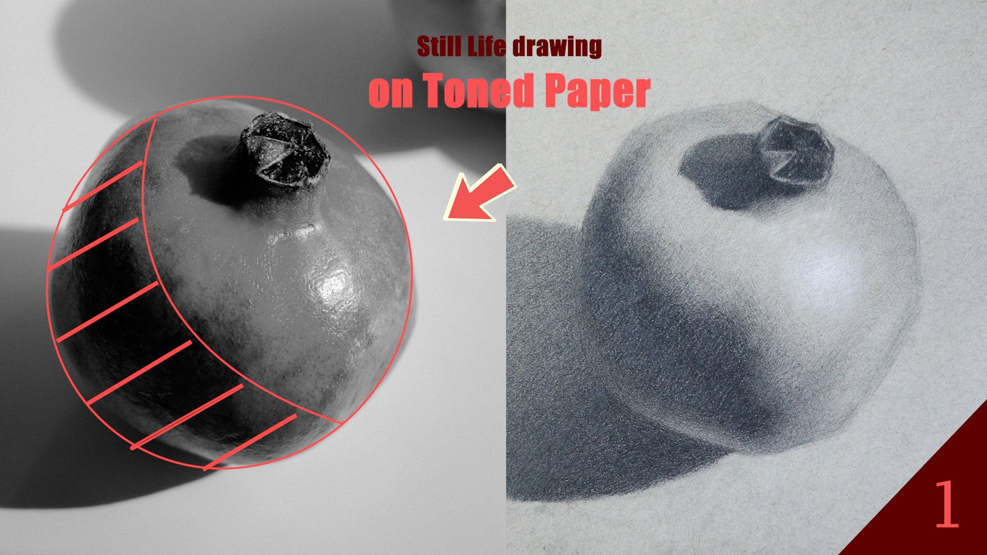
our shadow family. Using the sphere as a reference, we have our lights
coming from over here and our sphere sitting
on a flat surface. Now, all we need to
do is add some light and shadow to the shapes
within the sphere, and we can begin to have
something three dimensional. Before we move further,
let's talk about the geometric shapes we see on the sphere. These
are known as planes. Planes all have a very
specific orientation in space, and this orientation,
relative to the light source, is what determines the value
we ascribe to the plane. Ergo, we will end
up with planes in the shadow and
planes in the light. A fundamental principle of realism is that those
planes in the shadow, those shadow values should be darker than our light values. So your lightest value
in the shadow should be darker than even the darkest
value in the light family. Complete separation of lights
and shadow is Wa apta. If we take a look at this
painting by Jeffrey Watts, we can clearly see
all the shadow values over in this part of the spectrum and all the
light values way over here. With that in mind, let's break down the
shadow values further. The shadow is comprised of
a form and a case shadow. In this portrait by Lis
Andersen, we see both. The cast shadow is the
dark area that an object projects onto a surface when
it blocks a light source. Unlike form shadows which
appear on the object itself, cast shadows are created on
surrounding surfaces and can have sharp or soft
edges depending on the lights intensity
and direction. The shape of the cast shadow, as we can see in the nose, mirrors the outline
of the objects, but may distort depending on the light angle and
the surface of hoson. Conversely, form shadow
is the shadow on the side of an object that is not
facing the light source. It occurs due to the three dimensional
shape of the object, creating areas of
gradual shading. Unlike cash shadows
which are projected by the object onto
surrounding surfaces, form shadows show the contours and depth of the object itself. They help define the volume
and structure of the object, giving the sense of realism and dimension in a
drawing or painting. Let's return back to the sphere. On the right, we've got our
checklist and on the left, our three values to work with. I'll begin by adding
value to the lights. I'm going to add value specifically to
those planes facing the light source making one average light
value for the whole. For the shadows, I'll
do the same thing, combining the form
and cast shadow into one average shadow value. I
know what you're thinking. This is so simplistic and a far cry from the masterwork
you've seen so far. But in fact, it is
the foundation of the more complex
value expression that we see in the
artwork on screen. If we squint your eyes or
even edit these images, you can see that average
shadow and light are doing most of the heavy
lifting in these works. In the next set of artwork, we further see this two tone high contrast principle emerge. However, even in work with
more subtle value differences, where the gap between light and shadow is
less pronounced, we can still see clo
dichotomy between our average lights and average shadow serving
as the foundation. Turning back to the
sphere, we can introduce one more value to the lights to bridge the gap between
light and shadow. This band of value we
called a half tone. It is the name we
give to values that help us transition
from light to shadow. Take a look at this
portrait by Bowen. We can separate the
join into two sections, the region of average
light and average shadow. The key to creating
a real sense of volume is to render
your values and the lights such that it does not encroach into
your shadow values. In reality, there
are more than one or two values in the lights, but we also don't
want a menagerie of 50 different values
modying up the picture. The best piece of advice I can give you is to use sparingly, if at all, the half
tones that are closest to the shadow
in your light shape. Thus, when modeling
your half tones, observe that they are
just a step darker than our average light value before
turning into the shadows.
3. Portrait demo: As you know, the
human head is pretty complex, much more
so than a sphere. So let's try to apply those same principles in an
actual portrait. Our task will be to distill
the hundreds of values in this photo into
just three values. You all know real life comprises
more than three values, but the lesson here is to train your eyes to simplify reality, to convey a light effect
that is more powerful. Forget that you're
looking at a face. Squint your eyes, flip the image upside
down if you need to, and imagine you are gazing upon a set of abstract light
and shadow shapes. I'm taking a tonal
approach for this drawing, creating a mid tone with my
graphite powder as the base, and using my eraser to
create the light shape before going back in
with my B pencils to darken the shadows. Content in this moment is not
with the portrait likeness, although you may end up looking
somewhat like the person, but in creating a
clear picture of how the planes of the face interact with the light source. That's what's really great
about exercises like this is that you're not only
practicing your drawing, but your ability to
render values as well. You can perform this exercise, starting with the line drawing if you're more comfortable
with doing that. But the lesson within
is still the same. We want to pay close
attention to the shapes, even if you don't get them
right the first time, but by constantly comparing
our drawing to our reference and making the
necessary adjustments, we can achieve a good result. Limiting ourselves to three
values forces us to focus on only the essential aspects of the form and all the thousands
of letter details I fallo. By the way, between every
value shape is an edge, an edge being the boundary where two different
areas of adjoining meet, which is where lights
meets shadow or where one shape ends
and another begins. It can be a distant hard line or a softer, more
gradual transition. We use edges to define form, create depth and soften the transition between
one value and another. Are generally three types of
edges in art, hard edges, which are sharp clear
boundaries that create strong contrasts
between two areas, making objects appear
crisp and well defined. Soft edges, which are blurred
or blended transitions, often used to depict gradual
changes in value or color, given a sense of
softness and depth. And finally, loss edges. Lost edge being an area
where the boundary between two shapes
or tones becomes so soft or blended that it's
difficult to discern where one object ends
and the other begins. This technique is often used to create a sense of atmosphere, depth or soft transitions
in light and shadow. By losing the edge,
artists can imply form without explicitly
drawing a line, making the artwork
feel more natural, and allowing certain areas to
recede into the background. These edges all
exist on a spectrum, so it's not so much that they
are three kinds of edges as much as there is a continuum of edges from hard all
the way to loss. Having said that, whether
you are working from a reference photo or just
dueling from your imagination, you can apply these same concept to get a base for your values. So you might be
wondering if, in fact, three values are sufficient to make an impactful
drawing or painting. I wouldn't blame you
for thinking that way, but I would point to you
the bar drawings that are an essential part of the
curriculum of Atlliers. In these drawings,
we see some of the highest expressions
of simplified values, producing a convincing
three dimensional picture. Some of these bargs
have fewer values than others, but
in each of them, we have something very real, but yet so far from
the complexity of nature and photographs. I exhort you to go
online and check the Charles Bag drawing course, and maybe try your hand at a
few of the drawing plates. I promise you will
not regret it. You can use three, four, five values to make a
complete value statement, or you can use it
as a foundation for a more complex
painting or drawing. Good art more from than not, contains within it
a firm structure of values from which all the other elements of a
picture like line, color, texture can emerge from. That's all for this
video. Thank you for watching. Bye bye.
4. Class project : 's project for this
one would be to create a portrait and graphy
using only three values, one value for the shadows and
two values for the lights. The big drawing from earlier will serve as your inspiration. Simplify, simplify,
simplify. The fewer values, the stronger the
impression will be. I'll attach in the project
and resources section, a couple of reference
images where the dichotomy between
light and shadow is clear. You definitely don't
want to perform this exercise with the photo with washout lighting or no
shadows for that matter. Also, you can posterize the images to make the
simplification easier. There are a lot of apps
and even free websites like the one you see on screen
that can help you do this. Play around with
the settings and find the one that
works best for you. A so just when completing this project that you
start by developing the shadows first with
your two B pencil, creating the halftones
with your HB pencil, and the centlte with
your two H penton. Separating the values by
pencil can help further cement to your mind the kind of structure you're looking for. If you're newer to
join, I find the task of your portrait too
daunting for right now, I suggest selecting an image
of a fruit or water flask, something a little less complex, so most of your energy can be
focused on how you express your values in the objects as opposed to getting
their proportions. By the way, there
are a few things you can do to avoid
getting muddy values. Muddy values mean essentially
a situation where there is no clear distinction between your whites and shadow values. Number one, like I
mentioned previously, is to separate your
values by pencil, right? So two B for shadow, H B for mid tone,
two for centate. Of course, the lines
blur and you have to work on the edges
between these values, but stick into those pencils. Per region can make it a bit easier to keep your
values separate. In addition, make sure
not to push hard when layering and always stick to the right pencil for
the right value. Number two, is to
stand six feet or so from your work and
squint your eyes. When you do this, values
tend to group together, and you get a better sense for where that structure
is or isn't. When in doubts, ask yourself, where is the light in
your picture coming from and observe to see
whether the movement of values in your
work is in agreement with the location of
the light source. It's all for this class project. Feel free to leave a
question, comment, or review of this class
if you enjoyed it. It took a lot of
work to make, so I hope you had a good
time watching it. On the next one. Bye bye.
 Terence Zulu, Fine Artist & Teacher