

5 Typography Mistakes Every Designer Should Avoid (& How to Fix Them)
Learn how to identify and fix common typography errors like rivers, widows and orphans to improve the readability and professionalism of your designs.


Good typography often goes unnoticed. That’s because when it’s well-executed, it guides the reader's eye seamlessly through the content, allowing them to absorb information without distraction. But when it’s done poorly, typography can be distracting and even irritating. And when common errors are present, they can make text look unprofessional, reduce its readability and disrupt the visual harmony of a design.
So how can you keep your typography from falling victim to common pitfalls? Explore some of the most common mistakes made in typography, and learn how to fix them like a pro. From distracting rivers of white space to orphaned lines and ragged edges, we'll cover the telltale signs of poor typography and provide simple solutions. By mastering these techniques, you’ll not only improve the aesthetics of your work but also ensure that your message is delivered as clearly and effectively as possible.
Rivers
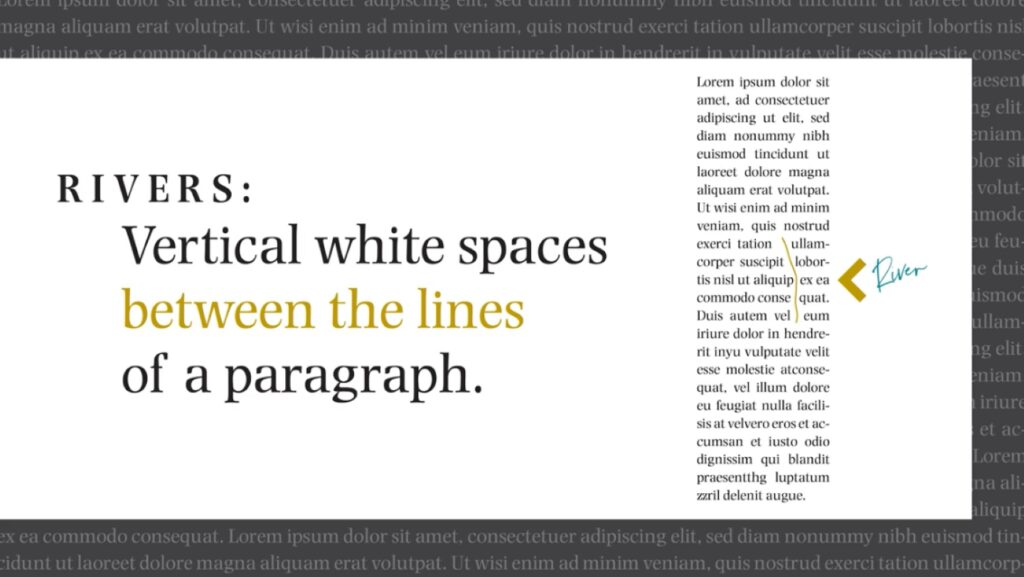
Also known as rivers of white, rivers are visually distracting gaps of white space that appear to run through a paragraph of text. They are caused by the coincidental alignment of word spaces, but since our brains are wired to identify patterns, they tend to stick out like a sore thumb.
Why Rivers are Problematic
The primary problem with typographic rivers is that they interrupt the reading experience. A reader's eye is naturally drawn to these prominent white channels, which can cause them to lose their place or become distracted from the content.
This ultimately compromises the text’s legibility, and also brings down its aesthetic appeal. In professional design work, from books and magazines to websites and digital documents, the presence of rivers signals a lack of attention to detail and can detract from the material’s credibility.
How to Fix Rivers
To fix rivers, you’ll need to carefully manipulate the text to break up the alignment of the word spaces. Here are some of the most effective methods:
- Adjusting tracking and kerning: Tracking is the uniform spacing between all letters in a selected block of text, and kerning is the space between two specific characters. By slightly increasing or decreasing these settings, you can shift the words just enough to break up the vertical alignment of the spaces.
- Improving hyphenation: Enabling or fine-tuning hyphenation can drastically reduce the occurrence of rivers. When a word is hyphenated and broken across two lines, it can even out word spacing and eliminate large gaps.
- Manual adjustments: In industry standard design software like Adobe InDesign, you can manually adjust line breaks by moving a word or two to a different line. This offers the most precise control, but can be time-consuming for large amounts of text.
- Changing alignment: The simplest fix, especially for web or digital content, is to switch from justified text (i.e., text that’s perfectly aligned with the margins of the page) to ragged right alignment. This leaves the right margin uneven, which can naturally prevent rivers from forming.
Ragged Edges
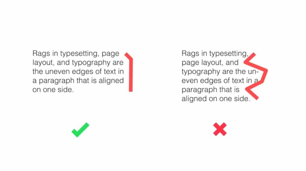
Commonly called “rags” for short, ragged edges in typography refer to the uneven or irregular vertical margin of a text block. While a ragged edge is the natural result of text that isn't justified, a bad rag is one that is drastic, visually unappealing and disrupts the flow of reading.
Why Rags are Problematic
A good rag should have a gentle, organic curve, with line endings that vary slightly from one another. A bad rag is characterized by line endings that create awkward, distracting shapes or patterns.
For instance, line endings that step in or out dramatically and consistently can create a "staircase" effect, while an overly straight rag can look like a vertical "river" of white space (a phenomenon distinct from the diagonal rivers discussed previously). These jarring shapes draw the reader's attention away from the content and can make the text look sloppy or poorly formatted.
How to Fix Bad Rags
You can remedy bad rags by paying attention to the line breaks and the overall rhythm of the text block.
- Manual adjustments: The most effective way to fix a bad rag is by manually adjusting the line breaks. In professional design software, you can insert a soft return (shift + enter) to force a word or phrase to the next line without starting a new paragraph. This allows you to manipulate the shape of the rag on a line-by-line basis.
- Hyphenation and justification settings: Many professional applications, like Adobe InDesign, have sophisticated hyphenation and justification (H&J) controls. By adjusting settings such as the minimum and maximum word spacing, letter spacing and hyphenation zone, you can automate a better rag.
- Change line length: A common cause of a bad rag is a line length that's too short for your chosen typeface and font. If your lines are too narrow, the text will have very few words per line, which can make the rag appear choppy and unpredictable. Experimenting with slightly wider or narrower column widths can sometimes solve the problem automatically.
- Content rewriting: In some cases, the best solution is to slightly edit the text. Rewording a sentence to make it a word or two longer or shorter can often resolve a problematic line break and improve the rag without any other technical changes.
Orphans
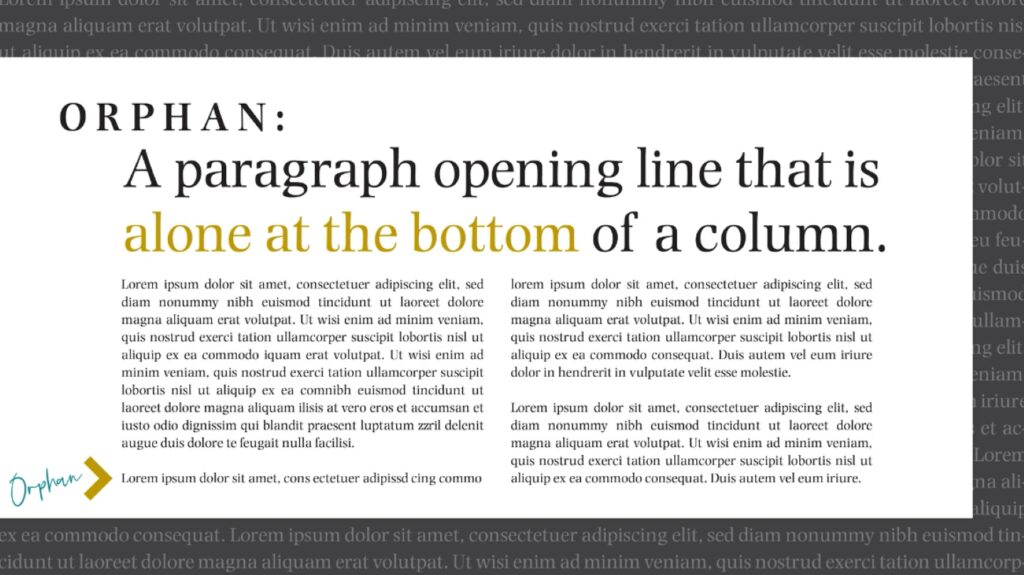
In typography, an orphan is the first line of a paragraph that appears by itself at the bottom of a column or page, separated from the rest of the paragraph which continues on the next column or page. It is a typographical mistake that creates an awkward visual break, as a single line is left stranded at the bottom.
Why Orphans are Problematic
Orphans are generally considered a typographical mistake for several reasons. Primarily, they disrupt the flow of reading by leaving a single line of text isolated from its context, which the reader must then seek out on the next page. Visually, an orphan creates an uneven and unappealing bottom margin, as the last line of the page is often shorter than the lines above it.
In professional design and publishing, orphans are a clear indication of unaddressed text flow issues. As a result, they stand out as a sign of poor craftsmanship and a lack of polish.
How to Fix Orphans
Fixing orphans involves adjusting the text so that the first line of a paragraph does not fall on the last line of a page. Here are some of the most common methods:
- Adjust line breaks: The most straightforward way to fix an orphan is to slightly adjust the line breaks in the paragraph leading up to it. This can often be done by adding or removing a line from the preceding paragraph. A soft return (Shift + Enter) can be used to move a word to the next line, subtly rearranging the text to prevent the orphan from forming.
- Tracking and kerning: Much like with rivers, slightly adjusting the tracking (the space between all characters) or kerning (the space between two specific characters) of the preceding paragraph can change the total length of the text, allowing it to shift just enough to move the orphan line onto the next page.
- Manual adjustments: In some cases, you may need to manually edit the copy. This can be as simple as adding or deleting a few inconsequential words to either shorten or lengthen the paragraph, ensuring the first line of the new paragraph doesn't end up stranded.
- Using "Keep Options": Adobe InDesign has powerful features called "Keep Options" that automatically prevent orphans and widows from occurring. By selecting a paragraph and setting a rule to "Keep Lines Together" at the start of the paragraph, the software will not allow the first line of a paragraph to be separated from the rest.
- Adjusting column or page depth: In a worst-case scenario where other fixes aren't viable, you can slightly adjust the depth of the text column or the page margins. Since this can affect the overall layout design of the document, only use this option as a last resort.
Widows
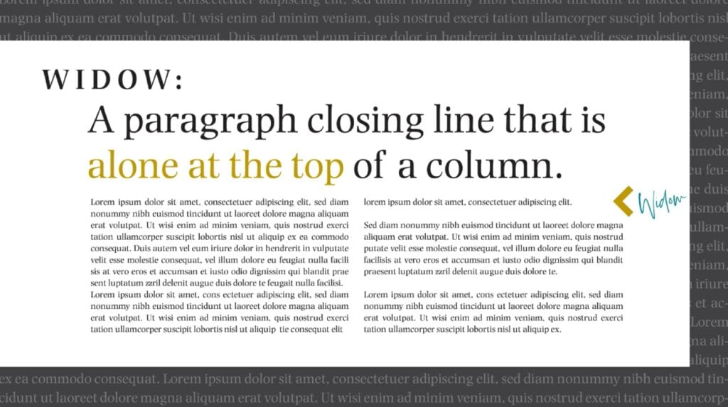
Think of a widow as the opposite of an orphan. It’s a short, isolated line—typically the last line of a paragraph—that appears by itself at the top of a new column or page. This mistake creates an awkward visual break that leaves a small amount of text stranded at the top of the page.
Why Widows are Problematic
Like orphans, widows are considered a typographical error for both aesthetic and functional reasons. Visually, they leave a large, distracting amount of white space at the bottom of the preceding page or column, where the rest of the paragraph ends. When viewed at the top of the next page, a widow can appear insignificant and out of place, disrupting the visual rhythm and balance of the layout.
They make the text look poorly handled and can detract from the overall professionalism of the design. The stark visual contrast of a short line at the top of a new page is a clear signal of an unaddressed text flow issue.
How to Fix Widows
The goal of fixing a widow is to ensure that the last line of a paragraph is not left stranded at the top of a new column or page. You can do so with one of several methods:
- Adjusting line breaks: The simplest solution is to slightly adjust the line breaks in the paragraph to either make the paragraph one line shorter or one line longer. You can achieve this by using a soft return (Shift + Enter) to push a word to the next line, or by manually editing the copy to either shorten or lengthen it.
- Tracking and kerning: Slightly adjusting the tracking or kerning of the preceding paragraph can change its overall length. By tightening or loosening either one, you can force the last line of the paragraph to either stay on the previous page or move to the next page with the rest of the paragraph.
- Using "Keep Options": Just as with orphans, you can use Adobe InDesign’s “Keep Options” to prevent the last few lines of a paragraph from being separated. This will automatically force the widow line to stay with the rest of its paragraph on the previous page.
- Adjusting column or page depth: As a last resort, you can slightly alter the depth of the text column or the page margins. By making the column slightly taller, you may be able to accommodate the last line of the paragraph, thus preventing the widow from forming. Conversely, making it shorter could push the entire paragraph onto the next page. Remember to use this approach with caution, since it can affect your project’s entire layout.
Runts
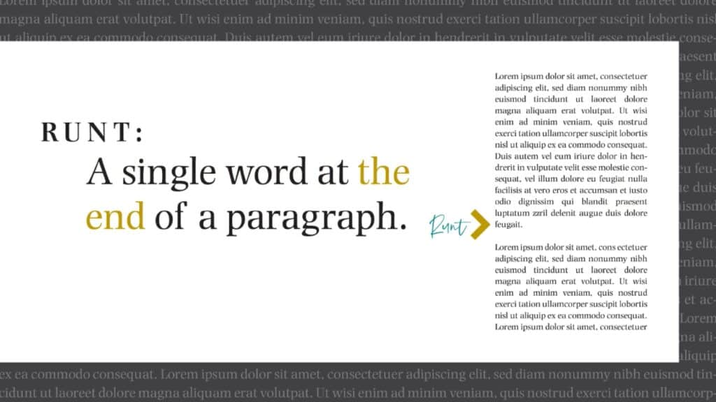
In typography, a runt is the last word of a paragraph that is left stranded on a line by itself. It is a single, short word—or sometimes the tail end of a hyphenated word—that occupies the final line of a paragraph, leaving a significant amount of white space in front of it. This is a visual error that, while minor, still disrupts the neatness and rhythm of a text block.
Why Runts are Problematic
Runts are considered a typographical mistake primarily because they are visually unappealing. They create an awkward, unbalanced look at the end of a paragraph, where a single, short word hangs off the line.
This disrupts the visual rhythm of the page, and can make the block of text look sloppy and poorly organized. While runts may not impact readability as severely as a river, they are a clear sign of a lack of attention to detail and should be avoided in professional typography and design.
How to Fix Runts
Fixing runts involves adjusting the text so that the last line of the paragraph contains more than just a single, short word. The goal is to get at least two or three words on the final line to create a more balanced and aesthetically pleasing paragraph ending.
- Adjusting tracking and kerning: The most common and subtle way to fix a runt is to slightly adjust the tracking (the uniform spacing between letters) of the affected paragraph. By making the tracking slightly tighter, you can often pull the last word back up to the previous line. Be sure to reduce the tracking as little as possible to avoid making the text look too condensed.
- Making manual adjustments: You can also manually edit the copy to fix a runt. This can involve slightly rewording the last sentence of the paragraph to make it a word or two longer or shorter, or inserting a soft return (Shift + Enter) to move a word or two from the second-to-last line to the final line.
- Nonbreaking spaces: By using a nonbreaking space (Ctrl + Shift + Space Adobe InDesign), you can tie the last word to the one before it, ensuring they stay together on the same line. This is a particularly useful technique for short, last-line phrases.
- Modifying hyphenation and justification settings: Adjusting the hyphenation and justification settings in your design software can often automatically resolve runts. By allowing for more flexible hyphenation or slightly adjusting word spacing, you can give the text the room it needs to arrange itself more gracefully.
- Changing column width: If you are working with a narrow column, the problem of runts may be more frequent. Tweaking the column’s width can change the way the text flows, and will often solve the runt problem automatically.
- Content editing: Sometimes, the simplest fix is to rephrase the final sentence of the paragraph to prevent the runt from occurring to begin with.
Correct Amateur Mistakes for Pro-Level Text
After mastering the nuances of rivers, rags, widows, orphans and runts, you’ll be well on your way to becoming a typographical expert. These subtle mistakes, though often overlooked by the untrained eye, can profoundly impact the professionalism, readability and accessibility of your work. By consciously avoiding these common errors and applying the techniques covered above, you won’t just be a writer or designer anymore—you’ll be a typographer, who’s capable of meticulously crafting a flawless reading experience from start to finish.
Good typography will serve as a silent partner to your content, enhancing it without drawing attention to itself. The goal is to make the text disappear, which will allow readers to fully immerse themselves in your message. By paying close attention to these details, you’ll elevate your work from good to great and demonstrate a commitment to quality that will not go unnoticed. In the end, a clean and professional-looking page isn’t just an aesthetic choice; it’s a sign of respect for your readers and a hallmark of skilled workmanship.
Related Reading
Carrie Buchholz
Carrie Buchholz is a freelance writer who lives in Northern Colorado with her husband and dog.
Try Skillshare for free! Sign up for a 7 day free trial today!
Get Started- Unlimited access to every class
- Supportive online creative community
- Learn offline with Skillshare's app


