

What Is Tracking in Typography: Definition and Examples
Discover the true meaning of tracking in typography, and find out how you can use it to refine, polish and perfect your own typographic designs.


Typography is the art and technique of arranging type to make written language legible and appealing, and it involves various intricate elements. One of those elements is tracking, a crucial aspect that significantly impacts the overall aesthetic and readability of text.
Want to learn more about this essential part of typography, and become a better designer as a result? Discover the definition of tracking in typography, explore its significance and get practical tips for its effective application in graphic design.
Defining Tracking in Typography
In short, tracking refers to the adjustment of space between characters in a block of text. Designers use tracking to alter the overall spacing uniformly, which affects the density and readability of the text as a whole.
If you think that sounds awfully similar to kerning, you’re not wrong. But there is one key difference: While kerning deals with the spacing between individual characters, tracking focuses on the entire block of text. With its help, designers can strategically tweak spacing to enhance visual appeal, legibility and create a harmonious flow in any type of text.
Tracking in Graphic Design: Pro Tips
In graphic design, tracking plays a pivotal role in achieving the designer’s desired look and feel. With these pro tips, you’ll be able to better utilize tracking in your own graphic designs, whether you’re creating brand marks, designing custom types or just starting to learn typography.
- Explore tracking variations: Experiment with your design program’s tracking settings to find the optimal spacing for complementing the overall design. Different tracking can evoke different emotions, and can convey unique stylistic elements.
- Evaluate font distinctions: Different fonts may require distinct tracking adjustments according to their shapes and details. Pay attention to the characteristics of each font and tailor the tracking to maintain a balanced and aesthetically pleasing appearance.
- Synergize tracking, kerning and leading: Understand how tracking, kerning and leading all work together. Striking the right balance between these elements ensures a cohesive and visually appealing layout.
- Seek outside feedback: Design is a collaborative process, so don't hesitate to seek feedback from peers, clients or family members. Why? Other people can provide valuable insights into how the tracking contributes to the overall design, and may offer viewpoints you wouldn’t have otherwise considered.
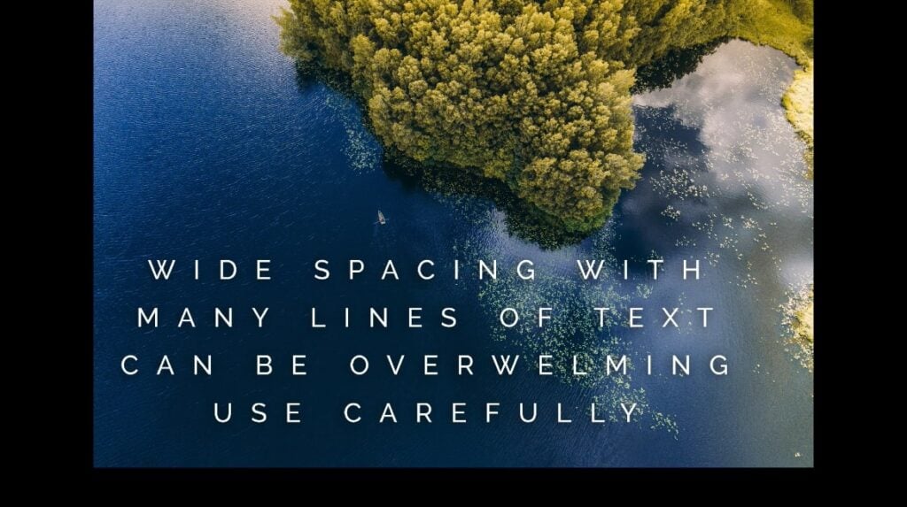
- Go bold with single words: While multiple lines of tightly- or loosely-spaced text can be difficult to read, single words avoid that problem. So if you’re creating a design with one or two words featured prominently, don’t be afraid to experiment with bolder tracking decisions.
- Flip your design upside down: Rotate your design upside down (or left or right) to gain a different perspective on its tracking, and see how the spacing looks when you can’t easily read each word.
- Use kerning to fine-tune your design: While tracking controls the spacing between all the letters within a portion of text, kerning can be used to fine-tune smaller details. If two letters appear closer together than they should, for example, you can use kerning to fix the issue.
Effective Application Tips of Tracking
When working in graphic design applications, it’s crucial to master the tools that make precise tracking adjustments possible.
Here are some practical tips for effective tracking in one of the most popular design programs, Adobe InDesign:
- Adjust tracking from the Control or Character panel: Navigate to the Control or Character panel to fine-tune tracking settings. Both panels can be found under the Window menu.
- Use the Type tool for text highlighting or Selection tool (V, Escape) for entire frames: When working with text in design applications, employ the Type tool (which you can activate by pressing the T key on your keyboard) for highlighting specific text, and the Selection tool (which you can activate by pressing V, Escape) for manipulating entire text frames.
- Find the tracking option with the 'AV' Symbol in the Control or Character panel: Locate the tracking field, which is represented by the 'AV' symbol in the Control or Character panel, for quick access to tracking adjustments.
- Adjust tracking with positive values (to increase spacing) or negative values (to decrease spacing): Experiment with positive and negative tracking values to increase or decrease overall spacing between characters.
- For linked frames, tracking in the first frame affects text across all linked frames: When dealing with linked text frames, be aware that adjusting tracking in the first frame will affect the text across all subsequent linked frames.
Master the Art of Typography
Becoming proficient at typographic design requires a nuanced understanding of elements like tracking. By exploring tracking variations, evaluating font distinctions, synergizing with kerning and leading, seeking feedback and tailoring tracking to individual fonts, you can elevate your designs and master the art of typography.
Searching for a way to learn about typography on your own terms? Look no further than Skillshare’s online typography classes. With our diverse array of talented teachers and community of passionate students, Skillshare is the best way to improve your design skills from home.
Carrie Buchholz
Carrie Buchholz is a freelance writer who lives in Northern Colorado with her husband and dog.
Try Skillshare for free! Sign up for a 7 day free trial today!
Get Started- Unlimited access to every class
- Supportive online creative community
- Learn offline with Skillshare's app


