

Skeuomorphism: The Forgotten Design Trend That Shaped Your Screens
Skeuomorphism once defined digital design, making interfaces feel real with textures and depth. Discover why it vanished and whether it’s making a comeback.


In the early days of digital design, user interfaces often relied heavily on skeuomorphism, a design style that mimicked real-world objects to instantly create a sense of familiarity. But over the years, it eventually gave way to flat design, a sleek and minimalist approach that stripped away textures, shadows and intricate details in favor of simplicity above all else.
But now that flat design is so prevalent, it's facing growing criticism for feeling cold, impersonal and difficult to navigate. So, what's next for digital design? To find out, you'll need to first explore the origins of skeuomorphism and flat design.
What Is Skeuomorphism, Anyway?
You know how the recycling bin icon on your computer's desktop looks like, well, a recycling bin? Or how the icon for the notepad app on your smartphone looks like a piece of lined note paper? That's skeuomorphism in action.
In a nutshell, skeuomorphism is a design concept in which objects have purely decorative details that resemble functional details from the objects that preceded them. Case in point: plastic Adirondack chairs that are molded to resemble wood.
In most modern contexts, though, skeuomorphism refers to digital objects that mimic the appearance and functionality of their real-world counterparts. This approach helps users recognize and interact with digital interfaces by drawing on familiar physical references.
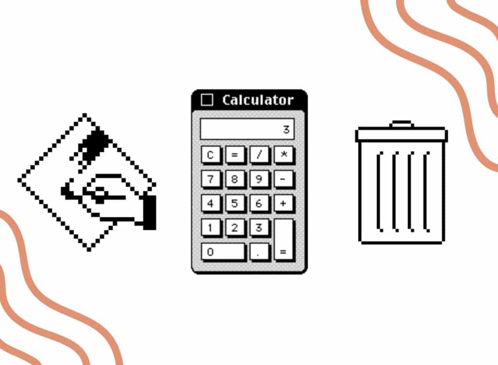
Early computer operating systems used skeuomorphic design frequently, from "save" buttons that resembled floppy disks to calculator programs that mimicked the look of a physical, three-dimensional calculator.
These visual cues can make digital experiences more intuitive, especially for users who are just learning how to use digital tools.
But remember that skeuomorphism isn't limited to the digital realm—in fact, the term was originally coined in 1889, and can refer to things like:
- Stone architecture in Ancient Greece, which often featured decorative details derived from purely functional elements of earlier wooden buildings.
- Early automobiles, which were designed to resemble the horse-drawn carriages that came before them.
- Tiny handles on maple syrup bottles, which have no functional purpose but bear a resemblance to the handles found on earthenware jugs.
Once you know what to look for, you can find examples of skeuomorphism just about everywhere.
Why Skeuomorphism Once Dominated the Digital World
In the 80s, 90s and 2000s, digital design was overflowing with skeuomorphism. Just as today, one of the most influential companies at the time was Apple, which went all-in on skeuomorphic design by creating charming, familiar-looking icons for its early Macintosh computers.
In a time when many people were just starting to use computers, those icons provided a sense of familiarity and helped them navigate new and often confusing user interfaces.
And when smartphones burst onto the tech scene in the mid-2000s, skeuomorphic design elements continued to be popular as they helped users move from physical buttons to glass touchscreens.
Skeuomorphism also served as a handy way for designers to showcase digital devices' increasingly high-resolution displays. As those displays got brighter and more beautiful with each passing year, they got even better at recreating digital imitations of real-life materials like wood, leather and metal.
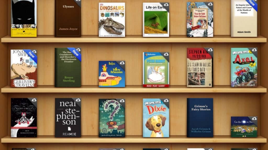
For instance, Apple’s iBooks app (now known as Apple Books) was once designed to look like a real wooden bookshelf, on which users’ books would be displayed like physical objects:
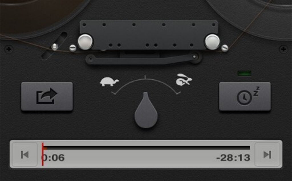
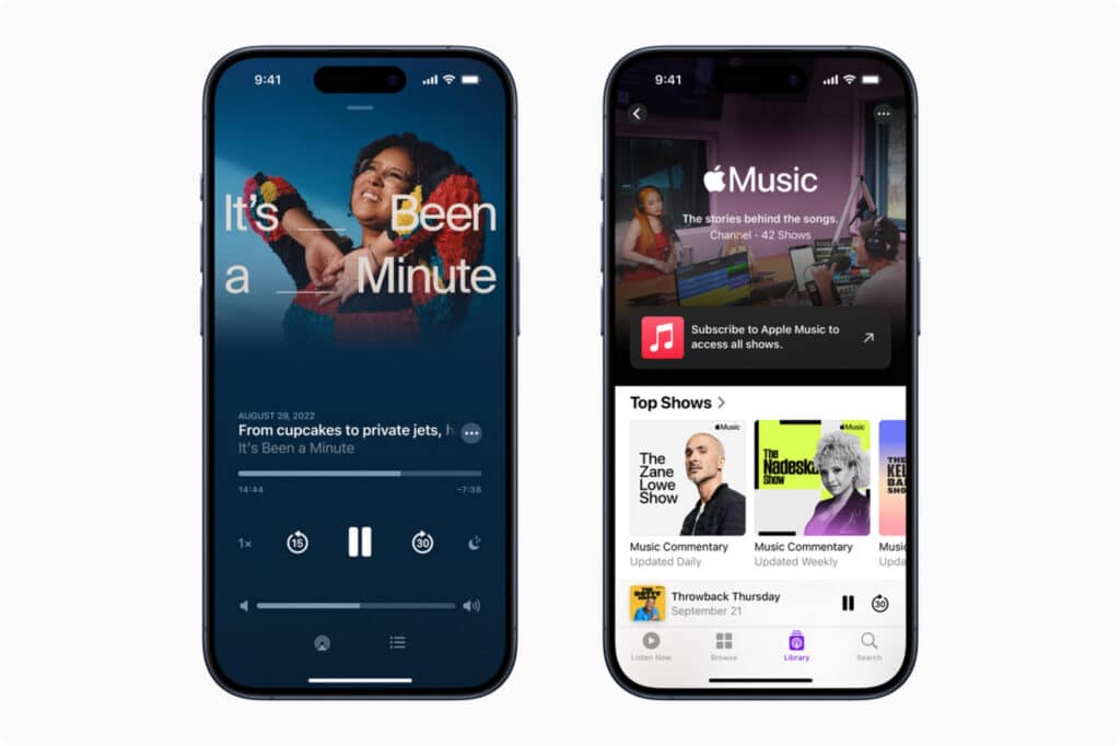
In the same vein, when Apple debuted its Podcasts app, its interface resembled that of a reel-to-reel tape recorder:
In hindsight, it's easy to see why skeuomorphism ruled the world of digital design. But now, the question remains—what happened?
The Rise of Flat Design
In many ways, Apple was responsible for the widespread popularity of skeuomorphic design in tech products. So, it's only fitting that it was also responsible for its downfall.
It started in 2012, when Apple's design team began working on iOS 7, the operating system for the upcoming iPhone 5s and 5c. Jony Ive, former Chief Design Officer at Apple, recalled in an interview with USA Today that "we understood that people had already become comfortable with touching glass, they didn't need physical buttons, they understood the benefits."
"So," he continued, "there was an incredible liberty in not having to reference the physical world so literally."
And with that, Apple began moving away from skeuomorphic design and toward flat design, a style that favors:
- Two-dimensional elements over three-dimensional ones.
- Simplicity over decorative details.
- Solid, bright colors over more realistic and muted shades.
- Clean lines over beveled edges.
- Sans-serif typefaces over their serif counterparts.
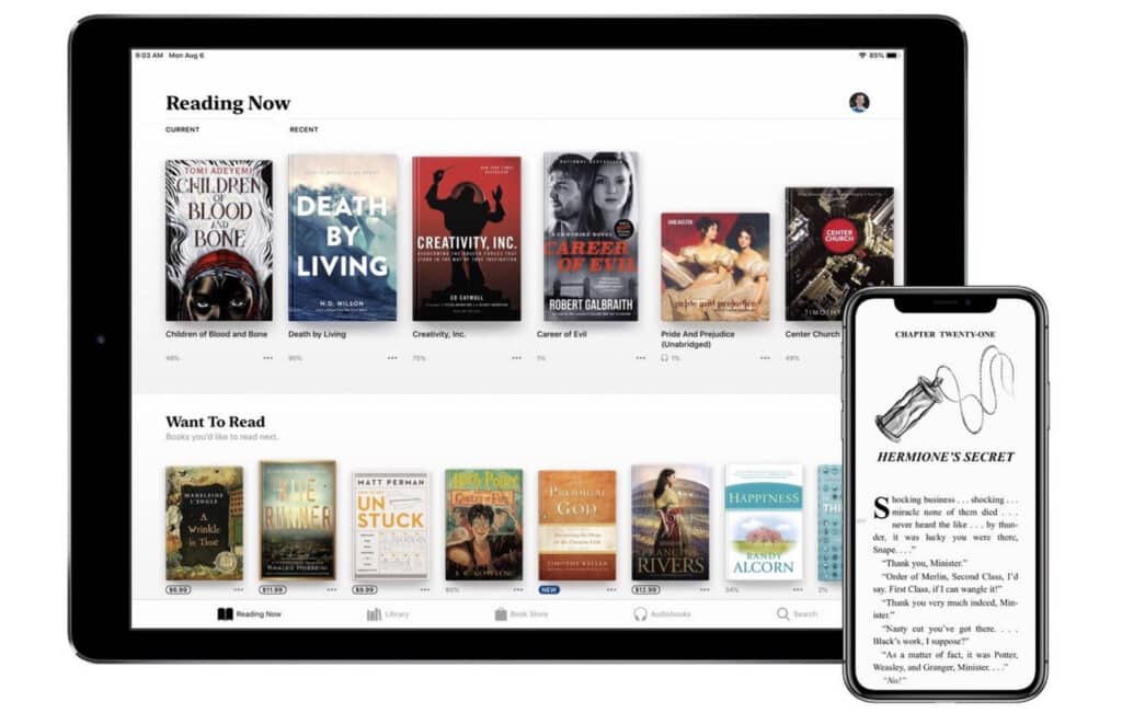
The result is a sleek, minimalist aesthetic that bears little resemblance to the physical world. To see what that looks like, turn to the more recent version of Apple’s Books app. Remember the 3D wooden bookshelf from before? It was replaced with a plain white background, above which users’ books simply hover:
The Podcasts app got the same treatment, with updated iterations of its UI looking simple, clean and colorful:
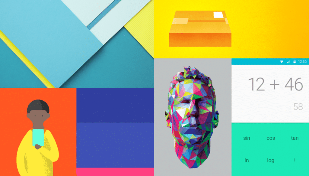
Compared to the real-world elements of skeuomorphism, flat design felt downright futuristic. Other tech companies were quick to follow Apple’s cues, and Google released a design language it called Material Design in 2014:
It was official: skeuomorphism was a thing of the past, and flat design was the cool new look.
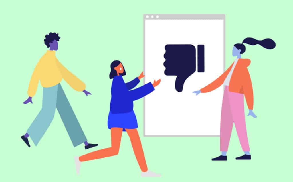
The rapid proliferation of flat design even spawned its own distinctive art style, "Corporate Memphis," which is named after the design group Memphis Milano. It features flat swaths of color, geometric shapes and clean backgrounds:
But over the years, Corporate Memphis—and perhaps even flat design as a whole—has become so widely-used that it’s predictable at best, and annoyingly repetitive at worst . With that in mind, it's only logical to wonder whether flat design is on its way out.
Is Flat Design Losing Its Luster?
Flat design gained popularity for good reasons: It looked clean and modern, and it also lent itself well to responsive design.
But in recent years, some designers and tech companies have begun shifting away from purely flat design, and have instead started to integrate elements of depth, shadows and gradients in a style that's sometimes called neumorphic design (more on that later). This evolution raises a crucial question: Is flat design on its way out?
Criticisms of Flat Design
Flat design might be popular with large companies, but it's not immune from criticism.
Poor Usability
One of the biggest criticisms of flat design is that it can actually make interfaces less intuitive. The removal of depth, shadows and other tactile cues can make it difficult to distinguish buttons from their surroundings.
While flat design was originally intended to simplify user experiences, it has sometimes gone too far by stripping away crucial visual indicators that help users navigate digital environments.
Everything Looks the Same
One of flat design's most critical flaws has nothing to do with functionality: Many people have simply grown sick of its cold, sterile and overly corporate aesthetic.
When it first emerged, flat design felt sleek and modern. But with time, its widespread adoption has made many digital interfaces feel about as warm and cozy as an operating room.
The excessive white space, rigid uniformity and lack of personality in many flat-designed interfaces have created backlash. Critics argue that while flat design prioritizes functionality, it often sacrifices warmth and emotional connection. As a result, many websites and apps look nearly identical, and it can be difficult for users to distinguish one brand from the next.
Excessive Minimalism
While minimalism can create clean and uncluttered interfaces, flat design sometimes takes this too far by removing too much detail and leaving interfaces feeling empty and unfinished.
At its most extreme, flat design's ultra-minimalist elements can leave users feeling confused and frustrated. For instance, if important buttons are buried deep in nested menus to create a "clean" appearance, users may struggle to find them.
How Flat Design Is Evolving
Rather than disappearing entirely, flat design is evolving in response to these criticisms.
A New, More Balanced Approach
Some designers are adopting a hybrid approach that's often referred to as “flat design 2.0” or “semi-flat design.” This updated style retains the simplicity of flat design while also reintroducing subtle shadows, gradients and layering to improve usability and visual appeal.
Tech giants like Google and Apple have already embraced this shift, and are now incorporating more depth and texture into their interfaces (albeit slowly) to create a more user-friendly experience.
Rejecting Cold, Sterile Design
Beyond semi-flat design, there is also a growing trend toward more expressive and engaging visuals. Many designers are pushing back against the cold minimalism of flat design by incorporating richer color palettes, organic shapes, hand-drawn elements and nostalgic aesthetics that evoke warmth and uniqueness.
The rise of design elements inspired by the past—from charming retro logos to unique hand-lettered text—signals a broader desire for interfaces that feel more one-of-a-kind and less mass-produced.
The Rise of AR and VR
Emerging technologies such as augmented reality (AR) and virtual reality (VR) are also influencing the next phase of digital design.
Since both AR and VR demand more dynamic and lifelike graphics, many apps and games that utilize those technologies are moving away from the strictly 2D aesthetic of traditional flat design. Instead, they're using shading, gradients and realistic textures to create worlds that users want to spend time in and interact with.
Is There a Future for Skeuomorphism?
While skeuomorphism may have fallen out of favor with the rise of flat design, it hasn’t disappeared entirely—and in some ways, it’s making a subtle comeback.
Why? As technology evolves, designers are beginning to recognize the value of skeuomorphic elements, especially in areas where realism and familiarity improve usability. But instead of returning to the hyper-detailed, texture-heavy designs of the past, the future of skeuomorphism is likely to be more nuanced.
Places Where Skeuomorphism Still Makes Sense
Skeuomorphism isn't obsolete—it just makes more sense in some contexts than others.
Augmented Reality (AR) & Virtual Reality (VR)
As AR and VR experiences become more mainstream and accessible, designers are increasingly turning to skeuomorphism to make digital objects feel more tangible.
After all, in the context of ultra-immersive environments, purely flat design just doesn't make sense—users expect virtual objects to have depth, texture and realistic interactions that mimic the physical world.
Haptics and Touch Interfaces
With so many mobile devices utilizing haptic feedback and touchscreens, skeuomorphism is finding new relevance. Users naturally expect buttons to feel like buttons, switches to behave like switches and haptic feedback to be accompanied by believable animations.
In response, modern UI design is subtly reintroducing skeuomorphic elements like soft shadows, realistic motion effects and subtle gradients. Together, those elements enhance users' sense of tactility and improve interaction cues.
Nostalgia and Branding
As brands look for ways to stand out from the minimalist and even sterile aesthetic of flat design, some are embracing skeuomorphic-inspired elements to add warmth, familiarity and personality to their interfaces.
A prime example is dirty design. This design trend embraces imperfections, physical textures and retro elements to create a look that feels human and handmade, not mass-produced and impersonal.
The Rise of Neumorphism
In recent years, a modern reinterpretation of skeuomorphism called neumorphism has been slowly but surely gaining popularity.
Neumorphism blends the simplicity of flat design with the 3D elements of skeuomorphism. The result is a look that's characterized by soft shadows and raised or recessed buttons, which creates an interface that looks both modern and tactile at the same time.
While not a full return to classic skeuomorphism, this approach indicates that designers are experimenting with ways to reintroduce depth and realism while still maintaining a clean and modern aesthetic.
A Balanced Future
Rather than making a full comeback, skeuomorphism is likely to evolve as part of a hybrid approach that borrows its best elements while avoiding its past excesses.
Along the lines of neumorphism, the future of UI/UX design will likely combine the clarity of flat design with the intuitive cues of skeuomorphism, resulting in interfaces that are visually appealing, functional and user-friendly.
Striking a Balance: Where Digital Design is Headed Next
Rather than disappearing entirely, both flat design and skeuomorphism are simply being adapted to better suit new technological needs and users' evolving tastes.
Flat design is evolving into hybrid styles like semi-flat design and neumorphism, which reintroduce depth, texture and usability improvements. Meanwhile, skeuomorphic principles are finding new relevance in cutting-edge technologies such as AR and VR, where realism serves a true purpose by helping users navigate an immersive virtual world.
As digital design continues to evolve, its future will likely consist of a balanced approach that borrows the best elements from both flat and skeuomorphic design. The truth is that users no longer want sterile interfaces that are purely functional, nor do they want ones that are bound by the textures and colors of the real world. Instead, they want designs that are intuitive, engaging and maybe even fun.
Related Reading
Carrie Buchholz
Carrie Buchholz is a freelance writer who lives in Northern Colorado with her husband and dog.
Graphic Design with Skillshare – Start Your Free 7-Day Trial Now!
Start Your Free Trial Today!- Unlimited access to all classes
- Graphic design classes for all levels
- Learn offline with Skillshare's app


