

Dirty Design Is In—Here’s Why It Matters
Learn how embracing imperfections and gritty aesthetics can add authenticity and depth to your digital design work.
Table of Contents
- Understanding "Dirty Design"
- The Cultural Shift Towards Imperfection
- The Aesthetic Appeal of Imperfections
- Practical Techniques for Embracing "Dirty Design"
- Success Stories and Real-World Applications
- Why "Dirty Design" Matters
- Challenges and Considerations
- What's Next for "Dirty Design?"
- Give "Dirty Design" a Try in Your Own Creations
- Related Reading


In a world obsessed with perfection, a new design trend is turning heads by embracing flaws, blemishes and glitches—welcome to the era of "Dirty Design."
For years, sleek and minimalist design has been the dominant force in the creative world, capturing our collective desire for simplicity, sophistication and Apple products. From website design to mobile app interfaces to brand packaging, clean lines and polished aesthetics have long reigned supreme. But as our social media feeds and store shelves have become increasingly saturated with minimalistic and ultra-streamlined visuals, a growing fatigue with overly polished design has emerged. Enter "Dirty Design"—a refreshing shift that challenges the norm by embracing imperfection and authenticity.
"Dirty Design" stands out as a raw, unapologetic approach to modern design that welcomes grit, texture and vintage aesthetics into digital work. Stick around to find out why this trend matters, uncover its cultural relevance and learn how designers like you can apply it in their own creations.
Understanding "Dirty Design"
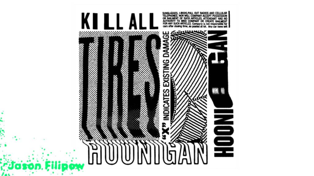
"Dirty Design" revolves around incorporating imperfections, unexpected textures, the perfect amount of grit and well-placed retro elements into modern design. Think grainy overlays, rough edges, hand-drawn elements and the occasional not-so-accidental “mistake” that's more concerned with adding character than creating polish.
This approach celebrates the quirks that remind us of physical printmaking, screenprinting and the early digital art era when technology wasn’t very sleek but had personality to spare.
But where did "Dirty Design" come from? The concept has deep roots in vintage design, from punk rock album covers and DIY zine culture to the early desktop publishing software that encouraged experimentation.
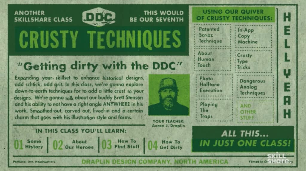
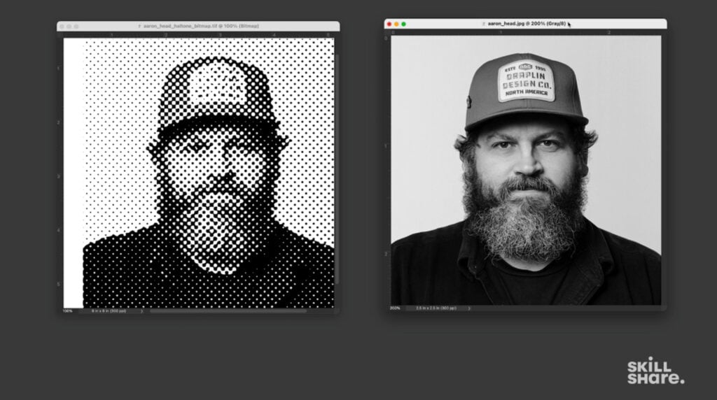
This aesthetic, seen in techniques like risograph printing and halftone effects, recalls a pre-digital (and early digital) world. Influential designers like Aaron Draplin, founder of Draplin Design Co. and prolific Skillshare teacher, have been vocal proponents of the style, and have successfully brought "Dirty Design" to the forefront with their bold and unique work.
Other prominent designers who have propelled "Dirty Design" toward mainstream success include:
- Art Chantry, designer of iconic band posters and album covers.
- Jeff Kleinsmith, creator of retro-inspired film posters, logos and album art.
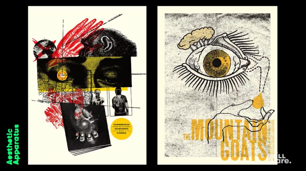
- Aesthetic Apparatus, design studio that makes posters, prints and more.
- Kate Bingaman-Burt, illustrator of zines, advertisements and whimsical doodles.
The Cultural Shift Towards Imperfection
Today’s audiences often value realness over perfection. "Dirty Design" appeals to this shift by embracing flaws and imperfections to create a relatable aesthetic that mirrors the authenticity people are actively seeking in their online and offline lives.
Platforms like Instagram and TikTok, which have popularized unfiltered and "behind-the-scenes” content, have been instrumental in reshaping our visual expectations. As viewers become more attuned to raw and unfiltered content, graphic design trends have followed suit, with many designers taking approaches that feel more genuine and less mass-produced.
"Dirty Design" is also effective because it taps into nostalgia by stirring memories of retro aesthetics and analog mediums like VHS tapes, 35mm film and woodblock prints. Elements like those can evoke an emotional response for certain viewers and give them a sense of familiarity, coziness, and connection that hyper-polished digital designs often lack.
The Aesthetic Appeal of Imperfections
From a purely aesthetic standpoint, imperfections bring layers and depth to designs. This creates a sense of visual interest that clean, minimalistic designs tend to lack. The use of grain, texture and rough-around-the-edges elements invites viewers to linger, look closer and engage with the smaller details of the design.
And in a digital age where much of what we see feels algorithmically generated, the hand-crafted nature of "Dirty Design" is a breath of fresh air. Rough edges, hand-drawn sketches and organic textures make the work feel more personal, and better reflect the human touch behind each design. Even in work that has been created 100% digitally, imperfections and irregularities can tone down the spotless look of conventional modern designs.
So, while minimalist design can come across as sterile and cold, "Dirty Design" brings a gritty, rebellious energy that connects with audiences on a more emotional level. The flaws make the work more memorable, all while offering a stark contrast to the clean, often forgettable designs favored in minimalist styles.
Practical Techniques for Embracing "Dirty Design"
Curious to know how you can make your designs seem more nostalgic, analog and real? Start by choosing a couple of these tactics and their associated elements to incorporate into your work.
Incorporate Interesting Textures
- Grain and grit: Adobe's Photoshop and Illustrator software both offer tools you can use to easily add grainy effects and grungy textures. When applied carefully, those effects can give digital designs a more worn and physical feel.
- Halftone patterns: Emulating vintage print techniques is a breeze with the help of halftone patterns, which can instantly create a nostalgic print look.
Embrace Unique Imperfections
- Hand-drawn elements: Incorporate hand-drawn sketches or lettering for a more organic, personal touch. And if you don't like how your own handwriting looks, remember you can always download a font with a hand-drawn appearance.
- Happy accidents: Just as Bob Ross always said, mistakes can sometimes be the best part of a work of art. So, don't be afraid to allow minor “accidents” to become intentional (and permanent) aspects of your design.
Try Experimenting Off-Screen
- Physical media: Experiment with ink splatters, scribbles, scratched paper, crumpled photos and other physical materials to create distinctly analog textures. Next, scan them, pick your favorites and put those real-life textures into your digital designs.
- Scanning artifacts: Remember that scanning errors such as glitches or streaks can become creative features rather than flaws. So if you spot some in your scans, try incorporating them before you click "delete."
Add Blurred and Obscured Elements
- Deliberate blurring: Blur certain elements to create a sense of movement or depth, which can mimic the look of out-of-focus photos or worn-out prints.
- Layers upon layers: Try layering semi-transparent textures, illustrations or colors to create visual depth and emulate materials like layered posters, handmade collages or aged magazine clippings.
Take Inspiration From Old-School Mediums
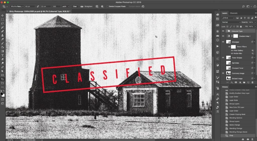
- Simulated photocopier effects: Experiment with designs that look like they’ve been photocopied multiple times to create a grainy, high-contrast look.
- Film grain and light leaks: Add subtle film grain and light leak overlays to give designs a retro photography aesthetic.
- The hand-stamped look: Use digital brushes or stamps that mimic the unevenness of rubber stamping for a more tactile look.
Success Stories and Real-World Applications
Several brands are integrating the "Dirty Design" aesthetic into their branding, tapping into the authenticity and grit that resonate with consumers today. Industries like fashion, music and even food and beverage have used the style to set themselves apart.
Take for example the soda brand Olipop, which employs a vintage-esque logo, fun colors and whimsical illustrations to make its cans stand out on store shelves.
Meanwhile, the popular eco-friendly clothing store Lisa Says Gah uses Y2K-inspired design elements and photographs with a film-like appearance to attract on-trend customers.
And as far as individual designers, Aaron Draplin has been instrumental in popularizing "Dirty Design." His work, which is marked by bold lines, gritty textures and vintage-inspired layouts, has inspired a generation of designers to embrace imperfection as an intentional choice.
Keep in mind that "Dirty Design" isn’t limited to niche sectors. The music, retail and even tech industries are incorporating gritty aesthetics to build emotional connections and distinguish themselves from competitors.
Why "Dirty Design" Matters
In a market that's long been flooded with clean, simple and undeniably homogenous content, "Dirty Design" stands out from the crowd. Its imperfections add some much-needed character, which makes designs more memorable and increases their chances of resonating with audiences.
The best part is that authentic design isn't just eye-catching; it can also help to build customer trust and loyalty. By embracing imperfections, brands can foster genuine connections with their audiences, who often see their own work mirrored in the realness that "Dirty Design" conveys.
For designers, "Dirty Design" offers a break from perfectionism. When designers are given (or given themselves) permission to embrace flaws, experiment and let their creativity flow, they can find their own unique style while pushing the boundaries of what digital design can be.
Challenges and Considerations
Although "Dirty Design" has no shortage of benefits (and fans), it's important to keep these challenges and considerations in mind.
It's All About Balance
While imperfections can add depth to a design, remember that they should always enhance it rather than distract from it. In other words, successful "Dirty Design" requires careful intentionality to maintain the message’s clarity and impact.
Be Aware of Client Expectations
Regardless of your personal taste, some clients may still prefer traditional, polished aesthetics. You can always try to communicate the value of "Dirty Design" by demonstrating how it connects with contemporary audiences who are seeking authenticity, but know that you may have to tone down your dirtiest design elements to keep clients happy.
Strive for Cultural Sensitivity
Graphic designers should be mindful that certain imperfections may be interpreted differently across cultures. For example, a design element that comes across as nostalgic and charming to one culture may simply appear sloppy and unfinished to another. So, it’s essential to ensure that the “grit” you add to your designs aligns with your audience's cultural expectations.
What's Next for "Dirty Design?"
Is "Dirty Design" a lasting paradigm shift that will change the world of graphic design forever, or is it just another passing trend? It's impossible to say with absolute certainty, but with audiences' increasing appetite for authenticity and individuality, it's unlikely that "Dirty Design" will ever disappear completely. However, that's not to say it won't undergo significant changes down the road.
For instance, with the growing popularity of AI and a near-constant stream of software advancements, designers have more tools than ever to experiment with imperfections. That means designers will find it increasingly easy to create even more innovative applications of "Dirty Design."
And as this style gains traction, it's more and more likely to have an impact on design education. In the near future, design schools may need to incorporate lessons centered around embracing imperfections and exploring analog mediums. If implemented effectively, such teachings could help encourage the next generation of designers to find beauty in flaws and inspiration in the past.
Give "Dirty Design" a Try in Your Own Creations
"Dirty Design" has emerged as a bold alternative to the squeaky clean and overly polished aesthetics that once dominated the creative landscape. By embracing grit, texture and imperfections, designers like you can meet the demand for authenticity in a world that craves the genuine over the flawless while boosting your own graphic design skills.
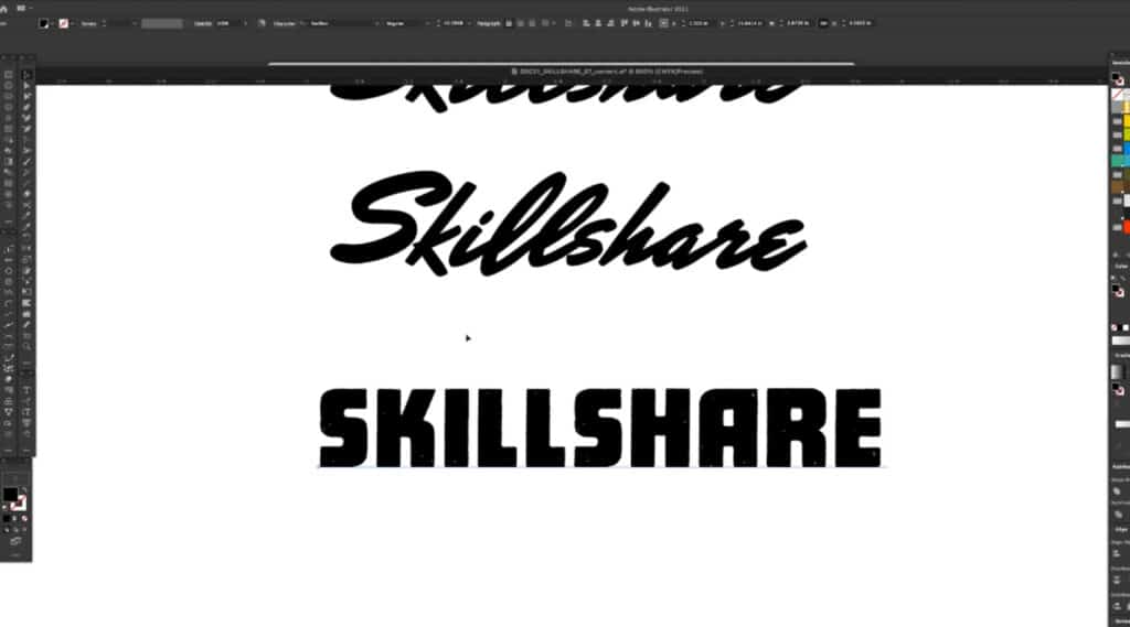
As you reflect on your own work, consider the value of imperfections. Let "Dirty Design" inspire you to experiment with textures, embrace Bob Ross-approved “happy accidents” and create one-of-a-kind designs that stand out in a sea of sameness. And if you're unsure how to get started, take Aaron Draplin's Skillshare class on the subject—once you do, you'll be whipping up unique and gritty designs in no time.
Related Reading
Carrie Buchholz
Carrie Buchholz is a freelance writer who lives in Northern Colorado with her husband and dog.
Try Skillshare for free! Sign up for a 7 day free trial today!
Get Started- Unlimited access to every class
- Supportive online creative community
- Learn offline with Skillshare's app


