Style explorations
----------------------------------------------------------------------------------------
ETA: well it sucks that after writing for more than an hour, skillshare started acting weird and would delete random text blocks when adding the next picture and, afraid of losing what I had already written, I saved the project and surprise, it deleted all of my commentary, all of it... I'm so sad ;( so this will be a shorter version of what I originally wrote.
-----------------------------------------------------------------------------------------
Materials used for this project:
- Ink and G nib
- Derwent Academie double pointed markers
- Gouache
- Watercolor brush pens
- Oil pastels
- Fude brush pen
- Watercolors
- Watercolor pencils
- Colored pencils
- Pencil
- Micron pen
- Watercolor paper
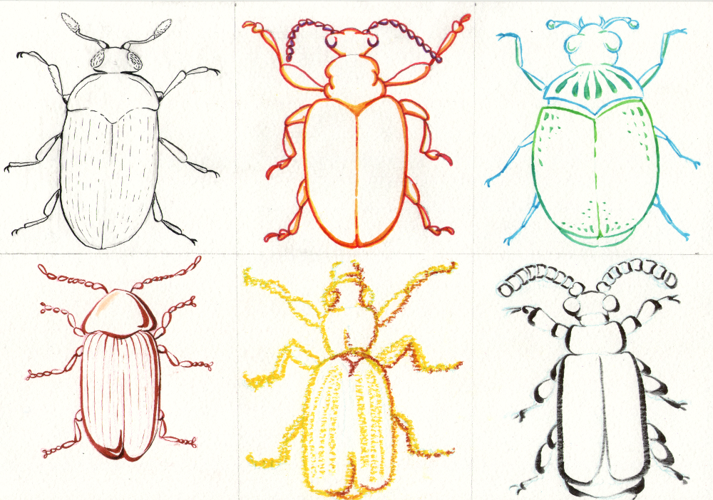
1.- LINE:
I sketched first on a different paper and the transferred to my watercolor paper by rubbing it with the graphite side down, next I sketched directly with pencil and then I tried red and blue colored pencils. My favorite was using blue pencil but it is hard to erase and I prefer sketching straight on the watercolor paper without tracing or transferring it.
It sparked joy and warm fuzzy artsy feelings to use ink. Markers made me realize I like combining colors and realized gouache is way cooler than what I thought the first time I tried them. Oil pastels are hard to understand, it's so wonky and ugh, nope. Fude brush pen makes me want to create lines in Chinese calligraphic strokes (inky ink I like you).
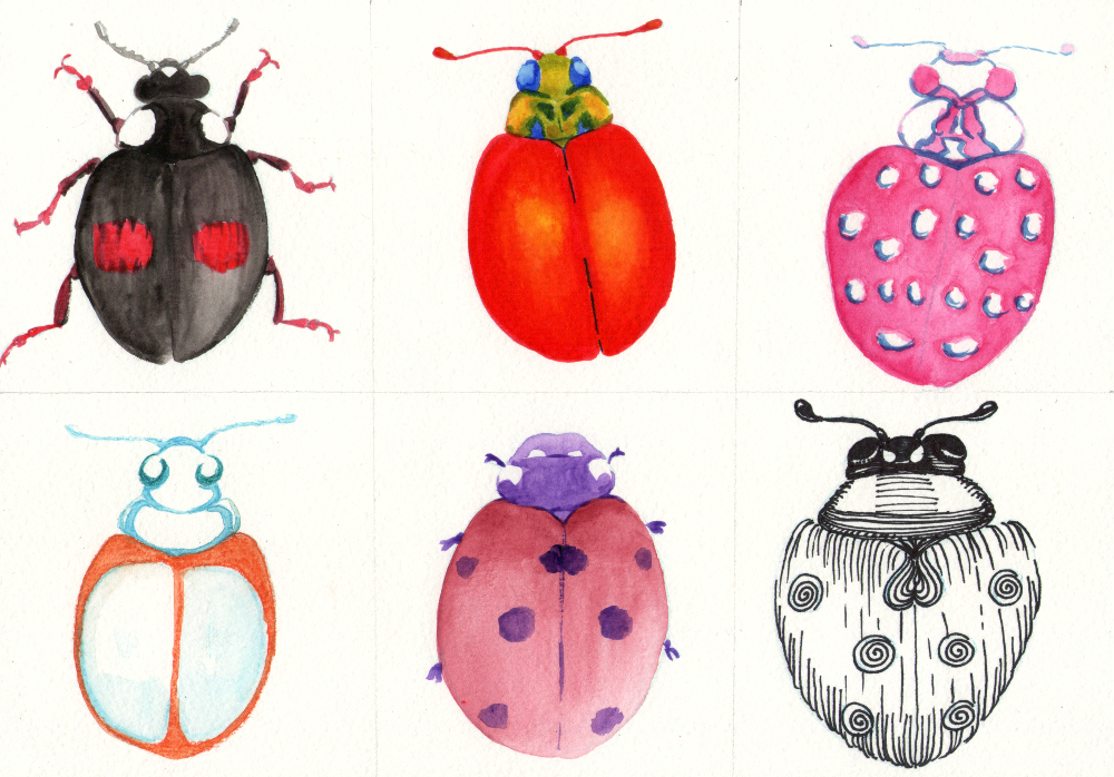
2.- SHAPE:
There is soooooo much I learned from each experiment but these are the highlights: I like how I can blend markers with water, I don't like wonky style like the pink 3rd ladybug. I don't know the limit between "loose" and derpy. I like gouache and "cell shade" style like 4th ladybug but I need to learn more. I love the colors of 5th ladybug, they are more neutral but still colorful. I fell in love with the texture and multiple lines of last beetle, it has volume and it looks unique. I can see ink is important to me.
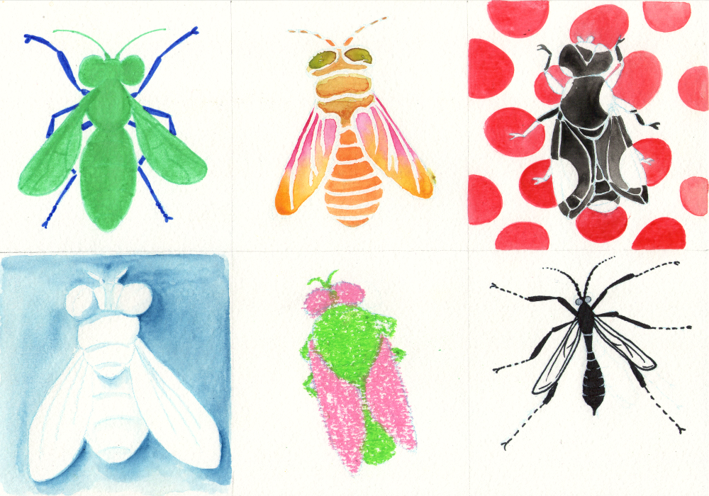
3.- SPACE
Very surprised that I liked them all, I think I understand oil pastels better and would use them for children's book illustrations. I don't like vibrant solid and blocky color designs like the first fly. I prefer gradients or combining colors (like in the line experiment) unless it is black.
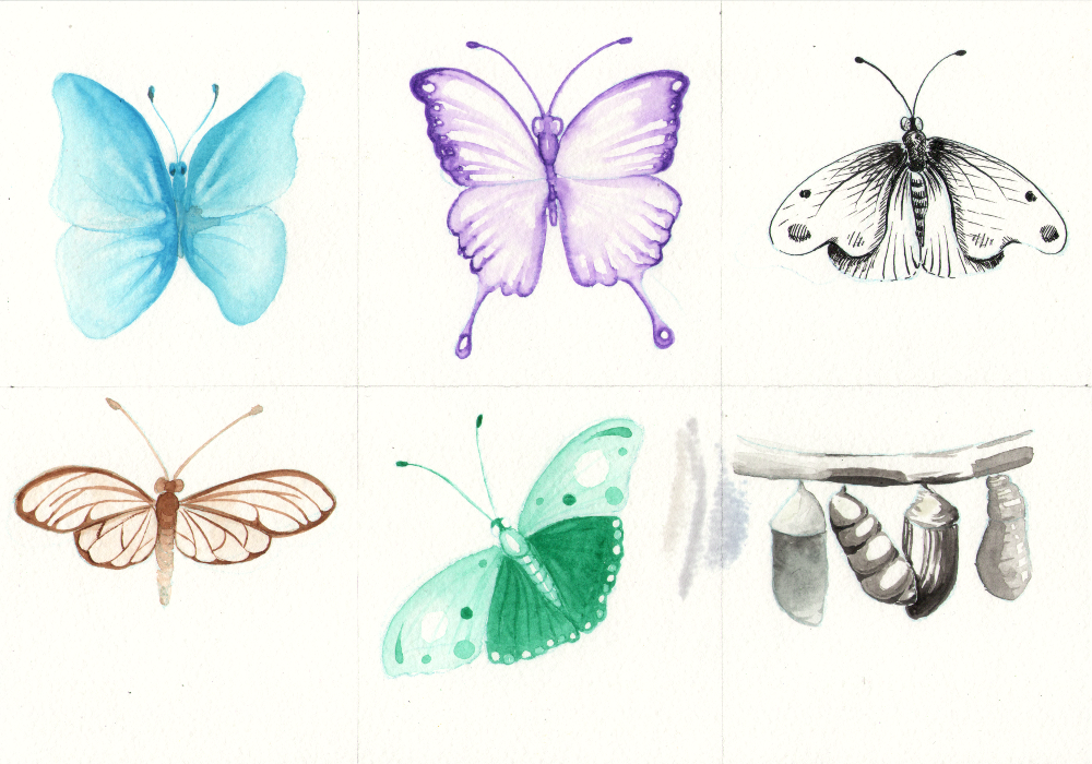
4.- VALUE:
Another one that I overall liked. I like that I can lift gouache way better than watercolors and create white effects like the first butterfly. 2nd butterfly, I love high contrast but didn't like the "lineart" feeling, I prefer more how the first one looks. 3rd fly, I tried creating values with ink, did I mention I love ink?. I just need to learn more inking techniques. 4th one I used brown color on purpose because I don't use it often and I LOVED IT! I think Art Noveau when I look at that butterfly, definitely realizing I prefer muted colors, even if I don't normally use them. Las one, they didn't have time to hatch! and tried 4 different shading styles with brush and ink. Guess if I liked it?. Ink is my soulmate maybe.
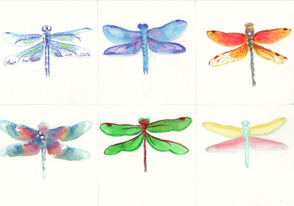
5.- COLOR:
This was a shock, I was sure I would "ace" this experiment with lots of new color combinations or stuff that would make me fall even more in love with color (More than line or shape person, I would have said I'm a color person) but surprise, surprise, I don't like any of them completely. 1st one I like leaving white spaces and rough strokes. 2nd one didn't like that it is not loose neither well defined. 3rd one, I don't like dominant red yellow combination, too attention seeker. I did like using gray and letting in mix with hints of color (body). Again, neutrals win. I love the color combination of 4th dragonfly, kind of batik, whimsy, fantasy feeling and the loose brush strokes are nice too. 5th one, yep, no blocky bold colors, but I did discover I like green over red for shadows, reminds me of block printing and could work for my cell shading style. Last one, I like pastel colors, thank you gouache.
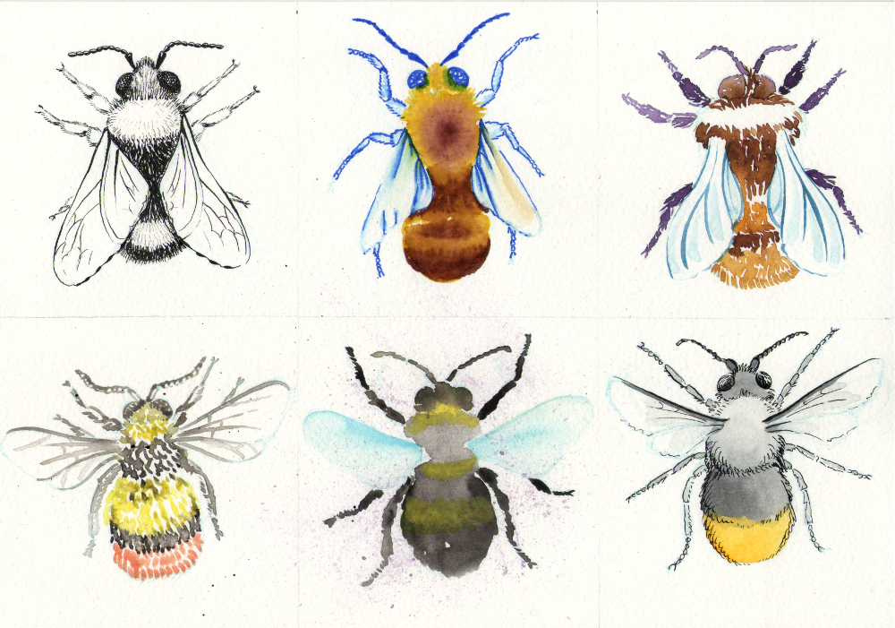
6.- TEXTURE:
Another "Uuuuh I like them all" moment. Ink goes without saying, it looks more time consuming but in reality the next one (markers) took me longer. 2nd one, markers, I still enjoy how I can blend them and create smoother textures, haven't really paid much attention to them, specially the blending part, and I think I will use them more now. 3rd bumblebee, watercolors, was a pleasure. I love the subtle changes of value and again, playing with neutrals. 4th is gouache and I played with white + color (tint?) and I love it. Colors don't combine but they are not that solid or blocky so I still like it. 5th bumblebee I splattered a bit of paint by mistake and I liked it, so I splattered even more. I really like the extra texture combined with the loose blotchy style (gouache, but yellow appeared translucent). Last one I combined 2 of my favorite things from all the experiments: color and ink. I like everything about that one and I could make a whole new set of experiments with different ink colors, nib types, watercolor/gouache/markers, neutrals, whimsy, and so on~
In conclusion, I discovered that I like ink more than I thought. I rarely combine it with watercolors or gouache but I will now. Markers were also a nice discovery. I had high expectations for watercolor pencils but in the end they didn't bring much to the table. Oil pastels are not my jam, they look cute and childish but wont use them as my style. I want to test colored inks and different nibs. Also, gouache is something I neglected because I was too artistically immature to even know how to use them properly but now I will experiment with them more. I loved each and every of the experiments, and surprisingly, the one I felt more confident about, was the one I struggled the most: color! Maybe because I felt the pressure to focus on color and my brain just got tangled with so many options and hard to decide? I don't know, but felt really interesting. High expectations can hinder results sometime. I will keep my experiments and notes for future reference :D
Thank you Alanna, this was a terrific class!