Illustrative Style Discoveries
A collection from the class projects and the resulting rampant rabbit trails I found myself on. These wild diversions can be prolific when the subject matter is really engaging for me--and oh yes, insecty-friends are.
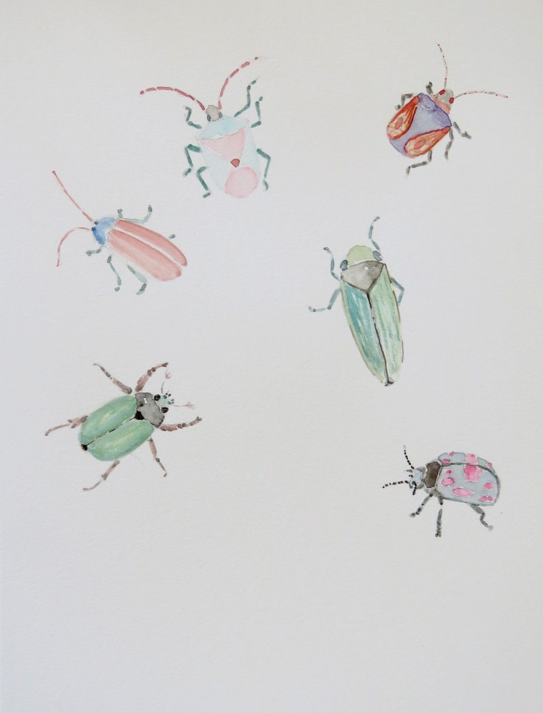
#1 - I grabbed an insect guide from my library and picked some beetle pics that appealed to me. Drew them in pencil without worrying at all how they were placed on the page. Painted them in with watercolour, realizing after I should have picked a different medium for each bug. Oh well.
Loved drawing the insects, so much that I became all entranced in their nifty features and found myself unable to dash off quick sketches. Really liked filling in the shapes with loose strokes of watercolour. Didn't like adding detail with the watercolors, which I found irritating and stressful.
In an effort to fill in some blank space I added some ink doodles. Adore the little bug village with the wonky antennas. I've been attempting to artistically connect with the zany, off-kilter side of myself that's usually very repressed in daily living, so I was pleased that my attempt at whimsical came quite naturally, though a bit hesitantly.
Next I coloured the doodles with pencil crayons. Didn't much like working with them and the results rubbed me the wrong way at first. Later, I really liked them, especially the center moth in primary colours. So strange, since that was the one I particularly disliked once it was finished.
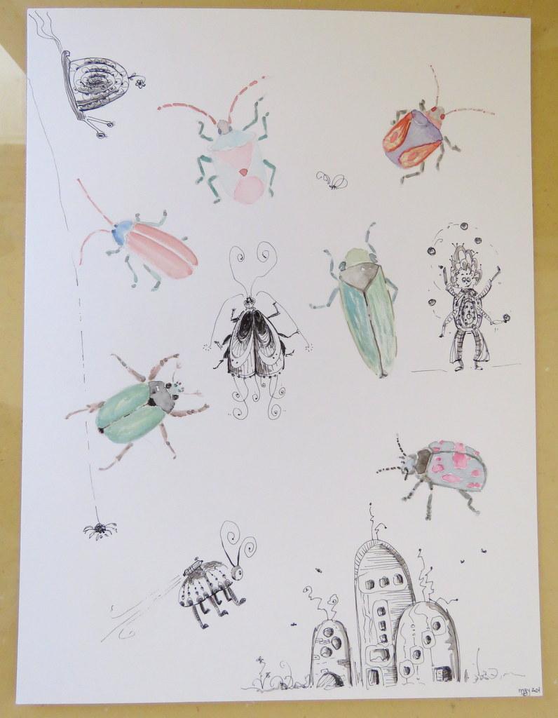
Second lessons learned: I'm excellent at creating problems for myself to sort out. I really like solving problems. So, do I sneakily create art problems that I'll have to resolve, learning a massive amount of information in the process? Or am I a mess of self-control when it comes to creative expression? Interesting to ponder, since I'm very disciplined normally almost to the point of dreaded perfectionism. Oh yeah, what I learned...
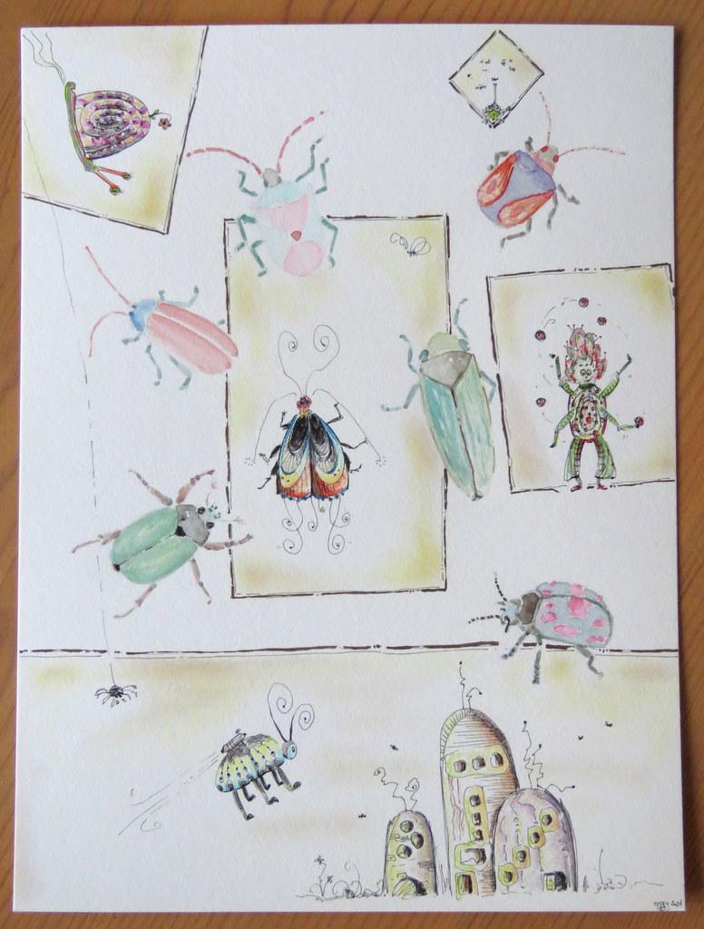
The spacing of everything is not ideal, but I do find the overall effect tells an interesting and quirky story, and that feels true and honest. Playful and whimsical, yes that's where I want to head. Serious and aiming for perfect? Please NO! Way too much of that in real life already.
The pale watercolour painting on the insects is doing something very strange to me. I like it, but I know it'd be better with ink applied...and shadows. Yet, I'm held back with the odd sense that I need to leave it as is, that somehow letting them be lovely yet incomplete is a more important reference lesson.
Oh yeah, I strongly dislike that purple and orange-winged insect. This one I got fiddly with the watercolours, learning to keep things loose or I'd be unhappy with it. The woodborer (between moth and juggler) has a dry brush technique for the shell. I don't like it, but my it's my partner's favourite which is interesting.
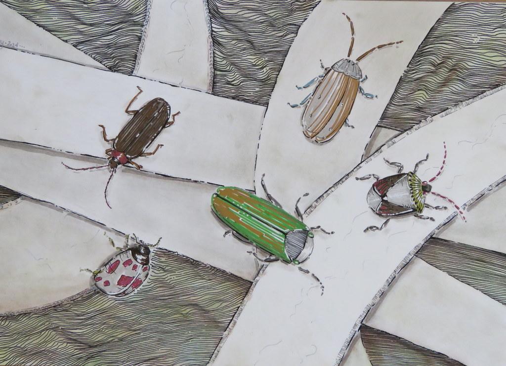
#2 - These beetles were coloured using my metallic markers which I hadn't really explored yet. Oh boy, they ended up being so fun that once again I couldn't stop myself from filling in all the insects with one medium. Hmmm, what is this lesson saying about myself?? Do I really need to think long and hard on it? Naw, let's just keep running with it.
Later, I added the paper roads. These were the only elements that I truly sketched in, tweaking the paths until the composition was pleasing. Next came the topographical background done in pen. Started with straight lines at the one corner and thought how rigid that looked. Began undulating the lines and thoroughly enjoyed the process, getting lost in the depth created just by the lines. Finally I added shadows, chalk colour to the background and paths.
Love using the markers. The bold colours with the metallic sheen have my inner critic screaming Kitschy! but too bad cause they're really fun.
Something about perspective and depth keeps engaging me. I just want to play with it and see what happens.
Overall, I'm pleased with this piece and it makes me very happy looking at it.
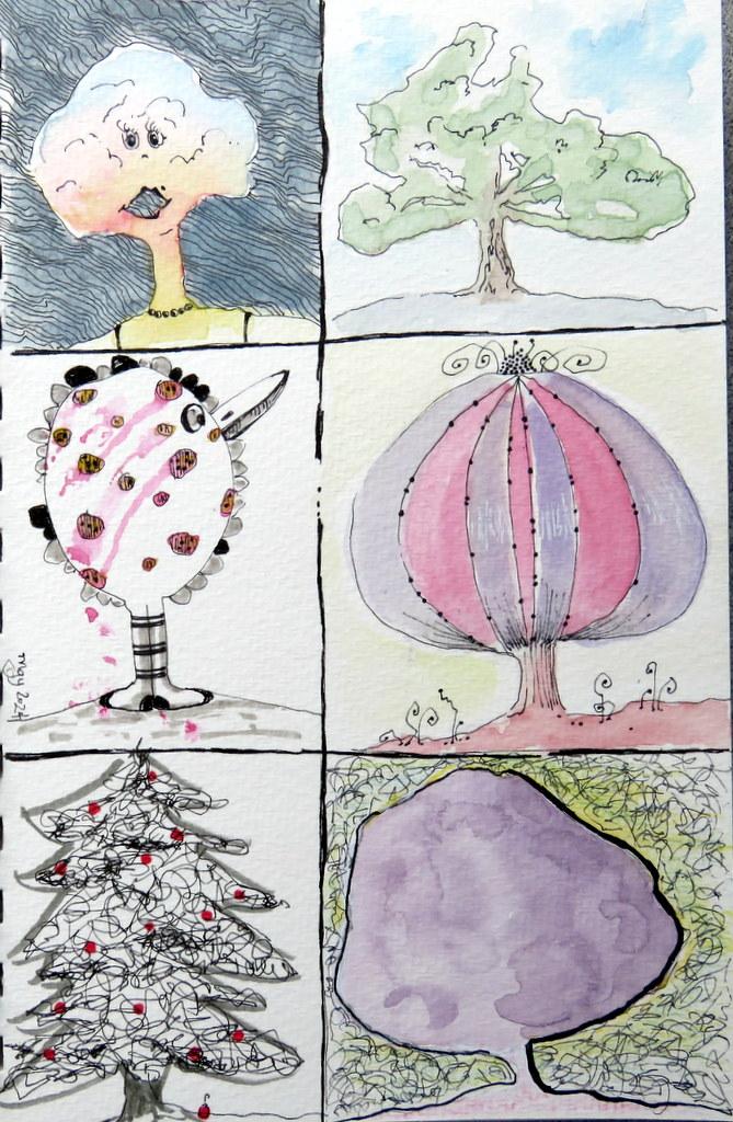
Sketched tree shapes for next series after deciding flies were too distracting to keep simple. Did my best to get 6 different tree shapes in very quickly, with #3 & #4 the most basic lollipop shapes which I'd never usually use, #1 & #2 probably what I'd most gravitate toward, and #6 being a very large organic shape in the frame.
Water colour washes to most--yeah, couldn't stop myself once I got going. Accidentally dragged my hand across the still wet spots on #3. Oops. After adding sunset colours to the tree on #1, I filled the background in with pen to mimic silhouette, experimenting with reverse negative space. I found that very interesting and loved the simple clean tree shape with the soft colours. Only later I added a bit of pen for branch shaping and ruined that effect. *sighs* Fiddled to add a face, put dress straps on her shoulders at my husband's request, then added the pearl bling. She's pretty interesting and maybe a little creepy, and I did like it best with the plain coloured tree, but it was a satisfying experiment.
The bird tree came after I drew stripes on the trunk and thought they looked like socks. Too fun to resist the rest from happening.
#5 Scribbly Christmas tree is very pleasing to me and the scribble work was so fun I carried it to the background on #6 to fix a mess I'd made here. I love it here. Really love it. The lavender in this shape happened very quickly as I purposefully tried to limit my time painting it. The background was a frustrating struggle using pencil crayons to get any colour I liked. Ugh. I think I'm giving up on trying to incorporate the coloured pencils. Used a bit of white gouache to sort out the ugly background. Scribble work on. Much better. Couldn't get the outline of the tree to feel right. Thickened and thinned lines almost driving myself to distraction, then took my thickest Sakura pen and really attacked the outline and bolded up right side in a fit. Holy! Suddenly it felt done and wonderful to me! I'm still trying to understand why so I can learn to utilize the technique.
I adore #4. It's probably my favourite. It's not only the shape, but the funny little story I love. I think I'm learning through these excellent exercises that my style probably needs a little story to feel most genuine. Very much gravitating toward that end when I'm creating most freely. As much as I love this one, I considered the colours ugly together and struggled with them, in the end leaving them to see if I'd like them better later. Yes, I do. Another mystery why my colour choices mostly don't make me happy while adding them, but later they seem okay or even pretty. Just not me. Which ones are me??