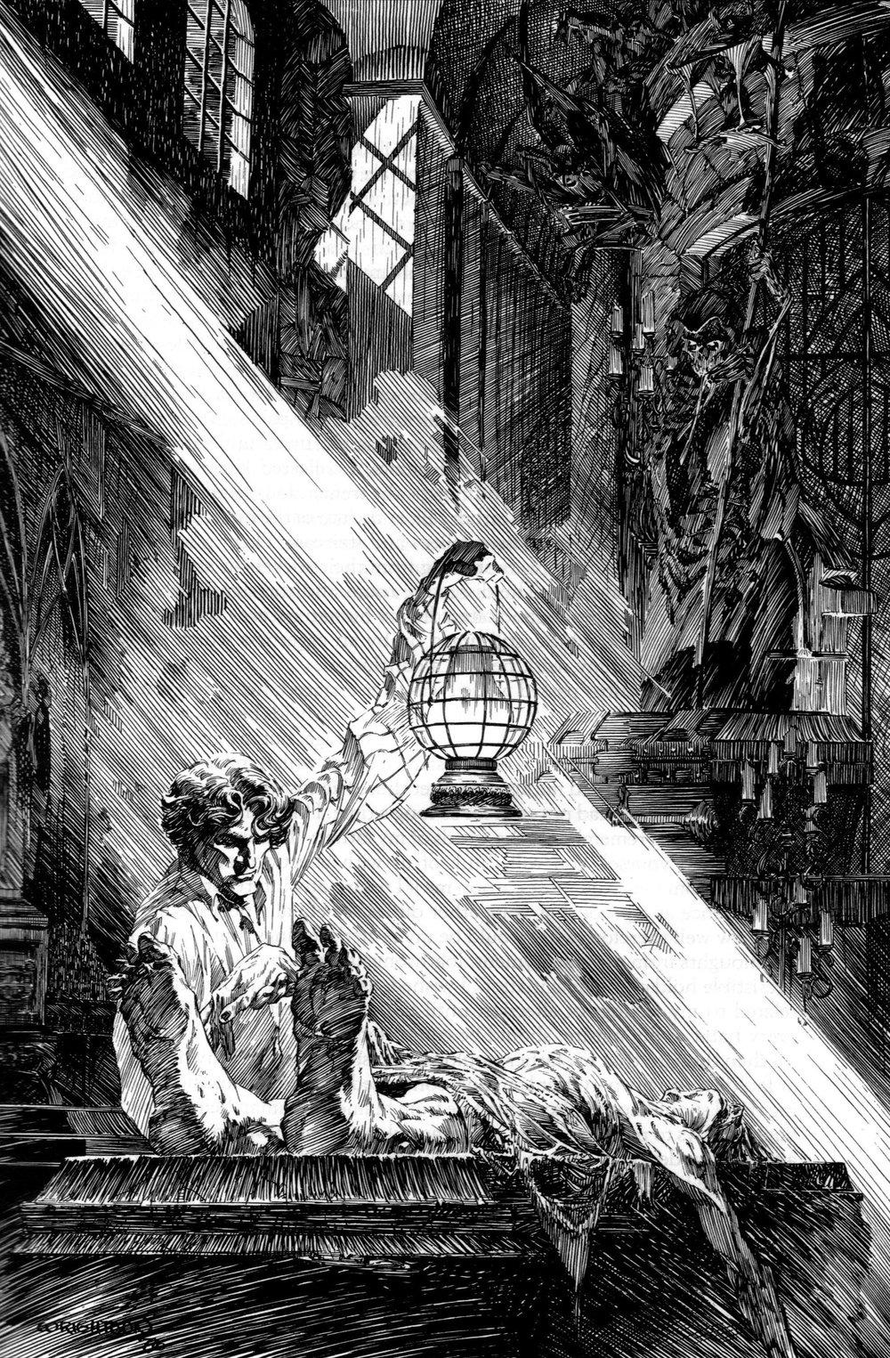
Master Study - Bernie Wrightson
I did a master study of this Bernie Wrightson's illustration (I just love his work):
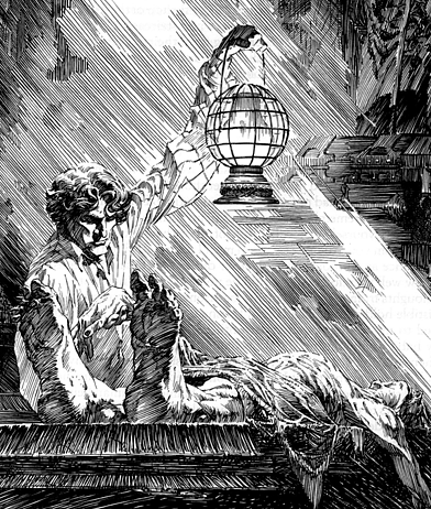
I chose this part:
Here are some of the exercises:
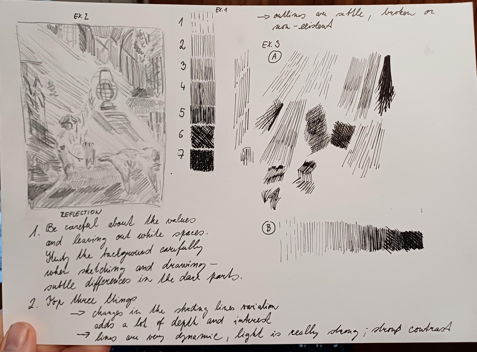
Top three things from my analysis:
1. A lot of variation in thickness, direction and proximity of the hatching lines creates depth, interest and illusion of details even when those are only lightly indicated (background).
2. Strong contrast, strong light, lines are really dynamic.
3. Outlines are broken, sometimes left out and replaced by strong and precise hatching. The outlines aren't prominent.
My study:
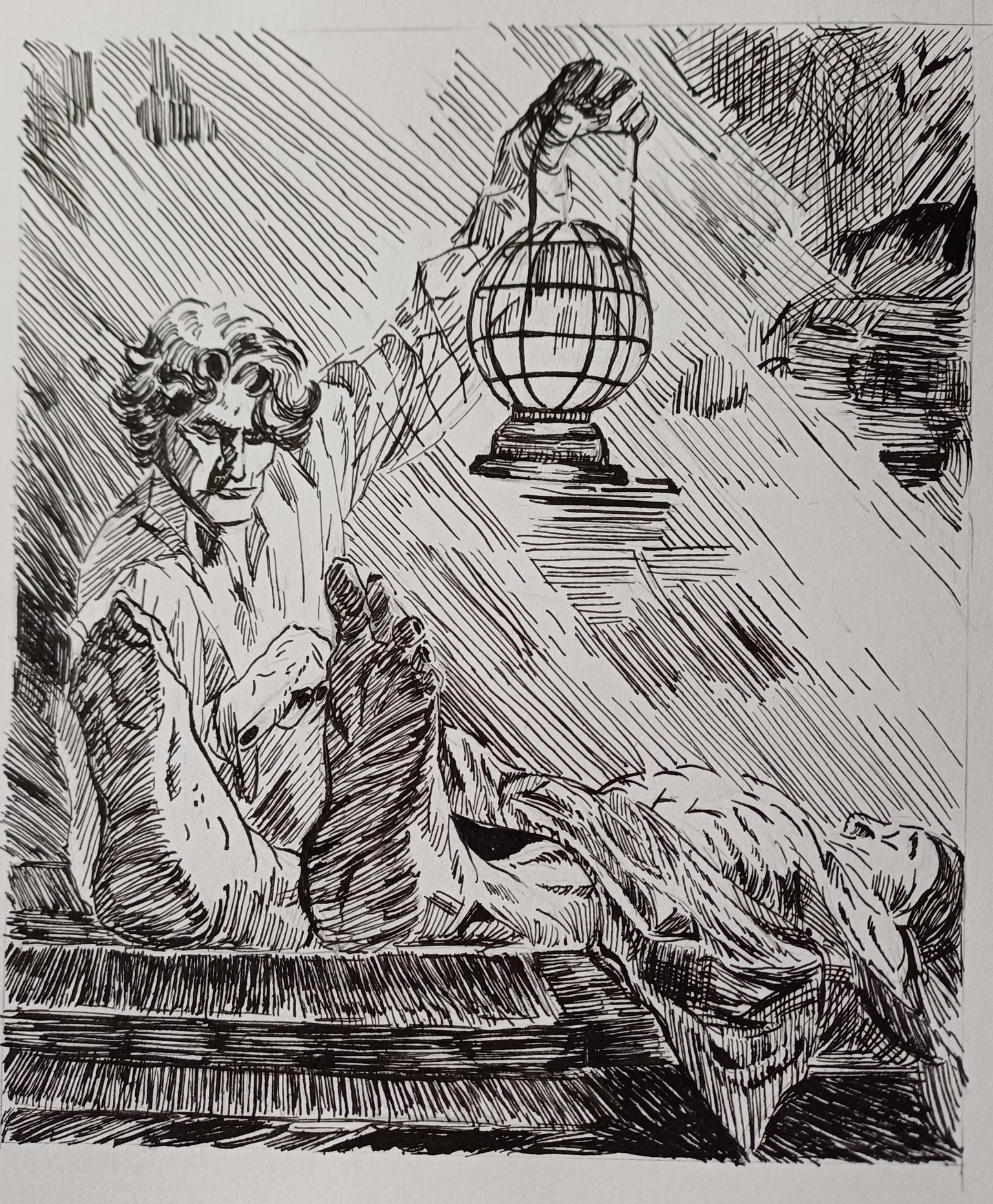
Takeaways:
1. I am very new to a dip pen, this is like my third real drawing with it and it is obvious that I lack the control I need to be more precise. I also might need a different nib as it was kind of hard to vary the line thickness (or of course it could be a lack of practice, too).
2. I need to practice drawing hands and feet.
3. I need to practice drawing longer straight lines.
Thank you for a very useful class!