Let's Go All In (Part Deux)
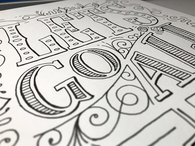
So now I've "Gone All In" here! #BadPuns
From previously going through Mary Kate McDevitt's Hand Lettering Essentials for Beginners online class to this one. Now going through the process and methodologies going forward from inking into fully-scanned color finality.
Here's the final full-color rendering for those that like to jump right to that:
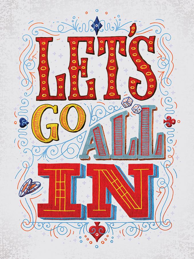
Now here's the progression of process order I created to mimic her process shown this round:
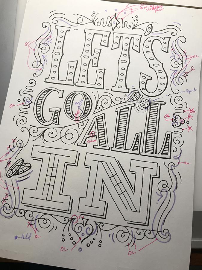
Back to the original inked final drawing and immediately calling out "corrections" based on early videos in this class such as connecting counters to outside edges for ease of digitizing (good idea!). And pushing other embellishments further knowing they'd be inked separately.
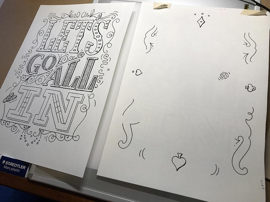
Inking the separations on the lil' light table.
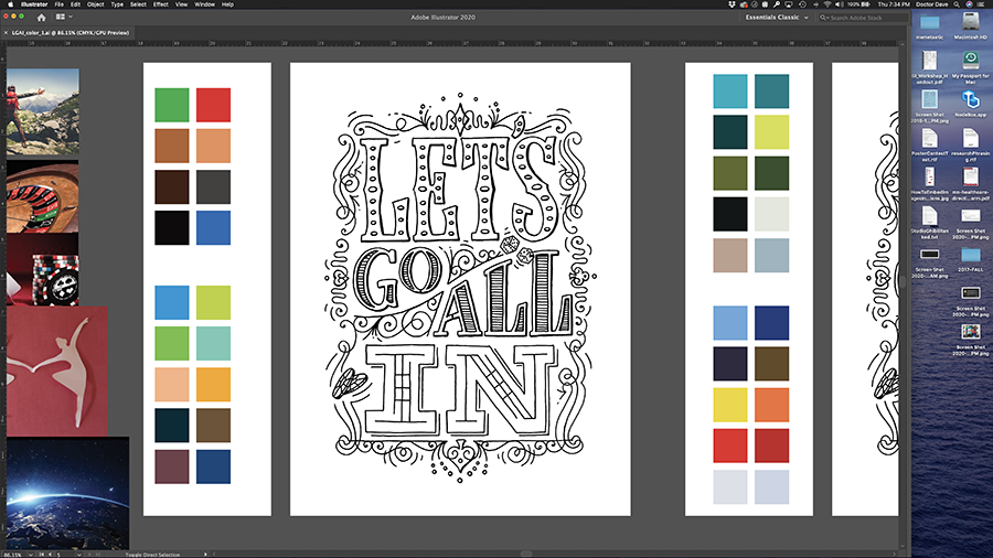
Now scanned and relatively happy with it, Image Trace settings were challenging as we are much further along than CS6 (though I miss those non-subscription service days, but I digress...)
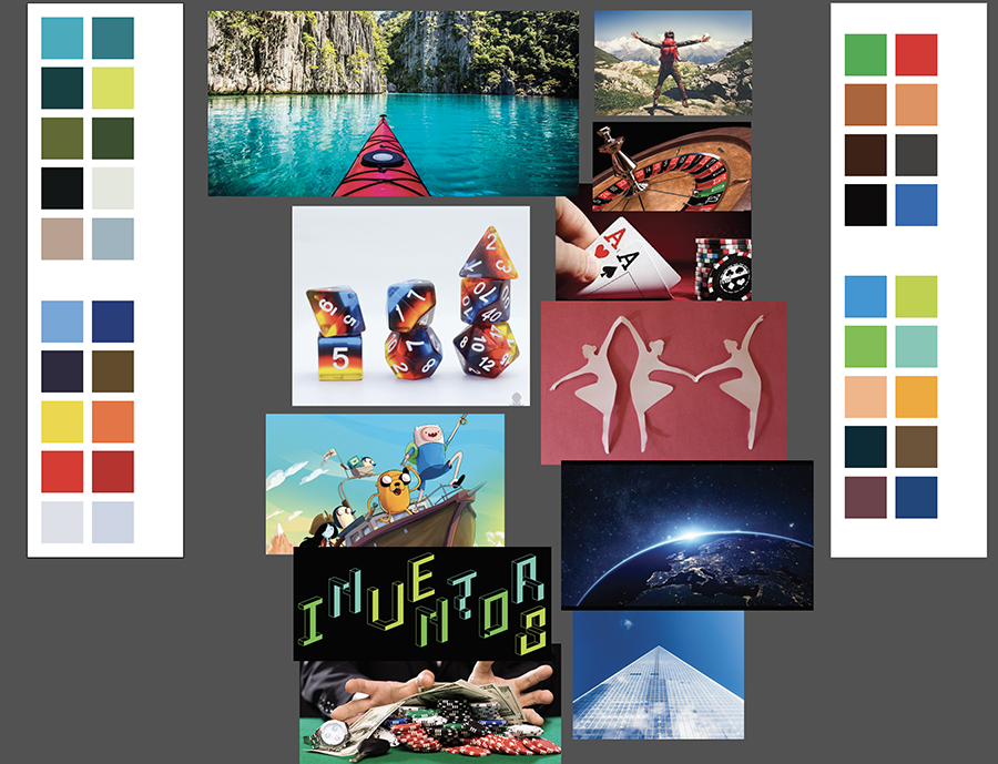
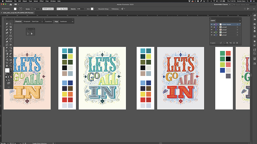
Pulled back from mood board work and started some swatch-group ideas from said imagery. Not trying to overthink, just eyedropper color-grabbing.
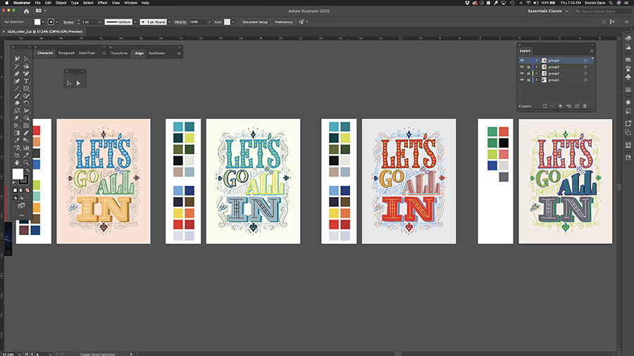
Based on those palettes mixing and matching to see some variety in tones!
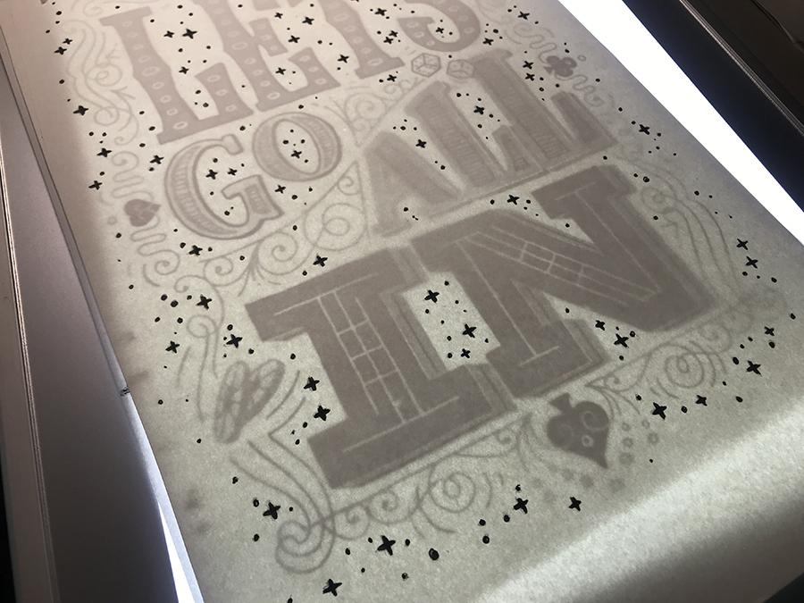
With watching more videos and looking over the layout I decided to add more Vegas-risk positive "bling" to really populate so black-and-white printout and inking some more....
Brought those 'posi-stars' into the four color experiments for more...then a friend noted that, "Oh, those are poker chips? I thought they were film reels." Sooo...fair note! Back to inking and scanning that part.
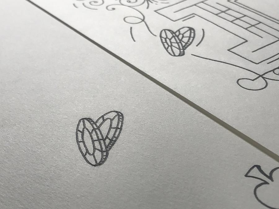
(It helps when the center area is a much larger circle...just sayin'...)

So now pushing this color direction as the trying many reds that are usually not my comfort zone, all about pushing ourselves yes? Maybe? Okay we're going in....
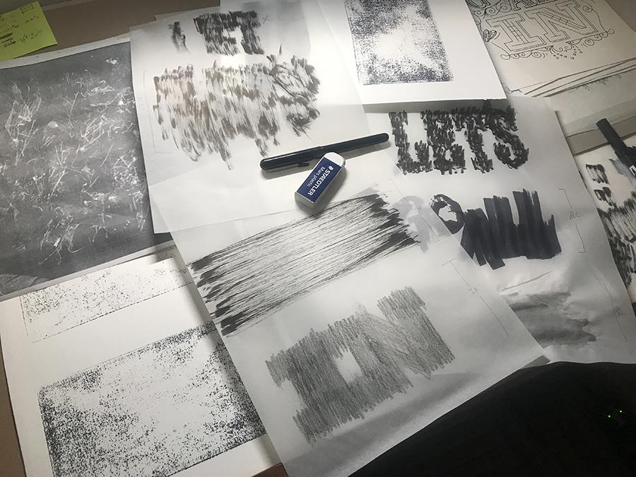
Making some textures...
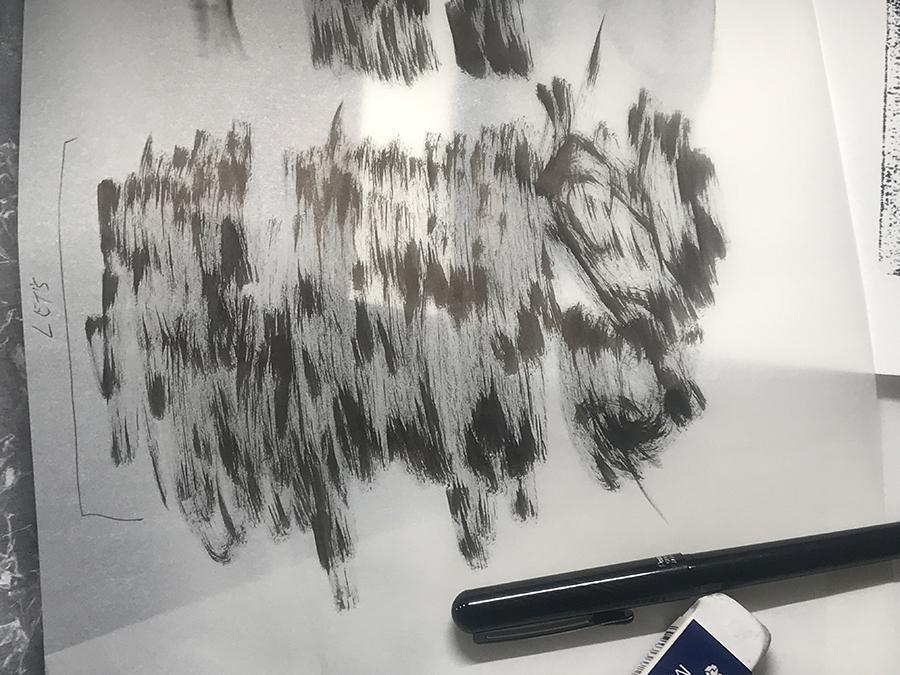
with different black pens...
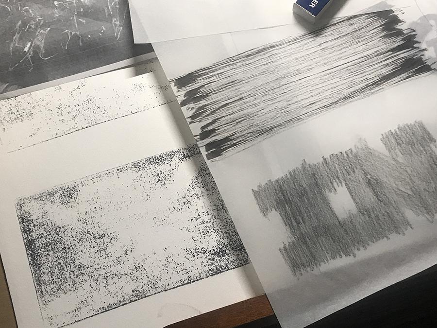
and B-rated pencils...
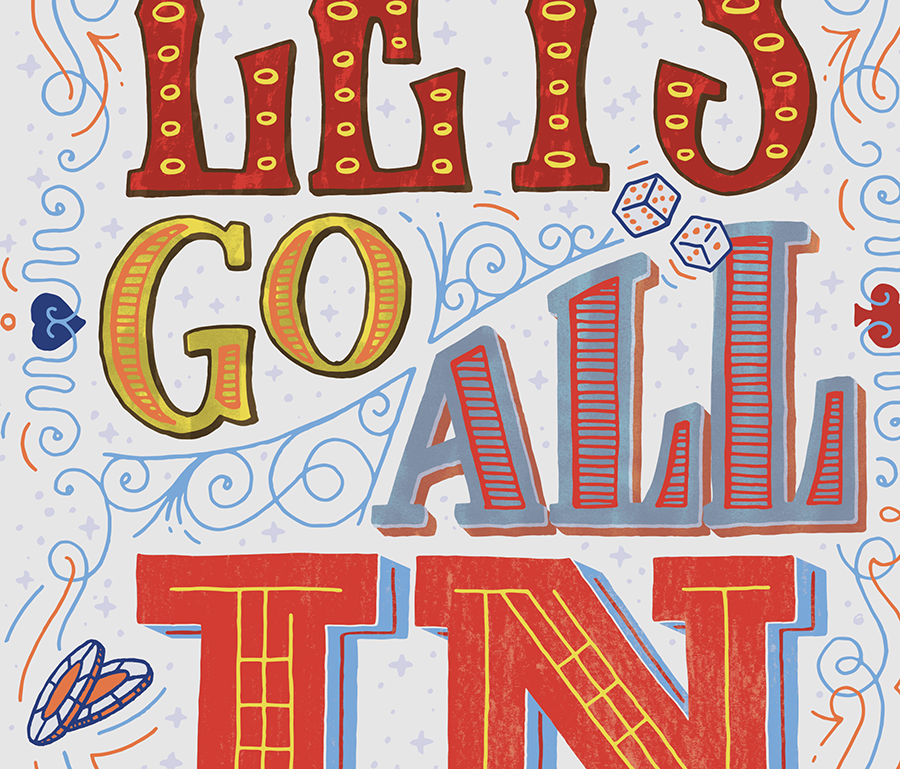
And having now scanned into photoshop working with the initial hot-mess #Srsly of content and layer-mixing. Took me a bit to really play with Hue/Levels/Color-Balance. Will still be curious to see how it officially prints out...
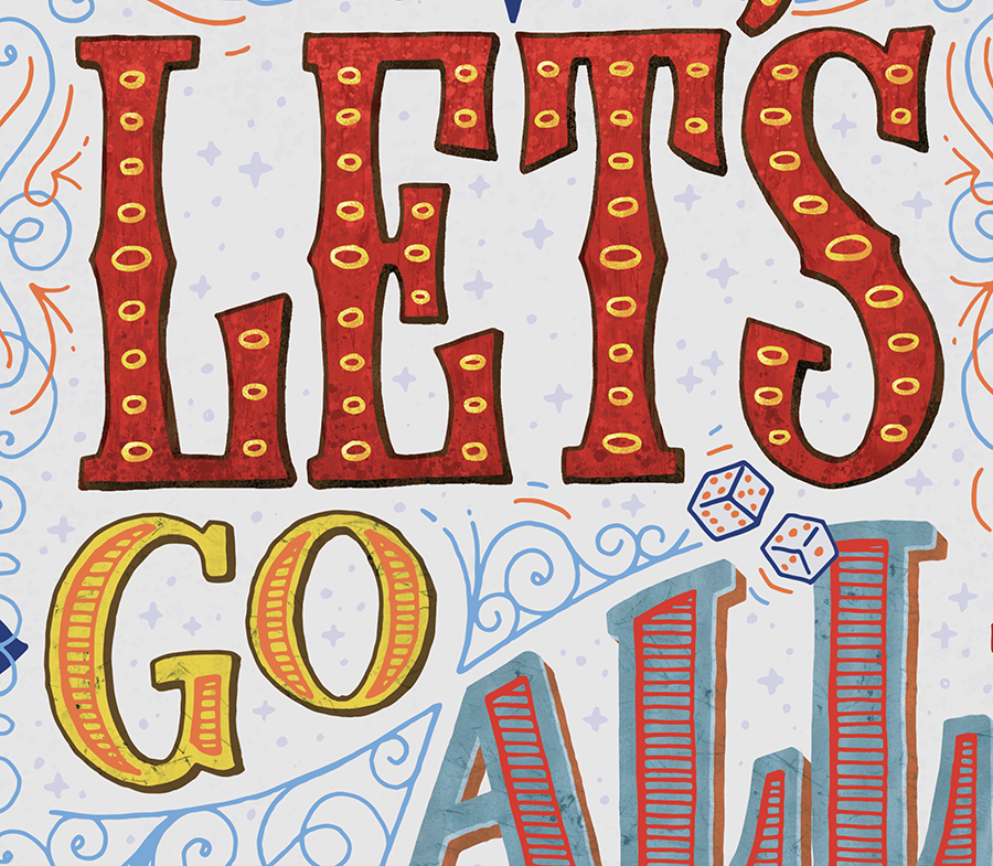
More futzing with handmade textures...
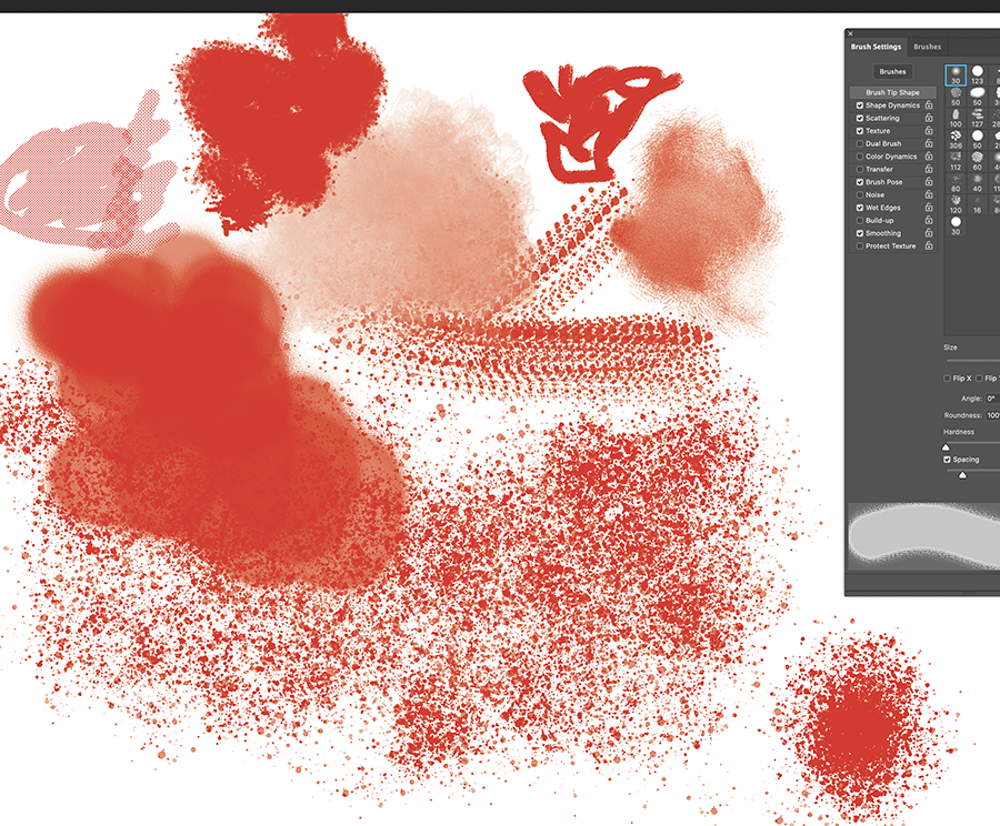
Now playing with a few of the brushes and trying to make sure not to use those nasty, nasty patterning brushes.
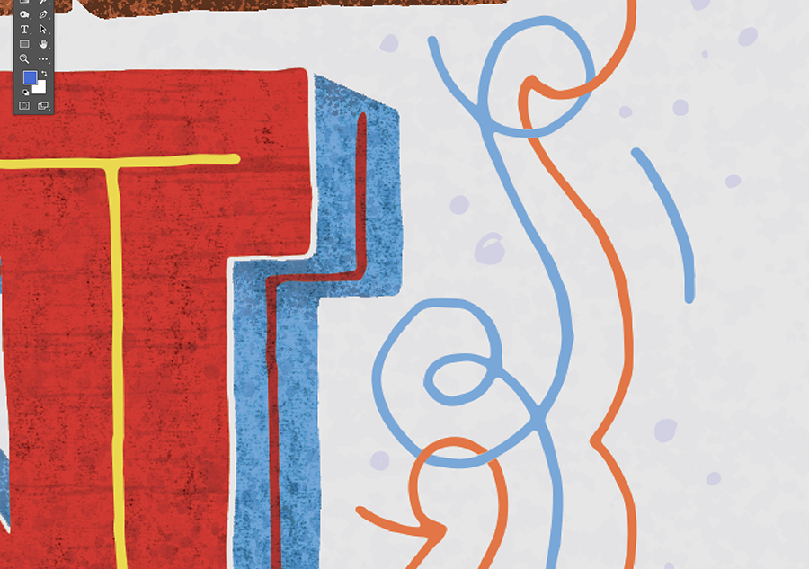
Better texture mixing! And now also fixing the various color filigrees so that instead of just overlapping one with the other, they interlock. Ooo fancy...
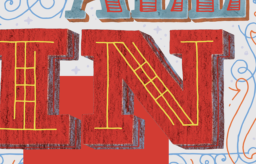
Learning I didn't remember to separate the IN-Surface red from the Blue Surface 3D-returns...so a singular texture over both a warm and cool color being adjusted with levels/hue/etc. did _honestly_ become a hot mess. Fix!
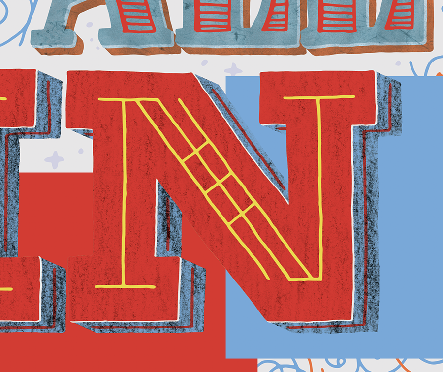
Better...and using solid color blocks to remind myself the original color intents of those fields of color.
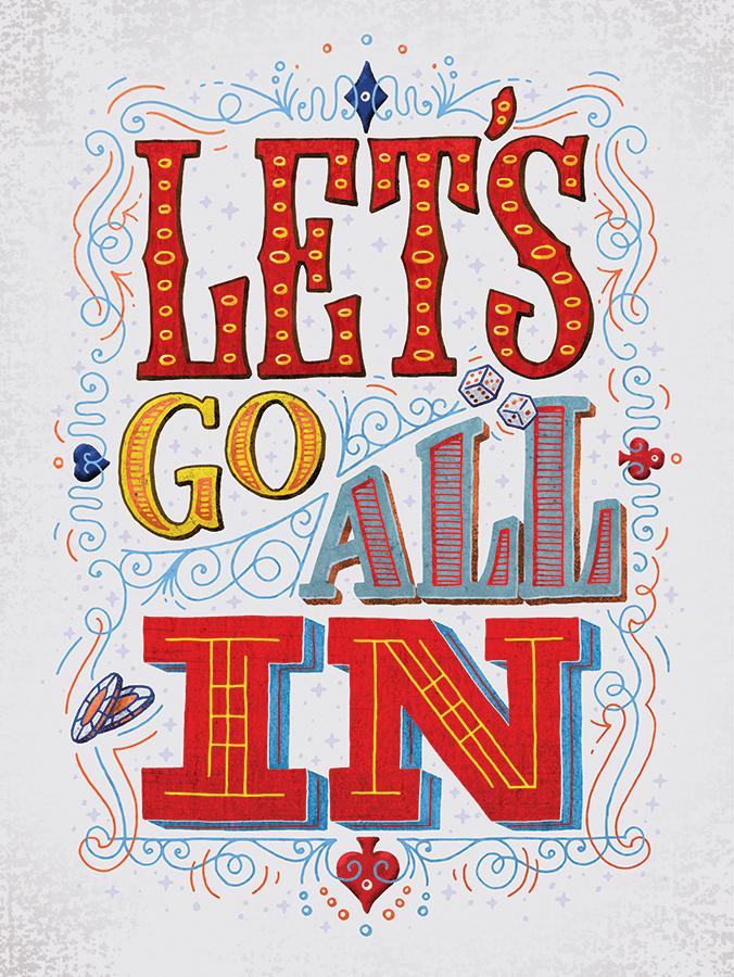
And playing with textures all around, background, side objects, main letters, and filigree. Feeling pretty happy with it! Though I still think some of the previous color iterations back in Illustrator could come through this process looking swell too. Phew! Done. Next!