Experiments in: 1.Line 2.Space 3.Texture
Hello all :)
Here are my experimentations with various designs styles (I'll upload more when I complete them :)
1. Line
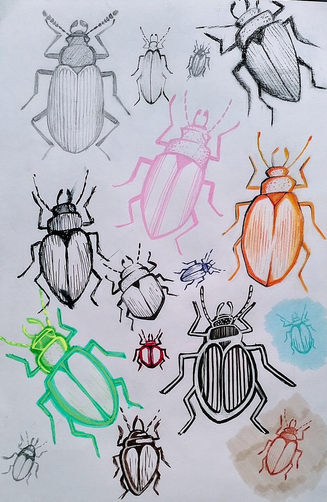
As stated in the class I started by doing a detailed study of a beetle reference image of a beetle in pencil (to left) to help me really understand it's structure so I'm more confident in breaking down and simplifying the image.
I experimented with gel pen, Biro, pencil, charcoal, dip pen, brush pens, coloured pencils and posca pens.
Result: I love line and how expressive it is. By using variation in line, multi-coloured lines, or using line on coloured background you can create a feeling of whimsy, boldness, weight or more. I also experimented with minimal lines and using it to distort the beetle shape and line within line! What i didn't like heavily coloured bright lines or very thick lines because they're too dominating. But yes, line is definitely my thang!
2. Space
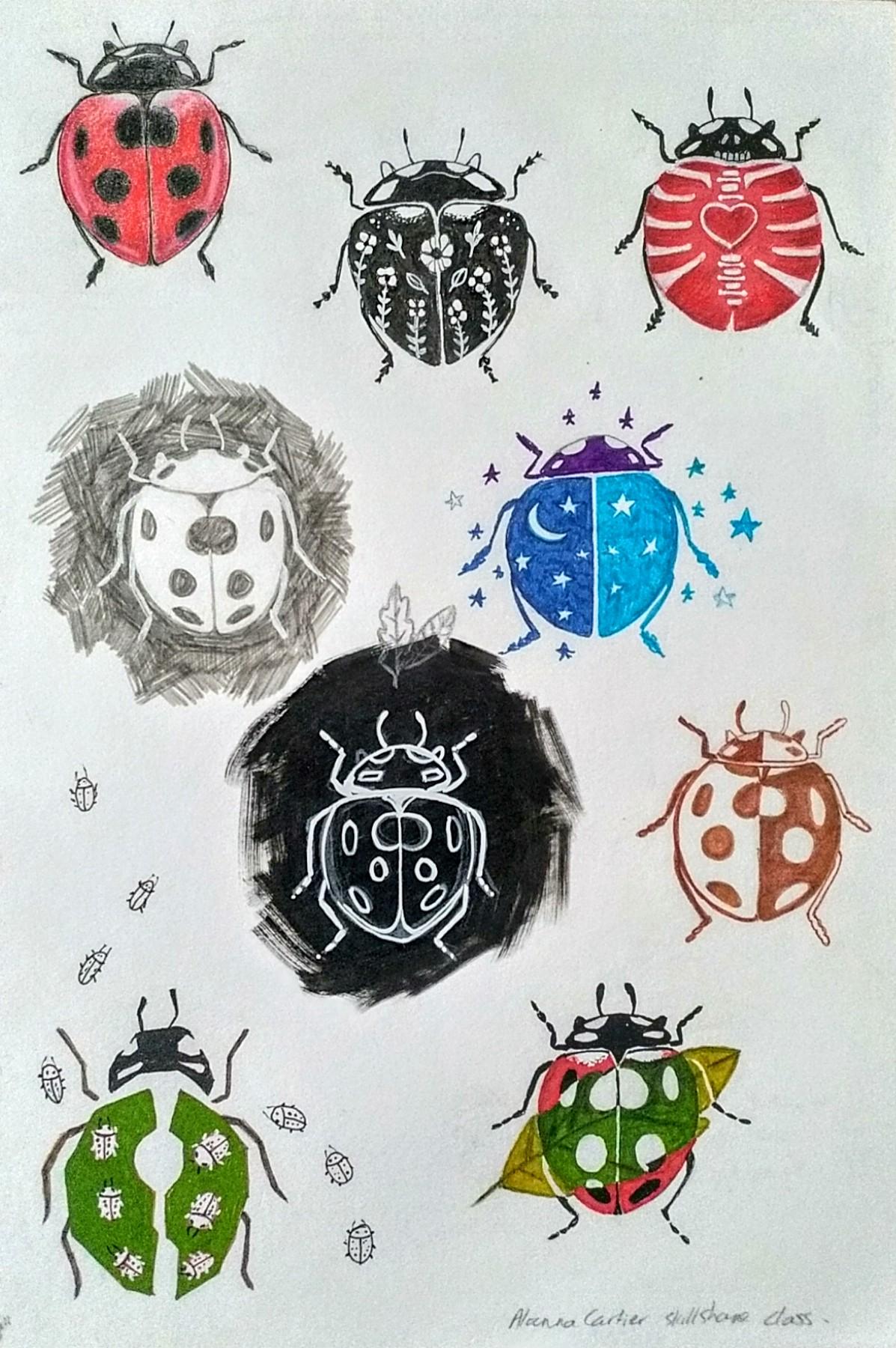
Negative space was a tricky one, so I decided to use the ladybird for this prompt instead due to it's simpler form with distinctive marking.
I had to think hard for ways to use space within or around the little bug. I think the trouble for me is that it's hard to use space with just one subject item, I felt it needed to bounce against something else like leaves or stars for me to find a use for it.
Overall I'm drawn to images with a lot of white space, it gives a composition room to breathe and enhances areas with detailing I don't enjoy every area of the canvas being filled in. However, it needs to be used carefully for the right impact so it seems the most difficult to use for me out of all the styles (but very rewarding).
3.Texture
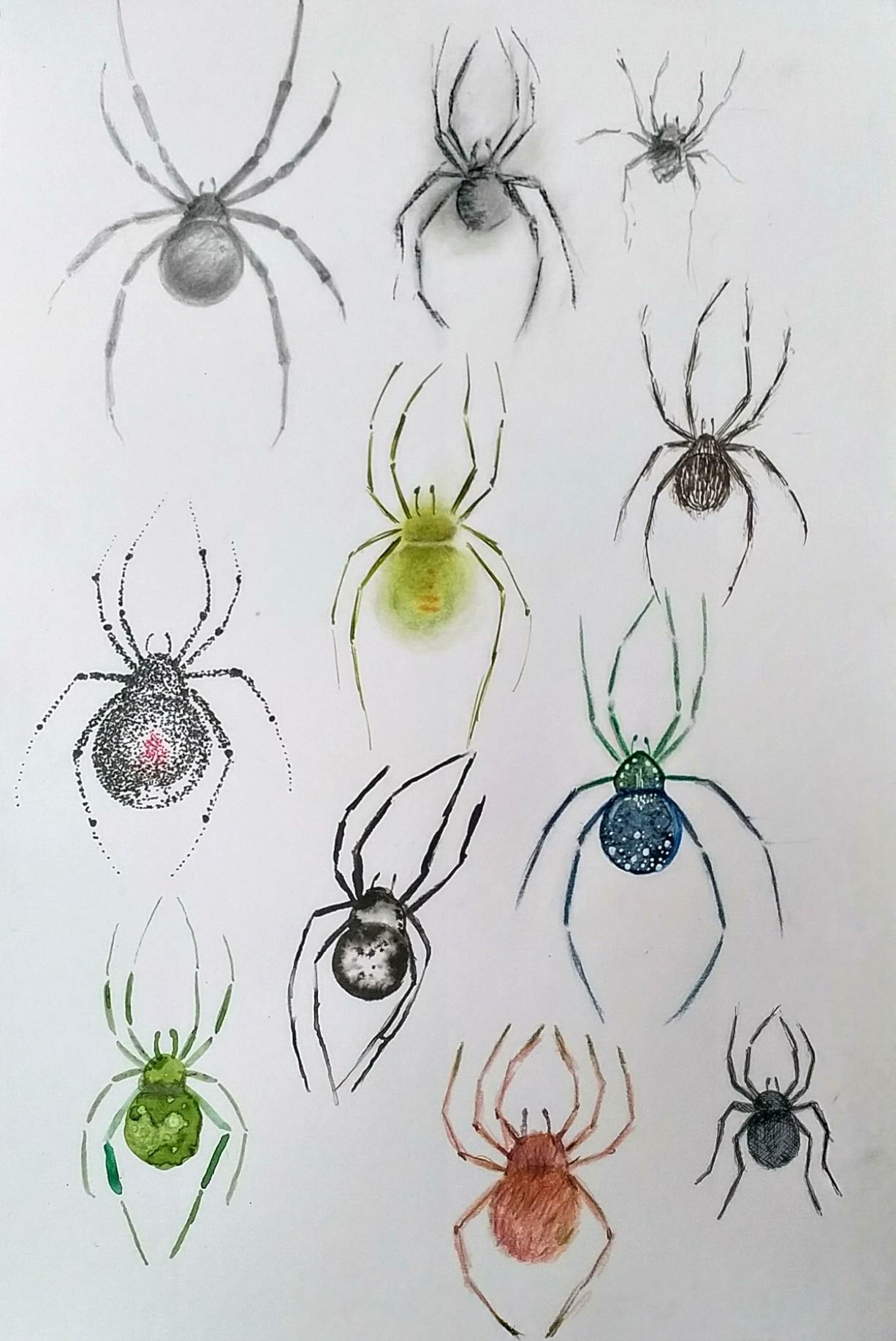
My apologies to any arachnophobes out there, but I wanted to see if I could get texture out of a spider!!
I started again with an initial study from reference then experimentimg with charcoal, for a rough scratchy slightly more impressionistic feel, fineliner to create a hairy texture, pastels for a soft fuzzy and transparent feel, stippling just to try, wet in wet Indian ink (which was a failure even the spider looks squashed) watercolour with salt and white gel detailing, watercolour with alcohol, pencil crayons for a fuzzy textured feel, and cross hatching on a flat base colour!
I really enjoyed putting texture into these illustrations it felt very natural and allowed me to add a kind of detailing without being slow and meticulous about it. I also felt line and texture are closely related. My favourite ones where the scratchy charcoal spider because it captured how I feel about spiders, and the green loosw watercolour spider because of its loose effect and varying tones, and the coloured pencil spider because it creates a fuzzy textured feeling and I could add blend colours within to create extra interest
If there was anything that I didn't enjoy it I think it was the stippling not because I don't like dot's, I really love them but because I feel they are best used in selected areas or in a more loose style rather than to compose an entire image of a which was too time-consuming and painstaking for me. over the inky spider was a failure i think I just need to try again :)