Transcription
1. Introduction: Bienvenue dans cette classe sur les trucs et astuces
Excel. m'appelle Julian, et j'ai enseigné XL depuis dix ans
en tant que marketeur numérique. Exile est un logiciel incroyablement
puissant,
mais souvent, les gens ne connaissent pas beaucoup
de ses fonctionnalités qui pourraient
leur faire gagner du temps et renforcer leur analyse des données. Pour ce cours, j'ai choisi ce
que je pense quelques-unes des meilleures fonctionnalités d' Excel qui sont les plus faciles à apprendre, rapides à utiliser et très puissantes. Le cours est conçu
pour les étudiants qui ont déjà
un niveau
d'expérience débutant dans l'utilisation d'Excel et qui souhaitent développer
leurs compétences. Si vous êtes complètement
nouveau dans Excel, je recommanderais plutôt mon cours Excel pour
débutants. Dans cette classe, nous aborderons Flash Fill et comment il peut
automatiser les tâches manuelles. La fonctionnalité Goalseek, options de mise en forme
conditionnelle. Approches de bonnes pratiques pour
créer et formater des données. Et plus encore. Les leçons ont été conçues pour que vous puissiez les
regarder dans n'importe quel ordre. Cela signifie que vous pouvez ignorer
toutes les leçons qui couvrent des sujets que vous êtes
déjà à l'aise. Une fois le cours terminé, vous pourrez
tester ce que vous avez appris avec le projet de classe. Merci de vous être inscrit à ce
cours et commençons.
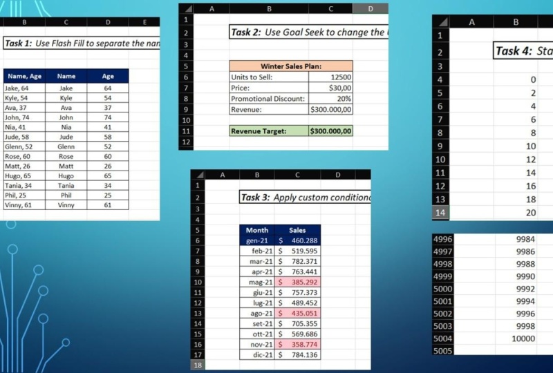
2. Automatisez les tâches manuelles avec Flash Fill: Dans cette leçon,
nous allons jeter un coup d'œil à la fonction Flash
Fill. Ce que fait Flash Fill c'
est qu'il détecte un
motif dans les données et remplit automatiquement
les cellules restantes fonction de ce modèle. Nous avons ici un exemple où
nous avons FirstName dans colonne A et le
deuxième nom de la personne dans colonne D. Et ce que nous
voulons faire, c'est remplir toutes les cellules de la colonne
C avec le nom complet, le prénom, plus
le deuxième nom. Il existe maintenant plusieurs façons de faire fonctionner Flash Fill. Mais tout d'abord, il
suffit d'écrire le premier. Alors, Amy Larson. Ensuite, l'un des
moyens les plus rapides qui fonctionnera souvent, nous pouvons simplement commencer taper le deuxième
exemple, comme cela. Et vous pouvez voir comment Excel remplit toutes les cellules
et la façon exacte que
vous souhaitez faire, je peux simplement appuyer sur Entrée, puis tous nos
noms complets sont reremplis. L'autre option, nous
n'avons même pas besoin de
taper quoi que ce soit ici. Nous pouvons simplement accéder
au menu Remplir dans l'onglet Accueil du ruban
et sélectionner Flash Fill. Là encore, XL est
peuplé toutes ces cellules exactement comme nous
voulons qu'elles soient peuplées. Enfin, il y a un
raccourci clavier, Flash Fill, et c'est Control
E. Il suffit de faire le contrôle E. Et ensuite tous
nous-mêmes et de le remplir
comme ça. Ensuite, nous allons
examiner un exemple de Flash Fill. Et nous allons en fait
faire le contraire de ce que nous avons fait dans
le premier exemple. Ici, nous avons le nom complet
écrit dans la colonne A. Et ce que nous
voulons faire, c'est diviser
le nom complet dans le premier nom dans les
colonnes B et C respectivement. Ce que je vais faire, c'est juste
écrire Amy et la cellule B2. Et je vais déplacer la
toux vers la cellule C2. Et c'est vrai, Lawson. Maintenant, bien sûr,
il y a plusieurs façons faire fonctionner le remplissage Flash. Je vais juste
contrôler l'option ici, alors Contrôlez E. Et puis vous pouvez voir tous nos prénoms se
sont renseignés dans la colonne B, traverser la colonne C et je vais refaire le contrôle Z. Et maintenant, nous l'avons. Tous nos deuxièmes noms sont
maintenant renseignés dans la colonne C. Nous allons voir un autre exemple de la façon dont
vous pouvez utiliser Flash Fill. Celui-ci est légèrement différent. Cette fois, nous avons
le nom du représentant commercial et les
ventes dans une seule colonne séparés
par une virgule et un espace. Et ce que nous voulons faire, c'est
placer le nom du représentant commercial dans la colonne B et le
chiffre des ventes dans la colonne C. Encore une fois,
il suffit d'écrire cette première ligne. Ensuite, appuyez sur Entrée et je vais
faire Contrôle a et Contrôler E. Et puis, d'ailleurs, vous
pouvez voir comment nous avons rempli toutes ces cellules de
manière très rapide. Nous avons donc maintenant les données que nous voulons diviser en deux colonnes
différentes.
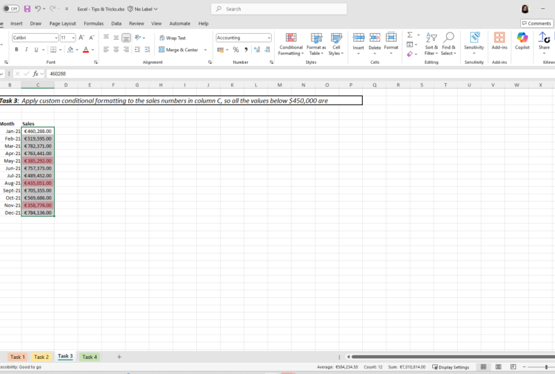
3. Objectif : Laissez Excel faire les mathématiques pour vous !: Dans cette leçon, nous
allons jeter un coup d'œil à la fonctionnalité Goal Seek dans Excel. Maintenant, la meilleure façon d'expliquer la fonctionnalité Goalseek
et de montrer ce qui est utile est de sauter
dans un exemple. Nous avons donc un plan de vente
estival fictif. Ici. Nous cherchons à vendre 7 000 unités d'
un article au prix de 40$ avec une réduction de 20 % car il s'agit d'une vente
appliquée à ce prix. Et ce que cela signifie, c' est que si nous prenons les unités pour vendre le
temps de vente,
c' est que nous appliquons cette réduction
promotionnelle de 20 % à 40$ serait en fait un prix
effectif de $. 32. Si nous obtenons un
résultat de revenus de 224 000$. Maintenant, disons que nous
avons un patron qui dit qu'
après avoir examiné
cela, ce n'est pas assez ambitieux et
que nous avons maintenant un objectif
de chiffre d'affaires de 250 000$. Maintenant, il existe plusieurs
façons modifier ce plan afin d'
atteindre cet objectif. Par exemple, nous pourrions augmenter le nombre d'unités
que nous prévoyons vendre. Nous pourrions augmenter
le prix ou réduire la réduction
que nous offrons. Désormais, déterminer à quel point
nous devons changer
les choses est un cas de
mathématiques ou de conjectures. Par exemple, on pourrait dire, eh bien, que diriez-vous si nous
vendions 70 300 unités ? Et j'entre là, puis je vois que j'ai
pris cette supposition, mais ce n'est toujours pas suffisant. C'est ici que Goalseek entre en jeu. Imaginons que nous allons
sélectionner cette cellule et
que nous voulons qu'elle finisse
par atteindre 250 milliers. Et nous voulons y parvenir en augmentant le
nombre d'unités vendues. Donc, ce que je peux faire, c'est d'aller
dans l'onglet Données et
de sélectionner l'analyse, puis
Goalseek. Ce que nous avons ici. Nous avons cette partie de cellule définie ici. Donc, C6, je l'ai déjà
choisi. Ensuite, je dois spécifier ce que je veux que cette valeur change également. Je veux qu'il soit 250 000. Je suis donc sur cette cible. Ensuite, nous pouvons choisir, et c'est le
pouvoir de Goalseek, quelle cellule nous voulons
changer pour y parvenir. Je vais sélectionner la cellule C3 avec les unités
à vendre. Je sélectionne. OK ? Alors vous pouvez voir que c'est
le calcul qui choisit, d'accord ? Et nous savons maintenant que nous
devons vendre 7 813 unités. Et nous pouvons constater que
le chiffre d'affaires a été actualisé et que nous
atteignons maintenant cet objectif. Ainsi, Excel a automatiquement fait cette masse et l'a
calculée pour nous. Je peux en faire un autre exemple. Disons que cette fois-ci, nous
voulons modifier le prix
du produit. Je vais rester sélectionné sur cette cellule
ici parce que c'est la cellule où nous voulons
aller de deux
cent vingt-quatre mille, deux cent cinquante mille. Je vais passer à l'
analyse et à la recherche de buts. Et encore une fois, je vais
en mettre 250 mille. Ensuite, en changeant de cellule,
j'accepte cette fois, je vais choisir le prix.
Je vais choisir. OK. Ensuite, sélectionnez OK,
encore une fois, et vous pouvez voir que nous avons 44,64$. Nous pouvons donc voir comment, ce dont nous aurions besoin pour
modifier
le prix si nous voulons atteindre notre objectif. Comme vous pouvez le constater, Goal Seek est un
outil vraiment puissant dans Excel. Il fait le
calcul pour vous et c'est une excellente chose à avoir dans
votre boîte à outils pour gagner du temps.
4. Comment mettre en place vos données avec Autofit: Dans cette leçon,
nous allons expliquer comment formater
les largeurs de colonnes et les hauteurs de lignes afin qu'elles correspondent automatiquement
aux données qu'elles contiennent. Nous avons ici quelques données
météorologiques historiques, mais comme vous pouvez le constater, la mise en forme est vraiment
désordonnée et incohérente. Donc, certains de nos en-têtes de colonnes
nous pouvons lire l'emplacement B, température
maximale, mais d'autres sont dissimulés et deux,
lire ce qu'ils contiennent. Nous devons cliquer
dessus, puis chercher dans la barre de formule. Certaines données elles-mêmes sont masquées car
les largeurs de colonnes sont trop étroites et les hauteurs de lignes sont
également mises en forme de manière incohérente. Nous avons donc une rangée 17 où il y a beaucoup d'
espaces vides, par exemple. Il y a plusieurs
façons de résoudre ce problème. Le premier, je peux simplement faire Control ou Command a sur un Mac. Accédez au
menu Format de l'onglet Accueil et sélectionnez
Ajustement automatique de la largeur de colonne. Ensuite, vous verrez toutes
nos largeurs de colonnes et notre ajustement
automatique aux données. Ensuite, je peux formater la hauteur de la ligne d'ajustement
automatique. Et maintenant, nous avons toutes nos rangées formatées de
manière bien rangée. En revenant juste en arrière. Eh bien, je
peux aussi mettre en évidence toutes les colonnes et
pour appliquer l'ajustement automatique, ce que je peux faire c'est simplement
double-cliquer sur l'une d'elles. Et ensuite, vous verrez que toutes nos colonnes sont désormais automatiquement ajustées. Et puis je peux mettre en surbrillance
toutes les lignes, double-cliquer sur l'une d'elles. Et encore une fois, toutes les hauteurs de nos rangs sont
également ajustées.
5. Les meilleures pratiques avec le raccourci clavier AutoSum: Dans cette leçon, nous
allons examiner la fonctionnalité AutoSum dans Excel. Et plus précisément,
nous allons examiner le raccourci clavier
pour l'autosome. Nous avons des données sur les ventes ici. Ses ventes par des agents
Berlin, Édimbourg, Los Angeles,
Manchester, bureaux de Singapour. Et nous avons les données de
ventes de 2018 à 2021, donc quatre ans. Vous remarquerez maintenant les
cellules ici et ces
cellules ici ou vides. Et c'est ce que nous allons faire, c'est remplir ces
cellules avec les totaux. Ainsi, les cellules situées
le long du bas
contiennent à nouveau les totaux de
tous les officiers pour
chaque année. Et ensuite, les cellules situées sur le côté ici contiendront
le total pour toutes les années, mais pour un bureau à la fois. Et puis cette cellule ici, donc f 11 contiendra le
total pour tout. Il existe plusieurs façons d'
additionner les totaux et Excel. Évidemment, une façon très
lente de le faire
consiste sélectionner une cellule
à la fois comme celle-ci, B5, B6, B7, etc., ce qui vous prendra
beaucoup de temps. La prochaine chose que vous pouvez faire est d' écrire
manuellement la somme égale. Ensuite, nous pouvons sélectionner les cellules
que nous voulons ajouter, appuyer sur Entrée, et nous obtenons notre
total comme cela. Il vaut la peine
de connaître la fonctionnalité AutoSum. Donc, lorsque nous sommes dans la cellule
que nous voulons obtenir notre total, nous pourrions venir ici et
sélectionner AutoSum et expirez instantanément
la fonction de somme et sélectionnez les cellules correspondantes. Nous devons juste toucher Entrée
et nous récupérons à nouveau notre total. Mais le but
de cette leçon est de montrer le raccourci clavier. Pour cela, nous pouvons faire alt égal sur Windows ou Command
Shift T sur Mac, ce qui est plus rapide que de saisir la souris et de passer
à la somme automatique ici, appuyez sur Entrée et nous récupérons à nouveau
notre total. Maintenant, ce que nous pouvons faire pour remplir le reste de ces cellules,
c'est faire glisser cette formule. Et ensuite, nous pourrions refaire
AutoSum ici. Appuyez sur Entrée et nous pouvons faire glisser cela vers le bas et nous obtenons
tout comme ça, qui est un moyen
assez rapide et assez efficace d'
additionner tous nos totaux. Mais il existe en fait
un moyen plus rapide dans une situation comme celle-ci. Excel est donc très
bon pour comprendre ce
que vous voulez faire et
examiner vos données. Nous avons donc ici un ensemble de données où toutes nos
valeurs sont devant nous et nous
avons des données que nous avons
clairement étiquetées, des en-têtes de
colonne et des lignes
clairement étiquetées. Ce que nous pouvons faire, c'est que nous
pouvons simplement effectuer le contrôle a. Il
vous suffit d'être sélectionné
n'importe où dans la plage de données. Ça n'a pas d'importance. Contrôlez un qui va tout sélectionner
et c'est Commande a sur Mac. Ensuite, nous faisons simplement le même raccourci
clavier pour autosome. O2 est donc égal à Windows ou
Command Shift T sur Mac. Donc je fais juste Alt égal. Et instantanément, vous remarquerez que tous nos totaux
ont été ajoutés. Maintenant, tout a été ajouté avec un seul raccourci
clavier. Et deux d'entre vous incluent le contrôle a ou la commande
a pour commencer. C'est juste une compétence Excel très rapide et puissante à avoir dans votre boîte à outils qui
peut vous permettre additionner
rapidement des totaux
sans avoir à faire les choses manuellement.
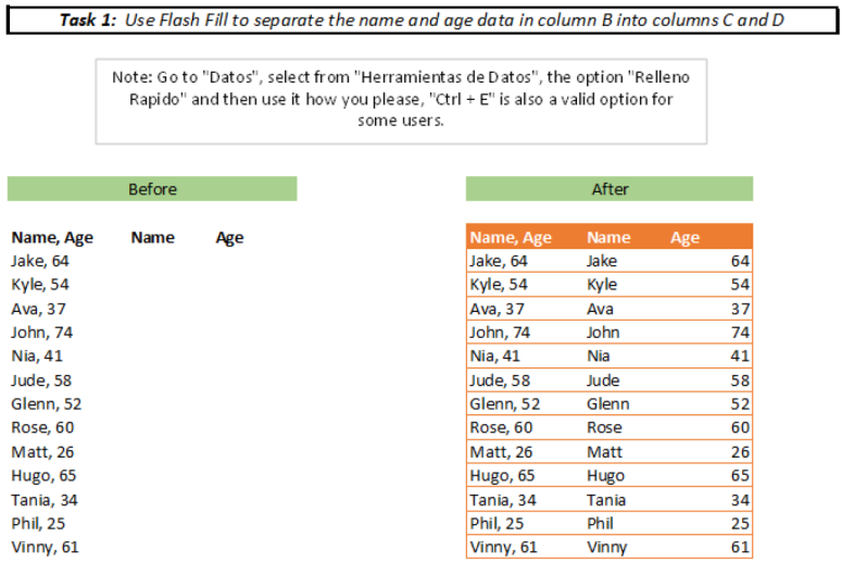
6. Formatage conditionnel : rendre vos données plus faciles à comprendre: Dans cette leçon, nous
allons examiner deux types de mise en forme
conditionnelle. Désormais, la mise en forme conditionnelle
est vraiment utile car elle peut rendre vos données plus faciles à
comprendre en un clin d'œil. Et cela rend les données un peu plus
intéressantes, très franchement. Nous avons donc nos données sur les ventes
par Office ici, 2018 à 2021 dans six bureaux différents situés
dans différents endroits. Et toutes les données
sont en dollars. Et vous pouvez voir que nous avons ici
une gamme de
valeurs différentes. Donc, si je passe
au menu de mise en forme conditionnelle de l'onglet Accueil, les deux types que nous allons
examiner dans cette leçon sont les barres de données et les options d'échelles de
couleurs. Avec les barres de données, il existe deux options de formatage
par défaut. Nous avons un
remplissage dégradé et un remplissage solide. Et vous pouvez voir le
style différent de ces deux-là. Pour ce premier exemple,
nous allons simplement utiliser l'option de remplissage dégradé bleu. Ce que vous remarquerez,
c'est que la
longueur de la barre varie en fonction
de la hauteur ou du bas de la valeur. Notre valeur la plus élevée des ventes
à Paris 2018, soit 179407. Il y a une barre de données qui
couvre le commerce de gros. Et ensuite, si nous examinons
notre valeur la plus faible ici, ventes de Los Angeles 2021, la barre de données ne couvre
qu' une petite partie
de la cellule. Comme vous pouvez le constater, je
peux rapidement modifier la mise en forme par
un autre type. Cela dépend donc simplement du type de style
que vous voulez, mais il est rapide et facile à ajouter. Examinons ensuite les options des échelles de couleurs. Comme avant. Il existe différentes
options en ce
qui concerne le style de mise en forme souhaité et par défaut. Si nous allons simplement avec
ce premier, je le sélectionnerai pour l'échelle de couleur verte, jaune et rouge. Ce qui s'est
passé ici, c' les valeurs
les plus élevées ont le type de vert foncé, est que les valeurs
les plus élevées ont le type de vert foncé,
puis elles descendent
à un vert plus clair, puis les
valeurs les plus basses ont une couleur graduée. Nous avons donc les ventes de Los Angeles
2021 avec 57811. Il y a différentes
options comme je l'ai montré. Donc, si nous passons à nouveau aux échelles de
couleurs, nous pouvons voir que nous
avons cette option, c'
est-à-dire notre échelle de couleurs vert
blanc. Celui-ci ici, qui est une échelle de couleur blanche, rouge,
etc. Différentes options. Autre chose à mentionner,
c'est que vous pouvez également ajouter ce type de mise
en forme encore plus rapidement. Et c'est en utilisant l'outil d'analyse
rapide. Une fois que
vous aurez
mis en surbrillance les cellules, cette petite
option apparaît ici. Nous venons de le sélectionner. Et instantanément, nous avons sélectionné les options de
formatage. Et il y a les
barres de données et les échelles de couleurs. Maintenant, il n'y a qu'un seul type que
vous pouvez ajouter ici. En ce qui concerne le formatage, il y a moins d'options, mais c'est un moyen très
rapide de l'ajouter, il vaut
donc la peine d'être conscient
de cette option deux.
7. Comment ajouter un formatage conditionnel personnalisé: Dans cette leçon, nous allons jeter un coup d'œil à l'ajout d'une mise en forme
conditionnelle personnalisée basée
sur les règles que nous avons définies. Nous allons donc revenir à
nos données de vente par Office. Je vais mettre en évidence
toutes les valeurs des données. Accédez au menu de
mise en forme conditionnelle. Et cette fois, nous
allons utiliser
une section de règles de surbrillance des cellules. Et je vais appliquer une
certaine mise en forme pour les cellules dont
la valeur est supérieure à 140 000$. Disons donc, vous savez, tout ce qui dépasse
140 000$ est considéré comme très bon. Et nous voulons le souligner. Je vais sélectionner
plus que et ensuite je vais
écrire 140 mille. Et il existe différentes options de
formatage. Pour cela. Je vais
aller en vert, remplir avec du texte vert foncé,
puis sélectionner un k. Vous pouvez voir comment toutes nos valeurs sont
supérieures à 140 000. Donc, ce que nous envisageons, très bonnes performances, clairement
mises en évidence avec
la mise en forme verte. Ensuite, je vais de nouveau mettre
en évidence toutes les cellules. Et je vais
ajouter un peu de formatage pour les bureaux et les
années où nous
avons des
performances particulièrement médiocres et nous allons
établir une référence de tout ce inférieur à 70 000$ est médiocre des performances que
nous voulons mettre en avant. Pour cette fois, nous allons
passer à l'option « moins que ». Je vais juste
écrire en 70 000. Nous allons le laisser rouge clair, remplir de texte rouge foncé. Sélectionnez. D'accord ? Vous pouvez maintenant voir que
deux types de formatage ont été appliqués. Nous avons donc le vert
pour plus de 140 000 et le rouge pour
moins de 70 000. Il s'agit donc d'un moyen rapide de
visualiser les endroits où nous avons particulièrement bonnes et
des performances particulièrement médiocres.
8. Édition et suppression de la mise en forme conditionnelle: Une autre chose
à garder à l'esprit avec forme
conditionnelle
est qu'il est facile de modifier et de supprimer les règles
que vous avez mises en place. Avec nos données de vente
ici, nous avons toutes
les valeurs supérieures 140 000$
surlignées en vert et les valeurs inférieures à 70
000$ surlignées en rouge. Disons que je
voulais changer cela pour que les valeurs qui sont
surlignées en vert soient supérieures
à 150 000$. Ce que je peux faire pour changer cela, il suffit de mettre en surbrillance
les cellules, puis passer au menu de
mise en forme conditionnelle. Accédez à Gérer les règles. Vous voyez que nous avons nos
deux règles ici. Je dois sélectionner la
règle que je veux
modifier , puis sélectionner Modifier la règle. Puis j'ai changé cela de
cent quarante mille, cent cinquante
mille, sélectionnez, OK ? Et sélectionnez, OK, encore une fois, vous pouvez voir que notre
formatage a changé. Par exemple, ces
deux cellules ne
sont plus vertes car elles
ne dépassent pas 150 000$. Disons maintenant que
je veux simplement
supprimer tout
le formatage conditionnel
que nous avons ici. Ce que je peux faire, c'est aller dans le
menu de mise en forme conditionnelle et appliquer des règles claires. Et je vais suivre des règles
claires de toute la feuille car je n'
ai pas sélectionné ces cellules. Mais si vous souhaitez supprimer la mise en forme
conditionnelle de certaines cellules spécifiques, vous pouvez les mettre en surbrillance
et utiliser cette option. Mais dans ce cas,
je vais simplement utiliser la feuille entière, sélectionner cela et ensuite
tout notre formatage, la mise en forme conditionnelle
est maintenant supprimée.
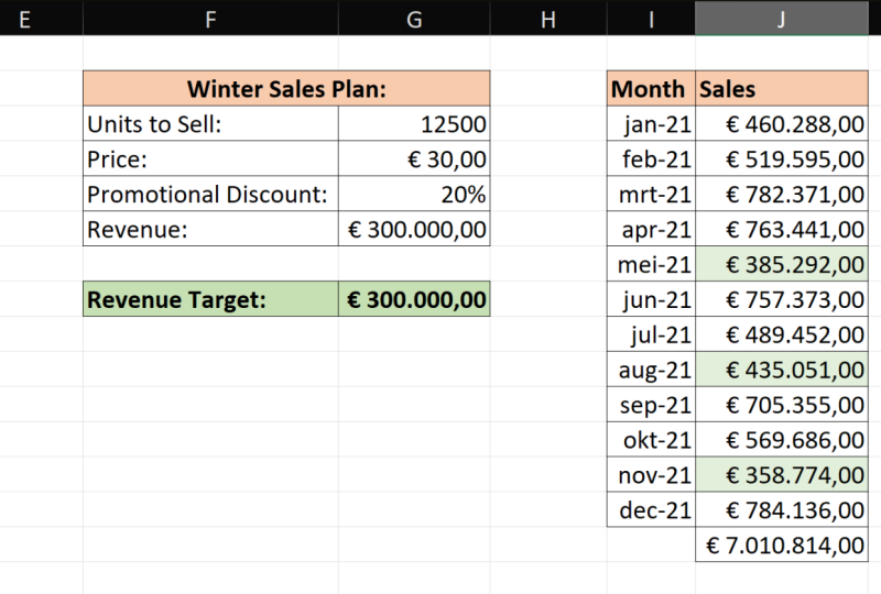
9. Série : Comment faire de grandes listes rapidement: Dans Excel,
vous souhaitez souvent créer une liste de chiffres ou de dates. Et la façon courante de le
faire est
d'écrire les deux premiers chiffres qui seront
dans cette liste, donc 12. Ensuite, faites-les glisser vers le bas et remplir
des séries de numéros comme celui-ci. Disons donc que nous voulons
aller jusqu'à 100. Nous avons ensuite obtenu une liste qui va de un à 100. Juste comme ça. C'est un moyen assez
rapide de le faire, c' est certainement beaucoup
plus rapide que, par exemple, faire quelque chose comme ça, où nous entrerions
chacun manuellement. Mais il y a aussi un autre
outil à prendre en compte dans
Excel au-delà du simple fait glisser
les chiffres vers le bas. Cela est particulièrement
utile si vous devez
créer de très longues listes. Nous allons
commencer par une liste qui
commence à une seule, sauf que cette fois-ci, nous allons passer
aux options
de remplissage l'onglet Accueil
et sélectionner une série. Ce que nous allons faire, c'est créer une liste de numéros
allant de un à dix. Les milliers de personnes sont très longues. Et pour ce faire, nous
devons spécifier la série en colonnes car nous
descendons dans une colonne. Valeur d'étape, on
va partir comme un seul et ensuite taper linéaire,
on va laisser ça. Mais la valeur stop, on
va mettre 10 000 cheveux. Donc 10 000, alors tout ce que j'
ai à faire, c'est appuyer sur OK. Et puis, instantanément, j'
ai une liste qui va de un à 10
000 comme ça. Comme vous pouvez le constater, c'est un moyen
très rapide de créer longues listes de nombres
massives dans Excel ou
autre chose que vous pouvez faire. Vous pouvez utiliser les options de série de
remplissage pour créer des lignes, des lignes de numéros. Supposons donc que nous voulions créer une rangée de chiffres à chaque fois. Donc, 2468, etc. Je vais commencer ma rangée
de chiffres comme ça aussi. Je vais ensuite accéder au menu Remplir la série. Je vais quitter la série
impliquée cette fois,
laisser ça tel quel. Je vais changer la valeur de l'
étape par deux d'entre eux. Premièrement, je vais mettre
une valeur stop de 100, et je vais sélectionner OK,
vous verrez ce qui se passe. Nous avons donc maintenant la table deux
fois qui va 246810, etc.
, jusqu'à 100 là-bas. Dans cet exemple suivant de
la fonctionnalité Fill Series, nous allons passer en revue
un cas d'utilisation plus appliqué. Nous allons donc créer
une longue liste de dates
allant du 1er janvier 2019
au 31 décembre 2022. Ensuite, hypothétiquement,
ce que nous aurions alors c'est une longue liste de dates où nous pourrions remplir tous
nos chiffres de vente ici. Ce que je vais faire,
c'est commencer le premier janvier 2019. Ensuite, je vais passer
à l' option Remplir
la série. Vous pouvez voir que
Excel a identifié que nous travaillons avec une
date sélectionnée. Je vais échanger des
séries en lignes, séries en colonnes parce que
nous descendons. Ensuite, je vais
spécifier la valeur stop, qui est le 31
décembre 2022. Tout ce que j'ai à faire, c'est choisir. OK. Alors, comme ça, nous avons toutes nos dates remplies. Nous avons donc toutes ces
valeurs allant du 1er janvier 2019
jusqu' au 31
décembre 2022.
10. Même Changement, Feuilles Différentes: Dans cette leçon, nous allons
voir comment vous pouvez apporter la même modification à
plusieurs feuilles. Maintenant, c'est vraiment
utile lorsque vous
avez une gamme de feuilles
différentes et que vous voulez que toutes les modifications soient apportées
, mais que vous ne voulez pas avoir
à le faire manuellement trois fois ou quatre fois ou cinq fois ou quel que
soit le nombre de feuilles que vous possédez. Nous avons donc ici
un classeur avec 12 onglets, un pour chaque mois de l'année. Nous allons utiliser ce classeur pour intégrer les données de vente. Ce que je veux faire, c'est avoir
quatre rubriques : date, unité, vente, prix unitaire et chiffre d'affaires dans chacun
de ces onglets. Et je veux qu'ils
se ressemblent tous. Donc, ce que je peux faire, je suis actuellement dans
l'onglet janvier et comme vous pouvez le voir,
ceux-ci seront vides. Ce que je vais faire, c'est simplement sélectionner l'onglet Janvier en maintenant Maj
puis sélectionner décembre. Et ensuite, toutes
les feuilles seront mises en surbrillance. Je vais commencer par écrire dans les en-têtes des colonnes, juste dans l'une de ces feuilles. Je suis donc juste dans la feuille de
janvier, la date, unités vendues, le prix
unitaire et le chiffre d'affaires. Maintenant, je vais juste
arranger ça un peu. Je vais donc les mettre en gras. Je vais également
redimensionner ces colonnes
juste pour que toutes les données correspondent correctement et que nous puissions voir
les en-têtes de colonne. Maintenant, ce que vous remarquerez,
c'est que lorsque je clique sur chacun de ces
onglets, vous verrez qu'
ils sont tous identiques. Nous avons donc ces quatre
rubriques de dates, unité vendue, le prix unitaire et le chiffre d'affaires au cours
de ces 12 fois, mais nous n'avons eu à les
saisir qu'une seule fois. Il convient également de garder
à l'esprit que vous pouvez inverser ces changements. Donc, si nous sélectionnons à nouveau toutes
les feuilles, et si je devais simplement
mettre en surbrillance celles de janvier et
ensuite cliquer sur Supprimer. Et puis, si nous
regardons chacune de nos feuilles verrons qu'il
n'y a rien dans ces cellules. Le changement a donc été
appliqué à tous. Encore une fois, c'est juste un excellent
petit hack qui vous permet de gagner du temps et vous évite de devoir répéter la même tâche encore
et encore.
11. Sparklines : Quoi, Pourquoi, et Comment: Dans cette leçon, nous allons
jeter un coup d'œil aux étincelles. Maintenant, quels scintillons y a-t-il mini-graphiques qui rentrent
dans une cellule coulissante. Nous avons des données
que nous allons
utiliser pour les deux premiers exemples. Ses ventes par représentant s'échelonnent
de 2016 à 2021. Nous avons différents représentants commerciaux et toutes les différentes années. Par exemple, en 2019, ont animé 67 ventes, tandis que
Leo a réalisé 35 ventes. En 2017. Peter a réalisé 40 ventes et Sheldon a réalisé 63 ventes, ainsi
de suite. Maintenant, pour faire entrer les brillances, ce que nous devons faire,
c'est simplement mettre en évidence toutes nos valeurs
comme cela. Ensuite, vous verrez que option
de l'outil d'analyse rapide apparaît ici. Je vais choisir ça. Ensuite, à droite, nous
avons la section Sparklines. Et puis il y a trois types
différents. Et nous allons
commencer par la ligne. Nous y voilà. Dans la colonne Tendance des performances, un nouveau petit
graphique en courbes a été ajouté. Et si l'on regarde la ligne d'Anna, ce qu'elle fait, c'est montrer la tendance
de ces données ici. Nous commençons donc assez haut, 66, puis ça descend. Ensuite, il
revient à nouveau là où nous avons une valeur de statistiques de 67, puis elle redescend. Si nous regardons Leo, par exemple, commence assez
haut, puis descend, puis remonte, puis redescend. Je suis Peter commence très haut, tombe,
plonge en quelque sorte au milieu, mais ensuite recommence à
grimper. Autre chose à prendre en
compte avec les étincelles, nous pouvons modifier leur
mise en forme. Donc, si je vais à l'
option Sparkline dans le ruban ici, il y a
différentes options pour que je puisse les rendre
vertes, par exemple. Et ensuite, vous verrez que leur
couleur a changé. Une autre chose que je peux faire est également souligner les
points forts, par exemple. Et puis vous remarquerez que nous obtenons un petit marqueur où se
trouvent les points forts. Ensuite, nous allons jeter
un coup d' œil à un autre
type d'étincelles. Je vais juste y retourner. Ensuite, nous allons garder toutes ces valeurs mises en évidence. Sélectionnez à nouveau les outils
d'analyse rapide, accédez à Sparklines et nous allons jeter un coup d'œil à
la colonne cette fois-ci. Maintenant, nous avons le même genre de
choses qui se passe ici. Nous avons donc un mini-diagramme, sauf que nous avons un
graphique à colonnes plutôt que des lignes. Si nous jetons un coup d'œil à la
pizza, par exemple, nous pouvons voir cette tendance
à recommencer,
à redescendre , puis à
remonter à nouveau. Sheldon repart très bas, sautant
soudainement, puis redescend. Et encore une fois. Il existe différentes options de
formatage, vous suffit
donc d'
aller à nouveau dans le menu. Nous pourrions sélectionner un point haut
et ensuite vous pouvez voir, dans ce cas, les colonnes valeurs
les plus élevées
sont colorées en rouge. Dans cet exemple suivant, nous allons examiner des données
légèrement différentes. Nous avons ici des données sur
les profits et pertes par mois pour 2018, fruit 2021. Ce que je vais faire, c'est simplement
mettre en évidence toutes ces valeurs. Rendez-vous dans le menu
Sparklines et sélectionnez gagner ou
perdre cette fois. Ce que vous pouvez maintenant voir, c'est
que nous avons des marqueurs rouges. Ici, par exemple, le troisième marqueur,
tous sont rouges. Nous pouvons en réalité
trouver les données et nous pouvons voir que toutes ces valeurs sont
négatives pour mars, le troisième mois, donc nous
avons
moins 50 000, moins 23
000, etc. dans la ligne d'étincelle. Ensuite, d'autres points, vous pouvez voir surtout que nous avons des
valeurs positives de profit, mais ensuite d'autres points, par
exemple ici. C'est donc le deuxième
mois dernier en 2019, en novembre. Nous avons une valeur de moins 736. Ainsi, cette valeur négative apparaît également dans
la ligne d'étincelle. Comme vous pouvez le constater, il s'agit
d'une excellente ligne d'étincelle à prendre en
compte lorsque
vous avez affaire à des valeurs
positives et négatives. Et vous souhaitez identifier
rapidement où se trouvent les valeurs positives et où se trouvent
les valeurs négatives.
12. Les prochaines étapes: Merci d'avoir suivi le cours
et j'espère que ça vous a plu. Faites-moi savoir si vous avez
des questions et vous trouverez les
instructions et les
fichiers du projet de classe ci-dessous
les
instructions et les
fichiers du projet de classe pour tester
ce que vous avez appris. Si vous souhaitez en savoir plus
sur Excel, consultez mes autres cours et suivez-moi pour obtenir des mises à jour sur les nouvelles classes. Encore une fois, merci d'avoir le cours et j'espère vous
voir dans le prochain.
 Excel Classes, Excel teacher