Transcripts
1. Introduction: Last year, I made a class from drawing female characters. In this class, we're going to start expanding on the subject by branching off into a new medium. In class, we'll be exploring copic markers. I love these markers. They're not like your typical markers because they're really smooth and blendable. With just a few of them, you can easily add an extra level of depth and style to your character portraits. In class, we'll cover materials, and basic sketching, and shading techniques. Then, I'll show you how you can add simple details that will pool your sketch all together. Near the end of class, we'll also dive into some fun, alternative methods that you can try out in your character illustrations. If you want to learn the basics of drawing female characters, then please join me in my previous character course first. Then when you're ready, jump into this class for a fun twist on the subject. All right, let's get started.
2. Materials: For this class, you'll want paper, pencils, blending stumps, or Q-Tips, a white gel pen, an eraser, and a couple gray alcohol-based markers. Use whatever materials you have on hand and that you're comfortable with, but if you'd like recommendations, this is what I personally use. Basic white smooth paper work great for pencil in marker drawings. I'll be using a couple different papers in this class. One of my favorites is the HP Premium Choice LaserJet paper. It's really smooth and bright white, which I really like. It's also perfect for putting under your drawing hand while you work, so you prevent smudging. Barnes & Noble also has a nice selection of sketchbooks. I like to browse their sketchbook section when I go and look for nice smooth white paper. They change brands a lot, so it's hard to find consistency but they're often really nice. Both of these papers will bleed though. So, just put a couple of pieces of scrap paper under your drawing people while you work if you end up using these. There are special marker papers you can buy online or at the art store that won't bleed through. Honestly, I think the HP paper works just as well though, and for me, personally, I actually prefer it. But you may like the idea of market paper because it's bleed resistant. So, if you get into this process, maybe get some other sturdier paper options to go. I usually start my character drawings by lightly sketching with my 0.3 millimeter Draftline mechanical pencil. Using 3H Pentel lead, I lightly plan the features of my characters face with this light pencil. For detail work, after I've applied my markers, I'll typically use my 0.5 Staedtler pencil, with 4B pencil lead. 4B is a dark and smooth lead and I really like it because it can give you those dramatic darks. I also enjoy using a Pro-matic MC5 because it has a nice weight to it. I find it helps me draw long hairs. I use the lead that came with this pencil when I bought it, but when I need to replace the lead, I'll likely buy the Pentel brand replacement as I love their quality. I use a kneaded eraser to erase any mistakes I made while sketching. Prismacolor, Generals, and Faber-Castel are all good brands for buying a kneaded eraser. These erasers are great because you can mold them into any shape like a point or a stamp, and they won't leave behind eraser crumbs like normal erasers do. Stumps make for excellent graphite blenders. I like to use these around my characters features to smooth out hard marks. You can also use Q-Tips if you don't have stumps. In my sketches, I also use a white gel pen to add little sparkles in the eyes, at the tip of the nose, and on the lips. I really like the Uni-ball Signo white gel pen. It makes adding these little sparkles easier than if I were just using an eraser. If your pen ever stops working, just tap it on the back of your hand or on a piece of scrap paper and it should work again. If you're thinking you need a ton of markers for this class, you really won't. Just 2-3 Copic markers will help you add nice step to your illustrations. Copics are alcohol-based markers. Because their alcohol-based, they blend really beautifully and easily. There are other alcohol-based marker brands that you can try as well, but I found that the Copics are affordable and they work wonderfully. There are two types of Copic markers I would recommend; the Ciao and the Sketch. Copic Ciaos have a round barrel, are available in 180 colors, and are a great option if you're just getting into markers, but aren't sure if you want to invest a lot of money. They are refillable and the tip can be replaced. So once you buy one marker, you can use it for life. They're the same great quality as the Copic Sketch markers, they're just less expensive, mainly because of the design differences, how much ink they can hold at once, and the number of colors available. Copic Sketch markers have an oval barrel, they hold a bit more ink in the Ciao, and they're available in 358 colors. Just like the Ciao, they're refillable and have the same excellent quality. I use a mix of both Ciao and Sketch markers, and I use the super brush nib side. The nib enables you to draw and blend into other colors really smoothly. The nib, plus the fact that these markers are alcohol-based, is what I think makes all the difference. These are the markers I would recommend for this type of work. If you'd like to go with the Ciao, I recommend purchasing C0, C1, and C2, and so on if you wish to go darker. Just three markers will be perfect though. I found the best prices on dickblick.com and jerrysartarama.com. There you can buy individual markers for a great price. So, that's where I purchased mine. I say, buy the markers individually rather than in sets, so that you can pick your own and not waste money on colors you'll never use. If you like to try the Copic sketch, I would recommend the C-range again. Or since there are more colors available on the Sketch, you can also try N0, N1, N2, and so on. The Cs will be a bit cooler in cooler temperature, and the Ns will be more neutral. There are also more available that lean warmer, if that's your style. For these demonstrations, I'll be using Copic Sketch N0, N1, N2, and then also a little bit of N3 and N4. The key, I believe, is to purchase markers that are right next to each other. I find that this makes blending a breeze and it will make getting those smooth gradations from light to dark a lot easier. These are the best markers I've personally ever tried, so I would recommend them if you like the look of this type of sketch. At the end of this class, I'll show you a couple of alternative methods that you can try out. For that, I'll be using Copic Multiliners, tape and a light box. These are optional supplies though and not at all necessary for this class. I'll also be experimenting with sketching on my iPad first, making a print out, and then coloring the print. But, again, this is not at all a requirement. So grab the pencils and paper you have and a couple great Copic markers, and let's start sketching.
3. Sketching: Shapes are really essential to understand when it comes to designing your characters. We can break down a cute simple face into simple geometric shapes. Basically, two parallelograms for eyes, one upside down triangle for a nose, and something like a squished hexagon for the lips. There are many ways you can simplify a face, this is just one way to think about it. Sometimes, I'll simplify the eyes into squished ovals as you'll see, and the lips can be simplified even more as well. This is just an angular breakdown of the facial features that you can keep in the back of your head. The arrangement of these simple shapes is what will determine the look of your character. This is what will make up your character's proportions. Experiment with the spacing between these shapes. Here, all the shapes are the same size from one face to the next, but you can see how just changing that space between them can lead to dramatically different looks, even though all their features could be drawn identically. Also, experiment with the size of each shape. Playing around with the size of the eyes, nose and lips will give your character a distinct look. Discovering your personal aesthetic for these proportions will help you in developing your style because, likely, you'll be continuously drawn to that same look that you really like. So, always be on the look out for faces that inspire you. Try to copy their exact facial features, spacing, and size, so that you can bring that knowledge back to your characters in the future. All of my characters are drawn in a similar style because my personal goal is to lock in to a certain cute feminine look, but you have to decide for you what you like. Do you like a big variety in your characters? Or would you like to develop a look to your girls? This is where experimentation with shapes will come into play. Whatever you do, try to do it with intention. Push these shapes around and try to get the exact look you want. Be patient with yourself though, and remember that you can erase if you need to. If you need a reference, I found that loosely using ball jointed dolls as a reference for character faces works great, or you can join my Design a Female Character class and check out the Proportions video for a breakdown of basic human proportions. I'll leave it out of this class so I don't become too repetitive. Now with stressing the importance of shape out of the way, let's begin the demos. I'll be demoing two drawings for the next couple of videos, breaking the steps down into sketching, shading with copics, and then adding details. To start on this sketch, I put in two little oval shapes for the eyes, an upside down triangle for the nose, and the hexagon shape of the lips. You'll see I immediately bring the corners of the lips up, so I can start to get that look of a smile. Now I add two little triangles to the sides of the eyes to eventually be like a cat-like eyeliner. Since I think these shapes are nicely placed, I erase a bit and develop the shape further. This time, considering the angles like the parallelograms I mentioned earlier, but kind of combining that with the round quality of the eye. For now, I like the placement and size of the nose. So, I'm going to erase a bit, and put in the parentheses shape nostrils, a light indication of the roundness of the nose, and the parentheses shaped wings of the nostrils. This sketch is lighter than my demonstrations in my previous class because we have to remember that we'll be using copic markers over this. So the lighter you can sketch, the better since it's not a great idea to use your copics over a lot of dark graphite, it could ruin the Knibb so we want to keep this light. My 3H lead is perfect for this, and if you have say 4H or 2H, that will be great, too. Now, you'll see I redraw this mouth over and over and over again. Personally, I'm not one of those artists who can see something in my head and then just draw it on paper. So when I'm not using a reference, I'm kind of discovering it on the paper as I draw. Sometimes, this is why using a reference will help cut down frustration. Using a past drawing you made that you really liked or maybe using a picture of a ball-jointed doll just as a general guide will really help you. But this is one of those sketches where I'm working from my memory, so I'm just fishing around a bit until I find a look I'm into. I think it's good to draw from your memory sometimes, just to kind of check out where you are and see where maybe your weaknesses are. So eventually, I find I need to raise the nose a little, and that's okay. I didn't invest a ton of time into it. When you're drawing, I think it's good to be okay with letting things go, because there can be a possibility of something better. If you drew it once, you can draw it again so have faith in yourself. Stay light on the pressure of your pencil in the sketch stage so you can easily erase. Now, I'm drawing the face with a couple angled yet rounded strokes, and I'm indicating the ears. In a straight on view, they'll start at about the eye line, and end at the bottom of the nose. I lightly indicate the neck as well with these inward pointing lines. Now, I'm drawing the hair. I try to imagine space for the forehead so I draw the part of the hair and some sketchy hairs coming down over the face. I don't know why, but I always love this look of hair coming out so I do it quite a lot. Then, I draw the roundness of the head and I decide to give her a round bun. Since this hair is falling in front of the ear, I erase this part out and define that clump of hair a little more with a couple strands. Then, I take the extra time to define how this one's placed, just so I have a relatively clean sketch when I head on to using my copic markers. Now, with a little shoulder dip and a couple strokes downward, I create a light shirt line. For now, we'll leave this one like this. So for this process, we're going to set up the face shapes all at once, instead of stopping at each feature and adding darker accents and details right away, like I taught my previous course. This is just another method of sketching that you can use whenever you find it useful for your process. I find I personally go back and forth between methods all the time. For this sketch, I'm starting by considering those parallelogram sort of shapes for the eyes. I'll be drawing this girl in a slightly three-quarter view, so the further I will have a slightly squishy and will be a bit smaller because of the perspective. Now that I've placed my shapes, I go in and refine. Then, I put in the base shape, considering the slight turn of the head. This takes a lot of patience and practice, and also acceptance that you're going to make some bad sketches. I make horrible sketches all the time. It's just part of being an artist. Since I like the placement of the mouth, I feel confident as I darken the corners of the mouth up a bit more. Now, I'm just kind of designing her hair, and I'm trying to make these lines flow. As you could see from my previous sketch, sometimes it's a struggle to place the features, and sometimes it happens easily. I think this one was a bit more easy to place because I had an old drawing just up in the background as a general reference that I could just glance over to to, like, check myself on so that it didn't get too crazy of a sketch. So, if you are struggling, definitely use a reference and know that sometimes, even when you do have a reference in front of you, kind of wrestling with this is part of the creative process. It's a normal part of being an artist. So, just remember to sketch slightly and keep at it, and you'll get better and better.
4. Shading: So, when the basic sketch is finished, it's time to go on with the copics. If you found you got any darker than this in your sketch, perhaps dab a little of the graphite out with your knicky bracer before you begin. You can re-add details after you use the copics. The first thing I'll often do is start putting in the cast shadows. So, here around the face where the hair would cast a shadow onto the face, as well as here, right under the chin on the neck. Now, I'm toning the eyes with N-2. I want them to pop with contrast to draw the viewer in so I'm establishing darker irises. While I'm at it, I add the cast shadow under the nose, on the top lip, and under the bottom lip. I also want to make the lips pop so I go ahead and add a tone to the bottom lip as well. If you've seen my lighting class, you know I like to light my characters simply. So, often, I'll shade as if they're lit from above. These areas go into shadow in this scenario and make these shadow shapes. Now, with some sweeping motions and just the tip of my marker, I'm going over these main hair outlines. Now, switching to N-1 and pressing down a bit harder with my marker, so the thicker middle portion of the marker hits the page. I'm making broad quick strokes. Then, at the root, I make a few quick curve strokes to mimic the way hair would quickly turn in this hairstyle. You can practice this thing on a scrap piece of paper to get used to the motions. See how there are some paper gaps left showing through. I like to leave them sometimes because they work to act as a highlight on the hair. You'll notice just a few strokes do the trick. I'm not drawing a bunch of sketchy hairlines, just a few competent strokes. I finished coloring in her bun, and then I'm just establishing some of these lines that are important to the design that I don't want to get lost in the details' stage. I like to make sure I put as much of the copic marker down on the page as I'm going to want. You can add more tones if you wish but be sure you finish your copic work before moving to the next stage of adding details with dark lead. The copic nibs can handle working around light 3H lead like this, but they don't like going over dark lead like 4B. The graphite can clog up your nibs. So, once you're happy with the amount of shading you have on the drawing, then you're ready to bring in the darker pencils. You'll see, I like to keep the copic work pretty simple. Just a couple of shadows and tones will help to enhance the drawing. Now, let's try the copics on this sketch. For this one, I start with the N-0 copic sketch marker. I had the cast shadow there under the hair from the face and under the chin. I want to get this area here pushed back into shadow, so I quickly established that. Then, I go in and add the cast shadow under the nose and around the eyes. Then, I also get a tone up on the lips, and again, add a little darkness to the corners of the lips. Now, going into draw the hair, I use long sweeping motions. Turning my hand as I draw to help me flow in the direction the hair would flow. I like to use really light markers like this from the start because it helps me slowly sneak up on these values. If I were to start with a super dark marker like N-4, I couldn't do this as easily because once the value is down, it's there to stay in this medium. Now, I'm using N-1 to tone her irises and around her eyelids where the eyeliner would be. For these features, you can see amusing patient dabbing strokes working pretty slowly and carefully because this isn't marker paper, there may be a little bleed. So, I work with the tip of the marker on the features, so I don't press too hard down and make the ink spread outside the boundaries of these features. I darken this portion here since it will be hard for light to get into this crevice. Where two objects touch it's hard for light to get in. For a little separation from head to neck, I darken the outline of the jaw and neck. It's okay for things to look designed rather than realistic in your illustrations. This isn't meant to be a realistic rendering, it's a sketch just for fun, so use your lines freely. A darker upper eye shadow because I want it to be a bit more contrasty. You'll notice as the copic stride, they tend to lighten a bit and also smooth out a bit. So, if something looks too dark or maybe a little splotchy, don't worry too much because it will likely lighten and smooth out of it as it dries.
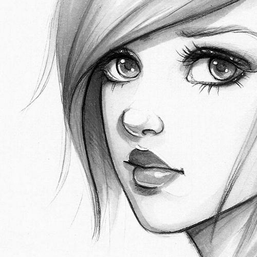
5. Adding Details 1: Now that sketching is done and we've shaded with the Copics, it's time to go in and add our final details to finish up our characters. To begin on this one, I go in with my dark 4B pencil. I darken her eyeliner to start defining and bring in more attention there. Then I start defining the edges of her mouth, but quickly I see I took it too far, but it's no worries. I can erase without fear of losing the work I did in my sketching and shading phases. Not everything needs to be defined for the viewer, so instead, I just darken up the corners of the mouth, the middle where the lips part, and the bottom of the bottom of the lip for now. I also try out little dimples to see if I like the look they give my character. I like how the one on the right side look, so I keep just that one, since the other one makes her just look older. Now I'm drawing in the little triangle-like shapes for her eyelashes. Now I'm defining the outer edge of the hair, and just putting in a couple pencil strokes inside too, to encourage the flow of the hair and also give it a little bit of texture. When I want to smooth out a line a little, I'll just do it with a dry finger. Make sure your hands don't have sweat on them, or oils, because that'll leave blotches on your paper. You can have a towel right next to you where you work, if you ever need to wipe your hands off. Now with a couple of quick strokes, I'm indicating eyebrow hairs. Now I'm just defining those eyelids a bit more, making another line slightly above, mimicking the arc of the upper lash line. Now I'm trying to figure out this nose. I go through a bit of trial and error, and that's okay. I decide I want a bit more tone on the nose. Noses often have a color change in relation to the rest of the face. They're usually a bit redder, so you'll notice that the value goes a little bit darker in gray scale. I erase the lead and come back in with a Copic N1, and add some roundness and value to the nose. At first when I did this, I thought, "Oh no, I've gone too dark," but remember, they'll dry a bit lighter. As I wait for that to dry, I add more details to the hair. For hair, I like to keep strokes near the face darker and strokes falling away from the face lighter. This will help draw the viewer into her face, which is my focal point. Now that this nose has lightened a bit, I go in and give her a couple of parenthesis-shape nostrils. I lightly indicate the wings of the nostrils, with two more light parenthesis shapes. I'm just tweaky now, changing things that pop out to me as looking weird. Now I am giving some definition to the eyes. Now I'm darkening the pupils a bit, and blending them out with a stump. Using my white gel pen, I add those fun, bright white highlights, in the eyes. I also add a highlight to the nose. Sometimes I let it dry halfway and then dab it with my finger, picking off some of that extra color, so it's not quite as intense as the eye highlights. Sometimes I'll add light right here on the lips, almost to be like reflected light, but this is more of a stylized thing. I'm defining these lips just a little more, I'm trying to be careful not to outline now. You can draw back over white gel pen too, if you want to refine more. Using my 3H, I lightly draw this little dip that represents the pit of the neck, and these two little lines going off, and slightly upward, to represent the clavicles. Keeping it super simple, not letting myself get anywhere near realism, but just hinting at these bones with simple lines. With my 3H, I lightly add some messy flyaway hairs, and I put a couple short, quick, round strokes, at the brood of the hair. With that, I'm going to call this one finished.
6. Adding Details 2: Moving onto this sketch the first thing I did with this one was a little correction with my white gel pen. I went a bit too far in here with my copics. With my white gel pen, I can go over and blot it out and correct it. That's another reason why I enjoy using white gel pens. Now I'm darkening up the areas pointing to the eyes and the eyes themselves. Forbelead is dark and smooth. For me it's perfect for dark values. Eyes can come in all sorts of shapes and sizes. If you want more ideas on how you can give them some variety, be sure to check out my previous course. These little stomps are excellent for blending and smoothing out dark lines. I just blend it out here almost like real make-up. Now I'm outlining the irises with pressure on my pencil to really up that drama. I indicated that a bit too darkly so I take some of that back out with my needed eraser. I want the detail but I don't want the darkness so, I grab for my 3H instead. This 3H pencil it is great for little details because the lead is only 0.3 millimeters. It's so small it can get into these tiny places. Now normally I don't do this, but I forgot to color in her brows with the markers so, I'm going in with my into and just being careful not to hit the dark graphite around her eyes with my nip. And now with my 3H, I sketch in a few wispy brow hairs. Again, I'm going in with my white gel pens to fix where the brow is coming out a bit too far. I lock in the placement of the mouth by putting in those dark corners, the part of the lips and the shadow below the bottom lip. I also shade the top lip since again, I'm shading her as if she's been lit from above. You'll see these shadow shapes repeat themselves from one face to the next when the character is lit from above. I love the way these stumps can get into these tiny areas and blend. I can never do this with my finger because the space is too tiny at the size I'm drawing. But the stumps work great especially when you have a couple of sizes to choose from. Now with my 3H, I'm putting in these nostrils shapes connecting them and getting in the light roundness of the nose. It helps me to simplify noses into simple shapes. Now upside down triangle with an oval on top and a little parentheses shapes for the nostrils and wings. Now I'm doing a little bit of detail on the ear. Nothing too fancy though as I don't want it to be distracting. I choose to simplify ear's usually because they have a lot of little shapes all squished together in one tiny place and because my drawing is so simple, I don't want to put all that ear detail in. Because the detail would play in contrast to the simpleness of the sketch, making it become my focal point and I don't want the ear to be my focal point. Keep that sort of thing in mind. If you have a lot of white in your picture for example and then you draw one thing black that black point is where people's eyes are going to naturally be drawn. Likewise, if you have a simple drawing and then a lot of complexity in one little spot, again, your viewers eyes will be drawn there. Always try to be intentional about this sort of thing. Be conscious of keeping your sketch balanced as well. Don't keep any one side of your paper overloaded with weight compared to the other side. I try to find my balance with compositions and the hair usually. I find that hair helps me create rhythm. I try to create rhythmic lines that continuously pull the viewer's eyes back into my piece versus out and I try to make the lines a comfortable balance. When I put a heavy line on one side, I try to balance it out on the other side with another. I'm using my promatic NC5 for some of these hair strokes because I like how it's a nice thick lead. This lead I'm using is one that came with the pencil when I bought it. I don't know the exact brand but when the lead runs out, I'll likely purchase Pentel brand two millimeter lead since I already know I love their quality. Make sure to play with line weight and texture as you draw. Use thin lines, medium sized lines and thick lines to give your piece variety and personality. You can also leave places undefined by line and let the viewer do a little of the work. You can leave gaps in your line-work, losing the line and finding it again. For me, what helps me draw hair is to make each line I make have a purpose. I don't want to arbitrarily draw hairs without considering if I really need them to make the piece work. I try to think about clumps of hair where they group together and tighten up and where they push and fluff out. Most hairstyles except for super straight hair are made up of simple S-curves and C-curves. Keep that in mind as you draw too. Now I'm adding a cast shadow right here, where the eyelids would cast their shadows onto the eyeballs. Now, I'm adding little dot highlights to the eyes and then a little line to the bottom lip as a highlight. Highlights can be different shapes. You can make them dots or lines or experiment with another abstract shape. You can also get creative with your eye highlights. For this lighting scenario, it would look more like this but this sketch is just a sketch and not meant to be realistic. Sometimes I like to break the rules for the sake of capturing a certain look. I felt this dark hair near the bottom was leading my viewer out of the page. I lightened that up with my needed eraser. Now, I'm adding a few lashes. I found that usually on characters they turn out better for me when I group several lashes into one triangular clump. You'll see I personally don't draw a bunch of single lashes. Instead, I simplify them into a few groups. Now, I'm just darkening the sketch in some places to give some variety to my lines. You can get variety to your lines in several ways. You can change the amount of pressure you put on your pencil. When you press down hard, you'll get dark values and when you press down lightly, you'll get lighter values. And this contrast of values can be exciting to look at linework. You can also change up the size of your strokes. Having two pencils helps with this like I have my 0.3 millimeter and I also have my thicker two millimeter pencil but even if you only have one pencil, you can still do this just by using a really sharp pencil for those thin lines and a dull down pencil for those thicker ones. You can also change up your texture. The copics really help with this especially because they're so smooth. So, this smoothness is nice juxtaposed against this sketchiness. Make sure the hair is coming out from a part have a curve to them and they aren't just coming straight down off the route. Look at photo references of hair, if you ever need help with this kind of thing. And with that, I'm going to call this one finished as well.
7. Alternative Methods: Now, let's run through some alternative methods you can experiment with. For this one, I actually sketched digitally in the Procreate app on my iPad Pro with my Apple Pencil. I used my willow charcoal brush, which you can download for free. When I was relatively happy with the sketch, I lowered the opacity of the layer, and then added a new layer on top at full opacity, and started refining. But I did let some of that initial sketchiness show through. I think it helped to keep some of the initial liveliness. Using a digital tool is a way to mentally free you up to explore options with your characters, without feeling like you're destroying your paper with an eraser. For the sketch, I used a ball jointed doll as general reference. I wouldn't copy the dolls directly, but instead, use their features as a general guide. Once I was happy with the sketch, I printed it out and let it dry for a day before drawing on it. I think this helped prevent any printer ink from smudging when I applied my copics. You have to experiment and perhaps do a couple of tests with your printer to see if this method is doable for you. My printer is really nothing special though, so yours will likely work too. I used the HP paper for this and that's another reason why I love this paper. It's already the standard size for printing. Even though the print is dry, I would still recommend avoiding the ink lines when you can. Just see if you can prolong the life of your copic nib. With small back and forth almost elliptical motions and filling in her face. I'm showing this in real time because I want you to see the pace. I'm not working super fast, but not at the snail's pace either. I want the ink to dry uniformly. So, I try to get to a pace where I can draw before it dries while still being careful and neat about it. Now, that that's all covered, I slide over any parts I may have missed that should be smoothed out while the marker is still on the paper. If you pick up your marker too much, it will start to look a bit bloggy. So, limiting the picking up to just a few times will help. Now, I'm going to bring this up tempo since you already know the basics of this. Switching to N-2, I'm giving her irises and lips a tone. I'm also putting that cast shadow in from the upper lids on to the eyeballs with a smooth stroke. I also add the shadow under the bottom lip and I add a little at the corner of the lips as usual. Now, I go in and add those cast shadows from the hair onto the face. You'll notice how with this sketch, I toned the entire skin tone first with the color. This is how you might want to handle medium or dark skin tones. Moving on, I'm just coloring each section of hair. With this piece, I just flow with the groups of hairs I already sketched going from root to middle and then from the gathering point back to the middle. Pressing down on your marker will help give a thickness to your strokes and going light on the pressure, you'll be able to get those thin strokes. Now, I'm indicating these pupils. But I make sure to blend them back into the cast shadow I drew earlier, so that my character doesn't look hypnotized. Now, using my N-3 copic, I make these cast shadows right up on the edge between the hair and face even darker, and I darken these hairs right here to push them back in space and into the shadows. Using N-2 now, I add a few strokes in the hair for variation to the values. I hit the top at the roots and around the roundness of the head. With my white gel pen, I add eye highlights. You can go in a little bit over the printed sketch. I also add a nose highlight and a lip highlight, dabbing to make them a little less strong. Here, I'm experimenting with adding a couple of sparkles on her eyelids to be like sparkly eye shadow. Now, I'm using my copic black multiliner to enhance the darkness of some of her features. I love making the eyelashes nice and dark because it makes them attention grabbing. I also darken these two arcane lines in my sketch to kind of be a sort of balancing frame for her face. Now, I'm adding a little late highlight to the Cupid's bow. Now, this one is finished. Now, on to the second demo, I want to show you how you can trace and ink your sketches. This one was again sketch and procreate with the willow charcoal brush. You can see how this one went through quite a few experimental changes. You can do the same thing even with just pencil and paper. If it gets too messy with the eraser marks and you want to use copics on a cleaned up version, you can just trace it. So, I print out my sketch and trim it down, so that I can easily tape it onto another piece of paper. I think it's a good idea to put the tape down on the back of your hand or on your clothes first, so it gets some of the tapes tackiness off. So, you can be sure you won't rip it when you take it off your piece of paper later. Slowing this down to real time, you can see I'm tracing the sketch really slowly. Some of the freeness will get lost when in a tracing, but you can add that freshness back when you have it off the white box. Also, if you don't have a light box, you can tape your sketch and paper to a window with light coming through. You'll also notice for the tracing, I'm using my very light three inch pencil and I'm keeping my pressure light as well. At this point, you can continue on with copics and pencils like we did in the previous videos or you can try inking. I'm using my cool gray copic 0.5 multiliner to slowly and carefully trace over my pencil lines. I've tried a couple times before to skip the previous pencil tracing step and go right into inking directly on my light box, but I found it really difficult because you have to be even more careful with your lines when you're inking. So, I would recommend taking that extra step of pencil tracing your sketch first. I'm only lining with one line. When I finish going over all my lines once, then I'll go back and add line variation on second pass. I try to make the strokes as long as I can. But when I need to, I pick up and start again. Now that you've seen the true pace I use, I'll speed this up. Now, I'm adding a second layer of ink to some of these areas. I like to give the areas where the lines converge that second layer of ink, as well as on the general contour of her character to make her pop from the background. Make sure your ink line work is dry before applying the copics. As a note, some liners will smudge and other brands won't. Some papers will allow the ink to dry quicker than others. So, do a test on the scrap piece of paper first and work on a couple of drawings at once if you need to wait for ink to dry. First, I start with my N-0, and I turn the cast shadows and features as usual. Now, using N-2, I darken the upper lip. Now, I'm outlining the contour of my character. At this point, I'm going back in with my pencils to add a few more details. I just love the look of pencil and paper. I hope you have fun experimenting with some of these copic methods whether it's sketching, and then going right in with a copics, trying printouts, tracing your sketch or inking, play around until you find the process that feels right for you.
8. Closing Thoughts: Thank you so much for joining the class. I'm really looking forward to seeing your artwork. So, please be sure to share your work. I believe sharing your work is good for artistic growth. Please also let me know if you have any questions too. Here are some tips if you'd like to improve your sketches. Keep a sketchbook, fill it with good sketches and bad sketches. Just draw on it as much as you can and practice, practice, practice. Then, when you're finished with that sketchbook, start another one. Fill it with drawings from life, from references and from your imagination. Do an art challenge. Give yourself a set time frame. Then, give yourself a specific theme or tackle a list of inspirational words. Post about your challenge online in a journal or blog, or through Instagram. This accountability will encourage you to keep going. Keep learning. If you want to continue regarding your art, take more classes, not just with me, but with any artists whose works you admire. But, I would love to see you in my other classes here on Skillshare too. I have lots of portrait classes and foundational drawing, and painting classes, and much more to come on the subject of drawing characters. So, be sure to follow along for updates. Check out Design a Female Character, Sketching Portraits With Pencils if you like a more in-depth look at the style, broken down feature by feature. Thank you so much again for hanging with me here. Until next time. Happy sketching.
 Gabrielle Brickey, Portrait Artist - ArtworkbyGabrielle.com