Transcrições
1. Crie móveis em Blender: Bem-vindo a todos. Como muitos de vocês sabem, uma ótima maneira de melhorar na modelagem
3D é criar
mais modelos de tratados. E todos sabemos que é difícil
começar um modelo 3D do zero. Mas nesta aula, vou te ensinar como
começar e criar um modelo realista a partir de
apenas algumas imagens. Você não só
aprenderá a modelar, mas analisaremos
todo o fluxo de trabalho de modelagem 3D. Então você vai de uma imagem para
um modelo texturizado de tratado, pronto para ser substituído
em uma cena ou até mesmo vendido por um
pouco de dinheiro extra. Esta aula tem mais de 14
vídeos para você explorar. Nestes vídeos, analisaremos o fluxo
de trabalho principal, que começa com
a busca das imagens certas para
recriar a cadeira. Assim que tivermos todas essas imagens, você começará a construir o modelo
3D dentro do Blender. Ao construir este modelo, você aprenderá
várias técnicas, que incluem a criação de travesseiros
realistas,
almofadas , uso de liquidificadores, incentivos
Croft Physics. Mas você também
aprenderá a quebrar e criar formas mais
difíceis. Nos últimos vídeos, superamos o desembrulhamento UV na adição de texturas
e materiais. Tudo isso é necessário para criar um
modelo 3D realista do zero. Por último, eu adoraria se vocês pudessem me enviar
a renderização final. Dessa forma, eu pude
ver como vocês progridem durante minhas aulas. E nossa Eva será capaz de
lhe dar alguns comentários. Obrigado por dar
uma olhada rápida neste copo e verei
vocês no próximo vídeo.
2. Introdução do curso + imagens de referência: Bem-vindo a este vídeo, e este é um tipo de vídeo de
introdução. E eu quero falar um
pouco sobre o fluxo de trabalho. E talvez já
o primeiro passo
do primeiro passo seja
procurar referência. O segundo passo será delineado, que é essencialmente
delinear seu modelo dentro do Photoshop ou qualquer outro programa onde você possa desenhar
em cima de uma imagem. Em seguida, temos nosso breakout, que é o número 34,
modelará nosso modelo 3D. Cinco estarão texturizando
e criando alguns materiais de
aparência realista. E com seis, podemos começar
a falar um pouco mais sobre a posição da
câmera de iluminação. claro que essa será
a seção de renderização. Nossos vídeos também
estarão nessa ordem, mas pode haver mais
alguns passos necessários
para talvez a modelagem. Porque se você quiser criar
um modelo de aparência realista, então eu também quero
separá-lo em determinadas partes que seja um pouco mais
compreensível para vocês. O primeiro passo aqui será nossa referência. E o que quero dizer
com referência? Depois de procurar um modelo
que você deseja criar, muitas vezes
você precisa de imagens de referência, mesmo que você queira
criar algo estilizado. Nesse caso, é um produto real que você
pode comprar em algum lugar. Então, o mais legal
disso é que você pode, é
claro, encontrar muitas
fotos dele. Se você estiver bem,
se você estiver na lista correta ou o que quer que seja, você não encontrará referências
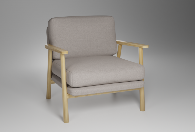
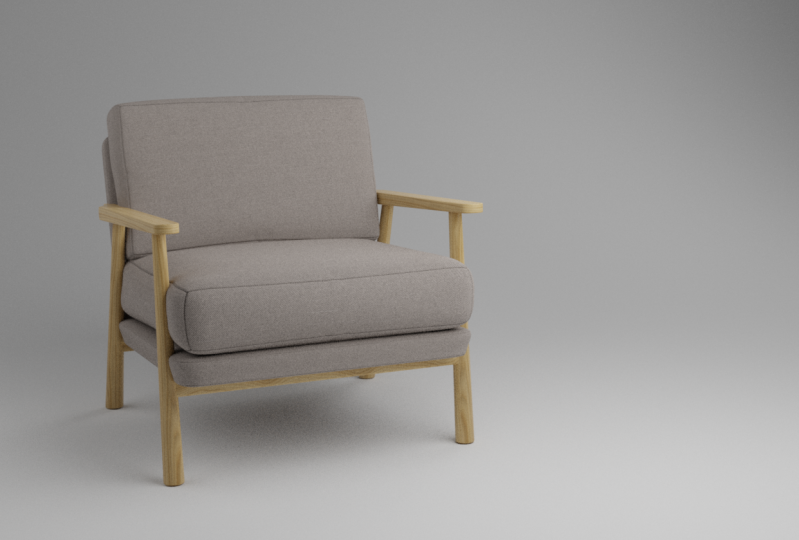
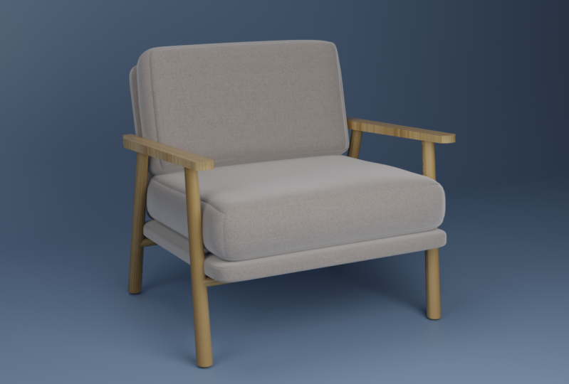
suficientes para realmente recriar o modelo. Nesse caso, encontrei uma cadeira. A cadeira em si é chamada de
Lars por algum motivo. Vou deixar o link
abaixo também. Mas uma das
coisas importantes que você precisa procurar é que você teria uma imagem com talvez um nome porque essa cadeira é vendida
em vários sites. E o mais legal
disso é que esta cadeira tem
muitas referências. E isso é muito,
muito importante. Então, por exemplo, aqui está
a frente que podemos ver da nossa cadeira. Mas se
descermos, podemos ver sim, também um pouco
de close-up sobre os materiais que
talvez precisemos recriar. Também muito importante,
mas também o Beck. E temos uma boa referência também
vem algo assim. Você pode ver as medidas. É muito difícil, especialmente se você está
começando com isso, inventar você mesmo. Portanto, não tente fazer isso. Basta encontrar uma referência que também inclua algo
com um blueprint como este. Este ainda tem um modelo 360
já pronto, eu acho. Aqui podemos ver em torno do
nosso modelo, Awesome. Você pode literalmente ver como
eles meio que fizeram isso em 3D. E essa também é a maneira que
vamos criar isso. Muito, muito legal. E há até um vídeo aqui disso com certeza
o suficiente para nossa referência. E o que queremos fazer se
isso em nossa próxima parte, quiséssemos colocar
algumas dessas imagens dentro de uma pasta e você apenas
renomeá-la para referência. Então talvez vamos salvar
este aqui. Presidente, você acabou de
criar uma nova pasta chamada referência
ou referências
e, em seguida, salva
sua imagem lá. Faça isso por esta imagem, talvez a imagem traseira, se tivermos uma aqui, esta. E eu sugiro
que você também obtenha essa imagem. Então acabamos de terminar a
primeira parte do nosso fluxo de trabalho. A referência é encontrada e , em seguida, na próxima parte,
iremos para o nosso esboço. Vejo vocês lá.
3. Como criar as imagens de referência: Vamos falar sobre a segunda
parte do nosso fluxo de trabalho, que é o esboço. É um
vizinho um pouco estranho, eu dei,
mas, essencialmente,
vamos desenhar em cima de nossas imagens e ver como
temos que tratar o modelo mais tarde. Vamos primeiro entrar em
nossa pasta de referência. E essas imagens vamos
arrastar para dentro do Photoshop, então você apenas as arrastará em
menos uma, a outra tela. Então você pode ver isso
por agora, mas eles vão ser arrastados. Bam, e eu só vou
clicar em enter. Todos eles foram importados. E muitas vezes eu gosto de ter todas essas imagens
apenas cinase pronta. Então, vou me certificar de
que todos eles se encaixam dentro dessa imagem singular. Aqui. Este eu queria manter grande porque essa é a nossa visão principal. Então vou colocá-lo aqui em cima. E então sempre podemos cortar
alguns desses antecedentes. Restaurantes, isso
rasterize, senhora. Certo. E então temos o que
faz isso de novo? Este aqui. Isso não é realmente
tão importante. Vamos colocá-lo em
nossa cena de qualquer maneira, mas aqui está um
pouco para referência extra. Portanto, não é muito importante. Mas podemos usá-lo para
olhar para o lado, eu acho. Então aqui eu posso liderar
esses restaurantes. Então, por que precisamos de todas essas
imagens compiladas juntas? Bem, eu gosto de
usá-lo de duas maneiras. A primeira maneira é apenas
salvar isso como uma imagem inteira. E posso ver aqui
que o salvei e gosto de manter isso
aberto em uma tela. Eu trabalhei pessoalmente
com duas telas. Uma tela que eu tenho liquidificador e
que na outra tela
eu mantenho minhas referências. Isso é muito, muito
útil para se você quiser ver todas as
suas referências de uma
só vez, em vez de ter que clicar
nas imagens para chegar
à parte de trás, à vista lateral ou à vista
frontal ou o que quer que seja. Tudo bem, então isso é
muito útil e eu
sugiro que
vocês também façam isso. Basta compilá-los completamente e ter uma única referência. E existem certos programas que realmente fazem isso melhor, mas eu já estou dentro do
Photoshop de qualquer maneira, então por que não fazer isso assim? Agora, a próxima coisa é
ir para o Photoshop e, na verdade, descrever
alguns dos meus modelos. Eu faço isso por vários motivos. E o grande motivo é apenas ver
partes diferentes do meu modelo, certo? Então, se eu olhar aqui, posso essencialmente ver o
painel melhor do que aqui. E também posso desenhar aqui, ver de que formas são feitas. Também gosto de
olhar para o fluxo de topologia. Não vamos passar
demais nesta classe em particular, mas eu estava planejando criar
um curso inteiro sobre isso. E se houver muito
interesse nisso, então nosso curso completo continua
continuando isso. Essencialmente, essas duas coisas
são muito importantes para mim. E acho que vai ser
muito útil para você também. Só ter esse fusível aqui é como podemos
quebrar nosso modelo. Então, se
olharmos aqui, podemos ver que este
é um modelo, grande coisa, mas podemos
quebrá-lo em um encosto, um assento, apoios de braço, e temos quatro pernas. Isso já é uma grande parte. Você pode simplesmente quebrar
em vários modelos. Agora. Essas pernas estão conectadas de
alguma forma na parte inferior. Mesmo de alguma forma aqui também. Estas são algumas
das conexões quais essas pernas
são feitas. Agora também temos este backplane aqui
na parte inferior também. Algo apenas separar torna isso já
muito mais simples para sua mente. Não olhamos mais esse modelo
intrincado. Na verdade, vemos
pequenas partes. E uma
outra coisa financiada que eu gosto de fazer em alguns casos, especialmente quando um
olhar sobre o fluxo de topologia está quebrando isso em formas
muito rudimentares. Se olharmos para dentro do Blender, podemos ver que certas formas, se você clicar em Shift a, são feitas apenas
dessas formas primitivas, certo? Então temos um cubo, temos uma esfera,
temos um cilindro, um cone. Você verá que a maioria das formas de modelos que
você vai
criar serão criadas a partir
dessas formas rudimentares. Vamos apenas desenhar aqui. Se olharmos para este assento, se dividirmos isso sua
forma e forma muito rudimentares, você pode ver que ele é
literalmente apenas um cubo. Pode não ser um cubo perfeito. Mas se formos ao Blender em um cubo e apenas reduzirmos
isso para definir o eixo. Você pode ver que a
forma principal que já temos, então o banco traseiro é meio a mesma forma muito rudimentar, que novamente é apenas
uma forma cúbica. Posso surpreendê-lo agora. Muitas das formas que
vamos criar agora serão essas. Mas se olharmos para nossas pernas, por exemplo, temos
algo diferente. É mais uma forma
cilíndrica. Temos um cilindro aqui. Acho que o mais
difícil de recriar será esses apoios de braço. Se vamos
olhar para essa forma aqui. Na minha opinião, vou ser como, Oh, onde vou começar, como vou criar isso? E tudo bem se
vocês pensam que sabem como criar isso tudo o
que você só faz uma linha aqui, aqui e depois você a
extrude lá. Mas se você tomar um pouco
de tempo investigando
isso, será muito
fácil recriar. A única coisa que eu recomendo é desenhar este esboço primeiro. Então, primeiro todo o
caminho por aqui, ele de volta aqui, assim, e depois passe por cima das bordas afiadas que estão essencialmente dentro
do próprio modelo. Então, aqui estará, e vai para baixo. E aqui está
uma forma circular, parece aqui também. Agora que
dividimos isso, podemos começar a colocar alguns loops de borda extras aqui e ver como
vamos criar isso. Esta é uma forma circular. Pessoalmente, acho que
vou apenas criar um loop de borda aqui e um aqui. E então, se quisermos fazer essas escoltas provavelmente serão um vértice ou vértice extra. Aqui também. Você pode ver como agora temos uma boa forma redonda e
só precisamos continuar
nossa geometria. Loops de borda extra.
Também podemos criar essa
forma mais arredondada que temos aqui. Com alguma geometria extra. Você pode ver que criar um modelo
desse tipo pode não ser
tão difícil quanto parecia pela primeira vez. É claro que ainda temos que adicionar alguma geometria extra,
blá, blá, blá. Mas, em geral, isso é muito mais fácil de recriar que
você está atrás de ver aqui. Então, em alguns segundos ou
minutos, o que você viu, podemos criar de uma forma muito difícil
para uma forma muito rudimentar e
fácil de recriar. Isso é
parte do fluxo de trabalho do esboço. Agora, no próximo vídeo,
começaremos com o blecaute, que será a parte
três do nosso fluxo de trabalho. E vejo vocês lá.
4. Configuração de cena: Bem-vindo à terceira etapa
do nosso fluxo de trabalho. Então, agora estamos
trabalhando no bloco. E o que eu quero que você veja
é que um projeto é muito, muito importante para
o seu bloqueio. Então, precisamos de algumas
medidas aqui. Agora, enquanto vamos
fazer é colocar esta imagem ou qualquer imagem que
você tenha no Blender. E eu sugiro
que você primeiro vá para sua vista frontal ou qualquer vista que você possa
ver na sua imagem. Caso contrário,
também fica bem estranho. Deixe-me realmente mostrar-lhe
se eu colocá-lo aqui, você pode ver que
ele também é puxado torto. Então, se eu for para a
vista frontal, parece estranho. Então, primeiro vá para os poucos
que sua imagem também tem. E, em seguida, basta editar. E podemos ver
esses tamanhos aqui. Portanto, são 74 centímetros
por 70 centímetros. Então 74 será o eixo
z, é claro, e então 70 será o eixo x. Se você clicar no cubo, que irá conter todas
essas medidas, vá para o item e em seguida, queremos alterar
essa dimensão. Agora é dois metros
por dois metros por dois metros. Podemos apenas colocar 74 centímetros, cm e um Enter. Então esse é o
eixo z, é claro, depois o eixo x, que
é essa linha vermelha, como você pode ver aqui também. X será de 70
centímetros centímetro. Então o y, que
é essa linha verde, será de 80 centímetros, então 80. Agora também temos uma medida de
outono, que é uma espécie de para
a semente, que é 42. Então você poderia simplesmente
duplicar isso fazer esse 142 centímetros
e, em seguida, certifique-se de se mover para o fundo aqui apenas para
que ele corresponda. Esses têm que ser perfeitos. Meio. Sim, aqui. E então, pessoalmente, eu gosto de colocá-lo um pouco
para fora só para que eu tenha uma diferença entre eles.
É literalmente isso. E é assim que
os assentos devem ser altos. Agora, o que podemos fazer aqui é que
podemos mover agora essa imagem, que é nossa
imagem de referência no lugar. Então, vou reduzir isso. Vá para o modo wireframe, que está apenas segurando z, e depois vá para o wireframe e, em
seguida, mova isso para o lugar. Então, uma vez que ele se encaixa, ele não
precisa se encaixar perfeitamente. E isso é mais
porque essa imagem é tirada de uma câmera e uma câmera tem uma
certa distância focal, por isso está um pouco
deformada e
não mostrará perfeitamente onde está. Mas acho que se colocarmos por
aqui, deveríamos ficar bem. Agora, vamos
duplicar isso e girá-lo em torno do
eixo z por 90 graus. Se você clicar em três, você pode passar pela
sua vista lateral. Nesse caso, mesmo
no meu wireframe, não
consigo ver meu cubo. Você pode fazer isso de várias maneiras. Você pode fazer um raio-X ou o que for. Mas vou mover meu plano de visão lateral
para o outro lado,
então, ao redor do eixo x
e depois vá para três novamente. E aqui podemos ver nosso cubo.
Podemos mover isso por aí. Então, uma coisa que
você também pode ver é que a vista frontal, que é esta aqui, tem esse pequeno entalhe ainda mais, que é o nosso assento. Então a vista lateral é meio que virada para o caminho
errado, como você pode ver, certo, esta deve ser a frente. Então, eu realmente
vou girá-lo em torno do eixo z
por 180 graus,
apenas para que a frente desta cadeira esteja realmente
voltada para a frente. Agora, você não quer
escalá-lo para cima ou para baixo e
não quer se mover ao
redor do eixo ztambém. Ao redor do eixo y. Você quer encaixá-lo neste cubo. Então, GY e depois
mova um pouco. É meio que se encaixa. Não precisa ser perfeito, mas coloque-o em algum lugar no
meio para que ele se encaixe. Incrível. Agora, nossas
imagens de referência que baixamos em nossas partes anteriores estão configuradas da maneira
correta para nós. Temos um ótimo
começo para nossos apagões. E eu pessoalmente acho que essa é a melhor maneira de encerrar
este vídeo também. É um bom vídeo curto, mas mostra
como eu começo esses modelos.
5. Bloqueio 3D: Bem-vindo a esta parte,
e, claro, vamos
bloquear todas as partes aqui. Mas antes de fazermos isso, sugiro que você
também salve seus arquivos. Certo? Você não quer estar na metade
desta aula ou curso, e então você está cheio de falhas, então você precisa refazer tudo de
novo. Só é uma droga. É especialmente quando você está
aprendendo que só chupa dólar porque então é
como vai ouvi-lo de novo. Certifique-se de salvar
o arquivo com frequência. Agora, o que vamos
fazer é que
vamos duplicar
esse cubo aqui. Duplique-o. E vamos
mudar a escala. Então, conjunto de habilidades, e
eu realmente passei por uma altura. Esses dois primeiros cubos, sempre
podemos voltar para eles. Mas agora eu só
queria me
concentrar nessas pequenas partes. Então, esta será a semente. Assim, podemos renomear isso também, e podemos até colocá-lo
em uma nova coleção. Se você clicar com o botão direito do mouse e
clicar em nova coleção, podemos renomear isso
para talvez lock-out, lock-out chair e colocar
essa semente aqui dentro. O bom de ter coleções é que, se você
não quiser vê-las, você pode esconder tudo de uma só vez. Por exemplo, talvez para
as imagens de referência. Você pode simplesmente colocar
esses meninos maus aqui e até mesmo esses
cubos, se quiser, porque esses também são
meio que apenas
nos mostrando o tamanho do modelo. E então podemos
esconder tudo de uma só vez. Então, podemos
focar apenas em 1 e pronto. Agora, o que queremos
fazer aqui é que queremos ter
certeza de que o tamanho
desse travesseiro realmente se encaixa. Então, vou
torná-lo um pouco menor. O eixo z também. Aqui, a vista frontal
parece se encaixar muito bem. Mas se formos para a vista lateral, você pode ver que isso
está totalmente errado. Primeiro de tudo,
precisamos girá-lo. Uma coisa que acontece quando
você está girando seu modelo é que, se eu agora escalei
em torno do eixo z, ele tipo de habilidades globalmente. E não o dimensiona em torno seu próprio tipo de
origem ou normal. Mas se você fizer a habilidade Z, Z, você pode ver que
o eixo z muda. Uma vez que isso acontece, ele realmente faz um habilidoso ou redondo. Acho que o normal é neste caso, mas você também pode escolher
aqui para fazer local ou normal. E o mesmo acontece. Depende de você como
você quer fazer isso. Mas isso é muito importante. Basta mover isso no
lugar e bem, certeza esta parte
aqui não se encaixa. Então, vou selecionar esse
rosto aqui e depois movê-lo. A propósito, com o
movimento, também funciona. Então, se eu agora quiser me movimentar, acho que é o
eixo y desta face. Em seguida, clique em Y e não uma hora. E então pega a
orientação de transformação local ou normal e, em seguida, simplesmente se moveu para o lugar. Agora, da vista frontal, ele ainda se encaixa perfeitamente. E da vista lateral também se
encaixa bastante decentemente, certo? Agora. Este é o nosso assento. Assim, podemos simplesmente duplicar
a semente e usar o mesmo modelo para
esse encosto. Então, apenas renomeie
esses seios Beck. E então podemos
movê-lo para cá. Dimensionado ao redor do
eixo ytambém. Isso parece se encaixar
bastante decentemente. Vista frontal. A vista frontal, eu meio que preciso mover
esta parte para trás um segundo. Veja aqui. E parece estranho, certo? Parece muito grande. Mas você tem que ter em mente, essa imagem, como eu
já disse antes, é tirada com uma câmera
que tem uma distância focal, então ela se deforma
um pouco. O BEQ parece menor
e parece maior. Mas isso não é realmente
o jeito que funciona. Então,
talvez pudéssemos pegar a ambos
uma escala um pouco para baixo. Mas acho que, da vista
lateral podemos ver o que precisamos chegar. E esse deve ser
nosso foco principal. Então, está bom agora. Pode ser um pouco maior,
tudo bem. Agora, o que queremos
fazer é criar esse cabelo na parte de trás. Estes são meio que, eu acho, para dar estabilidade extra, não
tenho certeza do que eles
gostariam , como eles serão chamados, mas eu acho que havia mais
comida aqui e isso é simplesmente agradável e macio a configuração
nos assentos e encosto, mas isso será
mais para a estabilidade. O que podemos fazer aqui
é o mesmo. Podemos simplesmente duplicar
esse encosto, quer tenhamos renomeado isso para talvez o quadro traseiro, habilidoso em torno do eixo z. Então é certo, mas
menor, mais fino, eu diria, então precisa
ser um pouco mais longo. Assim, podemos ver aqui pela vista frontal
que deve ter o mesmo tamanho que podemos ver
aqui na parte inferior também. Então, isso deve ser bom. Então, para esta parte, vamos
duplicá-lo também e apenas chamar esse quadro de assento. E podemos escalar isso
um pouco para baixo, é claro. Mas, como você pode ver,
eles não combinarão perfeitamente porque precisamos, é
claro, fazer algum trabalho
extra aqui, mas isso é totalmente
bom apenas para o Blackout. Então temos esses
atrasos que
já podemos criar a partir de um cilindro. Se quisermos
o cilindro, vou usar menos vértices
do que 32, então talvez 16. E então
continuei preenchido, não vou fazer nada. Não quero que ele seja preenchido. Então podemos simplesmente
escalá-lo aqui, do tamanho do céu agora,
já podemos ver o que é. Então, ele simplesmente se move para o lugar, escala em torno do eixo z. Então podemos encontrar a vista frontal. Devemos dar a volta por aqui. Podemos ver que
esse tamanho
não combina totalmente. Parece ser
menor na parte superior e reconstruir mais amplo
na parte inferior. Faremos isso em uma parte posterior. Mas agora
vamos duplicar isso e colocá-lo aqui. Então, como este descanso superior
são esses apoios de braço, acho que porque
estas são as pernas que também podemos
renomear na verdade. Então, lag. E depois a perna para trás, a perna para trás. Ambos podem entrar na fuga, compartilhar
pouca coleção. E então, para o apoio do braço, vou
usar outro cubo. Basta mover este cubo aqui. Em seguida, vista frontal. Isso é um pouco estranho, claro, porque este
parece ir para dentro. Mais uma vez, essa não é
realmente a verdade. Então, certifique-se de que essas pernas se encaixem
e, em seguida, escalem um pouco. Acho que isso deve ser bom. Então, esse
será o braço descansa. Então aqui na parte inferior também
temos duas coisas. Nós só vamos usar novamente, alguns cubos aqui,
cubos reduzidos, vão para a vista frontal. E vou colocá-lo aqui. Então eles provavelmente vão a
algum lugar assim, certo? Então, meio que se encaixa
aqui, nessas pernas. Você pode ver que ele realmente
não se encaixa com o que podemos
ver aqui na tela. Talvez eu precise colocá-lo
um pouco mais
no fundo para que eu possa
realmente vê-lo. Ou precisamos mover isso para
cima, podemos fazer isso mais tarde. E então este
será duplicado e também estará aqui. Este é
o bloco que temos. O que poderíamos fazer é recrutar
espelhar algumas coisas. Então, esses atrasos devem
realmente ser espelhados, certo? Então, basta selecionar a perna, passar pelo
modificador de espelho e vamos espelhá-la em torno desta
semente por enquanto. Podemos fazer o mesmo por
esses dois também. Então, vou
selecioná-los, então este é o último, que já tem o modificador, clique em Control L
e, em seguida, copie modificadores. Então agora eles têm
o mesmo modificador. Incrível. Então este é o
nosso pequeno bloco para fora. E na próxima parte
vamos
reorganizar tudo para que ele se encaixe um pouco melhor. E então podemos começar a
modelar algumas peças. Vejo vocês na próxima parte.
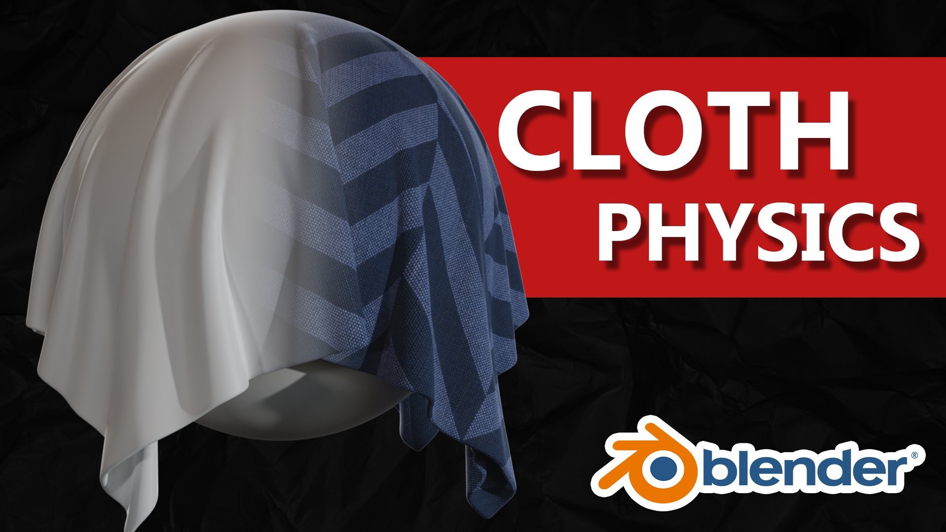
6. Crie Cushens com o modificador de pano: Bem-vindo a todos para a etapa
quatro do nosso fluxo de trabalho. Então, a etapa quatro será modelagem. Provavelmente
serão vários vídeos, mas todos eles
cobrirão a modelagem. Então, quando olharmos para
um modelo aqui, começaremos com este assento. É pano, então precisamos fazer com que pareça um pano,
precisa parecer macio. E isso não é feito apenas
com texturas mais tarde, mas também é
feito com modelagem. Precisamos ter certeza de que
nosso modelo também é solto, agradável e macio e macio. Se olharmos para diferentes
tipos de pano, você também verá que diferentes tipos de pano
atuarão de forma diferente. Mas se começarmos com nosso conhecimento de modelagem
base, poderemos criar tudo isso. Então, se olharmos aqui, você pode ver que temos
mais rugas, por exemplo. E isso ocorre porque o material em si tem uma certa espessura. É um certo
tipo de material. E é claro que também está
enchendo aqui dentro. Se olharmos aqui,
você pode ver que
há rugas muito mais pequenas. Dependendo do que
você vai criar, você realmente precisa
olhar para sua referência. E no nosso caso, nossa referência se parece com isso. Mal temos rugas. Isso significa que provavelmente o tecido em si não se
enruga em março. Além disso, por dentro, há muito recheio. Então, provavelmente há
muito algodão ou o que quer que esteja dentro para
expandi-lo tanto que o tecido em si não pode nem mesmo
Ringo. Você poderia criar isso apenas com modelagem
normal que você
provavelmente já conhece. Mas eu quero te ensinar uma
maneira de criar esse resultado. Mas também se você quiser
criar uma versão mais enrugada, você também pode fazer isso. E é isso que você
vai aprender nesta parte. Aqui dentro do Blender,
vamos esconder nossa referência por agora e olhar para
a nossa cadeira. Vamos usar
esses modelos aqui para criar o resultado
de uma serra acabada, para criar nosso resultado final. Vou duplicar
todo esse bloco fora partes compartilhadas, depois renomeado de
cadeira local zeros 012. Modelo final. Vamos nos concentrar
nessa parte aqui. Vamos clicar em Shift H
para ocultar todo o resto. E aqui temos nossa semente. Para essa técnica,
vamos usar o modificador de pano
faz sentido, certo? Algumas coisas que você
precisa ter em mente, no entanto, quando estiver usando
o modificador de pano, você quer manter toda
a geometria uniforme. O que isso significa? Bem, eu vou mostrar a você
o caminho errado agora, então não me siga e mais tarde eu vou te dizer quando o
reiniciarmos. Neste momento, temos isso e vamos
usar um modificador de pano. E o modificador de pano é mostrado em
propriedades físicas aqui, física e também como modificador. Mas se você adicioná-lo como um modificador, ainda precisará
passar pela etapa física. Então, basta entrar na física
e ligá-la aqui. E aqui temos
muitas opções. Não vou passar por cima de todos
eles, não é necessário. Mas também há predefinições aqui. Se você quer um tipo de pano mais denim ou roubo,
você pode fazer isso aqui. E isso mudará
algumas dessas configurações. Mas agora
vamos manter o que é. Vou rolar para baixo e vou mostrar o
que isso faz. Se eu jogar minha linha do tempo, você pode ver que nossa semente
está apenas caindo. Isso ocorre porque quando
você usa física, também
há automaticamente
uma gravidade atribuída a ela. No campo que você pode
ver o gráfico D está em 11 significa que ele está
funcionando totalmente e funciona exatamente como o gráfico do mundo real
aqui na Terra. O problema é que, normalmente,
quando você usa física, você realmente não
quer apenas excluir a gravidade, porque a gravidade é uma grande parte em que vivemos o dia todo. Mas neste caso, eu recomendo
que você o coloque em 0 porque é muito
justo trabalhar com o gráfico. O OEM simplesmente desligará
se jogarmos agora você pode ver que nosso modelo permanece no mesmo lugar
, mas nada acontece. Isso ocorre porque nosso modelo
é apenas direto no lugar. Não há gravidade, mas também não
fizemos nada a ela. Não estamos deixando
algo segui-lo ou deixando-se
cair em alguma coisa. E é por isso que nada
está acontecendo se
realmente
pressionarmos isso. Então, vamos colocar a
pressão para cinco. Podemos ver que agora ele
começará a se deformar. Ele se forma silenciosamente estranhamente que você
possa pensar. E isso é verdade. Isso ocorre principalmente porque não
há geometria para trabalhar. Quando você quiser
adicionar mais geometria,
ele apenas grego, clique com o botão direito do mouse
e subdivida. Aqui vem a uniformidade
da sua geometria. Se olharmos para nossas
fases, você pode ver que essas melhores são
bonitas e quadradas, mas elas são muito alongadas. Eles são retângulos. Então, se eu vou jogar isso agora, você verá que temos uma certa pressão dentro e
um pano está funcionando. Mas a maneira como o
pano está funcionando aqui é muito diferente do que aqui. E é por isso que sempre
queremos pagar com qualquer física ou mesmo uma escultura que
temos geometria estranha. Queremos quadrados e
ele precisa ser o uniforme possível.
Vamos começar de novo. Eu quero que vocês agora
peguem também seus assentos. Então, a primeira coisa
que você quer fazer é
olhar para a menor
fase para isso que você tem. Nesse caso, este
é o maior, e esses dois são esmagados. Não importa
qual deles eles são, mas eles são pelo menos
pequenos neste eixo z. Nesse caso, com o Control R, você pode adicionar loops de borda extras. Então venha para r e depois role para cima ou para baixo para
criar mais ou menos. E agora podemos ver que
se eu fizer uma contagem de três, essas fases aqui
são bastante quadradas. Vamos fazer o
mesmo neste lado. Também aqui. Há bom e quadrado porque
fizemos os dois lados. A parte superior também é
quadrada automaticamente. Isso é bom e uniforme. Se você selecionar tudo isso, se um clique com o botão direito do mouse e
depois parar a luta, você pode ver que agora para parar as visões também são
agradáveis e quadradas. Então, criamos um
bom modelo uniforme. Vou
simplificá-lo mais uma vez. E com essa geometria
podemos começar a trabalhar. Entre em suas
propriedades físicas, pano. E, claro, cairá. Então volte para os pesos de campo
e coloque o gráfico t em 0. E depois de usar a linha do tempo, você pode ver que agora ela
está no lugar novamente. Como antes, queremos
aplicar a pressão, então pressione e coloque um número de
pressão aqui. Vamos começar com cinco. Jogue novamente. E aqui você pode ver que
agora ele sobe bem. Você pode ver que porque não temos
muita geometria, na verdade
temos apenas
grandes rugas aqui. O problema é que, se você
colocar mais subdivisões, o que você pode fazer apenas com
um modificador de subdivisão, garante que você coloque o modificador eficiente
Sul antes do pano. Jogue novamente. Agora você pode ver que temos um
pouco mais de detalhes. Você pode colocar mais
ou menos geometria com as viewports de níveis. O renderização não funcionará. Os níveis são, na verdade,
onde está. Então, colocamos um mais alto
e reproduzimos isso novamente. Você pode ver que agora também a animação vai
demorar mais ou para a simulação, mas obtemos mais
e mais rugas. Tenha em mente que não é
necessariamente apenas colocá-lo super alto, porque isso
não é necessariamente muito realista. Por algum motivo, quando
você coloca muito alto, ele realmente muda um pouco a escala
do mundo real. Então, se você colocá-lo muito alto, ele essencialmente vê esse travesseiro como o tamanho de uma
casa ou o que quer que seja. Isso é errado, certo? Então, não o coloque muito alto. Também tem a ver
com a quantidade de rugas que
você realmente quer. No nosso caso,
queremos uma quantia muito baixa. Mas agora espero que vocês possam ver que, se você usar essa técnica, você pode obter vários resultados
diferentes. E isso pode acabar em perguntas
ou travesseiros
diferentes ou o que quer que seja. Você pode usar isso para todos
os outros que você
vai fazer no futuro
também, essa técnica. Mas uma coisa
que você precisa ter em mente quando quiser trabalhar
com propriedades físicas, seu modelo já deve se parecer muito com o modelo que
você vai criar. Se você olhar para este modelo
aqui, você pode ver,
em qualquer parte dessa animação, esses cantos estão
realmente se destacando. E isso é porque estamos
começando com esse modelo base. Se olharmos para o nosso resultado final ou quais eram nossas imagens de referência, você pode ver que os lados
já estão um
pouco mais suaves. Se editarmos nosso modelo principal, também
podemos obter esses
lados lisos como sal N3. Vamos voltar para o nosso assento. Vamos selecionar
todas essas arestas aqui. Todo o caminho. Então devemos reduzi-lo. Dimensione um pouco
ao redor do eixo z também. E aqui podemos ver que
agora temos uma forma mais suave e isso
se assemelha melhor ao nosso modelo. Se agora vamos
aplicar um modificador de pano. Agora, o pano será
parecido um pouco mais como o modelo básico ou
original. Portanto, esse é um
resultado melhor porque a forma principal agora é mais semelhança com
as imagens de referência. Na verdade,
ficará melhor com o modificador de pano
preso a ele também. Se jogarmos isso,
você pode ver que na
verdade é bastante extremo. Nossa pressão. Volte para o seu modificador de golfe aqui e suas propriedades físicas e então podemos
brincar com a pressão. A pressão faz muito. Se tivermos menos
pressão como uma, você verá que ela
não será bombeada tanto. Se eu apenas colocar um
pouco menos de pressão, você pode ver que isso
já é melhor. Portanto, a pressão é
uma maneira de realmente jogar uma rodada da largura dos
seus resultados finais. pressão não é a única coisa que
você pode brincar com as opções de mistura em
rigidez e amortecimento. Esses também
mudarão a largura,
mas, no geral, as outras
configurações não cobram muito. Com toda a honestidade, eu
sugiro que você apenas brinque
pela pressão e talvez um
pouco de flexão. Agora, vamos colocar a
planilha ainda mais baixa, 0,5. Vamos colocar essa flexão também. Isso não parece muito ruim. Agora vamos
adicionar outro suave eficiente após o
nosso modal normal. Clique com o botão direito do mouse, Sombra Suave
e aqui está nosso resultado final. Então, ainda não tenho certeza disso. Mas o que você pode fazer agora é escolher um determinado quadro. E você pode simplesmente dar a volta à sua linha do tempo e escolher um quadro que você
acha interessante. No meu caso, acho que cerca de
1415 parece interessante. Então você pode ir aqui e realmente aplicar
este simulador de clop. Primeiro aplicou um pano auto-suficiente,
depois o pano. Então este é o nosso modelo de sementes. Ainda não estamos todo o caminho para baixo. Então, esses são os
conceitos básicos sobre a criação travesseiros ou almofadas
dentro do Blender. Espero que vocês tenham
aprendido com isso e
na próxima parte onde você
realmente vai expandir isso e tornar isso um pouco
mais hiperpolarizado. Ainda parece um pouco. Mas eu só queria
fazer com que os caras tivessem um vídeo separado para o básico. Vocês no próximo vídeo.
7. Costuras de tecido: Estamos quase acabando
com esse travesseiro. No entanto, ainda precisamos
criar algumas costuras. Como podemos ver nesta imagem de
referência, temos várias costuras aqui. A aplicação real
do looks é para ts2. Dois ou mais pedaços de tecido juntos são vários
tipos de costuras, como você pode ver aqui. E dentro do Blender,
também existem diferentes tipos de
maneiras de criar costuras. Qual é o tipo de cena
que queremos criar? Agora mesmo? Vamos ter em
mente que esses modelos que
vamos olhar
não serão fotos de close-up. Vamos olhar de
uma perspectiva adicional para que não tenhamos que
entrar em muitos detalhes. Na minha opinião, apenas classificar geometria
extra para criar as costuras poderia ser
perfeito para este caso. Nas aulas futuras, também
explicarei diferentes tipos de costuras se você quiser
ir mais perto do modelo. Mas acho que essa técnica é
muito adequada para iniciantes. A primeira coisa que precisamos
saber é nossa topologia. Então, se você vir essas bordas, elas se conectam muito bem
aqui no meio. Agora, essa pode ser uma maneira perfeita de metade dos
tecidos se juntarem. Isso também acontece
em todo o modelo. Podemos essencialmente selecionar todas essas arestas na parte superior
e na parte inferior. Depois de selecioná-los, você pode clicar em
Control V para
chanfrar e rolar uma vez para cima. Se não estragarmos tudo, você pode ver que criamos
um triângulo no meio. E os triângulos não são
realmente úteis para trabalhar, especialmente se você quiser usar
uma superfície macia e eficiente. Com o Controle B. E role uma vez para cima, você pode ver que esse triângulo
se torna aspas, certo? Então, temos três citações
em vez de triângulos. Então, cada fase ainda
tem quatro vértices. Agora, não faça isso
muito grande, bom, pequeno. Depois de
aceitar isso, você pode clicar em Control menos. Agora você pode ver que apenas
esse loop de borda do meio todo o caminho está selecionado, vem de menos está essencialmente
diminuindo sua seleção. Então nosso altamente sugere que você vá para as Propriedades de Dados do Objeto, clique na velocidade
em um grupo de vértices, renomeie isso para parecer e, em
seguida, atribua essa seleção. Agora, tudo o que selecionamos é atribuído como esse grupo de vértices. Se eu agora por acidente,
clique aqui. Você pode ver que eu
realmente não preciso
selecionar tudo isso novamente. Posso selecionar o Grupo CME e cada
SIM será selecionado. Mais uma vez. Isso parece ter
múltiplos propósitos. Primeiro de tudo, quando nós
apenas os reduzimos, você pode ver que criamos
alguns Parece perfeito, certo? E é isso que queremos. Em segundo lugar, também
podemos clicar em Control E e marcar esquema. Você pode ver que eles ficam vermelhos agora e eles se tornaram parecidos. Então, o que essas costuras UV fazem? Bem, se você for
ao editor UV, você pode ver que
a seleção normal ficará assim. Mas como
criamos nossas costuras UV, agora
temos essencialmente todas essas
partes separadas. Então, se você clicar em você
e depois para desembrulhar, nós desembrulhamos essas costuras UV e cada pequena peça de tecido essencialmente tem
sua própria ilha UV. Agora, se você adicionar texturas a isso, obtemos uma textura diferente em cada peça de tecido, o que também é
muito realista. Além disso, as texturas também
não terão alongamento nelas,
o que também é bom. Como você pode ver,
adquirimos um esquema simples. Pode parecer perfeitamente com
a imagem que temos, mas essa é uma ótima maneira para iniciantes
começarem a entrar nisso. E parece ótimo. Ele
não olha para todos. Estas são ótimas técnicas para criar um pano como aparência.
8. Modelo 3D - Backrest: Vamos criar esse encosto. É essencialmente o
mesmo que este assento. E você pode fazer isso de duas maneiras. Você pode recriá-lo todo o caminho desde o
início, como fizemos. E se você quiser fazer isso,
eu aconselho que você
volte o vídeo e
não apenas assistiu novamente, mas faça isso para o banco de trás. Ou podemos simplesmente fazer o tipo de maneira
simples e vamos
duplicar os assentos. Então, basta duplicar o assento. E vamos pegar esses
automóveis de volta só para que eu possa ver onde
preciso colocá-lo, depois girar as rodadas de sementes
e simplesmente movê-lo para o lugar. Você realmente não
quer dimensioná-lo assim porque o eixo x
é do tamanho certo. Mas o eixo z parece
ser um pouco longo, certo? Se você quiser reduzir isso, você pensaria que o conjunto de habilidades
funcionaria perfeitamente. Nesse caso, ele meio que funciona. O problema é que ele poderia escalar
um pouco estranho porque o eixo definido aqui não está de
acordo com esses modelos eixo z, o excesso local deste modelo, o eixo local, não podemos
realmente vê-los agora. Mas se você fizer escala zed, zed, ele pega o eixo z local. Queremos encontrar esse eixo aqui e é muito
difícil de encontrar. Depende de como você o gira. Este modelo em
todo o caminho na cena. No meu caso, é escala
EY, como você pode ver. Vai ser um
dos três eixos. Então você simplesmente os move para baixo. Escala. Por que, por quê? Eu me mudei em posição? É claro, muito grosso. Então, habilidades que definem também
vou fazer para
torná-lo um pouco mais fino aqui. Então, parece um pouco melhor. Podemos excluir este encosto, este pequeno suporte de lugar
e olhar para o nosso modelo. Perfeito. Esta é uma
maneira muito útil de reutilizar seus modelos. Mas eu gostaria de dizer
que se você fizer isso, é
claro, nossa geometria não será mais quadrada. E nós temos esculpir
produtos de profundidade tornar-se um problema. Nesse caso,
vamos manter isso porque não vamos
esculpí-los mais aqui. Mas você pode optar por
excluir esses loops de borda. Esse bom trabalho. Você também é mais baixo
em sua geometria, o que é muito útil e isso
é muito mais parecido com a nuvem. E você também pode simplesmente refazer
o modelo ou dizimado. Mas neste caso,
vamos mantê-lo nisso e, em seguida, ainda
vamos esculpir. Eu sei que normalmente você não
quer esculpir porque você habilidade que não
há mais citações. Pode agir de forma um pouco diferente, mas age de forma diferente. Isso não significa que
não funcione mais. Então você tem que ter em mente, Ok, vai
agir um pouco diferente. Mas o pincel liso ou pincel de
agarrar ainda
funcionaria decentemente. Então, digamos que eu não quero que essas dobras sejam
tão perceptíveis. Você pode apenas suavizá-lo
com este pincel suave. Como você pode ver, vou apenas
selecionar meu pincel suave, brincar um pouco
com a força e, em seguida, suavizar as peças que
quero ser mais suaves. Essa é uma das maneiras pelas quais
você pode editar seu modelo. Sei que não é perfeito, mas às vezes você só
quer economizar algum tempo. Vamos também usar este pincel de
agarrar aqui. E podemos pegar certa quantidade de geometria
e simplesmente puxá-la para cima. O que você quer ter em mente
aqui é que você não quer pegar varíola e depois
continuar movendo-a. Na verdade, queremos pegar uma peça maior e depois
puxar tudo para cima. Porque se olharmos aqui
para nossa imagem de referência, você pode ver que
esse encosto está deitado sobre
essa semente normal. Se pudermos copiar isso em vez de
passar um pelo outro, isso será mais realista. Então, no modo wireframe, você pode ver onde eles estão intervindo uns com os outros. Então você pode mover isso para cima. Portanto, certifique-se de
torná-lo grande o suficiente. Em seguida, arraste-o lentamente para cima. Tudo bem se você for um
pouco para a
direita do que para a esquerda, mas não faça
muitos movimentos esporádicos. Simplesmente não parece certo. Isso já parece muito melhor. E também podemos suavizar
e essas bordas para fora. Então, se eu quiser
arrastá-los um pouco para dentro, eles não são tão pontudos. Isso também ficaria ótimo. Tão incrível. Isso é essencialmente a
África que eles
queriam dizer sobre o encosto. Assim, você pode refazer desde o
início ou
editar seu modelo de assento normal. E no próximo vídeo, terminaremos essas peças
de madeira. Vejo vocês lá.
9. Modelo 3D - pernas de madeira: Neste vídeo, vamos
criar todas essas peças
booleanas. Então, vamos ver isso primeiro. E eu quero que você
olhe para essas imagens
também porque a parte inferior parece bem
diferente da parte superior. Então você precisa dar uma olhada
na imagem frontal e
na imagem lateral, porque aqui eles
parecem do mesmo tamanho. Mas aqui isso é muito mais fino. Além disso, ele é colocado no lado
interno do apoio do braço. Também temos que ter
isso em mente. E aqui na
parte inferior podemos ver alguma borracha extra ou algo assim para que não danifique o chão. Vamos pular para o Blender. E podemos começar
a criá-los. Sabemos que eles precisam ser
colocados no lado interno
desses apoios de braço e eles meio que já estão,
então isso é bom. Agora, precisamos reduzi-los. E falamos sobre o
fato de que ele precisa ser reduzido. Mas do lado não
deve haver diferença de tamanho. Somente pela frente.
Provavelmente vamos escalá-lo em torno do
eixo x, escala x. Agora você pode ver que
isso, agora é menor em
oposição a este. Mas se olharmos para o lado, eles têm o mesmo tamanho. Agora, se também olharmos aqui, podemos ver que eles
são bonitos e planos onde quer que o chão
esteja em ambos os lados. E se olharmos para o fogo do nosso
planeta agora, podemos ver que há uma pequena curva
óbvia aqui. Também precisamos consertar isso. Vamos pegar um cubo. E esse cubo será nosso andar. Então, basta movê-lo um pouco para baixo. E este será
o nosso andar. Agora que temos a palavra, podemos reposicionar isso. Portanto, certifique-se de
entrar no modo wireframe. Em seguida, selecione todos os vértices. Certifique-se de selecionar este
último vértice como último. E agora esse vértice
fica branco, que é o elemento ativo. Em seguida, entramos nos pontos de pivô de
transformação. Vou mudá-lo
do ponto médio para
o elemento ativo. Agora, se girarmos isso, ele girará em torno
dos elementos ativos. Você pode girá-lo por aqui, bam, e depois fazer habilidades em 0 para ter certeza de
que está todo o caminho plano. Se eu vou
exagerar em lances, se eu apenas fizer habilidades em 0, você pode ver que a habilidade
estraga tudo o caminho. Então é por isso que
primeiro o giramos. Parece meio plano
e, em seguida, habilidades em 0, vamos fazer exatamente
o mesmo para essas pernas aqui. Selecione todos esses. Este é o último, gire ao redor e
depois escala em 0. Se você quiser que eles tenham
exatamente a mesma altura, você pode selecionar os dois. Em seguida, basta selecionar todos
esses vértices. Selecione 1 aqui como as
últimas escalas em 0, e agora eles também têm a
mesma altura. Perfeito. Este já está dimensionado
inverso. E também precisamos
escalar este para dentro. Você poderia ter feito em
ambos ao mesmo tempo. Mas neste caso estamos fazendo o separado um do outro. O bom sobre
o wireframe, porém, é que você pode ver
o desenrolado também, para que você possa escalá-los juntos. Certifique-se de voltar para
o ponto médio. Então aqui parece ser
do mesmo tamanho, perfeito. Agora, é claro que queremos que
eles sejam sombreados,
então verifique os dois, então verifique os dois, clique com o botão direito do mouse e faça Shade Smooth. Agora estamos perdendo 1 e isso é todo o caminho
no canto inferior direito. Assim como estes, ele precisa
ser bom e arredondado. Então, precisamos adicionar mais geometria. E então temos um
pouco mais aqui que protege o chão. Então, vamos selecioná-los. E podemos esconder este
andar por agora. Em seguida, clique em Extrusão, selecione todos estes com Alt
e, em seguida, selecione, faça a
extrusão de escala para dentro. Então, algo por aqui. Não precisamos
fechá-lo todo o caminho. Mas agora o que você pode fazer
é selecionar esse loop externo novamente e clicar no Controle
B para criar um belo chanfro. Você pode ver, porém, que esse
chanfrado funciona bem estranho. Portanto, se você quiser que seu
buffer funcione normalmente, você precisa selecionar
esse modelo Controle a
e, em seguida, aplicar a escala. Provavelmente
aumentamos ou diminuímos. Enquanto estávamos
modelando esse modelo, mexemos com a escala. Se agora vamos
chanfrar isso, você pode ver que
funciona muito melhor. Vamos fazer segmentos de três para que
você possa rolar para cima ou para
baixo para mais segmentos. Três parece estar
bem para isso agora, e isso parece ser bom. Podemos fazer o mesmo por este. Vamos apenas
extrudi-lo para dentro. Então, é claro, este também vai
agir com seus amigos. Portanto, controle a para aplicar a balança. Volte para este controle de
loop de borda B. E aqui temos
o mesmo efeito. Perfeito. Agora, como último, precisamos criar a pequena borracha por baixo. Podemos selecionar
esse loop de borda do meio. Clique em Shift D
para duplicá-lo. Clique com o botão direito do mouse, ele se encaixa
novamente no lugar, mas ainda está selecionado. Clique em P e depois
separe por seleção. Agora, essa pequena
parte está separada. Podemos escalar um pouco e
extrudi-lo em torno do eixo z. Certifique-se de que esteja sombreado e isso é
essencialmente tudo o que precisamos para
essa pequena borracha. Podemos fazer o mesmo,
pagar essa parte aqui. Verifique este, mude a seleção P
com o botão direito do mouse
e, em seguida, dimensione isso, extrusão,
clique com o botão direito do mouse, Vamos colocar nosso andar de
volta aqui. E podemos ver que estes têm pequenos Roberts em um IV. Então, isso pode ser um
pouco pequeno demais aqui, então você sempre pode
escalá-los se quiser escalar. Não precisamos criar um modelo muito detalhado aqui para esses ladrões
porque antes de tudo, lá na folha e
a única maneira vê-los é em
certos ângulos de câmera. Apenas um pequeno modelo com um tipo de material preto
será bom o suficiente. Certifique-se de renomeá-los caso contrário, não podemos
encontrá-los de volta. Estes em vez de pernas, a
frente será Robert Frantz. E estes serão Robert de volta. Qualquer inglês pode rir desses nomes, mas
sim, é isso. Então, no próximo vídeo,
vamos
começar e criar essas peças
de madeira aqui. Vejo vocês lá.
10. Modelo 3D - braços de madeira: Neste vídeo, vamos
criar esses apoios de braço. E a forma
desses braços
não é a forma mais fácil de sempre, como falamos antes. Se você quiser
conhecer uma forma, é claro
que vamos
percorrer todos os
contornos e estamos começando a ver do que a
forma é feita. Criar essas linhas
simples realmente ajuda a simplificar
a forma geral. Minha opinião, isso parece muito
mais fácil de recriar do que isso. O que temos que fazer
para realmente criar isso? Temos que
pensar em algumas coisas. Eu pessoalmente gosto de trabalhar
com geometria silenciosa. Isso significa que cada
fase tem quatro vértices. E uma área como
essa pode ser muito problemática com a criação de
citações porque é um polo. E você poderia criar isso. E então você pode ver
que esse vértice tem cinco ou mais
arestas anexadas a ele. E isso simplesmente
não funciona
bem com o sombreamento mais tarde. Ou também se você
quiser parar a luta, provavelmente queremos apenas
criar um loop de borda como este. E se você tem um real lá, então podemos ver que
temos uma boa geometria silenciosa. Agora, também temos que
cuidar
dessas partes lisas e arredondadas que
temos aqui e também aqui. O que isso significa? Isso significa que
precisamos criar mais geometria para obter
essa forma arredondada. Então, se tivermos um vértice
e outro vértice, você pode ver que isso, nunca
poderemos fazer uma boa forma
curva desta caixa. Se tivermos um vértice
e outro aqui, e um terceiro no meio, podemos combiná-los com bordas. E isso, poderíamos fazer boas curvas e
suaves porque
se você parar a luta, você terá uma boa forma curva. Então, provavelmente precisamos criar mais loops de borda aqui para
criar essas formas curvas. Isso é o que você
precisa ter em mente. Além disso, como
começamos esse modelo? Isso também pode ser uma pergunta. E quanto a nós apenas
olharmos para o topo agora, a tupla parecerá algo
assim, muito simplificada. Se extrudirmos isso para baixo, você obtém esse tipo de forma. Você pode ver que a forma
realmente segue o que precisamos. Se apenas adicionarmos mais geometria depois de criarmos
essa forma básica, podemos realmente
criar esse modelo. Vamos pular para o Blender. Aqui temos nossos apoios de braço. Vou criar um modelo
totalmente novo para este apoio de braço porque isso já
está girado e às vezes é um
pouco mais difícil se você trabalhar com objetos sim, pré-girados. Então Shift C para
garantir que você seja tratado cursores no meio
e, em seguida, adicione um plano. Vamos para a
vista superior, que é sete. Dimensione até atingir
o mesmo tamanho que esses pequenos
braços pré-fabricados descansam por aqui. E, claro, escaladores
ao redor do eixo y. Ele também se encaixa aqui. Perfeito. Agora, quando você clica em Shift H, lembre-se, a propósito, esta é a frente e
esta é a parte de trás. Se você clicar em Shift H, escondemos todo o resto,
exceto este plano. Agora, vamos começar
com a frente. O que vamos
fazer é nos
certificar de que temos geometria
extra. Então, vou
clicar no contador e me certificar de que tenho
três loops de borda aqui. Em seguida, selecione este
vértice do meio, vá para sete, que é a vista superior, e selecione a ferramenta de edição
proporcional. Então vamos descer aqui e mudar essa queda
de suave para esfera. Se você mover isso agora, você pode ver que todos esses
vértices se movem. Agora, deixe-me usar minha roda
de rolagem para que eu realmente possa ver
a queda do círculo. E eu só vou me
mover por esse vértice, em torno do eixo y. Você pode ver que
esses outros também seguem porque
temos essa queda. Algo por
aqui ficará bem. Agora, temos essa forma agradável e
suave e, mais tarde, é
claro, usamos uma superfície suave e eficiente que a torna ainda mais suave, mas vamos passar por cima disso mais tarde. Vejamos a parte de trás porque a parte de trás é um pouco diferente. Precisamos criar
esse tipo de forma. Como fazemos isso?
Bem, o problema é que precisamos primeiro
olhar para nossa referência. E se vamos
esconder esses dois aqui, olhe para a nossa vista lateral. Você pode ver que nosso loop de borda deve estar
em algum lugar por aqui. Se você clicar em Control R, é um pouco difícil de ver
porque é uma planície de inundação. Mas em algum lugar por aqui, precisamos criar
esse loop de borda. Também. Se você criar um loop de borda, mas um lado do seu modelo
é curvo assim, você pode ver que seu loop de
borda realmente
tenta também se livrar
dele dessa curva. Se você não quiser isso e escale-os ao redor
do eixo y para 0. E agora eles são bonitos e planos. Este é o
ponto de corte que precisamos. Agora, podemos selecionar todos esses, certifique-se de selecionar
este último. Em seguida, altere os pontos de pivô de
transformação para elementos ativos. Podemos desativar essa edição
proporcional. E se eu escalar isso para cima ou para baixo, ele será dimensionado em torno
desses elementos ativos. Vamos reduzir isso. Se eu quiser que essa queda seja mais suave, como círculo, só
preciso criar mais loops de borda e fazer
exatamente o mesmo. Escala. Isso é um pouco baixo. Dimensione
isso um pouco para baixo. Podemos selecionar tudo isso, clicar em um e
extrudi-lo para baixo. Sempre podemos
voltar e ver
nossas imagens de referência para ver o
quão espessa ela deve ser. Também podemos fazer isso
mais tarde, a propósito, mas acho que é
útil se você continuar olhando para suas
imagens de referência agora. Porque você pode
ver que esta barra aqui é um pouco
mais fina do que essa grande parte aqui. Então, se vamos olhar aqui, você pode ver que
provavelmente é algo assim. E aqui podemos desselecionar estes, movê-los um pouco para cima. Então agora ele vai de grosso
a fino, como incrível. Então, como tornamos isso um pouco
mais atraente para os olhos? É claro
que sabemos que o modificador chanfro e uma
superfície macia e eficiente são freqüentemente usados. Quando usamos modificadores como esse, muitas vezes
precisamos primeiro
aplicar nossas habilidades. Portanto, controle a e aplique a
escala do seu modelo atual. Isso ocorre porque
mudamos muito do tamanho
desse modelo
dentro do modo de edição. Você precisa aplicar isso
fora dele também. Caso contrário, esses modificadores
não sabem o que fazer. Se eu conseguir mais segmentos
aqui no meu modificador chanfro, você pode ver que, é claro,
estamos obtendo algumas formas agradáveis. Eles também colocam esse
valor um pouco menor, mas também estamos
recebendo chanfros, por exemplo,
talvez não queiram. Como você pode ver aqui
nessas bordas. Como mudamos isso? Bem, agora nosso
método limite está definido em ângulo. Se vamos
mudar isso para esperar, podemos colocar um peso em
certos vértices ou bordas, e somente essas arestas
serão chanfradas. Vá para o modo de edição. Selecione as arestas onde
você deseja o chanfro. Então eu vou percorrer todo
o caminho por aqui, todo o caminho. Assim. E isso é o último. Eu não vou
chanfrar esses laços de borda aqui e também não
esses aqui. Se você agora for para o item, vá por baixo dos dados das bordas e coloque peso
médio do chanfro até um. Agora podemos ver que um bom buffer é
avaliado por aqui. Ainda temos alguma seção
estranha aqui. Isso ocorre porque nosso
deficiente em SAP não é alto o suficiente. Também podemos clicar com o botão direito
e fazer Shade Smooth. Essas formas estão
começando a
olhar para as formas que
queremos que ela tenha. Bots, eles ainda não estão
até lá. Isso ocorre porque em
algumas áreas como aqui, precisamos adicionar mais geometria para realmente garantir que a
forma seja formada. Porque aqui você pode ver
que esta é uma forma estranha. Se adicionar um loop de borda extra, você pode ver que
a forma agora recebe mais sanduíches com
o que realmente queremos. Isso já é muito melhor. Também aqui, podemos ver que
esta é uma borda muito afiada. Mas se voltarmos à nossa imagem, você pode realmente ver que isso não
é necessariamente nítido. Pode até ter um
pouco de curva para ele também. Assim, podemos criar também
três loops de borda aqui. Selecione, deixe-me esconder
isso por agora. Todos esses vértices, vou garantir que minha ferramenta de edição
proporcional esteja ligada novamente e mova-os
ao redor do eixo y. Vou ligar uma superfície deficiente no
navio. E aqui podemos ver
que temos uma forma muito melhor. Também podemos
movê-los um pouco para dentro se
você quiser escrever para GY e mudar a forma
assim também pode ser feito aqui. Talvez nós queiramos um
lance, seus amigos. Só vou selecionar todos
esses, depois g, y. Então essas são algumas técnicas para realmente criar
um modelo como este. Vamos recuperar nosso
modelo original novamente. Todos esses aqui. Vamos ver como essa parte
se encaixa em cima daqui. Podemos excluir
esse tipo de espaços reservados, esses apoios de braço e mover
este para o lugar. Eu sempre gosto de obter minha imagem de
referência e voltar novamente para que eu possa
ver como colocá-las. Nesse caso, vamos
girá-los novamente. Aqui. Ainda podemos alterar o
tamanho disso, se quisermos. Não somos um tipo de vínculo com o
que acabamos de criar. Então eu só vou
mover isso no lugar. E você pode ver que essa parte
parece estar um pouco longe demais. Então eu posso selecioná-los e depois movê-los um pouco para trás. Perfeito. No entanto, acho que este modelo é um pouco largo demais
em torno do eixo x. Então, poderíamos selecionar tudo e,
em seguida, selecionar apenas esse
rosto como o último aqui. Certifique-se de que seu
ponto de pivô esteja definido
no elemento ativo e
desligue este, escale-o em torno do eixo x
para torná-lo um pouco menor. Isso já
parece muito melhor. Incrível. Então você pode continuar
brincando com isso. Vocês já
sabem como fazer isso, mas podem ver que essa
é a forma como eu trabalho. Como finalizamos isso? Bem, estamos perdendo
três peças de madeira. Primeiro de tudo é esse
pequeno botão aqui. Então também temos esses dois de
baixo. Você também pode ver aqui em cima
que esta perna realmente
passa e esta é a maneira como
ela é estabilizada um gás, ela vai todo o caminho
através desse apoio de braço. Eu pessoalmente não gosto disso, então não vamos fazer isso. Então, vamos nos
concentrar no fundo dele. E essas duas partes para
essas duas partes aqui, deixe-me exibir tudo e depois esconder a
imagem de referência e apenas selecioná-las. Eles são esses cubos. E esses cubos
são, na verdade, bastante simples e fáceis de
recriar com a forma que precisamos. A única coisa que temos que
fazer é clicar em Shift H. Certifique-se excluir essas duas fases externas,
EX, Delete, face e
criar um modificador chanfro. Podemos colocar mais alguns
segmentos aqui, talvez três, e colocar o
valor um pouco maior. Além disso, este, provavelmente
precisamos aplicar a escala. Você pode ver
que isso faz muito. Deixe-me colocar isso de volta em algum lugar aqui,
clique com o botão direito do mouse em Shade Agora, para outro cubo, podemos simplesmente selecioná-lo. Certifique-se de que aplicamos a balança. Em seguida, exclua essas
duas fases também. Fases. Em seguida, selecione-o, selecione aquele com os modificadores
já aplicados a ele clique em
Control L e copie modificadores. E agora os modificadores
são copiados aqui. Também faça sombra suave,
perfeita, menos. Queremos esse pequeno botão aqui. E o que podemos
fazer é selecionar este pequeno loop de borda ou este pequeno vértice
aqui e que temos. Em seguida, clique nas
curvas Shift S para selecioná-lo. Ou o cursor tratado
salta para este vértice. E agora, se adicionarmos uma esfera UV, você pode ver que ela será adicionada exatamente lá
no meio. Quando você adiciona uma esfera UV, você realmente quer fazer
alguns segmentos a menos. Podemos apenas fazer em vez de
3216 e, em vez de 16 anéis, podemos fazer oito bebidas. Agora, diminua a escala, gire-o em torno do
eixo y por 90 graus e vamos escalá-lo
ainda mais para baixo. Em seguida, podemos selecionar este
vértice aqui no final, clicar no contador mais para expandir a seleção e
excluir esses vértices. Agora só temos isso sobrando. Deixe-me mostrar
esse pequeno botão. E isso é essencialmente isso. Clique com o botão direito do mouse E também podemos tornar o pouco mais liso em vez desse bulboso, digamos então escala x e em seguida, apenas torná-lo
um pouco mais plano. E se você for para a vista superior, você também pode girar um
pouco se quiser. Isso é aquele pequeno fundo. Agora, para este apoio de braço, que agora é chamado de avião, podemos renomear isso para descanso de braço. Vamos adicionar mais
um modificador e esse é o modificador de espelho. Certifique-se de que esteja todo o caminho
em cima da pilha de modificadores. E use esse assento como
objetos espelhados. E agora são bem espelhos. Faremos o mesmo
por esse botão também. Basta usar um modificador de espelho. Selecione o assento como
objetos espelhados, e aqui está bem espelhos. Este fundo ainda é
chamado de esfera, então podemos renomeá-lo
para fundo de madeira. Não tenho certeza de como nomear isso, mas o fundo ficará
bem por agora. Provavelmente é como
um parafuso que
o parafusa nesta moldura traseira por cara. Na próxima parte, só
precisamos
criar um desses quadros. Podemos copiá-lo
para o outro, e então podemos começar
com nossos materiais. Vejo vocês lá.
11. Modelo 3D - quadros: Neste momento, só
precisamos criar mais
dois modelos e
vamos copiar um sobre. Portanto, não é tão difícil
criar esses dois. Além disso, não precisamos criar nenhuma simulação de pano
ou nada disso. Porque esses dois modelos, os quadros com o
tecido ao redor, não parecem ter
muitas rugas dentro deles. Além disso, há apenas uma pequena diferença
entre eles. Na parte de trás você pode ver que temos um belo canto arredondado na parte superior e inferior
também um pouco. E na parte inferior
podemos ver isso também. Esta parte inferior é um
pouco menor. Você pode ver que ele vai
um pouco para dentro. Vamos criar essas combinações
internas lá. Aqui temos esses dois modelos. A primeira coisa que quero que
você perceba é que esses modelos precisam se encaixar na
largura desses outros modelos. Então você pode ver que esta
votação, por exemplo, é uma pequena parte
intermediária que
passa por esse quadro e isso não
é realmente o que você quer. Além disso, acho que no meu caso,
esses assentos são um pouco grossos demais. Eu poderia escalá-lo um
pouco ao redor do eixo z. Agora, porque eu escalei
em torno do eixo z, eu também poderia me mover um pouco mais para cima, o que nos faz enquadrar também
capazes de subir um pouco mais. E eu poderia
reduzir essa rota. Se você for para a vista lateral, entrar no modo wireframe
e editar, basta arrastar
isso um pouco para baixo. Podemos fazer o mesmo por este. Isso, é claro,
muda a aparência. E você tem que ter cuidado
e apenas continuar olhando frente
e para trás nessas imagens de
referência, mas você sempre pode alterá-las. Ok, então nada está
definido em pedra ainda. Mas digamos que seja assim que tudo vai
se encaixar. Agora podemos começar e
criar esse quadro traseiro. Só vamos
selecionar esse modelo. E acho que o fundo deve ser um pouco mais fino. Então, vou movê-lo. Vamos entrar. Estou aqui no meu
quadro, selecione estes,
depois g, z, z moveu-se
um pouco para dentro. E aqui temos esse
controle a para aplicar à escala e podemos clicar em Shift H para ocultar todo o resto. O que precisamos fazer aqui? Primeiro de tudo, se você
quiser esculpí-los aqui, certifique-se de
criar citações novamente. Mas ainda precisamos de mais
subdivisões porque se eu apenas adicionar uma superfície de subdivisão
agora você pode ver que ela fica muito arredondada. Simplesmente não faz nenhum sentido. Então, vamos criar alguns loops de borda
extras aqui. E eu vou fazer em torno de
quantos temos aqui? Talvez por volta das dez. Isso também é olhar para o topo. Talvez 99 ou oito realmente criem nuvens,
então também podemos fazer isso. Então, vamos fazer oito neste caso. Farei o mesmo aqui e
vamos ver as cotações de crédito. Meu caso sete
parece funcionar deste lado. Se eu fizer oito vem
um pouco pequeno demais, então sete parece estar bem. E você pode ver que
agora esses cantos são muito bonitos e arredondados. E sim, parece
bem diferente. Se criarmos um loop de
borda extra aqui, na verdade
obteremos mais
da forma que a pessoa de
IA gosta. E também, que também se assemelha a
essa imagem um pouco melhor. O topo aqui
parece bastante plano. Bots, se você
olhar para a vista lateral, é um aço muito bom
e suave. Ainda há
algum tecido lá. Não é apenas um canto afiado. Então é isso que estou
tentando recriar aqui. Você poderia fazê-lo
com um loop de borda, mas você também pode chanfrar,
ele vem de B. Então, selecione o
controle de loop de borda V e, em seguida,
bisele-o para estender isso um pouco que
fique mais achatado no topo, mas ainda tem essa forma
agradável e suave para aqui na frente. Agora clique com o botão direito do mouse em Shade Smooth e aqui temos
nosso modelo final. Gostaria de primeiro
aplicar a superfície
suficiente de nível um. E agora temos essa
geometria que parece decente. E então eu gostaria de
adicionar outra superfície
deficiente para apenas criar mais detalhes,
mais geometria. Nesse caso, se apenas
selecionarmos esses dois loops de borda, clicar em Control V, rolar uma vez para cima e
torná-los agradáveis e SUV, eles podem se tornar nossas costuras. Por aqui. Controle menos. Eu gosto de ir aqui novamente para as propriedades de dados do objeto
criar uma boa aparência, grupos,
parece, atribuir esses loops de borda e, em seguida, podemos dimensioná-los para baixo. Então, dimensione esse caso, eu realmente preciso
colocar meus pontos de
pivô de transformação de volta
em pontos médios. Dimensione essas coisas para baixo, e aqui temos essa forma. Perfeito. Também não se esqueça de clicar ou
Controlar E e marcar a costura. Então também temos alguns desses
e parece aqui isso,
sim, parece um
direito bastante decente. Você pode escalar. Isso parece o mais
baixo que ela quer. Se você escalá-los um pouco mais
para baixo, você pode, é claro, ver que essas bordas
ganham mais destaque. Só não exagere. Eu não acho que seja necessário. Mas neste caso,
isso parece funcionar. Ótimo, incrível. Para esta parte inferior, vamos
duplicar esta aqui. Então vá para o lado,
algumas duplicatas. Vamos girá-lo por aqui. Traga tudo de
volta com Alt H. E então eu gosto de
mover isso no lugar. Então você pode ver que essa parte
inferior é muito maior. Dimensione em torno do eixo y. Bom trabalho. O problema é que se eu
escalar em torno do eixo y, escala YY, essas bordas
ficam meio estranhas. Eles também se alongam. Se eu exagerar, você pode ver
o
que está acontecendo quando você fica estranho. Sim, são bordas bonitas e
suaves ficam muito esticadas.
Não queremos isso. Então eu sugiro
que você apenas selecione uma determinada parte desse modelo
dentro do modo de edição e
, em seguida, mova isso. O que quero dizer se isso
for, vamos voltar, selecionar este modelo,
movê-lo de volta até aqui. É legal e escondido por trás deste volt, em algum lugar
por aqui. Em seguida, vá para o
modo de edição e selecione Com ver esses loops de borda. Em seguida, clique em G e
clique duas vezes y. Você pode avançar. Nesse caso, essa boa forma
arredondada que
tínhamos não será deformada
porque realmente
agarramos esses laços de borda. Mas, claro, não temos mais
essas citações legais. Com o Control R, você
pode simplesmente criar loops de borda
extras e
obter essas cotações de volta. E agora ainda podemos esculpir
sobre eles, se necessário. Uma coisa que você
tem que ter cuidado. O dimensionamento nem sempre é bom, especialmente se você
já tiver algumas formas lá para
as quais você trabalhou. Então, Alt H, podemos excluir esse quadro de bloqueio no qual não
estamos mais trabalhando. E a única coisa que
eu gostaria de mudar aqui é que se
olharmos para essa imagem, você pode ver que
essa forma aqui, e também pela frente, os lados vão um pouco para dentro. Se você selecionar este modelo, nesse caso, ele
excluirá o loop da borda do meio, selecionará o fundo todo o caminho e apenas diminuirá
um pouco. Agora você pode ver
que ele diminui. E então temos esse
loop de borda é meio que pára essa bela queda e
depois volta novamente. Então, eu gosto de excluir esse
loop e, em seguida, apenas criar um loop de borda novamente para
criar mais geometria. Digamos que isso pareça muito mais com o
modelo que temos. E estou realmente gostando do
que estamos vendo aqui. A única coisa que você
quer fazer agora é
terminar isso para
finalizar este modelo, quero que você dê uma olhada
rápida nessa imagem. Como esses alimentos estão interagindo com os assentos
e todos esses tecidos, você pode ver que eles ficaram bastante amassados onde o
Buda os toca. Isso faz com que pareça mais
suave e mais realista. Então, como podemos fazer isso
dentro do nosso modelo aqui? Bem, podemos ir para o modo esculpir. Antes de fazermos isso, você deve dar uma
olhada rápida se eles tocarem nele. Então, se digamos que este era
um pouco
curto demais em torno do eixo x
e não o toca. Você pode corrigi-lo de duas maneiras. Talvez você possa mover seu
voto um pouco para dentro, ou você pode simplesmente mover isso um
pouquinho para fora, certo? Então, essas são as duas
maneiras pelas quais você pode editar isso se quiser
esse efeito extra. Agora, vá para esculpir. E é muito útil
se você desligar sua
superfície suave e eficiente, apenas para
ver o tipo de geometria com que
você está trabalhando. Então eu pessoalmente
gosto de trabalhar se o pincel de agarrar aqui
dentro da ferramenta ativa, você pode ver o pincel de agarrar. E no círculo do meio, podemos ver nosso pincel. E o círculo externo é
essencialmente a
queda antes de empurrarmos isso
para dentro, sugiro que você também
ligue a simetria x. aqui. Você pode ver que agora
funciona nos dois sentidos. Então eu só preciso adicionar 1 aqui. Então talvez empurre esse pouco para dentro. E isso também acontece
de outros lados. Poderia fazer o mesmo aqui. Isso aqui, ele pode ser empurrado
um pouco para dentro. Você não precisa
exagerar, a propósito. Ainda tem que parecer um
pouco natural. Aqui. Se você quiser trabalhar em
outro modelo, vá para o layout, selecione-o e
volte para a escultura, e agora estamos nesse modelo. Então aqui, novamente, quando
você seleciona um unimodel, a simetria é
desligada novamente como o normal. Ligue novamente
porque a simetria funciona
essencialmente no modelo PR. Todas essas opções
funcionam para o modelo. Então, para este, apenas
empurrou um pouco para dentro. Aqui. Tenha em mente que está tudo bem se
não estiver perfeitamente bem, estamos aprendendo e isso é nosso, isso é para
garantir que você seja eficiente. As superfícies estão ligadas novamente, só para que possamos ver
o que criamos. E, na verdade,
parece lindo. Então isso é um pouco de março demais. Vou apenas acrescentar
isso no meu próprio tempo. Mas é essencialmente
assim que criamos esse modelo. E na próxima parte
podemos começar a criar alguns materiais.
Vejo vocês. Lá.
12. Unwrap de uv - tecido: Antes de
criarmos um material, podemos nos livrar de todas
essas outras coisas aqui. Portanto, as cadeiras de fuga
não precisavam mais e eu sempre
salvo vários arquivos. Então, provavelmente estamos no, vamos ver o arquivo nove já
bloquear o compartilhamento nove, que agora deve
realmente ser concluído. Cadeira modelo final. E então Barth dez, só para eu ter partes. Mas sim, eu sempre posso
saltar de volta para meus arquivos. E se eu fiz algo
errado ou se eu vir algo tarde
demais e pegar
esses modelos de volta, ou mesmo ir, basta voltar alguns arquivos e começar de
novo a partir daí. Agora, para limpar um pouco a
cena, não
precisamos mais
desse andar. Nós realmente não
precisamos mais desse bloco
dessa cadeira para que
possamos excluir tudo isso. coleção de compartilhamento de breakout também
pode ser excluída. Então temos outra coleção aqui, que é a
câmera e as luzes. Tudo bem. Vamos manter
isso por agora. E então temos nossa referência. As referências, eu realmente não
preciso mais desses cubos. Eles já estão bem
estabelecidos. E a última coisa
que quero fazer aqui é que quero manter
essas
imagens de referência apenas para que
possamos comparar nossos materiais
um pouco mais tarde. Então, o que queremos fazer agora? Bem, queremos começar com nossos materiais e como
iniciamos um material agrícola? Bem, precisamos primeiro desembrulhar cada
peça UV para desembrulhar UV. Eu também gostaria de
mudar esses nomes só que tudo
seja um
pouco mais sim, no exterior, digamos
porque, claro duplicamos e muitos
desses modelos e eles
agora têm nomes estranhos. Então, se tivermos esse quadro Beck, agora este quadro Beck 0 é 01. Bem, este é apenas
o quadro traseiro. Para isso, na
parte inferior, temos o Eu realmente não me lembro do
que chamamos isso, mas talvez o quadro inferior. Então temos nossos braços
descansos, tudo bem. E temos um zeros ao cubo 02, que é essa
peça de madeira entre aqui de algo assim. Só para você se lembrar disso. Bosque. De volta. Então temos o nosso
atraso Lá está bem, realmente
não precisa de 001
lakh frente também bem. Então temos
parte traseira de borracha, frente de borracha. Essas duas pequenas coisas de borracha
preta
estão por baixo. Então temos nosso assento, que é z 001. Pode ser apenas sementes. E temos C12, que é apenas o nosso encosto. Isso parece ser tudo. É útil se você
tiver todos esses nomes, especialmente se você quiser reutilizar esse modelo ou
se você estiver vendendo esse modelo, as pessoas querem ver do que ele é feito
porque podem fazer edições. Talvez seja muito útil
renomeá-los. Vamos entrar nos materiais antes que possamos criar materiais, precisamos desembrulhar nosso modelo UV. Se olharmos para um modelo, podemos ver que existem três
tipos diferentes de material. Temos nosso pano aqui, temos nossos volts e esses
pequenos Roberts por baixo. Não vou criar um mapa de textura especial para
esses Roberts na folha. Vai ser um material
tão simples. Mas para os votos
e para o tecido, poderíamos criar alguns materiais. Esses materiais podem
estar em um mapa de textura, ou podemos fazê-los em
vários mapas de textura. Só por uma questão de tornar
isso um pouco mais fácil e simples
para nós iniciantes. Vamos fazer isso em
dois mapas de textura separados. Precisamos de mapas uv, vá para Edição UV. E você provavelmente
já viu que já
criamos alguns mapas UV, especialmente para nossas peças de tecido. Se selecionarmos todos eles, que é esse encosto, esse assento e esses dois quadros, clique em cima para selecionar todos eles. Agora estamos no modo de edição
em todos esses, clique em um e clique em você depois em rep. Agora, há um pequeno problema. Primeiro consideramos que o objeto
tem uma escala não uniforme. Isso significa que a escalamos , mas nunca aplicamos a escala. Vá para o topo novamente para
entrar no modo objeto, clique em cones para um
e aplique a escala. Agora, se fizermos o mesmo, não receberemos esse erro. Termina. Esses UVs realmente parecem decentes, mas é tudo tão bom? Precisamos verificá-los. Existem várias maneiras de
realmente verificar seus UVs. Mas se você subir
aqui e rolar, podemos entrar nas
sobreposições e
podemos ver o alongamento da tela. Este trecho de lugar mostra
alongamento em seus UVs. E se formos aqui, podemos ver que essas partes, que não são apenas totalmente
sopradas, nosso alongamento. Se algo é apenas
um azul escuro normal, não
há trecho, o que
essencialmente significa que é bom. Mas se chegar ao verde ou mesmo em
vez de alguns casos, então há algum alongamento. O alongamento nem
sempre é tão ruim, mas muitas vezes queremos evitá-lo. Nesses lugares. Acho que isso é um pouco demais. Então, quando você não
sabe nada sobre alongamento e como ele
realmente ficará em suas texturas. Há também uma outra
maneira de realmente mostrar isso. Vamos para o sombreamento. E já temos um
material atribuído a isso. Se você
ainda não tem um material, basta criar um, então vamos
fazer com que o curso use nós e use uma textura de imagem. Vamos colocar isso
na cor base e vamos criar
uma nova textura de imagem. Podemos colocar este tipo de
gerador em branco grade UV e clicar em, Ok. Aqui podemos ver,
obtemos essa grade UV. Você pode ver nesta
grade UV alguns quadrados agradáveis. Se houver algum alongamento, o que acontece muito aqui, você verá que
esses quadrados não estão mais
ao quadrado e eles
simplesmente parecem muito afastados. Isso acontece também
por meio de suas texturas. Isso é apenas uma textura. Se tivermos uma boa textura de
tecido, mas então ela começa
a deformar tudo aqui. Simplesmente não é o que queremos. Simplesmente não parece bom, não parece realista e queremos
evitá-lo. No geral. Talvez tenhamos um
pouco de alongamento aqui, o que também pudemos
ver em nossa Edição UV. Há um pouco
lá e esses cantos, mas não é uma quantidade extrema. Então, esses cantos,
talvez possamos dizer que talvez haja um
pouco de incômodo de alongamento, não
há tanto que precisemos mudar nada. Aqui. Temos um pouco
aqueles que poderíamos evitar. Mas este eu simplesmente
não posso pagar. Vamos à nossa Edição UV
e vamos ver o que está errado. Bem, o que há de errado aqui é que este é um pedaço inteiro de tecido, mas tudo está combinado. Então o liquidificador está tentando empurrar e puxar
tudo junto. Então, ele ainda se encaixa
aqui neste mapa UV. Se acabarmos de criar uma costura, vamos fazê-lo aqui na parte de trás onde
realmente não podemos ver nada. Então, vou clicar em,
vou selecionar isso aqui, mudar H e criar uma costura aqui. Eu realmente não preciso que a
costura vá
até aqui ou aqui. E eu quero que a costura vá
da cena do rato existente que vemos. O outro aqui. Posso desmarcar isso, clicar em Controlar a
e marcar esquema. Agora, se eu clicar em um, você desembrulhar, você pode ver que essa
textura agora está toda alongada e pode
haver um
pouco de alongamento. Mas se agora vamos
olhar para trás para o nosso sombreamento, você pode ver que esse alongamento é muito melhor do
que costumava ser. Isso é essencialmente o que
estava errado com o nosso mapa UV. E essa é a única
coisa que precisamos mudar. Também para o outro, provavelmente não o
fizemos. Você pode ver que temos um
enorme ar de alongamento. Vá para o fundo. Selecione esse loop de aresta. Vamos
desmarcar esses. Esses também
contornam um esquema de marca a. E eu realmente quero
ver aqui com o sombreamento da
viewport, você desembrulha um, você pode
ver que ele está corrigido. Perfeito. Vá para Edição UV novamente. Alt H, selecione todas
essas peças de tecido. Vamos tentar isso novamente. Em envolvê-los todos. E aqui está você. As taxas parecem um
pouco diferentes, mas quase não há mais
alongamento. Claro que há
um pouco de alongamento, mas tudo bem. Normalmente, quando você
cria essas equipes UVC, você também quer otimizar
o espaço que tudo ocupa dentro deste mapa UV. Tudo aqui
poderia, essencialmente ser dimensionado um pouco. Quanto mais espaço você der isso
dentro do seu mapa de textura, mais pixels essencialmente você tem para que seu mapa
de textura seja mostrado aqui. Então, quanto mais alto você conseguir, você pode brincar com
isso o quanto quiser. Você pode movê-los por aí. Você pode dimensionar certas partes das quais são mais
visíveis aos olhos. Então talvez essa parte do cristão ou
travesseiro não seja mostrada. Você pode até excluí-lo. Parece estranho, mas é apenas geometria que nunca
veremos. Além disso, essa geometria menor dentro do mapa UV porque não
vamos ver isso. Mas este é essencialmente
um mapa de textura decente. E podemos entrar no sombreamento e começar a criar alguns
materiais para este tecido.
13. Materiais - tecido: Como criamos um material
crível? Nesse caso, vamos
criar um material de tecido. Podemos simplesmente renomear isso
com zeros de tecido. Se um desses modelos
não tiver esse tecido
aplicado a ele, basta clicar neste pequeno
material de navegação e usar o mesmo
material aqui, certo? Então, o que queremos fazer aqui? Queremos criar o material. Mas, para criar um material, muitas vezes
você também precisa de uma
boa iluminação para realmente mostrar as extremidades
do material. Eu pessoalmente gosto de entrar
no motor de renderização, ciclos. É um pouco mais difícil
em um computador e eu poderia tirar
você não quer
renderizar quais são os presentes? Resultados muito mais fotorrealistas. Isso coloca o dispositivo na GPU. Agora, se você entrar no sombreamento
renderizado da viewport, e isso é essencialmente o que você verá quando
começar a renderizar. Então podemos ver isso. O que vamos criar
agora para nossa iluminação não precisa
necessariamente
ser a iluminação que vamos usar
em nossa renderização final. Comprei um bom
forro é sempre apreciado porque então
podemos ver nossas texturas melhor. Objeto entra no mundo. E neste caso, temos apenas um fundo simples
com uma fonte de luz. Se excluirmos uma fonte de slides, você poderá ver que ela fica
bem escura aqui. A única luz que está sendo emitida
agora é do fundo, que é apenas uma força de um neste tipo
de cor acinzentada. Se eu colocar isso em 0, você pode
ver que está totalmente escuro. Vamos usar uma textura HDRI. Clique em shift a para criar uma textura de ambiente e colocar a cor na
cor do plano de fundo. E aqui podemos pegar um HGRI. Você também pode baixar isso. Acabei de colocá-lo para baixo como
um arquivo zip, eu acho. Agora escolha o estúdio. O que podemos ver aqui é que
temos uma imagem inteira, imagem
360 por aqui. E tudo isso é um mito
iluminado em nossa cena. Pode ser um cabelo um pouco forte
demais, mas sim, você pode apenas reduzir
a força, digamos 0,7. E podemos ver tudo
agora em uma luz melhor. Ha, vamos entrar em objeto. Depois de selecionarmos esse modelo, temos nosso
sombreador de princípios aqui. No momento, ainda temos essa textura de
imagem aplicada a ela. Se excluirmos isso,
você poderá ver que
temos um sombreador principal normal. Aqui temos uma cor base
que agora é branca para subsuperfície e todas
essas coisas boas. Bem, o que
queremos adicionar aqui? Queremos adicionar uma textura de imagem. Vamos colocar essa
cor na cor base e podemos clicar em abrir. Esses arquivos também estão
disponíveis para download. A primeira textura que
precisaremos é a nossa cor base. Aqui temos nossa cor base. Difunde o mesmo. Ok, então vamos usar
nossa cor base porque também
temos uma cor base
aqui em um sombreador de princípios. Agora, você pode ver que temos
essa textura de tecido agradável, mas não é a escala certa. Tudo bem. Como mudamos a escala? Bem, precisamos de coordenadas de
textura. Com esses nós, você
pode essencialmente atribuir em quais coordenadas você
deseja que sua textura mostre. Criamos UVs. Queremos que ele seja exibido em nossos UVs. Então precisamos de nós de mapeamento. Assim, os UVs entram no
fator dos nós do mapeador, e esse fator pode ser
colocado no fator de
qualquer arquivo de imagem. Nada mudou. Está tudo bem. Porque agora podemos
brincar com o nó de mapeamento aqui
e escalar, por exemplo. E isso mudará a
escala da textura da imagem. Então, digamos que façamos as vezes
sete em torno dos eixos x, y e z. Aqui obtemos uma imagem muito mais
pequena e detalhada. Muito, muito legal. Agora, há muito mais
dessas imagens necessárias. Você pode simplesmente duplicar isso. Então Shift C, Shift V, então abra o próximo, que será metálico. Não é 100% necessário porque podemos apenas
manter o metálico em 0. Mas nem todos os programas
são como o Blender. Às vezes, precisamos mostrar
com uma textura de imagem que o metálico é preto ou essencialmente não
funciona neste caso. Além disso, quando você usa
um mapa de escala de cinza, que é o
mapa metálico neste caso, queremos ter que chamar
um espaço não colorido. Não tem Senado colorido, são
apenas dados em tons de cinza. Então vamos especular. Aqui. Também
serão dados não coloridos. E aqui temos
especular, especular. Estaremos aqui. especular de cordeiro
provavelmente também será 0,5. Só queria isso agora. Mas isso é essencialmente o que
fazemos com nossas texturas. Deixe-me fazer isso um pouco maior. Então temos nossa rugosidade. Então aqui temos nossa rugosidade. A propósito, às vezes
mescla que apenas abre o espaço de cores de
volta para o nosso, sRGB. Basta colocar isso em dados não coloridos. Se o seu arquivo não for de dados coloridos, o que neste caso,
este é, este vai para
rugosidade e, em seguida ,
este vai até aqui. Sim. E agora temos
alguma rugosidade. Isso não é mais
tão brilhante. É mais parecido com o material que esperaríamos que fosse. Rif, a rugosidade.
No entanto, às vezes pode ser que ele seja invertido, especialmente quando você exporta ou importa de
outro programa. O que você poderia fazer nesse caso, você poderia usar um
nó invertido e simplesmente inverter isso. Mas, neste caso, você pode
ver que parece estranho. Então, neste caso,
não fazemos isso, certo? Então, vamos
clicar no Control Z. Mas sim, esse
pode ser o caso. Agora vamos
usar um mapa normal. Basta abrir o mapa normal. Além disso, o mapa normal
será um dado não colorido. Eu notei roxo,
mas são dados não coloridos. Colocamos isso no normal. O problema é que você pode ver que o pequeno
ponto colorido aqui é amarelo. O adulto normal é roxo. Muitas vezes isso mostra como, ei, algo está errado aqui. Isso não é realmente o
jeito que ele deve funcionar. Vamos adicionar um mapa normal e
colocá-lo no meio aqui. Agora você pode ver
que a cor
dessa textura da imagem vai
para o mapa normal. E do amarelo
vai para roxo, e o roxo normal
entra no normal. Incrível. E aqui temos dados normais. Você pode escolher a
quantidade de força. Se você acha que um é um
pouco forte demais, você pode,
claro, colocá-lo em
0,3 para torná-lo um pouco mais baixo. Isso tudo é possível. E se você quiser, podemos até colocar um mapa de
deslocamento. Acho que talvez o
deslocamento seja um pouco exagero. E é por isso que não
vamos usá-lo agora. Mas se você tiver um pouco
de detalhes maiores, você sempre pode usar
um mapa de deslocamento. Acho que também o temos aqui. Vamos ver. Esse provavelmente seria o mapa de altura. Acho que
é um pouco exagero. Não precisamos fazer
isso neste caso. Mas isso depende de vocês. Acho que isso
já parece bastante decente. No entanto, não
parece que jato macio. Temos algumas
texturas agradáveis aqui, mas não parece tão suave. Como fazemos isso? Bem, há uma boa opção
neste sombreador de princípios
que se chama Xin. Xin essencialmente meio que conserta esse pequeno reflexo agradável
em torno do seu modelo. Então, se pensarmos em um travesseiro, há um material muito macio que tem muito
menor ou cabelos. Esses cabelos ainda vão
pegar um pouco de luz e cria essa iluminação suave e
suave. E isso é essencialmente
o que o xin faz. Gosto de colocar isso agradável e alto e isso cria esse material bonito e
macio. Incrível. E isso é essencialmente
tudo o que precisamos
fazer para criar esse material
de tecido. Há também um complemento
muito útil. É de graça. Está dentro da própria marca, então você não precisa
baixar nada externo. Mas se você for para Preferências, entre em Complementos e
use o Node Wrangler, como você pode ver, menos
já está marcado. Então, o que você pode fazer é selecionar
essencialmente o sombreador
com princípios e, em
seguida, clicar em
Control, Shift e t. Agora, se você for para o material de
tecido, poderá selecionar tudo. Clique na configuração da textura do
sombreador com princípios. Agora, tudo está pronto de uma só vez. O mapeamento que temos
aqui é dos UVs, ainda
podemos mudar
nossa escala aqui, 77. É claro que o brilho provavelmente
será definido em 0, então você precisa mudar isso. Mas todos esses
mapas de textura são adicionados instantaneamente. O que molda muito tempo, especialmente se você quiser
fazer mais modelos. Primeiro, queria
mostrar como isso funciona, mas também que
existem maneiras de tornar isso mais fácil, simples e rápido. O mapa de deslocamento
também foi adicionado agora, se você for para
a propriedade do material e, em
seguida, descer para a superfície. Você pode ver que o deslocamento
está definido apenas em Bump. Você precisa colocar o deslocamento e colisão se quiser que o
deslocamento também funcione. Ele só cria problemas porque o deslocamento é tão pequeno. São apenas pequenas fibras. Essencialmente, só
cria mais problemas. Mesmo que acabemos de colocar
a escala para baixo. Não faz sentido
neste material em particular. Nesse caso, para
este material, farei apenas Bump e podemos até excluir o deslocamento e essa textura de imagem
aplicada a ele. Mas esse é o tecido. Espero que vocês tenham aprendido com
isso e vejam que isso é realmente mais simples do que muitos
de vocês poderiam ter pensado. E na próxima parte, podemos continuar e
desembrulhar UV. Mas são partes. Vejo vocês lá.
14. Materiais - madeira: Bem-vindo. Neste vídeo, vamos
desembrulhar UV e texturizar
essas peças de madeira. Neste vídeo, você também
aprenderá muitos problemas que você pode
encontrar durante a desembalagem UV. Primeiro de tudo, precisamos desembrulhar essas peças
UV. Com desembrulhamento UV. Temos que sempre ter em
mente onde colocar nossos UVs. No caso desses travesseiros, nós realmente sabíamos
onde colocá-los. São pedaços de pano. E nós colocamos esses pedaços
de pano juntos. Então você pode ver que as costuras
realmente fazem sentido. Além disso, as costuras estão
meio escondidas, certo? Então eles estão escondidos
dentro daqui. Isso também é útil
porque então você
não tem descontinuação em seu pano onde isso não faz sentido. Você nem sempre pode fazer isso. Pois isso não
seria, por exemplo, as costuras podem mostrar para modelos como esses atrasos ou mesmo
essa peça por baixo, queremos esconder nossas costuras. Então, vamos começar com isso agora vamos
começar com isso. E a primeira coisa que
eu quero que você perceba é que muito desse modelo, ou parte desse
modelo, devo dizer, está dentro dessa perna. E não é necessariamente ruim. Mas você poderia imaginar se
isso acontecer para dois
deles e, em ambos os lados, que realmente não
temos mais geometria. Comprado. Essa geometria que temos aqui, vamos ocupar mais espaço
em nosso mapa UV. Essencialmente, ele
tirará mais pixels do nosso mapa de textura. E não queremos isso. Você deve
dimensionar isso um pouco para baixo em torno do eixo x, escala x. E então aqui, neste caso, nada realmente mudou
do que podemos ver. Bots, nós, de ambos os lados temos menos espaço
ocupado em nossos mapas de textura. Incrível. Falamos sobre
esconder nossas costuras. Se apenas colocarmos uma costura
diretamente no meio aqui, talvez
possamos vê-la. Como se estivéssemos renderizados
aqui, você pode apenas ver que um corte não
faz nenhum sentido. Então este ponto aqui na parte de trás, é provavelmente o
melhor esconderijo. Agora, também podemos ver que
eles têm um modificador chanfro. Nem sempre é necessário
aplicar o modificador de buffer. Mas neste caso, acho que é
útil porque cria uma forma tão grande
dentro da nossa cena. Se apenas clicarmos em
ocultar e exibir, você pode ver que ele realmente
cria uma forma enorme. Nesse caso, eu
gostaria de aplicá-lo. Em seguida, basta selecionar esta borda aqui, Controlar e marcar esquema
você e desembrulhar. Você pode ver que o
objeto unwrap tem uma escala não uniforme, é um pequeno problema. Também podemos entrar na
edição UV para ver esse problema. Na maioria dos casos, você vai ser como, eu realmente não vejo nenhum problema, mas vamos entrar no modo objeto. Se o contorno superior, aplique a escala, volte para o modo de edição. Você se desembrulha. E aqui você pode ver
que está um pouco movido. Porque nós só
o escalamos um pouco para baixo. Não fez grandes diferenças, mas poderia fazer
grandes diferenças com modelos
automáticos ou se você
escalou em qualquer posição. Então esse erro, escala não uniforme significa
apenas que você
precisa aplicar a habilidade. Vamos fazer exatamente o
mesmo, pagar esta peça. E também aqui eu acho que aqui pode ser um bom
pequeno local para nossas costuras. Então aplique o bisel. Em seguida, selecione essa borda
passando por um esquema de marcas. Você desembala também para este, o
objeto tem uma escala não uniforme. Aplique a habilidade e
desembrulhe-a novamente. Incrível. Então, vamos voltar aqui e eu quero falar
sobre essas pernas. As pernas, eu só tenho
um modificador de espelho e o modificador de espelho
essencialmente o espelha. O que queremos fazer aqui? Bem, normalmente eu
gostaria de primeiro desembrulhar UV e
, em seguida, aplicar o
espelho, se necessário. E, se necessário. Vou explicar mais tarde
o que isso significa. Então, vamos primeiro selecionar uma borda. E neste caso também
queremos esconder essa costura. E o que queremos
pensar aqui é eu sempre vou olhar para
a frente desse modelo. Então você pode querer
colocar a costura na parte de trás. Mas se você quiser ter uma visão
360, neste caso, acho que o melhor lugar para colocar
essa costura seria aqui. E se você perguntar o porquê,
deixe-me explicar. Esta costura vai
de cima para baixo, mas há uma grande
parte que está escondida. Então, na verdade, há menos
visível da costura, certo? Então você poderia fazer isso aqui, mas você verá a
costura todo o caminho. Aqui. Há uma colina
inteira comprada que está escondida por
esses outros modelos. Então Edição UV, vamos
criar uma costura aqui. Passando por um esquema de marca, um U e desembrulhar. E aqui podemos ver que,
ei, isso parece bem, mas o que está acontecendo aqui? Às vezes,
nem sabemos onde o local pode existir
em nossa visualização 3D. Você pode ser como, este é um aqui e um fundo
em outro lugar no topo. Você poderia ir e olhar
ao redor do seu modelo. Ou você pode colocar a seleção de pias
UV. Em seguida, selecione a parte em que
você não tem certeza. E por causa da seleção de sumidouros
UV, oh, a propósito, certifique-se de
fazer a seleção de vértice aqui. Caso contrário, ele apenas
seleciona tudo. Seleção de vértice
e selecione-o. Você pode ver isso, devido à seleção
de sumidouros UV, agora só selecionamos
essa parte aqui. O problema deve estar aqui. Ele sincroniza a seleção. Como você pode ver, faz
todo o sentido, certo? Então, neste caso, vou colocar uma
costura extra aqui para parecer fora desta pequena
tampa inferior a, você desembrulhar. E agora tudo
é bonito e azul. E temos um pouco
de alongamento talvez aqui. Já contei
a vocês sobre isso. Esta pequena configuração UP
esticando S à mão. Mas, pessoalmente, gosto de
ir ao Sombreamento, criar uma nova textura. Certifique-se de que fazemos isso por
este material de Buda. Renomeado é de dois volts. Crie uma nova textura de imagem. Nós soltamos essa cor
na cor base e criamos uma nova grade UV do tipo gerada. Ok, vá para a prévia do
material, e aqui podemos ver esses pequenos quadrados
bonitos, certo? Incrível. Portanto, não há
muito alongamento. Isso ocorre porque
a costura está aqui. Isso é o que
falamos o tempo todo. Talvez em um fundo haja
um pouco de alongamento, mas acho que está totalmente
bem por agora. Não é realmente tão viável. O mesmo que podemos fazer
por esses modelos. Podemos apenas selecioná-los todos e,
em seguida, selecionar este tão menos quanto o material
aplicado a ele. Clique em Control L e
vincule os materiais. Então, podemos ver que
estes parecem decentes. Mas aqueles para os quais
não
criamos mapas uv
ainda parecem horríveis. Para este,
farei exatamente o mesmo. Provavelmente vou
selecionar essa borda. Seleção,
esquema de marca de país a, você desembrulha. Sabemos, no entanto, que provavelmente temos o problema
semelhante aqui. Então, também selecionarei
esse loop de borda. Em seguida, desembrulhe isso e
vamos voltar para a visualização do material
e isso parece decente. Nós também temos esse pequeno botão, na verdade, eu esqueci totalmente. Então, vamos aqui. Material de notas. Mas esse botão não
tem nada de especial. Então, você se desembrulhar e eu provavelmente
farei isso. No entanto, ele tem
uma escala não uniforme, então controle um aplicado à escala
e, em seguida, desembrulhe novamente. Agora, temos esta peça como a última. E eu queria falar com
vocês sobre essa peça porque
vamos seguir
o tipo de básico
do desembrulho UV. E vou te mostrar o que esses
modificadores poderiam fazer com isso. Porque agora, se
seguirmos essas belas bordas
afiadas por aqui, todo o caminho por
aqui na parte inferior. Clique OK. Controle,
um esquema de marca, depois um U e desembrulhar, não
temos nenhum erro. Podemos entrar na edição UV
para ver nossas texturas, qualquer coisa assim, produtos soltos. Nada está errado, não
há alongamento. Tudo é bonito e azul. Isso deve ser uma mercadoria apropriada. No entanto, se
olharmos para nossa pré-visualização de material, você pode ver que
definitivamente há algo errado. Isso tudo porque temos
a superfície subdeficiente. Se eu ligar ou desligar isso, você pode ver uma enorme diferença. Superfície macia e eficiente
quando está pronta para cortar mais Clark, suaviza nossa geometria. Se eu colocar isso muito simples, você pode ver que também
ele salta instantaneamente em uma boa textura
quadrada uniforme normal. Mas, na verdade, queremos essa forma agradável e suave porque faz seu modelo parecer melhor e também gera mais geometria, o que faz com que seu modelo pareça
melhor essencialmente. Então, como podemos evitar isso? São várias
maneiras de corrigir isso. O primeiro é apenas
procurar um nível suficiente ou
tornar este modelo final. Então, aplicando o modificador chanfro, aplicando-se um
nível deficiente e, em seguida, o UV desembrulhe novamente e, em seguida,
crie novas costuras UV. Então, digamos que eu vou aplicar este, apliquei este. E então você pode ver
que essas costuras UV estão um pouco confusas, então você precisa limpá-las
e criar novas. Isso pode ser totalmente uma opção. Mas e se você quiser manter a
superfície macia e eficiente intacta? Então, é um
pouco de diferença. Se quiséssemos manter essa superfície
deficiente como uma opção que as pessoas ainda vão mais baixo ou mais alto e níveis de
subdivisão. Então, eu vou
recomendá-lo apenas a
adicionar mais geometria. Você pode ver o que acontece
quando adiciono mais geometria. As formas, ou essencialmente,
essa superfície subdeficiente não
está tentando juntar todas
as formas. Enquanto isso essencialmente
suaviza. Adicionar mais geometria
realmente ajuda aqui, você pode apenas
olhar para a geometria, ver onde ela está se movendo. Aqui eu poderia adicionar um extra. Aqui estamos em um ou dois. Aqui. Ainda está bom. Aqui na parte de trás. Aqui. Pode parecer estranho, mas você pode ver que
o funciona totalmente. E uma coisa boa sobre isso, se eu usar um nível de
Viewport um ou 0, ele funciona tão bem quanto se
eu o colocasse mais alto para que possamos manter o Modificador de
Superfície deficiente de SAP intacto. Isso é tudo o que eu queria
porque se eu quisesse colocar minha cadeira pode
estar muito longe. Posso colocar todas
as superfícies auto-deficientes fora ou mesmo em um nível muito baixo. Mas se eu quiser
ampliar um pouco mais, sempre
posso colocar isso mais alto. Se você vender esse modelo ou se quiser reutilizá-lo mais tarde, você ainda pode fazer isso. Essas são minhas pequenas dicas e agora podemos começar a
criar os materiais. No último vídeo, você realmente viu como
criamos esse material de tecido. Basta ir para Sombreamento, selecionar ou excluir
primeiro esta imagem, depois selecionar um sombreador principal, usar a mudança
de controle T
e, em seguida, selecionar todas essas texturas. Configuração de textura princípio. Nesse caso, haverá algo diferente com
o uso de nossos mapas uv. Então, se formos para Edição UV, você pode ver que essa
textura não é quadrada, mas o programa que
eu uso para criar essa textura faz com que ela seja
desse tipo de forma. E ainda está vendo MBL. Não tem costuras. Se eu apenas copiá-lo repetidamente, eu realmente não
quero mexer com a forma neste momento. Podemos entrar aqui na pré-visualização
do material e ver como
o mundo se parece. Para ser honesto, isso
parece muito ruim. Então, podemos sempre em rápido novamente, também não muda nada. E isso ocorre porque nossos UVs
agora estão configurados de uma forma
que todos esses, acho que os
anéis
de crescimento aqui estão meio que apontando de uma maneira que não parece
tão interessante. Se girarmos esses 90 graus, você pode ver que isso
parece muito melhor. Eu também posso escalar isso aqui. Basta colocá-lo bem no lugar. O bom de ter essas texturas perfeitas é
que, se eu escalar ainda mais alto, ainda
funcionará porque
parece repetidas vezes. Mas ampliando-o para cima e para cima, você verá que ele começa
a criar um tipo de padrão. E você quer evitar
padrões porque,
claro , não
parece uma boa textura a receber. Então, vamos
mantê-lo em algo assim. E vamos fazer isso para
cada modelo aqui. Rapid novamente, gira. Então, o bom mesmo
se sobrepõe a propósito, eles não precisam
ser não sobrepostos. Todos os modelos que
temos podem se sobrepor escreveram, este também. Vamos falar sobre os modificadores de
espelho. Essa é a última coisa e
, em seguida, acabamos essencialmente. Os modificadores de espelho, como você pode ver, espelham
tudo perfeitamente. Também as costuras e uv
desde que criamos. Se você quiser detectar
que você pareça um
pouco diferente à
esquerda e à direita, você precisa aplicar
o modificador de espelho. Agora, se você apenas
selecionar um desses, então eu vou selecionar isso. Eu posso movê-lo por aí. E agora ele terá um mapa de textura
diferente, ou essencialmente as
texturas parecem um
pouco diferentes
da outra. Portanto, isso é muito útil para
criar mais aleatoriedade e mais aleatoriedade apenas
misturada, parecer mais realista. Faça isso por todos eles. Vamos olhar para trás aqui. Todos eles têm uma
textura diferente aplicada a eles. Se você quiser, você ainda pode jogar um pouco com
a escala, certo? Então, se eu quisesse fazer tudo um pouco menor, você pode fazer isso aqui. 1.5 pode ser melhor que dois, então 1.5, e aqui
temos essa textura agradável. Vamos dar uma olhada no sombreamento renderizado da
viewport. E, na verdade, começa a
parecer muito bom, caras maus. Então, ainda podemos brincar com esse hábil dentro
do próximo vídeo. Se você acha que algo
está totalmente errado, como se realmente não
precisássemos desse deslocamento. O deslocamento que podemos, por
exemplo, excluir já. Podemos brincar
com a rugosidade. Talvez queiramos um acabamento
muito brilhante, ou talvez queiramos um acabamento
ainda mais áspero. Ainda podemos mudar isso. Mas, neste caso, classificamos, nossas texturas são
UVs, são materiais. E na próxima parte
podemos
terminar isso e também renderizar. Vejo vocês lá.
15. Renderização de imagem final: E este é o último
vídeo desta aula. Quero agradecer a todos por realmente passarem por tudo isso. E o que eu realmente
gostaria se vocês pudessem enviar esta última renderização para
mim e eu puder dar alguns comentários para mostrar talvez o que vocês poderiam
melhorar nas próximas renderizações. Ou apenas dê uma boa curtida e dê um bom comentário à
sua incrível renderização. Então o que vamos fazer
agora é que vamos dar menos material para as partes 0
Roberts no Neith. Então, basta criar um novo
material, borracha. Não precisa ser
muito específico apenas para torná-lo escuro, cinza. rugosidade vai um pouco
até o ponto a 0,7. E isso é essencialmente isso. O mesmo material para esses
retroiluminados são ladrões. E é isso. Muito fácil. Agora, precisamos começar a
renderizar e temos renderização. Existem algumas coisas
que são muito importantes. Primeiro, gostaria de
criar um estúdio. Então, vamos para modelagem. Clique em Shift C para
garantir que nosso cursor 3D
esteja no meio. Então vamos criar um avião. Dimensione isso talvez
vezes cinco ou quatro. Em seguida, mova isso para baixo
ao redor do eixo z. Nós realmente não sabemos
onde colocá-lo. Então, vamos clicar em três
para ir para a vista lateral. Podemos mover isso por
aqui. Agora, se você for para o modo de edição, poderá selecionar esta
última borda aqui, extrusão e clicar em z
para se mover ao redor do eixo z. Queremos aplicar as habilidades
ou Controlar a e escala. E vamos
adicionar um modificador chanfro. Se acabamos de executar isso
sem um modificador de bisel. Então, digamos que eu
vou aqui. Você pode ver uma borda muito
distinta que meio que separa o plano do chão
do backplane. Isso pode ser uma escolha sua, mas neste caso eu quero que
seja agradável e suave. Então, vou usar mais
alguns segmentos
dentro do meu modificador chanfro. Deixe-me mostrar-lhe aqui
e colocar o valor para cima. Eu faço uma transição muito agradável e
suave aqui. Se você estiver satisfeito com
sua transição,
clique com o botão direito do mouse em Shade Smooth
e vamos olhar para trás. E agora você pode ver
que não temos mais essa vantagem, mas é bom e suave. No entanto,
temos uma enorme sombra e isso é, claro,
por causa do nosso HDRI. Não estou odiando o HGRI, mas gostaria de adicionar
outra vantagem lá. Eu no final EGN mantenho
este fora por agora. Então vá para o sombreamento no mundo
e coloque uma força em 0. Eu faço isso com frequência só para poder concentrar nas luzes e
vou adicionar agora. Então, vamos primeiro colocar uma
implicação na câmera. Clique em 0. Clique aqui, vá para
alguns, câmera, muito poucos. Gosto de uma visão como essa. Vamos ampliar um pouco em algo assim parece
interessante para mim. Tire isso e podemos começar
a acender luzes aqui. Sombreamento renderizado da viewport. Temos tudo preto
agora porque eu literalmente apenas
desligo o fundo de toda a onda. E podemos começar com
Shift a para adicionar uma luz. Vamos adicionar uma luz pontual. Esta é uma luz pontual. Muitas vezes, em iniciantes,
vejo que isso acontece. o turno D. Todos
sabemos sobre a largura de banda de
configuração de luz de três pontos, basta duplicá-los
repetidamente, e provavelmente será isso. Mas as luzes que você adiciona
simplesmente não fazem sentido. Por que você os adiciona? Deve ser a primeira pergunta. O que você quer alcançar? Primeiro de tudo,
começamos com uma luz. Este é o nosso primeiro slide, e vamos renomear
os slides em vez de 0,2 luzes chave. Esta é a luz chave
em nossa configuração de luz. E muitas vezes a
luz principal é a mais brilhante porque a luz que queremos mais focar
é a luz chave. Então, o que queremos que
a escala que eu faça? Queremos alinhar nossa cena, como podemos ver aqui, para
iluminar nosso modelo. E queremos ver o
quanto isso cria mais leve
se submetermos ou superexpomos. Mas também olhe para as sombras. Queremos sombras suaves
ou você quer sombras
mais nítidas e duras? Isso é tudo o que podemos
fazer com nossa luz principal. Como fazemos tudo isso? Bem, antes de tudo, quero mostrar como
podemos mudar a nitidez
da sombra da panturrilha se você
entrar nas opções de luz. Então, as propriedades
de dados do objeto da própria luz, então vemos um raio. Quanto maior a luz, mais suave e software serão
as sombras. Isso pode ser útil se você quiser fazer algo parecer suave. Muitas vezes você renderiza
uma fase, por exemplo, uma fase feminina com grandes luzes suaves e
agradáveis. Então, todas as luzes
dos EUA têm uma caixa macia. Mas se você quiser detalhes
muito pequenos, ou talvez você queira ver uma abside de um
fisiculturista ou um pouco melhor do que eles costumam usar luzes
um pouco mais duras. E também a posição, é
claro, é importante. Porque se você colocar uma
luz dura pela frente, ainda não verá nenhum aplicativo. A luz precisa ir de cima. Nesse caso, queremos
o mesmo visual ou escolher uma posição na qual você acha que deseja
iluminar seu modelo. Neste caso,
acho que uma luz aqui, faremos muito bem
para a nossa cena. Temos alguns bons
destaques aqui, aqui nas pernas e,
claro, no nosso modelo em si. Perfeito. Digamos que isso é o que eu quero. Mas quão brilhante
eu coloco minhas luzes? Vá para o objeto. Use notas para os slides. E aqui temos
esse nó de emissão. Em vez de brincar
com o poder aqui, agora
podemos colocar a
força para cima e para baixo. Muitas vezes é como, sim, você não pode simplesmente adivinhar que isso
provavelmente é bom.
Sabe o que quero dizer? Ou talvez isso seja bom. Mas você realmente não
sabe se está superexpondo seu modelo. Bem, se você entrar
nas propriedades aleatórias, rolar para baixo e ir
para o gerenciamento de cores, temos algumas boas
transformadas fílmicas. Vamos colocar isso em cores falsas. E podemos ver que, ei, essas são cores estranhas. O que está acontecendo aqui? Isso essencialmente mostra se
você está expondo seu
fornecedor ou modelo. Agora, neste caso, deixe-me colocar minha força
todo o caminho para cima. Você pode ver que alcançamos ratos
escuros ou até brancos. Isso será superexposição. Vamos voltar ao fílmico e você pode ver que ele é tão brilhante, parece branco e
perderemos muitos dados de cores. Esse é o problema
que temos aqui. É por isso que você não
quer expor demais nada, você só perderá
todos os dados de cores. Também não vemos
mais nenhuma profundidade ou os normais
estão quase desaparecidos. Você literalmente
não pode ver mais nada. Se
derrubarmos a força, no entanto, você pode ver
que agora está subexposto. Também aqui, você
perderá dados de cores. É preto para obter qualquer dado de
cor daqui. E se você colocá-lo muito baixo, é todo o caminho preto. Você sabe que essas coisas estão
erradas e faz sentido, certo? Mas o que é bom? Vamos voltar para a cor falsa
e colocar a força para cima. O que essencialmente é tão bom
quanto os pontos do meio. E neste caso, é cinza. Você pode ver aqui que
fez isso acinzentado. Também. Isso é um pouco difícil porque se você agora for fílmico, você pode ver que
parece decente. Mas é uma dívida atraente, especialmente com algumas
dessas renderizações de produtos. Você pode
colocá-los mais tarde no Photoshop novamente e começar a editar um desafio ou até mesmo
dentro do próprio Blender. Mas, pessoalmente,
também gosto de fazer isso. Também trarei minhas
renderizações, é claro, dentro de outro programa e as
editarei um pouco. Mas você também pode ir
um pouco mais alto. Nesse caso, estamos atingindo
o verde, quase amarelo. Mas se você colocar um
pouco mais alto, você pode ver que estamos
mais em relação ao amarelo e também
essas partes cinza estão essencialmente
ficando um pouco mais nítidas. Então eu gosto de dar a volta por aqui. Vamos para o filme OK novamente. E aqui você pode ver que
isso é uma boa iluminação. É essencialmente assim que você sabe o quão brilhantes suas
luzes podem realmente ficar. Essa é a nossa luz chave. Ao lado das luzes chave
no lado oposto, muitas vezes
colocamos uma luz de preenchimento. Vamos colocar a força
todo o caminho para 0. E quero que vocês percebam o que acontece com
a luz de preenchimento. Por que é
chamado de luz de preenchimento? Bem, deixe-me colocar força
lentamente e você verá
lentamente que essa luz de preenchimento enche as
sombras da luz chave. As sombras estão aqui. Estamos nos enchendo lentamente. Também. Muitas vezes, as luzes chave, como
eu disse, são as mais brilhantes. Se colocarmos a
luz de preenchimento tão brilhante, você pode ver que agora não temos mais sombras. Sim, criamos uma
nova sombra aqui. Mas todas essas belas sombras que tínhamos antes se foram. E você tem que ter em mente, sombras são tão
importantes quanto a luz. Vamos colocar isso mais baixo. Aqui. Podemos ver que ainda
temos uma bela sombra aqui, mas não é muito escuro. Faz sentido. E é isso que você quer
criar com a luz de preenchimento. Neste caso, eu
também gostaria de adicionar uma luz de aro aqui
e podemos enquadrar isso renomeado para luz de aro. Luz de aro. Se escondermos
esses outros, essencialmente cria essa bela luz de
aro como é chamada. Ele também pode ser chamado luz de
fundo,
algo assim. Mas isso cria essa
bela borda aqui. E especialmente eu sinto que
nessas peças de tecido, também cria esse efeito de brilho agradável que
falamos antes. Além disso, obtemos esses reflexos
muito legais ou áreas mais leves nesses apoios de
braço agora. Isso é o que queremos
alcançar se o aro acender. Você pode ver que eu realmente desliguei essas outras luzes. Muitas vezes faço isso só para ver o que uma certa
luz está fazendo. Neste caso, acho que talvez a chave acenda
um pouco brilhante demais, então vamos colocá-la um
pouco abaixo para nove nas luzes de preenchimento
e nas luzes do aro. E aqui temos um começo decente
para nossa renderização. Você ainda pode brincar
com esses slides. Mas você também quer
olhar para o seu plano de fundo. Porque se quisermos adicionar
o plano de fundo de uma só vez, também
precisamos observar isso. Vamos mover esse
plano de fundo um pouco para frente. E você pode ver que agora começa a fazer tudo um
pouco mais de sentido. E o fundo dele tem sombras de
baleeiros porque o
aproximamos. Agora, isso realmente está começando
a parecer bastante decente. Se começarmos a
aleatório é com f12, criamos uma renderização. Nesta aula, não
vou falar sobre
a renderização de camadas separadas, mesmo que isso seja bastante útil, primeiro
quero que você
entenda o básico da renderização. Digamos que isso é o que queremos. Eu sugiro
que você primeiro salve isso. E então podemos
falar um pouco sobre as opções de renderização
que temos aqui. No blended 3, as
opções de renderização mudaram um pouco. Agora temos amostragem, que é separada em
viewport e renderização. Agora vamos
renderizar, é claro, nesse aleatório temos
um limite de ruído, temos um máximo de amostras, temos uma opção denoise. Essas são muitas opções
e estão um
pouco acima do e estão um
pouco acima seu computador e
quanto tempo você quer
gastar na renderização de
uma determinada peça. Eu não posso apenas dizer como, Oh, você deve fazer isso
porque se você tem um computador muito ruim, mas ainda quiser terminar isso, então eu não posso dizer como, sim, vá esperar quatro dias por gastadores. Isso não faz nenhum sentido. Você poderia colocar um limite de tempo, por exemplo, se
você disser como, Ei, eu quero um resultado decente que eu
notei que será
minha renderização final, mas eu não quero esperar
um dia, talvez 15 minutos. Então você precisa fazer 15 vezes 60 , porque é
contado em segundos, que pode ser sua renderização total. Ou se você tem um
computador muito bom, você poderia ser como, talvez eu faça apenas 60 segundos, o que é um minuto. E eu, eu acho que você deve usar a opção denoise é bastante
útil, funciona muito bem. Isso é essencialmente isso. Podemos, é claro, ir para
os caminhos de luz e saltar. Mas eu não acho que isso seja
necessário para agora. Então, se
acabamos de correr com o F 12, então, quando terminar, acabamos com uma
imagem como essa. Você sempre pode entrar na imagem e usar salvar S para salvar sua imagem. Eu pessoalmente
gosto de formato de arquivo, tiff e, em seguida, uso
uma profundidade de 16 cores. Rgba está bem. E, em seguida, Salvar como imagem. O que fazer com essa imagem. Agora, neste caso, acho que
já parece muito bonito. Mas se você quiser editar isso, você pode fazê-lo em
vários programas. Eu continuo muito como o Photoshop, mas entendo que nem
todo mundo tem o Photoshop. Você também pode fazê-lo
dentro do próprio Blender. Então, vamos fazer isso. Por dívidas, eu
sugiro que você abra um novo arquivo do liquidificador. Portanto, certifique-se de fechar isso e salvar seu outro arquivo de mesclagem. Então podemos abrir um novo, apenas
um novo general. O que queremos fazer é saltar para a composição. Aqui vamos
usar anotações. Agora mesmo. Não vamos usar camadas
aleatórias porque
vamos importar uma imagem. Então, basta inserir o ouvido da imagem, podemos abrir, abrir
sua última imagem. momento, temos
essa imagem aqui para que você possa
arrastá-la para o composto, mas ainda não podemos vê-la. Se você segurar Control
and Shift e , em seguida, clicar com o botão esquerdo na imagem, você obtém esses nós do visualizador. Você também pode adicionar algumas notas, e isso só funciona se você
tiver o complemento instalado. Então, já falamos sobre isso antes. Preferências adicionadas é o complemento
Node Wrangler. Neste pano de fundo aqui, podemos ver nossa cadeira. Neste momento, se eu
quiser diminuir o zoom ou movê-lo, você pode tentar, mas você pode ver que estamos usando
apenas esses nós, estávamos apenas ampliando e
diminuindo com essas notas. Vá para Exibir. E aqui
você pode realmente ver que as notas são
o objetivo principal. Esta é a roda de rolagem mais antiga. roda de rolagem para fora está
usando todos esses nós. Mas o pano de fundo move a sopa de pano de fundo
no zoom para fora, tem diferentes
teclas curtas aplicadas a ela. Se você quiser diminuir o
zoom, clicamos em V, e isso amplia nosso pano de fundo. Portanto, tenha isso em mente. Você sempre pode
vê-los em exibição. Então você nunca
terá que ficar confuso. Aqui nós temos isso. E como editamos isso? Bem, o que
podemos fazer é começar a adicionar notas. E a maioria das notas que
você deseja usar. Nós apenas muito simples. Nesse caso, só queremos mudar um pouco a tonalidade e
a saturação. Então você tem
saturação e valor de matiz. Aqui podemos nos movimentar um
pouco. Você pode ver que instantaneamente as mudanças
africanas. Talvez você queira um
pouco mais de saturação ou ainda menos saturação. Isso é totalmente possível. Talvez você queira que essa imagem tenha um pouco mais de contraste. Então Shift a e você
pode entrar em cores. Aqui também está o brilho
ou o contraste, equilíbrio de
cores e
todas essas coisas boas. Então, vamos fazer brilho
e contraste. E você pode colocar esse
contraste um pouco para cima. Você sempre pode ver
se você coloca muito alto, o que realmente está acontecendo. Portanto, não sobrecarregue, é claro, mas você pode
ver o que está acontecendo. Muitas vezes você quer
fazer pequenos valores aqui porque, é claro,
estamos tentando chegar o mais próximo
possível de nossa renderização. E então, basta ajustá-lo um
pouco só para torná-lo
mais agradável para nós. E isso é essencialmente isso. A propósito, eu
pessoalmente gosto de usar. Em vez do brilho
ou contraste ou com o brilho e
contraste algumas curvas RGB. Se essas curvas, você
pode literalmente arrastar isso um pouco
e criar assim. Mas é assim que você realmente pode finalizar sua
imagem como você pode ver e torná-la ainda mais bonita e bonita
do que já era. Se você estiver satisfeito com
seu resultado aqui, a única coisa
que você precisa fazer é conectar seu nésimo nó aos nós
compostos. Então deixe-me
exagerar um
pouco para que vocês possam
ver o que está acontecendo. Fazemos isso e, em seguida,
basta clicar em F2. E aqui você tem sua imagem composta e você só precisa salvar a
imagem tão normal, salvar S e depois salvá-la. É literalmente isso. Quero agradecer a todos por
participarem desta aula. Eu também espero
que você envie sua imagem renderizada ou
final para mim. Então, talvez eu possa dar
alguns comentários. Se você quiser mais lições de
criação de móveis
, por favor me avise. Além disso, se você tem talvez
algo mais em mente como, Oh, eu quero aprender isso ou outro modelo ou um tópico
totalmente diferente. Então, por favor, me avise
porque se pessoas suficientes quiserem aprender um tópico
específico, eu realmente sei o que vocês
querem aprender e eu posso criar uma aula inteira ou
curso em torno dele. Tudo bem, por favor me avise e obrigado a todos e eu
verei suas renderizações chegando. Adeus.
 David Jaasma, 3D enthousiast and ofcourse teacher.