Transcripts
1. 1 Intro: Hey everyone, My name is sad
to see if Glover and I'm an artist and educator here
on the island of Oahu. I'm a little obsessed with
composition and design, and I've been teaching
it since 2013. I've written a few
books on the topic, but I've never really done a
full-blown course like this. So it was pretty
exciting because I think that's what we need to get the information out there and help change
the future of art. If you've ever wondered how the master painters created
their compositions, how they created remarkable
paintings and drawings. You're in the right place. If I had an understanding
of composition, and artists can never truly
reach the master level, they may fumble their way
to something visually interesting through years
and years of experience, but they'll never be consistent without quality knowledge. Consistency is key if we want to avoid an onslaught
of trial and error, most of us would rather spend
our time creating something remarkable rather than hoping our art looks good in the end, no need to worry though. If you're willing to be
open-minded to some new tools and principles other than the rule of thirds or your gut instinct, then this course will
definitely send you down a new path in your
artistic journey. I haven't a composition, the structure of an image. Why did he get put
on the back-burner? Well, it has a lot to
do with art movements. Artists got fed up
with structure and wanted to create art
that was pure emotion. The truth is you'll need
both to create great art. To throw-away structure
is a mistake that will leave anyone's art in
a realm of mediocrity. Around the turn of the
20th century is when composition techniques and master painters started
getting buried. This is when great masters
started passing away like Vincent van Gogh, Bolero,
Toulouse-Lautrec. Google row says on F7, Rodin, Renoir and Degas. This left only a few
to carry the torch, like Picasso, Salvador
Dali, and a few others, slowly but surely
decade after decade, hardly any trace of strong
composition techniques can be found within the paintings of modern and contemporary artists. Unfortunately, the
series artists have today who want to
walk in the same path of a master artists
are graded with nothing more than
the rule of thirds, leading lines and other beginner techniques that do nothing
for the composition. They never have a chance to gain full control over their art. And that's where I can help. What I'm teaching in this course may seem difficult at first, but it's only because
we're bridging the gap between logic
and creativity. Usually when it
comes to our logic is the path less traveled. Most artists rely
on their instinct, but this so-called Instinct is developed from past
experiences and knowledge. If this past knowledge
is mediocre, then it can't reliably guide and artists to create
something remarkable. Even if some artists care nothing for the
masters of the past, there are can still benefit from learning how to properly
communicate visually. In this course, I'll
slowly walk you through the composition and
design techniques used by master painters. Don't let this sweet
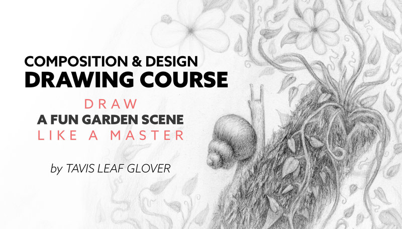
little innocent snail fool you because
this course is packed with a punch and full of value that you can apply to your art the
rest of your life, everything will be explained
simply, applied simply. Then we can refine it. If
you can draw a circle, square or triangle, you can easily design this fun
little garden scene. Aside from learning how to apply the composition
techniques, you'll learn how to
draw and render from imagination how to use the
dynamic symmetry grids, which pencils are used for what, and how to control each pencil
to create stylistic marks. By the end of this project,
you'll know exactly where to place your subject
without rules. It's a full course from start to finish and
we're gonna take baby steps just so all the new information
is fully understood. So let's not waste any more time and start digging into it.
2. 2 Materials list: To help you complete the
course has demonstrated and we've got a great list
of materials for you. You can use alternatives
if you like, if you see something that's similar to what you already own, go ahead and use that
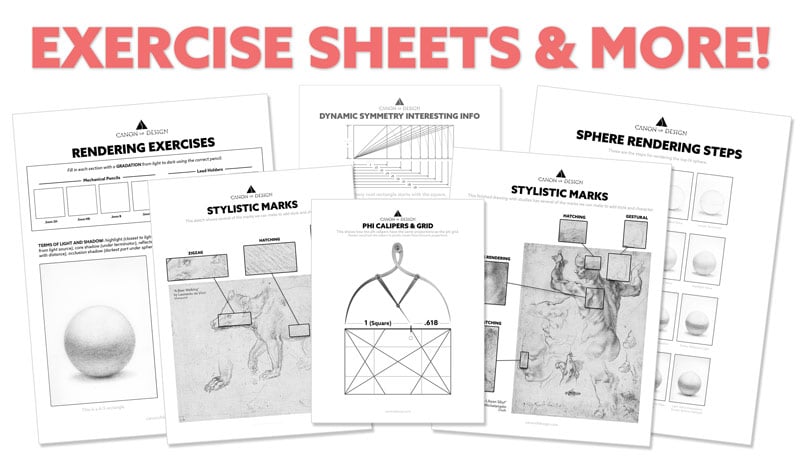
first up on the list are the files which are all
provided in the resources. So you can download those
and print them as you need. I've got them all printed here. Exercises and demonstrations
of certain marks and things, but you're definitely
going to need the printed grid so you
can do the project. I mean, unless you're
working on a computer or an iPad, you
should be all right. These are at most of the
tools we'll be using. We've got four
mechanical pencils. Three of them are
0.5 millimeter. This one right here
is a 0.3 millimeter. For smaller details, we've got three LED holders with two
millimeter lead inside, all different LEDS in all of
these ranging from two h, We've got HB, B and for b. And then the LED holders
have to AHP for me. So we've got mainly the same lead but in
different pencils because of the way we use
them to sharpen the lead in these LED holders, you're gonna use
this LED pointer. It's a pencil sharpener. Basically, identify
these pencils so I can quickly grab them while I'm drawing and I
don't have to stop and slow down to try and figure
out which lead is in there. But I use this blue tape. It's a low adhesive tape. Mr. Wrap it around there and
identify it with a marker. This right here. This is basically a broom. You can sweep off eraser
dust if you'd like, instead of using your hands and get some oils on your
paper or whatever, this is, a mono 0 and a kneaded eraser always comes in handy. These are five calipers. They're not really needed
to complete the course, but a lot of master
painters would use these to incorporate
five proportions. So I do have a
file available you can download in the
resources if you want to practice using
these five calipers on a painting or drawing,
need a ruler. A ruler will work. One of the most important
tools we'll be using is this light pad. Extra lead for your
pencils if you like. This is a sketch paper. It doesn't really
matter the brand or the type or anything. Only thing you might want to
look for is the thickness. So this sketch paper is
actually kind of thin. It's a little bit fragile
because you might want to go for something
that's thicker than £50. This is our main paper. This is a 100% cotton paper. It's meant for watercolor, but it's a nice surface for graphite drawings and it's archival and you use it
for your best drawings. Other than that,
you can just use your sketchbook for working
out ideas and things. But when you're
spending a lot of time on a design drawing, you want to use the best
quality paper you can get. In this one's pretty good to help with posture ergonomics. So you're not hunched
over a desk all day. You can use one of
these drawing easels. It's not required,
it's just optional, but I love using
one of these width, the light pad and then
drawing vertical like this. So much better for your posture. Once you've looked
through all the files and gathered all the
materials that you need, we can move on to the next step. We'll cover all the
individual tools as we work through the
exercises and the project.
3. 3 Intro to Techniques: We know what materials we need. Now let's start covering the design and
composition techniques, the checklist and the
simple diagrams I'm going to show you in a sec
are all in the resources. Whenever I start to
develop a new composition, I have this checklist just taped to my wall
and I go through each technique and make sure I tried to include as
many as possible. The more you include,
the stronger the composition you'll have. Let's slowly walk
through these techniques just to familiarize
you with them. And even though it may seem
like a lot on the surface, it's super easy to apply. Plus I'm gonna be
there the whole way so you don't have to
worry about anything. Feel free to grab the PDF and scroll through these techniques
with me if you'd like, you can also follow on the
design technique checklist. First up, we have
identified the main subject which you need to know
what the story is about, why you're drawing
while you're painting, who or what is this
piece of art about? You need to identify
them that way you can design around them and make sure that they stand out amongst the other objects
within the composition. The greatest area of contrast is basically where the eyes are
going to be drawn first, this black circle with the white background
stands out more than the other circles because it's higher contrast and it's a
larger area of contrast. Simultaneous contrast
is just saying that the tone or value will change depending on
the neighboring value. This works with colors as well. So these two gray circles, they're the same
value, but since this is on a light background, it looks darker
than the one that's inside this dark circle
figure ground relationship is basically how the foreground interacts with the background. You want to clean separation between the subject
and the background. This is typically
where the rule of thirds falls apart because a lot of beginners will place a
subject or someone on a third, rather than seeing the
image as a whole and making sure that the foreground interacts with the
background properly. When we talk about
breathing room, it means the top to bottom
balance of the image. So if you create vertical
and horizontal center lines, you can measure the
balanced kind of like a teeter-totter from left to right and from top to bottom. All this contrast here that's
considered the bulk of the image and there's more
on the bottom than the top, then the balance is going
from bottom to top. Same with gazing direction. The individual subjects
can actually have a gaze and that can
shift the weight. Say if someone is
on the left side of this vertical center line and they're facing to the right. That adds a little bit more visual weight to the right side, but this bulk of the composition
is further on the left, which means the composition is balanced is going
from left to right. So it's basically just working with these
center lines here. Magnetic momentum, that's
just a term I came up with to describe how contrasts interacts with this sinister diagonal. And also the way we read from left to right
most of us anyway, if the greatest area
of contrast is in close proximity to this
sinister diagonal, we read left to right, so we get a little bit of extra movement going up and
down this diagonal here. The way you can test that
is by flipping the image. You can see if the movement changes as you flip the image. Dynamic symmetry, of
course, that's our grid, but it's also the
foundation, a masterful art. You need a grid to
organize your composition. And it also promotes techniques
like dominant diagonals, repetition, strength, and unity. And we'll cover those
techniques in a second. So there's some terms to understand with the
dynamic symmetry grids, the basic armature consists of a baroque diagonal is going from lower left to
the upper right. Sinister diagonal going from the upper left to
the lower right, the reciprocal diagonals
actually intersect these major diagonals
at 90 degrees. And we'll learn more
about these reciprocals. These are the
horizontals and they're running through the
intersection point of this 90 degree angle where the reciprocals meet with
the major diagonals. And then you can run a vertical
through the same point. So that's the basic armature. And if you want, the major area divisions
will just basically put four of that same grid inside of the mother rectangle. It's just repeating
the grid inside of it. So we have more
diagonals to work with. Locking into the grid is
basically, as it sounds, we're just taking
the element and aligning it to the
grid the best you can. And if you can't
align it to the grid, we can always parallel it, which just means
you're running in the same direction
of a diagonal. All the intersection points,
they're called eyes. And with these eyes, we can generate new lines if we need, if we are using a specific
grid and we're posing a model a certain way and the grid isn't giving us
a diagonal that we need. We can generate the
diagonal we need and still adhere to the same
geometry of the rectangle. If we use these
eyes, as we said, this intersection point where the reciprocal diagonal
meets the major diagonals, That's considered a polar point. And that's because we can spiral these grids around this point and they get smaller
and smaller. The dominant diagonal
is just basically a very prominent diagonal within your composition image Flickr, that's when you have
high contrast near the edge and it's actually distracting from
the main subject. Definitely want to avoid that
if you can't get rid of it, it's best to keep it equal on both sides to
help with the balance, gamma is just
repeating diagonals, and these are promoted from
the dynamic symmetry grid. But the more you repeat
the same diagonal, the more you get a rhythm
throughout the composition. And it's a hidden rhythm,
works quite nicely. Negative space. You always need to be aware
of the story you're creating because too much negative space can create a different story. A story of isolation,
loneliness, or show the grand
scale of things. Separating shapes is basically separating the shapes
no overlapping, but they also have nice
figure ground relationship. You'll see this a lot
in cinematography. Coincidences are edge to edge relationships which create
unity and movement. So if you align multiple elements on
the same linear path, you're gonna get a movement in that direction just like
a dot-dot-dot image. And that movement is also a unifying these
elements as well. Arabesque works the same way. This is adhering to
the law of continuity. Just like coincidences,
the mind can follow these areas of contrast and create a movement
in that direction. Aerial perspective
can be used to create the illusion of depth in your
drawing or your painting. You can see how this
black circle pops out. It appears closer than
the ones that are faded, kind of like this is
showing us a foggy day and the further elements are
getting lighter and lighter. So when you're combining multiple elements
within the composition, you want to avoid
these kissing shapes because they can create
an unwanted illusion. A lot of surrealist
artists will use this concept to create illusions like forced perspective
and things like that. But if you're not
wanting to create an illusion and you're
overlapping shapes, you need to pay attention
to how you're doing it. And you can do it by
half by third or phi, which is basically
just a guideline, but it doesn't have
to be precise. So adding life to your story, as we said in the beginning, you need to understand
what the main subject is and add a little bit of life. Make them do something in
the painting or the drawing. This one's listening,
this one is smelling, and this one's peeking
inside the box. So it adds a little
bit more story to the composition aspect of view can be seen several
different ways, but it's basically meaning that the shape is more identifiable. If we take this box example beside view compared to the one that's
showing three sides. The three sides is actually more identifiable as a box
than the other one. Same with this group of people. These are overlapping and their limbs aren't
spread, but they, when they spread their limbs
and they're separated, we can easily identify them, even if they're
silhouetted like that. You can tell it's
two people jumping, same with this side
profile of the head and then a twist in the pose. We're getting multiple sides. You can have a hierarchy in size and you can also
have it in value. Pretty easy, large,
medium and small, or light medium and
dark, 90 degree angles. Those are promoted
by the grid as well, and they add a sense of
strength to the composition. Enclosures, those adhere
to the law of closure, which is another Gestalt
psychology principle. So if you take these
random shapes here and we organize
them differently, we get three different
geometric shapes, but it's actually just random shapes
organized differently. This means you can organize the elements in your
composition to have a hidden geometric shape
which creates unity ellipse, basically following
the law of annuity, which is showing that these
elements of contrast on this half can create an elliptical shape and also
create unity and movement. Echoing shapes is using similar shapes within
the composition. It can be different objects, but they're echoing the
same shape is creates a rhythm in the composition
pointing devices, a lot of artists might have
heard of leading lines. This is much
different than that. Leading lines can promote
generic composition. It's kind of like a road
leading to someone, but these are actually
different elements within your composition that can point to the main subject. You can have multiple
elements, say, like a spear or the side of a mountain that's pointing
towards the subject. Radiating lines, kind
of the same concept, but it's more like a
wheel with spokes. So the main subject has all these different
elements creating contrasts in the same direction pointing towards
the main subject. Can you use five proportions just like this
painting by Boudreau. He's measuring the
head and he gets the five proportion with the
contrast by this fabric here you can see how the phi
calipers measure up to the Phi grid with the
square equaling one, and then the rest of
the rectangle equaling 0.6185 proportion law
of pregnancy is fun. This one is used by Dali a lot. It's one that creates illusions. So in this photo here, I edited out the original shadow to create a little story
like she's a wolf, so she's got a wolf shadow That's just playing on the mind. So at first you might see
just a pretty girl smiling, but then once you look closer, you'll see the wolf
shadow patterns. These can create
repetition but also fill up some areas of negative space. Can add that in there to make the composition a
little more interesting, add more color to your
composition texture as well. You can see how Van Gogh
creates texture with the painting and
also with lines. So we can use this concept in our drawing as we
work on it later. Your story, you can
create ambiguity. So it's when the viewer can
think of multiple stories. So everybody can see this
a little bit differently, so we don't really know what's
going on in this scene. So it leaves it open
for interpretation. And to add more depth
in your composition, you can add a mirror. Some street photographers
would actually capture mirrors in their photo
and it adds depth. You can even paint a mirror in your composition habit
part of the story, this right here above
his head is an exit. This is Peter Paul
Rubens creating an exit. So it actually adds depth
and allows the eyes to exit out of this hole
and then come back in.
4. 4 Mark Making Basics Part One: Now we're ready to learn
the basics of mark-making. There's a variety of pencils and legs you can
use for drawing, just like a painter might
select different brushes, or a carpenter might
select different hammers. Certain tasks require
specific tools for the job. So that's what we're
going to learn today. Mechanical pencils are great because they always
remain sharp, but they can't do every task. We can't necessarily use the
broad side of the thin lead. The lead holders allow us to use a point or the side of the lead, but they need to be sharpened more often and they can't get as fine as that 0.3
millimeter mechanical pencil. So we use a variety
of pencils in unison to create a variety
of marks and values, we use graphite rather than
charcoal or konnte because in my opinion it's cleaner and it suits our needs
for this drawing. All right. So get out the mark-making
exercise sheet and you can follow
along with me. First, we're going to fill
in these specific squares. The left side is light, the right side is dark. And go ahead and start with the two H pencil and they're all labeled
on the sheet here. We're going to start with
the lightest pencil, the hardest pencil, and work our way up to
the darkest pencils. So the purpose of this is just
to test your tools and see how light you can make
that specific tool and then how dark you
can make it that way. You can kind of
judge, when we're in the rendering process
how to use your tool. You'll see as you fill
in this light side, how easy it is to
create a light mark. And the whole purpose is to just create a landmark as you can. You won't have to
be really precise. Just fill it in the best
you can however you like and create
the lightest mark. That's all you need. That's pretty light
with the lightest area. See how I'm holding
it on the side here. I'm able to just apply the pressure of maybe
the weight of the pencil rather than pushing down onto the paper for
the darkest side, we can get a better grip on the pencil and apply
more pressure. The legs will be rated
with numbers and letters. An easy way to remember
this is that the letter B can stand for bolds because it makes it darker mark the
letter H can stand for hard because it's a harder lead
and harder to make them are. The higher the number for B, the darker than
mark, the higher the number for h, the
lighter the mark. So essentially the graphite, it goes from super hard and
light to super bold and dark. The HB pencil, aka the
number two from school, is labeled perfectly
because it's right in the middle,
kind of hard. So speaking of HB, let's grab our next pencil. That's the 0.5 millimeter with HB lead and fill in both
sides light and dark. Hb pencil is really good
for a lot of value ranges. If you can control the pencil, you can get almost
as light as that. We always need to be mindful of the delicate paper surface, which is another reason why we should understand
the pencils we use. Most drawing paper has a soft surface and can
be scratched deeply with graphite pencils so deep that an eraser won't
even remove the mark. Or a nice drawing paper is
thick but it's surface is not as compressed compared to
something like card stock. Also, most drawing paper
will be more texture to which grabs that graphite
a little bit better. We can get pretty
dark with this HB. You can go back and forth. Now grab your 0.3 millimeter
with be laid in it. That's going to be our
smallest mechanical pencil with the finest point. And it's a softer lead. So you're actually
going to see how it might be tougher to
create lighter marks. The more compressed
the paper is, the harder it is
to leave a mark. This paper I'm drawing on
now is printer papers, so it's more compressed
and it's going to work with the graphite just
a little bit differently. If you really wanted, as you work through these exercises, you could probably print on nice resume paper,
that's cotton. It might be similar to the
drawing paper we have, or you could actually just cut the drawing paper to size and run it through your printer. This 0.3 millimeter lead
is really thin too, so you might feel
it snapping a lot, it might feel a
breaking more often. Let's move to the
last mechanical pencil with the 4-bit lead. You're going to find
it's going to be even tougher to create
that light side. Now, let's start in with our LED holders will
start with a to H lead. That's the hardest lead. It's going to leave
the lightest mark. When we choose to make any
deep scratches and newspaper, we want to save them for
the final rendering step. Throughout the design
and blocking process, we'll use the lead
holder with UDL HB lead. Use this handy-dandy
lead holder with the HB lead to fill
in this next square. This is our workhorse. We're gonna be using this a lot, so get familiar with it. All right, Last but not least, is our two millimeter
Forbes lead holder. And this is going to
create the same dark mark as the other for being
mechanical pencil. But like the other LED holders, is going to be able to fill in larger area of value quicker. That's mechanical pencils with the LED holders and all
the different lens. So hopefully you got a little out of that and learned
a little bit more about applying pressure
to your pencil and getting different
value marks.
5. 5 Mark Making Basics Part Two: Now that you know more about your pencils and your lead's, let's continue to learn
about mark-making. You already might have a
certain scratchy style and it could have
revealed itself when we were doing
that first exercise. But let's try to control things and see if we can improve
anything for the future. Lifting up the pencil and I'm
making the stroke over and over again is called
hatching or crosshatching. It's a common mark,
but it can create a texture in areas that
you don't really want. A texture like this
smooth surface of skin or glass metal. You may or may not want the surface to have a
rough, hairy texture. Hatching can also
be difficult for some artists to apply
the same pressure. Some artists are heavy-handed
as they call it, which means they just
have a difficulty of making lighter marks. Every mark is dark for them. Some beginner artists
can't control the value while hatching and
they make ugly marks. This could be because
the artist is using their wrists rather
than their arm, which produces
different results. To see that for yourself, Let's fill in this first square with just your risk crosshatch, make marks with just your wrist. And we're going to try and
see if we can identify any flaws in our mark-making so we can control them or
creating whenever we want. I was doing only a risk, mainly for that first exercise and you can see
how sloppy it is. But for the rest of
these exercises, we're just going to
use our workhorse, That's the HB two
millimeter lead. So go ahead and grab that one
and let's start filling in this first square with just cross hatches
and using our wrist. Pretty sloppy looking at, I'm gonna show you a close-up
what that looks like. You may notice these
small jagged marks because when the wrist moves, the forearm is and that creates
these inconsistent marks, even if you're experienced. This next square, just keep your wrist firm and move your arm. That's all you're gonna
do is move your arm. What that does is it just makes less movement and creates
a more controlled mark. And we'll see that.
Okay, I'm just gonna move this back and forth
and I'm crosshatching, creating an elliptical
shape where I'm going down, striking the paper,
coming back up and then circling back around
and striking it like that. You can see how my wrist is firm and the lines are much smoother. If consistency isn't a priority, say you're laying in some
value or doing a rough sketch, it won't really matter
how you use the pencil. You might even want to
turn your paper so you can continue that same movement
when you're crosshatching. You can see the difference
there. I'll zoom in on that. So you can see the difference. Much sloppier in
the first one went just your wrist because
there's more movement. You can look at your
arm as you're moving your wrist and you can see how much your arms moving
back and forth. But if you're just
moving your forearm and your wrist is locked, the only thing that's
moving is up here, but there's actually
less movement, so you get a smoother mark. To practice with gestural marks. Fill in this next rectangle
with figure eights. We're going to create
three of them. It doesn't matter
what they look like. Just try and practice your
C shapes in your S shapes. As you're creating
these gestural marks, you'll hold it from the
side of the pencil, which is usually what I do
when I'm creating the design. So it'll try and practice
with the side of your pencil because
that's the main way we should start learning how
to hold these LED holders. Instead of like a
normal writing pencil, hold it from the side and
create your gestural marks. Going in a circle
and lifting up, coming down, lifting up, coming down, lifting up. Keeping my wrist firm and just moving my
arm and my shoulder. Some cases, gliding my
thumb on the paper. So another common
mark is the zigzag. And that can be fast and crazy, like a stylistic mark
which we'll cover later. Or it can be nice and smooth
and lay in some nice value. To see the difference
we're going to fill in these next two squares. First squared is
gonna be controlled. So just keep your arm, moving, your wrist firm and lay
and some smooth value. Hold the pencil on the side
and use that HB workhorse. Your ability to control the mark and value will come
with experience. You may be coming
down too fast and at more of an angle and think, Oh, if I hold back further on the pencil, I won't
press as hard. I can create a zigzag
mark and it looks better. I'm able to go fast. Once you get impatient and lazy, maybe the area is a big area value that
you're filling in, kinda get lazy and go
faster and faster. You'll start to see
inconsistent marks. And you'll see these kind of
like a friction mark where the graphite is going over the same spot and
creating a darker value, which can be controlled, but probably just want to
keep it nice and smooth. Have some patients and
fill in the value. Heavy-handed artists can try making marks with the weight of the pencil instead of
applying additional pressure. Now let's create a
faster zigzag and this one using just
our arm firm risk, but we're actually just showing, if you go quicker, you might
see inconsistent marks. That's what we're gonna do. A little harder to lay down an even value when
you're going quick like this because the
pressure changes in different areas and you
get all these dark marks. Here, here, here.
It's less controlled. If you're trying to
render someone's face, you don't want these
dark marks in there. You want to control it and
make in nice and smooth. That's the difference there. Okay, So that's pretty much the basics of our mark-making, will get into stylistic marks
and other things later. But now we want to practice with our erasers just to see how
those work with the lead.
6. 6 Mark Making Basics Part Three: We're going to use our
same workforce and fill in these next two squares and
play with there are erasers. This first square, just fill
in with some medium value. Uses zigzag technique. Keep your arm moving with your wrist firm and fill
in some medium value. Doesn't matter, it doesn't
have to be consistent. We just need some value in
here to play with our eraser. Grab your kneaded eraser. And you know how
this can just be shaped in any shape you want. But what we're
gonna do is create a smiling face
inside this square. We're going to first create
a point with the eraser. We're going to make
the eyes and the nose. And the purpose of
this is just to learn how to dab out value. If it gets a little bit
more graphite on the top, you can just need it and find a clean spot and
dab out a little bit more. When you're rendering,
you'll have inconsistency in
your value and you can dab out certain areas
and even out that value. We're gonna do is carve
out the graphite. We're going to create a little
flat edge here and create a smiling face, mouth. And then just a simple circle. There's a smiling face. Hey, now this next section, we're going to use our
mono 0 small eraser. But first we need to
lay in the value. Alright. Now we're gonna
use this eraser and create just a W
inside the square. You can do quick hatch
marks like this, because that comes in handy. It gives that nice thick
to thin look to the mark. It's like a pencil mark when
you go quick like that. Or you can just go back
and forth, create a W. Doesn't have to be
anything fancy. You can play around
crosshatch inside here. Might come in handy
later when you're rendering or you can
just rub it all out. Remember that fan brush we had. You can use that to get
rid of this eraser dust. If we rubbed it off when I get some graphite on
our finger here. That was the simple
exercises, pretty easy stuff, but now you know a
little bit more about your tools and we'll move on
to dynamic symmetry next.
7. 7 Dynamic Symmetry Basics: Dynamic symmetries new
to a lot of artists, but it's been a part
of the art world far along are than
the rule of thirds. In fact, since dynamic
symmetry is geometry, we can safely assume that the ancient Egyptians used
it to create the pyramids. If you've ever heard of
phi or the golden ratio, it all relates to geometry, but thankfully, we
don't have to know math to use the grids. So that being said,
dynamic symmetry is an excellent starting
point for beginners. It's the foundation
of masterful art. But if we had to boil it down to one word, it would be grid. All we're using is a grid to organize the elements
within our composition. It's just lines. And when we start
seeing it like that, it becomes way
less intimidating. As a bonus, the grid
will promote a lot of the techniques that
we're going to cover like dominant diagonals, any degree angles, coincidences,
and repeating diagonals. All we have to do
is use the grid and it'll benefit our art. So why not use the
rule of thirds? Mainly because it prioritizes specific thirds placement rather than seeing the
image as a whole, how the foreground interacts
with the background. We need to see the
image as a whole. Using the rule of thirds
would be similar to a chef paying attention to
a potato on your plate, rather than how the
potato interacts and mixes with the other
ingredients to create a dish. The dishes, the whole meal. Not just one specific
element of the meal. Composition is everything. Seeing everything that
has a whole rather than specific placement in your composition usually creates generic compositions to like everyone else's artists
aren't to blame. I know I use it
in the beginning. It's all they seemed to teach in schools, magazines, and books. You can divide our
overlap with thirds, but to generically
place a point of interests on a third
is not good practice. Yes, we use dynamic symmetry in combination with other
design techniques. If we're concerned about
nice compositions, not the rule of thirds. There's a ton of information to learn if you're
wanting to maximize your understanding
of constructing the grids to fit your needs. But in our case,
we're just going to stick with the absolute basics. A greater understanding can come in time if you're
really interested. The grid we're using for our drawing is a 4
third rectangle. The same size as many canvases, like 12 by 1618 by 2436, by 48. Even the photos you take
on your smartphone, That's a 4 third rectangle. And there's also a micro
4 third cameras as well. Since dynamic symmetry is
new to a lot of artists, the main thing we want to pay attention to it
as just selecting a grid that is closest to
the size of our canvas. And that provides the diagonals that we need for our subject. And we'll get into all that as we develop the composition. The 4 third grid will
actually transfer perfectly to the
canvas and it has the diagonals to
help us construct the log and other elements
within the composition. So a lot of artists
might be concerned about where it's a
place of subject. And once you learn these
design techniques, you'll learn that
it can be placed almost anywhere you like. And it really gives
you full control over the composition and
where you can place your subject and how
to design around it to create movement and
unity and all that stuff. To learn the basics
of dynamic symmetry, go ahead and print out
the exercise sheet. Or you can use Photoshop
or whatever you want. But I'll go ahead and print
that out and then grab a spare piece of scratch paper
and put it over the top. We're also going to
use our light pad for this exercise with
the sketch paper over the exercise sheet. Go in and draw the
rectangle first. You can turn on this lipase so you can see the grid
a little bit better. So we'll draw the
rectangle first. We're just going to trace. This is a root three actually, doesn't have to be perfect. Just draw it the best you can. Doesn't matter what
pencil you use either. The rectangle is drawn. Now we're going to draw
the Baroque diagonal and it runs from the bottom
left to the upper right. All the dynamic symmetry grids have these major diagonals. They're called major diagonals. I'll move it over
to the next one. We're going to draw
the sinister diagonal. Goes from the upper left
to the lower right. I'm kind of drawing
off to the side, so mine is gonna be kind
of sloppy and wobbly. That's the sinister
diagonal, pretty easy. Now the reciprocal
diagonals may confuse, you, may sound kind of tricky, but it's just a diagonal. And it runs across these major
diagonals at 90 degrees. And that's the key to these
dynamic symmetry grids. Run these diagonals
up and they're going to cross the major
diagonals at 90 degrees. And since they're
running up from the bottom left to
the upper right, and we're going to call this the Baroque reciprocal diagonals intersects the sinister
diagonal at 90 degrees. Go to the other one, and these are gonna be the
sinister reciprocal diagonals. It really needs to
know the terminology. If you don't plan on
building the grids, if you're just using the grid. And you don't have
to worry about any of this terminology. But it's handy to know just so you can understand a little bit of what you're dealing with. And maybe if you want to
communicate it to other artists, just go ahead and trace this. This is intersecting
the Baroque diagonal at 90 degrees and
running to the corner. That's the major diagonals,
those bigger ones, and then the reciprocal
diagonals that intersect. And then degrees. Then all I need to do is draw the horizontals
and verticals. And those run right through this intersection
point where the reciprocal intersects the
major diagonal at 90 degrees. So go ahead and trace that. If you're just watching this, go ahead and trace it out
because that's active learning. Instead of passive learning, watching is just passive and
you learn a lot less by just watching rather than compared to actively doing the exercise. You need to see how
easy this is to do. Super, super easy, and it needs to be less
intimidating for artists. All we're doing is drawing these lines running right through that intersection point. So there's our basic armature that's considered
the basic armature. Now we're going to draw
the major area divisions, which is basically
just the theme of two, which means four
smaller rectangles. Inside this mother rectangle. The mother rectangles
the outer rectangle, this main one we just drew. And then the smaller
ones are inside, so we just divide by
half and just trace over these lines were dividing vertically and
horizontally by half. Then we basically draw
this same basic armature inside those quarters.
Pretty easy. The major diagonals, the reciprocals, run the verticals
and horizontals. Sometimes it's easy
to miss diagonal, but you can check the corners. See if there's two diagonals
go into each corner. If you want straighter lines, so you can always use your ruler to. Okay, that looks good. All the lines are in place. That's the dynamic
symmetry basics. Next up we'll do
the thumbnailing.
8. 8 Thumbnails and Planning: A thumbnail sketch
is a perfect way to start planning out
your composition. You don't have to worry
about any little details are getting anything perfect. You just scribble out some ideas and you can develop a
later just looking at the scribbled bicarb Po and see how it became a
masterful sculpture. One thing I do before I start the thumbnail is
actually just write out a list of all the objects I want to include in
the composition. This way I don't
leave anything out, but you always want to make sure you have that main subject in mind because that's what the design is going to
be developed around. If we have several
points of interest, it becomes more about
the environment rather than any main subject. A great example of this
is a painting by auto. There's not specifically
one subject that stands out
amongst the rest. He's just got a
complex composition full of little details. At first glance we see
a nice still-life, but when we look closer, we see a kind of like a
tiny world he's created. Knowing the main subject
and story allows you to communicate the story
with more clarity. The inanimate objects
like the flowers and leaves gained less
attention than the insects. If the insects weren't there, the story would be
more about the flowers rather than a little
creatures living around them. We can see the difference
in this still-life by font on Latour without insects, it's more about the flowers
and then anything else. While we're here, let's just run through his painting real quick and look at all the
design techniques used. There'll be a little refresher
forests plus it might inspire us for when we do
our thumbnail sketching. Now that our memory is fresh
with the design techniques, Let's start creating
our thumbnails. All right, so let's
just start by making a list of our objects
that we want to include. This composition
that has a snail, ladybug, log, vines, leaves, roots. We have a stick, rocks, flowers, and some grass. Nice little list we at. Now let's scribble out some
ideas and see if we can start to organize the list
that we just created. So the main subject
is the snail. And a story we can create
within the composition is the interaction between
the snail and the ladybug, and then they're in
their own environment. I'm using the HB mechanical
pencil for this, but you can use any
pencil you like. Alright, so the first thumbnail, we'll just start with the snail. We're going to put it
just a little bit off center and just
scribbling some ideas, keep it kind of light. Then I want to police
that log because I want it on that
Baroque diagonal. So we're just going to roughly find the Baroque diagonal there. We're just sketching it in. Keep it nice and loose. And the log is going to have
a couple of openings here. So I'm going to create
one there and there. There we have the
snail and the log. Now let me place a flower. Because I know I want a flower around here
because it's high contrast. And the way we read
the composition, we can pull the eyes up into this upper left corner and then redirect it
towards the style. And then create a lot of
movement in that way. Let's do another
flower right here. And then maybe one down
here, smaller ones. Then I'm gonna create
some vines around it. Coming out of the log. I'm gonna just kinda keep
this movement in mind. I'm going to create
these arabesque surround with the vines. But just to give us some ideas of where
we want to take this, maybe the sticks down here, a couple of rocks right here. Then the ground plane can
be right around here. Maybe some grass. Sketch in some leaves,
some more vines. Grass right here. You want to kind of fill
in this negative space, maybe create more
of the environment. Then some roots. A couple more leaves up here. You can see the composition
starting to come together. More roots. Couple
of grass areas. We've got snail ladybug will put the ladybug over here
on the flower petal. Log binds leaves, roots, stick, rocks, flowers and grass. So we've got pretty
much everything. I'm going to make this
ground plane here. That's the thumbnail sketch. Nice and scribbly. Now, if you get comfortable enough with
the design techniques, you can start to sketch
out some design techniques here that you want to
incorporate the composition. So a great way to inspire the design techniques
you're going to create if you get to that point, is just to look at your thumbnail sketch and see
what's starting to develop. You might have arabesque, so already starting to develop or ellipses or coincidences, things like that, you'll
start to incorporate these. But for now, I'm
seeing an ellipse here going around this way. That's a design technique we can emphasize when we start to develop the
composition if we want, definitely have that
dominant diagonal there. And then we can
look for triangles. Maybe we want to triangle here. We can keep track of that. And then maybe out
of the ellipse, we want an arabesque
to go across here. And over here. That's just one way
we can keep track of the design process and any design techniques we see
within the thumbnail sketch. Here, Let's do one
more thumbnail sketch. And this one we
can maybe create, say you wanted to have a
bottle instead of a log. So let's just do the same
kind of composition, but have a bottle there. So we'll have the bottle
on a baroque diagonal. Keeping this loose and
light, create this bottle. The ground plane will put
the snail in the same spot. Have the same story. Vines coming out of their
same as last sketch. Maybe we want to curving
a little differently. Flower here. Another
flower here. Since we don't have an
opening in the bottle, we can put some vines inside. Then we can show some of the vines mixing with the
roots inside the bottle. Maybe you still have
that stick there. Some rocks for that
triangular enclosure. Put some leaves in here. Just working out ideas. Keep it nice and rough
and it comes out nice. You can refine it later. Put some grass here. Maybe you could put like
another flower down here. Since it's empty now. More grass, couple more
rocks and other flower. All right. So that's
the thumbnail process. Now we're ready to tape the grid onto our paper and
start the design.
9. 9 Taping the Grid to Your Paper: Alright, so we're ready to
start the design process. But first we need to get
the grid onto our paper. You can find this
in the resources. You can print it onto 8.5
by 11 paper or A4 size. You only need one, but you
can print extras if you like. This is the 4 third MAD grid. So go ahead and print that out. You can see that I've got the light pad already
on the easel. Next, you need your paper. Go ahead and tear
sheet out of that. The way I do it is just used the blue tape and
use two pieces. And I leave a little
bit of extra room on the bottom so I can sign it
and data and all that stuff. So and then I leave a little
extra room on the top so I can apply the tape and then
center it from left to right. Doesn't really matter how you do it as long as the
grids on there and you can use it while we
develop the drawing. There's one. Alright, so that's
taped on there. Go ahead and turn that over. Now we're going to use
our light pad to draw the rectangle around
that four-thirds grid. If your iPad is decibel or chargeable or it's
running out of batteries. Can plug it in, turn it on. You can adjust the illuminance. And you'll want to find
a nice balance between the grid underneath and
then the overhead lighting. So you can see you want to
be able to see your sketch, but also the grid underneath. So you're gonna suggest
that until it looks right. But we're going to
use our pencil and ruler and draw that rectangle
around the 4 third grid. Alright, so congratulations, you just use the grid
for the first time. We have our rectangle. And you can turn your light pad off and see just the rectangle. Now I'm just going
to go ahead and sign it. I usually sign it. And then I add the grid
and the ratio on there. That way I can look back and get the ratio correct when I
enlarge for the Canvas. But I don't date it until
I'm done with the drawing. This is 4 third grid
with a ratio 1.333. You don't have to know the ratio unless you're enlarging it. That's it. You've got the
grid on your paper and now you're ready to start
the design process.
10. 10 Starting the Design Process: Okay, So now we're gonna do
the design, the resources, you'll find some trace
sheets and you can use those for the
entire process. Maybe just use them
in the beginning and then make your
own design later. So just remember,
we're not really drawing like most people
would consider drawing. We're actually designing
the drawing right now. We're designing it going to
be a little bit different. It's going to feel a
little bit different. We're going to use the design
checklist to make sure we incorporate a lot of
the design techniques. And then we're going to
refine the shapes later. And then that'll be
the drawing process. But for now we're
just designing. It's kinda like
building a house. We're setting up the
structure and the framing. And then we can put
in our nice couch and the espresso
machine, the fridge. We can do all that later, but right now we're just setting
up the structure. First. I'm just going to lightly pencil in the basic armature
of our grid, not the complete
grid because we have that the major area
divisions taped on there, but just the basic armature. And that'll help me parallel and lock in a little bit
later in the process. You should already have
your grid taped on there and the rectangle drawn out. Grab your light pad
and turn it on. We'll just lightly draw in
this basic armature and we're using the HB pencil for most of this design process. Again, I'm just going
to lightly draw in the sinister and
broke diagonals. Just keep it real light. You'll be able to see it. We didn't turn the
light pad off. For this grid, you'll see the reciprocals crossing the major
diagonals and 90 degrees. There's two of them
for each side. You also see them
cross the center line. Since this is a
four-thirds grid. We don't need the horizontals
and verticals for this, but we do want to make sure
we put in the center lines. That'll help with our balance. Just lightly put them in their
vertical and horizontal. Now we're going to lightly
draw in a big ellipse around and try and
lock it into the grid. But you can practice
on a scratch piece of paper if you want to get
that movement going down, keep your wrist firm and then just move your arm
and your shoulder around. And then I'll help you
create that ellipse. And this is going
to be an enclosure. And if you look on
the checklist here, we've got ellipses down here. Once we get that in, we
can check that off and make sure we use that technique. Sorry, ellipse will
lock into the grid, but it also be about an inch away from this
outer border here. And that'll be a guideline. So we keep high-contrast
things away from the edge. High-contrast near the edges
considered edge Flickr. And it creates distractions
from the main subject. So we want to make sure we
don't have any edge flicker. This will be a guideline to
keep things away from that. We're going to lock it
into this diagonal up here and just move it
around about an inch away. Lock it in down here. There's matching the
distance on each side, left to right, and
then locking it into this similar diagonals
within the grid. You can see under ghosting in
nice elliptical shape here. And that's all you need, just
something real to guide us. Alright, I'm gonna try and
make this a little bit darker, just so you guys can see in
camera what it looks like. But you usually keep these lines light so you can
erase them later. All right, So that looks good. See how that looks. That's the elliptical shape, pretty easy, about an
inch away from the edge. Alright, so now we
can draw a circle in the lower part
of the ellipse, and this will be
like an enclosure. Just like an ellipse, we can align elements up onto that linear path and create
more unity and movement. So we're going to just
draw a circle here. I'm going to go about
an inch and a half above this horizontal
center line. And that'll be the
top of the ellipse. Doesn't have to be precise, and it can be a guest animation. Ghosting in the same
way we did the ellipse. This is all based off of what we saw in our thumbnail sketch. We know we want to create
movement in Unity. So we're just basically setting up some design techniques
to help with that. Let's see if that looks good. That looks alright. So we've got the circle
and the ellipse, and that's the first part
of our design process. But you did it and
it's pretty easy. All we did was draw an ellipse
and a couple of lines. Let's move to the next step, and that's blocking in the log.
11. 11 Blocking in the Log: Alright, so now it's time
to block in the log. And since we're drawing from
imagination and you can pretty much create
any size you want. But if you want better guidance, just go ahead and do
it as demonstrated, will continue to use this
design checklists throughout the process and check-off
the ones that we use prior. We already have
enclosures and ellipses. In order to place our snail, the hero of our drawing, we need the first
place, the log, and then everything
can be refined later. There's no right or wrong way
to block in your objects. Block in an object is to just start simply then
develop things further. You can block an objects
however you like. But a more academic
way is to just create an envelope
of straight lines. Then refine these straight lines by comparing them
to the subject. It's kind of like
chiseling out the shape, much like a sculptor
would a piece of marble. Okay, so how are we going to
do is just roughly sketch in some lines, some
gestural lines. So we're going to
run the log up. So go ahead and turn
on your light pad. You should have your
grid taped on there, but go ahead and run a soft light line up
the Baroque diagonal. This is going to be
the top of the log. Then we want to have maybe about two inches down
from that Baroque diagonal, the one going from bottom left corner, its
upper-right corner. That's the major broke diagonal. And we're going to have it
about two inches from that. So if you find the center of your grid and run down towards
that bottom right corner, the first intersection there, that'll be about
a two-inch Mark. There'll be about thick
enough for our logs, so we'll draw another line. We're going to run it all the
way down to the bottom of this big ellipse, the circle. Run it most sides up and down, more paralleling that
Baroque diagonal. Since we want to create
depth in the log, we want to hollow out this log. We want to draw an
ellipse on the top here. I'll have the cheat sheets ready so you can just trace
this if you want. Otherwise you can just find diagonal in the grid and try and just create
your own diagonal. But we're going to make
this ellipse running the same direction as
a sinister diagonal, which runs from this way. If you find that first
semester reciprocal diagonal, one line up from that is
the diagonal I'm using. I'm not sure if
you can see them, but I'm just paralleling
that diagonal. Again. It doesn't really
matter which one you use. Just try and lock
it in to the grid. And I'm keeping this
ellipse real light. And it's not going
to look pinched. It's not going to
look like an eyeball. It's not going to look pinched. It's going to be more
circular around those edges. Make sure it's not pinched. All right, so I'm
drawing this ellipse and then we'll draw
it on the bottom. The ellipses probably about
three-fourths inches wide. We're just keeping
unlike because we're going to refine this
in the next step. So let me turn this off. You should see that
cylinder shape taken place. That's the log we're gonna draw. We're just keeping
it real light. You can see this bottom of the log is actually going
through that PolarPoint. Here's the sinister diagonal with the Baroque
reciprocal diagonal. It's running right through
that intersection point, the bottom of the log. Alright, so now that we
have the login place, we can check off two more things on our design checklists. So grab that. You check-off dynamic symmetry. And dominant diagonal,
since we have that major baroque
diagonal here, that's a dominant diagonal
being shown there. All right, so another thing
that it was established when we put that login
is the balance. If you look at where
the log is sitting, it's a little bit
to the right of that vertical center line. And if we look at that
horizontal center line, It's more in the lower
half than the upper half, which means there's more
negative space on the top there. And we have also gotten more negative space
on the left of it. Since our log is lower in the frame and more
right in the frame, we want to add more interest to that left side of the frame
and more in the upper part, we're just pretending it's like a teeter-totter and
the center line, the vertical center
line is the fulcrum and we just want to balance
from left to right. That's how we get a nice
balance in the composition. We can see in this
Peter Paul Rubens painting that it's weighted
towards the bottom. Go ahead and grab your
checklist and mark off balance and will continue
to adjust things as we go. Now we can start with
the log cutouts.
12. 12 Making the Log Cutouts: In order to help sell the illusion of
depth with this log, we want to create some cutouts. Normally we would save these
kind of details for later. But since we're designing
things on top of it, it's more efficient to do
it first rather than later. What we're gonna do is we
have those elliptical shapes there and we're just going
to kind of like a knife, just cut out certain areas
so we can see inside of it. And it adds a little bit more
depth to the composition. We want this log kind
of tipping forward towards the viewer a little
bit so we can see that top. And then the bottom side, we're going to have to
cut out a little bit differently so we can see the inside curvature of the log. I'll grab a scrap piece
of paper just to show you what I'm talking about here. So this is our log. When you've got those
elliptical shapes, what we're gonna
do is just cut out certain areas and then create a little bit
of thickness there. So it looks like it's hollow. Then over here. Since it's going further back, we want to create a
little opening here. But to show that
curvature of the log, we need to have some grass kind of showing in the background and showing that
curvature while also having a little bit of
thickness on the side here, kind of like it's cut out. And then we need that cutout
designed well enough to show that curvature within
the grass inside of it. And then also overlapping and not kissing certain
shapes, things like that. So that's how we're
going to design it. And then the inside is dark. Here. You can see a little
bit more depth. I'm using the HB pencil. I'm going to use a real
lightly the lead holder one. Just slightly cut
out some areas. Any line we create, we're going to try and
parallel the grid, lock it into the grid, going right down the broke
reciprocal diagonal. If I go up this way, I'm going to parallel
the sinister diagonal. And just keep going
around this one. I want a parallel it with the Baroque reciprocal
diagonal. Here. I can lock it in. Over here. I can
lock it in and go straight down here. Over here. I'll have the cheat sheets
ready for you so you can just trace if you want to get
an idea of what I'm doing. And I can lock in vertical there and just work your way down to this ellipse
that you created. And then the top, I want to have a little cutout
on the top there. And at an angle where I can see the inside of this
log, the thickness. We induce go, Let's
go parallel to this. Some cases you can't lock it in and you can't
really parallel it. So you can create lines, you can add lines by finding an intersection point and another one and then just
drawing a straight line. This line is cutting in nicely. We're gonna parallel,
then Baroque diagonal. And then we're gonna cut it out so we can see the
thickness there. Alright. So that's a little bit darker, just so you can see
it turn that off. You should be able to start
to see that cutout area. This is going to have an
inside lip when we render it. Going to show that thickness. Then inside here we can add grass just to give us an idea
of what's going on there. One thing you want to
make sure you don't do is when you're
making this cut-out, you want to create enough negative space
above the ground plane. You can see inside the log without that rough
cut hitting the ground plane. But if you want more guidance, just follow the trace sheets
and you should be fine, but would definitely
want to pay attention to the negative space
inside the log. So it's clearly defined. So everybody knows can see at a glance what's going
on inside there. All right, so we're
using the grid, we're locking in and
paralleling the best we can. We're using the ellipses. And so far we're
doing pretty good. And all of those techniques
using the grid and everything helps promote unity
movement, rhythm, strength. And we're on our way to create
a cool little snail home. Let's move on to the next
step and go from there.
13. 13 Blocking in the Snail and Flower: All right, so now let us draw on the ground plane real quick. And then we can get
to the snail and a big white flower,
the ground plane. Let's just find the sinister
reciprocal diagonal. The one going from this
bottom right corner towards the middle
of the left side. And then go about a half
inch lower than that, or you can find
your own diagonal. But what were you going to
do is parallel the diagonal. And we want to
meet that opening. But we don't want to create any bad overlaps or alignments
or anything like that. So what we want to do is just parallel that
sinister reciprocal diagonal and then curve it up it towards the edge
of this left side here. We're going to replace
this with grass, but for now we're
just drawing a line. And then the right
side of the log, we want the ground plane
to kind of just follow through and then curve around. We went a little bit
of negative space underneath this log here. I could do all that because
I drew the grid on my paper. But for this one,
I'm going to turn on the light pad the way I can
see the grid underneath. And then we're going
to follow through with that ground plane line and
then find maybe a point, this intersection point here. We're going to
curve around and go up parallel to another diagonal, and then curve up that
right side there. That'll be our ground plane. So now we have the
ground in there. Now we can block in the hero of our drawing and
that's the snail. We're just going to
keep it real simple, but you can refer to
the reference photos for a certain characteristics
like the tentacles, the eyes coming out, the tentacles for the nose, the spots on the
body going down, the shape of the shell, all that stuff, all those
details will be rendered later. But for now, let's
just keep it simple. We're going to block in the
snail and we're going to have his neck totally extended. And that's going to
accentuate the fact that he's curious to see
what the ladybugs doing. The neck is going to go. When we find that
vertical center line, we will put the
neck to the right of that vertical center line. So he's gazing from the right of the vertical
center line to the left side. That'll help add visual
weight to that left side, like we were talking about. Just roughly sketch in the neck. A couple of tentacles
on the top. Doesn't have to be perfect. Just making like a
V-shape at the top for the tentacles and straight
lines for the neck. The next kind of maybe
a half inch thick. And it's curving down
to the top of this log. It can coincide with this log
because we'll adjust that later because you don't
have to worry about overlap there because we're going to
adjust all that stuff later. Then tentacles for the nose, it's going to kind of heads is going to be kind of
pointed to the left. So we'll see a little
bit of his nose there and that'll cross that vertical center
line just a little bit. And then the shell, we're
just going to create a circle, simple circle. So find that vertical
center line. That'll be, we'll
draw the circle to the left of that
vertical center line. So the right side of the circle touches that vertical
center line, and then the bottom
of the circle touches that horizontal
center line. So our snail shell will
fit right about here. And then it's touching the
top of our ellipse, also. Just drawing a circle. And it's actually touching
those three sides. We don't even have our light
pad on for this because everything's already in there. Then the body can come down here and coincide with that log. Because we'll fix that
in a later stage. Right there is our snail. Basically. That's all we have to
do. Something so simple. This is the design process. We're just blocking in shapes, creating movement and
rhythm and all that stuff. All right, so one thing
to keep in mind with the snail is his
gazing direction. So the composition will
have gazing direction, and that'll tell us
what the balance is. Also, subjects in
your composition will have a gazing direction. Say, I'm looking this way, That's my Gazing direction. The snail is looking
from right to left, so that's its gazing direction. So as we mentioned before, it's creating visual weight. The gazing direction of the
subjects can create weight. And we can see that in a
lot of master paintings, a lot of photos,
things like that. The gaze adds visual weight
to wherever it's looking. Since we needed more
visual weight in the upper-left corner because
of this big bulky log, this gaze of the snail
actually helps our balance. Okay, so now we're going
to start blocking in the large flower and
the upper-left corner. It's a white flower. So it's going to hold
a lot of contrast. And anything with a
lot of contrasts, you should probably plan out. You create the correct
movement that you want. Since it's high in contrast, we know it's going
to draw the eyes. If we put it near this
sinister diagonal. It's in that upper left corner. We're gonna get more
movement because of the way we read left to right. If our eyes are drawn
to the upper-left, we read left to right, that our eyes can create a kind of a movement and
its magnetic momentum, what we learned earlier, it creates that movement so we can design around that contrast. What we're gonna do is create this white flower in
the upper-left area. And it's going to draw
our eyes up here. And then we're also going to
put the ladybug up there. But for now, let's
turn on the grid. We're going to find the
center of the flower. And if you look at the grid in this upper-left area, okay? And there's four polar points. If you choose the polar point in the upper right
area of that grid. That can be the
center of our flower. Because we wanted to kind of aligning with this
upper ellipse. We want the petals aligning
with this upper ellipse. So I just chose an I, an intersection point
to make the center of the flower not scientific, you just need to choose
a spot and align it to other design
techniques to create the rhythm and the
movement that you want. There's nothing pre-determined
or anything like that. It's just logically thinking, whereas this contrast, whereas the movement going
all that stuff. So I'm using the eye of the grid and I'm going to block in this white flower here. Now to create equal-size petals, you can just draw a
simple circle that's equal distance from that
center of the flower. And make sure it's kind of
aligning to that ellipse. That can be the
size of our flower, and it's aligning to
this ellipse here. Now we can draw the petals and lock the petals
into the grid. So we can have one
pedal going down here. This is the sinister
reciprocal diagonal. And the cool thing
about that is it's 90 degrees to that
Baroque diagonal. And one of the techniques
we'd like to use is the 90 degree angle on a tilt
because it adds strength, a sense of visual strength. So when we make this petal, one edge of this petal, 90 degrees to the
Baroque diagonal. We're adding a sense
of strength and we're also incorporating those
diagonals of the grid. We're promoting these techniques
just by using the grid. You don't have to know
anything about the grid. So long as you lock in
or parallel to the grid, you're automatically promoting these techniques
that I'm describing. It's pretty cool. We're gonna make a
flower with five petals. So we've got one,
make another one, kind of locking
into this vertical. We're just blocking it in
real quick, really easy. And aligning it to
that ellipse up, they're locking it into the grid best we can
paralleling the best weekend. I need a couple
more petals here. One here, one up here. Want to even this one out. Maybe create equal
distance from the petals. Get in there. Make this one a
little bit bigger. You can see I'm
holding on the back of the pencil, keeping
things loose. I don't like the way
this is looking, so I'm just going to
dab this one out. And I want it to be
kind of evenly spaced. So I'm gonna make this one
come down just a bit more. It's locking in a little
bit. On the right side. This one come down at 90 degrees still because that's
our technique. Here. That looks better. We got more balanced
within that flower. Alright, nice and simple. And nothing's being deeply grounded into the papers so everything can be
erased really easy. All right, so we've got
the flower in place, we've got the snail and the log. And we've incorporated
a few more techniques. So grab your list. We're incorporating
a 90 degree angle. This isn't our main
90 degree angle. That's gonna be the stick later. But we're incorporating them,
were thinking about it. We're thinking about magnetic
momentum, the white flower. We're definitely thinking about
how it draws the eyes and creates movement when it's
in a certain position. Checkoff magnetic momentum.
We've got that going. Now we're ready to move
on to the next step, which is drawing a couple
of more flowers in there.
14. 14 Blocking in Smaller Flowers: All right, so these next
two flowers are gonna be constructed in the same way, but they're going to
have seven petals. And it doesn't really matter how many petals
your flowers have. We just want to make
them a little bit different from that large
flower with five petals. We also want to create
a size hierarchy. We have the large flower. Now we want to create a medium
flower and a small flower. That gives us a hierarchy. And that's one more thing on our checklist that
we can check off. All right, so you may
be wondering where should we place
these two flowers? And the answer is the grid. Just let the grid Inspire
where you put them. And we can use our design
techniques to guide us. I'm going to turn this light pad on so I can see the
grid underneath. And let's put the first flower. We're going to find that
first large flower. Then follow that
horizontal line across. And then maybe we
can locate an eye for the center of the flower
like we did last time. And then just draw it in there. We're kind of playing
with this ellipse to, we want to kind of tie in that ellipse to the
next flower as well. We've got the center
of the flower. Now we just need to draw a
circle around that center. And that'll be the
length of our petals. And make sure the outer circle touches this ellipse up here. You can even lock it into
the grid right there. And then now we can
place the petals inside. And if you can lock in
the petals to the grid, and you can even create 90 degree angles like
we did the last flower. All right, so let
me turn this off so you can see the flower. This is the outer part of
the medium-sized flower. We've got the center there
and it's coinciding. This is a coincidence. It's coinciding on
the horizontal there. And it's also locking
into our grid. All right, so we've got
a coincidence going from the large flower to
the medium flower. And now let's create a coincidence with
the medium flower to the smallest flower, which is gonna go right
around here somewhere. We want to fill in this
little negative space. And if we're thinking
about a painting, we can think about color too. We want to spread out
the color a little bit. And this large white
flowers, white, but then the smaller flowers can maybe be like a blue or
something like that. We're spreading
out the color and balancing from left to right, all that stuff, creating
unity and all that. So I'm just going
to locate an eye. We've got an eye
here on the grid. And it's coinciding with this
edge of this medium flower. Doesn't have to. Just happening that way. I'm going to draw
a vertical line down and connect
to this other eye. That's gonna be our coincidence. We want the right side
of this medium flower to coincide with the left side
of the smaller flower. Way. They're on the
same linear path, but they're shifted
and we're going to locate this smaller flower here. We also have that
ground plane in place and we don't want
to create a bad overlap. So it just line up
the smaller flower. So it's touching the edge
of that coincidence. And so it's touching
the edge of the ellipse and it's not creating a kissing shape with
that ground plane. So we're just gonna
go a little bit above the ground plane. We can lock it into
that grid here. This diagonal. Keeping it real light. I'm going to draw the outer edge first and then I'll
find the center. In this case, we can't
start with an eye for the center
because we want to align these two points here with a coincidence
and the ellipse. So I'm locking it in the grid. I'm aligning it to
this coincidence, and I'm aligning it to
this outer ellipse. I'm going to make
it even smaller. Erase some of this
so you can see it. If it's not a noticeable
size difference than that, hierarchy won't
really work too well. There we go. Let me turn
this off so you can see it. Alright, so we've got our
circle for the medium flower. We've got our circle
for the smaller flower. It's locking in, it's
aligning to this coincidence. It's locking into
the grid and it's locking into this ellipse. Draw that center. Then we could turn the light pad back on and draw our petals. Remember we're going
to try and lock in, or we can parallel or we can create 90 degree
angles to that log. Just going to work,
creating seven petals. Just keep the shapes real rough, real light, and try
and lock things in. This is going horizontal. Locking in. This
one is locking in. We've got four petals. You can see when
we're blocking in, we're not laying
down nice value. We're not worried
about our strokes or anything like that. You're going to hold
the pencil pretty much any which way you like for these
smaller shapes here. But for the bigger ones,
it's easier if you hold it closer to the lead. That way you can move your
arm and your shoulder, you can get that
smoother motion. Here's the smaller one. When we refine these shapes, we can have some overlapping
a little bit with, as we render, we can create
a little bit more shadow, so it looks like they're
overlapping a bit. Give a little bit more depth. I'm gonna make this a little bit more clear so you can see it. The seventh petal. We want to keep track
of this coincidence. Make sure your pedal is touching that vertical line
that you drew. So that's the two flowers. Then we will look at all three. We've got a nice
hierarchy in size. Got that coincidence there, got another coincidence there. So grab your checklist. We're going to check
off coincidences which are also
promoted by the grids. So even if you weren't consciously creating
these coincidences, it as long as you're
aligning to the grid, you should be promoting
these techniques. That's what the grids for. It's promoting those techniques. We got the coincidences
checked off. Echoing shapes because
the shapes are similar. This flower shape is
similar to this one, and it's similar to this one. So we're creating echoing shapes even though
they're not identical. But it's creating that rhythm
inside the composition. So we can check off
echoing shapes. We could also check off hierarchy because we
created that large, medium, small hierarchy
and the size. Also checkoff, identify
the main subject because we did that
in the beginning. We're taking care of
our list pretty well. Let's block in the
ladybug real quick. There's such a simple shape, we might as well
do it right now, and then we can move
on to the next step. We're going to place
the ladybug on this far left petal
on the white flower. That way it's close to
that sinister diagonal. The snail is looking at it. Plus if we're painting in color, the center of the white
flower can be read and it will grab our
attention and direct our attention to the
smaller ladybug. Since the ladybug so small, it's going to need a
little bit of help to direct the viewer's
attention to it. So we're going to use the
center of this flower. Use the gaze of the snail
and then the contrast of the white flower to
direct attention to the small tiny detail
of the ladybug. And we're going to put
that on the left petal. Let me just turn this
on real quick just in case and I can lock it in. There's a spot for me to
lock it in here to the grid. And I'm just going
to draw a circle to signify the ladybug. We don't need any details yet. Just circle. All right. Ladybugs blocked in,
flowers are blocked in. Now we can move on to Arabesque.
15. 15 Designing Arabesques: Alright, so every
piece of art you create will have a
different design. But what we really want to
establish in the beginning is the primary elements
of the composition. We've been doing that this
whole time with the log. We've got this snail in place. We've got all the
flowers and the ladybug. Only thing we're missing is the secondary kind of
elements switches the grass, the leaves, and the vines. Once you have the primary
elements in place, you want to use other design techniques to kind of glue
everything together. And that brings us to Arabesque. What we're gonna do is create an arabesque within
the composition. And this is gonna
be a hidden one that we can just align
elements to later. All the leaves and
the vines and things. So a lot of the master
painters would combine techniques and layer them
on top of each other. For instance, the
arabesque would run right into that ellipse
that we have there. And it just keeps
that movement going around the ellipse
and the arabesque. All the techniques, they all layer upon each other
and work together. So let's just start with
this large white flower. We're going to circle around. The left side of it, meet
up with the ellipse, just follow the same
elliptical shape. This time we're going to circle around this medium flower, the right side of
the medium flower. I'm holding the
pencil from the side, lightly pressing and using my arm to create
that gestural mark. We're sweeping down onto the log going
towards this snail. And the snail kind of already
has a little curve in it. So now that I see that, let's just include that
into the arabesque. Might have to extend the
snail body just a tiny bit. And then we want
it to meet up with this ground plane
that we created. So let's just draw
right through the logs, create that Airbus going through their meeting up
with the snail body, will make sure it completes and meets this
other ellipse here. The smaller circle that we
drew inside that big ellipse. That's what I'm
meeting up right now. You can lock these into
the grid if you'd like. If not, just makes sure
that motion is fluid. If we come down around
this medium flower also, we can just follow
the log down and then maybe curve out to
the other ground plane. That way we can maybe have
some blades of grass meet that just to direct the viewer's eyes and
create that motion there. Let me turn this off and you
can see what it looks like. You've got the arabesque
going starting from here, going around that second
medium-sized flower following the ellipse, going down the log, meeting
up with a snail body, going around through the log. That means we can
create leaves there to help create that
dot to dot effect, meeting the ground plane. And then circling around
that smaller circle inside. And then the other arabesque is circling out of the log
and up the ground plane. These are just hidden
lines that we can use to line up objects and create that movement
like the dot to dot image. All right, so let's move on
to more obvious arabesque, which are gonna be in the vines. So let's move to the vines next.
16. 16 Blocking in the Vines: All right, so now that we have our main arabesque hidden
inside of the composition, Let's create some more
obvious arabesque with the vines and the roots. We want the vines in the
roots to look kind of like winding rivers or snakes. We want them to curve uniquely like we
would see in nature. So grab a piece of scratch
paper and let's sketch out a couple of different
curves so you can understand what
I'm going for. Hold your pencil like this, that way we get a nice gestural
curve and movement with our arm while we're going
for isn't like this. Like an S shape. We're actually curving
it in like this. Making these crazy
loops like this. That's what we're going for. Something fun and
something varied. Instead of obvious,
like an S-shape. Go ahead and practice
a couple of those. Alright, so just
have fun with it. Now. Grab your nice piece of paper. We're going to create
several of them, but we first want to
connect our main flowers. Always work from the
most important objects to the secondary objects. All of the vines
are going to come out of the top of the log here. And we're going
to create them to emphasize the design techniques
we already have laid out. We have that coincidence here. We have coincidences here. We have ellipses and
arabesque plus the grid. So we have a lot
going for us to guide us to guide each vine
we're going to lay in. So let's start with
enlarge white flower. And we're not going to put
a vine anywhere in-between the snail and the ladybug
because we don't want to create a visual wall
in-between them. We want to clear path, so that's clearly communicated that they're looking
at each other. Let me turn this on real quick. We're going to create
this first vine out of the white flower and just follow the grid and the other design techniques
we have sketched in. I'm just going to follow this
diagonal here. Come down. See I don't want to, I don't
want to meet the ellipse perfectly because we're
going to place leaves there. We don't want leaves touching
the edge of the frame. So if we align the
vine to this ellipse, it might be a little
bit too high, so the leaf wouldn't actually be able to
sit in the frame well, so we're keeping the vine
lower than that you lips, so we can add leaves later. I'm curving around
and I'm lining up to this center vertical. I'm going to curve around. Just kind of go inside this log. Keeping it real rough, real gestural, real
light, playful. Kayla, let's do the second one. That's the medium-size flower. I'm actually going to be able
to use the Ellipse here. We're gonna go up this diagonal, curve around and then curve
into the top of the log. I'm meeting the ellipse
here and curving around. I'm going to curve
this vertical, then curve down into the log C. I'm meeting this
coincidence here, though, coincidence we created for the medium flower to
the small flower. I'm meeting that coincidence with this curvature right here. Way it emphasizes that movement
down to the small flower. Going inside the log into vines. You can see in
there, if you want, you can use the trace
sheets that I have. Print those out and
put them underneath your drawing and just
use those as a guide. Next, we'll do the small flower. And we're gonna
go out of the log here and keep track of our let me turn this
down a little bit. When you have the
light pad too bright, you can't really
see your markings on top unless you go dark. So you have to have an
a right balance from the above light to
the light underneath. You just have to adjust that. And I have this light here for that purpose just in case I have another secondary
light up here. Just in case I need to have
more light on the top. We're going to have this
other vine lead down to the smaller flower coming out of the right side
of the log whole. Align it to the grid. Create those fun
little arabesque. Meet this other
vertical of the grid, and we're automatically creating a coincidence
there. Another one. I'm circling around to enter. Though flower right
here on the right side. All these shapes will
be refined later. But where does kind of
playing them in and see how things look and we can make adjustments
from there. Okay, so we've got our
main three vines in place. Now let's create another
one that's coming out and going over the log. And we want it to curve around into the left side of the snail. That way it directs our
eyes to the snail and we can tie it into this arabesque
and ellipse and all that. If your line is hugging
a line on the grid, then it's locking into the grid. Have it come down, touch that vertical, curve around and
touch this vertical. This diagonal. Come around and I'm going
to touch this diagonal. I'll have to adjust
this ground plane later as we develop the
grass and stuff because it's kind of kissing that
light sketch mark we have we just got to
keep an eye on that area. And curve up the vine, curve up and lock
into this diagonal. Instead of following up to the arabesque through
the snail body, we're going to do a u-turn
and go the other way. That way it's not so obvious,
it's kind of hidden. So I'm going to curve up
and I'm gonna go this way. Maybe go through this
horizontal here, then curve up right there. Turn that off and see
what it looks like. It's coming out, running down, snaking around the other vines, we can be more playful. These have a purpose and I'm
guiding it through the grid. Later if we want to make
them more playful, we can. But right now I'm just
laying it in and see what we get and then adjustments
can be made later. We want to make
about eight total. Let's make about eight vines. And a couple of them
can go in front of the log to create that 3D
illusion that we want. One of them can be
pushed to the back in a later stage behind the log. But let's wrap one around. This main one that was
going to the white flower. Let's just make it twist it and wrapped around that main vine. Touching this grid here, this diagonal twisting
around and going into the log will make one
coming out this way. Let me turn this
down just a bit. Make one come out here and circle around
in front of the log. Follow this diagonal down here. Down, snake up this way. Sitting this horizontal here. Finishing up here. Another one can come out here. Go down, kind of direct our
eyes this smallest flower, and emphasize that coincidence
a little bit better. It can just touch that
coincidence right here. And then curve around
without coinciding with the log curve around. Maybe end pointing towards
that smallest flower. Remember all these are
gonna be adjusted later. We're just laying
it in real quick, keeping it soft and light. You need one more. Then we'll put it
right about here. And just kind of point towards this medium-sized flower.
Turn that down a bit. That's the vines in place. Now let's work on the roots.
17. 17 Blocking in the Roots: All right, So now the
vines are in place, we can start working
on the roots. And the roots are gonna come out of the bottom of the log. And they're going
to snake around in the same fashion as the vines. Before we start plotting
in all the roots, we wanted to just take
a minute and look at our design and
see if anything is starting to develop
any other design shapes, techniques or anything like that that we can
take advantage of. So let's just look
at it real quick, see if there's any
other movements. You can kind of see this
circular shape here. That's looking pretty cool. That's our arabesque. It's creating a swirling motion. Any other elliptical shapes? Look for a movement going around and see if we can
take advantage of anything. Might be able to complete
like right here, where this arabesque
is coming up. You might be able to
follow it through with a root and they can
connect somehow, maybe have the leaf
follow through here, and then it can connect
to one of our roots. That'll create a nice little
movement in that direction. So let's just keep
an eye on that area. And I'll pencil it in
just a little bit. See if we can emphasize that and create more
movement in our composition. So they're going to come out of the log, of the
bottom of the log. We're going to keep
these wavy that way. It's super easy for the viewer to identify them
separately from the log. When they come out of this log would keep them nice and wavy. We want one going up the logs, coming coming out of the bottom and maybe going
up the side of the log. Come down here. I'm just locking it in
there to the diagonals. This one is actually locking
into one of the verticals. Curving around. Going into the
bottom of the log. We want to make sure it's waving as it enters the
bottom of the log. When we render
will actually make these vines get
lost into shadow. But we wanted to just draw
them out. The finish point. And let's create another one. Let's work with this one
that we were talking about, where the leaf might
be able to connect. I'm going to assume that
there's gonna be a leaf here. So I'll make the vine little
bit lower than that area. Will curve it around. And just try and
hug as many lines as we can while
making our curves. Way we promote those
design techniques. We're talking about the
repeating diagonals, coincidences, all that stuff was just want
to make sure we're paying attention to the overlap
of objects as well. Always, always, always. That movement can be completed
with the leaf right here. Also want to make sure
we're trying to always connect to our other design
techniques like this ellipse. Right here, I connected to the lips and the
vertical of the grid. Here's another area
we can probably put a vine and connect to
the ellipse to just emphasize that ellipse
even more will curve around the grid there. You're making these gestural
lines with your wrist firm. Holding the side of the pencil, adult point on the top there. So we're not digging
into the paper and just making everything in light so we can erase it if we need to. Here we're going into the log, trying to bunch up. All these vines will start bunching up as they
enter the log. But trying to keep
twisting them together. They're not straight. We'll make one on
the bottom here, a little bit
flatter, so it looks like it's setting on
the ground plane. So these curves are more
elegant and beautiful. This one, I'll be a
little bit flatter and squished because
of perspective. We'll just kind of guesstimate
what that will look like. Try and lock it into the
grid and keep the coil a little bit flatter
so it looks like it's sitting on
the ground plane. Let's make a total of about
six roots coming out. The quantity doesn't matter. We just want to make
sure we're filling up any negative space to make
the composition look full. And let's overlap a
couple onto the log. So this next one
All curve around. I don't want it to
parallel the log, I want it to intersect the log. So it's obvious that it's
curving and snaking up around. We don't want it to
be straight with the log because it'll start
looking like the log. Unless that's your goal, you
want it to look all similar. But for this purpose, for this demonstration, we wanted to kind
of look different. So I'm curving this
route up the side of the log and I'm going to stop before I hit this
vine that we created. Just want to snake this
around a little bit more. For the last root, I'm going to have it
twist around this one we created for that
looping effect here. I'm going to have it
twist around that. Just logging in as
much as possible. You can parallel the
grid if you need to. I'm emphasizing this
ellipse as I go up. Turn this off. All right, so here's
the edge of our log. We've got, this is a vine that's going to
connect to the root. Soon as we add that leaf will have that movement completed. And we've got all
these coming out, curving around, snaking around, coming down at the bottom, twisting around each other. And creating some nice
elegant movements in a couple of them. And then we have one to
show that it's sitting on the ground plane that's
flatter looking right here. Then another one
curving up here. And we're emphasizing our
ellipse locking into the grid, emphasizing that
circle enclosure we created and the
arabesque store designs coming together nicely. We're doing all
the right things, doing what we're supposed to do. And in the next
step we're going to place the twig and the rocks.
18. 18 Blocking in the Twig and Rocks: All right, So now we're ready to add a sense of strength to the composition with a more
prominent in 90 degree angle. Let's create the
twig real quick. And we're going to
use this sinister reciprocal diagonal to draw it on because it intersects
the log at 90 degrees, draw it so the backside
of the twig is smaller and the front side of the twig is a
little bit bigger. So that way we get that
illusion of perspective. We're gonna make the end of the twig meet this
ellipse that we drew. We're just drawn a simple line, symbol cylinder with the
end of the twig circular, the back of the twig
circular. And that's it. That's our twig. And when you follow it up, it's hitting this
edge of the log at 90 degrees and we've got
our hidden 90 degree angle. Now, grab your
checklist and let's mark off the arabesque we've been creating with the vines, the hidden one and the roots. And then we'll mark off the
90 degree angles again, since we already kind of
incorporated that with the built that large white flower and adding all the
petals and stuff. But now we definitely know we incorporated that
into our composition. Next step, we'll add
the rocks in there. Let's create the rocks. But the trick is we're just trying to create an enclosure. How we made the 90 degree
angle out of the twig. Well, when it runs up to
the log and 90 degrees, we almost got a
piece of a triangle. Let's complete this triangle. Well, draw a line down the log, which should already be there. It's just going to
be erased later as we develop the
grass and stuff. But follow that line
down from the log, will see that triangular
shape starting to take place. And then we'll draw
a straight line. Let me turn this on
just in case just in case there's eyes we can
use or anything like that. We can use this one over here. Strong straight line. From that. I I'm just
sketching it in real quick. This is just a guideline. I'm meeting the
edge of that log. We've got a triangle
here, right? But we don't want an
obvious triangle. We want to hide our design
techniques always when we can. So what we're gonna do
is create some rocks in-between this ellipse and
the line we just created. That way we emphasize
the ellipse shape and we also emphasize the triangular
shape, the enclosure. So I'm going to align one on that center vertical
and it's just a circle. Just create a simple circle. If you're overlapping, just make sure you're overlapping properly with a third phi or half and it can be developed
a little bit later. I'll make one smaller. You can play with
size variation. Then I'll make one over here and maybe see if there's
any coincidences. We can emphasize this vine is actually running
on this vertical. I can emphasize that movement. If I align a rock to
that vertical as well, I can lock into the grid there. Then I'll make one
more large rock. I'll go a little bit above
that straight line we created. Just to hide the design
a little bit more. All right, so there's our rocks and in a later stage we can make them look a little rougher
like rocks instead of circles. That's it. Let me grab the
checklist and make sure we have enclosures checked off. Yes, we do, because we
created that circle in there before and we've been emphasizing it this whole time. But now we have another one,
a triangular enclosure. Now the next step we'll start
placing all the leaves.
19. 19 Blocking in the Leaves: All right, So far we've been
blocking in the shapes with ease and the leaves will
be known different. This is going to be a
good exercise to build your muscle memory because there's so many similar shapes, it's just going to embed
itself into your mind, Blocking into the grid, aligning to design
techniques, all that stuff. We're going to be
filling in a lot of the negative space now and just emphasizing the
design techniques we already have laid out for us. These first leaves
we're going to lay out are for the flowers. So let's take care of those
first and then we'll start laying in the smaller ones
around the binds and stuff. The large white flower, let me turn the grid on. The large white flower has got its vine coming in
from this direction. And we're going to put, since it's different from
these smaller flowers, we're going to put the leaves
together on the same side of the vine because we don't
want anything on this side. And we don't want anything in-between the gaze of the
snail and the ladybug. And we're going to
just line it up to any design techniques
we have laid out for us and then try and
lock it into the grid, line it up to the grid and
then lock it into the ellipse. We'll do one on the
other side of the vine. And a good practice,
but this is just to try and parallel to
the grid or lock it in. And one way you can do that is just locate one
of the diagonals. Draw that first. Right here on parallelly. I'm just going to
close up the shape. All these will be refined later, so we're just plotting them in. And I'm paying attention
to the overlap here on the petal in the leaf. It's going halfway overlap. This one is locking in. Now let's do the smaller
flowers and we'll do those leaves little
bit differently. We'll make one over here
that's locking into the grid, not overlapping onto the vine. We want to keep all the shapes separate because we're
going to add stems and things like that
later we're going to connect the leaves, the vines. These leaves for the flowers were connecting
directly to the flower. So they're kind of
fitting under the petals. We just have to pay
attention to overlap. I'm locking it into the grid and paralleling
the grid when I can. These leaf shapes
just keep them real simple, like a teardrop. We're going to make
all the leaf shapes, teardrop shaped,
kind of like this. Kind of like the flower petals. Almost. Then we're going to
refine them later. We can add twists
and turns to them, but just keeping real simple and generic in the beginning, because that will make the design process a little bit easier and you won't
have to switch back and forth from creativity to logic to creativity
kind of thing. So keep everything
simple and light. Let us small leaf here. I'll put one here that's locking into that
ellipse we have there. All right, so those
leaves are in place. I'm gonna make this
one the same size as I have it a little bit
bigger than the one below here. That was because I was trying
to align it to the ellipse, but it's still lighting
to the ellipse. I just want to make
these equal size. All right, so that's the
leaves for the flowers. Now let's start populating all the smaller
leaves for the vines. And that's the same
basic principle. Use the grid, try
and parallel it. Then align to our design techniques that
are already there. In doing so many leaves
as we're going to do. We're going to be promoting that gamut because
we're gonna be trying to parallel
at least one side of the leaf to the grid, or we're going to try and
lock it into the green. And that's going to create a
lot of repeating diagonals. And that's your
limited number of diagonals, which is gamut. And we're going to be taken care of that in this step
right here for sure. But again, we're
just going to follow the leaves are going
to follow the vines. We're going to
locate a diagonal. Draw one edge of the leaf and then complete
the tear shape. So right here where it is
filling in the negative space, I'm gonna locate a diagonal, which is this broke diagonal. I'll draw that first. Then I'm going to
complete the shape. All of these are gonna
be refined later. But the purpose is just to get the design first and then
we'll refund stuff later. Can add one here. Locking into the grid. Locate the diagonal. It's going pretty
much straight up. This vertical here. That one. Make a couple over here we want to emphasize this ellipse. Definitely emphasize
the ellipse. Here's some negative space here. So I'm gonna try and
fill that area in. And I'm gonna go for this diagonal salt
parallel that one. If you can use any leaves to try and direct attention
towards the snail, that will be beneficial. Like a pointing device. Just points direction
towards an object. Make sure you don't block the view of the snail
and the ladybug. You don't want to put
anything in-between there. We're trying to fill
in the negative space, but at about 2050 leaves just depending on the size you create them and the negative space, how is starting to fill in and how you're emphasizing
the design techniques. The roots usually
don't get leaves. But this isn't really a, an actual photo
that we're copying. Just imaginary so our roots can get leaves and that'll help with the balance
from left to right, will add maybe six leaves
over on the roots and then the majority of them on the right side and
around the log. And make sure you don't
overlap any for right now. We'll take care of all
that in another step. And then make sure no
edges are kissing. When you lay these in. Locate the diagonal. Going pretty much in the
direction of the vine, and then complete
the teardrop shape. We're also paying
attention to the edge. We don't want any
high-contrast near the edge. And that's Edge Flickr. So we're making sure none of the leaves kind of
hang off the edge. If they do, we'll have
to make sure they're low contrast in the
rendering stage. So right here I'm
locating this diagonal. I'm gonna parallel it here
and then complete the shape. You can do this with light
pad off if you need to, because we have that grid
already lightly drawn in. But you can get a little more guidance
with the light pad on. Right here would actually go, I'm going to point to
the snail on this one. So let's see. I'll use this baroque
reciprocal diagonal. Parallel that it'll direct
attention towards the snail. Then I'll complete the shape. You can see what that's
starting to look like. I might time-lapse
some of this because it's time-consuming
and repetitive, but any comments that I make, I'll slow it down so you guys
can hear that one up here. So I'll parallel the diagonal, locking into the grid
and the ellipse. All these are gonna
be the same size. And in a later stage we're
gonna make a variety, makes some of them
larger and smaller. Right now we're
just make them all the same size, all
the same shape. So it's easier for us to
just think about that and repeat it and repeat it
and finish the design. That's all we're doing. What I'm looking for is just areas that I have a
lot of negative space. And then I'm kind of
organizing the smaller leaf shapes to be equal
distance from vines, from flowers, from each
other, all that stuff. Locate the diagonal, draw a
paralleling edge of the leaf. Complete the teardrop shape. Just building that wax on, wax off muscle memory. This leaf, I was making it parallel to this
baroque diagonal. But since it's so
close to the edge, I don't want it to
look too similar, so I'm going to choose
a different diagonal, maybe just the sinister
diagonal, parallel there. And then complete the shape. It's not like a straight edge
right next to the log edge. I'm gonna complete this shape here that we were
talking about where the vine meets the root and
all we were needing was elif. That'll complete that
arabesque movement. Let me turn this on. I'll choose this
diagonal, two parallel. Complete the shape. Make one up here. Parallel that diagonal. I wanted this leaf. I wanted this leaf to point
in a different direction as this one because they're kind of up and separated
from the others. I just want to be a
little bit varied, but that's why I did that. A couple more on this side to fill in some negative space. Maybe this one can point
to the snail face. That's the baroque diagonal. It looks like compare
love that one. There's arabesque going
around that snail tail. I'm gonna emphasize that with a leaf just to make sure
I don't overlap anything. That's enough leaves
on this side, I think maybe I'll add one more, but it's looking
like enough there. This will emphasize the
ellipse a little bit. I'll do one down here. We've got to pay
attention to where that, where any vines get close to the ground plane because we want to make sure those
overlap properly. The edge of the leaf is not kissing the edge of any
grass we draw in later. Let me turn this off,
see what we got here. We can fill in this vine
doesn't have very many leaves. Gotten these vines up here, could use a few more leaves. Then maybe down here. So we're starting to fill it in. If you're having a
hard time determining your vines from your hidden arabesque
and design techniques. Feel free to make them a
little bit darker if you need, but just don't use the
point of your pencil. Uses side of your pencil still. Make it a little bit
darker that way you can still erase if you need to. Lot of the mine will
be rendered dark. Unless it's over. The log, will make them a little
bit lighter, but If you need to send some areas like I'm
having a hard time, some areas determining the
vine from my hidden arabesque. So I'm just making this
just a little bit darker. You can do the same if you need. I've got the light pad
off because I'm using the light basic armature
that we drew on there just to parallel
it and lock in. That way I can see these
other areas that are a bit jumbled with vines
and design techniques. Right here, I want
to add a leaf, so I'm just finding
this baroque diagonal. I can parallel that
or I can just, maybe I can create
vertical here. Then maybe I can
parallel as well. Then complete the shape. Anything overlapping on the
edge of the long lists, save those until a
further next step. Let's just keep
everything separated. If you feel like you want
to overlap something, go ahead, but we're gonna
do that in another stage. This is a vine so I can actually
add more leaves to this. These are the roots. This
one is actually a vine, so we've got this arabesque
coming down from the log. So I'm going to emphasize
that with leaf parallel, complete the shape and align
to the design technique. Then I'll put one
over here, parallel. Complete the shape. Right now I'm just
looking at this area. It's got the opening of the log, got a vine going across an area. We want to just render a little bit and pay attention
to just make sure we get things looking
properly because it's kind of a busy area and we want to properly align everything. Pay attention to overlaps in this area and stuff like that. So to make this area look a
little bit more filled up, but controlled will probably overlaps some leaves
in a later stage. And we add one here, just a little area. Any other areas of
negative space. We can add some other details, but that'll be in a
later stage also will add curls of the vines
and we'll add stems. It'll start filling in
more areas like this where it maybe you think
it needs another leaf, like there's
negative space here, here compared to this side
where there's more leaves. We can fill those spaces in with curling
vines and things. That way we don't overcrowd
the area and it still looks nice and balanced
in that section. So this is looking good. We've got enough
leaves in there. Things are starting to shape up. We've got leaves over
on the left side. As you do this, you can use the trace sheets, but placing the leaves, It's probably more
beneficial that you just do them by yourself. Locate that diagonal,
parallel it, and then complete
the teardrop shape. Because when we get
to these finer, smaller details and you're
using those tracing sheets, it's just going to start getting harder to align everything. Not all gonna be
a 100% accurate, just a rough estimate of where
you should play something and to give you an idea of how everything's being aligned
to the grid and stuff. It's best to just
keep that in mind. Let me add one more just for fun because this area can use it. Parallel the grid here, and then complete the shape. Alright, so that's enough,
leaves for this stage. Let's move on to the next one, and we're going to add
a lot more variety.
20. 20 Adding Variety: Alright, so we're making
progress on our design, but now it's time to
add some variety to it. But before we keep going, Let's get our checklist out. In the last step when
we created the leaves, we made some of them
pointing devices, so we can check that off. Down here. We also repeated
a lot of diagonals. We can mark off gamut, That's our live into the
number of diagonals. If we also filled
in negative space, We were paying attention
to negative space. So we can check that off. We paid attention
to edge Flickr. We didn't want any leaves near
the edge, so we did that. And then overlapping shapes, we definitely pay
attention to that. Make sure none of the
leaves are overlapping. So we can mark that off. And we'll make more
adjustments with overlapping shapes when we add more variety to the leaves. In this next step, next step we can cross off
separating shapes because we paid attention to that when we were adding
those leaves in there. Alright, let's get to our design and we'll add a
little bit more variety to it. Okay, so let's add
a little bit of variety to the vines first. It will make one of
them go behind the log. And we'll choose
this one up here. So I'll erase any leaves that
are attached to that Vine. Then we can draw them in later. Drawn some new
ones later to fill up this negative space here. Erase this. I always look at your
design techniques. You can always select the
one that best fits to go behind the log that
best fits the design. So right now I'm erasing
part of that ellipse, that first circle that we drew. I'm erasing part of that, so I got to keep that
in mind so I can add maybe some leaves
in that negative space to continue that movement across the log since I'm
erasing the divine. Alright, so that's good enough. We're keeping
everything light still. Were not ready to make dark
marks on our paper just yet. One other thing is
that the background is going to be light
when we render it. So these background vines
will also be lighter. We'll make sure, we'll keep
that in mind when we render, just to make sure that
these background vines are lighter than the
foreground binds right here. So now we can add some loops
to our vines, the roots. So we want to look for an, a vine or a root that has enough negative space in an area that we can just
add a simple loop to it. Let me show you what that
simple shape would look like. Just if this is the vine. We're just going to erase part
of it and then add a loop. Just going to loop
around like that. Pretty simple. Use your kneaded eraser for
this and just look for areas. You might be able to add
a little loop to it. Right here. There's some negative space. I'm going to add a loop to that. I'm not sure if I
can lock it into the grid, but I'll see if I can. Again, just create
a circle first. I don't want it to
touch this leaf here or crowd that space
with the leaf in it. You don't want the
loop to look like it's the same shape as the leaf. In this case, because
we don't want to create an illusion like it's a leaf, we want it to look like a loop. The vine. I add one there. That shape is looking, the shape I'm drawing now
it's looking like this. If you draw like this,
you'll just have to erase just a little bit of it. Maybe to get that little
indentation there. Little indentation right there. And that can be refined later, but just showing you
what it looks like here. Erase part of this. That's too. I'll add one more. Let's see. Just looking for the best area. Maybe right here there's a
little bit of negative space. And then that's where our
circular ellipse was going. So you see if I can line up to that and
then create the loop. There's our loops. Now we want to add
variety to the leaves. So choose seven leaves and
we're gonna make them larger. What we want to look for
is just an area that has a little bit more negative
space that we can fill up. And when you enlarge it, keep it the same teardrop shape. So don't erase any lines, the old line from
the smaller leaf, just keep that in place until all sudden leaves are enlarged. That way, you know which
ones were enlarged. And then you can erase
them all at once. But just look for
an area that has a little bit more
negative space or an area that has leaves that are two
identical to each other. You want to add a little bit
more variety in that area. So that's what
we're looking for. And we want to also keep in
mind the design techniques. I'm going to make
sure we emphasize those or keep the same. Design techniques emphasize
that we already created. So just some options there
to add more variety. This one over here
is a good candidate for enlarging because it's got enough negative space around it, plus it's by itself. So we're going to just fill in a little bit more space there. Maybe some on the log here, there's a bunch of negative
space here on the log, so there's plenty of room
to enlarge another leaf. And we want to try and keep that line that's
paralleling the grid. If you only make
them subtly bigger, you're not really
going to see that the impact of adding variety, it's just going to
look pretty similar. You want it to be maybe twice
as big as the old leaf. We've got to me,
I'd want appear. I'm still paralleling
that diagonal, just enlarging the leaf. Keeping that teardrop shape. There's three. Can do it down here. This one's paralleling
the diagonal there. So I'm going to keep
that, just extend it and then make the
teardrop larger. Make sure you're not overlapping your shapes or kissing edges. Like this one. It was it was almost touching. But I fixed that. Then we got three more to do. I'll make this one
down here a little bit bigger because it's right
by the ground plane. And it could use more room to overlap the ground plane when that's fully drawn
in with grass. Two more. You got
enough space here, paralleling the
Baroque diagonal. So I'll enlarge that
going into the grid. And then maybe one. Let's see Adam, more
variety up here. Locking into the center. Alright, so that's seven, will erase the lines. This one and this one are larger but they're
almost identical. So I want to, maybe
I'm gonna parallel this way and it mixes up
the shapes a little bit. And then make it a little bit more around on the top there. Way the shapes aren't identical
and next to each other. All right, so now
that we enlarge some and let's shrink seven of them. So just go ahead and
do it the same way. Look for our old
design techniques, shrink it and then erase
the lines once all seven are in place and
malate shrink this one. And it's paralleling
the Baroque diagonal. Sawdust, shrink it and
keep that diagonal there. Make sure you don't
shrink the ones that you just enlarged. Good. One can shrink. One can shrink. I'm gonna erase that one
because it's so small. The change way I can
keep track of it. Maybe shrink this one a bit to fit that negative space better. This one can shrink. I'll erase that one too. So we've got about five done. Shrink this 11 more. I'll erase the other ones. Let's do one over here. Maybe this one. Go. Once those are in place, just erase your old lines. We just made seven larger
and seven smaller leaves. We made some variations
in the vines. Now we can add some overlaps with the
leaves onto the vines. So just look for areas that have the extra negative space around the log on, around the vines. And we'll add another
leaf on top of the vine. Right around here has got a lot of negative space where
there's no leaves or anything. It's just kind of
a jumbled mess. But we knew this
area was really busy and we'd have to pay
attention closely to how we overlap there to
communicate it clearly. So the area I'm gonna
choose is maybe make this leaf bigger way, it's overlapping the vine. Going to make a
smaller one here. Gum, medium-sized one
kind of covered the vine. Meet that ground plane area. I'm erasing as I go. Just part of the vine
that was underneath the leaf over here. And we can add one
horizontal right here. At a leaf over the vine there. Maybe right here there's
some negative space and a good place where I can put another leaf and I'll lock it into the grid there. Maybe right here. The root can add another leaf on that side, maybe parallel. Then draw the teardrop shape. Erase that. That's five with this one. Now let's add two leaves
overlapping the log opening. Let's do one here. Fits a negative space
pretty well there. One back here. And you
can parallel the grid, lock it in, whatever you like. Just try not to kiss the finds. You want to overlap
properly not kiss. There's two. Those are done. Now we want to overlap some leaves on top
of other leaves. So let's look for seven
possibilities to create larger or smaller leaves
on top of existing leaves, like this big one up here, I could probably just add
a smaller one on there. Just draw the parallel line, complete the leaf
teardrop shape, and try and emphasize any
design techniques you see. And I'm going to erase as I go and attempt to keep
track of all seven. But that's one. I'll add one more down here by the large leaf near
this smallest flower. And I'll point it towards
the small flower. I'm going to just lock in there. I'm locking into this
circular enclosure as well. Probably add one here where this big leaf is and
maybe I'll point towards the snail and that's incorporating are
pointing devices. So just make one
edge point towards the snail and then complete
the teardrop shape. As you overlap the leaves
on top of the other leaves. Just pay attention to
what's underneath. And once what the actual
two leaves are doing, you want to overlap the leaves
properly and you want to overlap the background
properly as well. Sounds involved, but you're
just overlapping shapes. Just wanted to make
sure you pay attention to the different layers
that you're applying. This one down here, we could probably just add a larger leaf there
and maybe have it point to the right so
I can draw underneath it and have it come out
maybe halfway here. I'm paralleling this diagonal. Then I'm going to
complete the shape. Maybe one up here. Won't one right here. Maybe have it a little larger. Overlap properly, they're
parallel this diagonal. I'll do one more. Should be enough into
as many as you want. I'm just giving you an amount
so we have a goal in mind. And this one I'm maybe add
another shape underneath here. So let me just go straight down. Complete that. There we go. We got another smaller
leaf under the big one. Big one over the
small ones and small ones over the big ones
that adds more variety to. All right, now we want to
add some leaves that are behind the log that are
being overlapped by the log. Just look for a
negative space again, right here with that
circular enclosure, we've got negative space. I'm going to add
one right there. And emphasize this
circular enclosure while also locking
into the grid. Creating a nice overlap,
all that stuff. So just like that, if
you can't fit three, then it's no big deal. So right here, Let's see. There's a vine and
the log here, b, I can add one behind
the vine and the log. Overlap it properly. Still want it to be too cluttered in too
confusing in that area. This area is looking
pretty good. There's a lot of
stuff going on there. Right Here's a little
pocket of negative space, so maybe I can squeeze in a
smaller one and emphasize this air best that's coming down the log and lock into
this diagonal here. That's all you gotta do
is little shape there. Now to integrate the
snail with the log, we're going to make the logo a little bit behind
the snail body, will go off that Baroque diagonal just a
little bit and go up. We're kind of heightened
the design and make them more variation
in this shape and making the snail look like it's sitting on the log instead
of like right on the top. We're going to add
a little bump in the log to add more
variation there. There's a little,
there's a diagonal here. I can probably just
create a little bump in the log shapes to add
variation in the log. To make these edges
little refer to. Just add little
squiggles to the edge. If there's room on
the ground plane, near the ground plane, we can add a leaf that
overlaps that background. Ground plane we drew. It is add a horizontal leaf. If there's room, there's
little room here, so I'm going to add one and make it horizontal that
way we know it's kind of just sitting on the ground
plane and you can make it a little bit bigger so
it's easier to overlap. Just a simple teardrop shape there That's properly
overlapping, that arabesque that we
created in the ground plane. That'll be like a fallen leaf. Now we can address
the ground plane and just that arabesque we created, the lines we drew for
the ground plane. Just draw jagged grass
to represent that. And we don't need to erase
any design lines just yet. We'll do that in a future step, but just go ahead
and roughly make this ground plane
jagged like grass. Just scribbling in some value here to represent the grass. Maybe make some jagged and
longer blades of grass. And then the end of this
twig we can make it, it was snapped, make
it sharper and jagged. Here we go. Let's add a little bit
of moss to the log. We can add Moss just
like we did the grasp. It's just a texture
that we're going to add later, in a later step. But if you want to address
any areas that we'll have more contrast in there to carry the design
technique through. Then you can go ahead
and make note of those like this circular
enclosure here. If we needed to add more
value in that area, we would just make simple
marks and make note of it. So when we're rendering, we can push things
further there. I'm just adding
some squiggly marks everywhere on the log just to make it look like it's
got like a Harry moss on it. Add some variety to that shape. And what do we refined
all this stuff very soon. Just keep it all loose
and light right now. That was a huge step towards the end of our design process. We're about 98%
down with a design. In the next step we're going
to refine some shapes, add some details, and
see where we are.
21. 21 Radiating Lines and Erasing: All right, so before
we add details to all the little elements
in our composition, Let's do one more technique and it's called radiating lines. And this one is where the lines direct attention
towards the main subjects, similar to pointing devices. But grab a straight edge,
could be your pencil, it could be your ruler,
anything you can find. And we're going to try and direct more attention
to the snail. We're gonna do this by
using a straight edge. Going around, like the head of the snail is the
center of a tire. And then the lines
are the spokes. Use your straight edge
and go around and see if you can find
any opportunities to maybe shift a leaf and have it direct attention
towards the snail head. Don't worry about repeating diagonals or paralleling
the grid at this moment, because we already
have a lot of that. And let's just focus on the
radiating lines and see if we can incorporate that technique into
our composition. I'm just going to go around and look for leaves
maybe that I can shift slightly to direct more attention towards
this nail head. Got one up here. Right here. I'm just going to draw a
line towards the snail head. British shifting that teardrop
shape a little bit more. And I can erase that
small line there. Then let's see. We'll just keep running around. Looks good. See this leaf over here
that's pointing to the left. Well, let's change that
and have it point to the snail head and that would benefit the composition
a little bit more. So that's what we're gonna do. We're just going to
take our straight edge. Let me grab another
pencil just in case here. We're gonna point it right
towards the snail head. Still pay attention
to our overlap there. But what we're doing is
using the radiating lines now. Let me erase this one. Keep everything light for now. You can make a slight
adjustment to this one here. Just hovering the pencil
over the drawing. The way I'm not
touching the graphite. Can probably adjust
this one over here. All right, Grab
your list and let's mark off radiating lines. All right, I got that one done. Now for the moment of truth, we're going to erase all of
our design lines except for the ones that are going this ellipse shape that
we didn't use yet. And we can use that probably
for the background or foreground grass that we're gonna put it in the next step. So leave this area,
this ellipse here. Then this ellipse here
that we didn't use, this side of the ellipse. This side of the ellipse, everything else we're
going to erase. This will be pretty exciting. We can erase the grid line. Pretty much everything. Just use your kneaded eraser and slowly go through and start erasing stuff will all see the composition kind of emerge. When it gets into
these detailed areas, you can use your
mono Zero Eraser. Make sure you don't press
down too hard so you're not disturbing the surface
of the paper too much. Just kind of lightly
erase everything. Me even erasing this ellipse that we had down
here for the log. And then the chunk we cut out, just go ahead and
erase all that stuff. Don't need it. This area is the inside of the log. Just kind of looking at all
the shapes inside there and making sure it's clearly
defined when I'm erasing. Just don't want to
erase something that is part of the composition. All right, So that
looks pretty good. You should start to see the
composition coming alive. All your hard work
starting to show up. It'll become even more
evident when we get all the rendering
done and the details, and the details are
coming up next.
22. 22 Adding Snail Details: All right, so first we're gonna
add details to the snail, the snail shell, the snail body. We're going to add the
spirals of the snail shell, which is kind of like a
slinky wrapped around itself. And the snail body has some
spots. So we'll add all that. You can use the reference
photos for all the details. But the thing about drawing from imagination is that
the drawing will ever have as many details as an actual photo that
you're copying. Because we're using
our imagination and you won't remember
all those details are, most people won't remember
every single detail about a snail which adds its
own artistic style to it. So we're just taking pieces
of the reference photos, interpreting it in our head
and remembering it and putting it down onto the paper we're drawing
from imagination. So we wanted to look
a little bit more simple and not as
realistic as a photo. So let's start developing this
snail and sharpen your HB. Lead holder is put a nice
little point on there. We're not digging into
the paper just yet. We're not making our final marks into the rendering stage. We're just making a finer point just in case so we can
make smaller lines, inner lines when we need to, but we're going to still
keep everything light, the shape of our snail
as it currently is. It's got an aspect of you which means we can clearly identify. It's a snail. We're seeing the side of the body
with the snail shell, will develop that further. So we can see all the
coils of the snail shell. We see the tentacles
on the head and we're going to see the
tentacles on the nose. So we're seeing a lot
of the snail to help the viewer easily identify
what's going on there, rather than creating a snail shape That's
all overlapping. If we create a circle here
for the body and the coil, There's the coil and then
we've got the head coming up. We got the tail
less identifiable. If you view it at a glance, then this shape right here, this is more
identifiable than this. All right, so that's why
we're doing go ahead and mark aspect of you
off your checklist. Will just add details. We'll start with
the shell first. We want to make sure we're
lining up to that top of that circular enclosure. Plus we were locking
it into the grid. Let's start there. We
still want to have it look like the snail is
peeking out over its shell. Kind of like an inquisitive look and looking at the ladybug, I'm touching the top of that. We've got a horizontal there, but that's where the top of
the circular enclosure was. I'm touching the top of that, but I'm going to
create this coil of the shell down and habits
spiral down this way. Might be able to lock into
this sinister diagonal here. Notice I'm holding the pencil
real light from the side. I don't want to make any
permanent marks just yet. We're going to have this, the bottom opening of
the snail shell kind of parallel this
baroque diagonal. I'm locking into this other
sinister reciprocal diagonal. We'll see what that looks like. Getting more drawing
from imagination, so it doesn't have to look
like the photo reference. I'm going to make this side
a little bit less high. Who is touching that
top of that ellipse? This coil of the snail shell off the body and just have that first largest coil
touching the snail body, like it's coming out
of that opening there. Let me erase that stuff. You can see the snail
body coming together, this shell and stuff, but we'll keep
adding more details. Find the edge of the snail here. And the tentacles
are going to have a little nub on the top. Tentacles for the nose, we're gonna have a
little nub also. The body is a
little bit flatter. It kind of goes from a
curved form up at the top of the body to flat form
towards the edge. Keep the shapes simple. And we'll add some dashed
lines on the side here. That'll be the flat part. We can curve it up to the neck. Some simple shapes will
refine this woman render, but this is just a
simple indication of what the body looks like. Then let's add some spots. The actual spots in the reference photo and
on the snail or white, they're lighter in value, not white, but they're
lighter in value. But on our paper
we're making them dark because it's easier. We don't have to
create a value and erase value out of it. We're just making the
indication of the spots. But if we painted this, we could easily make the body dark and then the spots lighter. This create the spots lightly up the neck
and spread them out. It doesn't really matter
how you put them on there. The tentacles or a
thin at the top. If you look at the
reference photo, they're thin and they taper
down towards the head. So you don't want
them too thick. Then the body, the shell body is going to have these coils, like I was saying,
it's like kind of like a slinky and it
coils around itself. So what does create some
contour lines just to get our mind going to see the shape. And then we can render
it better as we go. Can add these lines. The first contour
lines I was going almost all the way
over this side. I was curving up and then
curving down on the other side, almost the whole shape. But these shapes by the crevice, you can just hatch
some lines that are maybe like 1
fourth the distance. Where do we get a
little bit of value going in there and
show some details. And then the highlight
of the shell will be, will have less details. Right now I have this area and it looks like a dimple navy, but I want to erase part of it so it's not looking
like a dimple, creating a nice hard edge there. So I know that's the opening of the shell or the snail
crawls back into. We can really find that later
during the rendering stage. Making sure these curves
are the snail shell or fitting together
nicely and curving. We don't want them wobbly and jagged unless that's
what you're going for, but kind of want
these curving nicely. We're just establishing
the final shape right now, adding a few details and
then the rendering stage, we'll add a lot more details. Can make that neck a little
bit smaller, like skinnier. All right, so that's our
snail for right now. We'll add more rendering later, but let's go on
to the leaves and we can improve those
shapes as well.
23. 23 Adding Leaf Details: Okay, so now we're going to
add details to our leaves. And that'll be simple enough to, what we're gonna do is create a heart shape out of the leaf. Right here is our teardrop that we've been creating right? Now. We're going to create a heart-shaped right
at the end here. Similar to this.
Then we'll follow it through to maybe
draw a line like this, but only about
three-fourths of the way, not all the way to the point. We'll turn this teardrop shape into a more elaborate a leaf. And then we can take this
end, we can curve it. Make all the ends a
little bit more pointed. Can add this vein. We can create wavy leaves. Say this is our teardrop shape. And we want to create
one edge that's wavy. We'll just go like
this, create a wave. Then echo that shape
onto the other side. We can curve it up. Maybe. Remember to put
our heart shape in their curve that around. This will be the bottom
side of the leaf, so it'll be a little bit
darker when we render. Then this part will be erased. Will have a nice
curvy leaf there. That's what we're gonna
do with all these leaves. We're just going to make
them pointed at the end, maybe a curving point, make the other end, the blunt end like
a heart shape. And then later in
another step we'll add the stems to those leaves. So this would be a kind of a longer process since
there's so many leaves, but it's simple enough
and we don't have to worry about the grid
or anything like that. We're just making the
leaves more elaborate, looking and defining them. Make sure not to commit
to fully to the line. Make sure you don't
make it too dark. Or hold your pencil. Don't hold your pencil up at the tip right here
and press down hard. We're still holding
it back here. Which might be hard
for some people when they're adding
these small details. So just take your time. You can erase the part of the leaf that's not
fitting the heart. The wavy leaves can be saved
for more obvious areas, may be right up
here or right here. Or if you want one
leaf folding over, you can do that in a
more obvious place where there's less leaves. All depends on what you want. But those unique characteristics
are best saved where they're easily noticed rather than kind of jumbled
with the other shapes. A lot of this stuff
I'm erasing here. Probably you don't
even need to do that because the
log is going to get value that's darker than any
of these marks I'm making. But outside here, if
you create that shape, you want to probably
erase what you didn't incorporate into the leaf is going to make it a nice
curve on this one. One was pointing towards
our snail heads. So I just did a double curve
and made it curve back. So it's still pointing
towards the snail head. This is the one that was
behind the log and the vine. So I'll just make sure I
still keep it that way. Take care of this one
while we're at it. So they're pretty
subtle changes, but they make a difference in the characteristic of the leaf. As you get more comfortable
with design techniques, you could maybe do the leaf all in one shot
instead of making a teardrop first and then adding these smaller details,
just all the pins. And sometimes it's just easier
to get the simple shapes. Most of the times
is easier to do this simple shapes and then
worry about details later. So just depends on how you work, your workflow, how you
develop your skills. Just a leaf that's sitting on the edge of the log opening. So I just want to make sure
I don't erase anything too important to keep that
overlap looking good. If you see any on the edge here, you can maybe you
have them curve inward and instead of outward to redirect attention into the composition
rather than outward, just small little changes like that can help
the composition. All right, so that's the leaves. And next up we'll add
details to the flowers.
24. 24 Adding Flower Details: All right, so we
have this snail and the leaves starting
to take shape. Now let's work on the flowers. To do that, just use
your HB lead holder. And let's grab our two
H mechanical pencil. And that'll give us a
light touch so we can add a few details to the
petals of the flower. Sometimes the side of my hand
is resting on the drawing. You don't want to smudge your graphite around so you can use a scrap piece of paper. If you need a rest
your palm on there. You can just hover,
use your pinky on the outside and just hover
over and erase it that way. Whatever is easier for you. You want to make
sure you don't start smudging your drawing around. It is make all the petals have a nice shape and use
your HB lead holder. Keep it nice and light still. You can turn your
paper if you need. I might need it right here. Use gestural marks to
draw that teardrop shape. You can probably just erase
all at once if you need to. Definitely need to do this
one where the ladybug is. You can erase all the
marks that you don't need. You don't have to erase it all. You don't have to
get it perfect. We're going to add texture to this white flower and it's just gonna be real light marks. But we don't want this
outer edge to be so thick. Outer edge of the petal It's only thick because that's
how we were drawing. We were blocking it in, but now we can have a
finer line on there as we develop and
render the drawing. You can go ahead and
make a better shape for these leaves as well,
these flower leaves, once you're done
with the flower, I'm not pressing down too
hard with this eraser either. If you do, it'll start
digging into the paper. You want to make these leaves a little bit more elaborate. Maybe erase part
of this so I can extend out to a different point. All right, Grab your mechanical
pencil and just draw a vein going down the
center and just lightly sketch it in and add a little bit of a curve
to it if you can, depending on how
your flowers facing. Use the same two
H pencil and near this creates some
squiggles in there. And that'll add a little bit of value and texture to each petal. And I'm lightly pressing down. Not very hard to either. It's not going to be
just one solid value. Alright, so that's
our white flower. Now we can work on the
two smaller flowers and just do it the same way. If you find that
teardrop shape with your HB pencil and erase
the parts you don't need. And you can actually make this center a little bit darker. We'll render this, but just add a little bit of value
to the center there. Same with this one
and the other one. You can make the leaves
more elaborate as well. Not much room in this area to make the
leaves to elaborate, but I'm going to add a
little curve to them both. I'm going to erase
some of the value that was created on the petals, those old lines that
we don't need anymore, just thin out that
shape a little bit. All right, Now use your same. Actually since these
flowers are darker, we'll use the HB pencil to add some texture so it can
be a little bit darker. Add your vein down the middle. And then we can add the
texture that I'm not making the vein go
the full length of the petal. Again. Then I'll add a
little squiggly marks to add some texture. Then we'll work on this one now, just defining the shape,
a teardrop shape. And then I'm going
to erase the lines. Go ahead and add
those veins in there, and then the subtle texture
and you'll be finished. All right, so those
are the flowers. Now we can move on
to the next step, which is just adding
details to the vines.
25. 25 Adding Vine Details: Alright, so now we're going
to add details to the vines. And that includes adding
little twists and turns and things wrapping around like two noodles wrapping
around each other. And we're going to add
those to the vines. And I'll show you
an example of that. Maybe just say this is your
current vine that you have. We're just going to add some
twists and turns in there. And you can be as crazy as you want or as simple as you want, but we're just adding more
variety to each vine. That's what we're doing. I also noticed that I want to adjust the snail a
little bit more, but we'll do that
in another stage. But let's take care
of the vines first. Make them just a little
bit darker as well and refine each vine
shape if we want, erase areas of the vine
that we don't need. This right now, I'm just
making them a little darker to find them more. And then we'll see where we can add some twists
and turns to them. And I'm using the
same HB pencil, we can actually start to see
them going into the log. Now, remember the ones going behind the log are gonna
get a little bit lighter. So I'll leave that one light. Still using this side of my pencil tool and
holding it back further. I'm not gouging digging
into the paper just yet. These ones on the log, I'm actually going to keep
them a little lighter because the log is going
to be darker than these. Want to make sure
they're clearly defined, then you can change the shape by erasing in areas
that you don't want. So you keep track of that. Easily. Erase these up here
since I've got the eraser. There's one area right here
that's kissing the line. So I just want to make
that leaf bigger so it's sitting and overlapping over onto the Levine
instead of kissing it. Feel free to make any
adjustments, correct? Any errors that you see. And I'm gonna make it flow in
the direction of the vine. So maybe I can use the grid. Let's see. There we go. You can do the roots as well. The roots are coming
out of the log, so you can make those a
little darker if you want it. And this area where
it's kind of busy, we'll make a vine that's lighter and we'll
define it more. So we're just
creating the edges of the vine and then
removing the value. So that way it sits on top
of the vines underneath. In this case,
whatever is lighter is going to come forward and the dark vines will be pushed back and all this
will be dark anyway, we'll add a grass texture
in there so it looks like it's sitting in the log is
pushed into the ground. But let's just work
on these routes and the vines add a little bit
more value in detail to those. I'm still making sure I'm not touching my palm to the paper, at least not where I've drawn. I want to make sure
I keep track of this ground plane that I drew in and erase
some of the texture. So I'm just adding
that back just a bit. I erased all the
rough lines and then added some just a little
value to smooth it all out. It looked a little
rough in that area. And it was messing
up the shape of the vine or the root symbol. This area has got
a little bit of extra value in this area. I want to erase some just so it's got more visual clarity. All right, let's add
some twist to the vines. So the areas I want
to add twist two are the areas that have
extra negative space, but also that could
use a little pizzazz, add a little more interests
to that area like this. This one's going straight up and it's got a little curves. So maybe I can just add a nice little twist to bring out some more
interest on that left side. Then right here is
negative space. So maybe I can add little bit of extra interests there and
then carry it up here. Some can be thin, some can be thicker. Just depends on the area
you're trying to fill in plus what you prefer
for your drawing. These ones already
twisting but you can add smaller twist like that. This could use a
little more possess. So just add a little curve there and other
small curve there. This one can add a little bit, like maybe a twist here. This one's going behind,
so it'll be lighter. So we won't worry about
adding a twist to the one that's going behind this
kind of a lighter value. So remember I'm saving
the cool stuff. So people can see it. I had some twists and turns in this one that's going down to the flower. Couple more. This randomly adding stuff, whatever I find could use a little more interests and
has extra negative space. I'm just adding a few extra
twist in the vine there. If you have a thick
one at a thin one, because it does add
some nice variety. Maybe this one here. All right, so that's our vines. Now we can continue
to add details. We're going to add this stems
from the vine to the leaf. And then we're going to add
little baby finds curling around everything so we can
fill in more negative space. So we'll see you
in the next step.
26. 26 Adding Stems and Baby Vines: All right, so the
leaves are in place, the vines are in place. Now let's start adding some
stems and some baby vines. So let me show you what that's gonna look like real quick. So say this is your
leaf, leaf shape. Maybe we've created
that heart shape. And then our vines right here. While we want to do is go
from the heart shape area. Maybe create a stem
coming from below. Then curving around
and meeting up with the vine in creating a
smooth transition to it. Not like this, like a tree, but more like an elegant
stem coming in there. There's your vine, the heart
shape coming underneath. Or you can go like this. If your vines running this way, you can go like this. And then this create a nice curving stem
towards that heart shape. Then a smooth
transition to the vine. Baby vines are
going to be kind of like we were drawing
the other ones. Elaborate snake shapes
are winding rivers. We're going to fill those in, in areas that have
extra negative space. Make loops and stuff like that. Let's do this real quick. These two, this stem and the vines are really
close to each other. So I just want to
erase part of it, makes sure it's clearly define. They're the ones
that the small leaf, say this small leaf is on
top of the bigger leaf. We don't have to worry about a stem coming out of that one. You don't want to just create a line that's kind of confusing. We're adding the baby vines next because we want to get
these stems in place. And the baby vines are
there just to fill in some extra negative space and add interests to areas
that could use it. This one is curving. This one would look
better if it's curving from underneath and transitioning back
towards the way that the violence
is coming from. Then that stem was
kissing the other stem. So I just want to make
that a little bit better. There's drawing has
a lot of details, but we've broken it
up into small chunks. So it's pretty easy. I mean, if we look
over all we're doing, we're just creating a
line or a curved line. Just a bunch of curved lines. Nothing difficult about it. This one I want to
curve underneath more with the flow of the vine so it has better
visual clarity there. Right here. I just created that stem, but it's just adding
visual confusion. I don't even need it. I'm
just going to leave it off. All right, so that's
all of our stems. Now let's add some baby binds in there and just look
for areas that could use a little more interests or areas that have little
extra and negative space. So I see one right here. We've got nothing
in-between these two vines. So we can just add a curving, snaking baby vine there
and have it transitioned into the vine the same way
we did with the stems. Still want to, crowd areas, want to keep nice shapes, nice and clear and not
create any visual confusion. So that baby Vine
was getting a little too close to the
tip of that leaf, so I erased it and redrew it. These ones, you can get more
elaborate than the vines. You can barely
snake them around. Do you have more
freedom with them? They're smaller and easier to
fit places. Here's a stem. I missed this area where the edge of the
log is and the vine. I just want to keep that
area kind of clear. It's easily separated. This is going to get a dark
value. That's a dark value. I just want to keep it kind of clear of stuff for right now, just to have a nice separation
when we render this. These are the roots, but I'm
adding those baby binds, what we're calling
an M as baby vines. Just adding those. You don't
want to add too many of these same looping
ones in the same spot. Let me add one more
here and we'll be good. All right, so that looks good. All the baby vines are in place, the stems are in place. Now we'll add some texture
to the log in the next step.
27. 27 Adding Log Texture: Alright, so now we're
going to add a little bit of texture to our log. And then we'll add
texture to the ground, some squiggle marks,
and then we'll be done with all of the details. Also got details of
the ladybug we can do. But we'll do that
in the next step. For the log will just
add some squiggle marks. That'll add a little texture. We'll be adding a
little bit of value. You can crosshatch. Just keep track
of any areas that were part of the
original design. I'm adding some value
down here in the shadows. That's going to pop out
this vine a little better. Add grass texture
over this area here, this squiggle marks
and then you can take your eraser and
erase part of it. And that kind of sets
the log into the ground. Just adding some squiggle marks. But we're not fully
rendering the log just yet. We just want to
add some textures, set it in its place,
will render later. Notice how these
dark vines aren't well-defined anymore because
the contrast isn't there. The white of the paper is gone. I want the vines to sit on
top of a dark log as well. So those will be lighter also, but all of those adjustments
will be made when we render. We want to create
it like the log has furry moss growing on it. That's the look we're going for. So this is just the
beginning stage of that. The inside of the log top here, making it just a little darker. Let's add some squiggle
marks for the grass. The log is pretty much
defined for right now where these rocks are. And we'll define these later in the next step as well
with, we'll do the rocks, add details to this twig here and then the
ladybug in the next one. But where these rocks are
laying on the ground, we can create grass texture
that's horizontal with it, running with it just
makes it look like it's sitting on the ground
a little bit better. And then create grass texture
in front of it as well. Adding a little
more value there. We can keep track of it better. This area here is where
the stimulus coming. Alright, so that's just a
little bit more texture for the log and the grass. And in the next step
we're going to finish off with the ladybug, the rocks and then
the stick, the twig.
28. 28 Ladybug Rock and Twig Details: All right, So we just
have a few more details to finish up before we block in that tall grass of the background and
the foreground. Let's start with the little
lady bug up there and go ahead and sharpen your
pencil if you need it because it's such a small shape, you might benefit from
a finer point there. And we're just going to
block it in real simple, but I'm trying to
get the shape down. That way we can get ready to
render it in later steps. The ladybugs shape
is real simple. We already have our circle, kind of like an oval shape. We just want to make a shape
for the head like this. Then the bottom is going
to cut across here. Little bit flatter
on the bottom. That's basically
all we gotta do. We'll render it. But what identifies it as a
ladybug is these spots on it. You can just put
these spots anywhere. But if they're on the edge, try and make them
not kiss the edge, but go over the edge. Make them different sizes. And then the head is actually
going to be dark and it'll have these white circles. Actually it looks like eyes, but it's just more
spots in their white. Then it has little white
spots down here so we can fill it all in making
it more noticeable. Those white spots. That's what we're gonna
do. Simple ladybug shape. And I'm using the
HB lead holder. Such a small shape, you might not be able to put in all the details that you
want. You can even put in. If you wanted, you
could even put in this part is
going to be erased. This bottom part of
the ellipse there. But you can put in
maybe a little leg. Just depends on how
large your drawing is. I guess. If these little
details will even matter, but feel free to do whatever
you want, your creation. I'm just showing you
how you can design it, will add the spots in here. If you wanted, you could add a little value for the red and just leave that on top
of the red shell light. But I wouldn't worry about rendering it until we learn more about what kind of lighting we're going to introduce
into our composition. That ladybugs done, let me
just clean up the edges, make sure these old
lines are erased. Let's do the rocks
and the twig next. These are really
simple, so we'll just knock them out real quick. We've already got it locked in, just going to make
that more refined, the outline of it, this squiggling in some zigzag shapes for that in
that's supposed to look broken. And then refining the
bottom of the twig. So that's where a little
shadow is going to go. And you can add little squiggles inside for texture of the twig. That's good for that one. Now the rocks will just make those a little
more square and maybe we can add some
diagonals, they're in parallel. Want to make sure
we keep that line that we have for the enclosure. Kind of just squiggling
in different shapes. It doesn't have to
be anything exact. But you want to try and maybe if you have room to
add more details, say this is our circle. Now I'm chiseling and down, but I'm just squiggling back and forth and that's adding texture. And then I'm trying to create
something on the top here, like it's got a flat
surface on the top. If you can create these three-dimensional
shapes like this. Just add texture. I'm creating one side
to side, three side. That adds three-dimensions. If you can do that, go for it. That's what I'm going for here. Because if you transfer
this to a painting, you can create
different values to show more
three-dimensional shape. There doesn't have to
be anything elaborate. Just try and present
three sides. Alright. Now the thing I noticed was this grass squiggle
that I have here. Directing the eyes more left than rather helping
the ellipse we have. I can just erase that and make the contrast go
up the ellipse better. That'll help that movement continue around rather
than just going straight. Just a small subtle
change in contrast can affect certain areas of
that movement going around. We'll add more value
and stuff later, but All right. So that's
the rocks and the twig and the ladybug. And now let's work on
these openings of the log. I'm still using the HB pencil, will do the top first. While we want to do is
just establish that edge. The log is going to have
that ellipse, the opening. But we'll pretend there's a smaller ellipse inside
that'll give it a thickness. That's why we want to establish, just establish these
two edges here. And then we'll do the
cutout and the cut-out. You just slice off little area. Make it go down and then
make the same thickness, and then make this area go down. We're just making a
little cut-out there. Something like that,
but it can be rougher. More squiggly, more
characteristics. And then go around like this. Doesn't have to
be a perfect edge or anything like that or just roughing in the shape
so it looks more organic. So do the outer edge first, and right here my vine
is kissing the edge, the outer edge of my logs. So I just wanted to adjust
that vine to either overlap the log opening more or just go above
the log opening. So I'll just both. So it's going above
the log opening. One leaf is going
over the edge here. I want to make sure that stays. And now we'll do the inner
edge of this log opening. I'm just kind of gapping across these vines coming out in the inside of this log
is going to be darker. All right, So now we'll do
the cut-out real quick. Just going down, like I did demonstrate it
on the piece of paper, cutting into that ellipse and then carrying
the same thickness down into the log and make it a little
rough, little darker. And then coming back
up the other side, I'll make a little bit darker inside of that lip is so
we can easily see that. I'm defining this leaf
a little better also, the one that's going
over the log opening. All right, let's work
on the bottom one. Now, when I define this thickness down
here of the cutout, remember the log
is gonna be mossy so the edge can be
a little bit rough. The inside can be a
little straighter on that edge and darker
because it's in shadow. This a little bit for now just so we can see
what's going on. This chunk right here. Remember we had the ellipse of the log hitting
this large ellipse, but we cut it off
and he erased it. We want this edge of
the log kind of digging into the ground right here and not add it like
a straight angle. You can make it
curved a little bit right here and then grasping go over that edge to give
us the illusion of depth. So we'll just erase a
little bit of that edge. So it'll look like
grass is going over the week where you
find that in a later stage. For now that looks
good right there. Make sure this edge
is nice and defined. We'll work on the edges, whether they're gonna be
soft or hard and all, explain all that stuff in
one of the next steps. For now, we're just making it
kind of just rough looking, adding just a little
bit of value so we can see what's going on
and going from there. Then the edge of this
one is going to be buried and have some
grass over it as well. All right, that's
the log cutout. I'm just defining this
edge a little better, adding some scumbling marks. Textures, squiggles. This edge right here
of the log opening, looks really circular
and generic, but it'll get changed
when we render. And I'll make that
blend better and it'll look a little
more natural. But for now we're just
describing it as the shape. I'm just defining this
edge on the top here to also wanted to make an adjustment to the snail
head just a little bit. Because the tentacles
in the front for the nose going just a little
bit too far out to the left. And then I wanted to make the head just a
little smaller so the tentacles go up and extend
just a little bit more. That's a quick fix. We just got to bring
in some shapes here. The head is kind of like gonna be like the end of your pinky. And the tentacles
extend from that. So it's gonna be like a
rounded head with tentacles. The longer those tentacles are, the more inquisitive it looks. I just see raised
a couple of parts, added a little bit
of rough texture back to it. And we're good. Okay, So that finishes up all the details that
I wanted to add. Now we're going to work on the foreground and
background, tall grass.
29. 29 Adding the Tall Grass: All right, the
composition is coming together nicely now
we just need to add that final touch to the
design with the tall grass. And that's gonna go
in the background here and in the foreground here. And we're just going
to make it a light silhouetted Paul Grass. Not gonna be anything elaborate. It's gonna be kind
of like a foggy day where you don't see any details and you're just
seeing the shape. So that's why we're going
to create for this. We're going to keep it so light that you can probably just use your two H lead holder and go ahead and sharpen
that if you need to. Mine is pretty good. We're not going to
be digging into the paper or making
anything dark. It just kind of laying in some value to show the
shape of the tall grass. And we're going to
take advantage of this elliptical shape
here and this one here. And finally be done with those. So let's use the grid as well. It doesn't really have to be anything too fancy or elaborate. I'm just going to
complete this 1 first. You can overlap. Pay attention to
overlapping shapes. Like here is if I show you
without the light pad, this is a baby vine. So instead of having this tall grass go right
through the middle of it, I'm going to the tall grass, encompass the whole shape. Then have it come down this way. Then I don't want it kissing
the edge of this leaf, so I'll just make the whole chunk of grass
come down this way. And it's gonna be thick. Tall grass. From imagination doesn't
have to be anything highly detailed at
all or realistic. Just going to give the
impression of grass so that one's done in place and
then we'll add more. Just want to make sure you don't cover this area like
we were talking about. We don't want to
block the gaze of the snail to the
ladybug or the flower. Want to keep that open. We don't want to
crowd that area. This is where we're going to add the most contrast
right in this area. Let me finish this
one down here, and then we can complete
all the other shapes. This, I don't want it to go. This, I don't want
this tall grass to go over the twig we built. So I want to take
advantage of this curve. So I'm just going to
curve it down this way so it misses the twig. Then hopefully maybe locks into the grid are parallels it. I'll just dodge that
twig there and make the tall grass curve
down this vertical here. Make the top and
just making the top of the grass is gonna
be pointed and then the bottom is going
to be thicker. That's how simple
it's going to look. That's all we need. Some simple like that. You can make it as
curvy as you like, but we don't want to draw attention away from
this elaborate design. We just want to fill
that negative space and add a little more
interest in those spots. Alright, now I'll just go ahead and use the
grid to block in some other shapes
and then I'll add value if I need without
the light pad on this side is good. Now I'll just add the value. You can see how the grass is not going to say this is
the bottom of your paper. It's not going up and
coming back down and then going back up and
coming back down like this. It's actually going like this. Then like this, maybe in
the middle of that one. Then adding some
variation there. Like that. We don't have this
big zigzag shape of something that's more
organic like that. It's going to fill in the
light value real quick. I'm using that zigzag
technique we learned earlier, which is holding the
pencil from the side, applying a little
bit of pressure and laying in some smooth value. Also probably don't want the
length of the grass equal, like this blade is the
same length as this blade. You want to have it varied. So I'll make that one
just a little shorter. Also used a blade
of grass to curve one into the composition
from the side here, let me place the other ones. I'll make one really long. You can come up to this sinister reciprocal
diagonal right here. Maybe to this point, there's an I right here. So I'll come on to that. Then there's an I here
so I can have them connect and come down. Let's see. I'll make one maybe come up. I don't want to crowd
the snail too much, so I'll make one
come up to this, I write here, I'll come down that Baroque reciprocal
diagonal here. Just a little, and
then curve back in. And maybe go in between
these two vines. Overlapping this little
vine here a little bit, maybe a third or half. Snails not gonna be too crowded. So that's looking good. Let me, let me add a couple more. I want one in-between
these two leaves here. So maybe I'll have 1 towards the ladybug
and then curve down. I'm looking at the
length of these, this one's tallest, shorter, and this one is the shortest. So I'll have one kind
of in the middle, maybe locking into
the grid here. And it's gonna point towards
that ladybug and then curve around and overlap
these leaves nicely. Then I'll add one
more, even smaller. Now have it point
towards the snail face and it looks like it's paralleling this baroque
reciprocal diagonal. So that's good. And then I'll come
down this horizontal here. There's an I here. I can just drop a horizontal and have that tall grass align with that and then come
down and overlap. Any shapes below this, fill in that value real quick. You can see how it fills
in that negative space As a little more variety with the thickness of the tall grass compared to this smaller
grass down here. It adds a little
more depth because we've got that
silhouetted shape, low details, low contrast. So it's adding depth
like a foggy day. The next step we'll learn
about contrast techniques.
30. 30 Contrast Techniques: All right, So when it comes
to design techniques, There's a few that
are mainly used during the rendering process. If you look at our list here, There's a couple that
you may have been wondering about and
they're right at the top. And that's because
they're really important. It's the greatest area
of contrast or GAAC and figure ground relationship
if GR for short. So they're really,
really important, but they're only
realized usually when we start to add value. Let me show you what the
techniques look like real quick on a scrap piece
of scratch paper. Since we're drawing on
a white background, the darkest mark and the
largest mark will be the GAAC. Always doesn't matter how
big or small or whatever, but in relative comparison to other marks on
the piece of paper, that's how you measure it. So this little mark here, the only mark on our paper, so it's the GAAC since the
darkest and the largest mark. If we have one that's
slightly bigger, that becomes the GAAC. Larger and it's the same
value but it's larger. Then we can keep going
and going and going. So usually measure the
GAAC by what's darkest, what has the most contrast? And I'm saying darkest because we're on a blank
white background. Now if we had value here, you always got to keep
simultaneous contrast in mind. Because if we have value here, then we lay down the
same darkness there. It's still doesn't
have as much contrast as the dark mark on the white paper because
we're surrounded by another value here. That's the definition of the
GAAC and that'll come in handy when we start
rendering drawing, we're going to try and
make the snail, the GAAC. One other thing to keep in
mind when you're rendering is it doesn't matter
how big that GAAC is. You can have your
entire drawing light rendered lightly like this. You can have just a few touches, a few accents to
draw attention to the main subject.
That's all you need. The contrast that
draws our eyes first. So that's how you
can control it, whether you want to
add a lot or a little. Now when you have a
drawing that's rendered completely and it's full
of value like chiaroscuro, like a Rembrandt or
Caravaggio painting. And say the backgrounds
just really dark. The GAAC becomes whatever is the lightest and
the largest amount. Because everything is dark. That contrast, the white dot is going
to draw our eyes first. The background is dark. You're going to look
for the lightest value to create that contrast, to draw the eyes. And if the background is
light like our drawing here. And you're going to want
to create the dark marks to draw the eye and
create that contrast. All right, so that's the GAAC. So another technique that
is mainly realized when we start to render is
figure ground relationship. And that's a really
important one because it helps
with visual clarity, helps define the subject. Because you're paying
attention to the foreground and the background and how
they interact with each other. It's really, really important. We've been using
it this whole time because the snail doesn't have anything in the background. It's kept separate. All the leaves have
been kept separate. We haven't added any
background elements to confuse those shapes. But if you, in your
own design decided to add tall grass
behind this snail, you're going to
want to be cautious of how your render
that because if you render the tall grass too dark and then the
snail is on top of it. You're going to get some
visual confusion there. Say this is our snail. He's coming down here. And if you start to add
dark marks behind it, It's confusing that shape. Now, if you wanted to add
tall grass behind it, you want to keep it low
contrast and really light. So say this is our snail again. Then you can add really
light value behind it. That won't mess with the
figure ground relationship. You always got to keep
the contrast in mind and keep that figure
ground relationship in mind so you don't
confuse the image. You want visual clarity. That's really, really important goal
for the overall drawing. If you're creating
just line work. If you're not planning
on rendering any value, you just creating line work, you still want to pay attention to figure ground relationship. And your greatest
area of contrast. Figure ground relationship and line work is pretty simple. Also. Say this is our snail. You still want to
keep it separate. Any line work like
we've been doing. We didn't render that. That's just line work. Basically. Most of it. If this is your snail and you want to draw
grass around it, you definitely want to try and keep those shapes separated. Way this snails still
visually clear. Because if you're
doing linework, say you're using
ink or whatever, you can vary the line of
the ink thick to thin. But if you're not
crosshatching or adding value, you need to depend on the
line to define the shape. So if you're adding lines
coming the same value, lines coming out of the
snail behind the snail, you can see how it's starting
to confuse that shape, starting to blend in
with the background. So figure-ground relationships
really, really important. You should always keep
that in mind when you're starting the
composition and when you, before you render it and
make sure it looks good too. All right, so the other
technique that is mainly realized when we start to
render is aerial perspective. And we saw that
come into play with the light tall grass in the background
and the foreground. We get that really low in contrast to create
that fogginess, like it's on a foggy day. So a lot of movies
you'll see smoke in the background and
they're creating that depth with the
fog, the smoke. When people smoke cigarettes, you'll see the smoke going
front of their face or it's in the background
and creating atmosphere. Whenever you get that
contrast reduced, doesn't matter
what particles are creating that
reduction in contrast, like it could be
rain, could be snow, it could be just long distances
in the mountain side. Whatever is creating that we call that aerial perspective. And it could be
lighting effects. Say, your environment
is really dark, like a Rembrandt or Caravaggio. You're creating those
lighting effects, so you're getting lost edges and the face starts blending
into the background. That's creating that
depth in that atmosphere. And we're shadow meets shadow, that's reducing the
contrast there. And it's creating that effect, that aerial perspective effect. So It's a really important
one to keep in mind also will show you right
here just how it works. So our papers light, so any dark marks are
gonna come forward. The darker it is.
In larger it is, the more it's going
to come forward. So that's our dark mark. You can see this one looks like it's further back and then this one is even lighter. You might not even be
able to see on camera, but you can increase
that illusion by raising them up in the frame and
making them get smaller. It's all an illusion. Getting smaller and lighter and raising up in
the composition. You can continue to add that depth in that
fashion as well. Alright, so that's
aerial perspective. And we can look at this
drawing by Troodon. He's got all three techniques
combined in one drawing. He's adding aerial perspective. He's got figure-ground
relationship and then he's drawing us to the main
subject with the GAAC. You can see how he's controlling the contrast directly in the
eyes where they need to be. And then defining
the subject with clear foreground and
background interaction. That's the techniques that we realize when we render mostly, but say figure
ground relationship needs to be planned
out in the beginning. So does the greatest
area of contrasts. You kind of need to know
where you want to place your main subject and where that main focal point in
contrast is gonna go. Alright, so that's GAAC, FDR and aerial perspective. Next step we'll learn about some stylistic marks and then
we can get into rendering.
31. 31 Stylistic Marks: So far we haven't used any blending stumps
or any other tools to lay in any value because we're in full
control of our pencils. If we want a lighter mark, we just use a different
pencil or use less pressure. And some of the marks that
we're going to cover in this section were
mentioned earlier, but we needed to start
seeing them differently and we need to start seeing
them as possible. Stylistic marks rather
than just laying in value, smudging with fingers,
blending stumps, Q-tips, cloth that's
all used moderately by artists that know how to control the value
of their pencils. But some of those tools are used to create expressive marks. There are a few examples in the PDF files and
you can refer to those whenever you want to get inspiration for your drawings. But an interesting one
is called pentameter. Believe that's how
you pronounce it. But if you look at
enough master drawings, you'll start to see something that looks like the
line was rubbed out and it creates a sense of movement
within the drawing. The master artists
would create a line. He wouldn't like that line. So say he's using
charcoal, he'd rub it out. Then that would
lighten this line. They needed to correct his proportions or whatever
with a darker line. And it creates this
kind of movement, ghosting effect in
the background. That's called pentameter.
That in itself, this technique in itself is a stylistic choice
that you can use. And it can be done on purpose. Or just as a correction
to your drawing. But you can, if you're laying in something a shape, you
want to correct it. You'll see that the
master artists, they rub it out and it
gives it that soft look. And then they come in and
create harder marks over it. You get that kind of fresh,
fast, spontaneous mark. Rather than using blending
stumps or anything like that. My personal favorite to blend is the zigzag method and
we've all seen that. But I'll go over it again. That's just laying
down even amount of value and keeping your wrist firm and just moving your arm and going
back and forth. You get this smooth value. Masters would use that in combination with
other techniques. Like a hatching. Say you want to create
the zigzag mark. You can also hatch on top of that to create stylistic marks. Add more value. Create more marks. You can combine the
techniques together. Maybe you wanted to
combine Pentium INT02. That's your shape. And you're correcting
it. Also a crosshatch just going the opposite
direction of the hatch lines. Keep your wrist firm if you can. Right now I'm moving my wrist because I don't want
to flip the paper, but keep your wrist firm. Move your arm and you'll
create that nice stroke. Instead of something
that's jagged at the end. There's the jagged mark. You can also add stippling. Stippling is when you
add a lot of dots and it creates a value whether they're close together or separated. Stippling is just adding dots. And if you're inking, you
could probably just touched the pin onto the paper and
leave a mark graphite. You have to scribble the
dot in that stippling. And you can do it a lot or
a little, doesn't matter. But say, this is someone's
nose or whatever. You wanted to add some
value. In a certain area. You can add hatch marks
on top of zigzag, on top of stippling. It doesn't matter, but it's good to know these
techniques just so you can render value
however you like. The more consistent you are with the marks you make
on your drawing, the more it'll embed itself
into your artistic style, people will start to recognize your style if it's
consistent like that. Consistency is the key to
a nice artistic style. Another technique you
can use is scumbling, and that's just when you create a little loop de
loop, scribbles. That's texture as well. So you need to be careful
what you're scumbling. If it's a nice smooth
face or whatever, you don't want these
textural marks on a surface that's
supposed to be smooth. So you need to pay
attention to what you're rendering and what
kind of effect you're trying to create.
That's scumbling. Another one is just, I call it squiggling, where you're just kind of
going erratic and creating an abstract line that
can add texture as well. We'll use that on our log. Could use a lot of
these techniques on our log because that's
full of texture. Just squiggle. That's
what I call it. Another way you can create a stylistic line is if you're
using these LED holders, you've got the fine point
and then you've got a wider point so you
can actually hold, you're going to hold the
pencil is certain way. I'm going to draw it from left to right so I
can get that movement down because the desk is keeping my elbow
from going down. I'm gonna draw it
from left to right. And if you hold it, you'll get a wide mark. And then you can twist the
pencil and get a thin mark. And then you can create
a thick to thin effect. That's a stylistic mark as well. A lot of artists use that
one too thick to thin. It's really nice-looking,
especially if you're really good at creating
gestural figures. Quick sketches,
nice line to use. That's thick to thin. You need a wider lead though. You can take advantage of that. You can probably use a
filbert brush or whatever. Use the wide side of the
brush and then just go thin. All right, so that's basically the stylistic marks we can incorporate in our
drawing if you want. But for this example, we're just going to keep
it with the zigzag. A couple more textural marks on the log and things
in the grass and stuff. Okay. And then you can
choose to rub out, use blending stumps or
whatever you like as you draw. All right, so go ahead and use the reference
material in the PDFs, check out those examples
of the master artists. And in the next
step we're going to start the rendering process. We're going to learn a little
bit more about rendering.
32. 32 Rendering Gradations: All right, let's start
the running process with some simple exercises. Go ahead and print out your rendering
exercises worksheet. It looks like this. You can print it out
on just normal paper, or you can transfer the
rectangles to your sketch paper. For the gradations,
I'm just going to use the regular printing paper and we'll start from the left
square and go to the right. So start with your 0.5 millimeter to HB
mechanical pencil. And you just want to create a smooth gradation from
one corner to the next, from lightest to darkest. And it all depends on the pressure you
have on your pencil. Sometimes in some cases, the weight of your pencil, maybe even too much. And you'll have to
lift up just a bit to get the lightest
mark of your pencil. Just use the zigzag mark
back and forth like this. Wrist is firm and you're just moving your arm
that way you get nice marks because that'll come in handy when we start
to render this sphere. To start from one corner
and go to the next and slowly build up the value
and apply pressure. You don't have to get
it all in one shot. Just work your way up from one corner to the next,
lightest to darkest. Second, barely see that
mark, which is good. This is the two H pencil, so it's the hardest lead, hardest to make a mark. Very good for these
really light values. In the middle here I'm
going to want to go in a little bit heavier
on the pressure. Then further on the right side, I'll just make it
as dark as I can. And you can apply more pressure, even hold the
pencil differently. So you can apply even
more pressure like this. Again, copier paper, this printing paper
isn't going to give you as nice marks as say
sketch paper or drawing paper. Just a little more compact and doesn't grab the
graphite and the same. Usually, if something like
this is difficult for you, if it stresses you out, if it makes you a little
frustrated, frustration, I believe, is a sign of growth. You're developing new
muscle memory and all that stuff and
developing your skill. If you didn't feel frustration, you couldn't grow
this good enough. And we can see how it great
aids from light to dark. Now grab your 0.5 millimeter HB mechanical pencil
and do the same thing. This one is not even the
weight of the pencil. I'm actually lifting
up on it and just barely scraping
the paper surface. And it's leaving almost
like the middle range of this to H pencil,
the lightest mark. That's why we need different
lens so we can create these different gradations and have better control
over the value. Right now I'm adding just maybe
the weight of the pencil. Go pretty dark probably if we
apply enough pressure here. Notice how I lay in value
and then I go back over it. It's usually just laying
in value in layers. And that's a great way to just slowly apply it
without overdoing it. If you want, you can squint. You can start to see the
gradation in a little bit better simplifies the values, blurs it a little bit, and you can see how it
goes from dark to light. It doesn't have to be
a perfect gradation. This is just a good
exercise to warm you up. You can't do it in
a simple square, then you'll want to
practice a little more before you start on
your good drawing, before you ruin all that
hard work you put into it. So let's move to
the 0.3 millimeter. Be lead, that's our
smallest point. Going to be a little darker. So it might be a little
bit tougher to lay in that lightest value because
it's a softer lead. I'm barely touching it. Also with these software LEDS, if you try to use them
for the lighter areas, such a light touch, it's gonna be hard to get
it really consistent. That's why we need
those harder LEDS. So the amount of
pressure isn't as delicate and we get more consistent marks
in those lighter areas. I'm barely touching and it's getting really
inconsistent right here because I can't
control that pressure. Like a machine. Really delicate
touch the software LEDS. Right here, I can
get a little darker. The amount of
pressure I'm putting on this piece of
paper right here. I would never do that with. Drawing paper,
because I'm really just gouging into the paper. So if I wanted to
erase something, it would be kind of hard
and then the paper will be damaged. With your nice paper. You just want to be
delicate up to a point, but you don't want to
ruin the paper just in case you don't want to smash
the texture of the paper. So it's just flat. Unless that's what
you're going for. With this copy paper, you'll definitely
notice that you'll have inconsistencies in the
value like right here. It doesn't matter,
you don't have to correct that or anything. Just focus on the gradation. You don't have to
get it perfect. That one looks good enough. Moves to your Forbes
mechanical pencil. Really tough to get
that light mark. Just going from left to right, filling in the
value as light as I can and then getting a
little more pressure, putting on that first
layer of value. And I'll go back and
make everything darker. And we'll do that with
this sphere to get enough. If you wanted to get darker, you could probably
just go against that stroke, make
that crosshatching. But this exercise, it
doesn't really matter, is practicing that gradation. All right, Now use your two millimeter lead holders and start with a to H lead. You'll notice these LED
holders lay in the value a lot quicker because you can
use this side of the lead. If you have any bumps on your light pad or
anything else like that, you're going to see
these dark marks show up. So just
be aware of that. I'm still using the zigzag
also with my wrist firm. This was your final drawing. You'd probably want
to just go in. You're, you can take
your kneaded eraser, make a point and you can dab out these inconsistent areas. Then you can go back in
with some lighter value. Let me just correct
that a little bit. All right, that's good enough. Now go to your horror course. The HB pencil should be a
pro at this pencil by now. See my papers got some
inconsistencies already. Something's under my paper creating that doesn't
matter though. Alright, now I'm going to grab
the pencil a little bit it closer to the tip and
apply more pressure. Notice how I'm
holding it further back for a lighter touch. You want to, you can always
dab out these little areas, should be able to see it
really good on this one. How far I'm holding it
back on the pencil. You can see that I'm holding
it way back here for that lightest area is barely
touching the surface. Let's good for that one. Lots of inconsistencies
with this paper. Probably just the
printing paper to the last one is the
Forbes lead holder. That first layer went
in really quick. You can grab it really close to the tip and laying a
lot of value here, apply a lot of pressure. Remember, don't do this with your nice paper unless you're really wanting to
commit to those marks. This is just to
create the gradation. I'm really digging
into that paper. Alright, that looks good. That's our gradation
exercise, pretty simple, but it's good to get this under control before you move to anything serious because you don't want to mess up
all your progress. So now let's move on to
rendering the top lit sphere and we'll
learn more about the terminology for
light and shadow.
33. 33 Rendering the Top Lit Sphere: All right, before we render
our final snail drawing, it's going to be
beneficial to cover some basics of light and shadow. So if you didn't already print out your rendering
exercises sheet, you should have already
done the gradations. And then next we'll
do a top lit sphere. You can draw on
this printer paper, but as we saw earlier, it causes some inconsistencies
with the values, some marks and things like that. So if you want to
use sketch paper, go ahead. That's
what I'm gonna do. But you can transfer this 4 third rectangle onto the sketch paper
and you'll be all set. I'll render drawings
from imagination required that the artists choose where the
lighting is coming from. And it can come from
any angle you like. But for our snail scene, we want the lighting
to come from above. We want it soft and
non-directional. And that's what this
topless sphere exercise is going to help us
create in this scene. In this photo of a banyan
tree here in Hawaii, we can see the difference
that an opening in the trees will make
the directional light creates a harsh
transition from light to shadow when compared to
this other tree over here. We want to create light
that's very subdued. That's why we'll
render things simply in without harsh contrast. So doing this exercise will really put your
skills to the test, but it's really easy once
you get the hang of it. And when you can start creating
them from imagination, you can apply the
same techniques to other forms like animals
or the human figure. The same laws of light
apply to all the objects. Most spheres you'll see
in drawing courses or online are gonna be silent
and that's perfectly fine. You're gonna see that nice
cast shadow and everything. But when you start to apply
those same laws of light to more complex objects like the human figure or
even our little snail. It's really hard to
render from imagination. When the light source is
soft and coming from above is much easier for the
artists to be successful. So that's the approach
we're gonna take with our sphere and our
final snail drawing. Y is top lighting easier
for us sometimes. It could be because that
the lighting that we see in everyday life is
coming from above. The lamps above me. The sunlight comes from above. Any directional
light we see during sunset is really
nice, really pretty, but it's definitely
gonna be harder for us to render that
directional lighting. It much, much easier
for us to just have the soft lighting
coming from above. And we can just conceptualize
it in our drawings. A lot easier. Alright, now we're ready to
start our sphere exercise. You can follow along
with these sphere entering steps that I
got a worksheet for you. It shows all the steps. Can use that if you like. Then go ahead and transfer your rectangle onto sketch
paper if you'd like. Otherwise, just draw right on the copy paper and get
all your pencils ready. You can sharpen
them if you like. All right, So I'll be starting
with the HB lead holder. And we first just want to block in our circle for the sphere. And a good way to do that, to find the balance of the composition is to
draw a square first. So we'll place a square lower in this
four-thirds rectangle, not touching the bottom edge and just use really light marks. Sketch it in there. Remember our breathing
room of the composition, we want the bulk of
the composition lower, in this case, went off to
use the grid for this. And now you can draw
this circle inside the square and just
use gestural marks. What sometimes I'll
do is I'll arrest my finger and my thumb on the paper surface and then I'll get a nice smooth gestural mark. I do this in the beginning
sometimes when I'm designing, just got to make sure
your fingers are clean. You're not leaving a lot of
oils and marks on the paper. And you've got to be aware of anything you've already drawn. If you're doing this
on another drawing, you don't want to be
smudging stuff around. So if you create
these gestural marks, you'll start to see
the circle come together nicely and it
won't be a perfect circle, but it'll start to appear to be a perfect circle and
you'll see it in there. And then you can erase the
lines you don't need later. That's basically our
circle for the sphere. And you could be loose
or tight with this. You don't have to be
perfect with the sphere. But I'm going to just render it like I would snail shell or something that's
supposed to be finished. I keep it looking
nice for you guys. All right, So there's a circle for our sphere inside that box. And now we can create the cast shadow in our sphere
as being lit from above. So the cast shadow is
going to come directly below that edge of the circle. And you can draw these straight lines
down from the left and the right side of the
circle that you just drew and should already be there
because you drew the box. If you didn't draw the box, just draw straight
lines parallel down from this sphere edge,
the left and the right. And that's going to be the edge of the cast shadow,
the outer edge. Now for the bottom
of the cast shadow, it depends on how big
your creating this, but for this example, it's about the width
of your pencil down from the bottom
of the circle. That's gonna be the bottom
edge of the cast shadow. Because we're pretending that
the light is coming down this side of the circle and
casting down onto the ground. And then about almost
equal distance behind this circle is going
to be a little smaller. Draw another straight line. You're going to end
up with a rectangle. And that's the bounding
box we're going to use for our cast shadow to
draw an ellipse. If you were lighting this, say from street lamp, you're gonna have
your sphere here. The cast shadows gonna
be different than what we're drawing. This. It's not going to
come straight down. Say this is your street
lamp shining light. Your light is going
to come down. This going to hit the edge of the sphere and create a cast
shadow that's a lot wider. That's what local light does. When it hits an object. You're going to experience the
same local lighting effect if you take an object
from your desk or say, an egg from the fridge or
an apple orange, anything. And you use the
flashlight on your phone and you move it closer
and further away, you'll see the cast
shadow gets wider and wider and wider the
closer you get. You'll also notice
how the tablet area gets smaller and
smaller and smaller because the light has less room to spread out
around that top area. So the closer you move your flashlight towards
that sphere or object, the smaller the
highlights getting, but the larger that cast
shadow is getting because more light is being
blocked by the object. And then when we have light
that's basically from the sun or soft light that's non-directional,
coming straight down. And that's why we're
rendering in our sphere. Go ahead and draw an ellipse
inside this rectangle. Simple ellipse, just basically rounding
out these ends here. You don't want it to be pinched like we were drawing
the ends of our log, creating a rounded
ellipse like this. Rather than a pinched. You don't want it to
look pinched like this. It needs to be round like that. We've got this circle
for our sphere and then the ellipse for
our cast shadow. And that's all the
blocking and we need. Now we'll move on
to adding value. When we lay in value, we're just going to use our
simple zigzag technique again and go ahead and lay in some light value there
for the cast shadow. We're going to adjust this
when we render fully. But we're just getting an
idea of what's going on here. So since there is no
directional light, our cast shadow is
gonna be really soft on the outer edges. And that's because
of reflective light. Light bouncing around in
the environment and stuff. Making this cast
shadow a lot lighter. And we'll cover bounce
light in a sec. But that's basically what the edge of this cast
shadow is gonna be. It's gonna be a lot softer in our environment and
that we're creating. So now that that's done
in the circles drawn, you erase these construction
lines and you can choose to make your sphere a little
bit straighter if you like, if it's a little wobbly and
areas go ahead and erase certain parts and make
it more circular. All right, so now
let's move on to the next step where we find the terminator and the
core shadow of the sphere.
34. 34 Terminator and Core Shadow: All right, So now
we're ready to create the terminator in
the core shadow. The way the light
works on our sphere, it's being top lit, right where that terminator
is the center of this sphere. So go ahead and draw a line
in the center of the sphere. Just like the center
of the Earth, the equator, it's gonna be
the center of our sphere. And the light terminates
at 90 degrees. So the light is coming
directly from above. Light is going to
terminate the center of that sphere and it can't directly hit
anything underneath. So that's where the
core shadow starts. It's transitioning
from the light side to the dark side is where
the core shadow is. And then terminator
is creating that because direct light
can't hit it anymore. So we go from the light side
and then the terminator, and then the dark side starts. Since we're a little
bit above the sphere. Let's go ahead and
measure the same distance from the bottom of our circle, the bottom of our cast shadow. And that'll be kind
of an adjustment we can make for a terminator, which is where the core
shadow is going to start. Just go and draw a
horizontal line, which is a little bit below
the center of the circle. And this is gonna
be our terminator. And then we can
curve it around on the ends and needs to be
curved and not pinched. Just curve it around. Got to kind of wrap around
the edge of that circle, create the illusion of depth. There's our beginning
of our core shadow. The core shadow can go down. Make your core shadow
go a little bit lower. Where does laying in
the first layer of value it to go too dark. This lay in that first layer. I'm still using the HB pencil. You can see even in
this sketch paper, I'm getting inconsistent marks. But you can dab those
out if you like, is to keep things
flowing correctly. But I think in this
core shadow area, we're going to go much darker. So these won't even matter
controlling them just in case this core shadow is going to wrap around
the sphere as well, not just a straight line. So down here, I'm wrapping
up around that curve, but I'm also kind of curling it down in this direction as well. It's wrapping in
both directions. Once we're done with
that, you just go ahead and take care of kneaded eraser and erase that first construction line
for the terminator. Make this rounder. Can see I'm holding the
pencil from the side and just roughly sketching in this value to smooth it out just
for the core shadow. That's good enough. Now we can move on to the
reflected light.
35. 35 Reflected Light: In the environment that we're
creating for our sphere, we're going to have light bouncing off the surface
that it's sitting on. Most services will
reflect or bounce light. It just depends. And the darker the surface is, the less light will
be bounced off of it. But usually light
will be balanced or reflected off of services. And we'll recreate that
in our sphere here. Since it's on the shadow side. Remember the terminator? It's the divider between
light and shadow. And since this reflected light, the light is bouncing off
this surface onto our sphere. So it's always going
to be darker than any tones or values we
create on the top side. In some cases, if you
have two light sources, you could have equal value
on them reflected surface, but most likely it's
always going to be darker than the top surface because it's not getting direct light is getting
reflected light, which is more subdued, just filling in value. It's not gonna be as dark as
the core shadow because it is actual light bouncing
onto her object. And when we do the second
pass over with the rendering, will make sure that
this bottom area is going to be darker
than this top area. We'll just have to make
adjustments as we go. And if your kneaded
eraser isn't getting that edge as fine
as you want it, use your smaller eraser. Another interesting thing about light is the way we view it. If this were a real sphere, we'd be viewing this sphere. And the light hitting the
front of the sphere would be seen better than any
light hitting this edge. So the edges are going to be darker than this area that's actually
reflecting into our eyes. Usually the edges are
going to be a little bit darker when you're rendering
these top LET forms. You can always count on that. When I'm rendering
from imagination, Say if it's the figure, I'll try and ensure that the edges are a
little bit darker. So it shows that wrap
around the figure, just like we're doing here, wrapping around that object,
it's getting darker. So if we're looking at a figure, it's getting darker
as it wraps around. So always make sure these edges are a little bit darker than the area that's getting
reflected light as well.
36. 36 Midtones and Highlight: All right, so now we
can transition from the core shadow to the
top of the sphere. And it's going to
get lighter and lighter as it gets to the top. This is called the mid tones
or the passive highlight. We want to make sure
we have an area at the top That's just the white of the paper and
no graphite or anything. And this construction line at the top is definitely going
to have to be lightened. We mentioned that the edges are going to be a little darker, but that's way too dark. But let's lay in
some mid tones here. And we just want to
create a nice transition from that core shadow
to the light side. And I'm still using the HB
pencil and the zigzag marks. And normally I would have more
freedom of moving my arm, but I need to stay
inside the camera angle. So I can't really dropped
my elbow passes desk, which would come in handy. Otherwise I'd have
to turn the paper. But I'm gonna try and
make this smooth and transition from the shadow
side to the light side. And we basically want to use the same concept as those gradation squares
that we created. Just go from dark to light, makes sure your
pressure's getting lighter as you work
your way to the top, then apply more
pressure when you get down to this core shadow and the terminator just to create that nice transition
from dark to light. Let me get rid of some of this
construction line up here. So it's not as dark. Probably just dab it
out since it's not really press deeply
into the paper, then be sure to squint. If you're having a hard
time seeing the gradations, just squint a little bit, should be able to
see a little better. Right here, I know
it's getting darker. Like I mentioned, there
is those dark marks and will control that in the
final rendering process, probably this area, this core shadow is going
to get a lot darker. And remember we mentioned that the reflected light will be
darker than our mid tones. Once we render it fully, we'll make this core shadow
darker and then measure the reflected light
to the mid tones and make sure those are
looking at two. Because I could
probably use this. I'm going to get a little
closer to that edge. I'm just making hatch
marks with this eraser. Racing a little bit of
the value that I created there, the construction lines. Now we could switch to
our two lead holder because we're going to
work on the highlight now. And this is gonna be the
lightest part of the sphere. The light's coming from above. This area is going to
be the lightest part. I was using the HB
pencil and trying to control this light
delicate area. I managed it. Okay, But this to H
pencils are gonna help us manage it with more control. We're making sure that there's an area of pure white
paper right around here, about the same distance you
measure from the bottom of the sphere to the bottom
of the cast shadow. You can measure from the
top of the sphere and down. And that's going to
be right around where our highlight of our
sphere is gonna be. Just leave that nice and white. And this construction lines
still just touched dark. For this stage. I'm just going to make
it a little bit lighter. Even though it'll
probably get darker than the next stage is keep all these layers consistent
as we develop it. Remember there's
gonna be a little bit of value up here on the edges to show that
form wrapping around. We're a little bit
above the sphere. If we actually rendered the highlight to be
right on the edge, top edge of the sphere. We would get a
flattened out sphere because it kind of
be just rendered. This. The terminator would
be directly in half. We'd have the core shadow and the reflected light
just look really flat. That's where we're slightly above the sphere to
give that curvature, to show the contour
of that sphere, we don't want it to
look flat like this. Of course we'd create
gradations up and all that, but that's why the highlights
not directly on the top. We have a little bit of value
right there on the top. Once you get a grasp
of this concept, you can light this
fear from any angle. You just have to think
conceptually where the cast shadow and
things are going. But say we have
these three spheres, lights coming down
this side, this side. And then maybe coming
down from below. You can just measure the 90 degree angles at the light's hitting,
create that terminator. Terminator here. Terminator here. The shadow side, shadow
side of this here. Then the shadow sides here. And then you just grade
eight and make it look like it's supposed to with the core shadow,
reflected light. So if this sphere is
setting on the surface, you'll get reflected light. This shadow area. Same with this one, because the light
is coming down, bouncing off the surface. But if it's being
lit from below, you have to think conceptually, how is that going to affect
the reflected light? How's it going to affect
the other shadows? You've got to start thinking of what it's gonna look like. You can apply the same concept, but you need to figure
out how you create it and how you render it to create the illusion that
it's touching the surface, but still being lit
from the below. You just need to put a little
bit more thought into it, but you can do it. You can create
lighting situations. Just takes a little
bit more time. Conceptualize and
think about it. Just like we're
doing this sphere. Create the same shapes but just from a different angle of the sphere. Same
with over here. That's just an idea of what you can do further
once you get the hang of how the light is hitting
the surface from above. If the surface is wet, we can see reflective or what they call a
specular highlights. And it's usually
rendered in the eyes. If you watch a movie and
it's a dark environment, usually you can tell where
they're lighting is set up. You can just look at the
actor's eyes and you can see the specular highlights from
the lighting that they have. But for our drawing,
we won't worry about specular highlights
or anything like that.
37. 37 Occlusion Shadow and Edges: The mid tones and the
highlights are taken care of. And last term we're going to
learn is occlusion shadow. And that's the area underneath the sphere that is not
getting any light at all. The light is being
blocked completely. And it's the darkest
part of the sphere. It's not necessarily the GAAC because the shadow is
surrounded by other shadows. So it's not creating
a high contrast, but we can create
the bottom area, just a small area, a
little bit darker. And it gives us the illusion of the sphere making contact
with the surface. Once this occlusion shadows in. Because of
simultaneous contrast, we see that this bottom edge of the sphere just
got a lot lighter. We need to make that dark again. To make it a little darker. I don't want a big
blind high-contrast near the bottom of
the sphere where it's not really
important at all. We need to control the
contrast we create. You lay down a dark mark. You need to make sure that it's interacting with the
neighboring values. So you're not creating high contrast where
you don't need it. So this edge is going to
be pretty soft looking. That's good enough
for occlusion. Shadow will finalize all these
values in the next step. All right, so now for edges, which is something really
cool to learn about, you may have heard
of artists saying that they need to work
on their edges more, but it just refers
to the way they are rendering the edge to create
that illusion of depth. All right, so let me
get a scrap piece of paper so I can
demonstrate this for you. A line is aligned and
it serves its purpose, but it can flatten
out the image, not really wrapping
around the surface. So an edge is basically a line, but it's graded away
from that line. That's an edge. We don't
have a straight line, we have an edge. Now. The edges can be firm like this. They can be soft. More of a soft edge. Could be a hard edge or
it could be a lost edge, which is really soft. Lost edges, very
low in contrast, soft edges usually
received in a drawing in some artists referred to
it as turning the form. Hard edges can come forward and we can see it in this
thing right here. It's similar to a camera
that's focused on the subject. If we place a lot
of hard edges in the background and it
would be similar to a photographer
accidentally focusing on the background rather
than the subject. The focus is in the wrong spot and confusing the
visual clarity. That is, unless it was
intentional, like in this photo, you can even create lost
edges which are usually found where one shaded
form meets another. You can also happen in lit area is kind of like a shiny sword in the bright sun or maybe a
lens flare from a camera. The edge disappears
into a ball of light and these edges are lost. It's reducing the contrast, which is why they're included in the aerial perspective category. So anything that's reducing that contrast and creating
that illusion of depth, like fog, cigarette smoke, rain, snow, steam,
all those things. As we were saying, the
edges can be hard, firm, soft, or lost. And it's not like scientific
measurements of anything. But it's just giving us a basic idea of what
the edge looks like, how much contrast is there, and the illusion of depth
that it's creating. Now that we know
more about edges, Let's take a look
at Bard plates, which are academic
standard drawings to copy. So many masters reluctantly
completed these Bargh plates. Funny enough though, no one
describes them as being highly conceptualized
drawings that aren't really set
in an environment. Charles Bargh admitted a lot of information
from the light and the shadow size to
simplify it for beginners, if we set these drawings
in an environment, the edge would have to
gray date and wrap around the form rather than
flattening out to one value. Why? Because of reflected light, this face we're
setting an environment would have a core shadow
and reflected light. And the shadow side of the
lessons to be learned from copying these plates is inside
the solid bounding line. But if you're wanting to study
more realistic lighting, you can check out
a cast drawing. The bark plates are great
for beginners to see the relationship between shapes and to control their value. But they should understand that they're highly
conceptualized.
38. 38 Final Render of the Sphere: All right, so now let's
go back to our sphere and look for any edges
that we can fix. So you don't want
any hard outlines. We want edges and not lines. So just if you have a line, try and soften it or erase it. Down here, where the cast
shadow is, I have a line. I'm going to estab that out. Remember our cast
shadow is coming straight down from
the sphere edge. And it's going to
be softer as it goes out towards the outer edge. Then up here, I could probably make this a little lighter. Gambling it is
control this better as we do the final
rendering process. Alright, so to finish
up our sphere, we're going to add
one more layer, and this layer is
going to be darker. So grab your two millimeter
for Pb lead holder. And we'll start by making
the core shadow lot darker. We're not going
to dig into it by holding it close to the tip and digging into the grain will have a nice texture on the paper. If you're using Sketch
paper or drawing paper, will start to see a nice
texture come out because the dark graphite is not getting into the pits of the paper. We're not pressing down into it. As the graphite glides across the paper will start to
see a nice texture form. Just lay in your core shadow. You can see I've got a
little dark spot there. Probably something
either on my light pad or underneath this paper
that I'm drawing on. But I'm just using
the zigzag technique, slowly adding the value where the light is no longer
directly hitting the sphere. For this lower area. With the reflected light, you can use your pencil is same pencil or you can
grab your HB pencil. Just depends on how much
pressure you want to apply. I'm gonna try it with the Forbes lead holder and
see how well I do. I'm just trying to squint, see the value and create that gradation down from the core shadow to
the reflected light. And then make these edges just slightly darker than
that reflected light. We're going to adjust the edges of this sphere during
the final stages. And the cast shadow is gonna
be a little bit darker as it's closer to that
bottom of the sphere. But remember to keep
the outer edges soft and a little bit lighter. I'm trying not to
turn the paper, but I'm gonna have to
because I can't render this edge of the sphere very well because my elbows
hitting the desk. Just keep squinting till
you get a nice gradation. From the core shadow to
the reflected light. Looking a little
darker over here. But let me add all the value in and we'll
see where it ends up. Okay, I'm gonna use
the HB pencil for the top part, grade eight, the mid tones from
the core shadow and the terminator towards
the highlight area. So adding a little
bit of pressure to match that value there. And then grade aiding upwards. Feel free to use the
two H lead holder for this area up here. Need a more delicate touch. They're just want to
make sure you have that pure white
papers still showing. Again, this can be rough or
it could be highly rendered. It doesn't matter because we're going to try and practice
these techniques, learn the terminology and all that stuff, and
check right-to-left. Make sure the values, even from right to left. I'm gonna lighten
up this left side just a little bit because it's a little bit darker and
it's right next to the edge. So it's creating more
contrast than I want. And we definitely wanted
to make sure that the reflected light area was darker than this
midtone area, which it is. You can make a point with your kneaded eraser like
this area that was dark, are going to just dab that
really dark area out. Gonna make this occlusion shadow just a little bit darker. Lost it is coming in. Just gonna get rid of
little tiny dark spot. Just dab it out there. Alright, so let us just ghost in a ground plane
in the background. And for that you
can just simply, if you have phi calipers, you can use those
and create it 0.618. This is the 0.618. This is 1.618. The phi proportions, you can play around with five
proportions if you want. And I've got a worksheet for you that you can print out
or download whatever. And there's also a PNG file, so you can mess
around in Photoshop and mess with the
five proportions. We're just practicing. Just keeping our skills sharp and using the same
techniques as master painters. So there's five
proportions there. You don't have to touch
the sphere with the line. Just goes to the general light and then carry it
through the other side. And then we can create
some light value. I'm going to use the HB pencil because it's giving
me a really light, some light value
for the background. And we're also going to
bring in the corners of the composition by creating
a slight vignette. Subtlety is really key here. You don't want a really dark, harsh vignette choking out
the life of the composition. You just want to, real subtle
photographers use this to, sometimes they go overboard
with the vignette. Great eating from the corner. It really light value. Now that that vignettes
finished lay in one more layer of light
value in the background. That way, the lightest area on our whole drawing is the
top of this sphere here. See I'm not very
consistent in some areas, so you can just dab those out if you made the same type
of mistakes there. Alright, so for this
exercise that's good enough and hopefully you were able
to create something similar. Now in the next step
we get to apply all these techniques to
our snail composition. So I'll see you there.
39. 39 Rendering Simple Value: All right, so now is the
moment when we start to see our composition come
alive with value. We're gonna slowly
lay in the value, then make adjustments
from there. The first adjustments
I see right off the bat is this area next
to the top of the log. I've got the vines
curving in a way that creates a shape that is
very similar to the leaf. I want to add some variety to
these areas here and here. A simple way we can
do that is just to add some mine twists in there. That's good enough on that one. Then let's see. I'll make this just
come across there. Twist around. Want to break up that shape
just a little bit. There we go. All right, that's
done. All right. Now another thing I noticed is the leaves that are being
overlapped by the log. There all pretty much
looking the same. So we can add a little bit
more variety to those. Just see where this
grid is taking us. This one pointing
to the snail head. I'll keep that one and it's
got a nice shape to it. This one right here
I will change, maybe just shorten it and
make it curl a different way. When we render this,
it'll look better anyway, but I just wanted to make sure these don't
look too similar. And this one is pretty
similar to this one. I wanted enough of the leaf
so this vine could overlap. Let me just add, let me just make it a
little shorter here. And then it will curl it inward and you're drawing might be a little bit different, but try and just
make sure there's enough variety in
between those leaves. They're actually
make this S-shape and then that vine is still
going in front of it. All right, That's those changes. Another area that I
noticed might need adjustment is this
area by the twig. It's got a little bit
of high contrast. And I know this is just
partially rendered, but I'm starting to see some visual tension
in this area of negative space
right here between the tall grass and the twig. Whenever you have areas of
contrast next to each other, but they're not touching, it creates more contrast in the middle here because
of simultaneous contrast. So this area in-between
the two areas of contrast is gaining
a lot of attention. And we don't really want
attention in that area. So I'm just going to reduce the contrast of the
end of this twig. We'll probably just
adjust all that when we render
everything together. But I'm going to also erase
part of this long grass so it's not as close to that twig is curl it
a little bit better, small adjustment, but it's something I noticed and I wanted to tell you guys about
visual attention. Whenever you have
those two areas of contrast next to each other, the area in the middle gains a lot of attention
when we don't want it too. All right, so now that
the composition is pretty much taken care of all
the details are in a one way we can
check the balance of the composition is
use your phone. Take a picture. Then you edit it. Push Edit. Then you can use the crop tool
and you flip the picture. You can maybe see some
change in the movement. This is what you're looking for. And we know that the contrast isn't set in stone right now. But we can see if there's any
change in our composition, the movement of our
composition by flipping it. And that's the magnetic momentum we were talking about earlier. But this is a fun
way just to check the balance and the movement
of your composition. Flip it and see if anything changes the movement
of something. And especially when
the contrast is in. But you want to figure out this, a movement before you start designing or
anything else like that, you want to kind of think about where you're
adding contrast and incorporate that
into the final design. To start off our
rendering process, we're just going to lay
in a smooth zigzag value on all the dark areas. Just try and get
things established. Start with the big shapes, work down at small shapes as we continue the
rendering process. But go ahead and just
use that HB workhorse. And we're gonna work
on areas like the log, areas that we know that
are going to be darker and lay in a smooth value
for these dark areas. In this would be super
easy, requires 0 skill. For the log, we want
the leaves to be lighter to sit on top
of the log visually, so we'll make sure the log
is darker than the leaves, but the vines will have to make the vines lighter
than the log also, because right now they're
darker and some areas we want nice figure ground
relationship on everything. So she's got to work with the contrast and make sure everything looks
good in the end. Work an area with value, then make adjustments as you go. That way, you don't lose track of your design or
anything like that. Like these vines,
they were darker. I'm gonna make them a little lighter so I can keep track of them as I render this
log a little bit. Don't worry about
turning the form. Where does laying in
some real smooth value, establishing what's
dark and once light. Using this small eraser again, just to work out that vine. And we can add a little
twist in there when we render it fully. This area down here where the edge of the log
is super straight, we can add a little bit
of variations there just by erasing some of the edge. Make it look a little zigzag. Then add some value
on the outside. Maybe for that moss that
we're trying to create. That'll break up that
straight edge a little bit. As the vine transitions from
the log to the background, you'll see it transition
from light to dark. And that'll just be kind of a smooth transition will
also probably render it to have a little bit of an edge or a line just to help us
create that transition. So it's clearly defined. Inside of this log is
gonna be pretty dark. The wall erase out some of the
vines so we can see those. Once you get in the
swing of things, you'll probably just
create a little dance between your tools
in your fingers. Going back and forth, switching, the process will go a
little quicker for you, but, and at first it may
seem a little weird. You get used to it. Maybe the most
difficult area will be the vines
overlapping the log. Just trying to keep
track of everything and converting it from
dark to light. But use lines, use edges, use value just to keep
control of what you've got going on here and what
you spend time on designing. Don't want to mess
up the design. Who's Take your time, should be nice and relaxing and easy. Add value around your
leaves to define them more. Also, the baby vines
that you have in there can be defined
more guinea erase, and just add value around it where you can just
increase the value of the baby vines just depending on what look
you're going for. The marks on your Log really don't matter which way you go. Because we're going
to create a texture there with darker value. So you can just scribble
it in however you want. Just keep it controlled though. You don't want to
dig into your paper just yet and make crazy marks. You can't erase. Make sure you're not
smudging your paper by rubbing her hand on here. Use a separate piece
of paper if you need to rest your palm on there. Right here in this
area, I'm going to, I'm going to lay in some value
and then slowly erase that just a little bit so
we can see the root on top of the dark log. And I'm making just
little hatch marks with the eraser to erase parts
of that route there. And you can go in
with some value and go around what you erased. And that root will start
to sit on top of the log. Maintain that edge of the log to towards that
opening underneath. Then you can work on the
vines entering the top. Make sure those are seen
as they go into the log. Can you use line or edges
to define that shape? Then it'll kind of
gray date down as it goes more into the log. We're just laying down some
smooth values here and trying to establish
these shapes better. Do you erase the value, add some lines, some edges. Grade eight. Whatever
you need to do to try and create the illusion that
these are going inside. The log will develop
a more as we go, but trying to
establish them first. Making sure all these look good. Coming out of the log
and overlapping the log. And then we can add a little
bit of value to the leaves. Land just a little bit
of value to the leaves that aren't overlapping the log, because then we'll have to probably go in and
adjust these ones overlapping the tall grass to make the contrast enough
so we can see them. Right there. I'm just adding a little light outline just
to maintain that shape. And then we'll render it
later. It'll look better. Same with down here in
the overlapping leaves. Want to make sure keep that shape separate
and the overlap good. This area with the leaf, the root and the
log will just keep the log and the leaf darker. And then it will make this
route lighter going over them. So it comes forward. A little bit of value to
these leaves over the log. Just a little. So they're
gonna get some value. They're just not gonna
be as dark as the log. Slowly go through
all the leaves and add just a little bit of
value to all of them. Like right here you can see that the construction
lines are still in place. So if you need to
make some changes, just go ahead and erase
whatever you need. Remember these two flowers, the smaller flowers
are gonna be a little darker than this
white flower here. So we can make them
a little darker with the HB pencil just laying
some light value there, the leaves will be
darker than that. So you can just make those
adjustments as you go. Then this one. Then this flower has to stand off of
the background grass. So we just got to make sure we control all this contrast
that we're creating, but not right now. We'll just continue
with this simple step and work each area with the
more complex rendering. Alright, I add a
little bit of value to the bottom side of
the snail shell. This will be darker,
just like our sphere. The bottom side is going
to be a little darker. We won't go hardcore with the core shadow and
all that stuff, but we want to keep
all that stuff in mind when we render the shapes fully, you can go full-blown reflected
light and all that stuff. But in the drawing
I'm gonna create, I'm just going to keep
it simple and make sure the top of shapes is lighter
than the bottom of shapes. Then add a suggested core
shadow maybe in certain areas. We'll see how it looks. But I don't want it to look like a cast drawing, for instance. I don't want it to
look artificial, like a cast drawing with perfect reflected light and perfect core shadow
and all that stuff. I want it to look
organic, simple, and fit the scene rather than a perfectly lit studio
with perfect lighting. Adding in some value
on the bottom here. Anywhere there is not
direct light hitting. Go ahead and add some value. That's a good way
to think of it. You can add value to
these rocks down here. Maybe make this side's
a little darker. Maybe make the bottom part
of the twig a little darker. Remember the edges
of the form are usually darker so we can make these edges of the
snail little darker. Maybe we'll keep this edge of
the snail a little lighter. That way. It kind of creates that illusion that it's
flattening out on the edges. Make those spots maybe
a little darker. All right, so that's
the simple layer of value starting to take shape. And next we'll do each
section at a time, and we'll start with this now.
40. 40 Rendering the Snail and Ladybug: Alright, now we're
ready to apply our rendering techniques to
this snail and the ladybug. So far we haven't worried
about any outlines. We still have the outlines of all the blocking
process and stuff, but now we're going to start
addressing that and create more depth by adding
lines, adding edges. And then some of these
blocking lines will be erased and just
filled with value. So we create some more depth in there and help define
some of the shapes. When you're rendering
from imagination. Just always try to refer back to that sphere exercise we did. We'll apply that to all
of our shapes here. And we'll start slowly
like we did the sphere. One layer of graphite at a time slowly build
up that value, will establish the main
points of interests. First, like the snail, the flowers in the ladybug, and then the log, and then the secondary elements within the composition
like the grass, the leaves and then
the tall grass, and a twig and
rocks and all that. That'll all be secondary. But we want to establish our main points of
interests first, get the contrast going in those, and then we can
adjust everything according to those main
points of interests. Go ahead and use the
reference photos if you want to get
more details in there for the snail and maybe the texture of
the log and things. But let's go ahead and start laying in the
darkest values of marsh snail and use the Forbes mechanical
pencil for that. If you haven't sharpened
your lead holder pencils, go ahead and do
that if you'd like. I've already got
these three already sharpened. We're ready to go. But we'll start with this snail. And the darkest area
on this snail shell. It's going to be right
underneath pretty much the occlusion shadow where the snail shell meets
the body of the snail. Not a lot of direct
light hitting that. We're gonna make it
a little darker. We're going to try and
imagine that snail shell, the volume of that snail shell. Dropping light maybe from
this outer edge here. And trying to imagine where
it would come straight down, maybe right about there. And we'll have it
nice and soft there. Then it gets darker as
it goes into the shell. In some cases, we'll use line to define some
of the shapes, but we don't want
to use line where this shell opening is. We want to keep that kind
of like a firm edge away, but I'll draw a lot
of attention to it. We don't really need
a focal point right where the shell opening is. We want the focus by the tentacles and then
at the top of the shell. So I'll add a little bit of
value with the same pencil. Try and imagine that core
shadow going around. Remember, the snail
shell is somewhat like a coiled up slinky,
going like this. And then it wraps around
itself kind of thing. You want to try and
imagine that coil to get that curvature and create a core shadow on this curve
here, this contour down. We don't want the snail shell to look to reflective either, so we don't need to render
a lot of reflected light. It's not gonna be a lot of light reflecting off this
dark log anyway. You start rendering too
much reflected light. It's going to look like
a metallic surface, are like Silver Surfer. It's going to look pretty fake. So just go with the subtlety. Try and imagine where the
light is not hitting directly. You can use your kneaded eraser. Take some of it out, soften it. Use the same pencil, just adjust my pressure and fill in some of
this reflected light. And then you can begin
to use the tip of the pencil just lightly to define some of these
creases in the shell. So when you start to
use that zigzag mark making to render value, just make sure you're using. You should have a flat
side of your pencil and then a really sharp
point if you've been using the zigzag. So just make sure you're using the flat part as you
render this value. And then for these
finer details, you can twist the
pencil and then utilize that sharp point for
these creases here. The trick to these lines
that I'm making is to not, we don't want a straight
line like this. We want to have implied lines, so we're just kind of Coming down with our
pencil and raising up. And you can use your arm. If it's a small detail
in a certain area, you're going to have
to use your wrist just to flick it up and try and come down
on the paper like this, like that arc we
saw when we were learning about our mark-making. You come down and
create like an ellipse. So you strike the paper
and then come back up, strike the paper, come back up. Instead of starting like this on the paper and trying
to make a mark, you'll get a different mark when you do this and come down. Instead of when you start. If you want to try and create
these thick to thin lines and have it an implied line
rather than a solid line. Just making quick
suggested marks for this texture of
the snail shell. That crease here. I'm just quickly creating
marks like this. Contour lines, not
crosshatching or anything. And then I'll go back in
and zigzag some value. And we'll start to
see that texture of the snail shell come alive. And when we wrap around, say this is our snail
shell, that one side. When we wrap around this, we want to still have it broken. We don't want to
solid line like this. What I had to kind of broken and try and not meet the edge with
a straight line like this. You want to try and curl it in and just have a quick
dash to show some texture. Then we'll slowly build it
up and render the value out. And then this side will
be a little bit lighter, but we'll start with the
value here and then it'll get lighter in grade eight
to a lighter spot. So that's what we're
going for here. What is slowly do it. Remember, this is
your darkest lead. When you get above this core shadow and you're
using that darkest pencil, you playing with fire. Because if you get
your pressure wrong, you're going to create
a dark mark like this and it might stand out. Just want to use your pencils appropriately the whole
time you're rendering. Don't commit to any
hard deep lines until the final
rendering process. We'll lay in all the value
and then we'll go through and we can make accents with
lines and things like that, and adjust any dark
marks, defined shapes. We'll save all that for the very final stage as we
run through everything. And then make sure
you're not smudging your hand on the paper. Slowly ln and value trying
to develop these shapes. As you work this
crease of the shell, you slowly developed
that texture in there. Don't get too high up on
that shell with this pencil, you'll start creating
marks you don't want in there that are too dark. Make sure the reflected light, indeed that you've
tried to render is going to be darker than
the mid tones up here. Since we have this pencil handy, we'll make some marks
here under the snail, and this will be adjusted
when we render the log T2 will add texture
over the snail body, but for now, just roughing in some darker value underneath the snail and it's broken up. I'm trying to avoid
solid lines like this. Try and break it up like this. You're going to
apply the shadow. We're going to add
texture over it. It looks more realistic, but we're always trying to imply the line rather than
having a solid line, like we see an
illustration or whatever. All right, Now I'm gonna grab
the HB mechanical pencil. Work in some of the textures
of the snail shell. Just kind of trying
to create that arc. Start with the crease first
and just create some contour dashed marks going
around the shell. Get that texture late in. On the bottom of
this snail shell, the lines will curve this way. And on the top it'll
curve this way. As they work towards each other, they'll start flattening out
and you might get a area that looks almost
flat with texture. Now I'm gonna try
and define some of this nail body with the
HB mechanical pencil. This may be a scratch in some of the edge of the body creates some value
on the edge there, like a nice firm edge. Definitely don't want a
straight line for the body. It's going to be
a combination of hard edges line and lost edges probably right now on
the edge of the neck. And just kind of using
that same quick stroke, thick to thin, to create an implied line that allows
us to define the shape. And you can work your way
inward and create an edge. Just keep using
that same stroke. Create the hard edged line, and then work your way in and
you create a harder edge, if you will save some of these smaller details for the 0.3 millimeter of
mechanical pencil, you can fill in some of
these spots if you like. Remember, we're
keeping this edge of the belly of this now
we're going to keep that light because the shape of the snail body kind of flattens out towards
the ends there. So that'll help us develop
a little lip for its belly. Then the neck is not hitting direct light because it's got a surface that's
straight down. It's gonna be a little
bit darker than what we might see on top of its head. Just like the sphere
would be looking at this side of the sphere, almost like the
side of the neck. And it's a little bit
darker on the side of the sphere compared to
the top of the sphere. That's kind of what
we're applying here where I can make
this neck a little darker and the top of the head
will be a little lighter. Let's use the two H
mechanical pencil will fill in some of
this value at the top of the snail shell because
our hardest lead, so it'll be making
the lightest Mark, kind of just smooths out any
areas that we missed with our HB pencils run
over these crevices. In grade eight, the
crevice up to the top of each snail ridge on the shell. For this transition from the core shadow
to the mid tones, that area, it's
going to be a little bit tough to use the two H. So I'm switching back to the HB. So I can just create that
transition a little better. If you follow the curve
of the snail shell, that's better than doing it. Another way where we can use those marks to defined
and described the shape. Got a little bit too
much value, I think, right in this area to make sure you
squint and you can see if you're making the value a little bit too
strong in one area, you want it to be
a nice gradation. Maybe write on this snail, the snail shell here
on the right side, it looks just a little dark. I'll lighten that up just a bit. More of a hard edge rather than a solid
layer of value there. Then work on the
gradation there. I'm going to grab
the in pencil just to establish any core
shadow that I erased. All right, now, grab your 0.3 millimeter B pencil,
mechanical pencil. And we'll start
hatching in some of these edges and work
on the tentacles, make those more defined. And we'll just keep
everything kind of implied. We don't want a solid line
all the way around the shape, maybe just one edge. Define another edge. Quick with it. Use your small eraser
if you need to. Define that shape
a little better. This one's going to scratch
into your paper a lot easier because it's such a small LED can get into the textures
of the paper easier. So be careful with that. I'm just lightly touching it in some areas and then apply
more pressure and others. Don't want a solid line when I create edges and lines
and just straight value, mixed it up a bit right
where the overlap is of the snail shell
and the snail body. We're going to create a
little harder edge in that area on the shell because
we want it to be defined. So we'll create this
nice harder edge in that area where the
snail shell and the snail body meet,
right in this area. I'm just going to
use the same pencil and define this area
a little better. It helps show that
overlap better. It's real simple like that. You can go in and maybe add some lines up here to try
and define the shape better. Marriages. If you're going to draw a line, just add part of a line
instead of a solid line. I want the top of this snail
shell to be kind of firms. So creating a line, then an edge just to make
sure it's clearly defined. Then come up these crevices, press down harder and increase the texture
of these marks. Creating this edge here
with some texture, be sure to try and follow
the contour of the shell. Create that illusion. This area, the crevices. Sometimes I'll just go back and forth to create
a little bit of value. Then you can go
like this out for the texture real quick
and not precise, rough. And you create that kind of texture that
we're looking for. Once it's all rendered out. That crevice, we're gonna make this log go
behind the snail body. If it's coinciding with the
bottom of the snail belly, go ahead and make
sure that log goes behind the snail belly
just a little bit. Then we can use that
same technique to create firmer edge to show
that overlap properly. I'm making this area
of the log go behind the snail body and
probably just create some hairy texture
for the mossy log. That's starting to look good.
We'll definitely go back and see if we need another
layer of graphite on there. But let's work on this
ladybug real quick. What we're just using the 0.3 millimeter be lead because
it's such a small shape, we'll just define some
areas and won't be good. Using. And starting with
the bottom of the ladybug, maybe create a little
cast shadow there. As mentioned before, you can add little marks for
the legs perhaps. Then we'll use the
same technique as the top of the snail shell. Just kind of a dashed line. Some value, some lines, some edge, and make it
look a little bit varied. And then we can go in and
render the dark areas like the spots that we have in the head and actually
has white spots. Then make the sides of the
ladybug a little darker. And then the top will
be the lightest. Switch to your two H
mechanical pencil for the top and just try and grade eight
up from the terminator. You can add two H value
to the entire ladybug. Just apply a little
more pressure where that core shadow is and where it great apes
up to the top. You should be fine. All right,
that's good for this one. We'll add texture and
value to the log next. And that'll start to really
make the composition pop out.
41. 41 Rendering the Log: All right, So now
we're ready to render the log and we'll increase that illusion that
it's hollow and it's got grassy
moss all over it. So there are a few reference
photos you can use, but this will be pretty easy. And we'll use a variety
of different pencils. But we'll start with the Forbes mechanical pencil and just start laying in some darker value will also increase
this core shadow, kind of like the sphere, but a little bit different because this surface is darker and
it's not as reflective. Let's just start slowly
laying in our value. And if you're a heavy handed,
you could probably just hold for their back
on your pencil, but we can use hatch marks to create some nice
texture on there, scrambled marks, anything to make some
different textures. And we're still not pressing
down as hard as we can. And we'll save that pressure for any areas within that log or the moss that is not being
hit by direct light. And that'll increase the depth. Just start hatching
in some value here. We'll have the hairy
moss grow downward. So keep that in mind. Instead of rendering hatch marks that are going across
the log like this, we want it to go down
the log and just be mindful of those vines
you have in there can usually just start creating the zigzag value by the vine and just work
your way out from it. And then create your
hatch marks and things. The areas where you
have the stem going, you can kind of create
another side value. Just use the zigzag mark and then continue outward
onto the log. I'll show you what
that looks like. So say this is our stem, this is our leaf. In our stem. This is our stem that's
connecting to the vine. All right, so I'm rendering
up to this point, zigzag, creating some
value up to that line. You can complete it by adding
value to the other side. Then you have a nice stem. They're getting render the
log hatch marks and things, but That's how we'll create
that stem. Not lost. You can do that with
the baby vines as well. Increase the value of that
edge by the vines if you want. Just a little bit,
as long as it's not darker than the actual log, you don't want it to stand out. If you're making a
mark against the vine, just make sure it's
the same value as the rest of the log. And then the edges of
the log will keep it a little bit softer and
less value to try and increase that depth as it wraps around, it loses contrast. Soon as laying in
some zigzag value. Now we'll go back over and
hatching some texture, just being real delicate
in these areas where the leaves are in the vines
are filling in the value. And then I can go back over
with some texture with kind of just an area
where you need to take your time and focus
on what you're doing. Lambda value, nice and smooth. And then we can go over it with some nice hatch marks
and different textures. But get that base value
in their first outline. All the shapes you need. Always keep simultaneous
contrast in mind. Starting to apply, adjust
a little bit more pressure in these areas that are
already covered with value. Keep this edge of
the top may opening. I'll keep that lighter. And then we can add a little
bit of value to it once we get the darkness of the log set and then
the inside of the log, we need to add more
value to that area. We can put this part's kind of intricate where
all the vines are going in and supposed to
get darker as it enters, will render the vine separately, but the inside of this
log means to be darker. There's one dark
mark here that's on the lip of the opening that
I don't want it too dark, getting some light,
so it shouldn't be as dark as the inside of this log. I'm going to work on
this other opening here. Define that and then
I'll figure out the rest of the value and
the texture of the log. I'm just running a line
down the edge of that. And then I'm making it an
edge and grading it outward. We got to remember this
is an area where grass is going to be growing
inside of the log. So we need to render
that curvature inside this little log here, create the illusion that
it's rounded inside. All these routes entering
the bottom of the log, they're going to be lost edges, all the shadows will
meet shadows and it'll just be lost as it
enters the bottom. Some moths will probably go over this opening so we can
keep it a little rougher. Areas. Doesn't have to be like a
straight, jagged, hard line. Right here. I'm using line and value to try and define the roots
going in the bottom. Did those twists and turns make sure they're
curved rather than straight. And make sure the value of fades off into darkness as it enters. That opening is
lighter near the edge. What we're grading it away. So it's not as obvious. It's not like an
obvious light area for some of these leaves. So you can add just a little
bit more value underneath. Create the illusion that
more light is being blocked. And it sets them more above the log rather than kind
of right on top of it. Make sure you grade aided out. If you're creating more value next to the edge of the leaf, just graded it downward. So that shadow just
kind of fades into the rest of the log will
define these leaves as we render those
two will use line and value to try and define
the shape a little better. Let's just get this
log value in there. This area with the roots. We're getting to make
sure that we can define these roots that
are going out of the log over this route
that's crawling up the log and then show
that overlap properly. Just make it a
little bit darker. And then I'll render out
the log and blend it in. And then this route
that's crawling up the log will be
a little bit darker to show that it's behind this root that's
going in front of it. Keeping this edge of
the log a little bit lighter than the inner
parts of the log. The belly of the
snail. You can just go ahead and add some values, some squiggly Harry
Marks over it to show that it's being
overlapped by the hairy moss. This area right here where the log opening at the
bottom meets the side. The side is going to be darker. Then grade eight to lighter. Because it's being
introduced to more light. I just want to make
it darker up here. And then it kind of just
great aids downward. Then it'll be a little bit
darker than this vine here, because the vines in front of it create that
illusion of depth. By controlling these values, going a little bit more
pressure in this inside here. So it's going to be
a really dark area. Since it's surrounded
by other darks, it won't really
stand out as much as any really dark areas
up here on the snail. If it does start standing
out more than we need to control it and maybe
take out some value. But we'll see all that in the end when we evaluate all
the values we put in there. Now I'm adding a little
bit more pressure. I've got the base of
the value in there. And just adding more
pressure on the log. Creating zigzag
marks, hatch marks, anything to create
that texture. We need. Any areas up here where
the log opening is and the vine is perhaps going
over the log opening, you can create a cast
shadow underneath the line if you want to do it now or when we render the vines, but it'll get some
shadow because it's being covered in the
light can't hit that area. Let us develop the core
shadow real quick. Imagine that curving of the log reading around here is going to
be the terminator. And then the core shadow will
be right underneath that. So we'll just make that
area a little bit darker, slowly, build up the value. Be mindful of these
leaves and the stems. And it's gonna be like
a hairy core shadow. It's not gonna be a
solid core shadow because of the surface. Just adding a little
bit more pressure in certain areas and
trying to grade eight it underneath
and then above. So there'll be a little
bit lighter on the bottom, lighter than the core shadow at the bottom will be
darker than the top. If you need to use squint, you can start to see
the value better. Maybe. Grab your eraser and we'll add some more texture
by erasing some value, especially on the top here. And we'll just use that quick
hatch mark with the eraser. And we'll start to
erase some thick to thin lines and it'll
look really nice. So start at the top and go downwards to create that downward
movement of the texture. And then sometimes it'll get a little bit too much
graphite on there. See how to wipe it off this
kind of hatchet in there. Try and remember that
the curvature of the log and gradate it
towards that core shadow. Then we can do it over the snail body and
just erase parts of that bottom edge of the snail Just to further
increase that depth. Especially when I do
this in areas that look to solid like
too much value. And it's just like one
solid value rather than a texture and varied. These areas under the log, we're creating that texture, but they're a little
bit too light. So we can go back over
maybe with the HB and just add more graphite over
those so they're a little darker than the
ones on the top here. All right, now, wherever
you raised, things, go back in with your
Forbes mechanical pencil and create a shadow next to it. And we'll really see that
texture start to pop. Don't add a lot of
pressure at first, just kind of get a feel for it. And then you can go
heavy with the pressure, creates some hash marks by it, and it's creating that depth within those little erased
marks we just created. Let's adding highlights
and shadows. It looks pretty cool. Remember, don't,
don't go in with value like this again
because we just erased it. This is your erased mark. Go in and just add
value next to it. Some hash marks. This is your erase mark. Let's go ahead and add
some value next to it. Mostly on the bottom because
the light is coming down. The shadow is going to be near the bottom since
we're on a slant here. The shadow just going to be
underneath instead of on top. Then the ones over
the snail body, we can just add a little bit
more value to maybe show like a blade of moss. This fine is coming out, so I just want to make sure
it's reading properly. Can do this eraser on the edge to just to add to that depth, soften it up a bit. Firming up this edge
here, grading it down. You're going to add eraser
marks over the opening. Like we said, it could
possibly just be going over this opening a
little bit, growing over it. And it's adding
value back in there. All right, the log starting
to take shape will develop the rest of the things and then we can come back to it, see how it's starting to look. But next up we'll
do the flowers.
42. 42 Rendering the Flowers: Now we're ready to
run our flowers. And those are gonna
be pretty simple too, because there's not
very many details. And we're going to use
line and edge value to create the shape because since they are lighter in there
on a light background, we want to have nice figure-ground
relationships still. So we'll just
develop the shape so we can get that
clear definition. Let's start with the Forbes
mechanical pencil and we'll just fill in the center
with a little bit of value. And go ahead and use
your scrap piece of paper for your poem
just so you're not rubbing the graphite
and everywhere and just slowly in some value. And we're not applying
a lot of pressure here, we're just laying in the
value and then we can gradate it from the center
out like this, creating some value there. And then we're slowly just
great aiding an outward. So it's not just like a
big black hole there. Work your way around
the petals if you like, just by creating
a little bit more value where the pedal is. Use your kneaded eraser if you need to erase
any of that value, like this area here, I just wanted to dab
out just a little bit so the gradation is better. We can do this with
all three flowers. Go ahead and create
the center and some value and then
graded it outward. This just helping us
add more contrast. Direct more attention to these heavier hand and try and use your HB
mechanical pencil. Maybe. The center has done there for the petals of the large flower and
the smaller ones. We're going to imagine that the petal is shaped
somewhat like this. If we're viewing
it from the side. It's got two arches on the top. And then that center is the
vein. It's coming down. So we'll create value, a little bit of
value on the sides, like we were saying, keep
the edges a little bit darker than the top area. That'll add that sense of depth. We'll make this a
little darker here, and then this a
little darker here. Then when it's
viewed from the top, will have that value here
and here in the center. And then around the edges. Then this area right here
and here will be lighter. It'll come forward more and create a little bit
of depth in the pedal. Even though they're
somewhat flat, they should have a little bit
of variation in the value. Let's use our two H mechanical
pencil to start with, and we can switch
back and forth. I'll start with
the large 1 first. And we can define the
edge of these petals by quickly hatching in some lines. And then we want to
add a little bit of value around the edges. Then, by the vein, we can take care of these
edges of the petals with our 0.3 millimeter
mechanical pencil. And that'll allow us
to get a finer line. If you need some in the
center of the flower to try and just grade eight
outward a little bit. You can do that. And we'll take care of these
leaves in a different step. In this area, I can
probably erase some of that value. It's
getting a little dark. Just some more of that construction line
probably leftover. Alright, let's use the 0.3 millimeter or mechanical pencil. That's our finest point. We'll just quickly
remember we were just quickly hatching
in some lines. We want to kind of broken
edge around the shape. Not a solid line like this. I'm gonna kinda
just break it up. A hatchet in, use
gestural marks. We want to try and
define this shape. Since it's on a white background
and our flowers light, we need to at least get some definition so it's
clearly separated. Especially try and have a
little bit of hatching by maybe this area where the
leaf is behind the petal. Way, we get that clear overlap. You can maybe add a little
bit of shadow by the edges of each petal is to increase the depth if it
looks like they're already starting to overlap, I've got a couple of
petals that looked like they might overlap a little bit. So you can use your B pencil or if you can't
control that value, since it's a little
bit darker lead, you can use your two H and just add just a little
bit of value in there. I'm just making these edges
just a little bit darker. Add just a touch more depth, define that edge a
little bit better. All right, That
one's good for now. We'll see how everything looks when it's all fully rendered and see if we're controlling
the contrast correctly. Now let's work on the
smaller ones and you can use the HB mechanical pencil. Since these are a little
bit darker there, like a light blue. Maybe if you're
going to paint this, trying to find the edges with quick hatch marks that a little bit more value to the edges and have the value gradate
towards that vein. You'd probably go
back in with the 0.3 millimeter mechanical pencil to define some of these edges. Still going to use the 0.3 millimeter mechanical pencil and just define some of these edges
a little better, especially where
it's overlapping. That one looks good. I can move on to the
next one down here. Same thing. Trying to find the edge, add some value, smooth out some of that value, gradate it wherever you need to. Then use the 0.3 millimeter
to define some of the edges, especially where
it's overlapping that leaf or just
needs more definition, usually where shapes
start to meet each other. You can use this line and help
define it a little better. Just don't want a
solid line still. Alright, these flowers
are looking good so far. Now we'll work on the
twig and the rocks.
43. 43 Rendering the Twig and Rocks: All right, so now we're on
the twig and the rocks. And we're going to just
render those real quick. I'm gonna be super simple. Use your HB mechanical pencil
will lay in some value. Just going to create a
little rough texture here, have the bottom of this
twig a little bit darker. If we take maybe the
halfway point of that twig, it's gonna be the terminator. And then it's going to
grade eight underneath. And we might have an
occlusion shadow. We just got to render the grass going over it a little bit, but for now we're just
taken care of some value. You can add a little
bit of jagged marks on the edge here to make it
look like those broken off. Remember, we're trying not
to get it too close to this tall grass just in case still need to
render all that stuff. Then it'll get softer
as it fades back. And we can add just a
few quick dashes on top, add some texture squiggles, hatches, and then it'll get
software as it fades back. Right now it looks like
it's high contrast, but let's get the
grass in there in a later step and we'll
see how it looks. These rocks you can
create the same kind of squiggle marks anywhere
there's overlap. You can just try and add some shadow between the
overlap and graded it out. Kinda like, let's see. If we have two
rocks overlapping. You can go, you can add some shadow where the overlap is and kind of
graded it outwards. If you want to try it that way. You can also. If you have a rock shape
that's kind of like a box. Instead of having the
sides all one value. You can actually
find that corner and make it a little darker. Then he graded it out. Like this. You can have
three values, 123. And it creates that 3D illusion. These are such small shapes,
it won't really matter, but this is maybe four if you're creating a bigger drawing
or for the future. I'm just roughing
it in squiggly. Going to end with this
0.3 millimeter pencil. Maybe make the top of the
rock a little bit firmer, gradate it, lose some edges. Rough texture on top just to show maybe that it's
a rough surface. Also to emphasize that
triangular enclosure that we had started. We can put maybe a fallen
leaf on this left side. And it'll emphasize that
triangular enclosure, since we do have
some negative space here, we can fill up. Let me just use the
HB mechanical pencil. Turn on the grid, maybe we can use that parallel something. But I'll create a
fallen leaf that's going to coincide with our edge right here. And the line we drew from
here to here, coincidence. I'm just going to draw
that in real quick. And then I'll create just some simple leaf that's
fallen on the ground. I don't want it too
close to those rocks. It's going to have that same
heart shape on one end. Erase this construction line. Some value on the sides. And the top will be
the lightest value. Will render this better
when we create the grass. That fills in a little bit of the and negative space and emphasizes our
triangular enclosure. So now that we've finished
up the twig and the rocks, and we emphasize that
triangular enclosure. We're ready to start
rendering all the leaves.
44. 44 Rendering the Leaves: All right, So the composition
starting to come together. Now let's render the leaves and the leaves on
the top of the log. We're going to approach
those first because they're all the same value and they're sitting
on the same plane. But what we want
to do is just pay attention to
simultaneous contrast. And we want to shift the plane
that they're sitting on. For the darker we make these
leaves on top of the log, the closer they'll
get to the log. So we can change that plane
just by adding value. So start with the HB
mechanical pencil and we'll go from there. Just to find the shape first by using the pencil,
create the outline. You'll increase the value around the leaf and that'll
help define the leaf. And be sure to try
and pay attention to the stems in any vines you see. Go ahead and outline some of the overlapping ones to
make those clearly defined. Just want to make
sure your lines are broken up and not solid. If you're creating a line here, just graded it out and
we'll get that kind of like a cast shadow
underneath the leaf. And as we do these, feel free to improve
the curvature of any of the leaves
because we're really taken a finer point and we're gonna start defining
them a little better. This one with the leaf under the other leaf will make the one under the
leaf a little darker. Create that overlap. Nice. Just don't want to, if
you're rendering the leaf, say this is your leaf. You don't want to have
the same thickness of line all the way
around your shape. If you're looking
at the log and you have a line like this
around your leaf. Try and add some variation. A little bit more value here, a little bit more here. That's going to break
up that outline. Look a little nicer for
the texture of the log. That's what I'm paying
attention to here as I tried to find
these leaf shapes. Same with the vines, the baby vines, the
stems, Everything. You've got that overlap onto
the lip of the log opening, create your line and then
graded it out to make an edge. That way you get
that clear overlap. Now that these
leaves are clearly define the ones that are
sitting on top of the log. Let's add some more value. We can use the HB lead
holder and just use the zigzag mark to push some further back and
push them closer to that log. Like these ones under that
appear a little bit lower. Maybe they can sit
further under the log, push them back a little. Got this large one large enough so I can just
kind of make it darker where it's overlapping and then graded it to lighter. So it's kind of maybe
bending upward a little bit. All of the leaves will try and create that
illusion of depth. If we have the leaf here, this is our leaf, just like
the petals of the flower, will make the edges
a little darker, value near that vein, a little bit darker. And that way we get
this area that's coming closer to our eyes
because it's lighter. And that'll help increase that, that we can use the two H pencil to help
with any lighter values. But right now I'm using
the HB lead holder. Just lay in some simple value. This one is curving upwards, so maybe I can keep this
pointed area little lighter. It's creating a wave effect. Break up this line around
the leaf a little more. Grab your mechanical pencil, will create a little bit of
value on top of these leaves. They're still gonna be dark, darker than this white paper. So we need some value there. You can see I'm not really taking particular
time with this. It's just a quick
laying of the value. It's not really many
details to worry about. And on some of
these leaves where the vein is you can create, say this is your vein. You can create some
contour lines, just like we did
the snail shell. It's kind of create contour lines a little
bit if you want. Just to suggest that
there's more texture there, you can use the two
H pencil for that. Just so it's nice and light. It doesn't have to be
anything too dark. Just adding some texture. I use the RB mechanical pencil and try and define the shape a little more where
it needs to be. We want it to sit on top of the log because we want it
to be separate from the law. We don't want the edges so
soft that they're just kind of blending in with the
texture of the log. We need to kind of
separate the two. And a quick line or edge with the 0.3 millimeter mechanical pencil will help us with that, especially where
we've got overlap. Anywhere where you see an obvious outline
around the leaf. Go ahead and address that
and do what I showed you. Just mix up the value around
it so it's more camouflaged. It's not so obvious. Go ahead and squint too. You can see if you can identify any areas that aren't
standing out enough, aren't being defined enough or too obvious with an
outline around it, you can break it up a little, create a better texture. All right, so the leaves on
the logger looking good. And now we can just apply those same techniques to the
other leaves around the log. This one I'm just
making a little darker. I'm making an edge and then
having a grade eight away. Then it'll be a little darker
under this overlapping one. Using the HB mechanical
pencil for this. Some of these
leaves will also be different values if you push
them closer or further away. In this case, since
the background is lighter than that log, the lighter we
make these leaves, the further back they'll go and the darker ones
will come forward. Spend me, I'll keep this
one by the snail shell. Little lighter. The way we don't
get visual tension between the snail shell and
maybe a dark leaf there. So I can just lighten
this one up even more and have the leaf as a value rather than
any lines or edges, like it's losing its detail. The further it goes back. The ones on top of
the tall grass, you'll probably want
to keep it dark. Same with anything
that's on the grass. You'll probably want
to keep it dark way. It's got enough contrast. We have nice figure
ground relationship. These ones behind the log, I'll just keep those light. A little bit of value there
and that's good enough. And then we can
increase the value from the log just to show a
clear separation there. This area right here is going
to be on top of the grass. The grass will have a
little darker value there. So we'll have to make sure these leaves
are clearly defined. We'll go back over these
with the 0.3 millimeter, be mechanical pencil,
just to help identify. If you find those
edges a little better, that's more value to this one on the ground using the two H
pencil just to add value. Just like all the
leaves will have value in some areas
lighter than the others, but should all be darker
than this white background. That's what we're going for. I'm going to have the
widest white right around the snail here so
we can create the GAAC. The greatest area of contrast. I'm still using the
HB mechanical pencil. When I worked quick like this, I'm changing from line two
edge to value to hatch marks. It's just a real quick
process when you know the look, you're going for one on the ground
again and create more cast shadow on
the bottom of it. Maybe some of it will be erased
when we render the grasp. Remember it's gonna
be lighter than these ones that are
more towards us. Got to control that. One by though a snail head. Again, just keep
that a light 12 way. We're not creating
that visual attention. Let's add some light
value in there. There's some leaves that are
all the same value here. So I can just lighten up one of these to create that depth. Let's add some
simple value there. One on top of the vine. We will have to clearly define. Here's a leaf that didn't
get a stem. Stem to that. Make this one a little bit. Let me make it a little
lighter. Push it back. Push this one back. One is overlapping the vine, so will clearly define that one. All right, now that all
the leaves pretty much have some value added to them, Let's go back and refine them. And we'll start by just
laying in value with a to H pencil and making sure each leaf has just
some value to it. There's no white left
on the leaf there. We still have to
render the leaves, buy the flowers, and then also look at other
things like creating depth. In some cases I'm just
lightly going over it just to make sure the white
of the paper is covered. Some areas up here that have some construction
lines left. I'm just going to touch that up. Now let's look for leaves
that we can create more depth width by
adding value to them. Then we'll get to these
leaves of the flowers. Will this add more
value by looking? Since all of these are
the similar value, we can pick a couple. This one was faded, so this
one just a little darker. This one on top of the vines will bring that forward more, just adding a little
bit more value. And remembering to keep
the edges a little darker, the vein a little darker. This one, we don't want too
much contrast at the top. Just keep it like that. Might draw a little attention towards the top if
we get it too dark. This area, we can make
this one a little darker. We'll go back in and add some nice lines to
help define these. This large one I
have by the edge, we're going to have
it a little darker than the background grass. So we'll have to just see how the grass comes in
when we render it. I don't want it too
dark because it's getting close to that edge. These leaves that appear to be underneath or lower on the log, we can make those a little darker that way they
don't pop out as much. Kind of adds more depth, like it's curving under. This one can go a little darker. Coming out a little bit too far. Then make this darker here. Make some of these by the
tall grass a little darker. This leaf over the vine here. Going to define that more. Make it come forward
a little bit more. Help the visual clarity in
this area That's kind of busy. All right, Let's
go through these flower leaves real quick. Kind of the same concept. They're gonna be
sitting underneath the flower so we can add
a little more value. And as it gets closer to
the center of the flower, we can make it a little darker. Have a great eight
out to the leaf. Don't forget, you can
add a little bit of texture in areas that could use that curvature or
just some more interest. This leaf will increase
the value that's closest to the center here and kind of sitting
underneath the petals. And I'm using the HB
mechanical pencil is still define the shape. Create that vein. Add some value. I use your 0.3 millimeter, be lead mechanical pencil, and go back to these
darker leaves that you created and define the edges, make sure that
overlap looks good. Make some of them more
defined so they stand out a little bit further and
we get more depth added. If some have line edges
and soft edges will start to get a little
bit more depth between the leaf shapes. Remember you don't
want to solid line, just keep it kind of
hatched in there and dashed over here on the edge
of the composition. We can keep these leaves
just a little bit softer. We don't need sharp
focal points over there. And use your line if you need to clearly define an area
that's kind of busy. All right, so that's the leaves so far they're
looking pretty good, but we'll go back through
them one more time once everything's rendered
and see how they look. But next time we'll do
the roots and the vines.
45. 45 Rendering the Roots and Vines: All right, We're really
close to finishing the rendering process now we can start working on the vines. For the vines, we can just add some simple darker value on the bottom half of the
vine and get away with it. But I can show you
this simple trick, keeping the top lit
sphere in mind. Say this is our vine. We can, if you want, you can create a
little core shadow. But just remember that the
lighting is coming from above. On these vines that are
going straight down. You won't really notice
that core shadow. It'll just be like this. We'll just create
that darker edge and then gradate it
towards the center. Same with both sides.
We can do that. And if it's a more of
a horizontal vine, we can create that like a darker core shadow if you want a little bit of reflected light, if you want, depending
on what the surface is. And also if we have vines that are kind
of going like this, we can keep this tablet
sphere in mind and we can create the core shadow. Reflected light if you want. The top of this area is
going to be lighter. It's going to grade eight
up from that core shadow. Same with down here. It's going to act the same way. You can create a core shadow. Have a great aid up to the
top where it's lighter. But these side ones keep us so the sides are
a little bit darker. If it's coming
from the top here, it'll grade a little bit darker, kind of like the
top of the sphere. If you have the
top of the sphere, the light's getting darker
and darker as it goes around. So we'll just keep treating this vine like it's
our tablet sphere. And then the shadow will go out from the
sides and come back in. This is mainly if you have enough room to
render this much, but a lot of these vines are really small
and you won't have enough room to add this
kind of lighting detail. But this is just to
keep in mind that we can render these vines the same exact way we did the topless fear just to keep
those techniques in mind. Then say, if we
want it to be more 3D and be on a different plane, right now it's all
on the same plane. But if we're on a light
background like this, we wanted to push this area back further and maybe bring
this area forward. We can make this area
a little darker. And then to fade this one to create aerial perspective
and more depth, we can make this one lighter. It's going back into space. And then you just
have to grade eight. It gets it goes from
light to dark again. If you want it to
come forward again, come towards our eyes. You can play these
different games with the same exact technique
as the tablet sphere. We can do this. You want with the vines in our
final composition, but this is just to
show you what we can do if you're
wanting to render that much and if you have large enough space to render
that type of detail in the lighting board is starting with the HB
mechanical pencil. Let's just lay in some
basic value for the vines. Anything that's twisting
together will make the one on top of it darker than
the one behind it away. It'll help with that depth. Like right here is fine
as definitely on top. If it's going under
this leaf here, we'll keep the vinyl
little bit lighter. So it creates that
illusion that it's going under and then we can make
it darker on top again. But we basically want to increase the value
of these ones. Most of the ones that are
not on top of this log. These will increase
the value as well, but we'll still need them a little bit lighter
than what we'll see here because of
simultaneous contrast. So just go ahead and fill in
some value defined some of the edges and anything
that's twisting together. These areas, you can
increase the value of any of the baby
vines if you'd like. Go ahead and use that hatching
technique where you define the edge with just a couple of hatching marks instead
of solid line. Will go back in with the
0.3 millimeter, be led. And we can define some of these areas that
are more important. This area there is a
twisting vine here, but it's not clearly defined. So you can use your small eraser and separate those a little bit. The one on top a little darker, maybe have a nice edge there
to help define that shape, especially when it's
overlapping that log opening. Again, keep that line on the edge there to
try and help with that overlap and erase any value you need
to create the line. Then you can gradate it
as it enters the log. This vine right here
is pretty elaborate. So what does anything that's kind of turning
away from the top here? I'll make it a
little bit darker. This vine going into
this kind of busy area, we'll make that a
little lighter as it enters the top of the log. And then we can
create an outline, just a little outline to
help define that overlap. Maybe a cast shadow onto
the top of the lip there. This one looks like
it's twisting so I can just refine that
just a little bit more with some outline. Then just try and create some more visual clarity
with these vines going into the log opening. Use line if you need edges,
value anything overlapping, trying to define it
with one edge maybe, and you can create a
cast shadow if you need this fine right here. You can see it, but it was leading to this fine
coinciding to it. Now I'm readjusting that
and just filling in this. So it's not so it doesn't
look like one single vine. One of them to be separate. I'm redirecting this
fine. This one. Remember we created
some extra twist to it. So just try and make that more elaborate on this twist here. I'm trying to just define it, then go back in and
make that edge lost. It kind of wraps underneath. Let's start working
on the ones that are on top of the log and coming out of the log will
have to render these values just a
little bit differently. Make sure they show
up on the dark log. And this one looks
like there's a twist, but it's kind of ending weird. So I'll fix that. Have it, maybe wrap more time over here. Still using that HB
mechanical pencil. We could probably
go in and create some kind of cast shadows underneath the
vines depending on. Where they are. We'll define these little more with our 0.3
millimeter pencil as well. Where this vine
goes from the dark of the log to the light
of the background. Probably just define
that edge a little bit just to help
with that overlap. Transition in grade eight, it from a lighter vine as
it's on top of the log, to a darker vine as
it's on top of that. A light background. This fine coming from
the top of here, runs down and then it
over across that opening. And then up this
other side here. We'll just make sure we have
it go underneath this leaf. But that it's clearly
defined but it's not obvious like a solid line. We want it to be seen
across this opening here, across the log, and then
up around the other side. But we don't want it
to look just like a big string leading our eyes. Want to lose some
edges, make it broken. Right here, it's losing edges. The shadow of the
vine is meaning the logs got to just
fading into low contrast. This route is going
over the other route, so I'll just make sure that's darker because it's on the top, it's going to come forward more. And we want these
to be connected. So we'll just define it
with edge or a line. And then this one
underneath by the log and fade that underneath
the lower contrast. And make sure this one going up the log is defined so
it's not being lost. If it's some nice edges there, maybe a cast shadow, occlusion shadow and where
it's overlapping that leaf, go ahead and make a
nice overlap there. But if it looks too obvious, then we can break it
up and just add value. Create these roots
going into the log, the bottom, and make them try and twist
around each other. In this area with the roots. We've got one going
in another one. Then maybe one's
going underneath. You want to show them
wrapping around each other. Same thing. You can create
that occlusion shadow, a cast shadow where
they're touching. And then this one's on top
so you can clearly define it with some hatch lines. And then where it's
overlapping here. This one's going to
be casting a shadow, having an inclusion shadow. Great aided out. Work it that way. And then you'll apply those
techniques like the sphere to grade eight from
one edge to the next. And you'll start showing that
they're twisting together. Then they fade into the log and they're gonna
go up inside the log. Now let's use our
0.3 millimeter. Be led. And define some of
these real quick. Especially the ones overlapping each other, twisting together. This area where
it's overlapping, just hatch in some line there. Squiggle some texture in here. If you'd like some vine texture, it'll get a lot softer as it
enters this lost edges here. You don't want any sharp
lines in that area. Define these ones
on top of the log. Because there's surely,
probably still a little soft and we need a sharper edge for them
to pop off the log. Logs kind of soft and got
that soft Harry moss. So I'll make sure it's, the vine appears just a
little bit more firm. In some cases I'm creating
if this is our vine that's existing and it's soft, and they're twisting together. If this one's on top, I'm just creating a line. A dashed line over. It kind of defines
the vine going over. Making sure this is
darker on top and then this is lighter on the
bottom and little softer. I need to, I can create a
line or an edge that's firm. Whatever looks best. But in some cases when they're twisting
really close together, you could just need a needle
line to help separate them. These ones overlapping the log. Then working their way
towards that background is trying to find those more
with this 0.3 millimeter, maybe just one edge. Make it nice and firm. Let's go through all
the vines and make sure they have a
little bit of value. So we'll use, we'll use this
to H mechanical pencil. Anywhere. Where were you
created those sharp lines? Let's make sure there's
value on the vine there. Fine, has a little kink in it. So I'm just going
to straighten that out and make it smoother. Work on the gradation
right here. Just make sure this one's coming out of the
logger a little darker. So it kinda great apes inward. There's that vine that's
going around behind the log. And we'll just keep that light, but might add a little
bit more value. In this case, mine wasn't showing up as much
as it should be. So I'm just using the
two H mechanical pencil to add a little bit more value. And I'm going to add a
little more value on this with the HB
mechanical pencil. It's kind of coming
forward a little more and then it fades
back behind the log. The vines are
starting to shape up. Those are looking good for now. And let's move on to the grass, get that filled in and
we'll be almost done.
46. 46 Rendering the Grass: All right, So now we're ready to render the grass and we'll use squiggle mark zigzags
and fill in some value. Let's start with the HB lead
holder will just fill in some value first and capture
that ground plane again, been lost for awhile. Just laying in some
zigzag value real quick. Then we can create taller grass and areas,
show some variety. Then add value around
our vines and roots. And all this area is going
to get a little darker. And anywhere there's
negative space, try and maybe create some
suggested blades of grass. If you want to make
sure your roots and vines are still
clearly defined, this value is maybe getting
just a little bit dark here. I'll lighten that up. Over here. You don't want, it's so busy already. We don't want a lot
of varying contrasts, so I'm just scribbling in making zigzag marks
where I can well, we don't want to
make it too busy. Otherwise it'll start confusing our roots that are coming out. Areas like this where
there's more negative space. We can just add some darker squiggle marks and then Render and
wisdom zigzag value, just create a little
texture there. Just don't want to make
these busy areas any busier, just lay in a little
bit of value. This area where we've got
that ellipse coming around, we can create a
little more value and zigzag marks there to help
that elliptical shape. Maybe even some with that
triangle coming down. I want this edge of the log
lighter than the grass. I'm gonna take some
of that value out. You need that edge to
come forward just a bit. Just don't want to
lose the design you have for this tall grass. So make sure that you
make those darker. Then you can lay on the
more subtle value there. In this area, our ground plane is going to be darker
than the background. So it stands out,
but just slightly. So up here we can make
a few longer blades of grass vary the
direction just a bit. Other areas we don't
really have much room to play and make
things more elaborate, which is fine. This darker. Going to vary the length
of these three blades. Since they look similar. Feel free to squint. Make sure you're creating the
correct values and areas. Don't want this tall
grass to be too dark, but when you squint, you
still want it to be shown. So just add a little more value. If you add this
tall grass up here, make that a little darker. Some inconsistencies right here. So I'm just going to
remove those real quick. If you like, you can add a little more value in
this lower-left corner because just like we did
with the tablet sphere, we added a little vignette. Just bring the eyes away from
this corner a little more. The other corner has
that tall grass, so it's working pretty well. Being very careful with this, just laying in value and it's a textured area so we can
be a little more rough. Now we can go back in and add some more squiggles to show
that texture of the grass. Then to create even more depth, Let's go in with our eraser. And we're going to make a
couple quick hatch marks over this twig just to show that there's maybe some grass
growing in front of it. Same with the rocks. Need to create that depth
Same with this leaf on here. The edge of the log. Some of the vines, if you do it over the vines, just do it in an
area where it's not really showing a nice
overlap or something. I'm not showing nice twists. Create these quick hatch marks. Even this following
leaf in the background, push them back further. Now we go back in and add some value where
we made those hatch marks. Like I showed you here with
the texture of the log. These are our hatch
marks that we just made. We're just going to add
some value maybe around it. Just to increase the illusion of that blade of grass going over. If it looks too generic, like these two are going
in the same direction. Just to add another one going
in the opposite direction. There's two together and
then add your value. So it's kinda mixed up a bit. You can do that in
these kind of areas. Just hatch some blades of
grass, add some depth. I'm just running
my pencil right on the side of that eraser mark. The inside of the log should be should show that
layer of grass. Say this is our opening
here in the log. To show that opening, we should have some
grass kind of curving around to show the curve
of the log inside. If it's not doing that, just
go ahead and erase some. Wanted to be low
contrast in that area, but we also wanted to help define that shape
a little better. So just try and create a nice curve with some
suggested texture there. Many erase some
of the grass near this vine way it coincides with this ground
plane inside the log. It helps that illusion
a little better. And then we can
erase some of this maybe since we've got
so much stuff going on, we lost track of where
that ground plane is, but it's so low contrast, it doesn't really
matter as long as we're trying to keep
everything intact, make it all flow together. Alright, so that's it
for the ground plane and the grass and the tall
grass and all that. Pretty much 99% done with our composition. It's
looking pretty good. But we'll go back in the
next step and we'll refine any details we missed
and go from there.
47. 47 Rendering Final Details: Alright, so we're almost there, we're almost to the finish line. And let's just do a once-over and make sure we didn't
miss any details. Let's start by adding value all around the composition
except for the snail area. And use your two H
lead holder for that. And this is going to help us establish the greatest area of contrast to slowly
land some value. Not gonna be as dark
as the tall grass. But if we make all the
paper covered with just a little value except
for where that snail is. And the snail has high
contrast than we're telling the viewer where we
want them to look first and trolling the contrast. So we want that area in-between the white flower
and the snail to be pure white paper and we
can gradate it if we need to. I'm not going around
individual shapes, I'm just going over
the whole composition. Not going over the flowers
for the vines, the leaves. Remember if we go to quick, we're going to start
getting inconsistent. Marx probably just
go nice and steady, try and control the pressure
even under the log. At some value there. Maybe even under the
snail just a bit. And I'm keeping this
area pure white paper. And if you have an
obvious area of value, creating a circle
around here and you've got a bit too far. So you might want
to just try and erase some of that
great aided out. Just supposed to be
a real light layer of value, nothing
too noticeable. You might go a little darker in this corner here just
to help that vignette. Just a real light layer value. Alright, now let's use
the 0.3 millimeter mechanical pencil and we
can define some more areas. Some areas around the vines and the leaves have too
harsh of an outline. So we can address
those like this area I noticed there's too
harsh of outlines. I noticed this area
with the tall grass. It gets a little
darker up here and then lighter down there. So I just want to make that
value more consistent. Dab out some value. Now let's address these
lines going around. Just make them less obvious. We can turn them into edges, increase the value, add variety
to the background there. That's the edge of the log. So we want to make sure
that's defined clearly. Increasing the value of
this background route. This one will pop out. Still a little dark there. I'm going to break this up. Just use the eraser. Break up that edge. Make some of it lost, defined some of it. This looks a little
obvious here. We need help creating
that visual clarity, but we can maybe adjust it
so it's not so obvious, just makes it a little
darker on the bottom there. Hatch some eraser marks across it to lose that
line a little bit. Right here it looks
a little obvious. Hatch some lines across
their break it up. This one where the twist is
going over the other vine. Kind of maybe create some value for the
one underneath it. Break up that solid line. The tentacle on
the snail nose can be refined a little bit
better just to quick. Mark should do it. This one on the top there. Some real subtle changes. This area of the snail shell. We can increase this
edge just a little bit. So it's emphasizing that
coiling around each other. So it should come in and overlap behind
here a little bit. I'll just add that real quick. Can add a few more
texture marks on the snail shell with your 0.3 millimeter is press
down a little bit in certain areas and that increases the depth
of that texture. Is real subtle changes. Maybe define some of
the moss on the log. This leaf. When I designed it,
I probably should have increased the
coincidence we have here. We have this coincidence
right in the center, coming down this
vine, down the snail. And then we could have enhanced
that and emphasize it a little better if
we just extended that leaf all the
way to that point. I'm gonna do that real quick. That gives us a nice, a nice coincidence there. And now I can just
fill in the value. And we still emphasize that
triangular enclosure to. If you want, you can use
that to mechanical pencil. You can add a
little more texture on the vines and the leaves. The leaves we're getting
those contour lines starting from the vein
and curling outward. I just want to add a few lines
can increase that texture. Just add some squiggles
on the vines. So any leaves that kind of look ordinary where the value
is just too perfect, you can break it up
with some texture. For any of these vines. If you want to adjust
the plane of the vines, you can bring some
forward with the eraser, just erase part of it. Like this, twist,
this loop in here. We can just erase part of
that, bring it forward. If it's sitting on top of
the mouth of that log, we can erase it at the top. Check your edges. Check the log edge, see if there's anything
you can ingest there. Maybe this area where the
vines going behind the log, you can increase the value of the hairy moss in front of that line just so it's a
nice clear separation. Same with where it's
exiting over here. Increase that Harry moss
value a little bit. These vines coming down, you can maybe check the value, make sure it's darker in certain areas that are
coming straight down. And then maybe a
little lighter here. All right, let's look at
the design checklist. Will check off anything else. We definitely define the
greatest area of contrast. Check that off. For squinting. The amount of contrast is
drawing our eyes to hear. The greatest area of
contrast is here. Want to make sure that the
log isn't competing with it. So if you want, you can try and
control this contrast between the log opening down here and the moss
growing over it. Make sure there's not
too much contrast. And then this area here underneath the long makes sure that's a little bit darker, so we're not getting that
high contrast there. This is just the
two H lead holder adding a little bit more
value in that area. So when we squint, it's not pulling our eyes
down to this bottom edge. Eyes are drawn to this. Taken care of any smudge
lines over this area. Make sure that paper
is nice and white. All right, We took care of the figure ground relationship. Definitely clearly
defined that snail is. So let's mark that off. Aerial perspective. We created the depth
with that tall grass. We've got lots of
lost edges in there. So we can mark that off. Originality, this pretty
original drawing. We've got a garden scene with a snail looking at a
ladybug, some flowers. Mark that off. A pattern developing with leaves
definitely got a pattern there. The repetition. Definitely have
texture. Mark that off. Then everything else. We
don't really need to apply. We've already applied
a ton of techniques. Now let's wrap things
up in the next step.
48. 48 Conclusion: You made it to the end.
Congratulations, and we've got our first
design drawing here, and you can convert it to a
painting if you like later. But there's simple
snail scene is full of composition
techniques that you can apply to different genres of art, photography
and cinematography. As we rendered the drawing, you learned more
about your pencils, how to create edges, how to control value, and how to draw
from imagination. All of this is pretty much from your imagination and you may have used some of the
reference photos, but pretty much everything
is from imagination, which is pretty incredible. So definitely try and apply these techniques to future
projects you might have. And if you're looking
for more knowledge, you can find me on my website. I've got a ton of
information there. Tons of articles,
videos, go to YouTube. If we've got a lot
of videos on there. If you like books,
you can go to Amazon. You've got other
grids on my site and everything else like that. But until then, let's keep
changing the future of art by sharing these
techniques with other artists. And I'll see you next time. Take care.
 Tavis Leaf Glover, Author, Blogger, Photographer, Painter