Transcripts
1. Introduction: Hello, I'm Jennifer Moore had, I'm so happy to see
you in my class. This class about balances, really learning about putting together visual art elements and arranging them together to form a very visual equilibrium. And you really get to learn so many things I cover
our appreciation. I compare an analyze painting, I go in and dissect paintings. Directional lines
are focal point, negative and positive space. The differences of
the symmetrical, radial and
asymmetrical balances. And I go a little bit
further and do a separation of the formal
symmetrical balance with a symmetrical balance. And imbalance. Simply do some exercises and we do a wonderful
project in the end, the art materials that
you'll need for the class, or a pencil eraser, pencil sharpener, drawing hat. You are welcomed to work on any medium that she wanted to. You can apply what you learned
through these exercises. Formal symmetry, symmetry, radial, asymmetry,
and imbalance. The project on a large canvas, I work in acrylics, so you can see the
different art elements with color as well. And I show you the process. This is the final project finished and what
was neat about it. I entered an exhibit
and it won first place. There's a variety of ways
to be learning this. So it can be for anybody
because you'll learn something. If you feel like
you need to learn more about the art elements. I also teach those
courses which is in color and line and
shape and texture. Who can benefit from this class? Find artists, graphic designers, animators, interior designers. Basically, anyone
who wants to learn about art and a fund
manager in my classes, what I do is really give you as much knowledge and information in a way that's very
understandable. And I want you to challenge
yourself and have fun with it and really excite
yourself with this class. I really thrilled about this class and I'm so
happy you're joining me.
2. Achieving Balance: Achieving balance. Let's start with
what is balance? Balance is an even
distribution of weight enabling someone or something to remain upright and study. Well, that's an Oxford
definition of that. Here's the definition balance
in art by white balls. And it's pretty interesting
because they really cover all the aspects
of balance in art. Referring to the
artistic elements such as line, texture, color, and form in the
creation of artworks in a way that renders
visible stability. We're so familiar with things of weight of a physical sense, but we're looking at art in a visual element
because we're gonna look at 2D versus
sculpture pieces. In dealing with this balance, It's one of the
principal organizations of structural elements. And these are these
principles of art. So to simplify it, down, is basically an
equal distribution of these visual elements
in a piece of artwork. Now why is balanced important? Balance is very important
in the art world because it creates a visual
harmony and the art keys, so it's very
pleasing to the eye. It can also create
a coherence and bringing the artwork together as a whole so it
completes the piece. We will be discussing
five different balances. The main ones that you
will hear about in the art world are symmetrical,
radial, and asymmetrical. I've added two of them
just to define them a little bit more for you
to see where it's placed, such as the formal
symmetrical balance is a little bit different
from the symmetrical balance. And then I added the imbalance. There is artwork that doesn't
have balance in there, but it's still does work. Another thing that plays an
important part with balances. What are you trying to say? What are you trying to
convey in your artwork, by your subject
matter and message, there are differences
in balance and they can achieve a sense of
liveliness, sense of tension. Recombinants, Party
achieve balance is through the arrangements
of your art elements. The color value shaped lines
checks her form and space, which is into perspective and positioning of
items in your work. And all of these play apart. Sometimes they're not altogether
or one is being played, or you have to understand these elements in order how
are you going to use them? For instance, color. One example is it brighter colors have
a more visual weight, the neutral colors, lines, heavier lines have more visual
weight than lighter lines. If an item has more
texture to it, that creates more weight. I'll be explaining these
different elements and how they apply to balance
within this class. Here are a few of my photographs to start explaining balance. But you have to understand also in a two-dimensional format. It's on a canvas or paper. So it already is in
some kind of square or rectangular or
circle format that the composition is
placed it right now I've got a square format. Looking at this, this is considered
symmetrically balanced. You'd have the tree in
the center and you have a vertical access pretty well going through the
center of the piece. You also have a
horizontal access dividing it and the
images on either side, there's enough there
to balance it out. You have a short
Bush on the left, kind of balancing out the tall tree on the
right-hand side. Here we have something
heavy barn on the left. And then we have this red tree. Well, the redness of the tree
is so bright and intense. The whiteness is
also very light, so they really push against
each other with the color. This is considered symmetrical. Now if I pull away
from it and add more elements to it within
this rectangular format, it's still staying symmetrical because you have that
tree on the left with another tree that
both of them have enough visual weight
against the red tree. And then the barn kind of
seeps back into space. So it becomes smaller. Here we have to my horses. And this is symmetrical. Shapes are similar. And then if we push it away,
it becomes asymmetrical. There's a lot more involved in there that's giving
me a balance. Asymmetrical. Best way I could describe asymmetrical is the
feeling of balance. And that's the hardest
one to achieve because there isn't that
exactness to it, but it has that feeling and
that's where those elements come in to remember what I
said before about color. That brighter colors have more visual weight
than neutral colors. So that bright red sky, especially the yellow
and the upper-left, balances out visually with all the neutral tones of the grass in the
pasture and the horses. One thing about landscape, it already has a
sense of balance within it because it has
your horizontal line, which is the Earth to the sky. And then it has vertical things
which could be buildings, are trees, so it has a sense
of balance to it already. It really attributes
to something that can be somewhat tricky balance
pretty much right away. Although in this one, because I've have
different objects in it, the fence that
comes close to you, so that deals with size and the perspective element of
the barn being further away. Although you know, the barn
is larger than the fence. But this is the visual weight
that we're seeing here. And then it becomes
asymmetrical. Here we have radial balance. It radiates out. It usually is in the center with everything coming
out from the Senate. Radial balance is also very similar to that,
a symmetrical balance. In the next segment, I'll be demonstrating
with an object from nature how to look at balance. It's really fun and a simple visual way in
explaining balance.
3. Harmony of Design and Proportions: Balance, harmony of
design and proportion. Balance. I thought I would start out with
something rather simple of an object
just to begin to understand what
balances all about. And through this class, I'll be really using a lot of natural things to
describe balance. So I found this
leaf that I thought was quite interesting because it really has such a
unique quality to it by the lights and darks
and also the line quality. We certainly have something here to really describe balance. In this class, we're
going to be talking about three types of balance. One, symmetrical to
asymmetrical and three, radial. Symmetrical balance is something that is very evenly balanced. It can be almost something
that is mirrored like this leaf formation
would be considered balance. It's pretty close to that feeling either side
that you look at it. A shape along each
side is pretty equal, although it's not exact, but it's close enough to be that of symmetrically balanced. Now let's look at this
in a different way of something that's
asymmetrical balance. And this becomes quite
interesting because it's a, it's a feeling of balance. Both sets of balance are very
important specially in art, because balanced portrays
a certain feeling and a certain way of
looking at things with the asymmetrical is
very straightforward. It's com, it has more
of an exactitude to it. And it's a formalistic way
of looking at balance. When you go into asymmetrical, it starts to change
and it can create a little bit of intensity to it. And let's start by just, I'm going to tear into it. And we're going to
just take a piece out. Now. It's changed things
dramatically. The shape itself, we starting to look at a negative shape. We could place that
negative shape close by for creating
tension right away. So things can change so abruptly by all-terrain and
looking at balance, let's move this aside. Take it out of the scene. Let's do to the same to
the other side is Vestas. I can take a piece out. Now. I've gone back and
made it symmetrical. It's not perfect symmetrical, but it has a symmetry to it. And looking at this, you
can go back and forth. You can play with things
of balancing out, wait, with smaller objects. I can put two of
these on this side. It alters that
balance of feeling in looking at this
particular space. So balance is so effective. And the idea of
working with art, even though you don't need balance to create a good design, balance will help create
harmony within your piece. Now we've done asymmetrical
and symmetrical. Let's go ahead and do radial. And I'm going to split
this right in half. And radial is something that
is going to move itself the direction of going out
like a circular formation. So let's let all these
lines radiate out. Place them radiating
out extra pieces here. And this is really a
symmetrical balance. It's radiating out. We're, all the elements are
pretty well-placed equally. And there's a central point, very strong focal
point in the middle. So then we have our
three balances, symmetrical,
asymmetrical in radial. Let's go to the next
segment and we'll further investigate
symmetrical balance.
4. Formal Symmetrical Balance: In this segment,
we'll be working with formal symmetrical
balance has been human. We can relate to
this formal balance, the symmetry because we are
bilateral in ourselves. You can see this depicted
in the maturity on man by Leonardo da Vinci that encompasses the drawing of the man within a circle
and even a square. It has an evenness to it,
formal symmetrical balance. This refers to balance that
is achieved by arranging art elements of
equal visual weight to both sides of
the composition. There is a bilateral access, either horizontally
or vertically, making each half identical
like a mirror image, a formal symmetrical
balance creates a sense of order or stability and as
aesthetically pleasing. Next, I'm going to do a brief art historical
aspect of balance and artwork that reflects its
formal symmetrical balance. So you get a real understanding
of how balance works. Uncertainty with his
painting titled Mr. meaning magistrates are
the artists cima buoy, and this is around 1431. This is kind of a
Renaissance painting. You can see this formal
symmetry going on here with all the halos and
the heads that are even on either side
of the Virgin Mary. It's very formalistic
at formalistic tunes itself also to the religious
entity of painting. I wanted to show you
another painting by him, which is the Last Supper. And you'll notice for that
looks odd, doesn't it? You still see the halo effects of all the parcels
around the table. But it feels odd because
the perspective is not their perspective
as introduced in the Renaissance a
little bit later. And we'll see one done
by Leonardo da Vinci, which is also titled
The Last Supper. Here you have a
perspective element of the figures that
are proportional, as well as the building's
structure that goes into what they call
a one-point perspective. But prospective becomes a
very important element and the essence of balance here
we have a formal balance, as you see all
throughout the painting. Raphael adds a painter, also in the Renaissance, but here we have
a painting called The Marriage of the Virgin, where it's happening here with balance, as you can see it, formalistic balance
on either side, but the balance
here is also used. What is very important
going on here? And it's definitely
the marriage. It'll be all the focus will
be placed towards the center, as you saw in the last supper
with Leonardo da Vinci, the Christ figure
is in the center. Let's look at the background. We have this building
that is very classical. Classical comes from the
antiquity of classicism, going back to the Greeks and
Roman art is about 1000 BC. And we see these columns and domes and those
types of structures. Will the Renaissance
pull that into their building
structures as well? And we can see that even
today's architecture of this classical approach
to these buildings will definitely see it in
government and bank buildings. Here we have another
painting by Raphael. It's called the three graces. And how beautifully
it's executed. You really look at
the figures and the simplicity and the innocent of the figures
of these graces. Balance plays this pleasing, kind of all placed together. So it's has a nice feeling
that's being created here. You rarely see
portraits done face on because they're almost
deliberate to intensify. But I found this one by Raphael, I thought was quite interesting. You can still tell the
feeling that's being conveyed here is the
intensity of the man, the importance of the
Manchus, by the way, he's looking at you, it feels statically pleasing. He really looked at
his eyes and his face. The background is muted
as well and the face is highlighted because of the wardrobe that he's
wearing that's very black. And also in this
Renaissance time, it's very naturalistic. So you have a realism
going on in here. Now since you have an idea where this formal balance comes
from in a historical aspect, Let's look at what it's applies to a more
modern versions. So we're going to just jump
ahead and see what happens. Here's a painting by Chuck
Close of Lucas want, this painting is a
100 by 84 inches. This is done in 1999 when
you're working with balance, what are you trying to reveal? What are you trying to convey? There are several things
going on with this course, is how large it is. So it encompasses you, it's larger than life. This phase be this large, you can't help to
engage with it, so that's one aspect of it. So having a symmetrical
balance is taken away, all the confusion
that's going on. It's directly related to you. It's located at you. Once you get the effect of it, the naturalistic, the
figure looking at you, then you start to
go into the pain itself and look at the
painterly technique, which is also visually amazing. Chuck Close as a
photorealistic painter, he's using all the art
element to work into his composition of
formal balance in color, value shaped, line size,
texture form altogether. To make this work, Let's look at something
completely different. Let's look at Frank
Stella's work. Who's only art element that he's working in here is
color and shape. So we're really seeing a minimalistic approach to
painting within his work. So what is his content? What is he saying? He's just wanting you to look at color and how it interacts
with each other, looking at it in a
very minimalistic way of viewing collar, Mark Rothko, abstract
expressionists, colored field painter. Here's painting. A color are not hard edge, but they're more floating images is contexts is what
he's working with. Making the color feel
more meditational. Mixed is Barnett Newman. He's a minimalist color
field painters as well. Essence of here is
hearted straight colors. Here he says about his
work is to start from scratch to pain is a penny
never existed before. He saw his compositions
of forms of thought as expressions of the
universe experience of being alive and individual. So this idea of just color, place itself becomes more of a universal way
of looking at it. Or we have Andy Warhol, a pop artists with
this soup cans, popular cultures, what he is exhibiting, Georgia O'Keeffe, a monitors painter, and
she made things large and close up so that she noticed that he had
Bridget Riley apart, apart as optical art. All she's working
with these lines here we have MC Escher, he started as a mathematician, but they're really
look at the geese that are flying to the
left that are black. But then if you look to the
other way than their white, so this is also
collusion to it as well. Come join me in
the next segment. I'll be getting a painting, interpreting forms of nature
as my subject matter. I will be using a
formalistic balance.
5. Exercise #1: Formal Symmetrical Balance: Let's start making art. We're gonna do our first
exercise of the formal balance. With our formal balance, we're trying to find
something that has definitely this mirrored
symmetry to it. So look for objects around you, look for something that
you can draw directly from and observe what
you're looking at. This is attracted at my friend's place and I
thought boy is pretty intense and I never
really looked at it as symmetrical as it is. Next is I looked
at my puppy dogs. Bella wasn't too thrilled with being taken a picture,
we're so close. But there's symmetry again, like humans, there's
symmetry and dogs. And here's one of syrup. For this exercise
you can work with. I worked with just with ebony
pencil and drawing paper. You're welcome to it with
the colored pencils, acrylics, anything that you would like that
would interest you. This is pretty basic
for those of you that are just beginning
to learning about this, this is a great exercise, but if you're more advanced, please take advantage
of this and learn a little bit
and also challenge yourself with this and this exercise one I'd like you to choose an
object to work from. Secondly is to draw out a
border format to work on. Break up your format
into quadrants and really observe your object that you're gonna
be working from. And if you need to,
you can simplify your image to produce
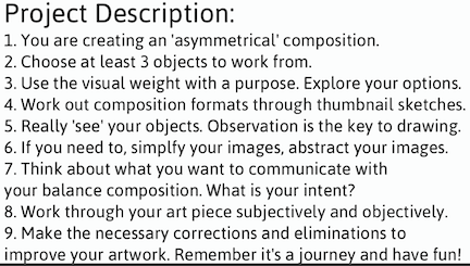
this formal balance. My studio right now, and these are the items
that I'll be working with for my exercises. I have rows and I purchased as well as
a bunch of daisies. It's wintertime here,
so I don't have any real flowers outside
that I could use. I'm going to choose the Daisy for this first one
being the symmetrical one. For my first two exercises, I'm going to use the
same sheet of paper, but I'm going to create
an edging for them. If you're composing, you have to have something you're
composing two. So it's just not a huge mass, but you want it to fit
within the format. I'm going to start with
doing my formal symmetrical. Now you can tell that it's
almost perfect the way it is. It is absolutely beautiful. I think nature really is a wonderful guideline of
making beautiful art. But I'm going to
have to take it a step further because it's not exact and informal. We have that mirrored image. I've divided this section into four equal
units, quadrants. You can see I'm moving around. This flower is so much, I've lost a few of the petals. But I'd still going to get the major idea of what
I'm drawing here. As I look at it, I've got a center round piece. So I'm gonna put
that right there. Right in the center. Is, even as I can. I'm noticing two layers. One layer of these
petals coming out. Then the second layer. What I started to look at is what is the
shape of the petal? Obviously, I do know because I lost a few so I can definitely
see what they look like. I can create this
shape very evenly. I can start right in here
and have it come out. Go out about that. Start one on the other side. Since I'm hand doing this, it is not going to be perfect, but I'm going to get
it as close as I can. That would be the
way I would begin. And I'm then going to
have to think about, okay, my spacing
in between these. I'm gonna give it a
little bit of spacing that I can well, it doesn't have it it
overlaps, doesn't it? Some has a little bit I
need a big that decision. What am I gonna do?
I am going to leave a little bit of spacing so I can put my other layer behind it. I'm going to figure out how many am I going to put in here. I think four would be. No, it looks like
three would be nice. So I'm going to divide
these into three units. Everything's gonna be equal. Now the markings I made, I would have to draw it in-between there
to even them out. So that's what in here. And of course they're
not as even as I like. Pretty good. Come on a little bit. Too bad. I'm going to continue on with the same type of
mythology as I'm drawing. Almost finishing up here. Some people really enjoyed
doing this type of drawing, its pattern formations and really has some very
significant value in it. Just have to choose what you like and it's important to use. It's a little bit harder for me. I like I'm a little
bit clean and neat, symmetrical type of things, but you get an idea of
what I'm working with. I'm using my flower is an
image to work from versa, just going out of
images in my mind, I kind of like working with
something to start with. If I look further on this, It's certainly has a
little more layers than those as Zach T2. I could play with it more, but I think I'm just
going to keep it as a double layer like it is. I see it right here. I will put it right behind this. Looking at it, it's a larger we can see with the
ones that I pulled out. We can see that it's certainly larger than the ones
that are closer in, so we'll make it a
little bit larger. And I'm just going to take
the larger shape and go right in between my other two petals. Looking at it again, problems in here
and here and here, then I need to address. This is coming too close to
the edge where it's not here. So this little few things I
needed to clean up in here. I know this one has should've
came out a little bit more. Close enough to
the idea of this. I think it makes it
quite interesting. Beautiful image doing it. My very formal. You think, well, why
would you use this for? You could use it for definitely
the type of advertising. Something that, and I can
just see it a lot of ways. And also patterning effects have a lot of things that are
very symmetrical in them. I think it's fun.
You can think of colors and everything else. You can go with it right now. We're working with
lines and shapes, implying fool with a format and a wire going in there,
but they just needed to. Here we have our symmetry. Let's continue to
the next segment and learn about
symmetrical balance.
6. Symmetrical Balance: In this segment we're gonna be covering symmetrical balance. As you can see, these cats
feel like they're symmetrical, but they're not exact,
they're not identical. In fact, the lower cat is Sasha, the mother to the
kitten above her Oscar. Another term for this can
be a approximate balance by axial having two-axis
near symmetrical. Here's a very famous portrait called the Arnold
Feeney portrait, done in the 1600s by Van Eyck. This is a really
excellent example of symmetrical balance in
regards to the social status. It's, everything's
carefully placed in here. It's rather complex. The lighting, especially it's very important coming
from the window and highlighting all the
figures and the objects inside. You have this wonderful
balance from the chandelier, the two figures on either side all the way to the fluorine
and even the sandals on the left that are not being worn shows that there's something
sacred taking place. The little dog and the bottom is representation of fidelity. Beautifully done. Colors are very harmonious
and it's not formalistic, but this balance symmetrical has still has a
formality to it by its presentation and trying to show the details
throughout the piece. Let's look at another way
of looking at as much go. Penny, this is by Raphael. If you'll notice it
has almost an S curve. That is the access
throughout the painting. You look at the focal point
of her face and it moves down to her right hand and
then down to her left hand. It shows a nice flow
throughout the piece, but it's very symmetrical. Here's a painting by ket, similar in the way it's
divided, but here's, has so much movement and
action that's going on so that the symmetrical paintings don't have to look so stoic. It can have movement
throughout the piece. Here we have one by David, very classical approach,
as you can see, it's divided in the middle. That's an axis. But on either side they have almost a pure middle effect
to them to balance them out. I'm going to show you a
group of paintings by Franz Marc friend spark
comes out of the Blue Rider. They use a lot of bold colors. Rider were
expressionistic painters. I believe that blue is the
most spiritual color and that the rider symbolize
the ability to move beyond. He's a German
expressionistic painter as well as a printmaker. But his symmetrical aspect in here is pretty
well evenly balanced. And I think it's kind of
exciting because there's so much intensity and vivacious business to us
approach to composition. Let's try thighs share with
you a few of his paintings. It really works with
this concept of symmetrical balance as we divide the painting in half and
we look to the left, we have two horses and
this white whispering, it looks like possibly a
tree in the background in comparison to the right
with the one Horace, who's much larger and has a larger whispering of
this tree coming through. But it divides the horse up as well because the horse's
head is in front of this. There's so much going
on as subtle as it is, but I think it's very
interesting to show this particular piece
in this series of work, he uses animals and they
symbolize an Age of Innocence. And you can see with
this one again, and it's also symmetrical
that it's split in the center with the horse in the middle and the two horses on either side, we have these two cats here. We have almost a bend in
between them. The divide them. The dog pretty well
evenly placed in the center of the piece like
the painting of the fox, we have this cat
behind the tree, the tree having the access
flowing through it. Let's look at a different
approach of using color. And this is in Claude
Monet's piece. Here we have softer
tones and hues that are being used in this
particular painting. It's very symmetrical,
it's very harmonious. Rehab. Another landscape by Monet. And again, you can see
the symmetry very much by the four trees and
very evenly broken up, but it really gives you a very peaceful way
of looking at it. Here we have one by Descartes, this figurative piece,
it beautifully, the figures placed
where arm is an adjacent to the foot
that's resting up above and having a complimentary
coloristic approach to the symmetry of the
orange on the right, to the complementary color
of the blue on the left here we have a contrasting
element that we just saw from day God's peace
to Matisse's piece of these vibrant colors of the
figures and the movement of that circular elements
that are happening with the dancing
figures as well as the background is very dark of the blue and the green
that's being pushed back. But what a difference, but here we have
symmetry and harmony. Here I have a
painting by Gauguin. We have the background
of the sand, the water very
horizontally place. And then we have the two
figures next to each other, giving it a sense of balance. Here we have a
painting by Magritte. Now let's talk about
positive and negative space. That negative space
of the figure on the right that shows the
sky in the background. Then you have the figure
as a positive on the left. So this creates definitely
a symmetrical balance. Here we have a beautiful
painting by Diego Rivera with the main figure
in the center, and then the two
females on either side. They're not exactly alike, so it's not identical, but it's certainly
the attributes to this wonderful symmetry, the size, shape, and coloration. Again, think about what
symmetry is conveying. You have an overall
sense of balance. It's not identical
because there's changes of color on either side. But this pattern, and
that's what's the work. And last in this segment
is Keith herrings work. He's really wants
to communicate in a very simplistic way and using symmetry surely is effective. And the way this is
being portrayed, having shown you a variety of ways that you can
create the symmetry, Let's move on and go
to the next segment. And let's do an
exercise on symmetry.
7. Exercise #2: Symmetrical Balance: Exercise two, we're gonna be working with
symmetrical balance. This is a painting
I created and this is of a clover flower. When I moved out to Kentucky, I just had fields of clover. I've never really
noticed him like that. And I tried to look up
real close to it and really was amazed by
the beauty in it. Why I made it so large on the canvas and place it
towards the middle and made it symmetrical because
I really want to convey the importance and the beauty of this small delicate flower. Look around you and see
all the different types of symmetrical elements
that and find. For instance, I was looking at my neighbor's barn again as
I saw that attractor before, but really enjoyed seeing this corrugated metal on
the side of the barn. The pain is off and
it's kind of rusting. It's just really interesting. Also just a stack of bricks. This is symmetry. Look around you. I've working with just like
before and exercise one, I'm working with IBD
pencil and drawing paper. You are always
welcome to work with any type of medium
that you so choose. We're gonna choose an
object to work from. I'm drawing out a border. You can break up the
format into quadrants. I'm not gonna do it in
this particular project and really observed your object. And I'm again going
to simplify it. I'm gonna do my symmetrical one. Here. We habit formal,
That's very even. So I've chosen a
different flower, little bit different
in regards to, has a little more play
with the different petals. And how can we make
this look symmetrical? Which it is? And maybe even a
little bit more. I don't necessarily have to
go straight in the center. I can go a little bit off. I can still do my petals. I'm going to play
with them like this. You notice I'm just having more. I think it's a little
more fun to do this way, but again, it really depends
on what you'd like to do. What do you want to
say to your audience? How do you want to convey the beauty that
you're seeing here? I'm just doing it
with line and pencil, so I haven't even
introduced colors, as you'll see a little
bit later in this class. I'm gonna go a little
bit bigger back here. I see more indentation here. Now. This is considered symmetrical. I couldn't even have a little
bit of my stem in here. You see the difference,
symmetrical formal symmetry. Very much different. How FUN segment I'll be introducing you to radial
balance. See you then.
8. Radial Balance: This segment is on
radial balance. Here's a stained glass of the stress or
Cathedral in France. But let's look at
the design itself. This is a radial design. It's from the center moving outward and it can
be very symmetrical. It can be very formal,
holistically symmetrical. But the main difference, it's from the center moving out. Now there's a term that's
used for these and it really covers a lot of
different centuries and, but it kind of has the
same type of meeting. These are Mandela's, basically, the Mandela is a geometric
design that represents the cosmos and the deities
of the heavenly worlds. So it's pretty exciting and it crosses over into Catholicism, Hinduism going into the Mayans as well as the Australian
Aborigines show you different Mandela's from several churches just to see
how different they can be. Here's run from San
Chapelle in France. This is a cathedral, the Most Blessed Sacrament
and Detroit, Michigan. We have one in New Zealand, and here's one from Louisiana, all beautifully executed, very different in
the stylization. So it's kind of amazing in the process of
drawing the Mandela, it makes you feel more
peaceful and calmer. Your heart rate comes down. It just is a good feeling. Carl Young and said that this is a very peaceful way of feeling. So it's kind of your inner
self showing yourself through. Here's the museum
that's dedicated their third floor
to the Mandela lab. And this is the result of this pandemic across
the world and the feeling of struggles and frustrations that she can go
up in there and meditate. Now let's go quickly through a modern version of Mandela's. There's such a variety
of them is just unlimited of what
you can create. Know I've shown you one
aspect of radial perspective, but it also goes
into other areas. This is a painting
by monk which is considered a radial balance. You have the center of
the sun and then almost like an explosion of a
radiating factor going out, you'd probably
very familiar with ever amongst the screen, you can actually almost
hear the scrape and especially having his hands
placed over his ears. But everything else kind
of radiates out so it can imply a different
feeling here we had something harmonious
and feeling good. It can actually have
different feelings, but it's how you compose it is what's really going to
make your it come alive. There's a beautiful piece by Eduardo Rodriguez
where it's smaller, spectrally imagery
and just erupting in this wonderful
continuous radius flow throughout his piece of work. Here's a self portrait. This has a different effect, but it's an explosion of inside out and
still that radius. Here's more abstract,
Li done and we have just shapes and angles
that are radiating out. Here's an artist's I'd
like to introduce you to her name is Frida Kahlo,
herself portraits. I noticed her balance that
she uses a radial balance. You definitely look at her face, that's the focal point. And then you have a lot of symbolism that will
go all the way around from Frida
Kahlo.org website. This really explains her very nicely in a very
short description. She's a Mexican
artist, Frida Kahlo, and is remembered by
yourself, portraits, pain and passion and
bold vibrant colors. She is celebrated in Mexico
for her attention to Mexican and indigenous
culture and by feminists for her depiction of the female
experience and form. Here's a quote by Frida Kahlo. I paint self-portraits
because I'm so often alone because I'm the
person I know best. Let's really look
at her piece of artwork here we have
three things that are so important that's going on the focal point path of vision and viewing
the whole artwork. The focal point is your face. The path of vision is
where you look next, which is down with that
bird hanging off her neck, up to the left side, which is the monkey to the
right side of the panther, and then up to the
lighter leaf formation that pulls you up
there because it's a different coloration
that into the top where her flowers are placed
at the nice part, you're going to view the whole
artwork again because it's going to pull you right
through it one more time. That's what makes an
excellent composition. Now let's look at how
completely different this portrait is her
choice of colors. You have that beautiful blue
violet behind her portrait. And then you have these flowers radiating out in this portrait. We have a completely
different look. It's more realistic
in the background. Now how would the
flow being here? Again, the focal point
is her looking at you. The second thing
that you'd look at that and the path of vision is to the left of that
grey leaf formation. And you see a little
banding underneath the bottom part that takes
you across and his wave pulls you up to the right-hand side because of the shapes that are pointing up and bringing it back to the beautiful flowers that
are placed on her head. Back to your eyes. Wonderful. These are amazing self-portraits
here we have her again, her face, but it's the
positioning of the birds. Where would you look next? The bird to the right
because he's kind of looking at you or deeper to the left, either one, but you'll see one of those birds
and it will pull you down to the other birds that
she's holding close to her. Again, you have this
radiating effect moving through the artwork in this portrait
receiving less color, those vibrant colors
that we saw before, but these colors
are more subtle. But the differences
do you see here is the intricacy of the fabric
that's radiating out. So there's a difference
of what you're putting together and how
complex you want it. And here you have a, just a beautiful radiating flow. Here we have another supports. It looks very much like that. With that beautiful lace
radiating out from her face. I hope beautiful. Let's go into the next segment and
let's do an exercise. I'm radial balance.
9. Exercise #3: Radial Balance: Exercise three on
radial balance. Look around you and
he could see a lot of different radial balances. I started with my
plants and looking at the center and
having it move out. Quite amazing when you really begin to look at
a lot of things. I looked at seashells. And another aspect is even
fruit like an orange. This will be very similar
to other exercises. I'm just working with ebony
pencil and drawing paper. Choose an object to
work from, draw it out. You can border this
if you'd like to. I'm making this one a little bit larger than my other ones. You can break it up into
quadrants and really observe your object if you
need to simplify your image. Now for radial balance, we could be using the daisies
as well as you can see. They project out
from the center. So that would definitely
be radial balance, but let's try
something different. Let's start working
with the rows. This also has a radial balance. It starts the
center and it kinda unravels as it goes out. This radial balance
could be very symmetrical or could
be asymmetrical. He could really play with it. But it has something
that's moving from the inside, coming out. I'm going to start
with the inside. And I'm going to start over. I'm gonna go offset
a little bit. I'm going to have a really
thick kind of center here. And I'm gonna start
looking at it. Let's starting to unravel it. As I come around. It doesn't have to be exact. It could be if you wanted to. Again, that's up to
you of how you want to manipulate your imagery. I kind of like having the
differences as it flows around, but you can definitely see
it moving. I'm folding. I might add a little bit
more than it has here. I can play with
the imagery as I'm using this as my resources, my point of vision. Can you see it and my lines, I'm really looking at how the
shapes are bending. Movie. Really like what's
going on here already. Now, for my direction here, I'm a little bit on the side versus the way you're
looking at it. Just a little bit
more like this. But I really love
what's going on. I'm going to go a
little bit further out. Really make it come out. And they're gonna
go real delicate with the edges here because they are not all perfect. It out here, maybe just coming back with that little fold, their radial. I could come in and assert to
model a little bit in here, giving it more of a 3D effect. He's certainly, it would be wonderful to come in
with color and texture. And there's just so
many other art elements that can add to this. You really know, have to
know these aren't elements of which you want to introduce
are good to the piece. I like giving a
little bit of depth. It adds a little more, I think a little more form
to it, more interest. That's my objective. But I want to work on I've got all this space in
here and I've got this. What could I do? I could
keep going with it. I can pretend this
is the center and then it's not finished.
I'm gonna do that. I'll make that as
my little one right in there where I was just
playing with all of it. So I'm gonna look at
the center a little bit more and just play with it and just move it all the way out. There'll be kinda fun to
take these outer edges. Maybe I might even bend back. Don't last long with me. Oh, well, I wanted to just
kind of bring it out a little, just a little bit
more as I can see it. Fun. Flowers say man, when he got kind of a
shape going in here. So I'm going to really
accentuate that back here, bringing another shape coming in and coming back to the piece. Now, having finally
going off my edge here, I've created a border. I'm cropping the
image by going off. That's okay, because I wanted to make
it more interesting. My page here than what
I had created here. I'm gonna go off a little bit
in here. Maybe come back. An extra one there. Maybe just a little line here. I'm happy with that.
Boy, and that's fine. You can just take one
thing and just keep expanding and start thinking about The ultimate goal of
this is my composition. How interesting is it? This format? By using just one of the principles of design
and art and design. His balance is really
my main focus. That you really need to
know your art elements. The whole purpose of this piece of artwork
is your composition. Even though we'll get to
a point that I'm gonna be looking at things
that don't work. But there's a
reason why I really like this in here. Because what I'm doing, I'm
balancing these shapes. Love it. How fun is that? Enjoy, look, explore. That's the whole aspect
of looking at art. Is always effort, ever
changing how exciting. And our next segment is
on asymmetrical balance. And there's really a lot to
understand and it's exciting.
10. Asymmetrical Balance: This section is an
asymmetrical balance. Asymmetrical balance is where the two sides of the
artwork are different, yet the visual
elements are arranged in a way to create a
feeling of balance. Now you're symmetrical and your radial balances are
pretty easily defined there. You can almost put
anything together because you can balance
it out equally. Or when you're dealing
with asymmetrical, you really have to know
the differences of different visual elements
of weight of your color, of your line, of your textures
is where I look at things, is to be aware of the positive, negative space or shapes. You can visually see
that feeling of balance. Your eyes are automatically
are searching for a place to either rest or play set is different
from something else. And it's kind of this intuitive
feeling that we all have. And that's what we have to go on to get this feeling of balance. As your eyes are searching, you're seeing all
these lines heading towards a certain area in
this particular painting. And if you look, your eyes
are gonna go to Vocalpoint. The placement of the focal
point is very important. Here we have a painting
by Van mirror. It's very dramatic, and that's another thing
with asymmetrical balance, you can really
create tension and drama within your
piece of artwork, we have this heavy drapery
folds on the left-hand side. You can help or that even the visual aspect of
it to have that weight. And then you have the
lady to the right. She's very light. So you have things
that are very dark all around and then you
have this light figure. Your focal point is
definitely going to be heard. And to balance her out
within all this space, you have that heavy
drapery folds. So this creates that, that visual weight of
asymmetrical balance. Next is the path of vision. So from the woman's face, which is really detailed
into the focal point, then you go down the lines
of her dress to the floor. The floor has a
pattern to it that has a diagonal that
pulls you to the left. We have the curve of
the drapery folds, pulls your across to the wall unit and then
down again in vector her, That's an excellent composition and that's movement
of space in line. Here's another asymmetrical
painted by Vermeer. Here we have the focal point
of the figure on the right. What do you see next? Yes, it's the woman next to this very bright
angle of the wall. Then you have this
strong diagonal. What a wonderful
asymmetrical composition. These are pretty
interesting paintings and Robert Huber, that's
pretty dynamic. And the way he's
approaching this, you have this huge
building structure on the right-hand side and this monumental
structure on the left, a very dynamic sky
in the background, which is blue and lighter. You almost have a division
that's diagonal in this, you have a path of vision that kinda balances each other out with both units on either side giving you
that sense of balance. Then I saw another piece of
his work that almost has an identical way of how we
visually balances his work. Dramatic sky. You have
the tree on the right, you have the building
structure on the left. This is that asymmetrical
balance that's going on. And here's another
one of his pieces, and I think this is pretty interesting is another division of visual weight is the
foreground versus the background. Very defined here. The foreground is very dark and the background is very
light and ominous would really is important to
this one to give you another visual identity is
the size of the people. It gives you the scale
to the proportions. Otherwise, if it was just
this rock formation, you wouldn't know if
it was an inch tall, but having the people
there will give you a proportional
relationship to it. So now you know
it's very massive. You have foreground background
dark colors weigh more than these neutral colors
in the background there, the size of the shapes. So we have size going in here. And again, the size is
scaled by the people. This is a famous
piece of work that I thought I would just
bring into this. I have a few of
them and then we'll go a little more
abstractly after this, I want a nice comparison
analysis between them. Here we have the size of the shapes because
we have these boats, these boats indicate smaller
version versus that wave. Knowing that's very massive, you have the intensity
of the wave, the darks and the lights
create attention. You have the movement
of line and you have a heavy usage of line
because they're very outlined. This causes a lot of
drama within the piece. Here we have starry, Starry
Night by Vincent van Gogh. Very dramatic and the essence
of how this is placed. Another thing that's
happening here is texture. You have the texture and movement of the sky
in the background. So it's not really
soft and ominous like we had seen
before in Hubert Work, but this becomes a very
dramatic and active. You have two things
that are happening here that it well,
almost three things. You have the cypress tree on
the left-hand side that's very large and dark. You have the cloud formations almost has a Yang Yang effect. To the very corner, you have the Moon. And that's very light and warm. Warm has a visual weight much more powerful than
it has the blue. So that warm really
comes through. You have a lot of
action going on. Next, we have the persistence
of memory by Salvador Dali. This has a lot of things
going on in here as well. Foreground and background. Foreground is very dark, with the background
being very light. That's certainly has a visual
weight and division to it. The large shape in the corner, which is the left-hand corner, and it has a warm
coloration to it. So that is going to produce
a lot of weight to it. You have hard edge versus soft. That's another thing. Hard edge objects are heavier visually than
software objects. And this becomes very dramatic. And of course,
because the watches, we have everything very realistic in here
except for the watches because of the actual Watch itself is soft
versus being hard. We reviewed a little
bit with realism, with premieres and
who bears worth. We saw a little bit of
NGO and expressionism. We've installed
Dali's surrealism. Now let's go into
impressionism and a little bit of abstract
works of art because it's so important when you're analyzing these asymmetrical
balances and works of art that it gives you really
the greatest way of learning this process of
understanding balance. I'll see you in
the next segment.
11. Asymmetrical Balance II: Asymmetrical balance
part to Mary Cassatt, this piece has to be one of the most wonderful
compositional structures. I've used it in art appreciation
and found it amazing. You have so many
things going on here. But when you look at it, it just looks like a sudden he had taken a nice photograph of
people in this carriage. She has a lot of cropping
going on at focal point. And then we'll go
for the path of vision and really
play with this. The focal point is
the young child, the lightest element and the piece that is why your
eyes go towards that. Also, when you have
a person, you, your next path of vision is going to go where
she's looking at. So we're gonna go left. We're going to follow the rains the woman is holding and then come down and follow the
harness on the horse, go towards the
carriage, go back up. Then you see the
rider in the back. He has an angle to him
that puts you up there, goes over to the woman, and then moves you around again. It is absolutely magnificent
and it's by color, shape, Positions, positioning your elements
in there is so important. Here's another painting
by Mary Cassatt. She has such great
paintings that are perfect examples for
understanding asymmetrical. And I talked about
before about how important were the placement
of the focal point is. And that's because
an asymmetrical, you don't want it in the
center nor in the corners because your eyes have no
place to go after that. So it's so important of these directional lines in how everything is
placed and organized. From the focal point, you'll look down at the child. The child's looking at the man. So it goes across to his
face and this is in yellow. And then it's gonna go where he's looking is to your left. Then we're going to go up with the orange where it's
the sale and move along that and back to the gentleman who's
a large dark area. And the width, the
light blue is going down across and
backup to the woman. Excellent, in regards
to your wanting the viewer to look at
your whole painting, but without knowing, it's just, you're being invited into this wonderful painting and
just exploring through it. So very good. I also shared with you before, how important is that how I do it with the positive
and negative space, the positive space
or the objects. The negative space basically
as the background. And I'm going to show you
just the negative space. When you look at
the negative space. Is that interesting to look at? If it is, then that makes
a good composition. Now what is she trying to
communicate in her painting? A pleasant afternoon on a boat, She's using complimentary
colors, warm and cool. The values of darks and lights, they're not real intense, so it's not too dramatic. The soft shapes and
how things are placed. Here's another
impressionistic painter, Edgar Degas, on the same
air of America sat here. He's doing some
different approaches to this asymmetrical design. First of all, let's start
with our focal point. And if you don't find
it very quickly, close your eyes for maybe
ten seconds and then an open your eyes and where your eyes go first will be the focal point. Let's go with our
path of vision, which is our directional lines. And there's actual lines
from the face of the man. His coat is an actual line. His umbrella is an actual line that goes to the
young girl's face. Then we have the looks of the two girls going to our left. Those are implied lines. Here's a short definition
of what implied lines meet. It's when the viewer's
eyes connects other elements of an
artwork to create a line. Here's an example. If you follow the dots along it, creates it a wine and
has your eyes follow. And we go to our left there. And the man on the
left-hand side is an actual line because it
follows a line of his body. And then he's looking to
the right implied line, going back to the focal point, Let's look at the negative and positive space within his work. There's a lot of negative space
in this particular piece, but it is still broken up. And quite interesting, if you'll see in the very upper
left-hand side, he doesn't take the
head completely off, but there's a little bit
of the base behind there. And then there's cropping. When you're working with
figures and cropping them, it's a good idea
not to crop them at like a wrist or kneecap, either go above or below, even on dogs and animals. You'll see that with
the child on the right, the man, the other child, the dog, the man on the left, and quite importantly
in that corner, the head is not completely off. If it was, it would
feel very awkward. So he's left just enough
of that negative space in there that keeps that figure
within the picture plane. And another element in his piece of what we
saw Married cassettes were her color scheme was
primarily complimentary colors, whereas to gauze color scheme is a monochromatic color scheme. He's usually primarily one color with its darks and lights. This makes it very harmonious, impulsive together via a lot
of vivid colors in here, your eyes would be going
every which way and has intent is to have a casual glance that
looking at the park, very subdued and harmonious. In this segment, you've learned
about directional lines and path of vision
implied and actual lines, focal point color schemes, cropping and negative
and positive space. Let's dive into the next
segment and analyze the usage of
asymmetrical balance with abstract art works.
12. Asymmetrical Balance III: This segment is
about dealing with asymmetrical balance
within abstract work. Abstract art is an art
that does not attempt to represent an accurate
description of a visual reality, but instead uses
shapes, colors, forms, and just roll marks, lines to achieve its effect. Let's start with the
first abstract art. Not meaning that there was never abstract art before this, but this was the first
abstract painting that was accepted in an exhibit
and this is by Kandinsky. This was 1910. He even wrote on the
back, abstract art. I thought this is an
interesting perception about his work. Kandinsky viewed objective. That means there's nothing there specifically of a
visual reality. It's not a figure that
you're seeing or tree. So this is called non
objective abstract art as the ideal visual
mode to express this in a necessity that the
artist wanted to convey more of a universal
human emotion and ideas. You viewed himself as a prophet whose
mission was to share this idea with the world for
him betterment of society. Now, let's go back and
look at his peace color. The color is very vibrant
and translucent and areas. But look at the positive
and negative space at moves throughout the piece. So it's visually
interesting and look at abstract work
necessarily need to see something that's
symmetrically balance, but similar things
that pull us through. So there are similar
shapes in here of the circular forms
that are going through, that's pulling us through. Let's look at another
one, a Kandinsky. So you can certainly see the pattern formations
that are being achieved here on the
left to the right. So there's similarity in that. It's a fun adventure is
another one of his meetings. It's called composition. So you don't necessarily
have to look at the title to decipher
what's there. Your focal point definitely
is in the left-hand side. It moves through the piece. It almost has a musical
action, so it's fun. It's something that
you can entangle your ideas and imagination
within the piece, you really have to know the basic visual elements he
create abstract art as well. I love these six paintings
by Piet Mondrian. It shows you how he starts with the tree and that was a
series that he had done. And then he slowly breaks
it down into non-objective, basic visual forms
down two squares, lines, shapes and color. Now you know a little
bit about color, which is your
visual weight here. What is going to be
the strongest one? The warm is stronger
than the cool. So the red and the
yellow are stronger. So you're lighter
area and the red, the kinda go to the left
and then back to the right. Here's another one. He's got to graze areas
there with the red. Obviously, the red
is so much different from everything else and
that's your focal point, but wonderful and moving. This is certainly not objective. There's nothing
there to show you that it's a tree or figure. I'll be showing you a
handful of artists that were very important
to abstract art. And let's start with
Jackson *******. His painting was about action, that actually the
process of painting. And it's very linear, so you have lines going
through it in color. That is the two visual
elements that you're seeing. Well, one more will
be texture because it has a 3D effect
to it as well. When you look at focal point, your eyes move everywhere. If you really saw this
upfront on the wall, you'd be able to
see a little bit more detailed and
it would probably have you move through
it much more than seeing it in a smaller
version like this. That's another thing
about abstract art. But they're usually very large, which makes you really
have to encompass into the painting and be a part of
it because it's so massive. Ellsworth Kelly,
He's using squares, so similar in shape all over the differences that
you're gonna see here, the variance of color and then the white shapes become the negative so that it creates an action and movement
through the piece. Here's one by Joan Mitchell. If you would consider
her WorkBoard gestural, using lines and moving
through the piece. And the idea of action, you can just feel the
tension that's created there by the movement and
color plays an important role. You can definitely see
the yellow color on the left-hand side
as your focal point. Because one by Sam Gilliam. Now he's painting not only
on the surface of Canvas, but he's taken it off the
stretcher and hanging it up. So that becomes a whole new
direction into abstract art. Here we have one
by Brice Martin, definitely linear,
gestural moving. He's using two to three
different colors in there, but it's making me move
throughout the piece. Now you can see how what we've learned applies to abstract art. The directional lines,
the path of vision, implied and actual
lines, focal points, color schemes cropping
negative and positive space. Now I'd like to
show you a few of my paintings that I've
done just recently. They're very small. I tried to attempt doing
something abstract small. I usually like to do
obstruction very large. And these are eight
by ten inches. And they're painting
on wood with acrylic. But I liked working
on wood as I could. It really capture a
lot of transparencies that is thin color applied
on top of each other. So it created different
dimensions in my work. So I did a lot of overlays. I liked the action
painting of the strokes. And I introduce these, these squares and hard edge
shapes throughout the piece. Kind of given it that
positive and negative to it, I really liked how
they came out. They have, they evoked
so many feelings. I get more feelings from water and land and
things like that. So I share this with you. I'll see you in the
next segment creating asymmetrical balance
and exercise four.
13. Exercise #4: Asymmetrical Balance: We're gonna start working on our exercise for which is
on asymmetrical balance. Here's one of my
paintings and acrylics. This is called flowering trees. I thought it'd be a nice example of using asymmetrical design. Again, I have a very basic
way to do this exercise, but you're welcome
to add more things. Even go abstract with this
one if you wanted to. I'm gonna be using
all three flowers. I will be playing with it a
lot more with asymmetrical. You've lended yourself too. I think a lot more options, although a lot more
difficult to work with, because it's that
feeling of balance. There isn't any real
specific structure, but once you see it, you will know it. This is where the thumbnail
sketches become handy. Like you'll see my
rectangular format. I will go ahead and create
that several times. In there. I can do a compositional
structure within seconds. If I had this here and
I'm wanting to balance it out and trying to figure
out what I want to do. What if I leave these
down like this flower here and had the two
daisies going this way. I can look at it one way, then trying a different view. I could go and crop
it off over here. I have it larger. One of the daisies coming here for the last
one coming off here. Can you see what happens, how different it can be? I can make it much smaller. The Daisy, they'd
be coming off here. The other one, maybe this one maybe it's
going a little bit further out on this side. Then I look at it
as a composition. Lots of lots of dead space
in here, here and here. Lot of unused space
in these areas. This one's not bad. This one is a little
bit too centered. This was to send
it on this side. This one, it would be something interesting
to do because I've got a nice open space
here, here and here. Those are just ideas
that you can work with. I just go at it because
I'm pretty well sure where I want things to go and I can also make changes along the way. Let's see. Kind of want to start
with this one because it's a little more difficult. The positioning where
I want it were these, I can turn and play with them a little bit
more where this is very, has a more solid form to it. I kinda like from looking at my sketches and kind of like
it being right in here. That's where I'm
gonna put this one. I'm going to start with 1 first, as you'll see when we do the
project and I'll show you, I'd like to start with
something down there because then you have to have
something to compare to. Otherwise, if you are doing a lot all over the
place at once, I want to give it some structure
just to begin with it. So I have, I can kind of
consider like a foundation. I'm not gonna be joined. A lot of detailing in here. It's just want to get a quick
view of what I can do to create nice asymmetrical
balance using these flowers. And I'm doing a little
bit of modeling in here. You can add a little bit more, a little more form to it. Great about the eraser. I come back and clean things up, make them look a
little more interest. On the side here. Now, I have to consider, I am using such a
variety of these that I have to think
of my strategy. Do I want to keep them? Obviously, I've gone
off proportion. It's larger than life-size. I wanted to do that so
it came closer to me. So I concert adding
dimension to this of pulling things back or overlaying where this could be really
huge up here. So I can play with soap
anyways with this. And how do I also
have to consider, which I consider this
my positive space and my negative space is
what's, what is leftover. Both are very important
because they're combined together to unify the whole of the compositional structure. All right, I think I'll
add a little bit of a stem to kinda wanted
to do the steps. Really loved these small
little parts to the flower. Find an interesting,
definitely going to have them. And it also breaks up my
space in here as well. They're pretty happy with
what's been softened, something that's looking
good to me so far. All righty. Let's see what we
want to do next. Certainly have to
use space over here. We've got here, so let's start putting
something over here. And I think this one looks
great the way it is. And it's kind of maybe
be facing each other. And I'm gonna put this one. You don't write in here. My petals are coming
out this week. We're going to crop
it a little bit. I like things going off the page because it kind of gives
like a photograph almost. I'm just very quickly
placing things in here. I'm balancing. And again, you can always
add color to this, which changes it totally. You'd have to be aware of what each thing has
to do with another, but you can always go
back and forth with it. Now I have two items. Pretty now I've got
something going on which is getting
asymmetrical here. They're going to continue with exercise number four
in the next section.
14. Exercise #4 (Continued): Asymmetrical Balance: We're going to continue with our project on
asymmetrical balance. Now I have these
two items placed here, very evenly placed. The sizes are about the same. So what we're really getting
back into is symmetry. I have to break it up more so I can choose different sizes, which I'm going to
make something smaller right in here for this one. Maybe think of
another one back in here to balance this out. Something back in here. Maybe something over here. I'm gonna begin on these
stages and see where I'm at. I like this one kind of
going on the side here. I'm going to flip this
one up a little bit. As it goes up. This one I want to go
maybe facing down a little bit more
of an edge to it. Putting it underneath
now are overlapping. This one, boy was poor flowers. Somebody wouldn't go
this way with it. And I kinda like just quickly
gesturing them in there. This one I would I think I
want to bring it back up. A little bit of it here and
then petals going here. Now I'm breaking it up and
it's a lot more interesting. Notice that the negative
shaping in here becomes just as interesting as
the positive shapes. So it's making me go in and out. So I'm really
excited about that. As far I think I'm getting
where I want this to go. I'm going to just shade a
little bit down here just so that you get an idea
of what's forward, but it's not coming
back with my eraser. And that will make
a nice difference. You see how now that's
starting to enter play in there of this
overlapping shape. Something's moving within here. Like what's going on here. I don't have anything
right in the center. I don't have anything going
strictly often the edges, but it's almost, I have
three here and three here. So it's kind of like I'm
back my symmetrical balance, which we have a tendency to do. So let's break
this up even more. So I'm gonna put
something back here. And I think something refer back to our original
sketches here that we did. Gesture one through something, enlarge writing here that
kind of balance these out. But I like the shape here, here. What do I want to do here? I think I'll do
something about, right? Maybe This my frontal one. Let's go through and I'll
start drawing in here. Trying to get all
those markings off. I have a tendency to overdraw, but that's again, went away. Other things that we do like this coming
up ahead of this. So things are going on. This is forward, that goes back. And I could re-emphasize
it with color to make these really bright colors. So it would even re-emphasize
what I'm doing here. You will establish this one. Do I want to go forward
with this or backwards? I think I want to
go forward with it, so I'm getting a little bit closer. I'm putting this one in front. I'm putting this one
in front of the rose. This comes up where
the row is going back. Here. It sends it back a
little bit more. Before it was up to far. I like that balance that's
being created here. Get a little bit
more in this one. Now, it's starting to work
itself a little bit more. We've got a focal point. We have another one here. It's really moving nicely. Pretty happy with this. I'm gonna clean this up so you can see it a little bit more. Another thing I like to do is
I can put my hand and using my hand or use an object to
see what to play, do this. But if I do that, now if I get too
many things going, it's going to be so much competition
that you can't see it. So you have to really
be aware of what you're leaving and spacing and the movement that's
being created. But I like what's going on. I'm going to just finish
it a little bit cleaner. I just began to put
my stem on here. So that's creating another
avenue working in here. So I'm going to put one
here this way. Coming here. That's kind of
having some fun too. In this one coming kind
of weave in there. That's breaking up
this space very well. The only place I feel uncomfortable
with this right here. I'm going to put something
right behind here. Maybe right behind here, just to break up this space
at this larger than this one. So we have a nice variance. Like what's happening
with this one. I got this still on the front. This is the front of this one. This one is in front
of all of them. This doesn't work out as well. So I'm going to, I'm thinking of extending these petals out. More. Just playing with that. Let me go off. It breaks
up that space in there. Now I feel comfortable with it. I've got my focal point, like right in through here, kinda go to either one of these. And it moves up here, pulls it down here,
and moves across. So I've created a nice
asymmetrical balance. Our next segment
is an imbalance. It's really interesting. See you there.
15. Imbalance: This segment is on Imbalance. I'm starting out with
this painting by Andrew Wyeth called
Christina's World. She's a blind girl. You can see her in the field. It's pretty impressive. This big negative space area of the field and the houses
in the background. This isn't imbalanced. This is definitely balanced. This is definitely an
asymmetrical balance with the figure being
the focal point. But I wanted it to
be a comparison with the next piece by Kirby that
has a similar look to it. This painting has imbalance. You have things going on in
the foreground and then in the middle ground you have this house that's
kind of tilted, that you really don't have much going on the left-hand side except these waves that
go out to that direction. But it's definitely
heavy on one side. As a viewer, we
want to always see some kind of balance or something
that we can hook up to. This one gives us a
little more tension. Here are the paintings
side-by-side, give you a comparative analysis. The one on the left, wives, even the colors very harmonious. It's monochromatic. We're on the right. It is dealing with complimentary colors
that are very intense. So it's creating so
much more action than the one on the left. You can really feel
the difference and the intent of the artist. Now remember friends
Mark's work, we were dealing with
symmetry where he had the animals that were
very well-placed. Here the balance is really off. The horses really cropped
lower part of the composition. So it gives us that
feeling of I'm balancing. Here's a penny with
horses by Degas. Similar thing of the balance be really heavy on
the right-hand side. So this is imbalanced. Here's one by McDonald's where
you have the white horses, this stripe of kind of yellowish green color
and the right-hand side. So it's really,
really quite active. Things to think about. An imbalance is the intent. I'm going to give you a word
called truism is the artists to have this really
come through has to be really true to his art. He really has to know the differences of all
the elements that he's working with and why he's
not including some of them. And that's through the intent. The viewer, on the other hand, is searching for this balance, so it is creating tension. Now let's look at this piece by Kleiner that it's even
titled imbalance. So as you look in here, you have the woman that's
looking towards you, and then you have the young
boy to the right looking out. What we had talked about before, where the figure looks, it really pulls it apart to give you that
feeling of imbalance. And a penny that's
imbalance doesn't necessarily mean that
it's wrong or it's bad. It's the intent of the
artist to pull it off, to have it come through. Now fewer working on this painting and you are
trying to balance it. What would you do to balance it? Certainly with the
figure on the right, you would have him turn his
head probably towards her. That would make
it more balanced. It really liked this painting. It really lends
itself to a lot of imagination and what's going on. It really gives a
suspenseful feeling to me. It's like I want to know more. It's another
figurative painting. This is by direct. You have a young man to the
right way in the corner. He's looking to his
left and you see this white object going
out in the corner. I mean, that's a really
hard visual thing because it pulls you so hard
edge to the left, creates a lot of tension. A lot of drama is
going on in here. This fiery yellow
and red That's being exploded through
the negative space has a whole different
intent to this one. The paintings that
I'm showing you, your opinions I really enjoy
and that's why I chose them. And I've found a
few of these that actually had the title
called imbalance. So I know definitely
that's their intent. And with this one, I mean, it's so dynamic. It's triadic color scheme. Your red, yellow, blue, you have the darks and lights. A lot of different
values going on. The choice of shape and form
is round and sphere-like. And that negative
space really employees into the positive space and that heavy
weight on the side, you can just really
feel that tension. Very dramatic. Here's another one by
Miller called imbalance. You have this fiery image going
right through the middle. Lot of action are
so much going on. Your eyes are going everywhere. Excitement that I
feel from this piece. Here's one by Hugo called
imbalance color scheme. You just have yellow, white, and black negative space,
definitely the black. You have soft images
except to harsh images. One in the corner that goes
straight in the corner, that cube-shaped going
out to the other sides. When I'm telling
you when things are just going directly out, it really pulls you
out of the scene. If you're trying to
get it symmetrical, you would avoid those areas. But if you're trying to get an imbalance, that
certainly works. Here's another one titled
imbalanced by melon. Lots of negative space, but the negative space
is handled quite well. It's an interesting
composition all the way through lot of direction, going right into that
upper right-hand side. A lot of tension because of those diagonal lines
that are used. Here's one by Rizzo. This really makes you feel imbalanced because the
whole thing is tilted. And using a monochromatic
color ration, it almost feels
out of this world. Here's one by Yeager, and this becomes almost
very surrealistic. You have that huge I, looking at you, I mean, it definitely pulls everything
off in the balance. Interesting piece though. Here's one by fields. They almost look
like figures that I'm not sure if they are not, they go into space and
this heavy impasto, which is heavy pain
that's applied easily, these pastel colors. It just really interacts
with texture and color and things that are just flying all
over this Canvas, which is just great. I just loved this
piece and this one by Frank using yellow, yellow, such a difficult
color to work with. But the yellow, red
and blue triadic, the yellow empowering
all that negative space truly makes it an imbalanced. But I think it's a really fresh looking
painting and really enjoy it. The next segment is going
to be really fun because we're gonna do an
exercise, an imbalance.
16. Exercise #5 : Imbalance: This segment we're
gonna be doing exercise five, which is imbalance. This class is really
about exploring, so you can try different avenues to play with the
idea of imbalance. Well, I started with the
last project we worked on, which was asymmetrical balance. Instead of just trying
one approach to it, I thought trying
several approaches. I have the computer
software ART rage. And I was able to pull this
up and play with color and line on top of this to
change it into imbalance. So you can really play with this and any
media that you so choose to see what you can do in exploring
within balance. Remember, it's intent,
what do you try to say? This was to bunch fun for me. You don't know how many
times I destroyed this fees, but that's the process of it. Sometimes it's trying to take everything away and just
leave the essentials. It's there. So it's a whole
new way of looking at it. Well, I thought, well, I'll just start with one color. Let's get something simplified. So I chose the color yellow,
really played apart, but I felt, am I really
getting into imbalance? So I thought, okay, let's try a different color to see if that changes at any. I tried to blue violet. Well, that's wasn't
as interesting as the yellow because the
yellow came forward. So push a lot of things back. I thought IT interplay a
lot more interestingly. And I thought, well, let's see tick that blue and make it more translucent and put it in the background and
see what happens there. Well, I kinda like that, but it's still, is
still balanced. I'm shooting for imbalance. So let's go further with this. I went back to my yellow
because I liked that and then I liked the background, but I thought I
needed more so than I put this red violet
over everything. I like it. It's kind of fun. You know, it almost looks like a print and it just has such
translucency through it. I thought it was a lot of fun. I had fun doing this. So that's my first one. So I thought, well, let's do something that's more opaque. So I started working with
something more of a pastel, so it was a little
bit heavier and more linear on my piece. Obviously, I like this
blue violet lately. So anyways, I played with this
and destroyed half of it. So now I'm eliminating
parts to it. I thought, okay, this
is pretty interesting. And I brought this light
blue-green pulling across it. So I'm adding lines and
a little more dramatic, but it's still kind of working. So what could I do to
really, really imbalance it? So I took a read, this orange red and went right through that corner and
pulled it right off. And I felt now I
haven't balanced, but I'd still like this
piece as well because it's so dramatic and comparison
to the other one. So have fun with this. You're exploring, that's
what this class is about as a learning visual process. I will see you in the next class because this will be our project on balance.
17. Project Details: This section is on
the project details to explain what we're gonna
be doing in our project. The materials you need
for this project. I put down MED
pencil because it's a nice heavy pencil to work with or any type of pencil
and drawing paper. But you can choose any medium
you want to work with, especially if you want
to work with color, which would be
really challenging. So think about what you
want to work with and the project description
is as follows. You are creating an
asymmetrical composition. Twos at least three
objects to work from. Use the visual weight with a purpose, explore your options. You want to work out
your composition formats through thumbnail sketches. Really see your objects. Observation is the
key to drawing. So it'd be great to
actually have the objects right there in front of
you versus photographs. Photographs can be
used is an additive. If you need to simplify
your images, go obstruct. If you want to think
about what you want to communicate with your
balanced composition, what is your intent? Work through your art piece
subjectively and objectively, and make the necessary
corrections and eliminations to
improve your artwork. Remember, it's a
journey and have fun. I wanted to talk
about demonstration. This is really not to follow
along type of demonstration. It's not like a
step-by-step process. What I'm teaching
you is how to make an asymmetrical balance
in my own work. And I'm just, this is just an example to help
you in your own artwork. And I'm gonna show you how
I make decisions and how I change things to make
this asymmetrical balance. So it's kind of a
fun thing to look at because this is the
first time I've let anybody in my studio
watch me paint. You are the first. It'll show you my
studio and I just set up the camera behind me. And when I paint, I just lose my whole
concept around me and I'm just so
focused on painting, it becomes very,
very subjective. I get excited about the colors and I think that's really fun. Then I have to go
back and view it objectively and make
necessary changes. So this will just give
you an idea of process. I'm not going to be
teaching you how to make a stretched or prepared canvas or how to paint
or draw or mixed colors. I have other classes for that. This is primarily about balance. I hope you have fun through my journey of doing my painting. Let's move on to the
next section and enjoy and learn things about
how to do your project. I know you will explore your fascinating ideas
when you work on yours. I can't wait.
18. Project: This segment is our
project and it's part one. I have here several followers
that I'm working with. Some of them I have
somebody I have photographs of like daisies. I have Black Eyed Susan
and cone flowers. I'll be working with
acrylic paints on Canvas. This is the best
part of working as having this big blank
canvas. To begin with. I'm starting out with what do I want to say in my painting? And it's basically, it's
my nature of the flowers. I really want to make sure that the brilliance and
colors come through. I'm going to consider
my background to be a little bit a
subtler and colors. So that's my main objective. I am going to put my flowers in her base I've chosen this
one is kind of simplistic, has a little bit
of a curve to it. I'm going to start
my composition. Since it says asymmetrical, I'm going to be very careful
where I'm gonna start. Certainly, no, I don't
want it in the middle. It's not gonna be radial. I don't want them in the edges. I need a base weight. I'm going to pull it to the
side, somewhere in here. Since it's glass, it's gonna
be see-through. Even though. And over here, I wanted to put the
weight down in here, so the flowers
certainly be up here, but I don't like
where it's placed. I know I'm gonna have a
struggle towards the end, so I'm gonna move it
a little bit over. That's what's nice
about writing here. I like that much better. So I'm going to darken
it in so I can see it. With so important about
knowing all your elements. I already have my
color scheme already set up with a gonna be triadic. I know that my, my textural quality, it
will be wide strokes. I have everything that I want artistically and elements of what's going to work in here. But the whole time
I'm painting this, I have to think about balance. Here's my first object once
I play something else. So parent is going to
change immediately. I'm going to start out, I'm going to put some
blues back here. Because I'm running
things to receive. Going to put a bit of
bloom blue back here. I'm just playing around here just to get some depth,
little more weight. I'm taking me in
my hand or if you don't like something
about right here, this size to balance. And I think they farmer, chooses cone flower and make it a little
bit to the side. Can be kind of a Live Lock, just doing a darker river. Now, bring some code here. That will be my start. Gonna can always
make it smaller. Right now, I'm working on a linear balance because
when I start adding color, it's going to change the
weight tremendously. So it's always in
progress against I said I think I'm in two days. I'm writing here. Let me overlap rule, but the daisies are
just a little bit thinner, a little bit smaller. A little bit of overlapping. Balance works really
nice in threes. Always counterbalances
all the time. If you're wanting
to do symmetrical, It's the 2s that you're
going back and forth now. Right now I have three. I'm just going to put
circles just to visualize. Or I could put other flowers. There's something
right? If we're giving something back here, something over here,
something sideways, there may be certain thinking about placing some
type of weight, the table and how things
are gonna be placed. I will continue with the
project and the next segment.
19. Project (Continued): And continue with my project, I call it part
two, but I'm going to finish up in this segment. Here's the image of my painting of what we
ended up with last time. And I had this circles of where it's going to place the flowers. In the meantime, I have placed
those flowers in there. I went ahead and darkened the cone flower with
a little bit of red violet. I did a little bit on the daisy. I added two of these violet
flowers and a small red one. And I put another cone flower on the right-hand side and
other Daisy on the left. And I've made this a
little bit smaller. I had to make this smaller
proportion to this. So you have to think
about the size in which you're working with
them, doing something realist? Well, semi realistic. Now I have these two flowers, I'm pleased with that,
but very circular. It's almost very symmetrically balanced and I don't want that. I think the problem
I'm having is this one is so straight on. And I'm gonna have
to change this enough and bring things out here to have it balanced
a little bit more. Let's think of something that
will be over here as well. Now we can't go to my
job here because we got to think about these
all kind of going. This area here. More of these, we're
putting one of these maybe over here. Here. You always have to stand
back because when I beam subjected with
it, I'm too personal. I mean, the moment
I'm real emotional, how I'm painting,
I'm real up-close. I need to be objective. I needed stand back, look at it. Sometimes it can be so
hard to look at it. It's best just to
wait the next day. You'll have a whole
new viewpoint at it. So looking at it, I critique it. I self could she hit? I try to detach myself
from it and not be so emotional and be
very open-minded. This is how you improve. This is how you
enhance your works. And some green in the background so I can see the flowers more and the green is also a
cool color that recedes. As I look at this,
I've expanded morning. Very happy with it. I'm going to need to know
what I'm on it down here, but I'm definitely going to have another one
of these flowers. I think that's going
to work out very well, fills up this space and now I'm getting some really fun
things that are going on. And it's like progress. I'm going to get a
lot darker back here. So these become even
brighter than they are. Placed it here, I'll
certainly change colors, but a lot of empty space
that I want to start filling out so that I could
really start to balance it. But there's a lot
of empty space. This can have a lot of
visual weight to it. So I've tried to kind
of a neutral color, kind of a light blue that I'm
gonna place right in here. Kind of cover of
some of these areas in this BLUF definitely
has overwhelmed it, but it's starting to push back. There'll be a lot
more dark sit here really to intensify
these colors, but just kind of red
and blue almost. So I'm gonna put in some
blank eyed Susan's here, here, maybe down in here
to balance that out. Black Eyed Susan said, OK or tone to them, That's kind of break there, but I'm going to
turn them down here. And I think that's going to
make it more interesting, reached this point and this little more definition if things are not refine just yet. But I've got a problem. This flower to that flower, it just feels like it's reading straight across and
it's not giving me that nice asymmetrical
more about intensity. Something's got to change. If I take this one out, There's a lot of
weight on this side. So a gotta figure out how to
make it more interesting. I've talked about adding things. Now I'm talking about
eliminating things here. On the left-hand side, I'm eliminating that flower. It's just way out there too far. There wouldn't fit
into the base. A little bit more green
and back in there, I've put in my Black Eyed Susan, so the yellow helps. I'm getting a little more
detailed with the flowers dark on the very right side
of the bottom of the base, really giving more
weight here it gives you an idea of a closeup. I'm adding more colors to the flowers and
things going back, smaller little blue
flowers back there. Still not clear enough. Here. I'm adding more stillborn depth. Something's missing in there
and I can't figure it out. I liked the light
green back there and I do change that to this blue. Just feels like a
little more open. It's outside feel that blue gave it a little
more life to it. I enjoyed that, but there's
still something wrong. I'm looking at it
and I'm looking, my focal point is at daisy that right on Daisy that's
been giving me trouble. I'm thinking it's
gotta be the daisy. And then it kinda
goes to the left of the cone flower and the
other one straight out. Don't like what's going
on in my composition. What can I do to change it? This one I hung on the
wall in my kitchen. I had the most distance
from it, my studio. I can't go far enough back. I mean, sorry, every time I'm walking by and I'm
thinking something wrong, something wrong,
something wrong. Well, it was too next day
I thought there it is. It's this there are
too much alike there, right side-by-side, which creates a lot
of weight over there. That's why it's pulling it so far down the one on the right. What I've done to
I've lightened it up. I made the other flowers
smaller and pushing it back, that it pulls itself
back to the vase. Better composition. This is the end of my painting. And what was so exciting,
I put it in his show. It's called colorful
differences. And at one first-place,
so I thought, well, wow, that's
pretty exciting. I thought this was kind of
fun to show you a painting. My first group that
every odd to see me paint and kind of see the process of how
you go through it. It's fun to me. I get excited just to
get myself through it. And so don't forget to upload your artwork into
the project gallery. I would really enjoy
viewing your art. I get so excited about that. That's just really
special to me. The next part is
my final thoughts. So thank you so much for
watching my demonstration.
20. Final Thoughts: Well, I hope you enjoyed
the class as much as I enjoyed teaching it because I even learned a lot
because I love to do researching and look at artists and I'm always amazed of new things that
I learned all the time. So the whole process of art
is such a journey and it's so exciting and I enjoy it and
I hope I can enhance that, that vitality of fun and enjoy
billion art in your world. I'll be teaching more
classes and I hope you enjoy seeing you again. And don't forget to put your artwork in
the project gallery. Loved to look at your
work and if you ever want a critique or something, just asked me, I'm more
than happy to do that. I want you to learn and have fun with this because that's
what art is about. It's a process,
It's a fun process. So bye bye and see
you next time.
 Jennifer Moorhead, Artist, Art Professor, and Entrepreneur