Transcripts
1. Hey there!: Hey there and welcome. In this class, we're going to put together a digital drawing, different kinds of images. Pictures have framed them to give way to a
new composition. Hi, my name is Brian. I'm a graphic designer
living in one trial and most of my work is designing
marketing materials, social media pose
in video editing. But I also work to
different companies for content classes and web design, which is I'm passionate about. Because I'm working as a
professional graphic designer. I also love mixing and
creating new composition from different medias and
even drawing materials to create a seamless
collage or a composition. I have been doing this
since 2018 when I first got my iPad here and I was intrigued
with the procreate app. First, I was intimidated. But after you just Orioles, I didn't even realize
they've been doing it with ease and system. I fell in love with it. I'm not really good at drawing, but I compensated for by mixing it up with
a bit of drawing, collage and blending
it just like, Well we're going to do
today in this class. Creating digital
arts helps me to relax and to be myself
and create my own world. And the best part is that I
can actually do it anytime, anywhere and share with the
world to see and hopefully inspire others to keep
creating and be good at it. Taking this class will
broaden your perspective on digital collage and
think outside of the box. We will experiment with colors, effects to create the basic
to a beautiful composition. All we need is our
iPad right here, Apple Pencil and
the Procreate app. And you're good to go. Alright, so this
is the breakdown of what the class is all about. First, we're gonna get into
where to get those images, those PNGs, jpegs, and all that. Second, are going to touch
on some of the basic coast to frame and create our
canvas on your first collage. Third, we will utilize some of the built-in brushes to
create elements and texture. For our drawing and the
entire composition. We'll be using
adjustment, transform, and selection to cut and
bring our composition to lie. Along the way, we're going to learn about tips and
tricks on how to make our workflow a little
bit better and faster without compromising the
quality of our composition. And voila, we have our collage. This is an intermediate class, but if you have a
basic knowledge of Procreate, then
you're good to go. By the end of the class, you'll be able to create
your own digital collage. And I can't wait for you
to share what you come up with in the project
gallery down below. We'll love to give
you a feedback. So let's get started and I'll
see you on the next video. See you there.
2. Your Project: Your class project
today is to create a complete digital
collage combining with throwing in different
images in Procreate. Under the Resources tab, I'll be sharing all the assets and you're welcome to use those. Or if you have
your own photos of plants and animals, you
can use them as well. If you're just getting
started with digital collage, don't worry, as I go through it, step-by-step from
creating your Canvas, guiding you to do
simple drawings, importing images,
applying effects more. And this is self-expression. So you can also do
freestyle or both. The main goal is to play with simple drawings,
colors, movement, framing your
composition, and cutting images and blending them
to bring them to life. Once you're finished, go to the project and resources
section of this class and click the Create
Project button and share what you've made and tell us a bit of your
process and results.
3. Where to get Images?: Hello guys and welcome to
this first part of the class. We're going to definitely
don't miss this part because this is the
foundation of our collage. Alright, so it's
gonna be how to find your images and your
assets for free. So the first thing that I
recommend is actually Google. You can pretty much
find everything here. But I suggest that
you go back souls to Unsplash ENG IMG and Deviant Art first before
you get into Google, because google is gonna
be the last resort. Take a look at clouds. These are clouds, but
sometimes they are. You're not supposed to
use them in production. So I think that you
have to be careful. You can actually go
into filter right here. You can select HD right here and see you get the
highest definition. As you can see, it's
all license of all, it's better you go to these free stock
photography right here. Sometimes they have
a little bit of requirements like you put
their names if you want to post it somewhere else or
if you're selling it in digital form or in
printing Pexels. Unsplash, also Deviant
Art as well for the PNGs. These are like,
let's say example, we can look for maybe
waves and stuff. So you can search for ways and
you can have all this one. You can even select what
type of resolution to need. If you want to original one, you can select it and
go to the smallest one given in unsplash.com. You can have all these good
resolution straight here. You can just cut them are
blending into your composition. And you have all
this planet and you can have the original size, which is a pretty big size
for this kind of thing. And you can PNG IMG.com. It says my go-to for PNGs. Let's say let's go get a cat. All the calves already
been cut here. So if you wanna do a
collage with cats, this is going to
be the best place. Sometimes they're
not good qualities, especially you can see the
resolutions right there. It's 557, so that's
not a good resolution, especially if it's
the focal point or if it's your main subjects. So this is okay, I guess you just have to look
which one is the best one. The higher the quality or the higher the
resolution means, the higher the quality is. Just that. And Deviant Art is
actually also a PNG. Let's say we want to, we need some trees, PNG and Deviant Art. You need to register
before you down, you can download these assets. These are PNG, so you can
just download them and then you can just cut some of these and then put it
into your artwork. Basically, these are the
only one that I consider. If you have something else
that you can recommend, please feel free to go on
discussion and post it there. I'll see you on the next lesson.
4. Canvas Set-up: Thank you for tuning in
this part of the video, we're gonna get into it. First things first,
you're going to create our canvas right here. So if you see this plus
icon here, just click that. If you see the screen size, that's what I'm going to
use today because I want to utilize a full-screen
capability of the iPad, showcase the artwork that
we're gonna do today. So let's just do that. And if you prefer
different sizes, like if you want to print
it out in the future. But for now, for the
sake of the tutorial, I'm going to use this
and I'm just going to select that and I get a
brand new canvas right here. I can even resize it right here. And if you want to make
it like a full-screen, you can just pinch
it just like this. We need to make a drawing
guide right here. So because we're gonna
mixing drawing and different images and
elements and textures. Since part of what we're
gonna do today is drawing, going to go ahead into the
wrench icon right here. We're going to go
for drawing guide. Edit, drawing guide right here. Have to increase the grid
size right here until you see we need like three
parts right here. I'm just going to increase
the opacity right here so you can see what
I'm doing right here. So as you can see as we
increase the grid size, you'll get a microscopic
part of the grid. So what we're gonna do here, we just need to set three parts and four
right here is it? So I think this is perfect. We have 44 rows
and three columns. So you can see right
here you can even change the color of your
drawing guide if you wish to have
different color just like this one, thickness as well. Kind of like this. As long as I can see
my drawing guide, I'm okay with that and
I'm going to click, Okay, what are we
going to do first? We're going to do
some random sketch right here now random, we're gonna do some
sketch right here. I'm going to get
black and white. I'm going to use, It's
gonna be sketching. And we can go pay probably
HB pencil right here. It says this is
gonna be our horizon right here, as you can see. And we're gonna do kind of like a mountain right here,
something like this. Probably five mountain to highlight the one in the center. So one right here, maybe this in here, and probably a different angle. Or we can actually anchor
this one right here, captures the center
of your artwork. And I'm planning to put
like a house in here, and this is gonna be a river. You can see that's gonna
be a river or a lake. This is gonna be the
house that I'm gonna be doing and this is gonna
be like a landscape. I'm going to just put
different colors right here. So this is gonna be a
landscape of grass, a different trees right here. Now we're going to put
kind of a sun and clouds, birds, and actually more animals like a dinosaur array here. Plants, different elements
everywhere right here. So I'm pretty sure this
is very confusing, but we're going to use this sketching and this is gonna be the part of what
we're gonna do today. So I'm just going
to multiply it. I'm going to change the
blend mode to multiply. So I'm going to decrease
the opacity right here. And this is gonna be our guide
as we go along. For now. That is the plan. And on the next video
we're going to create, are going to start to draw. What do we outline it here and
see you on the next video.
5. Time to Draw: Alright guys, thank
you for tuning in. We're on the part
of that we're gonna do serious drawing right here. This is just like a template to fulfill our mission today. But the layer two right here, I'm going to outline this
mountain right here. I'm going to make it
a little bit better. And we're going to use this
drawing guide brush here. I'm gonna get the
monoline brush. I am going to use a dark
brown color right here. Can use the recolor it once
finished with your outline, I'm going to just trace it here. You can navigate your brush
sizes right here if you want. And we're going to respect
the Drawing Guide right here. So we can just do this or we can make it a
little bit more bubbly. You can just close it and then we're going to
fill it up like that. And we're going to create
a different layer again. And we can just pretty
much do the same here. I'm gonna do this
couple of times. We're gonna do it one more time, actually two more times. So I'm creating a layer
because we want to make adjustment different colors and textures. That's
why I'm doing that. Otherwise, if I make
it in one layer, it will be hard to test. So we're just kinda do this
until we hit our target. So I think this is good. So we have five different
mountains right here. And I wanna like
to showcase also the sky so you can
put elements there. And we're going to disable the drawing to see what's
going on right here. I think it's pretty
okay for now. We can readjust it. We're going to start
drawing or putting a shape. In this lower end
of decompositions. I'm going to use monoline
brush right here, and I'm going to
change its color. So it's easier to ask
for to see and also, how are we going to
make a new layer? So I'm just gonna go and I'm going to hold it and procreate will make a straight line if you drag and hold it and then
just do it like this, you can just apply
color into the Layers. Think I'm going to, I did
a mistake right here. So I'm kinda make another, you're just going to fix
this one right here. And another layer for the last mountain that
we will be creating. Thing i'm, I'm just going to
make it something like this. And why we're going to do here, we can actually alpha lock
all the mountains right now. So he can make adjustments. If you select layer two and layer two is the
big one right here. And if you want to draw, it's just going to draw into this shape that you created
since it's alpha lock. Otherwise if it's not TOFEL
OK, it's going to bleed. We don't need that. Also reposition this one
right here and even free format to make it a little
wider if you want that. And we could pretty
much do right here. So this one, I'm going to
put it all the way on top. And we'll try to create a
texture to this mountain. We're gonna be using only the free tools
from procreate brushes. I'm going to go for charcoal and maybe carbon stick to create
a texture to the mountain. So let's try it out first. And we can even make it
something like this. And as you can see, it
gives it a highlight. Your why we're
doing it right now. I'll try orange to give a little bit of
texture right here. And since we are using a
Japanese empire artwork, we can actually, I like to
use this brush right here. This is built in from
procreate is called thylacine. And we're just going to
create texture right here. And we can increase
the brush size. So here we're not really perfecting the
details of the mountain. We can just create a simple texture right
here all the way. And we can make a kind
of a wavy texture here, add character to the mountain, or we can put the highlights
on top of the mountain. You can even wiggle it just to give it a
little bit of care. And just like this, you can make it a little
bit bigger if you want. You can actually use
different texturizing. And here we can even dry ink it. So we have more texture. And we can put highlights
to right here. Or you can even go to, well, you can go smudge
here and we can go airbrush and soft brush just to kind of blend them together
if you want to do that. Sometimes I do want to
blend it just like that. And go back and then go to the thylacine and
then fully go back to carbon stick and get
back to the color. And just to finish it up, I'm going to make I'm going to darken this
bar right here. And also on this part
of the mountain, the bottom part, are
you sure you want to darken it out a little bit? Just like this. And this part of the mountain, like put a shade on it. I'm gonna go back again
and tried to bring back the highlights and do
one more thing here. Alright, I think I have a
good mount dendrite here. I can even modify it if you
want to go to transform. You can free format to make it a little bit
bigger or smaller, just like this, you're gonna do pretty much the same thing
on the other mountain. I'm gonna go for a disk
mountain right here, the one on the side, create a texture first just like this. And then you can go to Tyson, says, this is not the main
focus of the composition. You can just do pretty
much just like this. And you can go to this
part and you can do, you can go pretty much the
same thing where we did. You can just a texture
just like this and get the brush
is one right here. You can just start
pretty much like this. Can put a highlight on top. And if you want, you can just go with on
this layer right here, I'm going to go for orange. And I'm gonna go for
the carbon stick. And I'm gonna fix the
layering right here. And I'm gonna get
the highest sin. You can vary the size of
your brush if you want, but I kinda like this. And lastly, we're gonna
make this one right here. So carbon stake probably
just put shadow right here. Can also put some shadow
to this one right here. So they have a little bit
of dimension and all that. I'm gonna go to
the water and I'm gonna go use the same brush. And I will get the
color from here. And I'm gonna go for this darker version and make sure that you offer lock
it as well so it doesn't bleed curve random texture
on the river right here. I don't think we're okay
with this and this bar. Don't have to worry
because we're going to put some elements right here. So I think we're good. Just kinda check the background. If we have a good background right here, they weren't good. On the next video,
we're just going to put all the elements like images. We're going to cut them. And
I'll see you guys there.
6. Time to Collage: Alright guys, Welcome back. On this part of the class, we're going to insert some of our images that we're
going to work on. So we're pretty much done
with the drawing part, which is not really hard. Gonna go insert
image right here. So add and then insert photo. I will be using this
image right here. I think it's perfect
for this composition. So you're going to use the
guide right here so you can see we still have
those lines right there. So that is going to be, are we going to use to
figure out to position this? We know that the lake is
going to be right here, so we're going to make
it a little bit lower. We can still see, but for now, we actually don't
have to worry for now because we're
just going to cut it, will position it after we
cut this on the selection. You can see this
selection right here. We're going to
remove the horizon or the flowers or the
background of the house. We're just going to retain that, the grass and all that. So I think we can just
start right here. I'm just going to point and I'm gonna go
straight from here. And I'm just gonna point
it just like this. So it's not that hard. We can get this part right here. I'm actually using free
farm and nothing else. And we're just going to quickly select this part right here. I don't think I will
spend time here. And I'm just going to
just do this loop. And I think that's it. We're gonna go here and mask. And as you can see, we have the House and now we can position it as
we wish right here. If you want to show some of
the oceans and all that, I think I would like that. And so we have a little bit, we can even make it kind of
slant, something like this. So it's, has a little
bit of character. The hazard is not stable. And so it's a little
bit more dynamic and we could even show some
elements right here. So I think we're pretty good. We're in a good direction. Just going to go ahead
and color grade this one right here so I can see
what we're looking for, adjustment, hue and saturation. I'm going to make the
house a little bit brighter because right
now it's kind of dark. So I'm going to
make the brightness a little bit just like this. And as you can see,
actually a problem, we can actually just merge the layer and the layer
mask just like that. And let me check. And from here I'm going
to color grade the house. So I just meant hue
and saturation. I'm going to make it
brighter just like this. And change the contrast to
change the color to this. This is actually the one
I'm looking right now. And I'm going to
probably look for more colors to see my
options right here. But kinda like the orange
that was brought right here. But yeah, I think
this is quite good. We can increase the brightness. And I'm gonna go
increase the house. Hello bit bigger,
just like this. And a little bit lower
to see what's going on. For now. I think I'm going to turn off the
drawing guide since I already have my baseline and all the elements is
set into their places. And I think we already captured the rule of
thirds tray here. I'm gonna go for, I'm going to go to the Canvas. I'm going to just turn off
the Drawing Guide right here. Then we're good. On the next video, we're going to put
more elements to make it a little bit more Omi and a little bit more
like out of this world. I see you on the next video.
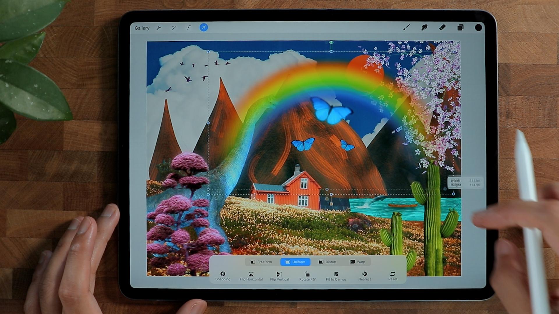
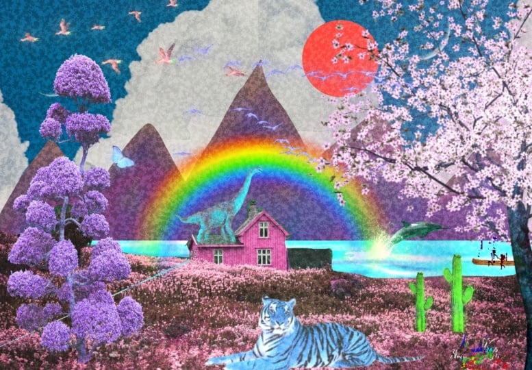
7. Add elements: Alright, thank you, Virginia, and we're going to bring the
landscape more to light. I'm going to go for different
elements right here. So we're gonna put
some trees here and always tablets from our sketch. So as you remember, we still
have the sketch right here. And we'll put some trees and animals to bring the
composition to light. I'm going to add to photo. I'm going to add this nice cherry blossom tree right here. As you can see, there is
no colors at the moment. It's kinda like black
and white color. So to solve that issue, we actually need to
go to the adjustment. Here we go, increase saturation. We're just going to find
the color that we want to. In a second. C gives a little bit of color. And I know it's not
giving any color, but we can, while
we can do here, we can increase and go back again and just increase the
saturation just like this. Go back until you get your perfect color that
you're looking for, then you can just repeat. And I want to put this tree here is to bring
it a little bit life, kind of like a
snippet of the tree. Make it a little bit brighter. So because right now it's
kind of dark on gamma. I'm just going to put
three points right here. And I am just going,
as you can see, it in brighten up
the composition, but it's still like dark. So I'm going to
go for different, I'm going to just
increase the brightness, I think gasping, That's okay. I'm gonna go for maybe bloom to writing it up a little bit. That is just too much. So you can increase
the burn here so the bird controls
how bright it is. So I'm just going to
put a little bit like this and we have something
going on right there. I'm going to put a new layer and I'm going to use to orange to our team right here is
just purely orange and teal. I'm going to put the layer
to this and I'll put mono line brush to create
a soap circle right here. It's kinda like the sun and say it looks like more like a
Japanese Inspired waste. This, I'm going to
put bar animals to board this landscape light
go Insert photo right here. So since we're talking
about out of this world, we're going to take
it to the next level. We're going to insert
like a dinosaur. Okay, so we have our friendly
dinosaur right here. And a second see it doesn't
blend into the background, so we want to create a
contrast because right now it's pretty like it's
all pale solve that. We're going to just call
a graded right here. I'm gonna go hue and saturation. We could probably
saturated or quite a bit, change the color to white, a little bit different,
like a blue. And since we don't follow
rules in this competition, we will just do that. And I think we're going
to make it even better. We can make it bigger
and put it right here. But I think it's too saturated, so I'm gonna go raise the saturation a little
bit just like this. So it doesn't really overpower everything in our composition. But so far it looks good to complete our Japanese
always is garden. I'm going to put like Japanese plants right here and there. So I'm gonna put this one right here just to hide the dinosaur. I think it's gonna be okay. And also to give like a
frame into our composition. And right now at first, it
looks pretty good and not too big because it might cover
up the entire space. But it's kind of blending
into the composition. So I'm gonna make it a
little bit less prominent, but you know,
that's still there. So I'm going to go for, I think motion blur. So it's not really too sharp. Think this is good
and we can actually change the color as well. We can go crazy here. I think this is good thing. I need to put something on our lake right here
because it looked, nothing is going on right there. So I'm gonna put different
elements right here. Flip it horizontally. Not gonna be too big. I'm going to go for motion blur, gives a little bit, you
know, kind of movement. And I want to color graded
to the color of the lake. So we're going to make
it something like this. Think it blends pretty well. And I'm going to
insert another photo. Alright, we inserted
this bullet right here. We're just gonna
put it right here, just to give it a little
bit of life and whatnot. Think that's a good idea. And I'm just going to put
a new layer right here. And I'm going to go for soft brush and we're going to
put it just below the boat. And just put it just like this and even this
one right here, we're going to put a shadow. So it blends pretty well
to the composition. I'm going to re-color the
oceans because it's kinda dark. So what I'm gonna do, I'm gonna go Adjustment
Hue Saturation, make a little bit brighter, so it's a little
bit more vibrant. We're gonna put more
elements as we go along to diversify the plants. I'm going to insert
different plants right here. So we'll be using this
cactus tray here just to diversify the collections of plasma we have in
this composition. So I'm just gonna put it right here a little bit like this. I'm going to move the dolphins and the bar right there
so it doesn't cover up. Duplicate this, so
he's not alone. Just gonna put it right
here, maybe smaller. To make a frame of
the composition, I'm going to insert
a butterfly to give it more like a
movement as well. Like someone is like flying
in this competition. So I'm gonna put it
all over the place, but it right here, maybe I'll put like
three butterflies, like family of butterflies, big one right here. I'm going to apply a filter
which is Gaussian blur. So it's kinda like out-of-focus. And it's giving a story that this dinosaur is playing
with a butterfly. The dinosaur, I'm actually
going to color it to this kind of blue on
top of the dinosaur. Make a new layer but put it below the dinosaur, a
little bit of shadow. I'm gonna be using soft brush. And I'm just going to make
it something like this. And I'm going to blend it
to maybe overlay and make it a little bit something
like this, the opacity. We're good with this. And on the next video, we're going to add
more elements, texture, give it more
life to the composition. So I'll see you on
the next video.
8. Bring it to Life: Alright guys, thank
you for tuning in. While we're going to do here, we're going to make
the composition a little bit more dynamic, so it doesn't look
like it's flat. So I'm going to put clouds
so high in those mountains. So to do that, I'm going to insert a
photo and I'll be using this clouds behind
those mountains. So I'm going to put this cloud behind all those
mountains right here. And a chicken C gives seeing is, it's giving you a good vibe. The clouds is being a
little bit more life through decomposition. I can actually stretch
this one right here, but I don't think it
looks good to retain Also like those blue
color on the background. I'm going to duplicate
this one right here. And then just position here. Actually I'm going
to flip it and just connect dose
cloud right there. And I don't even
see the difference. I'm just going to merge them
together, those two clouds. And there's kind of like a theme that is
being billed thing. We could use a clone
tool right here. So clone right
here, right there. And we can start this
circle right here, is gonna be your navigation where the chlorine is gonna be. So if you've pointed
right here and you start to paint
right here to draw, it's going to copy
what's on that circle. If you go more like this is just going to
blend it seamlessly. And right now we just fix
that, make it bigger. I think we're good. I just need to move the
mountain right here, this big one right here, because I think it's pretty big. And I want to show and also
the small one right here. I'm going to move it bigger. To add more movement or like more dynamic
to the composition. I'm going to add more
birds right here, and I think they're perfect
with the composition. We're going to color
grade it to thing. We're going to find color
that is out of this world. Yeah, I think I like
that color saturated. And so it goes with
this color right here. I'm going to go
ahead and go bloom. It looks more ariel, dreamy and all that
can also going to apply Bloom effect
this tree right here. And let's see if I can
create a little bit of bloom just to make it more
life to decomposition. Let us apply Bloom to
the cactus right here, like this as well. The domain focus mountains loom probably to the
dinosaur as well. So bloom, very, quite stunning
to the butterfly as well. So as you can see here,
something like this. I think it looks great. I'm gonna probably apply
it to the river as well. That's kind of too
much to make it more lively and
more fun and more. I'm going to put a rainbow. You can see the
rainbow right there. We're just going
to make it bigger to fit into the composition. Actually, I'm gonna put it below those mountains right there,
decrease the opacity. Alright, so I think we're
pretty good in here. I'd probably put
more texture here, so you're going to put
more layers right here. I'm going to drop
the black color. And I'm gonna go for noise. I'm going to add a little
bit of noise just like this. And I'm probably going to blend
it to probably hover lay, and I'm going to
decrease it quite a bit. So the brand pretty
well with the noise. Alright, so I think
we're good to go here. You can add more
elements if you want. But this graded and you Japanese inspire landscape
with all the mountains. A world that has a lot of life and different techniques
that we used here, draw the mountain right there to make it
our own mountain.
9. Closing: Thank you!: Hey guys, welcome back. This is actually the
end of the class. And thank you so
much for spending the time with me and
watching this class. I really appreciate it and I hope that you learn something new and inspire you to create
your own digital collage. And I can't wait to see
what you come up with. And I'll be happy to see
your beautiful project. If you have any questions. For clarification,
feel free to send me a message on the
discussion panel down below. For sure I'll get
back to you and I'll see you on the next
class. See you there.
 Bryan C'ngan, Graphic | Web Designer