vagabond wallpaper
cause i was bored i made this on canva
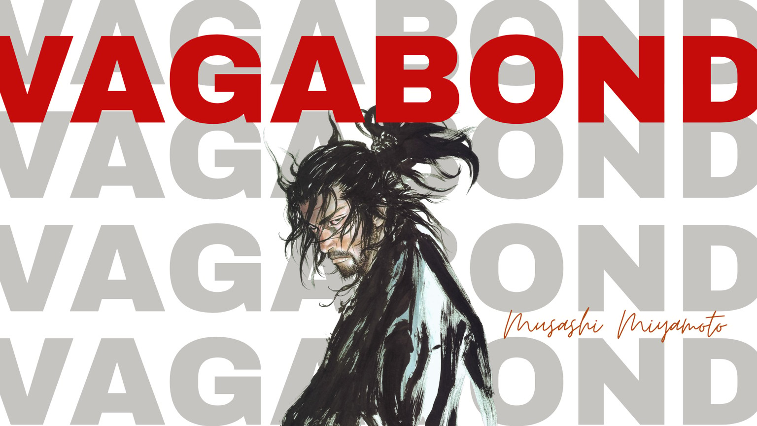
How the design principles were used:
Hierarchy
I used hierarchy by making the word “VAGABOND” the largest and boldest element in the design. Its bright red color and placement at the top ensure it is the first thing the viewer sees. The character illustration comes next in importance because it is centrally placed and highly detailed. The handwritten “Musashi Miyamoto” text is smaller, so it acts as secondary information.
Contrast
Contrast is used strongly through color, size, and style. The bright red title stands out sharply against the white and gray background. The black, ink-like illustration also contrasts with the soft gray repeated text behind it. There is also contrast between the bold sans-serif typography and the thin handwritten script, which adds visual interest.
Repetition
The repeated gray “VAGABOND” text in the background creates rhythm and consistency. It reinforces the theme of the poster and helps unify the whole composition. This repetition also gives the background texture without needing extra graphic elements.
Balance
The design uses asymmetrical balance. Even though the figure is slightly centered and more visually heavy, the large title stretching across the top and the repeated text in the background help distribute visual weight evenly. The signature text on the lower right also helps stabilize the composition.
Alignment
The layout feels organized because the text elements are placed intentionally. The large title runs horizontally across the top, the repeated background words align in a structured pattern, and the character is positioned to overlap these elements in a controlled way. This makes the design feel deliberate rather than random.
Emphasis
The strongest emphasis is on the main title and the character. The red title creates immediate impact, while the character’s face and flowing hair draw the viewer’s eye downward into the center of the composition. This keeps attention on the most important parts of the design.
Movement
The design creates movement through the character’s hair, pose, and the layered composition. The viewer’s eye starts at the red title, moves down to the character’s face, then across to the handwritten name. This visual flow makes the poster dynamic.
Proximity
The title, background text, image, and signature are grouped in a way that makes them feel connected. The handwritten name placed near the character helps the viewer understand that the text relates directly to the figure shown.
White Space
Although the composition is bold, the white background provides breathing room. This prevents the design from feeling overcrowded and allows the title, illustration, and background typography to stand out clearly.
Unity
All the elements work together because of the limited color palette, repeated typography, and expressive illustration style. The red, gray, black, and white color scheme keeps the poster cohesive, while the typography and image support the same dramatic tone.