kaleidoscope mandala
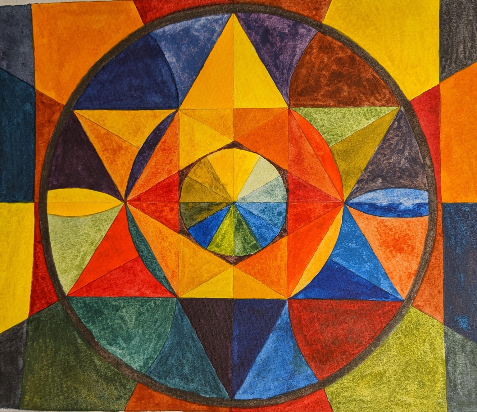
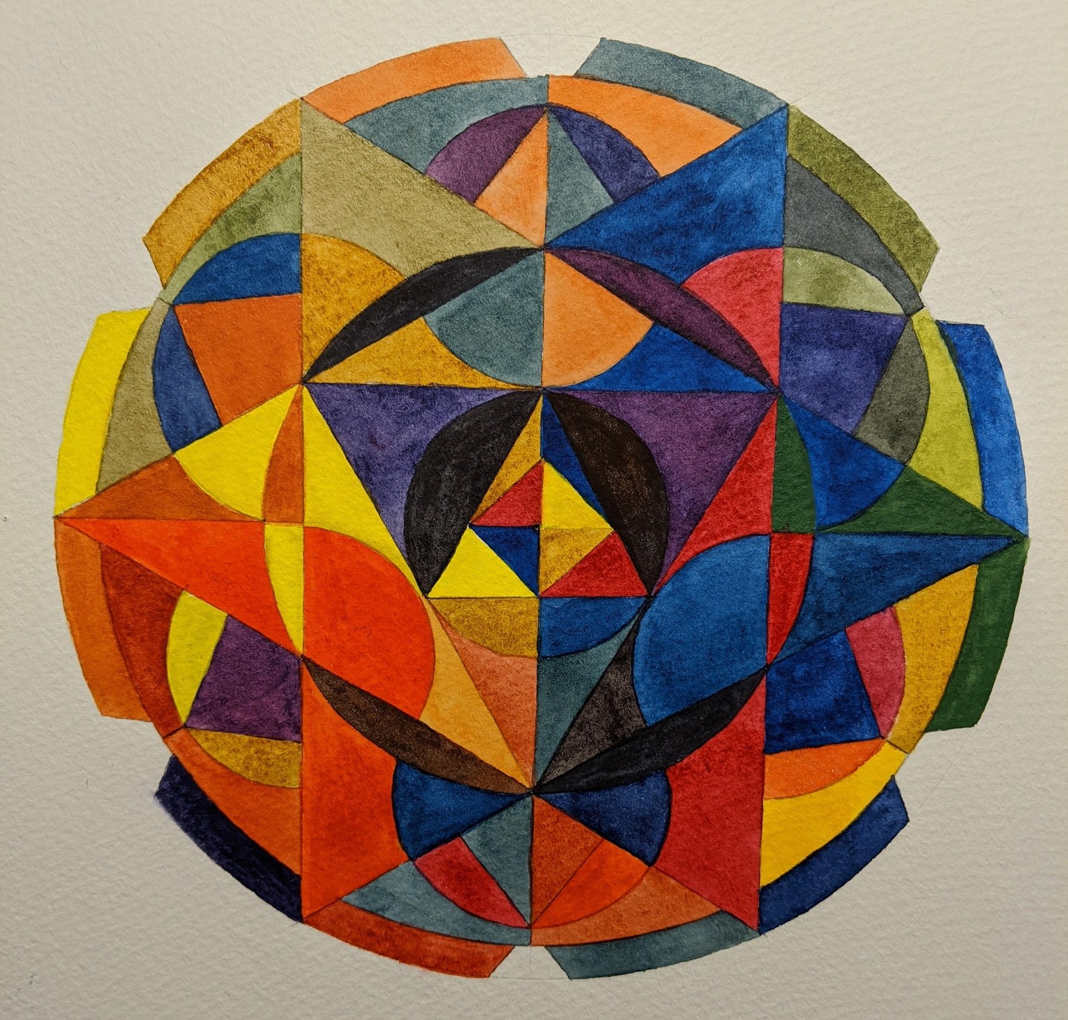
The paper I am using doesn't make for a smooth wash...it's a Bockingford Fat Pad, but I like the texture of the paper for experiments. BTW Chris Carter, I ordered some Rives BFK paper and it is stunningly crisp vibrant color when it is dry. I'll post that later. I sure would love another Mandala class. The class on your website is really good and I'm enjoying Skillshare.
Mandla with warm analogous colors with payne's grey as the only cool color on rives. Clear, bright color.
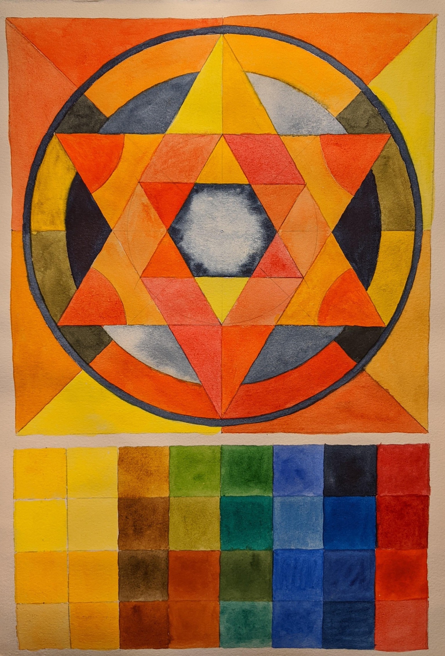
Serrated mandala with six colors: mind bender to paint. nickel titanate yellow (DS) - ochre (WN) weak color! won't use this paint for this purpose again - cad red light (DS) - permanent rose (DS) - Prussian blue (Schmincke) - Phthalo blue RS (DS). I didn't realize how close in chroma the two blues are. this project drove me a little nuts to paint. I also had the pinpoints of white on the first wash that have never happened on other projects. It was with the Schmincke Prussian blue and other mixes with that paint. hmmmmmm. I threw myself a bad curve when I finished the center with that square. it made for confusion, but I perservered!