Vintage-Inspired grape-hyacinth
Hi there! :)
Absolutely loved your new lesson! You totally convinced me to try out mix-media technique instead of pure watercolours, and I must admit that I enjoyed a lot both creating process and final result.
------------------
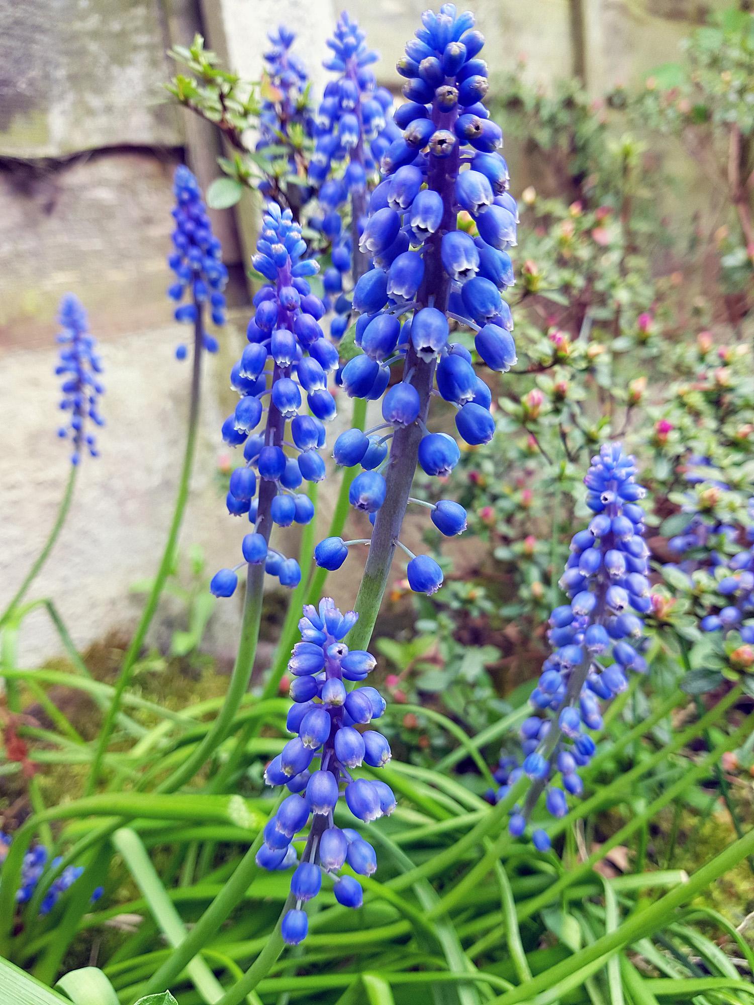
I made those references couple of years ago, right after moving into new house. These cute flowers were all over the place in our backyard, so I took few pictures just in case, without solid plan what to do with them. And now, after taking your class, idea of this illustration came in my mind.
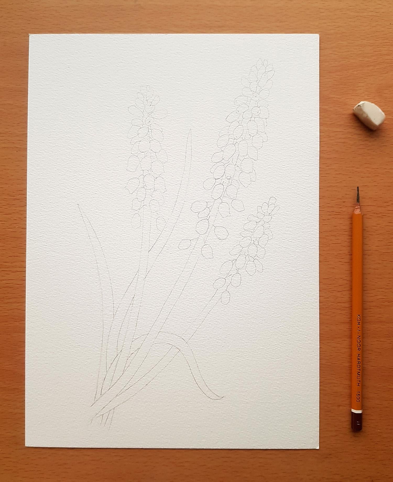
Pencil sketch wasn't too much detailed, I only put all these tiny bells in place.
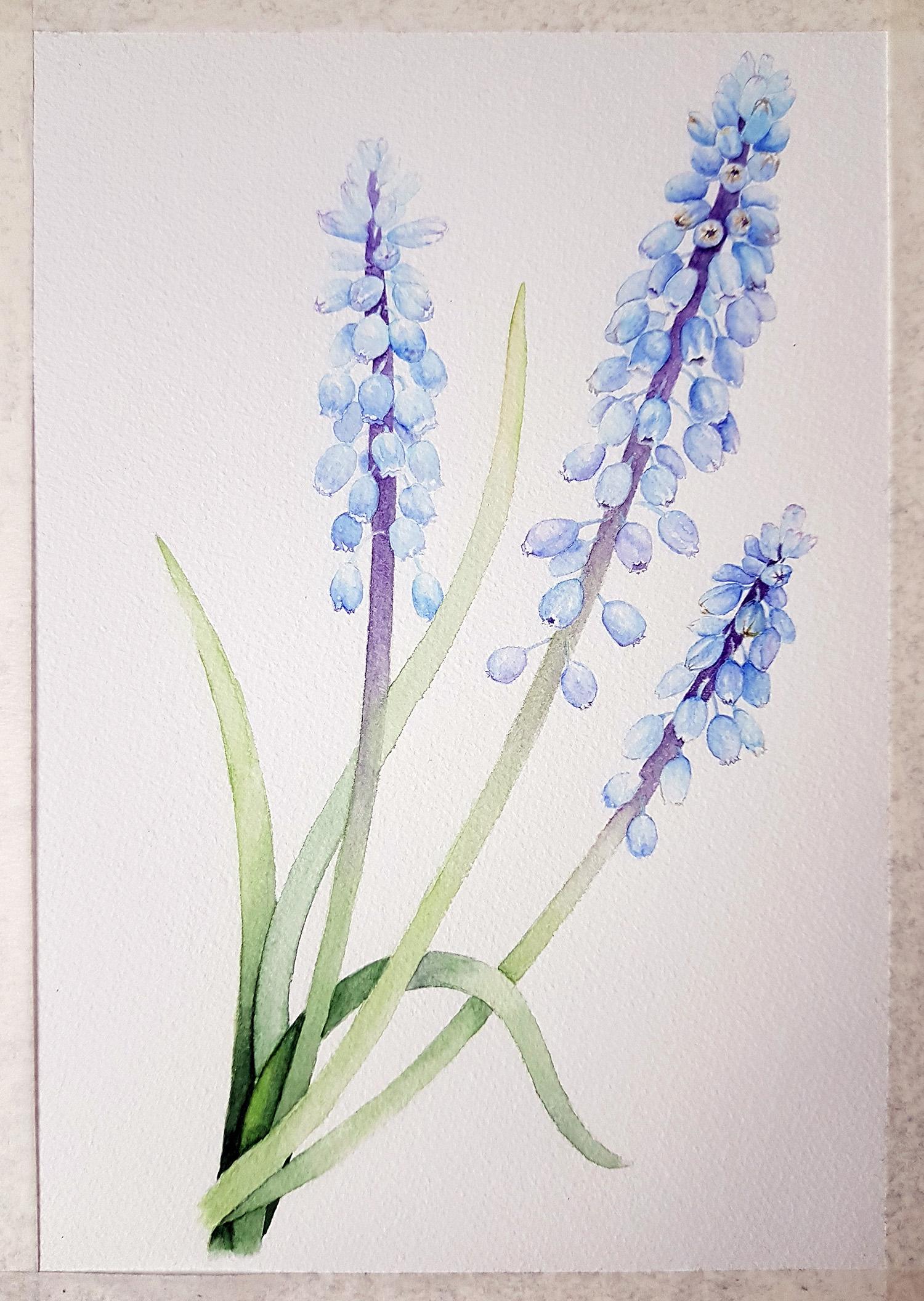
I'm pretty sure it was first time ever, when I used only one watercolour layer :) Under-painting turned detailed enough but very delicate colour wise, which I really liked and decided not to overwhelm this illustration with lots of layers and moved right to pencils.
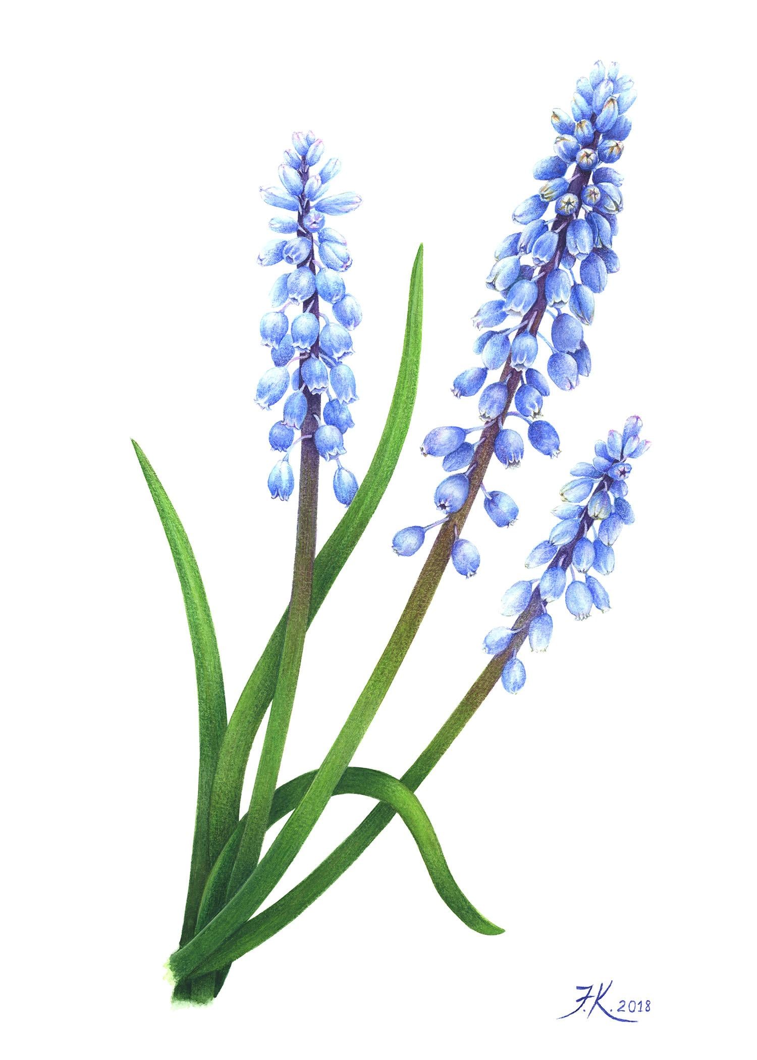
And this is scan of finished work. To my taste, illustration looks much nicer in real life, because you can see texture of cold pressed paper together with velvety finish of the painting itself, created with coloured pencils. It was pure pleasure to work again with unreasonably forgotten media and I'm also very pleased how this piece turned out in the end. Thank you Kendyll for this great experience! :-*
Materials used:
1. Cold pressed water colour paper, Winsor&Newton, 140 lb., A4
2. White Nights and Sennelier paint sets
3. Koh-I-Noor Mondeluz water soluble pencils and Faber-Castell regular coloured pencils