Value Study Kitty Palette
What a fun little class on color value! I already had a vague understanding of value but I wasn't really sure how to use it. I had NO IDEA about intrinsic value and that a color's position on the color wheel ALSO plays a part in its value - it's not only about how light or dark a color is.
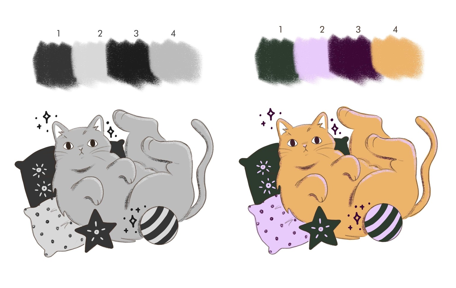
i made two versions of the color study - first I followed along with the mystery project (orange cat). I was so surprised by the bright lavender highlights! I would have never thought to use a purple hue to highlight an orange object. I tend to do my highlights and shadows in lighter/darker (or slightly analogous) versions of the base color but now I'll be experimenting a lot more with complementary colors for moor *oomph*.
second, I tried my hand at making my own color palette based on value (blue cat). Obviously I couldn't make it a true mystery but it was still fun to choose colors I like and then see how they behave with each other when the saturation is completely removed.
I'm excited to start paying attention to and using color value in my own work!