Simplification of the space.
I picked this example because it isn’t very easy or very obvious how and why it could be a problem.
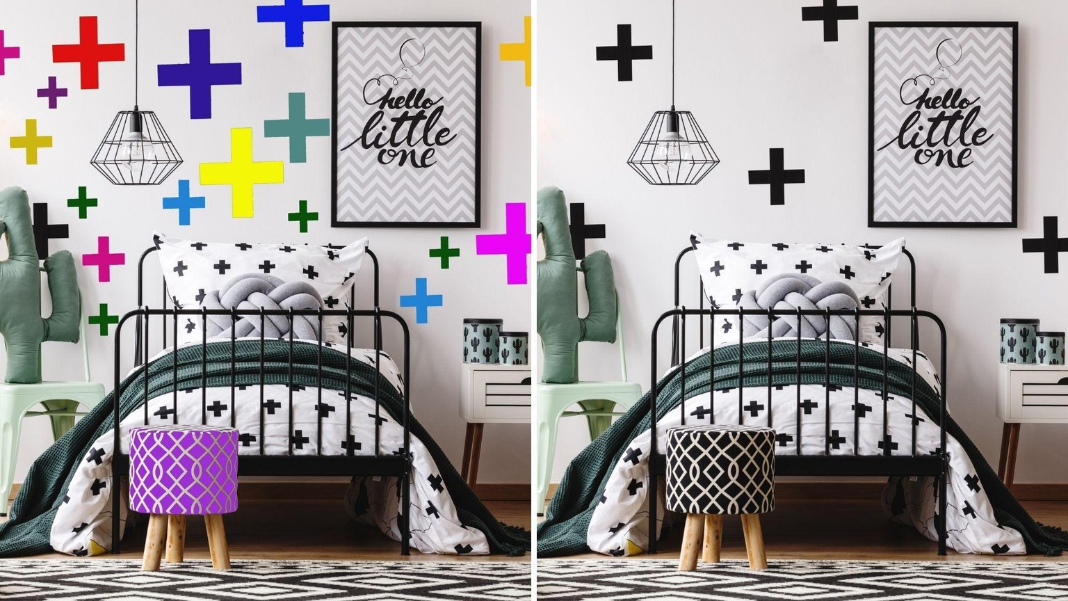
In the first photo, there are many mismatching colours and the crosses on the wall are each an individual size. This is problematic because it makes it hard for us to perceive the wall as one unit. Our eyes shift from one cross to another with no clear focus on where to stop. Our attention is attracted to both big crosses and small crosses in warm colours. The space feels noisy.
In the second picture the space gives a feeling of more calm for the following reasons:
- The crosses on the wall are each equal sizes and all black which makes us perceive the wall as one item. Because the bed is also covered in black crosses it makes us feel like the bed and the wall are from the same family. It is the same effect as when you are watching a mother leopard and a baby leopard. You can attribute the different spot sizes to each animal but at the same time see the two animals as part of the same family. This simplifies our understanding of the room. The bed and the wall are one family.
- There are fewer crosses on the wall than in the first photo which again, makes the space less cluttered.
- The number of different colours in the space is less than in the first photo. Besides black and white there is only one accent colour which is a dusty green. This makes the space look simple. It does not stimulate our attention too much. In the first photo, however, all the saturated warm colours make us feel more excited and more alert.