Sample Project
There are MANY ways to improve the same presentation, and here’s my take on the title slide!
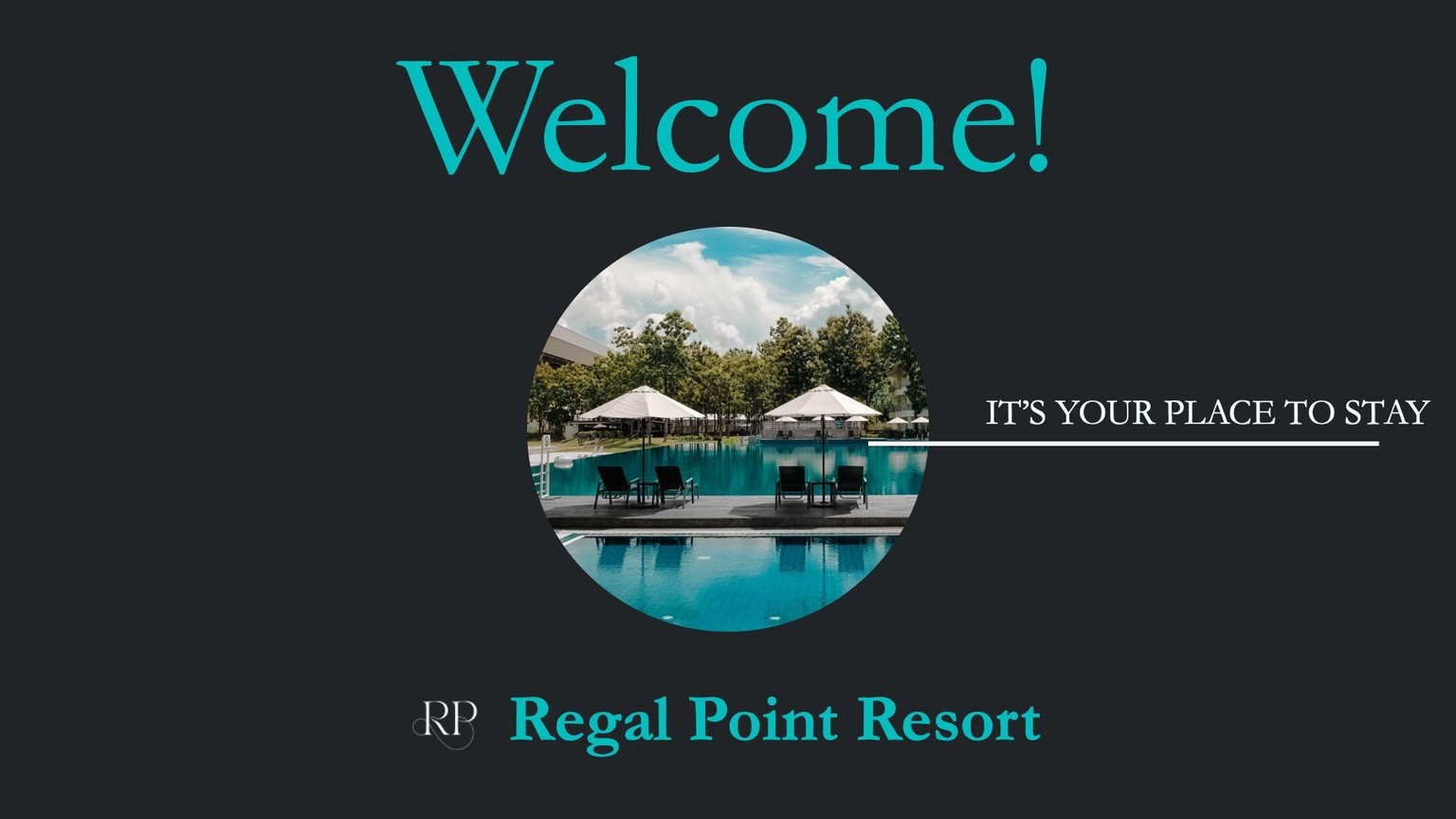
First — I took away “Welcome!”
 I asked myself “are you sure we need everything here?”
The “Welcome!” was way too prominent and stole attention away from the information that's actually important, like the resort name, so I took it away.
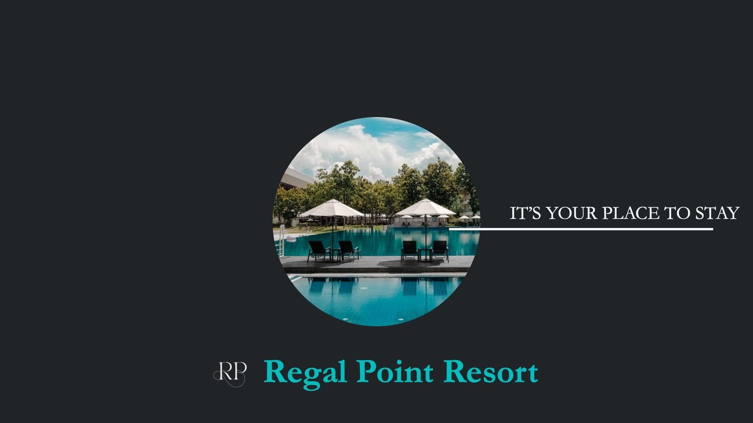
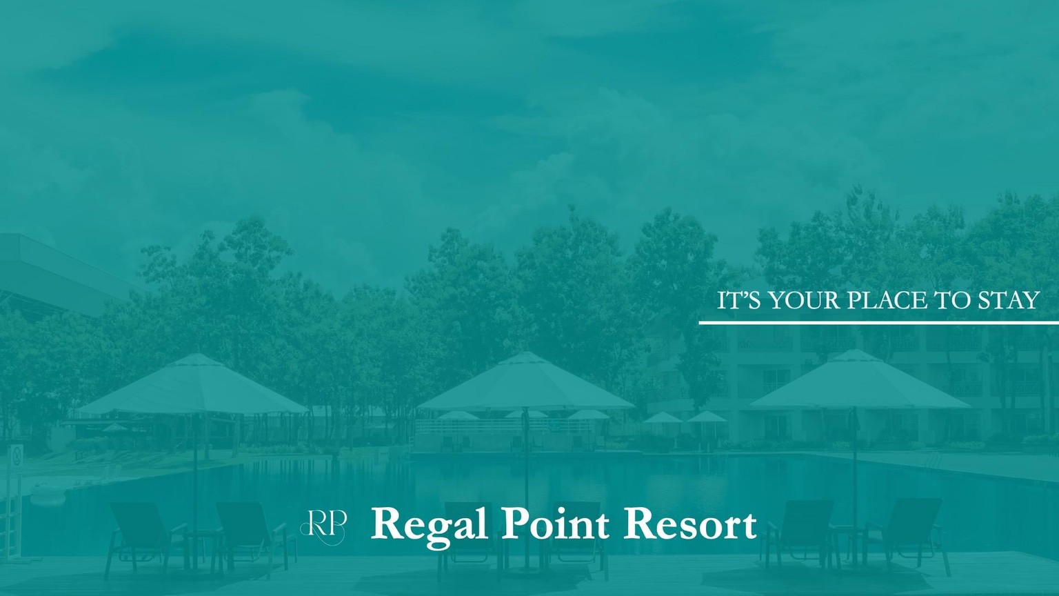
Second — I changed the emphasis to the brand colour and resort photo.
 Since this is our title slide, I wanted it to stand out without adding unnecessary elements.
By I wanted my audience to feel immersed in our brand, so I emphasized the slide with colour.
Third — I put more focus on the logo and tagline.
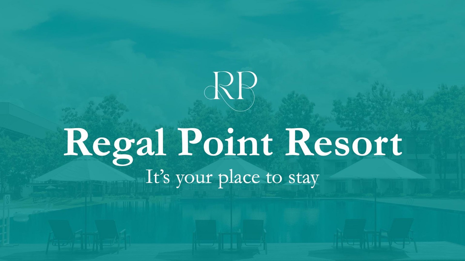 Now that we’ve created more space, we can bring more attention to the tagline and logo, which are the information I want my audiences to recognize.
Again, there’s no right or wrong ways to improve these slides!
Let me know what works for you, and I can’t wait to see all of your ideas!