Responsive Personal Portfolio Website - Using HTML, CSS & JavaScript
Figma wireframe: Using the file provided I modified it to suit the project that I wanted to create. This included unique styling and layout.
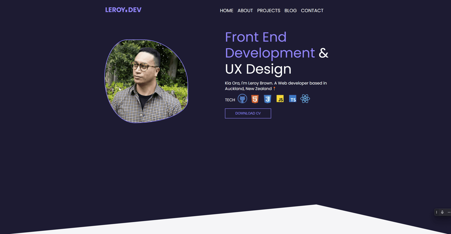
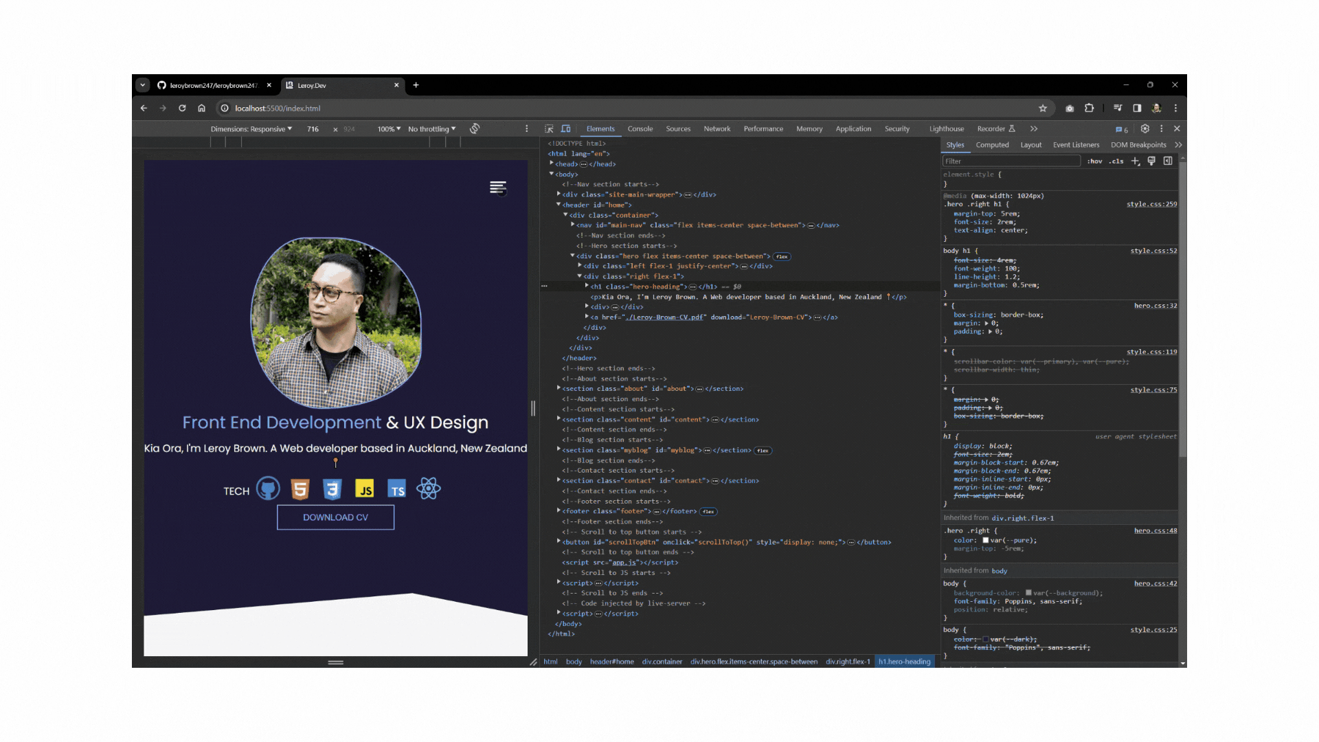
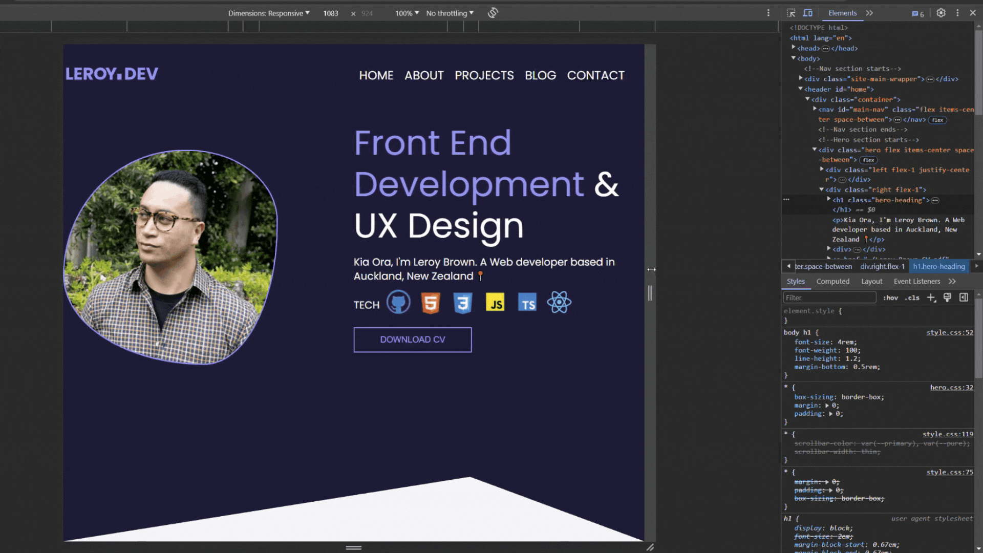
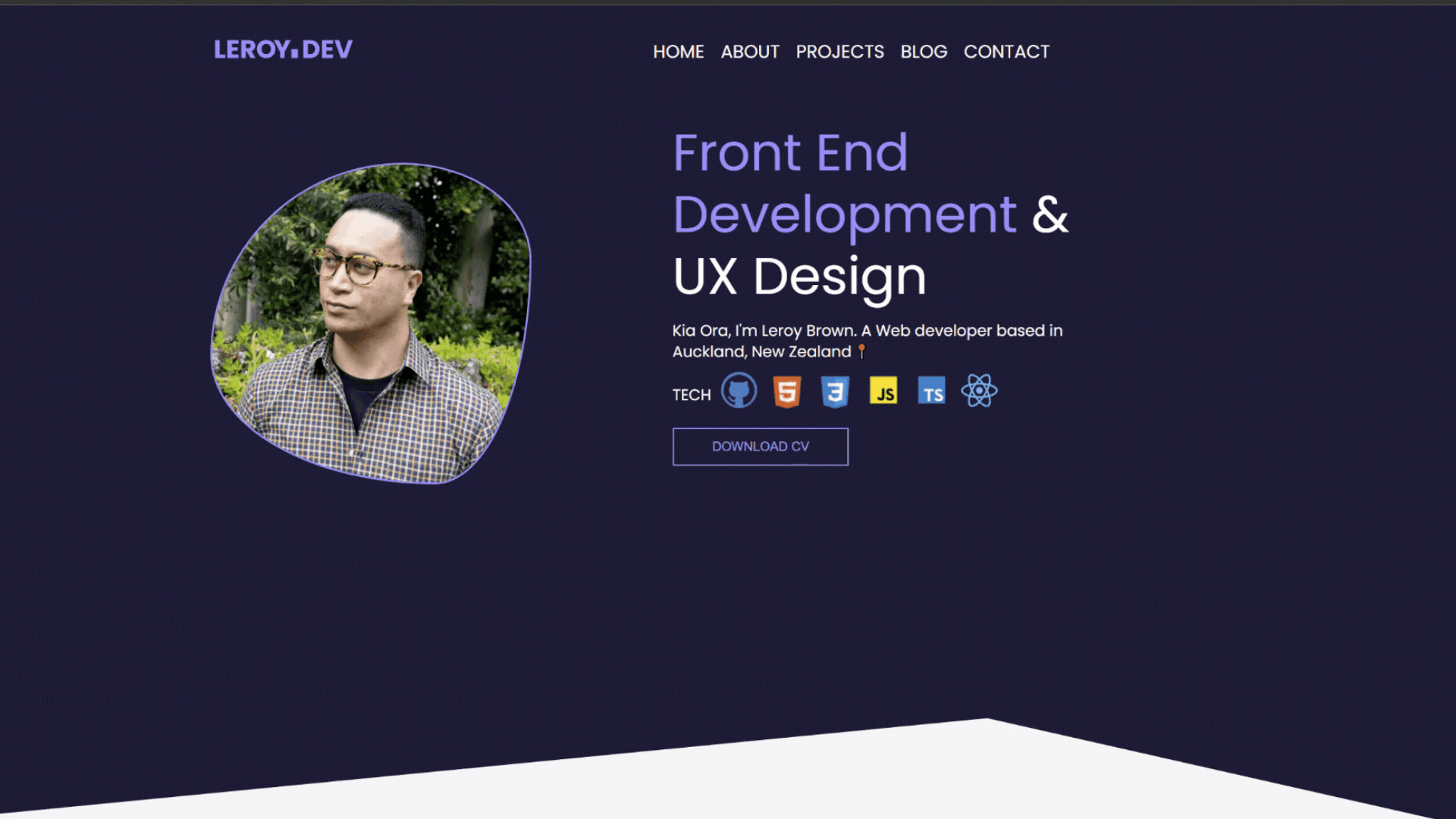
Hero section: I added some icons in this section to further define my particular skill set. I also added a updated version of my CV.
About section: In this section I added my particular social media icons which I created in Adobe Illustrator and refined in Figma. Also adding a expanding and collapsing text section which is explained further into this project.

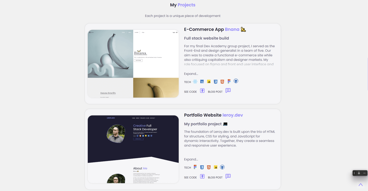
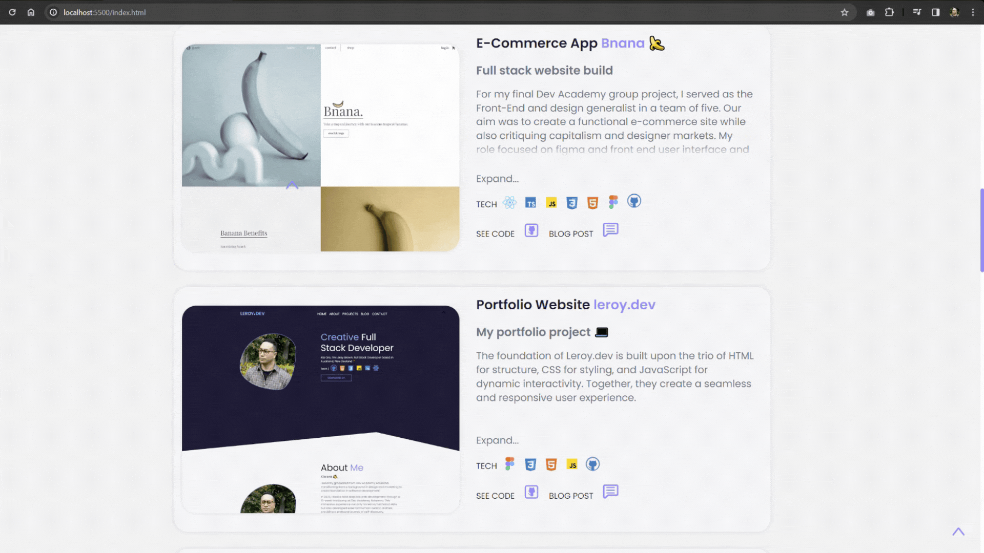
Projects and skills section: This section not only displays recent projects but also short description to each project. Also displaying the technologies used in the particular project. I have also added links to the Github projects and corresponding Blog Posts.
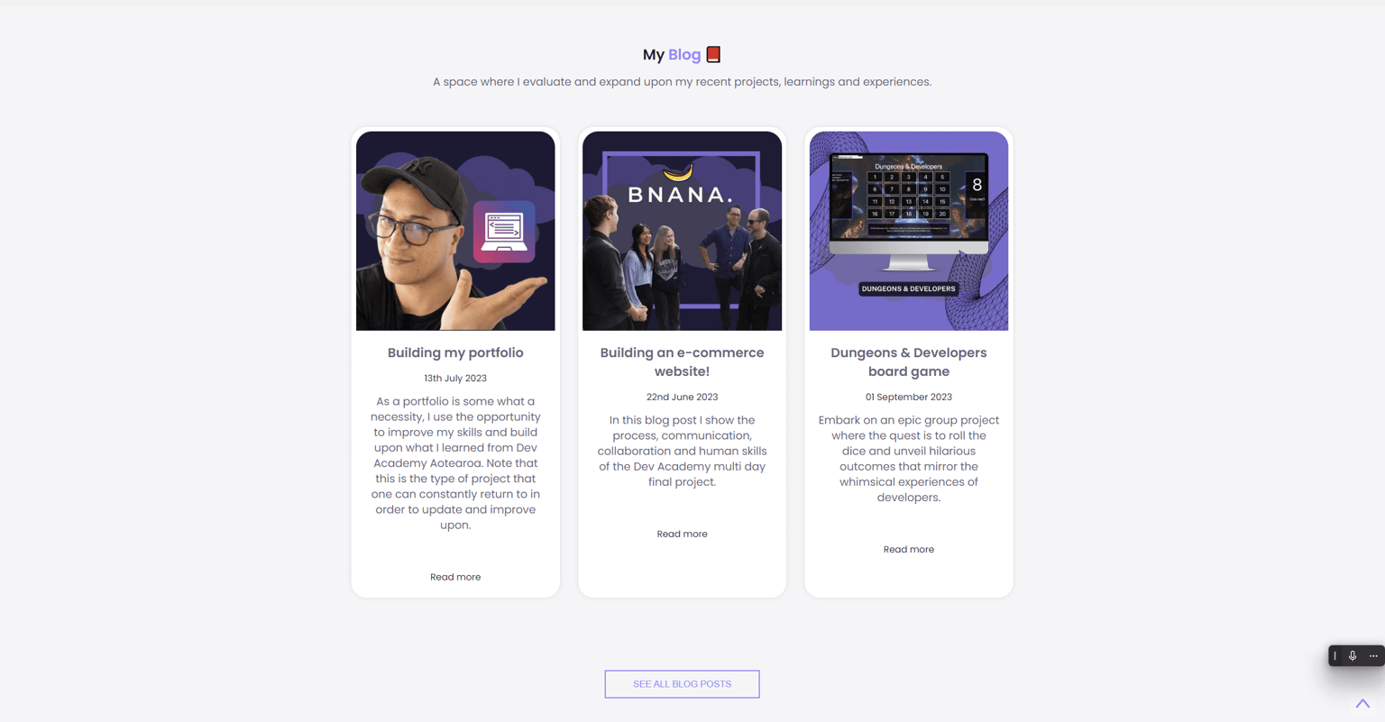
Blog section: My blog will redirect to a page that displays all the blog posts I created for this project. Also being able to directly link to each particular blog.
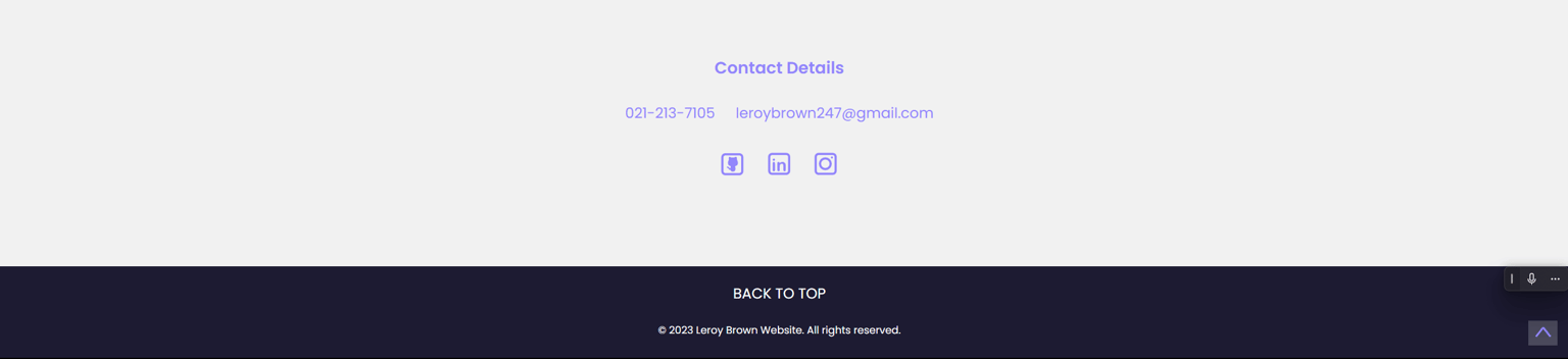
Contacts and footer section: I chose to keep my contacts and footer very minimal. I feel this make the User Experience simple and user friendly.
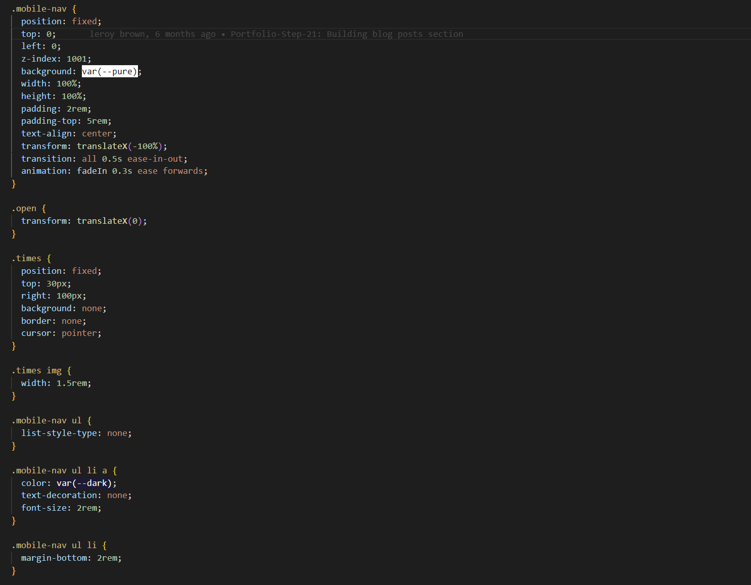
Responsive mobile navigation: The responsive navigation was a challenge to get correct but was definitely a value experience and i now feel confident in building responsive elements.
 CSS example:
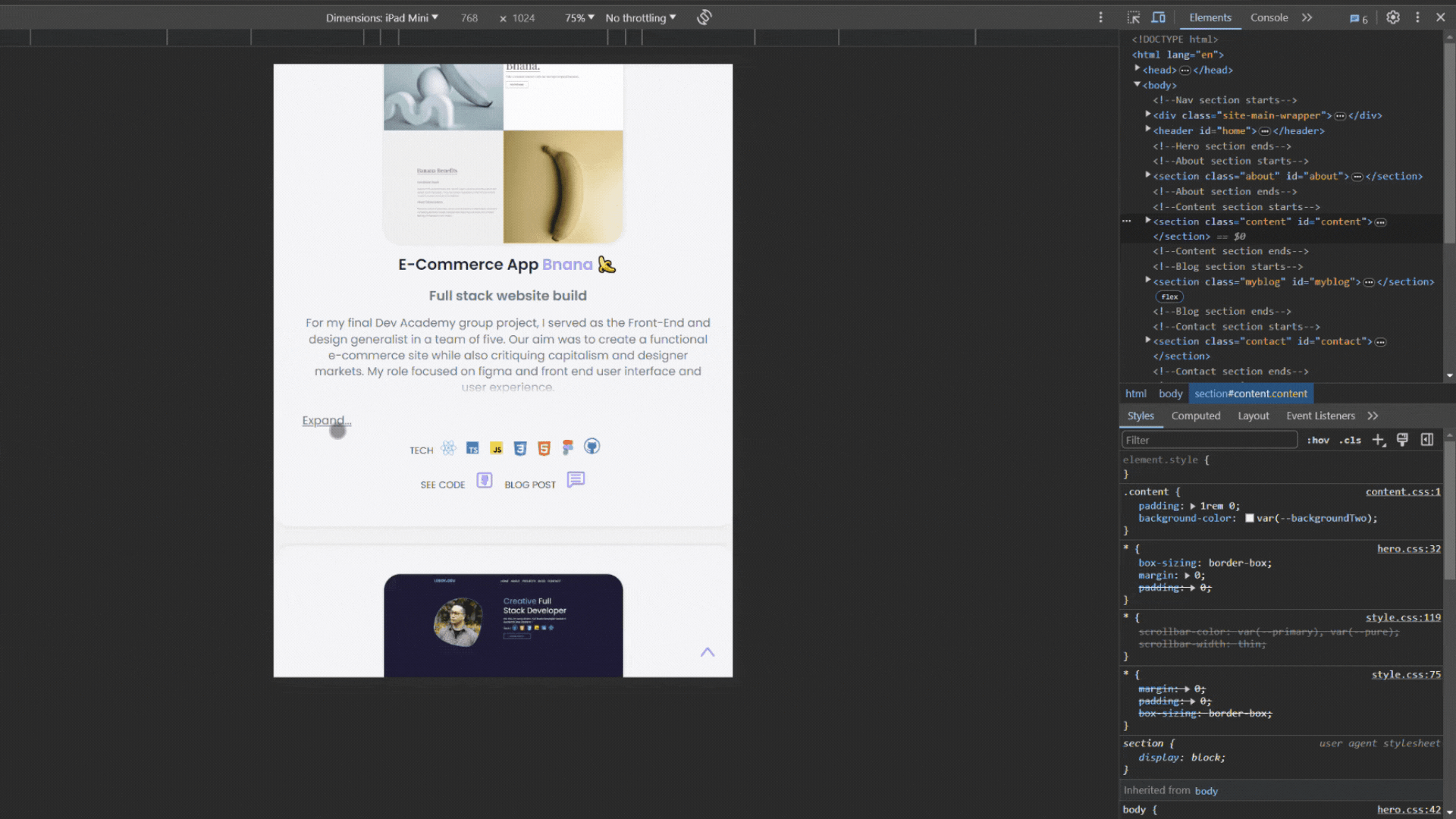
Responsive design: Over all responsive design is not as simple as one may think. As some one that considers user experience it can be easy to miss fundamental design concepts. For example styling and layout decisions should be considered in the wireframing stage of your project in order to avoiding doubling back to fix potential mobile version errors. Note some seem to be unavoidable and only identified when building your responsive elements.
Stretch material:
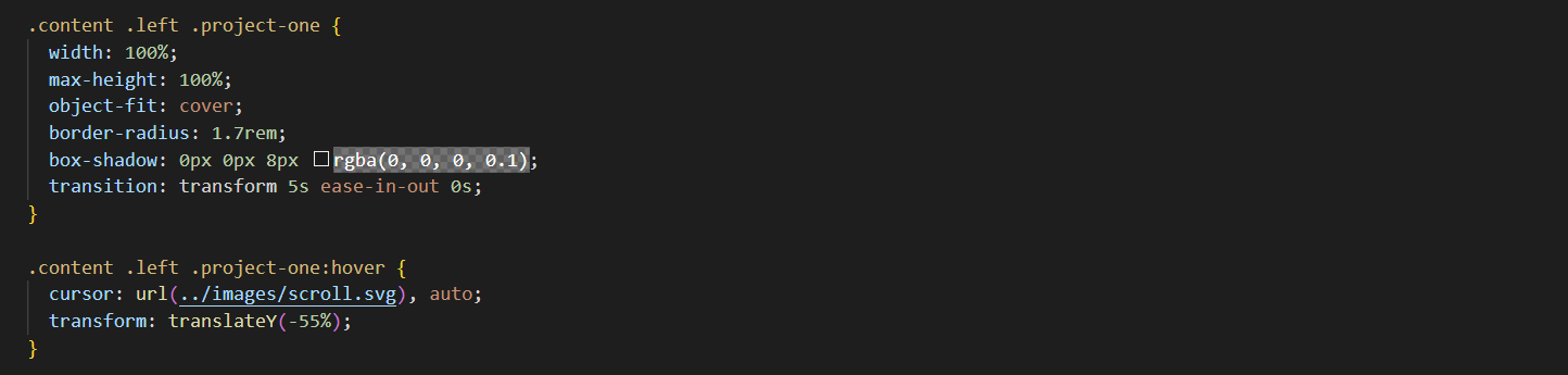
Animations: I created a animated image border, Note that this may not work in all browsers. The current browser is Google Chrome.
Hover state image scroll: By adding a hover state this image will automatically scroll the full length of the webp image within in bounding box.
CSS example:
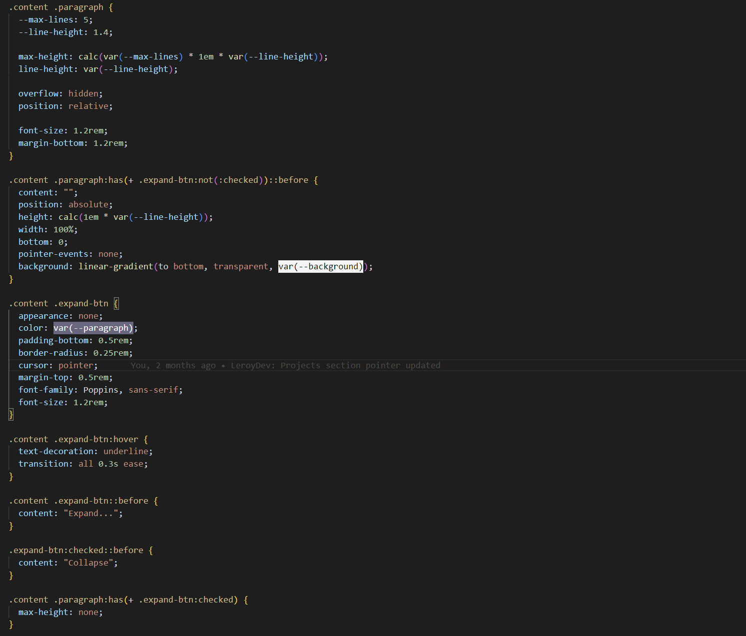
Expanding and collapsing text: I wanted to implement this feature in order to tidy up the user interface for this project.
CSS example:
Final thoughts:
I really enjoy using this basic yet fundamental tech stack. I find it super reliable and stable. The downsides do include having to use repetitive code throughout the pages in the project. Such as my navigation, contacts and footer. This seems redundant for larger projects and I can see the benefit of using tech and libraries such as React making it easier to manage your project and easily making changes simpler to implement.
This project was valuable for me in order to develop my HTML, CSS and JavaScript skills. If you would like to explore the project in GitHub please click the link.