My Old Logos!
For my class project I actually added a video (lesson #13) explaining my project and what I'd change after taking the class.
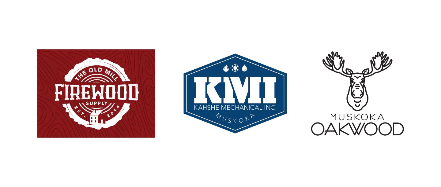
I mentioned this in the video, but it's always hard to show old logos and not nitpick them to death. But it is helpful to look at them and see what else you've learned along the way. So try and pick a few that aren't too embarrassing, but also are not your best work. Here are 3 of mine.
However, here are some notes:
The Old Mill Firewood:
This logo is a bit too busy and it is trying to accommodate too many ideas. I'm trying to show the wood being cut, as well as the house, and even the wood grain background, it's just overload. If I were to make it now, I'd likely remove the house altogether.
KMI:
The font weights in this logo are too drastic. I have a very heavy black stencil font for the KMI, and then all the small text is regular or light and is actually hard to read by comparison. It's just way too thin.
Muskoka Oakwood:
I explained in the video that there are some thing happening with the fonts. Also, I'd need to heavily simplify the Moose. The eyes and eyebrows fill in at small sizes and the antlers are too complicated.