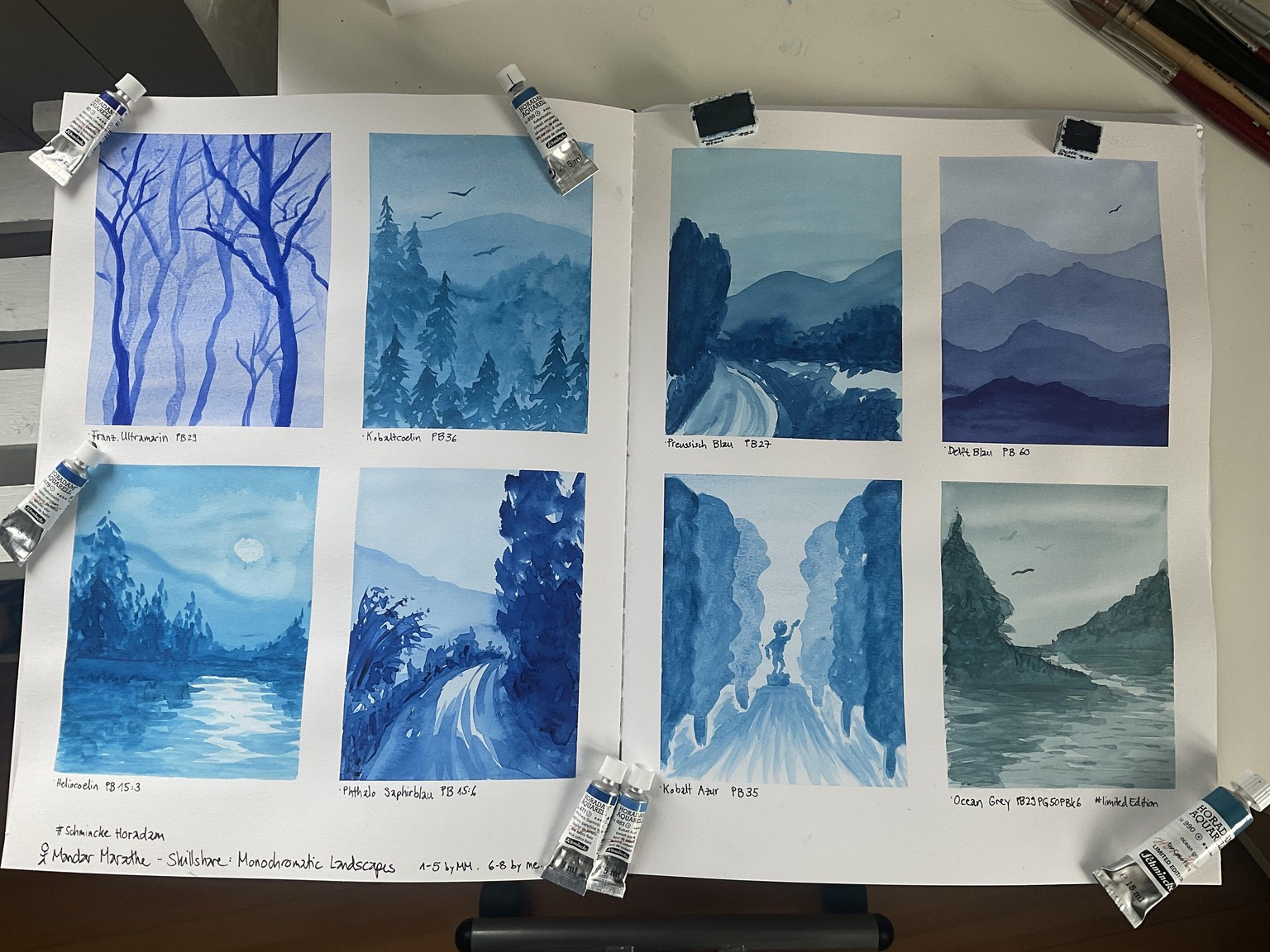
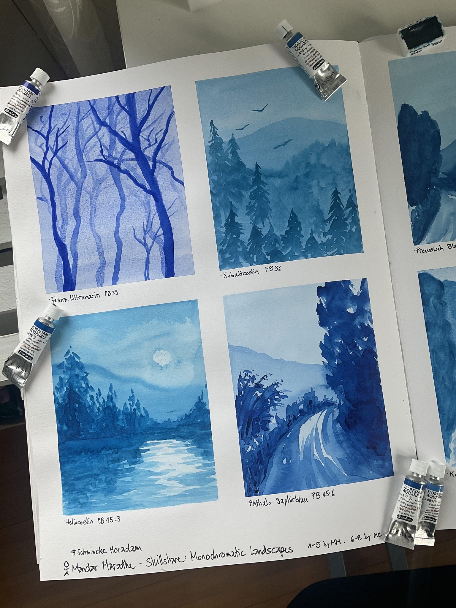
Monochromatic Landscapes #Watercolour
I really enjoyed this class! Thank you very much :)
In every painting I used a different kind of blue. "Delft Blue" was the colour that I loved the most! It's very deep and "kind" at the same time!
All colours are by Schmincke Horadam.
As I didn't want to leave the pages with blank spaces, I came up with three additional compositions.
What I learnt in this exercise:
- Being able to paint a monochromatic landscape is awesome for beginners but for intermediate painters too. As it's purely about values, which are one of most important factor of a painting, you'll learn alot about this!
- I forgot to leave out the moon as well. Unfortunately when I wanted to suck up the paint with a cloth, I pressed and turned at the same time - so the paper became bruised. #facepalm but of course I'll learn from this accident :)
- Birds are a super fun element to make a painting more alive and vivid
- Delft Blue (right page, at the top on the right) is a stunning colour... It leans a bit towards violet, maybe that's why I love it so much!
- Kobaltcoelin (left page, at the top, right side) and Heliocoelin (left page, at the bottome, left side) are almost the same...
- Ocean Grey (right page, at the bottom, right side) is a limited edition colour. It has 3 different pigments in it and when the colour dried, you could see how they separated. I didn't like this much.
- The first layers dried very quickly, whereas the layers later needed more time to dry. It was fascinating to observe this.
- Being brave and try out my own ideas