Mandala Project 4
The challenge to use 6 primary colors goes on! I am finding again that I have to remember that learning, in particular, has a very awkward teenage stage where I don’t know if the design will work of not. There is always the impulse to leave it and start over. Perseverance and patience are key, as well as trusting in the creative muse to bring things through in the end.
Here is the first mandala. Colors used (I ought to know this by heart now):
Yellows: W - Iron Oxide Transparent, C - Azo
Blues: W - Ultramarine, C - Prussian
Reds: W - Vermillion hue, C - Quin Red
I decided I was going to follow the design for the first one that Chris had done. I got almost to the end when the “customization” took over and it was transformed into a whole different design. : )
What I learned...for the first time in looking at the chart I did of the colors I was using, I had a little aha moment of what it means to pick a palette and know that it will be harmonious. This was pretty exciting, I have to say.
I tend to be drawn to saturated colors (thanks for the opposite word to neutralized - or at least it seemed to be the way that you used it) but now I am starting to have a bit of a love affair with neutralized colors. This image is a bit washed out. I will see if I can get a better one and replace it.
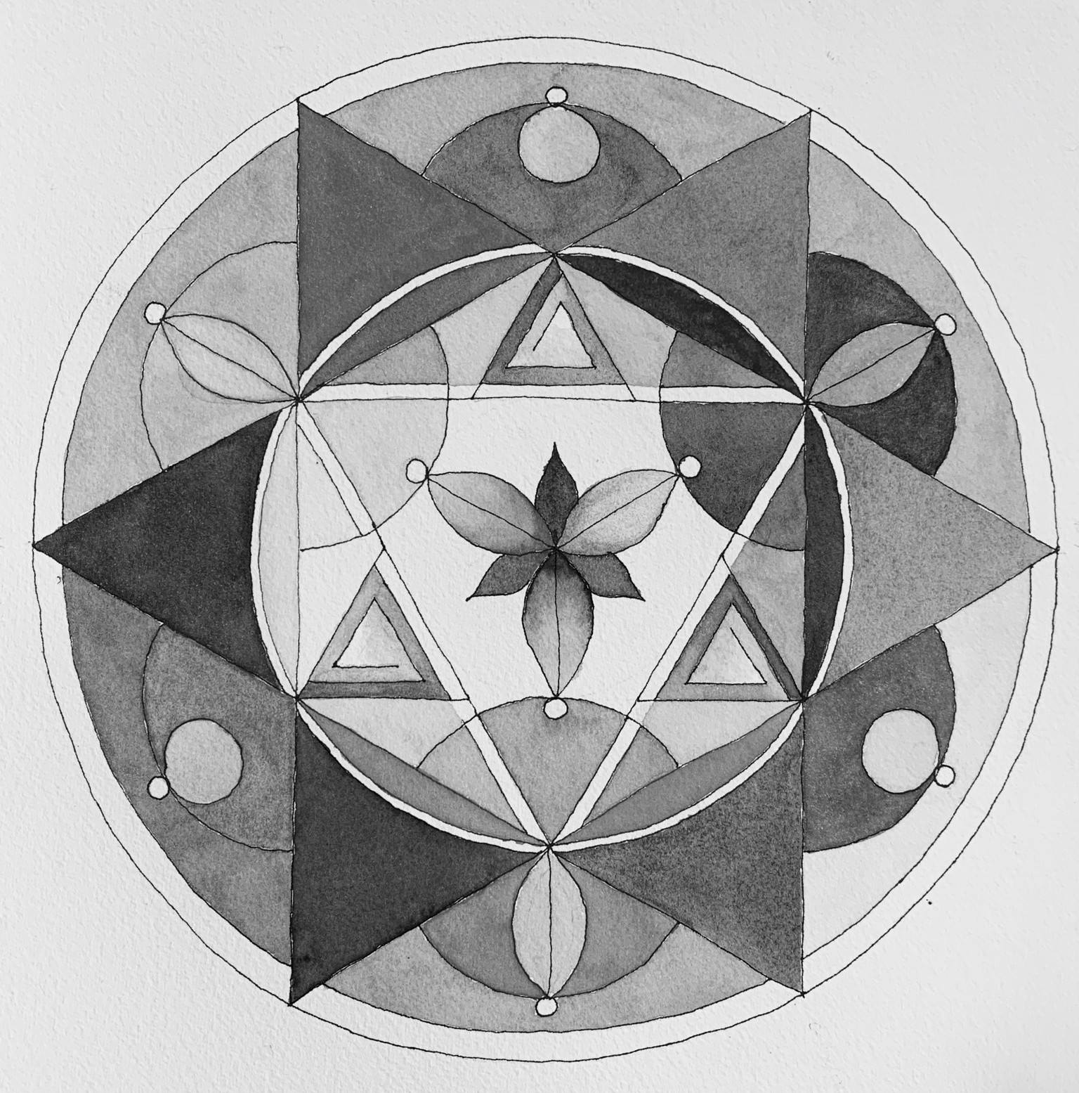
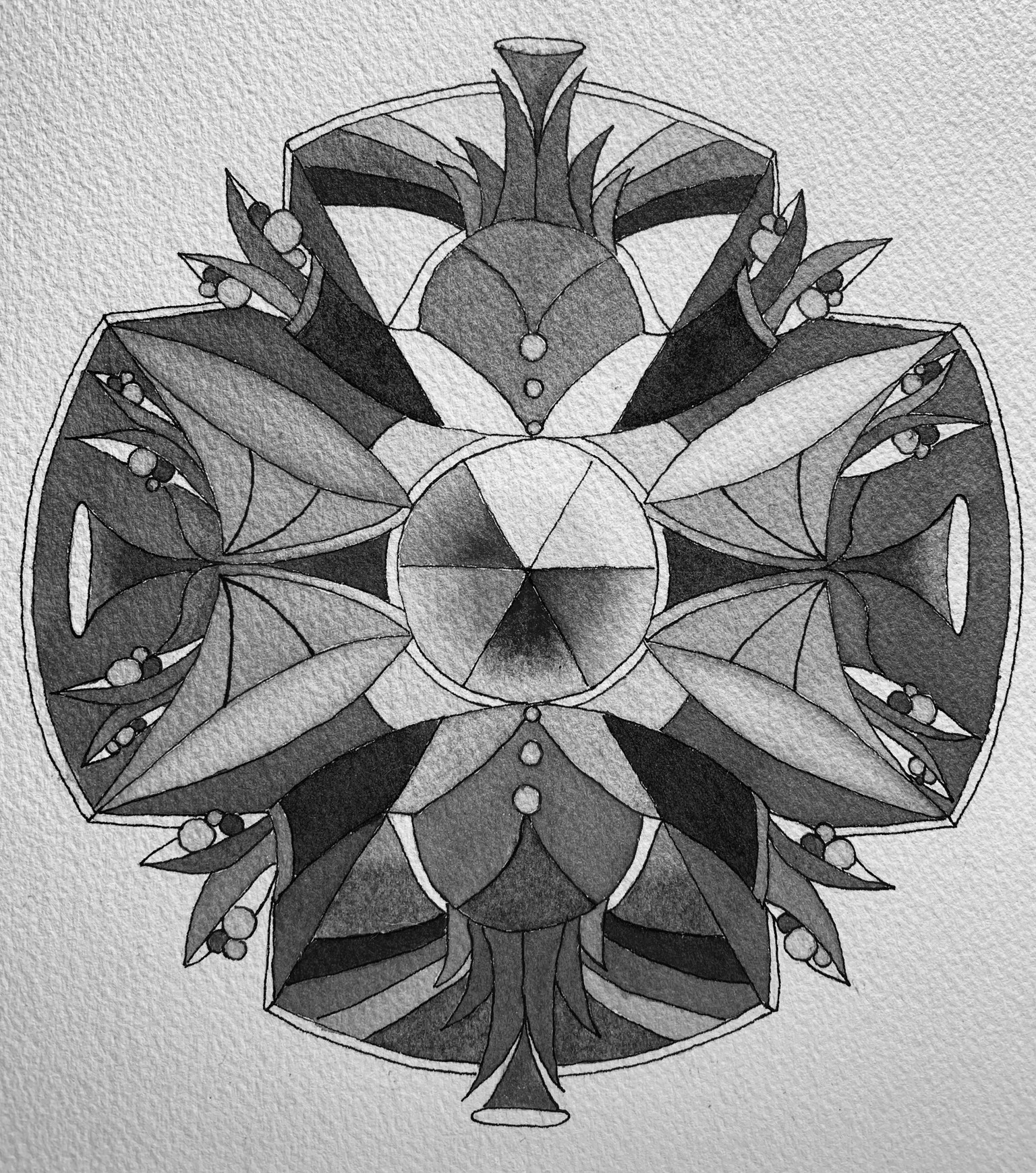
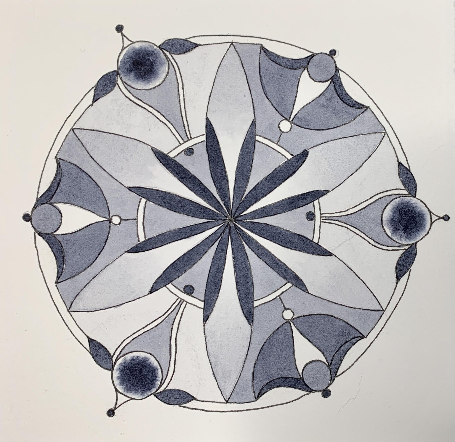
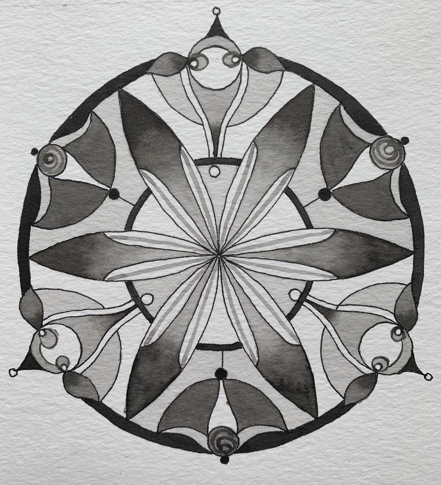
I also am going to do a grayscale and post it. Still contemplating if the outside element going around the circle needs to stay white or get painted. Jury is out so I am posting it.
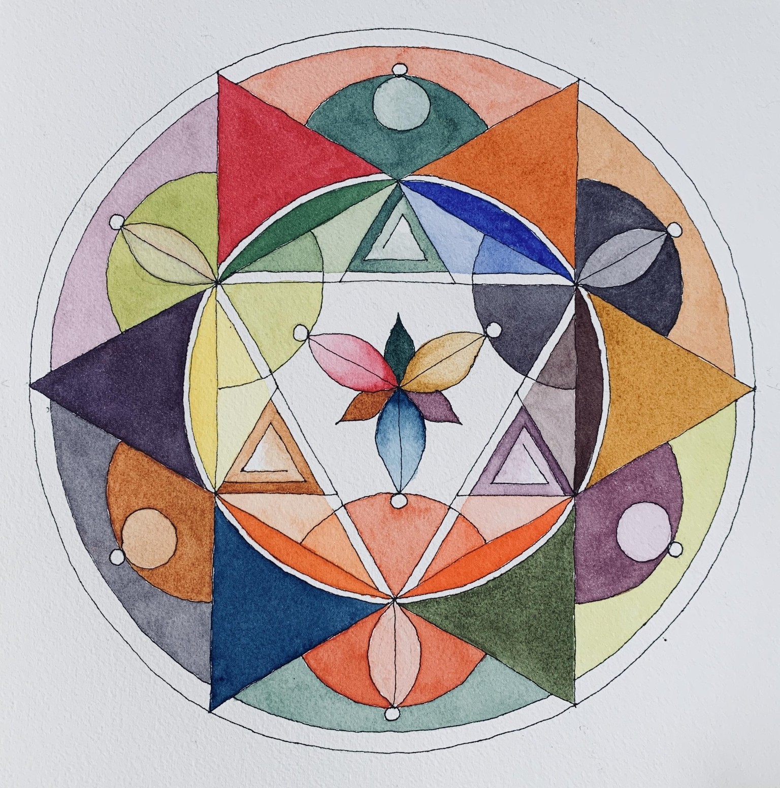
These complex mandalas take me forever to paint! I have been working on this next one for a week on and off. I can’t say I am terribly fond of the design and I backed myself into the “four” not “three” corner again. It did come from a 12 section design but that got lost. I was calling this the “Pea Pod Mandala”.
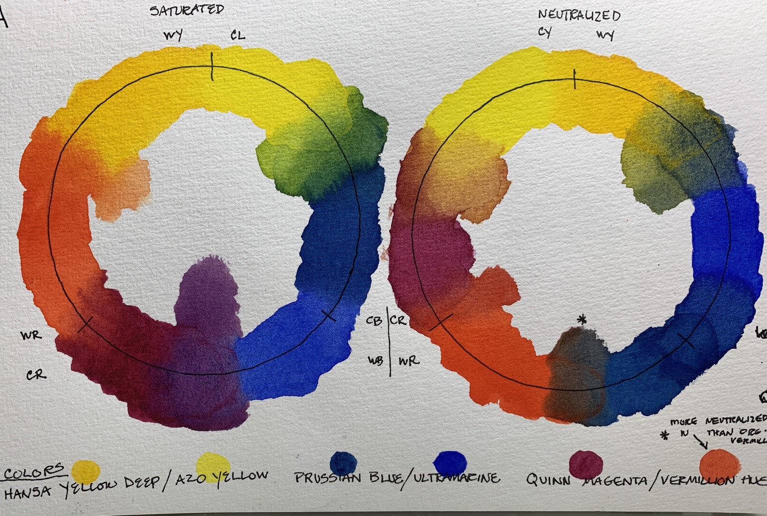
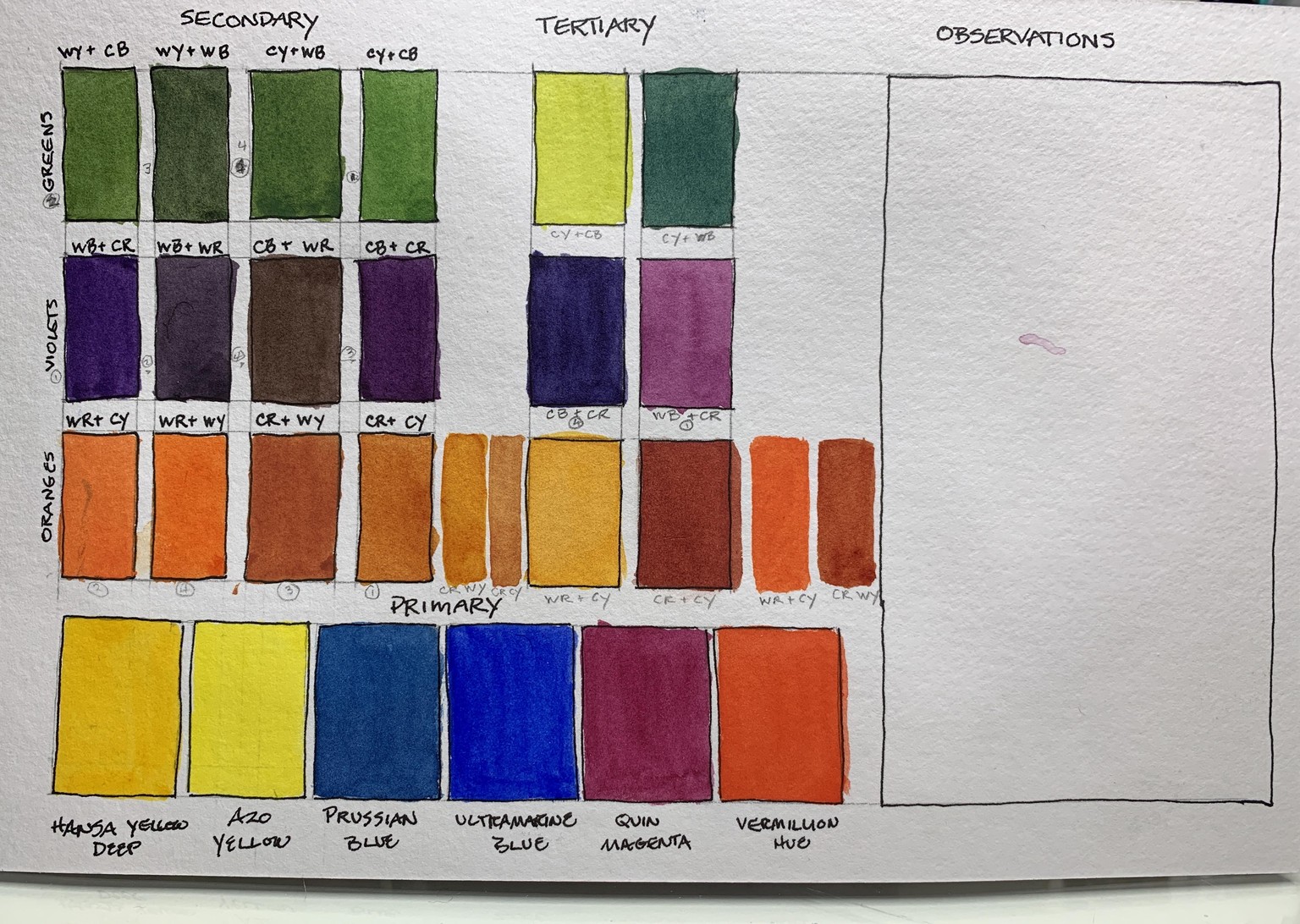
Colors:
Hansa Yellow deep/ Azo Yellow
Prussian Blue/ Ultramarine
Vermillion Hue/ Quin Magenta
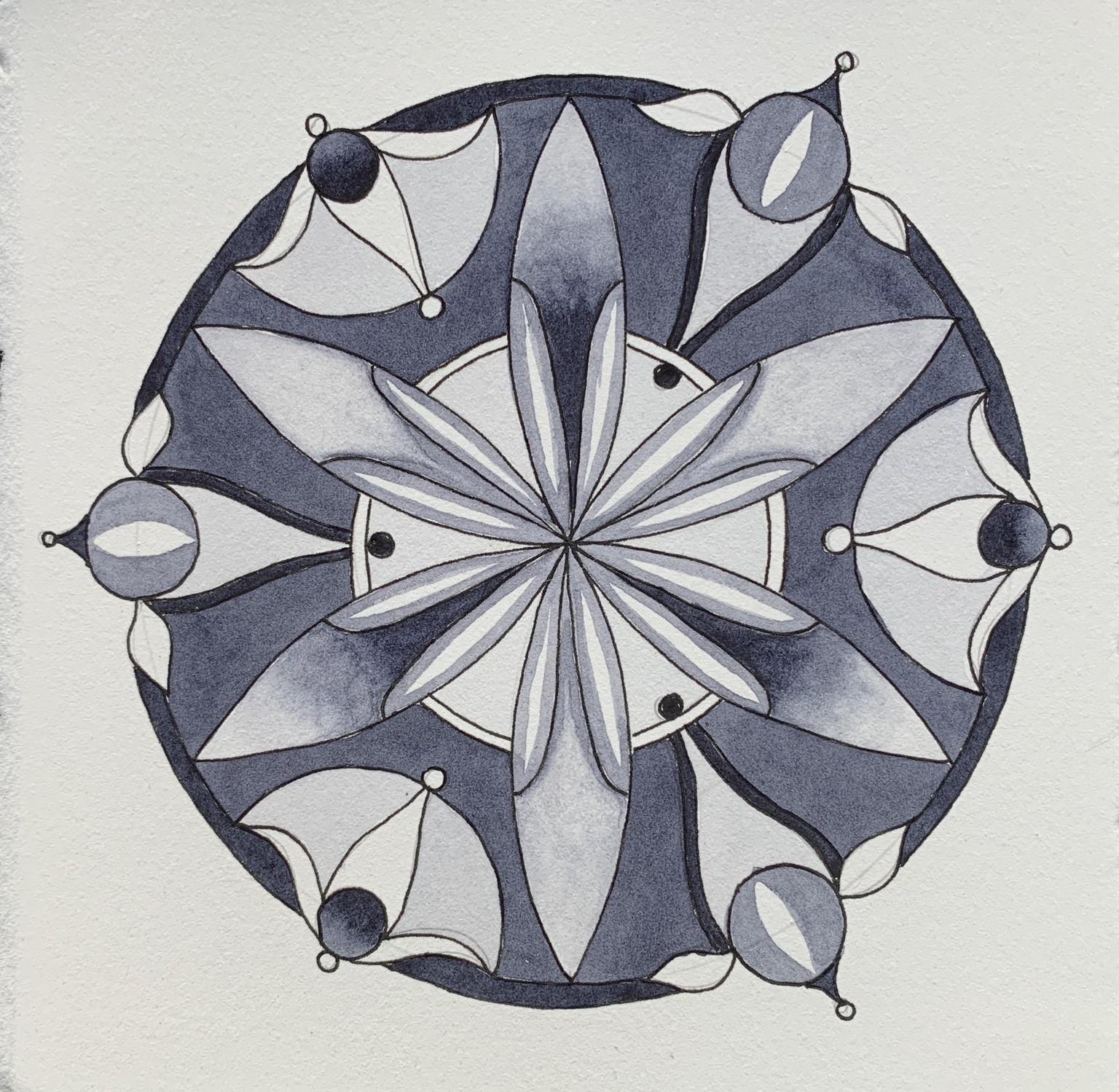
The way this is painted isn’t strictly the color wheel with the same logic usually used - my plan was: use the primary colors in the center and have them move into the design a bit, then the 4 secondary colors in the second tier of the design with tertiary furthest out in the circle. My goal was to see how the neutralized colors would work with the saturated ones.
I think it mostly works but I have to let the design sit with me a bit. Grayscale is also posted and I would love to get some feedback on how this design worked in that regard before I launch into my grayscale mandalas. It looks pretty well distributed but I am not sure what I am aiming for!
Balance of the design would be one thing. Defining key players in the design? What about the fact that yellow is never going to show up as a darker value? Does one need to take that into account in terms of the design?
Without further ado:
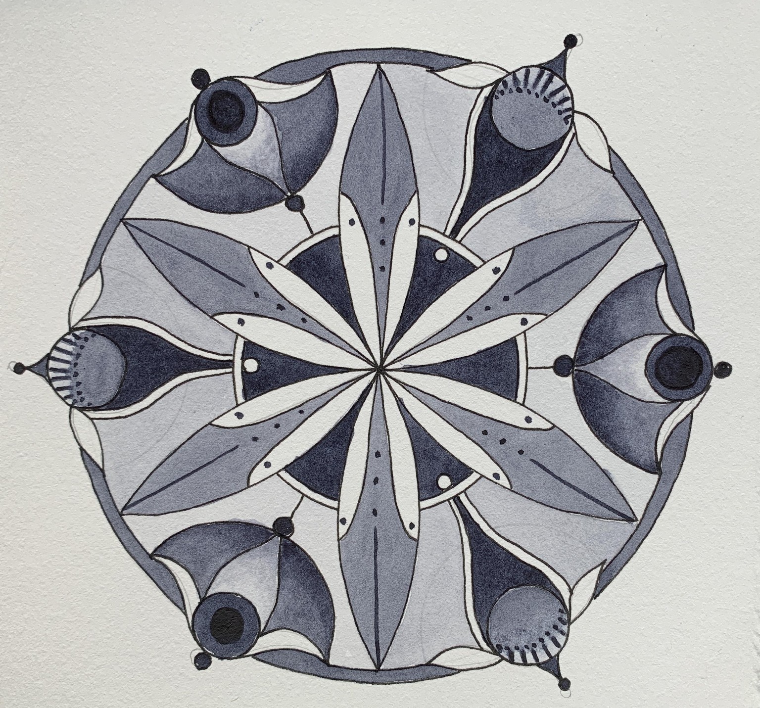
(Sunday evening) I am having a good laugh over this one. What was I thinking? When I saw it again after posting it this morning, it was a riot of shapes and color with my eye jumping constantly to try and find a place to rest. The last one I had that didn’t work was “fixable”, this one is so over the top, I am not going to even try. Oh well, without things that don’t work, I won’t learn very quickly!
I almost forgot: I have started a new habit of making a quick color wheel for both saturated and neutralized plus on the back of the card (6x9”), I have established a format for seeing the color mixes possible (except not all tertiary) and a space for comments. Here is the one for this mandala with no “observations” yet!
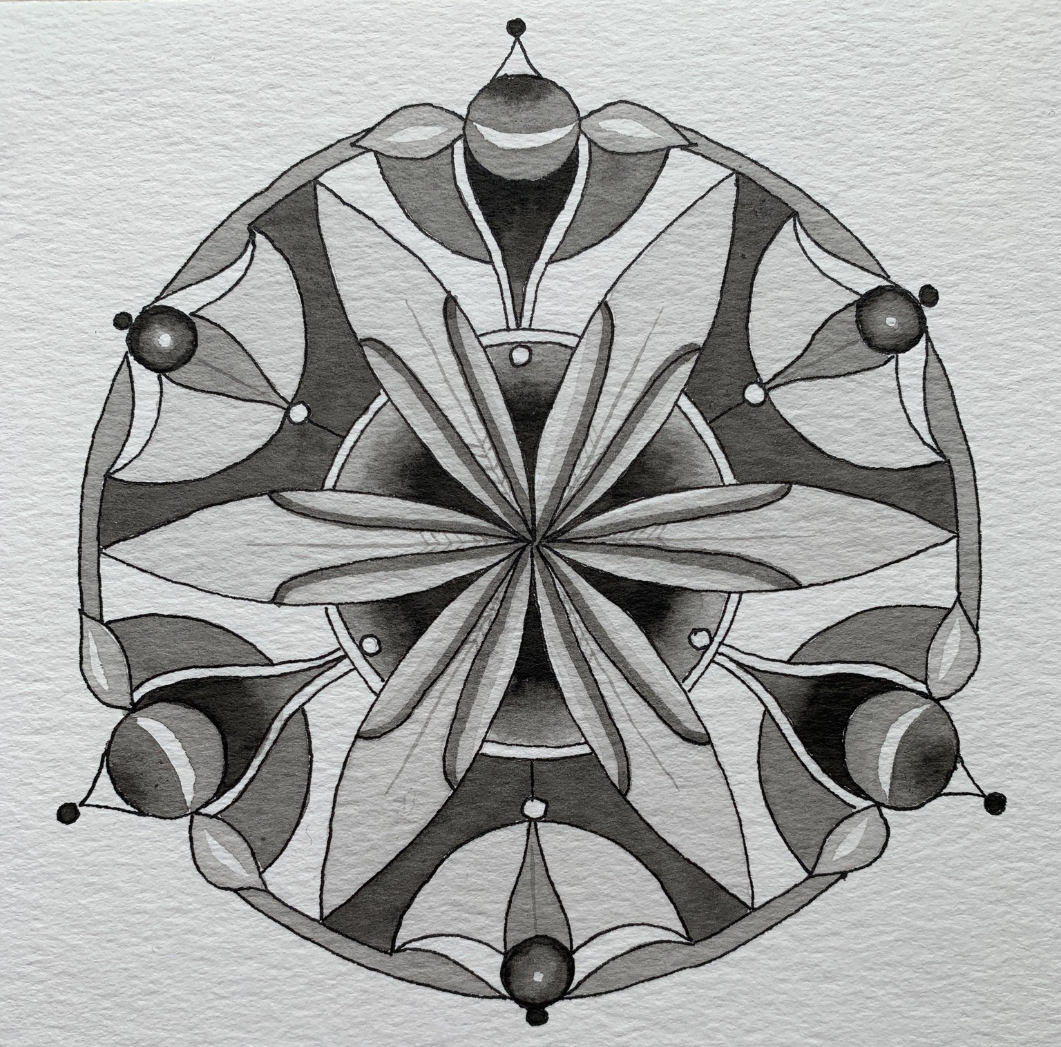
Couldn’t figure out where to post these three grayscale mandalas...so decided that since it came up in this class I would go ahead and put them here.
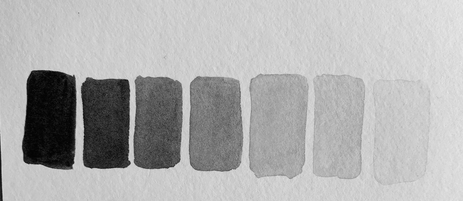
I used Jane’s Gray - a new gray by Daniel Smith (inspired by an Australian artist, Jane Blundell).
To start I made a grayscale palette of the color from dark to light with 7 values to choose from. From there, it was the fun part of painting the same design in 3 different ways. The paper was BFK Rives. It was dreamy to paint! The one issue that I have with it is that I tend to erase parts of the design after I am done and while I could lighten it up, it clearly isn’t a paper for erasing.
Oddly enough the bluish nature of Jane’s Gray isn’t coming across in this photo of the values.
Some of what I learned:
- I knew the designs would be very different visually but to actually experience it and paint with values was very helpful.
- I moved along and made decisions quicker without the distraction of colors to choose from.
- I have a new appreciation for the values in a composition.
My biggest question at this point is about the nature of colors such as yellow which will only read as a lighter color on a grayscale.
Here they are:
1st one: (I didn’t get a photo in natural light for this first one and the camera is seeing the dark as a lighter color than it actually is. Picture the darks more like what is in the second and third.
2nd one:
3rd one
I whipped up a couple more of this design as I feel like I am learning so much by doing them and its a whole lot of fun to see what variations there are in one design depending on the value.
I used Lamp Black (DaVinci) on Stratford cotton paper - I was curious about the painting experience on watercolor paper vs BFK Rives. I found that right now, I don’t have a preference but I haven’t worked much on Rives. The biggest disadvantage to Rives is my penchant for creating designs on the fly which means a fair amount of erasing - as Chris points out, this isn’t possible on the Rives printmaking paper. Well, a kneaded eraser with the lightest touch painted ok.
It takes me a long time to get the grayscale paint mixed! I had 7 values. Probably another thing that gets easier with practice. My next idea is to try doing a color scale mixed with black to change things up.
These designs are essentially the same as the first one with the exception of an enclosing arc that I mistakenly inked on one section so had to put it on all of them.
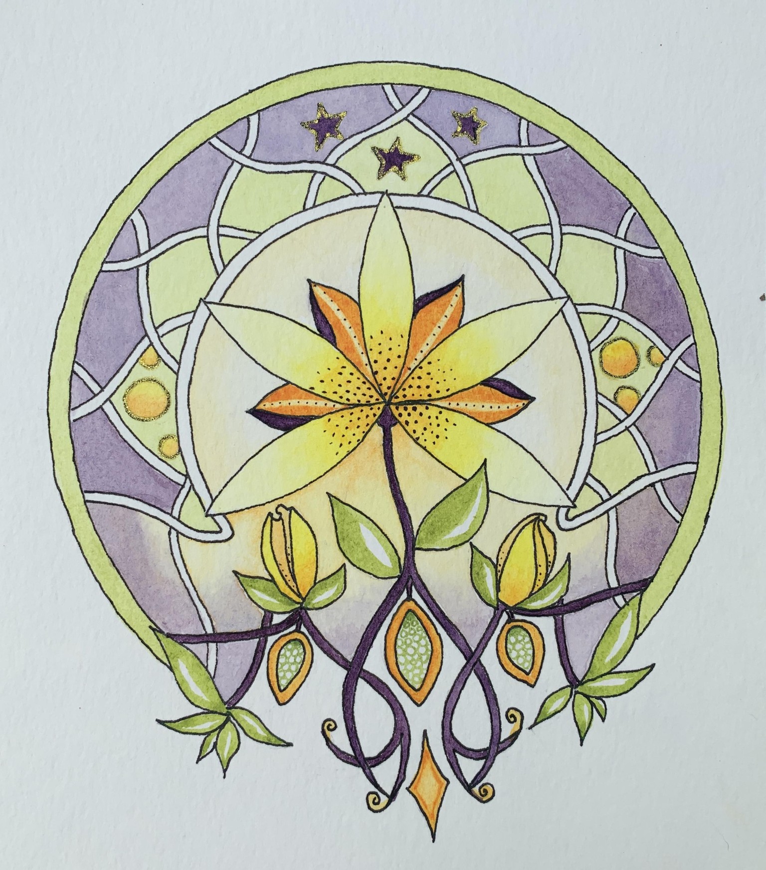
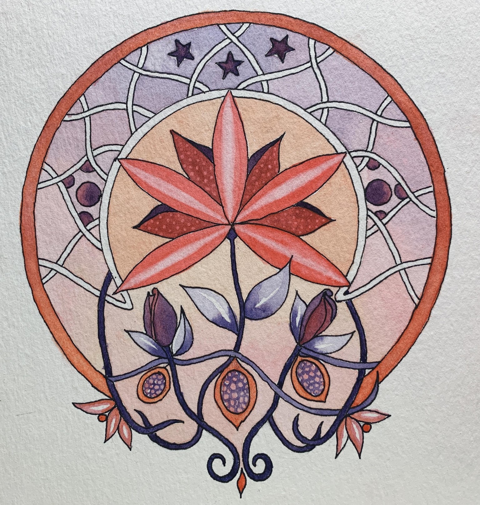
OK, so this is a mandala, BUT and this is a big but, it is not a color wheel mandala. (Oops, I went off on a tangent). However, it is, for me - a step forward in terms of color and mandala designs in that it breaks out of the “color wheel” and for me it shows my progress in both painting skills and the beginning of a better understanding of values. I didn’t have an intention or even a glimmer of the design when I sat down. The muse started whispering to me early on so it took on a life of its own.
For colors: Lemon Yellow, Cobalt Blue, Organic Vermillion.
Color Palette: I made a color wheel a la the color game, tossed the die, came up with #4 - Extended Analogous. Chose to work with BV, V, RV, R, RO.
I faded very light washes from one color to the next and it just glows. Very excited about that never having done that before and it came out perfect. I did make a huge error in picking the RO for the outside circle. It went from a peaceful, quiet mandala to eye popping blast off. I took it down a couple of notches by lifting the paint and then applying a very light wash over it to tone it down.
I have a variation of this one already to paint tomorrow and haven’t decided whether to use the same #4 with different choice of colors or to toss the die again and see what comes up.
Without further ado:
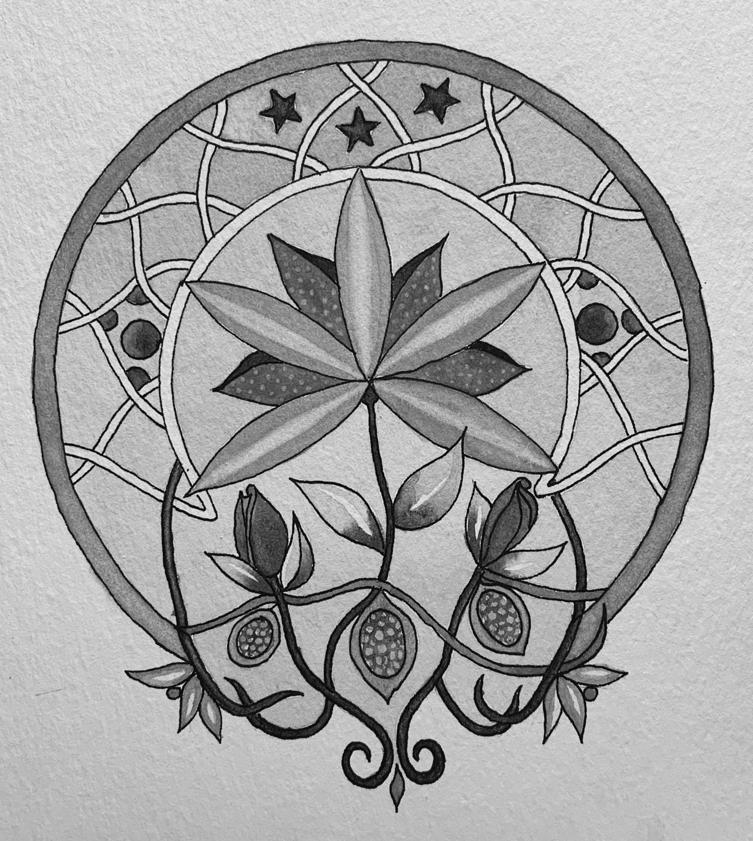
The grayscale:
I think this ended up with a pretty good balance. The one thing I might change is to make the bottom “roots” slightly less dark. My eye does move upward to the dark parts on the flower out and up to the starts and circles.
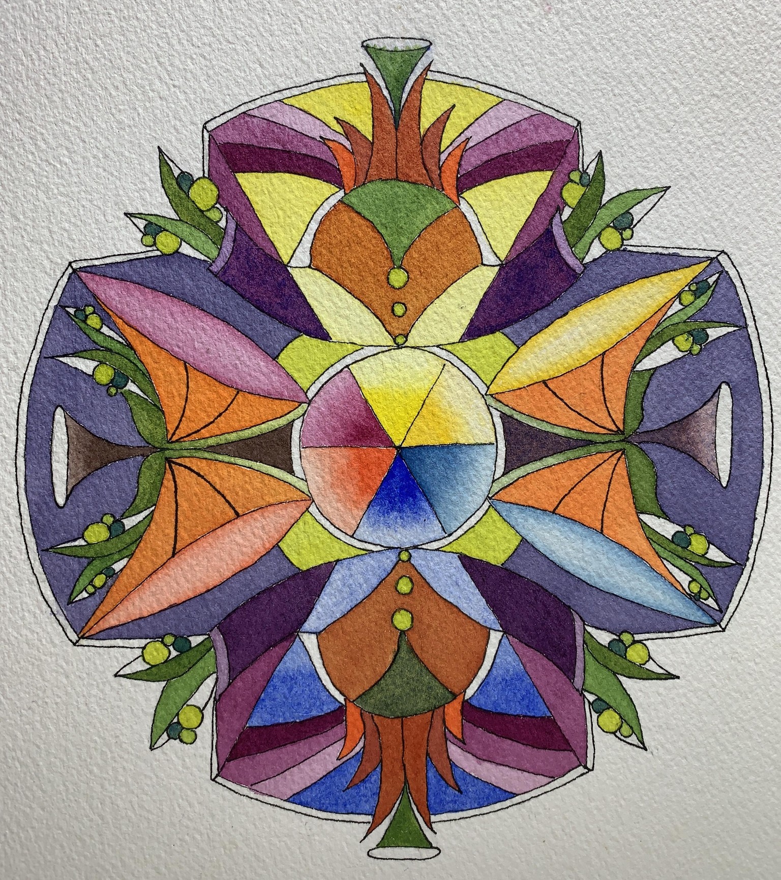
06092020:
The next mandala in the above series. I did a toss of the die and came up with an 3 analogous with a complement. Using the same 3 primary colors as the last one. Colors worked with YO, Y, YG with Violet as complementary.
I am just totally amazed at what a difference the choices of color make in how the overall response to the design is.
I found that I wanted to do a similar kind of light wash with these colors but it didn’t work out as easily as the last one given I wanted to use the violet, which of course didn’t want to play nice with the opposite colors. That would be a glitter outline on the stars and circles...