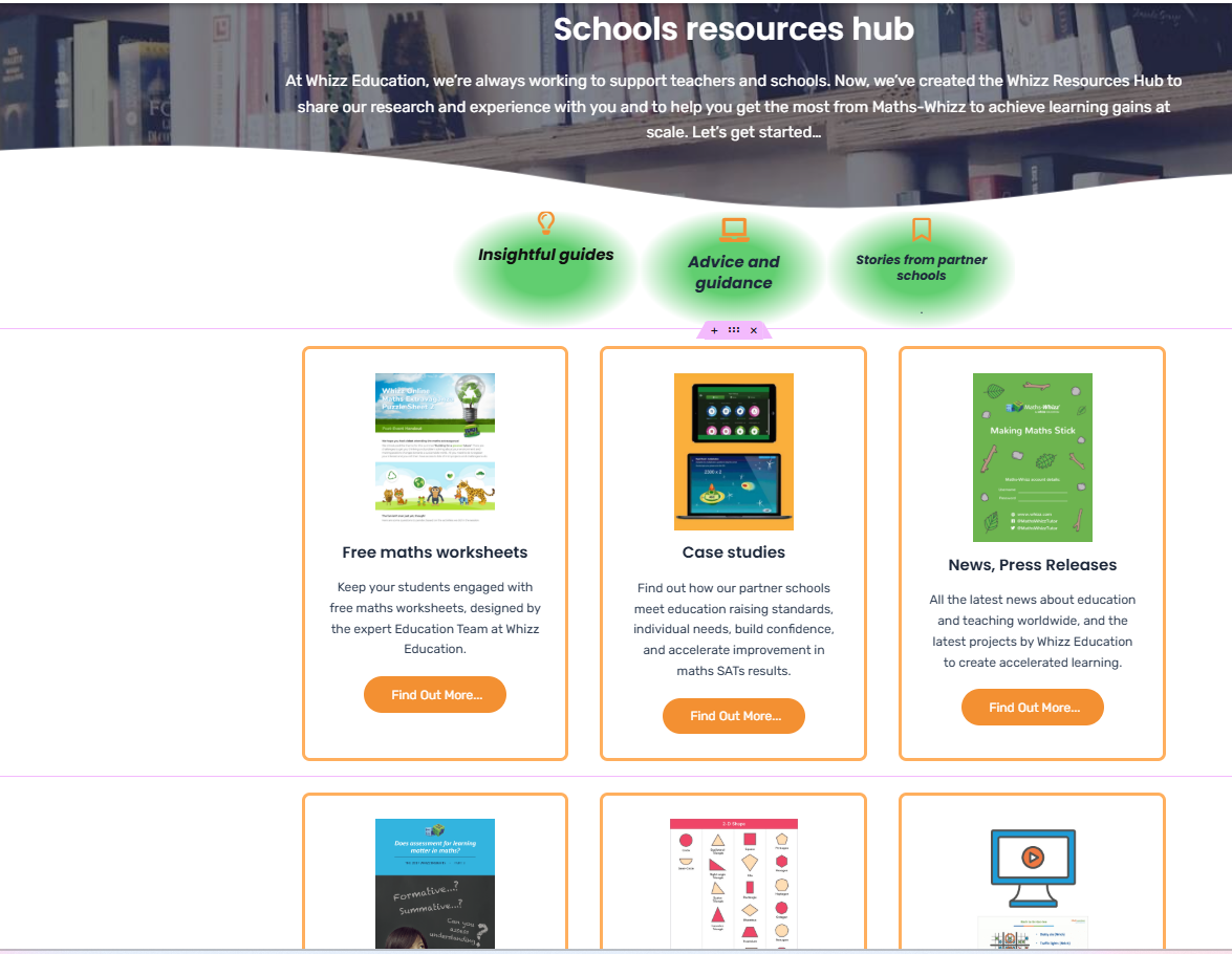
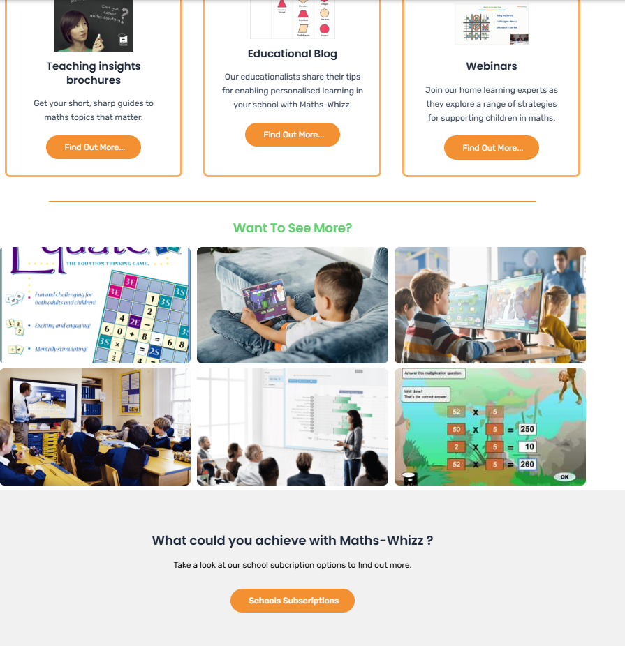
Making some improvements
This is how the webpage looked when I started designing it. It was a bit plain, with a lot of white space, and the subheading text was wordy and hard to read.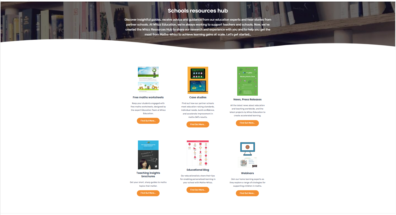
What I changed:
-
Took some keywords from the subheading text and turned them into icons, experimenting with colors.
-
Added borders on the content blocks to create more structure.
-
Included more content at the bottom that customers might be interested in, along with a call to action.
Any feedback would be highly appreciated