Lettering with Texture
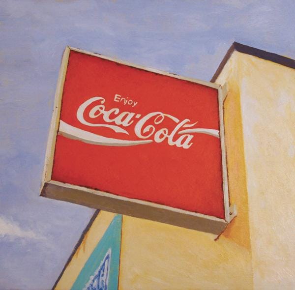
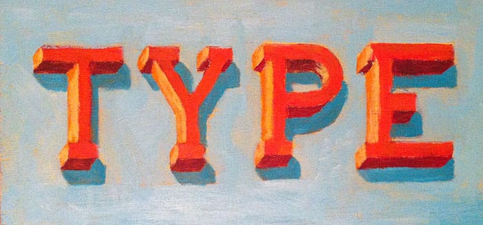
After completing my final piece for this project, I decided to do some further experimenting with the acrylics I bought for the word piece. I still have some polishing touches to complete it, but here it is, painted from a photo I took on my way home from work:
8/3/2014
6/3/2014 - Painting with (a little bit of) courage
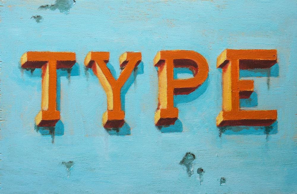
I decided to change my word for my first attempt at this project, to try and keep it simple.
Apologies for the bad quality iPhone photos, but they give an idea of where I'm at with it.
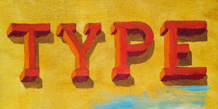
Step 1 - Looking really ugly...
Step 2 - Blocking in the letters
Step 3 - Working up the background
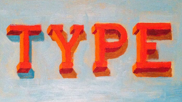
Step 4 - Adding a layer of teal to the type shadows
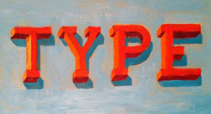
Step 5 - Adding highlights to the letters
That's where I'm up to at the moment. I want to continue to tone back the colours so that they're less intense, but will retain some of the bright bits so that they peek through the final layers of paint.
I felt really uneasy making this, because it was just looking so damn ugly! ...and still is a bit ugly. Anyway, hopefully tonight I'll be able to add the final layers of paint and refine the letters.
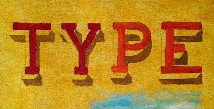
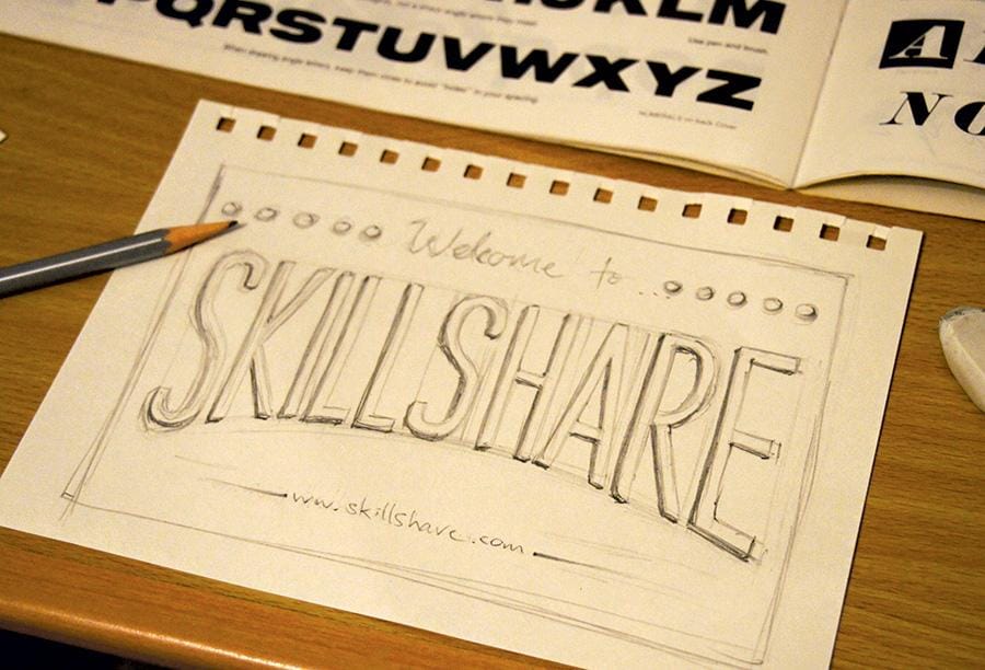
5/3/2014 - Sketching
Here's a sketch of what I plan to create for this project:
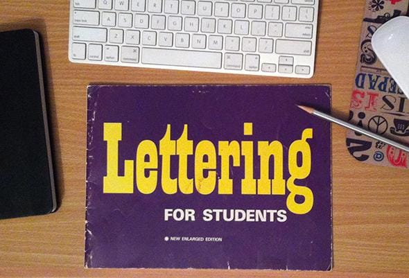
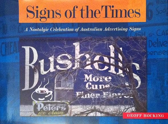
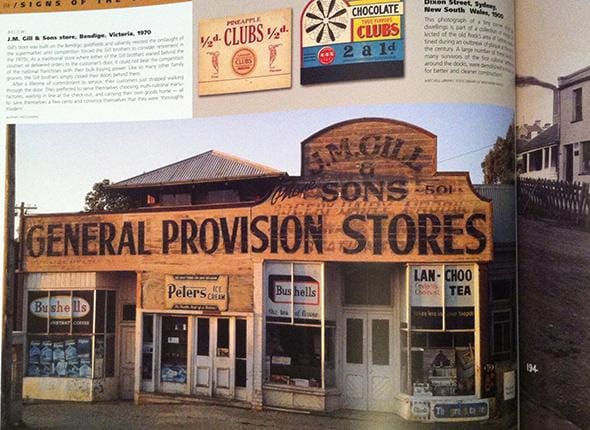
3/3/2014 - Research
As a starting point for this project I'll be gaining a bit of inspiration from this old lettering book I had as a kid. I'll also be using a few other sources, pictured below.
Back in my uni days, one of my old lecturers created a book called 'Signs of the Times', which is an awesome visual record of some really iconic Australian/International brand signage. So I'll be using some images from that as a source of inspiration.
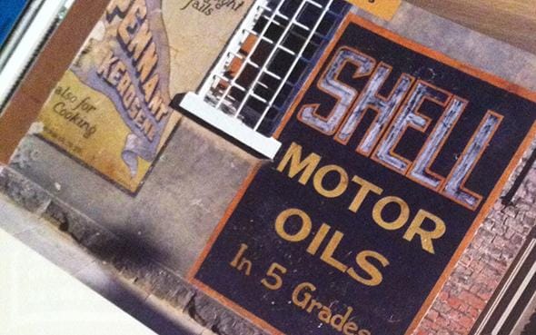

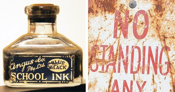
I also have a bit of a thing for collecting old stuff. From 50s/60s advertising and magazines, to signage, typewriters and packaging. Pictured below is an ink well from my grandfather (he was a (talented) painter in his spare time), and also pictured is a cropped part of a sign I recently bought from a vintage store.