Keep It Trill
March 23, 2014
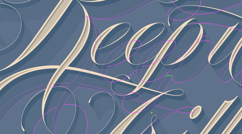
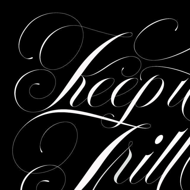
After watching the Effects and Embellishments lesson again, I decided to apply techniques to create dimension and shadow effects. I'm very happy with the final results of this project and appreciate all of your feedback along the way. I'm also excited to applying the techniques learned in future projects to improve my process and workflow.


March 18, 2014
Sidetracked with other projects for a few days. Happy to be back at it today and made more progress. Received some valuable feedback from my man Bobby Haiqalsyah (aka Bobsta14) to improve the 'K' and gave me ideas to explore. The 'K' needed to be reshaped, more specifically the arm and leg, and overall needed to interact with other elements of the design. (Reference the original drawing.) Pretty happy with how this piece is coming along, here's how it turned out.
Next I'll apply some of the techniques learned from the Effects and Embellishments Lesson. More soon.

March 12, 2014
More progress today. I knocked out the rest of the letters and now taking a look at the piece in high contrast black and white. After creating the primary strokes, I was able to quickly combine them to build letterforms. For example, the K was essentially built from the stem of the 'T' and the 'r'. Here's an updated view. I still have some work to do, but it's coming together nicely. Feedback is appreciated!
March 9, 2014
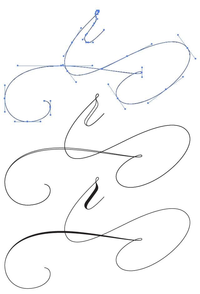
Worked on the 'r' and flourish today. Great suggestions by Mariana and Nick, many thanks! Here are a few different views of the process. Once all the letters are vectorized, I'll take a look at the composition as a whole and make adjustments to contrast. More updates soon ...
March 5, 2014
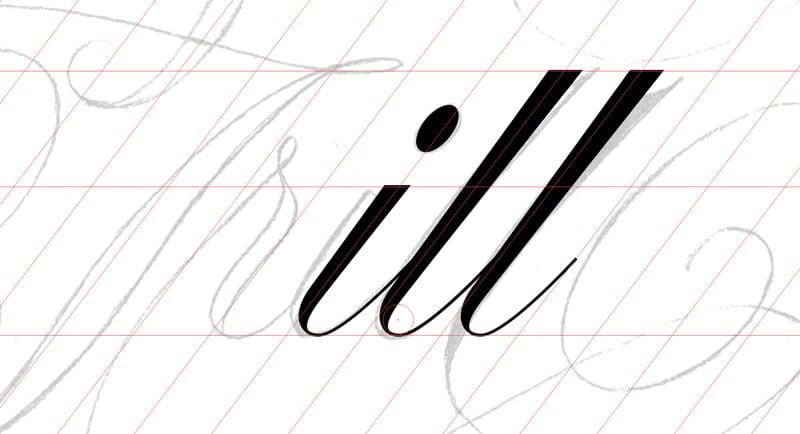
Happy to see my project is starting to take shape, but right now it’s just “ill”.
I started to vectorize my drawing using the techniques learned in the lowercase scripts lesson. In setting up my work area, I created three layers and labeled them from the bottom up: sketch (scan of my drawing), guides, and artwork.
Here’s how it looks so far:
Normally, I would have attacked the drawing with the pen tool and carefully trace the perimeter of each letter. This obviously becomes problematic when editing and can result in inconsistencies in the letterforms.
The advantages of following Spencer’s technique can immediately be seen. Beginning with the direct “l” form, I am starting to create the primary strokes needed for this project. (At some point, I may create the whole alphabet for future use). I then placed a circle guide at the bottom of the stem and connecting stroke to make the bowl feel like a circle. Then I copied the skeleton stroke, pasted in place, made adjustments to add weight, and joined the end points.
Here's another view showing anchor points and handles:
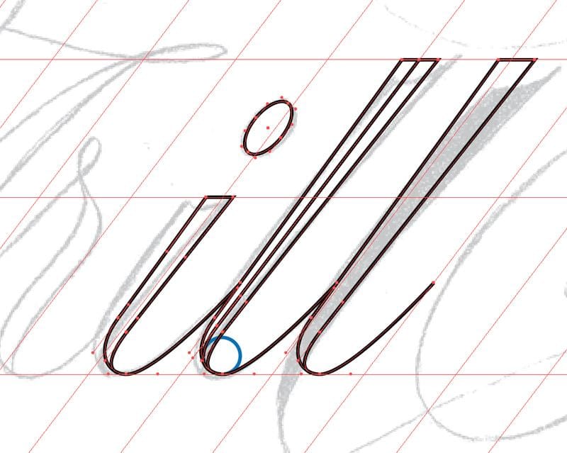
Obviously I created the “i” with the direct “l” form. Next I’ll create an oval form to start on the “e”, and will start thinking about how I’ll pull off the “r”. Any suggestions!!!?
March 3, 2014
Hey everone! Excited to be sharing my progress here with fellow designers. I've used Illustrator for many years but always feel constructively dissatisfied with my skill level. I enrolled in Spencer's class to specficially improve efficiency and overall skills in vectorizing hand-lettered work, but hope to learn new skills in creating letterforms purely digital.
I've only watched the first few video lessons and I'm already excited about the references and best practices learned.
My project is a phrase that I've heard in various rap lyrics, Keep It Trill (true and real). I decided to express the phrase in a spencerian-style formal script. Here's a rough sketch.
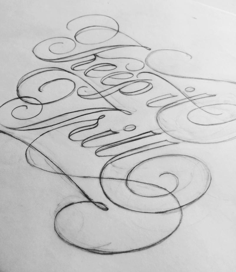
You may notice traces of erased lines and curves that reveal thoughts and decisions. Here's another sketch, a bit more refined, but still has issues (e.g. contrast and flat curves) that I hope to resolve in the vectorizing process.
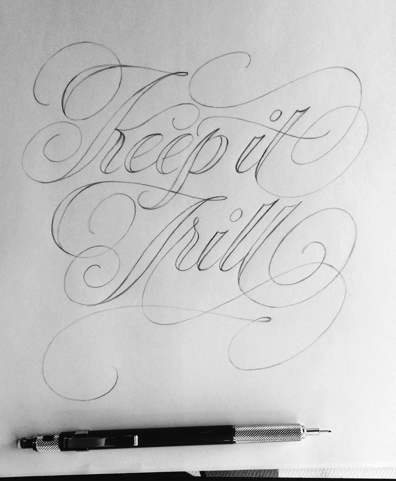
I think vectorizing this drawing will present some nice challenges to which I can apply some new skills from the class ... looking forward to getting started. Keep it trill ya'll.