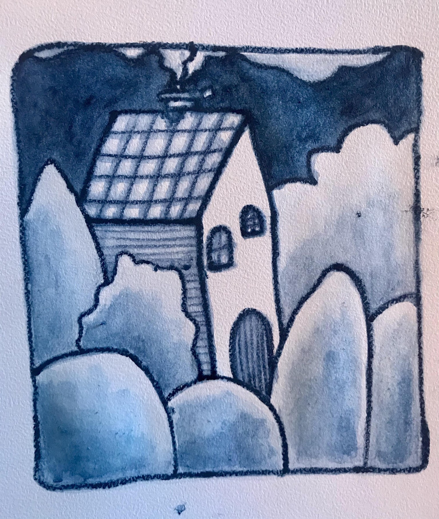
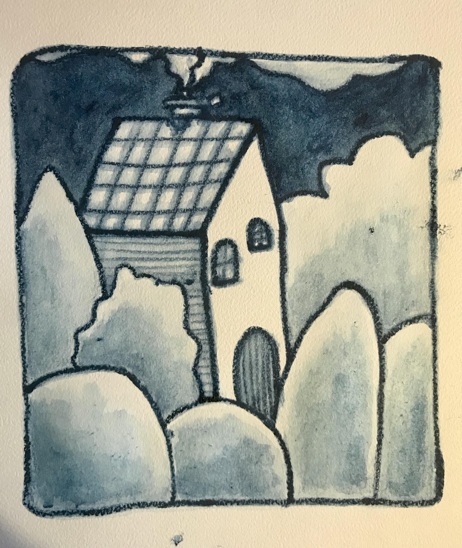
Gloomy-gloom Inktense Sketch
Actually followed along. I picked the blue pencil that had the sharpest point without looking at the color and it turned to be Iron Blue, Color Code 0840.
I liked experimenting with the different application methods. The last one with the wetted pencil tip, I didn't like the squiggly line work and decided to use this application method to outline the basic shapes, which to my delight added to the gloomy-gloom and I decided to add another layer to the sky to darken it even more.
For me the leaving out of the lines and dots and the fiddly stuff at the end, added to the gloomy feel of the iron blue. I have had the Inktense colors for over a year, but hadn't used this color (along with the majority of the lot 😌) and this exercise was a fun way to get to know this color and the ways to use this type of pencil.
Photographing it was tricky. With the lights on, the paper seems more yellow than it actually is. Without the lights on, the blue is more blueish. So I'll post both.
thank you for the fun class.