Floral Color Challenge
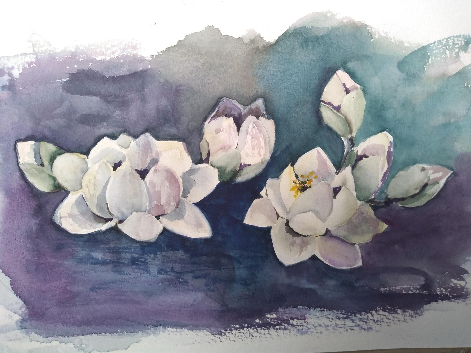
White Challenge (update):
I was amazed by Nina's lotus flowers, so I tried to paint these too. Since I made the other white flowers with grey shadows, this time I decided to paint the shadows in a colorful way. I used phthalo blue + perm. red violet + yellow gamboge for the shades on the flowers and buds, matching the colors used on the background. I guess these are the loosest flowers I painted in this challenge after all! :)
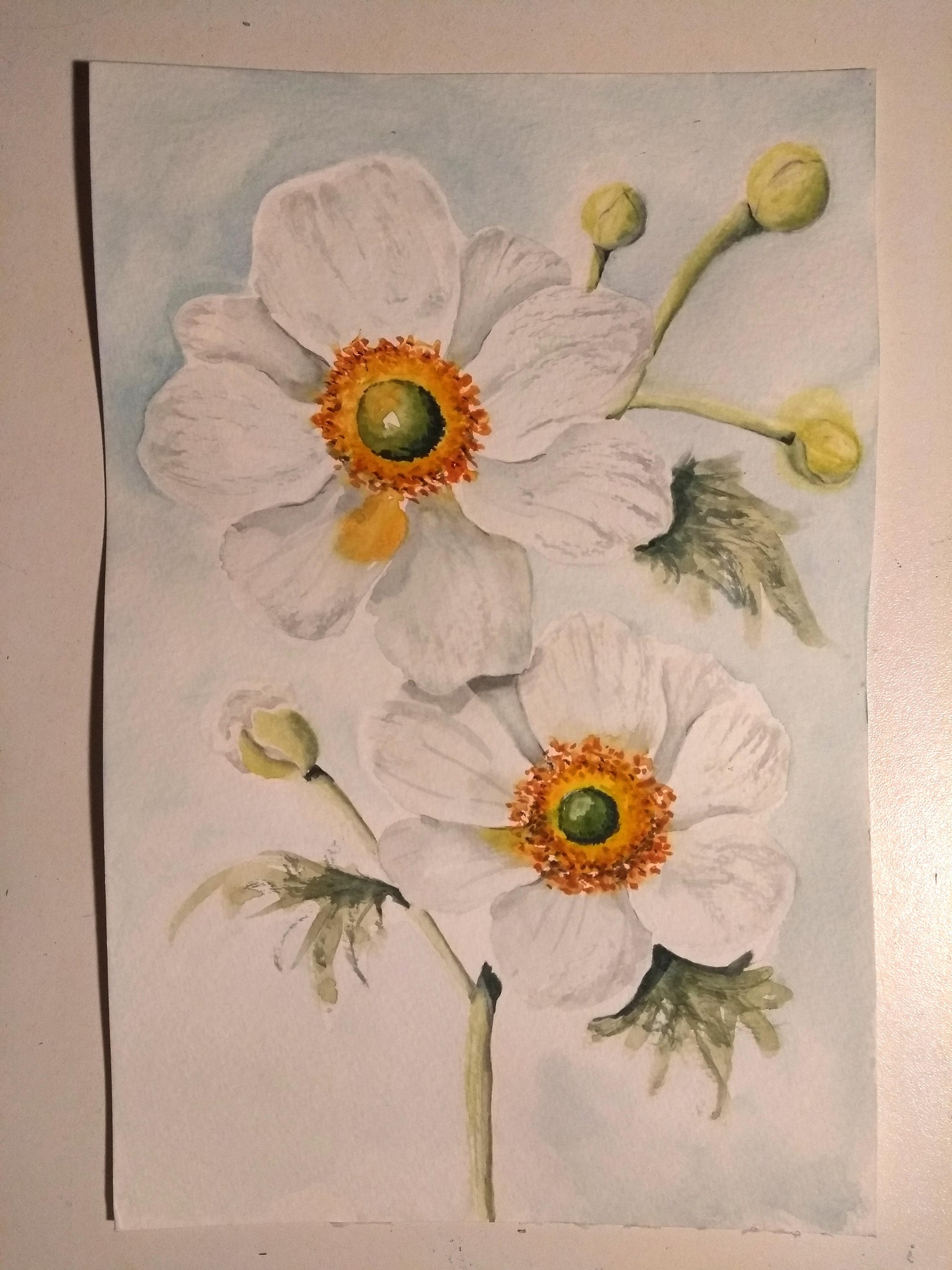
White Challenge:
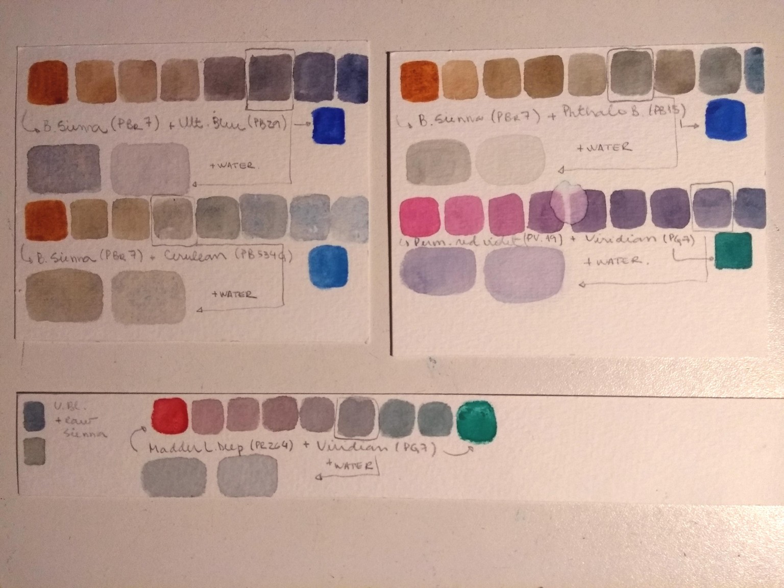
I mixed shades of grays from complimentary colors (as in the swatches picture below), and the gray I liked the most was made with madder lake deep (PR264) and viridian (PG7). I liked it because was easy to achieve a beautiful gray with the mix and I got either light and deep grays. I tried to include a bit of chinese white too, but had difficulties when trying to smooth it on the paper. As in the other colors challenge, I tried to stick to a few colors, so I used madder lake deep + viridian with gamboge (PY154/PO48) for the greens and madder lake deep + gamboge for the orange. The background was made with ultram. blue + viridian. I took the picture at night and while the paper was still wet, so the paper is buckled and it's a bad shoot, sorry! As for the looseness, I guess there's a long way to go yet. But... I tried to vary a little my leaves this time! I learned a lot with Nina and with this challenge! Thank you so much for everything, Nina! <3
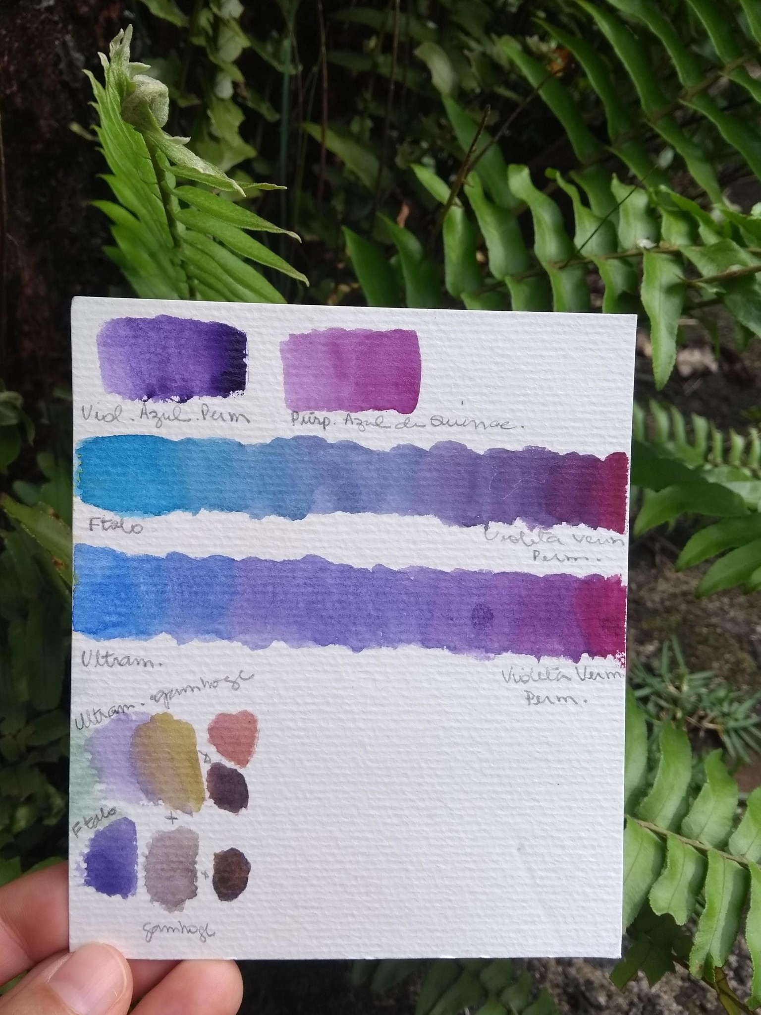
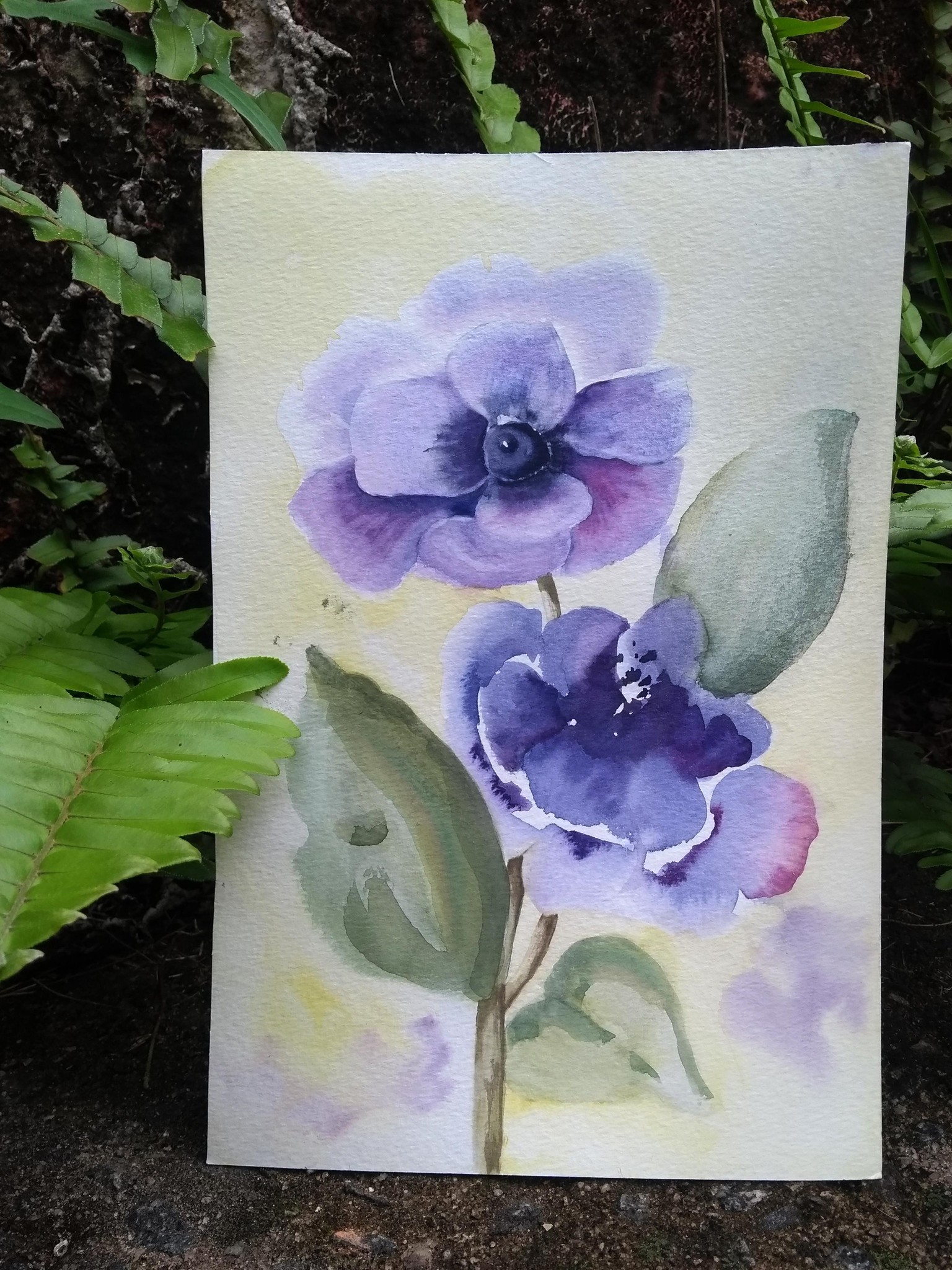
Violet Challenge:
I have 2 pre-mixed violets, and my hands were itching to use them! But I sticked to the exercise of mixing colors, so I used phthalo blue + perm. red violet (and, by accident, I added ultramarine to the mixture for the flower on the top). I chose phthalo, since it turns into a beautiful violet when mixed with the perm. red violet. I've had some issues with this mix, I found it to be kind of messy. Think it's due to the fact that this was the first time I used a mix with a lot of phthalo and its staining properties brought me some additional challenges. Although I liked this violet, I would chose ultram. blue for the next time, as it gets a beautiful granulation effect and I found it to be more manageable than phthalo blue. For the background I used gamboge, and for greens added this color to phthalo and tiny of perm. red violet. Oh, and I just realised that I painted wrong-shaped leaves for the anemones! haha
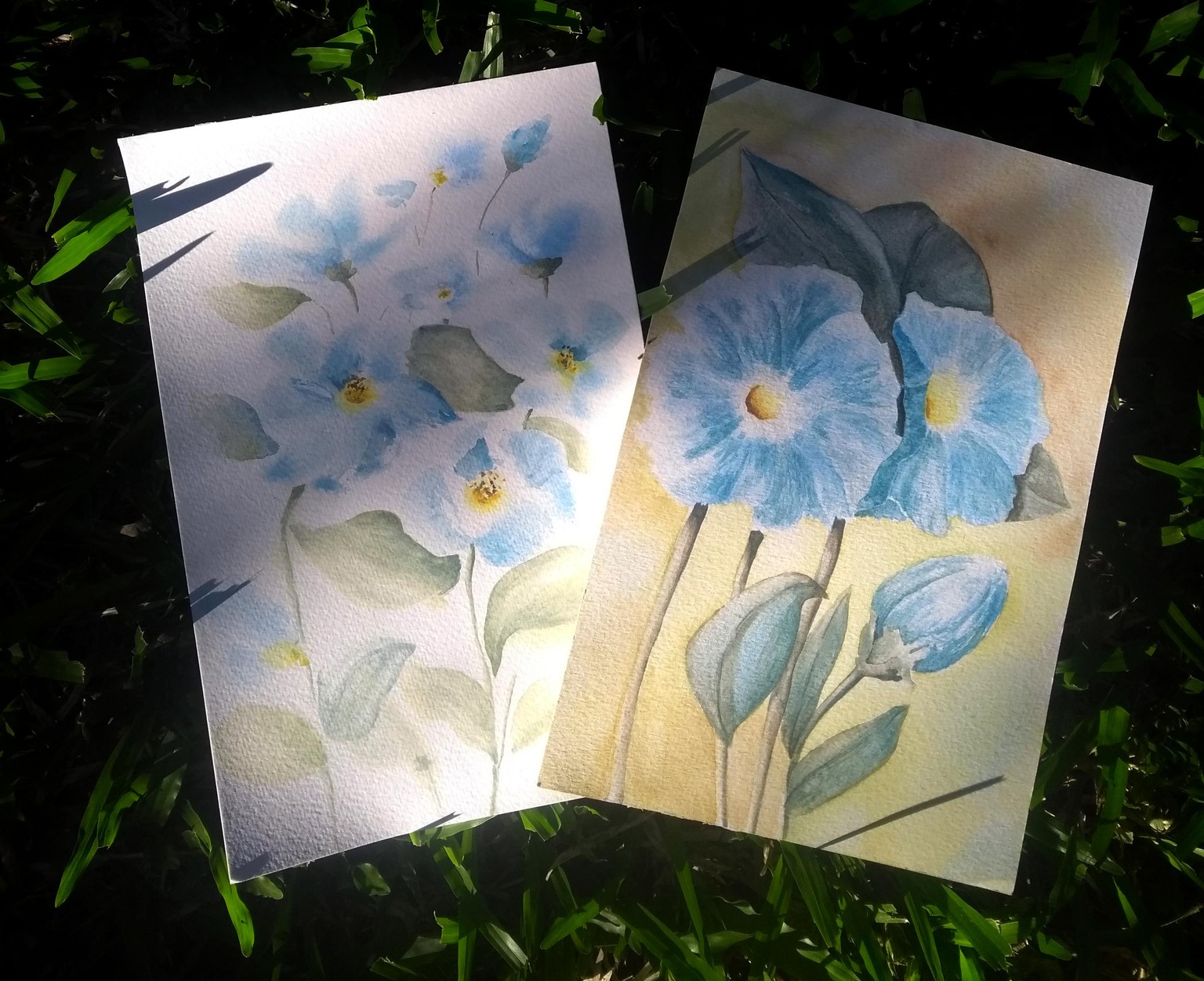
Blue Challenge:
I used cerulean (PB35) and ultram. blue (PB29) for the flower. Sometimes with a tiny amount of burnt sienna (PBr7) to desaturate it a little. For the leaves I mixed my blues and b. sienna with yellow gamboge (PY154/PO48).For the background and leaves of the painting on the right (this was my first attempt) I used a bit of perm. red violet too. On the left is the second try (I added more water and let it flow more). Cerulean + ultram. blue is a beautiful color mixture!
Green Challenge:
For the green flowers I mixed lemon yellow (PY184) with ultramarine blue (PB29), and sometimes added red violet (PV19) for darker/ less saturated colors. I chose ultram. blue instead of phthalo this time because I wanted the green to be less bright without having to include a red in the mix for the light value flowers. Plus, it adds a beautiful granulating effect! For the leaves I used the same pigments as in the flowers, but a lot more blue in the mix. The red, violet and browns were mixed with red violet, ultram. blue and lemon yellow with different proportions. As for the loose thing, ah, it was a battle haha! It only worked out when I put on some music, forgot the photo references a bit and painted something from my mind. Noticed that when I'm too preoccupied trying to represent something it either goes too tight or too messy/ overworked/ with terrible-not-at-all-planned backruns and unnatural pigment concentration (paint consistency is still an issue to me). But the references and previous attempts were super helpful in understanding a way to represent loosely the hydrangea individual flower that I used on this one. This means that I painted green flowers that actually don't exist!
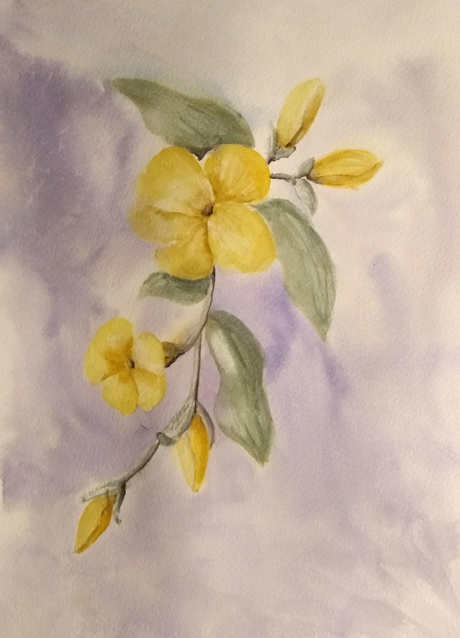
Yellow Challenge:
This time I feel I have given a few steps back on trying to be loose. I did 3 attempts and felt it was harder to keep it fresh with yellows. When I tried to give some contrast, it became muddy, and then I started fixing it, so I lost the loose grip and the paintings became stiff again... I'll keep trying to do loose florals with yellows. I thought it was easier, because it's a bright and light color! I used raw sienna, perm. lemon yellow, phthalo blue and permanent red violet.
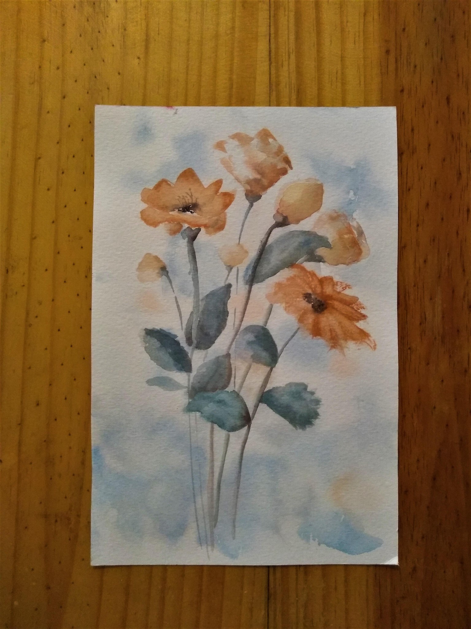
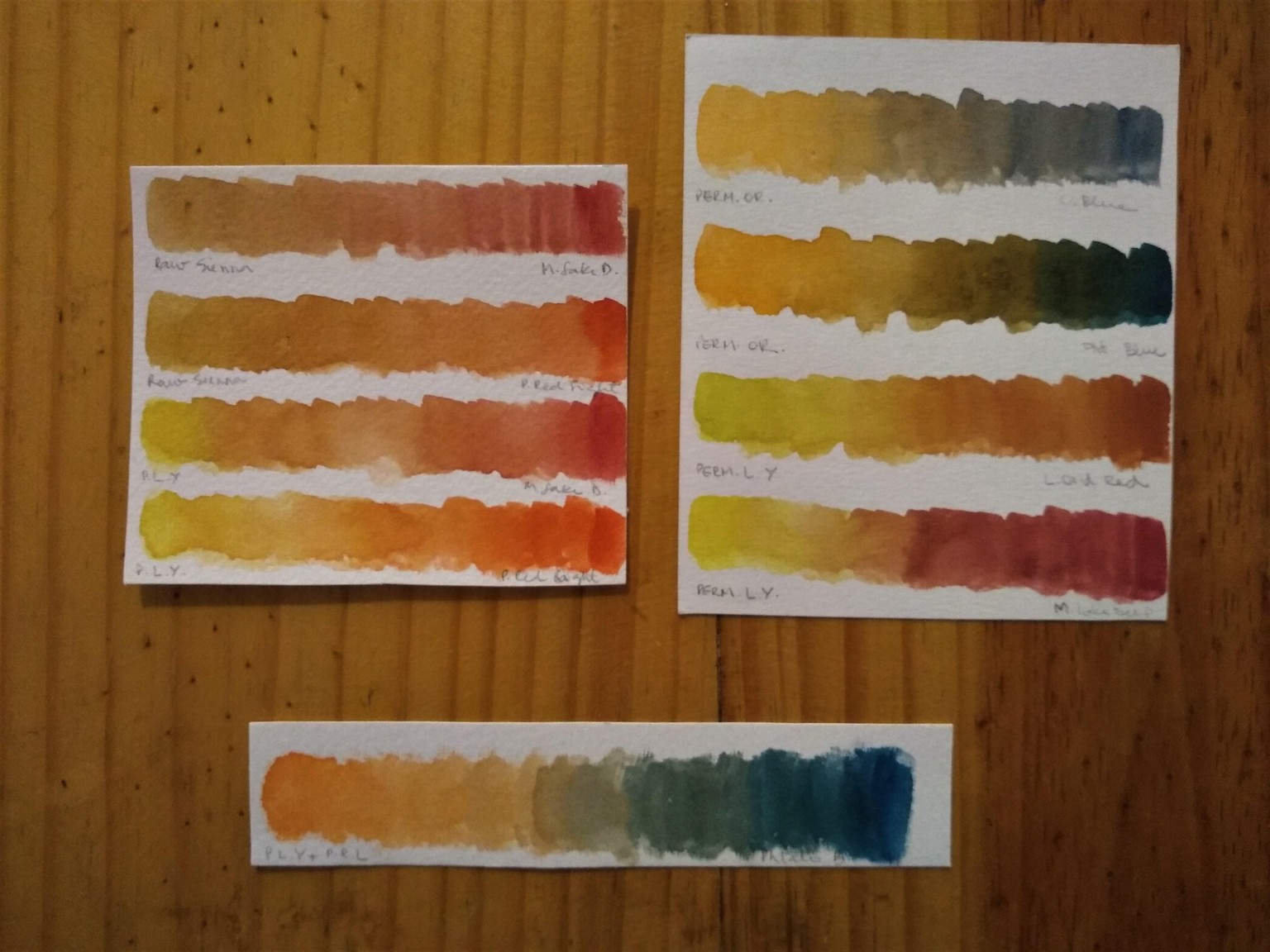
Orange Challenge:
I mixed 2 single pigment yellows with the reds I used in the previous flowers. Mixed my pre-mixed orange (Permanent Orange - PY154/ PO73) with two blues (ultram. deep and phthalo blue - one with green bias). Then I choose my orange (I preferred to use a mixture with one of the reds I used before in the challenge) and tested it with the blues and liked it better with the phthalo. So these were my choices. All mixes photos are bellow.
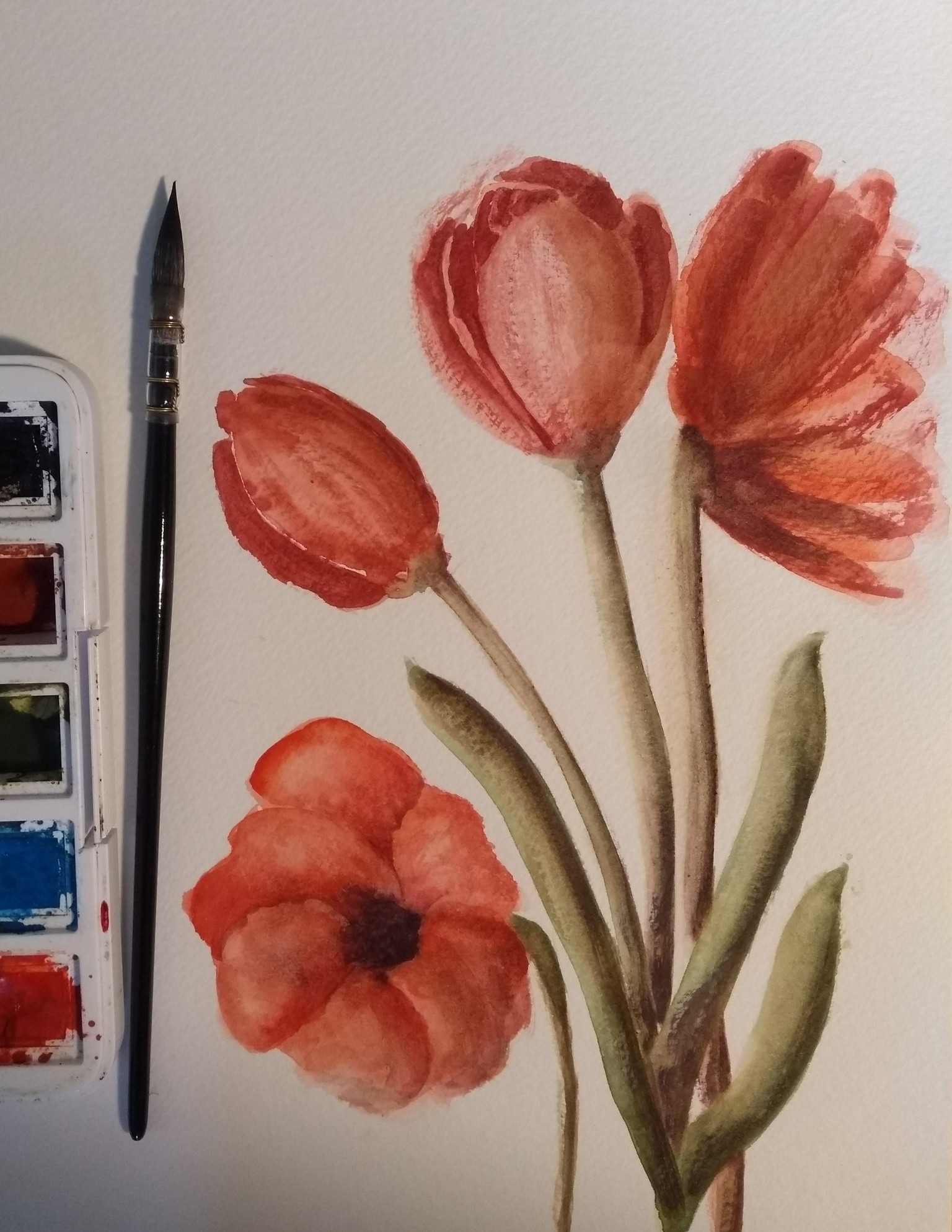
Red Challenge:
I tried it again, a little less stiff this time:
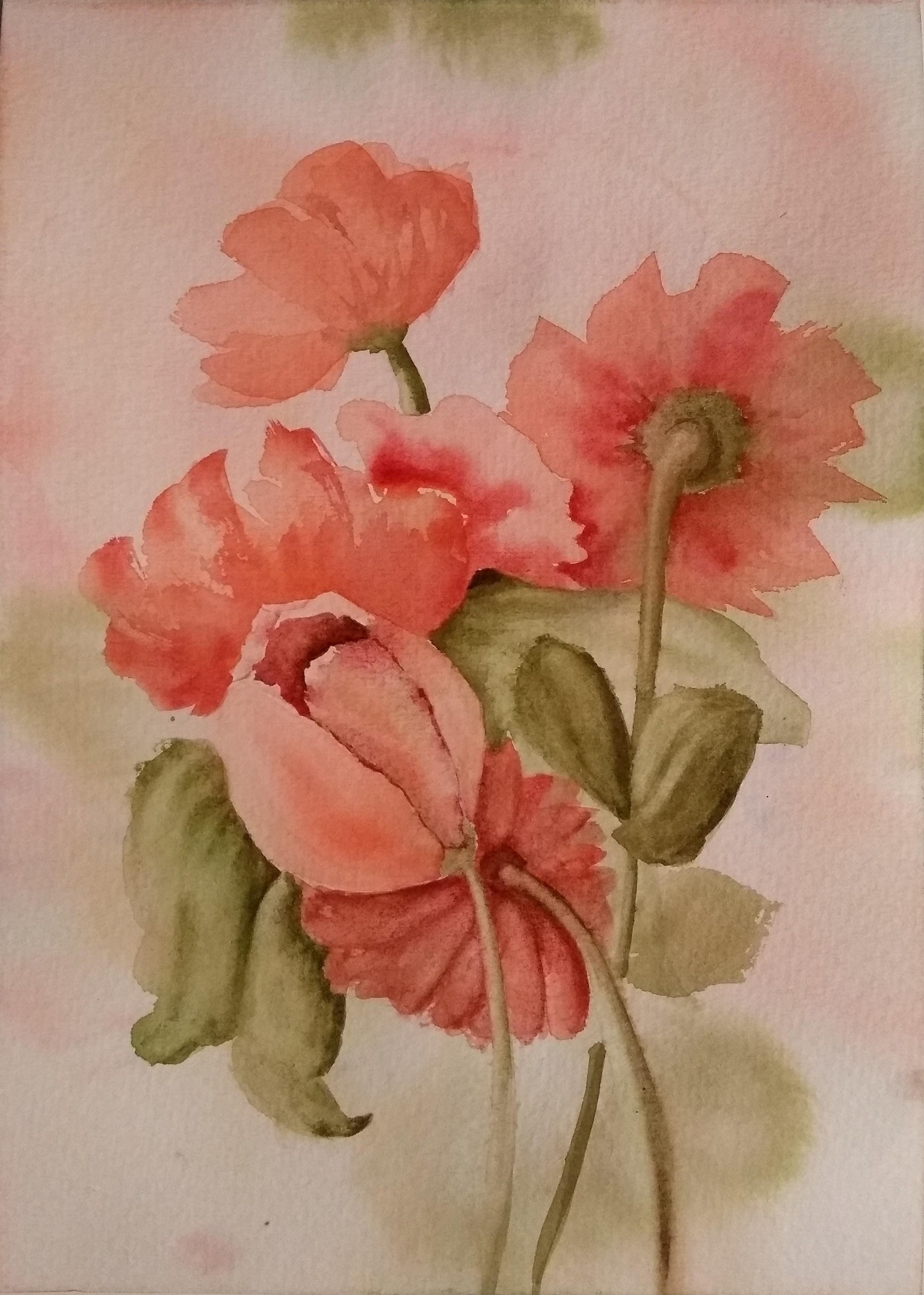
Thank you, Nina, for this class! It was really a challenge to stay loose and to stay light-handed! It came out stiff and heavy... I have only a few red pigments, so I used 2 of them: PR254 (permanent red light) and PR264 (madder lake deep). I used a limmited palette (besides the reds: sap green, ultra blue deep and burnt umber to darkening and for the leaves).