Every print is unique - and surprising!
Hi, creative friends! Thanks so much for popping into my class - I really hope you’ll enjoy Reductive Monotype as much as I do.
As I created this class I re-shot the demos a good few times as I tried to figure out which ink showed up better on camera…and so I also created a fair few prints!
As a support to the class I wanted to share all of the prints I made, so you can see:
- Firstly, that the very first print I made did not feel all that inspiring :)
- Secondly, that even though the themes are the same, every single print has a different quality
- Thirdly, that even if you stick to the basic themes I used in this class (water, trees, mountains, sky), there are other fun ways to explore them…so don’t hold yourself back!
So to start, here’s an image which really sums up the journey! While I have been playing with monotype for a while at home, I still sometimes go in too strong on an idea at first; or I don’t quite know what I’m aiming for; or I’m not concentrating and am a bit heavy handed; or excited and do too much! My point here is not to put too much weight on the results of your first print - even if you have tried the technique before.
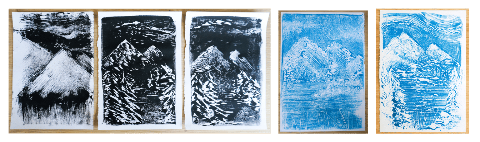
Take a look at the three black-ink mountain scenes. The one on the left is my first print. I cringe a bit to share it because my first impulse is to think it’s not “good”. Why do I initially think that? Because it’s oddly proportioned; too much ink has been lost so the contrasts are too heavy; it feels messy. BUT - in any art, if you can dole out negatives about it, you can also recognise the positives too. For me, the positives in that first print are that I could see the beginnings of some great textures peeping through in the foreground and sky; I had learned about how easily strong highlights could be created; and it released a rough mark-making energy that I’d usually hold back on.
The next time I tried a mountain scene in that session (the second image), it started looking more like my intention. There were parts about it I really liked - such as the marks making the trees and sky - but I also felt I had gone a little overboard with those marks in using them on the mountains too. It all felt a little “one-note”. But the main positive about this print is that it opened up potential - and it made me want to try again!
The image in the centre was the last black-ink mountain scene I tried, and it’s a favourite because it’s the one that brought together all the things the other two had taught me. For me, the mountain textures feel rough but solid, with different energies to the trees, and the scene as a whole feels a bit more balanced.
When it came to creating this scene in blue ink, the learning curve started again…figuring out how strongly the colour would print, and exploring the tonal values and contrasts within it. The blue (second from right) is a much looser version - and it has some interesting textures noticeable in the sky due to my ink having separated a little in the tube. (I gave that tube a real good shake before the next session!). While I felt it was a little too soft in tone, and needed more variation, I could still see that the blue ink would be fun to explore. When I eventually made the print on the right, I felt more confident in knowing where I wanted strong highlights and where I wanted softer textures, and I feel like there are some really successful elements in the print.
So let’s talk water!
I enjoyed a lot of expressive, swishy-swoosh fun with this theme. I started with the simple water/sky composition that we explore in class, but I wanted to share with you some of the other ideas which - while they didn’t make it into the class - were part of my process.
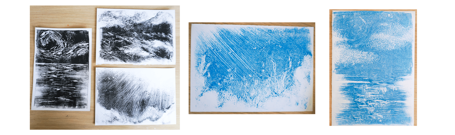
Of the three black-ink prints in the image, you’ll notice the one on the left is the one mentioned in class. But the other two are pure experiments for the fun of it. The top one is my attempt at a stormy sea - and the amazing thing about this one is that I did much of it while taking a phone call. I didn’t want to leave it to take the call, because I didn’t want the ink to dry out, so I keep dabbing at it a bit absently as I tried to book an appointment. A bit ridiculous, and I really didn’t think the print would be anything much when I pressed it. But it has turned out to be one of my favourite ever prints! Maybe it’s only me that can see what it’s meant to be, but even so, I adore all the movement and texture in it. It just goes to show, sometimes not thinking too hard and letting your hands do the creating, can create unexpected successes.
I tried two prints (one black, one blue) as an attempt at an underwater scene, and while I don’t feel either of them truly capture what I could see in my head, they were great learning experiments!
In amongst the Trees!
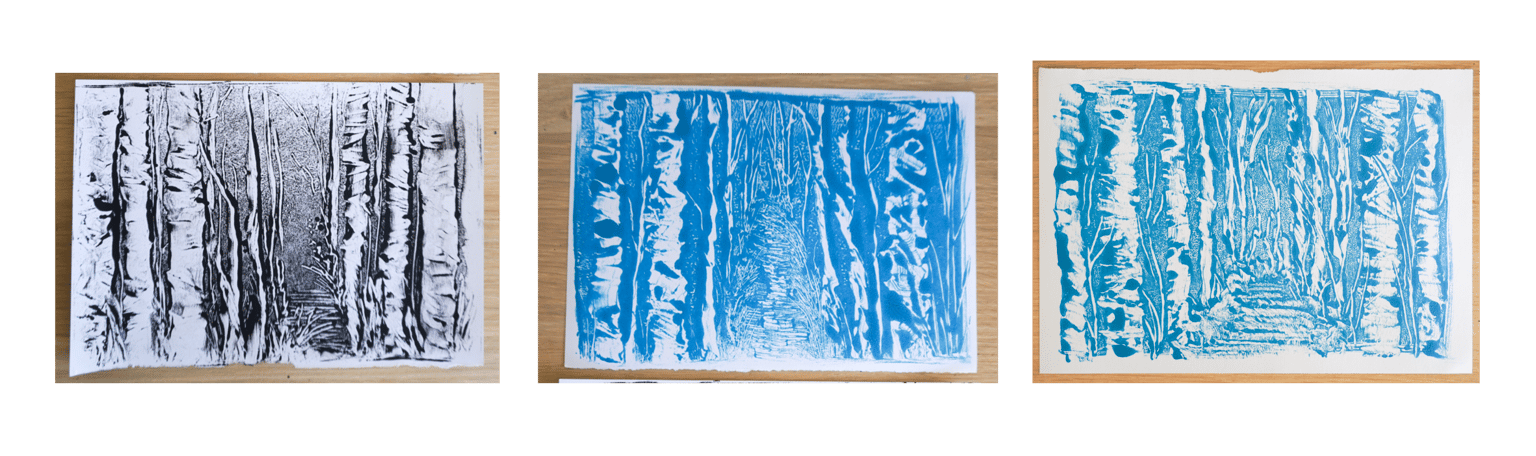
The “trees in a forest composition” is a simple but always effective one. It is also the composition/technique which I didn’t have to think about too much - and so, regardless of how each turned out, I just really enjoyed myself! I love how each one is the same but different and I could happily make more, because pushing ink in squiggly lines never gets old.
So, as you can see, enjoying Reductive Monotype is about more than just getting a good print at the end. It’s about which marks you let your hands make in the ink and how you let your mind wander as you go. No outcomes are guaranteed - at some point you just have to let your design go and take a chance. Whatever happens, happens. And the prints you’ll make will forever be uniquely, one-of-a-kindly, yours!