Duotones - Spring and Neon
High time to brush up on my Photoshop skills, I decided to make some experiments following Evgeniya Righini-Brand's excellent masterclass on duotones. Thanks for a fun and info-packed couple of hours!
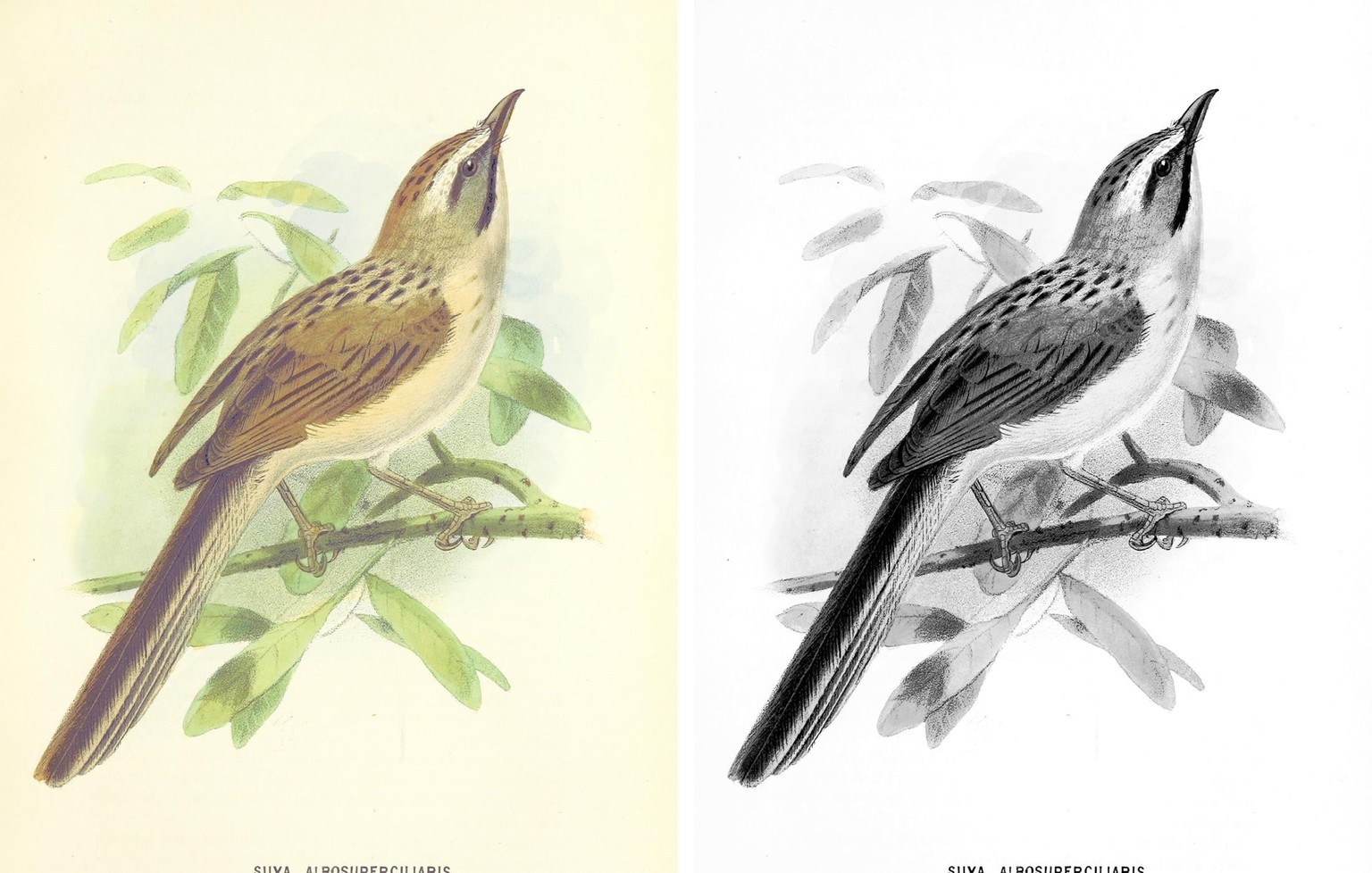
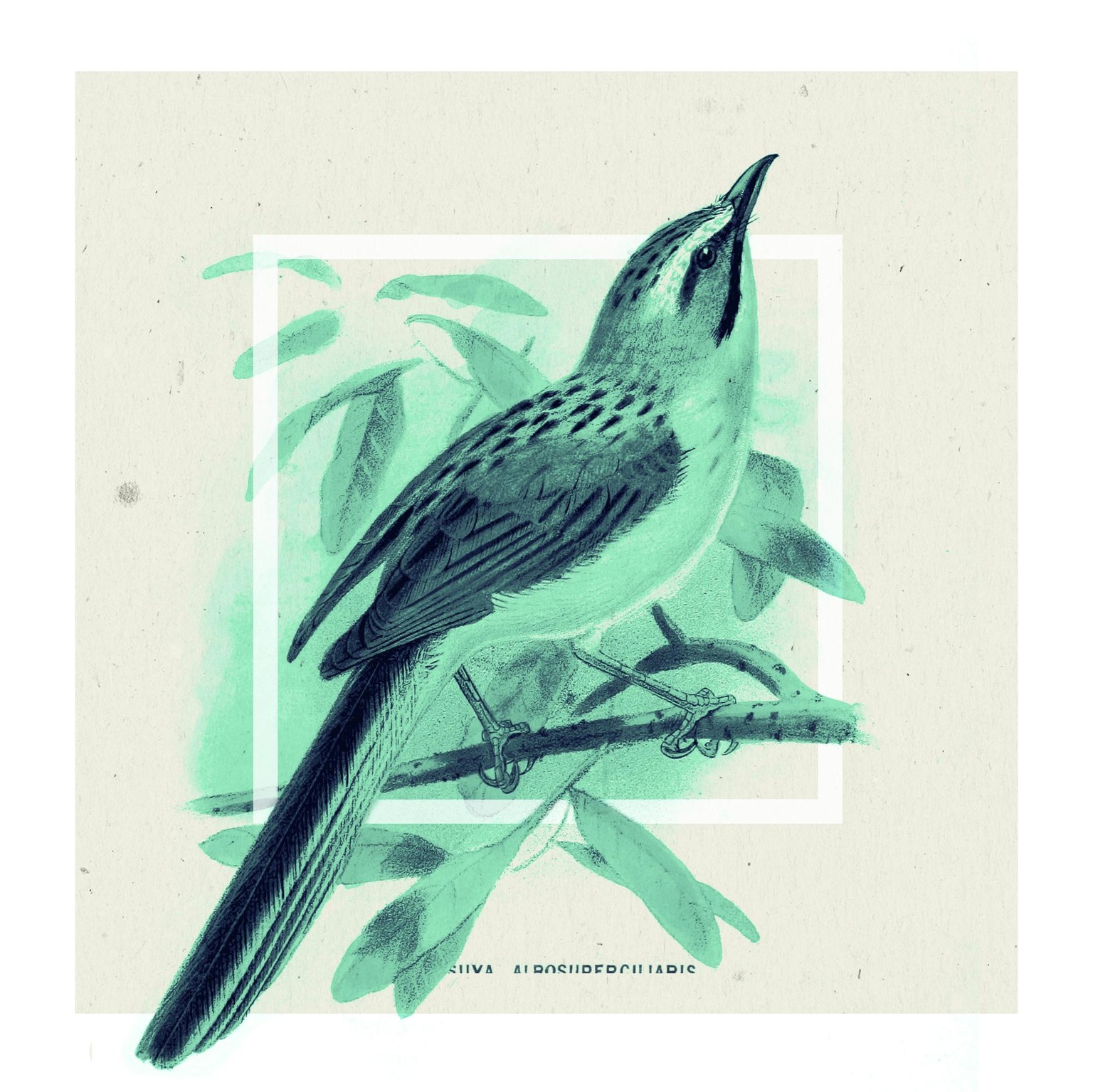
I started out with an illustration from the British Library's collection on flickr (a great public domain resource), and proceeded to bring out the contrast as much as possible.
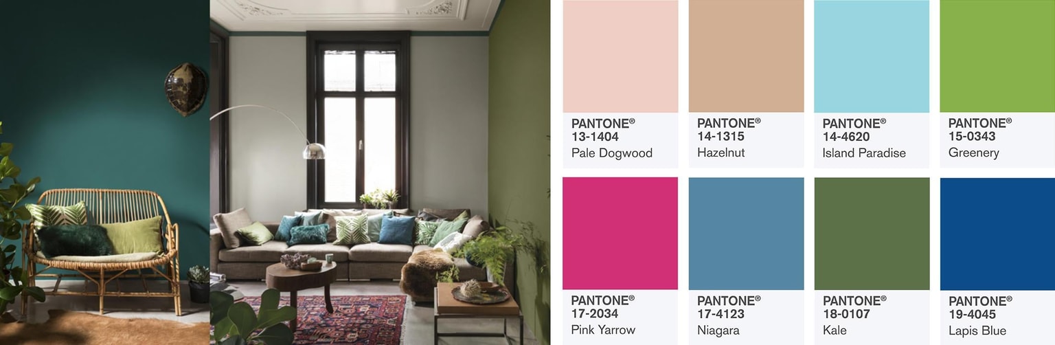
I proceeded to gather inspiration for some initial colours to use based on Evgeniya's suggested starting points.
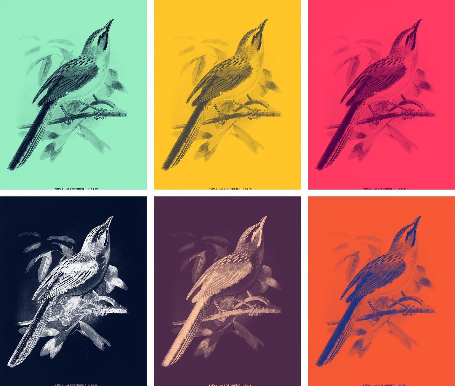
Then followed one of the most fun parts—trying out hundreds of colour combinations! Using the adobe extension was new for me, and really interesting to learn, it's definitely a resource I'll be using in the future. I've also taken the opportunity to organise all my swatches and panels more efficiently. I never though before to add a small area of white into the gradient as a highlight, I think it really makes the images stand out (tritones are certainly worth a look into as well).
A few of my favourite combinations are below.
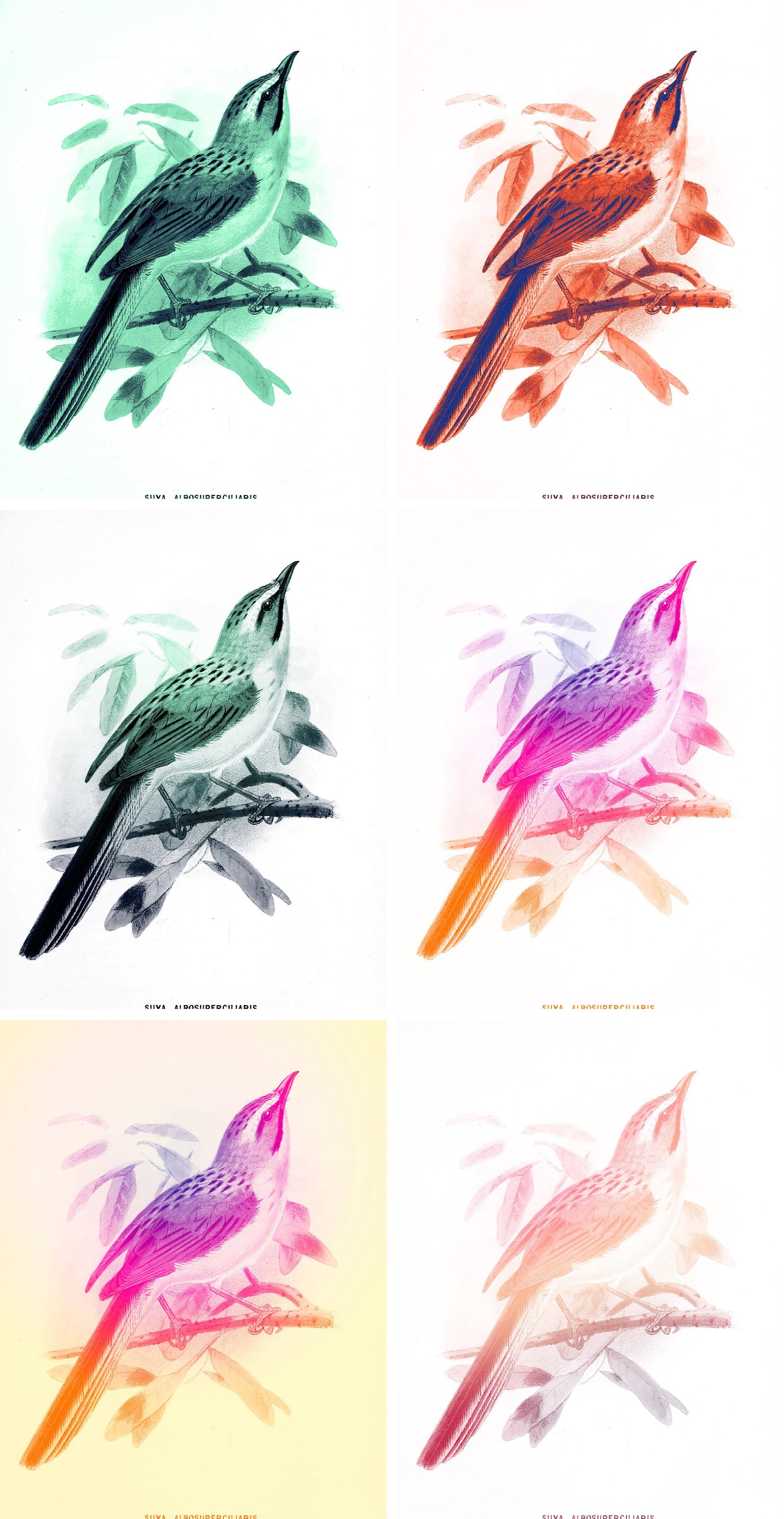
I also tried variations, like adding lighter parts to the gradient, removing backgrounds, and painting on the gradient by hand. Some of the effects remind me of split fountain printing—I'll admit, I may have stepped from "duo" to "trio" (or quad or quint) tone…
My final experiment was to use multiple images for an overprint effect. I like this a lot, and hope I can find a good way to use it soon.
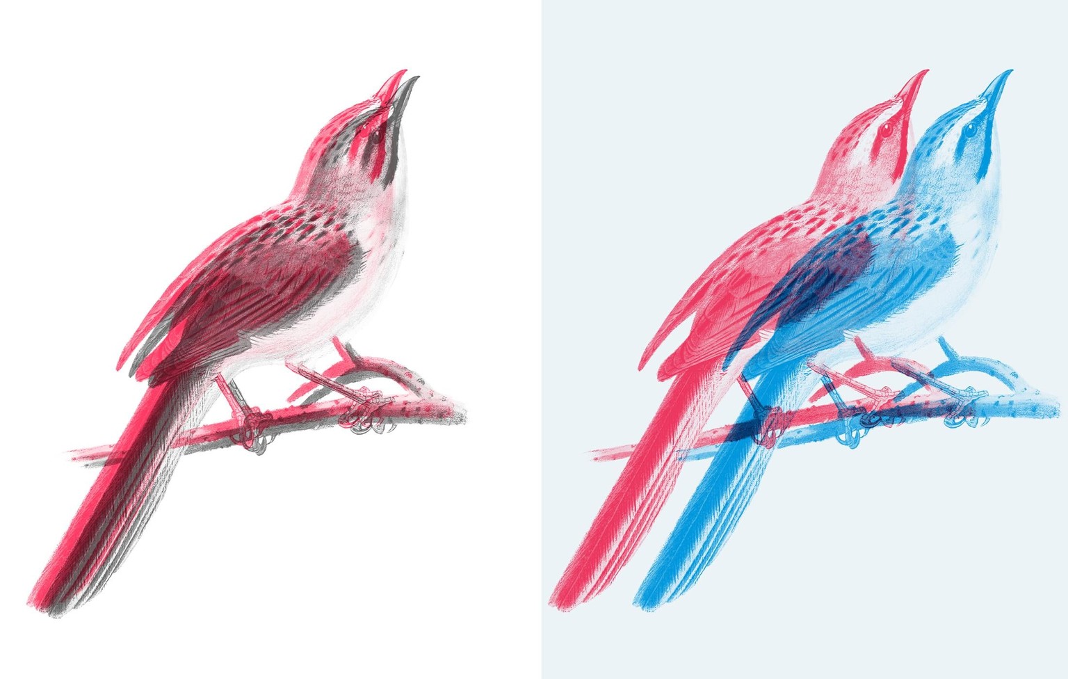
I had also tried cutting the bird out, but didn't like the very blunt feel as much. In the end, I compromised by using layering to give it more visual depth. I think the design below would be a nice starting point for a poster, album cover, web page etc. I considered adding text, but wanted to keep it simple, and quite liked the cut off effect of the latin name that was already there, so made it a feature.
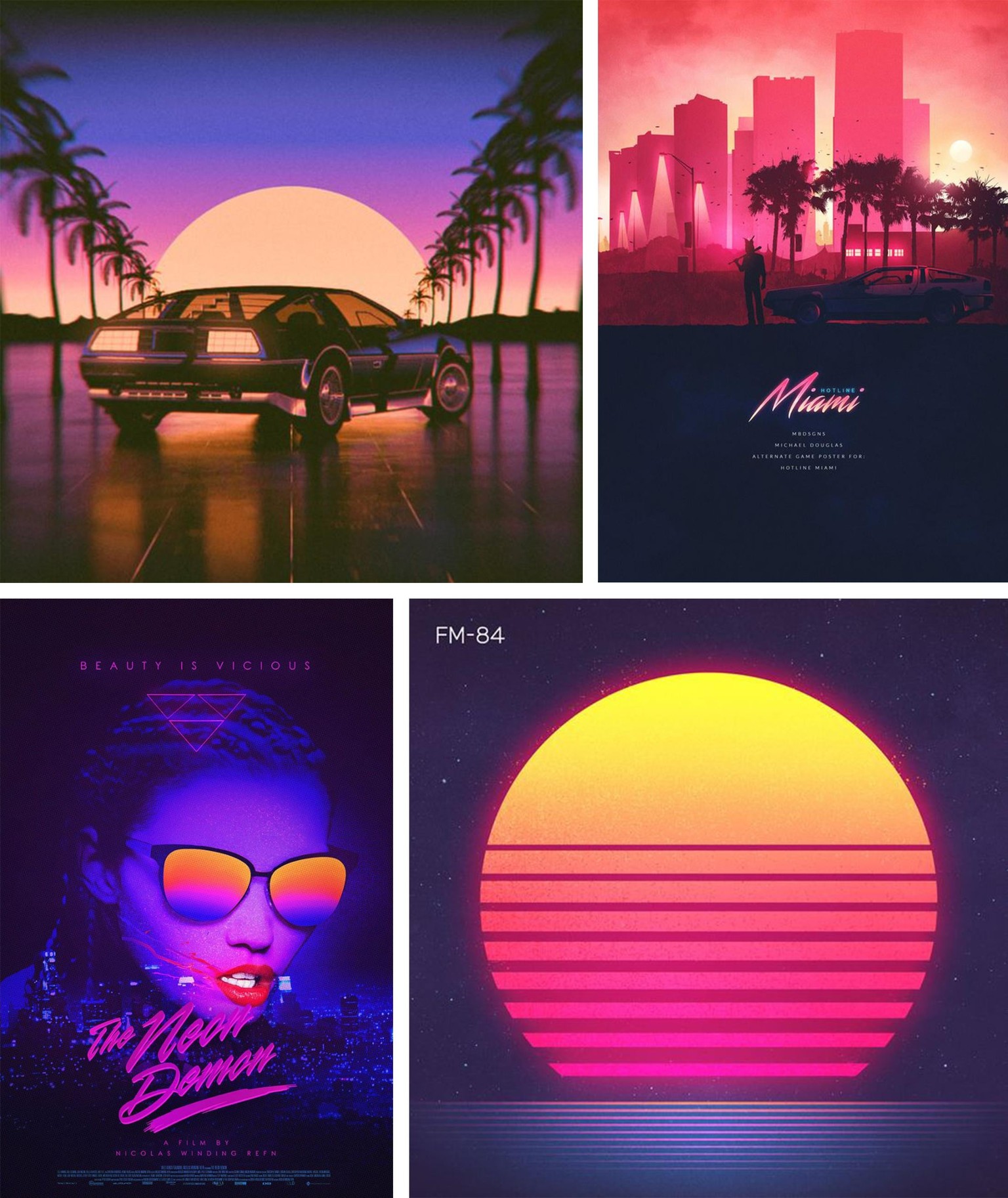
I really like the subtle colours and simple layout of this result, but found myself yearning for something garish, bright and tacky. I started researching art deco and 80s Miami style; cliché, perhaps, but it ticked the boxes.
View larger All credit to original artists
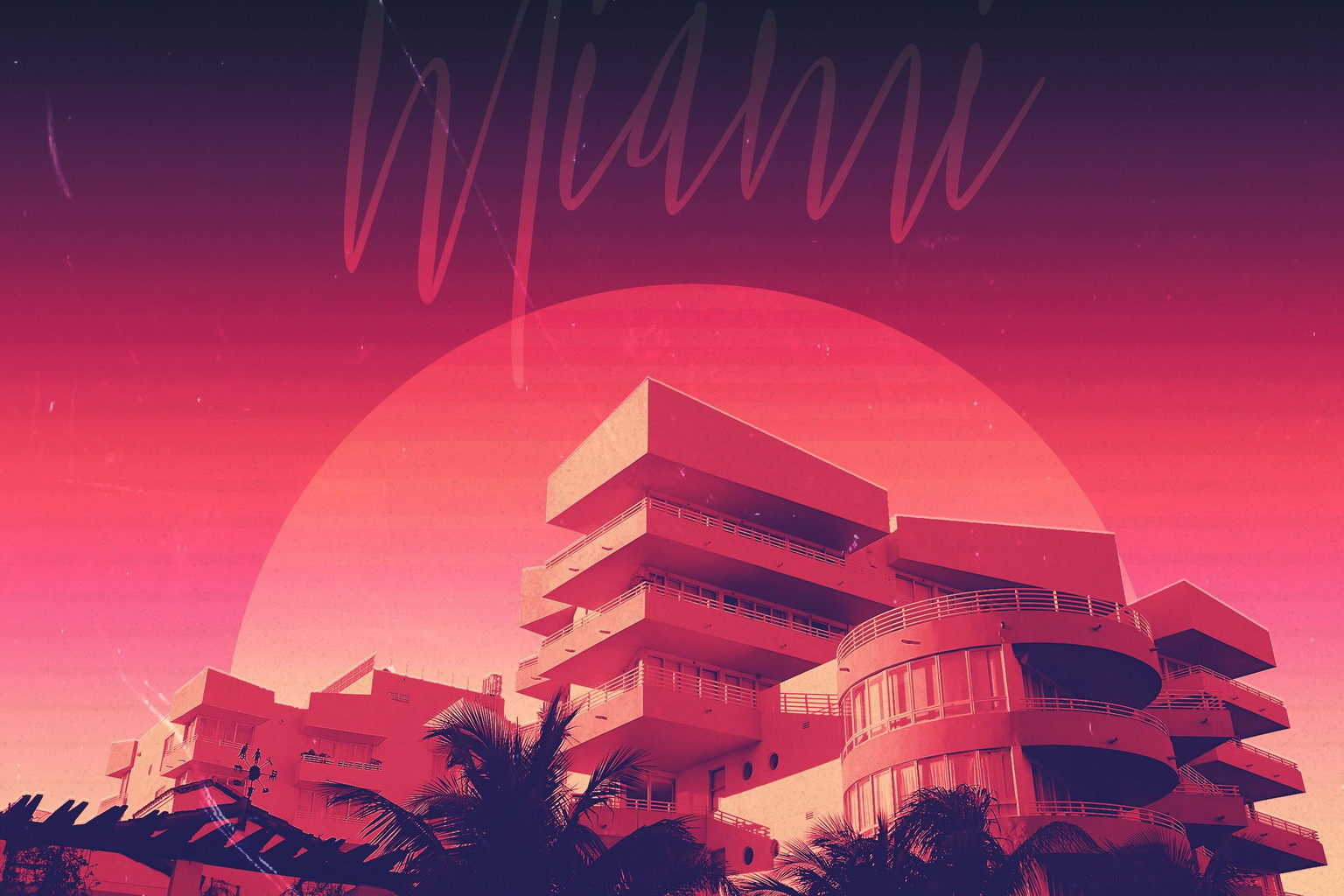
This attempt was a little different as I based it off a photograph. I also added a small highlight, to simulate both light hitting the roof and a registration printing error. A few more iterations and I might be able to get it as bright as I'd hoped!
I'm looking forward to using this technique in my day to day work, though I'm sure in a more subtle and legible way.
Thanks again to Evgenlya for a great class, if you haven't tried it yet I'd recommend taking a look. As always, feedback is more than welcome!
Ellen Covey
ellencovey.com • twitter.com/coveyellen • instagram.com/coveyellen