Curiouser
Hi Everyone,
I have been using illustrator for quite years now but I always stuck to within my comfort zone. I have always loved lettering and trying to hand draw type so I thought this class is an amazing opportunity to try and develop my skills in both areas.
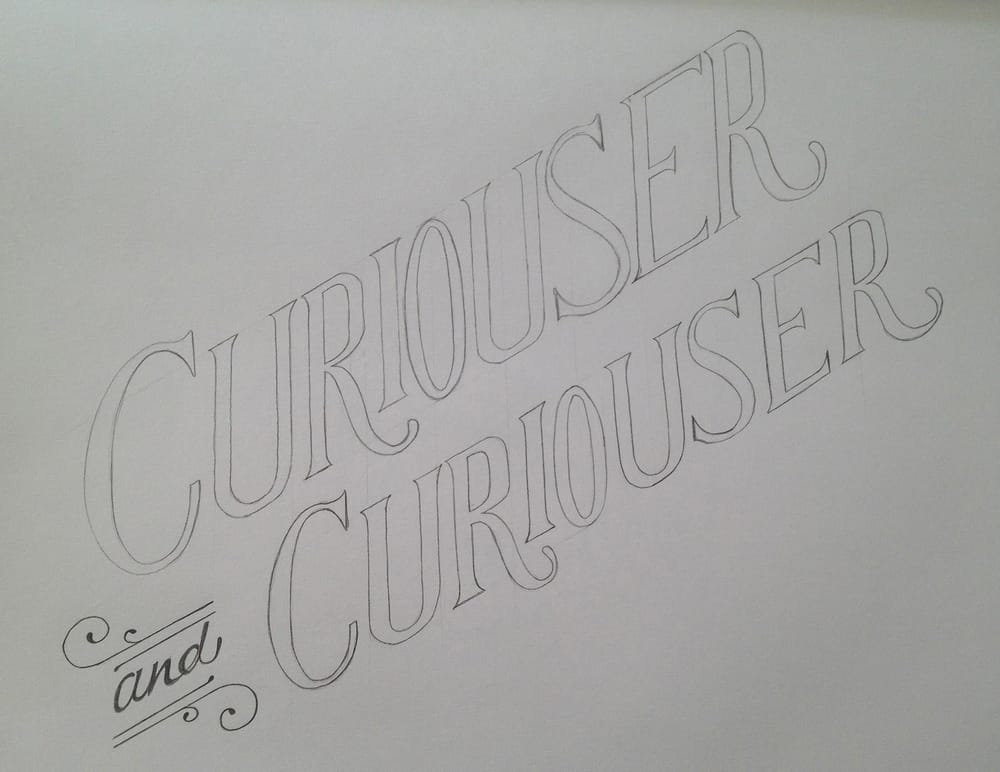
I have chosen the word Curiouser as is has a couple of letterforms which I always struggle with when trying to draw – C,O and S. They are just troublesome for me!
So I did some initial sketching and ended up with a composition using the quote Curiouser and Curiouser which i quite like, still pretty rough and I'm not happy with my C,O or S's but I can work on these more once I get in to illustrator.
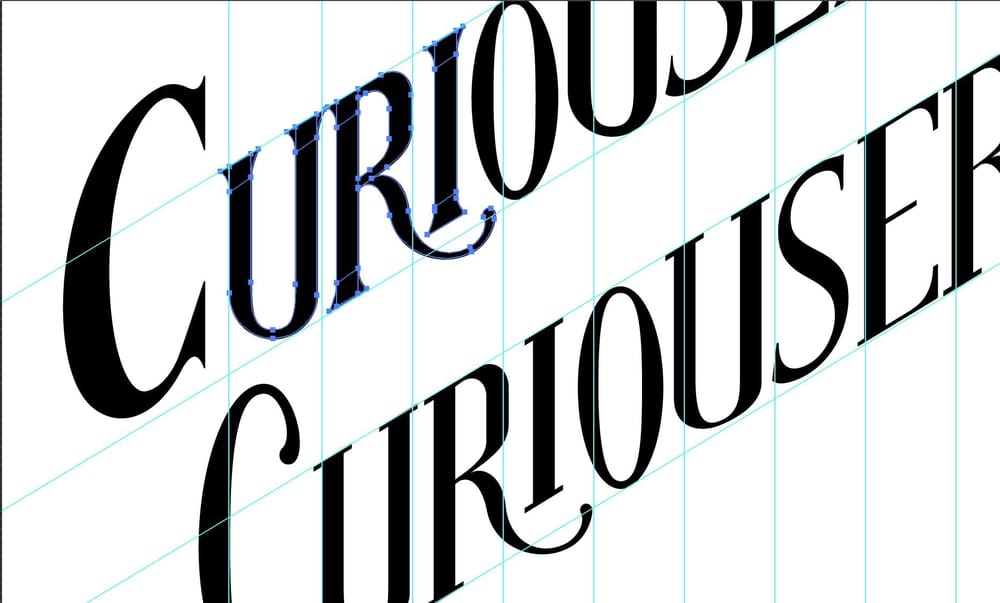
I scanned in my illustration and then started to trace my letterforms. Once I saw my initial letterforms vertorised I wasn't happy with the serifs, something about the curves just wasn't right. So I tried a simplified version – you can see the two versions below.
So here is my inital layout:
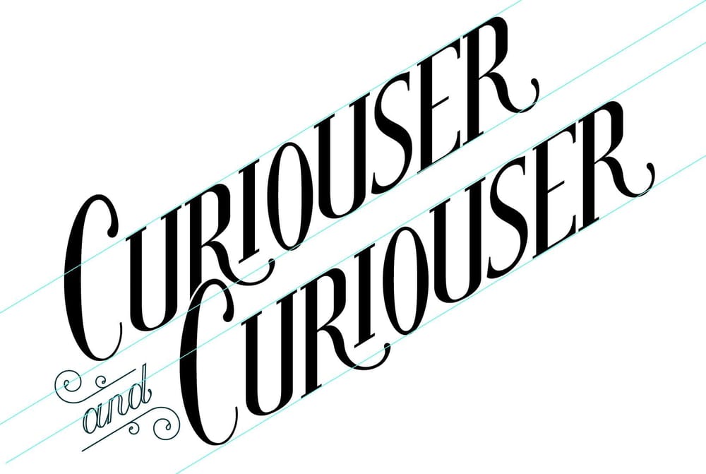
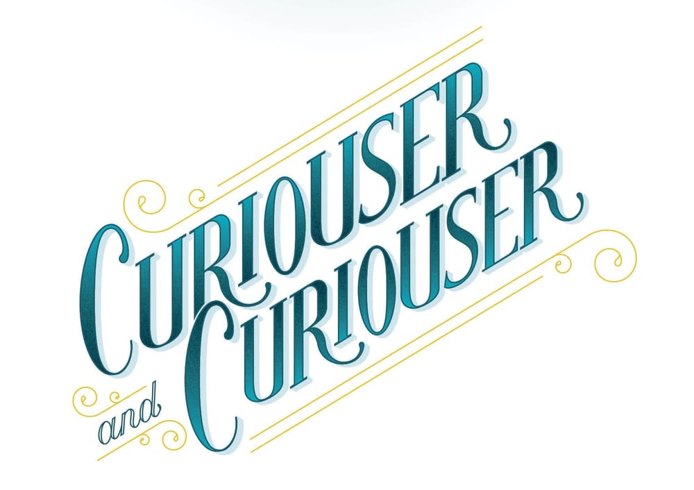
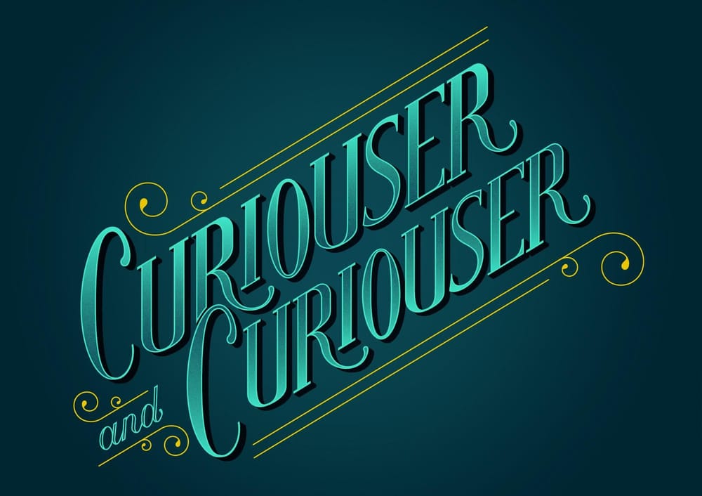
From here I then started trying out some colour options and some drop shadow techniques.
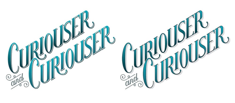
From here I made some slight changes to the composition and started looking into embelishments, textures and trying the layout on a coloured background.
Thanks for taking a look at my project so far!