Creative typography posters by Veronika
Thank you very much for this course! It really showed me some interesting ways to experiment with my typography :) For the posters I made today, I will explain my decision that differ with your examples:
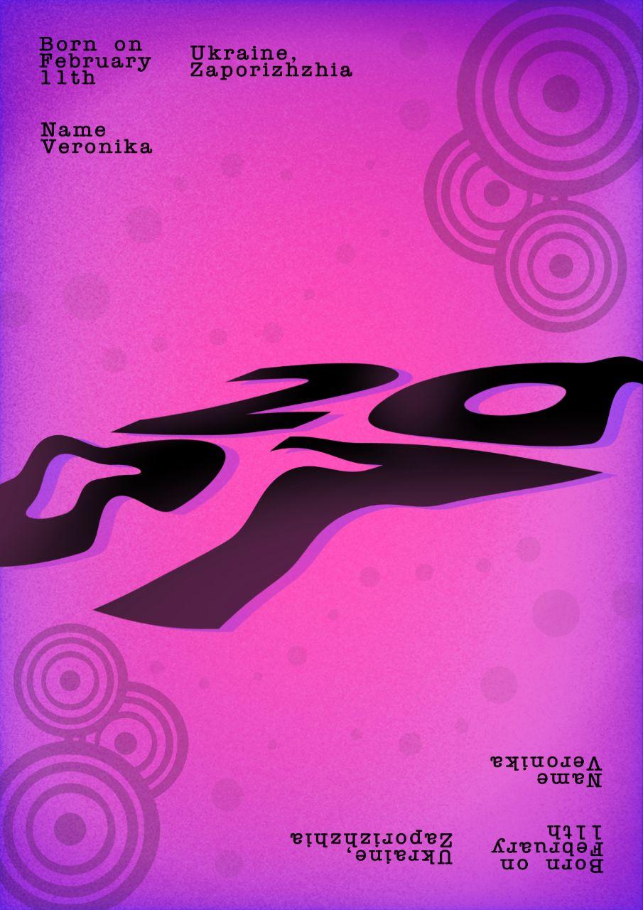
1. I changed the colors and choosed another font, to reflect the era (especially the emo/scene movement, because in my country 2007 is considered the year when this subcultures were really big). Also I added some fruiger metro style details.
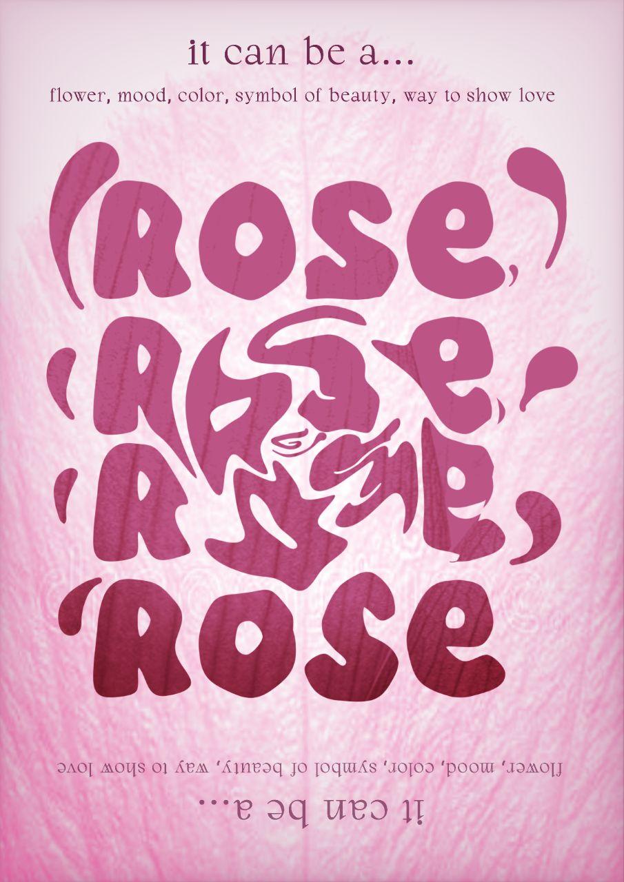
2. I wanted to make a flower out of text, but also reflect on how "rose" can not only be a flower, but also a color, a symbol, and even a mood!
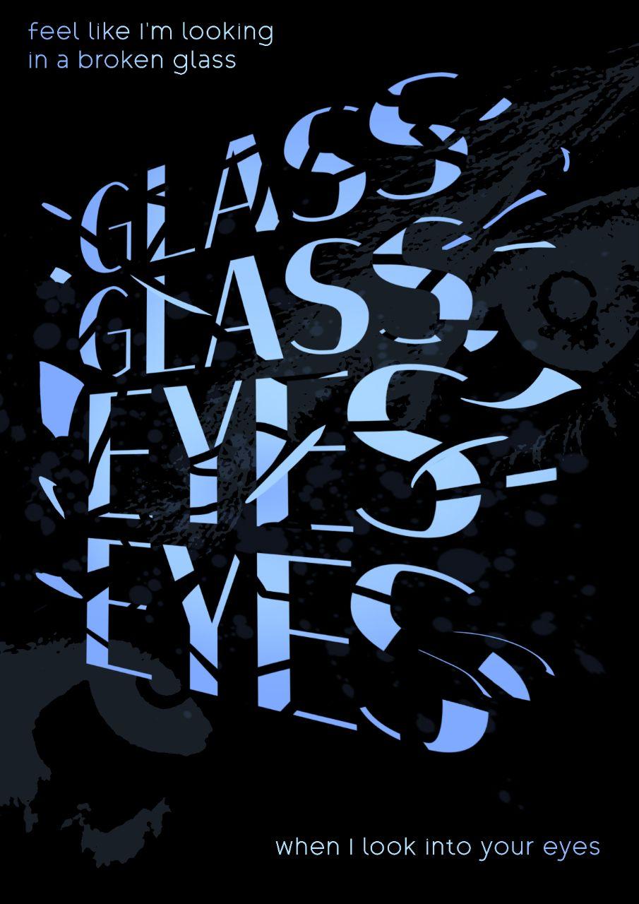
3. I really liked the idea of a broken glass effect, and wanted to link it with a narrative.
Thank you again for your lessons, and have a wonderful day!