Colour swatches for a new collection
I truly enjoyed this class, Weronika! Thank you so much for sharing your thoughts and introducing new ideas.
Even though I've been making lots of different kinds of swatches over the years, I haven't actually done the cut-out ones. Now I'm just sitting here wondering why because they seem so helpful! I'm excited to add more to my pile as I go. As you said, they can be very practical to have by your side when deciding what colours to use in a painting (especially when you're able to move them around.)
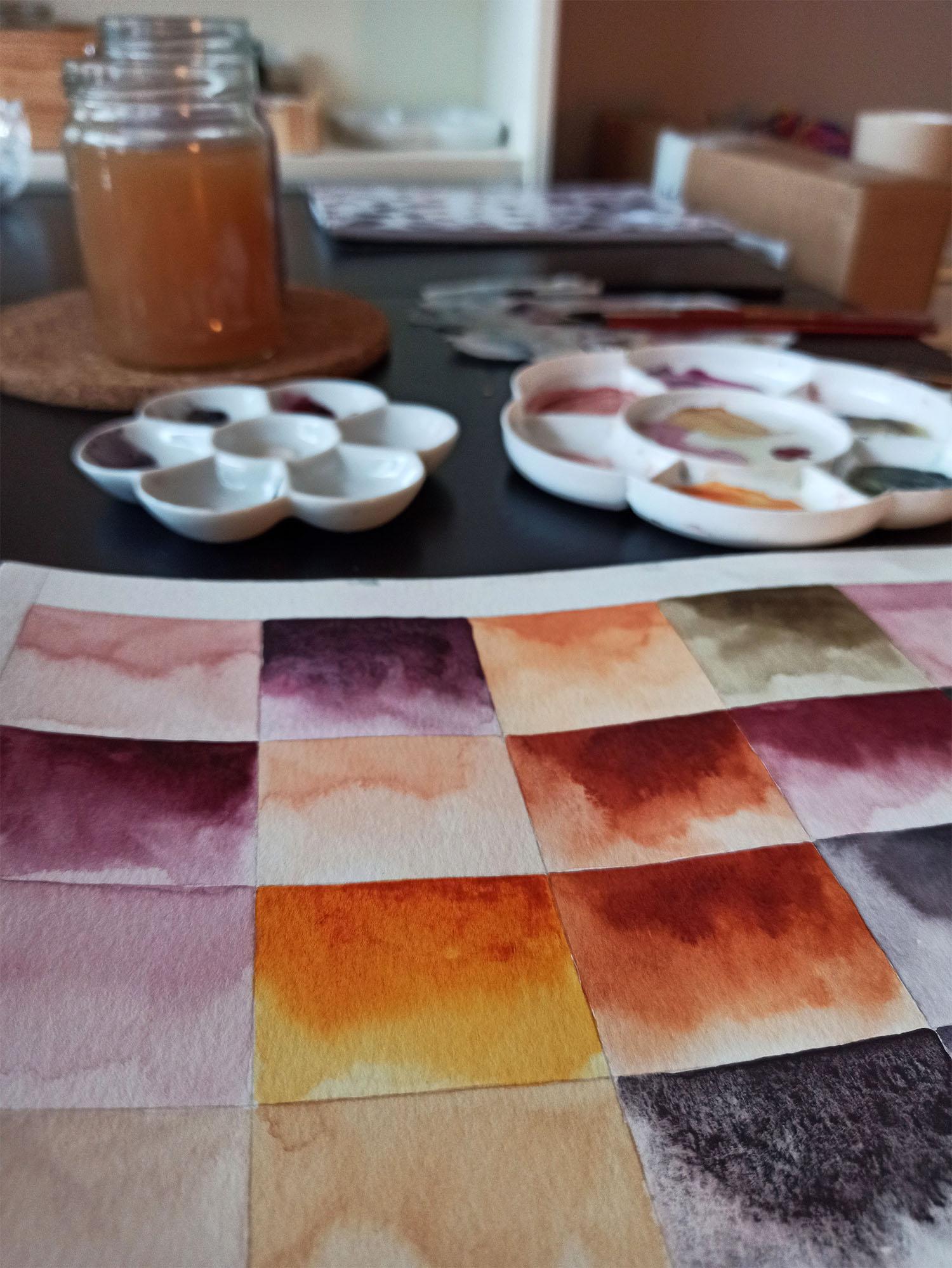
I decided to choose seven different watercolours (quite intuitively) and get more familiar with them because I am just about to start painting a new collection. At the beginning stage of any new art project, it's always exciting to experiment with colour palettes. I certainly do enjoy purchasing new supplies every now and then (there are so many wonderful colours out there!) but lately, I've been more interested in getting to know the paints I already own on a deeper level. For example, experimenting with what different tones I am able to create when mixing and matching different paints and/or when I add more or less water to the pigment.
For this project I used the following watercolours:
- Titanium Buff (van Gogh)
- Quinacridone Gold (Roman Szmal, Aquarius)
- Transparent Oxide Red (Roman Szmal, Aquarius)
- Naphthamide Maroon (Daniel Smith)
- Bloodstone Genuine (Daniel Smith)
- Neutral Tint (Lukas)
- Sodalite Genuine (Daniel Smith)
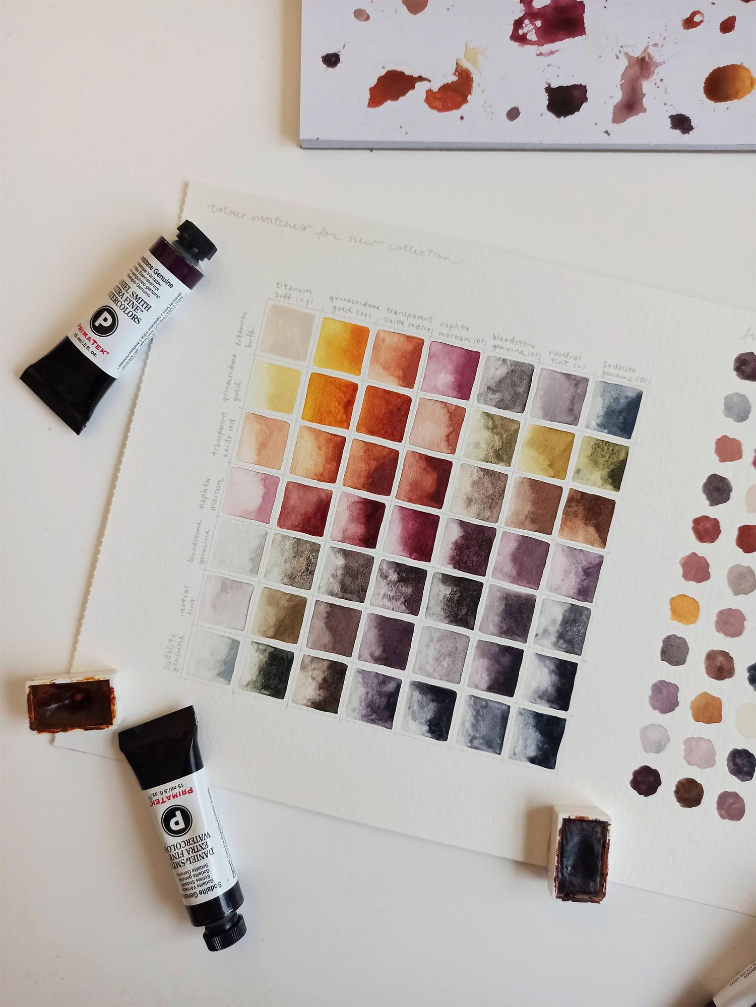
First, I created a pretty structured colour chart on a loose sheet of paper because I think these are quite handy to have as reference (and fun to make, too!). They also give a nice overlook of different combinations. I played around with the pigment ratios when I mixed two colours to not create two similar squares in the grid.
After this exercise, I had a palette filled with yummy colours so on the right side of the colour chart I just made some simple washes. I didn't write the names of the colours because there was no way I could keep track at this point haha. However, these swatches kind of give an idea of the different colours I could use when mixing and matching the seven chosen colours freely.
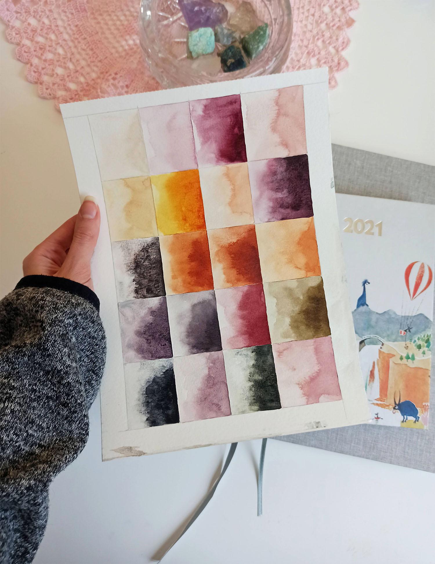
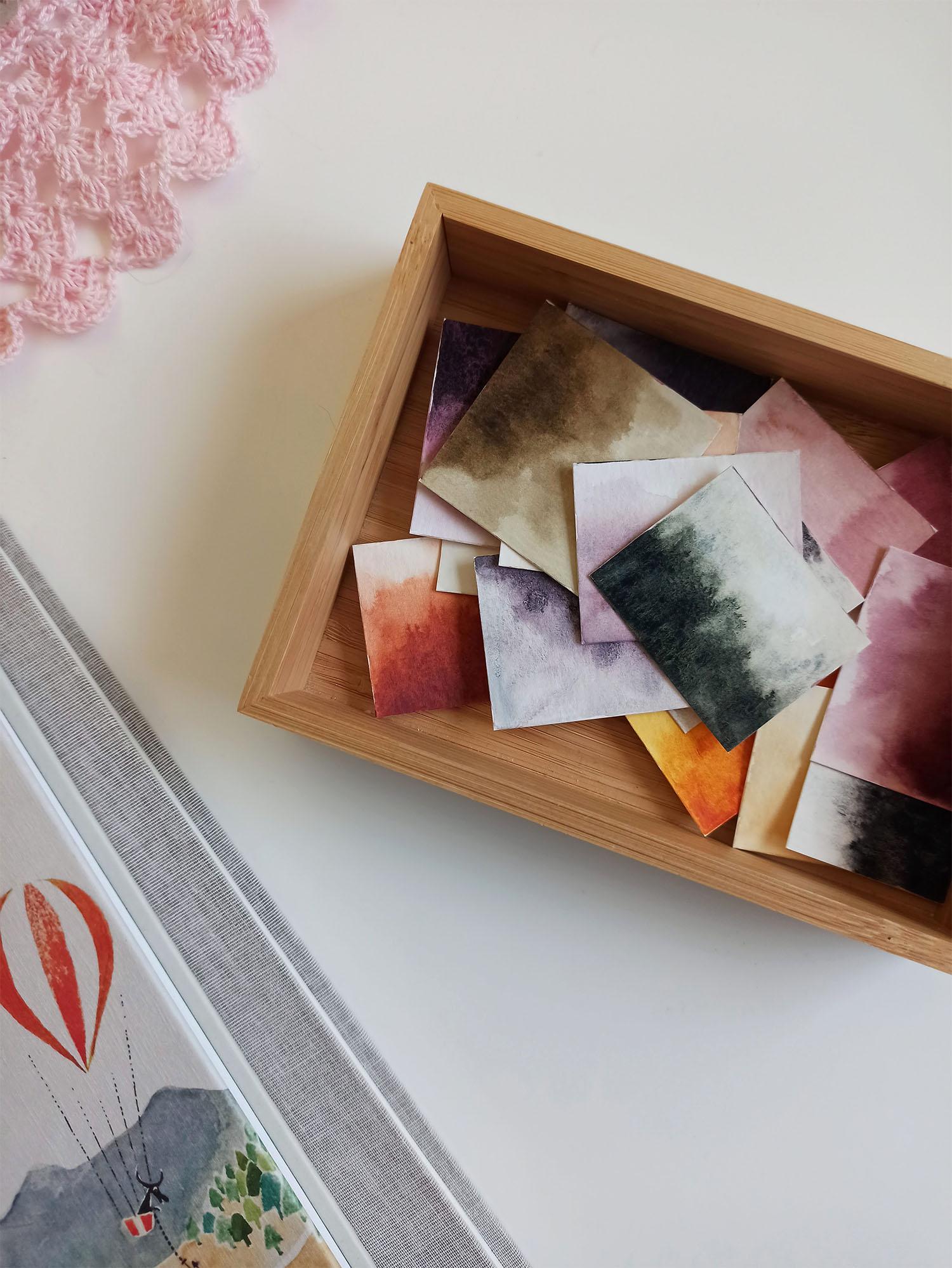
Lastly, I prepared cut-out swatches. I took a new sheet of paper and drew some rectangles. First I painted washes of the seven colours and made gradients so that I would be able to see how the colour changes when adding more water to the pigment. I filled the remaining rectangles with some of the colour combinations that I had discovered in the first exercise. For example, adding Titanium Buff to Transparent Oxide Red creates a beautiful apricot colour and mixing Naphthamide Maroon with Sodalite Genuine results in a wonderfully granulating purple.
Thank you so much for this class and I can't wait to start out my new project now that these stunning swatches got me all excited!
x Salli