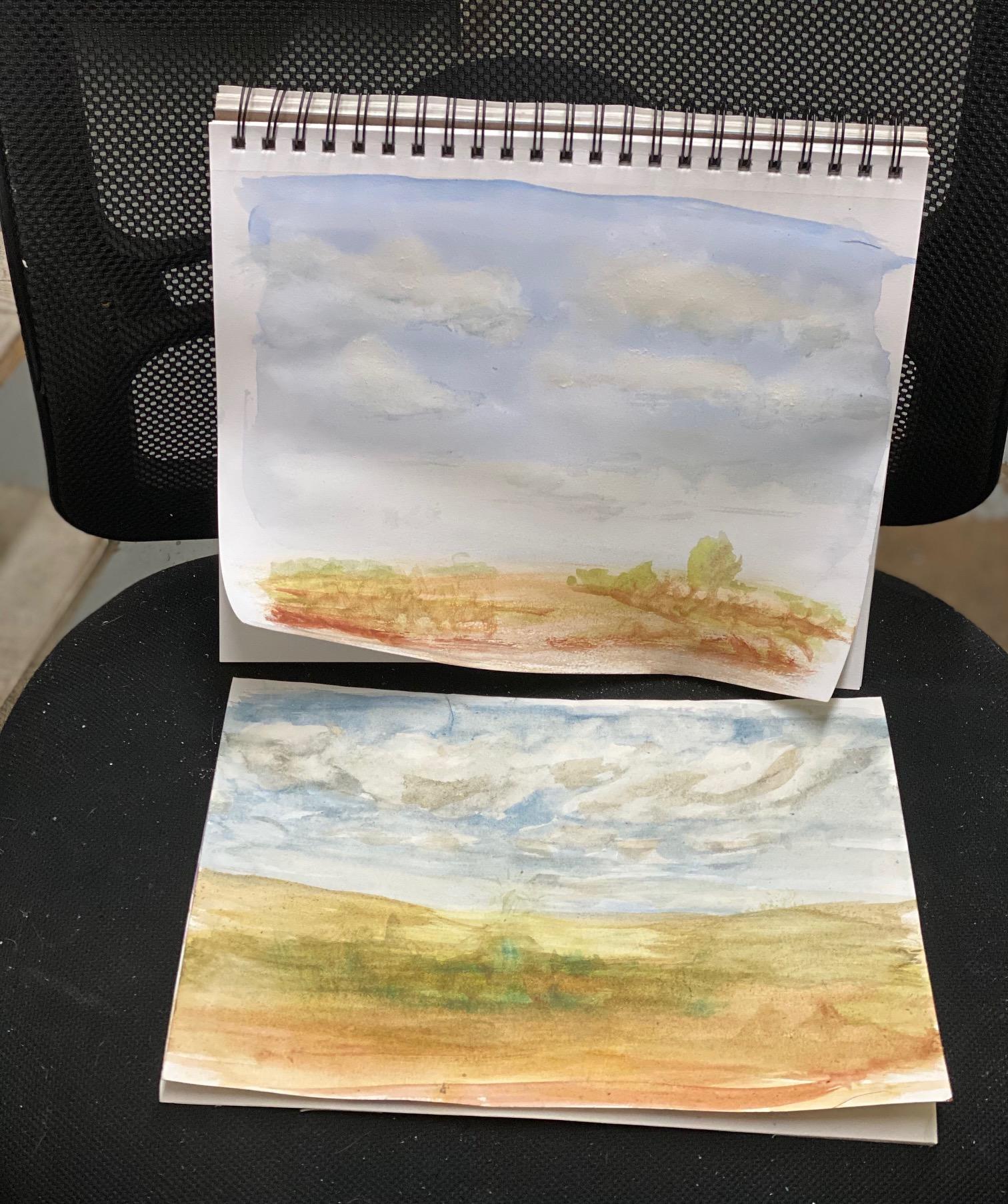
Close to my worst paintings yet
This is about number 15 attempt at clouds -
I'm only posting this because Robert is such a good instructor and there are no submissions here - yet. I'm sure when they see my bad effort, there will be more posting. The top one I tried first on the back of a painting on Arches. The bottom is the second effort on cheap sketchbook paper. I even damaged the paper near the horizon by fiddling! I just can't lay the color and leave it alone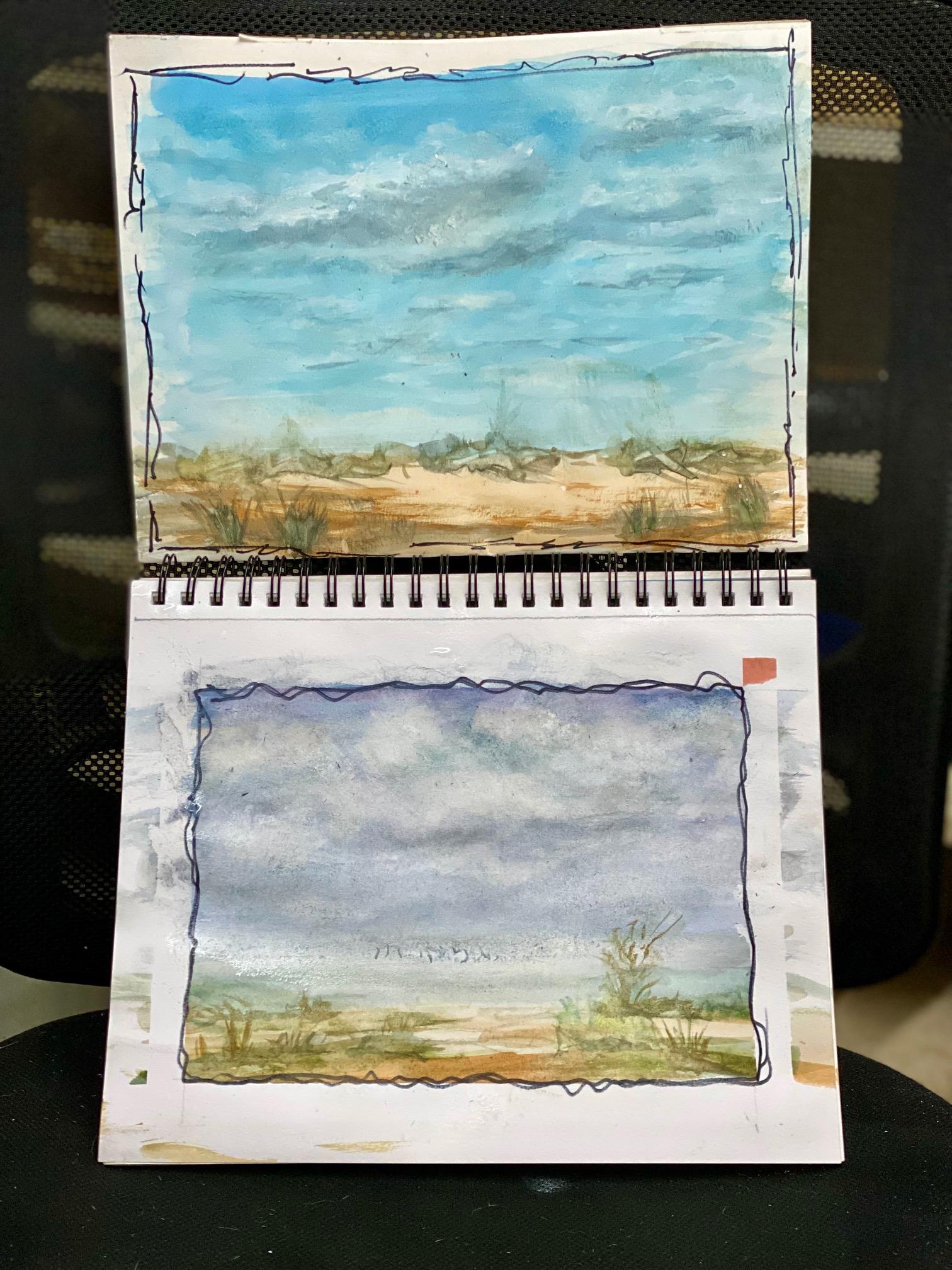 . Fiddle, fiddle and the more I fiddle, the worse it gets instead of getting better! I'll have to do 20 or 30 more of these before I ever get the hang of it. Feel free to give suggestions for improvement - like STOP fiddling! My colors don't look so hot either. Oh well -- nothing ventured, nothing gained. Ever onward. I can see how Arches 100% cotton paper is much better for this than cheap sketchbooks. The thought struck me - would it be easier to lay in the warm and the cool cloud shadows first, then use the blue sky to outline the white clouds, yes, softening some areas?
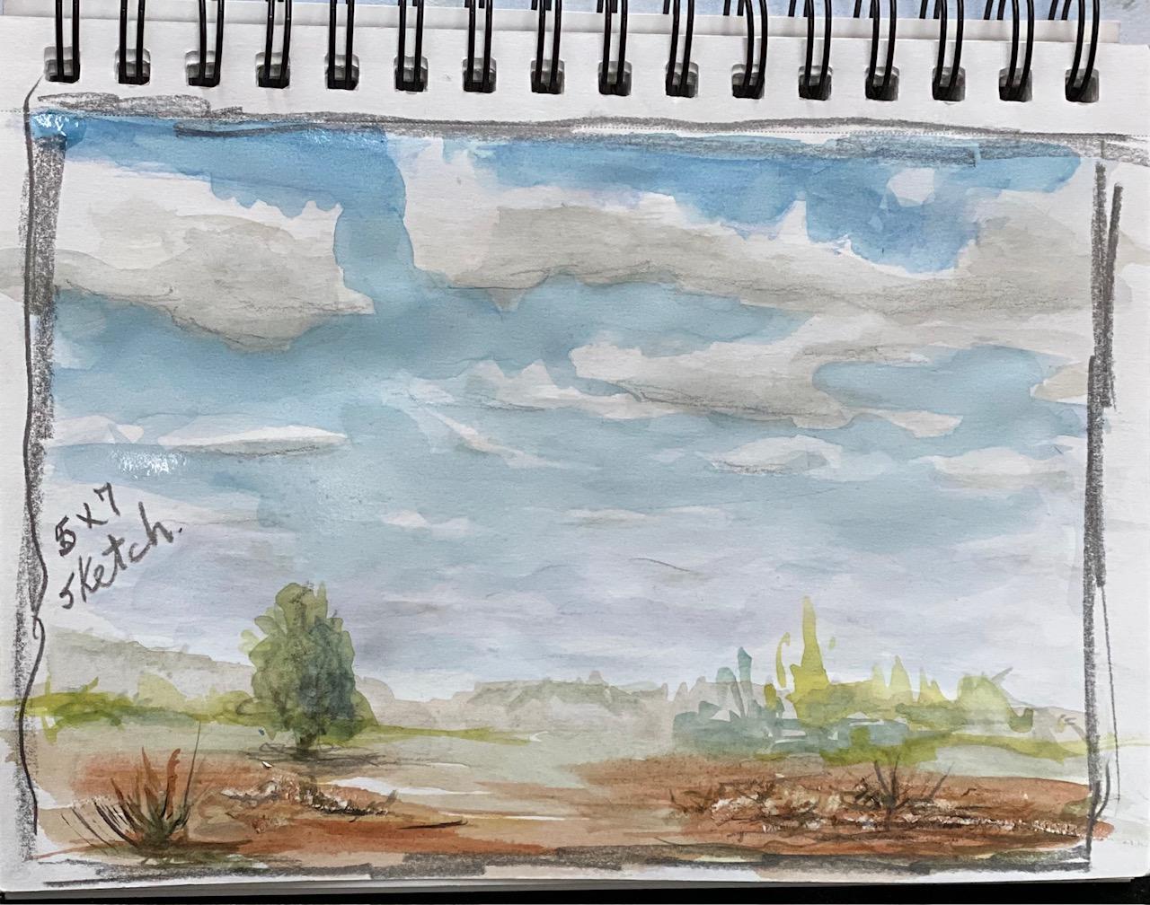
Edited to add two more skies. I like the top one the best (with soft clouds) but the blue sky is very pale. I think if the blue was darker, I'd like that one. Bit more realistic than the instructors, but I fight that all the time, no matter what style I'm painting. -- Oh, don't look at the ground in the bottom painting. That green junk was already there from another painting. I'm using scrap etc to practice clouds. Latest attempt is the 5x7 sketch on cheap sketchbook paper.