Business card for a fashion illustrator
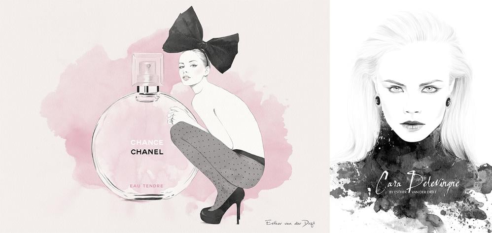
In this class I will be designing a business card for myself as a fashion illustrator. My work is typically minimal, elegant and feminine, so it's important to me that my business card also represents my unique style and brand. Here are some examples of the type of work I do to give you an idea of my style (you can see more on my Instagram):
REFERENCE PHOTOS
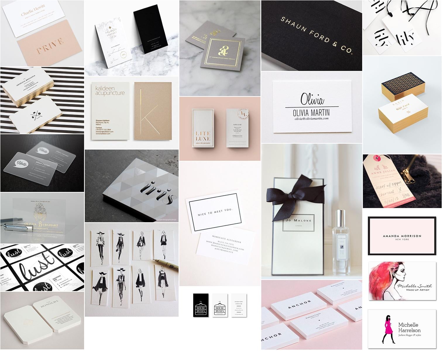
I was immediately drawn to monochrome and pastel pink colored business cards. I also really like subtle effects like foils or spot varnishes to spruce up the design.
FAVORITE JUKEBOX PRINT CARD
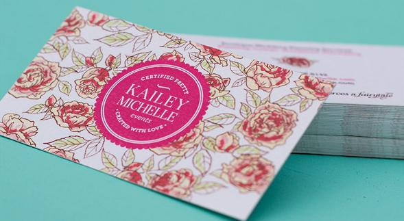
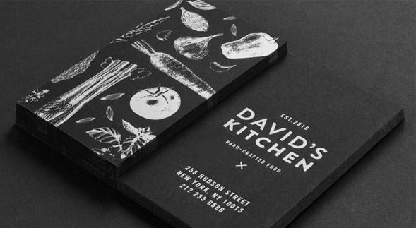
I picked two favorite Jukebox Print cards: one pink on recycled white paper, the other black with white foil details.
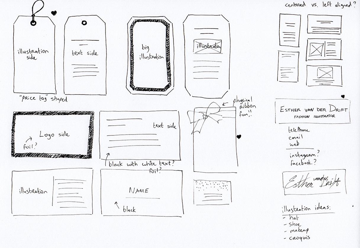
ROUGH SKETCHES
Since I'm an illustrator, I wanted to have an illustration on at least one side of my business card. In my rough sketches I used a lot of 'placeholders' for my business card elements (logo, illustration, text). My focus was more on the shape of the card and the alignment of the basic elements. I put some hearts next to ideas that I really liked, although I'm not sure that I will end up using them right now. I think I'll go for a more simple design first, just to get the hang of setting up my document for print.
FINAL BUSINESS CARD
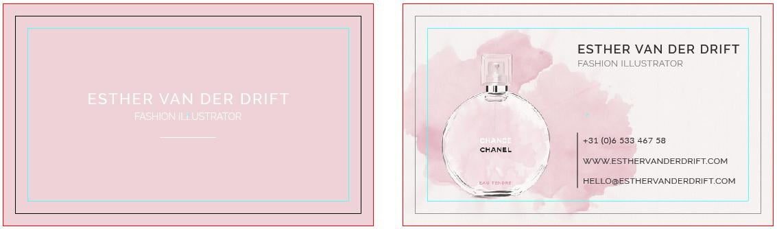
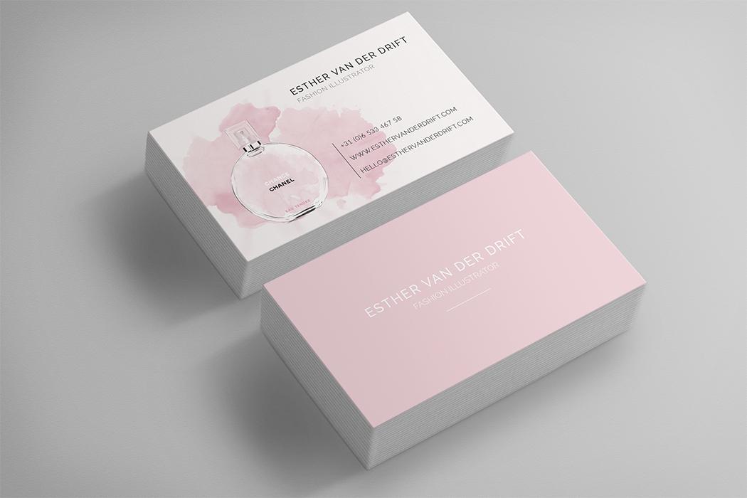
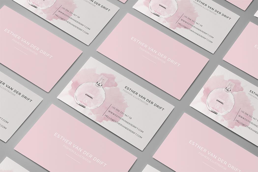
Here it is! My final business card design. I decided to use the perfume bottle from my Chanel illustration as I really liked the aesthetic of of the bottle with the watercolor stain. The front of my card is a soft pastel pink. I think a silver foil or white spot varnish would work great for the text!
I really enjoyed taking this course! While I wasn't exactly new to the Adobe Suite, I never learned how to properly set up my software for printing business cards in all three programs. Thank you Jon for all your guidance and I'm looking forward to your future courses!