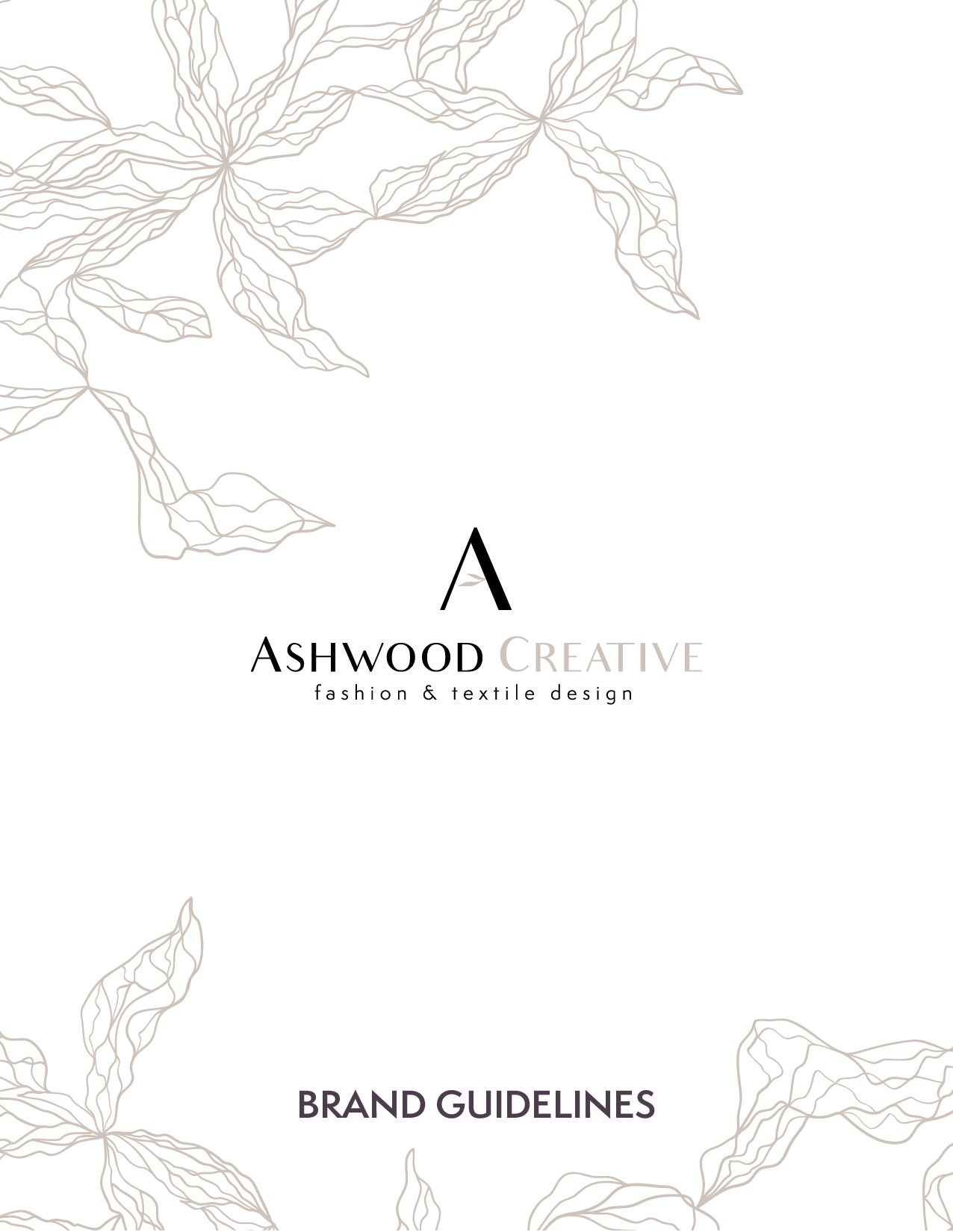
Ashwood Creative Re-Brand Project
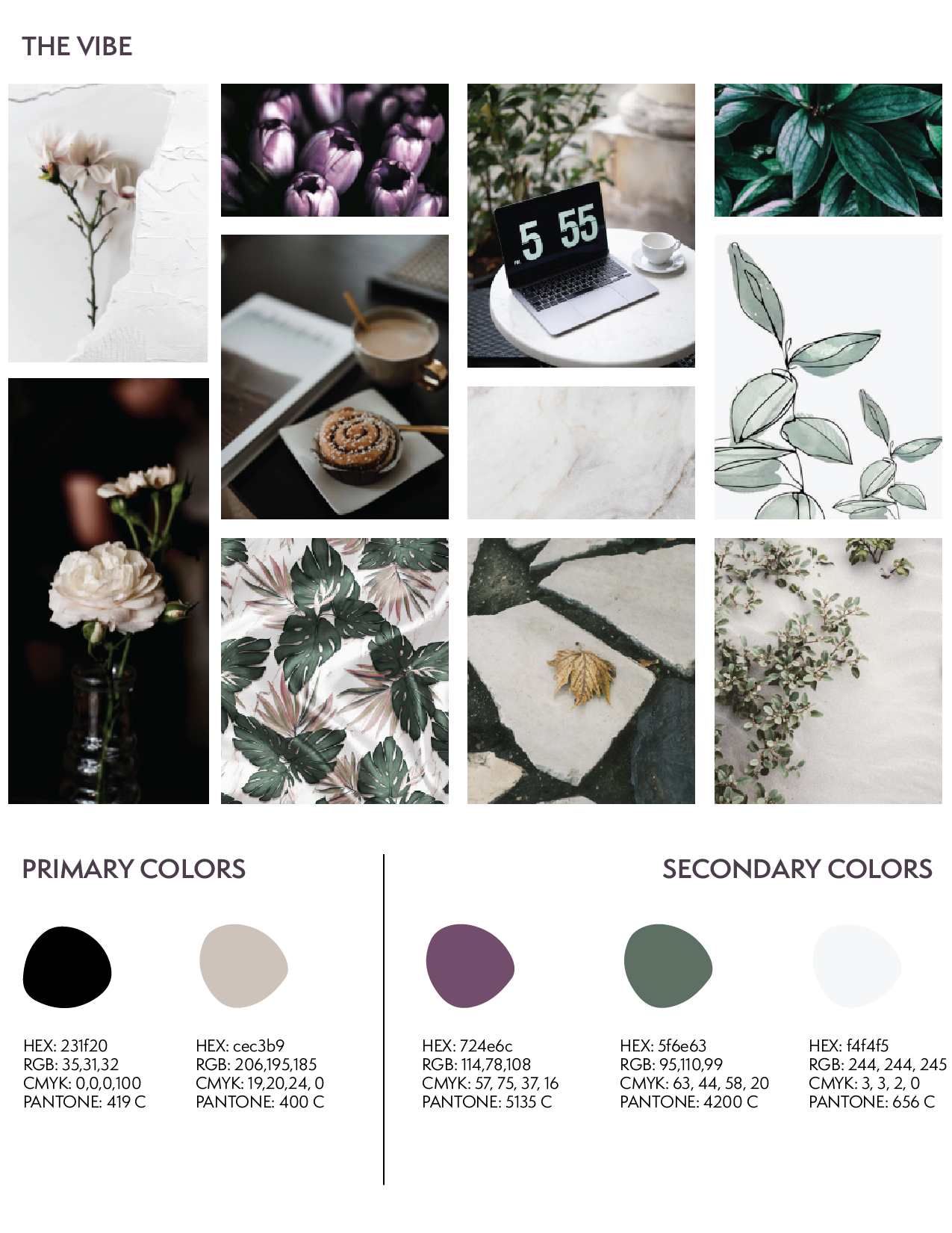
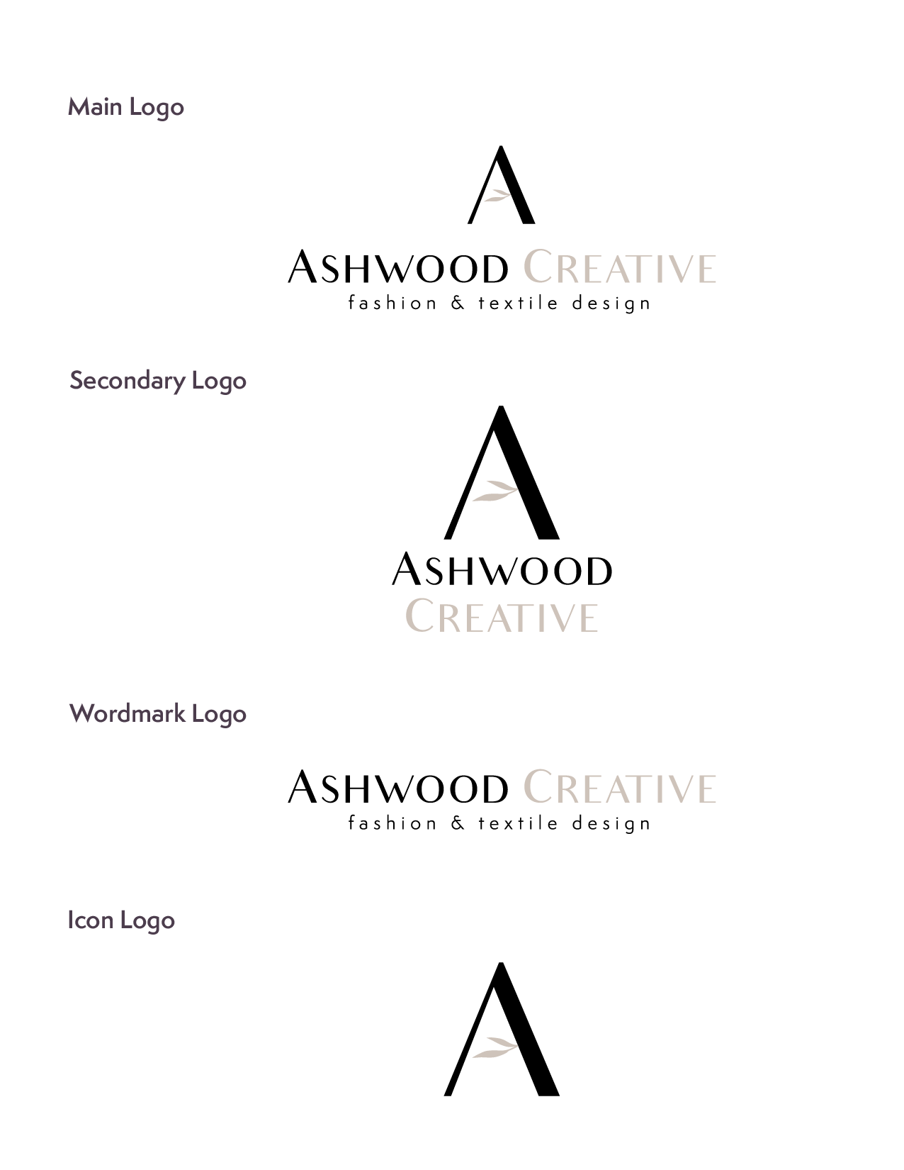
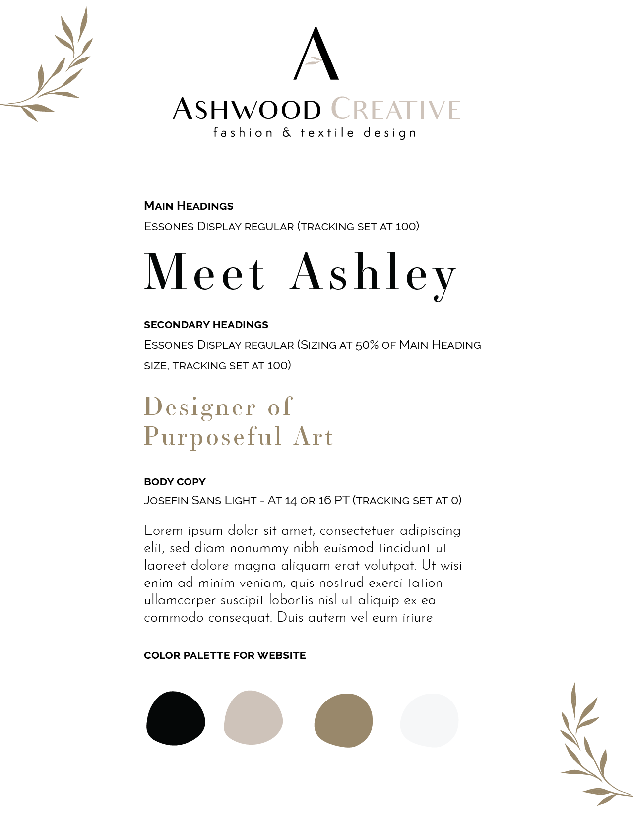
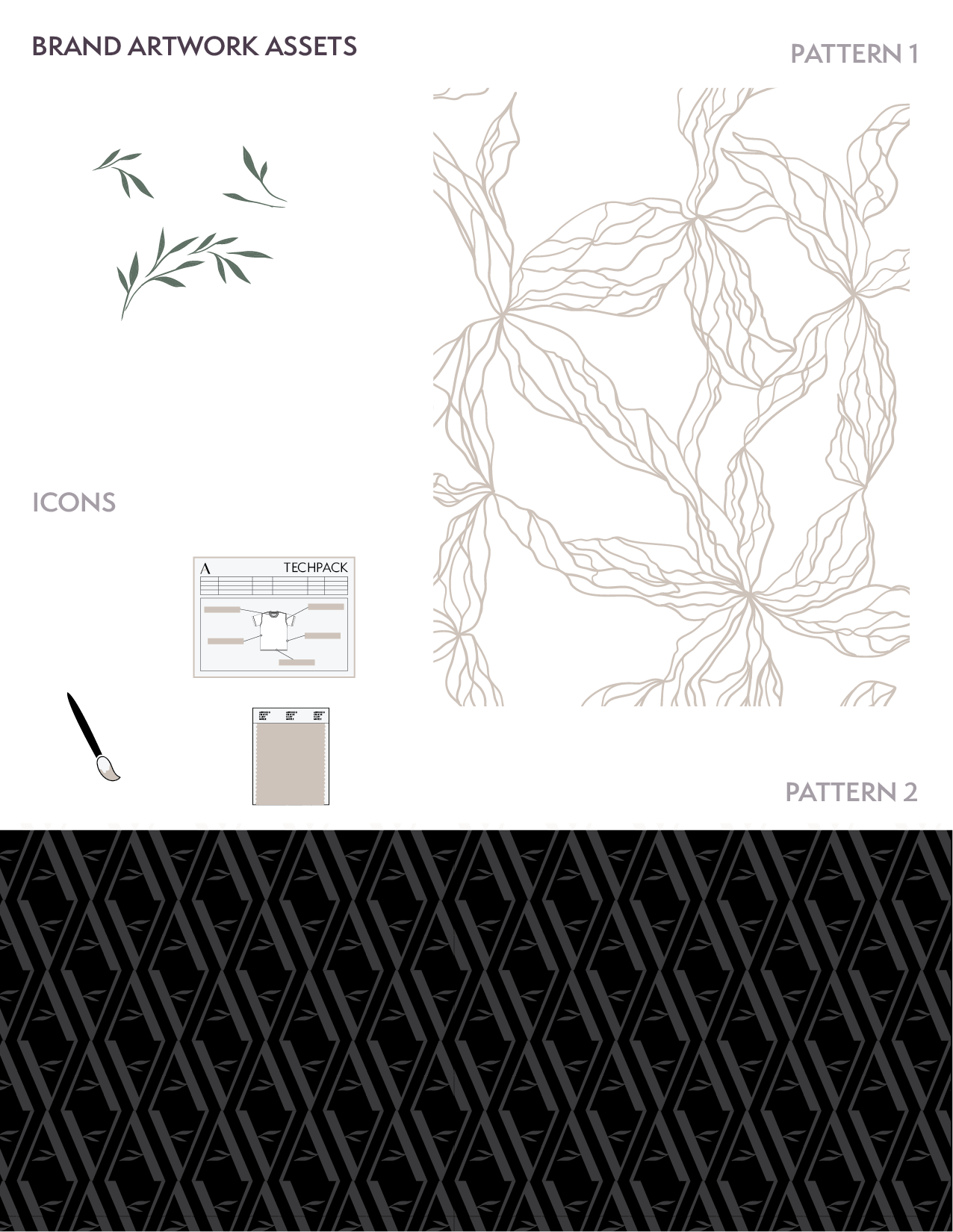
I'm a self-employed Apparel & Textile designer who has been working freelance over 5 years. I had a place holder logo for many years that had no brand guide and did not represent the level of expertise I provide to my clients. This project was a full month deep dive into every aspect of my brand and business. I re-evaluated my brand's goals, priorities, and paired the colors and fonts that reflect my business values. My goal for my re-brand was to encompass clean and minimalism design in combination with sophisticated colors. My original logo had the tree of life symbol which represents the "Ashwood" in my brand name. Inspired by my first name "Ashley" derived from the Old English (Anglo-Saxon) words æsc (ash) and lēah and translates to "Dweller near the ash tree meadow." I wanted to keep some symbolism of the "ash tree" in my logo which resulted in the leaf design inside the A.