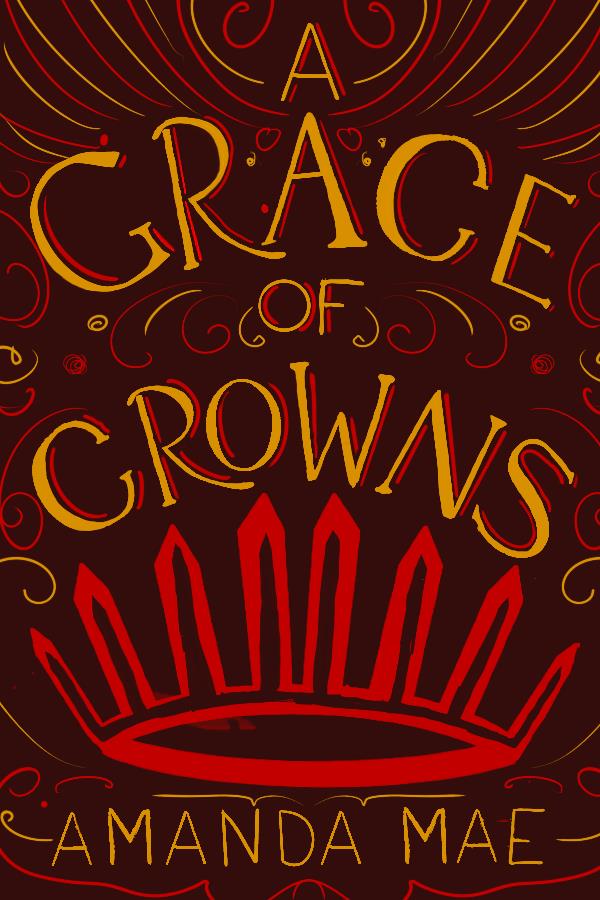
A GRACE OF CROWNS cover
I've been doing this course for a while now, and I was following along, trying to make something for HP #1, but the 'Philosopher's' was really throwing me off. So I finally changed my project to 'A Grace of Crowns,' a book that's been a favorite for a long time. And bam, I'm now satisfied with my work. I'm on the sketching the letterforms with the type and weight and stylistic decisions stage, and I'm going with a high contrast serif for the main words in the title, and for a sans serif for the rest.
The spokes are just a very very rough base where I'll be adding in an illustrated crown. The type sketch isn't finished yet, but I've been at this for 3+ hrs, because I was trying various versions of HP, so I'll get back to it tomorrow!
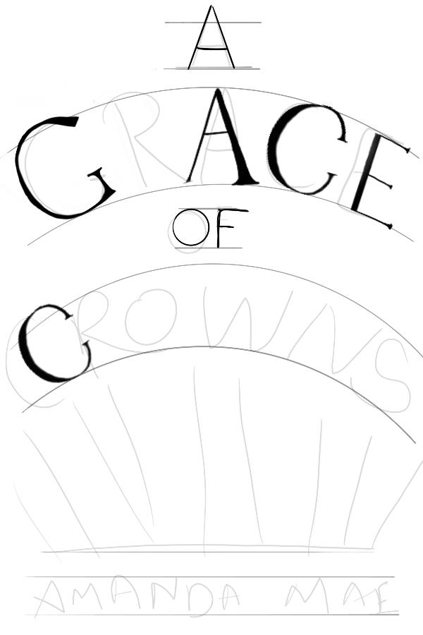
Any and all feedback appreciated! Keep in mind that this is a VERY rough sketch that I am refining right now! I'm aware that the G needs more work, and that the 'A' in 'Grace' needs to be corrected, but it's been done on purpose because I will be giving the R an swash, maybe. If not, I'll do the course correction.
AAH, I'm terrible at keeping up with projects. Anyway, finished this today! I know it needs to be cleaned up, but I would do that in illustrator (if I had it!) and then let it sit, but here's the current final: (the crown is possibly the worse part. Will clean it up...later. When I'm not so tired anymore.)